Transcripts
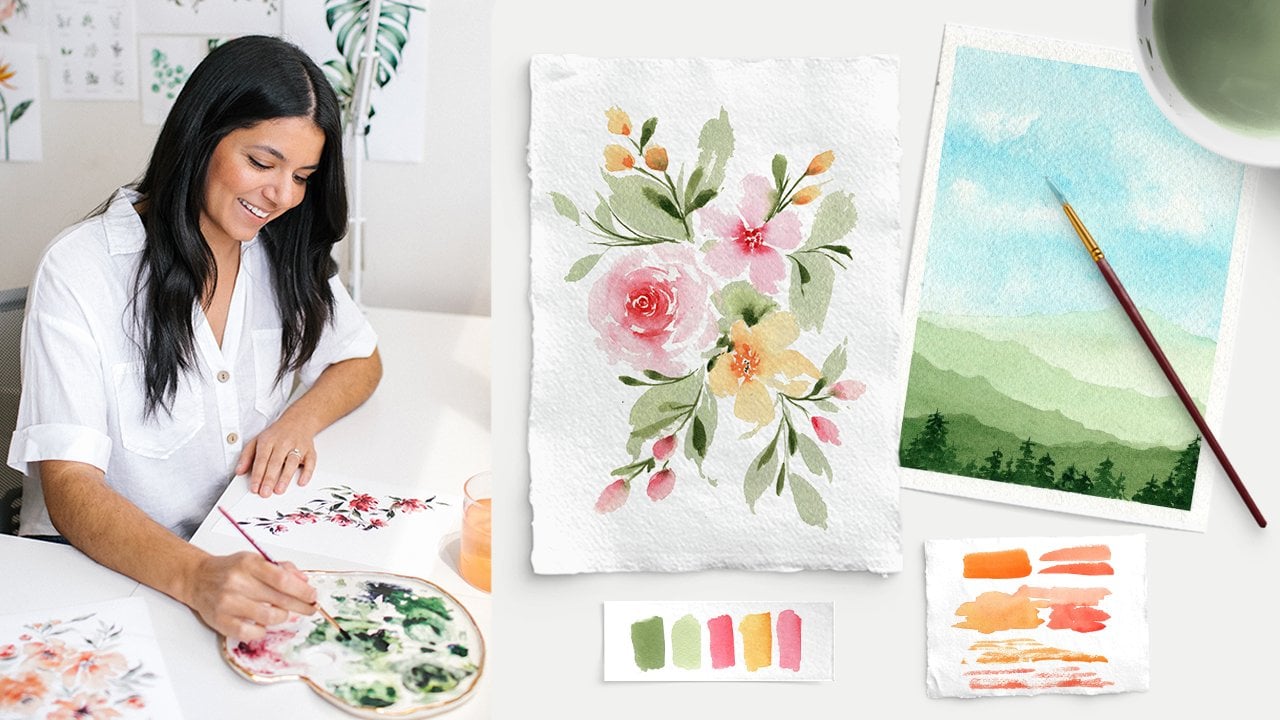
1. Welcome to Class!: Welcome to the 15 Day Floral
Watercolor Challenge. My name is Pria. I'm
a watercolor artist, and I've been painting
loose florals since 2018. And while I've
dabbled in painting other subjects and
styles over the years, I always find myself coming
back to loose florals. In the beginning of my
watercolor journey, I was hyper focused on
learning how to paint roses, leaves, peonies, daisies, all different types
of flora and fauna. And I was able to progress
my skills fairly quickly, but I could only paint
those flowers individually. Whenever it came time to put them all together
in a composition, I felt totally stuck. Did not know how to create
a cohesive piece at all, and I would end up getting
really frustrated. So that's what we're
here to tackle in this 15 day
watercolor challenge. So if you have joined any of my other classes or
tutorials before, but you're still
struggling with putting it all together, you're
in the right place. We'll start by identifying
some of the key tips for creating beautiful and
balanced compositions, and I'll share with you
examples of the good the bad family ugly from my
own paintings over the years. And then we'll get started
on our 15 floral projects. And in each piece, you'll
learn how to paint various flowers,
greenery, fillers, and other elements,
and we'll arrange them together in beautiful,
expressive compositions. We'll start with a couple of super simple pieces with just a few elements
here and there. And as we progress
through the class, we'll work our way toward more
advanced compositions with lots of moving parts and we'll also paint new and
unique flowers. By the end of this class, you'll feel confident in
your painting abilities, but more importantly in
your compositional skills. In each lesson, I will be sharing my step by step process, but there will also be plenty
of room for you to make your own creative
choices to help your final paintings
feel uniquely you. And I encourage you to do that as much as you can
in this class, because that's what's
going to start to build up your
creative confidence. Class is perfect for watercolor
artists of any level, and you are more than welcome
to work at your own pace. Before we get started, be sure to connect with me
on social media. I share a lot of behind the
scenes studio content, tips, and tricks, and tutorials, and I would love to have you
join the online community. So when you're ready, grab your favorite supplies,
and let's dive in.
2. About the Projects: Be completing 15 individual projects throughout this class. The compositions will start
out on the easier side and slowly incorporate more shapes and more elements as we go. And you'll also learn a lot of new flower painting
techniques along the way. From simple but elegant
rose compositions, to wreaths, to wild
flower bouquets, cherry blossoms, and more you'll finish this
class with a stack of beautiful watercolor paintings
you can be proud of. But even more importantly, you'll leave the class with
a new found confidence in your composition skills. And while the title
of this class is 15 day watercolor challenge, please don't feel
like you have to finish at all in just 15 days. Watercolor painting,
especially in the loose style works best when you're relaxed
and inspired. If at any point, you're
feeling like you have to rush or you're feeling like you're
falling behind, take a break, take a breather, try painting something
else if you have to, and then come back to the class when you're ready to continue. I also encourage you to take
some time after each project to jot down what you liked or didn't like about
each composition. Oftentimes when I paint, I look at my final
piece, and I think, h, I really should have had this filler flower curving
more towards the top or I really wish I didn't
add so many leaves in this one area because it's
looking a little too crowded. Or on the positive side, sometimes I'll think, Wow, I really like how all of
these flowers are painting in different directions or I love how these two colors
compliment each other. Let me write down exactly
what colors I used so I can refer to them
again in a future painting. Taking a second to
analyze your work and your processes really helps
accelerate your skills, and it helps you develop your own unique style as you paint more and
more compositions. I used to not do this at
all. I would either think Wow, this is a great painting or this painting is terrible.
What am I even doing? But there is really
something you can learn from each and every
painting you create, even if you don't end up
liking the final outcome. It does help to at
least acknowledge one or two things that you do
like about your paintings. That way you can incorporate them into your next projects. In the following video, we will talk about
all the supplies that you'll need to participate
in this class.
3. Art Supplies: Go over some of
the supplies that I'll be using
throughout this class. For your convenience,
I also included a PDF that has links to
all of these supplies, and that PDF also includes detailed color mixtures and color recipes for
each of the projects. Feel free to download
that if you'd like to check any of
them out for yourself. First up is watercolor paper. I'll be using professional
grade 100% cotton paper, which I highly recommend. Daily challenges like
this one can also be a really great time
to use sketchbooks, because it can be fun to track your progress in a
flippable manner. If you do that, though,
just make sure to choose a sketchbook that has watercolor
specific paper in it. Ideally, 100% cotton. My favorite watercolor
sketchbook right now is this one from Arch or Arches. This is another good
one from Etcher, and again, all these supplies are linked in that PDF below. Brushes, I'm using a
variety of round brushes from the Princeton velvet
touch and Neptune lines, but any round brushes that you like to use are totally fine. As for watercolor paint, I will share all the
colors I'm using at the start of each
individual project. But remember, you are welcome to use your own
colors if you'd like. Actually, I encourage
that because color is one of the
easiest ways to start embracing your own
preferences and styles and start making your
own choices for each piece. Finally, I always use a
paper towel mixing palette, and a bowl of clean water. Once you have all
your supplies ready, meet me in the next lesson
and we will start going over all the ins and outs of
floral compositions.
4. Composition Basics: Before we dive into painting, let's talk through some of the key elements that
make up beautiful, well balanced compositions,
because let's face it. You can't just plop
down some flowers on your paper and expect
it to look cohesive. But there are a few
key elements that can instantly improve
your compositions. The first is having
a focal point. You want your piece to
have one or a few florals that are the stars of the show. These are typically
your largest elements that the viewer's
eyes go to first. Then you have your
secondary florals, fillers, and greenery that play
more of a supportive role. If you didn't have
a focal point, your eyes wouldn't really
know what to focus on first, and your piece might end
up looking more like a pattern than a well
balanced composition. Speaking of balance, that's
the next key element. Balance is super important when you're painting
compositions, and that doesn't mean having a perfect symmetrical painting. It just means you want
to make sure that the piece isn't lop sided with all of the heavy elements on one side or all of the
bold colors on one side. You want to have a mix of
sizes, a mix of colors, and also a mix of the types of flowers spread pretty evenly
throughout the piece. Next step is white space, and sometimes it can be really challenging
to not overdo it, and you can sometimes
end up stuffing your piece with all
different types of leaves and fillers. But white space is
actually really important and you can use
it to your advantage. I want to show you
this old painting of mine that I cringe
looking back on now because you can
see that I jammed in all of these leaves
in every open space. There's no room for the
primary flowers to breathe. Every element is right
there in the center. Compare that to this
recent composition that feels much easier to look at because there's
some white space between all of the
flowers and the leaves. You can enjoy and appreciate all these different
elements in the painting without it looking
so crammed and busy. You also need to consider
shape and movement. Floral compositions can come
in all shapes and sizes. You can have your traditional
straight on composition. You can paint a
wreath, a bouquet. There are just so many options. But regardless of shape, it's always important to incorporate movement
into your piece. You don't just want the
viewer to look directly into the center of your
page and then move on. You want to have more
of a zig zag shape from one corner to the other so that your eyes can move
across the page. And for wreaths or
other bouquets, you want to add flowing
greenery and leave that curve to convey movement instead of straight
lines and symmetry. We'll get a lot
of great practice with this throughout the class. Next up is the rule of odds, and I personally think of it as less of a rule and
more so something to keep in mind as you
paint because I'm not a fan of rules when it
comes to creativity. But the thinking here is that
pieces are more pleasing to the eye when you work in odd
numbers versus even numbers. Let's take a look
at some examples. In this old painting
of mine that has just two big roses and
some greenery around it, it feels very unbalanced because it's just these two big
blobs next to each other. And your eyes don't really
know where to go next. When you have pairs of
two or four flowers, it's really hard to
make them look like they're not lined
up or symmetrical. Now look at these
more recent paintings where I have three
primary elements. It just looks a little
more organic and flowy. So especially when you're
first starting out, I recommend painting
three elements first, and then adding your supporting
fillers and greenery. But I say it's a suggestion and not a rule because I actually have a couple of
paintings like this one. That have two main elements, but I still really
love how it looks. And that's because
I offset them, so there is still some movement there versus the one where the two roses are right next to each other in the
same exact position. And last but not least, we have our color palettes, and color is such
a personal choice, but when you're first
getting started, the simpler, the better. Start with pieces that only
have two or three colors, which might seem like it
would be a bit boring, but by utilizing values, which is the relative lightness
or darkness of a color, you can still achieve
so much contrast and dynamic interest
in your painting. Take a look at this one color, which is paraline maroon,
one of my favorites. If I pull it straight from
the tube, it's a deep, dark, bold maroon, so
that is a dark value. But as I start adding
more water to my mixture, the color is less concentrated
and I can get it all the way up to the super light
super transparent maroon, which is a light value. So this entire scale is one
color, but multiple values. As long as you vary the total
values in your composition, you can get a lot out of
just two or three colors. So there you have it. Those are the basics of loose
floral compositions. I know that was a
lot of information. So if it feels a little
overwhelming, no need to panic. We'll get a lot
of great practice putting all of these tips and tricks into play as we progress through
the challenge. Finally, we will start on the
day one painting up next.
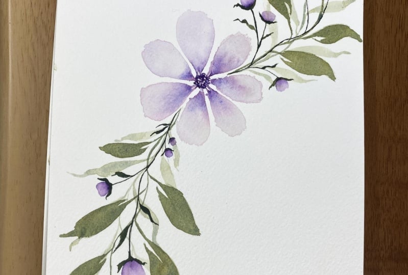
5. Day 1: Primary Flower & Leaves: Welcome to Day one. We're
starting sweet and simple with a very easy flower that has some leaves and buds
coming off of it. This is a great warm up painting for the rest of the challenge. It's only one main element, but the focus is on composition basics like
balance and movement, which we can accomplish with our leaves and our flower buds. The colors all will be using our paraene maroon
for the flowers and a mixture of deep sap green and paraene
maroon for the leaves. But remember, you can
use any colors you want. All right, let's
go ahead and get started with our composition. Like I said, for
this composition, we're having one main
flower, one primary element. So we really want to place that in the
center of our piece. I'm using a six by
eight inch paper for all of these projects. We'll have the flower
in the center, and then we want to
leave enough space to add our fillers
and our leaves. So I am using parain maroon, and we're going to
be pulling all of the color out from the center. So we want our center dots to be very pigmented and
with plenty of water. So I'm loading that
up in my brush. At this point, I'm using
a size six round brush, and directly in the
center of my page, I'm going to start
placing down some dots. It doesn't have to
be a perfect circle. We're just going to be pulling color from these center dots. So don't worry about making
them perfectly uniform. Just go ahead and
tap down some dots. We want to make sure this
maintains its moisture. We want it to stay nice and wet because I'm going to rinse
off my brush completely, so I just have clear
water in my bristles, I'm going to use that clean
water and use the color from the center that we just put
down to create my petals. You'll recognize this
technique if you've taken my other
classes or tutorials. I use the tip of my brush
to pull out some color. And then I let my
brush expand down on the paper to create
one half of the petal, and then do the exact
same thing right next to it to create the
second half of the petal. Go ahead and rinse
off your brush again. Every time I create a petal, I'm rinsing off my
brush because I don't want my petals to
get progressively darker, and each time I paint a petal, some of that color is getting
picked up into my bristles. I want to maintain nice and clean bristles
and that's why I wash it off after every petal. So you can see that
gentle color bleed. I don't have color in my brush. I just have clean water, but because I have plenty of pigment in those center dots, I can use that existing color
to create these petals. We'll continue working
our way around. Now, if your center
dots do dry up, if you're taking your
time, that's totally fine. Just go ahead and get
lots more pigments onto the tip of your brush and just go
ahead and re wet it. You can always rewet those center petals
if they ever dry up. Just make sure to rinse
off your brush in between, and then we can continue
adding our petals. Starting with the
tip of your brush, pulling out some color, you can see my
bristles expand out on the page when I
apply more pressure, and I create these nice fluffy
petals, just like this. Pull out some color.
Let your brush expand out on the page
and lift back up. Now, I had even a little
bit too much water there, so I'll show you
what you can do. If you don't want any
puddles like that, you can see a slight
puddle that I have. I'm just drying off my brush and letting my brush soak up
some of that extra water. Because I want to maintain that nice translucent
look on the petals. I don't want it
to be flooded and that's called the
lifting technique. I can squeeze in one
last little petal here. It's a little smaller than
the others, but that's fine. Same thing here.
I'm lifting up some of that excess water
with a dry brush. Now we have our primary flower. One thing I like to do is while these petals are
still slightly wet, I go back in and I just happen a little more color to
deepen that center. And I'm making that contrast
a little bit more bold. Now, I don't want the center of the flower to be completely
blocked in with color, so I am just tapping in
a little more pigment. There's our primary flower, and now we can go ahead and add the leaves and the fillers. I'm going to start with
a very light value of this green mixture and a light value just means
it's more watered down. Now I talked about adding
movement to this piece. Because it's a
simple composition, we only have one
primary element. The way we can add movement is through leaves and fillers, and we still want to
have that swirly sense of movement in the piece. I want to be able to add my leaves coming
out on either side. I don't want them to be
sticking straight out, I don't want them to be static. So I just want to keep all these things in
mind as I paint them. So I'm using the same size six brush and I'm going
to start by adding a very thin line using the very tip of my brush and
a very light value of green, dragging it out just like this, and then I'll create a
leaf on the very end. I'm putting heavy pressure
down and lifting back up. Now, I'm going to do a few
layers of green for this stem. That's why I always say you
should start out lighter because you can always add
darker greenery on top. If you start too dark,
you're not going to really have room to
go darker and darker. But if I start nice
and light like this, you can layer on
darker leaves on top and see how this leaf has
c, some movement to it. It's not sticking straight out because that would
make the whole piece look a little bit static. I'll do the same thing
applying more pressure, curving the edge of this leaf. And I'll add a few more
onto this little stem, using the tip of my brush, applying more pressure
and lifting back up. And let's add another
one right here. Making sure to vary the
amounts of pressure. That's looking good
so far for the top. Like I said, we're going
to do a second layer. Don't go overboard. You want
to leave a little bit of white space so that we can layer additional leaves on top. Now I'm going to
do the same thing coming off of the bottom. Like I said, one
corner to another, that's a great way to
structure your compositions. It's not straight up and down
or straight side to side, you have a little bit of
corner to corner movement. So I'll use the tip
of my brush again, swirling that leaf
stem a little bit. And then going light
pressure, heavy pressure, light pressure to create
that leaf at the very end. I'll do the same thing, adding a few more leaves all
the way down this stem. One coming off of here, making sure to add lots of
good movement and variation. And just adding a few
more to this leaf stem, making sure to keep the
white space in mind because I do want to be
able to add a second layer. And now you can see
some good movements starting to show up
on this composition. Another thing I
want to mention is you don't want symmetry. You want your composition to look very natural
and organic, and that means you
don't want to have this stem be a flipped
version of the bottom one. You see this one has a
few more leaves on it. It has a little bit more of
a curve there at the end. It's a little longer and
the one at the top is a little bit shorter and
only has a few leaves. Make sure you're varying all of the elements to
keep it interesting and keep your piece from looking to symmetrical and to uniform. All right, so I moved
you in a little closer so you can see
what I'm doing here. This is the top half, and you want to make
sure this leaf stem is dry before adding
any additional layers. I want to have very clean
separate lines on my greenery. So if I were to put a second layer on top
when it's still wet, it would just start to
bleed into each other, which sometimes
is a nice effect. But in this case, I just really want to keep
each layer pretty clean. Now I'm just going to add some additional greenery on top with a slightly
darker value. Again, darker value
just means it's less watered down and a
little more pigmented. I'm using the very tip of
my brush and pushing down. You can see a little bit
of overlapping there, and I don't want to make the exact same leaves like
I did in the first layer. I'm going to have
some overlapping. Some are just going to be
little wispy strokes like that. I'm really varying the
different elements that I'm adding to keep
it interesting. I'll have another one
overlapping here on top. Because I'm working
light to dark, I'm able to cleanly layer this darker stem on
top of that first one. I'll have one coming
down as well. Just get a sense for your painting. See
what you're feeling. Go ahead and take
some risks here. You don't need to make the exact same strokes that I'm doing. Go ahead and add some that are just wispy little
marks like that, don't be afraid of
painting on top of that first layer as
long as it's dry. You just want to make
this look nice and full. I'm adding these little leaves just by tapping my breast down. I'm not dragging it out
too far and that gives you those nice little small leaves and now we can do the
same thing at the bottom. See how it's a nice gradient from light to dark
up at the top. That's what we want to achieve on this bottom layer as well. Just go ahead and
freestyle some leaves. Always maintaining that
sense of movements and do your best not to mirror what
you did at the top stem. We have some leaves
that are overlapping, some that are just
little wispy lines using the tip of my brush. Just keep it nice
and loose and fluid. It's looking pretty
good. I think I'm just going to
add a couple of these little small leaves
like I did at the top. Again, just barely
tapping my brush down. Just tap and let the shape of your brush create
that leaf shape. Using your brush in different
ways like this can really help add a lot of great
variety to your piece as well. I'm going to stop right there
because I still want to add some little flower buds and
some secondary fillers. For now I'm seeing a
lot of good movement. I see some variation in value. I'm liking how it's
turning out so far, but I don't want to end
up having it too crowded, and I still want
to add some buds. I'm going to go ahead
and let this dry and then we'll finish
off with some more.
6. Day 1: Buds & Details: Now, anytime I add filler
flowers to a composition, you'll see this
throughout the class, I like to just start
with a pencil and just lightly pencil in
where I want those to go. That way, I don't have to
commit to putting paint on paper and then maybe not
exactly liking what I did. Doing it with pencil, again, I'm not sketching
out full flowers, I'm just putting lines, and that helps me plan out, make sure I like the
direction that I'm going without too
much commitment. These fillers,
these little buds, they're just going to be a
little tiny bits of color. So some of them I'm going to add to these lines that
I've already put. I'll have one coming
off of there. I want to have one curving. I still want to maintain
lots of good movement here. And I'm just probably
going to put a couple of these in
each of the stems. Have one coming out
here to the side. This is another
spot where you can really make your own
creative choices. If you want to add more
buds, go ahead and add more. If you just want a couple on each side, feel free to do that. These are just going to be
little pops of color again. You can't really go wrong
with adding a few of these. Definitely, feel free
to make it your own. Let's see, I have
three up at the top, I have two down here so far. I think I want to add
one more Let's see. Maybe coming right
here down the middle. Now that those are penciled in. I'm going to move to
a size five brush. This is the velvet touch brush, so it's a little stiffer than the Neptune that I
was using earlier. Again, I'm going to load up a pretty dark mixture
of my Perine maroon. I'll bring you in a bit closer
so you can see it better. I'm just going to tap the tiniest little
bit of color down on my page in a little bit of
a shape just like that. I'll rinse off my
brush completely. Tap it on my paper towel, so I don't have too
much excess water. And I'm going to start gently
blending that color up, rinsing off my
brush every time I touch it because I want this bud to get lighter and lighter. Have a smooth gradient from dark to light for each
of these little buds, and that's all I'm going to do. It's a very simple little pop of color that has that gradient
from the bottom to the top. That's going to look a
little bit weird for a bit because I'm going to add
the stems at the end. For now, I'm just adding in these little buds and they'll be floating for a little bit. I have that color in my brush, I make a little e
shape just like that, and then I use a
clean brush to gently start pulling that color
up and soften those edges, making sure to rinse
off my brush every now and then to
maintain a light value. Gently bring it up into
the shape of the bd. Now, see I originally penciled
in my filler to go here. But thank goodness I did it in pencil because now
I'm seeing that it's a little bit too symmetrical because I have this one
coming out to the left. I'm just going to
pencil in again, and I'll do another one
coming back up on this side. And that way I can keep it
where I have two on one side, one on the other, and it's not directly across
from the other one. Again, that's the
nice thing about penceling things in is
you don't have to commit, and you can make
changes as you go. Again, starting with
that super dark value, rinsing off my brush
completely and gently blending that color up to create this dainty
little flower bed. Rinsing off my brush again, maintaining a very
light watery value for the top of these buds. I want it to look
nice and delicate. So that is looking much better. I'm glad I decided to do that. Now I'm going to use
that same brush, but with the darkest
value of green, even slightly darker value than that second
layer that we did, and I'm using the very
tip of my brush here to create these little attachments
to each of these buds. I want it to be a
very fine line, so I'm not applying too much pressure
using the very tip of the brush and connecting it
with that little filler. Here's where I like to add a little bit of character to it too because usually when
I add those little stems, I also like to add some cute little leaves
coming off of it. I might do some little
wispy marks here. I also like to add
some leaves coming off that base of the bud too. I hugs the bottom of it and
add some good character. This is another step
where you can really get creative and make these little
attaching stems your own. I really don't want you to
feel like you have to do the exact same steps or
strokes that I'm doing here. This is where you can really embrace your creative freedom, especially once you have all
the main elements placed. You can't really
go wrong with just adding in those final touches. Again, using the very
tip of my brush here to connect that filler with
the rest of the piece. Why not add a few more
wispy strokes for the leaves. Have fun with it. Let's again make a
little base to the bud, help it look more complete. You can also use a smaller
brush here if you'd like. These velvet touch brushes
have very pointy tips, so this is working fine for me. But if you do have a
smaller detail brush, feel free to use that. Let's make sure this third one is dry. Y, we're good to go. If it wasn't dry, then when I connect it with
this lactle stem, I'd get some bleeding of
the green into the red, which again, that's fine. I like to do that actually
sometimes on some of my compositions if I want
that very loose effect. But for this one, I want it
to have a clean attachment. Adding those little
base leaves to help it look more
connected, and there we go. This is already looking
really beautiful. We only have one main element, but because we have such
a lush array of greenery, and we have the fillers
is looking like a pretty full
dynamic composition. Now we can go ahead and add the last little
fillers on the bottom. And we'll do the exact same
process that we just did. Again, starting with that very deep pigmented value and
pulling straight from the tube and painting
a little bit of a U shape at the bottom,
rinsing off my brush, so I have clean bristles, and then gently blending it up, making sure to rinse off
my brush each time so that I can get that gentle
gradient from dark to light. If my brush becomes
too saturated, you're not going
to be able to get those light values at
the very top of the bed. Every time you see my
brush go out of screen, that's when I'm rinsing it off
to keep it nice and clean. Let's do the same thing
on these final two. Again, you are more than welcome to make adjustments as you go. You can change where you
want your fillers to be, you can add more,
you can add less. If you want it to be
more clean and simple, this is where you get to be in charge of how
your composition turns out. And I'm liking the
balance of this so far, and I have one more
pencil than here. That also helps to balance too because I have
two on this side, and then I'll have two
on the other side. So they're going
diagonally again, which is something
I always try to do. Be sure you're
taking a step back every so often as you paint to just make sure things are looking nice and balanced
and you're not overdoing it. That's usually one of the
problems I run into is I just keep adding more and
more until it looks too busy. Same thing as we did
here up at the top, I'm going to give these
a little time to dry, and then we'll add our
darkest green attachments. These are nice and dry now. I've grabbed my darkest
value of green. Again, working light to dark. Every time I add a new
layer of greenery, it goes right over the top. I just use the tip of my brush to create these
little attachments. Making sure to infuse
some character by adding these
wispy little marks and the little
attachments for the buds. It just helps it look
more like it's a part of the overall composition when you have a nice full attachment. You can make that
part thicker if you want the bud to be
even more closed up. Even when I made this attachment here it's not super straight, but it is a little more straight than I usually like to do. If that happens to you, I'll show you what I
like to do to bring back a little bit
of that movement and that natural look to it. I grab that same color of
green and I'm just adding a little more movement on the leaves so that the entire stem isn't
perfectly straight out. It has that nice movement and curve to it through the use
of these little attachments. That's a nice little trick. If your stems are too straight, just add some leaves
that are very curvy to take away from
that straight line. Now because I added those,
it doesn't look so straight because it hides
that straight line with those curvy leaves. You can always make adjustments
like that as you paint. Let's go ahead and add a few more leaves coming
off on the side, just making those final details. Don't want to go overboard, but adding one final leaf
coming off of this stem. All right. Everything
is looking great. Let's take a step back and
just analyze this again. Everything looks
fairly balanced. The only thing that I'm noticing is that this third layer of greenery at the top dried a bit lighter than the bottom one. It dried quite a bit darker. It looks a little
bit off balanced, not a whole lot,
but just some of those darker elements that
aren't there at the top. I am going to reload my brush with the dark value of green. Again, I don't want
to go overboard, but I do want to realign some of these leaves with
that dark value. And make it a little more bold. I'm not going to go overboard. I just want to
bring back some of that dark color that we have
at the bottom up to the top. That's the nice thing about
working light to dark is you can always go back
in with darker layers. That's why I prefer this actually where it
dries a little bit too light than if it dries too dark because once
watercolor dries, it's pretty hard to
remove any of that color. Now it's looking a lot more
balanced because we have dark elements on the
top and the bottom. This is our finished piece. Even though this was
just one main flower, we were still able to
make it a cohesive and interesting composition
with the changes in value, the leaves on either side, and the secondary fillers. I hope you're proud of
what you painted today, and I will see you in day two.
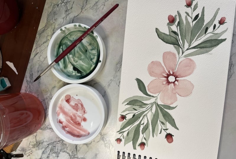
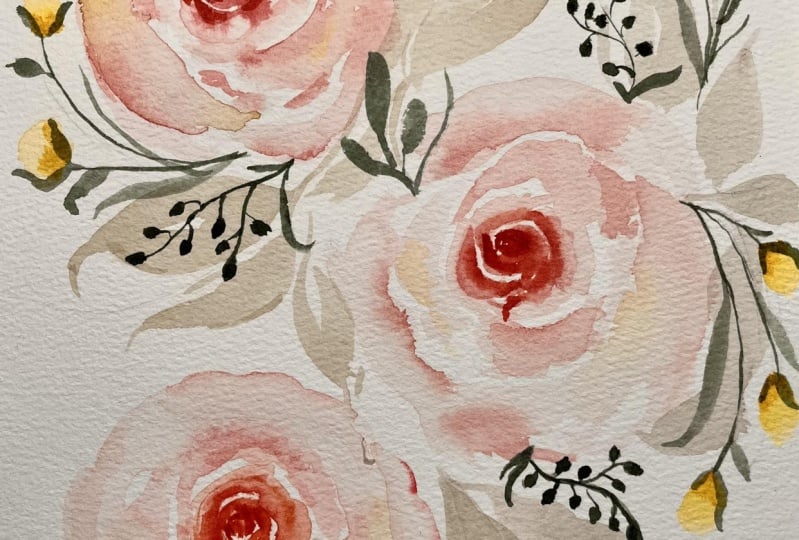
7. Day 2: Primary Roses: Our day two project
is a three piece rose composition with some
filler flowers and foliage. This is a great way to not only practice painting loose roses, but also to work in odds to help your composition look
more natural and organic. The color palette for this piece is soft pinks and greens. For my pink flowers, I'm using a mix of permanent
zarin crimson, yellow ochre, and
titanium white. I'm also going to be using
some cadmium yellow, deep. And just like the
day one project, I'm mixing some of that pink into my deep sap green to get a muted shade for
a cohesive look among all the
leaves and foliage. For this piece, I
mentioned we are going to have three
primary elements. We're working in
the rule of odds. I'm going to have one rose that is top left, one middle right, and then another down at the bottom that's
in between the two, and they're all
going to be roses. Let's go ahead and
add our first rose. This one will be
the top left rose. I'm starting with a very
pigmented value of my pink, and I'm going to use
the tip of my brush to create tiny dainty little
strokes like this. This is what I call
a C curve because the strokes are in the
shape of a C. I'm leaving some white space in between
each little stroke and I'm starting to put
these little strokes down on the paper and build
out the center of the rows. That's all I'm going
to do for now. Now I'm rinsing off my brush completely so I
have clean water, and I'll start to feather out those strokes
that I just made. I am still following
that sea curve, but I'm blending out
the dark pink that I already put down
and softening it out. That's creating some nice
depth within these petals. I want to go from dark to light. The very center of the
rose is the darkest. That's where the petals
are the tightest, and then we're
getting lighter and lighter for these outer petals. I want this to be
a very loose look, so I'm wiggling my brush, letting the bristles
expand out on the page, and I'm being cognizant
of my white space because what I say in all of my classes when I teach roses, is the white space
is so critical. If you don't have white space
in between your petals, that's when your flower really turns into a blob of color. And you don't have any of that
separation or definition. We are still doing
a loose style. We're not defining
each and every petal. But because we have a
little bit of white space, it gives the tiniest
little bit of definition and separation that we need
to create this style of rows. You can see the
depth building out. We have dark in the very center and lighter petals
here on the outside. Then I'll go back in and
darken the center even more. In that mixture
that I showed you, I'm adding a little bit more
of the sarin crimson to get a darker value and gently tapping some of
that into the very center. Again, I still want to
maintain that dark value, and you can see that the
petals are still wet, so you can have a little
bit of bleeding happening, which is something I love for
this style of loose roses. Darkening that center again and gently tapping in
that darker value. Then I'll go back into my light pink mixture with a pretty fair value,
not too dark. Go back over the top, adding a little more color. Again, you can see
that gently bleed out into those petals
because they're still wet, and adding the second
layer to really make this rose more
dynamic and beautiful. Now, how many layers
you add is up to you. I usually take a
look at how mine is looking if it needs a
little extra something, I'll tap in some more, but you really don't want to go overboard because that's when you can get into blob territory, and we definitely
want to avoid that. I will do one final tap of really dark pigment in the very center to
darken it even more. And make it really nice and bold because that is what
I think truly makes a rose pop is when you have the really dark deep center and then it gets lighter and lighter for the outer petals. I'll show you another
chick I like to do, and that's to grab a
little bit of yellow. You definitely don't have to do this part if you don't want to. But I get a very light
value of yellow, and I tap in the slightest bit. You can barely even see it here. But adding in a second layer to your roses makes
it so beautiful. And I think this warm yellow compliments our pink
mixture really nicely. T because it's wet on wet, those first petals
are still wet, so you're not getting
any harsh lines, you're just getting that
gentle bleed of color. I only put that on the
outer petals because again, you want to maintain
the very dark center. Our first rose is done. Now we can work on
the second one. I want to have a little
bit of space because we're going to have three
primary roses, and I want a little bit of
white space in between them, so we can add some
greenery and foliage and I don't want everything to be crammed into the very middle. Let's do this again. Starting
with the dark value. This is where the center
of the rose will be. And we'll go ahead and make
these little C curves. I'll bring you in closer
so you can see it better. Just using the very
tip of my brush, making these wispy
curves and making sure to leave that
white space in between for a little
bit of definition. You don't want them to be
perfectly uniform lines either. You can see some of mine
are a little bit squiggly. Then at this point
is where I rinse off my brush and gently start feathering out a
little bit of that color. Which creates such
a beautiful effect. And then I continue
adding more petals using a very light value
of our pink mixture. And I'm working with quite
a bit of water here. You can see I'm holding
my brush to the side so that I can get these
thick fluffy petals. And roses can be kind of tricky. I have another class on roses if you're wanting to
practice that more often. But my key tips are
just the white space, and then the change
in value from dark in the center to light
for the outer petals. As long as you
keep that in mind, as you paint, your roses will
turn out very beautiful. Again, this is blue
style painting, so don't feel like your roses or your petals have
to be absolutely perfect. Just have fun with it. And then before they dry, go ahead and add in
additional color and watch it bleed out into
that first layer of petals. That's my absolute
favorite part. Adding some more layers here
to help build up this rose. While it's still wet, again, I'm going to grab a
little bit of that yellow just because I personally
love this part, but if you don't like the
yellow, that's totally fine. You can maintain your pink. Just adding the
tiniest bit of yellow here to make those
outer petals pop. You can see in that first row, the very center is
very bold and deep. I'm going in again with
the second one with a very bold straight from
the tube sarin crimson, so it's very dark and
deepening that contrast a little bit So those
petals look nice and tight. And so I just work
my way around adding a couple more layers to help
bring this rose to life. I have a little bit
of a puddle here, just like we did in
the day one project, I'll use the lifting technique to soak up some of that excess. So we don't have any harsh
edges when it dries. And there is our second rose. The nice thing about
this composition is it's all roses for
the primary elements, but no two roses look
exactly the same. It's not going to look to
uniform, no matter what you do. Even if you do the
exact same technique and use the same colors, those two roses look
pretty different. Let's get started
on our final rose. We're getting a lot
of great practice with roses in this composition, so it might start to feel
a little repetitive, but roses can be pretty tricky. I never hurts to get a lot of good practice doing the
same thing over and over. So the center of the rows with the little dainty C curves, and then rinsing off my brush to soften out those
initial strokes. Making sure to maintain that
white space in between them. That part is super important, and then I'm getting
lighter and lighter as I work my way toward
the outer petals. I'm holding my brush at an angle so that it really
expands out to create the big fluffy petals and just taking advantage of all
the different strokes I can make with this one brush. While that's still wet, I will grab a little bit
of the yellow and tap it on along the outer petals. It's nothing major, but it does add a beautiful little effect. I love how those pink and
yellow colors work together. Just like we did
with the other ones, I'll go ahead and start darkening
the center of the rose. I have a darker value, and I'm just using the
very tip of my brush, still being very mindful of
my white space in the middle. My advice is to
not go overboard. It's better to do less
than to do too much. If you're happy with how
your rose is looking, then just feel free to stop
and move on to the next part. Just really love the center
to be very dark and defined. That's my favorite
part. There we have our primary elements. If those were tricky for you, try to go easy on yourself. Roses can be very difficult, but for lose style at least, the nice thing is it
doesn't need to be perfect. It's just an
interpretation of a rose. Like this, first, one, you
can see some hard edges. There's not a whole lot of separation in the outer
petals, but it's all good. It still looks loose. It still compliments
the other roses nicely. As we add more elements
to this composition, it'll really start to come together and look like
a full cohesive piece.
8. Day 2: Leaves & Rose Buds: Going to switch to
a very large brush. It's a size ten round brush. I'm mixing up some of my green. My trick here is when
I'm working with colors like this
light soft pink, I actually add a little
bit of that pink to my green mixture to make
it a little more muted, and it pulls
everything together. Just adding a touch of
that pink to my green, starting with a light value, and I'm going to add some big fluffy leaves
here to the middle. It's very light value. We'll be adding
more layers on top. So don't worry about making
these initial leaves perfect. You're really just
blocking in the color. So expanding my brush. You can see this is
a big fluffy brush, size ten, so it is perfect for creating
these large leaves. And we'll just continue adding some greenery
here in the middle. You're basically just
indicating that there is some foliage there in between
these primary elements, but it does not
need to be perfect. So I'll add another leaf
coming out of here. You're filling in
this base layer of color that will add
to in the next layers. I'll have one more
coming out of here, applying some pressure and lifting back up to
create the leaf shape. The same principles as we did in the previous lesson, you
want to have movement. You don't want any leaves
coming directly straight out. You want to have some curves. And create a beautiful
dynamic look. So that's all I'm going to
do for the middle right now. I don't want to overcrowd it. I need some white space
to let it breathe, but still show that those
primary elements are connected. So what I'm really doing with this first layer is blocking
in the main leaves, blocking in the movement and placing where I want the
viewer's eyes to move, which usually I do
corner to corner. But we will be painting on top of these first light leaves. If you don't like the you're going, you don't
need to freak out. You can always change it as
you add your darker elements. You can see I'm wiggling
my brush as I paint, so my leaves aren't
too perfect looking. They have organic edges to them. And putting in these
really big fluffy leaves because these first layers, I like to have the
biggest leaves, and then I have room to add smaller elements
when I come back in with the darker greenery. Again, we'll be doing
additional layers on top, so you don't need to fill
in every little space. Setting the stage
for the shape of this overall composition
with this first layer. I'm not having leaves
coming out of every single no can cree of each rose. You can see I have plenty
of white spaye still, but I'm placing down this first layer of leaves
and setting that foundation. Again, to create these leaves, I do a thin line with
the tip of my brush, apply more pressure,
letting the belly of my brush expand, and
then lifting back up. We have a lot of good
movement so far and now I want to curve it back
down at the bottom. I'll add a curving leaf coming
out of this bottom rose. This is definitely another
opportunity for you to make some artistic
choices of your own. I'm having my piece move from top left down
to the bottom, like a little S curve, I guess, or a z curve. But if you want to have yours going a different direction, or you want to have a
different style of leaves, by all means, you're more
than welcome to do that. The same principles will apply
though you want movement, you want some white space, and you want your leaves
to look nice and organic. They're not perfect
almond shaped leaves. They have a little
bit of a rough edge. You can add some wispy little
lines coming out of them, and I'll add one final
leaf coming off of here. This is looking good so far. This is just the first layer, so we can always
alter the shape. We can add more movement, longer leaves and stems. But for now, I'm going
to let this dry, and then we'll add our
foliage and filler buds. All right. Everything
is dry now. Now I'll go ahead and use
that good old pencil again. And start adding in where I
want these fillers to be. For my fillers, I'm
going to use a mix of my cadmium yellow deep that we dropped into the
outer petals here, as well as some of
the pink mixture. I think those colors will
really balance each other well, and we didn't get a whole lot of yellow in the primary roses. I think having those as some of the fillers will be really beautiful and tie
it all together. This is your opportunity again to add these fillers
wherever you want. Just make sure you're
giving plenty of movement. I'm going to have some
coming out of each flower, but not going overboard. I also want to have them all balanced in terms
of the direction. I already have some going down. On this side, I need to
have some pointing upward, and that helps give that swirly sense of
movement to your piece. I'll have some coming this way. Another one down here. And let's add one more. Curving out on the left. Now that I've penciled those in, let's go ahead and add
in some of the buds. So will be pink,
some will be yellow. Let's start with
the yellow ones. Same as we did in
the day one project, I'm starting by adding a U
shape down at the bottom, and then rinsing off my
brush completely and blending up that color to
be very light at the top. This creates a really
soft and delicate effect. I'll do another yellow
one across the way, and then we'll have pink
at the top and bottom. Again, just thinking about balance here as I add
all of these elements. Starting with that U shape, and I'm going to add
another one here too. I always encourage you to take a look as you're going
and make adjustments. I only penciled in two fillers, but I don't want it
to look to similar to the ones we just painted on the left. I added a third one. That's what I'm talking
about when I say, make your creative choices. Your painting might
need something a little bit different than minds. Feel free to make those
choices yourself. That is looking good for
the yellow one so far. Let's go ahead and
add our pink ones. We have a lot of this
very light value pink that has quite a bit of titanium white mixed into it. I'm actually going
to go with the medium, darker pink value. I'm still not going
full darkness, like the very center
of the roses. I want them to look delicate, but I don't want
them to get lost and just blend in with
these big flowers. I'm going a bit darker. I'm starting with that U shape, rinsing off my brush, and then creating that soft
gradient from dark to light. This is my personal favorite way to paint little flower beds. It might not look
super realistic, but I think they're
the perfect addition to a piece like this. Again, I had this penciled
in angled to the right, but this one on top is already
angled in that direction. I don't want them both pointing
in the exact same way, so I'm going to
change my mind here and have this one
facing downwards. Again, that's why
I always like to pencil it in first because
you can change your mind, see how things are shaping up and then make your
decisions as you go. You're not really committing to anything when you
just pencil it in. But once you put
paint down on paper, you're pretty much
locked into that. I actually have two more areas that I want to add fillers. Let's go ahead and add these bottom ones first
in the same pink color. I'll show you more of
a close up view here. Starting with the U shape
for the base of the bud. I'll do that for both of these. And then I rinse off
my brush completely, dry it off on my paper towel so that I can gently smooth that out and work my way lighter and lighter
towards the top of this bd, creating a very gentle gradient. You can see I have a little
too much water there. Again, going to use
the lifting technique to soak up some of that excess. I have a nice even layer, and I'm going to tap
back some color down at the bottom because when I
used that lifting technique, it also lifted up
some of the color. Just going to add some
of that back in and we'll soften the second one
too using the same technique, clean bristles and
gently blending it. You're creating this
very easy gradient. It's not a sharp contrast between the light and
dark at the bottom, it's a very gentle gradient and it fits the gentle vibe
of the rest of the painting. Now, I pencil in one
more area for the buds. Let's do one pink
and one yellow. I might as well keep
it pretty even. So I'll start with my
yellow one up here, adding in that U
shape at the bottom. That's your darkest value of
whatever color you're using. If you want to use other
colors, that's totally fine. And then we'll add our final
little pink one right here. Now, we'll add the stems next, and even when you add the stems, if you decide you want to add more fillers, you
absolutely can. This isn't the final chance to add any filler buds like this. I'm going to leave
it like this, but once I add the rest
of my foliage, if it feels like it needs another little bud or
there's a gap between here, so maybe I'll end up putting
another one, maybe not. But you can always
have that option.
9. Day 2: Foliage & Final Details: Now we'll do our
second layer of green. First, I'm going to go ahead and attach all of these buds. You can see it's one step
down in terms of value. I'm not going super dark here, but it's definitely darker
than that first layer, so I can easily
add it on top and I'm not worrying about adding anything additional
at this point. I am just connecting these little buds with
dainty little stems. You can see I chose to
have that one overlapping. You don't have to do that
if you don't want to, but it helps give a
little more sense of depth and movement when you have some leaves that
overlap the others. Gently using the tip of my brush and connecting
all these little beds. And always remembering
to give movement. I never want my
buds to be straight out because that's not going
to look very realistic. You want to have some
curve and movement to it. Now we get a pretty good sense of the movement of our piece, now that we've connected
all the main elements, and now we can just
fill in the gaps with some additional
greenery just like we did in the first project. I have that second
level of value. It's a medium green, and I'm going to add
some overlapping leaves. Some will be little
leaf stems like this. I don't have this
planned out in advance. I just am painting intuitively and figuring
out what needs to go where. I really liked the little
attachments that we did to the buds in
yesterday's project. Let's do that again. For that, I have the stem connecting, and then I just place these little marks at the
very base of the bud. It hugs the base of the bud. So it just makes it look a
little more connected than if it's just a thin little
line connected to the bud, you have kind of a place
for that bud to rest. So I'm going to go ahead and add all the attachments
to the buds, and then we'll meet back up to finish the rest of the greenery. Now that I've attached
all the buds. I did point out earlier that there's a bit of a
gap between these two, so I'm going to go ahead and
add one more little bud in between them coming
off of this one stem. It's not going to be as
tall as the other two, but just going to bridge
that gap between those two. If you notice any spots
in your composition that need a little bit more
or it feels a little b, and you don't just want
to fill it with greenery, you can always add more fillers. I have a little bit too much
water in my brush there, so I'll dry it off and soak up some of that
additional water. And then I'll go ahead and
attach it with one final stem. Now we can really see the general shape of
our composition. We have a lot of good movement, but I want to add a few more
of these mid value leaves. To make it look a
little more full. Now, we've done a lot of the
same kind of sharp leaves. We've had some whisky
strokes in all of them. But one other type of filler
that I like to paint. It's almost kind of
like a mini eucalyptus. It's kind of eucalyptus shaped, but like a small version of it. So let's try adding one of those coming out
of this rose here. So I have my vid
value loaded up. I'm adding a curvy little stem. And then I'm adding these
little tiny round leaves. It's almost like the shape of
a silver dollar eucalyptus. And adding those coming
off of the stem, it's just another fun way
to fill up that space, and I'm only using
the tip of my brush. So let's go ahead and add a few of these throughout
the composition. I don't want to overwhelm
it because we have a lot of moving pieces and
elements going on here, but I just wanted to add
a little bit of a funky, different type of filler
in a couple spots. So we have one
pointing downward, and let's have one
coming off of the side, and maybe one somewhere
up at the top. Again, as you near the
end of a composition, this is it can be a little
bit in terms of overdoing it, not knowing when to stop. So every time I add an
element at this stage, when I'm this far into a
painting, I like to step back. Take a look at the
overall composition, make sure I'm not adding filler just for the
sake of adding filler, but that it's actually giving
something to the piece. Because the worst thing,
not the worst thing, but something that's a little
frustrating when you make compositions is if you really like the way
it's turning out, and then you keep
on adding more and more because you're
so excited about it, that you end up not
really liking it, and you liked it a little bit more before you added
all those pieces. So that's just
something to be aware of in these final stages. I'm going to add a couple
additional leaves here. And doing one more little eucalyptus branch
coming up here. That's a little
lighter in value, so I'll darken it a bit. And I'll do one other stem here. So I encourage you to just experiment with different
types of fillers. You can't really go
wrong with fillers. There's so many
different types of leaves and botanicals
out in the real world. So even if you're just making
something up in your head, you don't actually know,
like, for example, I don't know what this specific
leave would be called, or if there actually is
something out there like this, but I'm just using
my creativity. And adding these little
elements to the piece. So taking a step back now,
everything's looking good. There are just a few
pieces that look a little bit disjointed or not super connected to the
rest of the piece. So in that case, I
just like to add a few more leaves here to
make it look more full, or if there's an existing leaf that you want to make
a little bit bigger. I do that quite often too, make sure you use a
slightly darker value. And this is a pretty
light tone too. So even though I am adding
more and more to it, it's not an overwhelming
amount of color. But it does just help some of those elements that are
hanging out on their own. It helps that feel a little bit more like it's part
of the overall piece. Doing one final look over. Again, this area feels
a little bit sparse. Let me just add a few more here. And this is the point
where I probably want to stop and not overdo it. Congratulations for finishing
your Day two project. This is one of those
compositions or shapes that I find myself painting
over and over again. So keep this one in
your back pocket for future paintings, and I'll see you in
the next lesson.
10. Day 3: Primary Florals & Leaves: On to day three, which is a
spring floral composition. This will be our first project with a mixed variety of flowers, and it's going to be a fun one. I also wanted to paint this one to show you that
it's okay to break the rules because this piece technically only has
two primary flowers, so it's not following
the rule of odds. But by offsetting them
and making sure we add plenty of interesting
buds and fillers, it's still going to look
balanced and easy on the eyes. The colors I'm using for this painting include
permanent red light, cadmium yellow deep, prussian blue with
some titanium white. For the green, I'm mixing together a little
bit of everything, including the colors
I just mentioned, along with some
green gold and panes gray until it reaches
this nice, earthy green. Let's start with
our first element, which will be the big rose. I'm going to place that
in the top left section, and then we'll do our
other primary flower down here and we'll fill
the rest with buds. For this first rose, I'm
going to be using a mixture of permanent red light
and cadmium yellow deep. It makes this really
beautiful orange peach color. We already painted a rose
in the previous lesson. One's going to be
slightly different, a lot of the same principles, but just some slight changes. Again, starting with the
deepest value of this color, I'm using the tip of my brush to create these very dainty
little sea strokes. They're the same
sea strokes that we did in the last ones, making sure I'm leaving some
white space in between. And creating these really
whimsical type of strokes. Now rinsing off my
brush completely, I'm going to start feathering a little bit of
these strokes out. Then we can start creating the softer lighter value petals towards the outer
side of the rose. Still keeping white
space in mind, but letting my brush lay
down and I'm wiggling it to create these swirly
funky shaped petals. Again, you want to
work dark to light just like we talked about
in the previous project. As I work my way toward
these outer petals, they're getting lighter
and lighter and I'm still being mindful
of those white spaces. I don't want this rose
to turn into a blob. The white space is
really important. While that's still wet,
let's go ahead and go back in with a dark pigment. Because I want to take advantage of that wetness while it's still wet so that you can get these little
bleeds of color. Now we're going to make this row slightly different from
the one we did previously. Instead of just
having these same s strokes expanding out, we're going to add some scoting
petals around the bottom. Instead of my C curve petals, we're going to have these
ones aiming downwards. That's a little
too much pigment, so I'm going to rinse off my
brush, get a lighter value. I'm just creating these petals that are falling downwards. I'm still leaving a bit of white space so it's not
all connected there. And I'll tap in some more
color at the bottom for some shadow before doing the same thing again
right next to it. Rinsing off my brush and creating these unique
little petals. You can see I'm
laying my brush on the side so that I can
get these fatter strokes. Then as I work my
way toward the top, these petals start
pointing a little more towards the
top of the page. We're just creating
these falling petals. It's not a straight on view of the roses
that expand outward, like we've done in the
previous projects. It's a rose that is expanding and blooming and those
petals are falling down. These petals at the top
get a little bit smaller, and then I'll start on the
left side petals, again, angling my brush to the side to get those nice big petals. You'll see me go in between
tapping in some color, taking advantage of that wet on wet before those layers dry, and I'll continue adding
petals most of the way up. And I really love the
look of these roses. They have just such
a fluffy appearance that I absolutely love. Again, I want to get
those nice bleeds. So I'll tap in some darker
color before it dries, and I'll also darken
the center again. Again, even if you're
using different colors, when you go back to tap
in and get these bleeds, whatever color you're using, you just want to make sure you add shadows with
the darkest value. And I'm going to add one
more final layer here. And then smoothing out
some of these bleeds. I don't want anything to
dry with harsh edges, which can sometimes happen when you use a lot of
water like I am here. So I want to smooth those out. And there is our rose. I absolutely love it. You can really see it
blooming and opening up. That's going to be one
of our primary elements. The next one is going to be a very loose expressive flower, and the center of
the flower is going to be the same
color as this rose. I am going to create these really dainty little
lines for the center. They're barely even there, but that is going to serve
as the center of the flower. And you can see
it's oval shaped. Our flower is going to be pointing a little
bit to the side. All these flowers aren't
just directly straight on. Those little marks help set the stage for how you're
going to create the petals. Now I'm going to move to
my cadmium yellow deep. It's a very bold strong yellow. We used a bit of it
in the last lesson. I grabbed my size
six neptune brush. It's a very thirsty brush, and I have a lot of this cadmium yellow and I want to
create these little lines. Again, we're going to
be pulling color from these dots just like we did
in the day one project. So I'm making sure there is a lot of pigments
and a lot of water. I'm going to rinse off
my brush completely, and I'm going to create a
really loose expressive flower. Instead of pulling out each of these petals very carefully
like we did in day one, I'm going to pull out
and bring it right back. So keep your wrist
nice and loose, and I'll show you how I'm going to create
this first petal. Pull out some color. And then
circle back to the center. You can see that color
bleed into the petal, which is absolutely beautiful. I'm going to rinse off my brush again and do it the same way. Pull out some color, go out
and bring it right back in. You get these really
expressive beautiful petals, and I like to make these little wispy marks
in between to give it some added character and texture and make it look a
little bit more expressive. I can already tell that these initial dots that I put
down are starting to dry, so I'm going to rewet that so I have plenty of
pigment to pull from. Rinse off my brush again,
pull out that color. You're pulling out and
bringing your brush back in. It goes out and then
circles back to the center, so it has that nice fluffy, really pretty appearance
to each of these petals. I'm going to rotate my paper
and do another one here on the side. Just have fun. These petals are meant to look wild and free
and expressive. You can add those little wispy
marks like I'm doing here, and let's go ahead and
add a few more here, pulling out and
bringing it back in. Don't overthink it. It's not
a very controlled approach. You're just pulling out that color and dragging it
out along with your brush, and you're going out
and pulling back in. Now, while that
is all still wet, I'm going to take that
dark Cadmium yellow deep again and you
know the drill. I like to go back in and
tap some of that back into the center because
we lost some of that vibrancy when we pulled
it out into the petals, so I'm just putting
that back in. Now I'm going to add
a little bit more of that pink color back
into the center. I don't want it
all to bleed out. You want to be careful
with your water control. It's okay if you get a
little bit of bleeding, like you can see
a tiny bit there. But I don't want it to
overtake the yellow. Now, sometimes I also like
to add another layer on top. If the petals are
looking a little bit too light, too translucent, you can just go over
the top and bring back a little bit of that
color with a medium value. Just keep your wrist
nice and loose. I'm not exactly tracing
over those first petals. I'm just tapping in some additional color to help bring a flower
back to life. It's looking very beautiful. We have our two
primary elements, and now we can add the
fillers in the greenery. I am going to move up to
a size ten round brush. I'm still using
the Neptune line, very thirsty flexible brush. I'm putting a very, very light value of green
here for the first layer, and you'll start to see a lot of these same techniques
across all the projects, starting light to dark, starting with the
primary elements first, and then adding fillers. But it all just starts to become a natural process as you get more comfortable
painting compositions. Starting with this
light value of green, and creating these nice, big, beautiful, fluffy
leaves for the base layer. Again, wanting to add
movement to the piece, so I'm never having leaves that are sticking straight out. I'm always adding a
bit of a curve to it. You can see these brushes hold
so much water like I said. Sometimes we need
to soak up some of that excess so we don't
get any pools forming. But I'm going to continue working my way through
this composition, adding this very light
first layer of greenery. We are going to add
additional greenery on top. But for now, we want to fill
in some of this white space, not all of it, of course, but just setting the stage
for where I want all of these elements to go and how I want the overall shape
of the composition. I like to go corner to corner. I have some in the
bottom corner, and I want it to
twist around and finish up here at
the top left corner. And look how far that
brush expands out. I just absolutely
love these brushes. It's my favorite
for loose florals because the paint
just flows so freely, and they hold so
much water in them. So it's perfect for those
loose expressive compositions. I'll just add a few more, we are going to have quite a bit of filler flowers in this piece, more so than we have in
the other two pieces. I don't want to overdo
it at this point. Creating that movement, creating that nice strong base layer of greenery and indicating
that we know there are leaves filling in
this whole composition, but you might not be able to see each and every
individual one. It's Looking a little
bar down here, so I'm going to add a
leaf curving like that, and I think that is good
for our base layer.
11. Day 3: Mini Roses & Details: So we're going to have
a few different types of fillers in this composition, not just the buds that we've done in the previous
two lessons. I really want to
pencil in where I want all of these fillers to be. I'll have some curving
out like I always do and filling in some
of these white gaps. I want to strategically place each of these fillers to help
add movement to the piece. I'm not fully
sketching out flowers. I am penciling in
where I think some of these stems would look nice and add to the overall structure. We have some on the right
side, some on the bottom. So Let's add one
curving upwards. And we are going to start
with some bigger rose buds. In the previous two, we've just added some color and then
softly blended it up. Now we're going to do slightly more of a full looking rose bud. It's almost like a mini rose. I'm going to use my very
light sky blue mixture, which is Prussian blue
with titanium white. I'll zoom you in a bit closer so you can see this step better. I'm going to make the
start of my rose, using the tip of my brush, making those s curves
like we've done, but I'm keeping it very tight. This is just a filler flower. I don't want to create
a full bloom rose. I'm making it small
just like this. I'm using a size five brush, rinsing it off, and starting
to feather that out. Softening some of those lines and not creating a
full blown rose, but just a very soft
little barely open rose. This will compliment the rest of the composition really well. Making those fine dainty lines
up at the top and then a little bit thicker down at the bottom to show that
it's barely opening up. While it's still wet, I'll make the center a little bit darker. I still want to maintain that dark to light
value that we've been practicing and there
is our first filler. It's not a full rose. It's not a little
tiny dainty bud. It's in between. I'm going to flip my
paper upside down and add one or two
more on the bottom. Turning my paper around, loading up some of
that same color again. And repeating the process, starting with the sea curves, using the very tip of my brush. I'm not making it too big and then rinsing off
my brush and letting the clean water that's in my bristles soften
out those lines. I'm making very quick
loose strokes here. I'm not overthinking it. It does not have to be perfect. I'm keeping my white
space in mind, and I definitely don't
want these fillers to turn into blobs of color. So you want to keep that
white space in mind. Let's stop and take
a look. I love the movement that
we have so far. Obviously, the little rose buds we just painted
aren't attached yet, but those will be attached soon. And I really like how the colors are complementing
each other. I think I'm going
to add one more little blue bud at the top, and then we'll add
some more fillers. I'm keeping my strokes
nice and tight. And repeating the process, keeping my brush
loose, my wrist loose. And I'm just adding
those little strips before rinsing off my brush
to smooth it all out. So I'm loving how
this looks so far. Let's add a few more fillers. This is going to be, again,
a different type of fillers, so we're learning how to do lots of different types of fillers, which is helpful not just for
these individual projects, but also for any pieces
you work on in the future. It's really nice to just
have a tool belt of all different types of
elements and fillers and secondaries that
you can put into your pieces to create a
beautiful cohesive composition. So I am sticking
with the same brush, and I'm going to move back to this peach pink color
for some more fillers. So for now, I'm going to use I have a little bit of
that color in my brush, but for the most part,
it's just water, and I'm going to tap some
little dots on the page, and even that's a little more pigmented than I want for now. So I'm going to
rinse some of that. And I am tapping, tapping. It almost looks like a little
lavender stem or something. But I'm tapping some of that color down and
you can barely see it. But then I'm going to go
back in with a darker value. I'll bring you in a bit closer. When you go back in and
tap in a dark pigment, it creates such a unique
and beautiful type of filler that I
absolutely love to add to my compositions because that second layer starts to blend with those
first clear dots. Once you add a stem, it turns into a beautiful pop of color. But I start light just with some water droplets and then
I tap in the dark value. When you add this green,
you can see it just gently bleeds with that pink
that we already added. It's almost just like a
little pop or a firework, little color in the composition, but it still looks
cohesive because it's the same color
as this rose. I love to add this
to my compositions. I'm going to add a few more of this color and some
of the yellow. I'll add a second layer of greenery and then
we'll call it good. Let's add a few more. I'm going to do a yellow one on this side here on the left. Again, I start with a completely clean maybe a
touch of the yellow color, but for the most part,
it's pretty clear. And watery. And I just start by tapping in
those little dots. You can't even really see
it at this point again. But once we go in to tap
in that second layer, that's when it really creates those beautiful
bleeding effects. Now I'm going back
in with my yellow, and it starts to bleed and bloom with what's
already there, which I just love. And I'm actually going
to add a few more here. I want it to be slightly bigger, and then I go in with that
very pigmented yellow, and you can't control how it decides to
blend with each other. So just lightly tap
and see what happens. That's one of the best parts is that you can't control it. So I just love how that looks and that's going to be
curving out of this flower. Now, this one's just about dry, so I know I'm doing a
lot of back and forth, but that's just how the process goes when I paint compositions. You can see it's
not even dry yet, so I'm going to add a touch
of a darker color here. Of course, watercolor
does dry lighter. So sometimes it looks a little bit faded or washed
out once it dries. Before that does dry, I just like to go back in and deepen a bit
of that pigment. The yellow ones
still plenty wet. So that is kind of
what I like to do as I paint as I kind of
pop around into different areas and
I see what's drying, what's not where I want
to add some more pigment. So it might feel a little
bit chaotic at times. But once you get
the hang of it and you paint more
compositions like this, the whole process starts to
feel a little more natural. So this is still wet. So I'll go ahead and
go in with my green, and I'm going to create the connecting stem using
the very tip of my brush. And I want to be careful
because I don't want to turn this entire filler into green. Or a green blob, but I'm just tapping in where
it's connecting to the stem and allowing
a bit of that green to mix and blend
with the yellow. Such a beautiful looking
filler, I absolutely love it. I'm going to start
adding a little bit of greenery here to this stem and I
go back and forth between adding
elements and adding greenery so that I can make sure that I'm liking the shape and making sure I add a
good amount of fillers, so I don't have any glaring
white spots in the piece. Connecting this rosebud using
that medium value of green. I'm going to keep saying
this throughout the class, but please feel empowered to make your own creative
choices as we go. Not all of our paintings are going to turn out
the exact same, and that's exactly
how it should be. If you don't want to put fillers exactly where I'm putting mine, by all means, put them
wherever you want to put them. If you want to use different colors, use different colors. You're always more than
welcome to do those things. I'm going to go ahead and add some more of these
little fireworks. I guess I can call them little fireworks because
that's what they remind me of, but I'm going to have one
coming down here at the bottom, starting either
super light value or just clear water
in your brush. Tapping down that first layer and then going in with
the darker value. I'm using my pink mixture and start tapping in that
second layer of color. This is a great time to
practice water control, too, because if you have
too much water and you're trying to
do elements like this, it'll just start puddling up and you won't
have any definition. It'll just look like a little slug or like a
blob of color or something. But because we have
some white space, we have room to add our stem. We have room to show that these are individual
little petals, even if you can't necessarily
define them super well. You want just the
right amount of water to where you can get
those bleeds and blooms, but not too much to where it
just becomes a giant puddle. Let's do one there, and I think I also want to bring
in the blue again. Starting super light value. This one's going to be curving upwards and have
fun with this part. This is just additions to
what you already have. We already have a
beautiful composition. Anything you add now is
just whatever you want. It's just fun little extras. If you're using the
same colors that I am, you can really play
around with how much white you add
to this mixture. Prussian blue is a
pretty strong bold blue. But I added quite a
bit of that titanium white to make it
more of a sky blue. If you want to have a darker
blue, use less white. If you want to have more
of a sky baby blue, add quite a bit of white. And now we can go in and
add our little stems. Gently using the
tip of my brush. Once again, I don't want
the entire thing to bleed, but I want to show that there is a stem in between all
these little red petals. So barely making little green
marks to indicate that. I think we're looking
pretty good with fillers. So let's go ahead and
add a few final bits of greenery using a slightly darker value
than the first layer. And make sure to add a
unique variety of marks. I don't want all of my leaves
to look the exact same. I want to have some variety. So when you take a step
back and look back at your composition to
decide what to do next, I can see I have
plenty of greenery and fillers down at the bottom, but it's looking a
little bare at the top. So that's where I want to
spend some time and attention. Adding a little bit more and
just beefing up that area. I'm not trying to overdo it, but you do want that
sense of balance. And since we have so much
going on at the bottom, I want to balance
that up at the top, gently overlapping
the first layer of lighter leaves with
this darker value. And there we go. Thanks for painting alongside
me for this project. I hope you're
starting to feel more confident in your painting
and composition skills, and I can't wait to continue
on with you in Day four.
12. Day 4: Primary Flowers & Stems: Welcome to Day
four, where we are going to paint our
very first bouquet. Bouquets can be a little
bit tricky at first. I still struggle with
them from time to time. But once you get
the hang of them, they're really fun to paint, and they all look so different. The colors I'm using here are paran maroon and then the
same pink mixture as day two. So that's permanent illusorin
crimson, yellow ochre, and titanium white
for the pink flowers, and adding in my tried
and true deep sap green for the stems and the leaves. So let's get started. I want my bouquet to
have a bit of a curve. I always like adding if
you couldn't tell already, I love adding movement
to my compositions. I don't want a
super curvy bouquet because I still want the
stems to be fairly straight, but I do want just a
little bit of a curve. I want to keep that in mind as I add my different elements, and I'm going to
start with my ros. Usually my roses are
the biggest elements, as you've seen in the
previous couple of projects. I'm going to start
with the rose, and I'm grabbing my
paraline maroon. Once again, same technique we've done in the
other rose projects. Starting very dark, making
the wispy little sea curves, keeping your white
space in mind, rinsing off my brush completely, and then starting the process
of feathering all of that out using clean water, creating soft and gentle bleeds. You can see that dark maroon bleeding out into the
rest of the petal. Although this rose will be the main showstopper
element you could say, I still want it to
be fairly small because we're not doing a
full page composition here. We're doing a
bouquet. So we need plenty of room for the
stems to come down. Sometimes I get a
little carried away when I paint roses and they end up getting bigger
and bigger and I add more petals until it
takes up the whole page. I want to keep in mind that I'm going to have several other
elements in this piece. Same as we did on
the previous rose, I'm going to add these little skirting petals
coming off of it. I need a little more
color in my brush there. Adding some skirting
petals coming off of it. Again, I don't want
this to be too big, but I do want it to be the main element that
really stands out. Scoting petals, they start coming down and then they curve to the side as you make your way toward
the top of the rose. I want to take advantage of
the wet on wet technique. Go back in and slightly tapping in a bit of
that dark paren maroon. I don't want to go overboard, but I do like adding a couple
of layers on my roses. And I'm going to call that
good for this first element, and now we can go ahead and get started on the second one. I want to have another rows, but I want it a little more of a side view, closed
up perspective. I'm going to start by
doing my s strokes, but in a flatter sense. You can see they're
still s curves, but they're squished and
they're more horizontal. They're not making that
perfect circular shape. This is a fun way to paint
roses that I'll show you. This is the top and
that's the only part where you'll see the C curves, and then the rest,
I'm going to create a u shape on the left side. Like this. Then I'm going
to leave a little bit of a white space in between and paint another u
shape right next to it. That's a little bit smaller. Now you can see it's
not fully opened rows. It's like the red stemmed roses that you can get
at the grocery store. So it's a different way to
paint them and to add variety. I don't want to have every
element of my bouquet facing the same way and in
the same perspective because when you have
actual bouquets, you have your flowers and your leaves going
in every which way. So I like to add a bit of a
variety when I paint them. So I am still keeping my strokes wispy and
loose as I paint this, tapping in a little bit of the darker value
where there would be, I guess a bit of a shadow. Let's do another one of
these pink shade flowers because this main rose is a dark maroon element.
I need to make sure. I balance it out with plenty
of the soft light pink, and then we'll add some bold
pink little fillers as well. I also want to keep in mind that my bouquet is going to have
a bit of a curve to it. So I'm already liking
the shape because you can visualize the stem
coming down here, curving down towards the bottom. So where else would
another element be? Probably right around here? This time, I'm going to paint a very simple loose flower like what we did in
the day three project. I'm starting by using
the tip of my brush. Making these little marks, and I'm using plenty
of this pink pigment. Loosely tapping in
the stamen there, and then I'm going to rinse off my brush and do that same out and back motion to
create these petals. Same process as we did in
Day three, watch the brush, it goes out, expands, and you're bringing it back
in towards the center. Pull out and come back in. It's one of my favorite
styles of flowers to paint. Again, if any of those pink
marks dry in the center, just go ahead and add some more, I have my ceiling
fan on overhead, so that always
impacts my painting because the surface of the paper dries a
little bit faster. I'm going to need to rewet
that a couple more times. But I'm going to continue
adding these very wispy petals. I'm not overthinking it. I'm letting my brush
do the work for me, adding some character here, and then let's go back in
and tap in some more of that color that we lost just
because it's drying so fast. Similar to what we did in the other one, I'm
going to go back, these petals are super light, which I do really like, but I want to add a little
bit more color. I will get a medium value of this pink and tap on
some additional color, not everywhere, but just
in some of the petals. Now, while this is still wet, I want to tie in some
of this maroon color too because we want this
whole piece to look cohesive. I'm going to grab some
of my paraline maroon, a very dark value directly
from the palette and I'm going to gently tap some of that into the center
of this flower. Just like that. Now you can see that ties these two
elements together. Let's add one more element here and we'll probably
end up adding more, but I'd like to start
with a few main pieces before painting
the actual stems, and then we can get
a better idea of the shape and where we
can place the rest of it. Let's go ahead and do one
more of these closed up roses and Let's have it coming
up here on the top left. I don't want it to be parallel to the first one
that we painted. I want to have some variation. It's going to be slightly
lower and to the left. I did mention this earlier, but bouquets can be a little bit tricky
sometimes because you're just visualizing at
this point where things are going to be and how you're
going to paint your stems. Sometimes it can be a little bit wonky, but I'll show you. Once you start adding the leaves and fillers and your stems, you can really help fix the shape if there
are any shape issues. Take your time and be patient. Once again, I'm going to
start slightly lower than that verse one and I'm adding
these horizontal C curves. They look flattened and squished compared to
our straight on roses. I'll rinse off my brush and
smooth out these lines. Then like I did with
the other, I'll create these two shapes with a little bit of white
space in between them. This one's a bit smaller, so I'm using the very
tip of my brush here, letting it expand
out and creating a very vertical U shape. Leaving some white space and doing the same thing
on the right side. I create that and then I go back in and tap
in those shadows. Using a darker value of pink, adding some shadow
here on the bottom. Again, we're not painting
in the realistic style, so you don't have
to worry too much about shadows and highlights and exactly where the light
is hitting your flowers. But I do like to tap in
a little bit of detail. At this point, things are looking good and I'm
going to go ahead and start lightly
painting in some stems. I'm always working
light to dark. It can feel a little weird,
like I said, at this point, not knowing exactly
where to place things or what direction your flowers
should be pointing. At this point, I really like to lightly and loosely start
adding in these stems. The thing with bouquets
is you don't need one perfect stem coming
from every single element. I add more than there actually
are to indicate that this is a very full lush bouquet
full of foliage and flowers. But you don't need to
see every single element connected to a perfect stem. What I mean by that
is, for example, I have this stem coming down, I'll make it slightly darker. I'm giving it a curve so
our bouquet can be curvy, and then I'll paint another
one coming down here, overlapping that first
stem and coming down. Now, this stem isn't necessarily connected to anything,
but it could be. It could be connected
to the rose, it could be connected to a
leaf that's coming out of it. It could be just another stem
in the mix of this bouquet. So I just want to make
sure you don't feel like you have to have
one perfect stem for every single element. Because in that case, it would
look a little too perfect. You want your bouquet to
look full like you could pick it up off of the page
with all those stems. So I start filling
in not all of them, but a decent amount
at this point. I'm going to add
where this one would be coming down and again, starting with a
pretty light value of green so that you can always fix mistakes and go darker as you add
more and more layers. I'll add another
stem here that's not necessarily
connected to anything, but it helps build out the shape and the
fullness of the bouquet. Let's go ahead and
add one coming from here as well, overlapping. That one has a bit
less curve to it, but now you can start to see what the direction
of the bouquet will be. It's curving. We can see where
our primary elements are. We can see where we need
to add a little bit more. I definitely want to
add some on the left. I'll have some
coming off the top. But at least this is a
good starting point. That's typically my process as I put some of the
main elements down, I do a base layer of stems, and then I add to it as I go.
13. Day 4: Leaves & Floral Details: This point, we have a lot of the soft pink and not a
whole lot of the maroon. I want to tie that
back in and I'm going to paint another
maroon flower down here, a very small little one. It's going to be a similar
style to this one, but not a full flower. I'll show you how to
paint that. I'm using my size five brush. When I add more flowers, I want to make sure
nothing is parallel. When I add this
other maroon flower, I don't want it to be directly
across from this one, just like I didn't
have these two roses at the exact same height. You just want to add a dynamic interest
through variation. This will be slightly lower, it'll probably be
the lowest flower. I'm going to start adding some very dark little lines for the center of this
flower just like that. This maroon is
such a bold color. You have to be careful
not to add too much and I'll start creating
little petal shapes, but I'm only pointing
them upwards. You can see have a
little too much water. What I do to manage
that is dry off my brush and let my bristles
soak up any excess water. I don't want any petals forming
like you can see there. You can always just
dry off your brush, then soak some of that up. I'll rinse off my
brush again and let's add a few more petals
on the left side. Pulling it upwards,
rounding out these petals, and I'll do a few more
here on the side. I'm actually going
to add one more of those probably up here in the top right corner and
then we'll go ahead and do our second layer of
leaves and stems. But I really am liking how these colors are
working together. I'm liking where we've
placed these elements. I'll add one more. Let's see, I want to have it curved. Let's add it right here. Starting with those
initial dots. Rinsing off my brush
and making sure I have clean bristles here to pull out these little loose petals. I'm not creating the
perfect petal shapes. I still want them to
look loose and organic. Letting my brush
pull out that color and create unique petal shapes. That's another one that's shaped really nicely because then you can visualize where you want that to connect
with the stems. Speaking of stems, let's go
ahead and add a couple more. Let's have one connecting
this top flower again, using a very light value of
green and pulling it down. Let's see where this one
fits in, pulling it across. Even that one maybe is a little straighter than I would
have liked, but again, we can fix that by adding some more leaves and
greenery that are curved. That'll help fix that
direction a bit. This is looking
good. Now let's go ahead and add some
darker layer leaves. Some of them will be retracing, basically some of the
stems we've already done. Some of them will be brand new, just helping to fill
out this bouquet. I have a darker value loaded
up in my brush and I'll start basically going
off a feel here, for which ones I
want to overlap, versus which ones, I
want to add new stems. That first layer
of very light ones was just to help set the shape. It's okay that you're going over some of them
with a darker value. Because having a
variation of values, having some stems
that are light, some that are dark
helps to build up that depth and show that some of these stems
are closer to you, some of them are a
bit further away. I'll start pulling
down some more lines. Again, these don't necessarily
connect with anything, but it helps to make your entire composition
look a bit more full. Making sure to keep as
much of a curve as I can. And then we can go in and add additional greenery
to fix anything else. At this point, I'm
going to go ahead and start adding some leaves. I want my leaps to also
follow this curved shape. I'll have one coming off
of this little flower, pulling my brush down
towards the stem, and this is where it needed
a little bit more movement. That leaf has a
good curve to it, which helps take away
from that straight stem. Now you can't even tell, and
that's a nice way to be able to correct any shape issues. There's always things you can
do to fix little mistakes. I'll do it again
here, pulling my leaf down and bringing it
right towards the stem. Once again, this is a
great opportunity for you to make your own
artistic choices. I know sometimes it can feel
a little bit intimidating or scary to try to figure out on your own where to place
all your elements and where you want your leaves to go and where you want your
flowers to go and all of that. But the more you do it, the more confident
you'll become, and it'll just start to
feel like second nature. This is a very low stake,
slow pressure project. Even if you end up doing something you don't
necessarily love, it's not the end of the world. We're just having fun
and practicing here. One thing I will
say to be careful here is as you add
more and more stems, try to make sure that they dry before you
add another one. You can see there's a little bit of bleeding happening there. Not too bad, but just another
thing to keep in mind. At this stage, I want to
add a couple of fillers. I'm going to do the same pops of color that we did in the
previous composition. Once again, I'll
grab my pencil and start sketching in
where these might go. Let's have one coming
out of the left side. On popping up off of
the top, maybe two. I might just stick
with those for now. I'm going to grab
some clear water and drop down some dots
of different sizes. I'm not making them uniform. You can barely see
it at this point. And then I'll grab
that paran maroon directly from my palette. So it's nice and vibrant, and I'll start using
the tip of my brush. I'll bring you in closer
so you can see it better. But as I tap that in, the maroon blends with some
of those water droplets and creates that very
beautiful blooming effect. This does help tie in. We have a lot of the soft
pink within the bouquet, but I want to tie in
enough of the maroon, so these fillers
can help do that. I'll do another one
right next to it. Dropping down some
random little dots. Don't overthink it.
Don't make it uniform. If any dots are
looking to uniform, just go ahead and
smudge them together, and then tap in
that second layer using the very tip
of your brush. Remember to focus on your water control so it
doesn't turn into a big puddle. And Let's do one
final one down here. Starting with the first layer, tapping down your dots. By the way, this, actually
all of these projects, but especially ones like this. There are a lot easier to do on 100% cotton paper where you can work in layers and you have
time before that water dries. If you're working
on student grade paper, it's totally fine, but just know that it might be a little bit more challenging because the water sits on
the surface of the paper, and you can't blend
colors as well. Sometimes it'll also give
you harsher dried edges. It's fine to practice on, but just know a lot of these techniques within
the class will be a lot easier to do on professional
grade, 100% cotton paper. All right. So I'm liking how this composition
looks right now. I'm going to grab a
darker value of my green. And let's add some
darker stems here, connecting everything
together and building out that depth. As I do this, if there are any areas where
you're feeling like, I want to add a leaf here, absolutely go for it. This is the perfect time to experiment and add your own little
embellishments to the piece. I'm going to do that right now. Is going to add a
little leaf here, attaching it to the stem. And having leaves throughout, you don't just want
to have stems in the middle because
in a real bouquet, you have leaves that are kind of trailing and leaves that come
all the way down the stem. So don't feel like you can only have straight lines for
stems in the middle. You can add leaves
however you want. I'm also going to
go ahead and add the connectors here to
these little fillers. And while I do that,
I'm also going to add some leaves
coming off of that. It's a little too much
white space for my liking. Using the tip of my brush and just have fun adding
these things. My favorite bouquets
in real life are the ones that have
funky leaves coming out everywhere and that
are crazy and busy and a bunch of different
colors and styles of leaves. You can't really go
wrong, have fun with it, experiment with some
different techniques, experiment with
different placements of things and colors. Make sure you're
changing up the value. I want to have a gradient of light value stems and
leaves all the way to dark value stems and
leaves and a little bit of mid grade values in between to help build up
the sense of depth. In this style of painting
where you're just kind of intuitively making
these decisions. You have a general plan of how you want
your bocet to look, but it's not perfectly
sketched out, like a very detailed
botanical painting. It can feel weird at first and a little scary
and uncomfortable. But I promise the
more you paint, the more intuitive, everything
will start to feel. And hopefully by the
end of this class, by getting 15 projects
under your belt, you'll really feel confident, and you'll start to feel that natural ability to add
things where you want and make changes and just build out a composition
that you're proud of that looks cohesive, and that doesn't
feel like you need a step by step tutorial
to follow along with. It just feels like you know what to do because
you're the artist. Bouquets were really a challenge
for me for a long time, just because I felt
like they were always plopped
down on the paper, the flowers, and then
I had random stems. I thought every stem had to have a perfect attachment to it. But once I let go of that
expectation and just allowed myself to develop
my own style and be confident when
where I place things, the whole process became a lot easier and a
lot more enjoyable. All that to say, just
go easy on yourself if you're finding this project
a little bit challenging. I really hope you
enjoyed this project. We will be painting quite a few more bouquets
throughout class, but today was a great
starting point. I'll see you in the next lesson.
14. Day 5: First Layers of Leaves: Other day, another painting. For day five, we're
going to paint this beautiful wreath
using only leaves. We'll paint a floral
wreath in the next video, but I wanted to start with a greenery only wreath to
get the hang of layering our color values and generating movement within
a circular composition. I'm going to be using
deep sap green and some ultramarine deep for a
very bold, moody green. Remember we talked about color values earlier in the class, and that's going to
be very important for this piece because I'm only
using this one color mixture, but we'll need to use
a light value for the first layer
and darker values for the additional layers. First, we need to start
out by tracing our circle. You can use anything you like. I have this little roll
of masking tape that works well with my six
by eight sheet of paper, but if you have a cup or a bowl or the
bottom of a candle, anything circular
will work just fine. I'm going to center
this the best I can and then just trace
around it with my pencil. It might be a little bit
hard to see on screen, but I have this sketched
out lightly in pencil. If you're working with really light colors when
you do a wreath, then you might just want
to gently erase it, so it's not as bold
of a pencil mark. Once you paint on top of pencil, you can't go back and erase it. But for the sake of the
tutorial and because I know that I'll be
layering darker and darker greens on top, I'm just going to
leave it as is. Now, I have mentioned
this before. We're going to start with the super light value
because we want to make sure we can build a very full
and lush looking wreath. So I want to add lots of layers and I want room to be
able to go darker. So I want to start
nice and light. I have a size eight round brush, and I'm working
from light to dark, but I'm also working from
bigger leaves to smaller ones. I like to have my
lightest greens be a little bit bigger and
bulkier, that's the base. And then we'll do some
more dainty leaves on top. If you do have a
slightly bigger brush, I would recommend using that
for this first little layer, and let's see how this looks. I am just going to use the
tip of my brush first and then paint this big
leaf Like I said, it's very light, it's a
little bit hard to see, but I'm going to smooth
out any extra water here so there's no puddles. But that's a pretty big leaf, and we're going to just set those around for
this first layer. I don't want them all
to look the exact same. I'll have some that are pointing
a little more outwards. So that are going up, maybe some that have
two leaves on one stem. Just doing some
various little leaves, maintaining the
circular shape overall. Because this is
such a light value, I have plenty of room to go darker as I add
additional layers. So you can see that one is pointing more towards
the center of the wreath while others are a little bit
more straight on. So I want to leave
a little bit of white space here in there so
that I do have room to add plenty more leaves and
stems and things on top. For now, I'm just going to work my way
around this wreath. And like I said, I'm
varying each of the stems. I do not want them
to look too uniform. This one has two leaves that are pointing more
towards the center. I'll do another big
guy right here. T this is going to be a lot
of repetition for each layer, which is nice because
it gives these leaves, these initial leaves time to dry so that we're not waiting
around between each layer. Because by the time I finish
this first round of leaves, the first ones will
already be dry. So that's kind of the nice thing about painting
leaves for a wreath. So I'll do a few more in real time and then I'll
speed it up a bit for you. But just take your time, make sure you're varying the leaves. You want every little
bit to look slightly different and also being
sure to leave white space. One of the trickiest parts of painting wreaths is not
overdoing it or overcrowding it. And you'll notice me talking about that a lot
throughout the class. Not overcrowding.
Simplicity is key. It can be a really great tool, especially for lose
floral composition. So we want to make some room
for these leaves to breathe, and we also want to be able to add more elements as we go. So I will speed up the
rest of this layer, but I'm just going to continue
what I've done so far, adding this first layer of
very light big green leaves. At this point, I want to take a step back and
look at the wreath. I see this space here is
a little bit more wide open than the rest of the
wreath along with right here. So again, I don't
want to overdo it, but the rest of
it's a little more. So I'm going to go ahead and add one more little leaf here and same thing down
at the bottom. Again, a lot of this
will be covered up, and there's another
little white space here. But a lot of this will
be covered up as we add our additional layers
on top of this, but I just want to make
sure it's pretty balanced. We already have a
good variety here. We have some bigger ones, some smaller, some that
shoot out to the side, some that curve inwards or
a little more straight, but there's already some
great variety here. So I'll give this a
little more time to dry just to make sure
everything's completely dry, and then we'll add
the next layer. All right, first layer is dry. Now I'll add a slightly
darker value on top. I don't want to have
a drastic jump from super light green to
a bold deep green. I want to have an easy smooth transition
from light to dark. So I'm moving to a
slightly darker color, and I'll go ahead and
do the same thing, adding some more darker
green on top and remember. It's okay. It's not only okay, but it's encouraged to have some leaves overlapping
that first layer. That's why we did it so light so that we can layer on top. Some leaves that I add for this layer will be
completely new. Some will be overlapping. So let's go ahead
and give it a shot. I'm going to start by showing you one of the overlapping ones. I'll bring you in
a bit closer here. I'm going to overlap
one right over the top. There's a little
transparency there, you can see the
layer beneath it. If you don't want that,
then just go a bit darker. I personally like
a little bit of that translucent
transparent layering. I'm going to continue
working my way. I might go slightly darker
actually than that. But I'm also going to make sure I'm changing up the type
of leaves that I add. I don't want this entire
wreath to look the exact same. You can see that one's a
little bit thinner and I'm going to do a second one
coming off of it right here. And evening out
that water layer. Let's add a few more in real
time and then once again, I'll speed it up so
you can work on yours. So there's not too much
repetition in this lesson, but also to give
yourself plenty of time. This is really honestly one of the best projects for you
to make your own choices. You do not have to
put your leaves in the same spots
I'm doing mine. There's a lot of room
for creative freedom. B wherever you see white space or a spot to add a
new type of leaf, you are more than
welcome to do it. And you really can't
mess up a wreath. So I have full confidence
that you can do this. But I'm just going
to continue adding in some different types of
leaves for the second layer. And you can see these are
a little too similar. They're both facing
the same direction, they're about the same width. So to make sure it's varied, I'll add another little
guy right in between. These aren't that different
in the value of color. They're both still pretty light, but I really want these
first few layers to be big fluffy leaves with a lot of room to add the more fine, tighter details with the
darkest color of green on top. At this point, we're
really setting the stage and placing
those initial leaves. But a lot of this
will be covered up once we add the darkest values. That's another good
thing to keep in mind is if you make a mistake
or not even a mistake, but just maybe a leaf you
don't necessarily like, you can always cover that
up in the later layers. So I'm going to speed up
the rest of this layer, but I'll let you take a
look at my process as I go. Be sure to take your
time and then we'll meet back up to do
the next layer. D. Once again, I'm taking a step
back here and I see a little bit of area here
that needs a little bit more, and I'm really liking how
this is shaping up so far. This is, like I said, the first couple of layers
just setting that stage. And now we have a little bit of depth building with
the first light layer, the second slightly
darker layer. We have lots of good direction
going on and movement, so now I'm going to this dry. And then I'm going to go quite
a bit darker and we'll add some smaller finer details on top and start to really
build out this wreath.
15. Day 5: Final Leaves & Details: Had some time to dry. Now
for these darker layers, I'm moving down to
a Size five brush. I was using a size ten and
eight to get these big petals, but now I'm going to do slightly darker, finer, smaller details. I want to move down to
that smaller brush. I'm going to be doing a lot of the same stuff I've been doing, but watch how dark this is. Laying down this first leaf and see how dark that is
compared to the rest of them. I don't want to overpower
it with this darkness, and that's why I'm
going to stick to doing mostly small little accent
leaves like this on top. As I work my way around, I'm also going to make
little wispy marks. You know I love making wispy
strokes in my compositions. We've done a lot of it
throughout the class so far. But I'm just adding some texture and some
more depth here. I'm not going
overboard because you can already tell how
dark this layer is, and I still want to maintain those light original layers
in the overall wreath. I'm using this color
pretty sparingly and just kind of inter weaving this layer between these leaves that
we've already done. And you can see I'm
not doing it as thick. I'm just dragging out my brush. I'm still doing a little
bit of a softer leaf. I'm not doing super
sharp point edges. You can see they're rounded off. If you want to go
the point route, you can absolutely do that. But since my first
two layers are pretty soft rounded edge leaves, that's what I'm
going to stick with for all of my foliage. Just to keep it consistent. And I want to maintain
the darkness. That stroke was a
little too light, so I'm adding more
pigment to my brush. If you see any gaps
where you haven't actually filled in the
circle part of the wreath, as you do this layer, you can fill in any of those
gaps with this dark color. One other thing I
want to do as I work my way around because
this is the final layer, I don't just want to
do leaves like that. I want to also add like that eucalyptus type
of filler that we did. Earlier in class. I have this little
stem coming off, and then that stem has these little circular oval shaped petals coming off of it. Just keep it interesting,
keep it dynamic. This is what brings
the wreath to life is adding these cool,
unique little details. Just have fun with
it and be creative. As you do all of these
different layers, just make sure everything is curving in the same
circular direction. Obviously, some of them are
coming off to the side. You can see this one's angling
off to the outer edge. But in general, you're
still following the curve of the circle. Let's do another one of
those little fillers here. Adding tiny little leaf petals. It's just a fun little addition, but it's not overpowering. You can still clearly see
the first and second layers, which is exactly
what I want to see. I don't want any of the layers
to be too overpowering. So I'll speed this
next part up again, but be sure to take
your time and just have fun adding all these
different unique elements. And I will also note here
in terms of balance, you want to keep that in mind, just like we've kept
balance in mind for the rest of our composition
so far in this class. So you can see I'm
kind of evenly spacing out these
little unique fillers, just because they're
a little bit different than the rest of them. I wouldn't want to have all of them on the inner ring or all on the outer edge of the ring or putting them all at the top
or all at the bottom. We're kind of evenly
spacing them, but not to the point
where anything looks too symmetrical. So keep that in mind if you add any unique
elements like that. Yes, you want it
to look whimsical and expressive and natural, but you also don't want
it to look off balance. Because when things
start to look off balance in
your compositions, that's where it takes away or distracts from
the beauty of it. That's another thing to
keep in mind as you paint. At this point again,
taking a step back, seeing if there are any
areas that feel too sparse. I might add a little bit here, but sometimes it can be
easy to get so laser focused on reads like this where you don't
take a step back, you're just adding
more and adding more. Be sure to look at your painting from afar every now and then and make sure you're still on track and that everything
looks fairly cohesive. Some of these areas, I'm
just going to connect the stem a little bit and adding some final
little scraggly lines to fill it out a bit more. I just use the very tip of
my brush for these guys. No applying too much
pressure down on the paper. Congratulations, Day five
is done and we'll get more wreath practice in the
next lesson. See you there.
16. Day 6: Mixed Floral Elements: Welcome to Day six. In today's project, we're building upon the last
lesson and painting a wreath with
flowers and fillers to make it a little
bit more interesting. This is one of those projects where I really encourage you to make some of your own
creative choices with colors, flower types, and placement. You can't really go wrong
with a wreath because we're following a pretty
straightforward circular shape, so it's a very safe
project to take some risks and start building up your confidence
with decision making. For this project,
I'm going back to the same color
palette as day three. That's a mix of
permanent red light and Cadmium mellow deep. A mix of Prussian blue
with titanium white. For the green, it's
all the colors I've mentioned along
with some green gold. Just like we did in
the previous lesson, I'm going to trace this
little masking tape to create my circle. Again, you're more
than welcome to use any circular shape you have. This one just happens
to fit really nicely with my six by eight
sheet of paper. Now the colors I'm using in
this piece are a bit lighter. I'm going back to the day three color pallete like I said, It's a lot of those
light spring colors. I am just going to
roll my needed eraser over it so that I can
still see the line, but it's not overpowering it. It might be a little
hard to see on camera, but just lightening
that circle a bit so that I don't have to see those
lines through the paint. We're going to start
by doing our roses. We're doing a few
different types of flowers that we've already
painted throughout class, but we're going to put them in various areas along this wreath. I always like to start
with those flowers first, and then unlike the
last wreath where it was a lot of leaves
and a lot of greenery, we're just going to fill
in the gaps with greenery, but for the most
part, it's going to be our floral elements. As always, you're
more than welcome to use whatever
colors you'd like. I'm going to start with
the sky blue for my roses. Same technique that we've
done for our roses. But I'm going to keep it pretty
small because we're just working on this
little circular area, so I can't make ginormous roses, but I'm just going to
place them randomly. We don't want to have
it be symmetrical. I don't want to have two flowers here or two flowers here. I want to have a couple up
here and one down here and just spread out all of our elements so that
it looks more natural. I'll start painting my rose with the darkest pigment
of this blue mixture. Making my little s curves using
the very tip of my brush. And then rinsing off that brush. I have clean water in my bristles and starting to gently feather
that out a bit, so you get those soft,
fluffy outer petals, always working from dark in the center to light
on the outer petals. I'm going to keep this
one pretty small. That's about as big as I'm
going to make these flowers. I'll zoom you in a bit so
you can see it better. While it's still wet,
I'm going to go back in with a slightly
darker value of my blue mixture and
start to tap some of that back into the center
to bring back the vibrancy. And there is our
first little flower. I'm going to do
another blue one, and I'm going to put it down here at the bottom
of the wreath, and then we can
start adding some of our other yellow
flowers as well. Doing the same
exact process here. Again, this is a really
quick and easy to paint rose because we're keeping everything
small and loose, starting with those
center strokes, and then gradually doing bigger petals and
lighter petals. And creating these
fun little roses. These are super loose roses, so I'm not even
worried too much about making the perfect se strokes. Just letting my
brush move across the page in the general
shape of a rose, but not making it too perfect. Now, sticking with the
same color palette that we used for day three, I'm going to move to my
cadmium yellow deep, and I'm going to add
another smaller rose right next to this blue one. The nice thing about finding
color palettes that you like is you can really just mix
and match all the colors, as long as you like how the colors look together and
they work well together. You can really mix and match
how you use those colors. Not all my roses
have to be blue, and not all my filler flowers
have to be yellow or pink. I could have a
couple yellow roses. I could have a couple blue ones. I can do some pink
filler flowers, and as long as you have a
cohesive color palette, your final piece is going
to turn out nicely. This is looking good so
far and let's add another yellow rose on its own. I'm going to fill in some of this white space
here with another one of these yellow
roses. Same technique. You're getting a
lot of good rose practice within this class. That's because at
least in my opinion, roses are one of the
most fun to paint, and they're also very versatile. You can add them to basically any composition that you like. And I'm using a
pretty small brush. This is a size five brush, but I can still get those
pretty thick petals by angling it on
its side like this. And then you can
see those bristles expand out to create
the nice big petals. And same thing as we did with
the blue on both of these, I'll go ahead and
tap in a little bit of the darker yellow
while it's still wet, so you get the gentle bleeds
of color in the center. And now I'm going to add one
final yellow one down here. We'll also be adding
some other loose flowers to fill in those white spaces. But for now, I just want
to block in the roses because those are my
main biggest elements. So I'll do one more down here. Starting with the
pigmented sea strokes. You know the drill, leaving
a little bit of white space, rinsing off my brush, and using clean water
to feather it out. Having that defined
center like that really helps show
that this is a rose, because the rest of it,
especially in this project, the roses aren't very defined. They're very, very loose. But as long as you have
a nice defined center, you can still tell
that it's a rose, even if the outer petals
are not super defined. They're just loose brush marks. And now we have all our roses. Now I'm going to move to my orange red color that we used in the
Day three Composition. We're going to add a couple of just regular loose flowers that we've already painted in
the earlier projects, starting with a very
pigmented mixture, tapping in those dots for the center in a
little tiny ring. I'm still using the
size five brush, so it's a very versatile brush. It's one of my
most used brushes. Then with clean water
in my bristles, I'm gently pulling out some of that color to create the petal. Again, using clean water here, pulling out that pigment from
the very center and letting my brush expand out to create
these beautiful petals. Again, if any of the
center dots dry, just go ahead and rewet them. Add a little more paint
to a little more water. One of my favorite things about watercolor is you can always reactivate things and
keep on painting. I'm just pulling out color here and I'm making two
strokes for each petal, and I don't want every
petal to look the same. You can see this one has a
little bit of a funky tip. Some of them are
slightly thinner. Some are a bit thicker. You just want to
give a good variety. And while it's still wet, going back into the center to tap some of that dark pigment, and it gently bleeds out into the petal and creates
a stronger contrast. Let's add another one here. This time, I'm going to make
it really, really small. Again, you want to
vary the elements. I have this rose that's slightly smaller
than the blue one. I want to make this
flower that I'm working on now slightly
smaller than the one we just did to keep
things interesting and varied and give our wreath a little bit of a
more dynamic look. So I'm just barely
using the tip of my brush to create
these little petals, and you can see it's much smaller than that
first one we did. I'll go back in and tap
in some more color. Let's do another big
one. I'm going to do it a little bit closer
to this yellow rose, so it's not directly across
from this one we just did. Tapping in my heavily
pigmented center, rinsing off my brush, and using clean water in my
bristles to pull out the color and
create these petals. And I'm making sure to rinse off my brush
every now and then so that I can maintain the nice transparency
in the petals. Every time that I paint a petal, it picks up a little
more pigment. So if I never rinsed
off my brush, by the end of this painting, these flowers would be
pretty dark and saturated. Just making sure you're keeping your brush
nice and clean. And next up, I'm going to do another little guy
right here kind of similar to the small one and one more down at the bottom, and then we can start
adding our greenery. So for this one, I'm going
to go back to my yellow, and I'll do this
same type of flower, but just really small, starting with the
pigmented dots, and just doing a tiny, tiny little circle, rinsing off that pigment
and painting my petals. And Let's do another
little blue flower. It's the same mixture
I used for the roses. I'm going to add
those little dots in the center and pull
out my petals. We have a really nice
variety of colors and a variety of different
types of flowers. While this is still, I'll
in some of that blue, and now we can get
started with the green.
17. Day 6: Details & Greenery: Not a whole lot of
room for greenery because we have so many
nice elements here, but we can just put
some leaves in between, we can have some curving
out to the side. Let's see what we
can do. I grabbed a very light value
and I'm going to start placing in
some little leaves to start filling in
these gaps a little bit. Again, we don't have a whole
lot of room to add anything, but just placing in
some of these elements. I'll put it first in
the very obvious spots. There's a bit of a gap here. I'll start adding some leaves
coming off either side. We have a couple more
gaps on this left side, and I'm really loving this
cohesive color palette. They're just such
fun bright colors. I tried to mix it up throughout
this class because I tend to go for a more
limited color palette, like the pinks that
we've been using in the bouquet project where you just have a few different shades of pink and then your greenery, but sometimes it's
fun to challenge yourself and add some
fun colors like these. I'm just varying these leaves. I'm having some coming
off to the side, some going into the middle. Unlike our last project where it was all
leaves in this one, they're really just
adding a fun touch. They're not the main focus. The main focus is
obviously these florals, the roses, the little flowers. But I want to make
it a little bit more full and lush
with these leaves. I filled in all
the obvious spots, and now I'll just
have some greenery coming out on the sides
of some of these flowers. But I don't want
to go overboard. And I'm still using
a very light value, keeping this first
layer very light, adding some of these
wispy strokes. I'm not trying to stuff leaves in every single possible place, but finding those spots that
could use a little something extra and adding
in these elements. Making sure I'm varying
what I'm doing, some of them have leaves. Some of them are whip marks, some have little leaves
coming off like a stem, keeping it nice and mixed up. I'm going to make these
ones slightly darker. I'm not going to do two
full layers of greenery, but I do want to make
some of the elements slightly darker to keep
things interesting. It's also okay. You can
see I'm overlapping here. It's okay to overlap some of
these flowers with leaves. But like I said, the flowers
are the focal point, so I don't want to take
too much away from them. Just finding those areas that
could use a little bit of greenery coming out without
it looking too busy. Again, you want to
balance what's coming on the outside of the wreath versus what's coming
on the inside. I have quite a bit going out at this point and not a whole
lot coming into the center. I'll add a few more angling
into the very middle. I'll add a leaf here, making sure that every element I add gives a sense of
movement to the piece. So for these ones,
I'm just tapping my brush down to create
those cute little leaves. So let's take a step back. Remember to do that
every now and then, the only thing that's catching
my eye at this point is I don't really love how these
two stems are coming up. I want to balance that a
little bit and offset it. So I'm going to do that by adding this little leaf stem
coming out on the bottom, and that helps to make
it a little more like an S shape instead of this shape going
outside of the wreath. Just remember to take those
steps back as you work, make sure you like how
everything is going. You can always make adjustments. Just like I did here, you can still see a
little bit of that U, but by adding the second stem, it really detracts from that and helps bring back
the shape that I want. I like how everything
looks so far. I actually really
like this element here and it's slightly darker. I'm going to add a few
more of those throughout. I don't want to have it directly opposite or make them too uniform or have all those types of stems on one side
versus the other. I'll have to pick and choose
where I want to add these. I'll add a same curvy stem
using the tip of my brush, and then tapping down my bristles to create
these little leaves. Let's see where else
we can add that. I'll have one coming
off of here as well. Using the tip of my
brush and tapping it down for these little tiny
leaves coming off of it, and slightly overlapping
that flower. Okay, this is all
looking really good. I'm happy with how it looks. The color palette is cohesive. All the elements look
pretty balanced. The last thing I'm
going to do is some of these flowers that we
painted in the beginning. The inside, the center of them, has lost a little bit of
that vibrancy because we pulled that color out to
create all of these petals. I want to go back in
and deepen that a little more with some
very pigmented values. For example, this blue
one looks pretty faded, so I'm going to tap in
some darker pigment. And the petals are
dry, so you're not going to get any
bleeding at this point, but I'm just ping that vibrancy. And making the contrast
more bold and interesting. Like I said,
watercolors always dry much lighter than when you first apply the
paint on the paper. I like to just go
back in and restore that vibrancy and help bring
these flowers back to life. We're all good for the blues. Let's do the same thing
for these pink ones. Making that contrast
a little more bold, using the tip of my brush
to tap back in that color. I don't want to overwhelm it, but look how it
really makes it pop. They look pretty
flat before that, but adding a little
bit more color really just makes it stand out. And on that last one, the petals also lost a little vibrancy, so I want to add one more layer. I don't want to go overboard because I do like the
look of these petals. But just kind of putting a little more color in
and then rinsing off my brush to soften any of these edges to bring
back that loose effect. And finally, we'll do the same thing for the
yellow as well. And the yellow, I
think, maintained its vibrancy the best. So we don't even need
to do too much here. Adding a little more color in the center and deepening
those shadows. One thing I love
about working with similar color palettes
across compositions is put it next to your
day three project and look how great those
two look together. Working with color
palettes like this, the compositions are both
so different and so unique. This one's really a full
page top corner to corner. This one's more of
a dainty wreath, but the cohesive color palette really brings it all together. Pieces like this
would look really cute framed and put up
next to each other. We go to nursery. I just wanted to show you how great these look together and the benefits of working with
cohesive color palettes. I hope you're feeling
more confident in your wreath painting skills. There really are so
much fun to paint, and they're a great
thing to paint when you're not feeling
very inspired, or if you're feeling art blocked because you don't
have to think too much. You just paint along the
circle and you're good to go. We'll move on to Daisies
in the next project.
18. Day 7: Daisy Base Layers: Day seven project is focused on these dainty little daisies. It's similar to our
loose floral bouquet that we painted in day four, but this one will be less busy in the overall composition, but we're going to add
a few more details on the daisy flowers. It's still a very
loose painting, but I really love to make the
center of my daisies pop, which requires some
shading and layering. But I'll walk you
through it step by step. We're also going
to add a couple of different perspectives
with our daisies. All of the flowers
we've painted so far in this challenge have been a pretty straight on
bird's eye view. But adding a flower or two with a side or back view can really
elevate your compositions. So I want to give
you some practice with that in this
day seven painting. The colors I'm
using in this piece include cadmium yellow
deep, raw umber, pines gray, and a mixture of deep sap green and raw umber for the stems and the leaves. We're going to be
painting three daisies. As you saw, two of
them are a little more full and the other is
just the backside. I'm not going to sketch out
the entire composition, but I do want to pencil in
where I want the center to go. For that main
flower on the left, I'm going to lightly pencil
in a little half moon shape. It's nothing too crazy, but this just helps
me make sure all of my elements are generally in the right
position on my page. The second one is up into
the right a little bit more. That's going to be
in oval shape again. And then the last one is
that back facing daisy. So all I'm doing for that is making a little
inverted triangle shape, and that is where that stem is connecting
with the flower. So again, you don't
have to do this part, but it does just
help to keep me on track and make sure generally things are
in the right place. So now we can get started
with the center of the daisy. So I am taking my cadmium yellow deep and I'll zoom you in a bit closer so you can see
this process better. I have a medium value of
this cadmium yellow deep, and I'm just going to put
down a general base layer. I don't want it to be too dark, but making it nice and even. And throughout this painting, you'll see that
I'm doing things a little darker just for
your benefit mostly, so you can see it
better on screen. For example, these pencil marks, if I was painting
this on a piece that I wanted to frame or sell, I would want to make sure these pencil marks are a
little bit lighter. See how you can see the pencil
mark through the yellow. I'm doing things a little
bit darker, like I said, just so it shows up on camera a little bit better for
learning purposes. But if you are
sketching these out, just make sure it's a
little bit lighter. But we're going to
have the top part of this center be a little lighter. We're not going too crazy with making things very realistic, but I do want some darker
shadows along the bottom because that's
where it's folding under and that's where
the shadows will be. I'm going in and tapping some of that in and then
smoothing it out a bit. As the last step for now, I'm taking some of my raw umber, which is a really dark brown, and I'm going to gently
tap it along the bottom. And it'll bleed into the
yellow a little bit. I don't want it overtaking
the yellow though. If you have too much water or you're having trouble
managing that, soak up some of that excess
water because for now, I just want to tap in a little bit of that color
along the very bottom. If it floods the surface, just go ahead and soak
it up with a dry brush. It's looking good for now
and I am going to get a little more of that dark
cadmium yellow deep. I might mix in a
little bit of red too to make it a burnt orange. I'll add a little bit more
color here at the bottom. Again, I really like to make the center of my daisies pop. So you can achieve
that by adding these shadows and
layers of color. Let's do the same thing for
the one right next to it. Starting with a pretty
light value with my cadmium yellow deep and putting down a thin even layer. Again, make sure to
erase or lighten the pencil marks if you're
penciling it out like I did. Starting pretty light like this, and then I'm going to tap
in a little more of that dark warm orange
yellow at the bottom. If at any point, you're getting too much bleeding or pool
start forming on your paper, just gently rinse
off your brush, tap it on the paper towel, and let your dry brush soak
up some of that excess. Because, although this
is still loose painting, we are adding some
details and shadows. So I want to have at
least a little bit more of water
control as I paint. Again, adding more of that dark orange yellow
at the bottom. That is serving as
a bit of a shadow. Then taking my raw umber, just a tiny bit of the
raw umber because we will go back in later
to add more details. But for now, tapping in a
tiny bit of the dark brown. It doesn't have to be raw
umber if you don't have it, but any dark shade of brown will work or even black is fine, too. And you can already see a little bit of depth
building here, and they look a little
bit more three D. Now, this third one is going to
be facing from the back. You're not going to
see any of the center, it's just going to be the
back side of the stem. So we can leave
that blank for now. Now, for my petals, just like I mentioned with the pencils, I'm going to paint
them a little bit darker because when I paint daisy petals really light
for a finished piece, it's not going to show up very well on a camera or on screen. So I'm going to be using still a light value of paints
gray for my daisy petals, but I am making it a little bit darker so that you can
see it better on screen. So don't feel like
you have to make your petals as dark as I am. Now, I have my size
four round brush, and one of the
differentiators with daisies is they have
very round petals. I'm not going to create
that pointed tip petal like I have in some
of the other lessons. You can watch what I'm
doing for this first petal, starting with the
tip of my brush, and then I apply
some pressure down. Do the same thing
right next to it. But I round it out, see where they connect, it
has a bit of a curve to it. It's not a pointed petal.
It's nice and thin. It gets a bit thicker, and then it connects at the
end to create a curved tip. Let's do that again,
starting with a tip, applying some pressure down, and see how my brush
just curves at the end. I'm going to do the same
thing and round it out. Now, for these petals,
we will be adding more details once it
dries, but for now, we're just painting
in these petals, working our way
around the center, and the petals here on this side are going to
be slightly longer. But we'll really get to play
around with perspective when we get to this second flower
and the backside flower. But for now, it's
going to be pretty even and just continue
working your way around, making sure those petals
are nice and curvy. I'm not making them too thick, and you can kind alternate, not alternate, but kind of
vary how each petal looks. So you don't want
them to be identical, some are a bit
thicker, some have a little more space in between. I'm not making them
look too perfect. But in general, they have
the same general shape, pushing down, lifting back up, and curving out at the bottom. We have a few more to
go here at the top. See that one's a
little too pointy. If you find yourself
making pointed edges, just use the tip of your
brush to smooth it out a bit because that's one of the defining aspects
of daisy petals. They're very curved and they
don't have pointed edges, and they have some good texture, which we'll be adding once
all these initial petals. Again, I'm making these
ones slightly smaller. But not too
drastically different. If you're working
with a bigger brush, maybe you don't even have to do two strokes to
create your petals, you can just push down
and lift back up. But since I'm using a size four, I'm doing two strokes per petal. Just take your time and make your way all the
way around the center. Again, these are a bit darker than I would normally
paint my petals, but hopefully you're able to see them on screen a
little bit better. All right, so there
is our first layer. We will come back to this
and add the texture, but for now, let's move
on to the second one. The second one is going to be a little bit of a different
perspective because we're doing a side view
droopy perspective. The difference is going to be these petals that we pull
down at the very bottom, they'll be very similar
to the ones we just did. But on the side, they're
going to be very short and they're going to have quite a bit of
a curve to them. And we're not even going to add any petals at the top because those petals If you can imagine you're holding a
stem looking at this flower, those petals would
be on the backside. So you're not even
going to be able to see those ones. Let's get started. I'm going to start with
these ones here at the bottom because it's
the same technique we did on the previous flower, making them nice and long and pulling down these
little petals. Now, this one's directly
in the center so that you'll see as I start
to work my way to the sides, they'll start to get slightly more curved and
slightly shorter. You can already see
that curve there, and now I'll move to
the left side again. Pulling down that petal and
rounding out the bottom. At this point, they're
still relatively straight, but now they'll
start getting more curvy and a little bit shorter. Let's do this again
right next to it. Giving it that shape
and making it a little bit shorter because
that's getting further back. If you think about where that
petal would actually be, it's further back,
so it's a little bit shorter and it
has more curve to it. I'm going to twist my
paper so it's a little easier to do and Making my last little petal here is just hang in there
off to the side. Now we'll mirror that
on the right side. Creating these nice little
petals. They're pretty thin. And the ones on the very side
are really, really short. You just barely see them. They're about half or even less than half as long as
the ones at the very bottom. Now, once we add the stem, you'll be able to see how this all plays into the bouquet. I'm actually going to add one more little stem
on this side too. It's just an indication that there is something
going on there, but you're not able to
see the full petal. Now, while we give
those a chance to dry, I'm going to go ahead
and paint some petals here for this backside, daisy. Now you can see this
it almost looks like a little funnel or
something shape. But we're going to add
our green stem later on. But for now, I'm just going
to paint some petals. Again, this is the
backside of the petals. It's a little hard to visualize, but I'm going to have
these petals coming up. That one's a little too dark. If that happens
to you, rinse off your brush and lift some of
that color off the page. These petals are
just facing upward. I'll have some off to the side. Again, you can round
out any petals that look a little
bit too sharp. Then these ones on the very side will have a bit of
character to them. Again, a bit too dark, I'll
lift some of that color. And I'm going to have one really droopy petal on
the bottom right. This is one where it looks
a little bit funky at this point because we don't have the stem attaching to it yet. But trust the process and
once we add the stem, it'll come together
a little better.
19. Day 7: Daisy Details & Stems: Now, while all those petals dry, I'm going to tap in
a little more detail onto the centers here. I have my cadmium
yellow deep again. I'm just doing some wet
on dry texture here. Tapping in some more color, giving it some
texture and vibrancy. Again, the colors dry lighter than when you
originally paint them. The base layer also
didn't have much texture. We kept everything
pretty smooth. I like to go back in and give it a little bit
of texture there. I'm also going to
grab my raw umber, that is the very,
very dark brown. You can also use
black, like I said, if you don't have the
raw umber and see how that brown already
doesn't look as dramatic because it dried
quite a bit lighter. I'm going to tap in. It's okay if some of that bleeds with the cadmium yellow
that we just added. But I'm just bringing back that vibrancy and deepening
the contrast a little bit. Using the very tip of my brush. So I don't overdo it.
Let's do the same thing. On the top, daisy,
I'm going to reload that color and darken it a bit. Just barely barely tapping
the tip of my brush to create this bumpy
texture and contrast. Just making the center of
these daisies pop a bit more. Now, I brought you in even
closer for this next part. You want to make sure
that your petals are completely dry
when you do this part, and I move down to
a size one brush. It's a very fine tip. Again, I'm doing this
a little bit darker, so don't feel like you have
to do this as dark as I am, but I'm using a darker
value of my pains gray, loading it up on my
brush and making these super quick
imple texture marks on each of the petals. I'm moving my hand quickly and barely grazing the brush
on the surface of the paper. You want it to be light, you want it to be
barely noticeable, but it adds an extra bit of texture to these
daisy petals, which is one thing that daisy
petals in real life have, a bit of that rip
roughly texture to them, almost like little grooves. You just want these to
be very natural looking. I'm not worrying about making
perfect lines every time. I'm just barely grazing
the top of my paper and letting the tip of my brush create these texture lines. Again, you don't want them
to be too overpowering. Keep your hand nice and light, making textural brush strokes. Now, if you don't have
a brush this small, just use the very tip
of your smallest brush. Just make sure you don't have
too much water or paint in your bristle so that it doesn't create too
thick of lines. You want to make sure
when you're doing this, that that first layer of petals that we
painted is completely dry because that's how you're able to get these crisp lines. If any of this
petal was still wet and I tried to add
these texture marks, it would just bleed
into that base layer, and you wouldn't be
able to even see them. Make sure that initial
layer is completely dry, and this is called the
wet on dry technique. Now let's do the same
thing for the final daisy. I don't have a set number of lines that I put on each petal, I don't have a set area
that I'm placing them, just flicking my wrist and making it look very
natural and organic, letting the brush
do the work for me. It's a very subtle thing, but it does make
a big difference in bringing your
daisy petals to life. Now we can get
started on the stems. Once again, I'm going
to pencil this in. I don't have a perfect
composition in mind, but I just want to make sure that before I put
any paint down, I have stems in a general
composition that I like. So I'll start with this first tell one and
start penciling in. You can see going in
between some petals here. The nice thing
about penciling in. Again, I'm not a big
fan of sketching. I'm not very good at drawing. But when I do compositions, I like to use a
pencil to just put my mind at ease and
just make sure I have things placed where I
want because too many times I've had it happen
where I really like the flowers that I paint, but then when I go to add
in the leaves or the stems, it's not exactly
what I had in mind, and I end up not
really liking it. So just breaking
out the pencil to at least start to place where
you would want these stems. It can really help
put your mind at ease and make your
strokes more confident. That one was a little
curvier that I wanted, so I'll just use my needed
eraser and try again. That's the best
part of penciling in stuff is you
can just erase and redo until your composition
is exactly how you want, and then you can start
painting in your stems. Let's do this last one here. I want this one to have a little bit more of a curve to it. Again, having that kind of funnel shape where it attaches. And then penciling
in a curvy stem. Adding that right in
between the first two, and then I'll pencil in where I want some
of the leaves to go. But that's usually where I
can just paint intuitively. And the most important
part for me at least to pencil things in is just the stems and the
shape of the composition, because that's what
really sets up the movement of
your overall piece. So in case you can't
really see this on screen, the pencil is so light. I have this middle stem
coming all the way down. I have the flower on the left, and the stem overlaps it. And then this one on the right, it's the backside daisy. It has a lot of curve to the stem and falls in
between the first two. So I have my good old deep
sap green and my raw umber, and I'm going to do
a couple layers. So you know the drill. I'm going to start pretty light. First things first,
I'm tracing over my pencil marks that
I just put down, keeping it pretty thin for now
using the tip of my brush, and adding in this
first little layer, and having it go where it
breaks up, where that petal is. It adds to the realism and the depth because
you can see that that stem is falling behind those petals
that are in front. And now, when I
paint these stems, I can confidently
paint them because that pencil mark is
already there as my guide. Again, I'm not
really sketching out necessarily all of my elements, but just penciling
in the direction. And that makes me a
lot more confident when I actually start
putting paint to my paper. I like to also have these stems. I don't want them all to be perfectly lined
up at the bottom. So they're all meeting at the
bottom at different points. And we'll add more detail
to this one later. But for now, I am putting
down that initial layer. And now you can see that this is the back
side of this flower, and this yellow stamen is
on the other side of it, which you can't see
from this perspective, but you can visualize it because we're
painting the backside. Keeping with the light value, I'm going to place
in some leaves. I'll have one, in one
coming up at the top. That one is overlapping the
daisy petals on the left. I'll be adding more details to this in a bit of a darker layer, but for now, I want to
stage these bigger leaves. Feel free to add your
leaves wherever you want. Also, if you want
to add more stems coming into the composition, you can definitely do that. I'm going for more
of a dainty look, so I'm going to
stick with three, but this is one of the
reasons why I love teaching bouquets because once you
have these main elements, as long as you're
comfortable with where your flowers are and
where your stems are, you can really go crazy
with making it your own. Because I don't even
have these leaves planned out in my
mind necessarily. I'm just going off
a feel and maybe I would end up placing a leaf that I don't
necessarily love, but that's a great way to practice and figure out
what you do like and figure out how to add different elements in
different places and put them on your paper
in a confident manner. This is definitely
one of the times in the class where you
can take some risks. The worst thing that
will happen is maybe you don't end up liking
one of the leaves, and that's not the
end of the world. The best thing that can happen is your confidence builds up, and maybe you put a leaf down that looks way
better than mine does or that you really end up
liking and you implement it into other paintings that
you work on in the future. So don't be scared of
taking these risks. Just a reminder, you're
never going to love every single piece that you ever make, and
that's a good thing. So also remember to take a
step back every now and then, look at your piece from afar. And now for the last step, I'm going to go in a slightly
darker value of green. I'm not going to go over all
of it with the darker green, but just adding a little
bit of shadow and texture to add some depth to it. Because right now all of
the greenery is looking a little bit flat because it's
all the same exact value. So I'll use the tip of my
brush and deep in some areas. I'm also going to add
in a little bit more of that raw umber
to make it more of an earthy green and just lining
a little bit of the stem. Again, you don't want to
go over every single part. Otherwise, then it would look flat just because it would
all be the same dark color. Right now it's flat because it's all the same light value. You want to have a
variation picking and choosing where I want
to add a bit more depth, and giving some texture
to some of the stems. I'm also going to add a bit of shadow and texture here at the base of this
backside daisy. Adding a bit of this
darker value at the base, and I'm going to
rinse off my brush and smooth out some of
these lines a little bit, softening those edges
with clean water, and that will help bring
this backside flower to life a little bit
more. You did it. Congratulations. As I mentioned, there are so many fun
ways to paint daisies. I hope you try this
one again sometime and experiment with some different techniques and perspectives. I'll see you for our day
eight project up next.
20. Day 8: Anemone Flowers: We're over halfway there. We are on to day eight,
and for this piece, we're going to
paint a new flower, well, new for this
class, the anemone. The process for painting
these is pretty similar to some of the florals
we've already painted, but they just have a
very unique stamen with lots of little details
that are fun to paint. Just like we did with the
Daisy in the previous lesson, this one will also include
a side view perspective. So we'll get some more
great practice with that. The colors for this piece
are Prussian blue and titanium white for the
light blue flower petals, deep sap green with a touch of hookers green to brighten up the stems and the leaves and carbon black for the
center of the flowers. So we're going to
have three primary anemone flowers in
this composition. Once again, I'm just
going to use my pencil and place three little
circles down on the page. And that just helps me plan out where each of those will be. So I'm going to be
using, like we said, the Prussian blue and
titanium white mixture. I'm loading that up in
my brush and I'm going to start with a very
pigmented mixture. Now we're going to do a similar technique to what we've done earlier in the class. I'm going to start
by placing down some dots for that
top right flower. You'll see I'm using a
lot of water and a lot of paint and putting them in
a little circle like this. This is where we'll be pulling pigment from for
the anemone petals. The actual dots
don't really matter. They don't have to be perfect
looking by any means, but we want to have
plenty to pull from. I'm going to rinse off
my brush completely, and we're going to create
very rounded petals. So I'm pulling some
of this color out and really letting my brush
expand out on the page, and I'm creating these
big fluffy petals. Now, even when I
start doing this, you can see I don't
have enough pigment from that center ring. I'll tap in some more because you really want
to have enough pigment there to pull from to
bring into your petals. If you work your way
around and you don't have enough pigment in those
center rings to pull from, just go ahead and add more. There's nothing
wrong with adding more color and more
water as you go. Especially when I'm
teaching a lot of times and I'm talking and
really explaining things, those center dots
start to dry up. But I don't want you to
feel like you have to rush yourself or that
you're running out of time. You can always just go ahead
and add more color in. Rinse off your brush again, and we'll do the same
thing right next to it. Now, you don't want to
have too much space. You want to have a
little bit of white space in between the petals, but not a big gap,
and you're just going to continue creating
these nice rounded petals. These are similar to the petals that we
painted with the daisies. These are obviously
a lot thicker, but they both have the
very curved rounded edges. I'll go ahead and add some more pigment here in the center. Make sure I have
plenty to pull from. It's drying pretty fast. Clean off my brush and paint another big petal
right next to it. Now, anemones, I have
a hard time with the painting process
sometimes because they look really goofy when
they're at this stage. Just because there's not
a whole lot to them. They're these big petals, but you don't have a
whole lot of details yet. But just bear with me and
stick to the process, and it'll all come together
when we add the center. Now, this color mixture
is really drying up fast, so I'm having to tap back in some more pigment after
every petal, which is fine. And let's go ahead and add one final petal right
in between these two. Good. Thanks. Good bye. And now I'm going to make my
petals actually a little bit darker just because
this color might not come across on
screen as well, because it's very, very light. You don't have to do
this part if you're working with a different
color mixture, but I just want you to
be able to see it well. That's going to be it for now, and we can go ahead
and give this time to dry and then we'll get started on the next
one in the meantime. Now the next one is going to be a bit of a side perspective. Instead of doing a full
circle like we just did, I'm going to do a half circle. So once again, I have plenty of pigment and
water in my brush, and I'm starting to tap those dots in a
half circle shape. You can see I made it
slightly darker so I don't have to go back in with
that second layer, but I'll rinse off my brush now, and I'm just going
to start adding petals along this little line. So I'll start with the
one at the very top. That's going to be the tallest, pulling out that color and creating the same basic petal
shape right in the middle. Now, let's do two more,
one on either side, pulling out the color, and
painting the petal shape. You can see it's butting up next to the first
anemone that we did. I'll do the same thing on
the left side as well. Again, if your initial
drop start to dry, just go ahead and
add more pigment. Now we're going to be going over these parts with black
details later on. Even if you're constantly adding more and
pulling the color out, we don't necessarily
need to go back in and have super
detailed centers like we've done in the other flowers because that'll
all be covered up with black details later on. I'm going to add a
few more dots here to extend the half circle, and I'll just do a couple
of little side petals. I'm not going to do a full
petal like we've done, but pulling a little bit
of color off to the side. This one here on the right, you can make a little
indication of a petal, but you can pretend that first
flower is overlapping it. Now for this bottom petal, that's going to be if
you can visualize it, it's going to be folding up. I'm going to tap my
brush just like this. Now, our statement
of the flower, we want to leave some room for, which is going to
be right in here. It's going to be a black circle. So I'm going to use my
pencil here and block off a little line for where that
statemen is going to be, and that's where I
can put my petal. I'm curving this petal upwards. This is another one
where it looks funky. It's hard to visualize
until you see it together. Stick with me, and this is a petal that's curving upwards, but you can't necessarily
see the inside of it and it's also covering a bit of the stamen or the
center of the flower. So to indicate that depth, I'm going to tap a bit
more color here at the bottom to show
that that's where the petal is folding underneath. It's almost like
a little shadow. And we're going to leave it
be just like this for now. And let's go ahead and add
our final flower here, and then we'll start
to add the details and really bring the
composition to life. So I'm going to go back to
my lighter blue mixture here, and same thing, dropping down those
dots and painting the flower the same way we did for the first one
on the top right. Okay. So now we have
these blocked in. Again, they look kind of washed out and
weird at this point, they look very lifeless, but it's really the
stamen that makes these flowers pop and
really come to life. I'm going to make a
couple of these petals slightly darker
before we move on. I'm working with a
pretty light color, so you might not be able to
see it as well on screen. So don't feel like you
have to do this step. But now that we have our
main elements placed, before we get started on the
greenery and the leaves, I'm going to actually add
a couple of anemone buds. Now, you know the
drill, when I add buds, I like to pencil those in first. I'm going to add a couple
coming out of the top. I'll have one coming
out of the side. And let's see. Let's do one coming out
of the bottom right. But feel free to add
these wherever you want. Just keep the shape and movement
in mind as you do this. Now for the buds, I'm going
to make them very general. They're nothing
fancy, but it's going to help add to the shape
of the composition. I'm going to lay my brush down and create a
basic oval shape, and I will go over these with some greenery once we
get to that stage. But for now, I'm just
painting them almost like little egg shapes and
blocking in that color. And I want to be sure I'm adding a variety of values
within the buds. So I'm going to go
back in and tap in a bit of a darker value. Here at the bottom. It
doesn't have as much of the titanium
white mixed into it. So it's more of the bold
Prussian blue color to add in the shadow and
smooth it out at the bottom. And I'm going to
do the same thing for all these little beds. And again, we are just
setting the groundwork here. This whole piece will start
to come to life when we add the stamen and the rest of
the leaves in the greenery. Tapping in a little bit
of that darker shade at the bottom and using a clean
brush to smooth it all out. So you can really
see at this stage why it is that I like to
use the pencil so much when I'm planning out
where these all go because it'll be covered up
by greenery later anyways. But at this stage where you have all these elements of
floating in space. It can feel a little
overwhelming and you might be thinking if you
didn't pencil them out, how does all of this connect and what will this piece
look like in the end? But having those
pencil marks and having a general direction in mind that you can then just color in or fill
in with your greenery. It really helps to make your
strokes more confident. Make sure that this is
all dry and then we'll move on to the next
step adding the stamen.
21. Day 8: Stamen & Details: For this stamen, I'm going
to make sure I'm using a very bold deep value
of my carbon black. I'm almost pulling
straight from the tube, and I'll start by painting
in a basic circle shape. Make sure the rest of your
flower is dry at this point. I'm going to leave a smidge of white space for
the highlight. Let's go ahead and add
this to all the flowers. Now, this one on the left
is going to be a little bit different because that petal is hiding a little bit of it. So I'll just use the
tip of my brush and do a little tiny mark and that indicates that the
statement is there, but it's behind
that front petal. I'll do the same thing on
this third and final one. Painting in my
circle and leaving a bit of a white space
for the highlight. Once you have all of
your circles in place, then we can get started
adding the rest of the dots and little details
and connecting lines. Again, make sure
that your flowers are completely dry because we want to have all of these
details be nice and crisp. We don't want any bleeding. We're going to give a little
bit of space here between the black circle and these dots. I'm going to start placing these in a ring
around the center. You don't want them to look
too uniform or perfect. You're just tapping down your brush and creating these
dots all the way around. You don't want them
to look uniform. Make sure you're
randomly tapping it in. Some of them are a
little bit thinner, some are a bit thicker, just in a ring around
the stamen like that. Let's go ahead and do
this for all of them. Now for this second one again, because it's a side perspective, I'm just going to do it in this curved shape following that same line of the initial
dots that we put down, and we'll do a similar one on this bottom
right one as well. I'm letting the brush
do the work for me. I'm not really carefully putting
down each and every dot. I'm just creating these
little brush marks using the very tip of my brush. Once you have all
of this in place, I'm going to move to my size one round brush.
It's nice and small. You don't have to use
a brush that's small, but we are going to be
making very thin lines. So it's a little helpful to
have at least a fine tip. I'm going to start making
these very dainty lines connecting those little dots with the center of the flower. You don't have to
worry about actually connecting each and
every little dot. You don't want it
to look perfect. You're just making these
little wispy lines, making sure to
leave a little bit of white space in between them because you don't want
this entire thing to turn into a blob of black. You want to be able to have
some defined lines here, and you can see my my brush
is just barely grazing the surface of the
paper to create these fine dainty strokes. This is really what brings
these anemone flowers to life. From those initial petals
to what it looks like now, that's a big difference. I'll do the same thing with
these lines on the left side. Loosely connecting them. You can make some
strokes thinner, some a little bit thicker. Some of them are overlapping, and you're just indicating
that we know that all of these little
marks are connecting, but you don't actually
have to show each and every circle with a
perfect connecting line. We'll do the same thing
on this last one. All right, so we have our
main anemone flowers. We have the buds loosely placed, and now we can start
adding the leaves. Now, the leaves for
anemone flowers. They're a little bit weird.
They're kind of almost like spiky little coral pieces. I don't know how
else to explain it. But I'll show you
what it looks like coming off of this top flower. I have a medium value
of green loaded up, and I'm going to just kind of add a little curvy
stem just like that. And then I'm just going to pull in these little green strokes. So you can see, these
are very spiky. It's honestly not my
favorite looking leaf. It's a lot different
to what I normally do. But that's what the anemone
leaves actually look like. Again, using the tip of my brush and pulling my strokes towards the stem to create these
spiky little leaves. I'm going to do one
coming right here. Pulling my brush toward
that initial stem. Again, you want to show in between these flowers that they're all connected
in some way. I'm going to add a bit
of a stem coming off of this side profile flower. But you don't need to
add too much detail. You're just loosely
placing that stem. Let's have one coming
off at the bottom right. Once again, encourage you to try your own little
leaves here too. You really can't go wrong
with anemone leaves because they're kind of
weird looking anyways. So if you're not confident
in how your leaves look, they don't have to look perfect. They're pretty strange looking, just wispy brush
strokes anyways. And you'll see the
way I do it is I add the first little stem so that I can make sure
there's movement there. But then when I actually
add the little spiky parts, as I like to call them. I'm not thinking
about it too much. So you can see I
add the stem there. I make sure there's
good movement. And then start to pull in those strokes and create all these little
leaf attachments. Now at this point,
I'm going to start adding the stems for
each of these fillers, and for now, all I'm
going to do is place these lines in and make
sure they're connected. I will add a little bit of overlap and detail
in the next step. But for now, just showing
that things are all connected and making sure I like the movement of
the overall piece. I really love to see these compositions come
together because from that first step
where we just had the petals of the anemones, it looks really weird and it looks a little
uncomfortable and you're not sure where the piece is
heading or maybe you're feeling not confident about it or how it's
going to turn out. I definitely have
experienced that a lot, and sometimes I feel the urge to just start over
and scrap it all. But once you add more elements, and you add in your details, compositions start
to come to life, that's one of my favorite parts is seeing it all come together. You add your elements,
you add your greenery, you add your stay in details. And most of the time, you end
up liking how it turns out. And if you don't, it's at least great practice
every time you do it. Now, I want to add
a little bit of coverage to these buds. So I'm going to start by making the stem a little bit darker. Make sure your bud
is completely dry. And then I'm going
to paint over it, and I'm making sure to
curve that outer edge. This gives the illusion
that your bud is still encased in this
greenery or the stem. It's not fully
starting to bloom yet. I like to do that
on some of the buds just so it's not a
random little line connecting to this
Easter egg looking bud, but it's showing
that it's actually connected and encased in
the rest of the flower bud. I don't do that same
style to everyone. Sometimes I just add a
bit of a connection to the base like this.
Put that way. It's not like I said, just a thin little line
connecting to the bd. So feel free to
experiment with this. Just make sure to
change it up on each of the beds so they don't
look too similar. So again, I still very much consider my style to
be loose watercolor. But loose doesn't mean that
you can't add a little bit of detail like this to
make it more realistic. Now, I'm going to add a
little bit more detail here. I do not want to go overboard, but I'm going to infuse this piece with some more
of these spiky leaves. This is another
great opportunity for you to infuse
your own style. You can also just have
someone off leaves like this, similar to the leaves that we've been practicing
throughout the class. They don't all have to
be the spiky leaf stem. But I do like to add a
good amount of those to make it look a little bit more like it does out in nature. Remember, as we've been
learning throughout the class, it's important to keep
different values in mind. Some of them are lighter,
some are quite a bit darker. Some of the leaves
are overlapping, the others, some
are underlapping. For the most part, the
greenery I'm having underlap and fall behind the main flowers and always keeping movement in
mind as I add these elements. Now, taking a step back, I really like how it's looking. The only thing is the stem up at the top is a little bit
less full than the rest of the m. I would prefer it to
be less busy than too busy, so I don't want to add too much, but I am going to add one more stem of leaves
coming off of that. I have one leaf coming down, and then adding more of these spiky little
branches off to the right. I hope you liked this painting. I think it was a great project
for our halfway point, and I will see you in Day nine.
22. Day 9: Expressive Blooms: On to day nine. The
past two projects have required a little more
detail than I usually do. So we're going back to those
loose expressive blooms. So I want you to shake
out your wrists, get your softest
thirsties brushes, and let's start painting. For my color palette, I am using a mixture of
quinacrodone Lake and ultramarine deep with a touch of carbon black for
the lavender color, permanent lyserin crimson for
some of the pink fillers, cadmium yellow deep, and various values of
deep sap green. Okay. We are going to start
with the top left flower. What I'm going to do is I'm
taking my size five brush and my cadmiumllo deep
and I'm going to do a few tiny little marks. This is just for the very
center of the flower. You're barely even
going to see it. So I'm barely placing those in. Just a few little dots
using the tip of my brush. And now we're going
to paint the petals, and we're going to do it in a very similar way
to how we did it in the day three project with the yellow flower
that we did with those rounded loose petals. So I'm taking my purple mixture, and I'm going to
make sure I have plenty of pigment and
water in my brush. And just like we did
in that project, I'm making tiny little marks around the yellow dots
that I just put in. I don't really want these
to bleed together yet. I'm keeping a bit of distance between the
yellow and the purple. I'll rinse off my
brush completely, it's the same
technique where you pull out and then
bring it back in. Pull out, bring it back. I'll show you on
this first petal, pulling out the color
and bringing it back. I want that to be
a little darker. Go over it one more
time, out and back. You can see that creates a
very beautiful fluffy petal. Now, I'm going to
go ahead and tap in a little bit more color here. You'll see it bleed out into
the petal a little bit, which is totally fine. Again, I want you to be able
to see this well on screen. Anytime I work with super
light colors like this, it doesn't come across as
vibrant as I'd like on screen. I'll do that again, pulling
out some of that color, letting my brush expand, and bringing it
back to the center. Now, as I create these petals, sometimes I go over it
a couple more times. Sometimes I add wispy
marks in between, and I just give these petals
a little bit more character. Let's move to the left side. Pulling out some color
and bringing it back. So you're just doing a
little loop de loop. Brush expands out and
I bring it right back. Keeping your wrist
nice and loose to create these expressive petals. As you paint your petals, make sure that they don't
all look the exact same. This one's a little
thicker, this one's thinner and more curvy. This one on the side is going
to be a little bit smaller. Same technique for all of them of coming out
and pulling back in, but just giving a slight
variation to each of them. I'm going to smooth out
this edge a little bit. But as you practice
these techniques, it might feel a little
bit weird at first, and it doesn't feel
very natural or fluid. But as you practice
that and you do them more and more and you
paint more compositions, it really starts to become a natural process and
a natural technique, and that's because
of muscle memory. When you do things
often like this, you learn how your brush works, you learn how to move your
hand in different ways, and you know what strokes
work best for your style. You can already tell my
color is drying up here, so I'll add a little bit
more into the center. But yeah, all that to say, just don't give up on yourself. I know lots of times when you're watching
other people paint, it looks maybe like it's a lot more effortless than it maybe feels to you right now. But I promise you with some
practice and repetition, it'll start to come naturally, and you can also infuse
your own style into your paintings the more you learn what you like
and what you don't like. There's our first flower. Now the next one is going
to be to the right, and it'll be a side perspective. And we're going to do
opposite colors for this one. The first one I
have the yellow in the middle and the
purple petals. This time we'll
do it in reverse. Because I want the second flower to be more of a
side perspective. When I add these
initial strokes, I'm very gently adding them
and they're in much more of a flattened oval shape than the initial yellow ones we
did on the previous flower. Just barely adding
that touch of color. Now we'll do the same
process but in reverse. I'm going to take a good
amount of the cadmium yellow deep and do the same thing
that we did with the purple. Starting by adding in pretty heavily pigmented marks here so that I'll have
plenty to pull from. I'll do a little bit
here on the bottom, but I want majority of it to be up there at the top
or on the right. I'm going to rinse off my brush, so I have clean bristles and I'm going to do the
same exact thing. Now, when I do my sideways
perspective ones, I want the petals on the left or the bottom to be a little bit shorter than the
ones on the top. I'll start with the
big fluffy petals expanding the brush
and bringing it back. Let's do that again. Pull out color,
leave a little bit of white space in between your petals and create these big fluffy,
expressive petals. I'm making sure to
rinse off my brush every time so that
I'm not creating petals that are too
saturated because those bristles pick up pigment
every time you do a petal. Let's create this side one. I'll rinse off my brush again. I'll do one more here on the side butting up next
to the purple petals. Little one here on the bottom. And then this petal
at the very bottom, it's just going to be kind
of a horizontal shape. It's not a full fluffy
petal like the others. Now, let's do our next flower
placed down at the bottom. We're working in
the rule of odds. It's a little bit easier
sometimes to do it that way. And I'm going to go ahead and add my third and
final primary flower. And I want the center to be somewhere in
between these two. This one's going to be
facing more downwards. They're all facing slightly
different directions. Adding the smaller
yellow strokes first before I go in
with a very pigmented, very bold mixture of lavender. You can also play around with different values of the purple. If you want it to be a
little bit more smoky, then you can add carbon
black or paints gray. If you want it to be
more of a pink hue, you can add more of
the quinacridone lake or whatever pink you're
using in your mixture, have fun with it and
try different ratios. Now, let's start
adding the petals, doing the same technique, pulling that color out
and bringing it back in and creating these really
fun expressive petals. And you can see the center of this final flower is
quite a bit bigger, so it'll have a little bit
of a different look to it. And that's something I always try to do in my compositions. I never want all my
flowers to look identical. Because if you have a real
floral bouquet in real life, you know that not all the
flowers look the exact same. So I try not to overthink it. And especially
when you work with quick bruh movements like
we're doing in this project, it's pretty difficult to have identical looking
flowers anyways. When you try to do it too
carefully and looking, then you might run
into the problem of having all your flowers
look the exact same. So keep your wrist loose, keep your grip on
your brush loose, and make these petals
expressive and fun.
23. Day 9: Foliage & Filler Flowers: Before I add any filler
flowers or other details, I'm going to do my base
layer of greenery. With my base layers, I start super light value. It's a very watery mixture, and I just lay down some
initial big fluffy leaves. This is just to fill it in a bit and start to build
out that shape, and then we'll go back
in and add fillers, and for the fillers,
we'll bring back some more of this yellow
to balance it out. We have a lot of purple, so we want to bring
back some yellow, and we'll also add in some
of that pink as well. But for now, I just
like to fill it up a little bit more with these
first layers of leaves. I'm also making it known that
all of these flowers are connected by adding some of
this green in between them. And when I do
these, I'm not even painting a perfect leaf
shape necessarily. I'm just filling in some of that white space and blocking in that color so that you can imagine that there is
greenery down below. And I'm also making sure
that I keep this value very light because I want to be able to add darker
layers on top. If I start too dark
for this initial step, then I won't leave enough
room for myself to go any darker when I add
additional layers of greenery. So keeping it nice and light, that way you can always
build layers on top. And again, when I do these, I don't have necessarily an exact plan in mind for where all of these
leaves are going to go. I'm just feeling it out and
filling up some of the space, making sure all the
movement is displayed in these leaves and making
sure it feels balanced. So that's looking good, and now I'm going to break
out my good old pencil again. To start planning where I want these filler
elements to go. I'm liking this movement so far from top corner
to bottom corner. We have some of a curve there. We have a little bit coming off to either side, but
for the most part, it's a corner to corner
composition, which, as we talked about
in the beginning, is a great way to establish nt. Now, usually when I
like to add these, I start penciling them in, and I like to add, let's say purple or pink
fillers coming out of yellow. I wouldn't want to do a yellow flower with yellow fillers. Just like on the left side, I want my fillers to
be yellow or pink. I wouldn't want them to
be purple because it's already pretty heavy on
purple on the left side. Like we talked about balance, we want to make sure
we have balance with our colors as well. So I have some
coming out up there. I'm going to have one
coming up on the side, and blocking in where I want all of these little
filler flowers to go. Again, I never sketch out full flower shapes or
anything like this. I'm just sketching out the
stems and where all of those are going to go and where we're going to see the
movement in the piece. Now let's load up some yellow
and start on the fillers. I'm going to start by tapping
in a base layer like this. Even that's a little bit more pigmented
than I would like, but just make sure it's a nice light value
and haphazardly, start tapping in the base
layer for this first filler. And then while it's still wet, I'm going to go back in with
a very concentrated value, very similar to what we did in the center of
the yellow flower. I'm going to start
tapping it in and you can see it bleeding and interacting with
that first layer. I don't want to add too much. I still want to be able
to see that light value, but just tapping in that
bold vibrant value. Let's do the same thing
down at the bottom, starting pretty light, leaving some white space in between
all these little marks. You want your fillers
to have some room to breathe and then going back
in with the darker pigment. No overlapping every single part that we did in the first layer, but just adding to it. Now let's move on to
some pink fillers. I definitely want to have
one down here at the bottom. I'll have one purple one coming out on the
right to balance out the color on the left and then some more
pink up at the top. Since we're not using
pink in the main flowers, I want to make sure I have
plenty for the fillers. Again, starting with
the light value and very gently tapping
in the first layer. That's even a little bit
darker than I'd like. I'll rinse some of that off and continue adding these
light little marks. Now let's take some of that
deep pink and tap it in. Let it interact with
that first layer. Let's do some more of that pink. I'm going to have some
coming out up at the top. Once again, starting
with that first layer, tapping my brush down, and we'll have two
sprigs for this one. And then go in with the second layer straight from the tube. It's a very bold mixture and
tapping it in right on top. And make sure to
have fun with it, especially when you're
taking classes and you're just experimenting and
learning new techniques. It's really low pressure and
it's important to have fun. So I'm adding this purple filler on the right side to create the sense of balance since we have so much purple
on the left side. You always want that first layer to still show through
on these fillers. When you add your second layer, just make sure you're
not adding to too much. Now, I really like how
this pink filler has two. It has the shorter one
and the taller one. I'm going to add a little bit of that to some of these
other elements. I'm going to go back in and
add some of this yellow. Tapping it down and
it looks like it's peaking up behind
this purple petal. Let's also do that on
this one on the right. But instead of
doing a purple one, I'm going to do a pink one. I feel like there's already
so much purple in this piece, and I also really like how the pink looks next to the purple. And remember, you're not even painting petals necessarily. All you're doing is tapping
your brush down with different amounts of
pressure and letting the colors play with each other. So now let's start adding
some little stems. Again, we will add more
greenery and details as we go. But for now, I just want to make sure all of these
elements are connected. Make sure you can tell that everything is a part
of this composition. We don't want anything floating
out in space by itself. I'm just using the tip of
my brush and filling in a bit of that white space
in each of these fillers. I don't want any straight
lines coming through them. I'm also going to start adding some little leaves coming
off of them as well. These help to contribute with
the movement of the piece. I'm not overwhelming it, but just complimenting and following the direction
of those fillers. This is very intuitive
painting at this point. I don't have a plan for where all these little
bits are going, but just seeing what
is needed, where. And adding it to
the piece as I go. So everything is
looking good so far. Everything is connected. So now the last step will be adding some final greenery
with a darker value. I don't want to go too dark, but definitely a step darker
than that first layer. And again, some of it will be overlapping what's
already there. Some of it will be adding
some brand new leaves. I don't want to go overboard. There's already a lot
going on in this piece. But I do want to build up some depths and sharpen
the contrast a little bit. And you can do that by using
a darker value of green. And And you can already see that
this second layer, it's not distracting,
it's just adding a layer of depth and
adding some contrast. Because you can still see that
lighter layer beneath it, and then this darker
layer on top. That's what's closer
to you as you look at the bouquet. So it's darker. I'm going to tap in
a little bit more of this dark green in between
the little fillers. And for example, this pink one lost a bit of the vibrancy, so I'll bring some of
that back by using some darker green So let's
take another step back. I'm liking how we incorporated some of
the darker elements. The only area that's still pretty light is this
top right corner. So I'm just going
to add a little bit more of a leaf coming out of here and embellishing
that greenery a little bit. And let's also add
one curving upwards. So there's lots of room to
play here, and there we go. This is a very
expressive, bright, beautiful bouquet, and I hope
you enjoyed painting it. When you're ready, meet me in the next lesson for
our day ten project.
24. Day 10: Primary Cherry Blossoms: Day ten of our 15 day challenge, and we are painting yet
another new flower. This time, it's the cherry
blossoms. But don't worry. The process is pretty similar to some of the flowers
we've already painted. I have always loved
cherry blossoms. I actually went to college at the University of
Washington in Seattle, and it is famous for
its cherry blossoms. I'll put some campus
photos up on screen. It's a major tourist
attraction in the springtime, so I'm really excited to
paint these with you today. And we're also going to paint a branch with some fun texture, so let's get started. The colors I'm using
for this painting include permanent zarin
crimson, yellow ochre, and titanium white
for the flowers and various values of raw umber
for the dark brown branch. I'm also going to add in some deep sap green
for the little leaves. So I'm going to get a very
light value to start with. Again, I will be painting
slightly darker just so that it can display on the
screen a little bit better. But you want to start with
your very lightest value, and we're going to be a
little more controlled with these strokes than we
have in other lessons. Wherever you want the center
of your flower to be, that's where we're
going to start. I'm going to press
my brush down and create a little more of a
controlled petal shape. Let me bring you in a bit closer so you can
see this better. And I'm going to go even darker here so that you
can see it better. But again, don't feel like you have to make your
petals this dark. C cherry blossoms are very light and they have
delicate petals, so be sure to keep
it nice and light. And now I'm going to grab a very dark value of my
permanent sarin crimson. I'm pulling straight
from the tube, and I'm going to tap a little
bit of that down here at the very bottom of this
petal. Just like that. I have a controlled bleed. I'm not out of control. There's not a whole lot
of water where it's puddling up or
anything like that, but it's also enough to where
you get a gentle bleed. Now you'll want to
rinse off your brush, tap it on the paper towel, and just blend this
out a little bit. It is still loose style, but I like to have a
little bit more of a controlled blend when I
paint my cherry blossoms. That one is coming
up to the top. Then the second one, we're going to start with
the light value again, and we're going to paint
another petal right next to it and pointing toward
the right side. I have that base layer done and then you're going to tap in. You can see the gentle
bleeds starting to form. It's not anything too crazy. It's very controlled. Then rinse off your
brush again so that you have nice
and clean bristles. Tap it off on the paper towel and start to smooth
that out a little bit. You get a very gentle gradient
from that dark pigment in the very center all the way out to the light value at
the edge of the petals. I'm going to smooth this first one out a little bit more too. As it dries, if there are any harsh lines that
you notice are forming, just go ahead and smooth it out. The nice thing about painting
petals like these is we'll be adding little stamen
details once everything dries. You don't need to worry
about your petals looking absolutely
perfect because A, we're just learning and
nothing needs to be perfect. But B, it'll be covered
by those stamen details. Again, I moved back
to my light value. I'm going to add
another petal here. Tap in that dark
pigment in the center. You'll see the gentle
bloom starting to form, rinsing off my brush. And then starting
to blend it out. You're getting a lot of great
practice with blending and layering and mastering
your water control. You can see that each of
these petals just has a very easy transition
from these outward, light, soft values into these
deep dark shadows as you reach the
center of the flower, and that's where the stamen will be once everything dries. Now I'll pull a petal downwards. Starting with a very
controlled first layer and a very light value. This one's going to be a
little bit more around. Go ahead and grab your
dark value of color again. And same as we've
done on the others, gently tap that dark
pigment into the center, rinse off your brush,
and smooth it out. Let's add our final petal here, starting with that light value. I'm being a little more
careful with my shape, making controlled strokes, grabbing that dark value and
adding it to the center. So there's our base layer for our very first
cherry blossom. I'm going to let
this dry completely, and then I'll show
you how to add the stamen before we move
on to the next flower. So once the base layer
is completely dry, I'm going to mix up some
permanent zarin crimson with a little bit of raw umber, and that will get you a
very deep dark, bold shade. And I switch down to
my size one brush. You can also just use any
brush that has a pointy tip. And what you're going to
do to create the stamen, I'm going to paint a little line here and then press
down at the very end, and that way you get that
little bud at the top, and you're going to
change the length of each of these little details. So you're pulling out
and then pressing down. You don't have to individually paint each little
circle in each line. You're doing it in one movement. Pull out, push down. And as you do this, you'll see my brush go out of
frame quite often, and that's because
I want to maintain that very deep shade
of this color mixture. So I'm reloading that
color pretty often so that I maintain a bold value. And again, you'll see I'm
getting some movement to them. Not every line is
perfectly straight, pulling out and pushing down. Stew it again, pull out, and gently tap it down. There is our first
cherry blossom. Let's do the other flower that's a little more
basic like this one. But this time I'm going to make the petals a little bit more round and it will be slightly below and
slightly to the right. What I mean by making
these petals a little bit more round and bouncy is just really curving my
brush there at the end. You can see the first ones are a little bit more almond shaped. But I want these
second flower petals to be a little bit more round. I'm actually going
to work on a couple of petals at the same
time for this one. Making sure to
leave a little bit of white space in between because I don't want
those petals to bleed into each other too much. Making the shape nice and rod, I lay down those first layers, and then I go in with
a darker value and gently tap some of
that into the bottom. You'll see a little bit of
bleeding starting to form, and then you'll rinse off your brush and
smooth it all out. Same process as we did
on the first flower. But this time, I'm just
working on two at a time. And continuing to add petal after petal for a total of five. There we have our main petals, and these are
staying nice and wet because I'm using cotton paper, so it's a lot easier to
add layers and blend. And now I can go back in with the dark value into the center. Again, we don't
need to worry about it being perfect because as you can see in the first flower
with those stamen details, you can't even see the blends because it's covered
up by the stamen. For now, it's just
putting those layers down so that you can tell that there is a
gradient from dark to light, but it does not
have to be perfect. Now, same thing as before. Once this is completely dried, we can start adding the
stamen on this one. Again, you can see there's a little bit of a
harsh edge line there. I had a little too much water, but it'll be mostly
covered up, so no biggie. I move back down to my
small detail brush, I have my dark value,
pull out color, and tap it down.
Let's do that again. Pull out color and tap it down. And make sure when
you add these, you're varying the
height of each of them. You don't want them to all
look perfectly uniform. So, kind of, like what we
did with the stamen of the anemone earlier
on in the class, you're really bringing
these flowers to life by adding these
stamen details.
25. Day 10: Blossom Buds: These are our two
primary cherry blossoms. I am going to add some
of the closed up ones, they're almost half
bloomed on either side, and then we'll add the buds. We're going to need to keep
perspective in mind as we paint the ones that are a little bit closed
up on either side. Let me show you an example actually of how these
are going to look. This example is a
little bit more of a detailed painting
that I did a while ago, so we want to keep
ars nice and loose, but this is a general idea of
what we're going to create. We have these petals in front and then you have
some in the back, and the stamen is coming
out from the center. To do that, we're going to be painting the back row
of these petals first. I'm going to start with
a petal that is not so much shaped like these
ones we've already done, but it's a little bit
more of a flattened edge. I'll paint my little
flat edge like that, and then paint the rest
of the petal coming up. Remember, this is in the back, so you're not seeing
the full petal. Then similar to what we've
done in the first two flowers, I'm going back in with a bit
of a darker value to show that this part of the petal
is deep down in the center. It's not fully opened up, so you'll have a shadow there. Again, we're not going for
super realistic flowers here. That example I
just showed you is a little bit more
realistic and detailed. We want to keep this one loose, but I do want to still imply
that there's a shadow there. That'll be the base petal, and then we'll do
the side petals, which will be much thinner. I'm using the tip of my
brush for these and they're just curving up a little bit, leaving a little bit
of white space in between so it doesn't
turn into a blob. And let's do the same
thing on the left side. Starting with the
tip of my brush and applying a little
bit of pressure down, creating a very dainty petal. You can see a little bit of
a hard edge there forming, so I'm going to clean off
my brush and smooth it out. Then let's go ahead
and add the shadow. I'm just tapping in a bit of a darker value at the very base. Again, we want to be able to
show that this is sunken in, and it's the very center of the flower that you can't
even necessarily see, but by adding some darker tones, you're showing that it's
the base of the flower. Now let's do the front petals. The front petal is going to butt right up to that back petal. But because those back
petals are still wet, I want to make sure I
leave a tiny bit of white space so it doesn't
bleed into each other and it's going to be a very
similar shape with a flat top. And you're creating a petal that is coming up
just like that. Let's add some darker
value again because this is where the petal
is folding underneath. So I know it looks a little
bit weird at this stage, but it's nice to be able to
get some practice painting in different perspectives
so that you can show different
elements in the piece. You don't just want
to always have straight on flowers
in your compositions. You want to be able to add
some interest and perspective. So I'm going to add another
petal here on the left side, making sure to leave
a little bit of white space so that these
petals have definition. And now you can start to see. Again, it is hard to visualize when you're working
just one petal at a time. I totally understand that. But now you can start to see this little
white gap is where the center of the
flower is going to be that we can't
necessarily see, and because we can't see it, it's going to be a little
bit darker because there's not as much
light hitting that spot. Now you can see that this
petal is in front and then these ones are
behind and to the side. They're all dipping into
the center of this flower. Let's give it some time to dry
before adding the details. Once it's dry, let's go back to our detail brush and
our dark mixture, and they're all starting right
here in the center because this is the front flower that's
covering the very center. We're only seeing the stamen
come up from the center. Again, we're not playing too much pressure
on the brush to get these nice dainty lines. I'm making sure to
vary the height. I'm giving some of them
a little bit of curve. You can really add as many or as few of these details
as you want. I like to add quite a bit. Again, pulling it out and
tapping down to create those organic little
stamen details. Now you can see a little bit better the dimension
of this flower. Once again, we're
doing as style, so nothing needs
to be too perfect, but it does add a bit
of a different look. We're going to do one similar to this on the top right corner. I'm going to have it aimed a little bit more to the right. I'm going to start
by taking my pencil and very loosely adding a curve, and that's just for my
own benefit to remind myself that I want that flower
to be angled to the right. This time, I'm going to show you a little bit of
a different way. For this flower, we painted the back petals first and then we painted
the one in front. Sometimes people find
it easier to paint the front petals and
then go to the back. That's what we're
going to do. I went ahead and added that little pencil mark and that's where I'm going to paint
my first little petal. It's the base petal that has a little bit of a curve to it up at the top and I'm going to actually make it a
little bit wider, and that'll be the front petal. I want you to try
painting this in both ways and see what
makes more sense for you. Perspectives can
be really tricky. I still struggle
with it sometimes. If you like painting
the front petals first, and it makes more sense to
your brain as you paint, you can go ahead and do that, or if you like the other style, then you can do that,
but it's good to be able to practice
different methods. And now let's add
the side petals. This side one is going to start about halfway up from
our first petal. I'm adding a bit
of a curve to it, not applying too much pressure, and we'll do the same
thing on the other side. But I'm going to make
this one slightly bigger, starting with the
tip of my brush and applying that pressure down. You're creating this cup almost for the bud where the
petals are curving upwards, and that's where it's going
to be connecting to the stem. I personally like to
paint it this way better just because I like to visualize
it from front to back, but a lot of people like to
do it the other way around. Just find what
works best for you. I'm going ahead and adding in those shadows at the
very base of the petals, similar to what we
did on the first way. Now I'll start painting
the back petal. I'm leaving a little bit of
white space because this first petal is still
a little bit wet. And we can always add in
shadows once everything dries. But blocking in
this color first, creating this little
petal in the back. Remember to leave that white
space because you don't want it to turn into
a puddle of pink. You want to have a little
bit of definition. I want to show that this
part of the petal is going towards the center of
the flower that we can't see. I'm adding that
depth and shadow by tapping in the darker value. And now let's try adding one more little petal
hanging off the side. This one's going to be
drooping downwards. I just don't want it to look too similar to the one we just did. I'll add a little bit of
this petal off the side. Let's give it some time to dry and then we'll
add the stamen, and then we'll start on the
buds. It's nice and dry. Using the tip of my brush
again and pushing down at the very end to get
those little buds, creating very dainty
little details here. Okay, so now all the main
cherry blossoms are in place, and let's go ahead and add
a few little buds too, because those are
really fun to paint. I'm going to pencil in some
little ovals down here, and this is where I
want the buds to be. I just want to have two little buds coming off on the right. They're very simple,
nothing too complex. I'm going to start
with that first layer, painting a little egg shape, very similar to what we did in the anemone project
earlier on in this class. Painting those in and then adding the dark
value at the bottom. You can see it start to bleed. You know what's coming next. We'll rinse off our brush
and smooth it out a bit. I still want these main flowers to be the primary focal point. I want to keep the
buds very simple. They're just complementing
the piece overall. Now when you turn your
page right side up, you can visualize where those little buds are going
to be coming off to the side.
26. Day 10 Branches & Leaves: So now let's go ahead
and paint in the branch. Again, it might be
a little hard to visualize at this
stage because we have our floating elements that are
just hanging out in space. But that's why I'm going to use my pencil for this part to start to draw in where I want this branch to go and
build up that direction. Because again, when you
do this with pencil, you can really visualize, is this what I was thinking
for how I wanted my branch to be positioned or did I want it to be a
little bit different? But if you just
start painting with your brown pigment right away, then if you end up not necessarily loving how it
looks, you're kind of stuck. But with pencil, you can always
go back in and erase it. This petal is going to be
in front of the branch. I want to have a
little bit of depth. I don't want the branch to be in front of everything else. Just connecting everything,
but having some of the flowers fall in
front of the branch. And you can really connect
these however you want. You don't need to
follow my exact shape, and finishing off by adding a dainty little branch
for these buds. Okay, now we can start painting. I'm going to start
by putting down a very light wash
value of my raw umber. And we're not going to do
any details at this point. I'm just making sure that
everything is connected, and I have that base layer down. I have a very light value. It's very watery at this
point, not too saturated. And I'm using my brush and laying down
this initial layer. And as you do this, make
sure you have some movement. Just like how we painted our leaves in the
previous lessons, we don't want any sticks
that are going straight out. You want to have at
least a little bit of curve and movement to it. And I really like how the branch is hiding behind this
flower on the right. So it gives the ill that
this flower is in front. So it's a little
bit closer to you. And there is our base layer. Now what I like to do, I'm going to bring you
in a bit closer. What I like to do to add some fun texture when I
paint wood or branches like this is I'm going to rewet this little section and make sure it has a thin even layer. I don't want any pooling
or anything like that. But I'm going to go into my
raw umber straight into it, so it's very dark,
and I'm going to start tapping in some
color along the edge. I'm not going to
line it perfectly, but you can see that
dark color kind of bleeding out into
that base layer, and it almost looks like
little notches in the wood, which is a really fun
little technique. And this is wet on wet. Adding a bit of that and it
gives a really fun texture. You can always clean it up a little bit if you
want to smooth out any parts of it using
a clean dry brush. I just go back and forth
tapping in some more color, making the branch a
little bit wavy and imperfect and letting
the water color do the texture work for
you, which is really fun. You're not controlling
it too much. Just make sure you have
a very even layer for that base layer
that way when you go tap in that darker color, it has gentle bleeds. My dark brown's not flooding
the base layer at all. It's creating some good
texture and organic blooms. I'm going to continue doing this all the way
across my branch. And remember, if
you start to have too much bleeding while
you're doing this, or it turns into a puddle, you can always rinse
off your brush, tap off any excess water
on your paper towel and soak some of that up and
give it a try again. So it's really forgiving. It's really fun, and you don't really have to think too
much while you do it. You're just taping
in some color, but look at that really fun natural wood
texture it gives you. I'm going to do these two
final ones at the same time. And look how fun that looks. Now we're going to finish off the piece by adding some leaves. If you want to
leave it like this, you can absolutely do that. You do not have to add
leaves if you don't want to. But you know me, I love adding
leaves to my compositions. I'm just going to add a few of them starting with
a medium value. I'm attaching it right
there at the bottom, and I'm going to actually
add a little more brown to my green mixture so that it ties in nicely with the branch. I'm not making
these too detailed, just tapping in some color
and I'll add a few more. I don't want to go overboard. I do really like how
the flowers are looking and I don't want to
distract from that at all. I just want to compliment
it with this green. I always like to
have some dainty little leaves coming
off of buds like this. I'll have one curving upwards. Just keep that movement
in mind because we already have good
movement with the branch, and you want to maintain
that with your greenery. Feel free to experiment
as you do this, you don't need to
add your leaves exactly how I'm adding mine. Just have fun with it and compliment what we've
already painted. Now, taking a step back, I think the only
area I'd like to add is maybe having one in
this top left area. I see quite a bit
of a gap there. Not trying to fill
up every space, but I'll add a bit of a
bigger leaf coming up here. Always working from
light to dark. I never want my leaves
to be too overpowering. Great work finishing
up at day ten. By now, you're hopefully
starting to feel a lot more confident with
your painting skills. We've added quite
a few new flowers and arrangements
to your tool belt. And hopefully you're
also starting to see just how many varieties of compositions you can paint with a little bit of creativity. We'll move on to day 11 up next.
27. Day 11 Lavender Petals: Day 11, we're painting
some lavender. There are 1,000,001 ways to paint and arrange
lavender stems, but for today's project, we're creating a curved bouquet, and we're going to
focus on creating movement and depth in
the composition through the use of overlapping stems and leaves and painting with a
variety of tonal values. The colors I'm using
for the lavender are quinacrodone Lake,
ultramarine deep, panes gray, and carbon black, and for the stems, a mixture of deep sap green and raw umber. So for our lavender
bouquet, as I mentioned, we want to have
some good movement, and I want this to be a little bit more of a curved bouquet. So I'll use my pencil, and I'm going to sketch in
some lines for the stems. So I'll start with
the tallest one. And I'm going to add a
nice curve just like that. And I want to have
six stems in total. I'll make some of them
a little bit shorter. I'm just going to pencil in
where I want these to be, and all of them will have
the same curvy shape to it. I'll do one coming
through the middle. Again, feel free to add as many stems as you want and
add them wherever you want. You don't have to do
the exact same amount and the same direction
that I'm doing. Just make sure if you
wants to be curved as well that you are
leaving space for that. And now we can start
with the first layer. So I'll bring you
in a bit closer and to create our actual
lavender petals. We're going to let the brush do all of the hard work for us. So I'll start super light. This is a very watery mixture. And all you're going
to do, anytime you create these
lavender petals, you want the tip of your brush
to point toward the stem, and we're just going to
move it around like that. But no matter what you do, that tip of the brush is
pointing toward the stem. So I have a light value, and I'm just tapping it down. Simple and easy like that. I'm going to leave some
space because we'll be putting more petals on top
with some darker layers. But for now, I'll leave a
little bit of space for those. You can see I'm moving my brush around at different angles, but no matter where I move
it or what I'm doing, the tip of the brush
still faces the step. So I'm just going to do that for now because we're going to add more layers on
top, like I said. But let's go ahead and add this first layer
to all the stems. Just gently tap it down, and we'll build these
out layer by layer. So I'm not doing a
perfectly even amount on these lavender stems. It's not like I put two
petals on one side, so I have to put two
on the other side. I'm just sporadically
adding some to either side and
leaving some gaps so that we can fill it in
with darker layers on top. We're just starting
out like this. It's better when you're
doing lavender stems to leave too much room because you can always
add more as you go. But if you fill it and
there's too many petals, it just starts to look too busy and you can't
really take away petals. So always better to leave
more space than you think you need and continue
working your way around, adding this first layer to all the stems and you're letting the brush do
the work for you. You're not actually painting
a perfect petal shape. You're just tapping
it down and letting it create those organic shapes. It does look a little
bit goofy at this stage because we're working with such a light value of lavenders, and we don't have
the stems in yet. So you can't really picture what it's going to look
like at this point. But just trust the process,
continue adding petals, and then we will add more layers and finish
with the stems. We're on to the last
couple of ones here. Again, I prefer the more
smoky lavender color by adding in some panes
gray and carbon black. But if you do want yours
to be more vibrant, then just be sure to
leave those colors out so they don't
get desaturated. If you want it to have
more of a blue hue, you can add more blue. That's the fun part of painting
lavender and working with so many different
colors is you can really make that shade
however you want. If you want more of a pink tone, you can add more of
that quinacridone lake. It's really up to you. Like I said, it looks a
little weird at this stage, but that's why I start
with penciling in the stems because if I
didn't have that in place, I wouldn't know where the
heck anything is going. It would just look like a
bunch of random petals. But because I have those
stems penciled in, I can at least guide my brush and visualize
the end piece. We'll let this dry
and then we'll add our second layer with a
slightly darker value. Once it's dry, go ahead and load up a slightly darker value. This would be considered
a medium value. You don't want to
go directly from a super light value like
this to a super dark value. You want to have
a gradual change. And I'll just start adding
in my second layer. Some of them will be in between the ones that we've
already placed, some of them will
be overlapping. Some of them will
be brand new petals filling in that white space. But I'm continuing
to tap this in. And I noticed my color
is slightly too dark, so I'm going to dilute it a little bit more to make
it more of a midtone. Some of them again
are overlapping, some of them are new, and I don't want to go overboard
still at this point. It is always better to add
not enough petals than too many because you can
always add more. I'm being pretty picky right now about where
I'm adding these, but I'm using the
same exact technique. The tip of my brush is always
pointing towards the stem, and I'm gently tapping it down. Now, some of these petals
will be a little bit shorter. Some of them will be
a little bit longer, and that just depends on how much pressure you
apply down on your brush. Just be sure to
give these lavender petals some good variety. We're going to do
three layers in total. So start picturing in
your head where you want to leave spaces
for that last layer, and that will be the
darkest layer of the three. We're also going
to have some stems and leaves coming through. That's why I always say it's better to not have enough because we can
always go add more. But if we start with too much, it's just going to
look too busy and you can't take any of that away. So I'm just kind of working
my way through these, some of them overlapping. That first layer. When you overlap like that, like this one, for example, it builds depth because you can see that lighter value
in the background, and those petals are a
little bit further back. And then these new ones
are closer to you, and they're a little bit
darker and more defined. Remember to always let the
brush do the work for you. You don't ever want
to be worrying about painting out a
perfect petal shape. We're just tapping the
brush on the paper. And now we can go ahead and add our third and final layer. As you go at this last layer, If it's looking too sparse, you can always go back and add some more mid tone values
or lighter values. Just make sure that
all of your layers are dry before you add more because you want to be able to differentiate all
of your different layers. If I go ahead and add
my darker layers well, the first layers are still wet, it's going to bleed and
turn into a blobby mess. You want all your petals
to be nicely defined. You can see how much
darker this last layer is, creating some really
nice bold contrast. So I did go quite a bit
darker as you can see, and I added a bit more
of my inacrodone lake into my mixture because it was looking a little bit
too desaturated, and I do still want it to
look like lavender after all. So you can always
alter your vibrancy and your mixture by just changing the ratio of
each of those colors. So also remember that
watercolor always dries lighter than when
you first put it down. So if you find yourself
thinking that it's too dark, just give it a minute and see
how it looks when it dries, and it might end up drying to the perfect shade that
you were hoping for. And I find this process pretty meditative because you can just kind of get lost in
tapping your brush down, creating all these
little petals, creating some variety, and I'm not really thinking about
where I'm placing each petal. I'm just plopping it down and letting my brush
do the work for me. I want to have a good balance
between all of the layers. I don't want to
go too crazy with this third and final layer to where it all looks too dark. I'm very much so giving a pretty even allotment of
all the different layers. You can see we have
some great movement here because we penciled
in those stems. Let's go ahead and let this dry and then we'll add the stems.
28. Day 11: Lavender Stems & Leaves: I have a mid value of my deep sap green and I'll
use the tip of my brush. For now, all I'm doing is lining my pencil sketch
just for the stems. I'm not drawing a solid
line for each of them. I want to show that there are lavender petals in front of
the stem in certain areas. Behind the stem
in certain areas. You can see I'm painting in the stem and leaving
little gaps here and there, because I want to show that
these petals are in front. I don't just want a solid line because that just wouldn't
look very realistic. I'm going to go a
bit lighter here for the second stem and continue on. I'm not fully
painting in a stem. Again, I'm showing that it's
broken up by those petals. And I'm making it
nice and dainty. I'm not applying a whole
lot of pressure down, and I'm only using
the tip of my brush. And up at the top here, I have a lot of petals, and you're barely going
to even see the stem. It's mostly just petals
up there at the top, so I'll continue
adding in this stem, mostly at the bottom. And so we're going to
paint these stems, and then we'll go in and add some leaves for
the final step. But for now, I want to
add all these stems and make sure I have the
shape exactly how I want it. And let's add our final one
for this little baby stem. Using the very tip of my brush, keeping it nice and dainty. And now we can start adding our leaves for the final touch. So I have a similar
medium value, same round brush that
I've been using, and I don't want to go
overboard because I really want these lavender stems to
shine, not the leaves. So I'm just going to
lightly press down and lift back up for
all of these leaves. And I even want to go
lighter than that, so I'll water down my
mixture a bit more, and I'll work my way through
this little tiny bouquet, finding some areas that can use a little more
something something, not going overboard, but just barely adding in these
little wispy lines. And I'm still following
the same general direction that we want to have
for this piece. But I'm not doing
anything too crazy. Just some little accents. So let's have one
coming down this way to add some more variety, and just have fun adding some different
little strokes here. Again, you don't
want it to look too messy because we do have already so many different
layers and a lot of different pieces with all the three different
layers of lavender petals. Just go easy, keep a light hand and create some
variation in your greenery. Now it's looking a
little bit flat. Just like we've done
in previous lessons, I want to go in with
a darker value and select only a few pieces
here and there to darken. I don't want to turn the entire
piece into dark greenery. Just picking and choosing
some stems to darken, some leaves to darken, and that way we can add
depth to the piece. Using the tip of my brush and going over some of these stems that
I've already painted, I'm not adding anything new. I'm just darkening some
of these existing stems. You can already see a little bit of depth getting established here because we
have lighter layers and we have darker layers. Just helps to bring your painting to life
a little bit more, add some depth,
add some contrast, but still keeping in
that loose style. It helps the piece overall look a little bit
more interesting when you have
different color values for your eyes to look at. Let's do one stem here. I'll do this little baby stem on the right, and there we go. It's a simple step, but it really helps bring
your piece to life. Great job with this
project, as I said, Lavender is one of those
flowers that you can paint and arrange in so
many different ways. This is another
project to keep in your back pocket to paint whenever you're facing
a creative block. When you're ready,
I'll see you in the next lesson for Day 12.
29. Day 12: Horizontal Florals: Made it today 12. In today's project, we're painting a horizontal
floral piece. Now, horizontal compositions are definitely less common
than vertical ones, but the same
principles will apply. Today we're practicing
a pretty simple one with just a few types
of flowers and leaves, so let's get started. The colors I'm using in this
project include a mixture of quinacridone red and
permanent red light, cadmium yellow,
deep, pains gray, some pression blue
with titanium white, and as always, my
deep sap green. All right, so I have
my six by eight paper, but this time it is
formatted horizontally. And as we place our
elements, again, we're using all the same
techniques we've done, but we're going to be placing
it from left to right. I don't want anything
to be perfectly horizontal or perfectly
vertical or diagonal. I want to place these
elements in a variety of areas and add my greenery to
really convey that movement. I'm going to start with my rose. So we have painted several
roses throughout the class, so I won't go step by
step super in depth, but I'm going to start with
this lower left corner. Starting with those same
delicate sea curves, using the tip of my brush
and keeping white space in mind as I add these dainty
little center strokes. Now, while it's still wet, rinse off your brush and use your clean bristles to
start smoothing that out. Always working from dark to light when you
paint your roses, darkest values in the center, and then you get lighter
for your outer petals. While it's still wet, I'll take some very pigmented dark value and deepen that center again. So I'm darkening
the center strokes, and then you can watch
the color gently bleed out into that first layer. Moving on to the next
flower, as I said, nothing directly to the side or directly above or
perfectly diagonal. I'm going to go slightly to
the right and slightly up. And for this one, we're
going to paint one of our standard five or
six petal flowers where I start with the
pigmented dots in the center. I create that little ring. Rinse off my brush, so you have perfectly clean
bristles to work with. Pull out some color and create these very
soft loose petals. Rinsing off my brush once again. Using the tip of your brush to pull some of that
initial color out and then apply more pressure
down to create your petals. Rinse off my brush, do the
same thing on the other side, and I'm just continuing to work my way around this flower. I just absolutely love this
bright cadmium yellow deep. It's one of my favorite
colors you can probably tell because I've used it in so many different
projects in this class, continuing to pull out some
color and lifting back up. Again, not all these petals
look perfectly similar. Some of them are a
little bit thinner, some are a little bit thicker, but we're going for
the loose style. So make sure you're adding
some variety to your petals. Now, I'm going to go back
in and tap in some of the red color that I
used for the rose. I don't want it to
bleed and overtake the entire thing because
I do like that yellow, but I do want a little
bit of gentle bleeding. So see how that pink is just barely bleeding out
into the yellow. That's the exact effect
that I'm looking for. Really focusing on
my water control here and just barely
tapping it down. You can see it expanding a little bit out
into the petals. Once it dries, I'm going to go back and darken the
center even more, but I don't want
too much bleeding, so I'll leave it as it is for now and go to the next flower. The next one is going to be that beautiful blue color
that we've been using, Prussian blue with
some titanium white. And we're going
to do another one of these simple loose flowers. Again, moving slightly to the
right and slightly below. I'm going to do more of a
horizontal oval shape for the center dots to get a
slightly different perspective. For these ones, the
top petals pull out just like we've done for
the other styles of flowers, but the bottom one
will be more of that horizontal petal to convey a different
side perspective. So I'm just barely pulling
out these wispy petals, making very expressive strokes. It's overlapping a little
bit with that yellow flower, which is perfectly fine. I'm not overthinking it. I have my wrist loose
and working quickly. Then again, this
bottom petal will be more of a horizontal
almond shape. Because again, I don't want every single flower to be straight on like
the yellow one. You want some diversity, you want them to look
slightly different and look like they're coming
in at different angles. While that's still wet, I'll grab some of my
dark prussian blue. Keeping water control
in mind as always. I don't want to make
this flower too dark, so I'm gently adding
it to the very center. Okay, so we're getting
some good variety. I'm going to add another
one of these pink roses up in the top right and then we'll
kind of fill in the gaps. So let's grab some more of that pink and let's
do another rose. This time I'm going to
do it right about here. You can see nothing is in line. Nothing is perfectly aligned, and that's exactly what we want when we paint
these compositions. So same as we've done before, just work on adding your s curves and
then blending it out. To do Now I'm going to add some of those
skirting petals here. We've done some of
these skirting petals in previous lessons. So I have my main circle like
we did for the left rows. But then I add these
other little petals to make it look more full and open. I lost a little vibrancy here, so I'm going to
pull some of that back and add a second layer. Being super quick
with my strokes, and I'm not creating
perfect petal shapes. I'm not thinking about
each and every stroke. I'm just loosely adding these petals and bringing
this rows to life. So everything is still
really nice and wet because I'm using
100% cotton paper. And that way when I add in
these additional layers, the color still bleeds and creates such a beautiful effect. Let's go back in and darken
the center a little bit more. Whatever color you're using, it doesn't matter
if you're using the same color palette I am. You always want that
darkest value to be in the center where the petals
are very tight and closed up. There's a lot of shadows and not a whole lot of
light reaching there. So things are
looking good so far. We have an equal amount of
white space on the edges. I'm going to just start
to fill in a couple of little flowers here
to finish it off. I want to do for sure
another yellow one. So let's start
with that for now. I'm going to do a similar
flower over here, but a little bit smaller. I want some white
space there too. I'll start my
center petals here. You can tell I'm keeping
it quite a bit smaller. I'll bring you in closer. Tapping in that pigment, rinsing off my brush, making sure I have clean
water and clean bristles, and then create these
little dainty petals. I actually have some of that red still stuck in my
brush from the rose. I'm going to rinse
that off even more. Tap in some more
yellow and really make sure my brush
is nice and clean. And then I'll continue
adding these little petals. The size of your flower is another great thing to keep in mind as you paint compositions. I never want all of my flowers
to be the exact same size. I want to have some that are smaller, some that are bigger. So that are a little
bit more full and open like this rose compared
to the one on the left. You just really want to
keep that variety in mind to make sure your compositions are interesting and dynamic. And let's do the same
thing we did with this first one where
you take a tiny, tiny bit of that
red pink mixture, and using the very
tip of your brush, you're darkening that center. So you get really
beautiful blooms of color. So for now, I'm going to add one more yellow
flower right here, and then I think I'll do a
little blue guy up here. And then we'll start
adding our greenery. Let's do one more
yellow one first. Since we're already
working with that color, I have it loaded in my brush. I'm going to do another
very small one right here, starting with the center dots, rinsing off my brush and
creating those petals. Go back in with your
red pink mixture and carefully tap
that into the center. Keeping water control in mind. Let's move on to
the blue flower, and then we can add
some final details on the flowers before
adding our leaves. For this one, I'm going to do another interesting
side perspective, but facing the top left corner. That's one area where I feel like it needs a
little attention. It's a little bit bare. For these ones, I'm making my dots in the center a little
bit more of an oval shape. I have plenty of
pigment and water in my mixture and we'll
do the same thing. Remember those top petals
are coming straight out, and then the bottom one is
more of a horizontal petal. With my blue mixture, I always tend to lose pigment
quite a bit faster, I think because we have
titanium white in there. Often when I'm painting
with mixtures like this, I have to rewet and bring in more pigment into the center
so I don't lose at all. This is looking great for now. I am going to add a
little bit more color to this blue flower, like I said, The blue
tends to fade quite a bit. I'm just going back in with one additional layer to
bring back that vibrancy. And then I'll grab that darker
prussian blue to tap into the very center and watch it
bleed out into the petals. That's my favorite part.
This is looking pretty good. These ones are maybe a
little bit to lined up, but we can fix that and add more movements when
we add our leaves. Once your flowers have
had some time to dry, we can go in and add
some more details. You don't have to do this
part if you don't want to, but as you probably
have seen by now, I like to really
deepen those centers. For the yellow ones, I'm
going in with one more layer of that bright pink red. And I'm gently tapping some
dots in the very center. Being careful not to overdo it, I just am bringing back that vibrancy and making
the contrast more bold. Definitely don't want
to go overboard, so I'm just using the
tip of my brush and I'll do the same thing for
these other yellow flowers. Let's do the same thing
with the blue flowers, but this time I'm going back in with some of the panes gray. This is a really deep
dark gray blue mixture and it's going to bring a lot
of dramatic bold vibrancy. A Those details really just helps all of these
flowers pop a little bit more. And I'm going to do a
similar thing to the roses. The centers are
already pretty bold, but I'm going to add
one final layer. These are very dark strokes, and I'm only adding them to the very center to really
deep in the depth. Let's do the same thing
on this right flower. Do not want to go overboard. I don't want this rose
to look too messy. I'm only bringing back some of that vibrancy
in the center. So now you can really
see those colors pop, and it's such a simple step, but it brings the
whole piece to life.
30. Day 12: Leaves & Flower Buds: Now let's start
adding the leaves. So I'm going to move to
a slightly bigger brush. This is a size
eight round brush. And remember with the
first layer of leaves. When we add these, you're
always starting super light because we want to be able to
add several layers on top. So take a really
watered down mixture. I might even water
mine down even more and start adding in this
base layer of leaves. Again, we want to save space to be able to add
more layers on top. So make sure you're not
adding to too much. But blocking in those colors, adding in this first layer and setting that stage for how you want your
composition to look. And I like to go
corner to corner, so I have this one pointing
up to the top right. Now I need to make sure I have some coming down to
the bottom left. I'm curving this way. Making sure each leaf that I add is contributing to the
overall movement of the piece. You can really start to see this composition come together, which this is just my favorite part
where you're questioning yourself in the beginning stages because things look a little
weird and disjointed. But again, once you start
adding piece by piece, you can see everything
coming together. And I absolutely love that part. Make sure you also add some greenery in between
all of these flowers. Remember these don't need
to be perfect leaves. You're indicating that there is some foliage
underneath these, and that's what's
connecting them all, but you don't need to
paint perfect leaf shapes. So that's good for now. Let's let this dry
for a little bit, and then we can pencil in where
we want the fillers to go before adding those and the
final layer of details. So our leaves are
nice and dry now, the first layer at least. And now breaking out the
good old pencil, again, I'm going to start sketching in where I want
these fillers to go. Our piece is already full with our primary flowers
and some leaves. So I really don't
want to go overboard. I'm liking the simplicity of it, but I'm still wanting to
add just a little fillers. I'm penciling in those
coming up at the top. Let's have some on
the bottom right. And then I want to
balance that out with one or two little stems
coming out on the left. I think that's going to
be good. Again, we can always change our mind.
It's just a pencil. It can be erased, but we're
going to start with that. Now I want to have a
good mix of colors. Like I said, we do have
three yellow elements. We only have two of
the blue and pink. But because the pink
ones are pretty big, I think they balance
out fairly well. So I definitely want to start by adding some of
the blue fillers and maybe some other pops of yellow since those
ones are pretty small. Starting with the blue, I'm
going to do a standard bud. The same kind that we've been
doing throughout the class, where I start with
a pigmented base, and I paint a little u
shape just like this. I'm actually going to make it a little bit more pigmented, rinse off my brush and start the process of blending
that color upwards. You get a very smooth
gradient from dark value at the bottom of the bud to
light value at the very top. So Let's do another one of these this time with the
Cadmium yellow deep. I love how these
two look together, starting with the
very pigmented value, painting in that U shape, and doing the same exact thing using a clean brush and
blending it upwards. I don't want these
buds to be too big, so keep that in mind. I'm keeping my strokes
nice and small. I'm actually going to lift
some of that color up. It was a little too
pigmented, too saturated. You can always use that
lifting technique that we've been practicing if your
colors are too strong. While those are drying,
let's do some more. And I actually like just
the blue and yellow. I think they look
really pretty together. We'll stick with that and
then we'll just leave the pink for those
primary roses. I've said this so many
times throughout the class, so you're probably getting
sick of me saying this. But please please
start practicing, making your own choices, especially when it comes
to fillers like this. It's such low stakes. If you're at this point in your piece where you
like your composition, you can't really go wrong with adding some little dainty
fillers like this. So if there is somewhere
else you want to try adding them or you want to try with different
colors, please do it. It's not going to
ruin your painting. And like I mentioned,
I don't even have a perfect plan in my head for where I want
all of these to go. So there could absolutely be better places for
these buds to go. Just feel free to experiment and make your own
creative choices. Because the more you
start to do that, the more confident you'll get. Okay, so again, I'm so glad I used pencil because
I can tell I have these two fillers coming
out on the right and these ones that I penciled in are pretty much
the same thing, and I never want to have That symmetry in my elements.
Good thing is pencil. I can just erase it with my needed eraser and figure out a different
place to add these. So we have these two that are
curving towards the right. I'm going to add one
little guy here. And let's also add one or two coming down
off the left side. Let's start on the left side
with my cadmium yellow deep, making an upside down U shape. Do you see how that
is so reflective? That's because that's a puddle. Again, I used too much
water, too much pigment, so I'm going to
soak some of that up using the lifting technique. These are really great projects to master your water
control, as I've mentioned. Because the more
you get the hang of working with just the
right amount of water, especially when you're layering, the more natural
it'll all become, just like that. I saw a puddle. I knew it was going to
be flooded with water. I soaked some of that up
before I make my next move. O in the other case, if
you have too little water, you can always go back
and tap in some more, like we've done when we
paint these flowers. Whenever those center
dots start to dry, we can always rewet it to be able to pull out
that color again. So you're really
getting a lot of great practice with techniques
like water control. And that's why I love
painting composition so much is because you're not just practicing
painting flowers and painting flower
arrangements. You're practicing so many fundamental
watercolor techniques that can be applied to
really anything you paint. Now, I'm going to
do a blue filler here because it's right
next to a yellow flower. I don't really want to ever have a yellow filler next
to a yellow flower. I'm going with blue
here. If you want, you can also use your
third color with the red. I just want to keep my
fillers nice and simple, so I'm sticking to
the blue and yellow, and that's looking great. Now let's take our
slightly darker value of green and we can start
connecting the buds. As always, I start by
just connecting them. I'm not adding any
additional leaves yet. I just want to make sure
that I like the direction of everything and that
everything feels connected. I really like that
because you can see that this yellow petal is
overlapping the stem, which provides a
good sense of depth. Oh. And now I'm also going to start adding the
little base to these buds. Like we've done in
previous projects. We add a little bit more to the very bottom so
that it looks like it's really connected
to that stem. I never want to
leave it like this, where it's just a
straight line connecting to the egg shaped bud. It just looks a little
bit disjointed. So I'm going to add a base to
each of these little beds. And I really like how dark these are because
it makes the fillers really since the rest of the leaves at this
point are pretty light. All right, so everything
is connected, and now we can go ahead and add our final
layers of greenery. So again, using a darker
value pretty similar to what I just did for
the little fillers, and this is where
intuitive painting really comes into play. I don't have anything in mind at this point for where I'm
going to place everything. I'm just going to start working my way throughout the piece, filling in what needs
to be filled in, trying to identify
any gaps that need a little bit more
something something. And helping this piece
look more full and lush and just starting to add all these
little embellishments. Again, sometimes
when I add elements, they're overlapping on top of leaves that are
already there. Sometimes I'm adding
completely new ones, and sometimes I'm
just adding on to these little fillers that
we've already painted. I'm using quick strokes. I'm not applying
too much pressure. I'm keeping my wrist
nice and loose to achieve these very
expressive, wispy leaves. And also be sure that you're changing the type of
foliage that you're adding. Some of these are
big fat leaves. Some of them are little
tiny, dainty stems. Some of them have a few leaves
coming off of the stem. Just really make
sure you're adding a variety to keep
things interesting. Don't forget to take a step back every now and then
when you're at this point, look at your painting
with fresh eyes and make sure you're
not overdoing it. Great job with this painting. As I said, it does take some
getting used to if you've only painted vertical
orientation compositions, but all the same
elements still apply. Don't forget to also jot down your thoughts or notes
after each painting. I mentioned it at the
start of the class, and it's something I do
almost every time I paint. Even if it's just something
as simple as, wow, I love the way I painted
this petal shape, or I don't really like the shade of green I used
here. It's too dark. Even a short analysis
like that can really help you develop
your style even faster.
31. Day 13: Spring Florals & Stems: Welcome today 13. We're already nearing the
end of the challenge. And today's project is
another fun floral piece. We're going to use a lot of the same techniques we've been practicing throughout this
class to create a dainty, vibrant bouquet of
spring flowers. The color palette I'm using is Quinacridone Lake and ultramarine
deep for the lavender, carbon black for the centers, cadmium yellow deep and a mix of deep sap green and raw
umber for the stems. All right, we want
to start by placing the flowers down first and then we'll fill in the
leaves and the stems. We're going to have seven
or eight flowers total, but most of them will
be front and center, and then we'll have a few that are a little bit
more filler style. So I'll start by using that same vibrant lavender
shade that we've been using We're going to start with the same basic flower
technique that we've been using quite a bit
throughout this class, so you're getting a lot of
great practice with it, starting by tapping down
those dots in the center, and I'm going to keep
this fairly small. I want my petals to be
nice and controlled and even and making these petals all the way around this flower. I want plenty of room to add quite a few flowers
in this piece without it looking too busy. So I just want to keep that in mind as I create these petals, keeping it small and contained. We're getting so
much great practice with this technique because it's the same technique
we've been using basically in all of our
projects throughout this class, but we're doing a bunch of
different variations of it. But in general,
it's starting with those pigmented center dots and then pulling out the petals. All right. So starting with a very simple
flower just like that, and now right next to it, I'm going to do another one. This one is also going to be
in that same lavender shade. It's basically going to be
the same thing we just did, but to the right of it
and slightly higher. Again, we never want our flowers to be directly next
to each other. This one's going to
be a little bit more of that side view perspective. So for this technique, as we've done throughout class, we're starting with
these dots a little bit more squished or flattened, more of a oval shape. When we do this, we
start by creating these similar petals on
the top and the side. But then that bottom
petal is a little bit more of a horizontal
almond shape. You can see just that
slight difference in petal really changes that
perspective of the flower. Now the way that we're going to add variation to
this piece because most of the main flowers will be various shades of
the same purple, but I've mixed up this color by mixing quinacridone lake
and ultramarine deep. You can get a more
blue shade of purple by adding a little bit
higher ratio of the blue, or you can get a
more pink shade of lavender by adding more
of the quinacridone lake. You can add variation
to your piece just by changing that
ratio of your mixture. That can just help you bring a little bit more interest to your piece when you're using
a lot of the same colors. Let's go ahead and add another
one in between these two. Again, going to be a very similar technique
to what we've been doing. Tapping in the center dots, not making it too big, keeping size in mind, and then pulling out these
very controlled petals. This one is going
to be just another one of those
straight on flowers. You can see I added more of the Quinacridone lake
for this mixture, so it's a little bit more of
a pink purple hue than blue. This one's a little
bit more blue because I used more of
the ultramarine deep. That's why I really like to mix two or a few
different colors to get one color because then
you can make it more interesting by
altering the ratio. Now let's add one that
is a little bit more blue and this time it's
going to be slightly lower. Just like we've done
in other lessons, I never want to have flowers directly below or
directly to the side. I want to have them placed and scattered randomly so that when we add the stems
and the leaves, it can look like an organic little bouquet that
you just picked up, and not something that's
too uniform or too perfect. Let's do another with
the side perspective. Again, for the side perspective, I make oval shapes for the center instead
of circular shapes. Tap in those pigmented dots and start pulling
out the petals. I know this is a
lot of repetition, but this repetition is what's going to build
up your confidence, so that by the end
of this class, you're going to
feel very confident with your brush strokes
and your supplies. I'm just going in and
deepening the center of some of these since it lost
a little bit of vibrancy. Now, take a look at
all of these flowers. They're all pulled from the same general
area of my palette, but this one's a
little more pink. This one's a little
bit more blue. These two are more
equal parts of each color to get the
medium value of lavender. It's still all within
the same color scheme, but you can make
slight variations based on how much of
each color you add. That's a nice little trick, and it's fun to be able
to experiment with that in pieces that use a
lot of similar colors. Let's add another flower here is going to be
quite a bit smaller. Making a very small center, and I'm not applying as much
pressure and I'm not pulling it out as far because I want these petals to be super dainty. I never want all my flowers
to look the exact same, especially when you're
doing a bouquet with a very similar
color palette like this. You want to have some
variation in size, in shade, and in perspective. Let's start adding some stems. Remember, we can always
add more flowers as we go. But at this stage,
I like to at least block in where these
primary stems will go. I have a very light
value of a green and I'm going to start pulling
down some stems. Using the tip of my brush
and connecting these. Remember to overlap
some of them. Some of them will just have little offshoots on
the primary stems. Just loosely start
blocking in these stems. I want this bouquet to be very
dainty and very delicate. I'm not applying
too much pressure. I'm starting with
a very light value so we can layer
darker green on top. Now at least we have the
basic shape of this, so now we can add some
more little flowers and fillers that'll
be shooting off.
32. Day 13: Filler Flowers & Leaves: Actually going to add some of the Cadmium yellow
deep here because I like how that yellow
compliments the purple, and I want to have some pops
of color and variation. I'm going to start adding
some little tiny flowers, and I do want these
yellow flowers to eventually have
a black center, but I don't want
to add that until the yellow is fully dry
because I don't want any of that black to saturate
these dainty yellow petals. For now, I'm just
going to start adding these little tiny yellow flowers using the same technique, and then we'll let
it all dry before adding a bold carbon
black center. I'm making sure all the petals look slightly different
as I add these. Again, I'm going to
leave it like this. Like I said, I will
add some black for the center almost like a
black eyed season flower, but I want to make
sure that that is completely dry
before doing that. Let's add another one here. This will be more of a
side perspective one, keeping it nice and small. And then pulling out
these little petals. This is a great project
for you to make your own choices in color in terms of where
you're placing these flowers, how you paint your stems, where you put your leaves. So you can definitely
follow my steps as a guide, but start to make some of
those choices yourself, and that's really the
only way that you'll start to build your confidence with creating
compositions like this. So at this point,
I want you to take a quick look at
my piece and take a few seconds to
think if you were to add one or two more flowers,
where would you put them? Look for any spots
that maybe have some extra white space or
need some balance and color. And let's see if we were
thinking of the same spot. I was going to put one
more yellow one right here on the left to
finish off this piece, and then we'll add
some more stems. Again, that's not
the only answer if you thought maybe you want
to add some up at the top. By all means, you can do that. I just think it's
really important to start practicing
stepping back, looking at your piece, and identifying what you can
do to make it better. Okay, so now that these
have had some time to dry, we can add the black centers. I really don't want the black to overtake the nice bright yellow. So I'm going to practice a
lot of water control here. I'm not going to have
too much water in my brush as I load
up the carbon black. And I'm only going
to use the tip of my brush and start gently tap in these
dots in the center. I don't want to fill in the
entire center with black, but I want to add
a little bit of texture and make
that contrast bold. Using the very tip of my brush here and making these
tiny little marks. I'm not placing
down perfect dots. I'm not filling in
a perfect circle. I'm tapping my brush, applying different
amounts of pressure to get different looking marks. And lifting back up. Now
to tie it all together, I'm also going to add a very similar thing to the center of these
purple flowers too. I want these all to have a
very bold, vibrant center. That's just a
personal preference. If you want to leave
yours nice and light, by all means, you can
definitely do that. I just have always liked
the look of going back in to tap in extremely dark
centers of flowers. I think it makes it pop and just adds a
nice bit of contrast. I also think that having
those deep dark centers between the purple
and yellow flowers really ties it all together. And now that all the
flowers are done, let's continue adding some
more stems and leaves. I don't want to
add too many here, but I do want to make sure that each element looks like
it's a part of the piece. Just like I've said in other bouquet projects
that we've done in class, not every single
element has to have a perfect stem leading
down to the bottom. You can fill it in as you like. You can add stems in the middle. You can have leaves
coming out the side. And now I'll just start
to add some leaves in the middle to start making it look a little bit more full. And I'm going to start going darker in value at
this point as well. I don't want to go too dark, but just filling in these
cute little leaves and deepening some of these stems to help build out the
illusion of depth. I'm creating these
leaves by just pushing down on my brush
and lifting back up. You can create so
many different leaf and foliage elements just by varying the amount of pressure that you
put down on the paper. Remember to keep in mind your variety of values
as you add these leaves, some of them are a bit darker, some are a little bit lighter, and that helps to really
bring the bouquet to life and convey depth. You're just picking and choosing where you want
those elements to be, which ones you want
to have a little bit, which ones should be lighter? Not overdoing it
with the leaves, but definitely making
it nice and full. So this is definitely
one of those projects where you have basically
all the same flowers. We made slight variations, but they're pretty
much all the same, but you can still make it vibrant and beautiful
and interesting, just by changing little things, like the perspective
and the colors, the shades, we made
some more pink, some more purple,
some more blue. And then we're adding volume to this piece by
really filling it in with a lot of dynamic
stems and leaves. And just bringing it to
life by adding depth. Congratulations for
completing another project. This is one that can be varied
in so many different ways, like we've talked about,
depending on the colors, the types of
flowers, the height. So definitely give this one
another try sometime soon and see how it turns out with some slight creative variations. When you're up for it, I
will see you on day 14.
33. Day 14: Border Florals: 14 is here. Today
we'll be painting a curved floral border
or partial wreath. This will be a great way to practice movement and variation, and we'll use a lot of the
same methods that we used in our floral wreath earlier
on in this challenge, so it'll be a good
refresher as well. These types of
bordered compositions can be great for
greeting card designs, book covers, notepads, and they allow for a
lot of creativity. Purple flowers will be the
same mixture we've been using, which is Quinacridone Lake, ultramarine deep, and a
touch of carbon black. I'll also be using
our pink mixture, which is permanent
sarin crimson, yellow ochre, and
titanium white, and our fillers will be
cadmium yellow deep. As always, our leaves
and greenery will be a mixture of values
of deep sap green. So I have my paper in the
portrait orientation, and in the other wreath
projects in Day five and six, we traced that masking tape
to get the perfect circle. Not tracing anything
for this one, but I did just
start to pencil in a very loose crescent moon shape to help keep me on track
when I start painting. You don't have to do
that part, but I tend to get off track sometimes when I'm painting
projects like this. I just have that as
a loose guideline. I want my primary element to be sitting right
here in the bottom left corner since that's the center of this
partial wreath. That's what I'm
going to start with. Now, we've gotten a
lot of great practice already with roses
in this class. Again, I'm not going to go to
in depth as we paint this, but it'll be the same
process as we've been doing, starting with the
dainty C curves with my light lavender color, using the tip of my brush, making sure you're varying these strokes and leaving a
little bit of white space, and then before it dries, rinse off your brush and
start feathering it out. So remember you're working from dark to light, darkest
in the center, lighter on the outer petals, and making sure to always
keep white space in mind. And then to create these
bigger outer petals, what I'm doing is angling
my brush to the side like this so that you have more surface area of
the brush on the page. And that's how I like to create the very big outer petals. Now you know the drill,
while it's still wet, we go back in with a
darker value and bring back that vibrancy in the
very center of the rose. I'm pulling straight
from my palette here to get the bold pigment, and you can see that color gently bleeding out
into the first layer. If there's any harsh edges, you can also start
to smooth those out. And just continue
adding layers until you feel happy with
how your rose looks. As you paint more
and more roses, since we're nearing
the end of the class, you're going to start to
develop your own style too. Maybe there's a certain step in my process that doesn't
feel right to you. Maybe you want to go about it in a slightly different way. Maybe you don't like tapping
in these additional layers. Those are all creative
choices that you can start to make as you develop your
confidence and your own style. Let's start with that and then we'll move on to another rose. I'm going to start
with the pink rose on either side to keep it balanced. Going back into my pink mixture. Let's start up here. I want
to give a little bit of space because just like we did in our floral wreath
earlier in class, we do want to leave
some room to be able to add leaves in between, so I don't want
all of my elements butting right up
next to each other. Let's go ahead and do a
slightly smaller rose up here. Same process, but I'm using
my pink mixture instead. Start pigmented, rinse off your brush and
feather it all out. And I'm going to keep it nice
and small just like this, because I don't want it to take away from this purple one, I still want that one to be the main element
in this piece. So I'll keep it small and bring back some of that color by
adding additional layers. Now let's go ahead and do the same thing here
on the right side. So adding another little
dainty and delicate rose here, starting with the darkest
center sea curves. And because the main
elements of my wreath, at with the color
palette that I'm using, the main elements are just
going to be pink and purple. So I want to make sure that
there is good balance. I don't want to have
any purple elements right next to each other. I don't want to have any pink elements right next
to each other. You want to make sure
it's nice and balanced. And I will be also adding some of the cadmium
yellow accents. But those will be more so
just little tiny buds. I'm not going to make any
primary flowers yellow, so I just want to make
sure I have a good balance between all these pink and
purple primary flowers. So for the rest
of these flowers, Really want this to
be the main section, and then the rest,
they're just going to be little dainty fillers almost. So I'm just going to switch
it up and I'm going to start painting little tiny five
or six petal flowers, but they're going
to be very small, and I'm just going to alternate them lining the top edge
and the bottom edge. So let me bring you
in a bit closer. This will be more of the same process that we've been doing, but on a much smaller scale. Again, making sure to
leave a little bit of space between all these
elements so that we have room to add leaves and greenery to make this partial wreath
or border look very full. So I'm rinsing off my
brush and I'm going to start pulling out these
little dainty petals. I want these flowers to be
very small and delicate. I'm being quick with my strokes and making little tiny petals. I'm not extending my brush. I'm not really brushing down, so I get big fat petals. I'm keeping everything
very small. Now let's go back in while
it's still wet to tap in some more color in the center
to make it really pop. And I'm going to continue since I already have that
purple on my brush, I'm going to continue
with the purple flowers, and then we'll go ahead and
add the pink ones in between. I'll give plenty of space
and I'm just going to make these flowers look like they were scattered or
tossed on there. I don't want anything to be
in a super perfect line. I'm going to give it a little
bit of space and make it a little bit off
of that main line so that when I add more leaves, it can look very full
and lush and wild. Go ahead and continue pulling
out your little petals, making them dainty
and almond shaped. Go back in to tap
in the dark center. I'm also going to do that to the first one since it's still wet. Let's add one more purple
one here at the top. Now I'm moving down
to the bottom, and we're doing a whole
lot of the same thing. The bottom section is not
necessarily as long as the top, so for now I'm going to
start with only two. Again, I want to vary the
pink next to the purple, so I am not going to put
another pink one right here because I want to create
that sense of balance, so I'm starting with purple. Putting down those dots, rinsing off my brush, and pulling out those petals. This is where you really
start to build up your muscle memory because we're painting a lot of
the same flowers. We're getting to know our
brushes and our materials, and it'll all start to feel like second nature,
the more you do it. Remember to keep
your water control in mind as you do this part. You don't want so much water
to where it turns into a really dark flower because that deep pigment
floods the petals. You want a perfect
amount to where it gently bleeds, but
doesn't overtake. Let's do another flower
here slightly off of that line that we sketched in at the very edge
of this border. We're getting a lot of
similar practice here to what we did in the wreath
projects in day five and six, but it's not a complete circle, it's more of just this border
on the corner of our page. Like I said, this can
be a great design for greeting cards or notepads, different types of stationary. It's just a lot of fun to paint. And now let's go back up
to the top and we'll fill in the rest of the space with
a few of these pink ones. I don't want it to be
too far off of that line because I do want to maintain
that overall curved shape. As I mentioned before, I don't want all these flowers to be directly on that line we sketched out because it just would look a little
bit too perfect. And I want to be able to add my greenery and
make it look wild and lush and like a full
wreath of elements. And now you can see since this flower was
quite a bit higher, it's lost a little bit of the arch or the
curve that I want. So I'm going to add one
more down here and maybe a little bit up at the top to help bring back
that curvy shape. So let's add one right here. Again, you can really use
these elements to help bring back movement and to fix
any shape issues as you go. You can also do that once we add the leaves as well
by bringing back that shape by twisting
your leaves and making sure every element you add
has good movement to it. This will really help bring
that arch back by evening out the curve a little
bit and making one last flower here between
the two purple ones. I know that projects like
these can sometimes feel a little bit repetitive as we go because we're doing a
lot of the same flowers, but that truly is what builds up your muscle memory is painting the same
things over and over, really honing your technique, practicing those strokes, and then it will all start
to feel more natural. So let's go back down to the bottom and do
the same thing. I'm going to try to
stay a little bit more towards the
line for these ones, tapping in those dots, rinsing off my brush, and pulling out my petals. So for now, I'm going to add one more little pink
one up at the very top. We can always add more as we go. I do that a lot, as
you've seen to fix any shape errors or to help fill it out a
little bit more. But for now, this
will be my last one. So taking a step back, you can still see that we have the bordered kind of
half wreath shape. But this one did get a
little bit off track, which is totally fine. At this point, it looks
wonky because we don't have any other leaves or
surrounding greenery. But I do want to match a
little bit of that fullness up at the top that we don't necessarily have at the bottom. So let's go ahead and add a couple more flowers
at the bottom. And again, it looks a little weird like it went
way off track. It's really not
that far off track, and especially once we add the greenery and we
add the fillers, we can bring back
that curved shape. And I actually prefer some of the wild flowers like this
rather than having it directly on the line
because that's what brings that loose whimsical look
to the overall piece. It's the perfect example of a trust the process
piece because, yeah, it does look weird
at this stage, but we'll add our leaves, we'll add our buds, and the whole thing will
look more full. So I don't want every
single element to be perfectly on that
crescent shape. I want there to be some
variation like this because that's what makes
the whole piece look more lush and full. But if I have that on one side, I want to have it on the other. So that's why I'm
going back into the bottom and
adding a few more.
34. Day 14: Leaves & Flower Buds: That it's had some time to dry, we can get started with
the first layer of leaves. I'm going to use a
slightly bigger brush. This will be a size eight, because you know when we do
those first layers of leaves, I like to have it a little
bit bigger and fluffier. Let's start around
these bigger elements. We want to have some leaves
in between the elements, indicating that there
is some greenery there, but you don't have to
fill it in perfectly. You're just blocking in
that color and making it known that there is greenery
in between the elements, but you don't need to see
the full perfect leaf shape. Because the whole point
of this first layer is to block in the shape, make sure there's movement in the piece and block in the
colors so that you know that there is greenery
there and then you can add the detailed pieces of
foliage and fillers on top. So at this point, all I'm doing is adding in these
leaves as I go. I don't want to have the
exact same looking leaves coming out of every
single flower. I'll have some that are
a little bit wonky, pointing at different
directions, and leaving some space as I go. Because I'm also
going to be adding some little yellow
fillers and buds. So if I go too crazy on this first layer and I add
too many leaves everywhere, I'm not going to
have a whole lot of room to be able to
add more to it. So I'm taking it easy and just filling in some of those
main white spaces, but not going overboard. And now, even just by
adding that simple step, you can see the shape
a whole lot better. So that's why I always say, don't freak out
when you just have the flowers placed
because at that stage, it looks a little scary. It looks like it's not all
going to come together. You might start
to doubt yourself or feel like starting over. But once you add in the layers and you bring more
elements to the piece, you can bring back that shape. So, some of these flowers are off the line, like we intended. But it looks wild
and organic and whimsical and add some
character to the piece, too, rather than having everything perfectly
on that line. So try your best to finish out your pieces before you
give up on them because there's always going to
be kind of an ugly stage of painting that you just
have to push through. And now I'm going to take
my pencil and I'll start adding in where I want some of these yellow filler
flowers to be. These aren't going to be big buds like we've
done in the past. They're basically going
to be little dots, and these will be even more off the line than some of these
pink and purple flowers. Don't be afraid to pencil
these in wherever you want. I'm making my lines a little bit darker than I
would want you to. Again, I want you to be able to see where
I pencil these in. But be sure to use a light hand if you are also
sketching these out. You don't see those pencil
marks underneath the paint. So I'm continuing
to add some in, and you can see they're going
pretty far off the line, and that's going to help
these ones that are off the line not feel so out there. And you should also
vary the fillers. Some of them will have three little dots
coming off of it. Some of them might
just be one or two. But I really want to compliment this pink and purple
color palette with a good amount of yellow because the yellow really plays well
with the pink and purple. It doesn't overpower it, it just complements it. You can see that all of
these ones are pointing in this direction and the bottom
ones are pointing upwards, and that really
just helps it all feel like it's curving
towards the center. L et's add a few more of
these little fillers here. Remember, this is pencil, so it can always be erased. You're not locked in
when you do this step. You can always change
your mind as you go. You also want to make
sure like we talked about in the previous projects, you want to have a balance. I don't want all my fillers to be pointing towards the center. I want to have some of them
on the outer edges as well. Keep all these things
in mind as you go. And continue to pencil
in these little fillers. This is going to be
quite a few fillers, and I'll show you what
technique I'm using. We've done a lot of
different fillers throughout the class so far. This is the time where you can choose to do the firework ones. You can do the buds. You can do little mini
roses if you want. You can do really any
of them that you like. But the ones I'm going to do, they're super
simple little dots. They're almost like little mini Easter egg shapes,
just like that. Some of them will be
a little bit darker, some of them will be
a little bit lighter. But I'm just using
the tip of my brush. And placing down that color and that yellow goes so well
with the pink and purple, it adds a fun pop of color. Again, my pencil marks are much darker than I
would want yours to be. But I'm also not
too worried about it because I am
going to go in and add a second layer of greenery and stems to
connect all of this, and that will be a
much darker green, so I can go right on top
of those pencil marks. The reason I'm doing my fillers
like this, super small, pretty much just tapping
my brush down is because I don't want it to take away from any of the other elements. We have our three primary roses. We have these secondary elements that are still small and dainty, and then these yellow ones
are a third level of filler. And so I really want these
to just be complimentary. I don't want them to take away from the rest
of the flowers, but I do want to add
that final pop of color and round out that shape. And you can really start to
see this thing come together, which I absolutely love this part of creating
compositions. Let's start going the
other direction here, doing the same thing, tapping my brush down in that
little egg shape. And adding in these simple,
simple little fillers. I said this earlier
in class two, but adding fillers like this. It's a great way to bring
the shape back into your piece because you
can go off the line. You can correct a curve, say, for instance, if this one
was looking too straight. I could add these
little fillers to bring back that curve and the
shape and movement. Not only are they great
additions to the piece, it's also a way that you can fix any directional
mistakes or challenges. Let's take another step back. I think this is looking
really great so far. We have a good amount.
It's not overwhelming. I do want to add A couple more of these
coming out of here. Let's do one on the bottom. I just don't feel like there's enough in this center area. I'll go back in and add these final little details
adding that pop of color. Once those buds have
had some time to dry, we'll go in and add the connecting stems and
the second layer of leaves. And this will be quite a bit darker value than
that first layer. So I'll start by just
connecting all the little buds, making sure that they've
had some time to dry so that my green does not
bleed into the yellow. I want to maintain the
light vibrant yellow color. And we will be able to add
some more details and leaves. But for this step,
all I'm worried about is connecting
all of the fillers and making sure all the
elements of this piece are connected and feeling cohesive as an overall part
of the composition. So now that everything
is connected, we can just do the final step, which is adding some
more greenery and making this whole piece
feel robust and lush. You know what I'm going to say. I've said it in almost
all the lessons, but this is where you have to start making some of
your own choices, getting creative, not being afraid to add things
where you want to, maybe in a spot where
I'm not adding things. Because I don't even
have any of this planned out necessarily.
I'm just filling it out. I'm painting intuitively,
trying to figure out what spots need some more and
adding things where I want. But if you want to
add your leaves in different directions
or different areas, by all means, you're more
than welcome to do that. Sure to take a step
back every now and then to make sure the shape
is still looking good. You don't want any lines
that are too straight. But also to make sure that
you're not overdoing it, I really want the flowers
to be the focal point here. I'm going to connect
some of these, but I don't want it to become so leafy to where the
flowers get lost. I want the leaves to compliment the flowers
that we've added because I really love how those flowers
all turned out and having the pink and purple color
palette be the focal point. Make sure you also keep
a consistent direction. Again, these ones are all
pointing toward the top right. These ones are coming up
on the bottom and upwards. I want to make sure
those are all facing the same way to keep a
consistent path of movement. I'm adding a few more
leaves here to the middle. That's one area that looks
a little bit more bare. Take a look at yours
and see what's needed. So I can see this area
looks a little too light. I'll add an overlapping leaf
here, nothing too crazy. Just making these
fine little details. Be sure to vary the types of leaves
that you're adding to. You don't want them
to all look the same. I don't want this
entire wreath to look to perfect or symmetrical. Be sure to change the
types of leaves you add. For example, some of mine are
just wispy lines like this. Some of them are
elongated leaves. Like these ones,
sometimes I'm adding little buds coming off
of the leaf stems. Just be sure to keep everything nice and varied and interesting. I can't believe we just
finished day 14 already. The class is flying by. We painted so many
different types of flowers and compositions, but we're not done yet. Meet me in the next lesson
for Day 15 when you're ready.
35. Day 15: Mixed Wildflowers: Made it today 15 of
our 15 day challenge, and we're ending the class
with one final bouquet. In this time, it'll be a dainty
bouquet of wild flowers. Now the one we painted at
the start of class was pretty busy and full of
leaves and big flowers, but this one will be
daintier and more delicate. Since wild flowers typically
grow nice and tall, we're going to focus on painting wispy stems and just a
few delicate leaves, making sure they
don't take away from the simplistic beauty of
the flowers themselves. Know it might seem
like the bigger, busier compositions are harder, but at least in my opinion, these dainty minimalistic pieces can be even more of a
challenge sometimes, simply because it's
hard not to overdo it. We'll need to be
very cognizant of our use of white space
in this painting. The colors I'm using
for this piece are the same ones we've been
using throughout class. The pink ones will be a mixture of permanent zarin crimson, yellow ocher and titanium white. And our leaves and stems will be different values
of deep sap green. Now, these wild flowers
are going to be very tall and
delicate and dainty, so I'm going to sketch
out a couple of the main stems first to make sure
I make them tall enough. So I'll start with
the first flower that will be a little
bit to the right, and I'm going to pull down the stem. It's pretty straight. I'm not adding a whole lot
of curve to these ones. I'll have another stem
coming off to the left. That'll be a little offshoot, and I'll have one that curves
and overlaps the stem. One more little branch here, and I'm just sketching
out these little lines. I'm not sketching
out the flowers or anything too intense, just placing down some very tall stems so that I can make sure we get the
length that I need. Let's do one final one here. Like I always say,
you're more than welcome to create this
bouquet however you want, especially now that we have lots of experience with bouquets. The difference with wild
flowers is I'm making them very tall stems with just
little flowers on top. I'm not going to
make it super full. But in terms of the layout, I'm just sketching
out some lines. I don't have a super cohesive
design already in mind. Feel free to experiment with
where you place your stems, and we'll go from there. I'm going to start with the
two flowers on this side. These will be my
two main flowers, and the rest will be
little buds and fillers, and I'm going to have my first one with my permanent
sarin crimson. I want it to be nice
and bold and vibrant, and I want that to be
the center flower. It'll be a very basic one. Same style as we've done before, starting with the very
delicate dainty center dots, and then using clean
water in the bristles. The only difference is I'm
going to make these petals, I'm not going to perfectly
pull out each petal, like the other ones I've done. I want them to look a
little bit more wild. It's not a perfect petal shape, but that's one of the things
I love about wild flowers, as you can just make
them unique and messy and they look
really beautiful. I'm still pulling out
that color like we have, but the petals are
looking a little bit more loose and expressive. I'm using quick
strokes and adding some little wispy
marks in between to really make them look unique. Same as we've done before. I'm going to go
back in and tap in a little more color in the
center while it's still wet. So you get those gentle bleeds, and that's going to be one
of our main wet flowers. And this one's going to
be a little bit more of a side perspective like
we've been practicing. So I'll start with an
oval shaped center. Was this one was a little
bit more circular. This one's going to be a
little more on its side. Usually when we do
ones like that, it means that we have those
petals like we've been practicing coming off the
top and off to the side. You can see I'm doing very
quick expressive strokes. I'm not making the
perfect petal shapes. But then that bottom
petal is one that's a little bit more of a horizontal
almond shape like this. It shows a little bit of a different perspective
than the first one. While it's still wet, I'll go back in and darken that center, and I'm actually
going to pull some of that permanent sarin
crimson so I can tie these two flowers together a little bit more with
the bold deep center. So just gently tapping that in. They look pretty similar, but this one is a little
bit lighter because I added more titanium
white to my mixture. Now, this whole bouquet is going to be different
shades of pink. Experiment with the
ratios of each. Sometimes I'll pull
directly from my crimson. Sometimes I'll add
more titanium white. Sometimes I'll add more of
the yellow ochre to give it more of a warm,
burnt orange feel, but that's going to help
this bouquet look unique and interesting and not just all
the same flat shade of pink. Now, for this one on the left, I'm going to do a variation
of our flower buds. I'll have one coming
off of the very top. You'll recognize this technique from some of the
earlier lessons where I paint the U shape at the bottom with a very pigmented mixture, rinse off my brush, and then gently start blending
that color up. Into the shape of a bud. And I'm going to work on
these two at the same time. I don't want either
of them to dry. So I'll switch between the two, continue rinsing off my
brush and softly blend that color up until it's soft and very transparent
up at the top. So you have a very pretty
gradient from dark to light. And you can add as
many of these buds as you'd like to your
wildflower bouquet. I'm going to stick
with two for now. And again, you can see I had more yellow ochre
in that mixture, so it's a little bit more of a warm orangy tone than
these two flowers. I really like the look of these, so I'm actually going
to do one more coming off of this main flower branch, just in between the two stems, starting with the
heavily pigmented u shape at the bottom, rinsing off my brush and
blending it up gradually. Rinsing off my brush again, so it's not too saturated, smoothing out those edges
and creating that gradient. Remember, if you have too
much color like I do here, I'm drying off my
brush and then using the lifting technique
to soak some of that up and lighten
that area that I want to have as a highlight. So there's our first three buds. And now the last thing I want to do is add a few little stems. And those will just
have a little bit of permanent sarin crimson. I want these ones to be very
vibrant bold pops of color. So I'll load up some of that pigment directly
from the tube. I have the stems drawn out. They're very light. And I'm going to start loosely
tapping my brush down. It's a little bit like we did
for the Lavender project. Tapping my brush, making
these imperfect little marks. They'll all look
slightly different. But once we add in those stems, it's going to be a beautiful
little pop of color for these wild flowers.
Let's do another one. I'll make this one a
little bit taller. Angling my brush in
different ways applying different amounts of pressure
to get these very unique, dainty little flowers,
leaving some gaps in between, not making it too perfect. Again, for wild flowers, I don't have specific
flowers in mind. I'm just thinking
of how I can paint these very expressive
looking blooms, just thinking what I could imagine growing on the
side of a mountain, but I'm not necessarily
thinking ahead of time of specific flowers
that I want to paint. More so thinking of colors and shapes that I might
see out in nature. Let's do this last one here, making sure I have some
movement and curve to it, creating these very
dainty little strokes. I'm not even pulling out color. I'm just tapping
my brush down onto the paper and letting it
create unique shapes. Now, I want to keep balance in mind for
this piece as well. I have some of these warm
orange pink buds on the left. I'm going to add one final one coming off at the
very bottom right, and this one's going to
be a little bit smaller. If you have other areas too that you want to add
buds, by all means, go for it, or if you
want to add more of these little pops of
color, you can do that. If you want to add more
wild flowers, go for it. I just really want to maintain my delicate dainty
feel of this bouquet, where it's mostly
those tall stems, utilizing our white
space and making the overall look very
delicate and dainty.
36. Day 15: Stems & Leaves: Now I'm going to start
painting in the stems, and we're not going to
do like we've done in the other bouquets
where we're adding lots of individual stems. I'm going to start by connecting those main elements
that we painted, and then just adding a
little bit more to it. But I do not want to go
overboard on this one. Starting with a
fairly light value and the tip of my brush, I'm going to start
painting in these stems, connecting these elements and working my way from
left to right. Now, these red ones
haven't fully dried yet, so I'm being very careful to not touch any of that so I don't
get too much bleeding. And we're going to just focus
on the attachments for now. So you know from the previous
lessons that I'll add a little bit more of a
base to all of these buds. But for now, I just want
to focus on attaching everything and figuring
out the shape of this. And as I do this, I'm keeping all of my strokes very delicate. I'm not applying a whole lot of pressure down on my brush. So I get these
fine little lines. And the final stem here will
be this little red filler, and then the bud
coming off of it. I'm loving how this
is looking so far, and now we can add some additional leaves
and really build it out. Again, I want this to maintain the light
and delicate feel, so I don't want to
go too much darker, but I'll go slightly
darker and start adding a few leaves
here and there. Not going too crazy. I still want to maintain
the delicate look, so these leaves that I'm
adding are very slender. I'm not applying a
whole lot of pressure. And I want to experiment
with adding some spiky, weedy little leaves
coming off of the stem. Feel free to add
whatever you want here. Wild flowers come in
all shapes and sizes, so you can't really go wrong. Just using the very tip of my brush to make these
wispy little marks. And then, as I said, adding
a little bit of a base to all of these buds to help
them look more connected. Again, I don't want
to go too dark, but slightly darker value
here to add some depth. And I'll add some leaves
coming off here and there, but keeping it very
small and very dainty. Remember to take a step back. Every time you add something at this point when you're working with a delicate piece like this, it's important to
take a step back. Fairly often, make sure you're not overdoing it or adding too much and also make sure you're adding various
types of elements. I made those spiky little weed looking leaves
and now I'm going to add these ones that almost look like mini
eucalyptus leaves, tapping my brush
down to create them. I'm really making
this interesting by adding a lot of unique
types of foliage, but not overdoing it. And if you remember
our other bouquets, we really went crazy
adding stems and making it look super
full and lush. But for ones like this, where you want to have
that delicate look, that's the vibe
that I'm going for. I really want to
make sure I keep it very simple and dainty
just like this. I'm liking how this looks, but I do want to darken a
few of these areas slightly. I'll add a touch of raw
umber to my green mixture. It's looking pretty
flat, which is fine. But some of these
very interesting little elements like this. I'm going to go over
with the darker green to help them stand
out a little bit more. Again, not creating
any new stems, just darkening ones
that are already there. I'll make that part darker
and maybe one other section. How about these little
interesting spiky leaves. Go over it one more time, using a slightly darker value of green and gently lining it. And the last thing
I'll darken is this stem on the very right
to keep things balanced. A lot of those dark elements we've already added
are on the top left, so I want to darken
some on the right. And there we go.
Congratulations on finishing all 15
of the projects. I truly hope you've
enjoyed it so far, and I will see you
in the next lesson.
37. BONUS: Create Your Own Composition: Surprise, I'm back with a bonus challenge
for you to create your very own composition with
no step by step guidance. Take everything
you've learned in this class and give it a shot. But if you're not
sure where to start, here's an easy way to get
started in three simple steps. Number one, pick a general
composition shape. Do you want to paint a wreath, a border, a bouquet, or a simple composition? Having at least a basic shape in mind will help you from
the very beginning and at least help create
a visualization in your mind of how you want
that final piece to look. Number two, choose
two to three flowers or other elements to focus on. For example, you could say, I want my composition
to just have roses or I want to have a mix of
lavender and daisies, or maybe I just want
it to be leaves. Of course, you can always add more to it as you
start painting, but at least having a couple
florals to focus on first, it helps take the pressure
off of a blank page. Number three, choose two to three colors
to use in your piece. In doubt, the
simpler, the better. As you can probably tell
throughout the class, I prefer simple color
palettes myself, and it's definitely
an easier way to go when you're
first getting started. Finally, I want to remind you that it does not
need to be perfect. Even today, I paint compositions all the time
that I'm not proud of, but if you don't take risks and experiment
with your creativity, you're not going
to get very far. So take a stab at it, have fun with the process, and go ahead and get
that practice in.
38. Resources & Final Thoughts: Give yourself a pat on the back. You made it through 15 days
of loose floral compositions. So which one was your favorite? I'd love to hear
what you enjoyed the most and maybe what
challenged you the most. I personally enjoy the basic super loose
compositions like this one. They don't always
turn out perfect, but I love getting
lost in the process, and that's really what drew me to watercolor in
the first place. I hope you enjoyed
learning how to paint all these different
types of flowers and fillers and leaves, how to arrange them together
in a cohesive manner, and also how to build your
confidence along the way. We painted simple flowers
and leaves, wreaths, bouquets, and a whole lot of other compositions
in between. Throughout the class, you were able to find out what you liked, what you didn't like,
and how to infuse your own style into all
of these floral projects. Now that you have these skills, you can fill your sketchbooks
with compositions. You can paint unique
floral designs for greeting cards
or stationary. Turn them into fun and
trendy stickers or even open up a print shop and
start selling your artwork. Take it from me in 2018, I was just getting
started with watercolors, and I was learning how to use my supplies and how to
paint leaves and roses. And now only a handful
of years later. My designs are being sold in
stores across the country. And more importantly,
I'm getting the chance to share my love of
watercolors with you. So whether you
join this class to simply have fun and
relax while painting, or if you joined with a dream of becoming a
professional artist, I truly hope you've come
away with tips and tricks that you can implement into
your own creative practice. If you'd like to continue on
in your watercolor journey, I do have other classes available for you
to join along with shorter tutorials on YouTube to keep your creativity going. So I hope to see you again soon. Thanks so much for
painting alongside me in this 15 day challenge,
and as always, happy painting from me to you. T.
 Petals by Priya Watercolor, Watercolor Artist & Teacher