Transcripts
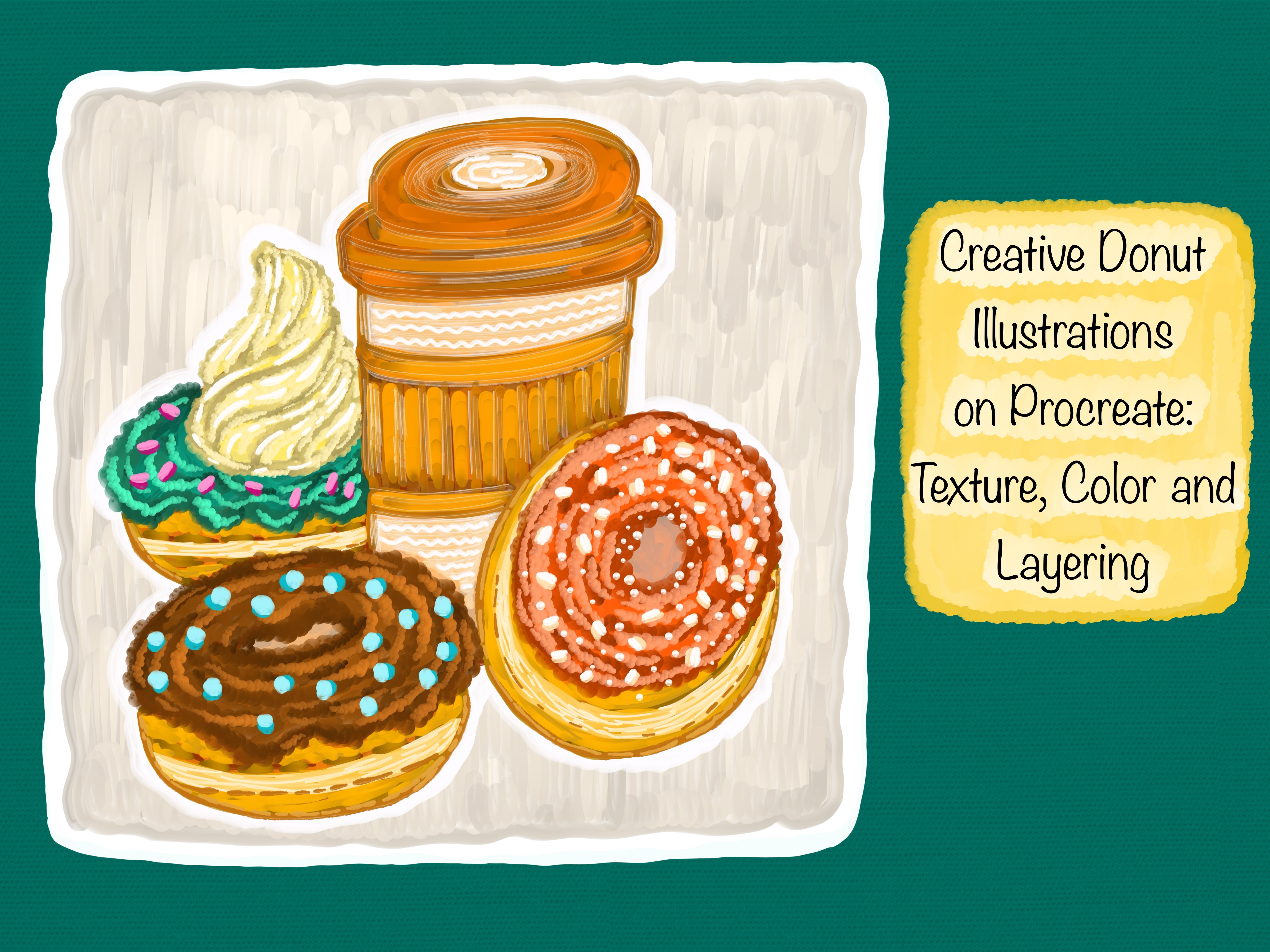
1. Introduction: Welcome to this creative
Procreate class. I'm so excited to have you
here with me as we dive into one of my favorite
subjects to paint waffles. There's just
something comforting and joyful about painting food, especially when we lean
into those soft textures, warm colors and layered details that make each illustration
feels full of character. For this class, I will
be working entirely on my iPad using the Procreate app along with my Apple Pencil. You can use any stylist
or compatible device that you are comfortable with. The main focus of this class
is to enjoy the process of building up an illustration using a pain early
digital approach. That feels rich,
expressive, and textured. I will be using
one special brush throughout the entire process, and that is my
bubbly letters brush from the Cdiglass collection
Procreate brush bag. It's a brush I created
myself and absolutely love using because it brings
such a soft, smooth texture. It glides beautifully and
gives me the freedom to work intuitively across every stage from outlining to
building color. And adding highlights.
Of course, you are completely free to use any procreate brush
dad gives you a similar painterly
or textured look. It's not about having
the exact same tools. It's about getting
comfortable with what you love and letting that
flow into your work. This class is designed to guide you through my
step by step process. We will begin with a
light casual sketch just to get the basic idea down. From there, we will move into filling base colors for
different parts of the waffle, whether it's a plate, the waffle blocks,
fruits or toppings. Then we will slowly build
up through layering, darker tones for shading and small finishing details that give the illustration
life and warmth. My approach is always
initiative and relaxed, so I love paying attention to how each area evolves as I go. The goal isn't to make
something perfect. It's to enjoy the
layering process to take your time and to see how small color changes can bring such a big shift in
mood and dimension. If you enjoy food illustrations or if you are just looking for a creative way to
explore painting with a single procreate
brush and a cozy theme, then you are in the right place. I hope this class brings
you a sense of calm, creativity, and confidence to explore your own
digital artwork. So let's get started and enjoy every brush
strokes along the way.
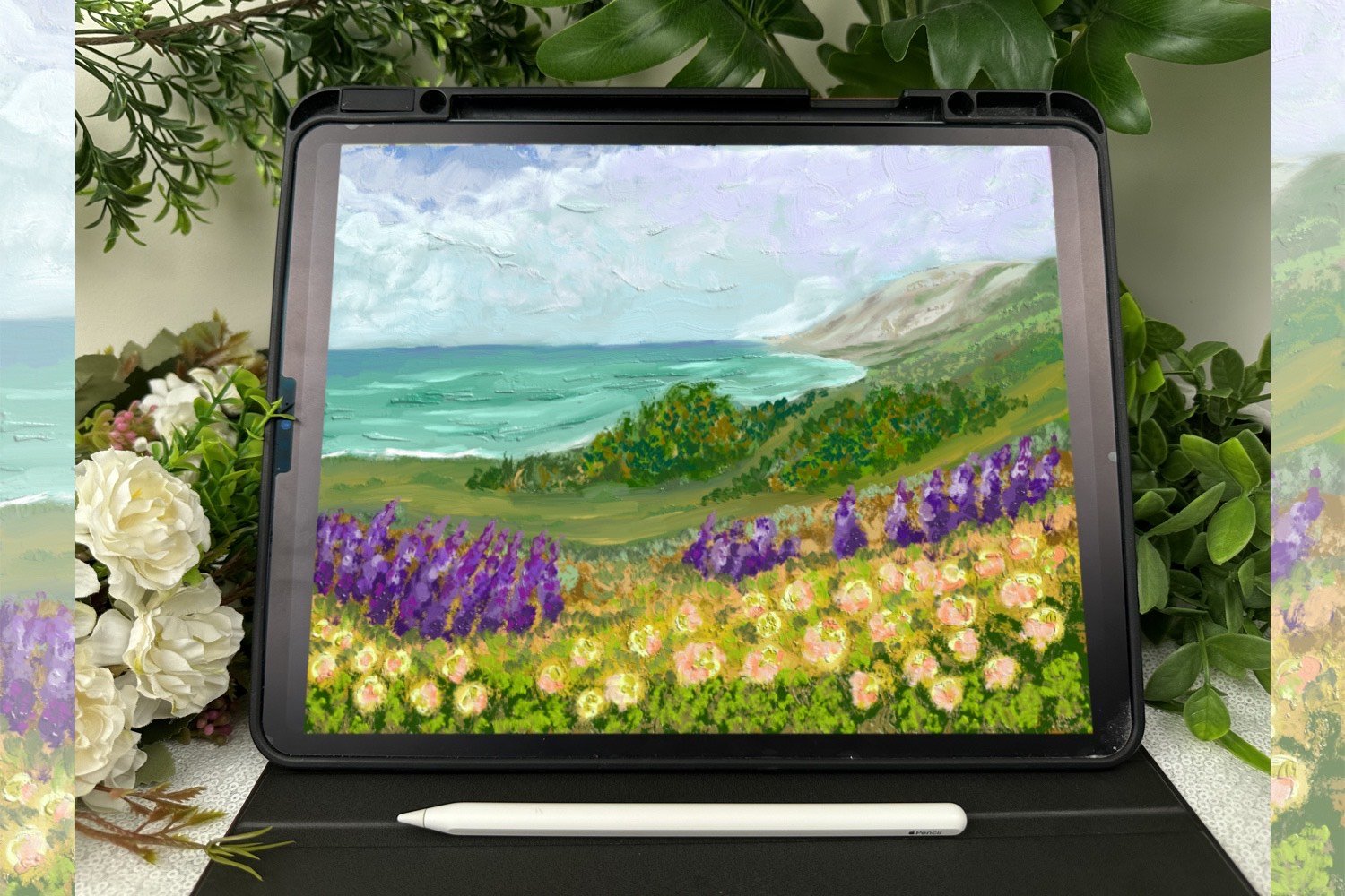
2. Materials: Before we jump into painting, I just want to show you the tools I will be
using in this class. I'm working on my iPad
using the Procreate app, which is my favorite for creating these colorful
illustrations. It gives me a lot
of flexibility and control when it comes to
layering colors and textures. I will also be using
my Apple pencil, but you can absolutely use any stylist that works
with your device. For this class, I will be using just one procreate brush named bubbly letters from my Cdiglass collection
procreate brush pack. This brush has a thick
paint early texture and is pressure sensitive, making it perfect for creating soft expressive strokes
with dimension. That said, you are
totally free to use any brush that feels painterly or textured
in a similar way. Just choose what works best for you and your illustration style. That's all you need
to follow along and create your own beautiful
waffle illustrations. Let's get started.
3. Classic Waffle Illustration: Let's begin with a fresh
canvas in Procreate. I am starting with the six peed pencil from
the sketching section. This is one of my
favorite brushes when I want that
natural pencil texture. Something that feels just
like drawing on paper. I'm holding the
apple pencil loosely here and just letting
my hand move freely. The first thing I'm doing
is sketching around soft shape that will serve
as the base for our waffle. I'm not trying to get a
perfect circle or outline. It's more like a fluffy, imperfect shape that already
gives a playful vibe. You will notice I'm sketching in short curved strokes rather
than one big outline. If your shape is a little taller or wider, that's totally okay. In fact, I encourage you to let your own style come through
right from the start. Sketching is such
a forgiving step, and this is the part where you can just relax and explore. I'm also leaving space on the sides for toppings
we will add later. So keep that in mind while
placing your waffle. Now that we have the
base shape down, I'm gently going over it
to add the waffle texture, I'm starting to draw in
the crisscross pattern. You know, those
signature squares that gives waffles
their fun, graded look. I'm keeping the lines curved
slightly just to match the round shape of the waffle and make it feel
more dimensional. You will notice I'm not aiming
for perfect symmetry here. These lines are a little
wobbly on purpose, and that's what gives a whole illustration a more
handmade and whimsical feel. While I draw, I'm
paying attention to how the lines wrap
around the shape. The ones in the center
are straighter. But as I move outwards, I curve the lines a bit more to hint at the round
from underneath. Think of it as sketching
three D structure, but with a soft artistic touch. Don't feel pressured to get
every grade line exact. The charm in this kind of illustration lies in
its imperfections. The key here is consistency,
not perfection. So try to keep the spacing somewhat even but
don't overthink it. Once the grid is in, you will already see the waffle
coming to life. As I begin outlining
over this sketch, you will notice I'm not really
aiming for precision here. I am intentionally letting my
lines drift just a little, and I'm not too concerned about perfectly tracing
over this sketch. In fact, I like to leave tiny gaps between the sketch
lines and my outlines. It creates a slightly loose, almost eerie feeling
in the drawing. Rather than aiming for
clean shark perfection, I'm focusing on the
softness of the movement. I let my hand float just a bit above the
screen while I work. So my stroke stay light. If a line wobbles slightly or curves unexpectedly,
that's totally okay. That's part of what
gives it personality. We are moving into the coloring
part now, and honestly, this is where
everything starts to feel really fun and expressive. I'm laying down a
warm golden base that will shape the main
body of the waffle. I'm not using any kind
of fill tool here, just painting it in slowly
one section at a time. Notice how I'm not trying
to be overly careful. I'm keeping my strokes
relaxed and letting them slightly drift outside
the lines here and there. If you look closely
at the brush marks, you will see the subtle
textures in the stroke. They help make the waffle
feel soft and real. You don't need to press hard or get the exact
coverage perfect. Just work naturally and build the color by
luring it gently. Sometimes I go over a
section twice just to deepen the tone a bit
or to smooth out areas, I want to feel more baked. And other times I will leave red or white or lighter gaps because they add a
nice bit of contrast. Let the unevenness become
part of the artwork. It adds depth and personality
in your illustration. You can also pause
between strokes and just look at how the color is
settling across the surface. If it looks a bit streaky
in places, that's great. It mimics how real
paint would behave. Don't worry about covering
every bit perfectly. Just focus on
enjoying this part of the process and letting
it guide your hand. This tap is also a
great opportunity to feel the rhythm
of your brush. Now I'm layering
in the chocolate, and this is where the
whole illustration starts to feel warm, rich, and a little
more dimensional. As I fell in the
little waffle pockets, I'm using a darker tone to
mimic that golden crispiness, but I'm treating it
like melted chocolate, settling into the texture. I'm not being too
precise instead of trying to stay inside
each square perfectly. I'm letting my
brush move loosely, following the rhythm
of the shape, but allowing those
painterly edges to show. That slight messiness gives it a more natural feel like real food with soft
and uneven surfaces. You will notice that I'm not
painting everything at once. I'm layering slowly, brushing
in a few strokes at a time. This kind of
variation helps give the waffle its
toasted character. It's subtle, but it
makes a big difference. The contrast between this
deep chocolate tone and the base golden
color is really what gives my illustration
its warmth. We are creating a cozy, inviting visual, almost like a fresh waffle straight
off the griddle. Also, don't worry about making every pocket look
the same. It's okay. If one is a little darker
or a bit more texture, that's exactly what adds jam. Just enjoy this process. Let your brush takes its time. This way, the colors
interact here, the warmth, the
richness, the softness. It all comes together
to create a delicious, cozy mood that feels really
satisfying on the canvas. In this step, I'm
focusing on blocking in the base colors for
each waffle pocket. I'm not blending
anything just yet. The goal here is to fill those little scare areas
with rich flat tones that clearly define
the contrast between the chocolate and the
golden waffle base. You will notice I'm not making the edges perfectly
clean or sharp, and that's completely
intentional. I actually like keeping
things a bit loose here because it brings a more natural handmade
look to the illustration. Even though these pockets
are part of the same waffle, giving each one its own
slightly different shape and tone adds visual
interest and personality. What I love at this stage is how the textured brush starts
doing its quite magic. It naturally creates unevenness
in how the color sits. Some spots look heavier, others look lighter, and this
instantly adds character. You start getting this
gentle bake texture effect almost like you
could already feel the crips outer layer
of a warm waffle. I don't have to overwork it. The brush texture gives that softness
without much effort. And since I'm not trying to make anything look finished yet, this part of the
process is really mic. It's just about absorbing how the tones look
next to each other, gently filling in each block, and letting the illustration develop one relaxed
stroke at a time. I don't rush through it. I let each shape settle in, knowing that these
early layers are the quiet support behind all
the vibrant detail to come. I have started outlining
around each of the chocolate and
waffle blocks to bring more definition and clarity
to the illustration. The outlining isn't
harsh or overly sharp. It's soft, slightly
uneven and textured, which helps preserve
the handmade feel we have been
building so far. What's really interesting is how the outline layer starts to
pull everything together. In this step, I have started gently layering in that warm, yellowish tone to fill up the lighter sections
of the waffle. I'm not trying to fill everything
in perfectly or evenly, letting the color flow where it naturally wants to settle. I want each block of yellow to feel like it's catching
a bit of light, which is why I am letting
some areas to be a little more opaque and
other slightly transparent. Rather than outlining sharply
or pressing for precision, I'm letting the
brush trail around the edges and soften
into the shapes. You can see I'm still
working within the blocks, but I'm not filling them
solidly edge to edge. This choice gives the waffle
a bit of movement and warm, almost like it's glowing
from the inside. The most important thing here is to relax into the process. In this step, now I'm adding
lighter yellow tones right into the middle
of each pocket to build up that
toasted golden look. At this point, I already
have the base colors down, so now I'm just gently layering brighter areas to create a soft sense of
warmth and light. I am not focusing on
clean blending just yet. This is more about
contrast and structure. I want you to feel that
the waffles are warm and fresh with pockets that have caught the light
just a bit more. You will notice how
a small stroke of yellow starts to bring out the form in the waffle pattern. At this stage, I'm
starting to build the character of the waffle by carefully adding
those warm yellow tones into each little square. These aren't highlights yet. They are still part of the base, but they help separate
one pocket from the next and give the waffle
that recognizable, toasty golden brown look. Each block of color is painted intentionally but not
with rigid precision. The idea is to preserve
that slightly imperfect, painterly feel that keeps the illustration looking
playful and handmade. As the yellow goes down, it creates a soft warm next
to the chocolate tones. At this stage, I'm
beginning to define the outer edges of the
chocolate sections a little more clearly. I'm still keeping things loose, but now gently outlining
each pocket to enhance the separation between
the darker chocolate and the base waffle color. This step isn't about
creating a hard outline. It's more about giving subtle shape and direction
to the waffles texture. At this stage, I'm continuing to build
up the character of the waffle by working through its pockets and
chocolate ridges, one color block at a time. I started by filling in each little square with deep tones for the chocolate
and bright yellows and gold for the base. These aren't blended yet. The goal here is
just to block out those areas and
define the contrast. I'm intentionally keeping the
edges loose and painterly, letting each pocket vary
slightly in shape and color. This tap isn't about perfection. It's about laying a warm
and rich foundation. As I added the outlines the chocolate ridges
in the next step, you can see how it helped give more structure and direction
to the waffle surface. The darker chocolate
just creates a beautiful contrast
with the golden yellows, adding definition and movement. This is where the brush
texture really shines, and it gives this soft
painterly texture. Finally, I went back into
refine those chocolate areas, strengthening the
shape and warmth. Even though it's still rough, you can already feel the
toasted dap starting to emerge, setting up perfectly for the final highlight
and detail layers. At this point, I started
enhancing the waffle by adding more lighter yellow
tones into the center of each pocket and along the edges. These soft highlights
helped create a warm, slightly toasted look, making the waffle feel
fresh and golden. I wasn't aiming for
perfect symmetry. Just enough variation in each spot to suggest
that slight crispiness, you see when waffles
are freshly made. These light strokes also bring balance to the
deeper brown areas, giving the whole illustration a subtle brightness and
more realistic texture. After finishing the
details on the waffle, I shifted attention
to the background to gently frame the
entire illustration. I choose a cool, pastel
blue for contrast, something that wouldn't compete with the warmth of the waffle, but would still feel refreshing. I softly painted around
the waffle using loose flute strokes to give
it a dreamy, relaxed feel. The brushstrokes weren't
harsh or uniform. Instead, they waved
organically around the edges, almost like watercolor
petals spreading on paper. This toys made the background
look calm and playful, like a breakfast seen quietly unfolding on
a peaceful morning. The soft blue gave just enough pop to help
the golden tones in the waffle glow brighter without overpowering
this illustration. This kind of background works
especially well when you want your food illustration to feel both cozy and polished, keeping the focus on the subject while still filling the
space meaningfully.
4. Waffle Sundae Illustration: Began by sketching the
entire composition using the six B
Procreate pencil brush, and this brush gives
off such a gentle, slightly taxtured pencil feel, and I love how it
instantly makes the sketching process
feel more approachable. I started with the outline
of the Waffle bowl. I used very light
pressure at first, just blocking in
the overall shape. I wasn't aiming for the
perfect smetry just getting the right balance and curve that would anchor this
whole illustration. It's okay if things look hand
drawn, it adds personality. Next I begin sketching
the scoops of ice cream. I imagine them piled into the
bowl overlapping slightly. So I made sure to vary
their shapes a bit. Some are taller, some rounder, and that helps keep
the sketch playful. Then I added the syrup drips
flowing down one scoop, just a few wiggly lines to
hint at a melty topping. After that, I placed the two wafer sticks
behind the scoops. They are simple diinal shapes, and I added light stripes
to them to make them feel dimensional like
crunchy rolled wafers. Finally, I added the little
details like berries, small highlights on the scopes, and some sketchy texture lines. This whole part of the
process is just about laying things down and getting
a feel for the shapes. Nothing has to be perfect yet. Once I had that
rough shape down, I moved on to the criss
cross lines inside the bowl to give it that
classic waffle texture. I kept these lines
loose and didn't worry too much about
perfect angles. You will notice I'm just
building things slowly, sketching with purpose, but
keeping the pressure low, allowing the lines
to flow freely. This part of the
process is always my favorite because
there's no pressure. I'm not focusing on
the final outcome. I'm just thinking about
composition and balance. Sketching like this helps
me stay relaxed and enjoy the creative flow
without overthinking anything. Alright. In this step, I'm working on the line art for our Waffle dessert illustration. I'm only using one brush here. It's the bubbly letters brush from my candy gloss
procreate brush back. Even though the brush was originally designed
for lettering, I really love how it gives a smooth and playful stroke that works beautifully
for outlines too. I began by sketching out
the basic shapes using the sixp pencil brush just to lay everything
down loosely. Once I was happy
with the structure, I went over it with
the bubbly ladders Procreate brush to create
the clean final lines. If you are following along, feel free to go with
a similar setup, keep it relaxed and loose. You don't have to get
every curve perfect. What matters more is that
the elements feel cohesive. So take your time here, have fun with the details, and don't worry about
making it overly polished. This part of the
process always feels the most satisfying
after finishing the line art using the
bubbly letters brush from my candy gloss
brocade brush bag. I began with the strawberry
soup on the left. There is something about
starting with pink. It instantly makes the
drying feel cheerful. Next I moved to the orange
scoop on the right. It felt like the perfect
contrast to the pink, still playful, but
warmer and more mellow. Now for the chocolate
scoop at the top, this one felt like the heart of the bowl comforting
and familiar. I used a deep warm
brown to fill it in, making sure it
contrasted well with the pink and orange
scoops below. Then I gently fill in the
chocolate syrup drizzle, layering it right on top. I kept it simple, just letting the lines
from the outline guide me. No highlights yet, just
flat shapes and rich color. Then I moved on to
the small raspberry sitting near the center front. I picked a rich
red, not too dark, so it would feel juicy but
still cute and vibrant. Right beside it, I added a cool toned tea leaf to
break up the warm colors. Then I filled both biscuit
sticks with a warm yellow base and then overlaid a soft brown
tone in diagonal stripes. These two tones played so nicely together like a
caramel, swill pattern. I try to keep the direction
of the lines consistent and slightly curved to match the flow of
the biscuit shape. The yellow felt bright
but not overpowering, and it gently
echoed the color of the waffle bowl while
still standing on its own. These biscuits kind of work
like framing elements, directing my attention
downward to the scoops. Finally, I colored
a waffle basket. My favorite part
of this section, I picked a light
golden yellow as a base stone because I wanted it to feel toasted
but still sweet. Then over that, I filled
the grid lines using a deeper brown to maintain
that criss cross structure. I was careful to keep
those lines visible. The basket pulls all the
other colors together. It's warm, welcoming and
anchors the whole dessert. It's like the foundation
of the illustration, and it really wanted it
to feel light but sturdy, like something freshly
baked, maybe even crispy. Apopl solid here with no
gradients or textured yet because I wanted a
clear foundation before any depth or highlights. Now, I really wanted the waffle bowl to stand out
not just as a container, but as a warm, cozy foundation
for this entire dessert. So I began layering in
those lighter yellow tones, focusing especially on the
upper parts of the bowl where natural light would hit if this dessert were
sitting in a sunny cafe. I didn't just fill in
the yellow uniformly. Instead, I thought about
the curve of the waffle and added brighter yellow
strokes more intentionally. Just on the raised areas of the lettuce wave
and around the rim. This helps those parts
visually pop out more, giving the bowl
around it slightly puff look like a freshly
toasted waffle cone. Next, I soften the main grid outlines using a
light brown tone, just a few shades gentler
than the original lines. Like, this step is subtle, but makes a huge difference. I carefully traced over some parts of the
cross hedge pattern, especially in the middle
sections of the waffle to create a feeling of bake texture without overpowering
the golden base. The light brown wasn't
meant to sharpen. It was meant to
soften and blend. Think of it like layering a toasted highlight
not a shadow. This technique adds dimension without darkening
the overall feel. It still feels light,
crips and inviting, which is exactly what I wanted because the rest of the
illustriation is full of bold. This technique adds dimension without darkening
the overall feel. It still feels light,
crips, and inviting, which is exactly what I
wanted because the rest of the illustration is full
of bold and fruity colors. At this point in
this illustration, everything already
had its base colors, and now came one of
my favorite steps, bringing each elements to
life with lighter tones, subtle dimension,
and soft textures. I began with the
pink scoop first. It's such a cheerful bold color, so I wanted to
retain its vibrancy while also suggesting
a creamy texture. I picked a lighter version of the same hue, a soft magenta, and used my bubbly letters brush from the candy gloss pack to sweep gentle curve strokes along the top and center
areas of the scoop. I wanted that subtle
softness that holds its shape but would
start to melt slowly. Then I move to the orange scope, which had such a
cheerful wipe to it. I mixed in a light peach tone and gently dabbed highlights
in the upper area. I let the strokes blend into a scoop without
fully outlining it. I find that when
I'm adding light, I like it to fade naturally, so I don't lose that
soft edible feel. It starts to resemble those fruit based scoops that are slightly icy
but still creamy. Again, using the same brush
kept the texture consistent. That's something I'm
very intentional about. So the strokes from scoop
to scoop feel cohesive. Now for the chocolate scoop, this one needed a
completely different feel. Unlike the other two scoop, this one had melted
chocolate dripping over it, so I shifted my goal from soft to glossy and
slightly indulgent. I introduce a warm
beach highlight to the top of the scoop, blending it inward to simulate that slight
light reflection. Then I deepened the
underside of the drips with a slightly darker chocolate tone to give the yen of
thickness and dimension. I kept the brush
pressure low here so the chocolate didn't
lose its density. Chocolate is thick, and I wanted that richness to come
across in the strokes. This part felt especially fun to do because of how
satisfying it is to see the contrast between the bright scoops and this
deeper luxurious tone. After the scoops, I worked on the biscuit
sticks at the back. They already had a cozy
cookie like color, but they needed more
warmth and shape. Layered a buttery yellow along the curves
of the biscuits, just on the edges where
the light would hit. I made sure the lines were
smooth and slightly rounded. These highlights instantly gave the biscuits more structure. They looked puffer,
more baked and added that charming dessert
cartoon style that I always lean
toward in my lstrians. Even though the raspberry
section is tiny, I always treat it with the
same care as the bigger parts. For this one, I zoomed in and
used a light red pink tone, almost like the hue
of ripe strawberries. I tapped small
curves and tiny dots right on the upper left
side of each berry bum. This gave the raspberry a fresh juicy feel like it
was glistening in the light. All of this work, the
highlights textures blending was done with
just one procrt brush, and that is the
bubbly letters from my candy glass collection
of procate brush back. I love using this brush for detailed work because
it's soft and round, but still gives me edge control. It doesn't have too
much grain or scatter, which makes it perfect for digital desert illustration
like this one. The way it lets me
control pressure and build up tone
gradually means I can work on both larger soils and tiny varibons without
switching brushes or settings. Then I moved to
the orange scoop. This one already had a warm base white broth in a very soft peach tone
to lift certain areas. I gently tapped it into the
upper curve of the scoop. I began softening the edges of the strawberry
scoop by adding lighter magenta tones right at the top curves and
around the ridges. This added a gentle
shine and gave it a creamy, just coop texture. I was careful not to
flatten the look, so I kept the original
richness underneath. Letting the highlights follow
the curves of the foam. Instead of going
for a glossy look, I aimed for something
soft and natural. Then I shifted focus to the
chocolate scoop at the back. I didn't want to
overhighlight this part since darker shades need
a more careful approach. Moving on to the biscuit sticks, I used a muted
yellow orange shade to brighten the curve tops. I wanted the brush strokes to follow the arc of each biscuit, so they would feel
cylindrical and bake like crispy pastry sticks. The added tone gave them that golden slightly toasted bakery feel almost like they were
fresh out of the oven. Although I haven't worked on the waffle bowl
yet at this stage, its deep brown lines and golden tone already
provide a solid base. Each highlight here
wasn't just about light. It was about foam. It helped make the
scoops rise up, the biscuits twist
more playfully, and the raspberry
sparkle with sweetness. And all these small enhancements work together to bring this
joyful dessert to life. I zoed in just a little for the raspberry to
work delicately. Here I added a few
tiny dots with a slightly lighter red paying close attention to
the round bulbs that makes up the fruit. These many highlights
made it sparkle just a bit without
making it too shiny, just enough to hint at
juiciness and moisture. So now I moved onto
the background. I wanted something
that would really help the dessert
illustration stand out, but still feel
playful and cohesive. So I went with this
rich, bold aqua blue. I didn't go with a
plain block color. I added the soft wavy edges
all around the dessert. The rippled outline
adds movement and gives the background a
light hearted frame. I wanted it to feel fun, not too serious or perfect.
5. Waffles Sweet Tray Illustration: Now I started out by sketching the dessert tray using the
six P Procreate pencil brush. It's honestly one of my
favorites when I want something that feels soft
and just a little textured, kind of like working
in a real sketchbook. I didn't worry too much about making things
super perfect here. I just wanted the sketch to
feel natural and relaxed. The tray slightly
tilted and I layered the dessert slices in a way that lets them
overlap just a bit, giving the whole thing
a cozy stack c. I also made sure each light had
its own little details like sprinkles or icing because I knew that would give
me a chance to play with colors and shine later when I get into
my candy glass brushes. This cat stage is where I
really like to keep it loose. I'm not trying to be precise
or polished at this point. I'm just setting the mood
for what's coming next. And I try to enjoy the shapes, the lines, and the
imperfections. If you are following along, feel free to sketch your
own favorite dessert or snack in a similar layout. Just make it fun
and make it yours. After sketching my
dessert illustration using the six B pencil brush, I switched over to one of
my absolute favorites, the Bb Ladders Procreate brush from my candy gloss collection. I love how it gives a soft but playful
edges to the lines. It's not too harsh
and not too delicate. It has that perfect
handmade vibe that feels both fun
and approachable. You can totally use any brush you are comfortable with here, but I personally enjoy
this one because it adds a little personality
to every line. As I traced over
the pencil sketch, I didn't worry about perfection. I let my hand flow naturally, keeping the shapes
a little wobbly, a little imperfect, but that's exactly what makes it feel
more real and joyful. I find that these kinds
of details bring charm into this illustration and
make it look less stiff. You can already see how this
step transforms the drawing, bringing it to life
with just the outline. It's like the artwork
starts to talk back to you in the gentlest way, and that's always
my favorite part. Watching a simple sketch start to feel like it has a story. Now that my lines are all set, I'm diving into the
base coloring stage, and I always find this
part to be so calming. It's almost meditative. I begin by filling in
the waffles first. I choose a warm, golden
honey like shade. That instantly gives the dessert a cozy and too good feel. I'm not thinking too
much about shading yet. This is just about laying
down that flat base color, and there's something really relaxing about that simplicity. I zoomed in just a bit to
stay inside the edges, but I also like letting some
of those edges be imperfect. It gives the whole illustration a handmade painterly vibe, which is something I always
lean toward in my art style. The base layer doesn't
have to be perfect. It's more about
starting to bring the illustration to
life through color. I take my time with
each section of the waffle selling in one segment at a time so that I can get a sense of the overall
shape and rhythm. You will notice, I'm not
rushing through this. I really like giving
each part its moment, especially when it's
food illustration. The golden color really glows
against the white canvas, and I love how it sets the tone for what's
coming up next. I always say, start
with the part of the illustration that
excites you the most. And for me, that was these
little waffle blocks. They are just so charming. Once the waffles
are all filled in, I move to the plate
for the background. I wanted something that would control softly but
still feel playful. So I picked a light
lavender tone. It's cool and soft, and it plays really nicely against the
warmth of the waffles. I go ahead and block in
the whole plate in one go. It's a bigger section, but I'm keeping my brush size consistent so that color
feels even throughout. I try not to overwork this part, letting the color flow and
cover the space is enough. The goal here is simply to give structure to this illustration. And once the
background comes in, the waffles instantly
start to pop more. And again, I'm not stressing
over perfect fills. So at this stage, it's all
about laying the groundwork, just big colors,
warm and cool tones, and letting the illustration
start to speak back to me before I move
into the details. I went ahead and started
outlining the plate. And for that, I choose a much deeper, more
intense purple. It creates that nice
clean edge I like and gives the plate a defined
shape without being too harsh. I followed the lines I had originally sketched
just slightly sharpening and
polishing them so they have stand out against
the lighter tones. You will notice I'm
not trying to make the lines perfectly uniform. I actually enjoy a
little unevenness. It keeps the
illustration playful and keeps me from overthinking
every corner. Then I began building
up the inside of the plate with different shades. I kept layering purples, not too dramatically different
from the base stone, but just enough that it created
variation and movement. It's like I was slowly sculpting with color
instead of clay. I tried to keep the edges soft
and blend in a few places while also letting some strokes remain a little
rough and sketchy, because I personally like when it looks like a painting in progress rather than a perfectly polished
graphic illustration. There's something
satisfying about painting the object that's holding
your main subject. Even though it's
just the background. In this case, the plate becomes
a stage for the waffle, so I wanted to give it
love and attention. I didn't want it to feel flat, so I used a variety of brush pressures and
layering techniques. Again, nothing super
refined, just initiative, lose, and kind of letting my hand move without
overthinking. As I fill in the side
planes of the plate, I let the brush strokes follow the angles to give it that
glassy dimensional wipe. Now that I had
already mapped out the shapes and filled in the
base color for the waffles, I started to really
slow down and enjoy adding depth and
dimension to each piece. I love this part
because it's where everything starts to feel
a little more alive. I wasn't thinking about
making things perfect. I just let my hand move across the screen in a way
that felt comfortable. Like I was gently layering in personality one
stroke at a time. I focused on each
individual waffle, adding slightly darker
tones to areas that felt like they would be
a bit more in shadow, especially on the bottom edges and where the waffles overlap. I was picturing them
stacked neatly on a plate warm and golden, maybe fresh out of
the waffle maker. I think that kind
of cozy daydream helps me decide where to adapt. It's not about accuracy, but about how it feels. Once the shading was in, I wanted to bring in a
lighter areas to hint at that golden crispiness waffles usually have around
the top ridges. So here I just starting
layering on this light yellow almost
like a sunshine tone, and I'm focusing on the
tops of each waffle piece. Like, these areas would
naturally catch more light. So I'm thinking about where
that soft highlight might fall if this were an actual plate of waffles
sitting by a sunny window. But I'm also not trying to
be too perfect about it. I just want it to
look happy and warm. I go one by one,
waffle by waffle and just gently start applying
the lighter shade. Sometimes I dab the color on and then slightly
soften the edges, so it feels like it's blending into the rest
of the waffle shape. After finishing the
base layers earlier, I spend this entire part of this process just working
on the sprinkles. It was a slow and enjoyable step where I let myself
having fun with details. Each waffle felt like
its own mini canvas, so I gave them all
something unique, different sprinkled
colors, different styles, and a slightly different
placement rhythm. I didn't try to
make the sprinkles perfect or symmetrical. Instead, I added them one
by one in a relaxed way, letting some cluster closer together while others
stayed more spaced out. One waffle got
tiny rainbow dots, another got little
pink and white dashes, and one ended up with lots of tiny white sugar dots that
gave it this cozy bake look. It was calming to repeat the
motion, almost meditative, tapping them and
using light pressure and letting the color
combinations play off each other. It's one of those steps
that really brings the painting to life
without brushing anything. And I didn't change
anything else. I didn't go back to the plate or at shadows, just sprinkles, carefully placed and
happily layered, adding sweetness and texture
to every single waffle. So now the waffles
are already looking super colorful with all
those playful sprinkles, but something feels like
it's missing, right, that depth and richness you get when you add a little
contrast underneath. And for this one, I knew
I wanted to bring in some chocolate layers just below the sprinkles to help
them pop even more. I really wanted them to feel like they are melted right onto each waffle like a sweet little chocolate glaze on every corner. I started working
from left to right, just gently filling in under the sprinkle areas using
a nice warm brown. I kept it kind of loose at first just to get
the bay tonee in, not worrying too much
about perfection here. What matters most is how the chocolate layer
interacts with the toppings. That little peak of color
that adds richness, especially on those edges where the sprinkle
colors meets the waffle. Now that the waffles are layered with their
sprinkles and toppings, I moved onto something that ties the whole illustration
together the plate. Even though it's just
a background element, I love giving it just as much
attention because it frames the entire illustration and helps anchor the color palette. So for this part, I started building up the base
color of the plate. I went with a light blue tone, something a bit
cooler to balance out all those warm waffle hues. I like how this
color twice keeps a focus on the waffles while
still feeling playful. I didn't go too flat with
the color either instead. I let the strokes show
a little giving it a casual energy that keeps the whole thing from feeling
too polished or stiff. Also began shaving
the outer edges of the plate with a
slightly darker shade, just to bring in
that contrast and help separate the plate
from the background. I always find that adding just a bit of shadow
around the edges really helps everything pop without needing to
go full realism. So now at this
stage, I wasn't too concerned about perfect
lines or symmetry. I was more focused
on how the plate feels visually in
relation to the waffles. As I worked my way
across the plate, I kept adjusting the tones
to make sure they were sitting well against
the bright pinks and oranges from the waffles. I love that mix
of warm and cool. It just brings the
whole piece to life. I love that mix
of warm and cool. And honestly, sometimes it's these smaller background
elements that really pull the whole
illustration together in the end. I will keep building on this
plate in the next steps. But for now, this was all about getting the first layer
of personality down. It's already starting to feel
like a fun breakfast scene, and I'm excited to add
in more dimension next. I came back to the waffles
for just a little bit. There was something
about the lighting that felt like it
needed a tiny push. I didn't want to overwork them, so I kept it really
simple and intentional. I focused only on soft
subtle highlights, just enough to make those golden ridges pop a little more. So I started working on the
background, and for this one, I really wanted a background to feel playful and light hearted, kind of like a cozy kitchen
towel laid out on a table, just subtle enough to support
the waffles and plate, but still holding its
own in the composition. I choose a soft coral pink
tone to lay the base. It felt cheerful but
not overwhelming. You can see how it starts matching together the
outer edges of the plate. To bring in a bit more energy, I started layering those
brighter diagonal stripes. I didn't want them to be
perfectly symmetrical or clean, something relaxed,
fun, and flowy. Almost like hand painted strokes across this piece of fabric. I made sure to keep the placement balanced
around the tray, using them more like
gentle framing elements rather than a full
pattern background. And one thing I kept
reminding myself as I filled in the background,
don't overthink it. It's really easy to get caught in making
things look right. But I find when I let the brush strokes
flow a little looser, the piece feels more alive. These small imperfections
like the uneven spacing or the slight wobble in the lines actually help the whole
illustration breath better. So here I'm just
layering the color in, adjusting the saturation a
bit to see what works best. And slowly the background begins to tie
everything together. If you are doing
this along with me, don't stress too much
about matching it exactly. Think of the background like your own little space to play. You can go bolder or softer
depending on your vibe. The key is just giving your central objects
a place to belong. That extra layer
behind it all makes such a difference in how the illustration
feels when it's done.
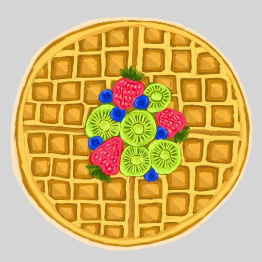
6. Fruity Waffle Treat Illustration: So now I'm starting off
this new illustration. I'm using the six B pencil
here because it gives that lovely textured feel kind of like a
traditional sketch, which I really love. There is something cozy
about beginning this way. It slows me down and makes
me more intentional. I decided to sketch out
this round waffle shape, and it's honestly been so much fun breaking
down the sections. I'm not going for
perfect symetry here, just a gentle balance
between neat and whimsical. I added a variety of
small square indentse on each half to really bring
that waffle texture forward. Right in the center,
I have clustered a few strawberries and
some banana slices. I kept the shapes very
loose and playful. I didn't worry about getting
them perfectly realistic. I just wanted to capture that joyful feeling of a
fruity breakfast topping. I even tucked in a couple of little leaves to give
it some freshness. There's something so satisfying about starting a
sketch like this. All the possibilities
are still open, and I'm just playing
around with ideas. I like working with just one
clean brush at this stage. Nothing too fancy or polished. Now comes the fine pot, switching from pencil to ink. And for this illustration, I'm using one of my
absolute favorites from the candy glass brush pack. That is bubbly Letters
Procreate brush. Starting with the outer circle, I traced over the waffles
rim in one smooth go. Then slowly I work
my way inward, outlining the grade
of square intense that give waffles
their signature look. I made sure to vary my
pressure just a little. Some lines are thicker,
others lighter, so it still feels hand
drawn and approachable, nothing too perfect here. For the fruit cluster, I traced around each
strawberry, blueberry, and slice with care
following the curves, but letting the brush
character show through. The seeds on the
strawberries, the ivc, even the gentle cuts
on the banana slices, all of it got a soft,
bubbly outline. What's interesting here
is that the stage sets the entire tone for the rest of the illustration
with this brush. Even before I add color, it already has a friendly, cheerful vibe like
a dessert menu doodle or a fun
kid's illustration. At this stage, I moved into what I call the base
painting phase. It's a part where I begin laying down flat colors across
the entire illustration. This part is always exciting
because everything that was just a sketch before now starts to get some
personality through color. I started by filling the waffle. I kept it a warm, rich, orange brown to capture that
classic baked waffle look. I wasn't trying to do
anything complicated here, keeping the tone even, letting the color
fall neatly inside the shapes I outlined earlier. The goal was to make sure the
waffle base look clean and recognizable without
jumping ahead to any extra details
or shading yet. Next, I moved on to
the fruit toppings. The strawberries came first, and I fill them in
with a deep red. I kept the shape solid and
uniform, not too bright, not too dark, just enough to make them
feel fresh and ripe. Then I added the kiwi slices. These were so fun
to color in because their natural vibrancy make
them instantly eye catching. I picked a bold bright green, so they would really pop
against the warm waffle tons. The bananas were the last
fruit I tackled in the step. I would choose a
soft light yellow to keep their presence
gentle and warm. The waffle as previously outlined and filled with
a light golden brown that begins to carry
the warmth and depth of something real,
something tangible. And it all happens through a
single thoughtful decision, adding a slightly
darker brown into each of those little squares
inside the waffle. Instead of rushing to
finish all the components, I choose to slow down and honor the structure
of the waffle. Every block was
treated with care like tiny pockets of crips edges
that needed to feel toasted, cozy and just right. Keeping the color flat, but deeper than the base, I didn't overcomplicate
the texture. There's also something
meditative about this stage as your hand moves
slowly across the screen, filling in block after block with this
rich toasted brown, the process itself felt calm. It wasn't just
about adding color. It was about letting
the waffle breathe. I gave it depth without
overpowering it. I made it feel finished
but still soft and sweet. Darker brown started playing beautifully with the
bright greens of the kiwi, the reds of the strawberries, and the sunshine,
yellow of the bananas. Suddenly, everything
began working together. It's a gentle reminder of how meaningful it
can be to focus on just one area and how even the quietest parts of a painting can carry
so much weight. Those little square blocks, they hold the whole
thing together. They are the foundation that
lets everything else pop. And by giving them just
a little extra care, I brought balance to
the whole illustration. Now it's time to
shift our focus to the little square
blocks on the waffle. I began gently luring in lighter tones inside each
of the great squares, keeping my strokes
soft and controlled. This is a moment where
the waffles strt to visually warm
up, dose golden, honey like tones begin peeking through the
darker foundation, giving a dark cooked
crispy surface. I carefully choose a shade
just light enough to contrast the deep brown base I laid down earlier without overpowering it. The goal here
wasn't to highlight every single block perfectly
or to make it too realistic. Once the fruit toppings
were complete and the waffle blocks already
had their baked daft, I moved on to a gentler but
equally important step. Adding soft, lighter
yellow tones across the entire upper
surface of the waffle. Using a gentle pressure
on my apple pencil and a slightly brighter
buttery yellow, I began brushing over the
top layer of the waffle. My strokes were wide and loose, not bound by the edges of the
squares because I wanted to capture the golden softness of a freshly cooked waffle
right off the pin. I didn't want it to feel flat, so I allowed some unevenness
in my brushwork to show how real waffles
catch light unevenly, depending on how
they are cooked. As I moved from one
section to the next, the entire surface
began to glow. It was such a subtle change, but it brought
everything together. Now that the waffle base is starting to glow
with all that warm, I turned my attention
to the fruits. This is where the
real joy begins. I started adding details
to the strawberries first. Using a lighter pinkish shade, I carefully dotted the
surface of each strawberry, making sure those tiny seeds pop just enough to give them a
little spark of realism. These strawberries
are such a strong red that the soft contrast with lighter pink makes
them feel like they are busting with
juice sweetness. After the strawberries, I
moved on to the kiwi slices. I used a darker
green tone to define the radial lines coming out from the center of
each kiwi slice. It's a small touch, but it gives the fruit that distant look almost like
sun rays peeking through. Then with an even darker shade, I gently paste dots all around the coat to resemble
the tiny kiwi seeds. This tap really brought
the kiwis to life, giving them that refreshing
feel we all love. The bright green surrounded
by those deeper tones are just enough contrast
to make them stand out against the
golden waffle background. And then came the bananas. For these soft mellow
yellow slices, I used a warm ochre
color to define the edges and add just a bit of curve shading
near the center. It gave each banana slice some septle dimension without
overpowering its soft tone. A little curved highlight near the outer edges of each
banana slice gave them that slight sheen like
they were freshly cut and sitting right
on top of the waffles. This tab was all about bringing the food toppings to life, not with too much complexity, but with just enough
playful detail to make each illustration
look like it belongs. The contrast of colors, the layering of shapes, and the joy of
watching everything slowly come together
felt so satisfying. Now that the bay stones and the fruit toppings are in place, I'm going in with a slightly lighter shade of golden yellow. This tap really softens
the overall look of the waffle and gives it
more warmth and texture. Instead of coloring inside
the small square blocks, I'm focusing only on the flat upper surface
that surrounds them. This is where I want the
light to hit gently, so I'm applying those lighter
strokes with a soft hand, just enough to
brighten the surface without overpowering
the warmth of the base. As I continue layering, I'm letting the
brush strokes follow the natural roundness
of the waffle. This gives a soft
pillowy texture. I'm not going for a
perfect highlight here. It's more about building a sense of depth
as if the waffle is slightly raised and catching soft light from the top left. Now that the toppings are done, I'm moving back to the
waffle base and focusing on giving those golden
blocks a bit more glow. I'm using a lighter, slightly creamy yellow tone, not too bright, just
enough to catch the light. For each square block,
I'm only applying this lighter shade to
half of the surface. I'm choosing one
side of the block, typically the top
left or top right, depending on where I want the light source to feel
like it's coming from. This technique is subtle, but adds so much
warmth and makes the waffle feel toasty
and dimensional. You will notice I'm placing this lighter
brownish shade along the upper edge or one
side of the square, kind of like giving the waffle a little spotlight from
the top right corner. It's subtle, but it
makes such a difference. These lighter tones
gives a sense of warmth, almost like the waffle
stock layer caught a bit more light
while it was baking. Instead of being a flat color, this new layer helps
suggest that the waffle has a toasted texture by only
covering part of each block. I'm not just adding color. I'm thinking about dimension. This helps each square pop a little and creates
the illusion that they are gently puffed up
rather than completely flat. I'm also being careful to
keep the strokes soft, nothing too harsh or sharp, so that it feels
like the light is just gently brushing
over the surface. After I felt happy with the
structure of the waffle, I turned my attention back
to the fruit toppings. For the strawberries, I added tiny specks of lighter pink
and a soft white along the curves to give that
plum glistening look like howbrries catch
the light in the sun. I got a bit more love here, too. I tapped in some curve shadows
between the little parts and lifted the top edges slightly so they
wouldn't look too flat. Then came the bananas and
kiwis. For the bananas. I added some buttery
yellow strokes in the center of each slice. Then pulled in soft creamy
color near the edges. It made them look thick, smooth, and a little
more dimensional. These final touches
might look small, but they tie
everything together. They help your eye move from one fruit to the next
balancing color. I always love this part. It feels like the moment where everything
clicks into place. Now that the waffle and
all the fruits were fully detailed and sitting
beautifully at the center, it was time to think about
the environment around them. I didn't want a
plain white canvas. It felt too empty for something
this warm and cheerful. So I decided to softly
build a background that would gently frame the waffle without paying too
much attention. I began by choosing a
pastel lavender tone. It felt soft, calm, and just playful
enough to pair with the bright yellow tones of the waffle and the
vibrant fruits. It gave the whole illustration
a comforting contrast, something that made
this illustration feel grounded and complete. I started painting loose horizontal strokes
behind the waffle, nothing too harsh or
precise, quiet movement, like the folds of a cloth or the flow of a morning breeze
across a breakfast table. I made sure to let the lines curve slightly and
peek from the sides, creating a sense of cozy space without enclosing the food
illustration too tightly. By the end, the background gave this illustration
a finished feel, just quite cosy wamp
behind all the color.
7. Thankyou: You so much for joining me in
this sweet and cozy class. It's been such a joy creating these different waffle
illustrations with you. Each one filled with
its own textures, colors, and playful toppings. Throughout this class, we explored not just
drawing waffles, but adding personality to
each one through details, shading and softness in color. Whether you followed
along step by step or just watch the process
to soak up inspiration, I'm truly glad you were here. My hope is that this clause gave you a peaceful space to create, even if just for a few
minutes at a time. I know how busy life can be, and it means a lot to me that you took the time
to paint with me. There are many more
illustration classes and creative projects coming up, and I would love for you to
keep joining me as we build a library of cheerful,
comforting art together. Until next time, keep
illustrating, keep exploring. And most of all, keep enjoying
your creative process. See you in the next class.
8. Conclusion And Project: Thank you so much for
painting along with me. So far, this was the very first
waffle illustration we created together
in this class, and I had so much fun bringing
this illustration to life. I really love building up
those warm golden tones and adding in those
thake pintly strokes for the chocolate topping. It gives a whole illustration
a cozy rich feel. There is something
really comforting about the textures here, and I hope you enjoy exploring this color palette and
brush technique with me. Let's keep this creative
momentum going. We have got more delicious
waffle ideas to paint next. This is a close up view of
the waffle illustration. We just finished. I really enjoy how the brush
strokes look up close. The thick lines and soft
texture really pop. When you zoom in like this. The war golden tones and layered strokes bring
out a lot of depth, and it's always interesting
to see how everything comes together when you focus
on these small sections. This is a slightly angled
look at our finished waffle, and I really love how
the pintly texture adds warm to the golden tones
and choclat browns. You can really see
the variation in pressure and strokes
from the brush here. It gives such a
cozy handmade feel. I think this illustration
helps capture the overall form and yummy
details all at once. This was the finished
illustration we created together, and now it's your turn
to give it a try. Use what you have learned. Trust your brash strokes and feel free to bring
your own twist to it. Whether you stick closely
to what we painted or explore your own color
choices and textures, the process is where
the fun truly lives. Just enjoy playing with those painterly textures and don't worry about
making it perfect. You have got everything
you need now. So go ahead and start your
own waffle illustration. We have already made this frutty waffle illustration
together in class, and I love how it shows
the transformation from a simple sketch to a colorful
finished illustration. You can see where it all began just lines and outlines,
and on the right, we brought it to
life with layers of color shading and those
fresh fruit details on top. Now it's your turn to
try this for yourself. You can follow along with the same steps or put
your own twist on it. Maybe swap in
different fruits at syrup or experiment with
your own favorite toppings. The fun of this
project is saying how your waffle illustration becomes uniquely yours as
you work through it. Take your time,
enjoy the process, and let each layer
built into something that feels playful
and full of energy. I can't wait to see your version of this
project come to life. Now, here's another one we made together during this class, a vibrant plate filled with
dripped waffle illustration. Each one busting with
its own personality from colorful sprinkles to
rich choclaty textures. This illustration is all
about playful details and letting your
creativity shine. If you have followed along
with the step so far, you already know
how fun it is to build up these textures
layer by layer. This illustration was
such a joy to create with each dip and sprinkle
adding its own flavor. The pattern tray underneath brings in a pop of bold color, and the soft ripples
around the plate make the whole illustrations
feel so much fresh. Just remember, it doesn't have to be perfect
to be beautiful. Every little
imperfection adds chump. And that's the best part
of making art like this. You have already seen how we took it from
sketch to full color. Now, you go ahead and
try your own version or use this as a reference
to add your own twist. This is the Waffle illustration. We completed it
together in this class, topped with layers of color and delicious
little highlights. You can really see how each
fruit slice and texture grid came together with patience
and playful brushstrokes. If you have been
watching the process and feeling unsure, don't worry. You have already seen how
it unfolds step by step. You are not starting
from scratch. You are just continuing what
you have already seen done. This is a great time to open up your canvas and give it a try. You can stick to the
same color palette or completely make
it to your own. Let the brush flow and
have fun with the shapes. The idea is to enjoy the
process while you build something colorful and cozy
one illustration at a time. Now, Dad, we have walked
through each step and explored how all the colors
and textures came together. It's your time to try
this for yourself. You have already
seen how we started with a simple sketch
and slowly built it up layer by layer until it became something rich,
thoughtful strokes. If you have never tried
something like this before, that's completely okay. This is your space to explore, to practice to see what happens when you follow
along with your own rhythm. Whether your colors turn
out bright or more muted, whether your strokes
are soft or bold, what matters is that? It's your version. So take a deep breath, set your own pace, and begin. You have seen what we
created in the class, and now it's time to let
your version unfold. Need more ideas,
let's play a little. We have already painted some lovely dessert illustrations
together in this class, but creativity doesn't
really stop there. It builds on itself.
That's the fun part. You can always
take what you have learned and spend it
in a new direction. Here I added a couple of extra waffles just to
spark your imagination. I played with a slightly
different layout, switched up the
toppings and added fresh fruit and
whipped cream on top. This is where you get to start adding your own
personality into the mix. Want to try strawberries, dipped in chocolate or maybe a whole stack of waffles
with jam in between. What if you add a drizzle of
honey or minced leaf on top? There are so many ways to make this
illustration your own. You could even experiment with backgrounds like
colorful napkins, a cafe tabletop, or a tray ful of berries
beside your waffles. Don't worry about doing
it exactly the same. This is more like a
gentle suggestion, a nudge to say, you can totally take this
and make it yours. If your brain is
buzzing with ideas now, go ahead and sketch
something new. Pull inspiration from
this extra treat and let your hand follow
what excites you most. Go ahead and get creative with your own waffle
illustration. This illustration is just
one Yumi idea out of many. Now it's your turn to play
with the possibilities. Try changing the layout, switching up the toppings, or adding your own twist with
new colors and textures. Maybe you imagine a pile of whipped cream with
a cherry on top, or even a shrill of syrup
that flows across the plate. Anything goes. Don't feel
limited by what you see here. You can mix strawberries
with blueberries, layer on chocolate, or even invent toppings
from your imagination. Real fun begins when
you start exploring your own vision and making choices that feel
exciting to you. Remember, the goal isn't
to make it perfect. It's to make it yours. So have fun, follow your
curiosity and enjoy each step as your waffle treat comes to life in your
own unique style. Need a little boost. Sometimes all it takes is a small push to keep
the creativity flowing. And this stack of waffles
is here to do just that. After completing
your own version of this illustration in class, you are probably already full of ideas, but
don't stop there. This example is meant to open the doors to
new experiments. Look closely at the textures, the layering of those
dripping pink toppings, the curves, and the edges
of the waffle squares, and how they overlap
one another. These elements can be just the beginning of
your own unique creation. You can explore different
color palettes. Maybe you want to try a
cooler tone for the syrup or give your waffles
a soft pastel wipe. You could add srills,
extra toppings, even some imaginative
elements like sprinkles, fruits or something
completely unexpected. There's no limit here. Let your ideas overflow just like the syrup
in this illustration. This isn't about copying. It's about building your
own twist on a theme. Think of this as a
gentle starting point, something to glance at, and then take in
your own direction. If you feel like your energy is dipping or you are
unsure what to add next, remember that making art
doesn't always need a plan. Sometimes you discover
your favorite results just by playing around. Take a break, look
at this illustration and come back to your sketch
with a fresh perspective. Maybe it will be
topped with shrills of chocolate or floating in a
pastel colored background. However you choose
to go forward, it will carry your touch, and that's what
makes it beautiful. There's no such
thing as wrong or right when it comes
to your imagination. What matters is
that it feels fun, expressive and true to you. This little waffle is
just a reminder that creativity is meant to be
light hearted and free. You don't have to stick with perfect shapes or
expected toppings, play around with lines,
play with color, play around textures, or even add something
totally unexpected. Your art doesn't need
rules to be meaningful. As you paint, allow
yourself to smile. Let your inner child explore
what feels exciting. Whether your waffle is
draping with chocolate, topped with sprinkles or has a wild color palette no
one's ever seen before. That's a beauty of it. It's yours. Celebrate the quaky, the messy, the gold, the soft. Every version you create is
an extension of your join. So don't hold back,
explore it all. There's room for
every idea you have. Just keep going and most
importantly, have fun. Now it's your turn to bring
your imagination to life. Take everything you have learned and loved throughout this class. You don't need to
follow any rules. This is your chance to take
the techniques that felt the most fun or natural and make something
entirely your own. Think about how you want
your waffle to feel cozy, creaky, vibrant, soft, playful, or even a little wild. You are welcome to
mix and match styles, change up the shapes, or try toppings you
haven't drawn before. You could go realistic, cartoon style, pastel,
or even abstract. Anything that feels joyful and expressive is
the right choice. Most importantly, don't
worry about perfection. This is all about
exploring what you enjoy, practicing your creative
voice and simply playing with art in a way that feels relaxing and rewarding. So go ahead, let your
creativity guide you and make a waffle that reflects your own
delicious style. You are invited to follow
my steps or go off on your own path and
design a waffle that feels fun and
personal to you. Think about colors you love, toppings that make you smile or a syrup drizzle that flows in a way that feels
satisfying to draw. This is your space to
be bold or subton. Neat or messy, classic or
completely unexpected. You could layer
fruit, add chocolate, or try something playful like a stacked shape or
dripping detail, whatever feels doyful to create. This is a Waffle illustration I created as my final
class project, and I had so much fun
bringing it to life. I use the exact same
procreate brush that we explored
throughout this class, layering and building
the textures slowly to give the waffle its
cozy and comforting look. You will notice how the golden colors blend
softly into one another, giving that fresh
off the pen feel. I added banana slices
and strawberries on top, along with a little syrup to complete the breakfast scene, something that feels warm,
sweet, and cheerful. This project wasn't just
about drawing a waffle. It was about expressing a mood, capturing a little story, and feeling the joy simple
shapes and soft strokes. Now, Dad, you have seen my
artwork as your class project. I hope you feel excited
to begin your own, whether you follow similar steps or come up with something
totally different. The most important part is to let your creativity guide you. So give it a try, enjoy
the process and make your version of a
Waffle illustration feel just right for you. Thank you so much for joining me in this cozy,
waffle theme class. It truly means a lot that you choose to spend your
creative time here, and I hope this
class brought you a little joy, calm,
and inspiration. Throughout this class,
my goal was to make the process light, fun
and unapproachable. If at any point you felt
a spark of excitement, a sense of calm while painting or simply smiled
looking at your progress, that's a beautiful
win in itself. And now I would love
to see what you made. Your Waffle illustration
doesn't need to look like mine, and it doesn't need
to be perfect. So if you are wondering whether your artwork is good
enough to post, I'm here to tell you
it is more than that. It might be just the thing that inspired someone else to try. The project section of
this class is a space for encouragement
and connection, and your submission
could make someone else feel brave
enough to create two. I would truly love to
see what you have made. So go ahead and
upload your project. Let's continue making
this a creative space filled with
warmth and positivity.
 Mooni Artstudio, Artist