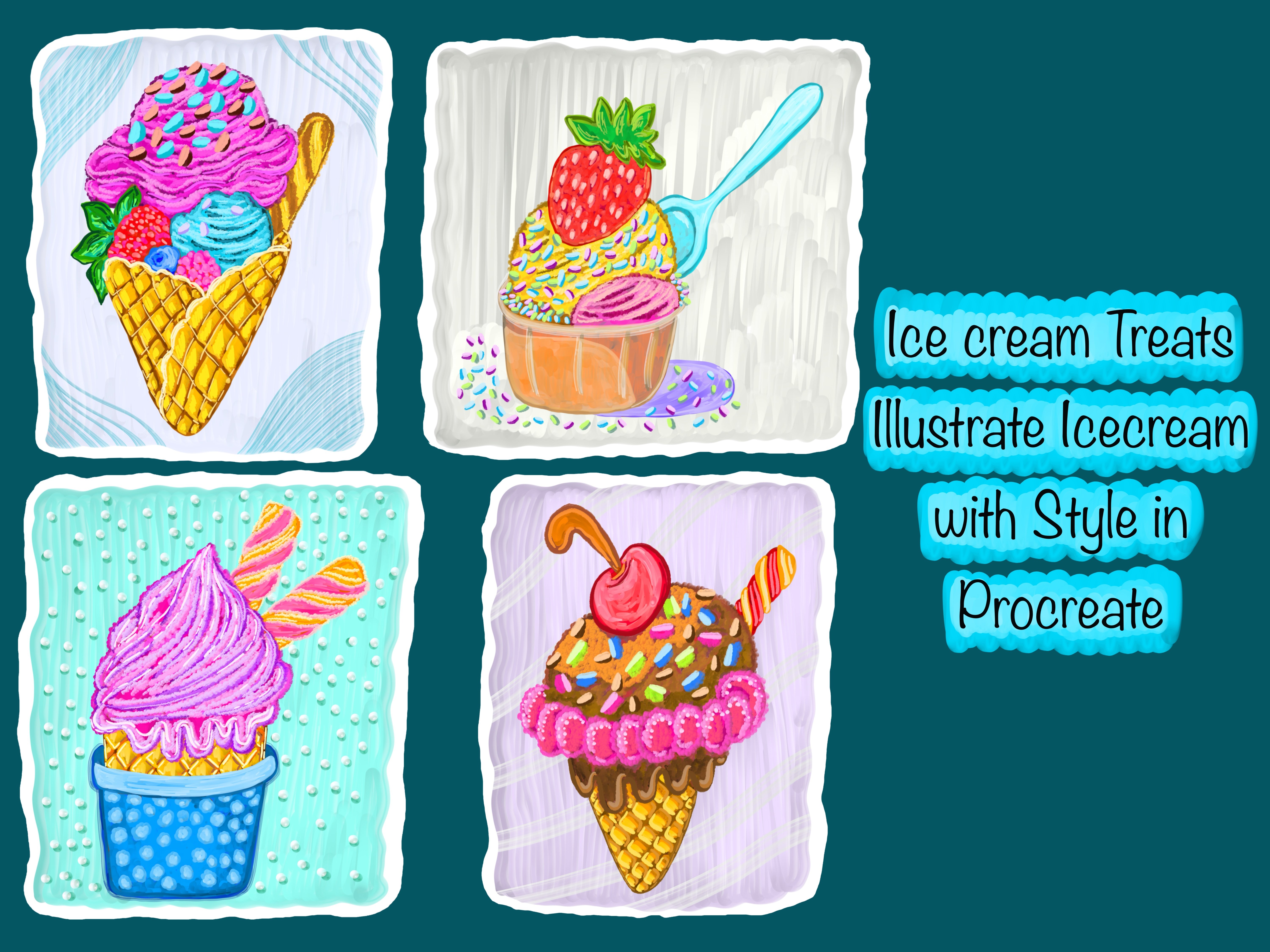
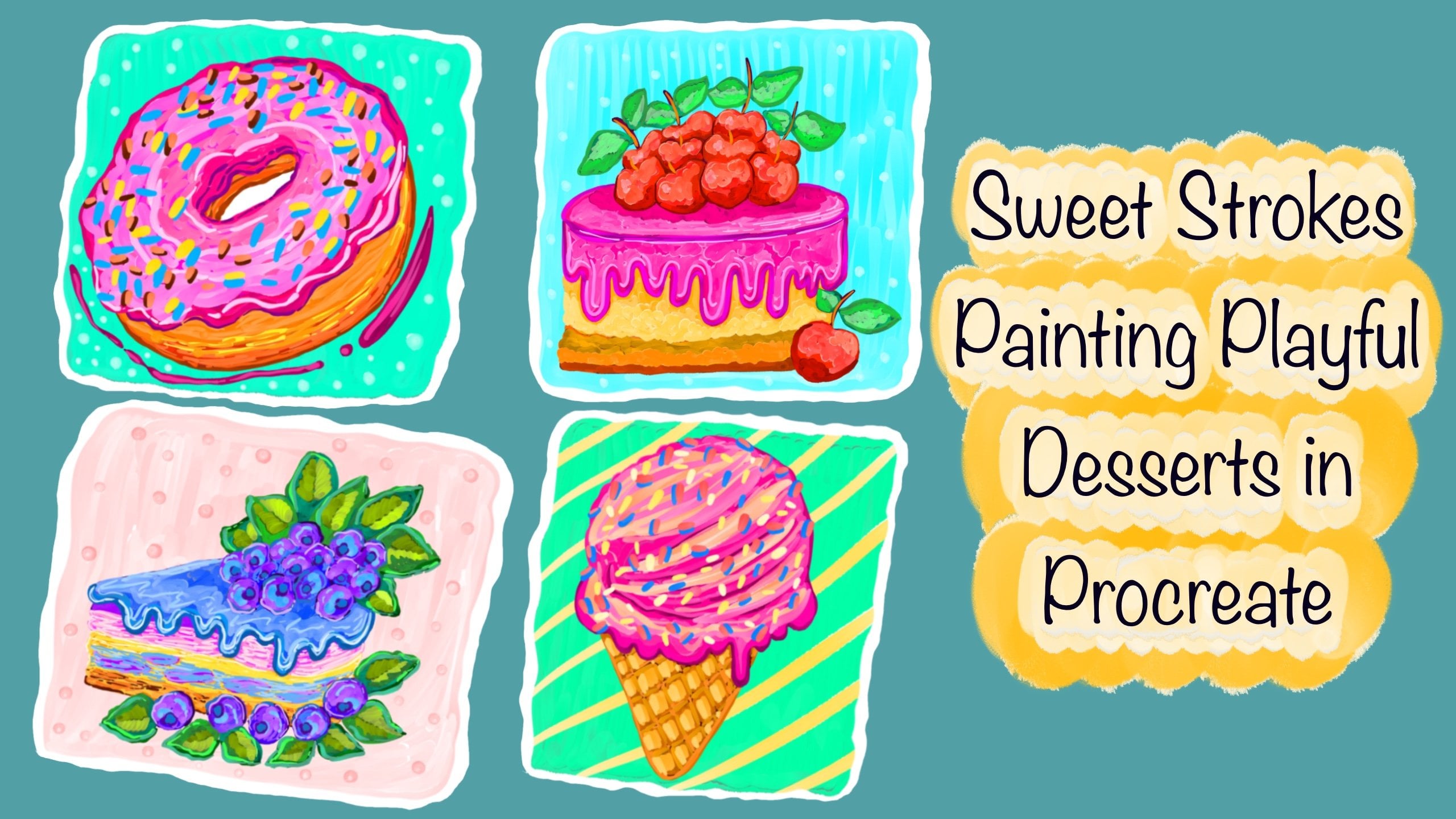
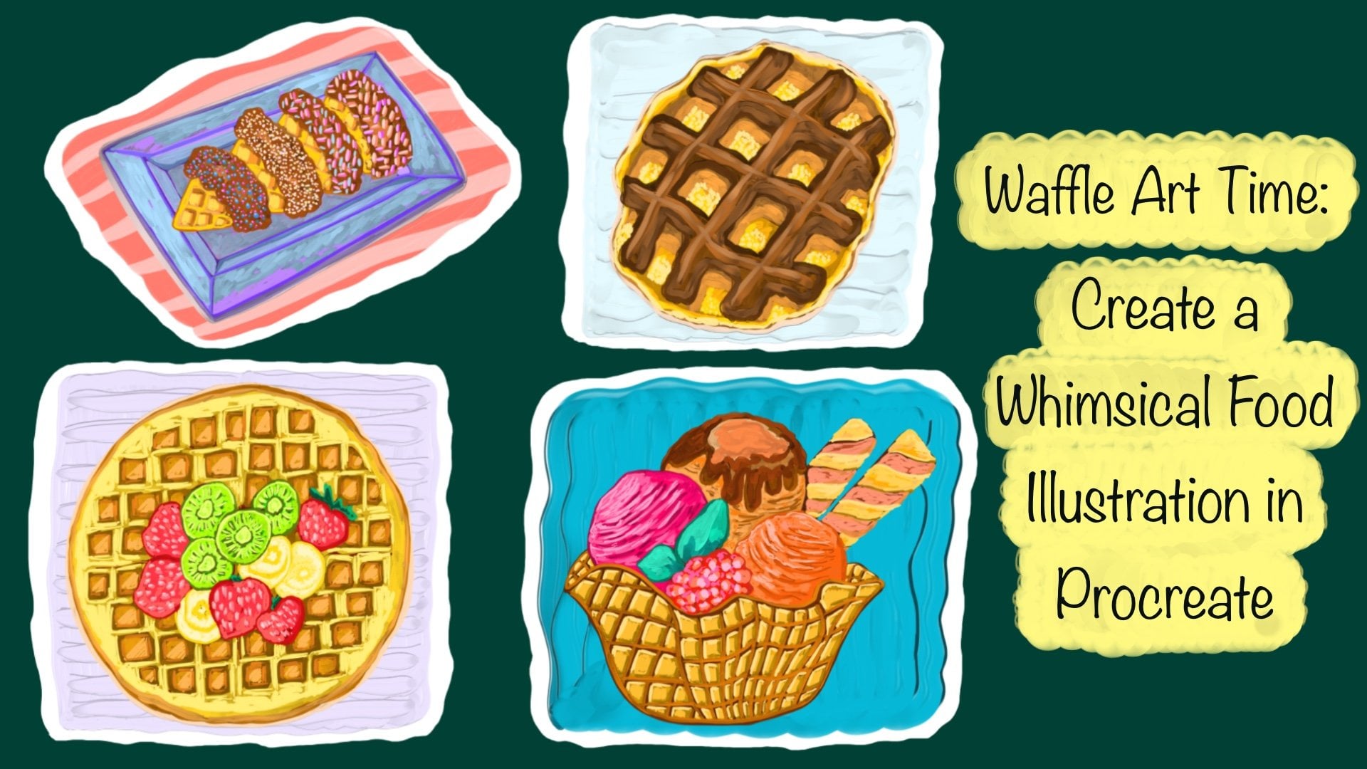
Transcripts
1. Introduction: Welcome to this class. This class is all about creating doughnut illustrations in a
relaxed and enjoyable way. We will focus on
building doughnuts, starting with simple
shapes and gradually adding icing color
in small details. Along the way, you will learn
easy techniques to adapt, texture and variation
without feeling overwhelmed. Throughout the class, I will be using my own cocade brushes, but you are absolutely
welcome to use any brushes you like or
feel comfortable with. What matters most here is that, how you build shapes, layer colors, and explore details in a way that
feels natural to you. This class is
designed to give you plenty of ideas
and inspiration so you can feel confident creating freely and experimenting with
your own doughnut designs. You are encouraged
to take your time, explore different
looks, and enjoy the creative process
without pressure. Whether you follow
along closely or take these ideas in
your own direction. I hope this class becomes
a space where you can relax and enjoy creating
doughnut illustrations. So now let's get started.
2. Materials: This class, I'm working on an iPad with an Apple
Pencil using Procreate. I will be using my
own Procreate brushes while creating the
illustrations. Throughout the video, you will be able to clearly
see which brush, color, and layer I'm working
on directly on the screen. I won't be mentioning
those details in the voice overs so you can focus more on watching
the process itself. I'm showing the full process
from start to finish, and you can always
slow down the video to match your own pace
and level of learning. Feel free to pause, rewind or adjust the
speed whenever you need. My classes are meant to be a
great source of inspiration, so you can feel comfortable
creating freely on your iPad and exploring your
own ideas beyond this class.
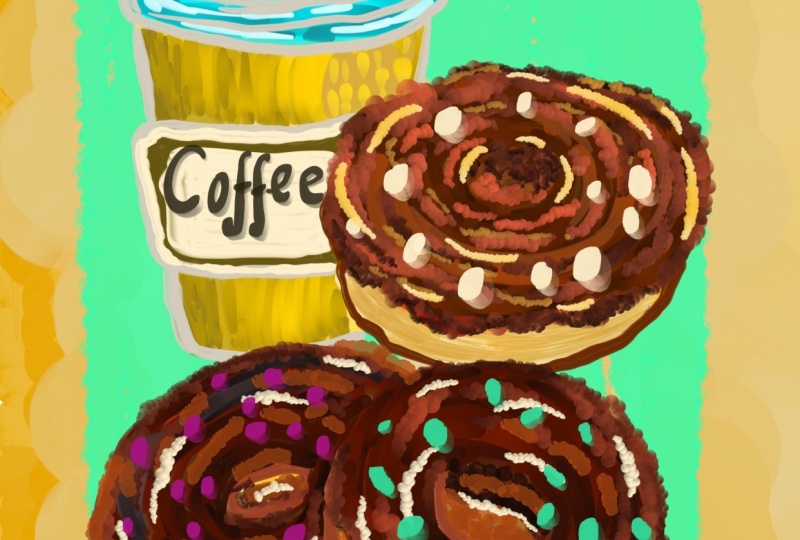
3. Donuts and Coffee Illustration: Starting very simply
with one doughnut. I'm using the six B pencil because it feels
soft and natural, almost like drawing
in a real sketchbook. I begin by placing a light oval for the
overall doughnut shape, and then I gently curve in the frosting edge
right above it. I'm not trying to make
a perfect circle. I like when the shape feels a little wobbly and hand drawn. It gives the doughnut
acute personality. I add the little bumps
of the frosting and then sprinkle a few
tiny shapes on top. The whole goal here
is just to build a friendly starting point
without any pressure. Now I'm moving over to the right and sketching
a second doughnut. I'm giving this one a slightly
different angle and adding a hole in the center to make the arrangement
more interesting. I start with another oval then softly draw
the doughnut hole. I sketch the frosting
drops again. This time, I make the drips a bit different from
the first doughnut. I stop with a tall cylinder
right behind the doughnuts. I sketch it very
lightly so I can adjust the height and
width if I need to. Then I add the lid, which is basically a soft oval on top with a few
layered curves. I keep the lid
rounded and chunky, so it feels warm and cozy. Next I mark the coffee sleeve
with loose vertical lines. These lines don't have to
be straight or perfect. They just give the cup
that familiar texture. I am intentionally letting the
cup overlap the doughnuts. Now I'm adding the
third doughnut, the one that sits right
beside the coffee shop. I sketch it slightly behind the first doughnut
so the composition feels layered and natural. I begin with a gentle oil again, then add the frosting curve
and those cell little drips. Now that all the mean
shapes are in place, I go over the entire drawing
slowly and refine my lines. I soften the frosting curve, smooth out the doughnut edges, and adjust the cup sleeves to make sure it isn't
leaning too far. Now that my sketch is ready, I'm moving into the
outlining stage. For this illustration. I'm using brushes
from my cushion blase tv procreate breast sack. Brushes have a really soft
textured look that makes outlines feel warm and hand drawn instead of
harsh or digital. As I outline, you
will be able to see everything clearly
on the screen, which brush I'm selecting and
which layer I'm working on. I'm not mentioning those details in the voice over just so the process stays relaxing
and easy to follow. You can simply watch the layers and brush names pop
up as I move through them. You can see that I'm slowly tracing over the shapes
we sketched earlier, the doughnuts, the little swirl of cream and the coffee
cup in the back. I'm keeping the outlines
loose and not too perfect. I want the drawing to keep that playful cafe
doodle feeling. Now I'm starting to
lay some base colors, and you will notice
something I always do to keep the process simple
and really cohesive. Whenever I pick a color, I like to use that same color in a few different areas
of the illustration. It makes everything
float together nicely. And it also saves a lot
of time because I'm not constantly jumping back
and forth between colors. So here I'm beginning with
this warm doughnut chain and filling different
doughnut sections before I switch
to anything else. It keeps the whole palette connected right from the start. I'm not worrying about
shadows or highlights yet. This is just the base
layer that now I'm bringing in a slightly
deeper brown tone, and this is where
things start to feel a little more dimensional. I'm just placing a
darker color wherever I want the illustration to feel
richer and more defined. You will see me moving
around the canvas again, adding this shade to
different doughnuts and then into the coffee cup. I really love doing it this way because it keeps a whole
illustration feeling unified instead of finishing one object completely and
then jumping to the next. I just slowly build
everything together. This also helps me stay
relaxed while painting. I don't have to overthink
where each color goes. Now I'm moving on
to the coffee cup and adding in that
first soft bias color. I like to keep things
really loose at this stage. I'm not trying to make
anything perfect. I'm simply dropping in the main color that will sit underneath
all our shading later. You will see I'm keeping
the tune pretty warm, so it matches nicely
with the doughnuts. We already colored. Now I'm moving on to
the next doughnut, and I'm adding in the
soft orange tone. I really love starting with
a color that feels warm and cozy because it instantly makes this whole
illustration feel inviting. I'm keeping my
stroke simple here, just filling in the base
layer without worrying too much about the
final texture yet. At this stage, I'm only thinking
about covering the shape evenly and giving it a nice foundation to
work on top of later. Now I'm moving over to
this little doughnut in the back and adding
a greenish chin on top. Now I'm moving up to the cream topping and adding this
soft yellowish tone. I really love using
a color like this because it instantly
brings a warm, cozy feeling into this artwork. Now, I'm moving back to
the orangish doughnut and starting to build in some
darker and lighter tones. This is one of my
favorite parts because the doughnut starts to look much more tab sured and alive. I'm using the same base color, just shifting it a
little darker for the shadows and a little
lighter for the highlights. And I'm following
the circular motion of the doughnut as I paint, so the strokes naturally
wrap around the shape. It gives everything
a really soft bake look almost like the surface
has tiny ridges and dips. Now I'm moving on to the chocolate doughnut and doing the same layering process, I start with a
slightly darker brown and just gently work it
around the center area. Falling the natural circular
shape of the tune it almost like it has
that soft big texture. Then I pick up a lighter
brown and tap a few strokes on the top edges where the
light would naturally fall. I'm not aiming for
anything exact, just soft touches of color to
make it feel a bit rounder. Now I'm moving up to
the cream on top, and I'm starting to bring in some darker and
lighter yellow tunes. I'm keeping my strokes
very soft here, almost following the
natural swell of the cream. I begin with a
slightly darker yellow and place it gently in
the shadowed areas, especially where one fold of
the cream overlaps the next. I'm not blending too much, letting the brush create those tiny textured
edges for me. Then I take a lighter
yellow and add small touches on the areas that would catch the most light. These lighter strokes instantly make the cream look
soft and dimensional. And again, there is no pressure to make everything perfect. Now I'm coming back to the
little tart and adding some darker and lighter
greenish tones to the icing. I'm keeping my strokes
really loose here and just following the
natural curve of the shape. Then I move to a lighter
softer green and add a few highlights along
the top edges and the folds. You don't have to be
precise here at all. Now I'm adding a medium gold and yellow tone to
the doughnut crust, and this is where everything really starts to come together, layering this tone
gently over the crust, letting it sit between the darker shadows and
the lighter highlights. We added earlier. I'm not trying to cover
everything evenly. I actually like letting some of the darker areas peak through. I follow the curve of the
doughnut as I were using soft circular strokes so the crust feels
rounded and natural. Take your time here and enjoy building up
the color slowly. These medium tones are what give the doughnuts that
cozy, finished look. Now I'm adding medium and lighter yellow tones
to the doughnut crust, and this deep really helps soften everything and
bring the crust to life. I already have my
darker base in place. Here I'm focusing on gently layering lighter
yellows on top of that. I'm not pressing too hard. I want these strokes
to sit lightly, so the darker color underneath
can still show through. As I work around the doughnut, I'm falling the natural
curve of the shape. I'm letting the lighter
tones catch the outer edges. You will notice
I'm not trying to make the color perfectly smooth. Leaving small variations
in tone actually adds texture and makes the crust feel more realistic
and hand painted. So as end up lighter than
others, that's completely fine. It adds corrective. Take your time here and
build the color slowly. These lighter yellow
layers help balance the darker browns and bring warmth into
this illustration. Take your time here and
build the color slowly. Now I'm focusing only on the coffee cup and adding
more details to it. At this stage, the base
colors are already in place. So this step is all about
refinement and depth. I'm working slowly here, layering slightly darker and lighter tunes to give
the cup more structure. For the sleeve, I'm carefully
building contrast by deepening some of
the vertical areas and leaving others
a bit lighter. That variation is what gives
the sleeve sexture and makes it feel wrapped around the cup instead
of just sitting on top. On the led, I'm following
the circular shape, letting my strokes
move around the fom, so it feels rounded
rather than flat. I'm not trying to make
everything perfectly smooth. Small visible strokes
actually at corrector. So eras feel a little uneven,
that's completely okay. This step is about slowing
down and absorbing. I keep checking
how the coffee cup sits next to the doughnuts, making sure the
colors feel balanced and don't overpower the
rest of the illustration. Take your time here
and enjoy this part. Itting these small details
really helps the coffee cup feel finished and brings this whole artwork
composition together. Now I'm gently defining
the outlines of the donuts using a
medium, dark brown tone. I'm not going back to a
harsh black outline here. Instead, I'm choosing
a darker version of the colors already
in the doughnut, so everything feels
more cohesive. I'm moving slowly
around the edges, following the natural
curves of each doughnut. I'm letting my
strokes stay a little soft and uneven because that helps the doughnuts feel more organic and so
much hand drawn, rather than stiff or
so overly polished. Now I'm moving on to adding
sprinkles on the doughnuts. This is a very fun step, but I like to keep
it relaxed and controlled so it doesn't
become overwhelming. I'm placing the
sprinkles one by one instead of scattering
them too evenly. I want them to feel
naturally sprinkled with some areas having a few more and some areas
staying quieter. I add them, I'm paying
attention to the curve of the doughnut and the
srill of the frosting. I let the sprinkles follow that circular flow
so they feel like they are sitting on top of the icing rather than
floating randomly. I'm also keeping the size
slightly inconsistent. Some sprinkles are
a bit smaller, some are a bit longer, and that small change
adds a lot of charm. I'm not trying to
make them perfect. Imperfect shapes actually make the doughnut feel more
playful and handrawn. I avoid placing
too many sprinkles near the very center hole, letting the area
breathe a little. This keeps the doughnut
from feeling crowded and helps the frosting texture
underneath still show through. Now I'm adding a few more
details to the cream, but only on the green donut, I'm not changing
the overall shape. I'm just gently
refining the folds. So the cream feels a little
more dimensional and layered. After that, I move
on to the outlining the base of all the doughnuts
using a brownish tone. This helps define their
shape and from each other. I trace the outline slowly, letting the lines
stay slightly uneven. That unevenness keeps the
illustration feeling hand drawn and textured rather
than too clean or stiff. At this point, the illustration
itself is finished, so I'm not changing anything
on the artwork anymore. I'm just moving
to the background to gently bring
everything together. I'm adding a soft
natural background color around the illustration, keeping it very
simple and quiet. The goal here isn't to compete with the desserts,
but to support them. I'm letting the
background stay subtle, so all the focus
remains on the details. I'm applying the
color evenly without worrying about perfect
edges or heavy blending. That slight unevenness keeps it feeling natural and relaxed. Almost like a painted surface
behind the illustration. This background helps
frame the artwork and makes the color feel more
settled and complete. Once this layer is in place, I pause and take a moment to
look at the whole artwork. Just to make sure everything
feels balanced and calm. And with that, the
illustration is complete.
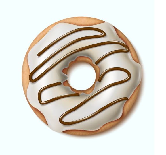
4. Swirl Glaze Donut Illustration: Starting the illustration by gently sketching out
the sheep using the CB, pencil brush and Procreate. Now I'm slowly
beginning this sketch by outlining the circular
form of the doughnut. My goal here isn't perfection. I'm just trying to capture the overall shape and movement. You can see that my lines
are a little uneven, and that's completely okay. I love when a sketch
feels hand drawn and organic rather
than too precise. As I go, I start adding the
flowing drips of the glaze. I'm imagining how the chocolate would naturally melt
and flow downward. So my strokes
follow that motion. Some of the drips are thicker, others are thinner,
a few curve inward, and others stretch out. I like this natural variation. It makes the
illustration feel more realistic almost as if the glaze is still
warm and glossy. While I'm sketching,
I'm keeping my wrist relaxed and letting
my hand move freely. Sometimes I will
stop and pull back just to check if the
balance feels right. The first few strokes
are soft and searching, and then as I gain
more confidence, I press a little harder
to define certain edges. Next day, begin adding small
details inside the doughnut. These little curve lines, that suggest the texture of the dough and the way the
surface slightly rises. I also make some tiny
marks near the drips, almost like faint guidelines for where the highlights and
shadows will later appear. You might notice how
the sketch starts to build up gradually
line by line. There's a quite
satisfaction in this part. You don't need to
rush, just enjoy how the lines begin to form
something recognizable. Sometimes I will go over
a section two or three times adjusting the thickness
or softening an angle. Every time I do that, it feels a little more natural, a little more alive. The key is not to get stuck
on details too early. Even if a few lines overlap or look messy, that's
completely fine. Now that the pencil
sketch is ready, I'm starting to outline
everything more clearly. This is where I began to give the drawing a cleaner shape, tracing over my sketch lines, but still keeping the hand
movement natural and soft. You can still see those light
pencil marks underneath, and that's perfectly fine. For this illustration, I'm using my Moni cushion blade
collection procret brush back. You will see on the
screen as I point out which brush and color
shade I'm using. And also which layer
I'm working on. So you can easily
follow along visually. I won't be mentioning those
details in the Voiceover because I want you to stay more connected to
the drying itself. It helps you focus
on the process instead of the technical parts. I'm filling the doughnut
with a warm golden shade, keeping my brush strokes
soft and slightly uneven, so it feels more
painterly and organic. I don't want it
to look too flat. Those tiny variations in tone make it feel like
real big dough, slightly crips on the edges and lighter toward the center. I like to start with a medium
tone first, not too dark, not too light, just enough to create the first
layer of worm. From here, I will
slowly build up other tones on top
in later steps. You can see I'm not trying to cover every single
spot perfectly. Now I'm slowly filling
in the chocolate glaze. This step always feels
really peaceful to me. It's where the sketch
starts turning into something that feels
more alive and full. I'm using a pressure
sensitive brush, which means the brush
responds to how gently or firmly I press
with my apple pencil. So if I press lightly, the color goes down softly and lets more of the
texture show through. But when I press
a little harder, it becomes deeper and
more opaque adding these beautiful little shapes in tone without me having
to switch colors. That variation gives the
glaze a really natural look. Almost like it has
depth and warm. The way melted chocolate
does in real life. I'm not blending
anything right now. I'm simply filling
in the base color, letting it look slightly uneven, and that's completely okay. Those uneven areas
will later help when I start layering lighter
tones and smaller details. When I fill in, I like to
go around the drip slowly, letting stroke curve naturally, following the flow of
the chocolate as if it's still slightly
warm and soft. It's not about being perfect. The charm of this stage comes from those small imperfections. They make your painting feel more expressive and handmade. If you're falling along, try to keep your
pressure soft at first. Now I'm adding the
background color. This step might look simple, but it really helps pull
everything together. It gives the illustration
a space to live in. Instead of just floating
on a plain white canvas. I'm not trying to
make the background perfect or completely even. I actually like when a bit
of variation shows through. Those slightly uneven
strokes give a soft hand painted feeling almost like working with real
paint on paper. I'm just filling it in loosely, letting the brush glide across the canvas and overlap slightly around the
edges of the doughnut. This idea here is
to create a warm, cozy backdrop that suppose the chocolate turns
in the doughnut. You will notice that as
the background builds, the main subject starts
to pop out more clearly. I'm keeping the strokes
visible on purpose, it adds movement and texture, and it keeps the painting
from looking too flat. Sometimes people
overthink the background, but honestly, it doesn't
have to be complicated. It's more about
mood than detail. I just let the strokes
flow naturally, covering the space without worrying too much
about perfection. The color doesn't need
to be fully opaque. A little transparency
helps it breathe. This step is also
really grounding after focusing on all the smaller
details of the doughnut. Working on a big open
area feels relaxing. It's like giving your artwork a soft frame that
complements what's inside. Now I'm adding a
darker blue sheet along the edges of
the blue frosting. This step really helps define the shape and gives
that area more depth. You can already see how it starts to look
more dimensional, almost like the frosting is slightly raised
from the surface. I'm not drawing a solid line. Instead, I'm softly building up the darker tone and
shot natural strokes. It's almost like
sketching again, but with color this time. The pressure is
pressure sensitive, so I'm letting the pressure
do some of work for me. This step is less
about perceion and more about feeling the
form of the doughnut. I'm gently following
the curve and letting the darker color flow
where it feels natural. It's okay if the lines
aren't perfectly smooth. Those small variations actually make the artwork
feel more alive. You can see how the
contrast between the lighter blue in the middle and the darker
outline around it, it starts to create a sense
of texture and weight. It gives the glaze a
nice and velvety look. Now I'm adding this
soft pink color, and it instantly brings a sense of sweetness and balance
to the illustration. Up until now, we have had
mostly early and cool tones, the chocolate brown, divamd
and that bright pop of blue. But once the pink
starts coming in, everything feels a
little more playful, a little more vibrant. I also like how
this deeper shade complements the warm tones of the dough and the pink glaze. It ties everything
together while still keeping the blue area as
the main point of focus. Whenever I add
these darker tones, I like to think of it as gently sculpting the
shape with color. Up until now, the frosting
has looked pretty flat. Just one soft tone, but by layering
these deeper shades, it starts to look richer
and more dynamic. As I move my brush, I'm following the natural
curves of the donut, especially where the frosting
drips or folds over itself. I'm not trying to be perfect
or even symmetrical. These small wavy lines help describe how the
frosting might settle. A little thicker in the middle and a little thinner
toward the edges. You can probably see
on the screen that my brush pressure keeps
changing as I move. This variation makes the surface
feel soft and touchable. Now I'm adding some darker
chocolate tunes to the donut, and this step really helps
everything come together. You can see how I'm slowly layering the dark
chocolate color first, focusing on building
a bit of dap around the edges and where the glaze
naturally folds or drips. The darker shade works
almost like gentle shading. Defines the doughnuts sheet, making it feel soft and slightly warm as if it's freshly baked. I like to move the brush
in small uneven strokes. Nothing too tight or perfect. Those little movements give the glaze a nice handmade feel. Like real chocolate, that's
thick and slightly glossy. Once I have laid down
those darker areas, I start bringing in a
lighter chocolate tune. This lighter color is what gives the surface that beautiful,
creamy highlight. It adds contrast and makes the frosting look
even more inviting. I usually add it
along the upper parts or where I imagine light would
naturally hit the surface. Now I'm just going
over the crust area, outlining it gently
with another shade. This step might look small, but it actually makes
a big difference. It adds a little
definition and helps separate the crust from the
rest of the frosting colors. Now I'm adding some lighter yellowish golden
tones on the crust, and this is where the doughnut
really starts to glow. You can see how these
warmer highlights instantly make the cross
look soft and baked. I'm lightly brushing
over the surface, letting the golden color sit gently on top of
the darker base. I'm not covering everything, just picking a few spots where I want that
light to show through. It's all about balance here. Now I'm going in with an
even lighter yellowish tone on the crust just to bring out a little more
light and warm. This time as that subtle
golden highlight. It's what really gives
the doughnut is spade, soft feel, almost like light is gently
touching the surface. As I paint, I'm
mostly focusing on the top areas and edges that would naturally
catch more light. Now I'm adding a brownish shade right along the crust
closer to the outline. This tap really helps define
the edges and gives the dune that cozy baked feel like
it just came out of oven. I'm placing the
darker tone mainly where the crust culves
away from the light. It adds a soft depth and makes the doughnut
look more dimensional. Instead of drawing a solid line, I'm lightly brushing in
small uneven strokes. As I move the brush, I'm letting it follow the
curve of the doughnut. Almost tracing around
those golden areas I just added earlier. The mix of warm yellows and this soft brown creates
such a nice balance. Now I'm adding a mix of medium blue and light blue
strokes in the background. This part is really fun
because it instantly gives the whole piece a brighter,
more playful feeling. I'm not trying to fill the
background completely. Instead, I'm just layering
a few soft strokes here and there to bring out movement and contrast
behind the doughnut. You can already see how
these shades of blue make the warm tones in the
doughnut stand out even more. I'm keeping my brush pressure very light so the strokes
stay airy and textured. It's nice to wary them a bit, some shot and curved, others are a little longer, just enough to give
the background a loose flowing rhythm. Now I'm adding a few medium pink and light pink
strokes in the background. These soft pink tones work beautifully with the
blues we added earlier. They create a nice balance
between cool and warm sheets. I'm using glide
gentle strokes here, almost like sketching
around the donut. There's no need for persuasion. Just let the brush glide and overlap a bit with
the blue strokes. What I love about
this step is how it instantly brightens up
the whole illustration. Now I'm adding a lighter sheet outline all
around the doughnut. This stub softly
separates the doughnut from the background
and gives it a clean, finished look without making
it feel too sharp or flat. I'm keeping my brush
pressure very light here, just enough to leave
a smooth soft edge. I'm following the natural curve of the doughnut
as I move around, not rushing through any section. The goal is to keep the outline even but still a bit textured. So it blends naturally with
the rest of the illustration. Now I'm adding a
few sprinkles in the background to finish
this illustration. This part is light
hearted and fun. It's where you can just enjoy yourself and add those
final pops of color. I'm placing the sprinkles
loosely around the doughnut, especially near the pink and
blue background strokes. They don't have to
be evenly spaced. It actually looks nicer when they are scattered
a bit randomly. I'm using a mix of colors here, just small dashes and
dots to create a variety. You can play with the tones
that match your doughnut, maybe a few light pinks, some blues, and
even little hints of white for brightness. Each tiny mark as to the
playful mood for this artwork. It's amazing how these
small sprinkles can instantly make this
whole illustration feel more joyful and finished. I like keeping my hand relaxed
while doing this step. These strokes stay
short and spontaneous, almost like comforti but softer. It's one of those easy, satisfying steps that really
bring everything together. Now I'm adding a few
sprinkled chunks right on the doughnut itself. I'm lightly placing
the sprinkled chunks over the frosting areas, especially where
the colors meet. You don't need to
cover everything. Just a few skated
pieces go a long way. The goal is to make
it look natural as if they have gently fallen
and stuck to the surface. I'm keeping my hand movements
soft and relaxed here, almost like I'm sketching tiny brush marks rather
than outlining shapes. Now I'm finishing the
illustration by adding a dark outline around the
edges and a background border. I'm starting with a
darker tone first, tracing softly around the border to create that sense of depth. The goal isn't to make
it perfectly even. A slightly organic edge feels
more hand drawn and cozy. Then I'm adding a lighter
tone just inside that border. You will see how
subtle change of color instantly makes the
border glow a little. Almost like it's catching soft light from
around the doughnut. I really like how this
step brings balance to all the colors from the frosting tones to the
sprinkles in the background.
5. Blueberry Donut Illustration: I'm starting really simply here, just easing into the
sketch with a loose oval. I'm not trying to
get it perfect. I'm just letting my hand move in a comfortable
circular motion. Now I'm adding the frosting. I love this part because it
instantly brings arrector. I finished the
frosting by gently connecting it back to the
lower part of the cake, keeping everything
round it and smooth. I'm looking at the whole
thing at once now. Next I start placing berries all around the top edge and
drawing small circles, overlapping them slightly so
they feel tucked together. On top of that first row, I add more circles. Some are leaning forward, some are nestled behind others. Then I fill the middle
area with a cluster of berries just so the top
looks nice and full. I'm placing them in
different directions, making sure there aren't
any big empty gaps. And finally, I zoom out a little to see how the sketch
slide on the canvas. I'm not fixing every detail. For this illustration,
I'm just using one brush from my sweet scape glimmer
procured brush pack. I'm taking a soft warm color and beginning to trace
over the entire sketch, just covering the outline so it has that cozy, unified look. As I move the brush
around the berries, I'm keeping my pressure light. The brush naturally gives me thicker and thinner lines depending on how gently I press. I'm not trying to make
every stroke perfect, letting each line wrap around the shapes
we built earlier. In this step, I'm
just filling in the bottom part of the cake
with a warm brown tone. I start by placing
the brush right along the edge and gently
pulling the color inward. I'm keeping my stroke
slow and soft so the shade settles nicely
without leaving harsh marks. Now I'm moving on
to the icing and laying down this
bright pinkish tone. I start right along the edge of the drip letting the brush
follow that wavy outline. I'm keeping my hand
really relaxed here, slow, steady stroke so the
color settles in smoothly. Now I'm moving up
to the little leaf stuck between the berries. I'm keeping this
part really simple, filling each leaf with a
flat green shade first. I start at one edge and
gently pull the color across, letting the brush glide. So this stroke feels
smooth and even. Now, I'm moving on
to the blue berries, and this part is always
really carming for me because it's just repeating the same
soft motion over and over. I'm taking this deep
bluish purple tone and slowly filling an
berry one at a time. I start on the edge of
a circle and then I gently pull the color
across the shape, letting the brush move in, these small rounded strokes. I'm not trying to make
every berry perfect. I just want the color
to feel full and even. As I go around the top cluster, I'm keeping my hand
relaxed so I can get into those tighter
spaces without rushing. And anytime the berries overlap, I pause a little and
carefully fill the color. Now I'm bringing in a
slightly deeper pink, and I'm using it to tuck some
shadows into the frosting. I'm keeping my strokes
soft and gentle, just following the natural
curves of the drips. As I move around the shape, I'm thinking about where
the frosting would feel a little heavier or where it
might be catching less light. I placed a darker tune
right along those areas, letting it blend into the base color without
covering it completely. I'm not trying to make
everything perfect, just giving the frosting a bit more depth so it
looks richer and fuller. Now I'm coming in with a
slightly lighter pink, and I'm just brushing it over the frosting to
lift certain areas. I'm placing this
lighter tone where the surface would naturally
feel a bit more raised. Or where the glaze might
be catching more light. I'm not covering
the whole section, gliding the brush
over a few spots. Almost like I'm letting the
color rest gently on top. These little touches how
the frosting feel fuller. Now I'm taking an even
lighter shade of pink, and I'm just gently
brushing it over the frosting to
brighten certain areas. I'm not trying to
make everything look perfectly
blended or smooth. I'm just adding
these soft touches wherever I feel the frosting would catch a bit more light. As I lay this lighter tone down, I'm keeping my
strokes very loose. I'm letting the brush glide over the surface with the
lightest pressure. Now I'm moving on to the
outlining the blueberries, and this part always
feels really relaxed, taking a darker shade of blue and slowly tracing
around each berry. As I go around each blueberry, I'm keeping my strokes
soft and steady. This darker outline
adds so much arrecter. It instantly gives each berry a bit more depth and helps separate them from the
frosting underneath. It's such a simple step, but it makes the whole top of the doughnut start to feel
more layered and alive. I'm also adding tiny touches
inside some of the berries, just little circular marks
or inner outlines that help define where the center
of each blueberry sits. These tiny details don't
have to be perfect. They are just gentle hints that make the
clusters look fuller. I'm taking a deeper, richer blue and
gently brushing it onto the berries to build
a little more depth this part is always
so satisfying because the movement darker shade
touches the surface. The blueberries start feeling rounder and more dimensional. I'm adding this
color mostly toward the bottoms and the
sides of each berry, the places where shadows
would naturally settle. I'm not covering
the whole berry, and I'm not trying to
blend it too perfectly. I'm letting the texture
of the brochure through so each stroke adds a
little bit of character. As I move around the cluster, I'm keeping my hand relaxed. I'm just tapping in
those darker marks, letting them sit right on top of the lighter
blue underneath. That contrast instantly makes
the berries look fuller. Some berries get a little
more shadow, some get less. I'm not worrying about
keeping them all identical. I'm switching to a softer, lighter blue, and gently brushing it onto the
tops of the berries. The darker tones we added earlier helped build
the structure. And now this lighter shade brings in that little
pop of freshness, almost like the light is
touching the surface. Placing these lighter strokes mostly on the upper
areas of each berry, just where the light would
naturally hit first. I'm not trying to
make it perfect. I'm just sweeping
the color in softly. Texture guide the highlight. Some berries get a
slightly bigger highlight, some only get a tiny touch. I love letting them
vary like this. It keeps the whole cluster
feeling loose and natural. Now I'm moving up to
the little leaves nestled between the blueberries, and I'm giving them
a clean outline. I like taking my time with these small areas because
even though they are tiny, they really help shape this whole top of
the illustration. I'm falling the curve
of each leaf slowly, letting the stroke
flow around the edges, so the shape stays
soft but defined. The outline helps
separate the leaves from all the busy texture
around them, the berries, the frosting, the shadows, and it gives them their own quiet moment in
the illustration. As I trace around, I'm
keeping the pressure gentle. The brush naturally creates those slight variations
in thickness, and I'm not aiming for
perfect symmetry here. Now I'm moving down
to the doughnut base and adding in the
soft yellowish tonee. I'm keeping my strokes
very relaxed here. Almost like I'm just lightly
brushing color across the surface instead of trying to fill every area perfectly. This warmer shade helps the doughnut feel
more baked and cozy. As I'm laying it down, I'm letting some of the
underlying color peek through. Alright, now I'm
moving more into the doughnut layer and bringing
in some lighter tunes. This tap really
helps the doughnut feel soft and a little
more dimensional. So I'm gently brushing a lighter shade right along
the top edge of the doughnut. I'm keeping my strokes
short and soft. Nothing too perfect here. We're just brightening the areas that would naturally
catch a bit more light. As I place this lighter color, I'm letting a bit of the base color peek through underneath. That small amount of
texture makes the doughnut look more interesting
and not too flat. I'm also following
the round shape of the doughnut as I paint, so the highlights curve with it. Take your time here.
Even a tiny shift in color makes a big difference. Just slowly build it up
until it feels right to you. Now I'm shifting my focus to the blueberries again and just giving them a bit more life with some extra
color variations. I'm starting with a medium tone, something that sits
nicely between the darker shadows and the lighter highlights,
we will add later. I'm lightly tapping
this medium shade along the upper curves
of a few berries, almost like I'm
suggesting more shape. I'm not covering
the whole surface. I'm just placing
small patches of color where I want a
little more volume. This tab builds a
softer transition between dark to light, which helps each blue
berry feel more rounded. Now I'm moving to
a lighter tone. With this one, I'm
being even more gentle. I'm adding tiny strokes
or little dabs of color right where the light
would naturally touch. It doesn't need to be
perfect or systematic. I'm choosing berries randomly, so the cluster looks more
natural and less uniform. As I layer these tones, I'm letting the edges blend slightly into
the color underneath. I'm not smoothing
everything out completely. I still want those tatured
marks to show through because they add interest and personality to
this illustration. Just take your time here. A few light touches can
make a big difference. And it's okay if each berry
looks a little different. That variation is what makes this whole bunch look
more playful and lively. Now I'm coming down to this pink layer right
underneath the blueberries, and here I'm just adding a little more color variation to make it feel softer
and more dimensional. I'm starting with a medium tone, something that
sits right between the base pink and the darker
shades we used earlier. I'm lightly brushing
this stone along the areas where the frosting
curves or dips a bit. I'm not curving large sections, just small patches
here and there. Now I'm picking up a
lighter shade of pink. With this one, I'm being
even more delicate. I'm placing it right on the parts that feel
like they would catch a bit more light usually on the rounder bumps and the
lifted edges of the frosting. I'm letting my brush follow the natural flow of the shape. Almost like I'm
tracing the curve. This adds a really soft
highlight that makes the frosting look glossy
without overworking it. Once I'm happy with
those lighter tunes, I'm bringing in a deeper,
slightly darker shape. I'm using it sparingly mostly around the
base of the frosting, and in the small folds where
it drips over the doughnut. These little darker marks
give this whole layer more depth and help separate it from the
doughnut underneath. I'm blending the edges just
a bit so it stays soft, but I'm not trying to smooth
everything out completely. I still want that painterly
texture to stay visible. Working layer by layer like this keeps everything balanced. So now I'm moving
up to the leave, and here I just want to bring it a bit more clarity and softness. I'm choosing a slightly
lighter green, nothing too bright,
and I'm lightly brushing it along the
center of each leaf. I'm using these
small gentle strokes that follow the natural
direction of the leaf. As we add this lighter tone, I'm not trying to
fill the whole leaf. I'm letting the darker bees
color show around the edges, so the leaf keeps
a nice structure. These tiny highlights help it sit nicely on top
of the blueberries, and they also give
a little pop of freshness in the middle
of all these deep tones. Now I'm coming back
down to the doughnut, and I'm adding some lighter
tones to the top surface. I'm following the round shape, almost like I'm tracing
the curve of the doughnut. I'm placing this lighter shade just where the light
would naturally touch. I'm keeping my stroke
soft and small, so it blends gently
into the base color. What I'm trying to do here is bring a bit of warm
to the doughnut, so it doesn't feel too flat
under all the frosting. I'm not aiming for
perfect blending. I still want to see some
texture from the brush, so I'm letting the base
color peek through, and I'm just slightly
layering on top. Now I'm going back to the blueberries for one
final layer of dap. I'm using a darker
tone now just a little deeper than what we already
have in the shadows. Now that most of this doughnut
illustration is in place, I'm going to bring everything together with a
simple background. I like choosing a soft natural
shade for this because it supports the artwork without competing with all the
colors we already have. I'm slowly brushing this
toone behind the doughnut, just filling the space
in a loose, relaxed way. I'm not trying to keep the
edges perfectly straight. Instead, I'm letting the brush create a slightly uneven border. Once the background
feels balanced, I'm moving on to outlines. The step really helps
everything settle in visually. I'm choosing a
tone that's deeper than the color underneath,
but not too harsh. I'm tracing along the edges with light confidence strokes. Now I'm returning to the blueberries for
the very last time, just to add a few tiny
finishing touches. These are extremely
small details, a little dot of highlight here, a slightly deeper shadow there, and I'm placing them carefully on only a handful of berries. After these final touches, I like to take a step back and look at the
whole illustration. Everything feels complete.
6. Stack Donuts Illustration: Alright, let's begin
our first step. For this part, I'm using the six B pencil
brush in Procreate. Now we will begin by drawing
the base of a doughnut. Think of it as the
bottommost fluffy layer. I'm sketching a simple
rounded shape here, keeping my lines light,
soft and flexible. Don't press too hard
on your pencil. We want these lines to
be easy to adjust later. At this stage, it's all about getting the
basic from down. Nothing has to be perfect. Once we have the base, let's stack another
layer on top. This one should be slightly
smaller to create that layer. Tier doughnut look, try
to align them naturally, so it doesn't look stiff. I often imagine how a real
doughnut would stack. There's always a bit
of irregularity, and that's what makes
it look natural. Now for the top layer, I'm shaping it like a doughnut, adding a small oval
in the center. Next, I'm going to draw
the dripping glaze. This is one of the most
enjoyable parts of the sketching process because it instantly adds a
sense of texture. Watch how I let the lines flow. Each drip has its own
shape and direction. Some are longer, some
are short and rounded. Try to vary them so the
glaze feels natural as if it's gently melting
and sliding down the slides. Don't worry about symmetry here. In fact, slight unevenness makes it more believable
and adds character. After finishing the drips, I'm adding a few light lines
between the doughnut layers. These will represent the texture and separation between
each doughnut. These small details will really help once
we start coloring because they will guide where shadows and
highlights should go. Now, let's add the final
touches, the toppings. I'm sketching tiny
square shapes on the top doughnut to look
like small fruit pieces, chocolate bits, or sprinkles. Scatter them loosely so
it feels spontaneous, not too aligned or patterned. If some overlap the glaze
lines, that's totally fine. It will look more
natural that way. At this point, you can zoom out and look at
your entire sketch. See how the layers
feel stacked and soft. Check that the height
and balance look right. If it's leaning too
much to one side, just adjust a few lines. Once everything feels right, you can group your sketch layers or merge them if you prefer. Now we are going to move from a loose sketch to a
clean, polished outline. For this illustration,
I'm using my Muni cushion Plase collection three
D Procreate brush pack. You will see on the
screen which brush and color shade I'm
selecting as I go. Point them out visually so
you can follow along easily. I have created a new layer
right above the sketch layer, and I'm using a warm brown
color for my outline. Using brown instead
of black helps the line art feel softer
and more natural, especially for doughnut
illustrations. It gives that cozy baked feel instead of a
harsh contrast. You can see clearly
on your screen, which layer I'm working
on keeping an eye on the layer panel will help you follow the steps
and stay organized, especially if you are
new to digital layering. We are going to start
adding our base colors. All those warm
bakery tones begin to shape the entire mood
of this lustration. I've created a new layer
underneath the outline, so the colors sit neatly
below the line art. Keeping this separation makes everything cleaner and gives you full flexibility later when
we add details and blending. Let's begin with
the doughnut paste. I'm filling it with a
warm golden brown color, something that feels
baked and cozy, like a freshly toasted
pancake or waffle. Use large steady strokes
to fill the shape evenly, but don't worry about
making it perfectly flat. A little bit of texture in your coloring is
completely fine and will actually help it look more natural when we start
blending later. Now, let's color in the glaze. This is the most
satisfying step. I'm using a darker chocolate
tone for this part, and I carefully follow the
falling shapes of each strip. Keep your brush
movement soft and curve so the glaze feels
smooth and creamy. I like to color in small
sections so I can keep control of how the paint
sits within the outline. Try using a few shades within the same family to make
it feel more realistic. You can place
lighter tones along the top where light
might hit the glaze and deeper browns
near the bottom edges of each drip to give
it a little thickness. If you spot any small gaps near the outlines, don't worry. Just go back with a smaller
brush size and clean them up. It's always better to fix those now rather than
later when blending. Once both the doughnut
and glaze are filled, take a moment to zoom out. The golden doughnut and
deep chocolate tones should already start to
contrast beautifully. If one feels too bold, you can adjust the
opacity slightly or softly layer a lighter tone over it to balance things out. The key here is patience. Instead of trying to
get the color perfect in one pass, build it gradually. Etroke adds a bit more
warm and softness. The base tones are in place, the colors are rich, and you can really see the
warm starting to build. We are going to add more
depth to our dont by layering a darker tone and creating soft sills on top
of our base colors. Instead of blending,
we are focusing on building richness and
texture through brushwork. This is a step that
gives illustration a more painterly and
detailed finish. I'm working on a new layer
above the color layers, keeping my outline
visible on top. You will clearly see
which layer I'm on, so it's easy for you
to follow along. I start by picking a
deeper brown tone, just a few shades darker than the original
chocolate color. Using this, I paint softly along the edges of the glaze
and doughnut layers. These darker strokes help
define shape and create a nice contrast between the top and bottom
parts of each section. Now I'm adding srills
on the glaze surface. These curved strokes
follow the natural flow of the glaze and help
it look rich and thick. Keep your wrists loose and follow the round motion
of the dinner top. That's what gives it
that soft, creamy feel. I like to vary the
intensity of these strokes. Some are darker, some lighter, so it feels more natural. Now I'm adding some
soft highlights and lighter tones to bring more depth and warm
to the doughnut. These gentle touches
start to give the chocolate glaze and doughnut layers a nice glow and help separate each
section visually. I begin by lightly brushing brighter tones over the
top curves of the glaze. These small curve strokes give the surface a smooth,
shiny effect. I'm adding lighter tones
over the existing color to gently lift some areas and
bring out some more shape. These soft highlights make the doughnut look
warmer and give it that subtle glow without making anything too
bright or blended. I'm simply using a slightly
lighter shade of brown and applying it with
short smooth strokes on top of the glaze
and doughnut. You can see that I'm
moving mostly along the curves of the glaze and
around the shrills on top. Instead of blending, I'm luring the lighter tone right
over the earlier color. That overlapping effect
adds a bit of texture and makes the brush work
feel more paint and soft. Now I'm focusing only
on the outline and crushed areas to bring more
definition to this doughnut. You will notice that I'm working around the
outer edges and inside those double lines
that we created earlier. This helps strengthen
the structure and make the layers feel more
baked in texture. I'm using a lighter tone again not to highlight the
glaze this time, these gentle strokes
and warm around the borders and help separate each layer
just a little more. Instead of filling
large sections, I'm keeping my strokes
short and selective. I move along the curved edges and in between the double lines, building up that
toasty golden brown feel that you usually see on the outer
crust of a doughnut. This bad really helps
the illustration. I look dimensional without
needing to blend anything. Now I'm bringing in a soft yellowish golden tune
to the crust area. This warm shade instantly gives the doughnut
that freshly baked glow and helps the
overall color palette feel lighter and more balanced. I'm keeping my
focus mainly inside the double lines and along
the edges of the crust. Those parts where the light
would naturally hit the most. Using gentle short strokes, I lightly move the brush along the curves
of the doughnut. You can see how this golden tone begins to lift the mid
areas of each layer, making the doughnut look
softer and more dimensional. As I paint, I make sure
not to fill every space. Leaving small bits of
the base color peeking through keeps the texture
area and organic. I also ing a few strokes
slightly beyond the edges of the glaze straps to show how the warm doughnut peeks
out from underneath. Now I'm adding a
lighter yellow tone right on top of the
crust to soften it. You will notice that
I'm still working within the same crust
area as before. But this time I'm using a paler, slightly more golden shed. The idea here is to build that baked out slowly layer by layer. I'm lightly brushing
over the earlier color, focusing mostly on
the raised parts and the edges that would
naturally catch more light. You can see how this
soft layer brightens the doughnut without covering
the texture underneath. I'm keeping my brush
movements shot and loose, just foling the same
direction as before, along the curve of each layer. I let the lighter color overlap
parts of the darker tune, so they blend visually without actually
blending the paint. As you build up these
lighter strokes, you will start to see a
nice contrast forming between the deeper brown clays and the bright golden doughnut. Now I'm starting to add sprinkles
on top of the doughnut. At this stage, I'm only blocking in the base color
for each sprinkle, keeping everything
really simple and loose. I'm working my way
around the top, placing small dabs of color
in a circular pattern. That follows the
shrill of the glaze. Right now, it's not about perfection or any
sort of detail. It's just about
filling the surface with soft scattered color spots. Each sprinkle gets a quick
stroke or type of color. I'm adding another color
to the sprinkles to make the topping look more
interesting and balanced. I've already placed
my first layer of sprinkle colors earlier, and now I'm just filling in between them with a
slightly different shape. This second color
adds variety in that. It breaks that uniform b and gives the top of
the tout more life. I still keeping my
strokes quick and light, just tapping in the
new color wherever I feel there's a
little extra space. You can spread these sprinkles evenly or cluster
a few together. Both ways will give
a nice organic feel. I make sure that some of these new sprinkles slightly overlap the darker glaze areas, so they blend naturally into the surface instead of
sitting too flat on top. That little overlap gives the illusion that
some are tucked in while others catch the light more directly.
You know what? It's important to keep
the tones balanced. Not too bright and not too dark. Just enough contrast
to make E sprinkle noticeable without taking focus away from the doughnut itself. This tab is one and free. You don't need to think
about smlray or perfection. Just play with placement and color variation until it feels visually balanced
and cheerful to you. I start by choosing a darker and muted tone that complements
the overall color palette, something warm enough
to blend softly but still noticeable next
to the lighter background. Then with light pressure, I begin shading
around the lower edge and slightly along one
side of the doughnut. I'm keeping my strokes
loose and eerie, not pressing too hard, so the edges stay
soft and natural. The goal isn't to
outline the doughnut, but to create a soft
hollow effact that makes this illustration feel
more dimensional to me. You can add more depth by slightly darkening the
area under the base. Now I'm adding a soft
background shade to complete this illustration. This background helps
separate the doughnut from the canvas and makes the overall illustration feel
more finished and balanced. I'm choosing a soft
blueton that contrasts nicely with the warm colors
of the doughnut and glaze. It's calm, subtle
and keeps the focus right where it should be
on the doughnut itself. As I start filling
in the background, I'm keeping the brush
movements light and free. I don't want a
perfectly smooth fill. Those small visible
strokes gives the background a more hand
painted and textured look. Now I'm adding a
soft lighter outline around the entire illustration. This outline helps
separate the doughnut from the background and gives
everything a neat polished look. I'm using a gentle light tone that complements the
background, not too bright. Just enough to lift the edges and make the
artwork stand out. You can see how I'm carefully tracing around
the outer shapes, keeping my hand relaxed so
the line flows naturally. The outline doesn't have
to be perfectly even. Slightly wavy organic edge adds more charm and makes this
illustration feel hand drawn. You know what? Actually?
It's really about softening the borders and connecting the whole composition together. It's a very nice way.
7. Pink Donut Illustration: Now going to make this pink doughnut illustration by using one procrete brush from my
daydream procrete brush back. First, I'm going to begin
with a simple light circle. This doesn't have to be perfect. Think of it as a soft guide
to help us place everything. Loose lines are
completely fine here. Once I'm happy with
the overall shape, I will add a curved
line along one side. This helps show the thickness of the doughnut and gives
it more dimension. Next I'm drawing
the center hole, I like to keep this
slightly uneven so it feels more natural and so
much hand drawn. After that, I'm sketching
the dripping icing, and I am letting the
lines flow gently. Creating soft coves
instead of sharp edges. This makes the icing look
more realistic and tasty. Now I will work on the
outdoor edge of the doughnut. I'm adding a slightly
wiggly outline instead of a perfect circle like this gives the doughnut a softer,
more organic look. Finally, I'm adding
a mark on one side. This is such a fun
detail and it instantly makes the illustrian feel
more playful and alive. For now, we are just focusing on building a strong sketch. Don't worry about making
everything perfect. Like this is your space to
explore and enjoy the process. Take your time here. You
can always pause or slow down the video if you would like to follow
along more closely. I'm using just one
procrete brush from my day during
procreatee brush back, and I really love using a
single brush hair because it keeps everything simple and helps illustrician
feel more consistent. I'm beginning with the
outline of the doughnut. I'm slowly going around the
shape, following my sketch, and I'm keeping the line
soft and slightly uneven, so it feels natural and relaxed. I'm not trying to
make this perfect, like a little texture
and movement in the line actually makes the
dot look more interesting. I'm keeping this line
simple and clean. After that, I'm drawing
the inner circle in the center and placing
it slightly off center, so it feels more natural and not too mechanical, you know. Again, I'm keeping my hand relaxed and light while I work. If you ever feel unsure, you can pause the video, zoom in or replay this section. Now that our outline is ready. Let's start filling in the icing with our pinkish base color. I'm gently applying the soft pink shade
inside the outline. I'm not trying to make it
perfectly smooth or flat. Instead, I'm using loose, like, relax strokes and letting
some texture show through. As I paint, I'm
moving my brush in small curve motions following the round shape of the doughnut. This helps the icing feel
full and dimensional. You will notice that
some areas look a little lighter and
some a little deeper. That's completely
natural, and it actually makes the icing
look more interesting. I'm slowly building
up the color instead of filling everything
in at once. This gives us more control and keeps the surface
looking rich. Near the edges and
around the dripping par, I'm being a bit more careful. So the color stays clean
inside the outline. If your pink shade looks different from mine,
that's perfectly okay. Every color choice adds its own personality
to your illustrian. So take your time here and enjoy this step.
There is no rush. Now that the pink
icing is in place. Let's move on to painting the
doughnut piece underneath. I'm starting with a
warm brown shade and gently filling in the lower
part of the doughnut, where the bread chews through. I'm using soft relaxed
strokes here and falling the curve
of the doughnut so everything feels
rounded and natural. You don't need to make
this perfectly even. A little variation
in color actually makes it look more
relating and interesting. As I paint, I'm keeping the
edges neat where the icing meets the base so the two layers feel
clean and separated. Now that the best
pink is in place, I'm going to start adding a lighter pink tone
on top of the icing. At this stage, I'm not trying to change the color completely. I'm just gently layering the lighter shade
in small areas, following the natural
curves of the doughnut. You will notice that I'm moving my brush in soft
rounded strokes. This really helps the
icing feel smooth, fluffy, and full of dap. I'm paying attention to where the light would naturally fall. Usually, that's
along the top curves and slightly toward the center. So I'm focusing more
of the lighter color here and keeping the
edges a little deeper. As I continue painting, I'm letting my
strokes stay visible. I'm not blending everything
perfectly smooth. These little brush marks gives the icing a painterly texture and make it feel more
natural and handmade too. And also changing my
pressure as I work. Sometimes I try a little
more to add stronger color, and other times I use a very light touch
to keep things soft. If your strokes look
different from mine, that's completely okay
because, you know, as every artist hand
moves differently, and that's part of what
makes your work so special. Right now, I'm being careful
not to overwork this area. It's very easy to keep
adding more and more layers, but sometimes stopping at the right moment makes the
artwork really feel so fresh. So I'm slowly building
the highlights, stepping back, and
checking how it looks. Like if something feels
too bright, I soften it. If something feels flat, I add a little more. Now I'm going to start adding a soft yellowtn to the
base of the doughnut. This yellow is going to act
as my foundation color. So I'm keeping it
light and warm. I'm not trying to make it
too dark at this stage. I just want to create a gentle big cloak that
feels fresh and soft. I'm carefully following the
curved edge of the dot, letting my brush move
slowly along the sheep, and this helps the base feel
rounded instead of flat. As I paint, I'm leaving a
little space near the edges, so I can build more depth later. It's always easier to
add darker tones on top than to fix something that
feels too heavy too early. You will notice that I'm using smooth, relaxed strokes here. I'm not rushing
through this part, taking time with the base layer makes everything easier
in the next steps. I'm also paying attention to how this yellow connects
with the pink icing. This step is all about bringing softness and dimension
into the doughnut. The base yellow gave
us the foundation, and the lighter shade is helping it feel more airy and texture. I'm using very light
pressure here, letting the brush glide
across the surface. I'm not covering everything. I'm just touching the
areas where I want the doughnut to feel
brighter and more raised. You can see how this starts
to create subtle controls. It makes the base look less
flat and more natural. As I layer this lighter tone, I'm constantly stepping back
and checking the balance. If something feels too
bright, I soften it. If something feels dull, I add a little more. There is no need to
be perfect here. Small variations actually make your illustration
more interesting and so much expressive. This is also a great moment to slow down and enjoy the process. These chant layers are what give your outward
depth and warm. What matters most is that
you are learning how to build color gradually
instead of all at once. Take your time, work slowly, and trust your instincts. As I continue adding
the sprinkles, I'm paying attention
to how they move around the center hole
and along the outer edge. I'm letting them
gently curve with the icing instead of placing
them in a straight lines. Sometimes I will
place a sprinkle, pause for a moment,
and just look at it. I ask myself, does
this feel right here, and if it does, I move on. If not, I simply
undo and try again. So that sort of
freedom to adjust is one of the nicest parts
of working digitally. I'm also making sure the
colors are balanced. If I notice too many blue
sprinkles in one area, I will add a green or
a lighter one nearby. If one section feels too bright, I soften it with a pale tone. It's almost like
quietly arranging tiny pieces until they
feel peaceful together. While I'm working, I'm
keeping my pressure light. I'm not pressing hard with
the appropriate brush. I want the sprinkles
to feel delicate, like they are resting
on the icing, not sinking into it. That gentle pressure
gives them a softer look. Now as more sprinkles appear, you can really see
the icing come alive, like it starts to feel textured and layered
instead of flat. And this is where
patience really helps. If you rush through this
part, it can feel messy. But if you slow down, it becomes very
calming and enjoyable. You might even notice
that this stage feels a little bit
like meditation. Just you, your brush, and these tiny colorful details. If you ever feel unsure, remember that there
is no perfect patron. Like, every doughnut in
real life looks different. Every sprinkle falls
in its own way. Now that the background
is coming in, I'm slowing everything down and working very gently because this stage is really about supporting the doughnut
and helping it stand out Without taking
attention away from it. I'm choosing a soft
pluton and filling the space around the
illustration in an easy, relaxed way, like
letting my strokes move naturally instead of trying to make everything
perfectly flat. You will notice that
I'm not pressing too hard and not
rushing through this. I'm aligning the brush to
leave soft textures behind, so the background feels
painterly and calm, and it blends nicely with the overall style of
this illustration. As I work around the edges, I'm being extra careful
near the doughnut. I'm letting the
background comes close, but I'm not forcing it
into the main shape. This little bit
of patience helps keep the artwork
clean and balanced. If you ever feel
unsure in this step, just slow down and follow
the outline gently. I'll filling in the background. I'm also paying attention to how the colors are
working together. This soft blue helps the pink icing feel brighter
and more lively, and it gives the
whole illustration a fresh finished look. You know, I'm slightly changing
my pressure as I paint, sometimes going lighter and
sometimes a little deeper. So the background has movement
and doesn't feel stiff, these tiny variations
make a big difference, even if you don't
notice them right away. This part of the process
is really very calming. There are no tiny
details to focus on now just steady strokes and gentle movement
across the canvas. If you feel tired or distracted, this is a good moment
to pause, like, take a breath and come
back when you feel relaxed again or doesn't
need to be rushed. Giving yourself time
here helps you enjoy the process more and feel confident in what
you are creating. As I continue, I'm making sure the background goes evenly
around the doughnut, covering all sides so the illustration feels
complete and framed. I love it. It's like giving your artwork its own
little space to shine. When everything is filled in, I take a quiet moment to
look at the whole piece, and see how the
colors, textures, and layers are
working together from a simple sketch to a
finished illustration. You have built
this step by step, and that's something
to be proud of. Take a moment to
appreciate your work. And look how far you have
come in this lesson. Now that illustration is fully colored and the
background is in place, I'm moving into the
outlining stage, and this is where everything starts to feel
more finished and clear. I'm gently tracing around
the main shapes of the unit, following the curves
of the icing, the soft mark area, and the outdoor edges. Like, I'm not trying to make these lines perfectly
straight or sharp and letting them stay
a little loose and natural. And because that matches the painti style we have been using
throughout this class, so these outlines helps bring
all the layers together and give this illustration a
strong confidence structure. As I work around the icing, I'm paying close attention to the flow of the shaves
we created earlier. I'm following the movement of the brush strokes and the
soft folds and the icing. Instead of cutting across them, this helps the donut feel
more rounded and dimensional. You will notice that I'm
taking my time here, especially in areas where
the icing overlaps the base. Slowing down in these actions
makes a big difference. And it really helps avoid
messy or rush lines. When I move toward
the lower part of the dont and the mark area, I'm being even more careful. This step should feel calm
and enjoyable, not stressful. Now I'm gently adding some soft stripes
to the background, and this tap is
all about bringing a little more movement and con texture into
the illustration. Like, instead of keeping the
background completely flat, these light horizontal
lines help guide the eye across the whole illustration and make the donut feel
more grounded in space. I'm using very light
pressure here, letting my brush glide smoothly so the lines
stay soft and subtle. I don't want these stripes to
compete with the doughnuts, so I'm keeping them
quiet and gentle. I'm spacing the stripes naturally without my
urine or overthinking it. Some lines are a little
closer together, some are slightly farther apart. And that's perfectly okay. This irregular spacing
keeps everything feeling organic and
so much hand painted. So if a line feels too strong, I'm simply lighten
it or adjust it, remembering that this
layer is meant to support the main subject,
not overpowering. So now I'm gently adding some light tuned
colors on the strip to soften everything and bring a little more
balance to the background. I'm not trying to
make these lines very strong or perfect. I'm keeping them
light and relaxed, just enough to give the
background some texture and interest without pulling
focus away from the doughnut. As I work on these
lighter tones, I'm moving slowly and letting
my hand flow naturally. I'm paying attention to how the colors interact
with each other, like how they support
the main subject, and that is our doughnut. You will notice that
these subtle touches make a big difference in tying
everything together. Once these light
tones are in place, I take one final look
at the whole artwork and make sure everything
feels balanced and finished. This is where the
illustration really settles into its own final form. Nothing needs to be
overworked at this point. A few gentle strokes are
enough, and with that, the illustration feels
complete, fresh, playful, and full of your own creative energy.
I hope you love it.
8. Caramel Donut Illustration: So now I'm going to make this caramel Donut
illustration by using one procrete brush from my daydream Procrite brush bag. I'm starting by sketching
the basic shape of the unit using a
soft six p pencil, keeping everything very
light and relaxed. I'm first drawing
a loose oval for the outer shape without worrying
about making it perfect, because this is just our guide. Then I gently add the dripping icing along
the bottom edge, letting the lines stay wiggly and uneven so it feels
soft and natural. After that, I sketch
the center hole, placing it slightly
off center to make the donet look more
realistic and interesting. I'm not trying to
make clean lines. I'm simply building
the structure and getting comfortable
with the farm. Think of this sketch as a quiet planning step where you are giving
yourself permission to explore the shape at just
proportions and slowly understand how the tuna sits on the canvas before moving on
to the color and details. Now that this sketch is ready, I'm moving on to
outlining the donut using just one procreate brush from my Daten Procreate brush back. I'm slowly tracing
over the main shape, starting with the outer edge and then following the
dripping icing line, keeping my hand
relaxed so the lines stay soft and
slightly imperfect. I'm not aiming for sharp
step outlines here. I actually want them to feel
flows over the doughnut. So as I outline, I'm also refining the shape, smoothing some areas, and
adjusting others where needed. So everything feels balanced. Then I carefully go around the center opening and
the top icing detail, making sure those lines connect naturally with the
rest of the painting. Now, I am continuing to layer this brown base color
slowly and gently, letting each stroke sit on
top of the previous one, like I'm not trying to make everything perfect or
smooth right away. Instead, I'm doing this process and letting the texture
build naturally. You will notice how I'm moving my potion small curve motions following the round shape of this doughnut and the
flow of the icing. This really helps create a soft, realistic depth without
overthinking it. Some areas are getting
a little more color, especially near the
edges and under the icing while other
parts stay lighter. I'm also paying attention to where the light might
be coming from. Like, I'm leaving a
few lighter spaces so the doughnut doesn't
feel heavy or flat. If your color looks uneven at this stage, that's
completely okay. This is actually what makes it look more painterly
and perfectly. Like, just keep layering slowly, trusting your brush
and your hand. If you feel like you have
added too much in one area, you can always balance it out by softly
blending around it. This part of the process
is really about relaxing into the painting and building confidence with your strokes. There's no rush here.
Take your time, Zoom when you need to. Zoom out to check the overall shape and
keep adjusting as you go. Every layer you add now is helping your doughnut feel
more solid and complete. By the time we move on to
the icing and details, this warm vase will support
everything beautifully. Now I'm gently building up the warmer lighter
tones on the doughnut, especially in the center
and along the lower edge. So you can see how I'm placing the softer yellow brown color
in small relax strokes, letting it blend naturally
into the darker areas. I'm not pressing too hard here. I'm just letting the brush
glide and layer slowly. This really helps create
that soft, big texture. That makes the doughnut
feel light and fluffy. If your colors start to mix in unexpected waste,
that's perfectly fine. Sometimes those little
variations are what make the illustration feel so much natural and
interesting, as well. I'm watching how the light
moves across the surface and using these light tones to suggest where the dont
might catch more light. I'm keeping the edges a
little deeper and richer in color and letting the middle feel slightly
brighter and softer. This contrast gives the
donut more dimension without needing a lot of detail. Take your time with this
step and enjoy the process. There's no need to rush or
match my strokes exactly. Now I'm slowly starting to build up more tones on the icing, and this is where
the doughnut really begins to feel rich
and dimensional. I'm working with slightly
darker and warmer shades and placing them gently along the curves and
folds of the icing, especially where it
naturally dips and overlaps. I'm following the
flow of the shape, letting my strokes move in the same direction as the icing. So everything feels
connected and smooth. I'm not trying to cover
everything at once. Instead I'm adding these
tones little by little, checking how they blend into the base color and
adjusting as I go. I'm also leaving
some lighter areas untouched so the icing still
feels glossy and soft. This sort of balance between the light and dark is what gives this surface so much
realistic and creamier look. If you feel like a section
is getting too dark, you can always go back in with a lighter shade and
gently soften it. Now I'm adding a
lighter yellow stone on top of the icing, and this tab is all about
bringing more brightness and softness into this
sort of tout illustration. I'm placing this lighter color
mainly on the raised areas and curve sections where light would naturally
hit the icing. Instead of filling everything, I'm using gentle flowing
strokes and letting the base and dctin still
show through underneath. I'm slowly blending
this lighter shade into the surrounding colors, softening any harsh edges and keeping the
transition smooth. If a section looks too strong, I'll likely go over it
again with a softer touch, so it melts into
the previous layer. Now I'm focusing only
on the outline and the area under the dripping icing and the
base of the donut, and I'm using a warm, dark brownish tone
for this part. This dab is really very
important because it helps define the structure of the unit and gives
it more depth. I'm carefully tracing
along the edges and slightly
thickening some lines, especially where the
icing overlaps the unit, so it feels layered
and more realistic. As I add this darker color to the dripping and
along the bottom, I'm thinking about where
natural shadows would fall. I'm keeping my strokes
very slow and controlled, following the curves of the dont instead of drawing
straight lines. If any area starts
to look too heavy, I gently soften it by blending it into
the surrounding color. The goal here is not to make
the harsh outlines, really, but to create warm, gentle shadows that
support the main colors. Now I'm focusing only on
the base of the tunit and I'm adding the lighter
tone just in that area. I'm not touching the
icing or the top at all, because right now
my goal is only to bring softness and light
into the lower section. I'm placing this
lighter shade where the light would naturally
hit the bottom curve, especially along the frontage. I'm blending it gently
into the darker brown. I add it earlier. So
there are no harsh lines. This really helps the base
look more rounded and gives it that warm big feeling instead
of looking so much flat. I'm doing this slowly
and carefully, building the coloring layers
rather than all at once. As I place these
lighter sprinkles, I'm paying attention to
the curves of the icing. I'm letting them follow
the flow of the doughnut. Some are a little
closer together, you know, some are
more spaced out. And that sort of variation makes everything so much
feel more organic. I'm also keeping my pressure
lights so the marks stay soft and don't overpower
the icing underneath. Once I'm happy with
the lighter tones, I move on to the chocolate
colored sprinkles. These darker ones add
contrast and that, I place them carefully
between the lighter ones. I'm using them to balance
the whole surface, filling small empty spaces
and adding visual interest. Auring the light sprinkles first and the darker ones after. Now I'm fully
focusing on creating the background and I'm doing
it slowly and thoughtfully, so it feels calm and balanced. I'm using the soft blue color and gently pacing
my lines across the spray building a loose grade pattern
behind the doughnut, I'm not miuring anything or trying to make it
perfectly straight and letting my hand move
naturally because that gives a background a warmer and
more relaxed feeling. I'm constantly checking how close they are to the doughnut. I want to leave enough space so the doughnut can breathe
and remain the main focus. If any line feels too close
or too strong near the edges, I soften it right away. This helps keep the
tension where it belongs. So on the icing, the sprinkles and the textures, we have worked so hard to build. Gently filling in the
background with color and I'm doing it slowly so everything
stays soft and balanced. I'm using this carm
blue tone and placing it inside the shapes
I created earlier, following those loose lines instead of covering
them completely. I'm not trying to make
this color perfectly flat. I'm letting some brush strokes stay visible because that adds texture and keeps the background feeling handmade
and so much warm. Filling the color close enough, so there are no empty caps, but I'm also making
sure I don't cover any of the outline or
details of the doughnut. This really helps the main
subject stay clear and sharp while the background stays
gentle and tumor supportive. If I notice any area
getting too dark, I immediately lighten my
pressure and blend it softly, so it doesn't become
so much heavy. I'm also thinking about
how this blue works with the warm yellow and brown
tones of the turnut. This contro is really important because it makes this
tuneut stand out naturally without needing
strong outlines or ho shadows. So while filling
this background, I keep zooming out and checking
the whole composition. I look at how the
color flows around the doughnut and whether it feels balanced
from all sides. If one area looks too
strong, I soften it. If another area feels empty, I gently add more color. This way, the background
becomes part of the story of this whole illustration instead
of just an empty space. I'm gently outlining the
doughnut to bring everything together and give the illustration
a clean finished look. I'm slowly tracing along the outer edges and
the dripping icing, making sure my lines
stay smooth and natural. I'm not pressing too hard here. I want the outline to
feel soft and hand drawn. Not stiff or heavy. As I move around the shape, I'm paying close attention to the curves and small details, especially where the
icing overlaps the base. And with that, this doughnut
illustration is complete. It's full of warm tunes, soft textures, and
playful details. And it reflects
every step we work through together from
sketching to coloring, shading, background,
and final outlining.
9. Colorful Donuts Illustration: Now we are going to make this
illustration and I will use one procrete brush from my daydream procrete brush pack throughout the whole process. Let's begin. I start this
illustration in a very simple, relaxed way just by placing
one soft ovil on the canvas. I'm not trying to make it
perfect at this stage. Then I slowly add the
second ovil be slided keeping the same gentle
pressure and sketchy feeling. I'm watching how these two
shapes relate to each other. Making sure they feel
connected but not crowded. Then I bring in the third oval and gently connected
to the first two. I'm thinking about how these shapes overlap in
how they create them. I'm imagining them as
part of one group. Almost like they are
leaning into each other. Once the mean shapes
feel balanced, and move on to sketching the chocolate bars and
donat the doughnuts, I draw small rectangular blocks and arrange them carefully. So they look like stacked pieces of chocolate supporting
the doughnuts. I pay attention to perspective, making sure some
blocks look slightly tilted are placed at
different angles, so the arrangement feels
natural and not flat. After placing the
chocolate bars, I begin working on the chocolate topping
on each doughnut. Along the edges, I draw
soft wavy dripping lines, letting them flow downward
over the doughnut surface. I don't make every
drip the same. Some are short, some are longer, and some curve slightly. Then I draw the center
holes of each janet. I position them carefully
inside the main oval shape, keeping them aligned
with the overall form. Then I refine the outlines
of all the elements, the doughnuts, the chocolate drips and the chocolate bars. I slowly go over the
important lines, making them cleaner and more confident while erasing or softening any rough
sketch marks. I move into the outlining stage, and for this entire
illustration, I'm using just one propri brush from my daydream
propriate brush back. I really love working
this way because it keeps everything feeling
cohesive and soft, and it also helps
me stay relaxed instead of constantly
switching brushes. I slowly began tracing
over my sketch following the natural curve of each tunt and gentle flow of the
dripping chocolate. I'm not trying to
make these lines perfectly stiff or mechanical, you know, I let them
stay slightly organic. As I outline, I pay close attention to the
thickness of my lines. In some areas I press a little more to make
the lines bolder, especially around the main
shapes of the doughnuts. In other places, I keep
the pressure lighter, especially around
smaller details like the center holes and the
edges of the chocolate bars. So now I'm slowly moving into the coloring
phase, and for me, this is one of the most peaceful parts of
the whole process. You know why? Because
I'm no longer thinking about
structure or sketching. So first, I start with
the pinkish unit. I gently fill the shape, following the outline
I created earlier. While flowing this color, I'm watching how
the shade spreads. If I see any gaps, I go back and softly fix them. If one area looks too dark, I gently blend it out. I'm not aiming for
perfection here. Once I feel satisfied
with the pink doughnut, I slowly move to the next
one, the orangish doughnut. Color brings warm into
the illustration, so I carefully with it. I don't want it to overpower
the other doughnuts. I build it in thin layers, slowly increasing the depth
until it feels just right. After that, I move on to
the chocolate doughnut. This one needs special
attention because darker colors can easily look heavy if we
are not careful. So I apply the brown
tones gradually. I layer them slowly making sure the texture still feels
soft and natural. I leave some a slightly lighter so the donut
doesn't look flat. Then comes the blue donut. This is my cold toned
element in this artwork, and it adds contrast to
all the warm shades. I feel it carefully. Keeping the edges clean, I check how it looks beside
the pink and orange tune it, adjusting the shade if needed so everything
feels balanced. Now that all the main
doughnut colors are in place, I turn my attention
to the crust. For this part, I
intentionally use one consistent color
across all doughnuts. You know why? Because this
creates visual unity. It connects everything together. As I paint a crust, I follow the curves and
contours of each doughnut, letting my brush move naturally. I slow down here
even more because this area defines the
structure of the doughnuts, cleanages make a huge difference in this kind of digital art. So I zoom in, fix
any tiny mistakes, and smooth out uneven strokes. Then I focus on the
centers of the dots. This type is essential for that. Without it, the doughnuts
would look like flat circles. So I carefully add darker
shades inside the holes. I blend the edges gently, creating a soft transition
between light and dark. After completing the cuts, now I move down to the
chocolate bars underneath. These small mons
may look simple, but they really support
the main sub ject and add richness to
this whole composition. I begin filling them
with deep brown tones. I use soft layering techniques to give them a slightly
textured look. I add subtle variations
so they don't look flat or so much artificial. Each chocolate piece gets
individual attention. I keep stepping back, you know, and looking at the full
illustration and asking myself, does feel balanced or do
the colors work together? Is there anything too
strong or too weak? If something feels off, I adjust it slowly. I never rush these corrections. Small changes often make
the biggest difference. So I'm still not adding
final highlights yet. I'm only building a
solid foundation. Think of this step as preparing the ground before
planting flowers. The base is strong, you know, everything else becomes easier. So I also pay attention to the
mood of this illustration. I want it to feel warm,
so much inviting, like something you would see in a cozy cafe or peaceful
morning scenes, you know? While working, I remind myself that art is
not about speed. It's about presence. It's about being fully here, enjoying every stroke, every color choice, every
little adjustment. Sometimes I pause for a moment, take a breath and simply observe what I have
created so far. This really helps
me reconnect with the process and
continue with clarity. So now I'm slowly moving
into adding lighter tones, and this is where the units
really begin to feel soft, dimensional, and more realistic. Up until now, I have been building the base
colors and structure. Now I'm gently bringing light
into this illustration. I always like to work
in a calm order, so I start with the
pink doughnut first. I choose a slightly
lighter shade of pink, something that feels soft
and warm, not too bright. With every gentle strokes, I begin placing
this lighter tone on the upper areas
of the doughnut. Once I feel satisfied
with the pink doughnut, I slowly move to the
orange doughnut. For this one, I pick a
warmer, lighter orange shade. Again, I applied it carefully, focusing on the curved
surfaces and raised areas. I follow the shape of the
doughnut with my brush so that the highlights will
connect it to the foam. After that, I move on to the chocolate doughnut
with darker colors. Highlights need extra care. So here I choose a soft,
lighter brown tone. I gently place it along the top curves and edges
we light with touch. I keep my pressure very light. I'm not trying to make
the chocolate look shiny. I want it to look rich, soft, and slightly textured. Then I move to the
blue doughnut. This one brings coolness
into this artwork. So I'm careful not to
make it too bright. I select a slightly lighter blue and gently layer it
on the raised areas. So now I'm focusing on adding
gentle lighter tunes to the center of the crust and to some areas of
the chocolate bars. You know, this is really
a very subtle step, but it plays a big
role in making everything feel more
dimensional and realistic. I begin by looking closely at
the crust of each doughnut. I notice where the
middle part of the crust naturally curves outward
and catches more light. That's where I want
my highlights to go. So I choose a slightly
lighter version of the base crush color. Nothing too bright,
just soft and warm. With very light pressure, I start placing this toe in the center areas of the crust. I follow the shape of
the doughnut carefully, letting my strokes
curve along the form. I don't rush this
part. I move slowly, building the highlight
layer little by little. I make sure the lighter tone blends smoothly into
the darker ones. I don't want sharp lines. I want the crust to feel fluffy, soft and gently baked. Once I'm satisfied
with the crust, I move on to the chocolate
bars underneath. These bars are an important
part of the composition, so I want them to feel solid
and three dimensional. I select a slightly lighter brown shade for the highlights. Then I gently add
this tone to some of the edges and top surfaces
of the chocolate bars. Now I begin with the
pink done at first. I choose a slightly lighter pink tone
than the base color, something gentle and
warm, not too bright. With every light pressure, I start placing this color along the curve
areas of the icing. Once I'm happy with
the pink doughnut, I move on to the
orangish doughnut. Here I pick a softer,
lighter orange shade. Again, I follow the curve
of the icing carefully. Then I work on the
chocolate doughnut. For this one, I choose a
slightly lighter brown tune. After finishing the
icing highlights, I move toward the crust
in the middle area. This word connects all
the doughnuts visually. So it's important to
treat it carefully. I select a light yellowish tone, slightly lighter than
the base crush color. This adds warmth and softness. With slow curve strokes, I place this color in
the center of the crust. So now I'm focusing on refining
the crust even more by adding extra soft highlights
using a light yellow tone. This type is all about
warm softness and making the doughnuts feel
freshly baked and natural. I choose a very
gentle yellow sheet, not too bright, not too strong. I want it to blend smoothly into the existing crust colors
without overpowering them. I start by observing where the light would
naturally fall. Usually it's along
the upper edges of the crust and the
slightly raised areas. So with this light pressure, I begin placing this yellow
tone in thin smooth strokes. I follow the curve of
each tong carefully, letting my hand move
slowly and naturally. I'm not rushing this step. Every stroke is intentional. I don't fill the whole crust. I only add this color
in selected areas. Just enough to lift the surface
and give it a soft club. Until now, everything
we have done has been doughnut structure
from light and dap, but sprinkles are different. Sprinkles are not structural. They are personality. I pick a small brush size because sprinkles should feel delicate. If they are too big, they start competing with
the doughnut itself. Instead of placing them in
straight lines or patterns, I place each sprinkle
individually and intentionally. I gently tap the
strain one by one, I white spacing them equally. Some sprinkles sit close
together, some are isolated. I slightly rotate
my hand as I place them so they don't always
the same direction. These sprinkles bring energy
into this whole outward. I take one last look across
all donuts to check balance, not equality, but harmony. Some areas have more, some less. I'm not adding a
full background yet. I'm only creating a soft
boundary ft. Up to this point, the units are sitting
on a plain space, even though they are
shaded and detailed. The eye still feels
they are floating. So instead of filling
the whole canvas, I first give them a
gentle surrounding shape. I choose a soft rounded
outline instead of a straight circle or square. I start from one
side and slowly move my brush around the
entire cluster. I'm not trying to make
the curve perfect. Small irregular curves
actually make it nicer. So while painting this, I keep a little distance
from the doughnuts. I don't place the
outline too close to the edges because then the
illustration feels cramped. Like, I also don't place it too far because when it disconnects, up to now, the outline was
only acting as a border. But once I place
color inside it, the illustration will finally separate from the canvas
and start to feel like a complete artwork instead of a painting sitting
on white space. Now I'm going back and
outlining the illustration. I'm not drawing a
perfect mechanical line. I'm following the natural
curves of the shapes, especially around the
icing and the crust. Immediately, you
can see the change. The donuts begin to stand out
more from the background. The edges become sharper and the illustration
feels so much clear. The icing has uneven curves, so I don't make a stiff line. I love tiny variations
in the line thickness. You can see how the
illustration changed. Nothing new was added, but everything looks
more finished. Outlining is not
just decoration. It is what gives the
artworks more confidence. So now the illustration feels
complete and more balanced. I hope you like it
10. Conclusion and Project: Created together in this class. We started with
simple outlines just focusing on the overall shapes and how everything
fits together. Then we slowly dit
color, texture, and small details to make each tonut feel a little
different from the next. This is a great example
of how you can take one idea and explore
it in multiple ways. Using the same steps
you practiced here. You can use this
approach again for your own project and make
it completely your own. If you are feeling like you want to explore a little more, this is a perfect
moment to do that. Using the same steps we
practice in this class, you can start playing with different doughnut
shapes and details. You might try changing
the frosting flow, adding more drips, or spacing the toppings
a little differently. Even small choices like where
you place a sprinkle or how thick outline feels can
completely change the look. You don't need to overthink it, follow what feels
enjoyable as you draw. This part is really
about experimenting and letting yourself try
ideas without pressure. Use what you learned here as a base and then let your
own style guide the rest. These are a few ideas
to show how you can take what we practice in this
class and explore further. Using the same steps, you can adjust the thickness, curves or overall size to
create different results. Small changes like
slightly uneven edges or extra details can add variety without
changing your process. You can keep things
simple or add a little more depending
on what you enjoy. Use these ideas as
inspiration and have fun creating your
own doughnut variations. For this part, think of it as a way to make the
doughnuts your own. You can gently change
the overall shape, make them a little
thicker or slimmer, or slightly tilt them so they
don't all feel the same. You can also play with the
edges, sprinkle placement, or how long the drips are while keeping the
main style consistent. These small adjustments
help create variety without
changing the process we followed in the class. Use this as inspiration
and explore in a way that feels fun and
comfortable for you. If you want to take
this a step further, you can try pairing
your doughnut with another simple food
shape like a cup. Think of it as building a small illustration instead of focusing on just one object. Keep the form soft
and rounded and let the icing wrap naturally
around the doughnut, just like we did
earlier in a class. You can play with color choices, surface details, and how much
texture you want to add. Depending on the look
you are going for, even small changes
like adjusting the icing thickness or
the contrast between elements can make the
illustration feel different while still
using the same approach. For your class project, you will be creating your
own unit illustration using the ideas we
explore together. Start by keeping the overall
shape simple and rounded. Then build it up with
icing and small details. You can add sprinkles, drips or gentle texture in any way that feels
comfortable to you. If you would like, you can also pair your doughnut with
a simple object like a cup to turn it into a small illustration instead
of just one element. Play with colors, spacing and details and let it
reflect your own style. There's no right or wrong here. Just take what you learned and create something
you enjoy working on. For your class project, I would love for you to create one doughnut illustration using the techniques we
explore together. You can choose any
icing style you like, mix and match colors, and add small details that feel fun or interesting to you. This is a great
space to experiment. Try different sprinkle shapes, play with drips, or keep things simple if
that feels better. There's no right or
wrong way to do this. Just follow what feels enjoyable and let yourself
explore a little. The goal isn't perfection. It's about using
what you learned in this class and turning it into something that
feels personal. Keep it relaxed,
keep it playful. And most of all, have fun
creating your doughnut. You can follow the steps
we went through together, or you can take them as a starting point and create your own
doughnut illustration. This is your space to add a personal twist through
icing color choices, drips, sprinkles or
little texture details. You don't have to copy
anything exactly. Let yourself explore and
see what feels fun to you. There are so many ways
this can turn out, and that's what makes it
enjoyable to work on. Just take your
time, experiment a little and enjoy the process. Before you wrap up, take a moment to look at
what you have created. Notice the colors you choose, the little details you added, and how everything came
together in your own way. This project isn't about
making it perfect. It's about enjoying the process and letting yourself explore. You can keep things
simple or add a few extra details if
Dad feels right to you. There's no single
right result here. Every junit illustration
will feel different. And that's exactly
how it should be. I hope this class
gave you a fun, relax space to create
and try something new. I'm really looking
forward to seeing your project and the choices
you make along the way.
11. Thankyou: Thank you so much
for joining me in this class and spending this
time creating together. I really hope you
enjoyed working through the Dent illustration and exploring different
ideas along the way. Whether you followed my steps closely or tried
your own approach, I hope the process felt
easy and enjoyable. This class is meant to be a space where you can slow down, experiment a little, and simply enjoy
drawing and painting. I would love for you to take what you learned here and use it to create your own
unit illustration in a way that feels
right to you. Feel free to play with colors, icing styles, sprinkles
or small details. There's no right or wrong here. When your project is ready, don't forget to upload it in the project section so we
can all see what you create. I can't wait to
see your artwork, and I truly appreciate you
being part of this class.
 Mooni Artstudio, Artist