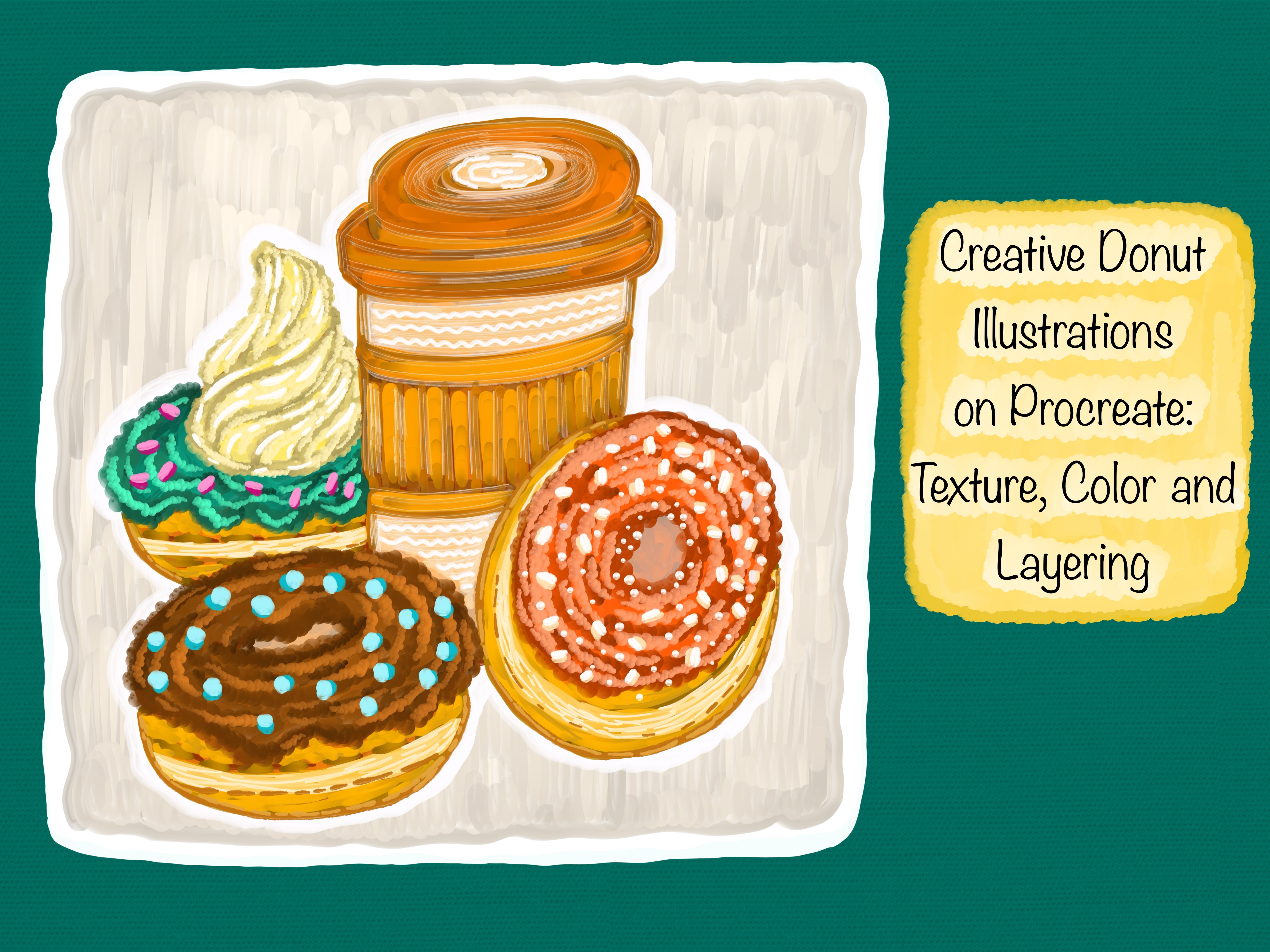
Transcripts
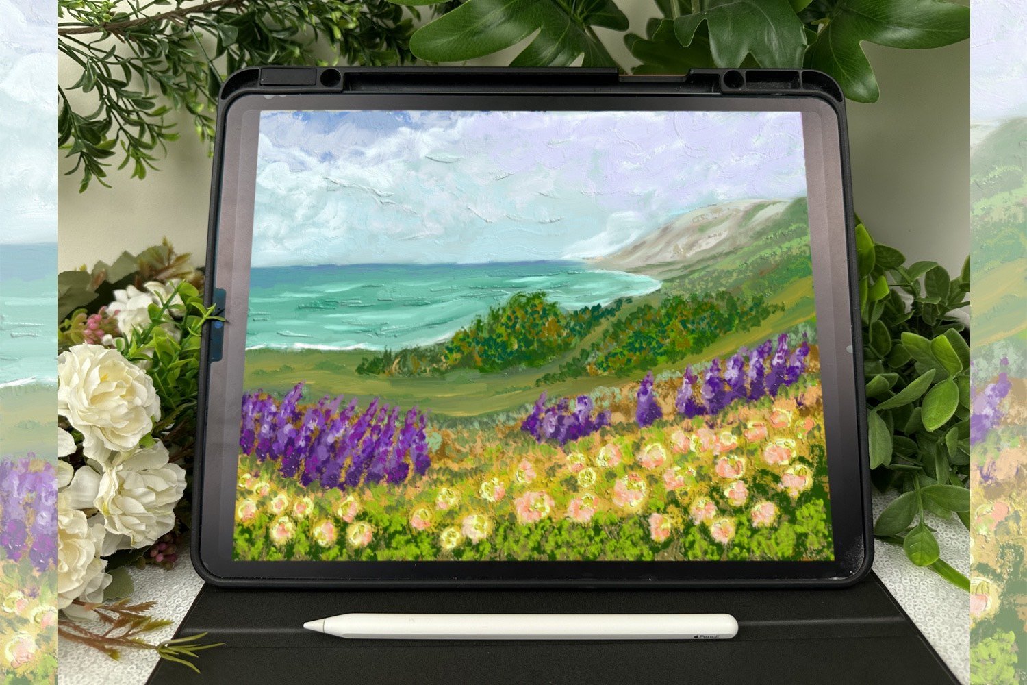
1. Introduction: I'm Moni and welcome to this
sweet and gentle space. This class is all about slowing down, opening a Procreate, and allowing yourself to enjoy the process of
creating something playful and joyful step by
step without any pressure. In this class, we
will be illustrating a charming little collection
of ice cream themed artwork. From pastel scoops stacked
high to soft biscuit cones, glossy sprinkles,
fruity toppings, and cozy shadows tucked beneath. We are not just creating
a dessert illustrations, we are building a soft
detailed world around it. Where textures, colors, and
highlights come together. We will go layer by layer, starting with the rough sketch
and gentle base colors, then gradually building
up the paintings, adding foam, depth, and
lovely pops of light. With my cushion blaze three
D procreate brush pack. This pack includes 20 procreate brushes
with playful textures, some soft and
pressure sensitive, some with bubbly finishes. And I have designed
this class to make sure you can follow
along just by watching. Whenever I switch
brushes in the class, you will see them clearly on
screen as I point them out, but I won't mention them in the voiceover to keep the
experience flowing smoothly. You are absolutely welcome to use whatever brushes
you have on hand. This class is made for
flexibility and freedom. Even if your brushes behave
a little differently, the techniques and
layer style we'll use can be adapted to fit what
you love working with. I will be using my iPad
with the appropriate app, and I will be drawing
with an Apple pencil. But you are welcome to use any stylist you are
comfortable with. I will walk you
through every step in a friendly compass so you can just follow along
without feeling overwhelmed. Whether you are here to
relax after a busy day, to get inspired for
your own projects or simply to spend some quiet
time with color and texture. I hope this class becomes
a safe space for you, one where you don't
feel the need to rush or perfect anything. Just create. You can pause the
class, take breaks, jump ahead, or go back over
parts you want to revisit. And if you are someone who is always creating
in little pockets of time between everything
else in life, I see you. That's why I design this class
with flexibility in mind. So let's settle in. Let's breathe a little deeper. Let's open up a blank canvas and procreate and start building
something that feels sweet, simple, and filled with color. I can't wait to paint with you.
2. Materials: For this ice cream
illustration class, I'm creating everything using my iPad and the appropriate app. It's such a fun and
flexible setup that allows you to explore digital
painting from anywhere, whether you are curled
up on the couch or sitting at your desk
with a warm drink nearby. I'm using an Apple pencil for
all of the illustrations, but you are welcome to use any stylist that feels
comfortable in your hand. Even your finger
can do the trick if you are just beginning
or trying things out. There's no pressure
to have fancy tools. In this class, I'm
using brushes from my cushion blade three
D Procreate brush pack, which includes 20
different brushes with a wide variety of effects. Some of these brushes
are pressure sensitive, making them perfect for adding subtle depth and
gentle variation as you sketch and shade. Others have a bubbly fun texture that adds just the
right amount of playfulness to soft serve ice
creams and textured cones. These brushes really help bring the illustrations to life
with that soft pretty look. But please don't feel like you need to use the
exact same set. You are completely free to use whatever brushes you already
love inside Procreate. If you have got some favorite texture
brushes or shading tools, go ahead and experiment with
those as you follow along. This class is all about enjoying
the process of layering, adding details, and discovering how different tools can help
you express your ideas. Whether you are using
my cushion Blade procreate brushes or
your own collection, the most important
thing is that you feel relaxed and inspired
while creating. You will also see me switching brushes throughout the class, and while I won't mention each brush name
in the voiceover, I do show them visually in the video by
pointing them out. If you are curious about which
one I'm using at any step, just keep an eye on the screen. I have made sure it's easy to follow even without
calling them out by name. You're always welcome
to set the speed of the video according to
your level of artwork.
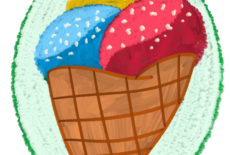
3. Create Candy Swirl Cone Illustration: All right, let's ease into this illustration
by starting with a nice gentle sketch using the six B Procreate
pencil brush. I really love beginning this way because it
feels like putting together the building blocks of our artwork without any
pressure to make it perfect. I'm just sketching
out the main shapes, the scoops of ice cream, that classic waffle cone, a little strawberry
tucked on the side, and this big flower that adds
a soft decorative touch. Everything is super loose
and free right now. The whole point of
this first step is to let your imagination take the lead and allow the lines to flow as naturally as possible. If your lines feel
wobbly or you need to adjust things as you go,
that's completely okay. That's what this part is for. You will see me
tweaking things, too, and I always remind myself that this sketch is
just the beginning layer. This brush has a soft, sketchy texture that I
find really calming. It feels almost like
real pencil on paper. I'm not trying to outline
everything in detail, just defining the placement
and size of the scoops, the cone and the little accents. And, of course, feel free
to make it your own. Maybe you want to add an extra scoop or swap the
flour for something else. That's the fun part. This sketch is your creative playground. So take your time here, zoom in if you need
to and don't rush. You are doing great,
and I can't wait to build on this together
in the next step. Now that the sketch is all set, we are moving into
the final line art, and this is where
everything starts to feel more polished
and intentional. I'm gently tracing
over the sketch with clean, confident strokes. You will notice that I have
slowed down here just a bit, really giving each curve and detail the attention
it deserves. I'm keeping my hand light
and relaxed, no rush, just enjoying the rhythm of the lines as they come together. You will also see me adjusting
a few things as I go, maybe reshaping a petal or
refining the waffle texture, and that's totally okay. This part isn't about copying
the sketch perfectly. It's about making
decisions that feel right as the illustration
comes to life. And don't worry if your
lines don't feel perfect. You can always undo try again
or smooth things out later. Now that our outline
is all done, and we have this
lovely sketch ready, it's time to fill in our illustration with
some flat colors. I move on to the cone. I love keeping the sport
warm and toasty looking. So I go for a golden
almost bague color, something that feels inviting, like a freshly made waffle
cone on a summer afternoon. I'm careful to color
just inside the lines, but I don't stress
if it's not perfect. I'm keeping things
really relaxed. I'm just going section by section and gently
tapping in the color. As I move to the
smaller elements like the berries and leaves
stuck into the slides, I start to see how they balance the
illustration visually. A little bit of green
next to the red, a tiny bit of contrast between the berry
tones and the cone. It's like the illustration is finding its own sense of rhythm. I just love watching it happen. It's such a comforting step like coloring in your favorite
childhood drawing book. There's no need to be
super precise right now. We are not aiming
for perfection. The first thing I do is feel
in those ice cream scoops. I have chosen colors that feel
a little bold and playful. A nice balance between
candy like and whimsical. You can go with any color stacked spark a bit
of joy for you. There's no wrong direction, whether you lean toward pistols, brides, or something in between. Just trust your gut here. This is your version
of this street. This part is so
gentle and grounding, there's no need to rush, even if it's just
feeling in flat areas. I always try to stay
connected to the artwork. Sometimes I pause and zoom in just to take care
with those corners, and other times I
zoom out just to see how the whole
illustration feels together. I want to encourage you to make choices that
feels good to you. Maybe you want your ice cream to be lavender or minty green. Maybe your berries
are more fantastical, blue, teal, even
pink. Go for it. This is your creative space and it should reflect your mood, your preferences,
and your style. One more thing, don't worry if something doesn't
feel right just yet. Let's pause and take a little moment to
appreciate this cone. It's already looking sweet, but now we are going to
make it pop just a bit more by adding some gentle
shading and highlights. I'm working only on
the cone and I really want to keep it soft
and initiative. Nothing too technical, thinking about where
the light might naturally hit and where some of those waffle sections
might fall into shadow. I start by gently deepening
a few sections of the cone. You will notice I'm not
shading every single square, just picking a few to give
a little more contrast. Sometimes that's all you
need a hint of variation can go a long way in
bringing flat color to life. I'm also darkening one
side slightly more, imagining that light might be coming from the left or above. There's no strict rule here, so feel free to imagine
your own light source. Then I go in and start
highlighting just a few edges. I want those criss cross lines to feel a
little more dimensional. Like they are catching
the light in place. It's subtle, but
that's the point. We are not trying to make
anything look ultra realistic. We are just adding
some warmth in that, so it feels like something you could almost
reach out and touch. This part is super
meditative and honestly one of my favorite little pauses
in the whole process. It's not about rushing through, it's about gently enhancing
what's already there. I always think about how even
the simplest adjustments can make a huge difference
in the way something feels. Take your time here, play around with your brush pressure, zoom in if you need to or stay zoomed out to get
the overall feel. The cone is such a fun
element in this illustration, and giving a bit
of dimension makes everything around it
feel more alive, too. Once you are happy with the
depth and you have added some glow to those top
lines, you have good to go. I love how this cone
is turning out. It already feels toasty, golden, and full of charm. Now we are moving on to a really sweet part of this
illustration the fruits. I only worked on the
fruit section here, but this little step adds so much life and charm to
the whole illustration. It's honestly one of my favorite parts to slow
down and really enjoy. So I started by building
up the raspberry. It already had its base color, and now I'm just gently giving
it some shape by adding small rounded highlights to suggest all those
tiny juicy segments. I'm not being too precise, just letting the brush
create that bubbly feel as if light is catching
on a few raised spots. It's super satisfying to do, kind of like dotting
little gems into place. I added just a
little more richness to the leaves behind the berry. This is where I like
to bring in a deeper green just to give it a
tiny bit more contrast. Nothing too harsh, just enough to make the leaves
feel like they are supporting the berry instead of blending
into the background. I also added highlights to
the strawberry beside it, brightening a few areas to
create that fresh, juicy look. Again, it's all about
keeping it soft and playful. You don't need a perfect
light source here. I always imagine a
summer picnic table in the sunshine where everything
glows just a little bit. I soften the blue
fruit next to it. I focus entirely on the
blue scoop of ice cream, and this is where this
illustration really starts to pop. I already had my base blue
color in place from earlier, but now it was time to
build depth and texture. You will notice I didn't jump
straight into highlights. I like to start with
the shadows first, carving out those little folds and swells that make it feel soft and scoop almost like
a puff of whipped frosting. I slowly brushed in some deeper bluetones
into the folds and edges. These darker strokes help show where the ice cream
tucks under itself. I'm focusing only on
the pink ice cream. The one right on the
top of the cone, and this is where things
really start to feel complete. There's something about the
top scoop that just makes a whole dessert illustration
feel full and happy. I had already blogged in
the base pink earlier, but now it was time to
really bring it to life. So I started by adding in
all those curve lines, and I made sure they followed the natural
shape of the scoop. Think of it like adding
folds and ridges that give the ice cream some
movement, some personality. They are not just random lines. Each one is following
the direction the ice cream would
actually swill. If it was real. I used a
slightly darker pink to build up that texture and then just kept layering as I moved
around the scoop. Always love this
part because once I start adding those
ridges and that, this cube slowly starts to look three dimensional.
I didn't rush it. I went slowly keeping
my strokes gentle, light, and a little playful. As I move toward the
top of this cube, I soften the ridges a little more letting the shape
round out naturally. I didn't try to make it perfect. In fact, I love when it looks
a little lumpy and creaky. The pink color itself
is so vibrant and it's doing a lot of the
visual work already, but these textural
details or what make this coop feel like you could actually scoop
it up with a spoon. I focused only on the biscuit. That tall, crispy stick nestled on the right
side of the scoop. This step was really satisfying because it felt like adding the final crunchy topping
to an already sweet treat. I started by refining
the base shape just making sure the foam
felt smooth and stable. Now I focused only on
adding the sprinkles, and this tap brought
so much joy. By the time I got here, the whole scoop already had
this rich texture and color. But it still felt like it
needed something playful, something cheerful and fun. So I zoomed in and
started dotting those colorful little
sprinkle shapes across the top of the
pink scoop one by one. I moved my brush across multiple parts of
this illustration, softening some edges,
sharpening others, and most importantly,
adding those small, quiet highlights that make
everything feel alive. I started with the waffle cone, even though the texture
was already there. I wanted it to feel
more dimensional. So I brightened the
ridges just slightly, adding strokes that followed the direction of the pattern. Staying light handed to keep
the golden biscuit warm. It's funny how a few
thoughtful lines can turn something flat into something with real warmth and structure. I turned to the leaves. They already had depth
and color variation, but I felt like they
needed a gentle glow. I added soft highlights along the curves and tips just
enough to make them pop. Then came the ice cream scoop. Probably my favorite part. I didn't want to overdo it, so I added just a few
curve strokes along the ridges to suggest
gloss and creaminess. The pinks, purples and blues each got their
own gentle touch. Alright, this is one of those soft final moments where we are not changing
the subject anymore, not adding new things, just finding the
gentle rhythm to say, This illustration is complete. The color I picked
for the background wasn't too dark or too bright, just enough contrast to
highlight the warmth of the cone and the
coolness of the scoops. I like using background
strokes that guide the eye without pulling
too much attention. There was this quiet moment as I finished those last few lines, and I just sat with
this illustration. For a second, I tilted
my eyepad a bit, took a breath and smile. It's always a lovely feeling when something feels finished. Not because it's perfect, but because you feel
at peace with it. You feel like it said what it needed to say, so that's it. The background is done, and with it, the whole
illustration is wrapped up. It's playful, colorful and
feels like a joy on a cone.
4. Create Cherry Chocolate Dip Crunch Illustration: Okay, so let's begin by
sketching out our illustration. This is honestly
my favorite part. There's something so comforting
about sitting down with a blank canvas and just
letting your ideas take shape. I'm using the six B pencil
brush in Procreate, and if you have never
used it before, you are going to love it. It has that perfect, slightly grainy texture that feels a little raw
in the best way. I always like to start with
the basic structure here. That means the cone. I kept the lines
slight and easy. Don't overthink it. Just let your hand
move naturally. I drew a simple triangle
first and then added some subtle curves to soften the shape and make it
feel more playful. Then using gentle
diagonal lines, I created the waffle texture. I wasn't aiming for
perfect symmetry here, like little imperfections,
make it feel hand drawn and unique.
And I love that. Then I moved on to the scoops. I drew a big fluffy scoop sitting right on top
of the cone with a slightly wavy edge to make it look like it's just
starting to melt a little. I added another mini layer below it for that
cushiony whip look. Now for the fun details, and this is where your
personality really gets to shine, I added a cherry
right on top with a curvy little stem that loops
slightly off to the side. Then I placed a long
tilted wafer stack tucked behind the scoop. It helps give the whole thing a little more height and charm. And, of course, sprinkles. You can do teardrop shapes
like I did or dots, hearts, stars, whatever makes your
dessert feel fun to you. Just remember this
sketch is your roadmap. It doesn't have to be
exact or polished. You can always refine it later, but for now, just enjoy
the moment of creation. And if you mess up, that's okay. Hit Undo or even better. Let the wonky lines stay. They tell a story and they
make your art feel real. Take your time, breathe, and let your hand follow the
idea you see in your head, even if it changes
along the way, that part of the
joy of sketching. Once you are happy
with your sketch, it's time to move on to inking, and this step always feels like such a satisfying
transition. It's where things starts to
look a little more finished, but still soft and playful,
just like we want. So here I switched
over to a brush that gives me smooth,
slightly textured lines, not too sharp, not too bold, just at perfect in between
that still feels hand drawn. Before I begin, I usually
drop the opacity of my sketch layer
way down and then create a brand new
layer right on top. That way, I can keep
the pencil guide underneath while I
trace gently over it. This gives me a fresh
space to work while still letting the original sketch peek through enough to guide my hand. As I trace over the lines, I try not to rush it. I let my hand move
slowly and naturally, almost like I'm breathing
with each stroke. Okay, so this is the part I always look
forward to the most. We have done the groundwork,
we have sketched, we have inked, and
now it's time to bring everything to
life with color. I started with some basic
color blocks, nothing fancy. At first, I dropped in a
golden brown for the cone, something that feels
warm and crunchy. Then I went in with a
chocolate brown for the scoop, just a soft and rich base that
holds everything together. I filled the cherry
in with a deep, juicy red and gave the whip topping a playful pop of pink. And those sprinkles, I just let myself
have fun with them. I used a home mix
blues, yellows, pins, a little teal like tiny bits of candy
scattered across the top. It's playful and messy
and just joyful. Now I want to let you know as I switch between brushes
during this taste, you will actually see
exactly what I'm using. I point to it in
the brush panel in the video so you can
follow along visually. I'm not calling the brush names, but if you are curious
while you watch, you will be able
to tell what I'm using just by keeping
an eye on the screen. That way, it feels natural and easy like we are
painting side by side, and you are peeking over at
my iPad every now and then. One of the things I love
most about coloring in Procreate is how easy
it is to experiment. You can change your
mind halfway through. You can layer in
deeper tones or go back and brighten up
areas that feel too dull. And that's what I did here. I added darker tones in
places where the scoops might naturally curve inward or where the toppings
would cast a shadow. It's soft and subtle, but it adds just enough shape to keep everything
from feeling flat. I kept switching between a few brushes as
I layered color. Sometimes I wanted a thick, cushony stroke that
felt pillowy and full. Other times I needed
something smaller to get into little corners or a texture
around the toppings. There's no right or
wrong combination. It's about what feels
right in the moment. And that's something I
really want to say here. Let this be a slow process. Let it feel fun. If something looks
too dark, lighten it. If you don't like
the way a color sits next to another, change it. This part isn't about
rules, it's about playing. So take your time, choose
colors that make you smile, blend them if you want, make bold choices or
keep it sweet and soft. Whatever you decide, know that your version will have
its own charm and flavor. You are not just
filling in shapes, you are building something warm and vibrant from the inside out. Okay, so I'm zooming
in and spending a little extra time just
working on the cone. Sometimes I like to slow down and focus on one part
of the illustration, and the cone really felt like
it deserved a little love. It's a base of the whole
dessert, after all, and giving it a bit of depth can really pull
everything together. So what I did here was
go back in with a brush that gives a little more of
a bolt and cushion stroke. You will be able to
see exactly which one I'm using in the video
just like before. I'm not calling them out, but I always make sure to pause and show you clearly
on the screen. So feel free to peek
at that if you are curious or want to try the same brush from
your own brush pack. I started by adding a slightly darker tone to the left and lower
areas of the cone, not too much, just enough to
hint at some soft shadow. It instantly gave the cone a little more shape like it's gently curved and
catching the light. Then I worked in a warmer tone over the crisscross textures, those waffle lines just to help them stand out
and not feel flat. I always like to
think about light when I'm adding
these subtle shades. Even though this is a
fun, cartoony style, adding just a touch
of shading can make it feel more
cozy and finished. So I darken the bottom of the cone just a
little more and then lightly added highlights around the top edges where the
scoop meets the cone. You don't need to use complicated blending
techniques here. What I found works
beautifully is just tapping a lighter or darker tone
on top of the base color. So now I'm zooming in
on the biscuit steak, that little thrill of cookie or chocolate wafer that's
tucked into the scoop. It might seem like a
tiny part of the piece, but I actually really
love giving it some extra attention
because it adds height, balance, and just a bit of crunch to the
overall composition. Now we are moving on to one of the most eye catching
parts of this whole piece, and that is a cherry. I don't know what it is
about painting cherries, but they're always
such a joy to work on. So here I zoomed in and really focused on just
the cherry itself. You will notice I switched up the brush
again for this part, something that gives a soft, painterly look with a little
bounce in the texture. You will see exactly which
one I used in the video. I made sure to pause and show
it clearly on the screen, so feel free to
follow along visually and pick whichever brush
fits right for your style. To start, I laid down a bold, pinky red base color, something juicy and rich, and I slowly started adding
darker tones along the edges, especially toward the bottom
and the right hand side, where a little shadow
might naturally fall. So now I focused on that little ruffle of pink ice cream sitting
right above the cone. And I just love how
whimsical this detail feels. To start, I selected a
soft vibrant pink that would pop nicely against the
chocolate scoop above it. I didn't want it to be too flat, so I layered a few similar
tones together a little darker for the shadows and a slightly lighter one
for the highlights. You will see in the
video that I switched brushes here again,
and as always, you will be able to
catch which one I'm using when I point to
it in the brush panel. So now in this step, where I spend some
quiet time adding texture and richness to
the chocolate scoop, the heart of this
whole illustration. It's the largest
part of the dessert and holds all the
playful toppings. So I really wanted
it to feel soft, full, and deliciously layered. I started by working directly on the same chocolate base
I had laid down earlier. Using a darker tone to
gently build in some shadow. You will see I switched brushes here to one that felt a bit more textural with just enough grain to create a cozy surface
without being too bold. As always, I point to
the brush in the video. So if you want to see
which one I used, feel free to glance
at that moment. I focused on adding darker strokes around
the base of the scoop. This helped round
out the shape and bring a little more depth
to the scoop overall. I didn't aim for a
perfectly blended lobe. I wanted to keep the
strokes invisible. Now we are moving on
to the sprinkles and I have to say this part
felt like pure fun. I worked only on the sprinkles. I started by deepening their
base colors just a bit, not changing the palette, but giving each one a little
more definition in life. You will see me zoom
in and gently go over the original strokes with
brighter and more varied tones. A vibrant lime green here, a soft peach there, a deeper blue, and a few
pastel shades stuck between. So in this step, I really encourage you to enjoy
the tiny things, choose colors that
make you smile, let the brush move freely. You don't need to
overthink the placement. Just let it be
playful and organic. These sprinkles are
a part of the piece, but they carry up a lot of joy. We have reached that
soft sweep part of the process, the
finishing touches. This step always feels like
a quite little celebration. Everything is already in place, the shapes, the colors,
and the textures. And now it's just
about slowing down, zooming in, and gently
refining the details. So I zoomed in and moved
around the canvas looking for anything that felt like it could use a little more care. I added a few tiny
highlights here and there, soft curves on the sprinkles, a brighter glow on the cherry, a few extra strokes of color
around the biscuit stick, just to make it
pop a little more. This part doesn't
require any big changes. In fact, it's really
just about noticing. You can step back
and ask yourself, is there any spot
that feels too flat, too dark, too empty? Sometimes I add a
touch of light to the cone or deepen a shadow
underneath the ruffles. And now here we are, the very last step. The illustration is complete, but I wanted to add just a little something
to tie it all together. So in this step, I worked
only on the background, keeping it super soft, simple, and a little bit dreamy. I didn't want anything
too bold or distracting, just a gentle texture that
feels like it wraps around the dessert illustration and gives it that final
artwork look. So I used a brush, that added visible stroke, something a little streaky, almost like dry paint
brush across paper. You will see me switch to it in the video and point
it out as usual, so you can follow along visually if you want to
try the same effect. I choose a light lavender
shade for the background. It feels playful and
contrasts really sweetly against the bright
sprinkles and warm cone. Then I gently layered
in some white on top using long sweeping motions. I let the brush flow naturally and didn't aim for
perfect coverage. The streaks and gaps
were intentional. They helped the background
feel more organic, like you are saying a
canvas behind the art. This step only takes
a few minutes, but it completely changes
how the illustration feels. It adds softness
around the edges, gives this entire
illustration a sense of space and makes it feel like something you
could print and hang. And just like that, we are done.
5. Create Frosted Dessert Cup Illustration: Okay, so we are diving into a fresh new dessert
illustration, and as always we are
starting with the sketch. I'm using the six B pencil
Procreate brush for this tap. I love this brush because it gives such a soft textured feel like sketching with
a real pencil on a cozy piece of
sketchbook paper. So I started with
the base shapes, a cup style cone with
a cute dotted pattern. Then I built up
the scoop on top. But instead of a
traditional round scoop, I went for a tall, really soft serve style. The lines flow upward
in smooth curves, which adds movement and
a little more whimsy. I kept the strokes
loose and playful. That's part of what makes
sketching so enjoyable. After that, I added a dripping layer of syrup
just under the sill. It's such a small detail, but it really makes the dessert feel extra sweet and dynamic. You get to explore
the shape and flow of the illustration without any
pressure to get it right. If you are falling along, feel free to adjust
things as you go. Maybe your swirll moves differently or your cup
is taller or shorter. That's the beauty of
creating your own dessert. It should feel like yours. Finally, I popped into biscuit stick
slightly overlapping, leaning out at an
angle for balance. The dinal lines on
the sticks give them that fun,
twisty cookie feel. Throughout this whole sketch, I wasn't aiming for perfect
symmetry or clean precision. This step is all about giving your idea a voice through line. Just you, your pencil brush, and the quiet joy of
drawing something sweet. Once the sketch fell just right, I moved into one of
my favorite parts of the process creating
clean line art. This step is where
everything starts to feel more intentional and clear. For this step, I created a new
layer above the sketch and dropped the opacity of my
pencil layer down quite a bit. Just so it could guide me without overpowering
what I'm about to draw. Then I switched to a
brush that gives me smooth, slightly textured lines. As always, you will see
in the video that I point to the brush I'm using
when I make the switch. So if you want to
follow along exactly, you will be able to
tell which one I have chosen by simply watching
that part of the screen. I started outlining the shrill, letting my hand move slowly with the flow of those curves. The key here is not rushing. I let my strokes be long and
confident but not stiff. It's okay a line vowels or if you need to
undo a few times. Alright, now that we have got our clean line art in place, we are moving into one of the most exciting stages
adding in our base colors. I created a new layer right
underneath the line art. I like to keep my colors completely separate
from the lines. It just helps keep
everything nice and clean. The cup I went with
this bold blue that really contrasts with the
warmth of the upper colors. It helps ground the illustration while still keeping
things bright and lively. I added those polka dots using a lighter blue
tone just for fun. They don't need to be perfect. In fact, their
little quirks make the cup feel more
handcrafted and cheerful. For the cone, I choose a warm, golden orange tone that
reminds me of the toasty slightly caramelized color cones get when they are freshly baked. It feels cozy and crisps. I started with the shrill, the soft surf scoop at the top. And for this illustration, I went with this
gorgeous bold magenta. It just felt happy. I love how it instantly adds a sense of
sweetness and whimsy. The shape of the shrill already has movement and this bright, candy like color makes it
feel even more playful. Almost like raspberry
or bubble gum frosting. All of this is just
flat colors for now. I'm not thinking about
shadows or highlights yet, just laying the groundwork. Think of it like decorating a cake before adding
frosting details. The biscuit sticks got a lighter caramel
color for the base, and I started building in
the sill striped details. Just enough contrast
to make them feel trilled and crunchy,
but not too sharp. We will add more
depth to those later. This stage is about choosing
colors that make you smile and getting a feel for
how they interact together. You will see me switch brushes a few times
while I color and just like before I'm showing each brush on the
screen as I go, so you can see what I'm using. You are welcome to
use the same ones or pick your own favorites
from your brush pack. There's no right way just
follow what feels good to you. One thing I love about this step is how peaceful it can be. You can color slowly, fill in the space
zoom in as needed. I focused only on the cup, and I really enjoyed
spending a little extra time here to make it feel more finished and full
of personality. So the base color was
already in place, that lovely bold blue
we laid down earlier, and now it was time to
build on top of that. I wanted the cup to feel
a little more rounded, a little more three dimensional, like it was gently
curving toward us. Nothing too realistic, soft shading and texture
to give it some depth. I started by adding
a deeper blue along the left and
bottom sides of the cup, taping gently, not trying
to blend perfectly. I wasn't worried about making it look airbrushed or smooth. Then I added a lighter
blue along the top right just a bit enough to suggest
light is hitting that side. I didn't use a pure
white, just a pale, cool blue and then my favorite
part, the polka dots. I used a small round brush for these and gently
went over each dot. Letting some stay
brighter than others, some are more filled
in and some I felt a little fuzzy on the edge. That variation makes them
feel more playful like they were painted by
hand on a real mug. I also let a few dots
slightly overlap the shaded area to help blend the light and
dark areas together. That tiny touch helps the
texture feel more integrated. As I worked, I zoomed in to
get those little moments of control and then zoom back out to see how everything
looked as a whole. I really recommend taking
your time with this part. It's easy to rush through background elements
or smaller shapes. But when you treat each part
of your drawing with care, the whole illustration feels
more balanced and loved. Tiscpe is where
your dessert sits. It's the base, the foundation, the thing, holding
everything up. And when you take a few
extra minutes to shape it, shade it and decorate it. It quietly supports the whole
mood of your illustration. Alright, now that the cup is
fully textured and detailed, I moved onto the cone, and this part is one of
my absolute favorites. There's just something so satisfying about
turning a flat shape into something that
feels crips and golden like a real waffle cone. To start, I looked at the
base layer I already had that warm yellow to it was
a good starting point, but I knew it needed a little
more life and texture. So I picked a slightly
darker golden brown and started laying
in diagonal lines, going one direction first, just lightly, not trying
to be too perfect. Then I added another
set of lines going in the opposite direction to create that classic crisscross pattern. Instantly, it started to
look more like a cone. I didn't want the lines to
look too flat or graphic, so I softened some of
them with a light touch. Now that the cone is fully done, I moved onto the biscuits, and these are like
the finishing touch that makes the whole
dessert feel playful, a little more extra special. I started by blocking in a warm, golden orange shade as the
base for both biscuit steaks. I wanted them to have
that classic vague look. Once the base was filled in, I gently deepened some areas using a slightly darker tone, mostly around the
edges and where the biscuit dips behind
the shrill of ice cream. That way, it adds a bit of dp and makes it feel more
tucked into the dessert. Then to bring in that
signature spiral pattern, I switched to a
bright pink color. The same one I used for the ice cream srill
to keep things cohesive and started
painting diagonal stripes. I didn't worry about making them too perfect or symmetrical, a gentle back and forth motion, following the curve of the steak to give it that candy strip. One of the most fun
parts was blending the stripe is just a tiny bit. This part is where the
whole illustration really starts to feel
sweet and magical. I worked only on this rill, not adding any toppings or
extra decorations just yet. I focused completely
on building up the dimension and softness
of the ice cream itself. I started by lightly sketching
the swirling motion of the soft serve following that natural spiral shape
from top to bottom. The brush I'm using gave me
a soft, streaky texture, which is exactly what
I wanted because I didn't want it to look
flat or overly digital. After the base was down, I added a brighter
pink highlight color to the top bridges of israel just enough to bring out the curve and make it feel
like it's catching the light. It immediately gave
the shrill that signature soft surf look fluffy on top and tapering
down into the cone. Then to deepen the shadows, I used a deeper
pinkish purple and gently brushed it into the
areas between each coal, especially near the edges and under the overlapping
parts of the rill. It made the whole
scoop feel more three dimensional and gave it a
little pop from the background. I didn't worry too much
about making everything symmetrical because real
ice cream is never perfect. And that's what makes it fun. By the end, the ice cream looked full and almost touchable. It started to feel
like a real dessert, something you could scoop
right off the screen. I spent more time working just on the ice
cream, softening it, refining it, and giving it that delicious almost storybook feel. You can probably see now that the shrills
look more defined. I added another round
of shadowing between the ridges to help each
curve stand out even more. The deeper shades really helped at that
sense of roundness, like the ice cream
is piled up with layer after layer of soft surf. At this point, I felt like the illustration was starting
to really come together, but the cup still needed
a little something, not a full makeover, just a gentle nurse to
feel a bit more finished. So I zoomed in and focused solely on the
outlines of the cup. Sometimes the smallest details can make the biggest difference. Now that the dessert itself
felt happy and complete. It was time to give it a
little world to live in. I started working on the
background, and honestly, this part felt like giving the whole illustration
a cozy blanket. I wanted something that
would feel soft and fun, almost like wrapping the
dessert in a gentle atmosphere. So I picked a cool toned
teal which felt like the perfect contrast to all the warm pinks and oranges
in the main illustration. It cooled things down just
a bit adding balance. But I didn't stop there. I added whimsical
little dots like tiny floating bubbles or candy sprinkles dancing
in the background. This gave this illustration
a bit of texture and movement and also echo
dpulka dots on the cup, trying everything together
without being too matchy. The edges of the background
are gently, wavy, not perfectly straight,
and that was intentional. I didn't want a stiff
box around the dessert. I wanted it to feel
light and playful, like a dreamy page
out of a sketchbook. This soft border makes a background feel like
it's part of the moment, not just something
pasted behind it. I really believe backgrounds don't have to be big or bold. Even a simple one
like this can make this whole illustration
feel more complete. I focused only on refining
the outlines of the cup, just softening the edges and
gently defining its curves, so it would sit more
comfortably beneath the scoop. I didn't add any highlights
or textures yet, just gently carved out the shape so the cup
would feel clean, supportive and steady
beneath all the fun. You can see how
those dotty textures start to bring this moment to life like a quiet sprinkle of celebration in
the background. I slow down to take care
of the finishing touches. This is where everything
gets a gentle polish, blending where needed,
softening transitions, and making sure each shape
feels like it belongs. All done now, looking at this cheerful little
treat makes me smile, and I hope watching it come to life feels encouraging
for you, too.
6. Create Strawberry Sprinkle Cup Illustration: Let's create another
illustration. I'm using the six B
Procreate pencil brush, which feels so natural, almost like your
favorite sketchbook and pencil in one swipe. You will notice
I'm starting with very loose, very open lines, nothing too defined because this stage is more
about placing shapes, not locking anything in. I'm just letting the idea come through one
piece at a time. First, I drew a
rounded scoop that sits like a little pillow
inside the dessert cup. Then added a big juicy
strawberry on top, slightly tilted to one side. It already feels playful, even in black and white. The dessert cup is simple, a nice white base
with curved sides, like a muffin wrapper, but deep enough to hold
all that sweetness. I also added little scattered
toppings around it. You can already feel the texture building even before
any color goes in. Then I drew the spoon
tuck into the back, curving outward in this
alllegant sweeping motion. What I love about sketching with the six B Procreate pencil is how it captures pressure
sensitivity so beautifully. If I press lightly, the lines are faint
and whispery. If I press harder, they grow bold and expressive. That variation really helps the illustration breathe
right from the beginning. I'm not trying to perfect it. Guide it into place gently. Remember, this sketch doesn't need to be tight or finished. It's more like planting seeds, letting the composition
grow on its own. You can refine and
add it as you go. But for now, just enjoy the process of drying
without judgment. I find that's where
the joy really lives right here in this quite
sketchy beginning. Now that the sketch is done, we are moving on to a more
refined line art layer, and honestly, this part
feels so satisfying. It's like giving the sketch
a little more confidence, a little more personality while still keeping
things playful and light. I'm starting right
over the pencil lines, but I'm not tracing
them exactly. I'm letting my hand move more freely simplifying
shapes as I go. This line layer isn't about
copying every detail. It's about choosing what
you want to emphasize. Alright, now that our
line work is ready, it's time for the
most exciting part adding color and bringing this dessert
illustration to life. This is where everything
starts to pop and feel real. Let's begin with the
cup at the bottom. I'm using a warm, slightly
muted orange brown. Take your brush and gently fill it in following the
vertical grooves. No rush here. Watch how even a simple shape comes to life with just
one layer of color. Now, we are moving up to
the ice cream scoops. I used a vibrant magenta
pink for that one. For the scoop on top, I picked a bold sunshine yellow. It's bright, happy and gives a bust of energy to
the whole composition. Fill that top scoop in fully
right up to the lines, then move to the lower
scoop picking out. These two together create that joyful summary dessert feel. Once those are done,
let's color in the spoon. I went with a soft teel blue to keep things fresh and cool. It slides right behind the scoops and tucks
gently into the cup. The curve of the handle adds a little motion like it's
ready to scoop a bite. You can use a darker outline or a little shading to
suggest a metallic feel, but keep it simple and
light if that feels better. There's no right or wrong
here. Follow your hand. Then we add the
strawberry on top, and this is where it starts
to feel extra yummy. I fill the berry with a deep rich red and added
leafy greens on top. It's like the cherry on top, only even more delicious. You will notice how this
little detail pulls your eye upward and gives the whole
illustration a nice balance. And finally, let's ground the whole illustration with
a soft shadow underneath. I choose a gentle lavender
tone, slightly purplish, and place it just under the cup, pulled a little to the side to suggest light coming
from one direction. It's subtle but powerful. The simple shape adds
dimension and gives your dessert a place to sit
instead of floating in space. Take your time
filling in each part. Don't worry about perfection. This step is all about
enjoying the colors and letting your dessert illustration bloom
on the screen. We are going to begin the
coloring phase with just a cup. Let's start by picking a warm orange toone
something that feels a little like a big waffle
cone or a soft pastry shell. I choose a shade that's not too bright but still cheerful. Once you have selected, your color begin gently filling
in the shape of the cup. Start from one side and work
your way across slowly let the brush strokes follow
the natural curve of the cup to keep it feeling
soft and dimensional. Now here's where we can
add a little extra jam. Take a slightly
deeper version of that same color and lightly shade between the
vertical lines of the cup. This gives the look of
grooves or ridges like the little folds of a cupcake wrapper or the
scoring on a tarred crust. It doesn't need to be perfect, just soft vertical strokes to suggest that
beautiful texture. Pay special attention to the bottom edge of the cup
where it curves around. A touch of a darker
hue here will make it feel like it's
sitting nicely on a surface. It's amazing how just
a small shift in tone can give your artwork a sense
of structure and grounding. I like to zoom in a little
while coloring this part. It helps keep things
clean and relaxing. There's no need to
rush this step. Now let's give some
love to the spoon. This little detail brings a lovely balance to all
the warm dessert tones. I choose a soft cool blue to
make the spoon stand out. Start by filling in the spoon
using smooth, even strokes. I always like to
begin at the top and gently work my way
down the handle, letting the brush
follow the curves. This makes a stroke feel more fluid just like the
shape of a real spoon. Then bring in a lighter
shade or even white to add a soft highlight right
along the edge of the handle. This helps suggest
the shine of metal without needing to go
into lots of detail. You don't need to
overthink this part, a gentle stroke or two
will make the spoon look a little more
dimensional and reflective. Then for the inner
part of the spoon, I softly shaded the
curved bowl part using a slightly deeper
version of the base blue. That tiny bit of shadow
instantly makes a spoon feel more realistic like
it's curving inward, catching just a bit of light. Take your time with this part, enjoy how your strokes flow
along the spoon's shape. Now that the dessert
is almost complete, let's take a quiet
moment to ground it on this canvas by adding a
gentle shadow underneath. I choose a soft purplish
hue for the shadow here, it feels playful but
still subtle enough to let the dessert remain
the star of this show. You can pick any shade you like. Cool tones work
beautifully because they help balance out the warmth
from the dessert and cup. To create the shadow, I lightly follow the
curve base of the cup, letting the shade flow
outward naturally. Imagine where the
light might be coming from and let your brush
follow that thought. I spent a few slow minutes focusing only on the pink scoop. I used a deeper shade of pink to gently sketch those wavy
lines across the scoop. Instead of going for
perfect stripes, I let them flow in soft, slightly curved motions, falling the natural
roundness of the ice cream. I also made sure to space the lines unevenly
in some places, letting them overlap
and vary in direction, especially near the edges. The small detail brings a playful hand drawn
charm to the scoop. This was one of
my favorite parts working slowly and playfully
on the yellow scoop. I wanted this scoop to
feel warm and bright. So starting at the top
and curving my way down, I added soft horizontal strokes. Instead of perfect lines, I let them have a slight wave. This subtle curve
adds a cozy sense of motion and makes the scoop
feel swilled and creamy. Some of the strokes are shorter, some are a little longer. I even let a few of them overlap or some closer together
in certain areas. So now adding the juicy red
detailing to the strawberry, I started with the rich red vase that was already in place, and now I'm going in with gentle oval strokes to give it that classic
strawberry texture. Almost like little fades
or glamers of highlight. The soft shapes are
placed loosely and spaced out enough to let the
red still shine through. There's no need to follow
a perfect pattern here. The real charm is in how
playful and natural it feels. As I added these details, I made sure not to cover
the whole fruit just enough to break up the
surface and create interest. After finishing
the red detailing, I moved to the green leafy top. This part is all about
contrast and shape, the pointy leaves curling
in different directions, give it that fresh
sprouted feel. I layered a brighter green over the base to make
it feel more vibrant, and I kept the strokes
light and wavy to match the playful tone of
the whole illustration. What I love about this tab is how it brings
everything together. The bright strawberry sitting
on the top adds balance. It's bold but still cheerful. So now adding in the sprinkle, it's such a tiny detail, but it completely changes the energy of this
whole illustration. I started placing these little sprinkle
shapes in different colors. Soft purples, blues,
pinks, greens and yellows. Each one is just a short dash, but together, they create this
happy explosion of color. I didn't follow a
perfect pattern here. In fact, I think
the best part about this step is how random
and free it feels. Some sprinkles are tilted, some overlap just slightly, and a few even fall off the
scoop onto the bottom area. And that's exactly
what I wanted. It's a simple process, but it's where your illustration can start feeling very personal. You can change the color
palette to match your mood or keep it as soft
or bold as you like. I choose colors that echo what I would already use
throughout this illustration, so everything would stay
harmonious, but still pop. As I worked my way down, I even let some of the
sprinkles drop onto the base of the cup and onto the
purple shadow underneath. Just like real sprinkles
would do if they tumble down a big scoop
of melting ice cream. If you are at this step
in your own illustration, try not to overthink it. Just tap your brush around the canvas and let
your hand clay. And remember, it's not about
many sprinkles you add. It's about how you feel
while placing them. That's the true sweetness. I zoomed back into
the strawberry to add a little more
clarity, depth, and softness where needed
not to change anything big, but to simply bring it
to life a bit more. Sometimes after adding
everything else, like the sprinkles, the shadows, the toppings, the main elements
need a moment of refocus. So I gave the
strawberry a soft pass with my brush refining
the highlight spots, shaping the top edge
near the leaves, and softening areas that
felt too sharp or flat. I started working on the
background not to take the spotlight away from
our colorful dessert, but to help it settle into
its own little world. I use long soft brush strokes
in a little gray tone, almost like quiet shadows or waves gently passing
behind this illustration. This choice was intentional. I didn't want a loud
or detailed backdrop. I wanted something coming
and neutral that holds the illustration together while giving the colorful elements
their moment to shine. There's something
really grounding about adding a
background at the end. It's like building a soft nest for your illustration
to rest in. You can see how the
control starts to build. The bright sprinkles
feel more playful. The spoon stands out more, and even the strawberry
seems to glow a bit more. I made sure to keep the
edges loose and imperfect. The vertical brush lines weren't meant to be
neat or symmetrical. They were there just to add a
bit of rhythm and softness. Feel free to explore other background ideas
to light pastel wash, dots, a grid, or even
just leaving it white. But if you do add a background, try thinking about how it
makes your artwork feel. Does it make the
colors pop more? Does it support the emotion or playfulness of
your illustration? So now this part is
completely optional, but I personally love how loose wavy outline
brings everything together. It creates a sense of clear and makes the whole illustration
feel more intentional. The border isn't perfectly
straight or rigid. It's playful, squiggly,
and fun because that's the energy I want it to carry all the way
through to the end. You can create a
border like this if you want your artwork
to pop even more, or you can simply stop
at the background stage if you prefer a more
open, aire composition. Sometimes adding a
border feels like putting your signature style
around this illustration. I also added just a
few gentle highlights on the cup at the very end. Nothing too sharp, just enough
to give it a little glow. You can see how that
small detail lifts the illustration and makes the cup look a bit
more finished.
7. Thankyou: Thank you so much for joining me in this sweet and cozy class. It's been such a
joy illustrating this colorful ice cream
artworks with you, from the playful
thrills and sprinkles to the little highlights
that made it come alive. In this class, we
focus not only on creating a fun ice cream
dessert illustration, but also on enjoying
the process. One breaststroke at a time. Whether you followed
each step closely or simply watched along
to gather inspiration, I'm so grateful you were here. My hope is that this
class gave you a calm, creative pause in your day, a few peaceful moments
just for yourself. Life gets busy, and I deeply appreciate you taking the
time to paint with me. There are many more cheerful and colorful illustration
classes coming up, and I would absolutely love
for you to keep creating with me as we build a collection
of happy, light hearted art. Until next time, keep
painting, keep exploring. And most of all, keep finding joy in your
creative process. See you on the next class.
8. Conclusion and Project: So much for joining
me in this class. It really means a lot that you spent your time
creating with me. This illustration
you are seeing now is one of the artwork
we made together. And honestly, it was
such a fun one to paint. From the bright, creamy shrills to the
textured waffle cone, all those tiny details like
sprinkles and berries. I hope you enjoyed every
breaststroke along the way. If this class gave you even just a little spark of joy or a moment
of creative calm, then I'm so happy. That's all I want these
classes to be a space where you can play and feel
proud of what you make. You don't need to create
something perfect. You just need to keep showing up with curiosity and heart. And that's exactly
what you did here. Thanks again for
being here with me. I can't wait to share more creative adventures
with you soon. Okay, so look at this close up. Doesn't it just feel
like a scoop of joy? This part of the painting was
honestly so fun to create. I really wanted the pink
scoop to look soft and srily almost like a web dessert that's boiled high
with happiness. I use short curve
brushstrokes to build that pipe effect
layer by layer. I started to feel
full and bouncy. And then came the sprinkles. They are such tiny
little shapes but instantly brought the
whole scoop to life. I mixed in blues, peaches, and browns just to give it that extra pop of color
and a bit of fun contrast. I love how the bright
turquoise stands out. It's a little unexpected and makes the whole thing
feel playful and sweet. Zooming in like this reminds me how much joy lives
in the tiny details, a curve here, a dot there. They build the mood
without saying a word. Here's another look. This part just feels
like sunshine to me, the golden waffle cone, those ribran berries, and
that little swirl of blue. I just love painting
this section. It felt like arranging
tiny triers. Each breaststroke had
its own little sparkle. The cone was all about
layering those warm yellows and soft browns to create
a cribs bake texture. And then the fruit
I really wanted this part to bring some
contrast and freshness. I laid in that big
strawberry first, building it up
with soft reds and pops of pink for the seeds. Then came those leafy
greens to frame it all. They really helped everything feel grounded and full of life. That little cluster
of pink berries and the swirly blue flower
just tucked in and made the whole artwork
feel extra joyful. When I zoom in like this, it reminds me that even
the smallest parts of our paintings can hold
the most personality. Now it's your turn to scoop
into the close project. I'm so excited for you to
dive in because this part is where everything you
have learned starts to come together in the
most satisfying way. This illustration with all
its sweet little layers is a perfect example of how playful and far giving
digital painting can be. We didn't rush, we didn't
aim for perfect lines. Instead, we build it
slowly one layer, one color, one
sprinkle at a time. Each breaststroke
had its own job, and together they formed
something so fun and vibrant. You saw how the textures
made everything pop, the shrills of pink,
the blue scoops, the golden waffle cone, and those berries tuck in with all their juicy little details. Let's take a closer look at how this little cup of
joy came together, starting from a black
and white sketch and blossoming into something so colorful and full
of personality. When I first sketched this out, I wasn't thinking
about perfection. I was thinking about fun shapes, circles for the scoops, a nice plum strawberry
sitting on top, and just a few sprinkles scattered around to
add some magic later. This sketch is there
to hold the idea, not to look it in. And the best part,
you can be playful, even if the spoon
is a bit wonky or the sprinkles are dancing
in every direction. It just adds to the charm. Once I started coloring, I let the sketch guide
me but not limit me. I choose a creamy orange for the cup to give it
warmth and then build up that vibrant yellow
white crim scoop with layers of textured
brush strokes. Okay, now, this one was
just so much fun to paint. I started with this
playful sketch of a swirly ice cream cone top with a cherry and those
rounded cookie toppings all around the edge. Just a loose idea of
what could become a pretty detailed and
exciting final illustration. I didn't overthink this sketch. I just focused on shape, balance, and a
little personality. As I moved into the color, I really wanted to lean into
that classic dessert palate, chocolate brown,
golden waffle cone, and that bright cherry on top. But I also wanted
to make it extra magical with bold textures
and happy pops of color. So I started with the base coop, a rich chocolate tone
with a bumpy texture. That makes it feel
full and delicious. This one makes me so happy. From the very beginning, I knew I wanted this lustration to feel playful and vibrant. So I started with this simple, really sketched, soft
surf style ice cream, two candy sticks peeking out and Dad's dirty little cup
wrapping around a waffle cone. Just a fun shape to build on. As I move to color, I decided to go bold. I mean, who wouldn't want a bright magenta and lic
thrill of ice cream? I kept the strokes
loose and textured, letting the brush mark show so it feels full of
motion and softness, not smooth like
digital airbrush, more chunky and texture, just like frosting piped out
of a bad. That was the vibe. Then I layered that
golden cone underneath, keeping the crisscross pattern to give it that
classic waffle look, and I made sure to shade it with warm yellows and soft brown, so it feels toasty and crunchy. And the cup, I gave it this deep blue tone to ground
the artwork and add it dotted texture to make
it look like it's got little candy bubbles or
sprinkles printed on it. It almost feels like a ceramic
cup with a glaze texture. Those candy steaks
in the back were the perfect way to sneak
in even more color. Soft yellows oranges and pink with a shrill
texture that pops. I really wanted
them to feel like peppermint sticks
or wafer rolls. You just have to reach far. This was such a
fun one to paint. It's probably the most detailed of all the
illustrations in this class, honestly, it was like building
a little dessert garden. So I started with a big sketch of a cone filled
with everything, scoops of ice cream, little fruits, a wafer, and lots of toppings. This sketch alone felt
really full and layered, which made it so fun to color. For the scoops, I went with
bubblegum pink and soft teal, just something that
felt playful and happy. I kept the texture really visible using chunky brush marks to give it that creamy look
almost like whipped frosting. I added sprinkle details in
the same rough painterly way, just dropping them in with different colors
to keep it lively. And then there's all
the little extras, strawberry, roseberry, blueberry,
and even green leaves. They bring this natural pop
of contrast that breaks up all the sweetness and
adds a hint of freshness. Need more ideas. Okay, so here's a little
extra scoop of inspiration. Sometimes when I'm painting
sweet treats like this, I think of them more like little characters
than just desserts. This one turned into
a floral garden cone. I added leafy greens, some soft white flowers and let the ice cream sill grow in
this wild, playful way. And that's a beery
of illustration. You are letting your
imagination lead the way. Maybe your cone turns
into a tiny celebration. Maybe your toppings
float off like fetti. Just go ahead. Nothing
has to be perfect here. If you are ever
stuck, ask yourself, what would this look like
in my favorite color? What if the cone was made of
waffles or flowers or stars? Little questions like that
can open up so many ideas. Let's add your own little
twist to the cone. This is where your
creativity gets to shine like sprinkles
on top of a shrill. You can go completely
free style. Maybe your ice cream turns
into layers of clouds, maybe the cone is chocolate dipped with heart
shaped candles, or maybe a topping spill over
the edge in the messiest, most delicious way possible. Try mixing up the shrills changing their
direction or texture. Maybe you want th
chunky brushstrokes or soft smooth waves that
melt into each other. You can even make your
own sprinkle styles. Who say sprinkles
have to be dots? They can be stars,
leaves, hearts, or even teeny paintbrushes if you are feeling
extra imaginative. Let the process guide
you, not the outcome. It's not about making
a perfect cone. It's about letting
your hands move freely and enjoying
each decision you make. You never know what playful
design will pop up when you just let go and let your
creativity lead the way. You have already seen a few cone styles and
toppings in this class. But now I want you to imagine what would your dream ice
cream cone look like? Would it be shaped like a flower pot or stacked
like a cupcake tower? Would it sparkle with gold dust or bubble
with jelly beans? I made this illustration by using same procreate brush pack. You can make soft pastels or go super vibrant, create
double scoops, triple layers,
maybe even drizzle chocolate sauce over an
entire mountain of colors. Go ahead and try new things. If it feels fun,
you're doing it right. The best part is every new
srill is a fresh idea. So don't hold back, add a little more texture, go bolder with the shapes
and enjoy your artwork. This was such a fun project I designed especially
for this class, and I really wanted to show how playful and
creative something as simple as an ice
cream cone could be. I use my own similar
procreate brush back to shape the creamy scoops and build
that waffle cone texture. These brushes helped me add
softness to each layer and gave the whole artwork
a joyful, silly look. I choose three classic
flavors chocolate, vanilla, and strawberry and stack
them up in scoops, each one topped
with a little fun. I added a drizzle of syrup
and colorful sprinkles to bring everything to life and give it a sweet,
cheerful energy. This illustration is part
of the class project, and I created it to help guide you as you go
through the same process. It's meant to
inspire you to play, explore, and make your
own delicious version. Whether you want to stick with same flavors or go wild
with colors and toppings, the best part about
this project is that there's no right or wrong
way to create your cone. You can use the brushes, however you like,
mix up the textures, make bold color choices, or even reshape the
scoops completely. It's all about having fun with the tools and letting
your imagination lead. So if you are following
along in the class, I hope this gives
you some ideas. This project is yours
to make special, just like I did with mine. What I want you to do is create one ice cream illustration using any brush technique you
enjoyed during this class. That could be the textured
scoops we played with or the syrup details or even how we
build those crunchy ones. You can make it your
own by choosing different kinds of
ice cream flavors, maybe even ones
that don't exist. Think blueberry, cheesecake, or something totally made up
like cotton candy clouds. The same goes for the
toppings, sprinkles, syrup shrills, maybe even
candy pieces or fruity bits. If you love making textures, go all in on that. If soft blending is more
your thing, let that lead. Just be open and have fun. And remember, this doesn't
need to look like my example. In fact, I encourage you to
explore your own style and make this illustration
feel like something you would proudly
hang up or share. You can either follow
the exact steps I showed you in the lessons, or you can take
those ideas and run wild with them to create your
own ice cream masterpiece. There's no pressure to
make it look like mine. Think about the
colors you want to play with soft pastels, bow neons, or even something totally unexpected
like mint and purple. You can switch up the
scoops or maybe it's stacked sky high or melting
a little on the side. This part is meant
to feel like you're just doodling in your
sketchbook for fun, and the possibilities they are truly endless and so sweet. So go ahead and pour
your creativity into it. Whether you stick with one
scoop a layer on five, use the brushes I
used to try your own. It's all about making something
that feels joyful in you. I really can't wait
to see what kind of delicious creations
you come up with. Thank you so much
for joining me in this cheerful little class
all about ice cream artworks. It truly means the
world that you spent your creative
time here with me. I hope you felt a sense of
ease and joy while working on your illustration
that quiet kind of happiness that comes from
choosing your colors, shaping each scoop, and just letting your
imagination flow. That's what this class was all about making space for
simple, playful creativity. Whether you followed
every step with me or wandered off in your
own sweet direction, I want you to know you
did something amazing. You showed up, you created. You made something yours, and that's more powerful than we often give ourselves credit for. Don't forget to upload your
project to the class gallery, not only so I can cheer you on, which I absolutely will, but because your work might
inspire someone else too. I truly can't wait to
see what you have made. Thank you again for being
part of this class.
 Mooni Artstudio, Artist