Transcripts
1. Introduction: Dear. I'm so glad you are here and I'm really excited
to create with you. In this class, we will be
working on four playful, cozy dessert illustrations
in Procreate, a frosted doughnut, a
cheerful ice cream cone, a layered blueberry pastry, and a sweet cherry cake. Each one is built up slowly with soft textures and easy shapes, and they are designed to feel
joyful and approachable. Like something you
would doodle on a quiet afternoon just for fun. This isn't a class about
getting things perfect. It's about letting
your creativity lead, enjoying every step
of the process, and building something
from the ground up from blue sketch to rich color
to finishing highlights. I will show you how I
work with bay stones, blend gentle shadows
and bring in light touches that make the illustrations
feel soft and alive. These are the kinds
of illustrations that feel warm when
you look at them. You don't need to be an
expert to follow along if you are brand new
to digital painting, or if you have been creating
for a while and just want something calm and
uplifting to work on. I will be using just one brush throughout the whole class. My own plump lion
procreate brush, from my nature notes, procreate brush pack,
but you are welcome to use any brush you like that
feels soft and painterly. The best part, you
will walk away with four finished
dessert illustrations. Each one filled with
its own cozy charm. But more than that, you will gain confidence in
your painting flow. In choosing colors,
adding texture, and just letting the
art unfold naturally. So whenever you are ready,
open and procreate, get comfortable, and let's start creating something sweet
and beautiful together. One gentle breaststroke
at a time.
2. Materials: Before we jump
into the painting, let's go over the materials
you will need for this class. First up, you will
need Procreate. That's the app I will be using throughout
the entire class, and you will also
need an iPad and a stylus or Apple pencil
to draw and paint with. I will be using just
one procreate brush for all four illustrations. It's called Cumplum and it's from my own nature notes
Procreate brush back. It has this lovely
painterly texture and responds really
nicely to pressure, which gives the illustration
that soft hand painted feel. But don't worry. If you
don't have this exact brush, you can use any procrete brush that gives you a similar feel. Just look for something with a painterly texture and
pressure sensitivity. You can follow
along very easily. That's all you need
your app, your iPad, your stylus or Apple pencil, and a cozy space to paint. Let's get started.
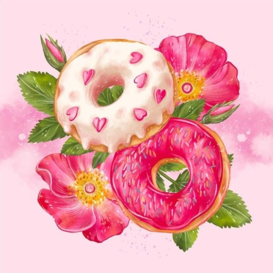
3. Donut Illustration: Okay, so let's begin with one of my favorite parts
of any illustration, and that is the sketch. And this is where we are
just letting ourselves play. For this sketch, I'm using the six P Procreate
pencil brush. This one is actually built
right into Procreate. So no extra downloads needed. It's soft, textured and feels really close to
a traditional pencil. You will find it in the sketching brush
section, but honestly, if you have a different
sketching brush you prefer or even one of
your own, go with that. What matters most
is that it feels natural and relaxing
in your hand. I gently drew a
slightly wobbly circle. Not a perfect one. I want this to feel hand
drawn and friendly. So I like to think of it as drawing with a
bit of personality. I kept my strokes light like you are whispering onto the
canvas with your pencil. Then I added a little
round hole in the center, but again, not a perfect oval. I just roughly blocked it in so we know where the
doughnut center will be. After that, I went back to the outer edge and
added a frosting line. Kind of a bumpy, wavy border that gives the
doughnut that frosted low. You can totally make this
frosting line your own. Maybe it dips down on one side or has an
extra shrill somewhere. Just follow your hand and let it be a little
wonky if it wants to. Then I added a few
sprinkles on top. I love doing this part because each sprinkle adds its
own tiny bit of charm. I place them kind of randomly, some straight, some tilted, some big, some small. Imagine that one moment when a real doughnut
gets decorated and everything just falls into place in its own messy, delicious way. Once you are done and
happy with the sketch, you are ready to
move on to colors, that's where everything
really comes to life. But I always love honoring this first step because
it's where the idea begins. Now that our sketch is complete, we are stepping
into what I think is the most peaceful
part of the process, and that is adding color. There's just something about it. It's quiet, it's slow and
it kind of feels like everything just
starts to breathe a little more once
the color arrives. I'm just using only one
brush from beginning to end, and it's called perlume and it's from my nature notes
brocade brush pack. I will be painting every part of this doughnut illustration
with just one brush, and that's very intentional. Sometimes limiting yourself to one tool creates a calm rhythm. You are not switching, you
are not tweaking settings, you are just painting. I always like to begin
with the power of the painting that I'm
most excited about. For me, that was the frosting. That beautiful,
sugary layer that's bright and happy and
full of personality. So I picked a rich magenta color and just began laying down, paint slowly stroke by stroke. By using this brush, I gently followed
the wavy line of the frosting we had sketch
in the previous step. So I didn't try to color it in perfectly or make
the edges char. In fact, I leaned
into the softness. Letting the color spill
a tiny bit outside the sketch lines
makes it feel like the icing has melted
just a little. I like to let my hand move slowly here, almost
meditatively. I fill in a little, then pause then
paint a little more. There is no need to rush. You are not trying to
complete something quickly. You are just connecting with it. You are just building the shape one gentle layer at a time. Once the frosting felt complete, not perfect, just complete. I moved onto the doughnut paste. I choose a warm,
reddish brown color to make it feel like it just
came out of the oven, slightly toasted but still soft. With the same brush, I began filling in the
area beneath the frosting. Wrapping the brown around the
outer edges of the doughnut and bringing it up close to the icing without
overlapping too much. I also added that
same frosting color into the center hole
of the doughnut, just a small touch, but it really helps tie
the composition together. Sometimes repeating a color in multiple areas gives the
whole piece balance and warm. This is not the step where
everything has to be perfect. Like this is where you
lay the foundation, your base colors, your
shapes, and your intention. And when you have finished
painting and your frosting and your donut base,
just take a moment. Like, sit with it. Look at your work. Notice
how far it's already come. From that simple
pencil sketch to something with warm,
color, and character. Now with the addition of a
lighter magenta tone softly swept across the top curves
and edges, something changes. The frosting no
longer feels still. It feels like morning light
is softly landing across it, highlighting just enough
to suggest a gentle curve. You can almost feel
it warming up under the light like something freshly baked waiting
on the counter. I place those lighter strokes mostly toward the upper
right area of the frosting, letting them flow
along the curves, staying soft and unblended. The contrast is delicate, not bright, not shiny, but enough to show the farm. There is something so
peaceful about this part. You are not fixing anything. You are simply enhancing
what's already there, just adding quite energy to it. You are suggesting that
this surface is not flat, that it turns, it catches
light, it has shape. Now on the doughnut
base, it was one soft, reddish brown tone,
warm and comforting, but still a little flat. Now I have layered in
lighter brown strokes mainly near the upper
edge of the base, especially where the light
would most naturally fall. These strokes are curved
just like before, always falling the
roundness of the doughnut. They are not loud,
and I didn't try to blend them perfectly
into the base layer. I just gently let them sit
on top, building softness. The base starts to feel baked
like it has a golden top, like it's been warmed by the oven and touched by
light from one side. I also took a moment to lighten
the center doughnut hole just a tiny little
patch of light that makes the hole feel less like a drawing and more like a space. We didn't outline anything. We didn't shade anything. We didn't add shadows
or define the foam. We simply layered light
on top of what already existed and that alone
started to shape the volume. It's a good time to
pause and reflect on how far the piece has come
with such a small shift. And what I love most about this moment is how gentle it is. You are not rushing. You are not trying to finish anything. You are simply observing the foam and responding
with a little bit of light. I added strokes
of lighter pinks, not just in one spot, but flowing across the top, along the curves and even
inside the doughnut hole. These lighter colors give the frosting a softer,
more dynamic look. It's no longer just
sitting on the doughnut, it's strapping over it, curling around the edges, catching light in all
the right places. I also added some mid tones, slightly darker than
the highlights, but lighter than the
original magenta. So these help bridge
the contrast so everything feels blended
but still full of variety. The inner part of
the doughnut hole also got a little
more attention here. I brushed in a few
brighter strokes along the top and bottom
curve of the hole, just to suggest that the
frosting is folding inward, following the roundness
of the doughnut. It's really such a small detail, but it helps a lot. Suddenly, the whole doesn't
look like flat anymore. It has shape, direction,
a sense of motion. If you are painting along, don't feel like you need to recreate every
highlight exactly. Just look at the areas that feel too flat and ask yourself, what's the light doing here? Them lightly sweep
in a softer tone? Just a touch. Don't
overthink the placement. Let your hand follow the
frosting movement like you are guiding light across the surface with gentle strokes. This is the moment where the doughnut becomes
more than color. It becomes a surface with shape, with softness and
with the personality. There are still
no sprinkles yet. We haven't added
any bold shadows. But even without that, the frosting already
feels small, full of motion, full of light, and full of presence. Okay, so let's
slow it down here. This part is tiny, literally just little
lines of color. But it's where so much
personality starts to show up. If you look at how
the illustration has changed from
just one step ago, the difference isn't structural. We didn't reshape the frosting or touch the doughnut base, but somehow the doughnut
feels brighter, lighter, a little more alive. And that's all because of
these sweet tiny additions. Now we are going to
adding sprinkles. This step is one of those
moments where I really pause, not because it's hard or
any sort of technical, but because it feels special. The sprinkles are
the first part of this piece that bring
in real whimsy. They don't follow
light or shadow rules. They are not here
to define form. They are here to spark joy, and that changes everything. I used a handful of
playful colors like blue, pink, yellow,
orange, and purple. I didn't think too hard
about which ones to pick. I just reached for the
colors that felt bright, cheerful and slightly nostalgic. And when I place them, I didn't line them up. I didn't grid them out. I just moved slowly,
one at a time, a sprinkle here,
a sprinkle there, one near the top curve, a few clustered closer to
the center, some angled, some upright, some
sitting just at the edge of the frosting as if they are
about to fall off. We are still in the middle
of something beautiful. I started this layer
right at the top, not over the sprinkles
but beneath them. Even though the
frosting already had its lovely base and a
scattering of joyful sprinkles, I felt like it needed
just a little more light, a little more glow, not in a way that distracts, but in a way that makes
everything else shine better. So I gently added light strokes
right into the frosting, threading between the sprinkles, brushing right underneath them. I didn't fill the
entire surface. I just gently swept through
with lighter pinks and magentas layering into the
curves we already created. This wasn't about detail, like it was about energy, letting the frosting feel like it's catching the
light in motion. Once I had softened
the frosting, I looked down at
the doughnut base, that gentle ring of dough
beneath everything, and it felt like it
wanted more warm. It was already painted, already shaved, but it
needed to feel baked. So I began brushing in deeper caramel tones and
soft golden oranges, gently luring them
into the brown. We already laid down
in earlier steps. So now I reached beyond
the shape and started painting soft gestural strokes around the bottom
curve of the doughnut, not trying to be realistic,
just expressive. So here we are at
the final step, and it's quite funny
because even though the doughnut has been
built up layer by layer, stroke by stroke, this last addition changes the feeling of the
whole illustration, and it's the background. But not just any background, not flat, not boxed in. It's this bright aqua shape that feels like a
soft cloud of color, wrapping gently around
the doughnut and letting it feel grounded,
supported and finished. I didn't fill the
canvas completely. I didn't aim for perfect edges or any sort of clean corners. Instead, I let the
background ripple. I let the lines breathe. The color choice matters too. The soft aqui is
cool and vibrant, but it doesn't overpower
the warm doughnut tones. It balances everything. It lifts the pinks and purples. It makes a yellow
and orange pop. It even adds contrast to the deeper magenta
outlines at the bottom. Which now feel anchored
rather than floating. That part, those
expressive magenta strokes from the previous stuff, they still show through, and they work with the
background, not against it. It's like the doughnut is resting inside the painting now. You just did that, and
it's so beautiful.
4. Icecream Cone Illustration: Alright, so this is
where everything begins, a blank digital canvas, my hand holding the
apple pencil gently. And this little idea in my
mind for an ice cream cone, that's sweet and playful. I started by laying down these soft light black outlines just gently guiding where
everything is going to go. It's not about
being perfect here. It's just about finding
the shape and feeling. This scoop on top is kind of this imperfectly round shape, not stiff or any
sort of symmetrical, but with these subtle, almost wiggly edges that hint at creamy, slightly
melted goodness, I made sure it felt soft
and fluffy like a scoop that's just been freshly added and it's already
starting to settle in. I drew the cone underneath. It has that classic
triangle shape, and instead of
being super crisps and exact with the lines, I let them stay a
little playful. I criss cross soft
diagonal strokes to make that familiar
waffle texture, almost like a little node to those bakery fresh cones
you get in summer. And if you look closely, I sprinkled in those little
oval shapes right away. I was imagining colorful
candy sprinkles from the very beginning
the kind that bring a smile to your face even
before you take a bite. I didn't worry about
making them match or line. I just scattered them across the scoop in a
loose natural way. I was thinking about
those real scoops where the ice cream piles up just a little messy
all creamy and textured. So I loosely followed
the outer curve. I kept the strokes slightly
uneven on purpose because I didn't want it to feel too perfect because real
sprinkles are never perfect, and that's what
makes them charming. I began by outlining
the cone first. I love starting with
the cone because it feels like the
base of everything. Kind of like you are gently
planting the foundation of your dessert before building
the fluffy scoop on top. I used a warm medium
brown tone here and just followed along the original sketch lines
with a steady hand. What's nice about
working digitally, is that you can really
let the pressure of your stylus or Apple
pencil very naturally. Then I moved up to the
ice cream scoop and brought in that fun,
playful magenta color. Okay, so here's where things start to feel extra
cozy and exciting. At this point, I've already outlined the ice
cream and the cone, and now we are jumping right into adding that
first layer of color, the base that everything
else will rest on. And honestly, this
part is one of my absolute favorites
in the whole process. There's no pressure
to get it perfect, no fussing over highlights
or shadows yet. It's just me and my
procreate brush filling in the shapes like I'm gently
waking the illustration up. And because I'm just using
one procreate brush, that is my plum plume from my nature notes
procreate brush pack, everything feels so
unified and harmonious. This brush has this lovely painterly texture
built right in, so even the simplest strokes feel intentional
and soft and rich. So you can use any sort of procured brush that
has this kind of texture like painterly and
pressure sensitive tube. For this ice cream scoop, I went with this magenta color, something vibrant and cheerful, almost like a bold
raspberry orbit. I didn't want to
use a flat tone, though I really wanted to
feel the brushwork here. So I'm letting some
of those strokes show through creating little
areas of movement, even in this early year. I'm not trying to fill it
in with perfect smoothness. I actually love
the variation that happens when you just let
the brush do its thing. Sometimes it's
softer in one spot, sometimes more opaque, and
that's what gives it life. I think, especially with
sweet treats like this, there's so much
playfulness and charm in letting the
textures shine a bit. It feels more handmade,
more heartfelt. Like something that's
just been freshly scooped and starting to melt
a little around the edges. Once I was happy with the scoop, I moved down to the
cone and I picked this warm golden brown
toe, not too dark, not too light, just that
perfect in between that makes you think of
toasted waffle cones right out of the oven. This is where I just allow myself to enjoy the
movement of my head, following the shape of the cone but not being overly controlled. And something really lovely
starts happening here. That rich magenta and the warm, waffle brown aren't just
sitting side by side. They are starting to
complement each other, giving the whole illustration this beautiful balance
of playful and cozy. So at this point in the process, it's starting to really bloom. It's no longer just about
base fills or simply shapes. Now it's about
building depth mood and character with intention
in this illustration. There's something so satisfying about watching it come alive. The strokes you added to the ice cream scoop are
doing so much more. Like they follow the
curve of the foam with just enough looseness that it feels spontaneous, not stiff. There's a playful
rhythm in the way each stroke sweeps
across the scoop. So thin, some thick, some more textured, creating
this lovely ripple effect. It's like you can feel the cold creaminess
under those lines and that lighter magenta
pick you brought in as highlights that
changed everything. It lifts the scoop visually, makes it feel three dimensional and just so satisfying
to look at. These brighter strokes give
the impression of light reflecting off a smooth,
slightly glossy surface. It feels like daylight
gently catching the shrill. And what I love is that you
didn't smooth everything out. The edge of the scoop, that wavy line near the bottom, dripping just a little, is packed with so
much personality. It's not just a
shape, it's emotion. It gives this ice cream, this feeling of summer of a tree that's too
good to wait for. Like, maybe it's already
melting just a bit, softening at the edges,
ready to be eaten. Texture there feels
slightly heavier, more saturated, and it gives the whole scoop
some lovely weight. It's like this ice
cream has gravity, and I love that so much. Then we get to the cone, and the shift from the
scoop to the cone is like a gentle transition
from sweet to warm, from playful to grounded. The golden brown tone you laid down on the cone has this
toasted quality to it. And you didn't just fill
it in, you painted it. And the strokes you added on top feel like little
hints of crunch. These stones hold a
softness that complements the magenta scoop while standing out just enough to be
noticed individually. As I work, I pay attention
to how the colors interact, not just with the scoop,
but with each other. I don't want it
to feel too tidy. It's not a grid. It's a moment a moment
captured mid melt, mid bite, like a
childhood memory, that's still vivid in
color and feeling. Let's really soak into
this step together, the final moment when
this illustration starts to feel full,
joyful, and complete. This is the sprinkle stage, and while it might seem like
just a finishing touch, it's actually one of the most expressive layers
of this entire illustration. Every single sprinkle I
add is a conscious choice, not just in placement, but in color, like spacing,
direction, and rhythm. I'm thinking about how the eye moves across
the ice cream, how those small dashes
of pastel color can breathe energy into the entire scoop without
overwhelming it. I begin by selecting a soft but bright
palette light yellow, powder blue, gentle orange, soft pink, not too
saturated, not too sharp. I don't want the sprinkles
to feel like decoration, like I want them to feel
part of this illustration. Like they belong in the
shrills and grooves nestled naturally
within the curves of the ice cream texture. So I follow those
shrills closely, laying the sprinkles along
the same lines of movement, allowing them to echo the
rhythm of the scoop underneath. Like a blue sprinkle
next to a yellow one creates this quite contrast
that's pleasing and bright. And a pink one near
the edge blends gently with the scoop while
still keeping its identity. Some are tilted slightly, some are more upright. What I'm doing here
is layering short, flowing lines of a
light creamy tone. It's a tone that sits
somewhere between warm, white, and blush pink. Just enough contrast to show up, but still soft enough to
melt into the scoops color. These marks aren't random. Each one is carefully placed to glide along the curvature
of the ice cream. I look for little dips
in the scoop surface. Those valleys
between pink ridges where the shadow sits
just a bit heavier, and I place these
marks just above or beside those areas like the light is screaming across the surface and catching
the tops of the curves. Sometimes the mark slips over a sprinkle just enough to soften its edge and make it
feel like it's tucked into the frosting rather
than floating on top. And sometimes the
mark rests between two sprinkles guiding
the eye from one to the next like a gentle bridge
and other times it dips down along the lower
edges of the scoop to help define the space
between the scoop and the cone. What I love about
this part is that it brings movement without
needing to move anything. It's just paint. Still and flat, and
yet it starts to feel like the scoop is lifting
up, rounded and full. I also let some of these strokes wrap around
the side of the scoop, slightly overlapping
with the outermost edge. That helps break
that hard boundary and makes the scoop
feel more fluid. So I started filling
in the background with this rich minty
green, not too dark, not too light, just the kind of fresh tone that makes the pink scoop come
forward and glow. It's such a satisfying contrast. The green feels cool,
calm and ground. While the pink stays
warm and joyful. These two colors just
long beside each other like a conversation
that keeps flowing. Then I added those
diagonal stripes, gentle golden yellow ones that stretch across the canvas
like soft beams of sunlight. They are not too sharp or too detailed and that's intentional. These stripes aren't here to take attention away
from the cone. Instead, they are there to
give the whole frame a rhythm. Little sense of
movement and direction. It's like they're leading
your eyes up and around, always circling back to that
delightful shrill on top. I kept the edges slightly
curved on purpose. Not everything has to
be boxy or straight. Rounding the corners gave this illustration a softer feel, almost like it's part of a streaker sheet or a
little framed art card. It adds that extra
layer of sweetness, just a small design
decision that gives the whole illustration
a little more charm. This is the kind
of stub that makes me smile because it reminds me how much small choices just
a few thoughtful strokes, a pop of color, a gentle
curve can change everything. It makes the whole illustration feel cared for and finished. And most of all, it feels happy.
5. Blueberry Pastry Illustration: All right. In this first step, I'm gently mapping out the entire pastry with
a simple line drawing. So I started with the
base shape of the slice. It's leaning slightly
to the right, like it's being placed
just casually on a plate. I kept the angle
slightly rounded and imperfect almost as if the cake is soft
and fluffy inside. At the top, I started
placing the berries, and I love this part, slightly overlapping and nestle together. I also added a few berries
at the base of the slice. These little touches help the pastry feel
like it's part of a cozy illustration you could almost reach
out and pick one up. I'm going in and refining those
lines just a little more. It's one of those slow, thoughtful moments where I feel really connected
to the piece. I'm not rushing to perfect it. I'm just gently tracing
over what's already there. You can see I have started
to bow the outline, especially around the
edge of the pastry, the blueberries and those
leafy lments at the top. I like doing this
because it helps the whole shape feel more
grounded and more defined. It's a way of saying, Okay, this part is ready to be seen. Even though we are still in the early stages, these darker, more confident lines start to
tell you with more clarity. And those leaves at the top, they are still really
simple right now, just bold outlines, but I already love how
they frame the pastry. Step is where everything
starts to bloom. I always think of this
moment at the point where the lustran really
begins to breathe. The blue berries on top. This is where things
start to feel abundant. I work in rich velvety blues laying small orbs in
slightly different tones. Some are more shadowed, some are catching the light. I think about how fruit
tumbles over itself, how no two berries
look the same. And how light scatters
across their cold skins. I keep my brush
pressure light and move in slow rounded motions, allowing some of the
strokes to stay bold and others to feel
more translucent. That gives them volume, that gives them life. Then I started the bottom
layer of the pastry, that warm golden orange and I imagine the soft
crumble of cake just barely toasted from the oven that's what I'm
trying to channel here, something a little
cozy and grounded. It's not a flat color,
it has variation, little shafts in the
direction of each stroke so that the texture feels a
bit rustic and imperfect. The way the brush
trails taper off at the edges with bits of
the base showing through. I don't correct that. I leave it there because that's
what gives it character. You want that kind of lived in feeling especially with
food illustrations. The purples and pinks that sit in the
center of the slice, this is where I let the colors feel a little more
vibrant and playful. I imagine this part of the dessert as a
shrill of way cream, something light, sweet,
and a little tart. I don't smooth every area. Instead, I move the
brush in soft curves, almost like I'm following the
natural swell of frosting. It's not about accuracy,
it's about rhythm. Then comes the leafy green top, and I love this part because it feels like tucking
something into place. I use large sweeping motions, letting the leaves arc
and curl naturally. Again, I'm not overthinking
the structure. I just imagine how
the leaves would lean or rest if this were sitting on a plate
by a sunny window. I add small highlights with lighter greens and let some of the strokes
remain textured. Almost streaky. That variety keeps the foliage
from looking too stiff. And finally, around
the base of the cakes, more blueberries
and more leaves. It's like they have
tumbled down the side or been gently scattered
around for decoration. I didn't want to
crowd this part. Then I began working into the berries with more intention. The first flat base of color
was just the beginning. Now, it's all about
layering in dimension. I didn't want the blueberries
to feel flat or decorative. I wanted them to look juicy and full like they had
weight and texture. So I added deeper purples
into the shaded areas and lighter lavender tones in small circular flakes
to build softness. I especially love painting the blueberries that sit
on top of the pastry. They are the crown
of this illustration and giving them that extra care, help them pop right away. Inside of the pastry was
such a joy to paint. It's made up of those bold, colorful layers, bright pink, golden yellow and
a soft orange tone that feels warm and rich. But it's not just
about the color. It's about the
energy in the marks. I added lots of little curvy
lines inside each layer, letting them peek
through and overlap. That motion inside the cake
makes it feel textured, like there are layers of
cream or feeling inside. It's playful, a bit whimsical
and full of flavor. Down at the bottom,
the blueberry sitting near the base got a bit
more attention too. I use strong rounded stroke
to define their edges and added that slight
variation in tone that makes them feel separate
from the background. Zoom into the berries
and frosting again. I added these tiny details, a few extra srills
on the berries, some highlights on
the frosting to make it look almost like
it's catching light. I think so that these
sort of strokes, they make everything
feel juicy and fresh. Then there's the key layers. Can we just pause in
admire them again? Soft yellow and orange base with the pink center is just this
happy little moment of warm. Tuckle inside all
the cool tones. It breaks up the rhythm
in the best way. I layered strokes like jam, letting them peek through that
uneven painterly movement. I didn't want it to
feel flat or graphic. I wanted you to feel the
fluff of the sponge, the soft sweetness
between the layers. I imagined to buy just one. That's what I painted, and then I returned to the
leaves once more. Now that the berries
were vibrant and layered and the pastry
felt rich and soft. The leaves needed to
carry everything gently. I went back with a
slightly lighter green and gently added
some highlight strokes, not hard edges, just enough to suggest the curve of a
leaf catching the light. I didn't outline
them sharply because I wanted them to blend
softly into the background. Like they are there holding everything but never
stealing attention. I think before they
were filled in, the pastry looked like it was floating like it
hadn't landed yet, but now it feels
like it belongs. It's resting, nestled,
it's complete. You can see how every layer is now gently holding
hands with the necks, the golden sponge,
the bright jam, the sweet cream, and
the glossy topping. All those pieces that started as separate strokes now feel
like they belong together. There's also a rhythm in
the brush strokes now. Everything's moving in
the same direction, like a gentle current
flowing through the artwork. It's not stiff. It's actually very soft. The layers of color are
imperfect in the best ry, just the right
amount of looseness to keep it playful
and expressive. Look at the base, the
sponge layer with those wavy textures
and golden undertones, the vibrant jam nestled between
the cake layers peaks out with this pop of magenta giving a burst of contrast
to the cool tones. You can almost hear it
now that quit pause right after the
final brush strokes when your hand stops moving, but your heart is still full. The piece doesn't ask
for anything else. It just sits there content, and so do you. And that's what this moment
really is an expression, not just of a dessert, but of patience,
creativity and joy. So the final moment in your blueberry
pastry illustration is just so soft and full. It feels like that quite sigh at the end
of something sweet. Not because you are tired, but because you are full
of joy from the process. I added the background here and what a gentle touch that is. It's a pale pink blanket
behind the pastry, soft and earing, like the lightest whisper of a
tablecloth at a Sunday brunch. The way we butter isn't
stiff or overly clean. It's free and flowing. It feels like you are
wrapping the lstrian in warm, not just showcasing the pastry, but making it feel
nestled and cherished. The polka dots are
the smallest detail, but they carry such sweetness. They don't overpower the piece. They just sit back there,
light and cheerful. And what's really beautiful here is the contrast between
the dessert rich deep, juicy, blues and purples, and the delicate pastel
of the background. It doesn't flatten the outward. Instead, it lifts it. The leaves look lush
and structured. Every single element has more presence
because the backdrop isn't trying to compete. It's simply holding space. You have created something that doesn't rush, doesn't shout. It simply exists in a moment
of calm and because of that, you can feel the
thought in every layer. But nothing about this
piece feels overword. This isn't just a background. It's an exhale. It's the final thread in the
embroidery of the piece. And at the end, it leaves us feeling like we have just watched
something bloom.
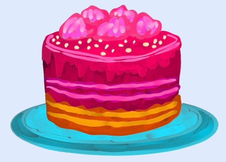
6. Cherry Cake Illustration: Okay, so this part always feels like the
coziest beginning. And I love that this
isn't just any dessert. It's a cherry top cake. I started with a loose hand, letting the shapes
breathe a little, letting the lines
wobble naturally, like frosting, melting
over the edge. I wasn't trying to
get it perfect. The drippy frosting detail really brings in that
sense of movement. Then I added the cherries
up top almost like a crown. But it already holds the
potential for so much richness. I can feel how the
texture is going to come alive with color
in the next steps. What I really love is that you don't have
to overthink here. This isn't about
making a perfect cake. It's about capturing
the feeling of one. That warm and sweet feeling. And the way the frosting
drips down the edge, that might be my favorite part. It's playful and messy
in the best way, like it's been freshly booed, still glossy and soft. I really took my time here to let the lines feel
loose but clean. No stiff at all, softly defining where the
colors will go later. And the color choice
for the outline, it's not your usual black. It's the warm berry red, almost like cherry syrup. The cherries are just
beginning to form now, but they are already nestled in like they know
they belong there. And honestly, outlining
with this kind of color makes it feel
so much more fun. It's like the linework becomes part of the
art, not just a guide. I'm thinking about the
layers now what's going to go into that space between
the top and the base. Let's really slow
down and soak into this step because it's not
just about adding color, it's about building the
mood of the entire station. I always feel like this part
carries so much weight, even though it's just
like the flat layers, there's something almost
comforting about it. Like when you spread jam on toast or layer
icing over a cake, you are just setting the base. I started with the main
cake body, this one, rich pink that instantly brought a playful sweetness
to the whole piece. Like, it's the
kind of color that makes you smile before
you even know why. In the second I
drop in that color, the sketch felt like it exhaled like it finally knew
what it wanted to be. That's my favorite moment in digital painting
when you realize the piece is guiding you just as much as you
are guiding it. You are no longer just
filling in shapes. You are building a little world, one color at a time. And then there's a frosting. I went with this warm
golden mango yellow sheet that just melts over
the top of the cake. It has such a comforting
feeling to it. It flows downward,
thick and soft, wrapping the cake in
this buttery glove. You could stop right here
and already feel the worm, the playfulness and the soft joy wrapped inside
this illustration. Next I move to the cherries
and the leafy toppers, and this is where the lstrian really started to feel
like a celebration. That deep velvety
red of the cherries brought such a strong contrast
to the pink and yellow. It crowned the
whole composition. A cherry felt like a little
hard please right on top, not too perfect, just
clustered in a way that felt natural and a
little whimsical. And the leaves, they are soft and rounded with just
the slightest curve, and even at this stage, you can tell they are going to add balance to the composition. I love how green bringins
everything to light. It makes the red even redder, the yellow even warmer, and the pink even more cheerful. It's that final ingredient that makes everything
start to sink. And even though I haven't
added details yet, no shading, no texture, this step is where the mood really
clicks into place. It feels juicy, cheerful, and a little bit magical. There is something
about drying desserts that feel so gentle
and inviting, like offering someone a
small moment of happiness. So now that we have
our colors in place, the next part is all
about bringing in those thoughtful little details that make everything feel alive. Just with this flat color base, it already feels like something you want
to keep looking at. So in this stage, I started with the
pink frosting, and it was instantly joyful. It felt like picking
the brightest soup of strawberry ice cream
from a bakery window. The color I choose
wasn't just pink. It had that electric softness
like bubblegum mixed with berry orvid and it instantly made the whole
canvas feel alive. It's the kind of pink that makes you smile before you even begin painting like it
brings its own sunshine. I began right at the
top edge of the cake, gently guiding my brush
along that curve line, making sure it followed
the roundness of the foam. I let the brush drag slowly. I wasn't going for perfection. I wanted it to feel a little whimsical, a little imperfect. As the color began to wrap
around the top circle, I could almost imagine the frosting starting to
melt ever so slightly, forming those thick, sugary drips that would begin
falling down the slides. But in this moment, I focused only on the
smooth crown of frosting. The part that catches
the light first. I wanted the curves
to feel natural like a gentle hand had just
finished icing the top. Then came the drips, and this part is
just my favorite. It always feels like a gentle
little turning point in the illustration
where everything starts to melt into character. Some drapes reached
almost all the way to the bottom like
they couldn't wait to fall while others hung just halfway frozen in
a sweet little moment. Once I felt the frosting
had settled into place soft and sweet with
all its personality, I moved my focus to the
base of the cake and immediately everything
shifted into this warm grounding moment. It felt like moving from
decoration to substance, from the fun thrills of roasting to the heart
of words underneath. I picked a yellow orange
tone for this part, one that reminded me of a sponge cake just
pulled from the oven. It wasn't too
bright or too dull, a mellow golden hue that carried all the comfort and warm I
wanted the base to hold. The color alone already gave
the feeling of softness, like it was infused
with sugar and vanilla. To paint this base, I block in the entire shape
with long smooth motions, not too tight or stiff. The goal here was to let
the shape feel rounded and gentle like something tender that had risen
beautifully in the oven. Once that initial layer was down and the shape
felt balanced, I moved on to deepen
the base just a little especially
toward the bottom edge. I choose a slightly
darker brown orange tone, first a step deeper than
the first and began gently layering it in
with soft upward strokes. Instead of laying it
in as a thick band, I used a feathering technique, brushing upward into
the lighter layer and blending gently
in small arcs. It's a way to give the illusion
of natural baked edges. Those bits of the
cake that toast ever so slightly and
trap the best flavors. The second layer wasn't
meant to stand out. It was meant to settle in. So I didn't press too hard. Now that the main
frosting and cake base were feeling finished, it was time to tie everything
together with detailing the kind of small additions that really bring the
whole piece to life. I zoomed in and began working on the cherries
and leaves first, gently luring a deeper red over the cherries, using quick, soft circular taps to
suggest their texture, not too smooth, not too flat. But with that subtle unevenness, that makes cherries feel real. I didn't go for harsh outlines. Instead, I focused
on building up the shadows softly along
the edges of each cherry, especially the one stuck in
the middle of the branch. Then I added that one single
cherry at the bottom corner, and it felt like placing the final touch on a
still life illustration. I used short control curve
strokes to shape it, letting the brush follow the natural roundness
of the fruit. The goal here wasn't to outline. It was to build volume. I worked with layers
of the same red, deepening the shadow
side with a darker tone, and then gently blending
toward the light side, using a lighter pink red. This method of
controlled clearing gave it that plum,
almost bouncy feel. I left a small area untouched to preserve a soft highlight. A tiny shape that suggested
a little light reflection. It's subtle, but enough to make the cherry
feel dimensional. Their leaves were painted
with a similar approach. Slight green as the base, then deepened with
a darker green using the edge of the brush, enough to shape the
veins and undersides. I didn't draw individual
lines instead. I let color transitions
suggest a form. This gives a more painterly look like something you might
see in the gouache or oil. I made sure the brush
pressure was light so the darker tones
could feather out without forming any
sharp cut offs. Finally, I went back to
the cake base just to refine the blend between the sponge and its
toasted bottom. I choose a slightly
textured brush motion here, almost dry brush style to drag a warm brown orange gently across the edge where
the two colors mat. That overlapping
motion helped blur the line and create the
illusion of a baked crust. Not hard or crisps but
gently caramelized. This final stage is always
one of my favorites because that's where the piece moves from looking painted
to feeling finished. Perfect. Now that the
illustration was nearly complete, I turned to the background, and this part always feels
like the finishing breath. I began by loosely sketching
the shape behind the cake, not a perfect rectangle, but something soft and wobly. So it felt hand painted
and a little spontaneous. I didn't want it to look
too clean or digital. I used a big brush
with light pressure, letting the edges
feather out slightly. Once the base of the
blue was in place, I added those simple
vertical strokes over top. I made sure to keep my brush
setting simple and the pressure light using
gentle vertical pulls from top to bottom. These lines weren't perfectly spaced or perfectly straight, and that was the goal. I wanted Dam to feel like
decoration like the backdrop of a festive card or the subtle
detail on a printed napkin. This final touch did more than just decorate
the background. It brought clarity. It lifted the cake
illustration forward and made every part of the
composition feel intentional. The warmth of the sponge cake, the brightness of the frosting, the juicy cherries, all
of it felt even more vibrant sitting against
the soft, cheerful blue. And with that last stroke, the lustration was ready, layer textured and
full of charm, just like a sweet moment
captured on canvas.
7. Thankyou: And that's a wrap on
this sweet little class. I made four digital
illustrations with you, a doughnut, an ice cream, a blueberry pastry,
and this jerry cake, each one filled with color, charm, and just a bit of whimsy. I really hope this gave
you the space to play, explore your
brushes, and try out some painting techniques in a way that felt light
and encouraging. Thank you so much
for joining me here. Whether you recreated
all four or just one, or even if you just washed
along for inspiration. I'm truly so glad you took this time to
make something creative. Keep painting what
makes you smile. You are doing great, and I will see you again
in the next class.
8. Conclusion and Project: Alright, let's kick things off with this colorful doughnut. I had so much fun creating
this sweet treat in Procreate. I wanted to play
with a bold palette. So I went for a
bright pink glaze, layered on top of that
warm golden dough. And, of course, I couldn't resist adding lots of sprinkles, each one a little
pop of color to make the whole illustration
feel playful and joyful. So this was the first dessert I illustrated in this class, and it really set the tone for the cheerful vibe I wanted to carry throughout the rest
of the illustrations. Here's a fun little close up of our doughnut illustration. I really wanted you to see all those yummy
details of closes, the way the pink icing
swirls around and how the colors layer together to give that frosted
glossy look. I used a few different
brush slices in procreate here just to get that
blendy creamy feel. And the sprinkles, I love each one adds its
own pop of color. There's a mix of warm tunes
like yellow and orange, and then those cooler
blues to balance it out. When I zoom in like this, I can really appreciate the little imperfections
in the brush strokes, too. It makes the whole thing
feel more handmade, more painterly,
and just more fun. It kind of reminds me of real icing when it
starts to melt a little. So soft and delicious looking. Okay, so let's zone
in just a little bit more on the bottom
edge of the doughnut, because this part right here, it's one of my favorites. Look at how the icing kind
of drips over the edge with those white and pink
brushstrokes blending into each other like frosting that's
just starting to melt. I really love how this golden
brown base turned out. It gives that soft caky texture, like something freshly baked. And those colorful sprinkles
still stealing the show. I played with contrast here, especially by adding that swipe of deep purple in
the background. It brings such a playful touch and really frames the doughnut. I wanted this whole
close up to feel almost like you could just reach
in and grab a bite. Now it's time for
your class project. Let's take a moment to soak in everything
we just created. These close up shots of the doughnut
illustration are here to remind you how far you have come from a blank canvas
to this super fun, colorful piece filled with
texture and sprinkles. Whether this was your first time trying something like this, or you were already comfortable with
digital illustration, I hope you felt inspired to just play and enjoy the process. This class is all about celebrating those
joyful, simple moments. And what better way than
with a donut right? This one's the cherry
cake illustration again. I wanted to show you
that before and after, I always love looking
at the sketch and then comparing it
to the finished piece. You can really see
how those cherries pop with color once
the painting is done. And I had so much fun
layering the pink frosting, adding little
textures, and giving the whole piece that bright,
cheerful background. Next up is the blueberry pastry. I love the mix of colors here. That soft pink plate
with the blue and purple frosting just feels
so playful and happy. You can see how the
sketch sets a base, but the real fun
begins once we start building color and
foam with the brushes. And those blueberries, they
might be my favorite part. Here's our ice cream
cone illustration. I wanted this one to feel
super summary and bright. So I went with a striped
green and yellow background. The waffle cone was so
fun to add texture to. And, of course, the sprinkles
brought it all together. I really focused on
brush pressure and color blending here to make the scoop look
creamy and fun. And this one's our
yummy doughnut. This sketch felt super
simple at first, but once I layered the brush strokes and
added all those sprinkles, it totally came to life. The frosting srill,
the golden crust, and the little highlights all work together to make it
look sweet and puffy. This one always makes me smile. Now, let's take a moment to just soak in these extra
dessert illustrations. I made this outside
of the class to give you even more ideas
and possibilities. You will see a cozy waffle
topped with berries and syrup, a bright cupcake with sprinkles, a red chocolate layer cake
with strawberry frosting. A candy wrapped conn and a dreamy purple doughnut with
whipped cream and sparkles. Each of these
desserts started with simple shapes just like
the ones we used in class. Then I layered on
playful colors, added soft shading with my favorite textured brushes and finished with fun little
details like sprinkles, syrup drips, and juicy berries. These are here just
to show that once you are comfortable
with the basic process, you can truly take it anywhere. You can mix and match ideas, try different brushstrokes, and just let your
imagination run free. Maybe you love waffles or maybe you want to draw a
macaron tower next, whatever brings you joy. Feel free to screenshot
this boat for inspiration. And remember, your dessert doesn't have to look
like mine at all. This is your time to explore and make something that feels
fun and sweet to you. Need a little more inspiration. I totally get it. Sometimes we just
want to see what else is possible before
diving into our own version. So here's another fun
dessert illustration I created a bold, bright cupcake with
layers of happy colors. I went with a deep
blue cupcake liner for contrast and then had fun piling on this
fluffy pink frosting. I added a shrill of highlights to give it
that creamy texture, topped it with colorful
sprinkles and placed two crunchy waffer streaks right on top like a little
finishing touch. That's something I really want you to take away
from this class. There's no one right way to make your dessert
illustration. Use this as a spark and
then make it your own. So if you're sitting
there thinking, What should I draw next? Maybe this cheerful cupcake
will give you a gentle nudge. This is your gentle reminder that there are no limits here. You can design anything
you like, anything at all. That's the dry of
digital illustration. You get to follow
your curiosity, explore new ideas, and
create without any pressure. This cupcake was one of
those spontaneous creations. I just started laying
some purples and pinks, then added yellow for contrast. And suddenly the
shrills came to life. I added that big juicy strawberry to the
side just for fun, and it instantly gave the whole thing a
playful, delicious look. I also tried something a little different with
the liner this time. Me blue tones with
hints of teal, giving it a cold contrast
against the warm frosting. Every element here came
from asking myself, What if I tried this? And I hope you will ask yourself the same
thing as you explore. So feel free to let
go of the rules. You are allowed to experiment. You are allowed
to make a dessert no one's ever seen before. Just explore and create. One of the most fun
parts of this class is how much freedom
you have to mix and match different dessert ideas. You don't have to stick with
just a cupcake or a candy. You can blend them together
and see what happens. In this illustration, I paired a classic cupcake top with sprinkles and a
bright strawberry. But then I added these
playful ripped candies with bold patterns and colors. These write and
checker textures are super different from
the soft frosting, and that's what makes it pop. It's a little creaky, a little unexpected
and totally fun. So if you're feeling
a bit stuck, just think about your favorite
treats and ask yourself, what would happen if
I mix this with that? Maybe a waffle with gummy bears or a doughnut with a
lollipop drill on top. There are no limits here. Let your sweet to
guide your creativity and come up with something
new and totally your own. Okay, so now it's your time to jump in and make something
deliciously fun. Your project for this
class is super simple. Create just one
dessert illustration. You can use any of the
techniques I shared with you or mix and match the ones that stood
out to you the most. If you loved using the textured frosting
brush, go for it. If the bold outlines
or soft paste till shading spoke to you,
bring those into. This is your space to play. Explore and just
enjoy the process. Don't overthink it. Just pick your favorite treat or invent
one from your imagination. Whether it's a cute cupcake, a fancy cake slice, or something totally made up, the goal is to enjoy
what you are creating. And remember, your illustration doesn't have to be perfect. It just has to be yours. If you are not sure
where to begin, you can use the
dessert illustrations I shared in class
as inspiration. Feel free to try one of those or pick your own
favorite treat to draw, and you are always welcome
to make it your own. Play with new color
combinations, layer in extra toppings. This part is really
all about enjoying the process and letting your
creativity take the lead, add your special touch
and see where it goes. This is the dessert
illustration I created to wrap up
the class project. I wanted to finish on
something sweet and cheerful. I used one of my own procreate
brushes from the class. But you can absolutely use any brush that
feels right to you. Don't feel limited. Take the one that helps you
enjoy the process the most. For this one, I combined strawberry and
blueberry elements to create a fun fruity topping
on a simple cake base. I wanted it to feel fresh, a little whimsical
and full of color. I layered on the texture slowly, building the soft cake, srilling on the red berry sauce, and adding those bright
little blueberries and one bowl strawberry. I didn't try to make
everything look perfect. The goal was to make it
feel light and playful, kind of like something
you would want to pick up with a fork right away. I kept the brush
strokes visible, added a few details
like shine and seeds, and just let the colors
do most of the work. This is just one way to bring your dessert
illustration to life. You can use this as
a starting point or totally remix the idea with
your own favorite treat. Maybe you would love to
illustrate a fruit tart, a creamy ice cream scoop, or even a cookie stack. Just follow what
sounds fun to you. And again, you can use any brush or technique
from this class. The idea is to explore, layer up some color, and enjoy creating your own
sweet moment on canvas. Thank you again
for being part of this class and spending
time creating with me. I really hope you had a fun experience
playing with colors, experimenting with brushes, and illustrating your
sweet little treats. Don't forget to upload
your project below. Even if it feels
simple or unfinished, your artwork has the power to spark ideas for someone else. We are all learning and growing here and just seeing
your unique spain could brighten someone's day or give them the little nudge
they need to create too. I truly can't wait
to scroll through and see your delicious
illustrations. Whether you followed along closely or added your own twist. Every illustration is special, so go ahead and share it. I will be cheering you
on from my studio.
 Mooni Artstudio, Artist