Transcripts
1. Introduction: Welcome to this creative
Procreate class. I'm so excited to have you
here with me as we dive into one of my favorite
subjects to paint waffles. There's just
something comforting and joyful about painting food, especially when we lean
into those soft textures, warm colors and layered details that make each illustration
feels full of character. For this class, I will
be working entirely on my iPad using the Procreate app along with my Apple Pencil. You can use any stylist
or compatible device that you are comfortable with. The main focus of this class
is to enjoy the process of building up an illustration using a pain early
digital approach. That feels rich,
expressive, and textured. I will be using
one special brush throughout the entire process, and that is my
bubbly letters brush from the Cdiglass collection
Procreate brush bag. It's a brush I created
myself and absolutely love using because it brings
such a soft, smooth texture. It glides beautifully and
gives me the freedom to work intuitively across every stage from outlining to
building color. And adding highlights.
Of course, you are completely free to use any procreate brush
dad gives you a similar painterly
or textured look. It's not about having
the exact same tools. It's about getting
comfortable with what you love and letting that
flow into your work. This class is designed to guide you through my
step by step process. We will begin with a
light casual sketch just to get the basic idea down. From there, we will move into filling base colors for
different parts of the waffle, whether it's a plate, the waffle blocks,
fruits or toppings. Then we will slowly build
up through layering, darker tones for shading and small finishing details that give the illustration
life and warmth. My approach is always
initiative and relaxed, so I love paying attention to how each area evolves as I go. The goal isn't to make
something perfect. It's to enjoy the
layering process to take your time and to see how small color changes can bring such a big shift in
mood and dimension. If you enjoy food illustrations or if you are just looking for a creative way to
explore painting with a single procreate
brush and a cozy theme, then you are in the right place. I hope this class brings
you a sense of calm, creativity, and confidence to explore your own
digital artwork. So let's get started and enjoy every brush
strokes along the way.
2. Materials: Before we jump into painting, I just want to show you the tools I will be
using in this class. I'm working on my iPad
using the Procreate app, which is my favorite for creating these colorful
illustrations. It gives me a lot
of flexibility and control when it comes to
layering colors and textures. I will also be using
my Apple pencil, but you can absolutely use any stylist that works
with your device. For this class, I will be using just one procreate brush named bubbly letters from my Cdiglass collection
procreate brush pack. This brush has a thick
paint early texture and is pressure sensitive, making it perfect for creating soft expressive strokes
with dimension. That said, you are
totally free to use any brush that feels painterly or textured
in a similar way. Just choose what works best for you and your illustration style. That's all you need
to follow along and create your own beautiful
waffle illustrations. Let's get started.
3. Classic Waffle Illustration: Let's begin with a fresh
canvas in Procreate. I am starting with the six peed pencil from
the sketching section. This is one of my
favorite brushes when I want that
natural pencil texture. Something that feels just
like drawing on paper. I'm holding the
apple pencil loosely here and just letting
my hand move freely. The first thing I'm doing
is sketching around soft shape that will serve
as the base for our waffle. I'm not trying to get a
perfect circle or outline. It's more like a fluffy, imperfect shape that already
gives a playful vibe. You will notice I'm sketching in short curved strokes rather
than one big outline. If your shape is a little taller or wider, that's totally okay. In fact, I encourage you to let your own style come through
right from the start. Sketching is such
a forgiving step, and this is the part where you can just relax and explore. I'm also leaving space on the sides for toppings
we will add later. So keep that in mind while
placing your waffle. Now that we have the
base shape down, I'm gently going over it
to add the waffle texture, I'm starting to draw in
the crisscross pattern. You know, those
signature squares that gives waffles
their fun, graded look. I'm keeping the lines curved
slightly just to match the round shape of the waffle and make it feel
more dimensional. You will notice I'm not aiming
for perfect symmetry here. These lines are a little
wobbly on purpose, and that's what gives a whole illustration a more
handmade and whimsical feel. While I draw, I'm
paying attention to how the lines wrap
around the shape. The ones in the center
are straighter. But as I move outwards, I curve the lines a bit more to hint at the round
from underneath. Think of it as sketching
three D structure, but with a soft artistic touch. Don't feel pressured to get
every grade line exact. The charm in this kind of illustration lies in
its imperfections. The key here is consistency,
not perfection. So try to keep the spacing somewhat even but
don't overthink it. Once the grid is in, you will already see the waffle
coming to life. As I begin outlining
over this sketch, you will notice I'm not really
aiming for precision here. I am intentionally letting my
lines drift just a little, and I'm not too concerned about perfectly tracing
over this sketch. In fact, I like to leave tiny gaps between the sketch
lines and my outlines. It creates a slightly loose, almost eerie feeling
in the drawing. Rather than aiming for
clean shark perfection, I'm focusing on the
softness of the movement. I let my hand float just a bit above the
screen while I work. So my stroke stay light. If a line wobbles slightly or curves unexpectedly,
that's totally okay. That's part of what
gives it personality. We are moving into the coloring
part now, and honestly, this is where
everything starts to feel really fun and expressive. I'm laying down a
warm golden base that will shape the main
body of the waffle. I'm not using any kind
of fill tool here, just painting it in slowly
one section at a time. Notice how I'm not trying
to be overly careful. I'm keeping my strokes
relaxed and letting them slightly drift outside
the lines here and there. If you look closely
at the brush marks, you will see the subtle
textures in the stroke. They help make the waffle
feel soft and real. You don't need to press hard or get the exact
coverage perfect. Just work naturally and build the color by
luring it gently. Sometimes I go over a
section twice just to deepen the tone a bit
or to smooth out areas, I want to feel more baked. And other times I will leave red or white or lighter gaps because they add a
nice bit of contrast. Let the unevenness become
part of the artwork. It adds depth and personality
in your illustration. You can also pause
between strokes and just look at how the color is
settling across the surface. If it looks a bit streaky
in places, that's great. It mimics how real
paint would behave. Don't worry about covering
every bit perfectly. Just focus on
enjoying this part of the process and letting
it guide your hand. This tap is also a
great opportunity to feel the rhythm
of your brush. Now I'm layering
in the chocolate, and this is where the
whole illustration starts to feel warm, rich, and a little
more dimensional. As I fell in the
little waffle pockets, I'm using a darker tone to
mimic that golden crispiness, but I'm treating it
like melted chocolate, settling into the texture. I'm not being too
precise instead of trying to stay inside
each square perfectly. I'm letting my
brush move loosely, following the rhythm
of the shape, but allowing those
painterly edges to show. That slight messiness gives it a more natural feel like real food with soft
and uneven surfaces. You will notice that I'm not
painting everything at once. I'm layering slowly, brushing
in a few strokes at a time. This kind of
variation helps give the waffle its
toasted character. It's subtle, but it
makes a big difference. The contrast between this
deep chocolate tone and the base golden
color is really what gives my illustration
its warmth. We are creating a cozy, inviting visual, almost like a fresh waffle straight
off the griddle. Also, don't worry about making every pocket look
the same. It's okay. If one is a little darker
or a bit more texture, that's exactly what adds jam. Just enjoy this process. Let your brush takes its time. This way, the colors
interact here, the warmth, the
richness, the softness. It all comes together
to create a delicious, cozy mood that feels really
satisfying on the canvas. In this step, I'm
focusing on blocking in the base colors for
each waffle pocket. I'm not blending
anything just yet. The goal here is to fill those little scare areas
with rich flat tones that clearly define
the contrast between the chocolate and the
golden waffle base. You will notice I'm not making the edges perfectly
clean or sharp, and that's completely
intentional. I actually like keeping
things a bit loose here because it brings a more natural handmade
look to the illustration. Even though these pockets
are part of the same waffle, giving each one its own
slightly different shape and tone adds visual
interest and personality. What I love at this stage is how the textured brush starts
doing its quite magic. It naturally creates unevenness
in how the color sits. Some spots look heavier, others look lighter, and this
instantly adds character. You start getting this
gentle bake texture effect almost like you
could already feel the crips outer layer
of a warm waffle. I don't have to overwork it. The brush texture gives that softness
without much effort. And since I'm not trying to make anything look finished yet, this part of the
process is really mic. It's just about absorbing how the tones look
next to each other, gently filling in each block, and letting the illustration develop one relaxed
stroke at a time. I don't rush through it. I let each shape settle in, knowing that these
early layers are the quiet support behind all
the vibrant detail to come. I have started outlining
around each of the chocolate and
waffle blocks to bring more definition and clarity
to the illustration. The outlining isn't
harsh or overly sharp. It's soft, slightly
uneven and textured, which helps preserve
the handmade feel we have been
building so far. What's really interesting is how the outline layer starts to
pull everything together. In this step, I have started gently layering in that warm, yellowish tone to fill up the lighter sections
of the waffle. I'm not trying to fill everything
in perfectly or evenly, letting the color flow where it naturally wants to settle. I want each block of yellow to feel like it's catching
a bit of light, which is why I am letting
some areas to be a little more opaque and
other slightly transparent. Rather than outlining sharply
or pressing for precision, I'm letting the
brush trail around the edges and soften
into the shapes. You can see I'm still
working within the blocks, but I'm not filling them
solidly edge to edge. This choice gives the waffle
a bit of movement and warm, almost like it's glowing
from the inside. The most important thing here is to relax into the process. In this step, now I'm adding
lighter yellow tones right into the middle
of each pocket to build up that
toasted golden look. At this point, I already
have the base colors down, so now I'm just gently layering brighter areas to create a soft sense of
warmth and light. I am not focusing on
clean blending just yet. This is more about
contrast and structure. I want you to feel that
the waffles are warm and fresh with pockets that have caught the light
just a bit more. You will notice how
a small stroke of yellow starts to bring out the form in the waffle pattern. At this stage, I'm
starting to build the character of the waffle by carefully adding
those warm yellow tones into each little square. These aren't highlights yet. They are still part of the base, but they help separate
one pocket from the next and give the waffle
that recognizable, toasty golden brown look. Each block of color is painted intentionally but not
with rigid precision. The idea is to preserve
that slightly imperfect, painterly feel that keeps the illustration looking
playful and handmade. As the yellow goes down, it creates a soft warm next
to the chocolate tones. At this stage, I'm
beginning to define the outer edges of the
chocolate sections a little more clearly. I'm still keeping things loose, but now gently outlining
each pocket to enhance the separation between
the darker chocolate and the base waffle color. This step isn't about
creating a hard outline. It's more about giving subtle shape and direction
to the waffles texture. At this stage, I'm continuing to build
up the character of the waffle by working through its pockets and
chocolate ridges, one color block at a time. I started by filling in each little square with deep tones for the chocolate
and bright yellows and gold for the base. These aren't blended yet. The goal here is
just to block out those areas and
define the contrast. I'm intentionally keeping the
edges loose and painterly, letting each pocket vary
slightly in shape and color. This tap isn't about perfection. It's about laying a warm
and rich foundation. As I added the outlines the chocolate ridges
in the next step, you can see how it helped give more structure and direction
to the waffle surface. The darker chocolate
just creates a beautiful contrast
with the golden yellows, adding definition and movement. This is where the brush
texture really shines, and it gives this soft
painterly texture. Finally, I went back into
refine those chocolate areas, strengthening the
shape and warmth. Even though it's still rough, you can already feel the
toasted dap starting to emerge, setting up perfectly for the final highlight
and detail layers. At this point, I started
enhancing the waffle by adding more lighter yellow
tones into the center of each pocket and along the edges. These soft highlights
helped create a warm, slightly toasted look, making the waffle feel
fresh and golden. I wasn't aiming for
perfect symmetry. Just enough variation in each spot to suggest
that slight crispiness, you see when waffles
are freshly made. These light strokes also bring balance to the
deeper brown areas, giving the whole illustration a subtle brightness and
more realistic texture. After finishing the
details on the waffle, I shifted attention
to the background to gently frame the
entire illustration. I choose a cool, pastel
blue for contrast, something that wouldn't compete with the warmth of the waffle, but would still feel refreshing. I softly painted around
the waffle using loose flute strokes to give
it a dreamy, relaxed feel. The brushstrokes weren't
harsh or uniform. Instead, they waved
organically around the edges, almost like watercolor
petals spreading on paper. This toys made the background
look calm and playful, like a breakfast seen quietly unfolding on
a peaceful morning. The soft blue gave just enough pop to help
the golden tones in the waffle glow brighter without overpowering
this illustration. This kind of background works
especially well when you want your food illustration to feel both cozy and polished, keeping the focus on the subject while still filling the
space meaningfully.
4. Waffle Sundae Illustration: Began by sketching the
entire composition using the six B
Procreate pencil brush, and this brush gives
off such a gentle, slightly taxtured pencil feel, and I love how it
instantly makes the sketching process
feel more approachable. I started with the outline
of the Waffle bowl. I used very light
pressure at first, just blocking in
the overall shape. I wasn't aiming for the
perfect smetry just getting the right balance and curve that would anchor this
whole illustration. It's okay if things look hand
drawn, it adds personality. Next I begin sketching
the scoops of ice cream. I imagine them piled into the
bowl overlapping slightly. So I made sure to vary
their shapes a bit. Some are taller, some rounder, and that helps keep
the sketch playful. Then I added the syrup drips
flowing down one scoop, just a few wiggly lines to
hint at a melty topping. After that, I placed the two wafer sticks
behind the scoops. They are simple diinal shapes, and I added light stripes
to them to make them feel dimensional like
crunchy rolled wafers. Finally, I added the little
details like berries, small highlights on the scopes, and some sketchy texture lines. This whole part of the
process is just about laying things down and getting
a feel for the shapes. Nothing has to be perfect yet. Once I had that
rough shape down, I moved on to the criss
cross lines inside the bowl to give it that
classic waffle texture. I kept these lines
loose and didn't worry too much about
perfect angles. You will notice I'm just
building things slowly, sketching with purpose, but
keeping the pressure low, allowing the lines
to flow freely. This part of the
process is always my favorite because
there's no pressure. I'm not focusing on
the final outcome. I'm just thinking about
composition and balance. Sketching like this helps
me stay relaxed and enjoy the creative flow
without overthinking anything. Alright. In this step, I'm working on the line art for our Waffle dessert illustration. I'm only using one brush here. It's the bubbly letters brush from my candy gloss
procreate brush back. Even though the brush was originally designed
for lettering, I really love how it gives a smooth and playful stroke that works beautifully
for outlines too. I began by sketching out
the basic shapes using the sixp pencil brush just to lay everything
down loosely. Once I was happy
with the structure, I went over it with
the bubbly ladders Procreate brush to create
the clean final lines. If you are following along, feel free to go with
a similar setup, keep it relaxed and loose. You don't have to get
every curve perfect. What matters more is that
the elements feel cohesive. So take your time here, have fun with the details, and don't worry about
making it overly polished. This part of the
process always feels the most satisfying
after finishing the line art using the
bubbly letters brush from my candy gloss
brocade brush bag. I began with the strawberry
soup on the left. There is something about
starting with pink. It instantly makes the
drying feel cheerful. Next I moved to the orange
scoop on the right. It felt like the perfect
contrast to the pink, still playful, but
warmer and more mellow. Now for the chocolate
scoop at the top, this one felt like the heart of the bowl comforting
and familiar. I used a deep warm
brown to fill it in, making sure it
contrasted well with the pink and orange
scoops below. Then I gently fill in the
chocolate syrup drizzle, layering it right on top. I kept it simple, just letting the lines
from the outline guide me. No highlights yet, just
flat shapes and rich color. Then I moved on to
the small raspberry sitting near the center front. I picked a rich
red, not too dark, so it would feel juicy but
still cute and vibrant. Right beside it, I added a cool toned tea leaf to
break up the warm colors. Then I filled both biscuit
sticks with a warm yellow base and then overlaid a soft brown
tone in diagonal stripes. These two tones played so nicely together like a
caramel, swill pattern. I try to keep the direction
of the lines consistent and slightly curved to match the flow of
the biscuit shape. The yellow felt bright
but not overpowering, and it gently
echoed the color of the waffle bowl while
still standing on its own. These biscuits kind of work
like framing elements, directing my attention
downward to the scoops. Finally, I colored
a waffle basket. My favorite part
of this section, I picked a light
golden yellow as a base stone because I wanted it to feel toasted
but still sweet. Then over that, I filled
the grid lines using a deeper brown to maintain
that criss cross structure. I was careful to keep
those lines visible. The basket pulls all the
other colors together. It's warm, welcoming and
anchors the whole dessert. It's like the foundation
of the illustration, and it really wanted it
to feel light but sturdy, like something freshly
baked, maybe even crispy. Apopl solid here with no
gradients or textured yet because I wanted a
clear foundation before any depth or highlights. Now, I really wanted the waffle bowl to stand out
not just as a container, but as a warm, cozy foundation
for this entire dessert. So I began layering in
those lighter yellow tones, focusing especially on the
upper parts of the bowl where natural light would hit if this dessert were
sitting in a sunny cafe. I didn't just fill in
the yellow uniformly. Instead, I thought about
the curve of the waffle and added brighter yellow
strokes more intentionally. Just on the raised areas of the lettuce wave
and around the rim. This helps those parts
visually pop out more, giving the bowl
around it slightly puff look like a freshly
toasted waffle cone. Next, I soften the main grid outlines using a
light brown tone, just a few shades gentler
than the original lines. Like, this step is subtle, but makes a huge difference. I carefully traced over some parts of the
cross hedge pattern, especially in the middle
sections of the waffle to create a feeling of bake texture without overpowering
the golden base. The light brown wasn't
meant to sharpen. It was meant to
soften and blend. Think of it like layering a toasted highlight
not a shadow. This technique adds dimension without darkening
the overall feel. It still feels light,
crips and inviting, which is exactly what I wanted because the rest of the
illustriation is full of bold. This technique adds dimension without darkening
the overall feel. It still feels light,
crips, and inviting, which is exactly what I
wanted because the rest of the illustration is full
of bold and fruity colors. At this point in
this illustration, everything already
had its base colors, and now came one of
my favorite steps, bringing each elements to
life with lighter tones, subtle dimension,
and soft textures. I began with the
pink scoop first. It's such a cheerful bold color, so I wanted to
retain its vibrancy while also suggesting
a creamy texture. I picked a lighter version of the same hue, a soft magenta, and used my bubbly letters brush from the candy gloss pack to sweep gentle curve strokes along the top and center
areas of the scoop. I wanted that subtle
softness that holds its shape but would
start to melt slowly. Then I move to the orange scope, which had such a
cheerful wipe to it. I mixed in a light peach tone and gently dabbed highlights
in the upper area. I let the strokes blend into a scoop without
fully outlining it. I find that when
I'm adding light, I like it to fade naturally, so I don't lose that
soft edible feel. It starts to resemble those fruit based scoops that are slightly icy
but still creamy. Again, using the same brush
kept the texture consistent. That's something I'm
very intentional about. So the strokes from scoop
to scoop feel cohesive. Now for the chocolate scoop, this one needed a
completely different feel. Unlike the other two scoop, this one had melted
chocolate dripping over it, so I shifted my goal from soft to glossy and
slightly indulgent. I introduce a warm
beach highlight to the top of the scoop, blending it inward to simulate that slight
light reflection. Then I deepened the
underside of the drips with a slightly darker chocolate tone to give the yen of
thickness and dimension. I kept the brush
pressure low here so the chocolate didn't
lose its density. Chocolate is thick, and I wanted that richness to come
across in the strokes. This part felt especially fun to do because of how
satisfying it is to see the contrast between the bright scoops and this
deeper luxurious tone. After the scoops, I worked on the biscuit
sticks at the back. They already had a cozy
cookie like color, but they needed more
warmth and shape. Layered a buttery yellow along the curves
of the biscuits, just on the edges where
the light would hit. I made sure the lines were
smooth and slightly rounded. These highlights instantly gave the biscuits more structure. They looked puffer,
more baked and added that charming dessert
cartoon style that I always lean
toward in my lstrians. Even though the raspberry
section is tiny, I always treat it with the
same care as the bigger parts. For this one, I zoomed in and
used a light red pink tone, almost like the hue
of ripe strawberries. I tapped small
curves and tiny dots right on the upper left
side of each berry bum. This gave the raspberry a fresh juicy feel like it
was glistening in the light. All of this work, the
highlights textures blending was done with
just one procrt brush, and that is the
bubbly letters from my candy glass collection
of procate brush back. I love using this brush for detailed work because
it's soft and round, but still gives me edge control. It doesn't have too
much grain or scatter, which makes it perfect for digital desert illustration
like this one. The way it lets me
control pressure and build up tone
gradually means I can work on both larger soils and tiny varibons without
switching brushes or settings. Then I moved to
the orange scoop. This one already had a warm base white broth in a very soft peach tone
to lift certain areas. I gently tapped it into the
upper curve of the scoop. I began softening the edges of the strawberry
scoop by adding lighter magenta tones right at the top curves and
around the ridges. This added a gentle
shine and gave it a creamy, just coop texture. I was careful not to
flatten the look, so I kept the original
richness underneath. Letting the highlights follow
the curves of the foam. Instead of going
for a glossy look, I aimed for something
soft and natural. Then I shifted focus to the
chocolate scoop at the back. I didn't want to
overhighlight this part since darker shades need
a more careful approach. Moving on to the biscuit sticks, I used a muted
yellow orange shade to brighten the curve tops. I wanted the brush strokes to follow the arc of each biscuit, so they would feel
cylindrical and bake like crispy pastry sticks. The added tone gave them that golden slightly toasted bakery feel almost like they were
fresh out of the oven. Although I haven't worked on the waffle bowl
yet at this stage, its deep brown lines and golden tone already
provide a solid base. Each highlight here
wasn't just about light. It was about foam. It helped make the
scoops rise up, the biscuits twist
more playfully, and the raspberry
sparkle with sweetness. And all these small enhancements work together to bring this
joyful dessert to life. I zoed in just a little for the raspberry to
work delicately. Here I added a few
tiny dots with a slightly lighter red paying close attention to
the round bulbs that makes up the fruit. These many highlights
made it sparkle just a bit without
making it too shiny, just enough to hint at
juiciness and moisture. So now I moved onto
the background. I wanted something
that would really help the dessert
illustration stand out, but still feel
playful and cohesive. So I went with this
rich, bold aqua blue. I didn't go with a
plain block color. I added the soft wavy edges
all around the dessert. The rippled outline
adds movement and gives the background a
light hearted frame. I wanted it to feel fun, not too serious or perfect.
5. Waffles Sweet Tray Illustration: Now I started out by sketching the dessert tray using the
six P Procreate pencil brush. It's honestly one of my
favorites when I want something that feels soft
and just a little textured, kind of like working
in a real sketchbook. I didn't worry too much about making things
super perfect here. I just wanted the sketch to
feel natural and relaxed. The tray slightly
tilted and I layered the dessert slices in a way that lets them
overlap just a bit, giving the whole thing
a cozy stack c. I also made sure each light had
its own little details like sprinkles or icing because I knew that would give
me a chance to play with colors and shine later when I get into
my candy glass brushes. This cat stage is where I
really like to keep it loose. I'm not trying to be precise
or polished at this point. I'm just setting the mood
for what's coming next. And I try to enjoy the shapes, the lines, and the
imperfections. If you are following along, feel free to sketch your
own favorite dessert or snack in a similar layout. Just make it fun
and make it yours. After sketching my
dessert illustration using the six B pencil brush, I switched over to one of
my absolute favorites, the Bb Ladders Procreate brush from my candy gloss collection. I love how it gives a soft but playful
edges to the lines. It's not too harsh
and not too delicate. It has that perfect
handmade vibe that feels both fun
and approachable. You can totally use any brush you are comfortable with here, but I personally enjoy
this one because it adds a little personality
to every line. As I traced over
the pencil sketch, I didn't worry about perfection. I let my hand flow naturally, keeping the shapes
a little wobbly, a little imperfect, but that's exactly what makes it feel
more real and joyful. I find that these kinds
of details bring charm into this illustration and
make it look less stiff. You can already see how this
step transforms the drawing, bringing it to life
with just the outline. It's like the artwork
starts to talk back to you in the gentlest way, and that's always
my favorite part. Watching a simple sketch start to feel like it has a story. Now that my lines are all set, I'm diving into the
base coloring stage, and I always find this
part to be so calming. It's almost meditative. I begin by filling in
the waffles first. I choose a warm, golden
honey like shade. That instantly gives the dessert a cozy and too good feel. I'm not thinking too
much about shading yet. This is just about laying
down that flat base color, and there's something really relaxing about that simplicity. I zoomed in just a bit to
stay inside the edges, but I also like letting some
of those edges be imperfect. It gives the whole illustration a handmade painterly vibe, which is something I always
lean toward in my art style. The base layer doesn't
have to be perfect. It's more about
starting to bring the illustration to
life through color. I take my time with
each section of the waffle selling in one segment at a time so that I can get a sense of the overall
shape and rhythm. You will notice, I'm not
rushing through this. I really like giving
each part its moment, especially when it's
food illustration. The golden color really glows
against the white canvas, and I love how it sets the tone for what's
coming up next. I always say, start
with the part of the illustration that
excites you the most. And for me, that was these
little waffle blocks. They are just so charming. Once the waffles
are all filled in, I move to the plate
for the background. I wanted something that would control softly but
still feel playful. So I picked a light
lavender tone. It's cool and soft, and it plays really nicely against the
warmth of the waffles. I go ahead and block in
the whole plate in one go. It's a bigger section, but I'm keeping my brush size consistent so that color
feels even throughout. I try not to overwork this part, letting the color flow and
cover the space is enough. The goal here is simply to give structure to this illustration. And once the
background comes in, the waffles instantly
start to pop more. And again, I'm not stressing
over perfect fills. So at this stage, it's all
about laying the groundwork, just big colors,
warm and cool tones, and letting the illustration
start to speak back to me before I move
into the details. I went ahead and started
outlining the plate. And for that, I choose a much deeper, more
intense purple. It creates that nice
clean edge I like and gives the plate a defined
shape without being too harsh. I followed the lines I had originally sketched
just slightly sharpening and
polishing them so they have stand out against
the lighter tones. You will notice I'm
not trying to make the lines perfectly uniform. I actually enjoy a
little unevenness. It keeps the
illustration playful and keeps me from overthinking
every corner. Then I began building
up the inside of the plate with different shades. I kept layering purples, not too dramatically different
from the base stone, but just enough that it created
variation and movement. It's like I was slowly sculpting with color
instead of clay. I tried to keep the edges soft
and blend in a few places while also letting some strokes remain a little
rough and sketchy, because I personally like when it looks like a painting in progress rather than a perfectly polished
graphic illustration. There's something
satisfying about painting the object that's holding
your main subject. Even though it's
just the background. In this case, the plate becomes
a stage for the waffle, so I wanted to give it
love and attention. I didn't want it to feel flat, so I used a variety of brush pressures and
layering techniques. Again, nothing super
refined, just initiative, lose, and kind of letting my hand move without
overthinking. As I fill in the side
planes of the plate, I let the brush strokes follow the angles to give it that
glassy dimensional wipe. Now that I had
already mapped out the shapes and filled in the
base color for the waffles, I started to really
slow down and enjoy adding depth and
dimension to each piece. I love this part
because it's where everything starts to feel
a little more alive. I wasn't thinking about
making things perfect. I just let my hand move across the screen in a way
that felt comfortable. Like I was gently layering in personality one
stroke at a time. I focused on each
individual waffle, adding slightly darker
tones to areas that felt like they would be
a bit more in shadow, especially on the bottom edges and where the waffles overlap. I was picturing them
stacked neatly on a plate warm and golden, maybe fresh out of
the waffle maker. I think that kind
of cozy daydream helps me decide where to adapt. It's not about accuracy, but about how it feels. Once the shading was in, I wanted to bring in a
lighter areas to hint at that golden crispiness waffles usually have around
the top ridges. So here I just starting
layering on this light yellow almost
like a sunshine tone, and I'm focusing on the
tops of each waffle piece. Like, these areas would
naturally catch more light. So I'm thinking about where
that soft highlight might fall if this were an actual plate of waffles
sitting by a sunny window. But I'm also not trying to
be too perfect about it. I just want it to
look happy and warm. I go one by one,
waffle by waffle and just gently start applying
the lighter shade. Sometimes I dab the color on and then slightly
soften the edges, so it feels like it's blending into the rest
of the waffle shape. After finishing the
base layers earlier, I spend this entire part of this process just working
on the sprinkles. It was a slow and enjoyable step where I let myself
having fun with details. Each waffle felt like
its own mini canvas, so I gave them all
something unique, different sprinkled
colors, different styles, and a slightly different
placement rhythm. I didn't try to
make the sprinkles perfect or symmetrical. Instead, I added them one
by one in a relaxed way, letting some cluster closer together while others
stayed more spaced out. One waffle got
tiny rainbow dots, another got little
pink and white dashes, and one ended up with lots of tiny white sugar dots that
gave it this cozy bake look. It was calming to repeat the
motion, almost meditative, tapping them and
using light pressure and letting the color
combinations play off each other. It's one of those steps
that really brings the painting to life
without brushing anything. And I didn't change
anything else. I didn't go back to the plate or at shadows, just sprinkles, carefully placed and
happily layered, adding sweetness and texture
to every single waffle. So now the waffles
are already looking super colorful with all
those playful sprinkles, but something feels like
it's missing, right, that depth and richness you get when you add a little
contrast underneath. And for this one, I knew
I wanted to bring in some chocolate layers just below the sprinkles to help
them pop even more. I really wanted them to feel like they are melted right onto each waffle like a sweet little chocolate glaze on every corner. I started working
from left to right, just gently filling in under the sprinkle areas using
a nice warm brown. I kept it kind of loose at first just to get
the bay tonee in, not worrying too much
about perfection here. What matters most is how the chocolate layer
interacts with the toppings. That little peak of color
that adds richness, especially on those edges where the sprinkle
colors meets the waffle. Now that the waffles are layered with their
sprinkles and toppings, I moved onto something that ties the whole illustration
together the plate. Even though it's just
a background element, I love giving it just as much
attention because it frames the entire illustration and helps anchor the color palette. So for this part, I started building up the base
color of the plate. I went with a light blue tone, something a bit
cooler to balance out all those warm waffle hues. I like how this
color twice keeps a focus on the waffles while
still feeling playful. I didn't go too flat with
the color either instead. I let the strokes show
a little giving it a casual energy that keeps the whole thing from feeling
too polished or stiff. Also began shaving
the outer edges of the plate with a
slightly darker shade, just to bring in
that contrast and help separate the plate
from the background. I always find that adding just a bit of shadow
around the edges really helps everything pop without needing to
go full realism. So now at this
stage, I wasn't too concerned about perfect
lines or symmetry. I was more focused
on how the plate feels visually in
relation to the waffles. As I worked my way
across the plate, I kept adjusting the tones
to make sure they were sitting well against
the bright pinks and oranges from the waffles. I love that mix
of warm and cool. It just brings the
whole piece to life. I love that mix
of warm and cool. And honestly, sometimes it's these smaller background
elements that really pull the whole
illustration together in the end. I will keep building on this
plate in the next steps. But for now, this was all about getting the first layer
of personality down. It's already starting to feel
like a fun breakfast scene, and I'm excited to add
in more dimension next. I came back to the waffles
for just a little bit. There was something
about the lighting that felt like it
needed a tiny push. I didn't want to overwork them, so I kept it really
simple and intentional. I focused only on soft
subtle highlights, just enough to make those golden ridges pop a little more. So I started working on the
background, and for this one, I really wanted a background to feel playful and light hearted, kind of like a cozy kitchen
towel laid out on a table, just subtle enough to support
the waffles and plate, but still holding its
own in the composition. I choose a soft coral pink
tone to lay the base. It felt cheerful but
not overwhelming. You can see how it starts matching together the
outer edges of the plate. To bring in a bit more energy, I started layering those
brighter diagonal stripes. I didn't want them to be
perfectly symmetrical or clean, something relaxed,
fun, and flowy. Almost like hand painted strokes across this piece of fabric. I made sure to keep the placement balanced
around the tray, using them more like
gentle framing elements rather than a full
pattern background. And one thing I kept
reminding myself as I filled in the background,
don't overthink it. It's really easy to get caught in making
things look right. But I find when I let the brush strokes
flow a little looser, the piece feels more alive. These small imperfections
like the uneven spacing or the slight wobble in the lines actually help the whole
illustration breath better. So here I'm just
layering the color in, adjusting the saturation a
bit to see what works best. And slowly the background begins to tie
everything together. If you are doing
this along with me, don't stress too much
about matching it exactly. Think of the background like your own little space to play. You can go bolder or softer
depending on your vibe. The key is just giving your central objects
a place to belong. That extra layer
behind it all makes such a difference in how the illustration
feels when it's done.
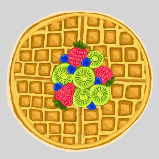
6. Fruity Waffle Treat Illustration: So now I'm starting off
this new illustration. I'm using the six B pencil
here because it gives that lovely textured feel kind of like a
traditional sketch, which I really love. There is something cozy
about beginning this way. It slows me down and makes
me more intentional. I decided to sketch out
this round waffle shape, and it's honestly been so much fun breaking
down the sections. I'm not going for
perfect symetry here, just a gentle balance
between neat and whimsical. I added a variety of
small square indentse on each half to really bring
that waffle texture forward. Right in the center,
I have clustered a few strawberries and
some banana slices. I kept the shapes very
loose and playful. I didn't worry about getting
them perfectly realistic. I just wanted to capture that joyful feeling of a
fruity breakfast topping. I even tucked in a couple of little leaves to give
it some freshness. There's something so satisfying about starting a
sketch like this. All the possibilities
are still open, and I'm just playing
around with ideas. I like working with just one
clean brush at this stage. Nothing too fancy or polished. Now comes the fine pot, switching from pencil to ink. And for this illustration, I'm using one of my
absolute favorites from the candy glass brush pack. That is bubbly Letters
Procreate brush. Starting with the outer circle, I traced over the waffles
rim in one smooth go. Then slowly I work
my way inward, outlining the grade
of square intense that give waffles
their signature look. I made sure to vary my
pressure just a little. Some lines are thicker,
others lighter, so it still feels hand
drawn and approachable, nothing too perfect here. For the fruit cluster, I traced around each
strawberry, blueberry, and slice with care
following the curves, but letting the brush
character show through. The seeds on the
strawberries, the ivc, even the gentle cuts
on the banana slices, all of it got a soft,
bubbly outline. What's interesting here
is that the stage sets the entire tone for the rest of the illustration
with this brush. Even before I add color, it already has a friendly, cheerful vibe like
a dessert menu doodle or a fun
kid's illustration. At this stage, I moved into what I call the base
painting phase. It's a part where I begin laying down flat colors across
the entire illustration. This part is always exciting
because everything that was just a sketch before now starts to get some
personality through color. I started by filling the waffle. I kept it a warm, rich, orange brown to capture that
classic baked waffle look. I wasn't trying to do
anything complicated here, keeping the tone even, letting the color
fall neatly inside the shapes I outlined earlier. The goal was to make sure the
waffle base look clean and recognizable without
jumping ahead to any extra details
or shading yet. Next, I moved on to
the fruit toppings. The strawberries came first, and I fill them in
with a deep red. I kept the shape solid and
uniform, not too bright, not too dark, just enough to make them
feel fresh and ripe. Then I added the kiwi slices. These were so fun
to color in because their natural vibrancy make
them instantly eye catching. I picked a bold bright green, so they would really pop
against the warm waffle tons. The bananas were the last
fruit I tackled in the step. I would choose a
soft light yellow to keep their presence
gentle and warm. The waffle as previously outlined and filled with
a light golden brown that begins to carry
the warmth and depth of something real,
something tangible. And it all happens through a
single thoughtful decision, adding a slightly
darker brown into each of those little squares
inside the waffle. Instead of rushing to
finish all the components, I choose to slow down and honor the structure
of the waffle. Every block was
treated with care like tiny pockets of crips edges
that needed to feel toasted, cozy and just right. Keeping the color flat, but deeper than the base, I didn't overcomplicate
the texture. There's also something
meditative about this stage as your hand moves
slowly across the screen, filling in block after block with this
rich toasted brown, the process itself felt calm. It wasn't just
about adding color. It was about letting
the waffle breathe. I gave it depth without
overpowering it. I made it feel finished
but still soft and sweet. Darker brown started playing beautifully with the
bright greens of the kiwi, the reds of the strawberries, and the sunshine,
yellow of the bananas. Suddenly, everything
began working together. It's a gentle reminder of how meaningful it
can be to focus on just one area and how even the quietest parts of a painting can carry
so much weight. Those little square blocks, they hold the whole
thing together. They are the foundation that
lets everything else pop. And by giving them just
a little extra care, I brought balance to
the whole illustration. Now it's time to
shift our focus to the little square
blocks on the waffle. I began gently luring in lighter tones inside each
of the great squares, keeping my strokes
soft and controlled. This is a moment where
the waffles strt to visually warm
up, dose golden, honey like tones begin peeking through the
darker foundation, giving a dark cooked
crispy surface. I carefully choose a shade
just light enough to contrast the deep brown base I laid down earlier without overpowering it. The goal here
wasn't to highlight every single block perfectly
or to make it too realistic. Once the fruit toppings
were complete and the waffle blocks already
had their baked daft, I moved on to a gentler but
equally important step. Adding soft, lighter
yellow tones across the entire upper
surface of the waffle. Using a gentle pressure
on my apple pencil and a slightly brighter
buttery yellow, I began brushing over the
top layer of the waffle. My strokes were wide and loose, not bound by the edges of the
squares because I wanted to capture the golden softness of a freshly cooked waffle
right off the pin. I didn't want it to feel flat, so I allowed some unevenness
in my brushwork to show how real waffles
catch light unevenly, depending on how
they are cooked. As I moved from one
section to the next, the entire surface
began to glow. It was such a subtle change, but it brought
everything together. Now that the waffle base is starting to glow
with all that warm, I turned my attention
to the fruits. This is where the
real joy begins. I started adding details
to the strawberries first. Using a lighter pinkish shade, I carefully dotted the
surface of each strawberry, making sure those tiny seeds pop just enough to give them a
little spark of realism. These strawberries
are such a strong red that the soft contrast with lighter pink makes
them feel like they are busting with
juice sweetness. After the strawberries, I
moved on to the kiwi slices. I used a darker
green tone to define the radial lines coming out from the center of
each kiwi slice. It's a small touch, but it gives the fruit that distant look almost like
sun rays peeking through. Then with an even darker shade, I gently paste dots all around the coat to resemble
the tiny kiwi seeds. This tap really brought
the kiwis to life, giving them that refreshing
feel we all love. The bright green surrounded
by those deeper tones are just enough contrast
to make them stand out against the
golden waffle background. And then came the bananas. For these soft mellow
yellow slices, I used a warm ochre
color to define the edges and add just a bit of curve shading
near the center. It gave each banana slice some septle dimension without
overpowering its soft tone. A little curved highlight near the outer edges of each
banana slice gave them that slight sheen like
they were freshly cut and sitting right
on top of the waffles. This tab was all about bringing the food toppings to life, not with too much complexity, but with just enough
playful detail to make each illustration
look like it belongs. The contrast of colors, the layering of shapes, and the joy of
watching everything slowly come together
felt so satisfying. Now that the bay stones and the fruit toppings are in place, I'm going in with a slightly lighter shade of golden yellow. This tap really softens
the overall look of the waffle and gives it
more warmth and texture. Instead of coloring inside
the small square blocks, I'm focusing only on the flat upper surface
that surrounds them. This is where I want the
light to hit gently, so I'm applying those lighter
strokes with a soft hand, just enough to
brighten the surface without overpowering
the warmth of the base. As I continue layering, I'm letting the
brush strokes follow the natural roundness
of the waffle. This gives a soft
pillowy texture. I'm not going for a
perfect highlight here. It's more about building a sense of depth
as if the waffle is slightly raised and catching soft light from the top left. Now that the toppings are done, I'm moving back to the
waffle base and focusing on giving those golden
blocks a bit more glow. I'm using a lighter, slightly creamy yellow tone, not too bright, just
enough to catch the light. For each square block,
I'm only applying this lighter shade to
half of the surface. I'm choosing one
side of the block, typically the top
left or top right, depending on where I want the light source to feel
like it's coming from. This technique is subtle, but adds so much
warmth and makes the waffle feel toasty
and dimensional. You will notice I'm placing this lighter
brownish shade along the upper edge or one
side of the square, kind of like giving the waffle a little spotlight from
the top right corner. It's subtle, but it
makes such a difference. These lighter tones
gives a sense of warmth, almost like the waffle
stock layer caught a bit more light
while it was baking. Instead of being a flat color, this new layer helps
suggest that the waffle has a toasted texture by only
covering part of each block. I'm not just adding color. I'm thinking about dimension. This helps each square pop a little and creates
the illusion that they are gently puffed up
rather than completely flat. I'm also being careful to
keep the strokes soft, nothing too harsh or sharp, so that it feels
like the light is just gently brushing
over the surface. After I felt happy with the
structure of the waffle, I turned my attention back
to the fruit toppings. For the strawberries, I added tiny specks of lighter pink
and a soft white along the curves to give that
plum glistening look like howbrries catch
the light in the sun. I got a bit more love here, too. I tapped in some curve shadows
between the little parts and lifted the top edges slightly so they
wouldn't look too flat. Then came the bananas and
kiwis. For the bananas. I added some buttery
yellow strokes in the center of each slice. Then pulled in soft creamy
color near the edges. It made them look thick, smooth, and a little
more dimensional. These final touches
might look small, but they tie
everything together. They help your eye move from one fruit to the next
balancing color. I always love this part. It feels like the moment where everything
clicks into place. Now that the waffle and
all the fruits were fully detailed and sitting
beautifully at the center, it was time to think about
the environment around them. I didn't want a
plain white canvas. It felt too empty for something
this warm and cheerful. So I decided to softly
build a background that would gently frame the waffle without paying too
much attention. I began by choosing a
pastel lavender tone. It felt soft, calm, and just playful
enough to pair with the bright yellow tones of the waffle and the
vibrant fruits. It gave the whole illustration
a comforting contrast, something that made
this illustration feel grounded and complete. I started painting loose horizontal strokes
behind the waffle, nothing too harsh or
precise, quiet movement, like the folds of a cloth or the flow of a morning breeze
across a breakfast table. I made sure to let the lines curve slightly and
peek from the sides, creating a sense of cozy space without enclosing the food
illustration too tightly. By the end, the background gave this illustration
a finished feel, just quite cosy wamp
behind all the color.
7. Waffle Dessert Illustration Sketch and Background Colors : I'm going to make this
illustration by using one proct brush from my sweet
scape glamurPcd brush bag, and let's get started. Whenever I start a
new illustration, I don't really think about
making a perfect sketch. I just want to get
the idea out of my head and onto the canvas. That's why this first
sketch looks pretty messy. I'm using my six B
proprid pencil brush, and I'm just drawing freely, letting the lines overlap and figuring things out as I go. I actually like
sketching this way because it takes away
a lot of pressure. If something doesn't
look quite right, I don't stop and erase
it straight away. I just draw another line. It just shape a little
and keep moving. Once I have the
basic idea drawn, I slow things down a little. This is where I start
cleaning up the drawing and turning that rough sketch into something I can
actually build on. I'm refining the shapes,
fixing proportions, and making sure everything
sits where I want it before I even think
about adding color. One thing I've learned
is that it's really worth giving your sketch
a little extra time. It doesn't have to be perfect. You are not constantly correcting shapes
while you're painting because you have already worked those things
out beforehand. I know it's tempting
to rush through this sketch and get
to the fun part. But really, a few extra minutes here you can save a
lot of time later. Now that I'm happy
with this sketch. I'm switching over to
one of the brushes from my sweet scape
climber Porcad brush bag. You can see it on the screen to start outlining
the illustration. Well, this is a brush. I like using When I want
my linework to feel a little softer and a little
more playful, you know? Before I add any colors, I always like spending some
time with the outline. It might seem like
a simple step, but I think, like, the linework really sets the overall foundation or
structure of this painting. Like every curve and every little detail starts
becoming more defined now, and this is where the sketch slowly begins turning
into a finished one. As I'm tracing over the sketch, I'm not trying to copy
every single line exactly. Sometimes I will smooth a curve, simplify a shape, or make something just a little rounder than it
was in the sketch. Also like keeping my hand moving at a relaxed
pace, you know, instead of trying to make
every stroke perfect, if I overthink every line, the drawing can
start feeling stiff. I know this. So when
I stay relaxed, the curves feel
much more natural, and the illustrcian
keeps that loose, and I really enjoy it. One thing I really pay attention during
the whole process, is making sure the
different elements are easy to read for me because
I have to work on it, and there are quite
a few toppings and little details in
this illustration. So I'm trying to
keep enough space between them that nothing
feels crowded together. I also find this to be one of the most satisfying parts of the process because
every few strokes makes such a
noticeable difference. This guy slowly
disappears underneath, and now the illustration starts
looking more clear to me. So now I'm moving
on to the filling in the wayful section. Just like before I am starting with the
base colors first, I know it can be tempting
to jump straight into adding shadows and all
those little details. But taking a few extra
minutes to build a solid foundation always makes the rest of the
Illustration much easier. And that is how I work. Whenever I'm coloring
something with lots of small
shapes like waffle, I try not to think about every individual
section all at once. Instead, I treat it as
one larger shape first, once the overall
color is in place. I can come back and gradually give each little square
its own that tint. Corrector. I'm also
paying attention to keeping the colors consistent
across the whole wa full. Even though some areas will eventually become
darker than others, I still want the base
layer to feel unified. Something that has
helped me over the years is reminding myself that base colors don't have to look impressive
on their own. There are somebody
there to support everything that comes afterward. If your artwork
feels a little flat right now, that's
completely normal. You don't need to
worry about for that. I also like to work
at a relax space because there are so
many repeating shapes. Slowing down helps
me avoid missing little areas or accidentally coloring outside the outlines. It might take a little longer, but it usually saves me time
later because I don't have to go back and fix as
many small mistakes. It's amazing how
different an artwork can look when you stop focusing
on one tiny section. This is also the
point where I start imagining how the finished
illustration will look. I can already picture where
the darker shadows will sit, Been the waffle sections. Where the warmer tones will
make everything feel more golden and where the
brightest highlights will catch more light to me. Even though none
of those details are there yet, you can see this. We are just working on
filling background colors. But having that picture in
mind makes it much easier to decide how I want to
build up the next layers. One thing I always remind my
students is that you don't have to finish one section completely before moving
on to the next one. So now I'm moving onto
the chocolate sauce, and this is one of my
favorite parts because it instantly starts making the
dessert look much richer. Instead of pressure
the brush down firmly, I'm actually using a
much lighter hand. That lighter pressure
naturally gives me a softer, dark brown with a little
bit of variation, which works really
well for chocolate. I actually like letting the brush do some of
the work for me here. Rather than trying to force every stroke to look
perfectly smooth, I allow a few subtle changes in the color to happen
naturally for me. One thing I try to
avoid is filling every area with exactly
the same shade of brown. Real chocolate, you know, isn't completely flat in color. Even when you're looking
at a simple drizzle, you will usually notice slightly darker areas
where it's thicker in, slightly lighter areas
where the light hits it. So, you know, like, keeping those natural variations in
mind makes a big difference. So right now, I'm not worried about making it look
shiny just yet. Right now, actually, I'm building that rich
chocolate base first. And so I'm happy with
the overall dap. I will come back later
with lighter tones and highlights to create
that glossy finish. I know it's a small detail, but changing the
pressure of your brush can completely change
how texture feels. Sometimes the
simplest adjustment like pressing just a
little more lightly. It creates a much
more natural result that constantly changing colors. So now I'm moving on
to the strawberries, and this is always one
of my favorite one because the illustration starts feeling much more
balanced to me. I mean, adding some fruits
on the top is very cool. Before I start thinking about
texture or tiny details, I like to choose a red that works well with the rest
of the color palette because I didn't necessarily pick the brightest red,
you know, at first. Instead, I look for one that
feels natural alongside with the chocolate and waffle without making one element compete
too much with the others one. I think color harmony is just as important as
the drawing itself because even a simple
illustration can feel much more clear and structure when
the colors work together. I'm also paying attention to their placement throughout
the composition. Like, since there are
several one of them, I want them to feel that your
eye is actually moving all around the dessert rather than making one corner feel much
heavier than another one, even though they
are small details, but I think they play a big role in creating
a whole composition. Another thing I enjoy is that strawberries aren't
perfectly identical. Like, they are not same. Like, some are slightly wider, some are taller and some have
softer curves than others. I try to keep those little
differences instead of forcing everybody to match
exactly like the same. So now I'm moving
onto the ice cream, and I think this is element that ties the whole
dessert together. I'll just love ice cream, even though it's only one
part of the illustration, it naturally becomes a
resting place for my eyes because it's surrounded by so many richer
colors and textures. For the base color, I'm choosing a soft creamy yellow
instead of a bright white. Even before adding any shadows, a warmer color helps
to feel softer. Pure white can sometimes
feel a bit flat, so starting with a gentle
green tone gives me much more flexibility when
it's time to add alls later, you know, all about
values and arcs. The next time, we will
start adding more dp, softer transitions and
highlights that will make it look much more creamer and
give it that finished look. But you will see
all of that later, adding color to
the whipped cream, and I have chosen a
soft muddy bluish instead of leaving
it plain white. I really enjoy introducing unexpected colors
like this because they give the illustration
a little more unique style, even though whipped
cream is white. Using a gentle blue creates a fun stylized look while still keeping
it soft and creamy. As long as the colors
work together, you have a lot of freedom to experiment and create your
own version of a subject. So you can definitely do a lot of experiments on
your illustration. We have the golden
waffle, rich chocolate, bright strawberries
and warm jalous. So adding just a
little cool color helps everything feel
more balanced to me. I'm also adding a few chocolate drizels over the ice cream. These little details help connect different parts
of the dessert together. Instead of every topping
sitting separately, the chocolate acts like a
thread that ties the waffle, ice cream and fruit into
one complete composition.
8. Waffle Dessert Illustration Building Strawberries, Icecream and Cream: So now I'm giving
some attention to the plate and a little
decorative stick. These might seem like
very small elements, but I think they are just as important as the dessert itself. Sometimes it's the supporting
details that quietly bring everything together
without drawing too much attention
to themselves. The plate helps
present the dessert. If it's too bright
or too detailed, it can compete with
the main subject, and that is the waffle. If it's too plain, the illustration can
feel unfinished. So finding that middle ground is what I'm aiming for here. Make sure we always look for the balanced kind
of work in artwork. So the little decorative stick is another tiny
detail for this one, even though it's a very small
part of the illustration, giving it its own
color helps I feel intentional rather
than something that was added at
the last minute. One thing I always
remind myself is that every object on the
canvas has a purpose. Not every part needs to be
bold or full of detail. Sometimes the quieter elements are what allow the
main subject to shine. So after filling all of
the background colors, this is the stage actually where I start looking
at the artwork as one complete piece instead of thinking about
individual ingredients, rather than asking, like, does this strawberry look right? Does this waffle look finish? I'm asking, does
everything work together, even though it's always satisfying reaching
this point because the dessert is no longer just a collection of
separate objects. The plate, the
decorations, the toppings, and all the little details begin working together,
and I'm loving it. Now that all of the main
colors are in place, I finally get to spend some proper time on
the strawberries, and I think this is one of my favorite parts of
the whole illustration. Yes, I love strawberries. Up until now,
everything has mostly been about laying a foundation, getting the
composition balanced, and making sure every element
has a place to build from. But the strawberries are
where I can slow down a little and start giving the
illustration more dimension. So they are already recognizable
from the base color, but right now, they
still feel very flat. So my goal isn't to complete transform them with one layer. Instead, I just want to
build them gradually. I will place a few strokes, look at them for a second, maybe zoom out, then decide
what they need next. Sometimes they
need a richer red, sometimes a softer pink, and sometimes they don't
need another color at all. They just need the
colors that are already there to blend together
a little more. I know it's a slower
way of working, but I actually enjoy it
because I never feel like I'm forcing this
illustration to get done. One thing I have learned
about time is that strawberries are
surprisingly colorful. At first glance, we think
they are simply red, but when you really
start observing them, there are so many little shifts happening across the surface. Some areas lean toward
pink, some are warmer, some are deeper, and
some cats so much light that they almost
lose their red completely. I don't try to copy every
tiny variation exactly, but I do borrowing that idea and bringing it into
this illustration. Like, those little changes make everything feel much
more natural to me, like using just one solid
trade from beginning to end. I also try not to paint every strawberry in
exactly the same way. Even though they are sitting together on the same dessert, I like each one to feel slightly different
from the others. Maybe one catches a
little more light because of where it's sitting. While another is tucked
closer to the waffle, it naturally feels
a little darker. So those tiny differences might not stand
out individually, but together, they stop the illustration from
feeling too repetitive. So it creates much more relaxed, natural look without needing
anything overly complicated. Another thing I pay attention to is the size of my brush strokes. At the beginning
of illustration, I don't really think
about that because I'm mostly filling larger areas
and my canvas size is big. So but once I reach this stage, I automatically start
making much smaller marks. Instead of covering big
sections all at once, that's one of the
reasons illustrations suddenly start looking
more detail near the end. It's not always because you are using more colors sometimes. It's simply because
your brush strokes become more thoughtful
than intentional. I keep moving between all of
the strawberries instead of finishing one completely
before touching the next one, I might brighten one, then switch to another, then come back to the first one a few minutes
later, you know. So I actually prefer
working this way because it really helps me compare
everything together. If I completely finish
one strawberry first, there's always a
chance to end up looking much more detailed
than the rest one. So by building all of
them little by little, they grow together and stay balanced
throughout the process. I also keep checking how
these reds work beside all the other colors that
are already on the canvas. The waffle has those
warm golden browns. The chocolate sauce
is much darker. The ice cream has
softer creamy tones, and now these
strawberries are bringing in a much brighter
splash of color. If the reds become too strong, they will steal attention
from everything else. So if they are too dull, they will disappear
into the composition. So right now isn't only about making the strawberries
look good on their own. It's also about making sure they work with every other
element around them. Sometimes while painting,
I notice myself wanting to add every little
detail I can think of. But I have learned that
illustrations don't always need every possible
detail to feel complete. I mean, in fact, stopping at the right moment is often harder than knowing what to add. So while I'm building
these strawberries, I'm constantly asking
myself one question. Does this layer actually improve the illustration or am I
adding it just because I can? Can you see the difference
of these two questions? That little question
has saved me from overworking so many
paintings over the years. I think one of the nicest things about digital
painting is that it gives you the freedom to experiment without
feeling nervous. So if I try a brighter
color and don't like it, I can always adjust it later. That freedom makes it much
easier to enjoy this stage. Instead of worrying
about getting everything perfect immediately,
because of that, I feel much more
comfortable slowly exploring the colors and seeing where the lustration
naturally wants to go instead of planning every
single step from the beginning. Strawberries are also helping create little resting
points for the eye. When someone eventually looks
at the finished lustration, their attention won't
stay in just one place. Their eyes will naturally travel from the waffle over
to the chocolate, across the strawberries, and
then toward the ice cream. So, you know, that those
brighter reds help guide that movement around
the artwork without me having to do anything
super dramatic. I also love this point in this process because it's
when everything starts feeling connected
instead of looking like separate pieces because we are building just
one lustration, but it's all filled up so
many components there. So earlier, it felt
like I was painting individual objects one by one because I was
feeling the base color. But now those objects are beginning to interact
with each other. These strawberries
no longer feel like decorations,
sitting on top. They are becoming part
of the overall dessert. I'm not trying to
chase perfection. I'm simply trying to make
each strawberry feel a little fuller than
it did a minute ago. So now I'm moving over
to the ice cream, and I always feel like this changes the mood of the
illustration a little. Up until now, I have
been working with textures that have lots of edges and little details
like the waffle pattern, the chocolate drizle
and the strawberries. You can see that. But the ice cream is
completely different. Instead of sharp edges and tiny details and
thinking about softness, I want it to look light,
creamy and smooth, almost like it was
slowly melt if you left it sitting there
for a little while. Instead, I'm looking at
the larger curves first. Those flowing folds are what make the scoop look
soft and rounded. So before worrying
about anything else, I spend time following
those natural shapes. You know, you have to move your hand super freely for that. Once those curves feel right, everything that comes
afterward becomes much easier. I'm imagining how the scoop would naturally catch the light. Unlike the waffle,
which has lots of little corners or
the strawberries, with their tiny seeds and uneven surface ice cream reflects light,
much more gently. So the transitions between
light and shadow are softer. So I try to keep my brush strokes relaxed
instead of making strong. That makes dramatic changes. I also like thinking
about the overall shape instead of focusing on
tiny details too early. Sometimes it's easy to get excited and immediately
start adding highlights. You know how peaceful
it feels compared to some of the earlier
parts of the illustration. Like, there isn't the same
kind of persuasion that I needed for outlining or
filling small sections. Here I can let my brush move a little more
freely following the natural curves of the scoop instead of worrying about
perfectly straight edges. You know, it's a nice
change of paste, and I think it keeps the whole painting
process feeling fresh. So now I'm moving on
to the whipped cream, and I think this is one of those little details that quietly brings the
whole dessert together, even though it doesn't take up as much space as a waffle
or the strawberries. One thing I really like about painting whipped
cream is that I don't approach it the same way I approach the other
parts of the illustration. With a waffle, I
was thinking about structure and
repeating patterns. With the strawberries,
I was building richness and little
color variations. With ice cream, I
was focusing on smooth curves and
rounded volume, but whipped cream feels much
lighter than all of those. My brush strokes naturally
become softer because I want the texture to feel
airy instead of solid. I'm imagining how whipped cream is actually piped onto desserts. It isn't perfectly smooth and it doesn't have
sharp corners. Instead, it naturally
twists, folds over itself, and forms soft little
ridges at it settles. So those flowing shapes are what I'm paying
attention to the most. I also love how
the cream appears in several different
places throughout this illustration instead of
sitting in only one spot. So there's a real resting
beside the ice cream, another on top and
smaller portions stuck between the waffle pieces. Because these little sections are spread around the desert, help connect
everything visually. So I'm painting and thinking
about all of them together rather than treating each one as a completely separate object. Keep in mind is that whipped
cream naturally sits on top of other ingredients instead of blending into them. So while I'm building
these shapes, I'm paying close attention to where each fold begins and ends. I want it to look like it's
gently resting on the waffle and beside the ice cream rather than becoming
part of those objects. Actually, find this part of the process very
relaxing because there isn't the same pressure to add lots of tiny details. Most of the work comes from slowly shaping the larger folds and letting the highlights and shadows describe the forms. It's amazing how just a few
carefully paced strokes can suddenly make
something feel much softer without adding a
huge amount of complexity. I'm constantly looking
at the overall balance instead of zooming into one
little still for too long. Since there are several small portions throughout the dessert, I don't want one area to look much more finished
than another one. I usually add a few
strokes to one section, move to another, then
come back again later. Working this way helps me everything develop
at the same pace.
9. Waffle Dessert Illustration Building Waffles and Chocolate anf Final Highlights : Always enjoy reaching
this point because all of those individual pieces
finally begin working together as one instead of feeling like separate objects
painted one after another. That's why I try to create these kind of illustrations
for you folks, so you have better idea
that how the way you can combine all of the elements
together in one artwork. I'm just adding a lighter shade along the outline of the plate and giving the little
decorative stick a lighter tone as well. These aren't big changes, but they are kind of details I always enjoy adding near
the end of an illustration. Even a small adjustment like
this can make everything feel a little cleaner
and more finished. Like, I don't want these
elements to stand out too much because they are not meant to be the focus of the
artwork for now, but they are simply there
to support the dessert. Like I told you before while I was feeling the color
on the background. Because it helps
everything feel connected. Sometimes it's surprised how saying a lighter tone
can make an object look more defined without needing lots of extra
shading or detail. I like keeping these
finishing touches up till because they let
the main subjects stay the center of my attention
while still giving the surrounding elements
a more cohesive look, or you can say the balanced one. I can look at the
illustration as a whole and decide exactly how
much each part needs. So in this case, just a gentle lighter shade is enough to complete
both the plate and the little decorative stick without making them
feel overworked. Now I'm starting to build
up the waffle itself, and this is the one where it
really begins changing from a simple shape into something that feels much
more dimensional. Earlier, the base colors were mainly there to map
everything out, but now I'm paying
much more attention to the little surfaces and how it suction relates
to the next one. So here you can see that
this is a part where I stop thinking
about the waffle as one object and begin looking at it as lots of small
sections working together. One thing I always find
interesting about waffles is that they have such
a recognizable texture. You don't need hundreds of
tiny details for people to immediately
know what they are looking at just by
carefully building the rays sections and letting the little pockets
become more defined, the waffle starts becoming
much more believable. I think that's why I
enjoy this day so much. Every few brush strokes make
a noticeable difference, and it feels like the
illustration slowly wakes up. Yes, more of the texture
begin to appear. So I'm not trying to finish one side before
moving to another. I usually move around
the waffle quite a bit, adding a little here and there, then another section there, and then coming back again. I can compare different areas while they are all
developing together. So if I completely
finish one corner first, there would always
be a chance that it ended up looking much
stronger than the rest one. So I also spend a lot of time looking at the overall
rhythm of the texture. Since waffles have
repeating shapes, it's easy to accidentally make everything
look too perfect. I actually try to avoid that. Tiny variations from one section to another make the
illustration feel, I think, much more natural. Some edges become
a little stronger, others say softer in
some areas, naturally, you save a little more attention depending on what's
happening around them. So those little differences stop the repeating pattern
from feeling stiff. Other thing I really
enjoy at this point is watching how
the waffle begins interacting with the
other ingredients instead of existing on its own. Earlier, each part almost felt separate while I was
painting it individually. But now the waffle is sitting
beneath the chocolate, supporting the
strawberries, holding the whipped cream and
connecting everything together. Instead of seeing
separate objects, I'm starting to see one
complete dessert taking shape, and I always think that's one of the most satisfying
parts of the process. Every time I add another
little section to the waffle, I naturally zoom
out for a moment to see how it affects
the whole composition. Sometimes a small
adjustment in one era is all that's needed to make
everything feel more balanced. It reminds me that texture isn't only about adding more
lines or more details. Sometimes it's about deciding
not to add something. Living a few quieter eras allows the more detailed sections
to stand out naturally. So if every single part receives exactly the same
amount of attention, I think the illustration
can start feeling super py. I think building the
waffle is probably one of the most patient
parts of this illustration because there isn't one
dramatic breast stroke that suddenly
changes everything. Instead, it's a
collection of lots of small decisions made
one after another. So each little adjustment may seem insignificant
on its own, but after repeating the
process over and over, the difference becomes
really noticeable. That's something I love about
illustration in general. Always remember, progress
often comes from many tiny improvements
rather than one big change. Began noticing how much more believable the dessert
feels overall. The waffle starts
looking like it has thickness instead of
being a flat drying, and it gives the topping
something solid to sit on. That sense of structure
helps every other element. Feel more convincing, as well. So I'm happy with this one. The waffle no longer feels like a simple base underneath
the toppings. It actually becomes
an important part of the dessert itself with
enough character to support everything else without pulling your attention away
from the strawberries, chocolate, and ice cream, I always enjoy taking
my time here because these smaller
refinements quietly strengthen the
whole illustration. So now I'm spending some time
building up the chocolate, and this is always one of the most satisfying parts
of the illustration for me. The chocolate is already
there from the early layers. But right now, it still
feels a little flat. You know, this is all
about giving it more richness and helping
it feel like it's naturally flowing across
a waffle instead of simply sitting on top
as a solid shape. I don't think of chocolate as something with lots
of tiny details. I think about how it
moves, how it curves, and how it gently wraps itself around the
surface beneath it. So as I add more layers, I'm paying close attention to the direction
of every stroke. Chocolate has a very
smooth flowing quality. So I want my brush strokes to
follow that same movement. Instead of making random marks, I'm letting E stroke travel along the trisle almost as I'm tracing the path the chocolate would take while it slowly
pours over the waffle. One thing I really enjoy is
watching the chocolate slowly gain more depth without
adding lots of extra colors. Sometimes it isn't about introducing something
completely new. It's about strengthening
what's already there. A few carefully
pasted layers can completely change how
rich the chocolate looks. Little by little, it begins
feeling smoother, fuller, and much more believable, even though the changes
themselves are quite subtle. So I'm also thinking
about the overall flow across the dessert rather than looking at one
drizzle at a time. Since the chocolate connects several different
parts of the waffle, I like keeping that movement continues from one
side to the other. Now I'm adding the highlights
to the strawberries. I'm not trying to cover
them with brighter colors. I'm looking for
just a few places where the light would
naturally catch the surface. Those little touches
are enough to change how the strawberries
feel a moment ago, they look nicely finished, but now they begin
to feel fresher. Juicier and much more natural. Like, it's amazing
how such a small step can completely shift
overall impression. I also like to remind myself not to place
highlights everywhere. If every part of the
strawberry is equally bright, the form starts to
flatten out again. Instead, I let certain
areas stay deeper and richer while allowing only a few small sections
to catch the light. So I pay attention to keeping these highlights
soft and controlled. I'm not trying to create sharp, white spots that immediately
grab all of your attention. I want them to blend naturally into the colors that
are already there. I also like these final touches begin connecting all the
earlier stages together. The base colors gave me
something to build on. Really, the darker
tones added depth, and now these lighter details help everything feel complete. So it's almost like the strawberry finally
starts reflecting the light that already present throughout
the illustration. This kind of work where
I slow down quite a bit because every small stroke has a noticeable effect.
Take your time. There's no need to rush through
it or at lots of marks, sometimes just a tiny highlight
in the right place can really see much more than covering half the fruit
with lighter colors. I usually place a stroke, zoom out, look at
the overall balance, and then decided if it really needs another one
more often than that, less is actually enough. So by the time I finish
these highlights, these strawberries don't
just look brighter. They feel like they have gained another layer of
freshness and dimension. So now I'm going to
finishing the plate. I'm adding just a few soft
shadows around the edges, and then balancing them with a couple of lighter highlights. It's a really simple step, but it's one of that
quietly changes. Like, up until now, the plate has mostly been supporting everything
sitting on top of it. Once these subtle light and
shadow variations are added, it starts feeling like an actual surface instead of just a flat shape
underneath the dessert. I don't want these shadows
to be heavy or dramatic because the plate isn't supposed to become
the main focus. It's there to support
the composition. I told you earlier that
not compete with it. So I'm keeping
everything very gentle, letting the darker
tone softly outer edge while leaving plenty of
the original color visible. I come back with
a lighter tone in a few places where the light would
naturally catch the rim. Those highlights are
intentionally soft. I'm not drying bright white
lines all the way around because that would make
the edge feel too sharp. Instead of that, I'm letting the lighter color appear
only here and there, almost fading into
the base color. So that uneven balance
feels much more natural and helps the plate look
smooth and rounded. I always find that
these finishing details are less about adding something new and more about helping everything already
on the canvas work together. The waffles, strawberries,
cream, chocolate, and ice cream all have
their own dep now, so the plate needs just enough dimension
to belong with them. Without these final touches, it can sometimes feel like all the tension is floating
above the surface. Now that all the main
elements are finished, I'm finally able to step back and think about
the space around them. It's really funny
how the background often feels like
the easiest part, but it actually has a
really important job. If it's too bright, it starts competing with
the illustration, and if it's too dark
or too detailed, it can pull your attention away from everything you
have spent time king. So instead of trying to make
the background stand out, I like keeping it
soft and underrated. I want it to quietly support the dessert without asking
for attention itself. I'm using a very light
bluish background with gentle vertical
brush strokes. I love adding this kind of
texture because it creates just enough visual interest for me while still feeling
calm and clean. Like, everything still
feels bright and open, and the dessert naturally remains the center of attention. One thing I always
notice is how much the overall mood changes once
the background is in place, because all the
individual pieces can feel like they are
floating on a blank page. Moment a background is added, they suddenly feel connected almost as if they have
found a place to belong. That's why I love making
the background of each illustration because it gives a very nice frame of work. I'm also keeping the color
very light because I still want plenty of breathing room around
the illustration. I don't always feel the need to fill every inch of the
canvas with detail. Leaving some open space
helps my eye rest, and it gives a
painting a softer, a kind of balanced
look, especially with colorful food
illustrations like this. I think that extra space allows
all those warm colors to shine even more instead of making the whole
piece feel crowded. At this point, there's really only a little bit left before
everything is complete. These are the quit
finishing touches that don't seem very dramatic while you are painting them. But once they are finished, the whole artwork suddenly
feels really more complete, and it's always satisfying
reaching this stage because all the little decisions
made along the way start coming together
into one artwork. These lost highlights
are probably some of my favorite details to add
because they are so small, yet they completely change
the way the waffles feel. Up until this point, all the colors, shadows, and textures have been
doing the heavy lifting. Like the waffles already
have their shape. The little pockets are defined, and everything is starting
to look finished. Those final highlights
are what make the surface feel like it's
actually catching more light. So it's almost like
the illustration takes one last deep breath
before it's complete. I'm being really selective about where I place brighter strokes. I don't want every edge
or every square to be highlighted because
then the light wouldn't feel
believable anymore. Like, instead, I'm
imagining where the light is gently touching
the raised areas of the waffles and letting only those places receive
a little extra brightness. So I also like keeping
these highlights soft instead of making them
too sharp or too bright. So they are here to lift the
texture, not overpower it. If the highlights
become too strong, they can start competing
with the strawberries, the chocolates,
the creamy stuff, and I still want the whole
dessert to feel balanced. So I'm adding them
little by little, stepping back every few moments to make sure everything
still feels natural. One thing I really enjoy
about reaching this stage is seeing how every earlier layer
starts working together. The base colors gave
me the foundation, the shadows added dp, the textures build character. And now, these highlights
quietly connect everything. So, you know, none of these taps would have the same
impact on their own. But together, they create something that
feels much richer. And I think than
any single layer could so with these final
highlights in place, this illustration is
officially finished. I always love taking a
moment to simply look at the completed piece before
moving on to the next one. After spending all this time
slowly building every part, from the first sketch all the way to these last tiny details, it's satisfying to see everything come together
into one finished one. So every layer, every texture, every shadow, and
every highlight has played its own role. And together, they have created a dessert that feels colorful, warm, full of dab and ready to be part of
the final collection. You know what, sometimes
the biggest reward is in adding one more detail. It's knowing exactly
when the artwork is complete and simply
letting it be finished.
10. Kiwi Waffle Illustration Sketch, Background Colors and building Cream: So I'm going to start this
illustration by using one proct brush from my sweet
ski glomerPcd brush bag. So let's get started. I'm starting with a
loose free hand sketch using six B Procde pencil brush. At this point, I'm
not thinking about perfect lines or
perfect proportions. My only goal is to get
my idea onto the canvas. I want to understand where
everything is going to sit, how large each
element should be, and how they relate
to one another. When I stop expecting the first sketch to
look super fine, it becomes a much more
relaxed experience for me. Like I can simply focus on exploring the
illustration instead of worrying about getting everything right
on the first try. If you are painting
along with me, I would really encourage
you to sketch freehand. Don't worry if your first
lines look a little uneven or if you end up drawing over
the same era a few times. That's something I
do all the time. A rough sketch isn't a sign that you are
doing something wrong. Simply part of finding
your composition. You'll probably
notice that I keep making little adjustments
while I'm sketching. Sometimes an object needs to
move slightly to the left. Another element might need
to become a little larger. Or maybe I decide that something looks better from
a different angle. I don't try to force everything
to work immediately. I give myself permission
to change things as I go because that's often how the strongest
sketches are built. Instead of trying to predict every decision before
I start drawing, I let this sketch guide me
toward the final arrangement. So once I have all the main
elements roughly placed, I slow down and
begin refining them. This is where I
start cleaning up my lines, making
the proportions, feel more balanced and checking that everything
gets together naturally. I'm not adding any details yet. I'm simply making sure that
the overall drawing feels solid enough to support all
the painting that comes next. One piece of advice I would
really give is not to rush this part just because you are
excited to start painting. I know it's tempting to
jump straight into colors, especially when you already have them picked
out in your mind. But every extra
minutes you spend strengthening your sketch really saves you much more time later. When the drawing
underneath feels clear, you won't have to strap
halfway through painting to fix proportions
or redraw shapes. Instead, you can simply
focus on color, texture, and lighting because all
those earlier decisions have already been made. Something I've learned
over time is that a good sketch doesn't have to
look beautiful on its own. It just has to answer the
questions you will have later. Like, where does this edge go? How large should the object be? Or how much space would I
leave between these elements. When your sketch answers
those questions early, the painting process
really becomes much smoother because you are no longer trying to solve
everything at once. So don't put pressure on yourself to finish
your sketch quickly, give yourself
permission to erase, redraw, and adjust as
many times as you need. Every illustration is a
little different and some simply need a few more changes before everything
feels balanced. I also find that sketching
becomes much more enjoyable when I stop
treating it like a test. It's really just
the beginning of a conversation with the artwork. Sometimes the illustration
changes quite a bit from the very
first few lines, and other times it stays
almost exactly the same. So now I'm switching to
one procad brush from my suitscGlmur procad brush pack now that I'm happy with
this sketch underneath. I can trace over it with
a lot more confidence. I don't feel like I have to keep second guessing every line anymore because I've already spent the time building
and refining this sketch. Also try not to rush
through the outlining, even though it can be tempting. Every line I draw here will become part of the
finished illustration. So I like moving at
a comfortable pace instead of trying to finish
as quickly as possible. If my hand needs to
slow down around a curve or a small
detail, I let it. Taking an extra
second often gives me a smoother line than trying to force it in one fast movement. One thing I really enjoy
about outlining is watching the illustration
slowly become more defined. A few moments ago,
it still looked like a sketch full of
construction lines. Now every clean outline starts separating the different
elements from one another. The plate feels more distinct, the waffles become
easier to recognize, and all the little details begin finding their own place
within the composition. While I'm outlining, I'm
also paying attention to keeping the line
work consistent. I don't want one area to feel
very heavy while another fails to delicate unless I
am doing it intentionally. Keeping a similar
rhythm throughout the drying helps
everything feel connected. And it gives the
finished illustration a nice balanced look
that I really like it. This is another reason I like
spending time on the sketch first because the planning
has already been done. I don't have to stop every few seconds wondering
where a line should go. I can simply follow the
drawing I have already built. It makes the outlining
feel much more relaxed, and I can put my attention
into creating smooth, confident lines
instead of solving composition problems
at the same time. If you're falling along, don't worry about making every single line
absolutely perfect. Even after years of drawing, I still make little
adjustments here and there. If something doesn't
feel quite right, I simply redraw that
section and keep going. By the time the
outlining is finished, the illustration already starts feeling complete even
without any color. So once these clean
lines are in place, adding colors becomes much simpler because every
shape is clearly defined. And I can focus entirely
on building light, shadow, texture, and all
the little details that will bring the
illustration to life. The first thing I wanted
to establish here was to waffle because it's really the heart of this illustration. Before adding all
the little details, I like seeing one of the main
elements take shape first. Once this warm bese
color goes down, it immediately gives me
something to react to. Suddenly, I can start imagining how the strawberries will
stand out against it, how the chocolate
will flow across it, and how the cream will sit between all those
little pockets. So when I'm choosing
this first color, I'm not trying to find a
perfect finish waffle color. I'm thinking about what will support all the layers
that are still coming. I know this a is
eventually going to have darker toasted sections, lighter edges, tiny highlights, and plenty of texture. So I'll leave room
for all of that if I make the base too dark now. I don't have much space
left to create that. If it's too light, I'll lose that one big feeling I'm after. So this first layer is
really about giving myself flexibility rather than chasing the final
look right away. I also enjoy seeing
how the line art slowly starts disappearing
behind the color. At the beginning, the outlines are doing most of the work, but once the base
colors are added, the art now begins relying
more on color than on lines. That's always a nice
transition to watch, you know? One thing I pay attention to while filling larger
areas like this, keeping the color feeling consistent without making
it perfectly uniform. Like, I actually don't mind tiny variations that
happen naturally from the brush because they stop everything from looking
too digital or too flat. I started paying attention
to the overall balance of this illustration instead
of just one simple subject. So now I'm filling
in is the kiwi, and I always enjoy reaching
the fruit because it starts bringing a completely different energy to
the illustration. Up until now, I have
mostly been working with warm browns
from the waffle. So introducing this fresh green immediately changes the
overall color balance. It's really interesting how
adding just one new color can make everything around
it look a little different. The waffle suddenly feels warmer and the white cream starts
standing out even more. For the kiwi, I'm not trying to capture every tiny detail yet. Just like the waffle, I'm beginning with a
simple base color first. I want the whole slice to
have one consistent layer before I start thinking
about the lighter center, arger edges, or all
those tiny little seeds that make a kiwi
so recognizable. I actually find it
much easier to build those details when I already have a clean
foundation underneath. Once the kiwi slices have
their first layer of color, I move on to the lease. I actually think about
these a little differently. The leaves aren't meant
to become the main focus, but they quietly help frame the dessert and connect
everything together. They are almost like
little resting places for your eyes between
all the waffles, fruit, cream and chocolate. Even though they
are small details, they help make the
whole illustration feel fuller and more complete. Now I'm filling the
cream and the honey, and I like working on these together because they
are both soft elements, but they behave
very differently. The cream has a light airy
feeling with a gentle folds, while the honey is much
smoother and heavier. Even though they are sitting
right beside each other, I want them to blend
into one shape. So giving each one its
own base color helps separate them before I
begin adding any depth. For the cream, I'm choosing a warm creamy tone instead
of using pure white. I almost never begin with bright white because
once you do that, there's hardly any room left to make the
highlights stand out. The honey is a little different. I want it to feel rich without becoming too
dark at this point, since it's going
to have shadows, reflections, and the little
glossy highlights later. I only need a warm
golden base for now. I like thinking of this
color as the middle of the illustration rather
than the ending one. Now I'm filling in the plate, and I actually like leaving
this until after some of the main ingredients already
have their base colors. So by this point, I have a much clearer idea of
the overall palette. So choosing the color for the plate feels much
more intentional. Instead of guessing
what might work, I can look at the waffle, the ivy, the cream, and the honey together
and pick a color that quietly supports all of them rather than
competing for attention. I decided to go with a soft blue because
I wanted something that would create
a gentle contrast against all the warm
dessert colors. Most of this illustration
is filled with oranges, golden browns, creamy
yellows and fresh greens. So introducing a cooler color underneath helps those warmer
tones stand out naturally. It's not about making the plate the star of this illustration. It's simply giving the
dessert a calm place to sit, so the food remains the
first thing you guys notice. As I move on to the cream, my focus shifts almost
completely from color to values. The base color has
already done its job. So now I'm thinking about how to make this look soft enough that you can almost imagine the texture
just by looking at it. I always find this part really satisfying
because it's where the illustration starts gaining that three dimensional feeling. Until now, everything
has been built with simple shapes and flat colors. But this is a point
where those shapes begin turning into something that
feels much more believable. Whenever I pinch whipped cream, I stop thinking of it
as one big object. Instead, I see it as dozens of tiny ribbons wrapped
around each other. Every ribbon catches light
in a slightly different way. Some curves as the
light directly while others naturally
fall into shadow. Looking at it like that makes the whole process feel
much less overwhelming. I'm simply falling one
fold after another, letting each little section
tell me what it needs. One thing I really
enjoy about painting cream is that it's
surprisingly far giving. You don't have to make every
stroke absolutely perfect. As long as your strokes follow the direction
of the srill, they naturally begin
describing the form. I let my pencil move with those curves instead of
cutting across them, and that simple change makes
the cream start feeling light and fluffy rather
than flat, I think. So direction matters just
as much as color here because those flowing strokes become part of the
texture itself. It's tempting because adding white instantly
makes something pop. But I like earning
those highlights first. Before I ever reach for the
brightest value, actually, I'm slowly building
the softer shadows and gentle mid tones. So those quad your values are actually doing
most of the work. They create little valleys kind of stuff between each fold so that later on the highlights have something to
contrast against. I'm constantly zooming in
and out of the canvas. When I'm zoomed in, I'm
paying attention to individual folds and making sure the strokes feel natural. Then I zoom back out to ask myself a different
kind of question like, does the cream still read as one soft srillO have I accidentally made
it look too busy? So that kind of balance
is really important. Something I always
notice while painting white objects is that they
are really actually white. Most of what we are seeing is a collection of warm creams, cold grays, pale yellows
and very soft shadows. So the brightest
white only appears in a few tiny places where the
light hits most directly. So realizing that completely
changed the way I paint cream because I stopped relying on pure whites
to create volume. Instead, I started relying
on value relationships, and the results immediately
felt much softer. I also like allowing some areas to see
quieter than others. Every fall needs dramatic
contrast, really. Some parts can gently blend
into each other while other areas become
the main focus with stronger lights
and deeper shadows. That kind of variation
is what keeps a cream from looking
mechanical kind of stuff. In real life, whipped cream
isn't perfectly uniform. And I enjoy bringing
a little bit of that natural randomness
into my illustrations. As more layers go down, I can already feel the cream becoming the highest
point of the dessert, even though the waffle
is physically larger, the cream naturally draws
the eye because it's sitting at the top and has the
strongest value contrast. That's something I keep
in mind while painting. I'm not only thinking about making the
cream look realistic. Actually, I'm also
thinking about how it guides your eyes through
the composition. Another thing I'm
paying attention to is the softness of
the transition. Cream doesn't usually have hard edges between
light and shadow. Most of those changes
happen very gradually. So I'm blending values together instead of separating
them with sharp lines. Whenever I notice a transition
becoming too harsh, I soften it with another layer. So I think those
little adjustments may not seem very
noticeable one by one, but together, they completely change the feeling of the cream.
11. Kiwi Waffle Illustration Building Kiwis and Waffles: As I start working on the caves, I always notice how
much they change the feeling of the
whole illustration now. Up until now, we have
mostly been surrounded by warm colors from the
waffles, honey and cream. The moment I begin building
these fresh cranes, everything suddenly feels
brighter and more balanced. Whenever I paint fruit, I don't immediately
think about details. Before anything else,
I'm asking myself whether the fruit already
has a nice sense of volume. I can't feel that
rounded shape yet, I know I need to
spend more time with the values before worrying
about sees or highlights. I always like solving the bigger questions because once the farm feels convincing, the smaller details
naturally fall into place. One thing I really enjoy about kiwis is that they
aren't simply green. The more you look at them, the more colors you begin noticing. These are color greens, warmer yellow greens, I mean, richer olive tones and tiny
shapes between all of them. Instead of depending
on one single color, I slowly layer several
greens together. Those gentle changes keep
the fruit feeling fresh, I think, and they stop it from looking flat or artificial. I pay close attention
to the direction of every brush stroke rather than brushing across
the kiwi randomly, I let E stroke follow the way
the fruit naturally grows. So those little
directional strokes begin creating the soft fibers. Instead, the kiwi without me having to draw
every single one. I know it's a subtle detail, but it makes such a
difference because the texture starts appearing naturally instead
of feeling forced. I also find myself flowing down around the outer
edge of the kiwi, that darker green ring is one of the things that gives
the slightest identity. Like, I don't make it exactly the same thickness all the way around because real fruit
isn't perfectly even. Some areas become
a little richer, others stay softer, and those tiny changes help everything feel
much more natural. I'm constantly comparing
the lighter greens with the darker ones instead of thinking about the
color separately. I'm asking myself simple
questions while I paint. Does this side feel too heavy? Does this section need a little more light or could this shadow
be slightly softer? So those little questions guide almost every
decision I make, and painting becomes much easier when I stop searching for perfect colors and start paying attention to how the
values are working together. The center of the kiwi
is probably one of my favorite areas because that's where so much of its
personality live. As I begin developing it, I'm careful enough to make the middle feel too
dark all at once. Instead, I slowly build that richness through
several layers. I find that gradual changes
almost always create a softer result than trying to reach the
darkest value immediately. So little by little, the center begins drying your eye without
feeling too harsh. Now I begin placing
the tiny seeds, and I honestly think they
are one of those details that people notice without realizing they are
noticing them. I don't count them. I don't
space them perfectly, and I definitely don't try to make every seed
the same size. I like allowing them to
feel a little random because that's exactly what gifts a fruit its
natural appearance. So sometimes I will
even make a few slightly darker than others
just to break up the pattern. Another thing I'm watching
is how the seed sits within the fruit rather
than on top of it. If they all look
like tiny black dots floating on the surface,
something feels off, so I gently deepen some of
the surrounding values, allowing the seeds to settle
into the kiv instead. Every few minutes
I zoom out from the canvas and stop
looking only at the kiwi. Instead, I look at the
dessert as a whole. It's very easily to
become attached to one little section and
accidentally overwork it. Looking from a distance helps me decide whether
the kiwi already has enough detail or whether it still
needs another layer. So I think those little pauses are just as important
as the painting itself because they help me
making better decisions. I notice how it changes
the colors around it, the war waffles suddenly
appear even toastier. The cream feels softer and the honey seems a little richer, simply because this fresh crane is now sitting beside them. I love moments like this
because they remind me that colors are always having conversations
with each other. I'm also careful not to make
every KV slides identical. Even though they are
all at the same fruit, I like letting each one have its own little kind of
personality, you know? So one slide might catch
slightly more light. Another might have a
deeper kind of outrage, while another could have softer transitions
through the center. When I began introducing
the highlights, I don't think of
them as decoration. For me, highlights are simply
another kind of value. So their job is to
help explain the form, not to make everything sparkle. I place them only where the fruit naturally
catches light, and I keep them
quite restrained. So one thing I really enjoy
about painting fruit is that it teaches patients
without feeling repetitive. Every layer feels small
while you're working on it, and sometimes it even feels
like nothing is changing, but then you stop for
a second zoom out and realize how far the
illustration has actually come. By the time I'm happy
with these kiwis, they have become much more than little green slices
sitting beside the waffle. Through all those
layers of values, carefully place
breaststrokes, tiny seeds, soft highlights, and
gradual color shifts, they now feel fresh, juicy
and full of texture. None of those effects came
from one single technique. They appeared because
every small decision supported the one before it. That's something I always
love about painting is really one moment that
transforms an illustration. It's hundreds of thoughtful
little choices that quietly come together until
almost without noticing, the artwork begins
to feel complete. One of the reasons I like
leaving the waffles until this point is because I finally have something
to react to. Earlier, I was mostly thinking about individual
ingredients on their own. But now I can actually see how the waffles are sitting
beside the cream, the kiwis, and the plate. That changes the way I
approach the color completely. Instead of asking myself what color is a waffle,
I'm really asking, what color does
this waffle need to be so everything around
it feels balanced? It's a small shift in thinking, but it changes so many
of the decisions I make. The waffles became the warm
center of the illustration, so I want them to feel rich
enough to hold everything together without becoming so dark that they overpower
the fruit and cream. Almost imagine I'm
slowly carving the form out of the flat
base color instead. Every darker value
I introduce is helping describe
another little plane of the waffle while
every lighter value reminds the eye where the
surface catches light. So I enjoy thinking about it almost like sculpting
rather than coloring. Instead of feeling shapes, I'm slowly revealing
thickness, edges, little corners, and all
those tiny surfaces that make waffles
look so satisfying. Even though the
structure is made up of repeating squares, I don't want them
to feel repetitive. Each little section ends up catching the light
slightly differently, and that's what keeps
everything feeling so natural. One thing I always notice
about waffles is how interesting they become once the light starts
moving across them. The raised edges
brighten first while the little pockets
naturally become deeper because they
receive less light. That difference is something I really enjoy building slowly. Rather than outlining
every square, I let the values explain
the structure for me. Sometimes a slightly
darker stroke besides a lighter one is enough to create
the illusion that one section is sitting
higher than another. It's amazing how our
eyes begin reading height and depth from
such small value changes. I don't need dramatic
shadows everywhere, just enough contrast to gently separate one
surface from the next. I also start paying attention to the personality of
the waffle itself. Like, I don't want it
looking perfectly smooth because that's not what
makes waffles appealing. They are big, slightly uneven, a little crepes around certain edges and
softer in other places. So I allow my bra strokes to reflect that sort of character. Some strokes stay quite soft while others becomes a
little more textured, almost suggesting those
lightly toasted surfaces without me having to
paint every tiny crumb. I think that's one
of my favorite parts of illustrating fruit. You don't have to explain
every detail literally. Sometimes suggesting
a texture is much stronger than describing
every single piece of it. I'm constantly
thinking about how these warm golden
colors are interacting with the cooler colors
that are already finished. The bright greens of the kiwi naturally make the
waffles appear warmer, while the cool blue plate quietly pushes those
golden browns forward. That's something I genuinely
love about this painting. Colors never exist
by themselves. Every decision affects
the colors beside it. So sometimes I will
slightly warm one edge of the waffle simply because
it's sitting near the cream, while another section
might become just a touch darker because it's tucked
underneath another layer. So those are the
little observations that happen naturally
while I paint, and I think they
would slowly turn a simple flat illustration
into something that feels much richer
and more dimensional. I stopped thinking
about Daffo as one large object and begin looking at it one little
section at a time. Every square has its
own tiny story to tell, you know, because some of them naturally sit a little higher, some disappear slightly
underneath the cream, while others are
partially hidden beneath the kiwi
slices or the drizzle. So instead of trying to
make every swear identical, I enjoy giving each one a slightly different sort of
balance of light and shadow. That little bit of
variation makes a waffle feel much more believable
because in real life, big food is never
perfectly even. Some edges become a little
darker in the oven, some corners stay softer, and those natural imperfections are exactly what make
it look delicious. I think if everything were
perfectly symmetrical, it would actually
lose a lot of charm. So I welcome those
little differences rather than trying
to correct them. One thing I notice
while painting is that the raised ridges of the
waffle almost act like tiny little bridges touching the light because they are sitting higher than the pockets. They naturally become
the brightest parts. I don't make those
highlights pure white or overly bright, though. Instead, I slowly
build them with warm, creamy yellows and
soft golden tones that still belong to
the waffle itself. So keeping those highlights warm helps everything
stay cohesive. If the highlights become
too cool or too bright, they start looking
disconnected from the big texture I'm
trying to create. I'm constantly asking myself
whether the light still feels warm enough to match
the rest of the dessert. Those are the kinds
of small questions running through my
mind while I paint, and they quietly guide
almost every breaststroke. The little pockets inside the waffle are probably
my favorite area to develop because they are where so much depth
begins to appear. As I deepen those
recess sections, I'm not simply filling
them with a darker color. I'm thinking about
how light gradually disappears as those surfaces
move farther away from it. That means the shadow
aren't all the time, have the same darkness. Some pockets stay fairly open and receive more
reflected light, while others become
deeper because they are tucked closer to
another waffle layer. Or hidden beneath the chocolate. So those kind of subtle differences make the
whole structure feel thicker. I love watching
that happen because the waffle slowly
stops feeling like a flat drawing and starts looking like something you could actually reach
out and pick up. Every now and then I pause for a second and look at
the illustration. Without painting anything. Those little pauses
are surprisingly helpful because they
let my eyes reset. When you have been staring at one area for several minutes, it's very easy to lose
track of whether you have added enough contrast or
maybe a little too much. So looking away for even a few moments helps me come back with very fresh eyes. Quite often, I will
notice something very simple like one
edge needing to be slightly lighter or one shadow looking a little stronger
than the others. So those aren't
dramatic changes, but they are usually the adjustments that make
everything feel more balanced. I actually think about these quiet moments of observing
are just as important as the painting itself
because they stop me from adding details that don't
really need to be there. So I began noticing how all these tiny value changes
are working together. None of them seem specially
impressive on their own. One slight, brighter edge,
one warmer highlight, one softer transition,
one deeper pocket, they are all very
small decisions. But once they begin sitting
beside one another, they completely change the
feeling of the waffle. It suddenly has
weight, thickness, warmth and that light toasted appearance I was hoping for from the
very beginning. That's probably
my favorite thing about building
textures like this. The final result
isn't created by one clover technique or any sort of dramatic
breaststroke. It's actually created
by hundreds of little observations and
thoughtful adjustments that quietly build
on each other. So by simply staying patient
and paying attention to those small relationships
between light, shallow, color, and form, the waffle slowly grows into the
heart of the dessert, naturally becoming
the piece that brings every other
ingredient together. So as I move into the
final refinements, I stop looking for
obvious things to paint and begin paying attention
to much quieter details. At this point, the
waffle already has its overall color
structure in depth. So now it's more about asking myself where the
lustration could feel just a little softer, a little brighter, or a
little more balanced. So sometimes there's only one tiny edge that needs to catch a bit more light
or one shadow that feels slightly too heavy
compared to the rest. So those little
adjustments don't seem very exciting while
you are making them, but they are often the reason an illustration suddenly
starts feeling complete. I actually enjoy this part because it becomes
less about adding more and more detail and more about carefully listening to what the painting is asking for. You know, actually, every
illustration reaches a point where it almost tells
you what it needs next. And I always try to slow down enough to notice
those little moments. The way the different waffle
layers overlap each other, even though this is a
stylized illustration, I still want those tack pieces to feel like they
have real thickness. Upper layer should
naturally feel closer while the lower suction
gently tuck underneath. So I create that feeling mostly through values rather
than outlines. A slightly darker era where two waffles meet instantly
creates illusion that one is resting on top
of the other than by allowing a soft highlight to
run along the upper edge. That thickness becomes
even more convincing.
12. Kiwi Waffle Illustration Building Leaves, Honey,Plate and Finishing Details : I'm moving on to one of the smallest parts
of the illustration, but I really think
these little leaves do much more than
people often realize. They aren't just there
to fill empty spaces. They help connect all of the ingredients
together and give the whole dessert a fresher
and lighter feeling. After spending so much time
working with warm waffles, creamy whites in the
bright kiwi slices, introducing these greens almost feel like taking a deep breath. They quietly frame the dessert without asking for
too much attention. I always enjoy painting little details like this
because they are often the finishing touches
that help everything feel complete rather than
separate pieces sitting next to one another. When I begin
painting the leaves, I don't think about them as
individual shapes first. Look at them as a small group, even though every leaf has
its own direction and size, together, they create
one flowing cluster. So instead of finishing one leaf completely before
moving to the next one, I naturally move
around the group, adding little bits
here and there, that keeps all of them
developing together instead of having one finished leaf besides several unfinished ones. So I find this approach helps me keep the colors and
values much more balanced because I can compare each leaf with the ones
beside as I'm painting. Green is one of those
colors that becomes much more interesting the
longer you look at it. It's tempting to grab one
shade and fill everything. But leaves really work that way. So naturally lead toward a warmer yellow green where
more light reaches them. While others become
deeper and cooler as they turn away from the light or tuck underneath another leaf, so I enjoy letting those
little shapes happen gradually instead of making
dramatic color changes, I gently introduce slightly
lighter and darker greens. So each leaf begins
feeling separate while still belonging to
the same little cluster. I'm also paying attention to their movement just as
much as their color. Every leaf has a gentle curve instead of sitting
completely flat. So I let my brush strokes follow that natural flow from the base of the leaf
toward the tip. Even though these
strokes are very simple, they quietly suggest the
shape of the leaf without needing heavy outlines
or lots of extra detail. I think following the natural direction of the farm is one of the easiest ways to make
something feel more belivable. One thing I really enjoy
doing this part is watching how the leaves begin
separating from one another. At first, they can look
like one green shape, but with each little adjustment, they slowly start
finding their own space. Sometimes all it takes is a slightly darker
value leaves overlap or a brighter edge
catching the light. So those tiny differences
help you understand which leave is sitting in front and
which one is stuck behind. So I don't have to draw
thick outlines around everything because the values naturally explain that
sort of relationship. Now I'm ready to build a honey, and this is one of those details that can completely
change a feeling. Right now it's simply sitting across the waffles as a flat, yellow shape, but honey has
a personality of its own. It stretches, gathers, slowly
drips, catches the light, and becomes thicker where our gravity allows
us to collect. So that's exactly what I'm thinking about
while painting it. So the first thing I begin adjusting is the overall
value of the honey. Even though honey looks bright, it actually contains many
different golden tones. Some areas lean
towards warm yellow, others become deeper amber, and a few tiny sections almost look caramel where
the honey is thicker. Instead of treating everything
as one solid color, I slowly introduce
those gentle changes across each drizzle. I don't separate them
with the harsh lines. I simply allow one warm tone
to melt softly into another. Those smooth transitions
are important because honey naturally flows without
sudden changes. And I want that same softness to appear in this illustration. I start paying attention to the thickness of every
ribbon of honey. Not every part should
feel identical. Some drizzles become thinner as they stretch across the waffle, while others gather into slightly thicker pools
before continuing downward. Whenever I see those
thicker sections, I deepen the values
just a little. It is only because the honey
suddenly changes color, but because thicker syrup
naturally blocks more light. So one thing I always
keep reminding myself while painting
glossy subjects is that light behaves
differently on smooth surfaces than it does on something rough
like the waffles. So the waffles scatter light in many directions because
of all their texture, but honey reflects light
much more plainly. Because of that, I keep
the surface smoother. Allowing the breast
strokes to follow the direction of the
honey naturally flows, and every stroke becomes
slightly longer and more fluid. Instead of building texture
and building movement. As the darker values
settle into place, I begin noticing
something interesting. The honey slowly starts separating from the
waffles beneath it. Earlier, it almost blended into the warm colors underneath, but now those gentle value
differences allow it to sit on top instead of becoming part of
the waffle itself. That little bit of separation
is exactly what I want. Honey should always feel like
an extra layer resting over the surface rather than being painted directly
into the waffle. So those overlapping forms
make the illustration, I think, feel much
more dimensional. Honey really has
perfectly stiff outlines, even when it drips, the edges stays soft and rounded because it's
constantly flowing. Let my brush follow
those rounded curves, smooth ankle corners, and avoiding anything
that feels too sharp. Now I'm turning my
attention to the plate, and even though it sits quietly underneath
everything else, I never think of it as
just a background object. A good plate does much
more than hold the food. So it frames the
entire illustration, supports every color
sitting on top of it, and helps separate the dessert
from the white background. If I leave it as one
flat blue color, the whole illustration would
suddenly lose that no matter how detailed the waffles
the cream or avis become. That's why I like giving just as much care to the plate as I do to
the main subject. Unlike the waffles with all their little pockets
and rough edges, the plate has long
flowing curves. Because of that, my
breast strokes also become much longer and smoother. Instead of making lots
of short textured marks, I let the color glide gently
around the oval form, so those strokes follow
the direction of the plate itself helping reinforce
its rounded shape. Rather than immediately making one side dark and the
other side light, I slowly introduce
gentle values shapes across the entire plate. So some sections receive a slightly color blue
while others stay lighter. The changes are subtle because
ceramic usually reflects light in soft transitions instead of sudden
dramatic jumps. I spend quite a bit of time
adjusting these middle values because they become
the foundation for everything that comes later. One thing I really enjoy
about painting simple objects is that they teach you how
important restraint can be. Like, it's very
easy to think about every object needs dramatic
shadows to look realistic. But sometimes the opposite
works much better. On display, I purposely avoid making the darker
blues too strong. I want the dessert to remain the star of this illustration. So the plate should
support everything sitting above it without
competing for attention. At this point, the illustration
is almost finished, and this is usually where
I slow down even more. The big decisions
are already made. The colors are in place. The values are working together, and the main elements already
have plenty of detail. So now it's all about those
quiet little refinements that often don't stand
out individually, but make a huge difference once everything comes together. I'm also adding a soft
background because I don't want the illustration to sit on a completely empty white canvas. A gentle background helps frame the subject without
stealing attention from it. So I purposely keep the
color very light and subtle, so it quietly supports everything that's happening
in the foreground. Since the dessert already
contains warm golden waffles, bright green kiwis,
creamy white, and cool blues from the plate, I choose a soft
lavender tone that complements those colors rather
than competing with them. My brushstrokes
become much broader than they were while working
on the dessert itself. I'm not thinking about
tiny details anymore. Instead, I'm thinking about smooth coverage and consistency. Want the color to feel calm
and even across the canvas, so the eye naturally settles
on the illustration first. If the background become too
textured or too detailed, it would start
asking for attention that really belongs to
the waffles and toppings. Sometimes simlicity
is exactly what allows the main
subject to shine. Now I begin looking across
the entire illustration when more time instead of
focusing on individual objects, ask myself little
questions while at work. Like, you know, that does one Kiwi suddenly feel
brighter than the others? Is one corner of the plate
attracting too much attention, or are the highlights
balanced or does the cream still feel soft beside the crips
texture of the waffles. At this stage, I like
slowing down and looking at the artwork as a whole instead of thinking about
individual objects. So the first adjustment
I'm making is adding a soft shadow
underneath the plate. Even though the
plate already has its own lights and
darker values, it still needs something to
anchor it to the background. Without that shadow,
the entire dessert feels likes floating
slightly above the canvas. I don't want a harsh or
dramatic shadow because the lighting throughout
this illustration has remained soft from
the very beginning. Then I'm adding a
soft white outline around the upper edges
of the illustration. I don't think of it as drawing another outline
around the objects. Instead, I see almost like a delicate rim of light
that helps separate the dessert from the background because the background
is a gentle lavender. I'm also taking another look at the whipped cream because
bright objects often benefit from one final pass of highlights after everything
else has been completed. Now that all the surrounding
colors are finished, it's very much easier to judge exactly where the
brightest highlights should sit. Sometimes highlight that
look perfect earlier suddenly feels too dull once the rest of the
illustration is complete. That's completely normal. Instead of making the
cream brighter everywhere, I carefully placed a few
crips highlights only where the light would naturally
cast those rounded folds. So those tiny adjustments
help the cream look softer, lighter and much more
dimensional without losing all the gentle value
changes I have built. They are simply about giving
yourself the time to notice the little details that help everything finally feel at home.
13. Strawberry Waffle Stack Sketching and Background Colors: So I'm going to make
this illustration by using one procreate brush from my candy gloss
procade brush pack. So let's get started. I'm starting with 60
Procreate pencil brush. I already know I want
waffles, strawberries, and that strawberry sauce
dripping over everything. But I don't need all of those shapes to look
perfect right away. I'm just trying to
get the main idea down and see how everything
fits together on the canvas. You can see that my first
lines are quite rough, and that's completely
intentional. I'm letting myself draw freely, change directions,
overlap lines, and figure things
out that as I go instead of trying to make the very first sketch look
like the final drawing. I'm mostly thinking about
the oral stack first. I want them to feel layered
and slightly overlapping. So I'm placing
those larger shapes before worrying about the
smaller waffle details. I'm not mirroring every angle or trying to make both
sides match perfectly. I actually prefer leaving
a little variation because it gives me a more
natural starting point. If one waffle feels too wide or another
one sits too high, I can always adjust it later. If your rough sketch
starts looking messy, don't let that bother
you. Mind those too. This is exactly where
messy lines are useful because you are still searching
for the shapes you like. You might draw the
same edge two or three times before one of
those lines feels right. So that doesn't mean this
sketch is going badly. It just means you're
working through the drawing instead
of expecting. The answer to
appear immediately. Then I start placing these strawberries around the waffles. I'm not trying to draw every seed or every
little leaf yet. I'm only looking at
the larger shape of each strawberry and deciding where I want those
brighter fruit areas to sit in the composition. Sometimes I will draw one and immediately realize
it feels too small or maybe it needs
to move slightly so it doesn't get lost
behind another element. I would much rather make those changes now while
everything is still loose than try to fix them after I have already
started coloring. I also like looking
at the sketch from further away
every now and then. When I'm zoomed in, I can get very focused on one strawberry or one waffle edge and forget about the
whole composition. So zooming out tells me
very quickly if one side feels too heavy or
if something is sitting too close to
the edge of the canvas. This strawberry sauce
is another part I'm keeping very free
in this rough sketch. I'm thinking more
about the direction of the drips than
the exact shape. I want the sauce to
move across the waffles instead of looking like separate little blobs placed on top. So I'm letting
those lines curve, stretch, and fall naturally. You really don't need to
make every drip identical. In fact, I think it looks
better when some are longer, some are shorter, and a few errors feel a little
heavier than others. I always encourage spending a little more time on the
sketch than you think you need, especially with an
illustration that has several overlapping
elements like this one. The waffles, fruit sauce, plate, and smaller details all have
to sit together comfortably. So if I rush through the sketch, I usually end up solving
those problems later, but I'm trying to paint. And that makes the
coloring part much harder. So when the sketch
already makes sense, I can focus much more on the colors and
textures afterwards. Once I'm happy with the
general arrangement, I start cleaning the sketch up. This is where I begin choosing which lines I actually
want to keep. I just want it clear
enough that I want where one object ends
and the next one begins. For me, that's really the
point of the final sketch. I don't need a beautiful pencil drawing underneath
the illustration. I just need a useful drawing. That gives me a strong
base to work from. One thing I really
want you to remember is that your sketch doesn't
need to look like mine. If you want your waffles a little taller, make them taller. If you want more
strawberries at them, if you like bigger drips
of sauce, go for it. So you can use my
illustration as a guide without feeling like you have
to copy every line exactly. I think of the rough sketch, almost like collecting ideas and putting down
possibilities, like, then the refined
sketches where I start choosing between
those possibilities. Now that I'm happy
with the sketch, I'm going to start
outlining everything. So I'm keeping things quite simple when it comes to brushes. From this point onward, I'm going to use just
one procut brush for the entire illustration, and that is from my
CdiglassProqt brush collection. And I really like using it
for this kind of artwork because I can get quite a lot of variation from a single
brocade brom brush. So instead of changing brushes
as I move from the outline into the colors and then into all those smaller
details later, I can keep working with the same one and simply
change the way I use it. I'm basically going back over the sketch that I already
worked out and turning those rough pencil marks into the lines that I
actually want to keep this is also why I like spending a little
more time on the sketch for. By the time I reach this part, I'm not trying to figure out where everything
should go anymore. So now I can concentrate
on the actual lines. I can look at each shape, decide which pencil
marks I want to follow, and clean things up as I move
around this illustration. And I'm still drawing
these lines freehand. I don't want every curve
to suddenly become perfectly smooth just because I'm doing the final outline. I actually like seeing those little changes in
the line as my hand moves. Some parts might curve slightly differently from
the sketch underneath, and that's completely fine. If I see something that I
think would look better, a little wider, narrower, higher or lower, I can
still change it here. This sketch gives me
something to work from, but I don't feel like I have to trace every single
pencil mark exactly. The brush itself is a
pressure sensitive, and that's something
I'm going to use throughout this
whole illustration. The way this particular brush responds to pressure
is a little different. When I select a color, a lighter pressure gives me
more of that selected tone. So, for example, if I have this dark brown selected and I use a lighter hush
with my apple pencil, I can get that deeper brown. When I press more firmly, the brush gives me a lighter, more transparent looking effect. You can experiment
with this pressure a little before you start outlining because you don't need to press exactly
the way I do. Make a few lines
somewhere on your canvas and see what happens when
your hand is very light, then gradually add
more pressure. Once you know how to brush
responds to your hand, it becomes much
easier to control. Everyone naturally holds and presses an Apple Pencil
a little differently, so I would rather you find
a pressure that feels comfortable for you than
try to copy mine exactly. Another thing you will notice about this broach is that it's transparent and that gives us another way of
controlling the color. So if I draw one line and then draw over that
same line again, the overlapping area
becomes darker, so if I go over it another time, I can deepen it even more. So I don't always have to choose a darker brown when I
want a stronger line. Sometimes I can simply layer another stroke over the
one that's already there, and let that transparency
build the darker turn form. That becomes really useful
when I want some of my outlines to feel
stronger than others. Like, I might leave
one line with a single stroke while another area gets
two or three pauses. Once the outline is finished, we have a really
clear foundation. Now I'm filling the base color for the strawberry fluffy cream, and I'm starting with this
bright pink red tone. For now, I'm keeping
the color quite simple because I
want to cover all of these fluffy cream shapes before I start building
anything on top. I following all of
those curves we created during the
outlining and letting the color fill the larger
sections as well as the smaller parts coming
down between the waffles. I'm not thinking about
highlights or deeper shades yet. You will probably notice that my strawberry fluffy cream looks almost like one continuous
shade right now. That's mainly because of the way I'm moving
my apple pencil. I'm trying to keep
the appropriate brush down while I fill
E section instead of constantly lifting it and
starting another stroke. So since this proct
brush is transparent, that makes quite a difference. When I keep the pencil down, I can move around the
shape and maintain a more consistent
tone instead of immediately creating
lots of darker overlaps. But your fluffy cream definitely doesn't have to look
completely even like mine. If you prefer working
with shorter strokes and you are lifting your
pencil every now and then, you may start seeing some
darker pink areas appearing. That happens when a new
stroke goes over one color. You have already painted, theirs begin building
on top of one another and the color
becomes deeper. So if that's happening
while you're filling yours, there's no need to keep
undoing those marks. You can leave some of
that variation there. And actually, with something
soft and fluffy like this, having a little variation in the base can work really nicely. Later, we are going
to need different values anyway because I don't want the cream to
remain one flat pink shape. There will eventually
be lighter areas, steeper areas and smaller marks that help us separate all
of these folds and curves. So if your first
layer already gives you a few subtle
changes in pink, you simply started
creating some of that variation a little
earlier than I have. Mine is staying fairly
consistent because I'm keeping my pencil down
for longer movements, but yours may already
have some darker overlaps if you are lifting
the pencil more often, and that's absolutely fine. Now I'm moving into
the strawberry sauce, and this is where the
stronger deeper red starts coming into this illustration. I'm filling the sauce
that's going right across the waffles and then continuing
down toward the plate. I really like keeping this part connected because I
want it to feel like the sauce has actually
been poured from the top and has found its
own way through the stack. So instead of thinking about every red section as a
separate little shape, I'm looking at where
the sauce begins, where it crosses a waffle, where it disappears
behind something. And then where we see it again, that makes it much easier
for me to understand which areas belong together
while I'm filling them. The color I'm using here
is noticeably deeper than the pink we used for
the strawberry floffy cream, and I wanted that difference. We have two strawberry elements sitting quite close
to one another. So if I use very similar
colors for both of them, they could start
blending together. The floffy cream has that
brighter pink base while the sauce gets this richer
strawberry, red base. We haven't even colored
the waffles yet, but you can already
begin to imagine how the warmer waffle
shades are going to sit between these two
strawberry colors. Now I'm moving over to the
strawberries, and for this, I'm beginning with a deeper, slightly muted red
as my first color. I don't want to start with the brighter strawberry
red because I know I'm going to
bring brighter reds and pink into them later. So starting a little
darker gives me somewhere to go with
those next colors. For the leafy tops, I'm switching over
to this deep green. I like having a fairly dark
green sitting beside the red because it immediately separates those little leaves
from the fruit. I'm not trying to create every tiny leaf detail right now. I already have the
shapes from outline, so I'm simply putting
the green inside them. So now I'm starting
with the waffles, and I'm going to
work my way from the top waffle down
to the bottom. There are quite a few waffles tacked together in
this illustration, so working from
top to bottom just makes it easier for me to
keep track of where I am. I'm starting with this
warm orange brown tone and feeling the first
waffle at the top. I'm not adding any of the
little waffle details yet. I just want to see
this warm color sitting underneath
this strawberry, fluffy cream, and all those strawberries
we already added. And as soon as this first
read of orange goes in, I feel like the dessert starts
making a lot more sense because now we can actually see what all that pink
cream is sitting on. Then I'm simply moving down to the next waffle and continuing
with the same color. I like working this
way because I can almost follow the stack as
it comes down the plate. Top one first, then
the one underneath, and then I just keep going. There are little areas where the floffy cream comes
in front of the waffle. So I'm painting around
those instead of trying to fill straight
across everything. Some waffle sections
are really easy to see, and then you have these tiny orange areas picking up between
the cream and sauce. I'm filling those two because
even though they are small, they help us understand all these layers once
everything is colored. I'm also not expecting
these waffles to look like waffles just because
I have added orange. Right now, they are going
to look pretty simple. And I'm completely
okay with that. We have all those lines
inside them from the outline. So we can already
understand the pattern. But the color still has a
lot of work coming later. Now I'm going with this
deep blue, purple color, and I really like what it does besides all those warm
colors we already have. Up until now, almost
everything in the middle has been
sitting in the orange, pink, red, and
warm brown family. So bringing this cooler
color underneath gives the whole stack a completely
different kind of contrast. I'm keeping the plate
fairly simple while I feel it because I don't want it competing with the waffles. Its job here is almost
to hold everything together and give all those
warmer colors a place to sit. That was really what I
wanted from this color.
14. Strawberry Waffle Stack Building Cream, Sauce and Strawberries: Going back into the
strawberry cream, and I've selected a lighting
color for this part, but because of the
way this brush works, you will notice that
the color you select isn't necessarily
the exact value. You will see with every stroke. When I press more firmly, I'm getting the
stronger medium pink, and that's where I'm using through quite a
lot of the cream. I already have my base
color underneath, so I'm not trying to
fill the cream again. I'm drawing directly over
that base and letting these new stropes start breaking up the larger pink areas. I'm moving my hand
quite freely here, following the shapes
I already created. And I'm letting the brush
do some of the work for me. So you can see that even though I selected
one light color, the pressure gives me room
to create different values without stopping
every few seconds to choose another pink. I'm using that
firmer pressure for the medium value
strokes and I'm letting them travel through the cream in these loose, slightly
uneven lines. I don't want to make a neat
pattern where every line has the same distance between it or follows exactly
the same direction. Actually, I'm looking
at the section separately and just
working my way through it. Like, some of my
strokes are longer, some stop quite quickly. And sometimes I go
back into an area and add another mark
beside the post one. So because we already have
that darker base underneath, these medium pink strokes immediately start giving
us another level of color. The cream is no longer
one solid pink shape, but I'm still keeping enough of that original base
visible between my marks because I want all
of these values to work together rather than
replacing one another. Then wherever I want to
suggest a fold in the cream, I lighten the
pressure of my hand. This is where the
same selected color starts looking much lighter. I'm barely pressing compared with those stronger
medium strokes, and you can see the
difference immediately. I really like using the pressure this way because I
can move between a medium pink and a much lighter pink without
interrupting what I'm doing. Like, I can make a
stronger stroke, then soften my hand for the next one and then go stronger again. I'm for how much I can get from the color
that's already selected. So those lighter
marks are the ones I'm using more carefully
because I want them to help me describe
where the cream turns and where I want that
folded texture to show. You can also play around with the pressure a little before you decide exactly how light
you want these folds. Like, you don't have to get the pressure perfect
on your first stroke. Sometimes I will make
one mark and realize it came out a little
stronger than I expected. And I just leave it there
and work around it. Another stroke we slide
it can be a lighter, and suddenly that
little difference actually gives me
more radiation. Your hand pressure is naturally going to be
different from mine, even if they slack the same
color and use the same brush, your strokes may come out a little lighter or
darker depending on how you hold your Apple pencil and how firmly you
normally draw. So just watch what your brush is giving you and adjust
your pressure from there. I'm continuing this across the different areas
of strawberry cream, but I'm not trying to finish
one tiny section with every possible value before
moving anywhere else. I like to move
around a little and see how the texture is developing across the
whole illustration. So now I'm selecting
a lighter pink tone, and this is where I start
adding the brighter highlights. I'm not starting
over with the cream or covering all the
marks we just made. Everything underneath is
stating there, actually. I want this new color
to be the smaller, the brighter layer sitting
on top of those values. You can already see how
much information we have in the cream from the
very first color and the different pressures. So I don't need nearly as
much of this lighter tone. I'm going into the
areas that I feel I could use another
little lift and adding these brightest
strokes over and between some of the marks
that are already there. So I'm keeping these highlights
quite free and narrow, and I'm letting them
follow the cream rather than drawing straight lines
through everything area. Like, some of them bend, some are slightly broken, and some are just tiny marks. I'm not trying to highlight every single fold that I
made in the previous part. Like, if I did that, all of those folds would become equally bright and we will lose the variation we just
spend time creating. So now I'm coming back
to the strawberry sauce and with the cream. I was thinking about folds and all those soft little changes
running through the pink. I'm thinking much more
about the sauce itself, where it's flowing, like, where it becomes thicker
and how I can make those long red shapes stand out against
everything underneath. We already have the darker
base color in place, so I'm not feeling
anything again. I'm starting to
work directly over that base and adding another
red tone inside the sauce. And I'm not trying to cover
the entire dark red area. I actually need some of that
darker color to stay visible because that's going to give me the depth around
these new strokes. This sauce is running across several different parts
of this illustration. So before I add too much detail, I'm just looking at how
all those pieces connect. I'm bringing a brighter red
into the darker breeze, but I'm keeping my
strokes inside the sauce rather than tracing
to our outside edge. I want that dark red
we already put down to keep showing around portions
of the brighter color. So you can think
of the darker was almost like the deepest
parts of the sauce. While this brighter red starts springing the middle
of it forward, I'm following those wavy
shapes that are already there, and I'm letting my
hand move with them instead of trying to
straighten anything. Like, the sauce is
supposed to look like it has been poured
over the waffles. So those uneven little turns and changes in width are
exactly what I want to keep. You will notice
that I'm also not making one perfectly
continuous stripe of brighter red from one end of the sauce
to the other one. Like, I can stop a stroke, leave some of the
darker base showing, and begin again a
little further along. And because the brush has that transparent quality
we talked about, you know, I can get these really nice changes when one stroke passes over another. If I draw once I get
one version of the red. If I come back over part
of that same stroke, that overlap becomes stronger. So if I'm using that here
and there in the sauce rather than trying to keep every mark completely separate, you can allow one section to
become richer than move into a softer section and then build a color again
somewhere else. It makes sense for sauce because I don't want
it to look like one perfectly flat ribbon of red sitting on
top of the waffles. I actually want little shifts happening as it was
across the illustration. I'm ready to start
bringing in a light color, and I'm going to be much more
selective with this one. Like, I don't want
this pale color covering all of that
beautiful red we just built. Mostly through the
areas where I want this sauce to look brighter
and a little shiner. So you can see
immediately how different the sauce starts to feel when
those feel marks appear. We haven't changed
its shape at all. We are simply putting
a much lighter value beside those red, and suddenly the
darker parts look deeper without even adding
another dark color. I'm letting the marks follow the same wavy
movement as a sauce, but I'm not outlining
the whole thing. You know, I might start a
pale line near one end, follow the curve for
a short distance, and then lift my Apple Pencil
a little further along, I can add another one. So now I'm moving into the
strawberries, and for these, I'm actually changing the way I build the details quite a bit. I don't want to repeat
the same method we use for the strawberry
cream or the sauce because strawberries
give us a chance to work with the brush in a
completely different way. I already have the darker
red base underneath, and instead of
immediately thinking about smooth light
in darker areas, I'm starting to
place these glues brighter red shapes
over the surface. So I'm keeping these
first red marks quite free as well.
You can see that. I'm not carefully following the outside shapes of the
strawberry with every stroke, and I'm definitely
not trying to create a smooth second layer
over the whole thing. So on one strawberry, I might make a larger
pass through the middle, while on another, I might keep more of the dark red
showing around one side. Once I'm happy with
those red areas, I'm moving into a completely
different kind of mark, and this is where
these strawberries start getting
really interesting. Instead of continuing
with larger strokes, I'm beginning to add lots of tiny dots across the surface. Like, I'm keeping my
appropriate poach fairly small and just
tapping them in, there's no complicated
techniques here and not drawing every seed as a perfect little oval or
trying to make neat rows. I'm literally placing
small marks across the strawberries and letting their spacing change naturally. Some sit close together, some have more
room between them, and that uneven spacing
is exactly what I want. I'm using a warm,
yellowish tone, and I love what this does
against all that red. We have been working
with so much pink and red through the
cream and sauce. So these tiny warm marks
immediately bring something different into the strawberries because they are so small, I can use quite a lot of them
without the yellow taking over I'm bringing in an
even lighter creamy color, and rather than replacing
those first dots, I'm adding these new
ones between them. This is where I start getting
that really nice mixture. There are warmer yellow dots, lighter cream dots, brighter
reds and darker reds. So all sitting together. I don't need to change
to re strawberry again. You can also make some
of these light dots slightly different sizes. They don't all need to come from exactly the same
tap of the pencil. Like a very quick touch
can give you a tiny mark, and another one might
come out a little larger. I actually like having
that make sure. I'm not sitting there trying to intentionally make a large
dot, then a small dot. Then another large one. And notice that I'm not
forgetting the green tops. While all this red is happening, I want those greens
to remain strong because they give us
such a nice break from the strawberry colors. I'm keeping the darker green
that was already there, and then I can bring
some lighter green into individual leaves rather than filling every leaf
with the same color. So a few brighter areas are enough to separate one
leaf from another, especially where the
strawberry tops overlap. So those different greens
help us understand the little shapes without needing to draw a
lot of extra lines. So with the green, I'm using
more of a stroke rather than a dot because I want it to feel different from what's
happening on the fruit. I can follow the direction of a little leave with one mark, add another lighter
touch beside it, and then leave some of
the dark green showing. So these are tiny areas, so I really don't need to fit a huge amount of
detail into them. If I keep some dark a
middle green and then touch in a brighter green here and there, that's
enough, I think. And I like how those greens
sit beside the red because suddenly the outside shapes of the strawberries
become much clear.
15. Strawberry Waffle Stack Building Waffles, Plate and Finishing: So now I'm coming back to
the waffles, and this time, I want to spend a little
more time building what we already have rather than adding lots of completely
new little details. So the orange rays gave us
the overall waffle shapes, but at the moment, those orange areas are still sitting quite
close together. So what I'm doing is
starting to separate the different parts
using warmer yellow, deeper browns, and
lighter touches. Actually, I'm looking at
each waffle almost like its own little shape
inside the larger stack. Some are facing
us more directly, some are partly hidden
underneath the cream and sauce, and some are only showing
along the outside. So I don't need to give every waffle exactly the
same amount of work. I'm simply looking
at the pieces that are visible in
deciding where I want a lego area and where I want to keep that
deep or orange showing. So starting with a
warm golden yellow, instead of covering the orange, I'm placing it inside the waffle sections that
I want to bring forward. You can see that I'm
leaving quite a lot of the original orange
around these new marks. Actually, that orange is useful now because
it becomes one of our middle values without me having to
repaint anything. So I'm not trying to be too neat and fill every
little space. I'm letting the yellow travel through selected
parts of the waffle, sometimes falling a longer age and sometimes filling
a smaller section. As soon as that yellow
goes beside the orange, the waffle starts
getting that warm, toasted color combination
I was looking for, starting to bring in
some deeper brown, and this is where I can be
a little more selective. I don't need brown
all over the waffle. I'm putting it into places where I want a
stronger separation. Inside some of those little
openings near a few edges and around places where one piece disappears
underneath another. The brown is quite strong
compared with the yellow one, so I'm using much less of it. A small dark mark can do
more than a large one here. Once I put that brown beside the orange
and golden yellow, I suddenly have three very different values
working together. And the waffles
start looking much fuller without needing
smooth shading. Especially like keeping some of these deep brown marks inside the smaller shapes rather than praising every outside edge. If I outline every waffle
again with a darker brown, I will lose some of the
looseness of the painting. So instead I'm letting those dark areas
appear and disappear. One corner can be deeper, another can stay orange and another might have a little
yellow touching the edge. So you I will still
understand the waffle shape because we already established
it with the painting. I'm checking the
waffles that are partly covered by the
strawberry cream. I still want to build them, but I don't need
to squeeze lots of detail into the tiny pieces
that are barely visible. If only a narrow strip
of waffle is showing, maybe all it needs is a golden mark and one darker
touch, that's enough. I would rather say the
stronger details for the larger open sections where
we can actually see them. So this also helps the cream
stay in front because I'm not creating a huge amount of activity underneath
every pink section. I also want to keep
a good amount of the original orange visible because that orange is what ties all these waffle
pieces together really because once you start
adding lighter colors, it can be tempting to keep going until almost everything
becomes yellow, but I don't want to lose
that strong orange. So every now and then, I stop and look at
the entire stack. If I still see orange moving
through all the waffles, I know I'm okay if one a
starts becoming too pale, I leave it alone and
move somewhere else. So the orange, yellow brown, and lighter cream all
need a little room. I'm ringing in a
lighter creamy yellow, and this is where I start being even more careful
about placement. This lighter color is
going to stand out immediately against
the orange and brown. So I'm not filling
larger areas with it. I'm using it almost like little catches of light
across the waffle. So some of these marks follow the longer direction
of a waffle section, while others are much shorter. So I might put one
beside a golden area, another near a
darker brown shape, and then leave a large space
before adding the next one. Actually, one the lightest color to field scattered through the stack rather than evenly
distribute it everywhere. And I'm not trying to put the highlight on the
exact same slide of every single waffle because
these pieces overlap, turn and disappear underneath other parts of the illustration. So I think it looks better when the highlights
move around a little. On one section, I might bring the lighter color
close to an upper edge somewhere else I might place it through the
middle of a golden shape. On another waffle, I may
barely use it at all. This is where I'm making
decisions based on what looks good on the canvas
rather than trying to follow a formula
for every piece. Another thing I'm doing
is letting some of the lighter marks sit right
beside the strawberry sauce. I love that combination
because the warm yellow immediately makes the
red sauce look stronger. They spend so much time
building those reds, and now the waffle colors are helping them
stand out even more. So I don't need to touch the sauce again to
get that effect. Just changing the
waffle underneath, it changes how the red looks. And the same thing happens
beside the pink cream. The golden waffle color makes those pale areas feels brighter. So all these sections are starting to help
one another now. I'm making sure I don't fill every open area with tiny marks. There are already plenty of
lines from when painting, like the cream has
lots of movement. The sauce has its
own highlights, and the strawberries have
all those little dots. Now I'm coming
back to the plate, and I actually like leaving this part until most
of the food has already been built
because now I can see exactly what the
plate needs to do. Earlier, it was mainly due
to hold the composition, but now that we have
all these warm oranges, pinks and reds and
little touches of green. That blue suddenly has
a much bigger job. So I want it to sit
underneath everything and give all those warm
colors a little separation. I already have this stronger
blue base underneath, so I'm not trying over
trying to cover it. I'm going to use words there and add a few different
blue tones on top. And this is one of those moments where I think it helps to look at the whole strch instead of swimming
in immediately. I'm starting along the outdoor
area with a lighter blue, and I'm align my strokes to follow the direction
of the plate. The waffles have loose lines. The cream has all
those uneven folds, and even the sauce has
its own irregular edges. So I don't suddenly
want the plate to feel extremely precise. I'm also changing my
pressure a little. Some marks come through more strongly while others
are much softer, and I'm letting that
happen rather than trying to make every
stroke identical. Because we are still using the same
pressure-sensitive brush, I can get quite a lot out of this one blue without
constantly changing colors. So if one section looks to even, I can go back over
part of the line in that overlap gives me
a slightly stronger blue. I'm also leaving gaps between
some of these blue strokes. I don't want to completely cover the first
blue we put down. So that original color is
part of the plate now. So I want to see some of it sitting between
the nearer marks. And because much of the plate is hidden underneath
the waffles, I'm not worrying about
what I can't see. I'm only working
with the pieces of the plate that are
actually visible. So there's a larger
area along one side. Then these narrow
little sections picking out around the bottom. I can treat each one
slightly differently. Divider area can hold a few more strokes because
there's room for them. So yeah, I'm happy with how the plate is sitting
underneath everything. So now I'm moving into the
background, and for this one, I want to do something
really simple because there is already so much happening
inside this Illustration. We have the waffles, all that strawberry plan
moving between them, the strawberry sauce,
these strawberries, and then the blue
plate underneath. So I really don't feel
like the background needs several colors or lots
of little details. So I'm choosing just
one light blue color, and I'm going to build the
entire background with that. And when I say one color, I don't necessarily mean that
the finished background is going to look completely flat or exactly the same everywhere. Because of the
brush we are using, I can still get little changes just from the way
I move my hand, the pressure I use, and whether one stroke happens
to go over another one. So I can keep the
color twice extremely simple and still get a background that has
some movement in it. I'm starting to bring this blue across the open space
around the plate, and I'm not trying to fill
the background as though I'm carefully coloring inside
a perfect clean shape. I want you to notice how
relaxed these strokes are as I'm moving across the
canvas and longer strokes, and some of them are
a little straighter, some change direction
slightly, and some overlap. I'm completely okay with
seeing those marks. Actually, for this
particular illustration, I want to see them because
the rest of the painting has so many visible
brush marks already. If I suddenly made
the background completely smooth
and perfectly even, I think it would feel a little disconnected from everything
we have just painted. So I'm letting my
hand move naturally. And this is a nice part of the illustration to relax
your hand a little. We have just spent so
much time working around smaller areas like
little strawberry seeds, folds and the creams. Edges of the sauce,
all those sections inside the waffles. And now suddenly we have
this big open area. So I don't want to
approach it with the same tiny,
careful movements. I'm giving myself
more room here. I can make a longer stroke, move across a larger section, come back, fill another area, and slowly work my
way around the food. You don't have to
rush through it just because it's a background, but you also don't have
to treat a inch of it as the wood needs its
own little detail. I mean, let the strokes
be bigger here. It gives us a really nice change after all that smaller work. Something else I
like about using only this one blue is that I'm not spending this
whole section thinking, what color should I use next? I already made that decision. Now I can just
concentrate on the marks. I can look at where the
background feels a little empty, where I have already gone over an area and where I
want another stroke. So it makes this part
really straightforward, and I think that's useful when the main subject already
has a lot of colors. So the first thing I'm adding is a shadow underneath the plate. I want the plate to feel
like it's sitting on top of this blue background rather than blending directly into it. So I'm following that lower outer curve with a darker tone. I'm not making a huge shadow or taking it very far
away from the plate. I'm keeping it fairly close
to the edge because I only need enough darkness to
separate those two blue areas. And I'm following the
shape we already have instead of trying to
redraw the plate. Once I'm happy with
the darker ge, I'm doing almost the opposite around the upper side
of the illustration, and here I'm bringing
a light outline. So I don't want
another dark border because there are already
plenty of deep colors inside the waffles around the sauce and some of
the strawberry details. A lighter edge feels
much better here, so I'm using it to pick out selected parts
of the outer shape, almost like a little line
of light catching the edge. Coming back into the
strawberry cream, and even though we already built quite a lot of light
into it earlier, I want to bring back a few of those brightest highlights
after adding the sauce, strawberries, waffles
played in the background. Some of the earlier
cream highlights don't feel quite as
strong as they did. So when we first painted them, so I'm not rebuilding the cream, I'm simply choosing
a few of those folds and giving them
another light touch. So I'm following the direction
that's already there. Some of these highlights
are really short while others travel
along a longer fold. So I'm not trying to
highlight every pink line. I want darker pink, medium pink, and the light pink
all to remain visible because that difference is
what gives us those folds. Then I'm moving
into the waffles, but I'm treating
their highlights differently from
the cream because I don't want every part
of this illustration to have the same kind
of finishing marks. The waffles have
much firmer shape, so I'm using the light tone in shorter, more selective places, long an edge here inside
one of those sections there are beside a darker mark where I want a little
extra contrast. So I'm looking at the warm
orange and golden tones we already have and choosing places where
lighter stroke will show without turning
the whole waffle pale. So I definitely don't want to go over every line
we made earlier. Some of those deeper
orange and brown areas need to stay exactly
as they are. So otherwise, we
will lose the range of values we spent so
much time building. I'm giving the plate a few
final highlights as well, and these are very
simple, actually. We already have several
blues in there, so I'm not trying to introduce a completely different
idea at the last minute. Like, I'm just taking
a lighter blue and letting a few strokes
follow the curve of the plate. I like how these lighter lines sit beside the darker shadow underneath because now we have both ends of the value
range working together. The deeper edge helps the plate separate
from the background while these lighter marks give the upper surface a little lift. And keeping them loose
and spaced apart, though. So there is no reason to
highlight the entire oval. Like a few marks are enough
for me to understand that this is a separate blue surface
underneath all that food. So if you are painting
along with me, give yourself a moment
here to look at yours before deciding
you need anything else. You don't have to
keep adding marks until there's nowhere
left to add them. So if it feels finish to you, that's a perfectly
good place to stop. And for mine, this is where I'm putting the pencil down.
I hope you will like it.
16. Fruity Chocolate Waffle Sketching and Background Colors: I'm going to make
this illustration by using one
procreate brush from my daydream Procreate brush
bag. So let's get started. I'm starting with six B
pencil procreate brush, and I'm keeping the
beginning very loose. I don't want you to feel that your first lines
need to look clean or that you need to know exactly where everything is going
to sit before you start. I usually prefer getting
the bigger shapes onto the canvas first and seeing
how they work together. Like, some lines will move, some shapes will become a
little wider or narrower, and I may redraw the
same area several times. That's completely fine. Right now I'm simply giving myself something
to work with. You can see that I'm sketching
everything freehand, so I'm not trying
to make every curve perfectly smooth or every
side perfectly even, especially with an
illustration like this, where we have several
shapes sitting together and
overlapping each other. Like, I find it much easier to work loosely
in the beginning. I can concentrate on where
I want everything rather than worrying about making
beautiful lines straightaway. So if your first sketch looks quite roughly with
rough for a while, you are still
figuring things out. I normally start with the larger shapes
because they give me an idea of how much space I actually have once
those are there. I can start bringing in
other parts around them. This also makes
it much easier to notice if something
is becoming too large or if I have left too
much empty space somewhere. And you can change
any of that now. That's one reason
I like spending a little more time on the
sketch instead of rushing through it just
because I know I will eventually cover these
pencil lines with color. I'm gradually adding
the smaller shapes and deciding where I
want them to overlap. I'm not mirroring anything. I'm mostly looking at
the drawing as a whole, like adding a line, looking again, and
changing it if I need to. Your arrangement doesn't
have to match mine. Maybe you want one part larger. Maybe you want another part sitting at a slightly
different angle. Or perhaps your overall shape ends up being
completely different. You will also notice that
I'm slowly moving from that rough beginning into
a more refined sketch. I'm checking out of shapes, then coming back inside and
adding the smaller sections. I'm basically
building this sketch little by little instead of expecting myself to draw the finish
version immediately. Like, that's a really
helpful habit to get into. So don't worry if your
rough sketch looks a little messy before you
refine it mine does too. I actually expect it from
this part of the process. I'm going to start outlining it for this entire illustration. I'm using just one
procrete brush from my daydream
procrete brush pack. I will keep the brush name
on the screens for you, so you can see exactly
which one I'm using. This is a pressure
sensitive textured brush, and I really like using it
for this kind of illustration because I don't have to do too much to get
an interesting line. As I start going
over the sketch, you will notice that
I'm not trying to make these outlines
perfectly smooth. I actually want some of that texture from the
brush to stay visible. When you make one
stroke with the brush, it already gives you a
thick textured mark, so just let the brush do
some of the work for you. You don't have to keep going over every line trying
to make it clean or sometimes that four
slightly uneven stroke is exactly the one I want to keep because the brush is
pressure sensitive. You can also change
the line while you are drying without changing your
brush size again and again. Try pressing a little lighter in some areas and then adding
more pressure in others. You will start seeing
how much variation you can get from the same brush. I think it's worth making a few little practice strokes somewhere on the side
before you begin, especially if this is your
first time using this brush. Something else I really
like about this brush is what happens when I start
overlapping my strokes. When strokes give me
that thick texture, but when I come back and
draw over part of it again, the texture starts
building on top of itself. So instead of getting one
completely flat outline, I can get these little areas that feel higher
and more layered. I'm not doing that everywhere. I'm just letting it
happen in places where I naturally go or
align for a second time, and you really don't need to
follow my outlines exactly. Use the sketch you created and simply work your way
around your own shapes. One of your curves is slightly different from mine, keep it. When section is
wider or smaller, that's completely okay, too. We spend time building
the sketch so that now we have something
comfortable to follow. I'm also not outlining everything
in one continuous line. I like stopping, starting again, changing my pressure, and sometimes overlapping a section. I have already drawn. So with the texture brush, those little changes
can look really nice because the line doesn't feel exactly the same
all the way around. Now I'm ready to start bringing
color into the waffles, and I'm still using
the same proced brush that I used for the outline. I'm actually going to keep using this one brush throughout
the illustration. So since we already talked about how pressure sensitive
and texture it is, now you can really see what
that texture looks like when we use the brush for a larger area instead
of only a fur lines. I'm starting with
a warm brown tone, but rather than thinking
of the whole waffle as one large shape that
I need to color in, I'm looking at all these
little boxes separately. I already created those sections in the sketch in outline, so now they are giving me a
really easy guide to follow. I can simply move
from one box to another and slowly build
a waffle from there. And the way I'm feeling
these boxes is a little different from how you might
normally color a shape. I'm not moving the brush back and forth like a
coloring pencil, trying to cover every
tiny bit evenly. Instead, I'm making
a stroke inside one section and letting
the brush lay its onward. Then I move to the next section and do the same thing again. I want those individual
strokes to stay visible because this brush
already has so much texture, one stroke can give
me quite a lot. I actually want to keep
those changes because that's what makes this brush interesting for this
artwork, you know? So as you are working
on your strike filling one waffle box with
a single stroke first, and then stop for a second. Look at what your brush
has already given you before deciding that you
need another stroke. Sometimes we automatically
keep going over an area because we think everybody needs to have exactly the
same amount of color. But with this brush, I really don't want that
perfectly even finished. Moving from box to box
quite slowly here, there's no need to fill
the entire ruffle quickly. I'm treating every little square almost like its own tiny shape. Some strokes will come
out slightly darker, some will look a little lighter, and some will show more texture. I'm leaving those
differences instead of trying to correct
all of them. Because on several boxes are
sitting beside each other, those small changes start
looking really nice together. You will also notice that I'm
following the direction of each individual section
rather than making one long stroke
across several boxes. I want to keep those divisions
that we work on earlier. So I place depression
side, one box, make my stroke, lift a pencil, and then begin again
in the next one. I know it's a very
simple way of working, but it gives me much more control
over how much texture I'm getting in each area. And don't worry if
a little bit of the lighter space underneath still shifts through
the brush texture. I'm not trying to hide
every single bit of it. If I wanted a completely
flat block of brown, I could use as much
smoother brush, keep painting over everything, but that's not the look
I'm going for here. I want to be able
to look closely at these waffles and still see how the brush
moved across them. This is also where
you can start getting comfortable with the
pressure of the brush. You don't need exactly the
same pressure for every box. Now I'm moving into the ice
cream in for this part. I'm not really
filling it in like we normally think of
coloring a shape. I still using the same
texture procured brush. I'm making these long
striped like strokes. I want you to be able to see
the movement of the brush because those
strokes are going to become part of the texture
of this ice cream. You can see I'm starting
near the top and pulling the strokes down along the direction
of the ice cream. I'm not worrying about getting one perfectly solid brown area. Actually, I don't
want that here. I want to see these
separate stripes sitting next to each other, almost like little
ribbons of color. So I'm placing one stroke, lifting my pencil, and then coming back beside
it with another one. And this is where I would
say that don't think too much about making
every stripe the same. Mine definitely n, some are
wider, some are thinner, some curve more,
and some come out a little darker because of the pressure I'm
putting on the brush. So just let that happen. If we try to make every
stripe identical, I think we would lose a lot of the nice structure that this
brush is already giving us. I'm also calling the
shape instead of drawing all of these
stripes perfectly straight. Like as the ice cream curves, my hand curves with it. If one section turns
slightly to the side, I let my stroke
turn that way, too. It's really just a matter
of looking at the shape in front of you and
asking yourself, Okay, which way would
this line naturally go? Then make the
stroke and move on. You don't have to plan all of these strives before
you start either. I'm just sitting here
deciding exactly where every single line is
going to go. I make one. Then I look at the little space beside it, and at another. Sometimes that next stroke ends up very close
to the first one. And sometimes I leave
a little more space. I actually prefer working
like that because it keeps everything from
becoming too calculated. The nice thing about using
this texture brush is here that the stroke itself
is doing a lot of us. I'm not having to add texture separately after
filling the base. The base color and the first bit of texture are happening
at the same time. If you are working
along with me, try making a few stripes and then stop for a moment
and look at them. Don't immediately decide that all those little spaces
need to be filled. Once you have several
strokes beside one another, you may actually like
those small differences. And because we are using a
pressure-sensitive brush, your hand is naturally going to change
some of these marks too maybe one stripe comes out a little heavier because
you press differently, while another one is
softer, I'm okay with that. I don't want to spend
this whole part trying to maintain exactly
the same pressure. I would rather let
the brush respond to my hand and see
what it gives me. You can also overlap
a few strokes if you want more texture in
a particular spot. Remember, because of the
way this brush works, painting over an area again can make the
texture build up. Every now and then, I
like to zoom out and see how these marks look from
a little farther away. So now I'm moving over to the blue raspberries and I'm changing the way I
used to brush again. Instead of making longer strokes like I did on the ice cream, I'm making very small single
strokes almost like dots. I'm just pressing
the brush down once, lifting it, and then making another little
mark beside it. I'm still using the same brush, but just changing the
way I use it gives me a completely different
kind of texture. That's something I really want you to experiment with too. You don't always need to change brushes when you want
a different effect. Sometimes changing the movement
of your hand is enough. I'm starting with this deep
blue as my base color, and I'm slowly working these little marks around the shape of each
blue raspberry. I'm not trying to draw every
tiny section perfectly. Or make all of these dos
exactly the same size. I'm simply pressing, lifting, moving over a little,
and pressing again. It's a very repetitive
little movement. But I actually like that here because the
marks start building that bumpy raspberry texture while I'm filling the
color at the same time. So again, I'm not really thinking I need to
color this whole shape. I'm thinking more about building the raspberry with
lots of little marks. As you are doing
this, try not to line all of your dots up too neatly and placing them quite freely and letting them
sit close to one another. Now I'm moving over to
the red raspberries, and even though I've already
worked on the blue one, I have chosen this
deep red for the base, and I'm starting with these
very small individual marks. Instead of dragging the brush around inside the
whole raspberry, I'm pressing once
and lifting again. So it's almost like marking
one little dot at a time. I will place one,
lift my pencil, move over slightly,
and place another. I really like using the brush this way
because I can build the raspberry slowly instead of filling the whole
shape in one go. You don't have to think of this as coloring inside an outline. Think more about placing
dots of little marks next to each other until they
begin to cover the shape. I'm not worried about making a perfect row or keeping
the space exactly the same. Some of my marks are going
to sit very close together. So might overlap, and there may be a little
gaps between others. I'm just letting my
hand move around the raspberry and seeing how those marks
collect together. So now I'm moving on to
the dripping chocolate. And for this part,
I'm starting with this warm orange brown color. I know we are calling
it chocolate, but I don't want to jump
straight into a very dark brown because I want to have room to build more
colors over it later. So this is really my first color underneath, everything else. I'm falling the shapes. I already created in the sketch, especially those
little areas where the chocate comes down
between the waffles. So now I'm moving
onto the plate, and I'm using this blue
as my first color. But instead of filling the
whole plate with color, I'm going to treat this area almost like a
collection of lines. I'm starting at one
side and pulling the brush across in
one continuous stroke. Then I lift my pencil and
come back for the next one. I'm leaving each stroke visible rather than going back
and brushing over it. So even though we are
adding a base color, I don't really want it to look like a traditionally
filled shape. I want you to still be able to see how every stroke was made. I'm keeping the lines fairly
close to one another, but I'm not measuring
the distance between them or trying to
make them perfectly parallel. Some naturally come
closer together. So have a little more space. And some bends slightly
as my hand moves. So I'm completely
fine with that. Actually, I prefer it
here because if I try to straighten every line and
make the spacing perfect, I think I would lose the loose feeling of the
rest of the illustration.
17. Fruity Chocolate Waffle Building of Waffle, Fruits and Icecream: So now I'm going back
into the waffles. I'm starting with this
warm golden color over the darker base
we already have. I'm basically following those
lines from a sketch again, but I'm not trying
to follow them so carefully that
everything becomes tone. I want those waffles actions
to stay a little uneven, so I'm just taking the brush
across in one direction. Then coming back
across the other way. And slowly that waffle pattern
starts showing up again. You can keep your hand
quite relaxed here. If one line bends a
little or one section ends up larger than the
next one, just leave it. I actually prefer
that because when every little box is
exactly the same, I feel like I lose some of the looseness that I wanted
from this illustration. And you can see I'm not covering
that brown base at all. I really wanted to
stay underneath because once I put this
brighter color around it, suddenly, those
dark line sections start making much more sense. So instead of thinking that we need to recolor the waffle, we are really just building another layer that
we already have. I'm going around
each little section with these golden strokes, and I'm letting the darker color show right through the middle. Now I'm starting to work inside those little waffle sections, and I'm using much
shorter strokes here. I don't want to simply leave every square as one
flat brown space. So I'm putting these
small marks inside them and letting the
brush structure show. I'm not counting how many
strokes go into each one, some have more, some have less. And really, I'm not worrying about keeping them consistent. I'm just looking at
the space I have and making a few marks
that fit inside it. Because the sections themselves
are different sizes, I think it looks much nicer when the marks
change with them instead of repeating exactly
the same thing everywhere. This part is actually
quite relaxing. Once you stop thinking that every little box needs
to look perfect, I'm just moving from
one to another, adding a few strokes, and then going
onto the next one. And I'm still using that
same texture brush. So even these tiny marks have
a little variation in them. Sometimes you will
get a darker edge. Sometimes the texture
will show more strongly, and you really don't
need to correct those things. Let
the brush do that. That's one of the reasons I choose it for this illustration. I don't have to create
every bit of texture myself because even a
very simple stroke already gives me
something interesting. I'm making sure that I don't completely lose the
darker color underneath. I want to have that
mix of dark brown, warm orange, and this brighter golden color
all sitting together. If I kept adding lighter strokes until there
was no dark color left. The waffle would become
much flatter again, so I'm leaving little
gaps between my marks. You can almost think
of the first color as part of the detail now. We put it down as a base, but we don't have to hide it. It can stay visible and become one of the dragger parts
of the finished waffle. Ian, don't feel like
you have to finish every little section before
moving somewhere else. I'm jumping around quite a bit. I might work on a few
sections on this waffle, then move to the other one. Now I'm bringing in another
lighter golden chain, and I'm going to
be a little more careful about how much
of this one I use. I don't want to go over
every line that I just made because then we would basically replace one color with another. Instead, I'm choosing
certain parts of the grid and adding these
lighter color there. Sometimes I'm following
a longer section and sometimes I'm just making
a short little strokes. You will start noticing
that some parts of the waffle come forward
more than others. I'm going into some
of these sections again now with
smaller golden marks, especially where I still
have larger drag spaces, and I'm not filling
those spaces completely. I'm just breaking
them up a little. Maybe I will make two or
three quick strokes in slide one section and then leave the next
one much simple. I'm looking for that
mix rather than trying to make a pattern
that repeats perfectly. You can take your time and move around until it feels
like you have enough. There isn't really a point where every box needs to be finished
in exactly the same way. Some of them can
stay much quieter. I think this is also
a really good place to use your pressure
sensitivity. Like if I press
down a little more, I get that heavier
textured mark, and if I lighten my hand, the stroke becomes smaller. So even though I'm
using one brush, I can get quite a few
different marks out of it. You can try a couple of strokes somewhere off
to the side first. If you want to get comfortable
with the pressure, then when you come
back to the waffle, you will have a better idea of how lightly you want
to hold your pencil. You really don't need
a different brush for every little detail. I'm moving on to the
second waffle again and carrying some of those
lighter lines across it. I'm not checking the
first waffle and trying to copy where
I put everything. I'm just looking
at this one on its own and seeing what it needs. There are a few areas where the dark base is
still very strong, so I'm adding more
golden marks there. Then there are other places that already have
plenty happening, and I'm leaving those alone. I think it helps to
keep asking yourself, does this area actually
need another mark? You don't always have
to add something simple because you have
an empty little space. And I'm keeping
the outside edges a little simple as well. Most of my tangent is going
into the grade because that's what really tells
us that there are waffles. Now I'm going even lighter, and I'm only adding the
color in a few places. These are really just
those last brighter lines that I want sitting over everything we have
already built. I'm falling parts
of the grade again, but I'm skipping a lot of it. I will make one light stroke, move somewhere else,
and add another, and then stop to look. I don't want this pale color
to take over the waffle. I just want it to catch
your eye here and there. And because
everything underneath is much warmer and darker, you really don't need very much of this color
for it to show. You can see how all of those earlier layers
are still there, and that's what I want. I can still see the first
dark brown inside the waffle, then that warmer color
we used over it, the golden grid, and now
these much lighter lines, none of those steps had to
be complicated on their own. We just kept adding one simple
kind of mark at a time. So if you ever look at an
illustration like this and think there are so many details that you don't know
where to start, try breaking it down that way. Start with one simple base, then give yourself one
sling to add next, and keep going from there. I'm just moving around both
waffles now and adding a few lost strokes wherever
I feel like they are needed. At this point, I'm not falling the grade from beginning
to end anymore. I'm looking at the whole shape. If one corner feels
a little too dark, I will add something there. If another section already
has a nice mix of colors, I'm leaving it alone. This catch gave us
somewhere to begin, and then we just kept building
over it little by little. Now I'm going to start building the chocolate
a little more. I already have that post
dark brown underneath, and I'm keeping quite a lot
of it visible because I want it to stay as the deepest color in this part of
the illustration. Instead of covering
it completely, I'm making strokes over it and following the direction
of the chocolate. You can see that I'm
moving along those drips and curves rather than just
coloring inside the shape. I'm also using the pressure of the brush while I work
with this dark brown. When I press differently, I can get some lighter
variation from the same color. So even before changing
to another brown, the chocolate already starts having a few different
tones running through it. I really like working
this way because I don't have to keep stopping and choosing another
color every time. I want a small change. I can just change the
way I'm using the pencil and let the brush give
me that variation. Now I'm moving to my
second shade of brown, and this one gives
me another level to build over that darker color. Again, I'm not
covering everything. I'm placing this brown over
selected areas and letting the first dark
shade stay visible around and between my strokes. I think this is much easier than trying to create
all adept at once. You can start dark at
your second brown slowly. Now I'm coming back to
these blue raspberries and starting to build them over the base color
we already have. I'm beginning with
the darker blue and instead of coloring over
the whole raspberry, I'm working with lots of
these small individual marks. Basically pressing
the brush down, lifting it, and moving
to the next little area. I want to keep that
bumpy shape of the raspberry very clear so I'm not dragging the brush across it or trying to make
the color smooth. Just these little marks
one after another, are enough to start changing that flat blue base into something with
much more texture. As I'm adding this darker blue, I'm not worrying about making every little mark the same size or putting them
into perfect rows. Now I'm switching
to my second way, which is a lighter tone, and this is where the raspberry start changing quite quickly. I'm using exactly the
same simple idea. Press, lift, move,
and press again. But I'm placing
these lighter marks over only some of
the darker ones. I definitely don't want to cover all that dark we we just added. I need both colors
to stay visible, so I'm leaving little
spaces between the lighter marks and letting the dark underneath become
part of the texture. When I press the brush, I can get an even lighter
shade within the same blue. So although I have only
chosen two blue colors, you can already see several
different tones appearing. That's one of the reasons I
don't feel like I need to keep picking lots of glues
from the color palette. So now I'm going back into
the red raspberries and I want to bring out that bumpy
texture a little more. I'm starting with a darker red over the base we already have, and I'm keeping my hand quite relaxed while I add these marks. I'm not thinking about
filling the raspberry anymore because that
part is already done. This is more about breaking up that flat area and gets the surface
something interesting. So I'm pressing the brush
down in small places, lifting it again, and slowly working my way
around the shape. You really don't need to
rush through this part. I like seeing the spray
change little by little, rather than trying to finish
the whole thing in one pass. I'm letting the darker red
collect a little more in some areas while leaving
other parts more open. I don't really have a strict pattern that I'm falling here. I'm looking at the
raspberry as a work and deciding where another
mark would look nice. If two marks end up
touching, that's fine. If there is a little gap between them, I will
leave that too. Once I have enough of
that darker red in place, I'm switching to my lighter red. This is only my
second red color. So I'm still keeping the
palette really simple. I'm going over some of those darker areas now with
smaller lighter marks, but I'm being quite selective
about where I put them. I don't want to lose that
beautiful dark red underneath. I want to be able to see
both colors together. So I will add a
few lighter marks, move to another section, add a few more and keep
checking how the raspberry looks rather than automatically covering every part of it. You will notice that this
lighter red can change quite a bit depending on the pressure I use
with the brush. When I press, the brush gives
me an even lighter tone, and I really like using that instead of choosing another
red from the palette. It means I'm technically
working with these two reds, but I can still get several different looking
marks out of them. So while you're working, try changing your
pressure a little. You don't have to press exactly
the same way every time. But some marks stay
deeper and stronger and let a few come
through much lighter. Now I'm coming back
to the ice cream, and this is where I
want to start bringing more variation into all of those flowing sections
we already created. I'm beginning with
a lighter brown, and I'm using it to make these longer stripes that follow the direction
of the ice cream. I'm not trying to make
one perfectly smooth line from beginning to end. Some strokes are longer,
some stop earlier, and some sit right beside the darkal lines that
are already there. I'm basically
following the movement that I can already
see in the shape, so I don't have
to think too much about where every
single strip should go. Now I'm bringing
in a medium brown, and you can immediately
see that its differently between the lighter stripes and those deeper browns underneath. I'm using this one almost like
a bridge between the two. Again, I'm following the
same general direction, but I'm not tracing directly over everything
I just painted. I want to find some of the spaces that
still feel a little empty and bring this
medium color through them. Now I'm taking a dark
chocolate brown and adding these little
chocolate chunks across the ice cream. I'm not trying each chunk first or trying to make a
particular shape. I'm simply pressing
the brush down and letting the brush
give me the mark. I will place one,
move somewhere else, add another and keep them scattered rather
than lining them up. Some are very small
and some become a little larger depending
on how you press. I especially like that. They entrapped all of those
long stripes we just made. We have had so many flowing
lines through this section, and suddenly these
little chunky marks give us something completely
different at top. Once I'm happy with the
amount of chocolate pieces, I'm adding a few
highlights to them. These are going to be much smaller than the
chunks themselves. I'm just touching a
little lighter color onto selected pieces, and I'm not highlighting
every single one. A tiny mark is enough. On some of the darker tones, I have room to
make the highlight a little more noticeable. While on the smallest ones, I might be able to
touch the brush down. I still want that
dark chocolate color to be the main thing we see. So I'm keeping the lighter
marks quite limited. As soon as I add a few, those little pieces start separating nicely from
the browns underneath.
18. Fruity Chocolate Building of Plate and Finishing Details: And now I'm moving to the plate, and I'm starting
with this really light bluish tone
around the outside. I want to establish
the entire shape post, so I'm taking my
time going around the edge in one
continuous direction. I'm not trying to
make that outline perfectly even or
perfectly smooth. I actually like having a
little movement in it, especially because
everything else in this illustration has been
drawn quite freely, as well. So I'm simply falling the shape, I already created and
letting the brush make that soft blue edge
around the whole plate. I choose a fairly light blue
hair because I already have so many warm deeper colors sitting in the middle
of the illustration. There are all those browns and
the waffles and ice cream, the chocolate and then those
stronger berry colors. I didn't want the plate to
compete with any of that. I wanted something cooler and
quieter around everything. So this blue gives me that
difference without feeling completely disconnected from the rest of
the illustration. Once that outside edge is there, I'm moving inside the plate and starting these long stripes, following the direction
of the plate rather than trying to make every line
completely straight. You will notice
that some of them curves lightly as they
move around the shape, and I'm completely
fine with that. I'm also not miring the
distance between the lines. I'm just looking at
the space in front of me and placing the next
rope where it feels right. I want the ropes to be visible, but I still want
them to feel like a supporting detail behind the food rather than becoming
something we notice first. To soften everything and
lowering the opacity and coming back with the same blue color over the whole plate. I'm not introducing
another color here because I already
like the blue that I have I just want a softer version of it
sitting over everything. With the opacity lowered, I can fill across the plate without completely covering
those stripes underneath. They're still there, but now they start sitting
back a little. This is exactly what I want because I don't want
to lose the work. I just did. I only want
to make it quieter. So now I'm moving
into the background, and I'm keeping this part
quite simple because there is already a lot happening in the center of
the illustration. I'm starting with
just one pink color. And the first thing
I'm doing is loosely creating this large
box around everything. I'm not trying to make
perfectly straight. You can see I'm letting my hand move naturally
around outside, and I actually like that
slightly uneven edge. Once I have that box, I can stop thinking about the overall shape and just
start working inside it. I'm using exactly
the same color, so there's no need to
keep going back to the color panel and
choosing different pinks. The brush is going to create quite a bit of variation
for us on its own. That's one of the
things I really enjoy about using a pressure sensitive textured brush for
a larger area like this. I'm flowing this area
with long stripes, and I really want you to try making each
stripe in one go. Put your bridge down,
move your hand across, left it, and then come
back for the next one. You don't need to stop halfway through every line and
try to correct it. If your stripes gets a little lighter
somewhere, keep going. If it becomes slightly thicker
or thinner, keep going. That changing
pressure is actually giving the background
the variation I want. So instead of trying to control every little change
the brush makes, I'm letting those changes
become part of the background, especially with an
area this large, I find it much easier if
I keep my hand moving. If I start looking too
closely at every stripe, I will probably spend far more time on the
background than I need to. And I'm not trying to create 20 identical lines sitting
perfectly beside one another. You will probably
notice that some of these stripes look much
lighter than others, even though I haven't
changed my color, that's coming from the brush and the amount of
pressure I'm using. When my pressure changes, the tone changes with it, and because the brush itself
has that texture quality, I'm also getting little
differences inside the stroke. I really like that here
because I don't want to manually build several
shades into this background. I want it to feel simple. One color, one brush, and then I'm letting
the way I use that brush give me all of
those little differences. I'm also not going
back immediately to fix every small gap I notice. When you are making lots
of stripes like this, it's very easy to see
one tiny open area and feel like you have to stop
right there and cover it. I would rather finish moving across the larger section post. Once most of the
background is covered, I can look at it as a whole and decide whether anything
actually needs another stroke. A lot of those
Chinese faces that look obvious while
you are zoomed and really aren't noticeable when you see the entire
illustration together. So as I get farther
across the background, I'm still using the
same kind of movement. I'm not suddenly slowing down because I'm getting
closer to the end. Keep your hand relaxed and
keep those strokes moving. Some will overlap slightly, and that can give you another
little shape in the pink. Some will sit right beside one another and leave more of
the brush texture showing. So I'm happy to have both. The background
doesn't need to have the exact same finish
from one side to other. I actually prefer seeing those small changes
because I can tell how the brush moved
across the surface. If you are falling along and your background is looking
different from mine, that's completely fine because
with this kind of brush, your pressure is going to
affect the result quite a lot. I'm starting with a
Leger tone and bringing a soft outline around the upper
part of the illustration. It's a very small addition, but it helps separate some of those darker areas
from everything around them and gives that upper edge
a little more definition. I'm keeping this lighter outline quite relaxed as I move around. I'm not trying to trace
every single little bump or make the line exactly the
same thickness everywhere. I just want a little bit of
lighting along the edge. You can add more in the
places where you feel you need it and leave
other areas alone. Now I want to give that plate a little more depth underneath
because at the moment, I feel like it could use just a bit more separation
from the pink background. I'm adding a darker
shadow underneath it, falling the shape rather than trying to make anything
too complicated. And there's one last thing I want to do with this
pink background. I'm taking a deeper tone and bringing outline around
the outside edge. Earlier, I wanted the background itself to stay quite soft. Now that everything is finished, I feel like it can
handle this darker edge. I'm following that same slightly uneven shape that we already created instead of
turning it into a perfectly straight rectangle. I like keeping that movement in the line because it works nicely with all of those long pink strokes we
already have inside. As this darker outline starts going around the background, it almost gives the pink area its own little frame,
and that's it. Our waffle illustration
is all done. I love seeing how they all
come together at the end.
19. Banana Chocolate Waffle Sketch and Background Colors: So now I'm going to make
this illustration by using one procured brush from my candy gloss collection
procreate brush pack. So let's get started. I'm starting with
the six B pencil that comes with procreate, and I want to spend a
little more time on the sketch because there are quite a few shapes
overlapping each other here. We have the waffles,
the banana pieces sitting between them, and then all that
chocolate sauce coming down through the layers. So before I think
about any color, I just want to figure out how everything is
going to sit together. I'm starting very simply with
the larger shapes first. You really don't need
to know exactly where every banana or every drip of chocolate is going to go yet. Give yourself a little room
to work that out as you draw. You can see that my close
lines are quite loose. I'm not trying to
make a beautiful, clean drawing immediately
because right now I'm mostly thinking
about decomposition. I want the stack to
have some height, but I also don't want it to feel too straight
or too perfect. So I'm letting some shapes
come further out than others, and changing the angles
slightly as you go. If you are drawing
your own version, your skin be completely
different from mine. Maybe your ruffles are wider, maybe your stack leans a little more or maybe you
want fewer layers. I would actually encourage
you to change things because this is where you can start making the illustration yours. Once I have enough
of that main shape, I can start placing some
of the banana pieces, and I'm treading these almost like little
shapes tucked into the spaces rather than trying to draw perfect banana slice. Some are more visible, some are partly hidden, and some are just giving
me enough information. So I remember what I
wanted to put there later. So don't feel that every shape needs to be completely drawn. When another part of the illustration is going
to cover it anyway, I'm really just trying to
understand what says in front, what goes behind
and where I want those little breaks between
the larger waffle shapes. Then I start thinking
about the chocolate sauce, and this is where I can
loosen up even more. I don't want all those drapes coming down in
exactly the same way. Some can be wider,
some can be quite narrow and some can disappear
behind another layer. I'm just moving my
pencil down and letting those lines change
direction naturally. You can make your smu
simple if you want to. There's no reason to copy a
little turn that I'm drawing. Even when we are
following the same idea, changing the size and
direction of these shapes can give you a completely
different result. As I continue down the stack, I'm basically repeating
the idea of waffles, banana pieces in chocolate, but I don't want e selection to become a copy of
the one above it. So I keep changing
where things appear. Maybe there's a larger
banana shape in one area and only a little bit
of showing somewhere else. These are really
small decisions, but they stop the stack
from feeling too arranged. Yeah, if you draw
something inside, you don't like where it is, just erase it and
try another shape. This is exactly the
time to do that. I'm also slowly working out the outside shape of the
entire stack as I go. I don't need both sides
to match, and actually, I prefer that they
don't side can come out a little further while another area
can move and work. Sometimes you can get so
focused on one fruit or one chocolate drape that you forget to see the
entire composition. Zoom out every now and then, and ask yourself if you
like the overall shape. If you do, keep going. If something feels
a little strange, you still have plenty
of time to change it. C, please take your
time with this part. There's absolutely no need
to rush through this sketch because we are going to build everything else
from this drawing. If you need 10 minutes,
take 10 minutes. If you want to spend much longer just in the shapes
before you move on. That's completely fine, too. I would rather have you feel
comfortable with your sketch than hurry into color because you think you should
be keeping up with me. You can pause the class
whenever you need to and continue
when you are ready. You will notice that I'm not worrying about
perfectly smooth lines. The six we pencil has
that nice pencil feel, so I'm happy to let the
sketch look like a sketch. I can go over a line again if I want to change
the direction, and sometimes I will have
two or three sitting beside each other while I
decide which one I like. That doesn't bother
me at this point. We are still
figuring things out. I think sketching becomes
much easier when you stop expecting the very first
line to be the correct one, put something down, look at it, and then adjust it. As more of the drawing
comes together, I'm starting to see where I need a few extra shapes and where I already
have enough going on. There are quite a lot of overlapping parts in
this illustration, so I don't want to fill every tiny space
with another detail. I'm going to clean
things up and bring the sketch the version I want to use for the rest
of the illustration. I can make the important
shapes, clear, move the lines I no longer need, and give a little
more definition to those overlapping areas. You will see the
difference when I show you the final sketch. But even in the cleaner version, I still don't need everything
to look perfectly moured. I want to keep those
different shapes and all those little changes in the chocolate and banana layers because that's part of what I like about
this composition. Now that I'm happy
with this sketch, I'm moving on to the outline
for this illustration. As you know, I'm using
one of the procrad brush from my candy glass
collection Pcade brush pack. I really like using
this brush for outlines because it has a really
nice thick texture, but it's response to
the way I move my hand. So instead of getting exactly the same line
all the way around, I can get those little changes in thickness naturally
while I'm drying. I'm keeping my sketch underneath
and simply using it as my guide rather
than worrying about following every single
sketch line perfectly. This brush is
pressure sensitive, so the amount of
pressure I use with my Apple pencil makes
quite a difference. When I press it a little more, I can get a stronger tick mark, and when I ease up, the line becomes
lighter and narrower, I like having the
control because there are so many different shapes
in this illustration. I don't necessarily want the outline around a
large waffle section to feel exactly the same as a small curve around one
of the banana pieces. I can just adjust my
hand pressure as I go instead of constantly stopping
to change my brush size. You will notice that
I'm not trying to make every line
perfectly smooth either. The brush already has quite
a bit of texture in it, and I actually
want to keep that. I'm letting my hand move
naturally around the shapes, especially through all
these uneven edges. If your line moves
slightly away from your sketch, that's
completely okay. You don't have to undo
every tiny dear friend. Sometimes I actually prefer the new line and
just leave it there. There are quite a few
smaller areas where the banana pieces and
chocolate sauce overlap. So I slow down a little when
I reach those sections, not because the lines
need to be perfect, but because I want to make sure the different shapes are
still easy to understand. If two lines are sitting
very close together, I might use slightly
less pressure there. Then when I move back into one of the larger outside edges, I can press more firmly again. That little change in pressure is enough
to give me some sort of variation and without having to do anything
complicated. I know when we
want a clean line, the first instinct can be to
really control the pencil, but sometimes that actually
makes drawing more difficult. Keep your hand
comfortable and let your arm move when you have
a longer section to draw. Some of these larger curves, I would much rather make one confidence stroke
and have it slightly imperfect than make
lots of tiny strokes because I'm worried about getting the shape exactly right. As you work through
your own outline, keep checking the shapes rather than comparing
every line to mine. You know that your waffle
layers might be a little wider. You banana pieces
might sit differently, and your chocolate drips might have completely
different curves. Keep those differences. You already made those
decisions while sketching. So there's no reason
to lose them now just because we have moved
to a clear outline. I must say that follow the
drawing that you made and use the pressure of the brush in whatever way feels
comfortable for your hand. Now I'm starting with
the chocolate sections, and for the moment, I'm only thinking about
the base color. There are quite a few chocolate as running through
this illustration. So I'm taking one rich brown and working my way through them. I'm not trying to make the
chocolate look finished yet. I'm keeping the
same texture brush that I use for the outline, and I really like
how different it feels once I start coloring
larger areas with it. Instead of getting a completely
flat block of brown, I can already see a
little changes happening inside the color because of
the texture of the brush. And the way I'm pressing. I'm happy to leave those
changes there rather than trying to cover them until everything
looks perfectly even. You can also see that I'm
filling these sections by hand rather than trying to make
every era completely uniform. So I like working this
way because I can follow all these chocolate drapes and irregular shapes that
we drew earlier. So some eras are wider, some become very narrow and some have those little
tons and curves. I'm just letting
the brush follow its shape and
feeling it as I go. If you are painting
along with me, you really don't need
to register this part. There are a lot of
small spaces here, especially with the
chocolate mills between the banana pieces
and the waffle layers. Take your time
around those areas. I usually work more slowly
near the edges and then become a little freer once I reach the
wider middle section. And don't worry if
you occasionally go slightly outside
one of your lines, you can always clean up a
small area if you want to. But I wouldn't stop after
every stroke to check it. I think that can make a
simple flowing stage wheel much harder than it actually is. I would rather keep moving, get the main color down and then look at the whole
thing afterward. I also align some of my
brush strokes to overlap because this brush has that
thick tax shirt quality. Overlapping a few strokes can
create small differences in the brown without me deliberately
choosing another color. I actually like that here. Chocolate doesn't need to look like when completely flat shape, especially when we
know we are going to add more color and
detail on top later. I'm not thinking about
highlights or shadows at all. I know it can be
tempting to start adding them as soon as one little
section looks complete. But I want to get this brown across all
of the chocolate first. That way, I can see how much
of the lstration it occupies and how it sits beside all the areas
that are still empty. There is quite a lot of
chocolate in this composition, but it's broken into different shapes rather than
sitting in one large area. That's something I really
like about this illustration. The brown keeps appearing
between the other elements. So once I start filling it, the drawing suddenly becomes
much easier to see that. As I move into the
smaller drips, I naturally use charter strokes. I'm not changing the way I paint because there is a
special technique here. I'm simply adjusting
to the space I have. For a larger chocolate section, I can move my hand more freely, while a narrow trap only
needs a few small movements. Now I'm moving into the bananas. I'm starting very simply with one warm yellow
is my base color. I already have all
those banana shape separated by the
sketch and outline. At this point, I don't need
to think about details. I'm just filling each
piece and letting that yellow start breaking up all the brown be added
for the chocolate. I choose a yellow that
has a little warmth in it rather than something
extremely bright. Since the chocolate is
already quite deep and rich, I want the bananas to
stand apart from it, but I still want the colors
to feel good together. We can always bring in lighter and deeper tones afterwards, so this first yellow doesn't have to do everything
on its own. I'm going through the
banana pieces one by one, and you can see that none of them are exactly the same shape. Some are longer, some are
partially hidden behind the chocolate and others are only showing
in small sections. I actually like that difference because once the color goes in, all those overlapping shapes become much easier
to understand. I can be pretty relaxed
with the brush. I'm filling them with
broader movements and then slowing down as they
get closer to the chocolate. There's no need to use the same kind of
stroke everywhere. If you have a large open
era, use the space. Then when you reach one of those little corners between
two chocolate drips, just make your stroke smaller. I'm also not trying to make this yellow completely flat since I'm still using this tactured
pressure sensitive brush. The color naturally changes a little depending on
the way I'm pressing. So I'm happy to keep that. I don't want to keep going over the banana again
and again just to remove every small variation
because I know we are going to build more
color over this anyway. So now fell in the
waffle sections, and this is where I can
finally start separating those larger layers from everything we have
already colored. I'm going with this warm orange brown tone
for the first color. I wanted something that
would sit nicely between the bright yellow bananas and the much deeper chocolate without getting too
close to either one. There is a lot happening
in this illustration because the waffles aren't
sitting by themselves. We have chocolate
moving across them, bananas appearing
between the layers and several edges
overlapping one another. So while I'm adding this color, I'm mostly paying
attention to where one waffle begins and
another one ends. I'm also approaching these areas a little differently
because they are much larger than some of the banana pieces
we just worked on. I have more room to
move my hand to ears, so I'm taking advantage of that. I can read longer stories
through the open sections and then slow down when I reach one of these
chocolate drips, you know, that it
makes the filling feel much more
relaxed instead of treating every part like a tiny area that needs
careful little marks. You can see how regular
these valve edges are too, and I'm keeping them that way. I don't want to straighten everything out now
that I'm adding color. So if one side comes
out slightly wider or one curve isn't exactly
like another, I'm leaving it. Stack like this actually gives us plenty of room for
those differences. I think this is
also a good point to remind you not to judge your illustration while you are halfway through adding
the fish colors. Right now, mine has
large orange areas, bright yellow spaces,
dark chocolate, and quite a few
unfinished sections. So it's definitely not
supposed to look complete yet. Sometimes this middle part of an illustration
can look a little strange because we know
what we want it to become, but we haven't added everything that will
connect it together. I'm letting the brush do some
of the work for me again because it has
that thick texture and response to pressure.
20. Banana Chocolate Waffle Building Banana, waffle and choco chunks: Now I'm moving to the plate, and I'm starting with this
soft bluish gray color. I wanted something
completely different from all the warm colors we
already have in the food. There is a lot of brown orange and yellow happening
in the center. So bringing this cooler color underneath gives everything
a little separation. I'm keeping it fairly
muted because the plate is there to support the waffles,
not compete with them. I'm fulling the plate quite
freely with the same brush, following that long curved shape we created during the sketch. I'm not worried about
making the color perfectly smooth from
one end to the other. I actually like seeing
a little bit of movement from the brush
inside, such a simple shape. If I try to make this completely flat and something
sort of polished, I think it would feel very different from the rest
of the illustration. So now I'm going back
into the bananas and starting to build them beyond
that first yellow base. At the moment, they are
giving me the shapes I need, but they still feel quite flat. So I'm going to work with a
few very close yellow tones rather than making a
big change in color. I want them to stay bright
and warm because they are sitting between all those
much deeper colors. I'm choosing a
medium, light yellow. It's lighter than the base, but not dramatically lighter. I'm adding these
little strokes inside banana piece and following
the direction of the shape. I'm not trying to fill
the whole thing again. I want actually plenty of
that forced yellow to remain underneath because that darker yellow is already doing
part of the work for me. I'm keeping my marks
quite close together in some eras and leaving a little more space
between them and others. You really don't need to count your strokes or make every
banana please match. Just look at the amount
of space you have and work comfortably inside it. Some of these spaces
are quite narrow because they are sitting
underneath the chocolate. So even two or three little
marks, can be enough. Also like letting the strokes curve slightly with the banana, that small change in
direction helps us see the shape without needing
lots of complicated shading. We are basically giving the eye a little information about which way that
survey is starting. It's a very simple
detail, you know, but once you repeat it
across several pieces, you can really start
seeing the difference. And I'm definitely
not worried about making those little lines
perfectly parallel. So now I'm moving to a
slightly lighter yellow. It's only one small
step brighter, and that's exactly what I want. I'm not trying to create a
very strong highlight yet. I just want another little
change in value so the bananas don't feel like one
flat yellow shape with lines sitting on top. With this lighter tune, I'm using fewer marks. You can see that. I already have the base and the force
medium light color. So this one doesn't
need to be everywhere. I'm choosing little
sections where I want the banana to
feel a little bit brighter and adding just enough to break up
the previous album. You can also leave some pieces almost untouched with
this lighter color. I know sometimes when we
introduce a new color, we feel like we have to put it everywhere so
everything matches
21. Banana Chocolate Waffle Building Chocolate, Plate and Finishing Details: Going back to the
chocolate, and this time, I'm not really adding
more chocolate just for the sake of filling it. The mean brown shape
is already there, so what I want to do now is make those razels feel heavier and
a little more dimensional. I'm starting with a darker
brown running it around parts of the chocolate that I want to define more clearly. I'm not outlining every single is in exactly
the same way. Some sections get a
thicker, dark mark. So only get a small touch. And in a few places, I'm leaving the original
brand completely visible, especially using this
darker brown where when chocolate section turns or overlaps another part
of the illustration. Those little places where a little extra darkness
makes a big difference. Instead of drawing a
perfectly neat border, I'm letting the
darker color follow the chocolate in a
slightly broken way. Sometimes the price harder
in the marks gets thicker, and then I ease up and
let it narrow again. That change in pressure
works really nicely here because chocolate shouldn't feel like it has one
perfectly even edge. So that's why I want some
as to look thick and heavy and others to almost
disappear into the base brown. What I like about adding the
dark brown now is that I can be much more selective than I was with the base color. When I first painted
the chocolate. I was thinking about
the larger shapes and getting enough brown
into the illustration. Now I can look at
those shapes and decide where they
need more definition. So there are places
where two brown eras are very close in value, and this deeper
tone gives me a way to separate them without
changing the whole section. So a little darker here or a thicker
edge there is enough. I'm not trying to redraw
what I'd already painted. So I'm just pulling
certain parts forward. I can make that to feel stronger by placing a little
more dark brown there. I think of these almost
as little pockets of deeper color rather than a continuous shadow that keeps the chocolate
looking loose and chunky. Like, if I made one
clean shadow line running along every drizzle, it would become much more
polished than I want. So with this lighter brown, I'm not tracing the same places where I added the dark outline. I'm looking for open areas
inside the chocolate instead. I will place a short
shirt along one of these tiger sections that may be another small mark where
the chocolate guards around. I'm keeping these
highlights quite loose. Some are longer, some are
almost just little dabs. And I don't like the shape
of the brush to show. I think that works much
better here than trying to paint a perfectly smooth
stripe through every section. You can really see the
difference once the dark brown and lighter brown
are sitting together. Before the chocolate was almost one strong shape moving across the
waffles and bananas, but now there are little changes happening inside that shape. Now I'm going back
into the waffles with a lighter hight tone, and this is one of those
parts where I really don't want to cover too much
of what we already have. So there are already several warm colors
sitting together, and I like seeing
those little changes from one orange to another. So instead of trading this highlight as another
full layer of color, I'm using it almost like
little touches of light. I'm falling some of
the longer edges, adding a few marks through the
middle, and then stopping. I don't need every section of the waffle to have
the same amount. And I'm not trying to make these highlights perfectly
straight, either. The waffle itself has all these uneven, slightly
wobbly edges, so a very clean
highlight would feel a little disconnected from
everything else I've painted. I'm letting my hand follow the direction that's
already there, and the edge bends, my
highlight bends with it. If the shape gets narrow, I make the mark smaller. So I'm ready to bring
in the background, and I've chosen this soft mated brown because
I want something that can sit quietly behind
all those warmer colors. There's already quite a lot
happening in the waffles with the orange tones,
the yellow bananas, the darker chocolate,
the little nut pieces, and that cooler blue
around the plate. When I work on a
background like this, I usually don't
worry about getting one perfectly flat
block of color. You will notice that some of
my strokes overlap some of a little darker because I've
gone over the air again, and there are small
changes in the way that brush sits on the canvas. I actually want to keep that. The rest of the illustration
has been painted with so many visible marks that a perfectly smooth digital
background would feel like, very different from everything
sitting on top of it. And this is the
point where I really start noticing the
palette as a whole. Before ending the background, we were looking at the food against a very
light empty canvas. Savvy color felt quite sappy. As soon as this brown starts
surrounding everything, I think the colors
change a little. If you are painting
along with me, you definitely don't have to use exact background
color either. This is actually a really
nice place to make the illustration feel
more like your own. So you could keep it very light. Choose something
warmer, go cooler, or even pick a color that creates a stronger
contrast for you. I was just look at the
colors you already have and ask yourself what you
want the background to do. Do you want it to be noticeable, or do you want it to stay
behind everything else? I'm right at the end now, so before I call this finish, I want to make just a
couple of small changes. The first one is
underneath the plate. I'm adding a soft shadow here because once I
feel the background, I felt like the plate needed just a little more
separation from it. I don't want a very dark or
dramatic shadow, though, I'm keeping it fairly close to the plate and following
the general curve, just add a little
bit of darker color, and the net gives a
plate somewhere to sit. The very small addition, but when I look at the
illustration from further away, I can feel the
difference immediately. I also going back
to these little nut chunks one last time
with a lighter tone. I already like the amount
of detail they have, so I'm definitely not trying to work over every
single piece again. I'm choosing a few clusters and adding tiny lighter
touches here and there. Some get one small mark, some get a couple
and plenty of them. I'm living exactly as they are. Because these pieces
are so small, even a tiny amount of
lighter colour shows up really well against
that dark chocolate. I especially like adding a
few of these brighter marks where the nuts are sitting directly over the deepest brown. And with those last
little touches, this one is all done.
22. Blueberry Cream Waffles Composition and Base Colors: So now I'm going to make
this illustration by using one proct brush from my sweets
cave glomerPcd brush bag. So let's get started. I'm starting with a six
bit Proct pencil brush, and I'm keeping the
beginning very loose. I already know the
main idea is waffles with blueberries and that
thick blueberry cream. But I'm not trying to make the
first lines look finished. Right now, I'm only
trying to understand how I want those big
shapes to sit together. I'm placing the
waffle forms first, then slowly deciding
where the berries and cream are going to break
into those larger shapes. I'm letting the waffles sit at a different angle and giving the plate its own
shape around them. That's something I
really want you to feel comfortable doing
in your own sketch, too. My sketch is still very rough. I'm drawing, changing a
line, adding another shape, and sometimes going
back into an area because I realize I need
a little more room. That's completely normal here. I don't expect the first
line to be the final line. I would rather work
things out now while everything is
still just pencil than rush into color and
then realize later that I don't like the way one of the larger
shapes is sitting. I'm also keeping the blueberries very simple in the beginning. I don't need to draw
every tiny detail and slide them right now. I just want to know where those round berry shapes are going to sit
around the waffles. And where I want them
grouped together. I think blueberry cream is another era where I'm not
trying to be too neat. I'm letting those edges
be uneven because I already know I want it to
feel soft and thick later. So during the sketch, I'm mostly drawing the
general flow of it almost like I'm mapping where it will move across to wall ful. I can refine those curves later once I'm happy with
the overall placement. And take your time with part. I know sketching in
sometimes we like the stage, we want to get through quickly, so we can start adding color. But for me, this is really where the illustration
starts making sense. Like, if the main
shapes feel good here, everything later
becomes much easier. You know, where the waffle ends, where the cream begins, where the blueberries
are sitting, and where the plate needs
to show everything around. And also checking the spaces
between the objects as I go. I don't want every part of this illustration back too
tightly together, you know, there are places where I'm leaving a little breathing room, little different shapes don't all merge into one large mass. So once I have the
enough arrangement down, I start going back over the sketch with a
little more confidence. Like I'm cleaning a few lines, deciding which curves
I want to keep, and making the waffle
edges a bit clear. I'm still using the
same 60 pencil brush, but now I'm moving from that very loose planning stage into something I can actually
follow when I begin outlining. You don't need to raise every rough line
immediately, either. Sometimes I leave a few
of them there while I'm refining because
they remind me of another direction
I was considering. Once I'm sure about
the final sheet, then I can clean it up. I think it's much
easier to sketch, when you allow yourself to
have extra lines instead of trying to keep the canvas
perfect from the beginning. So for the waffle details, I'm not trying to turn the sketch into a
finished drawing. I just want to know roughly where those inner
waffle sheets will go. So I'm not guessing once I start adding the
thicker brushword. The same goes for
the blueberries, I'm placing their shapes now, but most of the texture will
come much later with color. You can see the overall
arrangement much more clearly. The waffles have
their own direction, the blueberries are breaking
up those larger shapes. The thick cream has a place
to move through the center. This is usually the point
where I ask myself, whether anything feels
awkward before I move on? If something does fell off, this is the easiest
time to change it. You can redraw blueberry
or shape the edge of the waffle or make the plate slightly larger or change
the way the cream is going. So don't feel like
you have to keep something just because you
already spent time drawing it. You know, the sketches here just to help you make
those decisions. I'm refining the fine lines now, but I'm still letting
them stay a little loose. I don't want the
sketch to suddenly become stiff just because
I'm cleaning it up. I'm falling the shapes. I already worked
out and making them easier to myself to see when
I start the next stage. You can also simplify
anything that feels too complicated
in your own version. Like if you have too many
berries to remove a few, if the cream has too many
chans, make it simpler. If one waffle feels
too narrow, widen it, or there's nothing you need to preserve just because it
appeared in the rough sketch. And this is why I like showing both the rough sketch and
the more refined one. The fish version is really
me thinking on the canvas. It's not meant to look pretty. Then little by little, I make decisions and the
drawing starts becoming clear. So I want you to see
that difference because your rough sketch doesn't
need to look finished either. So before moving into color, I'm taking one last
look at the whole thing and making sure the composition
feels comfortable to me. So I like where the
waffles are sitting. I like the way the
blueberries are group. And I have enough room for that thick blueberry cream to become a strong part of
this illustration later. So now I'm going to switch from the 60 pencil brush I
used for this sketch and start working
with one brush from my sweet scape
plomerPcade brush bag. And this is actually the only painting brush I'm going to use for the
entire illustration. I really enjoy working
this way because once I get comfortable
with one procured brush, I can stop thinking about
which brush I should choose next and just
concentrate on the colors, shapes, and the painting itself. So this particular brush
is pressure sensitive. So even though I'm staying
with the same brush, I can get quite a bit
of variation from it. If I press more firmly
with my Apple pencil, I can get a fuller,
heavier stroke. And when I ease up
under pressure, the mark becomes
lighter and smaller. I use that change in pressure
a lot while I'm painting, especially when I'm moving
between larger areas and those little spaces around the blueberries and
waffle details. It also has a lovely
texture finish, which is one of the reasons I choose it for this illustration. Like, I don't really
want everything to have perfectly smooth flat edges. I like seeing a
little bit of texture inside the strokes because it gives me the kind of finish I naturally enjoy in my
digital paintings. Will definitely notice that
texture showing up more and more once we begin layering the different
colors on it. And don't need to
keep changing brushes just because an illustration has several different
things in it. We have waffles, flaerries, they cream, the plate, and eventually all
the smaller details, but I'm still going to work through all of them
with this one brush. So I will simply change how I use it depending
on what I'm painting. Sometimes I will make
the brush larger, sometimes smaller, and sometimes I will just change the
pressure of my hand. I actually think staying
with one brush can be really helpful when you are
learning a brush pack too. So instead of quickly trying
ten different brushes, choose one that interests you and spend some time with it. So if you are
painting along with me and you are using
a different brush, that is completely okay. You don't need this exact brush to follow this illustration. Choose something you enjoy
drawing and painting with preferably a brush that gives you enough control to move between larger shapes
and smaller details. And the important thing is that you feel
comfortable with it. I also don't want you to worry about making your strokes look exactly like mine because this brush responds to pressure. I'm starting the color with the blueberries and
the leaves first, and for now, I'm keeping
everything very simple. I'm not thinking about
highlights or tiny details yet. I just want to establish
those strong eras of color and see how they
sit against the sketch. So I'm choosing a rich, very deep blue as
my starting color. I want them to have
enough strength that they don't disappear once we bring in the
warmer colors of the waffles and the
lighter cream litter. I'm following the
shape from my sketch, but I'm not trying
to trace it so carefully that everybody
becomes a perfect circle. I actually like having some
of them a little wider, like, some slightly smaller and
some way the uneven edge. Blueberries aren't identical. So I don't want this
group to feel as though I copied and paste the same
shape again and again. So I'm letting my hand move
naturally around each one. As we start building them
later with additional tones, those individual shapes will become much easier to have it. I don't have to
constantly change my approach size for
every tiny difference. So now bringing the base
color for the leaves and I'm choosing a deeper,
slightly muted green. I like having this green
next to the strong blue because the two colors are different enough to
separate from each other. But they still feel
comfortable together. I think I'm not going very bright with the
leaves at this point because I know I can bring lighter greens into them later
if I need more contrast. The leaves are giving me a completely different
kind of shape to work with after all
those rounded blueberries. I can let the brush
scratch out a little more and follow those
longer pointed forms. So now I'm moving
to the waffles. I'm not trying to make the
waffles look finished yet because there are going to be
more tones coming in later. I'm being with these warm brown
and toasted orange shades because I want the waffles to immediately feel warmer
than the blueberries. That contrast between
the deep blue and those warmer colors is something I really
like in this one. I'm working my way around the
waffle shapes quite freely, and I'm letting the
brush do a lot of the work for me since I already have this sketch underneath and I don't have to stop
and rethink every edge. I can follow those
larger shapes and concentrate more on how
the color is going down. I'm using a fairly comfortable
brush size here because I don't want to fill
these larger areas with lots of tiny strokes. I would rather make
broader marks, let some of the texture show and then slow down only when I reach one of the narrower corners or an area closer
to the blueberries. So one thing I'm paying attention
to is that I don't want all of the waffle surfaces to
become one identical brown. There are several
waffle pieces here. They are overlapping, and
we need to be able to tell, where one finishes
and another begins. So even during this
early base color stage, I'm allowing a little
variation between them. One ear, I can lean more
toward that deeper brown, while another can take more
of the warm orange tone, it doesn't have to be
a huge difference. Even a small shape is
enough to help me separate those overlapping fronts before I start adding any real shading. I'm also feeling
the darker areas along some of the sides, and I like doing this very early because it helps you understand the thickness of the waffles. If I use the same light
warm color everywhere, some of these side sections will almost disappear into
the top surfaces. So by bringing that
deeper brown around them, I can already start
seeing which parts are facing us and which
parts are turning away. I'm not carefully
shading them yet. I'm simply giving myself these larger blocks of
dark and warm colors, so the construction
becomes easier to have it. Then I'm bringing that
warmer orange brown onto the top sections, and this is where
the waffles start feeling much more
noticeable, I think. Really like this color
next to the blue one because neither one has to
work very hard to stand out. The blueberries have
that strong cool blue, and now the waffle has
toasted, warmed underneath it. If you are choosing
your own colors, you can absolutely push
colors in other direction. Like maybe you want your waffles
lighter and more golden. Or maybe you prefer them
much deeper and browner. So I'm choosing these
tones because they work with this kind of
rich color combination. I want for this
particular illustration. When I reach the
little waffle pockets, I'm treating them differently from the large
surface around them. I don't want to peel everything
with the same orange and lose those shapes
we spend time drawing. So I'm aligning those little
sections to stay deeper. I'm not worry about making
every square exactly the same size or
perfectly filled either. Some of them are narrower
and some are wider and the brush texture changes to edges slightly as I move around. I actually prefer that. I want to recognize the waffle
pattern without making it feel as though everywhere
opening was mergered. Now, I'm bringing the base
color for the blueberry cream, and I wanted this part
to connect back to the blueberries without
using exactly the same blue. I'm choosing a
softer, lighter blue, so we still understand that blueberry flavor running
through this illustration. But the cream has its own
place in the color palette. I'm starting with a
very simple band of color between the waffle
pieces following the sheep. I already work out
in the sketch. Right now, I'm really just establishing where that
cream is going to sit. I'm not thinking
about highlights or little finishing marks yet. I want to see this
first blow against the warm waffles and decide how much of
it I actually need. So now I'm going to start
working on the plate, and I'm beginning with the soft meted gray ton
around the outside. I don't want the
plate to compete with the waffles because we already have quite a few strong colors
happening in the food. The warm oranges and brown, the blueberry blues and those
little touches of green. So for the plate, I'm
keeping things much quieter. I'm following that larger
shape from my sketch, but I'm not worrying
about making the edge perfectly smooth, so you can see my brush moving
around it quite freely. And I actually like seeing some of those little
changes in the edge. I'm starting around the
outside first because that gives me a boundary
to work inside, and with a large
shape like this, I think I find that easier than immediately filling
the entire thing. Once I have that out
cur established, I can look at the relationship, between the plate and
the waffles and make sure there's enough plate
trained around them. So most of the play is going to disappear behind the food way, as you know, so I'm
really thinking about those areas
that remain visible. And the larger
curve on the left, like the bottom edge and a little bit we can
see toward the right. So now I'm bringing a lighter
creamy grain to the inside, and I'm letting my strokes
follow the direction of the plate rather than filling it with perfectly straight marks. And I'm moving around that oval shape with
loose curve strokes, almost working my way
inward little by little. There's no need to cover
every tiny within one pass. I actually want some of
the first darker tones to stay visible near the outside because
that gives me an immediate difference between
the rim and the center. So even though we are still working with very
simple base colors, we can already begin suggesting the form just by changing
the tone slightly. And this is a very nice place to relax your hand or
ligle because the plate doesn't need the same
kind of attention that the waffle grad or the
blueberries needed.
23. Blueberry Cream Waffles Building of Blueberries, Cream, Waffles and Plate: Coming back to the blueberries, this is where I can start having a little more freedom with them. Already have that strong
blue base underneath. So I'm not trying to
repaint the berries or make every circle
perfectly clean. I'm starting with a
deeper purple tone and adding it in smaller
areas around each berry, looking at them one at a time, but I'm also trying not to make them all look exactly the same. Like, some will have more
of these darker colors, some will have juice a little, and a few one can stay much
closer to that original blue. I think blueberries
are especially nice for this because you
can move between blue, purple, and even
slightly brighter glu tones without losing
the feeling of the fruit. I'm also not following
one straight rule for where every darker
mark needs to go. I mean, you will see me
put one toward the edge of a berry and then maybe curve another
one around the top. And on the next berry, I might place it somewhere
completely different. I don't want this
cluster to turn into a repeated pattern where every blueberry has a dark side and a light side in
exactly the same position. That would make
me start thinking too much about each
little circle. Instead, I'm training
the whole group almost like one larger
area and moving the darker blue around
wherever I feel that berries need a
little more separation. Especially where several
blueberries are touching, this raceton is really useful. Earlier, they were
all sitting very close together in
almost the same blue, so some of those edges were
disappearing into each other rather than drawing a heavy outline around
every single berry. I can use these deeper
patches to help oneberry come forward and another sits slightly behind it. It's a much softer way
of separating them. And you really don't need much. Sometimes one small darker
between two berries enough for your eye to understand that there's two separate
pieces of fruit. So now I'm going to this
brighter purple blue, and I love what happens as soon as this color touches
the darker base. Suddenly, the berries
start feeling much richer. I'm keeping these
marks really chunky because I still want to see
the texture of our brush. I'm not blending the purple into the blue until the
transition disappears. I actually want to see where one color ends and
another begins. So I will make a little
curved stroke here, another broken shape there, and then I will move on. I'm also placing little
pieces of color rather than trying to shade the
blueberry in a very smooth way. And if your blueberry start looking a little strange
while you're doing this, keep going for a bit before you decide something is wrong. Mine definitely go through
that moment where I add one brighter purple
mark and think, Okay, this is very purple, but once I repeat it on
a few more berries, suddenly, it makes sense
as part of the palette. I think we sometimes choose
a new color too quickly because we are looking at the
very first mark by itself. Give it a few times, you know, put that color in two
or three other places, zoom out, and then decide
whether you like it. I'm letting some of
these brighter as wrap slightly around
the shape of the berry, but I'm keeping
the stroke loose. I'm not trying to describe
a perfectly round sphere. The berries already have their round shapes
from the base color. So now I'm just giving those
shapes a little movement. I'm bringing in a leger blue, and I'm being a little more careful with how much
of this one I use. The lighter, the color becomes
more attentionate a racks, so I don't want to cover all that beautiful deep
blue we started with. I'm adding these lighter
strokes in smaller sections. Mostly where I feel like a berry could use another type of trust. You can see how quickly
it changes the shape. A Bry that felt quite
flat a moment ago suddenly has a lighter area
sitting against dark purple, and we get much more variation without needing dozens
of different colors. I'm keeping the lighter
marks pretty imperfect, too. Some of them are almost
like little dashes, some curve around
slightly and some are a little thicker because of the pressure I'm
putting on the brush. I'm happy to let the brush
decide part of that for me. If I press down and get a mark that's wider
than I expected, I don't immediately undo it. Now that I have the dark blue, the brighter purple blue and the lighter blue
working together. I'm going back into a few
as I still feel too flat, and I'm not necessarily adding the lightest
color every time. Sometimes what I beryne is
actually another dark mark. That's why I like
checking the berries again after I've introduced
all the mean tones. So if everything become slide, we lose that beautiful depth
we had at the beginning. So I'm keeping back and
forth a little lighter here, darker there, and just trying to keep a good mixture
across the group. Now I'm coming into
the blueberry cream, and I want to treat
this part quite differently from the
berries we just finished. But the berries, we were working with lots of little
rounder shapes. So there was a lot of jumping around one
small area to another. Here I have these
longer sections of cream sitting
between the waffles, and I want them to feel
really tacky and generous. Like, I already have
that blue underneath, and instead of covering
it completely, I'm bringing this
purple tone over it in a long little strokes. I'm following the jungle
direction of the cream. I'm bringing a
lighter lavender now, and this is where the cream
starts changing quite a bit. I don't want to run
this lighter color evenly through the
entire middle. Instead, I'm breaking it up. I will make a longer stroke, stop leave some purple string and then start again
somewhere else. There might be a
little thicker patched here and then just a thin
touch further along. That broken e placement
gives me much more texture, I think, than one
continuous halide wood. And it also lets darker purple and then need
do some of the work for me. You can also see
that I'm treating the two sections of cream
a little differently. I don't want to make
the first one and then copy exactly the same
marks onto the second one. They are part of the
same feeling I know. So I'm repeating
the same colors, but I'm changing where
those colors sit. Maybe one has a wider
lavender section to the middle while the other keeps more of the
deeper blue visible. So those tiny
differences are enough. I think repeating the
palette while changing the brushwork is
such an easy way to make repeated as belong together without making
them look copied. And also keeping an eye on the warm waffle colors
while I do this, too, because that contrast is really what makes this
filling stand out. We have all of these browns and toasted orange tones around it, and then suddenly
there's cool blue, purple running right
through the middle. I'm going to spend
just a little bit of time on these leaves now. They are quite small compared with everything else
in the illustration, so I really don't
want to over them. I already have that
deeper green underneath, and now I'm bringing in a much brighter green over
parts of the leave. I'm not trying to
cover the first color. I actually want quite
a lot of it to remain because darker green gives
me the shadow immediately. Then this brighter shade cans
mostly toward the center, the tip one side. And because this brush
is pressure sensitive, I can make these little
leaf shapes without having to carefully draw an outline and then fill everything inside. I can start with
lighter pressure, press down a little as I
move through the wider part, and then release again, as I come toward the end, you can see how the
stroke naturally changes as my hand
changes pressure. So now I'm spending some time
building up the waffles, and it's probably one of
those parts where you will notice the illustration
change quite quickly. We already put down those deeper brown and orange
base colors earlier, so I have a really good
foundation underneath. What I'm doing now is
bringing in these warmer, bright orange tones
and letting them sit over the darker colors
instead of replacing them. I'm following the general
direction of each waffle, but I'm not trying to make one perfectly clean of
around everything. I'm starting quite loosely
around these outer edges. There are several waffles
overlapping each other here, and I want you to be
able to understand which one is sitting in
front and which one is disappearing behind
another without having to draw a very heavy outline
around every single piece. So sometimes I will bring this orange right
up toward the edge, and sometimes I would
struggle a little earlier and let the brown and then become the dividing line. You know, I'm really
just looking at one area at a time
and asking myself, Okay, where would a
little more warmth help this shape come forward? You can see that. I'm also
letting my strokes follow those long sides
instead of filling them with lots of
tiny marks, I mean. I think that helps keep the direction of the
waffle really clear. I will make a longer strop, lift my pencil, move
somewhere else, and then come back
with another one. I don't mind if those
strokes will laps slightly or a little bit of the darker
base choose between them. Actually, I prefer that
when you are using a texture pressure
sensitive branch like this. Those small gifts and changes in pressure give you
so much variation without having to dial briefly, create every little bit
of texture yourself. One thing I'm definitely
not trying to do is make all three waffles
exactly the same color. They are obviously part
of the same strat, so I want them to
belong together, but that doesn't mean
I need to repeat the same orange in
exactly the same places. So on one waffle, I might leave more of that deeper
brown visible. On another, I can bring
the orange further across. The front facing arrest can become a little
brighter while some of those narrow sections stuck between other pieces
can stay much deeper. So those differences are
really useful because we have quite a lot happening
in a fairly small space. Now I'm moving into some
of those intersections, and this is where I can start being a little more selective. I already have the darker
mark sitting inside. So I don't need to redraw
every single little shape. I'm just stretching
around them with this warmer tone and align the arge centers
to stay visible. So if your shapes
aren't exactly in here, please don't spend too much
time trying to correct them. Now I'm bringing in a
lighter page orange. I'm being much more
slacky with this one. I want to cover all of that beautiful warm
orange I just added. This lighter shade is
really dirty to catch certain edges and give me
another jump in value. So placing it along a few of those raised areas and through
parts of the top surface. So you can already see
that even small amount makes the darker orange
beside it feel richer. That's why I would
rather add this slowly than cover a
huge area with it. I'm also changing my pressure
quite a bit as I work. Sometimes I want a wider patch, so I press down a
little more and let the texture of the brush
spread across the shape. Other times I be touch
the screen because I only want a narrow little streak
of this lighter color. You don't have to consciously
think heavy pressure. After a few strokes, just let your hand respond to
the space you have. If you are moving
through a narrow edge, naturally lighten your hand. When you reach a wider era, give yourself permission
to make a broader mark. I am especially enjoying
these long edges because they give me a chance to use
slightly imperfect strokes. I don't want one ruler straight highlight running
from one end to the other one. I will let the line
wobble disappear, come back, get wider, and then become thin again. To look at the whole illustration
rather than one stroke, those little changes make the surface feel
much less stiff. And since we started with
such a loose sketch, I want to keep some
of that same freedom as we continue adding color. On the top of a waffle, I'm letting the brighter
colors come through a little more because this
area is much more exposed. There is a nice
open section around those smaller
shapes so I can use the lighter orange to describe the surface without needing
lots of extra detail here. I'm still keeping the
darker color inside those little recessed areas though that contra
destroying most of the work. The light tone tells us
which parts are sitting higher and the deeper tone
gives us those little pockets. So once those two things
are working together, I really don't need to explain
arrange with another mark. And I keep pulling my attention back to the whole
stack because I don't want one waffle to suddenly
become beautifully detailed while the others
look completely unfinished. So I will work on one
for a little while, then move to another, and then maybe return to the
first one later. There are a couple of
places where I'm putting the lighter shade right
beside a much darker brown, and I really like
what that does. It gives me an immediate
jump from dark to light without needing three or four carefully blended
colors between them. I'm not blending
these tones together because I want to keep
seeing the brush marks. The darker brown stats brown, the orange stays orange, and this lighter page tone
gets to sit right on top. So when you pull back, your eyes puts those colors
together for you. I think this is also
a very nice place to remind yourself
that you don't have to finish every small section simply because you
drew it in the sketch. Once the color starts going
down, the painting changes. Maybe one little line from the sketch doesn't
make sense anymore. Maybe a corner would look better if it disappeared
under another color. You can absolutely change it. I'm doing that as a go. The sketch gave me
this composition and helped me understand
where everything lawn. But now I'm letting
the colors take over. As I move toward
the lower raffle, I'm keeping a little
more darkness because it tuck further
underneath the stack. Then I'm adding a few
warm stores over the top, so it still connects
with everything else. It's such a very simple
way of freeing separation. Sometimes it's less about
adding a special shadow color and more about deciding when not to add all of
your lighter colors. So I'm mostly playing
little gaps catch my eye. There might be one
edge that feels too dark compared with
everything around it. So I will give it
a touch of orange. Somewhere else, I might have a large light area
that feels too plain. So I will trap it with
a smaller warm strop. I think that's a much
nicer way to handle these finishing
poses than trying to make every section
equally detailed here. I think I'm going to stop building the waffles around here because I don't want to lose
the dark areas underneath. So now I'm coming
back to the plate, and I want to treat
this part quite differently from all of the
food sitting on top of it. There's already so much color
happening with waffles, those brighter blueberries and the little touches of grain, so I don't want to play
competing for attention. So I'm starting around
this outdoor side with a deep muted blue green. It's really strong color, because I'm keeping it
mostly around the outside. I almost works like a frame around everything
we have painted. And folding that loose all
shade we made in sketch, and I really not worry about making this edge
perfectly smooth. You can see that my brush shorts are showing quite clearly, and I'm happy to
leave them that way. I actually like
seeing the direction my hand moved around the plate. If your plate is a little
wider on one side, narrower on other, or your curve doesn't match mine
at all, leave it, I think. There's no need to
keep correcting an oval until it looks perfect. We are painting a plate,
but we also keeping it in the same loose tone as the
rest of the illustration. Now I'm moving to the side of the plate with this
very pale blue. Is where the whole thing starts to feel
completely different. Really wanted a cool, quiet color here because the waffles are already carrying so much
orange and peach. As soon as the pale blue sits
beside those warmer colors, they both become more
noticeable, I think. So the plate feels cooler, the waffles feel warmer, and I didn't have to add anything else to the food
to make that happen. So I'm falling this
larger area quite freely. I don't need every stroke to
disappear into the next one, and I'm not trying to create a completely smooth
ceramic surface either. So I'm letting the brush
do what it naturally does. Some strokes overlap. So are a little more
transparent around the edges, and occasionally, I will leave a tiny bit of the previous
color showing through.
24. Blueberry Cream Waffles Finishing Details: Now I'm ready to work
on the background, and I'm keeping this
part pretty simple because there's already a
lot happening in the center. The waffles, the blueberries, the cream, the leaves, and even the plate all have their own colors
and little details. So I don't feel like the background needs to
introduce another big idea. I'm starting by loosely drying this rectangular shape
around everything. Yeah, you can say
I'm not trying to make those lines
perfectly straight. I actually prefer this slightly
uneven bolder because it feels much more connected to the way I've painted
the rest of the lot. Once I have that outer shape, I'm going in with
a soft muted tone. I choose something that
suits quietly behind all those stronger colors rather than trying to
compete with them. I think backgrounds
can sometimes feel surprisingly difficult because you have already spent so much time
on the main subject. And then suddenly
when we color can completely change how
everything looks. I'm using long, relaxed strokes and somebody moving
across the open space. I'm not trying to hide
the brush texture at all. You'll see these lines running
through the background, and I really like
having them there. If I kept brushing over this until everything
became perfectly even, I think I would lose looseness that we have been building
throughout this one. So once a section
has enough color, I'm happy to move on rather than going back over
it again again. And you definitely
no need to follow the same direction with
every single stroke. You can make yours more regular, change your pressure or FM eras, or will feel softer patches. This brush responds beautifully when you change the pressure. So even though I'm technically working with one
background color, I can still get these sort of little differences from
one stroke to another. I like that because
a large empty era doesn't end up looking like one completely
flat digital block sitting behind the
painting, you know? And now that most of the
background is filled, I'm going to stop and
look at everything together before deciding
whether it needs anything else. I'm starting underneath the
plate with a soft shadow, and I'm keeping it
quite loose here. I don't need the shadow to follow the little
curve perfectly. I just want enough of a darker underneath to separate the
plate from the background. So it's a small change, I think, but once it's there, the plate feels like it
has somewhere to sit instead of looking completely flat against the
surface behind it. I'm letting that
shadow be a little, and even as I move
around the plate, there are places where
I'm making it slightly wider and other places
where it almost disappears. And now I'm coming around the upper parts of the
illustration with a lighter tone. I want to bring back
a few edges that have become a little lost after
all the color we have added. I'm not outlining
absolutely everything. Again, I'm choosing
little areas where I feel a lighter edge
would be useful. And then I'm leaving
the rest alone. Now I'm moving into one of my favorite little
finishing details, which is the sprinkle of
sugar or the dessert, and I'm definitely not going to place every little
speck carefully. I'm scattering these little
marks over different areas and align some places to have more while others
have hardly any. I want it to feel generous
and slightly unpredictable. Some of the marks can be tiny, some can join together, and some can sit right across colors that are
already quite light. You know, I'm not trying to
make a perfect pattern here. I'm really just enjoying
the contrast of these little touches
against all those oranges, los, purples and warmer
tones underneath. It's definitely
leaning much more to word expression than realism, I think, and that was something I wanted from the beginning. There are a lot of
color changes here that you probably wouldn't
see exactly like this one, actual plate of waffles. We have these
really strong blues and purples sitting
beside warm oranges, peachy colors, soft greens, cold tones in the plate. And then all these lighter marks scattered across the top. But when I look
at them together, I'm not asking whether
every color is realistic. I'm asking whether I enjoy the way they sit
beside each other. And I think that's something
you can really give yourself permission to do in your
own food illustrations too. You don't have to keep asking, What color is this
supposed to be? Sometimes it's much more
interesting to ask, you know, what color
would I like to put here? If you want your
blueberries more purple, make them more purple. If you want a completely
different color for the cream, try it. I think if your vocals end up much brighter or
softer than mine, that can become part
of your version. So once the basic
chips are there, color gives you so much room
to move away from that. What something literally looks like and to how you want
the painting to feel. I'm continuing those sugar
marks across the top, but I'm trying not to
cover everything equally. I want to keep some of
these beautiful areas of color completely open. If I sprinkle the same
amount everywhere, marks will start feeling
more like a pattern, I think, and I don't
really want that. I'm still adding a few of
these lighter touches here, but now I'm being much more selective about where they go. Earlier, I could
work quite freely because there were large
areas that needed attention. But at this point,
every new mark changes something that is
already working, I think. So I'm adding a little
looking at it and then moving somewhere else rather than staying in one
place for too long. I don't want one section to
suddenly become extremely detailed while everything
around it stays loose. You will also
notice that I'm not trying to make these
share marks identical. Some are just tiny tabs, some are slightly
larger and a few almost merged into the lighter
colors underneath, too. So I really like the variation. If I try to make every spec the same size and
space them evenly, I think I would lose the
feeling I'm after here. So don't worry about controlling your hand too much
with this part, change your pressure,
make a few uk mark, leave some gaps, and
see what happens. There's something really nice about allowing the
brush to give you results that you didn't
completely plan beforehand. And that's really what I want
you to take from this one. You can start with
something very familiar and still make completely different
choices with the shapes, the proportions, the colors. You don't need a
complicated subject to experiment with your
own way of painting. And I think I'm going to
call this one finish. I'm leaving those uneven marks. I'm leaving all
those colorations, and I'm definitely leaving some eras much
simpler than others. I don't want to polish away everything that happened
naturally while I was painting. So take a look at your own
illustration before you finish and see if there is anything you genuinely want to change. I'm really happy with how
this one came together, and that's our waffle and blueberry illustration all done.
25. Conclusion And Project: Thank you so much for
painting along with me. So far, this was the very first
waffle illustration we created together
in this class, and I had so much fun bringing
this illustration to life. I really love building up
those warm golden tones and adding in those
thake pintly strokes for the chocolate topping. It gives a whole illustration
a cozy rich feel. There is something
really comforting about the textures here, and I hope you enjoy exploring this color palette and
brush technique with me. Let's keep this creative
momentum going. We have got more delicious
waffle ideas to paint next. This is a close up view of
the waffle illustration. We just finished. I really enjoy how the brush
strokes look up close. The thick lines and soft
texture really pop. When you zoom in like this. The war golden tones and layered strokes bring
out a lot of depth, and it's always interesting
to see how everything comes together when you focus
on these small sections. This is a slightly angled
look at our finished waffle, and I really love how
the pintly texture adds warm to the golden tones
and choclat browns. You can really see
the variation in pressure and strokes
from the brush here. It gives such a
cozy handmade feel. I think this illustration
helps capture the overall form and yummy
details all at once. This was the finished
illustration we created together, and now it's your turn
to give it a try. Use what you have learned. Trust your brash strokes and feel free to bring
your own twist to it. Whether you stick closely
to what we painted or explore your own color
choices and textures, the process is where
the fun truly lives. Just enjoy playing with those painterly textures and don't worry about
making it perfect. You have got everything
you need now. So go ahead and start your
own waffle illustration. We have already made this frutty waffle illustration
together in class, and I love how it shows
the transformation from a simple sketch to a colorful
finished illustration. You can see where it all began just lines and outlines,
and on the right, we brought it to
life with layers of color shading and those
fresh fruit details on top. Now it's your turn to
try this for yourself. You can follow along with the same steps or put
your own twist on it. Maybe swap in
different fruits at syrup or experiment with
your own favorite toppings. The fun of this
project is saying how your waffle illustration becomes uniquely yours as
you work through it. Take your time,
enjoy the process, and let each layer
built into something that feels playful
and full of energy. I can't wait to see your version of this
project come to life. Now, here's another one we made together during this class, a vibrant plate filled with
dripped waffle illustration. Each one busting with
its own personality from colorful sprinkles to
rich choclaty textures. This illustration is all
about playful details and letting your
creativity shine. If you have followed along
with the step so far, you already know
how fun it is to build up these textures
layer by layer. This illustration was
such a joy to create with each dip and sprinkle
adding its own flavor. The pattern tray underneath brings in a pop of bold color, and the soft ripples
around the plate make the whole illustrations
feel so much fresh. Just remember, it doesn't have to be perfect
to be beautiful. Every little
imperfection adds chump. And that's the best part
of making art like this. You have already seen how we took it from
sketch to full color. Now, you go ahead and
try your own version or use this as a reference
to add your own twist. This is the Waffle illustration. We completed it
together in this class, topped with layers of color and delicious
little highlights. You can really see how each
fruit slice and texture grid came together with patience
and playful brushstrokes. If you have been
watching the process and feeling unsure, don't worry. You have already seen how
it unfolds step by step. You are not starting
from scratch. You are just continuing what
you have already seen done. This is a great time to open up your canvas and give it a try. You can stick to the
same color palette or completely make
it to your own. Let the brush flow and
have fun with the shapes. The idea is to enjoy the
process while you build something colorful and cozy
one illustration at a time. Now, Dad, we have walked
through each step and explored how all the colors
and textures came together. It's your time to try
this for yourself. You have already
seen how we started with a simple sketch
and slowly built it up layer by layer until it became something rich,
thoughtful strokes. If you have never tried
something like this before, that's completely okay. This is your space to explore, to practice to see what happens when you follow
along with your own rhythm. Whether your colors turn
out bright or more muted, whether your strokes
are soft or bold, what matters is that? It's your version. So take a deep breath, set your own pace, and begin. You have seen what we
created in the class, and now it's time to let
your version unfold. Need more ideas,
let's play a little. We have already painted some lovely dessert illustrations
together in this class, but creativity doesn't
really stop there. It builds on itself.
That's the fun part. You can always
take what you have learned and spend it
in a new direction. Here I added a couple of extra waffles just to
spark your imagination. I played with a slightly
different layout, switched up the
toppings and added fresh fruit and
whipped cream on top. This is where you get to start adding your own
personality into the mix. Want to try strawberries, dipped in chocolate or maybe a whole stack of waffles
with jam in between. What if you add a drizzle of
honey or minced leaf on top? There are so many ways to make this
illustration your own. You could even experiment with backgrounds like
colorful napkins, a cafe tabletop, or a tray ful of berries
beside your waffles. Don't worry about doing
it exactly the same. This is more like a
gentle suggestion, a nudge to say, you can totally take this
and make it yours. If your brain is
buzzing with ideas now, go ahead and sketch
something new. Pull inspiration from
this extra treat and let your hand follow
what excites you most. Go ahead and get creative with your own waffle
illustration. This illustration is just
one Yumi idea out of many. Now it's your turn to play
with the possibilities. Try changing the layout, switching up the toppings, or adding your own twist with
new colors and textures. Maybe you imagine a pile of whipped cream with
a cherry on top, or even a shrill of syrup
that flows across the plate. Anything goes. Don't feel
limited by what you see here. You can mix strawberries
with blueberries, layer on chocolate, or even invent toppings
from your imagination. Real fun begins when
you start exploring your own vision and making choices that feel
exciting to you. Remember, the goal isn't
to make it perfect. It's to make it yours. So have fun, follow your
curiosity and enjoy each step as your waffle treat comes to life in your
own unique style. Need a little boost. Sometimes all it takes is a small push to keep
the creativity flowing. And this stack of waffles
is here to do just that. After completing
your own version of this illustration in class, you are probably already full of ideas, but
don't stop there. This example is meant to open the doors to
new experiments. Look closely at the textures, the layering of those
dripping pink toppings, the curves, and the edges
of the waffle squares, and how they overlap
one another. These elements can be just the beginning of
your own unique creation. You can explore different
color palettes. Maybe you want to try a
cooler tone for the syrup or give your waffles
a soft pastel wipe. You could add srills,
extra toppings, even some imaginative
elements like sprinkles, fruits or something
completely unexpected. There's no limit here. Let your ideas overflow just like the syrup
in this illustration. This isn't about copying. It's about building your
own twist on a theme. Think of this as a
gentle starting point, something to glance at, and then take in
your own direction. If you feel like your energy is dipping or you are
unsure what to add next, remember that making art
doesn't always need a plan. Sometimes you discover
your favorite results just by playing around. Take a break, look
at this illustration and come back to your sketch
with a fresh perspective. Maybe it will be
topped with shrills of chocolate or floating in a
pastel colored background. However you choose
to go forward, it will carry your touch, and that's what
makes it beautiful. There's no such
thing as wrong or right when it comes
to your imagination. What matters is
that it feels fun, expressive and true to you. This little waffle is
just a reminder that creativity is meant to be
light hearted and free. You don't have to stick with perfect shapes or
expected toppings, play around with lines,
play with color, play around textures, or even add something
totally unexpected. Your art doesn't need
rules to be meaningful. As you paint, allow
yourself to smile. Let your inner child explore
what feels exciting. Whether your waffle is
draping with chocolate, topped with sprinkles or has a wild color palette no
one's ever seen before. That's a beauty of it. It's yours. Celebrate the quaky, the messy, the gold, the soft. Every version you create is
an extension of your join. So don't hold back,
explore it all. There's room for
every idea you have. Just keep going and most
importantly, have fun. Now it's your turn to bring
your imagination to life. Take everything you have learned and loved throughout this class. You don't need to
follow any rules. This is your chance to take
the techniques that felt the most fun or natural and make something
entirely your own. Think about how you want
your waffle to feel cozy, creaky, vibrant, soft, playful, or even a little wild. You are welcome to
mix and match styles, change up the shapes, or try toppings you
haven't drawn before. You could go realistic, cartoon style, pastel,
or even abstract. Anything that feels joyful and expressive is
the right choice. Most importantly, don't
worry about perfection. This is all about
exploring what you enjoy, practicing your creative
voice and simply playing with art in a way that feels relaxing and rewarding. So go ahead, let your
creativity guide you and make a waffle that reflects your own
delicious style. You are invited to follow
my steps or go off on your own path and
design a waffle that feels fun and
personal to you. Think about colors you love, toppings that make you smile or a syrup drizzle that flows in a way that feels
satisfying to draw. This is your space to
be bold or subton. Neat or messy, classic or
completely unexpected. You could layer
fruit, add chocolate, or try something playful like a stacked shape or
dripping detail, whatever feels doyful to create. This is a Waffle illustration I created as my final
class project, and I had so much fun
bringing it to life. I use the exact same
procreate brush that we explored
throughout this class, layering and building
the textures slowly to give the waffle its
cozy and comforting look. You will notice how the golden colors blend
softly into one another, giving that fresh
off the pen feel. I added banana slices
and strawberries on top, along with a little syrup to complete the breakfast scene, something that feels warm,
sweet, and cheerful. This project wasn't just
about drawing a waffle. It was about expressing a mood, capturing a little story, and feeling the joy simple
shapes and soft strokes. Now, Dad, you have seen my
artwork as your class project. I hope you feel excited
to begin your own, whether you follow similar steps or come up with something
totally different. The most important part is to let your creativity guide you. So give it a try, enjoy
the process and make your version of a
Waffle illustration feel just right for you. Thank you so much for joining me in this cozy,
waffle theme class. It truly means a lot that you choose to spend your
creative time here, and I hope this
class brought you a little joy, calm,
and inspiration. Throughout this class,
my goal was to make the process light, fun
and unapproachable. If at any point you felt
a spark of excitement, a sense of calm while painting or simply smiled
looking at your progress, that's a beautiful
win in itself. And now I would love
to see what you made. Your Waffle illustration
doesn't need to look like mine, and it doesn't need
to be perfect. So if you are wondering whether your artwork is good
enough to post, I'm here to tell you
it is more than that. It might be just the thing that inspired someone else to try. The project section of
this class is a space for encouragement
and connection, and your submission
could make someone else feel brave
enough to create two. I would truly love to
see what you have made. So go ahead and
upload your project. Let's continue making
this a creative space filled with
warmth and positivity.
26. Thankyou: You so much for joining me in
this sweet and cozy class. It's been such a joy creating these different waffle
illustrations with you. Each one filled with
its own textures, colors, and playful toppings. Throughout this class, we explored not just
drawing waffles, but adding personality to
each one through details, shading and softness in color. Whether you followed
along step by step or just watch the process
to soak up inspiration, I'm truly glad you were here. My hope is that this clause gave you a peaceful space to create, even if just for a few
minutes at a time. I know how busy life can be, and it means a lot to me that you took the time
to paint with me. There are many more
illustration classes and creative projects coming up, and I would love for you to
keep joining me as we build a library of cheerful,
comforting art together. Until next time, keep
illustrating, keep exploring. And most of all, keep enjoying
your creative process. See you in the next class.
 Mooni Artstudio, Artist