Transcripts
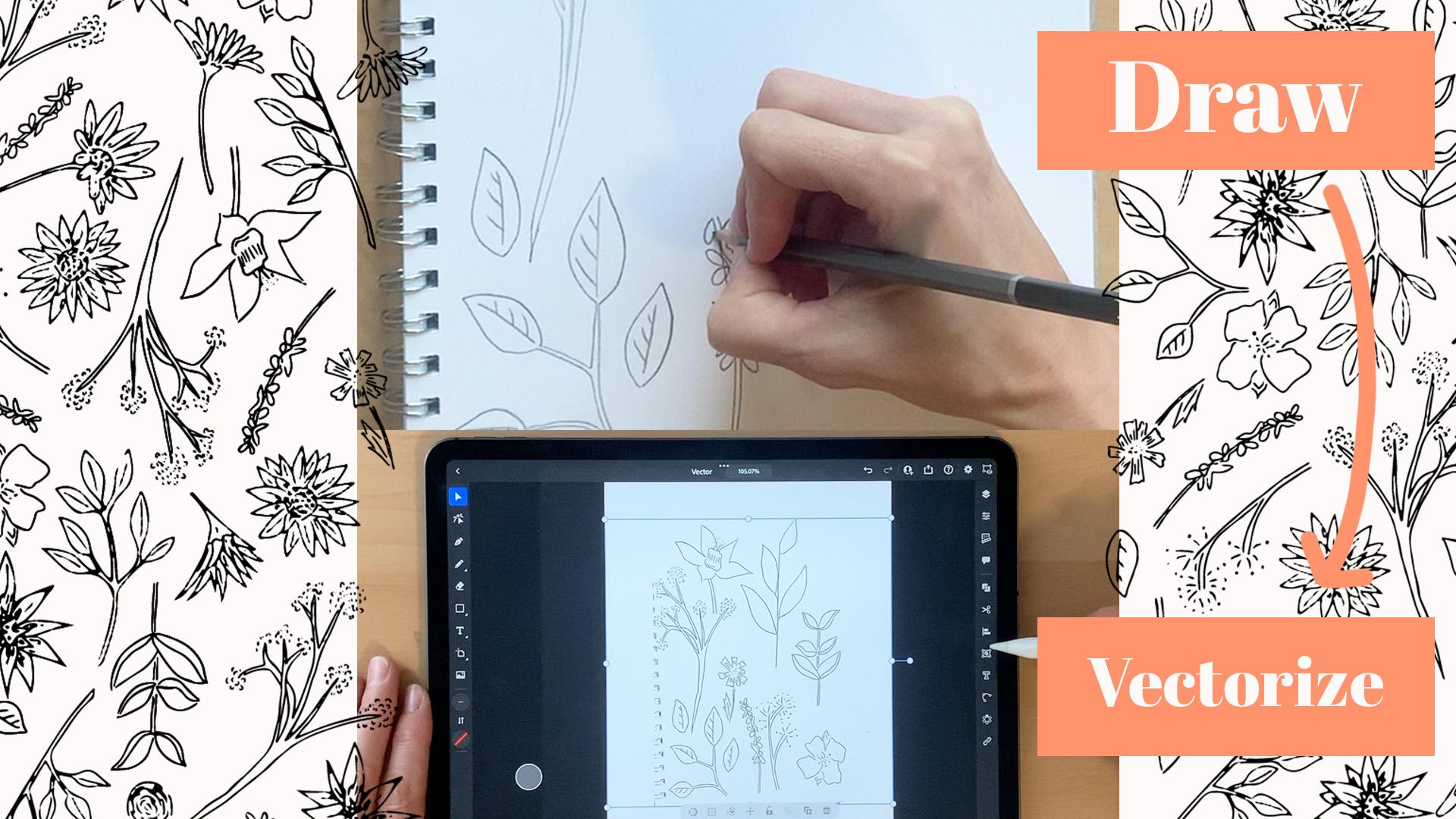
1. Hello: Hi, I'm Kirsty from
PRC-Saltillo designs. I'm here today to
teach to you how to vectorize your art by
just using your iPad. Nothing too fancy,
nothing too flash. Just a simple iPad Pro with an Apple pencil using Adobe Capture and
Adobe Illustrator. Throughout my class,
I'll run through from start to finish how
I achieve this. By hand drawing my elements to taking a photo
through Adobe Capture, then importing it into
Adobe Illustrator, and then finally the fun part
and vectorizing my work. If you have any
questions or queries, feel free to put a little
question in the discussions. The end of this class, I
would love to be able to see the new skill that you've taken
on while taking my class, please upload them to
the project section. It'd be great to be able to
see what you've created and how my classes being
able to help you throughout your
journey and creating. So let's proceed and
starting the first module.
2. Tools: To get started in my class, the one thing that
we're going to need is some drawing motifs to be
able to scan then vectorize. To complete this class, I have a few tools
laid out which is just wanted to show you
what I'll be using throughout this class. I'll also note them in
the description section. So you can reference to
yourself if you wanted to purchase these items
for taking the class, or if just for reference and the track you'd
like to get them. As a description says, I'll be using my iPad
Pro with Apple pencil. On here. I have my Adobe
Illustrator software already installed in it, along with Adobe Capture, which we're going to utilize
in scanning the artwork into our iPad so that we can then put it into
Adobe Illustrator. For my class, I'm
going to be using just a standard A4 notebook. Nothing too fancy. It's about 110 GSM. Not ideal for watercolor
or anything like that. But for my sketch work, it's perfect and notebook for
wanting to be using today. Throughout this drawing
section of my class, I have for drawing items
that I'll be utilizing. One is just in a standard
academy sketching HB pencil. Nothing too fancy or
flash about this. Just, it's mainly for me to get a real baseline all of
the design I'm going with because then the
truck I will be erasing this and then going over
with one of the pens a half. Now for the pens, I have
three different versions. Now, I have the 0.8 you depends
which I do really love. I've never had a bad
issue with these. And they just draw
very honestly when it comes to doing any of
my sketch working, creating my motifs by hand. I have two here I will be
utilizing within this class. One is 8.81 is a 0.3. The reason I really
like these is the nibs are very
nicely rounded. So find the glider the
nicely on the paper. I've chosen 0.8.3 because then I get a good differential
difference between the two when I
actually sketch with them, I tend to use a
smaller nib if I'm going to be using
very fine detail. And then point EGD for obviously the larger
things like stems, outlines of leaves,
that sort of thing. One thing to note
when you're using the pens is that
you really have to make sure there's
enough element of the pending on your paper so
that when you do vectorize, especially when you scan and then you'd put it into
Illustrator there. There's enough there for
the computer to pick up, which I'll go through within the drawing section of my class. Last but not least, all my pens. I have a Tombow. It's water-based, so I don't use it with any of my watercolors, but I really love that. It has two different sides. We have a brush stroke. Then on the other, it's just a simple rounded end, which is really just
a bigger version of the quantum state. Just really nice see glides and it's just a
pen favor of mine. Then the only other thing
I've got here is my eraser. I used to use a white eraser, just a standard thing that
obviously taught at school. And I thought I'd try one of these black ones and
never looked back. The one thing with the
white ones I really like because you have
to give them a good clean before you do
raise on your paper. Whereas these have
never had that issue. I have not looked back. That's a selection
of tools I'll be utilizing for drawing
within my class today. Any of these items that you're interested in getting
for yourself, please check out the
description section. And even in the project
resources will have a list of the items I'll be
utilizing threat my class.
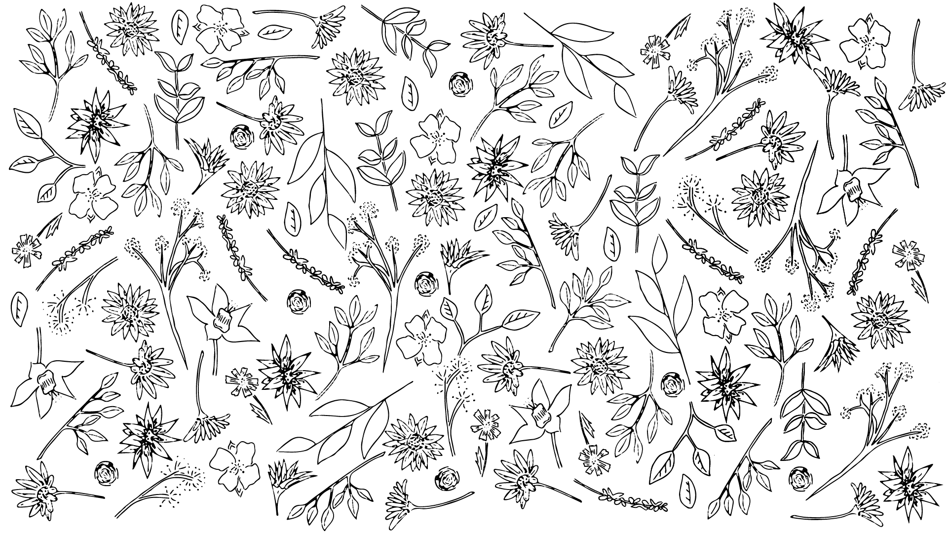
3. Drawing: To get started in my class, the one thing that
we're going to need is some drawing motifs to be
able to scan then vectorize. Now before I start drawing
my hand-drawn motifs, the one thing I'm just going to make sure is that
when I'm sketching, I really want to make
sure that I'm not pressing too Tegea on the paper. The reason for
this is I am going to outline with one of my pens. But I will be looking
to erase any of the outlines that I may not
exactly go over with the pen. So we're really
using the pencil as a guide for when we
finished with the pencil, will then trace with the pen. And then at the very end, arrays any markings left from the pencil so that it
doesn't confuse or really mess up your scan or
what Adobe Illustrator really finds or tries to read
when it tries to vectorize, it makes sure that
you just lightly enough that you were able to
see for yourself to trace. But at the end we will
be erasing them out. So don't go too heavy. I'm just gonna go ahead and
start sketching and feel free just to copy as I go or just do your
motifs as you follow. Now I've just created a
range of different motifs, choosing different styles,
different textures. Now what I'm going to do now is I'm just
going to go through my whole entire design and I'm going to utilize the three different
pens. I have. Mainly going to plan
out that for the stems items that I wanted
to be more dominant, I'm going to be using this
thicker 0.8 or the Tombow. Then for the more finer
details like the dots, spots, that sort of thing, I'm gonna be using the 0.3. Now, I'm going to try and aim to be on top of all my pencil work. But any parts that I'm going to miss or by Excellent,
I accidentally miss. I'm going to be erasing them out so that when
we come to scan, it's not going to be picking
up enough pencil work. So I'm just going to go
ahead and do that now. Now I've outlined
mine time motifs. I'm not going to
go ahead and erase any pencil marks that I can currently see within my paper. So that all it should
be evident on there is mod pan outlined motifs. Now erase that all minorities and are ready to be scanned.
4. Capturing: To proceed with us to proceeding capturing the elements from
my notebook into my iPad. The first thing I'm going
to do is I am going to shut off the light to my studio, mainly to stop any
reflections from my light above my head
reflecting on the screen here. I'm just going to do that now. The first thing for us to do
is to go into Adobe Capture. This is the logo here. This is my library
of things that I've touched and
worked on the past. Yours will look
completely different, so don't worry here. The next thing that I want us to do is to go to the camera, which is on the bottom
left here on your iPad. Just click on the
camera. Straightaway. When I open mine, it takes me to shapes because that's
the main one I use. If this is the first time
that you have used capture, you may find it opens
you up and materials or type or one of these
other ones on the right. But don't stress, just make
sure you click on shapes. Now for me, I'm
just going to move my notebook sort of the
top-left section of the screen. Mainly because my iPad
camera is on the top left. I'm just having
to make sure that it's directly underneath there. If you're doing this
class as I do it, just make sure that you've got
all your elements when you do this for all
your elements are within the screen,
within the camera. You can do this and turn
your iPad that way. But just because I'm actually
recording for this class, I'm just gonna leave it that way round that landscape view. Now, the next thing I do, which is actually in a way, quick way to do it. For me, for the way it
captures my elements, is an amazing way to do it. So I'm gonna stick
with what I know. On the left here you've
got these different tools, the little magic wand tool. Just when you press on that, what that does is it
literally freezes the page and gathers the
information that's on there. Now for me, I don't need
anything on the left. I just need these elements. I'm quite happy what
it's collected. So what I'm gonna do is I am just going to select
the magic wand off. Just switch it back on again just to see
what it's gathering. Isn't really much difference on my elements apart
from the background. So I'm gonna leave it off. This bar allows you to gather in the excess black,
the dark shades. I'm just going to
reduce it slightly. Apart from that, I'm
quite happy with that. So I'm just going to
click with Tick button. Now. What I'm gonna do now is I'm just going to
get move out then my notebook because I
don't need that anymore. I'm just going to
drop the iPad down. The next thing I'm
going to do is I'm just going to
rechange my screen. I can bring you in closer. You don't miss anything. I'm just going to turn
my light back on just so that you can see
around the screen. Grab my pencil. Now. I'm just gonna run through the different
things that Refine, crop and smooth do with refine, were given the option
of erasing anything. So arrays, I just do an example. I can get rid of
anything around here, which is actually really good. Click Done here. You also have the option
of drawing as well. And then obviously undo here. I haven't erased all of this because I'm gonna go to crop. And as you can see here, crop allows me just to
crop her anything I don't want brought in pretty
much a lot of the excess. Just going to hit pretty happy. Then next thing I'm going
to click on as smooth. I'm just going to turn it
on and see what it does. Unfortunately, with smooth,
there is no ability to sort of in a way correct it. So you could have 50%
smooth or 20% smooth. This either on or off. For me, I tend to not go with any smoothing mainly because
I like the look of it. Like it has been hand-drawn
and that's the sort of Luke, I go with my elements. Pretty happy there. I'm
going to click Save here. Then I'm just going to
go here and name it. Victor. Don, and save might come into my notebook
sketches where I've saved it. See, that's the elements. Now for us here, for us to get this into
Adobe Illustrator. Now the next method here, for us to be able to get this file into
Adobe Illustrator, we have to actually
do a few things. One is going up to the
share icon on top right, clicking there, clicking Export
to export it as an image. Then for me, I tend
to go save to files. Then on my iPad I've got a folder, it's
called Illustrator. I tend to save it in there
and then click Save.
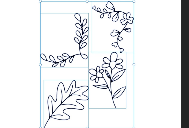
5. Vectorizing: Now the next state
for us is to know, since we've captured
our elements and put them into
Adobe Illustrator. And then next part
is to put them into Illustrator to allow
us to vectorize them. Now to do this, I'm just going to show you what the icon looks like
for Adobe Illustrator. Right here. I'm just going to click on
that and it's going to open up to what I've been
working on currently. Now for us to open up
the file that we have, there's two ways to go about it. We could go import and open. What I like to do is I like to dive straight into an art board. So I'm just going to click
and one of the standard ones. So I'm just going to click A4. That'll automatically
throw me into an art board that is A4 size. Then I'm gonna come over here and on the left and the tools you're gonna see this
little picture icon. I'm just going to click on
that and go go file, sorry. In here, see this a selection of different items that I'd been working in in that
folder, Illustrator. Let's see where I saved it. There's the one
I'm after vector. I'm just going to click
on that straightaway. It'll open up. Now if I click on it
with Adobe Illustrator, just make sure you're on the Selection tool
here to select it. With Adobe Illustrator
here we've got this toolbar that
comes on the bottom of it, any sort of object you have an Adobe Illustrator
that you're selected on. We'll have this toolbar. Now on the left here, this little symbol here
is to vectorize it. You can also come over to this little icon here
and you can collect, but you can actually
select vectorize here. For me, I'm just going
to select it there. That's nice and easy. What happens in this process
right now is illustrators reading what it can
gather in that image. And this is what it spits out. This right here. This is how it's basically
tell me basically what it thinks is in that
image that I've supplied. Thinks it's a line art, a black and white,
which is correct. There's no color in it. That puts going to be strokes. And we've got a few additional controls
here to mess with. Straightaway, I'm
going to tell us that it is actually a sketch. See, it does change it there. I'm also going to
keep it as fills. Then here I'm able to adjust the threshold is how much
it's pulling through. The bigger number you have a bigger value number
you have in threshold, the bigger your file
is going to be. If you've got a very
intricate elements are trying to vectorize and for some reason your
iPad keeps crashing. It's probably because your threshold number
is really high. If I drop the threshold down, you'll see it removes a lot of detail that
it was reading. I'm just going to keep dropping
that down a little bit. I'm just watching here. And here the elements
are missing. And it's just a really
fine line between how much you have
your threshold, how little you have
your threshold. I'm just gonna leave that for a second because what I'm gonna do is also burn drop noise done. Let's see what happens
there. Now with noise. What noise does is noises, what it thinks it is, thinks it's just dirt. Something that
shouldn't be there. Yes. A lot of the time it
helps increasing the noise. But as you can see a
lose a lot of detail, a lot of the leaves
shading that I had here. So I'm gonna make sure my
noise is down to one pixel. You can see here I get
a lot of this info, Beck, the next one I've
got his path in corners. Now, paths is
illustrator works in number values and
it also basically calculates in certain line
mark by adding a path. Now, Illustrator is a
fantastic software, but when you're
trying to vectorize, it can actually really
mess with how you style. As you can see here. If I drop passed down, you can see it seemed to
reduce a lot of detail here, especially here on
these leaves here. But bring that back up again. You can see it's got more
of a hand-drawn work ahead. But if I drop it
back down again, you can see it's a More jagged and the reason
being is it's got less paths. So the lower the percentage, the lower the amount of
passes within your work. Whereas if I actually
increase it up, you can see it's a
lot more smoother, a lot closer to the actual
notebook sketch I did, which is really what I'm after. So but once again, remember with past, the
more past there is, it's the same threshold. The more paths are, are the bigger your file is going to be. So just keep that in mind. Then again with corners, if our corners down, it really just sort of smooth out the edges a lot in the work. I put it down to not very much, not gonna huge amount of fact, but it might increase
up the other side. Just tidies up a
lot of the work. Now, looking through this, I have selected here to ignore
white, which is correct. I don't want any
white and white would be anything that's not black, if that makes sense. So this box, illustrators
reading that as a square, trying to read the
detail that's in here. But if I was to vectorize
this ignoring white, then it would just pull
through the black detail. So what illustrators
reading that? If I was to unclick,
Ignore White, what would happen here is
it would pull this box here as a white box and it would out cut everything
basically like penciling. If I was to trim around these elements with
a pair of scissors, I'd be left this white box
with these elements missing, which is not, I don't
have had no need for it. So ignoring white, the only
thing I want to pull out from this factorization is
the black elements that are within this. The other method we're
left here is the ability to retain these
sections in the middle. Now what I'm meaning
by there is if I click Ignore White
and I click that. If I click this method here. What illustrators reading
is that anything that has a closed path is to be a solid. Change that over. What I mean by see how this
line joins up to here, this note gap was facing. What is basically reading bony
selecting this is at once. I'm basically requesting
this whole section be one solid item, which is not what I wanted all I want to be able to in my own, fill these sections in. If I want to do color
this element in. Just note, it's
quite nifty tool, but depending on
what you're doing, pretty much 95% of the time, I have this one selected
ignoring white. If you're happy
with the selection here like I am with this, I'm just going to click
here expand victory. But expand vectorization, sorry. Then I'm gonna come over here. The one thing that
didn't do in capture, the reason I didn't
do it is it's so much quicker in Illustrator is to remove any excess that was pulled through
on the capture. What I mean by this
is going to ungroup this by just removing this
dashed line by clicking on it. That does is it
releases that grouping. So now I can just select
this section and so-forth. A good thing to do, and it's a good way to organize your work is once
you've fixed her eyes, certain elements like these is to just group them individually. What I mean by that
is just selecting those elements
altogether and then grouping them again so
that when you move them, they're all stuck together. If you don't do that, you'll find that you'll end up moving motif
and losing parts. Just a little bit of
housekeeping just to keep in mind what a meeting about
cleaning up is this whole bit of information here, which capture pulled
through and I didn't erase and capture. The reason being is
I tend to once I get my vectorized work into Illustrator and I've
finished the vectorization. I tend to just do this mainly because it's really
quick and easy. Then the last thing
I do is I just go around and group the
individual elements. Mainly because I've
just want to make sure that I am completely organized, mainly to ensure that I'm
not losing any elements. When I go to move them. I can just come into the file and I can just
grab everything. I need. Know that altogether and
there's no parts missing. Just going to do that now. They have it. That's how you vectorize your
elements in Illustrator.
6. Thank You: Thank you so much for
taking this class today. I hope you've been able to
pick up some new skills that you can utilize within
your creative journey. If you've managed to my classic create a new piece of work, feel free to share it
within the project section, I'd love to be able
to see and also to share with the current students and the future students
the work you've managed to create while
doing this class. You've also enjoyed my class and they watched
any of my others. Please feel free to follow me on my Instagram and
Karski underscore Salter designs so that you can keep up with any of my
new work that's coming out. An EDI releases, if any new
classes though. Welcome. Once again, thank you
so much and photo of my heart for taking the time
and taking my class today. If you have any questions, feel free to pop them in the discussions board and love to be able to
help and answer them. I love meeting new creators. Please don't be afraid
to pump question in. Once again. Thank you so much. Stay safe.
 Kirsty Salter, Illustrator & Surface Pattern Designer