Transcripts
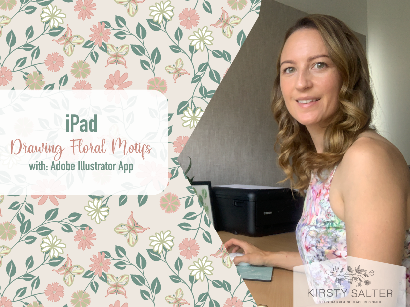
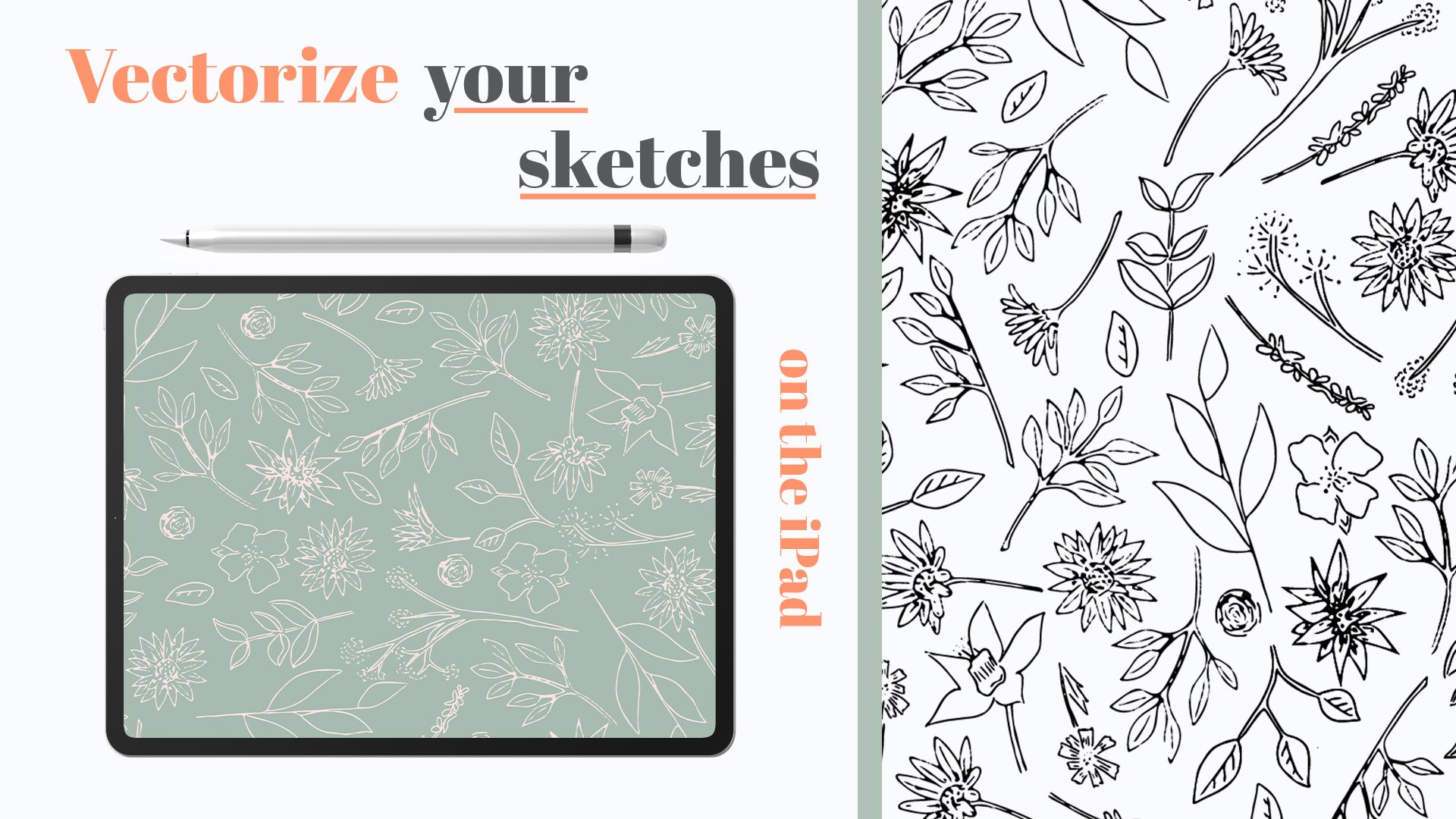
1. Introduction: Hi, my name's Kirsty. I'm an illustrator and surface pattern designer. I license and sell my work and have been doing for the last few years. I'm here to teach you how to create floral designs using the new Illustrator iPad app. Now this app I'd been waiting for, for the last few years since I started on this journey, I have been always wanting to be able to carry my iPad and be able to doodle as I go. As a mom of a two-year-old carrying my sketchbook, pencils, coloring and pencils, I found that my bag was just getting exceptionally heavy. But then luckily, illustrator announced that they were finally launching the Illustrator app. All of my work at the present time is done through vectors using Adobe Illustrator. I have through my previous time, worked with Affinity Designer, but have loved the platform that Adobe Suite actually offers, and especially with the Cloud. So I've stuck with Adobe, mainly for this reason. They, Adobe Illustrator app was launched back in November 2020. And for me it is being a complete lifesaver. I always find that if I'm on the go or I'm waiting on an appointment or in a meeting, I've been able to put my thoughts, my new design ideas straight into a new document within Illustrator. And that has sink straight onto my desktop, which has been a great safe, especially when you're a busy person like myself. Or even if you're currently designer and you want to basically save that time from sketching on a notebook and then putting it down, scanning it and then putting it in. But there is that additional advantage with using the Adobe Illustrator app. So in this class today, I want to teach you how to create florals using the Adobe Illustrator to App, one straight from hand and another, tracing from an image that either you currently have or if you go to the Projects and Resources, I've got a few options of images that you can use to be able to import and sketch off from. Through this class. I'll run through the general tools that the app allows us to use, mainly on the drawing side, the more technical side I won't really be going into within this class as I want to really focus on more the drawing tools that are available within this class. And from this, we'll learn how to import photos along with using the three basic tools, along with the bonus of using the mirror tool that the Adobe Illustrator app allows us to use. I'll also touch on how to export and most importantly, how to open your very first document within the app. So let's get started and thank you for joining me today.
2. Class Project: Now this is your time to shine. I would love for you to put together a class project which is based upon the floral design that you create within this class. Along with a one word or possibly two, depending how many you want to get in there. That basically equals and sums up your day to day. I've heard an example of how my day is today. For you to see as an example for your class project. I can't wait to see an even while you're doing this class project or even while you're doing this class today, share with me your journey as you take on this class by tagging me on my Instagram so I can share with all my followers your work as you go through this creating as such a journey. And we all take in different steps, but we're all unique and that's okay. So I can't wait to see your work and I can't wait to see taking my class and enjoying it as much as I've enjoyed being able to teach you today. So let's get started and let's get into this.
3. Getting Started: So let's get started with the first part of working with Adobe Illustrator. So here I've got my iPad. And if you haven't already downloaded the app, and the best way to do this is to go to your applesauce minds here. And then just search. I've already done this, but just search Adobe Illustrator and it should pop up as one of the top ones. As you'll see here. I've already downloaded it, so it's already on my iPad. But I'm just gonna click Open. You've already got it or you've installed it, the icon, it looks like this. So now, when you open up the first time, if you've never worked with Adobe Illustrator, don't stress, Don't worry. Everyone's recent sold obviously look different. This is stuff I'm currently working on and have been working on. So this is just showing me and as you obviously use a software more and more every time you open up a new document. Here we'll have any recent that you have worked with. So that's a really nice thing about this whole setup with Adobe Illustrator. Now, just going through everything that's here, we have have the home button, which just is basically brings you to this page, so it doesn't really do anything when you first open. The next page is your work. This really connects you with your, with Adobe Cloud. So if you use other programs such as Photoshop or capture fresco, this is where you can access all of those documents. So if I click here, it will try and pull in things and all that sort of stuff. So that's what the other two sides, which I really do love with Adobe Illustrator is. You've got the learn section here, especially if you're just starting out using this program. These tutorials are fantastic just to play around whether or not she watched how to do anything from starting with a sketch drawing for helpers, all that sort of side. There's some really good tools here. So when you do open this up and you do want to have a little play around with already created work. This is a great avenue. And then discover. Discover is fantastic. It's just people's videos of what they've created and some of the workers just absolutely magnificent. So good place to have a little lucky if you get a bit of a time. I'm just going to click home. Now, as we start off here on the top, we have The ability to create a Custom Size A4. My actual previous setup, which is 4000 by 4000 pixels. And then obviously just the standard A4 and millimeters here. I like to go straight down to here on the bottom, which allows me to create a new document. If you're ever importing from Photoshop file or anything like that, you would normally go through Import and open here. But I'm not going to touch on that. So don't stress if you're completely new to the software. So I'm just gonna click Create New. Now, as opens up here, we've got the presets up here. This is all the standards that I tend to work with. So my standard setup of artboards, artboards are like your piece of paper or your artboard. So this opens up your presets. So here I've got my recents. Adobe's pre saved work. The Print section, screen and illustrations. If you're working for a certain size here, to be honest for me, I tend to just go straight to recents and I tend to just go straight for a form. One of the reasons I do this is I like to be able to visualize in my head the size of the artwork I'm working to note that really affects it too much. The great thing with working in Illustrator is because we're working in vector. We can scale up as big as we want and obviously as small as we want. But for me, I just like to know that what I'm designing, I'm visually focusing on it being a four and then I think it's a good stock place for me, but everyone works differently. So the next thing to look at is also what we can do before we even open up our document. Here on the right, we've got the ability to name our file. So I can just do this and write floral. And then click Okay, and that will just come in here. And I tend to do this most of the time, especially if I've got an idea in my head where I really want to just even sketch something out and in a file then I tend to just give a quick name. So when I come back to it as a reference, I know what it was or the idea was going for. Then the other side here is the different sizes we can work in. Now, everyone works differently in sizes and that's completely fine. I tend to like working in millimeters and centimeters. So here we've got units. Now what are the units allows us to do is to pick which way we'd like our work to be measured. Now for people that are used to working in millimeters, or centimeters or even inches, we've got the ability to pick which one we're best preferred to. If you're new to the sizing, things are not really sure what pixels and points are. Once we've named our document, the next option that's given is four units. Now, a lot of the time people pick what they are mainly used to working with. So you've got feet, yards, meters, millimeters, centimeters, inches. I don't think I need to explain those ones to you. The ones that will sort of clear up on just to help any beginners out there that are new to digital work is pixels and points. Now a pixels the best way. And this is how I think of pixels as pixels. If you're thinking of a photograph. A pixel is a single adult in your image. So photographs are created by tiny little squares, basically tiny little colors that build photograph or, or a image. A tiny dot in your image is basically what a pixel is. Hope that clears it up. That's the only way I can wrap my head around it without going too much into detail. And then we have points. And points is basically a unit. Points is a unit that's previously really common for measuring type faces, so fallen, it's that sort of thing, but can be used to measure basically anything. Points is very rare. And to be honest, a lot of the time I tend to work in inches or pixels. Just say it gives me a bit more of an idea of where I'm at. And then if I'm working more of a detailed than I sometimes jumped to millimeters because I used to work in the graphics department. And a lot of the time it would be millimeters that I'd be working too. So just what really works for me and what sort of keeps me not to confuse with the unit side. I'm just going to put the stent inches at the moment. And here we've got our width, height right here. If you are working to say you want to have a rectangle and you know the dimensions you want it to be. You want it to be eight exactly by 11 inches. But you don't want to lose that formative, you want to still keep it in that shape. Then you can look this here. So when I go here and if I say I put that 10, this automatically changes to stick to that measurement on the other side. Whereas if I unlock that and if I put that to say 12, oops, this stays the same because it's not log. So just keep that in mind. I tend to use this quite a bit if I know I wanted to keep within the formation of an A4, but I do want to make it bigger. Then. This is where I make sure this is locked. You've got the orientation here, so you've got portrait and landscape. So you can change between either of those. I tend to just jump straight to portrait because a lot of the work I tend to be doing is that sort of profile. But like I've said, you can, but don't get too caught up in this section here, because once you create this file, you do have the ability to change it once you're inside. So don't stress too much. Here you've got the ability of picking how many artboards you've got. So basically high meaning of this size. You want within your art board. Now, for me, I'm going to go by eight by 11. And I only just want to have one artboard. Don't want to, so I'm just going to leave as one. Now the other thing to note here is the color mode. Now if you weren't in the printing industry or graphic design, anything like that, you'll be quite aware with the two different options between RGB and CMYK. But for you complete new beginners, don't fear. I'm just about to clarify what these two. So RGB is red, green, blue, and CMYK, cyan, magenta, yellow, and black. Now these two work differently because the way they actually are presented, either being print or either being digital. The way to think of RGB and CMYK is to focus on where you see or how you're going to use your design. If you feel that you're going to get your design printed on to business cards or onto t-shirts, any textiles, then you really need to be working in CMYK. But if you are just creating your artwork to be used all as digital, so on websites, branding, social media, really just visual content. That's not going to be null, going to be printed, then RGB is the way to go. You can, if you work within Illustrator on the desktop, you can actually change the artwork between CMYK and RGB. But I always like to make sure I've got this correct in whichever format I'm going to go with is how I'm actually going to present my work. So a lot of the time from my my work, I tend to our CMYK. So I'm just going to set this up and I'm just going to click credit fall. So that's how we create a new document. Remember if you're if you're completely new, check out some of these pre-sales. There's a lot of good options there. But if you just want to just get used to the system. So there you go. That's how you create your new document.
4. Tools Guide: Now I've created for this class bonus material, which is an Illustrator app screen map, which is literally just an image of a screen like this. But what we've got is I've labeled all these items down the side and up the top. And to help with you as you start within this app. Now this is available within the projects and resources section where you can download it and print it off, keep it handy or even as I have printed off and attach it to my desk for easy reference while I create. So let's get started into this. Now I'm just going to run through the individual ones of these. So as we run through this Illustrator, now, just go straight to the icons. So to get started, we're just going to start here with the basic tools on the left. So I'm just going to draw a shape just to give you an idea of how each one of these work. So right here, we're going to have the selection tool. So the very first one we've got here is a selection tool. And all that does is allows us to select one or more tools. Now, say I had a range of different squares. I can select them all by going across all of them, and that selects the MLE. The other way I can select them if I want to select them individually is this button here is like our shift keys, basically like a keyboard. So for me I'm just going to hold it down because it's my shift. And there we go, all selected. So there's two ways to select with the standard Selection tool. Now, here we've got the direct selection tool. Now the direct selection tool allows us to amend and change these anchors. And I can see here, they're all just standard points at the moment. But when we select an item with the direct selection tool, it gives us these options where we can remove the anchor, we can cut it or we can turn it into one with anchor paths. And what this allows us to do is manipulate each side of the path. Two ways to change the other. You can select the actual anchor and change it or double-click. This little. Circle here allows us to smooth off corners. So instead of having to go run H and every single one, if we select the whole thing, we can actually just amend it like this. So it's pretty cool little tool that is now the next tool on the left here is the Pen tool. Now through this class, I'll go into more depth with the pen tool and also the pencil and blob brush tool. But what these two really do, or these three even click here, you'll see the blob brush tool is here. They allow us to draw our own pass into which ever shape we feel like. So that's one with the pen tool. If we go pencil tool. And then even if we go to the brush tool, well, that's white, that's permanent going to help me, Is it? Okay. So that's those three. Don't stress about these two if you're not aware of them just yet because within the class we will get into the MAR. Then the eraser tool, which is just the same as any rubber you'd have at home. Just the raises sections of the path that you don't want. Next one we have is a standard shapes sections. So we've got square, circle, triangle, and star. So if we select one of them, drag it out. If we want it to be an exact shape. Hold down the Shift key here. And that allows us to get perfect shape. Next here we have the type tool which allows us to either create texts that it goes vertical or horizontal. So just go up here. Oops. There we go. So a quite simple, easy to use little tool. And then here on the left, art boards. So as we discussed within the opening a new document module, this is where you can obviously add new document and it's within your actual files. So this for me is one piece of paper. If I wanted to add another pace or another art board, I can either copy this one or I can even just draw my own one. So quite simple to change and manipulate. And then here we've got access to the iPad, camera, photos, files, cloud documents in libraries. So we can utilize this to gain access to anything within these areas. But I'm not going to really go into that too in depth. Here we've got the color. So this is a color fill. So if we come in here and collect the star, the moment it's currently showing that it's got a white outline and a green stroke. If I wanted to change that to have a yellow outline and then say we ended up having a orange stroke. Then that's how we change that. Now that's all the items on the left. Now they all have their individual little settings that you are able to change, which are all label on this sought. So even though that seems really basic with what these all can do, things like your pen tool. And just a general stroke can all be amended on this other side. So on this other side, we'll start off at the top just to keep it all simple. On the top here we've got layers. Now layers allows us to basically pick which items going to sit on top. So at the moment, this one, because it's right at the very top, it's at the top. And it's not on top of this. Homer's, I want to drag that up. It jumps to the back. There is a module within this class is specifically based on layers just to give any beginners that are new to this setup a bit of information to help with the learning process of this. So that's pretty much the scale of layers. So I'm not gonna go into that too deeply at the moment. Now here we've got properties and it's a very powerful tool, properties I use this all the time because it gives me access to pretty much every single item here. I can change the color of the item I have selected. I can also change the rotation if I wanted to. What it also allows me to do is change the location of where it's placed on the output, on the art board, or even changes general shape. The blend mode, which I don't really use a lot because to be honest, if I'm going to blend, I'm using capacity which basically makes it lighter and darker, more visible basically. And the most important section for me, especially when creating florals, is how the paths are going to be shown. So for me, if I'm going to be doing a line, say with the pencil, spin those over. This is where our half, I want to resize this section so it's 0.014. I'm going to change that 0.05. And you can see there, oops, let's make it bigger. But I don't like how this is all sharp and jagged. So I wanted to change that. So what the stroke section allows me to do is here, I can make it curled in the end. And also the corners can be rounded. Which for me when it comes to florals, I like that setup mainly because it looks softer and more looks like a ballpoint pen drawn. Instead of being very sharp and edgy, it's a lot more for me, it looks more aggressive. So then on the right here, we've got another tools that really great snapping, which just allows you for it to snap to grid. So you see here adds these pink lines jump in. What is, what is telling me is right now my stars in line with this green box on the left. Just perfect. That pink line running down the middle of the artboard is actually telling me that's the dead center of my art board. So very handy tool to have switched on, especially if you're trying to have things in line with each other. You can also have snap to grid to, which I don't really use that often because it tends to pull your item or your motif into a spot, which sometimes may not be the case where I want it to go. So I tend to keep that off. If you want a bit of help and you're used to working with graphs, then here you can turn on the grid mode. You can have it with just dots, which is quite fine. You can change how big the spacing is and the subdivisions. I tend to just leave it like this because it's quick, easy, and just nice and simple. And then just the standard guides, which is what we're basically seeing with the pinks. And the moment. You see there another lobe handy tool that does see this pink arrows that's showing me the spacing between this item and that item. So once you get your head around them, very, very good tools. The other options here on the right, we have the Shape Builder tool. Now the Shape Builder Tool is a very quick way for us to create a object. Instead of using the pen tool to try and draw a very detailed object, the shape builder tool allows us to kind of cut a few steps. So if I select these items, click the shape builder tool. You can see here it gives me all the options of what allow me to do. And I really just want to lose this section here. So I'm going to click, so, sorry, I'm gonna click that one. And you can see here it's removed, all the crossover overlaps. But that's fun because if that's what you're trying to initiate, then that's completely fine. Another way to work this is if you do say I want to get, oops. Say I wanted to get a complete crossover here between these two. I want this lovely shape in between the two circles. Can just click that. And then again, I've got that perfect little eye shape which I can manipulate and change. So that's a very handy tool, the shape builder tool. The other tools we've got on the right here are just the standard cut paste. This is basically where everything goes for your clipboard. So if you are, if you've created a shape within this software, within this document and you want to put it into a new document. The way to do that is to cut, come out of the document, open up the new document, click paste, and that will paste it into there. So nice and simple, not too detailed. Then here we have the simple align. So very much like any word processing document where you can have, you want to have these two IBD or even these three items all in line together. Can just click that if you want them all in a line together. Distributed. There's a range of different tools there. So when I'm creating florals or anything like that, attend to utilize this quite a bit, especially even flip vertical and horizontal. Very good little tools there. The other section we've got here, which allows us to manipulate and change our stroke paths. Now, these only come optional. These only become available when the actual object is in the right or you've got the objects selected. So for instance, if I do a simple line here, oops. Now if I just got a simple line here, now what I'm trying to do here, if I come here, you'll see is a few other, you'll see some of these have come available to us. Create Stroke Path or stroke outline. Convert to guide, make compound path. Now the only one really I use here is create stroke outline. Now, when I use that is when I know that I'm, if I'm going to be scaling this path up to say 50 percent bigger, what will happen is That actual line will get very small because at the moment, that stroke is only designed to be 0.05 inches wide, and that's it. Whereas when I scale it up by 50 percent, it's only going to get smaller because we're actually technically zooming out from the artwork. So to stop that from happening, which I have to say is a pain. If I've gone and created a floral motif and I've scaled it up. Or even the same way. If I end up scaling it down. If I scale this really small, what will happen in the process? You see it's quite wide. And that's because it's zooming down as it scaled down smaller. And because it's gone scaled down smaller. What we've because we've scaled down smaller than 0.05 inches is actually pretty big when you go into a size of a business card, for instance, it's a very big width for natural stroke. So to stop that from happening. And advises just to check whenever you have finished creating a floral or any design. And you know, you're done with it and you're not going to be having to change that stroke in any way. That makes sure you click on the Stroke. Come here and click Create Stroke Outline. What's that gonna do is when I click on this, you can see it's made this path no longer a stroke line path. Such he made it a shape. Which is great because if we want to scale it down, It's not going to change. Oops. You can see they're still got its nice thin shape. The ratio is still the same. So if I scale it up, it'll stay the same. If I scale it down, it will stay the same. So I use that a lot. I don't really use Convert to guideline because it doesn't, I don't find the need for it, but you may find that that tool works for you. And making a compound, I love everything to just be disconnected so I can manipulate it and change it when I import it into Illustrator when I'm creating patterns. So I don't really use that too much. I make clipping masks, but that's it. So the next tool here is the Type tool, which basically is pretty cool. I only got to play with this a little bit when I first started because I went straight into creating my florals and then I figured out how fun it was to play with. So what I want to do is just create a path here. And what I want to do is I want to have on this line some texts. If we select my text, select the path of cred. Type on path. It puts it on there. It gives me as well the ability to move it up, move it under. And also here my properties. Because I've got a text selected, also gives me a bunch of tools to change the size and font. So that's pretty handy. You can edit the path that this is on. So I have to make sure you double-click on it. But that's also quite fun to play with two. So now the other thing to note here as well is when you're trying to size up fonts or text. When you look at the size of this whole thing, you'll see it's very regulated sizing. And that's because Illustrator's reading out to this point, out to here at the top and down, which is what we want to know. We really want to know the size of the text, especially for a lot of car designs. I really like to know what size the Texas so I can measure it out and figure out, is it big enough? Is it in good proportion against the design I've got? Now the way that if I know that your or even yourself, if you know that you're not going to be changing the text, you're happy and that's what it's going to be. If you come over here and you'll see outline text is available if you click on that. Well, that allows is that all the messiness of changing the path of the text is gone. But it means we can actually, if you wanted to change the font, manipulate it to be something else. You know, maybe you wanted to go into this oh, and you wanted to remove the middle and put a heart in there. You know, there's so many options that you can do, but you can only do it if it's outlined. When it's outlined also, we can see exactly what they sizes as well. So just remember that little tool most of the time. The only thing I will say for anybody that is planning to do this, and they're using certain fonts a lot. Make sure you maybe off the artboard, have it written down what the fallen tears or copy the actual design you've got and just copy it and put it on the side. The reason I do this is there's nothing worse than knowing you've got a font you love. And I've done this. So this is just a little hot tip. And you can't find the font for some reason, Adobe has changed the available fonts. Or you can't remember what the font was that you use for a certain design. As long as you've gone off to the side. And you can double-click and access the actual type face, then you'll be safe. I've done it once or twice where I've finished the design off and I've converted it to outlines. And then I haven't been able to find the new font, the font that I use. And I've had to dig through and try and find an old file and it was messy and really frustrating. So if I went back here, what I would do is before I would export this, sorry, before I would convert this to outlines, I do a copy and I just move off to the side, so new that was there. And then I just go there, converted to outlines. And I could do, whoops, could do what I wanted with that. So just a little pointer there. If you're ever doing something like that, just maybe for safety sake. Heap it off to the side so that you can still double-click and still see what that font laws. The last but not least, is the last two options, which is the path. Now, path is going to allow, path allows us to, path allows us to basically manipulate and change sections within this path. So if you create with a pen, so Blob Brush tool square. This section allows you to change or cut the path, convert it to a corner, join path, all that sort of stuff. The one thing to note what this does, you've pretty much got access to all here. Because if you look the icons of the same, pretty much just a map of what you've already been given here. So I never really use the hiss, ever really, it's a bit of a funny one when you got access to the mall here. And this is a lot quicker. But good to know they're there. Let's see. Only thing I can say. Now, the last section, which is actually one of the most fun sections when you have time to play with it. I won't be going into too much detail within a few of these. But here we have click that and group these for a messed up. So here we've got radial grid mirror. Now, these are quite good fun. Just going to select color here and I'm just going to come out here. Now what the radio allows you to do. Now I'm not going into too much depth here, ladies and gentlemen, Just basically to the fact that I don't really use this because I I don't really use this tool, but I will quickly show you how it works. Radial copies the icon you've got selected and puts it into a circle, giving the name radio. You can change how many you've got if you only want to go a few round. And then you can also add more or less depending on what you're trying to do if you're even just after just a really cool shape. So that's what that allows us to do. The next tool is grid, Nike or surface pattern designer. You'll love this or if you're just getting into it, this is quite a cool little tool. Now this is only for patterns that are quite basic. There are more built within a tile square. So not really for detailed tossed patterns and things like that. Because you can't really cross across the line between one tile to another. I'll just show you how this one works. So click grid. What it does is basically mimics or dupe kits, that icon you've got selected. Now I can see how many come out. And then I can actually change these arrows here, Lima to push them closer. And there. So you can see there, I've just really quickly created a pattern. Very simple. And all it was was just a pedal leaf recreated. So if you are into creating your own patterns or designs, I can even do it for this one. Actually, I'll just duplicate this one here. I go there grid. And then you can see there, that's how to create passions. Now as a little bonus within this class, I'm actually going to show you how to utilize the mirror tool. Now, I'm not going to show you how to use the mirror in this section because I'm actually going to do a bonus section how to create your own motifs utilizing the mirror tool.
5. Layers: In this section I'm going to show you how layers work within Illustrator. So I'm just going to pick one of my creations. So I'm just going to take this one farm sides. This is one for an upcoming collection of mine. Now, we can see here there's a few elements to this design. So we have this rectangle with a bit of an Arab point on this side. And then we've got these little texture lines which are actually just stroke lines. And then the stroke line here and a different color and then the letters that are just stroke lines as well. Now, each one of these, when I click selects all the information within that section. And what this is called is called being grouped. It's being grouped together into one. Now, oops. What I, what this means is if I grab this, I put this up here. Now within Illustrator. When you select a design. We've got all these sort of little pinpoints here. Now talking about layers. Layers is up here. Now, Layers is basically allowing us to create an item as a simple unit, but grouping them together so we can manage them better. Now, in layers, whatever you ever have highlighted will be highlighted in your Layers group. Now how the layers group is, is think of it as a pyramid. Whichever item is highest, highest at the top, will be on top. So to give you an idea here, no, chicken is at the top, cow is at the bottom. Now if I'm going to move this one down here, it appears underneath the chickens on and that's because it's on the bottom. If I wanted cows to be on top of chickens, I'd have to grab it and drag it up and let go and it comes on top. That's how layers works. Now, within each of these can see these little arrows. If I click on cows, one can see all the elements that builds this groups design. If I wanted to ungroup this within the Illustrator app, this little box here with the line through. If you click that, you can see that line disappears. And it's no longer grouped item. So what things are still group? Let's have a look. If I click on it, you can see that this rectangle is grouped still. So if I move this around, it's so grouped with all this texture still attached. And you can see here, this little arrow shows you that it's grouped as one element. So same again, if I wanted to ungroup it, I would just click here. And then here you'd find that textual element is no longer group for that. And it looks like about she got a duplicate here, which might have been that maybe again. So that's basically how grouping and ungrouping works. And there'll be the same here with this element here. Can see as soon as I click on it, it's got that line through which is telling me it is grouped so unclick that I can move my each individual letters around. If for instance, I wanted to keep them grouped. There's two ways to go about it is to select each one and then group it again. And they'll be the same. Though all of these. And the other way is just to select everything that books and click Group. And that jumps back to being grouped. So that's how layers work. Another way to use layers is say for instance, you've created these elements and you've decided, I want to add a tree or add another element to this, but you want to manage it so that it's nice and clear and you can play around with how they all sit on top of each other. Then a way to do that is to add a new layer. It's just this little plus, which at the moment it's got nothing in it. But in time you can either open both layers, make sure you've got the new layer open. Because if you don't, if I just show you here, I grab this one and try and drop into this layer. Can't move non layered object and that's because this layer needs to be open before allow you to drop a new layer into it. So that's a really handy way with layers to utilize that. Some people don't use the layers at all. Some people just create and group them individually and don't even come and look in this section, especially if you're a surface pattern designer, a lot of the time we won't use layers, but it's just a personal preference. If you've got a graphic design background, then most likely you're very used to using layers. But if you're a complete newbie, don't feel like you really need to work and manage what you create. Because no everyone does. So that's how to manage your layers.
6. Drawing Florals: So I'm going to show you how to create florals using the pen tool. Now, I've already set up a little bit of a color palette here. But what I want to do is just add in a few other elements. Here are a few other different colors, sorry. No, I'm gonna do, I'm gonna get rid of that. What I want to be white and I'm going to pen tool. So I'm going to add in the grid just to help me get a bit more of a visual on my angles. I'm going to tap himself but a menarche and then tap. And then sort of figuring out roughly where the other one is, tap. And then then I want that to be filled. And I want there to be a few different variations of petals. I don't want there to be an exact duplicate all the way around. Just because I like there to be a little bit of differences between them, like a natural flower would look. So I'm gonna do that again. I'm going to go a little bit lower here. And there we go. And then I'm just gonna do this a few times. And then just as a little trick that I tend to do, depending on if I'm working, decided that what I've done is a bit different from what I'm creating. So I'm going to just change my points. Just to change. I'm just to meet him with how this is all going to drop that in a bit. So as three petals. Now, what I'm gonna do is I'm going to select this one. I'm going to duplicate it. Now here on our bar, we've got some great tools. So here we've got dragged change the opacity. Now, I really don't play with this too much, mainly because I automatically go up to here and I change the opacity here. But this is a good shortcut if you want to basically drop down the colors, especially if you're working with a bit more textures. The next of the option we've got is here, which is the stroke width. So it's really hard to see on this swan because it's white. But it allows me to fatten or make bigger that path and also to make it smaller. So that's a really quick tool if you basically, if you're jumping into here and two properties, the other option to try and do this task is here. The other side is working with your layers. Now, when I say that some people use layer, some people don't. I'm truly serious of that. In the passion design world. A lot of the time we just create and we don't really sort of focus on our Layers. And what layers is meaning. This little tool here allows us to not have to jump into here and move these around up and down. This allows us to do that. So if I push that down, is pushing it behind the next item Phi and just keep an eye on this path here or this section, sorry, is, if I do this, it pulls it forward. I wanted to jump back. It jumps back one. I want it to always back up, push it back, and it's all the way to the bank. This is really handy if you're working with a few elements and you just want to move one thing back. But you have so many paths and this list goes down and down and down. This is a great way to just shortcut that. Now here we have the transform just allows you to move it around. Sometimes I find with this program that if there's a small item that I can't seem to click on. And I'm a, uh, I'm being lazy. And I just don't want to zoom all the way in or when I do zoom in, I'm accidentally grabbing that element. This tool is really good for just being able to move the item around. A lot of the time I found if I've got a little piece of a petal on a want to move it. But when I try and grab it, I'm grabbing the wrong thing. Zoom in, click on it. And if you're trying to move your finger or with your pen, and you find that you're either stretching your element and just click on it and go here. It's the safest way to make sure you're not manipulating or even changing the element. I've done it loads of times. It's really frustrating and you end up finding yourself just going. Why am I not pressing on this? So just keep that in mind. Now the next option here we've got is to lock it. Now, I tend to do this if I've finished an element and I don't want to change it, I'm happy with its position. Then you can lock it here. The only way unfortunately, to unlock it, and you have got an unlocked is you have to basically click on the padlock at the top or find it within the layers panel and click it off there. So locking is a great way, especially if you're working with a detailed background and you don't want to miss the background up, tall, lock it, and it just won't move unless you press the padlock to unlock. Now the other option here is the duplicate button and the bin. So I'm going to use the duplicate rhino. Click that. And what that does is duplicates exactly. The element. So when you're doing petals and that sort of thing, I'm just going to carry on. So when you're doing elements like this, that you can duplicate elements and it's not going to affect your work. Then do so. So I'm just gonna go ahead and create this floral using the exact same method of DOM to create these petals. Just a detail my work. Okay. And there you have it. Just a simple floral design. And I've just done very simply Pen tool around and did the little cheat by just doing a very basically like a fill to fill in that section there. Then hand-drawn my little dots. I tend to use the pen tool a lot of the time for my little dots in here, just because they're very unique. Got a little bit of a bump there and then the sharp edges on here. It's just nice and unique. Instead of using the circle tool, which obviously just looks like use the circle tool. So that's using the pen tool. And I'm just gonna go ahead and add a little bit of details to this flower just to finish it off. Thanks. Yes. Six. Hi. This. You go, there is my floral made with the pen tool. So just a lot of these lines could obviously be a lot straighter. But for me this is my styles. So obviously if you're going to try and design a flower that is exact, then you can do that too. One thing to try and remember is that those anchors give you a lot of control. So for instance, if I wanted to do an exact flower, another way to do is to do this and then zoom in. Again. Just to give it a little rotate. There we go. Just and then if you wanted, you could even do the same process here. That color size down. She just duplicate that size that down. And they go, Let's just put the pen tool. Now you've probably seen me grouping items together like I have with here, where those four petals with the red outlines are grouped. Now if you do want to change or manipulate individual items within that, there's two ways to do them, because their groups, you can easily change it by just jumping in here and changing it. But if you wanted to get into this layer and only change, say these two petals a different color. All you need to do instead of having to ungroup it and then do the change, then have to regroup it again. The other option is to double-click. And that allows you, you'll get this blue box, the shoot appear on the outside of the element. And what that's telling you is you're actually inside the group element, which allows you to individually select those individual elements. So if I wanted to change that, to say this pink and that one to the pink. That's how I do it. So if you ever group and item and then worried that you want to go back in there and individually, color and item Don't stress because you can just double-click on them and then change them. I'm just going to remove these changes I've done. And then just to add to this, just going to do, I'm going to hold down my shift key of Lappin. It's going to hold my shift key. And then it's gonna go here and here. And I'm just gonna do a very not overly exciting stem. I don't want to move it back. So it's behind. And then I'm just going to do some very simple, not so flashy leaves. Basically very similar to my petals, but not too flashy. Loops that go behind, behind my stem. Thank you. And then I'm just going to duplicate that. I'm just going to flip it over to the other side and drag it over. And there you have very simple flower. So this is more my style when I'm designing. And this would be more sort of the controls style that you can get with the pen tool. I hope that's made a bit more sense to you. Any questions, just drop a little question on the bottom of the comments page within the class.
7. Drawing Florals Continued: Now we've used the pen tool to create these two motifs. I'm now going to show you how to create some florals using the pencil tool. The pencil tool for me is actually probably my most utilized tool within this app. Mainly because I like the free flow of the pencil. I can control the smoothness if I want to basically draw very wrong, not allowing the software of Illustrator to basically smooth out my lines civic giving example here. Phi draw can see it's very wiggly and not very exact. Sometimes I do use this if I'm looking for that sort of style. But if I am after more of a smoother line, I'll drag it up to about seven or eight. And then I'll just do another one. And you can see there, Illustrator, I have basically smooths it out for me. And this last points as well. Whereas if I click on this one, there's lots of points and that's because that wasn't the most smoothest line of ever created. And that's because of this little handy tool is smoothing here with the pencil tool. So I'm just going to delete those two. And I'm just gonna go with the flow and creates floral that would do sort of all my every day while doing my designs. Now you can see I'm literally just going up my own hand here. Nothing to over adventurous here. Just going wherever my mind sort of thinking as a gap. And that's one of the reasons I do love the pencil tool is is just very free flowing. I'm not having to draw pet lifted, hold it down like you have to do with the Pentel. Not saying the pen tools, a bad tool just for me sometimes I just loved to do to like you used to do as a kid with a pencil and a bit of paper. And this brings it very much home for me when I use this tool. So I'm only just going to do like a half open sort of flour here today. I'm just going to group them to keep them all together by clicking the button here. And then I'm just going to add just a little bud here, just to which is basically the opening hole and they're not exactly a 100 percent happy with that. So what I'm gonna do is kinda come down here. And I'm just going to change this anchor point so that it kind of stretches are uncovers. That line. This one's coming out of touch. So I'm just going to double-click drag that same little curl that I had. Here we go. Just a little manipulations. And that's why this app is so powerful because we can basically manipulate this into whatever sort of shape we'd want to look at that. Yeah, I'm really happy with that. And then I'm just going to draw a little stem goes up. And I'm just going to do an arrange of leafs. Now, just leave it like that. I'm happy with that shortly. So that's just a very simplified floral there. Now you can add in your own little sort of just extra textures here to define your actual style. So for me, I'm just going to go in here and just add in just a few little lines. Nothing too. And I'm trying to achieve is basically by doing a lighter color or even a light color like this yellow. It's just adding like a little sun kissed little prompt on these leaves. So it doesn't really have to be much when you're creating florals, when you're just wanting to add a little bit definition. It's just adding that little bit of touch. Plunge them. Pretty happy with that. So just make sure you don't change anything, move it. I'm just going to select it all and group the whole thing. So, oops, I moved it. And then I'm just going to lift it up here and holding down the Shift. There we go. So that's basically one design utilizing the pencil tool, and I'll just do another one just while I'm here. Change the color settings. I'm happy with that. The one thing just to remember as well with the pencil tool. If you still selected on this, and then you decide to do another drawing. Sometimes if you're still connected and say you do a drawing very close to it, sometimes it reconnects itself. So I'll just do it's not doing it for me now for some reason, but sometimes it does do that. So just be aware. The one way I try and save that from happening is if I'm calling it clicked onto a actual pathway here, I just test. Literally click off it, make sure nothing selected and then go back in. What I'm going to add in here. Because I want to do some patches behind. So to do this, I want that to basically mimic these shapes. So I'm gonna do, it's gonna duplicate, change the color. Just make sure I've got those. I'll select it again, group them to save that. And then what I want to do is I want to move them back. The reason I'm doing that is because I want to create this little like a shading basically behind, but I want to make sure it's centered. There we go. Then what I'm going to do here is I'm going to get rid of that here. I'm just going to do just as I was saying earlier, that can happen. So what I should've done is to literally stepped off and then went back on again. What I'm doing here, I'm just adding same bit of dynamics into this leaf. Nothing too fancy. I don't really like to add too much detail. Having quite nice and neat my mark. But everyone's, everyone's unique people. So just remember you do you got for this class, feel free to copy my style. Just can come down here. And again, just add in one more for good luck. Now I've created all these lines, so I'm just going to do is I'm just going to select here in the layer path, selecting them all. I'm going to make sure a group. And what I want to do is make sure they're rounded and IT want to reduce the size. And I want them to be too big. I just want them to add just a touch different size and you lost some. Lost some here. And there we go. It's going to go click, click and put them together in a group that together, group. So quiet, simple. And then once again, very similar to the last one I created. Just going to come down here. I'm gonna get rid of the outside stroke. And I'm just going to do just, oh, I didn't mean to do that. And I go direct selection tool again, I'm going to come out, just drag this out to the end. And I'm happy with that. We're happy with that one. School zoom out and just have a look at that. Maybe skip that more of a curve on the top. So this doesn't look so Jackie makes it a bit more softer. Then this one here is going to run up and down. And then same again, I'm literally just going to do my stem is going to go back up. And I'm just going to drag it up. So it's kind of hidden there. And then I'm just going to do mine. And then I'm going to switch two florals created with the pencil tool. I do love the pencil tool. It is a really good tool and it's one that I tend to go to even if I'm using it for just spit a free hand work, it is a lovely tool to utilize. The next tool I'm going to use is going to be the blob brush tool, which is located here by just holding down or double-clicking on the pencil tool. Get this little pop-out just here. So whether when you click on it, you get given a few options. Now, these are just your brush types. So you've got the basic round, flat, basic chisel and terminal. So if I went off the round, let's pick a color so we can see it. So that's the round option. If I went flat. Now, the next one is the basic flat. No, I don't really use this very often. Mainly because it's not a massive change between the round. And the flat. If I really want to see a difference between the round, I really just do the big jump to the chisel because the chisel just has a bit more definition. As you can see there. You can see where it's going off. If I was a felt tip pen for instance, in CIMI for my angle changes and it goes narrow. Or even if I'm using a brush, I mean, that's basically what it is. It's a Brush tool. If I come up high on my brush, it goes narrow. If I press down with more pressure and go at an angle, it comes fatter. And then you can just see the changes within water brush would do. So the flat is a very I don't know, kind of not really that utilize for me. And then the basic terminal, which is very different, and it's also designed to be bigger. As you can see the standard settings here, you're jumping up so the round is eight points, then you jump up to 10 points, the flat 20 points, so the chisel and then 30 points up with a terminal. So as you can see here, that each jump bigger and bigger each time you go up, and they each give a different effect. The blob brush tool is great if you're looking to do some texts, are you looking for, you know, right. You know, if I can finish it off. If I wanted basically write some tags, then that terminal is great and so is the chisel. So not saying that there, that the flat is completely unused, but it's definitely one that I'm always questioning on even using when I'm doing my work. So I'm just going to remove them. So I'm going to do the same thing again. I'm going to create two florals utilizing the Blob Brush tool. Now, I'm just going to use what I always tend to go to. But feel free to pick whichever one you want to use. I'm just gonna pick the route and then pick a color I'm going to use today. Go with the orange. So the one thing to note when you're using the blob brush tool is that you are given a few extra tools then the left here. So you can change the size of the drop. And gives you an example of how big it would be. Which would the other two? You don't get that option. The only way you can change the stroke within pen and pencil is you have to come over here and then change it when you've got it selected. So that's quite cool. I do like that with the blob brush tool. Then the same again, you've got the smoothing ability to change and manipulate that. And then the other side is your Dynamics. Because you're technically using a brush, you can change how much your bonuses. So technically you can turn your basic round into a terminal or a flat by just manipulating this. Also, depending on how your hands sits on the iPad. If you're left-handed or if you're right, you can change the angle on how you would actually write about droplets here you can see that if you are left-handed, that's what it would come out at us. So that's pretty cool when you're playing around with a and then here you've got your pressure dynamics. So depending on, so if I press really hard on here, but then lift my pencil up, which I'm doing now. It's going by thin line because all about how much pressure I'm placing on the tip of my pencil onto the screen and I'm going to lift again, going really lie, because I just want a very fine line. That's how we can control that. So that's a really cool tool. So I do sometimes mess around with this a bit, especially if I'm trying to manipulate any typefaces or anything like that. So you can see there I'm just going in and stronger lifting, lifting, lifting, stronger lifting, lifting, lifting. So have a play with that. If you're watching this at the moment or even afterwards, just have a play because that's actually pretty cool when you're playing around with the blob brush tool. Now, I'm just going to go here and I'm going to make sure so that everything that I wanted selected basic round. Yep. Okay. I'm just going to understand now when creating an item with the blob brush tool, when we create with any one of the pen tool, the pencil tool, you'll see that when we create a shape, if we've got this filled in, it's filling the shape pen with whatever is selected here. But with the blob brush tool, this isn't so, so show you. So I'm just going to draw a petal shape. Now. I have this selected, and you can see I've got selected here and it's showing that the film should be orange. But it's not in the middle. And that's because when we, oops, that's because when we utilize this blob brush tool, what it's creating isn't a stroke line. And what I mean by stroke line is come in here and if I click the direct selection tool, the stroke line is this red line here. That's our stroke. That's basically our path that holds all the way around. And there's only one. There is only one of these that we have, so that we can just manipulate that one line to change it. But with the blob brush tool, whenever we create technically to us a stroke, what we are creating. It. Three strokes. So we don't have this line that runs down the middle where we can manipulate that and this whole chunk of section gets manipulated on either side. It's basically created a stroke line, which is two lines where the middle and how that works is, if I pull this in here, you'll see that it's only affecting this inside line. And this is, this is the same with the desktop as well. So which is all gray and it's great, good fun. And it's good if you're doing, if you're wanting the center of your petal to have nothing in it, then that's fine. So if I wanted to utilize this random shape that was coming in here and design this floral this way. So I'll just do now just to show you, you can see that it's not much. It's got no fill. So all we're really getting as a repeat outline ruling. Now one thing to really note with Illustrator as well with the blob brush tool, blob brush tool. But if a muscle is if I was to draw another line through either of this color, it will basically weld itself to it. Whereas if I create a line that's a different color through this color, it won't wells. So I'll just show you here. Now this is what the pathway looks like at the moment, you can see I'll click on the direct selection tool. That's what the paths are. Now. That's all it's own individual item. Now I'm going to draw through here. Now when I select here, you can see and select the direct selection tool. This is an its own item. It's welded itself in. So even if I wanted to pull this out, it is one item. And the only way for me to disconnect this is either to use the eraser tool, which I'll do here and erase this part. And the same on the inside and so on, so forth. So whereas if I undo that, and if I change this to yellow, and then if I do the same and I select here, you can see it's got nothing to do with it whatsoever. And that's because within Illustrator, if you use the same color with the blob brush tool and either of the pathways touch it a well together. It just basically blends together. This is great if you're wanting to say color in this entire flower. So if I wanted to color in this flower, yet less fun. Then I could just do it like this by hand and just go about it this way. Which is a longer process. But obviously if you've only just got one motif or one little item, so smooth that off. Then you can see there it is one item. So two ways to look about it really, as you can see, that's just one little flower. Now what I'm gonna do is I'm just going to add a little bit for definition there. I'm just going to bring that down. To bring that orange. Just something to note why new utilizing the blob brush tool when you create a sarcoma or anything like that. And you know, you've got this filled with the yellow and you're thinking in your head, rot, okay, I want to draw this, and this is going to fail when I do that because you some I do it a lot of the time, I think. Oh yeah. That will be the same as the pencil or the pen tool. No, it's not. But that's okay. That's just the way it's been designed. So as you can see, you can utilize the way it creates that way to your own advantages. So for me, I'm just going to change a few little things here. I'm just going to use the same tool though. It's still the blob brush tool. That's a little bit big for me though. And I'm just gonna make sure these don't touch because over see if they touch. They'll mail the cells together. And there you go. So that's just a tone. Does have a lot of bands choose way bigger than I thought I was going to fail the same. And then same again, I'm just going to let you do the stem to be a little bit bigger. And then my leaves, I just wanted to be much She's can create my line in. I wanted to do is we can cast her another one to do my next floral. So there is a lot of ways you can utilize this. And it's just all about finding your own style. I know some amazing artists that just use the blob brush tool and their skill set is absolutely phenomenal. So it's whatever really suits you, you know, for me, yeah, I dive into the I do utilize the pen tool. Pencil tool tends to be my go-to a big chunk of the time. And that's just basically because of what's, what's comfortable for me. But you may find that you've got your own way that suits you best. So don't walk away from that. I'm just going to move that to the back of a can. I'm just going to give myself a little bit of, oops, too big. Now the other nice thing had to like about the blob brush tool, sorry, is sometimes reminds me of using a felt-tip pen. You know, just coloring in. And that is one of the loves a dude love about the book Brush Tool. And I'm just going to add a bit of white. Three sets of florals, Pentaho, pencil tool and blob brush tool. You can see the age have their own different styles when you can use them. Here I've got more set of defensive pointy edges and I use the pen tool here, a lot more softer, but I still get that point. He sections with the pencil tool. And then here, a lot softer with the blob brush tool. Now obviously if I decided to utilize, say for instance, the terminal and actually change the pressure points in the dynamics and the angles and everything like that. You know, it's you can see that I get a lot different shapes with it. If I drop this down. Oops. So my loss, my color can see the shape is a lot different. And even if I wanted to do that again, the only thing for me using this for creating flowers, because it's just a little bit uncontrollable. I know if I practice more utilizing the terminal or the chisel tool, creating florals, I would get better. But it's just a bit too out of control for me and it's not really my style. So for any of you out there, go Now let's try the other ones. Feel free to create your own unique motifs using whichever tool works for you. And can't wait to see what you've been able to. I can't wait to see what you've put together for your class project utilizing either these, as you can see, there's a range of different styles that you can come up with. And you can pick whatever range of color palettes that you'd like. So can't wait to see what you come up with.
8. Colour Palette: I wanted to create this module so that you'd have the knowledge and how to create your own color palette. If you're anything like me and you love creating color palettes, then you'll find this really interesting. Now, I've just pulled up here my color section. So simple. It's called the presets and it's still got that meant that I added in. But what I want to do is I want to clear this all out. Now there's another really easy way to do this. I can't select them all and remove them. So the way I can do this is click on the Color. Want to remove? Hold down on the color and click Remove. Now I'm gonna do this for every single one bar, the mint, white and black. I always keep those within my color palette. Now for me, when I'm creating a color palette, I love taking inspiration from a photo. So I'm just going to come in here, go into my photos. And I'm just going to pick one of my loads of pictures of my kids my children here. So just going to have to hold on for me. So here it is. Now this is a photo of a beautiful flower that I've got blooming in my garden and the moment, along with my pet dog here, Let's just coming in for the entertainment. Now, on this color section, we've got this little, little sort of pen tool. But what it does, as you see as I move it, it's showing me the color that it's sitting on. So I really want to grab this pink color. So as you can see, I'm sat on it here and it's showing up there. I want to add it. So to add it, just click there and it's added in. And just keep doing this process. We find a color. Can I sage love that? A lot of that in touch with Lucky little yellow here. Chicken love that little darker. And just keep doing this to have many you want to have. But this is how I go about creating a lot of my colors. Because I love the natural tones I can get from an image, the Nazi playing around with this, we'll try to find a color that matches. And another little tip. If you're not sure you want to add it, and obviously you can go in and remove a color. But another little tip that I tend to do as well is if I click the blob brush. And if I do this, and then I wanted to do another one, but I'm not sure on the color. I'll click on there. I'll go back to my blob brush color. And I even make a row of all these little blobs. And then once I've done that, I'll start rearranging them in their own individual little groups. And I can see which ones sort of work with each other. If that works together, I'll keep it. Or if I've added a blue or even if I wanted to even duplicate and say I wanted to make my own blue, that would sort of work with the toning of it. Maybe you need a little bit lighter. If I wanted to add these in, I want to add this blue. I have to come down here, have it individually selected and click Add. So that's how we create our own color palette within this artboard. Nice and simple. You can have it down as a list of you want. But I really love hang having it as a grid because then I can see it clearly. So I hope that's helped you if you're, if you're like me and you love making your own color palettes within your individual document. Then that's a really handy way to do it. Little trick of mine.
9. Image Tracing: Now for this section, I'm going to show you how to trace one of your images. Now I've uploaded and is available to you within the resources of this class. Two images which you can use with this class. Or you can even import your own images and sketch them. While we do the class is completely up to you. I guess a lot of image tracing, especially for a lot of line mark when it comes to my florals. Just to get that more definitive line, especially when I'm after a bit more detail on a motif. So let's get started and let's import these two photos. Now make sure you go to the project and resources section of this class. Well, you'll find these two images ready for you to download. Now, I'm just going to go here. Now I've saved these photos in my photo section, sign ago my photos. And here are the two images here. So I'm going to select on the first one and drag it over the left. I'm going to go back here, click photos, and then I'm going to click here. And there's a second one. I'm going to drag that over to the right. Now. I'm just going to select this rose one, the pinky one, and zoom in. And what I'm gonna do is I'm just going to go over here and change opacity and properties to just somewhere where I can see the detail enough, but isn't basically whatever I draw on top, I can still see it. Just going to look at now. I'm going to zoom in and I'm just going to pick my weapon, which I'm gonna go pencil. Now, I'm going to go because I'm drawing on a photo or resend to go black with no fill. Smoothness 7, which is perfect. And what I'm really focusing on within this is I want to get the lines. But what I'm also trying to do is I also wanted to have something to fill as well. But for this exercise, I'm just going to focus on the line mark. It's like I'm basically sketching it into a sketch book. So I'm just going to do this and you can follow suit. I'm just going to change my smoothing down to about three because it's smoothing out a little bit too much for me because I really want to grab some of these hard edges and finer details and roughness of these petals. And if you follow me on Instagram, you would have seen that? I do. A lot of these little florals, especially for my Instagram page. And a lot of the time what I'm looking for and I'm doing them is really just to show the shape and edginess and the line work that comes with the florals. Lot of time it's about the soft petals. For me, it's more about how these beautiful petals come together. So I'm not trying to connect my paths together. I'm more interested in about the shape this pedal gives. Now this beautiful Rouse. Very lucky. And I've got a doctor across the room. He's a great friend of ours. Actually has all these beautiful roses bloom every year. So the regular neighbor that pumps in and takes a snap of them from my own collection. But just remember, he loved drawing flowers. There's nothing more exciting. Well, it's exciting for me. Going out with my camera and taking photos of the beautiful flowers are blooming around. And it's so much more exciting. Drawing of something that you've captured, something that you've been able to see in real life. And they go up very quickly. Demonstrates. Now, if I scroll down here and find the photo and I click that, you can see there. There's my routes. Now, even just that simple design is enough even to create into a very unique design on styles. So, yeah, I think I'd probably change within this is if I double-click Texas the group. Oops, my head. I'm probably just select on that and trying to break this. Maybe I'll just remove it and I'll just add in. Doesn't need to be perfect. Some not after an exact copy of that image. So again, that's just one. Now the next one here says My neighbor's house. So I'm just gonna go here. I'm going to do the same thing that I did with the other one. Drop the resolution or the opacity down. I'm just going to look at so I don't accidentally move it into the world of, uh, did that. I'm just going to open a new layer just to keep all of this one inside. And I'm going to do the exact same process again, just focusing on working on the lines. Now remember you don't need to exactly like I'm doing. Obviously pleased to copy and practice this way. Everyone has their own unique style and how they create the work. You may like to create the whole petal together. And within that, that will be your design. We've all got to learn somewhere else for sure. And this one's a lot more simpler than the previous one. And then I'm just doing simple lines just to show basically wrote a lot of the veins are within. And doing that she allows you to see where the actual leaf is bending too. So I'm actually going to try and use the brush tool here and drop it down quite fine. And what we're gonna do here is, oops, I should have checked that for you. Try to go in here. I'm going to go round it plays. Now. I'm just gonna make sure my pressure as NIH some light. Then I come down here and remove that image. And there we go. There's my second one. So that's a way you can actually utilize and create your own designs. Just using an image that you have, an image you've created. And Jerome sort of motifs.
10. Mirror Tool: Now to add to this class, I've added a little bonus, which is to show to you how to use and utilize the mirror tool within the illustrator iPad app. Now this tool is ideal if you know that you're going to be creating and you wanted to create something that is completely reflected on the other side. This is saving you from having to create a shape or motif, then having to duplicate it, flip it over and try and get it to match. Now this takes all that hard step out of it. This allows you to utilize this tool to reflect your entire design. To give you an example. My butterfly design was used utilizing the mirror tool. Now on the credit one side of this design. And then what I did was utilized the mirror tool. The Don't you are any of you new beginners out there? Don't stress because I'm going to go through step-by-step within this module to show you how to utilize this tool so that you can add it within your future designs. So let's get to it, which is to create a mirror design utilizing just the standard motifs that I've created here. So I'm just going to grab these, group them and move them out. Just make sure these are all grouped. Yeah. So what I'm gonna do here is I'm just going to create one I'm going to plan to do here is I'm going to create an A4 design, but my plan is for the whole designed to be reflected, to be mirrored. So I'm only going to focus on 1.5. So I'm just gonna go with that at the moment and you can watch me as I do it. Now I've just created this. And what I'm trying to, in my head, trying to establish is I just want to create a bit of a border. So I haven't really figured out exactly what's going to be in the middle here. But I want on the other side to sort of reflect on here. So to mirror this one I'm going to do is I'm going to. So there we go. I've just created this border design. And my idea is that on the other side, I want to just reflect and I'm not really sure what's going to be in the middle is yet. But I really like how I've got this sort of flowery border kicking off with a little petals just to bring it together. So for me to mirror this, what I do is select all of the items I want merit. Come down here, click mirror. And as you can see, automatically flips it over onto the other side. So those two things I can do here to change this. One is there's always a little dot in the middle here. And what this does is allows me to bring it closer or move it further away. So I quite like it to be a little bit separated because my idea here is where these flowers are, sorry, where these stems meet. I want to design a flower that's going to lead to the mirror from one side to the other. I'm happy with the position. These items here allow you to rotate it around. So if you wanted it to be like rotate like that, then you can create something like that. So it's actually pretty cool this tool. Now I'm pretty happy with that. So I'm just going to deselect. And there we go. There is my mirrored border. Now I'm just going to go in here and I'm just going to create an extra flower here. So just watch me do this. Now I've created that flower. What I want to do is I want that to be literally marriage down here. Some basically wanted to just reflect on here. So I'm just going to select the flower, go to merit and click mirror. Now because I wanted to mirror down here. I can rotate it there, but she wanted to rotate there. Then this middle one, I'm just going to drag it down to where I need it to be there. So to rotate to vertical, you have to obviously rotate the motif and then drag the item has far distance as you want away from this item. And then you go, That's how to use the mirror tool.
11. Thank You: Thank you so much for taking part of my class today. I really enjoyed being able to teach you how to create your own florals using the new Adobe Illustrator app. This app is always updating. So what is now Adobe or gray? There are always adding new tools and make sure you check out the Adobe tutorials because they're really good, especially for teaching yourself the simple little techniques that may advance your work as you go along. I can't wait to see your class project and be able to see your shares on taking part in my class. Be sure to tag or even follow me on Instagram at Kirsty, underscore salted designs. I can't wait to see your journey taking on this class and to be able to share your efforts in this creative journey. If you'd like to keep in touch with any new classes that are coming or to see any of my new releases, be sure to follow on my Instagram, Pinterest or even my Facebook page, or even check me out on my website. It's been such a pleasure to be able to teach to you today, and I cannot wait to teach you new and exciting things in the upcoming classes. I hope you stay safe and keep designing and keep on the go. And thank you for joining me today.
 Kirsty Salter, Illustrator & Surface Pattern Designer