Transcripts
1. Introduction: Hi, I'm Kristi, and I'm a circus Peg designer
and teacher. I have been creating
for five years, designing and teaching in
the creative industry. My goal is to keep learning and to share
what I have learned. I love a community that
shares with each other in which us as creators are not scared to show our
vulnerable selves to each other. We are all wanting to grow. Otherwise, you and I
would not be here. I hope you enjoy this
class. Take it as some fun. And if you are looking for more, check out my other classes within the links in this course. Thank you for joining me today
and I hope you have fun.
2. What & why: Within this class, I'm going to show you the
different ways you can create your work to use at
the end for digital usage. This class will run through the different
techniques I use to create elements for
my own designs. If you're new to the world
of creating work for the end goal of using them
digitally, don't fear. You're not the only one.
There is a community out there that share
the same unknowns. I pass on some confidence and fun while we run
through simple steps in creating sketches from
free hand to using tracing paper and to
using an apple iPad pro. Okay There are certain tips
that I can advise when it comes to using either
methods that I showed today. Make sure that your lines are
thick enough to be visible. The pens I referenced
within this course worked very well for the
effects but I'm after. But you may find
that for your style, you would need to use
something different. We're all unique
work test and try. When you are scaling your
work on either method, be sure it is big enough for your finer details to be
picked up on your scanner. If they are too small, they tend to get lost
when scanned and all that beautiful effort can be lost when you digitize it. If you are struggling
for an idea of what to create to follow
along with this class, then check out the link in
the buyer from my list of prompts to help inspire you
along with some extra images. This whole class is designed
to being fun and to taking the steps that you
may not be 100% sure on and refining them. And you may even pick
something up new. So let's get started and
that to the next module. Okay.
3. Tools: The class today, I'll be using the tools I've
listed here today. These tools I use
are my favorites. You can use whichever tools you choose from paint to charcoal. Just remember that work
needs to be visible enough for when you scan your
ending work to digitize. Now, here's a list of
the main tools I use. Now, I use D pencils, which are favorite of mine. I tend to use the HBO B. The other thing I like to
use is a black rubber. I feel it's really
effective in removing any marks that I actually place on there
and want't removed. I was a complete skeptic, but I got changed
and I tried one out, and I have noted back
since to give it. The other pencil I
use is a unipen sign. I use the 0.1 and 0.5. In regards to pix, I really love the
Windsor Newton A four. For years, I've stuck with
this same note for brand, and I have now dozens of them. So just a go. Just Sandy tracing paper, A four, Masking tape
if you've got it. And any images you find from a magazine or even just
printed off your printer. I mean, that's a big
thing that I tend to do. I tend to actually take
photos when I'm walking around the local gardens or even when I'm basically
walking into ten, there's a beautiful rose garden, which I tend to take a dozen
photos off and then print on my printer and then either hand draw on free hand or I trace, depending on what effect
I'm really after. In regards to the more
of the technical side, I will be using today my Apple
Macbook Air and 15 inch, 16 gigabyte if anyone
was interested. My Apple iPad 11 inch
with Apple Pencil. I'll be using Procreate program, which costs 1999 and Australian dollars for
Aussies out there. A Illustrator, which is
basic provided by adobe, which comes at a cost of 32
$99,000,000,000,000 a month. It's not too bad. And if you're utilizing that
program regularly, then it's a big win. My printer scanner,
it's nothing special. It's not big and
it's not expensive. I think I bought it for about
300 Australian dollars. It's a canon, TS 9,560. The big thing for
me was that it had good settings in
when you go to scan, you can change the DPI
and that sort of site. So it's not fancy, and you don't need
to fork out dollars and dollars for a
really good scanner to get the effects you're after.
4. Pencil to Paper: Now, I do love
being traditional. For my first time in school, I love to draw and paint. All the way to high school, art and design was
my favorite class. Even to this day, I love to sit and sketch out
in the open in the fresh air to grab any elements that come and
motivate me to sketch. My favorite tools I've used
for years and haven't really gone astray since I landed
here in Australia in 2012. Now, these are all
elements that I have created using the same technique that I'm going to show today. These were all started
off using pencil. And then I went over the
top with my fine line pen, and then I raised the
pencil marks out. Now, for this class today, I'm going to show you the
finishing steps that I use. Now these are two roses
that I created that I just eyeballed off a picture
of a rose that I had taken. Now, I really like doing this, especially if I've got
a moment to myself, I can just focus on
the image that I have and create how I see it. Now you can see on this one, there are a few lines
which I've rubbed out, but I haven't properly
rubbed them out because I'm not at
the final stage. I tend to do most of
the erasing or rubbing out after I've put on the pen. Now the two pens I'm
going to use here for this section is the
unipenFin line, which is the 0.5,
and the same brand, same style, but 0.1. The 0.1 is a lovely. It's very fine. I love that
for a lot of the detail. I use that really let me see
if I can find it for you. I use the 0.1 for my owl which is part of a collection that
I'm about to launch. As you can see, it really
grabs a little bit of the details and
it's not too thick. If I need to thicken
up any sections, I can just go over it
again with the 0.1. 0.5 is slightly bigger. I really like I find with the 0.1 because it's
quite a fine nib. You have to be very delicate when you're going
along the line. You can't press too hard. Where there's a lot
more give with the 0.5. I'm just going to go
ahead and I'm just going to do what I normally do, there's no difference from any other day that I do this really. Now, the biggest
thing I always remind myself that it doesn't matter if I may not
exactly on the lines. When you start learning illustrator and getting more technical on the digital side, you can easily amend those. But if you're not that way, te Savvy who's yet, don't worry. It's all the learning process. We've all got to
start somewhere. Now, that's as much detail as I want to add
in for this one. Now, I'm just going to show you the next step that I utilize. Now, this is the
infamous black razor or rubber depending on
where you are in the world. I'm absolutely in
love with this one. I have been using
it for four years. I got shared a little video from someone using a black
razor and I was questioning, surely, it leaves marks on
your paper, but it doesn't. It is awesome. I'm just going
to go over this sketch. I'm just going to remove
all of the pencil marks. Okay. As you can see, after I've removed
all the pencil marks, you can see how really
nice and detailed it is. The fine lines of the
0.1 have really come out really well and it's
just really nice and clean. So when it comes to
actually scanning in, there shouldn't be a
problem with getting any of that information. I can do the same here
with this as well, but I'm going to use the
0.1 for the whole of it. I'm going to do the
same thing again. I'm just going to remove
all the pencil marks. Okay. And there you go. There is my my two
roses, I should say. Created by that technique.
5. iPad Sketching on Procreate: There was one thing that
I always carry with me, and that is why IPad P. It's been a saving
grace for times when I have had to wait
for an appointment or find myself summer
with time to spare. The Apple iPad Pro
has been a lifesaver for me creatively
from note taking, checking e mails, and
being able to create my elements for my designs
while I'm on the go. I'm a mom of two beautiful boys, so I am squeezing everything I can into my creative work
when I get the time. One of the key applications
I utilize is procreate. Design here in
beautiful Tasmania. This app is so fun to use with so many brushes and
a great choice. The other application that I use on my iPad is adobe illustrator. It obviously works using vector, which is pretty much where I sit in my little nice when
I create my patterns. Between these two
great applications, I have got them in my
handbag haver I keep them. For this part of the class, I'm going to show
you how I utilize procreate to be able
to create my elements. So from here, I'm
going to go and find an image that I've
taken that I want to sketch. So I'm just going to go up
to the little bit up here. I'm actually going
to a good turn. My brightness a little bit, make it easier for the camera. And then I'm just going to
go to the little spanner here and then click Add. Then I'm going to
click Insert Photo. Now, this automati
links into my photos. So I've got an album
here that I use. And here's where I basically say any images of things that
I've taken photos of. So as you can see, there's
quite a few images of flowers that
I've taken roses. This is actually my next door
neighbor's house who has an absolute beautiful array of roses at the
front of the house. So These are photos from our
local botanical gardens, and I think I'm
actually going to pick. Which one should I go?
Let's go. This one. Now, it's imported
that photo in. It's in good size. What you can do if
you want it bigger, you can grab these
little blue corners and just stretch them out. And then to deselect it
to get rid of this lines and to not have to worry about
it, unclick that little. Now, the way procreate works, it works in layers, very much like illustrator
and photoshop. And what it means is that one image is sitting on
this one paleted layer. So if I'm going to put
anything on top of this image, it needs to be on
top of this layer. And I'll just give
you an example. If I click on this and then Let's say I pick I'll
go to some of my resets, and then I'll pick on a color. Let's say I go on
a bright yellow, and I'm just going to go
over to this side here, and this side here is basically like the different
size of your stroke. So you can see here
it's saying that 100% that's as big
as that can go. And this is the opacity. So if I want this color
to be half the strength, then I can adjust that here. But to show you what layers is, is that That line there. It's on its own layer. But if I was to grab
and drop that under, you can't see it anymore
because it is under that layer. So just keep that in mind. Now, I'm just going
to pop this up here. I'm actually just going
to delete that layer. Now, the sole purpose here
is for me when I'm creating. Especially if I want to
create work that I want to digitally sell or promote. I'm wanting to sketch that. I tend to go to. As I said before,
we're all different, you may actually like syrup, which is just a
procreate standard. But for me, I like to
go to sketching and I do like to just jump
to the pencils. I don't know why I just like the effect that
it comes through. Or my other one is There is if I go to favorites, I can find it there she is. If I go to favorites here, I really like how this
one comes out too. It's called Jasinki Inc. I'm going to go here,
and then I'm just going to click actually
over to the colors. For me, I'm going to pick
in the disc section. If I bring that down to here, I really like for my
sketch to be quite bright because when
I go to export this and then
digitally utilize it, for instance to vectorizer
in illustrator, I want that color to be sharp. Like I said at the
beginning of this class, we need our scans to be strong vibrant and
a good contrast. The next thing I need to
do is this image here. We need that to
be not as strong. I mean, I could literally go ahead and sketch on top of it. But to make my life more easier, I'm going to click
on this image, and I'm going to
click this little N. And that end comes up with all these different color sets. But what I'm going to do is I'm more interested in the opacity. I want to drop that opacity
down, not a huge amount, but just enough so that
when I come to going onto my drawing layer,
If I start here. This is how it comes up. You can see there's plenty of
details still being left for me to be
able to sketch. And, as I've said before, the iPad is great to allow for us creators
to still be able to jot down work and create elements that
we spotted that day. If you're still
working full time, being able to grab
that lunch break and create a new element that could be for a new postcard
or a new greeting card. New fabric collection that
you've got working on. The world creative
selection is massive. And no one's stopping you
from creating art work. So the only person that
can be in your way is, as I always say to my husband, I'm the only one that can get in the way of what I want to do. No, I'm just going
assume out here. And I'm pretty happy with
that. That's quite nice. I mean, obviously, I'm
probably not going to have this element with
bright red outline. But for me, this is just so that when I go to digitize it, and if I go ahead and
do my vectorizing, and image trace
through illustrator. It will pick up these lines, and then I'll be able
to color in this, add shading to it
so many options. No, no, finish that. I'm just going to go up here,
and I want to have a look at how that actually
looks, you know? Am I happy with it? Do I
need to remove anything? So to do that, I'm
just going to click the tick here
actually removes it. And that gives me a better look at how the elements come out. I'm actually really
happy with that. There's a lot more
color I can add in once I actually digitize it, but in regards to the desired
effect. I really like that. Now, in regards to
exporting this so that you can loop to use it on any digital products
or anything like that. The way to do that is we go
back to this little spanner. So I'm going to
click that share. And then for me because
I'm planning to I like to export it both
in JPG and as a PNG. The reason for that is, if I export it as a
PNG and it's too fine. Sometimes some of
the little elements can get a little bit lost, it's mainly a time saber for me. So I like to have
both the JPEG and PNG saved so that I
can come back to it. And if one doesn't
image trace well, then at least I can pull the JPEG or the PNG, depending
which way I'm going. So if we go just the JP And then I'm just
going to save that image. And then if I just go my
photos here and there it is. Nice and easy. So let's move on to
Adobe Illustrator. Okay.
6. iPad Sketching with Adobe Illustrator: Now let's look at
Dob Illustrator. Now, this program is a favor
as my designs are vector, and I find it offers a
great starting place, especially when I utilize my own photography
for my designs. So the next thing we're
going to be looking at is Adobe Illustrator. Now, if you haven't already
got it on your iPad, you can go to the Apple store. This is a symbol, and you
can download it from there. You will need a
subscription for this. So it's normally if
you're paying monthly, I think it's around about $40, or you can go on a
yearly agreement, which I think is around about 32 99 and Australian dollars. I pretty much all of my work is done within Adobie illustrator
and for all my patterns. I find it such a great
platform for what I do in regards to creating patterns,
creating my elements. And yeah, it's kind of like
my go to home at the moment. So Now, I've just clicked it. I've just gone into the program, and this is what it
looks like when it first opens up. Don't worry. You don't see all of these. This is in a way my work space. This is previous files
that I've opened up. And yeah, this is just
basically in a way my history. So I'm just going to come
down here and we're going to start a new file. So I'm just going to
click Create New. Now, we are just
sketching or in a way, we are tracing an image. So I don't need my upboard
to be a specific size. So I'm just going to click A
four and click Create file. Now, the first
thing I want to do is we want to bring
in the photo. So I'm going to go to
the little photo icon. Click photos. I'm just going to
select that rose again. Now, I am going to just make
it a bit bigger for me. And then I am just also going
to just have a look at. Yeah, I'm pretty
happy where that is. And it's the same with it's the same with Procreate
as it is an illustrator. I really want to adjust
the opacity of this image. Now to do that, we've got a little sort of
toggle tools here. And on that allows me to
bring down the opacity again. So I'm just going
to drop that down. I think I'm pretty
happy with that. And then I'm going to go over to the pencil tool, which
is just over here. Now, I want to make sure
my colors are right. I want to make sure that I don't I'm obviously going
to have a form of color. But I don't want to have a film. And you can see, I've
just clicked on here. And this is the fill. And I don't want any fill right now. What I want to have
is I just want to have a nice gray to
actually will go. I'll do the same as Procera. I have a nice strong red, but I needed to be the stroke. And to do that, just a
little flicky button. And what I mean by the
filling stroke is, if I do a circle. You see Illustrator is
filling in, with the color. Whereas if I switch that around. It makes the line, the color, which is quite thin, so we're just going to
thicken that up a bit. Probably, but there is nice. Then you can see this. But if
I flick that over to fill, it fills that in as a circle. Now, this works really well depending on what
you're trying to achieve. And I'll just show you. So I'm going to do the
same thing as before. Go to zoom in, but
I'm actually going to change the color
I'm going to have. So I'm actually going to use. Let's go with Maybe
button there. Maybe I'll come a bit
more hotter pinch. That seems a bit nice to make sure I'm on the pencil tool. And then I'm just going
to do exactly what I did in Procreate. So I'm just going to sketch. I create my lines.
And I don't worry. You can't see them too much your lines because
we can edit this. Illustrator Illustrators a
lot more flexible that if you draw something and it is
very thin or is very thick. You can change that. Whereas with procreate,
if you draw a line and it is not thick enough. Then you have to go
back over it again. It doesn't have
that flexibility. It is literally taking you back to in a way, hand drawing. So I guess that's the real
big appeal with Procreate. It brings you more towards the natural elements of sketching and drawing
and painting. That illustrated doesn't
really connect you to. But I'm just going
to go along here. And what I'm trying
to achieve here with this flower is I don't want
it to be too detailed. I'm not trying to copy every
single curve of this flower. I want to just grab some of the elements because it's
the whole element in itself, not the individual
sections that I really want to work. Let's talk. What I'm going to do here.
By flicking to my layers, you can see that our
layers panel has got lots and lots going on here. And what I'm going to do here is I'm just going
to the selection. And what I'm going to
do is I'm just going to Oops. Excuse me. Sorry. I'm just going to be. Just moved my rose. One thing I did
forget to mention, and it's my error and apologies to stop that
image moving around. If you click on the image, you'll see on this
tool bar on your iPad, there's a little padlock. Just lock it down. We
can unlock it later, but it just means what I'm
about to do right now, I'm not going to grab
it if that makes sense. So I'm just going to Grab
all those lines I've made. All those vector lines, I should say about being more technical, and then click Join. A group, which is
this little box here. And what that does
is it basically grabs all those little
elements together. So, I want to click on
one, it clicks on on. And you can see here it
shows us a group as well. If we want to remove the
locking on this image, you can just come to
your lyris panel and just remove that little padlock. You just click on it and unlock. The next step, which
I'm going to do because this is
already digitized. Like, this isn't I don't need to scan this in.
This is digitized. I can go ahead and scale this up ten times larger
or ten times smaller. This is the great thing
about Adobe Illustrator. But what I want to do is I'm just going to
show you how you don't have to just do lines
and to sketch your element. But what I'm going to do is, I'm just going to deselect this, and I'm just going to
go with my pencil. Now, I really want to sort of incorporate some
of the color from here, so I'm going to click the
little color copier here. I'm just saying
that's that color, but I really want to mom want a similar color
but a softer color. Oh, what you? Gonna go Here. And what I want to
do is I want to basically add color to this. So how I'm going to do that is. I'm just going to go around it. Now, there's no color
filling right now. And the reason for that is, I really like to change it from stroke to fill
after I done this. The reason for that
is as you're drawing, it sort of half fills
it in as you go, and it can actually cover
quite a bit of the image, which then obviously makes it a little bit tricky
when you're trying to finalize or trying to
stick to a specific line. So I'm just going
to let go there. And then here, I'm just
going to flip this over. Now, that's appeared
over the top, but that's okay because we're going to go to the layers panel. And then we're
going to drop that. Down. And you can see
my lines have come in. Now, when we go back
to what I said about your lines being
small or sorry, thin. If you want to make them bigger, if you go to this little
settings tool here, you can come here
to your stroke. And then you can
just adjust that. To a stroke that
you're happy with. And another thing
I like to do is I like to round off my edges, so and I like them to
sort of have a softer. Luke. And then what I'm
also going to do is I'm going to untoggle That image, and I'm also going to remove
it. And there you go. That is my rose digitized. Just from a photo, it's funny that we can quickly do
that. I mean, that was it. I mean, if I wasn't
trying to teach this, it would probably take me about a minute to
get to this part. But it doesn't take long at all, and that is digitized work. So, yeah, that's working
with adobe illustrator.
7. Tracing: Now, before I take you to my favorite window
in my little studio, I just wanted to
show you basically the pictures that
I'm going to be utilizing today to
show you how I trace. Now, I've printed off two images here that I have
taken during one of my work during one of my walks through the botanical
gardens here in Tasmania. And I'll just try to capture basically as much of the
flowers as possible. The pictures aren't fantastic. My printer is not having a great time and the
guides to color. Luckily, I don't do any of my confessional printing in
hubs. So I printed off to. I'll pick when I go to the window to basically decide which one I'm
going to sketch. And this one here is just
to show you an example. Now, this is the tracing
paper that I use. But it's mainly to show you
sort of what you get from it. It allows me to really get a
follow through on the lines. Now, this obviously
doesn't relate to this image because I've
never traced these at all, but I'm really excited too, because especially
with these flowers, there's a lot of
design and elements so I could really get and
hone in for my style. But this is really sort of
the end result you're after. And with most scanners, they should have a white
backing on them, but if not, when you go to scan, just
remember you may need a white bit of paper on the
back of them when you scan. When we go to Ashley lay
it up into the window. This is this is just a standard
bit of a tracing paper. And what we're going
to end up doing is placing it directly on
top of the image and placing this on a window so the natural light
filters through on the paper through so that
I can trace on the window. So let's go and see
how that looks like. This is actually just my garden, so it is my favorite window
to look at and also view out So natural light is
what we're after here. We're basically wanting
the strength of the natural light from outside to shine through on the image that we're going to
place on the window today. So I'm just going
to redo my camera so you can get the
best look while I actually attach these onto the window and then
start doing my elements, drawing onto the tracing paper. So I'm just going to
attach on my image. Now, I've gone and picked
these beautiful flowers. And what I've done
is I've just lined the top up with
some masking tape. Now, you can use
any masking tape. My husband's a boat builder, so this was lying around. So we have a lot of these
rolls left over, like, probably about a meter or
two left on the rolls, which he can't use, so they
end up at home with me. So I'm just going
to stick them up. The It doesn't need to
be exactly horizontal. At the end of the day,
it's not going to affect the work as such. So that's it there. Now you can attach tape
on the bottom corners. But the reason I
haven't done so far is that I'm going to come over here and I'm going
to put directly on top. My tracing paper here. And then the bottom corners have a little bit of masking
tape as well. So Okay. And there we go. You can't really tell this
tracing paper on there. But that's the whole point
because we're basically trying to get as much of
the detail through here. Now, I'm just going to
just go with the flow and how I basically
would sketch this out. Everyone's unique,
everyone's different. If you follow this, you could feel free to follow the same techniques I utilize. But I think we're all unique
and unique characters. I'm just going to go ahead
and do what I normally do. Now, a lot of my style. I try not follow
elements. To exact. I like to sort of add my own vision if I could put it that way
on how they look. The D. So there you've got
three elements. Now, if I just remove this masking tape from if I
could get it off my window. If I remove these slick this up. And this. You can see here. I've got my little sketches. Now, I can add more
detail to these, or I can just leave them zs. I'm actually pretty happy with these how they've come out. I wanted one that had
a bit more detail, and then I wanted it
to filter through. So this one had a
little bit more detail and then this one, not so much. So yeah. So that's how I tend to go through the process when I want to trace my work. I find that this one's a bit more My elements come out
a little bit more rougher, but I like that for quite
a few of my elements, especially if I've
got ones that are quite detailed and
the wines are very, very descriptive, if I
could put it that way. And I'd like to sort of merge these sort of elements
in with that. So yeah, pretty happy.
8. Scanning: Now, scanning and
what machine you need has been a big question
that I have been asked. In all honesty, my
scanner is not expensive. It's part of my printer and only fits a four
pieces of paper. The main thing to remember is it's about the
settings that you select when you go to scan
it using your computer. Let's get technical. DPI stands for dots per inch, which defines the number of dots within each inch of
a printed document, also known as DPI resolution. If you're familiar with DPI, always aim for higher values to ensure better print quality. You're basically
grabbing more detail from whichever you're scanning. Firstly, make sure that the
resolution where you are scanning is set to at
least 400 DPI or higher. I always tend to pick 600. The more detail I can
grab can only be a bonus. If your scanner
allows for you to manually change the brightness
and contrast of the scan, then I'm advised to
make the colors be vibrant and the contrast
be as strong as possible. Mine printer doesn't
allow for this, so I do a little bit of editing prior to
scanning my work. If you make it this far, it would mean a
lot to myself and the following
community to see what you create and how far you
got within this class. If you're comfortable
to show your work, please upload your final
design to the class projects. Now let's look at how scanning
looks on your computer. Okay. Now, I'm just going
to share my screen and just give you an idea
of how I go through the process of scanning
my sketched elements. Now here, I've got a
sketch that I completed, and this is being created the exact same
way as what I've done previously with
sketching out in pencil, then going over the top
with a fine line pen. I think I used 0.1 for this one, and then raised all
the pencil markings to clear it up for scanning. Now, here on the right, it's got a few settings. Like I said before, my printer is fancy and either
is my scanner. It's just one whole device. It's there's not
even a modern one, so it's nothing fancy and the settings are
actually quite basic. For here, the scan mode is flatbed and that is basically the flat
section of your scanner. Because mine is
connected to a printer, you can basically have
it where you apply a piece of paper to
the side of it and it draws it in through the machine
and it scans it that way. To be honest, I've never got a great effect when I've
gone through that method, and I really like keeping
my sketch books together. I don't like pulling
the pages out. I use the flat bed all the time. Now, if you're using watercolor paints or
any form of color, I normally tend to use color because if you
want to bring in, especially with any
watercolred art, the actual textures
and effects you get once you digitize it
are pretty amazing. But obviously, for this one, I'm going to be going
black and white. Now, this resolution here, this is what I talked about in the last section of my class. This is really important.
If we scanned it is 75, the actual JP would be very small and when we
would scale it up, we'd lose a lot of
the resolution, a lot of the major detail
within our artwork. For me, when my process is I go automatically
straight to 600 and that will make the
file big enough to retain as much information
when it scans. Okay. The sections here, the sizes, and anything like that, I
don't touch them at all. I don't feel the need to. If I want to rotate my scan, I can, but I just
don't see the need. I can do that all
with an illustrator. Auto selection is if I
turn this on closing box, what that does is it basically grabs the element it can
find within that scan. What I tend to do is I will hover over these little circles. Once it turn red for me, means I can adjust them. I tend to just pull them in, so I'm not over scanning and getting bits that I'm not
really going to be utilizing. And just check top and bottom,
pretty happy with that. It changes here to
detect enclosing box. Just checking it
over, I may actually just pull this away
from the edge there. Yeah. Happy with that. Now, scan two is where this file where your actual scanned file
is going to end up, where it's going to save two. I've already got
that selected here, and then you can give
it a unique name. I can just scan f. Format, I always do a JPEG. I don't see the need
to really change it to anything else in my options, T PNG or JPEG 2000 or a PDF. PDF they're a lot bigger and especially when you're
working with online storage, you want to really not have
too bigger files because before you know it you're paying thousands for online storage. And that's really it. My image correction
doesn't work on my printer or scanner as soon as I basically
try and open this, it crashes my scanner software. But this doesn't even work. I don't really have any
options on my scanner. Like I've said before,
it's really basic. For me. This is the amount
of work because I do a lot of recoloring
within Adobe illustrator. This is really the way I go. If I do some watercolor, then I do all of these
settings exact same way. Apart from this is down to
color, and that's it. Okay. So that is how I
set up my scanner. Now, like I said before, your scanner will probably
be set up a lot differently. So just read your operations manual and work through
that on that side. And if you've got any questions, please just pop them
in the class notes. I'm more than happy
to try and help if you've got any issues
with your scanner. I've always dreamed about
being able to just travel and have a portable scanner and not really have the need to
have a big bulky printer. But so far, I am
still located in Tasmania and I don't see
myself moving anywhere far. And I really like the
location of my studio, so everything's pretty happy. If you get to this
part of the class, please, please upload
what you've scanned. I'd love to see the
results of one you created R and two the actual ending
product of your scanned work.
9. Thank you: Once you've scanned
your elements, it's exciting part of digitizing your creations
and cleaning them up. If you're interested in
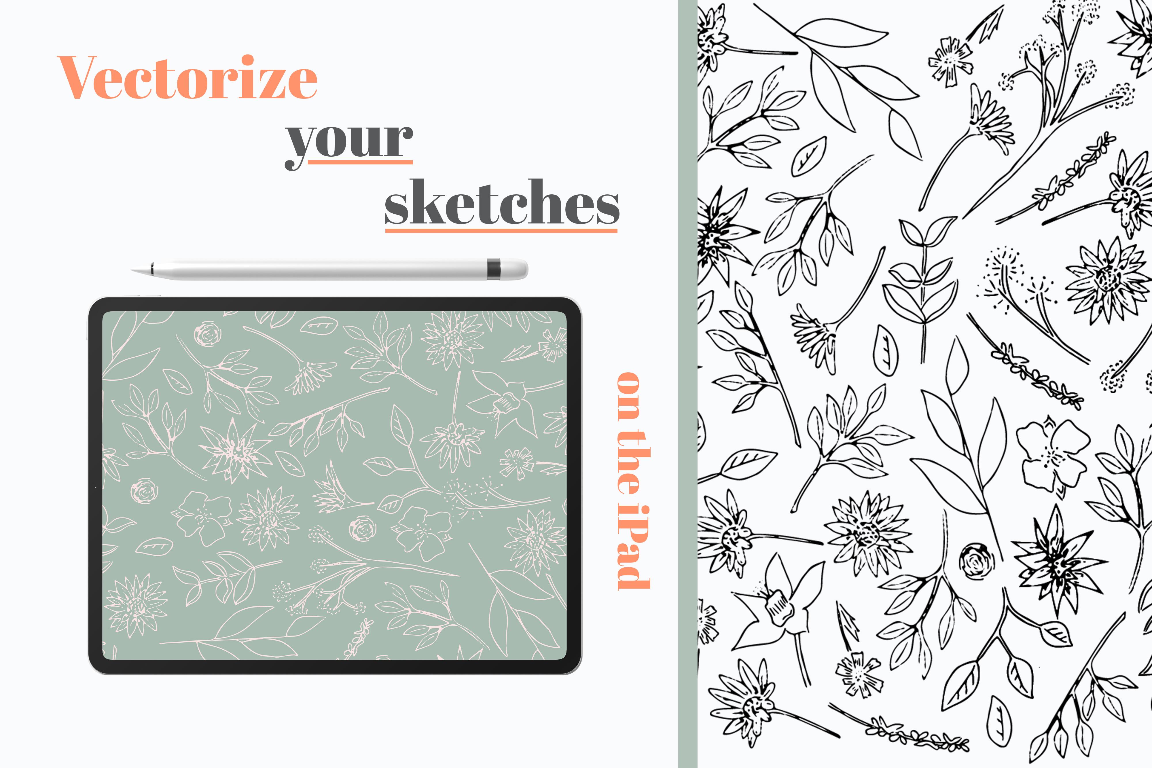
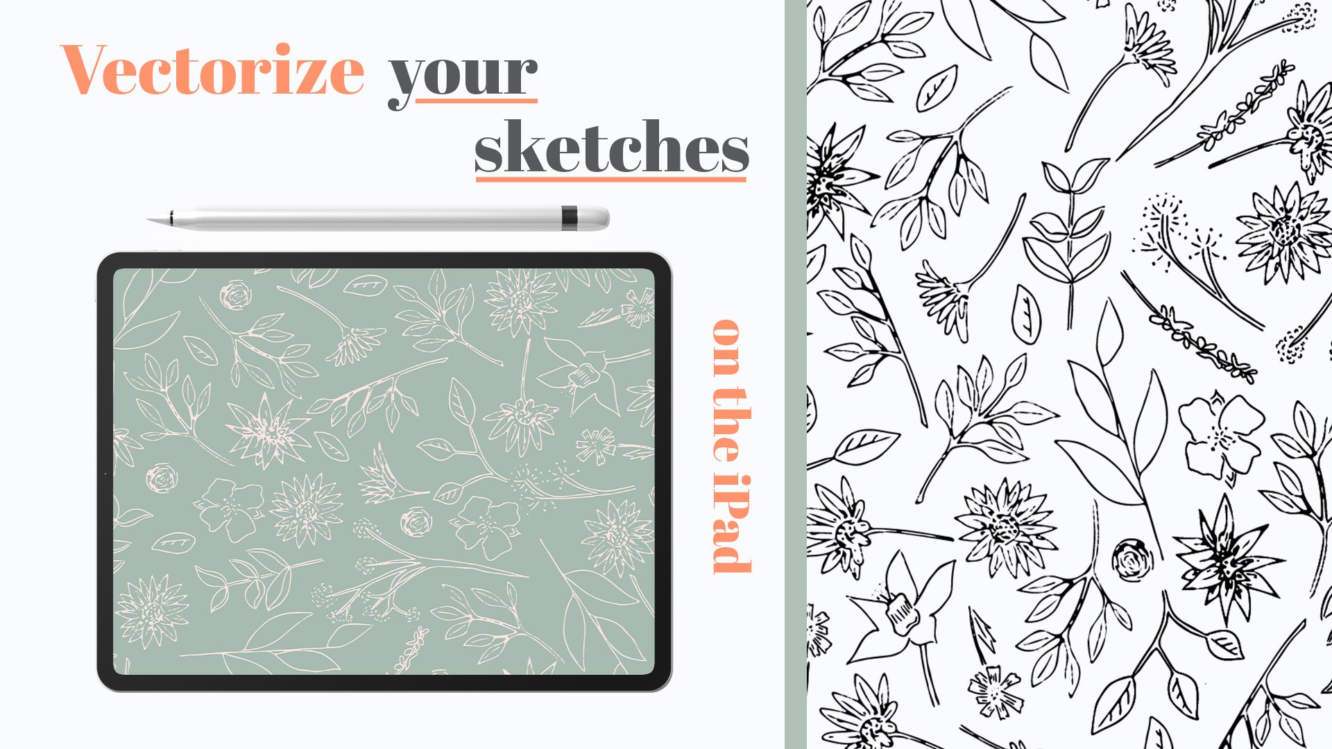
vectorizing your work, check out my other class, vectorize your sketches
with your iPad. The links in the
bio, check it out. I just want to say
a big thank you for joining me today and
taking my class. It means a lot and I'd love
to see your ending projects, if you could upload
them and even just put a bit of feedback
would be fantastic. I'm excited to see
what you come up with and thank you again
for joining me today.
 Kirsty Salter, Illustrator & Surface Pattern Designer