Transcripts
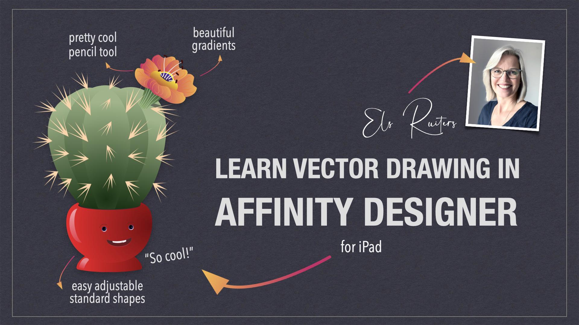
1. 01: learn Affinity Designer for iPad: Hello and welcome to my class, Affinity Designer for iPad. My name is Els Ruiters. I'm a graphic
designer, illustrator, photographer, and a Skillshare
teacher from The Netherlands. In this class, I'm going
to introduce you to a great vector drawing app called Affinity
Designer for iPad. Affinity Designer is not free, but it's not very
expensive either. And it has one great advantage. It's a onetime purchase. You don't need fancy subscriptions. Just buy it and
you're good to go! Good news for those who
work on a desktop computer. There's also a desktop version for both Mac as well as Windows. On a side note, why would you want to make
something in vectors? Well, as long as you
stick to vectors, it's indefinitely scalable. It goes both up and down over and
over and over again. You can export vectors
to pixel output easily, but the other way
around is not possible. That's why vectors are
especially suitable for logos. Affinity Designer
has both a vector as well as a pixel-based
working area. And you can combine both. But in this class I'm focusing
on the vector part only. This class is suitable for beginners and basically
for everyone who wants to learn
drawing with vectors in a fun and easy way. In the next lesson
we're going to take a closer look at the
requirements for this class. So let's get going.
2. 02 What you need: First things first
to get you started, what I use in this class, Let's take a quick look at the current status of
Affinity Designer for iPad. It's July 2022, and the most recent version of Affinity Designer
for iPad is 1.10.21. Currently, the price is about €22. If you are serious about
a good vector app, then this is definitely
worth the purchase. Keep your eyes open
for discount promos. That's how I got my
Affinity Designer, both for iPad as well
as my desktop computer. at a nice discount price. By the way, unfortunately, there is no trial
version for the iPad, but there is for
the desktop app. Next to that, I'm also using
an app called VizRef, VizRef costs about four euro's and it's a
very cool Moodboard app. You can add all
kinds of photos and other images and export it
to any format you like. You can drag and drop directly from the web or from
your photos or files, and it works like a charm. Now, let's move on
to the next lesson, starting with Affinity Designer.
3. 03 Starting Affinity Designer for iPad: When you started Affinity
Designer for the first time, you'll see the home
screen with two items. One is a link to tutorials that you can
watch to get you started. The second one is a folder
with examples to show you just a little bit of what
Affinity Designer has to offer. The tutorials are
well worth a visit. In the top, under
the question mark, you'll find a very
extensive handbook. Your work will appear
in this home area. You can add folders and store your work per item
or per customer. For example, Skillshare. Make a new project to create a folder that can hold all
your Skillshare files. Normally, each new document you make will show up
in this home area. If you haven't given you a
document a proper name yet, or you want to change it, you can tap the hamburger
menu and choose Rename. Be careful when you tap close, you will delete your file. Affinity Designer will ask
you to confirm this action. You can still cancel this If this happens. This is a bit different
from what you're used to. You can export or
save an image to a location outside
Affinity Designer, for example, on a flash drive
or somewhere in the Cloud. After that, you can
close your file. Setting up some
important preferences. Tap the cog in the upper-right corner to
go to the preferences. You can use a dark
or light interface just as you like it. There's also an option
for left-handed people. Affinity Designer comes
in different languages, so you might want to change it to whatever is
appropriate for you. There is so much
possible, but for now, there are just two things you
should definitely change. Tap on Tools and then activate "enable hand tool
for accessibility". And "allow canvas rotation
in all tools", tap "done". And now you're good to go. Next up. The interface.
4. 04 The interface: Create a new document, tap the Plus tab, Choose new document, and choose a format and a size you like
for print, for web, etc. For now, I'm going for iPad. At this stage, I don't need any transparency or art boards, so I'll leave those unchecked. Let's take a look
at the interface. What have we got here? At the top next to the
document and the edit icon, you'll see a blue vector icon. This is called the
designer persona The part of the app that
offers vector drawing. This toolbar on the left
holds all options that are activated when you're working in this particular
designer persona. Changing to another persona will automatically change this
toolbar on the left as well. The one next to the designer persona
is the pixel persona. The one next to that
is the export persona. We will stay in the
designer vector persona. I will discuss the
tools as we go. Otherwise, it'll be
very boring indeed. But one thing is good to know. See this question mark in the
right bottom corner? Hold that and you'll see
the name of each item. That'll help you further if
you don't know where to look. Now let's move on
to the next lesson. Getting reference pictures.
5. 05 Moodboard musings: I want to draw some
plants in nice pots. So I'll be looking for
photos to help me. Unsplash.com, a very
famous website, has free photos for
everyone to use. So I searched for house
plants and plants in pots. Now, it is possible
to drag and drop a browser image straight
into Affinity Designer. But I like to make a mood
board and I do it like so. I saved a dozen nice pictures to the files folder
on my iPad already. Let's head over to VizRef. First, tap the Plus to make a new mood board
and give it a proper name. You'll see a new board
appearing and open it. Under the cogwheel, you can set the background to dark or light. And you can toggle
a grid on and off. Now it's time to add images. Since I've already saved
images to my files folder, I'll open that file. Select "choose all", and invoke the dock by swiping
up from the bottom. Hold your finger
on the VizRef icon and move it to the
right of the screen. In the files folder. Hold your finger down until you see all images are loaded, and then simply drag the
selection onto the VizRef board. Let's go and give it a moment. VizRef will place
all images smoothly. A blue outline indicates
an image, or more than one. And that's the one that's
currently selected. Pinch to reduce the
size of art board. Now, use the arrow tool to
move a selected image around. And you can use scissors to
chop parts off, like this. Delete an image that you
don't need by tapping on the three dots in the lower-right corner and
then tap the bin-icon. Once you're satisfied with the mood board
you've just created, you can export it. I'm using the PDF version
to export the entire board. Ready. Of course, it's not necessary
to make a mood board, but I like to work
with it to help me get ideas and look for certain
colors or certain decorations. Next lesson, Affinity,
Designer, shapes.
6. 06 Shapes: Let's start drawing. Affinity Designer comes with a bunch of cool preset shapes. Tap and hold the rectangle tool. So all the different default
shapes will become visible. I was very surprised by how much is possible
with these shapes. They're completely editable
in all kinds of ways. Let's start with a rectangle. Put your pencil on the screen tap and drag to
make a rectangle. Your rectangle might have a
different color than mine. So now we go to the color studio on the right and tap
the fill button. Choose any color you like. I'm using the color wheel. The outside ring is the hue, and everything inside the
triangle is the saturation. Don't you see the color wheel? then tap on the color wheel fly out menu and you'll see
the option appearing. Don't you have a visible line? Tap the Stroke Studio and set a line width either by moving this slider or by
entering a value. A shape can have a
fill or a stroke, or both, or even none. You can easily swap the
color of a fill and a stroke by moving from left to right in
the color studio. Like this. If you move your finger up, you can set the color to none. Now, let's select
our rectangle. Tap the selection
tool, the arrow, and you can move
your object around, scale it by selecting and
dragging one of the handles. Select a corner and
drag while holding one finger on the screen will give you proportional scaling. Drag while holding
two fingers on the screen will provide
you with a copy. If you have the magnet in the lower-left corner turned on, you'll get nice even spacing, snap-to options, et cetera. This is very handy of course. How about a mistake? Well, that's easy peasy. Just tap with two fingers
and you'll have your undo. Also, these little "smaller than", "larger than" symbols in
the lower right corner give you undo and redo
options for multiple steps. In the lower left-hand
corner below the magnet, you'll find the bin. That's the delete button, that little x above the magnet
is the de-select option. There's also a history studio, the lowest icon in
the right part. To get you back even further. In the next lesson, we'll
take a look at selections.
7. 07 About selections: Let's talk about selections. You can select an object by either tapping on it with
the selection tool, or by dragging a
marquee around it. Mind you: completely drag around
an object to select it. If you only drag over
a part of an object, it won't be selected. You can select multiple
objects this way. It's also possible to tap the "Add to Selection"
button at the bottom. This feature does work with only taps on your
specified objects. But don't forget that
this is toggle button, so it will remain active
until you turn it off again. Above the magnet, you can find the de-select tool,
this little x. Last but not least, the Layer studio is also
very useful for selections. Unlike a pixel drawing app, each vector, line or shape
will live in its own layer. Swiping to the right, we'll add more layers
to your selection. Now head over to the shapes again and start playing around. Notice that the menu at the bottom changes when
you change your shape. You can, for example, add the number of points and the inner radius when
you're drawing a star. You can do this before or during or even after you're
drawing the star. Take a look at the
doughnut shape. You can change the
inner radius easily. Now it's up to you. Experiment with the
available shapes. Look what happens when you drag and put your
finger on the screen. With three fingers on
the screen and drag to draw your shape from
the center outwards. Try to select multiple shapes and move them around
and scale them. Practice a little with shapes, selections, de-selecting
and moving. And then we can move on
to... the order of things. Next is the order of things.
8. 08 Ordering your objects: Now that you're drawing
several shapes, you might want to put one in
front or behind the other. To do that, you can go two ways by going to
the Layer studio. Select and hold the layer
and then move it up or down. I've noticed it works
best to do this with my finger instead
of the Apple Pencil, but that's probably personal. The second way is by going to the Transform studio and use the order options
in the top section. I prefer the layers method
because it's easier to see what you're moving
to which position. By the way, now that we
are in the layers studio, if you want to select an
entire range of objects, you can tap the first with your finger, tap the last in
your desired range. Everything in-between
will be highlighted, meaning that they're selected. This makes grouping easy.
To group a selection, just tap this button. Tap on the three dots to
make a sub-menu visible. I'm using the lock quite often. It's also possible to change the opacity or the
blend mode here. There are usually several
ways to perform an action. For example, grouping can be
done in the layers studio, but also in the Edit menu, and that goes for
a lot of actions. In the next lesson,
we'll edit the shape.
9. 09 Shape editing: Now that we've got
shapes go covered, it's time to learn to edit them. To do so, you first need to convert your shape to curves. And to do so, tap this button. This "Convert to curves"
button appears in your shapes menu when
you're working with shapes, but it's also available
in the Edit menu. Now it's possible to edit
individual nodes and line segments like
this rectangle. Convert to curves,
select a corner point with the node tool and
move it anywhere you like. The shape will no longer
behave like a standard shape. When your shape has straight
or pointed edges and corners, you can round those
with the corner tool. Selecte the corner
tool right here, and tap your object. All corner points
will be selected. And you'll see the change when you start dragging inwards. You can drag one or more
points by first de-selecting everything and then drag a marquee around the
point you want to change. In the contextual
menu at the bottom, you will see there are more options than
just rounded corners, like cutouts and concave, for example. After you've done some
fiddling with this, it's time to clear this all. Drag a marquee
around everything you made and delete it by tapping
the bin. Next: drawing the pots.
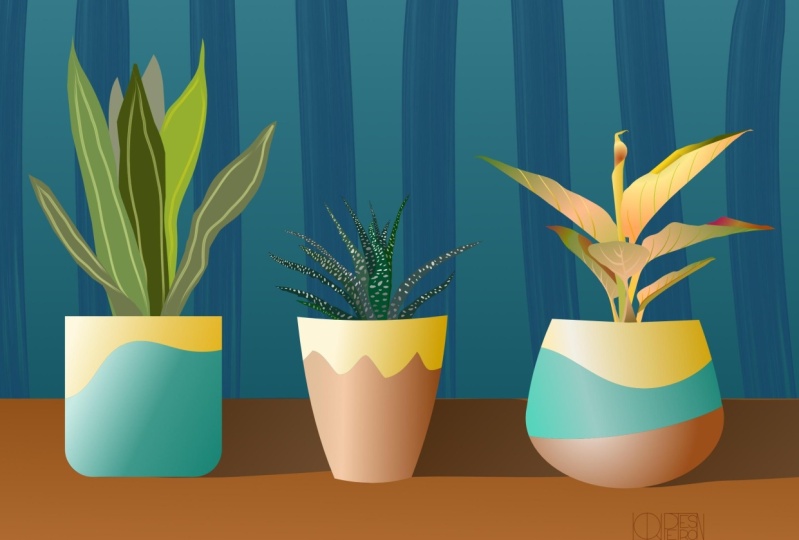
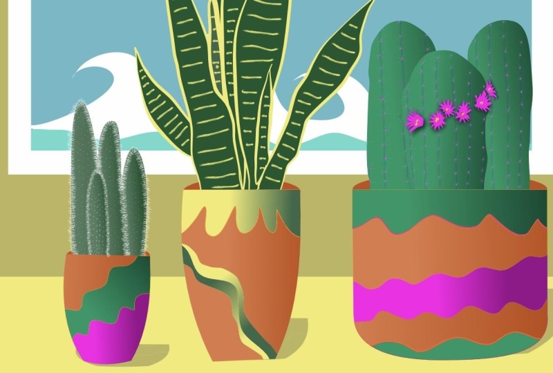
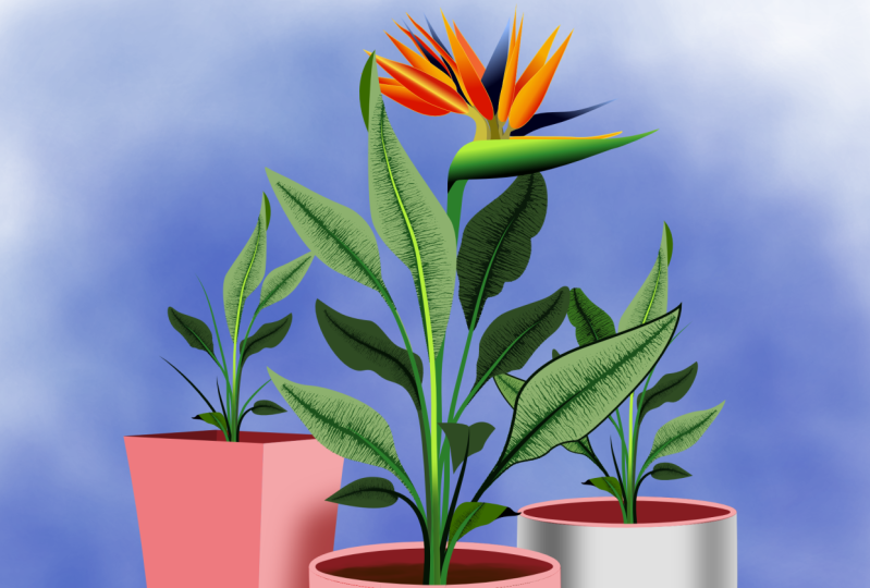
10. 10 Drawing a flower pot: Now it's time to place our
mood board in our document. Go to the document tool here
in the top and Place Image. Navigate to where you
saved your PDF and tap it. Now hold your pen
or your finger on the screen and drag to place it. Head over to the
layer studio and lock the layer by tapping the
three dots and the lock icon. I'm using this image as my
reference for the pots I'm going to draw. The three pots in the picture
clearly belong together, but each one has a
different shape. And I like that very much. For number one, I'm using
the rectangle shape. I'm starting with a pink thin
outline stroke, like this. Edit the color in
the color studio and the stroke width
in the stroke Studio. I use 0.5 points. Select the rounded corners tool and select the bottom
anchor points. Now, round the corners
by dragging inwards. If you need to correct
the size of the pots, move the anchor points
a little like this. Yaay! The outline of the
first pot is done. For number two, tap
the trapezoid shape. The narrow part will
probably be on top, so just drag until you have to shape roughly determined. Then use the rotation handle, - this one on top - to
turn it around. If you put your finger
on the screen and hold, you'll get perfect angles. Alternatively, in the
transform studio, right here on the right, you can flip your selection. Add rounded corners to the bottom two anchor points as you've done with
the first drawing. Next, use the node tool to
add a curve to the sides. Now add some anchor points to the top line and add
some curved lines. Amazingly,
even after this edit, this is still a shape ...and the outline of
another pod is ready. For number three, you could use
the trapezoid shape again, but for educational purposes, I'm using two shapes now: The ellipse and the
rectangle Tool. Now convert both
shapes, two curves. So the anchor points
will be editable. Move the lower anchor points of the rectangle to the
left and the right, where they will
touch the ellipse. Drag a marquee
around both shapes and go to the Edit menu. Then tap, "Add" under
"Geometry" and tadaaa! ...your shapes have been combined to one
pretty pot outline. In the next lesson,
we'll cover adding decorative elements to the
pots that we've just made.
11. 11 Decorations and gradients: While looking at my
mood board file, I want to incorporate these effects to the
pots I just made. Now select the pencil tool and make sure that Sculpt is on. Loosely draw a wavy line
on top of the first part. Don't stop but continue a
bit further than the pot. And then draw outside to
to end where you started. Close the line with
the node tool. Let's turn this into
a shape we can use. Select both shapes,
go to the Edit menu, and select "Divide" under
the "Geometry" options. The shape now consists
of the bottom part, the top part, and that
which is outside the pot. In the color studio, swap the color of the
stroke and the fill. And now you can see that we've made three separate shapes. Delete the shape
outside the pot. We don't need that anymore. On the left, you'll find the gradient tool.
That is this icon. Oh, I love gradients, especially with
Affinity Designer. It works so beautifully. With the objects selected. Use the gradient tool and drag over the shape to fill
it with a gradient. Affinity Designer takes
your most recent color and adds a lighter or
darker tone as a starting point. Tap one of the two points and change the color
in the color studio. Let's save the
colors we've made, in the color studio. Tap the hamburger menu and
make a new swatches palette, and give it an appropriate name. The current color is
visible in the color dot. Let's add this color so it
quickly at our disposal. You can save uniform color
and gradient colors. Gradients come in
different ways. Linear, radial,
elliptical, clinical. Just take a look
at what it does. It's also possible to add
more colors to a gradient. Just tap anywhere on the line
the gradient tool makes. And you'll get a new
point to which you can apply a different color. You can apply a gradient
to both a fill and stroke. How cool is that? I'm using a bluish gray and a yellow cream color
gradient for the pulse. Repeat this process for the
top part of the pot as well. Once you're done, select
both parts and group them. Number one is ready. Congratulations. Repeat this process for the
other two pots as well. Don't forget to close
curves outside the shape to ensure it will
be divided properly. On to drawing with
the pencil tool, a much more freestyle
way to work.
12. 12 Drawing with the pencil tool: Now that we've got
shapes covered, it's time to take a look
at the pencil tool. This is a free form pencil
and it's really fun to use. This plant, visible in my mood board, is what
I'm going to make. Let me head over to
the layer studio and bring the opacity of
the layer down a bit. Select the pencil
tool and select a thin pink color and
a 0.5 stroke width. Now, enable the Sculpt option. Do a test run, draw a leaf, and here you go. It's is very easy to
form a leaf like this. There are a few
things to consider. The first starting
node of a line or a segment is always
an open blue square. The last closing node is
always an open red square. In-between you'll see
anchor points: they're round. Selected anchor points
are turning blue. Affinity Designer doesn't
have an auto close feature, but when you've got
snapping turned on, it's easy to do that. Just select the node
tool and move the red over the blue square
or the other way around. You'll see it jumping
to alignment also the node-contextual
menu appears. You can see it's closed because you only have a break option. Now, you might be wondering why I'm using a
stroke instead of a fill. I think it's easier to concentrate on the
shape at this point in time and get the right color and fill once to shape is done. However, if you
prefer to draw with a fill instead of a
line, then please do. It's a bit like drawing
the outlines in traditional art work and filling
in the open areas later. Don't worry, just
like with the pots, I'm only using this
bright pink color to properly see what I'm doing and distinguish
my pink sketch from my actual artwork. So back to the
plant. I've restored my pencil width to 0.5 and I'll start tracing the
outline of the leaves. It's good practice to
start with objects in the back and then work your
way to the one in front. Of course, you can reorder and rearrange them
easily afterwards, but this is really a timesaver. Once I've got all the leaves, I'll make sure that I'll
be closing each curve with the node tool. I'll
connected the two squares, as I've just explained. Now, let's fill the leaves. Select all by dragging a marquee. Move over to the color studio and swap the stroke
and the fill. Wow, pink leaves! Now let's pick a nice green
color from the color wheel. Activate the gradient
tool on the left. Drag the gradient
over the leaves and the entire set of leaves will
have the gradient applied. I'm going to add a bit of
yellow to the gradient. Like so. I do however, want each leaf to have
its own directional fill. So de-select everything. Then tap one leaf and tweak the gradient just by dragging
these bullets up and down. Repeat this process. So each leaf has
its own appearance while still having the
same gradient fill. Last but not least, I'm adding this particular
fill to the Swatches palette. Next we'll be adding
veins to the leaves.
13. 13 Adding veins: Adding veins will make
the leaves come to life. Select the pencil tool and start drawing lines with
a yellowish color. Remember that I told you about starting and end
points on a curve? Well, this is a good moment to explain what starting and
ending points actually do. Look at this vain that I just made with just a single stroke. I'm going to the Stroke Studio and I'll increase the width. Pull down one of these
points in the graph, and look at the line, it's getting a sharper ending. Now, if I tap reverse
in the contextual menu, the settings of the
stroke are turned around and the narrow part has switched places with the wider part. This is a very handy feature. If I tap anywhere on
the line in the graph, I can get extra points
that I can move up or down to change the
appearance of the stroke. The reverse button changes
the overall ending too. If you want to delete these
extra nodes in the graph, tap on the line and you'll
see an option to delete the node or reset the
pressure altogether. Another cool feature is to turn on pressure in
the pencil menu. Take a look. If I apply a little pressure, I'll have a thin line. If I press harder, my line width will change. This is ideal now that
we're drawing the veins. So continue drawing veins but turn off
the sculpt option. When sculpt is turned on, Affinity Designer will continue
from your previous lines. In this case, you want
each line to be a new one. Once you've got one leaf ready, select all the veins
and group them. And now here comes the magic. The size of the pot and the
plant are way too different. So just select the
group of the plant, select a corner and scale
to an appropriate size. Well try doing that in
pixel based software. You'll have a blurred image
that you can't repair while the vectors stays
pristine and crisp. Now, how cool is that? Draw stems with the pencil tool. Be free in your approach. Experiment with
the stroke width. To give the stroke a gradient. Go to the Gradient tool and then tap the Stroke
option in the menu below. This is how you can add
gradients to outlines. Use the layer studio to move
layers in the correct order. In the next lesson, we'll be
working with clipping masks.
14. 14 Clipping Masks: Clipping masks are containers. They can hold items and hide everything that is outside
the clipping mask. Here's an example. Follow along, draw a circle and a star and let
them overlap a little. Fill the circle with a
different color than the star. Now, I want only part of the
star to show in the circle. Go to the layer studio, locate and select the
layer with the star. Then move it on top
of the circle layer until this horizontal
line appears. The star will now
be contained inside the circle and the effect
is visible right away. It is still possible to edit
this star and the circle too. Clipping masks can be stacked so one can
live inside the other. Here's what I mean. I'm drawing a line
and I'm moving that line on top of the star
layer in the layers studio. And bam, the line is
clipped by this star, which is clipped by the circle. When I move the circle, the contents of the
clipping mask moves along. But when I change the
size of the star, I'll double-tap
it and I can edit it without affecting
the container. In this case, the circle. When I change the
size of the circle, the contents sizes along. Now that you've know this, you can turn each leaf into a clipping mask to hold the veins for that
particular leaf. And then it's a piece of cake. And if you want to
edit your leave, the veins will remain intact. Just double-tap and you
can do some changes. If you're up to it,
you can move part of the leaves to a
position above the pot. Next up, we'll look
at expanding strokes.
15. 15 Expanding strokes: Now, I can continue
with Affinity Designer for hours because there's
so much to learn. Did I say that you can make a straight line by
selecting the pen tool, tap and tap somewhere else again? Give it a stroke width and the color and you've
got your straight line. There's one thing that I
really like to explain. We've seen it with
shapes; after converting to curves even more is
possible with this same object, although it's no longer a shape. Well, technically
speaking, that is, I'm converting the veins. I just made to
curves by tapping the Expand Stroke button
in the Edit menu. Now, select all the vein
objects in this leaf. Go to the Edit menu. Tap the "Winding
button" on the right, and then tap Add. Under "Geometry", the
path disappears. And if I want to change a shape, I no longer have a single
path or align stroke. Instead, each vein has become a curve and I can edit
individual anchor points. It might be necessary to ungroup the entire set of veins in
one leaf to get this option. All the objects are
melted together. And instead of a lot of
lines that form the veins, I have one object with the
exact same appearance. This step is, by the
way, not necessary, but there are far less objects and paths which I
always strive for. And by getting rid of line width, more stability in
artwork is guaranteed. Let me give you an example. Here are two exact same flowers. When I select 1 and 2 and
scale them down, you'll notice that number 2
still has the proportions that the original flower has. But the stroke on the
other one is way too thick. The stroke is nearly
covering everything inside the petals while
the other one is okay. If I enlarge the flower, the outline stroke
will be too thin. This happens when Scale
with Object is turned off. You can find that in
the Stroke Studio. Sometimes this
happens accidentally. Sometimes it's on purpose. It can cause some pretty unpredictable
and unwanted effects, especially when you are
sharing the vector image. Expanding your strokes,
you'll get only curves, will solve that. In the next lesson. You
get your assignment.
16. 16 Your assigment and examples: If you've followed these
lessons along, you will have at least
one pot and one plant. Hopefully, you've been
able to draw a few more. Your assignment is
to add a background setting or a scene to
your plant, or plants. For example, a wall or a window, a shelf, a framed
picture, a small table. Here's what I made, but I won't explain in
detail how I did it. By now, you should
be able to do this yourself without
too much trouble. Experiment. Don't be afraid
to try different things. Use reference photos to make backgrounds and take a look
at the different tools on the left that
we haven't used. There is still a lot
of ground to cover in the various
studios on the right, but you've got a
great basis now, I'm sure you can come up
with some cool artwork. Share your artwork in
the Project Gallery. So don't share the Affinity
Designer file itself, but exported to a JPEG or a PNG. To do that, go to
the document menu, tap Export and choose
a type and a location. Save it to your photo library
or your files folder, and of course, share it
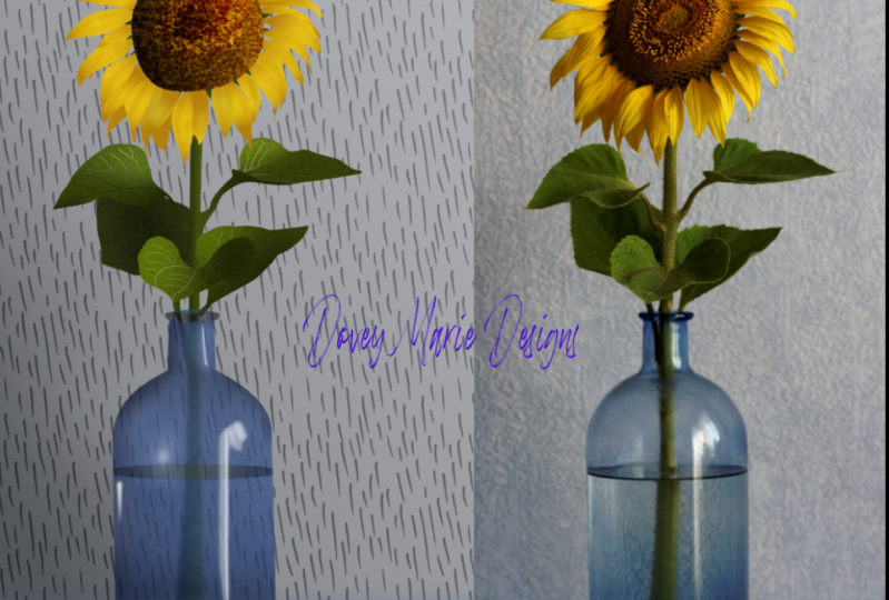
right here on Skillshare. To get you started, here are a few
examples of artwork I made with Affinity
Designer for iPad. We're nearing the end.
17. 17 Thank you!: This is it. Congratulations, you
made it to the end. I hope you enjoyed this class and I hope this
was helpful and it has given you more insight in working with Affinity Designer. In this last lesson,
I will reply a question some of you
might already have. I've made classes about
Vectornater in the past. Vectornator is free, so why have I moved on to
Affinity Designer for iPad? Well, Vectornator is
great if you're curious about vectors and if you
want to see if it's something you'd
like to do more often. But it's pretty basic. For me, Affinity Designer for iPad is definitely
more intuitive. It has a better interface and
it just works more natural. Is Affinity Designer THE app to use? Yes, for me. I still have a soft
spot for Vectornator as it is pretty solid, and it offers people a great
opportunity to try vectors. But for more control,
more smoothness, more versatility, and many, many options I'd made the step. You won't regret it. Now - we've reached the end. Thanks for watching. If you have any questions regarding this class. Leave
a comment below. And if you have any requests
regarding subjects, subjects you'd like to
see in the next class. Then let me know. Bye for now. Keep drawing, keep vectorizing.
 Els Ruiters, Graphic Designer from The Netherlands