Transcripts
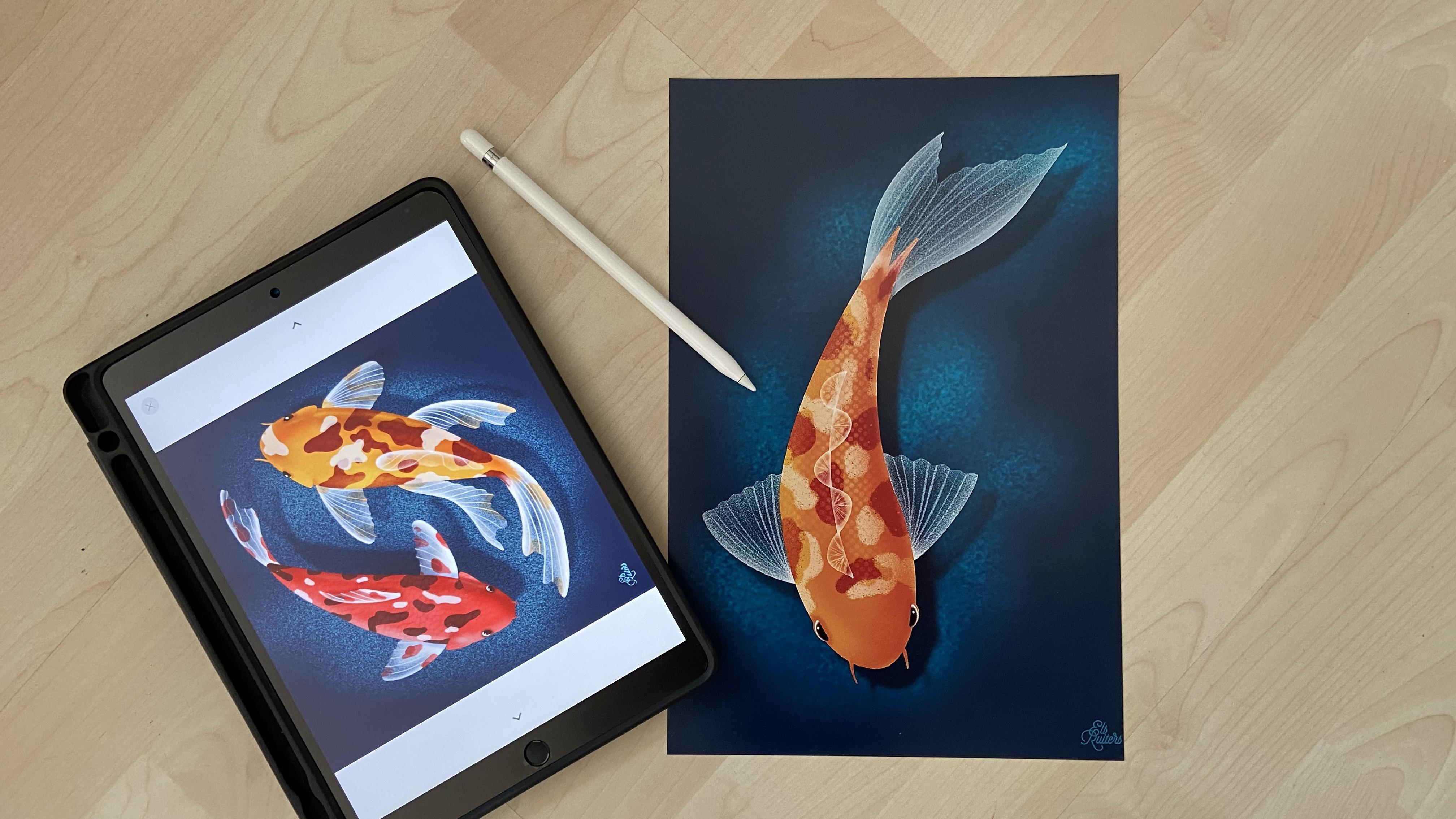
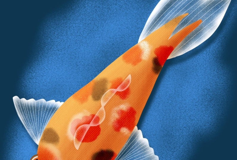
1. Introduction: Hello, my name is Els Ruiters and I'm a Skillshare Teacher. Welcome to my class about drawing Koi Fish. You've seen them, those beautiful large goldfish with beautiful colors and lovely tails. Or maybe you just like a goldfish. Well, they're really fun to draw and it's great to see how you can get transparencies In the fins and tails. So if you like to work with Procreate, with an Apple pencil on iPad and you like to draw, then follow me, join me in drawing a Koi fish. What you need - well obviously - An Apple Pencil and an iPad and Procreate. And this is approximately what it's going to look like. We are going to start with this sketch phase. Then we'll draw with white. Yes, we'll draw with white. And then we'll start adding transparencies to the fins and tail. Then we'll fill with color. And then we'll start adding texture and dimension using Blending Options. And finally, we'll draw the eye and the background, the eyeS and the background. It sounds easy... And it is not difficult at all. It's just a matter of learning how to do this. And it's really fun. It'll open your eyes to the possibilities of a blending options. So without much further ado, let's just dive in.
2. Lesson 1: preparations: First things first, let's take a look at this version of Procreate. Go into the gallery. Tap on the word Procreate. And right here you can see the current version. It's September 2020, and the current version is 5.0.8. ... If you have different things that you will see when you are working, it is very likely that your version will be newer than mine. This is the most recent one, but it changes quite a lot. The first thing I'm going to do is turn on guidelines. I like to know exactly where the center of my page is. I've seen many people draw lines to do this, but there's a much easier way. Go to the wrench tool, then tap drawing guide, and then edit. Now, what a lot of people don't know is that you can just move up the grid size all the way to the max. And now you have the perfect division, a vertical and horizontal line in your artwork. Should you accidentally move this? Mwaaahhh... where is my perfect centre? Just tap on the centre, tap reset and you've got the spot back in the middle. This is really helpful. I hope you can see it. I will turn up the colour little. I hope you can see it. This is an ideal way to get the center of your artwork in Procreate. Now let's see. I have made a brush set. Well, as you know, there are many brushes out there. Some are free, some you can buy, and some you can make them yourself. And there are so many different brushes that it's sometimes really difficult to tell apart what is what. So what I like to do is make a new brush set. Here's how I made this. This one is called Koi. If you go up, you can set the plus right there. You can tap the plus and then make a new set. If you want to add something to this set, let's say that I will pick one like... ...this clean brush. I can just make a copy and move it until my preferred brush set begins to highlight and just drag it in. You can still by the -1- that it is a copy of the original one. And there's another -1-, so it's a copy of a copy. The great thing about making your own brush sets is that you can easily alter settings like the stream line under spacing and even the shape if you want to. And you still have the original one somewhere in your original brushes. By the way, you can add brushes. You can delete them, you can rename them. You can add sets, you can rename them, you can share them, and you can delete them, but you can never delete the original ones. They are always at your disposal and you can always restore them to defaults. Here you can see the brushes that I'm going to use in this class. If you want to add the same: This is the 6B pencil which you can find under sketching. This is perhaps a bit difficult to read. Noise brush, which lives in touch ups. This is the newsprint which lives in vintage. And the dry ink under gesinki ink live in inking and a monoline you can find under calligraphy. These are the brushes that I'm working with and these are all standard for procreate. So that's part two of the preparation. And the last part I want to show you is my limited amount... my limited amount of colors that I'm going to use in this class. The only color that I'm actually drawing with is orange. I also have a black and white. And maybe it's a bit difficult to see, but this is a deep blue color for the background. And then I have these well, two requires are quite light blue color. And these are the colors that I'm going to draw with and I'm going to show you how easy it is to get a lot of different variations with just this very limited color palette. So now that we've done the preparations, let's start sketching.
3. Lesson 2: sketching: I have seen from images of Koi fish that they are often about four times as long as they are wide. I'm not sure if that's the correct way to say it. But let's begin with some squares to get the proportions right. So I'm in the first layer. And I'll use, let's say the 6B pencil, I've got this size all the way to the maximum and the color is to the maximum. And I'm using that light blue color. Just let me draw a small square. Hold my finger on the screen. And I've got my shape ready. It's just very simple. Let's move this down and make it a little smaller. I'm turning on magnetics and I'm moving this to the middle, think that's okay. All right. What I will do now is make a copy of this layer and another one. And another one. And now I will move these up. There are of course, many different ways to do this, but I'm using this method right now. Just let me put that a bit more in the middle. So now this is approximately what the basic frame should be. Put this in a group. I'll call this frame. Now, if I were to make a sketch – let's pick black –, still using my 6B pencil. I know that the widest part is somewhere in second square. Doesn't really go all the way to the end. It's something like this. Now you can see why I often use a sketch: I do really sketch. If this is the basis of the fish. And I would leave it at that, that would look pretty dull even if I were (let's turn off the frames for a second). Even if I were to rotate it, it still would look more like a submarine than a fish. So let's head back. Let's clear this one and go back to the frames. I'm taking the second frame, turn on magnetics - like that And the top frame. Like that. And now I'm picking the entire group and I'm just moving that, like so. Now it does already look more like a wavy frame. And if you try to imagine the shape of a fish in this direction, it will look completely different. So let's give that a try. Now, I'm putting this little V-shape in the end. I know from what I've seen that the fins on the side are like little triangles. And they live approximately at the same height as the second square. So this is where the squares really help, where they were really helpful. Let's bring this down a little. And I will make this slightly wavy. So if you're struggling with the right proportions, this is really a good way to start. The eyes should be somewhere there. I'll move everything down a little, to get a bit more room. To add a nice tail fin. Not bad. Maybe it's a bit too much. You can always change this later. This is still a sketch. And finally, I'm going to make a dorsal fin. It also starts somewhere between the starting point of the fins and then just follow the curve of the body. Then make an S shape, a double S shape. And you've got your fins ready. Now let me turn off the frame and the guideline, to see what it looks like. And I think that this is quite alright. Maybe the tail should be little smaller, little smaller, it's a bit big. Okay. I think we can start drawing because as far as I'm concerned, this is a good place to start. So let's move over to the next lesson, which will be drawing in white.
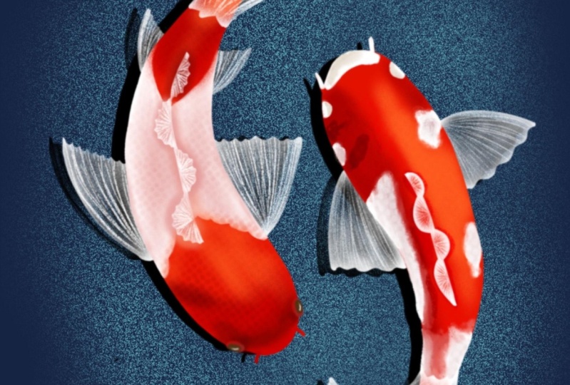
4. Lesson 3: drawing with white: Now I've got my image, my sketch ready, and I want to draw with white because The fins will be white or transparent, but my drawing is black. So how can I start drawing with white? Well, let's begin by turning on a color for the background. And I've already made this blue, dark blue color. And here is exactly the problem that occurs. Are not sure whether you can even see it. But here's my black sketch, and I'm unable to see it properly, but I do want to draw with white and I will show you why. Now to change this, to get this to be more visible I'm going to the layers menu and to the blend options. Normal is what you work with (standard) and I'm moving down down... ...down down down... And here is Divide. Divide is the perfect way to show a black sketch on a dark background. And that goes for everything that you sketch. It doesn't only work for for this particular class of course. That's great. I'm just moving down the opacity slider. And I've got a great base to start from. Probably on screen even darker than in reality, because it's not really all that light now, but this is good for this moment. Let's start by calling the Sketch, Sketch. And let's lock that one. What I will do now is draw with white. I'm drawing with the monoline. And I'm drawing each part on its own layer. If I look at this image I know that the fins should be at the bottom. But for starters, I will begin with the body. So let's rename this to body. And let's check this for certain. I go to my monoline and I'm looking if the streamline is turned all the way up. Yes, it is. So that's okay. I don't need any transparency just yet. The size is free, something that I like to draw with. Let's see, that's a bit big, Let's go a little smaller. All right, now, let's start drawing this. This will do for now. And what I will now is colour drop with white. They're still here too. That is one of the great advantages of working with the monoline, you can make really very sharp lines. And you're also quite certain that it will be filled properly if you do a color drop. So let's move this up, let's enlarge this a little. Koi fish have barbels. So let me go to my brushes and let me choose.... Well, maybe also the monoline. But no, I will take the gesinki brush. As I said, I'm not really sure if I pronounced that properly. And let's make a very smooth barbel right there. In the next layer, I'm going to make the fins. Back to the monoline again. Make sure that the capacity is turned up. And I'm going to turn that layer opacity down a little for the body. Now go to the fins. I'll just make this nice and smooth. And the other side, let's make this a bit wavy like that. And you can also colour-drop white into this part. Move the fins under the body. And here it is. Okay, Now this looks good. Yep, this looks good. And it's time to start coloring.
5. Lesson 4: adding colours: Now it's time to start coloring and that is really fun to do. There are a number of ways that you can do this, but if you follow my lead, you will have some amazing effects and maybe there's something new that you haven't done before. Let's go to the layers and make sure that the body... – the first thing that we're going to do – has alpha lock turned on. You can either tap on the layer and turn on alpha lock there, or you can swipe with two fingers to the right and also have the alpha lock turned on. You will see these little squares. And you know, that is just the alpha lock. Alpha lock means that you can not touch anything that is outside your drawing. So it's just you're drawing that will be influenced by whatever you do. I will do that for everything. Like so. And let's go to the body. I've a got nice orange color. This is the color that I'm going to use for the body. So let's bring up the opacity and fill the layer. Wow, that's very bright! Now just turn that off for a second. I'm going to the fins and I'm going to do something quite remarkable. I'm going to add a mask. A mask means that you are working inside an extra area that is protective and it is non-destructive. So when you work with black in a white mask, you will take away stuff like that. But if you want to bring it back, it is very easy to say clear and it's gone. You can bring it back with white as well. So I shall make this a little a larger and I'll pick the monoline. My color is black. I am in my layer mask. And now if I start drawing, I will lose parts of the image because it works like a, like an eraser. But it doesn't work like a real eraser. It just covers whatever I do in that mask. If I pick white, I can bring back what I have just taken out. This is not what I want. So I can just say clear, but this is a perfect way to try things without destroying your original image. If you were to work with an eraser, in the fins themselves, you would loose the original image. So you would either make a copy and then start working on a duplicate, or you use this method. This works like a charm and takes up less space. So let's see what I can do here. Let me bring back the body and lock that one. I'm going to work with black. And I will pick my noise brush. Let's see how big that is. Alright, let's bring that known. Let's start drawing. As you can see, this is already quite effective. And the fact that I'm doing this will make these fins transparent. I will put something underneath to make it a bit more visible. So just keep away from the sides. And just do whatever you think is lovely. I'm going back to white. I'm going back in the mask. I'm using the dry ink now. And I want to bring down the opacity. Let's see how big is it. It can be quite small and opaque. Now draw the lines in the fins like that. The gesinki ink is not such a hard line as the monoline. And for this effect, I think this is perfect. If you want to make the edges of the fins a little less harsh, you can use the same technique to soften them by using a black color in the Layer Mask and perhaps use the dry ink to do the edges. Or maybe the noise brush or even maybe a totally different brush, but I'm leaving it at this, for now. Once we've done this, we can do this same with the tail fin. The dorsal fin lives right there. So let's add a mask, not to be mistaken with a clipping mask. Let's bring up the capacity and let's use the noise brush. Just let me take some like that out. If it's too much, I can just change back to white and bring back what I've just taken out. I'd like it to be a little less harsh, like so. Maybe I can do a bit more to the sides. That's nice. And I will do the same, I'm using... the dry ink and not all the way up. Oh, look, this is what happens when I work.. (We'll make it a bit bigger). what happens when I work with black in the same mask: I should have done this with white. So I'm going to white now and I can make these lines. As you can see, I'm just doing these very freely. It doesn't need to be very tidy. It's just a certain waviness. And I've noticed that if I do this very slowly, I will get more crooked lines than when I do this fluently like this. And of course, having Streamline turned up makes a lot of difference. Well, that's okay. And the same goes for the dorsal fin. Again, a mask, the black colour, noise brush. And maybe this needs a bit of extra explanation. Bring up the opacity again. Stay away from the edges here. That is quite important. Otherwise you will lose that it touches the body or that it comes from the body itself. So stay inside... ...these half circles. If you've taken out too much, – I think this is a little too much – just go back to white and draw over whatever you've just taken out too much. Still working in the layer mask. And again, the dry ink. I will add the same effect as I've done with the fins. And this is wavy, coming from the body itself, like you're looking on the top of the dorsal fin. Now, let's bring the opacity down. It is like that. And we are already quite far. Now it's time to add some structure to the body, and that is what we are going to do in the next lesson.
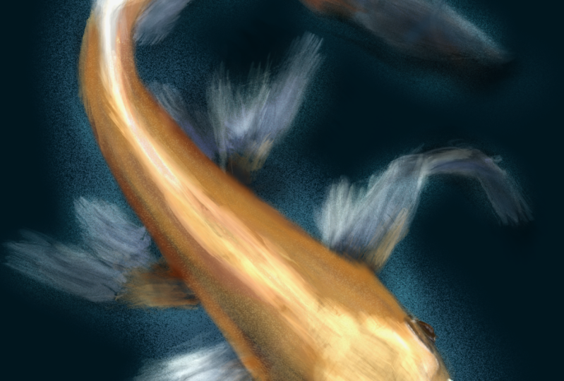
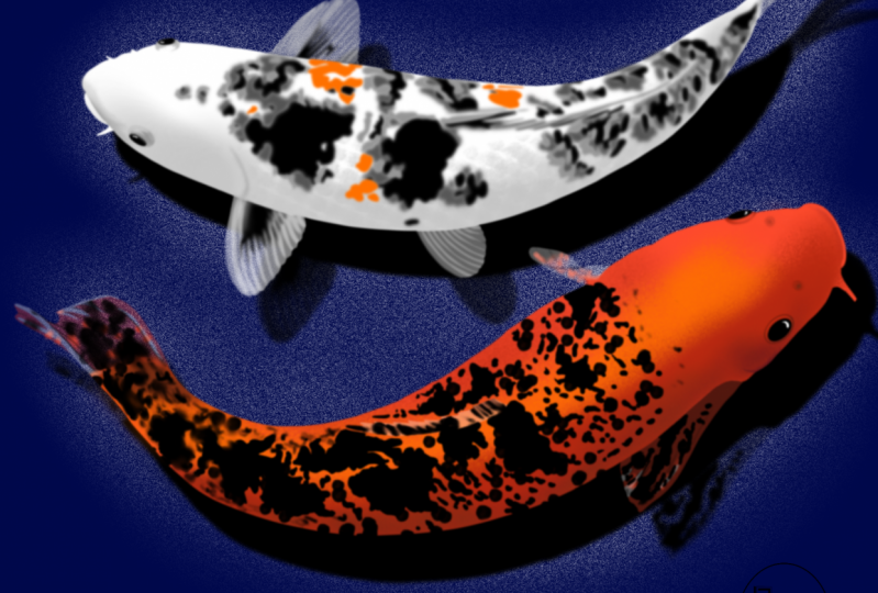
6. Lesson 5: more colouring tricks spots and scales: So I'm going to show you how you can bring dimension and definition to the body of the fish while using the same orange colour. Let's head to the Layers palette and add a layer above the body. Unlock the body first. Tap this and give it a mask. Now a clipping mask shows only what is available in the layer underneath. if a bit difficult to explain, let me just show you. I will pick the blue color. And just let me undo this clipping mask. I'm taking my monoline, ...my calligraphy line, and just add a thick line over this. If I want to make sure that it only appears inside the shape of the body. I will turn this into a clipping mask. And see:. It is only there even though it goes... beyond this image when I turn off this clipping mask. Let me clear this. This is a technique that we'll use to get the style and definition that I was talking about. Let's pick the orange color, clear the history for a second. And I am going to change the blend mode to multiply. You can see that it's a multiply because it has an M instead of N, N is Normal and M is for multiply. I'll go to my brushes, pick a noise brush again. Choose a size, that can be quite big. And let's start painting, look what happens on one side as if I was making the shadow of the fish. I'm going to add this. And because I'm working with the same color, it just fits beautifully. So this is really nice. And now you can also see why I love this noise brush so much because you get dimension and depth and I really love that. So let's make the size a little bit smaller. Where the dorsal fin is, I will also add a little to give it a bit of a shadow. Not too much, just a little I'm going to make another layer and again a clipping mask, so it will still be only affected by the shape. And I will turn this to Screen. Now I still have my noise brush, and I still have the correct size. And I'm going to make this side a little lighter. Let's bring that up again. By the way, if you draw, it's always a good idea to bring the capacity all the way up. You can always reduce the opacity in the layers themselves. So if this is too much, you can always bring it down. That's great, Lovely. This is what it looked like. This is the before and after. This is what it looked like. Now I have added the multiply, and I've added the screen effect, and this is already coming to life. Nice, isn't it? Now let's add another layer. I will call this Scales. And I will turn this into... let's see.. the Screen for now and we'll pick the newsprint brush. Turning up the size, it'ss quite big like that. And I will use this to make a sort of scales-effect. It doesn't need to be all that much. ... Maybe I can change this. See what is happening. If I do Add, it looks completely different. Lighter color doesn't show much, but I think I like this Add. I can bring down the opacity if it's too much. And now this is a really nice effect, as if I was actually drawing scales. And it's amazing because it is the newsprint brush and that works just quite beautifully. Ok. Now another thing, many Koi fish have spots and I also want to draw them. I think the spots should be above the scales, but below the layers with the different colors. So let's call this spots. And this is where I'm using the dry ink. Let's turn that up. Maybe bigger. And if that's turned out too dark. And let's see what happens. Well, that's not that's not really very much. Oh, look, this is a lot darker at once and it's still the same orange color. And I think I like it like that. If you want to, you can add another layer. And if you still want to keep the same color, what you can do is go to the classic mode in the color settings and just move up the darkness slider and then add color there. Because sometimes Koi have these really dark spots. Because my layer with the spots is beneath the light side layer and the dark side of the shadow and the highlight layer, it also gets the shadows and the highlights. So let's leave it at that. I think that's quite nice. Alright. Maybe bring down your opacity. And if you're still not satisfied with this, you can also just move through the possibilities. There is so much that you can see here that is different. Also made when I did this same effect and then I became completely surprised when I used a light mix somewhere. It was really quite lovely. Well, let's see. This is Normal. If you want to use normal, then bring down the opacity a little. And this is also quite nice, the Linear Burn that also fits the Koi quite well. So let's, let's keep it like this. This I think this looks quite nice. Let's take a look at the colour of the fins. Ok, here are 1-2-3-4-5 layer masks that belong to the body and they all do a lot just by changing the blend. So that's really something to bear in mind when you're working with this. Let's see if I can bring down... the brightness of the fins a little bit, they've should stay. Maybe. This is all just a matter of taste. There's no way that you have to do this. Okay! Now I think we're already getting a long way and it is time to move to the eyes.
7. Lesson 6: the eyes: It is time to make the eyes, and let's do that like this. I'm going to hold down this layer so that I will only have... my present layer visible. And let's go to the white color and the monoline. And I'm going to make a circle and colour drop it with white Now, I made this drawing guide in the beginning. That's pretty much in the middle. Now, I will turn on alpha look, and I will make a few copies. The lowest one will be, darker. So I'll do a colour drop. The second one will be like that, but a little bit smaller. So turn on magnetics and move it down. That, all right. And then the next one, I'm going to use orange again, fill it and make it smaller. The top one will be black, and below the pupil of the eye. Fill the layer and reduce that, so that it will be like that. Now this would be a very strange eyes, but fish do have strange eyes. Let's add some texture to the eye. So texture to the eye sounds odd, but that's what I'm going to do. Make a clipping mask. ... let's leave it at Normal for now. I'm going to the orange color again and the noise brush and just over the brown, I'm gonna add a little bit like that. I'm not sure that's even visible at the smallest size, but let's keep it like that. Okay. Let's do the same for the orange part. Make a clipping mask, and now I want to turn it to, let's say Multiply or Darken and get some definition there. That changes quite a lot. Alright, I think that's already quite enough. Just merge that down... merge that down. And I want to make this a little less harsh. So I'll go back to the white, turn off the alpha lock and then go to the Adjustments menu and Gaussian blur. Just move the slider that you see here a little bit to the right and you can see that it get's blurred on the sides. And I like that it doesn't need to be that, that harsh. That's okay. Alright. So I want to do the same for orange, just Don't forget it. You can try to get a Gaussian blur but with alpha lock turned on not much will happen. So Gaussian blur; move the slider and see how this changes. Just a little bit, not too much. This is only 5%, so that's already enough. I want to do the same for the black because the eyes would be very hard if I wouldn't even it out. So just Gaussian blur a little bit, just enough to get it out of the way. Ah, that's nice. That's okay. Well, right now I will group these and I will flatten them. What I want is to divide this. I want to have two halves. So I'll go to the selection tool, pick the rectangle, and then using the guideline, I will choose half. And then I will just say, with, three finger swipe down: cut and paste. Now I have one eye from one selection. And one eye from the other selection. I will call this the right eye. And this one is left. Let's put those in a group. And now when I tap and hold, the rest of the image will be back again. Let's bring those eyes into the right... ...proportions. Uniform is still turn on. Let's bring that down, down, down, down, down, down, down. I don't know exactly what size these eyes should be, something like that. Okay. Open the group and make sure that you have a eye half and bring it approximately to it place. Think of the sketch. Ok. Still looks a bit too big, but I will change that in a minute just like that. Okay. That's still too big and that's the reason why I put them in a group because now I can reduce the size simultaneously. That's better. Now it's just a matter of picking what one eye and moving it to the right place. Here's the right one. I can remove the white eyes. Well, maybe just turn that off for now. And they still look a little bit weird. So what I will do now is just take a bit off the side. Let's begin with the left eye and add a mask, as we've seen before. I will use black and I will use a dry ink. Very big, Sorry. Oh sorry. Now you see exactly why working with a mask is really helpful. You can't take away anything if you're not in the right place. It looks kind of angry, doesn't he? Now the eyes are more or less in place. And I will add some shadow in the body layer and then particularly where the multiply layer is situated. So I still use orange. And I've got my noise brush there, Just make sure that the size is small. And then go beneath the eye and start painting with the noise brush. Not too much, if you don't like it, if the effect is not strong enough, you can also pick a slightly darker color. Here's why working with this same palette is so great. Just go to the newsprint and just have that same effect applied to the nose right there. That is just... That's a bit too much maybe. So that's better? Alright! Alright, I think we're almost there. The last thing that I want to do is add a light point or glimmer in the eyes. And you have to do that at this point because if you would do that earlier, they would not be in the same place. So just make a small size. What is it? Monoline brush. And then just add a little glimmer in the eyes like that. Reduce the opacity a little bit and maybe add a little Gaussian blur. This is already too much. This is, well, this is 1.7% and it looks good. And I think if I look at this, this is almost done. Now, if I look at this image, I think that the dorsal fin should be a bit more down, so I will just pick that up and move it a bit there. Maybe even change the direction a little. Right? Now, this is beginning to look like something, right? Let's go to the next step in this lesson, which will be the background.
8. Lesson 7: final touch: Ok. Well, we've come a long way and it's time to finish this piece. So let's turn off the drawing guide for now. And let's go all the way down. To the frames, and I'm going to add a new layer. I can take away the frames by the away. I'll use the blue color. And I'm going to pick the noise brush again and - noise brush definitely is what I like a lot – And what I will do now is just add a little depth to the image. If it's too much just take away a little. And now you can see so very clearly what happens with the transparency in these fins. And that's really very lovely I think. But we haven't gotten there yet. Got the background now, maybe add a little Gaussian blurred, All right, that's enough. This was 1.6. And let's remove the locked bit about the eyes. Unlock that part , and what I will do now is select everything. And depending on the number of layers that you have, It will take while. Go to the lowest group and say flatten. And if I turn off my image now, I will have one fish on one layer. What I will do is use the same color as the background to make a shadow. So I'll go back to my colour palette, pick the dark blue color. Alpha lock it if it not, and fill the layer. I will turn on the one that I have on top for a second. And just take a look at this. You can actually see the lighters spots through the shadow of the fins. Now, this is quite nice, isn't it? To turn on the the upper group and the shadow. The shadow is what I'm going to move to the side a little bit like that. I think this is quite nice. And I think it is a good thing to make this a little bit blurry. Maybe move it to the side and that's good. If you move it away from you, the shape itself, you will get more depth. And that's what happening here. So that's okay. Now, make sure the alpha lock is turned on, go to the Gaussian Blur and slide to adjust. Not that much, just a little bit, just a little bit to get the sharpness of. And then of course, the final piece is your personal logo or your name. Put it in a corner. Done!
9. Thank you and bye bye!: Yeah, you made it, you've reached the end. Congratulations, I hope you had fun. I hope you've made a beautiful Koi fish. And if you have, please post them in the student's section below so I can see them. If you have any questions, please feel free to ask. If I can, I will help you. Well. I hope this was very insightful and I hope that this triggers you to try to draw more with just a limited color palette. I think it gives sophistication and real charm to a drawing. You can really get better work if you use your color palette with care. Yeah, that's probably right. So thanks for watching. Thanks for joining me and I hope to see you in the next class. Stay safe, stay creative. Bye-bye!
 Els Ruiters, Graphic Designer from The Netherlands