Transcripts
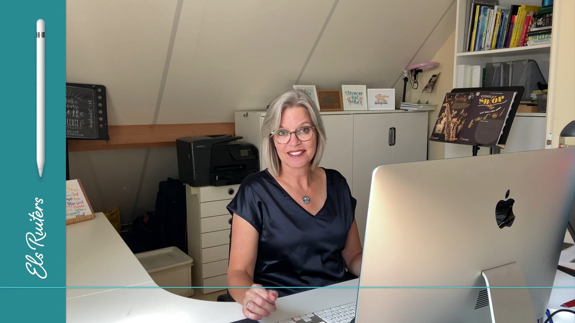
1. Welcome to weaving letters through photo's: Welcome to this skill share clause about weaving letters into photos. If you've never done this technique before, you might be impressed and you might feel that if you're a beginner, you don't know how to do this and this is something far away that you can never achieve. Well, don't worry, it's not that difficult at all. You just need someone to explain it. I'm here for you. So let's go. My name is Alzheimer's. I'm a graphic designer from the Netherlands, and I love to teach people new things on their iPad, in this case using procreate and Apple pencil. If you've seen previous classes of mine, you might have seen as Ryan coy fish or drawing your family tree. You notice a bit about the way that I work, and this is just one and that series. So if you like, just get your stuff out and let's get started.
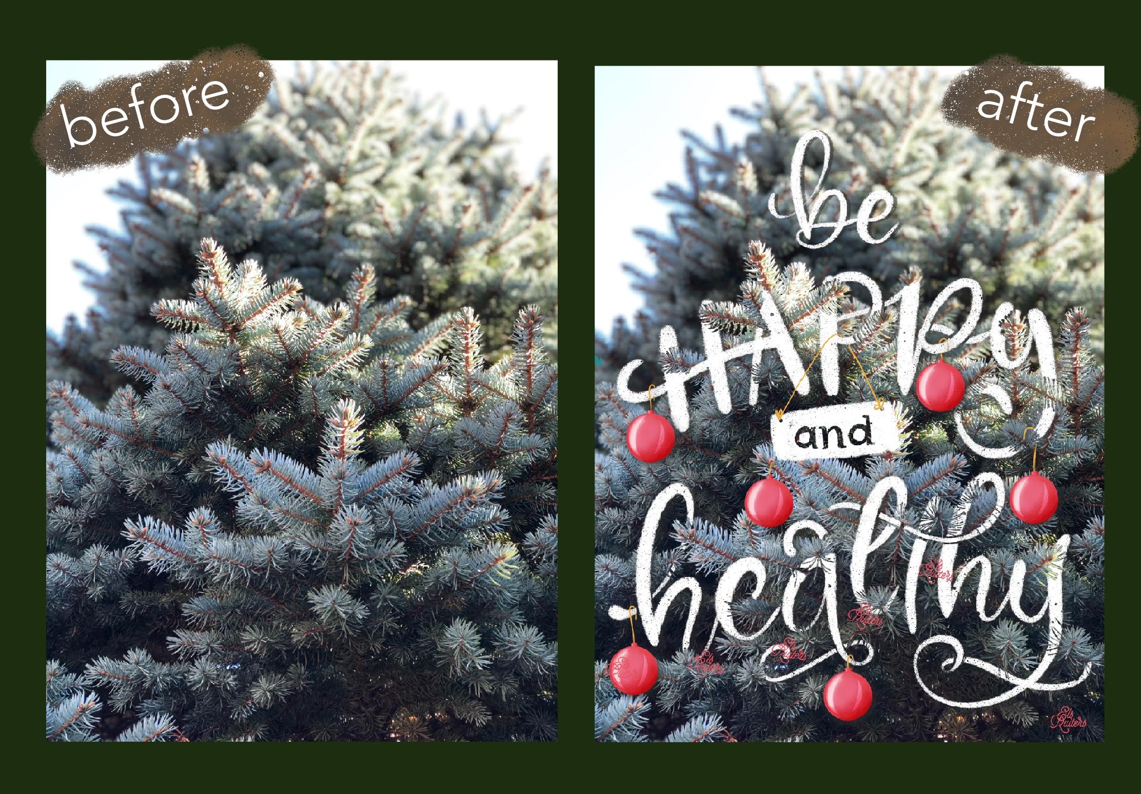
2. An introduction to weaving: Hello and welcome to waiving letters in photos using procreate, an iPad and an Apple pencil. And that says it all. You can make some pretty cool things just by using your imagination, a photo, and the appropriate app. This is one of the first things that I ever made. Look at how I incorporated the g and the e in the ribbon around the hat. This is far from good, but this is one of the first things that I made and I really liked it. So I did try it. It's all like these two letters, the L and decay, weaving through. The green ones are called the leaves of the strawberry and the peach. And an image that you give this kind of lettering has a little extra and I really love to do that. Like here. This is really an amazing photo. This girl has such a special pose that it was really nice to try and see what I could make. And I waved the D, threw her arms and her leg. And there's also the y going beneath the shirt, beneath the jacket, I think it is. But this is far from good. And I have tried many times to find the right way to do this. And now you can see this is more recent work that I've got the hang of it. And this is what I am going to teach you. This is what you can learn. You can see that the image to people drinking coffee adds to the lettering or the lettering adds to the image. And even though you can't read the entire word coffee, or together they are half behind and half in front of the subjects. It is still a clear image. And I love these little details like this squished going under the finger of the man. And the word, the letter F going behind the muck and the mug, and the latter ego and behind the risks. But still you can see clearly that it says coffee and that togetherness is even, is emphasized even more by the switch under the g, one that goes behind the arm or below the arm, and another one on the other side. And then suddenly it gets the arm back into the image again. This is why initial start my idea to make this class. But I realized very quickly when I was working on this that you would take a lot of time to explain how this works. So I'm not going to show you this particular thing, but when you are done, when you have done the class, you will be able to make something like this from a very plain photo of a forest of Christmas tree. Here's a simple photo, apostle and a glass of wine, and just some very simple waving and strong lettering makes this an eye catcher. I love this effect. Even though it is very simple, you can see how strong this works. And this is what we are going to make. And if this looks intriguing or maybe even a bit overwhelming, don't be scared. It is fun to do and you can learn it quite easily. So let's get started.
3. Preparations: Alright, first things first, let's take a look at the version of procreate. Sorry, this is always important because you might see different things than I am showing you. And that is probably because you have a different version. Currently. This is the newest one, the latest version and it's version five x three, and then a build with a lot of numbers. And it is November 20-20. Always make sure that you have the latest version on your computer, on your iPad. Now, let's make a new image screen size. And let's go to the coloring palette. If you have seen my previous glass drawing a coy fish, you know that I like to work with as little basic stuff as possible, just a few colors and limited color palette. And let's begin by clearing the history and taking a look at the colors. I'm actually working with black and white. And I have red and blue that I like to weld. So red is pink and blue or magenta and cyan. And these two colors are, these four colors are not color that I'm going to use, but I want to show you something about this. Remember that I just showed you the image of the coffee that people drinking coffee that was done with just one color, yellow, and a second color was pink. And I worked these together by while I mixed these together by adding information in the brush studio. I will show you how this works in a later stage and that's why I'm leaving them for the time being. Another thing I'd like to do as a part of the preparation is making a brush library that is specific for this project. So if you want to do the same, just draw down, pulled down and you see the boats and brush library, give it an appropriate name. I call the weaving. And then you can add whatever brushes that you'd like to use most. If you want to use the same virtues that I'm using. You can use 6B pencil, which you can find under sketching. The noise brush, which you can find an a touch ups dry ink under inking, the monoline calligraphy. The ink bleed is also in inking and let's add another one. I have made my own gel pens, which are just simple mono lines. But I made one which is quite large. And growing their swipe to the left, Make a copy. You can see that it is a copy because there's a one behind the name. Just hold that down, move it up, go to the library until it opens, and then just drop it. And this is the perfect way to get your, your working brushes together and work more quickly and more efficiently. So let's start drawing with 6B and let's use black. But before we start drawing, we need to import an image. And in the next lesson, I'm going to show you a great way to do so without having to pollute your own photo library. So let's move on to the next phase.
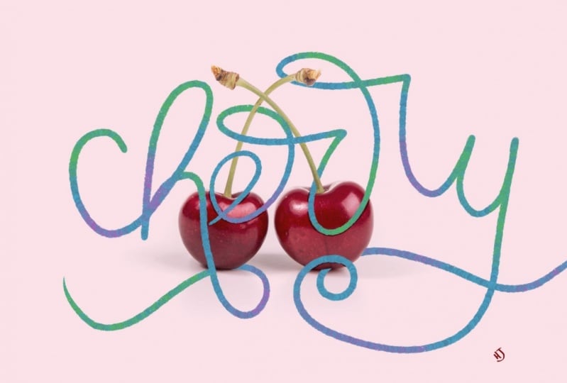
4. An alternative way to import a photo: You can of course, always import photos or images from your photo library or insertive file. A full song plays in the cloud like documents or iCloud or Google Drive, anything. But what I don't like is that you have to download your images often to your photo library and then bring them back in and you get all these images in your photo library that are indoors. So what can you do to avoid that? Now, move your slider up on the bottom until you see the bar. And then in this case I'm using Google Chrome, but you might be using a different image and go to an Splash.com and splashes a photo website that offers free, high-quality photos. And they are really very nice. As a search query, I added Cherry and I looked for a landscape orientation. And then I came across, well, of course there are many different ones. You can use this one if you like, and did try that one, but it leaves very little room to do some proper lettering. They think. I want something like that. See if there's anything else. That's a nice one. Let's take up one. Just tap it and again. And now it will open large in your screen and then tab download. It will appear large in your screen or larger even. And this is something that we can use. Now once again, I'm going to the bar down there. I put my finger on the procreate app and I move it to the left. And now I have the split view. Go back to the Google website. Hold down until you see the, the edge appearing. Oh, I wish to slow and then just move it. Drop it into your procreate page. You can exit the split-screen by moving to the right. And now I have my procreate. Just tap the arrow to get it completely into it. It's really quite nice there. And it's only in my procreate file. Of course, if you want to download that image because you want to use it again in a later stage, feel free to do so, but these were quite nice. So let's see if I start drawing. Do I have enough space around the image and in front of the image and beneath them, above the image to letter? I think I do. So it's time to move on to the next lesson. And that's making this sketch.
5. The sketching phase: Okay, time to start sketching. I've got my black color selected, and then the brushes panel and using my 6B brush. Let's go for the word cherries. If you have never done any littering before, I recommend that you follow a class on lettering first, there are many of those on skill share. The principle is still it always the same? Up strokes or thin downstrokes are thick. And with the sketch that we're making, it's not really that important, but it will be important in a later stage. So i'm working under the assumption that you already know a bit about lettering when you do this. All right, let's go and type or draw the word cherry. It's already quite important to imagine where the lettering will be, how it can be woven into this image. So let's make a few sketches. Right? That's not bad at all. Just let me take a look at what I can do. I can put this one, this part behind the cherry. I can weave the stem of the Gerry through the letter E, through this part of the r. I can leave this in behind, but I can also bring it in front of the R. And then here's some, some stuff as well behind and in front of the stem. And I can bring this behind the letter, behind the cherry and this part in front of well, let's make another one. And oh, look what I did I did not put that on a separate layer. Well, that's my punishment for not being precise. Let's just double-tap and bringing it back a shoot. Have locked this layer. As you can see, i'm also fully human. And let's draw again on a separate layer. Okay, now, I think this is not bad, but I already know that this will cause problems because it is unclear if I can put this behind the cherry or in front of the cherry. It's just not clear enough, so I will take up that one. Let me bring something back as well. I can do this. I think that's not that bad at all. Too much. That's too much. And then we have another book. So again, if you see that you're going to close to the edge, undo and try again. Right? This is almost ready. This part is not good yet. So let's bring down the opacity a little. Make a new layer, and that's try again. Oh, that's not bad either. I can use the H two, move it further. And then I can leave the R's together. And let's see what step on what that's like. I think I can use this. This has enough room. This has room to play with. Right there. One part can go behind the chariot, the other one can stain filled. I think this is something that I can use. So let's make a new layer. Let's bring down this sketch. Let's remove the first one to slope the sketch, and let's move on to the next step. The lettering itself.
6. The lettering phase: Go and letter. Let me take a look. I think that when I look at this image now, it is a bit too much to the lower part of the entire document size. So let's unlock this woes. And let's select them. And turn on snapping. And let's move them up a little bit to have a bit more breathing room in the auction. That's better. All right. Oh, I took the upper one as well. That wasn't necessary. Lock the image, look the sketch, and now let's start lettering. I want to letter with the blue is societies the blue color. And I'm using this color because I need to have some contrast. So That's right. And let's use a dry ink that see what that's like. That's quite nice to I have one color. Let's see. Go to the brush studio. Go too fast. Go to the brush studio. Check if the streamline is somewhere around 90. Go to color dynamics. Cray will anyway, and look, this is what happened. And that's why I left those other colors in as well. Okay, done. If I'm going to draw, I will have two colors. And if I'm choosing, I'm, something is going on between the pink color and the blue color, and that is what you get here. If I turn that pink in Word and turn that into yellow, I will have a totally different effect. I'm showing you this because this is what happened in the image with the two people drinking coffee. So if you want to let them try this and go to the studio. Every brush had a studio going to call it dynamics. Go down and in color pressure, bring up the secondary color about 50% or so. Also, you can try to see what happens when you move the Hugh about the Hewlett sweet. Lot happens, but I'm going to take weight the secondary color for now. So let's just clear this. This was just an example, and I will use a blue. Let's take a look that's really nice and bright blue. And I'm using the dry ink. I really loved that brush. It's, it has beautiful, beautiful effects. So let's start to try and trace this, but let's stay free, not be too focused on having it exactly as sketches. Right? I think this will cause some trouble. So I will do that again. Okay, let's turn off the layer with the sketch and let's take a look. What can I do in this particular image? Is it possible to use this as as I've drawn it here? Yes. To change the sealers what's a bit it's a bit Crockett, I think, but this is going just fine. The art looks good. This Ireland's node. And there's enough room right there to do something with the cherry. Let's move a little bit in the sea. So I'm going to the Eraser tool and I'm going to my weaving library and then using one big monolith. And I have made very small and very big moral lines. So as you can see, I can do a loss. And that is very helpful. That is very helpful if you want to do some erasing quickly. So let us take up this, see, when I make a new letter, even if it's only one, I usually draw a new letter on a separate layer because sometimes I need to move it at its own, shifted a little and it's easier to do that when it's in its separately, in a separate layer. And I'm showing you this to let you see not everything happens or goes well from the start. It, it can be a bit of a hassle to get things in the right position and the right size. And that's also the fun of it. So this looks much better. What I will do now is merge these down. And I have one layer with the word cherry right there. So we can start weaving. And we're going to do in the next lesson.
7. Weaving effect using masks: To start your weaving, you need to work with mosques. Now there's different kinds of mosques. You have mosques and clipping mosques. But in this case, we are going to add a mosque to layer. You will see a white mosque here. And that means if everything that is a visible in this layer, in the layer that is married to the mosque, everything is visible. If this layer was plaque, you wouldn't be able to see anything. And I can show you this. Let's say I've got black willing to fill there and now everything is gone. But, and that is what is so great about working with masks. It is a nondestructive method. I can easily bring this back. You slap me, choose white color, go back into my layers, physical layer and it's back again. Generally you can say that white reveals and black conceals. And that is a perfect way to remember what do I actually see what is going on? Now, let's start drawing with black. Um, you know that you are in a layer mask when you try to select a color and you can't see it happening. I work with black now in a white mosque. It is different when I'm on the layer itself, this is highlighted now and this is a well supplied light. Now, I can change my color. But if I'm working in the layer, I can only choose black, white, or the wide range of grey scales that are between black and white. But when you are working with black now, go to the brush library and let's use the ink bleed. Bring down the size. Let's enlarge this a little. And let's draw all with black over the stem on the blue letter. Like that. I want this stem to go on the, this part of the art, but over this part of the rat there, it's going through birch won't distribute on top. I want this part to be below the letter and the stem. So that looks good. I want this part of the arm to live behind the cherry. If you need a bigger brochure, you need. Smoothers settings, you can pick any person life, but in this case I think the ink bleed will do just fine. Now you can already see this image happening. You can already see what I'm going to do. Let's see, let's do something here at the bottom. Let's see what happens if I take out this barge and leave the part of his coming over it. Existing like that. This is something that I can do. Lets take this array lists all. Well, this is not going fast enough to my liking. So if I will change my type of brush to, in this case the big gel open. And I'm going back to the other brush again. And as you can see, this is not, this doesn't fit. Something is wrong here. So this should be back in, maybe this should go behind a letter. So we will, we will do is grab a white brush. And let's go back to the big monoline and just bring that back again. And you will see that this layer mask will have that back again. Everything, what happens, everything that I have taken out, this is a part of the letter R here, will be visible in the Layer Mask. And let's see what happens if I will take out this tiny thing. So let's use black again. And I'm using the small monoline Now that is a lot smaller than the big monoline brushed and I'm using for my eraser tool. And let's see if I can get this to work properly. Get a bit better. How? This looks better, yes, this looks better. I think this is something that we can work with. Alright, so let's check this. This is going over the cherry. Do we want to take this out as well? Let's, let's give it a try. I'm still drawing with black and white mask. And this is why it is so helpful to work with masks because you can, so you can change it very easily and nothing of your original image gets lost. Do we leave this slide? But yes, I think I leave it like that. But I will bring this back. This is not to my liking. So what I will do is just take white. And as you can see, this is an this is a process of trial and error because you cannot not always see in advance which part is most suitable for this particular weaving stuff. But this is, I think, something that we can work with quite nicely. So it is time to move on to the next lesson. And it is adding shadows to bring it more to life.
8. Add shadows to create depth: Great. We've got this beautiful piece of lettering. Now what I am going to do before I do anything else is changed the color and it'll, because this blue really stands out, but it doesn't really suit the red of the cherry that good. So let me move to the layer where blue literary and then go to these adjustment tool. And let's take a look at the hue, saturation and brightness. And especially the hue can be really helpful. Just move that little aha, this is already quite lovely. I think I like that more. Maybe a little darker, right? That yes, this is much better. This is a color that I want to have working together with maturity. So that is just fine. And if I go back into my layer, I will see that it has changed everything in that particular layer. If I were to take out anything else in the layer mask, it would still have those colors. So the blue that we used to have is gone. Allows good thing because that was quite update. Alright. I, you might ask me, why didn't you choose this, this particular color from the start? Sometimes it's difficult to see that particular match. And if you use a color that is somewhere in the neighborhood of where you want it to be or suspected will end. You can use a brighter color to have more contrast in your drawing and see what you're doing. But now we're going to see what we can do next. And I'm going to add a new layer. And i'm going to turn that into a clipping mask. Now you can see that it's a clipping mask because there's this little arrow, which means that it is connected to the layer beneath. And it also takes on the properties of the layer mask. So we, fred tried to draw something here. It won't be able to do so because that is hidden by layer mask. What I will do is change the color to multiply. And I will use the eyedropper tool to pick or the IP layer, is that the correct word to pick the color that I have just created? And I can add it right there in my palette. And now I will go into my brush library and I will use the noise burst touch ups. Let's take a look at the size. And everywhere where I can see a shadow appearing of the the letters touching each other or going behind or in front of the other, or where the cherries are connecting the letters. I am going to add a little bit of a shadow. And because I have changed the blend mode to multiply, it will be the same color, but only in a darker, darker tone, which is quite nice and quite sophisticated too. And you can immediately see that it begins to come to life because I'm adding these shadows. I think this is already quite nice. Now what do you also want to do is add shadows in the letters themselves. And I need to have a smaller brush to do so. I think that the 6B pencil will be just fine. We're going to add some small line to their iPad. Everywhere where they touch each other or where there is an intersection or something overlapping. I'm adding and it'll be those stripes. Here is the same thing. If this was a real ribbon, this would be probably on top of the other. And if it doesn't get too dark, just used a smudge tool. This is the smudge tool. And use the noise brush and small size to add a bit of gradients, smoothness right there. And say, that's okay, yup. So back to the pen. Now this is something that I can choose myself. Do I want this to be on top of the other or below the other? I think I want to have it behind the other. Move this and I like that. One. Do the same here. And if the pressure is too big, just make it a little smaller. You can change it quite easily. Let's see. I want this to go this particle over that part. So bringing down the size of the brush feminism. And I'm using this area to get that depth. And that I mentioned back. Right, like that. That's good. That's good. That's good. Okay. Here's another one there and there. So we'll put some lines there. And maybe it might be tempting to try different, different versions. Maybe you should have your lines right there instead of here. But I have noticed that despite the fact that that is very tempting to do, the more natural way is usually also the best one. It is unnatural to have the one going below to stem going over this swash and then going behind it again, then I will change it accordingly because it will feel a bit forced if I do that. And this one is definitely going over the small one. Well, I mean, this one is definitely going off the small one. Sorry. Just used a smudge tool. Right? Is beginning to look good. And there this is so subtle that it's hard to quietly visible. And the last one is this one. You do the smudging and always go from the part that you want to lighten to the outside. Okay? I think this looks quite nice. But we still need to do is add a little shadow from the letters onto the cherry. And we might have to add a little on the cherries themselves as well. So that's probably the next thing that we're going to do.
9. Add shadow on the cherries: All right, let's add a little shadow on the stem and only Cherry themselves. I'm going to do cherry layer and I'm going to add a layer on top of that one. I will use the color picker. Where is the color picker? Right there? That's it. And I will use the red color. And I'm going to change the Blending Mode again to, let's start with multiply. And let's go to the mono line and see what happens. Well, that's bright enough. Well maybe, maybe even too much. Let's leave it like that, but let's see what will turn out. I will use a dry inking, but then make it a bit smaller. And I will follow the same line as the letters that I have just made. Well, of course, I can use a drop shadow effect by, by making an actual drop shadow and then starting to take parts away in the mosque as well. But I have noticed that it doesn't work that good. This works much better. This is much more natural. Not too much. And let's see. I'm putting out a bit further. So I think I should take away the part that goes right there, just like I did here. So what we will do again is make a MOS and again it turns to widen to black. That's big black. Let's use the model line, looks to the moral line link, very smooth and be precise in the agents right there. I don't think I should do that from the inside. Going back to the layer again, use a brush and this case the mover line and add a shadow right there as well. So this is also a little bit too big. So again, I'm going to delay or mosque. I'm taking the monoline calligraphy, making it quite small. And that would surely have made too big. I will just conceal it by painting with black. Again. I think this is mood and enough I will do this a bit more gradual because there is wide of the of the light on the cherry itself as well to hear. All right, I think this is good enough for now and we need to add some shadows on the stems. So let's go to a new layer. And let's pick the green color and make this into turns into a multiply layer. Yes, use the 6B pencil sketch and the place in the same way, in the same place where stem as a shadow of the layer above. Just slightly. This is not actually necessary, but just slightly add bit of shade. And this is just enough to make it come loose, make it, make it stand out. I think we are almost there. I think we are almost reaching the part where we need to finish this project. So let's go over to the next layer and add the finishing touches.
10. The finishing touch: Nearly there. Let's go all the way up and add another layer. And we're going to add some color into this part. Now, I like something to go with this greenish colors. So if I pick this greenish color, this Bob blue-green, two choirs color, I can go to the harmony section. And let's see what lives right across the three from the harmony. Well, it is red. Now that is amazing. So this is probably not the best scholars who use as an extra column in the lettering because it will live so closely near the letter of the jury's. But it's fun to see that I intuitively chose a color that is very near the opposite side of the spectrum in the color wheel. So let's see what happens if I'm going or a more yellow color, not least crate, right, nice. I think. Don't say We like that. So what I will do, this just big this part. I'm on the cherry while I'm not in the Charolais or I'm in a separate layer, but I will turn that into a clipping mask as well. And I will use a noise brush and let's see what happens when I start adding. So chlorine right there. It's all bad. And the great thing is that you can use whatever college you like best. If you don't feel certain that this is the correct thing, that you should have chosen something different. And I can show you quick trick to see if something else is perhaps more suitable. Think this is quite nice as quite fresh. Let's see. If I have this layer ready. I can go to the Adjustment Layer adjustment settings, pick the top one again. And then let's see what happens. If I move this part around. This is getting darker. This let's say you can go all the way from one side to the other one would think that blue one was so bad at all. So let's just keep it as 50, which is where I lived when I openness and maybe turn up the brightness and saturation. Now, I think that is quite pretty well. If I want to, I can add another layer, turn it into a clipping mask, and then maybe use is more dark purple color. And again, use a noise brush and, and try to see what happens if I put that right there on the lower sides. That isn't all bad either. And you can see I can easily go over the parts that have not been touched by any lettering yet. It will not damage the rest of my image just stays inside the image itself. And I think that this is what it's going to be. The last but not least, is use a color from your image. I like this. Red light is red color. And I will go into my layers and add my own logo. Just tiny right there. And that's it.
11. Thank you: You made it to the end. Congratulations. I hope you enjoyed yourself and I hope you had fun. And I seem to be saying this in every class that I made so far. But probably that is because I like to do it myself. I hope this spark your imagination to try new things, to go in directions that you haven't tried before. If you have any questions, leave them in the student's section below. And if you have made any projects that you want to share, please feel free to put them there as well. And I can see what you make really curious to see if you got the hang of it and how you incorporate this into your work. Well, for now, thanks for watching and I hope to see you in the next skill. Share clones. For now, stay safe and stay creative. Bombing.
 Els Ruiters, Graphic Designer from The Netherlands