Transcripts
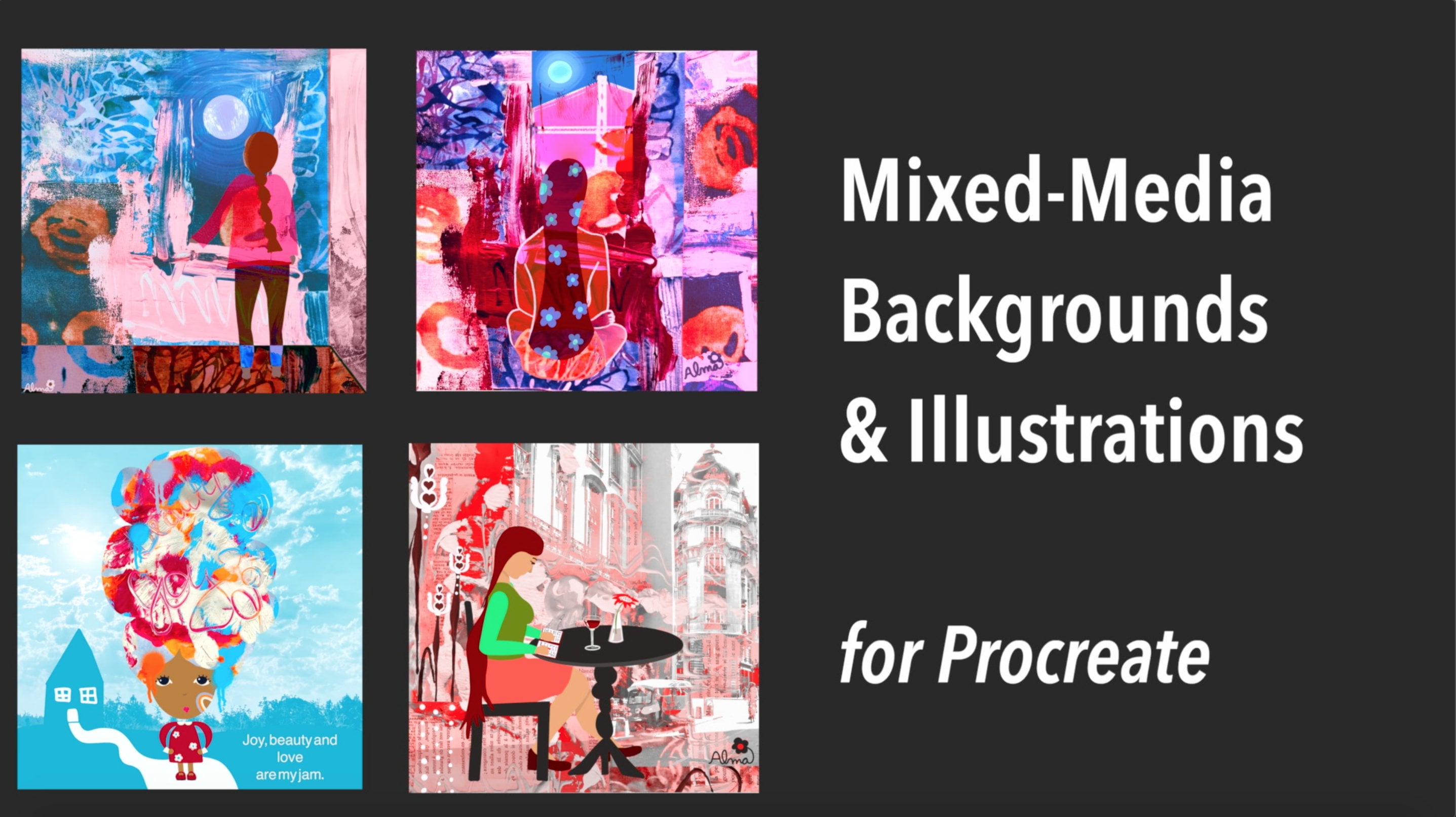
1. Introduction: Hi, I am only macaques. Welcome to my art studio. I fit a professional mixed media artists teacher and designer for 20 years. And I've had the great pleasure of sharing what I know about art with hundreds of people in person and online. What I really love is blending what is real with what's in my imagination and discovering new ways to layer these. In this class, I'm going to be showing you how I use photos with my illustrations in procreate on the iPad. Almost everyone I know has photos of flowers and landscapes. So it's these kinds of photos that are my inspiration for the projects ahead. The techniques that I'm gonna be sharing with you will give your illustrations new dimension and realistic depth. Don't be surprised at all when your followers asks you how you made that super-cooled background for your illustration. In project one, I'm going to use a photo of the river by my house, the background for an illustrated figure in project two and sharing photos from my garden and to create a portrait illustration. And I'm going to be enhancing the background two. And in the third project, I'll layer photos to create an unexpected background for the figures that you see here. There's also an inspiration video where I share tips from some other photo and illustration artwork that I've made in the past. And as a bonus, I had made a video of how I give rows some dramatic flourish because I'll be using an iPad and Apple Pencil, but a stylus or my hand would work just as well. I've made all the photos that I used available for you as free downloads. Please watch the project videos for the password. I'm delighted that procreate makes many of the functions that I've always loved about Photoshop, a breeze, making it a powerful tool for endless possibilities. I love the Superfund job that I have a preview. Some of the ideas that I hope will ignite your imagination. Thanks so much for your interest in this class. I really look forward to what you create.
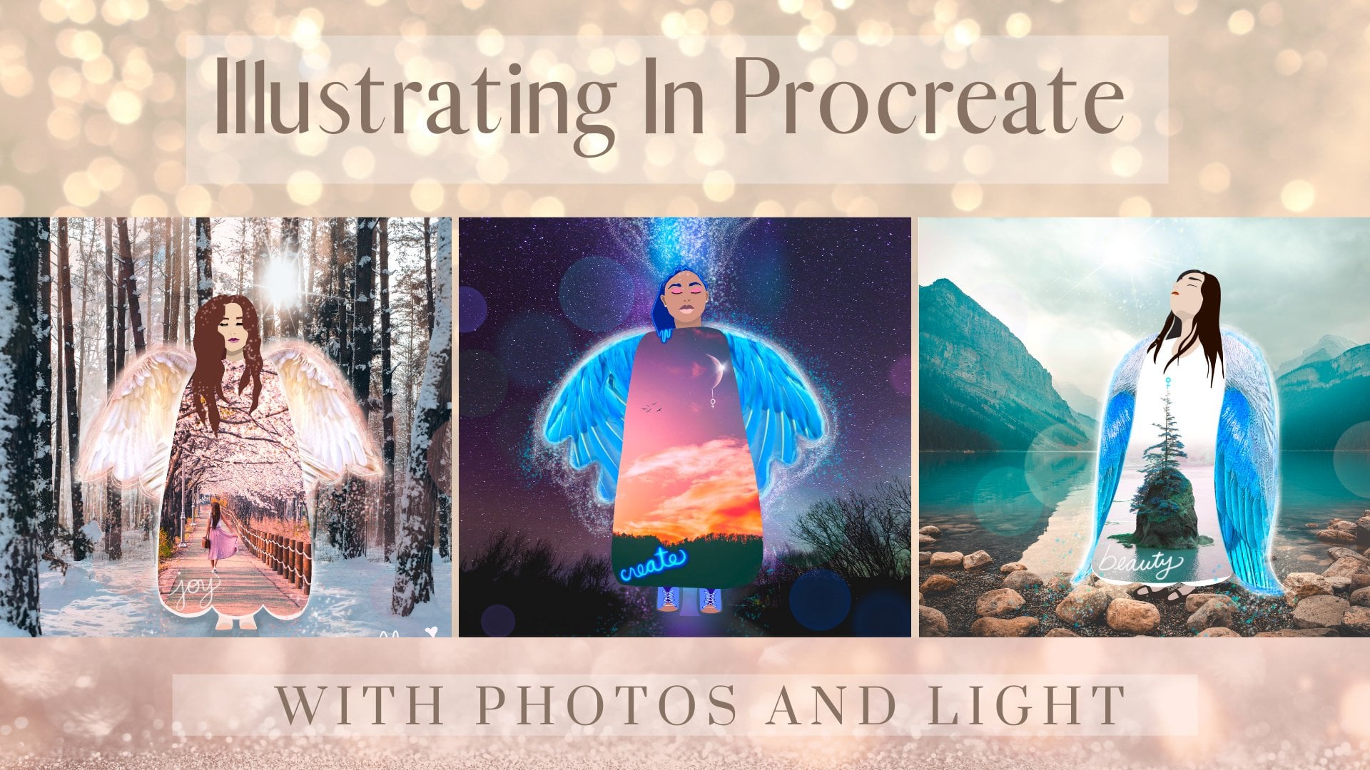
2. Figure In a Landscape: Okay, so the first thing that we're gonna do is we're going to be using the photo editor on the iPad to enhance the photo that we've selected in here, I have one of a landscape and I haven't saved it an album. And the first thing that I'm going to do is and I duplicate it. And the reason I want to do that is because I want to always preserve the original because maybe down the line I'll be using this as a background for a different project. And I may want to have it be very different. So I'm going to first select from the filters and I'm going through right now and just showing you the different options. And I think I'm going to land here on vivid warm right now I'm editing it when I'm looking for are changes that will give me more depth and in particular in the water. So I'm upping the exposure just a little bit. I'm giving it a little more. So there are no wrong ways to do this. And it really is about your personal preference. And I just love things are very saturated. So I'm upping the saturation, looking for those long reflections in the water. And I'm also trying to get more depth in the water. So I'd like you, when you're doing this, you know, it really is just a feeling. And one thing I notice here is there's a sharp blue line that has formed because my saturation is just too high, so I'm going to drop it down just a little bit when it tried to keep the changes that I liked in the water. But I'm getting rid of that stark blue line. I'll be altering this even more in procreate, but I like that this photo editor gives us more options. So the next step is to take this photo into Procreate. Here I am in Procreate and I have my 3000 by 3000 pixels square that I like to work with. This gives me approximately a 10-inch print if I chose to print this. And the first thing we're gonna do is bring that photo that we have edited into procreate. And you can see here that it doesn't fit on the canvas. So we are going to have to change its size. And before I do that, I'd like to imagine that there is a grid of rule of thirds and there's a little sweet spot that is in the corner of that middle square. And that's where I'm going to aim to have my finger. It's not gonna be perfect, but I'm going to aim to have my figure more or less be on that corner point, that lower left-hand corner of the square. And this is where it gets fun. So you're going to go to the adjustments and you're going to play with the hue. And you can see I'm moving the bar and I'm changing, altering the colors of this landscape dramatically. I want the setting for my illustration to seem like it's from my imagination too. And I'll be using the colors from my background is inspiration to choose the colors I'll use for my illustration and create a cohesive artwork. And here I'm just adjusting the saturation until I get something that feels really good to me and I love this purply blue, orange combination. So the next step is I'm going to add a layer and I'm going to be sketching out my figure. I'm gonna keep it very simple. And I'm just going to use white here so that you can see what I'm doing. I always like to sketch with my pencil under sketching and we keep it rough and simple. And my general rule is if whatever it is that I'm drawing, in this case, the female figure in a larger background. I'm going to keep her so simple like I won't even do facial features because, you know, too many details would just get lost. I want her to really pop from the background. Here. I'm going to size her. And I like to size during the sketching part so that way I don't need to alter. And he kinda pixels during the inking process. So I want the size to be pretty much right on during the sketching. I'm going to sketch her on different layers, dropping the opacity between each layer until I get her right. And I think I do this about three or four times. Just in I'm trying to write now figure out the position of her back. I wanted to be leaning forward, but I don't want it to look like She's slumping, So that's what I'm working on right now. So I had the sketch where I'd like it. So I'm dropping the opacity. And now what I'm going to do is to create the palette. I'm making this smaller so you can see the entire canvas. I'm just going to be selecting colors from the background and I'm creating a new palette, and I'm just dropping in the color into my new palette. And I'm, I always select many more colors that I'm really going to use, but I'd like to be able to see what the brightest colors are. I'm looking for contrast. So I'm also going to be repeating colors because it just sort of happens as you move around, the colors are very similar to one another. So I'm looking for high contrast and just a nice selection. And later on I will be upping the saturation of even these colors that she pops a little bit more, but this is just gives us a place to start. The next step is to go ahead and anchor. And I'd like to use the studio pen under inking. And I also like to have it on at least 90 percent streamline. For her skin tone, I am going to pick this deep dark brown and I'm then going to take it to the classic color picker. And I'm going to select a tone that is a little more gray and a little bit lighter. Generally skin tones have quite a bit of gray in that. And as I incur, I'm going to put each of her parts on a different layer and that is so that I can change my mind about the shirt She's wiring or the sleeve. And ultimately what I'm doing is I'm picking colors that really contrasts against one another. So that's why I like to give myself that option. So yes, it ends up being a lot of layers, but it's worth it to me just to have a little bit more control over the colors and the ability to change my mind. For her shirt, I'm going to drop down the opacity so that I can see exactly where her arm is and I'm gonna make her arm a different color so that again, all of her parts look differentiated. To give her figure and just a little more depth, I'm creating a layer beneath the leg layer that you see. And I'm going to make it just a little bit darker than that leg so that you can kinda just see just a slight bit of dimension. And I'm doing the same thing with her sleeve. So I put the sleeve that's behind the sleep that's in front on its own layer underneath that front sleeve. And you can see here I'm moving it so that it's even behind her body shape. Right? And I'm repeating that process with the hands and the feet. And I'm just making sure that I move the layers that are in the background lower than the layers that are in the foreground. Now I'm just adding the butterfly. And because we're a little hands are smaller than what I anticipated, I'm just, I'm just making that adjustment so the butterfly doesn't match the sketch, but that's okay. I can use the sketch as a reference and now I'm just cleaning up the figure before I work on the details that will really bring this illustration to life. So just cleaning up, filling out, erasing the places where it looks a little off her calf. To add the details to her hair, I'm going to apply an alpha lock. And the reason I do that is so that any details and design work that I do inside of her hair just stays on that layer so I can start outside of her hair, bring the pen in. And it just automatically keeps everything that I do inside of that particular layer. So I'm speeding up here as I add the details to her hair and to the butterfly. And I just want to also mentioned that, you know, a lot of these simple little drawings have come to me over the years. They are landscapes that I've done, for example, an artwork and mixed media art work in the past, and they're just simplified. And in my doodle class that I offer here in Skillshare, I've discovered a lot of these shapes and the style of drawing through the practice of doodling, which I highly recommend. And what I find really fun is that a lot of the drawings that I did as a kid in particular alert when I was ten to 14 years old, like rainbows and clouds. These are the things I used to draw when I was young. Age is happy. And it's just as interesting to me that, you know, I'm coming back to all of the eye and I love it. The final step is I'm going to duplicate my illustration and I'm going to work now on the copy. And I'm going to clubs or merge all of the layers that comprise the figure and the butterfly. And I'm deleting my sketch. And I'm going to keep my background separate in this way, I can alter the figure and I can, you know, up the saturation if I want to, which I'm gonna do now and just brighten her up just a little bit and make her pop just a little bit more. And then I'm going to select the background layer and I'm going to give it a little bit of an adjustment as well. And you can see here just a little touch of brightness and a little touch of saturation brings it together nicely. And I forgot to sign my piece in the original, so I'm going to do that now. I'm adding a layer and I'm using the same color palette for my signature. In the next video, I'm going to be creating a portrait illustration. I'll be harvesting flowers for her hair. And I will also be changing the background, putting my figure on a an altered photo background. So I will meet you there. Thank you.
3. Portrait In a Landscape: Welcome back. So in this second video, we are going to be starting off with many more photos than we did in the first. And here I have an album of arrangement of succulents and some flowers. And then I have two potential backgrounds that I am thinking about using. So just as in the last video, I'm going to duplicate each of these images in the photo editor that is on the iPad. And then I'm just going to simply apply a vivid filter. Each one similar to how I did so with in the last video, I'm also going to be applying a vivid warm filter to each of the background images. And once again, I'm going to begin with a 3000 by 3000 pixels square. And the first thing I'm going to do is I'm going to click on the wrench and add a photo. I'll be using the background on the left. And the reason I'm choosing that one is because there's a little bit of a structure in the background. And I just want to show you that sometimes photos aren't perfect and that's fine. I'm going to be putting my portrait figure right in the middle there, so it's going to be covering up that area. Next step is I'm going to be clicking on adjustments and applying a hue variation to this image. Right now, I am absolutely in love with this purply blue orange combinations. So that's what I'm going to be working with. Now. I'm going to insert all of the photos, the flowers, and the second lens that I want to use. And unfortunately I can't select more than one. I have to do each 11 at a time. So I'm going to fast-forward here as I bring them all into procreate. So here in my stack of layers are layers of flowers and second lines, I am right now prioritizing which ones I absolutely definitely will want to use. And those top two I'm seeing as my focal points. The next thing I'm gonna do is I'm going to select each of the pieces of the flowers and succulents with my selection tool, the upper left-hand corner. And I'm going to make sure that my free hand tool is also selected down below. And I'm basically going to harvest pieces from each of these photos. And the key here, it's a very sensitive tool. Once you have that free hand tool selected, what you, what I've noticed is it's best for my hand not to touch the screen. So I'm gonna do my very best to keep my stylus. Have that be the only thing that is making the selection. If my hand touches the screen, then the selection will actually move and it, I'll have to start over. So. Moving very slowly and very deliberately. And I'm just selecting, you can see the little marching ants that are forming. I'm just trying my best to select just inside the edge, but because it's almost, virtually impossible to do that all the way around. It's okay, It's fine. Later I'm going to show you my trick for any kind of gaps or little extra bits that I've collected that I may want to erase later. So for now, I'm just doing my very best to make the selection. It doesn't have to be perfect. I'm just sort of thinking ahead of time before I tackle the flowers. Exactly what I want to do. And this particular tool is awesome because you can stop and start. So I could take a little break right here and then start in again where I left off. Once I've made my selection, I'm going to drag three fingers slowly and deliberately, and I'm going to hit copy and paste. And you'll notice here that it automatically takes my selection and creates a new layer. So I'm going to take the photo that I just used. I'm going to drag it to the bottom and my stack, I'm going to turn it off. And now you can see that my selection is sitting on top of the flower that's underneath it. So for now, I'm going to turn off my selection, but I'm going to leave it at the top of the stack so you can't see it. I'm going to repeat this process for every single flower and succulent that I have on each layer. I am going to move slowly through the harvesting of this particular flower so that you can see the process. And then I'm going to be speeding up the other photos built take a long time. And one of the things I did want to mention is this takes a little bit of practice. And when I first started using the selection tool like this in Procreate, I found myself having to stop and start quite a bit and start over. And that can be a little frustrating, especially when it's taking you a long time to make a selection. So don't be discouraged, just be patient. Again, I really do think that not touching the screen is the best way to go. Just keeping the stylus on the image. And once again, I will turn off the, excuse me, turn off and drag the flower image. And I'm going to turn off that little selection that I just made. I'm going to keep it at the top and I'm just going to keep going through all of these photos until I've made all the selections that I want to. And the reason I drag the photo that I've just made the selection from to the bottom of the layer stack is so that I may decide during the process of creating my figure, my end, my illustration that I want to harvest another little piece. And so I just like to keep my Images in the stack. You don't have to, if it, if it feels confusing to you to have that many layers, you can just delete them for now because really if you need that photo, you can go get it again in your photos, right? So that's another option. I'm slowing down briefly for this particular photo because I want to show you that I really like this particular succulent. I want to also harvest that little stem, even though it's a little ragged ID. I don't have to include everything about it, right. So I'll just slow this little selection down so that you can see that you can be very intentional with what it is that you want to include or not. And the other thing to remember too is if you do include something that you want to delete later, that's not a problem. We can always select it again as we're creating our image. So here I'm avoiding that little chunk of dead stem. And the other option, of course later is you can just erase those little parts that you don't want. So it's up to you. But I just wanted you to see how I go about doing this particular image. And here I'm speeding up again through the rest of my flower selections. So I've made all of my flower selections, but all of those layers are still off. And so now we're down to the bottom, to the background. Meaning the background is the only thing that you can see because everything else above it is turned off. So the flowers that I decided not to use, I'm going to also put them all in a group along with the ones that I did use. And like I said before, I just like having them there. I don't have to. Next, I'm going to go to the selection tool and this time I'm going to have the ellipse shape marked. And I'm dragging my stylus and making just a simple ellipse shape. And the color at this point really doesn't matter. We can always change that. I have just a light beige going on right now. And then I'm going to use the Move tool and going to size it and move it so that I have it positioned where I want to and I'm keeping in mind that I'm going to give her some shoulders and I definitely need room for her large flower and sexual and tear that I'm going to give her. So that's all I'm considering right now. And you can see here that that ellipse shape is right above the background layer and all of the succulents are on top. And now I have turned on the very first layer that's right above the ellipse and that is that little succulent that I was talking about before and showing you. And now I'm moving it into position. And you can see here that I'm making small adjustments to. With her face. And I kind of imagined that these little tendrils would be kinda hanging away from her face when I saw the session. So that's how my imagination works when I look at flowers. But anyway, this little process here can get a little bit overwhelming because we're dealing with a lot of items. You know, at least I am with all the ones that I've selected, but I'm just going to do my best to move things and I don't want to make things too small because once you decrease the size of your items, then increasing the size later will actually cause them to pixelate more. Here I'm going to remove the very top succulent from this little group of three. So in this case, I'm going to use the selection tool to just go around that particular succulent. I don't need to be as careful because I don't have to harvest it from a background, right. It's all by itself, so I just need to detach it from the other two. And this time when I drag three fingers, I'm going to choose cut and paste. And the reason I'm doing that is I may want to use just that single little succulent that's on its own layer now for a different part of her hair. So I'm going to turn it off for now and just keep going with the positioning of all of these different items. And you've probably noticed obviously that I am not turning all the flowers on it once because it's just easier for my brain to just do one at a time and just arrange them intuitively, you know, as I go along. And this is a really big or one of the things that I really believe. Because I've been making art for a very long time and I've taught lots of classes. I think it's really important just to trust your own instinct as to the next step, and just trust that it's all going to work out. So right now with the, these are the main focal point flowers, right? So that's bigger. Second line on the left. I wanted that to be really prominent as this flower. I want it to be really prominent as well. And here I'm deciding, I think I'm going to cover up some of what's already there and you'll see here how I, how I deal with it. So I decided I am going to keep that flower there. So I'm gonna turn it off for the moment. And I'm going to remove from the tendril that top succulent. And once again, I'm going to be on that layer. And I'm just going to go ahead and select that whole top part and cut and paste it and then resize the xenia flower. And now that I have those two main ones positioned, I'm just going to speed up through the rest of them. And here, what I want to point out too, is design wise. I want her hair to be very asymmetrical. I want it to be in balance. And that's part of the quirkiness of her personality. And I want to draw attention here too. There's a flower that I did not use, the stack at the bottom. And so I've just decided here at the last minute that I think I am going to use that little pink flowers. So I'm taking a moment to. Select it from the stack and I'm going to add it to the right side of her hair. Here. I'm making just small adjustments to those little tendrils. I'm actually removing one and moving it a little bit. And now the next step is to create the palette. And what I'm gonna do is I'm going to choose colors from the selections that I've already made. And here you can see that I've created a new palette by adding it with the little plus symbol right there in the upper right-hand corner of the color palette. And I'm just touching the colors that I want from the canvas onto my palette. Since I'm having a hard time deciding on the skin tone from the colors that I see. I'm just going to use that darker brown to find a color that's a little grayer. But in that color family, once I land on the skin tone, then I'm going to also give her a neck and shoulders on the same layer as her face. And in the same tone. As I'm looking at my figure, I realized that I don't love these two small succulents that are attached to the larger ones. So I'm just going to remove these as I did and showed you before. The next step is to begin giving her her features in here I'm selecting a green. I'm thinking she needs classes since I wear glasses, not going to create a big palette, color palette, because I'm just going to be doing a few things and I'm just going to be selecting colors as I go. So for now, I'm going to give her glosses with the green. And I'm working directly with the studio pen without sketching beforehand because it's really a simple face. So I'm going to just move forward and then I will let you know my process and my thinking as I go along as I speed up. So a couple of things I'm thinking about. I want her eyes to be in the middle, more or less of that ellipse that I made. And a little dot of white and that really brings them to life. For her blouse, I'm just selecting the orange from that flower upon her head. The next step is to collapse the flowers. So I'm really happy with their placement. And the next step, this is my little trick for just softening all the edges. I'm going to add a new layer. And on this new layer, I'm going to be using the sketching pencil, the 6 B pencil. And you'll see here that I will start picking colors as I go and softening all the edges with the color that is nearest to the part that I am covering up. So in this case, that little bit of black goes away when I just color in using a little bit of that yellow. And I'm going around and this process can take awhile, especially the selection was a little bit ragged. But I enjoy it. I feel like it's artsy and sometimes I even make up parts as I go. For example, that did not have a reddish edge, but I'm giving it a little bit of more color. And here I cut off some of the red, so I'm just going to be adding some of that in. And you can layer color upon color so that you can really create the line to look like the other parts of your selection. And as I soften these edges, I'm going to go ahead and speed up. Again. Be patient. And it's fine if you use this pencil with your image, It's fine to alter the photo in any way that you like. And I actually really love the organic feel of the pencil. So that's the one that's my, my preferred choice. Once I'm done with all of the edges, I'm going to go ahead and make some corrections. I noticed, for example, that I forgot to give her eyebrows earlier. And I'm also deciding that I want a brighter or more intense orange and I'm giving her some details and this is where the personality comes in. I was going to give I wanted to give her name, so I just decided to call her Xenia. And I also gave her a little bit of shading under her neck. And the other thing I'm doing now is I'm adding just some illustrated flowers to kind of bring this whole thing together. And I'm using the pencil tool. And that's so that I can continue with that organic feel. And same with the little details that I'm adding. So make it your own and have fun with the process. Adding flowers to the background or anything really that you want to. Perhaps background allows for a little house or a bird or a butterfly. The key I think, is to keep it simple so that I don't detract from Xenia, right? She's the main focus. In the next video, we're going to create a layered background for our illustration. And I have three different projects that I'm going to show you that.
4. Layered Backgrounds: For this video, I'm going to show you how I combine two images to create something entirely new and different. And here I've got some flowers including some drawing hydrangea has some flowers that I purchase at the store and some from my garden. And I'm going to combine these flower images with some landscape backgrounds. I'm going to duplicate each of these photos and to review how I do that, please watch project one. Thanks. So here I'm auditioning different filters and I'm going to land here on the vivid warm. And then in addition, I'm also going to scroll through some of the adjustments and I'm going to enhance the saturation. I'm going to do this with every single photo and some will be a little bit different. I may create more contrast, I may expose it a little bit more. It just depends. And honestly, I'm just going with my gut as far as what looks interesting to me. I don't have a plan. As each photo comes up and just sort of deciding on the fly, you know what feels right? And here with the forests, I want those shadows to be prominent, but I also want to brighten all the photos. And with these hydrangeas, I'm adjusting the colors a little bit more just to create more drama. And with these flowers, I'm actually desaturating them a little bit just to see what happens. Okay, so like all the projects, we're going to open a Canvas and we're going to import the first photo. And I'm going to select this sunset. And once I have that in position, and again, I don't have a plan, but it just feels right to me to have the sun a little bit off center. So I'm not thinking about the rule of thirds right now because I really don't know where I'm going yet. I'm just sort of instinctively moving that sons that feels right in this moment. And then I'm gonna go and grab another background. And again, arbitrary here, I'm just going to pick this forest and you can see that one is horizontal and vertical. It doesn't matter. I'm just positioning them so that there is no empty space around them. Now I'm ready to create a little magic, but I will say with one caveat that it doesn't always work. So I'm going to start by being in the Layers and I'm going to click on the Blend Modes. And then I'm just going to scroll through and see what kinds of effects the layer on top is having on the layer beneath it. So whatever blend mode you apply, you want to apply it to the photo that's on top. I'm just moving the photo off to the side so you can see what is happening as I scroll through these different blend modes. This is sort of the first one that strikes me as somewhat interesting, although I'm still not convinced, so I'm going to keep going. And I like that one just a little bit better. So this point I'm going to go back to and just select the exclusion blend mode. And now I'm going over to adjustments and I'm going to play with the hue and the saturation and see if I can't find something that is interesting, more interesting to me. And I like what's happening here. I like just the different colors. And it's sort of feeling very sorry tail to mean. So I think I'm going to stick with this blend mode, but I'm going to play with the brightness a little bit until I see the sun coming through. And now I'm going to use the Move tool. I like what that light effect is is creating. So I'm using the move tool to move my bottom photo. And notice that I just need to have it selected in my layers panel. I already see in my mind a figure, a young female figure walking through the forest. So I'm going to select adjustments in this term. I'm gonna go to color balance. And here I'm just seeing if there's anything more or less that can be done to make this image a little more interesting to me. Okay, So the next thing I'm gonna do is I'm going to just start. I feel like I like this background enough to create a figure and I really am loving the blue in the deeper background. So That's going to be one of my inspiration colors for sure. So I'm just going to sketch out this figure. And, you know, just like I did in the first video, I'm going to keep her very simple. She's not going to have facial features. She's just going to have some very organic flowy shapes. And I'm going to be sure to size her, you know, appropriately in the sketch phase so that when I incur, you know, I'm not having to adjust the sides anymore during that inking process. So I'm going to speed up a little bit and during the, during the sketch. So she is science to how I'd like her and now I'm just going to go ahead and start inking her with on a different layer. And again, I'm going to keep all of her different parts separate so that I can make color changes if I want to. And I'm not creating a div, I'm not developing a pallet. I'm just sort of winging it as I go and selecting colors from the background. And I'm just sort of mindful at this stage to not use too many colors, right? I, I will try to keep my color palette limited and. I will say right now as I'm creating her and adding the colors to her, I'm not loving the red and the green house in particular and how they, those colors are looking with the blue and the orange. But I am pretty married to tear of the blue and the orange. So in a moment, I'm going to show you a trek to bring a cohesion to the background. And this is something that you can do at any stage when you're working with this process. Okay, So here we go. I'm going to bring in a new layer with a brand new color. And I'm going to actually go through the blending modes again with this particular color. So remember I said, whatever photo is on top is going to affect everything below it. So in this case, the blending mode is being applied to the blue. Now, I don't like it, but so now I'm trying with an orange and I'm going through the blending modes with that orange and seeing how it interacts with the two layers beneath it. And it doesn't, like I said in the very beginning, it doesn't always work, so I'm taking a chance, but here, wow, I've landed at something. And it feels a bit like magic to me. I feel like all the issues that I had before have just suddenly disappeared and I still get to use my blue and my orange. Now, it's very fortunate sometimes I have to go through many, many colors. Like I did with the teal, the bright blue and that orange color. But It's fine. It's, again, it's playing and it's allowing some serendipity to happen. So I'm pretty happy with the background at this stage. So now I'm just going to continue and giving her some more details, making little corrections to her hair, cleaning up the gaps and finessing herbal bet. And in just a few moments, I'm going to start adding the details that will give her more personality. Okay, so I've filled in her hair and now I'm going to add the details to her hair. So I'm going to apply an Alpha Lock to her hair so that I can basically add in, you know, the illustrations that are personal to me. And remember, I said that when you apply your Alpha Lock to a particular layer, then anything that you do will stay within the boundaries of that layer. So here with the details, I'm mostly interested in creating a lot of contrast. So I'm going to just use a few colors to do that. And I want it to feel soft and a little bit. Like I said before, fairy tale quality, to have that fairy tale quality. So I'm going to just add some. And little details that will enhance that mood. When I'm finished with this particular illustration, I'm going to duplicate the image in the gallery. And then I'm just going to make some final adjustments. I'm going to collapse all the layers that comprise the figure. And I will have that on one layer and in the background will be on its own layer. I will collapse all of the layers in the background as well. And then I'm going to just supply saturation and brightness to each of those individually. For the next project, I'm going to have my 3000 by 3000 pixel canvas and I'm going to bring in a photo from that collection that we adjusted earlier. And this time I'm going to grab the work this first time. This time I'm going to grab the flowers from my garden. And you know, this is really probably my favorite part, even more smooth and illustrating. I just love the serendipity of it all and I don't know what's going to happen next. And so that's the fun and I hope that you are enjoying that process as well. So here I'm going to select that simple Hill and see what kind of interaction we can get when we click on the layers panel and man, we apply some blending modes to this combination. And UX see right away this one. I love that interaction. It just feels heavenly. It, I love the flowers in the sky, but I'm going to go through all of them just to make sure that that's the one, but that's the first one that captured my interests. So I will commit to the lightened blend mode for this combination. So I'm going to accelerate through the sketching process and I'm going to pause to show you something that I want to highlight for this particular project, you can adjust your photo in the same way that I adjusted the sun in the photo before. I am going to use the Move tool, I've got the flower layer selected and I'm using the Move tool to just move it around and I'm auditioning the difference flower backgrounds that you, different options I have. When I do that and some more ideas. You can flip your canvas vertically and horizontally as well. And if you don't like something and you accidentally let go of The Move tool or should it turn off or something and it cuts off any part of your image, you can always insert that same photo again into that layer. So I'm going to speed up during the inking process since you already know what my approach and my process is, I am going to just fly by the seat of my pants and I'm selecting just a handful of colors that I'm going to use. I really believe in the power of a limited color palette. And as you watch me speed along care, I'm going to just make a few suggestions. You can combine so many photos in different layers. And what I love is just creating backgrounds for fun. And then having those saved in my photo library and then combining things with other pictures, unexpected things like a still life. It could be a teacup or here where I live in Oregon, there are a lot of bridges and I've a lot of photos and bridges. So combining these blended backgrounds creates a lot of interests for really virtually anything that you can photographs. So the sky's the limit. Really with this process, I decided to use images of landscapes and flowers because they, these are photos that most people have. And so I just wanted to keep it simple and I wanted people to feel like they could have success quickly. But I have combined so many different things, you know, fabric and my own mixed media art with my photographs. And in fact, if you want to see how I just add fabric to a digital illustration, check out the bonus video in my doodle class, which you can find here in Skillshare. It's a mixed media art class that the bonus video is Create Video doodle illustration with fabric. For this third illustration, we're going to start as we have all the others with our 3000 by 3000 pixel canvas, I've imported the first photo, which is the hydrangeas. And now the second photo then I'm going to use is going to be this other landscape with some trees. And the trees are inspiring me to do a figure with a tree pose, yoga pose. For this one, I landed on hard light for the blending mode. And so now I may just some very small adjustments to the saturation and the brightness. And now I am creating my first sketch and I'm going to move quickly through the sketch. As I've done before. Something that I'm really drawn to is making figures appear larger than life in a landscape. And the opposite is true too. Miniaturizing figures, for example, placing figure in a teacup or something like that. And once again, I'm just selecting colors from the background. That blue, it's very bright and it's very subtle actually in the background. So be sure to make your background really big so that you can grab the tiniest pixels from the background to get like those really less obvious colors. So for this piece, I actually didn't sketch her hair. I was toying with the idea of having her hair really being giants in comparison to the landscape. But what struck me as funnier or more amusing to me, was to have her hair appear out of balance as she herself is in balance. So here you'll see me fiddle a little bit once I'm done with her body, fiddling with her hair, and trying to make it look right, even though it will be off kilter. I also wanted to mention that I do offer another online class. It's not in Skillshare, but you can find it by going to my website at the end of this video and click on classes once you're there. And it's called fused, merging photos and mixed media art. And when you sign up, you actually get tutorials from 21 different artists and mixed media. But my class is more focused on digital in case that interests you. I decided here to change the color of her pants to match the leads that are in the base where she's standing and both That was the color when I created the hydrangea initially in the photo editor, those were the colors that I was related to onto that that blue-green. So I'm just honoring that initial love of that particular color and bringing it into what she's way. Here I am jumping ahead and I just sort of felt like she was fairly lonely in this landscape. So I wanted to give her a friend. And one thing that I really miss about having a dog in my life is that he went to every row with me. So I don't have a dog now, but it's nice that I can include this friendly guy in the landscape in my illustrations. So this has been a lot of fun for me. I hope that you've enjoyed it, and I hope that you will take little bit of time and watch the inspiration video that I put together for you and a little special bonus video as well. So thank you again, and I really look forward to seeing your Procreate illustrations and photo combinations. Please feel free to reach out and ask any questions about the process or if you're looking for feedback as to how to strengthen and artwork, I'm happy to weigh in as well, and I would always do so respectfully. So thank you again.
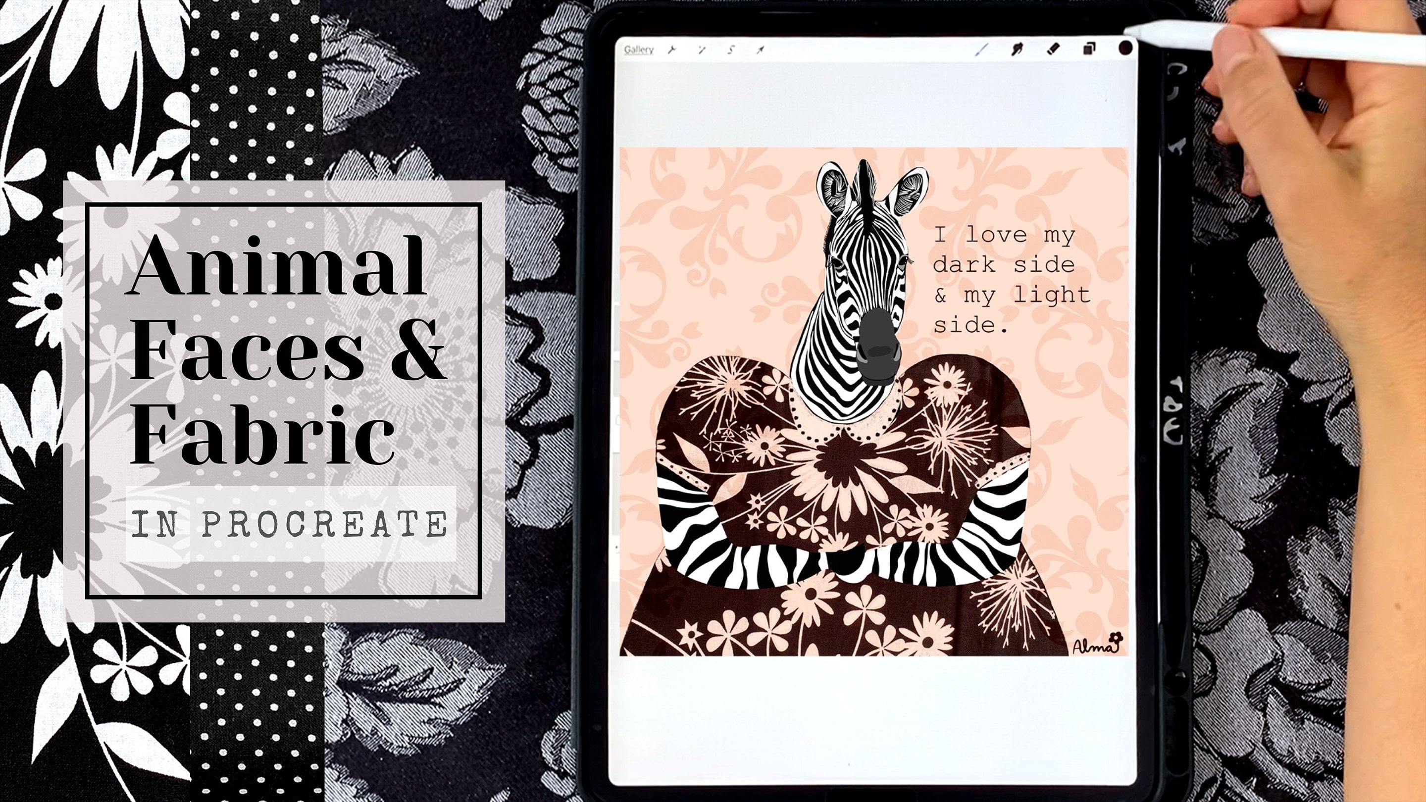
5. More Inspiration—Mixed-media Tips In Procreate: So for this inspiration video, I wanted just to point out a few tips and tricks for your toolbox so that you can have even more enjoyment on your iPad and procreate. So the first thing I wanted to point out is these hydrangeas were actually dying on my dining room table. But the drooping S I feel in particular with the one in the middle, is very effective for the look for these cute faces. And I just invite you to look at the world as a child would. And I mean, I'm seeing faces all over the place. So anyway, that's just one thing. And then the second thing is if you're not comfortable with drawing even just amorphous shapes that have an interesting gesture. Read as a figure. So I'm going to shamelessly plug my doodle class once again because I feel like doodling really goes along way and strengthening drawing skills. Okay, So this kind of psychedelic flower, I just wanted to point out that here I used flowers and a landscape photo and combine them. And then I also cut out the pieces of photos for that flower center. And how I got the translucency is I applied a blending mode to actually, it's right here to the petals. So it's an illustration done in purple. Really simple, but I've applied that blend mode to it. And so that is how we can see through to the background layer. This example, I just used one photograph to create all the different shapes, including the background band at the bottom of the canvas. And this piece similar to the one I just showed you, It's okay that I cut off part of that little flower in the back there. And then also I used the photo to make leaves. So that's another way that you can use your photos. This piece was really fun and came together really quickly. It's just one landscape image that I changed in my photo editor, change the color and the saturation, and then I simply went into here, I'm going to press the wrong button, but actually into organic, organic brush, I'll get there in just a moment. There it is, paper, Daisy and organic, and I just kinda spread that around the bottom. So it kinda looked like it was part of where she was walking. And then the other thing I did is I used illuminance, the light pen to actually do her outline. So that was really fun. So here I wanted to show you how I have the figure behind the trees and the landscapes. So here I've cut that little trees. I'm pointing to them from the background landscape. And you can see down below that I have two layers of the background landscapes. So it's the second layer that I have cut out and then. Membrane, swipe three fingers I cut and pasted so that now the trees on their own layer and I could move those in front of her body. So there are a couple of things that I want to share with you about this piece. So what you're seeing here is in the layers panel I've collapsed the illustration. So the little girl and the fish are all on their own layer. And what I want to point out is how I got the water to look as it does. I'm going to turn off the illustration layer and I'm a turnoff the other layers and sort of explain or try to explain how I created this background. So we're going to start first with this hydrangea photo. And then what I did is I layered a landscape on top of it, and I really loved that bridge effect. But let me show you what it looked like. Just normally. It's just a sunset and it's a photo that I actually turned upside down. And I'm going to show you here what it looks like right-side up so that you can really understand it. But when I turned it upside down and the effective created with the hydrangea was that it looked like there was a bridge and I could see a little figure sitting on that bridge. And so that was sort of the inspiration for this piece. So this is sort of an unexpected. Now, I really loved the color combinations. How that turned out obviously needed a lot more brightness and adjustment. But sometimes you have to sacrifice color for the cohesiveness of a piece. So what I did was I added another background color, which was green. And now I feel like I created or I felt, excuse me that I created some astronomer composition, something to work off of. So then when I put my illustration and she really pops off of that background, now I'm going to show you how I brightened the water. So what I did was I brought in a blue layer and I dropped the opacity of it. Then I went to my selection tool and I basically cut and pasted this blue color on top of that background that I had. So swipe three fingers, cut and paste. And now I had this blue on top of the water. And then I was able to give it a blending mode. And so I just scrolled or excuse me, right now I'm deleting the top portion, right. The part that I cut away, so I still have the bottom portion and I'm applying a blending mode. And now I'm going through to see what kind of interference effect I could create that would make the water brighter. So even though I love these colors, it doesn't work the overall composition. Now, this blue that I'm showing you this example is a little, is brighter than the blue that I used. So that's why it doesn't look right, but you get the idea. You just have to use different blues. And there we go. That's a lighter blue that matches is a little more in line with what I use. So just brightens up. Basically, it interferes with the green layer and also the background. So I hope I explained that well, well enough anyway, that it's just, the possibilities are just limitless. And then the other thing that I think makes this composition strong is that I use little illustrations to emphasize that we are here at a pond. I'm going to end this video with this last piece. I just want to point out that sometimes the best background is just simply a beautiful photograph. Thanks for watching everyone. I appreciate that you're here.
6. Bonus Video—Rose's Dramatic Flourishes: Welcome to the bonus video. I'm going to show you first how I created the star stamp that is in the background. For rows. We're going to start with a 3000 by 3000 square canvas. And the first thing that we're going to do is we need a true black. So I'm going to go to the color picker to the disk and I'm going to double-tap to get a true black. And I'm gonna drag that color in. And then I'm going to create a new layer and get a true white by double-clicking in the white area. And that gives me the white that I need to make my illustration. Next, I'm going to choose my studio pen from the inking brushes. Then I'm going to go to the wrench and I'm going to turn on the drawing guide. And I'm going to edit the drawing guide because right now it's a grid. And what I want is to use symmetry. So I'm going to go to symmetry. And I don't just want vertical, I actually want quadrant. And I'm going to make sure that assisted drawing is on, that's really important. So we're turning it into a quadrant where if I just make one shape and one quadrant and it repeats in all four. And here I'm just making sure that when I do my arc, that my point, my points are touching. So right now I'm just making sure that my shape is totally closed and would appear to be. And then I'm going to drag that white to fill in the color. And then I'm going to get rid of those extra lines that I created by using the tool, the selection tool. And I'm on the free hand as you can see. And I'm just swiping three fingers and cutting that away. And I do that because it's just cleaner than using the eraser. And you can see I still have just a little bit extra. So I'm gonna go ahead and do that again, swipe three fingers and hit Cut. And sometimes this process can take a little, little bit. Now I'm just going to finesse it a little bit. I'm just going to add just a tiny, just a couple little pixels on after I cut this bottom part off. To make that point as pointy as possible, I'm going to share some highlights with you about how I create a dramatic effects for rows. I'm not going to go over how I selected the flowers, how I harvested them. So if you would like to see exactly how I do that process, please watch project, the project to video. And there you can see exactly how I make all of those selections. Okay, so the next step is we're going to duplicate this particular shape. And we're going to turn off the original. So I'm just working off the copy. I'm going to use the Move tool. And I'm going to have the Freehand tool selected. And I'm just going to very gently squish my shape. The reason I don't start off with this shape because it's easier for my hand just to draw a wider arc and then use the tools to finesse it. The next step is to duplicate this layer and use the Move tool to rotate it at 90 degree angle. And now I'm going to select the uniform tool. And I'm going to squish that perpendicular diamond shape so that the vertical shape is longer than the horizontal shape. And that's it. We have our illustration. Now I'm going to delete my original because I don't need it. And I'm going to collapse these three layers. And the next step is to go to the Wrench. Hit Add copy. We're gonna go to the Brush Library and you're going to add a new brush set. And I'm going to add a new brush behavior. Let's call this set star shapes. And you can see here that I've made a few to practice. Now we're going to add the brush. And what we're gonna do first is we're gonna go to shape and bring in our new shapes. So hit Edit and then go to Import and hit paste. And there is your star-shaped that's come in. The next thing we wanna do is affect the grain and go to Edit. And here you're gonna go to the Brush Library for the grain and you have so many to choose from. But in this case I'm just going to choose blank. And I'm going to hit Done. And then I'm going to change my stroke path and make sure that the spacing is increased to the maximum because it's just one stamp that I want to do or create. I want to have control over where the stamps go. And then I'm going to hit Properties here. I'm going to make sure that my preview is checked and also that my brush size is at its maximum, which is somewhere in the range. You don't need a precise number. And that's it. My stamp is now created. Next thing is we're going to test our stamps. So I'm going to turn off the layer of the stamp I created and I'm gonna bring in another color so that you can see how the stamp is working. And I need to select a color that you can see. So I'm just going to go ahead and select white. And I already have my brush selected or my stamp. And now I'm going to just press and see the stars appear. And depending on the pressure that I use, that dictates whether it's going to be as white as possible or not. So less pressure, less white, more pressure, more white. Okay, So that's it. So we're going to take a pause for now with this background, we're going to go work on rows and then we're going to use what we just learned to put the stamps around her later on and give them some luminescence. So I think the main magic of rows are these flowers. And, you know, like I said before, it can go to Project 2 video to see how I harvested flowers. But I'm going to show you exactly how I created this effect. And actually it's really simple. You just go to the flowers themselves, whatever. And I'm, I'm sharing my roses with you. And I've already already have duplicates of these, so I'm not gonna go through the whole duplication process. I'm going to just go ahead and show you how I edited these flowers. And I simply went the filters and chose silver tone for every single one. And it just has this magical light. And later, I'll show you another trick, a couple more tricks that I did. It's nothing fancy, but I will absolutely mentioned this to you as we're going through the specific layers of rows. But I just absolutely love just the subtle shadows. And this one in particular, you'll see it's quite dramatic and I just absolutely love that brilliance that silver tone creates. Okay, So here we're jumping ahead. And obviously I've made all of the selections which I will repeat are in Project 2. I'll show you, I show you how to do that. And I've arranged them. And I also have here roses, face and shoulder, her silhouette. And what I want to draw attention to is the luminescence that I created in her hair. And the same way on in Project 2, I used the 60 pencil and I chose a nice bright white in this case, to bring in these soft little flourishes appears to have here and here you can see that I'm doing the same exact thing that I did when I first created her. And that's 6 B pencil. What I love about it is that it's really soft and I think what's really nice is the contrasts. The humanized say this again and again, sees contrast before it sees colors. So just having this texture, soft textured pencil line against that photograph really creates an interesting contrast. Here and making selections from the rose itself to change the color and just add a little more texture on top of the photograph. So I've said this before. Feel free to alter the photographs in any way that you want to. I mean, that's what makes this process really fun and more artistic. Okay, the next thing I did to create more highlights is I used the luminance pen and just go to the Brush Library, luminance. And I selected the light pen. I have the color of her skin selected from my color. And you can see here, I'm dropping intensity, excuse me, of the opacity. So when it first comes out firing pretty bright, so you just want to play around with it. And I wanted that luminescence to come through, but I didn't want it to be super stark. I wanted it to be softer. So that's why I dropped the opacity. So one thing that I did once I had decided that I wanted rose to be wearing something pink is I wanted just a bit of a hue in her hair. So here I'm adding a layer of a nice soft pink. And you can see here that just dropping the opacity, oh, just gives it a little bit of a blush. I experimented with the different filters, but ultimately at, ultimately I decided that just a little bit of overlay with the opacity drop-down was just enough. Okay, so now I'm going to show you how I added just a little bit of drama to her eye. And here I'm just using, It's not a super bright white because there's just a, just a teeny bit of a gray tone in this white that I selected because I'm going to use the luminance pen to give it just those little bit of highlights in the same way that I did her hair. Here, I've applied an alpha lock to the layer of the white part of her. I will apply the luminance light pen to the white part of her. I just like I did with her hair. And just a little bit goes a long way. I'm duplicating the whole eye layer and I'm going to use the Move tool and flip the eye horizontally so that we have two matching eyes. Now, generally, I don't like to be two matching, matching with, with facial features. But you'll see as I keep going, that I think that some symmetry is good with an illustration or else it gets a little too freaky real quick, I see it. Okay, now I'm just adding just a little touch of that luminance light pen again to the darks prize. And not just, in my opinion, brings eyes to life, is just that little touch of white. So now a little bit of asymmetry, and I think that this is all human faces are asymmetrical and. Little subtle things that you can do with illustration like here with her nose. It's a little bit wider on one side than the other. And then with her mouth, the same thing. Her lips are a little bit different. The left side is a little bit different than the right side. So here I'm showing you a similar mouth where it's just a little bit different on one side to the other, right? And it's very similar to the one that I did for rows. And here is one that is more symmetrical. And it really changes her look. Her eyebrows are also asymmetrical. There just a little bit different and that's just another little detail. So even though I kept her eyes the same, there are just enough things around her face that keep it interesting. And then the little star birthmark that was sort of my idea with this, is just again, the luminance light pen with the dropdown opacity. So now I'm just going to add the star stamps that I made earlier and showed you. And here you can use the bar on the left, as I said before, to change the size and opacity of the stars. And this can take a long time. Like I was really careful with my placement in my original here. I'm just showing you that, you know, you just sort of scatter them about. And then you can use the selection tool and the move tool to make changes to them individually. Adjust their size and their position and move them around wherever you want them to go. The magic for me is with the luminance light brush as different than the light pen because at its higher max size setting, it has this lovely just, you know, swash kind of effect a little bit like a watercolor. And so even just the lightest little circle on each of those stars makes it appear like they're glowing. As far as the details for your illustrations, one thing that I do, I just think about things that are meaningful in my life when I'm thinking about what to add, what kind of flourish to give an illustration. And in this case, a friend of mine gave me a pendant with my name handwritten in gold. And it really was really very special to me. So I thought I would bring that same idea here with rows. And then for the final dramatic detail, you can go to your hue saturation and brightness and affect the different layers. And here I'm affecting her hair and I almost went with a bit of a lavender hue to her hair. But I decided to land on pink obviously, but don't be afraid to change the direction if it feels better to you to have just a different color scheme overall, this is why we keep our layers separate and we can make changes to them individually. Thank you again for your attention and I hope you enjoyed this class. I really look forward to seeing what you create.
 Alma Cox, Painter ✶ Author ✶ Teacher