Transcripts
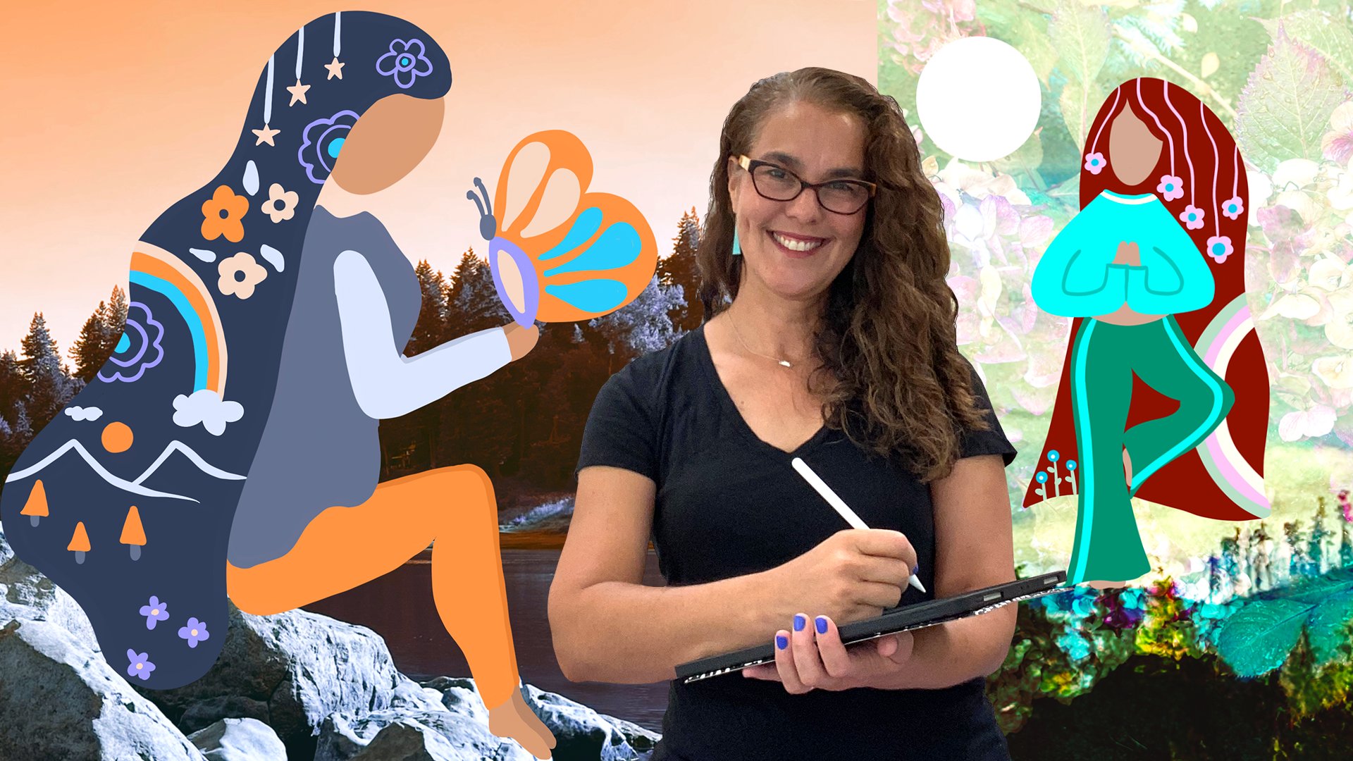
1. Animal Faces & Fabric In Procreate—Introduction: Hi, I'm also available in a Cox. The most important stories are the ones that we tell ourselves when we're creating art. Many of us are a challenge to believe that we're even good at it. We question whether the art itself is worthy good, or even valuable. And I often think that these thoughts are tied to what we believe about ourselves. It's taken me a really long time, over 20 years of creating and teaching art to realize that whatever I make has the meaning that I'm giving it, even if it's someone else's opinion embedded in here, good or bad. If I believe it, then that's the story that I'm telling you about my artwork. And I'm experiencing all the fields that go along with it. It seems really obvious and really simple. But what I really want most is just to enjoy myself. I want to experience childlike pleasure and freedom when I'm making art. And if I'm not, then that's an opportunity to bring awareness and possibly healing to feelings of insecurity and doubt. Fortunately, art can help us with that. In this class, our focus will be faces. Are subjects today have an inherent beauty, value in worthiness. Just like us in this simple and playful class, we're going to anthropomorphized animals to reflect the inherent good in ourselves as we digitally dress them and spend time with their expressions, will exercise our imaginations to create a statement that is positive of ourselves and our creativity, we're actually going to write something empowering with words. We'll use one of my favorite mediums, fabric to create texture and to inform our composition decisions. And hopefully as we focus on these amazing faces, our message will also enjoy the process of creating a cohesive digital collage. That's the goal, pleasure. You'll have a collection of free resources to use, including photos of my own fabric that I used in the artworks and some extras. Along the way, you'll learn how to use tools in Procreate to unify unlikely elements such as feathers, fur, fabric. And of course, every single artwork in this class is going to be good. That's my story and I'm sticking with it. I'm really excited to see your artful animals and to read what they have to say. Let's get started.
2. Selecting Photos & Fabric: Pexels As a Resource: Hi, everyone. So I've made a couple of collections
for this class. One is animal faces and
the other one is textiles. And they don't have that
many textiles and pexels, which is why I also have taken several photos for you
of my fabric stash, and you can download
those in the portal. But here are some very
cute animal faces, and here is the black and
white zebra that I used. For the first project, and the lizard faces
are fantastic. And there's the chicken face. I just loved this face, and then there's the two can. But you can see that there's
just so many to choose from. And I didn't put too many. I didn't want to overwhelm us. So I think I have close to 40. But of course, you can
look for other animals, and here I'm going to show you some of the textiles they have, and there's the red drape
that I use for the chicken. So they even have a
blue jean fabric. And when you select one fabric, they give you some
other options to look for some more. So
check that out. It is free to join, and as long as the photo
says free download, then we are welcome to use it. This is the textile I use
for the skirt for M two can, and I just love the pattern on it and just that
retropeel that it had. Realize I forgot to film
this very important part, and that is how to
download the photo. So I apologize for that. So I would hit free download in the
upper right hand corner and you have to make sure with every photo that you use
that it is okay to use it. And here it says down
below free to use and You always want to select the largest
photo that they offer, and in this case, it's
the original photo, just think about it in terms of your canvas is 3,000
by 3,000 pixels, so you definitely want
something that's going to be at least almost as
big as your canvas, if not bigger, so you get
the highest quality photo. And here then it jumps
for whatever reason, Pexels doesn't let me give
credit to the artist. So I just jumps here to
the photo where I open in, and then you would
just hit Save image. And then that automatically
saves it to your photo file, and there it is, and you can easily bring that
in to procreate. So once you're in procreate, you'll see with the next video how I just bring that
photo in easily. I want to encourage you guys to take photos of fabrics that you love at home if you have a particular shirt that
you love the print of, or I even did a two
can with a dish towel, my very first one that I did because I love
the pattern on it. So, you know, be creative
and let's get started.
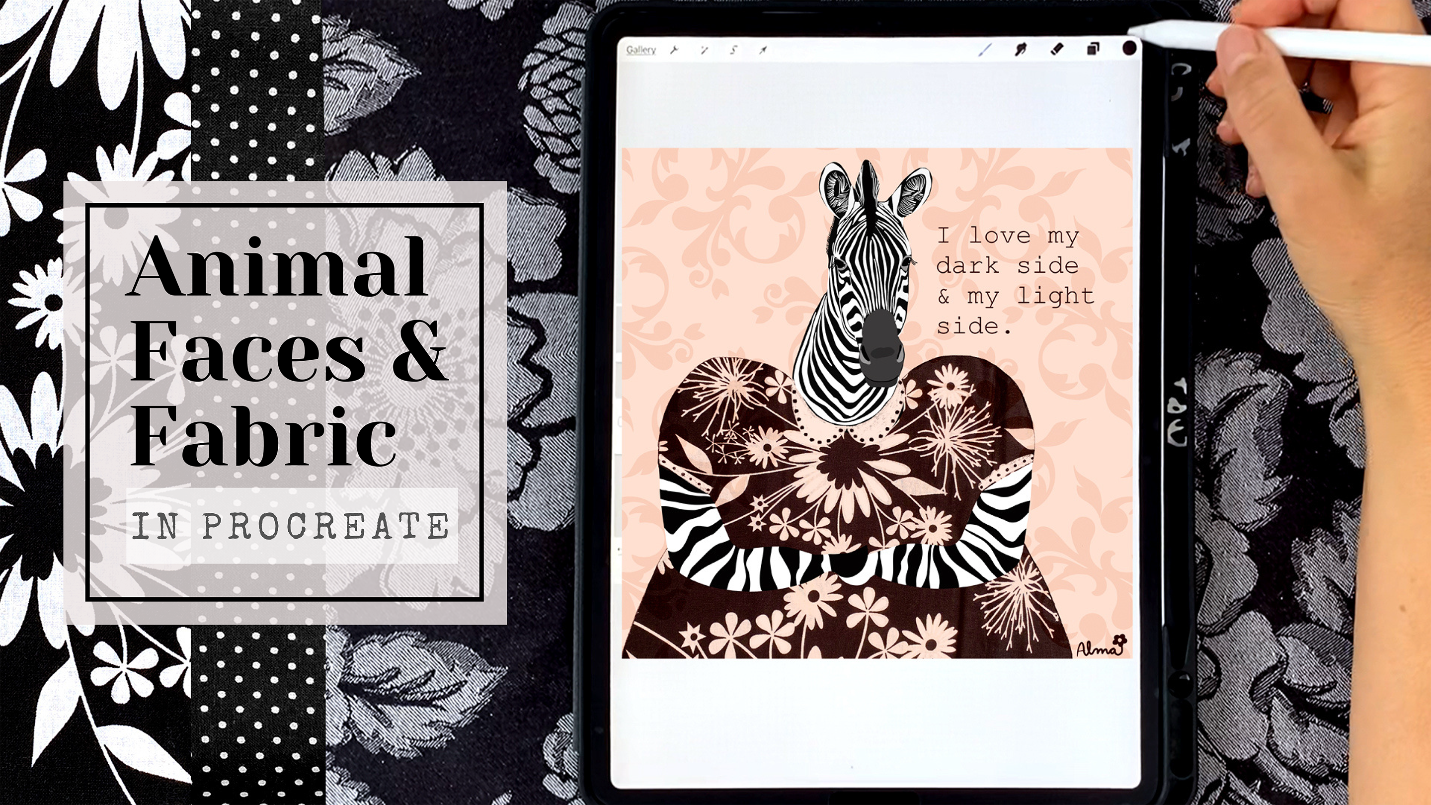
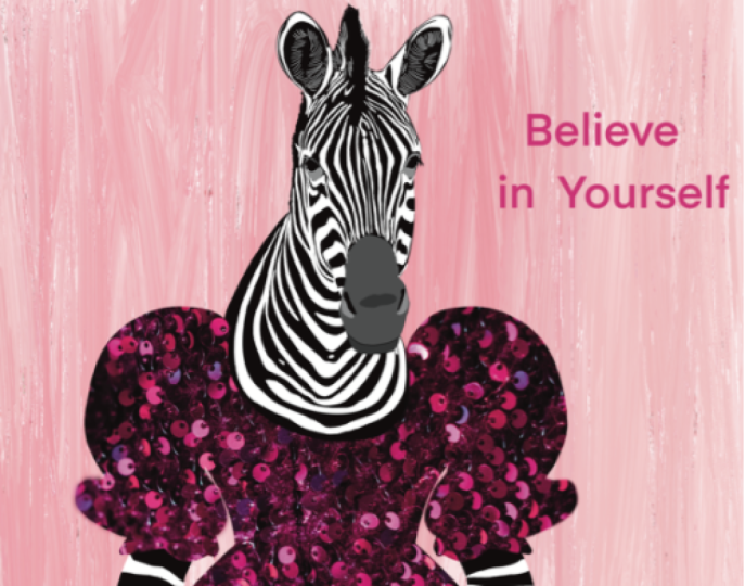
3. Creating High Contrast: Zebra: Okay, everyone,
let's begin by going into our animal faces
folder in pixels, and I explained in the
last video how to do that. And we are going to be using this beautiful black and
white image of the Zebra, not the colored one on
the right hand side. You're going to click on the upper right hand corner,
as I explained before, and you're going to grab the largest possible
image that you can, and then you're going
to click open in in the bottom right corner
and hit Save image. And this automatically
goes to your photos and is saved.'s open procreate and hit the plus sign in the
upper right hand corner. We're going to create a
$3,000 by 3,000 pixel canvas, which is a square that
prints at about 10 ", and it's at 300 DPI. And once we have that, we're going to click
on the wrench in the upper left hand
corner and we're going to insert the
photo that is saved, and that is right there. And you can see that
it's a really nice big photo So here you can see I have about half the size of the canvas for my zebra head. And now what I'm
going to do is I'm going to create a
base with black, and this will be I will fill
in the entire head shape, and I'm going to
add another layer where I'm going to bring
in all the white stripes. So first thing I'm going
to do is I'm going to grab my studio pen under
inking and brushes. I'm adding a new layer in the upper right hand
corner by hitting the plus sign in
my layers panel. And here you can see
that I'm just doing a very simple
outline all the way around this cute zebra head. And I'm not worrying
about the fur. I'm not creating any kind
of details at this point. This is just simply a very organic shape that I will be reducing the opacity
of in just a moment. I'm dragging that
color in by just grabbing the black and
dragging it into my outline. And here you can see
that I've already dropped the opacity
in the layers panel. Now, I'm adding another layer, and this is where I will
be selecting the white, the whitest white
actually that I can find on the zebras right
here along the collar. And so now I have white
in my color picker. And I'm going to try to keep the lines exactly as I see them, but I'm not going to add
in any extra detail. So I have a new layer selected, and here you can see that it
is above the black layer. And here I'm just
showing you how far the black outline goes. So I'm just determining where I'm going to be
starting the white line. I'm going to avoid adding in those tiny little
white details. I'm just going to make stripes. And so you can see here
that I'm actually creating a solid white line where the zebra's actual stripe
is broken up a little bit. And that's because
in illustration, I feel that just the cleaner
and simpler the design, the easier it is to understand it and take
in the information. So here you can see that the stripes connect
there at the very top. And then right where the turn is and now
connecting to the mouth, I just close the shape, and that is so that I don't have to color
all of my lines in. Now, the color filler isn't going to fill
in every single line, and you'll see that a little bit later where I do have to go in and fill in any empty spots. And you can see that there is quite a bit of fur
on the zebra's head, and I'm not going to in
any way, illustrate that. Those eventually, we'll just see the
black coming through. And this way we create a very
high contrast illustration. And the only thing that
I will do is maybe add a little bit of hair
lines for the ears, and I will slow down in just a moment to
show you how I do that. I'm keeping the details
of the ears very simple. I just want that white shape to really contrast
against the black. Added a new layer for the black fur that tuft on our head is just the
shape that it is. I'm not going to add any fur. I'm adding another new layer, and I'm still using
my inking studio pen, and you can see here that the
line thickness is not very thick so that we create
hair like lines. And I'm just using the
shape and the direction of those hairs to inform
me, as to the direction. And I'm kind of inventing my
own lines in there as well. I'm just sort of filling in, and you'll see that once
the black background is on, it's effective and it works. So let's add a new layer here. And the next thing
that I'm going to do is work on the nose. And with the nose, I don't want to I want to use just a straight black to
emphasize the nostrils, and you can see that here. And I'm going to use the pen
just to outline the mouth, and this is all on one layer. And here I'm indicating that, I just want to use a
single color of gray, and I may fiddle with the
color just a little bit, but I'm just going to
do a simple outline of the entire muzzle. Okay. I will add a new layer for the bottom
portion of the muzzle, the bottom part of the mouth, and I'm going to choose a
little bit darker gray. So between the black of the stripes and the
gray of the nose, I've chosen a gray for
that lower portion. Now I'm adding another layer and using a much lighter gray, and I'm taking my
cues from the zebra where you saw that whiteness
under the nostrils. And I'm just showing you here that that little bit of gray,
I'm just testing it out. You know, do I like
it? Is it effective? And, you know, again,
you're the artist. So you decide the types of contrast that you want to see and if the shapes
are pleasing to you. I feel like it works for me. So I'm just going to keep it. So the Zebra has black
eyes. They're very dark. And for my illustration because I have that
black background, I do want the eyes to stand
out, the eyeball itself. So I'm going to
use that same gray that I used for the nostrils, and I'm just going to
create an eye socket. And again, this is
something I'm inventing. And that's purely so that I see just some
interest in the eye. And obviously, it
works in nature. But I think for the
illustration in order for that eyeball to
really stand out, it needs that contrast. So I've gone ahead and
decided to do that. And here I'm adding in
some nice long lashes, and they don't have
to look like fur. They can just be
the arched line. Detail that I think adds
a lot of life to eyes, the eye shine, and here I
have three little shapes. And what I'm going to do
is I'm going to duplicate that layer by swiping left
and hitting duplicate, and then I'm just going to
use the move tool to move it to the same place
on the other eye. So You don't want to have the yeshin on the opposite
side of that eyeball, that would not be realistic. Here now I have it in
position where I want it, but I'm going to
erase the excess. It looks like that yeshin is peeking out through
the eye socket. That just creates
a little realism. Here you can see I'm
making a correction on a little bit of
pixels that I see. So here I've turned on the black background just so I can see that
they're now off, so I can see that there
is fur along the head. And so I'm just going to add just some little black
lines just to make it look fuzzy from a distance. It's not realistic,
and it just for me, it just creates a little bit of softness along that edge,
and I think that works. Here, I'm zooming
in to show you that many of my stripes
did not fill in, so I'm going to go
ahead and do that. I'm going to swipe
right on all my layers, and I'm going to use
the move tool to position the zebra head more
or less where I'd like it. And again, I don't want to
be aggressive in sizing it. I may even make head smaller. So I'm just reducing the size just enough
so that I know that I have enough space for
fabric and the next steps. At this point, let's take
just a little break to talk about now that we have this
cute face staring at us, what would this cute
face be saying to us? So, when you're drawing,
I'd like you to think about some kindness that
you can say to yourself. You know, what does
your sweet self need to hear right now? It could be that I am really
confident with my art. It could be the opposite
of how you actually feel, but it's something
that you're working towards and you hope to be, and you're working towards
being more artistic or making more time for yourself or
giving yourself a break. So think about some kindness
that you could say, some empowering words that
We'll give you a little boost. Don't overthink it. You know, this is an opportunity. Our cute animal
character is saying this as a reflection of a part of us that would like us to believe that we are
this positive trait. At the end of the next video, I will share my thoughts
about what I wrote. In the meantime, though, I'd like you to think on what you would like your animal
to reflect back to you. And in the next video, we will add some clothing to our lovely Zebra. Thanks, guys.
4. Adding Fabric To Our Zebra: Okay, let's insert a
photo of the fabric, and hopefully you have all
downloaded some fabric or that you've taken photos of fabric
that you like in your life. And here you can see that
I've just sort of positioned it kind of more or less where I think I want the
flowers to go, and I'm dropping the pacity
so that I can get a sense of where I'm going to
be drawing the blouse. So on a new layer, I'm just giving her
a poofy sleeve, and I'm then duplicating
that line and using the move tool and flipping it horizontally so that I get
two symmetrical sleeves, one on each side. Then I'm going to
grab the S tool, the selection tool in the
upper left hand corner, and make sure I'm on
the fabric layer, and I'm just going to go around the outline
straight across the neck, and I'm going to complete the selection and then swipe three fingers and
hit, cut and paste. And that cuts the fabric
onto its own layer, and I'm deleting the background. So we have a blouse
and now I'm reducing the opacity and
I'm doing that so that I can create the neck line with the
selection tool again. So I'm going to go ahead
and grab the S tool. I have free hand selected below, and I'm just going to
do a gentle curve that I'm going to close
into a semicircle, swipe three fingers and hit cut and paste again
or excuse me, not cut and paste, hit cut. And here you can see, I
have a little bit of extra, so I'm just using
the eraser to cut away that little extra fabric that's peaking out
beyond the line. Now I'm going to add in
an extra white stripe, and I'm just inventing it
following the guide of the other stripes above
just to fill in that space. And I do this so that too, we have that stark white
zebra line against the dress, and that just gives a
little more contrast, and I'll be adding a collar
in just a little bit. I think this little
Zebra needs her arms. So I'm going to
invent these as well. And I'm going to use
bright reds that you can really see
the arms clearly. Eventually, I'm going
to give her stripes. But I'm just doing a gentle
curve. That didn't look good. So I think I do need to give her a little bit
more of an elbow. And I'm just sort of thinking off the top of my head, Okay, what would a very
simplified hoof look like? I could give her hands. There would be no
problem with that. Do what's simple for you, what's easy for you to draw. And here I'm
duplicating the arm. And again, I'm using
the move tool and my flip horizontal to place
the other arm in position. And here I'm indicating
that I'd like one little hoof to rest
on top of the other. So right now, I'm just
cutting the little shape of the hoof so that I can position
one underneath the other. And then I will use the
pen to fill in the shapes. So I'm just trying to make my life as easy
as possible here. It's not a really
important detail that has to be super accurate. You know, we get
the idea that she's got these little
hooves for her hands. Okay. So now I've given her the colors black and white
for each of her arms, and I am next going to
put in a background. So add a layer to one arm
and hit clipping mask. And this way, whatever we
do to that particular arm, the stripes will
stay on that layer. And here you can see
that I am having to close all the shapes in order to drag the color in there
or else it doesn't work. So make sure you
close your stripes. And here I'm just taking my cues from the stripes on
the zebras head. So I'm going to go
ahead and speed up and you can see
that I'm really varying the lines have
more space between them. Try to really try to work on making every single shape different
than the other. During this next section, I actually switch the
colors of the arms. So it might look a little
confusing as to what I'm doing, but I'm going to explain
why I changed the colors of the arms where her
little white hoof is kind of looking like it's
cupping half of a flower. I don't feel like
there's enough contrast against the fabric background. And so I think the
fix for that is just to change one little hoof, the one that was
holding the flower, To Black. And so all of
this is me correcting that. And that way, it looks like there's a
little more contrast. I mean, this is very
this is Manutia here, but I feel better about it. So anyway, I will
continue with my stripes. So the next thing I'm
doing is I'm going to use the background as an
interference with the fabric, just to see what kind of cool effects I might
be able to get. So I'm on the layer
of the fabric, and I'm just going through my different options
starting at the top, and I'm just going to
scroll through and just to see if there's something that looks more
interesting to me. And this one, multiply actually does look more
interesting to me. Here you can see that
the background and the fabric are
interacting together and actually prefer this linear burn just a little bit more and this is just a way to make the illustration
even more cohesive. And you know you may prefer
just the straight fabric, and that's fine, but
I like this effect. And now what I've
done is I've gone and grabbed the sketching
pencil, excuse me, the six B pencil, which is under sketching
in the brushes, and I've selected
a very pale pink. You can see that it's
pink because the white of the zebra stripes is very
white in comparison. And I'm just adding in some little details
into the fabric. And this is just something
that I like to do just to keep the eye moving
around the composition. I'm not going to add this kind of detail to
every single flower, but just a few
throughout the blouse. I still have the
sketching pencil, but now I've selected a color that is the
same as the fabric, and I'm just softening
the edge of the blouse. You can see that when I made my selection with
the S tool earlier, it left a jagged edge. And so what I love about the six feet pencil is that
it's very similar to fabric. It just creates it has that
texture. It's very similar. So it's a great way just
to soften your edges. Now, continuing with
the six B pencil, I'm going all the way
around the blouse, and I'm not going to outline
the zebra zebra itself. I really love the
contrast between the inking pen and
the six B pencil. So I'm going to continue using the six B pencil here
with the collar. And you can see that
there's a very, very small black line between
the collar and the zebra. And that's by design. And that's so that very light pink just has a little
bit of contrast against that black line instead of being right up
against the white line. And here I'm doing the same
thing with the sleeve, and then I'm adding
little black dots or the dots are the same color as the black of the fabric or the very intense dark brown of the fabric to just give
a little bit of detail. And I'm just doing
the same thing on the other side. Okay. So the next step is
to add some words. And hopefully by now, you have come up with your empowering
reflective statement. So here you can see that I selected the wrench tool on
the upper left hand corner. And I really love anything that looks a little bit like
a typewriter style. So I'm just going to stick with Courier and
variations of courier And because the zebra and what she is wearing
is pretty bold, I'm going to use the font as an opportunity to
create more contrast. So I'm selecting a lighter font. And something that I've
been working with is really embracing my dark side as
well as my light side, right? This whole class is about
the light side of ourselves. But I think it's important
to acknowledge that, you know, we all have
a dark side as well. And so, I feel like the
Zebra with the high contrast that she is with her
black and white stripes really reflects that
idea back to me. And what do I mean
by my dark side? For example, you know, we all have the ability to feel jealous or greedy or selfish. And I think that it happens
more often than not that, you know, we put ourselves down for having those really
normal feelings. So this is something that I'm trying to just be
softer with myself about. And I find that to the
extent that I do that, I actually feel like I can really embody
the positive side, the light side, you know? So I think my dark side just
really wants my approval. Okay, so you want to add the texture or the flourish
in one fell swoop. So I'm not lifting
my pen at all, and here you can see
that I'm dragging it, so it's just above the pink
layer in the background. Now, of course, I have
to change a little bit. I just decided to throw in a little bit lighter
pink background. And here I'm playing now with the Victorian
flourish and just seeing what shades I'm
more interested in. Again, I mean, I can do
this for so long, you guys. But this is one I
like because I feel like the zebra is
really standing out, and that is what matters most. Okay. In the next video, we're going to meet a
curious chicken and see what kind of dramatic
drape we can create with her. Hope to see your projects
posted, you guys. I'm really looking forward to seeing what you all
create. Thank you.
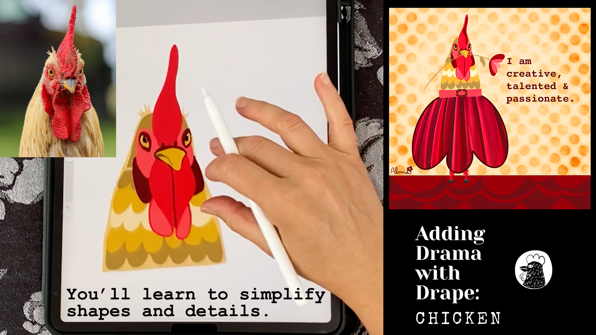
5. Adding Drama With Drape: Chicken: Hi, everyone. Welcome back. I have my $3,000 by $3,000 pixel square selected
from my canvas, and now I'm going to insert the chicken head
photo from pixels. And here, I'm you know, just like in the zebra, I'm trying to size it. I don't want to be aggressive. I want to kind of eyeball how much space I may need for the skirt that I'm thinking
about for this chicken. So it looks like it's about
a little less than half. So the main thing I
want to focus on, the chicken has a
lot of complexity. And I think the message that I want to get
across the most is let's simplify as much
as possible and we can still give this little
chicken a lot of character. So let's begin just like we did with the zebra on a new layer, we're just going to do
on an entire outline. And because these
feathers are thicker, a little more pronounced,
I'm going to go ahead and highlight them. I need a little
bit narrower pen, and this is my studio pen that I used and it's in the inking
folder in the brushes. You can see here that
I just decided to come straight across the red. I don't even know what it's
called. It's unfortunate. The little red I'm going
to call it her head dress. Because I'm going to be adding
the red on another layer. I only need the general
outline of the head shape, and then I'm dragging
in that color, and clearly, I've got
some open spots here. I'm just going to make
sure I've closed all of my lines and then go
ahead and drag in. Now I'm going to drop the
opacity again just like I did with the zebra and I'm
going to start layering. But this one's a
little bit different. Like I said, We have
a lot of parts, and let's see what we can do. I want to use three
colors of the reds. So I want a dark value, a medium value,
and a light value. The parts are going to
each have their own layer. So here I'm using a
medium value of red, and you can see here that
there's this little ridge. And so I'm not even
going to make it bumpy. I'm just going to
outline that ridge. I'm just going to
create two parts. So one is going to be
more of an outline, and then the other part
I'm going to fill. And now I'm going to drop the opacity of this
and don't worry. I'm going to have an outline
in between those two shapes, but I just want to get a
sense of the main shapes. So now I'm going to create
a new layer and I'm going to select my darker red value. And so I'm going to just draw a little line between
this heart shape. I'm seeing sort of this large heart shape that I'm dividing. And then I'm just creating a little bit of extra
here on the top. And then I'm going to use that same color to create
a shape behind the beak. So just like we did with the
zebra in the last video, I'm just creating
moments of contrast. So here I gave this little
chicken some nostrils, and I am going to make the
beak yellow in a new layer. But for now, I want
the yellow to be against this wine
colored background. So I've dropped the opacity, obviously, and I've
added a new layer, and now I'm going to
go ahead and I've just selected the yellow
right from the beak. And in this way, we're
creating lots of contrasts because there
will be a few layers. I'm just using the
colors of the chicken, so I just grab the color from the beak and here
I'm just creating the edge of the top beak where the top and the
bottom of the beak meat. And in the same way
with the zebra, I want to create something for the eye to contrast against, and there are a lot of
colors in this eye area, but I'm just going to
keep it fairly simple. There's my lighter red values. So you can see I have three
red values happening, and now I'm just repeating the same values for
the different parts. Here, you know,
you saw me put in the lighter pink
as a first layer, and then on top of
that the burgundy, and then that is going to contrast against the
yellows of the eyes. And I made the eyes slightly bigger than what they
actually are on the chicken. So you can see here
that you know, we took a lot of complex pieces and really made
them very simple. And remember, I mentioned
this is the outline part. And so I'm just going to fill it in with that lighter value, and it gives the appearance
that there's a fold there This is my trick for
simplifying feathers. I'm just going to create rows of these semicircles
and just stack them. So I also added a little bit darker value of
the body yellow to the head, and so that we see a little bit of an outline peeking out. And these do not
have to be straight. In fact, I think that they
have more personality when they're a little
bit wonky. Excuse me. So the main thing here though
is the value differences. So I used the body as my guide, and then I picked a darker value and a lighter or excuse me, two darker values than the body, and then I'm going to
make another value, which will be lighter than
the yellow of the body. And that'll be the
next one that I make. I probably could have been
more efficient and started at the bottom and layered
them that way. So I apologize for that. But I just get excited. I think it's cute and I
just get going on this. So here you can see, I duplicated one of the layers
that medium yellow value, and I'm just adding another little U shape there
at the end for that one. Okay. Once those
are all in place, I don't think I added shine to my eyes yet.
I'm going to do that. And here you can see,
I'm just increasing the size again if I had
been more organized. I see the feathers that
I did on the left, I think I wanted there to
be a little more symmetry, not exactly the same, but a little bit more balanced. Here you can just
see I'm filling in any spots and correcting the curves and making sure that things look a
little bit cleaner. And now I'm going to go ahead
and add my little shine, and I'm just going to do exactly
as I did with the zebra, duplicate them,
and move them into place and then remove the
part that we don't need. So now let's move
on to the skirt. So my approach for the skirt
is to do an outline first, similar to how I did the
sleeve for the zebra, how I just did one side
and then duplicated it to create a symmetry
for the other side. I'm going to create
one shape here, and then I'm going to at a
semicircle for the middle. And this is going to be
the outline for the skirt. So it's a little bit different. It's not necessarily a sketch. I'm actually
outlining the drape. I find that it's just
easier to outline it this way than it is to get a really steady straight line on the drape once I've cut
it out of the fabric. Next, I'm going to insert the photo of the fabric
that I have in my photos, and now I'm just moving
it into position. Determining what
folds I like best. You guys, I just crack up when I make these
kinds of things. It's just I have so much fun. Okay, so let's gather
her skirt with the move tool and select
warp and advance mesh. And this is really fun. Just moving these little anchor points inward towards the waist, just so that we mimic the
curve of the outline. Next, make sure you're on
your fabric layer and use your selection tool to go all
the way around the fabric, including the waist,
close your shape. Use three fingers to
hit cut and paste. Okay. Here I'm
selecting her body, and I'm separating
it a little bit from the skirt to
create her belt, and I just used the same
pinky red from her face. And now I'm just adding a little belt buckle
with some white dots. And I'm moving quickly
through these details because I feel I've covered I want to be
mindful of your time. Here I'm doing some funny
little chicken legs, and I'm just going to be
adding some fun little boots. And You know, here's the thing. I just really believe in
the power of contrast, I keep repeating myself in every single video
I do on Skillshare. But you know if she's dressy, then I want her to be
in boots, you know, and that's just kind of these are the little things that just make me happy and
make me smile when I look at these quirky
illustrations. And I also like that she looks just a little
bow legged to me. And here I'm going to play with her leg placement
for a little bit. Okay. So now I will go over the background with you and I like to use
repeating elements. So I'm going to use the
semicircles of her skirt to think about the design that I want to do on the ground, and I'm also inspired
by her feathers. So I have the bottom
of the skirt and the feathers that
have similar shapes, and right now I'm
just playing with the brightness and the
colors. A little bit. And I'm grabbing a
little bit darker value, and this is a new layer on top of the background,
which is the floor, and you can see that I'm
just mimicking the shapes. And I want to make sure that they are a little bit lop sided. I'm just looking at
what the designs are in my illustration so far, and I just want to repeat that. And the same thing with the
texture on the background. I really love newsprint and
you'll find that in textures. Just like the Victorian
background in the Zebra, you want to do this
all in one pass. You can see that I have it a little bit darker in some areas a
little bit lighter. I'm trying to keep it a
little bit lighter directly around her and then a little
bit darker in the corners. That just creates
a little bit of movement and a little bit
of drama in the background. Okay, so you can see that
I didn't give her arms, but I feel like she needs to be holding something in her
mouth like a flower. And so here I'm just
using all the colors. I'm just repeating all the
colors that I've already used, and they're either
lighter or darker values of what's already here. And same with the flowers. So I'm going to be selecting the colors directly
from her face, and then I'm just giving them
a little bit lighter touch. So I'm using the
circle palette to select lighter values of
the colors I already used? And that just keeps the
illustration cohesive. I don't need to use any
green for the leaf. I just want to use the
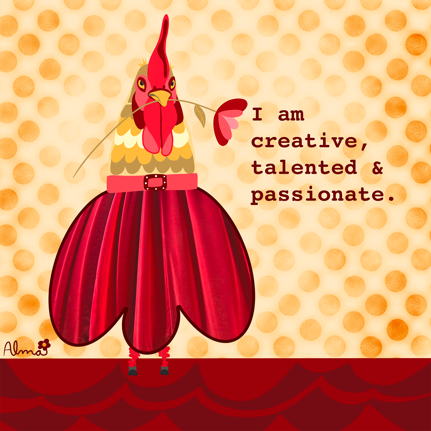
colors that I already have. Then let's think about what it is that
she's saying to me. What do I really want to
believe about myself? I am creative. What else? I am talented. Yes, and I'm
passionate. All true things. Do I always feel this way? I do not. But you know what? It's something that helps me feel good about myself
and believe in myself more. I hope that you find some empowering words for
your second illustration, and I'm really
excited to see it. So please post it in the portal. Thanks everyone.
In the next video, we will create our cut two.
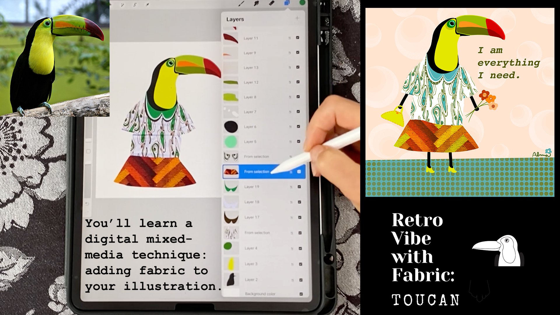
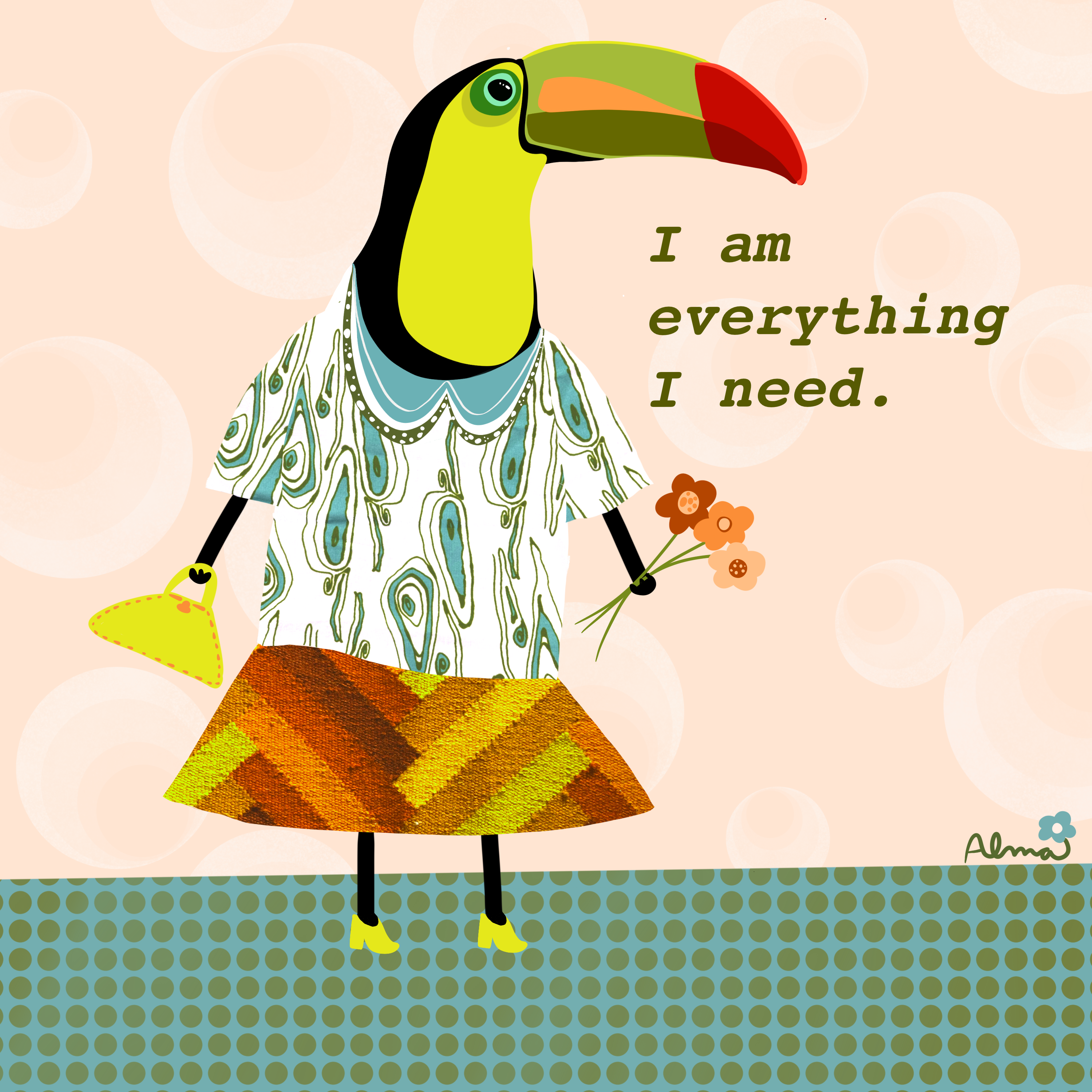
6. Retro Vibe With Fabric: Toucan: Hi, everyone. Welcome back. So I am just flying through the placement of our two can
on our Canvas because I have covered all of this
initial tracing of the animal head and the importing of the photos into procreate in
the last two videos, as well as importing photos
in the pixels video. So I want to be
mindful of your time. The two can is the
easiest animal to trace because he has
the fewest pieces. So please review
the other videos. What I want to focus on here is just the different fabrics, I'm using two different
fabrics here, and the two can just happens
to be a little quirkier. So I'm going to focus
on that in this video. So I've brought in
this fabric here, and this definitely is an older fabric in my
fabric stash collection. And I just absolutely
zeroed in on it because it just sort of reminded me of the two cans head shape, and it kind of had that
eye shape as well. So I'm going for it
in this project. I'm not sketching it. I'm just using my tool, my selection tool to go ahead and cut out the shapes
that I want for the clothes. And hopefully, by this point, you're going to
feel a little more comfortable to do this as well. And here you can
see that I'm using the actual shirt fabric
to create a little sleep. Instead of hitting
cutting and paste out of that fabric,
I hit duplicate. That way, I don't cut a big
triangle out of the shirt. And that is on its own layer. Now I'm going to do the
same thing on the left. I'm just going to draw a
simple little triangle, and I'm following the outline
of the curve of the shirt, and then I'm doing it again, and then I swipe three
fingers and I hit duplicate. And then the next thing
that I want to do, and this is just a
little thing that we learned with the
chicken is I'm going to actually adjust it
using and it's very minor, but you can see that it's
not lining up perfectly. So I'm going to hit
warp and advance mesh, and then I'm just going to pull just that little bit so that it looks a little more natural. Okay. Then I pinched all three layers so that
they're on their own layer. I'm on the wrench, and
now I am not the wrench, excuse me, I'm adjusting
the color and the hues. And here you can see that I
can really alter the fabric, the look of it, you know, so this is something that I encourage you to play with
because these fabrics, I mean they come in the
colors that they come, but here in procreate,
it's magic. You can change them to
be whatever you want. I've jumped ahead a little bit. I want to show you that I created this color
with three shapes, the brown being the biggest, and then the very pale blue. Although the shirt
sort of reads white, it's actually this
very pale blue. So I just grabbed the colors
directly from the shirt, and you can see here that
I'm just doing some cleanup, and you can tell that
I really love collars. And I just feel like it's a
great way to add you know, personality to whatever
clothing they're wearing. Okay, now I'm bringing in the skirt from the
Pexels collection. And what I love about
this is that this is really going to make this two can much more retro, I think. I've dropped the opacity like I've done with all
the other fabrics, and here again, I'm just going
to use my selection tool. Right now I'm using the
move tool to adjust it, but I'm going to use the
selection tool just to do a very simple
miniskirt type thing. And I love, like I said, the contrast between
the texture of this textile and just
the cotton fabric. Okay. Now, I'm adjusting the colors and the
colors are just amazing. Ultimately, I do
want there to be a little bit of green
because of the shirt, and then obviously the two can also has that limey
yellow going on. This combination is
working for me right now. So as I moved the skirt
layer beneath the shirt, I realized there's
this little wave, and it's like a little
happy accident. So I'm going to go ahead and select the move
tool and again, use the warp and
advanced mesh to just kind of play with
little wave in the shirt. So for the legs and the arms, I'm keeping them just basic little stick
figure type legs and arms, and I have just this
cute little shoe with just a little heel, and I've just decided to
keep it even very simple. But I duplicated the layer, as I've done in
the other videos. And with the two can, I'm
just going to give her a little purse and
some flowers to hold. And You can see here
with the little hand. I hope you notice
that. I just gave her very simple three
little fingers. So it just looks
like the little hand is grasping the
purse and the stems. So the fingers are
on their own layer separated from that hand. And then the same thing as
with the chicken, you know, I'm just using the
colors that are already in the colors that I'm, you know, really liking
already in the skirt. And the next thing I
want to address, I mean, this is all, you know,
pretty straightforward, but the shirt, right now, I'm changing the colors again because I'm kind of
lazy and that wrinkle. Is really stark. And sometimes the wrinkles work in the fabric, it kind of gives it
just that contrast, that realism as opposed
to the illustration. But in this case, it's not
really working for me. So I'm using the six B pencil in sketching and I've just picked up the color
from the back, the backgrod of the shirt, and that is what I'm doing. I'm not erasing. I'm
actually drawing in on a separate layer on
top of the shirt layer. I'm drawing in using
that pencil the same way I outlined the
zebra in that video. So here I'm just, you know, it takes a while to do
this, but it's worth it. You know, like I said, I just
I didn't look right to me. To keep with the retro feel, I decided to use disco under vintage
in the brush library. And here I'm just giving
just some little details. And I believe this is the
gel pen actually in inking. It's not the studio pen. I did use the studio pen
for everything else, but I like this little gel pen. It just gives it it
has that little bit of a wave in the line. Here I'm just playing
with some ideas. But ultimately, I
just decide to keep it pretty simple at the
base of the blouse, and here I'm just going to add some very organic
little seed shapes around the edge of
the collar just to add a little bit of
contrast and interest. I really enjoyed sharing
this technique with you. I hope you enjoyed it as well. Please post your
projects in the portal. I'm really excited to
see what you create. And as a final note, I wrote here that I
am everything I need, and I really believe that we each are everything
that we need. We have all the creativity
that we have right inside of ourselves to create
amazing artwork. And I'm really happy and
excited about skill share because I think it's
just an incredible place to learn so many things, right? Anyway, thanks everyone. I really enjoyed the class.
 Alma Cox, Painter ✶ Author ✶ Teacher