Transcripts
1. Introduction to Gouache Character & Doodles: Hi, this class is about painting this stylized character
in gouache with a background of doodles
and pencils and pen. Join me as I take you
through a doodle warm-up, stylizing this character from a reference photo
with lines of action. Painting the character with
a limited color palette, which always strengthens
the composition. And adding a doodle scene
for this character. This will add Lindsay and lots of contrast
to your artwork. In the inspiration video, I'll show you more examples. In the resources
you can download, reference those with lines of
action to help you further. There's even a video
on skin tones. I'm all macaques, a painter, illustrator, and teacher
for over 20 years. I've written a book about mixed media that was
inspired by doodle art. My work has been featured
in several magazines and I sold hundreds of paintings
since I began my career. I saw my illustrations online, which is so rewarding. And I hope this class
inspires you in this way too. I live in Portugal with my
husband where I'm continually inspired by old world charm
and beautiful vistas. I especially love doodle
sketching on location, which inspired the
idea for this class. I wanted to share the fun of my technique for
creating characters, which brings me so much joy. The key is seeing
the lines of action, which I'll show you how
to do for this project. You can follow along to
create this character. Please post your doodle, warm up the practice drawing
and the final painting. Believe me, you inspire
others when you do. Additionally, you can use
the other reference photos I provided for you to create
even more characters. We'd love to see those
as well. Why doodles? I believe doodles can
show you the way of your signature style
and your preferences, the kinds of shapes
that you like and what you like
to draw innately. It's a super relaxing way to express yourself that I think makes the child inside
each of us really happy. Doodling has truly enhance my painting and enriched
my illustrations. And I'm sure it will
do the same for you. Now let's jump in.
2. The Project Materials: Welcome. So for the materials, I use a very thin
paper sketchbook. That is actually the paper so thin you can see through it. So even just computer
paper will work. You don't need to invest in anything fancy for your warm up. This is just to get
used to the doodles. I use a micron pen, 03. You may prefer a little bit
thicker line 05 works well. Or a pencil. You don't even need to buy a pen unless you're going to
use it for your artwork. Now from my sketchbook, it is a watercolor
paper sketchbook. It's cold press, which means
it's a little bit bumpy if you prefer smooth
than go for hot press, you can also just use
standard watercolor paper. 140 pound is more than enough. And here I'm showing
you examples of gouache paint in
this style, right? Using some mixed media materials
with the gouache paint, I use quite a bit of water, which is why I buy
the heavier paper. But I think that
anything 80 pound or more for your gouache
is probably sufficient. I love royal talents because
they're very affordable. I use burnt umber, not black for darkness, and I have a white there. I also showed you a Winsor
Newton opera that I love. And these other two colors are the lemon yellow and
the turquoise green. So these are all
the colors I used. This is plain gouache. Also for the skin tone video, I introduced this
turquoise blue, which I do not
necessarily recommend. But we have more than enough with the ones that we
have here in front of us. Now, as far as the mixed media that you
use on top of your gouache, I love using Qur'an dash luminance pencils because
there are very soft, they smear really well
on the gouache paint. I also like to use
the Micron pen. You can see there.
And also I'm showing you a six B pencil, which I really love to use
for detail work as well. I use the six B pencil
instead of a regular pencil. It's smoother application
on the paper, I use a number four round brush, which I think is sufficient even for the
small-scale artwork. If you feel more
comfortable using something smaller, go for it. This is a Posca pen I'm
showing you that I used for the triangle shapes
and her shorts and also the flowers you can
see it's a thicker line. Posca pens come in an
array of millimeter size. I'm showing you now a
thinner millimeter size, a little bit thinner line. And I'm going to go dig for a much thinner line so you
can see the difference. Believe I'm out of
the white thin. So I'm going to show you a
block here in just a moment. It is. And you can see it's just barely thicker than
the micron pen, which I actually prefer
for the fine line work. You'll also need a pallet
of water container and an eraser and a
word on the eraser. In the practice drawing, I use the eraser to help me understand how I want
to stylize a character, I may try a hand position in a different way to see
which way I like it best. So I recommend
keeping one handy. And I wanted just to show
you the three color pencils that I used in case you're interested in using
the exact same ones. I have the perylene brown, which is what I
wrote the word joy width and did that
doodle sequence with. I also have in the artwork the rows hibiscus,
and that's for the house. I used it minimally
for the rocks as well. And I didn't film the green, but I do use quite a bit of dark sap green in this artwork. So right now I'm pointing to the six B pencil which I use for the one hand and the foot. And then I also use the micron
pen for the other hand. In the next video, we will
start our due to warm up.
3. Doodle Warm-up: Let's begin with
a doodle warm-up. I'm going to be using
a graphite pencil. This is a six B
pencil because it's dark and you can see it better. But I'm going to be switching
to that black pen on the left because I find that it just is a little
more fluid and so I recommend using a pen
or a pencil in general. But these little flowers
that I'm drawing right now, these are the ones that I
used to draw when I was on the telephone in high school. And I would just sit there
and do dozens of them. And what I'd like
you to do is start off with the most
comfortable doodle for you. So what is the thing that
you'd like to create? Is it a little house? Are they just a bunch
of squares, circles? Whatever it is,
warm up with that for me, it's scribble flowers. It's these little daisy
flowers that I just made. It's just creating a wonky shape and then calling it a flower. You can see that I'm kind of
connecting these flowers. And the reason I'm doing that is because in the next warm-up, we're going to do a continuous
line doodle drawing. I feel like it has
a script style, but instead of using
letters and we can incorporate
letters and words, instead we're using the doodles. And so it almost feels like it's your own language,
doodle language. And it almost has that
handwriting look a little bit and tells kinda helps to tell that
character story. It's a way to take thinking
out of your doodling. And there's less judgment. When we pause,
then the brain has an opportunity to
weigh in and then, oh, well, that one
didn't turn out, so I'm gonna do another
one even better. This is what I do. This is how my brain works. So the linear drawing
is really helpful for me and maybe it will be
helpful for you as well. With tree shapes and
these larger forums where there's space to fill them in with a little
bit of pattern. Go for it, makes circles,
triangles, squares. Keep it simple, but it's a great way to keep
your hand moving. Now I use this little
doodle landscape a lot with these types of
illustrations because I want my character
to be bigger inside a landscape or house
seen inside of a room. Let say. Now here what I want to share is just some personal
symbols that I like to use in my illustrations. And silliness is
always a good thing. They don't have to be perfect. I mean, I love the beginning and Yang symbol for
what it symbolizes. But it's just a way to
add my own personality. So think about what kinds of symbols are important to you. For the second part
of this warm-up, I'm speeding a lot faster. And I just want you
to get a sense of how fluid the process is, even though I'm moving fairly
slowly and methodically, the way I'm writing,
if you will, writing these doodles
is just thinking about, well, one, not
thinking very much, but every now and then
giving myself a prompt. So e.g. without bicycle, the first thing
that I thought of was the inside of an orange. And then when I looked
at it after I did it, I thought, oh, I'm
just going to make a bicycle out of it. And it's not thinking so much about what does
a bicycle look like. It's just about keeping
the hand moving like okay. Like right here I should
probably put the seat and move it across and
now the handlebars. Now what I'm doing right now with the little animal
that you just saw. This is my little doodle dog there on the left and
on top is a little cat. And it doesn't even look
like a cat or a dog, but it just doesn't matter because nobody is ever
going to see these doodles, but me and I find that I'm very relaxed and I'm having a
great time and it's fun. So this is the attitude that I hope that you
can have as well. It's about being free and being childlike and being
a little silly and telling yourself silly stories as well as you're,
as you're creating. Then what we'll do later with the character is you're
just going to pick out, you're going to pluck out
your favorite doodles. And it might just be
three flowers that you pick for your characters
illustration. And that's fine. Again,
it's just about looking at what you've
created and finding something that you like. And I think that it's
just a good practice in general to like
what we create, even if it's wonky, even if it's not perfect. So I stopped the
continuous line drawing, but what I did is I
created a little window. And then what that did
is it just prompted me to think about where
I was sitting. And I'm sitting at a desk with a computer and I'm actually
looking out the window. So this is what I drew. And sometimes the best
little scenes that you can create are the
things that are happening in your life
right in the moment. Also practice any creatures that you really love,
butterflies, birds, these are very simple
and easy to create an, a very childlike manner. So I highly recommend these kinds of supporting characters for
your illustration. In the next video, we will simplify some
reference photos and began stylizing
your character.
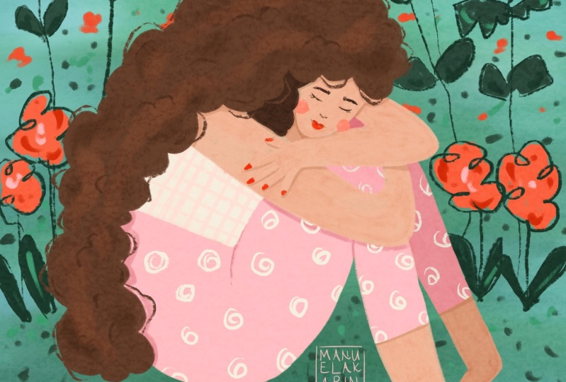
4. The Character: Line of Action: Lines of action show us the position of a
character's body parts. Shoulder to shoulder,
hip to hip, the curve of the torso, and what the limbs
and head are doing. When you see these
and draw them, you can then build your
character from their copy and practice the lines of action
from the reference photos. Stylizing than simply means deciding how you will build
your character from there, you can exaggerate size, angles and make it curved limbs. The possibilities are endless. You can add or delete parts. You don't see an a
reference photo to. I'll talk you through
the main character now, the line of action
of this character is mainly how she is sitting. I see a big U with a lid, which is her arm,
followed by a triangle. This character isn't realistic, which is what makes
this way of stylizing more fraying and
fun in my opinion. I don't need her head
to be a perfect oval. I can just suggest it with
that rounded V-shape. And it can be much smaller
in relation to her body. I want to empower
you to feel free to make changes as
you feel inspired. I prefer curves over the
sharp angles of her elbows. I'm rounding them. And as I look at the photo, I'm inspired to draw
hands that I don't see. I want her bottom arm to
be on top of her top arm. I'm also exaggerating
her arms so they feel really long and folded
in on themselves. Just to emphasize the story that this character is telling
me as I'm developing her, that she's embracing herself
like she belongs to herself. Use the lines of
action as a guide, but use your creativity
as you wish to create more whimsy or to
say what you want to say. I decided I wanted her hands and her arms to feel even
more caricaturist. So there really isn't an
elbow in that bottom arm. It's very much curved. It's almost a circle. And I feel like that just made
me happy when I saw that. And to go with the theme of this character
belonging to herself, I also wanted to change her feet and have them touching so they
are on top of each other. I just wanted all of
her parts to connect. Eyes generally go about
the middle of the head. I wanted her to have just a
very simple, peaceful look. So that's why I went with just
some very basic features. Notice the waste is just a
gentle curve and her legs, I've tapered them
significantly on the ankles. You can make your
legs thin or big. I'd like you to play around with some different
options here. A few more same lines of action. 12.3 have thinner thighs in one, her hair drapes over her body. Her feet and calves are
bigger into her hair flows over the right side and the words form a part of it. In three, her face is tiny and the U shape is
very long in four, there is no second arm. Notice that it doesn't matter. The brain fills it in,
we know it's there. We just don't see her face
is proportionately bigger in that one and her hair looks
like it's growing flowers. So as you can see, these are just four examples, but we can make so many more. And the whole point though, is to enjoy yourself
as you explore the different possibilities,
more cell considerations. As I think about
painting my character, I want to give her
much more important, so I'm gonna make
her significantly bigger compared to
her environment. And I also want to
add words on her arm, so I'm not going to
give her sleeves, so the words really stand
out against her skin. In the next video, we will
begin to paint our character.
5. The Character: Painting With Gouache: Welcome back. So I'd like to put a little pencil box
around my illustration. And this is just
so that should I decide that I want to
sell this illustration, it'll just be a lot easier
to tidy it up in Photoshop. If I start with a boundary, this is completely optional. So how I mix just
a simple skin tone is quite a bit of white, a little bit of a yellow, and a very small amount of the pink. You can also use red. I find that red can be just a little bit harsh and I liked the softer color
that the pink Gibbs. You can see that my, I have two tones
that I'm mixing. So I mix the first one on
the right and this will be my darker tone and then I put
more white it on the left. And this way, if I need to have a little bit more toned
darkness in my limbs, I have it ready to go. Just enough water so
that it's opaque, but I will use water
liberally if I want to lighten up my color
a little bit more. So you'll see that as I
run short on the paint, I'll put in a little bit
more water so that I get a little bit variation in her skin with all
the different limbs. If you feel more
comfortable doing a pencil sketch
before you paint, by all means go for it. The reason I don't is
I like the freedom of painting general shapes. So I'm not going to paint in, let's say her fingers
or any details. I'm just doing kind of a
sketch with the paintbrush. I feel that embracing
any imperfections as I paint characters gives
them more personality. Believe me though it's taken me many years to feel this way, but I found it to be really
worthwhile as I feel much more freedom to paint and I trust myself and
the process more. I encourage you to do what
you feel drawn to do, no pun intended and whatever makes you feel
the most comfortable. Now here I'm using
a little bit of the darker paint and you can
see that that's a way to differentiate between
the background arm and then the arm that's
in the foreground. And same here with the leg. I'm using a little
bit of the darker gouache in the leg that's behind and a little bit lighter in with the
leg that's in front. It's pretty subtle,
but I've watered down this leg a little bit so that you can see
the difference between the leg and the arm
that's just above it. So water is just a great way that you can get
some of the white of the paper coming through. And then it's just easier
to have that hand pop. When I put in that little bit of darker paint for the hair, I'm mixing burnt
umber with white. You can see I just
put a little bit of the skin tone in as well. This is just a way to make sure that the whole painting
looks cohesive. I'm introducing a new color. So I just want it to blend
in well with the color that's already on
the paper and that's why you always,
or at least I do. I think it's a
great practice just adding a little bit
of the color that you've been using to the new
paint that you're mixing. So you can see that I've added some waviness to her
hair and I've also extended her hair so it wraps a little bit
further underneath her. And these are the kinds
of improvisations that I encourage
you to try as well. If you feel called to change your drawing as you're
painting, do it. The painting, we'll
be stronger for it. I feel like her skin color on her face was pulling
a little bit. And so I decided just to dab it. And I kinda like dabbing it, making the face have
that little bit of extra white of the paper
coming through because it just creates interests
in her face and makes the face different
than her problems. For her shorts. I'm introducing
turquoise screen, but I'm adding in the pink
opera as well as just there's a teeny bit of the skin tone in that
mixture as well. Mixing your colors like this, instead of painting
directly out of the tube, is a way to make your
colors uniquely your own, cautious, not water resistant. So what that means
is if it's wet, it's going to mix with the
colors that are underneath. And if it's dry and you
add more gouache on top, it runs the risk of
mixing with the colors that you already have to
keep that from happening, make your paint mixture
a little thicker, not so much water to make something lighter or darker
to add more pattern. Let's say you want to make
sure your first layer is dry. I decided that I wanted to
lighten up her shorts and give them a little bit
of a painterly effect. And so all I did is I
mixed a little bit of the turquoise green with the water or excuse
me, the white. And now I'm just using a little bit of the dark
that's already on the palette. You can see here that
I'm moving some color. What's happening is
the gouache been below her skin tone is because it's not totally dry and
because I am using water, it's coming to the surface
and I'm not bothered by it because I do like that. We see gradations of blue. To me. It just makes
it more interesting. If you prefer a very flat
look with your illustrations, then, you know, don't, don't do as I'm doing. Just mix your paint and then use a little bit
creamy or consistency so that it's very opaque. And what I'm doing
right now is I'm putting the colors
that I'm using down below because later when I
introduce more materials, I want to be able
to test them out on the dried colors so that I can anticipate
ahead of time what, how something is going to look. Here. You can see that I'm
putting in quite a bit of the pink opera with a little
bit of the skin tone. And again, it's just a way to make the color or
something brand-new. If you're new to this style of making mixed
media illustrations, then I recommend that
you do as I do and you create a very
light background. Here. I'm keeping a lot
of white around her lens so that we can
really see her skin pop. And then I'm using the
pink kind of all around. I will add a little bit
of the turquoise green to the sky just to continue with that
whole painterly effect, look, you can see I'm
using quite a bit of water and I even threw a little
skin tone in there. Because all of that just makes, again the illustration
very cohesive. So in the next
video, I'm going to make sure this is completely dry before I add more materials. But the reason we go with a
lighter is because we want the other new materials that
we're gonna be using to really stand out and
have a lot of contrast. Stay tuned for a short
video on skin tones.
6. Painting Skintones: Welcome back. So with skin tones, I like to begin with
a base of white. And then I also add to that
a little bit of the yellow, a tiny bit, bit of
the opera pink. You could also use red. However, with red, I
feel like it's pretty intense and so pink just
makes it a little bit warmer, a little bit softer. I have my burnt umber for
my darker skin tones. And I'm just using
blue to show you. Some folks believe in
blue on skin tone, which is fine because
there is blue and skin because we all
have the vein the veining. However, I feel like it
can quickly turn ashen. So I'm going to show
you what to avoid. In my opinion, I like
using the white, yellow, and pink as a base because
I feel like these are warm. This is a warm color
combination that always plays well
with other colors. And here you'll see that I'll start with this combination. And then to lighten it, I can add a little bit of white. And now I'm going to dip into
the blue and I'm going to exaggerate a little
bit so you can see just how quickly it can go. Dull and ashen. And now I'm adding a
little burnt umber just to darken it a little bit. And you can see that, I mean, it just doesn't even
look like skin really. So now I'm going to start over, but I'll be adding a little bit of it with
my usual combination, the white, yellow, and pink. And now I'm gonna be
adding just a teeny bit of burnt umber a
little bit at a time. So you can see just how nice and warm the skin tones,
the gradation goes. And you can see here now I'm definitely adding
the burnt umber. It's getting darker. It's not very much
in this example here I've added just a touch
more of the pink. So you can see that
it kinda gives it just a little bit of a rosy next to it and
I just love it. So you can just keep going stark as you'd like
to create the skin. And now again, I'm showing
you by adding a little blue. I feel like it kinda
dolls, dolls it down. But maybe you need it depending on your colors
that you've chosen. So I just wanted to
show you what Blue does with these
particular skin tones. In the next video, Let's add details with doodles
to our character.
7. The Character: Doodle Details: Welcome back. So I'm placing my
warm-up doodles to the side where I can use
them as a reference. I'm going to be
creating the idea of a continuous line
drawing right now. Putting three little dots in as if it's a conversation
that is continuing. I'm creating the idea of a
continuous line drawing. However, for this final artwork, I'm being methodical and
I'll stop and start as I go. So I'd like you to also think
about when you're doing your continuous line artwork
idea to dip the lines. So here I'm going to
go a little bit lower. I started and I'm
going to create another little doodle,
little butterfly doodle. It doesn't have
to look like it's a straight line the way you
would write a sentence. So I'm going to also be placing in just some
stems right now. And then I'll add the little flower tops
in just a moment. So as I looked at the drawing, I sort of felt like I wanted her feet to look like
they were grounded. And so this is
another way to create a little perspective is I placed her little feet on some
rocks for her face. I'm going to keep
it really simple. And to create interests, I'm gonna give her glasses now one lens is going to be
different than the other. And that's intentional just
because I like how they look, like they create contrast and just gives it a little
more personality. You'll see the screen
here in just a moment. I get excited when trying and I forget
that there's a camera, so I'm creating two mountains. And then this third one that feels a little bit
more like a hill. It's not precise. The reason I made
it the way I did is because I like how it's
kinda framing her in. And now I'm just looking
at my doodle warm up and figuring out what kinds of trees
I want to include. I've moved to Portugal recently, and I absolutely love the old style pink houses
that dot the landscape here. So I'm including them and
almost all of my artwork. I really love them. And I'm just finding every
opportunity to place them, even if it's just
a little sliver of a house there on the side. But you can see that
something like this. Whatever it is,
personalize your artwork. And as even these
tiny little shapes, different colors and using
the variation between the pencil and the pens creates interests and
its contrast, right? And we have different
thicknesses of lines between the pencil
and the micron pen. I'll move the paper
here in just a moment. But now I'm coloring in some of those doodles and
just very subtle, just a tiny bit of the dark green and a little
bit of the pink. And you don't have to
color in every shape. You can just do a little
line drawing like I did here on this last flower. I'm sure by now you've noticed that the pencils I'm using are similar in color family as
the paints that I chose. The only different one
is this very dark green. But it works because
I'm using it repeatedly in the background. So it's just another way to
keep your artwork cohesive. Now for contrast
and also, I mean, I could use the same
pencils I've been using, but for little contrast, I'm going to use the
pencil just for her body. And this is another
way for her to stand out a little bit different
than the background. So I'm not going to outline every single part of her limbs, but most of them, but I'll leave some of them not outlined. And that again, is a
way to create contrast. I'm introducing a new material. This is the Posca
acrylic paint pen. And the thing about it, and gouache is e.g. here on the white and
cleaning it down below because it will pick up
the color of the gouache. So I don't want to really
color in aggressively. I'm just doing a couple of passes for each of the flowers,
cleaning it in-between. And that way I keep those flowers as white
as I possibly can. Pattern is a great way to create interest in your artwork. And also things that are kind of mismatches
are kinda fun, unexpected things like
triangles and I will add leads to her shorts as well to go with
those triangles. Here again, I'm just using the pencil that I've been
using from the background. And it's a way to bring the
foreground and the background together is using the same
materials just a little bit. If, if I had not included the pencil and the short,
it would have been fine. Here. I'm keeping some of the
leaves filled in and some of them just outlines. And again, that's another way to bring some contrast
into your artwork. The theme of the artwork is
important to me and so I want to emphasize that
with actual words. And I kind of, I'm riffing on the doodle this time by
including those dots. It's sort of like
this conversation that started with art and, or maybe it started with the words and then it
continued with the art. But they kinda look like
they belong to one another. I mentioned in the
warm-up doodle that personal symbols are really a fun way to make your artwork super unique and nobody else's. So think about what kinds of symbols you could
include in your artwork. What is important to you? If you'd like baking, you might make a tiny little
cake doodle and hang that or place it somewhere in your artwork or ice
creams or rainbows. I mean, really, they're just
infinite possibilities. In the next video, I'll show you some variations of some
doodle backgrounds and give you just some tips and tricks that I use for creating
some more characters.
8. More Inspiration: I included the gesture lines for this photo in the files for you. I just wanted to show you
that even something that looks as odd as this position
which I actually love. I put my feet up like this at home all the
time and it kind of gave me the idea for this
particular illustration. I love though, how you
can find photos that maybe speak to you
and then you can turn them into
whatever you'd like. Here, I've exaggerated
the character's legs and just given her a
little bit rounder look, gesture lines for this
character in the photo files. I wanted to give you
the opportunity to slow down this video so that you can create a character like this if she interests you. So the doodle details
for this character, I started with the Posca
pen and you can see I just started with three
simple flowers. And now I'm just repeating this pattern idea in her dress. And so this is just
wanted you guys to see this so that you can think about maybe doing
the same thing. This scalloped pattern can be a great way to bring
your artwork altogether. Then I'm just creating a
simple landscape for her using just the luminance
pencils and then filling in the detail with this pit pen, which is the fabric
Estelle Artists Pen. And then just using
more pencil work. For this character,
I was inspired to do a little bit more elaborate
landscape, but very simple. And I just wanted to show you that the rainbow is
not perfect at all. The lines kinda
overlap on the left. And mountains, like the project illustration just to simple
triangle mountains. But you can create depth
even with doodles. And here you can see just putting a couple
of those mounded, that mounded look
of shrubs and then creating different sections of, you know, florals and trees. And the sizing doesn't matter, but the flowers
give the impression that they are very much
in the foreground. And then the trees
because they're so small, give that sense of
distance, right? And then just the way the river essays from
tiny, too large. Now adding one more
shrub on the right in a darker color really
gives it even more depth. And it's something that's
so small and easy to do. But it just gives that extra
little bit of layering. This one's a little
more childlike and I just wanted to
share how Scribble hair and scribble
flowers can create a nice contrast with
the gouache as well. Now it's your turn. I'm super excited to see what you create. Please post your project. I'm here to support you and I'm happy to answer questions. If you liked this class, please do leave a review
as it helps me to bring you even more classes for
your enjoyment and learning. Thank you so much for taking this class and happy creating.
 Alma Cox, Painter ✶ Author ✶ Teacher