Transcripts
1. Intro: Many artists dream of having a large portfolio of work
that they can share or sell. It can seem really
daunting when you're just starting out or learning
a brand new medium. It doesn't have to be
as scary as you think. Hi, I'm Brittany
Bouyer, an artist, illustrator and surface pattern designer living and
working in Chicago. I primarily use
the Procreate app to create most of my work. I've been using Procreate
every single day since 2019. Since then, I've created over 250 illustrations and patterns, completely transforming and
streamlining my business. I sell my work in my
online shop on places like Society 6 and Spoonflower and in small shops
all over the country. I love using Procreate
because it helps me keep everything all
organized in one place. No more losing notes
on loose pages or trying to remember
what colors I mixed. Adding the Procreate app to my workflow has changed my life. Well, I too do sometimes create individual illustrations, I've also learned
the value of using this platform to create
collections of work. I can brainstorm,
research, take notes, organize ideas, and create thumbnails all within
the Procreate app. Working this way on my
iPad has helped me build a large body of work
within cohesive themes. My goal in this class
is to challenge you to learn a new
way to sketch. You do not have to be
an illustrator that only draws digitally, in fact, this class is great for
beginners or anyone who wants to expand their workflow to plan
out larger bodies of work. I will show you how to
create all your plans directly on your iPad and use them for many
different mediums, like how you can project
on a Canvas or use your iPad directly as a
lightbox from your sketches. Anyone who wants to
create a collection of work should totally
join this class. I will walk you through the basics while challenging
you to plan ahead so that you can keep
up the momentum and finish each
individual artwork. If you're ready to tackle
your next collection, come join me and let's
use the procreate app to create it from the
very beginning.
2. Class Project: [MUSIC] The class project
will specifically be creating six
different sketches for your next collection. For the class project,
you will create one thumbnail
sketchbook page and five individuals sketches
from your new collection. Not only will you learn some of the foundational tools to
use procreate along the way. But you will see how
beneficial it can be to plan the details of
your next body of work. Keep in mind, these
sketches do not need to be refined,
finished art. You should work at your own pace and truly develop your ideas for your collection to make the decision-making
process much simpler. I would love to see
your work at any stage, so make sure to share in the project gallery
section of the class. Now, grab your iPad and a comfortable place on the
couch, and let's get going.
3. Why Sketchbooks?: [MUSIC] I'm going to assume that we already know all the benefits of keeping
a regular sketchbook. But let's talk
about the benefits of a digital sketchbook. I think it has way better potential for easy
cleanup and setup. Simply set up your iPad and go. You don't have to
worry about the potential waste of paper, so great for the environment. It's simpler to create
a mobile library of your ideas easily for
you to view at anytime. You can create and assemble quick mood boards
without using a printer, who likes to use those pesky
things anyways [LAUGHTER]. It's super mobile, perfect
to jot down ideas anytime, anywhere, and I specifically like to use it on an airplane. You can develop
all your ideas for any project or collections, and it's a simple way to have everything all in one place. For example, if you
get an email from a client or a customer, you can automatically
use their photo as a reference for the work that
you're creating for them. Let's go ahead and
take a look at some artists that use
the Procreate app to create sketches and add
value to their workflow. Here you can see artist
Jessica Elena using her Procreate app to create
a sketch book like spread. Here you can see she's
created a visual that looks just like a
paper sketchbook, but instead she's used
that as a template to create multiple images
from one sketch. Now I will assume that
she has that template for the sketchbook page saved
to her Procreate app, and she's able to
reference it anytime she wants to create a sketchbook
spread like these two. Here you can see
artist Dave Reed using the Procreate
app as his sketchbook. On the left you can see he's used a lot of his sketches to gesture and create movement
in some of his illustrations. On his sketch on the right, you can actually see
where he started with different steps and
different portions of the illustration and combined a fully finished
piece in the center. I think one of the most
beneficial ways of using Procreate is actually
exactly what Dave Reed is doing here. He's starting the sketch on the same piece of paper and then fully developing the
illustration in the center. You can always add more layers and develop it as
you move forward. Our next artist is Iva Mikles. I truly love
watching Iva develop her ideas directly in
the Procreate app. I love how she
incorporates notes, thumbnail sketches,
color swatches, and then final illustration, so that when she's ready to
work on her final piece, she has everything
already planned out. On her left illustration, you can actually
see where she plays with four different color ways. I love how she even adds
elements around the border to make her sketches
feel more lively. Our next artist is Mike Lowery. Mike has created
travel illustrations in his sketchbook for years. I really like both of
these illustrations here because the
one on the left, you can tell that he's spent a little bit more
time and wanted to make a true
memory out of that. On the right, he took
something very simple, like drawing his day and has turned it into a
beautiful composition. Next up we have Claudia
from maus haus. A lot of artists choose to
use the Procreate app to sketch their work
before they would do a finished painting
or some printmaking. Procreate gives you the benefit of being able to quickly change colors and test out which one might be more visually
appealing for you, or your brand, or
anything that you want. I also want to mention that all the examples
we've seen today from other artists are images that they've shared on
their social media. Most of the time you do not
see the works in progress on social media as simple
lines and little sketches. I don't want you to be
intimidated by these works of art that look like they
had been fully formed. Keep in mind that we're creating a collection here and
using Procreate to plan. I do not want you to think
that you need to use this class to finish six
pieces of work entirely. Next, let's talk about
why we specifically want to use Procreate when we're building a collection of work. I've already mentioned that it's a huge benefit to be able to have everything when you're building a collection
in one place. You never have to
worry about misplacing your sketchbook or
wondering where a certain color of paint is. It's all right here for you. Procreate helps you quickly
create a mood with colors, with all of it's
versatile ways to incorporate color from
a variety of sources. You're able to quickly plan and layout many art pieces
within the collection, pretty much at the same time. You can block out
and test colors with just a few simple quick actions. Coming from someone who wasn't always the most organized, there's no way to lose your ideas if they're
all in one simple place. You're able to select
and slightly move any marks without
having to start over. Who doesn't love the idea of
unlimited sketchbook pages? Of course, you'll
be able to export your work to assist you in any medium that you plan
to finish your final work in. Now that we know just
how beneficial it can be to keep your
sketch book in Procreate, let's get started
on the next lesson in creating your very
first Canvas page. [MUSIC]
4. Creating a Canvas: [MUSIC] Now it's officially time to get ready to create
our digital sketchbook. What we'll do here is create an entire new sketchbook
within our Procreate app. I'm assuming that
you may not have as many items as I do here if
you're new to the program. But what you see here
is called the gallery. It's basically a space that holds every single
piece of artwork, sketch, idea, or canvas that you've
created within the app. To get us organized from
the very beginning, I'm going to walk
you through how to create a new canvas or a new sheet of paper for a
sketchbook in our case here. Come up here to the
top right-hand corner and you'll see a
little plus sign. If your interface
is on light mode, this all might be white
in the background and your buttons or
words might be black. Touch the plus arrow. Over here you'll
probably have a list of a few automatic canvas sizes. I like to work and
create my own so that I know exactly what I'm
working with for file size. I typically know that when
I create a piece of work, I will also work within sizes that I know I want to print for art prints later on. You can see here I have
some five-by-seven. Everything is in inches here
because I'm based in the US, but I have an 11-by-14, all the sizes that I
work with typically. There you can see I
did a test one for us. What we'll do is we'll come
up here to the little box on the top right corner,and
we'll create our own canvas. Again, like I said, I like to
work with inches because I know that typically I will
print directly from my items. For this case, I won't
be printing directly from the work that we're
creating in this sketch book. But I do know that I like
to work in a square. When I work in a square, I like to do a canvas size or like this blank sheet
of paperwork creating, they're called canvases, of a size of sketch that I
actually like to work in, and I typically work in
an eight sketchbook. I'm going to tap
where it says width. Make sure it's changed to inches over here on the bottom, and I will turn that to eight. Tap down to my height and
do another eight inches. Again, if you would like to
work in a different size, you're more than
welcome to do that. I will also show
you how to resize a canvas once you've
created it should you change your mind later. The other thing I like to
keep is I like to keep the DPI or the dots
per inch at 300. This again is great to
keep in mind if you plan on sharing it
on social media, it doesn't need to be that big. But if you do plan on printing, maybe so that you can trace
it for a painting later on, I would keep the DPI at 300 so that you can print
it to large scale without losing any integrity. The cool thing here
is you can actually see how many max layers you'll be able to use on this
canvas based on the size. You'll see that if you would
change that to an 8-by-14, it went down to 49 layers. It changes how much
space you have. I'm assuming we're not going
to be using 89 layers here, but it's good to know that
we would have the option. Then before you close out, I like to change the
canvas name from untitled canvas actually to the size of the
canvas that it is. I'll put eight-by-eight
sketchbook page. You don't need to
change anything else. But if you're curious
for color profile, I like to just keep it on
the automatic RGB option that it comes to. Most of the things
that I print going forward or digital and I can use the RGB color profile,
so I leave it at that. Once you're ready,
you can come back, double-check your dimensions
are set, everything is good. I will hit the yellow
"Create" button. Once you've created
that custom canvas size for your sheet of paper today, it will automatically open
up to that sheet here. Create as many custom canvas
sizes as you'd like today. Then in the next lesson, we will organize it all and get us set up
to start working. [MUSIC]
5. Staying Organized: [MUSIC] Welcome back. We are still in our
blank sheet of canvas or blank paper that we have here that we created
in the last lesson. What we'll do is we'll go
back and hit the gallery up here in the top left and
it will bring us back in. If you've created
multiple pages, different canvas
sizes, you might see a few blank ones
here, but for this, what I want to do
is go ahead and get set up basically like we're creating an entire sketchbook based on the work that we're
going to create today. From here I want
you to actually tap where it says Untitled Artwork. There we can type in, I like to just name
it sketchbook page 1. Then for the sake of the class, I'm actually going
to keep all of my sketchbook pages
the exact same size. A cool trick that you can actually do is to take
your finger and swipe to the left and a little
few options pop up here. We can hit "Duplicate", and it will actually duplicate
the exact same page. You can also see that they're
named the same thing, but I'm going to change
those in just a second. Because I know that
I want to have six sheets of paper today or
six pages in my sketchbook, I'm going to duplicate
this so that I have six. Now what I will do is
actually go through each one, tap on the name and just change that sketchbook page number so that I can keep myself
organized and in order. I've got all six of
my pages renamed. One of the coolest features
of Procreate is that you can actually create folders or
stacks as they call them. You can see how they're stacked here so that you can keep all of your projects and
sections organized as you move forward
because as you can see, it gets messy as you move on. Tap up here and hit "Select". Then this little window or these little circles popped
up, they're like checkboxes. You just make sure
that you tap on the circle and select each one that you want
to create your stack. I'm referring to this
as our sketchbook here and then tap
stack at the top. Now you can see there's a
nice stack of folders here, but we are still in
this selection mode, so make sure you turn that off by hitting the X
at the top corner. Tap on the name stack where
you created your sketchbook. I'm going to name this my
Skillshare sketchbook. Once you've renamed your stack, you can hit "Done". When you're ready
to move forward, you can actually tap on
the entire stack and then it opens it up in
this nice preview here, which I really love, especially once we start building elements
for our collection. Being able to spread them out here is really,
really helpful. I know sometimes it can actually be frustrating when
you're working in a physical sketchbook
because you have to flip through
the pages and everything when
you're going through selecting colors and
working on elements. This is one of my favorite
features of working digitally. If you've come into
your sketchbook and you actually see that the pages are numbered backwards like mine, I did do this on purpose
so that I could show you. You can actually tap on the
photo and move it around the canvas so that you can change and reorganize the pages. I'm just going to tap and drag them over so that they're
actually in numeric order. I could just rename them, but I did want to show
you how you can rearrange anything even within a
stack or your main gallery. Now that we've got all of our blank canvases
or our blank pages set up here in our
Skillshare sketchbook stack, we can get ready to move
to the next lesson. I will show you how to resize a canvas should you not want all of your pages
to be exactly the same. I know sometimes
we change our mind and it's important to know
how to do that going forward. I'll see you in the next lesson. [MUSIC]
6. Resizing Canvas: [MUSIC] Now that you've got your sketchbook all
set up and organized, I want to show you
how to change or resize a canvas page once
you've already started. Because I know sometimes as you're working
through a collection, you realize that you might
want to have something be a different size
or you want to change the proportions
a little bit and instead of doing that directly
on the sketch book page, you might actually want to
change the size of the page. Let's click on one of your
pages here at the end. I like to pinch and
zoom on my page just so I can get it a
little smaller and see. If you tap on the gear
icon under your Actions, here under Canvas you
can tap Crop and Resize. This first option is that
you already know that you want to change the size before you have
drawn on the page. The easiest way is to go
to settings and you can actually do the same thing
that you did when you were creating a canvas
and change the size. You can actually tap on
where you have the number. I still have mine
selected as inches. Let's say I want to change
this to an 11 by 14 inches. I'm still going to keep the DPI, but again, you have the
option of changing it. Then if you tap over here, you haven't made
anything permanent yet, but you can actually see your original size and then you can see the new canvas size. Here, I'm obviously deciding
to make it a little bit bigger and there's no
elements on my screen. You can hit Done if you're ready or Reset if
you want to go back. Let me show you how to
do that one more time. I'm going to change
that to an 11 by 14. I see how the proportions
are going to be. I think that's good.
Let's hit Done. Cropping my canvas. Again, you might change
your mind and you're, that might not quite work. If you use two fingers, you can tap and undue. For an example sake, I'm going to go up here to my layers panel and
I'm actually going to test if I had something
specific on my canvas. I'm actually going
to do another layer so you can see how multiple
things are selected. I wanted to add a
couple of elements here so you can see
what it's like to crop a canvas once you already
have some content on it. Before you would crop, you'd need to go
here to your layers. Any layer you don't want
cropped off of the canvas, you need to make sure
that those are selected. Tap one and then swipe on each layer that you
want to select with it. Then you come over here
to the transform tool. Both of my layers are selected. I come over here to the transform tool and I'm
actually going to make sure that I uniformly change everything to this
bottom right corner. Everything that I
drew is still on my canvas here so that
when I crop and resize, I'm not going to
crop elements off. I want to make sure
everything is still there. Turn off your transform tool then you can do the same thing that you did before
where you come back, go to actions, canvas,
crop and resize. If I go to my
settings, I can type. Let's say I want to make this
a five by five instead of an eight by eight. You can actually see here, those elements might be
cropped off at this point, but you can actually
drag the box over and zoom in and see if your
elements were moved at all. I'm going to make it a little bigger just in case
there's something on the edge and I can
crop this way. If I was ready, I could hit
Done or I can actually go back hit Reset and I don't
even have to type anything in. I can actually move and crop this anyway I
want and it's going to show you the height and
the width only in pixels, which can be confusing
if you're not familiar with the
different size options. But there's also a way that you can drag and do all
of that as well. I'm going to go back and
do that five by five. Tap over here, make sure that all my elements
are on and then hit Done. Now, just for the sake of
showing you how things work, if I would've left all of my elements the same
size as my canvas and then I would've
gone to crop and resized that five by five, you can actually see that
there is no way for me to get all of that on unless I
went back to a larger size. You have to make sure that
you select the elements you want to stay on the canvas
before you would crop. Now that we've played with
how to resize a canvas, we'll get ready to
dive right into our sketchbook tools
in the next lesson. I'll see you there. [MUSIC]
7. Using Shortcuts: [MUSIC] We're back here and I want to show
you a little bit about the shortcuts in my favorite sketchbook tool
so that we can dive right in. If you're already
familiar with how to use Procreate a little
more thoroughly, you might be able to
skip over this lesson, but I will show you my favorite tools specifically as it relates to sketching. I will not be diving into every single
thing the app offers. I do have another class
called Intro to Procreate, Creating Depth with Layers. Let's get started on using specific sketching tools
and we'll go from there. First, I want to start
with a few brushes. I'm using the Apple
pencil 2 here just for reference and I
have the latest version of the Procreate app. Do make sure that
your app is updated so that some of these
features I'm talking about are actually
available to you for sketchbook specific projects
that I'm working on. I recommend having
one pencil, one pen, and one paintbrush so that we can actually
use the paint to cover larger areas later when we start to color block
all over our sketch. If you come over
here to your brush libraries that are
over on the right, you'll see that the first one is actually your writing tools. They're actually all
the exact same tools, but these ones in the middle
are used for smudging. The ones here are
used as erasers, so they're all the exact same brushes that you
have in each one, but they just have
different purposes. Here is your layers panel. Again, I won't be
diving fully into that, but as we move along, you'll see how I use it in my workflow and you will
be doing that as well. Here is your color panel. There's lots of ways
to choose color. We will dive into in
a later lesson as we choose colors
and how that will reflect our collection
that we're building. To dive in directly with
our drawing materials, I suggest using again
the sketching pencil. I like to use the 6B pencil. A feature that they
have recently added to the app is a recent
folder up here. Any brush that you make
a mark over here on your Canvas will actually go directly into that
recents folder. Go down here to Sketching, choose the 6B pencil
in order for it to go to your recents category, you need to make sure
that you make a mark. For now we can just tap
two fingers to undo that. If you want to redo, I'll show you this a few times. You tap three fingers
to bring the mark back. Probably the most beneficial
shortcut you'll use [MUSIC] throughout your whole time
using the Procreate app. Now you can go to your recents category and you'll see that the 6B
pencil, it's there. The next one that I suggest is coming down to Calligraphy. I like to use the script
pencil because it has a nice fine point and it
is also at a full opacity. You can see here some
of these gradients, we don't want that for
this specific purpose, make one mark with that, undo if you'd like. If you come down here to
the painting category, I suggest using either the
round brush or the flat brush. I typically use the flat brush. You can actually change the size of the brush over here
on the left-hand side. If you're using the
Apple Pencil 2, you might actually have
a little gradient here. I'm pressing really lightly
and if I push a little harder and bring my pen
upstream, it gets more bold. If you do want to change
the opacity at all, the second part over
here on the left is how you lower the
opacity overall. I'm pushing fully, but
the opacity is down. I'm going to undo all of that, bring the opacity backup for
my brush and then let's make sure that all of those
are in the recent folder. Perfect, the ones
I've used here. Let's start with the pencil. Again, choose any color I
like to do a warmish color. I'll do a little bit
lighter so that I can see it here on
my layers preview. Let's do three separate flowers. We're just testing
those brushes. The first flower doesn't
matter where it is, just make it really simple. Then if you come back over
here to the layers panel, tap the plus sign to
create a new layer. Now I'm going to choose the
script brush, the ink brush. The reason I'm having you do a new layer is
because I think it's really important that anytime you want to have a new element, a new line, a new
color, anything, you would get in the habit of
creating it on a new layer. Because once you have
something on a new layer, it allows you to combine things, but you can't necessarily
always separate things. I think that this is always the best way to just
get in the habit. Because I'm using a new
pen or a new brush, I will come over here
and I will try that one. Draw that in, same thing. Let's add a new layer because
I'm going to switch to the paintbrush. That's very big. [LAUGHTER] I'm going to
come over here and change that a little bit smaller. Great. If you come over
to the Layers panel, you'll see we have
three separate layers. Because this is just
a small exercise, I'm not going to have you rename all the
layers we'll do that as we move on to the next lessons but you can see that
they are all separate. I'm going to grab this Layer 1, which is the layer
with my pencil mark. If you've come up here
to the Transform tool, which is the diagonal arrow and it's going to
select everything that is on that Layer 1. When I have that selected, I can actually move it along
anywhere on the Canvas. Really helpful when you're planning out anything
on a Canvas. If you don't like that
clicking that's happening, sometimes you need it,
sometimes you don't, you want to move in more freely, you just turn all your
magnetics where you're snapping off and you can move that
a little bit more subtly. That is very beneficial. I typically use the uniform if I want to resize something, make it bigger or smaller
and it keeps it in the intact shape that you had
created in the beginning. We can actually
do the same thing to all the layers if you want. The transform tool is
grabbing everything that's on that layer and then allowing
you to move that freely. We will take those three
layers over here in the Layers panel and you can
grab and pinch them to go. I'm putting them all
on the same layer now. Let's say that we had
actually used all three of those brushes and created these flowers all
on the same layer. You realize that you don't
want that to be the case. You want to be able to
move them separately. The other tool that
you'll use the most is called the Selection tool. A little window pops up down here and it gives
you a lot of options. For our sake, most likely
we will use the Freehand. Freehand actually lets you
select anything you want. Let's say there were things attached here that
I wanted to move. Once you have that
selection closed, you can come back up to the Transform tool and
it's actually going to move that selection even though it's on the same
layer of these items, I can move them really close. If I move them really close, so let's say they're
almost touching here and I turn that
selection tool off, they're now all on the same layer still
but just touching. Let's say that I wanted to do the same thing but
I didn't really like how that was laid out. If I come back in here
with that freehand tool, it's going to leave a weird mark here between
where I've selected. That's why I always suggest people putting things
on different layers. Because now you can see edge
on both of these flowers. It would've been better
if I just would've not had them on the
same layer and then moved them over top of
each other separately. Let's say I don't
like any of that. Again, I can tap and hold my two fingers to go back
and undo some actions or I can manually tap
slower and redo and undo. The next thing I want to show you while we're
in here exploring some of the tools is again, we are on that one layer. All three elements are there, I'm going to come back here
and make sure that those are separate again.
I undid that. Let's say I want to have this on a separate layer
because I plan on changing that outline a
different color in the future. I want to come over to the selection tool and again I'm using the freehand option. Let me show you this; the
option to use a rectangle, if you're using these
organic shapes can be difficult sometimes if you have a bunch of things
close together, but ideally it does
the same thing. Once it's selected here
under the selection tool, I can take three fingers swipe downward and a copy and
paste window comes up. I use this the most when I want to either duplicate an element, which sometimes they do, sometimes they don't
because it can lose actually its original integrity. It might blur or pixelate
the element a little bit, but typically all the
sides sometimes at a later option that
I actually don't want them to be on
the same layer. I will cut and paste that. Now you can see
that that selection has moved from Layer 1 and
gone to its own layer. Now I can move that freely
and if I stacked it over, it's not a problem because
it's on a different layer. Now that we've explored a few of the basic tools
that we'll be using today, we will really start working
on our collection ideas and how to use and utilize Procreate in
the best possible way. I'll see you in the next lesson. [MUSIC]
8. Choosing Collection Theme: Let's talk about how to choose a theme for your collection. Choosing a theme can be one of the hardest parts about
creating a collection of work. You might feel like
there's a little bit more pressure because you're
creating more than one piece. In this lesson, I
will share some of my favorite ways to narrow down all of your ideas into one collection theme
for the class. One of the first ways
I like to narrow down my ideas is to check all
the things that I admire. Looking at some artists
that you've found on Instagram maybe by
your saved posts or people that you follow, take a look at those and see if there's a theme among them. I'm sure many of you have
a Pinterest account, so check on some of your
favorite and most active boards. You might even be able
to tell just from your homepage what a lot
of your interests are. If you looked at some
of those Instagram saved posts and your
Pinterest boards, is there a general theme, maybe with color or subject matter that you
could potentially research? Maybe you've really been
admiring some artists, both old or modern-day. Taking some time to research their entire career can really give you some insight into how their work has evolved. Because you like their work now, maybe something that was created a few years ago could be
inspiring to you now. Taking note of all these things
can be really beneficial and you might even start
to see a couple of themes. Take notes and add
it to your canvas. Since we've talked
a little bit about my inspiration from
my collection, I want to show you exactly how I found a little bit of research. Here you can see two artists, one modern-day Olga Masevich
and Alphonse Mucha. I chose these two as inspiration because I love the colors and the movement that Olga
uses in her illustration. I have always been a big fan of the Art Nouveau movement
and Alphonse Mucha. I want to incorporate a lot
of floral illustrations and also a lot of the
borders and stuff that you'd see in his work
is also shown in mine. Now I know this might
sound like a no-brainer, but sometimes we forget that
we really need to follow our own interests
in order to stay motivated while creating
an entire collection. I really want you
to take your time here and answer these questions. Think about some of
your hobbies that are unrelated to your art interest. In general, what do you
like to read about? Even if you're reading
articles, magazines, or books, take note of those
themes that you are generally drawn to. If you like to travel, where have you gone
that has truly left lasting memories and what
did you love about it most? Thinking about what you
enjoy when you have a day off are some of the most insightful things
you can imagine. Consider what you love about certain TV shows or movies and what it is
that draws you to them. Is it the theme? Is
it the characters? Is it the clothing?
All of the above. What are some of your
guilty pleasures? Do you really have an
obsession with dark chocolate? That's me. Is there something right now that you're just really interested in? Are you suddenly
interested in fashion? Are you following
true crime podcasts? If there's something
on your mind that you're curious about and that you can't wait to
talk to somebody about, that might be a perfect theme. Here I'll show you how
some of my own interests will make their way
into my collection. My interest in women's
empowerment and my obsession with wildflowers. I am currently in love with researching artists
from the 1920s. I love French architecture
and positive messaging. Again, this might seem
like a no-brainer, but consider the things that you just simply like to draw. I'm going to assume that you're already an
artist if you are here. What is something that
you almost always want to include in every
one of your artworks? What's your go-to doodle? Is there something
that you feel really confident drawing
without much stress? Is there a subject that you
love to include in your work? It's really important
to make sure that you include elements
of your own style. Let's say you really
like drawing parrots, but you want to work on a
collection about women. Thinking about creating work
that combines both of them while still being true to
yourself in your unique style. Next up, I'll show you how
I will include some of my signature style elements in a totally unrelated
collection theme. As you can see, there are
no female figures here. But that doesn't necessarily mean that I can't include them or create an entire new
collection about it. As you can see here,
there are absolutely no female forms and that is the entire
theme of my collection. As I take notes in the
following lessons, I'll try to figure out ways to incorporate the new
theme elements, including some of my
poppies, flowing flowers, leaves, vines, and all of my favorite things
about Art Nouveau. Before we dive into
this next slide, I want to put a little
bit of a disclaimer here. I do not think you
need to consider an audience when you're
creating your work, even if you're
planning on selling. I truly think artists make
their most amazing work when they are following
their own passion and their own interest, so considering an audience
can sometimes be tricky. With that said, you
might obviously need to make some money from your creative endeavors here. Doing a little
study based on what your audience engages with
can be really helpful. Again, I don't think it needs
to be the entire driver of your theme here
or your collection, but I do think it's
good to consider. Are there any patterns you
see within your audience? What do they
typically engage with the most on social media? What are some of
your bestsellers? What's the topic you and
your audience discuss a lot? For example, if someone
sends you DMs based on some things that you
share personally in your stories, what
is that about? If they are messaging you about something that's
really interesting, then maybe there's
a little spark there that could inspire you. Now what I can say
about my own audience is that they almost
always respond the best when I am truly
authentic and share stories about why I was
inspired to create something. Everyone is really kind
because they are connecting to the work because I have shared my very own story
related to it as well. I'm sharing this example
because I actually have this design in quite a
few color waves and this is by far the most popular on social media and as far as
how many sales I've had. Since I know that
these colors are the most popular option, I know that I should
probably incorporate more of these warmer colors in
this upcoming collection. I also know that the visual representation
of a uterus anatomy was very highly appreciated and accepted by the
women's community, that is my audience. I'm trying to figure
out ways that I can incorporate more of that empowerment in the
next collection. Now, I know I say a lot of
things are my favorite, but this is definitely
the best part about creating a
new body of work. Doing research can inspire you
in so many different ways. One of my favorite ways to research is to
take time when I'm scrolling on Instagram and save posts into a collection folder. Again, I'm going to assume
that all of you have a Pinterest account or
access to Google Images. It's a great place to source inspiration based on some of the content you've
already enjoyed. I personally love the
new feature on Pinterest where you have created a
board and if you scroll down, it will actually give
you curated pins related to everything
that was in that board. It is essentially unlimited. Take screenshots of
advertisements that you see, take photos anywhere you go, even if you're walking
down the street and you see a bus advertisement,
take a picture of it. I have a feeling you
will be overwhelmed [LAUGHTER] in a good way with
all of your inspiration. I like to keep a folder in
my photos app on my phone called Inspiration so that you can turn to it
whenever you need. When I'm personally in
this research phase, I like to go to
Pinterest and I will click on a few things
that I already know. For example, like
mentioned earlier, I love Alphonse Mucha's work. I will search him in the
search engine of Pinterest and then from there a lot of other art will come up
that is more modern-day. Then that starts
the rabbit hole. Well, the exciting
rabbit hole, at least. From there, I'd moved on to
some vintage photography, women's empowerment
art, and so much more. The cool thing about all
of this research is that not everything here is specifically related
to one another. But that's the goal of our own collection theme is to take everything that inspires us and turn it into our own creation. If you're still not sure what theme you'd like
to choose today, there is a theme idea list down in the project resource
section of the class. Now we're getting one step closer to starting
our collection. In the next lesson, we will
take notes about our ideas. We'll brainstorm potential
subjects to include. We will create
repetitive elements throughout the
collection and we will begin our thumbnail
sketches and lay out each piece in
this collection. I'm really excited
to get started with you in the next lesson.
I'll see you there.
9. Thumbnail Sketching: Now that you've got your theme selected for
your collection of work, we can jump right into
the brainstorming and planning part of
your sketchbook. I want to come over here
to my layers panel. I just want to delete these layers and then you can actually tap this one,
and you can just clear. That way we still have one
layer that we're working on. Before getting started, I
always make sure that I check to see what
layer I'm working on, if there's no funky stuff. We have a clear, empty page to begin. My collection of
work is going to be all about women
and female bodies. I've been really
drawn to working on women's empowerment
in my work lately, and how our bodies change as we get older and how
we want to work on, accepting whichever
stage of life we're in. While that can be a heavy
subject or a theme, just any central
theme where you can tie all the pieces together is what matters the most here because this is the
next collection of work that I'm working on, I knew that this was
a great way to share my process and encourage other people to create some work with this Procreate
sketchbook this way too. Whenever I start my first page
of my sketchbook planning, I have a few steps. The first step I like
to do is to actually make some notes or
to write elements. Come up here and
just choose a color. I typically use a brown
instead of a black. But you can select any color
that you want to use as your base for starting
your sketches. I'm going to come up to
my brush library under the paintbrush here and
choose my sketching pencil. I'm going to pinch and zoom, turn it to the
right just as if I was writing on a piece of paper. I just want to test the
size of this real quick. I think I want it to be
just a little smaller. In this first writing part, I actually just want to write a few items
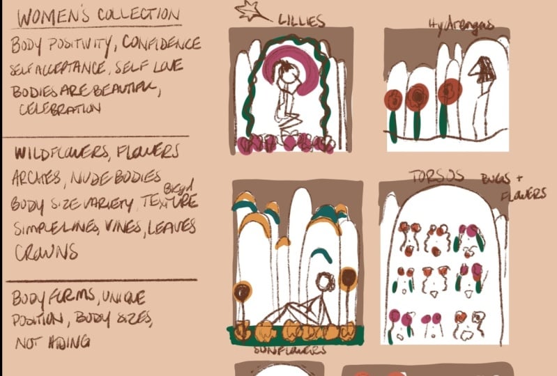
about the theme. I want this to be a women's
collection because I want to explain a little bit about this collection
just so that when I'm sketching my thumbnails
and moving forward, I can refer back to
this and keep it in mind each time I
make a decision. I'm really focusing on body,
positivity, confidence. Just a few ideas of
words that come to mind so that I can keep
referring back to it. One little shortcut to tell you is if you're
using the Apple Pencil tool, you can actually tap the
pencil twice with your finger, and it will toggle between the eraser and the
pencil option. That's a really nice shortcut. I'm going to take the pencil and draw another little line here. If I actually stop and hold
and don't pick up my pencil, I can create a straight line. Then if you use your other
hand and tap one finger, it will actually
make it parallel to the edge and lock
that in place there. That's a nice little thing
if you're working later. Now this next section, I want to write just a list
of overall ideas that come to mind of what I could include in the collection
as far as elements go, anything that you can imagine. Again, if you're
doing gardening, you might be thinking
that you want it to be about actually
planting the garden. Planting the garden could
be you're planting things. It could be it's
about the seeds, the roots, the dirt, just thinking of those
elements that you want to maybe repeat over
in your collection. I'm going to include a
lot of wild flowers. Wildflowers tends to be a lot of things that
I include in my work. Hopefully, you've got a list of about 10 or so items that you plan to repeat
throughout the collection. When you start to draw, you can remember that those are the repetitive
elements that will tie together an
entire collection. Because we have all of our
writing on this one layer, I'm actually going to tap
the layer and I'm going to rename so that we have
this nice and organized. I will name this Notes. Then because I didn't really realize how big I was writing, I'm actually going to
take the transform tool, select everything
that's on that layer. I'm going to make it just
a little bit smaller. Now I have that
uniform here so that I know that not
changing or distorting. If I was using free form, it would distort the body of the text or the body
of my handwriting. Am bringing that a little
bit smaller and I'm going to move it up
here to this corner. I have a lot of space to
work on my thumbnails. If you're thinking you want to add a little bit
more to your notes, you can obviously add as
much as you'd like here. I actually I'm going to add another little
section down here. The idea for this section
is still about notes, but I really want to write
some ideas of how I could interpret body positivity
and confidence, and all of these words that I've listed for the
women's collection. We're going to start a new layer because we're working on
something totally different. I'm going to put
thumbnail backgrounds. I'm going to abbreviate
a little bit so that I can see the entire
renaming title there. Now what I would do next is I might actually change
this background color to something a little warmer because it hurts my eyes to stare at a really bright
white screen like that. You can obviously bring that
anywhere that you like. But I like to have a little
bit of a warmer screen here. Knowing that we're on the
thumbnail background layer, we'll come over here
to the selection tool and use the rectangle. Under the rectangle,
I'm going to try to draw something as close
to a square as possible. I'm going to come over here and grab a pure white and
actually drag it into that. Because our thumbnails, we know that our sketch with pages are all square
unless you change yours, you can keep it to a
proportion that you'd like. What I will do is actually
duplicate that layer, drag it over and I'm going
to turn my snapping on from the transform tool so that it keeps that in a nice
little line for me. Then I'm actually
thinking I'm going to pinch and grab those to
bring those both together. Going to start a new layer. We don't have to rename
that one just yet, but I'm thinking this time I might actually end up
using a few rectangles, maybe an 11 by 14. I'm going to fill that, drop and fill the color
into the selection. You can see how the
selection is showing there and then I'm going to
duplicate that layer as well. Grab the Transform tool, bring it over
because I'm thinking maybe I'll have two that are 11 by 14 and then
maybe two that are square. Then I'm going to combine those. We have all our thumbnail
backgrounds and I'm going to move them
up just a little bit, so I can add another
one down here. This time I'm
thinking maybe I will have maybe some smaller options. There's my fifth one and I'm thinking that maybe I
might have a horizontal, just to give myself an option, and we'll drag the color
over and fill that in. Now we have, you can see
that there are all of my background thumbnails here, all on one layer, which
is super helpful. For some reason,
it's messing with my brain that the bottom
ones are not aligned. I'm going to grab
that Selection tool. I'm still using the rectangle
just because I've been using actual rectangular shapes. Tap the Transform tool and then I'm going to turn
that snapping off, so that I can drag this
where I'm feeling it needs to be and
then turn that off. There that looks much better and then I like to leave a
little section down here in the corner for more of
my color choices later on. Then I'm going to come back to my notes because I see that this text is actually so much
bigger than the other ones. I'm just going to go around that and bring it a little smaller, so that I have more room
for the colors later. Now we are ready to move on to the sketching
our elements here. Starting a new layer. I am going to put
sketch number 1. Just for now, I'm going to keep everything on separate layers, just so we get in the
habit of doing so. For sketch 1, I want to
come back and I want to use this Brush tool here and I'm going
to use my 6B pencil. Then to select color
that's already here, I want to show you
this trick too. I'm thinking I want to use
this brown color again. Instead of going back
to the Color panel, I can actually drag
my finger across here and choose any color
that's already on my canvas. We can use this
dark brown color. I'm going to start drawing my first idea here in
my little thumbnail. If I look in my list of
notes that I've written, I know that I'm thinking I
want to have some arches, some flowers, some
body size variety, and maybe some women
or female forms. I'm wondering how
composition-wise I would like that to go. These sketches are
really simple and really just about how I want
to lay out items. For example, here I'm thinking of one body shape that
would be very cool. I'm thinking I want to put little bit of a big
arc shape around. Maybe some variety here. This is really where
you get to play with the overall view of
something in a collection, because sometimes we go straight
into designing one piece and then we often forget
how we can make that relate to another item
in the collection. Here I'm thinking I want this
one to have a little bit of a vine around the arc. These really cool plants at our house right right
and I'm thinking, maybe I'll draw
outside of this line, and have an idea of the
plant that I'm thinking of. Just going to write a
little note up here. Then for this one, I typically have a few go-to flowers that I use
in my work pretty often. I'm thinking that this one is
going to have more lilies. I want them to be not super symmetrical
down at the bottom. But there I can at least get a little bit of a gist of how
I would want that to work. Then I'm thinking because
I love Alphonse Luca, I would like to have some
crown shape behind the woman. I would like her to have
her hair up in this way. Again, we can go into as
much detail as you'd like, but that gives me
a little bit of an idea for the first square. I'm going to slowly move onto my other thumbnails and just keep referring back
to my list here. What can be my
repetitive elements? I think I really
like these arches, so I think I'm going
to go through and add them all on each one and
just see how it looks, and see how I can add more female forms within them and then change
the flowers around. Take some time and start to just play with those elements
repeated in each one. Then you can narrow it down to how you would like that to look in a final piece of work. I just finished up my
thumbnail sketches. I had originally
planned on five, but now I've sketched
out six for now. We'll see if I end up
adding another page to my sketchbook stack
that we created. If you're still working on
your sketches, take your time. I will meet you in
the next lesson, where we come back
and we start planning our section over here all about colors and how to choose colors, and how to repeat them in a way that creates a
cohesive collection. I'll see you in the next lesson.
10. Choosing Colors: [MUSIC] Welcome back to
the next lesson where we will focus on
creating and choosing colors to create a
cohesive collection. I love to do this
part while we're in the thumbnail stage of
creating a collection, mostly because I feel like
you need to see all of it together in one group while
you're selecting colors. I'll show you exactly
how I plan that in my collection planning.
Let's go up to the top. Let's tap here at the thumbnail background layer and tap a new layer above that. The reason we're doing that is because we will actually
end up sketching a few of our colors within our thumbnail so
that we can actually see the cohesive color palette
together on our sketches. Let's rename that
layer our colors. I'm going to actually
do this color as one because we're going to have two separate color
elements going on here. Now, creating and planning
colors and choosing colors can be one of
the hardest parts because it is
essentially infinite. Over here, if you tap
the Colors panel, you'll actually be
able to see over here under palettes that there
are tons of palettes here. I have created some
of these myself, some of them down here
at the beginning. You will actually see some that should be automatically
in yours. I might have deleted
mine like these, they should look
something like this. There are so many ways,
again, to choose colors. I have a color palette
that I know that I typically use for my work, which is usually this one. You can tap any of
the ones that you see and set it as your default. Then when it's your default, it will actually come
down here and show up in that little panel here when you click your colors
in the first place. It's really easy
to toggle back and forth between your colors that
you're planning on using. The fun thing about
color palettes are, again, it is infinite, but there's a lot of ways that you can create color palettes without necessarily
having to do it manually. To do so manually though, I will show you we can add
a new palette up here. To create a new palette, you simply hit ''Create
New Palette''. You can tap there and rename at any point
using your keyboard. I'm going to name this
Test just to show you. I get untitled test. What this means is that I can
actually go through here, come back to any selection. I like to use the disk because I get the
whole color wheel. I can actually come
down here and just tap when I choose colors
that I really want. Simple and easy. If you do one, that u was an accident, you can actually tap and hold, and it will come up to let
you delete the swatch. If you want to change
one of the colors, so you can set to current color. One of the most fun ways
that you can actually add a new color
palette is you can actually use it from a camera. I love using this when I travel. If there's a beautiful scene, you can actually hold it
up and it will manually move and choose colors from
your current surroundings. One of the most fun
ways you can add a new color palette is to
come to the Plus sign, hit "New From Photos'', and you can choose a photo
from your photo library. I'm going to come in here
from some of these flat leaves that I've
created over time, and insert one of those. As you can see, it
created a color palette specifically from all the tones that were in that picture. Again, if you've been
to an art museum, you've been to a show
and you just saw something really beautiful
and loved the colors, if you take a photo of it, you can import the photo here and it will come up
with a selection of the most predominant colors. Really valuable tool here and actually really like
the color palette. What I'm going to
do here, again, you can lead into so many
possibilities from color. A few things to consider
are the mood of your work. Again, I will give you
suggestions for the garden theme. It might be something about
the seeds and the roots, so those might be more
deeper Earth colors. If it's something more about
like springtime garden and the foliage and the flowers
that come from planting, you might have something
more vibrant and bold. I am going for
something a little more earthy and a little
bit more Jewel tones. I'm going to come back to one of my favorites and
then I also saved another one recently
that was this, so going to set as my default. Come over here and
I'm going to choose that paintbrush I
had chosen earlier. I'm going to use the
round brush this time because I know
it's a bolder brush. I'm going to check
the size here. I will probably
just make some dots so you can choose
a color palette, come over here to disk so you can see the one that you chose. You can come over here
to the disk and just choose the colors from
your color palette. Just press and make a little
full-sized color of that, almost as if you're doing
a little swatch sample down here on your own. I think it's really
helpful to see the colors next to
the artwork as well, because then you can actually see how it will be
interpreted on each piece. You can use the ink
brush here too, if that makes more sense. I'm really liking this variety of colors here, that
was the same one. Then thinking that I might
actually end up including some a nice Ruby tone in some of those. I'm
going to add that too. You can see I've got a
little bit of warmth added to all of those colors because I feel like they're
very comforting. Because my theme is positivity and confidence and acceptance and about bodies, I feel like these are great colors to
ground people and to make them actually feel comfort when they
see these colors. If I want to add a few more, I can also dragging my
colors around a little bit, pop it into the color palette, which I actually forgot
to do that with the pink. I'm going to choose this lighter one and
select it over here. I like to say, choose about five or six that you will use over all of them. I'm assuming I will use most of these 10 and brown colors with
the green in all of them. Then my outliers are more
of these bolder colors, these oranges, these
blues and these greens. I'm also thinking I'm going to need more like a gold color. I'm going to pop
that in my palette over here and then make
sure I draw it here too. Now what we'll do, so we
have that on one layer, we'll add a new layer. This will be what I like
to call my color sketch. You'll probably want
to change your brush. Actually, I didn't really like the opacity that was showing at the beginning of that brush, so I'm going to come
back to this ink brush. I'm on my color sketch, got my ink brush selected. I might bring it down a little, since these are little sketches. We put that color
sketch layer on top of the thumbnail
photo or on top of the thumbnail shapes here
so that they're going to show up like it was on paper and then they're
under the sketch. I'm going to assume
that I'm actually going to use this dark brown as any outlining or shape
outline that I might do. I'm really happy I
chose to do that first. I'm going to select
this yellow here because I wrote here that I'm going to do some sunflowers. If I come in and I just almost color in underneath
those sketches, I can get an idea if I like
how that's planning out. Thinking maybe I'll have some color up here in
the arcs a little bit. Then I'm thinking I
might have some of this blue up in here as well. Really like the way
that looks together. You're just going through all of your sketches and
just seeing how the color would plan out. I think I would come in here
with a little bit of green. If you don't like how all the color's going on
top of each other, I could add a new layer here and come back and add all this green underneath
of here if I wanted. If you want to be
a little bit more organized and really
test your color, you can keep adding as many
colored layers as you like. I'm really liking
the way that is. I think that I
might end up taking this lighter brown and actually filling in how the background would look around those arcs. The cool thing about
this sketch brush is once I have closed the shape, so there's no open-end, I can actually take the
color drop and drop it over there so it fills in
that entire background. I do really like how that works, so I might have to make that
symmetrical on that side. Take some time and
find the colors that will be repetitive throughout. I already know that
I'm going to use the brown as my outline element. I'll probably use the greens in each one and then I'm going
to add those outlier colors. Take a few minutes and really get your color
sketches in here, and then we'll meet at the
end of this lesson and I'll show you how
to export so we can use this as a reference. [MUSIC] Once you've finished laying
out your color thumbnails, you can see I've got
a theme going here. I've got the repetition of
the color in the background, I got the repeated
color of the outlines. Then I've incorporated
a lot of the green and then a contrasting warm
color like the pink, the orange, the nice
bright yellow here, or the nice sunflower yellow. I'm really liking the way that that's taking shape right now. In order to move
on so that we can sketch some of our
entire pages together and you are happy with the way that this is working
in your colors or set up, I'll show you how to export. I want to export this because
we'll be importing it into all of our other sketches so that we can use it
for our reference, for our colors, our notes, and then all of our
sketch compositions. Come over here to the Gear
icon, we'll hit ''Share''. Then because we'll be
importing this directly back into our files or
our sketchbook, we will actually use the JPEG. All we're going
to do is actually save that image to
our image library. Now we're ready for
the next lesson where we take everything a little step farther
and start working on each individual
sketchbook page. I'll see you there. [MUSIC]
11. Sketching Together: Welcome back to the next lesson. In the last lesson,
we took a moment to export that thumbnail
into a JPEG, and now we're going
to bring it into our next sketchbook page that we have set
up for ourselves. I will start here and click
on my sketchbook page 2. We'll come up here
to the wrench icon. I think that's a wrench. Then we'll click the Add. I want to insert a photo, and I'll click right on that photo that we exported that has all of
our thumbnails on it. You can automatically
see that it actually has the Transform tool selected
once you've added any photo, but what I like to do is
come over here and you can actually see on the Layers panel that it's on its own layer. We won't need to keep it
toggled on the whole time. We can actually turn
that off and on whenever we need to by using a
little checkbox over here, just to be able to refer
to it whenever we are looking for our colors or we want to check
the layout here, maybe be reminded of our notes, so we have that saved for whenever we need
to reference it. Let's go ahead and
add a new layer, and then I will
actually show you another little trick that I
like to use from sketches. Let's take that Layer
1 and turn that off. Actually, let's
rename that first. We'll call that our reference. Then I want to come
back to the gallery, so it'll bring you to your sketchbook that
you've created. I want to tap on that
sketchbook page thumbnail. We come over here to
the Layers panel. Actually want to take this
sketch layer that I have, so that if you click on and off, you can see which
elements that is. I want to actually
grab that layer, I'm going to hold it and drag it as I go back to my gallery, come here to my page 2, and I'm actually going
to release the drop, and it will import that
directly into this page. That's actually one of my
favorite parts about this. One thing that we can do, so you can see here, it is
one of your inserted images. I would actually like to
start with one of these. Let's see what I
want to start with. I'm thinking I'm going to start with maybe the lilies one
up here in the corner. Let's take our Apple pencil, and I'm going to use the Selection tool and
I'm actually going to draw freehand around
those elements, and I'm going to
cut and paste it. I'm going to turn off
that inserted image, so I know the inserted image is the other sketches that we drew. From here, I'm going to rename this layer that only has
that small sketch on it. I'm going to layer
that Sketch 1. From here, I'm going
to take it and it's going to be
really distorted, most likely because it
was a very small sketch, and I'm just bringing it
up to a potential scale. Then back here, I'll
take that Sketch 1, and if you click on the
layer where it says N, you can actually
lower the opacity, which is one of my
favorite tools, I use it all the time. I like to bring it between 20 and 30 when
I'm working on sketches. Tap back on that new layer. If you don't have a new Layer 2, you can just tap the icon
there to give you a new layer. I'll rename this
one to Sketch 2. Basically, our plan here is to just refine these
sketches a little bit. I'll probably end up doing 1-2 more sketches here and
then maybe even an ink layer, so that I can actually see
everything coming to life. From Sketch 1, I'm
going to use my pencil. I'm going to find one of those colors that I want
to use for my sketch, and then I'm going
to start with all of those outlined elements
that I have here. Even if I wasn't going
to outline my work, I'd still need to section
off the way things look. One of the first things I'll do, I know that I want
this to be centered. I'm going to come over here to the canvas layer
under Actions, I'm going to turn my drawing guide on and I'm going to edit
that drawing guide. I'm going to turn on
the symmetry option, and make sure that that
symmetry is vertical. That's because I want everything to be centered vertically. Click "Done". Now I'll have a nice reference
point later on. Then I'm going to turn
off the Drawing Assist, because I don't want it to
copy my drawing on each side. I've got my pencil, I'm going to bring that
up a little bigger, and now I want to start with this arc I
have in the middle. That's basically my frame, and I will really start to
bring all that together. Whenever you're
drawing a circle or some element that
you want straight, like the same line that
I showed you earlier, you can actually not pick up your pencil and it
creates a smooth ellipse, but if you want a
perfect circle, you can actually tap
your other finger and it will bring you to
a perfect circle. I'm thinking I want it to be
a little bigger, perfect. Then what I can do is because it's the only thing
on that layer, I can actually go here and you can see it's
slightly off-center. I'm going to turn on my
Magnetics and my Snapping, and you'll see as I drag it over there's a
nice yellow line there. Perfect enough for me. Then one of the things
I like to do here, actually I will turn
that Drawing Assist on. What happens with the Drawing
Assist is it actually shows you what you're drawing
will be like on both sides. If I draw on this
side, it's going to automatically draw on that side. I'm drawing down and just
creating this arc shape. I want to edit it
a little bit here. Then I'm going to make sure that I still have the assisted on, and I'm going to erase. I want to make sure that I am erasing with a
brush that I like. Let me go back to
my recent script. I'm going to erase
with that one. I want a nice clean erase. Then the reason I kept the Drawing Assist
on was because I wanted it to erase
on both sides. There. Now we have
our first arc. I'm coming back, and
I'm going to turn that Drawing Assist off because I don't
want the assistance anymore at the moment. Now that we've got everything
set up for this sketch, we can continue
working on it and filling out the
remaining details. I will meet you at the end of this lesson
in just a few minutes. Now that I have gotten a second
round of sketches ready, again, I like to do these
sketches really quick. I actually don't need
to do another sketch, but what I want to do next is actually do the
color part together. Similar to what we did earlier, I will actually use a larger brush and I will
color block underneath. So I'm going to turn
this first sketch off, the one that we brought in. I will focus on working on the color next instead of
doing another sketch layer. But you can just keep doing
that as you build on. You can turn one of them off, you can lower this one and start refining another
sketch if you like. For me, I'm going to
add a layer between the two sketches that I have and I'm going to name
this my color sketch. What I want to do
in order to work on this and build color at the same time is we're going
to use a reference photo. If you come over
here to the Actions you can actually
turn reference on, and then you can
choose a couple of different options of
how you would like to use your reference and you can actually make it a little bigger, a little smaller. I'm going to use the
image and I'm going to come back here and use that same photo that we used here and I'm going to
zoom in really close. Then I'm going to drag
this over to the side. So I can see exactly
how I had originally planned that. Let's see. When I did the colored
background here, I knew that I wanted to play with a little bit of a texture, so let me come down here to my textures elements and
see what I want to use. I'm going to use maybe
some of the drawing. Here we go. Artistic crayon
is one that I really like. I'm going to use this thin one. I might end up using a couple of color sketches for
reference, but I want to, let's make that really big
and I'm actually going to do that to the whole page. That will be a background
texture and I'm going to turn it
down really low. Or, what I can do is just
make that a much lighter color and recolor it
by dragging it over. Some like that a
little bit more. I still want to bring the
opacity down just a little. Now I'm going to add a
new layer because I'm going to do another
color sketch. I'll rename that. Now I know that I don't need to actually turn
that down because those are the colors of
the lines that I plan on using and then I want to come back here to my colors and I'm going to
make sure that I'm selecting my script because it's a full color and that's
how I want to lay this out. Let's come back to this green here and bring that
down a little bit, and I'm thinking that
I'm actually going to use this color, and I forgot that I had used the drawing assist on the vine, so I'm just going to turn it on so I can save
myself a little time. I actually see what this will look like with the
colors I had in mind. I think that I would use probably this lighter
color and again, I'm keeping the drawing
assist on because those elements here are symmetrical from where I had
drawn them the first time. I'm just going to color those in and one of those of you a little bit lighter, then I can really see
how everything looks together and if I'm
ready to move on. That takes a lot of
the decision-making away once we get finished
with our collection. You can always change them but I feel once you've already made that decision
at the beginning, it truly helps you. I'm thinking these leaves
will also be the same green. Perfect. Again, I'm still keeping the drawing
assist on because I used it again for the flowers, but this time I want
the flowers to be a variety of this pink color. This really deep, rich ruby. Again, a grounding,
earthy color, and then I want to also use that light pink so
it's not too heavy. Good. Now I'm thinking
in my original sketch, I had drawn a little
bit of a halo up here, so I'm wondering if I'm going
to turn the drawing assist off and then I'm just going
to draw really quickly, again, trying to be
loose because I'm just planning how I like to
see the colors together. If I think how
they're blocked off, makes sense, that
it's balanced well. I'm just going to chip
and drop that in. Then I'm thinking I'll
take the darker color, fill in up here. I'm really liking this. As you can see
when you zoom out, you can really envision
the way that the work will come to life here. Now I'm even thinking
that I might add some of this blue color, let's see, I'm going to make
that a little bigger thinking this is one of
the colors I use the most often so I'm wondering if it will most likely make
an appearance here as well. I'm personally adding this so I can really see if the
color is getting balance. To me there was a
little bit too much of that textured background. I'm wondering if I can
play a little bit. I also want to do this
pink color again. I'm going to turn my drawing
assist back on because I'm working on a
symmetrical part here. I don't want to draw
over the green. Probably could have just
done a new layer to do that, but that's okay. I'm tapping and
holding to just go ahead and quickly
select a color that's already on the canvas
and I'm thinking that I might do something
a little bit here, just to add more details, bring up some of the
pink color to the top. I forgot to turn the
drawing assist off. So we go back turn it off. It can be something that
will happen to you a lot. I'm going to turn that off, I'm going to tap
and hold to select that pink color
and bring some of that up here as well. We're using both. Overall. I'm pretty happy with
the balance of color here. I might end up taking
a little bit more. You can see that I totally
went over this color, so I'm going to do that real
quick and make sure I can still see the green
because that's important that those
leaves show up. I don't want them to get
a hidden by the teal. I'm going to come back
over here and make sure my drawing assist is off and
I'm just going to draw in. Actually, let me undo this. I'm going to do this on
a different layer so that it goes
underneath everything. I'm bringing that
between the background and all those other
little elements I have. I'm just drawing, color filling quickly so I can just see if these things are going to pop the way
that I want them to. Sometimes if your colors
are a little bit too close, I don't think that it achieves
the contrast that I want. I want a little bit of contrast, but not too much. Also, you don't want things
to get lost if there are two similar together,
like these greens. I might need to brighten
that green a little. The best part about planning
all this out is just that, once you have it planned, you can actually execute exactly the way you that
envision from here on out. I really like the way this is. I think now I'm ready to
move on to the next stages. What you can do next is you
can close out this reference. Now that you've finished
your first sketch book page and we've planned out our colors and we've done all of our work
here on this page, you can take these exact same
guidelines and move on to the next four or five pages
in your collection because you already have the
thumbnails and it will make things so much
simpler to move forward. In the next lesson,
we'll talk about exporting and how to
use these sketches for your artwork in your collection no matter
what medium you're using. I'll see you there.
12. Exporting Your Sketches: [MUSIC] Now that we're back, I want to show you
exactly how to utilize these sketches in
your sketchbook towards creating
your final artwork. You can export these pages in lots of different ways
for different purposes. One of my favorite
ways to use it is to create on Procreate here, and I will actually show
you exactly how I do that. First, you'll duplicate
the file totally. Now that you have
a duplicate page of the original sketch, you can come over here and you can use this the same exact way you've been using your original sketch
that you brought in. You can come here, we can turn those layers off. We can come up here, turn that sketch layer
all the way down low. Then you can go ahead and begin inking directly on top of this and building your artwork from the sketch that
you've already created. It's the same thing
as if you were using tracing paper or something
from a sketchbook. It's great to just build on
layer by layer from here. The next option you can do
is directly from your iPad. I'm going to turn off
my drawing guide first, but if you wanted to
use it as a lightbox so you can make sure that your brightness is
all the way up, you'll have to approve your
settings to lock your screen. And then you can actually bring your sketch in your
paper right on top of it and draw
directly on top. One of the other options is to come over here
to your Actions icon. You can choose the
selection share. Now here's where it shows you all the different ways that you can export or share or
transfer your file. If you're planning on using this and building
anything in Illustrator, I suggest using a PNG and exporting your file as
is the sketch here, and then also another file
with the color turned on. Turning all of that
back on so that you can see everything and use
the color as references. You'd be sending
yourself two files. If you wanted to work on, again, not using the
colored sections here, but you wanted to export simply the outline or
the sketch drawing, you could use the
PDF or the JPEG and send it directly to your
computer and print it out. If you're working on a painting, I would suggest you
could even print it out if you have a
large printer at home. Or if you have a
local FedEx, staples, anything like that,
then you can get it printed to the size
you want to use. Then you can actually
bring it over, tape it to your canvas or whichever area you're
planning on painting, and then start from there
and transfer your image. You could also send this
directly to your computer. Again, whichever file
type works for you, and you can project it from a projector directly
onto your Canvas. Or maybe you're
working on a MURAL, anything like that,
this works great. Lots of options here. I know it can be overwhelming, but I'm sure you've
already thought about how you want to
use your sketches. I look forward to seeing
exactly what you come up with when you submit your
project in the next lesson. [MUSIC]
13. Sharing Your Work: [MUSIC] First you need to give yourself
a huge round of applause, or a nice pat on the back, whichever works better
for you because you have completed
this entire class. You've made it to the
end and you might still be working on
some of your sketches, but I want you to know that
this stuff does take time, it takes practice, and
it takes the commitment. I know that with the
first steps that we've set aside with that first
thumbnail selection, you'll be able to
move forward and work on each individual sketch. Once you've finished
all those sketches, I really hope you'll
take the time to upload it to the
project gallery so you can share with all your
fellow classmates and me. Because I obviously want to see what amazing ideas
you're coming up with. If you share it on social media, make sure to message
me and let me know, because I would just absolutely love to see what you've created. Thank you so much for choosing to take this class with me, and I hope you'll join
me again next time.
 Brittany Bouyer, artist + illustrator