Transcripts
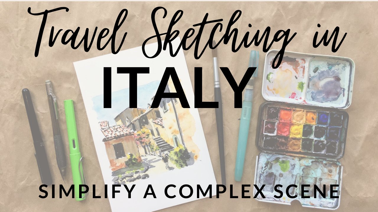
1. Introduction - Thank you for joining :): Hi everyone. Welcome to my class focusing on quick sketching
using watercolor. My name is Kasatka and I'm a watercolor artist and art
tutor based in Oslo, Norway. I specialize urban views
and also seascapes. I'm a huge fan of
painting on location. Today, I wanted to share with you my very favorite subject, which is quick sketching
with watercolor and simplifying very
complex urban views. I will show you step by step
how I choose my composition, how I layer my paintings, how I choose colors, and I'll share all
the tricks and tips that I use during painting. Behind me, you can
see a few views from Allcat in Spain and also
a few views from Norway. I think those views are really cool example of the subject that we're
going to cover today, I will show you the most important of
architectural painting. You will learn how to use layers to create depth
in your painting. Also, how to choose your
focus point and how to create by painting without
focusing on little details. If you want, you can use
your own reference photo. Maybe from your travels or
maybe from your hometown. Or if you want, you
can just use the photo that I use and follow
me step by step. Either way, I hope
you'll enjoy and I'll see you very soon
with fresh in my hand.
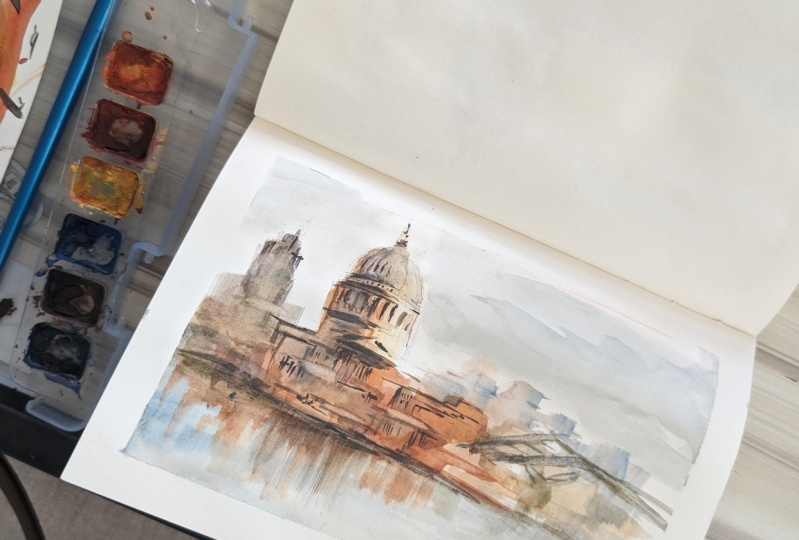
2. Getting Ready - List of Supplies: Let's start with preparing all the materials that
we're going to need today. You're going to need
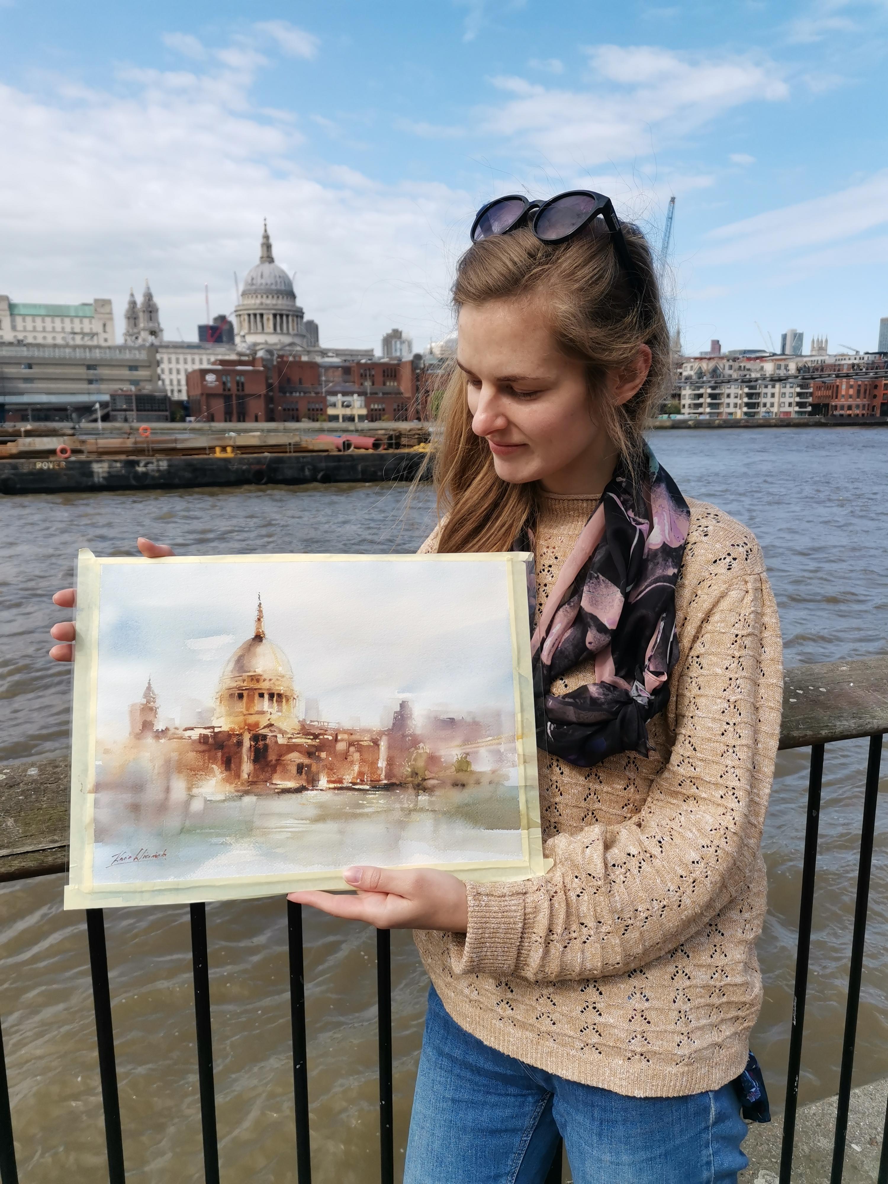
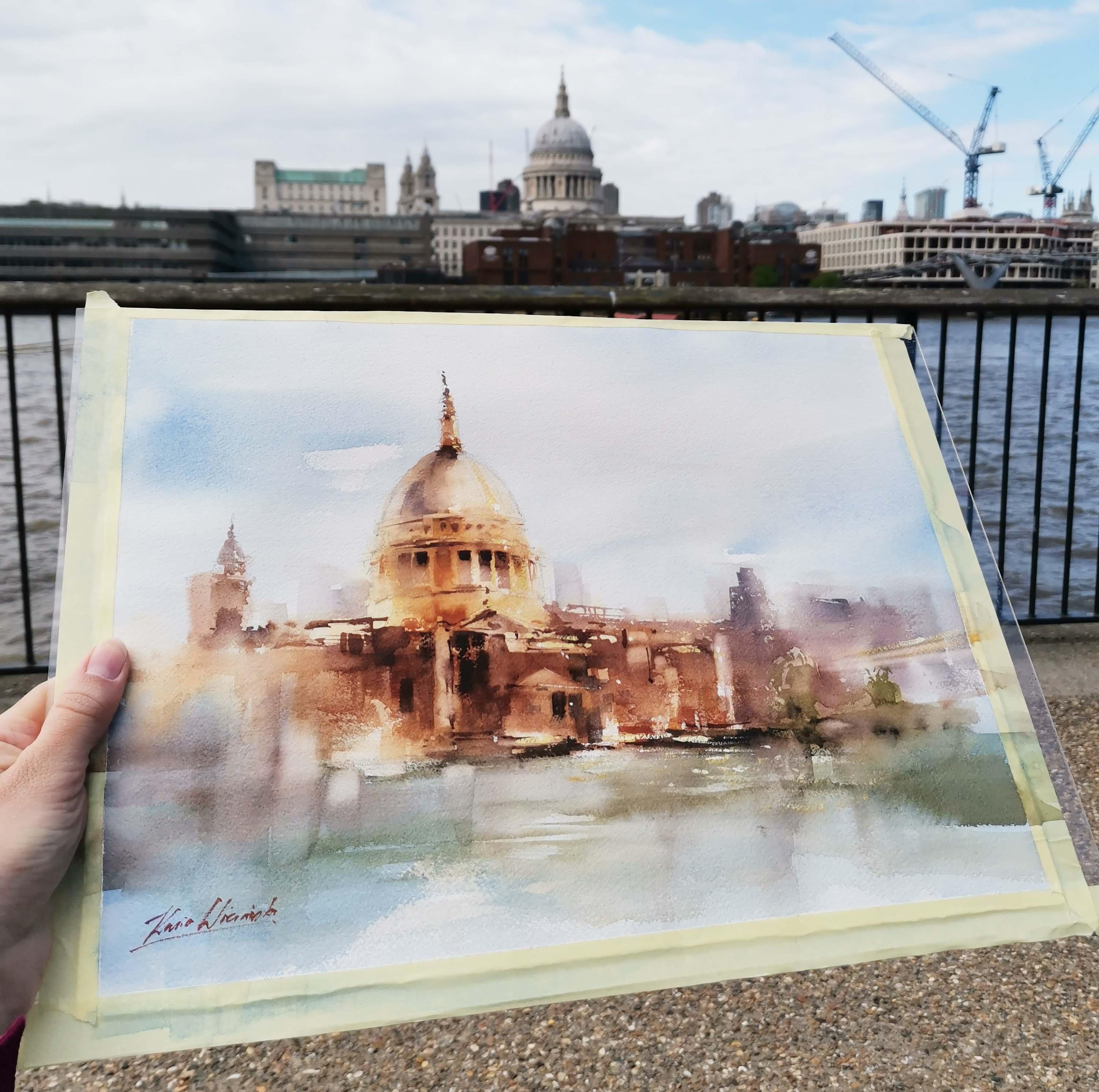
a reference photo. This is the final view, just example of
different painting that created the location. But you're going to
need just white paper. I'm going to use
arches, 300 gram rough. If you have cold press, it will be also nice. We're going to use palettes, so you need something
to mix your colors and all the colors we're
going to use today. I think mostly
something very warm. Yellow odum, yellow orange, burn Siena, a little bit
of burn amber I think, and a little bit of purple. That's, I think, the main colors that we're going to use today. Apart from that few brushes, I really like to use flat ones. For architecture, I
have few sizes of flat brushes and also
a few different sizes of round and pointed. Those are perfect shape of the brush for me,
round and pointed. Okay, the next thing
is white paint. We're going to use a little
bit of white paint at the very end to act
like shiny details. If you have it in tube, that will be perfect, like old towel or just
a piece of cloth. I use it brush and obviously jar with water.
I think that's it. So, grab your pencils. Oh yeah. I forgot to
mention about the pencil. We're going to start
with very simple sketch. So Jake, you.
3. Summary of the Techniques : Before we start painting, I wanted to show you
a few techniques that we're going to use today. Here I prepared like a
small sketch of the dome, that's this part of the building that
we're going to paint. I wanted to show you first to explain how the light
and shadow works. Remember, if you have
this shape and you want to make it look
three dimensional, it's important to have the
lightest part somewhere here. If we have the sun
from the right side, then the lightest
part will be here. It's not touching the edge of the shape, that's
very important. The lightest here.
The darkest here. Again, the darkest is
not touching the edge. And here we have
reflected light. It needs to be a little bit
lighter than the shadow, then it really looks
like three dimensional. That's the trick, we're
going to practice that when we paint
the actual painting. Then the second thing is going from thick paint to watery. We're actually
going to start with watery. Let's start here. We're using quite a lot of water and a little
bit of pigment. This is how we get all
those light shades. Then we're going to
increase the number, like the amount of
pigment we have in the brush and the paint will
be a little bit darker. The third sketch I have here is the contrast between
detailed and lose. So this is how I really like to work when I have
urban sketching. When I have views that
I want to simplify, I choose to have detailed object and then everything
else is variables. That's something very
important for the subjects. Today, I'm going to show you
step by step how to do it. But just keep in mind
that we're not going to paint every single
object in the same way. We're going to paint
something super detailed and then
something super loose. The last one here
is simplifying. I wanted to show you how
I simplify orban views. I try to use only like
rectangular shapes. I use my flood brush to do that. Then when we add few tiny
details of windows for example, then it can really
look like a C. You can see that I don't really paint every single
thing separately. I just try to make an abstract painting that somehow close to the
detailed object, it will really look
like a C. Okay. Again, we have three
dimensional shape. We have the contrast between
thick and watery paint. We have the contrast between
detailed and loose shapes. We have simplifying. That's, I think, the
most important subject that I wanted to
cover with you today. Grab your brush and
let's start painting.
4. First Layer: Let's start with
wetting all the paper. Big branch, clean water and
let's just wet everything. I would like to wet
my paper first just because it makes your paper
a little bit more soft. It's a little bit easier
to paint in a loose way. You're not going to have edges, hard shapes if
your paper is wet. That's why I always try
to start on wet paper and create the first layer
that's very soft. Now, wet your paper. After that, you can wait about 1 minute just to let
the paper absorb the water. Let's start with the building, because this is our focal
point in the reference photo. You can see that we don't
really have many colors. It's quite gray, but I really like to make my
paintings a little bit more colorful than it is in real life just to make it more
happy, if you like. Also this approach, let's try
to start with maybe yellow. Ok, I really like this color. It's like golden yellow color. Also, try to look at the photo and think
where we have the sun. It's really hard to say here
because we only have clouds. But I think we can try
to have the sun from the right side to make everything look more
three dimensional. It's good to have
sun from one side. You have light on the
right for example, and shadow on the right. We're going to make it this way. Now, a yellow. I'm adding
this color onto the building. You can see that.
For now, I'm not really focusing on any details. Everything is very
loose and very soft. Now we can start adding
a little bit of brown. I'm adding my Burn Siena. Still no details, everything
just painted together. Going to add details later. I. Yeah, it's quite hard to go
loose but try maybe close your eyes a little
bit and make it like without too many details, without any hard edges for now. Now I added a little
bit of burn amber. It can be even darker, especially at the bottom, because here the buildings
are a little bit darker, so we can go into brown. And also the left side of the
dome and of the cathedral. Okay. And a little bit
more of the color. It's nice to use different
colors in the same block. For example, here, it
cannot be just brown. Let's try to add a little
bit of yellow Okra, a little bit of burn,
Siena, what do you like? But just so we have a few
colors in the same block. Okay, I think that's what we need for the very,
very first layer. We can see Slo super light. Later we can add a
little bit more details.
5. Second Layer - Part 1: We can start adding
the second layer, you can see that I still have
white water and white sky. I'll leave it like that for now. Just because I want
to first focus on the focal point and I make the background to just
fit the focal point. Once we have it, we
have our first layer. Let's try to add more on top. We can use the same colors, just a little bit
of thicker paint. We use more pigment
and less water. Again, a little bit of yellow. We can start adding this
onto the cathedral. I want to keep this
part here a little bit lighter because this is where we're going to have the light. I'm adding that here
on the left side of the lightest part and a
little bit of bron Siena. I want to make the building
a little bit more golden. You can see this golden color in this space. Here,
here, and here. I want to emphasize
this color and make the building even more
shy and colorful. This is a very cool trick. If you want to do
like quick sketch. Emphasize what's the most
important in the building, what really grabs
your attention. Emphasize that the
rest of the painting, just keep it loose and
simple and then you can really create a really
nice painting super quickly. That's what I do and
I paint outside. Now the dome is a
little bit more gray. We can add different color. Maybe later, I'll add a
little bit more of this golden here if you
feel like you have to. Details Too many hard edges. Clean brush, That's what I'm doing now, cleaning my brush. I'm drying it and then you
can use like a rubber, like a razor to
soften the edges. That's what I always
do when I feel like I have too much definition. It's too many details. A little bit darker color, That's a mixture of burn
CN and burn number. And we can add more
here to the bottom. This part is where
I really want to go a little bit more
like blues and abstract. I'm trying to horizontal
and vertical lines. Just because this is
architecture that we probably have like
walls and windows. A lot of these angles you can see we have this
like rectangular pattern of a few different colors, but we're still using only a yellow crab burn
sienna and bar number Here I want to add few
details, not too much. You can see at the
very top we have a little bit more details
with the same brush. I'm just adding like smaller lines just to suggest that we have a little
bit more details there. And the same here
on the left side. Now, with only clean water, I want to soften
this part even more. We can even bring a
little bit of that onto the water that we have, like the reflection
on the water.
6. Second Layer - Part 2: I think now we defined
all the colors we have, like this nice golden bronze. I love those colors. We can try adding a little bit more details onto the cathedral just
because it's our focal point. I changed the brush
to round one. That a little bit easier
to paint details with it. We can focus on all those
shadows that goes around. You can see there's quite a
lot of decoration and there, there's like a balcony on top. We can see quite a
lot of lines here. We can now add those lines. We can also add the shadows like in those
gaps between columns. Let's have burn Siena,
burn amber color. If you want, you can add
a little bit of purple. If it's like too brownie
for you, it can be purple. Or if you add a
little bit of blue, you should get a nice gray color up to you if you like
colorful paintings or not. I really like colorful. That's why you can see so
many different colors here. Now we can try to
added maybe here. Now the important thing is not to have just
one straight line. I try to keep it like diverse. Every single line is a
little bit different. Now, even clean my brush and maybe here I
can just wash it. I think that's the key to make
the painting look a little bit more realistic and a
little bit more interesting, that every single point is
a little bit different. If you feel like
there's too much, just wash it like
that clean brush and you can wash
it a little bit. Okay, let's add more. I'm trying to have those
lines a little bit darker on the left side and then
lighter on the right side. Just because the
site is in the sand, the very right part of the dome, we can make it a
little bit darker. Not super dark, but
tiny. Tiny but darker. You remember at the
beginning I showed you and how the shadows on the three
dimensional form works. Now you can use this knowledge. The lightest part will be here. Here, we're going to have
the darkest part here. A little bit of reflected
light on the left. It's quite important to keep it, to make it look nice
and three dimensional. Now the dome is a
little bit more gray. To this color, we
can add ultramarine. It should give us
a nice gray color. If you mix burn umber and
ultramarine, you'll have gray. You can obviously use also great gray straight from the tube as
I have gray here. But I don't really
use it that often because it looks so much more pretty when you
mix your own gray. Okay. And now a little
bit more details on this tiny thing on top, like this tiny tower. Okay. And even more details. I think here that's the part where the building
like the cathedral, that's the part now a little bit more
detail somewhere here. So this is the part where the cathedral comes down and it just meets
the other buildings. That will be nice
to add also here, a little bit of details. You remember the
rule. If you want to simplify architectural views, it's good to use horizontal
lines and vertical lines. Just because those lines are
obviously in architecture, when we use them, it will
always look very natural. If you start adding some
circles or like diagonal lines, then it will look weird. People will ask you always that that's like
different thing. But if you use only those
verticals and horizontal lines, it will always
look very natural. That's, I think, one
of my favorite tricks when I simplify my paintings. I want to keep this
triangle shape. I really like it
in this building. It's very, I think, specific to be honest with you now, when I paint this part, I don't really know what
I'm doing like honestly. You can see in the
photo I have big one. We have quite a lot
of details here. Try to just choose the
details that you like. This part here, it's not
very important for us. This part is important. This is our focal
point. This part. Just try to choose the
details that you like. For example, I like this tree. I like those vertical
lines there. I think there's like a
balcony or something. We have some horizontal lines. Just choose wherever you like, add lines here so we
can feel the shape. But there is no point. Just like spending few hours trying to figure it
out what's there. Because many times, especially
when you paint outdoors, you just don't have time to
paint everything precisely. You need to learn
how to simplify it. I'm using thick paint now, so you can see it's
super dark thick, quite a lot of pigment, just a little bit of water. This is how we get all
those like very dark tones. I want to add a little
bit more here on the left side, but not too much. This is the focal point, so this is where we have
most of our details. I feel like now here I have
a little bit too dark. I'm taking a lighter paint with a little bit more water and I'm just trying to wash it out. Now, if side of my brush, I'm just adding few
details like that. It can be like a window, maybe some details
doesn't really matter. It just needs to look
like some details. It's like fake details. I don't really know
what I'm painting, but it looks like window
or door or I don't know. I think that's enough. What we want for
people to understand, that there are some
details there. It doesn't really
matter what it is. Here is a little
bit more loose on the right side, clean brush, and you can just wash things out if you feel like you
have too many details. Okay. And a little bit darker
here on our cathedral. Again, if you want to
go a lot of pigment, a little bit of water, quite a lot of pigment. Sometimes you really
need to spend more time to get this much of pigment depending on the
paint quality that you have. No, it's going to be
like almost black. It's obviously not black
because it's the color mix. So it's a little
bit more brownish. I think that's my
favorite mixture. I burn amber and violet, maybe a little bit
of ultramarine. It's my favorite mixture to get. It's almost black color when you paint windows or
those shapes like we have now. Like that is the hole
in between colors. It's really nice to have
a little bit darker at the top and then the
lighter at the bottom. I'm adding very dark
color now at the top. In a moment, I'm going to clean brush a little bit
lighter color, a little bit more water. Then the bottom can be
painted with these colors. It's going to be a little
bit lighter than the top. There is quite dark line
here just below those those. I think I have a little
bit too many details. Clean brush and just wash it. If you don't like something, if you feel like
that's too much, it's dark, just wash it out. Okay, I think we have
our second step. A little bit more details. It's still not final, but a little bit more so we
can move into our third step, which is adding core
to the background. There will be our
water and the sky.
7. Second Layer - Part 3: I'm going to take bigger brush. Maybe even this one, quite a big one of the water, you can see it's like silver. I think we can use ultramarine if you have different
blue, that's also nice. My ultramarine is quite dirty. I get this gray color. Actually, I think I like it. You want a little
bit more bluish? We can add a little bit of slur, but I don't want this
color to be super bright just because here we have
quite a lot of color. It's like even more
colorful than in real life. That's why I think the water should be a little
bit more grayish. Big brush, quite a lot of water. The paint now is not very
thick, it's very watery. Because we have this
loose style today, we can bring a little bit of this colors
onto the building. And here maybe as well it goes even more
loose and an abstract, we can use the same
color to the sky. We don't really have
much clouds there, but that'll be nice not
to have just white. I'm going to add the
same color here. I want to be a little bit
more precise not to have it on this building here
because it's a pole point. But if you have a little
bit here onto the building, I think it's completely fine. You can see that
this color is very, very light, super light. I'm just breaking the
white color of the paper. I don't really want to
have like summer sky bill. It's London, so it should
be more like rainy day sky. I do it with big brush because then it's easier to do it very quickly and you don't get
too many edges on your sky. I think we have this color now. Let's try to add a
little bit of green. We have some trees
somewhere here. I think if we add a little
bit onto the water, they'll be nice as well. Just because now
the building and water and the sky is
like different story. We need to connect it somehow. If we have like olive green,
that'll be really nice. Olive green, I don't
really have olive green. I always mix it myself. I use burn sienna and green. Now it doesn't really
matter which green you use, I use radiant green,
a very cool color. If you add any brown, I'm using burn Siena. But any brown should be good. Now I want to add this color, like in between
building and the water. The water can also
feel like a little bit more green I think is good. Because water is actually a
little bit green in the city. Yeah, I think it looks better. It's like a little bit more
connected with the buildings. Like the same story. We don't really need
this color here. However, I feel like the sky is too much blue, too bluish. Maybe Let's let it dry. But after it's dry, we can add a little bit
of brown maybe to it. It won't be like
so perfectly blue. I think this step is done. Our next step will be
adding tiny details. We're going to use tiny
brush like this one. We're going to add
some tiny details onto the building and maybe a
little bit to this site. Let's maybe start
with the building. A tiny dark paint. If you feel like you don't
have enough details, we can add a little bit
more, but also not too much. I don't want to like
overdo my painting, but that would be
nice to have tiny, tiny details and
tiny lines here. This triangle that
I like so much. I'm trying now, a
clean brush just to so some stuff because yeah, I don't really like
too many art edges. This part can be a
little bit darker. I'm using very thick paint now, a lot of pigment and just
a little bit of water, so you can see it's very dark. This is the shadow
part of the cathedral, so we can make those
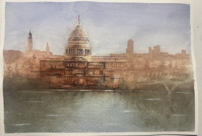
lines a little bit darker here, everywhere. But just in the shadow. Okay. I think this part is done. I think we probably have
about 70% of the painting. Let's have a break,
and after that, we're going to add more details and create more definition. It will look a little bit more precise and a little bit better.
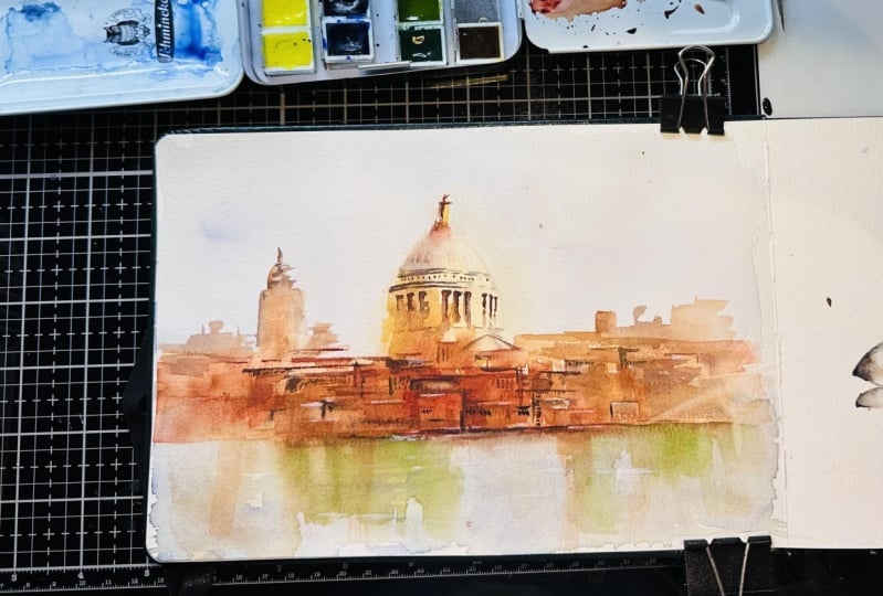
8. Third Layer - Part 1: We can continue now
with the next layer. We're going to add a little bit more details
for the building. We're going to add
also a bit more here. I think it's still too empty. We can finish the buildings
in the background, the ones that are
behind the cathedral. Let's start maybe
with those buildings. Let's make this brown color. I'm going to use my burn amber and a little bit of purple. Now the paint needs
to be quite watery. We don't make those
buildings like very dark. Now, I'm trying to
paint those buildings. You can see there are some
buildings like behind. I try to be quite
lose with that, like some rectangles, it gets
a little bit too precise. Then we can just wash it and close to the edge of the paper a little
bit more of those. Okay. And now the left side. It's a similar idea,
quite light bro. You can see I'm just using a vertical and horizontal lines. I'm just trying to get the
idea that there are buildings. I don't really want a sit. And now a little bit more here on the
left and right side. I'll change my brush
to have flight one. I think for me it's just
a little bit easier. We can use the same
color that we have here, this like green brown color, Olive green we can say. But a little bit thicker, More paint and less
water somewhere here. Just don't make it darker. A bit more big size
of the details, that's why I'm using
flat big branch. I'm trying to wash it down. Maybe it looks like
reflection on the water. Radical idea for very simple reflections in the water is just to take a clean brush and
just wash it down. A little bit like that. And now just because I don't want to have everything green. Maybe here a little
bit of brown.
9. Third Layer - Part 2: And now a little bit more here on the
left and right side. I'll change my brush
to have flight one. I think for me it's just
a little bit easier. And now, one of my
very favorite parts, so we can wash a little bit of paint to have a
lighter reflections. Now one of my favorite parts, we're going to wash a
little bit of paint. You have lighter reflections. I'm going to use this brush, it's actually acrylic
brush, not watercolor. It's a little bit better
for this technique. Try not to use your most
expensive brushes because you can just easily destroy
them. A little bit of water. I'm wetting my brush,
then I'm drying it. It's not super wet. It's just a little bit dumb when you feel like you have too much of
paint. It's too dark. We can remove a
little bit of paint. Now it works like a rubber. We can say that. You can see we have a
little bit lighter now, it really depends what paper
you have, what brush paint. Some papers are a little bit easier to wash, some
papers are not. Sometimes you just need to spend a little bit more time
to wash the paint. And sometimes it just
goes very easily. If it doesn't work right away, just don't worry to spend a little bit more
time to wash it. Or you can try later on different papers and
you'll see the difference. This technique in
many of my paintings, I really like to do
it because it gives you nice, subtle
lighter reflections. For me, it works much
better than using white paint or using
masking fluid. I really prefer to
do it this way. We can also wash here
a little bit just because we have one big color, one big part of green here. We have the bridge. We haven't painted it yet, but I'm just trying
to wash one line. It just a suggestion
that we have the bridge. I'm not really going
to paint it so precisely because this
is not my focal point. It's just on the side
of the painting, but just one line. So we can imagine that there is something I think
will be enough. I think that those windows are a little bit too strong. I'm also going to wash them. If something is too dark, you can very easily
fix it like that. It's not really true
that in water color, you cannot fix anything. It is true that
it's hard to fix, but it is possible any parts that are too
dark just wash it. Anything that's too light, we're going to add more paint. Let's add a little
bit more paint now. It's probably the very last step that we're going to have. We can add few more
details somewhere here, maybe a few lighter
details somewhere here. We're going to use
white paint as well. Now, tiny brush I'm using. This one is size six, but it can be smaller as well. Now for the details,
we really need to have very thick paint, a lot of pigment, just
tiny bit of water. Okay, and white paint. I use white paint
straight from the tube, and I don't mix it with water. That's quite important. If you start mixing this with water, it's going to be transparent, so you're not going to
really see the shiny white. We're not adding too much of it. Because then it looks quite like weird because it's a
different kind of paint. It's still water color, but you can feel it's
different texture. It gives you a
different texture. You can see tiny, tiny
things, tiny datas. Wherever you feel like you need this shining spark
in the shadow, we can act tiny bit of white. And if you want, we also
can add a little bit to the water to show those
wrinkles on the water. Those were like very
tiny little dogs. But you can see that
it really gave it a little bit more of this
like shiny effect. We have way more
details somewhere here. So it looks more busy and
that's what we wanted.
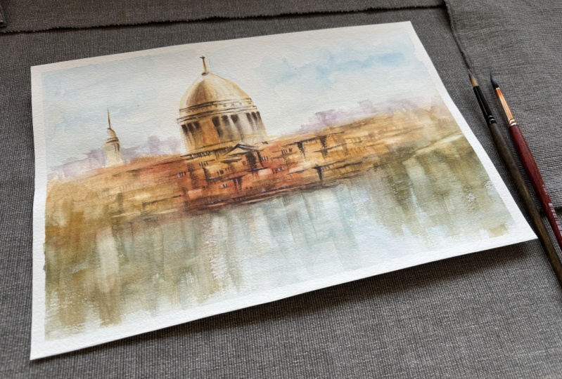
10. Conclusion & Summary - Congratulations :) : Thank you so much for
joining this class and congratulations on
your finished painting. I already have mine here behind
me on the wall. This one. I'm really glad that
we could explore the world of quick sketching
with water color together. I hope it was very enjoyable for you and
also very insightful that you could learn
some new techniques and maybe polish some
skills a little bit. Always remember that the
beauty of quick sketching lies not only in the final result but also in the process itself. Embrace all the imperfections. Don't be afraid
to experiment and just have fun because
that's the most thing. I can't wait to see your sketches that
you're going to create, please share them with me. And if you have any questions or if you need any
feedback, let me know. I'm here to help you. You can use one of my
reference photos or any photo that you like
from your hometown maybe or from one
of your travels. Just use your creativity, find the subject that you
enjoy, and just have fun. If you want to explore more, feel free to check my auto classes or find me
on Instagram or Facebook. Again, thank you so
much for joining. I wish you happy painting
and have a lovely day.
 Kasia Wiercinska, In love with loose style watercolour :)