Transcripts
1. Introduction: Have you ever wanted to paint your best fur friend, a loved one's fur baby, or any other species in the animal kingdom but have been stumped on how to approach painting a black animal? Hello everyone. My name is Denise Soden and I am a wildlife watercolorist living in Austin, Texas. In addition to my own artwork, I create technical watercolor classes here on Skillshare and educational watercolor content over on YouTube. This is the first class in a two-part mini-series on how to paint black and white animals in watercolors so that you can become more confident and comfortable with these difficult subjects. Using value to create a compelling visual story is always important for your watercolor practice. However, it becomes even more important when working on either of these extremes of the value range, and using a translucent medium makes this task even more difficult. In this class, we're going to start off by learning how to evaluate reference photos in order to choose the best colors for your project. This includes whether or not you should mix your own dynamic blacks from colors that you already have on your existing palette, or if there's a convenient tube color that would be suitable instead. We will explore how to focus on realistic or more colorful watercolor pallets depending on your preference, revisit the importance of balancing values within a single painting, and discuss how, if at all, to add a background to a painting with a dark subject. For your class project, you will choose a unique subject that you would like to paint, decide on the color palette that you would like to use, and set out to put all of your new watercolors skills to practice. This is an advanced watercolor class that is intended to help you harness your skills for your watercolor toolkit. As such, it is not a single tutorial that we're going to paint from start to finish. Instead, we're going to learn the tools so that you can pick the subjects that you want to paint. For this reason, there are several prerequisites or previous experience that you will need in order to get the most out of this class. We will talk more about these classes in the materials and prerequisites lesson coming up next, but they are also listed in the class description below. Ambitious beginners are welcome, but please take the prerequisites before you try to start this class to help avoid frustration and set yourself up for success. I am so glad you are here today, so let's go ahead and get started.
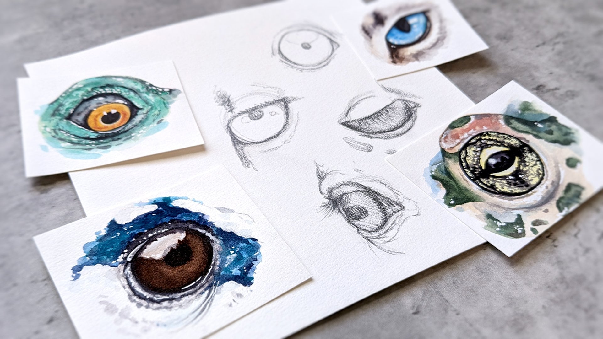
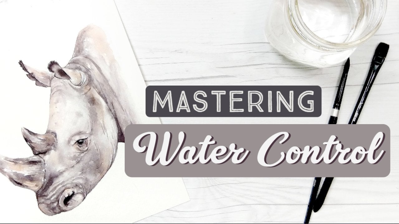
2. Materials & Prerequisites: Before we talk about supplies, I do want to stress one more time how important the prerequisites for this class really are especially if you're a beginner. We're going to be adding to our watercolor toolkit but in order to do that, we need to have some foundational skills first. Watercolor mixing based on pigment properties will teach you the basics of color theory including how to mix blacks. We will be covering specific mixtures in this course, but to understand why they work, this fundamental class is a great place to start. Mastering water control is the most essential water color class I have here on Skillshare. It begins with discussing various watercolor supplies and moves on to a variety of exercises to help you harness the power of water in watercolors. In this class, we will be building on these concepts but not recounting them from ground zero. Fur, feathers, and scales we'll take your understanding of water control and show you how to apply those skills to paint animal textures in watercolors. This detailed class has seven texture demonstrations and three class projects to really help you feel more comfortable painting animals. Finally, I also have a class on how to draw and paint animal eyes in watercolor. While this isn't as essential as the other three that I mentioned, we will be painting portraits in this class. I will briefly show you how the eyes in my demonstrations are painted but for a full understanding of my process, please check out that more detailed class. With all of those classes under our belts, we can use this class to exclusively focus on how do paint dark values in an interesting way using these other techniques. All materials for this class will be listed in the description below. You will need high-quality cotton watercolor paper. You'll likely be layering a lot and cellulose paper will not hold up very well considering. I will be using arches, 140 pound cold pressed watercolor paper for my demonstrations. For our watercolor brushes, I'd like you to use whichever you are most comfortable using after you've gone through the other exercises in the prerequisite classes. I will be using silver black velvet brushes in sizes 2-8 round. If you are looking for a small number of new supplies to purchase, I would recommend a size 8 and a size 2 round brush to get you the most versatile coverage. You may use any artist quality watercolor paints that you have on hand as long as they are highly pigmented. Mixing darks can be a constant struggle if you are using a weekly pigmented color as your base. We will go over specific colors that you may want to use in the next lesson. You can use masking or painter's tape to secure your watercolor paper to a hard surface and you will need two containers of water. I always use two containers, but it's especially important to do so when you're working with dark and highly pigmented colors. One cup is for your really dirty brushes, and the other one is for clean water so that you can soften things off. You'll also need basic drawing supplies like a pencil and a good eraser. Finally, you will need your own reference photo for the final class project. I will include the references that I use and you can use those as well but I would love to see some of your own for babies and favorite animals in the class project section. You can find a list of class product recommendations on Amazon using a link in the projects and resources section below this video for more tips on supplies.
3. Mixing Blacks vs. Tube Blacks: One of the biggest considerations for any painting is deciding what colors you're going to use. That becomes even more important when you're working with a one dominant color, like black or white. While our first thought might be to use one of the blacks that come with a beginning of watercolor palettes, like lamp or ivory lack. Those colors in particular can leave our paintings looking a little bit flat and one dimensional. Let's see where we can get with some color mixing. As we discussed in the watercolor mixing class, combining three primary colors together makes a black. However, it is a rather long and tiring process to mix these three colors in perfect balance, especially when you are painting an entire portrait with this mixture. Let's take a look at some shortcuts. By a shortcut, I mean that we're going to use two colors instead of three. One color and whatever it's opposite is on the color wheel. Dark blues and greens are a great place to start for mixing blacks easily, since they are already darkly valued and highly pigmented. Let's first take a look at the very standard ultramarine blue. Blue and orange are set across from each other on the color wheel making them opposites or complimentary colors. I find most bright oranges to be too lightly valued to get a really dark black when combined with ultramarine in particular, but some of the earth oranges and browns are great options. On this chart, we can see Ultramarine mixed with Red Iron Oxide, Burnt Sienna, Indian ed, Piemontite Genuine and Burnt Umber. Some of these mixtures lean gray, while others lean at dark purple, and some even lean brown. I generally choose altering mixtures when I want a beautiful gray or soft natural black. Next step, we have Indanthrone Blue mixed with the same earth colors. Indanthrone is a darker color than Ultramarine, so you can see the mixtures are inherently darker as well. You can also see that a lot of these mixtures lean towards brownish black due to Indanthrones, warm undertones. One of my favorite mixtures of all time is Indanthrone and Indian Red, which creates an opaque black, as well as soft [inaudible] when it's diluted. You can repeat this exercise with any of the dark blues that you're curious about. Mayan Dark Blue, Phthalo Blue, and Phthalo Turquoise are also great options. As you move closer to green though, you'll want to make sure to use complimentary colors that are closer to red instead of orange. Let's take a look. Phthalo green blue shade makes for smooth moody blacks that are wonderful for more whimsical color palettes. Mixed with warm reds, you'll get forest greens bordering on earthy blacks and as you move into the cool reds and purples, the mixtures become gorgeous inky blacks bordering on dark violet. I love the right side of this chart for those luscious teals and dark purples. Last up for these mixtures that I'm going to show you today, I have Perylene green. In person, these are some of my favorite blacks, though I do sincerely apologize, because the slide that you're seeing is a little bit confusing and misleading. Perylene colors do not scan well. Always skewing a little bit more red than they should be or look in person. I've tried to adjust these scans so that they look as real as possible, but there are notable differences. For that reason, if you like to reproduce your artwork, these might not be the best options to use on their own. However, I do want to ask you to take my word, that the mixture between a Perylene Green and Perylene Violet, is as close to a deep true black that I've ever found when mixing watercolors. I tend to use Perylene green when I want those really dark true blacks, or inky purples when mixed with a Quin Violet. But what about tube blacks? There is a pretty popular opinion in the watercolor community that you're not supposed to use black paint straight from the tube. While there are some blacks that I think that applies to, like the ivory and lamp black I mentioned earlier, that I don't personally use in my work, I don't think that's true of all tube blacks. There are plenty of black and black adjacent colors that come from tubes that are either convenient and/or really interesting colors. Some of those can be really great options if you don't want to mix up a large quantity of black paint, or if you're looking for some really cool effects that already exist. Why make your life harder if you don't have to. Here is a spread of black and black adjacent watercolors straight from the tube and I'll go over each of them briefly. The top row shows us some single pigment options. Lamp and ivory black are often included in beginner watercolor kits and are in my opinion, some of the least exciting options. Lamp black is made from burning tar or coal, and ivory black is made from heating animal bones. So they're also the least appealing to me personally from an environmental standpoint. Vine black is made from burning wood. It is usually dark brown in color and has a weaker tinting strength than most other blacks. Mars black or lunar black is made from an iron oxide that granulates heavily. It is an extremely matte black that may read as flat if you use it on its own. But it can also produce really interesting effects when mixed with a large range of other colors. The other two highly granulating options I have here are from Daniel Smith and they are Sodalite Genuine, which leans towards dark blue and Blood Stone Genuine, which leans towards dark brown. Hematite is also offered by some brands as a pigment, but it's usually more gray or brown than it is black when used in watercolors. The second row shows some more pre-mixed black and nearly black colors. First step we have three neutral tints. These colors are created with the intention of being added two other colors to make them darker without desaturating the mixture. However, they can also be used as blacks on their own. Daniel Smith's version is the most neutral black that I have. Well, M. Graham's and Schminke's versions lean toward purple and purplish brown respectively. The rest of the row is filled with some samples of Payne's gray, which I freely admit I don't have as much experience with personally. Depending on the pigments that each company uses for their mixture, the color may either be more or less blue, have more or less granulation and be more or less staining. These properties are ones that you'll have to explore on your own to see if they fit your needs. With all of that being said, the most common pre-mixed darks that I personally keep on my pallets are Sodalite, Daniel Smith's neutral tint, and M. Graham's neutral tint. Any of these colors are perfectly acceptable to be used in lieu of mixing your own blacks. Just be sure to pick the right color for your project.
4. Evaluating & Selecting Colors: Now that we have an idea of what blacks are available to us, how do we pick the right one for our specific painting? To help answer that, we're going to take a step away from our watercolors and head on over to the computer for just a moment. When we paint an animal from a reference photo, there are lots of things to consider. What colors the animal itself? Is it actually black or is it dark brown or dark gray? What is the ambient lighting like and does that give us any indication as to what time of day it is? In this reference photo, we can tell if the cat is outside, of course. There's soft lighting without harsh shadows, which means it's either overcast and/or the sun is low in the sky, like it would be at dawn or dusk. Before I tell you what colors I see in this black fur, I want you to take a moment to look at this photo and jot down some of the colors that you notice. The colors that I see are neutral blacks, neutral grays, and a hint of purple and blue and some portions of the fur that are facing towards the sky like on the top of the head. To confirm my perception of the color in this photo, I'm going to bring it into Photoshop and use a color selecting tool to see what we can find. Now, depending on how your brain works, this next segment may or may not be helpful for you. If it becomes overwhelming, or stressful, please don't worry about it. We're going to take a look at some simple photographs and just look at the colors in them in just a few moments. But for those of you who have analytical brains who really want to know exactly where these colors are coming from, I want to show you that process really quickly. Using the eye tool over any part of my photo, I can click the left mouse button and hold down. On the right side of my screen, you can see a colormap. When I move my mouse, it will automatically isolate the color of the pixel that I'm hovering over. You can see that it flickers mostly between blue and purple hues in this area. The other way that you can view these colors is to look at the Eyedropper tool over the image itself. There is a gray outer circle which shows the tool and then inside is a another circle that is divided in half horizontally. The bottom half of that circle is the last selected color. In this case, I made it black so that you can see just how black or not black the actual colors we're hovering over are. The top of the circle is the shade of the color that we are hovering over at that moment. Using this tool, we can isolate what colors are actually in our black fur. Here is a slide with five colors that I saw come up most often during my exercise in looking at this image. We have a true black, two really dark grays that are fairly neutral, a desaturated blue and a desaturated mauvish purple color. Using this information, I can decide what colors to use. If I were going to make a realistic painting, I would probably go with Daniel Smith's neutral tint, an ultramarine, or cerulean, and a tiny bit of pink to mix a desaturated purple with those other colors. Let's try another example with a warmer photo. What colors do you see in this cat's fur? Again, looking at the Color Picker tool, we can see that this photo has a lot of earthy oranges, reds, and browns. The edge lighting is even a very light shade of grayish brown. Here are the main five colors that I saw. Black, a very dark, cool brown, a dark earth red, a light muted brown, and a light pinkish brown. With this information, some of the colors that I would grab for this painting would be a neutral tint, burnt umber, and Indian red. Here are some more examples with different species and lighting. This dog was very likely photographed at dusk facing the sun. This makes for warm sunset-like colors and harsh shadows. Can you find the purplish browns, the desaturated purples, and the dark maroons in this photo? In contrast to the last photo, this dog looks like it was photographed in the morning under soft shade. The green grass and cool morning sky make for a color palette of slate grays and grayish blues. I'd be much more inclined to use an ultramarine mixture or a Payne's gray for this one. How about a bird? This grackle's iridescence makes it really easy to see the dark blues and teals in some of his feathers. For this one, I would definitely be breaking out with pthalo green, indanthrone blue, and quinacridone violet. On the other hand, this crow in direct sunlight has mostly neutral grays and just a hint of brown in the feathers. In this case, I would be inclined to reach for a neutral tint, adding a little bit of ultramarine or burnt umber for variation throughout the painting. This salamander's blacks are actually almost entirely dark blue, with the lighter highlights being the lightest and brightest blue that we've seen so far. To this snake has duller brown black scales with tanish colored highlights to help it better blend in with the brush. We've talked a little bit about the ambient light so far, but I did want to take a moment to show you a direct comparison of the same animal in two different lighting situations. While the color selections look similar for both of these references, you can see that the distribution and amount of each color in each photograph vary quite a bit. On the left, the sun is lower in the sky and the horse appears to be dusted and a bit of a dirt, maybe rolled around and had some fun. These colors are more muted and even though the brown is present, it is outweighed by the grays and blacks. On the right, we have the same horse friend who appears to be a bit cleaner and those rich, beautiful browns releasing. For painting the reference on the left, I'd focus more on black and gray with hints of brown. Although, painting of the horse on the right would be done with a brown base, layering up the blacks to get the darkest areas of shadow. Whether you're bringing your photo into Photoshop or just using your good old eyeballs, I hope that this segment was helpful in having you identify colors that are in your reference photos so that you can better pick colors for your watercolor paintings.
5. Creating a Range of Values: In the water control class, we talked about different methods for controlling values. You can regulate the amount of water in each wash or layer colors until the desired value is reached. Usually, we do both at the same time. Watercolor is generally dry, lighter than they look when we put down a wet wash. Dark subjects can be particularly frustrating as we often have to build up multiple layers in order to achieve depth over time. Everyone will have a different technique and style for how they prefer to achieve dark values, but here are a few tips that you can decide what method you like best. When painting a dark animal, look at the lightest values of your reference photo. Are they actually white, or are they some version of a gray? Let's paint the entire animal the lightest value to get rid of the white of the paper. You can still leave some highlights if there are some small white areas. But by tinting your paper, you're going to make it much easier on yourself to build up the correct values moving forward. Once your lightest wash has dried, start blocking in the middle value ranges to create form and shape. The mid-tones will still need to be adjusted later, but it helps me to have an idea of where my forms are before I go in with the very darkest values. The next step is the scariest one. What are the darkest areas of your reference photo? We are going in at deep. Lay in those nearly dark values so that we know where we have to end up at the darkest range of our values. After those scary dark colors are in, you're likely to have some major gaps in your value range, and that's okay because now we're going to fill them in. We can blend the areas of darkness into our mid-tones and our mid-tones into the lightest values. Using this type of approach will help you to cover a wide range of values in your painting and create interest.
6. Backgrounds for Dark Subjects: What is the right time to paint the background for your portrait, if at all? I really like animal portraits on the white of watercolor paper and paint them that way often. That can look even more stunning when you have a dark subject on the white paper for added contrast. But sometimes you do want a background, whether that's splash or a full bleed edge to edge. Let's talk about when we should do that. Painting black animals is likely to use a lot of paint compared to lighter subjects. In the most heavy-handed areas, this paint maybe easy to accidentally reactivate. If you wait to paint your background until after the main subject is completely done, you'll risk reactivating the paint along your edges. This can cause accidental blooms and will almost always soften the fine details. If you try to avoid touching your background to your portrait, then instead you might be left with a white gap of paper showing through. Instead, if you are painting a dark animal and want a light background, I'd highly advise you to paint the background first and allow it to fully dry. You don't need to be too terribly concerned with accidental overlaps. I'd even recommend painting slightly over your sketch lines into the portrait. This way, you don't risk wide gaps showing between your background and your subject. If the background color won't interfere with your lighter values, you can even paint the entire page that same color first. Either way, painting your background first will allow you to paint your animal subject on top of it, making for crisp, clean edges and leaving the small details like stray hairs untouched. You can still soften off the edges if you want to, but this order of operations will give you more control.
7. Class Project Overview: I am so excited for you to put your new found knowledge into practice with this class project painting something that you really care about. I'm going to show you two demonstrations today. They're not meant to be step-by-step tutorials, but rather demonstrations of the skills that we've learned so far in class and how I implement them into my own watercolor practice. The first demonstration is of a cat using realistic colors and how I try and stay as close to the reference image as possible. The second demonstration will show a dog where I push those colors a little bit further into the realm of colorful and a little bit more whimsy. I do want to let you know that I will be narrating the major steps during this demonstration. But since it's not a step-by-step tutorial, rather than talking on the way through it when I don't have anything super important to say or filling that silence with music that I've deemed appropriate for the class, I'm going to leave those larger sections of time blank without audio. There's nothing wrong with your recording. I just want to make sure that you have room for either your own podcast or music or TV on in the background, or just silence so that you can focus on your practice. After you've watched one or both of the demonstrations, I'd love for you to pick out a photo that you want to paint, whether that is a beloved family pet or your favorite animal, you can of course use the references that I've listed in the class projects and resources section, but I really would love to see that class gallery full of your favorite pets and animals. I do want to remind you that this class is about how to paint dark animals, not how to draw whichever species you choose. I don't want you to let that hold you back in your class project. If you would like to paint a family pet or your favorite animal and you're not quite sure how to draw them, use a copyright free image, either one that you've taken yourself or one from Pixabay and Splash or other resource online that you know is okay to paint. Then you can trace that image onto your watercolor paper and set yourself up for success. These detailed demonstrations will be best viewed on a desktop monitor or other large screen to get the most out of them. On the computer, you can find all of the recommended materials under the About tab under this video, and all of the reference photos under the Projects tab. When you're all done with your painting, I'd love to see it in the class project gallery. Use the "Create Project" button on your browser to upload it. If you are using the Skillshare app on your phone, you can find the same information by going to the Projects tab and click "Tap here to access this classes' project details and upload a project. This will open a web browser where you can find the same information under the About tab. Well, I greatly appreciate feedback in the class reviews, I can't respond to reviews that have questions. So if you have any questions during the class, please make sure to post them on the Discussions tab and I will get back to you as soon as possible.
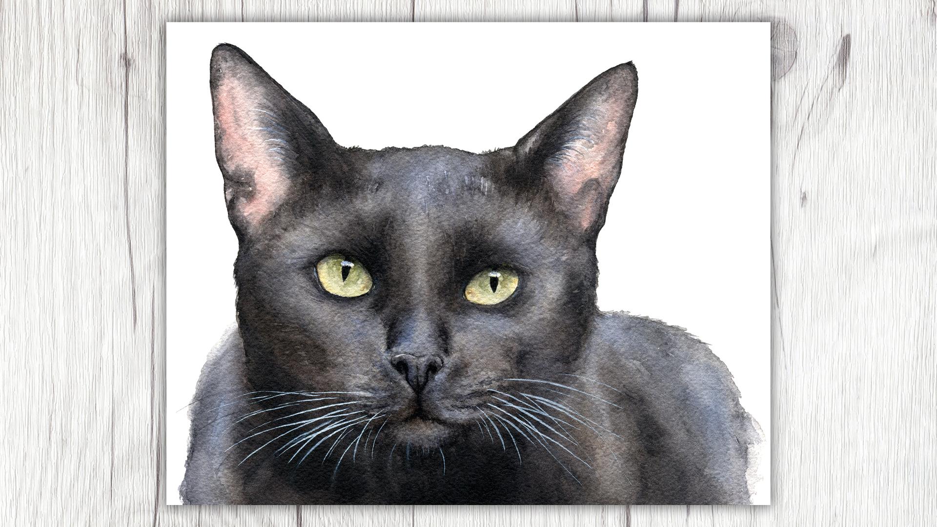
8. Demo #1: Realistic Cat (Part 1): For this demonstration, I will be painting a black cat with the goal of keeping my colors more realistic. Using the color picker tool, I have isolated that the main colors in this cat are black, dark brown, and slightly lighter shades of warm, and cool grays for the highlights. The inside of the ears are an earthy red or brown color, and the eyes are a golden yellow with bits of green towards the center of the irises. The specific colors that I'll be using are Daniel Smith's neutral tint, burnt umber, and ultramarine blue for the fur. I specify Daniel Smith's neutral tint so you know which version of neutral tint I'm using, but the burnt umber and ultramarine don't really matter since they're very consistent. I will be using Daniel Smith's undersea green, and yellow ocher for the eyes, and I'm using an Indian red for the inside of the ears. My specific version is Terra Rosa from M. Graham, but any shade of Indian red will do. The other supplies include a nine by six inch piece of Arches cold pressed watercolor paper, silver black velvet brushes, and a bit of white gouache at the end for highlights. I'm using Mission design color matte white because I have a large tube of it, but the brand doesn't particularly matter. I have transferred the reference image onto my watercolor paper using a light tablet. I want to make sure that the pencil lines inside the eyes and ears are light since those areas will be lighter, but the other areas will be covered with dark paint, so it's not as important for them to be as light. In fact, you probably want them to be a bit darker so your guides don't get lost under your first wash. We won't be doing a background on this painting, but in similar spirit to what I discussed during the background lesson, I want to start this painting with the lightest, non-black areas so that they do not get contaminated later. In this case, these areas are the irises, and inner ears. I do like to make sure that the color I'm using on the inside of the ear is soft enough around the edges so that you don't see that edge under the lighter shades of gray. Continue working on the irises until they are to your liking, then allow them to dry completely. Our next step would generally be to lay down our first large wash. But for this particular image, we're going to do it in three parts. The ears are going to require a lot of attention to detail as we paint around the lighter areas. I will do each of the ears, before moving on to the larger mass of the cat. I am going to be adding more detail to the ears in this segment than I would normally do in a first wash. But then we'll get to see what the more generalized process looks like. As a reminder from our previous water control class, it is particularly helpful to use two brushes when painting at dark subjects: one for pigment and one for water. That way, you don't have to constantly rinse off the pigment on your main brush to still soften off your edges. For the first main wash, I mixed up a large quantity of paint. I believe this was a mixture of all three of the colors that I'm using for the fur, meaning neutral tint, ultramarine and burnt umber. The ultramarine and burnt umber, although they do neutralize in addition to the neutral tint will create a granulating color and the neutral tint will darken everything up. This mixture is diluted to the proper ratio that I need to create those lightest values of the painting. I apply my first paint strokes to the darkest area of the cat first, so that if my first strokes leave stains or an edge, it's not that big of a deal. From here, I can continue to spread the wash over the entire area. During this first large wash, makes sure that your edges don't dry as you work your way from one side of the wash to the other, starting in the middle of the face like I did here is not ideal for that. But if you work quickly, you can still make it work. The edge-work along the top of the head in particular will slow you down a bit, but it is important to take the time now, so that it doesn't look like an afterthought when we add in tiny bits of fur detail later. Depending on the photograph that I'm working from, I may do this step now, later or not at all. For this image, I want to glaze in some color to differentiate different areas of the painting and add some interest, even though I'm still using the natural colors. First, I'm glazing in some ultramarine for the areas that are reflecting the color from this sky, and then I will be adding some burnt amber for particularly brown-tinted fur. Now that we have these base values and colors for our painting, we're going to begin what I call a value map. If you're having trouble knowing where to start, you can convert your photo into black and white. This tells me that the darkest areas are between the eyes, under the chin, on the left side of the painting, and under the tops of the ears. Once I have an idea of the areas that I want to darken up, I lay in small isolated washes and soften them off individually. I add a bit of texture during this phase-out of habit and muscle memory, but most of this texture will not show through on the final painting as we continue to deepen the values. This layer is more to inform me of the forms and contours in the animal's face or body.
9. Demo #1: Realistic Cat (Part 2): Once our main values are charted, we can begin painting details and texture, and continuously looking between the reference photo and my painting to see what needs more definition. Both when I lay down the paint, and when I soften off the edges, I'm painting in the direction of the fur to reinforce that for texture. Much of this stage involves deepening the darkest areas as well as adding texture to the mid tones. I will often size down to a smaller brush during this stage, though you don't have to if you don't have a mid-sized brush. Now we are definitely sizing down our brush in the final stages of the painting. We can add shadows to the pupils in the eyes, to find tiny noses and add fine fur texture and make any other small adjustments that we feel are necessary. Once you feel like the details are all in place, it's time to take a step back and refocus on the picture as a whole. Are all of your values as they should be? In my case, I really needed to darken up the neck area so that the face could come forward. I added a large dark wash to help with that. The final step and one that I feel is crucial for dark animals especially, is to add highlights with white ink or gloss. If you're a watercolor [inaudible] , you can try to paint around the highlights or use masking fluid, but I actually really like the look of having these little tiny, white hares on top of the other paint. However, you do want to do this very sparingly. I decided to focus on just the ears and the whiskers with a couple of tiny highlights around the eyes. My favorite brush for these details is a silver black velvet size 2 round. They can hold a lot of paint in the brush, but you still get super fine lines. Once you're all done with the highlights, that'll do it.
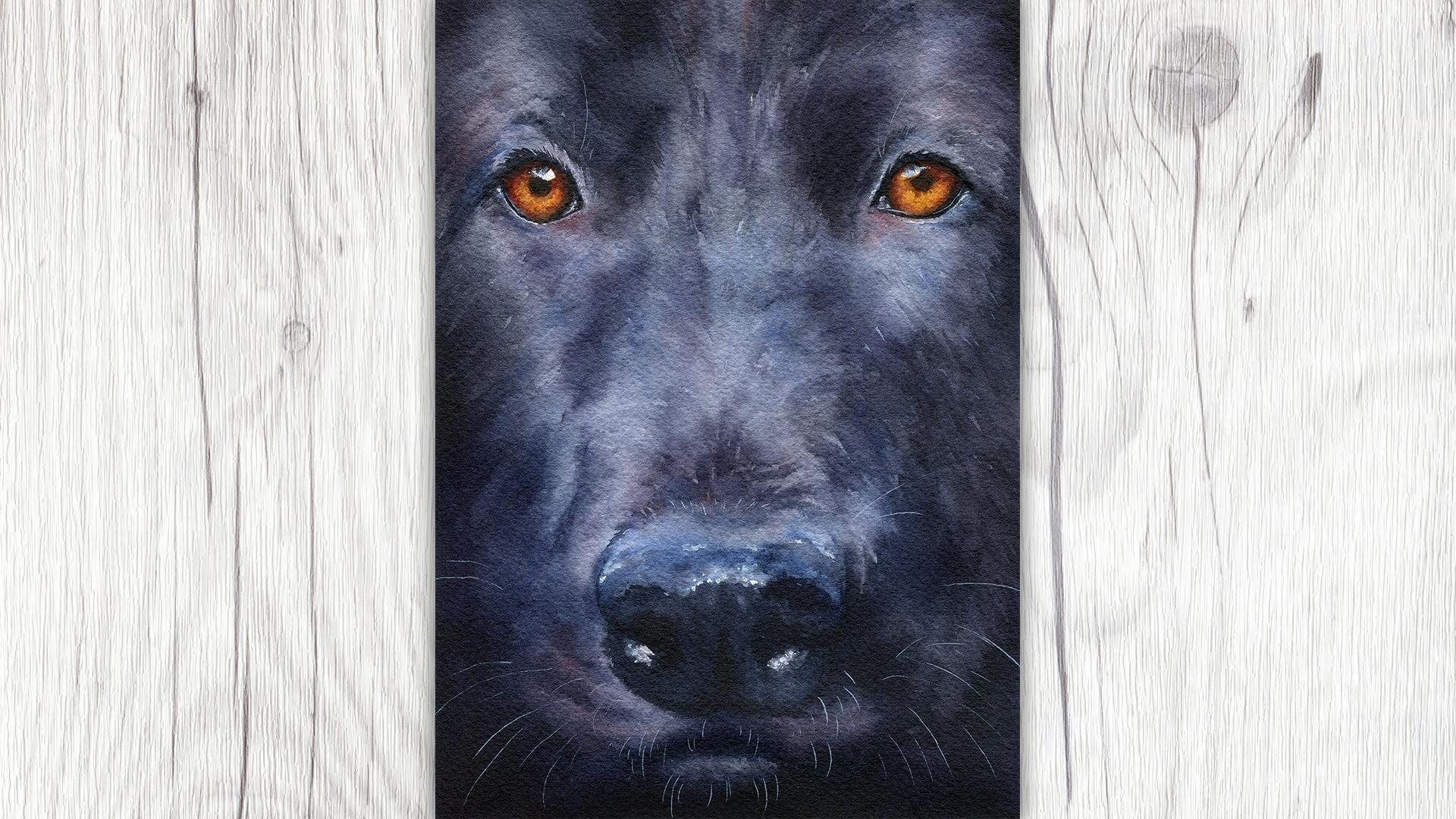
10. Demo #2: Colorful Dog (Part 1): For our next demonstration, we are going to do a close up of a black German Shepherd. I loved this reference or the intensity of the orange eyes against the bluish-colored dark fur. I want to push that even further in this painting. If you have a hard time seeing the colors and black fur, another thing that you can do aside from color picking is turning up the saturation. On the left of this slide, we have the original photograph, as is. Next to it, we have the colors that I pulled from the original picture ranging from black to slight blue-gray. I've also pulled the maroon, orange, and gold colors from the eyes. Finally, on the right, you can see the saturation is turned away up to show us how blue the undertones in this picture really are. We won't be going out extreme, but it can help us to see a little bit of whimsy for having trouble. For this painting, I will be using that Daniel Smith's neutral tint, Indianthrone blue perylene violet, quinacridone burnt orange, and quinacridone gold. Other supplies include a six by nine inch piece of arches called press a watercolor paper, silver black velvet brushes, and a bit of whitewash at the end for highlights. I am using Mission Design Color Matte White, but the brand doesn't matter. I have transferred the reference image onto my watercolor paper using a light tablet. I want to make sure that the pencil lines inside the eyes are light, but all the other areas will be covered with darker paint. So it's not as important for them to be light. In fact, you probably want some of them to be a bit darker so you guys don't get lost under your first wash. Very similarly to how we started our cat painting, I'm going to put down the first layer for the eyes before moving on to the main first wash, I'm using quinacridone gold and quinacridone vert orange. We'll come back to build up some more depth in just a few moments. After the eyes dry, we're going to begin our first main wash. This is a mixture of Indianthrone blue, perylene violet, and neutral tint. I have mixed up a large amount of diluted paint so that I can work as quickly as possible to fill the page. Using a larger brush would be very helpful for this first large wash, but I stayed with a size 8 round to show you that it's not necessary if you don't have the additional tools. For large washes like this, it's helpful to tape the board that you're painting is taped to. That way the excess water sits at the bottom of the wash. You can continue to move the bead of water down the page, which will help reduce backgrounds and blooms. When I get to the bottom half of the painting, I do make an effort to keep the nose lighter and the sides darker. The bottom of this photograph is nearly solid black, but there are highlights on the nose, so I'm trying to plan accordingly for that. Step 3 is a bit like step 1 continued, and I decided to go back to the eyes of this point while the surrounding areas were still light to reinforce the golden colors before moving onto the darker values of the painting. Continue to build up the eyes like you would for any other painting, and then we'll move on to the black fur. Just like we did for the cat, we're going to start our value map. In this particular image is a bit intimidating due to just how dark the whole image is. I'm using the same Indianthrone, perylene violet, and neutral tint and mixture, but in this case, it's very concentrated. The thing that you'll want to watch out for here is not to make the paints so thick that it drives with a shiny finish due to excess binder. We can and will add additional layers on top of this one to deepen things even further. So while we do want this very dark, we also want it to still look like a watercolor painting, so keep that in mind. Most watercolor paintings have an ugly stage, but this one was downright scary. You just have to trust that we're going to pull through and keep going. Get those dark values in, soften off edges and we'll worry about all of the details later. Now we have a very messy painting that is mostly uniform in color while showing us some different values. For the cat, we put in very subtle layers of color which we then plan to paint over and kind of hide between other layers of paint. In this painting, we're going to move around the painting using our three base colors, sometimes mixed together and often on their own. I will still be using mostly neutral tint for those really dark areas of the painting, but for the mid-tones and highlight, I'm going to try and utilize the Indianthrone and perylene violet to create some more interest to the color. Usually, when working on a painting, I try to use the biggest brush I feel comfortable with for as long as possible before sizing down to a smaller brush. This helps me to keep a painting loose and not get too wrapped up in the details too early on. However, for this painting, you're going to see a little bit different approach as I stopped working on the bigger areas partway through and switch to focusing on the details around the eyes. With a painting with such a narrow focus and so zoomed in, I felt it was really important to work over the eyes first, knowing how much detail I wanted to add here, would inform me about how much detail I wanted to include everywhere else in the painting. When I got to the second eye, had more information and experience after having done the first eye. So I pushed it a little bit differently. I used more of the perylene violet to shade the orange in the eyes instead of the neutral tint, which worked out beautifully. Using the perylene violet in this way really tied the eyes into the rest of the painting while still darkening those values. After that extra color within, that I continued adding the darkest edges in the pupil with the neutral tint.
11. Demo #2: Colorful Dog (Part 2): Once the area around the eyes were done, I switched back to that larger brush and began alternating the blue, violet, and neutral tint down the snout and through the rest of the painting. When I got to the nose, this is where some of the darkest values in the entire painting come in. Being careful to keep the highlights intact, I went in with a nearly solid black color for most of the front of the nose. This dark value will really anchor the rest of the darks in the painting and inform us how to paint our mid-tones. Do note that the texture of the nose is different from the texture of the fur, so I do try to make an effort to tap or dot in the color in this area, rather than pulling it down into a fur-like texture or getting rid of the texture altogether. Once the nose dried, it was time to balance out the rest of the dark values including behind the bottom of the muzzle and the inside of the nostrils. When all of your values are in, it's time to go back and add more texture to the fur and blend out our mid-tones just like we did for the cat. When you're adjusting values, you can do so in a way that helps you add color as well as darken the value, like I did here, adding a glaze of perylene violet all the way across the front of the muzzle. Just like we did for the cat, our final step in this painting is to add some white highlights to really make our black dog pop off the paper. I focus these highlights sparingly around the smooth skin around the eyes, for the wet highlights on the nose, and for a few little whiskers.
12. Final Thoughts & Next Class: Hey, you did it. You made it to the end of the class. Thank you so much for watching and I truly hope that the lessons in this class have helped you to better understand painting dark animals in no matter what you decide to paint moving forward. My next Skillshare class is going to be the counterpart to this one and that's how to paint white animals in water color. If you want to be notified for that class when it launches, make sure that you are following me here on Skillshare. Be sure to upload your class project to this class because I can't wait to see them and let me know if you have any questions under the Discussion tab so I can help you out with your class projects. Thank you so much for spending some time with me today, and I hope to see you in the next one. Until then, happy painting.
 Denise Soden, Watercolor Artist & Content Creator