Transcripts
1. Introduction: Hello, my name is T0 and I'm
an artist, graphic designer, and urban sketcher who enjoy
sketching out on location. This is a digital
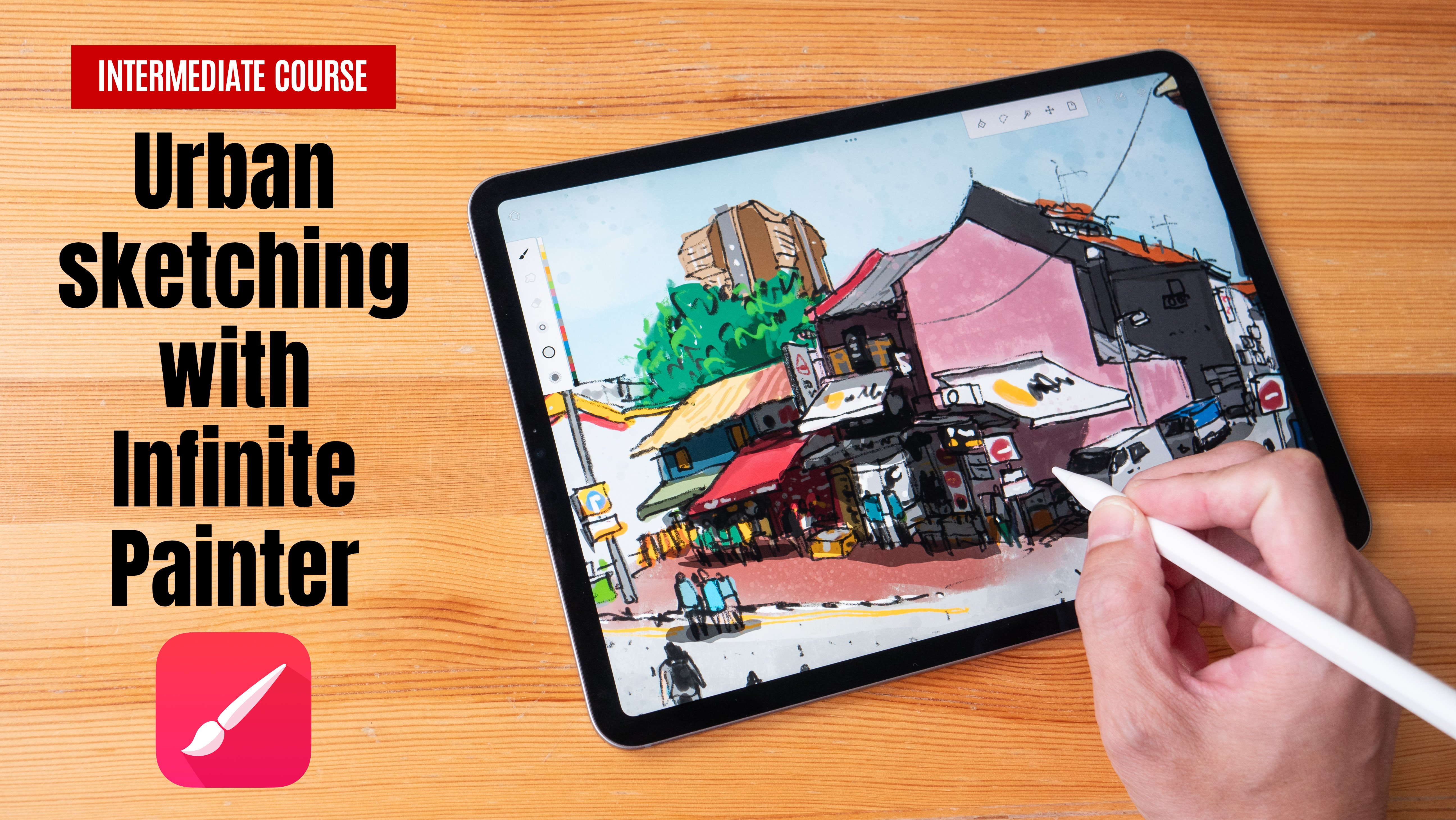
urban sketching cost using the app Procreate, which is available on the iPad. And this is an
intermediate costs. So you will need to be somewhat familiar with using Procreate or drawing in order to
follow along because we will be jumping
straight into drawing. So if you are a beginner who is not familiar with
using Procreate, I highly recommend you check out earlier calls that
I have created on how you can create digital
illustrations using procreate. In the first half
of this course, I will show you the tips
and techniques that are used for creating
digital urban sketches. You can download
the reference photo that is provided
to follow along. And in the second
half of the course, we will be going outdoors, where I will show you how
to apply those tips and techniques when it comes to
going outdoors on location. Before we get started, I just wanted to ask
for your help. If you find this course
useful to live this cause a review so that you can help other students
discover the cost. Alright, let's get started.
2. Composition and Drafting (part 1): Let's open the Procreate app. So let's create a canvas. By the way, you can create
your own Canvas size. Just click this button here. You can type in whatever
resolution you want. I'm going to have
it as four key UHD, so that's 3840 by 2160. And go look into this time-lapse settings
here and make sure that it's recording at four K
at lossless quality. So when you are
drawing, Procreate, we'll record a time-lapse
video of your drawing process. So now that you have
your own Canvas, you can just tap on it to create that canvas at that
size and resolution. So I have my reference
photo on the side here. If I'm drawing on-location, my reference, we'll
be in front of me. So the first thing
I want to do is to create a few layers. The first layer, I will use a light blue to create some drafting
lines to help me create the composition so
that I can feed or the subject that I want
to fit onto the canvas. So this part here is
going to be very quick. I just want to basically
get the composition. It doesn't really matter
if you can't draw the details at this stage because the details
are not important. All you want to do is to fit everything on to the pitch
to make sure that you have enough space to fit
everything onto the page. And you can draw more
accurately later on. So typically this
process for me, we will just take
like five minutes. If I'm drawing with my
watercolor sketch book. Depending on how
complex the scene is, I may actually use pencils to create
rafting lines as well. But if the senior is not
that complicated than I may just go or draw
with ink straight away. There is a van park here. I am not able to see site of the van because my reference photo
is cropped off. But if you are
drawing on-location, you get to see everything. There is anything
blocking your view. You can actually still
stand up and move around to see what's
in front of you. So this white car here, let me just place the wheels
higher compared to the Ben. Let me zoom out slightly
to have a look. Alright. I think this is
pretty much dropped. When I'm drawing
this building here. I want to make the line
straight because I know in the real-world,
lines are straight. Okay, there are other tall
buildings be highest. Well, there is an arch
here and this arch is actually cropped off k. So this is this
part of the sketch. So what I want to do
is to turn, sorry, make is more transparent so that when I draw with black lines
over there dropping lines, I would not be distracted
by the lies beneath. So let me just rename
this layer raft. And this layer will
be caught lines. And I will be using black brush that I'm using is a custom brush
that I bought online. If you want to use default
brushes provided by Procreate, these are the four
I would recommend. I use tinderbox and facing
net for drawing lines. Tinderbox is my preferred
brush for creating line OD. And you can use this
brush on the side with Apple pencil to sensitivity
to cover large areas. So tinderbox is quite
a versatile brush. For textures. I would use a hearts and clouds can be great for creating clouds or
textures as well.
3. Inking (part 2): Let's make sure we are
drawing on the correct layer. So I'm going to have one layer, four lines and other
leaf or colors. Another layer for textures
and other layer for shadows. I don't use a lot of layers
when I'm drawing on location because it's very difficult
to keep track of this layers. So let's draw the
beak shapes first. I'm going to draw
like really fast. This line is a bit thick. Maybe I can make
this line thinner. Yeah, I think it's better
to have the Allies thinner. So I have the brush controls
here on the loudest site. So what I want to do is
to draw the big shapes first and then later on draw the details
within the shapes. There is a sign here. Let me zoom in for you to see. So we've done drafting
lies beneath. It's easy for me to draw those shapes accurately
and quickly. So having drafting
lines can help you draw Foster and definitely
more accurately. So you may note, here's
my lines are beard. How should I say sketchy? They are not that straight. You don't have to draw a
perfectly straight line to create the illusion
of a straight line. There is a sign board here. The body is facing. The sun is actually facing
the shop front or some, or some somewhere
facing some direction. Anyway, withdrawing, you can
use your artistic license to have to assign point
wherever you want it to point. So I want it to point like this. Now we've Procreate by default, you can use two fingers to
tap on the display to undo. And procreate has good
like palm rejection. So now I can actually draw on
the display with my finger, but you can actually
turn off that feature. Let me erase. There should be a shortcut
for me to erase when I double-tap depends on maybe
I did not turn that on. So let me go into
the settings that gestures control
where you start, you raise, I'm going
to press toggle this. So basically this will
allow me to press this wire here and then
go into the erase mode. I find it easier to do this than to double-tap on
the Apple pencil. When I released my finger. It goes back to the brush. I realized that if
I draw like slow, my lines will look
like too rigid. So I will want to
draw faster to have, to have the Allies look
more sketchy mall dues. And we have this van
that it's parked here. This van is basically
or rectangular block. I cannot see the site
mirror of the van. So I'm using my artistic
impression, sorry, artistic license to
add a site mirror. You have two wheels here, 12. If you draw a location, if you draw a lot, if you get a lot of practice, you will be able to remember how a vehicle should look like. And if you are drawing the
vehicle for the first time, chances are you're going to draw the vehicle from
your imagination. And that vehicle from
your imagination is not going to look the same as the vehicle that you
see in the real-world. But if you have drawn like a lot of vehicles from observation, from the real-world, you will be able to draw v
equals more accurately. So that's one nice advantage, nice thing about
drawing on-location. It helps with your memory, even help you remember more. Basically, this is the line dividing the first second law. When drawing digitally,
you have the advantage of being able to undo. But I would recommend
you try not to use to undo unless
necessary because. The more you can do, the
more time you have to take to draw the scene. We have another vehicle here. And also if you just
keep undoing it, it will tell your mind that it's alright
to make mistakes. I mean, it is alright
to make mistakes, but if you just keep undoing, it will actually make
you more catalysts. For example, if you
are drawing with ink, you won't be able to undo. So because you are
not able to undo, you would be more careful
when you are drawing with but when you're drawing
digitally, at least for me, I find that sometimes
I am a bit more callous because I can just undo, undo, undo, undo,
and I can erase. Oops, see, notice that I
drew the windows wrong. This will hear, it. Shouldn't be in contact
with this v equals. So let me just erase here. So when you're drawing, it would be good to
pay attention to where the lines intersect. So I'm going to put
the wheel here. And this really is further away. This and higher. We have this here. There is a peeler here. This pillar will go down from the top to the bottom floor. So you have to draw a
continuous line to create that illusion that the
peeler is continuous. So now I've used a peeler to divide their shop house
from this shop house, I will continue to use
the peelers to divide. And now that I have the pilus, I have the sharp House Divided. I can draw the windows
within the shapes. This is so much easier
compared to earlier on when I drew the windows first
before drawing the pilus. So here I'm going to be
like really sketchy. And I think we have drawing digitally versus
drawing traditionally are on a sketchbook is
with digital software, with a tablet, you can zoom
in to draw those details. And sometimes it's not a good thing because you
don't want to draw too much. Sometimes you want your
sketch to be simple. You want to simplify or
Scatchard when so many details. So if you're drawing with paper, if you're drawing on paper, you will run out of
space to draw details, in which case you can just
leave out the details. But here you may have to
temptation to actually zoom in to draw those
little details. Which is good if you need
to draw the details. But it's not good if you
want to simplify and you cannot resist the urge
to draw all those details. So this part here is
very difficult for me because the reference will to actually doesn't show
what's happening here. So I'm actually just drawing
what I think is their case. So let's see what we
have here so far. I'm good. I think this is nice. The sketch is slowly coming to life. Let's draw the beauty and the tall building
in the background. So for the tall building, its height is here. So I have that curve there. This curve is not the exact curve that you see in the reference photo
and it's alright. I may want to turn off this ability to draw
with the finger. So let me go into the
gestures control again. So under General, you can
disable touch actions. So that's turned on. Now when you draw with your
finger and nothing happens. But when you draw with the
Apple pencil, you can draw. So this is quite convenient. This is basically
perfect palm rejection. I may have drawn this too wide because based
on the reference photo, the gap between the gap here
is actually much smaller. So let me see what I should do. Maybe I can draw this
and you've raised this. Yeah. Okay. I think it
looks alright now. Yeah, I think it looks alright. Let me draw a sign here below, and another window here. So the main shape of the
shop houses are ready drawn now it's just now I
just have to add details. Notice this part here. So this is an accidental
straight stroke that I drew with
my finger earlier. And if you don't disable touch, things like this can happen. And to rescue this,
to correct this, you have to unfortunately
redraw this area. So it might be a
good thing for you to actually able touch. Basically have such a way that you can only drove
the Apple pencil. You cannot draw
with your finger. Okay, let's see if there
are anymore stress rocks. And another one here. The NGO that I have here is wrong because if I
look at the corner of this roof on this should
be much higher at a window. I mean, a line to
the window here, but I have the arch here. So again, this is a sketch. So if you want to
draw accurately, you may have to erase all this oddest part
here and redraw again. But since this is a sketch, I can actually just use
my artistic impression to correct this scene. Now if you draw a long enough, if you have a lot of practice, you can correct your
scenes very easily. However, if you get
like the perspective, like if your perspective
is really off and correcting the scene is going to be like
very challenging. So sometimes it's good to actually draw those
drafting lines first. Another thing about the
drawing on-location is your eyes are very sensitive and will be
able to see details in the darker areas easily. So for example, here,
It's really dark. It's very difficult for me
to see the details here. From the photograph. I'm actually just
drawing some tables. I'm just going to draw
tables even though I cannot see the tables. This is a restaurant, so there should be tables. If you're drawing on
occasion, you will be able to see what's happening in this darker shaded area
in the photograph. But I'm trying with a reference photo
has its limitations. You will want to add
some people in the scene because it's going to make
your scene look more lively. So to draw, people tried to draw those people who
are not moving first. Because people who are moving. A bit more challenging to draw. And also zoom out to
see how big that person is in relation to whatever
you have just drawn. So I think the size for
this person, it's alright. So let me just draw
another, one person here. So we have people in your scene. It's going to make your
scene look more lively. And also it will
help the person who is looking at your
sketch get a sense of just how big all
those other elements are by comparison to those
people in your scene. So this is a coffee
shop that is selling some v and some food. I'm going to leave this a
rare just black later on. I will, I mean, just empty later on I will
just draw those details. Okay, at this stage, this sketch is almost complete. I can just look around
sketch to see if there are any more things I
need to draw like this, buildings in the
background that I have almost accidentally left out. I'm gonna use really
thin lines to draw these buildings
in the background because for elements
that are in front, they are close to you. You can draw them big with thicker lines for elements
that are further away, you can draw them small
width, thinner lines.
4. Colouring (part 3): Now for the coloring process, I forgot to mention earlier
that when I am drawing, I tried to close the lines. So for example, when I'm
drawing this triangular shape, I don't want to have
gaps like this. Because when it
comes to coloring, I'm going to use the fill
bucket to the few packet needs to fuse into
an enclosed area. When there is a gap, the color wheel leak out. Let me show you what I mean. So first thing I want to
do is to tap here and make this a reference
layer so that when I add or used a few bucket tool, they will use the reference
layer to feel the colors. So I'm going to add like, Can orange, should I have
written for the roofs? Let's have rate for the roofs. So make sure you are painting the colors into
the correct layer. So this layer will
be called colors. Make sure to choose
the correct The year and drag and paint the
color into the shape here. You can control how
much value there is, how much area that we'll cover. So this is good. You can see some jagged edges
here are the colors did not view on to the dinner
overlap deadlines there. So what I wanna do now is to move this color layer
below the lines. Alright, so now it looks better. You may still need to
go into color Ages. This is the part where
I don't particular and don't enjoy particularly
because it's a lot of work. If I'm painting with
actual watercolor. Watercolor, we just
go over the lines, but here with this view
bucket, It's not perfect. Alright, so let's do this again. Oops. Notice the colors
actually went out. So let me try it again. So you can control how
sensitive the few bucket is. Or you can just just do this. Yeah, just color it like this. Depends on whether or
not you want to save time or whichever
is easier for you. I've almost colored everything
that is read into sin. So here I just want to
go in and Few the lines. You can see the lines here. They are black and white. So I may want to
just at this rate over just to make it look nicer. Now a digital sketch
will not be able to replicate traditional
look a 100 per cent. Maybe it can replicate the
traditional look a 100%, but it's going to
take a lot of time. So for me I try not to. I mean, I would love to have the digital sketch
look traditional. But I also know that it's
going to take a lot of time. So I don't really, I'm not really too
fussy about how digital or how
traditional sketch looks. Okay, so sometimes I may
actually want to like CDs. I'm coloring, I'm painting
outside the line. If I'm painting, we
have real watercolors. Sometimes I will not
be able to paint within the lines because
I paint too fast. So sometimes I may want to add this mystics into the scene. Next thing I want to do
is to add some textures to the owning the sunshade. So what I want to do is to add texture only onto the red areas. So I'm going to use two
fingers to swipe here, basically to mask out
all the other areas. And I'm going to switch
to a different color. I'm going to use this color
wheel and switch it to something that is orange. And I'm going to switch
to a different brush. Again, the brush that
I'm using is actually a custom brush that I bought. This is hearts,
which ART Zack one. So this is a nice
textured brush. So earlier on, when I mask
out the the non pixels, this allows me to paint
within the pixels here. So now when I paint over, you can actually
see some texture. But this color doesn't
look that great. So let me just make this, instead of changing the color, I want to change the value. So now you can see the texture. I think this is
nice. I can adjust the size of the brush just to. Just to see what kind of
textures you can create. I can also make
this even brighter. More highlights,
basically give it more highlights like this. This looks nice. I liked this texture. So compared to this flat roof, you can see the texture. It gives it more life. But also, I don't want to like paint over the whole thing. I just want to give
it some texture. Okay, this is nice. Next up, let's paint
all the other areas. Before we pin the other areas, you have to decide
whether you should create another layer for the
odd the elements. So in this case, I may want to create another layer for all
the other elements. So here for the roof, I'm going to rename this again. I'm going to rename this as
a screen name is S groups. So I've just switch back to the other brush
and now I'm going to color everything else. Let's try and use this in. There are some plants here. Now for this particular part, I may want to append is
dark area here first. So I did not draw the lines
for the plans and I also do not draw the lines for
the blinds, the sunshade. Sometimes it's good to leave
a sudden things not drawn, don't use lines for everything. So here I can draw the plans. This hopes up my iPad
Pro is dying. Later. I have to I mean, right after this tutorial, I would have to send
this iPad for servicing. So let's use this shape here, this color here to
paint the blinds. And here. And here. This is getting very irritating. And I can use a darker shade to draw the lines on the blinds, maybe something darker so
that I can see the DTUs. It's nice. And I can use this green again, but this time make it
darker to add some details. I can also throw in some bread as z if there
are some flowers here. And you'll see these
black lines here. That's delete the black lines. Let's go to the lines layer
and delete the black lines. Alright, let's press, press this eraser and
move the lines up. So now it looks like
the plans are in front of the pillars
and the plants. They don't have outlines, so it makes the plants Lucas softer compared to the hatch, sorry, compared to
the hot H peelers. By the way, this color
palette that I have, It's also a custom color
palette that I bought online. I cannot remember the name of the person who actually
saw that pellet though, but it's a really nice palette. You can buy a lot of these
color palettes online, but don't get too carried away
with buying too much this. Now for the growl, I also want to add texture. So remember earlier I used a double finger to swipe
right to create the mask. So now this allows me to paint texture onto the ground
under the pixels. And I want to make this darker. Okay, so let's use the
other brush again. Okay. See the texture. Very nice. Um, yeah, so let me
just add some texture. And now let's color the
buildings in the background. So I'm going to color this
building with a light blue. Nothing is happening
because we need to unmask this first. Hopes. Hopes. It looks like the few bucket
is not working correctly. So I would have to actually
go in and color this myself. And I want to draw
the windows here. For Windows, Let's have
it dark, Let's have it. Let's have dark blue induce k. That's how the logo here. This car has dark
windows here and here and the bottom
of the vehicle is like black because
of the cast shadow. But we want to leave
some light here because we can see the
front of the vehicle. The cast shadow will go to
the site of this curve here. And we have to have the cast shadows for
this as well, the Ben. And we need to draw this pot
here and make it darker. There are some reflections, but I'm not going to
draw those reflections. So remember this shop. So when I paint this black area, I want to create an
outline for the people standing in front so that we
can see them more clearly. If you like, paint
over the person, you are going to lose the shape. That's draw some details
within this black shape. So I'm going to
make a square here. Maybe there's a sign
board with manuals. Um, so that's how
some white here. Maybe there's a light bulb
here, horizontal light bulb. And some T2s here, areas of highlights and may be, I can have this slight white, but I will blend this
site here like this. But I try not to lose
the shape of the head. And this area here because
of the photo that I'm using, I cannot see the details here. So maybe I can just paint
all these areas are black. And I will draw some details
later on for the chairs, the tables and the chairs. So earlier on I shouldn't have drawn those tables and
chairs with the black lines because it's easier to paint the black
shape and then draw those details with lighter
color over the black color. Now when you are
painting colors, I'll make sure you paint onto the correct layer so you're on. I pinned it to orange
onto the roof layer. See if I turn off the roof. I also turned off
the chairs and also the colors for all
the people here. Yeah. So be careful not to paint
onto the wrong layer.
5. Adding shadows: So next thing I gonna do is
to add shadows and I'm going to create a new layer
for the shadows. I'm going to have the blending mode Multiply so that the shadows can like
blend over their colors. And let's paint the shadows. So I'm going to
use a dark color. I'm going to use
maybe this warm gray. I'm going to try one reverse. If it doesn't work, then
we can try cool gray. Okay, I think a cool
gray works better. So let's paint cast shadows. If the shadow is too light, you can, you can make it darker later
on, I'll show you how. But first let's paint
or the cast shadows. I've just added the shadows. So if you find the
shadows too light, you can actually
make them darker. So in this case here, I may want to duplicate
this shadow layer first as a backup just in case things go wrong
after the adjustments. So select shadows,
select adjustments here, select Hue, Saturation,
Brightness, and select layer. So now you can actually
make the shadows darker. I'm going to make this
slightly, just slightly darker. So it looks like the sky. It's too bright, it's
too wide, too boring. So I've just created another layer for this
guy right at the bottom. So now I'm going
to use this color, this blue and just feel the
whole sky with this color. And it looks, all right.
It looks alright. Accept this guy, it's
a very flat colors. So I want to swipe
again to lock, to create a masking layer. And I'm going to use this lighter color
to paint the clots. So let's see what happens. Oops. So a lot of trial and
error is going to, you will need to have a
lot of trial and error to find a right brush
to paint clouds. And I think this brush
works fine for me. It's a very nice brush. And let's have the
clouds the more white. So I'm not a clouds
will be very white. Do here. Let's make it more white here. Last layer will be taxed chairs. Just basically just
adding some dots here and there to create
some textures. Let's have it as Lamar. Where's my texture? Hopes I used the wrong brush. So let's use this brush again. Too big. Okay, just some textures
here and there to do. And also I want to draw
the road markings. So for the rope
marketing is let's find the color layer and
use white for that. Have some road markings here and some yellow markings here. We can add more details
here and here, here. Textures at the top. So now that the
sketch is complete, the last thing you
may want to do is to create another layer. Right at the top. It's an empty layer. So the next time when
you open up the file, if for some reason you accidentally add any stray
strokes on to the art, you can actually just delete
that protective layer. So let's take a look at the time-lapse video
that was recorded. So this is the time
that's the deal. If you want to, you can share
this time-lapse video on your Facebook or Instagram page. If you want to share
this on Instagram, you will have to export this
video out first and then crop it to a square and
then upload to Instagram. So That's nice. The time-lapse video,
we will take up a lot of storage space. So let's take a look and see how much storage space the
time-lapse video is taking up. Let's look at the statistics. So that for k UHD fall is
taking up 310 mega bytes. The time-lapse video is
taking up a 137 megabytes. So if you want to save
some storage after you export and share your
time-lapse video, you may want to
just delete a way, the time-lapse video, but I'm
just going to keep it here. So notice the file
size is 300 megabytes. So if you want to sketch
or scheduling, this one, gig will allow you to store maybe just a
three or four files. Ten gigs will allow you
to store 30 or 44 hours. Hopefully your iPad has enough
storage to store on false.
6. Painting the sky and adding textures: So it looks like the sky, it's too bright, it's
too wide to borrowing. So I've just created another layer for this
guy right at the bottom. So now I'm going
to use this color, this blue and just feel the
whole sky with this color. And it looks, all right.
It looks alright. Accept this guy, it's
a very flat colors. So I want to swipe
again to lock, to create a masking layer. And I'm going to use this lighter color
to paint the clots. So let's see what happens. Oops. So a lot of trial and
error is going to, you will need to have a
lot of trial and error to find a right brush
to paint clouds. And I think this brush
works fine for me. It's very nice brush. And let's have the
clouds the more white. So it's another clouds
will be very white. Do here. Let's make
it more white here. Last layer will be taxed chairs. Just basically just
adding some dots here and there to create
some textures. Let's have it as Lamar. Where's my texture? Hopes I used the wrong brush. So let's use this
project can too big. Okay, just some textures
here and there. And also I want to draw
the road markings. So for the rope
marketing is let's find color layer
and use white font that have some road markings here and some yellow
markings here. We can add more
details here and here. Textures at the top. So now that the
sketch is complete, the last thing you
may want to do is to create another layer. Right at the top. It's an empty layer. So the next time when
you open up the file, if for some reason you accidentally add any stray
strokes on to the art, you can actually just delete
that protective layer. So let's take a look at the time-lapse video
that was recorded. So this is the time
that's the deal. If you want to, you can share
this time-lapse view on your Facebook or Instagram page. If you want to share
this on Instagram, you will have to
export this video out first and then
crop it to a square, then upload to Instagram. So That's nice. The time-lapse video,
we will take up a lot of storage space. So let's take a look and see how much storage space the
time-lapse video is taking up. Let's look at the statistics. So that for k UHD fall is
taking up 310 mega bytes. The time-lapse video is
taking up a 137 megabytes. So if you want to save
some storage after you export and share your
time-lapse video, you may want to
just delete a way, the time-lapse video, but I'm
just going to keep it here. So notice the file
size is 300 megabytes. So if you want to sketch
or scheduling, this one, gig will allow you to store maybe just a
three or four files. Ten gigs will allow you
to store 30 or 44 hours. Hopefully your iPad has enough
storage to store on false.
7. Walkabout on location: A course on urban sketching. Sketching out on location is
not going to be complete. So let me show you around this neighborhood
while I talk about the things we
should look out for when it comes to choosing
subjects to draw. The first thing to
look out for when urban sketching is actually to look out for your own safety, especially when
crossing the road. So look out for traffic, see those potted plants
across the road. Those are different types of plants and I can actually take reference photos of them as well to draw them as a collage. I may also take photos
of individual items such as this stone
lions that you're here. For reference purposes. If you want to sketch
in front of shops mixture to check
the opening time so that you don't obstruct or affect businesses,
all the shops. I highly recommend you walk around the
neighborhood to look for interesting perspective
and composition. All views and not just settled down at the first
convenient location. Take this mosque, for example, if you are going to sketch
from the front view, is going to look quite flat. So for this building, I would actually sketch
from this view so that I can get a
three-dimensional look to it. And I can also capture
the perspective. I'm always very excited
when I'm sketching because there are so
many things to see, so many things to draw, even for very mundane objects, they will look interesting to me when looking for
subjects to draw, try to look for
dominant subject. For example, if you take a
look at all the bicycles, here, it can be quite messy. If you are going to
draw everything, it is possible to draw this. But in this case, I would focus on this
bicycle in front and draw the background with maybe
lighter or thinner lines. Even back alleys may
look interesting when you are looking for
subjects to draw them. So here this back alley, we see a lot of air
conditioning units. And this building is
actually a restaurant, so we see a tall chimney
that goes all the way up. And this cover here that
covers the electric bought seems like it hasn't
been fixed for quite a while. This neighborhood,
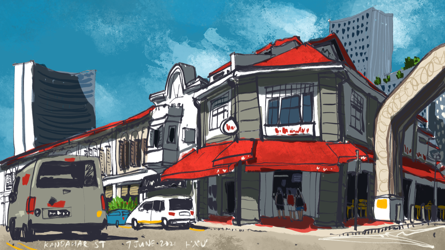
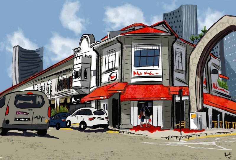
and by the way is Little India in Singapore. There on the right side, you can see a familiar
building there. So that's the building
and neighborhood that we sketch using the
reference picture. Foot places are good places to sketch because they
are very lively. You can sketch the
people eating and you can sketch the
food that is sold. See that empty table over there. You can actually buy a
drink or maybe a coconut to drink over there and
sketch the neighborhood. One thing I would advise is
to pick a spot in shade, which means if the
sun comes out, makes sure the sun is
not shining on you. This is the view from
the chair and this is actually quite good
spot for sketching. We can see a one-point
perspective scene here with shop houses that
have a lot of details. Even had a road
junction like this. You can actually sketch at
all the four corners of the junction and you will get four different views
as you walk around. I highly recommend you take as many reference photos as you can in case the weather changes, you can still work with
your reference photos. It's not technically
urban sketching, but you still have
something to work on. So this is the back view of the building that we
sketched for the tutorial. And from what I can see, it seems like it's
going to rain later on. So if I am to sketch
this building, I will have to do
it really quickly. So this is actually a church. Here. I wanted to take a photo of the name of the
church as well as the address so that if I am not able to sketch
this building, one location today, I can always come back some other day. So this is the view of the
church from the ground. And this object is porous, so it seems like it's
more suitable to be drawn on a vertical converse. If you want to make
this scene a bit wider, you can include the rate
building on the right side, but you have to choose a composition that
fits does to building. And don't have the two
buildings balanced like this. Always try to make sure
that one subject is more prominent compared
to the other subject. So in this case, you
can actually make the building more prominent by having it take up a larger
proportion of the canvas. Or you can make the church
more prominent by having it take up a larger
proportion of the canvas. My camera, unfortunately is
not white enough to capture the top of the
church in this case. However, if you are
drawing on location, your eyes are actually
going to be wide enough to capture the whole
scene from top to bottom. When I'm picking a
spot to sketch from, you should always anticipate
things that may happen. For example, the sun
may move the semi, move into you or
the shadow me move away or cars may pop
in front of you, or the business may open
up a business and push. There are cuts out to
where you are sitting. This is actually a good spot
for sketching the church. Because under the shade and I can see the
front of the church. And it seems like
I'm in luck today. There are some chairs
here that I can sit on. These chairs are
owned by anyone. It's best to ask permission
before you take them. If you want to sit
on dreams slaps, they may look stable enough. But I probably wouldn't advise you to do
so because I know those gaps things may
fall into the drain. So that's spot under the tree earlier was
where I wanted to sketch, but I found out that it's
actually a spot frequent by smokers and there's a truck that's ******* blocking my view. So sometimes you
may want to again, just spend some time walking around, observed a surrounding. Before you settle down. I've decided to draw
the red building instead because I couldn't find any spot where it's shaded
for me to draw the church. So that's one thing about
urban sketching some time to come out to or location one
draw something specific. But the thing is, you may not be able
to draw that due to conditions such
as the bladder, the traffic people
could be any reason. So I may come back to draw the church again,
some other date. So the last thing I'm going
to talk about is a hat. It's good to get
a hat to protect yourself against
the sun and rain. And I was a highly recommend
you get a portable stool, foldable one so that you
can see anywhere you like.
8. Drawing on location: In this lesson, I'm
going to show you a time-lapse video of my sketch. Now, all the tools that
features the techniques they were already discussed
in the earlier lesson. In this lesson, I just
wanted to talk about my drawing process and experience
of sketching outdoors. This is the view
that I'm sketching. If you want to practice along, you can download the reference
photo I have provided. Alright, let's sketch. At the start of all my sketches, I will create multiple layers and I will name the
layer so that it's easier for me to know which
layer I am working on. If you do not name your
layers is going to get confusing later on when
you have too many layers, it's quite intimidating to
work on a blank canvas. So for beginners, I
highly recommend you use drafting lines to mark out the composition first
to get a feel of how your sketch
is going to look. At this stage of laying
down the drafting lines. You will also be able to identify challenging aspects
of creating this sketch. So for example,
with this sketch, you can see me trying to
scale down the sketch because I actually
ran out of space. So I have a tendency to draw bigger and bigger
as the high draws. So with the drafting lines, this will help me mark out
the compositions so that I can stay within the composition and not run out of
space later on. Any mistakes you make at
this stage can be avoided. So just remember
the mystics and a Ford making the same mistakes while you ink sketch later on. So here I'm trying to find out where's the
vanishing point. And I realized that the bulk of the drawing that
I've just drawn on there don't match up
to the perspective. So I've decided to just mark out the vanishing point and draw the diagonal lines to
the vanishing point. So when you are
drawing on location, you can rely on observation
skills for drawing. But if you know the
laws of perspective, you can actually use
that knowledge to help you make a more accurate sketch, which is what I'm
doing right now. I will find a vanishing
point and I will draw the diagonal lines
to the vanishing point. It's also much faster to
find a vanishing point. Because if you are
drawing from observation, it's going to make
you more tired, faster as you are always
trying to observe, trying to measure what
you see when sketching. Try to draw the big ships first before drawing the details
within those shapes. And try to get the perspective
accurate at the start. Because if you get the
perspective wrong, that is going to affect all the other elements that you are going
to draw it later. For example, if you get the perspective of
the building wrong, it's going to affect
all the windows on the walls of the building is going to affect
all the pillars. So if you're building
looks like it's skewed, then the windows are going to appear as if they are skewed. So it's very important to get their perspective
accurate at start. And having drafting lines. That's really going
to help a lot. As you become more
experience with drawing, you will be able to identify your own habits when
it comes to drawing. For me, I have the
tendency to draw bigger and bigger and
run out of space, which is why I like to
use drafting lines at the start of the sketch to
mark out the composition. I also have the tendency to get the perspective
wrong occasionally. So nowadays, if I see a scene were very
obvious perspective, I will try to find the vanishing
point and Horizon first. As you become more experienced, you are techniques will also
evolve and you will improve. To make your lines look
more confident and you just have to
close up your lines. Don't have any gaps, and don't use too many lines
when one line will do. So. For example, if you are drawing the edge of a wall which is represented by
one straight line, just draw it with
one straight line. Don't draw it with three
lines joined together. Which is why I said, don't use too many lines
when one line will do. This will improve your
sketch noticeably. It's going to make your sketch, your line art look
more confident. For the truck that I'm
currently drawing, I'm comparing the size and position relative to the
site of the building. You just saw me
erase that because I got the size and location
of the truck wrong. When you're drawing, spend
some time to observe the relationship
between what you are drawing with things that
you have already drawn. So for example, if I
want to draw the truck, I was span a few seconds
just to make sure that a truck is in the correct
position before I draw it. Because if you draw it in the wrong position,
you can undo. But that's going to
waste some time. So if you undo too many times, it's going to waste
a lot of time. It's better to get it
right the first time. Spent a bit more
time to observe, get it right the first
time rather than draw it wrong and undo and
draw it again, it's double the
amount of work and time spent when drawing. Always look out for overlapping elements because
overlapping elements, we'll create this
sense of depth. I will always look
for elements in the foreground that overlap, elements in the background. So now I'm currently coloring the sketch with the colors
going onto its own layers. And I have just applied an
alpha mask to that layer. So when I'm painting
the textures, Textures will be painted
on existing colors. They will not be painted
on the white space. So that's very useful
to use Alpha masking. I did not draw the
windows with black lines. Instead, I'm using white
to draw the window frames. How I'm drawing the windows
now, planned in advance, I could have used black lines
to draw the windows and the window frames and color the window frames
with white later. But it looks so much better to draw the windows with white. Again, rate in this case. Also for elements that do not affect the form
of the structure. For example, we have windows
on the side of the wall. The windows don't actually
change the form of the wall. It's the h of the war that changes the surface of the wall. The balconies come
out of the wall. We have awnings that come out of the war are
attached to the wall. So those will be drawn
with solid black lines. But for things that do not
affect the physical form, I would sometimes just
not draw them with black lines and add those details later
on with other colors. With pre-planning, with
planning in advance, sometimes you can create
this very nice look. So while sketching,
I always try to mix and match different style. You don't have to use black
lines to draw everything. Sometimes you can just use
solid colors to create shapes. When coloring, It's also good
to work from big to small. So color the big shapes
first before you fill in the details
with spots of colors. For beginners, I highly
recommend you get very familiar with Procreate as well as the
digital art process first, before you head out to draw because it can be
quite intimidating for beginners sketching out
on location the first time. So when you're out on location, you don't really want to think about where are the 2s
or the brushes you need? How can I create a
layer mask or Alpha masking all those features, functionalities and
two's should be very familiar to you before
you hit out to drop. Because while you're outdoors
or there are going to be things that will
affect your performance, such as the weather. If the weather is
too hot or too cold, you're going to think about your firm and while
you are drawing. So you really want to
know procreate and digital workflow at the back of your hand when you're drawn. So that when you're drawing you, you're not actually thinking of how you're using
the software. You are not thinking of
the digital art process. You are just drawing. When you're drawing,
you're just drawing. Don't be disappointed
if your sketch doesn't turn out the
way you have an vision. Because that's part of the
funnel with urban sketching, you may draw with a
certain style at home. When you are outdoor sketching, there are so many
things that can affect your performance. And when you look
at the end result, it could be something that's totally different from
your usual style. And that is great
because you have just discovered a new style. If you have made any mistakes, that's great as well. Every mistake is a
learning opportunity. So the more mistakes you make, the faster you are
going to learn. I still cringe when
I look at some of the earlier sketches I have made when I started
urban sketching, but that's part of
the learning process. So now I am painting
the shadows. The shadows are right
at the top layer or somewhere near the top
layer has multiply mode. So the shadows we'll multiply
over the colors beneath. This is a very useful way to paint shadows because
if for some reason, if you want to
change the color of the building and make
it blue instead of red. Shadow layer is still
there and a shadow we'll multiply over the
new blue beauty. So it's great to
work with layers. And if you need to
delete the shadows, or you can just delete the
layer with the shadows. Painting all those little spots of colors and adding details is probably more
time-consuming compared to painting the big shapes. So on the right side, the bottom right side, there is a fence that
overlaps the building. I did not draw the fence with black lines are true defense, as you can see with green lines, it's good to mix and
match different styles, and it's good to explore
different styles. You don't always have
to draw everything with black lines and color
within the black lines. With mixing and matching
of different styles. It's going to make your
sketch look more interesting. If you take a look at my
layers palette, right now, there are so many layers, so it's very important
to name your layers. So I have the fence and bicycles on the right
side on their own layer. And if I need to
remove the fence, I can just clear the layer or
make that layer invisible. And now I'm adding
some street lamps. The background is looking. How should I say empty? So I need to add
some buildings in the background because there are some buildings
in the background. Now for elements that are
in the background where you can't really
see much details. You don't have to draw
that much details. Sometimes I would just
block out elements in the background with shapes rather than draw
them with lines. And if I want to draw elements in the background with lines, I would draw them
with the inner lines because we've perspective things that are in the foreground, they are appearing, they
will appear to be bigger. Elements that are
in the background will appear to be smaller, and this will apply to the thickness of
the lines as well. Notice the two street lamps in the background
on the left side, which were drawn with white. They are actually
supposed to be black. However, I chose white
instead because I want the white to stand out to contrast
against the background. Here I'm just adding little
details like the chairs that this restaurant people
standing beside the peeler. I'm also trying to see
where else to add details. The last stage of my sketch
will involve adding textures. Digital art is going to look
at digital most of the time, unless you are really skilled at using textured brushes to
draw and paint your sketch. For me, my style, it's very stylized and I want to add some texture to the ground, to the walls, to
the flat colors, just to make the digital
sketch look less digital. And it really helps
when you add those up. Backup max, dose ink
blobs here and there. I was really lucky
with this cache because the weather
was fantastic. It was sunny and light and
shadows are so beautiful. Actually, it's not complete yet because I just discovered
some details that I have left out accidentally when compared to the
scene in front of me. So I'm definitely going to add additional textures
to the sketch to make this sketch
looks more likely.
9. Touchup at home: Now that we're back home, Let's take a look
at our sketch and see if we can improve on it. If your first sketch on location doesn't look great,
don't be disheartened. It can be quite
overwhelming to apply all the techniques that
you have learned at home, out on location. So just keep on practicing. The more you draw,
the better you will get and the more
confident you will be. And your sketch is going
to look better and better with each new
scene that you draw. So let's take a look
at the layers palette. You can do some
touch up at home. In this case, I'm going to
maybe add some textures. Sometimes I may also draw
details that I may have accidentally left out while
it's catching on location. So in this case, I
may just want to add some textures to
maybe the building. I'm going to press
and hold here. Dropper. I'm going to make this
color a bit darker. Make sure you have
named your layers. Otherwise, it's gonna be
very tedious to look through all the layers to find out has the texture
layer in this case. So I'm just going
to add some dots. Just to make this
look more life be. You can add details to get after you have done
your sketch. Location. These are just very
minor details. The next thing I wanna do is
I have an empty layer here, which I will rename. I'm going to put
the street name. So let me just name the street. And I'm going to use
a white brush to just write down the name
of the street and also the data that
I've drawn on this. It will be good to
always do this at the end of your sketch so
that you don't forget it. And it's the 11th of much. I may also want to sign
my name somewhere. The last thing I want to
do is add an empty layer. Let me just rename this D so that this empty layer is going to protect all the
artworks that you have. And if you accidentally
draw on this layer, you can always go back to the empty layer and clear the
layer or delete this layer. So this is a protective
layer that I find is very useful because sometimes
when you open your fall, you may accidentally swipe
your finger on the file and it creates a stray mark that you may not
know it's there. But when you close your file, that file is actually saved and it was going
to push to undo. So the next time you open
you see the stray mark. You won't be able to undo, at least with this empty layer. You can still clear that stream out by just removing that layer. If you haven't
made any mistakes, It's going to be quite
difficult to correct it back at home because you
are no longer on location so you can
erase your mistakes, but to draw the details
back, you need a reference, which is why I told you to
take many reference photos, if possible, when
you're out on location because they can
come in quite handy. And if you need more practice, you can also just
practice with the help of your reference photo just to
build up your confidence, just to be more familiar
with your techniques. So now, if you want to
share your art online, you can do so by tapping
here and tap here to share, make sure to choose
the file format first. Jpeg is good. So in this case, I'm going to choose save image. Now let's take a look
at our saved image. So this is the JPEG file. You can share it as
this on Facebook or on a website or on any other
social media platform. If you want to share
this on Instagram, it may be good to crop
it into r0 square. So let's see if we
can do that here. And we can choose the composition that best
represents the scene. So in this case,
the highlight of this catches the red building. If I move here, I don't see much
of the building. So let me just move it
here and notice that the names of the streets and the date that
I've written down, they are gone when I
choose this composition. So you may want to do a
square crop within Procreate itself and write your name and street name here
at the bottom left, and save it as a
jpeg rather than saving as a JPEG
and then crop it, which is what I'm doing here. So when it comes to
the digital workflow, there are many ways to
achieve the same results. So let's tap here, done. So this is the square image that I can share on Instagram.
10. Goodbye: We've come to the
end of the course. I hope you have
enjoyed the course. So every sketching is
fun and challenging. It can be fulfilling
and satisfying as well. My parting advice to
you would be this. Get yourself very familiar with the urban sketching techniques, the 2s and procreate before you hit out to
sketch on location. Because when you are outdoors
sketching on location, it can be quite stressful. You don't really want to think about how you can use Procreate or where to find the two's are the brushes to create
certain effects. When you're out on location, you should focus on
drawing what you see. So all those
techniques, the twos, they should be second nature to you before you hit out to draw. And this is going
to make the urban sketching experience
less stress, who are more enjoyable
and more pleasant. Alright, so I hope you
have enjoyed this course. Thanks for following along with me. I hope
to see you again. Bye.
 Teoh Yi Chie, Sketcher, watercolour lover