Transcripts
1. Intro: Welcome to this course
on urban sketching with the app infinite painter. My name is to, and I'm an
artist, graphic designer, and urban sketcher who enjoys
sketching on location. Now this is an
intermediate course which means you will need
to know the basics of using the app infinite painter and the basics of drawing
from observation. If you do not know
those two things, I highly recommend you check out at least the beginners course
on using infinite painter. Because if you don't
know the tools, it's going to be quite
challenging to follow along. In this course, I
will show you how I set up my infine
painter work space, the settings that I use, the brushes that I use. I will show you my workflow
for digital sketching. Before we hit
outdoors to sketch, we will warm up with a
drawing exercise so that you can get familiar with the
tools and with the workflow. Urban sketching or
sketching outdoors can be quite intimidating
for beginners. I highly recommend you be as
familiar as possible with the tools and the workflow
before you hit outdoors. Because when you're outdoors, you should be focusing
on drawing and not thinking about
how to use app. Now, there are many advantages
to sketching outdoors and the most obvious advantage is it will help you
gain confidence. With more confidence,
your art can look better, your sketches can look better. And this can help
you improve much faster compared to
sketching at home. Infinite Painter is
a drawing app that's available on Android
tablets and on ipads. The functionality
of the app is more or less the same
on both platforms. Now on the ipad, the more popular drawing
app is actually Procreate. And I do have other drawing
courses with procreate, but on the Android tablet, Infinitpainter is more
popular because there is no procreate on Android tablets. I hope you're using
a tablet with a pen that supports
pressure sensitivity, tilt and pump rejection. Because that type of pen will give you the best drawing
experience and performance. You will definitely need
to buy Infinite Painter, which is a one time purchase in order to follow
along with the lessons. Because many of the
tools that I use, we'll be locked behind a paywall if you're using
the free version. By the end of this course,
I hope you will be familiar with the digital
urban sketching workflow. Before we start
the first lesson, I have a favor to ask of you if you enjoy this course or
if you find this course, you soon do leave this
course a review so that you can help other
students discover the cost. By the way, if you have any completed projects and sketches, sketches that you
have drawn outdoors, feel free to send
them to me and also send me a reference photo
of the scene that you have sketched so that I
can see the scene and also your sketch and give you some critics on how
you can improve. All right, let's head
over to the first lesson.
2. Workspace setup: This lesson, I want to
show you how I set up my workspace in Infinite
Painter for sketching. The user interface
is the same on an Android tablet and ipad
with minor differences. Let's go into the settings. The settings page
looks different, but the features are similar. Here I have the light UI, you can switch it to
dark if you want to. I have Split Tools
menu and Able. This will show me
two tools icon here instead of just one so that I don't have to
swipe left and right, I can just tap on the icon
to see all the tools. I also have color
history picker and Able. This will show you your
recently used colors so that you can
reuse them easily. Under gestures, I have
double tap set to feed screen and I have a long
press set to eyedropper. Now when I double tap, this will zoom out to show me the whole canvas so that I
can get a quick overview. As for the long press, when you tap and hole, this color picker will
appear to help you pick colors your canvas so they can re use those colors quickly. Under Stylus I have the
finger set to disable. Or you can set this to
move so that you can move the canvas with your finger. If you find that palm rejection doesn't quite work as expected, you can disable this for
double tap with the stylus. You can set it to fit
screen as well or some other shortcut under
brush settings. I have draw cursor and
Able so that I can see the cursor whenever the
cursor preview is supported. And I have shaped
detection able. If you enable shape detection, you can draw a shape and
after a split second the software will turn it
into a geometric shape. If you want to draw
a perfect circle, you can try to draw the circle
as perfectly as you can. Shape detection
will turn it into a perfect circle and you
can even scale the shape. I usually disable
that because when I draw a straight line and
if I hold down too long, the line will be
perfectly straight. But when I'm drawing, I
prefer that hand drawn look sometimes with
the slight wobble due to the hand shape, because it makes the
line look more natural. If your line is too perfect, your sketch can look too rigid. Anyway, all these settings
are just personal preference, so you can choose whichever
settings that you prefer. This is where you can customize
the pressure curve if you want the pen to be
more or less sensitive. I'm just going to leave
all this as default. Next, let me show you how to add the shortcut tools
that I have here. You can add up to
eight tools here. I'm going to remove
the tools first by dragging them out one by one. To add the shortcut tools, you just have to tap on the
pitch with all the tools. And I'm going to
choose field bucket, tap and hole, and
drag it to the top. I'm going to swap to the right
side to add the less too. I'm going to choose
the magic one tool. I also use the basic
transform tool quite often. Let me just pull it up here. And you can also tap on the
layers palette tap here, and this will call out the
layers tools and tap here. I have a clear tool that
I want to drag up here. You can even tap on the
Settings button here and drag a safe
tool here as well. If you run out of space here, they will move the
tools to the center. But if I remove this, this will go back to
the top right corner. In the next lesson, I will show you the
brushes that I use for sketching and for coloring.
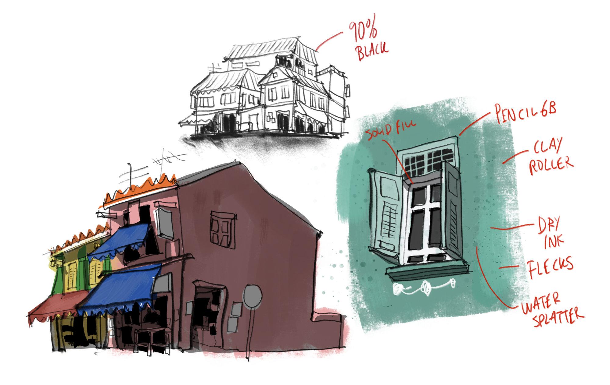
3. Brushes to use: This lesson, we will look at the brushes we'll use for
drawing and coloring. Just open the brush palette. This favorite
folder is where you can save all your
favorite brushes. If this is the first time
you are opening the folder, it's going to be empty. On the left side, you can see all the
brush categories. All my favorite
brushes were actually sourced from the categories. I have 60 pencil from
the pencils category. I have Cost ink Android inker
from the pens category. Solid field is from
the fields category. Try ink and clay
roller are from pinned here I have water splatter and flex from the
sprayers category. To add your favorite brushes, just go into the
category and look for the brushes. Let's add six. Just put a hot here
and this will be added to the favorites
folder underpan. I have to look for cost inker, add a T here, and cost
inker will be added. I also have dried inker which
has already been added, which is why you see the T here. Once you have the brushes
added to the favorites folder, you can actually rearrange them. You can put your most frequently used brush all the way up. One thing you should note is you can create favorite brushes for the smudge tool as well
as for the eraser to. If I tap here on the eraser to, I can choose to add the solid brush here
as a favorite brush. And I also have manga inker added as an eraser into
the favorite folder. Now let me show you
how the tools look. Let's select six feet pencil
from the pencils category. Depending on how
you hold the pen, you can get thin
and thick lines. If I tie the pen lower, I can actually
shade with the pen. Provided your pen supports tu sensitivity pencil can let
you draw versatile lines, Thin, thick and broad lines. You can use this for
shading as well. This is quite a nice brush. Next we have dry in dry. Incur can do the
same as the pencil. You can draw thin
and thick lines, and if you tilt down, you can get the
smudgers going on, which is very nice. This is how the
two brushes look. This is dry, incur. Next we'll look at cost
cost incur ink brush. The lines will be solid if you
like the bowl solid lines. This is a good
brush to consider. If I draw with minimal pressure, I can get the thin lines. If I press down hard, I can get the thick lines. Inks usually don't have tut. Tut doesn't really work here. Next we will clear the canvas using the
shortcut button here. Let's use a solid fuel. Solid fuel is what I
used to color things. What? Let me bring back
the chair and create a new layer beneath
the line art. I'm going to use color history here and use solid field
to color this chair. This is how I color my
sketches very quickly. The upside to using solid field is you can
color very quickly. The downside, it's
not very precise. If you want to color
within the shapes, you have to color more
slowly within the shapes. Let's see what other
brushes we have. We have the dry ink brush, which is nice as well. Let me clear this layer
using the short cut again. And I'm still using the brush. For the dry ink brush, you can hold the pen like vertically to get
the thinner strokes. This can be used to color
areas quite quickly as well. But you can see I'm not coloring within the ship again because the
brush is too thick. To reduce the brush size, I have to, well reduce it here. The nice thing about this brush
is you can tilt it to get the broader strokes
can hold it more vertically to color
into smaller areas. It has this very
nice texture effect which looks very beautiful. That's look at the
second coloring brush. Clay roller. For clay roller, this brush is too thick. Let me just reduce
the size here. This is nice because it
also creates that texture. Look, if you press down hat, you get a solid broad stroke. But if you don't
press down that hot, you can get this very nice. And you can go over
the texture several times to create
different layers. Sometimes I use this
to color my sketch. It's either this or
the dry ink brush with a mix of solid field. I try to mix the
different brushes to create different looks. Next we have the water splatter. This is great for
creating textures. If you want some texture here, let me just reduce the size. First, you can put
some splatter marks on the ground if you want to
create texture on the chair, For example, you can select the color wheel and shift the color slightly to
a different color. And you can place the
dots on the chair. Now you can see some texture
instead of the flat color, for this will give you
the brushes too thick. Again, this will give you
the smaller splatter at. These are all the brushes
that I use and these are default brushes
from infinite.
4. My digital urban sketching workflow: It's time for some
hands on exercise. In this lesson, I want
to show you my workflow. When I'm out sketching. I want you to follow
along with me and draw with me by downloading the reference photo
that I have provided, which is a photo of some
windows from the front view. This is not a very complicated
subject matter because I want you to focus
on the workflow and not be distracted
by the details. Let's create a new blank canvas. I'm going to choose
from the presets. I'm going to choose four. Make sure the orientation
is horizontal. Make sure you have disabled time lapse unless you want to
record a time lapse video. Let's create, let's show the layers palette
by the side and swap out so that we can
see the name of the layer. We need to create eight
layers, we already have one. Let's create more 2345678. I'm going to rename
the first layer draft. This will be where I create the drafting lines to
test the composition. Next, you have to rename all these layers which
I have already done. So the second layer is BG color, which is background
color that are usually reserved for painting
the greenery or the sky. Next there is color
followed by lines, which I used to create line art. On top of lines,
we have details, textures and shadow
for the shadows layer. Make sure you tap
here to go into the layers settings and choose the blending
mode multiply. The last layer is called empty
to protect your artwork so that in the future if
you open your file and you accidentally draw something, you can clear the empty
layer very easily. If you do this often, I mean creating the
layers and renaming them. You may want to turn this into a template so that you
can reuse it next time. To do that, just go into
the home page again. Choose the blank canvas. Tap and choose to duplicate. Now, tap and hole on
the blank canvas. Choose to rename, and
I'm going to rename the four template next time when I want to
create an A four file, I can just tap here duplicate. I can open that file and I have all my layers already
already renamed. I'm going to choose
the draft layer first to draw on that. I'm going to choose
the dry ink brush. I'm going to choose
a light blue color from the color palette. Something lighter to create the drafting lines first to help out with
the composition. This is just a lesson to get you familiarized
with the workflow so we don't actually have to be too
caught up with the details. I'm using the light blue
lines to draw the pillars, and then I will draw the
windows between the pillars. Let me use the transform
tool to scale this down because I
think it's too big. We have the top of the windows and the bottom of the window. This stage shouldn't
take up too much time, but this is a very useful stage because if you make
any mistakes now, you can avoid making the same
mistakes later when you're actually drawing or inking
with the black lines. Let me use the
transform tool again to move this down. Okay? If I make any mistakes it's okay because this is just
a drafting stitch. All right, Next let's inc, I'm going to make the
lines more transparent. I'm going to reduce the opacity to make the lines lighter. And I'm going to
select lines layer to draw my black lines. I'm still using the
dry ink brush and I'm going to 90% black. I'd like to draw with 90% black because the black is
not too contrast. Since this is just a
quick sketch to get you familiarized
with the work flow, I'm not too particular
about 100% representation of what we are actually drawing. Get a few of the pressure
and also get a few of the line thickness
that you need. If you feel like the
lines here are too thick, you can adjust the
line with here. You can draw with more
details if you want to, but it's not necessary here. Just doing a really
quick sketch. Okay, with the window
here. Let's divide it. This, my sketch
looks a bit white. I may even want to
use the transform to, to actually squash this. I think I shall just leave it
as it is. It looks alright. For the black part here, I can tilt the
brush to shade it. I can add some
details here as well. I will add the details for the windows later on
with another color. Okay. So believe it or not, this is actually the sketch. Yeah, we don't need
too much details. Okay, next let's color this. To color this, I will select the color layer instead
of the BG color layer, which are usually
reserved for painting the sky or greenery
in the background. So I'm going to select
the color layer which is below the line. I'm going to choose a brush, let's choose clay roller, and I'm going to apply a
very light shade of gray. Yeah, if you tell
the brush you can get this nice texture look. Next, I'm going to color the
window with this blue color, desaturated blue, maybe
something lighter. I'm going to use
the dry ink brush. The clay roller is great
for covering large area. If you want to color
smaller areas, you can use the dry ink brush
or reduce the brush size. I'm not very particular about
coloring within the shape. If the color spills out, I can actually paint it back. I can tap on the
display surface to use the eye dropper and
paint this back. Let me use the eye
dropper in to pick up the same blue to
color this window. Next, I want to add the details. I pick the dry ink brush again and I'm going to go
to the details layer here. And I'm going to select this orange color to
draw the details. We have a rectangle here, some horizontal lines,
and a rectangle here. When we have all these layers, it's easy to make
corrections if we need to. For example, if I want
to change the color of the window to
something darker so that I can have
better contrasts with the yellow or orange
color in front. I can pick this darker color and switch to the
dry ink brush again, and I'm painting on
the wrong layer. I can go back to the
color layer here and pint beneath the
details like this. I can also change the color of the window to some other
color if I want to. Now, this actually looks better. With better contrast,
it seems like the coloring looks flat. I want to add some more details. Let me change to a
different sheet of color to just add some texture. Okay, now let's have
the details back Next, I want to add some textures. I'm going to select the
texture layer and I'm going to pick this gray color and just make this grey
slightly darker. Just slightly darker.
And I'm going to use the water splatter brush
to add some texture here. You can see that I also have some texture spilled onto
the window and it's okay. This will make the flat
color look more interesting. Okay, maybe some spill
color over here. I think this looks good enough. Next, we will select
the shadows layer. We will choose a solid fuel
brush to create a shadow. I'm going to choose
maybe 50 or 60% gray, since the shadows layer already has the blending mode multiply. If I draw the shadow here, you will see the
shadow will multiply over the color like this. This is a very quick
way to add shadows. There are some shadows
here as well and some shadows here as
well by using the. Fill to, you can add all
solid shapes really fast. Okay, let's add the
shadow here as well. We have some shadows here. I think that's pretty much
it for the shadow details. Now, if the shadows
don't look dark enough, you can actually make it darker. Just tap here on the layers
to open the layers option, tap here to select this
will actually make a selection of the is that you have just
added onto the canvas. Now we can select a
darker shadow, maybe. Let's go with 70% Yeah. Now let's just draw
over everything. Notice how the shadow
is now darker. Let's tap here to get
out of the selection. Now you can see the
shadow is too dark. Yeah, it's too dark. Shadows around 50, 60, 70% works well for me. I think the shadows
look all right. Now, let me select the lines layer and
select the dry ink brush. And use the 90% black
to add more details. Because right now it seems like the sketch is lacking details. Let's add a few
more details here. Once you don't know where
else to add details, that's the time you
should stop adding details or you will
overwork the whole sketch. Another way to use the eye
dropper is to tap here on the color and drag it to
whichever color you like. Okay, have some shadows
beneath as well. I can use the dry inker
brush to add shadows too. Just tilt this part here. Now, this does not look good. Let's use the solid fuel brush to color this area much faster. There are also shadows at top. Apparently, this whole part
here is actually in shadow. Yeah, maybe I want to add
more details by the side here just to well complete the sketch because I feel like maybe it looks
more complete with more details here. All right. This is pretty much the workflow that I usually use
for sketching. Create the drafting lines to
figure out the composition. Create the line art at the
colors, at the details, at the textures, and finally, at the shadows if needed
and more details. Try and get more practice so that you can
be as familiar as the workflow as you can try to switch and try out
different tools as well. Just to get a hang
of how they perform. The last thing I
want to do is to add this paper texture
to the sketch. And to do so you just have to scroll down to the
bottom of the layers. Palette, tap on the paper layer, enable texture tap
on this image. This will open up all the
texture options you can choose. I'm going to choose this
and this will apply the texture to the sketch
that you have created. If I zoom in here, you can see the texture applied. It looks really good. You can adjust the
texture, for example, you can adjust how obvious it is by adjusting the depth here. If you want something
very obvious, you can go all the
way up to 100% I highly recommend you
scale down to have a look and see how it looks. You can also adjust the opacity, which also affects the texture. Let's leave it at maybe 30% You can also adjust the skill. It's easier to adjust the
texture when you're zoomed out. Just choose whichever
looks good to. The takeaway for
this lesson is be familiar with the
tools and the type of effects and look that you can create when you're
drawing and painting. Make sure you draw and
paint on the correct layer. Lastly, be very familiar
with the workflow. I highly recommend you get more practice before you heat
out for urban sketching.
5. Urban sketching essential tools: This lesson, I want to
show you some items that I usually bring along with
me when I'm out sketching. To make my sketching
experience more enjoyable, I always bring a hat because
this provides shade and this also minimizes the glare that really makes my
eyes uncomfortable. This is just a generic
white brim hat, and this is not waterproof. But you can buy one that
is waterproof as well. This particular one
doesn't have any brand, and I bought this at a
local shop for less than US $10 So this is
really affordable. What I really like about
this is you can fold this into something really compact and put it
in your pocket. I will also bring
a water bottle, and this one that I have here is a flat one so that I can pack
it easily in my backpack. You can find this easily
from online shops by doing a search for
flat water bottle. This is considered an
essential item to me. This is a portable
folding stool. It's light weight and this allows you to sit
anywhere you like. So you can choose a shady
spot to sit with the help of. And you can fold it flat so they can pack
it in your backpack. And sometimes I will carry
it around like this. I'm using a tablet
case for my tablet and this will add more
weight to the tablet. Sometimes when I'm
standing and sketching, I will just remove
the case to make the tablet lighter and
more comfortable to hold. But if I'm just seated down, then I don't have
to remove the case. Another thing you may want
to consider getting is at screen protector to provide that nice tactile
drain experience. But I am not using one because when you have the Met screen
protector on the display, all the reflections
will be diffused. It can make the surface look bright, too
bright sometimes, and that can be quite
glaring for my eyes, which is why now I no longer
use met screen protectors. Those are items that I bring
when I'm out sketching, but of course you don't
have to bring all those. You can just bring your
tablet and the stylus. All right, in the next lesson, we will be out and about
looking for places to sketch.
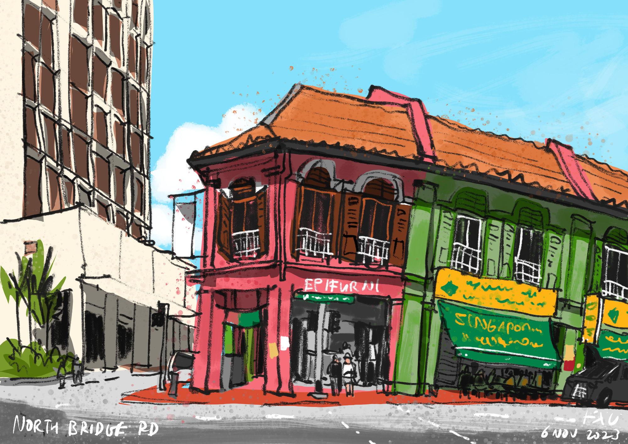
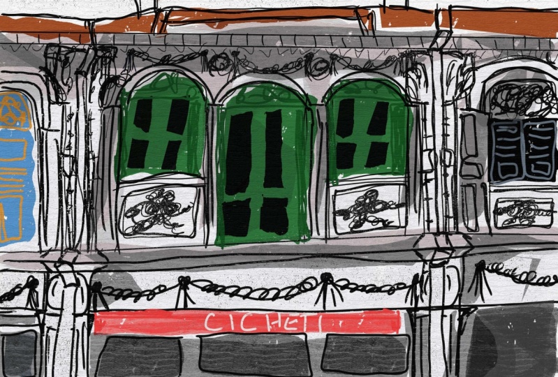
6. Walking around the neighbourhood: In this lesson, I want to
bring you around Little India, which is a huge neighborhood
here in Singapore. And it just so happens
that tomorrow is Valley, which is a huge festival
here in Singapore. So there are many decorations around the neighborhood
and also on the streets. My first thing for you as a neighbor sketcher is
to take some time to explore the neighborhood because you never know what you find. The pop up stores are
actually temporary. They were set up for the Debo Bali Festival
for people to shop, and as you can see,
it's really crowded. It's quite impossible
to sketch here because there is no space to sit, no place to sit, and almost no place to even
stand, and so crowded. Wow. What's the s? And if you think
this is crowded, wait till the festival
happens Tomorrow, maybe I should come back
tomorrow to sketch as well. So I just came out from there, so I just walked out from there. My next step for you is to be mindful of your safety when you're out of
urban sketching. When you're crossing the road, be aware of traffic. Be aware of cars and vehicles. And when you're in
crowded places, be aware of your belongings. Trying to stay safe and try
not to lose your things. Trying to find a comfortable
place to sit and sketch, because standing and
sketching with a tablet for extended periods of time
can be quite tiring. And don't forget to
drink your water so that you don't
get dehydrated. Today is a really hot day. This is actually a
nice scene to sketch, except I'm not able to find
a shady spot to sketch this. So that's the scene that
I wanted to sketch, but it's just way too hot. If you want to sketch in the
comfortable environment, the best time to sketch
is actually very early in the morning or
during the evening time. When sketching, you should always anticipate
things that can happen. For example, if you want
to sketch this scene, there is so much traffic, so you can anticipate
traffic blocking your view. You can anticipate vehicles that will park in front of
you to block your view. There are many people walking around who will block
your view as well. If you want to sketch here, you have to find a time
where it's less busy. Because otherwise it's just
not possible to sketch here, even though this is a very beautiful scene that
I want to sketch, right? Let's walk down the
street to see if there are other places to sketch. If it's really too hot, if it's noon time, you can find a cafe and
just sketch inside cafe, which is going to be way more comfortable and
less stressful to. Another thing you might
want to take note of is where the sun will be. Because certain
buildings will look better during the morning and certain buildings
will look better during the evening because
of where the sun is. Because of where
the shadows are, this is actually a
nice building to draw, but the sun is
behind the building. The front of the building
is actually in shape. And because of that, we don't really see
light and shadow. If you take a look
at this building, this is actually
a better subject because we have
sunlight coming from the left and we have the car
shadows on the right side. We also see some car
shadow beneath the roof. So this is what I'm usually
looking for when sketching. I want to see light and shadow. I don't want the whole
building to be shape. Lighting conditions can
change very quickly, so now it's cloudy and the
cast shadows are gone. Before you sketch, you
may want to maybe take a photo when the shadows
are still there, so that when the
shadows are gone, you can still work with your photo reference
as much as possible. I would prefer to sketch and paint everything on location, but the thing is conditions
can change very quickly. Earlier it was sunny
and now it's cloudy, and maybe in half
an hour's time, there could be a thunderstorm. Sometimes when I
am out sketching, I may end up not
sketching anything because the conditions
are not right. But I will at least try
to take some photographs to know where the sun is coming from and
where the shadows are, so that I can come back to the same place again to
sketch some other day. For example, with this building, you can see it's
lit by the sun on the left in the afternoon
to evening time, if I want to come back
to sketch this building, I will do so during
evening time. You can get more
dramatic shadows when sketching in the
morning and evening, because when the sun is low, the cast shadows will be longer. And that will give you the drama and excitement in your sketch. This church is a good subject
matter to draw as well, but I'll probably have to
draw in portrait orientation. But I probably won't
draw this because there is no light and shadows. And cast shadows when
the weather is not good. You can always catch indoors. So it's actually good to have some research done before
you hit out light. Have a list of places you can sketch during good
weather and bad weather. So those are some
of the many urban sketching tips that
I have for you. And in the next lesson, we will finally
sketch something. Okay? Hopefully something
not that intimidating, so that you can
get some warm up. All right. I need to find my
way out of this place first. See you guys in the next lesson. Okay?
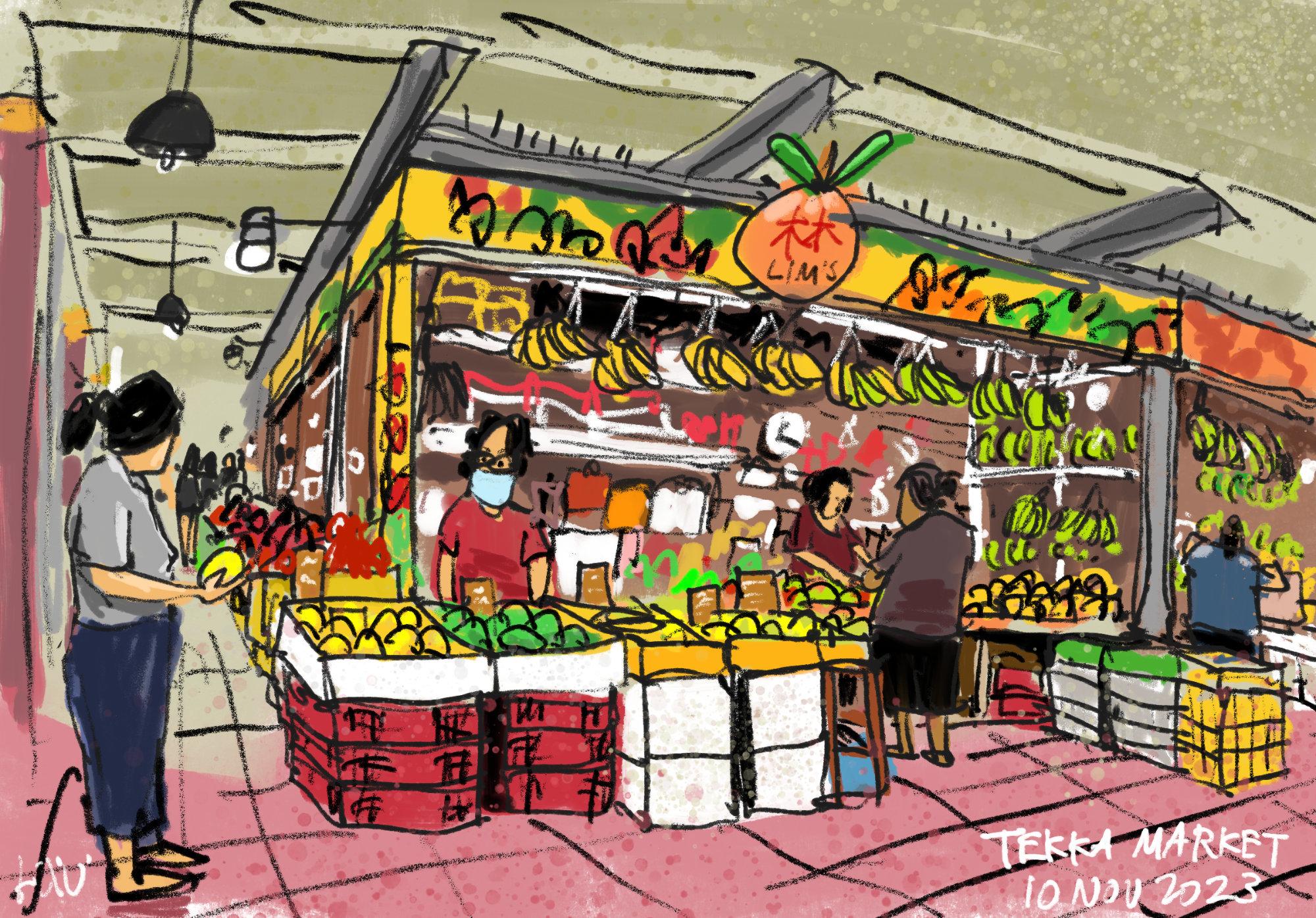
7. Sketching a fruit stall: In this lesson, we will
create some warm up sketches. Now, if this is your first
time sketching outdoors, I recommend you sketch at a
place that's familiar to you. Maybe you can sketch
near your home, near your office, or you can
sketch in your neighborhood, or maybe sketch in a cafe. Or if you want to
challenge yourself, you can always sketch
at a busy place, such as in the market, such as where I'm at right now. Or you can sketch
at the food center, shopping malls at a park, in the library, or in a cafe
where it's more relaxing. It will be great if you can find a seat so that you can sit
down comfortably to draw. Right now, I'm in front
of the fruit store, which I'm going to draw because I'm really attracted by the
colors of those fruits. You can even get
yourself a cup of coffee while you are sketching. Or if you're up
to the challenge, you can sketch people
eating as well. All right, let's do it. The first thing I want
to do is to turn on airplane mode so
that I won't get distracted while I'm sketching. Let's open the infinite
painter app and duplicate the template file from the
previous last openness. By the way, if you
want to follow along with this Totorrow, you can download the
reference photos provided. Now the perspective in
the reference photos will not match
what I'm sketching because there is
camera lens distortion versus what our eyes can see. I'm starting this
sketch by creating drafting lines just to
figure out the composition. Also figure out the perspective, and trying to identify any mistakes that I
will not want to make. Again, during the actual sketch, you can see me
reposition elements such as the shopper on the left. Now initially I drew the
shopper on the left too big, so I had to scale her down. And I also scale the whole
scene down so that I can have enough space to draw
the whole fruit store. During the drafting stage, there is a lot of leeway. Or you can move things around, you can reposition
elements, some scaling. After you're done with
the drafting stage, you can change the opacity
of the drafting layer to something that's
lighter so that those blue lines will
not be too distracting. There is actually
perspective going on if you look at where the
diagonal lines converge. And the diagonal lines are the ones at the top
of the fruit stalls. And diagonal lines for the
fruit crates and fruit boxes. If you look at where the
diagonal lines converge, you will find the vanishing
point on the left side. With that vanishing point, you can draw all the other diagonal lines, that
vanishing point. This is one way
you can draw more accurately and very quickly without having to really
draw exactly what you see. I mean, you can draw the
angles from what you see, but if you have knowledge
of perspective, you can actually use
that knowledge to help you draw faster
and more accurately. There is another vanishing
point on the far right, outside of the scene, which is why you see other diagonoizedil fitting
down to the far right. Now I have actually blocked
out the general store, and now I'm just adding details. Notice I've drawn the boxes, but I did not draw the details
such as the fruits and also the little
textures on the boxes. You can draw the
details later on. For example, when
you're drawing a shirt, you should draw the shape
of the shirt first, followed by the pockets,
and the buttons. Don't draw the buttons in the pockets before
drawing the sh, always draw the big shapes first before drawing
the details. That will really help a
lot with your sketch, because if you get
your big shapes wrong, if you get your perspective wrong at the start
of the sketch, all the little elements will be affected by
the wrong perspective. Try to make, try to get
your perspective accurate. At the start are actually some shelves at the
back of the fruit stores. I'm using those
horizontal lines for the shelves to
divide the back of the stores into smaller and smaller sections so that I can place the details more accurately
within those sections. You can see me use the
same technique when it comes to drawing the
pillars on the left and also the ceiling section at the top where the lights
are hanging from. For the coloring process, I'm actually painting
onto the BG color layer, that's the background color
layer using the clay roller, which is a very
big brush that can cover big spaces very quickly. You don't need to paint
colors that accurately. First, I'm actually painting the whole canvas
with colors just to remove the white of the canvas. For the detailed coloring, I'm painting onto
the color layer. This is where you can spend a lot more time to
paint the details. When it comes to drawing
or painting details, sometimes you don't
have to actually draw the details with
black lines first. You can actually paint
the details later. For example, there
are some containers and some shelving units
on the shelves behind. But I did not draw those shelves because I have the intention to draw those containers with colors instead of drawing
them with black lines. That's why I also did
not draw the fruits. Yet you can see the fruits, they are missing from the
boxes on top of the boxes, because I have intention
to draw those fruits with colored lines instead of
black and white lines. Notice I have the color
palette on the screen. If you want to show
the color palette, you can open the
color palette and use two fingers to drag the color
palette onto the screen. This way, the color
palette will always be visible and you can pick
colors very easily. The other way to pick
colors very easily is to use the existing colors
that you have already used. And you have to enable the color history palette in order to see the color history. Using color history
palette is great because this will limit the number of colors that
you have in the scene so they can paint with
more harmonious colors. Notice as I drew the fruits, I started out with
the green lines, but then I realized that it
doesn't look that great. I went ahead with
the black lines. But later on, I will still add more vibrant colors
for the fruits. For the bananas, you can see
they are actually yellow. They are yellow. But the
thing is the yellow must contrast with the
darker brown behind. Now initially, the back of the store was painted
with light brown, but with light brown you cannot get that color
contrast with the yellow. I actually painted the
back of the store with a darker brown so that I can create that contrast
with the yellow bananas, with the green bananas, and also with the yellow, red, and white boxes that
you just saw me draw. The tiles on the ground are
also affected by perspective. Those lines are
actually converging to the respective finishing points. I feel like I have to
draw the tiles because the ground looks empty. By drawing the tiles, you are actually adding
more details and information to your sketch. Believe it or not, this
sketch is almost complete. Now, it's really all about
adding more details, such as using the
splatter brushes to create some splatter to
simulate the traditional look. Because sometimes when sketching with digital art programs, the sketch can
look very digital. What I want to achieve here really is to make
the sketch look more traditional by
creating more textures, In this case
artificial textures. I'm actually using
the dry ink brush for most of the coloring. For coloring smaller areas, I just reduce the dry ink
brush to a smaller size. I like to use the dry ink brush
because creates textures. At this stage of the sketch, it's all about adding more
details to the scene. Trying to create contrasts
in certain areas just to present more
information with clarity. For example, if you have
boxes that are dirty. If you have boxes that are
not cleaned for a long time, you will want to add some
textures to those boxes. Maybe add some stains or
yellowing to the boxes. Adding details can
take a lot of time. Do spend the time to add details before you
start coloring. You should always
take a good look at your line art to see whether
it looks good enough. If your line art
doesn't look good, adding colors is not going to
really improve the sketch, unless you do some correction to the line art by using colors. If your line art looks
good at the start, you don't actually
need to add colors. Your line art
already looks good. Your sketch already looks good. Adding colors is just icing on the cake to make
your sketch look even better. To get your sketch to look good, you have to focus on getting
your line art to look good. And you have to use
a mix of techniques to make your line art look good. You need to know perspective. You need to know how to
draw from observation. You need to know some basics to contour drawing techniques. You need to know how to draw details in the foreground versus details in
the background. There are actually a lot
of techniques involved to creating good looking sketches. All this will be part of your subconscious when
you are more experienced. I've just added the paper
texture to the whole scene, and don't forget to write down the name of the
place and the date, and this is the
completed sketch. It was becoming extremely
crowded downstairs and I've just headed up the second floor to look for quite a spot to talk
more about the sketch. That, wow, there are so many clothing
stores on the second floor. On the ground floor,
there's also a wet market. This is a terrific spot
for sketching as well, because I'm away from the crowd
and I can see everything. When it comes to
urban sketching, we are usually drawing
on the ground level. This is actually a nice
view from the second level. There is so much activity
and so many things to draw. I've actually been on the
second floor here before, but I've never actually walked through all the
house hole today. I discovered a lot of places
that I've not been to. This is the completed sketch. I did not use all the layers. More specifically, I did not use the shadows layer
because I was drawing indoors and there wasn't any
sunlight and cast shadows. So let me remove the layers. I'm quite pleased
with this sketch. I think I managed to capture the activity that's going on, and I managed to capture
beautiful colors. And the paper
texture that I have applied looks really nice. Now if you look closely, you will be able to identify certain mistakes
that you have made. And you can actually
correct those mistakes at home and just learn
along the process. For example, here I
spotted one mistake. The color of the
sign board here, the price text here. The color matches the skin tone. I want to differentiate
this from the skin tone. Let me change the color of the sign board here to
something darker so that I can differentiate the price text from the skin phone
of the person there. Yeah. Okay. Now, it looks it definitely looks much
better sometimes at home, I may still want to add
some details because I feel like adding some details may make the sketch look
more interesting. All right, let me turn off the colors to
show you the line. Let me show you the
drafting lines first. So these are the drafting lines. So when I sketch this, I wanted to make sure I capture the perspective
accurately. So I tried to block out the
shape of the store first. I also try to block out the boxes and the
crates with the fruits. I also want to make sure the height of the people
are at the correct height, relatively speaking, compared
to the height of the store. Those are the very
important things you need to set up before you start. If you get the perspective wrong at the start
of your sketch, the perspective will be
inaccurate throughout the sketch. Try to get the perspective and the composition right at
the start of the sketch. It will be very useful if you can find the
vanishing point. For example, with this scene, the vanishing point for this
store is actually here. The diagonal lines
will point here. The boxes will also be affected
by the vanishing point. As I draw the diagonal lines, I will point the diagonal line towards the vanishing point. The other vanishing point is somewhere on the far right side. That's why the line here down. As I draw the lines, I will point to
that mention point which is somewhere
at the bar right. Now, let's overlay the line up with the drafting
lines created. You should be able to create
the line up more easily. The composition should be set. If you make any mistakes
during the drafting stage, that's great, because that means you will not repeat
the same mistakes. Here, let me turn off
the drafting lines. After I have sketched this, I've also added more people. I'm not sure if
you see that I've added more people here
in the background. And these people in
the background are further away due to perspective. They are actually smaller and you have to position
them correctly, relatively speaking, compared to other people in the scene, compared to the
store in the scene. I've also added
some people here. Now if the person that you're drawing
suddenly walks away, it's okay just leave
the sketch halfway, half done, and someone else will come in
and take the place. Later on when the
person comes in, you can continue to
sketch that person. Again, during this sketch, I noticed there are a lot of
things in the background. But I don't want to draw
all those items with line art because I can actually draw them later on with colors. This is how the scene
looks with colors added. You can see I did not draw
line art for the details here. But during the coloring stage, I can actually
color the details. I can use the colors
to draw the lines, the boxes, the plastic
bags in the background. It's good to have
a mix of black and white together with color.
Together with color. You don't always have to use
black to draw the lines. You can use color to
draw the lines as well. Let me show you the details. Yeah. If you need to overlay colors on
top of the line art, you can add them to
the details layer. This is how the
colors look alone. Without the line art, the sketch should
look good as well, even without the line art. This is quite interesting too. Of course, if you
actually create your line art more accurately, you will be able to
color more accurately. The line art is actually
quite important. If you get your line
art to look great, you can make your sketch look even better
with colors added. But if your line art does
not look great at the start, then adding colors later on is not going to
help that much. Okay, let's add the colors back. Let's add the details
back for this part. There are actually many bananas hanging in front of
the fruit stalls. You can see I actually
use black lines to draw the string that's used to hang the bananas black against the darker brown
is not that obvious. When I'm sketching, I'm always constantly thinking
about contrast. How can I create contrast? I wanted to paint the
background here a dark brown so that I can have the
yellow bananas contrast against the darker brown. I also use brighter
colors like this, bright red and white to create that contrast against
the darker brown. I could have drawn
the shelves here or the boxes here
with black lines. But as you can see, when you draw with some other color that
creates contrast, your sketch is going
to look interesting. Let me add the details here. I actually made the
background even darker so that I can draw the white
lines to create that contrast. Now, compare this to this. Which do you prefer? I think I prefer this
with more contrast. When you're sketching, always try to think about contrast. Lastly, I mentioned
the background. Yeah, this is the background
that I laid down. We have the floor and this is just a brown background
that's at the textures. Let me just show you how the textures look without
the other colors. I use textures, if the
texture is too obvious, you may want to
adjust the capacity. But generally speaking, when you use the eye dropper
to pick a color, you can just shift
the color picker slightly to get that
subtle change in color. That is actually good enough to create spltters like this. We have magenta color and I have a darker magenta
here at the top. I actually have the color and I increase the value to
create the darker spots. I also reduce the value to
create the lighter spots. I actually have a mix of light, light over dark, so that
it's more interesting. Once you have everything
put together, this is how it looks. Make sure to write the
name of the place and the date so that
you can remember the places that
you have been to. Don't be too disappointed if your sketch doesn't turn out
the way you expect it to, especially if it's
your first time out. Sketching, because
sketching is a still, it's just like writing. It's just like playing
a musical instrument. It's just like playing a sport. You need to practice
to get better. The more you sketch, the
better you will get. And you will also
be more confident, and when you have
more confidence, you will sketch better.
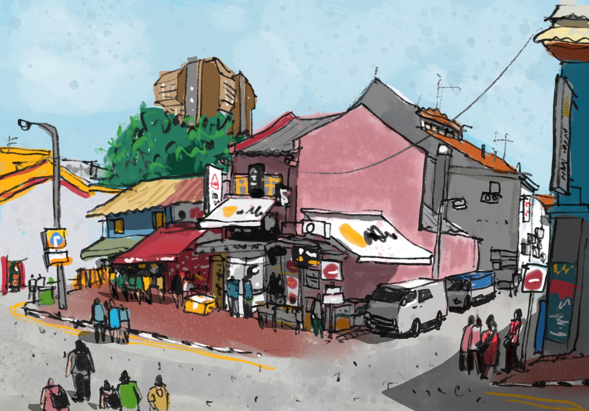
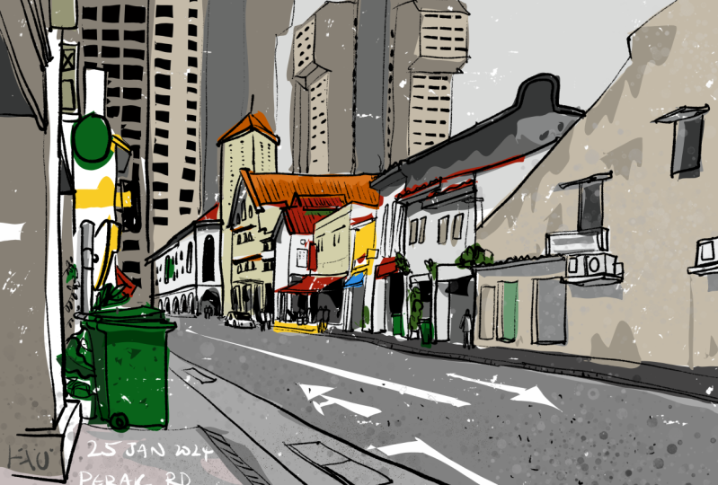
8. Sketching at a road junction: Hello and welcome to
this next lesson where we will sketch outdoors. As mentioned in the
earlier lesson, I recommend you to walk around
the neighborhood first, just to explore, because
the first place that you are at may not be the
best place to sketch. It is actually the
day of the festival, and I'm out here early in the morning
just to avoid the crowd. This is the street junction
that I want to sketch, and as you can see,
it's a cloudy day, so there are no cast
shadows which may make the building look flat later on when
the sun comes out. I will want to take a
reference photo just in case it becomes cloudy again. I can see a lot of
activity here at the shop, here on the ground floor, but this other shop
is not open yet. But when it comes to sketching, you can always use
your creative license to make the shop open
earlier than usual. I'm actually standing
here at a high elevation instead of there at
the ground level, because I anticipate heavy
human traffic later. When it comes to sketching,
try not to obstruct traffic, whether it's human traffic
or vehicle traffic. And try not to situate
yourself in front of stores to affect
their business. I've actually been here
at this place before, and I know for a fact that the sun will come from the left, which means there will
be cast shadows here. If I want to sit
here and sketch, I can actually do so. But I have to sketch really
quickly because the sun will move over to the other side
and I will lose the shadow. This is one of the problems that I mentioned about
urban sketching. There will always
be some vehicle that will park in front of you. You have to anticipate
this and try to find a location to sit where it's more difficult
for vehicles to park in front of you When the vehicle parks
in front of you, you can always sketch other
areas first and then come back to draw area
behind the vehicle. For this scene, I will
stand and sketch. By the way, I have this hop here that helps me hop back to the railing so I don't have to carry my bag or leave
my back on the floor. I actually want
to sit and sketch because I have my
portable stool here. I could sit at the steps here, but I know the security
guard will chase me away. Because I've already
anticipated that to happen. If you're using a matt screen
protector on your tablet, the reflection for the sky will be diffused into this
bright white diffusion. Personally, for me,
it's quite glaring, which is the reason why I no
longer use a mat protector. But as long as there are no
reflections on your tablet, it should look fine. Remember to charge the
battery of your tablet, because when you're
sketching outdoors, the auto brightness of the
display will usually be at 100% which will drain
the battery quite fast. All right, to follow
along with this sketch, you can download the
reference photos that I have provided. I have also made the looping video with people
walking on the street. If you prefer to draw
from a video where there is activity versus drawing
from a static photo, you can do that. This scene is more complicated
to draw compared to the fruit store because
there are so many elements. There are so many buildings, there are awnings and signboards sticking out from
the side of the building. There are many people
walking on the streets and there are some
parked vehicles. This sketch was also quite
challenging to draw because it was such a hot day and I
was standing and sketching, and everything looks really bright because it was so sunny. If you happen to have
a pair of sunglasses, you can use them outdoors as
well to reduce the glare. So once again, I'm
starting this sketch with the drafting lines, just to figure out
the composition and also the perspective. You can see me use
the transform tool quite often just to
move things around, just to scale certain elements, to make sure that
what I want to draw, all the things that
I want to draw, can fit onto the canvas. By the way, I just noticed that the reference photo
that I have on the screen right now does not
have the parked vehicles. If you want to draw
those vehicles in, you will need to know the
perspective of the vehicles. Two vehicles are
actually just trucks, which are rectangular and boxy, so they are not too difficult to draw with the help of the drafting lines
that I have created. You can see me now inking
over the drafting lines. If there are any
mistakes that I have made earlier during
the drafting stage, I can avoid all
those mistakes here. Generally speaking, I would
draw the big ships first, followed by the small ships. But here you can see me
draw the details first. That's only because
I have already drawn the big ships with
the drafting line. You should always
draw the big ships first because otherwise you may get a perspective wrong
or inaccurate at the start. And that's really going to
affect your sketch later on. That's why having
drafting lines is so useful and can help you save a lot of time later on so
that when you're drawing, you don't have to
undo that often. Try not to undo that. Often, each time you undo, it means you have
to redraw again. It means you have to spend
more time with the sketch, with the drawing
sketching digitally. Sometimes I will think
of myself as sketching with actual pen and ink
that cannot be erased. This helps me sketch
more carefully. This also helps me
observe more carefully. When you can observe what you see in front of you
more carefully, you will be able to draw
more accurate mistakes. Take time to correct. If you don't make
that many mistakes, you don't have to
spend so much time correcting the mistakes. This scene was actually drawn
from a higher elevation. For this scene, the
most important thing to find out first is
where's the horizon line? The horizon line is
actually somewhere between the first
and second floor. On the horizon line is where you will draw most of the lines horizontal ly for the lines that are above the horizon line, they will tilt down to a
vanishing point in this case, which is somewhere
off the canvas on the far left and
also on the far right. With this scene, I'm
actually sketching the perspective
from observation, instead of trying to find out where the vanishing point is and drawing the diagonal
lines to the vanishing point. Now one thing to note
about the perspective is there are many people walking for people that
are further away. You should draw them smaller for people that
are closer to you, you should draw them bigger. The placement of
the human figures will be relative to one another. Let's take a look at
what I have here. So far, the ink sketch
is almost complete. I just need to add some details. Perhaps I could add those
details with colors later on. Now, this door on the ground floor was
not opened earlier, but now it's opening up. If you anticipate the
shop opening later, you can actually draw other
parts of the sketch first and come back to this area
when the shop is open. If the shop is not
going to open, then you will have to use your artistic license to think about what
shop this can be. I actually thought this was a shop that sells accessories, but it's actually
a money changer. So I am going to erase this part here and turn this
into a money changer. All right, And now it's time
to paint again. Same thing. I'm using the clay roller
brush to paint the big ships. I'm painting the sky, the ground, the shop house. Just to remove the white of the canvas later on when
I paint the details, it's easier for me to cover the whole sketch with colors
and not miss out any spots. When you're painting the
big areas of colors, paint it onto the
background color layer. When you're painting
little areas of colors, adding the details with colors, paint them onto the color layer if you need to do any
adjustments later. For example, if you want to maybe change the
color of the sky, you can do so very
easily by switching over to ground layer to change
the color of the sky. Now, this scene was sketched
during a cloudy day. All the colors are desaturated. When picking colors, I try to choose a color that
is desaturated. But there are, as you
can see from the photo, some spots of bright colors, such as the bright red
awning under the sun. And also some of the people are wearing very vibrant
color shirt. For most of the sketch, I want to use a
desaturated color scheme. I will leave the
more vibrant colors to just certain smaller areas. If you make your sketch
like way too colorful, too vibrant colors can
look quite jarring again. When coloring, try to use
a limited color palette. Try to use the
history color palette to reuse the colors that
you have already used. This will, first of all, help you save a lot of time
because you don't have to go open the color picker all
the time to choose colors. And this will make the colors
work more harmoniously. Now notice I have
drawn some people at Bottom left side and some
of them are cropped off. I like to create this
illusion of people walking into the scene with those human figures
at the bottom left. The shops on the ground floor
are selling a lot of items, but I didn't draw
all the items with the black lines because I have intention to color
them with color. When you're coloring, try to use light over dark,
and dark over light. For example, if
you take a look at the red awning on the left side, red, but there are white
details on top of the red. For the white awnings, you can see the yellow
and black details on the white awnings. We have color or darker
values over white. And for the red and white, we have lighter values
over darker values. Play around with the
light over dark and dark over light to create
visual interest. To create contrast,
this will make your sketch look way
more interesting. When sketching, I'm always
thinking about contrasts, like how can I create
contrasts using values? How can I create
contrasts using textures? How can create contrast
using just line art? Because if you think about it, drawing is about contrast. When you have a clean
sheet of paper, it's just white and there are no lines on it,
there is nothing. But once you add a few
lines on the paper, there is contrast
and suddenly there is meaning to those lines depending on what
you are drawing. Will sketching this scene, it was cloudy, there
were no cast shadows. Without the shadows,
it's difficult to present the form of the
buildings more clearly, even when you have lots of
details in your sketch. Without the shadows, the
sketch can still look flat. Without any car shadows
or even shadows, the sketch looks flat. I really want to
add some shadows to increase the contrast
in certain areas, just to make the
physical form of the building look more obvious. The lighting condition
today looks very different compared to what
you can get on the sunny day. Because earlier I mentioned the sun should come
from the left side. But on the cloudy day, you can see that it's actually the right side of the building
that is lit by light. It is the right side of the
building that is brighter. The front side of the
buildings are darker. Now I want to add
shadows to the scene, and I'm going to
create two variations. The first variation will have the sunlight coming
from the right side, and the second
variation will have the sunlight coming
from the left side. I'm trying to remember
how the scene actually looks with shadows because I have been to this place before. When you have the sun
coming from the right side, the front of the shop
house will be darker. But if you have the sun
coming from the left side, it's the right side of the shop house of the
buildings that will be darker. This is how it looks. I'm using the fuel ship brush to create the shadows
very quickly. Because with the
fuel ship brush, you can draw big
ships very quickly. This is a very quick
way to add shadows. I've just added shadows, and this is my
artistic impression, because right now, there
is just no cast shadows. Let me turn off the visibility to let
you see the difference. Now, everything is brightly lit. There is no contrast, and it's difficult to make
out the form of the building. But once you add the shadows, you can see the shadow side. You can see the form of
the building more clear. This is scenario one, where the light source is
coming from the right side. Let me show you scenario two, where the light source is
coming from the left side. I'm not sure which
one looks better, but these two, the shadows
are not drawn on location. This is just my artistic
impression, of course. Lastly, we can add
the paper texture has enabled paper texture. So let's zoom in
and have a look. This is the wrong texture, this is the canvas texture. So let's choose the
sandstone texture. All right, this looks
so much better. One way to make the scene
look more lively is to add lots of
people in the scene. The second way is to add little details such as
overhanging cables. There is one here. You can add antenna lines
as well. There's one here. There is another antenna
line here as well. This is my completed sketch, which took me about
2 hours to complete. I'm quite pleased with it. So as you can see, it's becoming increasingly crowded
and increasingly hot because it's almost 12:00 the
sun is about to come out. But unfortunately, there
is a big truck in front. So even with the sun out, even with the cast shadows, I won't be able to sketch
with that truck in front. Here's a look at
the cast shadows. The sun is almost
directly on top, so the shadows are very short. You can get an idea
of where the sun is by looking at the shadows
of the people around. So this truck has been there
for almost half an hour. And I'm not sure when it's
going to leave because there's still quite a lot
for them to unload anyway. I'm quite hungry now, so I'm going to leave for lunch. And that's it for this lesson.
9. Adding shadows: Now I'm back home and I want
to paint the shadows again. This time with the help of a reference photo with
light and shadow. I'm going to show
the layers palette. Select the shadows layer, make sure the blending
mode is multiply. And I'm going to
select the 60% gray. I'm going to choose
the solid field brush. And I'm going to hide
this layers palette. After choosing the
correct layer, the sun is coming from the left. The sun is also coming
slightly from the back. The front of the shops
are actually in shadow. The site is also in shadow, but the shadow is less, probably due to the ambient
light for the front. Let's choose a 70% green
state just to make it darker. Let's just paint
this shadow shape. Now if you feel like
the shadow is too dark, you can adjust it later. I will show you how to do so. Try to paint the shadow shapes
as accurately as possible. As you see, this whole
part here is in shadow. If you need to erase
the shadows later, you can use the eraser
with the shadow, sorry, the solid field brush. So that will allow you to erase
the shadows very quickly? There is cast shadow here, yeah. So some of the people
here are under the shade, but their shoulders
are under the sun. We also need to paint the
shadows for these people here and here as well. You see some people
here as well. Okay, so it's the afternoon. So the shadows are
actually not that long. This whole part
here is in shadow. So now you can see
this is much darker, but is it too dark? We shall see later. Okay, here we have people. So we need shadows as well. And I can see the cast
shadow on the ground. So let's paint the cast
shadow for the vehicle. The vehicle will
cast the shadow. Okay, This part here as well, this part of the building
will cut shadow as well. This whole building here on
the right side is actually in shadow except for
the rooftop here. Let's just have all this
in shadow here as well. I'm going to cut away some of the shadow here because there
is light streaming through. Okay. For this side of the wall, I'm going to choose
a lighter shadow. This is 70% We will go with maybe 50% Let's see if it's
enough or light enough. Yeah, let's see if this is too dark or if the
contrast is not obvious, you can choose a lighter shadow. So let's go with 40% Yeah, I think this looks good. Let's create a shadow here. There is cut shadow
here as well. This Ac unit is in shadow. The bottom of the awning. In shadow as well. This whole part
here is in shadow. The fan is in shadow. The shadow is from building. It's actually cut shadow
from the building. We need to paint all
in gray, light gray. I need to erase this part here. Oops. Okay, let's
choose the brush again. And let's paint this pot here. This part here is lit by
light. We need this white. This part here is lighter. Let's choose maybe 20% gray. Yeah. Okay. So let's have a look and see
what we have so far. Okay, So this is
what we have so far. This part here should
be darker as well. So we need maybe 70 or 60% Yeah. Okay. Because this part is all these elements are
below below the shade. So it needs to be darker. Okay. All right. So this is what we have so far. This is also in shadow. We need to paint that as well. So let's go with the 40%
using the solid fuel brush. A very convenient,
it's very quick. It allows you to
paint really quickly. The top of the roof will
be lit by sunlight, so we just need to paint
the side of the building. Okay. This is what I have. Let's compare this with, with my artistic
impression of the shadows. Okay. I need to make
certain parts darker. Okay, let me reduce this first. This is the actual
shadows based on the P. Let's turn this
off and turn on this, which is my artistic impression, where the light is coming from the left and this
whole side is shaded. Yeah, this actually looks good. It looks pretty good because
the contrast is very strong. I can see very
obvious light area versus the darker areas. This is the second version where the light source is
coming from the right side. Yeah, the darker
shadows look better. And this is the one
that I've just painted with the real shadows. I'm not sure which
one I should choose. Probably this one. Yeah, I'm actually not too sure. Anyway, you can choose whichever version that
looks the best to you. And the best version is probably the one that was sketch
on location. All right. There are two ways to make the
shadows lighter or darker. The first way is to reduce
the opacity of the shadows. Oh, right now it's at
89% If I reduce it down to 40% again see the
shadows, it's almost gone. I can increase it all the way up to 100% and it
looks like this. The other way is to change
the color of the shadow. To do so very quickly, just tap on the shadow layer. Select this will select all
the pixels on that layer. In this case, it
will be the pixels that were used to
create a shadow. Now you can choose
a lighter gray, choose the solid fuel brush. Let me just zoom down
and just draw over this. And get out of the selection and take a look at your shadows. It's not that obvious, so let me just undo
because 40% is too light. Let me select this again
and maybe apply 50 or 60% 60% Let's get out
of the selection. And you can see 60%
is still obvious, but it's not too dark. There are two ways
to adjust shadows. You can use the
selection method, or you can change the opacity. If you find some of the
edges too rough like this, you can select the eraser to and choose the
dry ink eraser. This will let you erase the
to produce the rougher. You can see this pink
or magenta here, because that's from
another lower layer. Yeah. So just use
the dry ink eraser to create the
rougher H if needed, such as Here, spot here. All right then.
10. Video reference of road junction: Yeah. Us. Yeah. I re Yeah. Lousy religious. Yeah, this. Yeah. Religious. I think. Yeah. List. Yeah, Lo Yeah, I'm not Relus.
11. Goodbye: We are at the end
of this course. I hope you have enjoyed the course and I hope you
have learned more about the digital urban
sketching workflow and also learned more
about Infinit Painter. Don't forget to
leave this course, a review to help other
students know what this course is about and also let other students know
what you have learned. Recording this course wasn't
easy because I had to sketch outdoors and I had to record myself and the
weather was so hot. But it's still a very
fulfilling experience, especially on the
urban sketching part because I discovered places
that I've not been to. It's just a new experience each time when I'm
out sketching. Urban sketching is really about the experience as well as about the sketching
part of course. But it's really
about being there on location to
experience the sight, the sound, and the environment. And these are things
that you will remember for the
rest of your life. Don't be too upset if your first few sketches don't turn out the way
you expect them to. Because with more practice, you will be more confident
and with more confidence, your sketches will look better. It's really more about
practice and going out there to draw and to
enjoy the moment. Thanks so much for
joining this course. If you want to learn
more about sketching using traditional or
even digital media, you can check out the
other courses that I have. All right, see you in
the next course, bye.
 Teoh Yi Chie, Sketcher, watercolour lover