Transcripts
1. Intro: Hello, my name is teoh and I'm an artist, graphic designer, and urban sketch here who
enjoy sketching on location. In this course, I'm going
to show you the tips and techniques that I use
for Sketching greenery, which is an often
overlooked subject because they are
in the background. So I'm going to show
you my inspiration. I'm gonna teach you
how to mix green using the existing colors that you have in your watercolour box. And I'm going to talk about the things that you
should think about when you are sketching
and painting greenery such as trees, leaves the tree trunk, Ross and all those green stuff. All the lessons are
hence on an order. Reference photos are provided. And I do welcome you to
share your projects, your sketches with me so that I can have a look and maybe
give you some critics. Alright, Before we get started, I have a favor to ask of you. If you find is cause use Bu, do live this cause a review so that you can help other
students discovered a cost. Alright, that's hit over
to the first lesson.
2. Inspiration: This lesson, we will
look at examples of how other artists draw
nature and plants, and that includes my
own sketches as well. The two books I would
recommend you check out are the world of
urban sketching by Stephanie Bauer and Spotlight on nature by Virginia
in and Gail Wong. Let's take a look at some sketches from the
world of urban sketching. This is a book I will pick off my shelf often just
to flip through the pages to get
inspired because there are so many beautiful
sketches in the book. There are also drawing tips
from all these artists. From around the wall, and you get to see
a huge variety of subjects such
as street scenes, interiors, nature and people. For this sketch, we
can see the trees in the background and the
grass are colored green. For these two trees, they are almost black. The leaves were drawn
with ink and the trunk. The tree trunk
looks almost black. The thing with trees is if
you actually look at them, In real life, they are dark. The value is dark. You can actually draw
them with just black. You can use your
artistic license to have the tree trunks
in white and this is usually done for stylistic
reasons to create contrast. Here's another example
of a white tree trunk, and this was drawn to
create the contrast of this white space against
the busy background. Having greenery
in your scene can make your scene look
lively instantly. Because green is
usually a darker value, especially when they
are in the background, they can help you
create contrast easily. For example, this
building now looks more prominent thanks to
the darker background. We have the lighter roofs
against the darker leaves. But if you compare the
lighter roof to the sky blue, you can see the contrast
isn't as great. If you don't have the
trees in the background, the building doesn't
stand out as much compared to having the
trees in the background, to make the building look
more prominent to make the building pop out from
in front of the trees. If you cannot see the
individual trees or the leaves, don't draw the individual
trees or the leaves, draw them as a shape as
a collective of shapes. If you can see the
individual trees, you can choose to draw
the individual trees and also the shape of the trees just to give your
sketch more detail. This sketch was
drawn with pen and ink with a green wash on top. This is a sketch with the
greenery created with darker values that were created with densely packed
hatching lines. For this sketch, the
lines were drawn closely together to
create this shape. If you don't draw the
lines closely together, it's going to look like this. This value is not as
dark compared to this. If you use very thin lines, extra thin lines or
extra fine lines, the value is going
to look like this. You can see this is
a very light value with some texture created by the hatching lines versus
this darker value. Here's another pen
and ink sketch. Here the lines are used to draw the shapes as well
as create the value. Creating a pen and
ink sketch like this can take a lot of time because you have
to spend the time to draw all those lines. I would consider this to be
a very technical drawing. This is a style
that I love to see, but I personally don't draw in this style because
it's too time consuming to me. Notice the leaves here. They are actually highlighted by not drawing any texture on them. We can see the shadow
side of the plant here, and we can see the
highlighted leaves which were not drawn. This is a nice example
where the trees are treated as a group of shapes. We can't really see the
individual trees and notice how the colors
blend very nicely very smoothly into the color
for the building and this creates this big
interesting shape. On the right side, we can see a standalone tree. These are beautiful sketches and painting created
with opaque media, such as Posca markers and guash. I actually cannot figure out
how this sketch was colored. Because if you think about it, if you draw the black
line art first and color it with opaque media
such as Postcar paint markers, which were used to
color this sketch. The opaque paint will
actually cover the line art. But for this sketch, we can see the
very detailed line out on top of the paint, and it seems like the paint
was painted within the line, so the paint doesn't go onto
the line or out of the line. So painting these tiny areas, getting the paint into the
small areas without the paint spilling out is
quite challenging. I love how this sketch looks. It's just a very mundane
scene of potted plants, but it looks so interesting. Thanks to the
shapes and also the texture created by the paint, and you can see some graphic
design elements as well, the use of this shape as a
background for the wall. These are other artworks
from the same artist. These were painted with wash. Notice the
lack of line art. These were just painted. And the shapes that you see, they make up the scene. They create the subjects. For this sketch, we can see
the tree behind the cars, and the tree is in
front of the wall. There is also a tree
behind the wall, and this tree is also
behind the wall. Having plants and trees in
your scene can actually create this foreground and
background element to make your to give
your scene more depth. This is a mixed media sketch with color pencils
and watercolor. When you use mixed media, you can use each medium
to its own advantage. For example, with color pencils, you can use them to draw lines. You can use them to to create the texture because
it's a dry medium. For watercolor, you can use
it to create shapes as well, such as the pots
here or the leaves, and you can use watercolor
to cover large areas. These paintings were
created with wash and the colors are so
bold, so striking. There is so much
texture in nature. By using different
styles of coloring, different shapes,
and brush strokes, you can differentiate the
different types of trees. In this scene. Notice how the darker value
makes this structure pop up more and look more obvious
because this is white against met value
and darker value. We have two shades of
green to differentiate between the types of
vegetation or the trees. Notice the shading is
on the lower side. This is the shadow side of
the plants and the trees. That is where the
leaves don't get any light and that's
the darker area. Lines can represent branches, and if you pack them close
enough to create shapes, they can represent leaves. This sketch was painted
with negative shapes, and by that I mean
the tree trunks and the building structure
were left white or left as very light value
to create these contrasts of flight value against
the darker background, which is made up by
the tree leaves. Also notice the white spots. These are the light passing
through from the foliage. This catch has a good
balance of contrast as well. We have the tree in the
foreground with details. We can actually
see the branches, we can see the leaves, and we have the trees in the
background where we can't really see the branches and
we cannot see the boundary. For the tree. This is nice contrast. We have detailed versus
the less detailed. Notice how the colors blend very softly to create this
beautiful color gradation. The nature and plants in this sketch were drawn
with squiggly lines, they were drawn very quickly, and I like this style. Sometimes when you draw fast, you draw with this
sketchy style, it can contrast with
the cleaner and neter Let's take a look at some of the
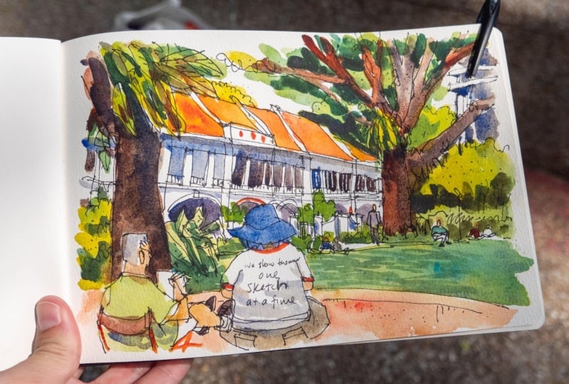
sketches I have drawn. This is the Singapore city scape that I drew on location
from a hotel room. There are skyscrapers, tall office buildings in the background and
low rise housing in the foreground and
there are so many trees and greenery around that makes this scene
look more lively. If the seascape is
just buildings, it's going to look
very stterile. This was also drawn on location. The green here is
just one big shape. And I use green and darker green for the shadow
or darker areas, and I have some line
art for the trees. Trees don't always
need to be green. As mentioned earlier,
trees can be white as well for
stylistic reasons. This was drawn on
location in Bali. There is so much greenery in Bali and I still remember
while I was drawing this, I was wondering if I
actually have enough time to draw all the details. My sketches are usually drawn with pen ink
and watercolor. But for this sketch,
this was drawn with pencils and watercolor. I remember the watercolor
brush that I use was so worn out
that it was quite challenging and almost
impossible for me to draw those sharp tapered leaves. You can see all the
ink washes here, the depths of watercolor. They are rounded off. But the leaves should
actually have sharp edges. If you can't get the
shape of the tree right, it can make it difficult to identify the type of tree
that you are drawing. Sometimes the trees
or vegetation or greenery can actually
block the building behind, and that can be a good thing because it means
you don't have to draw all those details
behind for the building. Don't be afraid to make mistakes or experiment
when you are sketching or painting because the more mistakes you make
the faster you learn. More importantly,
you will also learn what works and
what doesn't work. For example, with this sketch, my use of shapes is
not that precise, so it's difficult
to mark out or see or identify the
individual buildings or the shapes for the trees. I mean, from afar, this sketch works, but
if you look close, it's actually lacking the ship definition
and the details. This is a street scene
I drew on location. Again, I have trees here, which make the scene
look more lively. You can also make the scene
look more lively with people, pedestrians on the
street, and also cars. Things that move will make
your scene look more lively. And this was drawn
on the second floor of a fly over bridge. I have the trees
as shapes as well. This is a mixed media sketch
drawn with colored inks, colored pencils, watercolor,
gouache and Posca markers. In the next lesson, we will take a look at some
of the tools that we can use to draw and paint nature, greenery and plants, such as the tools that I've
used for this sketch.
3. Tools and supplies: Take a look at the
tools and supplies, we are using this cost. Now, before you buy anything, ask yourself this question. What will happen if you run
out of a specific supply. For example, what
will happen if you run out of ink and this marker, are you able to replace
this color easily? Before you buy your box set
of color pencils or markers, do some research to
find out whether you can replace the
colors individually or separately because you
don't really want to buy a new box of colors just to replace a few colors
that you have used. So the two set supplies
that I have here are a pen with waterproof ink, a watercolor sketch book, a watercolor paper pad, colored pencils and
graphite pencils, my watercolor box set, colored inks, and
postcar markers. If you're using
inks for drawing, make sure the pen you use has
ink that is waterproof when dry and this will apply
to colored inks as well. I use a founding
pan for drawing, so I have already filled this founding pan
with waterproof ink. And if you are also
using a founding pan, you can check out the
list of inks that I am showing you on
the screen right now, which are all safe for use
in the founding pants, and these are all
waterproof inks. Cold ink pens are fun to use, but they can be quite pricey. Before you buy colored
in pants, again, make sure to see whether or not you can
replace specific colors. This is the Duran
graphic line painter. Let me emphasize again
that you should buy inks that are
pamented what proof? I will list the brands of some color ink pens
on the screen so they can do more research on the pens that are
available from the brands. Do check out more reviews
online before you buy art supply so that you can
spend your money wisely. I highly recommend you get a box st of color
pencils because color pencils are
quite versatile and they are relatively affordable. You can get a box set of 12 or 24 colors depending
on your budget. We will be using
pencils as well. Because I use pencils
mostly for drawing, I prefer to use
mechanical pencils. A wooden pencil will be more versatile because this
can be used for drawing, as well as for shading. But the downside is this will
get blunt quite quickly, so you will have to
sharpen this more often. I like to use Posca
markers to add details because
the ink is opaque, which means it can go on
top of other colors easily. For watercolor, you can use
pen sets or watercolor tubes. Some of the brands I recommend
are listed by the site. And if you want to learn more
about watercolor mixing, check out the other cost that I have on watercolor mixing. The last thing I want
to talk about is paper. Since we are using watercolor, you should use watercolor paper. And you can use watercolor
paper pads with loose sheets, or you can use a sketchbook
with watercolor paper. For bins, I recommend you use
a watercolor sketch book. You can test all
different color mixes in your sketchbook, experiment with
different styles and effect to see what
works and what doesn't. You can refer to
your studies and your experiments in the
future very easily. You can also use the sketchbook to keep track of
your progress to see how much you have improved
over time with practice. Color paper is available
with two types of surfaces. There is the smooth
hot press surface, which is the surface that
I'm working on right now, and this actually works
better with colored pencils. The lines are smoother. The other surface is co
press textured surface. So you can see the lines here are rougher edges are rougher, and this textured
surface can wear down or wear out your color
pencils quite quickly. It's more difficult to feel the cold pressed textured
paper completely with color. If I try to fill
this with color, you can still see the white
of the paper showing through. If you have to use
pencil or dry media, I would recommend you
go with hot pressed, smooth paper surface, which
is easier to work with. Sketch books with smooth
hot press paper are not as common compared to sketch books with co press textured paper. I'm going to list some brands
of sketch books by the side here that come with hot press
paper for you to consider. In the next lesson,
I'm going to give you some quick tips on drawing
nature and greenery.
4. Mixing greens with watercolour: This lesson, I'm going to
show you how to create variations of green with colour
mixing using watercolour. If you already have
a Watercolour box, you can use the colors
that you already have. If you don't have a
Watercolour box and if you are thinking of
buying new colours, or if you are thinking of creating your own
palette of colors. Here are some colors I would recommend for mixing
greens and you can make your color
purchasing choices or decisions with the
help of a color wheel, such as this one
that I have here created by Bruce Mac II. I have to tips for you when it comes to choosing
which colours to buy. Choose primary colours that
are close to each other. On the color wheel, the primary colours would
be yellow, red, and blue. So choose a yellow or
red close to each other. Choose a yellow or blue close to each other on
the color wheel. So that's the first tape. Choose primary colours
that are close to each other on
the color wheel. The second tip is to
choose primary colours on the outer edge
of the color wheel, because those are the
most vibrant colors. You can mix vibrant colors. If you start with
vibrant colors, but if you start with
muted colors, well, your resulting mix will also
look mutant, will look down. So let's take a look
at the yellows. I would recommend I would recommend you go with
Hansa yellow medium, which is PY 97. This is a nice media alone. If you want a cool yellow for nice yellow greens goal
with hansa yellow light. Lemon yellow, which is
PY three or PGY1 75. There is also our PGY1 Fifi, which is Nico is or yellow, which is not listed here. Nikola is all yellow is a good primary yellow
for mixing as well. But for me I prefer
Hansa yellow medium. So for blues you can go, they go blue or ultramarine. These are the two classic blues. I have an additional blue, which is cerulean blue chromium. So serene blue chromium
is a beautiful color, which I will show you later. You can get either
Pb three is six, or PB F35, which are just
two variations of cerulean. This palette that I have, this is probably a cool yellow. This is lemon yellow, if I remember correctly. This is phthalo blue,
French ultramarine blue. So we have one yellow
and three blues. I can mix three types of ring, three variations of green. But if I have two
yellows and three blues, I can make six
variations of green. So the more primary
colours you have, the more variations of green
you can mix are also have some green colors
in this pen is a sap green and this
is fatal green. If you have a good mix
of primary colours here, you don't actually need this convenient colours
because you can actually mix this two with
the yellows and blues. You have, I have
these two greens here because I mix these
colors very frequently. So it's good to have premix. Colors shown on the screen right now are the
yellows and blues. I recommend void cadmium colors because those are opaque colors. When it comes to
Urban Sketching, chances are you
are drawing lines with ink or with pencil. And when you're
painting colors on top, you want the line
ought to show through. So use transparent colours. Don't use opaque colors that
can cover your line OD, so avoid cadmium colours. Alright, now let's
mix some greens. Usually I will start
with yellow and paint some yellow
on the paper first. And I can add some blue
if I want a yellow green, I will go with phthalo, blue with hansa yellow. So this will give me
the yellow, blue. And it's colour actually it
looks like phthalo green. So it can use Hansa
yellow medium with the little blue to mix, sorry, yeah, Hansa yellow
medium with phthalo blue to mix a color that looks
like they, Lou Reed. If you need to make
the green darker, you can add some red. You can add this red here, which is a warm red, a scarlet, just to
make the green darker. If it's to rate, you may
have to add more phthalo blue just to neutralize the red. So this will create the
shadow side of the tree. And you can use this to
paint the darker leaves. So this is hansa yellow
medium with phthalo blue. And this is the one rate discolored they have added
to make the green darker. The next mixed it I wanted to show you is with
Hansa Yellow Medium. Again, this is with ultramarine. It can be a French ultramarine
or ultramarine blue So this green looks
like the sap green. So notice that this
green is not as vibrant compared to the green creator
with the little blue. Again, if you want to make or create the shadow
areas at some red to it. And again, if there is too
much red at more blue to it, just to make the darker or
create the darker greens. Lastly, let's take a look
at some cerulean blue. So this again is
hansa yellow medium, and this is cerulean blue. This is a nice green. This is a yellow green as well. I'll say it's in-between
ultramarine and phthalo blue. Same thing if you want to make the shadow or create a shadow
areas, you can add rate. In this case, I will add
blue and some red to it. Just to create the darker areas. I mean, haven't used
too much water here. It is difficult to mix a dark
Karla with cerulean blue, which is why I'm
using blue instead. Let me show you what
you can get if you use a warm yellow with a
blue for mixing greens. So this is new gamboge, which is yellow and warm yellow. Or you can consider this
and orange as well. If I add some
phthalo blue to it, you can see the green
is trying to mute it. It's not as vibrant compared to mixing this green with phthalo blue and
hansa yellow medium. So this green looks kinda muted. If you want a green
that looks mute, or if you want look to be dry. Like for example, if
you're appending plans in desert or dry areas, this could be a good mix
for those dry ponds. This other greens I
was able to create with Hansa yellow medium to
get away with feel blue, ultramarine, cerulean,
blue chromium. If you are using another yellow, you will be able to
create another set of greens with the
blues that you have. So all of the four
mixes that I have here, if you want your yellow
to look, yellow green, I will recommend
you go with Hansa, yellow medium with the
little blue, cerulean blue. If you want your green
to look dry year, if you want your green
to look a bit muted, you can use yellow
with our trauma. And now let's paint
the tree trunk. For tree trunk, it's
first important, usually I go with burnt sienna. This is how burnt sienna loop. And if you want to make
your tree trunk darker, you can add outro marine. So this is just burnt sienna
and this is ultramarine. With some burnt sienna. Outro marine will neutralize
burnt sienna to create this darker gray color. If you want your branches, oil tree trunk to
show more brown. Just at mall. Been to see if you want your branches or the
tree trunk to be darker. Just add more ultramarine. This is the mix that
I always go to, the French ultramarine
and burnt sienna mix. Another thing to note about colour mixing is
trying not to mix your colors to completely
in the Color Palette, such as what I'm doing here. Because you can see this wash. If you mix your
colors to completely, this wash is going to look flat. So this wash here is not as interesting
compared to this wash on the left-hand side
where you can see the individual colours are pigments that we're used
to create this wash. So to make this wash
more interesting, you may want to charges additional color while
the wash is still wet. But it would be good if you
can have the colors mix on paper so that you
don't have to do this. Which can sometimes
be quite tricky. So it's easier to mix
the colors on the paper, then on the palette, and then makes it on paper. The next few lessons
will be quick tips on sketching and painting
nature and greenery
5. Painting leaves, branches, tree trunk: This lesson, we
are going to paint trees and we are going to create the pockets of light that passes
through the leaves. So if you take a
look at this photo, you can see the leaves. They don't actually cover
the sky completely. There are empty areas
where you can see the sky, where the light
can pass through. Same applies here as well. Here you can see the blue sky. Of course, if the leaves are too dense than the light won't
be able to pass through. Even for this tree, you can see the light passing
through the bottom of the tree where the
leaves are not as dense. And for this tree, the leaves are quite sparse. So let's draw this
tree for practice. So this is gonna be
a very quick sketch. And another tip I have
for you when it comes to drawing or painting nature is note that there are no
straight lines in nature. So when you are drawing
trees and branches, make sure the lines are
not completely straight. And even if the line looks very straight or the curve looks
very straight or to smooth, sometimes I may introduce
wobble or jitter, or doesn't make it a
branches turn more. Rather than draw
the straight line which will look unnatural. You can always use your
artistic license to make lines less straight. For example, if I draw
the crowd here straight, it doesn't look as
interesting compared to making it less trade. In this case by introducing some grass or maybe
have the ground, the line 2D, certain
direction or certain angles. What is tree? I'm going to start by painting yellow because yellow is a colored that
is quite easy to dirty. So I like to have yellow
first on paper and make sure you leave
areas of white for the light to pass through. It will be good if
you have a brush with a sharp point so that you
can create the leaves. Okay, I think this
should be enough. Next I'm going to add
some phthalo blue. Just a bit of blue, just to recreate the green. Mixed a green. Again, pay special attention to
leave pockets of light. Lift the paper white. Fellow green is a
very vibrant color that has high tinting strength, so you don't have
to use that much. Phthalo blue. Hello, blue is the color
with high tinting strength, which means you can use a bit of phthalo
blue and you will be able to get that intensity, get the extra vibrant colors. So don't use too much, they will do is going to overpower the yellow
very quickly. So just leave pockets of
light, areas of white. I may also want to just have some splatter of color or
spots of color outside. Just to create the leaves, just to suggest leaves. The bottom of the tree
we will get less light. So I want to make
the bottom darker by adding more blue
and scarlet red. So by adding more
blue and scarlet red, which will neutralize the blue, you can get the darker greens, you can make the bottom darker. And you can make one
side of the tree darker. If the lysosome coming
from the other side. Let me finish up by painting
the grass on the ground. You can use the
same green to paint the grass on the ground. If there is casts a shadow, you can use this darker green
to paint the cast shadow. Now for the tree trunk, let me use ultramarine and
a brown, the burnt sienna. Just to pin tree trunk. If you need a tree
trunk to be more brown, just add more burnt sienna. And if the light source is
coming from one direction, maybe the light source is
coming from this direction. You can make the other side of the tree trunk or
the branches darker. Once the wash has dried, you may want to
add some branches, but you have to make sure
to watercolour is drivers. Otherwise, if you
draw the branches, the color is going to
blend into the leaves, which is not going to look nice. So I'm going to draw
some very thin branches. Just a few branches, just to suggest the branches. Okay, I think this
sketches done, here's a comparison with other trees that I
have painted earlier. So this tree with the pockets of light definitely looks
more interesting compared to the trees here
where the shape is just solid. So this tree is more
interesting than these two, because there are
pockets of light. Pockets of light
candles will be created using the branches,
believed and Trees. So you can draw the
branches in a way that pockets of light
can show through
6. Drawing recognisable shapes: Lesson, we are going to
focus on drawing shapes. Let's start by drawing a very simple tree,
a coconut tree. This photo was taken from
the ground level looking up. When we draw the tree trunk, there are some lines
or some rings. Those rings are actually
curved if you are looking up. I will want to draw those
rings with very thin lines so that they can contrast with the thicker lines of
the exterior of the h. Okay. And for the leaves, when you're drawing the leaves, make sure you study how
the leaves branch out from the main branch and try to
draw the shape as you see. Okay. This is a coconut tree, which is easy to draw. Now for this branch here, you can see the leaves
actually branch out from this side. Some of the leaves are almost perpendicular, but some are not. I may want to add a thicker
branch here. A branch here. Pay attention to the angles between the branches,
for example, the angle between this
branch and this branch, this branch versus
the tree trunk. Okay, so this sketch
is almost done. Once you're done with this,
you can actually paint it. I will leave this
sketch as it is. Okay. Try not to go over
the lines again and again. For example, when you
draw a line like this, try not to draw
another line directly on top because it's going to
make your sketch look bad. Let's see if we can simplify this coconut tree any further. So I'm going to imagine this tree is actually
very far away. Remember when you're
drawing lines in nature, note that there are no perfectly or completely straight lines. This single line is used to
represent the tree trunk and I'm going to use another
line for the leaves. Okay. So this can be a coconut tree
from very far away. When you are drawing a tree, make sure the shape
is recognizable, even if there are no colors. Let's draw another tree. This one seems to
have a flat top. Pay attention to how the
branches branch out. Some of the branches are
actually overlapping. If you can see how they overlap, you can draw the overlap. But if you can't see
how they overlap, you can just draw the shapes
between the well, shapes. Okay. So I have some branches here. And now I can draw the leaves. This is a tree with a flat top. Sometimes I like to introduce little dots for the
leaves at the edges. Again, while you're
drawing the tree, make sure the shape
is recognizable. You can also introduce
some trunk branches This branch looks kind of thin, so I may want to make
this slightly thicker. As the branches move to
the edge of the tree, the branches will become
smaller and smaller, so that's something
you should know. Okay. And sometimes the
bottom of the tree, the tree trunks can be black or the color
that is very dark, that it looks like black. So you can actually, in this
case, color this black. Let's stop here so that I
don't overwork this drawing. Let's draw another tree. As you are drawing the trees, pay very special attention to the tree or the subject
that you are drawing, draw what you see, not
what you think you see. Pay attention to how the
branches branch out, pay attention to the shapes
created by the branches, such as this enclosed shape here and as the
branches branch out, make sure the branches are thin Notice this line here
that I've just drawn, this is two straight,
this looks unnatural. Use your artistic license to make the line straight
lines less straight. When you're drawing the
thin branches at the top, you can hold the pen more vertically to draw
the thin lines. Okay. So I have drawn the
tree trunks and the branches, so now I can draw the leaves. Now try to draw the leaves with different styles just to see
what works and what doesn't. I can see the boundary or
the edge of the leaves here. I'm going to draw this
edge here and see if it works and it seems to work. I'm drawing with ink. Now, if you're painting the
leaves with watercolor, you may actually skip the ink part and just paint
the leaves with watercolor. The inking part for the
leaves may not be necessary. Let me add some little
dots for the leaves. Now for this second tree, maybe I'll try a
different style. Maybe I'm going to use this gribble style just
to see the effect. Try different styles to see
what works, what doesn't. Even for me when I'm drawing or painting trees or greenery, I'm experimenting
with different styles just to see what works. When I find a style
that suits me, I will stick with that style. So notice this tree looks
different compared to this tree on the left side just because of the way I drew the leaves. The style actually does matter. Lastly, let me try watercolor on this tree here at the bottom. This is not watercolor paper, so the watercolor
doesn't flow that well, here I just want
to draw the shape of the tree of the leaves. It looks fine. It
actually looks fine. Remember to leave
pockets of light. This actually looks
better than I expected. This is the style I will go for. If I'm experimenting
with different styles. So for me, the shape created
by all these qugly lines. It doesn't make this
tree very recognizable. This tree here
still looks right, but it's difficult for me to differentiate the leaves from the branches because this
part here can also be leaves. Maybe I can color this. Let me just color this and
see whether it works Now, when you are painting watercolor try to paint with one stroke or one continuous wash when
one continuous wash can work. Because if you paint
with multiple washes or multiple strokes, the art, the wash is going to
look patchy, splotchy. That's not what you want. Now
after painting the leaves, you can tell where the leaves are compared to the
bottom of the tree. Now, for this particular tree, the leaves are
denser at the top, so I may want to
make the top darker. Yeah. Just make the top darker. Let me introduce
some little thoughts as well for the texture. Make the top and
the bottom lighter. Okay. Let's see if it works. This does not work. This works the best, and this looks all right. Now that I have these
two to compare, I can say that it is
actually not necessary to draw the boundary
for the leaves. Because when you
paint the leaves, the watercolor will
create the shape, so you don't
actually need to use the line art to draw the shape. So that extra step of drawing the boundary
is not necessary. If you are drawing
a coconut tree, you can draw the tree trunk. But you don't have to
draw leaves with ink. You can actually just paint
the leaves with watercolor. This will actually help
save you some time when it comes to drawing
plants or trees.
7. Project overview: Welcome back. In this lesson, we are going to use all
the things that we have learned so far to
create a pen, ink, and watercolor
sketch of this sin, the workflow that you
are about to learn is the same workflow
that I use when I'm sketching on location. For this lesson, we are
going to sketch with ink. We're going to
paint with shapes. We are going to think
about light and shadows, and we're going to add textures. This is the reference
photo we will be using. And you can download this photo from the downloads section. Let's look at the tools we'll
be using for this lesson. I have two cups of water, a pen with waterproof ink. I have to watercolor
brushes here, a flat one and a round one. I will mostly be using the
round brush for this exercise. Don't use paper
that is larger than A5 size because what
we're trying to do here is to understand the workflow and also
practice color mixing. So if things don't
go as expected, you can always start
on a new page. And when you're working on
a small piece of paper, you wouldn't have
wasted too much time. The colors I'll use for painting
our Hansa yellow medium, pyro, scarlet, French,
ultramarine, and burnt sienna. If you don't have this
colours, don't worry, you can use whichever
yellow, red, and blue that you
have in your palette. Just make sure those primary
colors are transparent. Let's look at the scene
we will be Sketching. So there is a building here
which is facing the front. So we don't really have to worry too much about perspective. There are trees in the foreground
overlapping the building, and there are trees in the background and also
behind the building. So what a trees in front, we will need to give
them more details for the trees in the background, we just need to suggest them. Some parts of the
Greenery are under the sun and some are
under the shadow. So this is where we will practice mixing
shadows for greens. So let's get started.
8. Project: Creating the line art: Let's sketch out the
scene very quickly. So we have tree here
on the left side. I don't worry too much
about the accuracy. Just try to get all the
elements are in position. So we have another tree here
is either branches and there are some leaves on this tree. And bottom of the tree will stop here above the other tree here, which is on the left side. We have another tree here. On the right side. We have this building here. And this is the roof. Now this is an in xin. What Asian proofs. So there are a lot of towels. Don't worry too much about it. Towels just draw the shape
and suggest details. So just make this quick sketch. What's important here is
to get shapes, right? And also where the trees are. K, This is the, I'm gonna use little
dots here to mark out the bottom of the house
where the plants are M, I'm going to use
little dots here to mark out the pathway. And this line will
suggest pavement here, and this is the root. And there are some trees
in the background. So that's draw those branches. While we are drawing the
tree trunk and branches, make sure to draw what you see, not what you think you see. If the branches are quite thin, you can just use a single
line to represent a branches. The branches are thick. You can use two lines to suggest a left and right
edges, the branches. So usually I may draw the wave of the branch
with two lines. And when I get to the top
where the branches branch out, I would just use a single line for those tiny thin branches. K, Let me use some
lines to mark out the greenery behind
just little lines because we can paint the
shape later so we may not even need the outline
for the, for the leaves. So what I'm doing here with all these little dots
and shortened lives is really to mark
out the location of the leaves to remind
me where the leaves are, where the leaves start and
where the leaves will end. Okay, So this building
will end here. Now you don't have to add too much details
to this building. You can add the mean, just add the door, maybe add some window. But you don't really
have too much detail because the objective of this lesson really is
to paint the Greenery. Okay, so this sketch
is pretty much done SUR are sketching the
trees in the background. Pay very special
attention to where the bottom of that SRY will. And so for trees that are further away the bottom may n.next actually hired
YouTube perspective. And this may vary depending
on your eye level. So again, draw what you see
instead of what you think. You see. We have not tree trunk
here and some leaves here.
9. Project: Adding colours: Make sure that ink is
dry before you paint. So now I'm going to use this
spread to wet the paint. If you don't have this, you can always use your watercolor brush to add drops of water
onto the paint. I'm also going to
spray some water here that I'm going to use. We have watercolour, we
paint from light to dark, so we'll paint a
lighter areas first, such as the sky, the roof follow up
by the greenery. So I'm going to use
a little bit of ultramarine to paint the sky. And this will overlap
into the leaves. Make sure you paint a space
between the tree trunks. And next, I can use this
ultramarine together with burnt sienna to
mix the roof. Here. Actually, I just want to use
these to draw the towels. If this paint goes into the sky, it's gone to bleed into the sky. So try to avoid that if you can. Let me separate roof from
this guy here, this H, I see some red that is used for the door frames,
so I'll Windows. So let's paint at the rate. The rate is dilute it slightly and mixed with
the other colors slightly. Again, you don't really
have to make sure this is as accurate as possible compared to
the reference for you. While we're trying
to do here really is to practice color mixing. So don't worry too much about getting your details, right. So when the windows and
doors are dry later, we will paint over this
area under the roof to make this darker because
it's under the shadow. Next we have mixed greens. So I'm using Hansa
yellow medium here. This is hansa yellow medium. I'd like to put
some fresh colours on the ground here on the grass. And I'm using a lot of water. So later when I have to green, the green and blue can
mix together on paper. So I like to do this. I have some yellow sky here
in front of the sky actually. And once you are done with
Adding the spots of yellow, you can add Ultramarine
in my mixing. Well, I tried to
keep the yellow on one side and blue
on the Arthur's. So if I need my mix
to be more yellow, I will move over to the site which has more
yellow and use that. And if I need more
green or blue, I will use the other side. You will probably need a lot
of paint for this segment or this stage because this is a big area and we also
have leaves in the sky. I mean leaves on the tree
which are higher up. So if you have more ultramarine, it's going to look like this. So let's try and keep
this area OBS too dark. Let's try and keep this
a rear much lighter. Let's have some blue here. Now, while painting
tried to capture shapes, I'm going to have
the green overlap, the abusing like this. So I wanted to have some
of the green overlap, the beauty like this. So later when I
paint with black, I can actually have the black cut into the
green to create doors. Strands of our blades of grass. That's keep this H
here, type and sharp. And we have greenery here. There seems to be a line
here in the background. So let's try and keep that line. What I mean is this line. So there seems to be another
path or walking path here, which is why there
is a line and there seems to be an open field there. So let's have this are the line in the
background as well. Don't worry if you go over the Tree trunk because tree
trunk is actually black. So when you paint black
over the green later, the green we'll not be seen. So don't worry about painting
over the tree trunk. We can actually see
some of the sky here, but I had left that out. So maybe our paint or
at the blue later. Here. The thing we've trees
as you will always see, little pockets of
light passing through. So it's good to have those
little pockets of light. There are leaves here as well. Try to keep this or
pain this as a shape. And remember to leave some space between the
leaves to suggest the sky. Research tree behind as well. There is, there
are leaves here on this tree here and
a tree behind. And I need to cover
this area as well. Now this front part
here, which is the rod, will be the same gray here, which is ultramarine
and burnt sienna. So this is almost dry now and I find a white on
the roof, a big glaring. So I'm going to use that outro
memory and punish sienna mixed hue paint over this guy. So Adding a secondly year here. And I'm going to use this
mix as well to paint the roof here that
I left out earlier, and also the bottom of the roof for another building which is behind that I left up. And I can use this to pain
and the walking path here. This will be ultramarine
and burnt sienna. If you don't have burnt
sienna for some reason, you can always mix the
three colors, yellow, red, and blue to get
there to get that gray. So again, when the
wash is still wet, tried to charging some
color just to give variation to provide
variation of for the wash, for the shape. And I have some green here, which is actually not very visible because this
whole area is kinda dark. Anyway, I can add
some green into the walking path or
the root here as well, because there are
actually some plants growing between the gaps. I can charging some green here. Next we will paint the
shadow area under the roof. And for this we will
need to use a lot of ultramarine and burnt sienna. And again, if you don't have
been sienna for some reason, you can always mix your grace
with yellow, red, blue. And if you find that your
mix is not the right color, you can always at more of the other
colour to a complement, sorry to balance out. Auto neutralized the
other colour, the wash. So once you add the shadows, your sketch, we'll
start to come to life. Just make sure that shadow is noticeably darker compared
to the roof because the roof is under
direct sunlight using the same mix
that I have here, which is ultramarine
and burnt sienna, I can use that to paint
the tree trunks as well. So if there is more row
for the tree trunk, you can add more yellow
ocher or burnt sienna. So this is the first layer. If you take a look at
the reference photo, you will see that a tree
trunks are all moles, black. Like it's so dark that you
can't even see colour. So I'm painting the first layer. And notice for the leaves here, I did not draw the
outline for the leaves. So I'm actually just
painting the shapes for leaves and for the trees
that are in the background. But for the trees
in the foreground, the leaves in the foreground. You have to add a
bit more detail. Here. We have some
branches here as well. While we are painting the
branches in the background, make sure the lines are thin. And make sure that the angles of the branches are going in the correct direction so that
they look like branches. And branches are
not straight lines. They are not straight lines. Okay. And now we have with for this to dry before we painting
additionally years. Now I may want to work
on the roof a bit more just to give
it more details. So I may want to pin
those roofed house again because it seems like my initial wash
is kinda light. So now I want to paint
that tells again, just to have more details. You can see the initial
washer, it's kinda light. So if you did it right
at the first time, you don't have to do it again, like what I'm doing right now. Okay. This part here,
this part here on the right side is under
the shadow of the trees. So we will wait for
this to dry before we paint or at shadows
on top of the roof here. So using the same gray wash that you have mixed with
ultramarine and burnt sienna, you can paint the
background as well. Buildings in the background
10. Project: Adding shadows: If you squint your eyes and
look at the reference photo, you may note is the
area under the roof is almost as dark as the
shadow area under the trees, the shadow area in
the foreground. So if we look at the
sketch that we or I have, now, it seems like this
era is not dark enough. I'm going to paint a shadow
area in the foreground now and have look and
see what happens. So for the shadow area
in the foreground, I'm going to try and mix that. We have the three colors, yellow, red, and blue. I'm going to test
out the mixture in a small area first
just to make sure I have to correct
shadow colour mixing shadows is kinda scary. Sometimes. You can see I have a
bit more right here. Now this shadow color doesn't
look like what I want. So instead of using yellow, red, and blue to mix the shadow, I may just want to use ultramarine and burnt
sienna instead. Alright, so this is ultramarine
and burnt sienna mix. And I have a long more
burnt sienna here, which is why it looks brown. So now I add a bit
more ultramarine. Here. I may want to have some leaves on blades of
grass here and here as well. Okay, this is still
too much burnt sienna. So I may want to add
again more ultramarine. So this E right here. It's kinda difficult to
differentiate the bottom of the tree from the
grass or the soil. Okay, well, this part has wet. Make sure you go over
this very quickly, otherwise the hot
ages will form. And I forgot to leave some pockets of
light on the ground. So make sure you leave those
little pockets of light, which I left out by mistake. So for the bottom
of the building, again, I'm going to
add another wash just to make this
slightly darker. Next we will paint the really dark areas like
the tree trunks and Windows. So for that, I will use ultramarine
straight from the pen. If you find that color too
concentrated or too saturated, you can add some burnt
sienna to neutralize that. Just makes sure the value is dark enough because it
has to be very dark. So you can see here it's
still kinda lights. So I may really need
to add more ultra. Need to use more ultramarine
to make this really dark. This photo was taken
during noontime. So there is no obvious site of the tree trunk that
is lead by light. Whoops, I actually painted
outside the tree trunk. So images pin this
knowledge, this. So while you're painting does be careful and remember to leave the gaps for the sky
to pass through. Sometimes when I
paint it to slow the sketch doesn't
look that great. So I mean, one to paint
a bit faster here. So this is almost black. And this tree behind has certain areas that
are black as well. And here as well. Hey, let's see where else
we need the branches. This area here, we shouldn't
be able to see the boundary for the bottom of
the tree and wrote. So let's try and mix
this up like this. That's paint the
little windows here. You see the red that I use for the window frame
that's almost gone. But doesn't matter. Let's just go with
we have so far Okay, We have the
black thing with ultramarine is it's very difficult to mix like
a complete black. I just realized that
this is actually a full height window or door. Anyway, doesn't really matter. While we are trying to do,
as I mentioned many times, is really to practice
color mixing. So now let's mix or use the same dark mix to
paint the strands of grass so we can
have the black go into the hopes that grass. Take a look at what
you have so far and see whether you like the
colors that you mix. So I don't quite like
the shadow area that I mixed here with ultramarine
and burnt sienna. So for the green areas here, I will still need to
add more darker values. So I will try and use
more ultramarine instead, more ultramarine with a
touch of burnt sienna. So this will be the darker abs. I can use this to
paint little details. What leaves? So certain areas are darker, so this is just ultramarine
on top of green for the plans are leaves on
the tree here again, I can use ultramarine to
make those areas darker. And I can use the same
ultramarine to add details, like the blades of grass. Now, if you are unsure, always test your
colors in a tiny area first before you paint them on top in the center
of attention. So this area here is
lacking in detail. So let's add some ultramarine
to make the areas darker. Tried to treat
shapes, the leaves, sorry, the tree as a shape because you can paint the
individual leaves obviously. So you have to treat this
whole area as a shape. Little details here, and
leave those pockets of light. So this area here with darker,
with more ultramarine. We have some depths
of green here. We can have the green
go across this. We have some green here as well. On darker greens switch I'm
painting with ultramarine. And once again, you can use ultramarine to add little
details like this. Now you may also want to have some shadows here
and background. Be here and here. And maybe some details here. There needs to be a
darker line here. So let me just use ultramarine. Oops. So I'll painting, there is a lot of
obscene moments for me. So notice I tried to draw
this line several times, is actually better for
you to tilt the paper and just draw one straight
line across like this, which we'll look more confident. The last thing I
wanna do is to add some texture with
splatter marks. If I have a clip, I will run my watercolour brush
against the clip. If I don't have a clip, I will just run my watercolour
brush against the pen tip. Make sure to clean the pen tip later on to prevent a pen tip from clogging false
splatter marks. Well, you can try
any color you like. For me, I will go with
this darker color, which is French ultramarine
and burnt sienna
11. Project: Adding textures: The last thing I
wanna do is to add some texture with
splatter marks. If I have a clip, I will run my watercolour brush
against the clip. If I don't have a clip, I will just run my watercolour
brush against the pen tip. Make sure to clean the pen tip later on to prevent a pen tip from clogging false
splatter marks. Well, you can try any
color you like. For me. We'll go with this darker color, which is French ultramarine
and burnt sienna. If you want to have
fine splatter, don't have too much
water on your brush. Building is actually desert it. So there is a lot
of overgrown grass. So I'm going to add some
overgrown grass on the pavement. This area here looks
unnatural with the white, which looks quite larynx. So I will want to just pin
this diluted green on top. But I still wanted to
keep some of the white. Maybe not so much. So this sketch is
almost complete them, you can use your pen
to add more details. I'd like to use the pen
to add some little dots to create additional texture on top of the splatter marks. Because it's kinda difficult to control the splatter with a pen. It's easier to control where
the details will go to. The roof seems to clean. So I may want to add some
splatter marks as well. Notice the splatter
going on to the sky. So splatter marks are kinda
difficult to control. So let me try and
keep the pen tip as close as possible to paper. So this is the completed sketch. I feel like more details
can still be at the, so let me try and add some white to certain areas for
the window here, sometimes I use
my white gel pen, sometimes I use is light blue, extremely light blue pen
soldiers to add some texture. So I have the pockets
of light on the ground, but unfortunately, I
don't have them here. So I may want to add them. Pencil, but it's not going to look as good compared to this. When it comes to painting trees, you don't always need
to draw the outline. So for me I just use
little dots to mock out the boundary to know where
the leaves will end, where the sky we'll start. And I drew the lines
for the tree trunk. But notice when I
paint over with the darker paint,
the lines disappear. So you may not need
to draw those lines. But again, I use those lines
to mark out the boundary. For the blades of grass. You don't have to draw
lines with black. You can suggest them with paint. And those textures,
they are very lovely. So on a small piece
of paper like this, you really cannot
add much details. Here. You really have to
focus on the colour mixing. Here we have to shapes
in the background that suggests leaves and we have
pockets of light again. So notice on the left side I don't have those
pockets on light. I should have left
more white areas, those little white areas here. Here we have to pockets of light where we can see through
the leaves to the sky. This is really nice. And we have actually
just two layers here. We have to firstly
year, which is a mix of yellow and ultramarine. And second layer, which such as the darker the
shadow side of the US. And notice here, we
don't really see the transition from the
tree trunk to the leaves. When painting, it's good to
have hot ages and ages and ages are areas where we can see the boundary very clearly. And soft edges are areas where you cannot
see the boundary. It seems like the colors
are blended together. So for example, I can
now see the bottom of this tree and the ground here and this era here for the tree and house in the background, this is kinda difficult to see properly because this is
just one darker area. Whereas in the reference
photo you can see the tree is clearly in
front of a lighter area. So to make this tree stand out, I may have to add some I have to make the
area around it lighter. I'm not sure if adding this
white pencil will help. Probably not. So I'm just going to
leave this as it is when you try to
correct your mistakes, sometimes you can end
up making things worse. So you may just want to leave
those mistakes as they are. This was a really
fine sketch to paint. And for this sketch I
use hansa yellow pyro, scarlet, and French
ultramarine and burnt sienna. If you happen to have another
set of primary colours, you can redraw the
same scene and paint using the other
set of primary colours. For example, I have
another set of colors with a AZO, yellow and truck. We night sky alert
and they loop news. So I can use those three
primary colours to repaint the same sketch and look and feel is good to
be quite different. So for your exercise, try to repaint the same scene with another set
of primary colours
12. Outro: Thank you for
joining this course. I hope you have enjoyed the course and you're now
more familiar and confident. We have sketching and
painting nature and Greenery. Do send me your sketches and your other projects because
I would love to have a look and maybe I can give you some
tips and pointers on how to improve Going forward
to improve on your own, at your own pace. I recommend use sketch and paint a variety of plans trees, because that's really
the best way to get more practice and to
learn more about nature. Alright, before you go, I just wanted to
say one last thing. If you enjoy sketching and
painting with watercolour, do check out the articles
instead. I have. Alright, see you
in the next class. Bye
 Teoh Yi Chie, Sketcher, watercolour lover