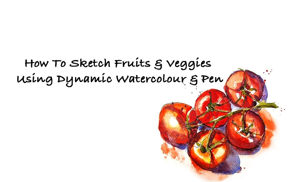
Transcripts
1. Introduction: Hello and welcome to another
session of urban sketching. I have been enjoying
sketching outside lately. It helps me to observe more and also get over the
fear of being judged, which normally affects
our process of sketching, as well as our confidence. This time I spent a lot of time in St. James's Park in London, which is one of the
Royal Parks in London. And I spent a lot of
time sketching there, trying to observe
different things that I like looking at and sketching. And in this course
I'd like to share my experiences about
sketching outside. We will be working
from photographs. As I realized that it
is quite a challenge to take the videos while I
was sketching outside. However, I will share all my experiences about
how I worked outside. We will start with how to observe and keep your
sketches quite simple. This is not a course
where I will teach you techniques about sketching
and watercolors. But however, I will share a little tips
about how to go about sketching and to
keep it quite simple and also true to your own style. Saying that you do not need
to know anything about sketching or watercolors
as such to do the score. This simple steps
that I show you in these sessions can
be followed along by anybody who's quite inquisitive about learning and finding
your own style and sketching. I will also share little
tips about how to prepare yourself and your materials
to sketch outside. You can keep each session
to about 20 or 30 minutes. The best way to enjoy
sketching is to keep it to 20 or 30 minutes session. And you can always come
back to it another day and finish it off or do any kind of changes
that you need to make. And also to finish off, I will show you how to
fix little mistakes that normally puts us off and affects our
confidence in sketching. The best way to enjoy. These sessions are to keep an open mind to using
different types of materials. And also not to put a lot of weight on the rules
are the methods, but rather using the materials to tweak your sketches in a
way that you want them to. And I hope that you will enjoy the process as you go along.
2. Suggested Materials: You can be quite flexible with the materials that you use. If you are already
sketching and you have a particularly
comfortable material or a tool that you use, you can continue to use that if you're completely
new to sketching, I would suggest the best
tool to use would be a pen. It can be any pen ranging from normal ballpoint pen to a
fountain pen or even a dip pen. Whatever you're
comfortable with. I suggest putting
away using a pencil right to the end ones until you are comfortable
with sketching. Because otherwise you
can spend a lot of time trying to erase and
perfect your sketches. During this course,
I will be using pen, which is a fountain pen with waterproof ink in it,
and some watercolors. I also have other
materials like pencils, colored pencils, pastels,
or white goulash, handy. This is so that I can keep an open mind to the
process of sketching. And you use any
material to tweak, manipulate my sketches to the desired effects
that I needed to be. If you're using pen and
watercolors like me, here are a list of
materials that you need. We're starting off with
fountain pen here. I have a laminar fountain pen, which I love to use and it's
filled with waterproof ink, the waterproof ink that I use for my fountain pen sketching. If you like using Indian ink, I would suggest that
you go with a dip pen. As Indian ink does not go
well with fountain pens. And you do not need to
stick to our black ink. You can always choose any
colored ink that you like. With watercolors. I have a travel palette filled with watercolors from my tube. And it is quiet handy to take
it even when I go outside, It is a box and can be
air tight when I go out. I use watercolor from the tubes, but I normally squeezed them out into my palette
ready for use. While I'm sketching outside. With the paper that you use, you can keep a little sketch
book for all your sketches, which is the ideal
way to go about it. So I have different
sizes and sketchbooks, starting with a very
small pocket sketchbook. This one is slightly
larger and it can be used as landscape as
all the rest portrait. And I also have very
large sketchbook, which is an A4 size. And I normally like using these, especially because I like to keep my sketches quite large. The size can completely depend on what you personally like. The people of these
sketchbooks are quite thick. They are moles can
watercolor sketchbooks, which means they're
really good at handling rushes and sketches. If you're using a sketchbook
with less heavier paper, you might need to
experiment with it to see if watercolor
works on it. For today's course. However, I have used
watercolor paper, which is also another
option for you to use. So these are sheets of
watercolor paper, 300 GSM. And they can take any amount
of watercolor washes. And this is applicable
only if you're using watercolors
for your sketches. Again, if you're
using watercolor, you will also need
a jar of water to wash your brushes and for
fresh clean water as well. And as well as that, we also need some
tissues or a cloth. I normally use a blue
roll and you can use either kitchen towel
or tissues are even normal cotton cloth. With brushes. I do not need a huge
range of brushes. The size of the brush will depend on the size
of your paper. If you're using little
sketch books like these, are doing little sketches, then a size eight
or ten is perfect. And if you're going,
if you're trying to do a larger sketch in
an A4 sheet or larger, then you will have to
go up a size as well. Again, that also depends
on your comfort level. If you like, you can continue
using a smaller brush.
3. How to prepare for an outdoor sketch: Here's what you need to prepare yourself for urban
sketching outside. The main thing to
consider is the weather. If it's really cold, then it's a good idea
to wrap yourself up in a warm jacket and take
some extra layers with you. Gloves, hats, scarves, anything, anything that helps you
keep yourself warm. Makes sure that you take enough water with you to
keep yourself hydrated, as well as for watercolors, it is also a good idea
to take a snack or two with you as well to
keep you going for a while. And also hunger is a big distraction when
it comes to sketching. You won't feel like
sketching when you're really hungry and tired
regarding materials, try to keep your
backpack quite light. Take only essential
materials that you need and a small sketchbook. Or if you're taking
a larger sketchbook, makes sure that you
have enough space in your backpack and it's not
too heavy to carry around. I usually carry a pouch
or a brush roll with me. The reason why I use a
brush roll is because I always use watercolors
outside as well. I like to keep my brush
is nice and straight. In my brush roll, I have a few colors
or color pencils. So here I have red, blue, yellow, which are
the primary colors. A few favorite colors. This is a warmer red of God, favorite color which is purple. And I also like using brown
and the dark blue as well, which is really
good for sketching. I also have couple of
pencils, pens with pen. I normally use fountain pen. I normally have at least
two different fountain pens for my sketch outside. As well as that I also carry, which is the main important
thing is my brush, which is why I use a brush roll. My brushes, which will keep straight inside
this brush roll. I usually take at
least two brushes in two different sizes. If you have traveled brushes, then you are free to
use that as well. If you're using fountain pen, you just need to make sure that your fountain pen
is filled with ink. You can, you can also
take a small cup or a jar for water and
also some tissues. Another important thing that you might need is a headphones. If you get distracted with the noise and
thinks that going up, that's going on around you
while choosing a start, I would suggest
that you start by finding a quiet spot and
a good scene to work on. Try to keep the
scene very simple, which I will talk more
about in our sketches. While sketching,
we're going to look for simple shapes and try to keep it as simple as possible with quick pen lines, it is a good idea to overlook minor errors and keep
going with your pen. Having wobbly lines and a sketchy outcome has
the charm of its own.
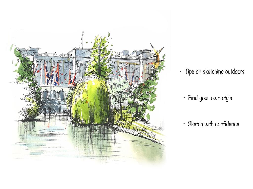
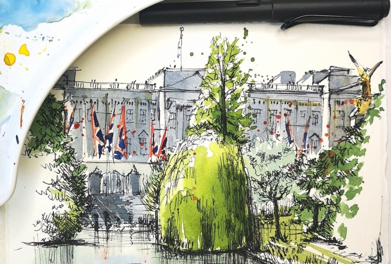
4. Scene of Buckingham Palace: Sketch: Hi there. Today we're going to try
and sketch this scene. It's a photograph of Buckingham Palace
from St. James Park. I had the experience
of going out to them, sketching in St.
James Park recently. And I'd love to share the idea of sketching
onsite with you. What you need to
think about is to keep your sketches very simple. And that is what we're
going to try and do here. So nothing too complicated, just a very quick and simple sketch with your
pen or your pencil. Anything that you feel
comfortable with. Looking at the picture,
the things that are in the foreground are the
trees and the lake. But because our main
focus is the palace, we're going to try and
sketch this area with the trees and the palace
and see how it goes. Starting off with the, the willow tree
right in the center. If you think you're not very comfortable starting
off with pen, you can always start
off with pencil. So just making a quick
mark for the willow tree, which is somewhere about here. So very light pencil mark. And I'm going to try it. Try and keep it
really quick as well, which is what we normally do
when we do urban sketching. I'm using the pen held a
little bit away from the nib. So I have lesser control. That way I'm going to try and keep my sketches very quick. Also, I like squinting my
eyes while I'm sketching. So that way I am able to
see only the major shapes. That is the willow
tree in the center. That's the edge of the lake. This line here,
which if you look at the picture on the whole, this line is slightly slanting. So when you do that, slightly slanting,
it sort of gives you the depth in the picture. Okay, So from here, there is a tree that
goes up like that. So just making that quick mark, maybe add a few foliage as well. The tree shape like this, I'm going to make
that shape first and then I can add foliage. Again. You can
squint your eyes to see which is the dark
and the light area. And then you can
have darker lines where there is a darker
area or a shadow area. Okay. Now for the willow tree, going to squint my eyes
and look at the picture. And I can see it's dark here, that dark area there, and there's another
darker area here as well. So just going to make scribbles like that to
create the darker areas. And also these sort of
lines give the impression of the willow tree foliage which is kinda
growing downwards. So that's really in
the shadow then. Okay, There's a little
bit of lighter area here, and then there's some
more shadow here. And the best way to not
think too much about these details is
to always squint your eyes and look at
just the darker shapes. Now, let's look at the other bits of
foliage that is here. So there is another tree in the background just going
to make that mark there. And that is the
edge of the water. This big tree here as well. So going to make that
quick outline of the tree. There's a tree here in the
background just over there. I'm trying to make that a little bit more lighter compared to the willow tree because it's in the background and that's
not really my focus at all. Okay. I'll just leave
that there for now. I'll complete the rest. And then if needed,
I can come back and darken that later on. And then this foliage
here as well. So we have the trees marked out. Now for the palace itself. If you look at the picture, It's quite
straightforward because you're looking at it
right from the front. So there's not a
lot of angles and perspectives that you
need to worry about here. So I'm going to
look at this line that goes all the way from
this edge to the other edge. So first let's make
that quick line. And don't worry if your lines
go a bit wonky like that. That is the beauty of sketching. We're going to make a quick mark for the statue
in this corner here. So all I can see two wings
which are quite prominent. Everything is going
to be a scribble. So just squinting my eyes again, trying to get the outline
or the basic shape. And the base, which is another
white structure there. Again, there's a
lot of shadow here. But just going to slightly mark a little bit of that shadow and I'm
going to leave it there. Now, turning our attention
to the palace itself. So that was the line. That was this line that I did. And now I'm going to
build on that line. So let's see, There's a
triangular shape there. That's the top of the building. And see how I make these
very broadly lines. And that's all we need right now because it's a
very quick sketch. A little bit of
perspective here. If you look at this
structure here, you can see a little bit
of a highlighted area. So if I zoom that in, this highlighted area is kind of a protrusion in the
structure itself. And if you follow this line, and from here, the
line goes downwards. So that comes straight and
then the line goes downwards. We're going to sketch
a straight line there. And from there we're going to
slanted downward slightly. That sort of gives
the impression of depth in your illustration. So we've done the front side. We're going to make these
lines downwards because we are looking from an angle where we cannot see the
top of the building. Okay. Now, for the railings
which is there, there is another
structure on top. Just making these
quick lines like that. Not too worried about
how it's going to look. You can make it as
wobbly as you like. I'm not going to go into the details of
windows. I see it. I will see how
it's going to look before I put in any
details of windows. Now continuing with the
building on the side. Just looking at the
triangular shape, which is somewhere about here. And I'm trying to
keep it about inline with the triangular
structure here as well. So just checking if it's on the same level or if
not slightly taller, the structure on top. And a line which
you're going to do a downwards and sort of gives you the impression
of perspective. Doing a few double
wobbly lines just to add details or texture
on top of the building. And you can complete
it to width, any sort of lines or dots. So as I'm doing this, I'm panelists in the background. I realize I need to make my willow tree a little
bit more broader. So I'm just going to make
that correction there. Which is the good thing about
sketch because you can go over the sketch and it
can still look charming. So the next major
thing that I can see here is this
horizontal line here, which is like the
balcony of the palace. There are flags. Here. I can see a gate here. Again. We can't really see
as much details. We're going to try
and do these gates were only trying to
keep this simple shape, no details here. So quick scribble. Just only thinking about
the shape of that gate. There are flags
on in front here. So I'm going to do the flags. Awesome flags sticking
out here as well, which you can't
really see us much. Just going to make that mark
and flags here as well. Just making a little
mark for the gate. Can't really see
a lot of detail. So I'm just going
to add some lines. And that is again near, nearer to the water
that's arranged. Just add these lines just to create texture and a little
bit of interests there. You can scribble in some bushes and foliage,
dots and dashes. You can even add a
little human figures. All you need to do is
scribble them like that. So we're about almost done with the main
things on this picture. Now, it is for us to add
in some more detail. So before we start
on with the details, I'm just going to add the
third triangular structure on the building there that
is behind the big tree. So I'm just going
to add those lines. So now I've placed
everything in there. I'm going to try and add a little bit of
windows, not a lot, not too much of details because we wouldn't be
able to do as much. It'll look like a big confusion if you add too many details. We're going to try and
look at it step-by-step and see if you need to
add any more details. So looking at the structure
of the palace itself, I feel it's a little
bit to blank. So I'm just going to add some
details of windows here. I'm just going to
add one window. They're very light pen marks. Again. I'm not overdoing it. Little window like
structures on top as well. And the same on here. Just going to do a little count of how many
windows I can see. So it's 12. There's one here, 345, going to see if I
can fit in five. If not, I will see
how much of I can. So let's do That's 12345. Then add little windows on top, little dots for the Windows, and then fairy light. Monks for the windows itself. Especially if you are looking at the windows behind the
flag and the foliage. Maybe it's best not to
add too much of details. So maybe a little
quick lines like that. I can't really see the
other windows because it's behind this tree. Let's say coming into the main, central part of
the palace itself. So that it's like a false
pillar like structure there on, on the architecture. So I'm just going to add
that detail or false pillar, maybe a little windows here. Just looking at the reflections, I can see these lines. I'm going to show those lines. Quick movements with the pen. And we're done with
our pins sketch. Now, you can either
leave it like this or you can go over
it with a little bit of watercolor wash and then
keep on working on it. It depends on depends on
how much time you would like to spend on your sketch. And usually I find that I come back into my
studio to finish it. If you do get the time and a comfortable place to sit down, then we can always finish
our sketch on site. So since we're in the studio, I'm going to try and add a
little bit of watercolors.
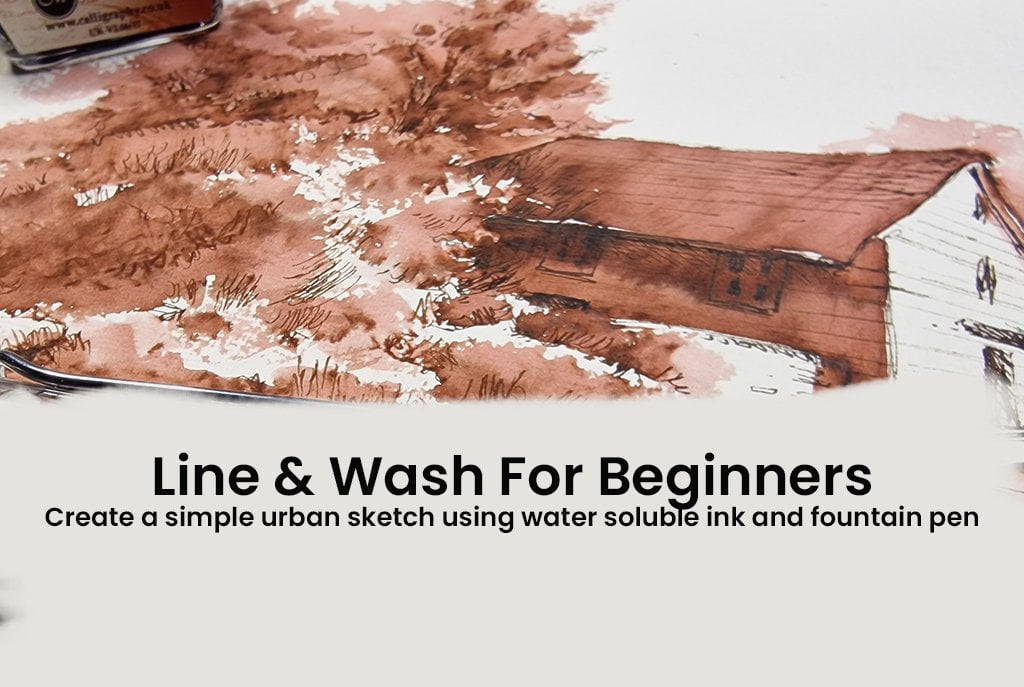
5. Buckingham Palace: Watercolour wash and finishing touches: Now let's look at adding a quick watercolor
wash on to our sketch. So I'm going to start off
with a golden statue here. So to make it look
nice and bright, the idea is to leave
a lot of white areas, the color as such, a right to yellow. So for this I'm going to add, I'm going to use a
little bit of cadmium yellow and tiny bit of orange just to make it a little bit more golden
yellow like with my brush, I'm just going to
add a little bit of color here onto the structure. Now, almost immediately,
I'm going to add a tiny bit of brown, Let's say something
like burnt sienna. Little bit on the
tip of my brush. Just drop that color in
for some deeper shadows. And also without
washing my brush clean, I'm going to use it a little
bit of ultramarine blue just to add that extra
bits of shadow there. And then I'm just going
to use my brush without washing it just to fill in
that area of the structure. I'm going to get a little bit of shadow color for
the palace itself. Let's try orange and
ultramarine blue, sort of gives you a
very dull gray color. So it's going to be
somewhat like that, but with more water. So let's add some more water
and see how that works. I'm going to use this width, a little bit of Naples
yellow as well, or any sort of warm
yellow that you have. Some going to do
them both together, have a little bit of
yellow as well in-between. Let's start off with some gray, making sure to leave that white unpainted
area around the statue. And also being very careful
not to paint in this area, which is where the light
is falling directly. So if you look at the
reference picture, you can see how the light falls directly into these areas. And I'm not going to paint
in that area simultaneously. Getting a little bit
of Naples yellow, maybe add a tiny bit of
splashes here and there. So let's carry on again with the gray going to
leave that area unpainted and then start off
with the structure here, again, making sure to leave
the flags unpainted as well. I forgot to add that
structure on top. So I'm just going to do
that with my brush now. Again, simultaneously
you can add a little bit of
yellow if you like. Not really necessary. Just going to try and
add a little bit, just little drops
here and there, just to suggest the color, some continuing with
the ultramarine. And again, being very
careful to leave some unpainted areas as well
to show light reflection. For the green of
the willow tree, I'm going to use a
mixture of Winsor yellow and Winsor blue, which is a very bright green. So I've got a
bright greens here. I'd like a little bit
more dull green as well. So I'm going to use
the same color, Winsor yellow and Winsor blue. And I'm going to add a tiny bit of permanent red into
the mixture, right? So that's for the shadow colors. So let's put that down first. And then quickly
washing my brush, adding a little bit of
lighter green as well. Not everywhere,
maybe a little bit. And then I'm going to leave
the rest as unpainted areas. Using the same green. I'm going to add a tiny bit
of color onto the tree here. And you can even do dots and dashes just to add
some interest. And even splatter. Just making that green a
little bit more deep here. Using a deeper blue
or Prussian blue. And think I can leave
it at that now. Now I'm washing my brush, I need a little bit more of. Blue into this green mixture, and I'm using cobalt blue
into this green mixture to depict trees in
the background. Again, leaving a
lot of white areas. Again for more green. I'm going to mix a little
bit of Winsor yellow. And this time I'm using a deep blue called in-depth
green-blue to get, give me a very deep green just to outline the foliage here. But that's about it. I'm not going to carry
on adding color here. It's just depicting the
foliage and that's about it. Quick brush movement
for here as well. Now for the final details, that is the flags, which is a very
bright red and blue, which definitely stands
out in this picture. So I'm going to use a little
bit of permanent red. Now I'm going to wash my brush and add a little bit of blue. For the blue, I'm going to
use in-depth green blue, which is a very deep
navy like blue. So looking at the picture, I can see a little
bit of shadow here. For this again, I'm
going back into my ultramarine blue and orange. Tiny bits of shadow here, sort of makes it, makes the illustration look
more interesting as well. Now for some finishing touches, so I'm quickly going to wet the paper for some
reflections in the water. I'm using the same green with a little bit
more Prussian blue in it for a deeper
reflection in the water. And you can also
use a little bit of bright cobalt blue for
some quick brushstrokes. You can also use a
little bit more pen for finishing touches, like darkening some areas, toning down some areas, giving it a little
bit more depth. Like how I'm doing
here with the pen. I'm just scribbling the area where I think it needs
to be a bit more darker, especially the reflections of the pillow tree in the lake. You can also add different
types of pen lines. It could be jumpy lines
of scribbly lines, even dots and dashes. Just to add more texture
to the whole sketch. Here again, I'm using little short lines to
create texture of grass. You can do lots more
things with the pen, and it depends on what you
really want in your sketch. And it's a very personal
thing to do as well. So I hope you'll enjoy using the pen to create these different textures
on your sketch.
6. Queen's Guard: Sketch and Watercolour: Hello. So today we're going to sketch one of queens guards. I particularly like this because of the
contrast in colors, the fuzzy little hat, and very easy posture. So if you're not really
comfortable sketching people, then this might be one of the easiest
postures you can get. And also if you wanted to go to Buckingham Palace
and sketch them, they could be really easy because they stand really still, unlike other people who
keep moving around. So let's start sketching. Started off with a
very simple line. So I'm doing a straight line, kind of trying to
get the pulse just treat so I don't get
the whole thing wonky. So I'm just making a mark where the shoes is going
to be and the head. So I'm starting off with
a large fuzzy helmet. And again, I'm only starting
with a very simple shape. The best way, again to look at the simple shape is
to squint your eyes. So I've got the basic
shape and now I'm going to start off with a little ice that is almost
hidden underneath. And you can see that the, the fuzzy texture of the helmet, this kind of covering
the eyes as well. And now we're going to place
the other features like the nose and mouth. The strap off the helmet itself
is going around his chin. And if you look at
the shape again, when you squint your eyes,
It's almost V-shaped. So I'm going to make that quick reshape and adding a
little bit of texture, which you can see in
the photograph. Now. I can see a little bit off his ears hidden underneath
the helmet again. So I'm just going to
make a little mark. And now I can finish
off the fuzzy helmet. Again using quick shot lines to show the texture
of the helmet, you can make it your own by adding other
types of lines as well. It doesn't have to be
exactly like how I'm doing. If you think you like to use a little bit
more curly lines, then you can use that as well. Now let's move on to his neck, which is slightly
visible underneath the the strap off the helmet. And now for the detail
of their uniform, that's the neck of the uniform. There's a little
pattern on the color, which is more like
an leaf-shaped. And let's do the
shoulders again, adding all the details
that you can see. Just thinking about it
as the simple shapes. And again, you don't have
to worry too much about the human proportions
or anything because we are only
doing a sketch. I'm not creating an
academy drawing. So even if you do get a drum or if you want
to change it slightly, you can do that as well. So, um, I started off with the shoulders and I
realized that was too big. So because I'm using pen, I cannot erase it. So I'm trying to create a little texture and scribbles
to fix that as I go along. So I've made the shoulders
a little bit more smaller. Now let's do the body
aligned for the body. And now for the rifle
that they are holding. Again, I'm not too
familiar with the, um, the terminologies,
so I'm just going to think of it as
a simple shape. Sketch that. So again, the trick is to
squint your eyes to think of it as simple shapes
and finish the sketch. Now let's finish that arm, which is holding the rifle. So again, if you remember, I made the shoulders a bit more smaller or a little
bit more narrower. Now the arm is a little
bit more smaller now. There's a large white
detail on their uniform. So I'm going to make that shape. Now for the tiny little
fingers that you can see sticking out off that
uniform holding the rifles. So I've curved the fingers slightly and letter told
the rifle properly. Now, moving on to finish off
the details of the uniform. So that's the edge of the
coat they're wearing. And now I'm going
to add a little bit of belt and button
detail on their uniform. So the bright white belt
against the red uniform. So I'm going to make
that shape there. Again, always thinking
of it as simple shapes. Now let's finish off the
rest of the uniform. You may now notice that the link has come
a little bit down, further down from the
little mark that we made initially because I
made a mistake of having the head too big and I didn't have
enough space to fit in the body within
that straight line that I had marked
in the beginnings. So I've made the
legalistic more taller. So this is why it's really
good to start off with very light pen marks and you can just make your
changes as you go along. Also, going wrong is nothing to be worried about because this is a little sketch and it's really good to make those little
mistakes because we always learn from my
mistakes and kind of helps us to observe a
little bit more as well. Finished off the trousers
and now the shoes again. Do the shoes anyway, you like it doesn't have to
look exactly the same arm. The large white details on the uniform making those
shapes over there. And now the little fingers, and I think we're nearly
done with the sketch. One final detail is to fix the mistake that I
did in the beginning. So I'm trying to
shade that area. I'm making that area
a little bit darker, just giving a little bit of
texture in the background. You can also Sketch little details of
the little houses that they stand in front of. They are actually
called century boxes. And they are used if the
weather is really bad and these guards can stay
indoors without getting wet. So I'm going to draw a
little archway just around the helmet depicting the
doorway of the century boxes. And you can do it
anywhere you like. You can even just copy
what's in the picture. But because I'm trying
to fix a mistake here. So I'm going to add
the archway just around the head of
the garden itself. And you can either leave it half done with a
little texture behind or you can complete the detail of the
century boxes as well. Now also finishing off the button details and
everything that is left out. And with that, we're
done with the sketch. Now, moving on to adding
some watercolors on this. Again, it's just an option. If you do not want to add
watercolors, you can, by all means use in other media, like color pencils or pastels, or even just leave
it as a sketch. If you'd like
adding watercolors, I'm starting off
with a bright red. And the red that I'm using is a mixture of permanent
red and quinacridone red. This is only because
I did not have a neutral or a scarlet
red with me. If you do have scarlet red, that is the color
of their coats. So I'm starting off with a
very light wash and again, adding in more pigments
as in when needed. And I'm just going to finish
the right of that code, making sure to leave white
areas where there is details of the belt as well as the
details on the sleeve, the color, everything that
is a different color. So I'm just doing the read, um, and walking around the areas where I don't need the color. Just adding a little
bit more deeper red to the uniform itself. Getting it to look a
little bit more 3D like. You can do that with any
medium that you're using. Or if you just want it
to be a quick wash, you can continue
doing that as well. So just deepening
the color here, just making it
look more vibrant. If you'd like to add shadows, you can do that as well. So the shadows that
I have added here is a mixture of ultramarine blue along with the red I
have been using to give me a very deep purple
blue shade for the shadows. Um, and you can
use the same kind of colors in whatever
medium you're using. Or you can even go back to
using a little bit of pen. Now let's finish off the black trousers so
you can either use a black or gray color or even mix something that can
look a little bit very dark, light, It's
completely up to you. What I'm using here
is Payne's gray, which is a very neutral color. Or any sort of gray in your
palate should be fine. So I'm quickly giving it a wash. You can still add the
lightened dark if you like, or just have it as
one single color. So I'm just finishing
off the trousers. And again, I have
left a little bit of white on the left side, just trying to dilute it, making it a little
bit more lighter. So it looks a bit more lighter. And I can add in some shadows. If the color is a
bit more lighter. That again, is my
personal choice of adding more
colors and shadows. If you're not too keen on that, you can just have a quick
wash with a single color. Again, for the shoes, I like to show the shiny
quality of the shoes, so I'm leaving a little bit of white unpainted areas
so it reflects light. And I'm going to do the same
with the other shoe as well. So leaving areas or marking out areas where I'm not going
to add in any color. So I'm being very careful
with the tip of my brush, not painting in a few areas
that some reflected light. Again, if you think your
colors are a bit too weak, you can go on and add a
little bit more pigment. And that in itself will give a sense of 3D look to
the whole illustration. Now let's move to the top of the figure where I
like to do the helmet, as well as a little bit of
splash of color as well. So I'm starting off
with some rain, making it look like a little
splash of color on the side. That again, is a personal
choice of style. If you do not like splattering, pigment or adding splashes
of color in the background. You do not have to do that. This is completely optional. I've done like a quick wash, just kind of getting
the colors of the uniform to bleed into
the background as well. And now I'm going to
finish off the helmet. Now I'm starting off
with a wet wash. So cleaning my brush completely, adding just plain water
on to the helmet. And now I'm going to add
some Payne's gray again, the same color that I
used for the trousers. Or if you have black, you can use that as well. I'm just going to
drop in the pigment straight from the pan
onto the wet surface. And you can see how it
becomes a little bit fuzzy and creates the texture. Now let's finish off the
edge with pointy lines, quick lines with the
tip of my brush. Just to get the texture right. Now, let's give some
color to the face. So the colors that are used, cadmium yellow, a little
bit of permanent red. And if you need a tiny bit of ultramarine blue to the
darker tones as well. And again, because it's
such a small shape, we're just going to fill
it in with the color. And it's totally up to
you if you wanted to add a deeper color to
show shadows and stuff. But if not, you
can just color it in and leave it like that. You can also use
the same color for the little fingers that are sticking out
from the uniform. And for some
finishing touches I'm using some bright yellow. Any bright yellow is fine. For the belt. That little detail of the
buckle on the belt and also the buttons just adding
a little splash of yellow. Getting it to look a
bit more gold like. Finally some thick red paint
straight from the pan to add the details of that stripe down the
side of the trousers. Using the same Payne's
gray for the rifle. And again, leaving a lot of unpainted areas just to show
texture or light reflection. And with this, we are done
with the illustration. If you chose to do very simple quick wash
with the watercolor, you can always go back
with your pen to add more texture or lines
to your illustration. It's completely up to you
how you do your sketch. I hope you will
enjoy this sketch.
 Suzanne Abraham, Artist