Transcripts
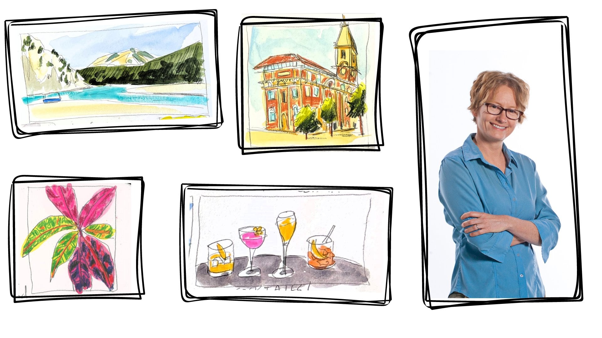
1. Introduction: Hello. I'm Amy Stewart. I'm an artist and a writer. When I'm traveling, I always take a sketchbook and I try to capture some of the places I'm visiting. And in this class, I want to show you the beautiful French village of combo Lebanon. Now, I love this scene because it gets it one of the biggest challenges of travel sketching, which is how to give a scene depth so that you feel like you're stepping into the picture. When I started travel sketching so many of my drawings just looked really flat, kind of like a cartoon. But I learned a few simple tricks that helped to make more inviting and more dynamic drawings that really let you feel like you're in that moment. So the first thing we're going to do in this class is we're gonna learn how to handle perspective in a scene like this, where the road is kind of winding and sloping. You know, the regular rules of perspective just don't apply when it comes to charming little European villages where nothing's level and nothing straight. So we're gonna work on that, and the second thing will learn is how to use different types of lines to help make the buildings feel riel, even when you're just dashing off a quick travel sketch like we're going to do. And finally, we're gonna look at how to use really strong light and shadow to give the scene depth and that feeling of capturing a moment at a very particular time a day. So if you tend to shy away from scenes like this, where there's a jumble of buildings and rooftops, doors and windows and all kinds of different angles, now is your chance to learn how to handle all of it in a way that's quick and lively and authentic. So come along with me and let's get started.
2. Project: for your project. I've got two versions of the same street scene that you can work from. So feel free to download the photos and work from those. I'm going to demonstrate both scenes in this class and I've sped up the video so you can watch me do both of them, and then you can figure out which one you'd like to try. But if you'd rather work from your own photos or, you know even better, go out on location and do a scene from life, please feel free to do that. Just look for any kind of scene where you're looking down a street and you could kind of see a lot of roof lines and buildings all jumbled together. That's the kind of scene we're working on in this class, and I would love to see what you come up with.
3. Supplies: Let's talk about art supplies. My favorite subject. What you're gonna need for this class is, first of all, some watercolor paper, so that could be a sketchbook. This is just a mole skin sketchbook. This is what I take with me when I travel or, um ah, watercolor block. This is hot press, which I like, because I like the way Inc moves across it. But hot presser, cold press is fine. The most important thing is that your paper needs to say that it's meant specifically for water color so that it can handle all the all the water and all the paint we're gonna put into it. You're also gonna see me use a T square ruler one of these to check my horizontal zand. Mostly my verticals. I don't travel with this, but I use it when I'm working at home. Just sometimes. If I want to make sure my some of my lines are straight. When I'm traveling, I take a little clear plastic ruler that does have a lot of markings on it, both horizontal and vertical markings. And I can use that almost like a T square. Aiken. Line it up with the edge of the paper and make sure my lines are straight. That's totally optional, But it's something I like to dio. You're gonna need a pencil and an eraser. I've got a mechanical pencil here with HB leads very light leads because we're just gonna lightly draw and then a race. And I use a need herbal rubber eraser with that, um, for pens. I'm gonna show you what I use but that I'm gonna give you an alternative. Um, something that makes a very fine line. And this is the platinum carbon desk pin. It's a fine line. Fountain pin comes with a cartridge, and this is waterproof ink. The most important thing is that your ink is waterproof because we're gonna be painting on top of it. So something that makes a very fine line and then just more of a medium line, kind of like a regular drawing pin. I'm gonna be using my Lammy safari pin. I love this fountain pen and this one it comes with cartridges, but they're not waterproof. So I've got a converter in here, works like a syringe. You just dip it into the ink and fill it up, and I'm also using the platinum carbon waterproof ink. The same ink that's in here is also in here. I just buy bottles of it and fill it up. So those two we're gonna use and then I just love the pin tell pocket brush pin. It's gotta brush tips so you get very painterly lines, and it also comes with a cartridge. It's very easy to just pop a new cartridge in, and that ink is waterproof. So those were the three pens I'm gonna be using. But if you if you don't have those, then the other option would be to just get yourself some regular drawing pins. Thes air, sometimes also called pigment liners. They're basically like markers. They're waterproof, and they come in a lot of different brands and a lot of different thicknesses. So you're gonna want a fine line. This is a three and 03 But in 02 or a No. One would also be good. And then something a little bolder, like this is a No. Eight. So just a little bit more up the scale. And there is also a marker that does the same thing as the pocket brush pin. It's gotta find brush tip. And this is the Faber Castell Pitt artist Pin it says s beyond the tip. Thes air. Very inexpensive. These pins are just two or $3. They're disposable, they're waterproof, and they do great. So totally good option there for paint. I've got a travel size watercolor kit, and I always work out of my travel kit even when I'm at home so that I'm just used to it. And it doesn't seem weird when I'm out painting in the world and I'll give you a list of colors I use, but this is a very simple project we're gonna do. So you don't need anything too complicated in terms of colors for brushes. I'm just going to use a regular round brush. This is a 10 like a tenor, and eight would be fine for most of this. And, um, I also reach occasionally for this water brush. I don't use the water in the barrel that much, but I use the fine tips so you'll see me reach for this occasionally to do some finer work . So maybe you want to find her tip brush, but really, anything's fine in terms of brushes, And then I'm also gonna use a posca paint pin once, just to show you how you can use it to pick up some details. So this is a unique Posca paint pin and white and I just happen to have a slightly bigger one and cream, too. And it's just nice for adding tiny little highlights to a watercolor, so totally optional. But, um, I'll show you how you can play around with those. Okay, that's everything we need. Let's get started.
4. Five Key Concepts: I want to talk about five key concepts that you're going to see me demonstrate when I do these drawings. The 1st 1 is you're going to see me looking around the edge of the frame to see where things come in and out of the frame. So, like, I'm going to draw this part of the building first because I can anchor it. We've got the building starting right there. We haven't ending right there. The curve of the road starts here. You might also say, here there's this little gutter thing, but it doesn't matter. You pick one. The curve of the road starts here. The other end of the road starts right there. Um, you go up here and you get to this roof line. So these air major points that anchor the whole rest of the drawing and I always start by going around the edge and trying to get those in the right place with a photograph. This is easy. You can literally sit here with a Sharpie and do what I just did. When you're out in the world looking at a scene, you're gonna be more like a movie director. You know, you're going to sort of be, um, using a pin or using your hands or a viewfinder to kind of decide what you're going to include in the frame and what you're not. So in the demonstrations, you'll see that I drew a five by seven rectangle on my paper, and this is what goes in it. When you're out in the world, you're still drawn that five by seven rectangle. But now you're looking at a real scene, and you're deciding how much of this do I want to include or exclude? But you can anchor your drawing by getting these little bits that represent the edge of the frame. If you get those first, it can sort of help with everything else now. So that's number one is. Look around the edge and see where things come in and out of the picture and get those established first. The second thing you'll see me Dio is to really know where your center Linus and I'm not going to use a ruler because you're gonna have to eyeball this when you're out and about. But you know, that's about the center, and, uh, I'm gonna say it's that. But then I'm in a double check. Yeah, that's about right. Maybe it's here. You know, that's the center as well. So the reason that's important is once you get that, you know what's right in the very center of your drawing. That's right there. And it helps you figure out where things are relative to your center line. So, for instance, this is not 1/4 of the way across the drawing. It's it's, you know, maybe an eighth of a way. If this is the halfway mark, this is about 1/4 of the way up. So just knowing that helps, and it can also help you establish things like, where does this road end like the road ends right here. So this curve does this, and I can see how far over that is compared to the compared to the vertical center in the horizontal center. And this is something again. You can do this in real life as well as on a drawing, but just sort of knowing Oh, is this is this halfway into the drawing? Like, um, you'll see me measure this. How far out does this roof line come? Not quite halfway. How far out does this one come? Yeah, that's actually sort of 25% of the way over is where that one starts. All right, so that's the second thing is knowing where your center lines are? Um, the third thing is knowing your lights and darks. So, um, where are the bright spots Where the sun's hitting that we're really gonna need to protect and keep very, very bright and very white? Well, obviously, you know, it's this. It's all of that. But then this is super important. And this and this, like knowing. And actually there's a little bit on the car, like looking, looking ahead and saying Okay, where those lights and darks that's gonna be really important when we get into painting. Another thing is repetition. I really love in any kind of urban sketch to be able to notice repetition. So these roof lines boom, boom, boom, boom, boom, boom, boom that really just leads your eye. End these lanterns which you'll hear me talk about over and over again. Boom, boom, boom! And in our other picture, there's actually four of them, and I'll add more in just to get that repetition the color on all these windows is all the same. All that repetitions helpful, and you'll see in the second photograph that I work from that one of these houses decided to be different from its neighbours and have green shutters. But I made him red because I like that sense of repetition. So that's really important. And then finally, um, lying. Wait, So what you're going to see me do is you're going to see me, do a lot of line work in the foreground and also have heavier, darker lines, including really deep black kind of inky areas in the foreground. And this really keeps you a present in the foreground. The further we go back, the less lines there's gonna be. Until this landscape. There's no inclines at all. I did the landscape in the sky entirely with watercolor, and it's just washed out so it keeps us anchored in the foreground. So those are the five things. Look around the edge, figure out your center lines, notice where your light is versus your dark. Oh, I should have also pointed out like this is a huge light area that's going to be really important. Where the street is lit a swell. So notice your light areas in your dark areas. That's the third look for opportunities for repetition. And then think about your line weight in your line work being more present in the foreground and darker and heavier in the foreground and getting lighter as you go back until maybe the things in the very far distance are just watercolor. All right, so we're gonna we're gonna move into the pencil drawing, and I'm gonna say a little bit about a key concept that I'm about to show you in the pencil drawing. And that is Aziz. Long as you. If you print the photo out and do what I just did and sort of Mark and think about it a little bit, then if you have this out anyway, I want you to go ahead and do this with me, which is once you've established some of this stuff and you know where things are so like, I know that this buildings right here. I know that the street comes in here. I know that the street comes in here. I know where it ends. The trick that we're gonna have with perspective is that nothing's lined up here. And so the way we're going to do this is by understanding where these shapes are relative to each other, and I'm about to demonstrate all of this. But go ahead and get a marker or a pen or pencil just anything ready and do this with me. You'll see that I'm gonna trace these out just to kind of get him in my head and just to think about like, Okay, this one, like, here's the bottom of this one, and this starts almost right at the same level. They're, you know, here's this roof line and it's above where the landscape is and you've got a little space between that one. And where this one starts, this one comes right up almost underneath it. This one sticks out kind of right in front of it. This one comes down a little lower than that, and it's right across from where this balcony is. This, uh, the bottom of this lantern hits the landscape in the background and is also right across from this roof. So you're going to see me do a lot of that? I'm about to really mark this up, and it's a good idea to just play around, print one of these out, play around with it and just get used to that concept. If it's not something you're used to doing, you'll see me mark out where these windows are and, um oops, things way. It's helpful to actually do this on paper, like just mark out like what the's angles look like. Go ahead and play around with some of this stuff before we get started, and now let's jump into it.
5. Pencil Sketch 1: I printed this out in black and white first, and I'm just going over with a Sharpie and just really noticing the tricky angles on the roof line and the balconies. And just by kind of making some marks with the Sharpie. It gives me a sense of what all those angles air like. I'm starting out with the building that's in the foreground and the little bit of road that you can see. So basically, I'm looking around the edge of the frame and just putting things in where they line up with the edge of the frame. So first, that building in the front and then the road, just figuring out where it comes in from the, um, from the corner of this little five by seven square that I've drawn and then also looking left to right. Like how centered is it? When I look at this roof line, I'm doing the same thing. I'm sort of checking these angles and literally just almost just drawing right on top of the little print out. I have just to kind of get the feel for it, and I'm looking at where every line is relative to every other one. So it's like once you get the first thing in place, you can kind of make everything else proportional to that first thing I'm getting in. This little there's a little kind of, um, planter box or something right there. And, um, I'm just measuring where it is relative to everything else. When I go across the page here, I'm looking at where is the roof line On the right, compared to the one on the left. And I'm double checking these angles over and over again because I really can't rely on rules of perspective here because this village is going down a hill and around a corner, So none of the ordinary rules or perspective work. So I'm just looking at, um, where is everything relative to the to the sort of center of my composition and relative to everything else. And once I can get that, the rest of it kind of falls into place like this little building next to it. I just have to see where it is relative to the one I just drew. But I'm always checking like am I in this center of the drawing and my off to the left or the right. And I'm looking at how things were centered vertically and also how they're centered horizontally so you can see I'm checking that over and over again. And once, I'm sure one thing is right, I can move on to the next thing by going, Okay, this is a little bit underneath that other thing. This thing is across from that other thing. So it's all about, like, getting the first thing right. And then, uh, everything falling into place after that. There's a little tiny building off in the background, and I'm just sort of looking at, like, how much of that can I include? You can just barely see it, but including these little buildings that are so far away, This is what gives us the sense of depth that makes you feel like you're moving into this scene. Um and, uh, getting landscape in the background is just a quick little line. And now I'm super interested in these lanterns. I love him because there something for the eye to follow. I mean, first of all, it's a lot of character, you know, this definitely looks like a little French village, but also there's a series of them. And so your eye moves from one to the next one to the next one. So I'm looking at like, Okay, where are these lanterns? Relative to the various features on the buildings that they're around and also to that little bit of landscape I can see in the background. And I'm not trying to draw the lanterns perfectly at this point cause this is just the pencil sketch. But I want to get him just close enough striking, so I could just kind of see, um, I'll finish up a few more little details in the foreground. There's, like a little railing of ah, of a balcony. And again with with this road curving and also it going downhill, I can't really count on normal sort of perspective guidance to help me that much. So I'm just checking over and over again and trying to get something that's really close by measuring it out on my paper and then measuring it out. Um, on the photo reference that I'm using, always double checking all these lines, making sure I'm looking around the edge of the frame to make sure that everything's coming into the frame where I think. And now for these windows, it's like, what are the angles on the tops and bottoms of the windows? Um, so I'm just gonna kind of sketch him in, but I'm going to give myself thes guidelines, like where two things stop and start relative to the rest of the building. And I'm just sort of putting, putting in with with windows and doors. You don't want to get to exact If you're counting Windows, you're in trouble. So don't ever worry about like, Oh, there's four windows I only put in three or anything like that. The most important thing is to try to get him about the right size and make sure that the angle of them is a is about right. So you do get a sense that we're looking off into the distance. So I'm just again looking for where do the tops and bottoms of those windows go? And how did they fall? Relative toe, Other architectural features, Aiken, see, how how are they compared to other buildings that are next to them? Just trying, Teoh, um, get him all in place in that way. And, um, I'm just double checking all of my angles. This is a complicated, tricky little roof line. There you can see a lot of different parts of it in one place, and so I'm just wanting to make sure that I've got all that right. All these various roof lines, little tiny windows off in the distance. I will go ahead and put in. And also some of those roof overhangs just helps to give everything a sense of depth and just make it look real. And there's 1/3 little lantern over there that I hadn't noticed it first, So it's very exciting when you can get three in like 123 going from front to back. That really gives it the sense of depth that we're going for. So that's a cool thing. And there's a little planter box in front. I like having something that's really obviously in the foreground to just sort of anchor you, and it makes you feel like you're standing right there, so I'll get that little planter box in. There's a little fragment of a red awning here that I can see and just a window that's in the in the foreground. I don't want anybody toe be looking to close it those, but I'll put him in. Now I'm using because I'm in my studio and I'm at home. I'm using a T Square, and I'm just going through and making sure that all the verticals air vertical this is gonna be a very loose drawing. But, um, making sure the lines of right is so helpful. And when I'm traveling, I used this little ruler, which you can basically use like a T square. You can see how I'm working on lining up the edges relative to the top and bottom of the paper or the little square I've drawn around the edge. So I will carry that little, very inexpensive little clear plastic ruler around with me and just get a few of the horizontal and verticals. The things that I know should be straight. I'll just really double check him and just draw another line on top. And that way, when I do start drawing, it could be really loose and free. Because I know that some of those fundamentals air, right. There's a couple cars parts there, and I've decided to go ahead and put the cars in. So I'm just drawn one box on top of another box. I definitely don't want to overcomplicate those cars. Um, and that's everything we have to do for the pencil drawing.
6. Fine Ink Lines 1: for this next phase, you can either use a fine line drawing pin like a No. One or a no to, or I'm gonna use my platinum carbon desk pin with waterproof ink. And I really sped this up because there's not much to see here. I'm basically just going over the pencil drawing that I've already done, and I'm doing it quickly. I am sort of, um, looking at the picture and making sure that I still like the angles. Everything's at very often. I'll find some little odd thing that's wrong with the pencil drawing, and I'll fix it at this stage. But basically, I'm trying to get just enough ink down just very light marks so that I can go ahead and erase the pencil. I realized I left out a little building way off there in the background, so I added that those are the kinds of things that could just happen at this stage. I'm gonna leave the little line of landscape off in the distance in pencil because there isn't a black line around the edge of the landscape, so I want to just leave that and also the line between the left, the house on the left in the sky. I'm just gonna do that with color and not worry about defining it with with a line. So, um, again, just racing. I also tend to mostly erased the border around the edge of the drawing. But I leave it very faint just so I can see it as I get into painting.
7. Ink Drawing 1: one of the nice things about doing this first passed with a really fine line is it means I've got some variety in my lines. So now I come back in with my Lammy Safari fountain pen. You could also just use a little thicker pigment liner, like maybe a five or an eight, something like that. And now I'm really starting to pay attention to this shape of everything and try to get some texture in Azaz. Well, um, so like, along this roof, these air, these Spanish style of shingles, and I'm really trying to notice, Like, what is the texture of that edge? So not every edges straight, you know, some are gonna be uneven and broken. And, um, some are gonna really just show a lot more texture a lot more of what that surfaces like. And I'm really considering as I'm doing these lanterns. If I if I made any mistakes earlier, I decide I don't quite like the shape of them. I can kind of just draw right over those very fine lines. And you really wouldn't notice him that much? Basically, I just want to be sure that there, um you know that that I have this nice symmetry between them. So that's the most important thing with those. And I'm not worrying too much about filling in blacks or darker shadows at this point because I'm going to come in with my brush pin. So I'm really just trying Teoh, get those details in. And I'm thinking also about places where I don't want there to be a sharp line, like maybe between the two buildings or between the building and the sky, things that I know I can do with color, like you don't have to differentiate every single shape with a line. I mean, I love line work like That's why I do these drawings that ways I love being able to see the sea, the line and see the artist's hand. But there are also places where you can rely on your watercolor to do the work, and you don't really need toe outline every single thing. So this little planter box in front No, I'm gonna pay a little bit more attention to this and really kind of give it more of a shape get in and just put some some little leaves in. I mean, this isn't like a big focal point. But it is something that kind of anchors you in the foreground and makes you feel like you're standing there because you're noticing details that are closer to you. I'm also moving left to right because I don't want to smear the ink. So think about that. If you're right handed, you want toe kind of start over on the left and move over to the right so you don't smear things. I always forget that I didn't a job in and deal with whatever just is most interesting to me right in the moment. But, um, give that some thought. So I'm I am looking again and my image, and this is one last chance to fix anything that I think might be a little offer that just doesn't look right to me. You know, the longer you look a thing, the more you start to really notice about it, and that's another good reason toe start with a pencil sketch and in those fine lines, because it means you've already spent some time just observing the scene. And the longer you observe it, the more you really notice about it. The more you can really see. So these cars are really just in doing like a little rectangle on top of another little rectangle. I'm not worried about making them look like the type of car that's actually there. I just want them to be recognizable as a couple of cars. And so that's plenty just continuing on with these roof lines. You know, this is the thing, this whole, this whole little scene is all about this little quester of homes and the repetition of these Spanish tile roofs. And so this is kind of my last chance to really check all of those getting in the 3rd 1 of these little lanterns. I'm very excited that there's three of those. Sometimes when there's not three, I'll just add 1/3 1 off in the distance anyway, because I like the way your eye travels from one to the next. It's just the kind of thing that gives a scene like this some depth, these windows and doors. I mean, it's mostly just square. Sometimes at this stage, I'll get in little pieces of trim if I can even see him from where I where I am. And this roof is also closer. It's a little bit more in the foreground, so I am paying a little bit more attention to just texture and noticing where you can really see the edges of the shingles. In some cases, you're just looking at it at a gutter, but I'm looking at all of that. I don't want to draw every single roof shingle, but I do want a sense of texture, and I know that I'm gonna be doing some of that with color. But I can also do some of it with ink, and you can see I'm putting in some broken lines like this does not have to be real continuous. And I'm just kind of randomly dropping in so little curving lines to suggest that these air shingles, but really not doing everyone, That's, I think, super important that, you know, I get too hung up on that and let the water colors speak for itself. And also, of course, people will. Your viewer will fill in details where you leave little things out. So a few more windows and doors in the foreground, um, just kind of filling those in and double checking angles everywhere I go looking for uh, anything else I might have missed other little lines, Just kind of. I can see that. There's a little bit of, like brickwork right there, so I'm dropping some of that in. There's a little plants. Um, and I'm just kind of making a note of those. And that's another thing that all sort of deliberately repeat. Like if there's a couple plants, I might add 1/3 1 If there's two in the background, all add one and four ground. It's just a nisi thing to add and just getting in a little sense of door trim and window trim again to give him some dimension because windows were not just little squares, they've got trim and sort of more going on. So any place I can add that kind of stuff, I definitely want to do it. And I'm just checking that everything is right and it looks good
8. Brush Pen 1: I make one last pass with a brush pen just to help give the image some more depth and some more realism and what I'm looking for. Basically, it's the dark side of any object, so there's light hitting it, which means there's a light side in a dark side, like under this roof. It's all in shadow on this lantern. Normally, I would not be using the ink pen to just color in black shapes. I'm really not looking for the color black. I'm just looking for shadows and dark areas, but in the case of the lanterns, I go ahead and I draw him in and give him Give him the black color just with ink. It's quick and easy to do, and it's precise. This brush tip. You can really get in and get some fine detail. So sometimes for a little architectural feature like that, I will go ahead and use it. But mostly I'm looking for the shadow side, the underneath of things. And as I'm moving off here in the distance, I'm filling in some of the shadows in the roof line. Little things downloaded the ground that are quite dark. I can't even see what they are from here. Maybe little planners. Something like that. Definitely. The edges underneath the roof is a great place for this. And I love this kind of inky line to It's not a rial super straight sharp line. I filled in the window on that car and said, I do like to fill in windows with this with this ink, um, Windows air very often. A lot darker than we think. We might think that they're like blue from the sky or whatever, but they're really not. So I'm getting all these shadows. Um, the eaves. I know I'm gonna want some amount of color in there as well, but so I leave little bits of white so that some color can come in over it, getting into the roof and just making some little extra marks to give it little extra bits of texture but not going over. Everything I've done like this is really about adding kind of 1/3 layer. So you have different line waits. You've got sort of fine, medium and heavy filling in some. Maybe some doorways here in their doorways are often quite dark, and I like the way the ink kind of looks for that. Um, I'm also looking for wherever there is a cash shadow, I will make a little line, but not do. The whole thing is I'll do that with color, and I'm realizing I should have had a few more details. I'm just gonna go back and get my Lammy safari pin because I want to fill in the shingles on these roofs. I forgot to do that, and that's a little easier to do with a finer tip in, and once that's done, I am ready to move on.
9. Watercolor 1: I'm going to start painting with the sky. So I'm adding Ah, water glaze here. Just clean water and just putting it in the sky and being careful to avoid any kind of features I don't want to run into And I can see that little line where the landscape begins . I know you probably can't see it, but I left its very faint little pencil line here and I'm just dropping in some civilian blue mixed with a tiny little bit of Failla turquoise. It just, uh, just gives it a little bit of a difference. This color I'm not worried about reproducing exactly Beats clouds. The fact that I got the paper wet first means that I do get thes nice soft edges, but I let those happen wherever they're gonna happen. I'm not trying toe even really make that happen anywhere. But having the paper be wet like that means that I can continue to add color, let gravity work a little bit and always remembering that sky's tend to be bluest towards the top. And as you get down towards the horizon, they they lighten up. So now I wanna I'm gonna go ahead and do the buildings. I'm using Naples yellow here, Um, I want this sense of light and shadow is so important here. And so this white building in the foreground that I'm pointing to I'm not gonna put any pain on that. I'm just gonna leave that the white of the paper. But there's another building next to it, and I think that by dropping in just a little bit of Naples yellow, it'll just help to distinguish one building from the next. So it's more obvious what we're looking at. Um, and it'll just look like a white building that's been hit by the hit by the sunlight. Um, I'm picking up a little bit of it with my paper tell I wanted to be very faded. I really just wanted to feel like a little bit of light. And that's kind of it. I'm doing the street. The I'm just doing the whole street cause I'm gonna come over with the shadow color. So it's that same sense that some lights hitting it. I'm just trying to get that in in this initial layer, and I'm just holding it up to the light to make sure that it's it's dry. um, the reason that I'm doing these buildings below is so that I'm staying away from the sky and I'm given the sky time to dry to dry. I mean, I'm doing this exactly the way I would do it on site, which is that I'm always being mindful of that. I'm also noticing where I need to leave those two buildings there that I'm pointing to. Those need to stay white because light is hitting them. And again, that's what gives this the sense of depth. So really noticing where you can leave some whites is helpful. All right, so I'm seeing that the sky is dry enough that, um, I should be able to get in there and start working on that landscape. Um, but I want to just play completely safe. That building on the left that is in Naples yellow that I know is still drawing just a bit . And I don't want it to run into the landscape. So I'm just looking for other opportunities. Like, what else can I work on while all this is drawing? And so a good thing to do is to get in all these windows. So I took my pyre, Allred and a little bit of transparent Earth. Just it's kind of dark in it up, and this is pretty simple. I mean, these were just these kind of red shapes, and it's interesting this whole villages painted. You know, all the shutters are exactly the same and the planners or the same in all of that, so I really can get in there checking always to make sure things were drying. But I can really get in there and do all this with basically the same color I am in a, um, you'll see me kind of change it up, like now I'm adding a little Eliza into it. I'm just changing it up to give it some variety. And, of course, once I get over onto the side, where the buildings Aaron shade, it's a little darker, so being mindful of that, too. So this is a mix of this transparent earth and also the pyre, all red and also some Eliza Rin and just dropping this in. Some of these are shutters, and some of them it's just the trim around the edges, just that you can't see much of the door itself, but it's not the kind of thing that the viewer is gonna be really looking at very closely. So I'm, you know, wanting Teoh. Um, just get this sense of thes again. It's a wonderful repeating element, like like these red doors going all the way back and just doing a little clean up here and there that that little building was not completely dry. So it puts him Naples yellow down on there. All right, so I've got some basic door shudders done, and now I'm feeling a little more confident that I can get into that landscape. So I've got sap green, and I'm just mixing it with my sky color. Which was that civilian? I think it's a little too green to numb blending in some ultra Marine because what I want is this sense of, like those trees off in the distance really far away. So not too much detail, but also not a straight line like I'm warning that sense of this kind of uneven background over there. I don't want people looking at the landscape in the background, so I'm really trying to keep it very simple, but just give you a sense that this is like a village nestled in the countryside. There are some kind of brighter yellow fields. Aiken. Definitely see that. So I'm adding some of that in, and I'm not worrying, really? If these colors run into each other because they are so far away that our eyes were just seeing kind of a blur of landscape out there, I'm actually bringing in a darker bit of sap green in the foreground because obviously, it's more green and darker in the foreground. And as it moves back, it just gets bluer and more faded away. But this doesn't have to be perfect. Just get something in there that looks like a landscape, you know, some fields and trees off in the distance. And you're good. That's all you need to worry about. All right. So getting back into our village scene itself, I'm once again mixing up this bland I've got transparent earth. Um, this is yellow Oakar. And so what I'm gonna do with these roof lines is I'm going to start with the yellow Oakar . I want this sense of light hitting some of these roofs. And so this yellow is just sort of conveying the lightest, um, version of what the roofs look like. And I'm I'm just dropping it in, being mindful of the fact that these air shingles and I'm gonna want ways to communicate that. And I'll just even these ones in the background that some of them are in shade. I'm gonna go ahead just for the sake of unifying everything. Just drop that in tow all the roof lines, giving it really just a second to dry. Um, not much time at all, but enough so some of that yellow will just sort of stand on its own while it's drying. This is my pyre, all red. And I'm just going in and getting that, um, getting that awning, which is a slightly different color red picking up a little red color with a dry brush. So it has that look like it's been out in the sun, and it's maybe a little faded in the sun. Now I'm doing a darker red for the underneath areas underneath this roof, and I will come in with some more shadow colors as well. So there's gonna be another past year, but I want to get some actual color like the actual red that you see Um, and then I'll do more with shadow color. This is Daniel Smith's neutral tent, and I'm dropping a little in while it's still wet and just letting it move. And it's just getting a sense of those darkest darks. So you do have a little bit of variety in that color. Now I'm taken some pyre, all orange, and I'm working it in with the other Reds I already have and just dropping it in the yellow . Roker's kind of dry by now, but they might blend together a little bit, and that's OK, because if you squint, just sort of look at it. Just glance at it. You're not looking at individual shingles, but you are looking at a particular kind of roof. And so I just wanna generally convey that style without without getting too worried about every little shingle. And I'm double checking to make sure that landscape is dry so this red color doesn't blend in. Um, and it was dry, so that's good. And that's what a lot of this is. It's kind of like time management and figuring out what you can work on while something else is drying and this is important like if I was standing right here doing this in person . You know, I'm probably with some friends, people air, sort of ready to move on after a while or they want to go get lunch and so do I. So you know, it's about being able to work quickly and, um, still produce something that really makes you feel like you were there. Let's get in here. I'm just doing some darker with a Liz Aerin and neutral tent, just trying to get a sense of a of a of a darker shadow under that roof, adding a little bit of red to the roof line that's in the foreground there, Um, and that really pretty much takes care of the roof. So one other thing that I'm aware of is I want to get this. There's kind of this wooden railing, so I'm mixing in some blues with some transparent earth, really, just taking all the reds on one side and mixing him with some of the blues on the other side to try to figure out if I can get a little grayer version for wood. This ended up being yellow Oakar with a tiny bit ultra Marine mixed in it just to kind of give it a more of a brown feel. Doesn't need too much, um, for the plants. Super easy. This is Hansa Yellow, and I'm just I'm just making some little kind of leafy shapes here. There's really not a lot to it. And then I'll add in some sap green and really just the yellow is still wet. So just dropping in that sap green will let it just move around a little bit. And it'll look pretty natural. I've also got this. Is, um, this is viral orange again. There's thes two little plants, so they're in these little pots, and I want to be sure and get those. I'm just looking around for other things I can do. There's a few windows and doors that I wanted to fill in, so I'm just looking for opportunities using That's Daniel Smith neutral 10 again. But, um, sometimes I'm really just, you know, using the colors I already have and changing them just slightly. I got a couple chimneys there, and that's basically just yellow Oakar. Same thing that, um, Hansa yellow with a little sap green, dropped in for those plants in the foreground, But that's really all they need. And then this is ultra Marine and these cars, they're blue cars, but they're also in the shade. So, um, I'm mindful of the fact that there's a little bit of light hitting him, and I love getting those reflections. I'm trying to leave some white paper for that, but I've got another trick that, um, I can use. I can come back in with paint pens if I want at the very end and add some of those reflections back in. So I might be doing some of that now, just looking at the pavement now. And I want to emphasize with Naples yellow. I'm just trying to emphasize that there's this walkway and there is a little I mean, it's really just a patch in the road, but I want to put it in because it helps let you see the direction of the road. And, um, I'm not. This is like paving right along the the side here, but I'm just putting it in is a little bit of color. Um, I like that it helps establish the sweep of the road, but we don't need to see exactly what it is now for the road itself. Again, I'm using Naples yellow, just bringing in more of that for where the sunlight is hitting it. And I'm just going to drop a little Naples yellow into the lanterns to show that they do have glass in them, and that's it.
10. Shadows 1: I waited to make sure that everything is really dry before I do the shadows because I want him to be really sharpened, really noticeable. And so what I'm working with all my palate is Daniel Smith. Shadow Violet is wonderful for shadows. I also love moon glow. I put some Carpizo violet on here. It's a purple that's very purple. So I always put too much and then kind of regret it by mixing in some ultra Marine because thes shadows look really blue to me. So it's I'm just keep going back and forth between the ultra Marine the Shadow Violet, A little tiny bit of purple, Um, And when I come in and start doing these, I'm really I'm doing this line free hand. You know, this isn't something I did in my drawing originally, So I've got nothing to go on here, and I'm really just trying toe notice how the shadow falls relative to the buildings and the other things around it. So again, it's a matter of doing that. Kind of like checking, um, where the shadow is relative toe other things, and I'm just covering in. It goes all the way back there so I'm just I'm covering in the, um, rest of the road. But then that shadow, of course, goes up the sides of the buildings to It's just that it's a little lighter because it's not the cash shadow. It's what's called the form shadow, meaning just the dark side of the building. It's not that another thing is casting a shadow on these buildings the way it is on the, um, shadow on the ground is actually being cast by a thing, so it's a little lighter, but it's basically that same color in here. I thought everything was dry, but that red in the door shutter wasn't. But I actually like that little glow that it leaves. Um, so I'm gonna I'm gonna leave that. I'm actually happy to have that picking up a little bit of shadow in the background and just looked a little too dark to me. But you don't overwork it. So I'm picking up a little bit more of the shadow violet color now to do this dappled light pattern on the side of this building. I really like that also shadow on the cars again, being mindful that I can always come back and add some little highlights with the paint pan , which I'm gonna dio and, um, just trying to find little places where I want to touch it up, darken it up just a bit, realizing that I needed to extend that shadow a little bit more into the street and then up under the roof, just adding a little bit of that. This is all about unifying the painting. It's all about let's repeat this shadow color over and over again so that everything looks like it all just hangs together. Um, this is gonna be a really important shadow right here under the awning. And again, I'm just doing this free hand. It's just this one little shape. I didn't draw this earlier in pencil, but I know what I want that to look like and looking for other little opportunities, really In the foreground, all these little tiny shadows cast by, like the underside of the window and stuff. You really want to get all of those. All right, so underneath the roof lines, that's really important. Just checking for any other little opportunities to add in a little bit of that shadow shape. And, um, this is looking pretty good. It's pretty much it. I'm realizing that I can add some little darker bits. They're like shadows, but I'm not going to use too much shadow color in the roof and that's it.
11. Paint Pen 1: I'm gonna show you how I use thes paint pins, and this is totally optional. I don't always even travel with ease, and when I do have them, I I'm not always taken the time. But there's these little reflections, like on that lantern and on the car, and it's fun to be able to just add those back in with a white paint pin. So that's it's a cool thing to have with you. There's more reflections that I thought was more of a creamy color. So I got out my creamy more of an ivory color paint pin and and added those and, um, another thing you can do this is just like the line between the building and the sky, and I just wanted it Teoh, be more of a sharp line and also cover up the pencil. But you can also do sign Ege, and I don't get fancy with this. When I'm out travel sketching. I just don't have the time to really think about lettering in a ton of detail. So the word restaurant is written on this awning, and I'm just putting it in with my regular handwriting. To be honest, I'm not trying to be real fancy with it. Um, but for like, a travel sketch when you're on vacation, definitely, you know, conveys the idea that it's a restaurant. And so that could be kind of a cool thing to do to just sort of get some of that lettering in. I'm just sort of adding a little bit of extra detail to it and, um, looking just for any place else where I might want to add just a tiny little bit more. Maybe on these lanterns, just little reflections on the metal. It just helps to bring it to life. It makes it a little bit less flat, and that's all I'm going for with the paint pin.
12. Pencil Sketch 2: Here's another view of the exact same scene and you can see I just shifted a little bit. And now the whole thing's different. So once again, what I'm doing with this pencil drawing is on looking at all the relationships where things are and I'm focusing on the end of the road. Just checking where it is relative to the horizontal and vertical center of the little frame I've drawn checking these angles. I'm gonna leave out that whatever that wall is, that's right in the in the front, that's in the lower, right. I'm leaving it out. Um, there's just a house there. I think I could draw the bottom of the house without too much trouble. I'm just gonna fake it. So once again, checking where is the center of my drawing and what falls there? So I want to make sure, like, is this roof? How far away is it from the center? Um, this is all about checking these angles again and just the relative shapes and sizes of everything. And remember, this is why we're using a pencil so you can always be erasing and rechecking. So basically, my goal here is just to be able to drop down these vertical lines and get the buildings themselves just positioned right next to each other. So okay, I know where that building is. Now I've got this. I can see more of what's going on here now than I could in the other example. So there's a little railing there. And then there's this roof line, and it's pretty clear you can see from this angle that that isn't just a planter box on the sidewalk. It's more like maybe a little food stall or maybe the, um, outer edge of a little sidewalk cafe. Something like that. So there's a door there that I can see now, So I'm gonna put in that door, and it's that same little little whatever it is the little half wall that's sticking out on the sidewalk. Um, so get that in, and I'm just kind of looking, sort of left to right, sort of just working my way around the picture, constantly holding up my pin against the image and checking the angles of all these roof lines. That's what this is all about. Looking at the roof lines and then also looking at you know how much space do I have, like between this and the end of the road, just to make sure that it's all more or less in place and that it all seems kind of proportionate. So I'm just making little adjustments as I go. But now for this next building, really looking carefully at all these shapes, every roof lines a little different. The angle of them's all a little different because of the road curving and also because of the slope. So it is getting those the best I can. Sometimes something that will happen is we'll get to the end of Ah little road and realize I didn't quite fit in every single building, and that's okay. I mean, as long as the scene reads accurately, that's totally fine. So here's this little building at the end of the road. You can see that a little bit better in this view, in this perspective and then just continuing across the right. I'm looking at the same buildings I was before, but a lot of things were just at a slightly different angle. Everything is in a little bit different position. So once again, I'm comparing where one thing is relative to something else. So this roof line that I'm working on now, where is it relative to the house across the street. So that's my way of lining everything up is just seeing how these things compare to everything else I've already put in so that it all kind of hangs together and so you can see him just looking like All right, what's across? Where is this roof line here? And I'm realizing, Oh, oops, I need toe sort of move everything down a little bit. And that actually is important because we do want this sense of these buildings going off into the distance. And so things are getting smaller as they go further away, obviously. So I'm really just sort of watching for all of that and making all these little adjustments . And I am just bring in the lines of the house straight down to the ground again. I'm just going to ignore this little retaining wall thing that's in the front, because I think I can fill in the details myself. There's a little landscape in the background, like we did before, just very lightly drawing that in. I'll go ahead and get in these windows in the awning. I mean, at this point, I could probably just do all this in pen because I sort of know where some of these things aren't go. But that's okay. I'm gonna do the little planter box again. But there's a little bit of stonework on the building, and I'm just gonna leave that out because it's not totally clear what that IHS once again, these lanterns that I love so much there in a slightly different position this time. So I'm really just thinking like, where is this lantern relative to the various roof lines? Um, getting in windows and again, I'm just sort of checking the angles. I'm having to just manually check those because every building has turned a slightly different way, and so they don't just have one vanishing point in terms of traditional perspective, you really just gotta hold up your pen and check those angles and make it work. So I'll continue along here, Um, getting in the second lantern that I can see and once again, looking at little windows, little doors off in the distance. Um, there's 1/3 lantern down there that I couldn't see before, but I can see it now, so that's pretty fun. And as always, I If I only see one or two, I might add Maurin. But I didn't need to do that this time. I'm also drawing in this little bit of stonework that's around the edge of some of these buildings. And I'm putting this in and pencil, and I'm not gonna draw it in pen. I'm just gonna go straight to color, so I will just leave that in pencil when I go to a race. Um, there's that other lander, and the 4th 1 made it look a little goofy. So I'm relocating it a bit, so I can see it better is what I'm doing and a few more little windows and doors in here, which again I can totally see because that retaining wall. But I can guess at it easy enough and just fill in the gaps, putting in some more of the little stone bits that are around the edge and just coming in and getting some of these details that air down, um, down in the street level, including the cars which are at a different angle now. And ultimately, I think I'm You know, I can always just leave those cars out there, not all that necessary. And, um, it is nice to just add a little bit of life, but at a certain point, if I don't think they're adding much to the drawing, I'll just leave him out. Okay? Just a quick double check of some of these vertical lines with a ruler, and I'm ready to go.
13. Fine Ink Lines 2: I've really sped this one up because I think you understand the idea. At this point, I am. This is the stage where I'm just going in and I'm adding all these fine lines, really, just so I can get to the point of erasing my pencil sketch. So I am looking at the scene when I do this. This isn't about just tracing everything I've already done very obediently. You know, the benefit to doing several passes over a drawing is that you've been looking at the scene longer and you've learned more about it. It's almost like doing little thumbnails or practice sketches ahead of time. Only these air, your practice sketches, that pencil and the fine line is sort of like practice for the, um for the rial drawing in the painting that you're that you're coming up to. So I'm just getting in all these same details and once again thinking about a few places where I might not put in a line and just let let a little tiny bit of pencil show through and just do it in water color. And that's going to include the landscape off in the background again and some of the places where the buildings meet up with the sky or meet up with each other. And maybe I don't want such a harsh line between him because it's really just 11 light colored shape, and any time you can just sort of joined shapes together like that, it can be really cool. But, um, again, this is just it's going around, getting in the most basic of details. I am getting in that windows and doors that I can't see because of that wall. But that's really about it. I'm also gonna leave that stone work like I did last time, um, and just paint. And so at this point, all I'm doing is going in and erasing and being sure to very, very lightly leave in a little bit of drawing. I did for the stonework and a few other things where I want to be sure that I can come back in with watercolor and just see a little bit of what my idea was for it. All right, well, that's everything for the fine lines
14. Ink Drawing 2: You know, it's kind of cool that I've drawn this scene before from a different perspective, because now I know it really well, And, um, getting all these little details just right. You know, it's it's fun to do that when you are more familiar with seen, you have a better sense of what you want to dio. So everything is a little different this time. I can Seymour of this window than I could before, So I'm getting in some window panes. Um, but I know that awning is there the plants in a little different place here, But I'm just sort of dropping it in down at the bottom again because I like to have some kind of details that are closer in that you can't see further back in the scene. And that's what helps to give it since the death and make you feel like, um, like you can step right into it. And, as always with these roof lines and thinking about these little details, like this time, I can see the dark shadows underneath the shingles. So that's what I was just drawing in there. That's a very cool thing to be ableto just work that in. And these air Very just light, broken kind of dotted lines. Um, I'm not trying to draw every single once again. I'm just tryingto just trying to give a sense so that you know what kind of roof this is. I'm gonna go ahead and put more details in there sort of these grafters and like cross pieces in this roof, and I think it makes sense. You can see those a little bit better this time. I'm also getting more of like the little lip that's underneath the window. Um, a little bit of some of the detail ing on those shutters. It's all just about like, what can you really see? Because you don't want to get too complicated. But it does help in the foreground to really anchor you by getting getting a bit more of those kind of details in the lanterns, of course, which I love. Um, that's about all I need to do there, working on this railing. Some of this I'll be coming in with color and really being able to emphasize some of this. But I'm just trying to give a sense of what it is that we have a railing. We have a roof which does have some texture on it. It's like a corrugated metal roof. It looks like to me So, um, just giving that a little bit of texture really helps, because what you're going for with your drawing is you're going for a lot of variety with your line work. So you want heavy lines and fine lines, and you want, um, different kinds of shapes, you know, different kinds of details. So getting those kind of wavy lines of that roof, it really helps to give it. Give it that variety. So going back to the windows, Aiken Seymour of the, um, trim around them. And this is a type of architectural feature that's very specific toe where we are, and any time I can get something in that's really particular to the place, I want to do that. So I am really looking at like, Well, what is the trim around the windows and doors? How does it work here? Because it's probably, you know, it's different at the at another little village down the road. So getting all those things just right and this really is, I just want to emphasize this really is one last time to check all the angles of the roof lines and stuff because you can still make changes at this point. Just if you've got a lighter line that you put in that you realize this is a little bit off , draw the right line just right where it belongs. And don't try to, like, cover it up or overwork it in any way. Just, um, just draw the right line on top of the wrong line and keep moving. You know, this is really supposed to be a method for sketching out in the world and not in your studio, where you're tryingto really get a very complete seen, a complete sketch done just in one sitting in the time you've got, which is probably not hours and hours. So that's why it's so important. Um, just get the drawing the best you can, and then just and then just keep moving. And don't don't fuss over and don't overwork it endlessly, all right. That little building in the background is at a slightly different angle than it was in the last version. So the kind of the lines of the roof, meaning the lines that the, um, roof shingles take our little bit different. All of these buildings are familiar to me, but I'm just seeing him in a slightly different angle. This kind of odd little roof line here, one last little lantern looks kind of goofy, but whatever, it's nice to still have that element. And I'm just sort of checking some angles on these windows one last time, making sure that I'm happy with the angles because that does give it the sense of death and gives you the sense that you're looking off into a distance, but also that you're looking downhill and we're really just trying toe support this notion of the direction that the village is headed in, the direction the road is headed by getting all these little angles in here just right. And once again, I'm doing the little shadows under the shingle like I did across the street. That's another one of those things, like if I can repeat that detail and so you see it twice to really cool your I kind of moves back and forth between the two of them. So I'm always looking for chances to do something like that where I can get that repetition in. So this is getting pretty close. I'm just checking a few little lines. Anything I can do down along the level of the road. Um, but that's pretty much it.
15. Brush Pen 2: okay, You know what the next step is? I'm gonna go in and with my brush pin. I'm just looking again for those shadowy areas areas where I can add a little bit more dark . One thing I'm going to do here is I can see that door on the left and it's fully in shadows . So I'm gonna really Inc that in. And one of the reasons for that is I love it when I can put a bull dark shape in the foreground just anchors you and really draws your eye. I'm not going to bother with a little red gate that's in front of it. That just seems like too much detail to try to squeeze in. So once again, I'm getting those little lamps, the little street lights in or the little lanterns, And I'm just going through and putting all of them so I don't forget about him. Get those in with this kind of bold, dark color and then up under the eaves as much as possible. I'll do some of this with paint as well, but I'm really just wanting to emphasize and really give you a sense of where the light is and where those shadows air hitting. And this is so important for giving everything some depth and more just of a sense of realism. Um, sometimes, even when you can't see the light source very well, you can sort of make an assumption, like the under the eaves of a roof line is an obvious place where there's gonna be a shadow . And even if you don't really see it, particularly when you're working from photos, this could be a problem. Go ahead and put it in. You know it's there, and the same is true of maybe underneath a little piece of trim around a door or something like that. But here it's super obvious. These were some of the darkest places in the picture, and getting those values right is just so important. So I'm really going in, and I'm looking for anywhere. I can highlight those darks, which makes the brights look that much brighter
16. Watercolor 2: now for the watercolor, Um, and it's really it's such a simple scene that it's really pretty quick, except just you're sort of waiting for one layer to dry before you do the next. So I did a clear water glaze here again and then dropped in my mixture of its cobalt blue with just a little bit of fellow turquoise mixed in. But just cobalt blue alone is fine, and I left that space for the landscape in the background. And now I'm coming in and I'm doing Naples yellow on the buildings that are being hit by the light. But I'm once again leaving that very front building totally white. I might change my mind about that later, but, um, I'm adding in this Naples yellow and sometimes picking a little bit of it back up again with a dry brush and being careful to notice where along the right side of the painting, the son might be hitting it. And I'm gonna that on the far right that wall that's getting the tiny bit of light. I'm gonna sort of exaggerate how much Sun is actually hitting it right there, just for a little bit added drama um here is a mixture of sap green with some pressure in blue. And I did give this enough time to dry, so you know that's doing the walls in between. That sort of helps, but it is important toe double check and make sure that, um, you're not going wet into wet on a thing like this. And then this is just Hansa yellow with a little sap green again. I'm trying to give some sense that there's fields and stuff happening back there, but I really don't want too much detail. I'm dropping in some sap green at the front, sort of the very closest thing. And it's OK if these blend together a little bit because things are a little blurry looking off into the distance. So picking up a little bit of paint with a dry brush just to get that sense that it's really faded and it's far away. And that's really all, Um, that's all I need to do there. Now. I will go in and do some of these red shutters and windows. I had no paint over here cause I left this totally white, so that's easy to dio. I'm picking up a little bit of that red just to make it look kind of faded in the sun. And this is that mixture of its spiral red. It's a little bit of transparent Earth. Sometimes I work a little. Eliza ran into it. I want him all to be kind of different, so I want to keep changing the color as I go just a little bit. It's perfectly fine that the mix changes just a bit. One of those houses down there actually has green shutters, but I got carried away and made him read. It's actually it's sort of nice just for unifying it in, giving the giving, the whole painting one unified color scheme going into the roof with yellow Oakar, the lightest color that might be in these roofs where the lights really hitting it. But I'm gonna put a little of that everywhere. And also for some of these areas that zits basically would. I'm just gonna use that yellow car for it's kind of like a sense of light. Would I forgot about that little balcony railing? Get that in. I'm always just looking for like that one thing, Aiken Dio, while I'm waiting for um well, im waiting for something else too dry. So I'm coming with that same basic red mixture and doing the roofs, um, leaving Cem leaving some white space here and there so I can continue to add some color putting that red up under the, um awnings or the underside of the roof where you can see it there. That's like all of these roofs also have gutters that are painted red. And I can really see that in this picture. So I'm kind of emphasizing that as I go back, um, these rooms are just colored in more solid. I'm not trying to suggest individual shingles, really at this point, but I do want them to be very light and get that sense that the light's hitting it. The light source isn't quite as strong in this photos. It was in the other one, but I am gonna just exaggerate that sense of that light a little bit. Just coming in with a little darker and trying to mimic those shingle shapes. Just a tiny bit. That is Daniel Smith's neutral tint, which works for me. Kind of like a black. I'm just adding it in in a few places where I wanna really emphasize that dark color. And now I mix some of my red mixture in with the blue from my sky to just get a brown. And I'm just very casually adding in this little bit of stonework that's kind of around the edge of some of these buildings. It really gives a sense of this being like a thing that happens in that village, and I like that. It repeats once again. It's my favorite thing. We're gonna have an element that repeats over and over again, getting in these plants with the hunts a yellow and a little sap green. And I just did pure pyre, all red on that awning. But this is, I mean, it's all very much like the last scene, and it's a really simple palette. I'm getting the road in with some. This is basically just yellow Oakar just to suggest that kind of stone sidewalk right there . And now I'm once again mixing the blue from my sky. I got a little more blue and I'm taking that read and I'm getting a gray, and I'm just gonna go across with a few big brush strokes like That's the whole road. That's what I'm going to do for that. I'm There's no reason to have any kind of real detail in that at all. The next thing is gonna be to look at shadow colors. So I'm taking the gray from the road and just I just added in a little bit of Shadow Violet into that. It's a blueish shadow. It's not tremendously purple. I'm not trying to really exaggerate a purple color here. I also dropped a little bit of that color into those windows, and you can see I'm doing this with a pretty big brush. I'm not getting real refined with it, but at some point it is time. It is time to bring in the smaller brush and and get some sharper edges. So, um, here I'm looking at which buildings over here are really in shadow and which ones are not. And also using a slightly lighter in just a tiny bit. Even Browner shadow on the buildings themselves versus the shadow that's out in the street checking out underneath the awnings, Um, a little bit of shade on the building right there, where it's not totally in full sun and um, also off there in the back, getting that dappled shadow in which is a little bit Browner. It's not quite as blue a shadow coming through the trees like that. And now I've got to get the shadow going across the street, and I added some of that cart. That carve is old violent, which is so purple is really intense s So this is a more dramatic shadow, and it's more dramatic than once in the picture. Really, I'm sort of going boulder with this shadow and wanting to get more of a contrast between dark and light than really what you see in the photograph. But I think if I was there, it's more what I would see. And this time, the shadows. We're doing kind of a different thing than they were in the other picture there, coming up and sort of climbing up the sides of the other buildings. So I'm just looking at these shapes that air cast and trying toe, not overwork it too much, but definitely give a sense that it's these particular buildings that are casting these particular shadows. You want there to be some relationship between the shadow and the thing that's casting the shadow. So I'm just sort of watching all that, but also trying to get those sharp lines that you see when a building is casting a shadow into the street and going around and making little adjustments Now that I have that shadow in the street, that kind of establish is how I want everything else to look.
17. Final Thoughts: Okay, that's it. I hope you enjoyed this little trip to France. Be sure and post your pictures in the project section. I'd love to see what you're working on and also feel free to post any questions or comments in the discussion area. I will pop in and be sure to answer those. And I teach a lot of art in writing classes. So check those out. Feel free to come find me online. I have website and newsletter social media instagram, whatever. I'm easy to find and I would love to hear from you. Thank you so much.
 Amy Stewart, Writer & artist