Transcripts
1. Introduction: Hi everybody. I'm Amy Stewart. I'm a writer and an artist. I do a lot of sketching in ink and watercolor, especially when I travel. And you know what else I do when I travel, I eat. I think one of the best parts about going to a new place is getting to try a different cuisine. And the fact is when you're traveling that you do end up spending a lot of time kinda sitting around and restaurants. And that means that your travel sketchbook ends up being the perfect place for drawing food and drink when you're sitting around that cafe in the afternoon or when you want to remember the fancy cocktails on the rooftop or capture your morning, cappuccino, or make a sketch of that blue berry tart that you aid for dessert because you're on vacation and calories don't count. But it's also just kind of a fun way to pass the time. You're sitting around chatting with your friends. And it's not just for travel, you know, drawing your drink, drawing your dinner. Those things are a great way to just practice everyday sketching. So my approach is to draw a food and drink in a way that keeps it very simple and very, very quick. Once you learn some basic shapes and a few simple tricks for drawing and painting very quickly at the table, you'll be able to draw whatever's in front of you. We are going to work from photographs in this class, but the idea is that you'll be able to draw your morning coffee you before the coffee gets cold. So this style is whimsical and informal, but it's everything you need to know to be able to capture memorable meals and his little everyday moments at the kitchen table with nothing but a pencil and a little watercolor. Alright, let's eat and draw.
2. Project & Supplies: I have a few different projects for you for this class. Of course, I hope that you're going to draw your own food and drink and post those in the project area. But I'll also give you some of my photographs, the ones I used for this class and you can work from those. I also have a bunch of practice sheets that you can download and use. This is just for maybe you're sitting in front of the TV in the evening, something like that. And you're just going to practice drawing some shapes over and over again. So this is the sheet that I filled out, but I made a bunch of these for you guys and you can work on that. I'll say more about that in a minute. But meanwhile, let's talk about supplies for this class. You will be doing just some practice in pencil. And for that you can use any kind of drawing paper. This is just a sheet or a pad of regular drawing paper. So you might have something like that. You're definitely going to want a pencil and eraser we're gonna be using pencil is our only drawing medium in this class. So I like a mechanical pencil because I never have to stop to sharpen it. And this is the pin tell side clicker. It's got a little side click button, so it's very easy to use. And I like, I always use these nice bubble gum erasers, but it's especially useful for this class because you might want to get in and really clean up some fine detail and you can shape these anyway you want. So that's very helpful. Now, when we actually are practicing sketching in watercolor you will wants and watercolour paper. So whether it's a sketch book or a watercolor block, just make sure the paper specifically says when it's made for watercolor, that's really going to help. And I want to show you what my watercolors setup would look like if I was actually sitting at the table drawing my food. I have a tiny little watercolor kit. This is called an artist to artist toolkit. I'll put all this in the notes so you can have a complete supply list. And these are just magnetize, they just pop right in and I fill them up with my own tube colors. But you can see that this is clipped onto my sketchbook. So if I'm sitting at the table and I am drawing this sandwich right here. It's just right here. So in other words, I haven't spread a bunch of art supplies out on the table because that can get awkward and difficult. You know, the waiters come in by picking up plates, putting down glasses, and you've got all your stuff spread out. So my watercolors stays here. Maybe I've got a pencil and eraser and my hand or I am keeping it in my lab or something like that. So this would be my setup. Now, I'm gonna use a little bit bigger palette for this class so you can actually see what I'm doing, but that's how I would do it. I also, for this class, we'll only be using one of these water brushes. I actually very often used the water that's inside this barrel because I find that it's hard to control the flow of the water. But this is one of those cases where I might, if I'm just sitting at a table, I'm doing a quick little drawing of my cocktail and all I need is a tiny little bit of orange paint. I might just squeeze a little water out and grab it and do that. And that's my entire, That's like all the art i'm gonna make right then. So it's useful to have for that. Couple other things that I think are very specific to what we're gonna do. One is spray bottle, so you can spray down your palette. This is a tiny little spray bottle that's like the size of a chapstick. And I carry this with me and use it to spritz down the pallet so that I can get the paint wet. And I'll explain why that's important in a minute. So some kind of spray bottle would be handy. And if I am sitting at a restaurant doing this, I would have a little water bottle to clean off my brush. And I might even keep this in my lap or something just so it's not on the table and I just dropped this hang on and some kind of little rag to wipe off my brush. And so, so my setup might be that I've got these things in my lap and I've got the sketchbook here. And I've got, I've got a pencil and a brush that are either in my lap or maybe they're just tucked in the outside of my bag. In my bag is sitting right here next to me in the chair. It's something like that. So I don't just have a ton of art supplies spread out all over the table and have made a big production out of it. I like to kinda keep it. If I especially if I'm out with a group of friends, you know, keep a kind of low key and not, not take up all the space on the table. So anyway, that's my setup. That's how we work and that's what you're going to need for this class. There's one more thing. I'm going to talk about these colors in just a minute, but I want to tell you what they are. There's two colors that I think are really useful for food and drink painting. One is Naples Yellow, and the other is buff titanium. I think you can get these from other manufacturers, but these two are both from Daniel Smith. Ok. So that's everything for supplies. Let's get going.
3. Watercolor Tips: What does 0 in on a couple of colors that are going to be particularly useful in just a couple of watercolor techniques that are really, I think, specific to what we're gonna do. And the first is these two colors, Naples, Yellow and buff, titanium. Both of these come from Daniel Smith. Other people make them. These are just the ones I happen to use. These are so useful for drawing food and drink and you're gonna see me use them over and over again. Naples Yellow is one that I always have on my palette anyway. It just looks like sunlight in a tube to me. So I use it a lot for a light hitting Buildings and for that kind of pale yellow stone, it's just a really useful Color. And then buff titanium is one that I'd been debating about getting and I could never decide, but it's so useful with food and drink. And I am going to show you how these two look. So here's Naples Yellow. It's this beautiful kind of buttery, light color. It's very useful for things like pastry. It can even be useful for, I don't know, maybe a white wine, something like that. And when you mix it, I'm just going to show you what it looks like when it mixes with transparent Earth. You can get a lovely milky. I'll do a little bit more. Really show you. You can get a lovely milky color that looks maybe like a coffee or chocolate. So I love that one. And also it is interesting how it just mixes with, with other colors. So let me just, I'm just randomly going to, I'll just pick this super bright red. And it mixes down to a really interesting pastel. So, so that's one and you'll see me use it a lot in the class. I just want you to be able to kind of see it on its own. And then buff titanium, you might be thinking, why do we need such a light color? When I'm painting in watercolor? And the reason is that we're gonna be using pretty thick paint mixtures. So normally with watercolor, if you want your color to be lighter, you just use a lot more water and a lot less pain. Like that's very that's so light you probably can't even see it, but that's very light, transparent red. But we're going to be using pretty thick mixture so it will dry really quick. But this is incredibly useful on dishes. It's very useful for certain foods, pastries. It also mixes beautifully, but it doesn't, it's not yellow, so it doesn't really change the color temperature as much. So like let me just take some transparent earth and mix it in. And you get that gorgeous color. So you'll be surprised at the number of different ways that I end up using one of these two colours. I think they're really fun to have if this is something that you're excited about. And I will also tell you that this buff titanium color, it ends up, portrait makers use it a lot for skin tones of all kinds. And, and in the landscape, people use it for rocks and beaches and stuff like that. So there are other uses for it. It's definitely not just a food color. But I, I made this and I just want you to be able to kind of see what happens. When you take Naples, Yellow and buff titanium, and then you mix them with just a whole range of different colors that I happen to have on my palette. You get some really beautiful light pastel and slightly more neutral colors when you do that. This one, obviously since it's yellow, it's going to, for instance, take your blues and make them a little more green. Buff titanium is not as yellow, so use tend to just get paler blues that aren't pushed quite as much towards green. So think of these as mixing colors primarily for what we're gonna do. There's a technique I also want to show you and that is we're not going to be using super wet paint. And the reason for that is we want things to dry quickly so that we can keep moving. We're at a table, we've got food in front of us and we want to we want to go ahead and eat. So like I'm right now I'm mixing up kind of a very watery mixture of this blue. And if I put that down, it's gonna take a little while for that to dry and we kinda need to, we need to move this along. So what I'm gonna do is when I get started, the first thing I'll do is I will spritz with water. And that's just going to kind of activate your paints and make it so that you could actually, if you wanted to dip right into your paint and go straight onto the paper, and there's just a lot less water involved when you do that. Now you might be thinking, oh, you've got water inside your brush, why not use that? And you can, it's just it's hard to control. So honestly, if you could carry a little spray bottle with you, it's easier, but otherwise just anything you can do to to dampen this and get some color down. See you can get good vibrant color. And I know it's hard to tell on camera this is something you'll have to experiment with at home, but it does dry faster. I mean, this blue is already a lot drier than that blue that I put down first. So sprinting and then going directly into the paint and from the paint directly onto the paper is something that you're going to see me do a little bit. It can be harder when you're trying to mix, because as you're mixing on the palette, you will end up getting a little more water in it. But to a certain extent you can even get pretty dry mixes like that and they can be very opaque and bold. So think about that. Think about these dry mixes. And having just said that about really dry mixes, let me talk a little about the opposite of that. I wanna talk a little about wet into wet and how you might use that. Let's say you have a drink and a glass. That's a, that's a very fancy glass right there. And there's light coming through it. So you've got different colors showing through. So maybe it's quite orange, but it's also a little bit yellow. So I'm pit guy, I've got some orange up at the top and some orange there. But there's a yellow in the middle. And I do want them to blend some because watercolors are great for drawing liquids because it does look watery like by definition it looks watery. So something I might do is let this dry a little bit so that some good intense pigment sinks into the paper. And then maybe this drink is more yellow in the middle because of the way the light is coming through. So I can just drop in that yellow right there. And then move on and go do other things, you know, go draw some other things that I have to draw. And in fact, I'm just about to do that. So I'm just going to let that sit. I'm just gonna give you another example of that since I will have a minute to let it dry. So let's say I put down some Quinn acronym rows right there. And this is going to be a crazy color of drink, but I'm just sort of imagining something where I've got quinacridone rows. And I know there's also some yellow in it. I'm going to put those kind of next to each other. And I'm just going to let him mostly dry. Alright? Remember that we're going to come back to it. But this is exactly what'll happen when you're out at a restaurant. You'll be eating and drinking and talking and stuff will be happening. And you can put something down and you can leave it alone and then you can come back to it. All right. There's one more tip I want to show you and will return and finish this one when it's had a second to dry. The other tip I want to show you is about expressing highlights on glass. This is the most cricket glass I've ever drawn, but we're just going to embrace it for the moment. I'm going to use some shadow. Violet, moon glow is also a great color. These are both Daniel Smith colors, but Shadow, violet color I always have on my palette for shadow's obviously. And then I'm sure you've got some sort of good blue. I'm going to use cobalt, just gonna put a little bit of cobalt over here. So the thing with glassware is glassware picks up light. I mean, it's clear, but you're always seeing light reflected in it. You're seeing colors, the colors that are behind it, and the colors that are around it. So a good way to really show the glassware is glassware and to do it quickly without getting so hung up on trying to make a masterpiece where you're dealing with every little bit of light that's turning up in the restaurant is to use kind of a grayish blue mixture as sort of a generic color on all glassware. Now, obviously, if you're in a room and there's a lot of really beautiful reddish orange light and you want to be able to depict that. Go for it. I'm not saying not to. I'm just saying this is like a little cheat, so I'm going to have a little bit. I'm showing you both colors in one, but you can obviously just choose one or another and it's sort of a grayish blue color. It could come down the stem a little bit. There could be a little highlight around the edge. Maybe even it comes down to drink just a ways. So you're gonna see me do this a lot. There might be a plate. There is a point actually, I'll make it. How about I make it a little bowl? Maybe there's a little bowl like that. Well, the bowl is white. Let's just say hypothetically the bowl is white, but it's really white. There's something going on. And so maybe there's a little shadow along the bottom. Maybe there's a little shadow around the rim right there. So these colors, this, this shadow violet, which looks like that. And I'll pick cobalt for my blue. It's kinda mixed in with some other stuff, but it looks like that using these kind of colors to just suggest little highlights on a glass is a wonderful way to make it look like you painted it. But to not, to, not really get hung up on so much perfection that you're trying to get all the little glint of light that might just be in the atmosphere around it. Okay. These things have had some time to dry. So I'm going to come back to this drink. I can look at it under the light and I can see that it's still wet. It's not totally dry. And I'm just coming in with a dry brush and blending them together just a bit. And so you can see that you do get a little bit of a yellow. You get some color change in there, right? Coming in with a dry brush here. Blend those together. If this were some sort of drink and a glass, I don't know what kind of drink it might be, but anyway, if it was, you would get some nice color variation. So I'm basically, it's basically just a little way of cheating. Like I want, I want add lovely wet in wet technique where I can see colors blending. But I don't have a lot of time. I'm trying to work fast. So I just put a couple of colors next to each other and I wait, and when I come back to it, I can blend them together without them totally running into one another. And then the last thing is that you can also pick up color, particularly if you're using Good watercolor paper. So this is, you know, it's been sitting here this whole time we've been talking, right. But maybe I want to lift some of it up and give it a little bit more of a translucent color because I feel like that best conveys the sense of like there's ice cubes in it and stuff like that. I've got some time to do that. If I'm using good watercolour paper, it will allow me that. And so we're going to play around with all these techniques. But the whole idea is that we're going to work small and quickly and splash some color around and have some fun.
4. Cheers!: This is very sped up, but the point of it is to show you how I might go back and forth between a few different things on the page so that I can let one thing dry while I move on to the next. And this is the perfect example of this sort of thing where maybe you're out with friends and you've got these three drinks, right? So the first order of business is to get the shapes in place. And I'd just drawing in the ice cubes and so forth. Now can you see how I'm putting down some color but I'm not really letting it. I mean, it is running into the other colours near it, but that's kinda more by accident than anything else. The idea is to move from one to the other, drop a few little spots in, and then move on to something else while you're letting that color. So again, and I'm being mindful of, you know, where are the darker areas in the lighter areas and wanting to kinda preserve that. So I go back over to the first one now to have a little time to dry and I can blend those together even just with a dry brush. I can do that. And I can work in a little bit to the ice cubes and start to add garnishes just because the things around it have dried a little. Now, obviously this is lose some quick even if it wasn't sped up, it's very quick and informal. But my friends can be drinking their drinks while I'm doing some of it. It's like I have some of the basic ideas in place. And I'm doing those little grayish blue highlights around the glass just to make it clear that it's glassware. And just dropping and maybe a little bit of the color of the drink down in the glass as well where it's reflected. But then that's it. Cheers.
5. Drawing Tips: I wanted to talk about a few basic ideas about working in pencil. If you've taken any of my other classes, you might know that I love to work in pen and I'm usually really quick to want to erase the pencil. I wanna do very light pencil and erase it as soon as I can. You know, one of the reasons that we're just using pencil this time is we want to work really fast. We just don't have time for a lot of stages. There's food on the table we want to eat, we want to drink. But the other reason is I do think it's kinda charming. So here's a few examples. This is like a little, little, little Cal zone, a huge Cal zone that my husband ordered when time in Italy. I'm drawing these from photos. This drink. Like you can really just see these very loose scribbly pencil lines. You can see the ice cubes and I love the way this looks. I think, you know, in some ways the pencil is a way for the artist to say I was here, this is me and my own hand doing this thing. And sometimes even if you're really, really light with the pencil and you can barely see it like in, like in this one for instance, in this question, you can barely see the pencil, but as you can see, there's no need to erase whether you do really bold pencil that's meant to be seen and is really obvious like it is here or here. Or whether you're doing something very, very light like it is here and here. And even somewhat here. Going straight from pencil to watercolour just has its own charm. And you can see in a couple of these, I started to add ink just to show you what it would look like. And I think the reason the ink is so different and kind of jarring is that these dishes don't have hard black edges around them. I mean, nothing in life has hard black edges around them, but there's something there's just something very organic and it's quick and hand-drawn and lovely about just leaving the pencil and painting right over it and watercolors. Okay, so that's one thing about Pencil. Now, a couple other things about working in pencil that I want to just point out to you. One is, most of the time when we start drawing, we hold our pencil just the way we hold it to write. So I'm going to just draw a little glass here, very goofy little glass. However, that's not the only way artist's whole pencils. Sometimes you'll see artists hold a pencil like this. This is pretty challenging for me to do and actually get what I'm after. But if you're standing up to draw and you're working big and you're working with different types of graphite, very often, they'll do this and it can be helpful for shading. And there's a lot of different reasons why you might want to hold it like this. But the other thing, and I will do this sum in this class is to go from this to this, where you're holding your pencil more straight up and down, can sometimes let you get in and get a shape that you couldn't otherwise quite get. When you're holding your pencil like this, you're coming at everything from this one angle. If you hold it straight up and down, you're not really coming at it from any particular angle. That's the second thing is think about holding your pencil in different ways. You also might find that it's more comfortable for your wrist. And as long as I'm talking about your risks, I should say Hold it loosely and lightly. You're squeezing so hard on your pencil that your hand hurts. You're not having fun, and it's not helping you draw better, so, so get in the habit of holding it lightly. One other thing I want to say about pencil work, and this is going to be especially important for what we're doing is you don't have to draw a complete shape. So I will once again do kind of just some sort of generic. I'll do some kind of glass is going to be a very wildly glass. I'm just sort of just sort of do some kind of imaginary little glass like this. You can draw the whole glass, but you can also just draw parts of it. And sometimes just getting in parts of it the way to sort of get it right and your eye will fill in the rest. So I'm gonna get into this in a little more depth in that, in the next segment. But just remember, let's say you're trying to place like where is this glass opened? And you put a little line there and you put one there. And you kinda get that. That's enough. So you don't always have to draw the complete thing. You can get part of it and go, oh, this actually really registers. This looks good. This looks right. I'm just going to leave it. The next thing I want to mention about pencil is there's no point in using a pencil unless you're also using an eraser. It's a two-part tool. People tend to think that a razors are for when you make mistakes. That is not true. Razors are part of the process. We would not have pencils if we didn't intend for there to also be erasing. So anytime you have your pencil out, be sure you always have your eraser out. And keep in mind that the whole point of an eraser is that as an artist, you are making little adjustments and you are rethinking. And Azure rethinking your coming back in with your eraser to make things on the page match up more with what you can see in front of you and more of the ideas that you have in your head about how you want it to be. So using an eraser does not make you a bad artist. It does not mean that you made a mistake. It does not mean that you messed up. Erasing is the whole point. Always have your eraser. Finally, a final general thing that I want to say about drying. This is like any other kind of sketching where when we're, when we're doing our drawing, we're thinking about how these shapes all fit together. So I'm gonna do a full demo of this sandwich later. But I just want to point this out to you like Here's the bottom of the rim. You can see the rim of the plate over here as well. There's sort of an inner rim right there. And so where does the sandwich go? Well, it starts over here somewhere. We can't quite see it because pickles and the way it comes over urine, it sits up outside of this rim and then it comes up and it is above the plate. You see that there's the plate, there's the top of the sandwich getting that kind of judging where things are relative to one another. That's everything withdrawing. We can do it over here too. We can see the plate comes out here and there's the end of this sandwich. It's like it's, it's along the edge. It doesn't even really hit were the rim comes in, we can't quite see this inner rim on this side, but that's where this sandwich starts. And we can't see the rest of the plate because it is blocked, obviously by the sandwich. And once we get those two things in place, we know right where these tomatoes go. These little smaller shapes sort of fit in with these bigger shapes. We can see that this pickle just kinda runs the length of the sandwich. So we're gonna do this over and over again where we're measuring where one thing fits next to another. That kind of being able to notice those things. That's everything withdrawing. And it's something that's going to come up a lot with glassware. So in this example, the kinds of things you'll start to notice when you look at glassware like, here's the bottom. And where does it line up with the rest of the glass? So the so the top part of the glass is wider and the base of it is skinnier. So those kinda relationships where I'm lining up how things fit next to one another. That's so useful for every kinda drawing, but it's also very useful with, with food and drink.
6. Circles & Elipses: I wanna talk about drawing round shapes in perspective. And we're going to draw this in just a minute. But first I just wanted to show it to you. So here's a plate. You can see that it's completely round. Now, probably you're not going to be drawing your food looking straight down on it, right? Like probably it's going to be on the table next to you. I'm trying to hold this up high so it's all on camera, but hopefully you understand what I mean. You're gonna be looking at it from some angle. You're not going to be looking straight down on it if you're sitting at the table, that is. So it's real important that you understand how a circle turns into an ellipsis. So here it is, it's perfectly round. Now look at what happens as I start to change the angle that you're viewing it from, it gets longer and skinnier, doesn't it? And the more I turn it, the longer and skinnier it gets. This is called an ellipsis. We're gonna be doing a lot of drawing of ellipses until It's perfectly straight. If you're looking at it straight on like this, you're also not going to be doing this very much because you're not going to be I level with the with the plate. I don't think. So. You're going to be drawing this kind of angle a lot. And something that's so helpful when you're drawing shapes like this, is to use what you already know in your head to deal with why you're seeing in front of you. So you sit down to draw a plate of food or let's say a pizza, like pretend this is a pizza. Pizzas around. You're going to, you're going to be very tempted when you start to draw a pizza to make it round like this, because we all know that pizzas are round. But the angle that you're looking at when you're sitting at the table. You're not right above looking straight down on it. You're looking at it from some angle like this. And so it really helps to be able to just tell yourself that can't be round because I'm not looking straight down on it. You're going to hear me say that a lot, but I wanted you to kind of have this in your head before we start doing it on paper. Now there's another thing that's going to come up a lot. And this is hard to demonstrate on camera. So I saved this giant jar from the recycling and I hope this will make sense if you're looking at this jar straight on at eye level, the bottom of its flat and the top of its flat. Right. But you're not going to be looking at it straight on because you're not going to be down at eye level on table. You're going to be sitting at a table and it's going to be over here and you're going to be looking at it at some angle, right? Okay. So it's the same idea as I start to tilt this, you can see that this round top becomes more of an ellipsis like we just talked about, right? Like here it is totally round, here it is totally flat. In between. It's all these different elliptical shapes. And the distance between the top of the rim and the bottom rim changes. So right now there's quite a lot of distance as I turn this. Can you see how from your perception, hopefully you're seeing this. There's just, there's not as much space between here and here. And by the time I've turned it all the way flat, there's no space at all and the two of them are perfectly lined up. Okay, that makes some sense, I hope. But what I really wanna talk about, and this is why he needed a clear jar to do it, is the bottom of this thing. So it's very tempting when you're drawing a glass or a mug or anything like that to make the bottom flat because it has to be flat, doesn't it? In order for it to sit on the table, otherwise, it would just sort of roll around and that's no good. But here's what happens when you start to look at it from an angle. So in other words, if I'm looking at it from like this, like it would be if I'm sitting at the table looking at it. Let me show you what you see. So here it is straight on, but when you're looking at it on the table, you're probably looking at it, let's say kinda like this. So you see how this is an ellipsis now, and look at what's happened to the bottom of the jar. It's curving. And again, I know this is probably kind of hard to see. So go in your kitchen and try this for yourself and you don't have to use a clear draw. You can use any color because you'll have the ability to look inside and other things that I can't easily do on the camera. But what you'll notice is the angle at which you're looking at this circle is different from the angle at which you're looking at this circle. And this top one is kinda is pretty narrow right now the way you're looking at it, it's probably a quite a narrow ellipsis. In other words, it's like a long, skinny, almost oval. This, the bottom of this jar is rounder. So this is skinnier and this is rounder. And it's because your angle from trying to sort of judge the exactly where the camera is like your angles coming in this way for this bottom one, but it's coming in this way for the top one. So you're actually seeing two different circles and you're seeing them from two different perspectives. Now this is a tricky thing to actually see with your eyes and it throws me off a lot. So what you're gonna see me do in this class is I'm going to actually kinda just exaggerated a little bit. Just trust me, when I tell you that the bottom one is rounder and the top one is narrower when you're, when we're sort of looking at it from an angle like this. And just remember, this is so important to remember. If you're looking at it from an angle, the bottom can't be flat, the bottom has to be curved, or I hope you can see this curve. So these are important principles that you kind of need to just look at real dishes in order to understand. So round up some dishes of your own or when you're when you're having dinner denied, or when you're drinking your coffee in the morning, really tried to look at that and see if you can see those differences. And even if you can't always see them or your eyes are playing tricks on you, just knowing that will help you to draw some of these shapes more accurately.
7. Measuring Cups & Saucers: I want you to print out some of these images and do this along with me because I think it'll help you to really understand how you figure out all these angles and get something like a cup and saucer accurate on the page. The first thing I do is I established where the bottom of it is and where the top of it is. And that tells me in my sketchbook how much space I'm going to devote to this little drawing. Ok, once you've got that worked out, look at these lines. There's one right there where the bottom of the top of the RAM, we got the bottom of the RAM. Then we have the bottom of the cup. And then we have the edge of the saucer and look at the space between them. This is the getting good at judging these distances. This is what it's all about. When you can get comfortable with this idea and you can really get to where, oh yeah, I can see that now, that's when you're drawing skills were really take a big leap forward. Now there's a couple other lines in here that I come and do later. Once I've got my cup and saucer where I want it, then I'm going to look at this line where the liquid is. And then I'm going to also look at where does the back of the saucer hit the cut? Where's that line? And I'll get the saucer ends. So those are the lines were looking for and we're going to do this over and over again. You'll get lots of practice in this. Let's look at this, let's look at this one. So here again, I'm going to establish where's the top of it and where's the bottom of it? And then once I know those things, then I'm gonna really look like, okay, here's the upper rim, there's the lower RAM. I'm also going to get the bottom of the bowl part of the glass. So I guess that's why you call it. And then I'm going to get where it comes in and joins with where the stem joins with the base. And then I get the bottom of the base. And once I've got those and I'm kind of comfortable with where they are. Then I'm going to I'm going to look back around here and get the, get this line right there where the upper part of the base is. And so again, just look at these distances like here's the distance between the upper and the lower REM. It's a much longer distance to the bottom of the glass. And then a little bit longer than that distance is the, is the stem. And then this distance here is actually pretty similar to that distance. And then the than the back of the base, it's just a little bit of a jump from there to there. So working all of those things out and understanding it as a little bit of a geometry problem is super helpful. And of course I'm also doing a little bit of that. Looking at these edges to like where's that edge compared to that edge? So it's about, it's about understanding those types of measurements. And I also wanted to mention actually I can do it with both of these. Sometimes the liquid, you can see it hit here and you can see it hit here. So it sort of below this rim, but but and below that rim. And in other cases, because of the angle, it can be quite different. So in this case again, here's the bottom of it, there's the top of it. There's that rim. And then here's where the drink comes in. And then it's just barely above right there. So noticing those kinds of things like where where does the line of the drink fall relative to the rim? Had I already had more of this to drink. It might well be that it's down here. And it's here so that both, both angles of the liquid and the glass fall below this RAM. So those are the kinds of things you just want to get used to looking at and measuring and judging. And by doing that, what you're doing is that you're taking a three-dimensional object and you're making it two-dimensional. Your understanding, your understanding these distances and you're understanding how to translate it to a flat page. So that's what we're gonna do.
8. Drawing Cups & Saucers: So let's just talk about a basic approach to drawing. Drawing something like a cup. So like I said, I'm going to always start by making a mark at the top and bottom to show where I want the top of this drink and the bottom of the drink to go. This is much larger than I do in a sketch book. I'm going to be mostly working pretty small, but this is just to give you an idea. And sometimes it helps to work big at first and really get your head around it. Okay, so I've decided this is as much room as I wanted to take up on my page. So there's the upper ram and he hears the lower RAM right about there. And the bottom of the cup is here. And it's going to be a little rounder. And then the saucer itself is here. Now once I get this, I want to, if I wanted to figure out how wide it is and remember, I showed you you can, if you want, you don't have to do this, but you can, if you want to give yourself some guidelines to work with, this can be sort of helpful just for keeping things symmetrical. It's good to do this, especially at the beginning. Give yourself a little bit of a sense of how this all works. So I'm thinking It's kinda like this. And you can see right away how having this helps me because I can compare the two sides and see how similar they are. This looks to me like it needs to be a little bit further over here. And so from there, I can see that. And I can see that and those are pretty symmetrical. Now the bottom is a little, it curves a little bit more than the upper parts due because of the angle we're looking at it from. And then it's just a matter of connecting it there. Connecting it there. I think this is a little bit taller than my picture, but we're just gonna go with us, you guys. And then the saucer is, is a little bit more than halfway up the cup, right? So the saucer is coming in about here. And the saucer comes out here somewhere. This is another one of those things where you don't have to really draw in the whole line, you can just sort of get part of it in. A cool thing I like to do with sorcerers is I can see a little bit of the rim on this side because this is the SS item I'm looking at. So it can be kind of fun to just draw in little bit of the rim as well. And there's a little bit of an indentation that the Cup sits in which I can choose to get if I wanted to. And then of course, where? What about the coffee itself? Well, so this is the, this line is really helpful for seeing the widest point in this ellipsis. And once I've done that, it becomes so easy to see that the coffee, the level of it is a little low, it's quite a bit lower. Here's the widest part. And the, the, where the coffee comes in is quite a bit lower than that. So it's really more like this. Is where the coffee is. So this is our basic approach. This is how we're going to do most of these and how much you want to spend really correcting and getting these angles just right and erasing and adjusting is entirely up to you. But that's the basic approach. And I also wanted to just say something. I'm gonna do this one smaller, but I also just want to remind you that this approach with the with putting in a vertical line can be really helpful with glasses that have a stem. So if I'm doing, I'll go ahead and do the whole thing. So if I put a horizontal line into, so let's say I'm doing a wine glass. This is just sort of an imaginary wine glass. I don't have one in front of me that I'm looking at. I'm doing this very slowly and deliberately. You see how like this shape should match that shape, right? That's, that's kind of what we're going for here. And this helps me to kind of make sure I get the stem right and the stem of the glass always there's always like a little round thing where it comes into the base. And so there's that base. And so maybe this, maybe the bass comes around like that. So having these lines can help you to really get the whole thing to be very even. And doing, doing dishes, doing these kinds of shapes. You know, it really, it's all about practice. And so that's why I've given you all these practice sheets and you can download these and just sit and draw some of these shapes. Just draw them over and over again. I just made a few here that you can just sit and practice with and you'll get a certain comfort level with just doing these. And you'll start to realize, oh, there's actually a lot of similarities here. And once I figure out how to do a few of these, I kinda get how this works. And if you can kind of get how it works than when you are in a restaurant and somebody sets down a glass that looks like this in front of you, you can sort of go. Yeah. Okay. I I generally understand how this shape works. I'm going to just make a little adjustments to reflect the thing that's in front of me. I did also do one of these, by the way, for for plates and serving trays. And I even did a little Chinese food takeout carton for you as well. So there's some for plates here as well. But just sitting and doing these over and over again can be a really great way to get comfortable with it and also feel free to make your own. You may have different shapes of dishes around your house that you want to practice on. So it would be great to see you do this from life and just put a cup or a bowl in front of you and fill all page with a couple of dozen little renderings of that dish. The final thing I want to say about this is after you've done all this work and you've really figured out like, okay, this is how I make this really even. I understand how this works. And you've gotten to where you can draw things that are really symmetrical and you get the concepts of it and you understand that this is rounder than this is and so on. Once you've learned all that, the idea is that then if there's a certain natural asymmetry to how you draw, if things are always a little bit wonky or a little bit off, embrace that as your style. Like The important thing is understand how it works, but then get to the point where you can just very quickly draw. In this case, this was gonna be a little martini glass. You can see it looks kind of wonky, right? Like this side straight, but this side had a weird little curve to it. In this case, I had this elliptical is very often is here too, I noticed. So that's kind of like one of my little things. But the whole point is getting getting comfortable enough with the, the way all these work. That when you do just start to draw what's in front of you, it's okay if, if they're a little off, if they're a little cricket, if your coffee cup looks like that, instead of being absolutely perfect, it's just a little strange somehow. That's your style, right? That becomes your style. So learn all these principles and make sure you understand them because they'll help you to be a little bit more fearless about approaching any kind of cup or saucer or any kind of shape you might encounter. I'm making this up. I don't have a picture here. I'm I'm referring to but, you know, whatever you whatever you run across, you'll feel more comfortable about jumping in and giving it a try. If you've just drawn some generic shapes and you understand the principles of how they work, then you can do something that Let's call this character that has a little more character to it and looks more like it was drawn by you and not just drawn by a machine. So I point this out because the goal here is not to immediately have everything be perfectly symmetrical and looked like it was drawn by a computer. But to get a handle on the principles and understand what you're looking at and how it all works. And then just be free with it and let your hand work the way your hand's going to work and enjoy yourself.
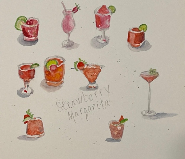
9. Food Shapes: For the sake of this class, I'm going to put food shapes into three broad categories, circular, random and box. Let me explain what I mean by that. Okay, so some of the food you draw is going to be circular, just like the cups and sorcerers and plates we're just talking about. A Pizza is a circular thing. Blueberry tart is a circular thing. So as a plate of sliced tomatoes, a bowl of soup, when you really start looking, you're going to see so many foods that are circular or round, meaning they're spheres. So pancakes, olives, cookies, hamburgers, oranges. We eat a lot of round food. And for round and circular food, you're basically going to use the same rules we just talked about for dishes. You're going to remember that it can't be perfectly circular because you're not looking straight down on it. You're going to be drawing ellipses, not circles. We're going to practice this in just a minute, but keep this in mind. Some of the food you draw is going to work just like cups and sauces and plates do. Okay, so that takes care of circular food. The next category is random food. This is the food that follows no useful rules of geometry at all. Think about salads, pastas, stir-fry skewers. They're just random assortments of little cut up bits of things. And I can't give you any hard and fast rules about that. We're just going to have to draw what we see. Okay, so that gets us to this third category, which is what I'm calling boxes. I'm not calling them cubes because they're not all perfectly square. Some of them are rectangular. And believe it or not, boxes and actual term in geometry, I looked it up. So we're gonna talk about drawing boxes. What kind of food am I talking about here? Like sandwiches, cheese wedges, amazing looking chocolate thing. Even slices of cake or pie. They're not square, but they're around. But when you cut wedges out of them, you end up with these geometrical box-like shapes. I'll show you what I mean by that. So I want to emphasize, you don't have to spend hours working on drawing perfect boxes and cubes and perspective, like you're back in geometry class. But if you do these exercises with me, even just once, I think you'll be able to grasp a couple of cool tricks that will make it easier to draw boxes or basically anything that's been cut and has straight lines in it as a result. All right. Let me show you what I mean.
10. Drawing Food as Boxes: We're not going to spend a lot of time drawing cubes in this class because I know you're eager to get to the food, but it's a good thing to practice. And if you've never done it before, it can really help improve your drawing practices. In a lot of ways. I think you'll be surprised, and I do have a Pinterest board with a lot more practice tips on it. So you can dive into this more if you'd like to. But we're gonna start with a square. Now a cube. The sides are all the same length. And you notice it's a square. So this side is parallel to this side and this side is parallel to that side. There's going to be important in just a minute. So when we draw it in perspective, once again, that angle, that line is parallel to that line. And then I've got this line and this line back here is going to be parallel to that line. You see how that works. And I've got this vertical line here and this line is going to be parallel. They, they work together. And then this line here is going to be parallel to that one. So that's how you draw a cube. And you can, you can spend endless amounts of time drawing cubes. It's a great way, like I say, it's a great way to improve your drawing practice. Just something you can do when you're doodling and it'll help you not just with food, but it can also help you with buildings and a lot of other things. Now, another thing that's generally going to be true is that because we are drawing food on plates, generally, your vertical lines will always be vertical. If we were drawing cubes that were floating through space, then all your lines could be at any sort of angle, but you can pretty much count on vertical lines being vertical and then you just have to figure out what these angles are. So keep that in mind as well as we go through some of these exercises. Okay, so let's see how I can use these principles. It's like to draw this chocolate thing and I can look for a shape I recognize. So that's the first step. So the shape I recognize here is this rectangle that's familiar to me. I know how to draw a rectangle. I'm pretty sure I can pull this off right? Rectangle. Okay? This is parallel to that, that is parallel to that, this y i that is recognizable shape to me, remember what I just said about the sides being vertical? Vertical, vertical, vertical. They're straight up and down. Now this thing happens to be a little bit kinda round and it's a little bit wider at the base and all that. But close enough, this line is parallel to that line. And then the lower part here, this line is parallel to that line. So understanding that, that this is a shape that we know and understood already, understand something about can let us get this right, right off the bat. If you understand these principles, it's really helpful now this chocolate thing in this case, but it could also just be like a stick of butter, right? You can totally see how that's a stick of butter. Now, think about if instead of this being a stick of butter, it was like a little. Butter on a dish. And maybe you, maybe you recognized like this square shape. But it's, we're looking at it from the side. And it's like that, right? Maybe that's your little pat of butter. Now, this little pat of butter, knowing how to make this box, and we're gonna call these boxes because we're out of cubes now we're into other shapes. Knowing how to do this means that we can draw a lot of other things. So let's think about a sandwich as an example. I'm going to make it a little more square like a piece of bread. And once again, what we're look kind of keeping these all kind of the same angle just so you can sort of get your head around it. Vertical line, vertical line. This line is parallel to this one. We got this line here. So I want to make a parallel line to it like that. So maybe that's a sand wedge like here's the two pieces of bread. Again, these would be parallel right off all of these lines. And there's like some lettuce, tomato and whatever. So there's your sandwich. Now, here's the cool thing. What if you want to cut the sandwich in half? So we make a diagonal line right there, and then along the bottom of it, we make another diagonal line. I'm gonna come in real quick and erase the part of the sandwich that we cut off. Maybe we ate that part. I'm going to erase it as best I can real quick. And now we have while law, half a sandwich. So what's, it's almost like a little magic trick once you figure this out, that, right, these are geometrical shapes that I already know something about and I already understand. Now you have to make a cube and cut it in half every time you're going to draw a sandwich, right? Like you can just draw the sandwich like maybe you recognize this rectangular shape. This is the cut part of it. Here's the lettuce and that her son had tomatoes. And once you get this rectangle and place, all you have to do is kind of figure out where are those diagonal lines going exactly. And there's your sandwich. So you've, you've done the recognizable easy shape and then you've just worked on kind of the rest of it. Let me just show you another example here. Maybe we've got, I'm gonna do a very similar type of cube. It's not a cube, it's a box. But you understand I'm talking about, and maybe we decide to cut this one in half. And we're doing it like this. We're doing it diagonally like that, right? And so I can get rid of the part we cut off. And this could be a lot of things. This could be a sandwich for sure. Like this kinda reminds me of those like sandwiches you can get inside a little plastic carton, you know, those things. Or it might be a wedge of cheese like this actually kinda reminds me of more BHAGs. It could be, it could be cheese. But the point is, you're taking like a recognizable shape, like you can start with this triangle and go, okay, well then what else is happening? And I'm pretty sure I just put this mind out. I'm pretty sure the other line probably needs to be parallel with that. And I have this line, probably this other line that's coming out here needs to be parallel with that. So just sort of understanding that and having that idea inside your head, that's the really critical part. I'm just going to show you. I'm going to show you another one just to give you another, just to kinda get you thinking about other ways this works and other kinds of shapes you might see. I mean, they're really all the same shapes, but it's just different ways of thinking about it. Ok, so those need to be parallel, that needs to be parallel. So we make sure that all that lines up. So another example might be, let's say we're going to cut it like that now in this case, hard to see without, I'm going to just make this, I'm gonna make this box transparent for a minute so that you can really kind of see the whole Where were they cut happens. But let's just say right there, I'm I'm cutting off this part of the box. I hope that makes sense. Now I can delete that, delete it. Now I can erase it. So again, this could be like a wedge of cheese maybe from the back and you get this angle coming down. It's just this is just like half a box. Like this is a box that was cut in half and put in front of you. Okay? This is something you can just like play around with and have a lot of fun with. It's sort of just a cool thing to practice and just kind of doodle with. But I also wanted to mention how it works with things like a piece of pie maybe or a slice of cake. And in fact, let me get a picture. Let me put a picture out here so you can see that as an example. So here's a delicious looking piece of cake. And probably I hope after everything we've looked at, they are already looking at this near like, aha, I see your rectangle. I totally see that rectangle. What angle is it ad? That's like that. Okay, then this one has to be parallel to it. And then it comes down like that. And this other line has to be parallel with that one. It's kinda like that. I know how to deal with that rectangle. Once that rectangle is in place, you can sort of just, you can judge that and you can measure the angle. You can sort of judge where this land you're like, alright, this is a little bit of a curve. And then I think it comes in like that. So we've got this kinda triangle shape that's a little bit curved in the back. And then we have this layer of cake. So it's all about just being able to kind of translate these, to translate these objects that we think of as cape, but really understanding the geometry of it. So here again, like I see that that looks really, that's, that's easy for me to understand. This is vertical, the verticals or if they're vertical, their vertical, right? They're going to be pretty much straight up and down. So I've got that. And I know that's going to be parallel to it. Now this let's go and like that. Let's go and like that. What else? Well, I can see that I've got a line coming up here. And I can recognize this v-shape. So I've got like a V-shape like maybe it's kinda like that and it's got a couple of layers to it. Does that make sense? Like I'm just breaking this down into shapes that I recognize and that I that I know what to do with. I wanna go ahead and give you one more example of this so you can really get it and one where you can see an example of what I'm working on. So once again, like straight up and down, straight up and down, straight up and down really, unless the food is being served to you on some sort of weird tilted platter or it is literally flying through the air. You can pretty much generally, as a rule of thumb, know that your verticals are going to be vertical, they're going to be straight up and down. So just by remembering that, so we've got two parallel lines here, two parallel lines here. So this is the shape that we kind of know and understand. And then I can just, I can just sort of eyeball this angle with my pencil if I want. We have sort of an odd perspective on it, right? So the angles are a little different. And so the easiest thing really is to just kind of just kind of eyeball it. There's the bread, There's a whole bunch of filling. And then in order to do the second one, a couple of things that we've already talked about. One is that I'm going to be mindful of where one thing is relative to the other thing. So where's that? It's about halfway in to this sandwich, right? So it's about their, Okay, well great, I've got a vertical line established. That's really helpful. And if it's halfway in over here, it's probably halfway, half again over here. So I can just sort of make sure those look about equidistance To me. There's some bread. I know this is straight up and down. I know that this line needs to be parallel with this line. And I like that this worked yet, you know, yay, so the sandwich comes in here. So that, that turned out to be about right. And I'm just double checking that my lines are truly parallel. And then once again, I'm just gonna kinda eyeball these angles. We're not going to, we're not going to really get into trying to figure all the intricacies of the perspective out on these. But see that we have rectangles that we, that we recognize. We've done this before. We have the slices of bread and then all the filling. So those are pretty accurately placed. And so that's our goal. Look for geometric shapes. And let me give you one more example. And, and maybe even print them out. Maybe even take some pictures and print them out and drawing them. And I think you'll recognize like, I understand this, I can do this. This. I that's a rectangle. I understand that. And then if I've got this angle, I can, I can eyeball that angle and then I just connect them with this curve. So I've got a triangle there and a rectangle there. Here again, okay, this is just about a square. And once I've got that, I note, so this is, this is the rest of that little wedge and then I just connect those. So these are the kinds of things that once you start looking for them and you're like, okay, this is not as, as impossible as it seems. That line is going to be vertical, that one's going to be vertical. These are going to be parallel to one another and then it's circular, it's connected. So I think I can manage to draw that in. And that's the kind of thing that I want you to get comfortable with. And that's the sort of underlying principle. That's how you break this down and simplify it so you can draw them quickly, is that you already coming into it. You already have a basic understanding of how this works like you, you already understand generally that this is how sandwiches work. So when you're trying to draw your particular sandwich, you're coming at it with this foundation that's already in place.
11. Coffee: This is going to be so quick and so simple. What I'm doing here is I'm looking at where these lines are right. Where's the top of the cup? Whereas the other part of the rim, where does the bottom of the cup fall and then where does this saucer fall? Those are the, those are the things I need to get into place. And I'm just gonna get the edges of this, of the rim of the cup of coffee and it's just straight lines down. And remembering that the bottom of the cup is rounder than the top is, because we're looking at it at a slightly different angle. So make sure that I've got that I might even be exaggerating a little bit here, but I want to make sure that you can see that it really does help. We have this temptation to want to make it flat on the bottom, but it's not flat on the bottom. And then you can see where the saucer hits like the saucer, kind of the back of the saucer, sort of halfway up the side of the cup, right? So knowing where that is is really helpful. I mean, just draw in, get this a little bit more clearly defined so that you can see it and draw in where the, where the coffee itself goes. All right. So there's my Ogg, there's that. And then now with the saucer, and I've got the top and the bottom of it. And I just kinda wanna get this angle generally Right? And I think I am going to do this little bit of blue on the side. There's like a little logo or something there. So I'll go ahead and get that in. I'm not going to bother with the spoon. This is plenty that you can see that the coffee cup is casting a shadow on the saucer. So that's super helpful. And then I've got a little cobalt blue. I just need the tiniest bit of it because there's kind of a blue reflection happening on the saucer as well and a bluish shadow on this side. So even though this is a way dish, seemed to have a lot of way dishes for this class. But even though it's white, you can see that there's actually quite a bit of color in it. So I'm going to take some transparent earth and mix a tiny bit of ultramarine blue in it, which pushes it towards brown. And I think that's a pretty accurate coffee color. I'm not trying to be real fancy here. Just getting that in is kinda fine. Use a little buff titanium for some other spots in the dishes where there's more of a golden light hitting it. And I wanna get that. I'm just going to use some ultramarine really dark once I'm sure that the rest of it's dry, get that little label in, and that is it. That is our very quick and simple morning coffee.
12. Negroni: I wanted to include drink that had ice cubes in it. Just show you that you do not have to get super technical here. If you've looked at a lot of watercolors, you've probably noticed that watercolour artists love to get into like reflections in glass and the shapes of ice cubes submerged in a drink. And you can get very academic with all that stuff, but you absolutely don't have to. So I'm starting out same way. I've established where I went the bottom and top of this drink to be and I'm just getting those lines in the rim of the glass. The bottom of the glass. This glass has kind of a beveled bottom, which is sort of fun. This is a fun challenge to draw this one. So we get the Raman, just try to, try to kinda get the distance there right. And then the sides come down straight and then there's they come in a little bit and then go down straight again and there's this sort of scallops, kind of indentation. I don't quite know how to describe this, but you all know this glass. You probably have a glass like this at your house and there's a thick chunky bottom to it. So I'm drawing that in and I'm trying to remember to keep those angles in there. Try to get this, to get this a little more accurate. This is why we have the eraser folks. I'm just GET those lines right. And so I'm going to let these lines show as pencil lines. And that's the point in this drawing is, you know, I'm letting the pencil lines actually show the viewer will know what this is. I'm not worried about trying to get tiny little reflections in glass that will suggest the shape of it. I'm just going to draw it. So okay. Now I'll get in. There's a couple of garnishes and I'm looking at where does this lemon wedge fall relative to the rim of the glass. So this is about, you know, you get one shape, right, and then you figure out where the other shapes Go. And this also I need to get in here where the liquid kind of lands relative to the rim. And I like these two big straws and we are gonna do the straws in the glass as well. So this is a good excuse also to show how something like a straw can go down into liquid. And you see, I am just drawing the ice cubes. I know it seems kind of silly and like almost cartoonish, but it absolutely reads as ice cubes. Nobody's going to be confused about what this is. So I have just drawn a min and pencil. I've been pretty bold about it and I'll be thoughtful about the fact that we're the ice cubes are, it's a little lighter in color, right? So let me go around and get the rind of these two pieces of citrus because I know I'm going to with those to dry while that's drying. This is Daniel Smith, neutral ten and there's a little bit of reflection here, but anyway, that's just dark black and I'm letting that and putting that on so that can draw drying as well. And while that's drawing, I've got my mixture of kind of grays and blues, shadow violet, cobalt blue. And I'm putting those around the rim in this case, that's pretty much the color that you actually see. So it does match up with the surroundings pretty well. Just getting a little that end to show that we really are looking at glass. Now, this drink, some of it's quite bright orange and that's really where the ice cubes are. So now I'm doing this mixture of, I've got, what I have is new gam bows and pyrrole orange. And I want to keep that part of the drink lighter. This is sort of the cool thing is when you can show, you can show that you're, you're looking through this liquid and the light's coming through. And this is what watercolor is so, so good at. So now I've got a darker red mixture, which is the parallel read with just a little bit of transparent Earth in it to make it just a little bit darker. And I'm trying to keep these colors are away from each other. It's fine that they're gonna blend. I want them to I want it to sink into the paper just somewhat so that yes, we have some blending, but there's also obvious separation and they don't totally melt into just one color. And I can see some dark areas right about halfway up the glass there. So I tried to drop that in and also around the bottom now that the citrus is dry, I can just bring in, I'm just bringing in yellow. I'm not getting fancy about the reflections on that citrus. Just drop that in and try to kind of fill in some of these other gaps. I want to do the straws, but I know that I need to let it dry a little bit before I bring those straws down or else the whole thing's going to turn kinda muddy. So I'm just looking for other things I can do. Like, I can see that there's a little reflection of the drink itself in the bottom of the glass. So that's a fun thing to include when you can see it. And now it's time to go for it. So this is Daniel Smith, neutral ten, and I'm bringing it down into the drink knowing that it's going to run a little bit because it's damp, but it's not completely wet. So you get this kind of watery effect and that's what I'm going for here.
13. Martini Glass: So here's a very pretty drink in a martini glass. I'm gonna do this small so you can see how you can do these just very quickly. Establishing where I want the top and the bottom of the drink to be putting a straight line down the center of it so I can be sure that it's more or less stands upright. And I'm just looking for these lines. Where's the where's the rim? How much of that can I see? And then with a glass with a stem like this, there's always this kind of curved area where the stem comes into the bottom of the glass and it's important to get that right. And then to get the, get the base of the glass. And once I'm pretty satisfied with all this, I'm gonna go in and just make the lines a little bit bolder. Get the bottom and the top. Remembering that you don't have to draw in the entire ellipsis, the entire curve. You can just get some of those lines in and the I will catch up the rest of it. There's a sprig of Rosemary coming out of this drink and I just made that extremely, extremely simple. This is intended to be something that you do very quickly. Maybe you're out with friends and you're gonna draw everybody's drink on the page. So by definition they're going to be small. And, and you wanna do and pretty quick. Alright, so I want to draw in where the liquid is as well. And it sort of sits just below where I can see the rim. This is Ngugi ambush. And there's areas of the drink that are darker where the colors more saturated. So I'm putting that in first and I'm gonna give you just a second to dry. It's not gonna get completely dry, but some of that pigment will soak into the paper. And so you'll get this effect of it being more saturated in some places and lighter in other places, which helps because it makes it not just one blob of orange, which can look a little, a little cartoony. So now I've got some shadow violet with just a little bit of blue, of cobalt blue. I just want that kinda nice bluish gray color. There's some very dramatic colors in this photograph which I'm not even doing. I'm just getting this color that kind of generically reads as glass when you put it in and putting a little bit of it around the rim and down the, down the stem and the base of the glass. And already you get a sense that there's some light hitting. It just helps a little bit. I also wanna emphasize that spot where the stem comes into the base of the glass and it just kinda anchors it. Now I've got some buff titanium and I'm mixing it in with that same new game beause. You could almost just come in with clear water and blend those together and see what happens. And I'll bring the color in around the side so you can see that there's just the tiniest little bit of variation. You can also come in with your brush and pick a, pick color up a little bit. And it's lighter on the top because there's light hitting it. So I wanted to get that sense as well. So I drop in just a tiny bit of that, some little reflections in the base of the glass and we are done.
14. Agave Pina: So we'll do this drink at a larger size. This is five by seven, but you know that's still sketchbook size. You could easily have a sketchbook that big. I did speed this one up a little bit just because there was some amount of like drying time to let things dry. So but you'll see you'll see what I mean about that in just a minute. So I'm doing the same thing I always do. I've already worked out where I want the bottom and the top of it to be. And now I'm just trying to figure out the curves of kind of the top and the bottom of this glass. And once I have that in place, I am just trying to connect them and make some little line about where the level of the drink is within the glass. And, you know, go ahead and make whatever little adjustments you need to make at this point. So I'm just kind of cleaning it up and double-checking some of these angles. And now I'll get right into some color. So I'm going to start with some of these little gray highlights along the bottom of the glass. Just, you know, just because glass is clear and so you need to see something shining through it. So a little bit of gray and a little bit of blue, which I actually do see here. But what I'm doing is I'm not really trying to get into this background-color and trying to get that kind of brownish red color in there. This is just sort of some very simple, very basic and very easy, grey and blue colors that suggest glass. And I want to go ahead and draw in the sage leaves. And that's a slice, a hell opinion right there. You're gonna get to see the recipe over this one in just a minute. But anyway, go ahead and get the hell opinio in there and I really want to give it some dimension. So I've got like this outer, there's an outer rind and then there's the little thing in the center. So I want to put all that in and then I'm actually drawing with pencil the ice cubes. So I'm not trying to get super fancy about subtle transitions of colors were these ice cubes, I'm perfectly happy to just draw them in pencil. This is meant to be something really quick and informal and fun. So I've got a green here. I have a fellow green and a Sap Green. And I'm mixing a lot of blue into it because sage is just a very blue-green kind of plant. And I'm not aiming for total botanical accuracy here, just some sense that it's kind of this light greenish color. And then that fresh Hal opinions are really bright, vivid green. So I'm sort of doing a mix of my Sap Green with my fellow green to make it pretty bright but not too terribly artificial. So I get those in all that stuff just takes a minute to dry. And many use new gamble. This is pineapple juice in this drink, so it's really intense and dark down by the bottom and you can see that it gets lighter as we go up. So I really just have kind of a wet brush and I'm working my way down and letting these things blend together. I'm going to come back into it with just a, just a little tiny bit of water to blend it in just a minute. Now you can see I went back into work on that pineapple and it was still a little wet. And this happens when you're working fast, you're sitting in a restaurant, you're trying to get this done quickly and there will be a little bit of that. Don't freak out about it. It's pretty easy to blow it up a little of that with a paper towel and go back to work and whatever you can. So I'm taking clear water and just blending in some of those colors in there and also blotting some of it up to get that effect that its lightness. What I don't wanna do is put a big heavy wash of water over this paper. Because if I do that, then it really is never going to dry. So that's why I came in and just sort of blooded it up. Now a little bit of light green, sort of a light yellowish green in the center there where the center of that hell opinio is. And I'm just going to darken up a little bit now that it's dry out a little bit more dark accents to that sage leaf. And now I'm coming up with a slightly bigger brush and I'm just going to splatter some paint across it, which is sort of a fun thing to do. And you're making a really casual piece of art like this, a little bit of green, a little bit of yellow to just suggest what the ingredients are. And this is the kind of thing. If you're like, let's say you're out and about in a restaurant and you're, you're doing this, you know, you can be drinking the drink while you do it, like you get the basics in and the rest of this, you know, the, you know, what's wet and you'll be able to, you'll be able to kinda work on it even as the drink is changing because someone's drinking it, you can still work on getting these colors. And this is meant to be really casual and really fast. And That's how it's gonna go and you're out sketching live. So I'm gonna get a little bit of yellow into the rim because there's always those reflections. And then I'm just gonna write the recipe right on the drawing here. You know, sometimes you go out to a restaurant, you fall in love with some drink and you want to remember what was in it. Maybe you talked the bartender and telling you how the whole thing works. So I'm not doing anything special with lettering here. I didn't even get out a pen. I'm just using my pencil and just sort of scribbling down the recipe for this drink, which by the way, if you're curious, is tequila and pineapple juice and a little bit of a GAVI nectar and then fresh Hal, opinio and sage. It's actually a really delicious drink and would be a fun thing to have in your sketch book and would just remind you of your, of your night out, which is the whole point.
15. Cappuccino: I chose this cappuccino for this class because I like this little box that it's in and it just shows that, you know, a little geometry can help, but also it just helps to kind of anchor it in place and actually let you get the mug down a little easier. Now you might be noticing, you know, we've talked about building boxes. You might be noticing that the left and right sides of this box are not parallel. And that's because we have the effect of perspective working on it's just a little bit so as this, as this, even though it's just a little tiny thing, it's moving off into the distance and the lines are converging to a vanishing point. So we're not gonna get into perspective in this class, but if you just observe that happening, then measure those angles and try to get them down. So I'm just trying to indicate this that this thing has a lip. And again, remember your vertical lines are vertical, so that can really help. There's little vertical lines on the inside of this box where the, where the sides connect. And then in the foreground as well, you can see that. You can see the side of it. Now, obviously, if this seemed like a like a totally intimidating drawing project for you, especially first thing in the morning when you hadn't had your coffee, you could leave it out and just do the cup of coffee. But I decided to go ahead and put it in so you could see how I tackle it. And now and figuring out where the, where the cappuccino cup goes by looking at how it fits into that box. Like where does the rim of it sort of come and how does it all work? And I am giving myself these little Guidelines again. And I know that it's quite a wide elliptical because I'm looking at it at an angle. I'm not looking straight down on it so it can't possibly be round. So I'm I'm bearing that in mind. And figuring out also just where like the bottom of the cup is relative to this little tray that it's sitting in. So the tree can have its uses in that way. You can really kind of get it, get it situated just right. And once I've got that in, I'll go ahead and erase any little marks that I'd given myself as I was as I was kinda trying to figure this out, get those out of there. And then I'll just redraw a little bit of a just, just kind of restate, make these lines a little bit more clean and assertive. And this is all really unnecessary. Like I'm fussing over this a little bit more, Mostly because I'm doing it for you. I mean, if I was just drawing this as part of like, you know, drinking my morning coffee, I'd probably be a lot less fussy about it because I'd be really eager to get going on the coffee, but I'm trying to, you know, I'm trying to just refine it a little bit, but ultimately, you know, the idea here is to be quick and informal and have fun with it. And the nice thing about a coffee cup is even if you're picking it up and drinking, you're setting it back down again so you still have it to look at the handle that the thing with handles is notice where the handle comes out relative to what you've already fixed in place, like the upper rim of the mug. Is it sticking up above that? Is way below that. How far down does it go relative to what you've already drawn in for the bottom of the mug. And don't get overly fussy with it. Don't try to make it overly perfect. It is what it is. You know, you'll just sort of feel suggest this handle and that's good enough. Okay, so once I've got that in, I'm gonna go ahead and do the napkin and the spoon to I'll go ahead and make this a complete little scene. So I like that. You see that there's a couple of little layers of paper that are folded over and it's nice to be able to just draw that. And I can look at the napkin and see where it fits relative to the box. Like how does it line up with the edges of this little tray that it's sitting in and just get the, you know, skip the spin in. And I'm also looking at now where does the spin sit relative to where I've placed the napkin? So I'm just sort of looking around the edges of the spoon and the edges of the napkin, seeing how all those things line up together. Trying to kind of sharpen up these edges and do a little bit, do a little bit of erasing, a little bit of clean up here. Just to, just to get the shape of this right. That's pretty good. You'll see why I like these needle rubber erasers because you can really get into some tight spaces. You can make a little tiny point for yourself and really get it just right. So this is a lot of perfectionism for a quick little thing of your morning coffee, but whatever it'll, it'll give you a sense of how to approach it if you really want to try to get everything measured out just right. And I'm just going in last little bit of clean up before I get into watercolor and see where are we going to start with this? So yellow ochre is a pretty good color for the tray. And I'm looking at the darker areas of the tray that are the don't have light hitting them. Basically, they're not quite in shadow. Well, they're sort of in shadow, but they're basically just the, the darker side that's away from the light. So I want to get back in yellow ochre. I'm using a little bit of shadow violet mixed with some blue to get the darker areas of the spoon so I can let that dry as well. You know, this is all about just looking at alright, what needs time to dry. So now I've got some transparent earth and I'm mixing it with kind of a lot of buff titanium to do the foam on a cappuccino. And this is a very fancy pattern. It's got two little hearts in it. Somebody who was really showing off, but I'm just gonna do one little heart because this is a very small little painting and I don't quite have room for the whole thing, but I do want to get the one heart in because that's kinda what so charming about it. Alright, so that is in, and I'm dropping in and some transparent Earth and a much darker color. Anytime you're doing liquid, it's nice to have some variety and some color transitions. And this is a watercolor is perfect for doing liquid because they will blend together and they will look watery, which is sort of the whole point. So that's kinda great. I'm gonna take Naples Yellow and there's some yellow light bouncing up off the tray onto the cup. So that's helpful with white dishes is something around it is a colour and it will sort of bounce up. And I'm going to use that same Naples yellow to just come in and do the other parts of the tray that are lighter in color now that that darker area that I'd put in is already dry, I can just come around and get that staying off the off the napkin. And with a little yellow ochre There is kind of a cast shadow there, cast by the cappuccino bug onto the tray. So I'll go ahead and suggest that the thing about getting these shadows n Is it really makes it feel like a three-dimensional thing that has some weight and has some presence. So anytime you can do that, it's always great. Go in and get a little bit more of a kind of a bluish color on this silverware. And also there's a little bit of that, that color hitting the mug as well. You can really, I think this one's a really great example about how like a white dishes, never white. You know, there's a lot of other colors in it. And I can get some bluish color onto the napkin and I can see where there's some bluish light hitting the napkin as well. It's not completely white and just kind of touching up Little Shadows. And that's really all I need to do. It's time to drink this coffee.
16. Croissant: If you go to France, you're definitely going to have to draw a picture of your morning quests on. I think it's pretty much just required. This picture is cropped and kind of a funny way, but I'm gonna just draw it like this. I, I like these I like these photographs where you don't see the whole plate because it's a good reminder that you can do this in your sketch book two. And also, I'm just gonna do one of the two quest salts will assume that you've already eaten the other one. And I'm marking out where the top and bottom of it is relative to the top and bottom of the plate. So I'm thinking about that and I'm measuring these angles. It almost helps if rather than think of this as a curved thing, if you think of it as a kinda like a bunch of straight lines. So I'm giving myself a couple of guidelines where I'm just looking at like where, you know, what, what, what are the major angles of the shape of this thing. And kind of using really close observation to, to get the shape and kind of the unevenness of it. And also getting these lines where the folds of the pastry come over. That's very distinctive and very much a specific thing about this particular kind of pastry that you want to be sure to get. And all erase some of those little guidelines that I drew for myself. And just look over the whole thing and make sure that I've really got the way this thing is built. I mean, the cool thing about this is true for a lot of food really is that they are things that have been built in. So it's kind of neat to sort of look at, well, what is the construction of it? And am I sure that I've got everything in place? Now? There's this little pot of, I don't know what this is, syrup or something. And again, I'm having to remind myself that this is not perfectly round. It can't be perfectly round because we're not looking straight down on it. So it's a little bit elliptical. And the bottom of it has these hard edges. It's like one of those little six-sided pots. So I'm trying to get those edges in. I don't want to fuss over this overly. Nobody is going to be looking at the little pod of syrup. They're going to be looking at the quest on, but I do want it to be, you know, somewhat accurate. So all right. I've got this little guy in here. And then let's see, I can manage this. I'm gonna do the spin. It's a cool look and spin. It's kind of fun to do and remember to just look at where does it fit relative to the other shapes. How does it come up against the edge of the plate? How does it come up against the quest song? Where does it disappear behind the little pot of syrup? And I'm not gonna, I'm, I'm, I'm not headed for perfect accuracy here. Like it's got this little loop de loop thing on the end. And I'm just gonna kinda draw that in and not worry about perfectly realistic rendering of it. And it's got sort of a funny curve to it already. So I don't need to get too worked up. I mean, it's already sort of irregularly shaped, in other words, so I don't have to get too worked up on making this perfectly symmetrical thing. It's fine. That's fine the way it is. Any other little cleanup now's the time to do it. And then once I'm ready to go, there's going to be, again, a lot of transparent earth. And I'll use a little bit of Daniel Smith neutral tint and also some red and orange. What I'm doing is I'm going to look at first getting in this pot of syrup and there's light shining through it. So there's places where it is a little bit orangey. So I went to drop that in and give them a chance to dry before I add other colors, they won't blend too much. Starting with buff titanium, I'm looking for the lightest areas and just trying to think about letting things dry. So if I can come in and get those real light areas, Naples Yellow. Get those in first. And then I can come in with kind of the Naples yellow in this case is sort of the mid, mid range color. Basically, I'm doing all the parts that don't have that sense that they've been baked to a golden brown. I'm trying to get those in knowing that I want to let those dry because the the more golden brown areas have pretty sharp definition and I want that sharp definition. I don't want them to run together and be all watery. So this is that it's against transparent Earth. You can see how much I use it. And I'm coming in and I'm just trying to draw in these darker areas and hope they don't all run together too terribly much. Yeah, that's looking alright. One thing about if you're sitting in Paris and you're trying to do your morning quests on, chances are there's not just one quest on sitting around, there's probably a whole basket of M. So, so if one of them mysteriously disappears while you're drawing it, there's probably others that you can refer to. But you know, the thing that I'm really going for is to get that very dark orangey sense of that it's been baked. So I've done about as much as I can do. I need to let a dry so I'm going to come in with the syrup and this is just Daniel Smith neutral tint, again mixed with a little bit of a any reddish tone like a transparent earth, something like that. And I'm not going to focus only on this. It's just going to look like a little pot of something and that's perfect. Some shadow violet in the spoon. And I'm just looking at where the reflection hits the spoon and where it's lighter and where it's darker. Get that in and also give that a second to dry. And then let me get some shadow is a shadow violet and a little bit blue in it. I do see that there is a bit of a shadow and places on the plate where the light is hitting and where the light isn't hitting. And there's also a little shadow cast by that pot. And to a certain extent a little shadow cast by the spoon as well. And I think that makes the plate look more, more real. And does it makes it look not just like a white circle that's floating in space, which is what you're trying to avoid. So now that it's starting to dry, I'm gonna come in with some darker colors and try to really establish that sense of it's just come out of the oven and there are areas that are, that are like very, very well baked. So I'm just gonna go over things a little bit, see if I can get a little bit more of that now that the spoons dry, I'll take a second to go in and touch that up with some lighter gray areas on the parts that aren't so distinctly in shadow. And this Daniel Smith, neutral tin, it's kinda nice. I'm gonna go ahead and put, I think a little shadow under the plate here. And I mix them transparent Earth into it. I just, I just didn't like the look of the gray like in this photo, it's sitting on kind of a grayish table, but I don't know, just didn't appeal to me. So I dropped that in. It might suggest that it's sitting on a wooden table or something like that. I'll think about that. Other little things I can touch up as it's drying like the edge of that pot of jam. Looks pretty good. And then I'm going to come back in with that. I've got this neutral tint and I've got this transparent earth. And I'm going to just bring this darker color all the way around. It's kinda nice. And sometimes you can add just a little bit of drama. You know, this is true for drinks as well, that you can drop a Color in behind it that's really pretty bold and dramatic, even when you're, the thing that you're drawing was kind of a bunch of lighter tones and it can make the whole thing pop out. So I sort of like the way this looks. It's, it's more suggestive of a wooden table that it's sitting on than a particular shadow. But I think it, I think it draws you in and remind you of hopefully remind you of where you were when you made it.
17. Pizza: With this pizza, what I wanna do is first get in that piece of paper that it's sitting on. And that's gonna give me just the outer boundaries of how much space this is going to take up on my drawing. Now remember, these lines should be more or less parallel. Of course, it's a piece paper, so it's kinda flipped over in one corner. It doesn't have to be exact. It's bending a little bit. That's okay. But once that's in, then I can see this wooden paddle that it's sitting on. Then I can see where that fits in. And by drawing a straight line, just imaginary straight-line. I made it very, very light on the page. From the top of that wooden paddle down into the handle that helps me to visualize it. And it also helps me to get the curve of that right. If I draw a line in the middle of it, it becomes very easy to compare the left side and the right side and see if there are more or less the same. Now you don't have to get too perfect about this because you're looking at it at an angle anyway. But again, remember, resist the temptation to make your pizza round. It's definitely not round because you're not standing up and looking straight down on it. So it is somewhat of an ellipsis. It's a little bit long and skinny. And then I really want to get the crest in. This is what makes it super obvious that it's a pizza and not just some random collection of finding little shapes. So I'm going to get the crest in and then I'm just going to draw in some shapes for what I see here. It's, there's like some spinach and well, it looks like maybe some brush sudo and some, some cheese. So you don't have to get super accurate with this, but I just want to indicate these shapes so that when I start putting color down, it all just makes it a little more sense. And it doesn't just look like random blobs of color, but it has something a little more intentional to it. Obviously, if you've got something on there that's very recognizable like mushrooms and you want to draw a little mushroom shapes, that's totally fine, but these are all pretty random looking shapes. So I just want to get something down and just kinda going over this handle, maybe showing a little bit of the underside of it. Anything you can do to make something look a little three-dimensional, always great. Now, the first order of business here is to get some color in the crust and let that totally dry so that we can put other things down and not worry about it running into the crust. And you can see it gets a little bit darker and a little warmer as you're getting toward the viewer. So I'm going to drop in a little bit more of that. Kinda nice. It's more of like a yellow ochre tone closer to me so that you get a sense of that. And once I've got that in, so this is some transparent Earth that I've mixed a little bit of blue into to make it browner. And I'm going to just maybe pick up a little bit more yellow ochre. I'm just trying to get a color for this board that looks slightly different than the color of that pizza. It's sort of hard because it's like this golden would. But anything I can do to just make that seem different, like I'm dropping some orange. So I'm going to make it a little bit more orangey than it really appears in the photograph. But it just separates those two things and makes it obvious that one thing is some wood and another thing is some pizza crust. So that little bit of variety helps. Now I've got Naples Yellow and I'm working it in with a little bit of buff titanium and just trying to get a light color in for that paper. It doesn't have to be fancy, it doesn't have to match exactly. It just needs to be something that suggests that it's sitting on a piece of brown paper. So just work something in for that. And I don't have to worry about I'm not going to be coming back to that, so that can take its time to dry. Now that the pizza crust is dry, I'm gonna get in to some of these ingredients. So I've got Sap Green and mixing it with a little bit of Thaler green just to brighten it up because there is kinda some bright, vibrant green here. And it did run into my crustal, let alone was not totally drives happens when you're trying to work fast. You're actually sitting at a table. There's food sitting there. The pizza by now has probably already been sliced up and passed around. But you know what the three ingredients are and you've done a drawing, so you can kind of work, work these colors in. Now. I've gotta let things sit and dry a little bit in between passes, so I'm just looking around for anything else I can do. And if this handles dry, I just want to suggest that little shadow under there, which just gives it a little more depth and a little bit more of a sense of dimension. So I think that's okay. There's sea still. It's not it's not as dry as it looks. But I'm just going to take my chances and see if I can get in and kind of do this little shadow. It's like a shadow, but it's also just, the crust is baked a little bit more. I don't want to get detailed with this crust. I mean, don't spend the rest of your life putting in all of these little dots where where you see these kinda brown or spots because for something that's small and quick, it's just not going to look like much. Alright, now I'm getting in some, I've got some Quinn acronym when acronym rose and a little pyro red and I'm just mixing it in with some of these brown or mixtures that are already on my palette. To suggest this, this prosciutto or I mean, honestly, the way I'm painting this, it looks like it can be tomatoes as well. But anyway, the point is getting this color in trying to stay away from the green so they don't run together. This is the big challenge of doing a thing like this of course. But also just really look at the, if the pizza is still there. Really looking at the pizza itself because you don't want everything to perfectly evenly distributed, like a little bit of irregularity. Here in, there is a good thing in this case. Alright, so I'm coming back. I've got yellow ochre, but also a little bit of transparent earth to try to continue the shadow that the papers casting. I like to look at that, but honestly, I'm also just trying to kill a little time while I let other things dry. If you were doing this while you're sitting in a restaurant or a cafe, you would just be eating and talking with your friends and, you know, you'd come back to this later once things were dried. But now I'm gonna take this buff titanium, which kinda sort of looks like the color of that cheese. But I like it because it doesn't just look like the white paper. I sort of want to fill it up with one color or another so that it does look like this mixture of ingredients is happening there. So this is Daniel Smith neutral tint. So that it's, it's very, it's pretty black, it's pretty dark with a little bit of that transparent earth. And I'm coming back in and I'm trying to get that shadow that it was a little too wet before, but I'm going to try to just emphasize this a little bit more. It's kinda strong, like maybe that's a bit much for that shadow, but it's okay. And I'll drop in a few little suggestions of this kind of like, you know, just to suggest that the wood fired and that there's a little bit of, you know, baked spots on the crust, but also inside the pizza itself, you see some darker colors where things have baked to more of a golden brown. So I just want to drop a little bit of that in and cover up the white as much as possible because I don't think the White Paper really helps right here. And Kevin just give it just a little bit of time to dry and go back in and maybe punch up that shadow at this point, I'm really just fussing and honestly it's just because I have the time. But here it is. There's your pizza.
18. Sandwich: A sandwich is a great example of something that's half of a cube or half a box. So a lot of those principles are going to apply here. And the first thing we're gonna do is get the plate in the right place. And again, remember, you're not looking straight down on this plate, so it can't possibly be round, but it's deceiving because you look at it and you think, Oh yeah, that's around plate. So I did give myself some guidelines, horizontal and vertical, so that I could be a little more confident about getting the shape of it right. And there's a little bit of a rim on this plate, so I want to get that in. And part of the reason for that is that I'm going to place the sandwich by using the plate as my guide. So like see how it sticks up above the top of that back rim of the plate a little bit. Those kinda things are really important. So I've got, this is sort of the outer piece of bread. But now I'm thinking in terms of parallel lines, like I know the top and bottom of that sandwich or parallel, I know the two sides are parallel. So this is where it helps to think a little bit in terms of these as geometrical shapes. And I'm trying to get this other sandwich in. Again by using the first one is a guide. And of course I realize that there are two halves of the same sandwich, so they really need to look the same size, but it's a little tricky the way they're positioned here. That's not real obvious. So I'm gonna go back and forth just a little bit and make some adjustments. Also looking for where does this sandwich sort of hit the edges of the plate? And once I've got that in, I'll think about drawing in some of these layers. So like there's three layers of bread here. And I know I want to get those established because that's sort of the, that's the whole story. Too little tomatoes, I'm just drawing a couple of circles. This totally does not have to be very fancy. This pickle, just kind of a weird little pickle shape there. Would you get the color on it? Everybody will recognize what it is. And I'm just gonna go think about other details. I like the wavy kind of scalloped edge of the plate. And I'm going to put that in, but just very loosely, I'm really just kind of doing that free hand and erasing whatever little Guidelines are stray marks I might have made. As I got started there. Go ahead and get rid of those now before I get into too much more detail. But again, you can leave all of that like you could just draw right on top of the marks you've already made. And it would be fine because the watercolor is gonna come along and, and it's just not gonna be as obvious. So, okay, get, getting those three slices of bread in and making sure that's really distinct. Really shows what's going on here, what kind of sandwich we're dealing with. And then for the fillings, I'm just going to be really loose about this. So just kinda some wavy lines for the lattice. And then there's some kind of ham or something in there as well. And the tomato slices. So just these sort of three long shapes for where the tomatoes are is really all I need. One thing I like to do if I can if I can see the rim of the plate, if I can see the edge of it. I'll kinda put that in. I think it helps give this adept and make it feel a little bit more three-dimensional. Okay, so that's all in place. Everything's just about where I want it and just going to touch up a few little things and then get going straight into watercolor. Now, this is one of those situations where I'm thinking about what do I need to really have dry first? And it's the bread because I want to make sure that the bread doesn't get other colors washing into it. So this is that buff titanium again, and I'm looking, you can see that some sides of it are lighter and some are darker just depending on what's in light and what's in shadow. So I'm using yellow ochre on that, those slices of bread because it's a little in shadow and it's more of like a golden color. I'm sure you can see that in the picture. Then I'll go even just a little darker. I picked up the tiniest little bit of transparent earth red because this slice is also in shadow and it's actually pretty dark. Okay? So the bread is in, and I'm going to have to be thoughtful about that needing to dry. So what else can I do? Well, the rim of this plate has just a little bit of color to it or maybe it's just the way the light transitions there. So I'll go ahead and drop just a little bit of color into that. I can get the pickle without risking that it's going to run into anything else. So this is just Hans, a yellow and a little bit of Sap Green. It's a very typically color. It's totally, it's totally obvious what that is. And then for these cherry tomatoes, I've mixed up a little orange and a little yellow. And I'm going to just let that sit there for a minute and dry before I work a redder color in along the bottom, I'm just trying to get a sense that there's like a light and a dark side. So I'm not gonna do that right away. I can come in and do the edges of the tomatoes were ACM. And I'm being mindful of the fact that this is a sandwich that's cut in half. So what I do to one salvage it should pretty much be the same thing for the other one. Okay, those tomatoes have tried a little bit so I can go ahead and drop a bit more color into those. And I'm also going to need some green. So a little mixture of both Sap Green and a fellow green to suggest this spinach or some kind of, some kind of lead us that's in there. And as long as I have it out, I'm dropping a little bit of it into the pickle, which does kind of change colors. It gets a little darker towards the bottom, so as long as I can get that in. But again, I'm very mindful of wanting to let things dry. So now I need to kinda stay away from all that. I don't always want to put a shadow around the plate to suggest that it's sitting on a table. But in this case, I think I'll just try it and see what I think. So of course, this is basically just Shadow violet just working in a shadow around the front there. And then also checking to make sure that's dry, dropping in a little bit of a shadow on the plate. There, you can see where there are these cast shadows. And as long as I'm waiting for everything else to dry, it might as well get some of that in just a little bit of a bluish shadowy color on the plate itself where it's not in bright light, just gives it a little bit more of a sense of dimension. So now I've got some Alizarin and a little bit of that red mixture and I'm just trying to get kind of a pinkish color to suggest ham or whatever's in the sandwich. I'm just trying to kinda drop that in. And there's another little bit of lettuce now that the tomatoes or dry, I can get, I can get that in as well. I mean, this is obviously pretty simple and of course by now you're probably eating your sandwich and you're, you're, you're well aware of what's there. You've drawn it with your pencils or you can just do this. I left that picks off, I realised, but I kinda like him. So I just went and drew those in with pencil. This does not have to be anything fancy at all. This is that transparent earth. Read that I use a lot and I'm just using it to kinda suggest that there's crust around the edges. Now this is a little risky because and I might get close to some kind of wet areas here, so I want to be careful. I also wanted to be really fine because you can just sort of barely see it. And I've decided I don't, I don't like having quite so much of it around that edge and it's a little too late to pick it up. So I've got a little bit of a smudge there, but don't worry about that, keep going. I mean, these are meant to be fast and loose and in the moment. So I'm going to use that transparent earth color. And I'm just gonna get in these marks from the, from the grill or that toaster will just kind of a cool thing to be able to add here right at the last minute, and a little bit more just suggesting the crest, it's always good to come in, you know, watercolors dry a little bit lighter than what you put down. So if you have time, it's always a good idea to come in towards the end and see if there's anything you want to darken up and make more vibrant and more intense. When I'm adding ink that EEG tends to really make everything pop. And without that, you really want to think about color and see if there's any places where you can add a bit more in like I'm doing here with these little tomatoes and the pickle. And thinking about places where I can hit this shadows just a bit more. I'm just going to use a little bit of AZO yellow on those two pics just to make those set out a little bit and then after a dried. And again, this could be something that's happening like while you're eating, you know, in your, in your painting is sitting there drawing and you can just sort of look at it. I decided to darken up that shadow along the bottom and just didn't dry very dark. So I just want to kinda drop that in and I really think it does make it pop out just a little bit more. And any other little touches that I can add At this stage, like putting some little spots on the pickle and that's it. There's the sandwich.
19. Cherry Pie: Okay guys, I'm sorry to torture you with this beautiful piece of pie, but it had to be done. The first thing I'm gonna do here is just think about getting these angles right. Like where am I? I'm, I'm holding it up to the computers. What you're seeing me do there when I lift that pin, I'm just lifting it up to the computer screen. So just working on getting those angles right. Remember the verticals will be vertical, so your up and down lines are up and down. And it's super helpful to just know that. Because then all you're doing is measuring, just hold your pen out and measure that angle with your eye. And then again, we have a little bit of a box here. So on the side there, the top and bottom of the slice of pie that the cross-section, those lines are going to be parallel. So if you know that, you can get it pretty right, just right off the bat. And I'm really drawing in the crust because having that crust be visible in the painting and keeping it from getting other colors running into it. That's going to be really important to make this just look like a piece of pie. So we've got all that in, and now I'm just going to draw these cherries with my pencil. And I am looking, I'm not just going to draw a bunch of identical circles. I'm really looking at what I see because some of those cherries are kind of smushed or they're cut in half, or they're at a weird angle. So don't just draw a whole bunch of circles, really try to notice what it looks like and notice where they kinda come down over the side so that you get this nice, kind of uneven texture with them. Just get a min quickly and kind of informally. I'm sure by now someone's eating this pi. I can't imagine it would last very long. But that's okay because the color scheme is really, really simple and it's just a matter of giving yourself enough time to let one thing dry before you do another thing, but you can do that. So this is, again, it's just buff titanium. I think there might be some Naples yellow on the palate. Mix those together, but you want this kind of golden color. Yellow ochre is also good for this. I'm bringing in a little bit of new gamble because there are places where it looks even more of a golden color to me. If you had something like when acronym gold, that would be good to right there. So I know that I need to let that dry. And I know that there's a bunch of different colors on these cherries. So now the first approach is going to be just a little bit of red. This is pyro red with a little bit of Alizarin, And I'm mixing it with that buff titanium to turn it just a little pink. So I'm looking for the pinker areas and I'm really looking at the slice of pie. I don't want to distribute these colors to evenly io, there's, there's some irregularity in terms of where the lighter or darker colors go. And I want to be sure I see that. And one thing that's really important with this one is preserving those white highlights because the sense that it's glistening IS I think really part of this that you want to get. So now I'm dipping into some quinacridone Rose and I'm mixing it with a little bit of a brown mixture that's like transparent earth. And I'm just looking for this kind of dark color. Now I'm getting into and Daniel Smith, neutral tint, which is going to push it to a beautiful dark red, what I would call a wine colour. And by now the crest is dry, so I'm not so worried about coming right into that crust. And so I'm just between Alizarin and quinacridone rows and sum Daniel Smith, neutral ten, I'm getting a color. I'm double-checking, always double-check this stuff. You really don't want these colors to run together. So I'm getting this colour that I would describe as very much a wine color and this is these dark, dark areas that you see. And again, I'm going to look all over the surface of the pie and just see where are the darkest spots. And let me drop those in now and let some of those start to dry while I think about what's next. And while I eat my pie and talk to my friends and whatever else is going on. And I'm also still being very mindful of wanting to preserve some white spots for reflections. I can always come back and cover those up. So leave too much white at first because it's super easy to get rid of it. If you decide you've got too much of it. It's also much darker and the little gaps between the cherries where you're just sort of getting into filling. So I'm I'm looking for that. Now. I've got more of a straight up medium red, so I've done the lightest color and I've done the darkest color. And now I'm coming in with the in-between color, which is really just pyro red. Not very complicated. I just sort of mixed it with a little bit of that pinkish color that I already had on my palette. But mostly I went to bright dual tone, kind of read there to come in between the other two. And I've already splattered some pain on my page, but that's totally fine. Let's see. So now I've got transparent earth with some Daniel Smith neutral tend to get a nice brown. And I do want to get that underneath. I think it gives it some nice weight and substance and there's the pie.
20. Bonus: Frose All Day: This is just a little bonus for you guys. It's obviously really sped up because I spent like an hour doing this. I'm sure you don't want to watch me draw a tiny little cocktails for an hour. But it's just an idea for a project that you could do that would really get you in that habit and in the groove of doing this kind of art. But something that's just really kind of relaxing and fun to do. So what I did is I picked a drink and in this case it's frozen. And I don't know if you're familiar with rosy, but it's a drink with frozen Rosie wine. So as a cocktail, it's kind of fun because it's, all of them are about the same color, but there's some variations and so they're all kind of different varieties of pink. And so what I did is I went online and I just did an image search for frozen. And of course I got a million beautiful pictures. And I'm just starting to draw them in and, and do a little bit of paint. And they're, they're tiny little works of art. But as you know, to fill a page, it becomes kind of a, kind of a fun thing to do. And so I'm using all of the stuff that we talked about in this class. I'm doing the little, little tiny highlights of kind of grayish and blueish colors in the glass and adding in these little sort of garnishes and working on my perspective and trying to make sure I get the angles right. And in some cases I spend a little more time trying to make sure that they're exactly straight up and down. You can see me going back and correcting here in there where I get things a little bit wrong. But that's part of why I wanted to show this to you is because the emphasis here is not on being perfect. The emphasis is on being quick. So you can get something done while you're actually sitting around a table with your friends? Possibly. And just something that kind of captures the moment or helps you remember the day. But the nice thing about something like this, where you're going to pick one subject and you're just gonna do it over and over again with really small variations, is that you do get used to kind of what are all the possibilities. So if I'm gonna do a cocktail, what are all the different ways? What our, how could this look like? What are all the different ways that this might this might turn out in this might be presented to me as a subject matter. Some of these glasses are not super interesting little shapes. They're just like ordinary drinking glasses. And some of them are incredibly fancy with lots of little ornaments and little elements on them. So as you're going around, you know, pick a, Think about a subject matter that would be fun to do this. And it could be a drink, you know, you could do Martinez or champagne glasses or something like that. But it could also be a food thing like you could do French pastries or you could do cherry pie or just all kinds of pies. Some, you know, just something that you love or some drink that you live where, you know, there's going to be enough of this kind of variety that you can actually make a compilation of them and really get comfortable with it and really experiment with it. Now, I'll say a couple of things about this little exercise. In particular, I'm, I'm dealing with a lot of different varieties of pinks and also oranges because sometimes a rosy can have a little orange. This what I'm painting right now, they mixed raspberries into it, so it ends up being a much darker red. So that's kinda cool. It's a little bit different. But what I'm doing here is I'm using some Quinn acronym rows for the pink. I'm usually mixing it in with that wonderful titanium buff, which gives me a nice very, I can get very, very light pinks. And remember the goal here is to be able to get these really light colours, but not to have to do it by watering it down so much that the papers just really, really wet. Now what I'm doing here, this is not fancy lettering, but I'm just going over it with plain water and then dropping in little bits of color from the different colors that I've been using so far that make the painting. And I just wrote what the ingredients were. I didn't write an actual recipe, but I did make a little note of what the ingredients are for her frozen. And I'm not trying to do really fancy lettering or anything here, but just to kind of, you know, by giving it some texts, just give it something that kind of anchors it a little bit. And you can see as I go along that sometimes all get partway through working on one and then I'll move away from it while I'm letting part of it dry and come back to it. And the other thing I wanted to mention is that I get some oranges in here too. So this is a drink that it can be super pink, but it can also be kind of orangey, yellowish, yellowish because Rosie comes in different colors. And the kind of fruit that they mix in it might be different. In some of these if you're curious and some of them I'm using some new gam bows. And in other cases I'm just going into my Naples Yellow instead of that titanium buff just to try to get some, some slightly different versions of this color. A lot of times the strain Caz strawberries blended into it. So it's that kind of strawberry Red, which might be, what I'm using is pyro read and just working in little bits of the quinacridone rose, occasionally even Alizarin, which is more of a deeper red. And then going back and forth with that titanium buff and also the Naples Yellow just to get kind of thing that just just to get the real variety and the colors here. And you can see how sometimes I'll, I'll drop in darker bits of color and just let those sink into the paper and dry a little bit and then mix them together. So I've got some more intense bits in here. I'm going around and just dropping in some more intense hits of color where I think it dry just a little bit too light. Just to kinda, just kinda Pepys up a little bit. And never hesitate to erase a racing is good. That's part of the process. That's why we do it in pencil. In this case, I even went in and gave myself some guidelines because I was I kept getting it wrong. So that's totally fine to do. That's how all artists work. And a few little garnishes. And there you go to page you're frozen.
21. Final Thoughts: Okay, well I'm starving after all that, so I'm gonna go eat and you guys keep drawing, download those practice sheets and draw some food, draw some drinks, post them in the project section, I would love to see what you're working on and I'm sure you'll give good ideas to other people who take the class. So please share what you're doing and also put your comments and your questions in the discussion area. I will definitely drop in and I'll answer your questions. I teach a lot of other classes, so I hope you'll check them out and please come find me. I'm on Instagram. I send out a newsletter, I have a website, I'm all over social media. I would love to stay in touch with you. Thank you so much and have fun sketching.
 Amy Stewart, Writer & artist