Transcripts
1. Introduction: Hi, I'm Amy Stewart. I'm a writer and an artist. I love to travel with a sketchbook and draw from life wherever I am. One of the things that I've learned over the years is that what really gives a sketch impact is strong contrast and dramatic values. What I mean by values is how light or dark an area is. Because by really amplifying those dark shadows and bright highlights, you can draw the viewer in and create something that has a lot of emotional impact. I think a lot of beginning artists really struggle with the feeling that their paintings are flat. May feel like there's just not a lot of interest or impact in their work. The answer to this is almost always values. If you can really understand values, you can make your art come alive. Strong values are what make round objects seem round. When you can see light or shadows in a street scene or a landscape, it helps to convey distance, depth, and a certain emotional resonance that just comes from this feeling of recognition like, oh, it's late afternoon in Rome, or oh, it's nightfall in Paris. It's those lights and darks that place you in the moment. In this class, we're going to dive into values by working with just one color. I think you'll be amazed at what beautiful and impactful art you can make in monochrome. Now, this class is perfect for beginners, but also just for anybody who wants to improve how they translate what they're seeing on the paper. We're going to start off by warming up with a simple painting of a pair, just to get us familiar with the idea of working with lights and darks, but without having to think too much about a whole lot of details. Then we're going to paint a gorgeous street scene in Italy. You're going to learn how to identify values in a photo, but also when you're out working in real life, and how to translate that to your painting. I'm going to demonstrate this process in sepia using an ink wash pen. But don't worry, if you don't have one of those, you can also take this class with any water soluble ink or with just a single color of watercolor. By the end of this class, you'll not only have a beautiful and dramatic scene that you're proud of, but you'll also be able to identify and replicate those values and all your work going forward, so that even if you never go back to working in sepia, I'm going to be giving you some tips that you can use to troubleshoot your paintings to make sure that they always have those deep, dramatic, and wonderful values. This is going to be a lot of fun. Let's get started.
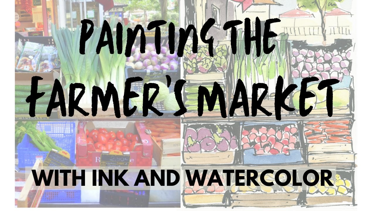
2. Project: Let's talk about the project for this class. I was thinking that one of the reasons I love sepia so much is, it's the color that the old masters used. You can see it in Rembrandt's work or DaVinci's. They managed to get so much life and vibrancy out of a single color. So as attribute to them, we're going to paint a classic Italian village scene as our class project. Now, you're welcome to use your own images and I really encourage that. You could do a still-life, a portrait. I've been doing portraits of my ancestors using this technique, or maybe just a city scene from anywhere in the world. If you don't want to work for my photos, work from whatever you like and whatever you decide to make, I hope you'll post it to the project area so I can see what you're working on. Also, please feel free to post any questions or comments and I'll definitely pop in to answer those as well.
3. Supplies: Supplies for this class are going to be really simple. Let me show you what we're going to use. I'm going to be demonstrating the use of one of these Pentel color wash pens. They're really fun to use. They have a lovely brush tip and a barrel that's full of ink and you just squeeze the barrel and the ink comes into a little reservoir here, and that's what you use to draw and paint with. It's very lightweight and portable and easy and fun to use. But if you don't have one of these, you could also use any kind of water-soluble ink if you like to work that way, or if not, you can also just do this in watercolor. I'll use the same color, sepia, and I'll demonstrate how to do this just using watercolor as well. You have lots of choices. Other than that, not much really. We're going to need a paint brush. This is number 10-round, but any watercolor brush will be fine. I'll be using a pencil and an eraser to sketch out the image to begin with. Then of course, you're going to need some good paper, and be sure that you use paper that says that it's for watercolor. Now, it wouldn't matter whether you used hot press or cold press, as long as it says clearly on it that it's meant to be used for watercolor because we are going to be putting quite a bit of water down. Really that's all you need. Let's get going.
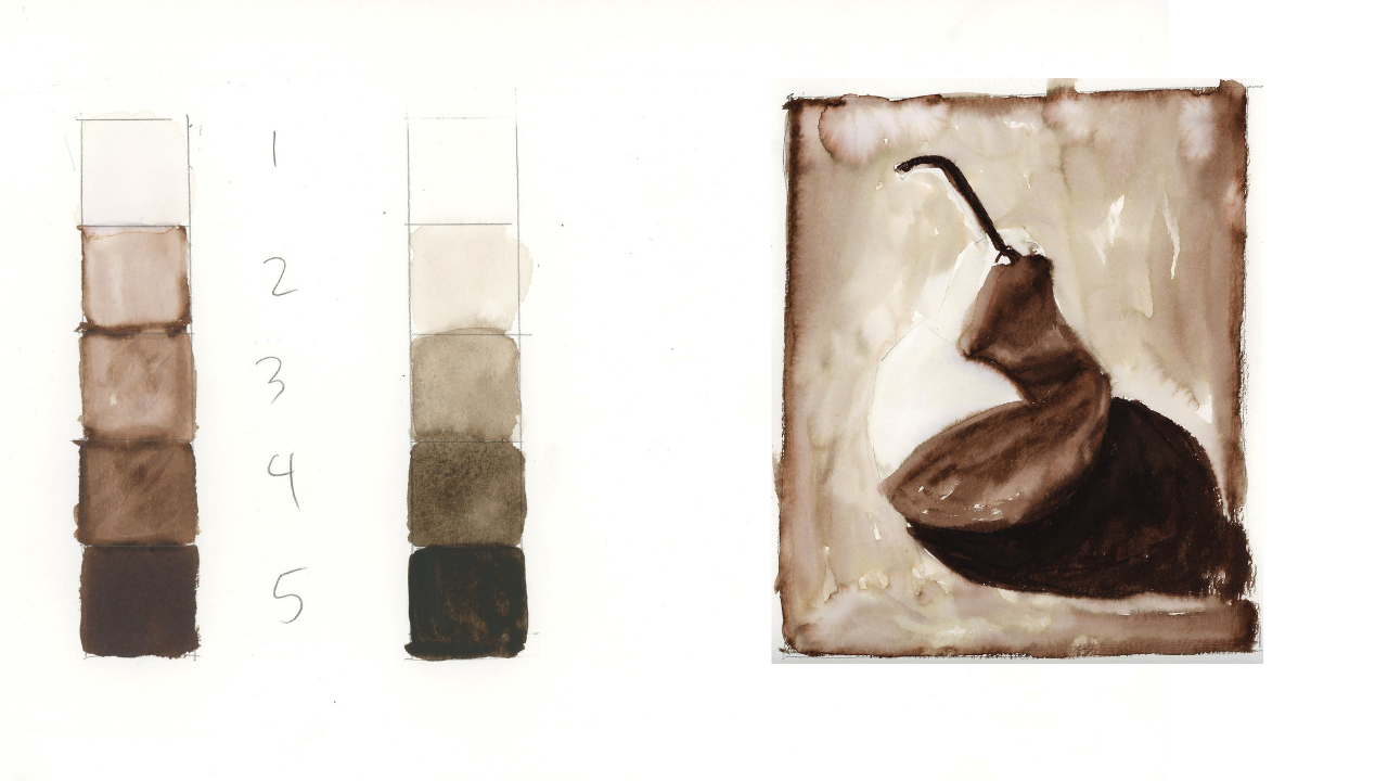
4. Value Scale: We're going to start out with a value scale. This is just a way of laying out a range of values from lightest to darkest. In this case, one will be the lightest and five will be the darkest, so just a really simple way of figuring out the full range from light to dark that you can get with your materials. I'm going to demonstrate this with both ink and watercolor. We're going to practice a value scale, both with the ink wash pen but also with watercolors, so however you want to do this class, this will work for you. A value scales real simple. You're just going to need five boxes, numbered 1 through 5. Number 1 is the lightest and that's just the white of the paper. Number 5 is the darkest. Another way to think about this, if this is easier for you, it's like this is nothing, it's zero percent. That's 100 percent and then you've just got 25, 50, and 75 percent, so we're just looking for a range of values from lightest to darkest. I'm going to start here with the ink wash pen and I'm going to just fill this in completely and that's it. For the darkest range, that's all you need to do. You've 100 percent filled it in, and that's the darkest possible value you can get. For the number 4, what I'm going to do, I'm going to draw a little box around the edge and then I'm just going to put quite a bit of ink in the middle but not fill it up completely and I'm hoping that when I add water, I'll get something that's still quite dark, but not as dark as that. Then for my middle value, my number 3, I'll still go around the edge here, maybe about there. This doesn't have to be real precise as you can tell. Then for the number 2, this is basically the lightest value you're going to get that isn't the white of the paper, so I'm just going to go around the edge of the box and not put anything in the middle. Now let's see what happens when we add water to this and I love this effect. There's this magical thing that happens when you add a little bit of water to this beautiful ink. I'm going in with a fairly dry brush. I've dipped it in water, but then I've dried it off just a little bit so that I'm not putting a huge puddle of water down. I'm just going to come in here. I want to have control over the water, in other words. I'm going to come in here, fill this in. I'm pulling ink in from around the edge, making sure that I get pretty good coverage. That looks good, and that looks pretty dark. Now I'll wash my brush off really good, dry it just a bit so again, I'm not leaving a big puddle of water on the paper. Now let's see if we can get this number 3, which should be like a mid-range value, halfway between light and dark. You can with a dry brush, pick up a little bit of this ink when it's wet and so I'm just adjusting, picking up a little bit and that looks like about a mid-range to me. Now for this number 2, I'm once again going to clean my brush off, make sure that it's damp, but not tons and tons of water. Well, that may need a little more water than that. This one needs to be the lightest value I can get without it just being the white of the paper. I think that looks pretty good. Now I'm going to show you a little trick for the white of the paper, which is that it might look too stark white if you actually use this as your lightest value in a painting or drawing. You might want to just add the tiniest bit of pigment to it so that it feels a little more unified. You can do that really just by dipping your brush into the water, which by now has some pigment floating around in it, so it's essentially just the dirty water that's in your jar, or maybe you take a tiny bit from something that's adjacent to it. You probably can't even really see that shift in value that much on camera but it's just ever so slightly dropping a little pigment in there too. Just unify it a tiny bit but now let's try this with watercolor. I'm going to bring the palette into view here so that you can see the mixture that you're going to need if you do this with watercolor. I have sepia watercolor here, you could use any very dark color would be fine, but just for consistency, I'm using sepia. Now I'm coming in with a pretty dry brush because my five value needs to be really pure watercolor. It needs to be as dark as I can possibly make it. This is watercolor right out of the tube with just the tiniest bit of water just to get it to move around a little bit, and that's it. Now for my number 4, I need to add more water, but still a pretty rich mixture and of course, when you're doing this in watercolor rather than with the ink wash pen, it's not a two-step process where you put everything down and then you add water later. This is a watercolor, so you add the water on the palate and what you put down is what you get. I think this looks pretty good and it's pretty similar in value to that. It's going to look a little different because it's watercolor and just slightly different than the ink I was using, but still the same idea. Now I add even a little bit more water to try to get a mid-range value. Again, you can dry your brush off and pick up a little bit if you need to. I might have picked up a little too much there. Let me just add just a bit back in. As watercolor dries, it gets a little bit lighter in value. Sometimes it's hard to tell if you've got exactly the right value, the right light or dark until it's had a minute to dry. But now we're going to try for our two value, which is the lightest you can get without it just being the white of the paper so I want a really watery mixture here. That's a lot of water and just a little bit of pigment. Feel like this has ever so slightly. Could be lightened up just the tiniest bit while it's still wet, I'm just going to pick up a little bit. That looks pretty good. Once again with the one which is just the white of the paper, I can just dip in to my water jar, which has some pigment floating around in it and I can add just a minuscule amount of pigment there just to very slightly tint the paper so that it might look a little more unified with everything else that's going on. I can see I had a little bit of water bleed over here, it's easy enough to fix those things. I'm going to go ahead and fix this because this is the thing that could happen to you too, so you might as well see how that works. There we go, that's pretty good. This is our value scale using either ink or watercolor. I hope you were able to give this a shot and make your own value scale using ink or watercolor, whatever materials you want to use. Now, keep in mind, I always like to start with the darkest, so I did the five value, which is the darkest first because that's just solid ink. Or if you're using watercolor, just the richest, thickest mixture of paint you can possibly get with almost no water in it. Now the one value is also pretty easy too, because it's just the white of the paper. If you want to, you can use my trick of adding a little bit of just basically dirty water out of the jar, just to ever so slightly give it a little bit of a tint, so it feels more unified with the rest of the painting. You're going to see me do this some more so you'll get a chance to practice that. But as for those middle values the four, the three, the two, don't get too hung up on making this perfect. This does not have to be exactly technically precise. The goal here is just for you to get a feeling for the range of values you can get by changing up the mixture of pigment and water. Now that we've done this, let's move on and do an actual image. We're going to do a very simple still life of a pair.
5. Pear Pencil: Now that we've had a chance to try out a value scale, let's actually put this into practice with our real image. We're going to start out by doing a still life of a pair. The reason I chose a pear is that it's already lumpy, odd shape. You don't have to worry too much about getting the shape exactly right. It's just a chance to experiment with this range of values. Let's get started first by doing a quick pencil sketch. I'm going to start by doing a quick pencil sketch of this pear. It's not terribly important that you make this a very, very accurate sketch. This isn't just an exercise to get familiar with figuring out the light and dark. As you can see, what I'm doing is I'm just making these straight lines. It's a nice little trick if you're drawing a curve is to actually just start by doing straight lines that seemed to suggest the direction everything's going and then we can round them off from there. The shadow is very important in this picture. I'm going to be sure to get that in. Something like that. This is really all you need to get going. We don't need to spend a lot of time on a real fancy pencil sketch and it's okay if the shape of your pear isn't exactly the same as the shape of my pear. Now, I'm going to leave these pencil marks as dark as they are. I'm not going to erase this back at all because I want you to be able to see it on camera. But if you like, you can actually erase this back and make it quite light so that your marks don't show up as much in your finished drawing. I also want to figure out what this shadow does. Let me put that in real quick. It comes up like this, goes over here, goes up here. The stem stops right there, but then it's got a shadow leading into it. This is the shadow on the table. I'm not going to worry about a lot of the surrounding stuff around the pear. This is more than enough to get started. I am going to start with the darkest value and when we look at this in black and white, which is such a wonderful way to think about value is to convert your picture to black and white. It's real easy for me to see that this is the number 5 right here, this dark shadow on the table and also the darkest side of the stem there. That's the darkest, that's number 5. It's also easy for me to see what the number 1 value is, which is pure white or the white of the paper and that's pretty much this lit up area of the pear and that means that everything in between is going to be a two, a three or a four. Like I would say that I see some four in here and right there and then probably that leaves this area and that area as a three and that the table surrounding the pear must be a two because if this is one, if that's the widest, that's got to be a little darker. That's two, this is even a little darker than that, so that's three and then this area right here and right there is maybe a four. Hopefully, you've got a sketch down that you're pretty happy with. Like I said, you can just put some quick, little diagonal lines down to indicate those curves. It doesn't have to be a super fancy sketch. You're welcome to erase it back as much as you want before we put ink down. But I hope it's also helpful for you to look at the image converted to black and white ahead of time. To just stop for a minute and think about, well, where's my number 1 value the very lightest, where is my number 5, the very darkest, and what's happening with those in-between values. If you take just a second to think about that ahead of time, it's going to make the process of actually putting down the ink or the watercolor go a lot easier and that's what we're going to do next. Let's get going.
6. Pear Ink Layer: I am ready for some ink. Now if you're doing this in watercolor, keep in mind, all you have to do is just work with the amount of water you have mixed in with your paint. For the darkest value, the number 5, it's just going to be the richest, thickest mixture you can possibly get. Then to start going lighter from there, it's just a matter of adding a little bit more water before you put it down on the paper. Just a more water you mixture as you move through the value scale. For those of you working in ink will put the ink down. First, being thoughtful about how much ink we're putting down, depending on the value that we're trying to achieve. After we do that, we'll add water to it and let's give this a try. I'm going to start with the darkest areas and I'm going to get in this really deep dark bold shadow. Whether you're using watercolor or ink, you're going in at full strength right here. I'm just going to color this all in. I could add a little water to it just to give it a watery brush stroke feeling, but the idea is that you've got your darkest value because you've gone in with full strength ink right here. There's that shadow and then I also feel like the stem is quite dark and I'm just drawing it in with this nice brush tip. That's plenty. That's the five value right there. Now we're going to need some darker ink here, that's a four. I see it here and here, and here, and here. But then everything else this is all three. You now this is all lighter, so I'm wanting to just lay more ink down here and a little less in these areas. This is mostly just going to come down to my water mixture. Maybe that's a three, this is more four, this is more four, this is more three in there. Again, there's not an exact right or wrong way to do this, you get a feel for it as you go. Now I'm coming in with a brush that has water on it, but it's not so wet that I'm going to get a big puddle. This is my four value, so still pretty dark. That's so nice. It's very pretty, beautiful dark color. Now I'm going to clean my brush off. Again, make sure you're not going to leave a puddle on the page. You need enough water to be able to move this around, but not so much that you're going to just leave a puddle. You see how I can make this a nice soft transition. But it's lighter, but still feels very natural. I think I want a little bit darker area in here. While the paper is wet, I can come back in, play around with this, bring some more ink back in. That's what I love about this process, as you can go back and forth. You don't have to just be one one done, you can play around with it a little bit. Again, with a clean brush that's damp, I can make some transitions happened here, I can soften things up, I can pick up a little ink, you get the idea. That gets down some basic values there. Now, let's think about the number 2 value, which is the table. I'm just going to go around the edge here. This is very much like what we did with the value scale. I'm just going to go around the edge and I'm basically just depositing ink here that I'll be able to pick up and use. Make sure I've got enough ink down that I can get a light value that will set off the shape of the pair without being super dark like it should really just look like a background color. Once I've put that down, I can just start coming around. Here, I am using more water because I'm covering a larger area. Again, I'm not definitely not letting the water pull up on the paper. I'm moving it around. I'm going to come in and just cut around the shape of this. Come in around the edge. You'll see that they'll bleed into one another if they come into contact with each other because this ink is water-soluble, it'll be water-soluble forever. If you come back a year from now and were to drop water on it, you could still move this ink around on the page. I'm going to come in alongside the stem there. There is a little white highlight on the underside of the stem. If I really want to be careful, just maybe I could leave in a little of that white highlight right there. Keep moving this around. You'll notice that this background is very uneven and textured and there's a lot of just washy effects happening here and I love that. That's very much on purpose as far as I'm concerned. I like the texture and the vintage feel of this type of background. If you wanted it to be smoother and more even then you would probably use a bigger brush and just work in an area of very specifically like what I'm doing right now is I'm just moving the ink across in a way that it can be very steady and not have these washy effects, but I love the way this looks. This is really just a choice for you. We've got a number 2 value down here. Like I said, you could keep playing around with this. There's more ink along the sides here that I could continue to bring in if I wanted a little bit of it to be darker. Definitely experiment with this because this is the fun part, is just learning the materials and all the different things they can do. I love these blooms and special effects with the water. But if you don't, then you can get a very smooth shear look as well. The last thing I'm going to do is what we talked about before, which is I want to knock back this white a little bit. It's so bright that I feel it looks unfinished. It looks not intentional like I didn't get the thing finished. I'm bringing in basically just water from the jar that has a little bit of pigment floating around in it. It just adds the tiniest tint of pigment. The other thing is that this pair has a softer transition to the shadow. I saved that for last because I want to make sure that everything else is in place and it's where I want it, I'm happy with it. Now I'm looking at edges very specifically. I'm going to look at this edge here and maybe I just want to soften it up a little bit. If there's not enough ink left to move around, I can always come in and just drop a little line right here. I can always just add a little ink. Yeah, that's nice. See that just softens that edge. You can do this as you go, but you can also wait until the end and just re-evaluate. It's just the thing that I like to check at the end of the process and just ask myself, am I happy with how all the edges look? Is there anything that I think doesn't quite convey the shape of the thing? I think the softer edges help to communicate that this pair is round and that there's a transition to be heard in those shadows. Then same thing with sharpening edges. I could come around here where a little bit of this ink ran and I can sharpen up that edge and make it a real hard edge. I can even do a harder edge again around the bottom of the pair. I could if I wanted to bring some water in to even my number 5 area, there's no rule against adding water to this darkest area. It will soften it up, it'll give it a watery look, but it'll still be your darkest value. These are all things for you to just play around with, have fun with, enjoy. Once you feel like you've got a handle on how this works, we will do our full-on city scene. I hope that was fun and I hope you ended up with a pair that you're really satisfied with. Just keep in mind the way I usually like to work here is what I start with the darkest and then backup to those lighter values and be sure and preserve the white paper for the very lightest values that I'm going to be putting down. Then after everything is dry, I do like to come back in and take a look at the edges and see if there's some edges I want to soften up, maybe by adding a little more water. See if there's any areas that I want to sharpen up like that shadow that the pair casts on the table where maybe I want a really sharper edge. Then also just keep in mind throughout the process as you're working that while the paper is still wet, you can lift up pigment with a dry brush and get it a little bit lighter. Or you can drop a little ink in while it's still wet and let that ink move around, if you want to add a little pigment, make it a little bit darker. There's a lot of adjusting you can do both during the process and also after the process. But now that we've had a chance to practice with that pair, let's go on to Italy and paint our village scene.
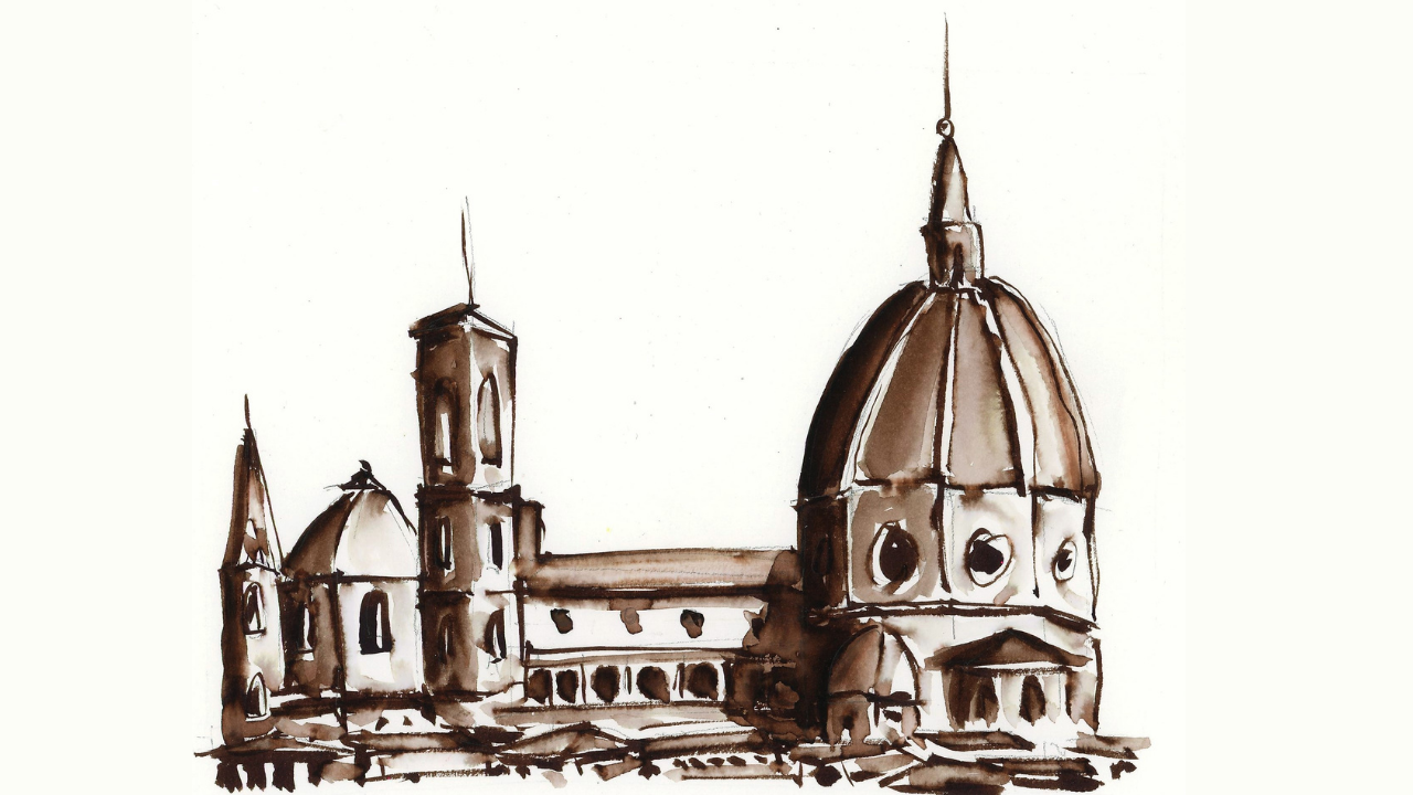
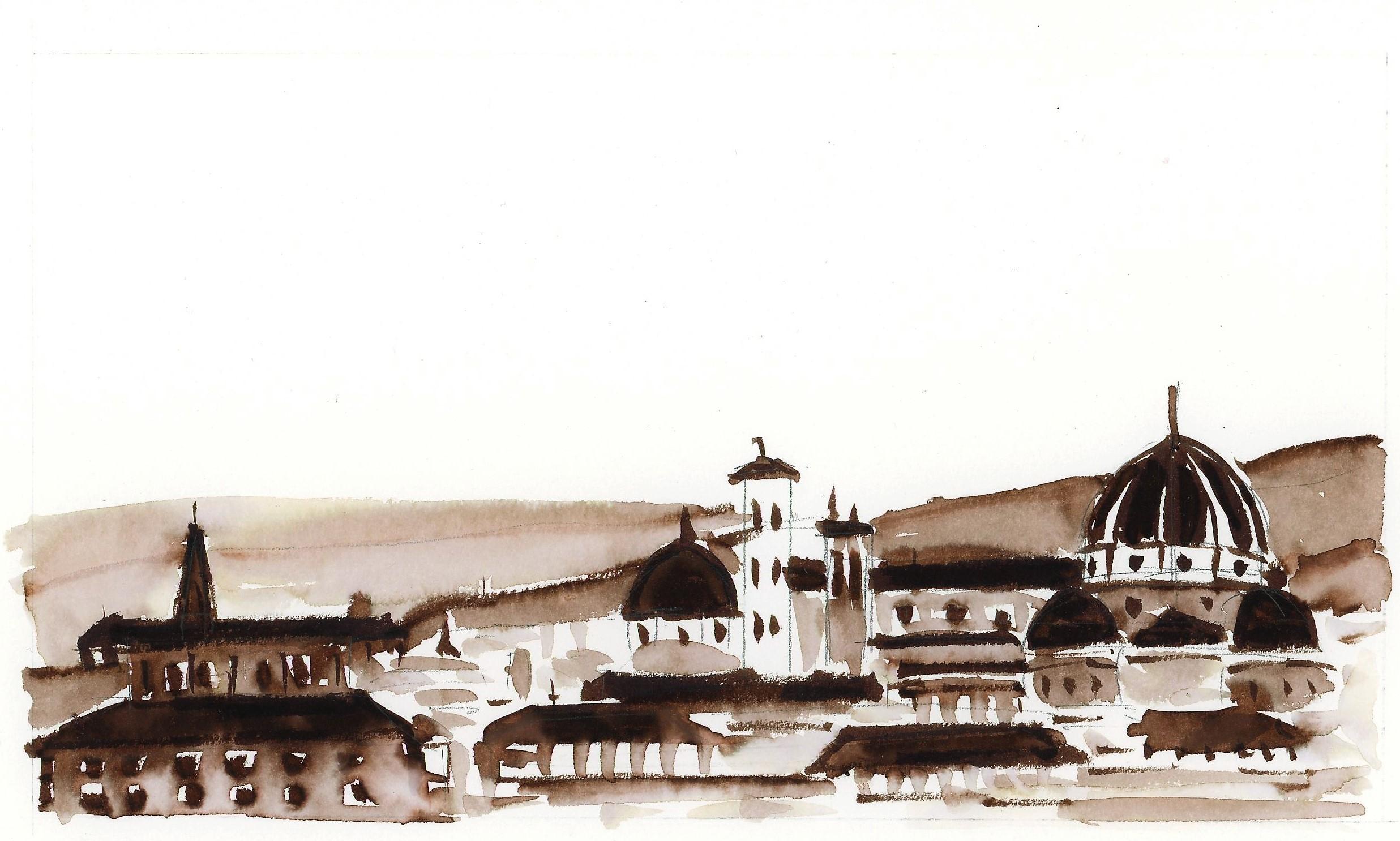
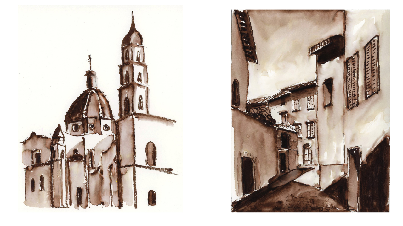
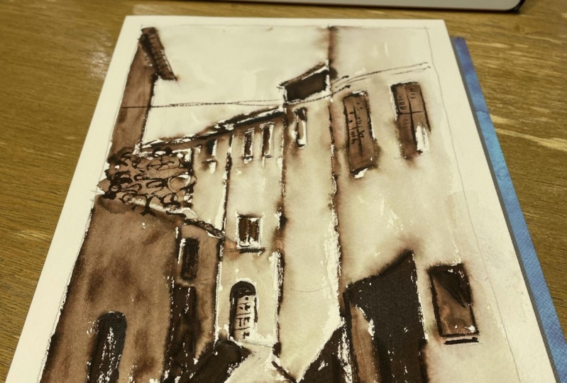
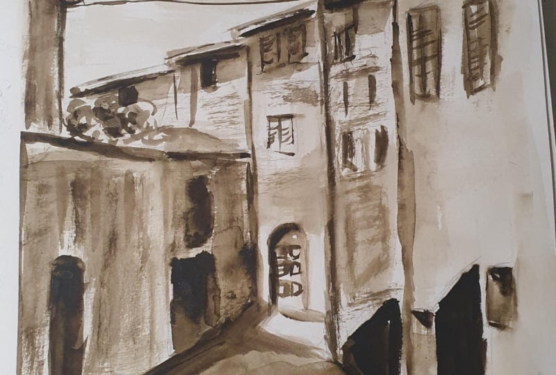
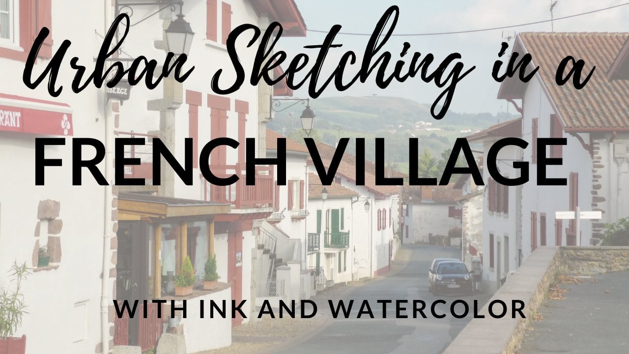
7. Italian Village Pencil Sketch: Are you ready for Italy? We're going to start by doing a pencil sketch again. But this time I am going to show you a few tricks that I use when I'm working with a cityscape or a street scene like this just to make sure that I get all the buildings and the elements in the right place. The tips and tricks I'm going to show you they work just as well, whether you're working from a photograph or whether you're actually out on the street sketching. Let's start with our pencil sketch and we'll go from there. This is a little bit more complicated scene than a pair, so I'm going to show you how I would start this pencil drawing. I would do this whether I'm working from life or from a photograph, which is the first thing I want to do is figure out what's coming into the edge of my image and where. Here's a place where the building comes into the edge, there's a place, there's a place, and there. These are all little landmarks. If I can get these in place, then it'll help me measure and get everything else in the right spot. This is especially useful if you're drawing from life because if you can just look around your scene and establish, all right, I want this building coming about this far on my sketchbook and here's where this building is going to start in this one, then it's easier to fill everything in. Let's start there. I can see that this building comes in about here, and I'm just going to pull it all the way down. I'm just resting my hand on the paper and dragging it down. Now, down here along the bottom, I've got an angle right there. Over here, I've got an angle coming in. I've got the top of this building coming down right here. Oops, that's a little bit steep, maybe it's more like that. Something like that. When you're drawing with pencil, always have an eraser nearby. I always say that a pencil is a two-part tool, there's the pencil and the eraser, and there's really no point in having one without the other. The whole point is that you're going to erase. Now there's a wall that comes in about midway here and it angles down like this. We've got a wall there and then there's another little building. I'm going to get this one in next. There's a little building that's here that I can see and I want to bring it down as well because this walkway curves around and you lose sight of it, and that's about where the other street comes in. That tells me what's happening with this building. This building's coming up like this and it's there, and then there's another little roof on it. You don't have to worry about getting all these details exactly precise. There's some plants right there. We just want to get the basic idea. We're trying to convey a mood and a feeling of this little village and this little alleyway. We're not really trying to represent every single architectural feature with perfect accuracy, so don't stress too much about where you put all these things. Remember, it's your drawing. It could be how you want it to be. We're just going to get a general sense of these roof lines, these buildings that curve around. Let me erase this line because that's going to be confusing. I like that. Now I want to get this doorway and because I feel this is important, you're looking down the alley and you see this charming arched doorway. I want that to really be in there, and maybe a little too tall. Now I'm looking at the height of this doorway compared to this building and just working out about how tall that should be. This is how you start around the edges getting these buildings in place and then you measure everything relative to everything else. There's that, there are some windows here. Again, I don't need to do a ton here. I'm not really trying to be super precise with the windows. I just want to sense that these are homes people live in. Let's see. There's a window over here. Just little suggestions of these features. Definitely don't get into counting windows. You don't need that level of accuracy, you don't need to worry about whether there's four windows across or three, or is there really a door right here? Is there a door over here? Just give a general sense of doors and windows. That's plenty, that captures the mood of the place. It just gives you a sense of what buildings these are, and that's really all you need. There's a window shutter up here at the top, but I find it a little confusing. Even in the photograph, I can't quite tell what it is. I'm going to leave it out. I'm leaving a lot of things out really. There is a little window right over here that I could drop in. I like that realizing that this door is actually much narrower and further away. Again, this is why we have an eraser so we can make little adjustments. The top of this door does line up with that window. I do want it there, but I just want it further away, like that. The other thing that's so important here, of course, is this beautiful shadow. We've got this shadow that comes down like this, and then it goes over, it follows this. I feel it does this, and then it goes here, maybe. I think that's quite right. Again, take your time, make your adjustments just like I'm doing. That's how this is supposed to work. Oh, there, just like that, and then maybe over here. I've got a little zigzag there, and then the shadow comes up the wall, and it continues up the wall right here. It comes down about there. I like getting that shadow and it's so important when we're doing value. Because we're really thinking about light and dark, so of course those shadows really mean a lot. Now let's look at the value scale and think about what's going to go where in terms of value. Like this is definitely a number 5, the store here, all black. There's this little, I don't even know quite what this is. We don't have to get real specific on what all this stuff is but there's another little dark shape right there. There's another little window right here. All of these are fives. When we look at our drawing and we look at the photograph, it's just a good idea to really compare and take a minute and go, okay, 5, 5, 5, 5, that shadow under there is a five. I'm going to go ahead and just draw it in so that I remember that it's there. This looks like a five. There's this little shadow in the door and there's another one right here in the window. I would say those are both fives, and then so what's a one? Let's go to the other end of the scale. What's bright white? Well, so there's this lamppost and I hadn't put this in. It's such a small detail that I think with our brush pen, it might get lost. I'm just going to leave it out, but I can see that there's a really light element along the rooftops here and the buildings are debatable, is this a one or a two? It's a judgment call for you to make. I also see a little bit more of a five, a little shadow in that door so I'm going to make a note of that. If this is a five and that's a one, then what's a two? Well, I would say that this is a two, this building here. This is not quite white. Then what's a three? What's halfway in between? Well, it might be this wall here and also really the sky. The sky's are very vivid blue, so when I print it out in black and white, it's quite a mid-tone. You might decide to leave the sky entirely white or to do it very lightly. That's an artistic choice you can make because you know it's sky. My camera happened to pick up a very vivid blue there, which translates into a mid-tone, but you don't have to do it that way. Sometimes that can end up looking a little too cloudy and not a clear sky, so you can leave it white or you could do a very light wash, like it's a one or a two. If that's a one and that's a two, and this is a three, then I maybe see a four in the shadows and a four in the ground here that's not quite as dark, and maybe these shadows are a four. You see how I'm just going around and I'm looking like this. Probably I'll make a little mark so I remember that there's a shadow along here. I'm just looking and asking myself, where's the darkest, where's the lightest, what's in-between? That's what we need to know in order to be able to do this in ink wash. You should have a pretty basic pencil sketch down and keep in mind, like I said, what I like to do is to start around the edge of the image and make sure that I understand where that buildings are, the roads, or the other elements come into the picture from around the edge. Because once I've done that, it's a little easier for me to place everything that's inside. Once again, I think looking at the image as a black and white photo is so helpful because you can see what the darkest areas are, you can really see what the lightest areas are. I think it's also good particularly in this case, because we've got this sky that was a rich blue color that ended up being dark in the black and white image. You have choices, you have flexibility, you are the artist, and you get to decide what to do with that sky. I'm going to keep mine pretty light, but that's definitely up to you. Now that we've got our pencil sketch done and we've thought a little bit ahead of time about the values, let's go ahead and get some pigment down on the paper.
8. Italian Village Ink Layer: Let's get going with some ink or watercolor, whichever one you're using, in this village scene. Once again, remember those of you doing watercolor just to get the darkest richest mixture you possibly can for your number 5 value, your darkest value. Then you're just going to use a more and more watery mixture as you go from there to lighten it up. For those of us that are doing ink, we're just going to lay down a lot of ink in those really dark areas and then just a little less ink as we go and we'll see what happens as it really comes to life when you add water to it. Let's do this. I've chosen not to erase this back so that you can see what I'm doing. But if you would like to erase so your pencil marks don't show up, you can really get it quite light just by dabbing your eraser on it. That's a choice for you but I'm going to go ahead and leave mine because I want you to really be able to see everything quite clearly. I'm starting with my darkest, darkest value, my number 5 where is it basically solid black. I know I've got these areas here, I know I've got this shadow that's traveling up this way. I'm going to get that in very dark. I know I've got this very dark shadow and then this shadow along the street I feel it's really dark right here and it does get a little lighter. It's not all that solid dark. This is more of a four in here. I'm going to go ahead and just draw it in so I don't forget where I am. But that's about how I would characterize that. Then here that's a five. This might be a like a little gate or something in this alley. I'm not quite sure what we're looking at here, but anyway that also super dark. That's a five. This here is a five. There is an area I'm almost certain I'm going to have to come back in and redefine this later, but I'm going to go ahead and put it in. There's a very dark shadow right here. I'm going to put that in. Then where else? Up underneath this awning is really good shadow right there. I think underneath all of these roof is pretty dark. Then some of these windows with the shutters are pretty dark as well. Then this right up here, we're looking at the underside of the roof and it's got some structural supports and beams or something coming out here and I'm going to go ahead and draw them in. I know I'm probably going to have to come back and redefine that, but I'm going to go ahead and just put something in. We've put down our darkest darks and already it looks interesting to me. It already has a lovely feeling to it. Now I want to think about my number 4 areas. We said that the walkway here, the pavement is definitely a four. Then we talked about these because there's awnings in these windows. We talked about these being a four. I'll put a fair amount of ink in there. I think also these shadows here on the building, I'm going to call a four so I'm putting this little reservoir of ink. We didn't really talk about, there's some plants coming out right here. I'm just going to draw them in as little plants. I know they're going to get watery and some of this detail is going to get lost. I might come and put it back in, but I'm just going to drop that in. I would call those things fours. There's some shadows under these windows. I actually see a little dark. That's more of a five. I'm going to put that in a little bit more of a darker area there, good, shadows under those windows. Now let's get into what we might consider a three, which would be this building here. I want enough ink that I'll get a number 3 value there. I don't want to just go around the edge, I want to put a little bit more down. You can actually draw here. I mean, if you wanted to really get in and suggest some details, you'll brush a lot of it away, you'll see in just a minute. You'll brush a lot of it away when you add the water, but it's fun to just play around. This I would also call a three over here. I'm just going to add some more ink there. I think that's all my number 3 area, maybe this window here. We've got a shadow that's cast but then we've got the rest of the window, something like that. Then everything that's left is a two and we also got to figure out what we're doing with the sky. But for now, for the number 2 area, I'm going to lay down some ink around the building here. I'm going to put some ink in just to create a little reservoir of ink, but also to show the division between these buildings. I do want to go ahead and mark out where these roof lines hit. I think I'm going to choose to not let the sky be as dark as what my photograph shows. I'm going to leave the sky as a one or a two. I'm going to let it be quite light. I have to say this thing already has a lot of charm to it just the way it looks and so I can't wait to see what it looks like when we add water. We have a layer of ink down, but I haven't yet added water to it. I just want to pause here and point out a couple of things. One is, you can go ahead and put details in at this stage but remember once you add water, you're going to lose a lot of those details. Sometimes it's helpful to do it just because it's on your mind and you want to capture it in the moment, but don't be surprised when some of that washes away once we add water to it. It's alright, it's part of the process and we can come back and work on that. It's up to you exactly how much detail you do or don't want to put in at this stage. But even before we've added water and let that ink move around on the paper, I hope you'll take a minute and just look at your image and hopefully you have something that's really dynamic and striking just the way it is. Once we add water to it, we'll really see it come to life. Let's do that now.
9. Italian Village Water & Details: It's time to add some water to our ink image. Now if you are doing this class in watercolor, you're probably feeling like your image is pretty well done. But I bet you want to add a little bit more detail, or you might even want to layer on a little extra pigment here and there and adjust your values. This is a good opportunity for you to do that. Stick with this because we're going to get into softening edges, sharpening up edges, and adding details as well. That'll be important whether you're doing this in ink or watercolor. Already I've got a pretty big brush here. I'm going to be brave and do it with this bigger brush. I'm going to leave my number 5 areas alone. Let me come in here and see what it looks like to get this number 4 area. Again, I'm trying to control the amount of water. I want enough water that the ink moves around a little and has that beautiful watery ink wash look that we're going for. But I don't want big puddles because I do need to be able to control what I'm doing. Here we go. I just think this looks so lovely. Again, the texture is not super even. I'm not going for that. I want this beautiful uneven texture on the walls here. Remember that you can lift up. If you feel like something needs to be a little bit lighter, you can do that. There's actually a little bright highlight right here. I didn't put it in. I'm trying to simplify this somewhat, but you can pick up a little bit of paint if you realize, I really want to show that highlight. That's also three, I would say. Then this is quite dark. But with this, you see the rafters. I'm trying to let some of those marks continue to show. But I can come back in and sharpen up those details. Remember after everything's dry, I have that option. This is the splint light if you can't really see much of what's going on there. I'm just going to put down something light and I'll draw a little bit on top of it. Now let me see. Over here, these are my number 4 or number 3 value areas. But then this whole building I decided is more like a two. So it's going to be pretty light because you want the feeling of sunlight hitting it. This is a bright sunlit scene. You want this scene of light coming across and you can see how these details can get blurred, these sharp edges. That's why at the end we come back and we take another look at edges. Don't worry about that. That's always a part of the process when you're working with water-soluble ink. To me, that's what makes it so beautiful as you get these lovely washes and booms that have a wonderfully old-fashioned field, but also just a wonderfully handmade feel as well. It's pretty dark under the eaves here. Let me get that in. Then this is all fairly light. Once again, in sunlight, it's all the same light hitting these buildings. I want the same value. I don't have any detail in the windows in terms of drawing the shutters or anything quite yet, we'll talk about that in a second. I want this to stay pretty light, so I'm picking up just a little bit of that ink. Looks pretty good. Then I didn't really talk about this door, but this door it's a two or three. I just need to get something in there and I do definitely want to draw some little details on that door because I feel like it's a focal point. This pavement that's in light should also be quite light and there's plenty of ink around to just draw into it. Again, you get that feeling of sunlight hitting everything. I already think this looks pretty cool. I really love the way this looks. I said that I was going to leave the sky pretty light, so I'm just coming in with some very clean water and picking up a tiny bit of ink and letting it move around so that it's more unified. Do you see how if I had just left the white of the paper, it just might've looked like it didn't quite belong. I do want to bring something in, but I'm not going to let it be so dark because I think it would just look gloomy actually. I'm trying not to let too much ink wash off into the sky, but I'm not worried if a little of that happens. Again, this is like part of the charm of this is that the ink is going to move around. Now I've got a brush that's clean and has just a little water. I'm just going to barely touch these roof lines. This is all my number 1 value, so I want to preserve it. I don't really need that to be that white. I want to preserve that, so I'm just barely touching it to knock back a little bit of the bright white of the paper without letting too much ink wash in. This is going to dry quite quickly. It's probably already dry in the areas where you started. Now you can just think about, would you like to add some detail and sharpen some things up. Let me show you what that would look like. I could come in here, I could add that shadow under the window sill and just make a sharper edge. On these windows, if I wanted to, I could come in, put sharper edge around them and I can draw in the scene of these shutters. Just some little lines to suggest this is a window and the shutters are closed and this one, you can see it really washed away. Again, that's fine. I like to use this when I'm just out on the streets sketching quickly and part of doing that is you're not super precise. You're not working with a tiny, tiny brush. The ink is going to go where it's going to go and that's all fun event, like I love the way that looks. These are the things that you can be as loose with as you want or you can tighten up and be more precise. These are tiled roofs and so I like to come in and add these little curved shadows that suggest the underneath of the roof. I'm not obviously going to get into drawing roof tiles or anything like that. But just to suggests that. Then for this door in particular, I did want to put in some of these details because they're so cool. I'm just going to draw in the actual door and just make some little squares here. It just gives it this wonderful. To me, it gives it this almost like storybook quality right there. I love putting in stuff like that. Then here again, little shutters. If I want to suggest that this is a plant, I can just make some little loose shapes like that that suggests there's a tree or a vine or something that's spilling over the edge here. I could come tighten this up, re-emphasize that arch. Then with these windows again, you can do as much or as little as you want here. This is really up to you how much detail you want to put in so I can come back in and re-establish these windows if they're washed away a little bit. Suggests the shutters. Maybe there's another little window under here, I could do. But basically what you've done is you've mostly told the story with light and dark and you've got this beautiful scenes of the light hitting and you've got this scenes of the charm of this village scene and you've done it with just one color and you really told the whole story through light and shadow, that's what we're always doing as artists. But this is just such a fun way to quickly capture a scene and quickly tell a story. Really getting down to the basics and with a lot of, I think, lovely character and just a very painterly quality to it. I wasn't going to do this, but now I'm looking at these wires that run across. I always love putting in wires because I feel like it makes it more human. You can certainly leave these out if you wanted, but I'm just going to drop in a couple of little lines and just suggest these wires are going across the alley. I'm even going to add another one. That's fun. I can see that they come up here as well. There it is. That's it. I hope that you have a little Italian village scene that you're happy with, that you were able to learn a little bit about just using these materials, but also about what a difference it makes to really get your darkest darks and really think about where your light is. Now in terms of adding these details at the end, once everything is dry, this is the time when you can come in and you can sharpen up edges that might have gotten lost when you put water on. You can add little details whether that's windows cells or little panels and doors or a little detail with some vegetation or even stonework if you want to draw in little bricks or details in the stonework. You can do some of that at this point. But my idea with this type of sketching is that it's something that you can do very easily when you're traveling because it's so portable really in the moment and it doesn't have to be something that's tremendously overworked. I would say, have fun with it and enjoy the play of light and dark, and ink and water. Just create something that's really expressive and it's captures the moment you're in. That's definitely what travel sketching and streets sketching is all about.
10. Apply These Ideas to Your Art: I hope this class is showing you that by using really strong values in your art, you can create a scene that pulls the viewer in. You can make objects seem three-dimensional. You can help your art have more impact. But most importantly, this is really just like a fun, simple sketching technique, that you can take with you anywhere. Especially with one of these water-soluble brush pens in your pocket, this is something you can work in to your travel sketching or just your everyday sketching around your neighborhood. But here's the thing, even if you don't keep doing monochromatic paintings after this, these are some tips that I want to share with you for improving value in your art no matter what you're doing. First of all, when you're working from a photograph, convert your picture to black and white, and stick with the black and white photograph for as long as you can before you go back to color. Then take a black and white picture of your painting and progress, and check that against your reference photo. Are the darkest areas really dark enough? Are they almost black? Are the lightest areas really bright? Do they stand out against that range of darks and mid-tones? Because usually the way to make a light area really pop is for everything else around it to be the right shade of darkness. This is something you can even do when you're sketching from life. Take a quick snapshot of the scene, look at it in black and white, and make sure you really understand where the darkest areas and the lightest areas belong. Those things will help you whether you're working monochromatic or whether you're working in color. Now another tip, and this goes for when you're drawing in ink and painting on top, which is what a lot of us do, is use full strength black ink in your darkest shadows. That way when you start to paint, there's no mistaking the darkest areas. You can put some color right on top of that black ink to lighten it up, make it feel unified with the rest of your painting. But the fact is with the darker color gets, the less actual color we see anyway. But there's not really much difference between black and a very dark red or very dark blue or even a very dark green in a landscape. Don't forget, black can be very effective as a color in your palette. Finally, remember that you can use ink to add a few finishing touches, or to really make the values pop. Even if you're working with permanent waterproof ink, it'll still move around on the paper a little bit while the paper is wet. If you had a dark area that wasn't quite dark enough, you could work a little ink into it while that paper is wet. Then you can also wait until it's dry to add sharp details like we did in this class. Those are just a few ideas going forward for things you can do, whether you're working monochromatic or in full color.
11. Final Thoughts: All right that's it. I hope you enjoy this class and that you'll take these ideas and go on and try them in the world around you. If these monochromatic paintings are new to you, I hope you'll just continue practicing on whatever subjects you like to paint and see if there's any new opportunities to really sharpen up your values in your artwork because of course it's value even more than color that pulls the viewer into the scene and makes a two dimensional drawing look three dimensional and just gets us excited by showing us contrast. One big thing that I hope you've learned from all of this is that you can always start with a black and white reference to take color out of the equation and truly focus on value. You can do that whether you're working from a photograph or even when you're out in the world by just taking a picture with your phone and looking at it in black and white. Now these ink wash pens that I demonstrated, they're easy to find, they're very affordable, it's an easy way to experiment with just one color, and I love to take these with me when I go travel sketching and work a few monochromatic scenes like this into my sketchbook. Of course, when you do go back to painting in full color, I hope this also just helps you remember how getting those values really right can help make the color really pop too. Having said all that, I really want to see what you worked on, so I hope that you will post your art in the project area, let me see what it was. If you have any questions, I would love to hear from you, so post your questions, I'll pop in to answer, if you want to share your work, you can come find me on Instagram, tag me, I'd really like to see what you're doing, and I hope you'll stay in touch. I teach a lot of other classes, I'm easy to find online, I have a website, I sent out a really fun newsletter, I would love to hear from you. Thank you so much.