Transcripts
1. Let's go!: Hi. My name is Victoria Tudoran. I'm an artist at an
bkecher based in Warsaw. Many of us dream of drawing
or painting as children. But then life gets busy, and that dream is
often pushed aside. I'm a self taught artist who returned to
drawing as an adult. So I know exactly
that it is never too late to develop
your artistic skills. Further you are discovering
urban sketching, or you already have an
artistic experience. This course offers a new way
to approach city scenes. There are a lot of interesting
objects in a city, cars, buildings, people,
a lot of details. But if we draw all
of them equally, our sketch could become messy
and nothing stands out. I believe that every sketch
should tell a story, and every story needs
a main character. That's why my method is
based on three piers, size, details, and environment. They help us to make a
main character stand out and guard your
attention toward it. With a small set of
markers, liners, and a sketchbook, we will create three complete
urban sketches. Each focus on a
particular pillar. By the end, you will know how to apply each of them to
your own city scenes. So join me in this course, and let's turn city scenes to clear, expressive
visual stories.
2. Introduction. Welcome to Urban Sketching: You never truly finish a sketch. You could just decide to stop. Today, we couldn't say that sketching a sketch is just a
draft for future painting. Today, sketching is a
complete kind of art. Some sketches are full of details are drawn
for several hours. So where is that line? Where is the difference between sketching and
traditional drawing? In traditional art, we usually start from the
distant background, and then each layer or step is moving closer to the viewer, at the very end, we draw a main character
in the background. In sketching, we start with the main character because the goal is to show the action, the mood, the
movement, the moment. And only then if we have time, we could draw the rest. If we have even more time, we could add more details. No matter when you stop, the work should look complete. This easy to say, start
with the main character. But how do you choose
the main character? How do you show it? And how do you explain others
what your sketch is about? There are three
tools, size, details, and environment that help to
connect viewers with a hero. It is the same like in a novel. A character that
occupies most of the books pages is
the main character. An object that takes up most of our canvas is the main subject. A character that is
thoroughly developed. The one who knows everything
including family appearance, occupation, friends,
enemies, relations, finds a way to heart and mind. In the picture, the same, an object that is well detailed attracts
attention immediately. In a book, a hero
usually has a mission. Or either help or stop them
from achieving this mission. When we start with the main
character in sketching, we have to show its
mission as well. Otherwise, it will be
just a sticker, size, details, and environment, help
a sketch to tell a story. We could use all those tools
individually, all together. In this course, we will
learn all three tools. We will draw together
three sketches. Each of them devoted
to a particular tool, size, details, and environment.
3. Urban Sketching Materials: A how to choose paper for
market urban sketching. The first option
that comes to mind is special marker paper. What is special about it? Each sheet has a different
quality on the front and back. The back side is
marker resistant, it's sourced to prevent
ink from bleeding through and staining on the sheet underneath
in a sketch book. The front side is
market friendly. And blend colors very well. Along, you create
perfect gradients. Like fade a little bit, and it mixed better
those examples, let's check the bleeding. If you want to enhance
that blending effect, you could take a
so called blender. It looks like usual marker, but it is transparent and its only purpose
is to mix colors. When such effect is useful. For example, when you want
to achieve a realistic look, you can find many examples
online like coffee cups, cakes, eggs, drawn this
way look so marvelous. You always want to eat them
along with the market paper. However, when you look closely
at any building or road, you notice that they
are not that smooth. A building drawn with overly smooth gradients might
end up looking cartoonish. Personally, I feel more comfortable using
regular sketching paper around 8,100
milligrams/square centimeter. I prefer ivory or bear to pure white because ivory already
acts as a base color. It gives the drawing a more
finished look from the start. Since the paper is still
thin, it blends markers. Not that well as markers, but you can see some
blended colors here. And slide roughness texture and looks great for
urban sketching. As for brands, there
are many available in any art shop and even at
any stationary shops. They all are fine
for basic sketching. Just check that they are
universal but not dedicated, for example, to pencil drawing. After some trials and errors, I personally settled on the
Italian bread fabriano. For me, the sketchbooks offer the best balance
of price and quality. So as you can see, 90
grams/square meter. It could be a five, this one A four, A
three, and more. And what is important, I can always find them
at my favorite art shop. Marker sketching is all
about drawing lines. So the tools I use are chosen
mainly for the variety, precision, and character of
the lines they can create. My main tools are professional alcohol
based artistic markers, for marker by Windsor and Newton and touch by Shenhan art. There are many
Korean alternatives, but I have not
tried them myself, so I cannot recommend them. These markers have two tips, a broad tip and a fine tip. A broad tip is very versatile
and allows you to create a wide range of
lines depending on the angle at which you hold the marker and
the pressure you apply. I use the side most of the time when I need
a sharp outline. A more precise line, I use the fine tip. Touch markers are
slightly more expensive, but they are refillable, which can make them more
economical in the long run. However, before choosing them, it is worth checking
whether refills in the exact color you use are
available in your country. Touch markers are
also sold mainly in specialized art
supply stores. Bro markers are much
more widely available. In Bond, for example, you can even find them
in stationery shops. For this reason, I
eventually stopped using touch markers and switch almost completely to pro markers. To finalize my marker sketches, I use brush pens and lines. Why not simply use a darker
or more contrasting marker. We discussed a little bit this topic in the video about paper. Alcoholic markers blend
into the layers underneath. Even black gradually
becomes part of the existing colors rather than producing a completely
sharp, independent line. Brush pens and liners
behaves differently. They are applied on the top, almost like a final
stroke of the drawing. My preferred tools is fiber costal brush
pen with a bit tip. A brush pen looks
like a regular pen, but behaves more like a brush. By changing the
pressure and angle, you could create lines of different thickness
within a single stroke. This makes the drawing more
dynamic and helps distinguish the background from
the foreground or the main subject from
secondary elements. Because the tip
behaves like a brush, it should not be
pressed too hard. Extensive pressure can
damage a shape and make the tip fluffy forever. Brush pens can feel
unstable at first, which is why I
recommend starting with the relatively form B tip. Fiber castle also
produces as B or soft brush tip which is more flexible and more
difficult to control. There are several
affordable alternatives. They could be called in
different way like brush, liner, real brush or just BB. But they are not the
exact replacement. From my experience,
they are more closer to the soft brush than to the firm. B, tip. Even if the B brush tip
feels too unstable, another option is a
see, soft chisel tip. It is closer to a
miniature marker. Tip. Depending on the angle, it can produce lines of
different fields while remaining easier to control. For the finst lines,
I use liners. I work with different companies. However I personally
prefer fiber castle. They are not particularly
cheap, but unlike markers, they are used only for
search and details, so one liner can
last a long time. Brush pens and liners serve
slightly different purposes, and there is no strict rule about when you must
use one or the other. And brush pen is especially
useful when you want a strong expressive lines
with changing thickness. A liner is better when the
drawing needs to remain light and delicate or when you want to add
very fine details. These tools are
particularly useful in urban sketching
because cityscapes contains small but usually
important elements, cables, antennas, polls, signs, cranes, railings and
similar details. Technically, many of
them could be omitted, but without any of
these elements, a city can start to look
unnaturally clean or artificial. At the same time, such details usually need only one
precise confidence stroke. This is exactly
why brush pen and liners work better than markers. The shar keep also allow you to add tiny details to
the main object, strengthening the
focal point without covering it with
unnecessary information. A liner can also be used
for secondary objects, but in many cases, marker alone are enough. The choice depends on
the effect you want. Stronger and more
expressive with a brush pen or lighter and
more delicate with a liner.
4. Choosing Colors with the Color Wheel: Sketching is not about realism. It's about capturing the
atmosphere of the moment, the mood, the feelings. Moreover, sketching is personal. It is your mood, your impression, and your
personal set of markers. It's impossible to have each and every marker with you, especially when traveling. That's why the realistic
colors are not the goal. The only rule is
on the one hand, color should work well together. On the other, they have to distinguish the main character
and secondary subjects. Some knowledge on color wheel would be useful in this case. There are plenty of
resources on this topic. For example, Can vap Show website offers a
simple explanation. Let's have a look
at the color wheel. On the paper or on
the Canva website. The color will consist of the colors of the rainbow
arranged in a circle. What is important
that all warm colors are on one side and
coat on another side. There are several typical
color combinations based on this circle and Canva website will be
helpful to learn them. Complementary colors from the opposite
sides of the wheel. This creates strong contrast which is rarely needed
in urban scenes. But what is important, they are from the different
sites from warm and cold. Monochromatic, different
shades of the same color. Analogous. Neighbor
colors on the wheel. Monochromatic and
analogous themes are often used within
a single object. One color serves as the base and the others are
used for shadows and extent. Analogous theme of more contrast
than monochromatic ones. Tetradic combinations. There are four colors, and it can be difficult to use. They involve too many colors and can easily overwhelm
the composition. A triendic theme
is more optimal. We choose two main colors
plus one for accents. It is important that two
main colors come from opposite sides of the
wheel in terms of warm and cool tones.
Do you remember? No matter when you stop, your work should look complete. For this purpose, I developed a process plan that
guaranteed the result. During this course, we
will simplify and change. But for now, the first step, a common composition
just with outlines. Adding textures and shadows at the next step
with the same color. Reemphasizing
outlines that could be missed at the previous step. The first step, adding colors. And the last one, adding final details with
brush pen and liner. For the first two steps, I use a cool gray marker. This one is by
Windsor and Huton. It is the lightest
in the line Cg. Cool gray, cool stands
here for neutral. Neither warm nor cold. If you make a mistake, draw a curve line instead of straight or draw a line
in the wrong place, this marker is forgiving. We could then easily cover
it with any other marker. For the step three, I use a darker version of the
cool gray, for example, CG three or CG four and a liner or a brush
pen for the final step. And now let's have a look
at our color wheel to find out how to choose markers
for the step four. For this course, we will
use mainly tradicthm. One color should be chosen
for the main object. And the second one
for secondary. The third color will serve
either as an accent or as a color for not important backgrounds
somewhere far far away. A good practice is to use three shades of
each chosen color. To create volume. In other words, to apply monochromatic or
analogous approach within the traded them. However, the number
of shades could be reduced to two or even one with the shading effect achieved using gray
scale markers. So ideally, one, two shades
of each chosen colors, plus the full range
of gold grays. This method always works best. Try dim when the
main color is warm. Because the human
brain naturally finds warm colors more attractive
like food or ripe fruit. The other two colors
should be chosen from the cool side of
the color wheel, especially if they both are used for the
secondary objects. For some demonstration,
let's use this nice to on the Canva website. For example, if yellow is
chosen as the main color, the other two could
be blue and rose. So warm yellow and two
cold blue and rose. Y green is the main color. The second could be blue
violet and now carefully. The third color would fall on the warm side
of the spectrum, and it comes from
the red family. Since red tends to
dominate other colors, it should be used in a very
light pastel shade if it is used for the
secondary backgrounds because we have to ensure
green remains the focus. If you use for the
accent, it's okay. Actually, more or less the
same situation is here. However, this rose is cold, it is still too bright. So let's use Kama options.
5. Basic Urban Sketching Elements and Drawing Techiques: Sketching is all
about drawing lines. Even when we cover a
square with color. We do it using lines. The first set method is to use the broader side
of the marker tip. It looks smooth
and uninterrupted. But this approach
is less flexible. I use it in three cases. For very smooth
surfaces like glass, for unimported objects or quick
sketches near the edge of paper and to push objects back or bring them forward using a
cool gray marker. But we will talk about
this technique later. A more flexible
method is heating. It may seem flow and
boring at first, but with practice, it becomes
faster and more intuitive. Hedging lets you follow
the shape of an object. And blend colors to
create gradients. Gradients are especially helpful to add volumes and shadows. Moreover, in urban sketching, perfectly smooth surfaces are. Hetching makes walls and
textures look more natural. What is the main fear
about drawing lines? Oh, I cannot draw a
long straight line. No worries. Minisa. That is exactly why
I love sketching. We don't need that skill. Yes, long outlines are
essential in urban sketching, but who says say have
to be continuous. Let's draw a window. One version, I'll draw in a single continuous line and
the other with small breaks. See the difference. The first window looks stiff and lifeless,
almost childish. The interrupted line
on the other hand, brings more life and makes
the drawing feel vivid. At the same time, it
gives you more control. There are a few rules to
help interruptions look natural and avoid breaking
the image in the wrong way. All the corners of the window basically places where
the line changes. Is direction are marked. Breaks interrupt only the ribs. The trickiest part with long lines is when
you are drawing two parallel lines like pipes, cobs, window and other
similar objects. In this case, make sure that breaks on each line are
at different height. So in this case, when the break is
at the same level, the image is broken, and you receive two pipes
instead of one. This way is correct, this way is correct and
look at our window. The same breaks are
at a different level. The secret of fast drawing is to simplify whenever you can. That's why we always
hetg secondary object Ogonlle regardless of what the object is or
what shape it has. A shark, tango, cylinder, or even more complex and natural shapes. We simply neglect the details. The main object is left white or the color of
the paper because it allows us then to add details and those details
have to be visible. Or the main objects is
shaded following its form. And Hetching is extremely
helpful technique for that. We even can change the density and make shadows deeper or just light. First, we identify the
main objects in the scene. Then we determine the most
important part of that object. For both, it's not
always obvious. However, with a cube, we could definitely choose
the main side and secondary. We might leave the
front side white, hatch the second visible side. Here but not along the
form like vertical, horizontal as well diagonally. And the last sight
another direction. And then we have to emphasize the rib that is
closer to a view. Thus we create volume and make an accent on
the important part. A Kp is a basic form for
many objects in a city, such as buildings, for example, this part is less important and then we just add her
windows entrances. Actually, we could add
here windows as well. Bosses Bosses as well. Cup variations. And just at her windows lights, wheels, and wear her. Even cars could be introduced as a variation
of several cubes. At least when we think
about main part, secondary part and shadows, with cars, it works
exactly the same. For long shapes
like pipes, cones, which are common in
city infrastructure, shading just one half at volume. So it's only if it is
our main character. You might be surprised, but we also view people as combinations of simple shapes
like pipes for the body, arms and legs, and a
bow for the head head, neck, one arm, second arm, body, one hand, another. So to color most objects in
the city, we use hatching. This another way as already
mentioned for buildings, cars, roads, street
lights, and so on. However, there are still natural elements in
cities like trees, flowers, grass, sky clouds. Sometimes like here, this can play a significant role in the story making them
part of the main subject. In such cases, traditional
hatching would be too time consuming to capture
the organic shapes of the bags and leaves. That is when the thick tip of a marker becomes
extremely useful. It allows you to quickly create the impression of tree textures. It could be a tiny delicate tree with small leaves, and we take the tiny spot
of the thick tip which just rotated different directions
to add small leaves. Or it could be a large dream. That costs a lot of shadows. Then we took the thickest
part and act the same. We're working dancia at the border between the tree
and other objects like sky, Dancia at the most
shadowed part. And further from
the ages strokes can gradually fade or disappear. That is how we
create a tree crown. We will have another look at
all those techniques with real objects already
on practice when we will draw our sketches.
6. Size. Composition Choice: If something occupies
the whole space, probably that is
the main character. Takes a portrait, for example, a face takes there up to 60% of the whole canvas
and almost nothing else. So we have no doubt what
the main character is. But where is the story. Portraits are boring. Before the camera invention, people paid for portraits, but they were interesting to
the customers themselves. Artists often felt
like little creativity or skill were involved because
they drew what they saw. Boring. Now imagine a line
from the Bible bowling what? Screaming people
fire everywhere. Seven circles of hell. That is the story. To show the urban life, our today's seventh
circles of hell, we should make our main
character large enough, but keep space for
other objects as well. We'll draw a main character
and their mission. If we go outside to the street, we can see a lot of interesting
objects and nice people. Which one is bigger. I couldn't recreate
a real street here, but let's have a look
at the photo reference. There is one of my favorites from Uttecht in the Netherlands. What do we see here? A cozy, red brick shop, a charming black affirm, a typical canal with bicycles and a group
of beautiful ladies. If we think about size directly, the black cafe might
seem big enough. But the real question is, do we really want a big black rectangle to
be the main character? To give it more meaning, we could remove extra
objects around it. Let's visualize it. Let's don't show ladies replace her cakes with cheese to make it more too big. Typically der on sweet. A lot of cheese. Here, we could put cheese
to this window as well. Make an accent of this guy who is looking
inside probably. He wants to buy cheese. Well, let's add few bicycles. And some Nian type bicycle we could add here with a box. And we get a nice, typical neural and thin. But remember, size
is just a toe. Size does not decide, redecide what the main subject is and how big it should be. Look at this photo and
think again about what we see a full photo and what
could become the subject. If we focus on the
red brick shop, the building looks interesting. But it is at the
edge of the frame. It's not fully visible, so we don't have enough
information about it. Of course, the black cafe
could be the main character. But then this is the Netherlands and the trich is famous for its
fancy embankments. He could crop out
all the buildings, draw the canal
with parked bikes, and to make it more vivid, we could move the y a
little bit to the left. Let's imagine he is a
local checking his skedle. However, I think you'll agree that the ladies
really made this photo. Honestly, I took the
picture because of them. Even so I had to pretend I was interested in the buildings. I think that you're risk trying to decide what to do next. We could focus on them and leave the street light at the edge with the bicycles to show the environment
they're in. Let's take a look at the photo I took in
Brno in Czech Republic. We seem a long street
lined with the buildings. And the roof line
is quite striking. That line alone could be a
good reason to draw the state. In this case, the buildings, especially the body between the walls and the sky
become the main character. We might want to crop it a little bit at the
top and at the bottom. When choosing a main character, we should always
ask ourselves why? What exactly caught
my attention? Is that something unusual? Maybe even a subtle conflict? Look closely at this couple. He's wearing shorts and
short sleeve t shirts. She's wearing a coat
and long trousers. What was the weather
like that day? What's really keeping
this guy warm? We could crop out everything
else and focus only on them. Oh take a look at this car. Okay, it's not an Lomborgini that stuck at the
narrow Italian streets, but it still seems to belong
to a different era than the rest of the street
including the road itself. Even the small detail
could tell a big story. As they say in the
world of modern art, the devil is in details. Size is an effective tool to determine the main
character in an image. In some cases, size
alone work great. But when size does not work, let's move to Lisbon Portugal. I used to think that of trams in Lisbon were yellow, surprisingly Only about half of them
or even fewer are yellow. A significant number are red, and others are wrapped
in advertisements, making them appear in
all sorts of colors. What happens if we enlarge the tram at crop,
everything else out. Of course, the tram is cute. It has a unique design. A three part windshield. A grill guard. A boarding step
looks really cute. And even the way the root is
shown, everything is unique. That everything made the
strum a real piece of art. But a ram shown almost
alone is better suited for magnets,
stickers, or logos. What we need is a story. If we return the original photo, the real proportions
tell us much more. This narrow street looks like a tunnel majors
for one tram. There is hardly any space left. Yet somehow the Portuguese
managed to feed two side works and even
walk their dogs here. This tram becomes
truly interesting as a part of the Lisbon's
vivid historic street life. But to make it the
main character, we have to use tools
other than just a size. We will discuss a tools
a little bit later, but for now, I suggest
a small exercise. Took any photos you like
either from Internet or from your own collections and think what standout as the
main character and why? Is it already clearly visible? If not, could you improve the composition by cropping
unnecessary objects? I'm leaving the link
to the Facebook group where you could
share your thoughts, your examples, and discuss
them with other participants.
7. Size. The Budapest Scene: the Main Character Choice: Let's draw our first sketch. This photo was
taken in Budapest, and we will use it
as the reference. Now, reference does not mean that we are going to
copy everything one to one. It just means we will
use it as inspiration. To draw quickly,
we need to figure out the main subject and
start sketching from there. Usually, what makes
something the main subject? Exactly. Size, details, environment. In this photon, the term
clearly stands out. So here, size is
the decided factor. The next question is, do we actually want the term
to be the main subject? If you have ever
been to Budapest, you probably know this route
along the Danube River, and those iconic
yellow vintage trams really help set the atmosphere. So for me, the answer is yes. That tram will be our focus. And that's why we will start
the drawing with the tram. Some may say, the trams
are easy to draw, and it might make sense
to start with passengers. Since they all look
different and in real life, they can just walk away. Of course, the tram
can leave too, but the next one
will look the same, so we can simply
continue with another. If we choose particular
people as the main subject, that approach is totally valid. However, the tram is
our main subject. Then it does not really matter which specific
people are around. We can always fight for other passengers
and draw them over. This photo is almost
perfect for sketching. We don't need to change
the composition. That room is well centered, big enough to stand out, but there is still plenty of space around to
show where it is.
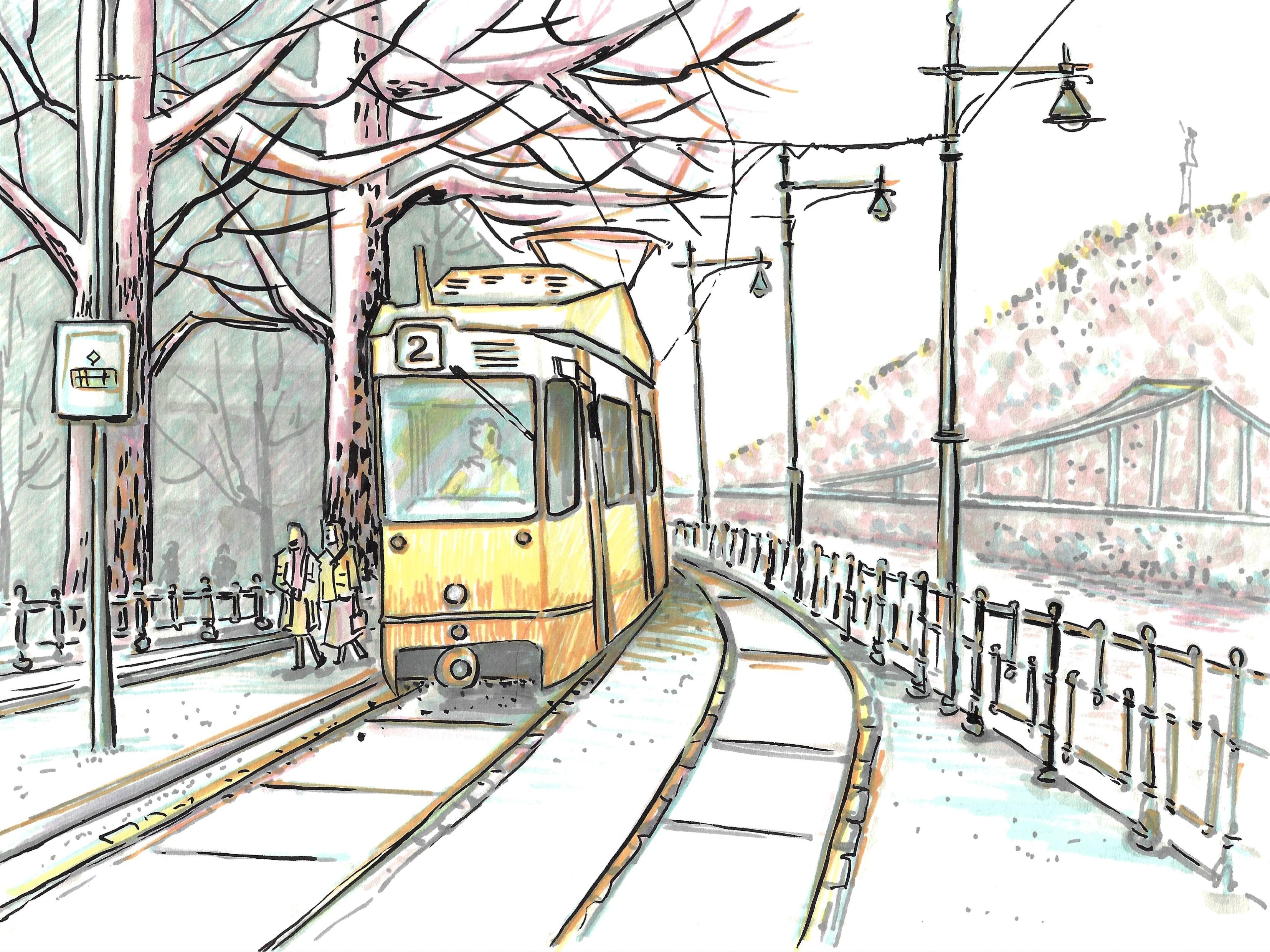
8. Size. The Sunny Tram of Budapest. Mockup: Let's draw a small mockup of a future sketch featuring
the Budapestrem. Why will make a mockup? It's not typical for
sketching because a sketch itself was born
from the mockup conception. Usually, the part we will discuss now is done
fast in your head. But before we are able
to do something in fly, we have train our brain with
longer analytical work. That's why in this course, we will do this mental
analytical work physically on paper. For the mockup, we'll mark a smaller space
with an outline, keeping the same proportion
as the food sheet. Remember, this is
just for planning. It does not need
to look beautiful. We'll start with
the main subject. The term, a simple outline, no internal details yet. The goal here is to figure out the right placement and the
size for our main subject. If even we don't draw it
exactly as the reference, it's okay because
all other objects will be drawn in relation to it. Next, we add nearby elements. The rails the platform. The tram stop sign
and the passengers. And the reference photos, there are two pairs
of passengers. But there is no need
to draw all of them. If there is not enough space, you can just pick one
pair like I'm doing now. Then we can place the street
lights on the boss side. Hans s here. Finally we sketch the
background, the trees. The mountain. And now we could
add some details inside the tram,
the root number, windshield, windows,
doors, light, some other funny details. And as you can see, the scene is already
recognizable. At this stage, we
could stop right here, but let's keep going
and add more details. We continue with shadows. The first step is
general composition. The next step is add some
shadows and textures. For the mockup, we'll skip the textures and just
focus on shadows. In urban sketching, shadows usually don't reflect
reality exactly, but instead help emphasize
the main subject. We need to decide which part of the tram is most important. I suggest the front because it has a lot of
interesting details like lights, driver, wipes, route
number, and so on. That's why we keep
the front white and shade the site. Windows usually are duck during the day look
duck during the day. Ty makes them graze well. Everything that is
not important or not directly connected to
the tram like building, the mountain and the river
will just hide in gray. And building. Now, let's work on the objects
that support the trim. So we cannot just
hedge them quickly. We treat them like
the main subject, identify the main and
secondary part of each object. Most of them are long and thin. And so we simply
shade one half of them along the full height. Since we are shading the
right side of the tram, we also shade the right
half of the other objects. For horizontal objects
like branches, we shade them from the bottom. Since the bottom is
naturally in shadow. Can add shades under the tram. More shades to rails. And also, we can add shades
between the rails as to the platform as the
kind of less important. Finally, we go back all the lines we drew
in the first step, composition step
with a dark marker. It's not a darker marker. This one is to bring them back. We can even add some
more details if we feel that something was
missed during the first step. The most exciting part in
our cup choosing colors. First, we have to decide on the color for the main
subject, the Budapest. Is original color is yellow, and in this case, I don't want to change it. Colors in sketching are reflection of the
artist's impression. For me, this sunny yellow trim really creates the
atmosphere and bring light even on
those rainy days. If you feel differently, you can experiment, for
example, try green. I choose apro marker color Y 156 called sunflower. Now, let's look at the color wheel and
pick the other colors. Based on the tradixin, the other two colors
should be blue. And pink. I did a bit of homework
and choose aqua C 428 and baby pink 228. Now, we have both natural elements like trees and mountains
and industrial ones like rails, columns,
stone buildings. I feel like blue work better
with industrial objects, and rose fits more naturally
with the organic ones. So let's Try. We'll call the tram yellow. A little bit rails passengers. Stop sign. Next, we add rolls to the trees, hills, river and passengers. Okay? It's almost run
out of pigment I have. Toby and won. Connect our main subject
with the rest at pink, a little bit everywhere. Finally, we use
the blue the coms. Special area near in between the building add a little bit blue
to the windows as they reflect the outside world. We could play a little
bit with colors yet if we see some places
that are not balanced, but we will precise it
at the real sketch, not at the mockup. The mockup is almost ready. We have so many tasks where
to play the main subject, how to play shadows, and which colors to choose. All these decisions have to be made on the fly in your head. But remember, we are loaded. Let's finish our mockup. The last step is
the black liner. We use it to tie everything together and to
add small details. This also brings more focus to the tram as the main subject. So just outline. Oh, man. Subject. Add a viper a mirror emphasize everything that is connected to the
dram like rails platforms. Lights. First of all, passengers. Stop sign. Moreover, at the final sketch, we emphasize trees and add more details to
the mountains as well. To the sites, it's
not necessary. Something is missing. Right now, our tram looks
like a bus a little bit. Of course, tram run
on electricity, and we didn't add any wars before because they're
too thin for marker tip. Just a few lines sets lines bring life
to the whole sketch. With this mockup, once all the important
decisions are made and we are happy
with the result, we can move to the
sketching itself.
9. Size. Main Outline: Finally, after all
the preparations, we can start drawing
our first sketch. In this lesson, we will work on the first step, an
outline sketch. I will draw and explain what
I'm going to do and why. You can draw with me or
you can watch the video first and then draw
at your own pace. I recommend the second option. Because in this case, you don't just copy but draw independently while applying
my recommendations. This way, your action is more
conscious and it will be easier to apply the acquired
skills in your own work. As we discussed in
the mockup lesson, we begin with our main
character, the tram. Usually, we draw a general
outline of the whole object. However, in this case, I'd suggest touting
without the roof. Because the roof does not follow the cube shape of
the main tram body, and it can be tricky to find support points that help align the top with the
bottom, left with right. So first, we draw the tram
body without the roof. And then we add the roof
relative to the drone pack. Another important thing
to pay attention to, we all know that
the tram is much longer from the side
than from the front. That's why there is
always a temptation to draw the side part longer. However, if we look
at the reference and compare the two dimensions
simply with our fingers, it becomes obvious that
the front side is bigger. That is something to
take into account. And don't be afraid
to make mistakes. Nobody is going to put
a best to stand at the same point a check if
everything looks identical. If we draw something
bigger or smaller, we can always adjust by reducing or enlarging other
objects accordingly. Let's start from
the left border. Remember that long strat
lines may have interruptions. Now, we continue
with the top part, repeat the shape of the
root number section, and stop at the point where
the line changes its shape. Then we repeat the
same from the bottom, making sure both front
horizontal lines are the same lengths. H. Before moving on, it's important to review
the concept of perspective. Objects that are closer look bigger while those farther
away look smaller. Finally, they all disappear
at the vanishing point. For example, rails tend
to converge at one point. We don't see that point
because it's behind the trap, but we can imagine it. If the tram were longer, its top and bottom would
also converge at one point. In traditional drawing, we would find such vanishing points, draw all supporting lines and then build all the
object based on them. However, we don't have time
for this in sketching. Instead, we use a
marker to determine the converging
angle of each line. Check the direction in the reference and
apply to the sketch. Sure. Notice that the tram has a complex shape with a
point where the angle changes. Make sure the top
and bottom points are aligned one another. Now we can add the roof. No words is something
is not perfect. We will correct it at the next
steps at the next layers. You finish the roof. With each step, we will
add other objects, starting with those closest
to the main subject. Let's add rails. Don't forget to
check the angle with a marker and its
vanishing point. The rails change direction. One platform continues along the initial direction
further from us, while the other platform with the stop is located
after the turn. Now, we add the
figures of the ladies. Same approach, no
details, just outlines. We can even draw them
as a single shape. A Then we add the stop sign. Check the position of the sign. Okay. Usually, it's easier to draw horizontal lines
than vertical ones. An academic drawing
teacher would tell you to train your hand and
never rotate the paper. But I allow you to choose the way that is most
comfortable for you. Seem, there are many
labels on the column, but we have no idea what
is written on them. For our story, only the
stop sign is essential. Now we can estimate how much space left and decide if we want
to add those guys. I prefer to omit them, but you could go with them. Let's finish platform. The next step is the
fences on both sides. They are quite beautiful and
have their own character. It is important to keep some
key features, for example, there is one thicker column that changes the size
from top to bottom, and one smaller com that
does not touch the ground. It's important to
capture this to make the fans look
vivid and natural, we need to add
many interruptions and only emphasize the nodes. Otherwise, if we
draw everything, we end up with a cage. I don't is deal with
that stone pot. And now I first add slightly
horizontal lights as basic. I then put the rest on thing. A the opposite side, the fence has full length com that finish somewhere
behind the platform. And between them
three short ones, one at the top and
two at the bottom. We can clearly see this only
in the pot closest to us. Closer to the vanishing
point, it becomes unclear. So we draw only what we see. The same start with
a horizontal line, taking vanishing point
into consideration. And then add the rest. Distance became cos cos a B, Look at the street
light columns. We can clearly see another
effect of perspective. In reality, the columns
are evenly spaced. But in this image, Each next seems closer
to its neighbor. The column consists of several
parts of different twits. If we draw lines
through each node, we notice they all go towards the same vanishing
point as the rails. We can draw several
interrupted lines to mark the position
of each street light. Then keeping in mind the
vanishing point direction, we mark the nodes
locations with dots. Yeah, I 'mo the
same height as Sam. Um, a little bit higher. Okay. And notes. Important point. That one. Now we have all the
support points to finish our street
lights confidently. The street lights in
Budapest are very specific with bell shaped hood and half of the lamp
visible underneath. Such details make
the view special. We have drawn all the elements
that make up the scene. Let's pause here and then continue with secondary objects.
10. Size. Inner Outline: As secondary objects, we
have two separate scenes, one on the left and
one on the right. The left one is
closer to our tram, so it feels a bit
more important. Let's start there. The building is almost
hidden behind the tree, so we'll draw two big trees first and see if that is enough. We can make them
more noticeable. I hide it behind the sine column to avoid conflicts between
those two objects. The same with the tram. I hide the tree partly behind
because trees should be a frame for our main subject and not conflict with it. A few small branches. So for the building now
just mark the roof. We will see later if we add
more windows or more trees. Now we are moving
to the right side. Compared to the earlier draft, there's enough space to
make this bridge visible. It's quite picturesque and
I think it's worth drawing, but gently, it should not dominate over
the street lights. Let's also mark the mountain
with top and bottom line. Once we got all
the outlines done, we'll go back to the trim
and add some details inside. Remember, the front
side is our main focus. So let's start them. Windshield number,
decorations, lights, that panel of the
different color and coupler we almost have. The wiper mirror and pantograph
are too thin right now, and we will add them at the
final stage with a liner. The root number is important because it
is an iconic root. Okay. On the side, we can mark the
doors and windows. The windshield is quite
large and transparent. The driver is looking
towards the platform, which as a strong
sense of connection. It would be nice to draw the driver and few
interior elements. If you don't feel
confident about it, you can skip them. And, of course, welcome back to our ladies
and dress them up. The last important detail. Sign. We finish with our outlines. It may look now not very
attractive, but no worries. At the next level, we fix everything that does not seem perfect
at the moment. And still worth mentioned that sketch should
not be perfect. See you in the next lesson, and we will work on shadows.
11. Size. Shadows: We have our outline
sketch ready. Now it's time to add shadows. We'll tend to minimize
shadows on the main subject, but cover the secondary
elements with gray. Let's start with the
less important objects. The ones we can
safely paint over. I mean the building, the mountain, and the river. For the building, I suggest
using diagonal hatching. We need to minimize attention since there are already too many detailed
objects on this site. Try to make strokes of different lengths and let the next row go into the previous one
by different amount. That way you avoid
a striped look. They should be more careful
near other objects, try not to cross
the boundaries and feel free when working
farther away from them. A from the main subject, strokes could be long and we can make them fast. We can change a little bit and go from left to right
and from the top to bottom to make hedge more vivid and interesting. Especially. Take it easy. The mountain. The mountain is more visible
than the building, and it's a good place to
show contrast between the industrial objects in the front and the natural
mountain with trees behind. Use short strokes, short thick strokes to create
the impression of trees. The stroke should be dense
almost without gaps, close to other objects and becomes parts away. Here, careful the
bridge, the columns. That is the mountain bottom. It could be more
thick as well and dense because of the
border with water. H, Almost almost freedom. Still, the top Ohm Bridge. Comes the rest. Oh Bridge. No, let's do it somehow. Let's stop here. For the river. Use
strokes typical for water surface,
short horizontal. A little bit short near the
bank and a little bit longer closer to more dense near other object. There are some objects, or it's cars, buses,
or maybe boats. So if we don't understand
what is it, just keep it. Imagine that there
is river everywhere. Okay. This way, we
highlight the main fin, and now it's time to
return to our trim. So let's decide what to cover. First, the windows. They always look
dark during the day. If you edit a driver, we need several shades
of grade there. We'll still use the same
light grade marker, but apply it more intensively
behind the driver. The closer an object
is to the viewer, the lighter it should be. Just paint everything behind. We drawing the person, think of them as a set
of geometric shapes, a shadow under the head, like on sphere,
shadows on the arms, body, like cylinders or
pipes, for the face. It's almost invisible. At shadows for eyes, maybe nose. It's not really important because we have to
create a glass effect above with a few diagonal
strokes or a whole windshield. Darker on the top. So, no, eyes no mouse
are really visible. Here, we have a complex shape. The front is our main subject, so we keep it mostly white. And we have the side
with the form change. Here is one rib. And here is second rip
where the form changes. It's important to
show those ribs. Let's start from the bag. And the back we make
strokes stronger. And soften them closer
to the rib line. And the rib makes the
stroke stronger again. And snow with front
strong near the rib. Notice that at the side, secondary part, we cover
almost the entire area. On the front main subject, we only cover about a half
and for the same principle. Now, add shadows under the
roof and beneath the tram. Space under the roof. Beneath and under
the tram itself. There are many orypic
elements here at the roof. We can also show this
lairyn with gray. Draw over the back elements, but only near the borders
with the front ones. Don't forget Roof. We have ribs here as well. The doors are slightly indented. While headlights stick out and beat shows a difference
with deeper shadows.
12. Size. Finish Shadows and Recover Outlines: Move on to the
trees and columns. Apply shadows as you are
shading a pipe, cover one half. Which half? It should be the same
size for all objects. Since if the light comes
from one direction, all shadows fall on
the opposite side. In sketching, we don't focus too much on the real
sound position. It's more about emphasizing the main and secondary subjects. Since we have already shaded
the trend from the right, do the same for
all other objects. For horizontal objects,
shade the bottom part. The corp. The handsets. A tree is not a smooth
as a metal part. Kick. For the natural objects, the shade is not exactly
like one half and one half. We can try to show
this shape difference those columns are too narrow. Look at our passengers. You can shade them
just like a driver. But you can also show
that they are together. Simply draw one
continuous stroke across both figures like here, top and here, bottom. We're almost done. The only part left are the
tracks and the platforms. The tracks are a continuation
of our main subject. So I suggest make
them primary and add more details around
the rails like stones, slabs, small indentations.
To both tracks. Let's add thickness. From the second part as well. Smaller stones far from
us and larger closer to us the same as we
did with street lights. Maybe top it shadows F size the focus on the tracks, atg the platforms, and the space between the rails horizontally,
following the shape. You can add more dia almonds. Okay. After all these steps, we have almost lost
our original outline. So let's bring it back. Use a darker gray
marker for this. If we started with
gray one or two, then gray three or
four will work well. Go over the initial
outlines from the previous Wood back windows. Separate lights
from the shadows. Tracing over the existing
lines is much easier, and this is a stage
where we can make small adjustments,
add more errors. Okay, let's continue
the platform curb. Rails for me, not the natural position
of the sketch book. Usually, I don't put it horizontally like
for the recording. It is linked to me, but it's as well
interesting experience for me and you will
see at the end say even inspite
all the mistakes I did that sketch will look okay. So no worries about making
any mistakes yourself. Ts. Let's found
all the branches. We draw and add even more. Second we get a um tries in between. So how it is here, I almost don't see the building. One more on the site. It's time to connect ans in one object. Okay. Now carefully, let's
put the bridge back. Mounting and water boer streets. H. Horizontal. But that concts everything in one object. Not a separate course. Okay. Mountain is still far away, so no more details here. Okay. I almost forgot we have an Chow its border but that's it for a moment. And great work, I think. We have finished all the
preparatory layers and are ready to move on to coloring
in the next lesson.
13. Size. Color the Main Subject: A thrilling moment we are
ready for colorizing. As you remember, we have already
chosen our basic colors. Yellow for the trim, rose for natural objects, and blue for industrial ones. It would be fun to
use this three and create extra volume with Gray. However, the final titer
will look more vivid and vibrant if we have at least
two shades of each color. One, base, and one for
shadows and other contrast. I have done my homework and prepared matching
pairs for each color. All the codes and exact names are listed in
this lesson description. But feel free to experiment. As usually, we
start with a tram. First, let's go over
all the outlines. In those words decorations A Now, we apply color to
the front using hetching. This house blends
the colors pattern. You might have noticed
that when I applied gray, I did it quickly using
the thickest tip. However, at this stage, we are working towards
the final results, so we'll mostly use
the thin dip side. I start hatching along
the form vertical. Always work with ribs S. Now, moving to the site
to show a change in form, we need to change
the hedging angle. Okay. Now I can phone change. The uncle change. Let's take the part color and apply it to
the shadow areas. Usually in urban sketching, the top part is lighter
because the light source, the sun or street
lights is above, and it gets ducked
toward the bottom. That's why we cover
the duc tin starting from the middle of the object, beginning lightly and gradually making the strow stronger
toward the bottom. Don't forget to emphasize ribs, protruding parts and
deeper indentations. M change it uncle. Okay. And more basic
color at the bottom of the bot area to mix
all the tins better. You should also touch everything that's thematically connected is a tram with yellow like stop
sign, passengers and rails. Touch sign a little bit. Dress lady in the yellow coat, another in the yellow skirt. For deep shadows and
windows, you'll use blue. If you look at any
picture at any museum, you'll notice that shadows are usually shown
in cold colors. So blue is the best choice. Apply blue under the roof
and beneath the trim. Just to remind this
part is very duck. For natural objects,
we agree to use rows. Let's add a bit of the
scover to the driver. By the way we could compte you inside the cabin. And now we cover windows with blue to show the sky reflection. Dark at the top and
from the shadow side. Let's continue with blue. First, let's finish the
look of our ladies. Next, we add blue to all
industrial objects, platforms, stop sign, street lights, fences, and the bridge. The colorizing approach is the same as when
we added shadows, not over the whole object, but on the one half
along the border. Here, we just allow ourselves to repeat the real signed plate. Don't forget about hedging. And it's changing angle and direction when the
surface shape changed. You can overlap the
existing lights. You can put color mirar to them. Both options are okay. Me yellow to the
track with a tram, less yellow, more
blue to the nap rail. I think we can
make a short break here and then continue in the
second part of this lesson.
14. Size. Color Secondary Objects: We have started colorizing our picture and the first
part of this lesson, we already add color to our main character and started to work with
industrial objects. During the break, I noticed, maybe a couple of
things for improvement. So first, our tram has white roof however to
connect with both parts, we could add a little bit of yellow near the ribs. Emphasize the borders. And second thing, Is tram and doors. I feel like we miss
a separator here. Okay, we have done platforms, we have done sign and
fences on this side. Let's move on to
the second side. Slightly touch a bridge
because it is far away. With this hedge don't
repeat everything just mark it as a part of
industrial objects, industrial characters
of this scene. And now it's time to decide if we want to add some architectural
details to the building. I think we can mark few balconies and
windows between the trees. But carefully, it
should not look more picturesque than the
objects in the foreground. So be careful with
thicker branches. They are supposed to be rows. Try to omit them. Very, very simplic. Very simple with balconies. Don't forget area
behind the hedge. And the area on another
side of the tree. We will use darker
blue for shadows. As before, at the
bottom of the object, the borders deeper window
areas and indentations. You could start with a trim make it deeper shadow. Her. And Denis in the corners behind the ladies Corners well border of the elements. Ground floor Mind. One half ho street cards. So columns markers almost tty. We still have not used
our rose markers. Let's work on the trees
and try to create the impression of bark. Okay. I add branches. Make it smooth near
the tram to avoid conflict and simulate structure further from it, to emphasize borders
and textures as well, we take darker rose. Be careful with them. It's not necessary to attack a marker in those two
trees because they are, like in the background. Enough for the trees. Now move to the mountain and add roast trees here as well. First at the border
and the top of the mountain a little
bit in the middle. B with a with the river, we could add the rows to
show the reflection of the mountain and difference between the water
and street lights. But still we can
add a little bit of bloom because sky is
reflecting as well. We have already started blending colors a bit between objects, but they still look to separate. Each color should seep slightly into other objects to
tie everything together. For example, we could add rose to the tracks on
to the ladies clothes. B. And we can touch windows, branches, top of the
street lights with yellow. It's reflect light. Just add here several
branches we can add, by the way, bos and dark
and yellow light yellow. Self feel look at your work and think where you feel you are
missing something. I think we could
have a little bit of blow branches as well. Probably we could make this rose coamer near the trim with gray. At the same time we
bring the ammo forward. If you feel that some borders were missed
or something else, it's a moment to fix it. We're almost done. The last step is
connected everything with a liner or brush pen and
adding tiny details.
15. Size. Last Details: The last and the best
part of sketching. This is small bit of work that really brings your
sketch to life. You can use a brush pen. Or any liner. If you are not too
confident with the flexible brush pen tip. First, let's go over most of the outlines
from the first step, except for the tin
inside the tram. That way we make it clear that the driver is
behind the window. Don't forget about details. If you are using a brush pen, try to vary your line with. Usually, the lines are thick on the shadow side in our
case the right and bottom, and thinner on the
opposite side. Indoors Secondo. Now it's time to add
a windshield wiper, the mirror, and the pantograph. If you could hear
some extra sounds, it's my cat during
his lunchtime. Okay, pantograph. Eight and let's add cables for the tram pantograph. For the second track as well. Look at those fancy notes, it's important to put
them on our sketch. Now, it becomes
clear that we need to emphasize the rails to balance the cables above and make the street
lights stronger. Otherwise, the cables
might look like they're just hanging in the air. It's as well good moment to add more details to
the street lights. I mean, this element. Okay. Be careful answer. And also. Sketchbook. And rails. Rails and everything around. How the stones all the elements. It's the same with
the second rack. It's all part of
the whole thing. Street lights are a part of
this page at the bottom. So let's add more
details to it as well. Don't draw each line. I kind of touch them especially the
bigger columns. Just with such dancing movement because the word do looks like a cage
with heavy lines. Very gentle, the
horizontal line. Okay, and let's balance it
with the thin at the bastop. Oh, Bs tram stop, of course. I like to make it a hut. Somewhere there.
Of course the sign and be sure that it
is a drum, not bass. Okay, the same approach does touch main elements,
bigger elements. But now, I think we need make some shadows deeper but big
don't smash the brush pen. What else we could consider and liner to
some trees and branches. But be careful here. They should not conflict with those cables
and pantograph. So probably a little
bit to this tree. But in general,
it really depends on the situation
and on your sketch, how it looks like
in your version. Because if your cable
goes over all the stream, better just avoid eight
additional details. All right. Let's spot
the Strom again. So I propose don't
add more details to the background elements
because we have to bring tram and
passengers forward. And for this case, I suggest pay more
attention to the platforms. As far as concrete
sofas are not perfectly flat and few dots can
show the texture. Smaller dots further
from the view. Ample as well here in between Ma and be few notes. Now, just quick look. What else are we miss and where what do you think could be a more? But not least your signature. Go ahead, proud Lasana work. Congratulations. We are done with our first sketch
in this course. Is there room for improvement? Of course there is. You never really
finish a sketch. You just decide to stop it. So let's stop here
and move on to the next sketch and
the next topic.
16. Details. Introduction to Details and Layers: We have just finished our first big lesson
devoted to the size factor. How size help us to show
what the main character is. However, if you go to any crossroad or
square in real life, you'll notice that is
actually pretty rare when one object
dominates the whole sen. In most cases, there are several objects that
are pretty equal. As you remember, the secret of the first drawing is that
we don't draw everything. We just suggest the
whole scene and then focus on one object and
its close neighbors. Let's look at the scene from
the Wine Festival in Brno. That is the example
where there is no one object that
dominated the scene. You may say that this guy
is quite picturesque, but he's dominating only
one part of the scene. And except of the crowd, we have quite a big
piece of buildings. The city layer is almost
equal to the people layer. Here, the artist is the one who decides
what is more important. If we want the city to
be the main character, we put all the detail
into the buildings. If we want the people to
be the main character, then we carefully
work on them instead. While we do the Budapest tram, we use the same idea. All the detail went into the tram and everything
directly connected to it, the stop, the tracks, and so on. Today we are starting
a lesson about detail. For this lesson, we'll use a photo I took in the small Polish town of Stdloz. The photo shows our
problem really well. You could say based on the size factor that the
church is the main object, but we only see part of it, and it's not even
the main entrance. The tree is quite big too, but it has the same problem. We only see part of it. There are two objects
that are fully visible, a car and a pair of ladies, but they're so small that
they can only become the main character if we crop
out everything around them. In a situation like this, we don't try to force
one clear main object. Instead, we start thinking
in layers like we did with Brnovu a city
layer and a pop layer. Here, we can call them the parking layer
and the church layer. So the church with
the tree behind, and the parking with
the tree in front, we end up with two equal parts. Which one is more
important is up to us. To make the choice
more conscience, let's draw two quick mockups.
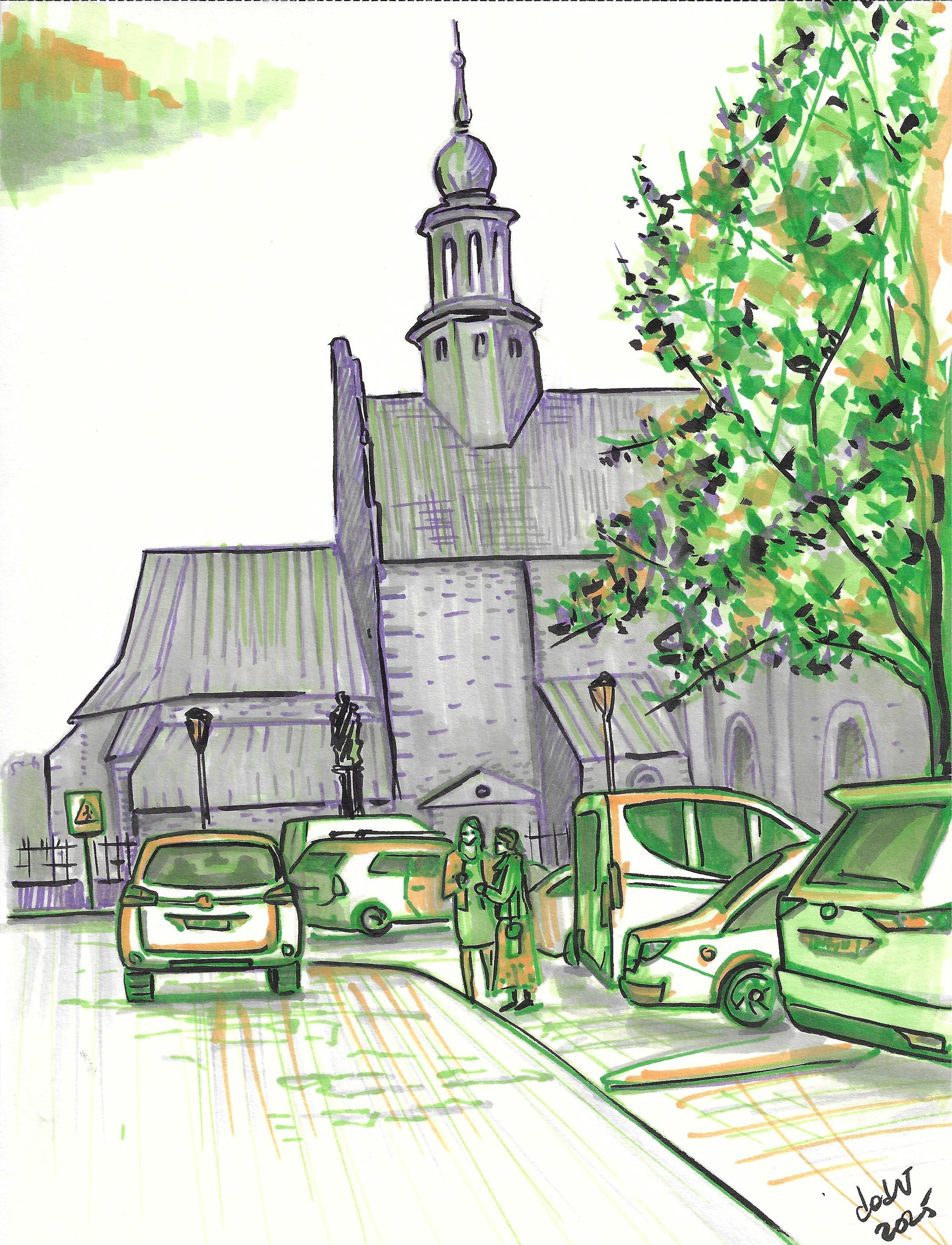
17. Details. Mockup with the Background Layer as the Main Character: The first Macup step
is line drawing, like in the first lesson. In this case, since we don't
have a main character, we start by drawing
only the main borders. First, we draw one line for the background layer,
the top border. Next, we draw the top border
of the foreground and we close everything with the bottom outline
of the parking cars. Don't try to draw
each and every car. With this layer approach,
it's not important. We can be quite relaxed
with the first two lines. But in the last case, try to pay attention. So the car corners and the ladies heads and
legs are not misaligned. After the common
borders are ready, we can go back and add in
the lines and details. We separate the cars
from one another, people, and include details
such as windows, wheels, lights, license plates and the tree trunk and few wrenches. It's a tree, trunk,
and several branches. Now let's move to the church. First, we separate
it from the tree, mark the roofs, show that it
consists of different parts. There are several
extensions with roofs at doors and windows. Okay Yeah. The corp that separates
the road from the parking space is missed. And that's it for
the line drawing. Let's move on to the next
step, adding shadows. I'd like to say that
this cage is much easier than the one
with the Budapest tram. With the tram, we added shadows with a gray marker
and only after applied color. Here I suggest making the
shadows directly in color. That will be our second step,
adding colorful shadows. As before, I did my homework and have already chosen the colors. I wanted to keep a
rainy summer mood, so I picked a blue violet
for the background, a cloudy shade, and a warm
green for a summer feel. If we look at our color el This church's choices follow the warm cool
color criteria, follow the two main colors, and we complete the treadm
with the orange accents. So in both cases, independently what the
main character is, we will use the violet
for the church and the green for the
tree and the cars. Orange will go on the church
layer if we decide to make it the main character or on the tree and
parking layer, if that becomes the main focus. For this mock up, we treat the background
as the main character. We start with the
secondary layer because it is faster and it creates a frame for
the background. First let's trace over the
layer outlines with green. Then we take a less
bright green marker, basically the one
we have used and cover all the cars and the
tree and the crosswalk sign. Use the wider side
of the tip and fill everything with
vertical strokes. Across all the borders inside, but be careful
with the outlines. This green looks too fresh and bright for the
secondary character. So we can tone it down
with the light gray, the same that we used
for the outlines. The secondary object
shadow is almost ready. Let's switch to the church. As before we start
with the outlines. All the main character,
we need to choose the light side and
the shaded side. It's pretty obvious
that the front side, the one we see the
most and that takes up the most space
should be the main one. Then we cover all the
partially visible sides At shadows a shadows
under the roofs and to the places that
are behind some parts. On the main part let's
into the windows, and let's emphasize
on the main part, some textures like
stones and roofs, especially around corners. Why is appropriate. We also need to
connect to layers. For that, we can add violet
to the shadow areas in the foreground under the
cars to the windows. The objects behind
little bit wheels. Herbs and stones along
the road and parking. Do you know what is missing? The sky looks empty. And at the same time, there
is a big colored spot on the right with nothing to
balance it on the left. A small cloud Good help. Add violet at the bottom
and green on the top. Clouds are usually
darker at cold on the underside and warmer on
top because of the sunlight. We also have an orange marker for accent on the
main character. I suggest adding
it to the roofs, maybe to the tree and
to the main ribs. And connect everything with
the road and parking area. That's enough for shadows, it's time to move
on for detailing. Our third step is
adding details. In this case, we
add details twice, first in color and
then with a liner. Because the elements
foreground and background have roughly
equal viral, wait here. Detailing is
extremely important. It's almost the only tool we can use to define
the main character. However, that does not mean we completely ignore the
secondary objects. Otherwise, the skege
may look incomplete. Let's start with the
secondary layer. I know I said we usually start
with the main character, but for lowering purposes, I want to change the order. That way, it will be more
obvious how many details we need to add to the main
character to make it dominant. For the parking area first, restore the outlines with
a darker green marker. Next, even the
secondary object should have a light side
and a shaded side. Since the shadow
side is on the left, for the main character, do the same for the cars. Add du green on the left side, and do the same with ladies. We can emphasize the
windows, wheels, and shadows on the cars but is We still have the tree. What I prefer to omit it, that tree is quite
big and detailed kind with a bright marker could
attract too much attention. Let's keep it for now. Next comes detailing
the main character. As usually, we can
restore all the outlines. Add another layer of texture
and make the shadows in the windows and add the
shadow sides deeper. Another tree, maybe
several strokes to the road as well so
shadows, to curves. In the final sketch, there will be more work, but
for a mock up, it's enough. Last but not least detailing
with a black liner. In most cases, we simply add one more layer to the main
outlines and elements. Both main and
secondary characters. Just to unite all of them with
this liner in one sketch. And of course, add some tiny details that were not visible before. Little bit emphasize bottom bot The place where we can
work more thoroughly is the small bow
tower on the roof. It has an interesting
shape, many details, and it's important
to show that it has a hexagonical shape. This is also a good moment to add a trunk and
branches to the tree. I can show corps, but I would not add too many
details to the road because it could steal attention
from the church. Instead, maybe a few
strokes to the roofs. To the taketre some shadows, especially in the middle. Looks like we have
met the requirements. The church reads as
the main character, despite the fact that it
is in the background. We'll continue our
research and make a mock up with the foreground
layer as the main subject.
18. Details. Mockup with the Foreground Layer as the Main Character: We have one mockup ready, where the background
is the main character. Now we'll move on to
the second option. I have already prepared
a line drawing. It's the same as in
the first mockup. The difference begins
at the shading stage. We'll keep the same colors, but this time we'll cover the
entire church with violet. Don't forget the borders
and be careful around them. White strokes through
all of them in outlines. Okay. If you are
not careful enough, it's okay. Just mock up. Now, the main part. For each car, we choose a main
side and a secondary side. We have only one
fully visible car, and we see it back. Therefore, we consider the side facing us at the main one. Color all the side parts, including the windows,
which are always shadowed. And let's play some
extra attention to the lattice and the closing. Uh As you can see, I show the tree canopy with dots as an interrupted line
rather than a solid line. Since the tree is a part
of the main character, it's very important, and we need to show the branches and
the texture of the leaves. Especially Mlives
at the border and closer to the chunk and shadows under the
cars under the ladies, a little bit of
the road texture. We are missing the cloud. Let's make it closer
to the main subject. Color in green. That's all for the
mockup shading. For detailing. We start with the main subject and then decide whether the background needs
anything added. We as usual, mainly went through all the
borders and outlines, add shadows to the
windows and under the car and pay attention
to the cars attributes, lights, wheels, license
plates, and so on. Use the thin tip. With a real sketch, we could be able to pay
more attention to people. As they will be bigger, here, it's almost impossible. I forgot here to let it to
the shadows to the site. As at the previous step, we work on the tree carefully, and it is since it is
our main character, we have to add to show the impression all the
leaves all the branches. Since it is our main character, we have to wait bright
orange accents. Let's add it on so called sunny areas on the trees on the cars and a little bit on the
ladies' clothes. Funny always on the top. May be trick it in the
scot here on line. Of course, to the tree. What we see now details here. We see now that the church
is kind of our picture. To connect it with
the foreground, we could add green elements, but not bright,
just a basic green. We can add, for example, something on the roof. Not to dense. Green should not dominate. Not to this one, it's
too close to the tree. I think we need to
emphasize the background outlines and show shadows and textures with
a darker violet. We can show the roofs,
the wall stones, windows doors and make the secondary sides
darker to show volume. And show a left to the tree show its border separate the tree
better from the church. And of course, a little bit
of let but to the root. It's almost the same what we
did with the first workup. But because all the
missing white surfaces and the better dialization with the orange accents
in the foreground, we switched the main character. The last detail is, of course, the liner. However, before that,
one more thing, the cloud need a second shade, the light one, the sunny one. Let's make it orange. With the liner, we
focus mainly on the foreground and show the main outline
of the background, especially the top border. With the tree never solid line. Then set to the border with other objects and just
feel in the middle. Feel like from Opel Corsa, we might Toyota scros But remember that nobody could come there and check
the car was in reality. So that's everything up to us. Which one do you
prefer, by the way? Try to show more
details to the lattice, but almost impossible
with this size. Here, we can allow ourselves
to show the rod surface. And more or less. That's it. Now we have both
more cups. What do you think? Which one do you prefer? I think I'll go with
the second one, not because the
foreground is preferable, but because the living
characters look more convincing to me and make
this sege more varied. I mean the people on the tree. However, with this mockup, you could also try the first option with the
church as the main character.
19. Details. Szydlowiec - Networking after Prayer. Outline: Ready for our second sketch. We have a reference, a mockup, and a sketch book. Let's take a gray marker
and draw the outline. About the proportions, there are several key points
to pay attention. First, the parking area takes more or less the
same height than the sky. Then the wall of the main part of the church
with this bell tower, more or less in the middle. And this red car and ladies are on the left
from the main church part. This is enough for
the sketching. It's not absolutely important how many cars you will
put on your sketch. You can put even
completely different cars. So let's start. As usually we start with the main outline without
any interior details, working from top to bottom. Draw the top edge of the
church and its garden. If you are afraid
of messing up with the tower, draw the roof first. Just keep some space
for the tower. Then build the tower
piece by piece on the left and right sides
of the roof working upward. It's okay that the
church is so high. The main thing is
to be sure that the whole tower fit
your paper sheet. Please omit the tree because
it belongs to another layer. Next, draw the top border
of the parking area, which is also the bottom
edge of the church. I prefer to omit this car in the background because
on the sketch, it would not be
clear what is it. In the versions, foreground
is the main character. So sketch the tree taking into account the leaves
and the branches. So it's natural textures. The next line is so called
city bottom border. Now don't rush, make sure the top corners of each object are positioned correctly
in relation to the bottom. The ladies' heads should be aligned properly
above their legs. When the outlines are done, we can add the inner lines. Let's start with the main layer. Since we have only two
fully visible objects, the red car and the
ladies, begin with them. For the car, separate the
bottom from the wheels, indicate the window tailing light. License plate. And we can mark
here more details. For example, the trunk door. We'll return to the car during the detailing step and
add more elements. Separate the figures
of the ladies, show arms and mark
few parts of dresses. Then finish other cars
where possible at windows, lights, license
plates, and wheels. For the cars closest to us, we can also show the trunk door. Okay. For the real shapes of the windows and lights. Mark the corpse. We'll handle shadows in
the next step in color, but at this stage, we can fill the windows
with gray because they usually look dark
during the day. Only windows. It makes the window shadows more interesting because
as you can see, there are a lot of
different spots in windows. Many reflections. And the sign it is as well
a part of the parking area. And now we move to the church. Draw only the outlines of its
main parts and extensions. You can mark doors, windows, make windows dark
like the car windows. C. You see the shape is
not like a rectangle. It's more complicated. There is some angle. The roof heel a little bit. If you don't understand
some constructions, draw it how you see. I see you can move some elements to prevent overlapping
like with this window. That's We can see here also street lights, a statue, and a hedge. But for now, we omitted and
left for the very last step. That's enough for
the line drawing.
20. Details. Basic Shadows: It's time to fill the
line drawing this volume. For our workup, we
used those tints. So the same for both
for the background as the main character and the
foreground as the main focus. As I finally decided to
work with this option, I want to come down a little bit the
background and replace the dark tint with a Karma version as well extend
greens with the thud tint, a light version to
create better volume. So today for the shadows, we will work with those three. First, we go around
the outlines Violet, light violet for
the backgrounds, and brighter green
for the foregrounds. I suggest starting
with the backgrounds, in this case, it immediately
emphasizes our main subject. Only very common outlines. Nothing inside. Bottom border take the thickest marker tip and work vertically
stroke by stroke. Try not to overlap outlines, but cross everything inside. I have a little bit dry marker, and it is even good
for our purpose. Because we don't need the
background be too bright. There is only risk if I run out of this marker before I
cover the whole area. I suspend that in this case, I continue with the basic gray. Try not to do things like this, not overlap the borders. But even something
like that happened. It's not critical. The sketching itself can forgive
you such things. I still a little bit more
tricky with this marker. I don't know if you
can see something. Around the trim overlap
a little because the border is the
border of the crown, it's not perfectly solid. And we can see we can see
the building through it. Okay, for a moment. Now, the foreground
borders first. For the main character, we go through all the outlines. If you can hear some
strange sounds, it's my cat and his lunch. All outlines. According to our workup, we choose the side facing
us as the main one. That means we need to cover
the shadow sides with color. We start with the lighter green. And the mockup. We simply color everything like
all the elements. But at the final sketch, we try to leave some highlights, for example, for lights, and maybe some other
interesting elements. So they stay more visible. T. No more details with
this card because it is too close to the
edge of the drawing, and we don't really
want to focus on it. We want to focus to attract your attention somewhere to the middle to this red
car and to people. By the way, about the people to show that they
belong each other, we use the method we already used at the
Budapest tram sketch. So we should create a flow like green jacket
of the one lady. We continue with green
dress of another lady. And we could add green
hair to create the curve. The back could be even
a little bit longer. Okay, crosswalk sign. Don't forget that it is as
well a part of our foreground. Now let's start to
work with leaves. So don't cover everything. We want the impression
that light from the sky, hit the branches from above, while it is darker underneath. So mix green with white gaps. Maybe one more thing
I want to do now is to emphasize some shadows for the cars like in the windows
with a bright green. And at the bottom, because shadows are
usually bright as them. What about this window? We can see the seats
and the mirror. So let's mark them. It's not the details yet we
just emphasize some shadows. This tree will start as
well with a brighter. Mark it for the branches
and for the trunk. And now for leaves, we took the light green version. Rotate your hand all the
time for each short stroke. Oh, each stroke should be in different direction to create bet impression of the leaves. Dancer near the border
underneath the branch. Let's still keep
those white spaces. And a little bit with a
bright green apart water. And work on shadows
under the objects, mainly on the parking, under each car under the laddie. Notice that we usually leave a thin white space between
the car and its shadow. Only the wheels touch shadow. When we are not right next
to the car like here, we can see not only the shadow, but also the area behind it. Is caching, we usually
use this approach to make the image vivid and have
more air, more fresh space. Even on a rainy day,
Shadows still exist. They are not that bright, but they still help us to
create to show some volume, create some three D effects.
21. Details. Shadows: Connect Layers and Create Volume: To connect foreground
and background, we add deepen shadows
with violet at the foreground and
add a little bit green to our background
mainly to the roofs. Let's try the
lighter green first. Maybe later after adding
details, we emphasize it. Here we have trees as well. We could add green here. One more roof. Not to dance, just to connect things together. If you feel that your
violet is too bright, you could come down it
using the light a gray, just lightly go over it. So in my case, I think there are even
not enough of the violet. However, we have to bring our foreground
basically forward. So for this case, we use
as well the light gray and cover everything with light gray closer to the borders
with the foreground. As well, to show a
little bit volume to our church and bring
some elements forward, we use the gray marker in elements for the
elements behind. One more time. Windows. And probably wheels. This car is behind as well. So let's add a little bit gray at least as a outline. You see, in such cases
when this element, it is, like, quite close to us. We make gray dance for the
elements behind it and cover the whole building extension but just near the border
with our main character. Around the tree is the same. It is our portal. Let's make the color dancer. J and violet at
the parking area. Now we have a good working
surface ready for details.
22. Details. Adding Color Accents to the Main Character: I we have our basic
sketch almost ready. Why almost because
we forgot our cloud. Let's create a basement
with lightest green. Add bright green warm effect, and add shadows with our violet. And now, the third
step, detailing. It is the essence of
this whole approach. Let's look at the
original picture. At first glance, the
car seem boring. There are not many details, and we have already added
windows, lights, and wheels. So what else is there? And that is partly true. Detailing is a
test of attention. We train our ability to notice
things most people miss. And even if yous don't consciously see every details
in the finished sketch, they still feel that the foreground is
the main character. So what can we do? Carefully reproduce the shapes of the windshits and lights. Add extra elements like the
brand logo, roof rails, exhaust pipes, full tank hatch, the lysis plant ses, and so on. Each light, in our case, lights has an interesting
in structure. It is made of different lamps, and that is worth drawing. Inside the car, we
might even see a chair, a had dress or a person's head
plus the rear view mirror. We can mark this also, and we have already
done that partly, but at this stage, we emphasize. Let's start. Take the
brightest version of Ukraine markers. As a previous step, go around all the borders again. Yes, one more time. It also gives us a chance to correct lines and
shapes at each stage. Don't forget this sign. You start with this red car. At the previous stage is well
like eight some details. So it's a moment
to put them back. Show that something is
written on the plate. So inside, don't use
the brightest marker. If you want to make something
inside stronger but or use light green we have already
used or the gray marker. Don't add too much details to those two cards because
they are behind everything. For the ladies. So add a bit of hair show a little bit
face shape, maybe eyes. Probably we will add
something later with a liner. However, with such size, faces are not important. Postures and clothes
go work better and tell us more about characters than tiny faces. She has some as well. Okay, continue with
other cars. Oh. On original picture, we don't really see something
inside one's windows, but we can also
imagine something to make those windows
more interesting. The wheels. We usually at the outline, make more shadows at
the part closer to us and at the inner outline, more shadows at the part
that is further from us. Somehow, as you can see, I used it here as well, it creates that volume effect. This Volkswagon is
clearly visible, but be careful not
to over detail it because especially at our skege it is very close to the edge, and it's not important. It's not even comfortable to
draw something at savage. Even if we want to add here
a lot of nice details, we are kind of limited. Still take the gray
for windows and emphasize some let's
say window effect for shadows in the wheels
area at the bottom, show that some cars
are behind others. What else we can add? We can emphasize curbs. And don't forget the tree. Focus on the branches and the leaves along borders
and at the bottom. Like make breaks in
branches because they are covered by leaves
in some places. So for 34 leaves still
use wide the tip. It allows to create any
shapes of leaves and small White if you rotate
your hand permanently. I'd say more leaves, near branches, near a trunk. Smaller leaves inside
tends to add the borer. If your road surface
looks empty, you can add several stones, but not with the bright
marker because in this case, you pull attention away from the cars forward to the road. We don't want to do this. I think in this cage, it's enough details
for a moment. The one thing I want
to do to come down shadows under the cars is gray.
23. Details. Emphasizing Color Accents: Now it's time to add some
details to the church. We can suggest wall texture, but not with the
brightest marker. Otherwise, it will
compete with a tree. Use a basic violet
to indicate stones. Enough for a moment. We take our brightest
violet and what we do. Of course repair
the borders again. Outline all the corners. A don't forget the bottom outline. Here, we mark corners because
they are interesting. Add a bid of roof texture. We also should show the volume. Since the side parts are the least important
elements in this cage, we can hatch them diagonally. Not to dance. If you see in some places, it'd be okay maybe to
emphasize some stones. Just do it. But the tiny tiny strokes, add some details to the roofs. Don't cover the whole roof. Show it somewhere. I think we even go from this place where the
roof changed its shape. We can work more carefully
on the bell tower. As we mentioned before, it sits on an
important visual flow that leads the eye
to our main subject, add more details to the roofs, ribs and emphasize the
shadows in the windows. It's not windows. It's like holes. Fwribs here and several
decorative elements as well as a shape change. This side nk. To bring the tree forward and separate it more
clearly from the church, we can add a few
dark violet strokes along the outline and
even to the trunk. Maybe a few branches outside, but not a lot. Tiny strokes, not
as big as green. Less strokes already at the sky where tree is not
intersected with the church. A little bit of wild strokes at the shadows areas of the te. If you feel that you miss
some valid strokes, add them. To make our main
subject brighten, take your x and marker, orange and touch the light parts of each object at
the foreground, always repeating and
emphasizing the shapes. For the ladies, use this
marker to finish the outfit. For example, let's
make an orange jacket. And orange scot. Okay. Yeah. You really add some light
parts, not the shadows. To the tree. To the tree mainly at the top. And at some areas that
we still keep white, but not try to cover
with the color orth leave some fresh
air in between. And our last touch is
cloud and the top. We're almost done.
The only thing left is final detailing
with a liner.
24. Details. Last Strokes: Time to finish our
second sketch. Before we add the final details, let's look one more
time at the sketch and think again what objects
we can bring forward. Maybe something we have to hide, maybe some emphasize
shadows to show the shape. It is almost the very last
moment when we can do that. I think this sign should
be better visible. Better separate one
car from another. So parking sofas and details. And then take a gray marker
and work on shadows. One time shows the
deepest corners bring forth our foreground If you feel that some details
or some connection between two layers is still not
good enough, do it now. If necessary, pay more
attention to Zabel Tower. Show ribs, show shadows. Now we are ready for
the brush pen details. One more time, we go through all the parking details and add things we
could not add before. Roof rails, wipers,
tire tread patterns. Don't forget the curbs. Remember that the
line could even have to be interrupted
to look more vivid. Okay. Allow us to fix some unclear
lines we might before If you see some details that I missed at the previous stage, it's good moment to at them. Wow. Curves and some stones and shadows part of the parking maybe
in it. Too much. As for the trim, it is
already rich decorated. There is no need to focus on the pot near the
edge of the page. It's better to work
closer to the middle, especially near the area
where our main characters are and the only
fully visible objects like this car and the lattice. I suggest adding a
few branches and leaves in the lower left part of the Of course, to balance it, we still need
something in the middle. Brush pens are very
good for leaves. A few strokes at the top
and go back to this part. For the background
at the main outline. A few accents on the bell tower and the main ribs of the
building larger part. We don't focus on the center, but we can add few elements
closer to our main subject. For example, fence
statue street lights. A He's a fence, very careful, very
slight delicate lines. The statue without
any details starts to show that there is something. About the city lights, just think how many do you need? I don't want to add
something additional here because we already
have a sign and a statue. The last look at the sage. Last shows If necessary, and I'll stop here. This completes the second factor of a successful
sketch, detailing. Size and detailing
can't work together, like in the first example
with the Budapest tram. We have here quite big tram that is bright and
that is well detected. No, it's not possible
to finish the sketch. You can only stop doing. So I remind myself
about the wipers. Details and size could
work together very well. But detailing can also help when it's not clear where
it's the main character. Sometimes it is even possible
to shift attention away from the biggest object
through careful detailing. Careful detailing and
one more factor will explore in the last
gauge of this course.
25. Environment. Introduction: Today, we start to learn the last pillar of urban
sketching, the environment. The first two size and details
were tightly connected. We need enough space
to add details. But in some cases, a relatively tiny object could
become the main character. If everything
around point to it. For this lesson, I chose
a theme from Brno Cheese. This place is not far
from the city center, but it is definitely
not touristy. There is a mix of different styles from
different periods, and they are not in
the best condition. The same can be said about
the Asphalt and cars. I was walking along
the main street and looked down
the side streets. They all looked similar except this one because of
the church at the end. Churches generally have architecture
that grabs attention. But additionally, it was
the only renovated object, and that contrast made
it a hero of the scene. I don't know if it
would have attracted my attention if I had looked at it from different
point or come closer. But from where I was standing, the environment made this tiny
object the main character. As usual, we start
with a small mockup, probably less detailed
than the previous one. We have to choose colors and
decide where to apply them. But first let's look back at our first reference
the Budapest tram. If you look at our first
sketche the Budapest tram, we can notice that the rails, the cables, the
curves, the hences, the street lights all
point toward the tram. Tha picture is just perfect. Is main character combines all three urban sketching piers, size, details, and environment. However, the last principle works with a small
object as well. Everything in this picture
pointed toward the church. The curbline, the
building roofs, the car roofs, or even the vertical ribs
of the buildings. Everything led to it. Our goal in this
lesson will be to show the contrast between the
church and its environment. At the same time, we will use the environment to enlarge and
add details to the church.
26. Environment. Brno Streets Secrets. Color Choice: Let's have another look
at our Budapest strem. It is pig, it is detailed. It is in the right environment, and it is yellow. Bright warm colors always
attract attention. I don't make color a
separate category. For me, it is just a different kind
of our detailed pillar. You can add many lines in
various direction and you could achieve the same effect
with bright warm color. In the same way, a dull color
does not catch our eye. Since we don't have enough space to add
many detailed lines, and we don't even
see all the details. We can solve the detailing
task with a catch color. I suggest choosing a juicy
beach color for the church, warm, sunny, bright, and
close to the original. Now let's have a look
at our color wheel. We need contrast. The most contrasted cow lie on the opposite
sides of the wheel, like red and green,
red and bloom. At the same time, such
contrasting colors are called complimentary colors, and they create
attractive combinations. Have you ever thought about why strawberries are so
visually appealing? It is exactly because
the red berries and green leaves color
wise, they're perfect. So our peach color is somewhere between red and orange
closer to orange. Therefore, we have to look for the perfect match somewhere
in the blue range. I chose a co aqua as a
complementary color. It is blue. It is bright and cold, as the name suggests. These two will be
our basic colors. For the details, we can
choose cama shades. Instead of moving to the
orange red direction, it's better to
choose a dark bee, which is actually
called light pecan. For blue, I chose
the color that is called degrees it is
slightly green gray. For secondary subjects,
two shades are enough. As you remember, we can usually make this range wider
with a gray tone. But for the main character, we may need something dark
brown for the deep shadows. This color is called deep Mocha. As usual, all the
color codes will be in the description below.
27. Environment. Mockups: Let's move to the mockup. We have already chosen
our basic colors. And in two previous lessons
devoted to size and details, we always started with the light gray for
the initial outline. Now we're skillful enough
to omit this step and start directly with the colors. If we apply a bright
color only to the church, it will look connected from
the rest of the picture, like a small bright spot, but not the main character. A main character has to be big enough to be reflected
in other objects. We can extend our
church with the stairs, the street, and the parked cars. This way, we create a pyramid
with the church at the top. What is important, then? Is to keep the church
as the main character, not the whole layer and not accidentally end up with another object as
the main character. For example, this car
is relatively big, even bigger than a
church with the stairs. So more bright color, more land detail should
still go to the church area. The other will be only slightly connected with
colors. So let's try. We start with the church. In this case, instead
of the main outline, we use the extension technique. Adding elements by elements, start with the tower, roof, the tower itself, the church roof, the
entrance group with columns and then continue with
the rest of the entrance. Don't try to be accurate. Don't add details because
cap is too small. We have just to decide which
color wear and how to apply. Nothing more. Now let's attach stairs and rails. Actually, for the scar group, we can use one outline as we usually do with any
other layers with groups. Try to count the cars and to put them all at the correct place. Nobody could go a check. Let's add the separate car. Let's add the curb. And let's divide cars
from one another. Maybe at a little bit of details as usually we do for cars Degstration plate
windows but lights Okay. Maybe shadows on is. What else we could add there? Probably this street
light because it creates like a frame
for our main character. So it should be higher
than the church. Guess what we have
to do next, exactly. Find the main site and
shade the secondary ba. The church faces us front side. So this direction
is the main one. Now we have to apply the
same logic to the cars. So front side, back side, it's actually the same. So with the separate
car, it's easy. It has the same orientation as the church and we don't
need to add shadows to it. But the other cars have
a diagonal orientation. So we have to choose again to
cover the side or the back. I suggest the back because
this side is more face to us. Then the back. Now, let's do it. We have to people here. People usually
attract attention. It may seem that we have to keep them right as they are
face to us as well. But we have to focus
on the church. I suggest either
omit them at all or just make it them
symbolically as filled spots. Something like that. I think it's enough
for the main layer, and let's check what we can
do with the secondary one. The secondary layer,
we will start traditionally with
the common outline. Check the direction of the roofs and make sure that they point
towards the church. Those buildings near
the church are more important as usually because they are near the main
character, but as well, they have very
interesting architecture, and we have paid to them more attention
at the final sketch. Now let's try to
add some details. More or less follow the fashion Now, it's absolutely
not important to show everything because we just have to decide a shadows which color. You see, I even omit this building because there is not enough space to show it. Okay. What is important here
that those building has two sides and shape
change many times. And now it's time to make
a decision how to apply shadows and which side to
choose as the main one. It makes sense to keep the main size the same
as the side that face to us and cover the parts closer to the church to emphasize that it is
the main character. Let's try. Let's do it. I something like this, we could as well add more
color to the windows. So is it good or bad?
Difficult to say. It's better to compare
with another option. I have prepared a second mockup. And now we try to apply color to the parts
that face to us. I make a diagonal for the purpose to reduce
its importance. Something like that. Now, we still could cover the buildings
near the church, but not the whole plate, just make a stripe near the
church and more or less with the buildings at a
stripe at the distance. The street is quite long, and those buildings are long. Even those, however, we
cannot see it directly. And this approach with stripes emphasize this
long street effect. What else we could do here? So first, we have to choose. I'm personally more
convinced with this option. Maybe it's not that
obvious with the mockup. But believe me
with more details, it'd be obvious because
I have already seen that the striped
technique really works. I usually you could try
the second option as well. What else we can do
here at mockup level and check how we could mix the colors to connect
everything together. So first, we could
add warm colors to all the ribs and roof lines. Maybe here as well on
some windows or frames, and we can add
blue as shadows to our main character and the
robes between the stairs, shadows at the windows
and under the cars. So that's it for mocap. The next step is
our final sketch.
28. Environment. Build the Main Character with Outlines: Now we know everything to
start our final sketch. Today, we will work
on our first step. As you remember, it was outlines with the basic word marker
for our main character, stairs, street, and
a street light. Our start point is
here at the top. Let's check where it is molars. So it is a little
bit higher than the middle of the sheet. One more thing. You may tend to make
it bigger than needed. So you can mark the
key points with dots or dash lines like
the bottom of the roof, bottom of the tower, bottom of this pediment, and bottom of the whole church. It's right to repeat all
the curves of this roof. But if you didn't manage it, we will fix everything
at the next steps. Try to show all the details
where it is possible. For example, I personally
have doubts about those two. I don't know what it is. So let's see maybe we add
them a little bit later, but for a moment,
let's omit them. The most important
group is this portico. Let's concentrate on it. The pediment. Then this beam underneath that is called
entablature entablature. Let's add those rectanal
decorations, cos And under the beam, we have this window. It's interesting shape,
quite complicated. Then a beam for the door. So let's try to show the shape of the
frame. Continue. The columns, but as you can see, the door is not fully visible. Here is the bottom show a little bit decorations
of the main buildings. Bron roof. And add the door. Cos, finish the Cs. All that's it for
the main character. Let's show the walls of the neighbor buildings and now time to extend
it with stairs. Check the direction. Mark borders of the stairs with dots and more or less
sizes like this. Let's just slightly
show several stairs. Hand rails. Okay, let's move to cars. Let's start with
this separate car. It is located closer to the
right border of the stairs. I could even make it
a little bit bigger. Common outline window light registration plate sign. Okay, and the curb now
the rest of the cars. So as you can see, there
actually looks like one group, and its top border, it is almost a horizontal line at the level of the last stair. So let's mark the
beginning point. This line tends a little
bit leaning to the edge, but not too much. Try to count the cars, but if you miss one or
if you added one extra, nobody go and check, but even go, there would be
completely different cars. Maybe be a little bit more
careful with this last car. And now let's go back that is by the way we visible. Okay, let's now divide them. I'll notice that there is
intersection of the roofs, but the car itself is longer. Not necessary to show that the car are of the same model
or something like that. Just show some cars. The parking is busy. That is important in this case. I know very well. Everything is visible. So where we can. Maybe more attention, of course, to this last one. Not too much. Its
interesting light with a registration plate on it. Here potentially
will be visible. Let's add people just
with common outline. And last but not least, a straight light that
immediately makes the scene vid. So it has to be higher. Remember that there is no
need to draw one line. You got to make breaks. What else we could enter a
border between the building. Now times for some shades. This top part is like pipe type. As you remember, in that case, we color the half
of it of course show the bottom shadows
here on the roof. And h so portico on the beams. And I think at the right side, as we started
shaking at the top, from the right side. And those groups the top
S if you wish we could add those elements they
become more visible later. The stas consists of several sections to
show sections just draw a few thicker lines. For cars, as usually
we make windows darker especially under the roof and from the one side, With previous work where parking area was
our main character, we more concentrated on what
we can see in those windows. For a moment, let's omit it. And now when we will shade, this backside of our cars, let's hedging like it is at
the mockup because otherwise we will create just
a big orange spot. And the only way to save this picture would be just to throw it away and
draw a new one. So hedging careful
near the borders. But quite slight. We could show the
head difference with this light and
the other part. Of the car could hatch it
together with the window. And the same is Os. Such smaller details like
lights and plates omit, to keep impression
that it is scars, but not something else. You see the scar is a little
bit of different shape. It is sedan I don't know the
correct English word for it, but the part of the top
is without shading. Okay. Wheels, shadows under
the wheels the cars. Let's make strong the right side of this cone and
just for a moment, hatch people some
shades under them. Okay, let's stop here.
29. Environment. Build Secondary Objects with Outlines and Basic Shadows: In this lesson, we build our main character
into the city. Simply put, we add the other
buildings on the street. Take a blue marker and start
the way we usually do. General outline first. Then divide it into
separate buildings. Check the direction of the top line and start
from the church. Make sure that the
starting point of the roof is more or less at the bottom
level of the church tower. Pay attention to where the corner should be in
relation to existing objects, especially to the stairs. Let's start with the right side. This building has very
interesting and complex shape, and it is worth showing such unique
architecture, let's say. And now what separate
this first building. Se more or less where
the roof should be. I have a little bit to turn because of the camera
and because I don't have space for my hand and arm. Okay. It's separate it. This roof has very
interesting shape. There are beams, and what is important detail
is this rain pipe. So let's find a place
for the rain pipe first. Rain pipe here is important because together
with all those ribs, corners and roofs, it creates that environment that pointed to our main character. Now, let's add that ground floor border show this old roof through beams. And mark some windows. Okay, next, those windows
are very specific. It'd be nice to fold them. If it appears that
you don't have space for all of
them, it's okay. We can skip one level. And here impotent moment
the original picture, the vanishing point
of all windows pointed somewhere in the
middle of the stairs. But we need that everything
points to our church. So let's do it. Change the original
vanishing point. Mark as well. So windows
to for the roofs. Okay, there is one more element. Let's add it. Together
with satellite plate. Okay, let's move
to another site. This building is
more complicated. There are more different
tape change and details. Let's first look at our photo. We start initially with only very front side
of the buildings, and then we'll continue
with the rest. So this side, only that corner, this border of the
building without the roof and the whole the building. Move again here,
check the direction. There is a border more or less. Be sure that it is at
the end of the stairs. Now, we could keep
space for the windows and somewhere under the first window start
another building. Check the direction of this of. Okay. This rooftop is rich decorated. Let's show it not
all the details. Is not our main character, but like a general impression and show a few windows. They are very characteristic
and specific as well. Mark few windows here. Now let's look at
our photo again. So what we already have, we have the lower side
of this building. The upper part has
three levels and the middle level shares one wall with the lower one
that we have already drawn. Let's try to repeat it. But first of all, make it relatively to the part
set already drawn. If something goes
wrong, no worries. We will try to fix what is
possible at the next levels. Almost add this corner
started another part. It is quite narrow. And there one side and then somewhere behind
will be this middle side, we could move it a
little bit down, and then the last piece as well shows that the roof
changes together. We show the corner, but first continue this roof. And now we could
be brave enough to continue the live
know where to stop. Let's continue the side wall Here is important detail
because it show how the building is growing and can continue our pointer line. That's why let's show the
pipes as well. It's up to you. You could show those middle
windows or not depends on how much space do you have. Finally. Okay, add
more details to that building that it
should reflect its front. One, two, three. Remember, remember about the
vanishing point that should points to our church. We have outlines
and what is next? The last step is shadows. So take our mockup. As you remember, we decided to cover the sides that face to us, cover parts of the front walls at the border of the church, and about others,
let's decide later. We'll see what we have. One more time, I
want to emphasize the corners and
start with hedging. Here is a roof, so another direction of hedging. This side, we hedge from
right to left. That's why. That's exactly because
everything should be directed to our
main character. The only thing to show that it is part of the
different building, we could hedge it part
the opposite direction. It's relatively small, so
it doesn't really have an effect on all
the pointing stuff. Don't try to make the hetching
strictly one direction. The building is old,
I need renovation, and the curvy hetching creates that impression
of the old wall. Now the part closer to the church shadows
under the rails. And more shadows
underneath all the parts. Windows here frame we
could choose the corner. Now what to do with
this building? We could hear L. What we
have to do we have to show shadows on the behind
the beams under the roof. Keep it white, closer to this building and add kind
of shadows behind people. If we think we could add our stripe here from both
sides of the rain pipe. I need to turn it again. So you could, as well. If you feel that it'd be easier for you to
turn, just do it. And now, keep it like this and let's
move to another part. So if here it was
from right to left, on this side, we hedge
from left to right. Emphasize the roof
line to see it better. Okay. My head chunk is
already a little bit curly. Check if yours is not. Yeah, it's easy to mess up what exactly have to be hedged. So be careful pay
more attention. A shadows on the roof. This is for hedging. And this part as well
could be hedged. As before vertical hatching
closer to the church on the rail show the windows more What? What else? With this building, we keep this side white to show the contrast with another building,
show the roof. And accordingly, show
the next building. Show the difference,
we have to go for blue here and show some
to rotate again, show some shadows
under the roof. For building it's
enough for a moment. But if we already have
enhanced our glue marker, let's add some shadows to
the church, for example, to the windows that reflects
the sky some shadows to stairs and traditionally
to the car windows. Shadows under the curves. And I suggest add more blue to this pavement as it is a
continuation of the building. You see how with blue, it get more volume immediately. But let's stop here and
work with detailing like
30. Environment. Emphasize Shadows in the Main Character Palette: The base is down. The next
step is to emphasize shadows, correct the outlines, and
connect all parts of the image. At this step, we take the medium dark word marker and go over all the main
character outlines, more carefully on the church and add on the main
outlines to other objects. Let's start? This one is this middle marker. We add on that amount
of details that we can but still try to add as much as possible, be more delicate with
decoration elements, but add more color
to them shadows. Window steps shown those sections and steps especially
near the borders. All the rails and remember
that it is the moment where we could kick something
from the previous layers. Now let's move on other objects. Here we work with outlines only, not with hatching
to prevent creating big spots that could steal attention from
our main objects. Here shows strong gas, the side, and mark the left one. Is a common line. Shadow of the window. There's deeper shadows with one common outline. And when it comes to the shadow, we think about them
like one object. As you remember, we
start one person and continue with another one. Corps are important. And go back to our cars group. Let's separate one
car from another. Now we actually put back the lines that we
have already drawn, but the lines that were missed
during some other stages. Let's put in lights
registration plates. Maybe add more shadows
at the bottom and add right side of the
windows right because everywhere we already started to shadow more the right side. If we decide to add
shadows to the left side, it's okay, but just
be consequent. I left, then left everywhere. Share those puns. I don't know if you
could hear or not, but we have a thunderstorm. I hope it's not too much disturbing that you
could still hear me. More shadows, more
shadows everywhere. Okay. Now, to
connect two layers, we go over the main outlines
in the secondary buildings. Pay attention to the
roofs, ribs, rain, water pipe, and some windows, especially those
closer to the church. We add color to
elements on the roof. They make these lines
stronger and more vivid. As it is the main
point in climbs, it is important for
achieving our goals. The satellite plate
is important as well. If I turn the sketchbook because of the handle
for my camera, it does not allow my
arm to move enough, If you have enough space
for your drawing arm, you should not make like I do. Let's continue with
the second part here. Be more careful because
this architecture is more complicated and you could make a mistake even when you
draw all existing lines. I be less careful
with those windows because too much too
many any other details. We this side it is less important than this
is another one. All those roof details, pay attention to them and
could cover the settle plate. Maybe even a warmer shadows hem. Is those windows are
quite interesting, but we could not spell the
word them too much attention. As we chose another
main character. If you have enough space here, you could show this drawing to emphasize the atmosphere
of the district, this graffiti on the street. Even if it does not
look like graffiti, it still show that
walls are not clear, not smooth and
there is something. Maybe enough with
the wall marker, it's time to add some code.
31. Environment. Emphasize Shadows in Secondary Objects Palette: Take a dark wool marker. Now, we go over our plans of
the secondary characters, but try to pay more attention
to the details as usual, along the pointer lines. Show the roof
thickness, roll beams. So because beams
have different sites with shadow and without frames, how specific they are especially for those building
closer to the church. Let's start with the buildings. That is the moment you
could show the frame. It's all of this frame. Be careful with the rib. Remember about vanishing
point when you draw other windows and more details
to the graffiti. Let's take the thick keep those old roofs creates a
space for the city bods where they could make the nestles it's even okay
that the lines are not straight because
they're not straight here. They are a little
bit waved with time. Under the of and the second side, what we could adhere, it's a shadow under
the handrail. Let's separate street light. Make the under shadows darker but don't make too
dark this decorated path. Maybe on a blue mark shades here. We show the structure. By the way we could
show the structure with a warm marker as well to separate this
building more from others. One more time, go over the windows if you wish I it to more details, but still not not too much. Put all windows pack. Now let's work is the border between secondary
objects and main object. Let's by the church for the section as well a few
steps closer to the border. Let's miss parked cars. And just a few details. Just very main big details that just show that it is scar, but not something else. On the places where shades
changing or deeper shades. If you want to shadows with the marker only hatching Under the car, we
could add Alets work with us independent cards and be The next step is creating this frame for our main character and work
with those fetched sites. But as this color
is quite bright, be careful, use the thin tip
and don't hedge to dens. The direction of the hatching
was already chosen as the previous step here, I probably could keep it on this slide page. Be careful near the borders. With the hatching
near the church, don't make short strokes
because it broke everything, few long strokes and we mix
them with the marker later. The same here. About the roof, there is different direction of shadow than on the wall and forget and now move on with hedging on another side. Here is a big space. Remember how the mix the hatching from the nextra
we have to overlap some. Now, let's correct everything
with light marker. H to the church, make the transition
better to the borders, make it nome others would
not follow the direction. And what a is missing shadows and builds that are far
from all my character. I want as well to emphasize area around people and the pipe. Connect the building
with the pavement mode. What we receive now, we have too much blue, dark blue, that is
now even dominating. We have to mix it a little bit with our world market to
connect everything better. Additionally, in the photo, we can see that the
plaster is old, cracked and even
missed somewhere. That hatching creates
the same impression and help us to connect
everything together, add more warm marker at the top, like it is closer to
the light and the ton If you see that
some lines, well, somewhere go over
them one more time. At this part, we
have to work mainly with this half and could omit
the one closer to the edge. But the moment where we could really for this
correct cluster. At this stage, the
environment looks good, but the main character
does not dominate yet. We need to add more
volume to it and probably think about additional
pointing lines.
32. Environment. Add Color Accents: We have already drawn
a lot and created all the important
objects that tree that leads upward and the buildings that are waiting for renovation. But we have started to
lose our main character. At this stage, we
will concentrate on detailing the main character
and its supporting blocks. Take the thin deep of
the darkest warm marker. Now we will repeat
all the outlines. We will just make
the shadows deeper and add details that
were not added before. Go over the areas under the roofs under the
overhanging elements and on the right side
of the projecting pat. If you notice any details
you didn't add before, or areas where some elements have merged into one,
bring them back. Here we lost almost everything all the decorations
we did before. Restores a window frame. Yeah. So letters. Separate the stairs. I cover the rail bit
more two stairs. What I would like to add a little bit more of
separate marker here. To stars as well. Now, if about other objects, we could make the street
light more visible. We could make the
pipeline more visible, make the shadows in the windows darker
and as well recover some corners that like a continuation of those
church pins and coms. Let's add them one by one, not all at once to control
better what we really need. The indoors almost lost here. I say miss this corner. I border between buildings
a little bit disappeared. Let's put it. But. Pipe let's finish this wines thickness. Let's add more war and
move on to our to people. Obviously, we have
now to separate the carpet let's go first to the street light. Now, a little bit at
roofs because otherwise, this street light
appeared from nowhere. Don't add p here because it would conflict with
the street light. Maybe separate a little
bit more cars not along lengths I just somewhere. I needed, Set for. The window, but as you
see, the more you add, the more you need to
add at the next step. We could show that asphalt is not young to show its structure, we add several dots, especially at the shadow area and glass tens
closer to where you. Well, we could add
even some lucium. Is bright enough brown, I have to fix a
little bit the cars and maybe let's
bit more sandals. At this stage, we have a lot of elements that support the
church from the bottom. However, the most interesting
element is the tower. And nothing points to it. We have to use sky
space somehow, but not overrode it. Keep a lot of free space here
as it creates a feeling of. I suggest take a light
blue marker and draw tiny clouds that creates
one diagonal line parallel to the roof line while leading directly to
the peak of the tower. We'll see if we manage to
lead it directly to them. It goes a little
bit to the building and we can switch direction. Yeah. And it's this way. Direct attention
to it and we take our light warm basic marker
and add some fun here. Sunlight. I'll here. I think we could
make as well but this streetlight this pipe this plate, some borders One more recovering
of the things. We had already done. For a moment, the church still does not look
like the main subject, but it is already playing
its part among others. We will do the rest
with a black liner. One more thing we have
to do before that. It is great volume with
a cold gray marker. Go over the church again and bring forward everything that
need to be in the front. Maybe with the church, I shall go with boom to
make shadows here bright. We have to keep the church
as bright as possible. The gray marker usually
make colors less bright. But this blue, as it is called play actually the same role as the gray is keeping
brightness of other colors. If it be too bright,
then we could use gray to come down everything. Exactly at the bottom, probably. We need gray to show that
those stars are in front, but that's actually it. Now I will show you one U trick. As I mentioned now, we should avoid covering with
gray our main character. However it is behind
those two buildings. Our task is to keep it
as bright as possible. The interesting effect
of gray is that if we cover the overlapping corners, it also separates the building and brings the corners forward. I was bors side. I could bring things
back as well as forth. It's see. My baby could take even darker gray
because I have it's one. Is corner itself,
I could try try this gray inside one. Additionally, those h building become karma and don't
compete with the church. With the rest of the objects, we do as usual, gray the objects
that are behind. Deeper shadows. Even a thin line of
gray can do the job, no necessity to make a big spot. Usually we use a thin line when the behind object is not
covered with any thing. M. If you wish work with windows or something so
you could sparate the cars. I the t. That's it for this stage.
33. Environment. Last Strokes: This is our last step and our last chance to
fix everything. After we have added the sky pointer and
separated things with gray, our main character is already in the middle of the composition
and catches the eye. With a liner, we
will add details to the charge and to the pointing lines and then we will see
what LCA is needed. Take a liner with a thin sharp
tip so you can be precise. I have a brush pen, so I
will try to be careful. There is no need to repeat
each and every line. Focus mainly on decorations, corners or on fixing
the joint lines. Remember, that is not our last
chance to fix everything. It is our last chance thing. I sure you control
the liner valve. The liner we could
bring more things in front this strange
element at the top, which I think we could omit show that those colons groups
a little bit moved forward. I could work more carefully
this window a frame. Y. And of course the
parade everything with the stairs at hues stairs les because I belong to the pointing park of course the parade nearest
buildings show the roofs. Special is it in
general outline. As before we concentrate
on the corners of those nearby buildings. That this roof is
important at that point in coin pipe we could show only on one side. If you're already near the pipe, let's add a common outline Not necessarily all around. Separate I can use a second part. Y. This corner. Let's
move to this light. Just the street light, and then we will see if we
need to show any other lines. I suggest here to show
that very top line. Maybe as well add some elements like antena so I don't
know what else is here, how to call it even if they are not the same place
at the original picture. Tree behind from the tree. Makes a picture of it. The cars in outline separate maybe some cars
additionally when it is needed. And add some dots to
this Asphalt effect. Now we have the same effect as we had at the previous step. There are a lot of
supportive objects below, but less at the top. This part seems a
little bit separated. I suggest to add here
an element that is not present on the original skege. We need something to connect to connect those parts together connect the top with the bottom. I suggest adding a cable from one side of the
street to the other. Not a hard line, but
a very delicate one. This line reads from the far top to the middle of the picture and the
main character. Let's try. Don't cross the main character, but make a line
quite close to it. If you feel that
something is missing, that somewhere more details are needed or some lines
has to be stonger. Just do it. I think that is enough. That is almost the end. We have finished our third
picture and the sub chapter devoted to the environment and its impact on the
main character.
34. Summary. What is Next?: Congratulations. Sometime ago, we started with
three references. Clean paper, few markers, and look where we are now. They have three ready works, and you have done that. If you think that
your works don't look good enough, just frame them. But what is next? For this course, I chose
references that could show power of each
two individual, size, environment, and details. In real life, such
situations is quite rare. Usually, we have to use all of them in
different combinations, and that would be a topic of the next advanced course for those who
completed this one. So good luck in your
sketching and see some.
 Viktoriya Tudoran-Opanasenko, Artist, Urban Sketcher, and Instructor