Transcripts
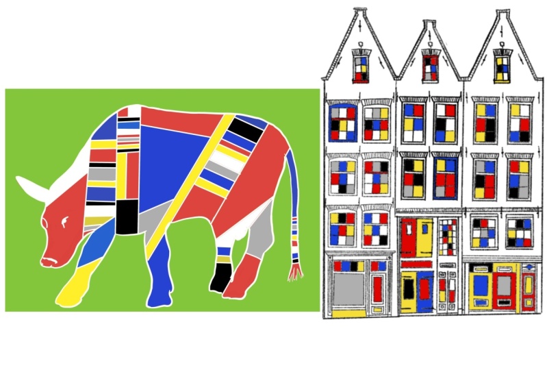
1. Hello: Minimalism is just not my thing. I draw, draw, draw, and then some! Whenever I look at sleek
minimalistic artworks, my first thought is,
yeah, they're pretty, but maybe they could
use a pop of patterns! So no wonder the
first time I laid my eyes on Mondrian's iconic
minimalistic paintings, my first thought was, what's up with all those white spaces? Piet Mondrian is a 20th
century Dutch painter, best known for his
abstract paintings made from squares
and rectangles. And don't get me
wrong! I absolutely adore his clean lines and
minimalistic color palettes. But there is an absolute pattern
loving maximalist inside me that's itching to cover up all those white spaces
with... well, patterns. So imagine turning
this into this. The fusion of Mondrian's
timeless elegance and wild, vibrant patterns can bring a whole new dimension
to his work. In this class we're going to be building a framework which is loosely inspired from Mondrian's iconic
minimalistic paintings, but we're going to be
adding a fun twist to it with Zentangle
inspired patterns. In other words,
we're about to dive headfirst into the world
of inspired creativity. Where patterns meet
minimalism and magic happens. Whether you're a seasoned artist or just starting out
your creative journey, this class offers a
welcoming space to artists of all levels for fun
exploration and growth. If this is your first time
taking a class with me, let me quickly introduce myself. My name is Ridhi Rajpal and I'm a filmmaker and a multidisciplinary
artist from India. I'm also a certified
Zentangle teacher, a certified Russian
sculpture painting artist, and now, a top teacher over
here at Skillshare. I've always been fascinated with patterns and textures and I'm on a constant lookout
for inspiration in my nomadic,
travel-heavy life. But one of the
things that I also love to do is to look for new ways to reimagine the works of famous
artists in my own way. Just recently, I've
published a class on reinterpreting Gustav Klimt's
artworks in your own style. And today I'm here to take
you on a journey with me to reimagine Piet
Mondrian's paintings. This class is a
no judgment zone. We're here to have
a blast, experiment fearlessly and to celebrate each other's creative journeys. The skills that you learn in this class are
totally transferable, which means that you can
apply similar techniques to reinterpret the works of other minimalistic
artists as well. My goal is to help you break free from artistic
boundaries so that you can create
artworks that truly reflect your own unique
style and vision. So if this sounds like fun,
gather your supplies and I'm going to
see you in class!
2. Class Overview: All right, everyone,
welcome to the class. As you can see, I'm fully
dressed for the occasion, all set with my supplies
and ready to draw with you. But before we begin, I just wanted to give
you a quick overview of what the class is all about, so you know what to expect
in the upcoming lessons. So, first, we're going
to start by looking at Mondrian's
artistic journey and understanding how
exactly he started to make his iconic
minimalistic paintings. Then we are going to decode
his style and color palettes to construct a basic composition
for two class projects. Finally, we will be
adding some patterns into both our class projects
to personalize them and give them your
own unique artistic touch. Now, if this is your first
time taking a class with me and you've never done any kind of
pattern drawing before, don't worry, I've
got you covered. We're going to be
doing everything from scratch and you'll be able to make
your class projects by drawing along with me. But if you're an existing
student of mine, then this class is a
great place for you to combine your knowledge from
some of my other classes too. So for example, if
you've taken any of my earlier Zentangle or color pencil or pattern
drawing classes before, then you can totally use those
skills over here as well. I will work with you to develop two class projects
in this course. But with the skills that
you pick up over here, you will be able to develop many more projects of your
own in the future as well. All right, now that you know
what the class is all about, let's move on to
our next lesson, where we're going to be
talking all about supplies.
3. Supplies: The supplies for this
class are fairly simple. You need something to draw on
and something to draw with. Let's start with the paper,
something to draw on. For today's class,
I'm going to be using these artist tiles from a
brand called Strathmore. These are available
in a square format. If you've been a regular
student of mine, then you'll probably know that square is my favorite
shape to work on. Because I love making
compositions on a square paper. But that's not a
hard and fast rule. You can totally use a rectangular paper or any other shapes
such as a hexagon, a triangle, a circle. Basically, just choose whatever is easily available to you. If you have a favorite shape, then you can work
with that as well. Another thing I want
to quickly point out is that I always cover the edges of my
papers with Washi tape. That's because later on, once my drawing is finished, I can peel these off to reveal
crisp, clean, white edges. It creates a faux mat or like a fake border
around the composition, which I feel gives it a very premium polished,
professional look. But this is totally optional. If you don't have Washi tape, or if you don't like this idea, then this is something
that you can totally skip. I just like the idea of having a nice crisp white border
around my compositions, which is why I use
the Washi tape. Now coming to the
tools that we're going to use for the
drawing. First up, I'm going to be using
these Sakura Pigma micron pens to create the main grid or the geometric structure
for our compositions. These pens come in various
different nib sizes, so you get them in thinner
and thicker variants. And if you don't have the same
brand available with you, then that's totally all right. You can use sketch pens
or technical pens, or drawing pens from
any other brand that's easily available. I am specifically using the black color from the
Sakura Pigma Micron series. They are available in various
different colors as well, but for today's project, I'm only using the black ones
from this particular brand. For the coloring, I'm
actually going to use my brush pens from a
brand called Ohuhu. I'm not 100% sure if this
is how it's pronounced, but this is a brand
that I found on Amazon and these are available in various
different colors. But basically the
reason why I picked these is because they
are multi functional. I love using tools which are versatile and can give
you different uses. In this case, these
pens have a dual tip. They have a fine
liner on one side, which is very useful in
making very thin lines and precise details and
really getting into those corners and crevices
of your detailed drawings. On the other side, they have a brush pen tip which can
be used to obviously do brush lettering or to
cover large areas of color... and to create
painterly strokes, and to create raw, painterly finishes
in your drawing. Now, one of the things with these brush pens is that
these are water based, which means that
with a single layer, they're going to give me a very translucent watercolor like finish. I can see these streaks of color which are forming when
I use a single layer. But if I want to build opacity, then I can just keep on layering and it'll give me a
more opaque finish. Again, the brush pens
are very versatile. Anytime I want to create
raw painterly finishes, I can go with light layers. But if I want to build opacity and make everything very flat, then I can just keep
on adding more layers and it'll give me that
nice opaque blocky finish. Now if you don't have brush
pens available with you, that's totally all right. You can use any other coloring
medium for today's class. You can use acrylic paints, You can use gouache, sketch pens, markers, or even crayons,
color pencils... basically, just feel free to have fun with the coloring medium that you're most used to working with. You can pick your
favorite tools and supplies; just
basically have fun! Now, apart from the paper
and the coloring supplies, we will also need some
standard stationery. We'll need a pencil, a ruler, and an
eraser on standby. Now, most of Mondrian's
paintings from the time when he started the
neoplasticism movement were with a primary
color palette. Which means he used
red, blue, and yellow. And those are the
colors that I'm going to be using
in today's class. But if you want to work
with different colors, you're totally welcome to do so. In fact, I have put in
some suggestions of color palettes in the
class resources document, which is available for you to download. Inside
that same document, you will also find the
link to a Pinterest board, which I have specifically
curated for this class. On this board, I keep
pinning pictures of any interesting work that
I find on the Internet, which is to do with
fashion designers, jewelry designers, architects or interior designers who have developed some
wonderful creations with inspiration from
Mondrian's paintings. This board is a great
reference tool for you to look at for composition ideas or to look out for some
design inspiration. And to basically just get
your creative juices flowing. I keep adding new pictures to this board pretty frequently. You can access this board using the class
resources document. Another thing that I've added in the document is the link
to Wikimedia Commons, where you're going to find high resolution pictures
of Mondrian's paintings. In case you are interested to really zoom into his
paintings and look at his work in a very detailed,
up close and personal manner, then you can definitely
check out that link. Wikimedia Commons
is a great resource for pictures which are
in the public domain. And a lot of
Mondrian's work is now available over there
for you to look at, and you can really zoom into those pictures and just
look at those details. Yeah, that covers everything that you will need
for today's class. With this, we are ready to
move on to our next lesson, where we're going to dive deeper into Mondrian's
artistic journey.
4. Mondrian's Artistic Journey: All right, so in this video, we will explore the artistic
journey of Pite Mondrian, delving into his early works and the creation of his
iconic minimal paintings. Piet Mondrian was a
visionary artist who played a pivotal role in shaping the
foundations of modern art. Born in 18 72 in
the Netherlands, he was introduced to
art from a young age. His father, a qualified
drawing teacher, influenced Monran's path, leading him to become a
primary education teacher while pursuing his
passion for painting. Initially, Monran embraced
traditional art styles, focusing on landscapes and figures with a
naturalistic approach. His work also showed traces of influence from the Hague
school as his uncle, Fritz Mondrian, was a student of William Maris from the
Hague School of artists. Monran often painted alongside his uncle during his childhood, which served as a starting
point in his artistic journey. However, he soon embarked on a deeper exploration of art questioning the
boundaries of representation. He encountered art
movements like cubism and Povism which ignited a
transformative period in his artistic career. Pena Museum then have, pardon me, if my pronunciation
is not absolutely correct. This plays several
paintings from this period, including post
impressionist works like the red Mill and
trees in Mon rise. Another painting
titled evening from 1908 depicts a tree in
a field at dusk and it hinted at Mondrian's
future developments by utilizing a palette primarily composed of red,
yellow, and blue. Although evening had
limited abstraction, it marked Mondrian's earliest
emphasis on primary colors. These works showcase his progressive departure
from representational art, signaling a shift towards
abstraction and minimalism. As Mondran style developed, he began experimenting with geometric forms and
primary colors. His iconic grid
based compositions, such as composition
two in red, blue, and yellow, epitomized his artistic philosophy
known as neoplasticism. Neoplasticism, also
known as the style was an art movement co founded
by Monan and Theo van Despa. It aimed to create a new visual
language that represented the essence of reality through pure abstraction and
universal harmony. The movement embraced
primary colors, straight lines, and right angles with a grid
like structure. Mondrian's grid paintings
like composition with yellow, blue and red, exemplify the
principles of neoplasticism. The precisely balanced
and arranged forms and colors create a
sense of equilibrium, reflecting Monran's belief in the universal harmony
underlying all existence. The Museum of Modern Art in New York houses several
of his iconic paintings, including Broadway
Boogie Boogie, which vibrantly
captures the energy and rhythm of New York City. But now you're probably
wondering why exactly did Mondran continue to evolve and
push himself as an artist? Well, the answer lies in his unwavering pursuit
of harmony and balance. For Monran, art served as a means to express
universal truths and his artistic journey represented a constant quest for the essence of beauty
and order in the world. He proclaimed in 1914 Art is higher than reality and has no direct
relation to reality. To approach the
spiritual in art, one will make as little
use as possible of reality because reality is
opposed to the spiritual. We find ourselves in the
presence of abstract art. Art should be above reality. Otherwise, it would
have no value for man. So in a nutshell, Mondrian's evolution
as an artist took him from the realms of traditional representation to the forefront
of abstract art. His pioneering spirit, and unwavering
commitment to exploring new artistic territories left an indelible mark
on the art world. Today, his iconic
paintings continue to inspire and captivate art
enthusiasts worldwide.
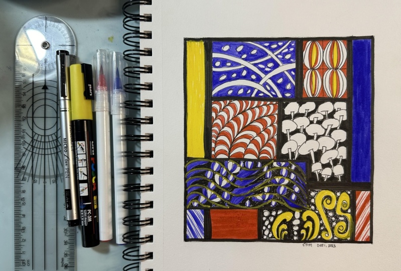
5. Project 1 - Making the Grid: All right everyone,
welcome back to the class. In this lesson, we're going to start working on
our first project. For this, we are going to need our ruler as well as a pencil. We want to start
by making a grid, which is similar to the Mondrian paintings
that we have seen so far. So over here, I'm using my pencil to make markings at about 3 centimeters
and 3.5 centimeters. Now one of the
things that I want to mention over here
is that you should always measure from the edge of the paper and not from where
your washi tape is ending. And that's because sometimes
your washi tape is not completely aligned with
the edges of the paper. So just to make sure that your markings are
accurate and precise, you should start your
measurement from the edge of the paper and not from the
edge of the washi tape. And it looks like I
had some black ink as a residue on my ruler from
one of my earlier projects. So that's left a little
stain over here on my paper. And I'm just quickly going
to clean this up so that it doesn't stain my
paper any further. Now, I'm just going to
draw these straight lines. Usually I try to keep
three markings so that it's easier for me to get
an accurate straight line. There's always the scope of missing your measurement
a little bit with just two markings. So just
to be on the safe side, I generally keep
three such markings to get an accurate
straight line. Now this side I am
making the markings at 1.5 " and a little
less than 2 ", about 1.9, 1.8,
something like that. While making this grid, you don't have to follow the exact same
measurements as me because there's a
high chance that your paper size is
different than mine. Just feel free to make a grid using random measurements
which come to you intuitively. The idea over here is that we just want to make
different kinds of lines which are of
varying thicknesses. Some lines are going to be thick and the others are
going to be thin. And so, once again, I'm aligning
this on the edge of the paper and making
a marking at about 2" and 2.25 " or
something like that. This time I'm just going to make the parallel
lines over here, like so; not taking it all the way
to the edge of the paper... basically just making
squares and rectangles to create a simple
Mondrian style grid. Again, over here, I'm
just marking it at about 7 centimeters and
then 7.5 centimeters. So you can see over
here that only two of those markings aligned and actually the middle
one didn't align. So this is a great example of small errors that can happen when we just
have two markings. And I'm just going
to double check that by placing my
ruler once again. Yeah, like I said earlier, it's always a good idea to
make three markings instead of two because two of them
will definitely align, even if the third one doesn't. It's always good to be
safe with these markings. Okay. Then over here
I'm just marking it at about 11 centimeters and
then 12 centimeters. Sometimes I use the
centimeter measurement, whereas the other times I use the inches side of my ruler. There is no
preference over here as such, because I'm
basically just trying to make parallel lines from
the edge of the paper. It doesn't really
matter which unit of measurement you use. As long as all the lines are
of different thicknesses. Then I'm just going to make
a couple of thin lines over here. So over here, I'm not really measuring it because I can pretty much
eyeball the distance. Some of these lines can be done easily by just using
the ruler's width. I'm just working with the
ruler's thickness over here. As long as the edge of the ruler aligns with a
previously drawn line, you can use the thickness of
the ruler as a guideline. And then create another set
of parallel lines like so. I'm just going to make a
couple more small grids just to break the large
spaces into smaller sections. You can feel free to draw as many lines and as
many grids as you like. Depending on the size of
your paper and depending on how big or small you like your details to be
in your composition, you can totally vary the sizing of these lines as well as the number
of these lines. Yeah, I think I have a pretty
good grid for me right now. This is pretty close to an
original Mondrian grid. Yeah, this is definitely
what I was going for. I hope that you have
also been able to create something
similar for yourself. Now, for our next step, we want to start
coloring these lines. I'm going to bring
in my black pen and I'm just going to
start adding the color. Now one of the things
that I like to do is bring in my ruler, and actually just go along the
edges and make straight lines first. And you want to
actually keep cleaning your ruler with a tissue or
like a scrap piece of paper, because sometimes the ink
does not dry very quickly. And then every time you
move your ruler, it's just going to cause spots and markings on other
sections of your paper. Just make sure that
you keep wiping the edges of your ruler every time you are using an ink
pen to draw the lines. This basically just makes the process of
coloring a little bit easier because then you don't have to worry
about the edges. They're already straight lines. All you have to do is just
color inside those lines now. You can always
bring back your ruler, if you feel that your pen line does not align properly
with the pencil line. You can always bring it back and achieve more precision and
accuracy in your drawing. Now again, we're just
going to color this up. So, since this is a fairly
repetitive step, I'm just going to
speed up the video a little bit for you
to see my progress. You can see that I'm bringing in my ruler
every now and then to make sure that my pen lines are aligning properly
with my pencil lines. Then I'm using my black pen to color the inside sections. This makes the outer lines or
the outer edges of each of those segments a
little bit neater and they look a little
more sharp and crisp. As against going just with
the pen on the edges. This just makes the
overall appearance of the artwork a lot more neat and precise because then
you won't really have scratchy lines on the edges
of each of these sections. All your straight lines
look very clean and crisp. I definitely recommend
using the ruler for that. Again, just as a quick reminder, don't forget to wipe off your
ruler every now and then so that you're not leaving
any extra stains or marks on your paper. Each time you use your ink pen and it touches the
edges of the ruler, it's always a good idea to wipe that ink down before
you reuse the ruler. So just by repeating
the same steps, I have completed my entire grid. And this is going to be our
base structure on which we're going to add our designs
and tangles and patterns. Once you have this grid ready, meet me in the next lesson where we'll start adding some
color into this composition.
6. Project 1 - Adding Solid Colors: All right, so now that we
have our grid in place, we can start adding some color. I'm going to start on
the top right corner of my composition and I'm just going to add the blue
color over here. And this is just going to be
a solid layer of the color. So you can pick any
three blocks in your composition and just give each of them the red color, the blue color, and
the yellow color. I've actually purposely
chosen this block because there was a little
black stain over here that I mentioned
about earlier. Adding this blue color over here is just going to
cover up that stain. This is an easy way to cover up a tiny mistake or a tiny error. Then same way, I'm just going to add my red color on this
little block over here. I think I'm going to
go just one more time just to really give it
a very saturated look. Then over here on this
rectangular block, I'm going to add yellow. The beauty of these
brush pens is that if you go over them
a couple more times, then you can achieve
a really opaque look. But if you'd like to have a
more watercolor like finish, or if you'd like
to have a slightly more raw look in your drawings, then you can also
just use one layer. I quite like the fact that these brush pens are very
versatile in that sense. Okay, with that, we have our color blocking
done. At this stage, this is pretty much like an
original Mondrian painting. So if you're ever looking for
a simple project to do, then this is an easy way to replicate his paintings or to
take inspiration from him. But for the purpose
of this class, we're of course
going to be using this grid to add more
tangles and patterns. And that's what
we're going to be doing in our next lesson.
7. Project 1 - Faux Weave & Hollibaugh: All right, once we have our
color blocking in place, we can start adding some tangles and patterns into
this composition. The first tangle
that I'm going to be working with is called Faux Weave. It's a very interesting
tangle because it has this very interesting movement and a very rhythmic
quality to it. To create this tangle, I'm going to start by placing
some horizontal lines. Then I'm just going to make some vertical lines to create something like a
checkerboard pattern. Just tiny little
squares over here. I've chosen to do
this with a ruler, but you can definitely do
this freehand as well. That's totally your choice. Now, once I have these squares, I'm going to start off with a vertical line in the center. Then I'm just going to add these curvy lines on both
sides of that vertical line. Pretty much creating
like a wire frame. And then in the middle one, I'm going to do
this horizontally. In the same way we're
just going to alternate the horizontal and
vertical placement of these elements in
each of the squares. And that's how we create
the tangle called Faux Weave. Now with all the empty spaces that are left in the middle, we are just going to fill
them up with the red color. The reason why I have
chosen to do this in red is because we are going to balance the use of the three colors
in our composition. We already have a red block
on the top right corner. Now I'm just adding
a little bit of red over here on the bottom. Basically, by
distributing the colors almost evenly across
the composition, we can create a balanced
and cohesive look. Adding a lot of red over here is also helping to
build contrast, because now those weave like elements are standing out a lot better against
the background. This is a great way to enhance the look of
your composition by adding more contrast and
saturated colored elements. If you're keen to check out
more examples of how to use Faux Weave in
different types of Zentangle compositions, then I've also placed a link to the step
out of this tangle, as well as some more examples
in the resource document. You can find that in the
resources section of the class, and it's available
for you to download. All right, now once we are
done with this tangle, we are going to move on to another section of
our composition. This time, I'm
going to be working with a tangle called Hollibaugh. For this, I'm going to start
drawing with my black pen. But the goal is to eventually add a little bit
more blue over here. Because as I mentioned earlier, I want to distribute
the color all over the composition to create
a more balanced look. The tangle that we're
using is Hollibaugh. And it was originally introduced to the
Zentangle world or to Zentangle art lovers by the headquarters of
the Zentangle method. It's considered to be
an original tangle by the Zentangle headquarters. Today, however, we're going to be working with a variation of this tangle which uses curvy lines instead
of straight lines. We're just going to make arcs. And this time we're
going to have some of these arcs going over into
another section. When you're working with grid
compositions like these, you can totally feel free to experiment with your
design placement. In the earlier tangle, we placed it within the block, but over here we're
going to have this tangle extending
over into another block. Then we can have a third tangle which will connect very well
with the second tangle. Basically, you can have
your design continuing from behind the initial
grid that we had drawn. I'm just going to add
a few more circles over here just to fill up this tangle a little bit more and to give it a slightly
more detailed look. Now I'm going to
bring in my blue pen, and I'm just going to start coloring in all of
these sections, leaving the curvy lines
that we have created. Again, as I mentioned, the idea is to use this limited color palette
in a balanced way. We already have a solid blue
block in our composition, but now I'm adding
more blue over here and creating a more
cohesive and unified look. Now I'm just going
to use this blue to color only this block. I'm not going to
use this blue on the block where the
design is continuing, because over there we
can use another color. We can probably use yellow
in the other block. But right now I'm just
going to use the blue over here and finish off
this little section. Now we have two blocks of
blue and two blocks of red. We definitely need to add some more yellow into
this composition. Take a quick break, and I will see you in
the next lesson, where we'll start adding more patterns into
this composition.
8. Project 1 - Strircles, Mooka & Cubine: Okay. Now we're all set to add more patterns
into our composition. For the section over here where we had
continued the Hollibaugh, I am going to start adding
a pattern called Strircles, which is a combination
of stripes and circles. I'm just going to add a few
more lines which are going to pretty much echo the shape of the previously
drawn lines over here. I'm just going to add a
few of these and then I'm going to move on
to adding circles. The circles are
basically overlapping these lines or these
stripes basically. Once again, if you're
interested to see more examples of how this tangle can be used
in different compositions, or if you just want to check out the step-out for this tangle, then I have put that in the
class resources document. You can follow the link
and gain some inspiration. Now I'm just basically coloring these lines in an
alternate fashion, pretty much like zebra stripes. And once I have these
stripes colored, I'm going to go
inside those circles. And now I'm just going to add alternate sections of
black over here as well. Now at this point, if you like, you can use another color to add some accents and details into
these stripes and circles. But for my composition, I'm choosing to add yellow
on the alternate sections, just so that we can
have a nice balance of yellow all throughout
our composition. We already have one
big section of yellow, but this is going to
be the second one. It's really nice to see
this pattern come to life with this yellow color
being added over here. It instantly brightens
up the design. So I quite like this combination of yellow and black
working together. All right, and now that
we have this completed, we have a few decisions to make. So now I have to choose where exactly I'm going to place
my next yellow section. Now over here I have
two yellow sections. And the third one
can be over here. Essentially, it's going to be
in a triangular formation. Similarly, I can add my red
in a triangular formation, and I can do my blue in
a triangular formation. Whenever you're making
abstract compositions with a limited color palette and you're confused
about where to place the color once again
in your composition, then you can always look for an imaginary triangular
formation within that drawing. When you spread out the colors
in a triangular formation, they tend to spread
out a lot more evenly in the drawing without
looking too repetitive. And there is a nice balance
overall in the composition. And it doesn't look
as if one color is just overpowering one
particular area of the drawing. This is a handy little
trick that I always use whenever I'm deciding where to place my color next
in my drawing. Yeah, these imaginary
triangles really help me to decide where
to put my color next. With that decision made, I'm going to add my
red section over here. For this, the tangle
that I'm going to be working with is called Mooka. Once again, the step
out for this tangle is available in the class
resources document. You're definitely free to
download that. And if you're an experienced artist or even an experienced Zentangle
enthusiast or tangler, then you can definitely choose to draw another tangle over here. So you don't necessarily have to draw the same tangles as me. You can draw another pattern over here and just
experiment with your composition in a
creative manner. And basically, just have fun with your drawing. Okay, now with that done, we are going to move on
to another section of this drawing where I'm going
to add the tangle Cubine. This one is a fairly
simple geometric tangle where we just need
to create a grid. Once we have that grid, then we're going to add some tiny squares
inside each of these, then connect them with a
diagonal line, like so. Once again, I'm choosing to
do this with a black pen, but I'm going to add blue
accents in this later on. I do want to keep using black
here and there as well in the composition just to make it look cohesive and connected. I think black also
really helps to add more contrast
in the drawing, especially when
you're working with such a limited color palette. Now for a tangle like this, you can also use your ruler and precisely measure each of these squares and
then draw them out. But in my case, since the
section was very small, I basically just eyeballed the distance and
created this freehand. But yes, if you have a
bigger section and if you're really looking
for precision and accuracy in your drawing, then you can take the help
of a ruler and measure out each of them individually
and then make your grid. Okay. Now, once I have
this base pattern ready, I can bring in my blue pen and I'm just going to
add the blue accents. And that's just going to enhance the pattern and make it
look even more beautiful. All right, and with that,
we have Cubine completed. So now we just have
three more sections to finish off in
our composition. And we're going to
be doing those in the next lesson. So
I'll see you there.
9. Project 1 - Narfello, Poke Root & Molygon: All right everyone,
welcome back to the class. In this lesson, we are
going to be filling up all the remaining empty
sections of our composition. Over here, I'm going to start off with one of these sections, and I'm going to fill it up
using a tangle called Narfello. And for this we start off with wavy lines which are almost
equidistant to each other. Again, I'm not really
measuring these, I'm just simply going
free hand over here and trying to keep them as
equidistant as possible. This section is going to
be in black and white. I am going to add
another yellow section, somewhere in the composition to balance it out with the
other two yellow sections. But this one is going to be
a black and white section. Same way, I'll also do another black and white section
somewhere in the drawing. Now, once we have these
wavy lines in place, we have to connect them
using small curvy lines. Eventually, it's
going to give us a twisted leaf like shape. For this, we're going to bring our pen closer to the bulge of the second line and connect it to the bulge
of the first line. Now at the bottom, we're going to do the opposite. Again, we are going to spot the bulge of the first
line in this case, and then connect that to the
bulge of the second line. With this technique,
we can actually create Narfello on a larger
piece of paper as well. We can create wavy lines on larger sections and then keep connecting them with
these smaller lines. And it's going to give us these smaller sections in the middle, which can then be filled with
various types of patterns. So in that sense,
Narfello is a very, very versatile tangle
because you can totally customize it with all kinds of patterns and details
of your liking. Every time you draw this, you're going to end up
getting a different result because you can customize it
in so many different ways. Now in my case, I'm filling this up with tiny little orbs. But you're totally free to
use another pattern as well. You can use all kinds
of filler tangles and patterns and take inspiration from everyday objects and their shapes and use
those shapes over here to fill up these sections. So I'm basically just
going alternate over here and leaving some
of these spaces empty. But you can also choose
to do it on all of these sections, if
that's what you like. Now once I have
the orbs in place, I'm just basically going
back in with my black pen and coloring all of those
sections with the black ink. This just helps to
bring more contrast in the drawing and it's also helping to make those orbs stand out a little bit better
against the background. Same way, I'm now going to
go in and add some lines. Simple stripes and
simple lines can be a great way to fill up
empty spaces in your drawing. I'm basically just sticking
to simple strokes and simple geometric
shapes to complement the other patterns that we have drawn so far in our composition. As always, you can customize this and use any
patterns that you like. Once again, if
you're interested to check out more
examples of how to use Narfello or if you just want to see the
step-out for this tangle, then I have the links to that in the class
resources document. Hopefully that will give you some inspiration for your
future projects as well. Now I'm purposely
leaving some of these sections
empty because it's always good to have
some amount of breathing space or negative
space in your compositions. Otherwise, they tend to look
very dense and cluttered. Leaving a little bit of empty
space here and there in your drawing is a good way
for the viewer's eye to relax a little bit, and for them to then move on to the next
area of focus in the drawing. Rather than the eye feeling confused with so many elements
placed closely together. It's definitely good to have some breathing areas or some negative spaces
in your composition. Especially when it's so pattern
heavy and already so rich with colors and dense patterns
and shapes, et cetera. Okay, now with
that section done, we are going to move on to another section which is again going to be
black and white. And this one is going to be
with a tangle called Poke Root, which pretty much looks
like little cherries. So we're just going to
draw two curvy lines. Give them a curvy line cap. And then just draw a
bulb around it. So again, two curvy lines... give them a cap and then draw
a bulb around it. This pretty much looks like wild berries or like seed pods. This is an organic tangle. Organic tangles are the
kind of tangles, which have no sense
of direction. You can choose to branch them out in any
direction that you like. They have no rigid
structure or pattern, or no specific style of repetition. I personally love working
with organic tangles a lot because they really put
me in a zen state of mind. They're very relaxing to
draw because there are no rules when it comes to
repeating these tangles. I definitely love working
with organic tangles a lot. At the same time, I know that there are a
lot of people who prefer a sense of prediction and rhythm
in their drawings. If you're that kind of person, then you might like
geometric tangles more than organic tangles. It all comes down to
the kind of person you are... the kind of drawings
you like to make. Again, if you are
interested to know more about the Zentangle
method and about its philosophy and
how you can create these various tangles and use
them in interesting ways. Then I do have a bunch of
different classes on that subject. You can check them out
over here on Skillshare. Now, once I have all
my Poke Roots drawn, I'm just going to go in with my black pen and color
the background black. Again, this is
just going to help bring some more contrast
in the drawing. And at the same time, it's helping those
Poke Roots stand out a little bit better
against the background. All right, with that done, we are finally left with
the last section of our composition where I'm going to use a tangle
called Molygon. Molygon is a fun little stackable tangle in
the sense that you can draw these
crescent moon like shapes and stack them
one on top of the other. But each time you rotate the angle just a little bit
for one of the elements, you can actually rotate the
angle of the entire row itself. It pretty much looks like little caterpillars which are floating across in your drawing. We just keep on building
them one after the other. Over here, I'm just
trying to create multiple such caterpillar rows going in different
different directions. Again, it's a very simple shape which has a geometric
quality to it. It goes very well with
all the other tangles that I have on the
composition so far. But you're definitely welcome
to use a different tangle, or a different pattern, if
that's what you prefer. Now once I have these shapes, I'm going to bring
in my black pen, and I'm going to add in
some contrast over here. In some of these,
I'm going to go alternate. Leaving one white, I'm going to color
the next black, and then repeat the same. But in some of the other
sections I'm going to do two blacks and
then leave one white. And then again two blacks
and then one white. Basically just
playing around with the rhythm and the
repetition over here. And of course, you
don't have to follow the exact same thing
that I'm doing. You can do your own
kind of rhythm and repetition and you can
do your own kind of customizations in
your drawing. All right, Now once I have
these elements colored in, I'm going to bring
in my yellow marker and I'm just going to color
the entire background yellow. Now with this, we have
three yellow sections, three blue sections,
three red sections, and two black and
white sections in our drawing. So you can see that it has created a nice balance
overall in the composition. No color is looking as if it's overpowering
the other colors. The black is actually doing a great job in bringing
everything together. It's helping to build that cohesiveness or a sense
of unity in the drawing. It looks like there
was a little bit of a black residue on my yellow marker from one of the previous sections
that I was working on. That's caused a tiny
little stain over here. Not to worry, I can fix it up. I can just add a little
bit of yellow later on. Maybe I'll just go in with my black pen and
work over that area. Honestly, I don't really mind
small smudges in my drawing here and there because they
make the piece look handmade. It's like an artist's mark;
a small identity mark that I quite like
having on the drawing. But in this case, it
looks like this smudge will actually take away the
attention from the opaque, clean, yellow background
that I was trying to create. Since everything around
is pretty clean, I might just come back
over here and rework this area to neaten
it up a little bit. But anyway, I'm going to
let this dry for a bit and then I'm going to come back and see what I can do with it. Now it's time to
remove the Washi tape. This is actually one
of my favorite parts of working with a
composition like this. Because you finally get to
reveal these nice, white, clean edges and you get to see your drawing
in complete glory. And it's actually one of the most satisfying parts of working on a
composition like this. Suddenly the second you
remove your washi tape, your piece looks so frame-worthy and you instantly want to
put it up on your wall. So yeah, that's exactly
what I'm feeling too. I definitely want to put this
up on my wall right away, but I do have that
yellow section to fix. So yeah, let's see what
I can do with that. All right, so a
few seconds later and after I've had a
little bit of coffee, I finally decided to come in with my black pen and just
go over the area once again. I did try working with my
yellow pen a little bit more, but it wasn't really working
so well because these are water-based markers and the black stain
was pretty opaque, so it wasn't really working in hiding the black pen or
the black smudge mark. Instead, I actually brought in my black pen and then I changed the shape a little bit to hide the stain that was there
in the background. Honestly, I'm actually
quite happy that this happened because
this is a great way for me to show you how
I creatively fix or manage my mistakes or tiny
little errors in my drawing. And I am always in the favor of embracing your mistakes and
not letting them upset you. If you also have
a similar section in your drawing, which has
a tiny little smudge, or if you have a tiny
little error, well, to be honest, firstly, nobody's going to notice
it because, well, only you as an artist know where exactly you've
created an error. And secondly, if it's really, really bugging you, and if
you're really bothered by it, then you can always go back in and use your pen to
creatively draw around it, and that's just going to reveal a new pattern or a new shape. And with that you can
creatively fix your mistake. Yeah, so over here I simply just wanted to
hide the smudge mark. And instead of filming this entire class all over
again from the very beginning, I wanted to show you
an honest picture or the reality of how
I work as an artist. So this is an authentic
representation or like a real picture of how I creatively
manage my mistakes. And I encourage you
to do the same and don't let them get in the
way of your happiness. So yeah, so with
that pep talk done, we are now ready to move
on to our second project. And for that, I'm going to
see you in the next lesson.
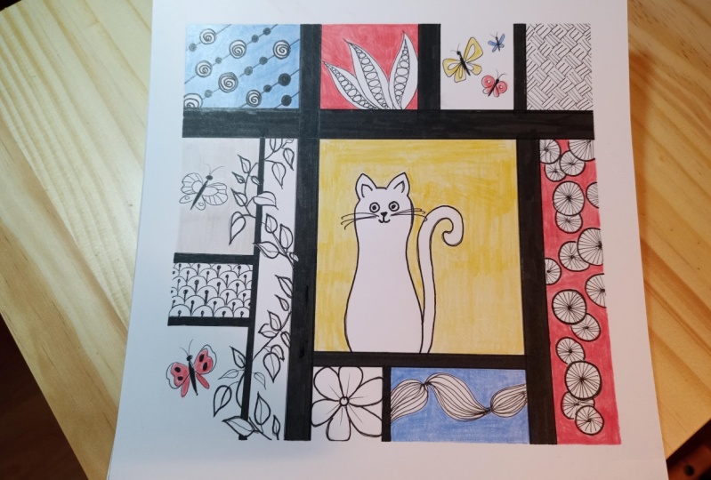
10. Project 2 - Making the Grid: All right, so we're
now all set to start work on our
second project. And I'm all set with my paper and all my
supplies over here. And for this project,
we're going to add a fun little twist to the original Mondrian paintings
that we have seen so far. For that we're going to
need an interesting shape. I'm choosing to work with this heart shape that
I have over here. So I am basically just taking the lid of this little tin
box that I have with me, and then I'm just going
to create an outline using this lid in the
center of my composition. Now, you don't have to create
a heart shape like me. You can also create another
interesting playful shape. For example, you
can create a star, a cloud, a flower, a bunny. Anything else that literally
comes to your mind. No restrictions over here. We just need a
cute playful shape in the center of
our composition. Then once we have the
outline done for this, we are going to create a
grid in the background. Now the process of
creating the grid is very similar to what we
did in the first exercise. But the difference is that this time we're going to create a simple checkered pattern
rather than creating those puzzle like segments that we had in each of
the larger sections. So basically just a simple
checkered pattern. But then again, of course, we are going to stay
true to our inspiration. We are going to take the idea of varying the thickness
of each of these lines. I'm going to create some lines slightly thicker
than the others. Once I have these lines, then I'm just going to color
these in with my black pen. I'm just speeding up
the video and taking you through the process
because it's very, very similar to what we did
in the first project as well. Once I have the vertical
lines in place, then I'm going to
repeat the process for the horizontal
lines as well. Once again, I'm
going to play with the thickness of these lines and I'm just going to place them at random points on the drawing. You can, of course,
create the grid as spaced out or as dense and as closely
put together as you like. There are no rules
when it comes to the scale of the grid
in the background. Feel free to have fun
and you can totally experiment with the spacing
and the sizing over here. All right. Now once I have
these lines in place, I'm going to bring in my black
pen and color these again. Once I'm done with the coloring, I'm going to see you
in the next lesson where we will start to add some more color and
details into this composition.
11. Project 2 - Adding Color & Patterns: All right, now that
our grid is complete, we are ready to start adding some details into
this composition. For this project,
I'm going to keep most of the details
inside the heart because that is going to be the focal element
of my composition. So the first thing that
I'm going to do is draw a few wavy lines
inside the heart. And I'm doing this in
pencil so that it gives me a little bit more
flexibility when it comes to adding patterns
over here. Later on, for instance, if I want some sections to be
bigger or thinner, then I can always erase
these pencil lines. Which is why I'm doing
this in pencil right now. All right, now that I have
these lines in place, I am going to bring
in my pencil. And I am going to
select a couple of these waves and draw some perpendicular
lines inside of them. Over here I'm going to
add some color which is very reminiscent of some of the later
works by Mondrian. So I'm taking
inspiration from some of his paintings where
the color blocks are placed next to each other. So I'm trying to create a
similar look over here. So I'm going to be putting
in the red blocks, the yellow blocks, and the
blue blocks... err... the blue blocks! Okay. That was a tongue twister! Yeah. So red, blue, and yellow blocks all
next to each other. Now that I've done one
red block over here, I'm just going to leave
a couple of these empty and move on to
the next red block. Then I'm just going to
follow a similar style of repetition for the
other two colors as well. I'm just going to speed
up the video for you to see how I have placed
all of these colors. You're free to do
them differently. You don't have to do
them the same way as me. As I mentioned, I'm just taking inspiration from
different paintings by Mondrian and
trying to incorporate those ideas over here
in my own composition. So these color blocks
placed next to each other was one idea that I
was really fascinated with. And so that's why I'm placing
them over here like this. Next I'm going to
start playing with some simple strokes and
simple geometric shapes. And I'm going to start
adding them all over this little heart shape
that I have over here. For example, over here I'm drawing some simple
circles and ovals. Now just to bring
in some contrast, I'm going to add in some
black ink on the background. Next, I'm going to add in some simple stripes and a simple checkered
pattern as well. And then in this
thin wave over here, I'm going to start
adding some curvy lines, which I can then
color in with black. I'm going to do some
opposite facing arcs in this thicker section
as well over here. I'm just going to play with
the placement of the lines. Then of course, I'm
just going to bring in my black pen and I'm just
going to add some color. The idea is that
I want this heart to pop out or stand out
against the background, which is why I'm going
to make it really dense with a lot of patterns
and a lot of color. It's just going to be a nice juxtaposition
against the background, which is going to be much
lighter and quite spaced out. So over here inside the heart, I'm going to add in a lot of tiny details using my
limited color palette. I am, however, going to use a little bit of extra red
here and there, because I want the heart to have slightly more red in it
than the other colors, and that's just because of
my personal preference. But if you feel like
you want to have all the colors
equally distributed, then that's totally
alright too. I just thought that it's
a cute little heart, and hearts are usually red, although there is
no rule for that. But I just wanted this heart to have a
little more red in it, which is why I'm going to favor that color a little bit more. And so just like at the
bottom of the heart, I've added a nice chunk of red, similarly, I'm going
to add a lot of red in other places
on this heart too. I'm also going to continue
playing with my other colors, and I'm going to distribute them randomly across
this composition now. So as I mentioned earlier, I'm going for a very
pattern rich look over here inside the heart. And so I'm going to fill
it up with lots and lots of details and
lots and lots of color. For this section, I'm going to add an imaginary center line. And that's just going to help me add some triangular elements, like a chevron pattern. It's going to be
like a guideline, which will help me
to understand at which point exactly I need to change the angle of my strokes. These guidelines are
quite useful when you're trying to put
simple geometric shapes. Again, I'm not really measuring
each of these elements. I'm trying to keep the
process as free-hand as possible so that I can
enjoy the process more. Instead of worrying about too many mathematical
details and too many calculations
and measurements. I definitely encourage
you to also try and do this as much freehand
as possible and not really stress yourself
with markings with a ruler and measuring each of your elements
very accurately, because then that just takes
away from the fun. Right? On the top section of
the heart as well, I want to add a little bit of extra red. Again, I'm going to continue adding some more color into these
sections that we have drawn. And I'm going to use more red as compared to
the other two colors. And, look at that! We have
a beautiful heart over here filled with lovely
colors and patterns. Now it looks like I
have a little bit of a stain on the
outer sections. I'm just going to bring in a clean paint brush with
a little bit of water. And I'm just going to wipe
away all of these stains. Now I'm able to do this because these are
water-based markers. They can be lifted up quickly, with clean water and a paintbrush. Just make sure that your
paint brush is clean and then you can lift up
these stains quickly. Now of course, this
won't really be possible if you're using a
different type of marker. For example, if you're using sketch pens or poster paints. Or if you're using
gouache or something else which tends to leave a little bit of the pigment
behind on the paper, then this technique
might not really work. But if you're using the exact
same set of markers as me, which is water-based markers, then yes, this trick will
definitely help you to lift up all of those extra stains and get your paper
looking clean again. Yes, with that, we are done with the designing
of the heart. In the next lesson,
we're going to refine it a little bit more and then we're going to
add some color to the background. I'm
going to see you there.
12. Project 2 - Background Color & Finishing Touches: Okay, so now that we have
the heart completed, I'm just going to come
into the background and start adding some colors
into these blocks. For this project, I'm also
going to be using gray, which is again reminiscent
of some of the paintings by Mondrian which he developed before he started
sticking to the red, yellow and blue color palette. He did use a little bit of gray
in some of his paintings, so just taking
inspiration from that. I'm just going to
add a couple of gray blocks over here
in the background. And once I have the grey blocks, then I'm going to pretty much
do the same with the red, the yellow, and the
blue blocks as well. Now again, I am going to
leave some of these blocks white because I don't want the entire background
to be colorful. I want the heart to
have most of the focus. I'm very consciously
trying to place all of these colors again in a triangular form so that they're distributed evenly
across the background. I think I'm actually
going to skip adding yellow completely
in the background because I do like
the little pops of yellow which are
inside the heart. I want the heart to be the
focal element and I want it to stand like really nicely, brightly against
the background, which is why I'm
going to skip adding some yellow in the background. I'm going to just
let the yellow pops be inside the heart, which is my focal image. And now I am just
basically using my black pen to accentuate
some of those lines. I'm just going back
into those waves and just trying to make them a
little thicker here and there. Just so that there's a
bit more differentiation between the various patterns
that we have created. And again, adding a little bit of black over here is helping
to build contrast. It's just bringing in a lot more interest and
drama inside the heart. And yeah, with that done, we are now ready to
peel off the washi tape. And once again, this is my favorite part because we can get to see these
crisp, neat edges. Look at that, we have a beautiful composition.
ready again! Now, at this point, if you like, you can add a few yellow
details in the background, and you can probably
do some tiny dots or tiny swirls or other kinds of
details in the background. But that's totally
a personal choice. I just wanted to have
more focus on the heart, which is why I decided to take inspiration from the
color palette by Mondrian and also some of his shapes and forms that he uses
in his paintings. I used all of that
inspiration inside the heart. But you are totally free
to customize this project. And this is just one
of the many ideas that can be developed by taking inspiration from
Mondrian's paintings. So feel free to explore. Feel free to have fun. I look forward to seeing what
you come up with. Make sure that you
post a picture of your project in the project
section of this course. So that you can look
at other people's work as well and gain some
inspiration from them. And at the same time, you can inspire
many other people by sharing your project. And of course, you can use this opportunity to get some personalized
feedback from me. Yes, with that, we have
come to the end of this lesson and I look forward
to seeing your projects.
13. Closing Thoughts: So congratulations on finishing this class and making
your beautiful projects. I truly hope that this
class was useful for you in finding fresh inspiration from minimalistic
famous artists, and then adding
your own fun, Zentangle twist to them. I encourage you to keep practicing this
technique further, and I promise you will continue to see
improvement in your work. If you found this class
to be useful for you, then may I please request you to drop a review for the same? Your reviews make sure that all my classes and
my presence on Skillshare continues
going forward and that I can keep building more
valuable content for you. Skillshare is truly a
student driven platform and I value your opinions
above everything else. If you have any suggestions or feedback for future classes, make sure that you put them
in the Discussions tab, which is right below this video. The Discussions tab is also
open for you to ask me any questions about this class or exchange
ideas in general. I also recommend that you hit the Follow button on
top of this video, which is right next to my name, so that you are subscribed to my notifications over
here on Skillshare. This way you will be
the first to know whenever I launch a new
class or a bonus lesson, or whenever I host a giveaway and have other exciting
announcements to make. In case you haven't
already done this, I want to give you
a quick reminder to post your projects
in the project gallery, which is right below this video. I reply to all the
projects posted over here, and this will be a
great way for you to receive some personalized
feedback from me. In the same tab, you will also find the class
resources document, which is available
for you to download. It contains additional
reference images as well as new color
palettes for you to try, along with links to some of my favorite tangle
collections online. Finally, don't forget to connect
with me on social media. I've created a hashtag community on Instagram where you can find students from
all my classes posting their wonderful work. This way we can all give and
receive endless inspiration. Thanks so much for
joining me today. I hope you have fun. And until
next time, keep creating!
 Ridhi Rajpal, Artist + Film-Maker + Educator