Transcripts
1. Hello & Welcome!: If there are two art
mediums that I absolutely love and adore and
can turn to anytime, anywhere, there are
watercolors and drawing pens. With just these two,
I'm able to create a wide range of artworks that aren't just
beautiful to look at, but also incredibly
calming to make. For me, watercolors and drawing pens are more
than just tools. They're a way to slow down, take a breather and soak it all in when life
gets overwhelming. Thank you. And if
I'm being honest, I get overwhelmed quite a lot. As a multi hyphenet, working in the movie business, advertising and marketing, while also running a full
time art career, I'm constantly
juggling projects, hopping cities and
countries, catching flights, and having an everyday
change of scenery in hotels, co working spaces, cafes, Airbnbs, friends apartments,
and you name it. It can get a little crazy living out of a
suitcase all the time, but I always have the comfort of my two constants with me, my watercolors and
my drawing beds. They travel light, fit right into my
suitcase or backpack, and come with me wherever I go. Because they're so
portable and easy to use, I can make art on the go. And frankly, that leaves me with zero excuses for not taking
regular creative breaks. Hi, everyone. My name
is Ridhi Rajpal, and I'm a filmmaker and a multi disciplinary
artist from India. I'm also an art educator, a certified Zentangle teacher, and a creative
entrepreneur running my own art and design business by the name of the color body. In this class, I'm
going to introduce you to the magical
world of Map Tangling, which is a technique that
blends the fluid joy of watercolors with the meditative elegance
of Zentangle patterns. It's a beautiful way to create abstract art using just a
handful of simple tools. The best part about Map Tangling is that it's totally
customizable. So whether you're a beginner, just discovering these
mediums or a seasoned pro, you'll totally be able to adapt this technique to suit
your own personal style. Simplify it, layer it, break the rules, make new
rules, make it your own. This class is in no
pressure, no judgment zone. I promise. I want you
to feel free, relaxed, and inspired as you explore the joys of working with
watercolors and drawing pens. Map Tangling has
endless possibilities, and I can't wait to
see what you create. See you in class. Two
2. Class Overview: Okay, welcome to the class. It's so good to
see you over here. In this lesson, I'm going to walk you through
the basic structure of this class so that you can make the most of your
learning experience. We'll begin with a quick
introduction to Map Tangling, which will help you
to get familiar with the key terminology and understand the concept
behind the technique. After that, we'll go over
all the tools and materials you'll need to create your own beautiful
Map Tangling artwork. By now, you probably
already know that watercolors and drawing pens are going to be our
go to supplies. But I'll still walk you through some of my favorite brands, as well as some
tips and tricks on what to look for when you're
picking these materials. Then we'll dive into the
class project together. I'll demonstrate the full
technique step by step. You're absolutely
welcome to follow along and recreate
the exact same piece, or feel free to take your
own creative detours. You can switch up the colors, add your own patterns, and truly make the
artwork your own. And once we're done
with the main project, I'll also share
some more examples, fun little variations, and
extra little techniques for you to try later
on. I know, I know. It sounds like a lot, but trust me, once
you get started, you're not going
to want to stop. So grab your favorite beverage, settle into a comfy spot, and let's get started. D.
3. What is Map Tangling: What exactly is Map Tangling? Well, as you can make out, it's a combination of two
words, Map and tangling. But before we dive
into Map Tangling, let's take a quick step back and talk about
the word tangling, especially if you're new
to the Zentangle method. Here's the thing.
Tangling is a verb. Just like you dance a dance, you tangle a tangle. The act of drawing Zentangle
patterns is called tangling. Now the word Zentangle itself is made up of two parts, Zen, which reflects the calm
meditative feeling you get while
drawing and tangle, which refers to the structured
patterns that we draw. When we use the word tangle, we're basically describing all those beautiful
deliberate patterns which are used in the
Zentangle method. In other words, tangle is the official term for patterns
in the Zentangle method. The Zentangle method
was developed by Rick Roberts and Maria
Thomas back in 2003. It's a fun and
relaxing way to create abstract art using
structured patterns made from repetitive strokes. If you're curious to learn more about the
basics of Zentangle, I do cover that in my
introductory course. So feel free to check that out. But now back to Map Tangling. So Map Tangling is a creative twist within
the Zentangle universe, where we draw imaginary maps and then tangle on top of them. Now there are a few
things that make Map Tangling quite
fun and special. First, there is no string
needed in this technique. Unlike the classic
Zentangle tiles, where we start off
with a pencil string, Map Tangling skips that step. We usually begin by creating
a base using watercolors, which then becomes the
map that we tangle on. These maps can be inspired
by real continents, imaginary lands, or
even a blend of both. And just like everything
else in Zentangle, there are no rules and no mistakes when it
comes to Map Tangling. All of the things that
I've mentioned are suggestions and not limitations. So feel free to explore, bend the norms, or completely reinvent the approach
in your own way. After all, Zentangle
is all about freedom, flow, and finding
joy in the process.
4. Tools and Materials: Okay, so it's time to go over all the supplies that we
will need for this class. So let's start off
with the paper. Of course, because we need something to
draw and paint on. So for this particular class, because we're going to be using watercolors and drawing pens. We obviously need
paper that supports wet media and in this particular
case, watercolor paper. Most good quality watercolor
paper will be of 300 GSM. You do get papers
which are lesser GSM, but I would recommend
going 300 or higher. Because this is the
ideal thickness for the kind of washes and the kind of bleeds and blends
that we'll be creating. Thinner paper obviously cannot support a lot of
watercolor well. So yeah, 300 GSM and above is something
that I would recommend. For today's class, I'm using this brand called menora which is easily available
to me in India, and they make really good
quality cold pressed paper, and this is the
one that I'm going to be using in today's class. Now, I know that there
are a lot of varieties of cold pressed paper
available in the market. So I just want to
quickly go over the pros and cons
of each of those. So for example, in
this particular case, if I show you this paper, and I think you can make
out the texture on camera, this is fairly smooth, and it has, like, the appearance of texture on it, but it's pretty smooth to touch. And so this is something that I prefer for projects like these, where I need to use drawing pens because
these drawing pens have very thin nibs and if
I'm running it over very, very textured paper, then I don't get really good
quality smooth lines. My lines are a little jittery. And the other thing
that tends to happen is that these nibs get spoiled very
quickly when I'm running them over
heavily textured paper. So to give you an example, I have papers from
other local brands, and this one is slightly more textured than the manura paper. You can, I think, make that
out pretty easily on camera. And then of course, we also get this kind
of handmade paper, which is really bumpy
with the texture. So that's also something that you can use for regular
watercolor painting. But I wouldn't suggest
something like this for a project where you're going
to be using pens because, like I mentioned, the
nibs get spoiled and the lines are not very smooth. And then one more example that I have is something like this, which is handmade paper. Again, it's great for
all kinds of media and usually it supports most
kinds of wet and dry media. But again, for this
particular class, I will say no to something like this because of the texture, as well as the fact that
this is slightly thinner. And so this is not 300 GSM, so I will say no to this
for this particular class. So bottom line is that we
want to look for something that's thick enough to
support watercolor. And so ideal choices would be watercolor paper and
mixed media paper. And basically, we
want paper that can take wet media and can
handle a lot of washers. And then the other thing
that you want to look for is the smoothness
of the paper so that you can run your pens easily on them and they
can glide over it easily. Some other brands
that I really like apart from minora for
the watercolor paper, as well as their mixed
media paper, are Stathamor, Canson, Arches, and Brutro. So yeah, these are some brands that I use pretty frequently. Now, one of the things
that I like to do with my papers is putting washi
tapes at the edges like these. And basically, I do this
because it helps me to achieve a four mat or like a
border around the painting. And so, for example, this one, you can see
that we have a border. As soon as you peel
off that tape, you get a border over there. And then same for these ones. So yeah, again, basically, these are all examples to
show you that you can get a natural border easily
when you peel the tape off. These are, by the way, from
the neurographic art class, which I had published recently. So if you want,
you can check that out in case this kind
of art interests you. And then these ones are from the 30 day drawing challenge. So yeah, now you know how to get those borders in case
that interests you. And again, this
is not compulsory if you don't like the idea of these borders or if you anyway
plan on putting a mat or, you know, you go to
a framer and you're asking them to put a mat
later on on your painting, then you probably
don't need this. But I just like the
organic look of it, so I keep my papers ready
with these washy tips. But again, like I mentioned,
totally optional. Now, we'll begin our
project using watercolors. And so you have a choice of
using pans as well as tubes. You can use whatever is
easily available to you. I travel a lot, which is why I always
carry these mini sets. Right now, these
are all sort of, like, organized by color, and depending on
whichever palette I'm working with during
a particular phase, I just kind of keep them organized in
that particular box. But of course, you get, like, tons and tons of various
different options in terms of color palettes, as well as the size of the pans. So yeah, these are some
portable ones that I keep with me when
I'm traveling. And so I think these ones, if I'm not mistaken. Yeah, these are
from Rico design, which I had picked up somewhere in Germany when I was
visiting my sister, and you get these kinds of boxes or these kinds of packs with a lot of
different brands. In terms of the quality
and the brands, I like a lot of
different brands. So, in fact, these are all a mix of various
different brands. Some of these are from Rico, which is where the box is from. And then a few of
these are from Rustro. A couple of them
are from artists who make their own
handmade paint. Then, of course, some other
brands that I really like are Daniel Smith and
Megalomision, and Senalia. So yeah, basically,
pick tubes or pans, whatever is easily available to you and whatever
fits in your budget, if you like picking
them independently and you don't want to
invest in a full set, that's also an option. One thing, however, that
I really like to stick to regardless of the brand is the grade or the
pigment quality. So what I mean by
that is that I will try to pick up
professional grade paints instead of student
grade because most of these professional grade ones will have better
pigment in them. And so you'll see a lot better results in
terms of the saturation, as well as the way the paints flow and just generally
the look and feel. So because I want to make
professional quality artwork, I will always choose
professional quality pigments and I will not choose
student grade ones. But if you're just getting started and you're on a
budget or if you're just trying these mediums
to see whether you like them or not and
you're just exploring them, then of course, the
student quality ones are also perfectly alright. So yeah, basically, you do you. And yeah, pick the
colors that you like, pick the brands that you like, based on the budget, based
on the size that you prefer. So yeah, you do you. Okay. So that's for the paint. Then moving on oh, yes, of course, before I forget. We will also need
paint palettes. And so usually what
I do is that I will basically just use the palette that comes
in built in the box. Again, because I like to
keep things travel friendly, I don't carry separate
palettes with me. It's only when I'm, you know, in my home or when I'm basically
in my base city is when I will use my ceramic platters and my ceramic mixing palettes, which I have probably, I think, used in some other classes, and you might have
seen some of them. But, yeah, right
now, I'm filming this class while I'm traveling. So yeah, I'm just using
the built in palettes. But you can use anything else. If you have just, like, random dishes or ceramic plates or ceramic cups or platters or ashtrays or anything else
that you have with you, just repurpose what
you have and use it. It doesn't have to be anything fancy just as long as it's
getting the job done. Then we will talk
about the brushes. For this particular glass, you actually don't need
very specific brushes. I do have a mixed set of brushes which are varying
in the price range. So the most expensive
ones that I own are, of course, the silver black
velvet series brushes. And I have, like,
about ten or 15 of these flat ones as
well as round ones. But for this particular class, we just need round ones, so that's why I have
these right now. And then I also have this one, which is the Escada
and then this one, which is the Princeton
Heritage Series. So, most likely, I'm going
to be using this one, and that's because this
is a decent enough size. This is size six, and it's decent enough
for this size of a paper, which is 15 centimeter
into 15 centimeter. So that's approximately
six by 6 ". So yeah, so this
is what I'm using. But of course, if you're
working on a bigger paper, then you can go
up to size ten or size 12 or whatever it
is that you prefer. I would just only
ask you to keep a round brush and
not a flat brush for this class because
then it's just easier for you to use the tip of the brush to get some
small shaping work done with the watercolors, and then you can sort
of guide and nudge them a little better with
the round brush. Now, one thing about
watercolor brushes is that they are specific for watercolors in the
sense that they're also called thirsty brushes. And the reason for
that is because the bristles basically
hold a lot of water, and then you can
easily kind of make your strokes and you can play around with the watercolors
a little bit better. So watercolor brushes are a separate category of
brushes altogether. And if you're someone who is heavily into
watercolors already, then you probably already know that other
kinds of brushes or these general purpose brushes don't support
watercolors very well. So when you're working
with watercolors, ideally, it's better to use
the watercolor brushes. But then again, for
this particular class, we can make an exception because we are going to be working pretty fast on the
background layer, and we don't need the brush to hold a lot
of water in one go. So you can kind of go
dip your brush back into the jar and
then put some water, then go back into the
pigment, put some pigment. Whoa, somebody just
whooshed past. Okay, so neighborhood
sounds. Okay, so yeah. So like I said, you can put
water, you can put pigment, and you can just
basically compensate for the quality of the
brush by working fast. So you can try to do that. But if you are doing that, then I would recommend to go for a slightly bigger sized
brush because you want to basically have the water being held at its
maximum capacity. You basically want the
brush to be used fully. So yeah, long story short, if you are using just
regular watercolor brushes, then use a size
four or a size six for a paper of
approximately this size which is 15 centimeter. And this can actually work
up until a four, as well. But for the same size of paper, if you're using general brushes and not watercolor brushes, then try and use a bigger brush so that you can compensate for the fact that
a regular brush will not hold a lot of water. You might have to rewind and go back on some parts
of this video. To catch all the little details in case you
missed them out. And the good thing is you can
do that on this platform. Isn't it fun? Do technology
is so much fun these days. Okay. So now we are left with, okay, before I come to the pens, let's finish the
watercolor stuff first. Now, because I
travel a lot, again, I use whatever is easily available to me
or I just improvise. So most of the
times, I will just ask diners or restaurants
or cafes wherever I'm going on a regular
basis to ask if they have any glass jars with them that I can borrow and re purpose. And then sometimes I will order in food or groceries
and stuff like that. So I will get glass jars, and so I will just use these
for holding my paint water. Right now, I don't
have water in this. And I will fill it up before we start the drawing portion. But yeah, basically,
you get the gist. You'll need one jar of water. Sometimes I also keep
two jars of water. Actually, most times I
keep two jars of water. One to clean my dirty brushes, which is called the dirty jar, and the other one to basically
pick up clean water. And so you've probably seen me use it in a bunch
of other classes. But for this particular class, I think one is going
to be enough because I think I'm going to be working with a monochromatic
sort of color palette, so I don't need to change the
water constantly so much. Plus, my paper is not too big, and I'm just only going
with a couple of layers, so one jar should be enough. And now coming to
the drawing pens. So I really like using
the Sakura Micron series. One, because these
are archival ink, which is very good
quality pens because archival ink means your artwork
is going to last longer. And the other thing is that these are available in a
lot of different colors. So, for example, I have the
blue ones here with me, apart from the black ones, but you get them in a lot
of different colors. I just have the blue ones
instantly available. And then they also come in
a lot of different sizes. So 005 is a thin one. There's a thinner one
than this, which is 003. And then you can go up
until size eight, ten. I think ten is the last,
if I'm not mistaken, so he's a 05, for example. So yeah, you get them
in different sizes, and so the thickness
obviously varies. You can read the sizes in millimeters over here
on the body of the pen. So for example, this is 05. Let me see if I can refocus
my camera for that. Okay, so this is 05, which is the brand's way of
identifying the numbers. But the actual thickness
of the nib is 0.45 Mm. So, yeah, that's that. Now, if you don't
have sacuda micron or if you prefer to work with any other brand, that's
totally fine, too. So some of the other
brands that I've definitely used and are Snowman, Brostro and Fabo Cassel. I don't know how to pronounce
that last one correctly. Like, please don't
hit me for it. I can never get it,
correct, for some reason. I try to remember it,
but then I forget. Okay. So yeah, so those are
the pens that you will need, and then we will need some other extra additional pens in case you want to
embellish your artwork. So for example, I
have the UIBol Cigna, which is a gold pen. And then this brand also makes silver and like in this
particular series, basically, they also have silver and white, and I think a couple of
other metallic colors, but I really like their gold. It's like this nice
sunny bright gold. And then I also use jelly rolls, which are again, from
the sakura brand, but this is a different series, which is the jelly roll series. And so these are
also really good for adding little highlights
and little embellishments. So these pens are basically sort of like
a mix and match deal. Like, you don't have to
have to have them all. You can just pick and
choose whichever ones are your favorites
or whichever ones are easily available to you. And then basically,
you can just kind of mix and match and make your own set for this particular class. And of course, you
can change the colors based on whatever
watercolors you're picking. And if you have a
specific palette in mind, feel free to experiment
and feel free to have fun. So, yeah, that's pretty much
it for all the supplies. And yes, you will also need some tissue papers
or kitchen towels, because if you are
like me and you make a mess all around your work
area and your workspace, then these are going to be your friends in that
particular case. So yeah, that pretty
much covers everything. And I will also put all of these along with my brand recommendations
and brand suggestions, as well as some other
characteristics that I look for when I'm purchasing
these things, I will put all of that in a handy little document for you, which you can download in the resources section
of the class. And, of course, as
always, if you have any questions, feel
free to ask me. There is a discussion tab
right below this video where you can post questions
and you can ask me, and we can chat. Okay, so that finishes up
this particular section, and then we can now finally
move on to other things. I'm pretty excited
to film this class. I think you can make
that out. Okay, see you in the next video,
very, very soon.
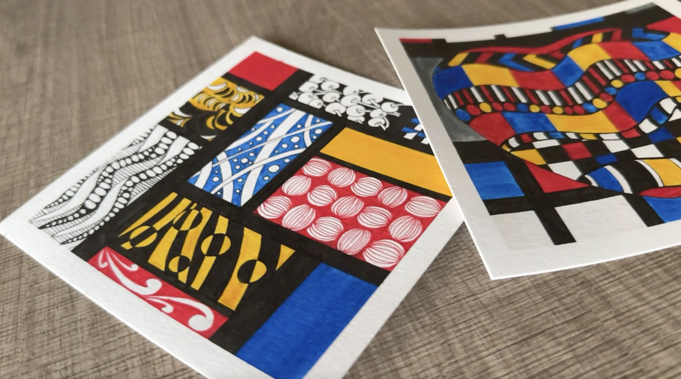
5. Choosing Colors: Okay. So in this video, I want to talk a
little bit about how I go about selecting the
colors for my projects. And this is something
that I get asked a lot. So I want to demystify the
process for all of you, and hopefully it'll
be beneficial for you when you're picking the
colors for your projects. So you can be as simple or as complex as you like
when it comes to Map Tangling because honestly, the technique is
so versatile and it's absolutely limitless when it comes to the possibilities. So feel free to experiment
and feel free to work with as little or as
many colors as you like. And you can go for
a minimalist vibe or you can go for
a maximalist vibe. It's totally up to you. But I'm just going
to walk you through some examples over here so that you can make a decision
about your own projects. Now you can start
off with something as simple as single colors. So over here, I have some
swatch cards which are basically mini cards on
which I do my tangles, these are all single colors. So I have this green one over here and then
something like this, which was inspired
by a coffee palette. So this is the simplest example. So if you want,
you can work with just one single color
and then do a lot of the embellishment
work or do a lot of the tangling work with different colored
pens on top of it. That's one way to go about it. And the other option is to go for two or more colors in
an analogous color scheme, which means that the colors are sitting next to each
other on the color wheel. For example, I have this piece, which is from my
neurographic art class where I had worked with a
yellow green color palette. That's one way to go about it. Then I have this base ready for a CDs that I'm
working on over here, I'm working with the blue
green color palette, as you can see, and similarly, I had worked on this series last year where I've also worked with
blue green color palette, and you can see that there's a beautiful
gradation which is happening from the
lighter sections going into the darker patches. So this one also is quite pretty because you
can see the blue and green blending into
each other over here, so that creates for an
interesting effect. Then while we're talking about
analogous color palettes, I also have these examples
which are yellow and orange, which is again in
the analogous space. I've also mixed a little
bit of red over here, but that's created like a orange color by mixing
it into the yellow. I've also added a little bit of brown over here
just for interest. So this is again a series
that I'm working on, and that's the wipe
that I'm going with, you can see that there's
some gradation happening. Now, keep in mind, these are
not Map Tangling projects, but when you do work on
your Map Tangling projects, the effects of the watercolors mixing into each other
will be similar, which is why I'm showing
these examples to you. Then I have this base, which I prepped for
a future project, and this one is with
pinks and purples. These are some examples
of how you can work with two or
three colors which are in an analogous space
or close to each other. And then we have
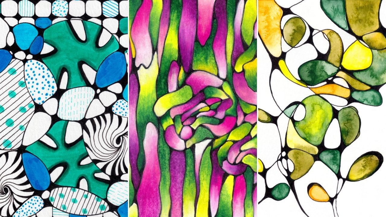
multiple colors, which can also create this
beautiful, colorful vibe. And if you're someone
who likes a hit of dopamine and you like dopamine
decor and a lot of colors, then you can also mix and match and create
something like this. In this one, I've actually
used a combination of matte finish watercolors, as well as some himri ones. So this blue one is actually a metallic pigment and this has created some
beautiful himri effects. And so what I love about
the multi colored approach is that when the colors
mix into each other, then they kind of create
their own tints and shades, um, and that creates a
beautiful vibe as well. So yeah, when it
comes to the colors, you can pick as many colors as you like or as few
colors as you like, depending on the be
that you're going for, and they can be analogous, monochromatic, or complimentary
or split complimentary. Basically just go with whatever
is your be and feel free to experiment with
the colors over here. That's one part of this. But for the second part, what I do want to talk about
is the importance of values. Now, value basically refers to the lightness or the darkness
of a particular color. For example, if you're adding white into a color or a hue, then you're creating
the tint of that color. For example, when we
mix white into red, then we are creating a pink, which is basically a tint. Then when you add
black into a color, you are creating a
shade of that color. Similarly, when
you're adding gray, then you're creating
a tone of that color. Now when it comes to
Map Tangling projects, we want to use watercolors
in the background, and then we want to use pens on top of that watercolor
background to tangle. So it's important
for us to create interesting values in the
background or basically use colors with different values
in the background so that they can add to the overall
aesthetic of the project. For example, this one, while this is not a Map
Tangling project, you can still make out
the beautiful blends and bleeds are kind of creating a lot of interest
and drama in the background. And over here especially. You can see some
saturated sections with a lot of pigment pulling
in together at one spot, and that's where the
darker colors are meeting. Then there are these beautiful faded or lighter washed sections which um have this
gradation happening. And in this entire series, I was creating a lot of
gradients and a lot of mixed and matched shades of blues and greens
and tints as well. You can see this sort of like a gradation
happening from here to here. And then even in this one, you can see this
beautiful watercolor bleeds and blends
which are happening. Values are important because
they build contrast in your piece and they save your piece from
looking completely flat. If you were to go
with just one color and just give it a single wash, then it will still look
pretty because, of course, watercolors in itself are very pretty and so they obviously add this magical quality to whatever project
that you're working on. But at the same time, they
tend to look a little flat. If you want to build interest
and drama in your drawings and you want them to
stand out a little bit, then it's always good to choose colors with different values so that you can build contrast and you can create these interesting
bleeds and blends. Now the good thing
with watercolors is that even if you're working
with a single color, you can still play with values. For example, over here, I have worked with just one color, but you can see that this is
lighter and these parts are darker and that's
because you can dilute watercolors by adding
more water into them. The minute you add water, they are automatically going to create this
lighter toned effect for you and the minute you
saturated with more pigment, you're going to get
a darker effect, similar to what
you see over here. Even if you're working
with a single color, you can still create different
values in your piece. By just either adding
water or adding pigment. Same way over here, you
can see that just by adding a lot of water in
this particular section, I've created this nice
faded washed effect. Was over here, I've gone back over and over again
for a couple of layers with the pigment and so that's creating a
more saturated effect. That's so much better than
just creating a flat piece, which is one single wash. Regardless of the number of colors that
you're working with, try and aim for
different values. So that you can create these beautiful areas in your drawing which have
wonderful contrast. In this one, I love the
fact that the pinks and purples have either blended into each other or
repelled each other in a way that it's created these beautiful boundaries
and these beautiful blooms. I do talk a little bit
about how to create these watercolor blooms
in my other class, which I'm going to
link over here. So if you want, you can
watch that as well, and we'll be actually
working with this technique a little bit once we get
into the main project. But again, coming back to my point that we want to basically pick colors
with different values. Now, one more thing
that we want to keep in mind while choosing our watercolors is the colors of the pens that we're
going to be working with. For example, if you're
working with a black pen, then it will show up beautifully against
most watercolors. So, for example, in this case, I have worked with a brown
and a red and an orange, and you can see that these are all standing out beautifully against the lighter yellow
and the lighter orange. And so that's obviously
another way to build contrast. But let's say if I was to work with my black pen
on a section like this, which has a combination
of pains, gray, and a little bit of
Margentine purple, then my black pen won't
necessarily stand out properly against this
sort of watercolor mix. In this case, I would
benefit from working with a white pen and
I might want to draw this particular patch with a white pen or a gold pen so that it stands out
against this background. So just to show you some
examples, over here, I have this piece where I have worked with
blue and green pens, and you can see that
for the most part, they're standing out beautifully against the lighter sections. But there are certain sections
where I've also used gold, and that's standing out more than the blues and the greens. Then similarly, this one had a slightly darker
blue background, and I also had some darker
green shades over here, which is why I used a lot of white jelly roll to
create these highlights, and that was helping me to build some contrast
in the drawing. Then this one was a very, very light wash,
and as you can see, the main pooling in of the colors has happened over
here in the central section. So for the most part,
it is pretty light. And so that's why the blue and the green pens are standing out beautifully against
the lighter background. So you want to basically work on a combination of
pens and watercolors beforehand so that your pens can actually stand out against
the watercolor background. And there is no restriction in terms of the colors
of pens as well. You can work with black pens, you can work with colored pens. I have blue and greens over
here, so I might use these. You can work with gold pens, you can work with white pens. But basically, just do your little sort of swatches
and tests like these beforehand so that you know that your drawing is going to stand out against the
watercolor background. Um, so yeah, long story
short in a nutshell. If your watercolor
background is dark, then you would benefit from
working with metallic pens or white jelly rolls or some other kind of
similar white pens. And if your background is light, then you can work
with darker pens, such as black or browns, or even the darker shades of the same color that your
background is made up of. So yeah, that is the
summary of this. And hopefully this will give you some ideas when it comes to
choosing your own colors, mixing and matching your pens
with your watercolors and basically just trying to build contrast in the piece overall. And you can also layer the pens. So for example, over here, you can see that
I have gone with the white jelly roll on
top of the brown pens, and that's also
building some contrast. But in certain sections where the watercolors
are very light, even though I've added a
little bit of white over here, you can't make out the white fully because the background
in itself is very light. Uh, but you can make out
the gold beautifully. So it all depends on
the saturation of the pigment that your
pen is made up of. And it also depends
on the saturation of the background that
you're working with. So yeah, just choose a
combination that works best for you and you can prep as many
backgrounds as you like. You can prep one background,
many backgrounds. It totally depends on how much workload you want to take for
yourself right now. So yeah, we'll hop into
the next lesson and we'll start developing
these backgrounds. And hopefully,
everything that I've explained so far in theory will be more obvious to you once we actually get into the practical portion of it. So I will see you
in the next lesson.
6. Making the Base: All right, so it's time to start creating the base
for our project, and this is where
the actual creation of the map is going to happen. So first things
first, I'm going to start by activating my paint, and I'm just going
to use a wet brush and take out a little bit of
this paint into my palette. I usually start off
with the lightest color or the color that
has the least value in my overall palette. And that's because I
don't want to commit to a strong or an
overpowering color on my paper just as yet. I want to gradually
build up the saturation. So it's always a great idea to start off with
the lighter color and then you can gradually add the darker
colors as you proceed. D. Right now I'm just adding a lot of water
and creating a diluted mix. With this diluted mix, I'm going to start creating some abstract
shapes on my paper. This is where we are going to
create our imaginary maps. And I'm also dipping my paintbrush back into the
water jar every now and then to pick up a little
bit more water and add it directly into this
blob that I'm creating. So anytime you want to show
more of the paper white, you can pick up more water
and add it over there. So that it creates
a lighter effect and anytime you want to create
a more saturated effect, then you can pick up more of
the pigment directly from your paint pan or from the palette where you
have created your mix. Once I am happy
with the shape of my first blob or the shape of my first
continent or island, so to say, then I'm going to dip my
paintbrush into one of the darker colors and try to add a few of those
blobs over here. And I'm just going to gently nudge the paint
to move a little. But I'm not going to blend
it in completely because then that takes away from
the organic look and feel that we get with watercolors when they create
their own organic blends. The best thing to do with
watercolors is to let them do their own thing and not
try to control them a lot. And you actually get a lot of wonderful results when you just let watercolors
do their own thing. I know it's a little difficult
to trust this medium, especially if you're just
starting out with watercolors. But with practice,
you'll realize that the less we control them, the more beautiful
the final result is because every time we add
more pigment or more water, they end up creating these
beautiful blooms and these beautiful areas of little textured effects
here and there, which cannot exist if we try to blend everything or
control everything on our own. So yeah, basically the
trick over here is to create these islands or
these little continents with the lighter color
and then introduce a darker pigment or your color with a darker value
bit by bit over here. You'll notice that
sometimes I end up picking the colors directly
from the pans instead of creating a
mix in the palette and that's because I
need very little bit of that particular pigment. I just literally use the tip of my paintbrush to touch the pan, and then I pick up very, very little amount
of pigment and then just drop it in to
the watery mix. So when you're making
these imaginary maps, there are two things
to keep in mind. The first is that you want
to work very, very quickly. And the reason for
working fast is to create these organic
watercolor blooms, which will not happen if you
let your first layer dry up. Basically, this
refers to the wet on wet technique that we often use in
watercolor painting. So the idea over here is that as soon as you create your base layer with
the lighter color, you want to immediately drop in the darker pigment and
let it do its thing, and that way, it'll blend more seamlessly into the
water or into the paint, and it will create these beautiful organic
blooms and blends. But if you let the
first layer dry, then every time you introduce more color or water
onto the base layer, it's going to create
these hard edges which sometimes end up looking very jarr especially
in a project like this where you want to actually add details with your
drawing pens later on. So you want the watercolors to not take too much
of the attention, and you want the attention to
still stay on the patterns. That's the first thing. And so you can also
create blooms by adding just a little bit of water like I'm adding over here or just
a little bit of pigment, and you can see how beautifully
the colors are flowing. Again, we just add plain
water over here directly from the jar and just give it a little bit of nudge without
blending it too much. And you can see how beautifully these blooms
are coming over here. Same way this little
bloom over here with just a little drop of water and it creates these beautiful
beautiful edges. All of these
beautiful blooms and effects are possible
only because I'm working quickly over here and because the blobs are
still wet on the paper, and I'm just adding either water or new pigment drops over here. And now coming to the second thing that
I was talking about, we want to try and leave interesting negative
spaces between these blobs of paint
that we are creating. So you can see that
I've purposely left some tiny white
gaps here and there, and those are on purpose. They are not mistakes because
the idea is to create these little mini breaks between the big blobs just for the
sake of interest and drama, and the maps end up
looking a lot more interesting when you leave
these little white spaces. So apart from the bigger ones
that you're leaving around, you want to leave some tiny
ones in the middle as well. And then I also add in some tiny isolated island like structures here
and there as well, just to make the map a
little bit more interesting. Of course, these are
all imaginary maps and so I'm having a lot
of fun playing with them. But if you ever run out
of ideas in terms of composition or how to create the edges for these
particular blobs, then you can always look
at real maps as well for some inspiration
because you can always look at the edges of
continents to look for places where there
are creeks or bays or islands or interesting, you know, just
borders to different continents and just use them as references for your
imaginary maps as well. There are no hard and
fast rules over here. Nobody is going to
come and arrest you for drawing these shapes wrongly because these are all imaginary islands
and imaginary maps. So basically, don't
overthink it, have fun and look for interesting ways to add the Darko pigment as well as the to pigment in
your composition. Just play around with
interesting placements and it will help to make your composition
look a lot more dynamic. There'll be a lot more
movement to it when you add interesting sections
of dark pigment and interesting
sections of to pigment. And yes, I think
this is it for me. I'm quite happy and satisfied
with this composition, and I quite like
the balance between the lighter colors as well
as the darker colors. So I'm going to let this dry, and I suggest that you also give your painting
ample amount of time to dry because you
don't want to start adding ink pens onto wet paint. Otherwise, the nib ends
up getting spoiled. So yeah, give it ample
amount of time to dry. And once you're ready, I will see you in
the next lesson where we'll start to add tangles to our map. So.
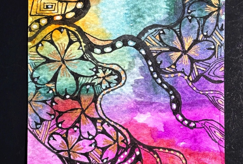
7. Adding the Tangles: All right, so my
painting has completely dried, and as you can see, I have got these
beautiful blends, bleeds and blooms over here, and I absolutely love the
effect that's happening. And now we are going to start drawing on top of this
map that we have created, and we're going to be using Zentangle patterns to
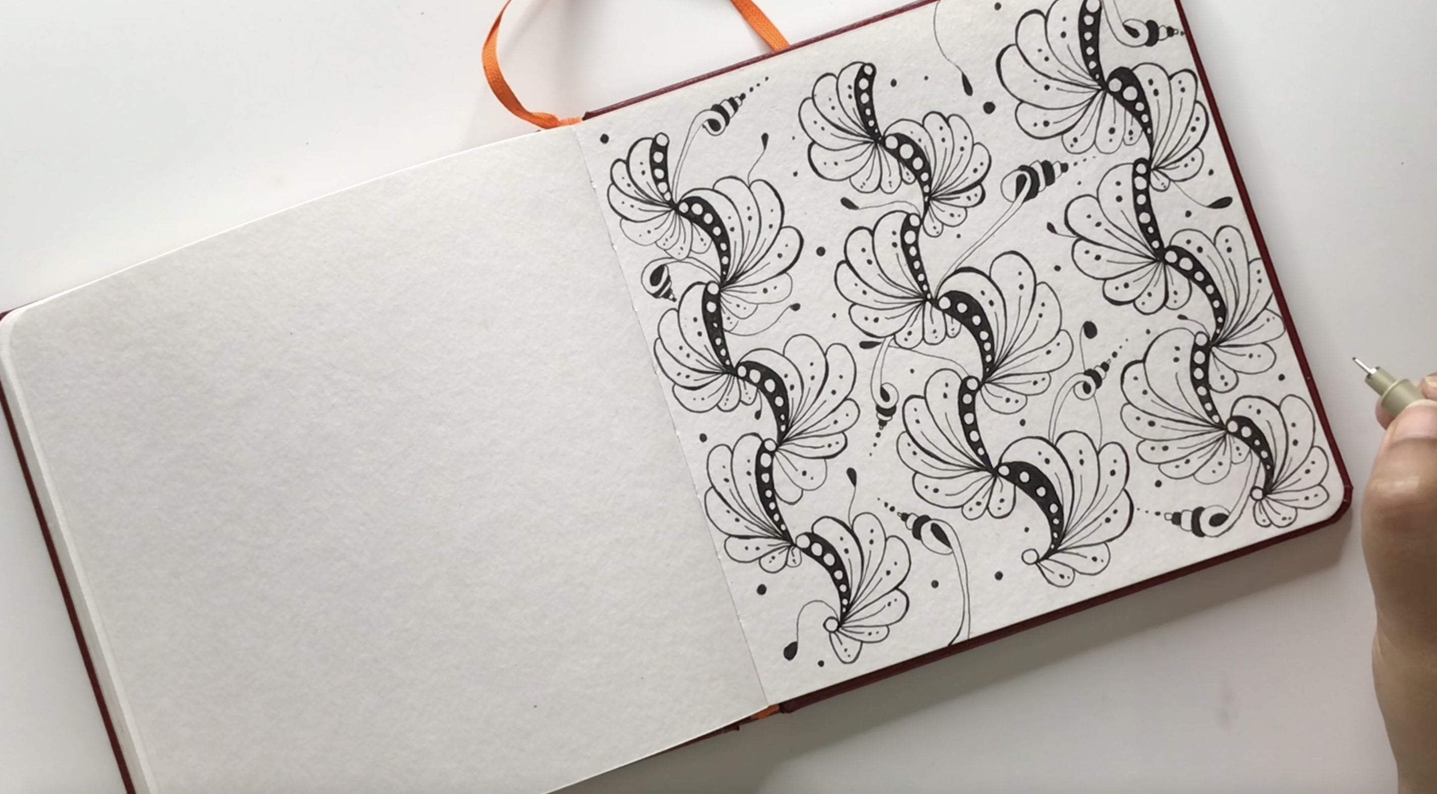
draw on this base. So the first tangle that we're going to be
using is called Humemi and it's developed
by Shi Naitomi. And as always, I am going to provide the step
outts for all of the tangles and all of the patterns that I'm
going to be using in today's class in the
class resources document, which you will find in
the resources section. So for this particular tangle, we basically start off with these tear drop shapes which
are blooming outwards. And so it kind of
creates a little flower. And there are no
hard and fast rules when it comes to the
number of petals. So you can have five petals
or six petals or even more depending on the size of the petals that
you're drawing and the amount of space that
you're leaving between them. And once you have the petals, then we go back and add these curvy triangles on the
top and just fill them in. And right away, you can
see that the whole purpose of these maps is to
act like a boundary. And so whatever we
are drawing over here is not going
beyond that boundary. And once I'm done with
the details inside, then I'm just connecting these petals by
small curvy strokes, which are also referred to as rounding in the
Zentangle method. And if you've taken any of my classes on the
Zentangle method, then I'm sure you're already familiar with the
rounding technique. But if you're new
to it, don't worry. I basically refers to
these curvy lines that we use to connect
different fragments or different sections
in a braining. And in this particular case, we are using roundings to
connect the different petals. So I'm basically doing the same thing with
the second flower, and this time, I'm just making it slightly bigger
than the previous one. It's always a good idea to vary the sizes whenever you're
drawing the same element over and over again because it helps to create a little bit
of variety in your drawing. And that way, you can also have a little bit more movement
overall in the piece. Once I'm done with the
roundings for this one, then I'm going to continue
drawing a few more flowers. I think I'm going to do a
cluster of five over here. But again, there are no
hard and fast rules. If you want to do more or less, that's completely fine as well. Depending on the map
that you have drawn and depending on the space that
you have on your painting, you can choose to increase or decrease the number of flowers and you can also play
around with the sizes. You'll notice that every
time I'm close to the edges, I'm basically just lifting my pen ever so slightly and just mimicking the motion midair and then bringing back the pen and touching it onto the paper. It's almost like I'm continuing the motion just slightly above the paper and then landing
it back onto the sheet. That's how I'm able to create
these strokes seamlessly. And then it doesn't look like
there's a jerk over there. For this one, I'm
basically just imagining a center point since there's
negative space over here. Sometimes we just
have to mentally map out the positions
of all the elements. Anytime you feel that you're
not sure of the placement, you can also always
draw something with a pencil and use it as a guideline and then
erase it later. But with time as you
get more practice, you'll realize that you won't need those guidelines anymore. In this particular case,
I'm just imagining the center and just
drawing free hand. That. I really like this technique of hiding one element
partially behind the other. It refers to the
Holy bou technique that we often use in
the Zentangle method. The idea is to have certain portions hiding behind
the other so that we can basically create
these multiple layers that just adds a lot
more dimension to your project and it
doesn't make it look flat, especially if you choose
to shade it later on, then it tends to look even more beautiful and it becomes
very three dimensional. I love layering the
elements like this. We do. All right, so that finishes up the first tangle, which is mei. And in the next
segment, we're going to be adding the next tangle. All right, so the
next tangle that we're going to be
working with is called Holy Bao it's a beautiful tangle which is made up
of parallel lines, and they end up looking
like sticks which are crisscrossing
each other or almost like an aerial view of highways or flyovers which
are crisscrossing each other. And my reason for
using this tangle in this project is because
it really helps to connect the different
sections of the map. So whenever we're working
on a Map Tangling project, it's always a great idea to use some connecting lines or
some connecting tangles, which cross multiple sections
of the map, and that way, the whole piece tends to
look a little bit more unified and the overall effect of the map really comes through. So basically, as you can see, I'm simply drawing
parallel lines over here, which are criss
crossing each other. And every time I'm hitting the edge of my watercolor area, I'm simply lifting up my
pen and just mimicking the gesture midair and then touching my pen
back onto the paper. It's okay if your lines go a little bit wobbly
here and there. Honestly, in the end, when you look at
the overall piece, nobody's going to
be able to spot one or two wonky wobbly
lines here and there. In fact, mine are also
not absolutely perfect, but it's totally okay because
when you add more patterns, these are barely
going to be visible. And at the end of the day, this is what handmade
projects are all about. These little imperfections
are actually adding to the charm of
the overall piece, and they just end up
making it look a lot more beautiful and then you know that this is definitely
a handmade piece. I. So yeah, that finishes
up Holly wow for us, and I'm just going to do a
few of these sticks and not too many because I want to leave space to add more tangles. But you're welcome to have these lines extended all
the way till the end, from one edge to the other. That's also one way
to go about it. There are no hard
and fast rules over here and there is no right
or wrong way of doing this. So feel free to add more
or less number of lines. But what I'm going to do now is move on to the next tangle so that I can start adding some more details inside
these little sections. All right, so this
tangle is called Baton and it's by Carl Ole, and it's a beautiful tangle
made up of lots and lots of straight lines which are going in different
different angles. And this is a great tangle to practice your eye stroke
in the Zentangle method. So as some of you
may already know, the Zentangle method has four elemental or
foundational strokes, which are ICS and O, pretty much like the
English alphabets, ICS and O, and
then we have dots. And so basically all the
tangles or all the patterns in the Zentangle method
are made up of these elemental or
foundational strokes. So Baton is a great tangle
to practice your eye stroke. And as you can see,
I'm basically just going inside those
hollbau sections, and I'm just rotating my paper after every
three or four strokes. Making these little triangles, and then just creating
parallel lines. Then after every three
or four strokes, I'm slightly rotating my paper
and just doing it again. So this is a great place
for me to add some strokes, which will help me connect one section of the map
to the other section. And so it's the same thing
that we did with Holibau. We basically lift
up our pen ever so slightly and then just
continue making the lines. I'm going to take
some of these around the UME as well so that it looks like the pattern was continuing
from behind the flowers. You'll notice that even
though I'm trying my best to create the
lines equidistant, I'm not really successful at all the sections
or all the places, and sometimes the lines
are a little too close, but that's completely
okay because like I said, there's no pattern police or there's no art police which is going to come and
use a ruler and start to measure the distance
between all my lines. So nobody's going to object to the fact that some
lines are closer, whereas others are
further apart. So just basically
don't stress over the pattern so much and simply just enjoy the process
of drawing these lines. This is best done with relaxing music or your
favorite beverage on the side in a
relaxing environment where you can fully
enjoy the process. It has a very, very
calming effect, and I highly
recommend using this as a warm up exercise
on days when you are feeling jittery or when you feel like you have a little bit
of an art block. Then simply just take your pen and use this tangle as
a warm up exercise, and your brain will just
basically start to work again. In this particular section, I felt like I wanted to extend
the hoy bow a little bit. I'm just going to extend the length of those lines
that I had already drawn. And then I'm just going to
continue filling up button. And this is slightly repetitive, so I'm going to speed up the
video just a little bit. But you'll still be able to see the sections where
I've added the tangle. So like me, once
you're done adding this particular
tangle to your map, meet me in the next segment
where we're going to be working with the next tangle. One. All right, so the next tangle that
we're going to be working with is called box spirals, and it is by Margaret Bremmer. And the reason why
I'm going with this tangle on the top left of my composition is because
we've used a lot of these straight lines in the bottom right of
the composition. And I want to create some
sort of a visual balance, and that means adding a few more tangles with
straight lines so that overall, the composition has a nice mix of organic tangles as well
as structured tangles. So drawing these box spirals
is actually pretty simple. We just kind of draw
them as regular spirals, except that these
are going to be at 90 degrees or they're going
to be at straight angles, and we just kind of
go around each of those lines and build
the spiral gradually. And then once you're
happy with the size or the number of repetitions
that you've done, then you can close the last loop by just connecting it
with the previous one. Just like I did with UME, I'm going to play with
different sizes over here, and I'm also trying my best once again to keep these lines
as equidistant as possible. But then in some cases, they're not going to be
exactly straight or they might not be at exact right angles or they might not
be equidistant, and that's completely okay. After a lot of years of doing this kind of
meditative drawing, I have finally
learned to let go, and there is this sense of
cathartic relief that you get when you release your attachment to
these little things. So yes, I definitely recommend
the same for you as well. Just be gentle with yourself and just remember that
at the end of the day, this is a handmade piece, and even though you're
going to try and do your best to make it as
perfect as possible, your tiny gestural strokes
and your tiny little mistakes or the particular style
in which you draw certain elements is going
to be unique to you, and that is what's going to make your piece personal to you. So just embrace that and
don't worry about perfection. Now, I'm a big fan of adding inky little details
in my drawings, which is why I'm going
back and creating these small squares in the centers of each
of these box spirals. I'm basically just
creating tiny boxes. And this is a personal choice based on my aesthetic
preferences. You don't have to
have to do this. It's totally up to whether you want to add
these boxes or not. But personally for me, I like to have these black inky sections in my drawing because they help to build a little
bit more contrast. And also because later on, if I want to bring
in contrasting colors of pens, for example, I want to bring in white or golden or something like that, then they really stand
out nicely against these black inky sections, which is why I'm
adding them over here. But it's totally up
to you whether you want to add these or avoid them. So now, again, these bits
are fairly repetitive, so I'm going to speed
up the video slightly. But by all means, please don't rush to finish
your project. You can always pause the video lessons over
here or you can also slow them down and watch
as per your convenience. So yeah, take your own time to finish this
particular tangle. And once you're ready, meet me in the next
section where we're going to be adding our next tangle. All right, so the last
tangle that I'm going to be adding in this project
is called Senna, and this one starts off with a wavy line that has a
little bulb on the top, which we fill in with ink. Then we just go
around the bulb and just draw another wavy line
which lands on the edge. In this case, it's going to
land on the periphery over here just at the edge
of the washi tape. Then we just kind of add a tiny little curve and
just sort of fill that in. This technique basically
refers to adding line weight, where we are making
certain sections of the line thicker
and this helps to build more dimension in your
drawing because it gives a slightly more three
dimensional look versus looking completely flat. I've also spoken a little
bit about adding line weight in my Zentangle
introductory classes, as well as in my
neurographic art class. If you're interested to explore
more projects where you are drawing free hand and building up your drawing
skills bit by bit, then you can definitely check
out those classes as well. And now, again, I
am imagining where these lines might land
behind the box spirals. So I'm again creating a
layering effect over here. And again, wherever the
watercolor sections are ending, I'm lifting up my pen and
just kind of imitating the motion midair and then continuing the gesture and then landing it
on the other end. And then same way, I'm
just going to continue adding more lines and just create this illusion of the lines going
behind the box spirals. And on the other side as well, I continue to follow
the curvy lines and just create more such
lines in that direction. And I'm being very mindful of those white spaces because I don't want to accidentally
draw over them. And then once it's
done on one side, I'm basically just repeating the process on the
other side as well, which is basically this
other empty section on my painting over here. And so again, over here, I have this wonderful
opportunity to take the lines from one section of
the map to another section. And so it's creating
this illusion of the lines continuing beyond. Over here, I have this little
odd gap where I'm just going to add a few more of the box spirals just
to fill up the space, and then it's going to be
all completely filled up. And of course, if you have larger spaces or you're
making a bigger piece, then you can definitely add a new tangle or a new
pattern over here. But in my case, I already
have a good mix of patterns, and I think adding one
more tiny pattern over here is just going to
take away the balance, and it's going to just suffocate the drawing
a little bit. So I'm just keeping it
simple and just continuing the box spirals. And
that's about it. So that is the tangling
aspect of Map Tangling. And now, if you like,
you can keep it simple and call this project finished and you can be done over here. In fact, this is a
great way to create these mini projects which are low pressure and don't
take a lot of time. But if you're keen on
adding more details and you want to embellish this
project a little bit more, then meet me in the next lesson where we can add a
few more details and just increase the
overall aesthetic and value of this project.
I'll see you there.
8. Adding More Details: All right, so it's
time to start adding some details to this composition
that we have created. And I'm going to
do this by adding some gold accents as well as some white accents
all over my drawing. So let's start with UME, and I'm going to use
my gold pen to create an outline around
these curvy triangles that we had added on the petals. And it looks like I'm using a pen which has run out of ink, so I'm going to switch
it to a new one. And once these
outlines are done, then I'm just basically
adding some strokes inside in the center
of the flower, which are going to act like
the little stamen inside. And then I'm going
to do the same for the rest of the
yummi flowers as well. I really like using white on top of black inky sections
in my drawings. So I'm just adding
some tiny dots over here just on
those curvy triangles. And as you can see, the
white nicely stands out against the black pens. And on second thoughts, I felt like I needed to add a little bit more contrast to these flowers and I wanted to give them slight
more emphasis, which is why I'm coming
back with my black pen and adding a little bit more ink around those roundings
that we had developed. And as you can
see, I'm basically just going around
the flower all over again and increasing the section where the rounding was added. And another thing that I'm
doing is just creating a little bulge on top of these petals by adding
a little bit more ink. So this is again, to create some more emphasis on the tangle and to basically give
each of these petals a slight more lift
against the background. You can instantly see
the difference when you compare the petals
that we have done to the ones that we
are yet to do and you can see that just by adding this slight amount
of line weight, the petals are standing
out a little bit better. In fact, you can create a nice layering effect with
this because you can instantly make out
that there are some flowers which
are on the top, whereas the others
are behind them. I'm just going to go
around and increase the line weight on each
of these petals first. And then I'm back
with my gold pen to do the same details
that we did earlier, which is to give
the outlines around the curvy triangles as well
as to add the centers. And then doing the same thing with the white pen, as well. Now, for the baton, I pretty much like
it the way it is, but I'm just going
to go around and add some random accents of gold. And for this, I'm just
basically picking out individual
triangular sections and just adding a little bit of gold in any one of those
lines randomly, which are going parallel
to the triangle. I'm not really following any pattern or any
rule over here. I'm just going around randomly
adding these gold lines. I don't want to cover up too
much of the pattern with gold and white because that will hide the
watercolor background. And I do want the beautiful
watercolor details to show, especially in sections where the blends and bleeds
are happening. And so there's a little
bit of gradation of color. So I want all of that to show, which is why I'm
just going very, very minimal with the
gold accents over here. A For the Holbou, I want to start by emphasizing the lines a little bit more. I'm just going to thicken each of these strokes
a little bit, and I'm just going to go
over them and just kind of redraw over them so that they can become
a little bit thicker. N. Once I'm done with that, then
I'm just going to add in tiny ovals or tiny orbs
inside the Holbau sticks. This again, helps to create that beautiful connectivity that I was talking about earlier. So you can see how wonderfully the orbs are leading your
eye from one section of the painting to another
section because your eye leads you in that direction and you start to follow the sticks. That way you're basically
being guided as a viewer. And that's what I love about these Map Tangling projects
because you can sort of, like, piece them together like puzzle pieces in your head. And you really enjoy this
sort of visual stimulation, basically, where your brain is connecting the
pieces together. At this point, I'm
not really sure what else I want to do with the Holibu and I want to do
the other tangles first. So I'm going to move on to the
box spirals and I'm again, going to give them
some emphasis. I'm just going around
the outlines of each of those boxes and increasing
the thickness of the strokes. And as you can see, that again, creates a beautiful
layering effect and the overlapping nature of these boxes really
comes through. When I'm working on
these kinds of projects, I almost always never go linear. So I keep on going back and forth in terms of the details. But yes, when I'm
filming the lessons, I try to be as linear as possible because I don't
want to confuse all of you. And I know that there
are some people who like a very structured
and organized approach. So I try my best to do that. But just like you saw
with the Holyboug, sometimes I have to
give into my you know, my inner voice,
which is telling me that I need to move on to another section before I
come back for this one. And basically, this is just
how my creative process is. I need to see some other
moving parts before I can come back to one part and understand what
else I can do with it. So in this case, now that I'm done with the outlines
for the box spirals, I'm just going back
in with my white pen, and I'm just adding tiny little dashes inside
each of those spirals. And again, over here, I want the watercolor
background to show, which is why I'm not adding
too many heavy details which will overwhelm or
suffocate the design. So I think just these tiny
dashes are doing a great job of adding that little ornamental
quality to the spirals. Then just for my love of gold, I'm going to add tiny little squares inside
those black squares, which are in the centers
of these spirals. I'm not really covering
the squares entirely. I'm just adding an
inner square or a smaller square inside
those black squares. You can still see
a little bit of the black around
the gold sections. And now in a similar fashion, I'm just going around the Sena spaces and just adding tiny gold
dashes over there. I try to keep a similar
visual language with all the details so that there is harmony and unity in
the piece overall. Adding too many different
shapes or motifs can tend to make the whole design look very disjointed
and disconnected. So because we've just used this dashed line approach
in the box spirals, I'm using a similar visual style over here in Sena as well. In this area over here, I want to polish my strokes a little bit more and just sort of connect these
different sections of the map a little bit better. So I'm just refining
the shape a little bit so that they can start
to look connected. And then once again, for the black inky
sections over here, I'm just going with my
white pen and creating smaller triangles inside the
bigger triangular sections that we have created over here. Again, I'm leaving a little
bit of the black around, so it's almost like
an inner triangle inside the bigger one, and so you can still see the
black outlines, so to say. Okay. Now, coming back
to the holly bow, I think I'm going to add
in some white dots inside those black ovals just so that there's a little bit
of highlight over there. So I think for two of these olivo sticks, I'm going to do the brave
decision of covering up the watercolor background and just sort of
color them gold. I'm not going to do
it for all of them, but I'm just going to do
it for a couple of them, which are just going to
act as accent lines. He because I've added the gold later, it's covered up some
of the black orbs. I'm just going to touch up
those black orbs once again. And so I'm just going to
redraw certain parts of it, and then we can see the orbs
a bit more clearly that way. Okay. And it's time
for my favorite part. Time to remove the
washi tape and reveal the beautiful four mat or
border around the painting. There it is, our finished
Map Tangling project. I quite like the way
this has turned out, and I quite love this
color combination, so I might just do an
entire series out of this. Who knows? But anyway, I would love to see all of your projects and I
would love to see your interpretations and
versions of this project. Please please, please do share pictures of your
projects with me in the project section
of the class because I absolutely love to go
through your projects, know about your process, and
give my feedback on them. And once you're done with that, meet me in the next lesson.
I will see you there.
9. More Examples: Okay. So before
we end the class, I wanted to show you
a few more examples of things that you can
do with this technique. So these are all
some fun experiments and some ideas that you
can explore later on. Hopefully, these will
inspire you to keep practicing this technique
and keep enjoying it. And hopefully you'll be creating more projects than just
the main class project. So let's dive right into it. First off, I want to show
these companion pieces which I have created to go along with the main project that
we have finished. And these are smaller sized
um papers as you can see. These are ATCs or artist
trading cards, um, and most times you'll
find them in shops available as a pre cut pack. But if you don't have
them precut available, you can always cut
these down to size. You can take larger sheets
and just cut them down. So that's an option. And what I really like about
these smaller sized ADCs, which are almost
the same size as a debit card or a credit
card, by the way. So what I love about
these is that when you're short on time and you just want a little
creative break, then these come to your rescue because you can just spend a few
minutes of creativity, without having the pressure
of finishing a big piece. And of course, these
are also great to create swatches and to do your testing of
the patterns beforehand, before you jump onto
the bigger piece. So these are great
for tiny experiments and for little moments
of creativity. And also, these are great
to exchange with friends or use as gift tags
or little note cards. So you can always punch a
hole and just tie them with a little ribbon or a
little cord and use them as gift tags and probably
do a message behind. Or you can just sort of give these to
friends as, you know, like a little
collector's edition sort of thing where your friends
can collect your art. And so yeah, so there are a lot many ways in which you can
use these little cards. So the way I make these companion pieces
is that I pick out the patterns that I have used in the main piece or the tangles that I have used
in the main piece. And then I just use them
individually in each of these. And so this one, as you can
see, this one's the UME. And then we have the pattern. And then this one is the Senna
pattern, as you can see. So yeah, of course, we
have the box spirals, and I've not done one for those. Maybe I'll do that in a bit. So yeah, so this is one idea that you can
experiment with. Then similarly, I have
created this piece, which is also making use of the negative space that we
leave outside of the maps. And so this is another idea that you can explore
where you can do one pattern on the inside
in the watercolor sections, and then you can do another
pattern on the outside. These don't have to be tangles, which is why I'm using the
word patterns frequently right now because
you don't have to necessarily rely on
Zentangle tangles. You can just do any kind of
patterns that you love in any kind of repetitive
strokes that you enjoy and just basically
do your own thing, mix and match the techniques. So that's another idea. And in this one, what I've
also done is an outline around the watercolor section so that it stands out a little bit
against the background. So that's also something
that you can try. Of course, if you
have a bigger piece, then the outlines will
look even more prominent. So that's something
that you can explore. Then these are, of course,
the standard Zentangle tiles, which are 3.5 inch squares. And so this one's a
work in progress, as you can see, um, where I again used
a single color. And I've just created
some gradation over here or some variation over here by creating some sections which
are slightly darker. For this one, I
have purposely left the background a little
light and not created so much of a contrast because my intention was to
go back on it with color pencils which sort of elevate the look and do the
job of building the contrast. This one is a little
more flat as compared to some of the other
pieces that I have shown you in this class. And like I said, that's because I want
to add color pencils. And so this is what happens
when we add color pencils, which is why I wanted to
show you before and after. And so in this one, what I've done is created a very flat background,
very similar to this one. But I have built that
contrast by going on top of it with my wax
based color pencils, and I generally use
the prisma color ones. But you can also use,
watercolor pencils or any water based
pencils, basically. And you can also use brush pens, and kind of go in and create these little
shadows and highlights. So here, I've created the highlights using
the white color pencil, and then the shadows
are obviously done using a shade
of the same color. I've just gone a little
deeper over there. All of this work that you see over here is with
the color pencils. If you're interested
to learn more about the color pencil techniques
in the context of Zentangle and how you can build these
highlights and shadows, then I have a couple of
classes on that, don't worry. I've got you covered, and
I'm going to link them over here so you can mix and
match the techniques. And then talking
of color pencils, I also have this piece over here with me,
which is, again, as you can see, pretty
dull on the background, where I've created
this abstract map with very dull flat colors. But I've gone back with very vibrant color pencils and created this effect around. In this one, what I also want
to show is the fact that I have not drawn all
the way to the edges. So as you can see, I've left some negative space to
give it a more airy wipe, and I've just added
some little dots and sprinkle them all around. So that's another
thing that you can do. You don't have to
have to stick to the whole map thing where you draw all the way till the edges. You can leave some
negative space within the watercolor
sections also, and that's also something
that you can try. And then this is again, similar to the one
that I showed before. I've not finished
working on this, but I'm very happy to show
my work in progress projects because it gives you an idea on how you can
build things in the future. So yeah, I just
want to show work in progress stuff as well. Then we have this piece, which is very similar to the class project that
we have developed. As you can see, this goes with the standard map technique
that I've shown. Again, this is a
work in progress and once I finish working on it, it's going to look similar to this in terms of
the look and feel. I'm going to use gold,
black and white pens again. That's another example. Then I wanted to
show this piece, which is one of my
favorites because this one uses
reverse Map Tangling where I'm basically
making use of the negative space instead of drawing on top of the
watercolor areas. And of course, we
can do both where we can use the negative space as well as the watercolor sections, and that's going to give you something more dense like this. But again, if you like an airy vibe and if
you prefer to create something with some
negative spaces or with a few pops of color, then reverse Map Tangling is also something
that you will enjoy. I love the fact that I've used the shimmery
paint over here, the watercolor, which is shining very beautifully
in the light. Um, so that's really good because I can have my attention going here as well as
on the other patterns. And so I can enjoy the beautiful Chimeri
effect in this one. One thing, however, that
I do recommend when it comes to reverse
Map Tangling is to create smaller
watercolor sections so that you have a lot
more negative space to play around
with the patterns. So if I were to go with big watercolor sections like the way we've done it
in the class project, then I'll have very
little negative space to draw my patterns, maybe that's the look
that you prefer. But for me personally, I like to do smaller
watercolor sections when I know that I'm going
to be drawing on the background instead
of the watercolor areas. So that's one technique. And then this one's a
big brother to this one. Um, and I did show this
in the earlier lesson, where I was talking
about backgrounds. And so as I was mentioning, the black is not standing out a lot against the
darker sections. It is prominent that I've
drawn something over here. I mean, it's obvious that
I've drawn something. But still, it's not as much contrast as I
would like it to be. Um, and so this is, again, a work in progress because I'm not finished working on it, and I will go back with my white jelly roll
pens on this to create some highlights and work with
a little bit of white over here as well so that it
kind of pops a little bit. And maybe I'll use a little
bit of white color pencils or chop pencils so that
it kind of stands out. Um, the way I have done it in my other color pencil piece where the highlights stand out. And finally, I also wanted
to show this example, which is a combination of neurographic art with the
Map Tangling technique. I've done the neurographic
lines over here. Again, if this is new
to you, don't worry. I have a class on
neurographic art that you can watch and you'll
understand what I'm saying. So I've basically done
the neurographic lines, and then I've gone back with some patterns on the
watercolor sections, which are the islands
of our map, basically. And then I've gone with a different pattern on
the negative sections. So yeah, this is another way to create a piece by combining
different techniques. Again, on this one,
I might just go back with my color pencils, and I will probably create some highlights and shadows
like I've done on this one. So yeah, these are some
different ideas that you can explore and experiment
with and play with. And hopefully you will be as obsessed with this
technique as I am. And I would love to see all
your class projects and all your experiments
and your work in progress and everything else
that you want to share. So yeah, keep
sharing the pictures and keep experimenting. Wow. N.
10. See You Soon!: Alright. Congratulations
on making it to the end of this class and finishing
up your beautiful projects. I hope you've finished them. I can't wait to check them out, so I'm going to head straight to the student gallery after
having a cup of coffee, and I'm going to
check them all out. So make sure that you
do put your projects in the student gallery if you want to receive
feedback from me. Meanwhile, if you
found this class to be useful and if you found
this technique interesting, then please do drop a review about it under the review tab, which is right under this video. Skillshare is truly a
student driven platform, which is why it's absolutely essential for me to get
these reviews from you so that I know what kind of
content you want me to publish next and also for me to get feedback
and ideas from you for what new content
you want me to make. So yeah, basically,
long story short, don't forget to drop the
review in the review tab. And if you have any feedback
and suggestions for me, make sure that you put them
in the discussion step. Also, if you're a
new student and this is your first time
taking a class with me, then I highly recommend that you hit the follow
button next to my profile on Skillshare so that you can stay
updated about freebies, news, announcements, gifts, other kind
of stuff that I keep on sharing with my
Skillshare community. So yeah, make sure that you hit that follow button as well. And finally, if you want
to communicate with me or reach out to me
beyond Skillshare, you're more than
welcome to follow me on all my social media handles. I keep posting
Tidbits of my life and a lot of chelated
content on my handles. So yeah, if you want
to be friends with me, beyond Skillshare, now you
know where to find me. Okay, so that's it for today. I absolutely love filming this class and sharing
this technique with you. Fun fact, I have shot this class in three different
cities on the go. So now you know that I film my classes and make my
art literally on the go. So I am going to get to
filming another class very, very soon because my brain is already buzzing with
a lot of new ideas. And until next time, you guys stay in touch
and keep creating. Bye.
 Ridhi Rajpal, Artist + Film-Maker + Educator