Transcripts
1. Welcome to the class: Hello everyone,
welcome to this class. I hope you're doing great
today. My name is David. In this class we're
going to sketch this lovely colorful buildings using urban sketching
techniques. Urban sketching is a
very loose style kind of sketch used to represent
everyday life scenarios. In this case, I'll show you
how to prepare your paper, make the outline
of the buildings, color and shadow the buildings, and finish the drawing by
adding details to the surfaces. The project for this
class is to make your own urban sketching drawing from a picture on the Internet
or one you take yourself. You can use Pinterest to get great ideas for these
type of projects. Or you can even
walk in your city and find a nice spot to drop. For this project over using some Copic professional markers, a white gel pen, and
I found them panel. Rather than the further ado. Let's get started with our
project and I'll see you in the next lesson to start
preparing our paper.
2. Preparing the paper: It's a beginner
project. There are a few important things
we're going to need. The first is inadequate paper
for professional markers. In this case, I'll be using a cancer and professional
Margaret paper, which is a very nice
translucent type of paper specifically designed to be used with alcohol
or silane based markers. Another important thing to
have is a clean flat surface. In this case, I'll be using
this flat acrylic frame. Any acrylic surface
will work great. Just make sure it's
always completely flat and free of any
dirt and its surface. Finally, some blue tape to
fix the paper to the acrylic. You can see I'm taping the paper right at the very
edge to the frame. And what you are looking for
is to make sure that paper stays as fixed and flat
as possible all the time. Make sure you tape
it on every side with your blue tape
to your flat surface. Once you're done, we can begin our project by drawing
the buildings outlines. In the next lesson,
I'll see you there.
3. Drawing the outline: Now that your paper is well
fixed to the flat surface, we can begin drawing
our project. For this drawing, we're going to start by framing or sketch, so to speak, in the
available area of our paper. For this, I'll first draw
a horizontal line that is going to be the limit between the buildings
and the street. What I'm going to do is
to draw a very thin line with a hard pencil so it
doesn't highlight too much. Just enough to let
me see the limit of the buildings in
the street. Later on. I'm using a very hard
graphite pencil, so the line will be
almost unnoticed. It is a good idea to have a reference mark of the vertical
limits of your drawing. In this case of the
buildings in the paper, you don't need to draw
these vertical lines as long as you know where these
limits are, it's okay. When you're ready,
you can start by drawing a horizontal
line, right? Where do you draw the
line with your pencil? And then just begin
working your way with the horizontal lines that are in the width of each building. If you wish, you can draw all the vertical limits
of the buildings. But in this case, I'll stop
right in the middle and start giving the first
building its details. As I mentioned
before, this sketch is based on an image
I found on Pinterest. Pinterest is one of
the best sites to find inspiration and
good-quality references for projects like this one. Notice how free and relaxed
the strokes are made. This is a very evident
characteristic operands sketching. It's a really loose
type of Scratch. Now I'm using a fine
nib fountain pen with a very dark blue ink, which I mix myself combining black and blue ink will
look like the drawing, but in real life it does give some marine tones when
receiving directly. I strongly recommend you use
a fountain pen for this job. Dispense Olivier very elegant combination of language when you apply different pressures on the NAEP when you're drawing
or writing with him. When he was done
with one building, move on to the next
one and repeat the same drawing methods
for its details. You can start adding more
details to the buildings such as the roof and even
horizontal lines in there. While drawing, I
suggest you don't overthink what your
sketch will look like. We tend to think too
much of our drawings and sketches because we want to make sure that what we're drawing, it looks very close
to what we're seeing, what we're thinking of. Remember, with this
type of drawing, we want to give an idea
and make our drawings have a unique field and
look that is quite different from the rest of those rungs that might be similar. We're not trying
to copy a sketch like if it was a
classic painting, a photo or
hyper-realistic sketch. But most importantly, we want to have fun while
making this project. So again, don't overthink
your drawing too much. Going back to the funds and Ben, this one in particular, I bought it a while ago on Etsy. But you can use any type
of phantom pain you wish. No specific brand whatsoever
for this type of projects. You can also use a telegraph
or fine liner to do this. What I don't recommend you
use is a ballpoint pen. Since both points, you need to apply more
pressures at the paper and the ink doesn't flow as freely as with a fountain
pen or fine liner. Besides, it really doesn't
live at night in the end. When drawing the windows
of each building, recommend you add some
frames in all of them. Since later on you might want to contrast the
quarters of the wall with the color of the
frame to highlight the position of the
windows in the drawing. Now you'll notice in the
rest of the drawing and in the next lesson that
he actually draws low. This will help you
see exactly how I use the markers and other writing
instruments later on. Also, I want you to see
this and to understand that this is actually a common
practice and sketching, don't be afraid of
you who are with slow strokes for this project. You want to also discover
your personal is wrong style and during a slow is actually a good thing when using alcohol-based professional
markers like capex. Finally, we have reached
the last building. Just like the other buildings, just start drawing all
the details you wish. And in the picture there were some concrete structures on the street right in
front of this building. So I'm just going to
add them as well. Once months rake to
balance your sketches when your fingers drawing
costs more weight on one side is to add some lines to the other
side, as you can see here. In this case, I've
extended the street with the horizontal
line and this will make this sketch
loop more centered. Now the reflection of
the river is actually going to be with an
even losers thought. It's a very freehand drawing. We will add some color
in details later on. Great. When you're done, we can continue to
the next lesson and start adding color
to our buildings.
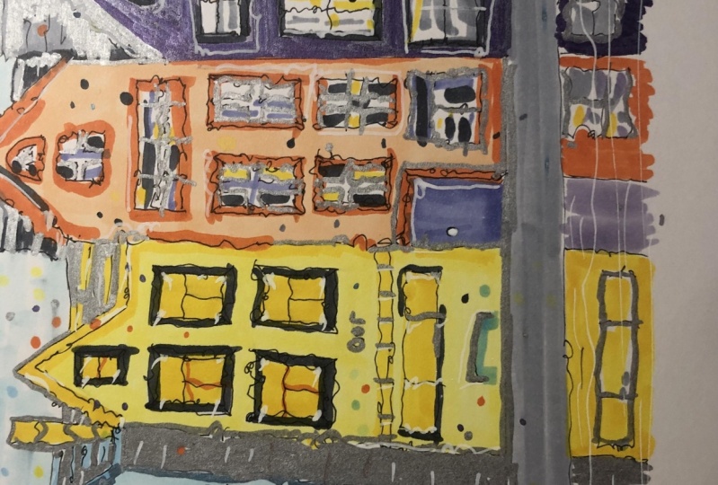
4. Coloring the buildings: Now that will cover
buildings outline, we can begin using our
professional markers. And in most cases we're going to use two different
tones of markers of the same color when it's going to be the base
color of the building. And the second one
is going to be used for shadows persons
in the walls. For the first building, I'm going to use this pair of Copic markers you'll see here. And I'll start by coloring the entire wall surface
with a clear marker first, all the buildings will follow
the exact same process. So we're going to focus
first on this first building and practically repeat the
process with the rest of them. Then other corresponding
details such as shadows and highlights
in the windows. Make sure your paint all the
surface of the first wall. And when you're done, let the ink dry for
awhile and then color the edges of the building using the darker tone
marker as you see. Also, pass a marker on the
edges of the window frames. This is going to give the edges some volume and it will look
really nice in the end. The frame, so the
windows and the door, I'll be using this
cool gray number five, which is going to represent the concrete
materials structure. Moving on to a darker gray tone, I'll be using it to paint
the roof of the building. I recommend this part of the drawing to do
it horizontally, since you can actually
started looking at how the building is getting
some character by now. C9 cool color is going to add more shadow and volume
to the breaks of the roof. We're going back
to the wall with a dark green to highlight
the edge of the building, as well as the window frames
were a dark gray color. Wherever very light blue marker you can draw the windows and with a red marker like a brick color one, you
can draw them at all. Again. You could use a dark gray marker to draw
the frame of the door, which will highlight
the door nicely. This building now polar, we can start using
a white gel pen to make some reflections
in the drawing. We first need to add
some dark gray in the windows spaces and
then we're a gel pen, try to imitate some curtains or reflections that are
present in the windows. Now for the second building, I'll be using some orange
tone markers and we'll repeat that process in an
almost identical manner. First, cover the
entire wall surface of the building with a light
orange color and then move on with the window
frames or in shadows of the building with a
darker orange marker. Now continue with the rows. Again. You can use a C7 or a C9 cold gray
marker from copying. In any case, it's okay, just make sure it's
contrasting dark gray tone. Once again, you can use
a red brick tone marker, but this time took us the
shadows of the building itself. And then you say C9 gray
zone to draw the inside of all the windows for the shadow of the building
on the top I'm casting the shadow generated by the roof in a much
pronounced angle, just to give you a
drawing more depth. With a brown marker,
we can paint the door, followed by a gray tone
marker for the frame. And we can once again use our gel white pen to add the light reflection
details in this building. We can actually also draw
some horizontal white lines that go on the roof to
simulate some snow or rain. Moving forward with a
third building, again, I'll start drawing
the bill wall surface with a white blue color. And this time I'm leaving
a space in the building. Where I'll add some
details later on. This time I'll draw the windows
with a darker blue tone. Follow with a dark gray
tone for the frames. For the intermediate section, I'll use a red marker to add some contrast to the blue
tone of the building. Then move on to cover the lower section where it
dark gray tones as well. Now I'll use a dark
blue tone marker to cast the shadows
of the building. And once it's done, I move forward with a roof using the dark gray zone and white
gel benefit of details. The fourth building or repeat exactly the same process
we've been doing so far, using my orange tone as a
base color of the building. You can also use your
fundamental draw, a slight handled through
the doors of your wish. It's a nice small
details of the drawing. For the final building. I wanted to use some
striking pink tones. This pink markers. I'll be using a contrast beautifully with the
rest of the buildings. I'm going to repeat
the exact same process as with the other ones. Now when the building
is finished, we need to cover the
concrete structures that are placed on the street. This structures will follow exactly the same principle
as the buildings themselves. Draw base color at a higher
tone took as the shadows, and add some white details
with a white gel pen. The street I'll be using
a warm grades on to cover all the surface in
a long horizontal stroke, followed by a darker, warm gray tone for the shadows. For the reflection
present in the water, you can draw your buildings and details in an extremely
loose manner. However, a nice detail that will highlight this section
as water is to use your white gel pen and draw straight horizontal strokes to simulate light reflection
of the liquid. The details of the
building's windows and doors in this section
are very loosen. Don't worry too much of
how good they might look. Compare with the real
buildings we just did. Finally, you can add some background color
to your drawing. I'll be using a very
light blue tone marker to simulate the sky and just freely start adding some color to the outer
sides of the building, as well as to the top
part above the roofs. One thing I like to add at the end of my
drawings is a kind of personal mark symbol that
identifies my drawings. I suggest you that
your drawings, since this symbol can serve as a signature or authenticity
icon of your drawings. In my case, I like to draw a small fox face using
my white gel pen. In the next and final lesson, we'll remove the tape
from the drawing and talk about the final
project. See you there.
5. Finishing the drawing and final project: Great. When you
finish your project, your drawing should look
something like this. Now we need to tape our
paper from the acrylic base. And to do this, we just carefully start
removing each state. Do it slowly to avoid
damaging your paper. The final project of this
class is for you to make your own urban sketching
drawing using a picture you'd like either from the
Internet or from your own and started using the same techniques we've
seen in the class. When you're finished,
don't forget to upload your drawings so other
students can see it as well. Thank you so much for
watching this class. I hope you have enjoyed it and I'll see you
in the next one. Have a great day, everyone.
 David Gonzalez, Industrial Designer