Transcripts
1. Welcome to the class: Hi. Welcome to this class. I help to Master one point perspective, using
Sketchbook pro. My name is David,
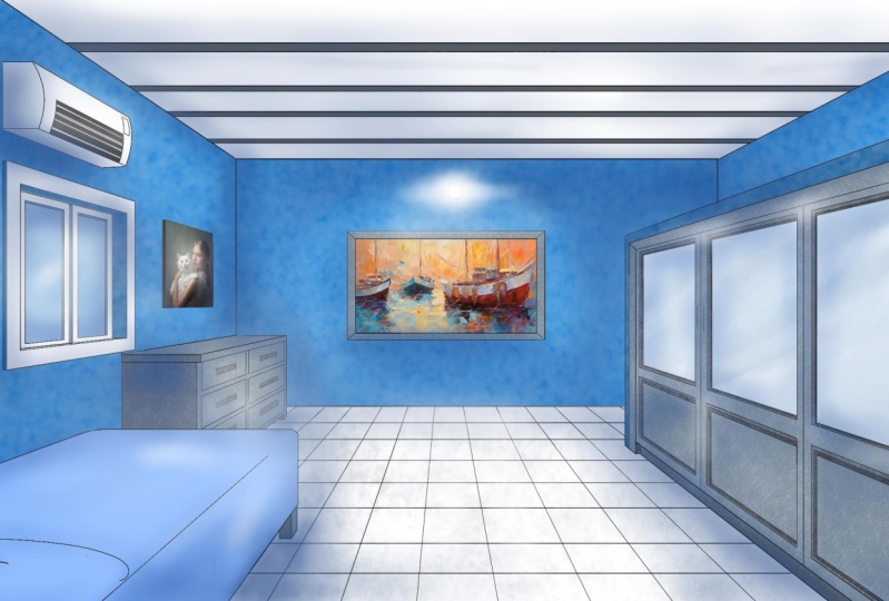
and in this class, I want to show you how you can create stunning
scenes like this one, using only your computer and drawing tablet and the
software Sketchbook. In this class, you'll
learn how to use a one point perspective grid and ruler to create an initial
sketch of your drawing. Then you will learn how to
apply language to your sketch and the importance of keeping your work separated by layers. We'll move on by coloring
the entire scene by adding textures to the
walls, floor, and doors. Finally, I'll show you
how to add shadows and lights to add more
character to your sketch, all done completely
from scratch. The final project
for this class is for you to create
your own scene using one point perspective
in Sketchbook Pro and design it completely
from scratch as well. Sketchbook Pro is a
very versatile software used most d by industrial
and product designers, but not limited to
those disciplines only. It is very user friendly
and you can get the software directly from the Sketchbook Pro app web page, which I'll leave you a link
in the class description box. So let's get started with
the class and head down to the first lesson
on how to create the initial sketch.
See you there.
2. Creating the initial sketch: Welcome to your first
lesson on how to use one point perspective
in Sketchbook Pro. In this lesson, we first need to set up the foundation
of our sketch. To do this, we'll be working on an initial sketch that is only going to serve as a guide for a final more detailed sketch. To do so, we're
going to be using two functions that are on the
main menu of the software, the one point perspective grid, and the vertical mirror tool. To begin, place yourself
on the layers menu and change the name of the
layer to perspective guide. This is going to
be a safety layer whose only function is to set a reference point in case we accidentally move our
perspective grid. This actually
happens quite often because as we move on
with our sketches, we sometimes need to rearrange the perspectives on
different elements, and once we move
the grid elsewhere, if we don't have a
reference guide, we won't be able to set it
back to its original position. In this layer, we're going to activate the perspective grid in one vanishing point or
one point perspective, and we only need to draw a vertical and
horizontal line that is going to pass through the
center of the vanishing point, as you can see in the video. If you just open Sketchbook pro, you can simply activate the
perspective grid and it will automatically place
the vanishing point right on the center
of the canvas. If you wish to work
with a different angle, simply move the vanishing point, and once you're happy
with this new position, I suggest you lock it with
a lock icon on the menu. Once you're done with
that, we can start working on the initial
sketch, and to do so, go to the layers menu and create a new layer called initial
sketch or foundation sketch. This sketch is going to serve us as a guide to our final drawing, so we're not going
to add much detail, the most relevant
things on the picture. So we'll start by adding the wall that is
furest away from us, and since we want this wall to look as centered as possible, we're going to activate
the mirror function, which is located
on the right side of the perspective
icon on the main menu. This mirror feature allows
us to create horizontal, vertical, and radial duplicates
of what we're drawing. So it's a very helpful tool for creating patterns
and reflections. Can begin by drawing
the limits of the wall on one side
of the cavas and you'll see the mirror tool will duplicate while we're
drawing on the other side. For this catch, I'm using a
fountain pen, brush size two, but you can use a pencil or
bal point brush if you wish. I like using the fountain pen, since I believe it leaves a sharper stroke when applying more pressure to the tablet. Once you're happy with
the wall in the front, you can draw diagonal
lines on the edges of the wall to establish the limits of the
walls on the sides, as well as the baseboards
and crown moldings. Remember to keep
your perspective read locked at all times. Now we can start adding
some doors and allow two doors on the left side
and one door to the right. To draw the door that is
further down the hale to a similar proportion as
the one closest to us, you can close the
perspective grit for a while and with
your ruler tool, which is on the left side
of the perspective ri tool, place one guide on the edge of the door closest to you
and cross the ruler, so it intersect with the horizontal line you
drew at the beginning. This will make the
ruler colign with the diagonal line on the upper corner of the
second door, as you can see, and you'll now have
a reference point to close the space
of the second door, and both doors interior, will have the same proportioning width, see true perspective. This is an altri that my
drawing professor told me a long time ago while I was
studying my bachelor's degree. Moving forward, once we're done with the doors
on both sides, we can move on and draw
some reference points on the roof where
the lights will go, as well as some extra guides on the floor to add some
pattern designs. Then we can start adding
more detail to the picture, such as frames on the doors. O. Oh. Now, since this sketch
is not the final one, we don't need to worry too
much in the small details, but it's useful to have
as much referent lines as possible on larger areas. Here I'm going to
add the moldings in the door that
is nearest to me, and these are only going to be vertical and
horizontal lines. Finally, you can
add some horizontal lines on the floor
that will serve as guides for any tiles or patent designs you
wish to include. So, there you have it.
Our initial sketch is now ready to be polished and
refined in the next lesson. See you there. Mm hm.
3. Adding line weight to the scene: Hi, everyone, and welcome back. In this lesson, we'll now be adding the final line
weight to our sketch. To do so, we need to
create a new layer on top of the Foundation
sketch we did previously, and for this lesson, I'll name this new layer
as line weight. Now, since I'm working
with different layers, I can now have control over
each one and work my way exclusively on the line weight without the fear of running
the initial sketch. If anything happens,
I can always come back to the guidelines
and work my way through. So to pick in drawing
the line weight, set the opacity
of the foundation sketch to somewhere around 50 to 60% and then place yourself over the new
layer you just created. We'll work exclusively on
this layer in this lesson, and to start adding the
line weight to your sketch, try to start somewhere that's easy and you feel you
have more control. For instance, like starting on the center of the sketch
because it allows me to first establish the
base from where the lines will be projected
in this perspective scene. Once we're done with
our first wall, we can move on to the crown
moldings and door frames. For this catch, I'm using a phantom pen size
too, by the way. Oh. Oh. A So I'm going to leave the details of the door for later and focus now on the side and floor moldings on the right side of the sketch. Then I'll repeat this
process for the left side. M Great. Now we can work
with the details on the right side door and draw
all the molding decorations. Now we could repeat
the same process manually for the
other door or we can save some time by copying the decorations we did and
pay them on a new layer. To do this, we need
to select the lines we drew with the poly
line selection tool and simplic command V to
copy and pay the selection. This will send the copied
lines to a new layer, which is actually what
we need in order to manipulate it freely from
the rest of the line weight. We are our copied line selected, we can use a transform
tool on our main menu and move the lines until we're
over the left side door. Then we can deform the sketch with a transformed tool and use the scale and deform options to freely adjust the
design as we wish. Oh T. Good. And now we can move on to draw the tiles on the floor, which are simply horizontal and vertical lines
in perspective. So I'll use my ruler and
perspective g for this. Oh. And finally, we can add some roof lights by
drawing the first lamp. And then repeat the process
we made to copy and scale to more lamps and place them accordingly to the perspective, and we're practically done. O. Now, as a final step, we
can merge the layers, we just use for
copying the lamps and door details by
placing our mouse over the first layer on
the layers menu and click in the middle of the layer until the sub menu appears. Then we drag our mouse to
the merge with below option, and once all our
sketches are merge, we have finally finished adding the language to our canvas. So we have finished the longest
process of our project, which is adding
linguaie to our sketch. In the next lesson, we'll be adding color to all the scene.
4. Adding color to the scene: Good. Now we're going to start adding color to the
scene in this lesson. Coloring is surprisingly
relaxing for me. It's actually my favorite part of any digital sketch I create. For this project, we'll
start with the walls. First, create a new layer
over the line weight. I'll just name it color for now. We're going to create
different layers for the walls, floor, doors, and frames, and work interchangeably with the line weight layer and these new ones. We're going to take advantage of the line weight areas which are closed and are easier to select
with our Magic one tool. This tool is located
on the right side of the polyline command
on the main menu, and in our line weight layer, with the Magic one active, we're going to click on
the right side wall. This will select
the closed area, and with the area selected, we'll go to the color layer
which just created and use our color pock and
paint bucket to add color to the sire selection. What we're doing here essentially is selling
the software we wish to paint the selected area we took from the line wa layer, but add the color on
a different layer respecting the limits of the selection we did
in the former layer. It might sound
slightly confusing, but this is the equivalent as using a transparent paper and placing it over a
black and white sketch and add color to the scene. We're going to
repeat this process for the left side wall and the one on the back and I'll rename this layer as color walls. Once we're done with
the walls, let's create a new layer called color floor and repeat this process to add
color to the tiles. We're going to do
exactly the same. Pick the area from the
line weight and go to the color floor layer and fill the selected
area in that layer. We can select several areas
with the magic one by holding shift on our keyboard while clicking on new spaces. Two At this point we finish coloring the half
the tiles of the floor. Now we need to color
the rest, but to do so, it's easier to select
the entire area with our poly line tool and simply
add color to that area. I'll actually add this
color in the walls layer, and since the black tiles
are above this layer, then look just as if we
color each tile manually. So for the rest of the elements, we'll repeat the
process in a new layer. I'll call this new
layer as door frames, since we also add color to
the frames and moldings here. And since there are many
elements we need to paint, we can start playing
with different tones with our color pock. We can do this by
placing ourselves over the color pock and click
on the center of the pock while moving it upwards
or downwards to make the tone lighter
or darker respectively. If you haven't seen my class on learning the interface
of Sketch po Pro, I strongly suggest you do. I explain how each
command works, and there's a dedicated section for the color and brush pox. S t. O. O The final step is to add color to the roof and we'll do it in
the same layer. Now you might think that
this is long and tedious, but it's actually
way faster than color in the areas
manually with a brush, and it ensures your line
weight is not compromised. In the end, if you wish to
change the color of one layer only or you're not happy
with how a section looks, you can just delete
that layer or change the color of the areas
within that specific layer. The rest of the sketch will be protected and can be
individually handled. In the next lesson, I'll
show you a trick to add more realism and some nice
effects to your line weight. A
5. Changing the line weight color: Hi, and welcome back.
In this lesson, I want to show you what you
can do with the line weight. If you wish to add more realism to the scene or simply
play around with it. This step is totally optional, but it's good to
know if one day you need to change the line
weight in your sketches. As you can see in the sketch, the line weight
contrasts considerably with the rest of the colors in the picture and it looks
slightly cartoonish as it is. We can change this
by placing ourselves in the line win layer
and change its color. Now, of course, we cannot
just place ourselves in the light weight layer and
use our brush and painted, but we can set our brush
to a very large size and go to the layers menu
and activate the lock icon, which is on the
right lower corner of the layer we wish to change. This lock will allow
us to only alter the information that
we've added in the layer. If we drew some lines
with our brushes or use some paint bucket to fill
some spaces with color, by activating the lock icon, we'll be able to only alter those spaces that we've painted. Now we can pick a similar
color to the walls and moldings of our sketch and modify the tones of
the line weight, so it doesn't look so cartoonish
if that's what we wish. M. Mm. We can also play
with it by enhancing the contrast and using
some white color, for instance, to add
some dramatic effects on our sketch, as you can see. For now, I'll keep the
line wait in black, and we'll see if we need
to change it later on. So I hope this trick was f. Let's move on with our
project in the next lesson.
6. Adding textures to the scene: Great. At this
point, we've already finished coloring
the entire scene. However, it still
looks quite plain. In this lesson, we'll add
textures to the walls, floor, and wooden elements
like the doors and frames to give the
picture more character. We'll do this using
different layers once again. First, we'll create
a new layer on the layers menu and
name it wall texture. Here we'll focus on giving texture to the left
and right walls, as well as the one
far away exclusively. Now to a textures
rapidly in Sketchbook, you can use the different
texture brushes available on the brush menu. On the right copper
corner of the menu, click on the icon with a
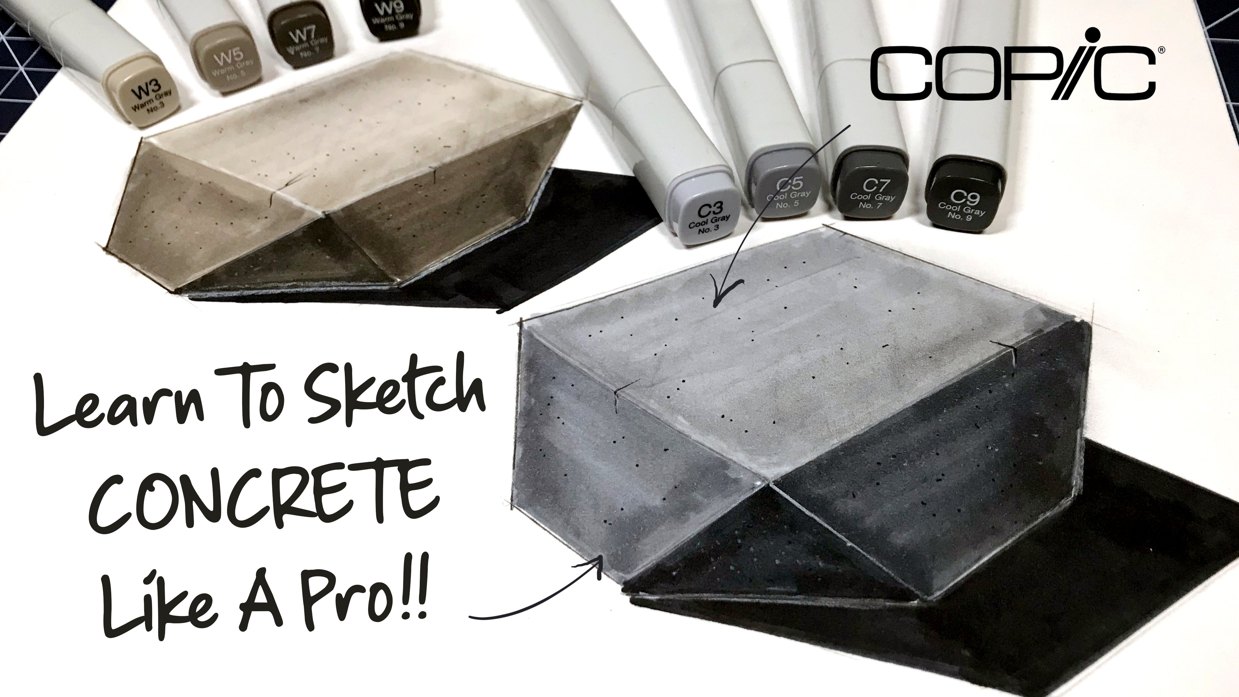
horizontal line and three dots to open the entire brush library and go to the textures brushes. For the walls, we want to give a texture similar to concrete, so we can use the camel
brush and set the size to a very large stroke both
on hard and light pressure. So we can select the
wall from the language, and with those areas selected, use our camo brush to
start adding texture. I'm using a black
color for this, but you can use whatever
color you wish. However, try to use a darker
tone than the one from the base color since
we're going to manipulate the opacity
of that layer later on. For the doors and
wooden details, I'll use the scratches brush. And instead of selecting all the elements
with the magic wand, I simply duplicate
the color layer and lock it to other texture. A. Roof will also be
affected by the strokes, but you can easily delete
any excess of texture by selecting those unwanted areas and deleting what's inside. For the floor, I
use the hatching to brush to give some
texture and for the roof, I went on and use the
cama brush once again. H. Oh. Now, once all the
textures are applied, we can lower the opacity of those layers if we feel
they're oversaturated. And was we're happy with
how the scene looks. We can move on to the
next lesson and see how to apply some shadows
and final details.
7. Adding lights and shadows: Good. We're almost
done with our project, but we still need to add a few details to really
make the sketch stand out. In this lesson, we'll be
adding shadows and lights and adjusting the opacity
of some texture layers. To add shadows to the scene, we can use the airbrush
located on the upper corner of our brush menu and set the
size to a really large one, since we're going to be working on large areas like the walls. Now we could do this by
using the same technique of selecting the areas from
the line weight layer, but then might just
take all the fun. Instead, I'll go and
apply the shadow freely with a darker tone from the
base color of the picture. Then I'll add some lights, using the same brush with a
smaller size and white color, and play around with the
second shadow color, which in this case, will be blue, since it makes a good match with the rows and
purple tones of the scene. A M. M m. M. M. M. M. M. Mm. Okay, now if the shadow becomes
quite overwhelming to some of the details like
the texture on the walls, we can always come back
to the layer and play around with the opacity to highlight them from
the excess of color. And after adding a
few more shadows, we have finally
finished our project. Here it is a lovely, one
point perspective scene done absolutely from scratch with
vibrant colors and textures. Now it's time to go to the
final lesson where I'll explain the project for
this class. See you there.
8. Final project: Great. So welcome to the
final lesson of the course. Now before explaining
the final project, let's take a brief moment to reflect on what we
have learned today. In this class, we have
mastered one point perspective and created our own scenery playing with depth and detail. We have seen the advantages of using different layers
and our projects to change specific details as we wish without compromising
the entire sketch. We have also seen how to use several commands such
as this selection tool, paint bucket, and brushes, and use them interchangeably
within our project. Overall, we have
mastered the basics to draw professionally in
one point perspective, and I hope you have
found value on this class for your
creative journey. Now it's time to put in
practice what you've learned in this course and
work with your final project, which is to create your
own scene and bring it to live digitally
using Sketchbook Pro. So go ahead and try the
software by yourself and see how versatile
and ECA is to use. Make sure to use the
techniques you've learned this class from
starting your sketch from far behind the picture
to apply in shadows and textures to add more
character to your sketch. When you're done, make sure
to upload your project, so other students
can see it as well. If you have any
questions, please don't hesitate to get in touch, and I'll be more than
happy to help you. So take care, and
I'll see you in the next class.
Have a great day.
 David Gonzalez, Industrial Designer