Transcripts
1. Welcome to the class: Hello everyone. I hope you're doing great today. My name is David and welcome
to this class where you learn the basics of the
interface of Sketchbook Pro. Sketchbook Pro segue tool
if you're looking to represent your creative
ideas very easily and fast. In this class, you'll learn the basic interface
of the program. We'll see where the tools and the menus are and
how to use them. The final project of this
class is to download the software and just start playing and exploring
what it can offer you. Without any further ado. Let's get started and I'll
see you in the next lesson.
2. The main toolbar: All right, welcome to
this first lesson. You learned the basics of the interface of Sketchbook Pro. In this lesson, we're going to focus right now in the
main toolbar first, before going into all
the different menu bars, there's basically five many bars that you need to know
and sketch book, which are the color
and brush bucks. The main toolbar,
the layers toolbar, the lagoon, and the
brush pallets as well. If you've ever worked
with Photoshop, you're going to find
sketchbook very familiar. But there are a few
cool features of this software that
are very intuitive. So in the menu, the
first two icons you'll identify quickly are the
undo and redo options. The next tool is the
magnifying glass, which has three main functions. The first one is assume
mean or zoom out or the Canvas moving your pen to the right or to the
left respectively. The second one is
a rotation tool that will help you
rotate the entire frame. In the third one
will help you move the canvas in any
direction of the screen. You'll see that
whenever you are in the top of each function, they highlighted in blue. This indicates which of
the trig functions is active and will occur when
you interrupt with the tool. Next is the selection tool, which is very similar
to our softwares. You can choose to select geometric areas such
as squares or circles. They are more free hand
like this lahar tool. There's also the
polygon selection tool, which is one where you can
select according to points. So do you integrate very useful for flat
surfaces as well. Now this tool is a margin tool and it's
similar to a magic wand. And basically what it
does is that it takes pixels of a similar
appearance, such as color. And based on the tolerance, you put going to select only those pixels
that have similarity. Or you can even
select pixels are close to the selected woman
but are slightly different. For instance, in
here it can select pixels that are deeming
color but are totally white. He's going to expand
the selection area. Now if you put a
tolerance at its highest, practically telling
the software to be extremely tolerant on the similarities of
the characteristics of the pixels around the
one you've selected. And it can even
select all the frame. In some occasions, I will recommend you
to live it more or less between 2030 and that's
a fairly decent tolerance. There's also this
three option tools which are really cool. The first one is an
adding selection tool where you can expand the
original selection you've done. If you've missed some pixels, you can use this tool
to add your selection. And you can also subtract them, and it doesn't only
work with squares. You can also use the Lasso
tool for this technique. You choose the last one. It's practically going to
make a frame to the work. It is rarely used though. The most interesting
ones are the adding and removing selection tools. Going forward you have
this tool which is a crop, where you can cut
the entire artwork. You have to the desired
length and width. Then you have the quick
toolbar selection button, which selects all the elements that you have drawn
inside a layer. For instance, I have drawn
this quick sketch and it gives me the option to move the
layer freely as I want. Rotated scaled, scaling a one
on one side to the other. Very practical when you
have finished the project, that you want to
quickly move around. It also has a
selection lasso tool, which you can also play with whatever you have
selected on top. And you can even make very interesting patterns with
us and with your designs. Moving forward, we have this deformation tool
that each time I click, it's going to select
all the space. There are elements in
the layer I'm working on and you can deform
it from the edges, or you can deform it moving all the vertices and
rotate them as well. It's going to give you some very interesting
weird perspectives depending on how hard
you are deforming it. And you can actually
also the format from the middle section
and make some kind of Michigan at the end. So it's a great tool. Of course, you have the bucket, which is one for color in the entire area,
self-selection. For instance, I can put
some color in there and this tool also has a tolerance. So you can go and
put the tool on top. And the higher the total runs, the more the color book it
will cover around the edges. The lower you go, the
thicker a white line, it will leave you because
in every sketch we make, in every stroke we
pass with a pencil. There's, there are
dimmer pixels at the edge of the strokes
that are not going to be totally black or totally
from the color we wanted to. The text editor really
needs no introduction. Just simply write whatever
it takes you want to use. It's not something you
expect to use a lot, but you might use
it just to show some details and instructions
of some designs you have. This one is a straight ruler. It's a really cool feature. If you want to draw
a straight line without any help or assistance, you will notice it won't
look exactly straight. Now with this ruler,
you are guaranteed to always draw a straight line. And you only need to position the two points where you
underline to person. And then just use your
brush to mark that line. This feature works with any
brush, even with erasers. And you can actually make
some interesting compositions just by using it. You also have a curve tool, which is practically the same, but it would have curved path. And again, you can
scale it and move it. You're going to find
that it's very useful and the software is
very user-friendly. Actually. Moving on, we have the Ellipse tool, which is in similar fashion
as the previous one, helps you shape perfect
circles and ellipses. You can scale them
and play with it. They mentioned of
the ellipses axis. You can see here that just by using the
Ellipse and rulers tools, you can make really nice
products in a very easy way. Adding to this function
are the French curves. They come in three
different shapes and they are very useful when you're trying to make interesting
and precise curvatures. French curves are we'll use for automotive sketching as
well as technical drawings. Just to give you an example
here, two curvatures. And I want to join them
with a very nice curve. I can decide which one
do I liked the most by just placing the curve and
moving it wherever I want, making some tests and then just deciding on which
one looks better. Then of course, I could delete all the lines that are not used anymore or are done by accident
when making the strokes. Then moving forward we have
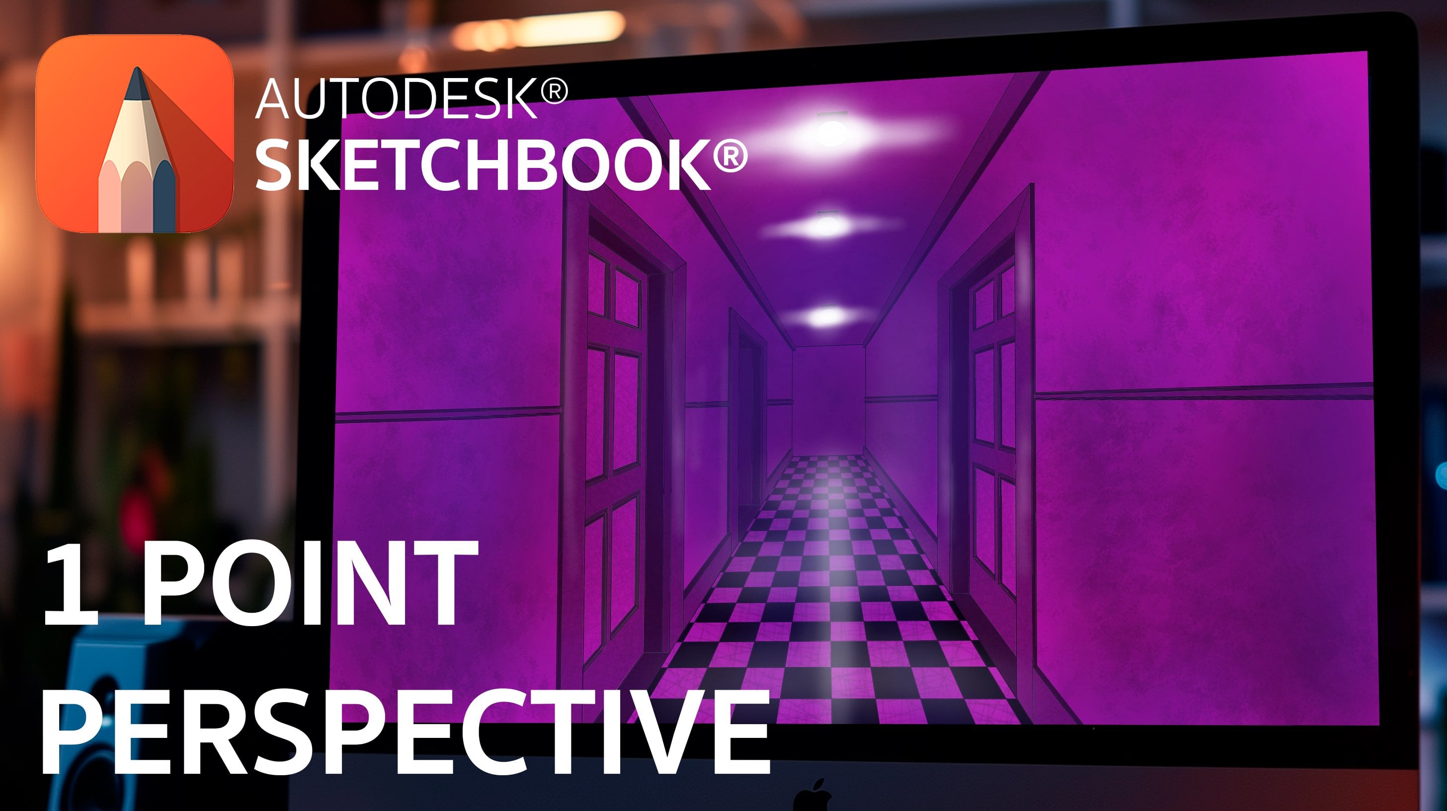
the perspective grid item. This is a truly beautiful
feature of the software. This icon button will show you 123 perspective options
to choose from, as well as a fish
eye perspective. This is very interesting
because you can see that if I wanted to use this option, the lines that directing
the selected perspective, arms locked to the
vanishing points out there. You're always going to draw your sketches respecting
that perspective. One-point perspective,
for instance, it will respect the horizontal
and vertical lines, whereas the deadlines will be guided towards the
vanishing point. You can easily make some realistic quick sketches
with these tools. The same can be done with
a 2 perspective tool. If you want to make more
complex perspectives, then they're very friendly, especially if you're starting
with perspective sketching. This can give you an idea
of how easy it can get. There's also the 3 perspective. I don't personally use it a lot since it's
mostly used for big objects such as buildings or architecture
and sketching. The effects of the
third vanishing points becomes very evident. Finally, there's the
fisheye option that can help you compress
a lot of information. It is drawn in a very close space and
can also look very cool for those, that mirror
or reflection tool, which basically
allows us to draw wherever you are drawing
on one side to the other. Naturally, depending on
what option you're using, there's a vertical and
horizontal mirrors, and you can combine
both of them as well. You can also mirror
your sketches. Really. You can add as many radial patterns as you wish and create very
interesting designs, such as Mandela's or REM designs for automatic
sketching as well. The next tool that
looks almost like a fishing hook is actually
one of my favorites. This tool allows you to make very clean curved lines,
continuous lines. For instance, when you
don't want to work with rigid perspectives or edges and you want something
more curved. You can use this tool to delay the path of the
stroke you're doing. What this does is that it maps and predicts your
stroke and aligns the pixels so that the lines you just drew
looks as continuous, as neat as possible. I'm going for the ellipse tool. If you draw an ellipse by hand, it might just look
very weird at first, but if you use this tool, you'll have very fast
perfect ellipses. Of course, when you have
more practice with it, it becomes easier and faster to handle these
tools altogether. Naturally, you can play with a tolerance as well as we know the tools to form more
precise elliptical drawings. Finally, you have this basic tools you can use for drawing squares or
basic geometries. The last three sections are one for the Layers menu,
the brushes menu. And the third one activates, or the activates
a color menu that we'll be looking at during
the following lessons. Yeah, This is basically the
main toolbar configuration. This is one of five
menus and we can check market and continue in the next lesson with
the Layers menu.
3. Layers menu: Let's take a look
into the Layers menu. The Layers menu is the one on the right side of the screen. When you open sketch book. This is the one you'll be using quite a lot and then he's
scratching project. You make. The advantage of having layers menu is that it gives
you the ability to work every part of your
design by separating every element without risking
any previous work done. Or make quick come up
modifications to certain areas or details without
affecting the rest of the items in the project. Let's suppose you have a nice
sketch strong in one layer. And this assigned took
hours and hours of work. And of course you'll try to work it out as carefully as possible, but suddenly you make a mistake and now you
have to correct it. The problem with working in only one layer is that
you're going to put a risk. Everything that is
inside that layer, working with layers
allows you to separate important
parts of your design. So for instance, you might
have your initial sketch, you might have the color, your design, and you can have
as many items as you wish, such as background in blue. And if all of these things, all of these items are
in separate layers. Wherever thing you modify in any specific
layer, for instance, that blue background
is not going to put at risk the rest of the
elements from other layers. He's not going to touch them. It's only going to
touch the things that are inside the layer
you're working in. For example, let's see at how
this idea would look like. Let's say I have a sketch layer, I color layer, and I
background one as well. Made this quick drawings
just to give you this example and let's say
it's time to paint it. I position myself in that layer. I wish the color to be. And you can see that when
I paint on that layer, irrespective me that
black sketching lines that I had in the
previous layer. If I erase it, the eraser is not going to pass or
touch the black part. Similarly, if I want to
call it this guy is going to respect the other two
layers that I've got there. The thing with the layers is to understand what to put them. So the other layers
are visible or not. Whatever layer is on
top is the one that's going to cover the information
of the lower layers. That is something very
important to have in mind. If you want your
layers to be seen, you will have to put it
on top of the other ones. Now let's have a look at how
the menu actually works. When you open sketch
book by default, it will show you two layers, the background and
the layer one. This is by default,
you can start adding layers on
top of each other. If you see this plus icon on the left upper corner
and you click it, you'll notice it would
automatically add another layer. The next icon helps you in case you wanted to group
some layers together. Let's say for example,
you're drawing the face and you're
working with an I. And this element has a lot
of layers that you want to move them together or
high them at some point. You can group all the elements and they can behave
as a common one. You can click the carpet icon and a layer called
group will appear. Then you can select or shift, select the SEC
multiple layers and drag them on top until they
frame the entire carpet. You can release the selection. And you know, there'll
be as an entire group because they'd have
this grayish frame of line on the left side. This sense you can
control the visibility of the entire group or independently for each
layer within the group. You can take them
out of the group by reversing the process shifts, selecting the layers
you want to take out and just drag them
outside the carpet layer. Next is this image button. When you click it, a
browse window will appear and you can import images that you have
in your computer. There will be added to
a new layer by default. Then you have this last
bottom there is an eraser. The cool thing about
this bottom is that if you have a
little sketches or items in a layer that you don't like or are not going
to use anymore. And you want to leave them. Instead of grabbing the eraser
from the brushes palette, you can click that
icon and it will automatically delete everything
that is in that layer. But be careful, you will delete everything in that
specific layer. There's also the
transparency button which you can lower and it will lower the
transparency of all the elements in that later. Basically that's it
about the upper section. Remember that the
layer you have on top of the other ones is the one
that's going to dominate. And we'll cover the
information that is present in the rest
of the layers. The information or the
lower layers is always going to be shadowed by that
one from the upper one. So that's something we're in poison to keep in mind as well. Now there's also
the option where you can click in the
middle of the layer. Then it will show you all
the commands which are practically the same ones
that we have seen at the top. But the most important are
the ones you'll be using. The ones corresponding
to adding, subtracting, renaming the layers and
of course hiding them. Work exactly the same whether you click the bottoms
and the top part, or whether you present over the layer to
show the commands, it looks exactly the same. Now this log sine is a really cool feature
that the software has. Let us suppose that
you draw something and after you have
finished your schedule wanted to give it some color, you can add another layer and paint the color
of that layer, but you don't like how the black lines
of the sketch look. Here, the sign now
with your new color. They look very cartoonish
and you want to change the color with
line only the line. You would have two options, either carefully makers,
often with her line. You can click the button. What is going to do is to lock all the information
that you have drawn. And it's going to be the only
thing that you can modify. In this case, it will love
whatever is inside the layer. And now I'll be able to change the color of
the line without any risk of getting another
color outside the line. It will only allow me to
interact with a line, not with anything else. And now you can
change the color of your line weight on your sketch. That's it for the Layers menu. The next menu we'll see is a
brushes one. See you there.
4. The brush palette: Welcome back. In this lesson we'll
see the brush pallet, which is the menu that isn't
the left side of the screen. This palette by
default shows a set of brushes coming from pencil, either graphs, font
and bands and erasers. And in most cases you're going
to work with these ones. They behave naturally and quite different
from one another. Even though they feel
quite realistic, they do behave very
differently between them. And each one will be useful for a specific type of work
she might want to do. There are two buttons on
the top of this menu. If you click to the right one, you'll see the brush library, which has a lot of options
available for you works. They go from pencils, pens, stains, marks all the way. It's a strange
patterns, for instance, the one I'm drawing now, the best way to see which
brush you feel more comfortable working
with a dry them out. Take your time and decide
on what kind of far do you want to work with and start practicing the different
brushes available. For this lesson, we're going
to use the default brushes. These brushes will
appear by default when you open sketch
book for the first time. Now let's imagine you want to draw a line with the pencil. You'll notice that
the density of the line is very different
from start to end. And that's because the
software detects the pressure that you apply on your
tablet, the wind drawing. You can access the
menu of the properties of the brush you're using, either by double-clicking
on the brush icon or by clicking the appropriate
the bottom on the upper side of
the brush menu. And here you can modify the
properties of the pencil. It's with opacity and even reset the preferences
to default if you wish. This applies to all the brushes
you'll have in the menu. Among the brushes available
besides the parent markers, you have point liners, ballpoint pens, and other ones. And we can have a
look at each one of them to see how they
draw by default. And you can see you have
a lot to choose from or enough to choose from to experiment with
your drawings. One of my favorite brushes is actually the fountain
pen because it leaves a very intense stroke when applied with some
pressure with a pen. And they soft beginning when the pressure
is another hard. One thing you'll notice
in the menu is that the main properties is something
that all brushes half, but some have
advanced properties. The Advanced Properties includes rotation and intensity
of the brush, as well as the transparency in regards to the pressure applied. If you want to rotate the angle of the brush to highlight or reduce the angles of a brush,
you can do it as well. All of these are
interesting features that you will most
probably use someday. So it's good to
get to know them. Now you'll also notice
these three icons here. And what they do is that
they deform the lines or sketch you have
in different ways. The first one is going
to alter the line and make it look like
if it was melting. You can actually make very interesting effect
with that brush. The second one is going
to blur the image or the line as if you had a drop of water following
into the sketch. And the third one, what it does is that it
sharpens the sketch. For instance, whenever you
pass a brush and just sketch, it will show some signs of subtle pixels around the stroke. And what this last
icon does is that it sharpens this pixels and makes the edge very
contrasting in the end. For the erasers, we only have two options
in this palette. The square one will erase everything it
touches by default. If you change the properties, you can make it look more
natural with less intensity. The second one by default, comes very soft
and you can erase large amounts of space but with less than density
than the first one. Basically that's it.
Again, there's nothing better to see which brush in
more convenient to use them, to test them out personally. Because you might find
the brushes like the most and the one that you will center to be using all the time. If you have the software at hand right now, get used to it. Start playing with the
different kinds of brushes and their properties and see what
might work well for you. Get to know what the
software can offer you and in no time
you leave answering the brushes and know what type of them exists and
when to use them. In the next lesson,
we'll see the color box, which are the ones on the
top side of the screen. So I'll see you there.
5. Color and brush pucks: Okay, so now it's time to look at the color and brush bucket. These are the two
very notable circles you'll have the upper
left of the screen. And let's take a look
at the brush1 first. Both box control very
different things. The black one controls
the color saturation and tons of the brochures using while the wetland control the sizes and the
capacity of the strokes. If you wish to adjust
his preferences, you can either go to
the brushes menu and do any adjustments as we've seen
in the previous lessons. Or you can seem
to use the pucks. So what you do is to position the center of the box and
then click in the center with your pen and move
it up and down to modify the opacity decides to
modify the stroke size. We look at this directions. This is for directions. Size modification
is going to be made by moving from left to right. Whereas the larger size
will be to the right. And making a smaller
size of the stroke will be my moving yourself
to the left. Opacity is going to
diminish if you go down and will go
higher if upwards. Of course it will reach 100%
opacity at its maximum. And that's basically what
the white bug is all about. Now what happens
if you wanted to change the color of your stroke? Of course, you can go to the color section
in the main menu. But a faster way to do is through the use
of the Black Buck. If you click on the center, you will find that there
is a color palette. The outer circle is the one that will indicate the
main tone you want to use. The inner circle is going
to indicate the intensity, luminosity, and
saturation of that tone. It's important to have this
in mind because you can select the desired
return, let's say orange. Any of you started moving
upwards to the white, the luminosity of that orange
tone is going to be higher. You can draw a darker orange
if you move downwards. But these changes are based on the main tone you select
from the outer circle. That applies to all the
colors in which use purple, for example, we can have a lighter purple
or are there one? It works in the same way
for every color you choose. Now, similarly to the opacity, if you click your POC
and move it upwards, the tone you have is going
to be more luminous, is going to go to
the water side of the spectrum and can
go totally white. If you click and go downwards, it's going to go all the way to the darkest spectrum and the color is now going
to be all black. So as you can see, it's a very fast way to have
your tone selected. If you move your
position to the right, you're going to increase
the saturation. Whereas if you move
yourself to the left, you're going to
lower the saturation and the out color from it. Your initial color is going
to end up in gray tones. Let's say you select
the green color and move it all the
way to the right, you'll see the saturation of that color is to its maximum. If you go to the left is
going to start removing That's iteration and it's
going to start looking rays. Now, that is how iteration
works with this function. Getting used to this
function, it's very easy. It's something you are going to use quite often. Actually. Summarize, if we have
this four directions where you can move and you have the main
color in the center. You can go and
increase, let me know. You can go down and
depreciate as well. If you go to the
rider's iteration will increase and to the
left will decrease. Again. Just start playing
with the functions of the box and you'll be
juicer them in no time. Now what happens
if, for instance, you're making it a sign that
involves a lot of tones. And you are constantly
changing the tones and colors and you need its own. You have previously used book. Don't remember which
number was it. Let's say you need
this blue color. What you can do is use
a small droplet to extract the color based on the pixel it's positioned
over the design. The color obstruction
with occur on the pixel selected and will give you the exact color you
want to work with. Of course, if you don't
like the work you've done, you can also quickly select the eraser also present
in the same book. Basically, this is how the
color and brushed bucks work. In the next lesson, we'll see the File menu, which
is the lagoon.
6. The lagoon: All right, So let's
now check the ligand. The lagoon is as menu that isn't the lower
edge of the screen. And what it does is basically what all the other menus do. I personally don't
use the lagoon. I prefer using the other menus. First because I
view it as having a repeated element are present that only
occupy some space. However, some people might
actually find it very useful to get the tools
they need from the lagoon. You can always have them
in the other menus though. Because of this, the
use of that again, is really going to be more
of a personal preference. If you start exploring the
buttons from the lagoon, you'll see the options that are present in the other menus. For instance, clicking on the triangle is the
option for the main menu. You've also got the
undo redo buttons, the stroke brushes also
present and so on. You can also hide or
show the lagoon from its default position by using this small button
which is on the left. It's going to give you some
options here, for instance, you can take it out if
you don't want it or you can move it
to the right side of the screen quite easily. Once again, I personally
don't use it. So you won't see me using
it a lot or at all. But it is a matter of preference whether you want to
use lagoon or not. Great, That's mostly the
information for this lesson. In the next lesson, we'll cover a few important details to consider for the
file preferences.
7. Preferences menu: One last thing you might
want to take care of before start drawing is to
have the right canvas size. This is very, very important. If you go on top of the menu and then
click on Preferences, you'll see the window
that shows several tasks with general information on
the document and program. The tabs you're going
to be using the most are the general
and the canvas one. In the general one, the first
option allows you to add a new layer every
time you want to import an image to the project. And that is something you definitely want to have enabled. Actually, I recommend you
leave it just like that. Then the maximum number of undoes is also set
to 50 as default. If you want to allow rotation of the canvas as well
as a third option. Last option is to save your document as either
a tiff or Piazzi. I strongly recommend
you set it on BSC since it is highly
possible that at 1 along the way you need to import or modify
a layer on Photoshop. The other important
thing is a canvas. The canvas size that
you'd normally uses, 1920 times 1080 pixels, which is full HD
resolution of 300 PSI. I'd like to use a resolution because even though we're
working in web here, it might be the case
that are designed, my needs to be printed and just wanted to have them
ready for such cases. Yeah, I haven't
finished this lesson. We're basically ready to
move on and start sketching.
8. Final project: Great, So there you haven't. This is the basics
of a Software. As I've mentioned before, there's nobody way
through their standard as to getting to
know the program, to practice tests and play a little bit with
it before using it. The project of this class is to simply download and install the software and get used to it really gives you have an iPad. You can download the
software for free. However, if you're working on a desktop computer or laptop, the software will cost
you around 19 or $20. You can download it directly in the app store or
in their web page. I'll leave you a
link in the project description section as well. I hope you have
enjoyed this lesson. Thank you so much for watching and I'll see you
in the next class.
 David Gonzalez, Industrial Designer