Transcripts
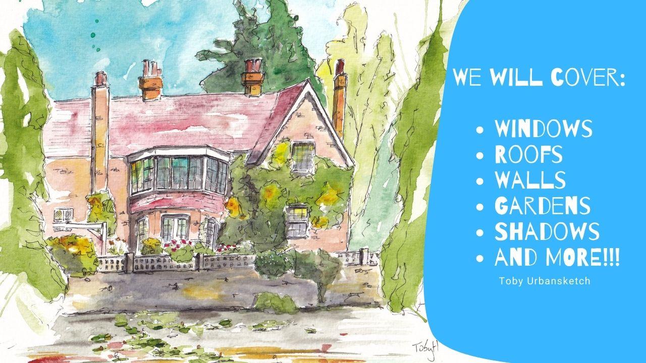
1. Introduction: [MUSIC] Hi there. Are you an urban sketcher
looking to get into home and house portraits but
not sure where to go? Perhaps you find those details, the windows too challenging or you never get the textures of the wall right and the colors just don't seem
to work together. If that sounds like you, then this may well be the
class you're looking for. My name is Toby, known as Toby
Urbansketch on Instagram, YouTube, and of
course on Skillshare. I'm an ink and watercolor
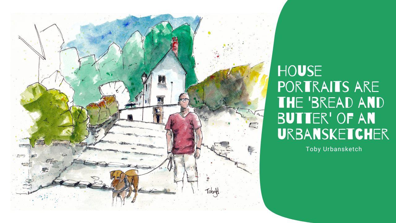
urban sketcher. One of the fundamentals, the bread and butter
of urban sketching is house portraits and
neighborhood sketches. Over the years, I've produced
lots of house sketches, both as commissions but also as unique gifts for loved ones, for people getting married, moving into their first house, or even just inundating my mum with loads of birthday
presents, sketching her house. In this class, I
want to show you everything I've learned
during this time. Houses are filled with
different details and there's lots of challenges
which we might perceive. But actually, with a little bit of practice and a
few tips and tricks, it becomes rather easy. We'll look at
perspective, for example, do you sketch the house straight on or do you
put it at an angle? How does that change things
like our vanishing points? Well, don't worry, we'll talk about all
of that and we'll work through an example as well. Next, we'll have
a general look at textures and think about
how we use our pen just to get enough detail not to
overwhelm the page but to really elegantly and simply show the viewer exactly what
we mean to show them. Using these principles we'll then look at some
specific details. Windows, doors, roofs, walls, you name it. We do it both looking at pen, but also how we add colors. I'll give you my top
tip on how to use just two colors
to paint any wall or roof and make it
very interesting without worrying about
the specific details. Next up, the class project. Now, I've provided you a
reference from my hometown. It's a beautiful house with a classic red brick wall with some interesting
shadows on it. You're welcome to use this. Or of course, I'd also be delighted if you wanted to
sketch your house or use this class as an opportunity to produce one of those unique
gifts for a loved one. If you enjoy the lesson,
please do leave me a review. It means the world. I also love hearing from you
outside of Skillshare. Follow me here, follow me on YouTube, find me on Instagram, send me a message and tag me in your images if you produce
them and want to share them. Most of all though, have fun, enjoy the lesson, and happy sketching. [MUSIC]
2. Supplies: The equipment, the
supplies I'm using and definitely not rules, but just guidelines for what you might want to use yourself. I'm going to split
it into implement, paper, and colors, add in the couple of
little extra things that sometimes we forget. So the implement, and
this is everything. I've got a mechanical pencil, this is no 0.5 mm
by Faber Castile. Of course, any pencil will do probably for Beale or darker, so that you can just be really light and gentle
with your lines. A rubber is important
because it lets you remove some of those darker lines when you go and do
your watercolors. My pen is a laminar
all-star panel. I sketch with this often, also a laminar all-star. I've got some ink and I cooled a Platinum Carbon Black
Ink, that's waterproof. Being waterproof is important. But the type of pen isn't. You could use a fine liner and loads of brands make
waterproof fine liner, and even some binaries
are waterproof, and I'm more than adequate. I know that people
have produced sketches for this class using borrow. Next my brushes. I'm just using a
Size 6 round brush and a Size 2 quill brush. You could use a Size 10
round brush instead of this. I just like the slightly
different shape, carries a different
amount of water, which uses a slightly
different effect on the page. When it comes to colors, I'm using my same word color
palette that I always use, it's got 14 colors inside. We're not going to be
using all of them. In case you're interested, the colors I will be using are just working
from the bottom. Some quinacridone, gold,
some Hansa yellow medium. I'll use some scarlet lake
and some cobalt blue. Then up here, I'll
use some moon glow. In one of the exercises, I'll demonstrate a couple
of these darker colors, perylene, violet, and indigo. I'll be using a lot of
quinacridone sienna. In the project resources I'll
list all of these colors, but I'll also list the important
ones and the alternatives because you definitely
don't need to go out and bind these colors exactly. Lastly, the paper. For my final project,
I'm using this, this is just a
simple student grade part of A4 watercolor paper. It's nothing special,
it's cold pressed, it's got a nice texture to it, and it's cheap, and it's fun. For the rest of the exercises, including the
watercolor exercises, I'm using this pad. This is an own brand, just bog standard, really cheap. I'm sketching part with
some cartridge paper, and more than adequate
for exploring colors, for exploring pen work
and having fun again. Let's not forget
those last bits. I've got a really
big jug of water. I use a liter jug and that's because it produces
more interesting effects, it keeps your colors clearer, and I like very
watery watercolors. I've also got some masking tape, which creates a nice frame
when you do your painting. Lastly, I've got a towel which I've been using for years
instead of kitchen paper. But you could use kitchen paper instead if you wanted.
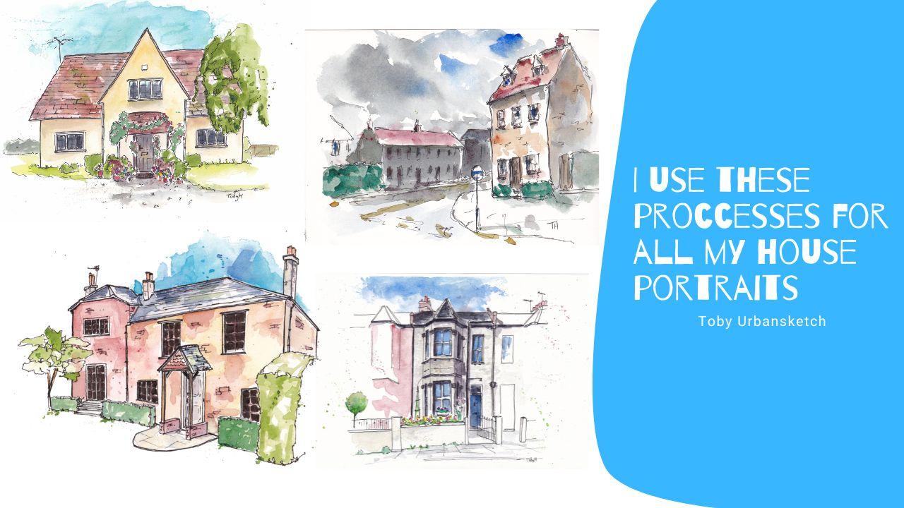
3. The Class Project: The final project will
be a house portrait. Before we get there, I'm going to take you through some specifics about perspective and that helps us to get
our composition right. Then we'll be looking
at details like how to sketch and color
windows, doors, roofs, all of these bits will feature, of course, in our
chosen final project. What I'd love for you
to do is either use my reference photo or sketch your own house
or a loved one's house. Maybe you want to take
this opportunity to create a beautiful
gift for a loved one and give them a Christmas or house-warming present
over a sketch of their house made by you. If you are up to it, it'd be amazing to share that in the class
resources as well. It's a wonderful
opportunity to get feedback to see
other people's work. But most importantly, when you are doing the project, don't worry, don't rush,
take it step by step. We'll be doing first
to pencil sketch, then a pen sketch, then we're adding on colors and then we'll be doing
these finished touches. All of these bits we've already practiced in the lessons before so you know
you can do it, and you know if you
work through it step by step it's
going to come together and it's going to look great.
4. Perspective in Sketching: The first thing we're
going to look at here is perspective, and
perspective is important because it's how we think
about our composition. I'm going to take you for a little walk
around my neighborhood. We'll look at some
examples of house from different perspectives and then we will do a
little work example to show how having no perspective or having two-point perspective
might change our scene and how we might work that
in to our final project. The first thing
we're going to try and think about is perspective. Perspective is a scary word and it's something which we
try and avoid thinking about and then get frustrated that
we can't quite get right. I suppose the first thing
is what is perspective? Perspective is how we
show objects which are 3D and represent them
on a 2D piece of paper. If we look at this house, this photo is already a 2D representation of
something that is 3D, and that's what we want to
transmit onto our page. When we're walking around,
when we're outside, things are more complicated
and the positions, the angles are always changing. We might go from a
really nice view, really interesting feel, less nice, less
attractive to you, or something which just
doesn't feel as good, and often perspective
is part of what's manipulating that
image in our head to feel interesting or not. What tips and tricks do
you need for perspective, for home portraits,
for house sketching? Well, I think that there
are two ways in which we most typically will approach
a house and sketch it. That's either with no
perspective like in this photo or in two-point perspective
like in this photo. What do they mean? Well, if we overlay our
no-point perspective with some lines, we can see that all of
our horizontal lines are strictly horizontal there, they're flat, while our vertical
lines are flat as well. There are no vanishing points. These lines are not
meeting off anywhere, they're always going
to be flat lines. What's the vanishing point? Well, if we look at our
two-point perspective reference, we put some lines over it. We trace our horizontal lines. We find they meet at two points. They meet at two points on what's known as
the horizon line. What's the horizon line? Horizon line is our eye level. If we draw our verticals, we find they're all vertical. There's no other
vanishing points, there's just these
two vanishing points. That's what we mean by
two-point perspective. Classically, two-point
perspective is when you're looking
at a street corner or you're looking at a
square or rectangular cube, rather a 3D cube from an angle. Whereas no-point perspective
is typically when you're doing that
shop front sketch when you're looking at
something straight on. In practice, how can we
put this down on our page? Well, let's just do a couple of little thumbnail sketches
here in a sketchbook. If we were to do a
no-point perspective, I'm very roughly use one of our no-point perspective
reference photos as an idea of what we're doing. What you could do is you
could draw out a grid and then you can
draw the verticals. You can imagine
these lines are just any width apart but
always being parallel. Then you're going to be
able to fit your house or whatever you're
sketching along or parallel to these lines so your house will
fit like this. The roof angles are
going to be angled, but the roof itself is
going to be parallel, then everything within that
is going to fit as well. These windows are parallel, the door is parallel. Everything has these neat
90-degree angles which fits. What about with our
two-point perspective? Well, again, that's roughly
take this idea of a house, we'll fit it into a thumbnail. Now the first thing we need to do is find a horizon line
because of horizon line is the one horizontal
line which is flat. Every line below that will be
angling more and more down, and every line above it
angling more and more up. When we know the angles, we can find the angles by
looking at our reference photo. We know the angles
of these lines, we can find where they meet. So we might finally
meet here and here we get vanishing points like so. Then we can draw out these
construction lines again. We'll find, if we draw the
middle of a house here, we'll find that we can meet all of these
construction lines like so. Apologies for my slightly
wobbly lines there. Then all the vertical lines
are going to meet up here, they're going to be parallel,
but they're all going to meet on the same
perspective line. This line will
take all verticals and all of this is actually
at the same height. Within this, you then
going to have windows which will have the vertical
lines going straight for all the horizontal lines following these different
lines of perspective. As such, you can
again construct. If we draw our same door, you'll be able to construct it. This horizon line is at
eye level like I said. If we were to add a person in, their head would be
their body and legs. Also, we know that the
door's going to finish slightly above the horizon line and many of the windows as well
will be a little bit above and then coming to below. The bottom is going
to have to angle down and the top is going
to have to angle up. That is how you can use two-point
perspective or no-point perspective to
construct your sketch and to make it feel 3D. Above this, of course, you're going to
have the roof line. These angles are going
to be different, but then the top will still follow these points
of perspective. We're still going to be following
our lines of perspective which all meet down at
these vanishing points. That's what we mean by no-point
or two-point perspective. No-point perspective lovely
for very detailed sketches where we might be
trying to bring out all the details in the brickwork or lots of things going
on in the windows. Two-point perspective, very
good for a sense of drama. Do you feel how this so
3D into the looming over us and it gives us a real
sense of drama and interest? For me, I often prefer
perspective sketches, but that's mostly what we'll be focusing on today in
our final project. But there's a very strong
argument that house portraits look extremely lovely
like this as well.
5. Make Textures Effective: This lesson is all
about textures, and it's just a very
quick overview. I want to show you that
less is often more that really effective
textures when we sketch, are actually produced by
well-chosen, well-planned out, marked not by a flurry of
furious, overworked pen marks. Let's have a look
at this example and I'll talk you
through what I'm doing and what I think the
best way to avoid a common mistake in getting
your textures down. Textures are our roots, are our walls or even a
windows, those grasses outside. We're going to be
looking at each of those different details in
turn in the next few lessons. But I just wanted to
give you an overview of my biggest lesson
about textures. I'm talking about
ink textures here. What I see, especially in the beginning sketches in
people just setting out is a real temptation
to say we see a wall. But it could be anything,
could be any textured surface and they see a textured surface. Then we think,
well, the only way that we can get this
in and do it justice. Is if we draw every
little brick. But of course, not only
does that take forever, by the time we're done, it looks messy and overcrowded
and not very pleasant. Now I'm not saying this is 100 percent the
wrong thing to do. I'm just saying it's
very time-consuming, very hard to get right. It's definitely got to wait. This is always going to be quite an overbearing amount
of ink to bring into a scene. To sketch the rest of the scene, you also can ask you an
awful lot of inkwork to make it feel balanced. What do I think the
most effective way of sketching a wonderful texture? It's with suggestions. The suggestion start
from that first line. You see see here we've got
a really hard outline, but a textured surface. Why don't we make that
outline texted as well? We're already thinking about what is making up this texture. In this texture is those bricks. Underneath perhaps we
already decided, look, we know there's some grass, they were already being
that grass texture in. We get to the top and we think, well actually the top,
perhaps there's a guttering, has got a hard line. It's a smooth and hard line, but in the middle,
there's a little bump where the guttering
joins together. Already, I think we've
suggested a lot of texture. This wall already looks more interesting than when
we first drew a square. It's certainly, for me it looks
more effective than this. To get a bit more
in, we can just start connecting a
couple of these lines. We can bring in those
brick-like marks. For all we're doing is
little suggestions, maybe a couple of full
bricks here and there. But I would ask, which
one looks better? The one we spent so long, I had to speed up the video. The one which is a
really hard bold line or the one where we just fold
about it a little bit, loosened ourselves up, and had a lovely little sketch
with some loose textures. This is the principle, I think is most important with how sketches and
things like this, when we're trying to get
the feel of a building. Don't sketch the whole thing, Find what's important and
sketch that in a loose, but interesting in every way.
6. Windows - My Top Tips: The next bit we're going
to look at are windows. Windows is very challenging. They're so key to a house. They got lovely reflections. They've got all
shapes and colors and it can be difficult
to get them feeling real. Well, the trick that
you'll learn soon is to treat them as a 3D object. They're not flat. They're 3D. Let's have a look
at this and we'll see how we add our
colors and our lines, thinking of them as a 3D object. Windows and doors. Now of course these things are very important potentially when the harder features to
feel like we've mastered. Windows come in all varieties, but they all have some
simple features in common that we can use to generalize and to capture
effective windows, no matter their shape, size, look in our scene. We're going to have
a think both about the sketch and about
the colors in this. First, the sketch,
the ink outline. Well, if we make some reasonably large
windows on this page, one thing is to start
nice and loose. It's tempting to draw the window and then come across and
immediately draw the frame. But why doesn't this look right? The reason it doesn't look
right is because it's not 3D and windows are
most certainly 3D. They have shape. If this is an upstairs window, we're looking from down here, we're looking upwards at it. What does that shape mean? What does it mean we can see. Well, it means we can see the
underneath of this window. It means we can see the
underneath of this frame. We're standing
slightly to the right, so we'll be able to
see the side here, and the side here, and we'll be able to see the
side here and the side here, and also type it
underneath there. But the frames
also have a front, so we also have an outer
edge to our frame. Now, for every one
line we first drew, we've drawn at least
one lawn in some places when we're thinking
about the perspective, the angle that we're looking at. We're drawing another. Now, we're building
up that shape, the real shape of a window. What else do windows have? Well, they have a
surround, don't they? When we think about
the textures, we could even have been bringing texture into
this line, but certainly, we can make sure we
contrast our window seal with a few of what will be surrounding bricks in a
typical house in the UK, but it might be woodwork. It might be something else. Just by making sure we treat
windows as a 3D object, we can get very
effective windows. It doesn't matter the size
or the shape or whatever. If we do this quickly
again and we think about it as a three-step
process this time, so what I'd suggest
you get your outline. Again, we're thinking already about the texture of
the surrounding wall. This is going to be a
nice circular window. We've already got
our outer frame in and we've thought
about the texture that's surrounding
it, some bricks. It's not the same thing as
what the window is made of. Then we think about
the inner frame. This is going to be a
slightly smoother line and it's going to capture the
big elements of the frame. In this case, maybe we've got two windows divided like that. That's Step 2. Then we think about the smaller elements in
the perspective. Where are we looking
at this from? If we're looking from below and maybe this time we're
looking from the left, we're going to be drawing
the inner side to the frame where we can see them
which you're going to be down the size, and at the top. Now, we have a 3D window and it's part of its
external surroundings. Often windows will have a nice good feature brickwork or perhaps we could
even do that here. They might have some
featured brickwork above and that can be really nice to consider as
part of your window. They might have little
internal windows as well. Often they're best done. There's a really
gentle couple of lines just loosely marking
in the key lines, but that's my tips, my three steps for getting your windows and fundamentally treating them as a 3D object. Now, color. What's important about color? Well, windows don't
have a color, do they? The frames might, but the
windows don't have a color. What they have are reflections. On a bright sunny day, the reflection might
be a couple of things. Most often it might be
a nice bright blue. Whatever blue you're using and popping that
in at the top of the windows is a
really lovely way of showing that reflection. Now, again, if we're looking up, we have to think about how
the light is reflecting. The higher the window, the more it will be
reflecting the sky, and whatever color the sky is, that might be a golden light. It might be a murky
cloud or something. As we come down, it's reflecting
whatever is behind us. It's often effective to apply some shadow in the
lower part of the window. Then we can come down and we can apply a nice shadow color
to mingle with that blue and to give that effective
idea of light reflection. Again, perspective because
it's showing our viewpoint. It's showing what the
perspective of the viewer is. You might also have
stuff behind the window, or you might have more
complex reflections or lines or light and
you can get those in, but you just have to be
gradual with the process. An example of something
behind the window which is really lovely to grab
is often if there's a glow, so if it's a nighttime scene or even just during the day
or the bright light on. How can we do that? Well, that glow is often
at the top of the window because the glow is coming from a light on the ceiling. Let's pop some yellow in there. Let's say that it's a
reasonably bright day, so actually there is
some blue in the sky. We can pop a bit of
blue in as well. Then remember our rules
about reflections. It's probably going to be
darker as we come down because it could be
reflecting more of the street and just general murkiness behind us and there we go. We end up with this glowing
light coming through. How did that work? Well, it worked because we
were sketching quite quickly and we kept everything wet. These colors can blend
and move together and that blending
is what provides such an effective glowing shape. I also think last little
bit on this lesson that it's worth having a
think with your windows about whether there's a
shadow under the frame and often having these shadows just accentuates the
idea that this is 3D. This isn't just a flat object. This is now casting a shadow. There's my little
lesson on windows, color, and line work. Three steps to finding
your window shape. Remember to treat
it as a 3D object and just take it gently
and consider the textures.
7. Doors - My Top Tips: Now that we've done windows, doors are really simple. They're like a window but
without the reflections. I'm just going to show
you really quickly how I ink my doors and then we'll move on after
that to the next lesson. Now, doors we can talk
about very quickly as well, but they're basically the same. The difference is they have
less window, less reflection. We can just do the same process
of get the outside line and then find the
inside of the frame and consider your viewpoint. If we're off to the right, we'll just see the
inside like this. We're going to see much
on this side at all. Then you've got your
little door furniture and accouterments. Maybe a little mouth as well. You might have a couple
of small windows inside. The challenging bit is often
a doorstop or this step. I'd encourage you not to
get too stuck on that, but just treat it again
as a simple shape; a series of lines which stack up and show you the
shape of your door. It's as simple as that. It's exactly the same
as a window really. It's just got less
reflection to think about. Instead, we think more about what's the
color of the door. How do we get the color of the door interesting
and accurate?
8. Walls and Roofs - My Top Tips: Now, walls and roofs. These are obviously a key, they make up a
house, don't they? But they're also so key in
the atmosphere of the house going from a red brick to a sun stain to a wooden wall, or a hay roof or a
modern slate roof really changes the
feel of the house. We're going to be
thinking a lot about those textures as we're
doing these sketches, but we're also going
to cover colors. I've got my top tip coming up on how to apply colors to
walls and roofs to make it easy to create
those beautiful, varied, and interesting tones. What we're going
to do, a couple of simple sketches, added
a little bit of color, and we'll talk through
the principles and remember that texture
lesson as well. If we do a nice red
brick house first, just remember, think about that texture as you're drawing. Red bricks are quite
neat, isn't it? These sidewalls there, they've got a little
bit of wobble to them, but they are not hugely wobbly. Then we come along, we pop quite a neat
line across because a red brick house normally
has a fairly modern gutter. We already just think
about all these textures. Then these bricks that
we're going to bring in, well, they're quite
small and orderly, so just a few little flicks
and hatches like this. Sometimes just putting
a couple of bricks next to each other
and little grips just gets that idea of texture across far
more effectively. There you go, a simple
red brick wall. I'd like to put more
bricks at the sides and at transition points. Things are changing. Then I do in the middle, and you might normally
have some windows and things in there as well. Next, let's try a
different type of brick, that big sandstone
brick which you might get in churches or
grand old buildings. This time, we're thinking
about having big steps and probably an older roof. Again, the top is
going to be wobbly. These bricks can be bigger. They're going to
be varied in size. There's going to be
some dark shadows in a few places that are a bit more random as
well, aren't they? But just by being nice
and loose with our lines, we can quickly create that feel. Now lastly, let's
think of a Nordic hut. We've got straight wooden walls, but very wobbly, difficult to see bottom, perhaps lots of grass
or perhaps the wood's a little bit mottle
at this stage and the same at the top, it might be a
little bit mottled. Then going up, we've
got these slats and some of them we'll
see all the way down. Some of them we'll only
see a little bit of. We're just producing
these vertical textures going up and down, and keep it varied, keep it so changing up, don't overdo it, don't
make it too patterned. Before you know it, you'll
have a lovely textured wall. That's all we need to do
to grab our textures. Now let's just think about
our roofs next as we move on, then we'll do the colors after. Let's put our red brick
house on a nice tiled roofs. These tiles are very
small little shapes. We bring the tiles across, give it a nice ridge line, and then the same
idea in these tiles, just they'll, flicks across. We're creating these little
shapes, suggestions of tiles. Perhaps this building has gotten more rickety old
reef bigger tiles. A nice way of portraying
a rickety roof is just accentuating and they'd lean
in their roof and a dip. Again, just bigger tiles. There we go, we've now got
that very different feel. Now maybe this roof is
rarely falling apart. Maybe it's made of straw
or something very loose, so it could be an old barn. It's a real loopy and
up-and-down roof and big dip. We can just put these
very loose textures in. Now it really feels like it's
falling apart, doesn't it? It's really coming
apart at the seams. Now an important
note about textures, if we just move
over here briefly. If we are drawing on a
two-point perspective, the vertical lines
of all these bricks they're going to
still be vertical. But all these horizontal
lines are going to be following our lines
of perspective, so these bricks are going to
be following these lines. If we draw the bricks here slipping out to
bricks at the top, a sloping down. But there you go. Really simple to just get
those brick textures. They've put textures
into your walls. Next, let's do a bit of colors. Now I've got a really simple
tip for coloring walls. I argue, you don't need
to get it exactly right, and the wolves themselves, they wouldn't have one color. They'll have lots of
different colors. I'm looking at my neighbor's
house now through the window and I can see his red brick. Some of them are almost blue, some of them are very pale. Take two complimentary colors, and what are
complimentary colors? Well, for example, a red and a warm brown. They're very similar. They compliment each other. Compare that to a red and
if we put a blue there, these are almost opposite. They don't complement, they're very nice together,
but they're contrasting. What are we going to do with our two complementary colors? Well, these two complimentary
colors are going to be closest to the
color of our brick. Here we've got red bricks. We put in some red, and we'll move that
red around a bit. Then underneath or around, we'll put in some
of our warm brown. Now we can move that around. We can add a bit
more red if we want, we can add a bit
more of our brown. Now we've got this varied wash. Just like all the
bricks are varied, we've got a lovely varied wash. We can repeat the
same thing over here. Let's make the sandstone bricks
a mix of yellow and gold. That's not enough gold, is it? Anyway here's some gold. Again, these colors compliment and then that variation
is just beautiful and it's really not hard work. Perhaps over here we've got
some more muddy colors. We'll take a moon glow, which is a very dark color. Then we'll choose, let's use some a purple Perylene violet, I suppose it's a
violet, isn't it? Again, we just vary that wash, and that implies all
that variation in tone that we know is there. The roof is no different. A couple of colors. Let's take indigo here. I'm going to pair it
with a moon glow. We get this lovely varied wash, which really punches
through everything. We could repeat that with
all of our buildings. Now another key point
now is shadows, so shadows in our buildings. How can we do that? Well, two ways. Number 1, we can take our color and we can apply it
in another layer. When it's all most dry, we can apply these
thicker tones of color. Then that will form a shadow. We can use these same colors to also add little brick marks and that enhances the texture. It's this thing that
I'll be doing in the final part of
my final project. But what else can we do? We can use a shadow color, so a moon glow, an
indigo, or Payne's gray, and we can bring
that across instead. That creates a different shadow. Perhaps more contrast in shadow, which might be what you want, but it might be too harsh, it might not be exactly
what you're looking for. This is important. Again, if we come over to
our two-point perspective it's important because
we're going to have one wall probably
in a bit of light. Maybe that's this wall in light. Then we're going to
have another wall which is in shadow
and what we want, we still want that color, so we still got that red, but we need a way of
pulling them apart. That might be, even
when it's wet, I can drop in some shadow. Now we've got a really
dark obvious shadow. Or if you wanted it more subtle, we could use this method. And it's also okay
to mix and match. If I just drop some of our
shadow color in this wall, it's still going to look lovely. Last little bits you can do
little splashes if you like, a bit of randomness to produce that interesting texture but
you don't need to do that. There is my simple processes for grabbing those
textures of the wall, so grabbing those
shadows and getting really interesting walls without painting every tiny detail.
9. Trees and Gardens - My Top Tips: Now we're doing house portraits, and houses often have
gardens or trees or bushes. I've a really simple way that I like producing
these on the page, as well as a simple
way of coloring them. That's what this
lesson is all about, and what I'm going
to show you now. We're onto our last lesson
about those little details. This one is those greeneries. I've got one really lovely
way for bringing out textures and beautiful
trees and bushes and grass. I think this one way is enough
certainly to get started and it's all you might
ever want to use. What is that way? Well, if we just do the
sign of our house here, we can use that as a
way of opening up where our tree might go. Now from my tree, what I like doing is pulling
out leaf-like shapes and creating an outline
of these random shapes. But trying to stick to vaguely, at least based on what the
shape of the actual tree or object I'm looking at is. Where there's a bit more
shadow at the bottom, we do few more of these
little leaf shapes. Then we just complete that tree. We can also add in a
few bits in the middle. Again, just picking out
where we are seeing shadows. Are we seeing that little
clumps of leaves at the bottom? All we need is a
really simple trunk. We can add Endo, side branches, and we can give that
trunk bit of texture. Remembering again that
less is often more. It works or bushes as well. We just come and we find
this little leaf shapes and before you know it, you can build up
a lovely hetero. At the bottom. You might want to get
a different texture in the idea of where it's
meeting the ground. Then again in the middle, you pick out these little
shapes of different greens and bits and bobs
going up and down. That's all the line work
that I think is needed when you're focusing on your urban sketch of
a house or a home. Put a bit of colors,
obviously lovely. Similarly to when we
talked about wolves, it's all about just
keeping a varied wash. I'm taking care here, what's called a cascade
green or dark green. Then on that, I could put some yellow. That way we never need more
than a couple of colors. Already, do you see how
that little variation in the wash just produces
light and shape? Do the same with our bush here. Start off with one color and then come in with
that yellow, sorry. You've got that
lovely variation. Light with wolves as well. A few splashes can just
bring that area to life. If you want to
bring out a garden, you can mark out with pen
or you can just leave it as is gentle flowing and again, Fareed wash of greens, different greens or
greens, and yellows. Perhaps there's a few
beautiful flowers and things going on. Well, again, no problem. You just add this little
punches of color. They could go anywhere. If you want to, you could
get that neater effect by marking out
individual flowers. You could, within your grasp, we've done little flowers and you leave those
flowers blank. Then when you come back, we have to do as of course, grab a little bit of
color and fill them up. Now you've got these
beautiful flowers sticking out of
your scene as well. Equally doing a few
little splashes of that color can be another
effective way of showing off the natural
beauty of flowers without having to over-sketch
them and overdo them.
10. Skies - In Two Ways: Now, no house is
complete without a sky. Well, actually
sometimes they are, so there is always the option
to leave the sky blank. But I like coloring the sky
and I'm going to show you my two most commonly used
method for coloring the sky, which will help
you choose between that beautiful blue sky
or there's more moody, dramatic skies when you
do your final project. Now, if you're doing a sky, I'd suggest popping a
little bit of water in the page first and
getting that water fairly neatly doesn't have
to be perfect, but fairly neatly up to
the edge of your house. Then what you can
do, you can bring in for a blue bright sky. You can bring in your blue and look at how it
just paints itself. Now that that pigment
is doing what it wants, we can have a play. We can do some splashes. We can draw off our brush and we can move the
pigment around. We can add more pigment and push the pigment in and
develop interesting shapes. You can fill the whole sky
with color if you want. I find it more effective. If we have this sky pointing
towards our focal point, pointing down towards that house and leaving it nice
and crisp edge. I'm not always, but
normally do this guy first because that also means if you go over a bit,
you can correct it. You can come back with some of the other colors
you're going to add and you can correct
that slight misstep. Of course, loosen watery
colors is also really fun and that's what I'm
normally all about. Having these colors pool over, perhaps pooling into some
of the trees and things. I also think it's
a wonderful idea. What's the other sky? Well, for more dramatic sky and more something else
going on, stormy sky, I suggest again a bit of water and then choosing
a shadowy color, like a moon glow, Payne's gray a dark
blue, perhaps an indigo. This is moon glow and we do the same thing and
it paints itself. We do some splashes and
you could leave it at that and we've got this lovely,
definitely moody sky. But you can go further. You can start having a play. You could put some
little blue end. Something that blue
brightens it up, it's now feeling like perhaps the Sun's coming out
behind this cloud. You could do something else. You could pop a
little bit of red in and you could have a fun making some shapes in the
sky and letting the water color just create
something really interesting. That's it. That's literally all it takes to create interesting skies
a little bit of water, a little bit of pigment,
and a little bit of plane. That's our last little lesson on the different aspects
of our home and house portrait in an urban
sketching style and we can move on
to our project.
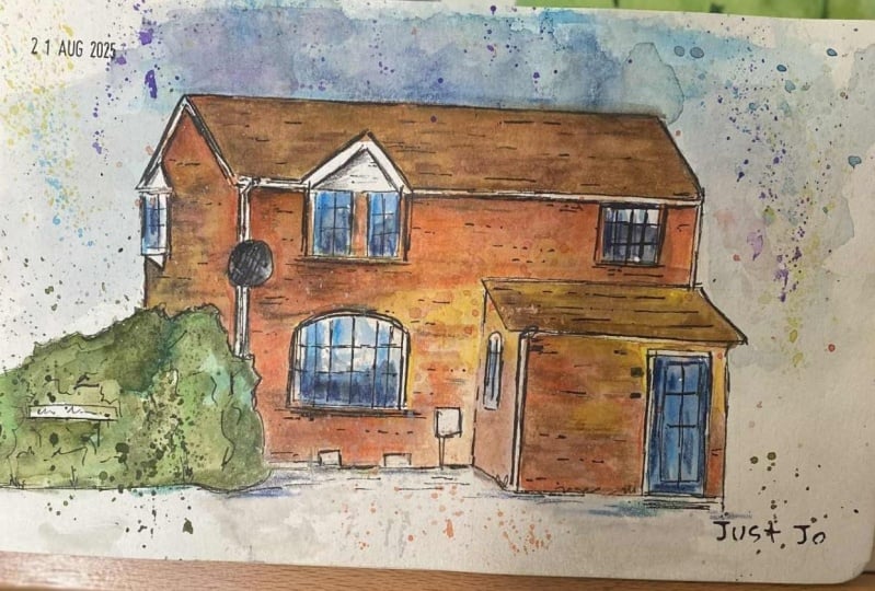
11. Step 1 - Pencil Sketching: Now we're onto the final
project and this is Step 1, getting our first sketch down. I'll switch this into two. We're going to start
with a pencil sketch where we're sketching nice and lightly getting
these big shapes. Not worrying too
much about texture, but getting the
perspective right, going back to that lesson before and just getting the feel
of our sketch right, trying to start to understand what our composition
is going to be. The first step is getting a little bit of a
sketch on our paper, getting our composition right, getting a feel for the
rest of the image. What we want to do here, you've got these textures
and get our shape and our perspective
on this page. Now, you'll notice
this reference photo. It's got two-point perspective but it's very angled and
it's not on the corner. The reason is normally you're trying to
focus on the house. That tiny bit of perspective, all that's quite awkward
to draw sometimes adds a lot of drama for me and that's why I like
doing it in this style. What I'm going to do, I'm
going to use a pencil just so I can get that
perspective in first. First thing, we want
this to fill the image. We want our house to be really the main feature because that's what a house portrait
is about, isn't it? Well, definitely it doesn't
matter if it's not perfect, but what we just want
to do is get the field and make it dramatic and
make it interesting. Make it feel like we really
cared about this sketch. There we go, see
I'm just getting these shapes we've got the
rectangle of the front. We've got the rectangle
of this roof. We can drop in where
our doors going to be. We can drop in where
these windows it can be and you can start to see
these lines of perspective. What we could've
done is identify the lines of perspective
in our sketch and put them down
but for this side, it's not too hard to just
see them to do them by eye. We can pop in just lines
for a window here. Again, just think about the perspective for the
bottom of the window. That helps us dropping
these windows in the right place and
we can line them up with the window below as well. Above we've got this slightly
awkward little triangle but if we think about
it like a triangle, it becomes easy. Then the roof is fairly flat, so just have a look at
how angled it really is and it barely creeps above
this triangle, does it? Remember as well, it's on
a line of perspective. We can exaggerate
that a little bit just to make sure
we've got it in. There you go that's
this face done. Now we've got the awkward phase, the one which is very angled. Luckily for us, we've
got a nice push in here so we can
just sketch that in. That means we don't
have to think too hard about this line. We've also got this
run of bricks here, which are providing us
a nice line to follow. You can see them going off. Then the other line
we can map out is the angle between this
corner of the roof and the next corner of the
roof and there you go. That's our other
line of perspective. Now we can use that to think about everything else like
when we're drawing our bricks. We've got this
sticking out window. How are we going to do that? I think to be honest, it's okay to start it and at least remember to
keep it on these lines perspective but you lease just start it as
a simple window. It's not on the main
part of the house and it's not super important. If you do want to make
it stand out more, to make it more correct, just remember to
grab those shapes. It's just a triangle and then a square and a
tiny little face here. I'm going to leave it like that. I'm going to cheat and
it's not cheating, it's making artistic decision, but I'm going to cheat and I'm going to
leave it like that. Now, you can start
putting in background if you like but this
is about this house. We're doing a house
portrait of this house. I'm going to leave it. What we can do is we
can bring things down, bring the colors
around the composition so that it just fills this house and leave some lovely
space around it. We can get a little bit of
shadow in here to mirror the bush over on this
side for example. Now, that is the
pencil sketch done, took about four minutes or so, but you don't need
to spend that long. That was mostly me whispering. All you need is this
broad outlines.
12. Still Step 1 - Adding Pen: So after the pencil
comes the pen, the first pen lines
to complete Step 1, our initial sketch. At this point we are now
really thinking about texture. Remember, texture starts
from those first lines, from the first
lines where you're thinking how much do
I wobble this line, how much do I move
it up and down? We'll also start to think about getting those
windows in 3D shapes. We'll start adding a few bricks in and getting the feel of
the house, those bare-bones, ready for those
beautiful colors. Then our pen. Let's think from the
beginning about our textures. It's a nice modern
red brick house. As we draw our walls we're
getting that red brick feel. At the beginning it's
going to look a bit messy and we're not going
to quite know if we've done the right thing. Don't forget as we're
going along as well to stop picking out
these other details. You've got these little
boxes at the bottom, you've got the little
electricity port up here, electricity port
that you'd like, circuit board for the
house, I mentioned. Every line that we draw
can have that nice texture which is simulating
the red brick. That's going to make it
easier when we come to our other lines to get those
actual red brick fields in. We get to a doorway. We can start just thinking
about that doorway. Remember just a few
horizontal lines stacked up. There we go. Let's just jump to
this line at the back because it'll be easier to build all our roof lines together. We give that nice little sweep just to give it some character. It has got a little sweep, a little dip to it anyway, but just adds a little
bit of character. This guttering is
nice and straight, so just keep it straight. Then down here on this side I've got another little
slightly wobbly line to simulate these tiles. Now what else have we got? Let's get this roof line in. Again, it's got shape, it's 3D. Let's think about
these 3D lines. You can see under
certain areas we get those areas that we
can see under in. We map in the underside of a guttering on the
side of the eves. We can do that just by creating little bit of noise
with these extra lines. I often describe sketching
as controlled chaos and I think it's a really and a sensible way of
approaching it really. I would think of
it being sensible because that's my idea, but what we're trying to do is we're trying to
display all that noise, all that busyness that's going on in the
scenes around us. We couldn't do it in a
way that just suggest to the eye exactly what's going on without having to draw
every little bit. There we go. We're almost there
with these key bits. Again, just getting that shape the underneath,
joining things up. And now let's do the
outside of the windows. Remember the windows
in that three-step process where we
find the outsides and we can go around and we can find the outsides
of all the windows. We're keeping these
lines in keeping with our brick texture because that's what
these lines are. They are the brick
meeting the window. This window is a bit wider. It's not the same as
the other window, but if you accidentally
sort of miss that, it doesn't matter if you get a slight abnormality or you know it's not perfect, it's really not important. And same here we've got little
of extra slot of our door and we got one window. I messed with my pencil
sketch, but that's fine. We can just drop it in. Remember, this perspective
is going this way. So this line scoops downwards. Over here. We've got our next window. All the time remembering
these textures, these lines are textures. And we can get the top in
as well, that little curve. We can even get a little
window just poking in here, just poking in the edge. So let's just get
that in as well. What's next? Well, let's just move on and add some of
the extra details, that we got this brush which is hiding some
of our perspective. Part of choosing
your composition is making it easy for yourself. So this brush is brilliant. It hide some of that detail which we would otherwise
have to work out. That's okay. It looks natural and it's a wonderful
natural bit of framing. We also got this door sign. Can't talk sometimes
when I'm concentrating. We've got this road sign, so we get that in as well. Why not? What else? Any other little
details we've missed? Well, there's a few
bits and pieces. We've got this drain
pipes coming down to, I think I'll add
them at the end. So we're left with the
fine details on me so we can start getting
some of these textures in and don't overdo it
because remember, we can come back. So we can always add more
after we've done our colors. We're going to add more
after we've done our colors. We're going to come back and
finish off final details, things like this drain pipes. And remember to follow with all these little brick
textures to follow these lines of perspective that we've worked out and drawn in. Then last but not least, the interiors of the windows and getting that
shape of the windows and do these lines. Remember we did the practice, it was quite big. So here, it's much smaller. So these lines need to
be much more gentle and they don't necessarily all
need to be complete lines. They can be just
suggestions as well. Especially in these
more distant windows where you can't really
see them anyway. On the door, couple
of little details, is long handles interesting? There's a couple of windows
which we can pop in. Then last window here. We're almost there really. All about remembering
to get those things, these 3D shapes don't leave
it as just a 2D shape. These things are all 3D. I'm going to invent this window and give it lots of shape. There we go. I'm going to finish just by giving ourselves a nice
little frame here. It explains the
context of this house and the rest of it, we can leave till the end. So I'm just going to rub out some of these more
bold pencil lines and then I'll meet you ready with a nice pot of water color, a couple of brushes and we'll start
applying our colors.
13. Step 2 - Watercolour Wash: [MUSIC] Step 2 is the colors. We are going back
to these lessons. Remember we got the
reflections of the windows, we got the two colors
to create our roof, to create our walls, and we also added colors
to our trees and bushes. Well, that's what
we're doing now. We're going to take
it step-by-step. We're going to move
around from sky to wall, to here, to there. By the end, we'll be
ready to just add those final touches and
bring everything together. Don't panic during this phase. It's not supposed to look
amazing straight away. It takes time, and in truth, it won't be till
those final touches where everything just
suddenly comes together. We are back and now it's
time for our colors. I'm going to bring my
colors nice and close. You can see my palette is a
bit messy and that's fine. I always say a messy
palette is a happy palette. I've got a size 6 round
and I got a size 2 mop, which is about a size 10 round brush if you
don't have a mop. The mop just got a slightly different shape and it carries a bit more water. What
are we going to do? Well, we are going to
start with the sky, which is what I said was
my favorite way to start. We can see in my little
reference photo, it's bit of a moody sky. I actually took this photo in December and I took it
not that late in the day, but probably about 3,2 of three o'clock and in
December in the UK. That's what skies look like, and I think
they're gorgeous. I think they're great fun. It's a moody sky. This is going to be touching
in those moody colors. But it's not just
moody as it is, it's not just an angry sky. It's got a bit of
joy in it as well. We're touching
these moody colors, we splash them around and we get them this shapes of
color pointing us in, bringing us in to our house. Then we can start playing
with some blues and let those blues add a nice
heartwarming accent if you like. Then a little bit more. What we can do, we've got this lovely frame from
the masking tape so we can bring that color all the way up to that frame and a couple of places and it'll be a nice, crisp cut off edge, and in other places
we get this more natural, general fading out. We can come back
a bit more water and just let things
move and flow. We can leave lots of white. This can be lots of
white underneath. That's absolutely fine. Then you get that's our
sky pretty much done. We'll see how it dries
and then we might be able to add a bit more if we want. Next, I'm going to jump down. I'm going to skip the roof
so that we can let this dry, and we can add some lovely
colors into our wall. Adding a little bit of water, and then I've
accidentally dropped some water into the window,
but that's no problem. That's why we have a towel
or a bit of kitchen roll. I can come I can just scoop up what was
dropped in there, and then we can start
again. There we go. Now got the water, not everywhere, but
in a few places. We're going to start
adding our colors and this is our
complimentary colors. For me, my spit of punchy red, and then underneath and the
reason I say underneath, because if we look at these
shadows and the light, there's a little shadow
down here, isn't there? The warmer brown rather than a punchy red is
going to be the shadow, at least the start
of the shadow, while this red is
going to be where all that beautiful
light is hitting. We just keep adding little bits, keep that wash nice and varied. It doesn't matter if it doesn't
look like a shadow now, we're just getting
this suggestion first. It's getting that little
drop of varied color moving around and
keep coming back, touching and moving around. Now, I'm going to
suggest that we don't have to be super
precise as well. I like the clear
cut-off in places, but then we've also got these lovely loose splashes and things and we can do exactly
the same with our house. Let me experiment so
you don't have to, as I like to say. If I just drop lots
of color in here, and take my reds, lots of water, lots
of that brown, I can let lapse of pull down. I could do some splashes
and I can let it a bit like the sky. Mirroring the effect of the sky. We can let things run and move and just have a
play on the page. We can drop more water in, and this is going to create
all interesting textures. When we come back to it, we'll be able to neaten
them up or push them around or do whatever we like. I encourage you to play
with things like tapping, splashing, use of water, blowing on the page,
that kind of thing. There's lots of fun, you can have lots of ways
of making your watercolors really interesting. There we go. That's that wash done. A few more splashes and we
can start to see these areas, we might want to
provide a little extra. This splash is fill that negative space and they push us in towards our image. All of this goes to
highlight our focal point, which is this rather
lovely house. [NOISE] Then what next? Well, let's move to
this bit of greenery. Again, a little bit of green, this is cascade green and
a little bit of yellow, and let them move. You see how it's going
to link into the house. Well, that's absolutely fine. You can keep them
separate if you'd like, but I like a nice bleed
between my colors. Like I like this
bleed down here. To correct it a little
bit if it goes too far, just dry off your brush, make sure it's nice and dry, come in and collect some of
that color, push it back. You can even reverse
the process by adding a bit of strong wall color, and it will push into the tree. In that way, you'll
see it becomes linked, it becomes a natural feeling. I personally really
like that feel. There we go. That's
this area all done. Let's now move on to our
sky. Not our sky, sorry. Our roof is a nice dark color. Let's just go with
the moon glow. But if we do that, is it going to contrast
enough with the sky? Probably not is the answer. We need something else in there. We need something else
to apply that contrast. Is very different from the sky. We could do lots of
things and we can see this is actually
quite a warm roof. Why don't we take a bit of that warm color from down here, a warm brown and what
do we mix that in? We can mix it in the
palette or on our page. By doing it on our page, we get this lovely,
varied wash again. Again, if it blends
into the sky, which I'm sure it will
in a couple of places, then all the better. I'm very happy for my colors
to paint themselves around. If you want a neater look, then just be more careful that
things dry between washes. Just by mixing these
colors little by little, creating that
lovely varied wash, we suddenly get a
nice subtle contrast going on between our
different areas. There we go. We can now, while the page is still wet, we can move around and start
just implying some shadows. Let's start with the
gentle shadow technique. If we take some of our
colors from before, our red and our brown, we just make them
a little richer, we can get that shadow started. We can do that all around. We can leave though, some of the texture shining
through from before. Then we can get these soft
edges because it's wet, things will blend
and you won't get these very hard-edged shadows. But as we get into these more
and more shadowed areas, perhaps you want to
flip and we want to start using a shadow color. This is where we get our moon glow and we
start popping that on. There'll be time for some
definite shadows at the end. When everything's dried,
we can go if we want, we can add in some of these much more definite
shadows which we're seeing, and I'm sure there
are some there. But for now, we can create these lovely loose
washes of falls in vivid color by being loose and just bold. Bold
is the right word. We loose and bolded
with our colors. That keeps everything varied, and watercolor is all
about that variation. There you go. I would
say we're almost there. Couple of things to finish. This roof here, of course, and we can leave a little
bit of white in it to pull it apart from
the surroundings, which got lots of rich color. Then we've got this very dark door and this
is where you might want to use a color which
really matches a door. Well, I seem to think,
whenever I sketch our house, for example, our house
has a lovely red door. I always try and choose
that red specifically. Now this one's got a kind of
like an indigo dark door. I've chosen my
indigo to just add the color to that door.
But you don't have to. You can also flex it like we
have been with other things. I would say that
is my step 2 done. All the first washes, There are things left to do. There's the windows,
there's the brakes, has a little bit more line work, but that all comes in step 3. Don't rush it. We'll
get there eventually, and we'll have something
really fun at the end. [MUSIC]
14. Step 3 - Bold Touches: Step 3 and hopefully
you're staying strong with me and
feeling confident. It's time now to add
those bold touches, so we're going to be looking at a little bit of
extra pen work. We're going to to
let our paper dry before we can do that or the pen will bleed
and run everywhere. When we've done
our extra pen work which is going to include
adding more textures and just resolidifying
some of our shapes, then we're going to add
those bold touches, those bold shadows, those dark windows and a
few little brick marks. I'm also going to have a
lot of fun with splashes. I love splashes and I
think for me and my taste, they add a huge
amount to any sketch or almost any sketch. Try it yourself perhaps if you're not feeling so
brave with the splashes, just try a little
splash on the side. Do a little thumbnail sketch
and see how you're feeling, but just to explore
and experiment and have fun with
this stage take it slowly and feel proud
that you got this far and I'm sure it will
look great at the end. Here we go, we are mostly dry. A few of these big patches are still wet, but that's fine. What we're going to do, we're going to do
the final touches. That's both bit of pen
and a bit more color. A pen comes first while
our page is still wet. Now, when you use your pen it's going to be a bit
bolder than before, so be nice and gentle. This time we're going to be
picking out key features and really making
them a feature. We've got these tiny little
boxes at the front for example and I know that they are
white in the reference, but now they're black because we are
illustrating this house. We are not producing
a perfect replica, we're making something
representative. To do that, sometimes we need to make
a point with our pen. If you want it you can
also be really careful and I have left them white too. You can make them another color. We're just going to go round and we're going to find
these key lines first. Again, thinking about
texture the whole way we can embolden those
important lines. That includes the steps, that includes capturing
some of these colors when they've gone a bit wide, a bit outside the
initial boundary. That includes these tops. You see where we've got these lovely white lines we've left. Encapture them and
leave them white, and that produces a nice
space between our two areas. Now we haven't done any
texture on the roof yet, so this is our time to
start adding those in and you see how we've got these little white gaps
that remember we left. Again, we can use those as little scaffolds
for our lines. The door is much the same. We come up and down. We leave this white gaps
where we've left them, but we can surround them
and provide more contrast. We can start thinking
about shadows as well. We can create deep
shadows in the hinges for example by creating
a bold pen line. Now, just conscious. I felt something wet on my palm and I don't want to
smudge on my paint, but other than that
we're doing well. The windows we're just going
to grab this key frame lines and we'll leave them for a
bit more color in a moment, but these key frame
lines we can embolden and we can find those colors. As we go to them we can start just popping in a couple
more bricks if it's needed. I don't feel that
you have to at all. Don't feel it, just
take your time. It's important not to
overdo watercolors and ink because the biggest trap is definitely
overworking things. Here we get a bit more boldness and we can see the boldness now because we've got in our colors. We can see the contrast, the saturation that
our image can take and that lets us fully explore
the pen a little bit more. Now this little bit of roof we can just reshape
a bit to make sure that we know where the
shadows are going to go. The same along here,
the same up here. Do you see how we got
that lovely bleed between the roof and the sky? But as we create a bold line, that bleed just feels
like a natural thing. It doesn't feel like a mistake. For me it's not a mistake. It's something I encourage
in my paintings, but if it was a mistake
don't worry about it. If it's not something
you wanted, just remember you're going to be able to pull these things back when you get to your final
touches, your final sketch. We're almost there. There's a few more
places that just need a little bit of line work. We got things we can
add like this door, so I think it's a door number. You'll always find
little bits you forgot. Like this window
here I neglected and this one I neglected. Just dot around, jump
around your image and find these things. I also just pop some fake
writing on this door sign and get a little bit more
shape into this curve. Just again embolden it, bring it to the fore with all the other
changes we've made. I think already
hopefully you're seeing it's really starting
to pop forward. Now we're going to
get our small brush out and we're going
to do all windows, and remember the windows
are reflecting the sky. That makes knowing the colors
we're going to use very easy because we know what
we used in the sky, and in this case it's mostly
these lovely moody colors. We can go in and we can pop some of those moody colors in, and we don't have to
be perfect about it. There can be overlap and there can be lots
of white as well and window reflections
are normally quite messy and challenging to look
at let alone to paint. Then I'm also going to
drop some of these blues, and these blues you saw glimpse
of happiness in the sky. It's not just an angry sky. This is just the same moon glow I was using before and
the same cobalt blue. Down below it's definitely
much darker there, isn't it? This time we can just
use the moon glow and create a nice just
locked out shadowy window. Now we're onto those
real final touches and go into our roof and we suggest a few little
tiles and things like that. We go into our walls, we take some of our darker color and we suggest a
few of our bricks. You do it all over and just a
few touches here and there. Few splashes always work well. Like I said in the
previous lesson some people don't like them, so make your own decision. I think they add
a lovely texture. I think they're
really fascinating. Then we need to do a bit
of shadow, don't we so. Let's take that dark color
and find these key shadows. That might be the whole
of one side of the wall. It might just be that you decide to focus on some of
the other shadows, the shadows under the eaves. We talked about popping
little shadows under windows and I'll
just show you there. I really like them and I think it's up to you
whether you want to put them. They're not necessarily real, but I think they're
really lovely. You don't need to put this
whole wall in shadow. This wall is already in shadow, look at it compared to this. We're just exaggerating or
enhancing some of the shadows. You can simulate shadow with
a little bit more splashing. If there's more
splashing over here, then there's more texture, there's more depth going on. I think to be honest
we're pretty much done. I think if there's
a real risk with this sketching and painting
if is overdoing it. I think I'm just going
to leave it there. I'm sure there's
things that I could look at in a minute and
decide maybe I'll touch here, maybe I'll do this, but I'm going to sign
it and feel proud, feel happy of the sketch I've done of this
interesting house. I'm applying colors
just to a limited area, but being really
clever and rich about how we apply them
clever but simple. We've really got a standout
house going on here. Thanks for coming along. If you go to the next little
bit I'll unveil the sketch, and of course say a
big thank you to you.
15. Summary and Thanks!: With that, that is
another class done. Now I hope you've enjoyed it and here as promised is
the grand unveiling. We, of course, are left with a really fun house portrait,
a really bold, punchy sketch, which I'd be very happy
to give to a friend, a relative, a loved one
as a beautiful present. I hope that you're proud
of what you've done. I hope you've learned something, perhaps broken a barrier or
just decided, you know what? It's not as hard as
I thought it was. It'd be amazing if you
can share your projects if you're feeling up for
it in the class resources. Please do reach out to me, connect either follow me on
Skillshare or on YouTube, or find me on Instagram
and tag me in your project there as well @tobyurbansketch. Thank you very much. My final request is, if you have time,
please leave a review. It means the world
and it really helps spread the word
about these classes.
 Toby Haseler, Urban Sketcher, Continuous Lines