Transcripts
1. Introduction: In this class what
we're going to do, we're going to explore the bigger picture of trees
or flowers or bushes. And what do we mean by that? The more you walk
around urban scenes, the more that you
walk around anywhere, the more that you'll
notice that there's lots of plants there's lots of trees there's
lots of greenery. They're beautiful
and they're really things that we want to
catch in our scene. But you might feel stuck. Certainly I, in the past
have felt stuck when I'm gone from trying
to draw buildings, to try to draw
these very natural and loose and
flowing structures. The reason for me is I
get stuck in the detail. When you look at a tree, you might suddenly zoom in and your mind and
think about trying to sketch every little
plant's leaf, every little flower,
every little petal. But we don't need to do that. In this class, I'm
going to show you my version of sketching trees. I'm going to show you how
to see the bigger picture, the bigger picture of shapes,
textures, and colors. To make it really easy to get
these trees on your scene, to get this bush, this greenery, these flowers into any scene that you
want to add them to. My name is Toby. My name
is Toby Urban Sketch, on Instagram, YouTube, and of
course here on Skill-share. My style of art is loose. It's about being free and
having fun with our processes, worrying less about
the finished result. But because we're
confident and we enjoy ourselves more often
than not actually, we produce something
we're really proud of. With that in mind,
simplicity, simplifying, creating the effect
of a scene rather than worrying about the details. That's what I'm all
about and that is what this class is
all about as well. We're going to spend
several different lessons just going through this idea. You will produce all
sorts of quick bushes, trees and flowers in ink
and then in watercolor to really just see how easy
it can be to make effective, pretty beautiful trees that
you can add into any scene. From there, we will of
course do a final project. The final project
I'm going to do is a scene with a house in it. But it's not about the house, is all about the bushes. There's a bush,
there's a tree that has lovely leaves
falling in front of us, there's lots of flowers. From that, we can just practice all these techniques
that we're learning. I'd love you to join in with me. If you do, please do leave a project in the class
projects and resources. You can also leave a review by clicking "Review", I'd
review underneath. As well as check out what other people have thought of the class to see
if it really is something which you want to come along and enjoy
and join in with. Fundamentally, what you can do is join me in this class and just gain a heap of confidence
that you can do it. You can take anything and
add a heap of greenery, a lot of flowers and feel
happy and confident doing it and enjoy the process and enjoy the results
at the end as well.
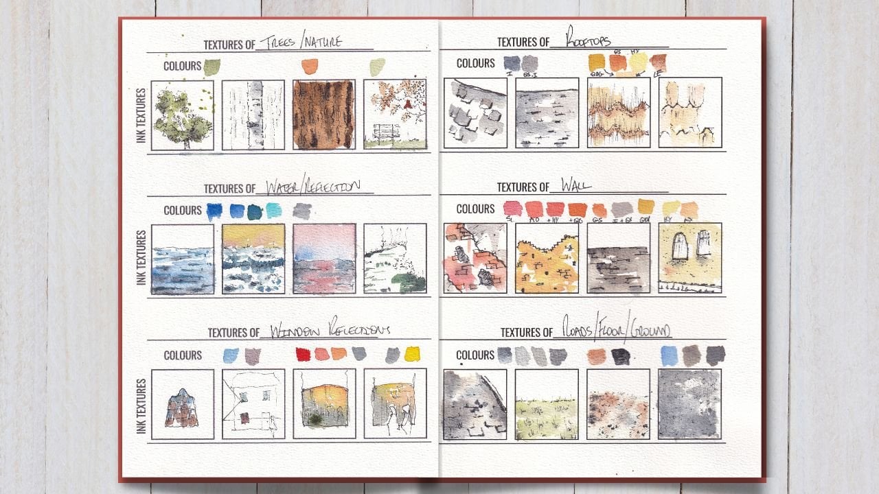
2. Supplies: Firstly, we're just going
to have a really quick look at the kind of supplies
you might want. I'm not going to bore you too much with this introduction. But the key message I
want to get here is that these are not a list of
absolute must-haves. This is what I'm using, but you can use what you've got, and any pen, and any pencil, and
a piece of paper. I'm sure you'll still get
a lot out of this class. But with that, let's
have a little look at what indeed I am using. These supplies, everything
that you could possibly need. Now remember, things
are flexible. This is what I'm using, but it's not what
you have to use. It's just ideas. You can make do and
you can switch up a few different items,
change the paper, change the pen, and
still you have a lot of fun doing all the different
parts of this class. What am I using? Well, I'm using my Moleskine
watercolor sketch book. These have got watercolor paper and which gives you
a lovely texture, not just to draw, and also, of course, for watercolors. If you don't have
watercolor sketch book, you can use watercolor paper. You can also use normal
sketching paper. Just be aware that you
won't be able to use quite as much water without
the paper buckling. Now, I've also got a couple
of clips I'll be using. This is really useful when
we're using watercolors, just to keep the pages controlled and stop
them buckling as well. Next I've got my pen. This
is a TWSBI Diamond 580. It's got an extra fine
nib and within it, it's got a platinum carbon, well, I think, which I
use from this bottle. This is waterproofing. That's the only
important bit here, that you need something
with waterproofing. That could be a fine liner. It could be a fountain pen. It could even be
a ballpoint pen. Just as long as it's waterproof, then you'll be
able to do all the techniques that
we're using today. Next, of course, I've
got my watercolors. I'll list my full set of
watercolors at the bottom in the project resources and
project explanation tab. I've got 14 colors here, but we'll be focusing
on the greens. In my different sketches, I'm going to be using my
three different greens here. But also, instead of that,
you could mix it with green. There's a separate
little section, a separate little lesson, where I'll show you
these three greens, tell you what they are. But I'll also show
you how to use blue, yellow, brown to mix a
huge variety of greens. No need to have a load of
greens in your palette. You can also just use
simple primary colors and a brown and have a huge
amount of fun as well. With my watercolors,
I'm using two brushes, a size six round brush for more concentrated
deep pigment and then a quite large size
two mop brush. That's similar to a size
of a 12-14 round brush, to do the initial loose colors. Then just the tiny
bits we always forget. I've got a pot of water,
which you can see. It's lovely and green
after all the paintings. Start off if you can
with some clean water. Makes life much easier. I've been painting today, so I've got lots
of green in there. Then just something as simple as a little tissue or a towel. You might need that just to control the water
a couple of times. But that is everything. In fact that is more than everything. You don't need all of this. One brush, any pen, some paper, a couple of colors, and you'll be good to go. Have fun and experiment
sketching greenery, sketching trees, bushes,
and all of the like.
3. The Project: So what is our project
for this class? Well, I've got two
options here, really. Firstly, what I'm going to
be doing is I'm going to be producing a sketch which
is all about the trees, the bushes, and the flowers. If you'd like to
join him with me, then the last few lessons
in this whole class, they're all about
that specific sketch, and you can find in the class
projects and resources, the reference photo
that I'll be using. You could also find
your own photo and join in and create
a lovely class project, all of your own based
on a scene around you. What I'd ask is just that that sketch is all
about the greenery. So there might be a house in it, but the reason you want to
sketch it is because there's some pretty flowers and because there's a big bush or
something like that. What we want to do with
our project is show how much confidence we've
gained in adding loose, fun, and expressive trees,
greenery, bushes, and flowers into our
themes with no first, just thinking about
the bigger picture. When you've done your project, what would be amazing is if you can share it in
the class gallery. Now to do that, all you
need to do is click "Class Projects & Resources"
below the video here, and then you'll find a button
saying "Create Project". From there, you just
upload your photo, quick snap on your phone, and perhaps even type a couple
of sentences about how it went and your thoughts and ideas or any questions you might have. If you want to
share your project and I'll be sure to come back, leave a comment and
answer those questions. So for both of us, it
becomes worthwhile, really fun way of connecting
and just enjoying creating and sharing
the artistic processes.
4. Trees - The Bigger Picture: The bigger picture,
that's what this lesson, in fact, that's what this
whole class is all about. What do we mean by
the bigger picture? Well, look, when we're walking around in urban scenes, or, of course, out in
the countryside, there's rows of trees,
rows greenery everywhere. But we normally don't
look too closely, we normally don't get stuck
in until we start thinking, how are we going to draw it? How are we going to paint it? How are we going to sketch it? What can happen at that point is we start imagining
ourselves zoomed in, we start imagining the individual
leaves of an oak tree, the individual petals
of a daffodil, and suddenly, trying to get these enormous beautiful shapes on our page becomes
really scary, really challenging,
way too much to do, and if it doesn't happen or
we just get stressed out. Now, instead, what I'm going to
suggest here is we think about the bigger picture, the bigger picture
of the shape and the bigger picture
of the textures. Now, that is what this
class is all about. By the end of this video, you'll have a lot more
confidence in grabbing that onto your page with quick, simple strokes, and be able to tackle all
sorts of different trees, all sorts of different
textures without much fuss. The first thing we want to be aware of is the bigger picture. What is the bigger picture? The bigger picture is shapes. Now, when we draw a house, for example, what do we do? We don't draw every brick, we draw perhaps a square, perhaps a triangle and
we've already got a house, no matter how wonky
our shapes are, it's still a house. Then we start adding
in little details, a couple of windows and a door, all of these things
just being shapes. Immediately, people
recognize what this is. This is the same for trees, there's nothing
clever about trees. What happens is we get into our minds that trees got a
certain types of leaves, they've got these
fascinating textures, and we imagine ourselves
up close to them whilst actually drawing
them from 100 meters away, and when we're 100 meters away, even if we are 20
or 30 meters away, or even 10 meters away, what can we actually see? Well, really we
can see the shape, we can see a little
bit of texture, and we can see light and shadow. Let's take a look
at, for example, this, oak. What is an oak? Well, an oak is a lovely tree with a very characteristic
and lovely shape. In this case, it's like a flattened, wobbly circle, this
was it's more of an ellipse or an oval. What we have to do is
capture that basic shape, and then underneath, we got the shape, again, of the trunk. All we're doing is
really simple shapes, and we get the idea
of our oak tree. You can see as well
that I've started to imply the texture, just a little bit
with the outline. We don't have to do that, but this is a nice way of just adding a little bit
more character, adding something else to our initial sketch and it is
part of the bigger picture. When we see a shape, normally that shape has a bit of texture. Even a wall of our
house might have a little wrinkly, wobbly field, and that is part of
the bigger picture, is part of what we can
see from a long way away. The same counts for
all sorts of trees. You might have a [inaudible]. Again, that's basically
just a triangle, isn't it? Again, with a very
rough outline, so we're thinking
bigger picture, we're thinking shape, we're thinking that broad
idea of texture as well. Again, it's got a shape at
the bottom which is a stem. Not a stem, it's a
trunk, of course, not a stem, and we can keep doing this for
all sorts of different trees. It gets interesting when we
move to trees which have got more different shapes in them. An ash tree often has big
spaces in it, for example. Now, we have a bigger shape, which is something
like a big circle. That big circle is broken up, and within it, we have little shapes which are already part of that
bigger picture. We've got that shapes, that initial aspect of texture, and then with just these
simple, simple lines, we're already forming
quite effective trees; effective trees which
would fit in our sketches, in our landscapes
and look like trees. My initial challenge
to you is just find a few photos or sit in your garden and
get these shapes. See if you can form
the key shapes, the key broad textures, and just be happy that already, with a few simple lines, you are drawing and
sketching trees.
5. Trees - Texture and Shadow: Now we're going to move
on and we're going to take a closer look. But whilst really still keeping that bigger picture in mind.
What are we going to do? We're going to look
at how to turn this interesting
shape into something 3D and with increasing and useful and visually
fascinating texture. Texture, which explains
not just the shape, not just the fact that it's 3D, but also tells us a little
bit more about the tree. Now having nailed the bigger
picture and being nice and competent with the idea of shape and that initial texture, we can actually move
even further into texture whilst adding
some shadow as well, and shadow is important because shadow gives us the 3D shape. These are 2D shapes,
circles, triangles, circles, 3D shapes or 3D
structures are spheres, or they are cylinders, or they are cones. That's really what
these trees are. How do you get that idea
of something being 3D? Well, it's 3D shadows. For example, if we just do
little doodle in the corner of our page here,
something really simple. This time we do maybe a cube, maybe we do a sphere, and how do we make these things actually a cube and a sphere? Well, it's by adding
in some shadow. If we just added in
shadows like this, with really simple hatching. Suddenly, what we've got is no longer just a
flattened 3D object. Well, we can enhance it
even further by adding in underneath a
shadow on the ground. Now our objects aren't
just on their own, they've got interaction
with the ground, the light and the darkness, it's interacting with the ground to give it a 3D presence. Now, the interesting
thing is our shadow, which gives us that 3D shape, doesn't have to be
simple hatching, it can also enhance the texture. If we take our
house, for example, where we could actually use
little brick-like marks, and we could do more brick marks where we want the shadow. If the shadow is all up here, we can do more brick marks, and then where it's really light at the bottom of the house. Say we do fewer brick marks. We can combine that with a
bit of hatching if we want. That combined effect just gives us a really
clear idea of not just that this is a house lit from the top according a lot of shadow underneath the roof here, but also that it's made of red bricks like this
little modern bricks. We can take this idea and
move it into our oak. This is where we do start
thinking about the leaves. Not sketching every leaf, but in general, what do
the leaves feel like? Of course, oak leaves, have got that really wobbly big feel. If I do a really dodgy
example of an oak leaf, it's got that shape. What we do is we imagine
that we replicate that with our own lines whilst
creating that shadow. If we treat in the oak
trees are a big sphere, we want most of the
shadow under here. I'm going to do some wiggly, wobbly lines, just
little flicks. Not even pretending
to draw leaves. What I'm doing is I'm suggesting leave and I'm taking
my inspiration from the texture of the leaf
that we've drawn up here. We can just do a few
in the light areas, but down here where it's dark, especially at the very bottom, it's very dark,
we do a lot more. This way, even just a few marks, but we most definitely
got a tree. Now, don't forget, the
trunk has texture as well. That give me that
architecture we can just get again through
the same idea. Just doing little flicks, little marks to
suggest the texture. Look, is a tree, but now it's a 3D tree. It's not just this flat image. What about here where we've
got pine needles perhaps. Well, sometimes you've got
a lowland, it's got more, I think is a drooping leaves, very short and very firm, very close to pine needles in
many ways in their texture, there are all these
short linear structures. Again, we take that idea, and we use that for our texture. That texture will build up and it become the
shadow that we want. Notice I'm just doing
slightly different marks for this tree compared to this. These are little sharp
short angular marks. Now, I'm not even pretending that I'm drawing the leaves or the pine needles
or whatever else this evergreen style
tree might be, what I am doing is taking
inspiration from them. We can move along
here and again, an ash tree you don't cite good, it's got stringy tiny
little leaves to the net, and they build up
into long areas. I say long areas, it fills
up along a stem like this. That's what I'm
trying to suggest. How are we going to do that? Well, why don't we do loopy
little longer wobbles. Now we've got lots of
shapes to consider, because we got
these three shapes all interacting
with one another. But again, just taking
the idea of these leaves, this long wobbling
structures, and before long, just putting these
little marks to suggest them not only has a
texture built up but our shape and our idea of 3D realism is also very
simply building up. Don't forget, I left
the trunk out here too, that's very naughty, I
left the trunk out here. Then we can just come back
and even the branches in here can get a little bit
of that textual mark. Now we have these 3D structures. The last bit, of course, is this idea of shadow. How do we do that? Well, we work out where
the light's coming from. Let's say the light's
coming from here, which is why this is all bright. We just cost down
a simple trunk, and then we can just do some really simple
hatching to suggest. Just where that light might be cost down by the
outline of our tree. We could do the same over here. It's like doing a reflection, a really loose reflection. You're coming down. Whereas this one going to fall, how's this one going to fall, how's this one going to fall? Now we've got all of these objects connected
with the ground. Last little tip which
might be helpful, is actually to connect them even more with
the ground here. You see how the trunks don't
really have an ending. Well, you can just give
them a little touch of grass in the front. We're going along like this. They'll touch with grass, maybe a little bush or
something to the side. That just instead of having this unnatural hard line like I've got here
with my oak tree. Do you see how this
little touch of grass, a little touch or texture, just gives us
something more fun, more realistic than this very flattened,
illustrative feel. There you go. That is Step 2 of our easy method
for drawing trees. What I suggest now is you go
back to the sketches you did from the last lesson and find out those
textures you can add, find the little bits
of fun you can add to make them more texture
filled more 3D.
6. How to Mix Greens: Not sure that I should do a
little extra lesson here. Little extra bonus because
what I do is I cheat. In my palette, I've got
three different green colors and that makes life
very easy for me, but they are definitely
what in the art world we can call lazy colors. Lazy because green
is so easy to mix. Now, if you aren't lazy like me, you might not have a lot
of greens in your palette. What you might want
to do is learn to mix the greens
confidently and easily from the blues and yellows and browns that
you have in your palette. That's what this
lesson is all about. Just because you don't have the greens that I
have in my palette, doesn't mean that you can't
continue with this class. No, it just means
you're better than me. It means that you're not lazy. Let's have a look at
how being not lazy can actually give you so much
more flexibility in how you can create and craft
different greens and textures and have fun
just using simple mixing. It's time for a little
note on mixing greens. What I'm going to be
doing in my sketches, I'm going to be using
three different greens. I've got here green gold, which is a really
bright yellow-y green, hence the name green gold, and cascade green, which is a green which has a
lovely texture to it, and it splits into different
tones and different hues. Lastly, I'm going to be
using green apatite, which is this deep theme, very granulating green color, olive green or the
deep sap green. These are lazy colors. Apart from the textures perhaps, there's no good reason
why you need to have lots of different greens. Instead, a very sensible
thing to do is to mix greens. To mix greens, what do we need? We need a blue. For example, I've got a cobalt blue here. I've got a phthalo
blue green shade. The phthalo blue comes in
green or yellow shade. Phthalo blue-green shade here. Now let us got a
couple of yellow, so I've got a hansa
yellow medium, and I've got a
quinacridone gold. Now using different greens and different blues in
different proportions, you can make all sorts
of different greens. If I let you just take a cobalt blue and spread
it across my page here, then I can come in with
some of this hansa yellow. We can mix this on the page. We can mix on the
page and we can see all the different kinds
of greens we can get. Obviously going
from very yellow to quite bright to much
more blue and muted. If we just change
one of those colors, if we take the cobalt again, but we change that to
the quinacridone gold, we get very different selection
of greens through blues, through this goldie color. We can see the green
team will subtle, and it's more brownie as we move towards the quinacridone gold. But there are still a vast range of different things
that we can achieve. I'll do another example. If we take our phthalo blue, you can see that's much more
vivid than the cobalt blue. Then I mix my yellow with it. We get really punchy, bright, and vivid greens. Even with just a
blue and a yellow, you can achieve such
a vast range of different greens that there
isn't a need to cheat. Now the last thing I'd add is
to actually be able to mix in a brown or just
another murky color. I've got a sepia here. If we mix that in with our mix, we end up with those more
muted greens like we can end up something close to
this rather than so vivid. If I take, let's take my
phthalo blue on the page, my hansa yellow, look at this punchy
vivid green we've got. But then as soon as I start
adding in a bit of sepia, look how it mutes
that green down, look how it pushes it
into the background. It becomes more
something like this. There's no need to
mix on the page. You can also mix in the palette
to feel more confident. You could just take
a bit of blue here, now you can take
a bit of yellow, and then literally just mix them together and see
where you end up. I want this green here. Then you can get a nice
block of a simple green. You can learn to mix on the page where you can do
a combination of both. But my suggestion is to have
a play with your palette. See how the different blues, the different yellows,
the different browns interact to give you
different greens. You'll find just really
these little changes. You can get such a huge
array of different greens. I'm just going to keep going. One last little demonstration
of different colors. This is all just using my same two colors
along with that brown. It's just using these top two, the cobalt blue and the hansa yellow in different proportions. But you can get such
an amazing array of different greens
just remixing. Have a go, have a play. If you have some greens
in your palette, brilliant, you can also apply
the same ideas to them. You can add yellow to green, you can add blue to green, add brown to green, but have a play because painting greenery is one of these things where
we think of green, but actually there's a
million greens out there. When we're comfortable
playing with our greens, we'll be really comfortable
having a lot of fun and sketching scenes with green, greenery, trees, bushes, plants, and flowers in them.
7. Trees - Adding Colour: Now it's time to have
a look at color. How can we use a little
bit of color to just enhance what we've done so
far to enhance our ink work. In one of the previous lessons, we looked at how to use
different greens or how to mix different greens or
use individual greens. In this video, I'll be using my pre-made greens out of the packet greens, which
were in my palette. But you didn't have to do that. The exact colors
aren't important. If you have enjoyment or a
necessity to mix greens, then that's what you
do for this lesson and you won't be any either
worse off of it. In fact, as I said in
the previous lesson, actually mixing our greens is a really good
habit to get into. So we've done our ink
sketching of arteries, and now it's time
to have a bit of fun with our watercolors. I'm going to suggest
the watercolors come in two and possibly three stages when we're thinking
about simple trees. So what are the stages? Well, the first is a really
nice loose and light wash, and you're just choosing a basic color which
fits the vine, fits the feel of the
tree you're going for. So for example, for my oak tree, I'm going to use a
nice muted green. This is a green genuine apatite. You could equally use
something like sap green. You can mix the green
with a yellow and a blue, and just mix together
yellow, blue, brown to get a nice tone that
you might find in a tree. But I also like having my
cheap greens in my palette, which just let me really
quickly splash on some green when I've got
a tree or two in my scene. How do I do it? Loads of water. I focus around the outside of the tree that keeps
it fluid and it keeps the idea that you can see through trees which
often you can, you can often see through into the
background of the tree. I don't worry too much about keeping that color
within the tree. You can if you want. But for me, trees are quite fluid. There are little leaves
popping in and out, falsely trying to keep
the color all within. Well, it's false, it
doesn't look real to me. It looks like an illustration
where it's getting that flowing feel the
colors billowing out. That's what I love about trees. I then add in a little bit
of color into our trunk. So let's try just
a simple brown. I've got a sepia brown in my palette. So I'm
going to use that. Again, just a really
light touch of color, and the green and the
brown are going to mix together. But that's fine. If you look at many trees, you'll see that actually
there's a little green reflecting
down onto the trunk. So you want those colors
to blend and merge. It's more realistic,
it's more fun, it's quicker to paint. For me, that's how I
like to paint, at least. Now, whilst this dries, I'm just going to move
on, and I just couldn't do a different green. I'm going to use this
time a cascade green for my evergreen tree. Same thing, lots of loose color. I'm focusing it
around the outside so I get some of these
spaces on the inside. What can be fun to
do is bring in a bit more of that pigment
and just touch it in. Again, that creates texture and lets things feel fluid
and like they're moving. We could use a different
color for the trunk. Sometimes trunks are
very dark, almost black. So what about a bit
of moon glow just dragging down in there to give a different feel to our tree. Then lastly, you don't
have to use green even, so if you could use any color. I'm going to stay fairly realistic and I'm going
to use a bit of a yellow and that'll give
us already a tunnel fail. Perhaps I'm going to use
a blue, yellow and then mix it with a bit of
quinacridone gold as well to get that golden yellow
feel and often ash trees, do you feel a bit brighter. So maybe I'm vaguely staying
in realistic territory here. Again, let's just change
up the color of the trunk. Let's go for a violet
trunk, perylene violet. Look, it's a bit bitten
nonsensical, isn't it? In many ways, but actually, it works because what
we've got is the shape, the structure, the
light of the tree. Don't forget that shadow. If we just take a
simple shadow color, we can pop that down there. So I've got a bit of moon glow, pop it down there, and
pop that in here as well. Look that just
connects the tree. What you might find in shadows as well is
sometimes a bit of reflection of the
color of the object. So a bit of green
in the shadows, or in the case here, a little bit of blue-yellow
coming down into that shadow. That again connects
the shadow down. That's the first layer of color. So now I'm just going to let
that dry and we'll come back to the second layer of color. As you can see, we're
back and mostly dry. What do we do now?
What do we do with our second layer of color? Well, we just add a bit
more richness if we want. For background trees,
this might be enough, but if they're closer
to the foreground, we might literally just want
to take the same colors again and just
enrich a few areas. This helps to further enhance the idea of
shape and of texture. So even using a really
big brush like this, you can get in the idea
of some leafy textures. Just move along our
three different trees using our three
different colors, and just adding in that
extra bit of depth, that extra emphasis
of darker shadows. Lastly onto my yellow gold area. If I just use a bit
more of the gold this time, you get the idea. Where you'll notice
is we've got lots of edges in this color. Do you see how all around
there's lots of edges. So it's got lots of lines
instead of just being a soft color, it got some line. So what we can do, we
can actually come back, clean our brush off. We can come back
and we can come in and just soften some
of these edges, you see how that
softening effect makes it feel more flowy, makes it feel more natural. Just the case of coming in,
gently brushing in and just reducing the angularity
of some of those edges. Not all of them because you
got some of them in there, but just some of them, getting rid of that little angularity. A tiny bit more here. Same thing, just look how
we can just soften that, make it more gentle and gradual. You get really quick. That is step number two for the leaves then
of course we need to do little bit more
on our trunks. If I just get my little sepia, we can do exactly
the same thing. Enhancing a little bit more of each of these shadow colors, each of these shaded areas. This is perylene violet, almost using the wrong
color there, ain't I? So a bit of perylene violet on this last set of
branches and trunk. There you go. So now that
is Step 2 completely done. I I said there's a bonus
potential with Step 3. We'll do a little bit
more about how to use different colors and things
in the next lessons. But something I often
like to do just to enhance it as a little Step 3 is to take my leaf colors
and do a little splash. You can just do a
little splash around. You can go in. Sometimes for me, that idea of these leaves, it can be little leaves
floating around, floating away, just makes
it again feel more natural. Now you don't want to
do this every time, you don't want to do it loads. But sometimes it's a really
lovely effect that you might really want to
experiment and play with. Especially to get that
feel of a fluid tree, to get that feel of
leaves floating off and drifting into the
wind. So there you go. That is our colors done for
our bigger picture trees. We've added some texture, added some 3D, and now added some beautiful,
lovely flowing colors.
8. Hedges and Bushes!: This lesson is all about hedges. Now hedges, what are they? They are dense, green, yellow, sometimes flowery,
lovely little structures. Again, just like trees, we can get too stuck in. In this lesson, we're
just going to look at how all the bigger picture or the color stuff that
we've been talking about, applies just as well to bushes. When it comes to
hedges and bushes, it might feel like we have
to learn a whole new set of rules but you'll be very pleased today.
Of course we don't. Bushes and hedges are
very similar to tree. If we look at a
couple of references, like we look at this one, and then we look at this one. What I hope you can notice
is there's still shapes. There are still a
bigger picture. They still got texture,
and they still will a bit of color and shadow. The only difference is that
they are lacking a trunk. All we need to do to draw
different size of hedges is just think of our shape
and remember that texture. We can have this as a
lovely little bushy, small plants coming
onto the bottom. Instead of drawing a trunk, we just connect it to the
ground and at the ground, there's often a lot of shadows, so we can do a lot
of that texture, that idea of the graphs coming up to start building the shadow. Then again, we can just inject some leaf-like shapes
to create that shadow; to create that texture. Equally the same for a much
longer, much bigger bush. Maybe this is a classic privet hedges which
are very straight. What it can be quite nice
to do is just bring it all across and just give
these little suggestions of the shape coming down. It's all focusing on that
texture very simply. Then underneath maybe we can even see a couple
of little bricks. There's often little bricks
at the bottom on there. Again, we just
inject that feeling; that texture at the bottom. Without trying to be too clever, without trying to get
stuck in the detail. You can see this
line is not going to quite match up, but that's fine. We just introduce a
little bit of randomness. Again these textures, these shapes which are
forming the shadow. There's nothing
different, nothing clever about bushes and hedges. They're just trees without
legs [LAUGHTER] if you like, if we wouldn't really
simplify all the way down. There you go, that would
be all our ink work done for a couple of
bushes and then we can do exactly the same processes to start injecting some
life and some coloring. Let's just take, I'm going to
use some cascade green over here just to do our
first layer of color. Same idea, leaving a little
bit of brightness in there. Let's use something different. Let's do some gold green, this is very light
and bright green, look at that almost fluorescent. You see, I should
have let the ink dry a little bit longer
there but otherwise, I think this is
working very nicely. Really it doesn't matter
if some ink moves, it just providing a little bit more of that textual feeling. Then while waiting
for these to dry, we can use a bit
of our moonglow, create a bit of a shadow. I think that moonglow has been mixed with much sepia a bit, which is fine
that's why it's got this kind of brownie color. I'm just going to
continue that anyway. We can get that shadow coming
down here at the base. I'm just going to let that
dry and I'll come back to in a minute or two and
we'll do the extra layer, the extra second layer of color. We're back, we're
pretty much dry, not perfectly dry, but
again, it doesn't matter. Actually when it's
not perfectly dry, it helps the colors soften, which is a part of our
process of course. What I'm going to do this
time, just a little dab of this same cascade green and just leaving more
of it down here, less of it up here so
we've got light and dark. Now I can go along,
I can do the same with our gold green. Again, I'm going to focus this in a textually minded way, so we get more of that shadow. Also, we're leaving little
dabs to suggest texture, to suggest extra bits
of shadow elsewhere. What we'll do then just
dry off our brush and we come back in and we can soften a couple of
these edges out. We can leave some of them hard. We don't have to
soften everything, but we can leave some of them hard and just
make sure we've done enough little
bits to softening. Now some bit we
might want to do for this is just as little extra. We set this as in brick, so we might want to just
come in and just drop little bits of color down here. Just to suggest that there's
bricks coming underneath. We might want to just come
back in a bit more of a moonglow to enhance that, and let some of this
color run down. We can actually
dropping the color in. Look how we can pull down that green by connecting the shadow. Now we've got that green
reflected shadow we were talking about
with our trees before. If you want, you can
add some splashes. Perhaps, this time I'll just
leave them unsplashed to leave them nice and clean like this so you can see
the different styles. With those very simple steps, you very easily could add
this bush into any scene.
9. Flowers!: Now flowers. These guys, well
they're beautiful, but in terms of sketching, sometimes they can feel a bit scary because they're
so beautiful. Because the colors
seem so important, because we know the
shape of daffodil, we know the shape
of a sunflower. We know what they're
supposed to look like. That can lead us trying to sketch them or paint
them exactly what they look like when actually
that's just us taking too many steps too
close and not looking as we talked about at
the bigger picture. In this video, in this lesson, we're going to see what is the
bigger picture of flowers. How can we actually sketch them without getting sucked in? Now flowers is where it starts to get quite
fun, doesn't it? There's lots of extra colors and shapes and things
to get involved with. Again, I just remind you to think about the
bigger picture. It's very easy to walk up to some flowers and go look
all these little petals, all these individual
things going on. But again, if we step back, what do we see? We just see little
flecks of color. Maybe a few shapes, but mostly it's about that
mingling of bright colors. I'm going to suggest therefore, two different ways
that you can approach flowers and I'm going to
do two different examples. The first is, let's say we have a tree or a bush in flower. What do we have?
We have our tree, which is a shape. Let's say it's one of those oak-like shapes almost
a circle with some texture. Then we've got the
trunk of course, which we'll just do that real simple shape and then we've got our little textures
at the bottom as well to make
it feel lined up. Then inside we've got
our textures as well, between those
oak-feeling leaves, just to build up the texture. But let's say it's
also got flowers. For the sake of argument,
we're going to make these red flowers just so
they really stand out, which I know is not
realistic for an oak. What we do is we can now
just start also picking up some shapes of flower. These just little
different shapes, maybe little squares
or little triangles, just something different
to these leaf shapes. We can just pick out a few
more, maybe a couple here, maybe even a couple of which
are just at the very edge, and we build around that. We get our leaf shapes as well. We don't do one or the
other, we do both, but we pay attention to
building it up gradually. Not overwhelming, not
doing every flower. Just a few little shapes. Then what we do,
the same processes. Let's come in with, let's use our gold
green this time. I just mix it on my
palette a little bit. What I'm going to do is come around and get the same idea. I'm going to leave some of
these flower areas blank. Some of them are going to
get covered with green because I'm not going to
paint on every flower, but some of these
little flower shapes, we're going to leave
blank, leave white. Now, we're going
to leave this to dry and then we'll
come back to it. In the meantime, let's try a different scene on the right. What about a meadow
filled with flowers, perhaps on a little hill. We've got maybe
little heel up here, but let's just pop
something fun on the top. Let's pop a little lighthouse
on the top, for example. Just again, for the sake of argument to give us a
scene to work with. Then what we've got
is a meadow coming towards us like this. How can we get the sense of flowers throughout
this meadow? Well, we can do a
couple of things. Firstly, the same idea
of little shapes, little dots, and as they get further away,
they'll get smaller. Then as they closer, actually maybe we do draw a couple of suggestions
of little flowers, even with little leaves,
just little suggestions. Then we get the feel
of the grass as well. Again, if this is a hill, then this is going to be
in shadow at the bottom. Then as we get closer, couple more little flowers, maybe even a big flower
poking its head out here. In the back, just a few
more dots and flecks. From that, we've done
the same thing as we've done with our brushes
and our tree. We've built up the tone through little textural
marks without overdoing it. Now let's do a
different green again. We'll go back to
our green apatite, and can we just gently
providing some texture, painting over some
of the flowers and painting around
some of the others, especially the ones up close you might want to paint around because we've made these more
like details, haven't we? Just enrich some of this
green here to get some of that texture already going. What are we going
to do? I'm going to let this one dry as well. I'll come back when my pages dry in just a couple of minutes. We are back in there nice
and dry. What have we got? We've got these same ideas, but you just got some
slightly different shapes and some slightly
different white areas, specific kept white areas. With our red flowers
in this tree, perhaps this is becoming
more of a cherry blossom. It's the wrong shape
for cherry blossom, but that's the red flower
field I'm going for. What we're going to do?
Well, we're just going to pop in these shapes, both the ones which
are white and the ones which
we've painted over. We're just going to pop
little dots of red. We can find new shapes. We can also pop little dots of red where we haven't got shapes. A little bit's on the outside. But we don't do too much yet because we still got
some green to add. Now we come back
in with our green. I should've said notice I'm
using a smaller brush now. The reason being this is more
delicate work because we are trying to pick out
not quite detailed, but suggestions of detail. With that really
big watery brush that'd be very difficult. We'd lose a lot of the ability
to have the definition. But we're doing exactly
the same technique. What we might want to do is actually lose some
of that definition. We might want to come in
and let this red blend, because again, like
with our shadows, when you have flowers, their lovely colors will reflect into the other
parts of your image. Now with flowers, I do recommend getting
in some splashing, so both without green, but also then with the flower color because we're
after the bigger picture. The bigger picture is
often these blending, bleeding mixed colors, and suddenly just having a
lot of these random red blobs basically in your tree is giving you that
complicated suggestion. Without it actually
being complicated to do, we can come back in, enrich a couple of
these shapes again. If we want, do a few little dobs and
dumps, and there you go. How you do exactly the same
thing here with our grass? Why don't we make these
lovely little yellow flowers. Maybe they are daffodils, maybe they are dandelions
or something like that. In fact, why do we
have even more fun? Why don't we make them both some yellow and some nice blue? Because it really doesn't matter which colors we're going for. I'm going to just
swap couple of bit of blue drops in a few places. Bit more yellow
in the back here, and then we'll come
back in with our green and find just a bit of
that shadowy texture. Now with grass
actually it's more about these linear textures, the grass tends to
come along like this. Then you might want
a few little flicks up and down just to suggest that big grass stalk, especially in a meadow, you might have big flicks with grass in the
front like this. But mostly it's about that
wavy up-and-down feel. Really been quite
gentle with your color. Then that means we can come back a bit more of
a bright color. Remember just a few splashes. Splashes, gone for
the wrong color there, especially with that. Yellow is blush,
lovely. Blue here. Now we've got this
meadowy field, absolutely jam-packed
with flowers. What we've done is we've
got the bigger picture, the suggestion of flowers, rather than getting stuck
drawing every little detail, which is way too challenging to do when we just
simply sketching.
10. Step One - Shapes: We're on to our final project. In our final project, as ever, will be following a
step-by-step process. Now, first Step 1, we're going to be focusing on those shapes and the
shapes with texture. Everything we talked about
in the first lesson, where we just talked
about the bigger picture. That's exactly what we're doing, putting it all into practice
for our final project. We're going to take
everything we've learned and we're going
to put it into practice. We're going to have fun with this little scene not
getting lost in the detail, but still creating the effect of all these lovely bushes and
trees and things going on. I'm going to start with my pen. Step 1 is all about
those shapes. Also with trees, it's the
texture of those shapes. With no further
ado, let's start by just getting really loosely, really gently the idea
of this house it. We just get the broad shapes, we can see it's
basically a rectangle. Then underneath we've
got these little roof, which is another
couple of rectangles. We can't see it go all the way down because all the bushes, so don't bring the
line all the way down. Just end your
rectangle bit earlier. Same down here. This ends, doesn't it? Just cuts out
behind some bushes. Then we can just
see a little top of the roof coming along with
some other little chimneys, which always nice little
extras to add in. We just add in our lovely
little chimneys really loosely. Bring that down. We can start adding a bit
of a shadow even know just the shadows under the
roof and things like that. Little window, another
little window here. That's basically our
house captured, isn't it? There's another window we can
just see off to the edge. Now we start adding
in the key bushes, the key bits we definitely
want to include. What are they? Well, to some extent it's up
to us to decide. I'm going to start with these
ones in the foreground. We can match them up, we can
line them up with our house. We just getting the idea
remember. Look at this. This has got lots of
very little leaves. We get those really funny
little textures coming down. Then it meets the grass. Let's just get that
idea of grass. Then you can see there's like
a wall coming across here, which is something we
practiced in our bush lesson. Just get that wall and the
wall gets cut off again by this little bushy leafy feel. Then, we can simplify things. There's lots of bits
and bobs going on here. But actually the most
interesting next thing is this really pink flowery bush. Let's get this idea of this pink flowery
bush. What is it? It's got these really big
circular feeling flowers. Where does that go? Where does that
finish on our house. It finishes here. It doesn't get as far as
the apex of the roof, but gets very close. Then it dangles down
over the grass as well. Rather than worrying
about making a 3D object at the moment, we're making it into a silhouette
which feels really odd. Feels very odd, doesn't it? Doesn't look like anything, but that's where the
shadows come in. That's when we add the shadows
and suddenly it will work. Don't rush, just take your time. We can see again, this
little brick wall is still in existence back here. We can add that in
and that connects us to our next
couple of brushes. We've got this lovely
little red one. We won't make too much of that. Then we've got this
lovely green one. We also won't make
too much of that. Why won't we make
too much of that? Well, it's getting into the
distance now, isn't it? As we go into the distance, it really is about the bigger picture is
not about the details. We've already got
these trees, leaves, bushes are rather which
real focal points. Then we got a fence disappearing off into
the distance as well. We can just make that disappear with some really loose lines. We've got a couple of trees and where do they come back to? Surprisingly close, aren't they? They got this droopy appearance, the one in the background. Let's just give it
that droopy appearance with our texture. Then there's another tree
which is in front of that, which is I can't
actually tell what tree. I'm sure someone
knows what tree, but it's got a slightly
different texture. We'll just give it a
different texture as well. Doesn't have a trunk. It disappears off to
the edge of our image, so we'll just let
it disappear off. I'm not going to include
the leaves at the top. They're not really part of
the context of the image. But I will include, is that the least shape of this tree but it's
definitely in the distance. Look how loose and
floppy and just gentle we can be and that will still be a tree when
we're finished. Anything else you
want to include? Well, why not put some of
these little leaves coming in. This is where if you want, you can make it
about the leaves. You can put this right
in the foreground. These leaves are really
in the foreground. It becomes less about the bigger picture and
it's more about the texture of these
leaves just coming in, coming across, and being right in front
of lots of things. There you go. We've both got a lot of bigger
picture stuff, but also focused down
more on smaller things. That is it. That is
the end of Step 1. In Step 2, we're going to add a bit more detail and
a bit more texture.
11. Step Two - Shadow and Detail: Step 2 now, Step 2 is all about just
adding that texture, that shadow, really
making things feel 3D and just making them
make that a little bit more sense altogether. Onto Step 2 now, so with our pen, we're just going to find some of these key lines and textures. I'm going to start
again in the house. You can see behind here
there's like a doorway that I didn't notice the first
time. We'll add it in now. We can see these is lovely
textured bits of wool versus some which have got
that pebble dash from there. Let's get that
suggestion of texture. We can continue that texture going on to the
other wool as well. Otherwise this wool is
rather big and blank. Just these few little
marks, I hope you agree. Just take it from being
blank to being interesting. But it's not the focal point. We don't want
loads, just enough. You'll know it's enough only often when
you've done too many. Always stop before you think you're done and just
have a look and for me, that's plenty.
It's looking fine. Then what else do we want to do? Just maybe enhance the
texture of this roof a little bit just to suggest some
of these roof tiles. Maybe pop in this TV aerial
just to something extra. Now let's move to our
real area of interest. Our real area of interest
is these lovely bushes. Now what we can see here, it's got these yellow edges
and then this green core. I'm going to use that green
to suggest shadowing and go. Really, go for it. This is
a right in the foreground, and it's got some
really deep shadows. Under here we haven't
drawn a tree, but there is shadow
so we can just maybe just go to
normal hatching. Now we've got more of
these lovely flowers. Let's get these flowery, loopy structures
coming down whilst also getting more
shape into this. Just by finding the dark areas
and adding more texture. Suddenly, you'll find that
actually something which is a really weird outline become something which
has got a real shape. Now it feels like it's an object which is trailing
onto the ground, which is what we
wanted it to be. In the background we worry less. We want this to be fainter. We're just going to do a
really loose textural marks. Same here, probably a little bit more because it feels more important in some
ways because it's providing a big contrast
out to the side, but not much is needed. Then in this tree, just
really gentle lines. Back here maybe nothing at all. Maybe just the bigger
picture is all we need. Now a couple of last
minute things to add in. We've got the idea of this
grass coming forward. We can do that and we want to fit it with this perspective. We've got this very steep
funny perspective going on. We do want to fit it with that. I probably haven't got
this perspective perfect, I probably squished it
a bit. That's fine. It's a sketch. It's about having fun and we're
exploring the trees, not exploring
perspective tonight. It's okay if it's
not quite right. With the grass, that's just
some little touches here. There are some little
flowers and things on it. Why not take our
learning from before and just do a couple of
little flower marks. There's probably some daisies and some dandy lines in there. There you go. That is
the end of Step 2. I can put my pen away and feel
very happy that we've got a really fascinating
sketch which already is all about
this greenery, despite there being
a big house in it, despite this being a
potentially an urban sketch, certainly something I could
have done just outside. This is all about these
lovely bits of greenery.
12. Step Three - Loose Colour: Step 3, now we know
that this is the way, it's got to be loose colors. We're going to be splashing on some lovely light loose colors, really starting to bring
our theme to life. Time now for the fun, for adding in all
that lovely color. Now, I'm going to start
with loose colors. Steps 3, loose colors. I'm going to take my big brush. I'm going to find the
different bits of green first. Going to ignore the
house completely. Actually, you'll find if we make the house
negative space, it's going to make
all the greenery pop out so much better. We don't need to paint
the house at all. Let's see at the end, if
we still feel that way, maybe we'll add a little
touch here or there. But we're going
to start off with the ambition not to
paint the house at all. I'm going to use the
same three greens that I've been using
through the rest. You can of course mix them. If you want to mix, then there's a little class about mixing, and this was a lesson about
mixing in this class, so have a look at that,
and you'll be able to do the same ideas just with a
blue and a green and a brown. I'm going start with
my lovely gold green. I'm going to put that on this
lovely, do you see this? Very yellow areas
in the front bush. I'm also going to use that
in a couple of other places, in these distant trees, for example because I don't want my light green just
be in one place. Even just dab it on to a
couple of these leaves here. Then I'm going to start
moving onto my deeper greens. I'm going to use my
cascade green next. [NOISE] Still being
very gentle and light with it. I'm
going to blend that in. This is now a bush rather with lots of different
tones going on. You're going to find some
of these greens in here, so that these leaves are
doing interesting things. Then I'm just going
to just give it a general light wash through the rest of these areas just, again, to promote that
idea of unity throughout. Notice, I've left this guy out, and the reason is this guy, it's got actually a lot more
pink than green, isn't it? What we might want to do
instead of starting with green, if you have a pink, then pink, otherwise, use a dilute red. I've got my red in there. I'm just going to make
it nice and dilute. It's not going to be perfect, but I could mix it a little bit of that red and maybe
a little bit of, I have got a violet here. It's a deep violet,
but a little bit of that just to suggest
it's not quite red. Then instead of adding
the color to that, what I'm going to do
is I'm going to add the green to the color. It's going to be
more about the color and how it interacts
with the green than the other way around. I
hope that makes sense. It's just these
little things with how you're thinking more
than anything else, let's you encourage
your watercolors to do what you want them to do. Next, a little bit of
my appetite green, so this is more
of a murky green. This would be the green you get if you start to add in a bit of brown and this is going
to come into the grass. But I'm not going to just
keep it in the grass, I'm going to let it blend into some of the bushes as well. Actually, it's not
blending that well, so specifically I'm
going to come back in, just soften it and
push it around, and that will help it
blend and move and merge into those other areas. This way, everything is connected rather than being
lots of separate things, which will become
more separate later. But rather than
starting so separate, they're all starting connected. Couple of other touches, I think important
to get a little bit of the idea of some shadows. Let's go back to this
moon glow again. There is our path
under this edge here. Again, letting these green
blend and merge out. Then a bit of shadow
coming under here, put in here, and I also like to just get a little bit of brown
onto this fence, I think. Haven't got the brown
there of course, we need to use it somewhere else just to balance out the image. That might be a nice way, just to touch in some more
leaf-like shapes up here. There you go. That is Step 1, done really loose colors, leaving a lot of bits of white, letting the colors
blend and merge. Now, we just need this to dry. We'll come in with Step 4, where we'll be adding in some deeper colors
and more bold colors.
13. Step Four - Bold Colour: Now we're on to Step 4. Step 4 is where we
take a little look at our colors and we enrich
them, bolden them, maybe enhance some shadows here, and start adding in those
very little flecks of line where we find flowers
and bright leaves. So we're back for Step 4. What I've got now is
my thinner brush. That's because we're
going to be applying some rich attains. That's easier to do sometimes
with a smaller brush. You can see it's mostly dry, but a few places aren't,
and that's fine. I didn't want it
necessarily totally dry because then
everything becomes hard and new and layers rather than being a
bit soft and interesting. I'm just going to work my
way around the image again. I'm going to really
enhance some of these light areas with
punchy bits of green gold. This might be a
more yellowy green, if you haven't got lots of different greens to play
with, and that's fine. You don't need lots
of different greens. Then I'm going to get this
textual green in here as well. [inaudible] and create more
than just a flat wash. Immediately I want to just
come in with my green apatite. Getting in this idea of
the grass underneath, the grass interacting
with that tree. Remember, these lovely linear shapes we can use there as well. I'm going to keep moving up, down, up, down, just
like I've done there. So bidders are lovely. Red to really promote some more of these flower
shapes. I know that pink. If you have a bit of pink in your palette, by
all means, use that, or you can even mix a bit of white gouache with your
red to make it more pink. For me, I'm sketching, so I'm approximating, and it's okay to just do a best effort rather
than something perfect. Going to take a bit
more of my cascade green and just drop that in. This time I'm not going
to blend it too much. I'm going to see what happens. I leave in a lot more red. So we've got that
murky undertaking from the red and
the green mixing, and now I want more red
really shining through. So just leave lots
of lovely areas of red instead of mixing, letting it blend too much. Now back to our murky green, our green apatite, a genuine green
apatite, I should say. That's too strong, isn't it? But we can just come back
in a little bit of water, and we can move it around. Soon enough it will be back to feeling part
of the real image. I'm going to bring up
all the way along now, all the way onto
here, and come back. Before it's dried, just do a little bit of softening,
if you remember. Just coming in and
making sure there aren't too many little hard edges. Then what else we got today? We're coming up
here, be good to use a bit more of a
cascade green again, just to give this bush a bit more life, a
bit more texture. That also brings it in front
of these distant bushes, so somebody will feel like it's closer if the colors are richer. We could just use lots of
little textural marks as well. Now, I do want a little bit of extra something in
this background tree, and so I just do
little gentle wash, just connect these
two areas as well. The same, the last bit
probably for now of green, it's just a more into
this tree again, to bring it in front, the other one behind it. Remember to come back in. That's looking quite a
hard edge, isn't it? So come back in, and soften. But now we've got all these bold colors
coming forward at us, which is really great fun. I want some more shadows and
more of my moon glow now, and we might have to do quite
a bit of shadow work just to get things feeling like they're arranged
in the right order. So lots of deep shadows
under this bush, under this and in-between. Bush shadow here,
and the same here. What we're doing is we're looking not just
at the reference, we're also looking at
our image and seeing, what does our image need? What is it missing
that it needs to actually provide that
shape and feel correct? That's like an
artistic decision. It's not just one about what's real and what's going on in our reference or
the front of it. It's also, how can
I manipulate what's around to do the job
I want it to do? Then we get to see,
what else could we do at this stage to
add a bit of life? Well, let's do a few
of our splashes. A few of our flashes there. Then we can take
a nice yellow for our plants or flowers
in the grass. We could do a few
splashes at the top here, [NOISE] and then we
could, if we wanted, we could actually
call this done as a lovely study of the greenery. But perhaps we'll lift
our image just by applying something
else to balance it. I wonder about adding
in a bit of sky. So actually, what
I'm going to do, so I'm going to come
in and I'm going to use a very light blue. This is a cobalt
blue, by the way. I'm just going to touch
that blue around. That doesn't need
to go everywhere. But what it can do is it can, again, just highlight
our negative space. Our negative space,
in this instance, is very much the house. Having established
a nice blue sky, we can introduce reflections. So the windows can now
have a little bit of blue, even the door could have
a little bit of blue. Under the light reflections
is often a bit of shadow reflecting from
the across the street. Maybe just a little touch of
shadow in our house as well. So it's still a negative space, but we're just defining it
not as a 2D object now, but as actually as a 3D object. So it's got a bit more present, just three simple
little touches. Still it's really a
white block in there, but it's got more presence. Now last thing I think
might be nice to do in this stage is just give
ourselves these bricks. Just give them a box of presence by having
a little bit of color. We can even use that little
red just in our fence. I know our fence is brown. But actually, again,
it unifies the idea. This red means it says
over man-made structure. I said last thing didn't I? But actually, there's always
another last thing to do. So what I want to do is just
use all different greens and just really make something
of these leaf-like shapes. These little leaves
that we've got dangling in front of us. We might even bring
in a few more. Even though we haven't
inked them in, we can just bring in a few
more leaf-like shapes. Touching in little last bits
here and there as well. Making some little suggestion
to the grass. There we go. That's the end of Step 4. Step 4, of course,
being the bold colors. The last bit is to just provide
those finishing touches. So I'm going to let
this completely dry so we can come
back in with our ink, maybe some more colors, maybe not, and see what
we want to do just to enhance this lovely
leucine a tiny bit more.
14. Step Five - Finishing Touches: Finally, we're almost done. Step five, step five, finishing touches or
anything goes in many ways. What we're going to do, we're
going to get our pen out, restructure our image
a huge amount and then also just come in and
find these brightest colors, there's boldest colors, there's most interesting touches which just need to be added
to make us feel happy. Here we go, we're
pretty much drawing. What we're going to
do, just come back in for the final touches. I'm going to start again by
redefining some shapes and what we can do now is we
can go round our trees, our bushes where the
color has decided to go because it's been loosened that means it
will have moved around. But we can redefine
these lovely shapes. We can redefine some of the
textures inside as well, just to provide that little
bit more shape uncertainty amongst a very
loosen wobbly wash. Same with our little bricks, they can come back as well. Little bit more
certainty about those. A little bit of a hatching, we can enhance these
lovely flowers, we could even just
extend in a few places. It's all the same principle. Again, just be careful
not to overdo this step. But also don't be afraid
of just experimenting, having a little bit of fun
and seeing what happens. In a worst-case scenario, we might ruin our sketch, but then it's just a
sketch and sketching is made for experimenting
and having fun with. What I'm doing is I'm
repeating a lot of these shapes we used before. I'm basing them just a lot more about what's
happened on our page, so I'm reacting to the page. For example here we've
got this little white gap in here so you can enhance that contrast by just coming in with a little line or just outlines where
we've got light, where we got that
texture in our graphs. We can enhance some of these
man-made structures a bit more and also these
lovely distinguishes. Now, as we get further back, we want to be careful not to
overdo it because bold lines come forward and this is what we want to be the most interesting
part of our sketch. We want to just hold off a lot more of the back
than we do at the front. We might even want
to just give this path another edge
because, why not? We can just suggest something
going on to the side of it. What else can we do? I think this tree is okay, this is okay, they're
in the distance, we want them to stay
in the distance. If I just enhanced this line, it will bring this bush forward in front of this
tree and the same here, if we just go over this line, it's going to bring this tree forward in front of this one, which is what we want to happen. Again, we can just find
these little edges of color and we can just do some little dribs and
drabs around them. What else might we want to do? Well, look, let's
make something of these lovely dabs of
color over here as well. Now what we can do is
we can really find all these shapes and outline
them and then connect them. Just by doing that in a
natural flowing pattern, we end up creating what feels like a tree
coming in front of us. Even with these
little ones that we added in at the last minute, if we just go around them, connect and create little
clusters of leaves, notice how it just feels now
even more like a tree is just dangling in front
and it wasn't hard work, it was just little
loose suggestion. Remember how we started? We're really loose
suggestions of lines and we even made it loser just
by little dabs of color. Now we can come back
and we can bring that all together and we can end
up with something really fun. Now, isn't much left to dig. I think there's one more thing
I want to do with the pan. I do want to just
make sure we've got this clear negative
space structure, so we just come
around and redefine our house and just being really clear that it really exists by giving it a nice bold outline. It's really there, we
really haven't painted it. We have purposefully
not painted it, so we can just get
the key shapes there and that just provides
a lot more structure in it. It shows we care
about this house, but actually we're using
it to push regional ac, your eyes get pushed from
that into this lovely color, this lovely myriad of greens. Now, last but not least, tiny touches of color to
just bring things to life. Now I'm going to use
very thick paint. I'm actually going to
be quite specific here. I want some of those yellow, we said they're probably
dandelions in the end, but some of those
yellow dandelions, I really want to stand out in the front and then maybe just mixed in with a bit of
red and come in and get some really
specific flowers here. Real specific dark touches,
not necessarily dark, but it's highly saturated
or strong bold tone of red. Again, that's just giving
us the bigger picture, the effect of the
flowers whilst also carrying a little bit
about some specifics. Now we can maybe a couple more camping really careful
not to overdo things. A little bit more enrichment
of these little bricks, which just spreading
that red around, the meaning of the red
isn't just in one place and maybe just a few gentle splashes just going on into
the edges here, just to fill up these areas, these little white areas
and finish off my sketch. Here we go. Just going
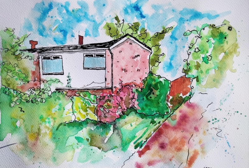
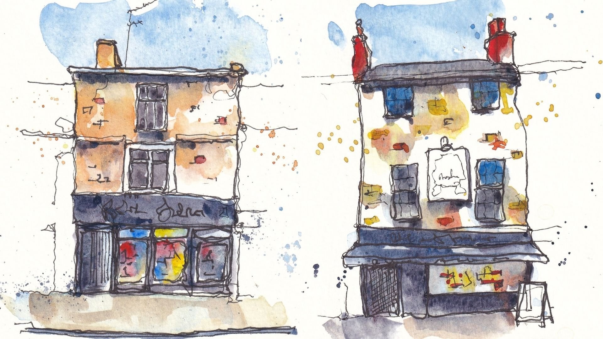
to put my name on it. This is a little scene, just a residential street from Sydney, so I'll put that on there as well and I'm done.
What have we've got? We've got a scene,
an urban sketch. We're virtually in one
sketch which could easily be in an urban
sketch outside, which is all about the trees. We've taken our
normal techniques and we've focused them in on greenery instead of focusing
them on the urban aspect. Might encourage you to do
this as something different. As you walk around
more and more, you'll actually notice how much, especially in the
Northern Hemisphere in Britain in the moment
everything is green and pretty and beautiful and
you'll notice there are loads of lovely scenes like this
which don't look like much, but are begging to be sketched. Have a bit of confidence. If you want to try this project, please do try this project or just try sketching
your house, your back garden,
or even just fill a page with some lovely
little suggestions of trees. It's been a pleasure to
sketch along with you. The last lesson in this
class will be all about summarizing and the next
steps we might want to take. Let's head over there now and
see what we've got to say.
15. Summary and Next Steps: Thank you so much for
getting all the way through the class
[inaudible] It's been a real pleasure
and I hope that we hit on those key
learning points for you. The idea of the bigger picture, whether we're talking about
the bigger picture of shapes, the bigger picture of texture, the bigger picture of color, we don't need more than that. Actually we can create
fascinating trees, greenery, flowers, everything, just by thinking about the bigger picture and
not getting too stressed, not getting to into
the nitty-gritty. With that in mind,
what can we do next? Well, I'd love you to join me on some more
Skillshare classes. I've got my profile all
organized all my classes, split into different sections depending on what you
might be interested in. Of course, if you've
enjoyed this class, please do share your project. You can do that by clicking the Project Resources tab and just clicking in
that Create Project. I'd also love for you
to leave me a review. Now if you've enjoyed the class, this is the most
brilliant powerful way of sharing the class for the people who have
given me feedback. Again to do that, what you
do is go below the video, click on reviews, and just create
review, add review. Now you can also find me on my website sketchloose.co.uk, urbansketch.co.uk,
and of course, @tobyurbansketch on
Instagram and YouTube. I'd love to connect
with you there and see the art you're
doing and also to go to share more regular
updates about what's going on in this
loose sketching, urban sketching world of mine. Anyway, without further ado, thank you so much for joining
me and happy sketching.
 Toby Haseler, Urban Sketcher, Continuous Lines