Transcripts
1. Introduction: Hello. My name is Fay
Guachillustrator, based in Germany. I'm really happy that you
clicked on this class, which already means that you find this
painting interesting. Now, in this class, we're going to draw
this urban scene together step by step using different
gouache technique so that at the end of the class, not only you have one finished
illustration of your own, you will also be able
to draw urban scenes or buildings using
the Gach technique that we learned in this class. Now, without further
ado, let's start.
2. Materials : Resources: So now the materials we're
going to use in this class. First is the paper. For this painting, I use the honeymuller
expression paper, which is coat pressed
and also mud. I love the combination of these both features and the
paper is 300 grams thick. But in this painting, I'm
going to use the same paper, but in a smaller version. And for the color itself, you can use whatever was
colors you have on hand. I'm going to use from this box I got from
Amazon several years ago. Or you can use Newton also
have fantastic gouache colors, and I actually like the one from Royal talents
also very much. But you can use whatever you got on hand in your local store. And for brushes.
Also simple one. If you already have some, use them and preferably, you have a different
kind of brushes. Mainly, we're going to
use the simple round one. And it depends on how big or small your
pint is going to be, you can use different sizes. Min are from Daffint
syntetics different series, and one is from Winsor
Newton antiin series. This one they have
very fine points. So what I'm going to
use and you may need a small fin brushes for the fine details you're going
to have in this painting. If you put it in water, it's going to be you can draw very fine line with
these brushes. So I hope you can see it. Now you can see it clearly. And last but not least, if you have, you don't have
to buy it particularly, but if you already have it, it may come handy if
you have the kind of brushes because it
may save much more time. I don't use this
kind of brush a lot, but sometimes I do use them. Other than that, some
mechanic pencils to sketch to draw the lines. You can also just use normal
pencils and some erasers. You're going to need
glass or jar for water to wash your brushes or to mix the color
that you need. That's pretty much
everything you're going to need in this class. Now let's start.
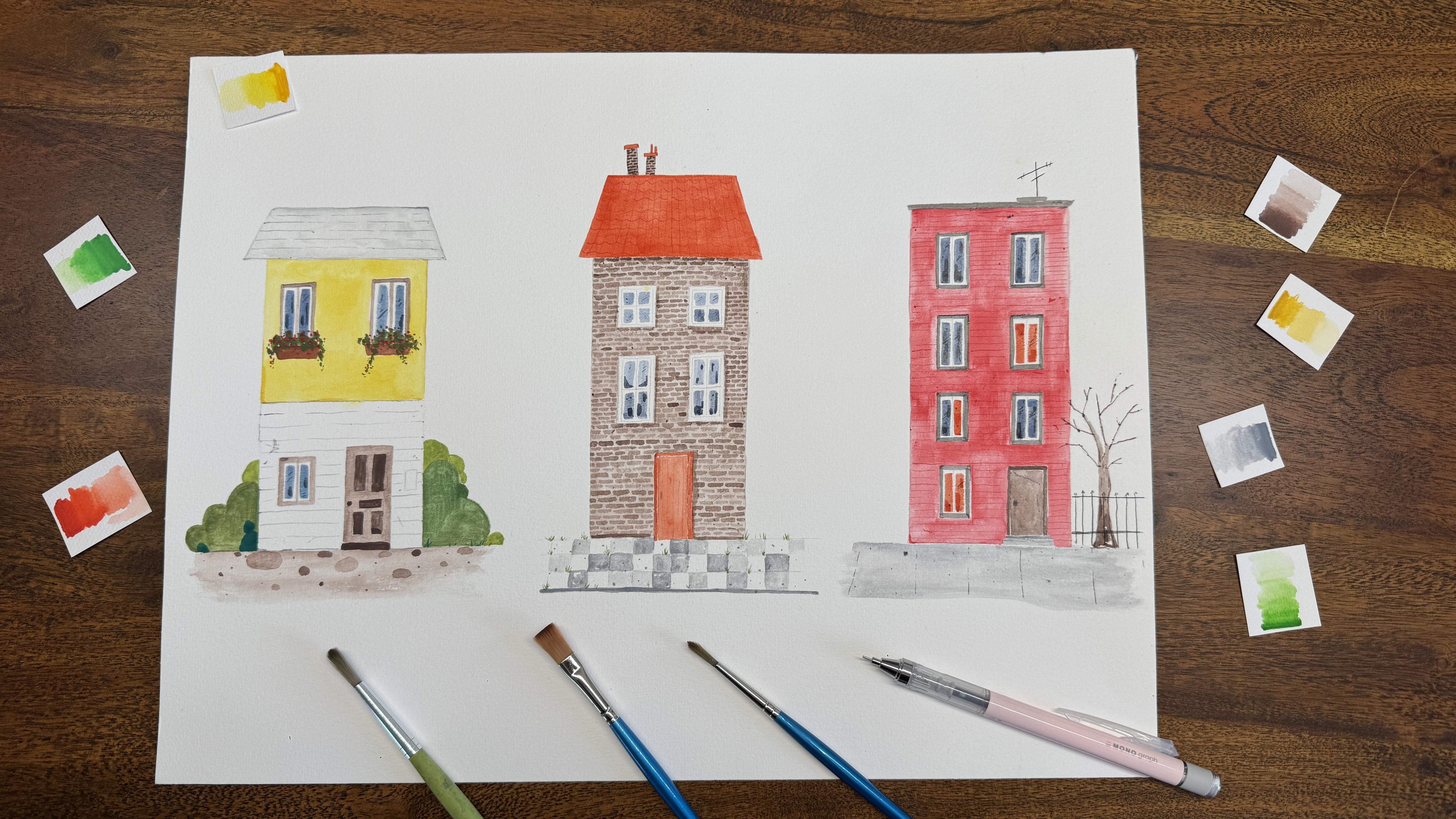
3. Before Sketch: So in this class, we are
going to paint this building together because
I think they all have very similar techniques. If you can draw one,
you can draw all three of them or
even your paintings. But before we sketch before
we sketch it finally on this watercolor paper on which we are going
to paint finally. We are going to sketch
first on a sketchbook. In the sketchbook, it doesn't
have to be beautiful. Mines also not pretty,
you can see it. It's just give you a basic
idea where we are going. I'm going to start
a new one here. This is what we are going for and now we're going
to sketch together.
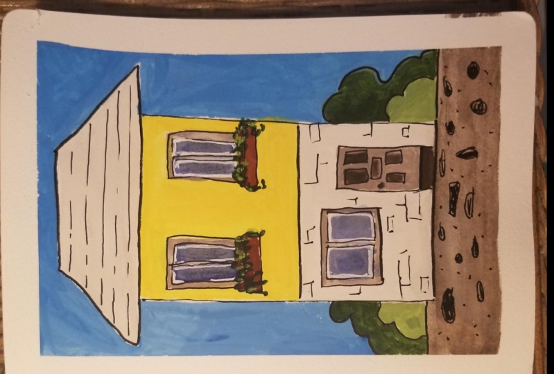
4. Sketch I: So let me just zoom in. So hopefully you can see better. Yeah. That's the end
of the paper. Yeah. So before we sketch, we first need to decide how big or small we want
our building to be. For me, personally, I want to leave a little bit of space
between the paper edges. So I didn't draw to the
very end of the paper, I want to put my
buildings in the middle. So to do that, now I decide
where my street to be. I draw a single line here. And below it, it's
going to be my street. Please notice I leave a bit
more space than I need for my street to have more
space to the paper age. I think for the final result, it looks better this way. And for the hair part is
the roof of this building. Now, I have three different
kind of roofs here. Like you can see, they have different thick,
different colors, and I think they all give
a different feelings of the illustration and show a different character
of the building. You can decide which
one you prefer. I will stick to the middle one. So first a little bit
space to the people age, a shorter line, a longer line, and then connect the end. So now, between the
roof and the street it's the main part
of my building. Ms is not straight at all, but like I mentioned before, at this stage, we just need a sketch to understand
the basic concept. It doesn't have to be pretty. So my building has two parts. I know it looks like
that, but for me, it doesn't have to be
exact in the middle. I about it, and I'm
going to abo it here. I think I'm going
to purposely make the upper part a little bit
longer than the lower part. Now, in the building, we have windows and a
door. For the window. I made the window sit on small balcony where people can put plants or flowers there. We don't need to sketch it. Later, we just go in
directly with color. I just give you a basic idea where I want the window to be, how I want the window to be. Now, I don't measure it exactly, particularly not
in the sketchbook. I just ebbo it where
I want it to be an it the window on
the small balcony. For the lower part, there's
a step before the doors, and I want to make the
door a bit larger. Yeah. And in my examples, you can see three
different structure doors. For these two, I just
sketch the basic form and sketch I didn't sketch
the details at all. For this one, I will sketch with you for the
structures of the door. Also here, no measurements
needed. I Ebo it. And the sketch
doesn't have to be perfect and the door knob. And on the left side
is another windows. So in the window, I give a frame for the window
on every one of them. And for the middle, I also just draw one line. Later, we are going
to go in with colors and brushes with one go. And for the lower body
part and for the roof, for the thin line you see here, I also go in directly
with brushes. No sketches needed for me now. Now, only the plans left on the right and the left
side of our buildings, I go in very freely. We can always change
it later with colors. And again, like I mentioned
several times in the sketch, it doesn't have to be pretty. It just give us a basic idea. The last part is
actually the street. So for these two street, I go in directly with
color for the lines, for the circles, and
I don't need sketch. I think it's look much more looser and prettier if I go
in directly with brushes. Only this one, I draw the
basic line with pencils. And if you prefer this street, not only this line needed, but for these two, we
don't need to sketch. Now the basic
sketch is finished. We just need to put this sketch
on our watercolor paper.
5. Sketch II: So now the same sketch
on the watercolor paper. Please notice here
in the sketchbook, we doesn't have to make
the sketch pretty, but I think it's better if we sketch on the
watercolor paper, we make the line straighter, we make the basic sketch
a little bit better. But the same process
like before. Basic line for the
street. No ruler. Hope you can see it,
it's very light because now I will make it a little bit darker so you
can see it better. But when you sketch on the watercolor paper,
just make it light. Later, we're going to cover
it with gouache color. We don't need the light to be
dark, only you can see it. It's enough. We just
need a light line there and make here dark just so you can
see it better here. No. Same the roof. The hunter line and
the longer line below. And connect or
somehow. No street. So, now it looks better. But I think this line
no street. Change it. So again, the same
process now for the roof, a shorter line for the upper line of the
roof or more space to the paper age and
the longer line below. Oh, I think I want to make
it a little bit brighter. Longer line below and connect the roof the
end of the two lines. And between the roof and
the street is my buildings. Now, I draw now what color paper I'm
going to draw slowly. So the light doesn't have to be 100% straight like I
draw with a ruler, but so street I can get with bare hand. Okay. I hope you can see it well. My are really dark here now. Normally when I draw
it, I make a lot later. Now I make dark so you
can see it better. Now, lie in the middle, I make the upper part
a little bit larger. Now, the two windows on the upper part of this building
for the small balcony. I think I put it a little
bit more in the middle. Like this. And then the windows. No exact the same, but good enough for me now. The frame of the window
and the middle line, the frame of the window, and the middle line. Now, I can see this balcony, I want to put it a little
bit more on the right side, but I won't change
the sketch now. I will fix it later with
brushes and colors. On the upper side, the step for the door, the door itself. And a window on the right
side, on the left side. With a frame in it
and the middle part. And the first sketch, I forgot there's a little
sign. I won't put it here. It really just need to be very light if you draw it
only what color paper. Just later when we draw the
structure of this building, we know here we're going
to put it leave it. I think that's pretty much
all I need on this sketch. Like I said earlier
for the street, no sketch for me
needed and only some part for the green, maybe
something like that. Then in the middle, I
want to draw it now. I want sketch it
now, later drag with colors on the other
side, same thing. I prefer. Sketch
finish now. Less pick. So now I notice I forgot
the structure on the door. I'm going to add
it like this for sketch to longer bar
on the upper side, and to shorter bar on the lower. I think I prefer this
distance better. Change it. If you don't sketch, you can change it
often as you want, and you are satisfied
with your sketch. Like this in the middle
sketch and the doorknob. So now is my sketch finished?
6. Colors used in this class: For the roof and the lower building
structure, I use the green. For the window frame and
the door and the street, I use the color burnt
amber and for the balcony, I use the color
Bonsiena a little bit. And for the window itself, I mix the color utamarin with
a little bit black in it. For the flower, I
use vermilion red. And for the greeneri, I mix the color for
the latter part, I mix the pale green
with yellow ochre, and for the darker
part, I mix the pale green with bond amber. That's all the color we're
going to use in this class.
7. Coloring I (a) first layer in the building: For coloring, we are
going to go from layer to layer from bigger
areas to fun details. I think, first off,
I'm going to make the light a little bit lighter. Because it's really dark then
it usually is when I draw. I think it will looks a little bit better
after I draw it. I painted with color
because from my experience, when you draw color on the pencil lines will be
really hard to remove it. So I hope you can
still see it well. I think we're going
to start with the biggest Air color block in these buildings, mid yellow. So I'm going to use the
brush from Daffinc set six, thinks not too big
for this area. I think it works well
this brush here. If I forgot to mention
it, of course, you need some mixed
palette or some glasses, some surface where you can
mix your colors to paint. So we start with the upper
part of this building, of course, not in the windows
and not in the balcony. Just calling it. That's when the tissues come
handy. I always do that. Actually, for gouache,
it doesn't matter if you accidentally draw in
the window frame. We can cover it with
a darker color later. But I personally think it is always better if
that doesn't happen. It makes the color more light, and that's the look I prefer try to make it straight. So now, you may notice
that in my paintings, they don't have the
colors not even. Some place are darker
than other areas. He is darker, he's a
little bit lighter, it's not evenly painted. Now, I personally doesn't mind because if you
go on the street, see the buildings, it's not always very smooth
with the colors. You know, it's the scar you got from rainy days,
from the ears. So I think it's as
personality there. So I don't mind here. As. Next, I will start
with the street, kiss the color still white. Bguach take it a little bit longer than
what color to dry. If I paint green here directly, I think the color may mix
in this area to avoid that, I will start with the
street on the lower part. Still, I want to make the
line a little bit lighter. Okay. Now, it's almost gone, but
you have your own sketches, you know, where your
street begins and now I can see where I
want my street to be. So there's the
color burnt amber. I'm going to use for the street. So I just hold my brush almost flag on the paper
and go with it. No, it's not everywhere with
colours, doesn't matter. I go in another time
with more waters, street like buildings, not very smooth
colors, not smooth. A bit more colors. I think that way it add more
authenticate in the street. It's not all the same. But now it's too dark for me. I think I'm going to adapt
it a bit. It's too much. No, I completely wash my brush. There should be no colors and just to make the color
a little bit lighter. Because later, we want to
draw some structures on it, so the basic layer should
be lighter, in my opinion. So, something like that, I think I'm gonna live
at it and let it drag. So I will stop, I promise. So live at it and let it drag. Good. Meanwhile, I think my upper building
part is dry enough. Yeah. Now, I can draw the roof. I use the color grey. So from the first mistake, I'm going to make it
very light for the roof. Again, I hold the brush
very flat to the papers, which lead me to dry
flack to the papers and go and fill in the colors. I bit more water just make
the color not too dark. Gach is really a very forgiving
colors or mediums to use. If you don't like what
you have already draw, you can always fix it with light or dark
colors you prefer. I hope you can see it. It's very, very light. Make it. Even later. Because later we're going
to put structure on it and the structures will
be a little bit darker. Now, all the three parts, I use set six round brushes
and it works well with me.
8. Coloring I (b) first layer the greens: As next, I think I'm going
to go in with the greens. For that, begin with
the darker part. I mix the color pale
green with burnt amber. In. Just make the light and
little bit lighter so it doesn't Go through
the guash colors. Think I like it dit a bit. So I mix the two colour to draw the darker
part of the green. Now, my brushes almost at
45 degrees with papers, and I just go in with
the form that I prefer, maybe like this and
be careful don't go in buildings almost
has to hold my breath, little bit colour to fill in. Oops. I actually doesn't matter, the plant can go in
front of the buildings. I just try to make it process. Not really necessary. So I think that's okay for me, maybe a little darker. I go in again with a
little bit more color to give you a little bit more
depth for plants particular, I don't think the color
have to be even because the natural the plant is
gold whatever it's like. Something like this. Now the other set give me the frame
because I barely see the line I draw earlier with
the plant for the plant. So I give myself a frame
using this technique. I don't usually draw the outline with brushes
and then filled in. It depends on what I'm drawing. Here, I think this
technique works well here. Toker. So, it a bit darker here. I think I like the green here
more than this one here. This one is very exact, almost graphic, and this one is no form at all, more natural. Yeah, like this. One
9. Coloring II: And now I won't draw the later part of the green directly because the color
may mix with each other. That's not what I want
for this painting. Now I think I'm going to
switch to a small brushes. Define says two to
draw the balconies. With the color Bern sienna. I already have it in my palette. I just mix a little bit of
it and here I don't need much water on the colors because I almost need the whole
intensity of this color. But still, I need water to
make the color workable. That's okay. And not perfectly colored, I think it's okay. This little dot space, I leave it like this. I
think it's cute here. It's almost like a highlight
and make it on purpose. I will leave it like
that and other part. Like I mentioned earlier, move it a little bit
more to the red set, so the window sit in the
middle of the balcony. Like this. I think I'm going to
color it like this. I just make the rest
a little bit longer. That's my balcony. I think now I'm going
to start with the door, not the smooth structure in it, not this part, but only
the light color part. I'm going to draw around it. Like I said, actually
doesn't matter if you go through just go through
everything with a bigger brushes. Later on, we can always add on darker colors with
squash. This works well. But I personally prefer
to make it clear edges between the structure
and the door itself. Um, for me, it's
better this way. It's not better to draw but
better to look at later. I think you always
notice the details, maybe because I draw it
for too long. I notice. But I think if people watch it intensively or more detailed, then you
will notice that. I think it's better to
don't misuse the color, cover every space, but really do the fan details and add in the darker color
later separately. So, something like that, and let it dry. I will use a similar color
intensity like this. Ice color, more water to draw
the frem off the window. The whole frame, not
exactly the same color. I mean, here is maybe
darker, here's lighter. I think it looks
prettier this way. I think I'm going to make here the pencil line I'm
going to make here, the pencil line also
a little bit lighter. So it looks prettier afterwards. So for the door and
the window frame, the whole time the same
color burnt ember. It's too dark for me. I wash the brush,
leave the color up. Now, go in with color again. Bit more water. Like this, this is a little bit darker than the
other ones already dry. I think there's too
much difference between the two window frame. So I will make it a
little bit more darker. Still not the same,
but okay for me now. Yes, my door is
almost, is dread. I'm going to go in with a darker color from the same
color of the store itself. Bond amber. I'm going to darker. Like this. And the lower 2 bars. Make it a little bit darker. It's not dark enough for you. At the first layer, we can always go in
and make it darker. M the door knob, knob. Not to forget the
step before the door. So I think the
door finished now. Just add in a little
bit more color to give it different structures
in the buildings. I think small details make
you illuse more interesting. But we're going to go in with
more details at the end. Like this.
10. Coloring III finish the greens: So let me zone in a little bit. Maybe we can see better. We're going to draw in most
and draw a smaller part now. So now I want to start with
the later part of the green. Now, I changed my mind. I think now I'm going
to use the mix I already have on my
palette that I mix with pear green on burn amber
on the lemon yellow. I'm going to mix it and to draw the later part
of this building. So I'm going to make
it. Yeah, like this. Be careful. Don't drow
in the buildings. I mean, you can it
doesn't matter because plants can get in front
of the buildings, but this time, I prefer not. Like this. Not exactly like my original building plant,
but I think it's okay. So here, give myself a frame. So it'll be easier for my brain to understand where
I want to paint. So I will leave that
small black dot, like a highlight and
add one more light green here and maybe also
on here on the very street. I think yeah. Yeah, I think I'm going to
leave my pants like that. Okay, for me now. So now, for the darker part in front of the
building the greens, I use the color deep green. So just at places you prefer, I also draw it very randomly. No rules here. Oh, I'm sorry. I think that's
the color VidianGreen, not the deep green, the
idiant green, I used here. On the other side,
I hold the brush almost straight 90
degrees to the papers and draw some small classes. No particular orders. Just it doesn't exact the
same on both side. Correct.
11. Coloring IV windows: Now, for the windows, I think I'm gonna complete
ad the medial line. I I don't need it. Oops. I use the same color bond amber for the window frame
and the middle line. So I just draw a
line in the middle, try to make it straight,
not really straight, and it's too light for me. So make it somehow straight like this a
little bit lighter. A straight in the middle. And a straight line in the middle. So like this. And next, I'm going to draw
in with the window itself. I hope you can see here
on the small details. I didn't fill in
the whole space in the window with blue colors. I think the white space
between the frame and the window itself make the
whole ills more loose. That's the style I'm
trying to go for. I hope you like it too. So for the window itself, Buta Marin blue mix with black. But So when I mix the color, I make the brush very
bright like it most. It's not a round brush almost, it's very I hope you can see it. When I use mix the color and the dap it here to make
the round brush almost fl. You can see it? Yeah.
I hope you can see it. So here, I can just
go in one time. Maybe two. To draw the windows. It's too dark.
Somehow everything is too dark for me today. No, it's better. If too dark, then add more water
to your color mix. Again, the bash is almost flag. And then draw a straight
line much better like this. It doesn't necessarily
have to go to the end of your balcony us
later we're going to draw flour and greens on it. You can't see the end
of the windows anyway. So Next window. I think that's good for
me. Let me to work. So now we will let the color dray and add in
the details later. And
12. Coloring V: So as next, I think
we can now draw the fan lines in the roof and
in the lower building part. For that, I use even
smaller brushes. It's also from Daffin size
one is the brushes a little bit the brushes is longer
and more fine rigor brush. And I use the color
green for that. But of course, a more
darker color than the roof. So before we start, you see my line is not
everyone is continuously. So there's some stop,
some space in between. I think it's more
organic this way. So I didn't do I just come I just do it
naturally I sit com. Hold the brushes almost
45 degrees to the paper. M, I didn't stop purposely. I didn't stop purposely. It's just very difficult
to draw a straight line, continue early with
a small in brushes. I also think with
stops in between, it makes the illustration more organic and so I just
draw as it comes. But I try to not always at the same
position, have the stops. You understand what I mean? Like, it's not continuously
at the same line type stops. It may look awkward. I think it's always
at different stops. Just purposely leave your hand and stop it and draw again. Um so now I finish and I think some of
the lines may be too light. So I want to go over it again just to make
it more visible. But my brushes is almost it's just barely
touch the papers. That's how light it is
to draw fine lines. If you press the whole
brushes on the paper, you can't get very thin lines. No, I just put a little bit
dot here and there to like, maybe inmate the dust you may have on the roof.
So that's enough. Now, for the lower part, I just eyeball it which
distance I won't have. And at the end if I come down to the street and have very different distance
as I have above, I think it doesn't
matter because it does it doesn't have
to be all the same. Also in the architecture, I think it's not always alike. Stops but not always
at the same position. Also my distance between each lines not always the
same is fine with me. I mean if you prefer, of course, you can measure it
with a ruler first and leave a mark at each beginning where you
want to start the line. But I think it's also
looks good this way. Remember, we have
a small sign here, so don't go through it. I hope you can
still see my lines. They are very thin
and very fine. The color is also very light. So I think it's good. And then at last, I want to go back to the middle line to the
point where the upper and the lower part connect
and make this line a little bit darker
than any other lines. More present. So it would
be more present like this. And also several
dot here and there, even small thinner lines to
give the wall a structure, but not too much. So that's enough. Maybe also a little bit here. It's difficult to stop, right? So it should be enough. I always have to make myself stop to draw the fine details. As next, we will go back. To draw the greens and
flowers on the window. So the mix of pale
green and burnt amber. And also, back to the two sides, no more round brushes. So I will go in now with
the green first and I won't leave space in
between for the flowers. This time, I will
just going to add the red later directly
on the green. So also almost 45
degrees with paper. I press the brushes to go
in to make the whole body, whole brushes on the paper. No exact form. We go
down a little bit. Now, now I use only the point of the
brushes to make small dot, like the plant is just hanging
excuse me, hanging down. Go the same. In the main part, I just press the
brush on the paper. And then if I go on the outer space outside of this green
building green plant, I leave the brush and only the point touch the papers to give it
a more loose look. Also here, some
greens going down, make it small and fun. It's only the point
of the brushes, different length of the
paper of the plant. Now I think my plant now
looks very one dimension. So I go in with more
dark color to give it a depth but not too much. Remember later we're going
to add flour with red too. But just here to
make it more vivid. So that's enough for me now. Now, we wait till
this green to dry. Now, get on the flowers. My green is dry. Mili red for the flowers. I actually use the same
set of bash two sets, round brushes, and just make
some dot on the greens. So there's my brush, almost straight to the paper, and just make some dot. Some smaller one, some big one. Try and make them
in different sizes. So it's look more natural. It's also flowers
here and there. Now, my brush is
almost 45 degrees, the floor going to be bigger
and the floor if you want the floor to be smaller
than 90 degrees, the floor going to be
smaller and if it's bigger than 45 degrees
from brush to paper. I think that's enough for me.
13. Coloring VI fine details: Now we go back to the fine rigger brush to add
some details on the windows. Use the same color Puta
Marine blue with black. The color you just mix. The color you just used
to draw the windows. So I just turn on the light. Hope it's better for you now, and I'm going to do
me a little bit more. Like I said, go back to the
rigger brush, the fine brush. And with the exact same color, you just draw the window with, but a little bit darker. I mean, the same color, but less water move colors, make the color more intensive. I know g draw some random
lines or dot here and there to imitate the
reflection on the windows. Okay, this one's a
little bit dark. And on the lower part, so that not every
window is the same. So point here and there, not too much. That's enough. So now we have the
same brush on hand. I notice I forgot to
put the sign here in this sign leave
white space here. Maybe it's just assign
about the house numbers or other messages you prefer, maybe the street names too. So the same brush with
only black colors, and I just draw some different
lines or dot to give the feeling that is
a sign of something. Yeah, now on the brush, we have the black colors, and I will just give it, draw a little bit more
structure on the building. So dot here and there, some fine lines to give a structure on the
building itself. Maybe on the street,
B bit darker. I didn't do it on my
paintings, but maybe here. So also not too much. Also maybe on the yellow on the upper part
of our building. Speak of which, we can
also give the upper part of this building some
structure, some texture. So now I change back to my number two round brush
with the same color, mid yellow with more
color, less water. Just here and there. And now I drew some places. There's lice colour on
my brush, it's more dry, and I just put all the brush on the paper and let it dance. And it gives so a fine dry structure that
we are going for. Yeah, there's enough.
14. Coloring VII the street: Last, we give our street a
structure, use the same color, burnt amber in different ton
in different intensitate. I will start with
the latest color. I mean, it's light
for the structure, but still a little bit
darker than the round. Then the street,
we have it here. So 30 degrees to the paper. Make it round. It doesn't
have to be perfect circle. This is actually darker
than I want to be. So more water to the colors. Maybe we can tap it. They'll have different
shapes, different sizes. That's what we want here. And here I did it, but actually, you didn't have
to fill in every circle. Give it more variety will make the low looks
more interesting. So this is very late. I hope you can still see it. So that's enough big one for me. Now, I use more colour, less water and put my brush almost 90 degree
to the papers to give it some small dot here and
there for the structure. Not too much like that. So no, I think I'm done now. Uh, maybe one last. We already have the small
two sets brush in the hand, and on the brush,
we already have the color that we used
for the window frame. So I think we can also add some small dots or line
here on the window frame, also make it just something
happened there on the window brush
so the lou itself the illustration itself
will be more interesting. So like that or may
also on the door. You know, not all the structure are always fresh paint
like on the first day, just to make our yo
more interesting. Okay, this is already
too much for me. I'm done here, I think. So I'm finished. I hope you like you paint. Actually, I think I
like this one more than that one because the
frame is not straight. There's more structures
in the building. There are different
variations in the green. So it's more vivid and more life in this illustration
than that one. I would love to see yours.
15. Coloring VIII the very last: Okay, maybe very last. I'm sorry. I just
come the new idea. I think it may be fine if
we chose some bird here, but use very simple technique. Just two lines with a dot. This one's a little bit
more further behind, so it's smaller
than the first one. On this side, also a small bird. One dot, two thin lines. My brushes barely
touch the papers. So I look I think it looks
cute. What do you think?
16. Conclusion: Now the class is
finished, how was it? I hope you enjoy the
possess as much as I do, and I hope you love
your illustration. I would love to see yours. If you want to, please share
it in the PoexGallery or even the other buildings
that you paint by using the technique we
learned in this class. Also, I would love to hear the feedback from you.
How was it for you? If you want to be
friends, you can find me on Insgum and Tik Tok. Thank you. See you
in the next class.
 Fei Fan, joyful interpretation, colorful swing.