Transcripts
1. Instroduction: Hi, my name is Fei
illustrator based in Germany. In this class, we're going to
start with a blanko paper, do the sketching
and composition, then color it using gouache. During the whole process, a ton of tips and
tricks are shared. I'm sure they will
be helpful for you. In this class, we are going
to go through line by line, step by step together. You can do it in your own pace, so there's no problem at all
for you to follow along. I'm sure after this class, you'll be much more confident
in doing illustration. Now, without further
ado, let's start.
2. Materials used in this class: First, the materials we're
going to use in this class. First, I'm going to use watercolor paper for
this illustration, even though I'm using gouache and mine is from
HanmllerEpression, 300 gram, 300 gram. You can use whatever
watercolor paper or mixed medium paper you have. For colors, I'm mainly going to use this box that I got
several years ago from Amazon, and also I'm going to use the color Rosiena
from Vincent Newton. For brushes, at least, we're going to need one
middles round brush and one smaller round
brush for details, and I'm going to also have one square brush for
this illustration. And don't forget a
pencil to do the sketch. You may need a sketchbook
or just some blanko paper. Also, we're going to
need one or two jar of water to clean our brushes during the process and
to make the colors. Last but not least, don't forget tissue
paper to clean our brush or to clean the paper during the
painting process. That will be all. What we need for this
class. Let's begin.
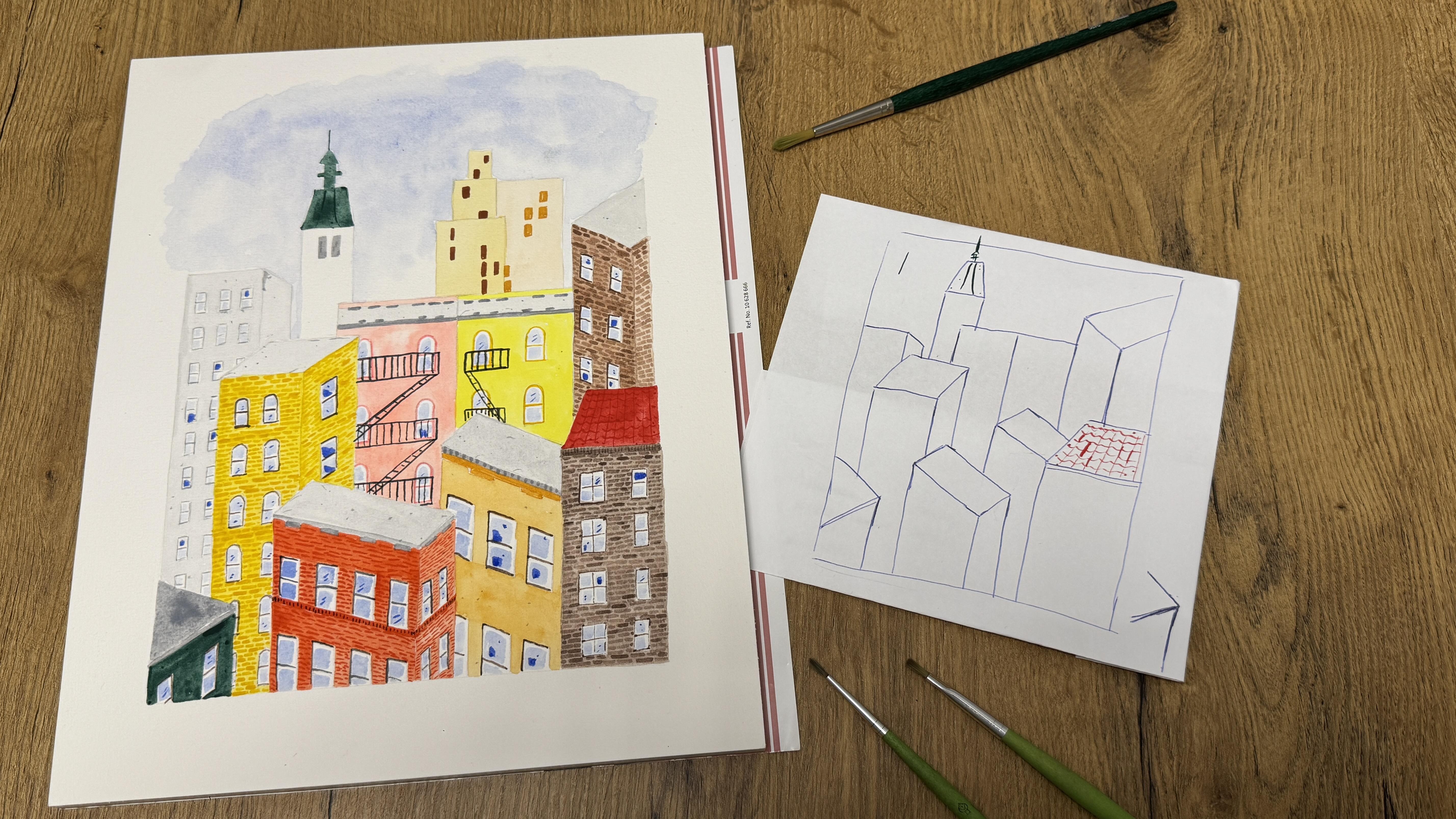
3. Sketching I - basic composition: So in this class, we're going to illustrate this beautiful
city block them. The two examples here. You may notice they have
very different perspectives. One, we just watch the
city block upfront. It's all there's no perspective, we just watch from one
single point of view. The other one, there are several buildings that are
put some perspective in it. There's more space in
this illustration. There's more space
between the buildings. I like them both.
For this class, let's combine these
two together. Also, these two illustration, I made them simple
canvas. You squash. But for this class, we're going to just draw one city blocks in on
normal watercolor paper. But before we start, I want to sketch
with you one time on normal paper to practice and maybe I can give
you several tips, make it easier for you
later for the sketch. Two different city blocks
with no perspective, we just look the building from the front and the other
one with perspective. But one they have the same, which is the buildings, they have different hive. Even though we look
in this illustration, we look all this
building from upfront, it doesn't look flat. There's still depth
in this illustration, and I think it still looks cute. I hope you think so too. I make it by using different in this illustration and also the building
in the upfront, I draw it with more details for the buildings in the bike, I use very simple blocks
to show the windows. Also, from this technique, it gives this
illustration a depth from which is front and which
buildings are in the back. The same goes with
this illustration. They have different health
and the building up front, more details and the buildings
in the back more simple. So now when we later draw
on the watercolor paper, I want to first give
a frame on my paper. Here, I will just do it roughly. Here I use a bow point pen so you could see it better
clearly through the camera. Yeah. Let's combine these two
in striation together. For the first one, which
we look from upfront, I'm going to take
the building on the red corner because I think this combination I like the red and light
yellow combination. I think it looks really cute. These two building
together because I think the buildings with stairs in the front is very
tupic for New York. I also like this white towel. I think it gives more character for city blocks,
so I can keep it. And for the rest, I'm
going to take from this illustration
with perspectives and we're going to
combine them together. For easy start, let's sketch with this one
at the right corner. I didn't measure exactly
where the building start. I practically just ebo it. Like this to give it one
line for the latest details. But for the windows, we
don't practice windows here, we just practice the structure and the composition
in the simple sketch. Now, before we draw these
two buildings in the middle, I want to fill in
the front first. With these two buildings, let's start with
the perspectives. Also for the
perspective buildings. I didn't measure the
angles with a ruler, I just apple it y. For me, it is enough
if the angles looks enough for the human
eyes to make it appealing. It doesn't have to be
mathematically correct. We are not going to build
this building physically, we'll just make
acute illustration. For me, personally, it's
enough if it looks pretty. I start with the right
one the left one. It doesn't have to pretty. One simple tip here for the
line which go uh vertically, it always goes it doesn't matter if the building looks
upfront or with the angle. The vertical line always goes down up and down.
There's no changes. And for the perspectives, I mentioned I didn't measure it. This one simple tip I
can give you is ebo it. The line is always 90 degrees
between the two lines. Because in the building the
corner is always straight. It doesn't matter
from which angles, so the line should be 90
degrees and that will be fine. We have this one and the second building
to make it easier. I draw the vertical line first. 90 degrees and the vertical
line just go straightforward down the other tip is the
line on the opposite side, they are parallel to each other. Just like that, you have a
city block with perspective. Here, the No street
and even the s street, it doesn't matter at this stage, we just give us a
clear composition and the structure for the
buildings and Illustration. Later we will do the sketch
on the watercolor paper, it'll be easier for us. In the font, I think
I'm going to just leave it with these three buildings
and go back to the middle, I'm going to take
this one with me too. So The lines are
parallel to each other, and I try to make exactly 90
degrees between two lines. So also, I accidentally drew
these two buildings like they are parallel
to each other. But in my original illustration, they are not the same. I think doesn't matter here. It's our imaginary city. We can make the city
block as we like. So you can decide which
perspective you prefer. I'm going to draw this
one in the middle too. Vertical line straight down. I think Otical line and the opposite line is
parallel to each other. Like I said, not perfect at
this stage, doesn't matter. Just give us the
composition and we can move forward to
these two buildings. Just make a bigger block. Basically in the middle. And for the more details, we're gonna draw it directly in the watercolor paper on
the watercolor paper. And I think I'm going
to take this one. Like this and the white tower. And for me the link on the
left side, there's more empty. So I'm going to put one
more buildings here. I think I'm going to
put this building on the left in the head
between these two. Somewhere here. Um, so that's it for my buildings. Now you may notice I didn't have much space in the upper
side for the sky, it's okay for me for
this sketch here. But later to do the sketch
on the watercolor paper, I'm going to move the
frame a little bit higher so I have more space
open up in the sky. I hope it's clear for you now. Maybe the perspective part
is a little bit tricky, but now we're going
to do one more time together on the
watercolor paper.
4. Sketching II - buildings : So now I got my
watercolor paper. Mine is from HanmllerEpression, but you can use whatever watercolor
paper you have on hand. So to sketch on the
watercolor paper, I just got one brilliant idea. I think I will use the convent to give my
illustration a frame. If you don't have the convents,
doesn't matter at all. Use whatever box
you have on hand, you can give it a frame or
you can draw it bare hand. It doesn't have to be perfect. I will explain to you why. Now, I have a basic frame
for my illustration. Now it's easier for me
to make the composition. Later when we finish, we will just erase
all these lines. We don't need it. So it doesn't have to perfect
like I said earlier. Here's the Itron reference
and our rough sketch earlier. Starting with the one
on the red corner. For the height, about it. I just won't make it too white. Leave more space for the building with
perspective, I think. That's what I'm going to do. The first and the other
one on the other corner, the one and then the vertical
line straight downwards. And the third line,
I won't measure it. I will give it a
90 degrees line, that's fine. Can you see it? I hope you can see it better. I don't want to zoom in now
only because I want you to see the two
illustration references and the composition
we have earlier. Maybe you want to
change it somewhere you want to make your own
composition, totally fine. I'm glad to see it.
I want zoom in now. I hope you still can see the
line that I draw clearly. The one in the building with perspective verticala
straight downwards. Vertical like
straight downwards. I'll give it a perspective. 90 degrees verticline
straight downward. And the line on the opposite
parallel to each other. Ibo it and parallel
to each other. Yeah. Yeah. And this red building
in the behind um, what I also noticed
earlier in this sketch, it almost looks like it's the same line for
these two buildings. I don't like this imagination. On the watercolor paper, I will make it more
distance between these two. More structures in
my composition. 90 degrees 90
degrees. 90 degrees. To each other. So, I will make the light darker
so you can see better. But you don't do
with PenthoT dark. You don't have to. I only make the line this dark so you can see it
better through the camera, but we don't need the
pensul to be this dark. The later, the better as
long as you can see it, you can recognize where
the building are. We mentioned these two
building in the back. I think but first we need one
more building in the front. Remember, not the same line. Make it some distance
between each other. Vertica straight downwards.
Make it a street. Okay. Like this. Is it clear? Yes. And now we can draw these two buildings in the back the top buildings
with staircase. Mm Yeah, do you think I think
I'm gonna make it. I tick white. I did bigger than the one
in the earlier sketch. Saw enough. I have enough. It's difficult for me. It's also easier for me to
draw two single buildings than one bigger one and then
separate in the middle. So I can better measure it. Yeah. I think this one this one maybe too narrow for each buildings
with their case, and now I like it. It's not so narrow. I think it's better this way. And all the details for the windows and for
the decoration lines, we're going to draw
them at the last. We will finish with
the whole composition. And this one building
on the right side. Fairly high with perspective. It's not always easy to draw a vertical line downwards
straight, right? It's smaller than we do
here, doesn't matter. That's why we need the
frame in the beginning. But I think it is okay this way. And the towers, white Towers. Sometimes it's easier to draw a vertical line straight
downwards, sometimes not. For the upper part
of the white tower, I will draw the upper
line first parallel to the baseline and
then combine the d. The one building
on the left side, different height I will make
it a little bit higher. With perspective. We didn't enjoy it in
the sketch earlier, but for me, it's too flat now. Basically this block
in the same line. It looks too flat for me. I don't want it, so I'm going to add two
more buildings here. I really forgot where I got all this photo references here. I think I looked at some photos and then combined
with my imagination, I draw the city
blocks and the two. The second one. So better. Also in the background, they
have a different height. I prefer it this way. And you know what? Now we finish the composition,
I'm fine with it. I will erase the upper line from the frame that
we draw earlier. Later, when I use blue
to draw the skies, I won't have a
straight line here. I will make it more freely. On the other three side is a straight line cut and by
the open is more flexible. I think it will look better
on the watercolor paper. And also on this set. I would just erase it. That's better. On the two set, that's a frame we draw earlier, that's a higher
part, I ate them. We don't need a light anymore. Now let's go in for details.
5. Sketching III - details: For details, I mean, the windows and the different decoration
lines, I will call it. How do you call it a building? This. Now for the details, I will zoom in for
each buildings, hope you can see better. So, no, I just draw one line
here for this one building, and I'm gonna draw
windows for this one. There's two lines of windows. I don't like when the
windows are too big. Change like this. So like this. To make it more easy, I will start with this one. This two has no perspective
in the building itself. So it's too light, right? I'll make it. Uh,
needs to be darker? Yeah. Like this. And for these windows, I want to draw the tubico one with the round one
on the upper side. Yep, I want to make it a
little bit Teper deep, lower for the windows. Um, so there's more
space in between the um for the staircase. Okay. Like this. And on the other side I change it because
there's no much space between this building and
the first window start, so I don't want to make it too
different from each other. But somehow, I always make
it bigger than I intend to. Better. Remember space between the two windows from
upper to the lower side, more space for the staircase. Yeah. Make it smaller go downwards. Do you think this illustration
looks easier looks easier, but when you really sketch it, it's not that easier
than you think. Go downwards. The staircase later we just
go in directly with squash. That's the easiest building to draw windows because
there's no perspective. Now I will put this away so I can see better for the
windows perspective. But still, I will oom
in for each buildings. So there's a line we make it
darker so we can see better. And the first one we make
the top of the line here. Imagine they go to
the two lines go to the same direction and end
in the same vanishing point. I bought it, I didn't
measure it. That's enough. Now for the windows, due to the perspective, I personally don't think
it's necessary to draw every single line
of the windows like we draw with the front view. You can see here, I give it
on the other side more depth. I draw it with gouache, make it more present. And the side that we should
not be able to clearly see, I won draw it later
with gouache. If you want, you can sketch it now with
watercolor so that you have a clear space later for the window itself,
it depends on you. For this sketch now, I will draw the more important line with darker pencil lines
and the I draw it, but with this make
it very light. Just so you know. So all the three lines have the same vanishing point. And all the vertical line
also go straight downwards. And you can make it longer, and then you have
the other windows. And these two have
the same line. So I draw the whole windows. Each line. But later, we won't withquash draw y lines. Maybe I can put it you. At least for this building,
you can see it better. There's the roof. Make
it doubled lines. This is somewhere
outside the paper, there's a vanishing lines for the papers for these two lines. Like I said, I didn't I don't like to measure
it with a ruler. Um, I just about, Loki it. Mok looks appealing for the eyes, and that's
enough for me. Now, we have another two lines here in the body
of the building. I will do this
first before I draw the windows because it also give the structures
of the windows, it'll be easier for me
to draw the windows. Basically, just to see that from the left side and the
re side of the building, you have the exact
same space in between. This looks fine enough for me. So this line is basically the same length as
this line here, and this line is basically the same length as
this line here. And this should
be correct enough for roughly a sketch
for the perspective. And the second line
should be either. Always have the equal space between the two lines,
and then you are fine. And I notice the first line north street So
that's enough for me. I didn't draw the
vanishing point and combine the vanishing point. Um, I just go in
with simple rules. So do we still have enough
space for two windows? I think here, I'm going
to just draw one windows. I think those will be too
crowded for me now here. Oh, we do two, but
two smaller ones. I don't know work? I
can't work this way. I see there if you draw the vertical line first
because it's just the line go downwards and not
complicated to think. And for the palline they're
just in line with each other. I don't know. The same space between the windows
to each other. I mean, the same space
between this window and the upper line and this
window and the upper line. So, like this. So if the first window on
the left side start here, the fourth window on the If the fourth window on the
right side start this side, and the last window on left side should end here just to make sure they
have the same space. I look better, I think this way. And now, let's see if we can make it work with four windows. The windows, the size of the windows should be the same and also the space between the windows
should be same. I think it could work
with four windows. I also draw a lighter line together to see the
composition and if it works, which it does in this case, and then I will make
the line more darker. And then also the lines
should the same lines on the same height and
the lines should have the same distance to the
upper part of the building. So we don't need continue it. Do you understand how I
draw this upper lines. These lines should also go
to the same vanishing point. And to make it either, I will just ebbo it this line
from starting to the end, have the same space to the upper lines here,
and here is the same. Then it looks fine. So for the lower side of the
window to be easier because we already know where the
vertical lines should be. It doesn't matter how high or low you draw the
vertical line now. We're gonna make it. And this line I'm going to draw now from the starting to finish, always have the same space
between the upper line. It's not. So make the light that we use
for the windows darker. And so And to draw the in the
middle of the window also choose the middle
of the left set, the middle of the re set,
and then combine it. Middle of the left set, middle of the middle
of the left set, middle on the right
set, and then combine. Middle on the left set, middle on the re set. Me do on the left side. Me do on the right side. This method is this method easier for you to
draw a perspective? Because I didn't go in with, um, vanishing point
and things at all. I think, um, this way
maybe it is easier. And for here, we don't
have the whole windows. So it is difficult
to maybe for you to imagine what the
middle line is. It doesn't matter
for the first two because it's really just make the upper part more
understandable part looks the same from the
upper part looks the same. And it should be enough. Yeah. Because the window should
also on the same side. So if all the upper side look
a poked max lee the same, then it's fine enough. Also, not too exact. So I don't need it
to be too exact. And the decoration you can draw it with a
small bricks here. Or later if you don't want to, we can also go in with gouache. I just want wash. And if it is not perfect,
it doesn't matter. We don't want to make everything so exact like it should be. Straight line straight
downwards and then compare the two. Like this. The lines the vertic line
goes straight downwards. And when you combine
these two lines, there should be
always the same space between the two
horizontal coline. And then that's fine. So we go through more
details with this one. Let's try one more from the
other side of this building. So two lines. So we have the roof. 12 lies under it. Also here, they should have the same vanishing point,
all the three lines. But I hope it'll be
easier for you just to understand you don't have to visually draw the
vanishing point. For me, I think it's enough so long as I notice
they always have the same space between the two, the two lines, that's
enough for me. And for the windows, the same. The fourth window
on the right side, the window on the left side. I draw the line just
to make sure that they have same space to the
end of the buildings. And this time we try
another technique. Maybe we combine these two line first to make sure that
the line always have the exact space to the upper
line, but make it light. It's just for references so
it'll be easier for us to finish the windows like this. And now we can also better visually divide it
to three windows. Yeah, it works. And then make the upper line
of the window darker. So for the finish line also approximately the same size in between two lines. So I finish this line
by looking the line also always have the same
space between these two lines. Don't worry if it doesn't
perfect from the first try. I had to be patient. I also have to change
several times. So if you have to modify it several times,
it's super normal. I draw the other beginning of the other window and to see
always have the same space between the two lines and then add in the vertical
lines from the upper part. At coline just go
straight downwards. And then I erase the
part between windows, and I only have the second
line of the windows. And the middle part
of the two lines, combine it, middle
part of the two lines. Combine it. Imagine if you
elongate this one, combine the middle point
of these two lines. Then maybe begin easier with
the middle one. Ebo it. So the line is basic
on the same line and upper part the same sides. I think this window is a
little bit too big for me, but I will leave it now. The same way we draw
the bricks here, vertical straight downward
to comb this line, we just need to notice that this slide the space in
between are even. So I hope now is
easier and clear for you how we draw windows
with perspective. Let me think, um, for these two
buildings in the back, I'm going to use the simple windows so
I won't sketch it now. I later when I finished it, I would go in with
gouache color directly. Also the upper part
of the white towel, I will leave it because
the background, the sky is light blue
and using gouache, we can cover it with
the darker green. I think it'll be easier this way to just leave it and later
go in direct with guash. But if you want,
um if you prefer, um, I will go, you can give it a
basic structure of the upper part of the um tower. But I think it's easier to draw. And later when we
quash to draw the sky, you don't necessarily
have to avoid this part. But for this line, it's really just
one brushes dish. This one I won't
draw it at all with pencils would be
my recommendation. So these two we said we want to leave the
window with simple details, go in directly with
gouache color. Now we have one, two, three windows to finish
with the windows. So for this metal part, I will take this
building as reference since for the front, I have the window with
the round upper side and this on side, I will have it with
straight lines. So I'm sorry. The battery of my camera just went out before I noticed it. So I basically finished
drawing this part. But let's go through it again. So in the front set let me see, in the front set, there's
no perspective needed. At least I didn't use any
perspective, like always. So verticline goes
straight downwards. And if you have the first line, we try to use our eyes to
measure it, stay the same. FT and the upper set, we made it round. Just combine the end
of the two lines. Like this. Verticle go straight downwards. And there's no perspective
needed in this side. Or in my in nutrition,
I don't need it. So in the in the middle, also, I just eb it with the middle and cut the windows
half in half. Again, there's two
line downwards. Combine the upper lines and
the down one. The bottom one. Yeah, it may not
be 100% correct. Basically, this
apple is correct. Like this. All right. In the middle or in the middle. Okay. So maybe perspective
is not 100% correct. But for my eyes, it looks fine this way. So it doesn't have
to be perfect. I know the space between the two windows are the same
from this part to this part. And then when I draw
the bottom line, I focus on to see it, you know, the window
is not cooked. It's straight window, and then it's not for me to
finish the bottom line. So let me um out
last two buildings. Let's begin with this one is basically the same perspective. But for this one, because
all the three buildings in front of it with the windows which
upper part are around. So I'm going to use I'm going
to use the no more windows. Like this, so more
square windows for these buildings
and also going to use the no more square windows for the building
on the right side, just so you know how
I'm going to use it. Also for this building, I think I'm only going to draw windows on the front
set for the set just too narrow that we
can see from the building, I won't draw any windows there. Let's start with this one. So the same process. Also because there's
the building in the behind in the back. So windows should be smaller
than the windows in front. Something like this. Also on the far set, no perspective for the windows. Hmm. So and I lie in the middle. All right. Something like this. Yeah. I noticed I didn't draw any windows on
this side of the building. So I may also leave
this at blanco. I know it's a little bit
bigger than this one. Maybe just for not all
the building is the same. I will leave this at
Blanco, like it is. And then I will
finish the sketching using by drawing windows
on this window, this side. There's also perspective for this building for the windows. When we finish using gouache, I won't draw iron line of
the windows like here. But in using pencil, I will draw iron line. Off the windows. Mm. So two lines of windows. Yeah, I think that'll be fine. Two lines. The street. Is the Comb to forest. And come this both
the bottom lie. It looks weird, right? Um Hans. So treat hours and
the same space. Yep. So this would be my windows. And just like that. We finally finish the sketching
for this illustration. Let me put this to. The next step, we're going
to coloring it with quash. One last step. I noticed this building
here is not street, the space between
are all the same, so I will have to change it. Like this space here, these are not the same. I have to change it. Better now. I found it maybe a small tip. Sometimes I find
it's also difficult to I'm sitting down at this desk and I'm looking sketching this way
and sometimes like this. But I found it sometimes
helpful if you put your sketchbooks
up front and locate with distant so you can see better which are not exactly right and
then you can modify it. O
6. Coloring I - first 4 buildings: Now for coloring, for
this illustration, I'm going to use the
same color palette I'm using I used for these two illustration
and I'm going to begin with the foundation
of each buildings, and then I will draw
using illustrate the sky and the last the
details and the window. So I think for the
foundation of the buildings, I'm maybe going to use
these two brushes. It depends on how big
the buildings are and how small the buildings are. So when the brushes are dry, you can always test it on
your illustration to see if the size of the brush you choose fit for the
illustration you have. I think it's a really
good method to test it. And the most of the building, I'm going to using the set six definite novas tentis brush. But you can use whatever brushes
that's suitable for you. So let's start with
the upper part. These two buildings
maybe of this set. I think I'm going to
start from left to red because I'm using red hand. If I'm pin this way, I won't go in my
hand with colors. I think that'll be
better. Let's start with the very left one. I'm going to use green
for this building. I have a green I
will use this color. Still, I need to mix it
with a lot of water. We need. I want this
grid to be really light, almost transparent,
like you can see here. You can always tie it on the
paper you have on hand to see if the color
is what you want. Too dark. And Um, maybe one motive. I'm not sure if it's a tip. I'm doing a little bit. When I draw there's
there's a lot of windows. I need to not go in directly. So I want to show you
how I draw like this. But I'm here, I want
to draw with pencil one brushes like
this and then go in vertically coloring
the between space. Like this. Then
because it should be the same space between
buildings between windows. He will be careful. Don't do in on the
other buildings. But if you accent did
it, it doesn't matter. Later, this building now
have a darker foundations. So if you accent go in
with gray, don't bother. We can fix it easily later. And also, I forgot
to mention it. I didn't read the
sketch before I use colors because I still want you to see it clearly
when I'm coloring it. But for your own sketch, if you can see it clearly, you can make the pencil
sketch very light. I think it's always easier to make the pencil sketch light before going with
color than after. So like this, it's okay for me. So on the left side, I would make it, I think, a little bit lighter
than the phone set. Now we have already
used the grey. We have the color
in our brushes. We can direct in
several with the roofs. The roof here, I use
all the green with different valuation and
we already mix the green. I think I'm going
to add it here. But a lot lighter than
the building, it is. You can still see
the difference. For this building here, I'm going to use mid
yellow like this one. I'm going to start
with the red set because these two
part are connected. So I hope it have
more time to dry. I go to start from the
red side of the building. I actually really hope
that now you could tell me if you want me to zoo in the camera so you can see my brush movement a little
bit better or you want to state this way so you can still see the references illustration. I hope you could tell me that
maybe for the next class. So like this. Just go in with the paper
with water tissues to make this set color a little
bit light because I think it's because I want to make the front a little
bit darker than the side, and this is already
too dark for me and I can't I don't want
to make it front. The front set even darker, so I make this set a
little bit lighter. Like this building behind
the front is little mean. The front set a bit
darker than the red set. So and this illustration for me is with this set, darker than the front set, darker than the front set, darker than the front set, but darker from the front set. But because I was thinking the light come from this way and the shadow is on the side. You can decide for your
illustration where the light is coming
for this illustration, it's coming from this set. A We using basically the same technique that
we use for the other one. Just on the front
on the upper side, we have to be careful because it's round on the upper
side of the windows. Use different angle of your brush. Oops. Use different angles of your brush to make it
works better for you. I think this coloring
part may be even easier than the sketching part. The tricky one is only
to make sure that we don't go in with the color we shouldn't like other
buildings or in the windows. If a set six round brush is too big for you
for your paintings, you can always choose
use a smaller one. We have the line from
the very beginning, so it at the same for buildings. So we are going to use vermilion red for the
building upfront. A small orange red one. So dark her color up front. So episode. I've got here. Learn from my mistake because
I forgot this part and then go in later and the color on the upper
part is already dry, you can see it doesn't mix. In this case, I will
just go in again with this color are
still white and to paint this area again, so the color would be even. I mean, small mistakes or small things it
doesn't bother me. I think it makes the
nostritia more levely. But things like this, I want to correct it. Like this. And then
on the other side, we said we want to
make I want to make it of the set lighter than the phone set. Look like this. Next, I will go in with a small building on
the left corner. I'm using deep green. Did we would draw the whole
part of the window so we know where the color stops
for the building.
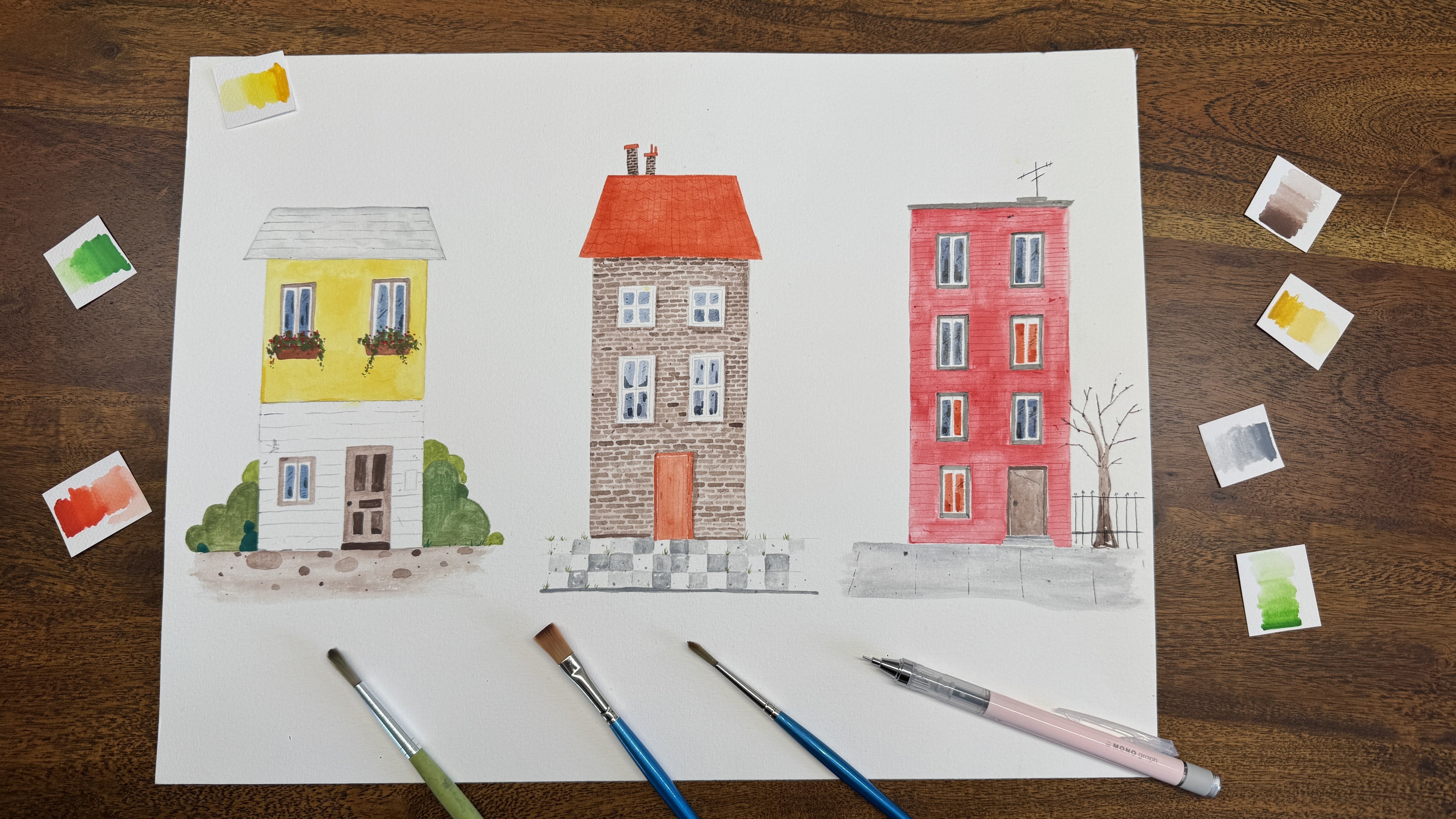
7. Coloring II - the rest of the buildings: And then Ro Sienna for the building for
the next building, like we talked earlier. This time, I'm going
to use the red color. But I want to mix really light. This is too too dark. And then I'm going
to draw these two. For the building on the left, I'm going to use let April
coat combined with peach red. I'm going to mix this color
a little bit together. So I got led apricot
and peach red, and I mix it a little bit with a lot more water to make
the color more light. Water. O and also on the upper side. And for the other
building on the red side, I'm using the lemon yellow. Also, a lot of water to
make the color light. It's so much easier if the
color are still white. And for the upper set building, I mix the color Bong
Siena and bong amber. And the last one on the left red corner I'm gonna use only bond
Amber for the building. Yes So next I want to draw all the roofs. I'm going to use different
gray for the roofs and also this metal part of this two building
gonna be grey for me. This part a little bit darker. So now for the middle part
of this two building, I'm going to use this two
brighted I'm going to make the two Bighted part a little bit lighter
than the lower part. And also, I think I'm going to These two are the same color, but still, I want to
draw them individually. It's small. I like the
look of a clean cut in my. I mean, there's not much. You can't see much difference. Sometimes you notice a
difference if you draw it in one wash or different part. I will let it dry first. Then go in with the darker part because I don't want it to mix. I'm going to draw the next
roof in the meantime. So the building up
front, remember, it's not a roof which we look on the roof,
is a front view. So I'm going to draw this
one with a scarlet right. A And now for the two buildings in the back, on the left one, I'm going
to use yellow ochre, but with a lot of water
make it really light. Remember, we're going to draw a direct window with
darker color on it, so the building itself should
be as light as possible. So studs me too dark
to intensive the color because the building are far from where we stand and
it's far in the back, it should be really light. For the building
on the red side, I'm going to use let April coat. We mix it earlier and
now we're going to use only April coat Okay. Mm. So in the very last, the upper part of the tower, I used the same deep green like we used for this
building down here. Yeah.
8. Coloring III - all the windows: So now we have all the foundation of the
buildings, the green color. We can go in with more details. But first, I want to
draw all the windows. I will color it with blue. In this illustration, all
the windows are blue, only the building in the
back, I change the color. And in the other illustration, there's also some orange to indicate the light
from the building. You can decide which one do you prefer use
different combination. But because we are already very colorful in the building's body, want to keep it only blue now, so it didn't be too chaotic. For the window,
I'm going to mix a bit white to the
color tamarin blue. For window, I'm going
to use flatbush. But I don't want the
window to be too dark. Okay. Now, maybe the window looks not so specular at this stage, but later we're going to add more details to
give it more life. Mm. So now we have all the windows.
9. Coloring IV - some details: Now I'm going to use
even smaller brushes, set zero to finish
all the edges. The small edges,
starting with these two with a darker green. And also on the right roof, it's a little bit darker
to give it more depth. Then there's small edges. But for the part in the
middle of the building, I want to use the same color
as a building mil red. Maybe the color even more intense than
the building itself. So it shows clearly there's
something happening here. The other side. And for the building on the left corner, still the darker
gray for the edges. Yeah. And there's two edges. The first one, I want to use the darker guy
and the lower one, I'm going to use the same
color with the building, but a little bit darker. So for this building, we use the colour osiena And the same decoration here. And the last edges
burnt and burn the same color as the building, but a little darker.
10. Coloring V - 2 Buildings Structure: And then I want to
give the building some structure so the building
doesn't look so empty. These two we talk
about there going to be a staircase
in front of it, and for the building in front, I want to make this one and this one give it more structure. For this one, I'm going to a little give it bricks and
this one just small dashes. We start with the right
one with really right. I really love this color. And to make it a pop, the color have to be
really intensive. There's no rule. Can you see it? As you mean a bit more. Because the color is the
same color as a building. But more intensive. It and because it's small dashes, you can always
change the direction if one doesn't suit you well. Actually, so small. It's not that important. Just remember we have
to go the same angles between windows have
to be even smaller. M. Mm. Because they're all
very small dishes. There's no room for me. I didn't particularly pay
attention to the perspective. You just go with the line
that's already have, and I think it can't go wrong. Mm. Mm. So at the other one with bricks. A with the same color
as the building itself. Don't amber for me. No. It could be really
meditative doing the small exact repeat work. But I think it makes you
more and more lovely. So the works are worth doing. I hope you enjoy the
painting psssed so far. If you have any suggestions or feedbacks, please let me know. So now, almost all the
bricks looks the same. So we can also go in and give
several different bricks a more intensive
color very randomly. And it's more lovely now. And go back with
the same bricks. So now, finish with a wick.
11. Coloring VI - last 2 buildings with structure: So now I want to add more details by giving
a brick structure, also to this and
these two buildings. The same technique. We
draw all the bricks first, and then we give several
bricks more intensive color, so it looks more lively. Always the same color we used to draw the body of the buildings. So starting with this one, I used mid yellow. Mm. Mm. More intensive color
for more structures. So the last one with bricks. And for this building, I combine the color Bong
Sienna and Bond Amber. I'm going to use the same
combination to draw the bricks. But the color will
be more intensive. Also, don't too dark. Don't I can't add
more structure later. And you must have noticed my
bricks are not all the same. They are not clean in form, not all the same. I want it that way because
then it doesn't look so stiff. M. And there's perspective. Don't forget it. You just draw I mean, if it's
easier for you, just draw for the line
along the windows like this and draw the
bricks in between. Maybe to be easier to
calculate the perspective. Most too light. M.
12. Coloring VII - all the window frames: Next, we're going to give
the windows more details. Let me zoom in again. For example, or we can make some windows more
darker than the others. So it's not all the same. We don't have to do it
in all the windows. There will be too much. Just
some details here and there, so it doesn't look too empty. In the illustration, it
can be some reflection. It's just small details. I won't do it everywhere. But in some of them, Okay. So it looks more, lovely. Small details always make
a huge difference here. It's so small, I would just make some windows
darker than the other. There's no right or wrong, but I think either you change the whole window in
a darker color here, what I did or you add
some small details. I have some big window here. My reflections are bigger, but still it's a lot smaller
than the window it is. If you make 50% of the window darker
and the other one not, I think it for me,
it's not that pretty. I like it small details. I think that's enough. As next, we are going to give
all the fences of frame. But let me show you first. Like I mentioned, if the
buildings look up front, we can give the
window a whole frame, and if there's a perspective
in the buildings, then not all around the
window, there's a frame. We can only see some of it.
So let's do it together. And for the window frame, I'm going to use
grey or bunt amber. I put these two color here, not to mix, but to
use them separately. I think, we just take it away. For the majority of them, I'm going to use burnt amber
and the one on the left, I'm going to use gray to
make the window frame. And I'm still
thinking about maybe the three uses its own color like it's building,
but we will see. Let's start with one on the
left. The building is grey. I'm going to use the
color grey to make the fil but the
grey going to be a lot intensive and darker than the one I used for the building. To make that infect, you just mix less water in the color than earlier when
we paint the building. There's basic no perspective, so we're going to paint the
whole four set of the frame. I'm using the set
zero round brush. Just make the window
more defined. And if it's not straight
line, it doesn't matter. I give a more loose
feeling of illustration. Because I'm intend to as all the pencil sketches
after the illustration, so we won't see the
pencil lines later. Like this. And for the green building, I'm going to use bunt Amber
for the windows frame. Give it a darker frame. Remember there perspective. We look this way. So I'm going to only
draw three set of it. One in the middle.
Let. Bond amber, I'm going to also use I think this one in the
middle, the yellow one. Yeah, I'm going to use this
one from the upfront window. And on the side, I'm going
to do only three sets of it. This. Fine defined lines. Not all the line continue easily and not all of
them are so straight. Just give the
window a clear fime So what do you think so far? It's more coming to
life now, right? I hope you think so, too. So now I'm already
using the boned Ember. Have this one. And for
the red corner building, can I use the same color. Also, this is a front building the building that
we look from upfront. There's no perspective,
so it's easy. We draw all four side. So like this. Some line are more defined than the other. Even the lines are
not all the same. That's quite okay for me. Uh, so And the building in the back. Gonna also use bond amber
for the window frame. Be careful of the perspective. I'm gonna draw three side of it, the upper, the bottom, and the left side of it. The upper part, the bottom line, and the left side. Like this. For the red building, I'm going to use black to
draw the window frame. Almost all my illustration
where a red building is. I use the black to
draw the window frame. It it just looks appealing for me and remember the perspective. For the windows
on the front set, I'm going to draw the upper set. And the left set.
And the middle. That's it. Not even the
bottom one because I think it's too
much in the front. I don't want to draw
the bottom one. And on the re set, I'm going to draw
also the upper set, the re set, and the middle. So this it. I know it's not always easy
to draw a straight line with a brush.
Remember to breathe. I often just accidentally
hold my breath too when I try to
draw a straight line. Okay. Okay. And the one behind for the
building behind it, I'm going to use the color
mid yellow to draw the frame. And for this one, I'm
going to use burnt amber, like we drawed with
the other buildings. I want more contrast. Remember the perspective? A draw on the upper side
and the middle one. And the bottom eye. Upper side. Straight nie I like this. And the last two. I already
said on the red one, I'm going to use mid yellow, and the other one we mixed the color let apricot
and beach red. I'm going to use the
same combination but make it more dark. We look from upfront, so we are going to
draw all that of it. Okay. I like this color combination. The last one? The last
building for window frame. So now, we have all the window frames and we
add details in the window. We're going to let
this window frame dry so later we can
draw the staircase. And in the meantime, we're going to working on the three buildings
in the back. Oh
13. Coloring VIII - Windows in the back, staircase in the front and some details in between: Now, in the three buildings, we need to draw the windows. I'm going to start
with the white tower. I'm going to use the color green to draw
two windows here. In the middle. Two windows. I'm going to draw some small
squares indicate the window. Now I used a different
color combination here. For the left one, I'm going
to use the color burn Sienna for some squares
for window to make it pop. There's no rules. You can use at how much or little
windows where you want. I I don't want to add too much window to give
it more loose feelings. I would love to see
you combinations. How did you comb
the window here? And for the last one,
I'm going to use the color raw sienna
so we can cover up the ground color. Okay. Now to check, I think my
window frame here is dro. I'm going to add. The staircase. Like this, I'm going to draw all the staircase
upfront first, all of them, and
then I finish them, I'm going to draw the
one that combined them. Basically, I'm start
somewhere in the middle of the window somewhere a
little below the windows. Some noise in between. As the next one. No need to worry if your
lines on our street, the space in between
are not all the same. We have the whole illustration
or more loose fitting. There's some window frame
that line on no street. So if it's here, still North Street it fit
the overall style here. So and you finish once we
finish all the paintings, it is gonna matter very
every little details. Now it's more present because
you only see this part. But once we finish, it's
gonna looks pretty. I know this two
staircase, for this one, I try to cover the two
windows or it seems like I cover the two windows and on the side only
covered one window. I think I'm going to
keep this there because the difference makes
interesting. I think. Can both make sense. This have bigger apartments. I have two windows, and
here with small apartment, it have only one windows. Like this. Then to combine it, remember on the side that we don't see exactly
where it ends, but when it combined, it should be from the end of the staircase
on the left side. You have to imagine
where it's coming and then elongate it
to the other one. M it's here. Like this. This one I choose to
draw on the other side. Yep. And some irregular to indicate the steps in between. So detail. Yeah, like this. I didn't even calculate which direction should be and how much the
space in between. I just go for it and
it's fine with me. Now, if I move in the
other illustration, you can see I also had some decorations on
these two edges. Now we're going to add it to. You'll see the color green. Also a more dark
intensive color. So we can draw
based on like this. So small details so it doesn't
look so empty up here. And see we have different
ages in different buildings, and we can also give
them a structure. And some dot dash
dot here and there, because the roof
won't be that clean. So some small details. So the inn doesn't
look too empty. We add details, but remember
they're just details. Don't overdo it. I know it's hard to stop. Oh, I won't do it. Like this. Some details. And
then I think for the red one in the middle
age and on this age, give it a structure. I'm going to use black
for the red building. Very small fine
lines in the middle. So here, the same color black.
14. Coloring IX - Sky and some last details: So for the sky, I'm going to use the
color tamarin blue, but I'm going to mix
it's very, very light. You can see my two
illustration here. The sky both very light. Now, because the
building block is already colorful and I don't want to make
the sky more pop. It should be quiet and
silence and still in the background to make
the city block more pop. I'm going to make the sky really transparent
as much as I can. But first, I'm going to
make the papers white. Later, the color will
run freely on the paper. Was more important is the space near the white
towel because it's white. We need the blue sky around
it to make it more defined. I'm going in with some blue. And the upper side
when it go down, the blue will be
more and more light. I like the transition. So I add more blue
on the upper side and basically drag
the blue colour down. Yep. Something like this. And There's no frame in the upper side of
this illustration. So the sky can run freely. I don't like the hard
edges stream line. T's a benefit that we
drawed with water earlier, the color are still white
and we can change it. Different shade of glue. Like this. That's
good enough for me. I'm not sure if you can
see through the camera, but this is sky blue
around the white towel. Yeah, let's give
the towel a free. Like this. Yeah, I can see
clear there's a towel. And we wait till the sky to dry. Then with a smaller brush set zero with the
color scarlet red, I'm going to give the roof only roof on color roof in
our illustration structure. That's a sketch
in the beginning. What I'm doing is I
just don't here give the roof structure,
something like this. And with a street line. Something like this. I'm going to give the
roof a structure, and when I finished, there's also some contrast
more contrast color. So something like this, I'm drawing here on the roof. If you see the
Illustration in person, you will definitely
notice the structure in the roof and all the
small details add up, make it more interesting. There's always some
details that people can explore and that's the fun part. And some color contrast
here and there. That's it for this roof. And now the last part, we're going to finalize the details of the
white, the green part. I'm going to use the
color deep green, which we use to color this part. But this time, the color need
more intensive than that. I'm just going to give it some
details on the upper part. And once you sky is really dry, and you can give the last
stroke upon the upper part. So a more intensive deep green like this. And some
details here and there to define the upper part. Yeah. And the ski have to be dry dry. Then we're going to
give the last straw. Thin and study. Right. Like this. And then maybe also we have already the depot in your brush. So also details in the building
here on the left corner. Can you recognize
it through Como? Just some details. Yeah. And
15. Coloring X - Finish: So that's the final result. From the sketch to finish. I really hope you enjoy it. I really love what we
finished together. I think it's cute is totally me. This illustrations
colorful, it's bright, it looks happy, and it's a
city block our imagination. I love it. Please tell me how do you think about your illustration and
our illustration.
16. Conclusion: Now the class is
finished. How was it? Are you satisfied
with your result? I'm so excited to see result. Please share it in
the Pox Gallery. Now we'll all be through
the same process. Let's share our
experience together. I couldn't wait
to hear from you.
 Fei Fan, joyful interpretation, colorful swing.