Transcripts
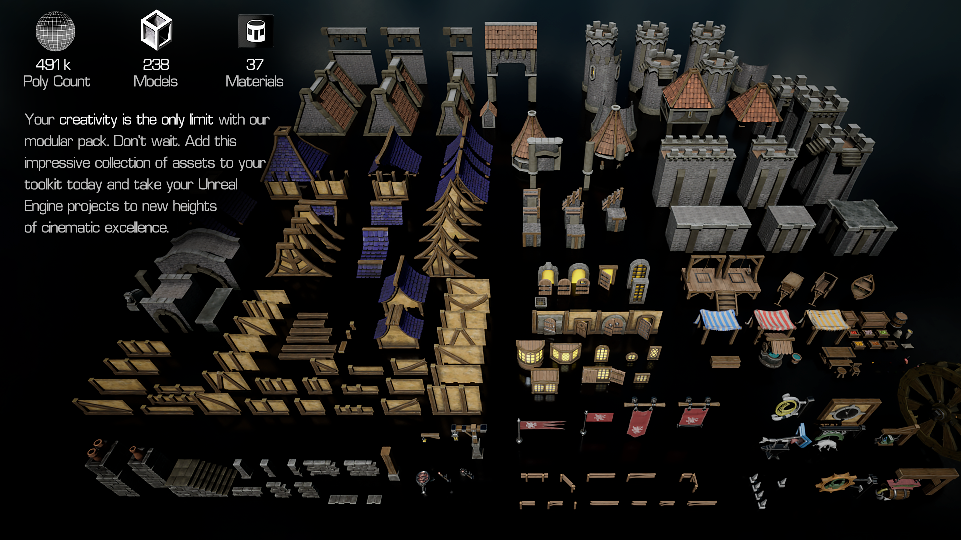
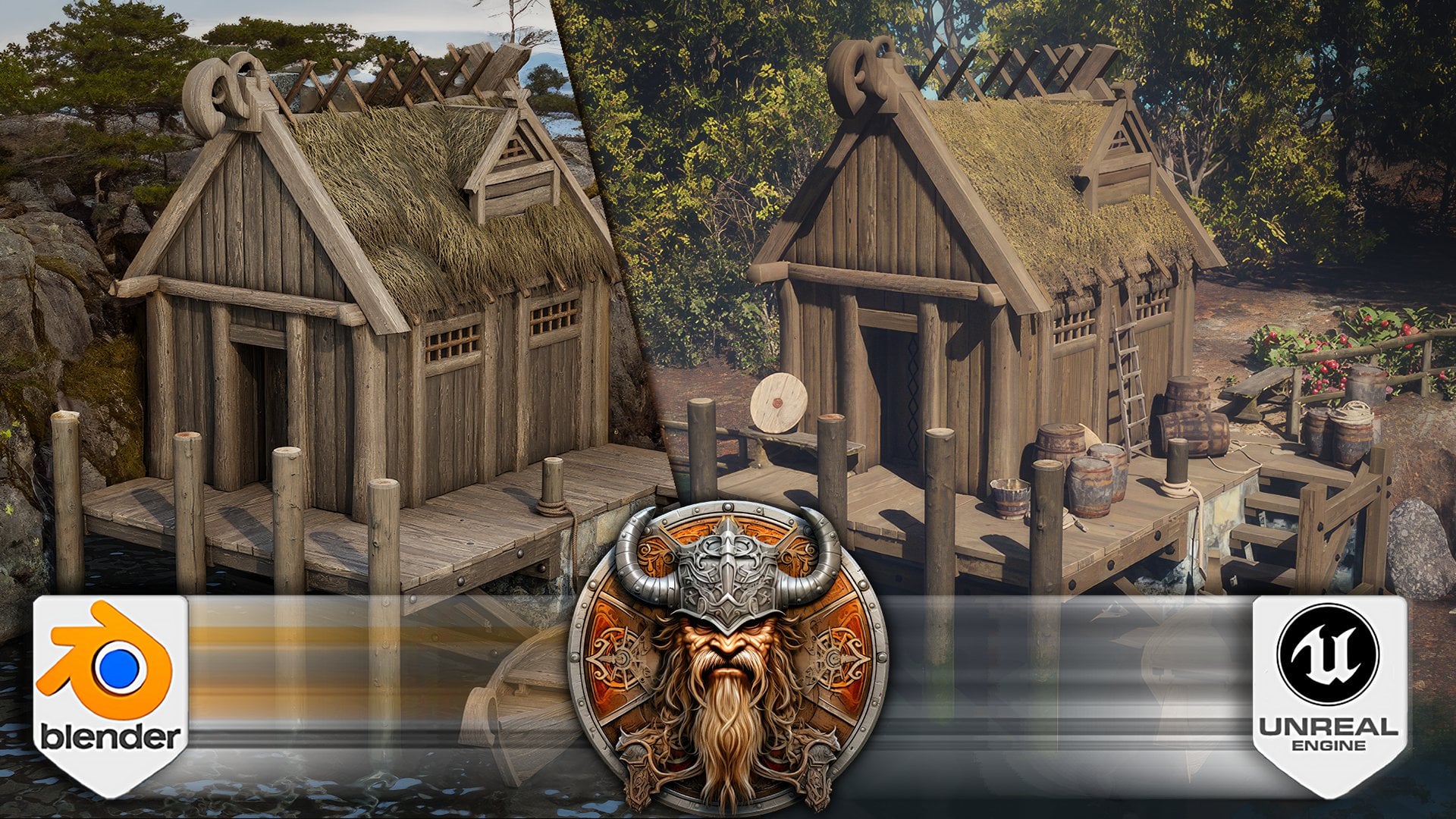
1. Blender & Unreal Engine 5 Massive Medieval Stylized Kitbash: Step into the world of your own creation with this
groundbreaking course, building standing medieval world is with Unreal Engine five, modular kid bash, instructed
by Luke from freely tutor, whether you are
uninspiring game developer or just looking to learn unrelated five for
the fun of it. This course has
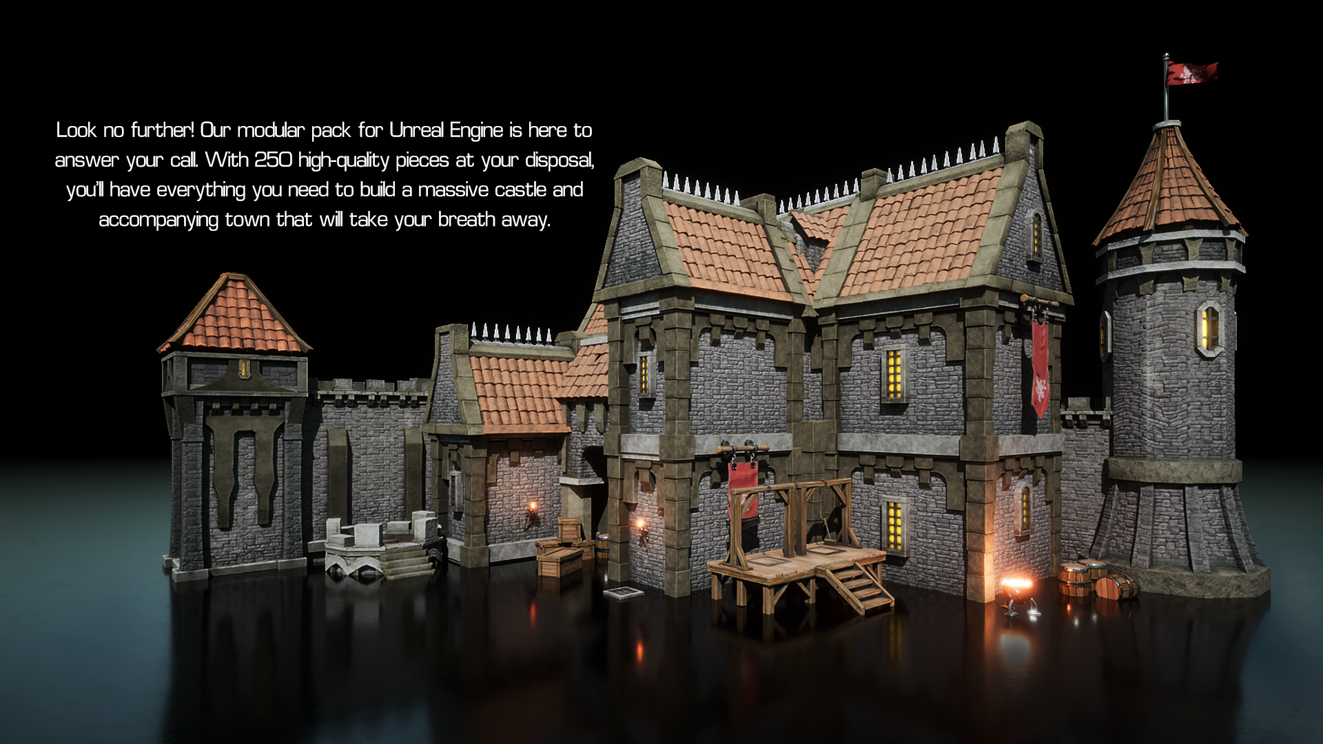
something to offer with over 250 modular assets
you can bring to life year medieval fantasy world filled with bustling towns, majestic castles, and
intricate canal systems. In this course, you will learn the unique techniques
needed to create stylized structures using modular assets and
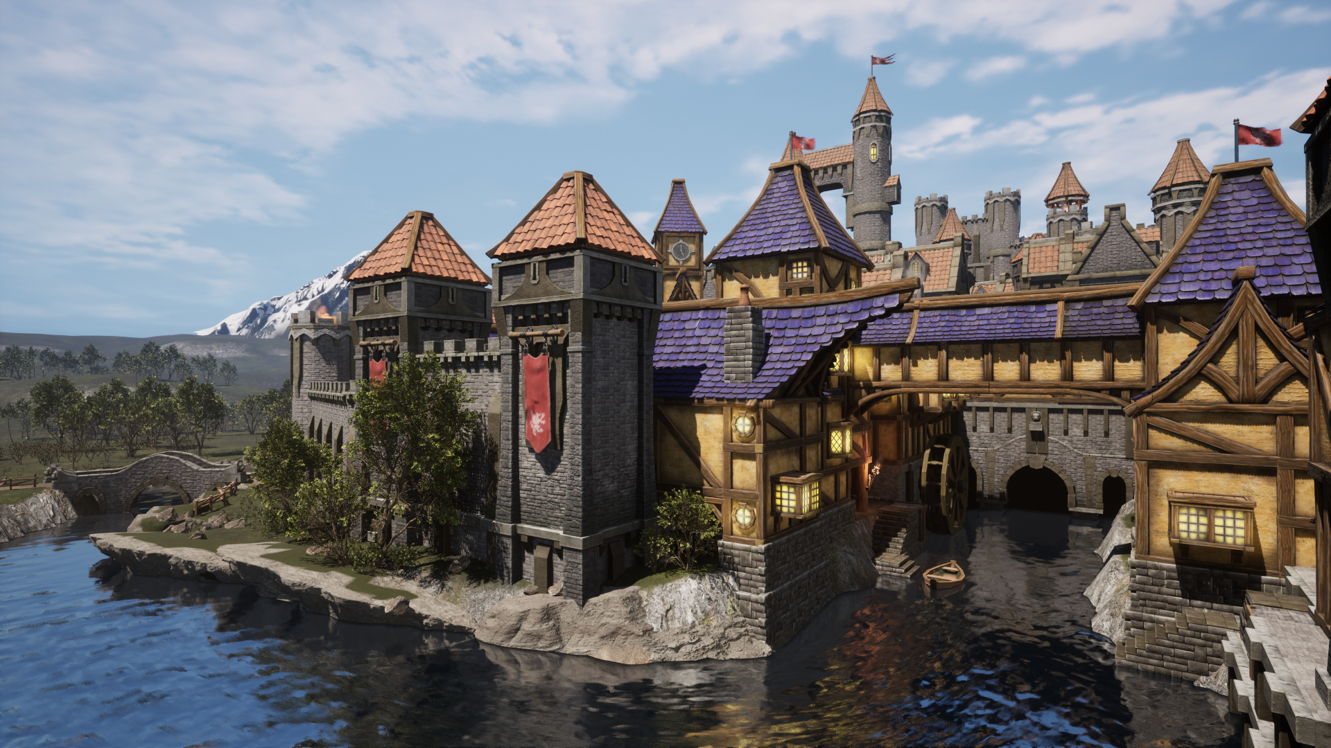
modelling modifiers. You will also learn to setup functional water system
with directional waterflow, submersible boat
assets, and of course, water wheels to bring
your water body to live. Enhance the nature
side of the world. You will learn how to
populate your own world with Panamanian night
enabled foliage. This course is the
ultimate one-stop shop for mastering
Unreal Engine five. It covers a vast array
of topics that will guide you through every
aspect of game development. You will learn how to
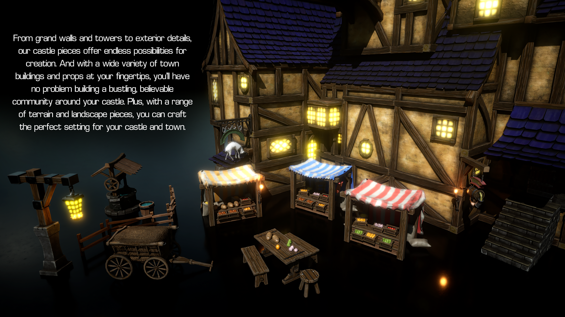
build entire towns and blacksmith shops with ease using the massive modular pack, which you will then be
able to visualize it with smaller detail for somewhat
a close-up shots as well. You will create not only
your very own town, but the environment
that surrounds it. You learn how to
build lush forest, rolling hills and
upper small detail that make all the difference
in the world building. In addition, you'll
learn how to create your own custom prop
collections using blueprints to make your
own world come to life. This includes iconic
shop windows, moving flags, banners, market stalls, and
cobbled streets. You will work on Castle
composition to set up a medieval structure that looks amazing from a
distance and up-close. The course also covers
the creation of a fully functional open
world system material, including distance-based
Blending, noise masking, and automatic
material transitions. You will work with multiple
preset camera angles to get the best composition
out of your castle that looks great from any angle. Moreover, you will learn how to plan out and create
large-scale series. On the go, you will work
with modelling mode, the deformer collection
of modular assets, such as merging
bridge pieces and bending bridges using
curved deformer. By the end of the course, you'll be able to create your own functional medieval world and immerse yourself and the player in a world
of medieval fantasy, you can choose to
build a small village or an entire city, and the possibilities
are endless. Join me on an inspiring journey for limitless world
of Unreal Engine five and unlock your creativity in ways you never
thought possible.
2. Creating New Project & UI Basics: Hello and welcome
everyone to building, sending medieval world with Unreal Engine Pi
modular kit bash. In this lesson,
we're going to learn how to set ourselves up with a new project from within
Epic Games launcher. We're going to be
using a version 5.1, but everything above
5.1 is also fine. So if you're not seeing
this kind of version, just go ahead and use the
plus symbol over here, which will give you a
new window to prompt up. And then from within this menu, you'd be able to pick the
version that you need. Basically the reason
we're not using anything under 5.1 is the launch version of 5.0 was kind of a bare-bones version
of Unreal Engine five. And I'm actually just
going to close this down. And by 0.1, what happened
with it is they added all the necessary
features that were missing otherwise
with pipeline zeros. So e.g. non-IT, the foliage
is working now. Water functionality
has also been improved in regards to
their reflections to it. And so let's go ahead and
launch this right away. I'm just going to start up
on real project browser. We're going to create
ourselves a new project. Let's go on to the game
template and we're going to get a third
person template. This way we're all
going to be able to run around freely within our world. And we're going
to make sure that we are setting it
up as blueprint. The other settings
don't matter as much. Let's keep it as
default and maximum preset or the starter content. We're going to be able
to import that in manually ourselves
whenever we need to. And then we have project
location which we can change by clicking on
this button over here. Let's go ahead and do that. When you go into located
within this folder, click Select Folder and change
the project name as well. We can't have any spaces
within this name. So let's go ahead and
just call it the castle. Castle good bash,
horse, like so. And we can just click
Create once it's done loading up and it starts
preparing all the shaders, we just need to wait
a little bit to get everything processed
for the engine. And once it's done with that, we're going to get this result. Now, before doing anything, I'm going to firstly introduce you to the basics
of Unreal Engine. And then afterwards, I will
show you how to migrate the assets onto our
newly created project. Now going to play
introduction video for the entire overview of the uy. And then afterwards
in the next video, I'm going to introduce you to the controls of the viewport. So without further ado,
let's get started. Hello and welcome everyone to Unreal Engine five,
basics tutorial video, in which we're
going to introduce ourselves to the Unreal
Engine pipe software. So Unreal Engine pipe
is an engine which was personally developed as
a game engine. These days. It's been widely used within other creative fields as well. But just Architecture
and film industries. But even with all
this versatility and design changes to
appeal to other industries, a lot over the core
design border layout has been kept as
the game engines. And right now we're gonna go
through to set layout code would be easier to follow
along the future lessons. So first things first, we're going to start off
with the upper-left corner. And within it will
find the Save button, which we can use Control
and S to save our project. This however, will only
save the current level. And if we're making changes
outside of the level itself, Let's say we're having a
material or an asset edited. We'd have a different window
that we're working on. And we'd have to save
this independently. So it would have a save button or we can click Control and S. And that would save the
window that we're working on. Only though basically, if we're working with different window, we need to make sure
that we save that out. And then afterwards,
if we're making changes or the level itself, we need to save this
out afterwards. So if I were to change this, we can only have it saved by clicking Control and
S and save it out. You have made a new level. You'll be prompted up
with naming it and selecting for where
your location is going to be four level. Then afterwards we
have select mode. By default, you're going to
be within a select mode, which you'll be able to use to make selections for
within your asset. You can also go ahead and use this to change
it into landscape, Polish, mesh, pain, and
other types of modes. Just to change up your workflow depending on
what you're working on. But by default,
most of the time, let's say 80% of the time you'd be working on a select mode. Moving on, we have
quickly add the project. This button will allow you to add more assets
into your project. The simple default ones
that you'd normally get in within that any type
of rendering software. So basic light shapes and such. And we found here, if you
wanted to search within it, you can click on it and
search for light, e.g. this way would be able to see all the assets with
light within its name, which you need to
keep in mind though, is that when you click on it, you need to make sure
that your mouse stays the same within this
icon over here. Otherwise, if I were to e.g. drag my mouse to shapes
and then search for lives. It notice that it only searches it within the shapes location. Whenever you're searching for an asset from within this bar, just make sure you keep the mouse stable within
this icon, like so. Next up, we have an icon that
if we were to click on it, would be able to have some options for creating
Blueprint Classes. Blueprints works similarly
to a sort of a prefab. However, for the sake of introduction to Unreal
Engine five layout, we don't need to get
into it too much. So the next one we have a level sequence and
masters sequence. And we can add from
this button over here. This is used when
we're going to be needing to set up our
project to be rendered out. Again. Let's move on with the
rest of the layout. We have a Play button. This will just start
off the project. And if you have a third
person template, e.g. like I do, and it'll just set off your character
to be played out. It'll also start up all the
simulations and whatnot. So this makes it real
nice to just check out your project and why
don't we click Play. We get to be loaded
in within our level. And now we get to
walk around it and actually experience what it's like to be within
our building level. We can jump around, we can run around the
way we wanted it to be. And it's actually
quite nice to see what we're like within
our own built level. We also have this
three dots over here, which if we were to click on it, we have some
additional settings, like simulating the
entire project. This will just allow
you to hit Play button, but without actually needing to lose control
over the edit mode. Again, we don't really need
to go too much into it. But basically this
section over here, we'll play and
stop your project. Then afterwards we
have platforms. But this is only for
when we're breaking out our entire package as a game. And we don't really need
to worry about this. So let's go ahead and
move on. Afterwards. We have a settings button. This will include
a sort of settings like Project Settings
and plugins, which can also be found within this upper-left
corner over here. So basically this just makes sure that everything
is in one place. We don't really need to go
through it because they're usually not needed for when
we're creating or seen. Anyway, moving on the outliner. Outliner we'll have everything that contains within your level. So it will have all
the assets within it. And right now, if
I were to select any type of an asset
from within this level, like this one over here. It will right away make a selection within
our outliner as well. After which, we
have Details tab. Details tab will give
you all types of options for your selected asset. So it will include all
the type of information that it requires to be
placed within the world. So e.g. firstly, we have transforms and this
will include the scale, the rotation on location
on this specific asset. We also have the type
of static method uses, as well as the materials. Each type of asset will have its unique type of
information set within it, which can be found
from Details tab. After which, if we go down
to the bottom left corner, we get ourselves going
to draw our output log. And cmd quantum drawer
is by default hidden. But if we were to click on it, we get it opened up. Now if we click on anything else outside of
the content door, by default, be hiding it away. We can also open up the cons and drop by clicking control and space to give us an easy access to where
our files are located. But the content rover is
basically a file manager. You keep all your folders, all your assets for
not only the level, but for the entire project
of the Unreal Engine Pi, we can also dock the contour by clicking this
button over here. By selecting it, we
simply make sure that they're always going
to be within dislocation. And even though we click Off, Off the content drawer, that is still going
to be within it. Now we can easily
undo this step by simply clicking on
undisclosed minor tab. And we can open up the country and Java
just like we used to, like so by clicking control
and space and output logs are pretty useful
for whenever we want to find out
some information. If something is
giving us errors. If our work is not
focused on coding, we don't exactly often use this. So let's go ahead
and close this down. Dmd is useful every once in awhile for whenever we
want to make a command. Right now I'm not gonna
go too much into it, but we can make use of it
and do things like taking High-quality
screenshots or getting a different type of view
within our viewport. Ok, so now we walked all
the way around our window. Now we're finally
gonna go ahead and talk about what's in
the middle of it. By default, we're going to
get ourselves a Preview. Going back to the content
drawer within it. We need to enable
certain settings. By clicking on this
button over here, we'd be able to view the type of different
folders that we have. Usually I recommend
you to enable the show edge and content
and show plug-in content. You ever get more? You get more out of our
Unreal Engine pipe. So after you enable it, you get yourself a folder other than the content folder,
which has engine. So this will have all types
of presets and plugins which we can make use out of and speed up our
creative process. Something to keep
in mind though, is that this is not
part of our content. So basically, this is already
within the engines folder. And if we were to change
any one of these folders with basically be
changing it for entire Unreal Engine five. Meaning that even if you
create a new project, the things that we
changed within it, within this section
are coming to be changed throughout the entire all the other projects as well. That is why by
default in a set of hidden to make sure that none of the content that is
set by five itself is changed in any way and messed up throughout
all the projects. But we can avoid this by
simply knowing that we can't change anything within
the Android folder itself. And it's better to,
whenever we make use out of this content folder, is by simply making a
copy out of whatever is inside and then dragging it
out onto your content driver. Just to make sure
that all that we use is only set for
the project itself. This way, we can make as
many changes that we want without ruining the
entire Unreal Engine to Pi of content files. And that is going to be
at four Unreal Engine, the UI introduction guide. Hope you got a lot out of it and will be quite useful to you going forward in the future for your Unreal Engine projects. And now let's get
back to the course. Alright, I hope that the
video has been productive, takes so much for watching. And then in the next lesson
we're going to continue on with the introducing to
the viewport this time. So, yeah, thanks so much for watching and I'll
see you in a bit.
3. Viewport Basics: Hello and welcome everyone
to building standing medieval worlds with Unreal
Engine five modular kit bash. In the last lesson,
we started off by creating ourselves
a new project and going over the basics of us for the unrelated
five software. And now we're going
to continue on with the course and actually familiarize ourselves
with the viewport itself and how to control
and move it around it. So I'm going to quit. Quickly play a video about that. And I'll see you in a bit. Hello and welcome
everyone to Unreal Engine five basics guide for
the camera motion. And we're going to start off by introducing you to the camera
type of motions within Unreal Engine five in order to help you and follow
along the lessons easier to start off within the middle section
of the software, we have a perspective
camera view by default. And using this, we can
move our camera around. The main thing that
you need to remember for when you're moving
your camera around is that by holding Alt and evil
one of the mouse buttons, you'd be able to make
a certain motion. So e.g. by holding Alt
and left mouse button, you'd be able to rotate
your camera around like so. By holding Alt and
middle mouse button, you're able to pan your
camera around just like that. And finally, by holding Alt
and right mouse button. If you were to scroll up
and down using this motion, it be able to zoom in
and out of your view. Alternatively, you can simply just scroll your mouse wheel and zoom in or out of
the project like that. Now, if we want to zoom in
towards the selected object, what we can do is if I were to select this box over here, e.g. I. Can click the letter F and it will zoom in
right onto the object. Now we can use this to
rotate our camera around and simply sea level with the
object selected as the center. If we were to select a
different one and click f with zoom in onto our asset. And if the asset is larger, like this ground
plane over here, e.g. if we were to click F, it would zoom out and
make sure that the camera view as the entire
selection within our view. But this is pretty
good for whenever we want to zoom in
onto our selection. However, you do
need to be careful, since if we e.g. were to select the
sky and click F, would zoom out all the way. And we don't really
want this to happen. So make sure that before
clicking f though, your selection is not
something like a sky sphere. Now, if you want to have
more control over camera, and let's say you want it to be similar to your
first-person game. Which you can do is by
holding right-click, you'd be able to enter a sort of a camera movement mode
within your editor. Right now, if I were
to hold right-click, I can simply rotate
my camera as if this was a first-person game. Now, what's nice about
it is if we were to hold right-click and use WASD, we'd be able to move
around our asset like so. So by holding right-click and W would be able
to go forwards. By holding right-click and S, we can go backwards to go
left and D to go right. And also, if you want to go
up directly or down directly, you can use the
combination of q and E. So by holding right mouse
button and holding Q, I can directly they
send out their level. Similarly, by holding
right-click and holding E, We can go up to level
just like that. Now, if the camera is a little
bit too fast or too slow, we can make use out of this icon in the
upper right corner, which says the camera speed. If we were to click on it, we can use the slider
over here to set the speed of our camera. So e.g. if I were to set it to one, I'd have a really slow motion. And we'd be able to have
a really fine control over where our camera
with an editor mode is. Where to set it up to eight. Be able to go really fast
up and down just like that. But by default, it should be
set to something like four. There is a value underneath
it which is set to one. If we were to set it to e.g. this will multiply or for speed to be all
the way to eight. So right now, if I were
to go up and down, you notice that
it is way faster. So this is quite useful for when we're working
with different scales. I personally only
recommend you to use this value or when you're going up and down in scales. So e.g. if you're working with
planetary scale of scaling, we'd want this to be increased
to resemble like 14. And then this way we'd
be able to go all the way out real fast
out of a level. But by default keeping
it at one and simply scaling this up and
down will do just fine. Now within the perspective view, we also have couple of
our perception modes. And those would be on the upper left corner of the window for the
perspective camera. Right now we have set
it to perspective. We can change those to be top, bottom, left, and right. What this would do is
basically it will help you get different types of use for our level right now
because I'm set to bottom. If I were to set it to left. And if you don't see anything, we can always make
use the letter F and go back onto the
level just like that. So this is quite useful
for whenever we're creating environments
and assets. And we just want to make
sure they look good and proportional to the rest of our level and from
all sides of angles. Again, by default, this
will be our perspective. If you do want to change it to be into a multiple
cameras though, and you want to see
multiple of them at once. We can click on the upper right within our view mode
button over here, you click Maximize the
restore viewpoint. So this way we get breed
different viewports, all from which are different
types of perspectives. Now, other than a perspective, all the other ones will by
default be set to wireframe. If you don't want
this to happen, we can always set
them to be lit, especially when
designing a level. This sort of a view
might be quite handy to go back onto one view, what do we have to do is locate our perspective camera and click on this button over here. We've been this
perspective view. We can also change the way our camera perceives
the entire level. And right now it is said
to be default of lead, which means that all
the shading would be seen with proper
shadows and whatnot. So in order to change that, we'd have to click on it. And if we want to e.g. select unlit, which
will show you all the level without
any types of shadows. We can go ahead and do that. We get this result is also something like a wireframe which should see
an alpha cameras. If were to click on it, we'd see the types of geometry
that we'd have. Those quiet, nice to know, especially if you buy accidents, sometimes click on one of them and you don't know
how to get out of, can always go on this button
over here and select lid, after which we also have
show icon over here. This one will get you
a different types of visualizations for your
respective camera. But what you need
to know though, is if you have something that's a little
bit off, like e.g. I. Have my grid right now, which is barely visible, but is often quite useful for when we're creating or level. But if this is not visible, e.g. if I have this turned off
with this button over here, and I want it on, but I don't know which one exactly it is. We can always go ahead
and click Use Default. This will bring back all
the selected defaults that is usually set up
by the default template. And that's pretty much all there is to the camera controls. I hope you enjoyed the video. And now let's get
back to the course. Alright, I hope that
the video has been informative and you've
learned a couple of new things that will help you along the way
of this course. And then in the next lesson, we'll learn how to
set ourselves up with migrating the resource
pack into the project. Thank you so much for watching. I'll see you in a bit.
4. Introduction to the Modular Kit Resource Pack : Hello and welcome back to
Brown to building standing medieval world with Unreal
Engine five modular kit bash. In the last lesson, we
introduce ourselves and with the view port
for Unreal Engine five. And now we're going to continue on working with this and set ourselves up with modular
kit bash resources. So let's go ahead and
get right into it. If you were to download
the resource pack, you'll be able to find yourself a modular kit zipped file. And this is a version that's been set up for
Unreal Engine marketplace. So whenever you buy yourself
a marketplace item, you probably get the
same kind of layout because the quiet about that. But if, let's say you end up buying it from another store, another website, you'd have
yourself a zipped file, which you'd have to then
migrate it into your project. And we can do that by firstly
and extracting the file. So let's go ahead and do that. I'm just going to quickly do extraction and just wait
it out a little bit. Since it is, I'd say 600 mb and we're going to get ourselves
a folder within it. We're going to get
ourselves content config and you project. We could technically
just launch ourselves. They project from this one over here by just
double-clicking on it. But often times when you're working on your
own personal projects, you'd want to ideally
migrate yourself an entire project or all
of the items on to them, the one you're working
on at the moment. So I will show you how
to do that right away. So to do that, we will actually need to go
into the project itself. And we can just do it by
double-clicking on it. If we were to click on it, we'll be able to load ourselves up with this project itself. So let's go ahead and
wait it out a little bit, which we're going to get
this sort of a result. And the only thing
that we need to do now is basically select the folder
itself, Right-click on it. And let's make sure that we basically migrate this
entire project like so. We're going to click Migrate. And we're going to get
all of these items. Let's just make sure that
they are all selected. I'm just going to scroll
quickly through all of them like so they seem
to be all in order. Let's go ahead and click Okay. And then we're going to
need to find ourselves at the project that
we're working on. So this is the one
that we're working on. We'll need to select
content folder itself. So let's go ahead and do that. We're going to click Select. And then after that, migrating all of its
older items like so, we can pretty much
close this down and go back onto our previous project. So let's go ahead and do that. I'm going to close
this project for the castle modular kit assets and go back onto the
project or be graded. So this is the project
that we created. We can now see that we have
Castle Git Bash folder. And within it, we can see
that we have all the folders already sorted in
the reset order. And yeah, most of the items, if it was set up for Unreal Engine marketplace will have this type of an order. And within it, you usually
have yourself a map, especially if it has an
asset preview type of a map, you'd have yourself a map
seen that we'll be able to show you the exactly the
type of assets that it has. So let's go ahead
and open that up and we have map item renders level. We can just double-click
on it to load it up within our scene and
see how it looks like. It will take some time to
prepare all the shaders. And we can say bottom
right-hand corner, it's preparing them like so. So once it's done
loading them up, we get this sort
of a mess. Right. And how it is, the reason it's being
like that is because this specific castle
Git Bash is using UTMs, we need to make sure we enable
virtual textures for that, which then will allow us to actually make use out of them. So for us to do that, we're going to click Edit top right-hand, top
left-hand corner. Sorry, we're going to click
on project settings like so. Once we open this up, we're going to search
for a virtual. If we were to
search for virtual, we can scroll down a little bit until we see
virtual textures. We need to make sure that we have the virtual textures
enabled, like so. And another thing
that we need to set up is we got to make sure that we change the
virtual textures, the Automatic Virtual
texture size, to be a little bit higher
because automatically, I think by default
they should be set as 2048 by one is set as 49 is six. So that's alright. And basically what this
will mean is that every time a new textures place, it'll try to convert it automatically to a
virtual texture, which is basically to make use out of just more space than simple as zero to one type of a texture space in
uv coordinates. It also lets us blend
in textures or whatnot. But anyways, we just got
to make sure that not all. Textures are setup as
virtual ones because otherwise there'd be a lot of performance
issues or whatnot. But yeah, we're just
going to come back to the performance in a
bit for now though, let's go ahead and just
make sure this is set as for k. And after
we're done with that, all we gotta do is make sure
that we restart ourselves. A project bottom
right-hand corner, we can see that a restart is required to apply new settings. So let's go ahead and do that. We're going to restart
ourselves this project like so. I'm going to wait
it out a little bit until it's done loading. There you go. We can close this down. And actually we can go back onto the map item renders just
to see how they look like. Let's go ahead and wait it
out a little bit like so. And yeah, there you go. We can now just look
around this area, I think. Yeah, the post-processing
has been applied. If you don't want to see it, we can totally turn this off and see all the items that it has. And in short, usually the
type of items you'd have. Everything should
be presented within one map and we can
make use out of it and actually just view over all of the assets so we can see the type of
variation that we have. Yeah, the reason
we're doing this usually before starting
out the project is to familiarize ourselves with all the items that it has. And to be basically
able to make use out of all of them in
as best way we can. So right now we can
see that we have a couple of light sources will be able to make
use out of them, although they don't have any of the particles
setup with them, but they do have a mission. I can see that they
have a mission if you look at it from an
oversight like it might be a little
bit easier to see the glowing a little bit. So the reason for that
is because they set up with some nice emissive type. We can see that we have
some flags that up. It says with clock physics, we can try seeing how
they look like by just clicking on
these three dots over here and clicking simulate. We can see how they look like. And yeah, there you go. We see them moving
around, so that's good. But the difference
between a simple meshes and once we've caught physics is usually they're set
up as skeletal mesh. So e.g. if I were to select this lambda1 over here on the
bottom right-hand corner, we can see that it's
set up a static mesh. And on the flag, if
you click on it, we can see that they are actually set up
as Skeletal Mesh. This is something to
keep in mind while working on it because
in the future will come in handy when we want to make quick access to all of
our items later on. Then we have other
things to consider is the variation of the
same type of assets. So e.g. what I mean by that is, right now if we look at the
end bits of these roofs, we can see that they
are exactly identical. They're the same size, but they have some
variation within them. So that will also come in handy when we're working
with our assets. As in, will be able to quickly replace and change
between them to get ourselves nicer
type of aesthetics when working on creating ourselves
somehow seeing and whatnot. And yeah, let's go
ahead and check this. We have bridged
part of the world, so this is going
to be connected. I can see that we'll need to work on certain parts,
but that's okay. We're going to make sure we basically combine
them all together. And one final thing
that we need to consider is how those pieces
are going to be connected. So e.g. right now, the modular pieces can either
be freely moved as in, you'd have to combine them and connect them manually yourself. So it's, in most cases, when it's done like
that, it will, you'd have a lot of freedom to control exactly how each
one of the pieces would be. So as an example, I'm just going to grab, let's say these
couple of pieces. I can see that these are castle wall foundations
and castle wall. So this will go on top, making sure I'm having them both selected by holding shift. I have the most selecting.
I selected them all. I'm going to hold Alt and
drag them out like so. And yeah, what I mean
by really moving if I were to have all of
my snapping disabled. So on the top right-hand corner, I'll have them stable. We could totally just move them around ourselves manually. I just kinda combine
them like so, and we can move them
slightly in words outwards, have them kinda messy
position like so, and that would totally be fine. That would work just as well, but it would be a little bit time-consuming for that reason. Usually with modular pieces, we have either snapping two vertices type of a
mode or snapping to grid. Snap it to the vertices
will basically mean that the pivot
point would be e.g. at the very bottom corner
of an asset though, e.g. if I were to hold the V, which allows us to get the
snapping two vertices enabled. If I were to hold V and
then drag it up, or sorry, I'm just going to make sure I hold Alt and then drag it out. Firstly like so. Then if I were to hold V
and then snap it downwards, we can see that we start getting ourselves snap two
vertices mode enabled. And by just doing that, by having our mass position to the top of the vertices like so, I can simply snap
it right on top of it like that and it
will work just as fine. But again, because it's not
set up at the very corner, not going to work
exam exactly as well. If I want to just move
it to the side, e.g. you can see that it's just not going to look quite as nice. Or if I want to
move it to an edge, it's just not going to give
us the right type of results, is going to give us
some gaps like this. So the final way for how modular kids are set
up is using grid mode. Let's go ahead and
make use out of that I'm going to hold
Alt and actually, by enabling grid mode, will be able to snap all
of these assets like so. So e.g. if I were to
select this one over here, or actually this bottom piece
over here and hold Alt. I can move them and you can see slight jittering
when moving. And actually, I think
they need to be a little bit more
larger actually is. But in essence, if I
were to connect this, you can see that they connect
perfectly just like that. But if I were to make this from ten to think, Let's try 100. If I were to do
that, we should be able to just move around them. And while holding Alt, we can just drag them
out and they will automatically get snapped
right into the area. One thing to consider though,
when using the grid mode is how the assets are positioned before
using the grid mode. So e.g. this one
is not going to be connecting as well like so, but we are going to come
back to that when we're actually building ourselves
up with the assets. For now though, we
basically introduce ourselves with the modular kit and we learned a
little bit about how modular pieces are created. And now in the next lesson
we're going to continue on and actually start on working
with a new level. So, yeah, thanks so much for watching and I'll
see you in a bit.
5. Setting up Large Scale Scene: Hello and welcome back
everyone to building, studying medieval worlds with Unreal Engine by
modular kid batch. In the last lesson, we introduce ourselves with the modular kid and now we're going to
make use out of it and actually set ourselves
up with a new level. So for us to do that, we're
going to click on File, new level, like so. And then we got a couple
of options to go for. The one that we're
going to be using is actually going
to be open world. Let's go ahead and click on it. So this will give us a basic type of a
landscape to work with. Let's go ahead and
click Grade, like so. I'm going to not
save this level. So it will keep the original
kind of a setup for the previous type of a thing for the kid
bash and how they go, we got ourselves a new level loaded up and we
can look around. And actually, the
first thing that we should do is actually go onto our content folder
like so and click Control and S to save
out the level first. So we're going to
do that actually. We're going to call
this one a castle. We can call it a castle
underscore scene, like so. I think that's going to
be alright. There we go. We got ourselves a
new level setup. So now whenever we make changes, we can click Control
and S to save it out and it'll work just fine. Another thing that we need to
do is actually sorted out. So whenever we open
up this project, it'll actually load up
within this project itself. So for us to do that,
we're going to go on to edit project
settings like so. And we're going to
search for mapper. For a search for Matt,
we should be able to find a day ago default map. So whenever the
editor starts up, we want to make sure that our castle scene is
being loaded up. So let's go ahead and
actually do that. We're going to click on
this window over here and actually search for
castle scene like so. We're going to find it,
this one over here, and actually we're going to change it for game
default as well. So if we were to
build ourselves game, we're going to load up with
this as a default scene. And we can close this down. I click Control and S
just in case again. And we're going to be going
over this entire setup. So if I were to
move around using the right mouse button and
just clicking W2 move. We can see that as
actually really, really slow for a moment. The reason being is that
this world is quiet, large so far as to speed it up. We could either change it on the top right-hand corner
for the camera speed. But if we're going within working with enlarged scale
and go in-between objects, sometimes they're
going to be closed, sometimes they're
going to be far away. It's going to be
quite a hassle to be going through this menu itself. So instead, we're going to, while moving just a use
our mouse wheel like so. So again, while holding right mouse button
and clicking w, I can use my mouse scroll
wheel to go upwards. And that'll increase
the speed for me to go down and to go up in regards to how fast
I'm going and vice versa. If I were to use my mouse
wheel to scroll down, I can actually slow it down
all the way to like so. But yeah, anyways, going
back to this project, regardless of a large world already set up for us
with world partition. So we're not going
to be touching that, but we're going to set
ourselves a camera to be around in a
center, like so. And I think that's
going to be quiet. Okay. So we have couple of things
to consider first though. The first one is
going to probably be a regards to the scale and
how large the items are. Although we have mountains in the background already
set up for us, it doesn't give us
a good reference to the scale to how
larger castle is. So what I tend to do is
usually when working on new projects is get
myself a human reference. First. Do that. We're going to simply click
on Add and we're going to add ourselves a starter content that's going to help
us out with that. We're going to click on
Add feature or content. Within our content browser. We have a third person
already set up, but it also creates a
character folder which makes use out of the meshes
for the ThirdPersonCharacter. So we're going to open this
up and we have mannequins. We have couple of
options for mannequins. I'm going to open
one of them up, going to go to meshes like so. And we have, there you go. We have a Manny and
we have a queen. So these are the
character references that we can make use out of. And I'm just going to
drag one of them in. And it doesn't matter
which one we use actually, we can just drag
either one of them. They have the same
measure density, so I'm not worried about their complexity
or anything of the sort. I'm just going to Wagon
Queen and there you go. We got ourselves a
simple character setup. And we can move it sideways. We can rotate it around. I'm just going to click E and just rotate this within
my gizmo like so. For now, I'm just
going to click W, move it to the side like so, and leave it as is. Then. Another thing that we
need to consider is in regards to working
to large scale. We're going to have
couple of issues. So the main issue is that
we'll need to go between the main scene setup
and we'll need to go between the cameras
for closer shots. And basically we'll
just need to be going back and forth
within our viewport. And for us to fix that, the easiest way for us to do, to kind of go back and forth between close-up kind of editing and just checking
the overall scene is by setting ourselves
up with a camera. If I were to click
Control and one, we can pretty much save
out the cameras setups. So now if I were to move
my camera to the side, we can now click one
without the control. So just clicking one,
we'll put our camera back onto the same position
that we saved it out. So again, glucose control one, we'll save it out and moving
the camera to the side, clicking one will reposition
it to that saved out area. We can do the same thing for pretty much all the
numbers control one, control 2345, so on. And yeah, we can pretty
much set ourselves up with a nice camera like so
we can click Control one, and then we can move inwards. I'm going to scroll in a
little bit to go a little bit faster than scroll
out to slow it down. And I'm going to then
click Control two. And there you go. We got
ourselves cameras that go back and forth
between those views. And another thing that
we need to consider is in regards to the
sun lighting setup right now are our light
is all the way in the back and we can click
and hold Control and L. And we get ourselves
a moveable at gizmo for the sun because it's already set up
or the atmosphere. We're going to change that
up in a bit in the future to make it a more of a
day-night type of a cycle. For now though,
we're going to set ourselves up with a default type of a lighting that will help us out in regards for that scene. And one more thing to
consider is if I were to move my camera to the side like so, we can see that we have a
lot of artificial shadows. The reason for it is basically because this entire terrain, if I were to go under it,
is actually one-sided. Now, the downside of it though, is that you can see
the shadows aren't working quite as well when
it goes under the mountains. When the sun goes out
over the mountains, because these
boundaries are actually positioned in the way that we'll be cutting
it off like so. So when the sun going from the left hand corner
hits it on the side like so it just passes
through it and gives us those really bizarre
type of shadows. So let's go ahead and fix that right away actually for that, we're going to go ahead
and select the landscape. We're actually going to
go on to the details tab. So we're going to search
for shadow, like so. And there you go. We gotta cells an option
that says shadow two-sided. If we were to click on it, we're going to get
ourselves a fixed, but actually we
need to do this for all of these areas over here. So the scroll up
onto the landscape, we can make this smaller. We can see that everything within this is
actually just chunks of this entire
terrain because it's split into multiple pieces,
into multiple groups. Set up for large-scale world, we can select the first one, then scroll all the way down to the very bottom of the one or
landscape streaming proxy. We can hold Shift and
click on a final one. And this should select all
of these chunks like so. Now within the details tab, if we were to look at it, we have a minus symbol. That means that it
has multiple values. One of it is TikTok and
other ones are ticked off. If I were to just simply
with everything selected to, just click quickly,
click it off, and then quickly click it on. We'll have ourselves a
fixed type of terrain, so that'll help us
out in the long run. Although for now though, I will say that we should
probably set ourselves up with a lighting that's
a bit nicer to that. And the easiest way to control it, the
easiest way to know it, because if we were
to click and hold Control and L to
get that gizmo up. It might be a little
bit hard to control, but what you need
to consider when working with this
sort of a dismal, if I were to just position
my camera a little bit, a better like so actually, I'll just position it closer to the mannequin that we have. The easiest way to remember
the controls for the camera, for the camera, for the lighting
is when holding control. And L, If I were to
move it left and right, it will erect position of the sun and then
moving it up and down, we'll bring it, bring the sun direction up
and down basically. So it's, the gizmo itself is quite useful
to visualize it, how the sun is looking in
regards to their position. But whenever you're trying to
look at it and position it, the arrow itself might
behave quite weirdly. Again, moving left and
the right will position the sun and moving
it up and down, we'll control its
angle and I'm just going to position
it like so kind of get it from the top
right hand corner from this sort of
an angle like. So. Just again, as a default, light source which we are in the future are
going to replace anyways. Yeah, for now, that's going
to be from the lesson. In the next one,
we're going to start working on the landscape itself. I'm going to make sure I clear out the search
bar over here. Otherwise it's
going to be applied on whenever we're selecting
the different meshes. So bottom right-hand corner
within the detail step, let's make sure we clear
out this search bar. And in the next
lesson we're going to set ourselves up
with the landscape. Thank you so much for watching. And I'll see you in a bit.
6. Landscape Mode Basics: Hello and welcome back
everyone to building, sending medieval world with Unreal Engine modular good bash. In the last lesson,
we left ourselves up by creating ourselves a new scene that has an open
world type of a system. And now we're going
to start working on it within the center of it. Philosophs, a castle. So for that, we're going to go on the top
left-hand corner. We're going to
simply open this up and we're going to
click on the landscape. Previously, we
already set ourselves up with a couple
of camera options. So by clicking one byte, we can go on to wide
camera and by clicking to, we can go onto the
close-up AB type of shot. And yeah, we're going to wait a little bit out there
because we can see top left-hand corner and bottom right-hand corner
that it's preparing shaders, which is causing us to
slow down the scene. And one thing I should
tell you while waiting, actually, if we were to click
on top right-hand corner, we can click on engine
scalability settings, which by default
it's set to epic, which will give us a
really good quality. If a Froude, the entire setup, your computer is slowing
down or whatnot. You can take this down and then bring it back
up easily, so forth. To change this to medium, we can see that after we wait a little
bit to change it down, the scalability to medium, we can see in the top corner that it's set to
scalability medium. And pretty much where we can just go through
them and change it whenever we want to get
ourselves a better performance. I'm going to set myself up
to epic quality for now. And for some reason, I don't know why they did it, but whenever we set
it back to default, this kind of option disappears
on the bar over here. So we'd have to go for
the Settings again and change engine scalability
within this area as again, yeah, going back
to the landscape, we have a couple of
options and by default, it set us scalp height datum, which essentially will allow us to bring ourselves
up with a mesh. We're not going to work
too much at the moment, or it's going to set
ourselves to kind of, uh, basics of this layout or at the very least the
front section of it. Because there are multiple ways to work with a landscapes. For environments, we have e.g. you can work with the landscape at the very start when you
generate the entire landscape. And then you work your
way down with the castle, with the building's itself based on that kind
of a landscape. Afterwards. There is also an option to build landscape as a last thing. So e.g. you already have a layout for buildings
and assets and using a 3D modeling program to just kinda build
everything out. And then you just sculpt the
entire landscape around it. It's especially good when you're working on miniature kind of level designs and so forth. But we're going to go
something in-between when we are working
on this level. And basically we're going to build ourselves and environment as we go along in regards to
this entire castle setup. So yeah, going back to this, we have sculpt which will give us just bring up the height. Holding shift is going to
lower the side, like so. And yeah, the shift
just basically inverts the values and gives
us these kind of results. For now though, the
best way to control it, because this terrain of sculpting is based
on height values, is essentially to move between Sculpt Mode and flattened mode. But flattened mode will do
is if I were to select it, we can just click
and hold and drag it from the area that's
setup by default, kind of a height. And then we can just bring
it downwards like so, or actually just looking on
what's going on over here. And it seems like it doesn't. I think it's because it's
affecting with multiple layers. I'm actually just going
to click controls that real quick to undo my steps to not
overdo it like so. First things first,
what we need to do is just scroll down
on the very bottom. We can see there are
options for edit layers. What this means basically
is that this entire terrain is built with multiple or
higher level data information. And we can see that if I were
to take the I4 flat middle, we can see that it's
actually looking more like this for
this entire area. The reason being is
that it just has default noise applied
and then on top of it, it applies another information that basically flattens
the middle area like so. So that's quite helpful to know. But when we were working on it, by default, we had base
landscape selected. And because flat middle is
being applied on top of it, we're going to get
wrong kind of results. And what I recommend to do
is just lock these layers, both of these layers up like so, and actually create a
new layer on top of it. So we're going to right-click. We can click Create Layer. And I'm just going
to make sure that if that's applied on top of
the flat middle like so. And yellow layer one is the one that we're going to
be using for sculpting. So let's go ahead
and make sure we left-click on it to select it. And we're just going to start by making your side of it to sculpt it up a
little bit, like so. So when we're designing, design, like in the tire level or setup for a castle, e.g. you don't want to kinda get an overall setup
all the way around, which you want to do
is start building up from one coordinate, slowly, gradually building it up, and then leaving some
space at the end. To make sure you have
some flexibility in regards to the scaling or proportions of like your
streets and whatnot. When again, designing the architectural
setup for your castle. And we're just going to use the scalp like so we're
just going to drag it out a little bit and flatten going back to
flattened by the way, we can now click and hold
and then drag it and kinda bring it back to default
flat that we had previously. So I'm going to go on the scope. And what we're going to
do right now is just, we're going to set ourselves
up with a basic Hi of a i. And I think that's going
to be quite alright. I'm going to click on flatten and I'm just going to get ourselves this
kind of a height. And I think the character
is in the back. I'm going to go back from landscape onto
selection real quick. Select my character
and bring it out. Words like so, just so we
could see him a little bit more and go back
to the landscape. The main thing that we want
to make sure we set ourselves up is a basic kind of a
hill that we can start, or cells or building the castle. I think that's going
to be quite alright. And not only a hill will want to have a small type of a
river going sideways. So for that, we
also have controls, by the way, on the brush itself. If we will look at
the tool settings, we can see the type of options that we have
built our brush settings. And actually we're going to use these ones throughout,
the entire setup. But for now, brush size is
going to work just fine. By allowing the brush size, we can see the entire
brush changing and this is the type of
brush you want to have. And the flattened tool who essentially picks the data
of the original click. So if I were to click over
here and just applies this high data on the
rest of the area. So we can just quickly
sculpt this out like so. Where to click and hold
on this area over here. We can see that it's being
shaped up like that then yeah, I think by default that's
going to be our right. Like so. We'll want to have a small kind of a river going downwards and then
expanding over here. And I think I'll want to have
a bit of an extra kind of a lower area over here
as well just to kinda ease off from here and
go into a lake area. Like so I think there's
going to be quite alright. We're not worried about like
aesthetics of the moment. We're just thinking of
the planning stage, essentially how
it's going to look. I think that's going
to be quite okay. And again, because
we are going to be building as we go along, That's going to be fine for now. Might extend it a
little bit more. And again, I lost the character, so I'm going to click Control Z, actually two, I think. Yeah, let's go ahead
and leave it as is. We're going to be able to
fix that up later on and think you're going
to keep something like this in a shape of a river. Maybe I'm going to click
Control Z and fix that up a little bit more like so. Bit more of a curve
for this area. Like so. Like the
way it turns up, there you go, something like
that. It doesn't matter. Again, too much in regards
to the overall type of a setup as we can adjust it as we go
along essentially. But for now, once we have this entire setup,
for us, essentially, we can go on to selection and we can work
with the castle parts. So we're going to
go onto content. We're going to go onto
cattle, the Git Bash, and we're going to find
ourselves meshes folder. So this meshes folder will
essentially have everything that we need to have
for our castle. We have each one of the folders setup
for us to work with. But right now we want to find
ourselves a castle walls. If I were to look at it, this should be Castile
stronghold castle walls they go and yeah, I think that's going to be
quite alright to work for us. But I think we're
running out of time, so we're going to continue on with this in the next lesson. Thank you so much for watching
and I'll see you in a bit.
7. Creating Entrance for the Tower: Hello and welcome back
around to building a stunning medieval world with Unreal Engine
phi modular kid bash. In the last lesson
with after all, by familiarizing ourselves
with a little bit of the environment setup
using landscape tools. And now within the
selection mode, back onto the selection mode, we're actually going
to start building up some of my castle. We're going to start
off by getting ourselves and entrance ready. And I'm going to click one just to see how it looks
like in regards to the scale of a character thing that's going to look
quite right actually. Let's go ahead and
move it back in. And I'm going to lower
down the sensitivity for camera just to slow it
down a little bit like so. Alright, so, okay,
we're going to make use out of a castle. Let's
see what we have. We have a couple of
castle stone walls. We have shorter one,
we have longer one, like so Stonewall, Stonewall B. And we have we should have at
least the Stonewall bottom. There you go. So that's for a longer
one and that's for sure. So yeah, we're going to start
off by actually getting ourselves in the longer wall. We're going to start by making
sure that actually we have a grid enabled and
set it to a hundreds. So this button over here
and set it to 100, like so. So this way, when we are
dragging the wall in, we're going to drag the
long one in like so we can see positioned automatically
within this area. So now when we hold
Alt and we drag this to the side and we can see that they
automatically stack. Basically. The reason we got
to make sure that the grid lock is set
up automatically enabled a straight
off the bat is because if we have this
disabled and we drag this in, like so, the next time we want to realign these two
pieces to one to another, we could click Enable. And if we were to
try to realign it, we can see that they
don't exactly match up. The reason being for
that is basically because the way the
grid snapping works is it picks the
original location of an asset where it was
originally positioned. And whenever it moves it, it just moves from that
original position like so. So because this, if
we have a look at it, is placed originally to
the exact grid location. It's going to help us
out in the long run. When we're trying to move out, our assets are like soap, e.g. if I want to position it
to the side, we can do so. And it would essentially
enable us to work with the acids to kind of
sticking them together easily, like sort of lego pieces
or somebody who is sorted. So yeah, Essentially
that's why we want to, whenever we're replacing
the larger pieces are the ones that start. At the very least. We
want to make sure that the grid snapping
is enabled whenever replacing them out as it will affect our workflow
in the long run. And we're going to
start off by just grabbing the long
piece of a wall, clicking E, rotating it. But for rotation I'm also
going to make sure I enabled napping
to angle like so. By default it's set
as ten degrees, but that's not what
exactly we want. Because if we were to
move this out sideways, it's going to move
it binary Greece, which is great if you want to just have it set as 90 degrees, essentially turning our
entire object like so. But if we want to have
more of a diagonal piece, we noticed that it's only
able to do it at 40 degrees, so it's not completely
perfectly diagonal. What do we wanna do is, if
I were to click Control Z, what do we wanna do is
essentially we want to keep the angle rotation as
15. Most of the time. It will allow us to not only rotate this back
and forth like so. It will also allow us to get us a nice fortified degrees and a perfect diagonal
type of a position. And I'm going to
click Delete now. And yeah, let me just go
ahead and position this with the snapping to grid and angle accordingly and it's
rather easy to set it up. We got ourselves a castle wall and I'm going to add
a foundation as well. Rotate this around and
we should be able to, if we were to select
this click w. And I'm going to move this essentially onto the top of
the castle just like that. And I'm going to click G just to avoid the highlighted areas just so we could see
how it looks like. It looks quite nice.
But we have some bit of an issue where we have a
bit of a gap on the top. That's actually quite okay
because I think by default, these castle walls are going to be a little bit
too large for our liking. We're going to make
them a bit smaller. So let's go ahead and
actually just drag them all the way to the bottom floor. Like so. And I think it had
Sega. There we go. That's going to
look much better. We got some middle way to
break off the bottom surface. While at the same time keeping that nice kinda look for them. Though, we can
select both of them while holding Shift,
select them both. And we're going to hold Alt and essential dragging
outwards like so. Or alternatively,
to make it easier, I'm just going to click Delete
and I'm going to select both of them holding
Shift, like so. And this time I'm going
to click Control G. Well, Control G, it
essentially does, is it creates a group actor. What this will mean
is basically when we have it selected, if
you want to select it, we can click on one of those
pieces and both of them will now be selected essentially
working as one object. If you click G, we can even see the boundaries of this
group selection like so. Essentially showing us how many pieces are
selected at once, which is actually quite
useful when we're working with multiple assets
in the long run. So for now, we're
going to hold Alt. We're going to drag
this outwards like so. And I think for now that's going to be good enough for us. We want to essentially create ourselves and entrance
at the very front. And for that, I'd
actually like to make use rounded tower areas,
tower structures. I can say that we have
some square ones and I can't find the ones
that I'm looking for. I'm actually going to
go onto the meshes. And I'm just going to search
within here tower, like so. And there we go.
We've got ourselves some tower pieces to
work with as well. And yeah, For this
particular one, what I like to do is I see some of them have some
stairs sticking out. We don't want to use them. We want to use maybe
circular tower C. Let's go ahead and drag this out and see if that's the
one that we want to use. That looks quite well actually, let's go ahead and
make use out of that. So drag it onto the scene. And then I'd say we can also
add a bit of a foundation. I'd want this tower bids
to be sticking out a little bit higher
than this over here. So for that, I'm going to add this one over here,
circular towel short. Then what it's going to position one with the other, like so. Drag it above, just
like that and it should be attaching
nicely with one another. And I think, yeah, just
like we did previously, we're going to drag them downwards like so
into the floor. I'm just wondering
if by how much it actually depends on how tall the towers we
want them to be. So this is good. Just going to be
for the entrance. It all needs to be
granted or anything. You just need to look
like a type of post, a guidepost for the entrance. So I'd say that looks
quite well actually, let's go ahead and
keep it as is. And then where you want
to make sure we have a bit of what's the thing
called the entrance. We can make use of
a sort of an arc. And it might be
easier instead of, instead of just going
through each one of the folders to simply grab all of the assets and visualize it within
our content browser. First three that we're going
to click on this button over here to open Filter menu. And what this
essentially let us do is select all the assets
based on their classes. And the ones that we
want right now is essentially going to
be a static mesh. So that is going to be this
one over here, static mesh. So let's go ahead and just
click on the box over here. And you'll see that
we get ourselves Filters tab over here which essentially show
everything within the meshes folder for
all of these assets. So every static asset right now, it's visible to us, which is actually pretty
nice when we're working on larger type of modular
pieces, modular kids. We can also disable that by clicking on this one over here. But you can see now we have our cells filters
tab enabled and essentially it will
help us to enabled and disabled static meshes
preview, basically. That's quite nice. And remember when we
looked at the flags, we also saw that some of the
flags are not static meshes, they're skeletal meshes as well. So we got to make sure
that we see them as well. First, we're going to go
back onto the filter. We can see that
static measure is already within this
button over here. We want to make sure that the Skeletal Mesh is
also enabled for that. So if we were to
click select on it, we're not going to see anything. Because I believe if we were to select that this is only
for the meshes itself. We can go on to the castle Git Bash and we can
see all the folders. And within it,
yeah, there you go. This is a separate
folder for them. But essentially what
we can do is click on the castle Git Bash,
select Static Mesh, Skeletal Mesh, and now
both of them selected, we should be able to see essentially the flags
and the static meshes. So that's my preference. I'm working to be honest, that's up to you on how you set yourselves up in
regards to their workflow. It's all about finding the right type of workflow for you. In the end, we're going
to find ourselves there, go Castle bridge, that's the
one where we're looking for. We're going to drag this
into the scene like so. And we're going to click E, rotate this around 90 degrees, and we're going to position
it accordingly like so. And I think, yeah, that's going to be a
little bit too tall. Let's go ahead and actually grab the mannequin that
we had over here. We're going to position it close to the entrance of our flower. Like so. And actually I'm going
to turn off the grid, going to position it like so. Now we're going to click G
and see how it looks like. We can click one to
see it from a distance and that might be a little
bit too far off or camera, I'm going to reposition
my camera again, like so click Control
and a one, and you go. Now we can click one and essentially change
up the camera angle. And I'm also going to go closer to this entries like
so click control too. And we can go back
between those two angles. So I'm going to quickly duplicate these two by
actually selecting them, clicking Control G to
make sure that they are grouped up the foundation
of the tower and the tower. Then hold Alt and drag this
out onto the other side. Like so. That's going to look
quite right, Diego. And essentially for now we're
going to leave it as is. Then in the next
lesson, we're going to continue on with building some extra powers and some walls or the startup of
our castle built. Yeah, thank you so
much for watching and I'll see you in a bit.
8. Creating Curvature out of Stone Walls: Hello, Welcome back
everyone to building, studying medieval worlds with Unreal Engine by
modular kid batch. In the last lesson, we left it off by setting ourselves up with a basic entrance
or our castle. And it looks quite
nice from a distance, but it does need
some extra detail to go along on the front line. For us to do that. We're going to grab a
couple of extra towers. And in this occasion, I think are going to
use square towers instead of off the round
wants just kinda rounded up and get some extra variation
out of this entire setup. For that. We're going to search for our search for that and we should be able
to find it like so. And yeah, let's
go ahead and just drag it out and let's see
how this would look like. It looks quite nice. It should have a base as well. So let me just go ahead
and search for that. I don't seem to be
able to find it, which is totally fine. We can also go within the folder itself and it
should be part of it. So I think we can just click
on this button over here. If we go ahead and select the tower itself that
we just dragged out, we can click on this
button to go onto Content Browser for the
folder where it's located. If we were to click on it, it'll automatically
de-select or filters like so and put us in this
same type of a folder. So we have couple of options. We have some wall basis and I think this is the one
Stonewall bottom b. Let's go ahead and drag it out. It's going to look quite nice. Let's put our tower
on top of it. I'm going to put
a tower like so. Very top of it. And
I'm just wondering, you need something extra or not. And it looks quite nice. I might just rotate this
tower a little bit, actually, Excel 90 degrees and reposition the tower itself just like that. And the frontal declarations
look quite nice, but the area for the top
doesn't look quite nice. I think it just
wouldn't quite fit if we just simply
had these type of towers at the very
top front section in comparison to the
watchtowers over here. So what we're going
to do is actually we have couple of options for the stone wall tower top. We have a simpler, simple type of tower
roof and we have, I think yeah, we have more
room type of a declaration. So let's go ahead and drag it. And it should
automatically puts itself on top of this type of tower. And I think we just need
to put it on and it seems like it's not quite right. Maybe it's because we
changed up the angle. I'm just going to
go back onto this. And I'm actually
just going to copy the angle that we have over here and I can see that,
yeah, there you go. Not set to 90
degrees completely. For starters, I'm
just going to change the rotation to 90 degrees. I'm not sure why
that was the case. If an AI transformations tab, we have some controls
that we basically have affected when we move or
rotate or scale or object. And we just rotated
this by 90 degrees. I'm actually, instead
of just mimicking this, I'm going to right-click on a rotation like so click Copy, go on to the tower itself, and paste this same value over here and see
if that fixes it in regards to placing this object on top of
it, and there you go. That seems to fix it. So I'm not sure why
that was the case. I think that was some
rotation offset, but all these areas seem
to be working quite well. So sometimes it's going to be the case where the wall or
something of the sort is not going to be rotated
in the same angle and it looks like it should fit
but it does not end. Yeah, they're gone out for it's perfectly so we'll
just make sure that sometimes the rotation and the scale is aligned to
the objects like so. Yeah, there you go. We have ourselves a tower. We can actually combine
all three of these pieces. Click holding Shift,
select them all, click Control G. And now
we have hi tower selected. And I think I'm going to write a quick wall over
here on the side, like so by just selecting it, holding Alt and dragging
it out to the side. And it's going to work more or less like Lego pieces
at this point. We're going to build
it up just like that. And I'm wondering maybe
that's a little bit closer and debts needed like so. And yeah, we definitely
need to bring this back. Actually, this tower
is a little bit back, just a little bit like so. There you go. That's
going to be looking much, much better. They're going to be forming
a nicer type of a pattern, maybe this one out to
the side. There you go. Okay, so now we
have a nice wall, but if you look from a distance, maybe it's a little bit
too straight in regards to this overall of a design. So what I think we should do is actually we should just end up moving and rotating these a little bit
off to the side. So I think so. Yeah. Let's go
ahead and do that. For starters. We're just going to
grab all of those, are going to select
them like so. And I'm not going to group them up because we don't need to. At this point, we're going
to click E and we're just going to rotate
them by 15 degrees. I think there's going
to be quite alright. And I'm going to
connect them like so. Now if we click one,
we can see it has a much nicer flow, although. I will say that we
have a bit of an issue with the wall itself
right here in the corner. I'm just wondering because obviously they are not straight. They are going to be
connecting a little bit differently through
this entire setup. We can either drag them
in closer, like so. Or alternatively, I think
we're going to do it another way in which I'm
going to click Control Z, have this everything selected
and move it a little bit to decide actually in
this occasion, like so. And in this case
that I've just doing it with the walls that we
have with the larger world. We're going to make use
out of a smaller bowl. You connect this smaller
piece in between the tower. So for that, we're going
to go ahead and grab ourselves to stonewall, a Excel. We're going to grab
the base for it, which is going to be
Stonewall bottom. See, there you go. We're going to put
them one on top of the average, just like that. And right away I think we can just have them
both selected like so click Control G to have them connected. And there you go. We should be able to just quickly slide it in
because we're still using the same rotation and grid
type of snapping mode, you should be able to
have it easily set up within the same
height variation. And I think we can just
move it inwards like so. I'm just wondering now what we can do in regards to this area. I think we don't want to say have it entire
section like so. We can even bring certain
pieces into the tower itself. So if I were to just
put it like this or a bit extra outwards like
so that might work out. No, I want to, I want to have a little bit more inwards like so and see how that would work. Like, I'm going to grab all of these pieces just like that and move it a little bit closer to the wall, bring it upwards. And I think that's going
to be quite alright. Maybe actually I'll
bring it, act like so. Yeah, okay, Let's go
ahead and leave it as is. Then for this piece,
we can actually disable the grid snap and angle snapping and just
kinda move it manually to decide and the
thing that's going to work just as well. I don't want this piece
to be rotated actually, I'm just going to put it
like so we should get ourselves this type of a result, which is looking quite alright for the front
or the back toe. Going to, might want to read
just a little bit because we can see that the pattern
of a stone is not as nice, perhaps looking, but actually from a
distance looking at it, it's not quite as bad. So yeah, I think we're
going to leave it as is. We're going to have a nice
curvature for the wall. That's what matters most when we're looking
at overall image. Most of the time
when we're setting ourselves up with large
kind of projects, we got to make sure that
first and foremost, the overall image
looks quite nice. Then we gotta come up with some problem-solving
in regards to how it would look like nicely in regards
to the upfront. So in this case, we got
ourselves a nice curvature and kinda stretches out
for the castle over here, where it has a nice straight
line and then kinda starts rotating to the
side and making it look really nice and
somewhat organic, I'd say even the castle. And I think I'm going to grab one of these areas over here. I'm going to hold Alt and just
put them off to the side. I of course, I'm actually forgot to turn up the grid snapping. Let's go ahead and click
Control Z real quick. I'm going to turn up the grid snapping and angles
snapping and hold Alt. But it up to the side like so. And I think in this case, yeah, we definitely want to
add some what of a curvature. We want to have actually
this tower sticking out. So I'm going to pick E, rotate this to the side, like so put it off to the side. And I think we could have this tower sticking
out a little bit more, although from this angle, here, from this angle even it
looks a little bit flat. So I'm actually going to bring this a little bit more
throwback, like so. And even rotate it just
a little bit more. And let's see how
this would look like. There you go. That looks much, much better in regards to
the wall over here. Okay, so we have
ourselves like this. We might even need to actually accept this
entrants a little bit. I think the easiest
way for us to do that would be to kind
of stretch it out and I'll turn up or turn off the grid snapping and
just kinda reposition a little bit to go inwards
because this is going somewhat more for angle a
piece itself, the tower. It's not quite made
for rounded direction. And I think it's going to look much better if
we just work the slightly stick it in
just in case so we wouldn't have any of
the gaps in-between. So there you go. Now, we're going to be
working on a bit of a couple of extra
towers over here. We're going to continue on playing with the
landscape as well, but that's going to wait
until the next lesson. So, yeah, thank you so much for watching and I'll
see you in a bit.
9. Building Archway within Inner Castle Walls: Hello, Welcome back everyone
to studying medieval world with Unreal Engine
phi modular kid bash. In the last lesson, we left
it all by setting herself with a bit of an extra
curvature for the castle walls. And now we're going
to continue on working with this
edge over here. We're going to continue
expanding slowly but surely with
this entire castle. And then making sure of course, that it looks quite nice
from our main camera short, which by the way, I'm just going to
readjust that real quick. Again. Make sure that the angle is better than click Control one. And they go, We're going to get ourselves a
much better shot. I'm going to click on to, to go back onto the closer shot. And let's go ahead and move on with building these extra bits. Yeah, let's go ahead
and set ourselves up with an extra tower
though Stonewall. The perhaps, yeah, this one is the one that
we're looking for. I'm going to drag the
foundation as well and just position one on
top of the other. Like though. Just like that, we've got it sells
both of these pieces. We're going to elect them. We're going to click
Control G to combine them both and we're going to
attach them like so. Now, because we were using
Angular and grid snapping, it's actually rather
easy to combine them, even if they're
both at an angle. We're going to
position them like so. Be quite alright and we're just going to pop them
in just like that. Might need to get a bit closer. Excel. You go just like that. And I'm going to actually
move a little bit above the camera and
position of my camera, just like that.
And there you go. We're going to attach
them just like that. And the next one that we
need to set ourselves up is going to be perhaps a wall
that's going inwards. We want to make sure that this stairway is
connecting it somehow, but I don't want it to be just a closed-off
type of space when we enter through this castle. Instead, what I'm want to
have is for us to have a sort of a walk walkway
through this area. But actually let's go
ahead and fix that up and get ourselves a
different type of way. There's a bit of
a world that has that arc way and I'm
actually just going to go on through castle kid bash, going to select the
Static Mesh and skeletal mesh within this folder to see everything that we have. If we were to scroll through
them and see all the assets, by the way, if you
want to make them smaller within the list, we can hold Control and
kinda scroll it up to see a much larger amount like so and actually just going
to scroll through them. Bill, if I were to
scroll up to see more of larger pieces
and ago that yeah, that's the one that
we're going to be looking for. Castle Bridge. Although this is made for a bridge piece which we are going to be setting
it up over here. We are going for now to just quickly drag
it into the world. And because they have pretty
much the same type of a setup for the castle
to make use out of them, to grab ourselves, to make
ourselves real nice type of a setup for this arc wave
or the pathway basically. Yeah, let's just go ahead
and just build it out over here and then we can
bring it inwards. We're going to start by just
grabbing foundation as well, actually, right next to it
there should be this bridge E. And we're just going to slightly position them
accordingly like so. I'm going to drag it
inwards a little bit. I think. Or maybe
they're not need it. And that's going to
look quite well. And we're going to just
slightly over one as well. That's not going to look
quite as nice and over. So I'm going to rotate this actually 180 degrees
position is like so. And I don't like how
they're not stressed out. They're not giving
us the right kind of an angle for this
bits, I think for now, I'm going to disable
the grid snapping, just kinda move them
outwards like so, maybe even bring them
upwards like that. And actually I'm going
to click Control Z. Bring this outwards
like so and then hold. Make sure to have
them both selected so we can move them
both simultaneously. Wants to make sure
that the same height is being applied
for both of them. And looking at it, it might look quite nice. But I will say that we
should probably add a bit of an extra detail and we can just use the British
parts as well. I'm going to bring
this upwards like so. In this occasion, again, we're just going to manually
positioned them like that, hold Alt and bring it to
the other side like so. It's actually quite nice. Let's go ahead and
actually see how it looks like we're going to
combine both of them. Everything, all at once. We have everything
selected and holding Shift Control G and that's
tried to move it outwards. Everything is combined and actually I forgot
one more piece. I'm going to select one
or basically Control G. Now everything
should be combined and we want to make
some readjustments. I did forget to mention that. Make someone readjustments
to bring it out from your group that area
beginning click Shift G, and this should
get us out of the Group, we can now just make a
selection and it'll give us the nice kind of reflection to readjust our assets
a little bit. But anyways, that's what
we removed the group, but once we have
it selected again, where everything is moving
in the same accord, we're going to click
Control G and move this to this side of our area. Let's go ahead and
position it like so. That's actually going to look
a real nice just like that. And I did actually
forget to go into, I'm just wondering if
we should use the grid. Might just want to
reposition this manually because this was
obviously for a bridge, might not quite
fit in as nicely. So just in case I'm going
to position it like so. I'm looking at the
bid for the stairs. If we want less, there's e.g. we can just raise this up
a little bit higher just by one end we're
going to get less, look like so and that might actually be quite
fitting for this area. So let's go ahead and keep it as is we want now to attach a, I'd say, let's
attach this tower is going to look quite nice.
We're going to select this. We're going to hold Alt
and attach it over here. Let's see how this
will look like. Going to slightly
move it to the side, put it on the angle of course, and then drag it
downwards like so. Again, not too worried about the grid snapping at the moment because this
was done separately. I'm just going to move it
upwards a little bit like so. And at this point, we do want to fix a little bit
of this landscape. So let's go ahead onto
the landscape mode. We're going to make sure we have flattened tool
enabled introduces, going to drag it out
words just like that. For now, we're just going to
drag it out like so again, we're going to be building with the landscape tool
as we go along. And that's going to give us
much nicer results overall. And having some creative freedom also helps us well, I suppose. But for now I do want to
check if we actually have a nice working setup
for this width of our angle of our Parkway. And yeah, looks quite alright. Let's go back onto
the selection mode. I want to check if I can
see that this bit, if e.g. is a bit outwards, but it
might actually be okay. Once we set ourselves
up with stairway, I want to have some
stairway going upwards and that goes along
the side of the world, e.g. or a path, a walk. So that's going to give us a really nice type
of result overall. Let's go ahead and set that
up actually real quick. We're going to actually
search for stairs, Excel. And those are the
sounds we want to use. We're going to actually enable
the grid snapping mode. We're going to drag
one and think, I'm going to click are
just tried to extend them. They don't look quite nice.
Extended. I'm going to instead go click W, hold Alt and just drag it out words to reposition
them like so. They might need to be
repositioned manually. I'm actually just
going to turn off the grid snapping at this point, went to position them like so. And this might look quite
nice, actually leg up, might need to bring it
inwards a little bit, just a little bit like so, and they go, Okay, I quite liked this result. Let's go ahead and
select them both. You will make sure we
make use out of them. And we're going to click
Control G to group them up. And now we're going to position the stairs to be on
the side like so. Let's actually see if it's
usable within our firemen. I don't like how high this is. Actually, I do want to lower
this down quite a bit. And although they
look quite nice, I don't like how tall this is, so I will yeah, let's go ahead and
lower this down. Just a bit too tall. But even so this is still
quiet at all areas. So I'm thinking that maybe going to bring this up
a little bit like soft around this amount and then click Alt and drag it onwards. But before doing that, we might get ourselves at different gizmo because
this is a world gizmo, what this will mean
is that a matter of the rotation of our
object is still going to be facing the same
way based on the world. And instead, we're going
to make use out of the gizmo to be changed from a world
space to local space. By clicking this button
over here, we can do so. And then we can see the
gizmo has changed so we can hold Alt and move it
outwards like so. And actually that doesn't
seem to work quite as well. So I'm just wondering
why that is the case. So it might be because
of the Group Selection. I'm going to click
G actually first, then hold Alt, and then move it outwards and how it
seems to work fine. So I'm not sure why
that is the case. Sometimes. It just doesn't
like to be used like that. So I'm now going to
click, Make sure reposition the stairs
actually like so. That's going to look
quite nice actually. Let's go ahead and
keep it as is. And I think that's
actually quite nice. Even you might want
to bring it in words. I don't like how
straight the look, so I will change that up
actually a little bit. I'm going to rotate it
a little bit like so and it go having a bit of
an angle adds to the look. We need to fill up
this whole real quick. I will make use out of one
of those stair blocks. I think that's going
to be quite alright. And they are quite chunky, they're quite blocky and I think that's going to
be perfect for us. Let's go ahead and just
put it in just like that. There's going to be quiet, okay. Okay. That's makes sure that
it actually works. What we need to do is actually
set ourselves up with a third-person play a
bullet system real quick, although it's already
using the template, we've got to make sure that it is bonding character
where we want it to be, but we're going to do
that in the next lesson. So thank you so
much for watching, and I'll see you in a bit.
10. Building Staircase and Fixing Collisions: Hello, Welcome back everyone
to building standing medulla worlds with Unreal
Engine five, modular kid bash. In the last lesson,
we set ourselves with a basic stairway
and our query. And now we're going
to test it out how it actually works
within our setup. And for that, we're
going to make use of a third person template, the one that we created, created the project prompts. So all we gotta do is basically, we gotta make sure that we have a player start the area enabled. And if we don't have it enabled, what will happen essentially
if we click Play, we are going to four-stars. I have it set a simulation, so I'm going to change
it to play from within, like the viewport, I'm
going to click Play. And essentially, if it doesn't find an area for Player Start, it'll create a player start within where we have
our camera facing. So e.g. if we were to be placing our camera in
this area over here, we can click Play
and we should go, we should be able
to do it like so. And now the stairs
are not usable. The reason being
is that sometimes the collisions are
not quite fixed. The insert and the meshes. We're going to make sure
we fix them up real quick. So for that, we're going to make some adjustments
within a collision itself. And before doing that though, I'm just letting
you know that the controls for the characters WASD space to jump around. And yeah, that's pretty much it. Essentially the simple, basic per person
mechanics of a character. Okay, so to fix up the stairs, it's actually rather easy to do. We're going to select the
stairs that we have over here. We're going to go onto a static mesh bottom
right-hand corner within the Details tab, we're going to double-click
on this over here to open ourselves up with a
static mesh editor. And the easiest way to fix
it would simply be for now, to go ahead and change
this up from a simple mesh which ends up being generated
if we were to look at click on a collision of a year and actually sorry,
not collision. If we were to click on the Show, we can select
Simple Collision to see how the collision is
being set up by default, this is the setup
for the stairs. It looks quite basic and
simple and it's quite a ride, but the steepness, it doesn't let us go climb up the stairs. So we're actually going
to be fixed in that. So yeah, let's go
ahead and change up this simple collision. What we're going to do is
actually we're just going to make use out of a
collision option. If we were to click
on a collision, we can click on Auto
convex collision. Click on this, and we have
couple of options how count maxillae vertices
hold precision. I'll count essentially, what
we'll do is try to find all the holes within
a match and apply it. We can just simply see what it does first, the default options, and we can click on
defaults to make sure it sets it up to the
default options. And now we can click Apply. And by choosing this, we can see that it converts it to the similar kind
of looking mesh, but it obviously is
a bit different and we can see how it behaves
within our scene. So yeah, I don't think this will still help us to
climb up the stairs. We need to increase the
amount of vertices is being used because
right now It's, I don't think there's enough, so we're going to increase it and it'll give us more
points to work with. I'm going to change it up
to 26, something like that. Let's click Apply,
see what this does. This will give us more vertices. You can see that some
of the areas already are trying to be
applied for the stairs, but it's still not quite enough. So we're going to increase the whole count and this will
again check more for holes. There is hope precision, the difference in how
precision is basically how close to the mesh
these gaps, e.g. In-between you want them to be. And by increasing precision, usually it increases
the processing time by quite a heavy amount. So I usually tend to keep this as is actually increase
the whole count. Instead, I'll change it to 18. Let's see how this will do. And we're going to
get this result. Let's see if this will work. Actually for us. It might get away, but actually will increase
this to a much higher result. Let's see how this will apply. There you go. So we're going to
get this sort of result and it's still
not quite the same. I'm going to actually
close this down, see how this will look like
if we were to hit Play there, can we climb up the stairs? We can actually climb
up the stairs now, so it is working just like that. I will show you though
the other way of fixing collisions
in this short bit because we cannot access
this arc way over here. So we always need to fix that. An easier way to fix it rather than generating
collision manually. What we can do is if we were to select it and
I think I'll need to take it out of
the group they go because we can't exactly
select multiple values. We're going to click Shift G to make sure we ungroup them. We're going to select this arc. I'm going to go on to
the static mesh for it. And instead of using
it, although we can click Apply, just
see how it goes. We can see it's not
going to give us the right results for our query. We might. Not like it. So instead, we're
just going to use high topology for
a base of a mesh. We're going to go ahead and simply search for
within the Details tab. We're going to
search for complex. I think if we're to search
for complex, there you go. Collision complexity.
By default, it's set as the default. If I were to set it up from use complex
collision as simple, essentially, basically you
have two collision boxes. One is for simplicity
to help out with physics and whatnot
within the engine. And the other one just uses the mesh as a collision itself. So if we were to use the
complex collision as simple, we can now if we were to
close this down, technically, we should be able to just walk through this area over
here. So that's quite nice. And yeah, essentially both of the
collisions are being used. So even though we're walking
up the stairs like that, we can see that legs
are being placed directly onto the mesh for
the complex collision. So even if we have collision
that somewhat wonky, it should still give
us the right results. So we can have, we can see e.g. here, I were to click
Show simple collision, that this is not a perfect
type of a collision. We have a lot of gaps, but even so for the feet, because they are being
placed directly on the mesh collision of
this complex collider. It will work perfectly,
exactly as it should be. So as long as you're able
to walk up the stairs, they're going to connect to those steps manually themselves. And it's going to work
quite nice overall. I think all in all,
that's pretty good. Let's go ahead and continue
working with this. I'm actually just going
to select these steps. I want to drag them in words
a little bit more like so. And I want to continue
working with these steps. I'm going to select them both. I'm going to drag
them upwards like so. And I'm thinking if I should have a bit of a transition for this area or not to have a straight kind of a
hallway you work with. So we can ever get
ourselves one of the cubes and one of the blocks like we had previously,
or alternatively, I'm just going to grab both
of these stairs, hold Alt, drag them to the side, and actually just move them a
little bit off to the side. And because they are
going to be hidden off, we don't need to worry
about them too much. And I think if we
were to select them, I'm going to right-click
on the stairs, select F9 write
enable is enabled by default for this measure
is nitrite is enabled, which is essentially like a
sort of automatic LOD system. So it helps us to save
up on performance. And we can essentially have the same mesh as many times
as we want essentially. And based on the
camera perspective. Nine, I will do most of
the heavy lifting for the performance of when we're
placing all these meshes. So we don't need to
worry about how much of mesh we are having
within this area. So yeah, by just dragging these outwards like so we're going to be able to have a
straight kind of a corridor. We're going to have some
steroids and I'm going to check if that's actually
enough for our setup. If we need to drag it upwards, but we fit just right in and I quite like
this type of a look, so we're going to keep it as is. Then we have a bit of
an issue over here. You can see that we have sort of an issue that I forgot to move this out of the
way a little bit. Like so. Yeah, I just wanted to hide
the blank a little bit. Just like that. I don't want to worry about
it too much for this. It's such a small piece and I might even have some
barrels on the side. It's not going to be visible. We don't need to worry about
small micro detail when working with such large projects
as more often than not, you just got to work on a time management who has been working on such
large projects. And yeah, I'm going to
select these two staircases. I'm actually going to
enable the grid snapping. And while holding Alt, I'm going to drag them outwards. And we're going to
create ourselves a couple of large
staircases like so. I think we want to actually
overlay them a little bit. We don't want them to be
completely trash out, so I think that's
actually quite alright. There you go. We can leave it as is. And even I would say that we could rotate them by 15 degrees. That's going to look
quite much nicer. It might not quite give us
a nice kind of results. I'm just wondering,
instead of 15 degrees, we're going to
click Control Z and changes up to five degrees. So we'd have more control, more fine-tuning over
this entire section. And I think five degrees
by switching it over, it gives us so much, much nicer or failed
look, these staircases. And I'm still gotta
consider myself how it's going to be built up in
regards to these staircases, because we've got to
consider the grid of angles for the
structure itself, how we're going to be
making use of the grid. We don't want to just ruin
this entire grid setup. But for now though, because these are the staircase we can overlay certain areas and I think it's syllable
work just as well. I'm going to continue
building up with this. And I still think I'm going to rotate this by five degrees, a little bit more like so. It's going to give
us a nice bit of a curvature like this. Then the next one, I want to pretty much do
the same thing or maybe straighten this bit
out actually, like so. Or this might be a
little bit too much. I think I'm going
to delete it and keep it as this amount. And now we can click Play
and see how it looks like. And that's actually going
to be it for this lesson. We got ourselves a
nice staircase set up, which is going to give
us a nice result. It's not going to be visible
from the main camera shot, but it's going to give us ability to work with levels in regards to
building up a castle, which we're going to talk about it in the next lesson again. So thank you so
much for watching and I'll see you in a bit.
11. Working With Vertical Slopes Of Castle Walls: Hello, Welcome back
everyone to building a standing medulla worlds with Unreal Engine five
modular kit bash. And last lesson we left off
by getting ourselves with stairway up to the
side off or castle. And it doesn't
look quite as much on the side if we look
at our main camera, but it's going to help us out and building some elevation
for the castle itself. Because what essentially
we want to do is get ourselves a nice castle
type of a silhouette. And in which instead of the castle itself just
being completely flat, we'd have some
towers at the top, almost reaching the
sky and whatnot then. That will help us to essentially make the entire castle
look more grand. When working with castles. Obviously, if it's the gameplay, we want to make
sure that we have a grant type of a look
from certain viewpoints. But all in all, they gotta look realistic or say believable in regards to restructure for, from different angles
essentially and look nice from the bottom angles from when a character is
walking around as well. But that reason, we are going to start
setting ourselves up with some nice decorations
on the side over here. And yeah, I'm just looking
at this real quick, making sure it looks
nice and maybe we do actually want to extend
this a little bit more. I would say we can do we can totally do that. Let's
go ahead and do that. We're going to just drag these
stereotypes are words like so and that might look much
nicer in regards to that. And I will straighten them out, actually, be quite
straight legs. So that might look much
nicer in regards to that thing that's going
to look quite okay. And this also gives
us a nice kind of a curvature on from the top. If you look at it, it
goes sideways, sideways, and then it goes back
along this line. Okay, so for this, we're going to make use of arc. Let's try actually search for arc if that's
going to be it. Yeah, there you go. Arc declaration a, B, and C. We need to make use
out of all of them. So let's go ahead and grab them, put them up to the side like so of course we
have to make sure that the grid is turned on and essentially we
have three pieces, so let's make use out of them. We have essentially
an arc like so, and we have a piece that
allows us to combine them. And if we duplicate this, e.g. we can raise it up a little bit. And I think though
in this occasion, it's actually, it actually fits quite nicely for this area. But for this particular case, I want to lower down a little bit and have a
little bit more of a control while still having that bit of a grid control for the snapping. So instead of 100, I'm actually just going
to set this up to ten. And in this case, if I were to actually, sorry, I clicked W on the search bar. I'm going to make sure
that it's still set as arc to see us the same
model that we have. So with this set, a standard, we can lower this down a
little bit and we can see that actually works quite nicely in regards to the overall setup. So we don't even need this e.g. in this case, we can
just set it up like so, and it would still join
quite nicely together for a nice arc in which
we can make use out of this specific situation. Although in this case, I do want this to be
part of an arc like so. It's going to look much
better in regards to that. We're going to
actually grab all of these items like
so holding Shift. We're going to put
them up on the side. And again, we're
not worried about the terrain itself
at the moment that we can have floating
stairs if we so desire to. And I'm just going
to make sure we have some real nice type of an arc way covering up
the side a little bit. We don't want it to be
covering it up completely, but I think we want it to be
just hiding the stairway, I think like so. So it would look
like railings as opposed when walking
upwards from this angle. And this is when we need
to start setting it up with a if I were to grab
this out of the way, actually, I'm just going
to keep this floating out and about so we can
actually make use out of it. Same thing goes for this.
We're just going to keep it up just in case so we can see what kind of
parts we still have. And I think for these
particular ones, I am going to rotate them
a little bit more like so and push it up to the
corner just like that. And I think that looks
Much better like this. Making sure there are no gaps. Because of course we need
to make sure that it connects nicely with
the rest of the items. Finger, we can just
grab them up like this and just push
them up like so. Should fix this, should go
it doesn't need to be exact. We can overlap the stairs. We just need to make
sure that it doesn't come out from the edges
are angles like so. And I think this looks
quite nice actually. Let's go ahead and keep it.
So next one is going to be, we're just going to grab
these ones over here. We're going to
expand it like so, and we're going
to raise them up. Again like this. Just to get more of a variation of these
railings, I suppose. And then we got to grab them again and push them
up on the side. Except in this case, I think what we're
going to do is we're going to rotate them to the side because we can totally make use out of them and actually set ourselves up with a nice type
of a setup for the angle. So I'm going to rotate
them nine degrees. Let's see how this would
turn up to be like. So, so this is
looking quite nice. And I think this is actually
looking quite alright. Let's go ahead and fix
that up real quick. The terrain, we're
going to select, the rain, go onto
the landscape mode, and use a sculpt tool to bring out the highest point,
actually like so. And yeah, we can just bring it up all the way
to the top, like this. A little bit too much. I'm going to click
Control Z. This is, I think quite alright, let's, let's make use out of
the flattened tool to just fix up this real quick. And we have some
issue in regards to how it's being overlaid now. So I'm actually
just going to use Latin tool to lower
the strength. Actually, for the tool strength, if we were to lower this down, we can have a much slower
type of type of a transition. So if I were to position
my mouse and where I think the area for
the height should be. So e.g. over here
should be lowered down. So we can lower this down. And I am going to lower down the brush a little bit
so we can just basically control how high up
this section is. I think this section is actually
going to be quiet, okay? Now, for this area, we obviously need
to lower this down. So again, I'm pressing
in the area where I think is going to
be the lowest point and kind of readjusting the overall section
of this terrain. We don't need to worry
about it too much though at this point and we can
always come back to it. But I just wanted
to make sure that our angle for the cliff
edges are going to be quiet. Okay. And I'm actually
just going to lower it down just a
little bit more just to make sure that we're
seeing those bits of pieces at the bottom over here. I think that's going
to be quite alright. Again, we're not
worried too much about it because we're going to come back to
them later though. Yeah, I think we can
just keep it as is. We're going to have a bit
of a castle extra here. We can click one to see how it looks like
from a distance. Again, it's not as
visible on this edge, but that's actually
perfect for us because we can continue working and slowly build up the castle from this
kind of a quarter. So for now, we're going to add a solid
foundation over here. We're going to go back onto
the selection mode, like so. And I'm just looking for what we can make use out
of in this area. We might use our
castle wall, e.g. let's go ahead and
search for wall and we are going to make
use out of yeah, let's go ahead and make use out of I'm looking for
the specific one, actually, the one that we
use for a castle base. So this one over
here, and they go, stone wall bottom B, that's the one that
we're looking for. Let's go ahead and add it
onto the side over here. We're going to need to rotate
it a little bit like so. At this point, it might
be okay to actually increase the snap to a 50, I'd say make use out of
that a little bit larger. And although at this point, I didn't set it up
to be dragged out. I'm going to delete
it actually and just drag it out
again because we have a different grid
snapping mode turned on. We're going to
position our angle x, so drag it to the bottom. And now we have a nice kind of transition foundation for
this piece over here. Although I will say that maybe
for this particular case, I might need to change
back to a snapping off ten and just make sure that it kinda slightly
touches the top. Like sodas is going to
look much nicer overall. Like this or maybe like this. Yeah, there you go.
Let's keep it at this. Then we're going
to grab a couple of wind stairs from here. We're going to drag
them to the side, rotate them by 90
degrees like so, and drag them
outwards like this. And I will say, we don't necessarily
have to make use out of the entire of the
scale staircase. I'm going to make use out
a couple of steps only. So I'd say 1,234.5. Let's make use out of five
staircase, stairs like so. So it's not going
to be as high up. And I think that's going
to look quite nice. And I'm just wondering
if we should have some of the cells sticking
out towards like Soviet. We will have some other
stuff sticking out like so it would be more
obvious to where to go. We're going to hit play and see how this would
look like e.g. and it is going to be
more visible when we're walking upwards and seeing where the character needs to go. So yeah, okay, we
can have a pathway like this and we're going to
drag this outwards as well. And I can see there's a bit of an issue in regards to this
platform sticking out. So I'm actually just
going to move this backwards like so hide it behind a wall and see how
this would look like. And I don't like
the way it's giving me those bit of an angle. So I'm going to click Control
Z right away actually. And there you go. I think that's
going to work much better actually, like so. We do have some bit of variation for the pillars
coming from the side. But I think for this
particular case, I think that's
going to be quiet. Okay. So I'm going to leave it
as-is or alternatively, I will actually drag this out. Words like soda go that might
actually be more fitting. It does have some nice way of
breaking up those surfaces, but we do need to fix
this over here as well. So I'm just going to drag this outwards a little bit like so. And there you go.
You're going to have ourselves some real
nice type of a setup, which I quite liked. But we just got to fix up
these sections over here and just make sure that
they look the same. So because previously we did it lightly erasing
it up from here. We're going to do the same
thing over here as well, where we raise it slightly above the staircase and yeah, there
you go. That's fitting. And I think we can actually
add that castle tower. They want us over here
onto this section. Over here. We're going to raise it.
I've actually like so, so much more and that's
going to be more fitting. Going to click G to
make sure it looks nice and it's not
sticking out enough. So we can just select this. We can drag it outwards like so. And there you go. We now need to readjust the landscape slightly
ahead and do that. I'm going to just slightly increase this from
the bottom like so. We're going to obviously
have some cliffs at a base. We're not going to be
worried about it too much. I just didn't want to see the castle itself the power
to be floating in the air. Alternatively, we could add, we could have added
some extra towers, but I reckon that
would have been too tall for this specific
watch tower over here. So we're going to keep it as is. And I think now that we have
the base of the wall set up, we can see that it has a
nice kind of look over here. We're going to work on the
castles in the next lesson. Thank you so much for watching, and I'll see you in a bit.
12. Building House Base: Welcome back everyone
to building, studying medieval worlds with Unreal Engine five,
modular kid bash. And this is where we left off. We basically create ourselves a nice wall that has
some bit of a curvature, has some better ways to break
it off and actually did forget to delete these
couple of floating pieces. So let me just go
ahead and delete them. And this time we're
actually going to move on and start setting ourselves
to inner parts of the castle. And for that, of course,
we'll need to build ourselves a couple
of houses and yeah, we're just going to move
it off to the side like so we're going to find ourselves the pieces
for the houses. I'm going to delete the
wall search bar over here. We've got plenty of
areas to work with. And we're actually just
going to set ourselves with the layout from the
original resource pack. And I think I'm going to go
on to the content browser. Let me just turn off
the filters like so. Let's go on to Castle Git Bash and we're going to open
ourselves up with map. And let's click on it to
make sure we go into it. Make sure to save everything out first for the
scene, for the map. Yeah, once we get
into this area, we're just going to grab
the whole layout so it'll be easier for us to work
with the House parts, especially to actually
grab the entire selection. We can't make a box selection within a perspective
view for us to do that, what we need to do is
actually we need to go onto a different report. So let's go ahead and get
onto a different viewpoint. We're going to grab
the top view port, but we can exactly see
what's up with this one. We're going to select
one of the items. We're going to click right
mouse button, like so. And then once we have the camera moving
within a top view, we can click F, which will
jump to our selection like so. Now I'm just going to zoom
out from the selection. We can see the entire interview. And the first thing that
we need to do is like if we were to just simply
make using left mouse button, make a selection of a box like so we'll
select everything. And the first thing
that we should consider is to remove the selection
of this text over here, I'm going to click
on one of them. We can see that it's within the preview item text is
actually nicely sorted. We can just close
down this folder and hide it away by clicking
on this icon over here, which if I were to
click on it, again, we'd be able to
unhide everything. But for now, again, let's keep
this text hidden like so. And we're just going to make
a box selection again lake, so we can now see that
it actually selects all the items and
not only items that selects the base itself. So what I like to do
is if I were to go to maximize back onto the
viewport with this selection, would like to do is
just simply click f to get the focus of
the entire selection. And because there's a
massive box of a selection, sometimes it's a Skybox as well. We can click Control
and we can select it on this type of a massive foundation
to make the selection. Now we can click f and
see that everything has been selected is only
within this area over here, which is exactly what we want. We can now click Control
and C to make a copy. We can go back onto our level
Coast Castle scene like so. And if I were to click Control
and V to make a paste, we should be able to get
this entire selection, paste it in like so. Now I'm just going to move
it up to the side legs so we're going to be able to
work with it all over here. And I'm thinking
that maybe we should make a rotation
for it right away, but probably not a good idea. Let's keep it as is actually
we're just going to leave this entire
selection as is, everything should be fine. And again, I just want to
make sure that we are evident make if we didn't make a
selection with the snapping. So it's going to be
a little bit off. I'm going to click
Control Z, control Z, control Z real quick. And now I'm going
to make sure that my snapping is turned on. Click Control B, since the
paste should be the same. And here we go, you'd
have everything, paste it in properly with the right type of
a setup or layout. Let me just go ahead
and check real quick. So there you go. You can see it's dead
center within a grid. I can hold Alt and just drag it out and
it'll be the same. So that's good for us. Okay, So what do we need
to know is basically the variations of the house and what did we
want to start with? I think we're just going to
start with these type of basic walls over here
on the left-hand side. There are a couple of ways to actually start building houses within Unreal Engine using modular kit or any other
3D modeling software. That is, we can start
off by creating ourselves a base of a house and then kinda
working upwards from that. We can also add in detail, one by one kind of peace and slowly going all
the way around it. Or alternatively, we
can start from e.g. from the roof itself. And we're going to work on multiple processes just to
familiarize ourselves with. Ups and downs of
each one of them. So let's go ahead and
just grab ourselves. House wall. We're going to hold
Alt and we're going to drag it out to the side like so. Just to start building it
somewhere off in an empty area, we're not going to be
using blueprints for this specific for the specific
houses to be a sag. Because usually
what I tend to find is that for larger parts, blueprints don't
quite work as well, especially if we want to make
readjustments or whatnot. I tend to make blueprints
only for smaller pieces. So when we're going
to start working on the marketplaces for these, we're going to set ourselves up with some nicer
blueprints for them. Yeah, for now though,
we're going to just simply create ourselves a simple
base for the house. We're going to start it off
by dragging it out couple of times and see how that
will work for us. So yeah, we're
going to hold Alt, we're going to drag it out, hold Alt, drag it out like so. And maybe one more time. Let's go ahead and do that. That looks like a
decent size house. We're going to start with a somewhat of a large
house actually. Then afterwards, we're going to work on a
smaller house as well. But usually I tend
to notice that small houses sometimes
are harder to read, especially for working with modular pieces because there's so many restrictions with when you're working with
those modular pieces. So, yeah, we're going to
start working on this. We're going to pray. I'd say three of the
variations on the side. So we're going to hold Alt by selecting freedom
of the wall. So we're going to move
them to the side, hold ie, not hold a tap E and then
rotate them like so again, both of the snapping for grid, snapping for angle is thick tone and at the moment it's set
for the angle to five, but we might change that later on depending on how
easy which bind this. And so yeah, we got ourselves this house area side over here and this area for
the house as well. I reckon we can just simply
like all of them like so. And hold Alt, move it
up to the side like so. Click E, rotate this 180 degrees associated be
completely flipped. And now we can try and pushing them to the original places. Like so. Just like that, we're able to get
ourselves some walls on each one of the areas. And it's already looking
nice for the base. Of course we're
going to be setting it up a little bit more. But for now though,
let's say if we want to make a bit of a larger wall, we can do that as well. And we of course, will need to make
some variations for these customizations for
these areas over here. But we're going to do that in
the future for now though. Let's go ahead and set ourselves out with a base and yeah, working from the foundation
all the way upwards, we're going to be able
to create ourselves some interesting
aesthetics, let's say. And this time we're going to grab ourselves one
of the larger walls. Again, we're not
too worried about the variations of
each one of them's. Just wanted to make
sure that we have a general size for them set up. And this time we have, we're going to just apply it onto the top section like so. This is going to be
a much larger piece. We're going to do pretty
much the same as we did for the other one. Like so. Then move
it to the side. Click E, But it to
the side like so. And actually, I did have my scalability set
alarms going to set it up to epic Excel, which will take off this hopefully this type
of texts from over here. Once it's done
preparing the shaders, let me just go ahead and
wait it out a little bit. Doesn't seem to be the case. It's saying that there is a multiple directional light
sources are competing. So let me just go ahead
and see the light sources. I think I think I
copied by accident the entire directional
light sources and whatnot. I'm just going to delete
them because yeah, when I click Control C, I didn't check for
those smaller ones. I'm going to make sure
I have them selected, delete and then post-processing
folder delete it as well. So this entire thing is gone. So that's why it was
behaving in a weird way. Again, I'm just going to quickly set the base for the house like so and move on from there. And we're running out of time. So we're going to
finish it up by quickly grabbing these
walls over here, putting them to the side, rotating them 180 degrees, and reattaching them back onto
the house, just like that. So yeah, we've got ourselves a base or the house
to work with. We'll add some customization to this as we work alongside it. But for now, thank
you so much for watching and I'll
see you in a bit.
13. Adding Roof to our 3D Hut : Hello, Welcome back
everyone to building, studying medieval worlds with Unreal Engine pipe
modular kit bash. In the last lesson,
we started off by creating ourselves a house in which we started off from
the base and just got ourselves a real nice
type of a setup. But of course, we'll need to
break it up a little bit. But before doing that, I reckon we can just get ourselves a roof
at the very top. Actually finish off this
top section built. Though. For that, we're going to
grab ourselves a nice roof. Let's go ahead and see
which ones are available. So I think I'm just going
to grab all variations of these pieces and grab
this one as well. So actually sorry about that. I'm just going to
grab this larger one, this shorter one, because these should supposedly connect. And I'm going to grab one of
the variations for the NPS. And I think this one is if
I were to just drag it up a little bit and we
can see that this is actually an eyepiece as well, so we're only going to
need one of them, like so. So yeah, three
variations of those. We're just going to
drag it out like so and see what we can do
with them essentially. And we're going to rotate
them for starters, I'm going to rotate them 90
degrees and I'm actually just going to change
rotation to 15 degrees, so it'll be easier and faster
to rotate them like so. We're going to start
off by getting ourselves the areas
properly set up. And we're going to
start off by getting this roof properly placed. And yeah, there you go. It's going to look
quite nice like this, although it's not going
to help us out in regards to getting
it nicely varied. Say, we can start by breaking off the top
section of the roof. It starts getting a bit more difficult once we actually have sections of the roof where
it's not properly fitting in, but it does help to break off the surface a little
bit in regards to that, as you'll see later on. And actually, I don't
quite like this roof. I will sorry about that. I will delete this. I think there is a
better version for our use and I'm just
checking the ones they use. There you go. That's the one
we're looking for, and that's the one
we're going to use. Going to be perfect. I think it's also a
bit wider as well. So let's just have
a look real quick. If it'll fit. I'm grabbing pretty much
essentially the same pieces, but another variation for that. And yeah, let's just put it
in and see how it looks. I'm going to grab
a larger piece. We're going to put
it in like so. And yeah. So going back to the
ups and downs on the building from
the bottom up and going up to the top is that
the roofs are going to look a little bit interesting
and I'm going to fit completely well, especially once you
start breaking off the surface of the house. So e.g. right now,
if I wanted to, I could technically extend this entire section and
make it look nice and getting so I can just
extend it all the way up like from this angle like so. Then it all the way up. But it's not going to look as nice. It's going to stretch
out and whatnot. Alternatively, we can actually make use out of this
and set ourselves up with more broken up
pieces of the roof. So what I mean by that
is if I were to also, I'm going to make
sure I have snapping to scale enabled over here. So now when we are snapping it like so we're going to extend
it just by a small amount, then that's actually going
to look quite nice for our overall a roof setup. And we're going to make
use out of this rubric, going to hold Alt,
and we're going to extend this out like this. But this is a
little bit too low. I want to kind of break off the house roof over
here on the side. Think for Saturday stuff. We're going to connect
the base to the house. And I'm just going to check
if this is connecting. Well, we do need to drag it
out a little bit of an extra. Or maybe I'm just going
to see how this looks. I think it looks
alright, actually, so worried about the
tiles being overlapping. But if I was to
not overlap them, they might not look quite
as nice for that occasion. What I'm going to do
because if I were to extend them out like this, we're going to have a bit of
a trouble with this as well, in which we're going to essentially have to
log ends over here. And that's not going to
look as nice soft thing. I'm actually just
going to delete this over here, go back, turn on my grid snapping tool. And I'm going to position
this over here on the edge. Since I can see that this
doesn't have a log n, it might actually be quite
helpful to us in that regard. And hago, it actually
is quite fitting, or should I say, I should probably extend
this a little bit. A gonads quite nicely fitting within this
section over here. And we're not going to have
any overlapping edges, although there are small gaps
which we might need to fix. Later on, I'll see how
that goes as we go, but from a distance, it might be quiet. Okay. We do have some small
gaps and whatnot, but this is how it works. Usually when we're
working with stylized. If it's a modular piece, it's not going to be
completely perfectly fit, or we can overlap them slightly. But again, it will come
at certain costs as well. I think now though, we're
going to keep it as is, we're going to move this
to end piece like so. And we're going to see how well this will work out for us. So I'm going to move it like so. To extend this, of course, a little bit over like this. If this will fit in and
it's not fitting in, I'm just wondering
why that is the case. Maybe I just need to
drag it out like so, but that's not going
to look quite as nice. And I'm just going
to go to Details tab see how well this is. This is extended by 1.25. This is 1.25 and
they'll not fitting. So first things first I'm going
to try to do is actually, I'm going to see
if I can make it, make this entire piece rotate. Maybe it will look better on the other side and
maybe it's meant to be on the other side like
so if I were to put it in, we can see that it
actually fits much, much nicer right now, put the downside of it though, is that not visible
from this angle. So an easiest way, the easiest way to fix
this kind of result is basically flip this around and
kind of mirrored at first. To do that, we're
going to go click our code to scaling mode and just use this button to
kinda flip this around. We can see in the value
when we drag this around, we change this y to negative one and essentially put this in. And it will work
just as well for us. Although we might need to flip
it out a little bit more, but I think that's okay for now. So I'm not sure why that's not going in properly as it should. And we need to
bring it out words. Or actually I'll switch
this to a value of ten snapping and just readjust
it a little bit like so. Hey, go by slightly adjusting it and were able
to fix it just as well. And now we're just going to move this to this area like
so avid hanging a little bit and maybe even drop it down a
little bit like so we're not going to play
around too much with it, which is making sure that
from different angles it'll look nice like so. And maybe it to the right. Okay, so now what have we
have this kind of a roof. We need to set ourselves up with this cover section as well. And I'm just wondering
what we can do for this area over here. On this particular case, we might need to lower down
on the area for the house. So for Cyrus, I'm going to what I'm going to do is I'm going to find
the right roof. And the roof that we
are going to use in this particular
case is going to be this one over here. And
this is a nice roof. So going to hold Alt, drag this out a little bit and position it to the
side of my house. So click f two, re-scale, refocus my camera, that is, and kind of position my angle. So you get a nicer type of a roof for this
particular section. But I don't like
how this is being. Of course it will need to
raise this up as well. So let's go ahead and
do that right away. By just this amount, I'd say. We're going to fit in a nice small height for
the side of the roof. Make sure there are no gaps. So we're just going to make
sure we do that as well. Go overall basis of this
kind of a building is essentially to make
sure that the top of the roof is
getting broken up. Enough of a variation, I'd say. I'm going to make sure that
this is fitting as well. They go, alright,
and I'm also going to move this off to
the side. Again. We're going to replace a
lot of pieces and bits. We just now need to
make sure that the top of the roof actually
makes sense. Or the South and then later on, it actually gets much
easier to work with. I'm going to lower this
down to this amount. This looks quite nice. I'm going to drag this
to the side like so. Right? And there you go. Alright, this is
looking quite nice. Small wondering Maybe
I should probably change this snap size to 50. After changing it to 50, it'll be much easier to
snap to grid to the n bits. And I don't want this to be
just completely going all the way to the back because I don't think it
will look as well. What we are going to end
up doing is actually we're going to raise this entire
house a little bit more. But now that I look at it, these pieces are not
looking quite as nice. Main reason for it is basically because it's the same width
and I don't quite like it. So we're actually going
to do is we're going to find alternative pieces
to make use out of. But this is a nice piece
to use and this is a nice, this is the original for large. Actually this is a large piece. Alright, so we can check how large this is
based on the square. So this is going
to be four by four and we wanted to replace it with I'd say three. Yeah, we
can replace it with free. And I think that will give us a better type of results
for this type of a roof. And I'm actually going to
push it down a little bit. Here you go. That's a perfect type of a squishy thing that's
going to look quite nice. But again, this is a little
bit too long in that regard, so yeah, let's go
ahead and fix that up. Or yeah, we're going to
use three by 1.3 by two. These are the nice
type of setup. Let's go ahead and drag this out and see what we can do
essentially with them. Going to drag them off
from the side like this. And yeah, we're going
to try to replace them. Let's try moving
this to the side, moving them 90 degrees, like some moving
them to the side, putting them up like so, and loading this entire
section just like that. Now with this up a little bit higher and a little bit
high-end Diego, it fits nicely. And we can essentially do the same thing on the
other end as well. But before that, let's
make sure we drag this entire thing a little bit to the back just like that. And it fits in nicely the roof on and is quite nice as well, although it's a little
bit too much, I reckon. I'm going to turn off
the snapping mode for this particular
case and I'm going to manually within
lake so myself, just like that,
going to turn off the grid properly
as well actually, and just raise it up
manually just like that. And again, the roof is the most complex one when we're building it from scratch,
from the ground up. Because we need to
make sure it fits in nicely while at the same time
it breaks off the surface. But yeah, once we have
the basis set up, we can turn on the
grid and we can just duplicate it and get the nice kind of result
for this type of a roof. I think there's going
to be quite alright. Let's say we can
also make sure that we duplicate this one
more time actually. So, and this'll, this'll make sure that it'll look
quite nice overall. I think I'm overlapping
this a little bit, so I'm going to change the
snapping to ten lecture, have some fine tuning or it, and add them up just like that. If it doesn't quite work out like this, as
you can see here, we can just grab all of
these roof tiles like so click R and then kind of
squish them all at once. And now it'll in much nicer
for us just like that. Alright, so I think this
is looking quite nice. Again. We're going to
make sure that this is being folded
upwards, like so. But I'm going to basically
flip these around, going to select them all, hold Alt, drag them
around and click E, rotate them around as well. Like so we're
running out of time. So I'm just going
to position them in the same exact spots as the other ones and
just delete them. And there we go.
We've got ourselves a nice type of a
setup or rubber. I'm just going to make sure that we have some
more variation. So I'm going to put them up by switching them around
just like that. So basically the ones that are going to be shorter are going to be in this corner over here. And I think that's going
to look quite nice. And we'll have couple of
options to work with. So, yeah, we're going to continue on with this
in the next lesson. Thank you so much for watching
and I'll see you in a bit.
14. Breaking up the Surface of a Digital House: Hello, Welcome back
everyone to building, sending medieval worlds with Unreal Engine by
modular kid bash. In the last lesson, we
left it off by creating ourselves where each
type of a house, which of course
we're going to be fixing that up right away. So for starters, we're going
to give it some elevation. We haven't finished off the
roof over here because we want to make sure that we get
we give some height to it. And so for that, I reckon we can make
use out of some of the already
existing areas, e.g. we can go ahead and
make a duplicate out of this roof over here on
the side of the wall. And I'm thinking that maybe we should do the same
for this one over here. Let's go ahead and raise it
up holding Alt, of course. And let's go ahead and make sure that we have
the same elevation. And I'm going to increase
the snapping to 50 like so. Which by the way, we
can use shortcuts to increase and change snap
sizes whilst just clicking, close the brackets,
square brackets, not quite sure what
they're called. They're found next
to enter a symbol. So by just doing that, you can see the number
increasing, decreasing. And yeah, just like that, we can change the snapping
of the entire grid snapping. So yeah, going back to this, we're going to set ourselves up with a nice roof on the side. And I'm going to grab this time, this sort of a roof. Let's go ahead and
make use of that. I think I'm just
going to grab all of these pieces like so just
like we did previously, we're going to grab and
take them out like so. We're going to rotate
90 degrees like this. And yeah, I actually
grabbed the wrong piece. Sorry about that. I'm going to grab shorter
roof tile over here as well. I'm going to grab them out. But it inside like so. And rotate them 90
degrees just like that and put it onto this
area over here. Some reason they're
not connecting and I'm not quite sure why. I'm going to go on to
the folder itself. Going to just drag it
outwards like so and Rag, this longer roof as well just to see if it
connects with AD Connect. So I'm not quite sure why
not connecting over here. And I'm actually going
to try find that out. Why I think the easiest way for us to fix that would be if
I were to select this roof, we're going to be
the coordinates and then go on to this roof
and paste them in like so. And there you go. Now you're going to be
connected perfectly. We can attach them like
so and they should work just as well,
just like that. So yeah, I think it's
because originally they were placed fine grid snapping for the presentational purposes. So they're not going to
be white as versatile, but it's okay because we
can easily fix that up. And I'm just going to make
sure I grabbed this roof, put it up to the side. Not sure why exactly. I made a duplicate more like if we need those
kind of pieces, we can just copy
it from up here. So I'm actually just going
to delete them like so and see how this would look
like actually of a year. And we might need to grab yeah, we definitely need to grab
one extra piece this time. We need to grab a small piece. And I'm just wondering if we can grab a two meter by two
meter, this one over here, we're going to grab it like so put it up to the
side of the building. But at night degrees and
I'm just going to click F, go onto the site. And let's see if this is
the right type of a size. I think it actually is. I might be wrong though. I do want to check
if that's the case. When to lower down
the snapping mode, napping size and kind
of attach it gently like this being how
this looks like. This looks alright. I'll let me check if there
is an alternative to that. There is a two-by-two. It seems this is three by two. And I think you might get
away with it actually, I'm going to go back onto
it to see how this looks. Yeah, definitely It
looks quite nice, but I definitely need to need to fix up some services
for starters though, let's go ahead and
make sure that the roof is well set up. So I'm going to
increase the scale or the snapping going to put this
up all the way to the top. Like so. There you go. And now we're going
to click W hold Alt, drag it to the other
side like this. And of course we need to
rotate this around so we can either rotate it 180
degrees or alternatively, what I'm going to do
is I'm just going to actually need to move this a
little bit more to the side. To do that, I'm going to
delete this because I can see that I didn't
position this properly. I'm going to actually wrap the previous piece
over here because again, we copy this entire set
from the previous and I'm going to set up properly. I'm going to right-click
on location, click Copy. Go to this one, right-click on a location for
transformation, hit paste. And this should give us
a nice kind of a setup. There you go. It should be properly in. Now this time. I'm just looking from both ends. If it looks nice, Let's
seem to look quite nice. So I'm actually just going
to make use out of that. I'm going to maybe
turn down on the snapping to bring it backwards. So some of the tiles
would be, as you can see, overlapping hanging
from the side. This looks quite nice. Let's go ahead and just quickly duplicate it to the
other end legs. And click r. And this is where we need
to basically rescale it. So I'm actually just going
to use the value over here, click Minus one,
and there you go. Perfect. Mirror. Like this. We can have more of a
hanging area over here just to kind of break it up the
surface a little bit more. And we're going
to make sure that some of this is overhangs
a little bit more. I'm just wondering how we
should do that over here. I don't like leaving the
gap over here at the top. So I prefer to actually start changing the shape itself
at the very bottom. Just by having some
different pieces. And think what I'm going
to do is I'm going to delete these,
all these pieces. So for here actually, and I'm going to
just grab this one. I'm gonna increase
the grid transition, going to hit W Alt, hold Alt while dragging it out. And we can just simply replace
all these parts like so. This is looking much
better already. And if we can make sure that we have somebody who speaks
and delete it as well. Make sure that this is
looking quite nice. I do want this roof to end over here where the rest of it is. I'm just wondering what we
should do in regards to that. And in this particular occasion, I'm actually also going to extend this a
little bit as well, so we want to leave
any of the gaps. And yeah, we could either Yeah, I think we're going
to basically move this entire house roof of
the house to the side, then use the smaller wants to extend them out
nicely like this. Although we need
to make sure that the grid snapping is
set to a lower size. And there we go. I'm going to now move
it nicely to the side. And also a might need to, then it wants more.
How this looks. I don't quite like
how this turned out. So I'm thinking that we
can get away probably by just simply extending
this aisles. We got to make sure that we
don't extend it too much. Otherwise, they're going
to look too stretched out. But it was such a
small gap that I reckon I can just get
away by doing that. And I'm also going to extend this over here a
little bit as well. Just to kind of break
off this surface, make sure there's
no gap over here. And then what's what's
left for the rest of this area is to simply increase the snapping
scale for the grid to 100. Going to click W,
move it to the side, ended up 90 degrees. And this is going
to look quite nice. So you can see how easy it is to build a house
basically from scratch. But because we started
from the base up, although the starting point and was rather simple and easy, we're going to start
struggling a little bit when we're setting up such
hairiness essentially. And I'm probably going to
grab these ones over here, going to move them just to
fill in this bit of a gap. And although it's overlapping, as you can see over here, doesn't cause much
of an issue for us because we're not going to
see these areas on the side. So I think that's actually
quite nice for us. Although I can see
that we need to perhaps bring this up
a little bit like so. And I'm actually just
going to do the same thing for this piece over here, since I see that
not as low down as I fought they are today go we've got ourselves a
nice setup for the house. And finally, we got a couple
of extra pieces to setup. I'm actually just
going to make sure I have a higher set
for snapping grid, going to move them
upwards like so. And this piece is done. Now we just got
to make sure that this side is done as well. Let's go ahead and
actually move that. Try seeing how this
would look like. It doesn't look quite as nice. And we didn't need to have this roof going the
other way, like so. I'm going to click are and then flipping this scale of one. Let's see how this
would look like a go. That's looking quite nice, although it needs to be definitely needs to
be going outwards a little bit more like so. I'm actually just going
to bring this with small snapping
value up like that and maybe even get away with
just stretching it out. I think that's actually
looking pretty nice. We just need to finish
it up by having this small piece at
the bottom again, because we need to, we need to make sure
essentially that there is no gaps on this. But this one, if we want
to have a bit about overhanging area, we
can do that as well. We're going to simply hold Alt, drag this out like so click E and then
rotate this downwards. Although it's not looking quite as nice and I'm just thinking what we
can do to fix it. So one way would be
to just simply bring this inwards and we might
get away with that. I'm going to bring this
upwards like so as well. Seeing how this would look like. This is looking quite nice
with the hanging over, overhang like so we might
actually leave it as is, as I do like this setup. But usually what
I would do is I'd bring this in even more. But I don't quite like this actually, I'm going
to click Control Z. I do like this overhang. But as you can see,
this flat area is barely touching the edge, so might not even be touching. It might be something
worth to consider. Although for this piece, I'm going to put it aside. I'm going to delete
this actually, I'm just going to duplicate
it so there would be no extra edges are visible. And just like that, I think were able
to fix this piece. I don't I'm not quite sure about this wall hanging out
like that from the side, but just looking
from the bottom, it doesn't look quite as bad. And from the side of these hanging areas
definitely look much nicer. But yeah, we're able to now break off the surface
of the house. We're going to add
some additional detail in the next lesson. So thank you so
much for watching, and I'll see you in a bit.
15. Creating Variation out of Modular Mesh: Hello, Welcome back
everyone to building, studying medieval world with Unreal Engine by
modular kid bash. In last lesson, we'll after all, by breaking up the
surface a little bit in regards to
it being vertical. And now we're actually going
to continue on with adding detail to this type of
a structure this time, however, we're
going to start off by breaking some of that edge. In regards to making
sure that we don't have simply some of the walls that are just going straight upwards. And for now though, let's go ahead and fix this over here where there
is no wall at all. And I think I'm just going to
drag this outwards like so. I'm going to actually delete this and make sure that my grid, my grid snapping is a little
bit higher than that. I'm going to do it
something like this. And then I'm just going to try and get this sort of a look. There is a piece that
needs to be filled in, so I'm just going to use
this from the corner and actually use it to fill
in this gap over here. Just like that, we're
going to get ourselves this type of a look and it's
already looking much better. You might need to get couple of extra ones on
the side as well. So let's go ahead and do that. We're going to move
it to the side. And just like that, we're able to get ourselves a nice type of a chunky house. But again, of course, we need to fix up
how chunky it looks. And I'm going to fix
this right away, actually going to use the same method that
we had previously. We're going to
grab this outwards like so and just set
them up just like that. And for this, we're going to thinking that maybe there is, yeah, there is a shorter one. Let me just go ahead and hold
Alt ravenous out of the way and put it up to
the side like this. And we got ourselves a couple of minutes
wasted within a lesson. Well not wasted. We refined ourselves
the main structure which we now can break down and make sure that it doesn't
look quite as the basic. I'd say. Let me just go ahead and lower down this grid and make sure that we have it set
up in the same area. And I might need to even think I can just
squish this down. No, that's not going
to work quite as well. Is there a broader
version for this? Even should be a
shorter version. I'm just wondering
where that is. I'm going to actually go
into the folder itself to see what kind of options
we have over here. So we have, if I look
at naming, we have e.g. for the shorter ones
we have free by one, we have to buy one. E.g. let me just go
ahead and drag this out. And actually, yeah, there we go. Going to be a shorter one. So I'm just going
to drag it directly from this area over here. And there you go. So this one is going to be bidding us quite
nicely in regards to getting that gap filled in
anything that's going to work as workout much
better in regards to that. Like so. Alright,
so now we've got ourselves a nice type of a
setup for this area over here. Little bit higher up. And yeah, okay, going back
to this section over here, we're going to actually break
up this entire surface. I don't quite like
it how it looks like even with some extra
windows or whatnot, it's not going to
look quite as nice. So what are we going?
What I'm going to do is I'm going to move
this to the side. I'm going to delete this
actually and just grab this, put it over here, or actually increase the
grid scale a little bit, then just redo this
step over here, over this 90 degrees
and just like that. And we got ourselves a
real nice type of setup. We just need to fill in the
whole set a top and a bottom, which we can do it
just like that. So doing it like so and
grabbing some extra over here, we get sideways and just
like that we're able to set it up just like that. Maybe we might need to do it in more of a
corner just like that. So I'm just rotating
this just to make sure that the logs that were on the edges would be able to support this top
section like so. And now it's already
looking much nicer. Although I will say that it's hanging so much that
the weight would not be supported by this. So we're going to find
ourselves a nice pillar. There you go, That's
a nice pillar. We're going to make use
out of it and we're going to put it up on this side. Just like that. Just wondering though,
if it's going to be okay in regards to
the scale or size, not going to be too
big or too small. I'm actually just going to use snapping scale to
kind of make this a bit smaller and increase it just like that,
just to kinda make The thickness of it, a lot less visible, or otherwise, it won't
look quite as nice. Okay, so this is
looking quite nice, although right now
it's standing on top of just a simple wall. And in this case, we're
going to learn how to set ourselves up with more
detail out of our walls. So essentially, what it is is if we select
one of the walls, we can click on to the static mesh to browse it
within a content browser. And we can see all of
it's similar variance. And all we gotta
do is just select evil one that we'd
like to use. So e.g. within this middle one, what I'd like to set it
up as it's going to be. If we were to look
at it over here, we can set it up with the one, let's say this one over
here. This looks quite nice. Now click on this
button over here to use selected asset
from Conger browser to essentially replace
this Static Mesh with the selected one. And essentially that's
replaces our own mesh. And with this, we
can pretty much replaced anyone that we'd like. And I'm going to
e.g. selected and the one underneath end. If we were to replace it
with the wrong scale, what will happen is essentially it'll create a bit of a mess, will have a mesh that doesn't quite fit
in the right scale. So we gotta be careful
when working with them. And for that, the best way
is just to simply click on the election for
the codon browser and see which one
is that it has. So e.g. this one would be a wall four by two and then this one
before by two as well. E.g. we can just hover
over and see it a name. They should have matching names if they are of the same variant. So let's go ahead and e.g. use this one over here. And I can also do
the same thing, which again gives us
this sort of a result. So by doing this
kind of a method, we can just pretty much get a lot of variation
out of our house, even though they're currently
using the same type of a modular piece, essentially. So I think I'm going to use the same one that I
just used like this. And for now, I don't quite like the way this is still
on the concrete, so I'm actually just
going to make use or the logs that
we have over here, I'm going to hold Alt and make
use out of it in order to stabilize the overall
structure for this blanket, say, for this pillar. Just by doing that,
we're able to sort it out like so that's
going to look much nicer. I'm just going to drag it backwards and put
it down like so. And that's actually
looking quite nice. We might need to get it a
bit close to one another. Maybe that's going
to look better. Or alternatively, I can just extend this a
little bit like so. And that's also going to look
quite interesting as well. Although maybe I think
I'll leave the gap is and have it slightly
extended just like that. Yeah, that looks
quite nice. I quite like the way this is set up. So it looks like
some of the logs that are smaller are
going on top of this. And in turn, it's actually
looking quite nice. Or alternatively, I can just bring this a little
bit forward, like so, make this log a
little bit shorter, like so, bring this closer,
bring this upwards. And now it looks like it's part of this kind of
a structure like so. And I think this is
looking quite nice. Maybe even bring this outwards
like so, there you go. I've quite like this result. Okay, so going back to
this overall structures, we've got to make sure
that we set it up in regards to the
variations, e.g. these variants, they're
not looking quite nice. Let's go ahead and fix
them up real quick. So what we can do is
actually we can locate this type of a chunk and we can try to replace it with a
therein, that same height. So if we look at it, it's
going to say two-by-two. So we're looking at a
three by two this time. So think is going to be three by two and this is going
to be three by two. I'm going to click on
it and there you go. That's actually
looking quite nice. Raise a variant to it as well. So I'm just going to make sure to make use
out of that Lego. And I'm going to bring this entire section a little
bit more to the front. Just like that,
we're able to make some expansion to
this room over here. And I'm going to make some essentially
additional variants out of this, these techniques. And so for this, I'd
like to add a bit of an extra support over
here, or this one. Perhaps we can get some more
decoration out of this. So maybe this is going
to look quite nice. I think that's going
to look quite alright. This is not looking quite
nice as it is two planes. I'm going to add some
variation to that as well. Maybe more of the
beam select this. I'm not going to add
additional beams over here. I'm planning to have a
door over here as well as over here on two ends. The reason for it, we're going to
learn it in a bit. And I'm just going to fix
the fruit because I can see there's quite a bit of a
gap actually over here. Go That's going to
be much better. So we're going to continue on with this in the next lesson. Thank you so much for watching
and I'll see you in a bit.
16. Adding Smaller Detail to the House: Hello, Welcome back
everyone to building, studying medieval world with Unreal Engine five,
modular kid bash. In the last lesson,
we left it off by getting some variation out of our heart by changing and replacing some of
those modular pieces. And now we're going to
continue working on it. And afterward done,
we're going to add certain window bits and additional props to
our setup for the house. So to start off, we're
going to quickly search for variations for
this area over here. We're going to replace it. And typically what I
like to do is actually I see that there's a
bit of a gap over here, so I'm just going to
fix that up real quick. There you go. While moving around
and seeing angles, different angles from a
variety of perspectives. We can see that
the certain areas, certain bits might not
look quite as well, are certain times we need to slightly readjust them
to make it more fitting. So this one was alright,
but I'm not sure why the other one was off. Anyway. So while going through
the module pieces, just make sure to
keep an eye out on certain bits
that don't seem to be in the right position and then tweak them out a
little bit afterwards. So again, going back to
the pieces and whatnot, I tend to change them
up based on an angle. So e.g. on this angle
will have this type of pattern and this angle would have another
type of a pattern. And usually what
happens is that we tend to rotate the house
and reusing it oftentimes. So it tends to help to get variation within the
setup of a city, e.g. it looks unique and
the style definitely helps to bring that
type overlook this one. This piece is another type, so I'm just going
to quickly find it. I'm going to replace it like so. And this looks actually
quite alright. Let me go ahead and
just check our pieces. So e.g. these ones might look
a little bit too similar. We're going to go ahead
and use a different one. So maybe this one over
here might look nicer, but this one was actually too similar to the one
that was right next to it. Not think all in all, looking at the pieces, they look quite nice. I'm going to actually leave it, maybe this one, I'm going
to replace it as well. This, and perhaps this one, we might want to
replace it as well. Use something a bit more
interesting, maybe. If something like this
and this to this, yeah, just a varying, varying the modular pieces also, we got to make sure
we understand how the windows are going to
be placed in as well. For now, I'm going to
switch out certain bits. So e.g. this, I don't quite like, I'm going
to change it up. This and this will also give
us some bit off a piece to work on our Windows
as well to add some smaller details
and decoration. So yeah, Well, I'm
working with such areas. We've got to make sure we
consider that as well. So this e.g. I don't want to add any Windows. I'll just add more of a
density for the logs. And four here, I
will add a window. So I'll keep that empty. And I think all in all
this is good for us. We can work with this actually. So let's go ahead and move on. We're going to get stairs. Let's go ahead and
search for stairs. And I can't seem to find it. I'm just going to go back
onto castle kid bash folder, going to enable both
static and skeletal mesh, then going to search for stairs. Like so. That's some serious
over here and actually rotate them around 180 degrees. But it's up to the side, like so maybe more
to the corner. Just like that. I think that's looking quite
good actually. Now we're going to
be adding a doors. Doors should be. If I were to look at over here, you should have some
connections over like so. For starters, we're going to add in the bag more
metal looking door. And at the front we can
add this type of doors. So I'm going to hold Alt, move them to the
side and they seem actually by looking at outliner, they have multiple objects. So I think we can
actually adjust the way the doors
are closed and open. We can do that later
on. Once were added these into our houses. And I think just
by looking at it, I can see that
they're not going to replace our objects as we can. We're going to need to
slightly tweak certain debts. But we're going to do
that right away actually. For Zara's, this part is not going to be as large
as the previous part. It's made for replacing off. If I'm not mistaking, it's going to be this
piece over here. This is a wall
that's free by free. You can see it on
a text over here. And this is also great
to be identical size. So what this will mean is
basically we just need to quickly readjust the way that we have those
pieces over here, which is actually going
to be quite fine. I'm just going to search
for these kind of areas and lightly add in the
detail myself, essentially. And yeah, that should actually
work out quite as well. Again, we're not worried
about things that go in that are going
inwards and whatnot. We're just hearing about
the outer appearance. If we were to be making something that's
inside of the house, that would be a different story. But for now though, it's actually going to
work out quite well. And I think I'm just going to
duplicate this on the side, but it's a corner like so and just bring it
all the way back like so and make sure they fit in quite nicely
with one another. Again, because we're
using the snapping mode, this shouldn't be too difficult
to realign and so forth. And just like that, we're able to get this result, which I'm wondering if it's actually good because there is no frame support at
the corner in the end. I don't quite like
it, so I think I'm just going to
replace this one, it like so and actually,
yeah, that works. By adding the one
that has more dense, more density within the frame. We can just add in such detail
and that works quite well. Actually, I don't think
I'm going to bring it in outwards like so. And yeah, that works
really well actually. So for the door over here, we're going to want
to kind of add, we don't want extra
detail at say something like a
roof might work. And I'm just looking at
the roofs that we have. We have a variety of
different routes actually. We just need to consider two. Which one we want to use. And I think I'm going
to use this one over here as it looks quite nice. Let me just go ahead
and grab this, put it to the side, rotate
this around 180 degrees. And again, I hold
Alt to make sure it's a duplicate so we wouldn't
get rid of that piece. And yeah, let's put it up
for this group over here. So it's going to
look quite nice. Bring it outwards and we might even squish it in a little bit. I think that's
going to look yeah, that's going to look
quite nice like so. And let's go ahead and search for window like so over here. Make sure we are within a
case gasoline Git Bash folder by clicking on this
button over here. And now we can just start
adding some windows. So e.g. over here. And definitely don't
like the way this looks. So I'm going to add
a window over here. If you don't see any window, make sure to click E and rotate this 180 degrees around like so. So it's already
looking quite nice. And I'm going to add
a window over here, a different type of
window this time. I had this sort of a window and I'm just
wondering if it's actually okay or the size of
this entire setup. Actually, I need to
make sure that I rotated by 90 degrees like so. So I don't think this
is the right scale. I'm going to make the scale a little bit lower
by 0.25 degrees, so you get 2.75. Again, I'm holding,
making sure that the snapping scale is also enabled and that seems
to help us out quite a bit. And then afterwards we're going to just looking for the square window that
we had previously. They go that's a square
window I was looking for. I'm going to add it
to the side like so. It looks quite nice. It's wondering, yeah, I should
probably make it smaller. And I think all in all for the windows will be adding
them as smaller windows. Maybe this one is going to
look quite nice over here. Circular one. I quite like it over here. Let's just check how
this looks like. Maybe I'd actually
quite like this. And we can add a square one over here and rotate this 18 degrees. And yeah, this looks, this looks actually quite nice. To make sure that we're
consistent with the scale. I am going to make this
window smaller as well. And yeah, we are going
to I think make sure to set the scale for all
of them to be consistent. Though, if we look at the overall setup where the windows, they all have more or
less the same scale. But once we start
scaling them down, if we have most of
them scaled down, the ones that aren't scaled
out are going to start popping out a little
bit and in the not so nice of a waste, so e.g. the frame of the windows
aren't going to have the same density and it's
going to look quite a bit off. And things like that
just need to make sure we have this somewhat
of a consistency. In regards to the scaling. And looking at this area, we might need to fix it up, but yeah, that's how we
essentially add Windows. We're going to get a bit more
in-depth to finishing off the declaration for
the overall design of the house in the next lesson. So thank you so
much for watching.
17. Customising 3D House Using Props: Hello and welcome back in
from two buildings standing medieval worlds with Unreal
Engine pipe modular Git Bash. Last lesson, we left it
off by getting ourselves up some nice windows
and some doors. And now we're going to
continue working on editing the detail onto our world. So let's go ahead and
get right into it. Actually. I'm going to firstly see how it
looks from the side, from this angle over here. It looks quite nice, though. The other side looks
quite lacking, but let's go ahead and
complete this area over here. This roof looks quite nice, but we can actually make use out of some additional
details. So e.g. this one over here,
I really quite like this additional add-on to modular piece as it helps us to break up the roof
a little bit more. So let's go ahead and do that. Actually, we're going to add it onto the side of
this roof over here. And I'm even thinking about adding it on this
side over here, but I don't think we'll
at the moment, though. I just want to make
sure that we have some additional detail
to make use out of. And then just looking at this, it looks quite nice, although it's not extended
properly all the ways. I'm just thinking what
we can do to fix that. I'm just thinking if we can ever added a little bit lower, like so, have the house
a little bit closer. Or alternatively, we can check if there is a way to
extend this piece. I don't see, I don't
see any way to do that. Actually, there's nothing
around it and that would fit. So what we're going
to do with this one is actually we're just
going to hold Alt, duplicate it, and rotate this
around 180 degrees like so. We're going to just attach it from the bag. Just like that. We should be able to
get away with it. We might need to overlap
them a little bit like so. And just wouldn't actually
it looks quite well. I quite like it sometimes
it's that ends up being that the areas for some e.g. this over here, That's
a great example. It ends up being
overlapped and starts, the face starts glitching out. So what I end up
doing sometimes in such occasions when I'm
overlapping them like that, one of the objects, I end up changing the
scale 1-0, 0.0, 0.99. And that will fix the issue. And I do that for
every single one of the values for the scale. And just by doing
that, we still should get ourselves a nice results. Sometimes it still looks
a little bit too off. So 0.99, actually, I'm going to lock this down in regards to ratio. So this button over here,
if you were to click it, it's going to make sure
that the ratio gets locked out throughout the entire
section of the thing. And in this case, we're going to get a valid That's
even closer to that. So 0.999, I'm adding an
extra nine and there you go. It'll change the value
to all of them to 0.999. And just like that, we're able to fix this
sort of an issue and still keep the same
kind of attachment. Look. And that's actually exactly what we want in this occasion. And I think yeah, I think that looks much nicer right now with in
regards to the house, we do need to add
an extra window. I'm just thinking what kind
of window we should add. And I think this time, or we can add a window
that has more of an arc. I think that looks quite nice. Again, let's make sure that
we are consistent with the scaling up is
0.75 for the Windows. And maybe lowering this
down a little bit as well. Very bottom of it. I think that looks
quite good actually. Let's keep it as is. And just thinking if we need a bit of an extra
window over here, what we can do as
well, by the way, we can just make a duplicate
of one of the windows. And for this particular window, what I think would work is
if we were to just simply rotate this 90 degrees,
but it's sideways. And now we have ourselves a
horizontal window, like so. And yeah, it looks
quite nice actually, I quite liked the overall setup. And this wall is way too open, so I'm going to go ahead
and select it and then change it to this one over here. Yeah, this one looks quite nice. Let's go ahead and
readjust the windows, make sure it fits a
little bit more to the overall setup.
There you have it. Alright, so we have
ourselves some nice support, some nice declarations
from this entire section. Section. It looks quite nice
from this angle. And we can actually
even start adding a couple of supports
for this area. I think we have some
supports over here. If we have a look, there you go. We have a couple of
supports and actually it's going to go grab
all three of them. We're going to just
move them out onto the house like so and see how we can
make use out of them. So this one over here, I definitely like that is
a nice Hyper-V support. I think we can make
use out of it onto our roof and just
attach it to the side. And we might need to make this a little bit shorter or smaller. I'm going to enable the
scale again or the snapping, and I'm going to make
it smaller like so. And this looks quite
nice actually. So let's go ahead and
just attach it to the wall and see
if it works out. And it might need to be
going upwards a little bit, like though, that's a
little bit too much. I'm actually going to turn off the snapping and just
manually move it myself into the position and maybe even squished
down this section. There you go. That looks
nice. I quite like it. It's more squarish. In this particular case. It definitely looks nice. I'm going to hold
alt, duplicate it, put it on the other side, and there we go. We ourselves some nice supports, although I'm going
outwards like that, I don't quite like so I'm
actually just going to move this entire roof a little bit
more to the right like so. I'm enabling grid snapping
by the weight back on. Make sure it looks nice. It doesn't look quite nice to
click Control Z to undo it, and I'm going to click OK. And one more thing that I forgot
to mention whilst scaling, something worth knowing
is that it always scales from the gizmo itself, from the pivot point
that it originates from. So right now, I know this
side is not going to move, but by simply scaling it
outwards like so it'll extend it onto the
right-hand side and it's actually a
little bit too much. So I'm going to disable the scaling snapping and
going to do it like so, then re-enable it
for our future uses. Okay, So we have some bits
of support over here. We might need to
add some supports over on this end as well. I'm going to actually
use this bit like so. And I'm going to add it onto
the sides just like that. And we're going to start adding a lot of
detail right away. I think we can speed up
the process a little bit. It's slowing us down if I'm explaining every
single piece I think. But in short, what do
we need to consider when working with modular pieces than whatnot with
the structures. We just got to
consider essentially how the house is built, how the house is broken apart basically in
regards to its edge flow. And probably the most essential
thing to consider is if, what kind of salary
want basically. So right now I'm working
more towards them. I'd say if I were to explain it more attachment
type of a house. So if we have a look at
the structure of this, we have some bit of
foundation for sure, but then we also have a lot of attachments added to
the sides, the house. So e.g. this one over here
is like a missing piece. This bit over here is also kinda almost
floating, I'd say. So that helps to
make it look up. I'd say more magical
in regards to that overall that out for the house. And I'm just
wondering if I could add this kind of a setup for a building
support over here. And I think that works
out nicely as well. I'm just wondering if
there's a bit of a gap over here that I'm not able to fix. Maybe I can just
add it to fix it. There you go. That seems to fix an issue. So yeah, this It's
also quite small, but I think we can get
away with it being small. I don't like it being so big. I'm going to turn off
the snapping scale, going to manually ALA down. I didn't quite like the overall scale because the proportions were
a little bit off. I want to have somewhat of a similar width on both ends in regards to
how they are being placed. And the window should
have the same ratio as the areas on both ends. I think that's going
to look much nicer. So by just clicking G, we can de-select
our selection or game mode and we can see how
it looks like from our ads. So again, we can fix
this area over here now. So for this area, we can start by
probably adding a, Let's go ahead and
add a door over here. So for that, we got ourselves this store that we just
left it off on the side. We're going to add it
onto this other area. And I think we definitely
will need a second lesson to make sure that all the detail looks nice
overall for this entire house. And we're going to do
that with another video. Thanks so much for watching, and I'll see you in a bit.
18. Modelling Complexity to our 3D Hut Using Kitbash Assets: Welcome back everyone to
building study medieval world with unrelenting
by modular kit bash. In our last lesson, we started off by getting ourselves more detail
onto the other section, but we just started Grove
and we are just getting a door in first and that's
the door that we're having. I'm going to click Control Z
to put it back in its place. And now let's see how we can actually attach it to
this area over here. So for starters,
we got ourselves a couple of issues
and one of them would be that it doesn't
exactly fit within this part. So let's go ahead
and see what kind of options we have for
this type of a section. I think that we can
replace the top with a smaller piece of this. And I think that might
work out better for us. Let's go ahead and
try doing that. We're going to grab the
three by two type of a wall. Let's go ahead and
see how this will fit in into our house. Like so. Just by doing it like this, you can see it's
looking quite nice. We can delete this larger
piece and now worry about this part over here. But I think we can
just actually grab or cells one of those
we have over here, I think we had a
short and small one. There you go. That's the
one we're looking for. Let's go ahead and hold alt, duplicate it to
the side, like so. And put it at the very
top of our house. We're not worried about
the aesthetics of it. We're just making
sure we're fitting in the blocks together
because we can always replace the type of blocks that we're now
having properly set up. So this is looking quiet, okay, we might need
to extend this. I'm going to turn off
the scaling snapping and see how this will turn up B. And yeah, this looks alright. We just need to
figure out what to do with this part over here. I think though, we can
actually clean this up. Be a different type of a block. I'm going to try making
this out of this actually going to put it up on the side like so and see
how this would help us out. But this is the type
that we're looking for. It's actually going to give
us a nice type of a result if we were to replace all
of the blocks over here. So I think that's what
we're going to do. I think we're going to take
out these drugs over here and replace these like so. And we should be
able to get actually a real nice type of
a setup like that. Yeah. Looking at the top,
if it actually fits and it does seem to fit. So that's actually
really good for us. Now we just got to
make sure that we change this up a little bit. We're going to go on to the blocks and we're going
to start adjusting them. Two are basically
whichever way we want. And we can make use out of them to add an
extra window over here. I do want a window on
this section over here, so I'm going to leave it as is. Or we might add a
window over here. So yeah, let me just go
ahead and change this up. It'd be something like
this and it looks quite nice although I'd prefer if they go more consistent with the supports that might
yeah, there you go. That looks really nice. Let's go ahead and
add some windows. We're going to go back onto
the castle Git Bash folder. Search for Windows,
like Windows. Search for window. Here you go. We're going to find ourselves some nice windows to work with. We're going to turn on
the Scaling snapping. We're going to make
sure that the scale for this window
is set like this. And this is looking quite nice. We might even add a
window over here. Even I'd say that
would look quite nice. Let's go ahead and do that. We're going to add a word
to search for Windows. Actually, I'm going to
select the previous window. Search for a windows like this. And I'm thinking that, yeah, I quite like, I quite like this design, but I'm going to actually shove this entire thing all the
way through back like so. And that's going to give us
some quite a nice result. I'd say just scaling it down
a little bit like this. And I go, it's going to
give us a nice result. I'm going to make sure
I scroll all the way back and pick a small type
of a roof for us to use. Like so. And so yeah, Essentially
the reason we're doing two doors on a house is because if we were to rotate it on one end is going
to look like an entrance. If we were to rotate
this entire check it over and it's also going
to look like an entrance so we can rotate them
around and make them look like unique houses within
the same street essentially. But that's going to
be quite useful. We're making sure essentially
that we can reuse the same house in as many
times as we can, basically. Yeah. This is looking quite nice. This is looking quite nice. This might need some
bit of an extra work. I don't want some
windows here because we already have a
window over here. So I'm going to actually
add some couple of extra support just to make
sure that it looks quite nice. I'm going to add a window
actually over here. Let's go ahead and add a
small window over here, makes sure that
it is scaled down to the right type
of a look like. So this is looking
quite nice already. We have some bit
of a roof support. We have some window over here. And I don't like how
small this window is. I'm actually going to make
this quite a bit larger. Although again, we might need to consider
ourselves how it is with, in regards to the
density of the bars. But this window is
quite isolated. I think it's going
to be quite okay. We're going to add a couple of windows over here,
Reagan as well, like so add another window
over here. It gets smaller. And this is going
to look quite nice and it's going to justify why there is a bit of an
opening over here. So basically to let in some
light onto, into the rooms. And I think all in all
it's looking quite nice. We might need to make this a
little bit smaller because it's over overlapping like so. It is a bit smaller as well. There you go. We usually wouldn't
need to do this, but we're not using this
roof to its full extent. Usually for the top sections, we need to make sure
that they have a bit of a nicer type of setup
for the roof and I'm not sure why this roof is
not working properly. Perhaps we needed to
mirror it the other way. But all is, well, I think that's looking
quite nice actually. Let's make use out of
this time to actually add a bit of a more detailed
to the overall setting. We're going to add couple of
windows over here or I can, let's go ahead and do that. Make sure that it's not as
flat looking for a section. So it's not quite like
how this is set up. So I'm actually
just going to make another additional
setup for this similar to what we did another
side with this attachment. We're going to just
replace this one and I'm going to look for
what we can replace it with. I'm going to search
for a smallest type of a replacement Diego. That's actually
going to be perfect. We're going to make
use out of that. You kind of reattach
the house a little bit. And yet it's already
looking quite nice. Going to make sure that we
push some malls onto the back. And I'm just wondering
what we can do about this top section missing. We can probably just raise this up all the way to
the top, like so. Yeah, we're going to grab
ourselves a nice log from here and essentially attach
it onto the house. You go. So now it's going to look
like it's properly supported. You go, alright, that's
actually looking quite nice. And let's just make
sure that these are properly attached
into the house. No no gaps left off. Paint extended just
a little bit ago. And maybe I'll extend this
a little bit as well. And yeah, just make sure
that we complete this part. Just like that. I'm wondering
if that's actually okay. I don't quite like how
far off this is actually, so we're going to fix
that up even more. I'm going to search for
the smaller pieces. And actually we do have, though, he says that I was hoping for, we have the ones that have more detail onto the side of
them you can see over here. So what we can do is
actually make use out of it. We can bring this in. And for these pieces. Thanks. Yeah, we have we have larger walls that's actually
fitting in perfectly. We are quite lucky with
in regards to that. So a bit of a problem-solving when we're working
with houses in regards to break it off
some surfaces in regards to making sure that they
look quite nice overall. But all in all, that's pretty much what it is in
regards to the setup. And I'm actually adding
couple of attachments in pretty much finishing
off this house, So yeah, that's going to
be in regards to that. All depends on you
with certain parts, but you just got
to make sure that when working with
such structures, we are consistent throughout
this entire setup. So e.g. when I was
working on this, I wanted to kind of detached part of this house over here. But over on this end, it looks way too
flat for a house. Both of these walls, as you noticed, look too flat. So we ended up adding a bit
about that attachment to it. Even if we had this
part over here, it didn't look quite as nice. We could have added a bit of
an extra roof to it as well, that I could have
probably fixed it. But we went the hard way to be honest and got
ourselves a nice setup. And that's going to be
it for this lesson. Thank you so much for watching. And I'll see you in a bit.
19. Working on a Small 3D Hut from Roof Downwards: Hello, Welcome back
everyone to building, studying medieval world with Unreal Engine by
modular kit bash. In our last lesson, we left
off by completing ourselves a nice art to be used
within our castle. And now we're going to
continue on with it. And as a starting point, I reckon we can just
make it into a group, make sure that all of the
assets are grouped up so we can move this entire house freely. Though. For us to do that. We're going to go on
to viewport settings. We're going to make sure that
we go on to the top view. And let's make sure that we have one of the assets selected. Now we can go on to
the top view, click F. And there we go.
That's our object. We're going to drag
it across like so, make sure that it's the
only thing selected. So what we're actually
going to go back onto our perspective
view port like so. Now we're going to click F
to make sure we zoom out. And we're going to de-select all the things that we
don't need to be selecting. So holding control,
we're going to deselect the sky sphere because it zoomed out all the way
back onto Cloud sphere. So just like we did previously, we're going to click
F and make sure that we focus on are
entire selection, which this case is
the terrain itself. We're going to hold Control, tap on it and make sure
that we click F again. And now we can see that only this selection
is being made. So now we can click Control
G to group everything up. And there you go, we
have ourselves a house. Let's make sure
we move it around and everything is
attached properly, which seems to be the case. So now we can just move
this house on to the side and continue essentially working with more complex houses. Or I'd say in this case, we're going to work
on a smaller hut, smaller house just to make
sure that we are getting some nice variations are off
or scenes for us to do that. We're going to start off
by getting ourselves a roof to start working
from the top down. This time, I'm going to grab
both of these items like so. And then we can just hold
Alt, move it to the side. I think this thickness
is good enough. I'm going to click E, rotate this 90 degrees and work
in this area over here. So this time, I reckon
we can just start by duplicating the house roof and putting it up to the side. I think there's going
to be a good thickness. We can just barely reattach it like so that is looking
like a good roof. Let's make sure that
we are attaching also these smaller pieces
on both ends. Like so. So making sure that nothing
is out of the ordinary in regards to some pieces being
sticking out of the roof. And this time, I'm just
going to make sure that this is ticked off and now I'm going to set it up as minus one. And there we go. We've got ourselves a nice roof
as a starting point. For now. I'm just going to select it all. Click Control G to make sure
everything is grouped up. And I'm going to
increase the scalability for my grid and drag
it all the way up. Not sure how much at the moment. But for now it is
looking quite right. So yeah, we're going to
start off by getting ourselves and nice
door and think. But this one, we
can grab our cells. This one I quite
like this design. Let's go ahead and use it. And I haven't shown you
how to rotate the dorsum, just agreeing to do
that real quick. So because this is essentially a rotatable object or the door and it's set
within a group that item. So we can click Shift
G to ungroup it. Now we can select the door and you can see that the axis is set around this hinge over
here so we can rotate it, opens and closes as
much as we want. And I'm actually
just going to select them both again and
click Control G. And now we're going to
have them both selected, or I should have them
both selected day ago. Now it's going to be fine. And just making sure that
this only once elected. It is. Okay. So now we're going to set it up with a nice type of a setup. So I like the original
point of this, but I'm going to move
it out on the site. Actually, we're going
to start by just building it downwards from
this angle over here. We're going to grab a
large piece of paywall, not worrying about which one
I grabbed us in an ordering, which variation, but I wanted to grab the largest one
we have at the moment. And we are going
to attach it up to the side to see
how it would look like just attaching
it likes this, seems to be giving us
the right results now we just need a
smaller variation. I think this is the one perhaps, or even smaller one. And this is going
to be two-by-two. And there you go. We're going to move it
out and on the side. Like so clicking E,
rotating it around. And one building with the
roof from the top-down view. We're going to
essentially run into a different issues for
Cyrus because the roof is going to be more
of a planar type, it's not going to be
able to natural just kinda get those
attachments on top of the roof like so it's going to perhaps look a little bit more
plain for certain people. But for me personally, I quite like this. The sign when, especially
it comes to smaller hubs. It gives us a nice pattern when we're building
out the streets. So that's something to consider when working
with those kinda roofs. Just wondering if
we should slightly to the side, maybe not. I'm going to actually make sure that my snapping is
lowered down like so. This is looking quite nice. Now, I personally prefer to add a bit of more width to it. So I think I'm going to
use these walls over here. This is going to be free by two. It's going to be a nice wall. We're going to add
it to the side. This is again, more of a
personal preference because we already are using somewhat of a squarish walls
that are front. I personally like to kind of break off the pattern
a little bit of those squares and get ourselves
more of a nicer width. Let's say something like that perhaps is going to give us
a nice type of a result. Let's go ahead and
make use out of that. So I think that's going
to be quiet well, make sure it fits in
nicely and I think it needs to be a
little bit forwards like this. Yeah, there you go. That's perfect for us.
Let's drag it down. And because we're working
with actually I'm going to delete it and I'm
going to increase the snapping grid to 100. Now hold Alt, and there you go. It's going to be much
easier with that. Going to do the same thing
on the opposite side, going to grab both of them, going to hold Alt, going
to move to the side. And although we
could mirror it on the other end by just changing
the scale to negative. I'm not going to do it. The reason being
is essentially I'm just going to rotate it 180 degrees and move it to the back. Essentially is the
reason being is because we're going to
go with the pattern all the way around and we're going to reach it with
another wall from this end. It's not going to attach within this l kind of a pattern
like it is for this one. But that's something
to consider basically when working with such pieces, how they're going
to be attached, and how you want them
to be flipped or rotated or whichever way
you prefer to be honest. But yeah, it's just going
to the workflow is going to be sped up a little bit if we're going to keep it in
the same regard. So this one is
looking quite nice, but I think it's
a little bit off. And again, the reason
being is because essentially we are copying
from this entire pile. So they're not set up with the grid to be
working in mind? I don't think so. We're going to
slightly fix that up. Actually, we're going to quickly select this piece,
right-click Copy, select this larger piece, left, right-click paste, and then move it out to the
side and egg are perfect fit. There you go. Alright, so we got it on
here and now I'd like to ideally think we can get away with these smaller
pieces over here. I'm actually just going to
move them to the side like so. Rotate them 90 degrees,
just like that. And again, they're
not going to fit. So I'm just going to paste
in the same location that already have for value and move it to the side
and they go easy, fix. All right, cool.
We are good to go. We have a nice setup
for the house. Just wondering if this
is actually okay. Because obviously this is
slightly sticking out, which I think I'm totally
okay with at the moment. So let's go ahead
and leave it as is. We just need to make sure we now finish off this piece over here. So the way we're going
to do it is essentially, we're going to grab, wondering what's the
best way to do it. We could grab the
same pieces over here from the back, hold Alt, bring it to the front and
rotate them 180 degrees, move them into the right places. And again, it doesn't
seem to want to fit in within this
particular area. So I'm just wondering
why that is the case. And yeah, it seems like doesn't want to fit
in because again, it's slightly off, but I think the easiest fix would be to
just simply grab them both. And if I were to grab
them all, actually, I'm going to upscale
them without the snapping Scale enabled, slightly upscale them,
lower down the red, napping and actually move them all a little bit
to the side like so. And that's going to be much, much better in regards
to the overall setup. So in total, we have a
length of six units, which we need to fill in. And that's essentially going to be for this corner over here and the other
side over here. So six units, and this
one is four by two. So we can grab this one
and we can grab a smaller where I reckon that's going
to be a write them out, both like so, and reposition
them accordingly. I'm actually just
going to paste in location again of the previous, of the original one that we just copied and kind of
move them out like so. Or alternatively, I'm going to click Control Z Real
quick, upscale the grid. And now moved about.
There he goes. That's going to be speeding up our workflow a
little bit and just thinking how we can get ourselves a real nice
type of a setup. So I'm going to grab
the smaller one, going to bring it out. By the way, the one that's
highlighted is usually is always the one that's going
to have a orange highlighter. And when they are overlapping, I tend to just click on the
area where I know they are. And the way the art
usually overlap is some of the pieces would be slightly sticking out,
especially for our word parts. So I can see that this
piece is sticking out so I can click on it and just
slightly move it to the side. And yeah, that's pretty
much it in regards to that. We can just now
change it up like so. And that's going to give us
somewhat of a nice result. Alright, so now in
the next lesson we're going to continue on with this hand build
downwards for this hut. So thank you so
much for watching and I'll be seeing you in a bit.
20. Adding Door and Overhang to 3D Small Hut: Hello, Welcome back
everyone to building, studying medieval worlds with Unreal Engine five using
modular kit batch. And the last lesson we
left it off by setting it up some walls and some
roof for a small hut. And now we're going
to continue on adding detail to this type
of a small house. And I forgot to mention why making a bit more of a
squarish type of building. And there's a reason for it is because when we're
working with this, we can also attach a
multiple of buildings, one next to each other
and they're going to look so much nicer if they don't have a lot of areas for where they're
being stuck out from. So e.g. for the roof, we're not going to be adding any attachable over here because we want to be able to
attach those houses, small houses, closely
to one another. And that's going to
help us in getting some really nice type of
streets and alleyways later on. So we're going to work on that. We're going to now
make sure that we have set ourselves up with some real nice type
of a house look. And I'm thinking that maybe in this occasion I do
want to actually, I have a larger type
of a plane over here. We're actually going to do that. I'm going to remove
this entirely. We're going to add a nice dipole of a
large plane like so. For this, we can actually replace it with
two smaller ones. I'm just going to try
to add couple of walls over here and maybe I
haven't replaced it. I'm not sure why
that is happening so easily being replaced
or it is being replaced, but I have not noticed
that in the back. So I'm actually just going to
drag this outwards like so. And going to drag
all of these parts outwards as well,
just like that. And this is going to
give us this sort of a hanging area which I think I'll be fixing by just
extending this entire roof. I'm going to turn off the grid snapping for this occasion, going to put it to the side and going to extend this
just a little bit. It actually going to
cause us issues because we have group selection enabled. I'm going to click Control Z. I'm not sure why the group of
men and work create groups. It gives us some issues
when we're scaling them up. So I'm going to hit Shift G to make sure we ungroup them and now it fixes up the scaling
issue that we had previously. So just putting that we can adjust our roof a
little bit like so. And ever going to get ourselves a real nice hanging
over hype, like so. We know it's going
to be quite alright. Okay, so now we need to fix
this other piece as well. So again, we need to replace this with larger
variance, like so. We're going to now basically
extending our house. And we're going
to make sure that the grid selection is on
and just tap it back. This kind of a look. Alright, so I'm quite liking the way this
is turning out to be. We're now going to grab
everything like so. I'm actually just going to
go onto the top-down view, making sure that the top section of the roof selected clicking f, selecting this entire house, holding Control, D,
selecting the terrain. But I think it'll go
into select the entire skybox holding Control D
selecting the Skybox itself. Now we have this
entire selection. I'm going to click Control
G to make selection. We're going to grab yourself
an extra bit holding Alt. We're going to lower this
down and add another floor, essentially the
ground floor onto it. And yeah, I think we can just grab these ones over
here, do the same thing. And I'd like to ideally
them a bit different. So what I'm going to do
is I'm going to make a duplicate and just
replace how they look. So in this area, e.g. I want to have a window. And we can totally do
so by just changing the frame and having more space to work
with for that window. And for this, we
can leave it as is. We're going to come
back to that later. I don't quite like how flight
this house looks right now. I'm just going to make sure
I grab everything like so. In regards to the
rest of the walls. And we're just going to
duplicate it for now. And see how this goes
ahead and do that. Then, there we go. Alright, so this is looking pretty nice, but again, this is a
little bit too flat, so we're going to
be fixing that. Although for now, I would say we should probably consider
how we're going to be placing those doors
and walls and whatnot. So let's go ahead and grab
this this type of door that we had previously prepared and attach
it to the side. And again, It's going to look like it's not
quite fitting. And actually I'm going to
select this, right-click, copy the location,
paste this in to here. So it should give us
the right kind of look, which is not giving me
the right kind of look. So I'm just wondering
why that is the case. And it's yeah, it's
obviously because the door and the
hinge is separated, so I'm going to have
to move it in manually with a low type of
a grid snapping. And this is going
to look quite nice. Just going to replace
couple of parts. I'm going to search
for a for this one. So this is four by four. I'm going to look
for free by three. I think there are some
options like that. There you go. We're going to grab one
of the areas and we're going to replace it and it's
actually looking quite nice. But I think what we can do is actually we were to look for one of the
areas of two-by-two. Let's go ahead and actually make this much smaller, like so. Now we can just
simply actually drag this inwards and get ourselves
a real nice type of a, if I were to increase
this bill for the grid. There you go. We're going to get ourselves
a real nice type of a setup or the hanging areas. So I'm just wondering if
that's actually okay. We need to make sure that we are attaching the walls,
wanted each other. If we were to extend
this house, e.g. it a bit outwards, then becomes quite obvious if we're to have some
of the piece e.g. going outwards like this
or something of that sort, they're going to be
overlapping quite a bit. So we don't want this to happen, but we can totally just get some attachments
going inwards while still keeping the same
kind of a style by having those attachments kind of overlapping with one another. Overlaying in regards to how those modular
houses are being built. In that sense,
we're just going to scatter ourselves couple
of pieces set up. I'm just going to make
sure that we are attaching those type of bits
in the right way. So this is not
quite working out. I'm going to paste
in the value for the one that'll be copied and it should now fit in
perfectly just like that. Alright, so this is
looking quite nice. It's looking quite
nice and we might as well just add this
piece to the back. Just like that. We obviously need to have
some bit of a support. So I'm actually
just going to grab that a bit of a support
from here holding Alt, I'm going to Put it over
to the side like so. And this is obviously to fix. So I'm going to let
r go to scale and just scale x and
the y axis, NOT z. So I'm just going
to squish it up. And actually I'm going to
make sure that we have scaling snapping so
you can squish it up. And I think that's going to be looking much nicer overall. Am going to slightly take off the grid snapping so we can
just do it this amount. I think that's going
to look much nicer. And of course, let's
not forget the top section over here as well. Let's go ahead and quickly
fix that hanging empty space. Like so we're going
to rotate this in this kind of an angle
because the reason being, as we want someone
that frame to be visible over here and I
think that here you go, it was a right kind of a wall. So it's going to give us a
real nice type of a result. So, yeah, this is
looking quite nice. We can also add
even more detail to this and add more
windows or whatnot. I think we can continue on with this in the
next lesson though. Thank you so much for watching, and I'll see you in a bit.
21. Adding Detail To Small Modular Houses: Welcome back everyone
to building, sending medieval world with Unreal Engine Pi
modular kit bashed. In the last lesson,
we left it off by setting ourselves
up with a nice side, but it's still lacks a little
bit of an extra detail. And we're going to start off with just setting it
up for the frontline. And I'm actually going to set ourselves up with a
camera just to speed up our process by going
back and forth whilst editing some of
those extra details. So I'm going to set my camera like this according to click on controlling free to set a
new camera essentially. And that'll give us a nice
perspective of this house. So now we can just go in, search for some windows. I'm going to go onto
castle kid bash, older, going to search
for window like so. And yeah, the ones that
we're going to use is we can start off with like a
square one over here, e.g. and I'm just wondering if we should into rotated right
way around, like so. I wondering if we should change this entire
section like so, which we probably should. So
let's go ahead and do that. We're going to go actually onto our planes were going to serve for the one that we want.
Maybe not like this. I don't want it to
be completely plane. Something like this would do. And now we can just put
this window in here and scale it down to a value of 0.75 to keep it consistent with the rest of the
housing type of setup. So this is going
to look quite nice like so we might even lower
down the gridlock and make sure that we have to
position the camera position or window a little bit
more inside the middle. And now we're going to go actually back on
through windows. We can probably press this button over here
and there you go. We got ourselves with
all the windows inside. We can just position
any window that we want and we're going to get
some really nice results. Like so I encourage
you to just play around the design a little
bit yourself as well. Just make sure to break up
the surface a little bit. So e.g. we don't
need something in the middle because
we already have something on both ends. And because these two are different width in regards
to how the planks, how the frame is set up. I reckon having a
smaller window over here will do us quite well. So we're not looking
for symmetry. We're actually making sure that the entire building gets
more asymmetrical or whatnot because it ends up looking more a
hand-built, I'd say. We will set up symmetry
in the grand scheme in regards to the entire buildings being set up one with a number. But we're going to do
that later on as we build the entire section
of the buildings. Again, for this one,
for this piece, we're going to set ourselves up and probably get away with just having a plain one on here and having a
larger window. Reckon. I'm actually just
going to do that. I'm going to grab a
window or the other one. Something in them as a part way, like partially circular,
partially not. And I'm just wondering if that's actually
going to be okay because when we have multiple
houses stacked together, they're not going to be out
of order in that regard. I think they're going
to be quite okay because this window is
going to be hidden. We just need to make
sure that the roof at the top has the
triangulated shape and most of the items don't go
outside and we don't have any attachments to those
top sections of the roofs. I think that's going to be okay. Yeah. For this part, we can keep it as, I reckon, we could
totally change this bit. But honestly, we can probably change some iterations
for this area over here, and that should give
us some nice results. Go ahead and do that. Or I can, we can
actually even change some bit of consistency. For the sake of consistency, I'm going to keep some same
variation at the very bottom. So not every block
has to be different. But we, by adding
some variation to it, we definitely at some bit of that extra touch to the
style of the entire house. I'm going to click free
just to see how it looks. And the frame looks nice. But I don't like this. I don't like these
words over here, so let's go ahead and
change them up real quick. And I'm going to change something like this
sideways and the other one. Hi everyone can probably be
maybe something like this. Quite like it might
try to change it to a horizontal as well
if that would work. And I don't quite like it. So I'm going to change
it to a plane one, we don't need to
overly exaggerate every single section for it. We have a bit of a
window on both ends for this empty area to be quite
viable if, let's say. And yeah, we can go ahead and check it from
the other side. Now I think this
looks quite fine, although we do have
a floating window, so let's go ahead and
delete that first. And check how this looks. And yeah, we definitely
need to fix up the area to break off this top
section of the doors. So usually adding a roof
will work just as well. Let's go ahead and find
ourselves a roof over here. And there should be some
they go roof sections. And there is a small
roof over here. So I'm just going to hold alt, duplicate it and put it
next to the house, like so. Alright, so we got it set
up next to the House. Interior wrote rotated
90 degrees and place it right above
it, just like that. And that's going to
work quite well for us. Maybe even higher up because
I want to match those seams, those logs with one
another a little bit more. I think that's
going to be better. Actually. Looks pretty good. And you know what,
we can actually change up how this
looks as well. I think we can make use
out of another window, which will work
really well for us. Let's go ahead and make sure we set ourselves up with a plane of a wall and then go
back onto our Windows. We're going to put it in
the window for a curvature. I think that's going to fit in quite nicely. Actually.
There you go. It looks like it's a bit of
an extra extension for this, which actually
works really nice. Let's go ahead and
check how this looks and we can already see it getting real nice type of a shape and I'm
quite liking that. So let's go ahead and
just positional camera to the other side
and we're going to click control and free. It will go back to this kind of view. So
that's pretty good. And yeah, a couple
of detail that we can add is for so all I'd like to get ourselves a bit more of an extra
detail within this. I'm going to increase the
gridlock a little bit, like so. And I'm going to just drag
it back just like that. Going to get those smaller
ones were ones like so. But it next to the side
rotate at 90 degrees. And we're going to get ourselves
a bit of that extra type of way to break ourselves
down with this wall. So we should probably change up. This seems so we're going
to use this one instead. There you go. That
looks way nicer. We're going to just make
sure we set it up like so. And otherwise,
Heaviside as well. Let's go ahead and
select both of them holding Shift and clicking E, rotating them
around 180 degrees, clicking W, putting them
inside just like that. And this doesn't seem to
want to work as well. So I'm just going to take down
the gridlock a little bit, just kind of manually put in. Just like that, Just wondering if that's going to be arrived, just going to put it as
much as they can without it going outwards like so. And I think that will actually
work quite well for us. Alright, so for this, we can add now a
couple of supports, couple of windows bits, and that will work quite well. And actually next to this area, I can see there are
support a, B, and C. I like the support C wants. So I'm going to make
use out of them, although I'll make
them a little bit smaller and fit in a little
bit better, like so. And just putting in them
or putting them in like so will work quite well for us. So as you can see,
just like that, we're able to break
ourselves to entire surface. It's not going to look
entirely quiet, just a square. And from an angle
we can see that it actually gives a nice kind
of what our query look. Although the top
needs to be fixed. So let's go ahead and
do that real quick. And I think you
can just make use out of this one over here. Just kinda put it to the side, turn it 90 degrees, and just bring it
all the way back. Just like that. Now,
there might be a problem where it doesn't have
a frame over here. We could totally put it in, but I don't think it's going to be quite as visible
over in this angle. I think we can just
leave it as is even. And it will work
quite well for us. So for this frame though, I do want to add an
extra window, I'd say. And I'll see if I can get away
with this type of a frame. We can get away with
this type of frame. So let's go ahead and do that. I'm going to go back on
through window section, which is this one over here. And we can add this window over here just because it's kind of an arc away already looking
type of a location. We can just make it, make it a little bit smaller. And I'm worried that it might
be a little bit too small. So I'm going to take
off the scale for logging and I'm
just going to fill it in just barely
just like that. Yeah, that actually looks
quite nice. There you go. I'm going to turn on back
the scale snapping so we wouldn't forget and add
couple of extra windows. So for this area,
I can totally just add this type of a window. We're not quite seeing
it because we need to rotate it around 180 degrees. And they go basically diagonal, horizontal type of a window, working quite well for us. Let's not forget to
scale it down by 75. Like so. Adding couple
of extra windows. This one over here, going to scale it down
straight away, 2.75. Although we're not
seeing the window, we can see the bottom
right-hand corner, the values to be changed. So that's good for us. And just going to rotate
around and actually might just duplicate this
on the top, like so. I'm going to look
if we can break off this area over here, which we can, I think this actually has pretty
good with that. And I'll just do that
for both of them. Maybe the top section, maybe I'll just change
it to another one. A go that looks, that looks quite nice
actually, I quite liked the overall design. So over in this section, I'm thinking that we might get away with adding a bit
of an extra attachments. So even if we are attaching
some extra houses sideways, I'll show you what I'm
talking about in a bit. We will want to add a
couple of extra windows, but I think we're
running out of time, so we're going to continue on with this in the next lesson. So thank you so much for watching and I'll
see you in a bit.
22. Composition Patterns from Modular Houses: Hello and welcome back
everyone to building setting medieval world with Unreal
Engine by modular good batch. In the last lesson we
left ourselves or with a nice setup for the Windows
and we're pretty much done, although I would like to
break off the surface a little bit over here as well
as it currently stands, is a little bit too plain, especially since these frames are taken up so much space is actually not enough of
detail for such an area. I think we can do a little
bit better with that. So we're actually just
going to do that. I'm going to grab one
of those longer wants to three by two type of a wall. I'm going to just drag it
outside like so I'm going to delete the larger one over here and replace it with this one. It's like that to make sure
it looks quite well because I forgot to make sure that napping is set
to a higher value, but I think that's actually working out
quite well for us. So what we're going to do now is because they were
too large walls, we can just actually
lit up into two parts. And instead of just doing that, even actually did forget to increase my value
of snapping grid. Instead of just attaching
one to a number, I'm actually going to
lower this down like so. And the large one in
the middle like so. And we can even, we
can even add a bit of extra touch with a nice window in a middle thing that's
going to work quite well. And then we're
going to be able to check how it looks like in regards to if I were to
lower down is snapping. In regards to how it looks like when they're actually
attached to one another. And this doesn't look
quite nice because it looks like it's just
floating on the wall and obviously needs
some supports. Though I think we can search
for a couple of supports. I don't want to
use the same one, so I'm actually just going to make use out
of this one instead. Let's go ahead and
make use of that. Going to lower down a
little bit like so. And that actually will
work quite well for us. We might need to lower this
down a little bit though. Go ahead and do that. And yeah, quite like this setup. Actually maybe we
need to get it a little bit closer to
the edges like so. All right, so going back
to what I was saying, now that we have
ourselves a setup for a basic type of a house, medieval house now to
check how it looks like when the multiple
houses next to each other. What we're going to do
first is we're going to make sure that
it is grouped up. We're going to go onto
the top-down view. So let's go ahead
and actually select one of the pieces going to hold, right-click to move
around in a top view. F, then select
this entire thing. Now go back onto the
perspective view. Click F, hold Control
Tab on the Skybox open. Click F again. How controlled tap on
the entire terrain. And this should
only leave us with this sort of a selection,
which is pretty good. Yeah, we can click Control
G to group it all up. And now if we were to move it, it's going to move
it all around. Okay. So we need to check
to make sure that it is being nicely stacking
one to another. So if I were to 0, I'm just going to
click Control Z. If I were to hold Alt and just move this house that aside, which doesn't seem
to want to move. There you go. I should be able to position the
houses like this. And they should look
quite nice together. So you can see the type of
pattern I was talking about. Even e.g. later on
we will be rotating. It likes something like this. The pattern for the roofs and whatnot still
keeps the same n. Alternatively, I'm just
going to delete them all. When deleting the groups, it will ask you if you want to delete everything within
the group as well. So just make sure to
click yes to all that. That'll solve the issue. And alternatively, we can
just make sure that they also stack up in regards to
just having it like so. And for some reason,
holding Alt and moving out of the way
doesn't seem to work. And I think maybe it's because
it's set to local gizmo. I'm going to try
changing that first, changing it to a world gizmo, maybe that will fix the issue. There you go, that fixes it all. Or alternatively, we can just simply click
control C, control V. And that will also make a duplicate out for us in
the same exact spot. So we can see that this kind
of way also seems to work, although we might believe
in a couple of gaps here. So I am a little bit
worried about that. And I'm just thinking what's the best way
to get away with it. But looking at it actually, even if the roofs a little
bit are overlapping, I think that's
still okay for us. We can also increase the scale a little
bit of these values, which I'll show you in a bit. Or actually I can just
do it right here. So if I were to
change it to 0.999, like we always do, and just by changing everything,
slightly offsetting it, it will accept a
glitching is over here. And just looking
at it from this, you wouldn't be able to see
that kind of a siem anyways. So yeah. All in all, I think
that's actually going to work well for us. And was worried about those
kind of gaps like here. But just by stacking them
all closer together, we can see that they will actually work out
quite well for us. Yeah. I'll change this to 0.999 just to make
a quick check. And yeah, that's not that's not going to give us too
much of a trouble, okay, we're going to delete
the duplicates now after checking them and move on to writing a final type
of a house that's going to use a bit of
a different method as well in regards to
the modular pieces. And actually before doing that, I'd like to talk a
little bit about in regards to the
roofs themselves. So e.g. this one does
not have a chimney. And if I were to look, we have couple of variations
of chimneys over here. We have couple of
stones as well, which we are going to make
variations out of the houses. But right now we can just focus about just
talking about chimneys. If we were to set ourselves up with couple of Ginny
somebody over here, it does give that bit
of an extra touch, bit of a nicer look to the
overall design of the house. But looking in the grand scheme, if we were to start
duplicating the house cinema not you see there
look identical now. And even if the bottom e.g. work pretty much
the same in regards to the overall pattern because they were small
pieces and we can see where somewhat
isometric as well, that helps to kinda
break off the surface, but with the chimneys that doesn't quite work out as well. So my usual method for
adding those chimneys is to add them later on as a
last sort of a result. And I'll be adding them as
like every other house. And that usually
helps to break off the entire layout
and composition in regards to those familiar
patterns and whatnot. But now though, for
the next piece, we're going to make a bit more accustomed
type of building. We're going to set
ourselves up with a centerpiece of a house, and we're going to learn how to do that
in the next lesson. So thank you so
much for watching and I'll be seeing you in a bit.
23. Creating Grand Building Using Freeflow Modular Building Technique: Hello and welcome
back everyone to building a stunning
medieval world in Unreal Engine five
with modular kid batch. In the last lesson,
we left it off by setting herself with a nice house that we're
able to basically replicate it and get ourselves some nice type of
patterns out of it. And now we're going
to continue moving on with a bit more of a
unique type of a building. We're going to set ourselves up with a water mill at, say, I'm going to move
this building off to the side a little bit
like so deliberate going to grab ourselves a nice type of a modular
piece for a door. We're going to pick it up and
actually we're going to set ourselves up with a larger
type of a position, the snapping grid snapping. We're going to put it
at 90 degrees like so. And we're going to
do it essentially differently in regards to
how we're building it as in, we're going to basically
have a couple of parts built separately and then we're going to combine
them afterwards. That the reason
for it is usually it helps to get some
nice complicated pieces. And then in regards to
how you combine them, they don't look too out of the ordinary when
you put them together. For now though. Let's go ahead and get
ourselves to this roof. I reckon we can. Rabbit lake. So we're going to set
ourselves up with a nice frontal section
just like that. And we're going to actually
put it at the top, like so. And maybe, yeah, in this case, we're not going to
worry about it too much in regards to how we're building with the grid or
the scale and whatnot. So we have more freedom, we will have more freedom
in regards to that. So I can make this much smaller, which will affect the
frame by the way, and will affect the pattern
for the aisles of a roof. But I think all
in all you get to that will not change it to
match our alternatively, I'll turn off
everything pretty much except for keeping the
grid set to a low value. And the angle can
also be turned on, although I'll change it
to a phi value like so. So this way we will have a minimalistic type of
snapping within our sections. What is going to help? But it's going to
help us maximize the overall freedom
for our creations. And we can actually even make
use out of different areas. So this entire building is going to be so close to
the water that we might as well get some quite a bit
of foundation of a stone. And this section, I'm just looking for the one
that I prefer to use. We can probably make use out
of this actually over here. So let's go ahead
and grab this block. We're going to hold Alt, drag it out to the side. And we can just kinda
rotate this around. So 90 degrees. For this we can just
position in life, so upscale it a little
bit in all directions. And let's see how
this looks like. Again, this whole process is going to be quite a bit slower, especially because we turned
off our grid lock and that makes it so it's not as much of a building just blocks
Lego pieces together. It's more, it becomes more of a custom creation and
schist, a lot blurrier. But again, it's, it might be a little bit slower if
you're not quite as used to it. So we're just going to
familiarize with this workflow. We're going to, they stretch
it out a little bit, putting inside and now we
can hide the ends with logs that we have over here that I remember we used before, which were were to
zoom out a little bit. There you go. These are the ones that
I was talking about. I'm going to grab a thinner one that's also quite lengthy, going to put it up like so. And the type of building that
we are currently making, his going to be mainly
the watermelon, but also is going to be
attached with a clock tower. So right now, we're going to start off with a
clock tower itself. And I'm going to actually just squish it down a
little bit like so. This actually looks quite nice. Let's go ahead and
keep it as is then. And then for the next piece, actually this is already
looking quite alright as its own kind of a section. I'm going to quickly
go on to the window. So I'm selecting what are
the windows over here that I know it's going to
be within the same section. And then going on to
the folder that has all the windows and think I want to use
a circle on one leg. So I'm going to just set it up nicely within
the middle section. And just by doing that, we've got ourselves a
nice type of a chunk. So this is going to be
attached onto the clock tower. We can leave it as is for now. Let's look at the type of
pieces that we can work with. I can think we can just grab ourselves larger
pieces over here. Going to hold Alt,
move it up this side. A, click E, rotate it
90 degrees, like so. And yeah, we're
just going to put it off to the side for now and
then attach them later on. So it wouldn't restrict
our movements as much. We're going to find
them together like so. Just wondering if I haven't rotated I'm completely
night degrees. Luckily, there is a grid and it helps us to kinda
get it more aligned, the proper world axis to
be a bit more straight. And we're going to just
duplicate this as well. Going to put it
next to each other. Just like that. For next one, we can grab
ourselves a smaller piece. Maybe this one over here. Yeah, let's go ahead and
grab this one over here. We're going to put it
up to the side as well. Just like that. And let's
see how this looks like. So this is a shorter one
on which is actually okay. Sometimes when you're working, you just want to kinda
get it a little bit more randomized and a
little bit disorderly. And so even if you don't grab
a complete full length e.g. of a piece, that's totally okay. Sometimes it can
make use out of it, especially when moreover
stylized type of a house. So right now we have
a bit of a gap left. Just wondering what type of a piece we can make use
out of it to fill it in. And actually you add one to, add one to make it
a bit lengthier. So I'm going to use
an alternative. I think I'm going to make use
out of this one over here. And I'm just going to grab
both of them even like so going to grab both
of them just like that and see how this
would look like. When you click E,
rotate it 90 degrees, and position them like so. And I think this is the same
length as the previous one. So I'm just going to grab
this one out of the way. And I am going to
simply have the shorter one in the middle and do lengthier ones on
the side, like so. Then afterwards, we can probably make a
duplicate out of it. Actually, I'm going to delete
the shorter ones for now. If we want to get
back, we can do so because the reason being
I wanted to have a bit of a lung wants is mainly because we should have a bit of a
window over here. And I think that
the shorter ones that are a bit too
short for that. So there you go. We're going to now add a
couple of extra longer ones. We don't need to worry
about it too much. Again, it's just a
creative process. Just use the chmod as
much freedom as you want. We can now change up
these walls a little bit. And again, because this building is only going to be
in the city once, as it's going to
be super unique, is going to be
standing out too much. So we'll make sure to add
detail only where we need to. E.g. over here, we can add some bits that are
a little bit different. So something like this
resemble will work well. And I'm going to grab
actually a window to check where it is in
regards to the entire folder. I'm going to grab a window. That's maybe
something like this. It's going to look quite nice. A position at 90
degrees, like so. And make it smaller. Now, by default,
usually we use a value for the scale of 0.75,
if you remember. But now we're scaling
it just a bit smaller. And I think that actually still works out quite
well enough for us. We can check it in
comparison, e.g. that our houses by zooming out. And it's still looks quite nice. So it's not too much of a
difference in regards to that. Now we just need a bit
of a roof added in. In this particular case, I'd like to make use
of not only this roof, but this one over here. So I'm actually
just going to grab these three pieces
which were to hold Alt, make a duplicate out of it, is going to be these
ones over here. And I quite like this
design or a roof. I think that'll work
really nice first, let me just go ahead and
attach them up real quick. We can just simply
drag them inwards. If we didn't change up
the position in x axis, it should still give us
a nice kind of look, but it seems to be a little bit out of position or maybe not. Maybe you need to
get it closer and they go with it actually
works out quite nice. Alright, so we've got
ourselves a nice roof. Let's go ahead and see how it works in regards to our setup. To change this 180, going to
put it up in here, like so. Alright, making sure
that the other side is not being moved out too much. Just like that. So this side is fine, the side is fine, okay,
Overall, the bytes. So we can now actually
click Control G to group them up temporarily and see how this would look like
when I'm placing it on top of our site if it's
actually good length or not. Even if it's not, it's
actually fine for us. Because in this particular case, what we can do is just we can, we don't need to worry about too much stretching them out. So we can see that the
proportions of them are actually lowest enough for us to just be able to grab
every single wall. Just like that seems to be all of them except
for the middle one. Now, I'm going to move them
all and that seems to work. Say I'm going to click
our and I'm just going to stretch
them out slightly. Like so. As you can see, doesn't
change too much in regards to the overall
setup for the frame, since they are somewhat
like man-made, hand-built type of a structure. It's not going to affect us
too much in regards to that. But all in all, we got ourselves a
smaller section. We got ourselves a
starting point for a clock tower or free
type of building. And we're going to continue
on with the next lesson. Thank you so much for watching
and I'll see you in a bit.
24. Creating Clock Tower: Hello, Welcome back everyone
to building standing medieval world
with Unreal Engine five, modular kid bashed. In the last lesson, we
left it off by setting ourselves up the base
of a clock tower, which we're going
to set it up as a custom type or a building. And what I think I
forgot to mention is in regards to this
window over here, because we stretched
out this entire wall, this might give us some bit off stretched out
type of a look. I'm wondering if we should
put it back a little bit like so or if we
should just keep it as is. But because these planes are
somewhat for horizontal, for the windows themselves, I don't think it matters.
It will wait to be honest. And plus, we haven't
stretched out to the point where it's too important. I'll say that as well. If we look at the wall e.g. you can see that
it's been changed by 1.15, which is totally okay. I usually go by the rule
of if it's a scaled under 1.1 for free, sorry, if it's scaled under 1.3, it's going to give us a
nice kind of a stretch. And it's not going to be two important within
those sections. But it all depends
to be honest on the resolution of a texture
and pattern that it has. So if we're stretching
out a face, e.g. even by a little
bit, because humans are able to recognize the faces and whatnot
we're pretty good at that. We'd be able to notice
that straight off the bat, that it's something
wrong with it. So yeah. Again, it all depends
on what texture. But for now, because this
is a simple type of setup, actually works out quite well. Now for us, I'm going
to grab all of these, going to just simply click Control C Control V
to make a duplicate, I'm going to push it
all the way back. Click E are rotated
180 degrees like so. Move it to the section that it needs to
be just like that. I think that's
actually quite fine. Let's go ahead now and
set ourselves up with the middle sections
of the roof and think we can set
ourselves up with some bit of a basic
type of a setup. I don't think it's
going to be quite as visible because we're going to overlay couple of other roofs. And next week we're going to attach couple of our buildings. So we're just going
to get ourselves very basic type of a wall. And let's go ahead
and grab this one, hold Alt, move it to the side, and let's reposition it
essentially like so again, because we have grid lock
pretty much turned off, it's going to be a
little bit harder to align it just like that. But all in all I think it's
going to be quite alright. And I'm just
wondering, maybe it's a little bit too big for a wall. This wall over here, I think it's going
to be quite okay. Let's go ahead and hold Alt the side and see how
this would work. And I'm just wondering if it's actually good for us or not. And this might actually
be quite okay. I'm going to delete the old one, the one that was larger, and that's actually going
to work quite well. Let's make sure that it's
aligned perfectly to the grid. In regards to the angle, we're going to now move
it up to the side. And just a bit short. So I think I'm going
to upscale it. I usually tend to wherever
it's upscaling or down scaling, upscale it. In regards to certain aspects. It makes sure that there's not too much noise in regards
to the overall setup. Otherwise, sometimes when you're done scaling a lot of assets, when you look from a distance, it's going to just
kind of look a bit scrunched up and
just too noisy overall. But the downside of it is
if you get a bit too close, you might start seeing too much of a resolution
for pixels and whatnot. But yeah, it's all
about in regards to the preference, I
think All-in-all. Let's actually go ahead and just quickly make duplicates
out of this. And we're just going to do
it multiple times like so. I'm wondering if freeze enough or if we should
have a fourth one. Or alternatively,
I'm just going to copy a section from over here. So I'm just going to
myself, what are those? Going to put it to the site? 90 degrees. Make sure it's 90
degrees, which by the way, you can see while rotating, there is an angle that's
shown next to it. It gives more as well, just letting you know as a quick tip. And yeah, let's just
put it up to the side, going inside of the building, anything that's going
to look quite nice. So this is quite nice. This is quite good. Maybe it's a little bit too big, so I'm just going to again
squish it in a little bit and push all of these actually
a little bit to the back. You can see they're
a little bit going outwards too much,
going to push it in. And I think that's
going to be quite nice. So what am I can
change this usually, you don't want to make sure
that all these changes are actually set up in a way that's not much outgoing. So e.g. you wouldn't
be just changing this one type of a wall. Otherwise it's going
to straight away stand out from the
overall patterns. So that's just one thing to consider while
working with that. And I'm actually
just going to grab all of these walls again. Like so going to
this question back. Down even more. Going to check how
this looks like. So this is slightly
going outwards, wondering why that is the case. We can just pushing it again. This is why working with
such a free type of going workflow is usually a bit slower because you'd get a lot of small details
that are slightly sticking it out and whatnot that aren't looking
quite exactly the same. And I think all in
all this looks good. Let's go ahead and put
it on the other side, which I can see there's
going to be a problem. I'm going to talk
about it in a bit. I'm just going to
grab all of this. Hold Alt to the side like so, rotate this 90 degrees. 180 degrees, sorry about
that. There you go. Now, we have ourselves this bit of an issue which is
actually quite easy to fix. I reckon. We're going to grab all
of these from the top. We're going to put
it to the side. 90 degrees. If you could, just like that. And it's not quite as visible, but just in case I'm
going to go ahead and change this pattern to be blank, like so so there wouldn't be too much of an issue in regards to that to bring it
forward a little bit. And I think that's
actually quite alright. We just go ahead and
squish it down a little bit to the side. And I see this is overlapping a little bit too much
with that one. I think this is actually
a quite alright. I'm just slightly disposition
them as well known. I don't quite like that. Yeah. Again, it's all about
personal preference in regards to when it comes to
such a free flowing building. It's a matter of scaling
it up and down and making sure that I'm
more or less the parent, especially for the brain, is going to be
somewhat consistent. So even though this
is a bit stretched out and this is a
bit stretched out, overall, the pattern
of a wood is still pink cap the same than
other. We're done with this. Let's go ahead and actually get ourselves and nice clock tower. So for that, I'd like to get, first of all, let's
find the clock. I know there's
somewhere. There you go. That's the one
we're looking for. Let's go ahead and hold Alt, drag it out to the side, position it a 90
degrees, like so. And we're going to actually
grab ourselves a square root. So I think, yeah, This is the only square
roof that has blue tiles. We have these options
over here as well, which you could make use out of. But the overall idea is
that the stronghold, the stone walls would
make use out of the orange tiles,
whilst the bits, the huts in the middle, we'll make use out of those
more of a purplish tile. And yeah, we have
ourselves a square roof, but it doesn't
doesn't exactly fit. That's it. So we're
going to make sure we scale this down
by little bit. We're going to just
slightly squish it in. And one thing to consider
while doing this, especially going to be the
overall scale of tiles. And it's quite a bit smaller and quite a bit
worried about that. So what we can do
one way to fix it, I suppose we could just
slightly stretch this out. Words like so. As you can see before, it was kind of squished in and was way more obvious
that they are smaller tiles in comparison
to the rest e.g. of a year. I'm not sure if it's
visible in the video, but if we were to
stretch it out slightly, although the width of those cells are going
to be the same, the overall pattern
in-between them, they're going to make it
look like the scales are somewhat similar kind of ratio, I'd say, yeah, just
by doing that, we're going to be able to
get ourselves this result. Yeah, well, let's just go ahead and fill out the sides now. I'm just looking for the
right type of a pattern. We have couple of
options essentially that I'm thinking
through right now, trying to figure out in regards
to the problem-solving, we essentially could grab
ourselves a larger piece and the clock on
eight on top of it, essentially like so
within the inside of it. Which would be a
great solution in regards to the tower as well, for the tiles, as it would make sure that the tiles
are too small. But It's going to be surrounded by quite a bit of a frame. And I don't quite like that. I'd prefer to keep it the
phenotype of a frame. Alternatively, we can just grab ourselves a smaller
type of an edge. We can make it a similar type of size and we can just
fix it afterwards. So yeah, let's go
ahead and do that. Actually, I'm going to shove this entire piece a little bit closer into it, but
before doing that, going to upscale it
outwards like so, and shove it inside
just like that. It's going to be quite alright. Don't want this edge of
a log to be visible. So I'm actually just going to be putting it in words like so. And let's just make sure that this edge is not being
visible over here. So it is highly
visible right here. I'm actually going
to turn off the grid completely now to do small tweaks for this
type of a section. And that's actually quite
okay. Yeah, it's okay. I think in this lecture we'll quiet works from a distance. It, I'm worried about this log being sticking out a little
bit too much from a distance. It looks like it
fits quite nicely. Maybe we can even just drag
it out where it's a little bit like so so it's looks
like it's the same thickness. But at same time,
if you get closer, you can see that the art, they're made out of
two separate logs. And I think that actually
works really well for us. So let's go ahead and
make use out of that. We're going to just go around
this entire tower and make sure that essentially we
are building around it. So yeah, this works quite
well. There you go. We just built a simple square. We're going to readjust the top section a
little bit like so. Making sure that from a brand perspective is
going to look quite nice. We can actually make use out
of our outliers as well. So within here, if
I were to click F, we can see how it
looks like and it should give us all the
right type of perspective, although the right side, I'm not sure why, but it's not showing us up. I think it's because the houses are overlapping, but
that's okay though, because you just fix
it from here anyways. I'm just placing the
night off the roof in the right area and I think
that's going to be it pretty much from that I'm
going to do right now, is quickly raise this
up and make sure that essentially we are leveling
this downwards, like so. I'm going to continue on with
this in the next lesson. So yeah, thank you so much for watching and I'll be
seeing you in a bit.
25. Creating Water Mill Using Free Form Modular Modelling: Hello and welcome back
everyone to building stunning medieval worlds with Unreal Engine Pi
modular kit bash. In the last lesson,
we set ourselves up with a nice clock tower, but it's a little bit too
short for us for our liking. So let's go ahead and
quickly customize that. We're going to
select all the back faces except what a
clock tower itself. We're going to hold Alt and just drag it down all the way, like so until we attach
to the very bottom. And of course we're going
to make sure we have ourselves a nice piece
at the bottom as well. I'm actually going to
click Control Z and make sure we have some snapping
enabled for this piece. Although we'll drag
that down manually for this occasion where we are going to be making
use out of it. And let's make sure that we only use when we're
dragging this gizmo, only y and x-axis and not z of y is the height
would be a little bit different from the upper ones. So, yeah, and I'm just going to select
everything at this point, going to hit Control G. And there we go, we've got ourselves and our
peace with that. We can put it to the side. And actually we
can start setting ourselves up with
this larger piece. And the way we're going to do it is essentially
we're going to savage just simply push this up on the side just like that. Because we pretty
much have ourselves a nice piece for the top
section of this building. Can just position
it in the middle. And it's going to look
real nice for us like so. And then for the space, let's make sure that we
have everything combined. So I'm just going to
actually go ahead and do our previous method where
we select everything. We go back onto our
perspective mode. Click F, hold Control, D, select this entire box, hold control these selectors. And click again to get our focus back onto the position
of our house. We're now going to
go back and move this slightly to the
side like so click E, rotate this 90 degrees and
push this off to the side. And it doesn't necessarily
need to be in the middle. We can put it
either on the side, we can put it in the middle. But I think yeah,
flexion like so. And yeah, there we go.
We've got ourselves a nice type of building
made out of free, essentially three
parts of a building. And we're just attaching
them together like so. And yeah, in essence, we're going to do
pretty much like that for the rest
of the building. We're still not
quite done with this because this is going
to be attached to our water mill in
which we are going to put it basically
next to the river. So let's go ahead and
move on with that. I'm going to grab a couple of parts from here just to
speed up the workflow. And yeah, let's do that. Actually. Going to just
select some bits on the side, some bits at the front, like so. And actually, yeah, we're going to just select
all of these pieces. So essentially, this
is what we have. We have walls on the side, wall sort of front and we'll set aside with the
roof on the top. I'm going to click Control
Z to make sure we don't actually take it from this
already graded structure. We're going to click control C, control V to make
a copy out of it. I'm actually just
going to rotate this a little bit just to
make it easier for us to work with Robert
because I'm planning to have a bit of a wider building going in the shape
of an l is going to be much better
if we were to just set it up right off the
bat in 90 degrees like so going to put it off to
the side just like that. And let's go ahead and realign
these ones real quick. I'm going to drag
them upwards like so. To do the same thing for
the bag, just like that. And first thing that I'd
like to do is actually, I'm going to probably stretch
these out just to fit in with the rest of the level
just to make it easier for me. But as you can
see, if we were to do this for this
particular block, what will happen is this, this edge kind of
a corner that goes diagonally might not
quite work out as well. And I go straight for the, the entire grain of the
wood might still look okay, but the diagonal one, I think, definitely stands out a
little bit too much so far as to make sure we
grab ourselves a nice one. I'm going to just grab the plane one and just
replace it like so. For now it's going to work
quite well enough for us. Actually. Let's go ahead and
fix this roof. I don't quite like
this particular roof. I'm going to hit Shift
G to ungroup it. Going to just select
this, delete it, and I'm going to replace
it with this piece. So let me just go ahead and hold Alt, but it's up to the side. And another thing
I should probably mention is while moving
around, while holding shift, if you are to move it, you can see the camera
move with it so it snaps the camera to the motion. And that kinda helps us, especially when working with larger scales to get ourselves a nice position onto
our asset essentially. So that's quite useful
to know as a quick tip. And we personally like
to use that often, but when I do use it, it's actually really nice and simple to make
use out of it. So yeah, going to
grab just like so. Let's go let's go
ahead and hold Alt. This downwards and although
we have our blocks to use, lady stretch them
downwards like so. And I'm just going to
check the scale itself. So it's 0.75. It's in regards to what I was
talking about, the scaling. If it doesn't go
above 1.3, it's fine. If it doesn't go under 0.7, it's also usually fine. So I'm just going to make
sure I click Control Z to make sure that we get
this selection back, I'm going to click W and just
drag it upwards like so. Now let's see just in case how the pattern
looks all the way around. So the main things
that I'm worried about a little bit is going to
be these blanks over here. They look way too
thin for the bottom. But in this particular occasion, I think that's
actually going to be okay because the
reason being is, I want to add some
stone foundation for this particular piece. For this particular
part is going to be somewhat
submerged in water. So we can just have those walls
to be submerged in water. We gotta have nice stone
foundation to make it look more believable that it's actually built around
the world section. So let's go ahead and do that. I'm going to find the stone foundation
that I'm looking for. So we will make use out of the bridge actually for
this particular case. But right now, I just want to grab this actual
stone variation. River used this one over here
or this piece over here. But all in all I think this is a little bit
too small for us, so we're going to
make use out of this. And we'll be able to
make use of it nicely, combine it plus it has
a real nice type of decoration at the front or back. Back also has a nice decoration. This is not going to
be visible though, because the reason why
we're using it is going to be just simply
attaching this section. We will need to build couple of stone areas for this
particular case. But all in all, we essentially are going to be
attaching them like so. And let's see how
this would look like. And yeah, I think that's
going to be quite alright. Just like that. I'm wondering that maybe we should stretch them out so they could fit nicely
with one another. So this needs to be a
little bit stressed. A stretch back, just
like that, not too much. It's sort of a gap, might be a bit annoying, so I'm going to stretch it
just a little bit more. It just looks like and
now it's overlapping. So I'm going to
click controls that actually leave the
store of a gap. And I think from a distance, it's not even the
visible, so it's actually working out
quite well now for us. And yet we have ourselves
a nice pattern. So let's now think about
how we're going to set it up in regards to
the rest of the stuff, how much do we want it to be submerged in the
water and whatnot? I think Paul, that I'm
going to herself as a simple cube just
to kinda help us visualize it for that. So sometimes I prefer to just
have a bit of a platform, go on the side and then kinda see how this
immersion would be. So it's not going to be completely 90
degrees of an angle. It's not going to be
as sharp obviously, because it's going to
be an edge and whatnot. But we can work with
this essentially. And I personally prefer to
have something like so. And then there's going to be
water a little bit as well. So actually there's going to
be water wheel over here. So let's go ahead and
grab the water wheel and just put it out on the side. Again. I'm holding Alt. You grab it. And let's make sure that
it's actually positioned nicely up on the side, like so. It's going to be attached something along the
lines like this. Lower, perhaps,
something like this. So the base is actually, it's going to appear at the
very foundation of the base. I think that's actually
going to be quite alright. And that's going to be quite the depth of
a river actually. I think that's going
to be quite okay. All we got to now
figure out is how we're going to set ourselves
up with the rest of the bid. So e.g. over here, the platform might be a
little bit lower, let's say. So. Yeah, it's going to be
around this amount. I'd say it's going to be much nicer and we are able to now fit in a little bit of that
extra area over here. I think I'm just
going to hold Alt, drag this down and I don't
want this to be as high. I don't want it to
squish it up even more. So I'm going to go
on to the folder, going to make sure that we
find ourselves smaller walls. So this is three by three and we need to find
ourselves free by two, maybe four by two, or
negative three by two. This one over here. Let's go ahead and replace it. And this should actually naturally just give us
a nice replacement. This is four by two, so
we might actually get away with setting
it up over here. And I think we will get away
with setting it over here, but we do need to
lightly stretch it out a little bit like so. And yeah, it's looking
quite nice actually. We might need to replace
couple of them actually. But all in all, this is looking quite nice. And finally, this
piece at the back. Of course, we need to fill
that in with a nice setup. Just like that and 180 degrees. But it all the way in
the back, like so. And I'm still not
quite sure how we're going to be attaching
them perfectly. So just in case essentially filling all of these Bax Lake. So just to make
sure that we're not just leaving them hanging as is, although most likely this that is not going to be visible. But again, just in case
we're leaving it as is, and we can always
come back to it and attach some of those
extra details. So right now we're pretty much done with setting
up the main item. We just need to make sure
that for the windmill, we add a couple of
windows and we will have a bit of an L shape
coming to the side. But that's I think we
can just set it up as a separate structure and then afterwards
attach it later on. So I think we're
going to do that. So yep. Thank you so much for watching and I'll be seeing you in a bit.
26. Extending 3D Water Mill & Creating Custom Attachments: Hello and welcome back
everyone to building, studying medieval world with Unreal Engine by modular
kid bash course. In the last lesson, we
left it off by setting ourselves up with a nice
base for a windmill. Of course, we need
to add a bit of an extra detail
for us to move on. We're going to actually grab ourselves this roof over here. And I think the second
one over here hold Alt, drag them outwards like so. We're going to connect this
to the back just like that. And then if we were
to search for, we're going to grab
ourselves a simple plain, going to attach it to the side. Again because we're using such a low snapping is going to work quite
as well for us. Let's just try
putting it in like so and it seems to
be a little bit off. I'm just going to squish it up. Just a little bit like so. And that's going to
work much better. Okay, so now that we
have it like so let's go ahead and raise it
up a little bit. And we're going to grab
a couple of basic walls. And the walls are
we going to use, are going to be these
ones over here. Let's hold Alt, push
them to the side, and put them over here. We're now going to grab
these couple of roofs. Let's make sure we
grabbed at all. So there you go. Okay, now I'm going
to click Control G, and right away I'm going to
click R and scale it down. Then I'm going to
move it closer to the side of this wall. And yes, again, let's make sure that when scaling it downwards, I'm going to click Shift G. I'm going to select
one so we could see it's already quite a bit smaller in
regards to the scale. So I'm actually just going to
scale it upwards actually, just by a little bit, like so. And yeah, 0.7 is going to give
us a nice kind of result. It's not going to be
two smaller Akin. So let's go ahead and keep
it everything together. I'm going to click Control G. So this whole thing would be
nicely grouped up for us. We're going to lower this down. And let's see what we can do
with this type of a roof. So I can see that already. We might as well stretch it
out a little bit like so. And that's going to work
quite alright for us. And we're going to
get this result. Although I will say that
we should probably, yeah, there you go,
something like that. It's going to give
us a nice result. We didn't need to
make sure that we are placing it in the
right area though. Something like this perhaps ago. So by doing these kind
of works, workflows, we can see that we are
already changing the frame, e.g. the thickness of it. But in this particular case, I think that's okay because we can totally get away by using a thinner type of a rooftop frames because
there'll be naturally lighter. But if we're working
on an hour piece, e.g. where the bottom
pieces are lighter, they're not as thick. We might not quite like them as much and then they might not look quite as
good Basically. Alright, let's make
sure that it's set up straight though. There you go. Alright, so now we can pretty much grab every single
one of them, like so. And I'm going to raise
it up just like that. And for the bottom pieces, we also need to make
sure we fill it in. Although I see that
this one needs to also be going outwards a
little bit like so. And I think it's not
straight enough, so let me just
straighten this up. Go. Now it looks a lot
better actually. No, it does not
look a lot better. I'm going to go ahead
and click Control Z real quick and see how this
looks and they go, alright, so now for
the bottom pieces, we just need to quickly
Control C, Control V. But a friend's section
just lower this down and let's check how
this looks real quick. Probably change this
y value to minus one. That might work. There you go. And we might even need to stretch it out a
little bit extra. It goes something like that. Again, it's only a base, so it doesn't exactly
matter too much for us how this looks
for the bottom, as we are not going
to see it as much. But although I will lower
this down by quite a bit, that I think that's going
to look much better. Okay, so now we have it set like so we're going to attach
a window on top of it. We're going to just click
on the window at the back. We're going to go
onto folder for the Windows and search for the type of window
that we'd like. So personally, I prefer
this type of a window over here is getting a nice
type of attachment. And I don't think I'll add any type of windows on the sides. So instead what I'm going
to do is I'm going to switch this to have
more frames like so. So it wouldn't look
quite as plane. So just like doing it like
so we're going to get a seltzer real nice type of attachment that we
can make use out of. And I'm actually just
going to select them all. And click Control G
to group them up. And yeah, we're going
to make sure that we are attaching it
onto our windmills. So let's go ahead and do that. We're going to click E, rotate
this around 180 degrees, like so, and put
it up to the side. So let's see how this
would look like. So I think it's
looking quite nice. Although I will say that this front wheel is a little
bit too much to France, so I'm actually just going
to put it to the back. A little bit more like, so
this is looking pretty nice. We might need to raise it up a little
bit though, like so. And all in all, it's going to look pretty good. We now need to I
personally prefer to have a second one over here somewhere close
to the upper one. But this is not quite
large enough for a roof. So I'm actually going to
extend this overall design. I think a little bit extra. I'm going to select
all the pieces at the front, just like that. So just selecting everything at the front and including
this one I think as well. Although I'll leave the
base for the stone like so. And I'm going to just
move it outwards. Actually, I'm going
to click Control Z, makes sure that my log with the grid is scaled
up a little bit. There you go. Now we're
going to move it like so. We're going to put in
a roof beforehand. We're going to hold Alt, select the top one
and put up the roof. Now realized that it might
not be quite enough just yet. So I'm going to re-select
all the pieces real quick. Or actually instead
of doing that, I'm going to click Control Z
to go back and make sure to go back all the way
to the selection where everything was selected
and then move it once more. Now, if I should
click control C, control V to copy it, put it to the middle,
and it works well. So just simply get
ourselves a couple of extra type of walls over here, see if that works. Might even extend
it a little bit. Just a quick fix, like so works well
enough for us. If it works, it works. We're going to leave
it as is essentially. We're going to make sure that we duplicate this stone as well. Just like that, it might, we might need to lower the grid, so I'm going to
lower it down and something like this and maybe extend it over
here a little bit. And of course, make sure that we get the
wall over here as well. We do that than it does a
little bit if you need it. If we need to go, we just extend ourselves
a house for the windmill. We now of course need to continue working
with it. So e.g. for a front section, it's
not looking quite nice. We also could add an
extra window over here. So I think I'm going
to do that real quick. I'm going to go onto
the folder tab, just going to
select the Windows, click on a browser, go to Content Browser and put
in a nice window over here, although I don't think
I selected right. There you go. It seems
to be two folders, one for the SLO windows,
one for the house windows. And we're going to use the
ones for the house windows. Mainly. Put it over here and lower down the scale
to make sure let's, let's make sure to
lock down the scale as well. Lower 2.75. So that's the good
looking window. And then I think
this is quite done. We need to perhaps change a
couple of bits over here. Let's go ahead and
make sure we add a bit of an extra detail
just like that. Somewhat of a bit of a
pattern, but not too much. And that's going to look
quite well enough for us. But it's area. We
can add a bit of an elevation to our area. We're going to make
sure we use stairs. I'm going to go on to
the castle bash folder, search for stairs,
should find something. There you go. And we're just going to attach
it onto the side, rotate it 90 degrees, put it up to the
side, just like that. And I think that's going
to be quite alright. So we still need to add a bit of a door and a couple
of extra touches, but we did extend this
place and we'll be able to add a final piece of
a house in a bit. So we're going to do
that in the next lesson. Thanks so much for watching,
and I'll see you in a bit.
27. Building Base For River Pass House: Hello, Welcome back everyone
to buildings standing medieval worlds
with Unreal Engine five module can bash course. In the last lesson,
we left it off by adding some extra detail for the front and extending this entire building
or a water mill. Now we're going to add some
bit on the back as well, so that's actually going
to be quite visible. The overall idea is to have
a bit of an extension that works from the left side and
have a clock tower building, which is this one over here
to be on the left-hand side, whilst leaving a bit of
an alleyway over here. And then we're going to have
a sort of an L shape where the river is going to be
down over on this end. And essentially, we're going to make sure we combine
all of them together. So without further ado, let's continue
working on with this. We're going to start by adding ourselves a nice type of a door. Just wondering which
one would be nice as maybe the more fortified one. This is going to be also not
only sort of a water mill, it's also going to be like
greenery since you can use a water mill to grain,
flour and whatnot. And I think that's going to work quite well enough
for us actually. And I'm just wondering
how we can do in regards to the overall scale. So I'm just going to
look quickly through the type of building parts. And probably what I'm going
to do is I'm going to grab both of these and I'm
going to bring them down, see how that would work out. If it would work out or not. I think actually
that does workout. So right now, we are
overlapping this section, e.g. with this over here. So we do are we are getting a bit of an issue
in regards to that. So I think we can fix it. If we were to find the
two-by-two meter long, we can just go ahead and
simply Miami selected. Let's go ahead and go back on the two-by-two or a simple type of a wall and click on it. And I'm also going to, when we scaled it down, scale that up and down, we left the transformations
and all sorts of places. We can click this button
over here to reset it to its default proper state. So we can reset all of its
values for the scale and we get this normal type
of a setup ban. It's already looking quite
nicely though, I reckon. We can actually get away
with putting it back, maybe, no, that's not going
to give us a nice result. I'm going to set it up,
something that is so Diego, the wall by a three-by-three
seems to work just fine. Maybe we need to squish
it down a little bit. I'm going to turn off
the scaling mapping. We can just scale it down
a little bit and we do have a curvature over here.
So I don't like that. We need to make sure
we have more of a, maybe these diagonal
ones would actually work as well. And
I think they do. I quite like this
overall style setup. So let's go ahead
and leave it as is. Let's add couple of windows, couple of setup
for this as well. And I think we can have a bit of an extension
to this area as well, but we can come to it in
a bit. For now though. Let's go ahead and add
a couple of windows. So again, I'm just going to
select this one over here, go onto its folder,
and there you go. We've got a bunch of
windows to work with. We're going to add a
window perhaps over year, even one over here. I'm worried about
this one because it looks like it would
usually go on the base. I'm going to check if it
has a foundational wise. It might be see-through and that's okay because we
can totally fix it, but now it doesn't seem to be the case, so
that's everything. Alright. If it did have a see-through
type over floor, if it was made just for ground
level type of a window, what I would do is I would simply make a
duplicate out of it. Turn this around a 180 degrees. And let's scale this into
the point where it's barely touching it and they go, we'd be able to fix
it just like that. Of course, there'll
be two assets in one and we might even need to drag it backwards a
little bit like so as well. And it is not a
perfect solution, but this is like a quick
and nasty way of fixing it and still getting
a nice visual results in case we would need to. And going back to Windows, let's actually add a nicer type of window over here on the side. We're going to simply drag this out and I think
I'm not mistaken, these ones should
also go over here. There you go. We can add one to one side and another one
and another side. Although we need to make
sure we flip it around. So I'm going to click are. Just to visualize
the gizmo can see this is the red one over here. So the red is going to
affect us for this flip. And we just wanted to
make sure that it's going to be negative
one a day ago. We can now partially
open them as well. That's also fine. And that would be
pretty good like this. And I think of them are gonna be fully
open just like that. Alright, so now we can also
add quick window over here. Perhaps. I want to leave some space
over here because we're going to add a bit of an extension
in regards to that. And once that is set
up here is done, we just now need to make
sure we set ourselves up with the main part
in the back over here. Essentially what
we want to make is going to be base part, where the flow of the
water goes through. So we're going to
click E to rotate them around 90 degrees like so. And started off, we can
just grab this one out. This is going to
be the base piece. And I think we can also connect these ones on the side as well. I'm going to increase
the grid scale to make sure that's snaps
a little bit better. And it doesn't snap exactly. So I'm going to quickly cop, copy the location of
this one and paste it in for here are hopefully
we'll fix it. And although this is more of a free-flowing type of a setup, it'll help us right
now to kinda get it on both ends just like that. And I'm just wondering if that's actually
going to be a nice, or maybe we need to add
these bits as well. I'm going to lower the
snapping mode back to Tam, going to hold Alt and
add them up to here. And then, yeah, we
just need to consider how we're going to
set them all up. Cyrus. I want them to slabs to
be a bit more visible. So I'm going to
put it in like so. That looks actually quite nice. I quite like this pattern. We're going to have a base of this entire
building over here. And of course, this type of setup is not meant to
be used buildings, it's more meant to
be used for bridges, but we can totally
build it on top of it. This way we'll have some real nice patterns as
well as a nice foundation. Or like rivers and water
bodies and whatnot. And it actually works
out quite well. I'm going to set up
the same kind of a base, add an S for this one. So I'm going to select this
hold Alt, drag this out. Let's see how this
would work out. And maybe a little
bit too thick. I don't like it. Let's
see the other side. That is like that. And I'm just wondering
if we were to go back onto the cubes onto the ones
that we had previously. Yeah, I'm looking that
we not only have this, we also have this one over here. I'm actually just going to
copy this one over here. The reason being is because
there is a finer amount of more basically off the
pattern that I quite like. And if you look at
the overall setup that's underneath
it for the bridge, we can see that it
has more or less like free areas for
the pattern itself. And if we were to use
this type of pattern, it would create three areas. But the free, the third one, the one in the middle would
be a little bit too wide, too large, and would be I think, a little too obvious
in regards to that. So what we're going to be doing is basically we're going to have the same pattern twice for the top and we're going to
meet it up in the middle. So this way, when
we have it like so you can see that it is a
certain amount of pattern. It doesn't stand out
too much in regards to the comparison or bottom
pieces where it's just two small ones on the
side and one in the middle. This one kinda compliments
the overall design. And as an extra, we can put in something
nicer as well. Although I will wrap this ones and put it to the
front like this, I think this looks quite nice. Actually. Maybe drag them out words even like so or squish them
down just a little bit. Yeah, there you go. That looks really nice actually
because the overall base is quite good for a
real Berber Foundation. And there is a lion's
head actually over here. I think we had a duplicate
over here. There we go. We're going to grab the
lion's head and we're just going to put
it in the middle, right in the middle over
here, something like this. Maybe even drag it upwards
and put it like so. So this is going to
be a nice focal point for the fridge, for the bridge. Might even consider putting small versions on
these areas over here. But you gotta consider how close we are going
to get us a player. We're going to
consider how camera is going to go within like
cutscenes and whatnot. And because this is
going to be a river, and if you don't have a
swimmable character or whatnot, you're probably not
going to go all the way. And unless you
wanna go under it, think that's more
than enough detail. Otherwise, it becomes like mixed up in too much of a noise. And we've got to also
consider when working with these as how much we want to push it basically
how much detail we want to add in comparison
to everything. So I think we can delete everything else from
this area over here. Just leave the base. Now
for the base itself, we're going to set ourselves
up with some nice details. So let's go ahead and do that. I'm going to look
for something nice. So there you go. This is
a nice foundational piece that we can work
with for the base. I'm going to put
it up on the side and right in the middle. I think that's going to
work really well for us. Like so you go. And now I'm thinking how far
we want this to be outwards. Right now it's
sitting on top of it, but we can be slightly
going outwards. So sum of the log would be
sticking out towards the end. It might give us a nice detail, but personally I
keep it as is in. It's actually plenty of an edge, just a bit enough to make it look like it's been handmade. And then I'm going to actually duplicate this to
the side like so. And probably replace this. I don't want this unique pattern to be mixing up on the side, going to replace it with this or even with less amount,
just like that. I think that's going to
work quite well for us. And now I'm thinking how we
should do it about the site. I'm actually just
going to hold alt, duplicate that aside
for this pattern. And I'm going to just change it up within
this area over here. So this way we'll avoid any snapping issues that
we had previously set up. And I'm just going
to do it like so. Maybe grab something like this. And for the bottom, I will want to have
more frames so we could put in an extra
window actually. And I think we started
off with a nice base, but we still have
quite a bit to go for this particular
piece of a building. So we're going to continue on with this in the next lesson. Thank you so much for watching and I'll be seeing you in a bit.
28. Building Modular Hut for River Top: Hello and welcome back
everyone to building setting medieval worlds with Unreal
Engine by modular kit bashed. In the last lesson,
we left it off by setting ourselves a
nice foundation for the underwater to go for the
river to be flowing around. And now we just need
to make sure we build ourselves a nice
house on the top. And for that, I'm looking at the top foundation on
what we can do with this. I'm actually going to copy
the roof from this one over here as it'll make it easier for us to rebuild it later on. So I'm just going to hold Alt, drag it out and actually I
used the different axis, so I'm going to click Control Z. And essentially we
just got to make sure that we hold the right
type of access to, drag it out words because
when we highlight this square root over here is going to be between x and y. And it's not going to affect the zed axis at all
when we're using it. So we can just drag it
horizontally across like so and get ourselves
some nice results. And essentially what we're
going to do is we're going to set ourselves up
with a nice foundation. I'm just wondering
what we're going to do in regards to
these gaps over here. We could either a, extended
a little bit or B. We could actually make
it more to the side. And I'm just wondering
if that would be the best solution. Or alternatively, we can actually make use
out of four by one. We can put it on
the side like so, drag it 90 degrees. And then we can just
simply rotated sideways. And that will give
us a real nice type of a result on both ends. And I think we need to pick
it up a little bit like so. And I think that's good. Let's go hold Alt, put it on our side like so. And we do need to fix it though. We're going to click
our makes sure that we check the axis so it's blue axis Mu need to make sure
we set it up to minus one. And it should give us the right
type of result over here. And just looking at it, it might look quite nice. Might not. Ends on our perspective. I am going to turn off
the grid for this one. And I'm actually going to hold both of them selected
so we can move them both downwards leg so make sure that they're both
sitting on the ground nicely. Just like that. Yeah, I think that's actually
quite alright for us. Let's make sure we add the end pieces to
this area over here. And I'm just wondering
what we can do. A kind of want to have a bit of an extension actually hear not going to lie,
will change this. I will end up changing
it. So I'm actually, we'll delete this one and change it to a smaller type
of a cube over here. Going to actually select
this right-click on entire. Where is it? Location? There you go. Click Copy, select
this, select this. Right-click on
transformation, click paste, and rotate this
around 90 degrees. Just like that, we'd have a
nice bit of an extension. And actually I will turn on the grid just to make sure
that we snapping it nicely. So threads, just like that. We're going to get ourselves
a nice type of a setup. I think it's going to be
touching the edge of the roof. So I'm just wondering maybe we should extend this entire roof. I'm going to select this
entire roof just like that. Like so. And I will like, are slightly extend
this over like this. We might need to readjust
the bits at the end though, which we can totally do so but easily like so in this
one is alright, actually. Ok, so now we're
going to simply add the middle section and
then finish it off by getting some of
the bits at the back. And of course we'll
need to get ourselves. So one of those type of walls were going
to drive them out. We're going to rotate
it and we're going to belong kid underneath just so we wouldn't
be seeing it. Anything that's
underneath basically like so it will give us a nice kind of allege to work with in it's actually
going to be quite alright. You go. First, we need to finish
off the edges as well. And I'm just wondering
what's the best way to do it and probably just getting a couple of I'm not sure how we
did it for this back. Yeah, we just
grabbed a couple of the large ones and
replace it essentially. So we're just going
to do exactly that. I'm going to grab this
one holding Alt that is Diego, going to click E, rotate it around 90 degrees
and be placed nicely. I hope a go. Alright, so now we're
going to hold Alt, but it's another one in, like both of them click are just going to scale it down a
little bit, squish it up. Again. It's going
to give us a bit of thinner type of beams, but hopefully that's
not going to be too much of an issue because we have so many beams on this area, so it's going to look
believable enough. And I'm just wondering
the roof itself probably move a little
bit to the side. I'm wondering in
regards to that. But it might be okay. And yeah, it's all about
small tweaking sometimes. And I think, yeah,
we are moving. We're going to
click Control G to make sure we group it up and slightly a little bit to
the side. There you go. We still have a bit
of an extra gap. So the easiest way to fix
it would be obviously to just grab all
of these at once, like R and then scale it outwards like so although
we need to readjust this a little bit
just like that and individually move it upwards because the reason being is the, are, the scaling is basically. Always scaling up
based on a local axis. So that's sometimes problematic, but usually it helps us
out speed up the workflow. That oversight can
be quickly fix that. We're just going to grab
all of these pieces. Just like that. We're
going to click WW. We're going to move it outwards like so we're going to click E, rotate this 90 degrees, 31, 80 degrees like so. Move it to the side.
And hopefully, if we have a look
at it, we're going to get ourselves a really, really nice type of a bag. Although I will say this, we don't need to worry
about the bag too much. And don't forget to
select this one. We're going to hold Alt, move this suicide note, this backstory, going to
delete it. I like this one. This little piece over here. Hold ultimate sort of back. Click E, rotate this 18 degrees because I totally forgot
to select this one. And we're going to fix it
real quick and reposition it in a nice area, like so. Then I'm going to click our, makes sure that we
select this has a negative like so and reposition it like
source of the edge, the border would be what a frame would it be still here? Yeah. That's pretty much it
in regards to that, we're just going to
select this entire piece. We're going to hold Alt and
we're going to duplicate it. Actually, I think that's all we need to do for this
particular piece. Reason we're doing
this is essentially because this is going to
be burned to the ground. This entire thing
is going to app of water basically flown in underground or so we go
to sort for now though. Let's go ahead and
work on Windows and set ourselves up with those. I'm going to select one
of the windows from here. So I will grab all of
them like so hold Alt. And actually I'm going to click Control G and then hold Alt. Makes sure to move
them to the side. And this is going
to look quite nice. Just like that. I'm
putting them in. And that doesn't seem to
give us nice results. I'm just going to squish
it down a little bit. Again, the values is over 0.7, so that's okay for us
to put it in like so. And see how this
would look like. And I think it looks,
it looks quite alright. I'm not sure. I might just go ahead and
click Shift G to go out of the group selection
in that kind of fully open the
windows over like so. And this will look
pretty good for us. Then I'm going to add another
type of a window over here. So I'm going to add it
just like Dad going to rotate it 180 degrees and
see how it looks like. We do have a border
going in the middle, but that might actually
help us out to make it more believable in regards to
keeping its weight intact. Although let's make sure that it actually a setup properly. Not overlaying too much pink. It looks slightly
off. I don't like this type of a
setup, to be honest. I'm just thinking what
we can do and yeah, just realized that it's
because the middle section is off because it's made out of two different planes and
might cause some issues. So what I'm going to do
is actually I'm going to select this one and
click are and just extend this out words that
hopefully will fix an issue, but it will give us this
type of hanging over a bit. So I'm just going to slightly, only slightly do it like so. And that should give us
better type of a result. We might even actually
bring it backwards a little bit and then extend
it even more. So it looks a little bit more
like it's in the center, doesn't have to be completely 100% accurate because it's more of a handmade type of
buildings in medieval era. So we've got to make sure that we have some leeway
with that as well. And this edge, I'm not
sure about this edge. We need to set it
up. I think we're getting to do is
essentially we're going to grab ourselves partially made
a building with some stone. So, yeah, we're going to do
that in the next lesson, and we're going to
finish that up. May have some couple of
extra parts essentially. So thank you so much for watching and I'll be
seeing you in a bit.
29. Combining The Modular Collections for a Grand 3D Watermill: Welcome back everyone
to buildings standing medieval worlds with Unreal
Engine five modular kit bash. In the last lesson, we left
off by setting ourselves up with a nice hat on
top of a river. Although we don't
have a river yet, we will be placing
within our castle area. Now we're going to add one more missing piece
to this overall design. And we haven't added any
of the walls here yet, because the reason being
is that we are going to get ourselves one of the
stone buildings setup first. So there's going to be a stronghold type of an area
within our castle as well, which we're going to
be setting that up. But for now though, we're going to start by just easing into it and setting ourselves up
with some basic castle walls. So let's go ahead and do that. We're just going to be
grabbing one of the roof. And I'm just wondering which one would be the best for us. I think the pin one is going
to be quite nice for us. There is a bit of a variation to that top section over here. So we're going to use
one at the very corner. We're also going to
grab this large, small and this largest though. Sorry, I'm going to
click control set to make sure I select
an hour thing. I'm doing my selection, I'm going to hold shift and select this one for decoration. Then we're going to
just simply click W, hold Alt and drag them
outwards like so. I'm just going to drag it
all the way to the side. Just like that. We're going
to start building them up. Going to start by simply raising this all
the way to the top, holding Alt and kind of position them 12 on
average, just like that. That's looking quite nice. Let's go ahead and
make sure we attach this one to this
wall just like that, just by placing your downwards. And let's see how this looks. This actually looks pretty nice. Let's go ahead and
make use out of it. Select both of them
by holding Shift, click E to rotate 90 degrees. And of course, we are going to rule over
this entire roof, just a good habit, the very
base of it, just like that. I'm wondering how
this would look like in regards to
the world's setup. So we're going to attach it to the very edge of it, like so. And we're just going
to duplicate this one. It's more just like that. We can also grab the whole the whole thing and extended
slightly just like that. Although it's meant to
be used differently, we are going to
learn how to make proper use out of it later on. For now though,
this is more than enough for us to
make use out of, maybe drag it out to the side, get that bit of an
extra overhang to get that nice shadow on the side to highlight the overall shape. And we're going to
actually grab all of them like so hold Alt With
them out to the side. We can't exactly flipped
them by scaling them. So we're going to click E, rotate them on Edit degrees. So we could have a nice type of an edge or this
pillar over here. But it up to the side, reposition them and put it under this type of an overhang. And I think we can just grab this one over here and slightly put it next to the edge of the wall to kind of
finish off the building. You're going to set
it up like that. I'm just wondering
if that's actually going to be quite okay. Or maybe we should lower
that down a little bit. I don't mind lowering
this down quite a bit. Actually, I'm going to grab
this entire thing with the wall and lower
it down. Like so. That's going to be quite okay. Maybe we need to raise this
roof a little bit higher up. Just like that. There you go. I was seeing some
overlapping bits over here, but now that seems
to fix the issue. We'd hold Alt, move it
to the side, click E, rotate this around
180 degrees and put it up to the
very edge, like so. So the reason we're
doing this type of a different structure instead of just continuing
on with the huts. Is this area at the back
where we're building our area next to this water male is going to start transitioning
into the stronghold. But that's the overall
idea for the castle. And right now we're just going to make sure that
the middle section over here is going to be huts
and taverns and whatnot. And then at the very
back of the castle, that's going to be more of a
royal type of a place where the military
stronghold is set up. So this is going to be
part of that building. And it's just overseeing the, I suppose, the overall
system, I suppose. And I'm going to go
onto the top-down view real quick click f while
selecting the top view. Make sure we have this
entire selected going to holding control and
left mouse button. And we're going to click F. Refocus, makes sure that
we don't have anything set up other than
this one selection. Going to click Control G,
make this a proper selection. And now we can finally
start setting ourselves up with a nice setup for
this entire structure. So I'm going to, I'm going to go back
to the top down. We actually going to
click F Ns real quick, going to select this
entire section, make sure this inner
thigh had this selected. Going to click F and then just deselect everything
by clicking f on it. Again. I guess selected
something extra. Diego. Want selection. That's good. I'm going to click
Control G to make a selection, to make a group. And then I'm going to go on
to the other asset over here. Yes. Essentially. We're just going
to be doing that. And I'm going to quickly
just go between them. I think that's pretty much it. Going to click Control
G to make a group. And this is the final one. So let's go ahead and quickly make a selection
for that as well. Deselect everything like
so. Go back onto the view. Click Control G. Now we have essentially a
couple of parts to work with. And yeah, Right now, once we have those assets
pretty much already setup, we can slightly tweak
them and adjust them and see how they would fit
together with one another. So e.g. right now, if
I were to just move this over here next
to the Water Mill, I might see that it's a
little bit too close, so I'm just going to put it off to a little bit more
to the side like so. Something like this. I quite like this overall
result as it's not too close, not too far off from the
wall are quite like it. And I might move this later on for the overall
windmill itself. And I think I need to actually lower this
down a little bit late. So I actually, I'm
looking at the base. I can see that it's
going to be still touching this water area, but I don't quite like it. So I'm going to increase
this a little bit. And I will actually
extend these structures a little bit downwards
afterwards, after a bit. But we'd have to essentially
ungroup this entire part. And then we'd have to re-select it and then
group it back up again, which would take a
bit of an extra time. So we're going to leave it for the last minute essentially. And what's nice about having those kinda buildings
already set up or making a structures
that because we're like that we can
essentially not worry about. Now angle of our buildings. We can slightly have
them rotate it like so. And it's going to add a bit of an extra custom touch
to our entire setup. This stronghold is going to go on to the very back like so. And I think it's going to, it's going to definitely
go outwards a little bit as well just to kinda jump out. And also when we're
looking from the side, we can see that it
has a nice flow to the overall structure
of this base. Essentially. I'm just
thinking what we can do in regards to this final
finishing touches. And I actually do want to have this clock tower a
little bit closer forwards. Look at it from the side. It looks much nicer. Maybe rotate it a little
bit extra, like so. But that's looking quite nice. And now we essentially
will want to connect this with the
building over here. You have a sort of an
attachment to both of them. So we're going to do
just that actually. We're going to make sure that
they're nicely protected. And before doing
that, I am going to grab this overall struggled. Try to extend it a little bit, doesn't seem to work. So what I'm going to do is
I'm going to click Shift G to ungroup it now and
slowly ended out reside. Going to make sure that
the front and the back are de-selected so only the areas in fancy exactly the
one at the inside. I'm going to click
Control Z real quick. Make sure that the entire
selection is like that. To de-select the
front and a back, basically only the sides
for them to be selected. And I see that there's one
that's not been selected. I'm going to click
Control Z real quick, make sure that the entire
selection is selected, is selected and run back except for the front and
back the selected like so. And the thing that's going to be the top now is deselected. And essentially once we
linked with controlling, then move that aside, did get ourselves this
sort of a result of bully. Just checking and yeah, it
looks, it looks alright. Okay, so now we can click our Gaillard upwards
scale to reside. And these don't seem to
want to move sideways much. I'm not sure why
that is the case. I'm going to have to manually essentially do them,
which is okay. But it is a bit of an extra
hassle I supposed to do that. I'm going to make sure
that both ends are selected on both sides. Like so click are and just
kinda extend them like that. And yeah, that's pretty much it. In regards to this. That's not over-complicate it. I just wanted to make sure we have a bit of an extra
extension to this. Again, because it's a type
of a free-flowing structure, we're going to have some bit
of an extra work for us, essentially because
each time we got to make selection and whatnot. And yeah, that's going to give us some bit of
extra work to do. And for this, I think
I'm just going to select both of these
on the end, like so. Or actually I'm just going
to select this one over here and extend this like so. Do it for this end as well. But first of all, we
gotta re-position this entire structure a
little bit more to the side. And they go up because the
PowerPoint was on a corner, we had to make sure we
get it from this end. So now that we
have, so to go back onto the type of group
that we had previously, we're going to click
F. We're going to go back onto the selection
click F again. And we can see that
because these structure is closer to the
entire other areas, we're going to have to
manually select all of them. And I'm thinking seems like they don't want
to deselect as well. I'm not quite sure
why that is the case. You will have to definitely
just manually kinda deselected like so
using Control click. And essentially, we just want to make sure that the
building is not too close, otherwise, it'll
be hard to select. And now the rehab
would like so I'm also going to make sure
we deselect the Skybox. We don't want it to
be out of the group. I'm going to click Control G
to make sure we group it up. And it should give us
a nice result, though, I'm seeing that now
everything is selected, so I'm not sure why
that is the case. I'm going to make sure
everything is selected. Now there you go, Control G. Everything's selected, attach to the back
of the building. And there we go. Alright, so now we can make
a quick over our king way. And then we're going
to be placing that into our area, into our scene. That's going to have to wait
though for the next lesson. So yeah, thank you so much for watching and I'll be
seeing you in a bit.
30. Creating Roof Archway Attachments For Custom Buildings: Hello, Welcome back everyone
to buildings standing medieval worlds with
Unreal Engine pipe modular kid bash in the last
lesson right after it off by setting ourselves those
smaller pieces and combined, combining multiple
parts of a building into one larger
type of a building. So this is already
looking pretty nice, but we do need to get some
extra parts out as well. And for starters, we need to combine this overarching wipe. And also perhaps
make sure we have some arcane way over here and ask for this area over here. I think we're not going to be
touching this as it is for now because we're going to work with some bit
of an extra elevation. And in that regard, we're going to basically
add some afterwards. And I think that'll work
out well enough for us. We did forget to adjust this a little bit in regards to this watermelon. So
we're going to do that. We're going to act very happy
with the overall position. We're going to hit shift in G. And essentially we
ended entire group. So it's going to
make it a little bit complicated for
us if we wanted to a change or readjust
the overall building. So make sure you
only do this when you're happy with
the overall setup. And I'm going to now slightly
move it out of the way. And actually, you know what, I will hold Alt and just kinda slowly get these pillars
on the side just in case. So it would be easier for
us to work with later on. And the reason I changed my mind is basically
because we don't want to, even if we're working
with terrain, we don't want in this
area to have too much of a leeway
in regards to how how the slope is or if there is a dirt or something of
the sort that we're not going to want to do much work
on us in regards to that. So I think we can
just do it like so and it'll work well for us. I'm wondering about
this and I'm probably going to delete it
and make use out of this couple and just
extend that leg and put it up wanting to
I never just like that. That's going to work
well enough for us. And at same time
we might as well just put them in
the back as well. Hold Alt, but without
outwards like so. If you drag it inwards so it wouldn't overlap just like that. And maybe one more smaller
version just like that. We don't need to worry
about it too much in regards to how the
backside looks, I think it's going to be quiet. Okay. And I can see that there is
a bit of aversion at a bit of an issue in regards to this kind of a wall,
we're going to fix that. I'm going to hit Shift G and fix that up manually, like so. That's a nice dark alleyway that actually might work
out quite well for us. Although we will need a bit
of extra wall in the back. So I'm going to do
that real quick. Like so 180 degrees. And it might look quite right. It might not. Just wondering what
happened to the wall. There you go. That looks nice. We're just going to put it up front a little bit,
make this smaller. And I think that's
actually going to work out quite
well enough for us. It's going to make sure
that we just rotate it a little bit to make it sure
we straighten that up. And that's a nice dark alleyway. We actually have
I'm going to make sure that we keep it as is. Maybe have some lower elevation
to make it even nicer. From the front this looks
like gets attached, but there's going to be a bit of an extra part where it's
just detached like so. And I think that actually
works out really well for us. And went back to
setting everything up. Let's go ahead and add
a smaller details. And we're also going to
be working on the detail overall as individual
building because we have a certain
amount of leeway when we work on individual buildings and we'll talk
about it in a bit. But for now, I'm just
looking for these, these particular
ones. Over here. We can see that we're just
going to grab all of them. The ones that we can
find for the archways, going to hold Alt, bring them out words and
see what's up with them. And they seem to be perhaps
attaching them to the top. Let's go ahead and check. I'm actually going to
increase my grid lock, see if that works out. And that seems to work
out quite nicely. So yeah, there you go. We have some variation
for them and probably was looking at
the way it's looking. So this one is going to be going through the side
and the other ones. So this is pretty much the
same as that except there's no extra log on the edge,
which is totally fine. We're going to essentially
create ourselves a nice setup. We're using them. And yeah, let's go ahead
and start right away. And I'm thinking maybe
these need to be switched. Perhaps. Let's go ahead
and start setting them up. I'm going to just move them
over to the side like so. And to position them
in the same area. Just like that doesn't seem to want to apply it very well. So I'm going to copy
the location of this one and just going to kind of reset the
location for both of them, then move it out to
the side and grab the roof outwards and see if that maybe helps us
out a little bit. It doesn't seem to want to
work in regards to that. I'm just wondering
why that is the case. Maybe we need to rotate it. I'm going to rotate
it 180 degrees and see if that would fit in. Sometimes when it
doesn't fit in, when it's intended to, sometimes they're just not rotated properly
and there you go. That seems to be actually
fitting in quite nicely to us. So let's go ahead and use that. We're going to essentially copy multiples of these
and see how that would work out for us. And I'm going to just
rotate all of them like so. And yeah. Essentially we're just
going to place it at the top of this
section over here. I'm actually going
to click Control Z, make sure we have a default. And I'm going to
click Control G to make a group hold Alt and
make a duplicate out of it. So we'd be able to reuse it
later on whenever we need to. And we are going to
essentially make some more arc we're
going across over here. Maybe even scale it down. Like so, not too much. Again, we're looking
at the pattern on the roof tiles and making sure we don't go
over or under 0.7. And think something like that is going to work out
quite well enough for us. Actually. I'm trying to figure out what I wanted to attach it and it's going to be a Diego, it's
going to be over here. So if we're not having
enough of these, we can probably wrap
up a couple of extras. I'm going to click Shift and g, grab the roof graph. The attachment makes sure
we are from the world. Gizmo to local gizmo
data will allow us to move it in the direction
that it's facing, essentially holding Alt now should be able to
move it like so. That actually fits in
quite nicely for us. So yeah, we're going
to keep it as is. Or alternatively, I'm going
to actually delete it and grab the one on the side. Like so, maybe move it a little bit to the side, to the edge. Now I'm going to grab it
like so and just move it like rabbit 180 degrees. And essentially what
we're doing is creating a nice arc in the middle. And that will help us out
quite a, quite a bit nice. Essentially, I'm going
to turn off the grid because we're working
with angles like so. It's a little bit more
difficult to realign them. But all in all, I think that's, I think
that's quite alright. Actually, we've got
ourselves a nice angle. And essentially, I did forget
about this bit over here. I see that this is meant to
be the base of the floor. And this house, on
the other hand, is pin placed, not
the base of the area. So what I'm going to do
right now is I'm going to quickly use a nice shape or just to kind of
visualize where the floor is or where it should
be on this level. Like so. Because I'm going
to be readjusting certain elevations
around this area. And I'm just going to select this entire thing because
it's still grouped up. It's actually rather easy for us to do and
I'm just going to raise it up just like that. And yeah, we pretty much
have ourselves a nice setup. Everything looks quite
well enough for us, and we might grab ourselves
or make ourselves a simple roof area
over here as well. Just looking how this
would look like. And yet Let's go
ahead and do that. I'm going to grab
or selves couple of roof pieces from
this area over here. And some walls as
well might as well. Just like that. And not growing, not going
to grab it too far out, just going to grab this
small section and attach it onto our already existing
type of a house. So we can just simply grab any pieces that we want
from already built ones. Reattach them
essentially, and I'm just going to make it a little bit smaller, not too much again, because we want to make sure
that the same pattern for both the wood and for a Ford, the pattern of the tiles. And I think that's actually
going to be quite alright. I'm going to make sure
I grab these ones at the side and just kinda move
them sideways, holding Alt. Hopefully that will help
us to reattach them. They go to actually
looks quite nice. And finally, we just
need to make sure that it's attached with in
regards to the roof. And they go, That's
looking quite nice. Maybe we also need to grab a bit of an extra
over here or not. I think what I'm going to
do here in this occasion, I think I'm just going
to move it inwards like so that'll make it look
like it's attached, but at same time,
it's not going to be too worrisome for us, but we do need to fix
the bottom piece. So I think we're just
going to select this. And actually I'm going
to click our TA can extend this house
and a little bit. We're going to select
all above them, like so we're going to
simply click control C, control V and rotate
them 90 degrees like so. Click our, makes sure we check which axis
is, which is a y. And just change this value
to essentially negative. And they go and we're
going to extend it and we're not going to worry about
R-squared for this one, it's going to be
such an alleyway that it's not going
to be quite visible, but from a top, it's going to look so much better like so. And I'm thinking that we're
pretty much done with this. We do have couple of extra
options to work with. We have a couple of extra prompts that I'd
like to talk about, which I think we're
running out of time, so I'm going to have to leave
it off for next lesson. Thank you so much for watching and I'll be seeing you in a bit.
31. Adding Water mill to the Centre of a Castle: Hello, Welcome back
everyone to building, sending medieval world with Unreal Engine by
modular kit bash. Last lesson, we
pretty much finished a nice water mill to be
placed within our area. But we still need to consider
a couple of extra things. So e.g. the small
detail that would usually be putting in after
we're done with the castle, we can be placing it right
off the bat into the area. And the reason for it is basically because this
is the new building. We don't have to
exactly worry about it being repetitive in regards
to the smaller details. So we can actually put those
details in right away. So I think we're going to do that actually right off the bat. And for us to do that, we're going to get ourselves
a couple of barrels, couple of extra
things to work with. And I'm just going to actually
go back onto meshes folder within the castle Git Bash
and Margaret props perhaps. They go, We've got a couple
of barrels over here, so I'm just going to
be putting that up. And I'd like to place couple of next to the door,
e.g. over here. But that's not going to
be looking quite as nice. And I think, yeah,
before doing that, I'm going to go into the
selection for the top view. I'm going to make an
anti selection like so. De-select everything
of course, like so. Click F, go on to the
main focus point. Click Control G, and then
kinda lower everything down. Just like that to ground level. You don't need to worry
about the water mill now being overlapping
like sort of thing. That's going to be quiet okay. At the moment. And yeah, going back to this, actually need to raise this up a little bit higher.
There you go. We're going to place
a couple of barrels, couple of boxes and
creates just like that and corners and just slightly
customize them essentially. And I think you're going to make it look quite
a bit nicer for us. I think they are a little bit too large for
this particular case, I'm going to make them
lower, a little bit. Smaller. Data is going
to be much better. We're going to essentially
grab this one and hold Alt, drag this outwards and see where we can fit this over here. And I'd like to ideally fit it over in the corner,
but at same time, I want to have a bit of an
extra overhang over here. And for us to do that, we're going to actually grab
something like this e.g. that's a nice platform
for us to use. Let's go ahead and
make the best use out of what we have essentially. And let's put it over on the side like so I'm
making sure I'm grabbing, by the way, the one that
has wood on the corners. So I think that's going to
give a nice aesthetic to us. And maybe putting it in words
a little bit more like. So. Yeah, that's going
to look quite nice. So now we can just
pretty much make use out of it and place
couple of barrels, couple of areas just to again, live and up the entire scene. We're going to place it like so and kind of start making use out of them in order
to build ourselves up with some nicer setup. So what I'm doing right
now is essentially making sure that whenever I'm
having some variation, some of them are a
little bit broken down. E.g. over here, we
have some barrels, we have some crates and they're mixing up nicely together in this section because we're having just multiple
barriers like so. Instead of just having
them exactly duplicate it, I'm rotating, I'm slightly, or like tilting them sideways completely just
to make sure that they look interesting
in its overall form. So from a distance, it's still actually looks quiet conform. So I'm going to rotate
this diagonally like so. Put it a little bit to
the side, just like that. And maybe now it is look better. Let's go ahead and give
it a look from the side. And yeah, that looks,
that looks quite alright. Actually might want to even do it like so
something like that. Even my work going to
rotate this a little bit as well to make it look like it's actually been placed
on the side of that. Yeah, there you go.
That looks really nice. Actually, I quite liked
the way it turned out. Going to put a couple of
barrels over here as well. Some larger ones, some
larger crates and whatnot at the very
corner, like so. I'm going to make sure that we have some variation within them, some rotation and whatnot, to make sure that
they're not looking, ask some conform
pieces and they don't need to You don't need to look like they just
been duplicated. They have some
variation within them and we're trying
to make best use out of what we have to make sure that they look interesting
right now, e.g. I'm rotating this
completely sideways, mainly because of the
edges of these would. And they're going to help
us get some nicer results. And the bid and the coroner, we're just starting
up some creates. What's quite nice. And I think we can start
building up our area. Although before doing that, we'd rather do
some preparations. I'm going to quickly just
group everything up first. But its entire
selection like so, making sure we deselect
everything just like that. Going to click G, control G to group
everything up. There you go. And actually forgot one
more final thing, its sign. So this is going to be part of the Water Mill as well as
grain kind of a thing. So we're going to be selling grains using this sign essentially. And I
think we can just Attach it to the side of
the wall just to make it look a little
bit nicer like so. So with, in regards to science, ever like to do them
completely 90 degrees. Or if I'm doing
them at the corner, in the corner, I'd like them to slightly rotate them like so. And I'm actually going to
make them a little bit smaller to a value of 0.75, something of the close values. And just by doing that is by having that
extra angle in the corner, I think it adds
so much more that overall design and income
going to leave it as is. Although I would also say
that we should probably add some extra bits of fortification for the
bottom pieces perhaps. But you know what,
we can leave it as is and we can come
back to it later on. Because when we're going to be building the houses
next to the water, they need to make
sure that they have some stone fortifications
again because they're going to be
partially placed in water. So yeah, we're going to be working on that
on that in a bit. We're actually going to be
replacing the not replacing, but addicts are variations on the houses that we already have. And I'd say just
as an extra touch, we're going to add some. You can see we have
couple of bags over here. We do have some nice
green look to these bags. I think we can actually
put them like so and it'll work out really
nice for us, I think. And yeah, we're just going
to place couple of them in. We are going to work
on setting ourselves up with some of our own. I'm going to go back
to the world Gizmo to place it nicely like so. Yeah, we are going
to be working on our own preposition
for the prefabs. But what is particular case? I just wanted to make
some extra touches, the overall setup and all in all, this is
looking quite nice. Again, I'm going to go
back to the top view, going to make sure that we have everything selected like so, making sure that everything
is like so looking F, making sure that nothing that's out of this building
is selected and clicking Control G to make sure that we have
everything grouped up. And yeah, let's go ahead
and straight away, put this into our area. I am going to hold Alt and just drag it out to make
a duplicate out of it. Actually, we are going to keep this as a preview,
might as well. And then later on we're
going to delete it. I will show you how to set ourselves up with a
duplicate out of a level. And it's actually
rather easy to do, but we might as well just
keep it in case we need to reuse e.g. certain parts. So it's always better safe
to be sorry, I'd say. And let's go ahead and see
how this would fit in e.g. within this area, I'd like to ideally have some elevation, but that's actually
going to be later on. So for now, I think I'm
just going to make sure that we are fitting it within the ground
level of this area. Like so maybe a little
bit more just like that sitting right on the floor
of this area and yeah, I think might as well grab it a little
bit more throwback. Just going to move it a
little bit more throwback. We're not worried about
how it's set up at the moment in regards to this. But yeah, let's go ahead and fix this entire
river a little bit. We're going to go
onto landscape. We're going to make sure
that the stool strength is we can keep it actually
at the same value. So I'm just going to reset it to default to strength of 0.003. We're going to change the
brush size so over and using the flatten can if
I were to go down, if you're not able to use it, Let's just make sure that we
have layer one selected and now we can just move
it outwards like so. And it should be nicely
connected and attached. Or I'm just checking
at the overall setup, we might need to
increase it and yet Let's go ahead and raise the
level a little bit for this. I'm going to use
a sculpt to kinda raise it up to where it's barely touching the edges
of this building. Then we're going to
start flattening and flattening it and seeing
how this looks like. And also just for
quick reference, I'm going to might as
well bring a person, a character, out onto the
side, going back to selection. Otherwise we can
make a selection. And I'm actually
just going to drag this over here to
the side like so. And seeing how this would
look like this on the side. Now we can go back onto the
landscape and it looks, it looks deep enough
for a water or a river. I think it's going
to be quite alright, so now we can just flatten
this area and make sure we have a nice type of a
riverbed just like that. So we can work with
this, I reckon, going to fix up the height
for river itself though. So I'm just going to quickly go ahead and actually
click Control Z, going to go over
this entire area. And again, it's just a
base, kind of a setup. We're going to work on the
river itself in later videos. So yeah, for now, the elevation looks nice. The waterwheel is a
scraping off the bottom, barely, which we
can actually fix. If we were to go
to the selection. I can just slightly
raises above and I think or maybe not. When we're happy
with overall setup, we can actually click
Shift G and kinda perhaps raise this up a little
bit or raise it down for the water wheel
if we're not happy. But I think we can actually
lower this down as well. So going back to the flatten, I am going to actually
slightly lower this area, e.g. so I'm just going to hold Shift and just kinda slowly,
slowly lower down. So use flattened to flatten
it out. And there you go. We're going to get ourselves a real nice type of a setup or the area in the
river, basically. Something like that. We're going to add a couple
of extra buildings over here, but we're pretty much done
with the main building setup. This is not going to
be duplicated and we are going to need to
make couple of adjustments, couple of tweaks for those
buildings that are over here, which we are going to be
doing in the next lesson. So, yeah, thank you so much for watching and I'll be
seeing you in a bit.
32. Creating Hut Tower Extentions Using 3D Modular Pack: Hello and welcome back
everyone to building standing medieval worlds
with Unreal Engine five, modular kid patch. In the last lesson, we left off by setting ourselves up with a nice castle type of a
hut right in the middle, in the center of the castle. And just by looking at it, it looks quite nice. Although one thing to know
is that we actually started doing it like more of a
center type of an area. So this is actually quite
a bit of a mistake because the reason being
is if you want to add couple of houses
at the front, e.g. and we don't have enough space, we'd have to essentially forces to move a little bit
backwards like so, which is why I recommend you to before continuing
on to make sure that this is grouped
up and everything can be easily just move
backwards like so. And this way, whilst
we're going to be working with couple of houses
in this area over here. They're not going
to be restricted simply by this small space. And if they need it, they can be close a bit further
away and so forth. All depends on the type of perspective that we get
from our main camera, which is this one over here. By clicking one, we can see that it's actually already
looking quite nice. We have a tower Bell. We have the clock tower that is, and a water mill on the side. So it's already
looking quite nice and this area is
just a bit empty. So yeah, we're getting into it. I would say that we
can actually start by making some variations or the house already
that we have. So now that we have just built a free setup of houses
using different techniques, we're actually just going to get more variations out of them. And for solder is though, we'd like to ideally
create a quick tower, square root type of a building
that would be able to, that we would be able to attach
onto the top of any house essential that will
help us to break up the surface of buildings
and structures. And actually it's going
to be rather easy to do. It's going to be a fast process. All we got to do is just grab the largest piece that we have. Hold Alt, drag it out and grab the square root roof and then put it up to the side as well. And I'm actually just real
quick going to make sure that we have a larger
type of grid enabled. But it up to the side like
so make sure that it's actually in this area like so. And actually it's a little
bit off from the grid. We're going to take
off the grid lock, going to put it right
in the area for where the pivot is to be right in
the center of this grid, increase the grid lock. And now it should be in the
right area, which it is. And I'm also going to
make sure that we have a smaller piece because I can already see that we're not
going to have enough space. I'm actually just going
to copy location of this, going to paste the location
for our piece, for the top. And I'm just going
to drag it up and it should automatically
be nicely attached, which it is with a large grid is actually really
simple and fast to do. I'm actually going to copy this Control C Control
V, make a duplicate, paste in the location and
doesn't seem too, I'm not sure. Oh, sorry about that. It's because I need to click Control Z because I already copied the location,
not co-location. The prefab of this, I'm going to copy
location points of that, going to paste in
the value like so. And now we're going to have it perfectly attached
to the side like so. So just by doing that,
we're able to get ourselves some nicer breaking points. Essentially for
this type of tower, I'm going to essentially
make use out of it, put a nine degrees and set it
up like so in the corners. Now that we have it like
so we can click control C, control V, make a copy, rotated 180 degrees
and put it in the right area like so we have the right
type of snapping. It's actually really easy
and simple to do so that we have it like so I'm
actually just going to select it all just like that. I'm going to click Control. I'm actually just going
to click Control Z to make sure that only
the walls are selected. So we're only
selecting the walls, making sure that
everything is selected, which doesn't seem
to be the case, or it is actually the case. Okay, I'm going to
click Control G, going to essentially
select them all. Now going to move them up, select the walls themselves, click control C, control V, and put them down, ones like so. Now we have two height of a power which we can
essentially make use out of n. Before doing that though,
I would actually like to, yeah, I will actually go
back click Control Z. The reason being is
I would like to make some variations first
and I would ideally like to great to
variations out of this tower to get
more, better results. So I'm going to click Shift
G to ungroup everything. Going to start creating some
variations out of this. So for now I'm going to
add some windows as well. And just quickly going to grab one of the
windows over here, grab some windows and
put them on the side. So for this one, we can just ended up with this one over here, 180 degrees. Let's make sure we
turn it properly and scale it down a little bit. I'm actually just
going to lower down grid lock like so a little bit so we can have ourselves a nice type of a
window, just like that. For this, we can probably change them up to be maybe
something like this. And then we can
just go ahead and switch them around
basically in any way, shape, or form that we'd like. So I'm getting some
bit of variation. Some of them are similar,
some of them are not. And for this one, e.g. I. Can see that this
one should be yeah, four-by-four, one over here. It looks really nice. Then we can also, for this one, we can grab something like this. And I'd say, I don't quite
like how this is e.g. if I want to get myself
a longer window. So I'm going to go onto Windows section and
add one to grab. Let's say something like this. This isn't going to
look quite as nice. I'm actually just
going to turn on snap size, snaps scale. And for that reason, I'm actually just going
to delete this one. I'm going to go onto the walls
and tried to find myself. The one that says
this is two-by-two, I'm going to find the one that says two-by-four are
actually in the search bar. I'm going to search
for a two by four, which doesn't seem
to be the case. Two by three, maybe. Four by two, then there you go. Okay. Four-by-two is an option and I'm going to replace
it this by that. So yeah, let me just go
ahead and replace it and I'm just going to simply
rotate it 90 degrees. And this should give
us a nice result. Lick our mixture, this is blue and blue scale is
going to be negative one. We're rotating it
around and making sure we get the right type
of result out of this. And it's still not giving me
the nicest type of a setup. Obviously, it's not meant to be used in this type of a rotation, so it's not going to be
fitting in perfectly, but we can manually put it in. And I think this
is looking quite nice now that we have it like so we can just get some supports which
are over here. And I'm just going to
put them in real quick. Like so I'm going to make
them quite a bit small actually and thinner and just
brush them out actually. Quite like this type of a look. Going to put them too like so. And yeah, I think that's going to look quite nice.
Just like that. There you go. Alright, so I don't quite like how this one is some
screen to try to move it, even with smaller gridlock. There you go. Now it looks quite nice. And on other side, we might as well also add
a bit of that extra touch. And we might also add
window over here. So I'm just going to grab
a quick small window, square window, which
should be a 0. That's the one. I'm going to add it over here. Like so make it smaller. And I think that's
going to be quite okay to take down the grid, lock like so
increase it back up. And yeah, that's
actually quite okay. Maybe we want even like a frame here to make sure
it supports it. Again, we're not going to
spend too much time on it, just making sure that everything quiet just fits in
together with one another. And this looks a bit quiet of an empty spot for a
frame essentially. So we're going to change it to have some bit of
a frame, like so. And yeah, one more thing that I'd like to add are those
couple of bits over here. I'm going to hold Alt, move
them through our side, and I'm not even
going to rotate them. I don't think I'm just going
to lately take off the grid, lock and Bailey, push it
outwards and we're doing that. We're going to get
ourselves a quick fix for the support
of those windows. And we're done with this
variation now we're going to simply select them
all and I'm going to go onto the top-down view. I'm going to take all
the top-down view, going to click F, makes sure
I go onto the selection. And then I'm going
to just deselect everything like we did
all the other times. We're going to hold Alt, make a duplicate out of this, bring it all the way
to the top, like so. Now I'm wondering what's
the best and easiest way to get ourselves this second
floor essentially, I'm going to just make a copy out of all of them
just like that. Except for the Windows. And go, that seems to be all just
going to move it downward, see if they all move
control C, control V, make a duplicate, move
downwards like so. And I'm even probably
going to replace couple of them just to have some bought more of a
variation essentially. But this one replaced. We don't want to have too much in regards to
the similarities, so you're not going to look too similar to the
previous pieces, e.g. and we also need to consider how this one of a
variation looks like. So we also have to make
sure that we don't have too much of against
similar looking pipe. So this is looking quite nice. It heads up that v-shape upside down and it
goes into one beam. That's actually really
nice type of setup. And I might even grab
more beams out of this. There you go. Actually looking quite nice. We might even move some of those a little bit to the side. Like so, That's looking
quite nice actually. Yeah. Alright, so these ones though don't look quite as nice. Let me just go ahead
and fix that up. I'm going to just add
variation and go. That looks better. And maybe for this as well. This and this to something maybe lane and add
a window to it. Going to hit going
to duplicate it, go to the back and just move
it all the way to the side. Like so. Essentially we created a
couple of extra towers. We only spent like one
extra lesson on it. But the reason for it is because we do need some
variation for them. And then we'll be able to work properly on the castle
without much of a worry. And already we have a
couple of houses setup. So we will need to make a
certain bits of variation, which we are going to be
doing in the next lesson. And so, yeah, thank you
so much for watching. And I'll be seeing you in a bit.
33. Reinforcing 3D Huts with Stone: Hello, Welcome back
everyone to building stunning medieval worlds with Unreal Engine five
modular kid batch. And this is where we left off. Essentially, we
gotta sell off some nice that we're able to now
we'll use it for attachments. But we're still not
quite done just yet with, in regards
to building, some variations are
realized that we're going to need some buildings
next to the water, which will need to have certain fortification
or the size of those, of those walls essentially. So we're going to do that. We're actually just going
to set ourselves up with stone four to 5 v from this building
that we already have. So it's not going to take
too much of the time. So yeah, we're going
to essentially reuse assets that
we already created, which is often the case within
video games and whatnot. It's essentially just speed up the workflow and the
average is going to drag this out to the side like so and start building on it. So ideally, want to
have edges going around in the same kind of grid areas to make sure that
they're properly set up. And what I mean by
that is if I were to increase my grid lock to
be a higher value to 100. I also want to grab all
of these walls like so. And let's say we're going
to grab all of these walls. And I'm also grabbing probably
these styles as well. And I'm just going to grab everything in regards to
the stone, to be honest. Going to hold Alt, going
to move up to the side. And the reason I wanted to
grab everything essentially is because we wanna
make use out of it and set ourselves up
with some fortification. But before doing that, I
also want to add some slaps, some tiles on the
ground basis of some of the areas are where
we have entrances, e.g. which will do so. Essentially, it's actually
rather easy to do. I'm just going to actually
go into where they are and we're going to
use this folder instead. Since I can see that
everything is so unrelated is within this area. Essentially the reason,
the main reason because is when we should
outwards like so it's going to be probably set
out with the same kind of grid system and it's going
to be nicely aligned. So if I were to use it on
the side of this house, hopefully if I
were to be placing it like so it should
place it nicely on the side of the house and we can just easily drag it across like so and add some bit of an extra detail to
the entire house. This house, however, is
going to be a small typo, compact house and most
likely it's going to be attached with
our houses as well. So for edges e.g. I don't want you exactly add
anything like that sort. But for this area where
we have the door itself, we're going to be
definitely adding it. You can see that actually the gizmo itself is a
little bit off from an objective reason
being for that is because when we now put
it next to the door, like so and it occupies
the same space it should. Technically maybe it
needs to certain cases, it needs to be lowered
down for the grid. But if we look at it, yeah, it definitely adds
in the same area, essentially where the gizmo
is for the wall itself. And we can make use out of it to essentially get ourselves
some real nice setup. And I'm thinking we can
either add quick bit in regards to a smaller
for this occasion, like so, which actually
works out pretty well. I might just move
it a little bit more to the side, like so. And just maybe
expanded like this. I'm going to turn
off the scaling snap and just do it manually. So yeah, I think that's actually
going to be quite okay. I'm not going to worry
about it too much to be honest because we're going to be fortifying ourselves
with the walls on the side as well
for this area. So the way we're
going to do it is actually going to be quite nice. As we're going to be making
use out of this walls. And these walls should. Technically, if you
drag them out and then use click W, hold, Alt and the mouth, they should connect
perfectly with one another. So that's actually
looking really nice. Let's go ahead and make
use out of that and start setting it up on the
sides of these walls over here so you
can see how easy it is to attach them one
to another, like so. We're going to leave a bit
of a gap over here to attach it to the side of
this area over here. For the smaller
areas like this one, we can grab ourselves a smaller area for
the wall as well. Do it like so. Or alternatively, if
it still doesn't work, we can also grab all
of them at once. Click are just kinda scale
it down manually like so, and move it a little bit to
the side just like that. And there you go. Works quite nicely. And essentially, yeah,
we're just going to go and reattach all the walls, essentially kinda piecing
them together one-by-one. And I'm just thinking
about this area. It might be a little
bit too large. We can also essentially
just gotta hide this entire block
into the wall itself. This doesn't seem to be
working at the moment. I'm just going to put
it in words like so because it's such a
unique kind of a side, it's not going to be
properly set up perhaps. So it's not always going
to be perfectly in, especially if we want to
make more custom pieces. So that's going to be
something worth considering. I'm going to increase the grid lock a little bit,
going to hold Alt. Going to put this to
the other side and this side seems to be
working quite well. I'm going to then move this a
little bit by nine degrees. And it's just a matter of putting the walls together
and reinforcing them. Essentially. You give us some nice results. We also got to
consider how far away, how far away we want it
to be from the wall. So e.g. right now, they're
just sticking out properly. And we can also put them in closer a little bit
like this one over here, but I don't want
this to be honest. I will just drag this out
a little bit like so I think that's going to work
and much nicer for that. And we're just going to work around that and set ourselves
up with some walls. Depends how, how close
to accuracy you want it to be with in
regards to how they're facing one another and whatnot. I'm actually going to
delete a couple of days, going to grab this
larger one over here. But it up to the side like so hold Alt and it
should be connecting. I'm not sure why didn't
I correct in there probably is the wrong size. They are the wrong
size at the moment. So I'm actually just
going to re-scale, reset the size and now it should be there go
perfectly intact. And I'm actually just going
to lower the grid lock by quite a bit and just
lightly down a little bit. So the brakes will
look like they're actually kind of go in underneath and not
overlapping one another. Or this window. However, I'm going to hit Shift G and just
remove it completely. It's not necessarily
in this location. Or I'm going to make
smaller window over here. Actually. That might also give us some good results for
this particular case. So that's actually quite nice. Let's continue on
working with this. We can essentially
speed up our workflow a little bit as well by
just go in between, in and out of these walls. We also have some variation for the walls in which
we can essentially replace it in similar way that we've been replacing
the walls, e.g. where we just grab select one and replace
them with the same size. But yeah, this is going to be
it's taken a bit of a time. All in all I think it
will work out in the end. So let's just continue
on doing that and you go, I'll piece. We had a smaller one over here. Let's hold Alt, drag it out. And it has perfect type of amount for these
bricks over here. Let's go ahead and quickly. Just make sure we add
a bit of an extra, you decide 90 degrees. Like so of an extra thing that's a
little bit too close, actually, I'm not sure
why that's the case. Again, the scale has to
be more or less the same. Wise is not going to be quite
fitting within one another. But we do have to lower
down in certain cases. So yeah, by just doing
this tedious task, it's obviously going to be
getting boring quite fast. And it's, I think it's
quite important though, to do this sort of a step. Mainly because we're able to just get much nicer
variations of our setup. And it makes a little
bit more sense, especially when it's
closer to water again. But I totally understand
if you'd like to skip this step ahead into
the next lesson, e.g. it's going to be
quite time-consuming as essentially I'm going to go all the way around and I'm
going to delete this window. And I'm also going
to delete this door. Actually. I'm going to go all the way around and then
afterwards I'm going to get another level orders and
just going to lower down. So we'd have a complete setup
for this overall design. So let's go ahead and
continue on doing it. We're almost done
with it though, so that's really good. And just make sure to keep up the pace in
regards to that. Don't worry about perfection
at the very start, especially because when moving camera from different
angles and whatnot, you can see the tiles, you can see the type of
different bricks and whatnot. And that really helps to get perspective of
overall setup. So e.g. here, not exactly perfect, but it might work
out if I were to just press it in a bit close
and does seem to work. So go ahead and do
that and we can eat. Also cheat a little bit and get some bits inside
of the wall, e.g. and then when we are
bringing them outwards, like so where to
bring them out words. I'm going to actually keep it as is because I know
that the top section, you can see, the top section just perfectly
slides in like so. And it works really
well actually, so we might keep it as is. And then finally, for this door, for this piece, I'm going to replace it with a
nice wall over here. So it's not going
to get in our way. Just like that. I'm going to go to the walls and get a
bit of a larger wall. So two X2, X4 maybe
or free, It's free. I'm not quite sure which
one would work out. Well. It'd be something like this. No, sorry, three x three. And then I'm going
to select one of them going to replace it. And actually, yeah,
there you go. That works perfectly for us and that will allow
us to finish it off. We can always add staircases
and get ourselves some nicer results out of
them using some setup. But after we're done
with this, essentially, we're going to quickly
select all of them at once and just replace them. And we can do so. Replace them as in like
get a different variation. And yeah, we can
do so by getting some extra variations
out of this folder, which I think does have
a couple of variations. We can look into that in a bit. But yeah, since we're
running out of time, we will have to continue on
with this in the next lesson. So yeah, thank you so
much for watching. And I'll be seeing you in a bit.
34. Finishing Small Hut Iteration and Planning Ahead: Hello, Welcome back
everyone to building, sending medieval world with Unreal Engine Pi
modular kit bash. In the last lesson, we left
it off by setting ourselves up with some nice
stone reinforcements. And now we're going
to continue on with this and set ourselves
up with actually, before doing that, we do need
to get ourselves a level. But after we're done with it, we're going to actually
start populating our area within
the castle itself. We're going to start by firstly making a group out of this and raising it up a little bit. So I'm just going to
locate it over here. I'm not going to even
go out of perspective. I'm just going to
weekly deselect these click F and make sure that
they're grouped up, like so. And I'm going to raise
this up by quite a bit. Actually, I'm going to increase the grid lock like so and
just raise it up like so. Now I'm going to click
Shift G n. Essentially. I'll make sure to select
every single piece like this. We could essentially
lower everything down and it'll look
hopefully pretty good. And let's continue
on doing that. Makes sure that
every single piece is selecting holding Shift. And then afterwards, what we'll be able
to do is essentially create an extra level in case we set up a terrain where
it's next to a river, e.g. it won't be looking quite off. So I'm thinking we can either
do it like so or like so. And I think we'd rather
do halfway and then expanded all were to
expand it a little bit. There you go. Just by a little bit, we'll be able to get that extra ridge, which actually looks
pretty good in most cases. In certain cases we do need
to slightly adjust them with a low grid lock, like so. And there you go. That's going to work out. Or us a go. So most of it looks
already pretty good. We just need to make
sure again to I have it. So it wouldn't look
off in certain areas. This looks alright.
This looks alright. And this might need
to go outwards. Let's go ahead and do
that just a little bit. This also might need
to go outwards. And we're not sure
quite about the levels because we're going to be
reusing this type of house. So I think in regards to
the doors themselves, we can leave it off for
now and we can come back to them later
lesson for now though, this is looking pretty
good, we also have a situation where if
this pillar so we can either extend this
or we can also make use out of these stones and
have them attached to them. So I think I'm going to make use out of
this one over here. That's looks pretty nice. Personally. I think
it looks pretty good. And we can just go ahead
and position it like so. Lower it down a little
bit and then kind of extended in regards
to its width. And I think that's going
to actually look, yeah, that's going to look real
nice actually, like that. Alright, so now we're done with this overall reinforcement. We can finally make
use out of it. Let's go ahead and group
up this entire house. I'm going to make sure that
we have it all selected. Going to make sure
that we have a certain de-selected
that we don't need. So only the house is selected. Click Control G. And
we got ourselves a house that we can
able to duplicate, make use out of it and
whatnot and all these nice, I'm going to leave the
duplicate for now. Going to start actually building certain
pieces over here. In regards to the overall
setup of a castle, ideally, we're just
going to talk a little bit about it
before building it out. We're going to have a couple
of houses, large houses, one next to the
entrance on a corner, and another one at the end. So whenever you enter
this entire castle, if we were to hit
play and have a look. If we were to enter
this entire castle, we want to see it
in the background at the very back of it, of the Alloway to have somewhat of a bit of
a grant type of a house, so essential, that's going
to be this house over here, the large one, the first
one that we created. And then afterwards
we're just going to populate the other areas
with the smaller house. We're just going to kind of
rotate them around and get ourselves into a nice
position for the area. And we're going to
essentially make the area in the middle of
this section over here to be somewhat a bit more open
since we're going to leave some space for a sort of
a market on open market, which we're going to build
on later, afterwards. But then once we place all of those small houses in
this left-hand corner, we're going to move
on to the river area, which we're also
going to populate it with our reinforce
house over here. And of course we're going to make some adjustments and
customizations to it all. But yeah, we're going to
cut this lesson a little bit short since forever. Set up these assets
within a new, fresh type of a lesson. So thank you so
much for watching. And I'll be seeing you in a bit.
35. Populating UE5 Castle with Houses: Welcome back
everyone to building stunning medieval worlds with Unreal Engine phi
modular good bash. In the last lesson, we
left it off by getting some variations from
the house and setting ourselves up with Foundation
and also talking a bit about planning in regards to the castle and how we're
going to set it up. So we're now going
to actually go into it and start setting
it up properly. And first things first, I want to go actually
under the landscape mode. It kinda flatten
this bit around. I'm going to make sure that the delay layer one is selected. And I'm just going to, and
not sculpt, sorry about that. I'm going to click Control Z, going to go on to flatten and just sculpt this
entire section out since we can add elevation
later on onto it anyways. So, yeah, let's go
ahead and leave this as sort of a orientation,
like sort of thing. That's going to be quite okay. So now first things first, we're going to start by getting some basics out of the way and getting some areas
in this area over here. So the way I'm
thinking is we can grab ourselves the
main big house. I'm going to actually
hit Control C, Control V to make a duplicate, going to put it in a nice area. So actually what we wanted to do first is set
this kind of a hut, be at the very
back of our house, at the very back of our area. And ideally, it's going to be that next it is next to
this elevation over here. I'm just trying to think how
that's going to look like. And yeah, it's going to be
somewhat in this order, one to actually rotate it. I do prefer this step
to be going out. It does look quite
nice when they enter initial scanner like that. In regards to the door
entrance being over here. And I want to be for it to be a bit lower down a
little bit like so. And I'm just thinking, yeah, it does float around. So we need to lower this
down a little bit, like so. And this might be okay. Yeah, somewhere close to that. And actually, I do want to
have an extra tower over here. I think it'll look quite nice in regards to breaking
up the surface, especially if we click one, it is bit missing over here. We want, we will want
to make a bit of a castle type of
towers to be having some elevation and overall
castle to be going upwards towards the sky a little bit
with some mountain range. So we're going to
continue on with this setup for the house and
actually grab a quick tower. And I think one of the
tower should be Diego. This is going to be grouped up. I'm going to hit
Control C, Control V to make a duplicate out of it and just put it next
to this entrance over here. It's going to look quite right. We need to actually
extend this a little bit, make it higher for
Cyrus will need to have enough space for the door. And secondly, we need to make sure that
when we click one, it's going to give us a
nice type of a result, slightly gradually
going upwards like so. So it's already
looking pretty nice. We will be adding
some towers and whatnot in the background
as we go along. But again, it's all
about building it up from ground up and slowly, gradually setting up the
overall architecture. But now that we have the
variations for the house is actually we're going to
be really nice and simple. And I'm going to go onto
landscape real quick to just kinda flatten this
area out as well. Like so we can work
on it later on. For now though, let's go ahead
and just leave it as is. And I think that's actually
going to be quiet. Okay. I don't like how this is
giving us such a large gap. We'll want to essentially make some stairs that go
sideways here as well. So I'm thinking that we could just grab some
stairs over here. Like so with this platform,
we're going to hold Alt. We're going to duplicate it
and put it up to the side. And I'm trying to figure
out how we're going to want to set this all up. Ideally, I want this house, this hut to be really close
to this area over here, but not overlapping too much. So maybe I'm just going to
click Control G for now to place it somewhere in this
area and perhaps this hut. I want it to be a little bit out in like opened
up a little bit. But let me just go ahead
and check how this looks like if we were to go
from this entrance. And yeah, this looks quite nice. But I will say that
I'll probably add another house over here
just to kind of break up the overall depth for this entrance and just to make sure that it
looks a bit nicer, we do need to however, fix up this overall platform. So let's go ahead and do that. And you should let
me just go ahead and quickly create a camera over here so we can
see how it looks like. I'm going to click Control three to create a camera
over here like so. And we'll have a bit of an
extra over here for the setup. And I'm just wondering how we want this to be in
regards to the positioning. So look up from the top view. It's going to have
this kind of an angle, but instead a driver habit, a little bit slightly
angled like so. So this entire kind
of a focal point would be go in a bit
more to the right. And I think that'll
make it much nicer when we look at it
from this angle. And maybe too much. Actually, I will
do want the door to be partially visible, Diego, but not completely open. So now what we can do is
essentially kinda combine these two together and make sure that we have a nice gap
in the middle section. So what I mean by
that is essentially, I want this to be close
enough for this to go on, something like that and make essentially no gap
or the staircase. So it would be very clustered and tight
type of a setting. And I think, yeah, that looks, it looks
quite alright. Actually, I'm just going
to click one just to see how the overall
view looks like. And I do like that, I do like that way,
the way it turned out. So let's go ahead
and keep it as is. Now going back to the house. We're going to just make a duplicate out of this
control C control V, make a duplicate out of it. And in regards to how we're
going to set this one up, we have couple of options
actually this by default, I think if we click one yet, I think it looks a
little bit too high up. It just blocks out the
overall shape and silhouette. So what we can do, another thing that we can just kind
of a quick cheat method is to lower this entire house into
the ground, like so. So even though it's a duplicate, even though it's a
variation out of this one, it's going to look
completely different just mainly because it's positioned in the ground so it
will look shorter and also because its position
from a different angle, so also look quite a
bit different as well. One thing to consider though, is this roof over here. So we might rotate this around
a 180 degrees, like so. And actually that does have a
Dory over here on this end. So it might actually
just get away with simply just moving into the side and
just hiding it out of the way that might
work out for us. There is a window
that's visible on this corner which gives
us some bit of a light. But I'm not too
worried about that. It's not as relevant
too much in regards to overall aesthetics of
this type of a setup, it actually does give a nice
overhanging area or here, so I'm actually just
going to leave it as is and just make sure it doesn't overlap to weirdly in regards to the castle itself. So e.g. this bit over here is
overlapping with the roof. So I'm just going to
move it sideways like so and see how this
would look like. And yeah, this looks quite
nice from the side view, we can see a bit of
a roof over here. And overall, I think
it looks quite nice. We can also, by the way, who can weekend while
holding right mouse button, we can also click and hold C. And then when we release it, we can zoom in to see
the overall kind of a smaller detail from
within this angle, which is quite useful sometimes, especially when I'm
working with cameras, it's going to be quite nice. And then when we release it, we essentially just pull back. And it's really nice type of a method to use when we want
to kinda get closer detail. But we don't want to just
leaning forwards and make sure that every detail is kinda working together
with one another. So e.g. this roof, I
can see it over here. It's actually
working quite nicely in regards to drawing
the eye away. So we can see that diagonally it goes sideways and then there's bit of a roof. It actually helps
to kind of lead the overall shape for
the entire section. So yeah, let's not spend too much time in
regards to this area. We're going to
continue on with this. Now. We still have some
areas to fill in. So e.g. this bit, this entire section over
here is quite a bit empty. And this obviously needs sort of a house
involved as well. So we're going to
grab a smaller head. We're going to click control C, control V to duplicate it. Put it in and yeah, it's going to be a
rabbit fast process now, from this point on, for the hot setup, especially since we
have so many pieces that already are written pretty much ready to go and needs to be placed
into the scene. And I'm going to
place one over here. I think that's going
to look quite nice. Depends how we're going to
have it from the third camera. We don't want it to cover it up. Much of this entire
section over here, we want to have
somewhat like this. I'm just going to check
how it looks like in regards to the overall
overlapping over here. So it is overlapping
a little bit, but I'm not too
worried about it. I don't think that's going to
cause too much of an issue. We might even slightly move it to the side and then
bring it outwards. Then let's see how
it looks like. And we're going to get
the same result because we're basically pushing it back and then bring
it in four words. And that's going to
give us somewhat of a similar silhouette
than it was before. Okay, so we're done
with this house. We're now going to need to work on the stairway
over here later on. I reckon we can
do that because I think it'll definitely need
to be a bit higher up. I want to kinda ideally start
from halfway through of this essentially
this stronghold type of a house to be partially
submerged in the land. We're going to do that later on. So yeah, what I didn't mention. One more thing before
we move on with the next lesson is
essentially e.g. if we have a silhouette
from top-down view, and if we look at this
type of a setup over here, like this, this area over here. If we don't see like there's enough of a way to
break up the Alloway. What we can do this
simply grabber cells, one of those smaller huts
just rotated sideways and essentially just merged
into the house itself. We didn't need to worry
about the main angle of our cameras. So I'm clicking G, I'm
making sure that it looks quite nice and it's
actually hidden behind a tower, so we don't even need to worry about that kind of
an angle over here. We just need to make
sure that maybe it doesn't look weirdly
with the overlap edges. So something like
this would work. And I would actually
prefer to have it angled in the
same way as it was. So just by doing that,
we're able to kind of break off the surface
a little bit. I'm thinking we're going
to have a bit of a, an arc going across
here as well, which we're going to
start setting it up once we get more of
the marketplace. And that's going to be a
bit further down the line since it's going to be
smaller objects for now, we're just worried about more of a setup for larger buildings. And most of it is
actually quite alright. We will have a bit of an
extra open space over here, and we'll populate our houses in the river over on
these ends as well. So we got plenty of work to do, but we're going to
continue on next lessons. Thank you so much for watching and I'll be seeing you in a bit.
36. Creating River Housing Area in UE5: Hello, Welcome back everyone to buildings standing
medieval worlds with Unreal Engine by
modular kid batch course. In the last lesson, we
left it off by setting ourselves up with some
houses in this area and now we're going to
continue moving on in regards to getting some structures next to the river bank as well. But for us to do
that, we'll firstly, I reckon we can just straight
up the river a little bit. That will help us
with the overall structure of the housing. And it'll give us a nicer
type of a way to work with. Although obviously we can
always readjust that later on. But for now, I see that the overall water mill is a little bit submerged
within the terrain. So just go ahead and flatten
that out a little bit. Like so we're not going to worry about too much what's going
on back at the moment. We're just going to
make sure that we are having a nice surface to
work with essentially. And it's not going
to give us much of an issue,
something like that. Again, we're going
to come back to it and refine it later on. But for now, we're
going to be finally able to grab some
of the houses and actually start
setting them up as some nice areas
around that rivers. So we're going to
grab the reinforce. How is this one over here? We're going to hold
Alt and then drag it out to copy it onto our level. And we're going to just drag
the first one over here, then find the right type
of angle to work with. So we're going to
start by, I'd say, rotating this around like so 90 degrees and rich going
to start by pushing it in, we're going to
click one to go to the side view and just
kinda reposition. Actually I'm going to go in
closer firstly to make sure that it's placed
directly on our range. Just like that. I think
that's looking pretty good. Or even realized that this has to go inwards into
the depth of water. So I'm actually
just going to place it low as possible and then
I'll bring it back like so. Then I'm going to click one and see how this
would look like. So it's looking nice, but I don't exactly like
how it's positioned. So right now it's a little bit too flat
looking from this angle, I might even change my
camera a little bit to get it closer to
this sort of a view. Going to click Control, want
to make sure we save it out. And now we're going to have a
much nicer type of a setup. And I'm just looking at this, wondering if we should. I have it a little bit more broken up in regards
to the house, and I think we'll do that
in a bit for now though. Let's go ahead and
keep it as is. We're going to click control C control V to make a
duplicate out of it. And now we're going to
figure out how we're going to attach these houses. And I would say that we should probably move this
to the side leg, so make it a bit more
diagonal, like so. And I'm going to actually rotate it all the
way rounds and say, yeah, we have a nice way
to break off this angle. So if we click one is barely
visible or not visible. But once we start
moving it around, that's going to be
more visible to us. And I think I'm just going to maybe rotate it a little bit, five degrees like so. And that's just
going to slightly distorted while at the same time getting that nice flow in regards to the overall
setup within the river. And the main focal point is going to be this
line head over here. So that's going to help us kinda director view for
whenever we want to e.g. do some sizing of the river over in this
section over here. But of course, we got
to make sure that the overall setup of a castle
is also looking quite nice. So from this angle, it still looks pretty good. And of course we need
to set ourselves up with our side as well. So I would say that we
should do that right away. Actually, we're going
to just grab this, grab a copy out of it by holding Alt and then start
setting it up. Like so. Now one thing to consider is how exactly we're
going to set it up. So she going to be rather easy. We're going to simply drag it
a little bit closer to it. Like so something like that, I think is going
to be pretty good. And then we're just
going to start holding Alt and
dragging them outwards like so we're not going to
be worried about anything at the moment other
than just grabbing a free houses out of
this entire section. And it should yeah,
there you go. It ends close to the
other one as well. So that's pretty nice actually. I'm just wondering
maybe we should. But this all of these
houses inside of closer, a little bit closer like so. So we'd have not
exactly the same line. This one would end a little
bit closer to the edge, but that looks pretty good. And now we should probably
set ourselves up with a little bit of that extra
variation for the river. We're going to, firstly, we can just rotate this around
the middle of building. We were to just rotate
it 180 degrees. We should get ourselves
a nice type of a setup, although we need to
probably readjust and realign the overall design. So there you go. That's already
looking pretty good. And essentially, once we
are done with the setup, we're going to be able to click Shift G to ungroup all of them. But I wouldn't recommend
you doing that until the very end
because afterwards is going to be quite a hassle to regroup them if we do so. And since they're so close, all the assets are so
close to one another, that would be a lot of trouble. Alternatively, what
we could do is also we could put each one
of the houses in folders. And actually I will
show you how to do that a little
later on in a second. For now, I'm going
to just duplicate one more extra house
and I reckon I can just place it over here as well. And even though there's
a nice overhang, will actually just make use
out of this house to kinda build it up from the side like so and
maybe even rotate around. I do like this
type of a support. Always try to make
use out of it. And maybe we can even drag it outwards like so
a little bit higher. Just to kinda get a nicer
overhang and even makes sure you have a nicer
type of a setup like so. This is looking much
nicer my opinion. We have a real nice
type of setup. Okay, so I'm going to show
you how to make sure that we have some nice overlays
or the selection, there is something
called them layers in this type of a
Unreal Engine version. But for some reason it's
not working as intended. It's giving a lot of
glitches in a moment, so maybe it'll fix
it in the future, but I'll show you another way, another alternative to it, which is going to be again to
make use out of the folder. So with the house selected, I'm just going to click on the folder and I'm
going to create this house folder essentially. So everything that
I was selected will be placed
within that folder. And then right away we can
essentially rename it. If you want to rename
it afterwards, you can click F2, and that will also give you an
option to rename it. But then afterwards,
we essentially have everything from this
small house within it. And if you were to
make a selection, e.g. from it, we can search for small house and it
should be over here. Then we can't make exactly
a selection for it. So what we're going to
do is I personally, I'll actually make sure to make ungroup everything so I'll be able to show you better. I'm going to click a ship G. And this makes sure that
everything is ungrouped now. So now to make an entire
selection for this entire house, where we can do is we
can right-click on small house folder and we can click Select and
all descendants. And that will essentially, it should give us a selection for this entire
section. Here you go. I'm not sure why it wasn't
working the first time. Afterwards we can
make the selection, make the adjustments
as much as we want. So e.g. this one over here, I do prefer this one
to be higher up, so we can see this bit of a
foundation stone to be here. And I'm going to delete
the one underneath. It doesn't matter to
be honest too much. In regards to how
much is underground, we are prioritizing more. I'm over making
this entire castle and visually it's still
going to be good. And in regards to the
real-time rendering, the performance
wise should still also be pretty good
in regards that, mainly because we
have non-ideal. So that's going to
help us out with that. And yeah, just looking at it, It's a nice street already. We're going to have some houses on the upper side as well, just wondering how
we should do that. And going back to just breaking
up this entire section, we're going to make an alleyway afterwards, the
reckon for an hour. Let's finish off with this type of a setup for the houses. And I'm just looking
at this one over here. We're going to make some
adjustments for it. It's going to check if we
have some roof variations. The one that's like actually
like this one over here. So I'm just going to
make use out of that. Just wondering if I can replace
it for this little house. Going to select
this little house, going to click a new folder and mol house to going to
name it like that. Going to select the House
makes sure it's selected. Click Shift G to
ungroup everything. And within a small house, I'm going to make
sure I have selected. Then click, right-click, go to select all
descendants and they go, alright, so now I'm going to make sure I
replaced this roof. I'm going to search it from
within a folder itself. There you go. That's the one that
we're looking for. The overhang is going to
give us a nice result, not giving us the right
that will set up. So let's go ahead and
invert this overall scale. So we're going to invert
it in green value like so, and move it to the front
just a little bit. So it would give us this
nice type of overhang. And I'm just wondering, yeah, we have this situation where
there was an extra piece. So let's just make
sure we delete that. And there we have it. A really
nice type of an overhang. And it's already able to give us some nice
way to break it up. We are going to have
an extra bridge and a couple of ways to
break off the roofs as well. So that's going to wait for
the next lesson though. And then after words, we're going to continue on
with the castle itself. So yeah, thank you
so much for watching and I will be seeing
you in a bit.
37. Breaking up River Roofs with more Roofs: Welcome back
everyone to building stunning medieval worlds with Unreal Engine Pi modular
kit best course. In the last lesson, we left
off by setting ourselves up with a nice area
for a riverbed, populating it with some houses. And now we're going
to actually make sure that we have some nice
variety with it and break off some of that edge flow with using some variations
that we already set up. So mainly we're going to start by adding
couple of towers over here to break off that a bit
of an extra roof surface. We mainly have two
roofs essentially, we have this one and
this one over here. And actually, I'm just
going to quickly make a group for them because it seems that we have
not grouped them up yet. We're going to go onto
the top-down view. We're going to just
simply make a selection, deselect this disliked
the main sphere as well. Like F makes sure that
everything moves around it, which it does go
into click Control, G, which groups everything up. And now we're going to do this. He says, Well, yeah, it is annoying how it
works in Unreal Engine, but this is what it is and we're now going
to group it up. So we have couple of
towers to work with. I'm going to just duplicate them off onto the side and see
what we can do with it. For Cyrus, I think
the taller one can go onto this edge over here. And this will work out
quite nicely for us. Wondering that maybe needs
to be a little bit smaller, just a little bit, as
little as possible, essentially because
we want to have some of that roof sticking out and break it off the
surface overall. And I'm just wondering
that maybe we should have that frame to be
touching the bottom section, but it's not going to help
us get anything underneath. So maybe that's not the
right way to do it. And instead I'm just going
to set it up like so. That's going to be
working out quite better. And actually maybe I'll
just try rotating it around and seeing how
it would look like. And it doesn't seem like
we have a lot of windows. You have a window over here. I'm not sure why
that's not shown. I'm just trying to figure
out why that is the case. And I'm just going to check
the previous one over here. So does have Windows.
I'm not sure why that duplicated off wrongly.
I'm going to delete it. A click yes to all. Just make a new copy
out of this control C, control V, and see
if that fixes it. So windows are back now I'm not sure why that was the
case, To be honest. I'm going to make sure that
we are putting it back in. And I just realized that it's probably because
we were scaling it downwards that might have
caused it to be flipped around. I'm going to try it again. And that seems to be the case, which is a little bit
unfortunate in that regard. So I'm going to try to figure
out what to do with that. If I was to scale it down
minimalistic, they go, some of the windows are
still popping out and I think that's actually
going to be good enough. So I'm going to just lightly squeeze it in
into this area over here. Maybe drag it backwards
a little bit like so. So that's looking
pretty good actually. And yeah, we're going to
make sure that there's another one on the
opposite end as well. This one is going
to be quiet, okay? Like so we don't
probably not even need to change up the tiles, but some of the tiles are
still going to be visible. So I'm don't quite like that. And I don't quite like that. Trying to figure out
what to do about it. I think the best way
would be to just slightly squish it in just
like we did previously. Alternatively, what
I was thinking about doing is if
it wasn't working, just to simply go back
to this original ones. Click Shift G and group them up, and then select only the walls, scale them down, and then
reposition each of the windows, which would take some time. But we were able to
get away with this. And yeah, if you
want more precision, you are more than
welcome to do so. Okay, so this looks pretty good. I will say this that I want to make sure that
it's somewhat aligned because I'm planning
to have a nice kind of intersection going in between
across this entire section, which is going to look
really nice in the end. Now that we have it
like so we're going to create that intersection. I'm actually just going
to make use out of this one over here
that we already have. Let's go ahead and
make use out of that. We're going to
simply just copy it. Actually, we're going to see how well we can make
use out of this. So let's go ahead and
just move it to the side. Rotate this 90 degrees and see what we can actually
come up with it. I'm going to move it all the way to the top section like so. So we can click Shift G and not worry about
them intersecting. We're going to select these
roof bits and we're going to now try to combine them. Actually, I think we're going
to firstly separate these, this one from that
one over here. So it will always have a sort of an end in this area
for the frame. Then I think we're
going to need to essentially make a
duplicate out of these two. Reason being is because
we don't want the frame of the woods to be
intersecting twice. So e.g. if I was to duplicate
this roof over here, we'd have two of those wood poles intersecting with one another constantly. And as for the bottom piece, we essentially want the one without the arc to
be going over here. And I can see that it's
going to cause us a bit of an issue in regards to this
because if you look at it, I think yeah, there you go. We have an end that doesn't have those extra logs over here, so I'm just going to replace
one of them like so. And I think I need to extend it just a little bit like that and I'll squish it down
a little bit again. So there you go. It's perfectly, very nice. It's going to work out quite well. Quite well enough for us. I don't know how far we
need to extend this, a thing that's actually going
to be more than enough. So I'm going to just get a weekly rotate this
around, like so. And hopefully that'll connect
nicely to one another. Just like that. And I might go squish
it in inwards a little bit like so or did like so. We kinda hide away the polls because I'm not seeing the
alternative version for it. So there's also just a
way to squish it in. And they go, we hide away the mainframe and
hopefully it's not going to be visible from another
angle for them overlapping. So yeah, the roof looks nice. It has a nice way of
breaking them apart as well. We might need to just move this a little bit
to the side though and slightly squished the roof like this or wouldn't
be overlapping as much. I think that's
looking much better. Let's go ahead and just grab all of them like so
click Control G to group them up and lower them down and see how this
would look like e.g. we're going to have actually
too long of a roof. That's interesting. That's still going to be okay. We're going to move
up to the side and now figure out what we're going
to do in regards to this. We can't squish it down or we can squish it out
actually nicely. Sometimes when the groups are positioned for every
single one of them nicely, you can just kinda
squish everything at once in regards to when
they're grouped up. So it's actually we're going to work out
really nicely for us. I was worried that
it's not going to work out, but it did. So that's actually going
to be really good. We'll need to extend it though
a little bit just to make sure this NPs going to go in, or actually I will, I will keep it as this. So we have a nice arc
way going from the side, but I will just get an
extra bit of our groups. I'm going to hit Shift G. And I'm just going
to copy this roof extra section like
so just put it inside the kinda get
this over a bit. Like so just to make it look
a little bit more stable. But the entire roof,
just like that, we're able to get a really
nice type of setup. We instill need to fix up
the river a little bit. I'd say we can do so
actually right away. And what I mean by fixing
up is of course we need to make sure that
those stones are visible. We can, which we can just
use flattened to fix. And I would say, if we were to scroll down,
we have brushed fall off. Essentially what this does. I don't think we
talked about it. So what brush fall
off will do is how much of a
transition there is. If we were to set
this to one, e.g. is going to be zero transition. And right away it should give us a real nice type of a setup. Or actually
sorry about that. I'm going to click
controls then brush, follow for one is going
to do the opposite, is going to give us
the most transition that we're going to get. But by setting it to zero, it's going to give us some
really sharp type of a setup. You can see it over
here. You without, with the flat until you actually don't really
want to use it unless you're going to use
something like smooth afterwards to smoothen
out the pieces. Because essentially what
this does is it tries to get the most extreme
type of angles. And you'll end up getting some really bizarre type of
artifacts within the terrain. So essentially you don't want to use brush falloff of zero. You want to use
0.1. This will give you a much nicer
type of a result. I reckon. There you go. We're going to set
it up like this. And I'm just wondering,
we can have some dirt showing up or we can just
completely cover it up. And even way is viable. And for this section, especially I know
that we're going to get ourselves a
really nice type of a setup with some stairs
coming down, coming down. We're also going to get
ourselves a boat here, which is going to be placed
nicely in the water, but that's going to be in, another lesson learned
is a bit later on, once we're done with
actually building out this entire castle, we're
running out of time. So I will actually just closed down and go back
to selection mode. And then in the next lesson, we're going to continue
on working with this and start setting up the right side a
little bit as well. We're going to try to not just completely encompass
this entire section. And slowly but
surely we're going to be working on
forward so we can have enough space and
not worry about how flexible our overall structure is for this type of castle. So that's going to be it for me. Thank you so much
for watching and I'll be seeing you in a bit.
38. Creating River in Unreal Engine 5: Hello, Welcome back
everyone to building, studying medieval worlds with Unreal Engine phi
modular kit bash. In our last lesson, we left off by setting ourselves up with a nice type of a city area that's built
next to the river. And now we actually can set ourselves up
with a river itself. I'm actually just going to move the character out of the wafers, going to move him closest to the gate just so I
could have it a bit more of a reference that we can make use out of
it in the future. And to set ourselves
up with a river, we're actually going to make
use out of a plug-in that's built-in within
Unreal Engine itself. We're going to go up to the
upper left-hand corner. We're going to click Edit
and select plug-ins like so. Then within this, we're
going to search for water, which should give you the
water plug in over here. We're going to enable it, which is going to ask if we do want to enable
it, click Yes. And we'll need to
restart our projects. So let's go ahead and do that. Make sure to save out
everything within your map. This is what we're greeted with. We're going to get ourselves an error message
probably that's going to add some errors in
regards to collision. But if we scroll all
the way to the right, we can just add an entry
to default engine in it. And it should fix ourselves with this error
next time we should be okay. We're going to close this
down and essentially, we can now make use out
of the water plug-in. So if we were to go all
the way onto the scene, here is we can just quickly
add to our project. If we were to click
on this button here and search for water, we should be able to
find ourselves all the plug-in that has to offer. And basically we
just want to for now make use out of
the river and lake. But now we're going to
start by adding a river and we're going to see how that
works out for our project. We're going to just click and hold and drag it
onto the project, which will add this type of
curvature onto our scene. And you can see in
the bottom right-hand corner it's preparing shader, so it will take some time to
load it up within our area. And although this plugin
is made to be used, it can be used with the
terrain build itself. So e.g. right now you can see how it's affecting our terrain, how it's building it around it. I personally would recommend you not to do that even
though this speed can speed up the
process by allowing you to adjust the curvature
and what not, and then helping you
build the area around it. It doesn't give you
as much control as if you were to
do it manually. So I would recommend you to
just turn that option off, which you can do so by if we were to select
this entire setup. So now I have the
water body rivers selected in a right-hand corner. You can see the outliner
that I have it selected. We're going to go within
his detailed steps and we're going to select
affects landscapes. If you're not able to find it, you can just search
for landscape like so and get yourself affects
landscape before to turn it off, it'll basically disable
this entire selection. So just like that, we're now
able to make use out of it. And it still doesn't seem
to be loading it up for me. So I'm just wondering
why that is the case. I'm just going to
check real quick for the material and see
what is up with that. So it is loaded up
for edge LOD water. We're going to check real quick what is going on with that? And it seems to be alright, but it's still not giving
me anything in return. I'm just trying to figure
out why that is the case. My tried to actually
reload my entire project. I'm going to click
Control Shift and S to save everything that
we just created. And I'm going to
close it down for now to try to load it back in and see
what is going to happen. And for some reason it's
still not on loading up. I'm not sure why
that is the case. What I'm going to do
right now is I'm going to scroll down within
the right-hand tab. We're going to go onto click Browse to
water material River. If you're not seeing
this content right away, you're going to
click on Settings. And you're going to
make sure that it says show engine content and
she'll plug in content. Both of them are ticked on. So I'm going to actually open
up water material River. And I see that there's nothing here that's attached to it. So I'm going to attach
this water material to its parent lake. So hopefully now it will give
us the right type of setup. And yeah, it's a bit complex when it comes
to this sometimes, but now we can close it and it starts updating the stream data. So that's actually good for us. Let's see what's
going to happen. There we go. We sell us. Now the river is set up. I'm going to raise it up
and see what's happening. And yeah, there you go. We got ourselves a river
and essentially, okay, we can talk about the
controls now that it has been somewhat fixed, you can see some
issues right away. For now. The reason being is because we have some bits that are going out from this terrain and we're going to
fix that in a bit. But again, let's
go ahead and start talking about the
way it behaves, the way this water. River water is being affected
by the entire curvature. And essentially when you drag
in this water body river, it creates water zone
as well for you. So you can see this entire scene is set up with a water zone. So essentially, if it's
not within a war zone, you won't be able to
see what is within it, and it creates everything
for you essentially. And the thing that you
want to control is going to be this curvature
that we see over here. So if we were to kinda
go top-down view, we can see that there
is a large type of curvature that's
been created. And essentially we can
click on each one of those points and kind of adjust them in any
way that we want. So once we have the entire
curvature is selected, we can see those points. And just manually, I would
recommend you to never, never essentially
adjust the z axis and less at the very
end where you want to maybe make that revert to start off from higher up
maybe or something like that. And Ted kind of go
down gradually, then maybe afterwards you
would want to do that. But in this particular case, especially will be just
using x and y-axis. You can see bottom
left-hand corner, by the way, x and y axis. And we're just going to slightly readjust this overall
curvature like so. I'm going to, I'm going to
click Control Z because I think I just lower it down all the way to the
ground by accident. And with the curvature in regards to the curvature itself
when we click on a point. And we also have a
couple of other options. We have these points over here, which if we were to turn it, we're basically affected the curvature transition
between those points, which is pretty useful to
get some nice transition. And essentially what
we wanna do is we want to make sure that the point that originates
the starting point is going to be over on this end. Over here. We're going to look
at the river itself, in which way it's flowing. And it's a bit hard to see. Maybe I'll be lowering down the overall
volume of the river. I'm going to select, just
click on the side of the curvature or actually
I'm just going to click on the water body
itself and it should help me. No, it doesn't seem to
let, let me help me. I'm going to click on
the body itself and this will make sure that the
entire thing is selected. So hopefully now, if
I were to lower down, again, it's going to load over this entire section like so. So we can have control
of the overall river by just selecting its body and then lowering
it down like so. A couple of other options
that we have for the spline is to add additional
spline detail. And so for starters, what we can do if we were
to select the last spline, we can simply hold Alt and get ourselves an additional added
spline point basically. And again, this is
broken off a little bit because we need to set
up a terrain real quick. So I'm just going to
do that actually. I'm going to get some edges on this and I'm going to
go on to layer one. I'm going to just add a bit
of that flattened like so. And just all the way around to make sure even to the brush
size a little bit larger. And again, we're going to fix everything in regards to the
terrain later on right now, I just want to make sure that we have a really nice type of setup or a nice kind of a water. So we're going to have some
bit of a lake over here on the site and I think it can
lower down the brush size. And let me just go back onto the splines and explaining
certain bits about them. Essentially, what we
have is by holding Alt, we can expand the spline, which by the way, we're going
to have a lake over here. That's going to be another body. And then we also can add
additional spline points. So by selecting this
section over here that are basically a line
between those two points, we can right-click and we can just click as blind point here. And this way we can just make some additional controls
for this type of river. It's not set up as a river
at the moment because I just re-adjusted this
material instance. And you might have
more workflow, but we're going to work
with the material itself. In the next lesson. Right now we're just introducing
ourselves a little bit. In regards to the spline itself, there is some detail
within the spline itself. So e.g. if I were to go
onto this corner over here, I can see that some bits are
maybe not in this point, but there are certain
times where we don't have the water touching
the edges and whatnot. And the reason for
it is sometimes the water wave is
not enough for this. So e.g. if I were to select this water supply and over here, this point to be exact, we can go onto the water settings, what
a detailed settings. And if we were to search
for width with like so, we should be able
to find fighting. We need scroll up a little bit. We should be able to
find a river width. And essentially
what this will do is if I were to make
this super small, you can see it starts
glitching out a little bit. It starts to kind of fill
in the gaps and areas. So just make sure that this is quite large but not too large. Because if we're to make
it a little bit too large, you can see that this edge
ends up going overflowing onto areas where even though there is a high chunk of water or
high chunk of terrain, that is, it's still going to try to expand it out based
on the river width. So just make sure It's
small enough for that. I'm going to set it
up as a positive 500. Perhaps that'll be enough. We can adjust it later on when we're actually working with the whole setup or the water
that is for the terrain. And I'm just making sure again, that is pretty good in
regards to the overall width, maybe I'm just lowering
it down a little bit just to make sure that it's just enough to not
touch they go, we're going to have some
artifacts over here. Obviously need to increase
this a little bit. And alternatively, we can
just go into landscape and manly kinda get a bit of
a thicker area over here. So yeah, it's a bit
finicky in regards to the setup for reverse
curvature and whatnot. But it's a really fast method to set up a river and I don't
have a flow at the moment. Again, we're going to go into the material
itself in a bit. And so that's going to
be it for this lesson. Thank you so much for watching
and I'll see you in a bit.
39. Setting up River Material: Hello, Welcome back
everyone to building stunning medieval worlds with Unreal Engine by modular
kit bash course. In the last lesson, we left
it off by getting ourselves a nice blind going across
our entire section. But the water doesn't
look quite nice. You might have a bit of
a better looking water, especially with the flow. Since right now I had to replace the original material with
the one within the instance, but as totally okay because
we can still go for all of the options and all
of the settings within it. And we're going to
start off by simply making a duplicate out of
this material instance. Again, if you're
not seeing this, make sure you go into the
material for the water. Go all the way down
until you get to the water material and
click on Browse to water material in
content browser may just make sure to
have within the settings, you have to show engine content
and show plugin enabled. And yeah, let's go ahead and basically make
use out of this. We're going to essentially copy and make a
duplicate out of it. We're going to hit Control C, Control V to make a
duplicate like this. And then we're
going to move this within our own content folder. So what we can do is
just scroll all the way down until we get to
the content folder within left-hand corner, within the content
browser itself. And we're just going to
actually drag it and drop it into the
content browser like so we can click Move here. And this should give
us failed renames. The following assets
should be renamed. I'm wondering why
that is the case. I'm going to actually
try doing that again. Let me just quickly move it out. Or maybe I could
just try copying it. I'm not sure why
that's happening. Actually. That's a bizarre type of
a thing that's happening. So I'm just going to
actually delete this one. I'm going to go back onto material instance for
water material or river, going to hit Control
C, Going on to the content folder and hit
Control V. And there we go. We have ourselves pasted this. I'm actually just
going to create ourselves a folder
for all the waters. So I'm just going
to right-click, click new folder and call
this water, like so. Then drag this into the folder
and hopefully they go at least it moves from one folder turnover.
So that's quite nice. Alright, so now what
we're going to do is we're going to drag this into the water material and
essentially replace this. So it doesn't have
a different name. I'm actually just
going to rename it just in case what
am I revert to? This should be, if we hover
over this window over here, under the water material, we can see that it says
Water material revert to, which is exactly what
we want for this one. So now we can actually
play with it and not worry about it changing it
within the engine itself. Because otherwise, every time you add a plugin
onto your engine, it would end up essentially just going back what you change. So yeah, if you were to change something within
engine folder itself, you would usually have those same changes through
other projects as well, essentially, and we don't
want this to happen. So going onto this
river material, Let's go ahead and go onto it. And right away we're just
going to search for river, which should be enabled
river over here. We're going to make sure
that we enable it like so, and enable both of them on. And now, if we wait once the
Shader compiles like so, It's a bit of time, but
just give it a second. There we go. We have ourselves
a normal flowing water, exactly what we want for
this type of a setup. And I'm just wondering if it's not too deep in regards
to the water itself. If we have enough
enough deaf or not. And I'm thinking that maybe I'm just going to
lower this overall setup. I'm not quite sure
in that regard. Just the case though, I will select this entire water
and just lower it down. The reason being is I do want
those arc ways to be more visible and we are going to be covering them up
nicely later on. But for now though we're
going to keep it as is. And we might have the water a bit too
shallow at the moment. Again, we can go and add a bit more depth later
on to the terrain itself. But main thing is I want
to have those arcs, arc ways to be visible, which is what we're
having right now. So let's go through multiple variations of
options and see what they do. Essentially. There is a lot of options
here, a lot of controllable. But the ones that
we're looking for, especially is going to be
if we were to scroll down, we're going to, we're going to actually make
this a little bit larger so we could see a little
bit more. There we go. I'm actually going to make the details a bit larger as well, just so I could see
the names of the list. Now, a quick thing that I'd
like to say before we adjust, if you're having
still if you're still struggling with certain
bits where the water is slightly glitching
out or there's a bit of a gap within your river if you're not having any of those sort of issues like this
one over here. What you can do is
within the Details tab for the material, you
can search for mask. And all the way at the
bottom there should be something called
opacity mask clip value. If you were to play
around with this value, should be able to fix your
situation in regards to that. So if I were to change, this seems to disappear
for the entire value. So let me just go ahead
and get back onto that. When five, perhaps. It's preparing shaders. There we go. So, yeah, by playing around
this opacity mask clip value, it seems to help me. Sometimes whenever I
have those issues, I'm just going to reset it
to a default value and play around with it if I do have a certain encounters with
that kind of an issue. So yeah, going back
to the settings, what we're going to essentially
do is play around with the values for some color
or opacity and whatnot. There is a lot of
options in here, but the ones that we're
looking for specifically is going to be if we
were to scroll down, we're going to have global
vector parameter values. So that's the one we're
looking forward to be honest. And there is a lot
of options here, but I'm not finding ones
that are looking for. There you go. That's the ones that
we're looking for, global vector parameter values. Essentially, these
will help us out to control the color and
opacity of our entire setup. So right away, if we
have the absorption, I wouldn't recommend you to touch it for the
color picker itself, it's not the way to make use out of the
absorption values, but instead, we gotta go
into the options themselves. So by clicking on the center
over here, we've got RGB. And a. Rgb essentially
controls the values for the color and how much it gets absorbed by
the water itself. And two, red, green and blue. And then a stands for alpha. So the intensity
of the absorption, and essentially what it
does is if I wanted to be absorbing more of a red
color, I can do so. And just doing it like that, you can see it starts
absorbing more of a red value. And it's that it actually makes
it a bit more red itself. And the reason being is that if we were to lower
down the blue value, we can see how much
of a change it does. It's not like it's absorbing
the red value itself. It's more like the more the value at absorbs the
moreover colored becomes. And if we e.g. over all of these
values to zero as an example and have only
read a set of standard, we can see the type of
a result we're getting. And it becomes a bit more clear in how it
behaves essentially. So right now it's only
absorbing red color and it turns everything
into blood type. And we can also
increase the Alpha, which is the intensity. Or it, it starts
absorbing even more of that and you can see it brightening it up
or alternatively, we can make it so it would absorb barely any color like so. And we can only see some absorption values at
the very top and the rest, the more deep it goes, essentially the less
it starts absorbing. So if we set it up to a
valid this close to zero, you can see turning darker
and darker and darker. And if we set it to
a value of zero, we can see it
turning it like so. And another thing worth
noting is that your water is going to look different based on the settings for the
engine that we have. So if you remember at the
early stages of the project, we were going
through the settings of Android scalability. And just scalability will also affect the
reflectiveness and the way the water behaves
within our engine as well. So right now because
my thing is set to Epic is going to give us
nicer reflections or whatnot. But if I were to change
it to another one, it might even give us a somewhat different
results to be honest, then it might look different
visually, like overall. So yeah, we're
actually going to make use out of this and set
it up quite nicely. We're going to start with
a red and I'm going to increase the absorption
so I could see a little bit more how it's
actually absorbing. Set up the entire color
a little bit more. And we're going to set up with
like a small value of red, something like 0.7, like so. I think that's going to be a good value of starting point. For green. We can get it to
a similar value. 0.6, I'd say, will
work quite well. Maybe 0.65 points X4. Essentially, what I'm
doing is making sure that the color looks
quite nice from the side view because that's how most of the setup
is going to be behaved. If we're looking from
the top, we can see it looking quite
dark and whatnot, which is actually
quite good for us. The reason being is if
we were to increase this value of alpha, we're going to get more of that kind of result
for the color itself. So I think as a default, I'll leave this a bit
higher even so we could see the overall color of
the water and the blue. Of course, we need to
increase it to get a real nice type of a result
for the overall setup. So if you were to increase this to a bit quite a
bit larger value, we're going to get a really
blue and nice type of a way, kind of similar to add say, if I were to look at the
items that we have similar to the bucket of water over here that we have within
our asset packs. But obviously that's a little
bit too much. I think. The castle type of water, it's going to look
a little too pure. I'd say maybe if it was like an Elvin village or
something of the sort, maybe that would work out. But for now, I'm actually going to lower this down
to quite a bit. To 0.3 at say, is a good value. So type of a bluish tint. It's still blue but not as blue. But right now because we have alpha is set up
to such high value, it's obviously going to be
absorbed, acquire a lot. So we need to start
lowering down. And as you can see, the more
we start lowering down, the more it looks like like
it's less of a clear water. And I'm actually just
going to lower this down to quite a large amount. I'd say 2.3. And from the side this might
look a little bit too much, actually just going to
lower down the blue. Just a little bit more. There you go, 0.83. Let's go ahead and
see it from the side. It looks like from
sight it looks great. We get some nice reflections. We can see some
reflections over here. And from the top view, we might need to, I'm going to try increasing
the blue over here. And from the top-down view, it's also quite
interesting as well. So whilst the editing
those values, we got to consider basically
both from an angle and the top-down view in regards to the
options that we have. And I would say that it's not as nice-looking
when it's lower down. In regards to the overall
setting of color water. Maybe something like this, although I would like it to be a little bit
more stylized. So I will increase this
actually to a value of two. There you go. On the side, we can see a bit of an interesting type
of a blue over here. But when looking from
overall type of a setup, we get a nice type
of a bluish tint. And from top-down view as well, is that bit of a blue as well? So, yeah, we're going
to talk a little bit more in regards to the
material in the next lesson, we're going to cover
some scattering as well. And then right away
we're going to move on in regards to
setting up a lake. So that's going to be
in the next lesson. Thank you so much for watching and I'll be seeing you soon.
40. Creating Lake Water in UE5: Hello and welcome back
everyone to building, studying medieval worlds with Unreal Engine by modular
kit bash course. In the last lesson,
we worked on setting ourselves with the
material that would help us get a real nice type of a reflective water
within our scene. And we didn't have to do much in regards to just setting
it up for absorption. But there's also
another option if we were to scroll all the way
down for all the settings, hold scattering and
that's right next to it. And essentially what this is, is basically applying
a color on top of it. So if we want to
get it more green, let's say We can totally do so. We can increase
the green itself, we can change the Alpha and
we can get that nice type of reflective color that
looks quite nice overall when we're putting
it over the top section. So it has better absorption
from a bluish tint, that type of a
nice stylized look that it actually makes
it look quite nice. But by having this greenish
type of it and applied on top might actually work
out quite well enough for us. And forgot to mention it has RGBA similar to absorption where it has the
color selection. And essentially it
kind of gives us a real nice type of an easy
way to essentially apply a color on top of already
the absorption that it has to have certain more control
over the entire water. So this does not affect
the water kind of opacity the way similar
into what absorption does, it just applies the color. It brightens up the entire
water based on color. So this is quite useful for when we want to make
sure that it looks, the water looks one way
from a certain angle, but from the top-down view, e.g. would look at
different way. So e.g. if I want to set it up
with a nice blue tint, I'm going to
actually do that bit of greenish blue tint like so. Now if I were to apply this
type of a setup to this, we can see that from this angle it still
looks quite the same, but from the top-down view, it starts looking a little
bit more bluish like so. We can even increase it
just a little bit more. And just having those values would give us a real
nice type of setup. So from a side view, we still having
this kind of a few, although it's a little
bit too much actually, I'm going to lower this
down to a value of 1.2. That's quite okay. So,
yeah, there you go. We've got to sell us
a bit of a blue tint from the top, from the side. They're reflective. Reflectiveness and opacity of the water still is
being kept the same. We still have an option for
a water opacity mask offset. So this is going to
be also affecting the edges as much as we want to, for them to be nice, nicely set up automatically. It's not going to be the case. And usually I just tend to get this value a bit higher up
to a value of seven, e.g. sorry, 70, that is
something to this value. So if we were to increase it, it would help us get nicer
type of setup for the edges. But we can see that this
is starting to break it off for some reason
and I'm just looking, maybe I'm just wondering if the terrain is a bit too close, but no, that seems to give
us some real nasty results. So I'm actually just going
to start lowering this down to what we had before. And yeah, if we have if we're having certain issues in regards to the water itself, for this particular case. Just make sure to kind
of offset this as well. We talked about mask
opacity before. So if we were to just
search for mass, we have mask opacity offset, essentially an opacity
mask clip value, blend these two other
values that we'd have to tweak it to get
ourselves nicer results. And I am actually
just going to undo this at the moment since it
did give me good results. But again, it's really
hard to say when it's going to end up
working as intended. Sometimes it just wants
to mess it all up. As for this case,
for this result, we're not going to be worried
too much because we're now adding another water body. Let's go ahead and do that. We're going to click Add and we're going to search for water, just like we did previously. We're going to search for lake, water body lake, and we're going to drag it into the world. We get this result. Again. We're going to
search for landscape. Like so I fixed landscape, turn that off, we don't need it. We're going to then drag it to the side and look
at what we have. And essentially it should
give us similar controls to our river research for Lake going to select it and I'm not seeing the app controls. Yeah, let's make sure we play. We press G, by the way. By clicking G were able
to see them lines. And I'm just going
to make sure that also adding them all
in the right position. And I'm thinking about the overall layout of this setup and how I
wanted to for it to be. And maybe just, maybe it's
just not quite enough. And also, I realized that
it's not working out. Maybe it's the same
issue in regards to the water as what we had before, but now that seems
to be working. Now. That's fine. There's also some
transition issues as well, which we're going to
come to it in a second. Now though, let's
go ahead and just kinda readjust overall setup. We're going to make sure we
have some entrance point. And we're going to also
add spline over here. Make it into a nicer shape. And I'm still thinking
about the overall shape. I want it to be more curved. If you look at it from a
distance a little bit, we want it to
slowly her a little around the entire castle and
just ended on its corner. And I think that would be
the best solution for it. But again, it's all up to your personal preference in
regards to this water body. So I'm just going to
quickly make that though. Going to set it up over
here in the corner. And I'm just wondering
how I want this to be. So again, slight type of a curvature would give us a
real nice type of a result. Don't want to do it too much, but just a little bit. Would it help us out? Maybe it's a little bit, needs
to be a little bit closer. Something like that perhaps might need to come back
to it a later though, and just an overall
length type of a shape. There you go. And of course we're going to fix a lot of stuff in regards to their overall shape and setup when we're going to be
doing terrain as well. So that's going to
be helping us out. Later on. We're going to be doing each
step individually though, and that will help us to
simplify certain bits. So again, going back to
this lake water body, like we are having some issues in regards
to the war itself. And I'm just wondering
why that is. We can see certain bits connecting it properly
and our snot. And I'm just going to go down and see what is up with that. So we have options
for it as well. And if we look at
the water material, we have water material as is, and we also have water
to Lake transitions. So what this is in-between
the area, essentially, it is a River to
Lake transition, so it's not exactly the
same as what we had. And the river itself would
have its own type of material, which again, for some
reason it's not connecting to the settings that we
have properly set up. So we're going to readjust them. And actually what
I'm going to do is I'm going to fix
it up real fast. I'm going to go all the
way to our content folder. Go into the water. I'm going to just make a
copy of the river material and change this to
just lake or this one? Lake. So going to double-click on
it and just disabled river. Essential. The main reason why we're doing
this is to take this off. The main reason why we're
doing this is because we want to keep the same
settings for the color. Otherwise it's not going
to keep the absorption and scattering
colors as they are. Now what we can
do is we can just drop it if we were to
select the water body lake, this icon over here, by the way, we can just drop this lake into the water material in which should hopefully give
us There you go. A nice type of result. We might need to do some
tweaking for it and whatnot. But all in all, it's already
looking pretty nice. So we can see there
is some issues with the mask and whatnot,
which again, we might need to
fix, but for now, we definitely need to fix
this transition to Lake. We're only going to do River to Lake transition if you're
doing like an ocean, which would engulf the
entire terrain, e.g. you would need to
fix up the ocean, but it's essentially
the same kind of a situation where we grab
this leg transition. I'm just going to
check what it is and I will need to make
a copy out of this. I'm going to hit select this transition
going to Control C, Control C to copy it, going back onto our
content folder. Or actually we can just click
on this button over here, which is a real nice
functionality that allows us to go onto our last visit, the folder which was
content water folder. And I'm going to paste
this in and I'm going to essentially select
the river itself. And there is River
to Lake transition. I'm going to call this River to Lake transition to so
we wouldn't get mixed up and replace this River
to Lake transition like so. So now when we hover over, we can see the identical names. We're going to essentially
now go into the river itself. We're going to copy both the values for
absorption and scattering. And I think we can
just copy this. I'm not mistaken. Copy global vector
parameter values. And then if we were to
go on to transition, were to scroll down, we
should have the same options. We're going to paste them in. And now that seems to
only give us absorption. We still need to do scattering, but we can already see that
it's giving us By the change. So river too, Let's
go back real quick. Scroll all the way down until the scattering, copy the value, and let's paste it in
for it as well. Like so. So it's not, we might need
to enable this first. Go ahead and paste it in. And it seems to give us the
right results, I'm hoping. Alright, so now we need to fix this entire issue with this. And the probably the best way to do it would be if we were to just adjust the
curvature of Osiris, get ourselves the entire lake
to be a bit closer like so. And lowering down the water. Last value would also help
us out. So let's do that. Or to lower this down
to quite a minimum, minimal amount, we're
going to get this result. So maybe the reason for it is
being that the lake is just not deep enough and the transition is it just
a little bit too small? So I'm just going to
raise this up for a river or a lake, sorry. We're going to get this sort
of result and it's still giving us some bizarre
type of issue. I'm going to click G by the way, and just going to picks this up and doesn't seem
to want to work. I'm not quite sure why. It looks like it's
actually using physics that's very amplified. We're going to
come back to it in the next lesson since
we're running out of time. Thank you so much for watching. And I'll see you in a bit.
41. Setting up The Bridge: Welcome back
everyone to building standing medieval worlds with Unreal Engine five
modular kit bash course. In the last lesson, we left
it off by setting ourselves up with a nice river
going down into the lake. And now the leg itself
is a bit misbehaving. So let's go ahead and try
fixing that sonorous. We got ourselves some waves that are going way out of control. And I reckon the easiest
way for us to fix that, if we were to select
the lake itself, would be to go onto
the wave settings. So within a DDL estab, if you were to scroll through it all on the upper section, you should have a wave settings. We're just going to
disable it completely. There is a way to control
waves or the entire lake, making them look a
little bit more or less like a chaotic, I'd say for the liquid. But if we were to
look at it, e.g. a. Gardener, water waves, we were to enable this. We could make use
out of it and have control of the waves if we were to open all
of these settings. Yeah, wavelength,
amplitude, direction, and steepness by playing with
those settings, you could, yeah, you could get
some interesting waves. But personally, I would say that in this
particular occasion, it's not exactly needed, especially if we
zoom out and have an overview of the entire setup, we can see that the difference
of the still water and the river going in is
going to be quite direct. So let's go ahead and
change this to none. And in turn, we should get
ourselves a nice plane that's going to give us
a real nice type of a setup for the water. And I think that's
going to work quite a bit better for our entire area. And also in regards to
this kind of a setup, we have some holes for the lake, so let's go ahead and look
into what's up with that. And I think click G. Yeah, we also need to readjust
the overall setup for a for this entire
type of a lake area. I'm going to extend
as much as I can or I can and then play around
with that afterwards. And I think this is a good
value. This is a good value. And maybe I'll add
another spline over here. So some watery
spilling out. Ready? Let's go ahead and
fix that in a bit. I'm just going to make
sure that we just have enough area to
work with and that afterwards we're going to
fix it up with just adding a bit of some thickness to the side of the
wolves like that. We might even add bit of a
larger brush just like that. And they, we go, alright, so we're going to get
ourselves some nice thickness. We're now going to be able to also accept the edges
if we have a look. Okay, so they
adjusted themselves. Let's go ahead and fix those. We're going to go onto the
material for the lake. So this material instance, we're going to open
it up and search for mask and play around with both of these values
have pink if we were to lower this value over here. Yeah, there you go. We should be able to fix it
and that's pretty much it. Actually, I'm not
going to touch it more if it's not broken, don't fix it essentially. But yeah, we got ourselves
a nice setup already. By turning this to negative
value seems to help. And I'm just making sure
that everything is nice, especially on a
transition over here. Sometimes this ends up
breaking a little bit. So over here, there is a
bit of a broken point, but I'm actually I'm wondering if I should be fixing it or not, or maybe you know what, I will leave it as is
because we are going to be adding some rocks
along the side of the shore. So that's not going
to matter too much for us in particular. And I'm just wondering how we should wrap in regards
to the bridge over here. Because we do need to
set ourselves with a nice bridge on the side. So we're going to do is we're
going to go onto landscape, makes sure that the
flattened tool is being used to kind of get ourselves a nice type of a bridge area. Think something like this. We're actually going
to go back onto our assets and set
ourselves up with a bridge. So for that, we're
going to need all of these assets like so
we're going to just make a duplicate of it and start setting it up within
our own area. Or alternatively, what I'm going to do is
actually I'm just going to delete it and bring
it in manually myself. I'm going to search within this area, going to open it up. And there you go. We've got to sell us all
of the assets over here. I'm going to increase the
grid all the way to 100, going to grab all
of these pieces. And it should give
us nice results. And I'm going to kind
of separate them to start off actually like this. Just so programmed to
not get in the way. And I'm thinking what we
can do is, for starters, let's go ahead and just add
them onto one area. Like so. Essentially we want to
construct our own bridge at, but this is a very
simple type of a bridge, so we'll want to make sure
we just work with it. Let's go ahead and just simply write some nice base
for it as well. Like so. Again, because we're using
the napping to grid, it's actually going to be super nice and nice to work with. Something along
those lines is fine. Putting it over
here is also fine. And maybe something along
those lines over here. Wondering if that's actually
quite alright or not. I might extend it after a bit. But just seeing how it looks
like actually really helps. And I'm going to
lower down the grid snapping just to help me
out to reposition this. You extend this a little bit though. A little bit too much. I'm not quite sure. Or maybe I will actually
just make a duplicate out of it and kinda squish it in
a little bit, like so. Just a little bit just to offset them each. Just like that. I think that's still okay. Is it going to be visible? Is going to be alright. There is a bit of a seam, but I'm probably going
to be okay with that. Wondering how this
looks on both ends. Yeah, I'm quite okay with that. I'm quite happy with that. Let's go ahead and use that. I'm going to actually make
a duplicate out of both of them and put it on the side. The reason we're setting
up the bridge is because the next
step is going to be actually making sure that
we form this entire bridge. So yeah, that's going to be
another thing to work on. And it's actually going
to be rather simple. We're going to go over the
basics of modeling toolkit within blender and get ourselves a real nice type
of a setup part of this. But for now, of course,
before doing that, we're going to get ourselves a nice type of bridge to begin
with as a starting point. Essentially, we
want a bridge that has nice setup overall. So we got a couple of lion heads is going to be some terrain at the front and terrain other bag and that's already
looking pretty good. I'm just wondering
about the main pillar. So these pillars over here
or they needed RT naught. We had another pillar
over here somewhere. I think it was lost within this. I'm going to delete it actually. I'm just going to make
sure we don't have any of the additional meshes in case we get messy type of results. And I'm just setting it up and making sure that
everything looks nice. Putting this inside like
so might look good. This might not look good. Or alternatively, we can
actually make use out of them to set it up
for the base over here. I think that's actually yeah, that's looking much
better over here. Let's go ahead and
make use out of them. Like so. We're going to put them all the way
at the back as well. And essentially,
we have ourselves a nicely symmetrical
type of a bridge, all because we were
using symmetry. Let's take this entire
bridge and put it into the river to
see how it looks. I'm going to select
everything or actually I'm going
to go on to the, you make a good selection and
just deselect everything. That is not part of it. Now seems like I have an issue where it is still
selecting something. I'm wondering what that is. It's probably the
water selection, so it's giving me some
issues in regards to that. There you go. Wait to
make sure we deselect that actually in the same
area as the water body. So we can see over here on the side view that there
is the water zone. So I'm going to make
sure I deselect that. And now if I click f, it should zoom in right
into my group. So I don't quite like that
the way this water zone, water body is done and I'm
going to go into the war zone. Or actually sorry, I'm
going to go back into the normal type of terrain view. So I'm going to
check a water zone. So I'm going to click G. There is a water zone
all over this place and it's going to give us
extra complexity for us. So I'm wondering if we can just simply turn off the
visibility within the render. If that would work, That won't work because
it will turn off the entire thing in this area. So we're going to need
to work around with it. And every time we make a
selection with this around, we're going to essentially go on to the square on
the review itself. And if we click G, we should be able to
see it over here. So yeah, let's just make
sure that every time we just hold Control
and de-selected. Now I'm wondering if I can
just click on this eye over here and that will
help me with that. I'm now going to go onto the top-down view
and see if it works. So I'm going to click F, select this entire
thing and click F. And that's going to
obviously do the Skybox. That's also going to
do this sort of thing. So yeah, just make sure
to click on the waters on the eyeball and it
should give us a fixed. Although you can see that the water right now
it's not visible, so it's just a quick fix
and no, Not at full-text. However, if we were
to click Play, this visibility is still
going to go back up and we should get ourselves
a nice water to go for. So yeah, Essentially, this is kind of a downside because we
can't see it in editor. So use it on your own accord,
whichever you prefer, you can either just go
and deselect that as an additional war or hide it
out of the way completely. And we're going to move this all the way to our
area over here, trying to figure out how that's going to look like
for the bridge. Something like that. Perhaps. Ideally I'd want
to be a little bit more to the left
actually like over here. That would look like a
nice area for a bridge. Something along
those lines so we can actually sculpt it
around a little bit. Based on that. Let's go on to our
landscape mode. And I'm going to
lower the brush size quite a bit to have a little
bit more control over it. And just kinda get ourselves a really nice type of
setup for the water. Something like this. If we're getting too sharp of an edge is we can go to smooth. And essentially what
this loop is just smooth out the edges
a little bit like. So just tap it a little bit and you should get much nicer, smoother transitions like so. And I think actually with
a smaller brush size, it might even work better as it will help us to
kind of get a cell. It's nice. Shorts,
Just like that. We're not worried
about the shorts themselves though because
we're going to come back to them when we're adding some bits of rocks and
pebbles and whatnot. I'm just making sure
that all in all, it's a nice overall type
of shape for a river. And yeah, that's pretty much it. Then the next lesson
we're going to continue on working
with this bridge actually and set ourselves
up with a modeling toolkit. So thank you so
much for watching and I'll be seeing you in a bit.
42. Deforming Bridge Using Modeling Toolkit: Welcome back everyone
to building, setting medieval worlds with Unreal Engine five
modular kit bash. In the last lesson, we left
it off by centering ourselves a nice bridge on top of a river. And now we're going to
continue working with it and actually make use
our modeling toolkit. So far as to do that, we're
going to make sure to enable a self modeling
toolkit mode. And right now if we
were to click on selection mode and get
ourselves all the tabs, we're going to see
that we should have ourselves modeling toolkit. We're not having this,
just makes sure to go on to the edit mode, go to Plugins, and within here, search for model or to
search for modeling. So we're going to find ourselves modeling
tool editor mode. And essentially just make
sure that this is enabled and then afterwards,
restart your engine. And once you're done with that, you should get yourselves
the modeling toolkit mode. So if I were to click
on it and enable it, we'll see that we have a bunch
of options to work with. And when I'm working with it, I personally prefer to turn off the content browser itself because otherwise
we won't be able to see as well in regards
to this entire tab. So I'm just going to close it down and you can see all
the options that we have. We can even scroll down
and see even more. And there is
essentially a lot of different tools for us
to make use out of. Some of them are made to e.g. courageous simple primitives. Hours are made for beating
up certain workflows. And there, there are some that actually help us out. If e.g. we were to use something like photogrammetry or scan data
to clean up the meshes. But we're not going to go
through them right off the bat. There's a lot of options for us. We're going to start off by making use of the
tool kit and getting ourselves nice information
for the bridge right now are bridged by default
is quite a bit straight. And if we want to set ourselves
up with a nice castle, I think it's a little too
rigid or this occasion. So we're going to go
ahead and fix that. We're going to select
this entire bridge is currently in grouped form, which I think should
still be okay. If were to scroll all the
way up where it says create, underneath the Create tab, we're going to have ourselves
merge multiple meshes. So with this selected, with all of the pieces
selected within it, we're going to click Mesh merge. So when we do that, we're going to have couple
of options within it. So it doesn't simply do
it right off the bat. We have options on the
right-hand side with the tool selected that allows us to
specify a couple of options. So e.g. we could replace the object itself or
create a new object. We can paint ourselves the
type of mesh that we want, but we're going to just
simply pick from input and I'll just make sure that
it's static measures well. And finally, we
have delete inputs, which essentially what
we'll do basically, once it creates emerge mesh, it will delete the original
items that are existing over here and give us merge
mesh within this area. And then afterwards,
at the bottom, we have options
for where we want to store this merged match. So by default, it should give us a world relative or
regenerating folder. So what it will mean basically
is that it'll create us a new Content Browser folder and generate mesh within there. So yeah, once we're
done with that, we're just simply going to
click on the bottom tab. We're going to hit Accept. And this should give us
a generated new mesh, which is going to be
essential since we want to create ourselves
deformation based on that. If we were to not
do that firstly, we would get ourselves a bit of an issue when we're
going to deform it because it only can do one deformation at time
for one mesh though. Yeah, Essentially if
were to select this mesh now and click on this button over here
to go to the browser. We can see that it
creates a new mesh for us, essentially as one. And it makes use of all the materials and textures that has
been using before. And yeah, we're able
to make use out of it and get ourselves a
combined mesh of it. So the way we're going
to make these out of it, his quiet simple is if we were to go scroll down a
little bit within this tab, we got Deformation tab. And Deformation
tab will allow us to bend this entire shape. We got a lot of
options actually here. We could make use
out of lettuce, e.g. or warp, I think would be better in this case
as it will give us a real nice control
over the way we bend our form or shape. If we were to
simply select this, we can see what it would do. And essentially, if you
were to look at it, it started spending
the entire bridge. But obviously it's not
going in the right way. So first of all, we'll need
to fix this type of a bend. So first to fix that, we got ourselves a gizmo
and we got a visualizers, in which way it's spending
this entire shape. So we can see the yellow
line going upwards like so from the default original
one which is underneath, we want it to be
rotated sideways. So with this gizmo, if we were to rotate it, whilst this snapping to
grid angle is enabled, we're going to be able to
essentially rotate this and we need to make
sure that we're rotating it 90 degrees. So if we didn't do the
right type of a turn, we can also go ahead and
fix that or we can click Control Z to undo our last
rotation for this gizmo. And I'm actually just going
to increase the angle to 15 so it will snap
nicely like so. I'm just making sure that
it's set as 15 as 90 degrees. Perfect corner. And yeah,
that looks pretty good. After we're done
with that, we also have couple of options to use. And by default, operation type should
be set already as Ben, which essentially would give us a nice type of a bend
forward information. Then we have upper
and lower band, which will essentially control where the band will
start with an a mesh. And these can also be controlled through to
visualize this over here. And if you're not seeing the visualize this just
makes sure that you have this enabled from
Joe visualization. Like so. If these aren't, we should be able to see
the ones angles or corners. And essentially if we were to drag this all
the way down, e.g. we can see that the band
only starts later on. So yeah, essentially, I'm
going to click Control Z and by default it should grab the entire mess,
but entire match. But just in case, make
sure that these are long enough for
your entire match. And I'm going to
click Control Z. But again, this should already captured the
entire mesh already. And all we gotta do now is essentially control
the band degrees. So we can just use this to bend ourselves in a different
shape, like so. If you want it to bend it the other way around, by the way, you'd have to rotate
this entire gizmo around and that would give you a bend to the other center, whatever way we want it
to bend it just lightly, just a little bit
like so we don't want it to bend it too
much because otherwise, all the textures within
this type of a tile set for this tone of who would get warped and it wouldn't
look quite as nice. So something like 40 degrees, I reckon, will do as quite well. We can check from a
distance by clicking one. We can go onto our default camera and see if it would
actually look good. And I think it does
look quite nice. So let's go ahead
and hit Accept. And then we should get ourselves
this sort of a result. So it's looking
quite nice for us, but we now need to
fix ourselves in regards to the entire river, we can either make this
brush a little bit larger and can expand
it on the side. Or alternatively, I'm
thinking that we could just make the entire river
a little bit broader. I'd say less of a wave and I think I'm
going to do that instead. Well, firstly, reposition my entire bridge within
the selection mode. I'll reposition it now to
perhaps be a little bit closer. I'm going to go onto
the camera view. Yeah, we'll need to set it
up a little bit closer, like so I think that
would be better. Overall. As it would be much closer to the
entrance of pink, it would look much nicer. So somewhere around this area. Now we can finally start
tweaking and readjusting the overall shape of
our river properly. So we're going to go
onto the landscape mode. And we're just going to
start just kind of getting ourselves using
the flattened tool and making sure that we
are within layer one, which by the way, to make sure that we're not
using the water layer. I'm also just going
to lock it down. Although we're not
using this at all, It's better to just
leave it as is. Otherwise it might cause some artifacts for
the river itself. So what are we going to do right now is
just quickly fix this river, which going to use this
tool to get ourselves a nice shape for
the river, like so. And that's going to
be quite alright. And for the bottom, if we of course need to
fix that up as well. So I'm just going to use
a smaller brush size to carve out. This entire area is going
to be quite alright. And I'm not too
worried about the overall kind of artifacts
were getting in right now. As I can fix that in a bit. They already I'm
getting some artifacts on the river as well. Again, also fine. Making sure that I
have enough of wave for the bridge is sensitive to be touching
this corner over here. And I'm also going to drag it down as you can
see that it's not exactly matching the top
section. There you go. I'm going to make sure
that it connects nicely to the pavement, to
the ground itself. And now we're going to go
back onto the landscape and slightly tweak out
these values like this, making sure that it's not completely straight
all the time. Just making sure that
we're getting some bit of that extra like so. I'm just looking at it,
seeing if it works out well. It works out quite nicely. But I will say that I'll need to readjust the
river itself as well. So I think I'm going to
do that real quick and actually make the thickness of the river just a
little bit thicker. I'm going to increase the
brush of the size for a flattened tool and start
just digging it out like so. Again, I'm not worried
about artifacts too much as I can adjust
them in a second. So something like this is a nice curvature for
the overall section. I'm going to now
use Smooth Tool to kinda quickly it just smooth out this area and making
sure there are no artifacts on edges like so. And I think that's
going to give us nicer. Options. We could change up the brush fall off
as well, by the way. But personally, I like
to have a little bit of that extra control for when
I'm making such a curvatures. So it's all of their
preference also the brush follow-up is being affected by the
brush size as well. So keep that in mind if
you're working with this. And I'm just going to go between those
two and just lightly re-adjusted to the
way I want it to be when this to be sticking
out a little bit more. And that's going to
be quite alright. And all in all this is good. I'm going to now go onto, back onto the selection mode and readjust his entire section for the curvature of the water. So something closer to
this would be better. And that's going to
be quite alright. Now we're getting some
artifacts over here briefing. That's okay because
I'm actually yeah, I need to fix up the depth
of the water as well. So I need to do that. But I'm just making sure
that the overall line for the river is actually
right in the middle. And I will adjust these
values over here, just kinda ease off
between the lines itself. Use those ends. Fixed over a line, making sure it's nice
and smooth because it's also affecting the flow of water as you
can see over here. So we got to make sure that it's nicely set up in
regards to that. And yeah, we're going
to definitely be fixing this area over
here as you can see, because it's a short,
shallow water, it's actually going to give us a really nice type
of a blue tint. But it really depends on the type of a water
that we're getting. And because we're now using such shallow waters
is actually I wouldn't like using it on a gradual slope or echidna would be a
little bit too much, but getting some lines, a bit of a tint or blue, I think it works out real nice. But let's go back and
fix this up real quick. In regards to that overall
depth of the water, I'm going to go back onto
the landscape like so. And I'm just going to go under water real quick just
to see how it looks. And yeah, it
definitely needs to be flattened out a little bit more. I'm just going to do that
real quick. Like so. Just making sure
that a bit of it is visible and something
like this will work. I'm just going to check the top. Needs to be a little bit fixed, but just a little bit, I'm just going to gradually
that **** on the side like so and it fix it like so. Then afterwards I'm
just going to make sure that it gets flattened out. So I'm making sure that I know that on the right-hand side there was a little
bit more depth, so I'm just making sure I'm using it and dragging it
from one side to the other, essentially flattening it out. So I'm not going to mess around too much in
regards to that anymore. I'm going to leave it as
is perhaps I'm just going to cut off this corner
a little bit as well. And we can spend as much time
as we want to on this edge, but we're also
going to be adding some rocks on the side as well. So let's keep that in mind and not waste too much of our time. In the next lesson,
we're going to add a bit of a boat on the side. So thank you so much for watching and I'll be
seeing you in a bit.
43. Creating Harbour Area in UE5: Hello and welcome back
everyone to building, studying medieval worlds with Unreal Engine by modular
can bash course. In the last lesson, we
left off by setting ourselves up with a
nice bridge that has a bit of a curvature
to get ourselves a nice aesthetic towards
overall Saturday or a castle. And now we're going
to continue working on with in regards to the water. Before I wanted to add a
bit of a boat section. But for doing that, I'd like to ideally add more of a harbor type
of a setting over here because it looks a
little bit too flat and everything just ends up
looking quite a bit off, especially because we
don't have people to be walking up the stairs
or anything of that sort. Doesn't feel like it would
be any sorts of boats, e.g. so we're going to make
sure we have that setting set up and we're going to go
on to the selection mode, back onto the selection like so. And I think we're
going to start with the staircase over on the side. So for a city that
we're going to simply grab some
stairs and I'm just going to go back
onto our setting within all the
assets that we have. And I'm just going to look at
the type of assets we have. We have couple of
stairs over here, but I'm just
wondering maybe using the stairs wouldn't be
quite as good because we have some rare cases with railing and I don't quite
personally like that. We have stare over here as well. And I think yeah, let's go ahead and use that. I would like to use that. And I think I'm also grabbing
some other parts as well. Ideally, I'd like to
get a combination of these and I Yan a larger bits, chunks of those as well. So I'm just going to grab this larger block over
here and I'm going to grab a couple of those
as well, like so. That's going to be quite okay. And of course the staircase. We also need to make
sure that we grab them. And we're going to add
tiles later on actually. So, yeah, in this
particular case, we don't need to worry about in regards to the
gridlock too much. So I'm just going
to hold Alt and duplicate it all to
the side like so. We're going to start
building them up and yeah, let's go ahead and do that. I'm just going to grab all of the assets to be closer
to one another like so. I'm going to position
them upwards onto our section and let's
make use out of them. So for starters, let's go
ahead and set ourselves up on the right-hand side with some
stairs that lead upwards. And I'm just thinking how
we'd like to set them up. Right now, I think yeah, I think that water is a little
bit too high up overall. We can totally erase it a lower makes sure doesn't
look like a schist. Almost floodlight
type of a reverse. So I'm just going to lower
this down a little bit, like so, just by a little bit. And that actually makes this look a little
bit nicer as well. So I'm just quite
happy with that. And I think I'll
need to lower down this a little bit as well in
regards to the overall lake. And let me just see if we are getting or any artifacts
which we seem to do. So I'm just going to
raise it back up and that seems to fix
the overall issue. And I think yeah, I'm going
to leave it as is for now and see what we can
do with it later on. Okay, so going back to this, we're going to have a staircase that goes sideways like so. And not only that, we can have a stairway that goes a little bit
outwards in an L shape. So I'm just going
to duplicate it, rotate it to the side
and make sure place it all the way down into our river. So this one is just essentially going to be a little
bit submerged because although it's not quite clear with the
water being like this, we still need to have
certain steps that are going downwards into
the war itself. So that's actually going
to be quite nice for us. And I'm going to actually
lower down the grid to tend to help us with the
control a little bit more. There you go. We're going to get
ourselves this result. There is some floating stairs, but I reckon in this
particular case, what we can do is we can
just grab one of the blocks over here and hit the side of the wall
to help us with that. So I think I'm going to do that. I'm going to grab
this entire block and just submerge it underwater. And just doing it like so. You'll help us out a little
bit. Just like that. I'm going to go into
water a little bit and fix that up again, even if we're not seeing
it quite as well. In case we were to change
the opacity of the water, Let's say, are
making it an angle. We could still somewhat
distinguish this angle, this water, though
it's better to have something and not floating
around basically. Yeah, that looks
pretty nice actually. Let's go ahead and
leave it as is. We need to fix the
landscape a little bit. We're going to use
landscape tool for that. And I'm just going to
actually in this case, make sure that the brush
fall off is set as zero, although I don't
like using that. We need to make sure
we set it up to be essentially a flat
surface over here. I'm going to click
controls that actually. And I'm going to go to the
flattened tool this time. Make sure that we're on layer one and lower the brush size. Minimum. Now I'm going to just
essentially just drag it like so and fix up this surface. And I think that might be a little bit too
much in regards to that. So we got to work with
what we have essentially, and there's not a lot of density in regards to
the terrain itself. So what I'm going to do is essentially I'm going
to fix it by yeah, I'm going to fix it by
grabbing a blog and making it sure is that
in a square position? I'm just removing this
entire section over here. And essentially what I'm going
to do now is just replace it with a, this type of a block. And I think that's going
to look quite nice for us. Just going to submerge it. And there you go. We're going to
essentially make it, make it look much
nicer this way. It's going to be quite okay. And yeah, that's quite fit with the setting off
the pattern overall. And that's looking quite nice. I'm going to duplicate
it, put it up to the side a
little bit as well. And this is overlapping, so I'm just going to
select both of them, drag it a little
bit to the back. And there we go. We've gotta fix over here. And for the stairs, I'm
just going to drag it to the back so it wouldn't
be much of a gap over here. And this is looking quite nice. We got to make sure that
our site is set up as well. So in regards to Riverside, were to move all of those
blocks to the side. So we also got to make sure we start building somewhat
of a corner over here, distinguishing
where the staircase is going to be and whatnot. So for that, I think what we can do is
essentially we can grab ourselves and our tower
from this area over here and just dry it out
to the side like so. And actually, I'm thinking about grabbing this
wall over here as well. Let's go ahead and do that. And right now, I'm actually just going to delete them
all real quick. And because I wanted to increase
the scale for the grid, you 100, and this way it would give us
much better results. So I think I'm just going to grab these two over
here and just hold Alt, move it to the side like so, and leave a bit of a gap
of an entrance over here. And essentially
what don't we want to do is if you click one, we can see that it has a nice
broken up part. Over here. You can see the staircase and I'm actually going
to hold control and L to move our sun a little
bit too, right angle. Go up and down to
reposition the height of the son and keep it something
in this type of a result. Alright, so now what we can do is add a bit of an extra tower, but just to make it
a bit more varied, I'm going to add a circle,
a terrible, actually. I'm just going to grab these
couple of pieces over here. Click Control G, make
sure it's grouped up. And click W, hold Alt and drag it to the
side. Just like that. Now I'm wondering if it's actually going to
look quite nice. And yeah, I think I don't
quite like this entire time. I'm going to hit Shift G, going to see if there's
alternatives to it. Going to check which
ones are like. So e.g. maybe this
one over here. I'm going to dock
this to the layout, the overall setting for the content browser to go back onto their default
layout that I like. And I'm just going to rotate them between the
couple that we have. This one has no pattern at all. This one has a pattern on
the front and the back. And I think that's actually the one that we're going to use. I'm going to rotate
it slightly though, just to get a pattern
in the corner and no pattern on the
inside walls essentially, because what I wanna
do is basically, I want to have a bit of a
ball going to decide as well. I think right now I'm just
going to get open type of a wall which goes this way over here, something like that. I'm going to keep it open as we essentially want
to build couple of extra items over here and have a nice alleyway
or the roads. I'm not quite sure how
large that is going to be. And we might even want to have this entire section moves
a little bit to the left because I wanted to have
some space for housing. I'm actually just
going to make sure we grab everything to the side. Like so. And yeah, that's going
to be quite alright. Again, we're going to come
back to this in a bit. We need to make sure we
keep this open in regards to the spacing because we're
going to readjust that. But we're going to start
building the Alloway over here. But for now though,
let's go ahead and just make sure we have ourselves a nice entrance in regards
to the side of this harbor. And I'm thinking we can
just grab these couple of stairs over here with
the yellow that we have. We're going to hold Alt, drag it out to the side. And this, in this
particular case, I think we can drag
it up a little bit. Let's say they go
something like that. Maybe I'm going to
rotate it this way. I think that'll look,
look much better. And looking at it
from the main angle, we can see that we'd have a
nice shape for the stairs. And it's going to
be quite alright. And of course we need to
go back on the landscape, fix this up real quick. We're going to just
erase the land a little bit over here,
just like that. And that's going
to be quite okay. And for this area, I think we'll need
to set ourselves up with some nice type
of a transition. I do want to have a bit
more of a platform because there is quite a bit of white coming from this
tower over here. So I think we'll need to set
up with moral foundation, reckon in that regard. So let's go ahead and use
this type of a pillar. I'm actually going to use a
longer type style Stonewall. So for that, I will replace
it with a longer one. And actually, I think
we're just going to continue on with this
in the next lesson. So, yeah, thank you so much for watching and I'll be
seeing you in a bit.
44. Finalising Harbour Environment for Castle City: Welcome back everyone
to building, studying medieval worlds with Unreal Engine Pi
modular kit batch. And this is where we
left off last lesson. We pretty much got ourselves a nice area over here, set up, and now we're going to continue on with the harbor and get ourselves a bit more
out of this over here. So we're just going to move
it slightly sideways to make sure that it's aligned
properly edge of the stairs. And they started off, I think I'm just going to lower
down all the way like so. And I'm going to
check how this looks. Overall. I do like
the way this is, but I'm just going to lower
it a little bit lower, making sure that the grid is set as a bit of a smaller angle. So that's going to be probably
better just like that. And we're also going
to need to make sure that it's a bit more consistent in regards
to the foundation, as we talked previously, this weight is not going to
be supported by the tower, the tower way that's
not going to give us enough for the
stability of the terrain. Soft pink, we can replace
the overall area over here. And yeah, that would be
quite nice actually. Let's go ahead and do that. Although just looking at it, we might want to drag these
out a little bit forward. If you click three or
sorry, if you click one, we can see that the camera
is looking quite nice, but I do want those
couple of stairs to be seeking out a little bit out
of the side of the house. So I think what we're going to do is we're
just going to grab this entire section and
just kinda stick it out just a little bit like so. And that I think
will look better. Overall. We're now going to grab this entire foundation and
put it up to the side. And in regards to
this foundation, I'm just looking in what kind of pattern for so I want
to have if I wanted to be this way or
other way where it has less type of
beams are seams. And I think I do want to rotate
it mainly because it has a thicker type of a look and it looks a little
bit stable overall. And also, we're probably not going to get a little
bit too close to it. So we got to prioritize in regards to how it
looks more from a distance from shore when a character is
standing from here, e.g. how it looks like from the side. And when we're going down away
or something of that sort, we're not going
to be essentially looking at as well, even
from the other side. I don't think it's
going to be quite as visible from here. So all in all I
think I'm going to use those figures type of beams. And yeah, let's just make
sure that we have it closer and I'm just wondering what we should do in regards to
the height of this area. And if we should lower down, I just want it to be slightly
above this area over here. And I'm thinking that maybe we could even
increase the height. I do want the stairs
to be a little bit more visible over here. So yeah, I think that's
what we're going to do. Actually, we're going to
increase the overall area of this section for
the terrain just to be a little bit
higher, like so. And I think that'll work
out better overall. Plus we have more work, more area to work with in regards to this
foundation over here, which I think we can
make use out of it. And for Saturday
I'm just going to drag this out a
second one over here. We might need to replace the
dough with a shorter one. So I do have a folder open. If we're done, we can click
on this button over here and change this one
to a shorter type. I think that might work
out quite well as well. Now as for the landscape
itself and has go ahead and just flatten
out this area over here. Let's remove this
terrain like so. And I think that's going to
work out quite well for us. Then I'm thinking,
what can we can do in regards to
this tower itself? And perhaps I want to ideally make this tower
a little bit close again, I'm not quite sure in regards to the house situation over
here, how I'm going to do it. And thinking that maybe
a couple of houses, couple of areas will end
up actually going on top of the walls and we're going to be able to fix that later on. So for now I think
I'm just real quick going to drag one of
the smaller houses on to the side just to kind of
see the thickness of how it is and to see if it would actually fit in within
this area over here. And just looking
at it will be able to more visualize
this overall area. I'll put it sideways like so. We can have a nice
kind of a setup. And I do like the way
this is laid out. Although I will say
that we can probably, if I were to group these up, I will group this tower up. So we'd have more control
over when we select them. And I will move actually all of them a little
bit closer like so. But I don't want that to
affect this overall area, as in I do want to add this
Alloway to be quite wide, to have some area of one side. And essentially you allow
us to walk past this area. So afterwards at the end of this Alloway, if you look at it, we will want to have
some stairway to go up onto the upper
section of the castle. So in regards to the
thickness of this alleyway, if we drag our character, we can see how wide it is. We have the character
at the very start, at the very front of our gate to drag it onto the Alloway now, and again, we're not going to touch the alleyway Just now. I just want to have
a general idea because we do want to figure out how wide this area has to be
for the front of the walls. And yeah, ideally, I think I'm just
going to drag it like so. Have a look. I think that's
actually pretty good. And this house, I will move it a little
bit more to the back, but now it's all split up. So if I'm not mistaken, this house should
be within a folder. We can right-click
on the folder, and I'm just going
to select the, select all descendants
of that folder and it should give us the
right selection. I didn't work out not sure why. I'm just going to click on
the folder itself again. Go into Select all
descendants. There you go. Now I'm going to move it backwards just a
little bit, like so. And I'm thinking
that even I'm going to drag it all the
way down like so. That's actually going
to look quite nice. I'm wondering in
regards to the doors, how wide they are going
to be and whatnot. So if we look at the
size of this door, right, alright, I think
we'd be able to fit in. I adore over here
at the very bottom. Maybe I'll just
ended up like so. Yeah, that looks quite right. Quite like the overall
design from a distance. It also looks quite
nice over here. But now I will, I will actually make sure to
get it a little bit higher. So the beam would be just
above the other one. So although they're
not touching, I think there's still quite
okay In regards to that. And actually, you know what, I will make them to be touching. The main reason for
them you touch is 0. The beam over here
is going upward, so it's not actually going
to work out quite as well. So the alternative
for it is probably copy a bit of a roof and
then attach it to the side. I think that will
work out the best. Let's we don't we're going to do that actually real quick. I'm going to make
a duplicate out of one of the sections
for the roof like so. And I think that's a larger one. There should be a variation
of a smaller one. It's going to look,
and there you go. That's the smaller repletion, replacing that with
the small one. And I'm just going to
make sure it is straight, which is not for some reason is because the
angle is set to 15. I'm going to set it
to five for snapping. In. There we go. Alright, so now I'm just going
to make sure that this entire roof
section is like that, but I don't want it
to be going over it. So I'm actually just
going to lower it down, something like so. And probably push it inside. Heel down even or no, in this case, it's
not going to work. Essentially, what
we want to do is we wanted to make sure that the roof looks like it's going
inwards to the very end. And I'm just making sure it
has that sort of a look. And I'm probably
going to move it to the side and that might
actually work out as well. Yeah, it's not perfect, but
it's such a small area, but from a distance you can
see them connecting and they look like they make a little bit more sense
than regards to that. And that will increase
overall section. So I'm going to right-click
and select all descendants, going to increase this
house just by a little bit. Like so. Actually, I'm going to
increase this a little bit. But the section for
the smaller part, because we duplicated from the
original area where it was within a folder from the original house is going
to be selected as well. So I'm just going to lower
this back down and that's the type of a look we should be getting, which is quite nice. Alright, so going
back to the harbor, we don't need to add
too much of details, but ideally, we want to make it kind of break up the
surface a little bit more. So what I recommend
you doing is also just select this and kinda
hold alt, duplicate it, and then bring it
forward is even, let's say it goes
so it has a bit of an extra layer underneath. Although this might not look so good in this area over here. What we can do is simply lower this entire section
a little bit more. And this will hide
this area over here. So think all in all
this looks quite good. As for this section, we can just extend it a little bit, like so. And I think that will
look quite well for us. We're just making sure that
there's no gap over here. Which makes it look quite nice. And for now I'm also
just going to clean up a little bit in regards to
this section over here. So there wouldn't be any
terrain areas or STC that are overlapping with
the main area with the main parts of the
houses and stuff. We're going to delete
these chunks right now. And I was thinking about
using the smaller ones, but in the end,
just seeing these, I think is going to look quite right place next to the water, the wood would end
up quite rotten. This one is quite okay because it's constantly
moving is going to be nice, wouldn't type of wheel. But if we were to be constantly submerging it within a water, it might not look like it's
a nice kind of a setup, especially with those foundations
that we had previously. So I think that's
actually turning out to be better in
regards to that. And perhaps we need to increase the landscape a little bit
in regards to the height. We're going to of course,
a fixed that up later on once we start working with the other side as well with the main type of a
Alloway over here. But I'm just going to
drag it out across the level terrain so we can work on that in
our future parts. And I'm just going to level
this up a little bit like so. I think that would
look much better, but we need to raise the houses. I'm just figuring out
what we need to do. And I think what
I'm going to do in this particular case
is I'm going to raise it up a little bit
next to the walls over here. So this would stand out
as much over on the side, but I will leave the rest as is. And I think that'll
fix the issue with just overall setup because
we don't necessarily need to have a more
elevation over in this end. So I'm going to actually
drag this back like so. And I think that will work
quite well enough for us, but we do have a bit of an area over here which
we can by the way, fixed by simply getting
some stairs out. So again, this is the
upper problem-solving we usually need to consider
when designing levels. It's like if it
makes sense and if it looks aesthetically
pleasing and whatnot. So by just simply placing our stairs like
that on the side, we'd be able to get ourselves
a nice type of a setup for the overall section
of our castle. Essentially. It leads down the larger part of the stairs are
actually underneath, but that's actually okay. All in all I think
it looks nice. So that's going to be
it for this lesson. Thank you so much for watching
and I'll see you in a bit.
45. Creating Boat Occlusion: Hello and welcome back
around to building setting medieval world with
Unreal Engine Pi modular kit bash course. In our last lesson, we left that off by setting ourselves up with a nice type
of a harbor area. And now we're going
to continue on with this and get ourselves
a bit more of detail within regards to setting ourselves a
nice Both over here. And we're going to be fixing
this whole afterwards. So we're going to make sure that the overall harbor
area is completed. And so for that for the in
regards to the boat itself, we're going to go
on to the measures. We're just going to
search for both. I think it should be
over here. There you go. That's what we're
looking forward to, going to drag it
out onto the scene. And you can already see the type of an issue that we're having in regards to this setup in which when we're placing
it into the water, the water itself is
actually going to overlap. The alternative for changing it would be if we
were to raise it, it might fix the water, but it's not going to
look quite as nice. I'm just going to
select this over here, going to actually why it's not selecting in regards
to my Transform Diego, I just need to click w and
I'm going to raise it up. But as you can see, it's going
to look like it's actually just on top of a war. And of course that
doesn't look quite as nice for us to fix
this entire issue. What we're going to do
is actually we're going to set ourselves up with a mesh first that we're going to use to occlude the entire water. And it's a technique that's
often used by video games and artists to get ourselves more believable type of a setup, especially with the
boats when they need to be partially submerged
so the inside wouldn't look quite as
artificial, might say like that. So again, we're going to
make sure we fix that up. We're going to select the
boat and pre-service. We're actually going to make use out of the modeling toolkit to make ourselves that type of a measurable
we're talking about. We're going to go on
to modelling mode. And for this particular case, we're going to make use
out of creation tool tab, which is going to
be poly extrude. This is very nice type of
tool that allows us to create custom shapes by just drawing around and then extruding
it from a plane. So let's go ahead and select it. And essentially what
you'll see is this sort of a line which wants to
start drawing around. You'd be able to make use arrow. But first before making
use out of it, actually, we're going to go onto our four panels setup so we could see it from
different views. And I'm going to click F from the top-down view
and should also show it from the
side view as well, which I'm not seeing this
type of a boat over here, so I'm not sure why
that is the case. But anyways, what
we need now is to just make sure we set
it up for the boat. And I can see that
it's actually being occluded by another mesh. So I think what I'm going to do first is before making this
out of the modeling node, I'm going to go
back onto selection and reposition my
boat real quick. I'll just put it somewhere
so it would be out of the way of everything
like so in this area, I think that's
going to be quiet, nice place to work with. And how we can go back onto
modeling mode over here, going to click F to reposition
my gamma. So there we go. We can now see it from the top-down view and
from the right hand side. So what we're going
to essentially do is make use out of
the poly Extrude. And it's going to create a quick shape that surrounds
it around the boat. Essentially. We don't want it to go
out of the boat itself. So just make sure to go inwards in regards
to the outliner. And it doesn't have
to be super accurate. We just have to make sure
that we have something that's inside of the boat essentially in regards
to the shape itself. And I'm just going to go
rounded just like that. Not too worried about the
overall setup too much, but I just want to make sure it follow a curve a
little bit like so. Once we're done by
the last point, we're going to
essentially click on this last type of
an arrow like so. And we're going to
get this result. And essentially in regards
to the wave itself, I think we can just make sure that we have a
certain amount of weight. We can see in the main type
of perspective view that it ends up being raised or lowered based on our mouths after
we connect the final dot. And essentially what we want, we just want any
type of thickness. So once we see the thickness, we're going to click on
it and hit complete. This will give us this
sort of a type of a shape. We don't need to worry about
the height of it in itself, but because essentially we
can maximize the window and we can just make it short on by scaling and downwards. But yeah, we can see that this is a type of result
that we're going to get where essentially making
sure that nothing is going to be outside of the boat. And yeah, that's a good
shape for us to work with. We are now going to make
sure that we are setting this up with an occluder. We're going to go onto
a static mesh itself. We're going to find it within a generator folder by clicking
this button over here. Then we're going to double-click
on it to open it up. And for scientists,
we need to make sure we turn off
all the collision. So if a character steps in it, it wouldn't be just
floating on top of it. We're going to search for
collide collision like so should find it over here. So Collision Presets,
we're going to make sure that there's no
collision for this one. And then another thing
that we need to set ourselves up is going
to be something called the Just to make it make sure that it's only visible
within the scene capture. Only if we search for
visible scene capture. Or actually sorry about that, we actually need
to exit this and that's going to be done
within the scene itself. We're going to search for
visible in capture only. There you go. So that's the option that
we're essentially going to need to make use out of to get ourselves that sort of a visible invisibility
for a scene. Essentially what this will do is if we were to click on it, we're going to make the
entire section invisible, ordering that I
recommend you to. Firstly, have it selected. Then once we click on it, we're going to group it
up with about right away. And that's probably the
easiest way to do it. But in essence, even though
we're making this invisible, what we're going to do
with this whole setup, if we were to lower
this into the water, we don't go into lower
it all the way for now. Or actually we will lower
this as an example. And essentially before,
before taking it, making sure that it's
within the scene capture, which I'm going to show
you what it does in a bit. We're going to firstly,
we select this and rename it so we could actually find
it within our outliner. So we're just going to call this one both occlusion,
illusion like so. And essentially what
this does even now, when we get this to be visible within scene capture
only we were to click on it. We can see that it's now
completely invisible. But if I were to click on
Show and go on to visualize, we can go select our sellers
mesh distance field. So we can select it and
see even though that we're not rendering it into our scene, we're getting ourselves
a nice distance mask, which we're now going to
be able to make use out of within the water setup. So we're going to do that. And to cope pack from
this type of a view, Let's go back and
just simply click Show and click Use Default. So this should give us
back to the default setup. One more thing that
I should probably do before moving on
is actually set it up with both of them being
grouped up with an outliner. If I were to search for boat, we're going to get
ourselves a boat occlusion and the simple boat
over here so we can actually just grab them
both together, like so. And I'm just going
to click Control G. Make sure they're
both grouped up. And I'm actually just going
to quickly unhide all of them just to make sure that they are the ones that
are being selected. So it is, I'm going to click
Control Z to make sure that I undo my selection
from the occlusion. And actually, we're
now going to move on and create ourselves a nice setup for
this using material. So we're going to first of all delete the search
bar in the details. They make sure we delete
the search bars in both of them so wouldn't hide any
of the objects like so. And yeah, firstly, make
use out of this occluder. We're going to set ourselves
up with some water that up and we're going to go
select the water river. We're going to go ahead
and drug scroll all the way down until we get
onto water material. We're going to select
this water material. And this material, this
is material instance. We're going to be adjusting
water material itself. And for us to do that, we're going to need
to open this up and scroll all the
way down, like so. We're going to see that
it's being parented by the actual water material. Which if we were to click on this browse to water material, we're now going to get onto this back onto the
engine folder like so. So this is the water
material that we're going to be adjusting
it a little bit and for us to actually
make proper adjustments to it. I don't want it to be changed
within the engine itself. Instead, what I'm
going to do is I'm going to select
this hit Control C, and then go all the way
back to our content folder, which is going to be
water folder over here, we're going to hit Control V. We're going to now
make sure that these two are set up with one another so that we will need to make sure that we open ourselves
up with the water river. We're going to scroll
all the way down and simply replace if
we were to find it. There you go. The
parents we're going to replace the parent
with this one. And actually I'm just going
to rename this water a river. What was it called?
It's going to be called Water material too. I think that's going to
be more than enough. We just need to make
sure it's separates. We split it up a
little bit and that's going to take awhile
to save it up. And once it's done with that, we can simply move
this onto our aren't. So essentially this is going to be now controlling
or material instance, which we are going
to come back to how to make use out of material
instances and whatnot. But now though we're
just setting it up, making a quick fix
to our boat and actually I'm just going to drag it onto the parent like so. Once that replaces, it
shouldn't give us any type of changes other than it needs
to be updating or textures. Let's give it some time. We're also going to
do the same thing on the upper end as
well for the leg. So I will make sure that we keep consistent in regards to the
material that's being used. And so for that, we're going to open ourselves up with the water material leg. We're going to scroll
all the way down like so onto our parent area. And again, we're going
to we're just going to replace the parent
just like that. So this shouldn't change
anything over them, the assigned material, but now we're going to
make use out of it and set ourselves up
with a river material. And actually, before doing that is going to be a new
one, new subjects. So I reckon I'm going to play a quick introduction or
video to a material graph. And then we're going
to set ourselves up with the masking
for the boat. So that's going to be
it for this lesson. Thank you so much for watching and I'll be seeing you in a bit.
46. Material Graph Basics: Welcome back everyone
to buildings standing medieval worlds with Unreal
Engine phi modular kit bash. In the last lesson,
we made a copy with a material or a water, and now we're going
to make use out of the occluder that we
created for the boat and actually set ourselves
up with a masking that will hide away the water
within the bone itself. So for our city that we're
going to make material. But for doing that, I'd like us to go over the introduction video of
the material graph itself, so it would be easier to
follow along what I'm doing. So yeah, we're going
to do that now. Then an adolescent after we're actually going to
be setting that up. So I'll see you in a bit. Everyone, welcome to
the Basics video for Unreal Engine in
which we're going to cover the basics of materials. So for starters,
in order to create ourselves a basic material, I'm going to right-click
within the content browser. And I'm going to select
material like so. By doing that, we're
able to create a cell, some material and we can at the same time
renamed the material. So I'm just going to call
this material like so. Click Enter. And then
I'm just going to double-click on it
in order to open ourselves up with
a material graph. But this is the thing
that we're going to spend most of
time tweaking and adjusting the material
which will be then applied onto her assets. Maximize the window itself. I'm going to go ahead and click
on this button over here. Like so, which will expand
this entire window and make it a little bit more clear on
what kind of content it has. Most of the screen is covered
with a material graph, which will allow us
to add nodes onto it. If we were to click
and hold right-click, we're able to pan or
view around within it. If we were to use
your mouse wheel, we can zoom in and out. And finally, we can make
use out of it to click and tap on a node using
our left mouse button. Currently, we only
have one node. This is the one where we connect basically all of the
information for a material. It will contain all the
necessary inputs for a material. If I were to zoom in, we can see that we
have base color, metallic specular,
roughness, and so on. Some of the material
inputs are not highlighted in the
same way as the other. And the reason being is that based on the type of material
setting that we're using, we're going to be able to have
different options for it. So by default, e.g. we're not able to use opacity. We can change that through
its properties tab. Speaking of properties,
if we look at the bottom left-hand
corner of the window, we can see that we
have Details tab. The Details tab will
show us all the options of a node based on the
selection that we have. So currently we have the
material result node elected. And this will allow us to
see all of its properties. So e.g. I'm not going
to go too much into it. It has quiet a lot
of advanced options. But e.g. if we were to scroll down using
this bar over here, we can see a lot more options. And I'm just looking right now for being called Blend Mode. If we were to change this
from opaque to mask, e.g. we can see that the
opacity mask gets enabled, allowing us to
make use out of it along the other material inputs. I'm just going to
real quick go back from Mac to opaque, like so. And continue on with the
overview of the material graph. On the top left-hand corner, what we have is we
have a preview of the material itself right now it's currently
set as a bowl. If we were to hold the left
mouse button and move around, we can see it rotating. So by using our
left mouse button and we can just
rotate it around. We can use our mouse wheel
to zoom in and out, like so. And we can use our middle mouse button to pan around this type
of camera as well. So it's a little
bit different in comparison to material grab controls where the
right mouse button is the one that pans
around in this one, using middle mouse button allows you to pan
around like so. Then we also have couple of useful options on the
bottom right hand corner, which allows us to change
between assets like so. We have a cylinder, we have a sphere, we have a simple plain YouTube
as well as we can also set ourselves up with a custom type of a mesh which we
currently don't have. So I'm just going to click
continue as is, and move on. I'm going to go back
onto the sphere. And also we have options for the type similar that we could see within our game view port, which is we can change the
mode to be unlit, e.g. to see only the base color. We can also change the show
to allow us to see grid e.g. or to disable the
background completely, to not get distracted while
working on our material. Then we also have
perspective which will allow us to change
the camera view. And we also have
Viewport options, which again is similar
to what you would see within the
viewport itself and allows us to keep
it real time to change the field of view
and options like this. Again, I'm going to
leave them as is nine, 9% of the time you're not
going to be touching them. As the default viewport
will allow us to see the material we're
working on just fine. Now we also have a toolbar
unique to the material graph, which are located
at the top section. We have applied, which
will allow us to apply all the settings
directly onto material and update our mesh that we have applied
that material onto. We also have
searched, which would allow us to search the node. What a specific type of an
item clicking Home will allow us to get back
onto our result node. We didn't have a hierarchy
which would allow us to work with more complex
types of shaders. We also have live update, which would allow us to get real-time update
for our game view. And the one that we'd
like to remember the most probably out
of this entire bar is going to be clean graph. If we have a big mess in our material and
some of them aren't, some of the nodes
wouldn't be even used by clicking on clean graph, you'd be deleting them, but just make sure to make use out of that
when you know that the material that you created doesn't have the nodes, unused. Nodes that you're
planning to use later on. Previous state hide unrelated
stats and platforms that all help with a more in-depth information for when you're
creating material. But we're not going to be
using them much often. But let's not get
into that too much. Speaking of stats,
we do have stars at the bottom bar by default, it will show you all the
necessary information, such as the amount
of shader samples that is being used
and shared accounts. So we'd be able to tell how
heavy it is and performance. Alright, so going back to
the material input node, based on the type of input we're placing into these values, we will get different
type of results. And the ones that we
can have options, the basic ones is, if we were to right-click, we can search for all
of the nodes that we can add onto your
material graph. And I'm just going to
search for constant. We can see that
we have constant, constant two vector, content-free vector and
constant for vector. We're going to talk
about that in a second. But nowadays I'm just going
to select constant like so. And we can see that we get
this sort of a option which essentially will
allow us to change the value of our nodes. If we were to directly plug
this into the base color, we can see the direct
results of the material. It takes a bit to load up, but we can see that by default, the value 00 will give us
a black type of a color. However, if we were to
change this value to A1 by clicking on this
type of a value over here. Or alternatively, if were
to select this node, we can see that the detail
step has now changed. We can change the
value over here. If I were to click on this one and change this to a
value of one, like so. We can see that the base
color has now changed to be a completely white material. One thing to worth knowing is
that everything on a node, when it's going to be
on the right-hand side, it's always going
to be an output. And when it's on
the left-hand side, it's going to be an input. So right now this is an output. I'm able to click and hold
left mouse button and connect it to a base
color or e.g. I. Could connect this to
our roughness value, which will make this
completely rough and no glossiness would be
applied onto this material, making the material
look quite flat. And this occasion, once
working with these notes, you need to consider that also. In order to move
them out of the way. You can click and hold
Control and holding left mouse button you can
and drag it out like so, tap on the screen
and then release it. And that way we're
able to remove the float value completely
from the node graph. And one more thing
to also consider, you can make use out of it in order to switch
up the values. So e.g. if I were
to connect both of these two roughness
value and the base color and I want them to be
onto another value. What I can do is I can
click and hold one, tap on the screen, get
myself a new value. And now while holding
Control, I can tap on this. And now both of these
connectors are going to be reconnected when I release
my left mouse button. So now I can see that
they go 1-0 and it turns my base color your value of zero and roughness
the value of zero, which in turn makes this quite
a shiny type of an object. Now, going back to the vectors, if I were to delete
this one, e.g. if you want to get ourselves
a different type of color, what we can do is when we hold
one and top of the graph, we can create a cell
as a constant, 1.1. We hold two on a graph
and tap on the screen, we can create ourselves
constant vector two. Then finally, we can
click and hold and tap on the graph and create a cell
is a constant vector free. But this will mean is that L
attached to values at once onto constant vector 2.3 values at once on to
constant vector free. However, if we look at
outputs, that is Gibbs, is, it's giving us three different
outputs within this graph. What this will mean
basically is that one output will
combine them both, while the other one is going
to give us a value for x. And the third one is going
to give us a value for y. The same applies to
a constant three, whereas the first one is going to be a combination
of those three. The second one is
going to be read, which is going to
be a value of x. The third one is going to
be green, a value of y. And finally, that is
going to be a last one, the value of the blue
output over here. By the way, in order
to move the graphs, if we were to click and
hold on the top section, we can just simply move
them around like so. And now what's
interesting about X, Y, and Z is that each
one of them have the color value
assigned to them. So as I said before, x is going to be read. It's always going to be read
in a Unreal Engine software. And what this will do is it's also based on
the 3D space. So e.g. if we look at this
bottom left-hand corner of our preview sphere, we can see that the Z is
going to be going up and x, y is going to be going
forward and sideways like so. But this value is not
only help you to get more additional
information and also represents a
three-dimensional space. And not only that, if I were to change
the x value, e.g. 0-1, we can see that the
entire color changes to red. We can see this within the
preview bar over here. And if I were to connect all of these values like so
onto our base color, we can see that it changes the entire material to be read. So what's nice about it is that by just simply
combining these values, we can simply get ourselves complete different
value to our material. So by changing this
to a 0.5 and e.g. changing the y value
to a bonfire as well. We can see that we get
this sort of a result. I will change these to one, e.g. you get brighter. And by changing them
to a higher value, we can see that it gives us a brighter type of
a color as well. And by having these x and y values present both
of them at once, we can see that it combines them and changes the
color completely. But we can make use of
these float values to actually get a custom
color out of our material. We can also make changes out of this using a color
picker by clicking on this constant
option over here. First of all, let's go
ahead and make sure we select the float,
the node value. And now we can click
on this box over here. We can see that we get
ourselves a color picker. Essentially, yeah, we can change the color to
any one we want. So e.g. I. Want a blue color or a pink one and
we can click Okay, and we're going to get ourselves a pink type of a material. Now that we're done
with it, I'm going to click clean graph like so. To clean up my unused nodes. I'm then going to click on
the top left-hand corner, click Apply to make sure that my material shader
is being applied. And if I were to
close this graph, we can see that
material has been made. Basically we can create
ourselves a shape. Let's go ahead and create
a sphere within our world. I'm going to just simply click
and hold and then drag it onto this object like so and
get this sort of a result. So, yeah, that's
pretty much it in regards to the material setup. That's all it takes
in order to set ourselves up with a material. Alright, I hope that
video was informative. Thank you so much for watching. And now let's get back on with the material
graph for the boat. I hope that the video
has been helpful and thank you for watching.
47. Tweaking Water Material for Boat Masking: Hello, Welcome back
everyone to building, sending medieval world with Unreal Engine five
modular kit bash course. In the last lesson, we left
it off by familiarizing over with the material graph and how to make use out of it. And now we're going to set
ourselves up with a mask, the occlusion of a water. We already have ourselves
a nice mesh setup. Just as a reminder, we're
going to basically go on to visualizer and go on to measure since fields
and essentially we create ourselves a mesh that
we'll be able to, we will be able to
make use as a masking. And by default, the
war itself doesn't have the setup for
the masking itself. It's not quite functional yet, so we're going to manually
set it up for yourself. So yeah, let's go back onto
the water graph. Like so. If we look at it,
it's already set up really nicely for us
to make use out of. We already have a bunch
of different settings, so a bunch of different
comments for us to go for it. And yeah, within this area, we got a section
called a masking. If you look at comment that
says masking over here, and if we look at it, there is a material function. I'm not going to go too
much into depth with it, but it has some inputs. It has outputs and essentially it already has a naming
for additional water mask. And we're going to
make use out of this default value over here. And essentially, what
we're going to do is we're simply going to make use
out of distance field. So for us to do that, we're going to right-click
and search for distance to nearest surface. So essentially this
is going to grab us that mass that
we've been talking about before in regards to
how it's being visualized. And then afterwards we
essentially need to grab this and sort out with in regards to
the multiplier value. So we'd be able to make sure that the intensity for
a mask is a bit higher up. And so, yeah, for us to do that, we're just going to grab
it outwards like so search for multiplier or actually
easier way would be to just simply
hold em and tap on the graph and simply attach
it to the a section like so. Now we can go ahead
and attach this to additional water
mask or actually no, we need to before doing that, we need to saturate the value. So essentially with a
saturation would do is it will essentially
clamped down a value 0-1. And yeah, by making use of this, we essentially are
able to multiply this entire mask and then
clamping down a value, essentially allowing
us to increase the contrast of
the overall masks. And yeah, For us, we need this to make sure that the intensity of
a mask is a bit higher. Soda would actually
hide everything that this instant Earth's surface
is seeing essentially. And so for a multiplier, we're going to set
this to a value of two and that'll hopefully give
us the right results, which we might come
back to it in a bit. But now the rehab ourselves, the entire setup ready, we can connect it essential
to additional water mass. We can ignore the water depth. It's not as relevant for us. And if we were to apply this entire thing by clicking on the top left-hand
corner, clicking Apply. We should essentially see that the entire setup is now
ready to go essentially. But let's go ahead and
see how that looks. So it's currently
preparing the shaders. Let's go ahead and wait it out. And it doesn't seem to
work with the boats. I'm just trying to figure
out why that is the case. I'm actually going to search for both collision real quick and ungroup this entire section. Going to select the
occlusion and see how it looks like
without the scene capture and we might need
to drag it down or I'll try to move it around
and see what's up with that doesn't seem
to want to work. I'm trying to figure
out why maybe it's because of the scale of it. So increase the scale
a little bit like so. Now it seems like it is
being affected on the side, but we're having a
couple of issues. So let's see what
is up with that. And we seem to be
getting the effect on the corners of our areas. So I think what's happening is it's because when it's
next to the shore, we're getting near shore mask and we need to fix
that up right away. Actually. What we're going to do
first, we're going to select back onto the river. We're going to search within the river material or actually go into the material itself. Let's go into the water
material instance like some within
the masking area, we're going to actually, we're going to search
for mask like so and get ourselves these options. And I think it's actually going
to be water mask opacity. Let me just go ahead
and test it out. And yeah, that seems
to be the case. So it seems next to the shore
the highest value we have, the closer to the shore we're going to get for
this type of a mask and for that reason I'm just
going to increase it to a value like 500 and that
should fix the issue. Now we can move this around,
this occlusion around. I can we can see it all
the way across the river and I'm going to see what
kind of error that caused us. For starters, I can see that this entire section is broken off and I'm
wondering why that is. Perhaps it's because it's using a different material at the
moment as a parenting setup. So I'm just going to check
that out real quick. I'm going to go ahead and check the River to
Lake transition because we can see that
the lake over here is nice and the river is nice, but a bit in-between is
what's causing us to issue. So River to Lake transition, let us go ahead and open that
up and see what is up with that doesn't seem to want
to work for some reason. So I'm actually real quick
just going to change that. I think it's because we're using two different materials now, it's causing us issues. We need a nice transition
between using one material. So let's go ahead and just
simply replace the parent and with the water and material
and see if that works out. And there you go. That
seems to have fixation. Again, it's all really
finicky and whatnot. But all in all, this is, remember that this plugin is
within a experimental state. And actually, I'll
be honest with you, it has been an experimental
stage for awhile, so I'm not sure what
they're doing with it. Hopefully, they're going to work on it in the
future together. Give us a nice water system. But yeah, going
back to the water, both a system or using occlusion is a
standard functionality and we now need to go ahead and actually make use out
of it in the boat. So I'm going to get back onto both occlusion that we
had previously selected. And I'm going to position it
back onto the boat itself. So it's going to make
it smaller and whatnot and just kinda get it back
onto the mask that we had. It was like it wants to when
I make it too small here. So I'm just trying to figure
out why that is the case. Maybe because it's not
touching the water. So we're going to go back onto visible seam capture
and turn that off. And I think I think
that was the case. Actually. It wasn't
touching the water enough. Now, if it is
touching the water, it's still is within the
right kind of setup. So that's actually
pretty good for us. I'm actually just going to use
these values over here and kinda give us a
nice typo squish. And essentially I'm just
pushing only in x and y-axis one at a time,
essentially type. And just by doing that, you can see we also have a
bit of an issue in regards to the water occlusion itself because it's not just the plane. This is a physics-based type of a water in regards to where we saw the water being spilling over and
giving us artifacts. It's actually going to be giving us some artifacts in regards to the around the mask itself as well as you can see over here. So just play around
a little bit, get that type of a fine-tuning just a little
bit close enough so it wouldn't overlay with in
regards to the mask itself, but we obviously don't
want any artifacts inside. So like playing around a little bit and getting
that right type of results, we should be able to get
something that looks decent. Within this. Keep in
mind that the boat itself is somewhat thin. But all in all I think that is going to give
us some good results. And I think I'm actually going to go ahead and set it up
like we did previously, grouped them both up, click
Control G to group them up. And now I'm just
going to raise up the boat just a little bit like so and Shift G actually, and I'm going to adjust the occlusion a
little bit even more. I think that's actually
going to be quite okay. I think we might make about
a bit bigger as well just to kinda get those bits in and
don't have any overlaps. Again, we're just playing
around making sure that we have a nice
mask and setup. And once we have that, we
can like both of them. We can click Control
G to group them up. And essentially we have
ourselves a nice boat to move around and we
can place one here. And we should be able to now make use out of the
boat on a lake, e.g. so I'm holding Alt making a duplicate and we
can get ourselves, hey, both in the lake as well. And I think it was
suffering from the same type of situation
where if we selected, I'm actually going to move this both to the very
corner over here. If we select this leg, we're going to go on to
the material itself. Just real quick just to
check what is up with that. And I'm going to open up
to what a material search for mask and see what
is up with that. And I think we were to increase
this to high value Diego, that seems to give
us this result. So it's, yeah, it's a bit of a finicky situation is
a bit of a nuisance. And also by changing this, we also have a chance
to kind of give us some artifacts around
the water as well. So all in all, it's still quite nice
thing to use though. So I quite enjoyed that. And this is going to give us some artifacts because this
is a transitional area. Remember, we have a transitional in-between Rick lake
and river as well. Make sure to play around with the opacity for that
as well over here. So that's going to have
pretty much the same option. Just enable this and
play around with it and you should be getting
some nice results. I'm going to delete this
one over here actually, because I only want a boat
in this corner over here. I think that's going to be
looking quite nice for us. Going to rotate
it slightly so it wouldn't look quite as conformal and maybe even rotate it
a little bit like so. And a thing that's actually
looking quite nice. Yeah, That's going to
be it for this lesson. Thank you so much for watching. I really hope you were
able to follow along this. There was a bit more finicky than adolescents in comparison, but all in all, it turned out pretty well. So let me know if you have any issues by commenting
on this video, on this lesson and I'll
be able to help you out. So yeah, that's going
to be it for me. Thanks so much for watching
and I'll see you in a bit.
48. Material Instance Basics: Hello and welcome back at
Brown to building studying medieval worlds
with Unreal Engine apply modular kit bash course. In the last lesson, we left off by setting ourselves up with a bolus now able to sit
properly in the water, to be nicely floating
in our area. And now we're going to
continue on working with this. And before we actually move
on working with Alloway, I think gets better as two. Fix this bit at the end since it's kind of
bothering me and we should probably finish off this area so we can move on with the rest. And rabble preferred
to get ourselves some nice variation for elevation in regards
to the cancel. So what do I mean by that is before to go to the landscape, we're just going to elevate
this entire site on the back. I'm going to make
sure that we only use the layer one
for this point. And we're just going to increase the brush size a
little bit and just kinda elevate this
area over here. We're going to set it up
to be where this house is. We're going to adjust
that later on when we're working with
this whole setup. For now, though, I'd
like to ideally just block off this end over here, and we should get this result. Now, naturally, this still doesn't look quite
as nice overall, because the main reason is that we're just
blocking off the light. And the backside of it is just not going to look quite as nice if we're looking
at it from a distance, we're going to be seeing
that area over here. So we're going to make
sure that we actually hide it away with
nice type of a setup. But actually before doing that, I'd like to play a, an introduction eerie video
to material instances. And so we could learn a little
bit in regards to that. And then afterwards right away, we're just going to start
off with that material. So this way we
have more controls over material, the
material instances, and you'd be essentially
more familiarized with the workflow or have
enough knowledge to follow along the
parts of the video. If we were to right-click
on our material, we can create our sellers and material incentives by just simply clicking on
this button over here. And essentially what it'll do
is it'll create a material that gets us information
based on the material itself. So if I were to click off of it to get material
instance like so, we can simply apply
this onto your object. I'm just going to
click on this one, the Control D to make a
duplicate to the side and simply drag and drop this material
onto this object like so. And essentially, we
will see that they are identical and we can click on the material incentives
to see what it is, which will show
us the preview of the material within
this preview window. It will also show
us that this is a parent of this
material instance is going to be this
one over here. It allows us to make use
out of one material to create multiple
material variations. Right now we don't
have anything, so I'm going to go
and double tap on this material to open this up. And essentially what
we'll need to do is we just simply
need to convert some of those options and
we have applied onto a material and make
them as parameters. So e.g. by right-clicking
on the roughness value, we can select
Convert to parameter and it will allow us to
make a choice on the name. So if I were to call this
one roughness like so, we can just simply have a
parameter name as roughness. Now if we were to click
Control and S to save this out and apply our
material like so, we can go back onto
material instance. And now we see that
we have a value for roughness by default is
going to be ticked off. And if you want to
make adjustments to the value of this
material and we need to make sure that this is ticked on and this will allow us to make changes to the
material instance. Parameter is essentially,
if I were to change this to a value of one and make this
completely rough like so. We can now close this down
and see that this material is now a different
roughness value. So one is shiny and although the other one is using
exactly the same material, is going to give us a
different type of result. And if I were to go onto material and take
it a step further, I can right-click
on this base color. I can change this to a parameter and call this color like so. I can now close this down. And let's make sure
we save this out. Like so. I can go back
onto material incidence. And I can see that we have a color option of a year if
we were to take this on, changes to a different
value like so. And close this down, we can see that we have a different type of
a result completely. If we have a look at
the material instance, the parent is still the same, so it's still being
used in the same way. This allows us to make big
changes to a material itself. It also allows us to save up on the performance of
our game engine. Whatever thing that I'd
like to say as a quick tip is if we were to go back
onto materials, so e.g. we change this up to a
value for a parameter. But there are certain
shortcuts that allows us to create parameters
right off the bat. So by clicking and holding S on our keyboard and then tapping
on our screen on our graph, we're able to shut up, create ourselves a constant, one node, which then automatically gets
changed to a parameter. So I'm just going to change up the name to something
like metallic. E.g. I. Can set this up to
a metal like so. And also if you want to
change the naming e.g. afterwards, what we can do is we can change it within
the Details tab. So by simply selecting this
and changing this over here, we can have any
name that we want. So metallic, I can
call it value like so. Then I'm going to click
Control S to save this out, which if we have a look
at it, closes down. The original material is not going to be changed because by default the metal
value is set as zero. But if we were to go
onto material instance, we can change the
metallic value. Finally, one of the things
that I'd like to say, I'd like to mention
is that if we were to make this window
a little bit smaller, What's nice about material
instances is it doesn't require us to compile anything
to save out material. And we can just simply see the changes within the material instance
right off the bat. So if I were to enable this
metallic value and change this into a value
of one, like so. And maybe I'll change the
roughness to a value of 0.3. We can see that we automatically right off the bat,
change the values, and we can even click and
hold on these parameters like so and change
them up like so. And it gives us the reg type of a result onto our viewport. Which is quite nice. So yeah, that's pretty much it in regards to the
material is set up. That's all it takes in
order for us to set ourselves up with a
nice material instance. Yeah, we can create
multiple materials, material instances out
of a single material and it'll give us a completely
different type of results. So right now I'm just
applying this on to this type of a sphere and changing the color
to any type of a color that I want basically. So yeah, thank you so
much for watching. Now, let's get
back to the video. Alright, I hope that the video was productive and informative. And now in the next lesson, we're actually just going
to set ourselves up with a nice fade to hide away
this area over here. So yeah, I'll see you in a bit.
49. Creating Depth Fade Material Instance: Hello and welcome back
everyone to building, sending medieval world with Unreal Engine five
modular kit bash course. In the last lesson,
we left ourselves off with introducing ourselves with
material instances. And now we're going
to make use out of this information and
set ourselves up with her very own material that will be used as essentially a plane. You hide away this
area over here. So by just putting
a simple plain, it wouldn't work quite as well. It would look like a solid
object and it would cut off this entire arc way, giving us a shallow look for
the entire arc way setup. So what we're going to do is we're going to firstly create ourselves a plane and
put it on the side. So I will actually
show you what I mean by it being too shallow
looking essentially. We're going to just
extend it like so. And you can see the entire depth of this area just disappears. So we're going to
need to fix that. We're going to firstly extended a little bit
more just in case, yeah, we're going to create
ourselves and new material. I'm actually going to go
on through content folder. I'm going to just
simply right-click and create a new
folder called this one f x visual effects essentially. And we can just go into it and create ourselves
a new material. So let's go ahead
and right-click Rayleigh cells and
the material we've called this master material. So I'm M. We can click enter and enter it into
the material itself. To be one of the simpler ones in regards to the materials. But we're not going to be using all of these values
that we have over here. Base color and metallic specular is not needed for
this particular case. So for starters, we're
going to make sure that it has no reflections, no combination in regards
to have the light being, is being bounced off from
this material so far Syria that we're going to change its functionality completely. We're going to,
actually, I'm going to expand this one over here. We're going to essentially
select this node and scroll through the
entire section. We're going to firstly
make sure that this is a translucent
type of materials. So for blend mode, we're going to change
this through translucent. So this will ensure that we're able to make use out
of the passenger mass. But we still are going to have this material
affected by the light, so we don't want this to happen. So essentially we're
going to change the shading mode from
default lid to unlit. Now of course, we're
going to set ourselves up with the color and opacity. So watercolor
itself, we're going to simply make use out
of the vector free. So let's hold,
hold number three, tap on the screen and connected
onto our emissive color. This will be essentially, it's not going to be a miss it, which is going to be a
simple type of a color. We're going to keep it as black. And we can actually change this to be
more of a parameter. I think we can do
that then we can have more control afterwards with it. So let's go ahead and
right-click convert this to a parameter and
call this color. And yet default, Let's go
ahead and keep it as black. But if you want, we can
always change it through this left-hand side
Details tab over here. But again, we're going to be able to have control now that we change this to a
parameter in later on, all we need to do now though, is make sure that we
also have opacity. But for opacity though, we need to make sure that we use something called depth fade. So let's right-click
search for depth fade, like so, so this one over here, let's go ahead and select it. And essentially what this is, is basically sort of a mass that will allow us to
change the opacity. And I'm going to be
affected at the opacity is going to be affected by
the distance it travels, essentially divertor along it travels after the render
has passed an object, the less you're going to see essentially by
just combining it, adding this to our opacity, we're going to get ourselves
some nice results. All we gotta do is
just set ourselves up with the values for
opacity and depth fade. And for both of them, we can create ourselves
parameters and have some control from within
the material incidence. So let's go ahead and hold S. Let's tap on the screen. And for this we're
going to call opacity. I'm going to call it
the opacity like so. And we're going to attach
it right onto opacity. Then we're going to hold S. We're going to tap on the screen and this one we're going to call it paid distance, like so. And again, we're going to attach this to the
fate distance. If you want to rename it, you can always go ahead and select it and click F2 to rename it, and that will help
you out as well. So we have color, we have opacity
and fade distance, and we're pretty
much done with that. Although the default values, we can change them and get ourselves a bit of
a nicer results. So let's go ahead and do
that right off the bat. So Opacity, and
we're going to set this as one because usually it's right value to use to see our object before it
disappears completely. If it was set as zero, you wouldn't be able to see
it right off the bat as we apply it onto our material
and feed distance, we can set it to a
more of a nicer value, something like 100
perhaps would be better. Then after we're done with that, we're going to pretty
much apply this by clicking top left-hand
corner click Apply. And once it sets us up
with and I shared it, we can close this down and we
can see what it looks like. By default, it doesn't
look like anything, but now we're going
to right-click and create a material
instance part of it. And for this we can just
call it that instance. We don't need MM, and we're
just going to keep it as is. And now we're just
going to simply drag this onto our mesh onto
a plane that we created. And preferably,
before doing that, I'd like to ideally change
the name for this plane. So we're going to select this,
we're going to click F2. And we can see in the outliner It's alexa, the name for it. I'm going to call it
something like that. Water or something, a river
or something like that. And we should get
ourselves a plane like so. So anyways, once we
have it selected, we're going to just
simply drag and drop this depth instance
on to display. And we can already see the
results that we're getting. We're getting some
really nice results. So if we were to go
into material instance, we have some controls
and I'm going to just drag this window downwards so it would be
minimized a little bit. We can enable all of these options and play
around with them. But personally I prefer
this type of a look. But alternatively,
if we wanted to e.g. make this color a
bit more greenish, we can also do so. And we put increasing the value, we consider the type of
result that we're getting. So we can get, totally get this
sort of a result of Henle would look
quite nice as well. So it would look more
like sewers, e.g. of something that's sort e.g. it might be a little
bit too much value. So we might lower this down
and get something like this. Or alternatively, we can click through the values individually
and change them up. So the value is, if we hover over this bar, we can see that the
value is set over here. And essentially this allows us to control the brightness of it. And even if you don't have
enough control over here, we can change the value of here. So e.g. I. Can change the value
with numbers and habits, something like 001 sort of build super dark type of green. And as for the other
values that we have, not just the color itself, we have paid distance and
opacity and feed distance. What essentially it
will do is if we start lowering this
or increasing it, we can see it starts disappearing much
further down the line. So the more you increase
this, the later on, the more of a gradual
kind of a gradient it becomes in regards to how
far you'll be able to see. And as for the opacity itself, it essentially means
that the last, the max value of the mask is going to be
applied as opacity. So if we were to
change this to half, it going, it's going to give us half of the value
at the very end. And no matter how close
or how far away we have, the fade distance, it's
still going to be, the end result is still
going to be set as 0.5, which sometimes it
might be useful to give us the look that we want. But more often than not, I would just use
the opacity mask set as non-zero
source set as one. There you go. You gave us a completely
pitch black type of a look at the very end. And as for the fate distance, we're essentially
going to increase it as far as we can until we touch the basically
the very back side. Something like this. Essentially it'll give us a
real nice type of gradient. Or actually in this personal, in this personal case. Um, I might want to lower
this down a little bit more. So we basically get less of a gradient and
we get this result. For color wise, I still don't quite like how
bright the green is. I'm going to lower
this down even more. So 00, we're only getting a basic type of green and
it's a small type of change, but we can see like completely black if I were to
change it to one. Sorry, zero. Doesn't let me do
it. There you go. If I change it to zero is
going to be like this. But if I were to
click Control Z, which doesn't seem to help me, like so it would give me
a little bit too much. So I'm going to go ahead
and change it to this. I'm not sure why it's not
affecting it like so. And that's a little
bit too much. That's a little too little. So something in regards to that, so 0.005 and it's going to give us a real
nice type of a result. It's a small, gradual
type of a tint, but all in all, it is giving us a real nice type of a look at in regards
to the color itself. Perhaps we should
change it to be a bit more of a bluish tint. So bluish green.
So since this is such a blue and pure
type overlooking water, it might look much better
in regards to that, we're still making a nice dipole of a stylized gas laughter also, it has to fit within that scene. It doesn't need to be as greedy. And I think that's
actually pretty good. So yeah, once we're
done with that, we can essentially now checkout
looks from a distance. We can click one to see it. And you can see that it has a real nice type of depth
in regards to the backside. And that's pretty much
it in regards to that. In the next lesson,
we're going to continue on building the castle. We're going to start creating ourselves a nice
Alloway over here. And I think we'll need to create some variations for the houses, a couple of extra, but that's going to be
actually super easy because we already have most of
the parts already done, so yeah, that's going to
be it for this lesson. Thank you so much for watching and I'll be seeing you in a bit.
50. Designing Alley Way 3D Environment: Hello and welcome back
everyone to building, setting medieval worlds with Unreal Engine by modular
kid batch course. In the last lesson, we
left it off by setting ourselves up with
a nice riverside. Has a bit of a boat section
over here and we have some nice depth of detail from a single plane that hides
everything in a pack like so. And now we can
continue on moving with the Alloway and working
on this section over here. We're going to do that
actually right away. So for us to set it up, we're going to start thinking
about in regards to how we'd like to get all the
huts and houses setup first. And I think the easiest
way for us to do that would be to just simply yet, yeah, we already have
one of the houses, the smaller hubs
setup on the side. I'd like to ideally have some more variation
within this area, but we're going to be able to
do that later on. For now. I think we can just hold Alt. We can just move them
to the side like so and get some nice
variation thought of them. I'm going to just rotate
them whilst moving and at the same time getting some
variation that way as well. So I'm trying to think if we want it to be a
completely straight line. Yeah, what I'm thinking
we're going to do is we're going to have this house just slightly
outside, like so. And we're going to
have some slabs at the very bottom as well
to help us out with that. Then afterwards, for now though, we're going to have
a one Morehouse actually placed to
the side like so. And I'm just thinking in
regards to the setup of this, ideally, I'd want
to these houses to end where this
one ends as well. As for the side of the walls. We also got to consider
those as well. So let's go ahead
and look into them. We're going to start
by grabbing some of those walls and actually connecting them a
little bit better. And I think we can just slightly rotate this
wall over here, since is going to be a
nicely attached to the wall. The second mole is
going to be also connecting in the same way
as this one over here. Just like that. It looks like a nice connection. And now asked for
the tower itself. We can grab this one
over here actually and just put it up on the side. Just like that. Let's make sure that
the pattern is actually facing outside, just like that. That's looking
already pretty good. We're going to raise this one up actually all the way to
the top, just like that. So we'd start getting
some elevation. And essentially what do we
want this typically one, we want to start going
upwards a little bit in regards to
the walls as well. So we're going to start
doing that actually. Now I'm trying to
think on what to do in regards to
this area over here. And ideally, I actually want somebody whose
hearts to be sticking out a little bit on the
side of the wall so they wouldn't look like complete
type of unfortunate, but instead like a
lively type of a city. So I think what I'm going
to do in this occasion, in this particular case
is perhaps some of those houses and set it
up to be placed nicely. Or actually I'm going to start by wrapping those squarish. How's that we have over
here and placing them nicely on the side of a wall. So I'm going to grab
the one that has less elevation like so
and see how it would look like if we had it over like
so something like this on the same kind of a level as we have these other
houses over here. I think they would look
quite nice from its side. But yeah, we're not going
to stop with the world. So we're going to
actually make use out of the foundation of
the castle walls. For that, we're going to go onto our castle Git Bash section. We're going to search for, I'm not sure how it
was called a way to actually detach the group
from one of the walls. I'm going to just select
the bottom piece, like so. I'm going to scroll all
the way upwards and I'm going to click on
Content browser just so we could see type
of goals that we're working with within this folder. And ideally, we want to
make use of castle base. I think that's going
to be quite good. So we're going to actually
make use out of the same type. And let's rotate it around
like so 180 degrees. Think it's going to be
quite a nice setup. And as for the entire
section over here, I'm thinking that we could have a bit of a good starting
point like this, which is going to be a little
bit lower down, like so. And I'm actually just
going to undo this and make sure that we are working more with
the snapping grid. So I'm going to
increase this to 50. I'd say that would be better. Going to delete this one,
actually going to replace it. So it would be essentially
within the grid setup. Now I'm going to place
it nicely like so. And we should probably get ourselves some
nice bit of an angle. So I'm going to rotate it
by ten degrees like so. Move it to the side and I think that's going
to be quite nice. I'm going to place
this house like so rotated a little bit as well. And yeah, I think
that's actually looking pretty good from inside. It's not going to be quite
visible from the main view. But if I were to select, put it up on the camera like
so we can see it like this. And I think I'm going to
set up different cameras. So I'm going to
click Control and four to set up a new camera. And that's going to help us out in regards to building this, because we're now going to
be just moving it up to the side and start building
it outwards actually. And this one over here. Ideally I want it to be
increasing it upwards like so. So it would look quite nice. And I think that's actually
going to work out quite well. I'm going to rotate
it back so it wouldn't go diagonally
the entire time. We need to readjust the house top section
a little bit as well. And that's looking pretty good. Although we're a bit, we should probably be a bit worried in regards
to the collisions, how it's being keeping those
holes a little bit as well. So I'm going to move it inwards perhaps a
little bit like so. And that's actually
working out quite nice. It doesn't have that
bit of empty gap. And we're able to from a distance to see it
quite nicely as well. So I think that's
looking quite nice. We're going to continue
expanding this. We're going to continue moving
on in regards to the wall. Look quite nice. I am worried about
this overall setup in regards to this
massive gap over here, but I think that's
going to be quiet okay, later on we can work with that. Afterwards. We gotta, we gotta be
sure to not enclose this entire section
because we'd need to have some flexibility
while it's working with this entire area. But all in all I think that's
going to be quite alright. And I think I'm going
to extend it once more just like that before actually moving on with building this entire section within
this area over here. So now, in regards to
breaking up this area, we're going to definitely need to make use out of
smaller houses. So that's going to be rather
easy and simple to do. We're actually just
going to go back to our original house over here. And we're going to start
setting it up as a smaller hut. But actually looking back at it, I don't think we have
enough time for that. We're going to start setting
that up in the next lesson. So we're now though, I think it's best to work with
what we have over here and start setting ourselves up a bit in regards to
organization and whatnot. And we talked a little bit
in regards to the folders, in regards to how we can keep those houses and huts
little bit more organized. So what we can do is set those up as well
and get some bit of an extra adore space in regards to the
house is over here. So e.g. this section could
totally have a door that will help us to look a
little bit nicer overall. And I realized that all the houses that are
actual floating, I'm just going to grab them all. I'm going to lower
down the napping, arrange and lower this
down a little bit like so. Alright, so now it's actually appropriately touching
on the floor. We're now going to set it all these free houses on
its own separate folders. It really depends how messy or how clean you wanted to
keep this entire project. But essentially what a
preferred to do is if I know I'm going to be changing a
lot of things within a house. I tend to ungroup them and
before and grouping them, I essentially create
a folder for them. So if I know I'm not
going to touch it much, I'm going to leave it as is e.g. this one over here. I don't think I'm going
to be touching it much, so I'm going to keep it as is, but for this one, I definitely need to
create a new folder. So let me go ahead and select
it. Create a new folder. Small house. I think this one is going to be, and then I'm going
to be selected, selected back to make sure that we are within
the same folder. Click Shift G to ungroup
everything within it. So now everything is still going to be within the small house. So we can make, always make a selection based
on it, like so. Essentially, we can make a selection based on
that all the time now. But essentially we're going to replace this with a nice door. So let's go ahead and search for right type of door
that we're looking for. And I think in this occasion, we can make we can make
use of nicer door, perhaps even double stack door. I quite like this one,
but it looks a little bit off the side type of a door. So I definitely will make use of something
like this instead, perhaps In this will look
quite nice or maybe this. Let me check how
the previous door was in regards to
the one next to it. So e.g. this one over here, it also matters what kind
of door we used previously. So this one was reinforced type, and ideally, we
want to make sure that we use a different
variation essentially. And I think this one is
going to be pretty good. Let's go ahead and
make use out of it. I'm going to hold Alt mode
off to the side like so. And set it up over here. And that should give us
a nice type of a result. It's going to be a bit
harder to set it up in regards to the grid snapping. I'm just going to
manually move it like so. And to the same position
as the big one. Then we're going to delete
the big one and try to replace the ones that
we have over here. I'm going to make
sure that these ones are actually set to a larger pieces
like so then move them to the side just like that. And I'm going to
delete the one above, going to hold Alt and drag
this upwards like so. Now all we gotta do is just replace a smaller
piece over here. I'm actually just
going to hold Alt, but this already existing
one on the side like so. And just find a small
piece to replace it with. And I think we can also grab ourselves a small roof as well. I'm going to actually
search within a folder for roof and should give
us some nice options. And there we go. Yeah, there you go. That's the type of roof
I was looking for. We can even make it a
little bit squished up smaller so it
wouldn't stand out in regards to breaking up
the entire sequence of this type of a alleyway. But essentially
that's pretty much it in regards to how
we can control it. And then we can
even put this into the folder for the house
the easiest way by the way, to move it to another
folder or to move it into our folder is if
we were to select this mesh and then
right-click on it, we can essentially move it. If I were to find this area over here,
go at the very bottom, moved to, we can essentially
move this two house three, and this will give us the
right type of results. So we selected, we
can see that it is selected within the house free and that's exactly what we want. So that's going to be
it for this lesson. Thank you so much for watching and I'll be seeing you in a bit.
51. Creating Mini Huts for Extra Space Fillings of a Castle: Welcome back everyone
to buildings standing medieval worlds
with Unreal Engine five modular kit bash course. In the last lesson, we
left off by setting ourselves up with a nice way to add some nice buildings within and have some open doors, which we're now going to actually get ourselves
even more buildings. But there are a couple of
spaces that would like to fill in and make them nicer. But just by looking at
the buildings themselves, you can clearly see
that they're a little bit too big for
those areas, e.g. so we're actually going to make even shorter buildings using
the ones that we already have and essentially going to be super simple type of a setup. We are going to essentially grab this building over here and
make variations out of it. So let's go ahead and do that. We're going to hit Control C, Control V, but it off
to the side like so. Now let's see what we
can do in order to short it and shorten it down. So essentially we're going to
firstly need to take it off from the group that
parts and we're going to hit Shift
G to ungroup them. We're going to elect the first part of
the roof, delete it, and then drag this above
part of the roof backwards. But I'm going to expand
the grid lock to 50 and that should give us a
nicer way to set it in. And now all we gotta
do is just delete all the smaller parts
from here. Like so. And we're going to see what will it look like essentially. I'm also going to going to remove it from the
other end as well. Let's go ahead and do
that real quick to delete all of these
parts like so. Then in regards to
this door over here, we can actually move
it up to the side. I'm going to grab both
of these pieces like so. I'm going to move
it up to the side. And essentially
we're going to have ourselves a door over
here on this end. So I'm going to rotate this
by 90 degrees like so. And ask for this part,
this entire part. We, I think we can just rebuild
it from the other side. So I'm going to delete all of
these parts just like that. Everything out. I'm
going to click Control Z because I kinda wanted
to keep the roof on. So I'm going to leave
it up on the side. And all of these smaller parts, we can just delete it just
like that and see what we are. I've left essentially. And let's go ahead
and just simply copy the bits at
the back, like so. We're going to simply
click control C, control V, move it off
to the side, like so. Click E to rotate, rotate it 90 degrees
or, sorry, 80 degrees. Move it off to the
side, just like that. And because we're working
with larger scales right now, it's so much easier when
everything fits in together. But in this case, it seems like this
this wall over here doesn't want to go in
into the building itself. So I'm just thinking
the easiest way for us to solve that. And it'll probably be to just
remove the lock from 50. With a lower intensity
for the gridlock. We're going to move
it backwards like so. And it should fit in much nicer. Just like that. We've got some artifacts though. We got a couple of issues in regards to having some
bits from over here. We're going to go ahead
and delete them and see what we can do with
it afterwards. And now, in regards to
this part over here, I think we can make
use out of it. However, I would like to have
a shorter wall over here. Maybe something like this
would work much better. I think that's actually going to work perfectly for us actually. So I'm using three by three
instead of four by four. That seems to give us a
real nice type of result. I'm going to duplicate this or it's like so and just
replace it straight away and replace it with a
shorter part essentially. So this one over here, this
is going to be free by one. So it's already
looking much better. And actually I'm just
going to duplicate it downwards just like that and see what we're
going to be left with. And this looks quite nice. Just a simple type of a hat. It looks very plain. But because they're going
to be attached closer to other buildings is going
to be alright for us. And essentially
we're going to do the same thing on the other end. However, I would
probably delete them and get it on this side instead. So I'm going to do that. I'm also going to delete the supports that
we had previously. Let's go ahead and just
grab this entire wall. We're going to hold Alt,
move it to our side like so. And click E, rotate this
180 degrees like so. Move it back and
we're going to have ourselves a simple
type of a setup. We can also have
some bit of Windows, and I don't think it's
going to interfere in regards to the overall
setup for the frame. And we can also even just adjust the variation
a little bit, making it a little
bit, a little bit. Look nicer. There you go. This is looking quite nice. But it's one we can just
grab some plain ones, perhaps something like that. Talking about planes. These ones look way to
play in some screen too. Lightly add some variation
to this overall type of a setup and maybe have
some bits on the end. I'm going to click Control Z because that was the
wrong one to use. But this one, I'm
going to use this one. Perhaps that's going
to look quite nice. And maybe some window
at the back as well. We might as well grab one of
the windows just like that, but it 90 degrees and
put it off to the side. And just like that, carousel is a real nice type of a setup with a
different variation, essentially for a house, although for the window, I'm going to grab a square
type or a window over here. And this list looking
way too plain, but it's set up so
I'm actually going to grab a window on
the side as well. It's going to think
on in regards to what sort of a window
we'd like to have in this area and want to get
a bit of a smaller window. Something like this, perhaps is going to do it quite nicely. I'm not even going
to bother with in regards to adding
some blinds for it. I know it's not necessary. It's not needed as much.
I'm actually going to make this smaller, down to 0.75. It looks quite alright. Yeah, I totally forgot to make some of those
windows smaller, so I'm just going to
go ahead and do that. All of them like so
to make it more of consistency in regards to the overall size
of those windows. And I think all in all this
is looking quite okay. We can go ahead and
work with this. And although I do want to add
a small window over here, maybe I'm going to lower down. The size of, this is a
little bit too large of a window into perhaps
add this sort of window, and I'm hoping it will
fit in quite nicely. Yeah, there you go. That looks quite nice. Alright, since it was a
little bit too plain, otherwise, that'd be like so let's go ahead
and add a door. We can actually just
replace this bit over here to have ourselves a
nicer type of look. I'm going to go
ahead and do that. Actually, I'm going to simply This actually get both
the door and the frame, but it into the side like so and just a little bit
closer, just like that. I think that's going
to work quite well. This is a little
bit overlapping, but all in all it's not going
to give us any problems. We're not going to
have any clippings in regards to having one-sided mesh and having some C4 areas. But all in all it's good. We're going to move this roof all the way through
back like so. And we already have ourselves
a nice type of Hood, although to break it off, we'll add a pink, this type of a window over here. That's going to look quite nice. Just like that. And just kinda attach it
to the side like this. Maybe lower it
down a little bit. It's actually going to
look quite nice overall. And maybe even I'll
make it smaller. Just like that. There we go. Alright, so we have ourselves
a nice setup for the heart. We're going to also
make sure we can even make even one more
extra of a variation. I think there's going to be
in the right choice in here. We're going to go onto
the top-down view. Click F to reposition, grab it, all, click F again. And this makes them
these selections using control de-select.
Just like that. I'm going to click F
again and seems to be an entire thing
that I'm missing. I'm not sure why
it's the selecting or there is an entire plane
that's being selected. I'm going to make sure that the water section
is being selected. So the water zone
was being selected. Let's make sure that it is not being selected
and once we have it, so it should zoom in
to the entire house. I'm going to hit Control G to make an entire group
going to hold Alt, moving to the side and now click back onto
your perspective. And for this variation
that liked to make, I'm going to also
do the same thing. So Shift G, make a selection. And now in this case, I'm going to want to actually move the door on
the other side so we have a bit more control over the dissection or actually, yeah, let's go
ahead and do that. What I'd like to do ideally
is switched them around, but essentially in regards to the window and in
regards to the frame, I'm going to do just that. I'm going to make sure I
select the bit on the back, which we can do actually
by just going on today inside and selecting
the frame like this, everything should
move it to the side. Now what we're going to
do is we're just going to essentially thinking if we can just rabbit this entire
section for the wall, like so, move it off to
the side just like that. And essentially what I wanna do is make a nice
extension to this. So we can do just that. Actually, we can grab
ourselves a roof. Let's go ahead and
grab ourselves a roof. Just like that. Roof and wonder like to use
is actually going to be maybe something like this. Yeah, that's actually
perfect. It has. Sides on both ends
and we can attach it nicely to the edge
just like that. Let's make sure it's straight. So would be able to attach to be attached
nicely onto our side. And I'm going to also
make it smaller, not too small though, so something to a value of 0.8. And making sure that
I'm also turning on the snapping scale
actually as well. So I'm just going to make it a little bit smaller,
just like that. That's plenty actually. And what else can we do? Well, we're going
to grab ourselves a wall three-by-three from here. We're going to lower this
down over here to replace it. And we're going to make
use out of it to get ourselves a new wall over
on this side over here. This way, we're going
to get ourselves a nice attachment
Just like that. Let's make sure that we actually properly set it up though. And I think I can just move it up to the side
just like that. And let's see what will happen. Essentially. We're going
to grab this down to the side and put it out like
this, something like that. Like to ideally bring these
walls a little bit closer. So I'm actually just going
to replace this one with hopefully, I'm not mistaken. We had some variations to them. So this one that
has multiple edges, multiple frames, I'm not
going to worry about the frame itself are just
overlapping too much. I think that's going
to be quite alright. Something like that. Perhaps it looks quite nice
and quite liked this design. Although I will keep this small
plane because ideally I'd want to have those attachments
just up to the side. I think I will do actually, I'm going to remove
the wall on the back. I don't think we need that. Oh, yeah. We can just move these to the side and attach them back to where
they were essentially. But on the other side, this one is a little
bit distracting. I'm going to remove it. Let's see what we
can do with it. I'm going to move this
roof down like so. If I can get a bit of
additional time or setup, and I'm actually just going to, I'm going to click Control
Z a couple of times, get that heart back, going to try to use
it fits quite nicely. So I'm going to use it to attach this tiny roof over
here because I really want to make
sure that it looks nice in regards to
this attachment. And such attachment for the roof ends up looking really nice, going to actually
flatten it down. Basically, what I'm doing is I'm essentially shrinking
this entire roof and making sure that I'm stretching out sideways so it
looks a little bit smaller, but at the same time
the pattern itself is being kept consistent. And in regards to the width
of the tiles and I split it, I'll probably do the same thing. I'll just extend it a little
bit sideways, like so. I don't think it's going to
affect our Alice too much. And yet Let's just go
ahead and finish it off by adding some bits on
the side, like so. And we are pretty much we're pretty much
done in regards to that. I think we're going to
continue on in this, to finalize this in the
next lesson though. But more or less, we got ourselves to
huts in one lesson. So that's going to be it for me. Thanks so much for watching and I'll be seeing you in a bit.
52. Finding Place for Smaller Houses Within 3D City Scene: Hello and welcome back
everyone to building, studying medieval world with Unreal Engine pipe
modular kit bash course. In the last lesson, we left
off by getting ourselves some really tiny
houses for our areas, for our castles,
where we want to fill in some app
that extra space. And real quick, we're just
going to go over them and see how to set them up. And before doing that though, I'd like to fix this up real
quick because I can see there's a couple of issues in
regards to some bits, e.g. the house, the window is a little bit out and want
to go ahead and fix that. I'm going to hit shift and g. Make sure I take off the group and real quick fix this area. So because I was rushing in a previous lesson
to get them done. And I'm just going
to go ahead and actually finish off
this part as well. And I really want
to make sure that this is looking really nice. And we yeah, we definitely
need to lower this down, but I'm going to do that
actually in a bit right now we can do that like so it
should be totally fine. I'm going to do that on
the other end as well. I'm going to move this to be 180 degrees and just put
it out into the wall. And it should have a
nice type of a setup. Everything should look nice. And I'm a bit worried
in regards to this because just
by looking at it, I can see that
there's not enough of a section to fill and I think I'm just going to I'm just going to move this
out in words like so. And I'm a bit worried than this occasion that is going to be overlapping
a little bit too much. So for this particular part, I think what I'm going to do is I'm just going to move it
out to the side and I'm going to move this window
up perhaps or even. Yeah, I'd like to actually
have a small window over here. You've kinda be in the
middle of this attachment. That's going to look
quite nice actually, I'm going to make it a
little bit smaller perhaps. Yeah, actually that
works quite alright. I think I'm going to leave
it as it looks small, nice detail like this. So let's go ahead and
group that everything up. We're going to,
first of all select this sounds that I
just don't grouped. I'm going to click F,
the select this entire selection and make
sure that you also go ahead and check
where it is in regards to the water section as well. Although it's going to be a bit of a tricky
one to de-select. Don't always like doing this, but it might be better in
this occasion to make it invisible first and then
help ourselves out. In regards to making
a group selection, I'm going to click
Control G to make, make it an entire
section grouped up. Then we can go
ahead and go on to the second house and make
it grouped up as well. Going to make some selections just like we did previously. And this should be same situation where we need
to make a selection like so. Click Control Z
because it didn't make any selection
properly. And there we go. I have this. Now we're going
to click Control G. And we have couple of houses at
miniature houses to work with. I'm going to go ahead and
expand this entire selection, going to hold Alt, going to move them to the
side just like that. And again, we're going
to now make use out of them and set ourselves up with some nice housing
in these areas. So for starters,
this one over here, I'm trying to figure out
how that would work out. And you probably want to, actually, if I click one,
we can see that better. We probably want to break up the overall pattern for these
houses, for these roofs. Every house roof now is
go in a single direction. So I'm actually at
the very start. I'd like to have such a house where it goes the
other way around. And this looks pretty nice. Now, in regards to the right, we have couple of options. We have a way to
just place it down all the way to the
bottom, like so. Or alternatively,
we can just put it all the way lower,
just like that. And I'm going to click one and see how this
would look like. And I'm going to click G to make sure we go
into the game view. And yeah, it doesn't
look quite as nice. I'm going to go ahead and select this entire house and move
it all the way to the top. And I think it should work
with the group selection. But essentially we
also have a number of ways to place them
down onto the ground. If you click End button
on our keyboard, we can essentially tell items to move all the way to
touch the ground. But it doesn't seem to be
working with grouped up assets, so I'm not going to do that. Sometimes I like doing them when combining all
the measures, e.g. with this bridge over here, when all the meshes is
essentially one asset, but I suppose it only
works with individualized. So that's not going
to work out for us. We're going to make you sad
of that in the future anyway, so everything is fine. And in regards to the setup, even want to do it this
way or that way, like so. And it's looking quite nice. Although I will say that
overall setup or this house, not quite what I was hoping for. So I'm going to actually
move it backwards, bring the second house because
this has a nice extension. Over on the side
and I think that would look better over here. So let's go ahead and
make use out of it. We're going to move
it like so and something like that
or something that I'm away perhaps maybe
like that even I'm trying to figure out what's the best set-up for these houses. And I do want to have it
in this general direction, but in regards to
the overall setup, maybe this would look better. The overall premise
when we're building, like the layout and composition is which way the character would start seeing
this entire view because that would be probably
the most memorable setup. And although there
is some water over here and you'd probably wouldn't be like swimming
across and whatnot. Ideally, I want to have a nice experience when you're walking past this overall setup. So just having to send our entire house kinda
be close to the wall. I don't quite like
this overall setup. So maybe I'll just
rotate this slightly by five degrees to the
side and have it like so. And I'm just making
sure that from the top, it's not going to look like it's overlapping from this area. It's not going to look
like it's overlapping. And I might even add
a door over here, actually even make
it look quite nice. Or alternatively, I can
probably switch out the enticement to be over here as well and
add an extra door. I think that would look quite nice in that regard as well. So I'm just trying to
figure out which best way I want to approach
this situation. And yeah, I'm definitely
going to click E, going to rotate this to its
default type of estate. And then I'm going to grab
one of the attachments, perhaps going to
put it to the side. So just a quick type of a setup going to slide
it inside, I reckon. I'm not too worried about in regards to the overall layout, just making sure that it's
on the ground like this. And maybe that's
going to look nice, maybe not, not quite sure, I'm going to actually delete
it, try the other one. That would be a better choice. And we do have couple of
doors if I'm not mistaken, if I remember correctly, there are a couple of
doors that are separate, so we can make use
of that as well. But essentially, what I wanna
do is make sure that we have a nice type of door essentially that comes
out a little bit outwards and this is not looking
as well as I hoped for. So I'm actually just
going to delete it. I'm going to check the arc way. Maybe we can make use out
of that and then celebrate. In essence, it's all
about the creativity that we make use out of our objects. And this is looking quite nice, although it's not having
the roof on the top. So I'm not sure where that is. I'm going to go back
to the measures, therefore roof and see what
we can have a look and find. Essentially this one over here. Like that perhaps is
looking quite nice. So from a side view, we can see that it's
slightly breaking off the surface a little bit and
that's exactly what we want. I'm going to move
it to the side, make sure that nothing is
overlapping on the upper end. And perhaps bring
it forward like so, bring this roof a
little bit forwards. And there we go. Now,
in regards to the door, Let's go ahead and
search for door. So let's see what
we can find so we could make use out of these
doors like we did previously, tried to place it in. Or alternatively, I reckon we can just simply
attach a simple door. And I think we can get
away with just that. The downside of it though,
is that we can open it up to make it look like there's
some inside of it. So I think that's going to be
a right then this occasion. We just want to
make sure that it's not a completely empty. And the thought process of this entire setup is that I
don't want to make it look completely empty
for when the player enters and I want to break
down the surface a little bit. But that's exactly
what we're doing. Although I will bring it in
words perhaps a little bit more or even more actually like somebody like so
the reason being is, in this case, I want to
store it to be a little bit more visible
in this occasion. I don't wanna be
covering it up when a player, e.g. enters through. So something like that would actually work out quite well or even might as well actually
put it down like so. Also we need to consider
the roof on the top and how it interacts with the
windows like so so e.g. this one is overlapping. I'm a bit worried about that. I'll try to either move
into suicide like so, which is causing some
issues over here. Or alternatively, we can
ungroup everything and then will be pretty much
done in regards to that. But I reckon it's okay. It's certainly okay
to leave it as this. I do want to add a bit
of a smaller rooftop, so let me go ahead and do that. And this roof is going to be the same roof
that we always use, although a little bit smaller
in this particular case. And just by doing that, I'm also going to shut it down like so and
something like that. Perhaps. I'm worried that it's a little bit
too squished down. I'm going to turn off
the snapping tool and just kinda it a little bit. And I think this is
looking quite nice. So essentially, if we're looking from this angle and we can see that there is a bit
of an extension, which is pretty nice. And then once we go over here, we can slightly turn a
camera, e.g. our player. And then we can see some roofs. And this helps us to
break off the surface. We still have this whole
area to work with though, and it looks quite flat. So I reckon we are going to use we're going
to spend one more or less than this alleyway and then move on onto the upper parts. And at the same time we have
some roofs to work with. We didn't end up spending some time on working on any type of the
roofs, to be honest. So yeah, we got
plenty of work to do and we're going to
spend some time on it. So yeah, that's it. That's going to be
it for this lesson. Thank you so much for watching. And I'll be seeing you in a bit.
53. Design Overhangs for a Virtual Street: Hello and welcome back
everyone to building standing medieval worlds
with Unreal Engine five modular kit bash course. In the last lesson, we
left off by setting ourselves up with
a nice Alloway and getting ourselves some
of those smaller type of hearts to be able to fill
in those empty gaps. And now we're going
to continue on working with this
Alloway and actually set ourselves up with a
little bit more of an extra detail
in order to break up the surface for this Alloway. So first things first, if we have a look at the
overall type of setting, I reckon it's a little
bit too opened up. The entire area needs a bit
of an extra overhang and we can ever get some
extension that would be able to expand
it from the side. Or alternatively, we can do something
similar to what we did over here and get ourselves
a nice bridge going across. I think that's exactly
what we're going to do. Actually, we're just going
to copy this one over here. And I'm just going to copy
this entire section by selecting it all holding Alt and move it in
cross, like so. Now of course this
bridge is going to be a little bit too long for us. So what I'm going to do, instead of just setting it up like this, I'm going to raise it
all the way to the top, a little bit higher like so. Then I'm going to kind
of position of one of this angle to be
faced essentially from the edge of this area to be essentially attached to the top of this
roof over here. So but I think it'll be easier to go
through a top-down view. So I'm going to go
ahead and do that. I'm going to go ahead
and just locate a top-down view with
the selection on, I'm going to click
F. And then I'll be able to see what
we're able to do. And by default it is
set as a wireframe, but we can change this
up to be lit mode, e.g. to get similar to
this kind of a view. But I also like to
go on to unlit mode, since that's also
less our performance. Keep in mind that every
window would have its own kind of a renderer
or a setup, as in, it would cause a bit of a
performance issue if we were to have everything set up in
unlit type of a setup. But anyways, moving on, we're going to now just slightly move this off to
the side like so. And I think that's
going to be alright, So something like this close to the overall type of a beam and I'm
actually just using the upper side like
so, but that's okay. We can totally do that as well. And yeah, that looks quite good. We're going to be lowering
that down in a bit, but before doing that, I'm just going to
go ahead and delete that extra section and just reattach this entire
area like so. And that should give us
a nice type of a result. I'm worried that the overall
beams are a little bit too vague since they're
overlapping with one a number. All-in-all from a distance. It might be quite alright. I'm going to go ahead and
check how that looks. I'm going to put
the top-down view. I'm going to change it
back to wireframe so we wouldn't have to worry
about it in the future. And I'm going to go
ahead and expand this entire window like so
and lower down this bridge. So go ahead and do that. And we can lower it down
to even more of a setup. Or actually, I'm going to
see how this looks like. So from this area
it looks alright, but from the other side, it's obviously not touching
this entire section. So I'm just wondering
what we can do in regards to that could ever expanded
a little bit or we could. I think I'm going to
move this entire section over to the side like so and
just expand the middle bit. And that's going to give
us the right result. Hype started lowering this down, but we should just only
move it to the side for now and get it
around this amount. We can see it a little
bit closer from this that it's
actually quite okay. And yeah, for a minute
section we can expand this and it should give us
a nice type of a result. Let's go ahead and see if it
actually works out for us. And it's actually going to be
going on that side like so. And can we actually
make it work with that? So right now it's obviously, I think it's because this one is this side is being flipped. So we're not going to get
the same type of results. So but his bottom piece, I'm going to just
slowly extend it out. Like so. I'm going to extend it
a little bit more so we'd get those
beams overlapping. I think that's going
to be a better choice. And I'm a bit worried about
in regards to the pattern, but I think that's going
to work out for us. Now for the top section, we're going to split up
a little bit as well. We're going to just slightly
overlap them all in all. I think that's quite alright. So this overhang, it's not quite as visible because
so it is going inwards. But all in all I think it's
going to be quite alright. Actually, we can make use out
of this and keep it as is. And I don't quite like
the overhang four here, so I'm just trying
to figure out what we can do in regards to that. We can e.g. move it out to the side and have this a little bit
shorter, actually. Like so something like that. So we'll get more
of a nicer type of an arc connecting onto
the rest of the buildings. But then we have a
problem in regards to this entire section not being
touching the other side. So what we can do, I reckon, is we can actually just move this out to
the side like so. And that would fix
actually are issues. Like that. So this right now is not
aligning with the roost, but just looking at
it from a distance or looking at it
from underneath, It's not quite as visible. So I think I think it's best
to leave it as is actually and it does have those scatter nice broken
up the type of roof. So I'm quite liking that. Now as for as I'm not quite sure what we're
going to do about this type of house because it's lightly touching it in
the wrong kind of way. And I think if I click one, I'm going to check out looks
like and we can see that it actually has zoomed in a little bit too much
Sophie unreleased. See, when we're
holding right-click, we can actually see
how it looks like. Just looks a little
bit too broken off. It looks a little bit out of position and just kind
of like floating. They should look like they're more attached to one another. So I think that's what
we're going to do exactly. We're going to
slightly move this out to the side a
little bit closer, not too much because
we still want to have it look like
they're broken off. And as for this, our
house of a roof, we can just move it off
to the side and I think that's going to be a
little bit better. I'm not quite sure. Or alternatively, we
can also make use out of the Schroder
House as well. So it really depends on us. And I think in this case I will make
use out of the house, just kinda fill in that gap. So let's go ahead and delete
this entire area like so, and make use of a
Schroder House. So previously we made use of a house that had an extension.
So this one over here. Now it preferred to make
use out of this house, since I think that'll
fit in quite nicely with the entire setup. Let's
go ahead and do that. Then we can think
about how to fill in the other area of a
gap next to the wall. So if we were to move our
entire section like so, we're going to get ourselves
a great result and we have our ways to fill
in this entire area. So e.g. maybe we can open up this door
a little bit more to make it look like the
diabetes is a little bit broken off a little bit,
which we can totally do. So I reckon we can actually do so I'm going to go
over this house down though to make
sure it's touching the floor a little
bit more like so. And actually, that
looks pretty good. So let's go ahead and keep it. We have some broken off parts and I think that looks lovely. And I'm going to select this entire house and make sure that we are setting it up, up into the folder before
actually ungrouping it. And we can call this tiny house
one, something like that. I'm going to select
this entire house, going to click Shift
G. And now I'm going to open up this door
a little bit more like so and look
at it from here. Might look a little bit better, although I don't quite like it. Overall. Just a little bit more. Think is going to
be better. Like so. Yeah, there you go, That looks much better
in regards to that. Now let's see what we
can do if we can fit in an extra door over
here on the side as well, that would be quite nice. That way would be able to broke
off a breakup some parts. And also we are going
to be looking into small props like
flags and chimneys. And I was thinking about doing Chimneys
right off the bat. But it might be better
to get an overall kind of aesthetic of the
entire setup first and then kinda break off those patterns a little bit using a smaller type of props. I think we're going
to leave small props overall for later bid. For. Now though, let's
go ahead and add some bit of an extra
touch over here. And actually before
adding a door, we can also add a window. Let's go ahead and
see what do we have in regards to the
options for those. You have some options in regards to just having some
extensions like that, which I think would actually
work out quite well for us. So let's go ahead and
make you saw that. Actually, I'm thinking
where we can place it. We can either have it here. I think I'm going to want to replace one of those windows. Or alternatively, we can just completely ignore it and
place it on top of it. And that actually would
work out quite as well. We do have an issue
where the stone is actually and being just and
not looking quite as nice. So maybe something like
that would look better. And that doesn't look quite
as good as they'd hoped for. So it's yeah, it's
not nice like that. I'm trying to figure out
what the best way we can do is we could put it
to the other side. Other side is way easier
because they're playing roles. They don't have those
type of stone structures. So by doing it like so, it's actually rather simple
and easy to break it off. And of course, those
logs might look like they're a little bit of us. So if we were to just
slightly push it outwards, we should get this result, which I think it's
in quite nicely. Let's just make
sure that they're centered a little bit more like. So this is looking quite nice. So there you go.
We got to sell us some way of a breaking point. But for this area, it doesn't quite fit
the overall setup. So what I'm thinking
of doing is getting ourselves one of those extensions
that we had over here. And if we look at overall setup, we have something like this, I think would be working
out quite nice for us. Or alternatively, we can grab one of those extensions
that we have from here, e.g. something like that also work out quite well
enough for us. So we can have some options
in regards to that. And I'm thinking that maybe it would be best to
just actually grab one of those types of setups
from over here and then simply have a small
nice extension for our use. So I think we're
going to work in the next lesson in
regards to getting some of those extra reusing
essentially are built-in assets to get
additional detail for our setup. But that's going to be
it for this lesson. Thank you so much for watching and I'll be seeing you in a bit.
54. Adding Attachments to the Street: Hello, Welcome back
everyone to building, setting medieval worlds with Unreal Engine to Pi of
modular kid bash course. In the last lesson,
we essentially left it off by
setting themselves up with a bit of an extra
extension or alleyway. And it's already shaping
up quite nicely, but we're not quite there yet in regards to
finishing it all up. So what I'm thinking of doing, Asia's quickly grabbing
a bit of an extension to kinda help us break off the
surfaces of the alleyway. And I'm thinking about grabbing his house essentially
and getting that sort of an extension stolen from this actually
that might work out for us. So holding Alt, I'm
going to duplicate this. I'm going to hit the
ship G, essentially. I'm going to grab this
entire section like so. Grab everything from it, making sure that we
have it all selected. And just to check that we
have everything selected, I'm just going to move
it out in words like so. This, this seems like a decent setup except
that other side, I'm going to click
Control Z to undo it. There you go. Now we have
everything selected. Hopefully, I'm going to move it from the side and
the door is missing. So let's go ahead and
make sure we undo that. We're going to select it
all and hopefully now go, we can now move
it out of the way and it works just fine. Okay. So yeah, we're just going to use this as an extension
to our Alloway. And I'm going to click Control G and we're actually going
to leave it as is. Or maybe I should, we should definitely
clean this up. Actually. We're going to do
that right away. I'm just looking at the house, setup itself if it's
actually properly aligned and I think this roof is actually misaligned at my end, but actually they are
quite works out, alright, because I don't see any gaps
from the bottom as much. And it just makes it look
like type of a shabby hat, which I do like the setting off. Let's go ahead and delete this
remaining setup from here. I'm just going to go click F, grab this entire setup, like so, just like we did previously
with grouping in, we need to deselect
everything first, I'm going to click F and make sure that everything
is selected. And now we have an issue
in regards to, of course, the overall watching my
cold water body zone. And now I made sure I select that click F
and there you go. Alright, so now
we're just going to go ahead and delete this part. We're going to keep
this little one and I'm actually just
going to hold Alt, make a duplicate out of it, and drag it out to the side. And let's see what
we can do with it. Alright, so I'm just going
to put it over here next to our other smaller
huts so we could keep it next to whenever we need
to make use out of it. And I'm going to hold Alt, make a duplicate out
of it and just try to attach it over here on this end. Like so. Right now we have a bit of an issue with the
bricks as well. It changes our elevation
or the entire setup. But I think if we were to just simply make an attachment
over here, we should be okay. I'm just wondering how it would look like from a distance. So we have a bit of a
plain wall over here, which we could fix it up, but we also have quite a quite a plain wall
over in December as well. So what I'm thinking
of doing is just simply attaching it like so. And that should give
us a nice result. We can even remove that
window attachment over here. We can put it to the side of it and it should also fix us. It was a nice type of a setup. Just hoping that it's not overlaying because I
simply have to set up a folder and whatnot and I'm I don't quite want to
do that at the moment. I think it's going
to be quite okay. I think we do. If we were to just move,
it is going to be alright. We have quite a, quite a bit of a gap over here. So I'm wondering if there's
a cheap way we can fix it. And I think we can
totally just fix it or we take too long to set it up nicely
in regards to that. So I think I'm just going
to use a wall to cover up. And essentially that's going to be more than enough for us. Let's just look for a large
or small that we can find. Or actually we do
have some beam. So let's go ahead and
make use out of that. Actually. I'm going to
just cover it up like so and just put in a couple
of them just like that, maybe bring them in back. You would have a bit of a
breaking point like so. And yeah, just like that, we're able to handle
the way Essentially. That's going to
be quite alright. And I'm just going to make a duplicate just in case and get gave some width as well to it. There you go,
something like that. It's obviously might not
look close up too good. But when you're
scrolling past it, e.g. if I have a camera like this, you're not even going
to be noticing it as it looks like just
part of the scenery. So all in all, I think
that's quite nice. Although this overall setup
is a little bit too far off, I think I wanted to
bring it in closer. So I wanted to slightly only
break off this surface, but I don't want it to hide off this entire overhang because
it looks so nice over here. In regards to the doors, I'm going to check how big
the other doors are. So e.g. this one over here,
this thinly sized, we can totally add a bit
of an extra over here. That's exactly what I'm
going to do actually. I'm going to grab myself a door or the search for a door within the
Catholic Git Bash. We should find ourselves some
nice doors over here with actually we have a
frame, we have a door. Let's make use out of them. And I'm going to
select the frame, drag it out to the side like so. For now, put it up here. Another door, not the
store, another door. Where do they go? That's going to
work great for us. And we essentially have ourselves a nice
door to work with. I'm going to rotate them around 180 degrees and
place them in sites. So if we e.g. one, this door to be
opening from the other end. And we're going to fix the
bottom piece in a bit though. If we e.g. want to have this door opening
from the upper end, what we can do is essentially
we can grab both of them. We can change the
scale for them. And I'm going to
click are just to see which one is
the axis for it. So this is going to be x axis. We're going to change this scale for X axis to negative one. And it should give
us the results. We need to reposition
a door a little bit. But essentially, we got ourselves a setup where we
can open a door from the end. That's quite useful. Now, let's go ahead and yeah, this is dismissed already ungrouped and in the
different folder, let's go ahead and
grab those stones and remove them from here. And I'm just going to real
quick this door over here. And that's going to
be quite alright. We do have a seam going across
this one entire section. So we can either go
ahead and fix it using some planes and kind of mash
it up with wood log n's. But all in all, I think if I were to just slightly
move this to the back, That's going to be more than
enough in order to fix it. I don't think it's going
to look good if we open this door
completely, like so. But I think I might be able to get away with just moving this to the
back a little bit. Or alternatively, this
doesn't look quite as good. I'm going to keep
the door somewhat shut and that's
going to be quiet. Okay. In regards to that, but
it's still quite visible. So let's go ahead and
fix that up real quick. I'm essentially going to replace this type of a beam
with something smaller. And we have something, you'd have something to
make you sad or e.g. large wall, we can make
use out of a large wall. Let's go ahead and replace
this with a large wall. I'm going to rotate it
completely 180 degrees, like so. Essentially we're just
going to make use out of a plane or it just like that. Now of course we'll
need to set up some beams or it as well. And do that in a second. I'm essentially going to drag this all the way through back. Just like that. Give us a nice result. And we still need to either, I think I'll grab this a
little bit forwards and no, that doesn't seem to work. I'm going to grab this URL and put it a little bit more to Rebecca when you go,
something like that. And that looks that looks
that doesn't look too good. I think it's not
completely rotated, so let me just go ahead
and there you go. We got it straightened out. We're going to bring this a
little bit to the back and it should give us a nice
result to work with. We now need to just get
ourselves couple of beams and we have some smaller logs as well. This is still too
big. I'm wondering if there's a smaller one. There's a mid large and that seems to be
the smallest one. So we will have to make use
of what we have essentially. And I'm going to make
this quite a bit shorter, although like send this
entire section like so. Essentially what we're
doing is we're just making sure that there's
nothing in the middle section. And I'm going to squish
this up like so. And it's actually just squish it up and we're
going to get away with it, I think like so. And of course we need to set up a beam over here on top as well. Go ahead and do that. And essentially what we're doing is we're manually
constructing out this entire setup to make sure that there's no no
seams are nothing like that. And we need to cover it
up on our end as well. It's actually quite
a lot extended, a little bit more
extended than I hoped for wondering why that is. Maybe we need to rotate
it even more like so. Yeah, we need to
rotate it even more. And now I'm going to drag it a little bit back just like that. And that seems to fix the
issue in regards to the wall. I'm going to actually move
them backwards like so. Essentially I'm yeah,
I'm repositioning them so they wouldn't overlap. Look like they are overlapping
from this edge over here. I'm going to turn off the
grid snapping and just kinda have some final
tweaks like so. And they go hide
it out of the way. This one, we can
just move it out to the side like so and
this should be fine. And yeah, All in all, I
think that's good enough. Alright, so now we need
to set ourselves up with those extra
houses over here. This is going to be a sort of a interesting setup in
regards to the house. It's actually quite
easy and simple to do. We might get away with just grabbing couple of houses
and just putting it on top. But we are running out of time, so I think we're
going to continue on doing this with this
in the next lesson. So thank you so
much for watching. And I'll be seeing in a bit.
55. Creating Huts on Top of Castle Walls: Hello and welcome back at
Brown to building standing medieval worlds with Unreal
Engine five modular kit bash. In the last lesson, we left it off by setting ourselves up with a nice alleyway and now
we're going to continue on with making sure
that the backside, it looks quite nice as well, but we have couple
of foundation wall, It's going upwards like so. And we could have
actually set ourselves up with a terrain that
has a nice loop. And then gradually we
would be essentially changing how the wall
interacts with it. But instead of doing that, I personally prefer
to have this sort of a solution where
we're just stacking the foundation on
top of one another. It's honestly a
personal preference. But I think the overall
foundation of all a sort of a strong type of a castle feel gets a bit
better if we have this result. And now we're just
going to make sure we have a bit of a live your type of a
solution over here in regards to not
just having hours, but we're also going to have
a certain huts on top of it. And the way we're going to do it is actually going
to be quite simple. We're going to grab
one of the huts, think that the smaller one would do as better in this case, I'm just going to go ahead and use that going to use the one without a overhang, like so. And yeah, just going
to start putting it in in regards to the roof flow, I've think I'm going to
put it sideways as in, I'm going to rotate it
horizontally like so. Now as for the height of
this type of a hot pink, we're going to start off
by, let's firstly check. This looks this side. So here's a door on number on this side and on other
side there is none. So it's a little
bit more flight. It's actually going
to work out a little bit better for us because I'm thinking about just putting it inwards into the wall itself. The reason being is
that we want a bit of a short house over here and then we kinda
wanted to grow it outwards. And yeah, let's go ahead and grab one of the larger houses, little harder ones,
but the variation from the side that is
a bit larger like so. And I'm just going to duplicate it and move it all
the way to the side. I'm going to click S, F
to get to reposition. Or actually we can just hold
shift and just kinda move ourselves with this
house like so. That might be a little
bit easier for us. And now let's just go ahead and try putting this on like so. So essentially what we're
doing is if you click one, we can see the house is
gradually going upwards like so is exactly what we want
when building ourselves, this sort of a castle. And I'm just wondering in
regards to this entire breakup, how it's going to be set up. So we can either have it
set up like this. Perhaps. I'm just thinking
that maybe we need a way to break these
apart a little bit. And I think that's exactly
what I'm going to do. I'm going to make sure we have something to
break this apart. And what a foundation itself. I'm thinking about
grabbing another tower actually and just
putting it over here. This needs to be
way too all are way higher over here, like so. And if you click one, we can see that they're
slightly going upwards again for the main composition is going to look real nice. Whilst at the same time
from the side view, we've got to make sure that
we have a certain flow while breaking off the
edges a little bit. So this being higher is
exactly what we want. Now we just got to figure
out how we're going to have it placed
on the terrain. We can increase this terrain, have some rocks on the side. Or I'm thinking that we can get away with just
duplicating the side. Let's just make sure that
it's properly aligned. In regards to this angle, I'm going to click one just
to see how this looks. And yeah, it looks, it looks quite nice
from this angle. I'm gonna go ahead and go back, going to actually think I'm
going to just squish it up to the side completely just
to make sure that we don't see the angle of the
windows the other side. I'm not too worried about that. We're still working on
this end over here. So I'm just going to
hit select this tower, hit shift in G. I'm
not even going to put it in a folder because
it's only three pieces. And then I'm going
to start lowering this entire thing down, like so. I'm going to actually click
Control Z because I want to increase the grid scale to 100. I think there's
going to be easier. And I'm going to
click Control Z again because I wanted to hold
Alt instead of a shift. And a couple of pieces like that might give us a good result. Speaking, but that's actually
looking quite nice or not. And in my opinion, three is where I draw the line. That's a little bit too
much in regards to that, I'm going to go ahead
and delete that. The second one, we'll keep an eye will actually
maybe increase the scale a little bit just
so it would look a bit thicker in regards
to route outside. And we're going to
go to landscape real quick and just play around with the value over here to make sure that
we are in layer one. And then start building it
up a little bit like so I'm thinking maybe having something like this would be for the best. Mainly because we
don't want to use a structure a little
bit too much in regards to that entire section. And I'm just going
to level it off using the flattened
tool, something like so. And probably just use smooth, get ourselves some transitions
and we can work on it later on in the future. But for now though, we
could just got to get ourselves a nice type of a flow, which is going to be slightly
gradually going upwards. And over here, we essentially, if we actually select
the brush size, we essentially are going to have a nice scatter heightened
up area over here. So we're just going
to work with that. Yeah, If we look at
it from a distance, we'd have a slight hill and the castle at the
very top essentially. So yeah, that's exactly
what we're looking for. Of course, we're
going to be working with the backside in a bit. Let's go back to
this area over here. I do like this setup, but there is quite a bit of a gap over here and especially the there is a floating
areas we need to fix. I think one of the
easiest ways would be to just ourselves this house, this had duplicated, but it down perhaps have
something like this. Yeah, I quite liked this. Design is going to look
like there's perhaps like a hot dog in the aside or
something of the sort. That's going to look quite nice. It helps us also to break
off the entire orderly type of a look and makes it
look like it's been casually built-in for the
Castle, which I quite like. The only downside
of this though, is that there is a door that
a codon quite exactly like. So I'm going to go ahead
and fix that real quick. But before doing that, I
reckon we can also add some chimney and see how this would look like
or known or chimney. Sorry about that. I'm going to hold Alt going
to drag this down and I'm just going to position
the house like so. And just putting that
actually, it looks quite nice, although I'm going to try
to rotate it around as well and see if it looks better. And it does look quite nice. But the entire setup, it's tried to
actually rotate it. I can rotate it. It is unfortunate that we
can't rotate it. We have it combined like so. So for that reason, I think yeah, I think
I'll keep it as is. But I will remove the
door over here because the houses aren't
matching up as much. But just by putting
the entire house underneath like
so we can see how nicely this turns out to be. And there is a bit of
a window over here. I'm just wondering
if that's actually okay or if it should remove it. And it might be okay. Actually it might be alright. No adult quiet. Now if we should keep
it, but from a distance, I don't think it even
matter of sexually. So if it's not worth
bothering to change it, we don't need to
change it essentially. So let's go ahead and
move on with this. In regards to this section, now that we're finishing
up this area over here, we need to make sure
we set ourselves some elevation to work with. And I think on our side we already started building
up some elevation. We are still trying to play around with in regards
to elevation over here. So thinking of having some variation in elevation
to regards to this, what I mean by that
is we will have a smaller elevation over
here in this section. And then that goes onto the high elevation
and eventually onto the highest elevation where
it is going to be like a sort of a court or whatnot. Yeah, for us to do that. We're going to
simply grab couple of stairs and go ahead
and fix this section up. I think we can just
grab this harbor area. I think that's going
to be quite alright. Actually. I'm going to
grab these ones over here. But instead of grabbing that, we might grab the foundation. Instead. I don't quite like the front
section for the foundation. I want to have some variation in regards to in
comparison to the harbor. So I'm just going to
actually rotate them around. I'm going to rotate
this entire section for scientists to grab
these sort of stairs. And then I'm probably going to, I'm trying to think
how it's going to look like from this kind
of a setup over here. I don't want it to be
the original downstairs to be the lowest tears to be going straight,
kind of a thing. Instead, what I want to
do is I want them to be rotated 90 degrees like so. And these ones are going to
be helping us to split it up. And if we have a look, we can even check if it
actually looks better or not. And I'm just going to set it up. I'm going to change the grid. So we could actually
reposition them like so. I have something of
this result like so. I'm wondering about in regards
to this area over here, we need to add an
extra house or not. And we might need to do that. Although I'm wondering
if that's going to be a better idea or not. We're going to come
back to the front section over here in a bit. I'm going to want to make sure we finished this piece of first. Yeah, a little bit higher,
mainly for the reason of just I want it to be kind of to whom install in
regards to that. So it wouldn't look
like it's easy to climb over something, but at the same time, it's going to look yeah, it's going to look like there
is a different elevation. Now as for ease, we're going
to make use out of them. Again, we're going to
rotate them as we talked about before in just to make sure we don't
have the same kind of similarities or the harbor. And now that we have
some variation, we're able to make use out of them and set ourselves
up with this. And I'm thinking, yeah, actually the size of
these blocks are at perfect size that
we want them to be. We might even have them a little bit lower in comparison, know, something like that
because I want to have those declarations are visible from this angle exhausting, that's going to look quite nice. So I'm actually just going to make a duplicate
just like that, going to shove it down the side. So and play around with the one-tenth to
be barely visible. So they're going to be
able to be broken apart a little bit with the timber coming to the side and
they're not going to be as flat looking essentially
at something like this. I think it's going to be good. I think that's
exactly what we want. Let's make sure that
there's nothing overlapping with one another
and that looks nice. I'm also going to
make sure that it's actually as close to the
edge of this as possible. And finally, we're going to just move this to
recite perhaps. And that actually
looks quite nice. We might need to drag it
a little bit to the back, but then it starts
showing up with this. I'm just trying to figure out if that's a good idea or not. And just looking
from a distance, we can grasp the better
situation of this. And I quite like the height
over all of this setup. I'm actually going to just make sure that we are
nicely overlapping. So something like this is going to be pretty
good, actually, going to make sure that they are the same height. That's alright. And I'm going to
also make sure that
56. Adjusting Structural Detail for a UE5 Street: Hello, Welcome back
everyone to building, sending medieval worlds
with Unreal Engine five, modular kid bash course. In the last lesson,
we left it off by setting ourselves up with a folder for this entire
house, for the hut. And now we're going
to go ahead and register slightly to make sure that the window is
not overlapping, as well as the roof over here. So I'm going to hold the just click Shift G to
ungroup everything. And now it should
give us this result. I'm actually just going
to delete this roof over here or alternatively, we can try lowering it
or making it higher. And that might also fixed
or issue in regards to overall setup might
actually be quite alright, are quite like this
overall design. And we're also going to
move this window over here. And I think we can even put it out on the very base like this since it
has some elevation, I think that's going to
look quite nice overall. And has, in regards to this, it's pretty much done
and we're now going to focus a little bit on
the backside over here. I'm just wondering if
it's possible to have something in regards
to this small space. In regards to the
small gap which we might be able to get
away with something. Let's go ahead and see if we can just put our tiny
house inside over here and get it filled up in regards to the
overall scale and size. And yeah, just by
seeing this thing, the roof has to go
maybe the other way. But it might be quite alright. But overall, in regards to this, it might not be quite right, is the staircase is going
downwards quite a bit. And yeah, It is unfortunate, but we might go, and, or alternatively, I'm
thinking that we might get away with this word
to just keep it like so. And it would have
a way to go down. But we need to, we need to fix this a little bit over here in regards
to the size, scale of this setup. So I think that's actually exactly what we're going to do. We're going to slightly
tweak those areas over here. We even have enough base
for this section to work with and just doing it like
so we might get away with it. There is a bit of
overlapping roof over here, so we're still going
to push it all the way back, like so. And that might help
us out overall. And just by looking at this, I'm thinking if we can actually
move this entire section, but more to the right. So I don't quiet mind
this overall result. We don't have this entire
platform covering. This might be a right, it just needs to support
it next to the water. And all in all that
looks good. For this. We might need to
slightly rotated. I'm a bit worried in regards
to the overall setup. If you click one and we
can see it going sideways, actually we have a house is
a little bit covering it. So I'm just going to move
them away off to the side. Click one to see how that looks. That looks quite alright. I'll do. We need to focus on working out how we're going to fix
this overlapping setup. I do like the overall
position over here. It gives us a real
nice type of a setup. We even might duplicate
this couple of times to get some nice
styles over the back leg. So but yeah, the biggest issue right now is that the roof
is overlapping over here. So I think the best
way to fix it is if we were to raise this
up, words like so, we're going to get
ourselves a real nice type of a setup to make sure that we have these
completely inwards like so. And maybe I'll even stretch
it out a little bit. Like so. I need to use this x over here because they
are grouped up. They're behaving a
little bit weirdly, but we can see that they're
being stretched out. And just by tweaking
this value over here, we pretty much, I think, fix the roof over here. It's not going to be visible. This end over here. This is going to be
completely hidden. So I'm not too worried
in regards to that. But all in all, if we
were to click one, we can see that it
looks quite nice down. We'll say that we might need to slightly adjust in regards to this overall layout over here and just rotate
it a little bit more. That looks a little bit better. And I'm thinking about
also even just lowering down this entire
section just like that. But then again, we
have some trouble in regards to this setup. As in, it's not going to look quite nice for the
Windows and whatnot, so we might need
to readjust that. Reason I'm doing it again is to break off the surface to help us see a little bit more depth when we are looking
from this area. So forward to just hold C and just kinda
zoom in a little bit. We can see that it looks, it looks quite right, but I'm still not sure if it's
actually going to be okay. Let's go ahead and leave
it as is actually, as for this type of a setup, I do want to actually
fix this up real quick. So I'm going to go ahead and create ourselves a folder
for this selection. Tiny house like so
and one like so. I don't remember how I
call them previously, so I'm just going to go ahead and check that out real quick. And it seems like I didn't have a tiny house variation for this. So that's actually okay for us. I'm going to hit
the Shift and G and then simply going to delete
this window over here. I think that's going
to actually work much nicer in regards to that. Now as for the door section, this might be a
little bit different, which we need to
raise it up like so. And probably delete
this smaller part. And I'm also just going to stretch them out
like this a little bit. It's a quick and dirty
fix, but all in all, when you're walking
forward from here, might actually look quite good. I don't like though, how it is with such a
smaller type of a roof. So we might even add a bit
of a larger roof over here. Let's just go ahead and quickly check whether the dipole
roofs that we have. And also, I was thinking in regards to that
app for the roof variations. At this moment, we are just
kinda small tweaking a little bit while it's
still not going into too much of small detail. So e.g. what I mean by that is if we were to select this
house, a roof over here, it looks too generic
and comparison, and you might want to make
it a little bit stand out, especially when it's so tall
and close to the tower. We might make it look
a little bit more. Grant, and I'm looking
at this over here. I can say that the house is actually being overlaid. Though. I'm going to go ahead
and fix that real quick. I'm just going to delete all
of these parts since it was already ungrouped is actually wait to be called
rubber, easy to do. All I'm doing is just
small cleanup work. Again, whilst working
with such a high detail, how minor detail It's all about moving the camera around
and just checking and visualizing how it
looks like from all the areas and just
not being afraid to switch out certain bits and just working as you go
along essentially, e.g. right now we cleaned it up. But in this area over here, if you want to add extra detail, it looks quite nice with
the window actually, but it just opened
up for no reason. So what we can do is actually, I think if we search
for fence which be able to find something like
So, yeah, there you go. We've got some things
this over here. So we can just simply drag and drop one of the
fences over here. And it looks like it's kind of a small balcony or whatever and actually acquired
this type of a setup. I'm just going to
rotate it a little bit and just put it in the middle. And there we go. It looks like if
you could just walk out of this type of a window, open it sometimes,
and just kinda gaze into the environment. So that's actually quite nice. Now I split this top
section of the roof. I'm going to quickly create
a folder for this house. And I don't remember how
I call the other houses. So small house they
go I'm going to call this small house five, like so. And there you go. Alright, now we're
going to go ahead and start to remove
some parts of e.g. this one over here. We need to click Shift G to make sure
we ungroup everything. This one over here, there's
no reason to have a door. Let's go ahead and remove
all of those like so. And of course, it's going to create a bit of a
hole over here. So I'm actually just
going to remove this and his door frame. Yeah. We're going to make sure that we replaced it something with a larger eye of a mesh,
maybe something like that. There you go, that's
actually perfect. We just need to make
sure we drag it down, drag it backwards, and maybe reposition
it like Yeah, that's perfect for us. And yeah, going back to
the roof and we need to make sure we have
some bit of a variation. Otherwise it's not going
to look quite as nice. I'm checking for the one
that has There you go. That's a nice decoration, going to replace it, and that's the one that we have. Going to drag it back
so we could actually position it nicely
and a little bit off. So I'm just going to
slightly tweak that up. And we have this covered that's overlapping with our original one and I'm
going to remove that. And I'm going to just
copy a couple of those, like so move them 90 degrees. Just like that and
reposition it. We wouldn't have
any type of a gap. I'm not sure why it's like
that sideways like so. But there you go.
Be fixed it now. So that's quite nice actually,
that's quite good looking. Or a house. We could also on the same node, changed up this area over here. So it's already set up
with ungrouped areas. And I'm just going to change
it to this roof like so. And I think that's going
to look much nicer for the ending part of the section. And I'm just going
to delete this, making sure it looks nice. And yeah, there you go. We set ourselves up with a
nice coordinate over here. And in regards to this, we have some bit of time
to fix up this elevation. So let's go ahead and
do that. Actually we're going to go onto landscape. And I'm just going
to flatten out this area in regards to
the height of a year. And I haven't actually talked about in regards
to the elevation, but we do have something
called flattened target. If we were to elect
this, like so, we have essentially
made it so it would always flat and the target in regards to what we put in here. So if we were to increase this, we can we should
be seeing a bit of an elevation in regards to flat. We want it to be e.g. so right now, I'm just
increasing it a little bit and you could see there
are lines coming up like so. And the easiest way to control them essentially
is There you go. We can see the lines coming up. And essentially, if I were
to just sculpt it out a little bit outwards with
a small type of brushes, a little bit, increasing
it bit by bit until we get to a level
that's something like this, maybe a bit lower, something
like so like that. And we can click on
flatten and we can select this pipette
over here and tap it on this edge
like so we can see now the grid is
over in this area. And essentially once
we start leveling, this is going to level two are exactly desired type of an area. That's actually what
we want over here. I'm going to click controls
that don't because we, we're a little bit too
close to the stairs and we can readjust
them in a bit. But now with a larger brush, I'm going to go ahead and
just do this sort of result. And then afterwards, we're
going to increase this. They're way over here and get ourselves
some nice elevation. And also we need to
make sure we don't mess up this section over
here where the water is. So yeah, we're going to continue on with this
in the next lesson. Thank you so much for watching and I'll be seeing you in a bit.
57. Connecting Edges of our UE5 Castle: Welcome back everyone
to building standing medulla worlds
with Unreal Engine by modular kid bash course. In the last lesson, we left off by setting themselves up with a basic elevation
for our next level. And we use landscape
tool which allowed us to essentially give us
a better control over our entire setup. So by simply using flattened target and using
this perpetual over here, we're able to have an
exact control on how we want to behave in
regards to our height. And right now, I
just have it set. So it would go over
these types of platforms over here which
look a nice from a distance. And I'm just going to make
sure that we don't have any of the area next to our underneath
water section over here. Just make sure to
not go too far out of what it's going to start
covering that section out. So e.g. if I were
to do it like this, it will probably
start showing up on though it's still quite okay. We might get away with just not worrying about it too
much in that regard. I think I'm going
to do something like this and I'm
actually just wondering in regards to elevation
over this level. So I'm going to go to the
other section over here, going to go back to
the selection mode, and we're going
to start building out these stairs select. So in regards to the elevation, I'm looking that there is
a bit of a gap over here. Let me just go ahead and
fix that up real quick. I think it's because I added up overdoing in regards to
elevation, some other parts. Let me just go into
landscape mode real quick. And I'm going to turn
off flattened target. And I'm just going to
clean up it from the top, this massive hole over here. Let me just go
ahead and make sure that everything is
nicely tied up. We are going to use
partially setup tiles put us in regards to the texture
for the entire terrain. So we're not going
to be covering up this landscape type of
a setup for this mesh. And yeah, speaking about mesh, we need to make sure that we set ourselves up with
nice staircase. And we got to consider
in regards to how big or how
large those cells, those stairs we want it to be. We still are not done in regards to this
section over here, so we will need to complete
out this castle section. And let's go ahead and we
can get into it right away. We're going to make sure that we hit Shift G to ungroup this. And I think I'm going to actually scale them
up just a little bit. Your value of 1.1, something around the
scale over here. And yeah, I think that's
going to be better. Then afterwards we're going
to width nice grid lock. I said to 50, we're going
to just draw them outwards and we're going to change our
gizmo from rural to local. This'll allow us to move
them out towards nicely. So we're going to start building
them up for the stairs. Something like this
will do quite well. I'm going to lower down the
grid lock and just kinda manually reposition
it just like that. And I think we're going to also increase this entire
selection just like that. It's going to leave us
underneath some bit of a gap. So I'm actually
just going to make a quick duplicate out of
that or before doing that. Ideally, I'd like to rotate
these stairs a little bit. It looks a little bit
too out of position. If we look at it from a
distance from an entrance, it might look quite
nice actually, but it's all down to preference. I want it to be facing a little bit closer towards the entrance. So I'm going to go ahead
and adjust the rotation. Do something like this. The downside of it though
is it might not look like it's perfectly
aligned into overhear. All in all I think it's okay. We might want to rotate it a little bit
backwards like so. And yeah, this looks quite nice. If we look at it
from a distance, we can see it facing a
little bit more forward, which is looking pretty nice. And also, I'm going
to go ahead and copy this and put them
outwards like so. In regards to
elevation over here, we need to consider how
high up we want this to be. And I'm thinking that we should probably have something like so. In regards to entire circuits, essentially the entire wanted the entire area to start off here, but a
little bit higher. So something like what we
had actually over here. And I will actually
experiment in regards to the elevation on
this section as well. So I'm gonna go ahead
and make a duplicate of the staircase and experiment
from this area like so. Just a little bit,
not too much though. We're not going to
spend too much time in regards to this area. So let me just go ahead and
see how this would look like. Personally, I'd want to
have a lot of stairway, a lot of staircases
going across like so. It gives us a realized
I've pattern and widen our entire section
and something like this. We will do the trick. So I reckon we can lower
down this entire selection, this entire elevation
to this height. And essentially what
I'm going to do is I'm going to go
to the landscape. I'm going to enable
flattened target, and I'm going to select an
area where it's going to be more or less in exactly
the same spot as the top of the staircase going to
use the pipette for that and a little bit under something in this
section. So there you go. We're going to get
ourselves to this grid. And let's go ahead
and flatten this out. Like so. And I'm actually just
going to go ahead and just Continuing on with
this in regards to if I were to find
the brush size, they go going to increase this a little bit and just kinda get a nice type of a setup
so we could see how it looks like when we combine
those two areas together. And yeah, we essentially
went from one side to the other side and
now we're just combining section in a middle. Let's go ahead and see
how this would look like. And he definitely
looks quite nice. But I will say that we probably need to set ourselves
up with a bit of a bit of a less there's
that would probably do better. Let's go ahead and
delete these ones. Let's go ahead and make
sure we make use out of this something to this amount. And now we can just push
them in words like so. Just to get a bit of a
nicer type of a look, these are going to
be more straight. I think that's going to
give us a nice step of a curved look from this setup. But of course we
need to readjust the bits, the
platform underneath. I think that would be
working out better for us. And we can either raise
it up and rotate it slightly and we can just play around with
the overall silhouette. I think, yeah, I
think something like this will actually
give us a nice result. From this corner, you can
see there's a bit of a gap. So we might want to increase, just push it forward
a little bit more, readjust angle a little bit. There's going to be an
overlapping edge over here, but I think that's going to work out quite well enough for us. And the door itself
looks quite alright. Although we do have an issue in regards to the
setup on this area, I'm going to turn off
the flattened target. I'm just going to
flatten this bit off. We wouldn't have
an entire section just buried underground. And yeah, just looking at this, it's already looking
pretty nice. We now can start setting
ourselves up in regards to, let's say, the stronghold
area over here. But I'm thinking we
can probably add some bit of an extra touch in regards to the
side over here, we don't want to be climbing up. And speaking about climbing up, we can say that the area for the stairs is still
a little bit hidden. So I'm trying to figure
out what we can do, what's the best alternative
to fixing this up? And it will probably be too. Firstly, go to foliage mode, go to smooth and take off the brush size to
quite a small one. So we can just kinda ease
off from this ground. Like so something like
this will do quite well. In regards to getting
our staircase, we can go on to selection, select the staircase and
drag it outwards like so. And we can just increase
it small amount. I think that's going to
work out quite well for us. Go. The downside would probably be that we can see a
bit of a gap over here. So we can either grab this and extend this or squished
down upper platform. And I think I'll just
extend it like so. You give us a bit
of a nicer result. I think that's going to give us a real nice type of wide look. We might need to slightly change something up in regards
to this section over here. Or alternatively, we can just wrap this platform and
rotate it to the point where it's going to be from the back essentially, like so. And that's actually going
to help us out to give us an realized type of
setup or this platform. We can even lower this
down a little bit and squeeze it in words. And this looks alright, but I don't quite like how
it's known as same level. So go back to the previous
level and sorted out like so. Something like that.
Perhaps you might need to push it a little bit backwards
or extend this even. Can do this as well. It goes something
like that, I think looks quite nice and we can have a bit of an extra like proper
something on this area. And then in regards to
the prompts themselves, I would like to
have a small hut, small house over here. And that way we'll end our entire section in
regards to the wall. And then we start curving
a bit to the left and go off onto the strongholds. So I reckon, in regards
to the huts themselves, we can either make use out of the small heads
or recreate it, or we can also make use out of the ones that we have over here. So this square one, I think that might look quite nicely the square
type of a roof. Let's go ahead and
make use out of that. Actually, we're going to
go ahead and do that. There's something in
this area over here. I think I'm going to place it some somewhere
around this area. We can keep it
somewhat free as well. And then we can also add this type of an
entrance attachment. I think that's going
to be quite alright. I'm going to go ahead and use shift actually to
just move it to the side lengths so nicely
attach it out to the side. Then we're going
to start working, actually start working
with the stronghold itself and get ourselves a
nice back at the end. Like so. We can probably increase
this a little bit higher up. Don't want it to be
two stories tall. I think that's a little bit
too much in regards to that. So I'll keep it
something like this. And we might even want to lower down this entire roof, which I think I'm going to do. I'm going to hit
Shift G. I'm going to take out these
additional types of supports like so going
to move the roof out to the side and
just essentially a go, remove this entire a bits
and then kind of drag this entire roof
downwards just like that to give us this
sort of a look, which I think would
look much nicer, like. It looks a lot better
from a distance as well. This lower roof connects nicely
to the other one as well. In regards to this one, I don't think we even need
this type of a roof over here, but we can add touch it actually mole tiny type
of a roof like so. I'm going to remove
the window actually, instead of removing and
I'm going to place it on the side because I think
it's a little bit missing. In regards to the
detail on the side of the wall over here.
Something like that. Perhaps. There we go and extend that as
well a little bit. Something like this. What
will work quite well, and I think we need
to love it around the roof a little bit lower, both these roofs actually. And make sure they're actually
above the door itself. Something like this. And I think that
looks pretty nice. Or such a nice hot
in the corner. Yeah, in the next lesson
we're going to continue on with the that up. I think we're going to work on the massive landmarks
since we're approaching this area over here. So that's going to be
it for this lesson. Thank you so much for watching and I'll be seeing you in a bit.
58. Working on our Environment 3D Landmark: Hello and welcome back
everyone to building, studying medieval worlds with Unreal Engine pipe
modular kit bash scores. In the last lesson, we
left off by setting ourselves up with a
bit of an elevation. And now we're going to continue
working with this type of a castle and actually get ourselves a nice
landmark in a bag. Because if you click
one and go back to our camera that we
set up previously, we can see that there's not much up an elevation just yet. And we could totally start with some stronghold
building similar to this one over here
where it's made out of stone because we do have the type of parts for that, but we're going to continue
on with that later on. For now though, It's
best to start by getting the main part of the
structure out of the way. The landmark, the
one that's going to natural draw in the
focus of your eye. And it will help us to start
building around it instead. So this is going to be
more or less the end of the castle and it's going to, again, help us in
regards to that. So let's go ahead and get
started as a starting point. I reckon we can
just grab ourselves a large type of a tower. So I think we can just build it off the recited and
work our way around it. I'm going to grab a
couple of pieces. The one that, the ones that I know that we're going to make use out of the base is
definitely necessary. Couple of windows is also
going to be quite nice. The one type of the castle part that's not going to have
anything around it. I think that's going
to be quiet, nice. Yeah. We're going to
grab all three of them. Essentially. We're
going to hold Alt, move them to the side and then
start building with them. I'm also going to just grab it in regards to the gridlock. But if we look at the grid, they might not quite work out
as well if we increase it. I think it's because
they were essentially placed this for presentation
and not for the use. We could find it in our browser. Or alternatively,
what we can do is you simply put one off to the side, copies location like so
and paste and location for both of these by right-clicking
and clicking Paste. And essentially this
should give us a selection that makes all of them be
placed in one center point. And I think that's going to
be quite helpful for us. But let's go ahead
and work with them. We're going to start working
with the first couple. And I think we're going to get ourselves a nice type of a top. So essentially what we're
going to do is we're going to build a large tower. And at the top
it's going to have a nice setup for the
we were to look at it. There you go. That's the type of roof
that we're looking for. We're going to make a
duplicate out-of-date paste in location like we did
previously, click F. And now we can just raise it
all the way through the top. And essentially that's
what we're going to get. So let's grab all of
these pieces like so, and push it out onto the side, onto the very back,
just like that. And essentially, ideally, I'd like to have a bit of
open space over here. We're going to have
something in this area. And then we're going
to have a bit of an extra elevation in
regards to the floor. So I'm going to actually drag this type of stair over
here to the side as well. Just to make sure
that I understand how high up this I
want this to be. And I do want this to be
a little bit higher up. So I'm going to go
onto landscape mode, select scope, going to
increase the salivation, which doesn't seem to
be doing anything. It's might be because
of the brush size. I'm going to increase the
brush size and there you go, it starts working now, going to crease it a little
bit above the staircase. Now I'm going to go back
onto Platinum tool, going to select flattened
target and select the pipette, which will allow me to just select the high
That's going to be just under the entire
section of the staircase. And now I'm going
to just flatten this area out a little bit like so with maybe a bit of a larger brush,
something like that. So I would understand where it essentially is in regards
to the overall size, in regards to the
overall height of it. And yeah, something like
that will do us nicely. Now going to drag this
tower above this base, like so, and start working
essentially with it. We're going to firstly
determine where we want this to be in
regards to its height. If we look at it
from a distance, we can see that maybe we need to readjust the
angle at this point. I want it to be a bit lower
down to the ground so we can actually see some of that
tower, but at same time, we ideally want to have, we want to compose
ourselves a bit of a scene like this for a setup would be a quite nice that we have a clock tower. We have a bit of an
entrance show in which we are also
going to fill out. We have some additional
prompts and we're going to click Control one to
kind of reset our setup. So this looks quite
nice, I reckon. Although a little bit
more to the right, we can play around
with the composition a little bit in the
future for now, it's just the base of it. And let's go ahead and work with how it's set up
and also upgraded to go on to the castle
part's going to check if we have some
alternatives to work with. I don't quite like this. We could grab both of these and expand them
outwards like so. And that might also
work out quite nicely. But I'm going to
click Control Z. I'm going to search
for alternatives. And we have some smaller pieces. So maybe we can make use
of small pieces like so. And I'm just going to. You something like this, perhaps
this might work and also make use of another one that doesn't have
any of those parts. But this might look a
little bit too plain. So we'll click Control Z, actually, oh too much. Going to click Control
Y to redo undo. And something like this will
work quite well actually. Although if we look at
it from a distance, it might need to go a little
bit more to the right. So yeah, I think I'm
going to do just that. Firstly though, I will select this entire selection of
this entire tower like so. I'm going to click Control G
to group it up, click one, and then we can work
our way with it. And ideally I want
it to be a bit more on the left-hand side
after the river. And that's going to help
us out in regards to that. Something just barely
touching this type of tower. It's going to help us in
regards to transition. So the right hand side, it's already looking quite nice. We might have ourselves couple
of buildings over here. If we look at it on
the left-hand side. So this area is a
little bit too empty. And then we'll work our
way with the stronghold in this section
over here that will gradually go up in regards
to the tower itself. But for now though, I think that is more than enough
in regards to this, we can actually we can raise it up just
a little bit like so. We can adjust them later on once we have more things
that we placed. For now though, I'm
going to click Shift G, and I think I can increase
this width over here, just a little bit wider. Like so essentially what
we're doing right now is making sure that it doesn't
look just like a pencil type. And we have some actual
whip out of this. And I'm going to increase
all of them just a little bit like so if this one as well, and this will give us a real nice type of
gradual transition. Maybe need to increase
this a little bit as well. And yeah, we didn't need to
increase this a little bit. And now if we were to
increase this a little bit, it's of course going
to kinda mess up our entire bill in
regards to this setup. And I would ideally
actually want to have some of the windows up in
regards to the tower itself. So I think that's what I'm
going to do for starters, I'm going to replace
this with that. I'm going to just drag one
of them above and other one. If I were to click
on this area again, make sure I deselect other one and that looks a little
bit better, maybe. Not quite sure in
regards to that, I might even just use the ones that are underneath and make a duplicate out of it. I don't like this entire setup and we definitely need
the second tower though. Let's go ahead and
add a second tower. So Cyrus, yeah, reuse this
already. Used a tower. I'm going to quickly
change up those patterns. Like so. Something like this, I think will work quite well. Maybe stretch this one
down just a little bit. Something like that
will work quite well. Although what we can also
do in regards to this, we can just move it
downwards a little bit. So if we were to expand
it just a little bit, we should get this result, which is, I think it's
going to look quite nice. And we can expand
this a little bit. And again, we're
just playing with the overall composition
in regards to the Tau, we can see that it's looking like it has a bit of
that extra shape. I'm just making
sure that there's no extra gaps that are left, which in this, in
this particular one, it does seem to be the case. So I am going to lower this
down a little bit like so. And the other one
is going to give us a bit of an extra gap. So I'm trying to think on what we can do in
this particular case. We fixed that issue and
I'm thinking that we might grab location of
this one over here, copy and paste this in. And what are
essentially I'm going to do is I'm going to rotate this 180 degrees, like so. I'm going to drag this
outwards like so. And I will increase
the scale a little bit so we get essentially an extra
ring that goes around it. So that's the type
of problem-solving sometimes they regard to use. It's not it's not the
prettiest of the workarounds, but it definitely helps us
out in this particular case. And I'm just wondering
that I should probably turn down
the gridlock a little bit and just kinda
readjust this like so. And I think that's
actually quite alright. I think that's going
to work out for us. That's one way to hide those
kind of seems like that just flip an asset around and
get of a shape out of it. For now though, I'm
going to select this entire section like so. I'm going to grab it all. Just like that. I'm going
to move it out to the side and make sure that we
grab this entire thing. I'm going to essentially paste
this to the side, like so. Hit one and then kinda
start lowering this down. Essentially, we get
to a nice low end. I think something like this
would do us quite nicely. I'll do it on like
how it's touching the tower so much
for the clock tower. So I'm going to move it a
little bit to the side though. And that's already
looking so much nicer. So let's go ahead
and stay with that. We're going to need to adjust a couple of areas over here. But essentially what
you wanna do is make sure to get
the main pieces out of the way once you get to them and then work around
in regards to them. And I will need to add a bit of an extra buildings over here. Work with that, and we can totally continue on with
this in the next lesson. For now though, I'm
still going to use an extra minute and just
kinda slowly sort out. This entire section. Doesn't look quite
as nice right now. I'm going to go ahead and
fix that up right away. I'm going to turn off
flattened targets to that, since I don't think
we need this. At the moment, I'm going to turn down the brush a
little bit as well and just kinda clean up
these asset areas over here. So make sure that there's
no any crevices or anything of the sort going to
increase this area perhaps. But this area is actually quite similar to the one
area over here, but I'm just wondering what we should do in regards to this. So maybe we're going to have an extra bit of a higher area
in this section over here. And they kinda go, That
goes back downwards, like so. Something
like that perhaps. In regards to this area, we can see that there is a
massive Kravis over here. We can fix it by having
some extra platforms. So platforms over here. And I think that would
work quite well for us. Now though. I think all in all,
it's quite nice. We might give ourselves a bit
of an extra space to work with in regards to this
section over here. And this is going to be essentially the size of
photography zoom in. Overall, we have
base for the city and we have some section or a, again, like it's typo
stronghold or a castle. So that's going to be
it for this lesson. Thank you so much for watching
and I'll see you in a bit.
59. Creating Stronghold Structure in Unreal Engine 5: Hello and welcome back
everyone to building stunning medieval world
with Unreal Engine five, modular kid bash course. In the last lesson,
we left ourselves off with a couple of towers
and now we're going to actually continue on
working with the stronghold and actually get ourselves some nice wall around this area. But before doing that, I'd recommend you to actually stabilize
these towers first. We're going to actually get ourselves something
to help us with that. I think this one is
going to be quite nice. This type of connector
is going to be working out really well for us actually in regards
to this set-up. But if we have a look at it, overall, this might be
a little bit far off. So what I can imagine doing is if it's a
little bit too far, we could even extend
it a little bit. Or alternatively, we could make a second version
of it like so. Or if it's a little bit
too short or too close, we could squish these all down. So we have a lot of
possibilities with those when working in regards to
the overall distance. Though, even though we right now have somewhat
of a nice setup, if you click one, we can
see those towers looking quite nice in regards
to this overall look. But so of course I
wouldn't want to move it, but of course we need to combine them a real quick using such. And I think that's going
to help us out in regards to breaking up the
overall setup. Like so. I think that's looking
quite nice actually, we don't need to worry
about it too much. We need to make sure
we don't overdo it in regards to
stretching because of course the tiles are
going to mess us up in regards to pattern
and texture stem cells. And I'm just going to maybe squish this down a little
bit, even like so. And I think that's
going to be quite nice. And one final thing
that I wanna do is perhaps position this
a little bit better. So I'm going to rotate
this, decide like that. This eye looks nice, this
side looks nice as well. But something like that I
think will do us quite nicely. So let's go ahead and click
one to see how it looks. And we might adjust the
height a little bit like so, but all in all, maybe it's a little bit, needs to be a little bit
higher like so. Something like that, I think
will do it quite nicely. In regards to the windows
themselves though, I think as long as
we don't overlap it, like so, it's going
to be quite alright, or we could just slightly
rotate this and tweak this in regards to where it is because I'm pretty sure
that inside of this, there is going to be a window
or there isn't actually, which is actually
quite good for us. And I'm just looking
at overall setup. Yeah, it looks quite nice.
Okay. Now let's move on. In regards to building this type of a setup for
a stronghold can start by getting ourselves couple of strangled houses that we'd be
able to essentially reuse. And so for that, let's go
ahead and throw it away. Go into this area over here. And actually I'm just
going to select it like so going to go into this folder and I think it pretty much has everything
that we need in here. So let's go ahead and
make use out of it. I'm going to increase my
grid snapping to 100. And I'm just going
to essentially start building out
the walls real quick. And I think this should
connect to here. Naturally. I'm going to make sure
that out There you go. It looks like it's connecting
naturally and I'm going to check if combines as well. It combines nicely as well. So essentially what are we
going to do is for Cyrus, we're going to grab all of these walls and make sure
we combine them nicely. Like so. I think there are three
variations over here, like so. And what are we going to do is we're just going to group
them up just like that. So we'd be able to make
use out of them like that. Then we have a couple of
roofs to use and whatnot. But essentially
we're just going to grab the highest looking wall. We're going to start building
it up and we're just going to start plunking
it down like Legos, just like that,
something like four. In regards to the height, I'm not quite sure how
high it should be. I'm actually just going to
grab a person which we should have had left that
somewhere in the corner, maybe over here, there you go. That's when we're looking
for which by the way, you can just search it on the outliner for Quinn and
you should able to find it. Anyways, if we were to just
simply place it next to our assets like we want it to be this one just like
overall large type. Nothing. That's
actually quite alright. We can totally raise this
up and it's going to look quite nice as well
as for the sides. I think we can adjust
them in regards to setup, all are roofs for
this stronghold. I'm going to just grab the
first one and see how it looks like rotated 90 degrees. And I'm hoping it'll fit
nicely like so, which it does. That's really nice for us. We can then evert just, I think just
duplicate it like so, which actually look, I quite
liked this overall setup. It might look quite nice or think we have some
alternatives to work with. I see that we have
this one over here, which is a similar
type of a roof. If not the same,
I'm just wondering what the difference
is between these two. Going to quickly check
them actually out. And there's better looks of it. It seems like they might just have a bit of
variation in regards to the top. So I'm just going to
delete this one over here. And what about this one? I think it should have a nicer. Yeah, It actually might look nicer like this if you
connect it like so. So what I'm thinking of doing
is actually just having one long and a couple of
the shorter ones like so. And then add one long
again in the end, just kinda have some variation. I'm looking at the
overall rules set up and it's looking quite
alright. I'll do. It looks like it's not
carrying over here. So I'm just wondering
why that is. And it's probably because of the way it's set up
with declarations, but I do want to decorations on the top section
of these walls. So what I'm going to
do is I'm going to try to raise this up just
a little bit like so. Hopefully that'll fix our issue. We have some issue in regards to how some stone is
overlapping, e.g. but all in all, I think that's
actually quite alright. Let's go ahead and
make use out of that. We're going to simply
select it all like so, or actually we're going
to leave it as is. And we're going to, we're going to grab
a cell's couple of these walls since they're
already grouped up. And I'm going to actually
delete it real quick because I wanted to increase the
grid scaling gridlock. And now we should just
drag it out like so. And it should give us a
nice result just like that. And I'm hoping once I rotate it, it's going to still
fit in quite nicely. Which doesn't seem
to be the case, or it does actually, so it's actually quite nice. Then in regards to
the second wall, I'm going to grab all
of these walls like so. Making sure that it's the
only site that selected. I'm going to hold Alt,
move to the back and essentially rotated
around 180 degrees. Put it back to the
side. And let's see how this looks like. It might work out
quite nicely actually, I think it's dead in the center, so it's actually really nice. It worked out really
nicely for us actually. Let's go ahead and grab these
ones at the side as well. I'm going to put them
out 180 degrees like so. Essentially reattach it to
the back side, like so. So, yeah, we made ourselves
a real nice type or a hat, a stronghold version of a hut. Although it does look like
it's lacking details. So I think we're going
to add that up as well. We're going to grab this
actually Castle part. And that might look quite nice
in this section over here, I'm going to lower down the grid lock and going to
try to put it in the middle. I think that's looking
quite nice actually. I'll put it down on
both ends actually. And I'm thinking that
on the other side, in regards to making use out
of this reasoning, this, we want to have some variation, so I'm just not going
to duplicate it. I'm going to set it up on, let's say one side, like so. And the thing that will
work quite nicely, although before doing that, what I'm going to do
instead is I'm going to add a couple
of extra windows. Then we're going
to duplicate it. And I think that will
work much nicer for us. I'm going to go
back onto measures, going to search for a window and should be some stone
windows, I reckon. Definitely be there and I'm looking at it and
it should be the hill. These are the ones that
we're looking for. Castle windows over here, we have inverse-square are roundish ones for
these particular ones, I wanted to make
it more roundish. I think it's going
to fit in nicely in regards to the overall
setup over here, since these windows are all
surrounded or so overall, we've got to consider in
regards to how they look and how consistent we are with ourselves as
well and whatnot. So sometimes I'm going to
have these houses high, rapid and they're
going to be quite visible in regards to
the overall setup. So the towers are
going to be visible, these are going to be visible. And essentially, we want
them to look similar in regards to the sale
of those windows. And I'm just going to
put them out like this. And that looks, that looks
quite nice actually. I'm thinking wherever
to either push it in words a little
bit or pull that out. But all in all that
looks quite nice. I'm going to grab one
of them, going to hit Control G to group it up and then place it
on our end as well. Of course, we've
rotated 180 degrees, place it on a over
n Just like that. Anything that works
out quite nicely. And we might as well
attached couple of windows on these
edges over here. So I'm going to do that. I'm going to make sure
we attach it 90 degrees. I make them smaller and
actually I'm going to turn on the Scaling snap to make
it smaller like so. Now it looks quite
nice. Let's go ahead and put another window
somewhere like so. That's going to be quite
alright, just like that. And we're going to essentially
just rotate them around and get ourselves our
area as well as set up. Just like that, I think is
going to look quite nice. Although you might
make use out of couple of variations
for those windows. I'm still thinking about
using the square one. Maybe we could totally make
use out of that actually. And I'm wondering what if
we squish it down e.g. and that actually
doesn't look too bad. The wave in regards to the middle section doesn't
look quite as nice, but all in all, I think
it looks quite alright, actually, something like that. Perhaps going to make
sure I check the bottom. So this is squished by 0.5, which we gotta be wary
because it's under 0.7. Just by looking at
it from a distance, we might get away with it. This window needs to be
pulled out a little bit. Excel. And this section,
I'm just going to have a couple of extra
windows over here. And I think that's going
to be quite alright. Maybe I'll delete this
bottom window and add another couple
of windows over like so that perhaps it might work quite nicely
just like that. And let's make sure that they are actually aligned properly. Like so. Alright, so this is already
looking quite nice. Now we need to make sure we have some variations
out of them. And we can even add some
extra items in regards to the variations for the
Supreme Court is now click shift in G. We can
remove some of those. And I think that
might help us in regards to getting
ourselves a nice pattern, although not in this occasion, maybe in here, if
we were to e.g. the leader day, it
looks quite nice, but it's one that
we might need to increase it a little bit. With. In regards to the scaling Aldo, I'm going to click
Control Z real quick and make sure that
this looks like so. In the next lesson,
we'll be able to make some variations out of this and actually a little bit customized version
of this essentially. Yeah, that's going to
be it for this lesson. Thank you so much for watching and I'll be seeing you in a bit.
60. Creating Different Sized Cobblestone Buildings: Welcome back everyone
to building, sending medieval worlds with Unreal Engine phi
modular Git bash course. And essentially, this
is where we left off. We've got ourselves a nice
structure for our stronghold, and now we just
need to make sure we get some
iterations out of it, which is actually going to be easy to do first things first, we're going to create
ourselves a nice setup. We're going to essentially
started off by, I think we're just going to make sure we group everything up together nicely and then we
can work our way from there. I'm going to move these walls a little bit to the side so
it wouldn't get in our way. I'm actually just going to
make sure everything is selected and this seems
to be a duplicate here. I'm actually just going to
go ahead and delete that. And I'm going to check real
quick if I didn't make any duplicates over
here in regards to that, it seems to be fine. It's just want one little one. Okay, we're going to go on
to the top section like so. And I realized there is a
character here as well, just to make sure
we don't catch him. I'm going to move
him to the side. And I'm going to select
one of the parts, going to go to a top-down
view, select this house. And in this case, I was thinking
about de-selecting, hiding away the water. Don't, but I think that's
going to be alright. I'm going to click G Actually I can see it within my
perspective view. I'm going to make sure I hold
Control and select it and hopefully that good help
us to deselect them. There you go. I'm going
to click F and it should actually give us a nice
type of selection like so. Alright, so now
what we can do is we can just duplicate
it actually, we can hold Alt and move it
off to the side like so. In regards to this size, we're essentially going
to make it much shorter. So let's go ahead
and try doing that. Actually, we're going
to delete half of the building to make my
life a little bit easier, I'm going to go back
onto selection, Shift G with
everything selected. And now we should be able to quickly delete everything
in regards to that. And this should give
us a nice type of result in regards to
our overall setup. Our walls are going to help us out in this situation over here. So yeah, I'm not really worried about anything at the moment. I'm just wanting to clean this entire section
just like that, making sure that I'm deleting
the other side as well. And we should have
something like this. Although we can probably
delete this part as well, I'm actually going to
check the shortest wall like so going to hold Alt, move it up to the side and
see what we can do with it. I'm actually just going
to delete it first. Actually. Try getting ourselves
some bit of grid lock, like so going to crease the
gridlock, going to hold Alt. And this should give
us a nicer setup, although I'm pretty sure
because we are so low, it's actually going to not
help us out with this Asian, which is okay, I think I'm
just going to do it like so. And I'm going to go
on to the rooftops. Rooftops, see what kind
of other roofs we have. We have a smaller one. So this is quite a small one. I'm wondering if that's
going to help us out. Maybe not this one,
something like this, perhaps going to also try to essentially get
ourselves some smaller, shorter walls on
the side as well. So I'm probably going to
go ahead and do that. I'm going to move it
down to the side. Just like that. And it should give us a
nice hopefully type of a result like this. And finally, this type of roof. Let's go ahead and see. We can go ahead and fix it. I'm going to remove these
walls over here as well. And is this actually going to fit in nicely with the
overall setup for this roof? As the best question to have essentially a statically though, it might look quite right. So I'm going to actually make use of those
smaller wolves like so, and increase the gridlock and then just move them
out just like that. And is it looking nice? We need to delete
this part at the top, but that's okay for now. We need to first of all, replace the walls that
we have on our side. Click E, replace them with
one a degree type overturned. And hopefully that'll be okay. We also need to replace
this upper end, which I'm actually going to do. I'm probably going to delete
one of the windows as well as delete this
entire section, something like that perhaps were essentially rebuilding this
entire section because ideally we want to
have a shorter type of a house and it might have been better to
just do it from scratch, although I reckon
that's still okay. I don't want any attachments
on this particular case, so let me just go ahead
and delete them as well. Like so. Now we're going to actually, we're going to leave this
and see if we can grab ourselves a bit of a
larger type of a setup. Maybe Our be this yeah, this roof is actually shorter, but that's actually going
to work really well for us. Hopefully. Something like that. I'm
actually going to copy the location of the previous rooftop and paste it in here. And hopefully that'll
allow us to nicely, they go nicely set it
up just like that. But for this though, we
probably need to move it down to the side like
so, something like that. It will work quite
nicely for us. We still need to fix
this area over here, which I think we're
going to do right now, doing to make a copy,
drag it around, and set ourselves up
with a real nice type of a setup board
overall stronghold. Just like that, we
have quite a mess. Actually, we need to fix
ourselves a little bit. I'm thinking about just making
this quite a bit smaller, or it looks a
little bit too off. I'm actually going
to delete it in such a small type of building that it might be better
to just keep it as is. I'm just wondering
what is up with diverse side like
this over here. And we just need to add
the other side just like that and see if we can actually essentially fix
this entire situation. So now if we were to
rotate this around, I'm going to get it like so. And we need to reattach it essentially on to the main part. Like so. Now we're going to grab
all the walls because you can see now that there
are way too high up, all the shorter walls
that is, wrap them all. I'm going to lower them
down just like that. And that should be in
the right position. I'm going to lower it like so. We got ourselves a nice
structure to work with. And we have, yeah, I think I like these
ones over here. I'm going to leave
them up as is. And I might even though, expand this a little bit
without the scaling, proportional scaling on,
without the scaling Log. Just a little bit like so. Or even might rabbit
upwards and make sure that I have a grid lock down
this entire Waldo. I forgot to grab
it. So I realized now that might lead
to lower this down. Like so. Something
like that perhaps. All in all, I think
it looks good. We need to make sure that it
actually doesn't overlap. So I'm going to grab
it and put it up higher. That doesn't
seem to work. So I'm trying to figure
out what's going on with this because everything seems
to be fine on this end, but this particular case doesn't seem to want to go
low enough essentially. So I'm going to drag
it down manually and that should hopefully
fix the issue, just making sure
that there's no gaps at the bottom which
there aren't. This section,
however, doesn't seem to be on the right
type of place. So I'm just going to lower
this down a little bit as well and see what
is up with that. There's going to be a gap
if I were to do it like so. And maybe it's because
just this type of was just the Declaration that was a little bit too
high up in certain areas. That was the reason why it was doing it
like so you can see them clearly being a little
bit too high up essentially, but all in all, that's pretty much it
in regards to that. The other variation
essentially is going to be way
easier to handle. I'm going to go ahead and
quickly grab everything again. Going to make a deselect,
and I'm going to click GI. I'm going to de-select this entire water body click F makes sure that I don't
have anything selected. I'm going to click queue
to make sure I take off my gizmo control. And hopefully there you go. That dyslexic now
de-selected completely. I'm going to essentially
make sure that the grid lock is set to 100. So now we can actually put it
out onto the grid properly. And it'll look quite
nicely for us, although I'm going to put
it on the other side, so I wouldn't get
too close to them. The main items essentially. Now going to go ahead and
grab all of these little tower's going to make sure
that we set it up like so. And let's like that I think it's going
to look quite nice. I'm going to delete this
one that was ungrouped. Let them up to be something
essential like that. One going to be on one side and two are going to
be on the other side. And essentially, I think
that's pretty much it. In regards to that, we
need to add some bit of an extra variation and we
are running out of time. So I think we will need to continue on with this
in the next lesson. We're going to leave
it like this actually, thank you so much for watching and I'll be seeing you in a bit.
61. Adding Detail Variances to the Stronghold Structural Assets: Welcome back everyone
to buildings standing medieval roles
with Unreal Engine five modular good bash scores. In the last lesson, we
pretty much settled in with getting ourselves
three variations for the stronghold structures. And we're going to continue
on with this real quick. We're going to make
sure that we have everything placed in order. And so for that, let's go ahead and right away, just get into it. We're going to make
sure we move all of these parts to the end. And essentially, I'm going to talk a little bit
about in regards to the variations and whatnot
and how I usually set them up in regards to what I want to work with
such environments. So essentially, what we're doing is pretty
much more or less the same in regards to
making sure that they look unique from all
the angles. So e.g. from this side, it's going
to look like one type of building from
this side is going to look like another
type of building. And it's going to, you can see that the
windows over here look differently to this
one over here. If we were to
slowly walk through the castle or something
like this one over here, it might, it might look a
little bit odd that some of the windows of
the same structure might be off or whatever. But when we're working on overall large
scale, Large-scale, we want to reuse the same type of buildings
and essentially we want to make sure that they are a
fitting within our theme, whilst at the same time
they're looking unique. So yeah, Essentially we just want to make sure we
have enough variation. So that's pretty much
it in regards to that. I'm going to move them a little bit to the back and I'm
trying to figure out why they're not fitting in
in regards to this area. A. Quite alright. I'm just wondering maybe
it's best to just grab them all and extend them
out a little bit. I think it might be the
best choice in this regard. And I think I'm going
to do that actually. Not going to be
extended too much, but at same time
we're just eating up the workflow in regards
to the overall setup. And now we got this side
of the wall as well. I'm just making sure
everything is selected. Make moving everything
to the side. So making sure that
everything is selected again, going to click G to make sure I see the entire
group that meshes. And that looks quite alright. Okay, now we can work with setting ourselves up
with some variation. So first things first, in regards to this
declaration somewhere here, we're going to select them all and figure out what
we're going to do with some variation missing. So e.g. these ones over here,
we can just delete them. We're going to have
only bits on top. Then it doesn't actually look, it does look quite a bit
plane in that regard. I'm actually going
to grab couple of windows and add them over here. And hopefully that'll
fix us in regards to this issue of the walls being
a little bit too plain. I'm also considering myself just attaching couple of
attachments just like that. And maybe that might also
help us out in that regard. I think I think that it might actually work out even better. I'm going to go
ahead and do that. I'm going to make sure I
don't attach it too far out. Otherwise, if we are attaching
those types of buildings, they're going to stand
out quite a bit. And it might overlap in
regards to the overall setup. Going to lower this down
to a value of 0.65, which is a bit low, Let's say. But all in all, I think that's going
to be alright, taken off the grid lock
a little bit to get some fine tuning in regards to the scale and size
and overall setup. Going to group them up and I'm going to just move
them off to the side. And just by looking at
them, they look quite okay. Alright, so I think something
like that, perhaps. Nothing quite like them. I don't like these
extensions being out on the side like this at the
very base of the foundation, I'm going to actually drag
them upwards like so, making sure they're
always on the top. And then I'm just going to grab couple of windows and make sure those windows are nicely set up. The windows themselves
should also probably be somewhere around
the same size. I'm just going to scale them
down a little bit like so. And make sure that they are
somewhat in the middle. Just like that. We're not using grid
scale right now, but I think that's
actually going to be okay. This one is a
little bit too off. I'm going to move
it to the side. Something like that, I
think will work quite well. These windows over here, I think we can remove
couple of them, like so. I think we can extend
them as well a little bit and have it something
like this in the middle. And this area over here, we're going to leave all
the decoration as a, so basically we have quite a bit of variation on both ends. This house over here, I don't want it to overdo it. In regards to the overall setup, I'm going to go
ahead and just make sure I have everything slightly extended in regards to the overall setup because
I see there's a gap. I'm going to take off. Seems like it's alright. I'm not sure why it's
extending it this way is because of the way
the grouping of work. So this way we
need to extend it. They go learning to look nicer way to take down the
gridlock a little bit. And yeah, something like that. I think it's making sure there are no holes
essentially for this one. This side, again, we
can probably take off the entire
declaration over here. Something like that. No,
not like that, like this. And there is a massive hole
now because we probably. Needed to extend this. And actually instead
of extending it, There's actually a lot of
the mesh is on the ground. So I think I made a mistake
in regards to that, but I'm going to
just compensator with just extending it like so. And that's going to look
quite nice overall. This, on other hand,
is a bit quiet, longer type of a building. I'm going to make sure we have some nice variation out of them. I'm going to grab this
group up section. We're going to add
some attachments to this building like so. And just like that, Probably something like this. And I'm wondering what to
do about the bottom pieces. And we probably
need some windows. I'm going to grab a couple
of windows over here, actually going to start detaching them just
like that, 90 degrees. Let's make sure we are set
up by 90 degrees like so. And there we go,
something like that. I think that's going to
work out quite nice. Putting it on one end.
I think it's okay. And maybe I'm just
going to extend this window here and have it right in the
middle, just like that. I think that actually
works out quite nicely. We can break it off with
some barrels and whatnot and actually have
some nice setups. But essentially that's pretty
much it in regards to that, we can even probably
add some decoration on top right off the bat if we
have some small integration. So if we were to look for roof, go ahead and see what we have. So we do actually have some
setup for the roof spikes. So that's actually quite nice. And we could totally just start adding them in actually
right off the bat. And I think I'll
increase the gridlock. Make sure it's set up nicely and rotate it 90 degrees C.
What's up with them? Though? They look quite nice and they're a bit off centered. There you go. You're going
to be quite alright. And there's a couple
of extra left. But I don't want to
use the single one. It will take too long and
too much of a hassle. So I'm just going to
duplicate it like so and do something like this. And there is a bit
of an issue now that we have some spikes
coming out on top. But instead of just manually placing them
around and whatnot, I'm just going to lower
them down like so, click our scale them
down like so and just hide them behind
it essentially. And I think that's
going to be an easy and quick way to fix it. Essentially, I'm
going to go ahead and select all of these
spikes like so. I'm going to drag them
off to the side a little bit too high that
our one like that, and I think that
works perfectly. Now we just need to make sure we grab a couple of extra spikes. There you go. I think the ones that are not needed eventually. And I'm making sure that they are not overlapping over here. There we go. We got
ourselves a nice roof, wondering if we should have it the same setup for the
other ones as well, which we probably
should to be honest, Let's go ahead and
grab it all like that. And in some cases where
we don't need them, essentially, we can just
easily delete them afterwards. So I think that's what we're
going to do in the future. I'm going to grab an entire line because we already have it set up and we don't need to redo it. Essentially. I'm just going to that
wraps up being like this. I think make them lower e.g. or in this case I can see it's a little bit not
working well enough because the height is different
to this one, I believe. I'm not sure why
that is the case. Checking around the
level is nicely set up, so I'm just not quite sure
why that is the case. We can draw we
fixed it though by just dragging it down
and that would fix it. Or Although I do like the difference in
variation for the level, I think we might be able
to make use out of that. I'm just going to
place couple of spikes essentially
in this area and grab couple of spikes over here and place
them over like so. And essentially, I think we're pretty much done in regards to
the spikes over here. We can put them like so know these ones
that are overlapping, we definitely need to
then in this case, grab a duplicate and replace it with a single spikes
so it would have the same location
as the other ones and we can just place them
down manually like so. And to finish it off, the final bit, of course are going to get even more spikes. And then we're going to
group up the entire section. So let's go ahead and
do that real quick. Grabbing all the spikes just like that holding
shift, of course. We're going to drag it
out to the side like so. Essentially, let's see
what we can do with them. We're going to place
them out like this. Some of them would
be inside of here. And it's going to
be quite alright. This one is not thick enough
to hide it all like that. So I'm just wondering
if it's possible to add something
else done to them. And it's probably
a right, Actually, we're going to make
a duplicate again. And it all the way. And I'm not too bothered about the ones that are slightly overlapping underneath the
roof like this one, e.g. I think that's quite
okay. As long as there is no extra artifact from this end. And for this end though, I think we can just delete it. And it might actually, it might be just right actually. Okay, so now we're going
to group them all up. We're going to go top-down view. We're going to select
this entire section. We're going to
de-select the ground. We're going to let
g go into hold. Right-click, deselect
this water area as well and just
making clicking f, making sure that it's only
this one that's selected. We can control G.
And then you go, we got ourselves
a selection. One. Selection too is a smaller one. Of course, we're going to make ourselves, make use out of that. I'm going to just click
F, F, and F again. Zoom in until we get
this water zone. Now click F again. There you go. That's perfect. Go ahead and make sure that's only selected with
green lines by the way. And final one, let's go ahead and make a final
selection just like that. They select everything. Click F, D, select the sky. And there is one
more that's left, that's going to be the water
zone like so clicking f, making sure that it's only
that selected clicking Control G. And there we go. So we're pretty much
red in regards to the building variation
for the stronghold, we can now start building
ourselves up with this area, entire area over here. And we're going to start doing
that in the next lesson. So thank you so
much for watching and I'll be seeing you in a bit.
62. Creating Stronghold Structures in-between Landmark and City: Hello and welcome back
everyone to buildings standing medieval roles with
Unreal Engine Pi modular kit mash course. In the last lesson, we
left ourselves our way of getting herself by nice
landscape in the background. And now we're going
to continue on working with this and
setting ourselves up with some additional
buildings in order to connect the set landscape with
the rest of the town. So far as to get started,
we're going to go ahead. And Firstly, I reckon before touching the
buildings in the background, we're going to go
ahead and add a bit of an extra power over here
just to kind of break off the surface overall and
also to get it nicely ended in the corner over
here or that are reckon, we can just go ahead and
grab that All over here. And that's going to be a
real nice type of setup. We're going to grab the
wall and the foundation. We're going to drag
it off to the side and now we're going
to reposition it. And I think the easiest way to set it back to a
straight type of a line, we're going to just click
on this button over here, which essentially resets
the default value back to normal like so. And we're going to
get this result now I think by default
though we are, We definitely need to
rotate this around. Make sure that we are
more consistent with the outside of the wall
because the other side, I think, would look
much better for the inside of the wall as well. So that's why we're
using essentially. And let's go ahead and try connecting ourselves
up with the tower. We're going to start
by just connecting it with the top section over here. We're going to leave a bit
of an area for the door. And then the bottom section, we're not too worried about
it not connecting because what we can do is just
simply drag this downwards. Anything is going to fit us. Jess final exam. And that's pretty
much it in regards to that for this second
part of the tower, we can just duplicate
this entire piece. I'm going to group them up, make sure that it is grouped up, going to click G,
make sure that we see the gray green
outline like so. And then dry it off to
the side holding Alt, positioning it like this. And I think all in all, it's going to look
quite nice overall. Let's go ahead and check. We might need to start working
in regards to breaking off the surface for
the vertical walls and whatnot because otherwise, it's going to end up looking too repetitive and two flat
as a wall overall. But that's going to be done
in the backside of the oil mainly I think for
this small piece is going to be just fine. Then we got some
buildings to worry about. We're going to go ahead and
grab a larger piece first. Yeah, let's go
ahead and actually grab the larger piece first. We're going to hold Alt, we're going to drag it
off to the side. Everything should be already
grouped up nicely for us. And we are going to go ahead and start playing around essentially with
this overall setup. And I think for this
type of a look, we can just simply push it
off to the side like so. And maybe habit starting to kind of interacting with
the castle Wolf a little bit. Reason we can do it like so and just attach it
because essentially this is more or less the same
material and it looks like it's just part of the
building essentially. But that's quite nice. I'm just wondering if it's
not too long, not too big. We can also alternatively
just make use out of the building that
we have previously set up. And we could totally do that. I think that might
be a little bit better in this particular case, although this long type of a building works just
fine for us actually, let's go ahead and make
sure we connected. In regards to connection,
we got to make sure that we break off the edge of
the wall a little bit. So by just doing it like so, attaching it to the side, we still have that
massive pillars shown. But if we click G, we
get to see it visually. It looks quite nice. Then
I'm just worried that it might not look
quite as straight. So I'm just trying to figure
out why that is the case. Maybe it just needs to be
rotated a little bit like so. If that's better or not, or probably not, it probably
doesn't look quite as nice. Let's go ahead and
make sure we have a straight leg so we
can check the grid at the bottom to see how it
looks and all in all, this looks like a nice building. And in regards to this
section over here, I'm just worried that it might not look like it's
connected properly and I think it still
needs to be rotated now, does not need to
really rotate it. I'm going to go ahead
and click Control Z and merge it a little bit to the side of the wall,
a little bit closer. So it looks like
there's a bit of a passage way in regards
to the side like so and maybe I'll just
push it outwards like so. Now I'm a bit worried
in regards to this section over
here, and of course, this little house as well as
it needs to make sure that we make it look like
it's attached a little bit more and not just
inside of the wall. And I think I'm going
to grab it all and just kinda push it a
little bit to the side. And it doesn't seem to want to move in regards to
this overall setup. So what I'm going
to do instead, now, I think I'm just going
to go ahead and go on to the top-down view to make sure that we are
within a top-down view. Click F to reposition
or camera and select this only on
a bit of an edge because this entire building
was already grouped up and only these smaller
pieces needed to be a kind of connected to it. So I'm just going to
drag it across like so and everything
should be connected, although let's make
sure we don't move it. We're going to click Control Z. The reason we don't
want to move it is essentially because
we don't want to change the entire setting of the building with
the ground itself. And we want to click
f first and do basically the type
of steps that we always do to make
sure that we are. And selecting this selection
for the water body. So it's over here. I can see it from
the right-hand side, clicking f and making sure that I'm selecting
the terrain itself. Now I'm going to make
sure that also I click Control G. So wouldn't, we wouldn't have
the same kind of mistake as we did previously where we couldn't select this entire selection
and now we can, yeah, this seems
a little bit off. I am going to rotate this even more excited to have
a better connected. And I'm just going to read
just this sort of a building. In regards to these
buildings though, it's actually quite nice
and easy to set them up. We can grab a smaller building, e.g. what are the smaller ones? I think this one over here, we're going to keep the
tiny one away for now. And we're going to start playing around and essentially
with the shapes and kind of break off this
entire surface of the series. So in regards to the towers, we can start like not
hide the bottom base, but more like make it look like it's connected as part
of another structure. That would look quite nice. And of course, because it's a
bit of a bridge on the top, we've got to make
sure that we also connect the structure
in regards to that. So the reason there'll be a branch on the
top is of course, because we'd have some buildings that are detached from it. And perhaps we have a bit of a passenger passageway
over here as well. So that would work
out in that regard. And I think that's going
to be quite nice overall. We're going to
simply connect it to the side of this area over here. We can have it like so. And I'm just worried about
in regards to the selection, we can start flattening
it out and get us, tell us a bit of a nicer type
of an error to work with. Otherwise, it's going
to get in our way. But let's go ahead and
do that. Let's make sure that we select the right layer. It's going to give us an error. Otherwise, there you go. And we're just going to make sure that everything
is flattened out. I think I'm going to flatten
out this area over here as well and just kinda work
afterwards from it. And this way, we'd be
able to get ourselves a nice setup in this
section like so. It's going to move this
to the side as well. And I've covered this
out a little bit and I'm still not sure
what I'm working with in regards to this, but I'm going to keep
it a little bit more open so we can
continue working in regards to a kind of
a free-flowing form shaping the forums and whatnot
with this modular piece. So let's go ahead
and work with that. I'm going to actually rotate
this around a little bit. I don't like these windows
to be sticking out like so in this area or maybe I do. I'm not quite sure am
going to keep it as is. I'm going to click Control Z. And the reason being
is yes, it looks nice, but I do want to have a bit
of a crop area in front of this house for where the hangers are going
to be and pink? Yeah, they're going to
be placed in a bit, but essentially we're going
to place this entire section over here onto the
front of that building. So it's going to look
quite nice and it, it'll help us to break off the surface of the
volts as well. So all in all it would look
really nice as a section. So yeah, we're
going to make sure that we cover up this
section like so. Now going back to the walls, to the entire structure
of the castle, we can grab this entire
type of a house. We can just rotate it around and make sure
it looks quite nice. In regards to the
positioning of this though, I think I'm going to rotate
it all the way around. The reason being is because it wouldn't be visible
in regards to repetitive pattern that we have over on this side over
here, some from a distance. If we had an angled like this, it would be very obvious that these are the same
buildings like so. With this, we can actually just put it off to
the side like so. I can see that we
should probably flatten out a little bit
more of the surface. Although for now I'm
going to leave it as is. Again, in regards to
the overall setup, we can just bring this
inwards a little bit like so it will look like it's attached to this
building over here. And we can even expand
this building itself. We can get another
building like so. Although what I do instead is I'm going
to delete this click. Yes, all going to
select the larger one. And I think I'm going
to make use out of it. And now I'm going to make
use out of a smaller one. The reason being
is that we want to make sure that we
break off the surface a little bit in regards to the overall structure by figuring out the
overall building. But we don't want it to make
it look too repetitive. So by just using
another building like silver able to achieve
some nice results and also were able to break
off the surface of the overall setting for
this type of a hut. And what I think I'm
going to do as well, I'm going to hold Alt and essentially duplicate
this entire section, going to click E and rotate
this around by 180 degrees. And if you notice,
although we don't have a lot of type of
detail on these walls, it will still look quite
nice in regards to repetition because the front and a back of this structure has the same length in
regards to their roofs. So it has a bit of that
extra type of a setup for the buildings themselves
and I'm going to attach it like so a well, however, need to remove these type of
attachments over here. I think they're
getting in the way in regards to the
overall building. So I think I'm going to do
that straight off the bat. I'm going to select
this, hit the Shift G, or before doing
that, I'm going to select all of these
buildings just like that, going to put it in a single
folder and I'm going to call it a stronghold, building, something like
that. Strangled building one. I think that's going to be
okay. I'm going to re-select. They're going to go on
to the folder itself. I'm actually just going to hit Shift D to de-select
essentially this entire part. I'm going to grab
these windows like so. And I think what I'm going to do is I'm just going
to move it out to the side like so and see if
I can attach it on our end. Just like that. I think that actually might
work out quite nicely. We're going to get ourselves
some real nice type of setup with the windows like so. And yeah, that's pretty much it. We are essentially connecting it with the buildings themselves. We're going to click one
just to make sure that look nice in regards to
the setting itself, boys, the structure,
they're not looking like. The peaks of those
towers are just sticking out like
so as you can see, this building is a
little bit higher up, so it looks a little
bit nicer overall. As the sections or the cities
are gradually going up, we still have a lot of
ways to go because we're going to get ourselves couple of towers
in the background. And that'll help us with the overall aesthetics of
this entire structure. But all in all, we're going
to leave this lesson here. Thank you so much for watching and I'll be seeing you in a bit.
63. Connecting the Edge to the Stronghold: Welcome back everyone
to building, studying medieval world with Unreal Engine five modular
kit abashed course. In the last lesson, we'll ask
ourselves or with setting ourselves up with nice
buildings for the stronghold. And now we're going to continue
on working with this and get ourselves some actual structure on the
backside as well. We're going to think personally about in regards to
their overall setting for the housing and how it's
going to warp are bounded. So what we can do is we can start closing off
this entire area. And I'm thinking it's best to start off from
the left-hand side, mainly because we still
are going to, I think, build some towers in this
section over here to kinda help us break off this overall type of an empty space on
the left-hand side, I don't think we'll need as
much because essentially if we have a look at it
from this angle over here, there is a bit of
a nice transition in regards to this
overall section, we might need to put up a
couple of extra towers, something in this
area over here. But all in all, this space is quite empty in
regards to that. So we're going to go
ahead and fix this first. Of course, after we are done
in closing this entire gap, we're going to start off with
the or stronghold setup. So we're going to copy
the buildings and actually I'm just looking. I think I grabbed
and duplicate it one of the buildings
and left it as is. I think the smaller
buildings were actually in regards to that. So real quick to fix it. I'm actually just
going to bring it back onto the side like so just to make sure that we are able to nicely grab it
whenever we want it. Now going back to this type of a strong gold setup
for the building, we can go ahead and
place it here and right away because this is a working going to be
working to help us walk around the entire setup for the structure just
by seeing this building, it looks a little too
long in regards to that. So we're going to help
ourselves getting, in regards to getting
a shorter building. We're going to delete
this one over here. And I think we can
make use out of this building over here that's
actually already short. And essentially this one over here is going to
be a duplicate of that. We're going to rotate this
around now we gotta think also in regards to how this is
going to be set up. So e.g. it can be perpendicular to
this building over here, which I think would
be a little bit nicer in regards to
this overall setup, we also need to consider how this is going to end over here. So I think as a reference, I'm going to leave
this building like so. I'm going to go on
to landscape mode. And I think it's best
if we were to just extend this section
just a little bit more and then work with our setup in regards to where to just flatten this area over
here, something like this. In regards to how
we're going to expand this section over on
our side, over here. So yeah, before actually
warping around this building, we're going to work in regards
to this section over here, which I don't think it's
going to take too long, mainly because we have most
of the blocks already set up. So let's go ahead and have a quick look in regards to how
we want them to look like. We're going to start by
grabbing some of those blocks on our side and actually
just looking at the blogs. I think it's best if we were to if you were to use a
stonewall bottoms will be able to have ourselves some
nice payment that goes across the side and it looks like there's some
painting onsite as well. I think that's going to look quite nice in
regards to that. From a distance it's not
going to be visible. But when we go around
the castle has to look like a closed-off
type of an area. So that's exactly what
we're going to work on in this particular case. And I think I'm going to go ahead and get
that done first. I'm just going to look
for a type of, a setup, a type of block that
I want going to find it within the
castle Git Bash area. And I'm just going to reset
the filter is real quick. I wasn't quite sure if they were part of the ones
that we were using. So for now we're going
to leave them off. And yeah, I think it's best if we grab
the shoulder wall that's going to help us out
in regards to getting a more consistent pattern
for the side of these walls. Let's go ahead and grab
it and try putting it to the side of this
payment over here. And then we can just connect
the dots essentially. So although this is
a straight wall, we can actually play around with it in regards
to its height. What I mean by that is we
don't necessarily need to have these walls to be always
growing straight like so. And going to look at how
this looks like real quick. I think I'm going to rotate
it around like this. It's going to stand
out a little bit more. I'm going to help
us get that nice, a type of curvature for the
side of the wall. Like so. I never got to work by
essentially in regards to connecting this
that a stronghold, the type of building over here. So let's go ahead and start
connecting them like so. In regards to the elevation, not needing to work with our sellers with a strong
type of setup or the heights, we can always just
elevate them a little bit higher up like so and see
how this would look like. It will end up looking
like a staircase. I think that's
actually quite nice. And yeah, we can just continue
on moving these around off to the side and getting ourselves this kind of elevation a little
bit by little bit. We're going to be able to get ourselves this sort of look. We can also hit play and see
how this would look like. So let's go ahead and do that. And yeah, it's walkable area, nice type of elevation
that's lightly. You always add words. It still doesn't look like
it goes outwards too much. Or we can alternatively move this entire setup a little
bit more to the side, really depends on the type of
a space we want over here. And I want this to
be a bit more of a storage back alleyway for overall stronghold soda to sort the type of place where e.g. food might be transported and stuff for the
nights or something of that sort in this area like this backside of
a kitchen, I assume. And just having this type of setup looks pretty
nice. I'll though. Yeah, we're going
to ourselves up with a bit of a smaller
section in this regard. And this way we're able to
get ourselves in space, just enough space to
bring it back like so. In this regard though, this entire setup, I'm wondering
if it's actually good. And I'm thinking of deleting it mainly for the pure reason that it's not going to help us out in regards to the overall
setup of the structure. And just by looking at it, we said before we need to have a certain empty
space over here. But I don't want it to be too wide in regards
to the spaces itself. We don't need to
exactly push this off to the side in regards
to connecting this path. So yeah, if possible, we are going to do just
like that to avoid it. And one more thing
that we need to do is probably extend
this a little bit out, like so once more,
just like that. And now I'd like to
ideally get a bit more of an elevation in regards to this
section over here. So what I'm thinking of
doing is we can e.g. grab a couple of blocks
over here, push it upwards, and just wrapped couple of those stairs that
we had previously. And essentially, we're
going to connect them to give us a
nice type of a setup. We're going to hurry
them, I think, into the site itself so we can have the
stairs to be visible, the steps like so. Whilst at the same time, they're going to
help us move up, but they're not
going to be visible for this top section like
so I think it's going to be much better in regards
to the world setup and think it's going to be good, but we need to consider
the overlapping edges. So e.g. the main part of this
is that if we can't see, we wouldn't need to see
the edge over here. And that's already looking good, but other side is looking
quite too visible. So we can either fix it by just grabbing this
additional piece and kinda mushing it to
the side like so. We could extend
this entire piece just like that and hide
it just like this. Or we could squish down the stairs themselves and
that would also work. So all of these
options are viable, but it's all a matter
of preference. And I think the easiest
way to fix this would be to grab these two blocks. We're going to essentially put
it up to the side like so. Now we're going to
consider in regards to them overlapping like this. And the easiest way
to fix it is if we were to take off the grid, we're going to slightly
move it downwards, just barely like so. It's going to give us
a small gap over here. But it's just small enough to kinda transition from
one end to the other. And we also got to consider in regards to this
small payment over here that's going to be kinda
giving us a small line. So all in all though, as long as it's not overlapping in regards to
giving us glitching out the faces when they're
in the same position, we are essentially good to go. So I think that's exactly
what we're going to do. We're going to move this a little bit to the side as well. And we don't need to
worry about in regards to the angle in this as well. We can just think e.g. move
it off to the side like so we can try working
something with that. Perhaps that would
be a little bit better than in regards to that looking like it might not fit quite in in
regards to the overall setup, especially if we were
to just keep it as is. And mainly the main
reason for that is because we'd have one
block are going one way and I have a more going across like so it's
sort of pattern is going to be quite visible. So we're going to
essentially with them both to the side like so and that's going to fix our issue. I'm also going to slightly
move it closer to one another. It's small tweaking,
small tuning. But all in all, when we were to, if we're were to click play
and have a look at it, it's going to look much
nicer in regards to that. I'm just wondering why the
stairs aren't working quite as well in regards
to this section. And I think yeah, I think we need to fix
up this Hurst. Again. I'm not quite sure why the
stairs aren't working when we had them fixed up in regards
to the overall setup. So I'm going to
have a quick look. And I think as the easy fix, we're going to just
set up this with complex collision and we might come back
to it afterwards. So we use complex
collision as simple. So essentially it's going
to reuse entire mesh for this entire setup. And we can now hit play and essentially run
up this area over here. And it looks quite
nice, all the null. So we just got to make
sure that we connect it now with the base itself. This part is going to have a small bit of
elevation to help us get up to this section
are more like we need to make sure that
we also go down it. So let's actually make
sure that we set ourselves up with some nice staircase
for this area as well. I'm going to grab some stairs, going to put it on
the side holding Alt like so 180 degrees,
just like that. I don't actually
think in regards to how far we want
it to be pushed out. We can totally just make sure
that we have it's slightly rotated as well to help us get this nice
type of curvature. And of course it's a little
bit to floaty in this regard. So I'm thinking if we should get an extra pair of staircase, which we totally can. And again, we're going to work with elevation
straight afterwards. So some of the others in this regard I think
would do us better. We're going to have more
consistent staircase and we can even push it a little
bit closer like so. So it looks like one
type of staircase, which I think all in all will
end up looking much better. In this particular case. We can even grab this staircase and set
ourselves up with some moles. And I'm just thinking about
the walls themselves. If we need to set them up in regards to this
section over here, or we can just hide
them out afterwards in which we can totally do so like this or someone
going to store it. We have course needs to set ourselves up with
the declaration. And yeah, we can do
that real quick. But before doing that, I
would like to stabilize the overall landscape
type of elevation. The higher-up area is going to have this
sort of valuation. So I think we're going
to try to match that. And I don't want this to
be any higher than that. Ideally, we're going to see if we can connect
them somehow. Still far off, I'm
trying to figure out if we should maybe a lower this down overall or if we
should essentially have longer staircase at this end
and it will wave would work. I think. We all got to, we also
got to consider in regards to this setup
from a distance. So this type of a look, looks quite nice if e.g. we were to match the overall
height over here with the side of There's a
typo setup or foundation. I quite like this type of elevation from here we're
going to have some clefts, some rocks on this end. And this going higher
up looks pretty nice, but we will need to have ourselves a bit of
an extra staircase, Just like in this
section over here. So we're going to work in
regards to that in a bit. We also have a bit of a
window picking fruit, which we are going to be
fixed in a bit as well. That's going to have to
wait for the next lesson, doping you so much for watching and I'll see you in a bit.
64. Finishing Elevation Edges: Hello and welcome back
everyone to buildings standing medieval world
with Unreal Engine five modular kit batch scores. And last lesson we left
ourselves off with connecting this edge over here
with the entire castle. We have a lot of
gaps to fill in and ensure that they look quite
nice overall or the setting. But that's going
to be rubber easy with the buildings
that we already have. It's all about getting the main picture out
of the way first. And it's already shaping up
like a nice thorough castle. But of course, we now need to think about a bit of
a smaller details, especially on this regard
for the side over here, which we're going to work
on right away actually. So let's go ahead and cover
up this side over here. Otherwise it's going to
look to plane and TDL. And I think some of the
walls are still gushing out as well at which you are
going to be visible. So we don't need to
even worry about that. We're going to grab some
of these wolves like so I'm just going to make
sure we grab yeah, I think that's
going to be enough. We're going to
grab them like so, and just start
working our way in regards to making sure that
they look quite nice overall. And we're going to start
setting them up just like that. When we consider the railing, we got to make sure that the character is able
to see it passed it. So like so, and
not just ran off. So this high enough
to kinda hold it up, but not high enough to not let the character enjoy the
view of the scenery. Something like this
is perfect for us. We're now going to
make sure that we just replicate it and move
it off to the side. And I'm actually
totally forgot about turning on the entire
grid lock system. So let me just go
ahead and do that. I'm going to set it to 50. And hopefully that will help us out in regards
to building this. And I'm just wondering in
regards to the height, it might be a little bit off, so I'm going to lower
down the gridlock to ten. And it's still going
to help us out with the world setting
or something like that. A casual elevation every once in a while it will
be good for us. In regards to building
this entire setup. We might even want
to rotate this and we get about taking
this off as well for now. So let's go ahead and do that. It's going to be
alright, because we have a pillar over here that
we'll need to place. And we're going to rotate
this a little bit like so. I'm going to reposition
it to make it a little bit more, less straight, let's say, and make it a bit more of a curvature for the overall section of a castle. But this though, we can
just move it off to the side and nothing that's
going to be quite okay. We can also rotate
it by five degrees. Let's also going
to help us out in regards to setting it
up nicely, like so. Alright, so let's go
ahead and keep on moving. We're going to grab
ourselves a number one, we're going to make
a nice pattern like so and continue
working with this. Now we can start rotating
it a little bit as well because I think we're going
to start rotating over here. So yeah, let's go ahead and
rotate it just a little bit again to help us with
setting up the curvature. This is going to start
overlapping a little bit, but as long as it's not
overlapping past this side, we are good to go. Essentially. Let's go ahead and
see what's up with this is we're going to
start overlapping for us. No, it doesn't. That's
actually really nice for us. And we are getting a
bit closer to the wall. So all in all, what
we can do is we can also grab all of
this setting like so I'm just kinda outwards just like that
a little bit like so. So we're still going to have
a nice curvature worlds at the same time we have a
little bit more freedom. And I think I'm going to push
it out a little bit more. I'm also making sure that we don't have a
lot of gaps over here. So we're starting to
get some gaps like so. So we might want to, we
should inwards like this. And it might be a little
bit concerning with this, these gaps, but I don't think I'm too worried
in regards to that. I don't think that the
player can fall through them and they still look like they're nicely attached to the
sides of the wall. So all in all,
that's good for us. We're going to worry
about in regards to this. It's already getting
a little bit too closed off in regards
to this space, so we can already and
over run past this, I think in regards to the stairs and it doesn't look like we can, but all in all, I think it's
better safe than sorry. So I'm going to go onto
these railings over here. I'm going to grab
ourselves the declaration. So this one over here, I'm actually just going
to duplicate the already existing
one and I'm going to replace it with this one. So grabbing this one, selecting this replacement for
the small pillar and putting it down like so, it's going to give us
the same exact spot that we wanted it to be. Then we gotta do is just make sure we play around
with this a little bit and make sure we have a nice setting for
the side of the wall, something like this, I think
would work just fine for us. I'm going to readjust
this wall a little bit, also, Just something like this. And then in regards
to this overlapping, so I'm actually
just going to bring it like so hopefully
nothing is overlapping. There is a bit of an overlap. I'm going to bring it out words even more, just like that. Going to actually
rotate this around and something like this. Give us a nice type of results. Let's go ahead and move on. Now, we're going
to essentially do the same trick on
the other side, I'm going to grab
both of these or grab all of them like so going
to move it out to the side. Then we've got to consider
how we're going to set it up in regards to
this section over here, which I think we're
going to just slightly grab it
outwards even more. That's going to help us out. But I'm worried that
it's not going to look nice in regards to
the symmetry itself. So this pillar is of course
going to be slightly slanted, slightly higher than
this over here. And this might not
look quite as nice, but all in all I think
is going to be okay. I'm going to set it up like so. Just like that,
I'm going to grab the smaller pieces like so
that we're underneath and essentially replace
replicated on the other side. So
something like that. I don't think we even need
this piece to be honest, let me just go ahead
and delete it your way. And it's going to
look like this. So adults, it looks
quite nice actually. I'm going to go
ahead and keep it. I'm then going to grab
this one final piece. Wiley position it in
place so it would look like it's attached
to the wall, like so. Essentially making it look like an illusion that it's actually part of the
same building power, part of the same structure. And ask for this. Now, we're going to work
on making sure that the nice setup for the staircase is also
looking quite good. I'm just wondering in regards
to the staircase height. So this one looks like
it's an okay State. And I'm going to
move it over here. I do know that we're going to have some circuits over here, so we're going to leave
this staircase like so. Now in regards to this, I think what I'm going to do is I'm going to flatten
this out a little bit. And then essentially work
ourselves in regards to this entire setup and flattened like so, something like this. And then from the other side, we're going to bring
this in words. And this doesn't look like
a nice enough of a height. I'm just wondering
why that is the case. Maybe doesn't look like it's
the same kind of heights. I'm just wondering
why that happened. I'm just going to go ahead and check this
section over here. This theory doesn't look like
it's flattened off as well. So yeah, I think I just changed up the
elevation a little bit. I'm going to go ahead and
increase the total strength. Or actually, I'm going to go ahead and grab the
flattened target, going to check the one
that's over in this edge. And then I'm just going
to start painting around with a small brush. And I think that's
going to help us out and regressive
grabbing ourselves. A nice type of elevation in
this overall area section. I'll going to worry
about it too much now because we still have a long way to go in order
to set it all up finally, and we're going to start working in regards to making
sure that we have a nice type of a setup or
the overall type of look, we need to combine this, this entire section
over here though. I'm going to go ahead and
do that straightaway. Going to grab this part
like so to make it a little bit more consistent
in regards to how we set this building's up. Going to make a small
platform to make it look like it's somewhat of a section to just to help us break off the staircase a
little bit as well. And I think that's going
to look quite nice. It's going to actually rotate this a little bit to make sure it's perpendicular to the building that's
set aside of it. And just like that,
we're able to get ourselves a nice type of setup. There are gaps though, which we might need fixing. And of course we are going
to look into that in a bit. But all in all, I think this is looking
quite nice like this. Like so. Some better way to break off the surface over here
is actually quite nice. There is quite a bit
of a hole over here, which actually looks
like a nice secret, kind of an intrinsic
secret typo passage. And how do I like it? I will need to
essentially fill it in. And we have a lot of things
to work with in here. But first things first, we got to make sure we fill in this with some
houses and whatnot. So for that, we're going
to make use out of the shoulder houses and move it out to the side just like that. And I'm just wondering in
regards to this housing, if it's going to
look quite nice. I think it's actually
going to look nice if we partially clip into
the house over here, it looks like it
would fit nicely, especially if we were to
rotate it to the side, like so and have it
something like this. So it looks like
this root ends for the sake of this
entire stronghold. But now I have this
large gap over here. So I'm trying to
figure out what we can do in order to kind of help us to essentially break off this empty space
in this section. And I think we can make
use out of a smaller hut. The smallest part from here, we can just grab this
heart over here and just kinda bury it
in that section. And I think that will
work out quite nicely. We just do have to worry about in regards
to when we click one and we can
perhaps see this hot. I don't want it to be
visible, to be honest, I wanted to help us
break off the surface of something like this
will end up quiet nice, and I'm not even going to worry about it too
much to be honest. It's just a place
filler, All-in-all, but it just has to look nice
from the top-down view. Make sure it doesn't look like a schist in slapped in
this area for no reason. So in regards to this house, we're making sure that we essentially are attaching
it nicely over here. And yeah, that's I think
that's looking quite nice. We can have this
attachment looks like it's growing into
this house like so n is going to look like
essentially it's been built into the side
of this part of the house. And yeah, we can leave
it as is essentially, we can work with the landscape molding a
little bit in the future. But all in all, we just
made sure that we have a nice setup for this in
regards to the overall area. We have nice way of
walking through it. So the area itself is
large enough for us. And essentially the
elevation behind is more stabilized so we can have the same elevation proud this
entire section over here. So now in the next lesson we can actually close off
this entire gap. We took a bit of time in order to sort out this
section over here, but I think it was worth it in regards to
making sure that this section looks
quite nice from a distance or some buildings
floating at the moment. So we're going to be fixing
that up in a bit as well. So yeah, we're going to leave
it here in this lesson. Thank you so much for watching and I'll be seeing you in a bit.
65. Shaping out the Stronghold: Hello, Welcome back
everyone to building, sending me the real-world with Unreal Engine phi
modular kid bash scores. Last lesson we left
off by setting out a little bit of those
steps on the side. And now we're going
to be able to finally close off this entire
area in the back with certain stronghold
buildings have been talking about it for
a couple of last lessons. Actually, I really
wanted to finish it off in regards to
closing this area off to actually get the
overall nice type of structure for the, just the overall setup
of the buildings and the environment
itself and actually start working on other pieces. Hands are seen within
Unreal Engine five. But before doing that, let's go ahead and work on this setup within the strongest
buildings themselves. We're going to start a wreck. And from this area over here, we're going to get ourselves
those smaller buildings. And I think, yeah, let's go ahead and make a
duplicate out of the smallest type of a stronger building and
work our way with that. So right now we are going to have a nice type of
a setup over here. We can start off
by not only just having it just working in 90 degrees in regards to
the buildings themselves. We can also have them diagonally and that
also helps us out. In regards to the overall setup. One thing to know
though, is that those combinations not always a workout in regards to
how we connect them, it's a bit harder to connect
them in that regard since the overlapping system looks a little bit off in
regards to that. So e.g. right now, if I'm working with
this type of setup, we can see that
the window can be partially lending in and with
this in regards to that. But I think if we were to
just lightly overlap it like so we're going to
get this result and all in all it
looks quite nice. Although I will say this that the elevation is to consistent. So to break off the
overall type of attention, we can just put it
lower down like so. And we're going to get
this sort of results. So all in all, this is
going to look quite nicely. Now. We can also grab the same type of a building and connected to more apparent particular type of a alignment over here. So we can have a nice
type of transition to more of a structural
sound type of a setup. And whilst working
with the buildings, you don't want to make sure that they're too uniform
in regards to that angles. But at the same time, you
don't want them to look to organic and you don't want them to look bendy and whatnot. So we also have to
make sure we have those type of
rectangles as well. So this is 90 degrees to this angle on the
structure itself. And I think it works out
quite nicely overall. We're going to move this building a little bit
off to the side to get this type of a transition
for the angle of the pillar. I think it's going to
work out quite nicely. Then in regards to the building that we can
build off to the side, I think we can start off slightly going off to the
side. For the building. At the back, we
can actually grab the largest building
that we have. We're going to
duplicate it like so. We're going to move
it out to the side. And of course, we're
going to set it up nicely on the ground
just like that. And while it's doing that, we can also consider in
regards to Building edges, the building extensions,
that is so e.g. this, these walls over here
look a little bit to play. And so I'm going
to turn it around and make it look
something like this. Now, in regards to the overall
setup of this building, ideally, I want to have a bit
of extra spacing over here. And for that, I think the best option is to drag this all the way a
little bit to the back, which will help us to break
off the surface over here, I think we can have
some extra walls are towers awareness, and although they're not
going to be quite as visible, we can have them set
a little bit more in the background from our main
landmark for these towers. We can also rotate this building a little
bit off to the side. And this will help us
to break off the edges, the overall type of alignments. It doesn't have to be looking
like they're perfect. They have to look like
they've been built up bit by bit in regards to
the buildings themselves. And that way, I think that'll
look, would look nicely. And now in regards to
this edge over here, we're going to set ourselves up with some extra structure. But I think the best
way to do it would be if we were to grab
this building over here, we were to duplicate it. We were to put it up
to the side like so I think I'll make it so it will be from this
angle just like that. And I'll put it up like I'll put it up a little
bit to the front leg. So to break off the surface
mainly on the side. Now we've got to
consider how you interconnect these over here. And we might want to have a bit more of a
landscape on this side. So I'm actually going to grab these all of these
stairs like so, but it up to the side
and we're going to have a bit of an
extra support here, which we can totally do right now actually I'm
going to grab one of those supports like so and the little stone supports
and put it down on the side. And I think that will work
quite nicely actually. Just like that. And maybe we need to
realign it a little bit. So it makes sure that it actually looks quite
nice in regards to making the
overall building pop out a little bit like so. We might even make a second
duplicate out of this. And I'm actually just
going to overlap it with the spillover here and kind lower this
down a little bit. Actually, we found
the overall grid setting and lower this down
just a little bit like, so. There'll be barely visible
to the back a little bit and maybe even change the scale
a little bit like so. And that might work
out quite nicely. Although I'm going to push it a little bit
to the side like so. Just having an
outwards like so I think we'll work
out quite nicely, although I'd rather move it
to the other side like so. It wouldn't be quite as
obvious this type of a seam, I think. Yeah, there you go. It doesn't doesn't even seem to be quite obvious if we were to be moving it from the side. So all in all, Let's go
ahead and leave it as is. And I think for the
stairs, we're going to move them forward.
Something in here. I think that's going
to look quite nicely. Alright, now going
back to the buildings, so we're going to
make sure that we break off the surface over here. We have a real nice type of a straight line in this section, which might look quite
good for open area. But I think all in all, we're going to grab
ourselves a building and we're going to put
it on the other side. So let's go ahead and do that. I'm actually just going to click Control Z because I realized that we're duplicating
this building from already existing folder. And we don't want this to
happen because it would complicated if we
weren't to want to select this entire
section for the building, for the structure essentially. But let's go ahead and grab
this building over here. And I realized that we don't
have the grid selection on. I'm going to click
Control Z again, going to go back onto the main selection like
so going to turn on grid, going to increase
the grid to 100. And although it's not as
important this particular case, that's still prefer to have some rigid and look out
of these buildings. So right now, I think
they're going to look quite nice in the same height, e.g. something like so. We'd look quite alright, let's go ahead and
try it out like this. Or maybe even keeping it also
looks quite nice because the reason being is you're going to
have a certain bit of attachment look through them, whilst at the same
time, it's not going to overlap this window and from a distance is going
to look quite nice overall. And even though the overall
structures look quite nice, I think we will still
need to make use of those towers over here and set ourselves up
with some bit of a background detail just to make sure we break
off the surface. So yeah, just using those
kind of plain towers is not going to give us enough
detail photos ends. So yeah, for that, we're going to make sure we
grab couple of extra walls, a couple of extra pillars, I'd say, and we
can work on them. Yeah, let's go
ahead and actually grab this pillar over here. We're going to move it all the
way through back, like so. And I can actually
play around with, in regards to the shape
itself, to the setup. We can click one and start
playing around with the tower. So ideally, I want one
tower to be like so to help us with in regards to the elevation
and the second tower, to be a slightly higher
version, just like that. But of course we need
to make sure it's being placed nicely in
regards to the back. And for that, we're going
to make sure that we are we're going
to make sure that the top sections are
aligning to where we want. And then we're going
to start thinking how bottom pieces are going
to be realigned essentially. And so for that, we're going to grab
ourselves as a large wall, low lung wall looks
so we're going to attach it to the side of both of these hours and we're going to try get ourselves and nice
type of a setup out of them. So e.g. what I mean by
nice setup is this tower. I know it has some variation. I'm going to hit Shift
G to ungroup the base. I'm going to search for the
base and I know that it has the goat add some staircase
type of a setup like so, which we can a
rotated around and get ourselves a real nice
type of a look out of it. So let's go ahead and do that. I can see that it has
this one in particular has two type of staircases
for this tower, we're going to make
sure we realign the edge to habits
declarations facing sideways so we'd be able to connected to the side
of the wall essentially. I'm going to also move
the wall itself a little bit closer to the
middle section, like so. And that's actually
looking pretty nice. I'm going to lower it down a
little bit whilst this wall, I'm going to rotate
it around as well. Something like so to have
this angle facing the wall, habit face it sideways,
something like that. I'm going to lower down the
grid setting like so and get it faced to be placed exactly in the
center just like that. Now let's go ahead
and click one. Let's make sure that this
elevation is not too much, which impersonal
in honest opinion, I think it's a
little bit too much. So I am going to lower this
down just a little bit like so we'll have more of a
gradual type of a change. And this is looking quite
nice when we do need to set ourselves up with more type of stuff in the
background though. We do need to connect
this a little bit, which is going to be
easy enough to do so, yeah, we're going to leave this in the next part,
the next lesson. Thanks so much for watching
and I'll be seeing in a bit.
66. Patching up the Back end of our Virtual Stronghold: Hello, Welcome back
everyone to building, setting medieval worlds with Unreal Engine five
modular kit bash scores. And last lesson we left it off by setting ourselves up with a nice hypothenar area
in the back that's going to help us kind
of break off a bit of formation for the city in regards to the
overall landscape. And now we're going
to make sure that we attach it to the
rest of the scene because right now
we're just living in floating and that doesn't
look quite as nice. For sorrows. We're just going to grab a foundation that's
going to be going underneath this type of a wall and I'm just going to
locate it in here, going to increase the
grid lock to 100. And let's go ahead and
find this one over here. So actually what I'm
going to do is I'm going to copy this one. The wall itself going to replace it with a foundation like so. So we'd have it be placed
right under it just like that. For now. We're just
going to move it all the way to down the area. And actually before doing that, I'd like to grab all
of them all at once. And this one is actually group that way if
the tower itself, we're going to ungroup it, or it's going to make sure
we grabbed the foundation. And essentially right now, we're just going to
move it everything at once in regards to
while holding Alt, we're just going to
make a duplicate of it and create this
sort of a pattern. Now of course, the
pattern itself is going to be quite oppressive
at the very start. But we're going to
work with it in a bit. And I'm just looking how it looks like in regards
to the overall section. We might want to equalize
it in regards to levelling. But what I think it will
work out better for us as will be able to have a nice elevation in regards to the terrain itself as well. Making the overall
scene look a bit more organic in regards
to the glyphs. So let's go ahead and leave this section is now in regards to having a
better one extra, we of course need to combine it with the rest of the items. So let me just go ahead and
check if this is the largest, longest wall that we
have and it probably is. Which is actually okay. We're going to start
building it up on the side instead of just grabbing it and putting it
diagonally 90 degrees like so. I'm actually just
going to twist it to be diagonal, not straight, that is, and that's
going to help us out in regards to giving us a
nicer type of setup. So watertight degrees
will allow us to get that rigid type
overlook our castle walls, whilst at the same
time making us help us to get a bit of a curvature in regards
to them as well. So that's going
to be quite nice. Let's go ahead and
just position it. The tower itself, like so. And I'm just wondering what we should do in
regards to this area. I'm going to click
one again real quick just to see how
it would look like. And yeah, we definitely want
to lower this wall over here by quite a bit wise. It doesn't look quite as nice. In regards to the flow
of the entire setup. We can see if we were to
zoom in, this entire area. Doesn't look quite as nice. Let's go ahead and fix
that up real quick. We're going to grab one of
the towers in this case, I think because we use some circular towers
in the middle, we are also going to
use some in a bag, just kind of combine
the mixture. And I think instead
of just combining this entire tower with the house and then we have
an extra wall over here. We are going to leave this
type of a wall on its own. And so, yeah, we're going to end the power basis that are connecting to the back on
this section over here, which will essentially allow us to have a bit of a mixture in regards
to the house as well, so we don't have
to make use out of those squarish towers
route the entire scene. So for that, we are going
to grab a circular tower, which by looking at it, I can't seem to
find it over here. I'm just going to grab
one of the pieces over on this tower over here. And I should be able to, if I were to click
on the Browse to bind the all the pieces
that are circular like so. And yeah, we can reuse
the ones that we already have over here or make use out of the
ones with Windows. Which if I were to click one, going to check real quick, I'm wondering if the
windows in the back are going to be an okay idea. We don't want to make it too distracting from the
main landmark piece. If we click one, these
are the windows that will attract somewhat of
an attention as well. So I'm thinking that it might
be best to leave it as is, but the shape itself, we're going to
change it for sure. So we're going to first address, move this out as a duplicate. I'm just going to
check real quick. And actually before doing that, I preferred to grab both the foundation
and a tower itself. This way we'd have something
to work with underneath. Then ask for this piece. We're going to make sure that we also have some
condition as well. And yeah, let's go ahead and quickly make a
duplicate out of this. Make a foundation
replacement just like that. Going to drag it up,
connect them both. And for this tower
at preferred to, honestly, yeah, we're going to change up the Rudolf
pink will look, make it look a
little bit better. In regards to the overall setup, we need to consider in
regards to the height. But we're going to do
that in a bit for now. Let's go ahead and drag this. Our topic on we're going
to make use out of this one because we're able to get ourselves a nice setup. It's not connecting because
I probably move this out with a different
setup for the gridlock. We're going to quickly go
ahead and copy the location of this and then face location for the tower piece by
right-clicking, of course. And then we can just
drag it out and it should connected nicely. But overall setup, so let's
go ahead and see if it does. And I think, yeah, I think this needs to be going
upwards a little bit like so something like
that they go that sounds perfectly on the
top on the foundation. And click, Let's go
ahead and click one. It's a little bit too high up. So I'm going to lower
this down a little bit. So because the tower itself, the top of it, is actually going inwards, it doesn't mean that we need to keep all the top of
the towers to be in a similar kind of a
lenient gradient angle where it goes so gradually
lower and lower, we can break off this
entire angle with this sort of a look where this piece goes a
little bit higher up. But at the same time, because it's going
inwards on itself, It's such a small piece
is still going to give us that overall
nice composition. Gradually giving us a nice, If we have a look at it, a nice setup for the middle
section of the tower. So I think that's going
to look quite nice. Also. We can even raise
it up even higher, and I think we can
do that as well. This will also make
sure that this is a little bit higher up in
regards to overall walkway. That's going to be quiet, nice. Maybe even hire a little bit
Diego, something like that. And also this makes sure
that the foundation is set up nicely as well. So this is looking quite nice, but it's not quite fitting
in regards to overall, for this angle, I'm going to
actually move it slightly. It fit in nicely to
the side like so. So that's looking quite nice. Wondering in regards to
this overall setup for the decorative part that
might not look quite as nice. We can easily
change that though. We can just make
sure we use that. Or alternatively, I can just
grab one of the ones that doesn't have any angles
or that has all amount. Was this one over here? No, it was not. Our D There you go. That's the one. It still doesn't have all the angles connected. So I'm just wondering
what we should do and also rotate it a
little bit and that'll look like it's connected a
little bit more to the side of this area angle over here while still keeping
some of the decoration. This part, however, is going
to be left on its own. It's not going to be
standing out too much and all in all, I think
it's going to be okay. As long as we have some
declarations that are back, I think that's going to be okay. Now let's go ahead and actually drag these downwards like so. And we can work with in regards to the scaling
itself for them. And this is looking quite nice. But it doesn't, I don't
like how it's not fitting. Or in regards to
the castle setup, we might even move this a
little bit actually downwards. So I'm just going to click
one to see how it looks. It looks quite nice, but not to the way
I'd like it to be. So I'm going to click Control Z. The main reason again
is because it's wasn't just visible in regards
to her background. But it's on the other hand, is more visible, it
looks much better. I'm also going to click Control
to just to make sure that I can move 1-2
cameras bookmarks. And that will help us out in regards to the overall setup. Now actually before breaking up the surface in regards
to the vertical walls, Let's go ahead and
actually get some of those more walls in regards
to the other side as well. So what I'm going to do
is I'm actually just going to make it more
difficult for the Foundation. I'm going to grab all of these walls like so
and tower as well. Just like that. I'm going to go ahead
and reposition. This. Would be at an angle,
something like this. It's going to be quite alright, going to rotate it around this. Well, now we're going to essentially see how
this would look like. And it doesn't
look quite as bad, but ideally wanted to start by connecting it over like so. I think this will
look much better. We can cut off a
bit of a corner for the house itself as it will be hidden by
most of the wall. Anyways, then it's going to be most likely hidden
by shadow as well. And I think I'm going to
extend the wall as well. So that's going
to be much nicer. I'm going to actually
move this power itself by quite a bit. And before doing that,
I'm going to have its entire selection
going to click Control G to make
sure we group it up. And now we're going to do
the same thing for the wall, Control G and move it up. And let's localize the gizmo. Now we can just drag it to the side and it should
give us a nice result, although it doesn't
seem to want to work, especially because it's
probably grouped up. I'm going to hit Shift G
and now it should work. So I'm not sure why
sometimes it does it like that, but it's okay. Now, in regards to this part, I think that's actually
going to be quite okay. We can lower this
entire section. I'm actually just
going to grab these, all of these walls like so. Click Shift G and then lower
this entire section down. Just like that. I'm going to click one just
to make sure it looks nice. But it's just touching the
side of the roof area like so. But I think because
we have some spikes, it'll help us to
break them apart. I'm going to select
this entire hour, going to put it back like so. And we can also
consider in regards to switching up the roofs
a little bit as well, since I'm in regards to
these towers over here, we have couple of no roofs. And these ones could have roofs, but I think it would
look better if we were to just add those roofs
as different variants. I think it'll look much nicer. I'm also going to copy the
location of the thyroid cells. While actually I need to
shake a click Shift G coupled copy location of the transformation
and paste it in for the tower top, like so. Then raise it up. And it should give us a
nice type of a result. We need to lower
it down like this. Or I'm actually just going
to put it to grid log of 50. And there you go, Perfect. Now let's click two. Let's see how it looks. I'm
sorry. Let's click one. Let's see how it
looks. And yeah, we can see that it still has
that nice type of a setup. We can even lower this
tower a little bit down. I think it will still
look quite nice. I think that's exactly
what we're going to do. We're going to lower this
down and we're still not worrying about in regards
to the terrain itself. We're just going to, again, we build that up as we go along. I'm going to click one after selecting it and
just kinda manually lowering this down onto
the point that I'd like. So it's a bit lower than
I would want in a bag. I think that's going
to be quiet. Okay. And the tower wall, of course, we can't move part of it to be halfway through,
kind of a thing. We can just have it at
an angle like that. It wouldn't look quite as
nice and great to click Control Z and do my step. And all in all this looks nice and we're
running out of time. So, yeah, in the next
lesson we're going to make sure that this
chunk of a wall is a little bit more sturdy looking
because right now it's just a thin type of
a look we're looking from the top especially
doesn't look quite as nice. So we've got to make
sure it's connected to be part of the stronghold. And yeah, thank you so much for watching and I'll
see you in a bit.
67. Reinforcing Virtual Castle Walls: Welcome back everyone
to building, setting medieval worlds with unrelated your pie
modular kit bash course. And this is where we left off. We essentially create
ourselves a back-end type of a stronghold for
it looks nicely, but it doesn't look
quite sturdy enough. It looks like by just
a small gust of wind, it will be blown away. So we're going to go
ahead and fix that first. And one of the ways
in which we can fix this with some couple of extra
walls, e.g. in the back. We can do so by grabbing
these ones over here. I'm going to go
ahead and do that. I'm going to grab this
entire section like so. And I think that's
going to be quite okay. I'm going to simply then
make up duplicate out of it and essentially attach it
to the side of the wall. So by just doing
this, we're able to make it look like
there's a couple of extra attachments to it through
this entire strong role that it has more of a
structural integrity. And overall, the waltz are
looking a thicker right away. It looks like the support
actually is there. That's one way of fixing it. And before moving on, I'd like to ideally actually
changed up the towers. Perhaps. We have couple of
rounded towers in a bag. But I'm thinking because we have some variations as well, e.g. at the very start, we have some connecting towers with the square ones and
the circular ones. We can also make use out of
the consistency in regards to that and get ourselves a nicer
type of setup over here. And so for that reason, we're going to
actually change one of the towers to be circular. I'm going to actually
delete this one over here. Going to click Yes.
Going to grab, I think I'm going to grab
one that has no top, something like this
one over here. Grab both of the pieces
and I'm going to try to attach it over
here in this case, I don't think it's
necessary to for us to set it up with in regards to gridlock because I don't think
we need such a sturdy type of a building in regards to
how close attachments are, because it's going to be
all the way in a bag. Something like this perhaps. And I'm just wondering
there's going to be a small gap over here. So we can also grab
these pieces and perhaps make them a little
bit thicker, like so. And we're going to make use
out of the same technique in the back as well and make
sure we have some variation. Now, this looks kind
of interesting. It might not look as nice next to all the
buildings like so. But if we can turn this into your building itself, if we e.g. fertility these walls around, I'm actually just
going to flip them around to make my life
a little bit easier. I'm going to click on and
see which value that is. So that's a green value, that's going to be y. And I think we can
just change it. Sorry, that's going
to be y over here. I'm going to change
it from negative one. Essentially, I'm going
to flip it around. So this one, this side has less the karate or declarations. And I think we're going to add a small attachment here too, in regards to sort
of an entrance, which we can actually
do that right away. I'm going to go back to all
of our small pieces and search for the ones that
area that I'm looking for. So these are the walls. These
are the parts I was talking about that will help us to
get a nice entrance look. And I'm just going to click
on the Content Browser, just search up the area to make sure that we
are in the same one. And then I'm going to start
building it up real quick. Going to create a
nice type of setup. I think a corner piece is
going to look quite nice. Let's go ahead and
make use out of it. And this is going to be
hopefully an attachment. Let's go ahead and see
how this would look like. Like so essentially we're
building it up a nice stairway. Their case like so. Just like that,
something of the sort. And I want it to be attaching
it to the side like so. I'm wondering if that looks
good as an attachment. So it looks like a nice
type of therapies. We're missing a bit of a block, so let's go ahead and find
it, something to fill it in. So that's kind of a square end. As in regards to the
90 degrees angle, we want to make sure we just
use this piece over here. I think it's called
Castle stared D. So there you go. Yeah. This one doesn't have any of the
wouldn't be set aside. So it's going to hopefully
fit in nicely over here. And we've got to sell us a nice type of setup
for the stairs. Let's go ahead and
make use out of them. Again, reinforce the wall a little bit and attach
it to the side. We still are missing doors. We can come back to doors
anytime of the day, basically, we can
just do that later. I think that will be
better for now though. I just want to make
sure that they look quite nicely attached, something like that,
maybe a bit lower. So I wanted to be part of
this foundation over here. And I'll push it a
little bit to the back. I can see that the
entrance though it doesn't seem to be
working as well. To try to rotate
it a little bit. Let's see how that looks.
Doesn't look quite as nice. And yeah, for Cyrus, Let's let's make
sure that we align it to the side of the wall. And I'm thinking that
I'm going to put the, ideally I want a
door to be over in this area and also
wanted to staircase. Begun that way. So I'm trying to
figure out what I can do in regards to this. I think I'll have to switch up this kind of approach
a little bit. In regards to the staircase, I'm just wondering what
I can do to fix this. I'm wondering if we can click Shift G, rotate this around. But I think, yeah, I don't think this part
has side of the wall, so I'm trying to figure
out what would be the best part in
regards to this. And we could try making
it with a corner. So grabbing this, perhaps turning it around and
seeing how this would look in regards to this,
something like that perhaps, and then attaching some stairs and regards to the
stairs themselves, we can either turn them
sideways, diagonally like so. Now having them attached
like this perhaps. Again, there's going
to be a part missing, so I'm wondering if
it's possible to have it covered up in
this particular case. Or if you can have a
number of blog just kinda hiding it in
regards to that. I think, yeah, that's what
we're going to do a reckon. I think we can just make use
out of the castle wall base and just kinda set it up with the side that it up 90 degrees, like so or sorry, 45 degrees
and put a diagonal helix. So that's a fin going
to look quite nice. Actually, a person like this
type of platform as well. We can have some props over here that's going to
make it look nice. And again, the door is
going to be over here, so we're going to
leave it for now. Go back to this
entire setup though. Let's make sure we
set ourselves up with nice type of a pattern
in regards to the back. Because as you can
see over here, it doesn't look quite as nice. So in this particular case, but personally say to do is just grab every other
wall like this. And essentially we're going
to turn them around in this, in this case, we're going to click Shift G to
undo entire group. And we're going to
make sure that there's no group that parts. Because right now
we're going to yeah, grab every other piece. So a couple of their,
couple of here, couple of here perhaps
going to click par, going to check which
way it's facing. So that's going to
be green value. I'm going to switch it to a negative one and that
will essentially flip it. Again. Most of the time we were using the entire section in regards to the decorations facing this way, kind of a section I believed in it's going to be
over here as well. The ones where it has more of the courage declaration
was facing inwards. But in this particular,
in this particular case, it's actually better if we just mix it up a little
bit over here, because from a distance
it's not going to be visible or quite as much
the pattern itself. The repetition in
regards to making that extra type of a noise
is going to be quiet, obvious if it's
repeating in itself. And also I'm going to make sure I drag this down and it's
actually just in case, even if we don't
change the elevation, we're going to have ourselves
a nice setup over here. In regards to this part. We're going to have
a small attachment in regards to the door, or also we can have
a tower over here. I think the tower,
we would actually be looking quite nice. Let's go ahead and try that out. Since it's a square tower, I think for this
particular case, it'll work out quite nicely. We'll we'll make it look like
it's part of the building, something like that. Perhaps. I'm a bit worried in regards to the overall setup for
this particular case. I'm going to drag
it in, overlap, makes sure that there's
no gaps over here. And this looks quite nice. I'll try rotating it
a little bit like so. Make sure you match up the
angle or this entire setup. And I think that
yeah, that works. That works quite nice. Now in regards to the height, we got to make sure we
check that out as well. So maybe I'll erase it
up, maybe lowering down. I'm going to click one and
see how visible that is. And that's not even
visible from the back. So I'm not too worried
in regards to that. Let's go ahead and
leave it as is essentially, we're going
to look quite nice. Now, going back to the
foundation, again, we're going to do one more, one more type of setup. Essentially we're going to grab the bottom pieces like so. And essentially over to grab all the bottom
pieces like so. Essentially what
we're going to do is we're going to click
R and we're going to slightly extend
them out like this. Just barely do this amount. I'm going to see
this part over here. This doesn't seem
to be a lining. I think this is
way out of place. Let me just go ahead and
fix that up like so. Or actually I'm just
going to delete this one and just kinda
duplicate it upwards. Like that. I wasn't sure why it
wasn't outwards because I changed up the angle is going to look like
that. That's totally fine. Then we're going to grab
all of these parts like so. We're going to extend them out a little bit just
by a tiny amount. Then we're going to make sure
that we keep the selection. I'm going to click Control Z to make sure that we
keep the selection. We're going to grab
the extra pieces, not a top like so. And we're going to again
extend it out just a little bit itself
from the front. It should still be okay. They're not visible, so
we're not even worried about in regards to
the front as much. But based on the angle setup, I can see that some
of them might be extending out a little bit
too much in regards to that. So we got to be a
little bit careful. I'm also making sure
that my snapping angle, not angled snapping
scale East turned off. So we'd have a finer
tuning in regards to that. And essentially, we're
just making sure that the thesis at the
bottom are a bit larger. I might even grab those pieces individually instead of
just trying to scale them up all at once and play around a
little bit with them. Maybe drag this
out a little bit. Going to turn off the
grid mode at this point and just manually
push them out words. So in this particular case, I think that's going
to look quite nice. We might have those pieces sticking out a little
bit over the tower. I think in this particular
case, it's okay though. And I don't want these pieces, some of the pieces to be
kind of going outwards. Essentially, we
are trying to make it have like a diagonal, diagonal type of a
gradual upward rising. And that makes the overall wall make it a little bit sturdier. You can see already how because
of the bottom foundation, it just makes it
look so much nicer. So again, we're just
going to make sure we do the same kind of a
setup for all of them. Essentially moving
them outwards, scaling them a
little bit as well, just makes it so much more of a difference
in regards to that. This bee is I'm not sure why I haven't flipped them around. I'm just going to go
ahead and do that. I'm going to change up the scale to minus one. There you go. I'm going to make
sure that they're not too much outwards
and I'm going to check the other side
just to make sure that they're not going out from the
buildings themselves. They don't look too fake
in regards to that. And I'm just seeing that
this part is a little bit panning out in weird angles. I'm just going to move it
back a little bit late. So small tweaking like that, I think is needed in regards
to the overall setup. Get a nicer type of composition when we're just having a sort
of a turntable or whatnot. And the playable character wouldn't probably be able
to reach this point even, but maybe from a
distance and a terrain, be able to see this wall and it would look to
plane otherwise. Again, I'm just going to play around a little
bit more, perhaps. Drag these out even more. This angle looks nice. This is not visible. That's nice for us. And yeah, that's pretty
much it in regards to that. So we're going to end
this lesson here. Thank you so much for watching and I'll be seeing you in a bit.
68. Preparing for Landscape Creation: Welcome back everyone
to building setting medieval world
with Unreal Engine five modular kit bash scores. In the last lesson, we
pretty much finished off the side of the wall, which are the backside
looks quite tall and yeah, it looks like it's being
supported by its own weight. So now we're going to
continue on moving with the entire setup,
with the environment. And we're going to
take a small break from constructing
the entire castle. And instead, we're going to focus a little bit more
on the landscape itself. So for us to do that,
we are firstly going to delete all these assets over here since they're
going to get in our way. But before doing that, what I prefer to
personally do is actually make a duplicate
out of a level. So this way we can create a sort of a checkpoint
for our own scene. And what I mean by that is essentially if we go
back to our content, once we go back onto a level, this is our scene that we have been working
on for the past. We're going to now make sure
that we save it all out, clicking Control Shift and
S, saving everything out. I'm just going to make sure
that Let's save that like so. Now we're going to
essentially select this and make a
duplicate out of it. And yeah, we can just
simply select it, click Control C, click
Control V. And this way, if we wait a little bit, we are able to now create
a cell as a second level, which is going to be exactly
the same as this one. We can even open this one and was asking me
to save it out, which might've misconduct when regards to saving out my scene. So let me just go ahead and
see how this one looks. It will take some time to load, but this is essentially
what you get if you get exactly the same copy
of the previous level and I will go to the
original one instead of since I prefer to work
in but one is fine. We can also rename
those files as well and keep ourselves in a
nice and orderly fashion. And essentially this is
going to be a checkpoint. Even if we mess something
up in this level, we can always go back and
just kinda see how it was or even start from scratch from that entire
different level sequence. So yeah, going back to this, I'm just going to
remove couple of items. I'm going to remove these pieces over here that is
floating in a bag. I'm thinking about
removing the houses, but I think for now
I will keep them as is just going to delete all of these that are just
floating off to the side. I know that we have some
duplicates over here and I will start deleting actual days
are over here as well. Keep in mind that we
can also copy and paste the groups from the level sequence that
we just created in a similar manner that we did
for those items over here. So essentially we'd be able
to still bring out the group up items that we
have on our level. And I will leave this entire section over
here just so we could, again kinda see what we have
in regards to the assets. We still might want
to come back to it. So just in case we're
going to leave it as is, and we're going to delete every single hour
piece just like that. Which also will increase
our performance because there's less items on
our level, on our scene. So that's actually quite nice. Let me just go ahead and
continue doing so like that. And that's pretty much
it in regards to that. Let's go ahead and now and start creating the material
or the landscape. Now we're going to
create ourselves a folder for the landscape. We can call this
landscape like so. And enter it and right-click
red cells and material. All this material
landscape mass, the material underscore
mass of material like so. We're going to
double-click on it to enter its material graph. And essentially to make sure we use the material for landscape. The first thing that we
want to do is simplify this entire setup
because we're going to be combining
multiple materials, multiple textures is going to be a little bit
messy if we were to just keep it as is if every time for each
one of the base color, each one of them, roughness, metallic and normal channels Wherever we're going
to need to create essentially a new type
of mixtures or whenever we want to blend in
those new textures. So yeah, for us to make
our lives a little easier, we're going to make this entire material change
this from just the material. They ended up as
material attributes. So far as to make use of
the material attributes, essentially, we're
going to make sure we select this material. We're going to
click Use material attributes is Details tab. It's one over here. And this essentially creates from all of these
different nodes, gives us this result, a single node information that has multiple nodes
attached to it. And it helps us out
in regards that it allows us to make use out
of simplified version. But at the same time
it kinda hinders us because not all the
nodes will allow us to connect and match those
material attributes for us to make use out
of material attributes, we're going to right-click, we're going to search for
make material attribute. Like so. And essentially
this is what allows us to connect all of
the different textures still. But then afterwards,
this entire setup can be mixed up with
a number setup. And afterwards we
can connect them, mixed up those mixtures onto
the material attributes. And essentially that's
going to into it. We can connect this onto
material attributes for now. And yeah, by just simply
if we were to hold free, tap on the screen and attach this to the base color,
change the color. We can see how it
would essentially work with in our landscape. We're going to click, Okay, we're going to close this down. And if I were to click Yes to make sure we save
it out, like so. After it's done applying it, we can essentially
drag this material onto our landscape and
it should connect, which I'm not sure why
it's not connecting. Perhaps we need to
select one of the areas. We're going to then
scroll all the way down until we see
landscape material, which we can now drag it
onto the screen like so. And you can see this
entire chunk is now making use of this material. Of course, there's no way
what, not what we want, but it's usable now as is. And before actually setting ourselves up with material node, what I personally
prefer us to do is get ourselves
all the textures, all the materials ready before, and then we can work on the
landscape, entire materials. So let's go ahead
and do that first. We're going to set that up. What? We're going to make sure we
go on to the crystal bridge. So quickly add button over here. Let's go ahead and click on it. Like Quicksilver
bridge, like so. Then the first thing that we need to do is of
course we need to sign it. Make use out of the same
Epic Games channel. I'm not sure why. It keeps popping up every
time we create a new project, but that's the way it is. And after we sign in, we're going to search
for mossy forest, for floor, mostly for rest. Law. The first material that
we're going to make use out of this one over here. Actually, there is a lot
of Morsi forest floors. I'm still going to
make use out of the first one, like so. And it's still asking
me to sign in, so let me just go ahead
and do that real quick. I'm not sure why it's doing
that, but there you go. Now it's properly signed in and hopefully is
going to give us this. Just looking at it. We still might not like that. There is another version. There is more sea
floor, forest floor. It's still going to
be the same naming. I'm not sure why they
named it all the same. It's a little bit messy, but essentially the
green one we're going to make use out of this
one, not two green. And it's honestly personal
preference at this point. But I'm going to show
you how to adjust the colors and its variations
afterwards anyway. So just pick
whichever pattern you prefer in regards to these
type of greenery is. We're going to make
use out of this. We set ourselves
up with some grass essentially within
like overall terrain. That's going to look quite nice. Let's go ahead and make
sure that this is the loaded with an
immediate quality. We don't need any higher. And it's only when working
with smaller type of scale. And it has an option for, for K and eight K resolution, but that just chugs down in
regards to the performance. So just make sure to use that and we can
set ourselves up with some nice variation
and whatnot to get yourself some nice
quality out of this. So after we add this
into our scene, the next one that we're going
to look for is going to be called were to just always
these down rocky ground. Like so. This should give me a
lot of different ones. So I'm just going to
also type in mossy. You go surfaces. Let's make sure
we go on to serve as essentially the categories will allow us to go
with different ones. And this is the one
that we're looking for. This is going to be used
for our cliff areas, the ones that have a
super type of site. It's going to help
us out and break up the entire surface terrain of essentially our entire land. So let's go ahead and
make use out of this. And again, medium quality. Let's go ahead and add
this into our scene. And it showed if I were to drag this side, gave us new folder. So essentially every
time we create a new content browser that
we add from Crystal bridge. And this should be here. So we have mossy
forest floor ground. And then the final thing
that we need to get is going to be concrete tiles, which we are also going
to get from here. I'm going to show you
what we're going to do with them later on. But now let's go ahead and
make sure we grab everything. Concrete pavers like so it gives us a nice
result. There you go. That's the first one. And think for the
medieval castle for a grant that's going
to be perfect for us. So let's go ahead and again, add this onto our scene. Make sure you download
it first and add it on. And for good measure, we're going to get ourselves
never forest floor. We're going to get a couple of dearth of variations
essentially. So first of all, for its lower, Let's go
back home to research. And this is the one
we're looking for. First floor, you can
see how it looks. It's essentially
going to help us out and break off
the surface again. And yeah, it's going
to look nice overall. So let's go ahead and
add this into our scene. And finally, we're just going to search for
mud and should give us a nice result for one of
these type of an areas we want to have more
of a plane type of a look without much of grass
or anything of the sort, since we can always
mix in the growth from our already
existing textures. I'm just looking at which
one is going to be in. So they go to injure a riverbed. I think that's going to be
perfect for us actually. Let's go ahead and
make use out of this. So, yeah, let's download
it added to our project. Like so. Essentially we got
everything we need. We got five different
materials, different textures. That is, that we're going
to be able to mix it up for the landscape and we're going to continue on
with the next lesson. Thank you so much
for watching and I'll be seeing you in a bit.
69. Creating Landscape base Material with Quixel Textures: Hello and welcome back
everyone to buildings standing medieval world with
Unreal Engine Pi modular kit bash course. In the last lesson, we
set ourselves up with some preparations for using
the landscape textures. And we got a bunch of materials now that we're able
to make use out of. So before getting into it, I'd recommend you to firstly go back onto the landscape
material that we created, which is going to be within
this folder we're here. Let's go ahead and
double-click on it. And instead of just applying this entire material
onto our landscape, what we're going to do
instead is we're going to firstly create a
material Instance database. So let's go ahead
and right-click. Create a material
instance like so. And for this one we
can just delete mass of material word for it, then you can call it
landscape instance. And I think I'm
going to click F2 to delete the extra
under score like so. Anyways, why don't we
have it named like so we're going to have
this basic setup. Of course we don't have
anything over here because we don't have any
parameters to work with. By default, light mass of material property ovaries are
going to be in here anyway, so we're not going
to touch them though in this horse lessons. So we don't need to
worry about them. We're going to double-click to open ourselves up
with the material. And yeah, we're going to start off getting ourselves
at first material Center. Right now. We only have a color setup and we just tested
it out if it works, which it does, and it's really nice in regards to the
material attributes. But of course we're
going to make sure that we're setting ourselves up
with some nice material. So I'm going to make this
window a little bit smaller, going to put it out above like so we can set ourselves up with material content browser over here by clicking Control
Space and it pops it up. We can also dock it
inside of this window. But I personally
prefer to just work with a smaller
window over here and just kind of push
it outwards like so and have it split likes this. So anyways, going back to what we're talking about in regards to setting
up our material. We're going to go
onto medical scans, onto the surface folder. And for Cyrus, we're going to
get ourselves forest floor. I believe that's the one. I'm going to check
if it is the one because it's looking.
There you go. It wasn't loaded
for some reason. It should be
something like this. And that's not actually
the one I'm looking for. I'm going to quickly
cancel this out. That's why we need to check double-check to make
sure it's the right one. Massive Laura does the one that's the one
we're looking for. Okay. It's nice
and green type of a color for us to set it up. Of course, we have a
material over here, but we're not just going to make use out of this
material instance. Instead, we need to essentially
recreate it ourselves. So to be able to make use out of it within a material attributes. So for us to do that, we're going to simply select all three of these
for textures like so. All three of the
texture selected, we can now drag it into
our material graph. And now we can expand the graph itself to see a
little bit better. We can delete this node is not going to be necessary for us. In this particular case, we can work with just
essentially free texture maps. But as you can see, the
last one, this texture map, which has the name of underscore
0 r d p at the very end. As a bit of a bizarre
type of a setup. We're going to come back
to it in the second. Firstly, we're going to
just attach the texture of our grass into the
base color layer. So from RGB nodes so we can get all the full
value of a texture. Then we have a normal
and normal is going to go onto normal value as
well just like that. And ask for this one is going to be a bit different because
if you have a look at it, if we were to open it,
we can see that it's a bit noisy bill for
odd type of texture. And essentially
what's happening is that we have RGB channels, and each of the RGB channels
hold its own value for it. Where to turn off green and blue channels
only keep it red. We can already see that
there is a different type of formation that
essentially allows us to contain the black and
white type of image of color information onto
just red channel. The green channel is going to be a complete different
type of a setup. And essentially these are just going to be helping
us out in regards to getting a PVR value a bit more optimized or
more packed in the way. And if you're wondering how they're set up
in regards to that. And if it's hard to
tell from the visuals, usually just the naming itself, you should be able
to tell it apart. So if we were to go onto
the lecture sample itself back on three tab
and I can actually close this down like so. Going back to the tab
for our material graph, we can just go over the
name and the underscore, underscore 0 r d p.
Essentially what it means is the 0 stands
for occlusion, are for roughness and DP for depth or height
map value essentially. So we're going to connect
it in that regard. So again, our ends
for occlusion. Let's go ahead and
make use out of it. And occlusion is going
to be ambient occlusion. Let's go ahead and
find it in here. For some reason they're not
set up in alphabetical order. I'm not sure if it's
better or worse, but I always find it a
bit odd in that regard. There you go. We're
going to set it up with amine occlusion. Green, as I said before, is going to be our roughness. And that's going
to be roughness. And DP is going to
be left off for now because we're
going to set it up with some height
blending in the end. So essentially once
we're done with that, we can go ahead and click
Control and S to save it out. That should apply our entire
material if it doesn't, just make sure to click top left-hand corner
which says Apply. And if I were to
make this window a little bit smaller
and lower it down, we can get essentially
this type of result. So as you can see, we're
getting a texture, but it's not a nice type
of a texture just yet. It's a little bit small for Cyrus and it's
quiet, repetitive. So of course we are
going to be fixing that. And yeah, First things first in regards to the
size of the texture. And actually just make
ourselves a little bit easier. What I'm going to
do is I'm going to apply this entire
texture for landscape onto this entire terrain to fix this entire scaling
type of an issue. But we're going to
do is we're going to go back onto our material. Like so, we're going to find essentially something
called texture coordinate within our notes, we're going to
right-click on the graph. Searching, searching
for texture coordinate, or PSR is going to be
coordinate texture. They go to xy coordinate. That's the one. We're going to click
on it and we're going to essentially apply this information onto all
of these extra samples. So ferocity that we're
going to just simply drag and drop it
onto the UV parts of the information for each
and every single one of them is going to give us a
default type of a value. Because by default this
is still going to give us the same scale of a texture. But in order to grow and make the scale
quite a bit larger, we are going to lower
down the value. And by default, I find that the value for
most of the lectures, for landscape or the
default value that I tend to start off with
is going to be 0.15. And I do this for u and
v Texas essentially. And sorry about
that, 0.15 days ago. Yeah, by clicking on
this node over here, we can go into detail steps
and change them like so. And now, when we save this
out and apply the texture, which I'm going to
do that right away. We should be able
to get ourselves a much nicer type of a setup. As you can see, it's going to be a lot larger type of
detail and it's going to, of course, give us
nicer look overall. But of course we're
still not quite done. Just with that. We still need to set ourselves
up with more in regards to the variation and making
sure that it doesn't look like a repetitive
type of texture, which by default, it kinda does. And for that, we'll
need to work in regards to having some
noise multipliers. And actually before doing that, what I'd like us to
do first is set up the entire material for a landscape to be using
this type of texture. And that's going to help us
out in regards to setting up those noise scales later on. So I'm going to close down
this material graph for now. I'm going to make sure I apply this entire texture
setup for everything. For that, we're going to
firstly locate our folder, which I think I'm
going to just select this lecture chunk over here. I'm going to click on
the Content browser. There you go. That's the one
we're looking for. We will also need to
make sure we apply material instance
for everything. So what I'm going to do
is essentially I'm going to find the landscape setup. I'm going to go all the way
up and it's going to be under landscape tab by default. And you essentially will need to select the
first, the top one. We're going to
scroll all the way down until where it ends, which is going to be overhear
landscape streaming proxy. And we're going to hold Shift, tap on it and it should select
it all for us like that. So now what we can
do is we can simply go ahead and change the material which
should be over here, landscape material by default, it should be set to none, but it has multiple
values right now. By default, it should have a default type of
landscape material, but it has multiple
values and it says none because we have
one changed already. But as the right, we can
simply drag and drop into our graph the landscape
instance that we created. And this should essentially
apply our entire setup. So let's go ahead and
wait it out a little bit. And there we go. We've got ourselves a nice
setup just like that. And it's looking, it's
looking too repetitive. It's still not quite there yet. We're going to start fixing that in the next lesson though. So, yeah, thank you so much for watching and I'll be
seeing you in a bit.
70. Using Noise Texture to Break Landscape Pattern: Welcome back to Brown
to building studying medieval worlds with
Unreal Engine five, modular kit batch course. At last lesson, we
set ourselves up with a base material
for the landscape, which covers our entire field in a nice or street type
of a grass, moss. And now we're going to
continue working with this because our pattern is a little too visible
for entire setup, especially down at the very end, it's looking quite noisy and the pattern is just
repeating on itself. So let's go ahead and get right into it and
we're going to open ourselves up with the
material graph like so. And first thing that we
need to do is essentially, we need to make
use out of annoys. You help us overlap the overall color in
regards to the texture. So the way we're
going to do it is we're going to hold
D on our graph. We're going to click to get ourselves and empty
texture sample. Then we're going to select it. And within a left-hand side, if I were to make this a
little bit larger for now, we fill it left-hand side. We're going to search
for Perlin noise. So an empty space over here, we're going to open up this entire bar to search
for Perlin noise like so, Perlin noise mask
is going to give us a real nice type of a noise to kinda overlay on top of it. Then we're going to essentially set ourselves with
a multiplier that will multiply the value for the scale of whichever we
pick with the grass itself. We're going to hold em. We're
going to tap on the screen. If I were to do it properly. There you go. Now if we were to just
do it by default, you can see the type of
result right off the bat. We can just attach the
a and B to one another. We can attach it
to a base color. And it should give
us this result, which you can see
some variation, but it's not so quite clear. But I'd recommend you
before doing that. Or actually I will
show you how it looks like if I were
to lower this down, we can hit Apply and see how it looks like within
the graph itself. We're going to get this result. It's a little bit too off the scale for status
which we can fix. And it's going to have
a bit of an issue in regards to the
variance of that noise, essentially making it
too intense for our use. So we're going to fix both of these issues actually
quite easily. I think first things
first though, we need to fix the scale. So we're going to get
ourselves sexual coordinate. We're going to right-click. We're going to search
for texture coordinate like texture board like so. We're going to apply it onto our UVs so we'd get controlled. We're going to select
the texture coordinate, and we're going to set this
to a value of 0.1 leg. So it's going to be a larger overlay on
our texture itself. That afterwards in
regards to the intensity, we're going to make use
out of the clamp value. So by right-clicking
and search for clamp, we essentially get a node
that will allow us to control the maximum and minimum type
of values within our noise. So if we were to now
connect this from RGB to clamp and a clamp
itself to multiply, essentially giving us nice
control over this setup. We can essentially make sure we lower the
minimum value from zero, which is completely black type of a value, to a value of 0.5. So it's going to just do
it in halfway through. It's going to cut it off
at that point essentially. And now if I were to click
Control S to save it out, we can see our results. So just by doing that, we're going to get
this sort of a look, which is looking already much better in
regards to helping us out to sort out
the entire noise. But as we started
looking at the distance, we can start seeing more
hyper noisy pattern. And it's not, it's not
quite there just yet. So essentially what
we need to do to fix this sort of an issue is get ourselves multiple noise
patterns that will start overlaying as it
goes further on and on. So yeah, we're going to go
ahead and do just that. We're going to essentially copy this entire node setup
by clicking Control C, Control V, and then
putting it on top. And then we're going to connect this with the multiplier
that we already have by another, essentially
another multiplier. So this one is the
one that we have. We're going to drag
this forward like so. We're going to attach
our multiplier and we're going to attach this
color to the base color, essentially multiplying
or previous noise with the noise
that we have right here. The value for the clamp, I think we can leave it the same and we definitely need to change now the tiling for
the texture coordinates. Let's go ahead and change
it from 0.1 to 0.01. And that will make the
scale much larger. We can now click Control
and S and see what it does. And essentially we
are going to be overlaying even
larger type of noise, which will help us with
regards to breaking up this pattern
within our material. So it's already looking
much, much better. But just for a quick measure, just to make sure that we have a nice overall type of result, even in the lowest
type of points, even in the furthest
points possible. We're going to have
some variation. We're going to make another
multiplication out of this. So let's go ahead
and select these. I'm going to hold
Shift to make sure I select this value separately. Going to hold, going
to click control C, control V to make a
duplicate, of course. And now we're going to
create another one. I'm also going to just drag this out of more to the side so we can import a little bit more with this extra space like so. And yeah, we're
going to then move this multiplier value like so might be a little bit
too small of a window. Move this multiplier value
and connect this from multiply that we have
previously to the multiply that we connected
through the noise. This texture
coordinate is going to be with an extra zero, essentially 0.001, like so. Essentially we have noise
that starts off with 0.1, then another noise
that sounds with 0.01 and final noise
that starts with 0.001. So with this, then we can click Control and S and see the type of result, that
type of difference. And we're going to
get out of this. And you can see the type of a value that we're getting
just by looking at it. And I'm sorry about that. It's not it's not working
because we didn't set ourselves up with the
multiplier results to be going into the base color. Let me just go ahead
and do that real quick. I'm going to do it like so, then start applying it
onto the main material. And this is the type of
result that we're getting. So it's looking quite nice, but it straight up darkens
our entire texture. What I personally like
to do also is I like to increase the overall
value for the noise for the results that we're
getting out of this by simply adding a multiplier value by holding m tapping
on the screen, adding into our graph like so, just adding to those values. And essentially I'm
changing this b value manually myself to
a value of 1.5. So adding 50 per cent more to the brightness
of the overall texture. And I'm going to essentially
do the same thing for the upper one as well. I'm not going to do
the one for the bottom because the smaller one has a nice type of darkness
setup and it becomes a problem only when it starts overlaying with one a number. But once we do that, we can see, we can click Control
and S and see more of a variation out of this
entire setup. In there we go. We've got our brightness back, and it still keeps us with a nice type of a pattern
throughout the entire scene. So yeah, it's already
looking much, much better in regards to that. We still have a long way to go in regards to the overall setup. Because the main
reason that we're not seeing a decent type of a setup, our landscape is essentially because the landscape itself
is the same type of scale, the same type of pattern
throughout the entire setup. So even if from a distance we have some ways of breaking
down the overall setup, it's still going to give us some ways of pattern
just sticking out like a sore thumb in
regards to the texture itself and from a
distance as well, it's not going to
be quite obvious for the color, how it behaves. And It's just going to look like a simple base
color for green. And the texture itself is
just too small of a scale. But I think we're going
to continue on with this in the next lesson
and we're going to learn how to set ourselves
up with a nice type of a distance blend based on
a different texture scale. But yeah, we're going to
leave that for next lesson. Thank you so much for watching and I'll be seeing you in a bit.
71. Distance Based Material Blending Blending: Hello and welcome back in front
of two buildings standing medieval rules
with Unreal Engine phi modular kit abashed course. In the last lesson, we
set ourselves up with some noise on regards
to the base color. And we get this sort of
a pattern which helps to break down and
overall texture is it overlays the sort
of a color on top of it. But now we still
have a problem in regards to the overall texture. Just kinda blending in with a base type of a color itself. And it just looks like a simple green color
in a distance, whereas from close-up, it
looks like a nice texture. So we got to make sure
we set ourselves up with a nice way to help
us transition to a larger type of a texture
to help us essentially make the distance type of fields look a bit nicer
in regards to that. So let's go ahead and
get right into it. We're going to maximize
the screen like so. And essentially, what we need to do is we need to duplicate this entire setup and get it to be a different
scale first. And we're going to grab this texture coordinates
and all of its textures. And also we're going to grab the make material
attributes setup as well. So all of these nodes, we're
going to hit Control C, Control V to get it like so. Now, in regards to the type of a color or the
noise multiplier, we're just going to grab this simple multiply
and essentially make the same type of a setup with this already set
up type of noise. So we're going to hold em, we're going to tap
on the screen. We're going to drag
this to be in this age. When multiplying, you
don't necessarily need to Worry about a and B
values are going to be, whichever way you connect them, they're going to give
us the same output. So we're going to now drag this out from this
one over here. Just by looking at it, I can see the problem already. There's going to be an issue
if we were to just connect the value from this
multiplier over here. And that's the fact that
it's going to carry out this texture information
proud this entire setup. So I'm going to
rework it a little bit and get it to make sure that the noise itself
is only going to be the noise of a multiplied
with its own scale. And then the texture is going to be applied only afterwards. So for us to do that, it's actually going to be rather simple thing we're going to hit. Makes sure that the
original texture for the noise is going
to be going onto multiply that and
the multiplier value is going to go with
the other one. And essentially that's
going to be it. And only then is going to get it multiplied with
the main texture. So what we've done
essentially right here is we're making
sure that the value for the noise is going to
be just consistent for only the noise itself and the texture is going to be
applied at the very end. And this way, it's
still going to give us the same exact result. If we were to click Control
and S and save it out, we can see that it should
still be the same ones. I just scroll down There
you go, exactly the same. But now what we can
do is we can grab this entire multiply node from the top and drag there
at the bottom like so, and apply it onto our
duplicate of the textures. We need to make sure we create duplicate essentially because we're going to be mixing those
materials up a little bit. And before going into it, we're going to make sure that
we changed up the scale. So right now we're going to
change up the scale for this from 0.15, 20.025, like so. And we can even check how
it looks right off the bat. I'm also going to make sure that the multiplier note
that we connected to the noise is going to be
applied onto our base color. And straight off the bat, I'm going to test out the scale itself before making
use out of it. And just going to connect it into landscape
material attribute, we're replacing
essentially the value that we had previously. So just by doing that, we're going to save it
out and we're going to see how it has been affected. And right off the bat, we can see that when
it's really close, it's going to look a little
bit low resolution is going to look like the grass itself is a little
bit too loves case, especially if I were
to hit play and get our character to walk
around in this area, it looks too large for a grass, but often a distance. It looks really nice actually, you can see the
mountains being covered with grass and
texture still stays. And it's not too
small in that regard. And even if we were to
zoom in with the camera, you can start seeing
the overall type of texture actually looking real nice when working with large
scale type of terrains. Having larger texture
actually helps us to keep that type of a
look photographs, although the grass itself, individual strands and whatnot are actually going
to be too large, but for a distance, it's actually going to
be perfect for us. So one thing that we
also need to consider now is how are we going to
blend in these texture? So we have a large variation
of the texture over here, and we have a smaller version, version of the
texture over here. We're also going to
real quick because it's been in the way this
line over here, it's a little bit to a
diagonal for us a wreck. And I'm going to fix up this, multiply a little
bit to be going. Forwards, we can also, we can also double-click
on the line like so, which gives us a
subtle connector. Essentially allows us to
move our line across. And now if we were to hold control, we can move it across. We can also drag it out like so. And it would give us
an additional line. And essentially it lets us to reorganize our entire
type of connectors. Like so. It's not performance heavy
or anything like that just helps us to visualize
it within material graphs. So keep that in mind. And yeah, Once again, once we have the
two materialist, larger and smaller versions, we're going to go ahead and fix them up right off the bat. I'm going to move these noise a little bit up higher so
we can split it up like so. We have noise, we
have smaller texture, and we have larger
texture like so. And to blend these
two values together, we're going to make use out of a distance blend attribute. We're going to right-click. We're going to
search for distance, Len distance, gap, blend Diego. This is blend has the
one we're looking for. Let's go ahead and at
ourselves that we're going to then get the values for it, which is going to be a blend range and
blend start offset. And both of them are going to be needed so we can make use out of them from within
material instance for our personal ease of use. So we could essentially change
those values in real time. But yeah, for us to do that, we're going to hold
and tap on the screen like so to get ourselves a nice parameter
for a float value, we're going to call the first
one blend range, like so. And a second one we're going to hold and tap on the screen and call this one blend offset, land, offset, like so. And then we're going to
connect both of them like so. And the default value, let's just keep it
as one for now. As for the result, this is essentially
going to give us a nice Alpha based
on the Blend value. And we can even
visualize it actually in where to place it into
our material attributes, which I don't think
we can actually know, we can't. That's unfortunate. Yeah, One of the things that the macula attributes doesn't allow you is to make use
out of the normal nodes. So we have certain way
to get around with it. So for us to blend in the
material attributes and actually make use out of it for the Material attribute node, we need to essentially
get ourselves a node cold blend material attributes. So this will essentially
allow us to connect one material and another
material like so, so to individual
materials just like that. And we can use alpha to
blend them together. And the alpha that's
going to be for us is going to be
this one over here. So we're going to essentially
connected onto your Alpha. And we're going to now connect or material attribute
just like that. Then we're going to hit Control and S and
see what it does. Once it saved out. We're going to see the result. Now we can lower this down. We showed when we
get close enough, yet ourselves, a
different material, I think it's two
values is too low. I'm going to close
down this material, going to go onto
my cereal instance and play around with the values. So now we have two values, blend of cell, blend range. We can enable both them
and play around with them. And if we were to start
increasing this value, it's still not
giving us anything. I'm going to start
increasing it over here. And it's still not
giving me anything. So I'm just wondering
why that is the Hagar started increasing it. There are a lot larger value and starts blending in
this valley is nicely. Yeah, I think the
default blend offset, I'm going to keep it as one. And then I'm going
to play around with the blend range itself. And essentially, if
I were to reposition my camera so we could
see a little bit off the top as well
as the bottom. And we're going to
get a little bit closer to the side as well. We're going to be able
to make use out of the blend range in order to
get ourselves a transition. If we were to keep on increasing to somewhat of Ohio Valley, we consider transition
going in between these two values
like so essentially. So, yeah, we're able to
control the entire transition in-between those two materials
with just this value. We also have an offset which should help
us out in regards to getting a nice transition
for this type of a setup, in regards to making
sure that there's a bit of more of a
contrast for it. But honestly just by using the first value and keeping
the blend offset as one, I find it to be working out
quite well most of the time. So I'm going to go ahead and play around
with the value a little bit more in order to make sure that we get
it set up nicely. And if e.g. you have a material
that's actually flipped around and you want
to hire texture. So let me just increase
this a little bit. You want the texture that's larger to be
on the other side. You can essentially get the blend range value
to be negative. And so for this value, I'm going to
essentially make it. So whenever we're
close by something like 5,000 in regards
to the range, it's going to be enough. Whereas to get a nice type
of a setup when we're close, but a far distance, I think it's going to
be alright if we have a bit of a larger
setup and yeah, that's pretty much
it in regards to making a nice
transitional setup. Of course, this is only one
material that we're using. We still have a long way to go in regards to
setting ourselves up with a nice type of a
material for the landscape. So we're going to continue on working with this
in the next lesson. Thanks so much for watching and I'll be seeing you in a bit.
72. Creating Material Blend: Hello, Welcome back everyone
to building standing medieval worlds
with Unreal Engine five modular Git Bash course. In last lesson, we
set ourselves up with a nice material to be used
as also blending in with, in regards to the blend with
in regards to the distance, blending values for the texture. And now we're going to continue on working with the material. Let's go ahead and open it up. This time we're going to get some variations based
on a different texture. And so far as to do that, we're going to make sure
to essentially reuse the same exact setup again and get ourselves a
different type of a look. So what we're going
to do right now is we're just going to
grab everything like so up until blend
material actuaries are actually sorry about
that and we're going to grab land material
attributes as well. We're going to hit Control C, Control V over here. And based on the mouse, essentially it's going to
put it in a lower position. Then we're going to reattach this values for the
what's it called, the noise, which we can do. So if we were to simply double-click on
this area over here, we're going to get
the node that we'll eventually let us split
off this part over here. And it's going to help us to keep it more orderly
in that regard. I'm just going to drag it down until we get our multiplier and we have to multiply
values one for larger, one for small values, like so. So we essentially have the same recreated values
or the layer blend. This time however, we need to
make sure we get ourselves a nice setup for the rock that we're going to
make this window smaller. I'm just going to drag it
from the top, like so. We're going to grab onto
the content browser. We're going to go onto
omega scans surfaces. And this time I think it
was called mostly rocky. Yeah, there you go. That's a nice rock
to make use out of. Let's go ahead and do that. We're going to make sure we essentially replace
these bottom pieces. Over here. We're going to grab one of
the texture samples and drag scroll down essentially
until we get to this area. And the easiest way to do it is simply to make use out of
this button over here. It's going to have
essentially the same buttons that we were using during our modular
kid bash session. So we can select extra sample, go into detail steps, select the lecture material. And I think it's
actually not going to be working
because by default, if we were to click
Control Space is actually if we were to
select this window firstly, click Control Space,
it's actually going to make use of this
content browser. So if I remember correctly, I'll try using it just in case it's not going to
work though or is working. So sometimes I'm not quite sure why it doesn't
like to work. So we can also make sure
to drag it out like this, manually ourselves
and replace it. So that's an alternative
for it essentially. And yeah, I'm also just going to replace every single one
of them for the rock. And essentially with
the same base color, normal and the combined picture. And that's going to
make sure that we use the same type of
results but for the rock. So now, once we haven't
like so we can try out the entire setup for the
material by click quickly, replacing it within the
material attributes, I'm going to drag out
the landscape material attributes a little
bit off the side. Then I'm going to straight up or replace it like so just to check how the rock
looks like if we need some adjustments in regards
to the height and whatnot, to click Control and S
and see how that goes. Let's go ahead and check. This is how it
looks for the rock. It looks quite nice overall. We've got some nice
blending in regards to the distance and all
is looking well, so let's go ahead and keep
it as is now to create some variation out of
this to make sure we are able to make use of
this entire setup, we're going to need to set ourselves up
with my layer blend. And for that, we're going to right-click search
for layer blend. Like so. This time we're
going to make use of the landscape layer blend
in which allow us to essentially get multiple
setup channels for it. And with it selected by default, it's not going to have anything. I'm still going to connect
this to material attributes. Essentially, it's
going to give us an error because it
has nothing to show. And we're going to
select this node. We're going to go onto
his detail steps. There is a plus
symbol over here, which by clicking on it, we're going to get
ourselves a new layer. And it's set to none of which is because if we were to click on this arrow to expand this index, is going to say that
there is no non, essentially no, no name to it. We're going to first of all, get ourselves a nice grass. So we can call this one whichever way we
want to be honest, but I'm going to call this
one and grass like so. And I'm going to
connect the already set up grasp material
blend attributes to it. Just like that. The second one, we're
going to select this. We're going to click on
the plus symbol over here to create a second index, which we can also
expand over here. And this one we can
call this one rock. And we can connect it to our own previous rock replaced type of a setup
for a node like so. We have two of them
connected and essentially we'll be able to blend
them in together. But by default,
it's not going to look quite as nice mainly
because of the height. I'm actually going
to personally, before moving on to show
you how it looks like. Now, we're going
to click Control S to save out this
material like so. And it will work quite
well with the blend. But before doing that, I recommend you to firstly, make use out of the way Blend because otherwise if
you are not changing, these is going to
give us trouble later on when we are creating
a blend information, which I'll show you in a bit. What I mean by that. So, yeah, let's go
ahead and make sure we have the right
blend type setup. So we're going to
change the blend type from the wavelength
to hide blend. And this is where the
height values will come in. I'm going to change the blend to both of them
essentially like so. And now we're going to
start setting ourselves up with the height
value for both of them. And essentially what we want, we still want to make use out of the blend material
attributes as we did before, but we're going to
set ourselves up with a new value for it, for a specific purpose of blending in the height
value from this, which if you remember, has at the very
end adapt type of a texture with the one that has a different
scale essentially. So for that, instead of using the blend
material attributes, this is just a simple type
of a material information. And using a simple lookup
value will work quite well. We can search that in
the notes search bar, or alternatively, we can hold L and
tap on a screen to get ourselves alert node. So with that, we can now essentially connect
a and b values. Just make sure you connect
the a and b values similar way that we connected our
blend material attributes. So a value is going
to be the one on top, the one that we used from here. So that's what I'm exactly, I'm going to do with the
blue channel from coming from here and going
into the EHR value. So essentially, this one
that was on the top, as you can see here, is going to be connecting to
the top value of a. And for B is going to connect to the b value blue channel
and b value like so. I'm also going to fix
up this type of line. I'm going to double-click on
it and drag it, drag it out, holding control and dragging
it out like so it's going to help us out to have
it neatly ordered. So just like that, we can now make use
out of the Alpha, which Alpha is going to be the same distance blend as
we had previously like so. And we're going to connect this to essentially our height grass. So this will help us with
the blending values like so. Essentially we need to do the exactly the same thing in regards for the
bottom rock piece. We have learned previously. Obviously we could have
copied the values afterwards, but that helps us
to kinda go over the process a little bit
better in regards to that. But that helps us to go over the process in regards to that. And now we're going
to go ahead and set ourselves up with the same essentially value
we're going to hold L, we're going to get
ourselves, we're going to get the Alpha
from distance blend. And a is going to go
from this one over here. And like so. And the b value is
going to go from the one that's lower,
this one over here. And like so. And we can hold and drag
it across just like that, just to get it a
little bit nice, I'm going to hold a
double-tap on the graph like so I'm going to hold
control and I'm just going to move it
upwards just like that. So we'd be able to have
it nicely ordered. Like so, I think
that's quite alright. Actually, we're now going to drag this all the way to the top just like that and
connected with the height rock like so. We're going to hit Control and S and see how our material
has been applied. And essentially, if
it's set up properly, still not going to give us
the right result because it's going to give us a
black type of values. For that reason,
we're going to go on to our selection mode, we're going to go on to our
landscape mode like so. And there is not
only sculpt values, There's also paint values being tab that we can
make use out of it. If we were to click on it, we're going to be able to make use out of the already set
up a type of a material. And by default there
should be no layers. If we're, if I was to just
scroll down a little bit, we have no layers setup. So sometimes it just doesn't
want to make use out of it. And I'm wondering why that is. And you just need to reapply essentially the material
instance that you have. And I'm going to exactly do
just that actually going to reapply this entire setup and that's sometimes
updates layers. So I'm not sure why it
doesn't always updated, but that's what you need to do. Or alternatively,
you might also need to go ahead and now we're going to update
essentially the layers. We're going to make sure
we select all the arts, all the terrain like so. We're going to apply reapply
the material instance, just like we did previously. Just like that. This should update everything, which essentially it gives us some layers to work
with for our paint. And let's give it a second
to compile everything first, bill doesn't seem
to want to work. I'm going to go ahead and try going back to
selection, e.g. going to select
this, deselect this, try going back to landscape
again and go on to paint. And there we go. We now
have ourselves layers. Sometimes it doesn't
like it being updated. Now we can see bottom right
hand corner and prepares the shaders and it
updated now finally, so again, I'm not sure
why that's the case. Just try going back in and
out of the landscape mode. And that seems to
have worked for me. And once we have the layers, we can now go ahead and
create a layer information that's going to be a weight
blended layer like so. And we're going to
make sure that we do essential that four of
them the same area. It's going to just go ahead
and generate your folder. It should be nicely
stored up for us. So we all we gotta do
is just click Save. We're going to click
save for both them. And once we do for the grass, it should start compiling ourselves with a
nice grasp material. Then we're going to
do the same thing for the rock as well. Create a weight
blend information. Yeah, Essentially that's pretty much it in regards to that. Now we can go ahead
and select a rock e.g. and start painting this out, which starts compiling
everything like so and is going to give us a really nice
type of rock texture. And of course, bottom right-hand corner, it's still compiling. That's why it's loading. Slightly slowing
down or computer. And essentially that's
pretty much it for the rock. We're still not quite done with the overall
setup for landscape. We still have a long way to go, and we're going to continue on with this in the next lesson. So thank you so
much for watching, and I'll be seeing you in a bit.
73. Automatic Landscape Material Setup: Hello and welcome back
everyone to building, studying medieval worlds with Unreal Engine Pi modular
kit bash course. In the last lesson,
we set ourselves up with two layers
that we're able to now use and paint
entire terrain. But when working with
larger projects, you usually don't want to spend a lot of time just
constantly adding all the detail in which
is why we're going to learn a bit in regards
to how to set ourselves up. We have an automated
process for the texture. So we're going to go back
into the texture setup. We're going to go onto content and I'm
actually just going to make this a little
bit bigger so I could see which one it is. And that's going
to be landscape, landscape material, master
material that we created. And essentially
what we wanna do is because this is a stone
material that we created. We're going to want to
make sure that this stone is being essentially applied onto the edges of our cliffs because
you'd usually want to have some bit of a stony
type overlook for them. So for that, we're going to
maximize this entire window and we're going
to start building ourselves up that sort of a, a mask which will be
able to make use out of, to blend in the values, will essentially want
to combine it with the grass type of
a setup itself. So, yeah, without further
ado, let's get started. Let's go right into it. We'll want to go after the blend material attributes
or the grass itself. So this is going to be it. And yeah, we're going to
create it right next to it. Essentially. We're
going to make use R1. Note that's called if we were to right-click search for
slope mask, like so, we're going to get
this sort of result and essentially it
will want to tell, give it some options for it. So we'd be able to have
some control of it. And yeah, let's go
ahead and start off by telling you
about the slope angle, which we want it to be facing. So we'll want to make
sure it's going to affect the z axis in regards to
the vertical slopes more. So for that we're going to make use out of the vector free, which is going to
be by holding free, we're going to tap on the
screen and we're going to attach it to the slope angle. And then we're going to
want essentially tell it that it's only
going to be using z axis, the vertical type. So we're going to collect one, then fall off power. We can essentially create
ourselves a parameter for them. We're going to hold us, we're
going to tap on the screen. We're going to call
this slope falloff. So we're going to
attach it to power. This one can be set as
one, just like that. And then we're going to hold S, we're going to tap
on the screen. We're going to call this one
contrast, slope contrast. Like so we're going to attach
it to the value over here. And I think we can
start off by just having a value of one. Then we're going to start off by getting a nice
overlay for that. And actually before doing that, I'd rather just show you
how this works instead. So to get a nice
overlay out of this, we're going to make
use out of the blend material attributes
like we did before. Let's go ahead and
search for blend material attributes like so. We're going to
attach this to the a and the b value is
going to be our rock. And the rock that
we're going to make use out of is actually going to be where is it? There you go,
already blended in, in regards to its height. So that's right before it's being attached to
the layer blend. This is the one material
blender we want to use. We're going to go ahead and
attach it to the value of b. Then slope mask is
going to be our alpha. Let's go ahead and
attach this to here. And essentially, we want to attach this to
the layer grass. And right off the bat, we can click s, see how
this would look like. We're going to get ourselves a nice result once it's done compiling bottom
right-hand corner, we can already see that the
shaders are being combined. Let's go ahead and wait
it out a little bit. And once it's done, we can go ahead and lower
down this entire window. We can see how this looks. It looks like quite a mess. So let's go ahead and
see what's up with that. We're going to open up
our material instance and play around with the values. First, we got slob
contrast slope fall off, and we're going to
open up both of them. And we're going to start off
by getting sell us a slope. Follow up first, we're going to start increasing it until we see certain change on
the edge of the cliffs, which I'm not seeing anyways. So I'm trying to figure
out why that is the case. I'm going to go into the
negative value instead is time. And it's still not giving
me anything extra. In regards to that. I'm just wondering why that's
being caused like that. It should. If it's a nice setup,
I might need to click Control and S to save out. This material instance is still doesn't seem to be
giving me anything. So I'm going to actually
try to close this down, see if that works and
then reopen it and see if it actually
affects anything. In regards to the setup. I'm going to go on to some extreme values and see
why that's not working. And that still doesn't
seem to be giving me anything that I want in regards to
the slope follow-up. Maybe we need to increase
the contrast a little bit. Like so. It's not giving us anything. So we have to go back
into the material itself. We're going to close
this down real quick. I'm going to go back onto
the material landscape and see if I mess something up. I went to check, double-check essentially the entire setup. So material is
being blended with the slope mask, which is okay. To go ahead and try
it one more time, this time within
a selection mode, maybe that was causing it. And going into
material instance, reset the value back to one. But that was a blend range. Let me just go ahead
and undo that. Now, the rage doesn't
seem to be working, so I'm trying to figure
out why that is the case. I'm going to close it down, save that out this
project and I'm going to try essentially reset the
project, see if they help. Flex is my issue. And actually just saving out
the project seems to have reset the values
and it works again. Now it seems we need to go
back onto landscape mode and just changing the values doesn't seem to affect
anything at the moment, trying to figure out
why it doesn't work. I'm going to quickly
check if it's being applying a material
or mass of material. I'm not sure why it changed back to mass of
material that might've click Control Z by accident couple of times
or something of that sort. I'm going to real quick apply the material instance just to
make sure it looks alright. Let me just go ahead and do
that real quick and then hopefully it will start working
back through we intended. Now we should have
some control over it. I'm just going to go back
onto material instance, going to try to make
use of the fall off. And I actually changed off
the blend range by accident. I think it was something like 5,000 or something of the sort. And there you go, something of that sort. So when it gets closer it's
going to be like that. Okay, Going back to
the slope, fall off. Now let's go ahead
and play with that. We're just going to
go ahead and increase the value of goods to see
that changing in value. But obviously, we want
the clip ends to be in regards to it being stone. So we need to make
sure we invert the entire mass ferocity
that we're going to go into the master material. We can go for the
material instance over here for the parent. We're going to go ahead and find ourselves the material
blend attributes. So this alpha over here, and essentially
what we're going to do is we're just going to, I'm going to expand it first. We're going to get
the slope mass to be inverted and we're
going to drag it out and search for one minus. Essentially it will allow us
to invert the entire mask. Then we can connect
it back to Ralph, I click Control S.
And this should, hopefully if we have a
look at the entire mask, once it's done preparing all of its shaders is going
to start increasing in regards to the length of the preparation for the
shaders is going to give essentially this sort of
result for the rock formation. So we can look at
it from a distance. We can see that all
of the rock style, I hope this stone is going
to be placed in regards to where the slope is
going to be larger. So that's going to give
us a real nice type of a setup or terrain. Now we need to work on
in regards to getting that slope to be a little bit more varied because
the transition of it, even if we were to play with
the contrast for the slope, it's not going to help
us yet any nicer of a transition is still
going to look a little bit to plane. Let's say. Let's go ahead and go back
onto the landscape mass, the material we're going to play around with the height values. Essentially, we're going to locate the value for the rock. And I'm trying to
figure out which one is the one that's larger. And that's going to be
this one underneath. We're going to get, It's
a rock formation and essentially the blue
channel on to what we want. And I'm trying to remember
what we need to use. I'm going to essentially create an overlay to help us
blend in that mask. Going to right-click
search for Overlay. Blend overlay. Really good tool to
make use out of. And I'm going to attach this to the
blend value over here. As for base is going
to be the mass. So let's go ahead
and actually drag this entire setup for
the blend overlay all the way to the top where we had the lobe mask like so over here. Just before it gets applied
to blend attributes, it's going to give us a
nice blend overlay before. So just like that, we're
going to attach it like so. And it's actually going to
be on alpha just like that. And essentially that
will help us to get a nice breaking points in
regards to the overall setup. It's not going to be changed in regards to the height
values based on a distance like we
did previously with our setup for the
distance blend. But in this particular
case it's actually okay. We not only need
to set ourselves up with a nice landscape look, we need to also make
sure that we have a nice overall performance
while it's using it. And it's a bit harder when it's not
automatically blend it in, but all in all, it's okay
in regards to the distance, especially on the corners, we can already see it being affected is going to start
stretching out a little bit. And especially in the
distance we can see it's going to give
us this result which is not looking quite
nice because we need to work with in regards
to the contrast. So just by working with
the contrast a little bit, we can get quiet nice results. And this slope obviously is
a little bit too, too much. We're going to work
with that later on. I'm just making
sure that the rocks and the distance are
blending in nicely. We can even go
closer to them and kinda figure out how
we want them to be. Yeah, because it's blending
in with the distance, we can get some nice
transitions in regards to them. And I think just a small kind of transition like that is
going to look quite alright. The following itself, something
like a value of five. It's honestly a
matter of preference, but we are essentially
looking at the distance and making sure that there's some nice transition
for the rocks, for the values of those areas. And as for these ones, we can always work on them. Come back to the
landscape building and set them up real
nicely ourselves. So, yeah, that's essentially it from the automatic
landscape setup. We're going to
continue moving on with improving the landscape, making sure that we have
more variation to work with, and making sure that the
inside of the castle is not just the green
type of a setup. We're going to set
that up as well. So that's going to be
it for this lesson. Thank you so much for watching and I'll be seeing in a bit.
74. Creating Tile Textures for Landscape Material: Welcome back everyone
to building, selling medieval worlds with Unreal Engine phi of
modular good batch scores. In the last lesson,
we set ourselves up with a nice setup for landscape and we're
pretty much done in regards to materials, but now we just need
to add couple of extra materials on top of it. We need to make sure we have more variation out of
this dipole by setup. And first things
first before I start actually doing those
additional materials. But we need to realize is that once we start adding
more materials is actually going to give us a
bit of an issue in regards that it's not going to end up mixing up nicely
to the landscape. And what I mean by that is when essentially we
add more materials, more than two materials, I think it's after
free, especially. It's going to start not picking that up
and it's going to give us just the default type of material setup in
regards to that. And the reason for it
is essentially all we need to do is
within the materials, within the textures themselves, we need to go on to the
texture sample and change it from a sample source from the prompt textures that
asset texture change the sampler source from texture said asset to shared warp. And the reason for
it, There's again, because otherwise it wouldn't give you the right
type of results. So let's go ahead and change
them all up real quick. We're going to do it like so. And we're going to make
sure that each one of them is set up essentially like that. And afterwards we're going to go back and start adding
extra texture. So real quick, we're
just going to do it. Probably easier
would have been to just make a duplicate of it and makes sure that all of
it is set up like that. But again, it's just
best to do it right now, better late than
never essentially. And once we're done with it all, once every single texture
set is set as a warp, we can click Control
S, save it out, make sure there's no
additional errors that pops up afterwards. We're just going to reapply this essentially this whole material onto the setup and
see if it gives us any changes which it should not go the same
essentially and how we can go back and start actually
doing some work with it. And we're going to grab ourselves the original
material setup. I'm just going to
check this real quick. And we have a distance blend. We have everything already
set up over in this area. So let's go ahead and just grab this entire setup and essentially started
working with it. I'm just going to
grab it like so. So this ROC area for
smaller and larger, set up this material
attribute with multipliers, distance blend, everything
set up already. Control C, Control V. I'm moving the mouse
first downwards like so to position everything
in this area. And essentially we got the
same setup as we did before with the blend material attributes with
everything set up. And now we just
need to make sure we change up the material. So I'm going to make sure we
grab the top of the window, move it to the side. Like so. Get onto content folder
mega scan surfaces. So we already did the forest. We don't have a forest floor. That's going to be our dirt. We have tundra overhead, which we essentially are
going to make it a little bit more wet and we're going to find out how to do that later. We're going to go ahead
and start with concrete. The stone tiles actually first, because the reason
being is we don't have the entire setup for
the grass area itself. So let's go ahead and
fix that up real quick. We're going to essentially
replace every single one of those setup for the textures. And there we go, setting up like this. And it's a little bit smaller
window probably for videos. I'm going to try to zoom in
a little bit as much as they can in regards to the setup. And let's make sure we use every single one of them
in the right order, like so one by one, we're setting it up like that. And yeah, Essentially
the reason also we need to set it up as a
separate type of texture. Set a samples is, otherwise it won't
quite used to blend in distance quite as
well if we were to just use simple
one extra set. And I kind of tried to reuse the texture coordinates in
regards to different scales. So yeah, that's
why essentially we need to set it up in regards to our new texture sample set, twice the tree that I
showed different materials. Then we're going to go ahead and apply this and see
what it looks like. All the tiles themselves
and will need to set up, set up unrealized
type of a setup for the painting itself. First of all, we can try it out by going into landscape mode, go to the paint settings
and make sure we have layer one selected
because by the way, the layers also affect
the painting as well, not only the sculpting. So let's go ahead
and make sure that we only use that one for now. We're going to make sure
that we go back and forth from the
landscape selection and hopefully that update our entire setup if
we were to look down. So it doesn't seem to still doesn't seem to have it updated. So I'm just wondering
why that is the case. Going to click Control Shift S, perhaps that'll help us out in regards to that,
saving everything out. And that's still doesn't
want to be updated. So I'm just wondering why
that is the case and that's probably because I haven't
plugged in these values. Over here, so we need to
make sure we do that. We're going to go ahead and get back onto the layer blend. Over here. We're going to create
ourselves a new index. Essentially I'm going to
minimize the previous ones. We're going to create
a new element. So that's going to
be a new index. This one can be called
tiles like, so. It's also going to be
hide blend everything. I'm just making sure it's the
same as the previous ones. There you go. Yeah, we're going
to set ourselves up with the same setup. Like so. Bring it all
the way to the top, just like that, but
clicking and dragging and still all the way
to the top like so. Attach it to the layer
tiles and ask for a high. Of course, we need to
set ourselves up with essentially the same setup
as we had over here. That's going to be
alert and layer blend. Yep. Okay. Just making sure that
we have the same, we have the loop
over here value. We're going to
essentially drag this onto the height tiles like so. And we will be needing
to change some, make some adjustments
essentially because we again, need to make sure we have
a little bit extra control in regards to the
tiles themselves. For now though, let's
go ahead and click Control S to save out
this entire setup. We're going to then try
out to make use Arabic. Like so. Once it's done loading up, we're going to also
make sure that it's finished loading up shaders and bottom
right-hand corner. I'm going to move
it down a little bit in regards to
this window, like so, so we can see what it
looks like and going to reload the selection
to landscape again, hopefully this fixes in regards to giving
us an animal land, which doesn't seem
to be the case. So maybe we needed to wait in regards to the setup itself. Now I'm going to reload
again landscape like so. And it still doesn't
want to give me the additional layer. I'm trying to figure
out why that is. The k is going to
check to make sure that we do have tiles attached, so it doesn't seem
to want to work. Perhaps changing
in-between edit layers that might help us out. No, it still doesn't
seem to want to help us out in regards to
adding additional stuff. I'm just going to click
controls that real quick and see what it does. There you go now to ads. I just needed to
tap real quick with one other textures and it
seems to update it for us. And it says none. So I'm just wondering
why that is the case. It should also give
us I'll layers. So now that it's
updated like that, I'm going to go out from the landscape to selection
and back onto it. And it's still
showing up as none. So I'm trying to figure out
again why that is the case. This time we have
everything set up. I'm going to click Control
Shift and S are just in case. Actually real quick,
I'm going to go ahead and select back to
the Selection Mode. Have this selected, go into the material landscape
instance and just kinda drag this
onto here real quick. See if that helps
out in regards to the problem, to the solution. And that still doesn't help
us out in much of a white. I'm going to add
weight blended layer for this right off
the bat though, going to see if
this will help out. And now it says
tiles layers info, so it changes to tile. So that's actually good for us. We're going to make sure
we are on layer one. And yeah, I guess we
just needed to add a white paint to fix it up. I'm just going to try
painting it over here. This layer is not
assigned in for yet. You need to create
a sign layer info before you can paint
on this layer. So actually just
looking at this, I can see that there's something not attached
to the layer itself. I'm going to go back onto
material and see what I missed. And actually, I can already
see the error in this regard. The multiplier values don't have the noise already set up. So I'm going to go ahead
and do that real quick. We essentially are going to set ourselves up with
the multiply values. And from this point, I'm going to essentially
grab it from, from the same point over here, just to make it less confusing, I'm going to grab it all the
way through to the bottom, like so and attach it to the, these values over here. And I'm going to essentially
do the same thing again. And it doesn't matter
if you connect it from this point or from
the origin of the node. But essentially we just need
to make sure we connect ourselves with the
noise variance like so. And there we go. Now if we were to
click Control and S, Let's go ahead and see if that
actually works out for us. Like so I'm going
to move downwards the thing itself or it's
preparing the shader. So let's go ahead and
wait a little bit. Here we go. Alright, now
let's go ahead and see. There we go. We have a proper setup.
We can already see that the image,
what else is there? So everything should work fine. We're going to try
painting it out. And it still doesn't
seem to give it a right kind of results. I'm trying to figure out
why that is the case. Maybe I'll go back to selection mode and back
onto the landscape. And that hopefully now allows us to select
the tiles itself. And there we go, we
can now paint on it. So yeah, just going back
and forth like that, sometimes it doesn't
seem to want to work. But that's the problem solution
that we have right now. For now, I'm just going to paint it out on this
section over here, like so just to see
how this looks like and the tiles themselves. Needs a bit of work in
regards to everything. And first things first, I'm actually just going to
click Control Z to undo this and might as well just start in a castle
right off the bat. So I'm just going to
paint something in here just so we could
see how it looks like. And yeah, the starting
point looks pretty good. Although we do want some to have certain control
over the tiles. And the first thing
that we want to make sure that we have
is essentially, we want to have control over the rotation and the
scale of the tiles. So the rotation is going to be rather easy and
simple thing to do. We're going to go next to the Tile Texture
samples like so, going to right-click search
for rotate, like so. And there should be something
called custom row data underneath the texturing,
this one over here. And we're going to select it. And essentially we have a UV space which is going
to be taxed coordinate. Let's go ahead and plug that in. We're going to actually
click and hold Control and redirect all of these
values from texture coordinate to rotate
the values like so. We're then going to connect
the coordinate index to UVs. And then we're going to
hold and tap on the screen to get ourselves
a rotator angle. This is going to be called
just the tile rotate. And in this case,
you can see that there's a rotation angle.
It says zero to one. And essentially what we wanna do is get this rotation angle to be stuck 0-1 value. So it would not go over that
when we want to rotate it. And for that, we're going to
select the parameter itself. We're going to go
onto the slide and maximum within its details tab, and we're going to change
the maximum value to one. And essentially that will
give us this full range. And when we hover over, we can see that one would be
360 degrees in that regard. And that's pretty much it
in regards to rotation. You also need to do
is extract actually the same type of a setup
for embark on peace. And I haven't mentioned
this when I was talking about it previously in
regards to the parameters, I'm going to click
control C, control V. But when we copy a, note that not only has a type of a simple
node like this one, we also will come, we copy the parameter itself if it has the same
name, essentially, when we change this to something
like 0.50, 0.5 like so. Essentially this upper
value on the top is also going to change because
they have the same naming. And that will make
sure that it's essentially the same
type of parameters. So I'm going to keep it at zero. The other one is going
to also be kept at zero. I'm going to plug this
into v's and yeah, we gotta make sure that we do them individually, like sum. Then we also should probably set up ourselves a very basic
type of scaling setup. We're going to hold S, we're going to tap
on the screen and we can call this one the scale, scale tile, or
actually tile scale. It's better because we have the same type of a
naming convention. So tile rotate, I'll scale. And this one is going to be essentially set up or multiplier with the
texture coordinate. And that will help
us to get a basic, very basic type of a
setup or for the scaling. So we're going to
hold em, we're going to tap it over here and just attach both of these and
attach this little movie. We're going to select both of these and we're going
to hit Control C, go all the way to the top, hit Control V to get the same
values over here as well. We're going to attach them and make sure that we are
setting them up properly. And essentially with those, both setups are done like that. We can now go ahead and apply
this entire setup like so. Let's wait it out until
it's done setting it up. We also need to wait for
the bottom right-hand corner for the shaders
to be set up as well. And there we have it. We can now go ahead and just
move this window out of the way because
we're still not done with it just yet like so. And in regards to the tile, so let's go ahead and
wait it out until it's reset like so. And actually I did a bit of
a mistake in that regard. We need to make sure
that the title scale is set to default. One, our y is going to
give us the right result. I don't think although it is giving us a somewhat
of a nice result, I'm just making sure the
style scale is set to one. And there we go. We're going to get
ourselves this result. And now if we actually, we can close this down, we can come back to it later. If you go onto the landscape
material instance like so, we have control for tile, rotation and scale and rotate
essentially will allow us to rotate the
angle of the tiles. So if you said it's the
one that's going to be exactly the same because
it turns it one. It turns a free 60 degrees. And essentially,
this will mean that if you want it to
turn it 180 degrees, which would be flip it around, that would be a value of 0.5. And if you want it to be going our way in
regards to the flow, that would be 0.25 and that's pretty much in
regards to the tiles. We can just rotate
them all overall. And then we also
have a scale that so making them smaller, making them larger, we can go
ahead and do that as well. So that's going to be
it for this lesson. Thank you so much for watching and I'll be seeing you in a bit.
75. Creating Node Reroutes: Welcome back everyone
to building standing medieval worlds
with Unreal Engine five modular kit bash course. In the last lesson, we left
it off by setting ourselves up some variation for in regards to the tiles which we
can now make use out of it or upsetting for the castle. And we're going to make use
out of it actually first. And before that, I
realized that there's one more thing that
we need to change up and that is going
to be distance. In regards to the scale. We essentially don't need
it for the tiles itself. We're going to go ahead
and go on through material and quickly
delete that. So that's a mistake on my end. Sorry about that. We're going to quickly go ahead
and fix that up. And essentially what we
need to do is just make sure that there is no
lurk values for that. We were reaching the end
of the lesson previously, so we didn't have
time to fix that. So let's go ahead and just simply delete this entire part. The bottom piece, like so with the multiply of
Alice and whatnot, we're going to actually
instead of that, we're going to delete
the entire bottom piece and make material
attributes part as well. Let's go ahead and do that. Then we're essentially
going to fix up the alert values
which are not needed. So I'm going to delete this. Since blend, we're going to
be left with the low value. And I'm just going to
switch all of these app essentially while holding
control from the value, I'm going to plug it
into the value for b. I'm actually going to
also double-click on this to kinda hold control and essentially make
sure it looks a little bit nicer and more
tidy in that regard, I'm going to delete
dollar value and delete this a little
bit over here. And as for the blend
material attributes, we don't need it, so we're going to hold
control from it and attach it to make material attributes that was from the tile itself. So now that we're
done like this, we're going to click Control
and S to save it out and now check it over
again real quick. And hopefully that
will work for us. We're going to prepare all the shaders bottom
right-hand corner again. Every time now it's going
to start preparing. It is going to take
a bit longer time, but we can already see that it's not being
affected essentially, because they are the tiles. We need to make
sure that they're going to be consistent size. And in comparison to the way we were working
with the terrain itself. Now going back to the
terrain materials set up, now the next step that we
need to do is essentially we need to get ourselves a couple of variation for the textures. We need to make sure
that we're able to work with additional type
of setup with them. And one thing that we're
going to do to start off is we're going to essentially
grab one of the textures. And yeah, we're going to start actually by just moving
this downwards, like so. So we could split
it up a little bit. The tile setup. We're then going to
grab ourselves to set up for the stone and
make a duplicate of it. Clicking Control C,
dragging all the way down, clicking Control V, like so. And we're going to make
one more out of it. So we're going to
click Control V. So one is going to
be for dirt and everyone is going
for a four mile, more of a wet mud type of texture to make more of
a puddle type of a look. Yeah, Let's go ahead and
fix them up real quick. The multipliers, we can fix
them up straight off the bat. We're going to be working
on both of them at once a wreck and they
speed up the workflow. But essentially we're just
going to drag entire setup. And I was dragging us all from one point just to make it a
little bit easier for myself. But I'm thinking
right now it might be just best if I was to simply make an add-on on
one of the lower pieces, I think that might just make it a little bit
faster in regards to that. Let me just go ahead
and write that like so. And it's actually going to make this type of around about, which I'm not quite happy about. And so we're going
to go ahead and just quickly grab it from
this point over here thing that's
going to be much easier to just keep it
nice and consistent. I'm going to draw it
all the way down like so onto multiply one
of the multipliers. And then I'm going to go ahead and do the same
thing for this one over here, I think in this case, yeah, I think in this particular case, I will grab it from over here that will make it a
little bit easier. And essentially the
main reason for it, if I were to select it off, it seems to be maybe not
connecting properly. I'm going to drag
it out and off. Doesn't let me create a Diego. It now lets me create a
second type of intersection. And I'm just going
to drag it down, which I'm going to actually
zoom out a little bit. There you go. I'm a little bit over complicating
it for myself. I'm actually just
going to drag it from the multiplier
itself value. And I just realized
that there you go, That's the one that
we're looking for. We have a section of a young
going to hold Control, going to put it away over here. And essentially,
we just might make it as easy to read as possible. We're going to work on
organizing them as well. But for now, let's
go ahead and just make sure that it's
using a noise. And I'm also just going to do another one over here
and drag it from here. And that should. Give us a nice type of
connection. There you go. So maybe it's not the best to make intersections like that in regards to when we want to
change up the settings, e.g. but it does help us to create a quick connections like so. So now the next
step is making sure that we're connecting
those types of setups. We're going to go ahead and
quickly create if we're to go all the way to the top where we had ourselves
layer blends. We're going to create two new material attributes within here. We're going to create one
and then another one, index three and
index for this one we can call it a
dirt and other one, we can call it mud or wet
mud or something like that. So we can call it like some. And that's pretty much it. In regards to that, we
also need to make sure that we change these up to heights so we can get
ourselves a nice or type of a blend in regards to
transition to the materials. And yeah, let's go ahead
and start connecting them. We're going to start by
connecting the third, like so drag it
all the way down, all the way to the top. And instead of just
dragging it out like so and trying to find ourselves the node that's
all the way at the bottom. We're going to get
ourselves a whole bunch of mess in regards to
the webbing itself, we can already see how big
the node system looks. We're going to actually go
all the way down until we get ourselves to the dirt textures which we need to
still replace it. I will show you a
different way that we can sort out our node system. And for us to sort it out, I'm actually just going
to drive a little bit for us to sort it out this weekend, create a sort of a node that's
going to be attaching it. And then another node
that can be used to interconnect between them without actually having
these lines across. And that will actually help us simplify our
material attributes. Let's go ahead and drag
it from blend material attributes outwards like so if we were to search for named, we can get ourselves
utility called add named rewrite
declaration route. And essentially what this
will do is it will help us to get type of
information that will, yeah, give us a sort of a
node that has input output. We're going to call this
one dirt layer node, like so, something like that. And now we have input and output and essentially
with this, we don't need to
drag it outwards like so we can go all
the way to the top, all the way onto
our layer blend, drag it out from Layer dirt. And if we search for dirt, we should find ourselves
name and reroute. Or if we were to
select it, we're going to get this result. And you can see
that this one only has the output because the
original one that we create tends to have both the
input and output and then wonder to create afterwards
based on that named one, It's going to just have its
information that it conveys. So that's actually
a really nice way of sorting everything out. But what one thing
that you need to know is every time you
create a new one, based on the type of information
you're dragging it out. It's going to have a
different color and that usually means that you can't connect them with
sometimes. So e.g. if I drag it out
from lower value, which has information only of the textures that are
mixed up with Alpha. So the blend material
attributes has the entire material setup and this one only has the textures. Let's go ahead and drag
this out and call this one. Again. We're going to get
ourselves named reroute. We're going to call this
one dirt height, like so. And you can see that each has a different node color
shirt off the bat because it has different
information of the color. And I think we can
change the color itself as well if you
want to customize it. But honestly, by default, it's only going to be based on the information that it
tries to connect it with. So they're tight. We can go
all the way to the top like so and go closer to the dirt height and we
can just drag it out, search for dirt, make sure we can select their tight
and there we go. We've got to sell us this setup and we can do the
same thing for a mud. Let's go ahead and
go all the way down. We're going to
quickly create that. And I'm thinking maybe you could reroute the same thing for an a, for noise to make it a little
bit easier for ourselves. But I think it's
going to be okay. It doesn't matter in regards to the performance or
anything like that. It's just a personal preference
more most of the time. So I'm going to go ahead
and leave it as that. I'm going to move the
loop a little bit. So from blend attributes, I'm going to get ourselves a new name attribute and the score. Call this one mud, like so. And drag this out and call this one again a new
one, mud height. And actually I'm just going to rename that to
just tie it again. It's more of a preference, personal preference.
There we go. So now that we have it
like so let's go all the way to the top, like so. Scroll down and add these up. So mud layer, they go and min-height to drag them
out like so much height. We can also use
arrows, by the way, to move them up and down when researching and then
click Enter to apply. And sometimes he'd
see me doing that. And there we go. In regards to that,
we now need to make sure that the texture, so
I set up properly though. So let me just go ahead
and do that real quick. We're going to go all the way down until we get
through textures. We have these setup and we're going to quickly
changed about, but essentially so this is dirt, this is going to be
mega scans purposes and that's not it. That's the one I think. There you go. Alright, so it's going to be a forest floor. We're going to go ahead
and select this one, scroll down a little bit, and go ahead and essentially replace it with these values. Like so. And like so. And then again, we
got every dataset. So let's go ahead and do that. A bit of a tedious process. I understand that,
but just make sure to follow along nicely
because otherwise, if you misplaced the texture is not going to give
you the right type of PBR values for the material
there is that we don't want. Now we need to make sure we
set up the tundra riverbed. So this one is going to be it. And I'm just going
to drag it downwards a little bit in regards
to the window itself, just so could see
more a little bit. And we're going to replace each and every
single one of them. And actually I think
I'm just going to zoom out a little bit more
and see both of them. This way. I can select the dirt and
then select this normals. And I guess speed up the process a little
bit in that regard. So every time we're working with different types of
setups and whatnot, we always need to look
for new type of setups, new type of workflow that
will help us to speed it up. So now I pretty much did
that in one go and yeah, that's pretty much
all there is to it. I'm going to hit apply and it should give us a nice result. Or that. Again, make sure
that the shaders are compiled bottom
right-hand corner. And now we can close down this material and see how it looks like and actually
we're running out of time, so we're going to
continue on with this and next time
we can check it out and we can make sure that the overall material
is organized. So yeah, that's going to
be it for this lesson. Thank you so much
for watching and I'll be seeing you in a bit.
76. UE5 Landscape Material Clean-up: All right, Welcome back
everyone to building, setting medieval worlds with Unreal Engine by modular
kit bashed course. In the last lesson, we left
off by setting ourselves a nice type always
set up or material. And we have some
variation out of it. But of course now we need to
readjust couple of things. First things first,
I'm going to go back from selection onto landscape like so which hopefully
you give us extra layers. Doesn't seem to be the case. I'm going to quickly
select grass and e.g. touch it on a terrain so
that should update it. And going to go back onto landscape again
doesn't seem to work. I'm going to try
using rock brush real quick just to click on
it real quick again. And it doesn't seem
to want to update it. I'm trying to figure out
why that is the case. Going to go on to landscape again now it
doesn't seem to want to work. I'm going to go then
back onto the landscape material real quick to
see what is up with that. And everything is actually
connected in regards to that. But it still doesn't
seem to want to work. So again, I'm trying to figure
out why that is the case. Going to make sure that we click Control Shift and
S to make sure we save everything out and then
try painting it out again. Doesn't seem to
work. I'm going to apply material instance onto the extra itself or by going to selection mode
and just dragging it out. We're actually just selecting
the one of the chunks, dragging the material
landscape instance like so onto itself. Go back onto the
landscape mode and see if that have fixed
Asia. And there we go. We now have ourselves
to prepare shaders. Again, it's really kind of a nuisance sometimes
when it comes like that. So yeah, just make sure
to selected just drag out to my material instance
back onto the thing. And now it should give us the new she'll new
textures to work with. So we're going to try out
a bit of dirt, like so. And it says it, we need to create layer info trying to figure
out why that is the case. Go back onto material instance, see if I missed anything
in regards to that. And we attach these ones over
here. We got all of these. We can also click on the third
layer note that we named and right-click to select the link that it
was coming from. And that way we can jump
between them as well. So problem-solving in
regards to that, this looks, are bright and also look right. I'm just wondering
why that is the case. And everything seems
to be connected in regards to the Multiply
off the noise. So it all seems to be alright. We also have malachite mud
layer for each one of them, which are also connected
with one another. Texture setup is
also looking nice, so I'm not quite sure
why that is the case. Let me just go ahead and quickly click Control Shift
and S to save it out. I'm going to go out
of landscape mode, going to go back onto
the Selection Mode, impact on the landscape mode and see if that fixes an issue. And that doesn't
seem to be the case which I totally forgot is because of the weight
infant not being applied. So let me just go ahead and add a normal base the
way paint like so we can click Save to
both of them like so. Now if selected, it should go, it should start updating it. We need to wait it
out a little bit. And once it's done with that, we're going to have ourselves some dirt to play around
with essentially. And again, it's preparing
shaders and whatnot. They go some dirt like
this and some mud like so. But right now it's not the type of mine that
we're looking for because essentially this type of model is just going
to be a little bit just do plain
looking, not quite there. In regards to that,
we need to make sure we have some
variation out of it. So let's go back onto the
selection mode real quick. So we'd stop painting it. It's also still a
applying the shaders on the bottom right hand corner and asked for the entire much, Sarah, I think we can do a little bit better
in regards to that. We're going to essentially
make some tweaks to it. So for us to do that, we're going to go onto
omega scans surfaces folder and we're going
to find ourselves the tundra riverbed texture. This one, it has a
bunch of variety. So for starters, one
thing that we can do to adjust the texture itself is
by double-clicking on it. We can have a bunch of details options over here on
the right hand corner which has adjustments tab
and adjustments that will allow us to
make quick changes to it. So e.g. if we want to make this darker with
thorough account by changing the brightness and we can adjust the saturation, e.g. and whatnot the hue values
as well to change it up. And yeah, we can totally
do everything like that. So first things
first, I'm going to change the darkness
to a value of 0.5. I think that's giving us a
nice darker type of a setup, which I think is what we need
in this particular case. Then the next thing that
I like to do is actually change the overall
roughness value. But because the roughness value for this lecture is actually set up within one
texture channel. We're going to need to go ahead. And I think that's
actually going to be green value over here. We're going to need to
essentially make it a little bit couple of
changes in regards to that. And let's go ahead and do that for us to actually set that up, we're going to need to go back onto the landscape material. We can open it up through
mass of material itself. And we're going to expand
this actually like so. And I'm going to go all the way down until we get to the math
section which is over here. Oh, for the month. We're going to essentially makes sure that the
roughness value is set up nicely overall in regards to the channel, a single channel. And I'm just going to
quickly highlight one of the notes that says
roughness for the month. I'm going to find
it which one it is. This is a green channel. Actually. Essentially what we need to do to control
the mud roughness is we're going to hold,
going to hold em. We're going to tap
on the screen. We're going to get a
cell, some multiplier, attach it to the a
and the b value. We are going to help hold
S, tap on the screen. And this one we can call
this mud roughness. Like so Henan, we're going to attach this to a value of b. We can keep it as one entity. We can control it from
the material instance itself, just like that. And we're going to go ahead and attach this roughness value. Then we're going to
go ahead and control, click control C to both of them. Control V on this one over here. Or actually I'm
thinking we even need this type of a setup
for this mud over here. Because if we look at
it, overall setup, you'll see that most
of the time we won't be having much just like
in a distance and whatnot. It's going to essentially
be in small areas. And so to save up
their performance, when I'm thinking is
actually to just delete the transition and it's going to help us out in the
long run essentially, as it's not quite necessary. So I think we can totally
do that actually. Let's go ahead and Let's delete all the
bottom pieces like so. We're going to delete the blend, arrange distance like
so we're going to delete a blend
material attributes, but before doing that, I'm just going to change up the value. So from a gray to click and hold a right mouse button and left mouse button and essentially read transitioning them like so. Then we're going
to delete this and go ahead and change up
the lookup value as well. So this is going to be
not needed anymore. But we're going to hold
control and left mouse button, add it to the mid height and I'm actually just going to
double-click on it, hold control, But it to
the side a little bit. So it would look a little
bit nice in regards to that. Going to delete this and
clean up a little bit. That's looking all
nice and good. I'm going to finally with this than going to click
Control and S stoplight, going to test it out real quick. And then as a final thing, I'm just going to show
you how to sort out the overall organization and it's actually super
easy and simple to do. But let's just wait
this out a little bit. That's going to look quite okay. Like so. Alright, so we have this setup. It's not going to be
changing up and right Now back and forth from this. So the mud is going
to be quite alright. We're going to access
the material instance like so I'm going to open up a new tab over in this window. And now we have roughness. So this roughness, I
think we can lower this down to a small
value like so. And you can see how
glossy and shiny it is. And yeah, just by
looking at this, it's going to look
like a nice puddle. And that's going to be really helpful for us to
set it up like that. I think by default
I'm going to leave it something like a value of 0.2. We can adjust that afterwards when we're working
with the castle. And it's going to make it look kind of gritty, a bit slimy, but still stylized type
of a medieval castle. So once we're done with that, we're going to now
learn real quick how to delete the
textures themselves. I'm going to go onto landscape
and I'm just going to essentially select the mud, going to hold Shift and I'm
just going to take it off because essentially
what we're having is when we're working
with layers like this, each one of the layers has its own type of
color information. So I can either lead e.g. this one over here. Because if I try and
nothing's going to happen, because essentially it has its own layer information we
need to go onto dirt itself. Then afterwards we're going
to hold the Shift and left mouse button and
still applying shader. So I'm just going
to wait for a bit. There we go. So again, with the
layer selected, I'm going to hold shift,
just delete all this bit. Then we're going to
go onto the rock, hold Shift, Delete
all this bit like so, and you go, and now we can go back onto master
material real quick. We're going to open up its
layer and I'll show you how to organize it real quick with simple commentary
and centrally. So if we were to select this whole setup like
so we can click C and this will give
us a sort of a box that allows us to make
a quick comment on it. And if you're working on
a landscape like this, it's easy to, easy to
forget what part does what. So it's best to keep
commentary over it. Right now with this one. You can then select
it again, by the way, and click F2, e.g. to rename it. This is where when we
can call it noise, like so and we can
just leave it as that. The bottom piece,
this one over here, we can go ahead and
select it just like that. I'm thinking in regards to
this as well, slope mask. We can leave it off for a bit. Essentially, we're going to select this entire
thing and we're going to click C
and select it all. Make a comment out
of it. This is going to be default grass. That's what exactly what
I'm going to call it is. You can see over here
this small piece. I'm going to actually
move it a little bit off to the side like so. I think that's going
to be quite okay. You want to select it all? I'm going to hit
C, going to call this one automatic
landscape mask like so. Then going to move on
to the bottom piece. This one was rock. Let's go ahead and
select that all. Lexi call this rock. So go downwards. This one is, was a finger.
What's your style? I'm not mistaken. Yes, it was just tile. Let's go ahead and
select it all flexy, going to call this
one tile like so. And then go downwards. Again. We're going to
select all of these. This one was third,
I'm going to click C. And finally met at
the very bottom, the mud, like so. And one more thing
before we move on, we can also select the
boxes themselves as well. Or to just click on a
top section like so, there is also common
color as well. So we can simply change these up and it would give us a
nice type of layout. So e.g. we want each
one of the materials to be a bit of a different value in
regards to the color box, to help us out, to essentially organize them. We can do so. It's all up to your personal
preference, like so. And yeah, it will help us
out in regards to that. Each one of them has different essentially a color that we can make use out of. And yeah, something like that. E.g. is going to be quite okay. Rock and we'll just go ahead
and change that up as well. Something to maybe
a bit more bluish, darker, something like that. Perhaps. I'll personally, I
prefer to keep it a bit brighter color
for the comments. And this one default grass, we can make it green. Like so. Automatic adjustment
mask like to ideally make it
something like purple. And I'll make purple
as well for noise. So I would know that these essentially in
regards to the color, they're going to be somewhat
of the same, not the same, but they're just
additional inputs to our overall type of a setup. So once we're done with that, we can pretty much click
Control and S to save it out. And we can pretty much where sellers are nicely set up
type of landscape material. So that's going to be
it for this lesson. Thank you so much for watching. And I'll be seeing you in a bit.
77. Fixing Ground for Digital Castle: Hello and welcome
back everyone to building sending me they will worlds with Unreal Engine
module can bash course. The last lesson we
left off by setting ourselves up with a nice
landscape material. And now we're going to make use out of it to set ourselves with environment type within the inside because we still
haven't touched on much. So we're going to
spend our lesson essentially cleaning that up. So to start off, I think, yeah, let's go ahead and just add tiles
right off the bat. I'm going to go ahead
and select the tiles. I'm going to make
sure that the brush, if were to scroll down, if I were to scroll
up, the brush, fall off is set up to quite a bit higher or
sorry, quite a bit lower. In this case, it has
to be zero essentially because we want it to be if
we're to start using it, if we wanted to
essentially cut off at a nice type of an area. So I think if I were to
hold it like this light and moving it in and out,
we can see it over here. It has a nice type of hair off. For that, I'm going to click Control Z real quick
to undo this step. And another thing that I
want to do essentially is get ourselves to
strengthen, be set as one. We don't want it to be
gradual transitioning, we just wanted to
plain tiles to be in. And now I'm going to move the brush by holding
the close of brackish, which will essentially
change the brush size, we can make use out of that. So close off brackets, open up by square brackets, they're going to be
able to allow us to change the size of the brush. And essentially what we wanna do is quickly create the
sort of transition. The transition itself
is not going to be perfect because
we're still using the landscape in regards to the values of when they blend. But they're going
to start popping out just like that
as you can see, we can also hold Shift,
just kinda remove them a little bit and we're
going to get this result. And I think we can have
a concrete beam or something in the
middle over here to help us hide that seem away. Then we essentially
are going to go through each and every
piece over here too, hide away all the
grass in this regard. We can also, I think to make it easier to
avoid the shadows, change the visibility
from lid to unlit. And I think that will help us to kinda see in areas where it's a bit darker since we're also going to be adding
tortious in the future. But that's going to give
us extra light source. So we got to make sure
that every single bit is being hidden in whatever, wherever the player
is essentially going to step on this area, I'm going to hold Shift
and I'm just going to remove like so we
can leave it as is. I don't think it matters
too much in that regard. It's still looks like
a nice transition. So yeah, we're going
to leave it as is and this areas, okay. Now, this area on the
other hand is not okay. Let's go ahead and fix that up. We might even get ourselves
a larger brush to increase the speed that
we're working with. I'm going to go ahead and
just add concrete tiles or slap stones onto the
whole area. Like so. Something like that I think
is going to work quite nice. Just like that. And yeah, we're just
making sure that again, there is no grass in this area. Even if we do leave
a bit of grass, it might still be okay. It would look like
a just a patch or thrown out of grass or
something of the sort. So it wouldn't be
that bad, evil way. But all in all, we essentially want to
eradicate a whole to grasp from this area when we
get closer to the wall. So we need to make sure that we don't touch it too much in. Otherwise, we're going
to be overlapping. The tile stood outside
again holding Shift and just tapping it out to
remove it would be okay. And yeah, we're just going to
essentially grab ourselves this type of tile set up
this entire area like so. That's looking quite nice. This era is looking quite nice. And this is looking nice. Alright? Okay, let's not
forget this area as well. Like so in regards
to this section, we might want to, yeah, we will need to fix up the overall landscape
with the sculpting. We're going to do
that in a bit though. We're now let's go ahead
and make sure we change up the slopes over here
to fix them up. So we're going to go
back onto the live mode. And yeah, in general, it's not really good to make use our landscape to set
ourselves up with a texture, especially that goes
vertically in those areas. So instead what
we're going to do is essentially we're
going to get ourselves some blocks that will help
us with this overall layout. And first things first, I reckon we can just
duplicate these stairs. I'm going to actually
delete this one because I want to enable the
grid lock like so. Then I'm going to just quickly
they said one to another. We'll actually turn down
the gridlock to ten that help us to help
us out like so. And here we go. Free staircases
like this position nicely in regards to the wall, like so I think we'll
look quite nice. I haven't actually checked it in regards to the back itself. For this, we also need to
adjust the slope over here, so make sure that the
tiles are actually in plane off an area.
We can set them up. So we have couple of holes, especially over
here, especially. We have a couple of holes
in here especially. And we're going to go ahead
and fix it all up with a simple type of setup or sadness overcame to make sure
that the stairs themselves. Nicely placed,
something like that. Again, we're going to
make sure that they are straight to the
side of the wall. So it would look more normal. Let's say we can push them
all the way to the back of the side of the
wall so we can start off break the staircase. And I think we need another
staircase over here. And yeah, so for that, for this other section, I don't think we need
a staircase over here will look to y. Otherwise. Let's go ahead and fix
that up real quick. We're going to grab ourselves
the bottom foundation. I think we can just
grab it from here. We can we're going
to position it like so and we can either set it up so it would be ending
where the staircases are somewhere in this area or we can push it up all
the way to the front. And that honestly depends on the type of setup you want
for this particular case. I don't particularly
like this alleyway Just being in slabs like that. I'm just going to push it all
the way through back leg, something I'm worried about the overlapping of the terrain
itself at this moment, I'm going to actually
duplicate this, put it off to the side, something like that perhaps. And I don't in this
particular case, I don't think look
good in this regard. So we might need to make use out of a different
type of setup. Going to go on to the
castle content browser and see if we can make use
out of the stone walls. Are these ones
over here? We ever have a longer one or short one, I think in this particular case, we're going to make use
out of the short one, mainly because it has the pattern that overlaps a little bit more
in regards to hear, I think that's going to
look much nicer overall. I'm going to turn this
around and position it. Be placed at the
very bottom like so at the same level as the staircase,
something like that. It's going to look quite nice. There we go. So that's going to
look pretty good. Now we do have a bit of a
tail is going over here, which I think in this
particular case is, okay. I'm going to make a
duplicate out of it and just place this
one to another, like so I'm going to
actually grab them both. Oh, that seems to
be all overlapping. Let's make sure that it's
actually nicely set up. Alright, so we're
going to grab it like so put it on our side and try to set it up so it wouldn't look too
off in this regard. I think I'm just going to push it a little
bit to the back. And essentially what
I'm trying to do is have some bit of connection I don't need to worry about in regards to the
overlapping pieces. I just wanted to make sure that this structure
looks quite stable from the ground up and
it looks quite alright. I don t think we need to
add anything over here. We can try now cone on the landscape mode
and setting it up with proper elevation. And I'm going to
actually make use of if we're to go on to
sculpt mode, There you go. We're going to go ahead and make use out
of flattened target. I'm going to use prepared
to just grab the area from here and essentially start
flattening it down links. So something like that is
going to look quite nice. We might have had some
barrels over here, something to break
off the surface. I don't quite like that. We have some
elevation over here. Let's just make sure
we fix that up. We still have a hole
in this entire mesh. And we will definitely need to fix that
up for now though, we're going to leave it as is or I think it's an
easy fix actually, let's go ahead and try
fixing it right away. We can just grab all of
these blocks like so. Going to hold Alt, drag
them downwards like so. And I think that's
more than enough in regards to fixing them. Yeah, let's make sure that
we drive them down properly. Seems like I made a
bit of a mistake. I'm going to click
Control Z to undo that. I'm going to see what's
up with that. Yeah. This this part of the front. I'm not going to touch
the ones that are back. I'm going to touch
like so because we added essentially some platforms
that would help us out. So now if we were to drag it, we're going to get this result. And I think that's
going to be much better in regards to that. Something like that is
going to look quite nice. These are going
to still going to have some overlapping issues, but I think that's quite okay. In regards to that,
we can also add some bit of pillars or something to hide
them out of the way. But again, in this
particular case is okay. This can be probably blocked
off by one of the blocks, to be honest, I'm done. I don't quite mind
doing it like so. We can also have a bit of
a wood duck over here, which I think might look quite alright in this particular case. And yeah, we're just
making sure again, that are having a nice type of an overall result in
regards to the setup, just flattening it out
from this area like so making sure that there's
no bizarre type of a look. Are these sections. We might need to add a couple
of platforms over here, but I think all in
all it's alright. We now need to focus on
this section over here, which we're also
going to be working in regards to our
stones as well. So that's going to be
something afterwards. I'm also just going to drag
out some platform over here. So we make sure that
it's not just floating type of a house like so. We're going to work more in
regards to the landscape for the outside in a bit. But for now, let's go
ahead and fix all of these issues with our
gaping holes and whatnot. There you go,
something like that. That's going to look
alright, we can add a platform over here. I'm going to go into
selection mode. It's a little bit
annoying and frustrating when you need to go
back and forth between the modes in regards
to landscape and the assets themselves. But I think all in all it's going to be
alright and actually just crapped a staircase
just by accident. I'm going to grab a
platform itself though. In this particular case, we're going to move
it down to the side, rotate it 90 degrees, like so. Grab it out. And now in this is going
to look quite nice. Out a way like so. Look, yeah, it's going
to look quite nice. Actually likes it like this. I think it's
actually needs to be rotated a little bit like that. And now it looks perfect. Alright, so it actually fits in quite nicely with oral setup. Let's make sure that there's no, no, nothing like that. Where it's like rushing out of the Decide going to
go ahead and fix that. This is a lower area. So I'm going to again
reuse the prepared to just kinda get the same
type of an elevation, make sure that other side
is looking quite alright, which does going to
go back over here, see if there are any issues
in regards to that as well. This looks quite alright. These areas looking alright, making sure that everything
looks quite nice. This is slightly, No, it's not actually has a bit of a setup underneath this bit. I don't quite particularly
like I'm going to go ahead and hide
it out of the way. Actually going to
grab this staircase. That's a circuit. I just actually going to grab
the foundation from here, going to duplicate it and
put it off to the side, just essentially
hiding this a bit underneath. Just like that. Something like so I think it's
going to be quite alright, going to rotate it
as well a little bit actually and position it like so so it's actually
sticking in the house, but from the side it looks like just a bit of a wall
or something or a sword. And actually the
foundation, the frame rate. The foundation, the frame
is placed on top of it, which is already
looking quite nice. So all in all, it's looking quite good. Again, we're going to work from in regards to the
outer walls in a bit. But it's already looking
like quite a nice castle. So that's going to be
it for this lesson. Thank you so much for watching and I'll be seeing you in a bit.
78. Creating Puddles in our Castle: Hello, Welcome back
everyone to building, sending medieval worlds with Unreal Engine five
modular kit bash scores. In last lesson, we left off
by setting ourselves up with a nice pavement for
our entire castle. And it's looking quite nice. But I reckon before moving on, I'd want to add that bit of an extra puddles mud to
break off the surface. Because if you just look at
it from this angle over here, this overhaul type of texture
setup doesn't look quiet, stand out in regards
to the overall setup. So for us to do that, we're going to go back
onto the landscape mode. We're going to click on paint, go all the way down
until we get mud. This time, we're actually going to make use out of new layers. The reason we didn't use new
eat layers before it was because usually for Cyrus, it over-complicate
certain aspects. And another reason is that it increases the performance the
more use of those layers. So as you essentially just like overlay
information on top of one another That's also set in
a nondestructive manner. We're going to go back to the nondestructive
manner in a bit. But essentially now we're
going to right-click. We're going to create
ourselves a new layer. And we're going to select it. We're going to click F2 and call this one mud layer like so. So we only are going to use this just to change
up the model. Essentially. In this particular case, we're going to go ahead
and have it selected. Then we're going to
scroll all the way down until we get
to the mid section. With it on. We are
going to go all the way to the top to go to see where our control settings
for the string. So we're going to make sure
that the brush fall off a set, a reasonable size. So something like
0.3. I think that's going to give us the
right type of setup. Will shrink. 0.5 will do the trick. And now if we click and hold, we're going to get this result. Essentially, our entire tile is going to be replaced
by a month section. And if I were to click and
hold Shift and remove it, it's actually going to give
us this result because it replaces the information
of the grass and ads. Another section of not to grasp, it replaced information
of the tiles and adds default type of
layer afterwards. And essential to remove it. To put it back, we need
to set up the tiles. So one way to get ourselves
fixed up in regards to that, if we were to use
target value and make sure that it's not
set up to your one. If we were to change this
to a value of 0.5 e.g. we can now make use out of the mud and click
and hold and drag it across like so
we're going to get this result which
already looks semi, semi type of wet, but it's
not quite there in regards to the overall setup because
the reason being is we need to replace a
little bit more eight, perhaps we're going to
start increasing it. We can see this sort of result. There is a little bit, or should be a little bit more in regards to
the tiles themselves, I'm going to click and hold
Shift and then remove it. If I were to do that, or actually I'm going to take
off the target value first, is going to give us back then the fault type of
a setup for the tiles. So essentially, by making
use out of the target value, we're able to overlay the information
completely and have them both present
within the setup. So using that, we can get
ourselves a nice setup. I'm just going to play
around with the values before making use out of it. First, we're going to use 0.5. It's a little too liberal. Going to increase this
to 0.7 this time. Increase it like so. So this is looking quite nice, but I want it to be, it's looking quite
nice for a pedal, e.g. if I were to, I'm
going to take off the target value again,
going to remove it. So if we want to have 0.7, we can add some bits of
like puddles like so, and that would look quite nice. Maybe a smaller brush actually, this is way too
big for our brush. I'm going to take off
the target value again, going to kind of break it
off a little bit like so. And you can see like small
nice puddles on top of our surface looking quite
nice in regards to that. But again, if you want it to be more of a month
type of a setup, we can also do that as well. And increasing this
to a value of 0.8, I think, will give
us a nice result. Let me just go ahead
and make use of that. Yeah, this is
looking quite nice. I reckon. We can make use out of that. And I think I'm just
going to go over essentially the
areas and set it up with that with a value of, I'd say point free
for toString because if I don't like how fast
the puddles are appearing, so I'm just going to go over
certain areas essentially, I just kind of
adding those details and a pink afterwards. I'm also going to take off
to use target value like so. And holding Shift, I'm just
going to slowly remove those bits and still the tool
strength is still too much. So I'm going just to take
it down the value of 0.2. I'm going to do it like so
maybe just break it off. Like this. Little n.
Yeah, there you go. That looks quite nice overall. And essentially we still don't have any props or
anything of the sort. So I'm just going to just
randomly kinda go across it. And for that might
make use out of the what's called
the brush type. So I think that's going to be, if I remember correctly, aisles mask, this one over
here for the texture, going to search for noise. And it's going to give us a
lot of noise noise options. Going to get. I'm not
sure which one to use, to be honest, in regards
to noise itself for this particular case, I'm
going to use this one. Perhaps we have couple of options in regards
to the actual scale. We're not going to go too
much into detail with this. But essentially once we start
making use out of this, is going to start hopefully giving us some variation
in regards to the ground. So that's quite nice actually. And also, yeah, we're going to increase
the texture scale. So if I set it to five, it should give us some, you can see some
variation in regards to even if I'm were to
just hold it out, I can increase the
brush like so. And it would be a
little bit more clear perhaps like that. I'm going to also take it off and maybe play around a little bit more with this
overall setup. I'm going to make use
out of the world space. I think even before it was
just the brush itself. So now if I click
and hold is going to give us a different
type of setup. So you can see how
it breaks down, but it's not quite
there just yet. In regards to that,
I want to make use of a think a little
bit different texture. This is a more
blurred out of ink. So if I were to go or no, I will keep the same texture. So this is low-res,
blurred noise. It is low-risk blur noise. Wondering if we can
get us something else to give us a better result. Offset noise this in
field for normal, maybe it's something like that, will work quite nicely. There you go. That looks much
better in regards to that. So that's what we can use to
just kinda add a bit of a, essentially some puddles and
whatnot we can click and hold and just add
them up like that. And most of case randomly I'm just going to add
some puddles just like that then break off the
surface and we can just see how much it changes in
regards to the street itself. It's already looking
so much nicer overall, we can again changed
up the scale of the size for the texture or where to find it
where we have it. So because we are now using
origin scale, origin space, we have to have a different
size, Diego repeat size. If we were to set this something to let's say or that's
a little bit too much. 5,200. I'll put it like that. We're going to get a cell.
So different type of result. And something like that
perhaps will do the trick. But that's actually a
little bit too much. In regards to that. I'm going to actually
lower this to 2000 and see how
that would work. And it's going to give us a
much denser type of setup. So you're just
playing around with the values that will give
us some nice results. But all in all I find
that this works. So I'm just going to
make use out of that. Going to take off this
entire setup actually like so a little bit too much
in regards to that area. But all in all, this
is looking quite nice. Going to pick it up,
pick it back up, and just play around
with them and just kinda break up the overall
surfaces like so. And that's going to give
us some real nice type of setup, just like that. Maybe turn down the brush
as well a little bit. In regards to that. A little bit too much in
regards to this area. Again, it's all down to
personal preference. But when working with
this sort of a setup, you'd usually want to have more of a puddle type in close to the corner areas and sometimes in more of
a centered areas. Well, as data would like, perhaps gather more
puddles or something, it usually plan out to
take out the puddle, the middle section areas, and cover them up with
some props, let's say. So that would make it look like they're attached
to those props. We can come back to
this all the time as well by making use of props afterwards
and whatnot and just getting some nicer
results with them. I think all in all, we are going to be quite
alright in this area. Let's go ahead and make sure
we fix this up as well. Going to go onto landscape mode, sculpt mode, flattened tool. Make sure that this is
set up in a nice area. I'm going to grab this
section over here, reposition it like so. What is entire section?
Making it look quite nicely just like that. And now in the next
lesson we're going to continue working
with this castle. We're going to set ourselves
up nicely and I totally forgot to add a bit of
platforms in this area. I'm going to just quickly grab it from one of the sections like so and just kind of position it next to the corners
just like that. And it's going to
be quite alright. It's actually looping out. So I'm going to grab both of them and just push it
backwards like so. Rotate it a little
bit to match it up. Move it to the side.
Something like this will do the trick. It looks quite
alright. Actually, I quite like this overall design, making sure it's in the middle. And there we go, That's pretty much
it Then regards to having some variation
for the puddles. Thank you so much for watching. And then in the next lesson
we're going to continue. Again. I'm working with
this type of setup. So yeah, I'll be
seeing you in a bit.
79. Creating our First BluePrint: Hello, Welcome back everyone
to building standing medieval world
with Unreal Engine five modular Git Bash course. And last lesson, we left it
off by setting ourselves up with some nice
puddles in our areas. And now we're going to
continue all moving with the entire building section and start building more
of small areas, particularly the ones with
the marketplace setup. So we're going to learn how
to do that using blueprints. In this case, the smaller
props are essentially better to have them grouped up
in one type of a fall, a file called blueprint. And we're going to learn
how to set that up. But first things first, we are essentially going
to start by building ourselves out that
blueprint from scratch, I think within a
content browser, if we were to look for the kids that the
Catholic Git Bash, we do have a blueprint area and they do have
already some setups, but we're going to create
a once ourselves just to help us familiarized with the
overall concepts of them. So let's go ahead and
get right into it. We're going to start by going into let's go back onto
the castle kid bash. We're going to go
onto the meshes. And if we were to open
up this Static Mesh, like so, we shouldn't
have a bunch of different options to make use out of if were to scroll down. So we have market stalls. We can also search
them up in here. By the way, we
have market salts. We're going to start
with one of them. We're just going to
drag it out like so. And I'm thinking wherever to either do it inside or
outside of the castle. Yeah, let's go ahead and do it that side of the
castle actually, it'll be easier for us to
later on set everything up. So I'm just going to move
it out to the side like so. But one of the stalls into it. And then I'm going to
drag the market stall that has the area
next year as well. So this is a nice table
to set ourselves up. I'm going to actually
turn off the grid for this particular case
because when working with smaller type of setups, it's usually best to fill it out yourself without the grid
help because otherwise, we wouldn't have enough
freedom working with them. So yeah, I'm actually just going to go ahead
and select the style. I'm going to go into its folder, see what's up with that. I'm going to go into
the content browser and actually most of the
prompts are set up in here. So it's actually going
to be really nice and easy for us to make use out of. And best way to start off is probably set ourselves with some boxes and populate them. I'm going to grab one of the
crazy like so I'm going to add a bunch of different fruits
and vegetables into them. Or actually, yeah, we might not as well
do that and we got a bunch of fruits and vegetables over in
this area over here. So that's actually going to help us out in regards to that, but we can totally
just do it like so. And that would be pretty good. And yeah, we're just going to start off by
setting ourselves up with a stall that's more
of a vegetable related. So let's go ahead and do that. Because some pairs we got some, let's say garlic as well. Wondering in regards
to the size, that's probably a
little bit too big, I'm going to select both of them and make them smaller and start essentially breaking
down the surface of this oral section in
regards to the rotation, I wanted to rotate it so
we could fit more boxes. But at the same time,
this helps us to break up the overall tension
for this setup. If we look at it from a site, can see that it's actually
looking quite nice. So yeah, but just having a different rotations that would help us out in regards to that, we can even change
up the crates by doing this differently
selection, something like that. And that would look pretty good. So maybe another
box of lemons, e.g. not going to work
too much into it in regards to what kind of
content at the moment that is essentially as long as it's vegetables is going to
be quite right for us. I'm going to drag it holding
Alt and essentially position it like so maybe have more
potatoes at the very bottom. We can do that and have more. Maybe garlic. Garlic over here will be nice actually,
let's go ahead and do that. Having some lemons on a
silo is nice as well. Just wondering in regards
to the size itself for the boxes that might be
a little bit too large, I'm going to select
every single one of them just like that. I'm going to click are and then see in regards
to the overall setup, maybe make it a bit lower, smaller lakes so that I think
would work much better. And then I'm just going to
again reposition all of these. As you can see, actually, this is set up in
a slanted areas, so we've got to
make sure that it is set up in the same kind of slanted that up like so. That's going to be quiet, nice, green to make sure
that in this case, it's going to be more or less in the same type of an angle. The reason being
because this is in a slanted type of base, it's going to look much better
and much more stable if you were to just hold
it off like that. And we might even consider just moving completely sideways. So that might give
us a better result. I think half of them like that, half of them like that would
be quite nice as well. But in this particular case, I don't want them
to be like that. I just wanted to make sure
they're nicely positioned. We're not going to spend too much time in
regards to this. We just wanted to have
some iteration like so. And then we can have some e.g. some bags at a site as
well to help us break up the surface when we're working
with these kind of stalls, smallest dollars, we're going to consider how you're
going to be connecting, how they're going
to be attached next to the sides of the walls, e.g. within the castle itself. So I do want to break up the overall surface
to help us out with that by just having some extra bags since extra
prompts next to this. But at the same time, we also can't go out too much out on the distance
in regards to them. So I'm just going
to present position the bags like this and that's
going to look quite nice. Maybe another bag over here. Something like that,
will work quite nice. And of course, we need
a chair for a person to sit down to this section. Maybe it's a little bit too
big in regards to that. Maybe you can make it smaller. It's all dependent in regards to how much of a difference
you want it to have. But I think this
is a nice setup. We can keep it
essentially as is. And then we can add a bit
of an extra barrel, e.g. over here as well. It's looking quite nice photo
size of the barrel, but I think for this
particular case, I want it to be a little
bit smaller, not too much. 0.8 is quite alright. Yeah, that's pretty much it
in regards to the stall. We've got a setup,
so now how do we make it as a blueprint? Essentially, it will, just
like we did previously, we're going to select one
of the one of the assets. We're going to go onto
the top down view just like we did
with the grouping, because we need to make sure that we have
everything selected. We're going to essentially
do the same thing. We're going to make a
selection out of it all. Going to click F, de-select
the Skybox, click F again. And now it's going to be that nuisance for a
water setup over here. Going to zoom all the
way in until we get it. And they selected click F again. And now it's only
this. Alright, so now that we have
everything selected, essentially what
we need to do is go onto the top
left-hand corner, there is an icon called
list of world blueprints. There is an icon
for the blueprints. If you were to click on
it, we have blueprint, a type of setups
and we can click on Convert Selection
Tool, Blueprint class. If we were to click on this, we're going to get essentially
this type of result. And we want to make sure that
we harvest the components, which will allow
us to keep all of the information from
the static meshes and makes sure that
all the naming and whatever stuff like that
will be kept within this. So once we have it selected, we can now go ahead and select the path that we want
to be created on. I'm going to actually
click on this folder over here and get the file folder to be
created in a new area. Going to go ahead and
actually just created within a content browser
and right-click, create a new folder like so, call this blue
prints them like so. Selected, go into
it, click Okay, now it should help
us to go into here, click Select essentially a. Now we create ourselves
a new blueprint, which is you can see we
get this type of result. We have a viewport
in the middle, which we can also move around just like a
normal view port. This is going to be like that. Now, if you have a look at it, the asset itself, it essentially converts it into
one type of asset. We can see it just being
one selected asset. And essentially, we can also see it in a folder just
as one blueprint class, which we can now drag it
out onto the world and get ourselves set up
with newer blueprints. So yeah, that's
quite easy to do, quite nice to access it. We can either double-click
on the blueprint itself or we can select one of the blueprints and
within as Details tab, click, Edit in Blueprint. This will also open
up this window. And as you can see now it opens up with a
different viewport because we have a viewport
construction and script. And before actually
touching them, I'd like to go ahead and actually run a quick
video introducing about the blueprints just to kinda
get everyone up to speed and help us to follow along the course
a little bit better. And then it will be able
to make use out of them properly and set
ourselves up with unique, custom blueprints
that it will be able to populate the castle. So yeah, that's going to
be it for this lesson. Thank you so much for watching. And I'll be seeing you in a bit.
80. Blueprint Basics: Hello, Welcome back
everyone to building, setting medieval worlds
with Unreal Engine pi, a bunch of liquid bash scores. In the last lesson,
we created ourselves a simple type of a
setup for a blueprint. And we do have ourselves
a blueprint class, which we can now drag
it out onto the scene. But before moving on, I'd like to play a quick
introduction video to the Blueprint class
itself and what it does. And then we'll be
able to follow along the course a little
bit easier hopefully. So I'm going to go ahead
and play that now. Hello and welcome everyone
to the basics video for blueprints in which I'm
going to explain you everything there
is a need to know about Blueprint system
within Unreal Engine five decider of what I'm
going to do is I'm just simply going to right-click
on or content browser. And I'm going to select
Blueprint Class, which by default is going
to give us a bunch of options in order to
get ourselves a fresh, an empty type of a blueprint, I'm going to make sure
I click on an actor. And this will give me an empty actor that we're
able to make use out of it. We can also change up the name, but I'm just going to
click off of it to get ourselves a new blueprint. And essentially if we were to double-click on
it to open it up, what this will do
is it'll give us an editor for the
blueprint itself. And what Blueprint is, it's a combination of a code, asset and everything you want to have within a single bundle. It's a sort of a prefab
for Unreal Engine. So if we were to change
this with the editor, is going to be changed
within Unreal Engine itself. Currently, I'm just going to
close this down real quick, and I'm just going to bring this onto our game engine viewport. I'm just going to drag
this out like so. We can see that it's
completely empty and clean. G2 see the icon itself. And I'll go even further and
just make a duplicate out of it so we could see
how it behaves when we're adding couple
of items within it. I'm going to click
Control D to make a duplicate, but
off to the side. And now we have two separate icons that
don't have anything. If you click G to go into our game view and hide
all of our icons, we can see that
there's nothing there. So with that being
said, I'm going to go back onto the blueprint. I'm going to double-click
on it and I'm going to see what
stop with that. Going to be greeted
with this window, which is essentially because we don't have anything
within this blueprint. And to open a full
blueprint editor, we're just going to click on this text over here,
double-click on it. We're going to be able to
open ourselves up with it. Proper. All Blueprint editor, I'm going to maximize this. And now the main things
that we need to know is essentially there are three
viewports within a blueprint. There is somebody
called viewport, which will show us a 3D space
of the blueprint itself. There's also a construction
script which will allow us to add options and settings
on to our blueprint, which would work not only when the editor is being
played or simulated, it will constantly be working. And finally, we
have Event Graph, which will allow us to do
coding for the blueprint. And we have couple of
options that allows us to essentially start to code
whenever it's being played, whenever the Unreal
Engine gets hit Play. It also has an
option to overlap. And finally it as an
option to run the code on every single frame
of the engine. But for now though, we're going to go back onto the view port and we're
going to talk a little bit more of the other
options as well. We have Components tab, which will show us everything in a similar manner to an outliner
within our game engine. We also have graphs,
options, macros, variables. So this is for
coating essentially. Then on the right-hand side
we have options, Details tab, which essentially will work in the same way as for materials or for objects within
our Unreal Engine. It'll show us details based on the selection
that we have. So e.g. if I add a component, which we can do so by clicking
Add button over here, you can search for box like so. You have couple of
options to pick from. And one of the options we can, we can choose is
going to be cube. If I were to select
cube like so, we're going to essentially
create ourselves a cube. The options for the viewport
are pretty similar to the ones that we have within
the game engine itself. And by holding
right mouse button, clicking and holding
right mouse button, we're able to move
our camera around. Looking at WASD will allow us to move our camera
around like so. We can also use our
scroll wheel to move it out and in
and out like so. And by clicking and holding
middle mouse button, we can simply pan or
camera around like soap. Alternatively, left mouse button is giving us this
sort of an option. We can click F to re-center onto the
center of the selection. So yeah, going back
to the details tab, we have cube selected
and we can see the details tab for
the cube are in here. And it's going to give us all the necessary
information and control over the viewport
that we have over here. Now e.g. if I were
to close this down, we can see that we have
cubes in our level. And these cubes are
basically blueprints. So what is the main
is we were to select this and we can click edit in Blueprint
within the Details tab, we can change the options
from within here. And if I were to lower
this down a little bit to select this
object, we can e.g. are to go on to our scale mode. And we can now, I'm going to drag this out
and we can see that both of these objects are being
scaled upwards like so. So yeah, anything
that makes use of the blueprint will
be changed like so. And yeah, that's
essentially it for the basics of blueprints. I hope that the information
was informative and how. Let's get back to the video. Alright, welcome back
everyone to the lesson. I hope that the video has been informative and now
in the next lesson, we're going to continue on
working with the blueprints. So yeah, thank you so much for watching and I'll be
seeing you in a bit.
81. Creating Blueprint Variations: Alright, welcome back
everyone to building standing medieval world with
Unreal Engine Pi modular kit batch course. In the last lesson,
we left it off by familiarizing ourselves
with what blueprint does. And now we're going
to continue on by adjusting some of
those blueprints to set ourselves up with aren't unique type of
assets that we can essentially habit as collections and straight up drag
it into the world. So let's go ahead
and do that right away right now because
they are a blueprint. Just a quick before we move on, if you were to go onto viewport, we can essentially, I'm going to make this window a
little bit smaller like so. We can essentially move all those pieces a
little bit like so e.g. if I were to erase
this down, up, we can see that all
of these assets are going to be raised up. So one blueprint is essentially connecting all
of those collections as one. So it's a good thing or a
bad thing in a way that we can make adjustments
to them all at once. But at the same time, if we wanted to make
individually adjustments, would be struggling with that. So what we can do essentially
in this particular case, because I do want to make
some variations out of this. I'm actually just going to
go ahead and close this down and should be still good. If we want to make
variations out of this, essentially what
we need to do is make a duplicate out of this. So that's exactly what
we're going to do. We're going to select this, we're going to click control C, control V, make a
duplicate of this, and we can call it whichever
way we want it to be honest, I'm going to leave the name is. Now if I were to drag this
and make adjustments to it, it'll be totally fine and
that should be all good. So let's go ahead and go
into this blueprint class. We're going to go on to review board and start adjusting it. And if we were to e.g. raises up only this part is going to be raised up.
So that's quite nice. First things first, we're
going to change up the way this blueprint is located
in regards to recolor. And it works a little bit
differently by the way, to the blueprint, the
actual scene itself. If I were to hold Alt e.g. and drag it out, it's
not going to copy it. If I were to try doing a
couple of other things, that would be a slightly
different type of variation. So but yeah, All in all, we have on left-hand side, we have all the
assets over here, which we can
essentially replace and change up if you do want to
make a copy out of it, e.g. add additional, extra
credits over here. We can do so by
selecting one of them, click control C, control V, and duplicating it like so. If you want to add
a change to it, we can essentially go on through content browser by clicking this
button over here, which won't do much because I
think it changes up for it, for this area over here. And I think if we were
to select a number, create something like that, we can click on this button
over here to change them up. Sometimes they don't want
to work in the end up going on to the content browser on the bottom right hand corner. So by clicking
Control C and paste, you can see that we have
another content browser which we could make use out of, but not in this particular case. And essentially we can also
talk them into our area, which now if I
were to select it, we can grab and drop it into
the selection over here. And I personally prefer to
have a unique content browser. You can see it says
Content Browser two, which is actually much
helpful because you can have a complete new setup
within a content browser over here when working with the
level than real quick going into the blueprint itself by
clicking Edit and blueprint. And if we were to
go to the viewport, it should have a
content browser to, which will allow us
to essentially go into its unique mesh setup. So that will have a saved up
location for the materials. And I'm going to go
ahead and select that. When we click on
this, it should pop it in regards to this
folder over here. So again, I'm mainly doing this as a second content
browser because I want to keep the
original content browser to be in a different location. And when we open up a blueprint, I just want it to be popped
up in the same folder. So going back to this setup, we're going to go
ahead and create variations are ways
to replace this. E.g. if I were to click, we have couple of our
colors to replace this, we can select the red one, e.g. we can click on this button
over here to replace it. And now we're going to get
ourselves a different color, which is pretty handy,
especially e.g. if we wanted to
change it up and have this particular one to be
a myths than let's say, we are going to go
ahead and change this up from lead to unlit to
see what's underneath, to not have any of the shadows. We're going to
start dragging this directly into the scene, which should give us
this sort of a setup. I'm going to go ahead
and just select this and get the meat reposition
out like so. Yeah, so it's not
going to be dragged directly in regards to
where the mouse is. Sometimes it just wants
to be a little bit off to the side when to grab
couple of meat pieces. We need to position them
properly and I'm just checking the scale for them all
everything seems to be alright. To put them off on,
hanging on the side. I think that's going to be
looking quite nice like so I'm going to hit Control C, Control V. But it
after our side like so maybe rotate them out a
little bit, just like that. Scale them down a little bit
just to have some variation. And that looks like a different piece of meat at this moment, which
is pretty nice. Drag this out a new
type of meat like so. And actually instead
of doing that, I'm going to go
ahead and delete it. Instead. What I personally prefer to
do every once in a while is have an asset that I want to make use out of in regards to their location
selected going to hit Control C Control V to
make a duplicate dragon outside and then replace
it with the new asset. And essentially that's going
to keep it same position. So it's an easy way
of sorting that out. We're going to get more
meat on the front, perhaps more vegetables,
more potatoes. Just to kinda have nice
variation in regards to that. Make this a little bit of a midi butcher type of a setup at the
start, at the front. So, but it was good to
go well with the meat. So I'm going to go ahead
and change them up to that. I'm going to maybe rotate
them like just a little bit, not too much because
of course we wanted to we want them to be
sticking up to the front. Then we also could get
rid of those bags, e.g. over here, and make sure that we set up some
barrels in this area. Like so. Maybe that's going to
be alright. Maybe not. I'm not quite sure
because the main reason is these bags are
getting it away again. Holding Shift doesn't
work when trying to select multiple,
multiple objects. So holding control
does the trick. And that's really,
really annoying to me. Actually, quite used
to working with the overall setup
or the level seen. So it's a little bit
frustrating when it has certain bits of
different controls, making sure that we're
set up from the side. I'm going to make sure that from the side
view it looks quite nice. We can change up the
perspective from here as well, some screen to make sure
that we have left view e.g. and how it's set up in
regards to the area itself, I haven't actually talked
about in regards to the origin points as well, which I probably should have
done right off the bat. Essentially, the world origin
is acting as a pivot point. So what do we need to
do is go ahead and click control a select all, and then drag it
everything up upwards. I'm going to make sure that
the origin of the gizmo, etc, world origin by clicking
this button over here and going to go on
to the side view, from perspective
to the side view. Like so, we can see that the
origin point is going to be where the lines are crossing the blue and the red in
this particular case. But if we are from
a different angle, it's going to be different based on an axis
we're looking at, which we can see on the
bottom left-hand corner, I'm going to drag essentially all of them upwards like so. So only the area, the bits in area or the bottom pieces of the
water touching that I'm going to essentially
make sure that the red line is going to be crossing where we
want the brown to be. Once we have set up
for the ground, e.g. we can hit Compile, we
can go out of this. And now when we move in in regards to if I
were to change this to where to go ahead and find this blueprint which I
shouldn't have it selected, so edit them, blueprint. It's not going to be it. I wanted to essentially go
into the folder itself. I'm going to go ahead
and find the folder. Blueprints customer like so. So now if we were to grab
it and drag it onto ground, is essentially going to be
stuck right onto gravitas, exactly how we want them to be. So that's essentially
what we wanted to do. But I see that this
is bit as floating, so I'm going to readjust
that as well real quick. Going to grab all
of them like so. It's drag everything down until we are matching with
the middle of wood, going to click
Control S. And we can see that now it's fixed as well. And now dragging outwards is going to give us
the exact result. We need to fix up
the barrels though. Let's go ahead and fix up
these barrels like so. Just like that. And yeah, I'm actually just
going to go real quick back to the original
blueprint for the blue one. Like so because it's a
different separate blueprint, we need to make sure that
all of them are selected. And essentially they're all positioned at the top of
this section just like that. So it's going to
help us out a lot. And essentially it's going
to help us and drag it out. But all of the ones that we
were placing beforehand, it's going to be
all of them are now floating because we
had to readjust them. But now when we drag them out, they're going to be
nicely placed within the right type of
an origin point. So that's going
to be quite nice. I'm actually just
going to draw a couple of them outwards like
so I'm just going to kind of visualize how they look like we do need
more meat than this. We need more barrels in red one. Let me just go ahead and
do that up real quick. Going to zoom out a little bit, couple of extra barrels to be enrolled on the side as well. Going to select this, going
to hit Control C Control V. Rotators to the side like so. And essentially that's all
we need to do in regards to getting it nicely set
up, something like that. You can replace even the bench, even the sitting area over here. I'm going to locate the
content browser to like. So going to search
for the sitting bits. So that's a table actually. And I'm wondering if we
have a bench, Diego, we do have a bench
of going to replace it with a nice bench like that. I don't think that's
going to look quite nice. And maybe I'm just
going to squish it down to make it look like it's kind of uncomfortable
seat to sit in and just off in a corner and maybe rotate it a
little bit as well. That's something like so It's going to look
quite nice overall. I don't like exactly those types of setups for the front section, though, maybe I'm
wondering if I can just change it up with empty ones. Empty crates. Not not great. Sorry, empty crates, small. Craig G. There you go. That's not an empty one. Just wondering if we have
an empty one actually we should think of is
using it before. There you go, That's
an empty one. Let's go ahead and
make use of it and reposition it again. Like so. I'm going to make
it even bigger. E.g. I squished it
up by accident, just going to go back control Z and change these up
with smaller ones. Different craziness. Sorry, yeah, go and make them
look like they're empty. But always meet his
needed to be placed. Some of them are
going to be empty. Of course, a meat
is quite a rarity, especially in the
medieval times. So something like that, and
potatoes, maybe some garlic, I'll add some garlic, going to look quite bland,
otherwise like so. And I'm going to
rotate them all, I think going to hold
control to select them all, wrap it up and just rotate
it 90 degrees, like so. And that's going to
be quite alright. Of course, I'm making sure that the gizmo is set to local. Otherwise, if it's not local, it's I don't think
it's going to give us the right type of rotation.
So yeah, there you go. Nicely set up all the
right areas placed. That's all good and easy. And we are also going to add
a couple of credits as well. I think that's going
to be quite alright. But it's setup. Going to rotate this over
here and we're still not quite finished with the
setup or the market salts. We're still need to
use one more lesson. I reckon for that, I'm
going to click control the NesC compiler top
left-hand corner like so we can now close it down
and you can see we have ourselves a nice setup
for this, though. Yeah, that's looking quite nice. Actually just wondering
in regards to Blueprints, if it's actually
being placed nicely. Yeah, This great
needs to be fixed. I'm going to spend a little bit more time
in regards to that. Going to go back into view port, make sure that this is
higher up, like so. Now going to compile it and
everything should be fixed. There we go. Alright, so yeah, that's it. Alright, so yeah, that's it. That's going to be
it for this lesson. Thank you so much
for watching and I will be seeing you in a bit.
82. Populating our Castle With 3D Market Stalls: Hello, Welcome back
everyone to building, studying medieval worlds with Unreal Engine Pi modular
kit bash scores. In the last lesson, we
set ourselves up with a blueprint variant
that we can now basically used to
populate our world. But I still think we're missing one more blueprint that will help us out in
regards to that. So let's go ahead and
quickly create a new one. I'm going to make
a duplicate out of the blue blueprint.
Stole like so. I'm going to open it up
and shut off the bat, going to go onto the view
port to change its color. So I'm going to just click on this
content browser search. Like so, which doesn't
seem to be opening up. I think it's because it
needs to be selected first. Now if we were to click
on it, There you go. Now it's goes into
this type of section and I'm going to change it to yellow one, yellow
one associates. I associated with like
wheat and grain products. So I think we can
replace most of these assets to be that I'm going to go ahead
and delete them off. Like so maybe eat some garlic
and some bit of lemon. That's going to be quite a
ride from the top section. I don't quite like this setup, so I'm going to actually replace it with just simple bread. I think that's going
to be quite nice. I'm going to drag it out. I'm going to click F and try to find it where it
is. Let's sing it. So I'm actually just going
to search for a name. It's called food
a I'm going to go ahead search for food a day ago. It was actually hidden
underneath this stole. Let me just go ahead and place it to the side off the counter. That's going to be quiet. Nice bit of bread just placed on a stall
wherever it wants to get it. I'm going to click
control C, control V, Control V again, and just
place a couple of them, maybe rotate them a
little bit like so. Have them maybe in different
sizes a little bit as well. There's some variation,
is always quiet welcome. And we can also have some, perhaps some
scattered fruit over here as well, if that will help. So maybe tomatoes as well. There we go. There is a tomato. We're going to essentially make them placed all the
way like on a corner. I mean, that's quite alright. We don't need to do too
much in regards to that. Maybe I'm going to set up a small box create
onsite as well, just kinda as a way to help
him carry some stuff like so. Now as for backside, we also need to go ahead and set up maybe something
like that as well. I'm also going to maybe add a bit of an extra on
the bottom as well. I'm going to Control
C, Control V, and replace this one with
a green type of letters, although It's more
of a grain type, I think it will work out
for this one in particular, make it a little bit larger, perhaps rotated,
but it on the side, essentially what I'm
doing right now is just adding some bit of variation so it won't
look quite as empty. So something like that.
I think it is. Okay. I'm going to delete this
barrel over here and start adding some extra sex. We have some sex over here. I'm going to click control C, control V from the side. Going to replace this one with an open one and a thing
that looks quite nice. I'm going to check
if it looks alright in unlit mode, which it does. And going to grab
a couple of them, actually just place
them like this. It looks quite nice in regards
to how they're set up. That's looking quite nice. We can also make use out of maybe variation on
other side as well. I'm going to hold control, make sure that both of them
are selected and now are just essentially re-adjust
them essentially to make sure that
they look unique. So in comparison to the
blue dropping stole. So I think that
looks quite nice. Or in regards to just the
breadth type of setup, we can keep it as
is essentially. Let's go ahead now and
click Control and S, make sure that we compile it. And now we should have the final stall ready
to go essentially. Or this seems to be quite empty. I'm just wondering why
that was the case. But that's actually
because I'm just dragging out the
simple static mesh. That's the reason
why I'm going to go ahead and open up the location which I can't seem
to find an area for that in the
blueprint itself, which is a bit frustrating. So I'm gonna go
ahead and make use out of the folder,
blueprints custom. And there we go. We got ourselves a nice
setup with the stall. Now, we're going to finally
go into this area over here, start setting it up with
regards to shopping stores, we're going to
essentially drag and drop it into all the
areas that we want. I'm going to drag one each
for now and then we can just copy and paste
it afterwards, making sure that the
door is not blocked off. There's always needs to be a
bit of an entrance left off. It doesn't have
to be always just like completely open in
regards to the door, e.g. doesn't need to be fully
open for that space, so we can leave it as is. And blue can be over here. And essentially, because
we have three variations, we can just duplicate it. Click control C, control V, make some duplications around, and that should give
us some nice setup. And also one more thing, one more good thing about
blueprints is now that because we have it
set up as one object, we can click Are we can use a scaling tool to essentially flip it around nicely, like so. That should give us a
nice type of result, although still looks
quite bizarre, I'm just wondering
why that it is case it should be attaching
one towards they ever going to know that
doesn't seem to work. Yeah, I'm not sure
why it does it. We can certainly make use
out of it to flip around. Essentially, I'm going
to click Control Z, going to go into the
scale settings for it and seeing that it's
negative red value. So we can change this
x value to minus one. We can essentially flip it
around and it's going to be the opposite of what we
had on the other side. So that's pretty
nice in regards to getting some variation every once in a while we can rotate
it a little bit as well. That's going to help us out. We don't need to completely attach it to the
side of the wall. And we can even just drag it outside from the wall
as well because we need to use these to clamp it down to the
pavement, essentially. That's looking quite nice.
That's looking quite nice. We can add some bits
over here as well. I'm going to this
time just duplicate a blue one. Over
here on the side. Perhaps I'll set up
another red one over here. Maybe that'll look quite
nice, something like this. Now look quite good. And in regards to our side, we also need, I think, to populate this area. I'm wondering about
the middle section because if we were to just look at it from this angle over here doesn't
look quite as nice. We need to populate
it with some bits. I think. I'm just going to
grab a blue and yellow one, going to copy, both of them, going to rotate them around. And I think in this
particular case I'm going to just stretch it out. And a negative value, so minus one, like so
to flip it around. And this one was actually
a positive value. So I need to set it up to
just a normal one like so, something like that
will do the trick. Like so. Just flipping them
around essentially just to get some variation nicely. Just like that. It's looking quite nice. This is looking quite nice. And all in all I think
it's looking quite right. Maybe this one needs
to be a little bit more in a corner like saucer would have a certain
flow to this overall market. Overall, in regards
to the path where it is going to actually
grab a blue and again, perhaps duplicate
it on this side. And that's going to
look quite nice. Now the pattern is going to be there a little bit in
regards to the look, I'm also just going to
grab a red one as well and put it out on the
side just like that. And we're pretty
much in regards to the setup of the market salts maybe put it in the
corner over here. So it's going to
look quite nicely. So now if I were to click Play, we can see how it looks like. And all in all, we can just walk around
this overall setup and have a real nice dipole stall
setup or are playable area. So that's going to be
it for this lesson. Thank you so much for watching. And now in the next
lesson we're going to continue on with more setups, adding, enriching
certain areas as well. We're going to work on all
of that in the next lesson. Thanks so much for watching
and I'll be seeing in a bit.
83. Populating Castle With Asset Collections: Hello, Welcome back
everyone to building, setting medieval worlds with Unreal Engine five
modular good bash scores. And last lesson, we
set ourselves up with a nice tall area for
the marketplace. And now we're going to continue
on working with adding additional extra detail using sines and some crazy
all over the area. So usually white
or more working. We can already see we have
some pieces over here, e.g. group that within this building. But essentially
we want to create a certain tool collections of assets that will allow us to
help us break off the areas, the surfaces of
certain aspects, e.g. this place over here
is quite a bit empty, but we can go ahead and make use out of blueprints
setup that we're going to now create to help us eventually populate them
with certain props. For us to do that, we're
first of all going to delete these
sections over here. We don't exactly need them. And actually I will leave one of each
since I'd like to just kinda get overall
aesthetic design for the setting of our props. And yet Let's go on to
our content settings. Let's go on to our
Catholic kid bash. We're going to
open up our meshes and we're going to
search for a crate. And I think if I were
to search for Crate, we should find
something like this. We're going to select one of them, drag it into the world. And I'm also going to just located within the folder
which should have more crates. And yeah, but now
we're going to set essentially packs of crates
together as collections. Let's go ahead and do that. We're going to rotate
this a little bit. We're going to create
this one like so. Yet another credit that's
going to be next to each other and maybe have one on
the top rotated our way. Something like this will
do as quite nicely. And actually we need to grab
this in a little bit closer. The reason being is
because firstly, we want to break
off the surface, look for the surface
on the side. And secondly, we
want to make it look like it would go
nicely in corners, so we don't want this to be
overly saturated like this. So this is going to look
quite nicely from the edge. We also want to make
sure that we're not having any floating
sections like so. So this is looking quite nice. We can now grab two
of the crates like so holding Alt, put
it off to the side. Like this. Maybe grab an extra barrel or some sort maybe
make it a little bit smaller like that at one to ideally have a nice
setup for that. And I'm actually just
going to leave it as is. Maybe I'll have one smaller
barrel lays down on the side, make it smaller even actually, we can have some height
and size variations as well and set it up like this. I think that's going
to be quiet. Okay. So just like that,
we're going to look, we're going to have a nice
type of setup, Excel. Now, in regards to the barrels, of course we need to have
some barrel variations. We're going to
duplicate one of them. We're going to essentially
rotate them around like so. I have one of them
like falling over. And this is going to help
us make it look real nice. Essentially. Making sure that it's placed
nicely on the ground. So this is looking quite nice. You can also have a
certain variation with the empty crates as well. Maybe something like
this. Quite nicely. And yeah, that's essentially it. I don't think we need
anything else in regards to this particular one. We're going to keep it as
this and now we're going to start making blueprints
out of them. So later on, we can just grab everything at once and
placed them off on the side. So let's go ahead and do that. Actually, we're going
to grab all of them just like that holding shift. We don't need to go
and overly complicated by just making a box selection
from the top-down view. We're going to convert this into a selection to Blueprint
Class high-risk components, and place it in the same area as we had custom blueprints, Excel, go ahead and
select it there, That's going to
create it like so. And yeah, it's going to
give us the same problem in regards to the
items being floaty. So we're going to go
onto the left side. We're going to raise
them up a little bit. Essentially. We're going to hold control
to select them all, raise them up like so. So now there'll be placed
nicely with one another. I'm going to now close
this off and it should. Yeah, it's going to give us a nice type of a setup like so. All right, so that's
looking pretty nice. Go ahead and delete
this one off. We're going to essentially do the same thing for
these as well. Convert the blueprint,
harvests components, blueprints custom,
it's already set up. And now go to the left
hand, left perspective. Select them all like so or
actually left-hand side, we have all the assets
I'm going to hold Shift, select the first and
the last one like so. But it up a little bit like so, close this down and
this should give us a nice type of result. They go, alright, then the final one are not the
final one. The final one. We're going to do
the same thing. And it's getting
a bit repetitive, but it's essentially
going to give us lots of variations
to work with. Though. Yeah, let's go on
and continue on with that. To make sure that we drag
all of them downwards with a side perspective view. So making sure that right at the very base on the red line. And a final one,
it's a small one. We might even make comparable variation in regards to that. I'm going to actually create a small crate on
the side like so. Just have it laid out like this and that's
going to be quite alright. Just like that. Select them all. I'm going to create a
blueprint, harvest components, same setup, and finally, put them out on the very bottom. Just like that. There we go. We can now
go ahead and delete all of them actually
or a will. Maybe. Yeah, I'll go ahead and
delete all of that. I'm just going to drag them out, just make sure that they're
placed nicely on the side and they're not
floating like this. So we're making sure
double-checking. It's not necessarily
this particular case because we can always go into the blueprints themselves and re-adjust anything that
we essentially want. So it's really nice, non-destructive type of way. But now we can essentially
populate this middle piece. And I was, yeah, it was really bothering
me this middle section, but we can now drag all
of our assets like so and kind of break up these
pieces a little bit. So it looks like there's certain setting in regards to
the middle section. So that's looking quite nice. When to drag it a
little bit closer, maybe set it up like this,
something like that. And maybe a couple of barrels will do as quite nicely as well. That's looking quite nice
in regards to barrels, I think I want them to
be placed over here. I'm not quite happy with
this edge being so empty. So I'm going to actually grab this image section and click our Gail this in a negative way, like so, should flip this around and we're going to place
it out just like that. That's looking quite nice. So yeah, that's pretty
much it in regards to setting up some variation
in regards to that. We can rotate them
around by the way, to move them in different angles to make sure that when we're looking
from this angle, they're not going to look
like duplicates essentially. So we want to be
extra careful in regards to that dragging
couple of areas. And essentially when we see
like an empty warlike data, we can just grab
some, place them out. And it's going to
look quite nice. This section over here, maybe we can play
some extra barrels. This is looking quite empty.
I'm worried about that. And I'm thinking that it's looking quite empty
in regards to that, I think we're going to
set ourselves up with one extra blueprint in
that regard or not, or even a blueprint I
think we can just go into where is it
castle Git Bash. We can search for a while. And there we go. We're going to get
ourselves a, well, I'm going to go into the folder itself just to see what kind of items that as it
is a static mesh, I'm going to drag it out first, going to go open it up
in the Content Browser. And we have a, well, we
have both the usual stuff and I think I were to go into
meshes, search for bucket. We should have a bucket as well. So that's actually really good. So I'm going to
go ahead and draw this out on to this
area over here. Like so. Just like that, it's
going to look quite nice. So right in the middle, in this area over here, going to position it rotated
around a little bit, whichever way you prefer. It doesn't really matter
too much as long as we have it nicely
placed on the ground. And I'm going to have another, well over in this
section over here, that's going to be quite nice. Actually. Going to check it how it
looks like from a distance. And I do want it to be
visible, but not too much. So I'm going to
place it somewhere in this section like this. And when I'm walking forwards like so I think
it's going to be quite okay. Alright, so, yeah, let's
not forget our bucket. Of course, it plays a bucket
and each one of the ends, just to make it look quite nice. Now we can populate it
with some extra prompts. So let's go back onto
our content browser. We're going to go onto
bluebird customers. We're going to start adding
some extra credits and whatnot and just make sure not to overdo
it in that regard. And essentially, what I like to do is when
I'm thinking about it is just kinda have more or less a zigzaggy
type of an order. So we're going to have
it on left hand side and on the right-hand side, and so on and so on usually. So e.g. here, this is a bit too
close to the staircase. I think we can leave
it as is by default. So it goes back to
the left-hand side. These, I think we're left with this entire group so
we can keep it as is, this area is a bit empty. You can create some
problems over here. That's fine as well. This area but empty. They go placing it in corners, making sure we're populating
the entire setup. This is looking way too empty, so I'm going to go ahead
and add some creates some barrels and
whatnot just like that. And we are essentially
populating this entire area. So this section is going
to be having some doors. Some agencies don't want it to. 0 were populated
going to delete it. But I'm going to add
a couple of barrels over in this section like so. That's going to make
it look quite nice actually. Just like that. Yeah, That's looks quite nice
from a distance, I think. And yeah. We can also add some bits over here in regards to the grades, making sure that we populated, but not too much
because of course, we don't want it to make the
entire section look like a certain sort of
a storage room. We just wanted to make
it look like it's just populated with
certain bit of a livelihood that there is
a mess all over the city in regards to the people just building up or like constantly
on the move and whatnot, then they don't have
enough time to clean up this sections like so. All in all that's
looking quite good. In regards to this section, we are having to
empty of a place. So I will be adding an
extra setup for that. I think. In regards to the setup itself. Let's go ahead and see what
we can do in regards to that. And this is actually
looking quite nice. I'm going to leave a bit
of a box hanging over on the side since it's
looking like a nice style. So for this area, we are, we're going to leave it for now and I see that we're
going to spend some time working on
certain areas that will help us to elevate the
overall structure. So yeah, I can see
that we still need to set some bits up in
regards to the castle, so we're going to continue on working with it in
the next lesson. So thank you so
much for watching. And I will be seeing in a bit.
84. Working on Structure Aestetics inside of Castle Walls: Hello, Welcome back
everyone to building, setting medieval worlds
with Unreal Engine five, modular kid bash course. In the last lesson, we
left it off by setting ourselves up with
some crate areas and essentially
populating some of the aspects of our city. And now we're going to
go ahead and firstly, actually just add couple of extra touches in
regards to that. Just a little bit, not
too much because I did forget couple of extra spaces
in regards to the backside, especially, we're going to go ahead and add a
couple of crates. And again, we're not too
worried in that regard. We're just making sure
that we're breaking off the overall straight
edges that we get from the castle sides. And that usually having certain traits like that
help out in that regard. So yeah, something like that is going
to work out quite well. Maybe some extra credit in this section over here
because it's going to be the backside of the Alloway,
something like that. Going to make sure that
this is a bit more rotated so it won't have the
same duplicate effect. And now, in regards
to the overall setup, if we were to look at
this edge over here, we still have transition
that needs to be fixing, which I've been living
for quite a bit. We can go ahead and
just get ourselves a nice concrete pillar or something of the
sort and plug it in. I'm going to go on
to the blueprints. No blueprints. Are
you going to go on to castigate castle Bash? A search for concrete or stone, sorry, stone should
have some myths. And yeah, just by making
use out of Heber, want to be honest, would
work out quite as well. We can either use slabs, e.g. to set it up, which would also look
pretty nice actually. And I'm considering about
using them actually, I think it would
look quite nice. We can also be a little
bit creative and just use a wall that's going to, of course, look a little bit
off unless we lowered down. And now it starts looking
like a certain slab bits. So that's also an option. And I think I'm going to
stick with that option. I think that's going
to look quite nice. Overall. The slabs themselves, It's honestly a
personal preference, but yeah, just playing around, seeing the type of solutions
you want to get always seems to work out in the end and just rotating them around, positioning they would like. So I'm using just a
freehand typo setup and getting those results. I think it's going
to look quite nice. And in case we want to make
them a little bit thicker, we can also do them
just a little bit like so I'm going to stretch
it out too much. All in all it's going to help us get a nice type of a result. So this is looking quite nice. In regards to the
entrance itself. If we were to just fly
through this entire section, it looks real nice and open. We can see some back ends
of the castle itself. And it's really nice setup, although I will say this. I prefer to be a little bit
closed off for the entrance. The main reason of it
getting a bit more buildup. Or whenever you enter a castle, you'd could have
a custom music or something playing in, e.g. when you're entering it and you need more of a transition
in my personal opinion. So for that, we're going to copy one of the large
long bridges over here. I'm going to select all of
these pieces just like that, making sure that
everything is selected. Like so I'm going to
hold alt, duplicate it. I'm going to get something
like this, which is great and put it up on an aside. Essentially, we're going to have more of a closed-off side. And I'm thinking about
just attaching it to the stone pillar over here. On one hand will have this type of a building
which is nice for the heart. But another side, we have
the stone type of a setup, which might not look quite
as nice because mainly of the overall setup, how it's attached and whatnot. Because the wood and concrete
might not look quite nice. I think though, we can
just slightly higher the bit where it's connecting
to make it look quite nice. And that's going to
give us a nice result. I'm actually going to turn
off the angle snapping as a well positioned it
a little bit more. Really like this type
of setup on this hand. I'm going to go
ahead and keep it. And now we have a nice type
of a closed-off section, which looks really nice, but we now need to figure out how we're going
to connect it. But the bottom
pieces, because they have no structural integrity. Essentially, we're going to
make use out of the pillars, stone pillars. There we go. They look quite
nice. You don't have the pillars that I'm
looking for actually here. I'm going to look for a pillar, like so. And there you go. We have pillar would, I'm going to essentially make use out of both of them and I'm going to combine them
with one, a number. That's going to give us a
really nice type of result. Like so going to
make them a little bit thicker, just like that. Something like this. For this one maybe it's a
little bit to fig, actually going to go ahead and reposition it a little bit
like so going to squish it in. And we want this
elevation where it has a border around it or
somebody like that, making sure that it's
set right in the center. Just like that. Not doesn't have to be
completely in the center, but close to it to
make it look nice, aesthetically. Going to
select both of them. Click Control G to make
a group out of it. Rotated around and just play around with
where their position. The one-to-one to be
positioned over here, which is going to be
affected by this, which I'm going to move it to
the side and the other one, I'm going to move it out to the other side like so
something like this. I think we will do
us quite nicely. It's not actually
touching very top. Wondering if that's
okay. It is touching it. So I think I'm okay. I'm going to be okay with that. This part. I wanted to be a little bit
more like this closed-off, not going to touch it on this side in regards
to the setup. And this, I think
we can just push it back and get this result. Which is going to
be quite alright. There we go. It's going to look
nicely over here, touching with one another in regards to the market stalls. So maybe I want to have
it like this a little bit as well in regards to
getting a blow off the market, a little bit more angled. So it's going to look
like it's a bit more closed off in an area if we look at it from
top down view, this overall section is going to be more of a circular shape. I think that's going
to be quite okay. And in regards to that, we now need to make sure we fill in this
section over here. I think that's going
to be quite important. Let's go ahead and take
off the search bar. We're going to go on to
the custom blueprints, are going to just position a
couple of barrels over here, couple of boxes and a
backside and that's going to be more than enough
in regards to that. Like so something like that. Now when we enter, it's going to be nice closed-off
space and then select, wow, castles and
towers and on top. And it's going to be a
really nice in that regard. Then another thing
that I'd like to do is going to be for the
backside of this section, this is way to open up an area. I'm going to find a nice setup. What I'm going to
go into the castle, a bash static meshes, scroll through them,
see where I can find to fill in the space, we should have some prompts, some real nice props. And I'm just finding
Diego gallows. That's exactly what we want. I'm going to put it in here and it's going to
look really nice. And it looks, it looks quite well
overall in this setting, we can put in a couple of
our boxes and whatnot, and I totally forgot about that. We have bags as well. We can place perhaps couple of bags over in the corner as well. Kinda help us again break
off the surface area. Just like that. Place that I want on top, maybe something like this. Then go back onto the contents, turned off the static
mesh, like so. Go to the blog, a
blueberry custom, a couple of boxes, maybe
position them like so. And I think in this
particular case I will make them
actually smaller, quite a bit smaller,
just like that. Just so I'd be able to have
it nicely setup over here. I think I will make it smaller
over on this side as well. Not too much though.
I don't want to have too much variation in
regards to the consistency of the size of the box
because it helps us to get the overall setting
for the castle. If some bits in one area
will have smaller boxes, that are bits will
have bigger boxes. They're not going to
look quite as nice. Although for this setting
somewhere here, for the solid, you can see the barrels will be smaller and this will be larger, but not to the extent
that would help us changed overall setting. It's only slightly better
as you can see over here. So I think all in all, it's looking quite alright. It looks like these are more of a shipping type of barrels
and these warrants are for individual type of traders and whatnot to
use within their stalls. So all in all I think
it looks all right. Now let's sort of backside.
I'd like to ideally set it up with a battling ground. And I think we're going to
do that in the next lesson. I do find myself that we need some barrels maybe
over here as well. We can do that like so. So yeah, we're going
to continue on with this in the next lesson and we're going to
set ourselves a nice battleground over
in this section. So thank you so
much for watching. And I will be seeing
you in a bit.
85. Landscape Building: Welcome back everyone
to building, setting medieval worlds with Unreal Engine by modular
kit bash scores. In the last lesson, we
set ourselves up with a nice landscape and we've pretty much
finished with that, but now we're going to continue on working with it and make sure that overall
landscape is set properly. So I think first things first, we're going to start by making
sure that the outside is looking quite nice and clean
by sculpting around it. And then we're going to add
couple of additional prompts, some trees and rocks afterwards. So yeah, let's go back
onto landscape mode. We're going to make
sure we use the layer one that we use previously. We're going to start
by just going all the way around the castle and
making sure there are no gaps, something like in
this area over here. And the best way to do that is probably by just
using Latin tool with a small flattened target. We're going to turn out
flattened target off. We're going to take
down the brush size. And that's going to give us a nice type of control
over this entire setup. And I'm just wondering,
in regards to this, we can just probably click
and hold on the side of the mountain like
so and just drag it out a little bit
just like that, just to bring it out like so. And then we get a
little bit too much in regards to the overall setup, a little bit too much of
a landscape coming out. We're going to slightly
push it back inwards. And just by doing those
kind of couple of steps, were able to get those
nice transition. Of course, we're going to have some rocks in here so we don't need to worry too much in
regards to how this looks. I'm just making sure
we get a bit of an extra setup over here
on the side as well. Something or disorder is
going to be quite alright. And I actually just got
myself to hold back. So I'm just going
to go ahead and fix this up just like that. Again, we don't
need to worry about it too much in regards
to overlapping. We're going to have some
stones in this area as well. This area, we can make sure
that we can fix it up by just using flat and tool next to the side and getting
this sort of result. But it's a hurry. I can see that some
of the texture is being set up a style. So in certain cases we might
need to come back to it. And I'm just wondering how
it looks like from our side, this is big enough for a surface that we don't need to
worry about it too much. But that's going to
be quite alright. This is a small gap, so we don't need to be worried
about it too much either. And we're just going to
focus mainly on the outside, but at the same time
while doing it, if we just got to
make sure that we keep in mind the
inside of it as well. So every once in awhile,
we do need to come back to the inside
part and just make sure we check it over to get that nice kind of a
result for the setup. So in this area, I'm just
making sure we're getting those nice terrain
parts over here, trying to figure out
what to do about in regards to the overall
setup for the water. So in this particular case, we are going to
get a bit more of an elevational reckon regards to head going around
a little bit like so. Something of that sort of
thing is going to be quite alright and doesn't
need to be too much. But again, it's mainly
about breaking off the edge is breaking
up the entire setup. And essentially we don't want to have just this
kind of a cliff. It's hanging over off
too much on the side, so we'll need to fix that. But before doing that,
I'm going to go ahead and flatten this area
a little bit like so. It's like that. Then I'm going to click
on the middle part of this cliff and just
kinda bring it down. And the best tool to use is flattened for making
sure that we're getting ourselves a nice type
of a leeway in regards to the overall elevation of the rain going to this
section over here. Or we can leave
this type of setup. I quite like this design. We're going to get a bit
of an extra layout out of it in regards to the
elevation variance. We're going to also have some
of these, as you can see, artifacts because
of the amount of resolution that
landscape is using. But what I tend to do afterwards is your
own this move tool. And essentially just kinda click real quick and a couple of those areas and that seems to just fix out these
issues anyways. Again, we're just making sure that the overall elevation is nice most of the
time and we have some bearings in this regard. I'm just going to drag it
from the middle section, going to make sure that there's no part of the top
that gets taken out. And think something like that
we'll do is quite nicely. That is quite nice. We need to have some
elevation in here as well. And I'm not too worried in regards to
the overall setup at the moment because I
just wanted to make sure that these holds outside
were filled out. I'm going to look over here and then I'm going to
go over in regards to their overall large
scale and set it up a bit nicer in that regard. So yeah, we're going to
do that in a second. We're just making sure
that none of the parts are just floating out like that. And you can spend
as much time as we need to in this particular case, but we're not going to
spend too much time. I just want to have some
parents maybe over here. Again, we're going to
come back to it in a bit. But now though, we're
just making sure that we are going to have a
nice elevation and then. Yeah, we're going to use
a bit of a larger tool, large scale for that, to get ourselves a nice
setup in regards to that. And everything else
seems to be okay, alright, so now we're
done with this. We also have couple
of options in regards to making sure that we
have some nicer variance. And we're going to make use
out of erosion and hydro to go into it a little bit and get some nice variation
out of this entire setup. Before doing that
though, ideally, I'd prefer to get ourselves
some more of a variance in regards to the overall
setup of these sides. So now that I have
it set up like this, I personally go back onto
flattened tool and actually increase the brush size To a bit larger,
something like that. And instead of
just trying to get same-size from this
area over here, what I personally
like to do is just go on to flatten target for
this particular case. And most, as often as I
can just make use out of the puppet tool to just kinda get some nice elevation
tool like so. And just get some variances in regards to
evaluation themselves. So bids on over here,
button over here. I'm not worried about the
shape itself at the moment. I'm just making sure that
we're having a nice variance in regards to the overall setup for the elevation themselves. I'm also need to make
sure that I'm being conscious in regards to their
parents self right now, the pattern itself,
it looks a little bit too rigid in that regard. So I'm just going to add
some more elevation over here and go forward at
some bit of over here. So we'll go to the side as well. Go ahead here, some elevation, perhaps, something like this. That's quite alright. In regards to here, we
can change the height, click on a pipette, and just get ourselves a bit more
variants like so. And just like that, we're able to get ourselves
a real nice type of a setup. We're also going to go over
it a second time as well. So we're going to click on it, get ourselves even
lower type of setup and just write more elevation
out of this setup, like so, just like that. And this is looking quite good. So far it's looking quite
nice and we're going to shape out these islands
in a bit though. I'm just getting the main
shapes out of the wagon. See that this bit
is a little bit too large for brush size. We're going to go in like this. This is looking quite nice.
It's looking quite nice. Then maybe add some variation of height on this
section over here. Although I added a
little bit too much. So what I'm going to do now
once we get some main kind of high elevations for
chunks of those areas, we're going to essentially
go back onto flattened tool. We're going to turn off
the flat and Target and now we're just
going to reshape it in regards to just
erasing some of that value like so a
little bit from here, adding extra over here and
just kinda going over them. Just like that, just to kinda
picture that they don't look too rounded off in
regards to the overall setup. So adding it over here, removing some bits over
here, something of the sort. It's going to look pretty good. And this section over here, this is a little bit too round. Let's make sure
to take that off. Again, taken off the
roundness from here. This section, I
don't quite like it. Maybe I'll add some elevation in here as well.
Something like this. Maybe we'll do as quite nicely. And I'm just tapping it a
couple of times like though, again, with the tool
strength of 0.3. So it will look too
off in that regard. And something like this
is going to just create us nice variation to
the elevation self. I'm going to leave
this space over here since I want
to get a bit of a ramp and maybe I will add a bit of
alliteration for now. And just going back to this, just making sure that we
have a nice type of a setup. In regards to the stone itself. Again, see how I
create somewhat of a squarish type
look in regards to just making sure that I subtract the height value from
the landscape itself. And that gives me a
nice look overall. And maybe this needs to be going outwards a
little bit like so. The main reason for
this area to be going inwards or
outwards like so. It's just to connect
these two parts because otherwise it looked a little bit too
small in that regard. And maybe I'll remove some of this here
and you can already see how well it's shaping
out overall in this regard. So in regards to the overall landscape,
sculpting and whatnot, It's all about control of the height variance is
essentially because what we're doing is we didn't get to
understand that we're using the height information
of a texture That's getting applied
on top of our landscape. And making sure that we're
using it to kind of bring out this geometry out
or in words like so. And I'm just going to
get some of them in, some of them out, maybe get some bit of an extra
elevation over here. I'll just sort, I think it's
going to be quite alright. Maybe I'm just going to
tap it now a little bit. I'm an extra. And that's pretty much it in regards to getting the
main shape out of the way. First, we're now
going to move on to actually continue
on with the landscape. That's going to wait for
the next lesson though. So thank you so
much for watching. And I will be seeing in a bit.
86. Eroding Edges of our Cliffs in UE5: Hello and welcome back
everyone to buildings standing medieval worlds
with Unreal Engine pipe modular kit bash scores. In the last lesson, where
did that after ourselves with a nice setup or elevation in regards to the
overall platform with bin or castle scene. Now we're going to continue
on with this and get us, tell us a bit of an extra
type of detail out of this by making sure that we are using a different
type of tools. So first told that I'd
like to show you which find it quite
useful, called ramp. If we click on it,
we're going to get essentially a tool that allows us to control the
elevation in a gradual form. We're going to click
on one end and we're going to then click
on the other end, like so. We're going to
click on the higher end and lower end essentially. And then we can go back actually onto them and make
sure re-read just them. They're going to
work in the same way that we move our objects, e.g. and yeah, just by doing that, we can see that we get
this sort of look. Then afterwards we have
couple of controls with it. In regards to its width. We can see it being visualized
over here on our level. And we can also have
a follow-up which essentially shows how
gradual transition is. And I usually leave
it at default 0.4 and come back to it with just my own tools to
really sculpt it out. So once we get something like this, this is
looking pretty good, although I will want to maybe get this a little
bit more inwards, like so to get a bit more power into this type of
a platform setup. And once we get
into it, like so, we are essentially
going to click Add ramp button over here, which will give us this result. And that makes it so
much easier to create some nice pathways
or something of that sort to get like walking areas that allows us essentially to go
in-between elevations. And then afterwards, once
we're done with that, we can go back onto our
flattened tool, e.g. we can just lightly break off this overall shape like so
something of that sort. Maybe I'm just going to
remove it over here as well. And I think that's looking
pretty good, actually. Something like that. And of course, since we
have it set up like this, we can also add ourselves
a bit of a road as well. Although this elevation,
I don't quite like it. I want it to be a
little bit more curved. So what I'm going to do
in this particular case, I'm just going to
use flattened tool, a little bit and smooth
tool and just kinda get a bit more of
a rounded off way. And then I'm probably
going to add a bit more of an elevation
over here just to kinda help us look like the path is going more
towards this area. We get the path itself. We're going to go onto
landscape, paint. This tab over here. We're going to make use of a thirt like the one
we had previously, and we're going
to start building it up in regards to that. So I'm going to select dirt, going to start clicking on it, tapping a little bit on
each one of the layers, making sure that
each one of those, essentially that we're
going to be using dirt is going to apply the shaders and a bottom
right-hand corner. So the preparations is
essentially I'm just tapping in areas that I know
I'm going to use and then waiting
for it to load up. So afterwards, we can just not worry about the
performance itself too much. And now in order to set ourselves up with
the road itself, we're going to use a
small tool strength with a small brush size
and I'm going to just start wrapping it
around like so. You get this result. And I think this is
looking quite right. I'm also I can also
hold Shift to just remove it overall or sorry, not shift doesn't seem to work. Trying to figure out why it's
not working with the shift. I'm going to go back
onto grass layer and just kinda undo
it like this instead. And that seems to give us a
nice issue, a nice result. And essentially we will want
to have something like this. We can also go back
onto our grasp. I'm layer itself. We're going to make
sure we get ourselves pattern brush like
so the texture, I'm going to make
sure that the texture is set up with simple noise that's more of a
consistent in regards to that search for low noise, low resolution, blurred noise. That's exactly what
I'm looking for. Be nicely set up already, The scale and everything. I'm quite liking that
I'm just going to start tapping on the
side of the road. Like so a little bit too close. So kinda break off
the overall surface. Nothing that's going to
help us out in that regard. Just wondering for the scale, maybe the scale is a
little bit too much. Or actually I'm going
to use a world scale. I think that's going to
give us a better result. In regards to our overall setup. I'm just going to try using it and see what kind of
results I'm getting. I'm not quite keen about
the results themselves. I'm going to increase the
repeat size and maybe a little bit more to 6,000,
something like that. Double it essentially. And then I'm going to
start clicking on it. And that should start there. If you were to hold it, we can see that it actually starts applying. It gradually. With the setup that we have, and it helps us to break
off the edges essentially. So we're going to
make use out of that, kinda go around the edges, refine them a
little bit like so. Something of that sort that is already looking pretty nice. Entrance though also
needs a bit of dirt, so let's go ahead and make
sure we have that as well. We're going to go into dirt. We're going to make
sure that we don't use the pattern brush to be a little bit more consistent with
a simple brush like so. And I'm going to go ahead
and just apply it over here and making sure that
I don't go into the tile area because
we weren't using that. So I liked the foot what
I set up with this look, so I'm going to go
ahead and keep it. I'd like to ideally
have more dirt next to the sections of the
entries for a bridge. And just looking at
it from a distance, we already are
getting a nice setup. We still have a long
way to go in regards to the foliage and whatnot,
but it's getting there. So now we're going to go back
onto the sculpt and talk about in regards to
erosion and hydro. And essentially
both of them have somewhat of a similar
type of an outcome in regards to adding some detail to our results for the
overall setup of a mesh. And once we start
clicking and holding it, we can see that what it does is essentially a broads or
entire setup like so. So it's already looking quite
interesting in regards to the design and erosion. If we were to click and hold it, it's going to do somewhat of
a similar type of result, although I find it, it does it more in regards to similar to what
smoothed would do. And it gives us a detailed that rather
than adding detail, it ends up removing
some of that detail. So it might be useful in areas where it's a
little bit too edgy. In regards to the
artifacts were getting. We can also take down
the total strength. Maybe that would help
us out in that regard. But I'm not quite liking
in regards to erosion. Most of the time when I use
it is going to be when I wanted to have more of a
transition next to it, corners or edges and whatnot,
something like that. Just tap it around
every once in a while. And it would give us a nice way to break
off the surfaces, maybe in this area
over here as well. Something like that would give us a nice type of a
setup for hydro though. It's going to pay a bit more
useful when we can just tap it around like so and
get ourselves some nice, nice type of elevation
all the way throughout. So I'm just tapping it in areas where I see that there are artifacts in areas that I just wanted to break
off the surfaces, e.g. and just quick tabs again
with the total strength of 0.1 is going to give us
a nice type of setup. We have a lot of actually
settings within here, within a hydro itself,
the rain amount, e.g. would give us the intensity in regards to the overall erosion. But again, I find it
that leg just leaving those settings as
base would give us the best type of a setup. I'm not even touching them. And instead I just changed
up the tool strength or just make sure that
I use a smaller brush. And just like that,
we're going to go around real quick
just to break off the surfaces are
essentially something like this and this clip
is way too steep. So I'm thinking about just
taking it off completely. In regards to the
texture itself, what are the downsides
is that the deepness of the cliff effects the
stretching is of a texture. There are ways to get around it, but personally I find
it that whenever I get these type of results, I usually just end up covering
them up in regards to the overall type of a
setup for my build. So we're going to get ourselves some nice clips
and cover this up. Afterwards. I'm just making sure
that there are no holes next to the settings, next to the areas for Windows and whatnot. This
looks quite alright. Going to go back on
to the hydro erosion. Going to start clicking
it with a bit of a larger brushes that we'll do a bit better
in that regard. Start tapping it
all the way around. And that's going to
give us a nice type of a setup, like so. And that's going to
be quite alright. Actually, let's go
ahead and continue doing that all the way around. Like so I'm going to give
us a nice That was set up is I don't quite
like this type of Iraq. Maybe I'll just yeah, I'm just going to
still tap it on it and that's going to
give us a nice setup. Like some couple of tabs, couple of real tabs, again to
break off the entire shape. Because if you look
at it closely, we can see that it kind of bends in the areas next to
the slopes as well. So that's actually quite nice in regards to giving us
a nice step of setup. So if we were to
click and hold it, we can see that it
tries to go around the slopes themselves and kinda highlight
them essentially. That's quite nice. I'm not spending
too much time in regard to that because
we're running out of time already so we can spend as
much time building around and working around our
entire sediment like so. And I'm also going to probably add a bit of an elevation in regards to this
area over here. Otherwise, it looks a little
bit too flat in general, when working with Denning's with the overall setup
for our terrain, we want to make sure that
it doesn't look too flat, but at same time it's not
just random, bumpy noise. So here it looks like it's just to plot in regards
to this large area. So I added some
elevation like this. And just by adding
it changes so much in regards to overall
setup like so. And I'm also going to take off for a couple
of edges over here, making sure that it doesn't look too circular
in that regard. It looks something
like this. And that's pretty much it actually. I think that's
looking pretty good. So, yeah, that's going to
be it for this lesson. Thanks so much for watching and I'll be seeing you in a bit.
87. Working With Chunk Copies: All right, Welcome back
everyone to building, sending medieval worlds with Unreal Engine phi modular
kit batch course. In the last lesson, we left off by setting ourselves up with a nice elevation in regards
to the detail off or edges. And now we're going to continue working in regards to this rain. We have a large
type of amount of detail all around
us in this regard. But it's a little bit too flat in regards to
the plains themselves. We're going to learn how to populate the overall
area real quick. So for that, I'm going to firstly go into the
selection and I'm going to find myself
the mannequin I often use when to search
within my search bar skeletal, I think I should be
able to find a date go mesh, where to search for it. I'm going to click F
to see where it's at. That's actually going
to be over here, which is pretty nice. I'm going to set it
up in a bit more of a distance in the plane area. I'm going to start working on in regards to creating
ourselves mountains. So for that, we're going to just start elevating one section like silver going to essentially want braver elevation types. And one is going to be
at this sort of a hill. I don't want it to be higher in regards to the hill itself, in comparison to what
we have for the castle. You want I'm also going to
do just at a quick check. We can also make use
out and flattened tool. We can go into flattened target, use the pipette and just click
on it to get ourselves and entire graph and then see if
it's actually high or not. And yet over too
much in that regard. So I'm going to lower that down. Going to just go into takeoff the flattened
target probably. Then click and hold on
the side somewhere like in this section over
here, like that. So this is the tall
mountain there. We're going to set up, going to click on the
flattened target, click on a webpage, check how it looks like in
regards to its side. Or I don't forget chick
clicked on a Diego. I'm going to go all the
way back and that's going to be around the same height as this
area but the backside. So that's going to be I think that's going to be
alright for the tallest the section because
they're going to be a bit more in regards to
the mountain anyway, moving on, we're going to get
this as the highest point. We're going to then build up from it bit next to
the side like so we're not worried about
this coming out in regards to much
something like that. And then finally, one area that's going to be
in this regard, just the smallest section. Then we can make use out
of the flattened tool with the flattened
target ticked off. And we can start
shaping it in regards to just reusing the same
values essentially. And we're going to get ourselves a nice typo setup for mountain. And once we're done with that, once we're done with getting just a general shape
of these setups, like so, something like this as well that needs to be
cut off a little bit. Don't like the circular motions. Something of this sort of thing is going to
be quite alright. Then we can go
ahead and finally, add a bit of an extra detail
with a smaller brush. The brush size even smaller, and start adding it like so. And just like that, I think I'm going to be quite
alright in that regard. Breaking off the
edges, making MIT perhaps a little bit of
an extra in that regard. And something like this. I think it's going to be quiet. Okay. This is a little bit to circle, are going to go ahead and
break this up a little bit. And that's looking much nicer and something like that
is going to be quiet. Okay, in that regard,
we can now go on to the hydro and the erosion. And I think I'll start
with erosion first just to kinda picture that
these aren't too hard. And I think I did it too much. That regard. Yeah, it's a little
bit too strong. But his brush so
instead of changing up the tool strength because
that's also going to be affecting throughout
all of the brushes. I'm going to go ahead and just
take it off in regards to the iterations
essentially that's also going to be in a
way to strength. I'm going to change
this down to 12. And we should get ourselves a smaller, don't quite like it. We're going to take
this down to six. Let's see what this
does. And actually I'm going to click
Control Z first. And there we go.
Something like that, I think will work
quite a bit nicer. And yeah, Like this
area over here. This area is a bit
too much as well. This area, something like
this, is going to be quiet. Okay? Alright, now we're going
to go to hydro just to kinda play around with the
shape itself a little bit. Maybe more staff and around, playing around with
the shape again, making a nice hill HMP type. And we can also go back to flatten and kinda
get certain shapes back out before we had herself
setup with the erosion. So something like that, I'm going to make a
brush even smaller. And I can get some
bit of a grass area in this section over here. Don't like this hump, so I'm going to
essentially take it off. And this is a nice, this is a nice hill that
it can make you setup. That's actually exactly
what we're going to use. And we can essentially
set ourselves up with this route,
our entire scene. So we'll show you
how to do that. We can essentially make use of a copy paste area
tool over here, which essentially should
give us a nice box setup. We're going to click F
to find myself I box. This is the box that
we get essentially. And essentially have a gizmo at the center of
this entire area and move it to our
little mountain over here and position it like. So we can also
click E, R, and W, like we have with
all of our tools and kinda reposition this region
to the way that we want. So I'm going to
make sure that this is nicely packed
up. Essentially. Make sure that we essentially grab this entire hill
that we created. We're going to position
it in regards to the entire setup or the terrain doesn't
have to be perfect. It just has to be
something like so. And we also have
to make sure that the height is being
positioned properly. So for that, we can click Fit height
values to use my size. It should eventually reshaped this into a proper
setup for the height. But again, just make sure that the top and a bottom boxes are touching the highest
and lowest areas of the entire regions. Then afterwards, we're
going to click on copy data to gizmo and it's
going to give us this result. And if we were to move it, we can see that this
entire region is being copied in
regards to this side. And we can now move it around
and we can click E, e.g. we can reposition it. And essentially afterwards, we can use our brush if
we were to increase the brush size to
quite a large value and start essentially
sculpting this bit out. So if we were to click left
mouse button on it and just, and I go over it like so we can now click W and move
this to the side. And we can see that we
essentially copied the same hill. And using this method, we can essentially copy out
our entire areas and get ourselves
nice humps and hills all the way across
our sections like so. And I'm just wondering the best and easiest
way that we can get away with just getting
the most out of this. And I think we're just
going to go ahead and also scale this up
a little bit like so, even though the height
is going to be now a bit higher in this regard, I think that's still going
to be quite alright. Though, something like this. I'm going to go over it in here as well, move
it to the side. And we gotta be careful in regards to the brushes
because as you can see, we're going to get
this result here. So essentially we've got to make sure that we're not too fast. When we're moving these
terrain chunks around. Some more. Over here. We can just click and
hold, drag it across. And we're going to
get this result. I am going to go ahead and
go on to the smooth mode, going to smooth out the edges. I don't quite like the way
this turned out, like so. And this area as well. A little bit too
much, just wondering why that was the case. Went back to the
copy real quick. See what's up with that. And we could actually yeah, we're going to do
that in a second. I'm going to firstly smooth out these sections over here
and click on smooth, smooth out these
sections over here. That's like that. It's going to be quite alright. And essentially, instead of
just doing it like that, we can also go into copy and we can change the pace mode
from both your own erase. So in this case, it's
only going to be raised, which I think it was
doing by default. But just in case to
make sure that we don't have any bizarre transitions
for this settings, we're going to get ourselves
a nicer type of result. Now, in regards
to our high data, we also can set up
ourselves a brush fall off, which I'm going to set it up
all the way to one like so. Now in regards to the brush
size, to be quite alright, it's really, really annoying
how bright these areas are. To be honest to me, it's, it's hard to see
what we're doing, but essentially I'm
just clicking and holding and dragging
the mouse around. Like so. Now I can
move this out of the way and get ourselves
a much better setup. So now we're not going to get these bizarre
transitions like that. Just make sure not to
forget to rotate it around. In regards to these
islands like so, and get ourselves smaller, larger scales and so forth. And not only that,
we can also clear gizmo data to go back
to the default setting. And we can grab a chunk of our side in regards
to the castle itself. So e.g. I really like this
type of setup over here. So I can essentially make
a copy out of this type of a setup that I think that's
going to be quite alright. I'm going to go ahead
and copy data to gizmo. We're going to get
ourselves this result and I can position it
a bit differently. But whenever we do it, we
could just got to make sure that this is just not duplicated in our background
in the same angle as in if we were to just see this same type of setup
in the background, is just going to be too obvious. Declare so e.g. I'm just
going to rotate this around, make sure it's
position it like so. And then essentially going
to paste in the values over here when it's only going to be visible while the
camera is rotate it so it's not going to essentially be the same terrain in
regards to both sides. And I'm also going to make
sure that the base mode is set to bulk for
this particular case. Because I know that
the edges so go inwards because of
the erosion itself. So some other areas might be a little bit unknown words
like so might even lower. Does that actually just
a little bit as well? Just so we can make sure
that the hill is not exactly identical in regards
to our overall setup. And one of the downsides of this is that now if we
were to go to scope, we can see that the backside doesn't look
quite as nice perhaps. So if you wanna do it from
all different angles, will have to set ourselves up with a large type
of mountain, e.g. that's nicely set up with all the different angles and essentially duplicated across. But for this particular case, because I want to have
just a focus area in regards to the center. I'm just going to duplicate this around and just move
it to the side. So now in this regard, I'm going to position this type of iterate
over here perhaps. And I'm actually just going to, I'm going to scale it inwards
like so to essentially flip this overall type of setup.
Something like this. Not scaling it too much though, like so going to now start
building out the cliff, just like that, clicking and
holding something like so. I'm going to click
on the selection to go out of it, see
how it looks like. Yeah, it looks quite nice. We might need some elevation, but all in all it's alright. For in regards to the
elevation itself, we can go on to
flatten tool as well. And we've, we've flattened
target by selecting, selecting this section,
we can now go ahead and just bring this entire
section upwards a little bit. Actually, I don't
think I selected it properly. There you go. So now we can just bring
this outwards like so. The strength is a
little bit too small. I'm going to set it
back to zero points bri in regards to
the total strength, then kinda start working in regards to this
section over here. Yeah, there you go. Now it's going to
be appropriate type of elevation for that section. And I'm not going to spend too much time in regards
to this at this moment. We can always come back
to it later and actually essentially work with
it in our later videos. So that's going to be
it for this lesson. Thank you so much for watching and I'll be seeing you in a bit.
88. Bringing in Stone Assets onto our Environment: Hello and welcome back
everyone to buildings standing medieval worlds with
Unreal Engine Pi modular kit best course. In the last lesson, we
left off by setting ourselves up with some
nice background hills. And we're still not
quite there just yet, but we're going to come
back to it later on. After we're done, we're
setting ourselves up with some additional prompts within the scene and talking
about products. We're going to start off by getting yourself
some nice rocks. And we're going to
be able to break off a bit of that surface
for the terrain itself. So for our Syria,
we're going to go back on selection mode. We're going to quickly
add the Project button. We're going to go ahead and
select pixel brush like so. First things first we're
going to get ourselves couple of rocks and
within the scene. So let's go ahead and
do that real quick. I'm going to quickly check
the local files that I have. You're not going to have
it downloaded just yet. But since I already set
myself up with them, I'm just going to check
which ones I was using. And it's going to be
huge sandstone cliff, this one over here. Make sure to go
ahead and download this within a search bar. Of course, you just type in
a name and should pop up. And we're also going to use this boulder forest
folder like so. I'm just going to add both
of these into the project. Huge sandstone Cliff,
going to add this one in with a medium
quality of course. And then the forest bolder. And I'm thinking about
actually grabbing one more just for good variants. So for that, I'm actually
just going to scroll down and see couple of
additional variances. We don't need to do it too
much in regards to them, but we just need to
make sure that we have enough variance in regards
to the left sides. One is going to be quite large, so the clefts themselves, the stone boulder is going
to be enough for some cliff. For the smaller rocks though, we're going to need a little
bit more in regards to that. So that's why I don't
order the second one. And I'm not quite sure which
one which one I downloaded. I'm just going to go ahead
and close this down. Essentially, if we go now
onto omega Scans folder, we're going to have ourselves
really Assets folder since it's grouped up in
a different category. And it's going to have
huge sandstone cliffs. And Alicia in the
forest bolder and I'm not seeing myself the
other variant of a stone. I'm going to go real
quick back onto the Quicksilver bridge
just to check it up. You'd have it within
a local settings and think it's going to be
this one over here, I believe once the
boulder forest believe it was that one. Was this one over here. I'm just going to quickly, after downloading it
added to my project like so again, mossy forest bolder. And we should have
three variants, cliff and two for bolder. And that should be
enough for what we're doing essentially force
most of the time, the more, the better. But it also hinders in regards to the performance
of our project. And also it over-complicate certain aspects for when we're creating
ourselves a scene. We're going to start
off by getting ourselves those cliffs
on to our areas. And for that we're going to
go ahead and go into them. And then right off the bat, we're going to start
placing them in and they're going to look something
like this within our scene. So it's looking quite a
bit larger in this regard, but we can readjust
them essentially and makes them into our area. We're also not going to
worry about in regards to their overall color
for them just yet. Since we're going to continue on with them later down the line. And I'm just going to grab actually one of
them by holding Alt, just trying to see how they
look like from the side, from a distance and whatnot going to try to actually turn
them around and see, yeah, the base of them
look really nice. I'm going to make
use out of that. Actually. I'm going to start setting it
up just like that. And we're just going
to make sure that we essentially cover this
edge for the river. We're going to make use out of them to break off
the entire setup. And we might even need to have we need to
bring them inwards. I'm going to make sure that
the gizmo is set to local at this point and just kinda
move them in words like so. So now they're
going to blend in a little bit more with
the terrain itself. And I'm wondering in regards
to the overall scale, it might not be quite
there in regards to the overall quality of this. I'm wondering that we
might actually use a larger quality
or these meshes. I think that would be much
better in regards to that. I'm actually going
to go back onto the Quicksilver bridge
like so to get ourselves a higher-quality out
of this and that I'm going to go onto local since we now don't
have it downloaded, going to find myself the
cliff that we were using. So this one over here or it was massive, huge
sandstone cliffs. And essentially this time
we're just going to change the medium quality to be
high-quality like silver. Still not using that at
quality since it's not needed. We can also quickly change
that out ourselves. So we're changing this
to a high-quality. I'm going to go ahead
and download it. Like so. It's going to
essentially read on, on all of our asset files. To a higher version of it. And once we're done with that, we should be able to
just click Add and it should repopulate our project
with a higher-quality. So let's go ahead and do that. Make sure it's clicked on it. There you go. Now it's rewriting it. So let's give it a second. Like so. And there we go. Once we're done with that, we can now close down the
window and it should, if we hover over the textures, we should actually have
different textures. So sometimes in the past
it used to replace it. Now it actually
gets a duplicate, which is totally okay for
us because we can just get ourselves essentially a
higher-quality version and drag it out and
see the difference. This one looks much
better overall. Again, the color, we're going to be switching that up soon. But essentially, now that we have this original one LOD zero, we can essentially actually just delete this and the ones that
we have placed it before, we can just click
on this button over here to use select the asset
from the codon browser. Of course, let's make
sure that we have selected and it should give us a nicer type of result
and she'll replacing them. We're also going to
straight off the bat, right-click on this and
set it up as Night Live. So real quick, once it's
done loading it up, once it's not preparing all the shaders and
everything on the sort, we're going to get ourselves
a nice result for that. And it's almost
done. There we go. Alright, so one more
thing to consider is in regards to
the color itself. I don't quite like the color, but I do want to have
a better look at it. So I'm actually going to show you how to change it within a quick
still acids themselves, going to open ourselves and material incentives
for K resolution, the higher version essentially. And this is a two K
version if we were to be using a medium quality asset. But yeah, going back onto the
four K for it to open it, we have a bunch of settings
to make use out of. And essentially, the only
thing that we need to worry about is the
albedo tab over here. If we were to look into it, we have albedo tint
albedo controls. And by opening both of them, we essentially have
the necessary controls to tweak out these values. And this point, all I'm
going to do is just going to click on the albedo controls and changed up the
brightness a little bit. Make sure it matches more
with the cliff color itself. Maybe I'm going to take
down the saturation as well since it's a little
bit brownish color, make it look as close
to the cliff ends. Cliff Texture itself. But again, I'm not worried
about it too much. We're now going to
play around it. We're going to come back to it later as we need
to set ourselves up with a material mix later on. So now that we have
ourselves set up like this, we're essentially
going to be mixing up the rotation of one end and another and kinda
going around it to get ourselves a nice
setup for this area, essentially, something like this perhaps is going to
work out quite well. Again, we're not worried
about in regards to how color transition is going
to look with the grass. We're going to come
back to that later. But we do need to
worry that this needs to be sticking it into
the ground itself. So I'm just rotating it around making sure
it sticks in nicely, like so something of that sort. We go. This one is not
thinking quite as well. I'm going to actually
lower the camera speed a little bit so we can actually position it a
little bit nicer like this. That actually works
out quite like that. Maybe a little bit higher up, just like that. There we go. So with this type of result, we can essentially just
reposition this entire setup. Or our dean, I'm going to go back on the
normal gizmo to the world. Gizmos are going to have
more control over this. And I'm going to position them all properly just like that. Of course, vary in
regards to the Hail, the flipping, and whatnot. We can also scale
them in regards to reversing them so we could have it mirrored just like that, clicking R and using the red arrow to essentially
change up the gizmo. That's like that.
We're able to get ourselves a nice typo is setup. We don't need to play
around it too much, but by breaking up the overall surface and we're going to get much nicer result. And then once we're done
with this, by the way, we can just go ahead and select multiple of these
acids just like that, can hold the Alt and
just kinda move it to our side and
rotate them around. And they should be
fitting not perfectly, but in a certain angle, which is going to help us
speed up the workflow as well. Then afterwards we can just manually tweak up
the bits a little bit like so and get the exact type of
result that we want. So for this, I think they're actually quite going
in quite well. This one maybe needs to be
readjusted quite a bit. Yeah, it's like that. Alright. Maybe even rotated
the front angle. But it up like so. He headed set up nicely in
regards to the overall design. Maybe get one more in
regards to the final piece, maybe I'm going to
grab one of those. We can also stretch them
out a little bit to get ourselves a nicer type
of a setup as well. And I'm making sure
that not too much is being overlaid in regards
to the top section, we're also going to have some grass on top
of those rocks, but they're not going
to be adjustable in regards to the way
the landscape is, basing it on distance blending. But I think that's going to be it in regards to the river. We still have a long way to go in regards to
the overall setup. And I realized there is a bit of a section, a bit of
a pillow over here. Let me just go ahead and
fix that up real quick. And I think in the next lesson
we're just going to spend it in regards to placing
all of these folders, all of these rocks
around or castles. So that's going to be it
in regards to this lesson. Thank you so much for watching. And I'll be seeing you in a bit.
89. Setting up Rock Formation in our Digital Landscape: Welcome back everyone to
building standing with your laurels with Unreal edge of Pi modular kit bash course. In the last lesson, we
left ourselves off by setting up a high-quality type of rocks you placed around the entire surface of the river. Now we're going to
continue on and actually add them on to some of
the other edges as well. We're going to just grab couple
of them in line like so. And we can just hold Alt, move them off to the side, and placed them on the
side of over here, e.g. in totally make sure that we get ourselves a nice transition
in regards to them. And I'm just going to also just play around with the
overall setup, e.g. we can stretch them
out a little bit, make sure that position then
blending in nicely together. We can spend quite a decent
amount of time, to be honest, just working with landscapes
and sculpting him out, making sure they're looking realistic and
believable and whatnot. And the shapes of them really depend on time
we spend with them. But again, I'm not
going to spend too long in regards to the time itself as I want to move on
with the rest of the course. And I'm just going
to make sure I show you how I do the entire process. Mainly in regards to that. Again, I'm just making sure that I'm break off the surfaces. Sometimes we can
leave some gaps. We don't need to essentially
create all the pieces to be positioned in regards to
them overlaying the terrain. But we just want to essentially
use this entire setup to help us break out a surface that would otherwise
be a little bit mundane. E.g. this piece over here is quite clear to me that
we can definitely make use out of it
this entire setup to get ourselves a nicer type
of a cliff over here. And I'm actually planning on just putting this
entire piece into this setup like so and
hiding it under the cave, the cave, the terrain like so. You reposition it a little
bit, something like that. I think that will
work quite well. I'm a bit worried in regards
to this overlapping, so I think I might just grab
it out just a little bit. Again. We can tweak as long as we want to in
regards to the setup. But I'm not going to spend
too long in that regard. And in this case, in particular, if I wanted to turn this
entire type of cleft, we could, for starters, make use of the same setup we had for this bridge over here, where we bend the entire
setup using modeling toolkit, which we could totally
do that actually. But the alternative
version of it is just to grab another stone and hide this hanging area that's
visible from this empty space. Essentially. We're going to hide it away. Let's go ahead and do that. I'm going to just put it in like so essentially and I think there's going
to be quite alright. Or also we can just drag some of that landscape a
little bit as well. That would also help us out
in regards to hiding it. But either way, it
works out quite well. So now it's not
quite as visible. Maybe it needs to be lowered
down though, like that. That's going to
be quite alright. Okay, going back to this setup, we can continue moving on in regards to the
overall layout. I'm going to grab a
couple of clips again, going to move them out
to the side like so. Position them out
and essentially make ourselves with a
nice type of a setup. I'm going to actually, one of them is
underneath the rain, so I'm just going to
go underneath terrain myself and pull it
out just like that. It's a massive type of an asset, so it's really hard to
miss it if we were to get, get lost within the
terrain itself. I'm going to go ahead and actually really turned
this area around. Whilst turning it around. You have might've
noticed that I'm only turning it 180
degrees more or less in regards to the world set up because the rocky site, the fundamentals of this cliff
has a sort of a pattern. Brushes sideways. If I were to turn
this, this way, it might not look quite as nice in certain
clips. It works out. Averse doesn't. And I figured
that this one doesn't have that sort of look
that I'm looking for in regards to
the overall setup. I'm going to go
ahead and move it off to the side just like that. And it doesn't look quite nice. Maybe I'll move it
backwards like so. And try to play around
again with the shape. Something like that. Maybe we'll do it better. I'm going to make
sure I have it set to local if that will help
us with the rotation. Sometimes you want to rotate it based on the angle itself. Sometimes you want
to rotate it based on the world of
position and whatnot. And that will depends on what kind of results
you want to get. But you play around
with those in regards to the
overall setup and you get usually a nice results. And one thing to consider
is, again, the variation. I talked about it
in the last lesson. We definitely need to
have more variance in regards to the cliffs and the more the better is usually. But also we got to consider in regards to how
large our scene is. In regards to what exactly we're trying to
achieve out of this. So we have just enough
variants or this clip. We're also going to make
sure will be very in regards to a painting out a bit of
a texture to it as well. We're going to do that in
the next lesson though. And for now, we want to
have more of a variance. We can also flip these
rocks around like so. And again, just doing
those kinds of variations, just playing around with
the overall setup helps us out so much in
regards to the setup. Or it's flipping around will also give us a nice
that up as well. And I'm just going to
go ahead and do that. I'm going to maybe grab this one or actually
just going to delete it. I'm going to grab
this one over here, going to put it up. Like so, maybe just get it a little bit
more visible like this. And this actually
looks quite nice. We can also keeping
mind and we can also get them overlapping
with one another. And that also gives us a
unique type of a look since the transition between them is really hard to see in
regards to this seems. So there is that as well. I'm going to continue
on working with this, making sure that we
essentially have a nice setup all the way around. And I'm going to only do like one part of this in regards to making sure that
everything looks nicely. And then afterwards,
I'm going to essentially duplicate it
throughout this entire scene. Usually this type of process by just manually
building it in, in regards to the cliffs, can
take quite a bit of time. But of course, if
we set ourselves up with nice first area, e.g. we can reuse it essentially. We've got to sell us a
nice setup afterwards. And I'm trying to also make
sure that some of the areas for where where the
terrain is also visible. So that'll help us to kind of bring out the shape a
little bit as well, the one that we had. And I think this is
looking quite alright. We could also, maybe I section, small section out of the way, can also flip it this way. I suppose. This would also be quite helpful and speed up our
process a little bit and just give it a little
bit of that extra side, like surfing, that's going
to be quite alright. Just like that,
we're able to get ourselves a really
nice number cliff. And from a distance we can see that it looks quite nicely. And also, I don't
think that I forgot to mention when building
those glyphs, you gotta consider
the ratio and in regards to pattern itself. So right now, we can't exactly distinguish
the pattern too much, maybe except for
these two clips. In which case, we can also just grab the clips that we
had previously, e.g. the one that was flipped around and kind of position it in an area and not in the exact
center between those two, but in a bit of an
offsite like so e.g. so now it looks like they're
they're a bit different of cliffs in regards to just having that extra and elevation. That same pattern
going across doesn't quite send out when there is
something covering it up. Sample though. Yeah, when working with
those sort of stuff, we gotta consider just
overlapping all of them. And essentially, after
we're done doing that, we can just copy the overall general chunk of it and just kinda position
it in different areas. And that will help us out in
regards to setting it up. Some of them, at least some
of the cliffs that we have. Now just working in regards
to getting a nice setup. So maybe some bit over here. And this usually would take
a really long process I'm considering about setting
up by second lesson for us and just making sure
that everything looks nice. And also if we were to
have this grouped up, so by clicking Control G, it might also help us out. I'm going to click G to go out onto the game
view so we could see those green lines and
make sure that this is the only one that's been
selected just in case. And that'll help us out
in regards to that. Now in regards to
this piece e.g. I'm going to look quite as nice. And because this is only
grouped up section, that will be how I'm
going to hold Alt, going to move this out
of the way over here, going to select this, hit Shift G, like so. And now manually reposition
the pieces just like that. So even though
we're repositioning with the ones that we
already had before, It's going to be
still quite alright in regards to the
overall layout, I reckon Because the
pieces are still going to overlap nicely
with one a number. And the same as themselves are not going to be
quite as visible, mainly because of the high
topology of our mesh, because it has so much of the resolution within
this high topology is going to essentially give us a real nice transition
in-between those areas. So if it was a lower one, it might not work out quite
as well and quite as easily. But again, it really depends
on the type we're using. And in this particular case, it just works out quite nicely. So you can see it
blends in nicely with, in regards to the grass
over here as well, e.g. and all in all, it just looks real nice overall. We're going to continue
on working with this. We have some clips
setup over here. We're going to essentially move them around and get ourselves a nice type of a
setup out of them. And I'm thinking about just making sure that
these large chunks are going to be eventually
placed properly first. And then we can come
back to it all and readjust them manually so we can probably go
ahead and do that. I'm going to just add a
bunch of ones in here again, is we're using non-white. It's not going to be as performance heavy as
it used to be before. They're going to be
essentially automatically optimize based on the
viewport and whatnot. All in all, edible
work out quite nicely. And keep in mind that even if we weren't we weren't covering
the clefts themselves, they still have somewhat
of a texture already. We're just making sure that
the shape is more refined in regards to just having a
single slope like that. This doesn't seem to work
with in regards to scaling. Sometimes it does, or if we were to tweak
it just a little bit, it would also help us to get ourselves a
unique type of shape, which essentially would help
us to break out the pattern, the same kind of
pattern that we're having for this entire setup. But I'm not too worried
in that regard. We're also going to have
additional trees and a couple of extra smaller rocks that we
have set ourselves up with. So all in all, it's not much of a problem
in regards to that. It's going to make sure we have some rocks in regards to
this variation like so. And this looks alright, maybe some over here as well. Like so. Now we can start adjusting. Well, maybe a couple of
ones over here as well. And then we can finally
start digesting them in regards to how we want them to be set up a little
bit more personalized type 0 setup running
out of time. So I think we're going
to leave it here. So thank you so much for watching and I'll be
seeing you in a bit.
90. Reforming Rock Formation in 3D Environment: Welcome back everyone
to buildings standing medieval worlds
with Unreal Engine phi modular kit bash course. In the last lesson,
we left off by selling ourselves
some rock formations, going all the way
around or setup. We still have a lot of gaps
and we still need a lot of work in regards to
making them look nicely. So we're going to continue
on working with that. We're going to grab those rocks and we're just going to start setting it up a bit more in
regards to being them around. Like so. We're not going
to worry about it too much in these areas. I don't think we can
just call always come back to them if we
want to add more detail. But again, ideally, I don't want to spend
too much in regards to this setup because we can have as much time as we need to in regards to
the overall setup. But at certain point we just got to think when we need to finish. And now, essentially
once we have everything grouped up
all the way around, I'm going to adjust manual
rocks a little bit like so. But I'm someone to ground, rotate them some and make sure essential that none of
them have any gaps. While at the same time, it looks like it has a nice formation going all
the way around the setup. So essentially it, in regards to what I'm
trying to do for this bit, I'm probably going to just push it all the way into
the rock like stuffing. That's going to
be quite alright. You can always go ahead and
readjust that afterwards. So, yeah, when
constructing a structures, when making sure that we're
setting everything up nicely. We got to always make sure that we keep on going in
regards to the setup, in regards to the
layout of ways, we can always also spend too much time in regards
to perfecting everything, which is not always nice, which is not always
beneficial to them. It environments that we're
creating on essentially. But it's looking quite nice.
It's looking quite nice. I'm not even going
to touch this one because it looks quite alright. This I'm not, I'm not quite liking how repetitive
this looks. I'm going to click Shift G, going to select one
of the rocks and essentially I'm going to
turn them around like so. This is going to give us a
real nice that all set up. I'm not quite keen in
regards to where it gives most are for the quick assets. I think they should be more more setup nicely
in regards to that, because when I'm
flipping around them, they're not they're not
set up in the same area. Much rather than have
them be in more of a position for those
particular pieces. But that's down to a personal
preference. Perhaps. Just going to make
sure that we have ourselves a nice rocks
over in this area. I think that's pretty
much good enough. This area. Maybe this
is good enough as well. This area is also right. I'm surprised self, whether
they are fitting in. But we are going to
grab one of the rocks. We're going to just make
a duplicate out of it and put it in side of this, perhaps making sure that we have some smaller
variations as well, essentially,
something like this. We'll do it nicely though. Yeah, we're going to be
quite alright with that. Yeah, we're just going
to leave it as is, to be honest, it's looking
quite nice already, although these gap
was filled in, I'm not sure what happened
to this entire setup. I might have moved
it out by accident. So sorry about that. I'm just going to grab the
group that Fox from the side. And I'm really not sure what happened with
this entire setup. Luckily, this entire
setup was already made for this particular area. So I'm just going to
fill it in nicely like so. There we go. Small mistake, but going
to be easily fixed. Something like that, perhaps
it'd be quite right. We also got to
consider in regards to how these are filled out to make sure that we are not
overlapping them too much. We do have a certain
declarations over here, but I think because these are being completely flipped out, they're not going to be
much of a trouble in regards to when viewing
it from a distance. I'm going to go ahead
and leave it as is this particular part. I'm not quite keen about
it being overlapping. Again, it's all about
personal preference. I'm not going to spend too
long in regards to this time. So maybe it's a little bit. And let's go ahead
and give it as is quite alright
with this setup. Now, we're going to
learn how to make ourselves use smaller
rocks essentially to grab a bit of that extra detail and make
sure it is fitting more. In regards to the overall setup. We're going to go onto
the free the assets. We have two stone variations,
essentially like this. We're going to now grab them. And I think for Cyrus, we're going to just
put them both next to the cliff that
we have over here. And essentially assess how they look in regards to the overall. Hello. So actually we're quite lucky in regards to the
set-up because they look nicely blending in its
pattern, same environment. But if case in case we had a different type
of a rock, e.g. we could also always just go
into the material instance. And just like we did
with the cliffs, we could go into
albedo controls, play around with essentially
saturation and brightness. And yet it fitting a little bit nicer in regards
to the setup. So this is a bit too
much saturation. Something like this
perhaps is quite alright. And that's going to be
it in regards to that. And we can go ahead
and close this out. I'll do yeah, we can always come back to
it and adjust it. I'm going to go for now and make sure that I delete both
of these rocks like so. And now we're going
to actually make use out of a foliage tool, which essentially allows us to populate the entire
area within our scene. And we're going to go ahead and click from the selection
mode to foliage pollex. So this is a whole
other section in regards to setting up our system for
environments and whatnot, It's a huge help when
we want to essentially populate our environments
quickly with a lot of props. You started off, I'm just
going to grab the assets, boulders, stones that we have. We're going to just
drag down from here and see the
drop foliage here. Essentially. We're going
to do exactly that. We're going to drag and
drop both with them in. So it's going to ask to create a foliage type out
of this Static Mesh. We're going to click, Yes. We're going to go
on to the freely assets back and get ourselves a different variation
and essentially drag and drop it from a
content browser into it. If you're not seeing it again, we can just make sure
that this is lowered up or if the browser
is covering it up, scroll down using the
right mouse button. And essentially once
we're done with that, I personally prefer to turn
off the continent browser. Otherwise, there's
so many options playing with them
when we select them, especially there's a bunch of options that we can scroll
through them and you can see them like so
that content browser ends up just hiding them
off as you can see. So I prefer to
close down this tab for a content browser and just have this or
completely opened up. And essentially what we
need to know, for starters, we're going to cover
it up a little bit more when we're working
with the foliage itself. But for now with the rocks, we're going to essentially have, when we hover over them, we're going to have a blue
tick which will allow us to make use out of
it within the store. We're going to make
sure that both of these are selected and
by holding Control. And then I'm going to make
sure that they are ticked on. Why don't we have
them both selected. We can take on multiple
assets like so. I'm going to make
sure that both of these have blue ticks. And afterwards, we're also going to keep them selected bot, which will allow us to
essentially have control over them all at once
within our setup. And all we're going
to do for now is changed up the
scale variation. There is something
called scale x, which allows us to scale, to have a scale range. We're going to change this
from not quite sure actually, I'm going to tap
on the area first, going to see how they look like. They're going to load in and that's the size
that we're getting, which is quite alright actually. But again, we're going to
have ourselves variant and I totally forgot
about one quick thing. We're going to go back
onto our static mesh. I'm going to hit
Control Space to open ourselves a browser
that just pops up. The Content Browser. Going to go into omega scans 3D assets. Going to go on to the bolder and right-click onto the
boulder Static Mesh, which will also change up
the static mesh foliage. Anyway. So I'm going
to right-click and set it up as
nitrite and essential. That'll make sure that we use
an added from this boulder. We're also going to do
this for the other pieces. Well, Static Mesh, which is going to be
the blue highlight. By the way, we're
going to right-click, we're going to click
on nano it like so. And this will change as well. And now we're able to
make use out of it. We're going to go ahead. And for starters, again, as a simple type of a setup, we're going to
firstly just make use out of a single foliage tool, which is this button over here. I'm also going to
click Control Space to take off the condom browser. We're going to click on the
single foliage like so. One would think
that we need to do is we need to make sure that the instance mode
is not all selected, but instead, it's just going to cycle through the
selected like so. Then for the scale x, as
we were talking about, we are going to
change this from, let's say 0.5 to
something like two. That's going to give
us scale variation. So now when we click, we're
going to have variation in-between them and we're going
to vary the size as well. This is quite essential for
when we're working with our landscape and we can just essentially help us break
off the surface over here. And when placing these rocks, what I personally like to do is just think of them in clusters, the clusters of three,
clusters of two pluses of four and have those
numbers to be varied. So this way, we're able to got ourselves
a nice variation out of this entire setup. Like so. Don't be afraid to be, to have them
overlapping too much, but just make sure that they're not hitting the same spot. If you don't like one of them, you can hold Shift and just click off of it to
essentially remove it. But if you want to remove, just make sure that they have
a blue tick next to them. Otherwise you're not going to be removing anything at all. So with that in mind, we're just going to
go over them and just realized now we're
running out of time. So I think we're going to use
one more lesson for this. So yeah, thank you so
much for watching. And I'll be seeing you in a bit.
91. Placing Stone Clusters using Foliage Mode: Hello and welcome back
everyone to buildings standing medulla worlds
with Unreal Engine five modular kit batch course. In the last lesson, we
left it off by setting ourselves with a polygon
mode in which we have couple of rocks and
we're able to make use out of it with a single mesh tool that essentially allows us now
to place all of those rocks around the areas where we want them break up the
surface a little bit. So we're going to
continue on doing that. Previously, I
mentioned a little bit in regards to clusters. But one of the clusters is essentially if we have
a couple of rocks, something like free,
or if we have four, we'll want to essentially make them have a certain
shape overall. So right now, e.g. we're not having them in a straight line. We're having them slightly
outwards like so. If we were to just have them in a kind of a line like so go and imagine going all the way around this type of an edge. It wouldn't look quite as nice
and wouldn't look quite as natural because we have essentially make
use out of these. If I were to click hold shift and just tap
it out like so, if we need to make use out
of this to essentially highlight The more of a natural type of a
shape out of them. And I'm struggling to erase them and trying to figure out
what a better way would be. We can also just go
on to paint mode. And with this brush, which essentially
is a top settings of a year paintbrush options, which essentially
is same type of setup for us, for the landscape. We can hold Shift as well
and just tap it out. And that will also get rid
of our entire setup like so. I'm going to go back
onto the single mode. And in regards to
cluster is just make sure to accentuate
the shape itself. Now we can see it goes outwards and back in
like so over here. And again, I'm not going to spend too much time
in regards to this, but just consider bringing about in regards to their overall
shape when working with this. And these are always
getting bit smaller. I want a bit of a
larger one day we'd go. That's a bit nicer looking
this area as well. I'm being a bit over here, I'd like to ideally a bit of an interesting
shape like those. When working with
stones like that, you've gotta consider
how they're going to be interpreted within
the terrain itself. We don't want it to be just
placed on the side of a clip, which doesn't seem to work
in this particular case. Because the reason being
is the slope there is if we scroll down
there is a slope option. Minimum and maximum ground, slope angle, etcetera,
45 as maximum. It can go higher up. So it actually benefits
are, as you can see here, that we can build it like so, but we can't build it any higher in regards to its angles. So the automatic
angle is quite useful for where we want to have
more larger types of setups. We're going to work on that in regards to our trace later on, so we don't need to worry
about that at the moment, but I'm just letting you
know right off the bat. This doesn't look quite as nice. I'm just going to go
ahead and replace it. Maybe I'd look for
bolder and we can essentially just click Control
Z when we don't like it. And rate of cells or own
unique setups like so. Yeah, Something like that
will work out quite nicely. Maybe a bit of a breaking point over here
and a small folder here. It's overlapping too much. Going to add, it's
something like so. I'm going to go
all the way around essentially just doing that. Yeah. If we're talking about
the foliage actor itself, the way it works is not the
same as just positioning the entire an acid in this area. If I were to go on to
the selection mode, you can see that we cannot select these assets
individually. The reason being they
are actually attached to the overall landscape area, or they get attached
to an object itself, which we can set it up. But yeah, for now though, we're just going to
make sure we use this single tool and just make sure we
break them up again. We're not going to
go into too much into detail in regards to
how they work at the moment, this is too large and one
small one day you go nicer set up just like that and just
working on overall shape. If you need to, we can go
back a little bit then just make sure we have
a nice setup and yeah, just make use out
of the rocks to break off the shape.
Nothing more. We don't need to make them
look resembled too realistic. Or maybe in this case, it's a little bit too close to the cliff or something
got assorted. But whilst going, moving around, the castle is just going to
make sure that it breaks off the overall shape of
the terrain and that's exactly what we want over here. So yeah, right now, we can able to place them on top
of an object as well. And this area over
here. But yeah, going back to what I was
talking about before, when placing on terrain, placing an object,
they are going to be essentially attached
to an object itself. If I were to place this
on an object like so. Now we can e.g. move
this entire area, move this entire group, and you'll see it
gets stuck right back onto the same location
because the way they are being placed
is essentially based on values that
get attached to. Object themselves. That's something
worth considering, but it does benefit us. So e.g. if we wanted to readjust this overall landscape,
we can totally do so. And it wouldn't affect how are essentially how rocks
are being positioned. And I'm just going to go continue on moving
with these setups. Like some great couple of
variances, just like that. Maybe some over here, and maybe some over here. Over here. I've heard one. I'm using too many
just clusters of free. Really need to have some more variation
in regards to that. I'm going to go ahead and
continue on with this. Have maybe more
clusters over here. Plus there is a free over here
at one that goes upwards, too much, too big. There we go,
something like that. And something like this role. So workout. And it looks nice
from a distance. Again, we're just
working on making sure that we have nice setup. Like so this area needs
to be properly fixed, but again, probably fix it by just having
a couple of rocks. In other thing that we'll
look quite nice like, so just like that. And that looks quite alright. Actually, let's go
ahead and leave it. A couple of rocks over here. We can also use the
same technique, but a way to complete the
side hills over here. And I'm thinking about
just coming back to them later on when we're
setting up the trees. And we're just going
to go over them in more of a faster way. I think that's
going to be better. But as this is mainly
the main piece, we're just going to make sure that we spent a bit
of that extra time and setting these up one-by-one essentially in regards to the
rocks, something like that. As is no no easy way to get it properly
sorted for when we want to have that
extra custom detail for our terrain. So
it's always better. Get it nicely done like so. In regards to this road, it's not looking quite nice. I don't think just
by keeping it as is, we're going to break
it off a little bit in regards to just having couple of rocks over here, like so. It's going to be quite alright. Maybe a couple of
rocks and a terrain as well aware it's
a bit more plain, just like that over
here perhaps as well. And yeah, we could also have some bits next to the
castle, just like that. We've got to hide
some of those areas where it's a little
bit too plain looking. And all in all, it's going to look quite okay. It'd be over here as well. Again, we're not too, we're not too worried about
this overall situation. This overall area as we still have a lot of
foliage to work with, uh, to come back to this setup. So, yeah, we're going to
go ahead and leave it as is essentially maybe
a blue rocks over here. And before we move on, I'd like to ideally
add a couple of extra pens over here just to kinda break off the
surface a little bit. I know we're going to go into the overall details setup for the inside of the castle and
go into the small progress, but it looks quite a bit better and we still
have a bit of time. So I'm actually going to go
on to the selection mode, back onto it, like so. Going to dock my castle Git
Bash Content Browser onto it, then search the castle
care batch folder, like so, go into meshes, search for events should
be couple of answers. There we go. We have a couple of
offenders to work with. I'm actually going to
turn on the grid lock, going to set this to, I think that's going
to be quite alright. And going to start building up a little bit
of extra fence is just to break off the overall
surface of this setup. So let me just go
ahead and do that. I'm going to start by just
dragging them out, like so. Adding them one by one. And it should look
quite nice overall. And going to get ourselves a nice type of setup over here. Like that. Perhaps going to add a final
piece over in this section. Like so, a higher up, like so make it higher. And I'm going to also rotate them a little
bit just like that, just so it would follow the
curve a little bit like so. Notice how I
constantly just upon grabbing multiple ones and
just slowly rotate in them. So gradually I create a nice
sort of a curve like this. In this regard, I can
also just rotate it in words and it might not
look completely straight. But for this particular case, I think that's actually
going to be quite alright. I'm also, I can also just move
them individually like so. And that's also going
to be quite okay. And just like that,
we can create ourselves a nice type of a setup all in all for
this particular area. Then afterwards we can
just grab them all. So I'm going to spend too much time in regards
to this overall setup. I just want to make sure
that we have some ways of breaking up the surface in regards to the overall setup
of our area, of our terrain. Just like that. And now
maybe one more over here. I'm going to grab
this entire setup, going to, in this
particular, particular case, I'm going to inverse this will completely turn this
around like so. And there we go.
What am I found? Peace perhaps that we
should consider is adding a bit of an extra fence
over in this area of here. I'm actually just
going to grab a couple of pieces from this section. Being free pieces is
enough going to hold Alt, move this out to the side
and add it up like this. Just to get a nice a type
of a look in this regard, I don't think we need to
add on other side as much. We can have a
couple of bushes or whatnot and I think
it'll look quite nice just making sure that you're not completely
in the grounds. That making sure they're also a bit more straight,
just like that. And there we go. That actually looks quite nice with
just a bit of setup. We got ourselves this result. So, yeah, that's going to
be it for this lesson. Thank you so much for watching
and I'll see you in a bit.
92. Quixel Material Blend Setup: Hello, Welcome back
everyone to building, setting medieval worlds with Unreal Engine by modular
kid bash course. In the last lesson we let
ourselves or by getting those stones in regards to the areas next to
the terrain placed. And we also broke off the road a little
bit with a couple of pencils just to transition it from the road onto
the grass itself. And now we're just going to
continue working with it. In regards to the stone itself. I also, by the way off
camera real quick, I just fix this bid because
they totally forgot to copy and duplicated when I
was moving off to the side. So I'm just letting
you know that. Yeah. Go ahead and pack the
histones real quick. I'm going to make normal material that allows
us to use vertex painting. So we're going to make
sure we use that. We're going to make use out
of Quicksilver bridge itself. Let's go ahead and open it up. And we've been here, there is actually a hidden type of functionality
place within it. I'm going to select any
one of the objects. So cliff, it doesn't
matter because That's not the main point
that we're looking for. We're just looking for
this little button over here that will help us if
we were to click on it, open up this menu. This menu is essential when creating a setup for a
vertex blending material. And you can make use essentially out of all the
Quicksilver materials to blend in with the acid material and Quicksilver
seamless materials. So what I mean by
that is to set it up, we essentially need to go back onto our mega Scans folder. We need to make sure that we
get ourselves a material, static material, not
starting material, sorry. We need to get ourselves
a material instance. So for that, we're going
to go onto materials. Material instance like so. You see every single
material that we're looking for and essentially will want to make use out of the
mossy forest material and the sandstone cliffs material
will need to make sure that the first material that
we select is going to be the one of an object. So make sure that
this is going to be sandstone cliffs material and
then while holding Control, it's going to be
mossy forest floor. So again, make sure that
this is selected first, advice is not going to
go work quite as well. It does the deck to order on which is going
to be selected. And then once we
have it selected, we're going to go back onto our, onto our window over here. But essentially once
we have it selected, we should be able to just click Create Material blend
and it will create us with this type of setup and material
blend material name. We can call this material or blend material
underscore clip. Like so, something like that. We can now click on it. And it should, if we
were to close this down, close all of these down
based on our selection, if we're to go onto our content, take off the filter, of course, we should find ourselves
blend material folder, which should have blend
material underscore cliff. And this, if we were to look
at it as a bunch of options, it has already set up with
the materials that we, I have created for ourselves. To make use out of it, will essentially need to
apply it onto our Eclipse. So first things first, I'm going to select one
of the clips like so, one of the cliffs that
are grouped up like so, going to find its name. So this is going to be
huge sandstone clip. I'm going to find
all of the sand stone lifts like so or sorry, that's the wrong search bar. I'm going to just simply copy this and
paste it at the very top. Like so sandstone cliffs, that's exactly what
we're looking for. We're going to grab all of
these that we're finding essentially within our search
bar, within our outliner. And I'm just going to
start off by properly selecting it all and
grouping everything. That's going to be
the easiest way. I'm just going to hit the
Shift G to ungroup everything. And you know what, I might
as well put everything in one folder just
to make it easier for sellers to organize it because outliers can
get quite messy. And we got to make
sure that every once in a while we keep it in order. So I'm just going to click on a new folder and just
call this clips. So it's going to select
this folder called lips. And I'm going to right-click
actually just going to select all
descendants for it. Then we're going to
essentially replace this material with
our blend material. And essentially it's
going to give us this result which doesn't
seem to want to work. It needs some time to update it. And sometimes there
is a better one error in regards to the
nitrite itself. It doesn't seem to want to
work with denied meshes. So I will say this. If you want to make use
out of this functionality, you will have to
turn off nitrite, which is unfortunate,
but it is what it is. So yeah, I'm really hoping they'll fix it
someday in the future. But for now I'm just
going to go ahead and disable that
I produce glyphs. Yeah, again, it's
very unfortunate. Maybe hits going to be
fixed in the new update. When you apply the
material blend, you're going to get this result, which is going to be
essentially quiet mats. And the reason for it is because we're using
virtual textures. The virtual textures
are essentially used for this overall
setup or the UTMs. And these materials
essentially don't like that. These material blend materials
don't make use out of it. And we're going to
get this result. To fix that, we're going
to need to go back onto our mega Scans folder. We're going to go
onto our 3D assets, or actually we're going to go ahead and stay in this area. Then we're going to change
our filters to be chest, the lecture so we can find
a texture tab over here. If we were to select
it, we're going to get all of these
sections like so. Simply, we just want all of these sections to be
in normal textures. We're going to click
Control a to select it all. Then we're going to
right-click and we're going to convert to a regular
texture just like that. So once it's done, we're going to make sure that the size threshold is
just not being used. Essentially, we can keep it
as S If we don't touch it, we're just going to keep
this entire setup is, let's go ahead and click Okay. And it's going to
take some time to load up preparing
all the shaders, including landscape because they were using the same textures. And when we're done, we're going to get ourselves
all the textures back, which is really nice actually. There we go. We're going to get glyphs
back to its original setup, which are looking
real nice right now. So now that we set
ourselves up with that, we're going to turn
off or filters. We're going to go back onto
the blend materials like so, open this up and we
can see what it does. And essentially we have
material for the cliff setup. And we have a cervical,
middle layer, middle layer that has a whole type of
greenery for the grass. So for us to use that, we need to essentially make use out of the
vertex painting. The vertex painting is going to be from within the
selection tab. I'm going to click on
this button over here. We're going to go ahead
and make use out of it. And I'm going to firstly
select one of the clips. We can just go on
to the front leg. So we're going to
select this clear e.g. over here, or just
as an example, this clip over here
is going to do, well. We're going to then go on
to, with this election. Keep in mind with
this selection. We're going to go on
to the mesh bait. And we have a lot of
options over here. Essentially will want to just most of the time
we'll just want to be using paint itself by clicking on this
button over here. We have some options that
quiet, quiet show up. Well, I'm going to close down the content browser since
when they're not needed. And we, by hovering, we can see a lot of dots. And each of those doors are essentially going
to be a vertices. And each of the vertices have its own unique color
values attached to it. We can see those values by
going from color of view mode. And if we were to just
enable RGB channels, is going to be nothing
there because we haven't got any of
the values on it. And so for us to add some color, we can just click
and hold and drag and doesn't seem
to want to work. Thinking maybe it's because it's not going to go ahead and
select this real quick. Go on to mesh itself, which is now quite
a bit of a mess. So I'm going to actually disabled not add real quick
and see if that works out. Because I don't think gives us the right
results for that, which is a bit unfortunate. Now that the knight is disappeared and
we're going to get this bizarre result on the top. So in order to make
use out of this, we do need to disable
ourselves with non-IT. So just make sure to
disable your night, set up over here, and then after that, you'll be able to paint
it on the meshes. So going back to the mesh paint, we can go ahead and see
what's up with data. Going back onto the
page, we can click RGB channel and we can
see this sort of result. Essentially what this is, going back to it properly. Regard size, strength and fall off
the same brush settings. And we have paint
color and erase color. And essentially this
is primary color and a secondary color. And the only thing that
you need to know is that you can have values of them. You can have
essentially the whole RGB channels over here, which by default should
be completely white. So let me just go ahead and click on this fill
bucket over here, which will replace
the entire Carlo with the primary
color essentially. And we should, if we were to go back from the RGB
channel back to off, we should get back to
the default setting. I'm thinking the middle
layer is going to be controlled by the red channel only we don't need the
green and a blue channel. Now, once we start trying to use the red channel, which
should be over here, or actually I'm going to
flip the colors in which we can press letter X or clicking
on this button over here, by the way, we can just take
it off and there we go. We're going to get
ourselves this sort of a setup which allows us
to paint over our cliffs. So with this, we can
essentially blend in some real nice type of
setups over like this. And it really helps us
out to kind of blend in objects in nicely
width overall terrain. So again, the downside
of it is that doesn't exactly support
the vertex painting. But vertex painting itself allows us to blend and textures. And sometimes it's
really useful. Or what do we want to get nice
setups right off the bat. We have couple of other options, but essentially, we want to
disable virtual textures. We want in the table that I now will be able to make use
out of the vertex painting, which we're going to go into it properly in
the next lesson. So thank you so
much for watching, and I'll be seeing you in a bit.
93. Adjusting Textures using Material Blend Controls: Hello, Welcome back everyone
to buildings standing medieval worlds
with Unreal Engine phi modular kit bash course. In the last lesson,
we left ourselves off with this type of setup
that allows us to make use out of the
mesh paint and quickly paint over the cliffs
just like that. So first things first, what I'd like to do
is just get myself a nice area across like that, but it's still going to go into the painting properly itself. Again, I'm using
black to take off the red channel if we were to go into the color view mode, because essentially where
this entire channel is being affected by Rachel, we can go into red channel
and see how it works. So we're taken off
essentially the red channel, the red color of each
of the vertices, and allowing ourselves
to overlay the original, uh, type of, uh, textures are not original
type of texture. The middle texture,
which happens to be our, select the texture of a grass. And without going too
much into detail, we're going to make
use out of it. We're going to turn off the
color view mode back to off. And the first things
that I like to do is go into Settings. I'm going to go on to
the Selection Mode, going to select this entire
cliff just like that. And I'm going to go into, I'm going to delete the details search tab
just like that. First, going to go into material for blend
material cliff. Then we're going to
just put it off to the side just like
that After window. So we can only see
the details that because that's only the
only thing that we need. Essentially, we're going to
scroll all the way down. We got a base layer option, that's the original
material options. And middle layer. Middle layer can be
essentially changed up in a similar way to what we
changed the pebbles previously. This time we need to essentially
change that up in here. So the change to graphs, we're going to open this up. We have couple of options
for the layer tiling. We're going to
enable this option. And essentially we want to
make sure that it matches up nicely from when we
are off at a distance. So because this
entire landscape mode is set up with distance blend, essentially, when we get close, it's going to give us a
different type of results. We want to make sure that
this overall setup of cliffs, usually you wouldn't get
player to be going over it. We want them to be just nicely set up from when we're
having it at a distance. And the best way
would probably be to just drag this entire cliff, just set it up of the desired can get ourselves to
distance off like this and get a value that's close to this scale,
but not quite. We still want it to look quite nice for when we
get it close enough. Again, it's not going to be affected by the
distance scaling. So we've got to make sure
we just have it looking nice in just a general type of an area Allan can make use can make a huge difference to the texture in regards
to the pattern. If we were to set this to ten, e.g. the both of them. We can go in and we can
see the tile is quiet. A large smile, a lot smiler. It might be compared to
the bit that's next to it. But again, we wanted
to make it larger. Actually, we want it to blend in with a larger texture more. We can set this to 0.5, which is going to be
half of what it was. And we can see this
type of result. I'm also going to
click G to see what it looks like and that's a
little bit too large, or actually that
might be perfect. Now it's a little bit too large. We can increase
the scale to 0.8, perhaps something like that. I think that's going
to be just right. We also have adjustments
themselves and yeah, I remember now we need to enable the layer
adjustment layer. So essentially, we need to get ourselves this little
icon ticked on. And it's going to be
for middle layer. So let's go ahead and enable it. We're going to make
sure that this is tectonics going to take some time to process
it all at once. We're done, we can now
scroll down and we should have a go middle
layer adjustment. So a second, let me just
scroll a little bit down. Here you go. All of these
options now get TikTok. Tiktok, we can now
make essentially use our same type of functionality
that we had before. And we're going to go into middle layer
adjustments like this. We gotta sell saturation
and brightness, and that's pretty much all we need to get ourselves a
similar type of result. Keep in mind that the
landscape has a sort of a noise applied on top of it that darkens the entire texture. So we got to match it
up a little bit like so something like that I think
will do as quite nicely. I don't worry about
saturation itself. Just the brightness
will seem to do. Then afterwards we can
go into the top layer. There is a base layer
adjustment as well, which is going to be the
main texture for our glyphs. We can now start
adjusting them to fit a little bit more with the cliffs themselves.
Let's go ahead and do that. Actually, I'm going
to reposition this real quick to get
something like this. And it's going to be
looking quite nice. We need to paint them out
a little bit as well. But for now, let's go onto
the base layer adjustments. Again, base layer, this is
going to be the main layer. We need to make sure we enabled this one over here that has a saturation
and brightness. We're going to start playing
around with the values, getting ourselves to look
more like the stone. It is next to
something like that. I'm going to look at a
distance a little bit more, get down the saturation, perhaps a little bit more. And essentially, we
want to make sure we are getting it as close
to it as possible. Contrast will allow us
to get sharper edges a little bit in regards
to the overall texture. So that's kinda nice.
Think something like that will
work quite nicely. I'm going to increase
the saturation, actually, going to
increase the contrast. And it's really sometimes hard to get the
right app, a result. Something like this. I think we'll do as quite nice looking like it
blends in nicely. I quite like the overall. Let's go ahead and move on to back onto the
texture painting using the material blend that
we set ourselves up with. And one more thing
that we need to essentially cover
is going to be, if we select multiple
pieces at once, we can go onto mesh paint. And we can also
select, by the way, all of them with
the Selection tool so we can grab them
all like this. I'm just going to grab coupled. The more we grab, essentially, the harder it's going to check in regards to
our performance, we're going to go onto
the paint brush like so only the red
channel selected. Now it's going to set
with a black paint color. And we're going to lower down this brush size a little bit, which we should be able to do, doesn't seem to want to work in regards to the
shortcut I'm using, I'm going to lower
it down manually, which is a bit unfortunate, but it is what it
is that I'm going to start painting out all of them and essentially
only the ones that have selected,
we'll start painting. Again. It's going to really check down in regards to
the performance. If we have a lot
of them selected, we can hold shift by the way, to take off the lecture
quite a bit as well. That's also an option. Yeah, let's just go ahead and paint out some of those areas. Get ourselves a
really nice type of setup. And there you go. That seems to be in regards
to the performance, perhaps the selected too much
of these sections like so. And to get ourselves
a nice setup, and I don't really
like a circular areas. It becomes too obviously
when we're using a brush. So I usually just
kind of break it off by the edges like that. This is a little bit too
much, something like that. Look quite right. And we can spend as much time as we need to on
these type of areas. I think might spend an
extra lesson on it. Really just making sure that I'm tweaking all of
these values nicely. So yeah, thank you
so much for watching and I'll be seeing you
in another lesson.
94. Vertex Painting : Welcome back everyone
to building, studying medieval worlds with Unreal Engine five
modular kit bash course. In the last lesson, we
set ourselves up with a nice type of a blend
material that we are now able to adjust and blend it in nicely with the cliffs itself
in regards to its textures. Now we're going to continue on working with this
and make sure that we paint in some nice type of grass detail
within our areas. We can also make
use out of it to blend in some of those
corners a little bit. In regards to where the grass goes next to the edges, like so. That also helps out to overall blending the values with
the terrain itself. Just by going in and out like that between the
materials that we can help ourselves to get
ourselves a more organic type. We'll look essentially. Yeah, this looks quite alright. We can move on to the
other sections as well. Or actually I'm going
to add a bit of a brain area over here, e.g. to help us break
down this cliff, which I think looks
pretty nice right now. In regards to this,
this is not selected, so we need to go back
into selection mode, select this system essentially, and then start heading in
those detail manually like so. And yeah, we're not
going to go too much to close into it because
essentially these cliffs, deer mountain, they're not
meant to be worked on. We just need to make sure
they are going to be good enough in regards to the overall
aesthetic of the castle. They can be worked on in regards to the character
and they're not going to be standing out too much in regards to the
overall layout. But again, they're
not exactly meant to. So we can cut some corners in regards to those
type of details. Just making sure
that it looks nice overall in regards to where
the clips are positioned. So this perhaps needs
some grass over here. Go ahead and add it like so. And again, just going to make
sure everything looks nice. And regards to where
the grasses were only positioning essentially
the grass or the very top, we just need to sell the idea of it being overgrown
with the grass. We don't need to necessarily
put it in between, like all the gaps vertically
or whatever we could do. So like in this
example over here. But all in all I think I'm just going to leave it
as is and keep it as a sort of a dead
type of cliffs looking with the breeze
next to it and stuff. Yeah, going back to this, because these were changed
to from virtual texture. So normal textures, we're
getting this sort of a result. Essentially what we
wanna do is select them all right-click and change them to a virtual texture again. There we go. We've got
ourselves the rocks back-end. So every once in a while
we do get these sort of issues in regards to going back and forth
from conversion. And the main reason
for it is essentially because Quicksilver blend is
a totally different type of material than week's
material itself that they usually use by default for
their material instances. And so we're going to get results where some of them need to be virtual
texture as well. It's Alberts, if
they're not using, if they're not using
materials that are blending in the values that are essentially going
to be different. Though. Going to continue on painting
with this type of a setup. Let's go ahead and just make sure that everything
is painted out nicely. Like so maybe some bits
on the top over here. I want to increase the process. I can also increase
the strength, which would be this
one over here. Now, it should be a bit easier
for us. Yes. Like that. And sometimes it doesn't
seem to want to work. I'm trying to figure out why
it seems to want to work on certain slope isn't but not the average
slopes of pink. I'm just going to keep it as
is. No need to overdo it. We just need to make sure
that the main platforms like this one over here, e.g. as a bit of grass and just
a little bit is enough. You get some nice
look out of it. Maybe not even this
one, to be honest. So yeah, we're just
going to go over all of them and make sure that the ones that we need to setup like this
one, this one, e.g. this one, this area for sure, this section needs and these couple of ones
that heat as well. Essentially, we want
to make sure that we have all of these
ones that we're looking to blend in with the terrain and the standout
a little bit too much. They don't look like
you're part of it. Just quite yet. We want them to be added
with the terrain mesh paint and we should be getting some nice blends in
with the overall grass. So after I have them all selected now I'm just
going to go for all of them and it would increase our entire process
by quite a bit. Something like this perhaps
is going to be quite alright. This section and also have a
bit more of grass like so. This should also be selected. I'm not sure why
it's not selected. We'll just go ahead
and select it like so. Just like that,
making sure that it doesn't look like
it's completely off. In regards to reset up. Just like that. The other side is quite okay. I reckon this for sure though it needs a bit of
an extra grass. I'm going to go ahead and
click Control Z because I think I did it underneath
the water itself. Where to go ahead
and select this, make sure that we add
some grass over here. The top section. There you go. I'm going to remove some
of the smaller brush. So that's going to
be quite alright. Let's go back onto
the selected areas, which being the de-selected. I'm not quite sure
why that is the case. Maybe it's because I had
so many of them selected, ended up raising over
the computer real quick and then it just clicked off whenever
I tried to paint. That could have been the case. But all is alright
because we can just quickly select each
one of them individually, add some bit of
greenery like so. And again, we're not going to spend too much time on them. We just need to make sure that
they have a basic type of blending and values to
make it look like a, have a nice setup overall. So there is that. And I think this is
a fun piece that I'm going to want to add it onto. So let me just go
ahead and do that. Just like that, we can add
as much greenery as we want, essentially blending
in the values and from a distance you can see it's
already looking quite nice. So yeah, One of the thing
that we forgot to talk about is going to be
within a blend material. Real quick. It's going to have
essentially blend controls. And if we were to select it, enable it, we have
a blend them out. So this one, the
first bar over here. And actually that's not the one, the one that's going to
be the one underneath. I'm actually just going to extend it to see the full name. Bass middle layer
blend controls. We're going to go
ahead and enable it. And if we were to
scroll in closer, we can start seeing how
it blends in and out. And essentially, we can
play around with the values as much as we want and get
ourselves a nice blend. Values like so. Something like that. Maybe
blend fall off as well. We can play around with that. You get a nice transition,
essentially photographs and yeah, there's that. And actually whilst
working on this, we're still struggling with the overall artifacts in regards to the
textures themselves. So what ended up doing though, is I went back to the
mega Scans folder, are turned on all the textures, made sure that everything
is selected and then convert them
to virtual texture. So you can see the BT on the
bottom right-hand corner. And essential that made
everything properly pop out. So I'm wondering maybe there was an issue in regards to that. I'd been converted
and converted back and whatnot And yeah. And also afterwards,
I made sure to get everything in regards to
converting it converted. And that includes
if we were to go onto our materials
material instance, we're going to scroll all the
way down onto the parent. We're going to go onto our default materials
or the parent itself. We're going to select one
of them and we're going to go onto its albedo
value over here. So again, this is a
bit messy or process. I'm going to go ahead
and open it up. You can see them being set
up as virtual textures now. So, yeah, Once I went
into this folder, automatically then refresh this entire setup or the plugin. So you can see I'm
actually within engine, a folder itself right now, which is located within here. So if you were to go open
up the settings tab, show engine content,
show plug-in content. You should be able to access
this type of a setup and just make sure that
these textures are also using virtual textures. And once I have them turned on as textures with
virtual textures, if I were to go back real quick, these textures in
MS v d t textures, they should be set up as
virtual textures already, but just in case they're
not, make sure they are. And again, going
back to the setup, everything worked
fine afterwards. So I'm not really sure why the issue originally
was in the first place, but after a while, it seemed to have
sorted itself out. So that's a bit messy in
regards to this lesson, but I hope you were able
to learn something new in regards to that and we
were able to follow along. So thank you so
much for watching and I'll be seeing you in a bit.
95. Small Foliage Setup: Hello and welcome back
everyone to buildings standing medulla worlds
with Unreal Engine five, modular kid best course. In the last lesson we
left ourselves of waves, setting ourselves
up with nice cliffs and have some nice blending in, in regards to the
vertex painting. And now it's kinda
blends in nicely in regards to our sections
of the side of the glyphs. And of course, we now need
to add ourselves a bit of an extra in regards
to vegetation to make the overall scene
look a bit more lively. So for us to do that,
we're going to go on to quickly add to Project
button and we're going to click bookstore bridge. And essentially this will
allow us to get ourselves a nice vegetation
and we're going to click on the Home
button over here. And there's a category
called 3D plots. If I were to click on
it, we're going to get all the nice vegetation
with for our scene. And essentially this is
just small vegetation. We're going to learn
how to set ourselves up with larger vegetation later on. But for now, we're going to get ourselves some nice shrubs. And this is the one that I'm looking for, European spindle. You can always click on the top bar to search
that up as well. And we're just going to get
ourselves that I'm going to make sure that it's also set
to high-quality as a fight. You work best in
regards to the scenes, even if it's a
large environment, I usually tend to work
with high-quality. And then afterwards, in
regards to optimization, and I'm just going to click Add button over here, like so. This should give
us a nice setup. I'm going to now close this down and just look at what we get. We get ourselves essentially
within omega Scans folder, we get ourselves a third folder now that's called freely plants. For your plants will
have a folder and so on for the setup of our foliage. And I'm just wondering why
It's not showing up properly. We have ourselves meshes
that aren't working at. I think it's because of the virtual textures that
could have been the case. Sometimes they don't seem to automatically work
quite as nicely. So I'm just going
to go into it real quick to check
what's up with that. I'm going to check
the material itself, going to see that Albedo has an invalid mega scans
lecture requires. It requires virtual texture. So I will try to actually just
flip them over real quick, all of them into
virtual textures. Let's see if that works in
regards to the setting it up. And let's go ahead and see that. Interconvert it out real
quick and see if it works. Take some time to reload
all the shaders, I suppose. Let's give it some time. Which still didn't seem
to have fix an issue. But now if we were to go on
through material itself, we now having a different
type of an issue. It's saying sampling
virtual texture for opacity mask material
attribute is disabled and render settings. So I'm wondering why
that is the case. Going to try to go into
the parent setup itself, going to see that there
is that over here. And then we're going to see
if I can go ahead and fix it. So for opacity mask is saying, so I'm going to check
the opacity mask. Got it over here. Going to scroll all the way
through it and see what is outward that it
should be alright, So I'm not sure why
that is the case. I'm going to
essentially flip over the place holder and see
if that fixes the issue. So I'm going to
click Control and S and see if it fixes an issue. But to also try changing
with the white placeholder. That's a virtual texture
to just a normal texture. If it had more to fix
an issue. There you go. We can bring this
sort of result. So yeah, I'm not sure
why that was the case. I'm just wondering
if anything else is broken at that point or no. Sometimes it does get a bit finicky in regards to the
virtual textures, but yeah, just converting that
initial material to the setup seems to work now and we do get an issue
with the billboard, but we're not going to be working with the
billboard itself, so not even worried about
in that regard to it. I'm just going to select the
meshes that we imported. I'm going to start
moving on with in regards to setting
up a within our scene. They're going to grab
all the static meshes or we can actually just
make use out of a filter. I'm going to grab all
the static meshes, going to convert them
tonight, like so. And this is going to give
us a nicer type of result. Let's go ahead and just wait for the shaders to load
up first and compile. Like so. We're going to get this result. And now if I were to
go out and in words, it's essentially a real
nice type of a setup for a night in regards to optimizing over all
fields and whatnot. That's why I'm not
too worried in regards to using a high-quality
mesh at this point. I just wanted to make sure
that when we get close up, we're going to get ourselves
a nice setup and I'm just going to wait for to
save out the finish. There we go. And I'm going to tick off the static mesh
from the filters. Now, we essentially have
not only this setup, we also have a folder
called foliage, which is essentially
the information for static mesh foliage. This is going to be similar
to the information that we set ourselves up
with, the static bolus. And now we're going
to start working with them a little bit more
in depth, in detail. And essentially, if we were to go into the foliage tool itself, we should have automatically enabled all of them
when essentially we brought it up into our project with the
Quicksilver bridge. But just in case I'm going to
let you know if you're not seeing any of these
files over here. You can always just go
to the foliage folder. You can grab all
of them like so, and essentially just drag and drop it into the
system like that. I have them at the moment. I'm going to click Escape to make sure that I don't drag it. And again, I don't think
it would matter much, but we're going to do it since
I already have the files. Now going to go ahead and start working with the
foliage mode itself. We're going to close
down the Minitab, and I'm also going to delete this lonely tree over here since we're not needed within
regards to that. And actually one more
thing before I forget, we are going to need to readjust
overall setup for them. So I'm going to real
quick going to just grab them and just place them
down like this in a mask. Just not going to worry
about it in regards to the overall setup at the
moment because I'm going to want to go into the
setup for a mega scans. Are freely plants
going to go open this up and now we're
going to adjust the material instance
or European bushes, essentially, we're going to
open this up and by default, I think they're really too bright for this type of setting. They're just green
and luscious and we wanted to make it
a little bit more darker to fit overall
scene settings that we can just go down into if
we were to open this up. So I have the material for
the plant setup or opened up. We have the essential
stuff for color overlay. And I'm just wondering, yeah, we're going to aerosols
color overlay. I think that's
going to be the one I'm going to take it on. And essentially I'm not going
to set it up over here. I'm going to click
on this overlay and start dragging this down. And just by doing that, we can see that we are
setting it up with a much darker type of a value. And one more thing that we
should set ourselves up in regards to this
overall setting, I'm actually just getting an error which
worries me a little bit to check whether it is sampled requires
known virtual textures. But it's, I think
it's because of the billboard type
of setting itself. Again, because we're not
using the billboards, it's not going to
affect our setup. I'm just going to
ignore that menu, going to scroll down. And within a z-test steps, we're going to find the enabled when settings for
this one over here. Going to make sure that
essentially we enable this and have it on like so, which should give us a real
nice that we're setting. I'm just going to wait it out until it's setups, the shaders. And there we go. We have some now some
motion within our brushes, which is really nice and all. And we can finally
start working with them with after we set up
the right color and whatnot. And let's go ahead
and do just that. I'm going to go back
on to the Polish mode, voltage mode like so,
and start talking essentially in regards to
how we should set them up. I'm going to hold shift for now, just going to click it off like so just to
remove everything. And first things first, I'm going to just
select them all actually just in
case we're going to take it off just to make sure that
everything is TikTok offers, including the rocks
that are underneath. To actually scroll
down a little bit, we can see that it sometimes
confuses me personally. We have 2 bar,
essentially one that scroll down in regards
to the whole menu. And the second one, Let's
scroll down through the menu of the
icons themselves. So we just got to make
sure we're aware of our mouse position
whenever we're scrolling up and down
in regards to that, as it starts affecting how we're scrolling through
this entire menu. Now going back to this,
we're going to start by selecting all of them. We're going to start
by placing them. We have essentially
two variations in regards to this
overall setup. One, smaller plants we
can see on the top, and I can probably make
this a little bit larger. I'm going to try to make it a little bit Roger,
in regards to that. So they go, We get ourselves
as setting setup like this, which if we were to
start scrolling up, we can see more of the
icons a little bit. So hopefully that'll be
a little bit better. And I'm going to make sure
that the rocks are off. And in regards to the bushes,
we have couple of wishes. And then as we go up at its very top, we
have smaller ones. It's not based on the scale
or anything like that. I think it's more in
regards to the name itself, but just visually we
can see or we can also make sure that we check each
one of them individually. We can have them all ticked off. We can select one of them, have it ticked on and
click on the area and we can see that the small
shrubs and whatnot. Yeah, when I'm
working with them, we're going to
work and make sure that we set them up as well. We also are probably
going to make sure that we have filters
to turn down as well. So if we were to scroll up, we have within the
paint menu itself, there are filters that says
landscape static meshes, BSP. Then essentially, we
want to make sure that the landscape and static
meshes are turned on us. It'll allow us to
build that foliage on top of these areas if they were ticked off for
landscape, e.g. if I were to take this off
and try to paint it now, I can't do it because
it's ticked off. But e.g. because
the static meshes enabled this rock
is static mesh. I could totally painted on this mesh and we
totally be fine. But again, I'm going
to make sure that the landscape and static
measures are both dictum. Moving on. In regards to the
settings themselves. I'm going to start by probably having some variation
in regards to everything. So I'm going to have everything TikTok except for the rocks. So that includes the small
shrubs and bushes themselves. And moving down. In regards to the density, the density itself
is going to control how much thickness and people want in regards to how
the placement itself, if we're to start
placing it all now, it's going to be way too dense and it's going to be too much. But that's also going to be
a sort of a multiplier in regards to our if
we were to scroll down or paint
density on the top. So the pain density at
the top is essentially going to allow us to have a multiplier value of the
density set as 100 right now. So we can either set
this up or the one on the top I had both of them
would work quite as well. I'm going to start
by just setting it up the paint density to 0.1. I think that's going
to be a bit better. Like so I like to have this value little bit lower
as the starting point and then probably
the density overall with whilst everything
is selected by the way, I'm just making sure
that everything is selected like I did previously. So the first one and the final one like so in
regards to only the bushes, making sure that density when
all of them are selected, it's set to something
like 50, e.g. let's see if this is better. And yet it's already looking much better in regards to that. We already getting a
real nice type of setup. We are getting
some below pop up, but that's more in regards
to the planet itself. There are certain controls to
the engine setting itself, but I'm not going to
touch it as it actually looks quite nice in regards
to the overall setting. I think I'm going to leave it as is in regards to that pop up. As we are working with
real-time after all. And by changing the
engine scalability, you'd be able to essentially remove that popping up anyways. So there's that. And yeah, we're pretty much got ourselves sorted in regards to
their overall setup. That we're going to start
painting it and we're going to continue on with
this in the next lesson. So thank you so
much for watching. And I'll be seeing in a bit.
96. Building Our Shrubs: Hello and welcome back in
front of buildings studying medieval world
with Unreal Engine by modular Git Bash scores. In the last lesson,
we left ourselves off by setting up
with small foliage we can now make use out of and actually start
populating the world. We're still going to be
left with larger foliage, which we're going to learn
how to set that up in a bit. But for now though,
let's enjoy ourselves. That actually starts
setting ourselves up with the overall foliage. In regards to the main area, we're going to come back to the overall large-scale
later on though. So yeah, let's just play
around with the shrubs. I'm going to go ahead and
just start building it up. And essentially, when we're
starting building it up, we want to have, in regards to the clusters, making sure that
they're kinda cluster up a little bit in that regard. So they're not just going to
be just a noise essentially, we're not Dutch want to do that. It's not, it's not going
to look quite as nice. And we want them to start
slowly building it up. And as you can see over here, I've just painted
in a little bit, I deleted while holding shift, some of them like so. If it's not working
in regards to delete, by the way, just make sure that all of these are ticked on. If they're not ticked on, they're not going to
allow us to delete. It's only the leading, everything that's ticked on, and also it's affected
by arrays density. If we were to start
increasing this, we're going to
start deleting less and less of our foliage. So e.g. if I were to
set this to something like a point or I'm going
to start holding Shift, going to grow across
this and you can see it not affecting it as much. The reason being is that
it's actually painted low, higher up than pain density. So I need to set it up to
something like 0.5 legs. So then hold Shift and then it starts to actually
affecting it like so. So it also is in contrast
to the pain density itself. So keep that in
mind what working? I'm going to keep this as zero as I wanted to
just make sure I have an ability to delete
and add as I go along. And I'm just going
to start adding bits of here but severe. And also we should definitely talk about in regards
to the slope, we want to essentially
have same slope as the automatic setup
for our landscape where the hill
essentially starts, where the ROC area starts. We want to make sure that it
doesn't start touching, it, doesn't start building up on it, which it almost is good. But we're going to
play a little bit more extra in regards to that. So scrolling down, we
have some setups for it. We're going to have
to go over here. We have grants slope angle
and maximum is set as 45. So essentially what
this means is if I were to set this up higher, something like 90, I can start building it up and
it should allow us. You can see over here
the trees are just hanging off the side like this. We don't want this obviously. So 45 was the default value, which was okay, but I'm
going to lower down to 45. And this should make
sure that we have a nice type of a setup overall. We are also going to make sure that we have random pitch angle. Random pitch angle will
allow us essentially to have our bushes to be
slightly more rotated. So that is something to an
extreme value like 90 is going to show that some of them are just facing
sideways completely. And essentially what this
allows us to do is have some of the trees that are slightly
more sideways and whatnot. I usually tend to keep this
at zero or close to zero, something like five e.g. but just adding
that extra touch, It's going to help
us out in regards to building or shrubs
a little bit more. We can see some of them
are a little bit more, rotate it a bit
more scattered out. And it's going to give us a
really nice type of setup. And I'm just going
to go back and forth in regards to that. So by having it like so we
can see they're broken up. The entire foliage is setup. So it's already
looking quite nice. I'm going to have a bit
over here or over here. We're going to just get some intricate shapes
in regards to that. So certainly splashes
of water, e.g. a. Blobs or something. We've got to consider
when working with this in regards to how e.g. are well, firstly, how our
trees are going to be placed. And then secondly, we
also got to consider in regards to where you'd have a certain amount
of fertile soil, e.g. so you'd have more
closer to the water e.g. as there'll be more of a
moisture around the air, maybe you'd have a little bit less next to the
cliffs themselves. Maybe they're a bit harder to grow in regards to the wet
soil that's closer to it. Somebody an asteroid, or you
got to consider all of that. And essentially, we want to make sure that it's broken up. It doesn't look like a sort of a pattern when placing them. And it has an nice way of adding an overall view to the composition of our scene. So that's essentially
what we're doing in regards to this
type of setup. I'm just going to go
all the way around like this and just going to hold shift maybe and
just kind of break off from surfaces
just like that. So it wouldn't look
like a straight line. Suddenly like this thing, it will do us quite nice. Maybe some that over here. Touch-up area for these
sections over here. And in regards to this section, obviously we don't
want to raise to be growing on the rocks
themselves. Maybe we do. Maybe it does look
quite nice actually, but not in this particular case. So I can also turn off myself a static mesh
filter over here, which essentially is
we'll start building only within the sections
landscape is at. And one of the thing
that I forgot to mention is because we're sticking
onto the landscape itself. We can also go onto the
landscape mode and just start adjusting and sculpting out this area over here, e.g. which will essentially
allow us to make transitions while
still maintaining that overall set and put a tree. So e.g. I. Create a bit of a
hill over here. And it's still going to
keep that overall setup. It's actually preparing shaders. That's why it's
working a little bit slower in regards to that. Just overcome that. So I
wouldn't have to wait. I'm going to go
on to unlit mode. And this way, it'll
can still get our shaders setup
while some doing some better or work on the side. And you're just getting
this type of a hail e.g. I. Can go back onto foliage mode, can go back onto the
live mode, like so. And we can see that these trees are still stuck on top
of the surface is, although the area when angle is, they're also going to
have certain bit of a foliage for them. So we gotta make sure that we clean up afterwards
a little bit. In regards to that. And all in all, I think it's going to look quite okay In regards to this setup, this area perhaps needs
a bit of an extra. I'm also using larger
and smaller ALL type of shortcuts with the
brackets, square brackets. I'm not sure what
they're called. I'm just going to make
use out of them and just set up a nice typo area. I'm not worried about in
regards to the background at the moment as we're going to
come back to that in a bit. For now, I'm just
making sure that this overall setup is
looking quite nice. Redesign of our area and just making sure we're
enjoying our process, just having some fun in
regards to the setup, adding couple, removing
capital, just not overdoing it. We don't need to be just
having like a jungle type. We just need to make sure
that we make it look like it's part of
nature essentially. And that's exactly
what we're doing. We need to add maybe a
couple of extra round just like that shift
to remove them. In regards to the shape,
something of that sort. I think it's going
to be quite alright. Just like that, a
couple of tabs, couple of clicks to remove. Something of this sort is
going to be pretty good. Like this, like this,
and maybe couple of over here as well,
just like that. Alright, now that
we're done with this, we can also add a bit of an extra in regards to if you
want to take a step further, we can go ahead and
select them all. We can click on the
blue over here. And essentially we can select the smaller shrubs
that are at the top. And now, if we were
to start building, can see these shrubs like this. So what I tend to
essentially do is go around in a smaller brush
size, something like this. And maybe I'm just going to
check how they look like in regards to the overall
setup. And it look quite right. And essentially, I'd
like to sometimes just go around the edges
of where we have larger that up for the foliage or where do we
have a larger chunks and kinda help to compose a bit of a look that
makes it look like this. Larger voltage is
trying to spread itself out and have some smaller
of it's like the sentence, grow out from their sides. So that's pretty much
it in regards to that. And we've got to consider potentially some
of them to be just sticking out and making it
look like they're growing. Also, it helps to
kinda break off the surface of the road,
I suppose as well. That's looking pretty good. Getting some couple
of extra shrubs near the areas like so. To add an extra touch of nature, essentially not going to spend too much, we're
running out of time. So I think I'm just going to add couple all the way
around like this, just tapping real quick, intense steps, essentially just rushing through
this entire setup. And all in all I think that's
going to be quite alright. So now we don't need to worry
about the shrubs themselves too much because they're
going to be so small, barely going to be visible. So I'm not even concerned in regards to the
overall shape setup. What m, because we only have the shrub selected
if I were to want to e.g. add a lot of shrubs over here,
but I want to delete them. I can hold Shift and start deleting them and
not worry about the trees themselves being deleted because they're
not going to be deleted, are going to be fine as
they are because we only are deleting only
the tick on foliage. And all in all that's
going to be quite alright. We might get some
shrubs over here. Totally forgot about this area. But it's going to be okay because we're adding a
couple of larger trees. And all in all, I think that's
going to be quiet. Okay. This area probably needs
some shrubs as well. And that's going to be it
in regards to this lesson. Thank you so much for watching, and I'll see you in a bit.
97. Setting up Large Trees: Hello and welcome back
everyone to building standing medieval worlds
with Unreal Engine five modular kit bash course. In the last lesson, we left
ourselves off with setting up some nice shrubs in the
area around the castle. And now we're going to
continue on working with this and make sure that we have
some nicer trees as well. And I'm just going to check real quick that they have motion. You do have motion.
That's alright. Just making sure I'm going to
go back into selection mode so we wouldn't get away with intercourse or tab on
the left-hand side. We're going to now
essentially not go on to the Quicksilver
bridge, but instead, we're going to go back onto
the Epic Games launcher because the trees themselves are actually set up
within the marketplace. I'm not sure why they not have it within a
crystal bridge itself, but we're going to
essentially manually extracted out from
the marketplace. Let's go ahead and go on through marketplace itself, like so. They're going to be
permanently free anyways, there are set up by the
same Quicksilver company. And again, I'm not
quite sure why they not have anything set up in regards to it being on the Quicksilver
bridge essentially. But yeah, let's go ahead and
search for quickselect tree. We should be able to
find it just like that. That's not the one
that I'm looking for. I'm actually just
going to click on this yellow area over here. You go onto its name. That way we'll be able to see all the assets that Quicksilver mega scans as provided
within the setup itself. And actually, we're just looking for this three over here. There we go. We're going to essentially
make use out of this. And it is quite a large project. I'm not quite, I don't quite
remember how the size is, so it might take a
while to download it, but essentially, after
you download it, just add it to your project. And I'm going to select my
castle could bash course, going to add it to
the project like so, and wait it out a little bit. And essentially the first
time you download it, it adds it to your
bolt within a library. If I were to, just while
waiting for adding the project, There you go, it
starts verifying, starts adding onto my project. And essentially, once
you download it the first time it's going to add
it onto your volt over here. We should be able to then add
it onto your own personal, essentially added
onto your project. They are going back
to the project. We're going to go ahead
and enter our own scene. We're going to then see if
it already added our trace, which should have
added Black Adder. So that's the one we're looking for in regards to the folder. But I'm going to
check the geometry first and it's going to be
simple wind, I believe. And that's the type of
setup you're going to have. I'm going to check real quick by adding it onto the project
if it loads properly, which seems to be
greater than moment. I'm just wondering, yeah,
it's preparing shader. So the bottom right-hand corner, so I'm just going to wait
it out a little bit. That's the tree I'm looking for and it's looking
pretty good. Although I will set
this up with the night. So for that, we're
going to actually, I'm just going to drag this
into the layout itself. I'm going to select
all of these trees. I'm going to right-click
and I'm going to have weight this to be loaded
up properly. There you go. And it's loading up
with everything. Again. I'm just going to
select everything going to go on tonight and enabled
that export selected. And yeah, that should be pretty good in regards
to the world's setup. We can also go on to that. I can just select one of them
and see if it's ticked on. If it is thick tone
is going to be essentially set up properly. And I think just in the
same way as we've done for the bushes will need to adjust the overall color for them. We have a couple of settings in regards to the
trees themselves. I'm dragging them
out like this right now because I want to
set them up first. And in regards to retrace, we're going to need a
couple of start-up first. And one of the things that we'll need is essentially when system, well, the wind system,
we're going to click on a top left-hand corner. We're going to search for wind. And there's going to be a default wind
directional source, which we're going to
just drag it into the world like so it's
going to be used as global settings in regards to
our wind overall setup for both the trees and
the plants that we're going to start attaching
it later on, on the video. And yeah, just by
looking at this, it seems to be quite alright. And overall, movement
is going to be affected mainly by the speed itself
within a directional wind, we were to go onto
the content browser. Actually, we're going to
search for MS. presets. We're going to open ourselves
up with the MS presets and then there's going to
be MS foliage material, which I'm just looking for it, a mesh to polish material. There's going to be
global foliage actor. That's the one
we're looking for. Essentially, if I were to click and drag and drop
it into the world, we're going to get this result, which will have all the
settings over here. The wind itself or the
trees are going to be controlled through the actor. And then this is going to be, well, it can be
deleted right now, is going to be
affecting in regards to the simulation for
the fabric itself. So they are going to be two separate controls
essentially. And yeah, if we were to increase now this wind strength, e.g. we can see them moving much, much faster and whatnot. So that's pretty nice. And by default, I think I actually like to take them
down a little bit more. In regards to that, I
think it's for the speed mainly I'm going to take
down the speed to 0.25. So it's going to look
a little bit slower, but it's going to still
give us a nice result. Overall. Any other speed
increases the frequency of the motion and
the wind strength, the overall strength on how
much it bends essentially. With that being said and done, we also have something
called seasonal strength, which if we were to
start increasing it, we can see the leaves start
turning orange and whatnot. We can see them turning a real nice type of an orange and it's actually really
nice type of setup. So that's pretty nice
for when we want to set ourselves up with the
overall type of a look. And we can have some variation
in regards to health, e.g. where they look like somebody
I'm indicating and whatnot, I will keep them all
as green and luscious. I think it's going to
look quite nice though. Maybe lowering them down to something like this might
do us quite well as well. Going back to the setup
for the color itself, we can also just essentially
go into the material. We can find ourselves
element one, I believe that's going
to be element one. And essentially, we
can adjust this to change the color of albedo just like we did
with the previous pushes. We have a couple of
additional options over here. We're going to go to a better
controls for the leaves. We're going to take
this on and we're going to lower this darkness. And there we go.
That's controls. Controls it much better in
that regard way to lower the sound to make sure that
it fits the overall setting. Maybe this is a little
bit too much green, decrease it a little bit. Like this sort of
blends in nicely with the rest of the
bushes essentially. And I might also
increase the saturation a little bit like so
just by a little bit, I'm going to lower down and
darkness, the brightness. And a little bit too much saturation. Something like this. Not quite like it. I'm going to actually
lower down the saturation, a value of 0.9. Even. They go do the opposite
essentially out of, we'll make sure that
it looks quite nice. Then we can click get
close-up of view as well. And it starts breaking
down to the overall setup. I'm not sure why
that is the case, but it looks I think
it looks quite okay. Alright, so now that we
have everything set up, we have the global foliage
actor that controls the wind and the
seasonal changes. We have overall
colors setup as well. We can now start using it
and actually set ourselves up with some nice trees in regards to the
overall environment. But of course we're going to
do that in the next lesson. So thank you so
much for watching and I'll see you in a bit.
98. Planting Trees in Unreal Engine 5: Hello, Welcome back
everyone to building, setting medieval worlds with Unreal Engine phi
modular kit bash scores. In the last lesson, we
left ourselves off with setting up nice trees
for the environment. And I'm just wondering, in
regards to the overall setup, it looks like some leaves
are quite missing. I'm just wondering
why that is the case. I'm actually just going to
go back onto a static mesh, drag one of them
and see if it is. Okay. And that seems to be alright. I'm not sure why
that is the case. So we're going to play around
with the overall foliage. In regards to that, we're going to go onto
the foliage mode. It should already, I have it up or actually I'm going to
go onto from geometry, like adder going to go on
to the folder for foliage. Going to, I think I'm
just going to make use of a simple wind in regards to
the overall large scenario, it's best to use that. And this should be included. Yeah, I think it's
only being included automatically if it's from
within Quicksilver bridge, we're going to manually
essentially add this all in. So I'm going to click Control
a to select them all. And I'm just going
to drag it in. And I'm wondering
if it's actually best to do that or not. I think I might
just grab couple of trees and just not
overly complicated. Essentially, that might
be a better choice. I'm just going to
grab the first couple of tree bushes like so. First three is I'm going
to grab two that we're looking longer and maybe
this one over here for 05. This is looking pretty nice. So these trees I think, are going to be
perfect for our scene. We don't need any more,
which is going to track this foliage into
our setup over here. I'm going to close
down to conduct browse and see what's over that. Going to make the scale for the list a little
bit smaller perhaps, with a little bit too
much in that regard. I'm just going to select
all these selected all, and now see which
ones are actually set up as black adders essentially. And this is getting complicated in regards to the overall setup. So what I personally like to do is I personally like
to select them all, make sure that they're
all de-selected lysosome. Then because we're looking
for black Adams going to type in Black Adder, like so. Oh, that doesn't seem to
be the name. It was black. Older. Sorry. There you go. Those are the three essential
that we dragged in. I'm going to select them all and we can start
building them up. And this is the type of
method we're going to get if we were to just
use them by default. I think the default trees are
actually quiet too large. In regards to the setup, I'm going to just
see how they look. And I'm actually going to, what I'm going to do
is I'm going to use a single tool which is going
to be over here single, I'm going to start clicking
and cycling through selected this mode over here to see if they're all this large
and they all seem to be quite massive giants in
comparison to the castle itself, we're going to make
sure that the castle doesn't get
overwhelmed with that. So we're going to make
them quite a bit smaller. Overall, we have
them all selected. We're now going to go
down and we're going to change up the scale,
the minimum, maximum. I think we can just
set it up to 0.5, 0.8, something like that. Perhaps, there you go. That's much better in
regards to the scale itself. So it's going to help us
out in regards to that. Now we're going to essentially
start building them out. And in certain cases
we're going to use paint. I think that's going to
be a good starting point. We're going to have a
good small paint density. So I'm going to actually increase the brush
and see what's up with that entity
is still too big. So I'm going to lower down density of the world treats ten. Going to see how this looks, maybe to one even
this doesn't need to be large setup,
something like this. I think that's going
to be pretty good. We're going to essentially
start building them up. Just a couple of them. They
don't need to be a lot. We're not making a
forest in this area. Maybe more in here to be honest. Like so. And maybe top of the hill
would look quite nice. Just wondering in regards
to the scale variants might need to increase that. Going to increase that for
sure actually the minimum, we're going to set it to 0.1. So essentially,
we're going to have some smaller trees as well. That's going to be pretty nice. And I'm just going
to grab a couple of them to make sure
to kinda break off the surface of the overall
type of setup for our terrain. Going to set it up like this, just tapping in couple of areas where I think they're
going to look quite nice. So if we want, we can hold Shift
and just tap it over again and kinda reset
that all setup. This is obviously a floating, just make sure that
we don't have that. Going to add a tree over here, maybe a tree over
here, three over here. That overview here.
And now it becomes a bit more of a hassle in
regards to controlling them. So let's go ahead
and start actually making use out-of-order,
more finance, a type of controls and
have more of that. So essentially, what
we can do is firstly, we can make use
of a single tool. We can manually tap
in next to the areas. So e.g. I. Want a
tree over here. We can totally have a
tree next to this area, like this, something like that would actually
look quite nice. Couple of trees over
here like this. And now, if we want to make
some adjustments, e.g. I. Don't like how these trees
variants are set up. We can go ahead and just
click on the Select tool. We can select one of the meshes and essentially
this is how we control them. We can now move them
around and it's going to be moving around. And also, I don't
think we can move it upwards or can we
sometimes it goes. In regards to the gizmo itself, it doesn't go back
onto the selection. I'm just going to delete that. There you go. Alright, now going
back to the trace, we have some controls
with the basic selection. And now this one is completely
off in regards to that. Now they're starting
to get mixed up. I think. Yeah, I think it's getting mixed up in regards
to the engine itself. Maybe it's one of the updates that are getting it mixed up. But essentially, this
shouldn't be happening. Once you have one
of them selected. You should be able to
just move it around. You can click E to
rotate them slightly. You can click are to have
them scaled up and down. And essentially this is the fine tuning of
our overall setup. And we can have them as much control as we
want in regards to the world settings of
our foliage essentially. Yeah. When working with
these kind of areas, just make sure to break off
the surface of the castle, just to kind of highlight
the overall setting. I'm just wondering
which one is that is when selecting that. And if I select that, it's
going to select this one. I'm not sure why
that is happening. I'm just going to
go along with it. I'm going to click F
and just kinda make sure I set them up nicely
in regards to that. So all in all, when we're done with
setting it up like that, I'm just going to spend a bit
of an extra time in Europe. I see that. I'm going to go onto single
mode and I'm going to start by getting some bushes a
little bit more accustomed. So I'm going to take
all of them off, going to select
these first couple because I know they're
similar shapes. So I'm not going to be too surprised in regards
to the variance. And then I'm going
to also take off the maximum scale
to be way less, something like 0.3 and
minimum scale to 0.2. So to have more consistency
in regards to that, sometimes consistency
is also important when we want to add specific detail. So e.g. this one, I want to just help us break off the overall shape
of certain trees. There's three line is obviously
not looking quite nice. But if I were to add a bit of an extra bush over
here is going to help us out in regards to breaking out the overall
surface like so. And also the strength of wind seems to be
way out of control, trying to figure out
why that is the case. Then they seem to be going
down properly afterwards. I'm going to look at
it into that in a bit. I'm not sure why
that is happening. I'm going to go back into
selection actually real quick. If this is still
being affecting it. And if you get an area
where it's just too much, might mean that we need to lower down the strength overall. It might just go with
wind strength of one. And we just want basic motion. We don't want it to be wobbly
or anything like that. I think that's going
to work much better. In regards to the wind strength going back onto the foliage, I'm going to start
setting it up with in regards to a single
type of setup. Going around with
more consistency in regards to the overall nature, essentially, you have more
control of breaking up the surfaces of our plants. And this time in particular, I just want to make sure that
we have some nice way of breaking off the overall
shapes when you're going off in a
distance like that. They just look like singular
trees and just don't look quite as nice in regards
to the overall setup. But when we place it
next to a smaller trees, when we combine them, it
looks much better overall. As the competition becomes
a little bit nicer, I think, in personal opinion, but this is a little
bit too much. I'm going to click Control Z. We can also go back
onto pain mode and just kinda hold Shift and just remove those scrubs like so. That will also work out when to add couple of like this, anything that's
going to be quiet. Okay. Adding one over here. It's quite okay as well. And yeah, I think that's all in all that's
going to be quite alright. In regards to the controls, That's pretty much how we build up those closer
pieces of Polish. What we're working
with larger areas, like the ones that
are background, we're going to learn how
to do that in a bit. Now though, that's pretty
much all there is to it in regards to setting up your own foliage within
Unreal Engine pipe. Yeah, that's going to be
at it from this video. Thank you so much for watching
and I'll see you in a bit.
99. Cloth Simulation for Flags: Hello, Welcome back
everyone to building stunning medieval worlds with Unreal Engine Pi modular
kit bash course. In the last lesson, we
set ourselves up with some nice trees
around the castle. We still have the planes in the background which we're going to be working in the future. But well now though, I think we have some time to go back to the castle real quick
and add some extra details. First things first
that I like to add. When regards to that, I'd
like to ideally add a bit of a foliage and
simulation this time. And yet to have some
motion within the scene. And VRA have some
bit of a wobbling. In regards to the
trees themselves. They're just slightly
moving around and looking quite nice. But yeah, we're
going to make sure that we're setting it all up. In regards to their overall
looks of the flags. For us to do that, we're
going to go ahead and open ourselves with
the content browser. We're going to go onto
content browser itself, and then we're going to look
for the labs themselves. There should be within. I'm actually just going to
check that out real quick over here on the app itself. So we have couple
of flags over here. And if I were to click on
the Browse to content, we should be able to get to diego catholic Git
Bash, skeletal meshes. It should be over here. The ones that we're
going to be using are going to be highlighted in pink. These are going to be
essentially skeletal measures. So you can see the icon itself. There is a pink stripe and that's exactly the ones that
we're going to be using. And you started off, I think we're going to set the wind system properly first. I'm going to grab one of the flags over here
and I'm going to drag it onto top of this tower
just to see how it looks. And this is going to be
shaped into position. It's sideways, going to maybe rotate it around a
little bit like so. All in all it's
going to look good. But now let's actually go ahead and start
setting up the wind. Essentially because
their skeletal meshes, they're going to
be already set up. If we were to go
ahead and open it up, we can see that they have clothing setting on
this one over here. It's going to be
having clothing data. So we don't need to essentially
do anything for them. They already have
everything set up. And all that we need
to do is just simulate and essentially played
the game itself, play the Unreal Engine project. But instead of playing,
we're going to simulate it. And we're going to click on
these three dots over here. We're going to select
Simulate like so. This will allow us to simulate
the clothing physics. Let's go ahead and wait it out. Since it's the first
time building, it is going to have new assets that says that needs to be
rebuilt and whatnot. I'm going to wait it
out. And there we go. We go essentially got
ourselves this type of setup. It's not going to be
moving, it's just going to be flat, somewhat flat. So we're going to be working in regards to that,
fixing it up, making sure that it looks
quite nice for us to do that. We're going to first of
all stop the entire setup. Going to see this
arrow over here. Physical material
needs to be rebuilt. And I'm just wondering
why that is the case. I think we can just click on the top button over here
and where it says built. Then we can just click Build all levels and fix up this error. There, HLR, this
save everything. It's going to wait it out. It's going to take some time. It gets his building everything. So that includes the level and the data for lighting
and whatnot. Essentially, we're just
making sure that we're fixing the errors so we want to be
seen knit the next time. I'm just going to
click on continue. Every time I see a pop-up. I think it was a
material templates. So again, we don't
need to worry about that as it will just make sure that the data for
the level itself is going to be saved out and everything is going
to be at right. Now if we were to click
Simulate and broadcast, last time we click simulate, It's going to pop up
with a button over here. But the last option that
you use are these modes is going to be replaced
with this button over here, we can click on this button
now to simulate, it, probably needs to rethink
the recalculate everything. So just give it a second. There you go. Alright, so
now it's moving properly. And to get some wind, we're going to go ahead and add quickly to project select wind. We're going to add when
directional source like so. And essentially in
regards to this, when we're going to
just make sure that the wind is positioned
accordingly. So if I want to be
blowing this way, e.g. it should be blowing it. And just as a real test, real quick test, I'm going to enable this speed
to be much higher. So big to ten, going to simulate it should
be simulating it. So I'm just going to click Play. And there you go. It starts, increase the wind. Essentially it's going to
be blowing it this way. And we can even e.g. move it upwards like it
should also be going upwards. And something like this. And I'm just going
to increase as something to our ridiculous
amount to in regards to the speed wind and see what
it does. And there we go. It's a little bit the
way all over the place. Obviously we don't
want this to happen. I'm going to change
the speed to, I think the default
was set to 0.1, going to change it to one, going to change the location
of the overall rotation for this factor rotation for default one and rotate it may be to
the side just like that. We can see the blue
arrow pointing this way. There's going to be
blowing the wind that way. I'm going to maybe move it a little bit more to the right. So it's going to have our nice, ourselves a nice setup. So now we can add the flags
that are our type of life. So e.g. a little flag on the front section that's going to look quite
nice over here. Went to rotate it quite a bit. Actually, I'm going to make
sure I use snapping to angle. So that will help me out
because all of it is snapped to an angle nicely collected
at the very top. Maybe make this one a
little bit smaller, is going to also affect
the cloth simulations as well in regards to
when making it smaller. And if we were to hit play, we should have a nice setup, although it has an iron
bar at the very bottom. But I'm thinking it
will be moving much, but you can see some small
motion in regards to that. That's looking quite okay. Alright, So in
regards to the flags, Let's go ahead and
add couple of them in regards to decorating
the entire setup. We're going to, for this part, we're going to add
something nicer as well. Maybe this flag over
here, there you go. That's going to work quite
nicely in this area. Going to make it much
smaller in regards to that. Or maybe I'll just add
it to be over here. Actually. Something like this. It will work quite nicely. There you go. Now we can check this one. I don't think this one
doesn't have an iron bar. I'm going to click Simulate, see what's up with that. And we can see it moving
it just like that. And one more thing I need
to say in regards to making cloth simulation and adding the wind and
all stuff like that, is if you're making a flag
that's going to be e.g. over here that's
going to want to be less windy because it's
in a closed-off space. We can also set
that up for that. If I were to drag this out
like so at a flag over here, maybe make it smaller, something to this
amount. Like so. Alright, if you want to essentially make it less
windy in this area, to make it more believable
within its area, we are going to be
able to do that. And the way we do it is
essentially going to be true. If I were to look at it. Essentially going to be through laugh weights of
parsers for weight, it should be, there you
go. Cloth. Ben Wade. If I were to increase this to something like 100 and
then hit play is going to be the opposite effect is
going to just be all over the place and the habits actually too much
in that regard. So maybe exaggerated a
little bit too much. That might work a
little bit better. And essentially, it will help us to exaggerate
overall simulation. And if we were to
go the other way, which I often do from one, I'd go to e.g. 0.3, something like that. At essentially lower down the overall physics of the
cloth simulation only for this particular flag that's
still being affected by the same wind simulation. But essentially it's
just a bare amount of minimum in comparison
to what you'd have. Normally. It's really
useful for that in regards to controlling
it overall setup. And so yeah, we've just
using these controls were able to add some
flags throughout the city. I'm going to start by adding
couple at the very front. Over in this area, finger's going to
look quite nice. Going to grab one of the flags, going to add it in this section over here
behind a tree, maybe. I don't want it to be covered
behind a tree too much. I might move the
tree itself later. Yeah, we'll move the tree later. But now though, I
will make use out of these flags to set it
up nicely like this. It's all down to you in regards to where you
want to place it. Like this sort of setup
definitely helps in regards to adding some extra
touch of an overall look. For this top flags, I'm going to use just
smaller type that up. And these are more basic and comparisons that are
top of that tower over here just to kinda make sure doesn't look like
it's too bizarre. Often overall setup. So we want more simple flags
in probably the tower of tavern owners or
whatnot wouldn't be buying super expensive and
fancy-looking flags anyways. But it just again, as a bit of an extra touch, who the overall city. So something like that. Perhaps it's going to look quite nice in hit simulate to
see how it looks like. I'm going to click
Simulate from here. You go. Now we can see the flags
moving and it's nicely setup. That's like that. Alright, one more
flag on this corner. We can pretty much move on. In regards to the whole section. I'm just going to add
one more flag over here, make it a bit smaller. Overall, just like that. Add it in. And we're pretty much done. I'm also making sure that
the rotation is going to be general position in
the genital area. Otherwise, even with
the wind. If e.g. if I were to set up like this, click Simulate like so, even with the wind
itself is not going to look quite as nice visually. If I were to have
a flag like this. And the motion of the
wind is going that way. It's just not going
to look quite right when all the blacks are weighing in one
direction in this flag, which has a different
type of shape. But yeah, we're just going
to make sure that most of the direction of the flags are facing the right direction. And that's going to be
it for this lesson. Thank you so much for watching
and I'll see you in a bit.
100. Adding Fighting Ring to Castle: Hello, Welcome
everyone to building, sending medieval worlds with Unreal Engine to Pi of
modular kit best course. In the last lesson we
left ourselves of wave, a nice setup for a foliage and overall flags and everything nice in regards to
the appearance of the entire castle
on the outside. But now we're going
to go in a little bit closer to the overall setup and make sure that
everything looks nice or from the inside
a little bit more. So for that, we're
going to start with this area over here. It looks a little bit too plain. Ideally, I wanted to
add some better via cord and make it look like
there is a fighting stage. So think we're going to
come back to the castle and add some of that
detail as an extra, essentially, we're going to
go onto Content Browser. And actually for this
particular piece, I'd like to ideally just
go into landscape mode. So let's go ahead and do that. Or actually I want to go
ahead and click Place. I'm going to click play with a selected viewport
like this just to make sure I see how large my character is in
regards to this area. So yeah, there's
plenty of space to work with and to set
it all up nicely. Let's go ahead and do that. We're going to essentially
go on to the landscape. The landscape mode. We're going to go ahead and open ourselves up with a paint. And this time we should
already know how to set ourselves up with some
variants for dirt and whatnot. And we're going to make sure
that we are using third. So let's go ahead and select it. And we will want to make use of a fall off that is
essentially nonexistent. 01, something of that sort. You need to be quite
alright then we're going to start essentially adding are up, adding it up to
this entire area. We are going to want to make
it square type of a look, something of this sort. So currently it's
obviously not squared. I'm actually just going to
make a general area like so, something of this sort. And then I'm going to
go back onto the tiles. Like so. Make sure that tool
strength is set to one. And I'm just going to, oh, that's going to remove
this puddles over here, but I'm not quite worried
about that Actually. I just want to make sure
we set ourselves up with as a square
overlooking type of a setup as we can for this what is area essentially
something of that sort. I think that's going
to be quite alright. There is a bit of a gap over
here which I want to bill. And also we can't exactly work in regards
to reposition itself. There is, of course, that the transition
with the overall setup, because we're using
landscape mode painting, it's not going to give us a completely perfect type of a setup in regards
to where we want. So essentially we've got to work our way around it then e.g. now I'm going to raise it over here and you can see
it just pops in like that. So yeah, we gotta make sure we work with what we have
in regards to that and lie and nice that up
ourselves, ourselves like this. So this is looking quite nice. We get a nice to transition to that because it will be
affecting the entire landscape. But it's already
looking pretty good. And now we're going
to add some labs. I think they're called slabs. We're going to
search for slabs and the entire section like so. We're going to get ourselves
some nice labs to work with. I'm going to make sure we have some grid lock that
to 50 in this case. I'm going to drag
it in and going to drag the smaller
one in as well. Went to see which one is
needed at the moment. And I'm just going
to start building it up essentially like this. Just by adding one to
another, looking pretty good. I'm going to start just
grabbing all of them, actually going to put
them off to the side. Something like this, 90
degrees in pretty good. I'm not too worried
about the area over here in the corner is going to
make sure it looks quiet. Our K in regards to oral
setup, something like this. Not going to spend too
much time in regards to the overall area. I'm going to grab
the smaller one and actually readjust
the little bit. We just want to get an
overall general type of a shape like so. And this is already
looking pretty good. Now we can actually turn
off the grid lock like so, and we can start
building them up with a little bit more financed through a
little bit more control. And I think I'm actually just
going to drag all of this that other side
because the middle, this inside area is a bit, how should I say
it as a straight? We're meant to be
next to the houses, but we can do it like so. And I'm actually
just going to grab the whole thing like so. Move them downwards into
the ground like so. And we're getting this result, which is already
looking pretty good. We're going to grab all of
these essentially right now. We're going to hold
deed duplicated. Turn this around, click E, make sure that we are
turning this around 180 degrees, like so. And we are going to
reattach ourselves. If this setup, I think that's going to
look quite alright. Yeah, it's actually
quite perfect. Now we can click Play
and see how the scale is in regards to
this overall pit. And that's a pretty
good fighting pit, as you can see over here. We're going to get
some maybe benches. Like so on the side.
Just like that. We can grab some tables as well, kind of like four
spectators or something for commanders or something
of the sort table. Like so. Wrap a
couple of barrels, perhaps just filling
in the space is essentially going to
be quite alright. A couple of barrels
perhaps I think I have I have a nice
barrel preset over here. Going to put them in here, going to move them
around like so. So it wouldn't look like a
duplicate from the other. And now we can
pretty much keep it. I don't need to work in regards to this
entire area too much. We can add some bits and bobs and that's going to be down
to personal preference. Honestly, I'm going to
leave you guys to it. Now, going back to the
overall layout and set up, we still have some
areas to touch. So first things first, the doors or have none
of those in here, I'm going to search for door. I should be able to
find some of them. Stonehenge doors. That's exactly the type of one. So we're looking for and
I'm just looking for a specific door actually going to actually
click on one of them, going to drag it in here and
going to go onto its folder. That's the ones that are
we're looking for. Okay. Ideally for this
particular wall, I'd like to have more
rough plane type, going to drag it out like so, and going to grab a
door for it as well, attach it to the side, make it partially maybe open
just a little bit like so. And then attach both of them. And I'm actually just
going to click Control G. So we can reuse this
just like that. And putting up, up
to the side Excel. And that's going to be quite
alright as a nice hinge. And I think it looks
quite nice actually. Let's go ahead and
duplicate it off to some areas that needs
some doors as well. Maybe we can about this area over here
actually. That's good. Also need some door. And in regards to
doors themselves, we also got to consider
how how this structure, it is a setup for
the building itself. E.g. middle of this area might be quite
alright for a door, even though it's covering
up the declaration, It's still going to
look quite okay, like it's part of a setup as this is supporting
the overall wall. So it's looking quite nice. I'd like a roof or
something that was stored, but I don't think there's much of a need in regards to that. Now, as for the main
doors, I'd need to e.g. add some doors over here.
We could totally do that. I think in this particular case, I'll go ahead and add
some wooden doors. I think it will look
nicer for the castle. Edges of the wall's
going to go ahead and select them
both at this point, I don't think I don't think I'll add any of the open doors. I'm going to go ahead and
keep them close like so. I'm going to just attach
them, criticize like this. And on one end, we could add it to the
other end as well. Like this, it'll make it
look a little bit more believable in regards
to the setup of this area As in which way
people walking through. And essentially
that's pretty much it in regards to how we
need to set it up. We need to go for each and
every piece individually, but all in all, it would
look quite nicely. So for this area, e.g. we could set ourselves up with the circular stone door
would look a bit nicer. Or the rounded off
type of towers, mainly because I
think it will look, it'll fit a bit better. What aesthetics, where
doors with circular towers, I don't know how well
they work in that regard. Let me just go ahead
and add it up like so. Make sure you Bring
it in quite a bit. And that should give
us a nice setup, although the yellow tint is not going to be quite
as visible anymore, I think it's still quite okay. We were to set it up like this. It would still look quite right. The way to go around this
would be to click Shift G to select this frame
and drag it out. In this way, we're able
to put it inwards, while at the same time keeping that yellow tone from
the side of the door. So now we can open
it and it's going to be or should have been
there to be honest, might need to do it a little
bit more in that regard. Or we can also rotate the
door a little bit as well, in that it's an issue, Diego that fixed
an issue for us. So yeah, that's pretty much
it in regards to that. In regards to the
rounded towers, I'm going to now go ahead
and quickly check of which ones need
those doors setups. And I don't think
I'm even going to worry about setting them all up. We don't need to make it look like each one of those
areas has an entrance, e.g. in this clay in this case, we don't need this entire
setup to be going to the other side over here because there is actually
a hatch door over here. So it makes sense that
you can enter from one end and you don't need to call enter our
side of the tower. So just like that, we can
set ourselves up with some nice type of doors
which I think I've lost it. Actually let me just go ahead
and grab these coupled like so I needed to group them
up actually like that. Now I'm going to grab
it and there we go. Alright. We'll just go ahead
and set it up. Just like that. And we're going to spend one more or less
than I recommend this, making sure that
we're polishing up the houses and I think we're going to start
working on chimneys. I'm going to talk about in regards to that in
the next lesson. So yeah, thank you so much for watching and I'll
see you in a bit.
101. Setting up Chimney and Slabs To Decorate 3D Huts: Hello and welcome back
everyone to buildings standing medieval worlds
with Unreal Engine five modular Git Bash course. In the last lesson, we let ourselves off with building and nice area over here that
can be used for fighting, fighting pit or
somebody who's sort. We also added a couple
of doors in regards to their overall setup
of our castle, which is looking pretty nice. And we can also make sure that we add now
a couple of chimneys. And also not only that we
have floor gates as well, so we're going to work in regards to setting
them up as well. So in regards to Chimneys, I usually leave that out
as one of the last items because mainly when I'm working with the
overall building setup, you don't want a
chimney to be just used as an orderly
type of a pattern. You want to make use
out of it in order to break up the roof
tiles themselves. So what I mean by that is
actually if I were to go real quick search for that in the asset section like this. I'm going to select
them like so, and we're going to
work with them. I'm actually just going
to select one of them, going to go ahead and search
for within the folder. So this is the one
we're looking for. We're going to start
building it up, using it. So long story short, we're going to start
just adding it up to the roof tiles and just
bringing them in like so. And it's simple enough
that overall setup. But all in all, what
we need to do now is instead of just having
like this on each tile, like so we're going
to break it up and the entire surface
a little bit like so. So these two have a bit of a similarity that's totally
okay in certain cases, e.g. an oversight, I might want
to use this other type of roof and you can see how it has like a zigzag type of a form. I don't want to place it in the same type of error
is just like this. Sort of wouldn't look, it
wouldn't look quite right. That would look too formal, not formula to organize. And that would be a
big no in regards to setting it up in,
within aesthetics. So we're using essentially
the chimneys to kinda break off the forums to get
an overall shape, somewhat disorganized,
yet organized form in regards to the
overall rooftops. And yeah, we already have
a nice triangle over here. We could set up a couple of chimneys perhaps on
the other side as well. I'm going to think
I'm going to get a smaller chimney over here
and set it up on this one. So I'm going to Bring
it in quite a bit. Actually, it's not going
to be quite as visible, so I'm going to bring
it out like so. Now it looks a little bit
weird in regards to that. We're going to go take it quieted down quite a notch down. So it's not going
to be visible from the main shot if word click one. But all in all, we are going to add
some smoke. Later on. The smoke is going to be visible and it's going to be visible
from other angles as well. So that's something that you
need to consider as well. Now, I want to add more
chimneys over here, but all in all I think it's already clustered
up in this area. I'm going to move
on to this section. This section could
have a small type of a chimney will not spoil. The biggest we have
at the moment. And this area over here, we could set up with a chimney. I do like this chimney
actually quite a bit more mainly because
of the form and whatnot. We could also rotate
this around as well. It doesn't look
like it has much of a variation in regards
to the texture itself, but it does bring
out the different, slightly different form which when looking from
certain angles, is going to give us a
different effects, e.g. this one over here, I'm just
going to rotate this around. And you can see that it has a slightly different
formation in regards to overall
setup for the brakes. So that's going to help
us out and break off that and duplicate a look from them. And yeah, going back to this and add some chimneys over here. Like so one chimney over
here maybe I'll add a larger one over here because
it's quite a chunky house. Like so wondering if I should
add a chimney over here, which I perhaps, well, I'm going to make
sure I align it to the roof edge, bring it in. This time I'd want to
make it more visible from back in to
check how it looks. Yeah, I need to definitely
bring it up words, it's not actually
quite visible anyway, so I'm going to go ahead
and just make sure that it looks okay from
other side for angle, Something like that, I think is going to look quite alright. Yeah, I think we're pretty much done in regards to the chimney. It's not much of a setup, but we definitely add
a bit of an extra. Maybe there's a need
for a chimney over here on this set and
this house as well. But I quite like this
overall flow for the roof. It already has a declaration
over here in the middle. I don't want to take
off that setup. So I think I'm going
to leave it as is. And yeah, I've definitely
want a bit of a chimney over here on the side,
something like that. I almost forgot about
this more on the side. And that's going to
look much nicer. Bring it in even
actually like so. Something like this. It is going to be
quite alright. Okay. So yeah, moving down with
in regards to the detail, we also have those slabs which we haven't talked much
about in regards to them. But I personally
like to make use out of them for
whenever whenever I have certain house that area that needs to be broken
off a little bit. So e.g. this area over here, we can make use out
of the tiles to kinda get ourselves a
nice That type of setup. And I think I'm going
to delete that first. I'm going to turn on the grid lock, going
to set it to ten. And I think I'm just
going to work with that. And just by doing that, we can get ourselves a
nice corner over here. I'm going to rotate
it 90 degrees. But an app like so. And
something like that. Real quick, real simple, but we're able to blend in
the tile is just a little bit more in regards to the
style of our setup. So you can see how it
blends in nicely now with the labs that are on the ground. And I think the main
one that I like to do, ideally, it would be
this street over here. We're going to go ahead
and just drag them into this area like so. I'm going to make
sure I positioned I'm properly and just drag them couple out like so
over here as well. And maybe this one needs
a bit of a smaller ones. It doesn't seem to be the case. Go ahead and continue on and just grab a couple
of them over here. Maybe that looks quite nice. Worried in regards to the slab overlapping might just
remove it like so. It might be quite okay. I'm going to be quite
as visible and I think they're actually floating. I'm going to take them
down a notch like so. I'm going to put them
inside actually, the main terrain itself
just a little bit. I think that's going
to be quite okay. Yeah, just keep
on doing that and make sure that we
have some variation. Essentially, we could
go all the way around and add some of those styles we going
around it and whatnot. The purpose of them
is not to have nice type of paint consistency
in regards to that is just mainly to help
us break apart the overall shape in regards to the houses between the
houses and the terrain itself. And that seems to
help us do that. In this case, in
this particular case where it has stolen, we might not even
want them here, but I think I will still make use out of them
just to try it out, just to see what I
can do with them. Going to go ahead and
rotate them around, see if I'm able to push them off to the side
and if it looks good or not. So it's looking a bit bizarre. Maybe it can make them a
little bit thicker actually by just scaling them up. And I think in this
particular side, it might even look quite nice. But we're having an issue in regards to this
attachment over here. So I might even just
delete this part like so. And just have a couple of tiles just like that for a bit of a nicer overtones, I'm
scaling it stretch. I'm gonna models well in
regards to where needed. And I think it'll make
it look quite fitting. The texture itself makes it look like it's part
of it quite nicely. So all in all, I think it's
going to be quite alright. Yeah, I'm just
making sure it looks like we're sticking them
out towards like so. And just by seeing this, you can see how much
nicer it is in regards to the world setup and slit looking already so
much nicer to that. I'm going to grab couple of
these like so real quick. All of them great to hold Alt. Drag them out all the
way through back, like so somewhere
in here perhaps as needed as well. That's the case. In to delete couple of them. Just going to probably going
to make a duplicate out of this and replicate it
with the smaller ones. So we're just going to replace it like so and I
think there you go. That's perfect. Yeah,
that's all there is to it. Maybe we want to add
couple of tiles over here. Actually even I'm not
too sure about that. I will do I will do that though, just because I think
it'll look nicer overall. Even though it's not willing to. I don t think it will
fit quite as well. Now, does it actually
does fit quite nicely. There we go. Alright, so we got ourselves
couple of tiles. We might need to do it some in regards to this
marketplace over here, but it's so full pack that I don't even
know where to add it. Maybe over in this
section that might help us to break up the form shape. I'm not even sure if it's
going to be visible, but all in all, going to help us just to decorate the
house a little bit. Like so. Now I'm actually going
to see it from a distance if it looks fitting and I
think it looks quite alright. We might add some, yeah, we could add
over here, e.g. we could move them
forward in regards to the salts and add them
somewhat the back. But I'm wondering
that it might not be worth it because
there's so much going on already in this place that I think we're just going
to leave it as it. So yeah, that's pretty much
it in regards to this lesson. Thank you so much for watching
and I'll see you in a bit.
102. Setting up Day Night Cycle Using BP: Hello, Welcome back
everyone to building, sending medieval worlds with Unreal Engine modular
kid bash course. In our last lesson, we
left ourselves off with some extra detail by adding some chimneys and adding
some slaps to the side. But now we're going
to continue on moving with in regards
to the lighting itself. We barely touched this. And although we
can click and hold Control and L to move
or lights around, it's not exactly a
nice kind of a Cycle, day-night cycle or keeping on the sort if you wanted to
set it up as a nighttime, it's not going to give us
much of a nice results. So we gotta make sure we
set that up nicely first. And for us to do that, instead of just doing
it from scratch, we're going to make use of a marketplace just like
we did with the trace. We're going to go ahead and
go on to Epic Games launcher. And there is a real nice type of a day-night cycle
within the marketplace. So let me just go ahead
and go into it real quick. We were to search for
something called goods sky. Like so, sorry, good sky. Doesn't seem to pop up a
whole I missed out the space, so give me a second.
There we go. Good sky is going
to give us this. And essentially
this allows us to make use out of a nice night
cycle, day-night cycle. That's a basic, very
basic type of a setup for sort of atmospheric look. And it's going to look really nice in regards to our
stylists projects. So let's go ahead and
add this to our project. We're going to download it first and add it to the project. And after it's done,
sorting everything out, we can then go back onto our project and we've
been as content, we should have something
called good sky. So there's good
sky is essentially what we're going to be
using for our setup. We're going to grab
this good sky. And first things first, I reckon we can just delete the Cloud system and what not. We're going to just select on the sky that we always keep
on clicking and clicking. We're going to essentially
delete it like so. And we're going to delete
Volumetric Clouds as well. So we're also going to, I'm wondering if she deleted this guy atmosphere in
this particular case. We're actually just going to leave this guy
atmosphere for now. I'm going to come back
to it later if needed. And yeah, we're going
to go ahead and click and drop and
then drag it interval, the blue's a blueprint
for good sky. And this is what
we're going to get. So yeah, I'm going to click G, going to see essentially
this type of a setup, which as you can see it
says sunrise in the east. And it's going to be all in
all a nice type of setup. If we were to click
on this blueprint, on the one on the world itself. So on this icon over here, we're going to essentially
have a good sky settings, so there's a bunch of options
to play around and whatnot. But essentially
we're going to set ourselves up with
a day-night cycle, which is a bit harder for us to do because I'm not
sure why the sun, stars plus moon never seem to have worked for me in
regards to the day-night cycle. The day-night cycle
I'm talking about is in order to
actually enable it. There's going to be
something called Sky beta. And there is within it a day
GO enabled day-night cycle. We will essentially
want to enable this. And it says how long you
want the date to be, if it's set to one, I think
it's going to be 1 min. If it's set to 60
is going to be 1 h. Essentially. If I were to set it to
0.1 and click Play, you'll see it'll end up being quite a fast
day, night cycle. The sun goes up,
the sun goes down, and it should be seeing
the sun coming up. Wondering why I'm
not seeing that. And I'm just trying to figure out why I'm not
seeing the sun itself. It might be because
of the brightness of the directional light. You're going to
try to figure out, out real quick, oh,
we are seeing it. Here we go. Alright, so yeah, it's actually coming up from the other end and
going down over here. I want the opposite of that. Actually, I prefer, I prefer the opposite
of that for sure. I'm going to rotate
this 180 degrees then. And now if we hit
Play, we can see the rotation of the Sun. This is important to set
ourselves up so we can have a nice moon as well. When to try the moon real quick. In regards to this, again, I'm not quite sure why, but in version of Unreal Engine, it never seems to
work in this regard. So it just never seems to
be the moon over like so. But lucky for us, we do actually have ourselves a nice setup in regards
to the moon itself. And we're going to go over
that actually real quick. Yeah, for us to do that. We're going to go
into the sky itself, we're going to go
into the resource. And it should be something
called textures like so. Within a texture there should
be something called moon. If you look at the moon,
the moon itself is not quite there in regards
to the whole area, in regards to the whole setup, looks quite a bit green
and that's because different channels represented
different that up. So if I were to turn
everything off, we can turn on blue, we
can see nothing is there. We can turn on green is just the green circle or if
I were to get closer, yeah. Mainly it's a green
circle, like so. And then red is going to be
the main texture essentially. So we're going to
make use out of it. You'll get ourselves
a nice setup or are essentially moon. For us to do that. We're
going to go ahead and actually create ourselves
a new material. We are actually
running out of time. So I think we're going
to continue on with this in the next lesson and
just do it from scratch. So yeah, that's going to
be it for this lesson. Thank you so much for watching
and I'll see you in a bit.
103. Setting up the Moon in UE5: Hello, Welcome back
everyone to building, studying medieval world with Unreal Engine pipe
module kid bash course. In the last lesson,
we left ourselves off with setting up a
nice day night cycle, which we can now play and
see how it looks like. And it's looking
quite nice and all. But we need to start off
getting that moon in. First. Of course, it's a little bit
too fast in the whole area. And actually we're going
to start by getting the moon and then we're going
to adjust the night sky in regards to the stars themselves after we set ourselves the moon. So yeah, for us to do that, we're going to go
onto Content Browser. We're going to
access the resource, pack, the dash, the mesh, and textures, and we can
just copy this section, bring it out yourself. So I think we're going
to do just that. We're going to hit Control
C to bring this texture. And then we're going to go on to our own effects
folder over here. We can just paste it in so it could easier work with this. Now we're going to right-click. We're going to create
ourselves a new material. We're going to call
this moon, a moon. M underscore MM, molar
mass of material. We're going to then
double-click on this, open ourselves up
with unsterile graph. And then I'm just going
to simply drag and drop the material texture like so
into this area over here. And then we're going to select this material graph itself. We're going to make sure
that it's not as opaque, but sorry, it's not going
to be this shading model. That's the one. We're going to make
sure that this is set to unlit so it won't give us any type of shadows on the moon itself or
anything of the sort, which is going to have a
default nice texture, like so. And I'm also going to double-click
on the texture itself, essentially just
selecting texture sample double-click on this area here. And then I'm going
to remind myself which one is which
so rich analysts, the texture and green channel is essentially going to
be our alpha mask. That's exactly what
we want to set up. Let's go ahead and do that. We are going to click on this. We're going to make sure
that the blend mode is from opaque set to either
mask or translucent. And I'm going to check
the mask real quick. I'm going to zoom in to
recite and you can see how it has a slight blur on the edges. It's not actually Sharp
or anything of the sort. I think it's actually
going to help us out in regards to that, in regards to getting
the blend mode to be not just a quick sharp mass
that just ends on the side. So for that reason
we're going to make use out of translucent. Because otherwise if were
to have said that to mask, it wouldn't allow us to
have a nice transitional. It was either zero or one in regards to
the opacity itself, in regards to the opacity mask. So yeah, that's exactly why we're setting it up like this. So for the moon color, we're going to firstly
going to hold em, going to tap on the screen. Then we're going to
hold S and we're going to get ourselves
a parameter. This is going to be
Moon strength, like so. We're going to set this
default value to one. We're going to attach this to a, attach this to red channel like so we're going
to get this result. And as for the color
itself though, we're going to make sure
that we get a color as well. So we're going to hold em, we're going to tap
on the screen. We're going to get herself
a multiplier of color. We're going to hold three. We're going to tap on a
screen to get a vector free. We're going to right-click changes the parameters
so we can control it and call this
moon hello, like so. Attached a straight
up to the multiply. And we're going to
change this default to be essentially
white, pure white. So go into effect
this. By default. Everything is alright. We're going to attach
this to emissive color. As for opacity, we're
simply going to drag and drop the
green channel link. So that's going to
give us this result. And it might be easier if we just look at it on the plane. There we go. We're just going
to change this to a plane just like that. And we can see the type of
results that we're getting. And this is looking
pretty nice actually. Well, that's pretty much it. In regards to setting
ourselves up with a moon, we're going to have a little bit more control in regards to it. I'm going to hit, Yes. You apply this. And now we're going to grab ourselves a simple
shapes, simple plane. We're going to raise it up. We're going to rotate
this 90 degrees like so. Going to extend this
by a little bit. That's a moment
for a little bit. We're going to get
much bigger sky that up later in a bit. We're going to then right-click
on this moon mass of material create
material instance and we can just call it, we can just delete them
to be Moon instance. Now we can just drag
this onto our sheet. You're going to get
this sort of result. I'm going to just make
sure more than 90 degrees like so it doesn't
exactly matter for this particular case. Then this plane, I'm going
to go ahead and select it, going to just click F2
and call this one moon. And I totally forgot about this. We need to set up
this sky sky setup. If I were to just find where
it is over on our area, we can just click
over here and it's going to give us a selection. We need to make sure that
this is essentially going to be placed within
the right folder. So I'd like to get this
underneath the lighting folder. And the easiest
way to do that is by right-clicking on the setup. And we can just move
if we were to find it, move to hago and
lighting folder. So hover over, moved to and just go on to
lighting folder. And that will drop this entire
section on to lighting. I'm actually just
going to do the same thing for the moon as well. Move this due to lighting. And just like that,
at the very top, if I was to find a lighting over here is going
to be this one over here. I'm actually going to rename
lighting folder as well to one lighting like so. So we'd have essentially highlighting a folded at the top because it's alphabetical order. So, yeah, now going
back to the moon, we got ourselves couple of
settings to play around with. We've got Bootstrap,
we've got moon color, and we can just change up these. We can get more of a
yellowy moving and we can get it like a rare
type of a moon, blue moon or things like that. It'll give us more
control over all. And yeah, First things first, I want to make sure that we
have a nice setup in regards to not quite like how this exposure is changing
in regards to the sky. So, so strongly,
we're going to might, we might need to
adjust that in a bit. But now though, Let's go ahead and set ourselves
up with a moon. And the way we're going
to set the moon up is essentially going to be first just positioned
in the moon at the top, at the highest section
of our location. I'm also going to crease
the camera with the speed of something like 87,
something like so. I'm just going to scale this up by using the
transformations themselves. Going to lock the
transformations of scaling and just
set it up to 1,000, I think should be quite alright
and not seeing the moon, I'm wondering where it is. Maybe it's not
enough in regards to the scale going to add
couple of extra zeros. See what's up with that. And there we go. It's actually outside of
boundaries for our entire setup. That's okay though,
because we can move it backwards and see
how it looks like. I'm just going to
move it back like so and we should start
actually seeing it. Not sure why we're
not seeing it. There he go. Similarly, we're
looking for That's exactly the type
we're looking for. I'm going to set this
back to your files and see what's up with that. And maybe add an extra zero. There we go. That's the type of
moon were looking for. Real depends on personal
preference, honestly, in this regard, I'm not
seeing the moon again. There you go. It's essentially
because the blueprint creates a sort of
a box around it, around this entire area. And we need to
essentially readjust the setup to be it is
similar scale of this. And I'm going to change it to maybe 3,000 is going to
be just right though. You go, That's a nice moon. Maybe it's a little
bit still too big. You get uncertain. It's probably bigger than sign. It's going to be too big. If I wasn't. There you go. Alright, so we're going to
set it up close to the walls, but not quite there, so to have enough space
to rotate around. And now we also got to
consider the shadow itself, so it wouldn't be giving us
any type of shadows at all. We're going to select
the moon itself. We're going to search
for shadow, like so. And we're going to
turn off dynamic, we're going to turn
off static shadow. We're actually able to just disable the
shadows altogether, which doesn't seem
contact shadow. This dynamic static shadow. We're just able,
Oh, there you go. That's the one we're looking
for. Sorry about that. We're going to It doesn't
matter actually at this point, we're going to disable the
cast shadow will completely, and that's going to disable
everything in this regard. So I wasn't sure why I
wasn't able to find it. Yeah, that's pretty much it in regards to
setting up the moon. And now we just need
to make sure it rotates together
with the sun itself. So now if we were to
look at it, like play, to see how it looks
and the moon, It's going to be or
should be there. I'm not sure why it's not there. What is going on right now
and just trying to figure out going to bring the
moon closer a little bit. Maybe it's just
not bright enough. Going to, Yeah, There
you go to implement, is there the moon
is there for us. Alright, That's a very good. I'm going to go ahead
and actually make the moon smaller. Actually. It's a little bit
too daunting for me. I think it's going to be
just the right shape. There you go. Nice moon, good mood. Are they set up? Alright, so first things first, what we need to do is get ourselves a nice setup
for the moon itself in regards to where we want it to be the highest
point of our area. In regards to the castle itself. I'm going to set it up over in this kind of a
section like so. So it would go from
here around to here, and it will essentially follow the rotation of the sun itself. So keep that in mind. Once we got the moon setup, we're going to now essentially
dropped the light, make it go all the
way to the top. Or this should be refreshed
with the overall mean. I'm going to drop it
all the way to the top. So while holding Control L and making sure that
the rash directional, directional light is
facing downwards like so. So now only the skylight from the blueprint is
affecting this overall setup. But now we're going to go back
onto the blueprint itself. We're going to scroll down
and there is something within this guy better
called Refresh sky shader. By clicking on this, we should
get ourselves night sky, basically because we're
not sorry about that. We're not set ourselves up properly in regards
to the skylight. We're going to need
to essentially direct the overall skylight
in regards to our direction skylight
With indirection, skylight within
this box over here, we're going to just search for direction light
would be over here. And then when we hit Play, it's going to be this direction. Light is going to be
starting to be affected by the position of the rotation that's within a
blueprint itself. So essentially you were
to hit play though. We're going to see the setup of a sudden going up and down. So all is good, all is well, we're still going to need
an extra listed Point app, so we're going to continue on with this
in the next lesson. Thank you so much for watching
and I'll see you in a bit.
104. Adding Moon Cycles: Hello and welcome back
everyone to building standing medieval worlds
with Unreal Engine five modular can batch course. In the last lesson, we ended up setting ourselves
up with a moon, which we're still going
to make use arrow. And we got ourselves attached directional
light onto our sky. Like so, which should
based on Refresh, I'm actually just
going to rotate. So the sun should be from
this area over here. I'm going to refresh
now the shader. And there we go. We got, we do have a
suddenly it was just hard to find it and it is
within the sky. Forward to lower this, I should be able to
see it over here. So even if the sun is over in this direction
when we hit play, it doesn't matter which
direction it's in, because the direction
of the sun is going to get picked up by the
overall setting. And so to set up the light, we're going to firstly
readjust a little bit, something like this,
in this angle. Like so we should get, yeah, we do have some control
over the sunlight, but essentially
it's really finicky and I wouldn't recommend you
improving it, to be honest. And afterwards,
we're just going to rotate this than
manually downwards. We're just going to grab or to find the one that I
want. There you go. That's the one that we want. And once we have the moon to where we want it
to be in the round, we could say this
area over here. We now need to consider in
regards to the sun itself, how it's going to behave for
our blueprint of a good sky. And yeah, let's go ahead and
check that out real quick. I'm going to check
my intensity of the light, of the sunlight. It seems like the exposure
is going off quite a bit and getting irritated in regards to when looking up
everything dog is down. And that's because the
exposure of the sun itself is not enough to
support the overall light. So yeah, just checking
the light itself. It seems like it's way too low. I'm going to try
something like five e.g. and now it should give us a better result.
I'm not sure why. I must have mistakenly changed up the intensity
for that at some point. But yeah, just changing that up. You can see there is a way less of a difference
in regards to their setup. And the shadow is the only thing that we
need to consider and be concerned when changing up the directional light
is the shadows itself. In regards that when
it's a little bit too much in regards
to the overall son, It's going to bleach out, wash out some of that shadow
election essentially. So I'm going to keep it as intensity of 58,
something of that sort. That's going to give us
a nice type of sunlight. Now, coming back
to this skylight, the sunlight itself, I'm
going to bring it out. Words like so, I'm
going to click G and see what it looks like is essentially looks like
this sort of an icon which will show us how
it behaves and the thing that we need to consider the
most when having this is essentially how it is connected
to the goods sky itself. I'm going to scroll all
the way down just to see, just to make sure that
we have it connected. And that's going
to be over here. So after we have it connected to the rational actor within
the sky better tab itself. We can refresh it
after we changed up the essentially
the overall scene. And sometimes it doesn't exactly work in a way
that I wanted to be. I'm not sure why if it's
because of the update or not. But in certain
cases, as rotating, this will not affect how it
rotates when we hit play. I'm going to simulate
this real quick. I'm going to see
how it looks like. Now. We can see that it rotates
from this area over here, goes up from here, and goes all the way
around, like so. So if we look at
this overall setup for the grid by clicking E, we can see that essentially because this
is rotate this way, we're going to
change up the gizmo from the world Gizmo
to local gizmo. And we can see that
it actually makes use of the green
type of rotation. This rotation is
what controls how it rotates around in
regards to the axis itself. It constantly being added up to the overall axis, like so. And it just goes all the
way around like that. We need to be concerned in
regards to that and how it behaves as essentially
when we adjust the angle, we are going to have
this kind of emotion. So yeah, we're going to readjust the overall setup for
the sun a little bit. We're going to go into the
rotation for the world because we want to essentially
rotate it on its own axis, and not this blue
arrow over here because it will disorientate
the whole setup. So what we're going to
do is we're going to go back onto the world setting. Now we can see as a nice flat type of rotation
which we can rotate. And it's going to give
us a nice result. I'm going to rotate
it this way, like so, which should give us this arrow pointing
downwards like this. We can now go ahead and
click on a local axis and try it out and see
that by adding angles. So you see 80, it says 90, 95 and so forth. If we can just essentially
drag it up like so. And that means that the sun will start setting in
that area over here. Real quick. I'm just going to go
onto good sky itself, going to go down, refresh
the sky shader just in case. Now it should work
perfectly fine going to start simulating
this area like so. Going to see how it looks
like just as a quick check, again, sun is
looking pretty nice. I'm going to maybe rotated
a little bit extra. In regards to that,
I'm going to select the Sun itself and go
back onto the world. Gizmo. Little bit harder to control. So I'm just scrolling down
while I'm doing this, making sure it's not too fast
in regards to the setup. Going to slightly
move it to the side, perhaps something like this. And then I'm going
to click Simulate to see where the Sun looks
like it's coming from. Maybe I wanted to
from the other side. Yeah. I think I want it from
the right-hand side. That's exactly what
I'm going to do. Like to see it how it
looks like now and now. It looks much better
in that regard. Okay, so now we know
that it goes around in the green axis over
here and we can now attach ourselves a moon. So we have it set up all
the way back like so. And essentially, if we were to just attach it
right off the bat, it's not going to give
us the right result. We can go ahead and try it. We can attach a directional, directional light just like
that by dragging it into it. And it's going to work
straight off the bat. Then just make sure
that it's at, again, mobility to movable
over here for the moon. Otherwise it's not going
to let you attach it. And let's see how it looks like. We're going to click Simulate
and see how it looks like. But because the
sun is at the top, I think is the moon itself
is just going to rotate it only when it comes
out for daytime, which is of course
not what we want. We want the opposite of that. What we're going to do is
essentially we're going to do, to go onto direction light. We're going to rotate this
around, this green rotation. And it has to be also
local, local axis. We're going to rotate
this all the way around until the nighttime, until it's pitch black, like so. Then we're going to go
on their goods guy, refresh the sky shader so we can see that it
is a nighttime effect. We're going to now go back
onto the moon itself. We're going to
position that moon to the way we wanted it to be. So just like that, something in this area over
here, something like that. I think that's going to
be quite nice actually. Since we're done. We can now go ahead
and click Play. We can see how it looks like. And it should already
they go nighttime, moon. All good. Alright, so that's pretty good. We got ourselves a nice
setup or the moon itself. We are now going to go ahead
and just hit stop over here. And first things first, we're going to set
ourselves up with the sky, proper sky at night time. And the stars are a
little bit too big. The moon itself and
needs to be readjusted. And it needs to have a
certain direction light, which we're going
to set ourselves up with in the next lesson. So yeah, that's going
to be it from this. Thank you so much for watching
and I'll see you in a bit.
105. Setting up Night Light: Hello, Welcome back everyone
to buildings standing medieval worlds
with Unreal Engine five modular kit bash course. In the last lesson, we left ourselves off with a moon over the nighttime and
now we're going to continue on working with this. We're going to make
sure that first of all, it's positioned nicely. And once we're done with that, we're going to go into
material instance first, we're going to play around
with the strength essentially. Have talked much about
the strength itself. What it does is going
to help us make it glow a little
bit more or less, even depending on what type
of mood we want essentially. And I think I'm going to
increase it to a value of one point to somebody like that just to get a
bit of an extra glow, it's not going to give us a
glow for the scene itself, which we're going
to need to fix it. But for now though, let's
just make sure it looks nice and allright than
regards to the overall setup. So this is looking quite okay. We can also make it a bit
more orange Etsy, like so. Really nice red moon and
we can get out of that. But I think we're going
to keep it as a bit of a yellow tint like something that's going
to have a little look, look much nicer in
regards to the scene. Now, as for this scene itself, for this guy, it's, the stars are a little bit off. We have a lot of control
actually in good sky. In regards to the setup of
the sky atmosphere itself, it's going to look quite
nice in regards to that. So if we were to go
to the sky effect, there is some stars. And essentially we can just increase the tile for
this and get ourselves much more intense type of a looking starry
night like so or we can make them the opposite
and make them super big, which I don t think is
going to look at that. Well, we can also
probably increase it by, we can also increase it by adding extra value
is just like that. And star E, star Starry Night is looking quite nice already. I think I'm going
to leave it to, I think there's going
to be more than enough. And there is star
brightness as well, which we can also control. I think we're going
to actually lower this down by quite a bit to 0.5. That's going to give us
a nice sparkly type of a setup in regards to
the overall height. And now to set ourselves
up with a nice light, nice type of sunlight. Not a sunlight,
sorry, the moonlight. We're going to go ahead
and create a sells. A new direction lies so quickly add it to
the project late. So we're going to
make sure that we add a directional
light just like that. And right away we're going
to right-click on it. We're going to move it into
lighting folder, like so. But I'm going to
go all the way to the top and straightaway. We're going to essentially
make sure that the position of this light is in the same exact
location as the moon, which is easy enough to do. We're going to select
the moon itself. We're going to go all the
way to the top right. Click on the location, select the location
by copying it. We're onto direction
light right now and right-click on
this, base that off. And so we're going to get
it in the same position. And sometimes there are cases
where we are going to get this sort of a
message where it says duration lighting is
not set up properly. Essentially, we're going to go ahead and need to
finish that up. And essentially what
we need to do is we need to go onto
directional light, the first one, the original one. We need to make sure that
the priority set to be a bit higher than the
one that we created. We're going to search
for priority, like so. And we shouldn't get ourselves
forward chaining priority, which if we were to switch
it up to a higher value, is going to give us
essentially better results. So let's go ahead and
increase this to one. And this will go ahead and make use out of it to
be the main light. Then going back to this directional light to
which is our moonlight, we'll first of all
have to make sure that it's the overall location
is set up nicely, properly in regards
to the rotation, we're going to essentially
go into its rotation values, which is going to be over here. So rotation will just want to essentially rotate it to
the point where we'll get a nice type of shadow coming from the
moon light itself. So let's go ahead and
do that real quick. I think it's this one over here, which doesn't seem
to be the case. I think it's
actually going to be to rotate a reset it. Perhaps. There you go. That's the one
we're looking for. And we wanted to rotate it
to something like this. Essentially making this moon gave us a nice type of a shadow. It's making sure it's set up
properly in regards to that. So mainly looking
at this wall over here and the shadows casting
and the moon itself. That's going to give us a nice
estimate. And there we go. I'm going to give
us, There you go, right away and write shadow to be facing that exact location. Now once we're done with that, we're essentially going to
firstly change its color. So let's go ahead and make it
blue, give it a blue tint. And right away we can see going to give us a real
nice type of look. We also would probably want
to decrease the intensity. The intensity that we want to use is essentially
going to be way low is less than the original
one and it's going to be the moonlight would by
default have a really, really low type of a setting. But we don't want it to. Make it too low in that regard, because otherwise
it won't look quite as good in regards
to our visual. So resetting it to
freeze quiet, okay, I think then we can just
play around with the value, make it a little
bit more like this. And that's type of a
look we're looking for out of our night scene. It's going to give us a
real nice type of result. I think though it's a
little bit too blue. So I'm going to take
down the saturation maybe a little bit
or maybe increasing. The essentially, the colder
the night he wanted to be, the more of a blue tint
you want to get out of it. So if I set it up with this
and with within a nighttime, within a snowy area, that would be perfect actually, but I think something like
this will be quite alright. This value is quite alright. Let's go ahead and
click. Okay, and now we need to essentially attach this
to the moon itself. And if we were to hit play, after attaching the
directional light to the moon, we're going to get this result, which is looking really nice. Actually, the one downside, as you can see over here, when it goes to the DateTime, is that the sun, the nighttime, is
actually giving us some really
bizarre type of glow, which the easiest way to
fix it would be to just grab a shape, grab a cube. I'm going to put it here, going to rename this one to platform and right-click on it. If I were to find it, I'm not seeing right now, so I'm just going to
search for IT platform. So going to right-click,
going to move this onto. If I were to look for it, it doesn't seem to let me
move it onto the being. I think it's because
I'm searching for it. I'm just going to take off the
search and I'm still going to have with that selection
going to right-click, going to go ahead and add
it to lighting like so. And now essentially
we need to take off the scale with the
platform selected. We're going to take off the
scale ratio log essentially. Then we're going to start
increasing it on x and y axis. We're going to set
these up too crazy. High values, something like
this will do the trick. Something like this, I
think will be quite okay. And I'm also going to increase those that
are valid just in case. So to get a larger block, and maybe I need to
increase it by bit higher. So it would cover essentially the entire range just like that. Then I'm going to
lower this down into the ground all the way
to the ground like so. And essentially now
when we're moving, we're not going to have this
kind of glow coming out from underneath the ground
from the light source. So if we have a look at it, we're going to have
daytime proper. Nighttime proper. There's no extra glow
coming out of the ground, so yeah, that's pretty much it. In regards to the
day, night cycle, we can now go back
onto good sky. We can now change the, essentially the length of our
day-night cycle. I'd say. How long is the day-night? We can keep it as one,
something of that sort. I think 1 min is enough, or a nice type of
a setting like so. And I'll dub right now. But once we're done with the settings for the
day-night cycle, I'd go back onto the
sand main sun itself and then I start switching
up how high the sun is. I'm going to make sure that we are within a local
gizmo going to click E. And I'm going to just
bring this back up. And I think we need to, we need to go ahead and just
use negative value like so. And well, there you go. Going back to essentially
nice default type of a lighting just like that. So it will start
always within this. And we can also see
how it looks like. And yeah, there's going to be it pretty much hit
in regards to that. We're still going to work on an 18 a little bit in regards
to the lighting setup. But we're going to leave
that for the next lesson. So that's going to be
it in regards to that. Thank you so much for watching
and I'll see you in a bit.
106. Window Light Sources in UE5: Hello and welcome back
everyone to building stunning medieval worlds with Unreal Engine phi
modular kit bash scores. In the last lesson, we
left ourselves up with a nice night cycle that has
proper direction light setup. And now we're going to continue on working with the nighttime. Actually, we're going to add some nice lights to
make sure that we essentially make it look much nicer within the castle walls. For that, what I tend to
usually do is essentially just take off the direction
light itself to get pitch black type
of a source like so. And it can work quite well, usually when setting it up, especially for working
between lit and unlit modes. And I'm just wondering if that's the best choice for
this particular case because we need to have a bit of an extra type of a light source. I can see that
from here clearly, usually it gets a little nub by atmospheric
light quite a bit. But in this particular case, I think it's best if we were to go back onto directional light, turn that on, and set this to be quite a low value,
something like 0.3. So this is quite okay. Actually, this is
going to be quite, quite alright because now we're going to make sure that we add some extra lights into our windows and we can see
that they're glowing up. It's because the way
the lumen is set up is based on the screen space. We're going to get
ourselves lit up with the overall end atmospheric
light coming from the mission and messiness
of the windows themselves. But for the moment we turned
away from this area, e.g. over here, which
should be working. I'm not sure if it's a
good example in this area. But essentially, the
moment we turned around in regards to
the lights themselves, they actually somewhat disappear in regards to glow itself. So the way to fix it, the easiest way to fix
it in regards to that, is going to be adding
some light sources. And the way we're
going to do it is actually going to
be super simple. We can create ourselves a
new line sources by simply holding L and tapping
on the window like so. And that way we create
ourselves new point lights. So holding L and tapping on an object essentially
creates a new light source. And I'm just going to do just that essentially create
new light sources, route each and every window. Well, not for each
and every window. I'd say proof the main windows that we want the light
source to be in, because we're going to get ourselves some real nice type of setup are of the light coming
from the windows anyways. But even so, we do want
some of those windows to be lighting up our streets
essentially a little bit more. So that's exactly what
we're doing right now. We're adding those up and we
don't need to worry about some of them getting
and giving us errors because they're
going to be too close. We're going to be fixing
them all at once. Essentially, we're not even worried about the
colors themselves. We are just making sure that we have enough light coming
out of these areas, maybe some light
from here as well. I'm going to click W2, just move this light
manually afterwards, like so, I think there's
going to be quiet okay. Something like this. Perhaps it's going
to be quite alright. I'm not sure though. I don't
quite like this in a door. Let's go ahead and move on. Maybe a light from here as well. Maybe a light from here. And just play around with
the values from the lights, just making sure that
when I'm adding them, they're going to add that extra touch to the overall setup within
those specific areas. And that's exactly what we
want in regards to that. E.g. this window over here, I don't think it's
going to add much, so I'm not even adding light. But for this slide, for
this window over here, it might give us a
nice step of setup. This one over here, it's going to be
constantly covered up with just the background
type of Stoll. So I'm actually just going
to add an extra light just in case to get those
nice shadows over here. Once we're done with that, essentially, we can now move on. I'm going to add couple
over here as well. And yeah, by playing
around with them, we can get ourselves
this type of look of our entire setup. I can even just from this
distance do the same as well. Alt L tap on the
windows just like that. And maybe couple of over
here in the corner, like so I think that's
going to be quite alright. We don't need to add
too much of them, but we can essentially
add as much as we want. And once we're done
with them, with them, we can finally go ahead
and select all of these lights like so or Cyrus. We're going to right-click
and we're going to move into new folder. Actually we're going to
create a new folder and we can call this lights like so. I think that's going
to be quite alright. And with that done, we can now go ahead and
right-click on the folder. We can go ahead
and click the leg, everything from
moving the folder, all descendants like so. We have all the options on the bottom right-hand
corner for them. First things first, we're going to change up the
attenuation radius. We're going to change that
up to something like 200, maybe 300, just playing
around with the values. Something as little
as possible to get the best results as we can
essentially are on the slides. We're also going
to make sure that the source radius is turned
up quite a bit because otherwise it's going
to give us some really bizarre harsh shadows in some areas where they're not properly aligned essentially. So. Offset that we're going
to increase this to something like 50
perhaps or even 100, something like that. I think
it's going to be quiet. Okay. We have as this
sort of a result, I think that's going
to be quite okay. And finally, we're going to
switch up the color lights. So that's going to give us
a nice yellow tint like so. We also have intensity for it. By default this is, I think is a little too much. So something down to a value of free or maybe to even one. I'll keep it at 22.5, I think is the value. We also can look at it
from a distance like so. And you can see how they start popping in and out like this. The main reason for that is
because it tries to save out. In regards to the performance. There is a huge
performance issue when we're using so
many light sources. So in the best way
to solve that is actually to firstly take
off The shadows themselves. And that will give us a
nice type of an overview. We're going to
search for shadow, like so we're going to
take off cast shadows. We're going to get this result which if we were to
get super close, will notice there's going to be a huge issue in regards to that. Well, not too much
of a huge issue. It just helps us to lighten up the area around it
with light source, with playing around
with the light source is going to help us out. So light source, the one that we used
previously set to 100. If it looks a bit odd, just make sure to
increase that and it should give us a
nice kind of result. Then in regards to
the distance itself, we're going to essentially get ourselves nicer
type of a setup. So it's still disappearing. But now because the
performance has been increased in
regards to that, we're going to go
ahead and fix up the overall calling itself. We need to go on to edit. We need to go onto
project and find ourselves somebody called
rendering within the tab. There you go. That's going to be it rendering. So that's going to
be actually within an engine settings rendering. There you go. Alright, now, once
we go into it, there is a section for lights. Let's go ahead and
find that as well. I'm going to scroll all the way down until we find cooling. And essentially this is
what we need to change. You need to make sure that
minimum screen radius is set to a bit of
a higher value. And if we start
placing ourselves in a camera that starts
pumping out like this, we can add, we can
add an extra zero. And that will essentially
fix the overall issue. Never recommend you to never use a zero for a value because it will not break on in
regards to the engine, it'll increase the
performance massively. So just adding a couple of zeros seems to be enough for
this particular case. So I'm going to go ahead
and leave it as is. Having some variation in
regards to light is quite nice. And I'm wondering now if it's actually okay In regards
to the setup that we have, we're going to hit play
and see the difference between when a light
goes up and down. And we're going
to see just that. We're going to actually took down the speed at which it goes. I'm going to go all the way up. You are good sky. We're going to increase the speed and real quick
just as a quick check. So we wouldn't have
to wait a whole. We now need to make sure we
go back to intensity and change this back to
previous phi of a value. And when it's a day time, it's actually going to be quite alright for this light setup. But when it turns
to a nighttime, then makes it look much nicer in regards to its
variant and whatnot. So, yeah, that's pretty much it. In regards to that, in regards to making art night
scene look at much nicer. And yeah, that's going to
be it for this lesson. In the next lesson,
we're going to continue actually working a little bit more with the lights as well. We're going to make sure
we set ourselves up with some nice torches since we
haven't done that just yet. So yeah, thank you so much for watching and I'll
see you in a bit.
107. Setting up Fire Particle within Torch Blueprints : Welcome back everyone
to building standing medieval worlds
with Unreal Engine five modular kit bash scores. In the last lesson,
we set ourselves up with some nice
light source is coming out of the windows
within our night day cycle. And how we're going to
continue on working with the light source is
a little bit more and actually get some of
the light sources to be sticking in in regards to
the torches themselves. So right now we have some
light source is over here. We have a fire place like this, and we have a couple of torches over on this section like so. We're going to make sure we set that up with a little bit of an extra buyer in regards
to the world setup. And actually, I'm thinking I might set up the light source is over here for
these ones first, since they're so simple to do, we're going to essentially do the same thing as we
did for the Windows. We're going to grab
them a couple of. First, we're going to
make a duplicate out of it so we wouldn't
destroy them in the bag. And yeah, we're going to hold L, we're going to tap on
each one of them like so. We're going to click G
to see what they are. We're going to select them
both and move them inwards. We're going to change
the source radius to something like 50, I reckon that's
going to be alright. Or even an 80, that's going to be quite okay. We're then going to make
sure that they are burning in a yellow type
of a tint like so. Going to take off
shadows since if we have a lot of them,
we usually put them, want them to be on like this is going to
look so much nicer. So much nicer from a distance at an ancient radius also needs to be lowered down to
something like 500. I think that will be alright. And that's pretty much it in
regards to setting them up. We can now go ahead
and wrap them. Actually, I'm going
to make sure we grab the light source and
the lantern itself. We're going to create
a blueprint out of it. I'm going to convert
this to a blueprint, a class just like that. And for the path, we're going to make sure we get ourselves blueprint
custom area over here. We're going to essentially
create it like so. We're going to do the same thing for the other one as well. So let's go ahead and do that. And actually before doing that, I'm going to real quick grab
both of these and make sure that it is set within a
nice world origin position. Going to go at the
very top and just move them out to the
side just like that. Oh, that's was a
little bit too much. I'm going to make sure I
grab the light source and the position of Lambda now
going to grab the shared loop, shared route, I'm going
to move them out to the side like this
and this should fix an issue in regards
to the overall setup. Now the gizmo is going to be
nicely placed for this one, we're going to pretty
much do the same thing. We're going to grab this end. There shouldn't
be a light source coming out of it as well. Into select them both. You're not seeing
the light source. You can search within a
search bar or point light. And it should give us
the right type of setup. Anyways, going back to this, we're going to quickly make
sure we convert them to a nice type of a lantern
essentially. Like so. I'm going to go ahead
and select them both. And I think in this case, I'm going to need to drag
them upwards a little bit. Yeah, I do. We need to go ahead
and do just that. Something like this. L will be alright
to figure out where the main barrier is in
regards to the location. Going to select this
actually going to reset its location,
see where it's at. So it's over here. And actually I can just
reset the location and probably just move
this to itself. Essentially, it's
going to be a little bit easier to sort that out. I'm going to close it down
and now we should get ourselves a nice typo
set up just like that. In regards to the fireplace
areas themselves, we're going to make use out of the fire assets by particles that we can get it from the Unreal
Engine itself. We can click on this Add button over here and there it is, something called Add
feature or content pack. We're going to click
on this, and then there is a button
called content. We're going to click on this. We're going to select
Starter Content and add it to our project. And then we're going
to give it a second to wait for it to load in. Within the sada project, we're going to get us
started content folder. And within here,
we're going to search for something called particles. If we open up and we get
ourselves particles for fire, if we were to drag this out. This is already preset type
of a foreign particle. It works quite nice, although I will say this right off the bat, that it doesn't exactly work. Nice in regards to ray tracing, if we had ray tracing turned on, it wouldn't actually
show up quite as nice. But this should already have, if I were to drag it down, it should have already
somewhat of a light source, although it's not quite there. So we're going to set it
up actually ourselves. So first things first we're
going to set this one up. We're going to grab it like so. And we're going to hold L, we're going to tap on the screen. We're going to increase
the intensity. Or actually we're going
to lower the intensity of this to something like
to set it to a value of this or read type of look at an ancient rate is
2500 doors radius. Two. If I were to look at
it, it's going to be 50. Something like this
is going to give us a nice type of a setup for our small type of a fire. That's going to
be quite alright. We're then going to do something similar in regards
to this setup. But in this case, if
we're to drag it, the fire itself is going to
be a little bit too big. And so we need to go
ahead and fix that. We're going to first of all, go ahead and select this fire like so we're going
to hit Control C, Control V. And as you can see, it is a legacy type
of a particle. It's an easy setup, but it's not quite there. In regards to setting it up
within Unreal Engine five, it doesn't make use out of
Niagara particle system. Which if we were to open up, we're going to see
quite a messy type of a setup over here. And we do need to open
it up because if we were to just simply
scale this down, in regards to our particles, we can see that it
starts scaling it down and making it look nice. Then I'm actually just going
to grab this real quick. Move it off to the side. We're grabbing these and
moving them off to the side. Like so. I'm going to put
it off over here, then I'm going to
fix up the scaling. So by scaling the
particles like that, we're able to scale the
particles themselves. But they're spawning location, they respond position of the spherical on where they
are being spawned, essentially where
they've been created. They are not going
to be scaled down. So we need to go ahead and
fix that right off the bat. The way we're going to do it
is going to be within the, once we open up the particles, the copy that we created, once we double-click
on it, open it up, we're going to get this result. I'm going to make this
window quite a bit smaller. So we can see, we're going to start playing around
with the overall settings. And the ones that
we're looking for is going to be initial size. Now, it's not an initial size, sorry about that. It's
going to be the sphere. If I were to click on a sphere, we're going to be able to
roll. On the left-hand side. We're going to go
on to the details, vendors, radius,
distribution and constant. And then we're going
to change this based on how well we scale this. And the particle that
we scaled it down to is going to be, if I were to look at this, seem to find it, That's alright.
We can just eyeball it. Essentially. We just wanted to make sure that it fits kinda the overall area of this torch. So for us to do that, I'm actually just going to
lower down the camera speed. Now. Going to set it up before. I think I had it. I've scaled a little bit just to help us with the environment. Now I'm going to make sure I
have it positioned nicely, maybe even turn off
the grid lock like so. Once a position it nicely, I'm going to go ahead
and go on to the sphere. Going to change
this constant for the sphere distribution radius
is something like ten e.g. and we can already
see it changing. And that's exactly what we want. We have two variants
of flames essentially. So we need to go on to the second flames and change that up to something
like that as well. So it's already changing up quite nicely and we can
already see the flames. It'd be way different by just changing them
around the flame. We should be a right, the
smoke itself, she seems to be. Okay. We can go ahead
and leave it as is, although I would ideally
change the numbers themselves. So let's go ahead and do that. We're going to change
the ambers to be well, five for this one is
okay because I see it dropping out from
the center point. I'm going to change it
to something like two. And just in case, then there's a second
sparks over here, which also has a sphere. We're going to go into it. We're going to make sure that
this is also changed up. So something like one I'd say in this particular case is going
to be okay if we're not sure which ambers in which
sparks are which in regards to the effect which we can see on the top left-hand corner
within this viewport. I can also click them off
and see them like so. By just taking them off, I
can see that this was it. In regards to embers and
the emperors themselves. I'm going to leave
the sphere too. I think that's actually
quite alright. Going to leave it as is the
sparks themselves though. Let's go ahead and see
it. I don't think we even need the sparks
to optimize it. I'm going to actually
disable the sparks. And this will give us
a nicer performance. Now I'm going to go back
onto flames, going to check. One of them going to
actually increase the size of this
one to 21st one. Like so just to make
sure we're getting it. In regards to being nicer, that seems to be a
little bit too much. I'm going to change it to 15. And there we go. We got to get ourselves
a nice type of a setup. So yeah, that's really
basic and simple type of a setup and it's going to give us somewhat
of a nice results, although I'm still y not liking regards in regards to the
smoke going upward so much. So I think I'm going to
go ahead and change it. There is one more
setting that we need to do basically in
regards to the smoke. If we were to go
into it, there's something called lifetime. We're going to go
onto smoke lifetime. We're going to open
this app distribution. We're going to set this
up to different values. And something like 1.2. I think that's going
to be alright. We get this result. And the, I think we also need to do the same thing
for both the flames. Let's go ahead and
do that real quick. Minimum, maximum. This
is actually quite okay for this flame, but
it's still too much. Let's go ahead and change
that up to 0.3 and 0.8, something like that
to both of them. Like so Let's close it down
and see how this looks like. And there we go. Real nice type of small
flame for our torches, we're going to make sure
we get ourselves a, actually we're going to get
the same type of a duplicate. I forgot to duplicate
it, so I'm going to go ahead and make a
duplicate of this. I'm going to delete the
essentially the particles from here since I duplicated
onto the second one, going to grab the slide,
move it over here. And without select deselecting, I'm going to just make
a duplicate out of it. I'm going to put it up onto
the torches themselves. Onto one of the
torch. Over here. We need to increase the
cameras speed a little bit, just because it was getting
in the way of the controls. And there we go, going to
put it over here like so, we're going to decrease the
intensity to something like 1.5 and change the light color
to be a bit more orange. That's going to give us a
real nice type of result. And then I'm going to make sure I make a duplicate of
this slide as well. Like so I'm going to
grab these ones as well. I mean, sorry, the
second one over here. Going to put it up to the side. Going to, then I'm
going to grab it like so in regards to
the particle for a firearm and just reposition
it just like that. And yeah, that's pretty much it in
regards to setting it up. It's a bit of an easier type of walk around and
it is a legacy. But it's still, is giving
us a real nice type of results in regards
to the fire themselves. You can see these
are quite small, quite nice, and this
is quite large. Raging fire was quite alright. I think I might just try to make it a little bit smaller
in regards to the scale. And although it doesn't
affect the spherical spawn, it is affecting the overall
type of dispersity for it. So we're going to get
nice detail in-between. I think that's going
to be quite alright. Yeah, we now need
to make them into blueprints and set them
out throughout our castle. We're going to continue on with this in the next lesson though. So thank you so
much for watching, and I'll see you in a bit.
108. Setting Torches in Medieval Castle: Hello, Welcome back
everyone to building, sending medieval world with Unreal Engine five
modular kit bash scores. In the last lesson,
we'll ask ourselves up with some nice setup where the particles and we got it placed in regards to the
light sources as well. And we're actually just
going to grab everything real quick and set
them up as blueprints. I'm going to go ahead and grab these three assets over a year. The asset itself, the
light source and particle. We're going to go ahead and
convert it on us. Blueprint. Make sure that we
harvest its components, set it up within the path of blueprints customer, like so. And I'm just going
to click Select. And this is going to give
us this kind of result. I'm going to actually
reset its location. I think that's going to be
a little bit easier for us going to select the
asset itself for the lame asset like so I'm
going to reset this location. Then I'm just going to move the light source and the fire
particles upwards like so. And I think that's
going to be easier in regards to making sure that the gizmo is going to be placed in the
same exact location. And let's just do the same
thing for the other two. We're going to select this. We're going to go ahead and
grab the viral particle. And if you are struggling with selecting light
source, by the way, just make sure that you
move it out on the side. I think that's going
to be quite okay. In this particular case,
we're going to grab the light source and
converted as a blueprint. So let's go ahead and do that. We're going to convert
it as a blueprint, blueprints custom path. Let's go ahead and do
that. We're going to then click on this arch itself. We're going to
reset its location. We're going to move its
particle to the proper setup like so. And light sources. Well, let's go ahead and move it into position just like that. And that's pretty much
it in regards to that. Go ahead and move on
with the final one. We're going to select
all three of them. Just like that can
seem to select the light source. There we go. Or actually one more
quick tip in regards to that is if we were to select it like so and we
can select one more acid, we can click H to hide
everything out of the way. We can then select it by holding Shift,
select it like so. And then we can click Control
and H to unhide it all. And this should help us to select a light
source like that. We can then move on to selecting the particles and move on
to select an object itself. And that's pretty much it. We essentially hide it
then unhide objects, you help us with the selection. Then we're going
to go ahead and go on to converting it to Blueprint Class horizontal
components, and click Select. And there we go, we're
going to reset it, its scale, of course, not scaled to location. We're going to make
sure that these are placed on top of it. Like so. And that's
pretty much it. In regards to that,
we got ourselves a light sources for or castles were going to
make use out of it. Let's go ahead and
actually increase our camera speed a little bit and start
placing them around. We can four-stars, place
one in this area over here. I really wanted to
place one like so just to light up this entire
area a little bit. I don't think I'm
going to be placing them these towers on the top. But I do want to place the entrance wants over here
just to make it look like it's being guided and constantly
kept on phi n regards to the guards essentially making sure that
everything is saved. Then we can place couple of
torches on the sides as well. It's all down to personal personal interests in regards to how well
we want to place it. But I will say that
we might even go back onto the main light source
direction light over here. We can simply go ahead and
change the intensity 2.05, something of that sort
and is going to give us real nice type of looks in regards to the light
sources themselves. And that's all it takes to
set ourselves up with them. We can always go back and adjust whichever
way we want them to be. Though some torches
over here maybe like a type of a
fireplace over here. And this owner, I don't like being too
dark, so we can change it. In regards to this darkness. This could definitely have a bit of an extra light
source like so. And this is way too dark
for such an open Alloway. Let's make sure that we
have some bit of light. And this area looking from a distance might
look quite okay, but when we get closer, especially from this section, you can see that
it's not drawing in the eye in regards to
attention to the eye. So I'm going to place
a fireplace over here but move it a little bit
off to the side, like so, so we can have the
door being highlighted a little bit when we're going through this
Alloway like this, and not going to spend
too much time on it. Again. Just making
sure that we have some nice light source is
covering up the entire area. And I think all in all, it's going to be quite alright. So making sure. That is looking quite okay. So areas like this where
it's so closed off and looks them actually
is better to leave unlit. We don't need to make
it look like it's a Christmas light-filled
type of setup. All in all, we just
got to make sure that it's filled with light sources, but it's barely broken down in regards to where
I want them to have. So e.g. this is going
to be an entrance to the boat area and we don't want it to have the entrance to be
just hidden away. We're going to add some
extra lights, but e.g. or to just keep it like this. E.g. this area over here is
only okay to leave it hidden and dark and terribly
serious, I'd say. So. Yeah, I'm going to maybe add an extra light in regards
to that with this one, but maybe that's a bit
of an outside light. So I might take this out. I'm going to add a
light source over here. Maybe, let's say something like this is going
to be quite alright. And no, it doesn't seem to work. In regards to this area. I was thinking maybe adding
some over here as well. But it really all depends on what kind of setup
you want it to have, maybe down the road like so would give us a
nice type overlook. But I'm not going to worry
about this light up over here. I just want to focus on the that are within
a castle itself. And I think all in all,
it's already looking quite nice and we still have
a little bit of time. So let's make sure that
we actually set it up nicely in regards to the
intensity of overall values. So first things
first, I'm going to check the intensity of the light side of the
head coming out of the windows is set to 2.5 white. Alright, then if we go
on to the blueprints, so the blueprints within
the folder itself, I'm going to check each
one of the light sources. We have to make sure
that we have it set nicely so we can click
on a light point, light like so, and check the intensity on the
bottom right hand corner. And I'm actually just
going to go ahead and check the viewport itself. So this intensity
is way too much. I'm going to make sure
it sets similar to what you would see in the
windows are actually even less. I'm going to set
these wants to 0.5. I think that's going
to be much better. Are actually two just in case
there's going to be quiet. Okay. I'm going to close this down
and see how it looks like in regards to just adding
this up to the wall. Like so it's still a
little bit too much. I'm going to go ahead
and open this up, play around with
value itself again. And we can also minimize this window by clicking
and holding and dragging. Select the point light on the left hand corner and
change the intensity to maybe 1.51 is going
to be quiet okay. When to keep it as one. Then as far as this is
also way too bright in comparison to change
this up to be, if I were to select
this one to 1.3, I'd say a little bit brighter
than the one on the wall, if that's going
to be quite okay. Now, we can also make
sure that they are. If I were to click on a light and within
this detail search, I'm going to search for shadow. We need to make sure that
the cast shadow is off. So I think it's going to
be off on a second one. Or the lanterns for the torches themselves are
going to make sure that they're set
up nicely as well. 1.5 value is quite okay, making sure that the shadows
are taped off as well. So on all of them. So the value for
density is okay. The shadows are needed to be
ticked off just like that. And finally this one as well. Let's make sure we
do the same white light shadow, like so. And we're taking it off. So now if we were to drag this, It's going to be quite alright. Yeah, we pretty much a, set ourselves up with
some nice light. And we can play around even more with the settings
afterwards as well. Once we get the main sources
of light in our scene, we can see from a
distance how it looks like in regards to that. And we can even now go
ahead and change back. Let's not forget to change
back or light source. We're going to go
all the way up, change back to light
source of our son to be back at five, like so. And I haven't said much in
regards to the sunlight, but by default, it's
set as just pure white. It's not quite as nice
when it's like that. It's usually just a little
bit with a splash of yellow. Let's make sure we add a bit
of yellow type of a tint, just a minimum amount
of saturation, as you can see over here. You need to make so much of a difference in regards
to the sun itself. And I don't think it's
enough actually even I'm going to make it
a little bit more yellow, something like this. Actually looks quite okay. Yeah, it's going to give
us this type of a look. And if we click simulate, we can see how it's going
to look like in regards to the overall setup for
our day-night cycle. So let's go ahead
and click Play. We're going to then
get a nighttime. Nighttime comes up. And we're going to get ourselves
this sort of a result. Yeah, it looks quite nice. The night 19 looks quite nice. Everything in regards
to the overall setup, even at our over here in the
back, looks really nice. And I'm quite happy with the
result now actually, yeah, that's pretty much
it in regards to the setup of the light sources. Also going to take down the intensity a little
bit for the light, you can see how much it affects the overall lighting
off the terrain. And just by changing this
to something like two, e.g. you can see a
darkening way down. But I think for this
particular case, I'm going to, I'm going to
keep it at a value of three. I think. There you go. I'm going to give us this
result, which is quite alright. So, yeah, that's going to
be it for this lesson. Thank you so much for watching
and I'll see you in a bit.
109. Large Scale Terrain Sculpting: Hello, Welcome back everyone
to building standing medieval worlds with
Unreal Engine Pi modular kid bash course. In the last lesson,
we left ourselves. We're setting some
extra light sources for our scene, for our castle. And how we're going to continue on and make sure that everything around us look pretty nice
in regards to revolt setup. So far I Syria, we already have couple of mountains already
set up and whatnot. We are going to
adjust and tweak one of them a little bit extra
erecting this one over here, make sure we have an extra, he'll essentially
to make use arrow. And then we're going
to start making sure that we're populating
this entire area. And then afterwards we're going to grab couple of
trees in regards to the larger scale
and learn how to set it up in regards
to the whole terrain. So without further ado,
let's get started. We're going to firstly
adjust this entire area. I'm just going to check
this piece over here. I'm not sure why
this is still here. I'm going to flick fc what this splatter on that
we used previously. I'm just going to lower
this down a little bit, like so just a tiny bit there. I'm going to select one
of the assets and just click F to go back
into the terrain. Yeah, it was this
particular area was a little bit too
low end the platform there was catching up the light from the moon needed to
go lower essentially. And so now we can go ahead and slightly tweak this
up this study Hill. We're going to go
onto landscape mode, going to make sure that we
set up some variation for it. So the top section, I don't think it
needs much touching. I'm just a bit worried about in regards to the
sides over here. So I'm just going to
go ahead and select platinum tool to make sure
we are within a layer. One, brush size should be quite a bit higher and then I'm just going to start tapping it out. Or actually tool
strength is not, doesn't seem to work
it out quite as well. So I'm just wondering
why that is the case. It doesn't seem enough
that I'm able to touch this area over here. I'm just trying
to figure out why it doesn't allow me to do that. Actually it within
the paint mode. So let me just go
ahead and switch it up the scope
note, there you go. I'm going to make sure
that we are within a flattened tool and I'm
going to increase the brush, going to change the
brush, fall-off, be quite a bit lower
to something or 4.3. And then I'm just
going to start adding that extra depth essentially
into our terrain. So something like this
perhaps would do the trick. I'm a bit worried in
regards that we're only having one layer out of this. We're actually going
to start setting it up a little bit of an extra. And yeah, I'm just working
with this essentially. I'm just making
sure that there are no rounded off edges too much. So I have this type of
a thing sticking out. I'm just going to
go inwards with a bit of an extra
touch and fix that up. And then we should have
something like this essentially. I should also be able to get
another layer out of this. And yeah, I think that's
going to be quite alright. Yeah, Okay. When we populate it with Tracy is going to
look quite nice overall. Might want to add some detail on the top a little bit perhaps, to play around with this
value over here as well, going to tap it once and
I'm going to just start elevating this area in regards
to the overall section. And I think that looks
overall quite alright. Okay, so now we can go ahead and make use out
of the coffee tool. When we click on it, we should
get it within our setup. And we're going to actually go ahead and clear
it gives more data. And I'm going to click
F to see where it's at. I'm going to click G also to make sure we see
the entire area. And now I'm just going
to use this gizmo to reposition it for the top of my hill, something like this. And at this point I might grab
this smaller hill as well. Or actually no, I'm going
to do them manually. But yeah, when we set ourselves up with
this overall terrain, I'm going to click
are as well in case we need to scale
it up a little bit, something like that,
perhaps a little bit wider. Like so. Repositioning my gizmo, making sure that I'm grabbing it all in regards to its height. Now we can go ahead and
within the school setting, click copy data to Gizmo. So just like we did
originally with setting up the landscape ourselves
with those smaller hills, we're going to essentially just make a duplicate out of it. And I'll just point, we can just stretch this entire
area like so. Then play around with
the information just to get more of an interesting
shape for our setup. And afterwards we're
going to make sure we increase our brush
larger amount and just start building it out in this middle area like
so we're not going to touch the corners too much because now when we move
this out of the way, we can see that it's going
to look something like this. So that's quite
alright. Actually. We can also rotate this around, squish this up a little bit, and so forth, and
just play around. I miss clicked. I'm
going to go ahead and go back into the Copy tool. And so in this particular case, if we want to fit in
this entire mountain a little bit more in regards
to the overall terrain, but we can also do just spit
it in-between those two. Maybe rotate it around
actually like so. And click are just upscale it a little bit
since they are hard, some rain already set
up in a background. And now with these mountains
in-between the area, we can essentially
just click and hold and tap it out like so a little bit and
we should be able to get ourselves a nice setup. And we can also click G just as quickly check this is
what we're getting. Essentially, we're going down
a little bit in this area, so don't quite like this, we might need to come back
to it, but all in all, it's overall this type of
result that we're going to get. So that's looking pretty nice. We can then go ahead and e.g. add some extra over here. We can lower this
down a little bit and we can see some
bits sticking out. And that's sometimes just enough for us to get
a nicer results. Sometimes we just want this
one area to be sticking out. So if I were to just
click and hold on the top click G just
to see how it looks. This is a type of hump
we're going to get and that might be just enough
for us overall area. We can then move on
to this section, e.g. move this around,
maybe stretch it out as well a
little bit like so. N, just like we did previously, or actually I'm going
to click Control Z. And our thing that we
can do is the pace mode. We can just click
on rise like so. Then it won't be going down. And it's only going to add that extra topology
on top of it. Not apology, sorry about that. The height, we're going to
click G and see how it looks. And yeah, it's just a
bit of an extra hump. Maybe we need to increase this, raise it up a
little bit like so, so we should be able
to now it like so. And one more thing that
I should mention is that whilst if we were to
click G to hide the subway, we can also hide the overall
gizmo visualization. So sometimes there might be
useful to that it up like so. Anyhow, just a bit of
an extra variation within this hill area
is going to be enough. And then we can move on
to the upper section. And essentially
we're just going to quickly set it up
with some variants, Excel and then add a bit
of a halo over here. Maybe we need to tap and
hold and release it. And that should after
some processing, if it hasn't crashed the engine, which has crashed her engine, I'm going to go ahead and
just reset restarted. This sometimes happens and
we can't do much about it. Hopefully though,
going to be okay. We're going to just get
ourselves a restore packages that are going to
select everything and restored selected. And that hopefully will help
us do restored our project. Let's see how much we
lost it essentially, to go ahead and see the overall process and we
seem to not have lost much. So that's quite alright. I'm just gonna go on the
landscape mode just to see if it has saved up the copy. Just go ahead and
head and see that. I'm going to click F and now I need to reset it, but
that's actually alright. Go ahead and do just that. We're going to just select
this area over here. And that's going to be quite
alright, the same as before. Quickly reposition it up, scale it like so. And after we copy it, we can go ahead and move
on and continue on adding some data for the variation of our landscape, going
to move it around. And at this point, I'm not quite sure about this setup over here. I think what I'm going to
do just in case we need it. I'm going to go on to the
selection mode, like so. And at this point, we are going to hide it all. I'm going to select one of them, going to go onto its
folder which should be set up within the previous items folder over here are all of it is it is. So we can just go ahead
and hide it actually. And that would be
alright. Although when we do press Play, it's still going to be visible. So one way that we can
fix this is simply, well, first of all,
we could delete it. Secondly, we could
go ahead and select this entire folder,
all of its items. And then we'll finish
the tellers stabs. There would be a visible section if we were to just add tick, visible in rendering, it's not going to affect our
world entirely. And the third option, it would essentially be to
make a copy out of this level. If we were to go back
onto our content, we can make a duplicate out
of this and this is going to be castles seen by
the name of it. So this is going to be here. Hit Control C, Control V to
make a duplicate out of it. Like so. And now we can go
ahead and select the folder which the
preview items are in. It's going to make sure
that all of them are the only ones going to go
ahead and select it all, like all immediate
descendants, like so. And just in case I'm
going to click app just to make sure that I see what I selected and other parts were actually duplicate
it from this area. So this is what
we're going to get. I'm going to go ahead and
select one of the objects. Click F to zoom into the scene. The area going to go on
to the top-down view, like so I'm seemed to have
misconduct going to click Control Z and it should give me the same selection.
So there you go. I'm going to go all
the way to the top, make a selection for
this hold Control, to select the area, the
plane hold control and F. Essentially clicking
f every time I want to refocus my camera. And now this is the type
of setup I'm going to get. This is going to be Platform going to hit F,
something selected. So it's going to be
this one over here, which I'm not quite
seeing from this area. So what I'm going to
do is I'm going to go onto the side view. So this one over here, essentially de-selecting everything with
Control and clicking f over and over again until
we get only to our selection, which is this one over here. I think I messed it
up in regards yeah, this is the one that
we're always looking for because I saw top
left hand corner, it says real-time off, which is the reason for it is
because this was top view. So I don't want to mess them up, going to make sure
that this is set. So as top view, I'm going to go back into perspective
view like so. And actually going
to click Control Z to make sure that this
is the selection. Now we're going to go
ahead and delete this. Click yes to all. There we go. We now have deleted them. We have couple of
options over here. I'm going to go
ahead and actually make quick selection
to them all. It's going to be quite fast since all of them
are grouped up. Going to go ahead and delete it. And yeah, that's
pretty much going to give us an empty type
of result for the scene, which we now can continue
on setting it up, I'm going to click Shift,
Control Shift and S to make sure that everything
is saved within a project. Just in case the
pressure is again, going to wait out
for loading time. After which I'm going to go
back onto landscape mode, going to add quickly
those scenes in, again for the terrain. And then we're going to continue on moving with the trees. So we're actually
running out of time. So I think we're just going to finish that up
in the next lesson. Thank you so much for watching, and I'll see you in a bit.
110. Sculpting out Large Terrain for Castle Scene: Hello and welcome back
everyone to buildings standing medieval worlds
with Unreal Engine five module kid bench scores. In the last lesson, we
left ourselves off with a nice scope around the areas and we're still
not quite there yet. So real quick, I'm just going to continue from where we left off. We're going to go back
on to sculpt layer one, going to make sure
we are at a copy. And actually real quick, I'm just going to go ahead
and copy one of the pieces. Like so it's going
to reposition this, going to make sure
it's up scaled nicely. Then the ground and the
other area is not touching. Now we're going to
go ahead and copy this, just like that. Or pig copy data gizmo. And I'm actually
just going to scale extended just a little
bit more like so they go, alright, so now we can go ahead and continue dragging this out. We're going to just put them in the right positions
around our scene. I'm wearing this area e.g. going to make sure that base
mode is only set to rise, wouldn't go inwards
down on our landscape. I think there's
going to be better. And I'm going to extend the brush like so going
to play G At this point, I think I'm going to start
extending them out like so. And the total strength
is a bit low, so I'm going to
increase this to 0.8. There you go much
faster in that regard. Going to get some
variance over here. Like so. I'm going to move
this to the side, like this, rotate this around
just like that, and continue on with the setup. Just like so. And yeah, it doesn't
need to be much, but this amount is actually
going to be quite alright. Couple of extra, let's go ahead and continue on with that. I'm going to position
it over here. Rotate this around, going to actually
increase my camera speed. So there's multiplier
for camera speed, which we can increase
it over here on top, which I think is
going to be better. I'm also going to lower
down the sensitivity one, moving around with my mouse
and scrolling my mouse wheel. So I'll be able to essentially, with this multiplier
down to six, I'll be able to scroll
my mouse wheel and have a great control over setup. Going to continue on with
this overall layout, like so. And set something
up just like that, maybe increase this
height a little bit as well over here. And my products seem
to have crashed again. I'm just going to go ahead
and check it out, but log. And yeah, there you go. There's an error, red arrow over here, something
about the moon. So perhaps I'm just
going to go ahead and it's asking about spatial
loaded active moon. So the reason being is
probably because we're, the terrain is set
up in chunks and it's set up with spatial loaded. If we're good to go
ahead and actually select the moon itself, I'm just going to go ahead
and search for spatial. Diego is spatially loaded. I'm going to make sure
this is ticked off. And now to go ahead and
quickly simulate this world. And yet now everything
is still working. Is going down the moon should be going upwards and
everything's okay. Alright, so we, to make sure
that by taking this off, we're just making sure
that their terrain isn't attached to
the moon itself. And that fixes the issue. Again, going back to the
landscape mode like so, we're going to
continue on with this. We're going to just go
on through copy mode and now I have to
reset the setup again. Let me just go ahead
and do that real quick. At this point, I might scrap the island with the setup
going to Claire gizmo data. Make sure I don't see
anything with it. And I'm just going to grab
all of these setups like so it's actually giving
me a large type of a box. I'm going to take
off the Details tab, search as well, might as
well do it at the same time. Any I'm grabbing those
both at the same time. It's going to help
us out to have this small island within here. I'm going to go
ahead and hit Copy. Going to start duplicating it throughout this entire setup, going to make sure that the
paced mode is set to rise. And let's go ahead and
continue working with this. I'm going to click G,
increase the brush, start sculpting it out. Oh, need to make sure that
the layer is set up for L1. Now we can go ahead and do that. And of course, brush a
strength has to be set to 0.8. Something like that will
help us out a bit more. So and I'm just going to click
GC. What's up with this? Seems like, yeah, I need to increase the height
a little bit. But here you go. That's what we're looking for. And something like that. Maybe it's a little bit
too high for a mountain. Integrate Control and Z actually for that
controllers that again, going to reposition
this overall setup. A grabbed a little bit too much in regards to the overall area. To go back real quick, going to copy another setup like
this, or that's much better. We can see it visually that it's actually nicer setup now. So let's go ahead and
make use out of it. I'm going to move it over here. I'm going to hit G to
move it out of the way. And start building
it up like so. Yes, like that. And at this point,
my paced mode, I'm going to set it to
both because I don't quite like that mountain in
the back over here. Going to ahead and fix that up. Take it back to raise and kinda equalize this area
over here. Like so. Alright, so this is
looking alright. Continuing on, I'm going
to zoom out a little bit, makes sure that the camera
is set to six, like so. And now I'm just going to quickly play around with
the terrain essentially. Get some nicer rotation
stretch out in certain areas. Just to have some
variants like so. And yeah, that's going
to look quite alright. Actually gave me an error, again, crushing my software. It's going to see
what's up with that. And spatial loaded
actor goods sky, going to actually go
on to the good sky add-on and makes sure that
it is also spatially loaded, ticked on, there you go. Facial loaded. Let's go ahead and make sure
we take this off as well. Now, hopefully it'll give
us better type of a setup. And we're going to, again, continue on with the
landscape build. When we're not going to
be discouraged by that, we're going to make
sure that we have a camera set up to six, move it out, grab
some of these areas. And actually at this point,
I might actually just grab a smaller type
of a mountain and, and play around with that. Instead. We're going to go ahead
and do just that. I'm going to grab one of
these like so copy the gizmo. And now we have some variants
to play around with it. I'm going to go ahead and just scale this all the way like
so rotate this around, perhaps something like this. Going to, oh, actually I'm
going to click Control Z, make sure that we're touching
the entire terrain like so. Go ahead and select layer one. Now copy the gizmo,
and there we go. Alright, now we're going to
move it out to the side, making sure we are expanding
this entire setup, like so, rotating it around and going to make sure that we are having
a good tool strength, increasing the brush, and increase it enough like
so I'm going to click G, playing around with
the shapes like so. This sort of a look,
That's alright, let's go ahead and
move it to the side. Is going to be
quite okay as well. Go ahead and get some
variants just like that. Move it down to the
to the side as again, outwards like so extended. And yeah, it's all down to you in regards to how
you want it just to you need to make
sure that you have some breaking points in
regards to the overall range. Just to get nicer
variation out of it. Something like that perhaps
will be quite alright. Yeah, but just using
this tool to copy and paste the setup is
going to help us out overall in regards
to just getting a nice type of look or are seen. To put it over here. And at this point I'm just
making sure that we are setting up some nice mountains. I'm going to probably
raise this up a little bit, move it to the back. So it doesn't have to
be perfectly aligned. We can do diagonal as well. Just going to give
us a nice type of mountains setup as
well in that regard. But that's a little
bit too much. Maybe I can use a lower
perspective as well. And just lower
this down a little bit like so. Picks that up. And now because I set up an area where not quite
getting to the very end, I'm actually just going to
lower this entire down, this entire thing
down a little bit. If so, until I get the nice
position and I'm actually, I'm just going to mix it
up a little bit like so. And if we do get
or sulci setups, we can also just go back to flatten or even better
back to smooth. Smooth will allow us to
essentially like average out to vertices and
except those issues. So it's way better than
flattened in this particular, particular case because
as you can see next, as long as we go towards the
story and at the very end, we're going to get a bit
of a slope towards it. So we might as well just use
a smooth to average out. These are vertices
over here, like so. And yeah, I think, I think that's going
to be quite alright. I do actually have
this one section that I'm going to fix it real quick in regards to the rock
being placed over here. I'm just going to go ahead
and weekly change that up, which I think the brush is
a little bit too small, so I need to raise the
scale of the brush. And there you go,
fix that real quick. So now that we have nice kind of a setup in
regards to the terrain itself. And to finish it off, we can also of course
just sculptor out. And in regards to the
large scale itself, I'm just going to
decrease the brush, just tap a couple of times, make sure that the scale of these mountains
are not too high up. And then I'm just going
to go ahead and go to flatten and and kinda drag them out like so
just a little bit just to get some nice
variation out of them. Just like that. Simple hills, simple
humps and whatnot. All of it. I think it'll
turn out quite nicely. But of perhaps over here, make sure it's not too
much in regards to that, again, we have already a nice reference to
the overall scale. So I'm just working in
regards to its side, making sure that we're getting
not too high up of a hill. And I think I'm
also going to take down where is fall off to 0.5. Maybe something like that
might give us a nicer result. Something like this, I think is quite alright. There you go. Yeah. All-in-all. All is great. In regards to that.
I don't want to add too much of mountains
in certain areas. So I think I'm going to go
ahead and leave it as is. And then the next lesson
we're going to continue working on with this
and set ourselves up with some nicer
type of foliage. So we're actually
going to go ahead. And for this, I want to add
a bit of an extra over here, are kinda falling off
onto the distance itself. Like so, making sure
we have some variance. And of course we also have
hydro that we can just get ourselves moving out with that
some erosion essentially, which I'm not going
to go too much into it because they're going
to be more in a distance. Or that I'm not planning to have much of a playable
area for them. They just need to blend in, in regards to our setup. So that's exactly what
we're going to do. And especially with the foliage, it's not going to E2
off in regards to that. So yeah, a couple
of hills over here, couple of hills over here, a little bit of variation. And in this area, I don't, I don't like it, how it's set up. These hills are two lane
in regards to one another. So I'm going to just
flatten this out a little bit in regards to set up, making sure that
this doesn't look like a circle, a typo brush. And that's pretty much
it for this area. So that's going to be
it for this lesson. Thank you so much for watching. And I'll see you in a bit.
111. Creating Clusters of Foliage for Large Scale Environments: Welcome back
everyone to building standing medieval worlds with unrealized your five
modular kit best horse. In the last lesson,
we left it off by setting ourselves
up with some better, more landscape in
the background. And now we're going to
go ahead and continue on setting ourselves up with
that background landscape. This time, we're going
to go onto our foliage. We already have
everything set up when we were creating
this area over here. But now we're going
to essentially work with a bit of a
larger type of setup. So I'm going to close
down my Content Browser, going to go into this
entire section and make the icons a little
bit smaller, like so. Just to see which ones
we should start with. The ones we're going to
start is going to be black, older. The trace essentially. And when working with largest scale type of
foliage placement, what you need to
figure out is how the shape of the
overall assets are going to be an easiest
way for a city. That is firstly, by
starting off with the largest ones which
are tracing this case, we're going to make
sure that we have everything selected or
actually I'm going to double check that we have
everything deselected by making sure that we have
everything selecting and de-selecting
districts over here. I'm going to go ahead and select the Greece again, like so. We're going to have
them selected and we're going to go on to the
pain mode. This time. We're going to start by
just painting it across, seeing how the density is. The density for it
is not quite there. So what I'm going to do is
I'm going to click Control Z, going to decrease the
pain density to point to see what it looks
like, a cross like that. Looking at it a little bit
better but maybe a little bit more going for I'm actually
just going to double it. And that's actually looking much better in regards
to the overall setup. Let's go ahead and increase
the entire brush, like so. And we're going to start
brushing or trace around. And actually I'm going to make sure that they're not placed on the edges there looking
quite nice in regards to that. Which TR, and I'm going
to make sure that the settings themselves
are also that up nicely. So random pitch angle is set
to free ground slope angle maximum is 0.25 basically
to 525 degrees. And I think all in all, that's going to
be quite alright. Let's go ahead and
start brushing it off. When you want to brush them off, you don't want them
to just cover it up entire section like that. You want to work in shapes and overall kind of setup for them. So in regards to
clusters of them, you want to have a bit of
a cluster over here, e.g. and you might not want it to
be completely rounded off. So I'm going to
hold Shift and just delete a bit over here. In regards to, if you
look at it from the top, we see it's kinda going inwards and outwards
from the castle. Little bit like that. And yeah, we're going to
make use out of them to kinda brush it out
nicely like so. And get some interesting
shapes of overall typo setup. We can also, just to make sure that we are seeing
a little bit better. We can also go from
lead to unlit mode, which sometimes helps us out to see the trees a little bit. I don't think it helps out
in this particular case. I'm actually going
to go back onto the lid mode itself. Again. Just continue on
working with that. I'm going to grab couple
of trees over here, couple of trees over here, and making sure that we're
working in clusters as we are. And we're going to go
all the way outwards. And then closing a bit by bit until we get the right
type of a setup. So that's pretty much it. In regards to the trees.
We're not going to be worrying about the
bushes or anything of the sort of we're
just worrying about the clusters of
forests and whatnot. And yeah, just making sure that I began
having some like e.g. in crevices, maybe I'm
around the mountains. Mountains, e.g. might
need some extra trees, but a little bit less. I'm just going to add just
a little bit like so. Because they're in that light, we don't need to be worried
about the performance themselves in regards to
this large amount of trees. I'm not worried in that regard. Something like this is
going to be quite alright. Then over here, but over here, in regards to the backside, we're also going to
add a couple of trees, but at this point, the guests are going
to be so far off. What we can do is we can get
even larger type of brush. And we also got to consider now the elevation
of those streets. So they're going to be like
so high up that they don't exactly matter in
regards to the density, they're going to be less sparse in regards to
the overall setup. So I'm actually going to go back to the top of our settings, going to change
brush paint density to 0.1, something like that. Just making sure that we
are adding some trees. But obviously it's going
to be a very sparse in the top section of
our hills right now, just adding all of
them around like so. And then I'm going to
break it up afterwards. So I'm just going to do that. I'm going to continue
all the way around. So not worried about it too
much in regards to setup, just breaking them up. Afterwards as I go along. Something like so. And the thing that's going
to be pretty good, Alright, now I'm going to hold Shift and just going to start
deleting some clusters, can pull up chunks, maybe
with a smaller brush as well, that might help us
out to break it up. And I'm just making sure I'm going in zig-zags while holding Shift and just kinda breaking off the pattern a
little bit like so. Just like that. And getting some nice
results for the background. And it's making sure that we're brushing out the
overall shapes a little bit to get more harmonic type
of a setup for our nature. And I think that's going to
be quite alright actually, we can also add a bit
of over here as well, just a little bit
like so they're going to be so much far in
the background that they don't need to help us
out in regards to setting up anything for our visuals. We just need to make it look like it's not just plains and we have some bit of silhouette coming from
the background like so. Going back to the
forwards though, going back to the front, we're going to go ahead and
set this back up to 0.4. Let's continue on
with the foliage. So at this point, I just want
to kind of like streaks of lines a little bit like
so with the foliage. Just want to overhear
bits over here. And every time when I set
up with a certain shape, I go back onto them
and just kinda refine it by holding Shift
and deleting some of those. Greece. At this point, we're
going to be coming closer to this overall main section. I don't want to
touch it too much. So I'm going to lower down
my brush a little bit. I'm going to make sure that
the chunks are all chunks are quite similar anyways. And I'm just going
to continue moving along with the overall
setup like so. A couple of trees over here, couple of trees over here. Obviously we want to have a bit of walkway
over here, e.g. we should actually
continue on with the path. But I'm going to leave it as is. I think that's going
to be quite alright. Main reason for it is
that I'm not planning to have a playable of field going off for this
particular reason. And main focus is just
the castle itself. So yeah, I'm not going to and anything too much
in regards to the exit, just leaving it as is. And once we're done
with the trees, we can now go ahead and
start doing the bushes. And I think though
before doing that, I'm going to continue
on with the trees, making sure that
the areas next to the castle is set up nicely as well, just smaller clusters. And I think it's going
to be quite alright, making sure that we have some
certain shapes over here. And once we're done with this, once we're filling out
the shapes itself, if we're thinking about
the trees themselves, when we look at it from an
aerial type of Charlotte, e.g. go in with a plane over them
or something of the sort. We need to imagine them as like sort of chunks or cluster
center my thoughts. So when we look at it from this setup, is
looking quite nice. But to take it an extra notch, essentially take
it a bit further. What we can do as well is play around with our arrays density. By default it's set to zero. But if we were to set it to a
same density, which is 0.4, we're now going to
get any difference because it's going
to be the same or it should actually give us
half of that density. Sometimes it doesn't seem
to work as well anyways, by playing around
with eraser density, we are able to determine
what kind of density we can get out of our
deleted areas. So e.g. if I were to hold
Shift and just drag it across, we can see the type of density and we're going
to get out of this, which is going to be
something like this. And also, we can go ahead and just switch that up to a bit of a higher value at say, something like a value
of 0.6, let's say. And then if we were to
click and hold and drag and we can see that
we're actually spreading those forests around. So this is another way of
just kinda making sure that we have some variation in those clusters of our tree. So maybe a little bit over here, maybe a little bit over here. I'm just making sure
that I'm breaking out oval shapes just a little
bit more over here, e.g. that over here all the
way to the side edge. And mainly it's on an edge
is I'm making sure that the inside of those clusters
are not touched as much. So edges like so. Just again to break up the shapes overall,
something like that. But over here, maybe
over here as well. And yeah, that's pretty much
hit in regards to that. We're going to leave it
as it is essentially, we can see that the
whole scenery is coming back to life now with all the
foliage in the background. We're still going to
continue on with this. The bushes and a
couple of stones in regards to the
main area section. And we're going to continue on doing with
this in the next lesson. Thank you so much for watching
and I'll see you in a bit.
112. Setting up Bush Clusters for Large Environments: Welcome back everyone
to buildings standing medulla worlds
with Unreal Engine phi modular kit batch scores. In the last lesson, we'll
ask ourselves off by setting up all the nice trees
around their terrain. And now we're going
to continue on working with this setup
and get ourselves some nicer type of refinement out of them by
using couple of bushes, couple of setups like that. Let's go ahead and
get right into it. We're going to go onto the
foliage mode and we're going to make sure that
everything is selected first. Cough the tick mark over here. So everything is going
to be de-selected. And I'm just going to
search for a European, since that's the foliage and
we were using for our setup, this is all the foliage
that we're going to get. And I think for the background, I'm only going to use couple of variants would have
more consistency. I'm going to select the
last four, like so. I'm going to go ahead
and take them on and use paint just to see in one
area how they look like. This is what they look like. And I'm not sure
about these ones. I don't like the berries
in the background. I think they're
going to look too far fetched in that regard. Going to take these
off, going to select the couple of our four. So going to go ahead and stick them on, see how they look like. And I think some of them
should not have the various I'm looking for the ones that don't have the virus. I'm gonna go ahead and
see these ones over here. If they have berries and these ones on how
various, alright, so essentially I want to have the ones with
various a little bit and the ones with width not so I'm using these
ones over here. I get hovering over
the name to see the variance and variance
16 invariant 17. And I'm going to take
one of them bearing 16, variance 17 and maybe variants
five thing that one has, that one does have the barriers, so I will want one variants
of the various lake. So there is four is also
going to be quite alright. I think something like
that is going to be quite okay from a distance is going to look
something like that. So again, it's just mainly to break off
the overall shape. And then yeah, because in regards to the
camera overall setup, it means that we need to just make sure that it looks
quite nice from this area, which we are going to
be doing right away. With those selected for the
variances of our bushes. We're going to just
click and hold and then drag it across like so. And I think the density
is a bit too large. I'm going to click Control
Z, the paint density. I'm going to change
it to four it for, let's see how this looks like. This is looking quite better, but I'm not quite liking in regards to the
variance for the size. I'm going to scroll all
the way down for the size. I'm going to switch
them up a little bit. Going to make sure
that the scale minimum and a maximum, it's switched. So the maximum is okay, but the minimum is
quiet not so scale x, I'm going to change this to 0.5. Let's see how this
looks like and this is looking much
better already. You can see the
variance within it. So that's quite nice. Let's go ahead and
make use out of it. Now, we're going to simply start from the
back a little bit. Not too much bag because the
main reason is there's not going to be a lot of visibility for
these brushes anyways. I'm just making sure
that I'm breaking off a little bit in regards
to the mountains e.g. so sections like
these over here, making sure that
they're slightly syrup going to hold Shift and
just kinda take them off. Or in this particular case, I'm going to go onto, going to delete this search. E.g. are going to go
all the way to the top, going to make sure that the
density is set to zero. Now can hold Shift
and just take off the ones that I don't
want to be used. So next two hills like this, some bit of clusters like that, and some areas next to the
trees, just like that. Think is going to
be quite alright. And actually erase density. I'm going to set it up to 0.1. So couple of them
would be stuck behind. I think that's going
to be quite alright. So I'm going to
have some classes over here again working
with the cluster itself. And the AI will need to go back, I come back to it. But firstly, making sure that every sensor is set to zero. Just getting some smaller
clusters that are closer to the trees mainly to get some nicer shade
for them, like so. And yeah, that's going to be pretty much alright
in that regard, making sure that some of this
is set up nicely as well. Like so something like this. It's going to be
looking quite okay. And we can spend as much time as we need to on these
particular cases, refining and retuning
this particular case, because we just need to
make sure that the castle itself looks quite nice with
these in the background. I'm just making sure again
that they're facing forwards. All of these bushes, we don't
need anything in a bag. And this way, we're also able to cut down our
time essentially. So let's go ahead and
continue doing that. Just making sure
we have couple of brushes over here,
couple over here, maybe some next to
the mountains again, just a break off the
shape, like here. Here. And over here. And what else do we need to do? We need to make sure that
we transition nicely with the bushes in regards to the
hills of the castle as well. It's going to be a
little bit harder in that regard because there are some bushes
in these areas already. So if we've got to make sure
that we use smaller brush, we're going to just add
couple of them up, like so. Maybe some ove here. And in B, some bit of over
here next to this exited, this large type of a terrain
is going to be quiet. Okay? Then once we're
done with this, we can also refine it
a little bit extra. In regards to the paint eraser. I'm going to play around
with a little bit of an extra shapes before
doing that though, like to ideally have some variance in regards
to this overall setup. Just a way, bit of a way to
break up shaped like so. Again, just by tapping that, we can get some real nice
overall type of shapes, making sure that some
of them are next to our entire castle as well. Just kinda nicely ease in. So e.g. this area is
completely empty. There's nothing in regards to breaking off the edges or these. I'm going to add couple of them over here just to kinda ease in, in-between the nature and
the terrain of our castle. And this is looking better. So that's pretty nice. And yeah, that's already
looking quite good. I'm just checking shapes from a bit of a distance as well. They're going to be less
visible based on distance. And that's quite alright. And we're going to make sure that they are
looking quite nice. And I think this is this is
as nice as we're going to get for this particular case that's looking from a distance
from different angles, we can turn around our camera
went to increase my cameras PD bag to six when working with large scale is
better to do that. I'm just going to go
around real quick, just kinda make sure
it looks quite nice. We might even try to
squint your eyes a little bit to make sure
blurs out the view. And just to make sure
that the overall shapes are quiet nice as otherwise, we might get lost too
much in detail and we can get the nicer
overall picture. Yeah, just by looking at it. I think it's quite
okay. Maybe we can get some bushes over here as well. The final thing that we
need to do, of course, is just to kinda
get some variance in regards to the density. We're going to go
on to erase density of points for I think that's
going to be quite alright. Let's go ahead and hold Shift and see how this would work out. And working out. Well. Cartel, I think
we need to lower this down to point to
something like that. Let's go ahead and
see this working out. And there you go. Now
it works quite nicely. So I'm just going to use that from a distance and just kinda tap it quickly in
couple of areas just to break off the shape
even further, make it look a
little bit organic, whilst at the same time, keeping that overall
type of curvature shapes that we'd have
within clusters. This one over here
don't quite like I'm going to just break
it off a little bit. Like so. Just like that, it's looking quite nice. It's looking quite nice. This needs to be
broken up like so. Clusters. Alright,
lets us there, okay, over here,
breaking up the shape. Yeah, that's that's
all there is to it in regards to setting up the
polish is nothing too fancy. It's just a matter
of technique in regards to when we're
breaking them up and whatnot. We can also do it a little
bit closer to the castle. For the ones over here, I think they're using
different variants of foliage, in which case we
wouldn't be able to do much about it because we are using different selections and without the
right selections, we're not going to
be able to delete anything in that regard. So yeah, there is
that I will spend some time actually to set up the path a little bit over here. I think that's going
to look much better. It was bothering
me a little bit. I'll be honest with that. But I don't want it to
continue off too much. I'm going to turn it to the
side of the forest over here. I think that's going
to look much nicer. So I'm going to go
onto landscape mode, going to go onto paint
that makes sure we have the dirt selected
and layer one selected. And I'm just going
to go top down view excel going to make sure
that the brush is smaller. Strength is set to
something like 0.5. I think it's going
to be quite alright. And just essentially to strong strengths
that the point free. Let's try that.
Still too strong. Wondering what's up with that. There you go. Something like that. 0.1 is going to
be quite alright. Follow-up though,
we need to make sure we have a nice fall off. 0.8. Going to be quite alright, just brushing it out, rushing around like so, just making sure we
have a curvature going all the way to the side. It's worth touching
another chunk. It's going to start
preparing shaders for it. I'm just going to
wait it out before continuing. And there we go. Alright, so there is that we have couple of rocks we might
need to set up as well. But I think all in all, it's quite okay In regards
to the overall setup. I don't think we even need
those rocks to be honest. I think it's going
to be quite okay if we just leave it as this. So I'm going to end it here in regards to the setting up the
foliage in the background. Though. Thank you so much for watching
and I'll see you in a bit.
113. Adding Decorative Mountains In Background: Hello and welcome back in
from two buildings standing medieval worlds
with Unreal Engine module kid bash course. In the last lesson,
we'll ask ourselves, are we adding couple of bushes to have variants
who are terrain? We also added a bit of an extra path going
off to the side, although it's not necessary. I think it adds a
little bit of that extra because it was
ending over here, wasn't looking like
it's leaving anywhere. Just ended up fixing that. And now we also need to fix up in regards to the terrain
itself in the background. Because although we have
couple of mountains in the back area is still
not quite there. So even if it's an open world
type of a setting where you want your character to walk around in pretty much any place. You still want, but you
still might want to consider certain aspects
to the background. So e.g. adding couple of
landscape type of terrain. That's just for visuals, sort of mountains and whatnot. Yeah, For that, we're
going to actually go on to our marketplace
for Epic Games. We're going to go
onto the marketplace that's permanently three. And because Unreal Engine has a lot of items
that end up just being sold off or bought off by the Epic Games themselves just to kind of help
with the craters. They usually have a lot of items that we're able
to make use out of. And one on which would be if we were to use for a
search for landscape. Landscape, Let's try
landscape backgrounds. Let's clean background. Should be able to get something. There you go. That's the one we're looking
for, landscape background. It's completely free so everyone is able to
make use out of it. Let's go ahead and make
use out of it right away. As nice type of setup
that we can make use out of with different
season changes and whatnot. And it works really
well for backgrounds. I already got myself and
download it version. So I'm going to just simply
click Add to Project, going to click
Show All Projects. And I shouldn't be able to
find this one over here. It's okay for the version. We don't need to
worry about that. I'm going to add it to
the project like so. Wait it out a little bit,
verifying, cleaning up. And now we should, within the project itself, have ourselves a nice
setup of mountains. If we were to go back onto
the continent folder, I'm going to drop down this
onto the Content Browser, go into search for
this folder over here, which should be think
it's in a landscape mode. Not over here, actually. Just give me a second
to find it out. They go for our backgrounds, that's the one we're
looking for, meshes. And it should be certain types of setups
which we can make use arrow, we have spring, e.g. mountains, we have
summer, winter. And I think I'm going to make use out of winter because I
want some peaks to be snowy. I'm going to make go onto here. And all of them should
be static meshes. So for us to make use out of it, I'm going to make sure I'm
going to modular winter folder and then making sure that the filter is that
we have Static Mesh. After we select it. If I were to click
on it, There you go. I can now drag one of
the mountains out, wait until it loads up. And this is a type of setup
that we're going to get. So I'm going to make
sure the camera speed is going to increase the
sensitivity a little bit. And essentially start playing
around with our background. If we look at it from over here, we can see some peaks
coming off e.g. and it's going to
look quite nice. We can also, by the
way, it turned a little bit just so we can have some of them peeking out,
sticking out a little bit. And we can also just
drag them out a little bit as well
just to get more of those peaks visible within the background as well as them looking a little
bit more intense, but make sure to not overdo it. Otherwise, the geometry of the world's setup gets a little
bit distorted, so forth. To do it too much, we can
see the peaks actually have only just fair amount of
visibility for the pixels. You don't have a lot
of shape out of them. So just make sure not to
overdo it in that regard. Yeah, I'm just going to drag
out a couple of mountains, make sure that we're
setting them up nicely, dragging them out a
little bit like so, setting up nicely
with one another. We don't need to be worried
about overlapping too much. We just need to worry
about the shape, how they look like in regards
to the background itself. So this one, e.g. as a
bit of a hole over here, we obviously don't want this to be visible and we're going to rotate this around
quite a bit like so. And now, in regards to blending
this in with the terrain, we just need to make
sure that the shapes are going inwards a
little bit as well. Because the main reason
for it is that we're going to be fixing
that in a bit. We're just making sure that this is nicely set up for now. And I'm going to
bring this over here, maybe not this one particularly going to drag this
upwards a little bit. No, actually, I don't
like this shape, so I'm going to remove this. I'm going to search
for another one, maybe something like this. Let's see how this loads up
with the shared is prepared. And this is looking quite nice, although not quite
sure about that. I'm going to duplicate it
for the area a little bit. Like so. And making sure that we have some mountain center back or actually I'm going
to delete this, going to make sure that I'm
focusing only on one corner. So it would save us
are a little bit of some time going to add some
mountains in the back. And also let's not forget to click one to make
sure we have some nice that are for the back of this area over here we need
some mountain variants. So the main shot is probably
the most important one. Let's make sure that
we have some of that hill section
over here as well. And a blending in a little
bit with the terrain. And we're going to
work again with the texture blending
in, in a second. We now making just Sure we have some nice type of setup with
the overall EPA mountain. So this one e.g.
might not be as tall. I'm going to just squish
it down back to the scale. And it's looking quite
nice. But it's section. We can also drag it a little
bit forwards as well, e.g. again, playing around
with the setup. The setup going to make sure blend them
in nicely like so. Click once here,
this looks like and maybe this particular case
I'm going to drag them out. So there we go. Looking quite nice overall. The mountains, this is
going to be blended in. I'm not too worried about that. And once our, once we
have this section, essentially what we can do
is just go back to the setup and play around with the
other shapes as well. Or actually, I'm not going to do that in regards to
the setup screen to make sure that what area
is completely set up and then I'm going to just
duplicate it real quick. There are other sections,
so I'm going to also turn off the snapping angle as well, top right hand corner. And just make sure that we have some nice type of a look at. Are these something like that? Maybe it looks quite alright. Okay. So yeah, we're pretty much done in regards
to the mountain setup. We just need to make sure
that we have a couple of variances of mountains
essentially, and just kinda blend
them in together. We might even grab one more e.g. like so went to stretch it out and see
how this looks like. And this actually looks quite
nice. I quite like this. It's easy to control as
well because it's nice. It has some nice corners. And yeah, we're just making
sure that it looks quite nice from the castle angle though, which seems like a does except for this big chunk
over here actually. But we can also drag this down and make use out of it
and leg just like that. So yeah, that's all up to you
in regards to what kind of forms you want to set it up with the cameras
set up previously, we're going to make
sure that we have a nice scatter background
of the mountains. And we'll be able to add
some on left-hand side using the same type of duplicates from these
ones, I reckon. But for now though we're
going to keep them as is. And then in the next lesson
we're going to learn how to set them up in regards
to the vertex blending, which kind of already did with the small
eclipse over here. But it previously, we were using ourselves
the Quicksort blend. And now we're going to
set one up from scratch. And hopefully that'll give us some real nice results
for the background. Yeah, that's going to
be it for this lesson. Thank you so much for watching
and I'll see you in a bit.
114. Setting up Custom Vertex Blend: Welcome back everyone
to building standing medieval worlds
with Unreal Engine five module kid bash scores. In the last lesson, we
set ourselves up with some nice background type
of mountains and how we're going to continue on
working with them and make sure that they blend in
a bit better than this. Though for us to do that, we're going to go ahead and
grab a couple of textures. We're going to make sure we find the textures that
these are using. So it's going to be
these ones over here. And if we have a look at it, they're actually
set up like this, so they are quite complex in regards to
the overall setup. You quite a bit
more complex than a normal type of PBR values. But we're still able to
make use out of them, which is going to
be quite alright. The main thing that
we need to know is which mountains use, which textures,
which mountains use, which materials and whatnot. So this one is going to be
just this one over here. Fine. And I'm just wondering
if the other ones are using different
materials or not. This one is using this one e.g. which is totally
understandable, totally fine. And this one is going to be using again, these
ones over here. I'm considering to even just
set it up from scratch. But I think the best way
would simply be yeah, because I didn't use
a lot of variants. I think I'm going
to be quite right. Yeah, okay. I'm going to essentially
start off by making a copy out
of this control C, control V, and
then reapplying it onto the mountains over here. So these mountains are the same, just going to check
it by the name. So Mountain a, these
are all bound to a. So by just looking at the name, we can see that it
says mountain a, mountain C and mountain D. These are the variance
I'm using right now. And I'm making sure that all of the mountain a are
using one variable. I'm going to go ahead and drag
the copy that I just made, which it should be yeah, it should be over here
next to the original one, going to drag and drop it
into the setting like this. And now with this coffee made, we're going to access
it and we're going to start by making use of the same material
that we had for the landscape as it will
speed up our process. I'm actually just going to
close this down real quick. Going to go on to
the Content Browser, going to go onto
landscape folder. So open up the mass of material. Search for the grass area, which we added over
here, default grass. This is going to already have blend range and have
a fixed sorted. So we don't need to worry
about that too much. We're just going to grab
everything from it. Selected, I'm going
to hit Control C, going to go back on to the
material setup like so, or actually, sorry about that. I'm going to go back onto this as a realized
that we also have a noise that we need to copy as well as credit and
make sure we do that. We're going to copy. Whereas default and
noise all at once like so we're going to hit Control C. So now we can close it down. We can go back onto
our mountains. Have more than two
months later they're going to go ahead and check the duplicate and
go into it like so. Now I'm going to go ahead and paste this in the
very top, like so. And to make sure it
doesn't overwhelm it, we're actually going
to click Control Z because it doesn't seem
like a pace that a properly going to paste it
in so it wouldn't overwhelm the bottom pieces. Like so now I'm going to drag this out a little bit like so C, which is a witch, going to see that these are
the base colors like so. So, yeah, for us to do that, we're going to select
this material itself, going to right-click, going to make material
attributes. Where is it? There you go. Make material
attributes going to, while holding
control, just read, drag them onto the according, onto the same type of setup like so
speculators over here, roughness is over here. Normal is over here. Anything else? No, that's it. Okay.
Now we can go ahead and make use out of
material attributes, which is going to
set it up like so. I'm going to drag it out
to the side a little bit. And we already have in
material attributes from here. Because blend material
attributes with the original, we're going to again blend
material attributes. So let's go ahead and do that. Land bacterial attributes. This one over here, going to go ahead and select it. Though, a is actually going
to be original one like so. Actually I don't think it
matters at this point. We're going to set it up as B. We're going to go ahead and drag the blend
material attributes. The one that we had from the
grass setup is going to real quick check the grass and
it looks like it should be okay in regards to
the overall setup, then we're going to
simply drag the spout, my material attributes
itself, the output. And finally, for alpha, we just are going to set it up with a quick, quick, slow blend. Not, sorry, not quite so
bland vertex plant and we're going to search
for vertex color. Excel, we're going to
drag it out from red, so we could only
use one channel. It doesn't matter.
It doesn't need to use any more
channels like so. And now we should be able to click Control
S to save it out. See how this would look like. Let's go ahead and see. Well, that's it, it's
done loading out. We should have the same
exact result like this. We're going to close it down. And one thing that we can do now with it is if we
were to go on to our mesh paint with one of the mountain selected
the one that we just created
the material for. By the way, we're going
to go onto its selected, which allow us now to click
paint and this areas. So I'm just to click and
hold and see what's up. I think the default
color is already white. If I'm going to go on the red channel like
this for visualize, everything is
already white, red. So we're going to change our
pink color and erase color. I'm just going to
click X to make sure that the pink
color is black. Now once we start painting this, I'm going to turn
off the red channel. We should be able to see
something like this, which doesn't look quite
as grasp as I hoped for. I'm trying to figure out
why that is the case. Going to probably start off by assuming it's because
of the noise. The noise is actually
not setting it up quite well in regards to the overall setup because
it's actually using UVs and not world scale. I reckon that's the case. I'm going to go ahead and
go into the material, back onto the materials, see what's up with that. Going to take off
the noise for sada, see if it actually helps out
in regards to oral setup. If not, it okay to just drag the both of the
colors based colors onto these, instead of just
applying the noise. Though, try to click Control S, See if that works out. The scale, the scale of the texture is
actually too large. In regards to that, I'm
going to click Control Z. Both of them make
sure that the noise is still being kept up. Then I'm going to
just play around with the texture
coordinates themselves. So for us to do that, we're going to, firstly, we're going to set
up the one that's a bit larger so we could
see it from a distance. I just have some better
by painted area like so. Then I'm going to select
the texture value, which is going to
be something like, let's say we're going to
start off with just one, going to click Control and S C. What's up with that? If it works out or not. And there you go. We've got ourselves
a nice setup. Okay, so now we just
got to match the, the bits a little bit. In regards to the
texture itself, we're going to set this
up as from a distance to be visible with a
value of, let's try four. Let's see if this
would work out, which is going to
play around with it a little bit until we
get the right result. So there you go. We're getting, we're
getting there. It's still not quite there, but we're getting there in
the center up to eight. Let's see what's up with that. Go eight looks quite nice. Now if we get closer, we should blend in a little bit with the main stuff itself, which I don't think it actually is behaving
in the same manner, but I'm considering about
just leaving it as is, as we're going to be seeing
it only from a distance. But I think just in case
we are going to blend it in a little bit better in regards to the
close-up as well. We're going to select
this top section of extra coordinate photographs. We're going to change
that up as well. I'm going to go a bit closer to a value of
something like one. Let's see how that works out. And it still doesn't
seem to change it. I'm just wondering why that is the case from a distance
it looks alright. As we get closer, it doesn't
have that distance blends. I'm just wondering
why that is the case. I think it's because these are not set up properly for us. For that, I'm going to go ahead and select the landscape itself. I'm going to go and find
the landscape instance. I'm going to
double-click on it and see the numbers I'm using. So Blend offset, one
plan range is set to this and we're just going
to hit Control C copy it, lowers down the
landscape instance and put it up in blend
range over here. Forward to set that up, I'm going to click Control
and S see how that behaves. Now once we get closer, we're going to get
ourselves change texture, which is exactly what
we want. Of course. We want this texture
itself to be way higher up for the,
the texture setup. Going to select
the texture blend, going to change these up to something like ten or 12
or something, got assort. I'm going to click
Control and S and save that blends and properly. What's considering about using a world scale itself for
this particular case. But as much as I liked that, I tried to avoid it
because it usually is either from the top
or the side view. And once we get certain elevation and starts
kind of stretching out the texture itself
as it becomes quite obvious in that regard. So I tried to avoid doing that. Well, is a little bit
too small or too large. Still. Check 64. See
what's up with that. That's actually going to give
us a nice type of a look. And there we go, something
similar to that. That's actually quite alright. We're going to have this
kind of breaking point, which I think is because
of the noise over here. So I'm wondering if we should
change that up or not. But again, it's because it's
going to be from a distance. I'm not too worried about that. I'm going to go ahead
and close this down. And now I'm just going to start painting these out in regards to the
vertex painting, but we're running out of
time, so we're going to have to continue on with
this in the next lesson. Thank you so much for watching
and I'll see you in a bit.
115. Blending in Mountains with Landscape in UE5: Hello, Welcome back everyone
to buildings standing medieval worlds
with Unreal Engine phi modular kid bash scores. In the last lesson,
we'll ask ourselves or with setting up a nice vertex painted material
from already existing one. And now we're going
to continue on with this and actually blend in some values nicely so it wouldn't look like
they're just being cut off with the white snow. So for us to do that,
we're going to go ahead and actually select all
of the variance of a, since this is the
material that we create it and we're just going to
have them all selected. We're going to go
onto mesh paint. We're going to select Paint,
and now we're going to start all the fun them
with the paint colors. So were to make this
brush way smaller, which doesn't seem
to want to work. I'm just going to
manually do it like that. Add up to something
like this value and I'm going to
start painting it in and you can see how nicely it starts blending
in the colors. That's already looking quite
much nice in that regard. Of course, this is based on
the vertices themselves, on the information for them. So we need to consider
that when we are essentially having
large mountains because they're not going to
have a lot of lending in. But again, from a distance
when we look at it, it's going to look so much
better in that regard. I'm just going to make sure that the scale size for this is that there's something like 0.03,
maybe something like this. That's going to
be quite alright. I'm going to start
tapping it and just blending in the values
just like that. At the bottom you'll want a more grass at the
top, you'll want less. But all in all, you just
want to make sure that we're blending these values nicely
together with one another. So it's looking quite nice. It's looking quite nice. And I'm just making sure that we have these selected
headboard painting and all. This is going to be a different
amount than we might need to results up with a
different setup for that. And we're just breaking
off some edges, some services again,
while clicking one, we can see how it looks like from a distance
and that's exactly what we need to think about
when working with that. So yeah, it might even
break out the surface so some separate chunks of
snow might be visible. So that's going to
be quite alright. I think that's
looking quite nice. Overall. Blending in over here. I'm going to do it too
much in regards to that. I'm just going to do one variant that nothing that's
going to be okay. And then once we're
done with it, once we have everything
set up in that regard, which I think might
want to spend a little bit of extra
time in regards to that. We can now make some variance
for the other mountains. So see mountain will obviously
use a different material, which is going to be
this one over here. I'm going to go ahead and
select it and hit Control C, Control V to make a
duplicate out of it. Going to go on to the one
that we created previously, which is going to be over here, going to essentially make a copy out of this entire setup. Zoom out in the fall
grass and noise. We're going to make
a copy out of it. And also I'm going to
zoom in a little bit, make a copy out of this as well. Holding Shift, I'm
going to select them, so everything is selected that, that up we're going
to hit Control C. We're going to go
onto the other one. To close this down.
I'm going to go on to the copy that we created, which should be this one
over here. There you go. So that's one has
underscored to that cell. Usually the copies are we're
going to be for doing that, we're going to select
all the sea mountains and mountain variation. See, we're going to drop this second variants
onto it, like so. Now go into it. Make sure we duplicate
what we created like. So change this to
material blend, which firstly, we need to set
this up as material blends. So make material
attributes. Though. We're going to drag and drop this into the
channels accordingly. Just like that. Roughness is separate,
normally separate. And that's pretty much it. We're going to now
drag this into B or make material attributes
into B and drag this into, sorry, we need to make sure that this is set up as
material attributes. Let's go ahead and select it. Now we're going to
drag this into here, hit Control S, save it out. Now we can do the
same thing as we did for our previous mountains, were to go ahead and select
all the mountains, sea. We can look at it. A lot of them are
actually nicely set up. I'm not even going to
touch him too much. I just set them up just in case because you want
to make a duplicate. You're going to be needed.
In regards to the vertex painted versions for d, I think I can get away
with not using it. I'm going to check real quick in regards to how they look. And I think what this particular
case to save some time, I'm not going to do that. And as if they look quite
nice overall as they are, I'm just going to go ahead
and start heading clusters of Mountains all the way around
going to go ahead and make this entire selection go to
hold Alt selected like so, rotate it around
just like that and add it into the
scene? Yes. Like so. And that's all it takes in
regards to setting it all up. We might need to
readjust couple of them a little bit like so. Just to make sure
that it looks quite nice from the main angle. Just like that, I do want
them to add a bit of an extra mountain
range with Italy. This one, I think I'm going to duplicate this one over here. Rotate this around
as like the shape of it and kind of blend in with the terrain a
little bit like so. Making sure that
there are no holes like this one over here, we need to fix that. I'm going to drag it
in a little bit like so going to rotate this
mountain a little bit. Something like
this. I'm going to click once, see how
they look like. They look quite okay, alright. Maybe you need to
drag it inwards so I can down
something like that. Alright, so we're done
with the mountains. I'm going to actually make another duplicate and
put it up to the side. So I'm going to grab these
ones like so, yes, like that. Hold alt, duplicate it and
put it up on this corner as well so it doesn't look
too plain. Just like that. These mountains can be
something like that. And extrude them a little
bit, not too much again, making sure that
shape nicely set up. And you can just looking from the other way around,
it looks quite nice. This one needs to
be fixed up though. We're sure it goes
something like this. Already looking
quite nice actually. Though. There you go.
That looks quite nice. That looks like a nice way of
breaking up the background, just like that of
some mountains. We're going to continue on
with the vertex blending. I'm going to make
sure I save out my map clicking Control Shift
and S to save everything. Now we're going to do
is just select one by one and just add a bit of an extra touch in regards
to the mesh weight paint. To blend in. Again, the overall setup going to get the
size a bit higher. So 0.6, maybe,
something like that. Make sure that
most of it is just blend it in. We don't
need to be perfect. We just need to make
sure that there is some nice areas within
this overall setup. So just like that, nice transitions overall,
something like this. I also forgot to say
one holding Shift. We can increase the blending in regards to the
vertex opposite. So we can delete it, we can add some
more to expand and holding shift is
going to invert it. And then if you start
clicking on it, we're going to add another, another information
that's going to be on opposite of that is going to start using arrays of color. And in that regard, we can just make
use out of it all. You blend in the values
nicely with one another. Just get some nice
or type of a looks. Then afterwards I can go
ahead and go to Select mode. I can select a couple
of mountains like this and add some vertex over here, e.g. something like so. And just like that, you'd be able to
get ourselves some real nice type of mountains. It takes a bit of extra
type of a setup for that. But all in all, I think
we have more control out of these that I think
it's more for doing so. And yeah, we can
just get ourselves some real nice type of mountains in the
background just like that. Nice. This is actually floating.
I don't like that. I'm going to go ahead and
select this one over here. Bring it in words
like so, there we go. This mountain now it's floating. So I'm just going to bring it in words, but a little
bit more of it. So I'm just going
to do it like so. It's like that. Alright. And again, just as an
extra touch and we're going to go on to mesh paint, going to select this, go to paint and blend in the
valleys again in-between these dynamics settings
for the grass. So maybe some grass
even on top of here. If we want to add some bit
of an extra gap, a grass, we just need to
make sure that we are having some that make
a little bit more sense. So the top sections not
slopes and whatnot and e.g. over here and just have it. So a bit of an extra
grass. Totally fine. Just to add that
extra detail to RC. And yeah, I think that's
looking pretty good overall. We can go ahead and
leave it as is. And then in the next
lesson we're going to grab a selves couple of nice that UPS for final renders and whatnot and leave it as is. So, yeah, thank you so much for watching and I'll
see you in a bit.
116. Post Processing in UE5: Welcome back and run two buildings standing
medieval worlds with Unreal Engine Pi
modular, good batch scores. In the last lesson, we left ourselves of way of setting up some nice mountains and blending them in
with the terrain. And now we can
continue on working off on her overall setup
and just finish it off by getting some nice
lighting setup and getting some nicer setup overall in
regards to the fork e.g. so yeah, One of things, one thing that we can
do if you were to within outliner search
for exponential fog, we'd be able to get
exponential fog at the very top,
which allows us, if we're to hide it off, to get some depth in regards to the distance so
we can see what it does. And essentially, the further
away the camera goes, the more of a fog, the rays, which really helps us to sell
that kind of a distance, really helps to get a nice
landscape type of debt. Yeah, without it, it's not
going to look quite as well. But by default, I find it to be a little bit lacking in
regards to the color itself, mainly, what I like to do is there is something
called in scattering color. I like to just open that up. Like so, change this
up in regards to the color and we can
see it change like so. And I just prefer
to add a bit of a bluish tint just like that. More sign, perhaps, something
like this of that sort. And you can see the
difference before and after. If I were to click
on this button over here and I click Control Z, we can see the before and
after, just like that. And it's looking quite nice, although I think by default I added a
little bit too much. So I'm going to lower
this down just to get a nice blue type of content. And I'm actually going to
increase the saturation just to make it more magical
photo background. Just like that. We also have ways to control the height book by
selecting itself, by dragging up and down, we can increase and decrease the height at which
the fox starts. Which is pretty nice overall. Don't think I'm going to touch it too much in regards to that. Going to leave it quite low, maybe a little bit higher up. And also in regards
to the fog density, we can change it up within
the Details tab as well. We can increase the
decrease in like so. If you want more, we
could turn will do so by just changing the
value over here. And that would give us
a real nice type of foggy setup or our scene. But I think by leaving it
by default is quite nice. We're going to go ahead
and do just that. And, uh, we'll actually
take down the saturation. Now that I look at it in that
I just adjusted the height of this fog just by a little bit like so we're going to
get so much nicer type of a look just like that. Then start distance, we
have a star distance which allows us to danger
where it starts. So e.g. if I wanted
to start a little bit further down, we can do so. And I recommend you doing that actually a little bit
because otherwise, everything is just going
to have a bit of that fog, especially for walking
around in our city. We don't need that type of fox, so just setting it up 2,500, I think is going to
be quite alright. We're still going
to get our overall, but once we get
started getting closer into a CLOSE-UP
sections and whatnot, when the camera needs
to be closer up, that fog is going to disappear. So it's actually quite
helpful in that regard then, in regards to the
post-processing, for us to set
ourselves up visually, nicer type of a look. We can go ahead and click
quickly add the project. We can search for
post-process like so. And then we can
just drag and drop this post-process
volume into the scene. Which afterwards, if
we with it selected, I'm going to right-click
going to move this right away
into the lighting. Not the lights lighting like so it's going to
be one lighting. So now within the folder itself should be able to
have that at the very top. So, so anyways, going back to
the post-processing volume, we're going to click F to locate this box which
everything within it is going to be changed unless
we're to search infinite, like so we're going to
have infinite extent unbound by clicking on
this will make sure that everything
outside of this box will also be affected
with these settings, which is really good for us. We now have couple of
options to go through. And one thing that I want to highlight mainly is going to be if we were to scroll
all the way down, we're actually a little
bit a lot of options. I'm going to just
within the search bar and search for exposure. There are options for
where to find it, a go or minimum and maximum. And these ones, if we
were to enable, these, are the ones that are going
to control how bright or how dark it is based on our
brightness over all. So you can see this is what
controls essentially what the brightness is based on overall setting by looking at the sky is going
to look like this. Well, if I were to just go back, you can see the brightness
kinda changing and it kinda gets that sort of assimilation
for the overall eye. Let's say we set it
up so the light, the night light is going to be a bit darker to a free lux. And the main son should be actually set to a bit
brighter of a value. I'm going to set it up to six. So there's two increase that. And then afterwards, what we can do is within the
post-process volume, we can play around with the minimum and
maximum values to get. Since the right result, I'm going to go ahead and
search for exposure again. So minimum is going to
be how dark it can get. Basically, at a maximum
is going to be how bright it needs to find that these settings by default
are set up quite nicely, but you might want
to readjusted based on nighttime datetime cycle. And the other option that we have is exposure compensation, which is going to be affecting the overall
type of exposure. I like to personally, I play around with
this a little bit and I'm just checking that it
doesn't seem to want to work. I'm trying to figure out
why that is the case. And I'm just going
to real quick check the infinite extent, setup. Infinite extent. I'm going to make sure that
this is ticked on. There you go. Now
with this thick tone, it's going to give us
the right results. I'm going to go back onto exposure compensation to
reset it was by default set to think it was set
to something different. Trying to figure out what's
going on right now because everything seems to be looming. And I think it's because, yeah, it's definitely
because of the bloom effect. Going to go ahead
and check for bloom. I'm not sure why that was on. By default, the intensity
of it is way too much. And once we start reducing it, I'm not sure why
that was the case. I think some of the
shaders were still resetting or something of the
sort, but yeah, by default, loom should be okay in
regards to the setup, we can make use out of the
bloom in regards to getting some nicer type of lights coming out of the surfaces
from Windows, e.g. which is actually quite useful. We might want to do that. I'm going to increase the
Bloom all the way to the top actually first before
changing got to exposure, going to then also increase the threshold and now play
around with the bloom itself. This way, we're able to tell apart how bright something is. And I'm going to set
this up to value 2.5. I reckon that's going
to be quite alright. We can see the bloom is going off from our windows
and whatnot. We're going to lower
down a density now, something to a value of 2.5. So we're going to get a real
nice type of Bloom result. Coming out of or Windows
coming out or torture someone. And that's looking quite nice
Going back their exposure. As I was talking about,
we have minimum, maximum by changing this
to something like 50. Actually not going to
just look anything. And downside of this is
that the speedup speed down also affects how fast
it changes in between. So yeah, usually I
don't touch them. If it's a night, day seen, I tried to switch up the brightness of the moon
and the main sunlight. And then afterwards, we, yeah, we going back to
exposure compensation, we have some setups for this. By darkening, by
up-scaling this, we can see how it behaves in
regards to our Sun as well. So that's pretty nice. I think I'm going to
lower it to a value 0.95 just to darken it down. Overall scene just a little bit. It's small factor who actually, I'm going to lower it
down to a value of 0.85. Sorry about that. There you go. Just a small dark enough. Then we can go into the
color grading itself, which is going to be, if I were to go all the way down over here to
global settings. So let's go global
tab essentially. And if I were to
select all of these, we can make use out
of them like so. The main ones is going to be saturation contrast and gamma. And saturation, as it says, we can change that how
colorful everything is, our dark everything is. And if we were to make use
of this bar over here, we can tell it how, how much it takes off from specific saturation
of one value. But now I'm just taking
everything off from in regards to the blue value
itself and we're increasing. You can see the table results we're getting by
just playing around. We can see the amount of changes we're
going to get and it's crazy good when we want to get a different type of
setting and whatnot. I prefer to go a little bit
orange in regards to that, to a value of 1.15,
something like that. And we're going to
get a bit of that extra in regards to
the before and after, it just brings out
that extra color, then we have contrast, which is affecting the
sharpness of our object. We also have the same bar in regards to this overall
type of a tint, which I tend to
just leave it as, is to be honest, most
often of the cases. But the very start, I think I can just go ahead and click
on this button over here, which resets the property
to a default value. And then I like to
increase it just a little bit to a value of 0.01, 0.08, sorry, there you go. Then as for gamma, this is
the one that I use with, in regards to just
this over here, I tend to increase this to
a bit of a high value so we can play around with
the overall setting. And I would increase it a
little bit more towards the purplish blue
like so or yeah, I will increase it to
purplish blue like so. Then lower down this
value to original one. So, and you can see before and after a little bit like that. And that's a little
bit too much, I reckon I'm going
to lower this down. We're actually just going to
take this down a little bit like so small tweaks. That's all we need to
set up a nicer type of a look in regards to
our overall Harrier, in regards to the whole scene. And finally gain. Again, I tend to do the
opposite of what I did with my eyes were
to increase this. We can see that it also does a sort of an
overlay for colors, but with different
curvature controls of them. And I tend to go like this and increase this
to a value of 1.2. That's going to
give us this look. So before and after
just kinda helps us to highlight certain color
like so or the yellow. And that's pretty
much it in regards to the post-processing we set
ourselves up with that. We're not going to
touch offset as it's just an offset
of certain colors, it just bleaches them out. Often. What? Often? Anonymous, going
to take that off completely and get ourselves
this sort of results. So that's going to be it in
regards to the castle built. I'll have one more or less
than just to show you how to get some blah, photos and about how to
get up player start. Yeah. Thank you so much for watching and I'll
see you in a bit.
117. WaterWheel Motion: Hello, Welcome back everyone
to building standing medieval worlds with
Unreal Engine Pi modular kid bash course. In the last lesson,
we left it off by setting ourselves
up with a castle. And I did actually forget
to animate this wheel turning because right now
the whole river is flowing, but we don't have this wheel
doing any type of motion, so we got to fix that. And it's quite simple
and easy to fix. We're going to go
ahead and select this. We're going to hit the Shift G, or actually I'm
going to make sure that this is within a folder, just like they always do. And I'm going to call
this a water mill house. Then I'm gonna go
ahead and re-select. They're going to hit Shift
G to ungroup everything. To select this,
we'll make sure that the pivot is at
its center so you can rotate it easily like so and actually seems like
it's rotating off. I'm going to make
sure it's set to local gizmo like so I'm just going to check out
looks and there we go. That's exactly the type of
motion we're looking for. I'm going to then go ahead and make sure that we
are transforming this, setting this up as a blueprint. We're going to convert
this as a blueprint alike. So going to harvest
its components and make sure that the path is
set to blueprints custom. Just like that, I'm going to
go ahead and click Select. Then we're going to
get this sort of a result which all we
need to do is to put in the rotation is click on Add Component
and search for rotator. Rotating movement. There you go. Let's go ahead and select
it and adjust some of the adjustments
within as Details tab. So for sorrows pivot transition, we don't need to worry about it. So 00 is going to be alright. Rotation rate is the moment where we need to make sure that this is properly
set up and right now it's set to 180 degrees. If we were to start
simulating this, we're not going to
get any motion. And the reason being is because the wheel is not
set up as mobile. So for us to fix that up, we're going to go
back onto a wheel. We're going to make
sure that this is set as movable and I'm just going to go onto
a static mesh as well. For it, we're going to change
this to movable as well. Now, we should first of all compile it like so,
then click Simulate. And it's still not
going to turn hand. The reason being is
that it's only going to be turning out
of the blueprint. So I'm actually just going
to move this out of the way. I'm going to go back
to my waterwheel real quick over here. Now when I hit simulate, like so, we can see
what's going to happen. And by default
it's just going to get us weird motion like this. We obviously don't
want this to happen. We want to get that fixed. And the thing we need
to fix is the rotation. If we were to go back
onto rotation movement, we've got essentially
a rotation rate for all set to zero
except for the z axis. The z axis is going to be
determined if we were to select on a circle on the water wheel itself
is going to be. If we were to click E, we can see the gizmo itself
and bottom left-hand corner. So this is going to be
turning in z like this. And that was what
was on by default. Then we've got y and x. So x would be this. And obviously that's not
the case that we wanted to rotate it and why it's going
to be rotating it like so. So yeah, we want to make sure
it's rotated y-direction. So we got to make
sure that we delete the z rotation like so
from rotation rate. And now in regards to why, We gotta determine also how
fast we want it to go around. And if we were to set it by 360, that would mean that 360 degrees would be turning
in every second. And that would be a
little bit too much. I recommend setting it up to 60, something like a small
movement could be bit better. We're going to go ahead
and compile it and then we're going to
simulate a roll to see which way it's actually
turning because I don't actually know if it's
going to be the right way, it's going the opposite
way of the waterflow. So we gotta fix
that up real quick. We're going to now
change up the rotation to make it negative
degrees -60 like so. Compile it again and
now we can simulate it and it should give
us the right result. Although it still might be a little bit too fast.
So let's go ahead. Yeah, it's still a
little bit too fast. Let's go ahead and
change it up to something smaller than that. I'm going to change it to -15. Let's see how this looks. Going to go ahead
and compile it. It simulate and see
if it works out. Well, there you go. Something like that. Looking pretty good. And yeah, that's all there is to it then requested
Warum Weil movement. That's going to be
it for this lesson. Thank you so much for watching
and I'll see you in a bit.
118. Final Unreal Engine 5 Steps: Hello, Welcome back
everyone to buildings standing medulla worlds
with Unreal Engine Pi, modular kit bash scores. In the last lesson, we
left ourselves with a nice type of setup
for our castle. We got the
post-processing set-up. And now if we were to just click play with our
default game setup, we can pretty much get
ourselves character to be played in any of the areas that can look
quite nice overall, although it didn't notice
just now that this gizmo is setup that's visible to us
or the global foliage actor. We're going to actually just lower it down into the ground and hide it off or our sides. Now we can just go
around and play around the castle and
see how it looks like. And everything should load up nicely and look pretty nice. One more thing
before doing that, I did realize that
the bridge e.g. doesn't have proper
setup of a collision. So for us to fix
that real quick, I'm just going to go into it too complex and change
this up to be, use complex as simple
To close this down. Now we can see how
it looks like. A quick check, quick test
every once in awhile while walking around the castle is quite useful in that regard. There you go. Now I can just go up
and down our scene. Our environment is changing
up, which is nice. But at this particular case, I want to make sure that this
is set up our proper place, so we're going to go
ahead and change that up. Or night scene to be not
so fast essentially. So we're going to go ahead and change this to a nice setup. Maybe something like ten. I think that's going
to be quite alright along the time of day
is that it did turn. I think that's
going to be better. Hey, go much slower
in that regard. I think that's going to be
much better in that aspect. And what else, what else? What else we need to consider in regards to the overall setup within the game so far as to actually check how it looks
within the game itself. And I don't like how these graphs are not
actually looking right now. Quite as nice. I'm going to darken
them down real quick. I'm going to go into
the blend material and darken them down, which again, we can do
afterwards as well. Raise the brightness
a little bit, increases saturation,
something like so, so to match it just
a little bit better. Alright, going back to
this hit Play button and what do we need
to do is we just need to go on the
three dots over here. We're going to this time
click on standalone game, which will let us save
out the entire project, makes sure that the
compiler is our offering. Then we can see
how it would look like within an actual
game type of a setting. For that, Let's
just wait it out. We're going to give it a
second to let it play, which is going to be anytime
second and a moment. Now, going to also
maximize the view by hitting the top right hand
side button over here. Once it's done loading that is, and it should give
us this result. And I think my camera went
under the setting itself. So one more thing
that I need to do is make sure that
we have ourselves, our character, playable
character start properly set up. So we're going to
go on a quick play. We're going to
search for players, start one over here. We're going to drag
it into the scene. We're going to raise
it up a little bit. And there is a blue
arrow which points are where the character is going
to be starting facing. We're going to just
point it over here. So whenever it starts playing, it's going to play
nicely in our setup. So now we can go ahead
and save it out. We're going to load
everything out again, which is going to give us this. And at the top left-hand corner we can see that we
are having couple of a couple of issues in
regards to the overall game. We're going to fix
that up real quick, but before doing that, we are going to hit on Console button over here,
which opens up a counselor. We can first of all, disabled all the messages
which would allow us to disable all the messages, are messages like that. We're going to find this
one setup over here. I'm going to click enter. Fractions are not entered, disable all messages
like So hit Tab, then I'm going to hit Enter
and then I'm going to hide all the messages top left-hand corner just to see
how it looks like, just to visualize the scene. So but yeah, we can play around, we can check how
it looks at all. And if we like it, we like it. And if we want to
still fix that error, we can go ahead and do that. We're going to just
first of all click old enough port to
close that down. We get back to our project. Now, I'm not sure if it's a
sort of an issue overall, but we fix that. We need to go onto
the world petition, which you should have it
next to the details tab, or you'd have it in
here itself within one of the windows rolled
petition world position editor. And what do we need
to do is just make sure we have
everything selected. We're going to
right-click load region from selection like so. Then we're going
to go on to build, built all levels and this should build
everything up for us. We can just make sure we don't want on you exactly
using a shallow depth. We're just using nice. We can just delete them. We can say for everything, it will start loading
everything up, building everything for us. Like so. Hitting a small error, I'm trying to figure out
why that is the case. Going to check real quick. And this is the error
that I'm getting, essentially going to just
click on this one over here, see what's up with it. And I'm seeing that this
is caused by the moonlight and it's something to do if I were to click on
the dots over here, It's an easy solution actually, we just need to probably
switch up the scale for this. I'm going to reset the scale and hopefully now we're to close it. Go back to build,
build all levels. Just going to delete H, L, or D, save it all out. See if this will give
me better results. Let's go ahead and wait
it out a little bit. And there we go. Window now
have that error anymore. So once we're done with it all, I'm going to go back
to zoom in onto the scene itself to
see how it looks. And yeah, that's pretty much it. Something real quick
as a quick tip, I can also show you
how to set it up. In regards to just
getting some quick, quick screenshots, I'm going to close down this tab over here. You'll get some
nice screenshots. And what we can do is just click on a top left-hand corner. We can click on that
icon over here. We are going to click on my screen resolution to
get this window like so. And this will allow us to get ourselves some real
nice type of shots. So after we're done, like
getting a nice composition like the one where we had
previously with cameras saved. We're going to click Capture. And this will give us
bottom right-hand corner a screenshot where it's saved. We can open this up and see the image that's like that so we can share it with
other people as well. Yeah. By this point, we went
through the whole process of building up our castle from
scratch using modular pieces. We learn different techniques for building
large-scale projects. We've learned how
to modify meshes on the spot within
Unreal Engine itself. And we've also created
waterbodies to set it up to be integrated
within our castle. Then after which, we
created ourselves our own large-scale environment
material from scratch, and made sure to use
it to build ourselves a suitable landscape
for our Castle, which was then enriched with
the foliage and mountains. And by this point,
we've got ourselves a complete environment
of a castle builder. We can now walk around
in Unreal Engine pipe. Now we do have a lot of
other content out there. We have over 30 our courses ranging from isometric
room designs to dungeon style environments and all sorts of wonderful
projects in-between, we have courses themed on medieval sci-fi and
stylized themes. We teach for both Unreal Engine 5.4 blender, which by the way, recently we got an
animation course for blender which shows a full scope of animation setups within a variety of
different environments. So yeah, if you're
interested in it, please go check that out. And as always, please leave a review or a simple
common telling us what you like best about the course and then
what we could improve. But that's going
to be it for me as always happy modeling everyone. And I'll see you
in the next one.
 3D Tudor, Bestselling Blender Author & 3D Educator