Transcripts
1. introduction: Hi, everyone. Nice
to see you here, and my name is Jen. I'm excited to be your
word Color teacher, and I have been teaching
word Color for many years, about six years in Melbourne. I have my own studio teaching
and also teaching in another places like our school and Community
house as well. I'm really enjoyed to share my experience with my students. Like about watercolor, for me, it is just not like painting. It's like meditation because when I'm doing the watercolor, I feel like paste fool. So every time I complete
the watercolor painting, I find myself feeling relaxed. I love painting natural
things, flowers, butterflies, feathers, stones,
landscape, and animals. Painting is a creative way to record my daily
life and memories. I found word color painting
to be a very good hobby. And what you will
learn from my course. I will start with the basics of water color and basic things like introducing the
brushes palette paper, mixing and landing. Like how to use the art materials and
some texture medium. And the next step is
learn about color levels, breathing space,
contrast, shadow, balance, and including
structure and color. And I will show you how
to choose a subject. Actually, we can paint in everything we can
see in our lives. Who is this course for? I think anyone who wants to learn to paint with
the word color. It's good for yours. Hope to see you in our classes.
2. Essential Watercolor Tools A Beginner's Guide: Hi, everyone, nice
to meet you here. Today, this lesson is
all about art materials. If you are a beginner, that is what we need
to use in our class. First is how to prepare before starting
the word color class. You can download this
list in our website. If you have any question, also you can leave your
message in our website. The first is very
important things you need to have a box
of word color pens. And in the shop, there are many many
different brand of the pen. I recommend keep simple
when you started the water color and also is
according to your budget. I use a lot of different brand where was
the beginner, I used. This is a very affordable one. If you don't want to
spend too much money, so that's maybe a good choice. And the other one, they have many different brand,
like Japanese. You can see in the right
side, this big box. That is the Japanese brand, and also it's my favorite
brand because they are easy to get the color and very easy
to see what I want. And the other one
is the left one. It's easy to move if you go somewhere to
paint in outside, and if you want
travel somewhere, you also can bring
them with you. Other things is very
important is like brush. For the beginners, I
recommend still keep simple. Like three size brushes I think is enough
for our practice. Like zero one. This one is for the detail
or some very fine line, and zero six is very
useful in our painting. For the beginner, A five and A four se of paper is
good for the beginner. The six brush is used
a lot in our class. And the other one is 12. This brush is bigger
than other ones, and when we use the very wet style like a
flat wash and gradi and wash, they might use lots of water. That brush is very
good at with this. And if you want painting
really big shape, that is also needed 12. Maybe you can see
more than that size. You don't have them
to buy all of them. It's like zero, one, zero six and 12 is enough for when we started
to learn watercolor. And also have another shape of brush like flat brush mop brush. That is when you more familiar with the word
color these art materials. If you want to update
your materials, you can also try to some
new shape of the brush. When we after more
and more practice, we might need more brushes to help us to paint
different shape. Otherwise, I recommend
Chinese brush. The Chinese brush is very soft and very easy to make
a detail and fi line. But I recommend is professional
for the watercolor, for the painting, not
like calligraphy. When you choose the
Chinese brush or round brush to make sure
they have a good point, that is very important. And also make sure
the hair is smooth, not like a sparate
when they wet. That's what we need
for the round brush. Also we need some paper. Why was beginner, I
used some sketch paper, that's may be really hard
to paint watercolor. After that, I realize to find the professional one for the watercolor,
that's very useful. I recommend you can buy
the watercolor paper. It's like 180 grams
or 300 grams. This between them is thin one, you can use when we do the wet on dry is not
too much background. You can use the 180 because
not too much water on it. If we do the very wet
style like wet into wet, you might need to
use lots of water. That is good to use
the thicker one. 300 grams. Also, they have a rough
one and smooth one. If when I try to paint texture like a snow mountain
or surface of ocean, I like to use the rough one. But if I want to
paint very detail, like a bird's eye, I will use the smooth one. So in different brand, they paper my
different feelings. I recommend you can try and with different types of paper and
choose what you like it. And also, we have to choose
some waterproof pen. In my class, I always have some little bit drawing
and with water color. While I doing little
complex structure, I will use the pencil first and I would like
to use the pencil. It's very light color. So it's not like professional drawing because
I want they can rub it out. So that is the brand I
recommend and would prove pen is when we use the pen to draw something we might
after to use the color. So that means we need
to wet the paper again. So if you don't want
the looks mess. You might need to use
the waterproof pen. Other things we need
a container of water. You can use the
glass of bottle or any jar is just can hold water. That is for the blend color
and also what she brushes. The other things I
used is the sponge. I use the sponge to clean my brush before I
go to the water. I can keep my water clean
and for the long time, I can blend with
the other color and no need to swap the clean
water all the time. I can keep one of the water. Paint for a few hours. That's just a little tips. You also can use the two cups, and also you can use the paper towel or anything
else to clean your brushes. That's what we need for our beginning lessons
in the future lessons, we need some different
special medians. But when we started, keep simple, that is all
basic art materials. Let's get started and
hope to see you soon. U.
3. Unleashing Color: A Guide to Watercolor Pigment: Hi, everyone. Nice
to see you again. Today we're going
to do the subject. It is bloom. When we started, we can
learn about water color. You can see in this page, we have color whales
For the water color, it's a little bit special
things is one color can be many layers if you
add more water, they can be lighter. If you add more pigment, they will be dark color. So that is all depends on
how many water you use. That will be a lot
different color. You can see the right side. This is a more water is light, and also sometimes depends
on your brush stroke. If you make the brush
put on your paper, smooth, will you can see the
color gradient make smooth. If you maybe go back more
times with the palette, they might have some wood mark. So that's all depends
on how many water and how many pigment you use
and the son of them. They will be make different
texture and different result. So I think that's all good. That is why how we
make water color. Okay. So this video
is all about what is water color and how we use
the pigment to make a level. So please follow net the video to keep
going this subject.
4. Start with Color: Watercolor Warm-Up: When we started to listen, I will introduce
what we going to do. In our class, I
always like to do the small practice and
then go to the big one. In the first color
practice can help you experience to do the
big one for the subject, sometimes it's about the color, sometimes it's about
the structure. That every time
will be different. But it's like a
warm up practice. So in this page, you can see the painting
the feel circle. They are all used a
different technique. That is very common
in the water color. The first is like a flat wash. That means no
gradient color in there. In this shape, every
level is the same. That means the flat wash. Uh, and also like even you do
the light one or dark one, if they are not met
level in there, they can be called
flat wash. And the gradient wash is
light to the dark. So that's the smoothly to make a different layer and the
other one is wet in wet, that's very common
in watercolor. We into wet is when you add
another different color, the first layer should be wet. Make sure when you put
second layers into it, the first layer, not too dry. That is wet wet and you can get the really natural mixing
color inside of the shape, and also also depends
on lots of things like how many water you
use and how many pigment. That's every time
it is different. And the other one is blending, like I used the two
color blending. One is a little bit pink purple, and the other one is blue. So that's the comes together. Also we have to practice
about white space, follow the basic shape. Because today we are
going to do the bloom. If you want to make
your bloom is feel like a more breathing space
and feel more three D. You might use
this technique and leave with a white space is very common and very
helpful in word color. Highlight and shadow as well, reflexing and also the background
can be the white space. Okay. The last one is just try to blending many
colors together like blending all the
technique we have done and make the
very colorful shape. That's what we're
going to do for this lesson and
let's get started. Hi, everyone. Before
we start the subject, I just wanted to show you
some very basic technique. I recommend if you
have a spring bottle, you can wet your pigment
because that can help you easy to get the color
from your pant box. When we started, you
can use your brush, like I use the number six
and wet my brush first. Make sure they are
pretty wet and that you can easy to get
your color You can put your palette first and to feel they are
too dry or too wet. Also, when you want to
change another color, I recommend, you can use the sponge or paper towel
to clean your brush. You can see the water still
clean why get another color. They are pretty clear and
without the other pigment. Okay. So you can say I clean my brush many
times in the sponge, and there are another
basic technique that I want to show you. If you want to get the light
color from one single color, you can add more water. If you want to make
a thick color, you can less water
and more pigment. We started to make practice I add some water and the pigment into my palate, and I prefer to start
with the outline. That can be easy to
control this shape. Even you might join
another shape, rectangle, and the flat
wash make the evenly. Give a little bit time, they can be moved naturally. So slowly they will
be a flat watch. And the second practice
is a gradient watch. I still use the same
level of the blue. And then I just clean my brush, but not to complete. Still a little bit the
blue pigment in my brush. But I add the water to make the lighter and
clean in my sponge. So you can see they will get the light color
in the right side. And they will make this bowl, looks like a three day
light to the dark. Also, I add some dark
color into the corner, but not too much
water in this step. If you use too much water, they might light again. Okay. So clean my brush again. And number three, I started
to use the wet into wet. And in this one, I use the two color. So I won't show you clear, so I make two color
in my palette. So I started with the violet. And fill like flat wash. A Don't worry about the shape is imperfect. You can slowly if you
want smooth out line, you can make a bigger. So I finish the first
layer and then I do the second color
into it before they. You can put a short line
or do or small shape. And they will keep blending
because they are wet. But I'm not doing too much work to help them blending because they will be mixed
in by the self and will be very natural. If I try to use my
brush to blending, they will looks
like dirty color. Sometimes less is small. And number four, I
just try to make a two color and that is
one color for the half. And between them, they
will connect each other and they will
become another color. Same before, I still
didn't do too much work. I just connect them. And the same step, clean your brush
all the time when you get in to use the new color. The last one is wet style, but is leave the white space. I recommend when you do
leave the white space, always follow your basic shape, this one is the circle. So I just follow this shape. If they are angle or rectangle, I might change my
direction of the brush. Okay. The last one is just the practice, like a flat wash
flat wash again. In this step, you can
see I'm not my palette, so you can see the second
one a bit lighter. Sponge to clean
this corner again, make a light color. That's like a second one. The number three is same
with the wet into wet. Do the color first. But a little bit different is I all connected with the circle. You can see between them, they make more color. Number four and the number five, I leave a white space. That is a good way to practice
with the white space, because the light source
come from the different way, sometimes the white
space can be the top, sometimes can be the
central or bottom. You can try all
the different way. And highlight is not
just the bloom and they can be used in different areas when we
paint in different subject, like glass bottle
and also include the fruit like a
cherry and egg plant. And also like a car,
they look shiny. Okay. In this circle, I try to make some dark one. In the word color, I prefer to start
with the light to the dark because light one can be covered by the
dark one and I can build more layers
overlap on the top. So that is good step
to do the word color. If you start with the dark one and then you might
change your mind. That is to remove or hard
to cover by another color. Normally, I always start
with the light one, when you put in the vice space, you can do back
to the light one, no problem like this step. Sometimes we might
feel the balance, need some light color or
need some median color. That we always can
change the step, but basically follow the
light median and dark. And this technique can
be used a variety way, like you paint in the flower and you
just have a two color, but you can make many
many different layers. Okay, so that's what we
done for the practice.
5. Easy Watercolor: Painting Balloons for Beginners: Welcome back the class. In this step, I
want to talk about the composition before we
started to do the bloom. I give you a six sample
for the composition. You can see this little
square is one painting. Like this line and this
four point is help you to understand in this
paper which central area. Like first one is very common
and same with my sample. You can see I cover
about four point. And the other one is a little
bit close to the left side, and I just do the one
more in another side, so that's cover the three point. You can see if I'm
not doing this one, feel like a little bit
empty in right side. That's why I add one more
and make a good balance. So I think when we focus on the composition is also
focus on make good balance. And the third one, you can say I make busy in the central area and there
are many, many blown inside. Also, I make a little
bit one on the corner. Because if you can see if
this area pretty busy, I add one more just
make interesting. If without that one, little bit few sticks. And the number four, I put most of the bloom on the bottom and the
two bloom on the top. If I just do the bottom
one without the top, we might feel that's too
much white space on the top. In other composition, we say we must be doing four of them. Sometimes you label a lot of white space is
still good balance. That depends on many
different things like your color balance is really really good balance or your contrast is really good. No need to do anymore. Sometimes the less is more. Yeah. So I just gave you some basic idea for
the composition. You can see I do the left
side and the right side. These make have some
connection and between them, I leave some gap. So that's also another
interesting composition. You can try. The last one is all
bloom is come from the bottom and I
make some higher, some lower and some smaller. That make vivian
looks like they are our perspective is change like we stay on the top of the bloom. That's six or very
basic composition. Just give you some idea, and you can try
which one you like it or you can develop more
different composition. Let's get started
to do the balloon. When we finish this
color practice, we going to do subject. This is all about the balloon. This subject is
really suitable for the beginner because the
shape is not complex, easy to give more
opportunity to practice with the color layers and help you to more familiar
with the art materials. So first, you can
see my palette. I already put my color into it, like blue, yellow and red. That's I just want
to show you clearly. First I started
with my main bloom. I started used blue color, and you can see
before I already show you feel technique
about build layers. Like first, I leave
some white space for my blue bloom and also
gave the some dark shade. That's how I make
my blooms three d. The second bloom
is the purple. And also, as before I mentioned, what I doing the smooth shape. I always start with the outline because this
water color when they dry, the outline will be clearly. If you do the outline
a little bit roughly, so when they get in dry, you might feel that is
a little bit different like a bloom because the bloom the surface is very smooth. They might feel like
something else. The surface is roughly. And my third bloom
is the yellow, and I still follow
my bloom structure. It's not like a vertical
line or horizontal line. It's just make the
tea brush stroke, looks like oval shape. And I also give this few bloom
with the different size of shape because that is good to make a balance because
some is in the front, some in the back. So they should be
the different size. If you prefer to use
some color more times, you can make it you don't need to always change
the color all the time. I like this yellow bloom, so I make three. This step is to make
a good balance. And I still use some
technique, same before, light to the dark and
leave some highlight, follow the light
source direction. Sometimes I like to
blending some color between the two color before I
use this yellow green. I try to use some yellow
and add with a dark green, get the yellow green. Sometimes if you're very
familiar with your pigment, you will easy to get the
more and more color. So you can use the yellow
to move to the blue color. You will get the green color. And if you want to
make a warm color, you can make a
yellow into the red, you will get orange. And when I finish my bloom, I will start with
my waterproof pen. This size is zero one. It's pretty thin one, and watercolor proof they
are have many sides. So I think it's depends on
what size of paper you use. Like this sample, I
use than the A five, so I use zero one or 005. If you use the very thick pen, that's no problem, make
a very strong contrast. Sometimes I like
the light feelings, make it really fresh and make
this bloom flow in the sky. And I also drawing some flower to make
they are different, like plant, leaves and flowers. This step just like fill
in the white space. This step is not like a plan, so you have to think about what kind of shape you want
to draw and the second step, you want to do another shape
into the different area. You might make some array busy and some array
is more wide space. Everything is all
depends on the balance. And S before, I explain
about the composition. Let's give you some feel
idea about composition. If you don't have idea, you can have a
look this picture. So when you draw, you still can think
about the line is always can be cross each other
because the end of the bloom, they will be tied together. That means they will become
together in the one point. So also include some leaves. They also overlap
on another one, and some might
hide in the bloom. And in this panting, I feel like the dark color
a little bit not enough, so I add a little
bit darker brown. So you can see one eye
at this dark color. They are pretty strong
contrast than before. And also, you can see when I
add some dark color a little bit carefully to do it
because in the water color, if you use the
really strong color, they might change the balance. I always into the last
step to do the dark color. Because that can help me to
build more and more layers. If I'm doing the dark
color in the first stage, I might have not too
much opportunity to build the layers at more color because
they are too dark. It's hard to cover. I also recommend if you
use the dark color, not just the black, like if you want the brown with black or green with black, or you want a warm color, you also can use red with black. In this step, I feel that's
enough for this balance. When you feel, you
can't do anything, stop and because
sometimes less is more. Okay. So that's all
about today's lesson and hope you enjoy today's
class and see you next time.
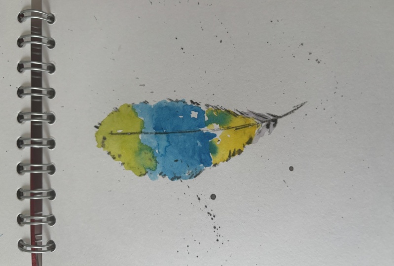
6. Introduction of Feather: Everyone e to see
you again and we'll come back to my
watercolor class. Today, I'm going to show you how to paint in
with the feathers. Same step before is
we were going to do the color practice and then we go to paint
the feathers. But before we started, I will explain some
basic color and the basic structure
things to you and help you to more understand the structure
of the feathers. So you can see this
page in the right side. That is my painting, a very simple color, two color, like a
big blue and gray. And so that's feathers, you can see the I leave a lot of white gap and many details
for these feathers. Sometimes we don't have to
use a lot of different color. So some feathers might have
very different color in it. So first, I'm going to talk about what we going to do
for the color practice. On the right side that
one, you can see, I choose some feel color
to make it like a lie. And in this step, I
just want to show you how they work together. If you want to make a few color comes together in natural way. So that is good to use the best work to blending
them like less is small, they can still wet in the
paper so they can keep blending by the self so that you will get very natural color. But in this step, you need to show the
water and pigment. So that's where
we're talking more about this when I
show you the video. And this first is about
the structure of feathers. You can see the feathers, they have different parts
to make these feathers. Like they have long stem, and the surface is very
smooth and they are not flat. The bit curve. When we're
doing the feathers, we have to think about
always use a big lie, avoid to use two straight
even include the stem. And other one, you can see the feathers have
a different shape. In the bird or some other shape should be different like tail. The feather should be harder. So when we use the color, we might try to use the more
confirm and more precise. And the other one is
from the bird's head, they might more soft. So when we use the brush stroke, we might use the
more light feelings. And this is what I'm drawing for explain the gath
of the feathers. So normally for
this middle line, I always use the double light, but always thick on the bottom. So just avoid to make the
thickness is the same. And also need to consider they have a gap gap
between some round the whole feathers because some feathers comes together and they might have
a big gap in it. If you want to make natural, if you can include things, your feathers might
look more natural. And also consider this gap
is in different position, is always not like a symmetry. So one in the top and
one on the bottom. Also feather, they have a different position and
they have a different shape. You can see it in
the right side. They looks like some is like S, some is just a curved line. This is my painting
to show you like feathers is one of my favorite subject
using the wood color. You can see they can be a lot of different
color and shape. First one is one shape with a few feathers and
more like a shape. The second one is use a lot
of lie to make a detail. The third one is more
impression style, and more focus on
the colors blending with water and make that
very blurry feelings. The last one is very
strong light come from the backgrounds and
also very strong pattern. That is all can be very
different feathers shape So if you interesting with this subject is this is really
good subject to practice. Okay? So, this one
is today we're going to do for the practice. And then I will talk
about more how to do it. So then we go to the medio.
7. How to paint the feathers: Hi, everyone. Nice
to see you again. And welcome back the class. Today, I'm going to show you how to paint with the feathers. Before we started this subject, I will show you how to
do the practice help you more understand and familiar with the
color and blending. So first, I used the paper A five and with the
brushes number six, and I started blending
with pulling. Not too much water and
not too much pigment. And I put few.in my paper, and then I will clean my brush because I'm going
to add another color. So I want to make sure my brush is clean and
with a different color. So I do this color in the same time before
this green color dry. So you can say why I put
another blue color in it. The blend in by the self. So green with blue. That you will get the
blue green color. And then I started to clean my brush again and try to
blend in another color. And in this step, you can start it with a big
light color like this green, you can add more water. Show the ragio of water
with the pigment, like a second color, this blue, you can
increase pigment and less water to make a
little bit thick color. When you go into
the third color, you can less water than before, make a more intense color. You can have a look different. Because if you are using
the same amount of water, they might make a
different result. And then I started to use the another rose violet color to add into this line
and make more colorful. And when I add this color, I try to make the shape
a bit different is. So is one. Because if you gave the
amount of the water different and also amount of
pigment in different ratio, they will be really different. That practice is to help you
to create your own color. Now, I started to use
a really thick color. So that means more
pigment and less water. So you can see when I
use the less water. They might not easy to
blend in with other colors. So that's if you want to
make this layer very clear, that is a good way to do. And you will get the two level. So in this practice is just help you to understand with the blending and the
mixing with the color. So then I will going to show you how to draw the feathers. The first, I will use
the waterproof pen. This number is 01. And I use the size of
paper like a post car. So if I going to
do the practice, I prefer to use the small one. So I just try to use lots of broken line to make the
outline of the feathers. So that's easy to control the
shape if you're not sure. So that is the good
way to start it. Okay. Like, before I mentioned, the feathers might
have a lot of gap, and the surface have a lot
of texture like many line. So if you don't want to
do the realistic style, you can do this way
to make a lot of short line in the outline and also include
the central area. So because I in the
drawing and the color, so I'm not going to join
too much line for it. Just give the very basic shape, and then I started
with the color. No. And I still use before
the color, what I use. I start with the light yellow, and then just the second
layer on the top, start with the blue, and I
still use the number six, and you can see one
eye a more color. I always try to make
the brush stroke. Direction is similar
with the feathers. It's not like a flat wash because if you use
the flat wash way, they might two flat It's
like drawing a bowl. And the last layer,
I use the green, so that's full color. And the bot, I use
the rose violet. As before I mentioned, when you change the
color, always remember, go back to your
sponge or paper towel to clean your brush. And when I finish my color, I go back, use my pen
to draw in more detail. That is the very simple
feathers finish. Also you can leave a lot of wide space because
in the water color, the white space is very helpful, help your painting
looks more breathing. And I used my brush
to make a splatter, like a lot of dot. That's make very easy
to make a good balance with this painting because
that's a lot of white space. You can see my layers, start with a light
to the darker and also include the detail
and white space. So this subject is very good for the beginner to study
with the wood color. Okay. Okay. So that's
what we practice for the feathers and hope
you enjoy it and see your next video. Okay.
8. How to draw the rose and envelope: Hi, everyone. Nice to see you again and welcome
back to my class. Today, I'm going
to show you how to draw and paint with
rose and envelope. First, when we started, I will introduce what I'm
going to use in this subject. First, I use water prove pain. That's number is 01. And I start to draw a envelope because that is easy
to organize my rows. And in the left side, this picture is the
reframe photo to show you how we draw a rows. Like you can see the
white oval shape or some circle shape
in top of the rows. That's just to show you
what the rows structure. Like a row structure
is made by many petal. That is like a
many circle in it, and one petal overlap
on another petal. And they are not always the same size and
into the central, that will be the small petal, and also the more tight. That means the distance
is then the outside. That means when we join them, we have to make a
short line into the central and a bit
long line in outside, and also the big petal. So they might abit the
curve and a bit straight. We have to step by step to d
join them and the easy way, I think is start
with the central. This tiny circle and then start with the oval
shape and another oval shape. And also we have to think
about how they grow together. And the some petal
because they are the curve, and they fold. That's will give the two
shape of the one petal. And also around outside in
the bottom of the rose, the petal might bit older. They getting go to the ground. The looks like a shaped angle is different with another petal. When I finish the one rose, I will going to a stem and with some tiny leaves
on the bottom. And the one I finished
during my envelope, so that will be easy
to organize them. And I prefer to always
start joining with the central area and then go
to the outside of the rows. You can see in the referent, they have a different
perspective because some rows
might face to you. Some rows is f to the top and maybe some is
left and some is right. That means the basic
shape will be different. Some is circle, more, some is more oval shape. W we join them, we needed to think about
the thickness of the petal, and also ine before
I mention that area. The other way is to
make this shape is always compare with other petal like start
with the central, and then you can use this point to compare with
the other petals point, be higher or lower. When you join the stem is easy to start with the central area. Let's look like they
can hold this rows. And also think about they might have some
leaves between them. In this step, you can
see I already finished the two rows and
the angle a little bit different with
let one bit face to the top in right
one to the right. That's make this two
rows looks different. Then I always prefer
to join the front one, which is I can see
the whole shape, and then I start to join the some rows is behind
of this front one. That is easy to make
the right orders, which one is front and
which one is in the back. Because that one
is the back one, part of them we might concede, so that we can do a little bit less detail and because they
are more further. That means they will
be lower contrast. And for the rose shape, I think this outside this
petal very important. The shape and the angle. I make this rose basic shape. And some rows might hide then, we might just see them
feel petal in there. And if this is your first
time to joining the rows, you might do the
less of the rows. You don't have two
amount of rows with me. You might can do the two
or three and other one, you can try to make more
leaves around the rows. And because they rose, the structure is a
bit complete hence so you can try to
make it simple. In this back one, you can see the
shape is completely different like we might just
see the side of the rows. Sometimes I feel that angle
much easier than other one. Because we don't need
to join val shape or circle shape in
the central area. We just focus on the one petal
over lap on another one. And if you try to join many
different sides of rows, try to make different angles. If you have a many white
space, don't worry, you can add some simple shape of leaves and the same with
the different angle. Some more narrow, some more wider and some longer
and short one. Let's make more natural and also it's good to follow
your white space. Also when you add some
different signs of leaves, it's good to composition and make they are not too white
space in the background. And I try to give a little bit
more detail for the leaves and also
include envelope. L give you some dot
for the texture or pattern because this subject is w proof pain with
the word color. I can do biting and then another work is
for the word color. O if you don't have this waterproof pin, you can use the pencil
to light during first. I just want to mention if you don't have a waterproof pin, avoid to use another
normal pin because the water when you a
to use the wa color, not blending with water. Oh.
9. How to paint the rose and envelope: I finished the drawing and
I started with the color. This color, I try to use a little bit different
color like a pink color. In this referent photo is
more like a rose violet. If you're happy with this color, you can use a different one. It's no problem. The first layer, I
always add water. In this video in the right side, you can say I have
another brush. That one is just to show
you what the color I use. For the light pink color, I just color for the top of the petal and also
leave some white space. Because I already
drawing a lot details, so I can color very roughly. Second level is a
bit intense pink and focus on the central
and g of the two petal. That can help me to
emphasize the structure. You can see in the
referen photo, they have a lot of
deep gap in there. That's how we make rows. Is this gap is very important. I use the same color
with these few rows. In the right side, you can
see this color is light pink, intense pink, and
another big like purple. For the very dark area. And for the intense color just avoid to use too much in
the outside of the rose. This intense color also make these rows have a focal point. In this step, you can see
the looks like a more three D. I still leave
a of wide space. That this rows is a bit
breathing feelings. Now I started to mixing
with the green leaves. In the right side, you can see
I mixing with a few green, start with the yellow green. Then the little
leaves and the stem. The other one is
the green leaves. The last level is
the dark green. Looks like flower in the leaves, I gave the three layers. If you're happy with the
first layer of ring, you can put other play, not just the front
of the leaves. Let's make a good balance with the front leaves
and the back leaves. Quickly, I start with
the second layers. And the brand of the green, I found the color a
little bit different. I think a more
natural green is with the yellow or if you want
to make a more or green, it's good to add with
orange or brown color. If you feel your green
color is too bright, you can try that way
mix it with some color. For the last layer of the green, I mix it with a
little bit black. I always try to avoid
mixing too much black. When I make a really dark area, I use the green with the black
or brown with the black. In this step, you can see
why after with the ring, the the gap with the
two rows is more depth. I try to make a little
bit different green. Yellow green, blue green. Because many rows together, they have a space
inside of them. How we make they are not
flat is like a bouquet, that is good to use the dark
color to emphasize the gap. Also, you can use
the leaves shape to adjust if you are happy
with your composition, like some area a little
bit too much white space, you might give them more leaves. Then I go to the envelope. And this envelope is
like a brown paper. So I use the brown
with the yellow. Start with the flat wash. And I don't want that
looks like a two flat. So I leave some white space. You can see in my painting, I really like lots of white space that I feel
fresh in the breathing. In this se, I start
to add another layer, a bit intense yellow and orange. Why at some edge
of the envelope? You can see a bit more straight like this paper have a
gap in the fold area. I like to join every
thing to emphasize the thickness in this
envelope, even the paper. This is the last level for the
envelope, very dark brown. I still use the number six. Most of time, I use
the number six. This size brush is good to painting the A five and A four. Like A three, I will
use the of time to use the number
12 or mop brush. When I finish this envelope, I do a little bit
the shadow because I feel like this background a little bit too
much white space. So I give the very light
sky color sky blue in the bottom. And then I add a little bit
tex sa with the color pencil. Sometimes the water color
is good mixing medium. I try many was to do
with the water color. You can it, but just make sure
you add this color pencil. The paper is. And when you doing that one, think about the
direction of the paper. You can see what at the
little bit the color pencil, the more like paper feelings. I join some interesting things
because the right side, little bit more white
space than the left side. I d join a little heart. You can join something else. Okay. So let's
finish this subject and hope you'll enjoy this
lessons and do some practice. Thank you for your watching and hope to see you next time.
10. Introduction of vegetables: Everyone, nice to see
you again and we'll come back to my word color
and drawing classes. And today, I'm going
to show you how to paint with the
vegetables and fruit. In this lesson, the key point is paint the freshness
of the fruit. And also, we have to
learn about the color of fruit and I like used to
try different varias. Shapes. Yeah, and
also we focus on the different shapes and
also include color and also how to organize they are in
the same picture and control the balance because there are so many color
in the one page. So the next step is about
the color practice. In the first step, I will introduce about
what we going to do. And before we doing the
vegetable and fruit. You can look at this page. It's all about the color. You can do some
color practice first like what color for the fruit. You can see the right
side this page. I use the sunny yellow and
orange and big red underneath. This is for the things. And also about the leaves, I use some blue green. There are so many
different green you can use in this color wells. They have a cool
yellow yellow green, and a green, blue green
and a cool green. If you want to make this
vegetable very fresh, you might use the cool
yellow green to the green. So they leaves a bit on fresh. Older, like un leaves, we might go to this area. It's a bit warmer yellow
and go to the brown. Also for another vegetable because they are many
different color. They might mix in with the
cool color and the warm color. Also we have to think
about the texture, like what is the
surface of the flit. I they are smooth or shiny
or roughly like orange. They are pretty roughly. No like a tomato, they are a bit shiny, so that we might need to
leave some white space, and also like egg plan. And if you can do some color
practice before we go, that's help you to more familiar with the vegetable
and fruit colors. Like I my face to face classes, I always gave a bit time for students to practice before
we go to the subject, like color practice
and or maybe shape. So shape is a bit complehens
with the structure. So they are more familiar like a woman up for the practice. And you can see this
referend photo. The shape is man,
many different. We have to make this simplify for all of them because we today not do very detailed one. Hope you can try to just feel the color
and the basic shape. In the online, they are many many different
referend photo. You can choose some
what you like, like the shape and the color, or you can get vegetable or
fruit from your kitchen. That's also a good idea. This is all about basic things, what I want to show you, and that is a small introduction
for my today's subject. Then I will going to
show you the video, how to paint them. So please watch next
video and see you soon.
11. How to draw vegetables in a simple way 1: Hi, everyone. Welcome
back to my class. And today, I'm going to
show you how to paint with vegetable and food
with a very simple way. And that subject is
good for the beginner. And follow last video, I have done some
introduction for you to introduce some basic things
about vegetable and food. So the first one, I'm going to show you this
vegetable with the purple one. And because this shape is round. So I would like to star with a light color and the
use the wet into wet. So that color. I use
the deep violet, and then the more pigment on the nad to make a gradient wash. Also in the same time, I add the big alchemarn blue to make the more
different color eat. When we doing the natural
things like a vegetable, the surface might roughly, or some is very shiny
like egg plant. That we have to focus on when we make a
different outline. Some we might need to
do the very smooth. Some is needed to
be more roughly. Like this one, you can see, I leave some white
space and also bit rough on the outline because
the surface is on flat. Why I leave this white space is follow the basic structure. That's not a straight line. It's always like a.in
the small curve line. When I finish the boton, I'm going to join this stem. This vegetable, the stem is very special color
like pink red. I use the wet into
wet this technique, so they can connect each other. That's my bottom one, they will be at the pink color. Today this paper is I use
the three and smooth one. I started with us the
number six of brush. I add more smooth out lie
with the Chinese brush. The Chinese brush is easy to make a more fine
line and detail. In the same time, if you want to fix some shape because
they are still. You can't do that step. Also some dark
layers on the ath. And then I started to paint with the leaves area and go
back use the number six. Number six, round
brush is very good to paint in this shape. Not really big area, but like a small size
with the leaves. The leaves because they surface
a lot of like a buckle. They even. I like a round brush stroke to make the surface
not even not flat. And also these three leaves, I try to make a little
bit different green. Like first, I used
the yellow green, and then I started to use some more green pigment
in the dark ring as well. The dark green, I will add
like a.in the short line, make they are more depth. In this step, you
still can leave some white space if
you like white space. Because I like a white space. This can be instead like a highlight area and some
shade area, very useful. And then I finish
these three leaves. Then I go to the drawing
another vegetable, and this color is light yellow, not lemon yellow,
like a sunny yellow. Then the second layer, I add the big orange color. And that's still use the wet
into wet and the red color, but not too much, and with very thicker. That's why you can
see I'm not back to my palette direct from my box, and also make yellow as well. I think when we paint
the natural things, we can use a lot of
different color. No say you should
be same with me. You can add some if you prefer to use more orange or yellow. That is all good because
vegetable is orange. So is yellow. That's all makes sense. If you can make a right
shape and the texture, this still looks like
these types of vegetable. And these leaves will be
a bit different shape. So I change my brush stroke, like same direction, but make
more tiny leaves for them. And this green, I'll try to
use a bit different green. This green is like a more dark
green and with more water, so that's get the light green. Normally they boton one will
be the darker when they connect each other because
they have deep gap in there, so we can add some dark
green with some tiny brush. I go back use my Chinese brush. Add some dark green. And if you like this color, you can add with
another vegetable because they are
in the same page. If you can add the
beat the same color, they can help them to make good balance in the connection. And the shade of the stem. If you want to make a day more looks like a
more three day, you can add more shade
color with a dark level. You can see they
still pretty wet, so we can give them
more time to dry, and then we go to
another vegetable. That one is tomato. And this surface is
not a rough one. It's a bit shiny. I think for the shiny surface, it's good to use a white space. And the easy way is to make a gradient color
from the light to the dark. That can make them more around. And also we can try
to use the wet into wet beat the water in the first level and the less
water for the second level. And then we just
wait for the dry. I started to mixing another
dark green for the leaves. You can see the different vert, the green leaves shapes, is different and the
color is different. Some leaves is pretty
sharp and the skinning, or maybe is bigger
in the rough one. It's good to leave
some white space for them they not mix together. Because we are doing
very impressing style. Don't worry about if you
live too much white space, you can see I can use the outline to make
the shave more round. Outline it's very helpful.
12. How to draw vegetables in a simple way 2: In color, we have
to try and then you will found what color
you like to use. And when you try more times, you will have more experience
with different things. And this is the bean green bin. So I try to mix in with the yellow green and because they have a
lot of bean inside. So I leave the white space
for the bin three circle. Half and just with one level. And then I do the
same time to make a really thick green to add
with the side of the circle. So that they can blend
in a little bit. So that you will get the
two layers on there. In this subject, you can put any white space like what I found which one
is my first one, and then I just try to
find more space to put in with other vegetable. And it's good to choose the different shape
and different color, which is close each other. If you put a green with
green red with red, maybe this is too similar. So that's if you want your this painting
looks very colorful. It's good to try to
make a different one and to close each other and
also the different shape. If you like this shape, you can try another one with a different in different size. Now I finish the basic
color of green being, and I just need
another detail for the three circle to make the more stand out
in more three D. So you can say I
add bit the shade into it in the half circle. And in this step, it's good to use the Chinese
brush or zero brush. And then I started to
join another purple one. So you can see this egg plant
is between the orange one. So that is how I organize
them in different area. So first, I used the deep violet with Alchmarne blue and
with the meaning water. So second layer is
more lchmarn blue, and then more water. So that is like one more pigment and the second layer
with more water. So that's like a middle layers. In the central area, the more lighter and
into the end of thin, more thick color. And I leave a lot
of white space, and this is with very intense
blue and with big black. And I like plan this subject for color because the
skin is very shiny, and I also use another
more detailed way to do. Today is more simple
ways and like the color, some purple and some blue. This subject, we have done the many different
vegetable, actually, like I have another
class is like a strawberry and just
egg plan or e tomato. Because the watercolor style can be a lot of different way. Like a strawberry,
the can be very, very simple way with watercolor, or you can do the more detail to like drawing the
seed in the surface. The all lot of interesting
way we can painting again. So in this painting, you can see it my strawberry
is pretty simple way. The half is light red, and then I add
another more pigment. So on the top and with white
gap do another leaves. And I also do some cherry. Cherry is also very good
subject with a white color. They can be very
shiny feelings like a white space and the light color in the
dark color that's it. You can make the
looks like a cherry. And other one is
paper like a chili. That is also the good subject. They have many white space
and a long white space. I think do that way
is keep simple. Like even you can
see a lot of detail, but try to simplify. And also the shape
is very useful. Even your color might use
the very different color. But your shape looks
like wberry or chili. They will be looks like
this kind of things. And also the stem
very helpful to help the people to
recognize what they taste. And in this page, you can see I have
done five big things. And other white space. I just find some small things to fill in to make this balance. So in this painting, you can see I do some warm color of vegetable
and some cool color. And if you like
some small things, you can do again. Like the strawberry cherry. That shape is more good to
add with some white space. And also, you can
change a bit color. Like this second strawberry. I add more pigment, more orange, and the more red. You can go back to have a
look at this other one c, the more water texture
in there water mark. If you don't have enough water, they might you got
the dry brush. Text. If you use
amount of water, they might the water mark. So we have to practice, have to try and choose
what would you like. Some people more like control
so that you can less water. Some people they really enjoy the loose style play with water. So you can add more water. I hope you can try
different way. And this is onion is with half. So that's vegetable
when we cut them, you will get the more color in the shape and the
text shot as well. So that's why I really enjoy
painting the natural things. And there are still
many white space. Your painting is now a lot
of cool color or warm color. If you not enough black color, you might can add
some black one. If you feel they need some cool color to make
this more different level. You can try to add
some small one. Like I feel like I need to add some green color or
maybe some like pearl. And another good way to practice is if you have a
vegetable in your kitchen and try to figure out
what the color you can use in the tex sha
and shape as well. And this one is another chili. So I try to make some warm
color into the corner. So add another green one, the chili between this red
strawberry and red aple. And if you have some idea, what you want to learn, you can leave the message, and I will make another video. And in this step,
they almost finished. So I just do some the
just for my balance. So sometimes we have to
learn what time we can stop. Like, if you try any, you want to try, and then you have no
idea what you can do. Maybe it's time to stop. So this is not should
be finish finish. So in this step, I just add some detail for my
strawberry, like a seed. And when you do this step, make sure your first
layer is completely dry, and then you can add some dry brush to make a
texture on the surface. That can help you make more
depth and more detail. And in this step,
we almost finished. So hope you enjoy this class. And if you have in idea
you want to share. Yeah, I'm happy to try and in process with a
different subject. Thank you for your
listening and hope you enjoy today's class and
see you next video.
 Jingru Li, LJRART