Transcripts
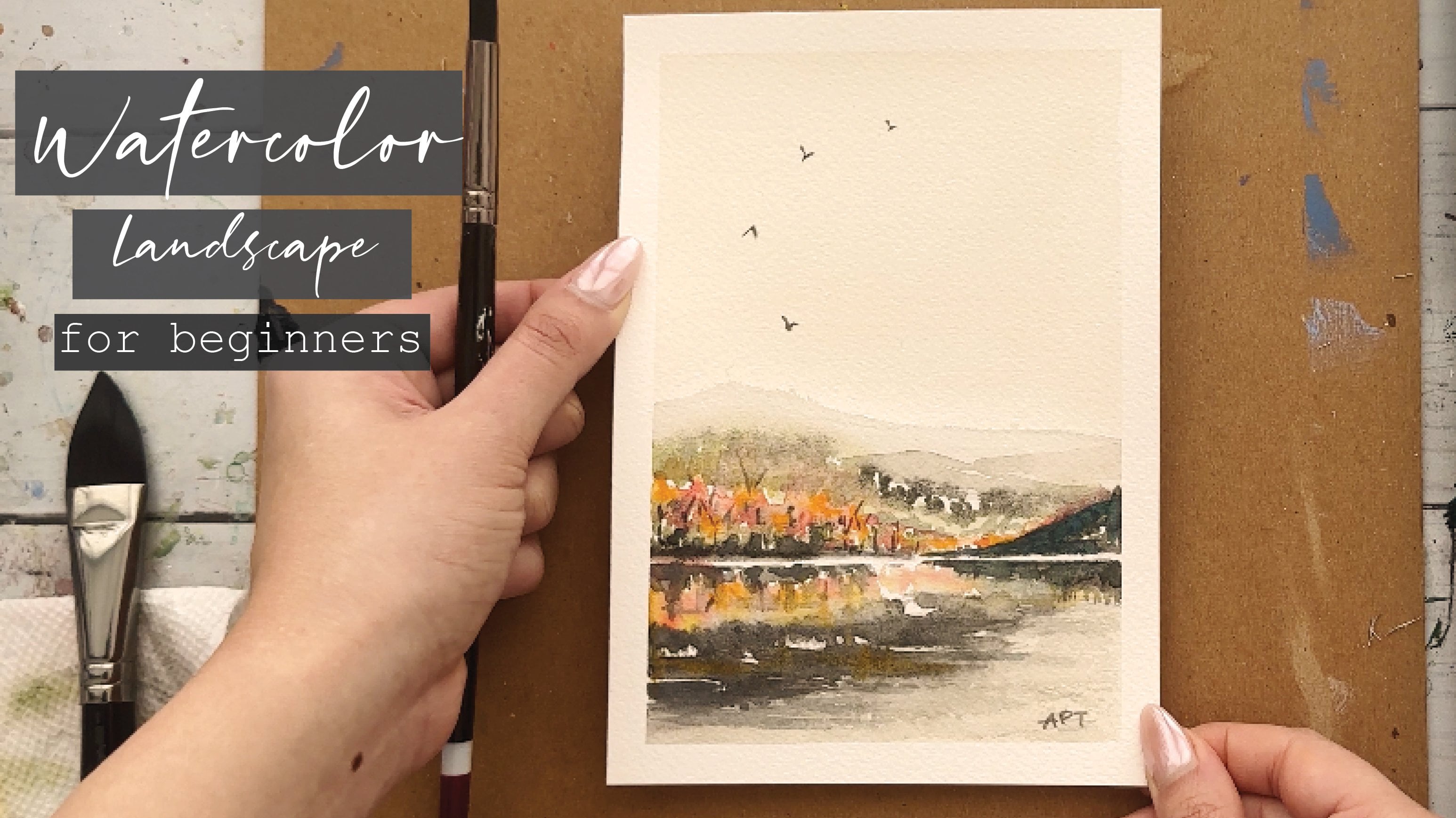
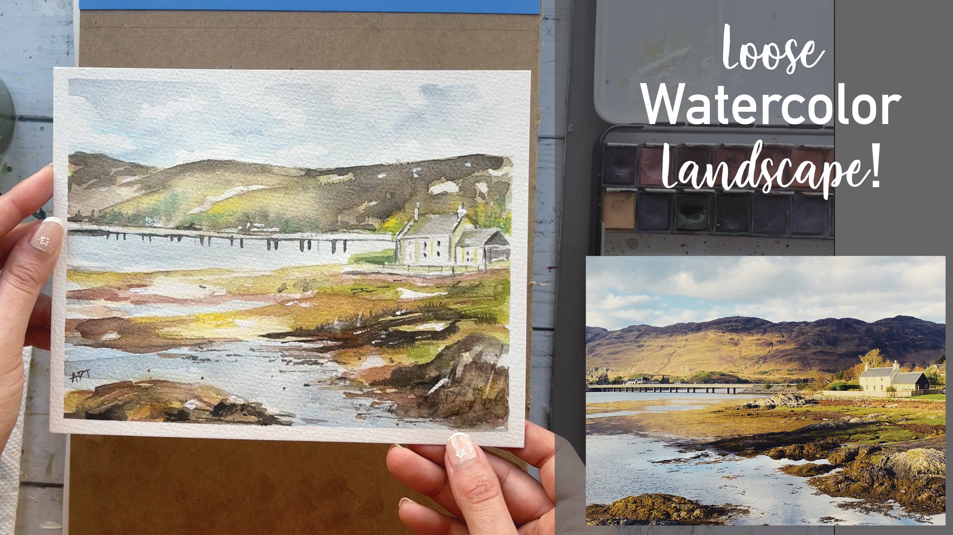
1. Introduction: Hey everyone, my name
is Alicia and I'm an artist here in San
Jose, California. In today's class, I will
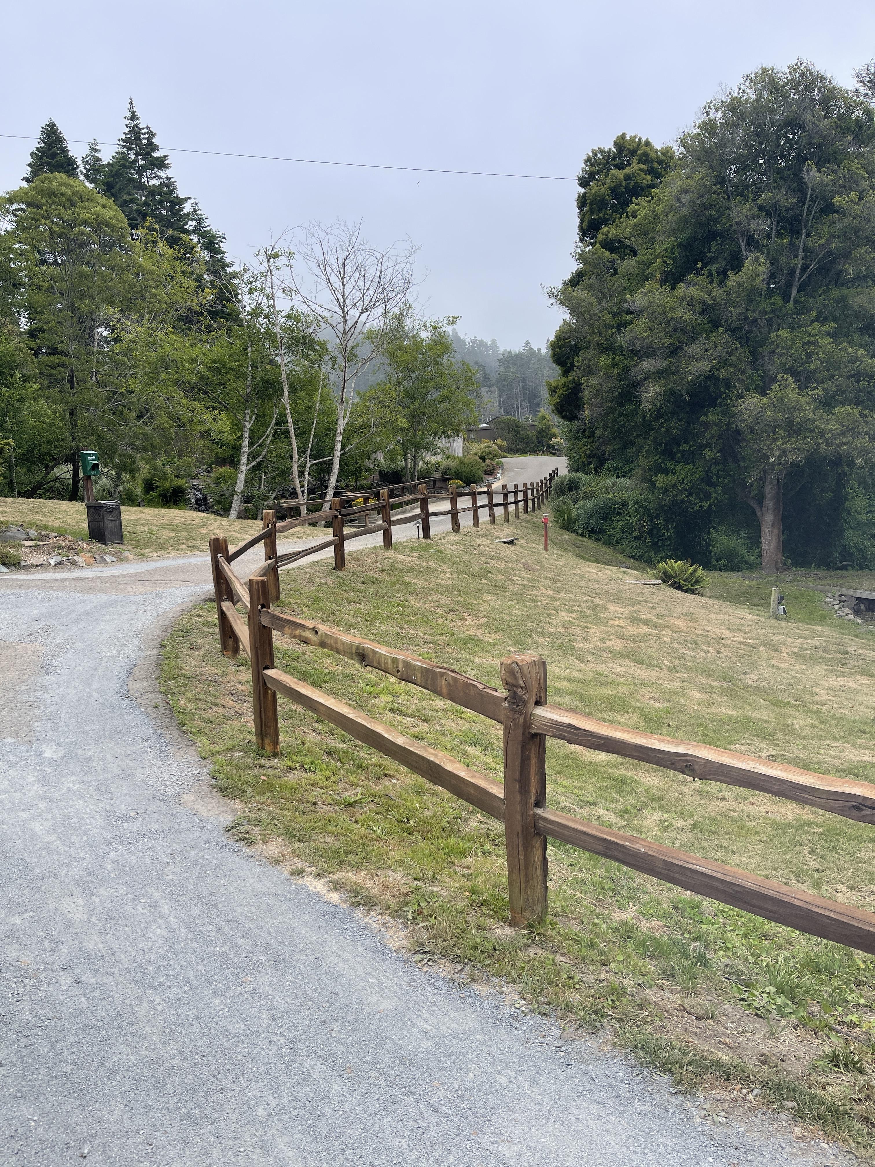
show you how to paint this loose watercolor landscape
using a reference photo. We will go over the materials, basic watercolor techniques,
naming and washes, as well as some
standard brushwork. You will then paint
this watercolor painting step-by-step. So let's begin.
2. Materials: All right. So these are all the
materials that I have used, both for water, napkin. I use a washi tape to
tape down the edges. Will need a pencil and
eraser for sketching. And these are the four
brushes that I've used. So they're mostly
all round brushes ranging in different sizes. And then from a company
called Zen art, they don't sell this exact
same paint brushes anymore, but I will try and link some
other favorite brushes. And this is our teaser
paper I love using. Along with our teaser
watercolor palette. It comes in 36 colors. And all the names have been
listed down below as well. And then I also like using a colleague white
paint for highlights.
3. Exercise 1 - Techniques: So before we start, I just wanted to go over
some basics with you. I'm not going to
overwhelm you with a lot of techniques
and brushwork, but I'm just going to cover the techniques that
we will use in today's class so that you can get a more practical
approach for this. So the two most common
watercolor techniques, or wet on wet and wet on dry. For the wet on wet paint
is applied to wet paper. You can layer different colors on top of existing wet paint, which will create this
blurred out expansion effect, where you will notice the colors bleeding into one another. The second technique is wet on dry paint is applied
onto dry paper. It is as simple as that. So let's look at the effects
that these gave us, right? So now the wet on wet
gives us soft edges. It's more blurred out. This is great if you want more delicate, softer paintings, great use for backgrounds or
far-away objects. You can also blend
easily while getting an effective gradient and
also creates a misty effect. It is also unpredictable
and hence, not so much in your control. The very opposite of the wet
on wet is the wet on dry, which gives us sharper edges. So you can definitely have more control where you can
get well-defined shapes. The wet on dry also allows you to lay your paint as
much as you want. We will go through
layering in the next step.
4. Exercise 2 - Layering: So here I'm going to
show you how you can layer your paint in watercolors. I'm going to show
you three different kind of washes here, each one with a
little more pigment to show you the
effects of layering. If you want well defined shapes
and it comes to layering, you will have to work
on this wet on dry. So I'm drying out my paper
with a blow dryer to speed up the process before I
begin to layer my shapes. Okay, once you're
painting has dried, layer your shapes little by little getting darker each time. But also wait for
your painting to dry in-between each
layer that you add. So as you can see, the
lighter your initial wash is, the easier it is to
build up on layering. So keep that in mind when you are painting with watercolors, you always have to
work light to dark. Unlike acrylics, where
you can get away with working from dark to light, I think watercolors as a medium does require you to
be more patient.
5. Exercise 3 - Wash: Let's go over some
basic washes here. So for the first one
we have a flat wash where your pigment
is even all around. And then to get a gradient, I'm starting from a light wash
with less pigment and will slowly increase my pigment
intake as I move downwards. You can also, you can also start dark and then
gradually lighten up. Your wash as well. Too toned is where you
combine two colors and merge them
together by blending. And to blend them, you will lightly brush your
colors in between.
6. Exercise 4 - Brushwork: In this lesson, I
wanted to go over some basic brushwork that can be applied to any
watercolor painting. So I'm going to start with
a nice big round brush. Again. All of these
brushes are linked below. If you are interested in them. I literally love this brush. You will see me using
this brush for Mozi, the entire painting
almost 95% of the time I'm gonna be
using this one brush. It is super versatile
because you can get extremely tiny lines with
this as well as big ones. Holding your brush
is straight up. Using its tip can give
you thin strokes. You can also use the
side of the brush. And then obviously
using its belly can give you larger strokes. This next brush is
a long, thin brush, which can give you
extremely fine details. I usually pull this brush out at the very end when I'm
wrapping up just to add last-minute final details to make an impression
and to add a few, just a few marks here and there. Okay, So this last
brush that I'm gonna be using is the old brush. I like to use this to get some really cool
dry brush effect. You can also make this
brush yourself by taking any old around
small round brush that you have that you do not
really care much of the state on any surface to
make the bristles span out. But like I said, I
use this brush to get some dry brush effect
mainly on my trees. What this means is that you want less water and more pigment
for this brush technique. Using this can give you very natural brushstrokes
and somewhat, it's somewhat
unpredictable and adds to that loose painting
style effect. You can also get a
dry brush effect with your regular round brush. So usually in a good
watercolor painting, you should have all
these techniques we went over to add interest
and make it impactful. So as you move on
to today's lesson, you will see me using all these techniques we went
over and I will show you how you can turn a simple
landscape and make it interesting by
adding a variation of brush marks and details.
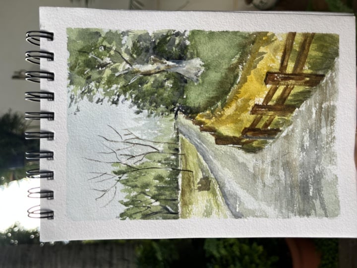
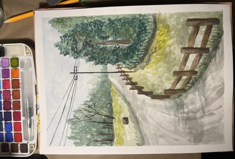
7. Painting - Sketching: To begin, I'm just going to tape down the edges
with a washi tape so that the paper
stays in place and also it has a clean
border once peeled off. I'm sketching the
landscape briefly, forest before painting
for placement purposes. And to make the painting
process easier. Just a reminder, you can
find the reference pic. I've taken myself in the project
and resources tab below. Simply right-click and save it. So starting out with
a pathway for us, I'm only drawing the outline of the tree again for
placement purposes only. I decided to add a
electric wire pole in the foreground here
to break up some of the shapes and to
add more interests. When looking at a reference, don't feel obliged
to copy it exactly, but use it solely as a
reference and inspiration. Feel free to change up
things here and there. And if you please, I'm drying out the fence
and making sure that I am staying true
to the perspective. So the fence that's
closest to us will be bigger as you move
along backwards, it will get smaller in size. So keep that in mind. Alright, so this is all a sketching that I'm
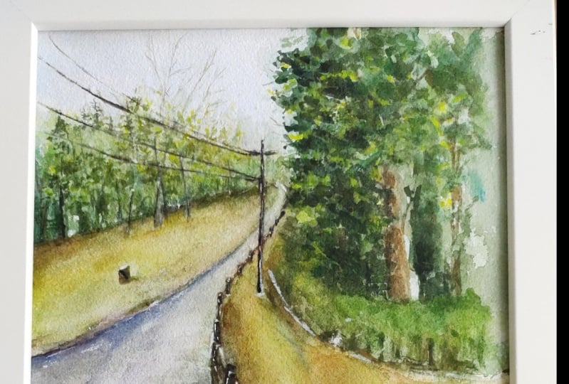
going to do for now. So let's begin painting.
8. Painting - Base Colors: Alright, so beginning
with the sky, I'm taking in civilian blue and adding a flat wash
to that at the very top. So don't be afraid of going
over the tree section of it because it will be covered
up of a queen anyway. I'm just using a
simple round brush. I will link whatever I can
link in the description below. Moving on, I wanted
to get the bigger portions of this
painting done with first just adding a base color. So here I'm trying to figure out colors for the pathway that
we see in the reference. I'm taking a bit
of indigo, black, Naples yellow, which gives me this muted olive
green, muddy color. But I wanted more of
a cooler tone colors. So you'll see me experimenting
with different blues and purples to give me
this quiz, color tone. So in a nutshell, I'm adding slightly
cooler gray blue tones in the center pathway with warmer
yellow tones on the sides. Again, this is just
an initial wash, so we will come back
to it at stage. Here, I'm just plotting
some of the paint with my napkin to give the
road some texture. I'm now painting the
sides of the grass with Naples yellow
and sunburst yellow, which is basically
a combination of a masterly color
with some orange. Leaving some of the gaps open. Here for some green, I'm using a combination of foreign green along
with spring rain again, which is basically a dark and light green
mix it together. I like saying this
because just in case you don't have
the RTs I palette, you can just use the colors based off of the
palettes that you have. So just use a combination
of dark and light mixed in. It's very important as you paint along to be mindful
of spontaneously leaving some white gaps open and don't paint over them
throughout the painting. These little gaps, breakup shapes adds natural highlights. It gives off impressions of objects and also adds interest. Alright, so I'm using
the same colors on the left side of the lawn. I'm adding a bit of
Oxford blue with the muddy colors I already
have on the palette. And I'm giving a very light
wash of the trees far back. Using the tip of my brush, I'm dabbing slightly to give this faraway tree
like impressions. Using that same blue again, I'm gonna give this pathway
a lot more texture and grit. And you can do that
by adding in what is called a dry brush technique, where you're using
less water and using the side of your brush to drag the color down
like you see me doing. So using some warmer towards on my palette to
decide if the payment. Here, I'm just building
on the colors a bit by bit to give
it more dimension. I'm adding in some more
green to the left side, but not covering it up fully. Just little dabs and places
to give impressions of mass. Rinsing off my brush and using Naples yellow to
the side as well.
9. Painting - Trees: I'm taking in those dark
and light means again, so f1 green and spring
green to add to the portion around
the right tree. Using that same
green color to set a base layer for the
trees on the left. So I'm simply dabbing the tip of my brush
and the belly of it to give an impression trees while leaving a few
white gaps open, adding a bit more darker green. Now, I am working on this wet on wet and just dabbing very
gently to a few potions. Using foreign green again, let's paint the right tree now and add a base layer to it. Same method by using the tip of my brush and the belly of
the brush in three places. I'm lifting off some of
this color as I go along. Here, I'm adding some dark
gray with one green now to deepen the color
for the shadow areas, build on this tree little by little and be patient with it. Instead of going extremely
dark from the get-go, which is hard to
lift off after her. With this medium, you will
learn that you have to paint light to dark and bold
on the layers slowly. I switched my brush to a
smaller brush now to give me some more control
and final details to the leaves on this tree. Using a darker green with black, I'm dabbing that color gently. At this point, my paints
are still halfway wet. So you can see I'm still getting some of that
wet on wet effect. Now, I know if you look at
the reference, you will. The tree that I'm painting
right now is pretty far back. But I wanted the tree on my painting to be a
little bit more closer. So this is the reason I'm
actually painting some of the outskirts of the
leaves in more detail. So taking in some burnt sienna, I'm painting the trunk
of the tree here using some of that brown. I'm also adding just
like some grass like effect by flicking off my
brush vertically like this. So just move your
brush swiftly upwards. Why am I paint is still wet. I wanted to get more darker
tones to this tree here. So almost using black now
with the tiny bit of the green and dabbing that
color in few places. Using that same
color and adding in little final details to the
left side tree as far back. So being very minimal here, just a few marks.
10. Painting - Road & Fence: It's time to get back onto the road and add more color and texture to it and give it the right perspective and
direction because as of now, it does not look too grounded. So here I'm just dragging
out the dark gray color I added to the edges and pulling it out horizontally
on the sidewalk. Taking in some of that mustard yellow color as well to add more warmth and a bit of
sunshine to the sidewalk. I also like adding
some cooler tones to my pathways as well. So I'm going in with a blue and dropping and hence
of that color as well. Let's jump right in
and paint the fence. I'm using a mixture of burnt
sienna and chrome orange, which is similar to a brown. So just one Sienna brown
if you would like. And I'm trying to make one
side of the fence darker than the other side to give it some roundness and a
three-dimensional look. This will ensure them
to not look that. Going back to the
sidewalk a last time and adding in a hint
of Oxford blue, which is similar
to a purple color. So I'm just adding the
brush marks horizontally again and a bit to the
edges of the pathway.
11. Painting - Fine Details: All right. Let's go ahead
and take off this tape since we don't need it
anymore for the edges. And this way It's also easier to see what we've got
working for us so far. I'm adding in some
details with acrylic white and a fine thin brush. In the middle ground here, I'm just adding some
really thin trees. So a simple horizontal align with ten branches and
twigs coming off of it. Really thin, fine brush
will be useful for these little bits because that'll be you
have more control. Using a bit of that
acrylic white to add some highlight
details to this tree. Using white, I'm going to add some few details to the
bigger tree in the front, just a few branches
and twigs coming off. I think in a few highlights
here to the fence, you can go ahead and add your highlights wherever
you feel like it. But remember a little
goes a long way, so do not overdo it. You will see me adding some of the whites on the pathway
and sidewalk as well. I wanted to change the scenery
and the composition a bit and add an electric wire pool
in the middle ground here. So I'm drawing it
out with pencil first to make it easier
to paint over the lines. Using a fine thin brush. I'm simply going over
the lines with black. Once again, I'm adding a bit
of highlight with whites. As we all know, watercolors
do have a tendency to dry lighter than
we first paint. So once the painting dries, I like to go back in with last-minute final touches to bring out some of the
color and detail. So here I'm using dark green to bring out the
details of the leaves. Just add the outline
of the tree here. I'm simply using a
fine brush here and just gently dabbing in a few details to
create some leaves. In the next few steps,
you will see me adding in some more dark tones and
midtones to finish soft.
12. Painting - Last Layer & Class Project: Bringing in a lot
more of that warmth that I wanted my
painting to have, just adds a really nice pop. Adding that same sunburst yellow to the sidewalk to make
it stand out more. I'm just cleaning off
this edge by adding an additional green and
little specks of grass. So I'm just pulling off. I'm playing the green upwards to create some
grass like effect. Finally, I'm adding in some
yellow to that big tree and only a few places just to
make it look a bit more airy. And that will complete
our painting. This completes our loose
watercolor landscape for today. Hope you enjoyed, and
I cannot wait to see what you'll come up with.
Share your projects. I would love to see them and do not forget to
leave this class. It will ask me any questions in the
discussions tab below. Lastly, if you
enjoyed this class, do consider following
me so that you do not miss out on any future
painting classes from me. Follow this class out with more loose watercolor
painting classes from me. I do appreciate all the
love and support from each and every one of you
from my orders, likely so. Thank you. And to shop my
art to do visit my website. Thank you once again
and happy painting.
 Alifya Plumber, Artist | Acrylics, Watercolors | Painter