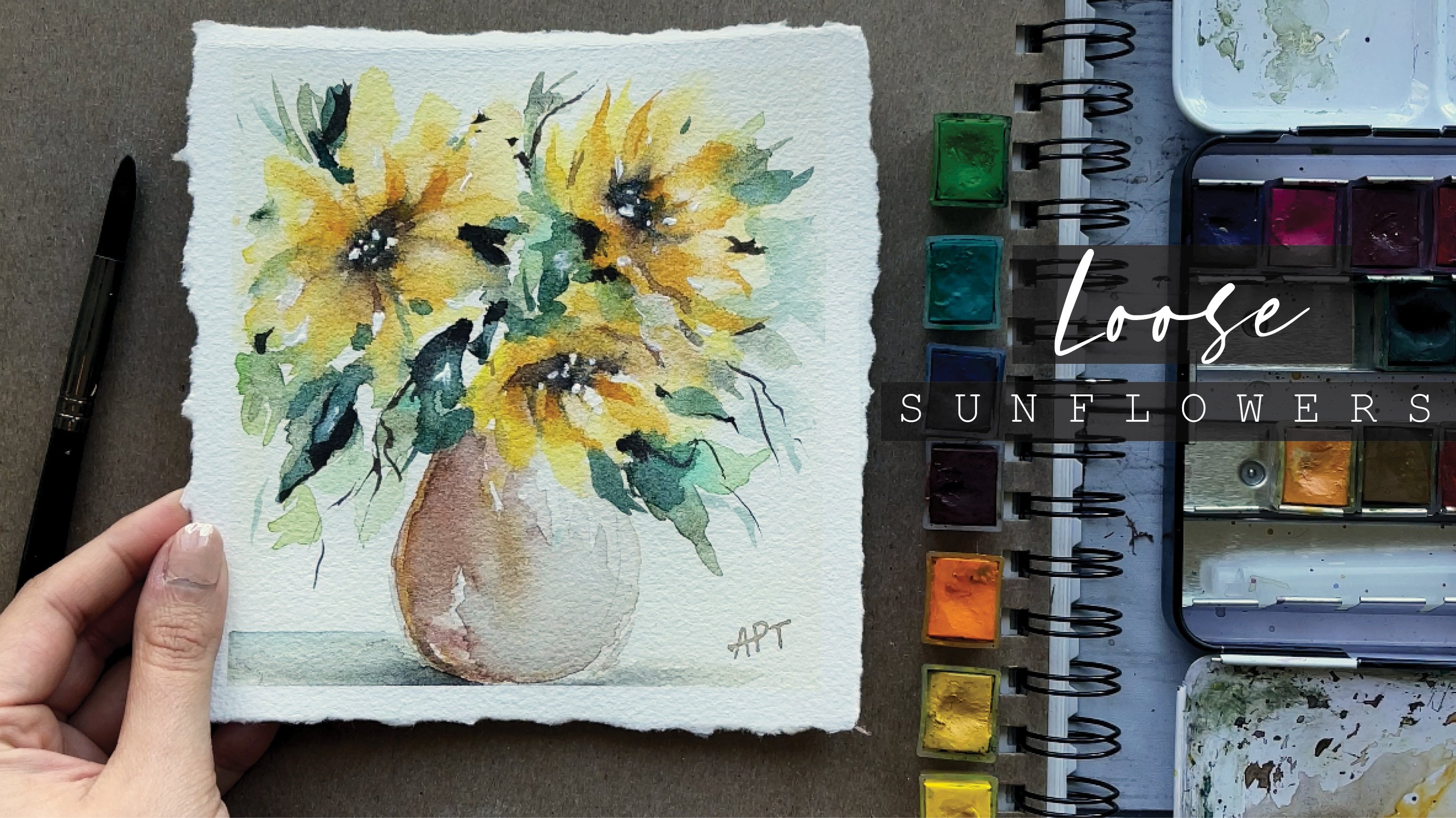
Transcripts
1. Introduction: Hello everyone. My
name is Alicia and I'm an artist here in
San Jose, California. In today's class, I will
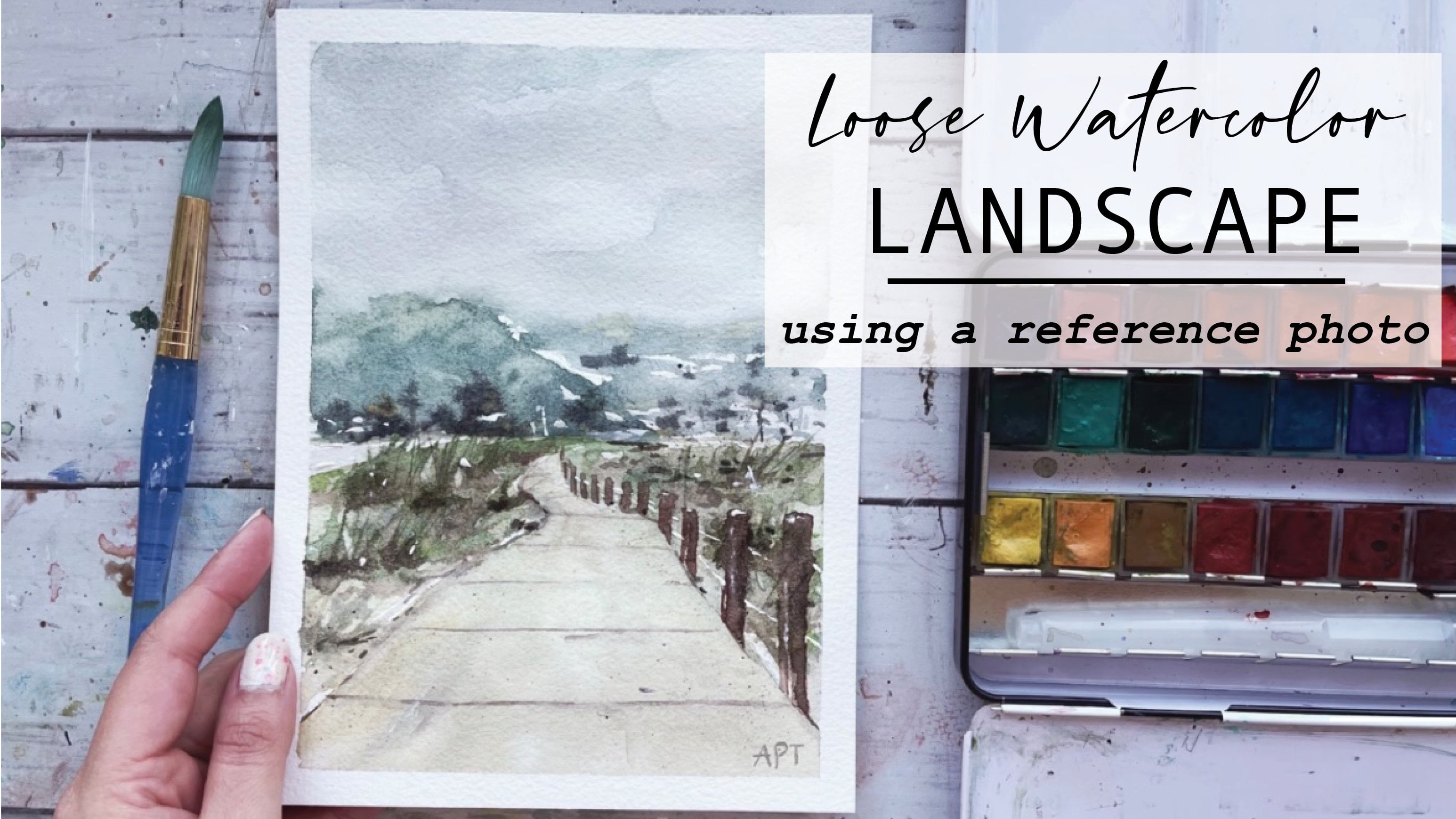
show you how to paint a loose watercolor landscape
using a reference photo, we will go over the materials, basic watercolor techniques,
layering and washes, as well as some
standard brushwork. We will then paint this
watercolor painting step-by-step. So let's begin.
2. Materials: These are all the materials
that I have used. You'll need a bowl for water, pencil for the sketch phase, a washi tape to tape
down your edges. And then I've used
three brushes. They all have been linked in
the description by the way. Also, this is our teaser
paper that I've used. I cut mine to a
six by eight inch. I also use acrylic white paint
and then our teeth palate, which just comes
in like 26 colors. Again, everything is linked in the projects and
resources tab below.
3. Exercise 1 - Techniques: So before we start, I just wanted to go over
some basics with you. I'm not going to
overwhelm you with a lot of techniques
and brushwork, but I'm just going to cover the techniques that
we will use in today's class so that you can get a more practical
approach for this. The two most common
watercolor techniques are wet on wet and wet on dry. For the wet on wet paint
is applied to wet paper. You can layer different colors on top of existing wet paint, which will create this
blurred out expansion effect, where you will notice the colors bleeding into one another. The second technique
is wet on dry, where paint is applied
onto dry paper. It is asked simple as that. Let's look at the effects
that these gave us. Right now the wet on wet
gives us soft edges. It's more blurred out. This is great if you
want more delicate, softer paintings, great use for backgrounds or
far-away objects. You can also blend
easily while getting an effective gradient and
also creates a misty effect. It is also unpredictable
and hence, not so much in your control. The very opposite of the wet
on wet is the wet on dry, which gives us sharper edges. So you can definitely have more control where you can
get well-defined shapes. The wet-on-dry also allows you to lay your paint as
much as you want. We will go through
layering in the next step.
4. Exercise 2 - Layering: Here I'm going to
show you how you can layer your paint in watercolors. I'm going to show
you three different kinds of washes here, each one with a
little more pigment to show you the
effects of leering. If you want to well defined shapes when it
comes to layering, you will have to work
on this wet on dry. I'm drying out my paper with
a blow dryer to speed up the process before I begin
to lay on my shapes. Once you are painting has dried, layer your shapes
little by little, getting darker each time, but also wait for
your paint to dry in-between each
layer that you add. As you can see, the lighter
your initial wash is, the easier it is to
build up on layering. So keep that in mind when you are painting with watercolors, you always have to
work light to dark. Unlike acrylics, where
you can get away with walking from dark to light, I think watercolors as a medium require you to be more patient.
5. Exercise 3 - Wash: Let's go over some
basic washes here. So for the first one
we have a flat wash where your pigment
is even all around. Then to get a gradient, I'm starting from a light wash with less pigment and
will slowly increase my pigment intake as
I move downwards. You can also, you
can also start dark and then gradually lighten
up your washer as well. Toned is where you
combine two colors and merge them together by blending. And to blend them lightly. Brush your colors in between.
6. Exercise 4 - Brushwork: In this lesson, I
wanted to go over some basic brushwork that can be applied to any
watercolor painting. I'm going to start with
in nice big round brush. Again, all of these
brushes are linked below if you are
interested in them. I literally love this brush. You will see me using this brush for most CD entire painting almost 95% of the time I'm
gonna be using this one brush. It is super versatile
because you can get extremely tiny lines with
this as well as big ones. Holding a brush is
straight up and using its tip can give
you thin strokes. You can also use the
side of the brush. And then obviously
using its belly can give you larger strokes. This next brush is
a long thin brush, which can give you
extremely fine details. I usually pull this brush out at the very end when I'm
wrapping up just to add last minute final details to make an impression
and to add a few, just a few marks here and there. This last brush that I'm gonna
be using is the old brush. I like to use this to get some really cool
dry brush effect. You can also make this
brush yourself by taking any old around
small round brush that you have that you do not really
care much of and twist it on any surface to make
the bristles span out. But like I said, I
use this brush to get some dry brush effect
mainly on my trees. What this means is that you want less water and more pigment
for this brush technique. Using this can give you very natural brushstrokes
and somewhat, it's somewhat
unpredictable and adds to that loose painting
style effect. You can also get a
dry brush effect with your regular round brush. So usually in a good
watercolor painting, you should have all
these techniques we went over to add interest
and make it impactful. As you move on to
today's lesson, you will see me using all these techniques we went
over and I will show you how you can turn a simple
landscape and make it interesting by
adding a variation of brush marks and details.
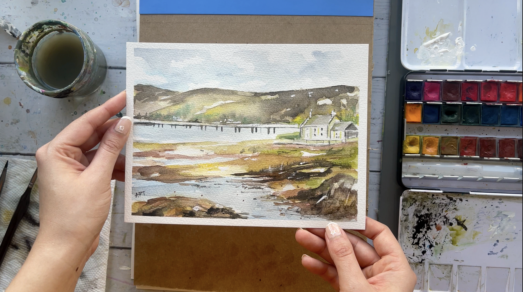
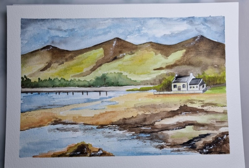
7. Sketching Landscape: Alright, first step like
always as taping down our paper and I'm using a washi tape to tape
down the edges. And I'm working with a six by eight inch
Artesia paper here. All right, so once you're
done with this step, we will move on to
the sketch phase. All right, so let's
roughly sketch out this landscape to make the
painting process easier. Try and simplify your sketch
and only draw things that will help you in identifying
shapes and color. So starting off with
the mountains here, feel free to modify
a few things as you please based on the shape
that you're working with. I mean, the the painting, the paper size that
you're working with. Here, I'm getting down the
bridge that I see far back. I'm just separating out the
marshy land with the water. This will also help me to identify the different
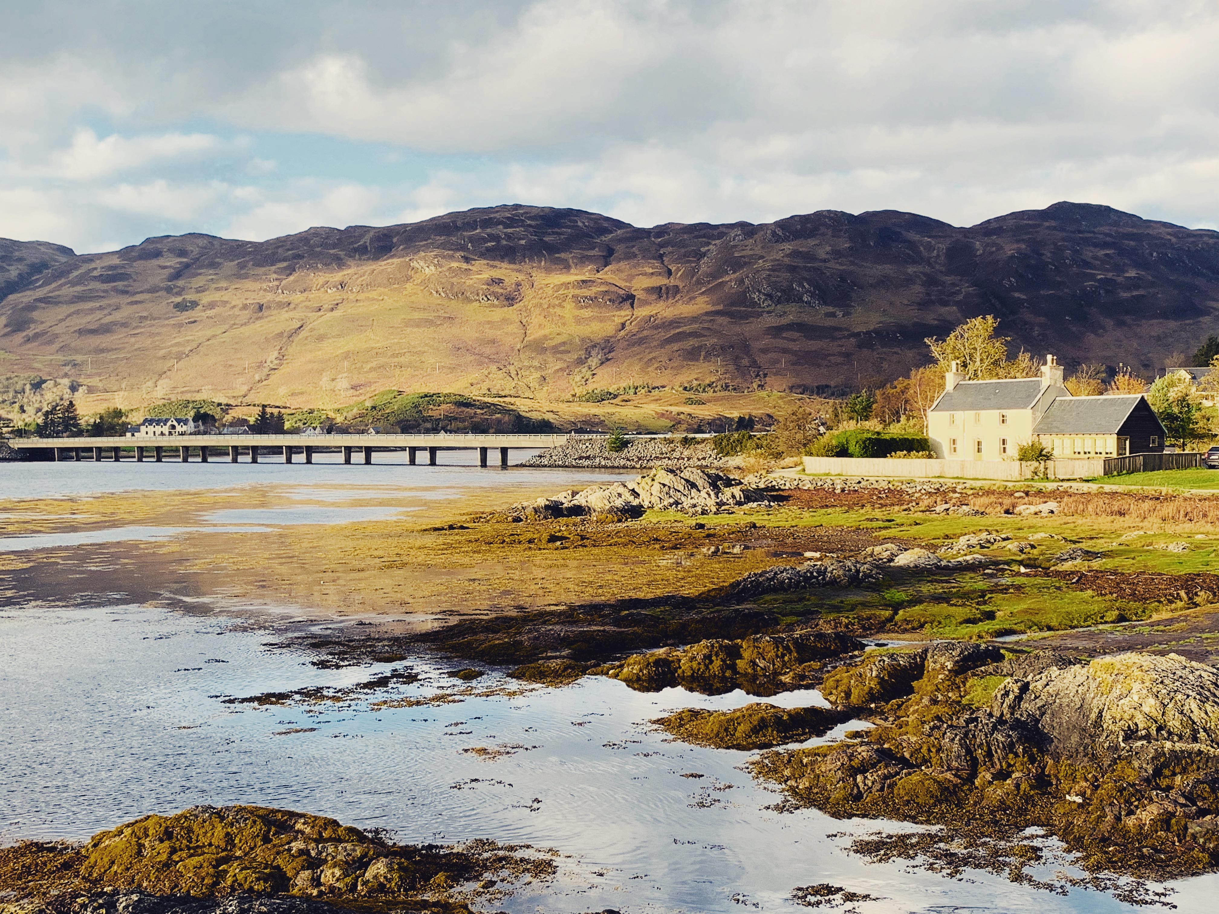
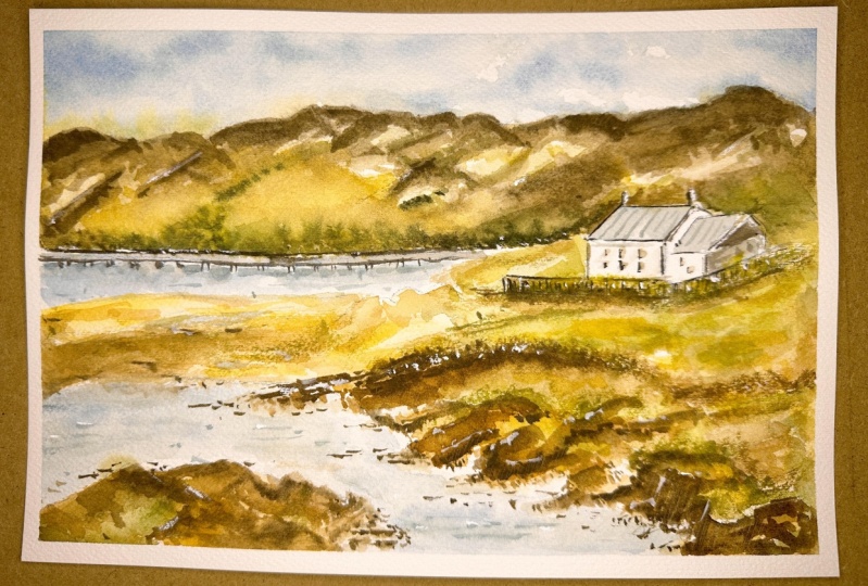
obvious colors. Just a reminder, the
reference pic is in the project and
resources tab below. So if you want to pull it up
on the side as you paint, feel free to do that. And you can also
right-click and save the image to print it out. This picture was taken by me when I was
traveling to Europe. And I just loved
the composition and the warmed that we get
from this landscape. So I thought this would be
a perfect reference pic for today's class. I did want to draw out this little house that we
see towards the right. Use the reference as a guide
to help you draw that out. Once you're done with
the sketch phase, we will move on to painting.
8. Painting - Base layers: Like always, let's
begin with the sky. I'm using deep ocean blue
from the artist's palette. But any light blue will work
using a round brush and get a light pigmented version
of the blue and dab your brush and places you see the blue color in the
reference picture. So keep it very light and use the tip and the belly of the
brush to spread it around. It is very important to
leave some white spaces are gaps open to act as clouds. So taking a bit of indigo blue now I'm
getting it in places. I see some grayish clouds to add the fluffiness of the clouds and to give it a
three-dimensional look, again, do not cover
up the whitespaces you've already left. Leave that as is. To make any edges
software just go over that edge with your brush
and pull out that color. I did not want to add
too much to this guy, so I'm just leaving it as is, and we'll move on
to the mountains. I'm starting with a
simple flat wash to the mountains forests by
using sunburst yellow. Just cover the entire area up, but also leaving some
white spaces open. I'm adding some yellow
ocher and burnt umber, which is a brown to add to sum up the shadow areas
for sealing the mountains. Keeping this wash is
still fairly light, just to leave some more room
to build up on colors later, get into a habit and constantly leaving some white
spaces randomly open. I do this pretty
spontaneously as I paint. Not only adds interest, but it's a great focal point and also add some impressions
of tiny objects. It also breaks up in
differentiates the shapes, which again adds to the overall
interests of a painting. While the painting is still wet, I'm taking a darker brown color, sepia brown, I believe. And I'm building on
the shadow a bit. I decided to leave the
mountains as is for now. We will come back to it
later once it dries, but this is a good initial base. Let's move on now to the
base layers of the land. Taking the most dominant
color that I see, which is the sunburst to yellow. I'm laying a flat wash to that. Mixing in a little bit
of yellow ocher to get this muddy brown color for
this section to the right. Adding some yellow ocher
and burnt sienna and adding God to the shadow areas. These are just
initial base layers. We will be building up on
these colors a bit more. Mixing some yellow ocher and
sand bursts yellow again for the rock and the front
and to the right side. I wanted to fill up some of those green beds we
see in the reference. So going in with spring
green and sandbars, yellow and a bit of
olive green to cover up those areas of light greens
that we see in the reference, All in all, keeping mindful of leaving some white gaps open. Also be sure to hold your brush from the back of the
handle to create more loose and
effortless brush marks rather than more controlled. I see some of the green
sort of flying and bushes and trees around the house and in the
back of the house too. I'm just kinda loosely adding
in those marks right now. Before we move any
further with details, let's finish up the base
layer of the water sections. So I'm taking the same
color we used for the sky, in my case, it's called
deep ocean blue. And adding a very
light wash forest.
9. Painting - Mountains & House: Now let's go back
to the mountains and bold up on those layers. My latest underneath
have dried up. So I'm working on
this wet on dry. Going back in with sand
bursts yellow to bring out that beautiful sunlight
that's falling onto the mountains
towards the central left. Also getting some
of that color along with some greens to the
trees behind the house. Simply dabbing the
tip of the brush to get impressions
of trees here. Create now, moving on to the
shadows of the mountains and bringing out those
layers a bit more. So I'm using a dark
gray and brown for this and adding
that to the right side. Keeping in mind not to cover up all the existing layers and also leaving the
white gaps open. Also getting some impressions of faraway trees at
the bottom here. Just a very light pressure to your brush will do the trick. You don't have to really be
pressing down on anything. As you can see, I'm
just very lightly just touching the brush to my paper
and that's all you need. The blurred effect that you get with the wet-on-wet works really well with far away objects to give it more distance
and perspective. Because far-away objects
often aren't clear anyway. So this technique does help and that there are some dark shadows at the top of the
mountain as well. So I'm adding that layer too.
10. Painting - Middle ground: Now in these last few layers, you will really see the
painting come more to life because now it's time to keep building on the
Layers little by little and adding some details which will define
the landscape more. Let's work on the
middle ground here, and I'm bringing out some
of those colors a bit more. Going back in with sunburst, yellow, and brightening up
those lighter sections. Similarly adding
some darker values to the areas where
I noticed them. The reference pic, so towards the left and then the
other rocky bits as well. Going over the middle section with the yellow ocher again. And then I will also go over the sections of
the green as well. I'm basically adding
an additional layer of color and bringing out
those colors a bit more. Just add that pop because
you have to keep in mind that watercolors
do try litres, so it does require a few layers depending on how light your initial
base color was. Now Raleigh going
dark and pulling out those darker layers more
by adding black and brown. In watercolors, I often
pull out the volley dark, darks at the very end. You always want to
work light to dark in general, but in acrylics, it doesn't matter
because you can't lay or light colors on darks, but not in watercolors. Using the very tip of the
brush and dragging out some of those star
colors onto the water. So tiny little specks will give that impression of
debris or marshy soil. Using the splatter
technique here. With some dark brown to add some random specks
of color are far more interested in the foreground and just giving a tiny
impressions of objects. So tapping on my brush, we'll add some of that splatter. Be sure to do it carefully. You don't want it all over. So you can also put your hand in places
where you don't want it.
11. Painting - Fine Details : Pulling out my detailed
thin brush now for some additional marks and just to add movement
and interest. While the paint is still wet. I love mark making and
using my fingernails to do this can add a variety of
just marks and, and movement. They can also add
a very personal and intentional
artists touch as well. You'll basically etching
into the paper which I, you know, I love leaving. Adding somebody light dry
brush techniques here, which basically means that my brush does not
have much water, so it leaves a dry, rough texture, which is nice
to have for some variety. These techniques work well
with foregrounds because you would see more texture up
close anyway in real life. And then I love adding more of the wet-on-wet techniques
to the background for that blurred effect because it's far away and so you
get the right perspective. Let's go ahead and give
details to the bridge. Now, I'm taking black and using the same
thin detailing brush. I'm simply making those
watercolor lines that we see in the reference
and that's it. Detailing the house a
tiny bit with black adding a very light
yellow wash to only some parts of the
house on the side.
12. Final Touches & Class Project: All right. Let's go ahead and take
off this tape now, before we add our final
last minute details. Here, I'm taking in
plain acrylic white. You can also use gouache
if you have that. Just adding a few highlights
to the overall painting, a few little specs
and dots will make it stand out and will provide
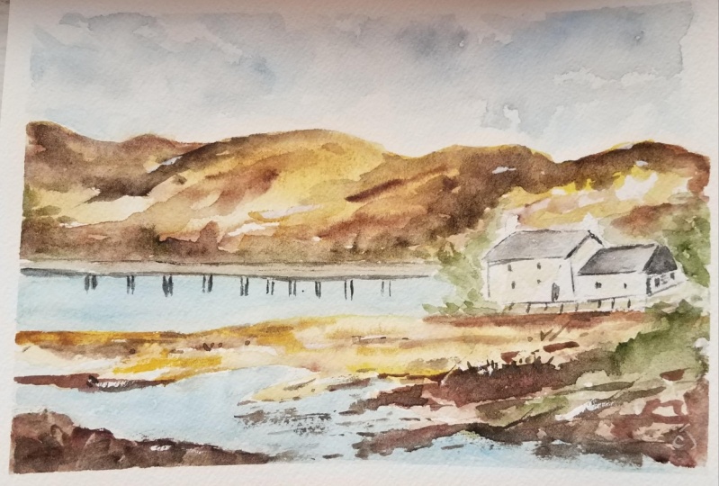
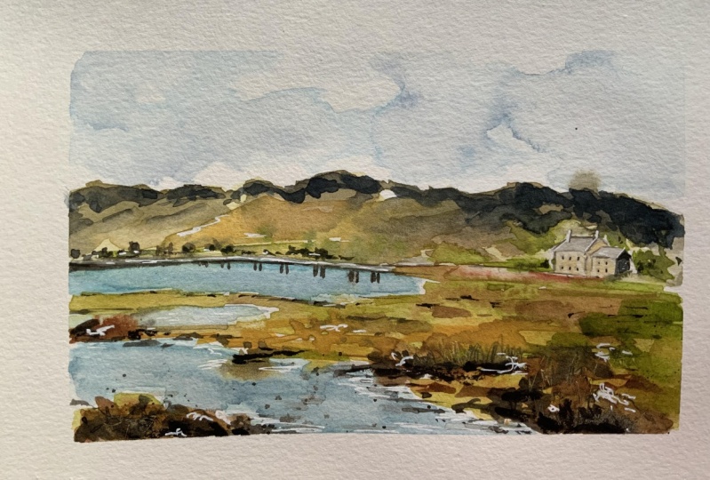
interest to the lands IP. This completes our simple and loose watercolor
landscape for today. Hope you enjoyed and
learned some fun, easy techniques
from today's class. And I cannot wait to see
what you guys come up with. Share your projects. I would love to see them and do not forget to leave
this class if review. If you've enjoyed this class, makes sure to follow
me so that you do not miss out on future
painting classes from me. Also, if you love this painting, follow this class up with one of my most popular watercolor
landscape classes that has well over 2
thousand students now, I have linked it in the projects
and resources tab below. So check that out
to shop my arts do visit my website where I sell my original landscapes
and follows, as well as prints and all sizes and much
more to keep up with latest news and to
follow me on Instagram where you can stay up to
date with my new launches. Thank you once again
and happy painting.
 Alifya Plumber, Artist | Acrylics, Watercolors | Painter