Transcripts
1. Introduction: Working with unconventional material is interesting, because you're not so stuck to rules that seemingly come with holding a paint brush or a pencil. Hi. My name is Conny, and I'm a professional Graphic Designer and Artist from Austria. I'm a passionate learner and an ardent observer. I see art and inspiration everywhere around me in nature. In my art, I love to work with texture and color. What I like about this art is the joy of the process and the wonder of seeing what you can create. Closely observing an object allows us to be really present and fully immersed in the activity. This can help you relax and get into the flow, a state of mind where you can be most creative. This class is about experimenting and exploring, about combating perfectionism and opening up to new discoveries. We will be using different sorts of objects you have in your home. Objects from the bathroom, objects from the kitchen, packaging materials, and nets and stencils. For each object, we're going to create one piece and explore the different marks you can produce with it. After an overview of various kinds of paints, we will cover different types of basic marks, color mixing and color combinations. I will also give some tips on composition, which you will learn to approach intuitively through practice. Mark making with everyday objects is an exercise in the unexpected, you never know for sure what you will get. But working with chance can really boost your creativity. This class is perfect for beginners and people who want to get started creating again, or are stuck and aren't being able to create. For me, this way of working was a great start into a regular art practice, and I've benefited from it in many ways. After completing this class, you should have a series of artworks which you could frame or use for such things as greeting cards or bookmarks. You could also digitize them and upload them to print on demand sites. The possibilities are countless. I hope you will take away some valuable insights and ideas to incorporate into your personal creative practice. See you in class.
2. Class Project: For the class project, you can use any of the shown objects and techniques to create your own unique artwork. In the upcoming videos, I will tell you what materials you need, how you can set up your workspace, and what paints are most suitable. I will also give you some tips on color mixing and color inspiration. Then it will be time to roll up your sleeves and get going. I will show you all the objects I will be using in advance, so that you can have as many as you can find in your home ready to use, to follow along with the demonstrations. We are going to be creating a piece of artwork for each object we use. Though as your final project, create at least one artwork for each major category. That is, one with an object from the kitchen, one using an object from the bathroom, one using packaging materials, and one using nets or stencils. As soon as you have something to show, please snap some pictures of your artworks together with the materials you used and upload them in the project section. To create a class project go to Projects and Resources, and click on the green Create Project button. First, you need to upload a cover image, then insert a project title, and if you want also a project description. Now you can add additional images to your project, then click on Publish. Finally, we all can enjoy your artworks. This class is about having a relaxing creative practice, so please don't stress yourselves or the results. The main objective is to become immersed in the process and to enjoy it, and maybe even get into the flow state, which helps your brain to work in a more creative way. I'm looking forward to seeing your creations. But first, let's have a look at materials and workspace. See you in the next lesson.
3. Materials and Workspace: Welcome to my tiny creative space. We are in my laundry room where I have a small table right next to the window. It's not perfect, but the most important thing is I can come and go as I want. I don't have to get my art materials out or store them away when I'm finished. That is a real benefit. Before I had this art space, one of the biggest obstacles was actually to get things out of a cupboard and to clean up a table. So I think it's really worth thinking about your own tiny creative space. Maybe you have a little room, a little place somewhere in your home where you could put a little table. If that's not possible, you could also put all of your art materials on a serving tray, so you're more flexible. I believe that art has a lot of benefits for all of us. That you should do everything to remove the obstacles so you can get creative. I would even encourage that you block a span of time in your calendar every week, on the same day, at the same time, and even if it's just 30 minutes. So you can get into a routine, so you don't have to wait for that creative spark to miraculously appear at the perfect moment. Maybe you have watched art tutorials before where you needed some fancy brushes or art materials that you didn't have in your home. That can be quite frustrating and also expensive. I believe that you don't need a ton of art materials to be creative. So you should have most of things we need for this class already in your home. Most important of course, paint and paper. I recommend trying whatever paint you have at home first. You need at least two different colors and white. We will go into different kinds of paints in the next lesson. Apart from that, we need painter's tape or washi tape, pieces of corrugated cardboard, a water jar, a pallete, or an old dish, any old or new brush, because we won't actually paint with it, but use it to mix colors and apply paint to our objects. At the end of the class, a cutter and a ruler might also come in handy. I recommend using mixed media or watercolor paper. Go for the cheapest you can get your hands on so that you are not precious about using many sheets. I use a watercolor paper from my artstore's own brand, which has 200 gsm and a mixed media sketchbook with 300 gsm. You can totally work on a heavy paper with 300 gsm without taping it down. But if you have thinner paper, you should use painter's tape or washi tape. That way it will flatten out again when dry. I just eyeball it when taping it down so that about half of the tape is on the paper and the other half on the cardboard. Press it down slightly so that no color can get under it. To remove the tape, slowly pull it away at a very low angle. However, sometimes you cannot completely prevent it from tearing the paper up a bit. These are some of the everyday objects I will be using and we will collect them at a later stage. But you can also find the list in the class description. You might not have all of that ready to use, but keep an eye open for them before throwing it into the trash can the next time. Additionally, I have added a PDF document into the resources section of this class. Where I wrote a list of all the objects that I have used before. You can find lots of inspiration there, and I'm also really curious what else you come up with. Now that we have talked about the workspace and most of the material, let's go into more detail about different kinds of paints. See you in the next lesson.
4. Various Kinds of Paints: In the last lesson, we spoke about required materials in general. Now let's have a look at different kinds of paints. It really depends on the kind of object you're using what kind of paint is the most suitable. Let's have a look. For some everyday materials, such as the toothbrush, you can definitely use liquid watercolor or ink. On the other hand, you will not see good results if you use inks on something that has a rough, water-absorbing surface like a toilet paper roll. The paper would absorb most of the water and the pigment would stick to the paper roll instead of your painting paper. I prefer to work with paints that have a creamy consistency and stick to the objects without dripping. Now, you have seen that you hardly get any marks when applying ink on a water-absorbing surface. But what about smooth surfaces? Here, I have a very smooth plastic lid. In my first attempt, it hardly left any mark again. Then I press it down more thoroughly in the middle, which made it a little better. With gouache, I got a better result. That mainly results from the fact that creamy paint has a body or a thickness to it. You don't have to rely on everything being even to get the paint to transfer. On the creamy side are the following water-based paints: gouache, acrylic, and tempera. I will now show you two brands of each kind of paint so you get a feeling for the differences. We will have a look at two properties, opacity and water solubility. Comparing the opacity. My absolute favorite paint to use is gouache. I like that it can be very opaque and that it dries quickly. That way I can easily add multiple layers, and it dries with a beautiful matte and velvety surface. Now, I will show you two different paint qualities right out of the tube. The first is a brand that is aimed at children and the other one, Caran d'Ache is of higher quality. Technically, gouache sits between watercolor and acrylic. It is water-based and water-soluble like watercolor, but the pigment particles are bigger than in watercolor, and usually white pigment or chalk is added. That makes it generally more opaque than watercolor. But obviously, that depends on the quality of the paint and how much water you use. You can see that the cheaper white is not completely opaque with just one layer, but it is definitely not bad for the price. Acrylics have a similar consistency as gouache, but they tend to look a little glossy when dry because they are derived from plastics. They also have a longer drying time than gouache and cannot be reactivated with water once dry. Here, you cannot see any difference between the two brands concerning opacity. I think that there's less of a range in quality with acrylics in general. But I might just have been lucky so far. Honestly, I don't have much experience with tempera. When I was looking for inexpensive paints to use with my kids, I came upon them. I bought this super cheap package which I found online. Now I have about eight liters of paint with a very low quality. They are great when painting with children who generally like to squeeze out quite an amount of paint, but they don't contain as much pigment as artist-grade paints and were therefore, quite a disappointment to me. They have a very long drying time and dry with a matte finish. It really depends on your project if that works for you or not. I also have a few old tubes of Sennelier artist-grade tempera, which obviously have to be thinned with water. They smell very nice and are a completely different thing than the kids' tempera. Comparing the water solubility. Water-soluble paints are easy to clean off your tools, and for me that's a real benefit. Tempera is a water-soluble paint and it can be reactivated when dry. Here, we clearly see that there's very little pigment in the cheap paint. Acrylic paints are water-based and water-soluble when they come out of the tube, but they become water-resistant when dry, therefore, they cannot be reactivated again. Gouache is again a water-soluble paint like tempera that can easily be reactivated. Having discussed all that, it's up to you to decide. But I would recommend using whatever you have at home first before you buy something new. If you want to invest in new paint, I can definitely recommend gouache. I would buy the three primary colors and white. The main benefits of gouache for our purposes are the quick drying time, an excellent opacity, which is great for layering, and their water solubility when dry, which makes cleaning easy. In the next video, we will talk about color mixing and color inspiration. Now it's time to get your paints out and ready to use.
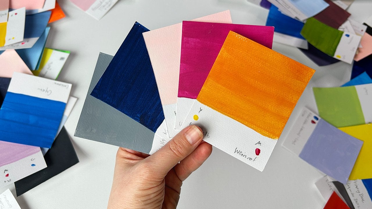
5. Color Mixing and Inspiration: In the last lesson, we were talking about different paints in general. Now it's finally time to get yours out and ready to use. How do we begin? You can totally just start by mixing your colors together randomly. But if you don't know where to go and what color you want to mix, you might end up with grayish, brownish, or dark colors that you didn't expect and didn't intend. Let's have a look at color mixing first. I usually try to have the color in mind before I start mixing so that I kind of know the approximate direction. Then I tried to stay flexible because it takes a lot of practice and good knowledge of your own paints to really get a complete likeness. For our purpose, we actually just need to mix two colors we like. What do you do if you can just visualize a color in your mind? No worries. Color inspiration can be found anywhere around you. Since I'm working in my laundry room, I often find color combinations on the laundry rag. I also like to be in nature and when I go for walks, I like to take pictures of things that catch my eye or I pick flowers and arrange them at home to take a picture. That way I have a collection of color combinations for future reference. There's also a lot of help to be found on the Internet. You will find several tools to create color combinations on the basis of color theory. If you type in "create a color palette" or "color wheel online" into your search engine. With these free online tools, we can come up with beautiful color combinations. If you are having a large color palette, you might not want or need to mix colors, but there's some benefit to working with just the primary colors, cyan, magenta, and yellow. If you are using only three primary colors to make up the rest, you cannot do much wrong concerning color combinations, because you are having all the combinations of the same three colors with different mixing ratios, they all work together harmoniously. Additionally, white comes in handy to brighten colors up. If you buy colors, it is always a good decision to go for a more premium quality with your white because it can also enhance the opacity and consistency of your other colors and make up a little for inferior quality. In the video, you can at first see me using the pure color, then mixing it with a low-quality white and then with an artist-grade white. The result of the later is a super bright, opaque yellow, even on black paper. You don't really need black unless you want to use it as a pure black color. A very dark gray or almost black can also be achieved by mixing all three primary colors together. I like to mix magenta and yellow first to get a bright orange red, and then add this color to my cyan. I do this in small increments so that I don't overdo it and stop as soon as I've come to the most neutral gray I can get. Sometimes you only see how well you have done when you lighten it up with white. Then a tendency to one of the primary colors is seen more easily. In my case, I've mixed a rather cool gray with a tendency towards cyan. Now I have assumed that you know what primary colors and complementary colors are. Probably you have seen the color wheel in school before. But let's take a look at it together and refresh your knowledge. The color wheel is a great reference to have at hand when mixing colors, I have painted mine with my primary colors cyan, magenta, and yellow. The primary colors are the three color shades which are not mixable and therefore have to be bought ready to use. They consist of only one pigment, if you combine two primary colors, you get a so-called secondary color. If you mix magenta and cyan, you get violet, yellow and magenta become orange, cyan and yellow become green. If you mix all the primary colors together in theory, you should get black. In reality, it's more of a very dark gray. What are complementary colors? The complementary colors are the ones that are opposite of each other on the color wheel. For example, for each of the three secondary colors, the complementary color is the primary color that was not used in the production of the secondary color. That is, I used magenta and cyan to mix violet, which is the complementary color of my primary yellow. I often work with complementary colors because they make a very good contrast and are really exciting to look at. A color combination I like very much is yellow-green and red-violet. But what happens if you don't rinse out your brush thoroughly and tip it back into the yellow-green? It becomes light ocher. If you add even a big more of the violet, you can see how it becomes a dark ocher. This brings me to a difficulty that many beginners face. You mix and mix, and then unexpectedly you end up with muddy, brownish, or grayish colors that you didn't want. So what has happened? You might have mixed two complementary colors together as I've just done. Therefore, it is really helpful to actually know how to mix those grays and browns on purpose so you are able to avoid getting them unintentionally. Knowing that, let's see what happens when mixing our two complementary colors, violet and yellow. In my first attempt, it still looked a bit too violet for me on the paper, so I tried to second version. But instead of adding a lot of yellow in that mix, I started again now with yellow as my basis. That one turned out a more neutral gray, which you can see more easily when brightening it up with white. The main thing to remember is that gray and brown are obtained by mixing all three primary colors in different proportions. To mix gray, you could, of course, also just use black and white paint. However, different gray tones can be achieved by mixing complementary colors, as I've shown before. On this page, I've watched the different grays I've mixed. In the middle, you see the neutral black and white. On the bottom is the gray and mixed with my orangey-red and cyan, which resulted in a cool gray, and on top I used a violet and yellow mix which ended up a much warmer gray. Although I've used the more neutral version of the two grays compared to the other grays, it looks a bit violent again. When mixing colors start with very small amounts. First, go with the primary color that is the basis and probably has the largest part. If you want to make a light green, that would be yellow, then you add a second primary color, which is cyan, but add just a tiny bit and then mix and see how it turns out. To lighten it up add white. I really recommend using very little paint and to add the second color slowly, because sometimes we completely underestimate the effect and then end up with a large amount of a color that we didn't actually want. You can see that I had to add more and more white with each step to make it lighter. In the end, I even wiped my brush off and just used the residues in it with the pure white to get a very light green, which brings me to another tip: The mixing ratios of light and dark colors. In this case, I'm using up all of my white to make the cyan bright and then I'm using only small amounts of cyan to turn my white into almost the same blue. One thing to keep in mind is that if you want to darken a light color, you only need a small amount of dark color. If you want to lighten a dark color, the opposite is true. You need a lot of light color to achieve that. Knowing that be especially careful when adding dark colors, as the result can only be corrected with a great amount of lighter color. How to get great color combinations? Generally said, it really helps if you use the same basic colors to mix all others for harmonious color combinations. A very safe choice is to use colors that are near to each other on the color wheel, also called analogous colors. You could also use just one color and extended with shades, tones, and tints. The most important thing to remember is that contrast is your friend. Contrast creates great visual interest. You achieve the strongest color contrast if you use complementary colors. A combination that always works is to use vivid and muted colors together and very important is of course, color value. You can create good contrast if you use light and dark colors together. If you are not sure about your colors value, snap a picture on your smartphone, and switch it to black and white. Let's have a look at two examples. Here's the first one. Do you think this one has a weak or a strong contrast in value? It has a weak value contrast. Both colors have approximately the same value, but that doesn't mean it is a bad piece. It just doesn't derive its interests from color contrast. Let's have a look at another one. What do you think? This is an example of strong value contrast. You can see very dark and very light grays together. Now you have the basics and color mixing and you know where to find inspiration. Let's finally get to the fun part and dive right in to basic mark-making. See you in the next lesson.
6. Basic Mark Making: When I was writing this class, I thought that I will use just one object to show all the different marks I wanted to make. But when I was filming it, I actually found out that this is not possible and that is actually the biggest takeaway from this lesson: Get to know your object. Have a look at it. Turn it around, see what different sides it has. Feel its surface, squeeze it, crumple it, bend it. Try whatever you can do with it. It's really easy to do all that with a silicone muffin cup. But yeah, that's possible for this object and it has some unique mark-making qualities as most objects have and some marks can be created by others also. But you really have to find out and take a close look. In this lesson, I will be using a cardboard box, chopsticks, kitchen sponge, and a shampoo bottle lid. Mark making is about dots, lines, shapes, patterns, and textures we create in our artworks. Let's have a look at the main marks: dot, line, and shape. To begin with, we will find out about the most basic marks that are dot, line, and shape. First, we start with a dot. Imagine putting a lot of dots next to each other. Yes. Then you get a line. Again, if you put a lot of lines next to each other, you get a shape. So now we have our three main marks. What else can we experiment with? To create our main marks, we have just put down our object on the paper and lifted it up again. So now as soon as we have printed a mark, we can add movement without lifting our object up from the paper. If we start with the dot and move our hand in a circular motion to get a curve, a circle, a wave, or any scribble. Next, we will experiment with the line. We can twist it into a cone, a half-circle, or even a full circle. We can make a wave or just any random movement. So we have the shape left. We have already seen that a line plus movement makes a shape. So we can get only variations here, but there's a special quality to marks that are starting with a shape when you add movement, especially with a sponge. Now you have learned about the basic marks and their variations. So we have put down the object once and lifted it up or put it down, moved it, lifted it up. Now we go on to a more composition-related subject and that is repetition. One of the design principles is rhythm. Rhythm is created by the repetition of elements. We differ between predictable and unpredictable repetition. A predictable repetition is a pattern. You can, for example, repeat the same mark in a regular distance, or repeat the same mark in alternating distances. Or you can alternately repeat different marks. You can repeat the same marks in a random way. That is obviously hard for me to do. You can spread them around on the page, or create clusters. You can make only a few marks or a great amount. So that should have given you a lot to play around with. Now let's have a look at one last topic, and that is paint texture. The basic consistency of our paint depends on the kind of paint you use and also which brand. There's quite some variation to be seen. However, you can influence the amount of water you add. Depending on how much water you use, you will get different results with your marks. Here you can see me making a mark using no water at first and then thinning out the paint. I'm also experimenting with printing creamy over creamy paint, and fluid over fluid paint. Then I try to put fluid paint over creamy paint and creamy over fluid paint. As you can see, you get different results on the overlapping parts every time. Then you could of course, also apply different colors directly on your object and see what happens. I also did the same things with added movement. This video should have given you lots of ideas about what is possible. Now, I will collect all the items I will be using in the following lessons. So if you want to follow along, now's a good time to scavenge in your home and find some objects to use. See you in the next lesson.
7. Collecting the Objects: Now it's time to hunt down your everyday objects. Let's start in the kitchen. Have you been ordering a lot of takeaway food lately as I've done? Then you might have some chopsticks left. They're really good for mark-making. Additionally, what most of us have at home are toothpicks. I like to use the ones that have a pointed and rounded tip. I have these muffin cups, which are made of silicone and they're really bendy. Also the paper muffin cups. Those have the rounded corners, which is not so good because if you smooth them out they lose all the edges. These are a bit better. They have really pointed edges. Yes, we have the sponges. Obviously, that's a kitchen sponge most of us will know. I usually cut out little pieces because I don't need the really big one. That's a natural sponge that I used for watercolor years ago. I haven't actually tried this one. But it looks really nice. That's a really funny one, makes a really funny noise, if you hear that. You could definitely also use packaging material that is spongy. This one was from oil pastels. Now it's time to hunt down some objects from the bathroom. First of all, we can use a toothbrush. Then we could also use a comb, any kind of tube like from a toothpaste or also facial cream. I cut it off. Tried to make this really even. Also we can use cotton pads - they sometimes have a structure on them on one side and they're really cool. I think the best-known packaging material concerning its mark-making qualities is bubble wrap. You might have seen that before. It makes a really cool texture. A candy, a chocolate packaging. It makes really cool marks because it's very even here and you get a lot of marks with just one print. Then of course, we have lids, all kind of lids. You have one that have a small texture here or its round side. You can also use, that one left over from takeaway, one made of cardboard. Here I have another one that has a texture on the side that can be used. Or you take a very smooth one, which makes it different and one that I like very much much is this one from a shampoo bottle, it has lot of different things. You can even print this and this side. Then yes, of course, we have food containers. We have this goat cream cheese in a really cool container. It has a lot of geometric forms, a lot of sides to print. I cut off this side on this one so I can have this side to print with and of course the lid so it's really much and of course you can use one from yogurt or something like that, so you have lot of round containers. I'll be using bubble wrap, the candy packaging and the lid and one of the food containers. This time we will be using nets and stencils. I used fruit and potato nets. I don't know if you have that, this one's like a clementine net and this one's like a potato net. It's really soft, like a thread or like wool. Sometimes there's also this different kind of net which is made of plastic and that's really making a different texture, so maybe you can find one like this one and one like this one. Then we will be using stencils. I don't know if you have any stencils. I stole that one from my son's math class. They make really cool marks and also some kind of stencil, is a doily. If you have one of those, they're really cool to make texture with. We have talked a lot about theory right now and actually, I don't believe you need theory to create art. But sometimes it helps to have it in the back of your mind and have heard about some things before. Since this is a prerecorded course, I can't go around and help you and give you hints here and there. Keep it in the back of your mind, your brain will work with it and just get started, try to relax and have fun.
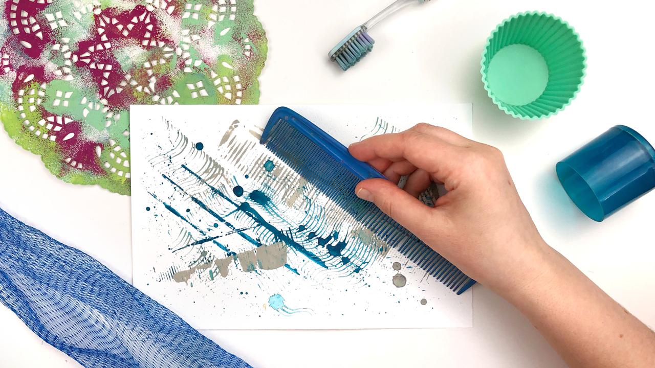
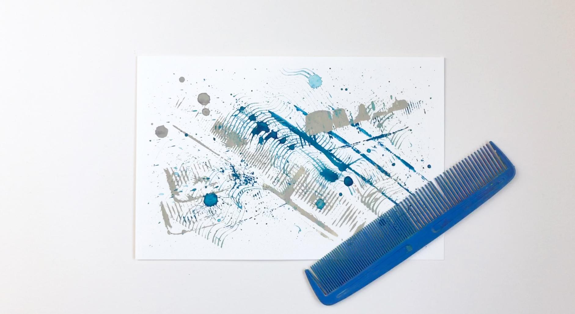
8. Objects From the Bathroom: What I like about working with everyday objects is that we can approach them like a child again. That is, without knowledge. We know so much about conventional drawing tools, but this knowledge restricts us. Have you ever seen a toddler sitting at a table spreading the mush all over it and being amazed at what marks it can make. Let's try to see our objects through the eyes of a child again with all the wonders and possibilities they may hold for us. Let's start in the bathroom. You don't need a lot of water if you want to use gouache in an opaque way. It really depends on the brand you use, but mine are thick and I dip my brush into the water before I start mixing. That is usually enough. I start off by closely examining my object. I turn it around, feel it, and think of possible ways to use it. We can use the side, maybe the small textured element. We have a line, we can make points with the edges and we could use the oval shape. I've used the oval shape of a tube before, but it obviously was not really even this time, so I just got a small curved line instead. If this had been a pencil or a brush, I would definitely have managed to paint an oval. But being as it is, I had to work with it. That's actually the great thing about mark-making with everyday objects. It really trains your flexibility and you have to work with coincidences. There is power in threes. Three elements are easy to count, and it's a number where the brain doesn't yet start to group. I like to use the same element around the page a few times, often three times. If I can see an angle emerging, I usually try to stay with it. I don't like to have too many angles. I like my compositions to be structured. But that is just my style and way of working. You will have your own ideas and ways. I also like to make the same marks with different colors. That way, they are kind of a variation on a theme. They are different but not too much. When I was going for open circles I unexpectedly ended up with two dots and one circle. So I tried to make another group like this on purpose. I'm not using inks with the toothbrush as I've shown before because inks make a really big mess and I like to stay with the water-soluble paints. I really love to work in threes. You will be seeing me using things three times all the time. Obviously, 45-degree angles speak to me a lot at the moment. One neat thing you can do with a toothbrush is spraying and splashing the paint over the page. The more watery the paint, the bigger splashes you get. In the end, this piece needed a few marks in a darker color to achieve a good value contrast. Let's go for the next item. That's a comb. Of course, this is not one I'm using for my hair. I really love painting with a comb because it makes such interesting marks. Occasionally, you can clean your object with a paper towel because you don't want to start mixing your two colors right away. You can put paint on the different sides or just parts and you can experiment with using thick or thin color. Of course, the more liquid the paint, the less you can control it, but you can definitely fill up the little compartments between the teeth of the comb and I love how you can get parallel lines by dragging it across the page. This is definitely an object that works very well with added movement. It is also fun to spray and splatter with it. That are some ideas I came up with, but I wonder if you even discover something else, please let me know. I would also love to see your artwork in the Project section. A cotton pad is probably not something you might think of as a painting tool right away. We have this automation that comes with traditional painting tools and I've learned already so much about how to use them. Using something unconventional frees us of those restrictions we have in our minds and helps us to explore and paint more freely. In addition, we can get some quite interesting marks we wouldn't be able to achieve with a brush or a pencil. Here are some ideas, how you could use a cotton pad. Some of them come with a structure and you could try to transfer that. You can also make large marks with the full side. You can paint the edges, you can bend it in different ways, and experiment with using different paint consistencies. Maybe you even want to add some movement to your marks. Since you can't wipe them off, having several of them on hand is really useful to control your colors. Small kids are really good at experimenting and exploring and they know nothing about perfectionism. Over the years we have picked up so many rules and assumptions about how things should be painted and how things should look. This knowledge restricts us. We easily get discouraged if we don't live up to our own expectations. So let's try to approach creativity like a child again. It's all about play.
9. Objects From the Kitchen: You can find a multitude of objects in the kitchen that are great mark-making tools. Some of them even offer a large variety of marks you can make. It's easy to get overwhelmed with all the possibilities, and that's the theme for this lesson. Have a look. Sponges are very versatile mark- making objects. They can be found in various textures and sizes. To make more controlled marks with a sponge, it is better to apply the paint on it with a brush and press it down lightly. Anyhow, that is just one option. Try to experiment with the various marks it can make. Use a page to create as many different ones as you can with a sponge. The texture doesn't differ so much on the different sides of it. But there are lots of things to experiment with. Here are some ideas. You can cut your sponge into different forms. You can press then just parts of it like the edges, you can squeeze it while mark-making, you can vary the amount of pressure you use to press it onto the page, you can move it around the page, you can change the consistency of your paint, or you could even wet the whole sponge. Silicone muffin cups are so much fun, that I often tend to overwork the whole page. Here, I chose to use a dark violet first. That put me in some trouble because beginning with very dark bold marks is not the easiest starting point for my composition, and I could very well just have added one one light mark here, like a smear over the whole page, and be finished with it. But I made the decision to go on. Generally said, you get more depth in your artwork if you put dark marks on top where they feel closer to the viewer. That is something we know from real life. Think of a foggy day. The things that are close to us are darker, things that are further away are much lighter. I did quite the opposite here. I worked my way from the darkest value to the lightest value. I also worked around the middle axis and I had some trouble getting the elements to connect. After everything got much denser, I turned the page around to get a different perspective and find the spots that needed some balancing. Great compositions make use of wide space. If you are not going for a page filling pattern or texture, the so-called negative space is something you really want to consider while working. Sometimes it is the hardest thing to stop at the right moment. To my mind, I should have stopped much earlier with this one to get a pretty exciting composition. As I didn't, I ended up with this wild pattern and a lot of learning. With chopsticks, you can make a lot of different marks and it's easy to get lost in all the possibilities. Here, I added a group of three marks three times, and I repeated that in a different color. Using different colors for the same type of mark, helps to achieve overall consistency in your piece and creates a connection between the elements. I have done a great job of experimenting on this one, and I can definitely draw several ideas and inspiration from this for future projects. But from my feeling, I used too many different marks and the end result is pretty wild. In contrast to the last one, I tried to restrict myself to very few different marks. Toothpicks can be an exercise in patience, but you can also view it as a meditative practice. I like to bind them together with a rubber band, to have small clusters of marks. I am going for analogous colors and I'm alternating between dabbing and twisting my tool. There's already a lot of pressure out there in the world, and it's really unnecessary to put pressure on ourselves when creating. A repetitive task like this can be very calming and relaxing. By completely immersing yourself in the process, you might even experience the flow state, a feeling of energized focus and enjoyment. In this lesson, we have seen some very basic everyday objects that have a great variety of marks and I've been a bit overwhelmed, myself, with all the possibilities. What I can recommend is a quick warm-up exercise to loosen up and get your creative juices flowing. Try to make as many marks as you can using just one object. Maybe you even want to use a spread page in your sketchbook for each object to create a visual library for future reference, I would love to see your discoveries in the project section.
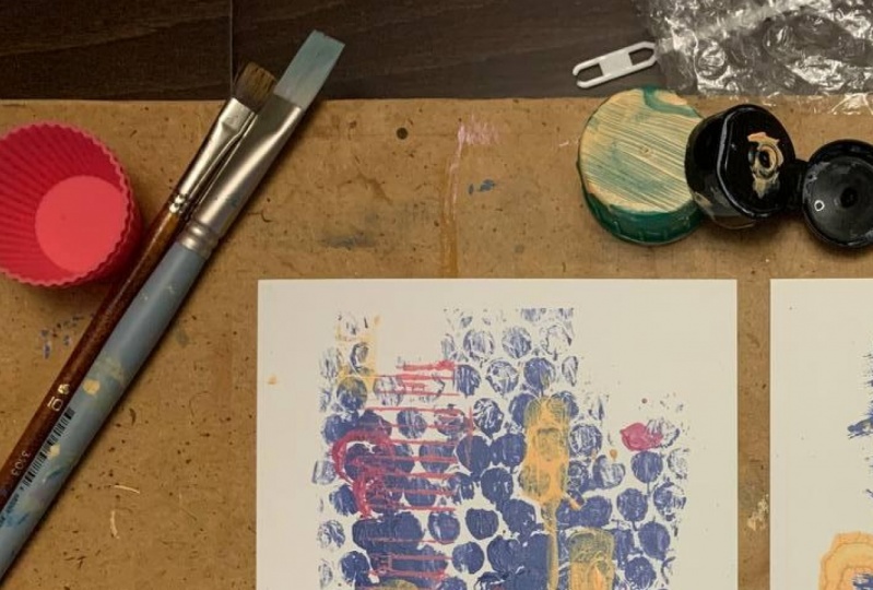
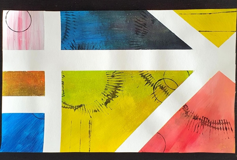
10. Packaging Material: Now we're using packaging materials. I'm trying to use the same color palette for all of the objects so that I can create a series of artworks that speak to each other color-wise. Working in series has a lot of charm and is a great option if you want to create frameable art. I'm using my swatches that I painted over time with leftover paints. It is a good idea though to know which primaries or which colors you use to mix them because you won't be able to get the same hues with different colors. Here I'm using a chocolate candy packet that makes a lot of marks with just one print. It is really neat and you don't have to do a lot to get a cool effect. You don't have to paint the whole thing every time. This is one of the creative decisions you have to take. The object is just a vehicle and you can decide how you use it. I painted some of the compartments only, but since I'm not calculating in my mind where these will land, it will also have an unexpected effect. There's already much going on with all the marks. Therefore, I like to keep a structure by keeping my marks at the same angle. I'm using the dark violet color to get a good value contrast. When I'm close to finishing, I take an overall look and decide if some marks need to be added deliberately in a certain place. Bubble wrap is such an everyday material and it is another example of an object that makes a pattern by itself. But still, there are many decisions we can take. You can decide the color, the amount of paint you apply, how hard you press it down, and also if you apply the color everywhere on the rep or if you press down the rep everywhere. Apart from that, there's a lot of room for chance and surprising effects. I have not tried plopping a few of the bowels or using more watery paint so far and I wonder what ideas you come up with. Most of the time, I work with just one object, but this time I'm challenging myself to use three. If you make too many marks on the page, it easily gets visually confusing. That can also happen when you're using just one object, but it's more likely when you're using many. The possibilities are countless. To still keep it easy, I'm following a circle theme here. In another lesson, I was getting a message about the battery being low, and therefore I was really hurrying up and that improved the piece a lot. That was because I wasn't overthinking it. Therefore if I can't decide where to put down a mark, I sometimes force myself to count to three and then put it down just trusting my gut feeling. What this piece lacked was a shape that connected the single marks. I used the lightest color to achieve that. I'm contrasting the open circles with blue-filled circles or let's say dots. At the same time we have to contrast between big and small. The first blue dot is currently the strongest visual element and it really draws your eyes to itself. To balance things out again, I am placing the dot three times around the page. I decided against using the gray. Now we see the very light skin tone, which has the lightest value, the turquoise with the middle value, and the blue with the darkest value. There's a pretty good value contrast to be found. When working with abstract paintings, it really helps to turn your page around every now and then to get a different perspective. When deciding on where to put down the next mark, I also look at overlapping parts a lot. You should take care that your overlaps are always deliberate. It can look weird if they are unintentionally very small or objects are very close to touching. Generally, this piece follows a triangular compositional approach. I decided to add three middle-sized circles in the mid-value color. There are several groups of three elements that relate to each other and create leading lines in your composition. Although having three elements on a page can help lead the viewer's gaze into the depths of your artwork, in the end, it needed some small interesting marks to finish it off. I placed them rather symmetrically on the page where they are really drawing the eye. All I've done so far is painting without moving the object and this cream cheese container should work well with edit movement. When applying the paint to the container, I'm adding a bit more water and then I move it over the page to get a smear. I'm trying to do a very quick one here because sometimes those are the best. I tend to be very perfectionist and very structured. Sometimes it really helps me to work with a time limit to loosen up. I mix this year's Pantone colors of the year, gray and yellow and I'm placing the three yellow marks in a triangle. I do this a lot because triangles are really good to create visual tension, especially when they are asymmetrical and not sitting with the flat side down on the page. Also, they guide the eye and keep it on the page because the eye jumps from one mark to the other. To keep up with the movement theme, I try to move and twist the other marks a bit too. A quick side note, if you haven't heard before, black and yellow makes green, so my gray and yellow also turned green. That was not exactly what I planned, but it is part of the unexpected things that can happen when you are very immersed in the process of creating. You might end up with a color combination, which you wouldn't have thought of, but which could inspire you for future projects. As I said in the beginning, I was trying to have a recurring color in all of the pieces. As it turned out, I have a second scene going on and that is circular shapes. I ended up having a really nice series of three artworks to hang up on my wall. See you in the next lesson.
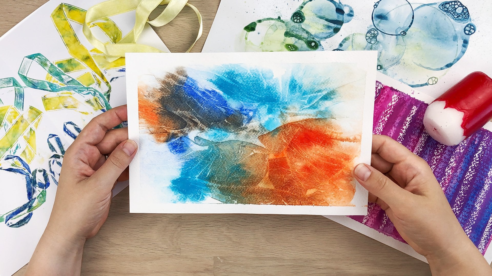
11. Nets and Stencils: In this lesson, we will create textures and patterns and work with chance and the unexpected. First, we will use nets to create textures and then stencils to create patterns. Working with nets is very experimental, you cannot really predict the outcome, and you might have to try it a few times to see what works for you and your paints. We start with a net that is used for lemons, clementines, or potatoes. It is made of thin threads and has a soft feel to it. I'm spreading the paint on the page, but I try not to mix the two colors too much in the beginning because they're kind of complementary, and I would get a dull gray and your page needs to be wet for this technique to work. In some places, you can see the colors already running into each other. After putting the net on the wet paint, make sure to really soak the net in water and paint. If you want the effect over the whole page, you can still reposition the net a bit to cover all the corners. Since gouache is water-soluble, you can easily reactivate it by going over the dry spots with your brush. You can also add more color at this stage. I'm adding some more green into the big magenta spot to break it up a bit. Now you are in for long wait. If you're impatient, you might want to use a hair dryer to speed things up. Peel off the net, the paint should be dry but the paper can still be a bit humid. Since mine stayed overnight, it was really hard getting the net off. For this you really need to tape the paper down, no matter how thick your paper is. But if you're working with so much water, sometimes it can be helped that the paint gets under the tape. It is a small path between pressing the tape down too much so that it might rip the paper when pulling it off and pressing it down too lightly. You can even see small threads in the final piece. Probably this would work too with wool or other kinds of threads. I'm curious to see what you come up with. I am using a net that is made of plastic, which is used for fruits and vegetables. It doesn't soak up the paint like the previous one. I really struggled with the handling until I taped it down at the edges. You can also see that I have tried different things to get the texture to transfer. A second sheet of paper turned out to be the best choice. But I tried a brayer, a brush, a sponge, and kitchen paper. This is a good example of experimenting and embracing the unexpected. Sometimes it takes a while to get on terms with your materials, and you really have to try hard to make it work. But if you manage to push through, you will be rewarded with new discoveries and a very unique piece of art. Let's have a look at the type of stencil you might have at home, a paper doily, and also you can definitely put paint on them and print them. From my experience using a sponge works better. Sometimes I dip my sponge right into the paint, but it is actually better to apply the paint on the sponge with the brush. If you have too much paint or too wet paint on the sponge, it is hard to control, and it could get under the doily or even rip it after a while. What I aim at is a texture that almost looks as if you've sprayed it. Usually I just work with two colors and the mixture of them. But sometimes I get inspired by the colors I have on my palette already. The yellow-green color I'm adding to it is a good decision because my first two colors wouldn't make a very nice mix since they are close to being complementary. I didn't plan that, but if we have a quick look at color theory, the three colors I'm now using are kind of split complementary. I sometimes hover over the piece with my object and have a look at different options. There's no right or wrong. It is a decision to make and sometimes I'm happy with it and sometimes I would love to have an undo button as on the computer. But the great thing about working with real paints is that you have to work with it anyway, and that's really what's boosting your creativity, that you need to find out how to go on. You constantly have changed starting positions, and you are consciously and subconsciously making decision after decision, going from one mark to the next. That really trains your brain and your creativity. Now, I'm using parts of the doily pattern very deliberately and I'm layering the colors over each other, which works really well with gouache paints. This is a stencil I have from my son's primary school's math class. This time we can definitely paint a stencil because it is made of cardboard and not so sensitive as the doily. That is giving us a neat design option because now we can make a negative and a positive print. By painting the stencil, I create the positive print with the holes in it and then I dab on the stencil with my sponge to also get the negative spaces, the dots. Sometimes I use a brayer to print negative spaces, and sometimes I just use it to press down the stencil on the paper. But you could also do that using a second sheet of paper and your fingers. I used two 45 degree angles in this pattern to align my objects too and I work with a lot of layering and different paint textures. It really gives the piece more depth if you have several layers of color with different opacities. To get my value contrast right, I'll finish off with very dark marks. I find these techniques really satisfying and great to experiment with. If you have much in your mind and you really want to relax doing something creative, or you need a quick warm-up exercise, they might be the right thing for you. This was already the last of the demonstration lessons, you've made it all the way through. In the next one, we will have a short look at what you could do with all of your creations. See you there.
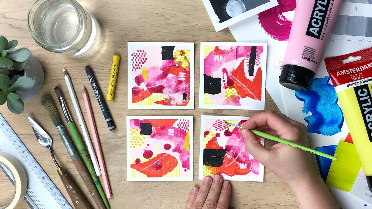
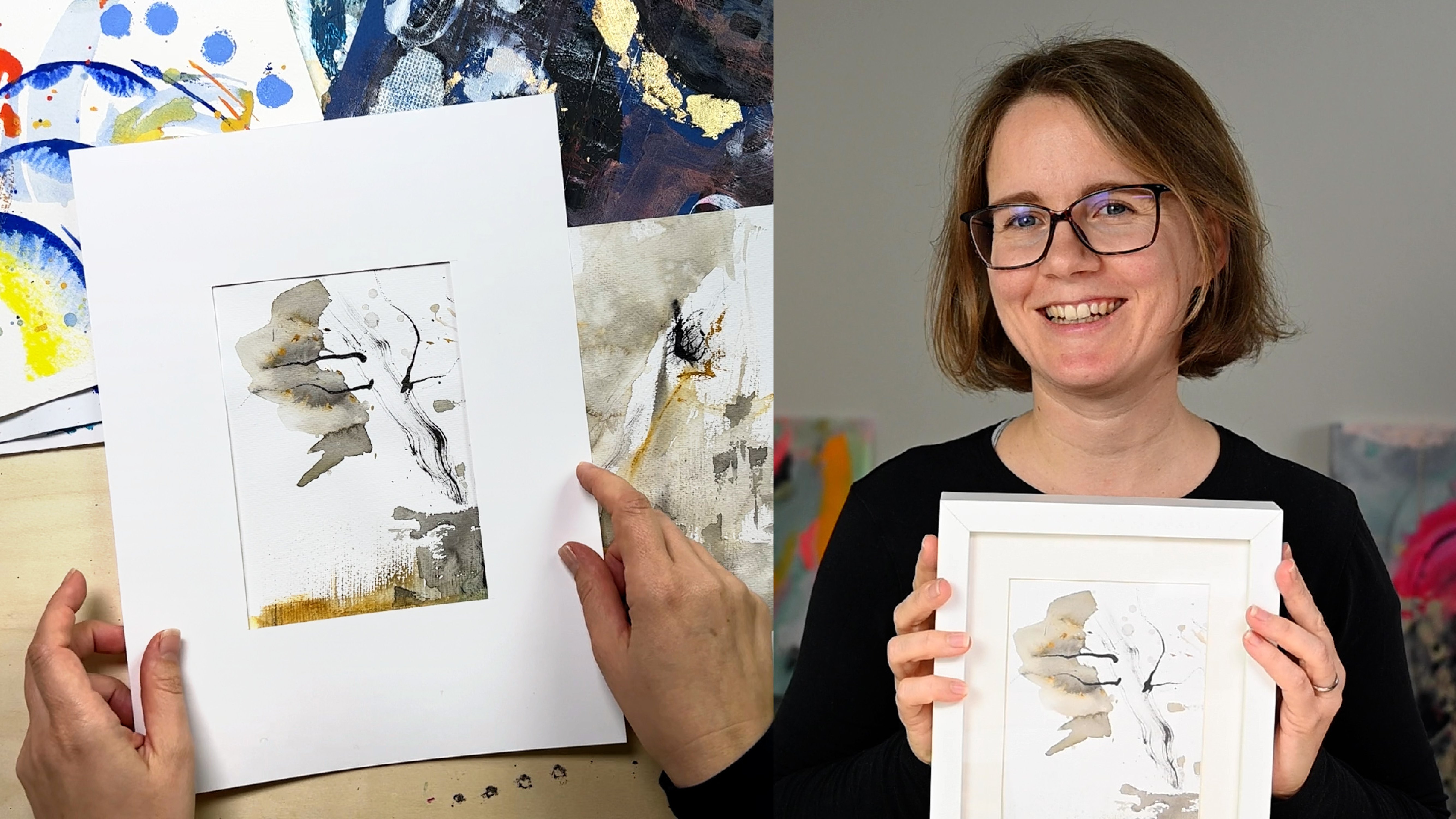
12. What to Do With Your Creations: You can use your artworks for a wide variety of things. The most obvious one would be to frame it and hang it on the wall. But you could also use parts of it to create your own unique greeting cards. Let's have a look. Sometimes I'm not contend with the overall way a piece turned out. Here are a few tips to help you find the most interesting sections. Create flexible frames. I use the side of my artwork to measure our two L-shaped pieces from two sheets of heavy paper. Then I cut them out and use them as flexible frames to slide over my piece. I try different sizes and different aspect ratios. In this case, I like the colors a lot, but felt that the overall piece was too busy. So I try to find a section where the composition work better for me. However, sometimes you are not flexible concerning size. Make your own Mat. If you go for a certain size, you can make yourself a mat and move it over your piece to find the most interesting parts. For this, you might want to use a larger paper than I did, so that you're not distracted by parts of your artwork showing on the sides. Take care to make big enough cutting marks so that you can still distinguish them from your artwork. The first time I filmed this, I made just tiny dots at the corners, and when I lifted the mat, I couldn't find them. Then you can cut out the section or frame the piece with a mat. If you want to frame your artwork to hang it up on your wall, using mat is a good idea anyway. Mats give pieces breathing room, while at the same time providing a clean border that boosts the impact of small-scale artworks. You could hang a series of three next to each other, or even create a group of several. A fun option is to create greeting cards with a see-through window. I still have one with a Christmas bubble, but you could, for example, also cut out the shape of a birthday cake and draw some extra canvas in the same style. Then again, you put your artwork below and try to find an interesting detail. I would love to see what you come up with. Apart from those analog techniques, you could also digitize your artworks and use them for social media or upload them to print on demand websites. The possibilities are endless. You could create your own posters, T-shirts, throw pillows, and really anything you can imagine.
13. Final Thoughts: Congratulations, you've made it to the end of the class. Hopefully, you have enjoyed it and created some unique artworks. We have talked about seeing things through the eyes of a child again, about letting go of the restrictions that come with traditional painting and drawing tools. Also we have covered a few more theoretical aspects like color mixing, color theory, and composition. I really encourage you to incorporate this way of thinking and working into your creative practice every now and then to loosen up and get new ideas. If you haven't already created a class project, now is a great time. The best way to get feedback from me and from others is by sharing it here with the rest of the class. I'm looking forward to seeing your creations so much. If you share your work on Instagram, you could use the hashtag, markmaking_theclass, or you could tag me so that I can discover your work outside of Skillshare. Thank you so much for taking this class. Please leave a review and follow me on Skillshare if you want to get notified about future classes. I can't wait to see what you create.
 Cornelia Zelinka-Bodis, Mixed Media Artist