Transcripts
1. Introduction: Hello, everyone.
I'm Denise Love. In this class, I invite you to embark on an artistic
journey like no other, centered around the
world of abstract art. Get ready to unlock the full potential of
your imagination as we dive into the
process of creating custom color palettes
from our favorite photos. My hands on approach begins with selecting
photos you love. These photos will serve
as the foundation for crafting your very own color
palettes using Photoshop, or you can simply use them
to inspire your colors. You'll choose five or six
colors from your photos, resulting in a unique and
personalized color scheme that reflects your
individuality. Once you have your colors, we'll start creating through a series of
interesting projects, from expressive brush strokes
to creative compositions. You'll witness the
transformation of your palettes
into beautiful art. Join me for this one of a kind experience and let
the artistic journey begin.
2. Class Project: For your class project, I want you to pull together
two or three photos that you love and curate your
colors from these photos, pull together your materials
and have fun painting. As a final touch, write a brief reflection on your creative journey
throughout this project. Share the inspiration
behind your choices and the process of crafting
your custom color palettes. Remember, this project
is all about embracing your individuality
and expressing yourself through abstract art. Let your imagination run wild and enjoy the
liberating experience of creating a color palette
that resonates with your heart and your
soul. Happy creating.
3. Inspiration For Color Palettes: Let's talk about what inspired this workshop and my love for
color palettes in general. Years ago there was this
website called Design Seeds. It's the first time that I ever saw color palettes
created from photos, ever since I saw that. This is more than a decade
ago that I'd seen this lady that did these is not even actively creating
these anymore, but the website is still up. Her Instagram page
is still up with all the palettes that she
created over several years. I've always been fascinated with this concept
of taking a photo which you can see already looks beautiful and harmonious and the colors flow together. Pulling colors out of that photo that I know
already work together. Like I've already been attracted to that photo
for one reason or another. Maybe I'd like to create art
in that same color palette. That's what makes these so fun. Now I can pull a color palette. A lot of people have trouble sitting down and just pulling out colors and then creating that masterpiece because they get stuck at the color point. And I'm one of those people too. I sit down and maybe I'll
pull some colors out, and I'll just start throwing
stuff down on the paper. And I'm like, oh,
this is terrible. What did I do? It
didn't come out. I wanted it at
all. And I'd be so upset now with things like this where you're
pulling together a color palette that you're
already finding super cool. You can get past the color
part of your issue in creating and create
something that is already going to be harmonious
for you there. It's like you've already gotten over the biggest hurdle
that a lot of us have. This was the original site that I had been
looking at years ago. Design seeds, super fun to
go take a look at that. Then more recently, I
have been on Pinterest. If you go to, let's pull
up Pinterest real quick. If you go to Pinterest and
you search color palettes, then you get a hundreds of different options
and things to be inspired by that people have created and that are beautiful
that you could go for. People use these for
a lot of reasons. They use them for help
in interior design. Look how beautiful that
one is, that's beautiful. You can be in for
interior design, for home colors, for painting. I like to be inspired
for painting and stuff. You can be inspired for things you pull together to photograph. There's so many things that
you could do with that. Then more recently, I had done a photography
workshop all about color, and we had created some of
these lovely color palettes. Then a month or two ago, I came across these color
cubes by Sarah Renee Clark. And I love these because
they are right up my alley. Take a photo, have
a color palette and they've got color
cubes set one and set two. There are 500 color
palettes to go by, and I have been
working my way very slowly through the color
palettes in these cubes. As a personal challenge, just as a color palette
challenge to do fun things and work my way outside
my comfort zone with creating a color. I love these. Then I happen to think, well, you know I do photography. Why don't I take my
own photos and create some color palettes to do for some of these art challenges? And that's when I created this lovely set of my own photos and the
color palettes under it. I've made a template for these color palettes
that I've given you over there in your
resources and downloads. And these are
Photoshop templates. So you'd want to work in
Photoshop or Photoshop elements if you want to
create this type of thing, or you can just look at the
template and create it in whatever design software
you know how to use. I just think that pulling colors from photos that already have
a lot of meaning for you. In my instance, ones that I
created in my studio and took the time to pick
interesting lenses and interesting props
and interesting colors. And I created every aspect of that photo and then took the photo and then
edited the photo. Then I'm like, oh yeah, this is definitely my style
and what I love to look at. And I thought definitely
a color palette from that might be interesting to work
with in my abstract art. I just love these. You don't have to
print these out. You can look at these
on your computer or your ipad and you
can work that way. I've done that several
times and you can match colors just fine. You
can print these out. On a home printer, I had these
printed at because they're nice heavy card stock postcard sized pieces that I could print a different picture on the front of
every one of these. On the back side, I just
put a logo because you can only customize the front side. And the backside is going to
be the same thing on all 25. But I thought, how
beautiful would these be? Because I like my
color cube ones that I can hold in my hand. I would love to be
able to hold these in my hand and revisit
them over and over. But you could also
print these on your color printer after you
get some of these together, or you can just use
your own photos. This is a calendar
that I made of some of my photographs two years ago. You could just look at some
of your own photos and say, well, here's something that
I really love the colors in. Let me just match
colors out of that. Like save this
one, for instance. Let's take a look at
what I might do to match colors before we get
started in our workshop. And I told you in the supplies
that I was working with, the Kuretake water colors and the neo color, two
pastel crayons. If I'm working with, say, one of these color cards, let's work with this one. For instance, I'm going to look here through my colors and pull together paint colors that
are as close as I can get it. It might not be
completely perfect, but it's going to be very close. We'll just see what
can we create. My goal isn't to
be 100% on these. My goal is to work within a color palette to
get very close. It doesn't have to
be exact, exact. If color mixing is your goal, then you might color mix
these to get exact exact. But I'm trying to
get very close. Just so I'm working within
an inspired palette. Even if I'm a shade
off here or there, I'm still within an
inspired palette. Look how easy that was to come
up with those five colors. A light lavender, a dark green, a black and a gray. I mean, that was fairly simple. If you had enough colors
like this little kura, Taki ones that you could match that and not have a big issue. Now, if we did the same thing, but say with a photo rather than one where I've already pulled the colors out for us that I might
want to work in. Now I just want to use a photo. Now I'm looking at
this and I'm thinking, okay, what colors
can I see in here? I can see a beautiful lavender. Maybe this color here. Let me get a little
palette knife. Sometimes I can't get
these out with my finger, but maybe we'll pull this out
for these colors in here. I can also see a
pretty brown in there. So I can either go with
like an umber or ape, like I might even say that. And this lighter tope
could be in there. Or this color right here is this topi shade that
fits right there. I could say at this point, is three colors enough? Do I need another color? Do I need a dark color? Do I want this charcoal
black that's out here? Maybe I do. Then what
else do we have in there? We have a really white
light, whatever this is. And I could either
pull out like a white or like a shimmery white
to be that fifth color. And then I could say, okay, here's the colors that I'm going to work with out of this photo. I don't want you to feel
like if you don't have your Photoshop
skills or you don't want to go and make a palette
from the palette template. You can pull colors from
the photo and still use some of your favorite photos
as your color inspiration. You can do this with photos
that you find online. If there's any photos that you happen to find
online that you're like, wow, this is beautiful. And I'd love to
use this in my art and be inspired by the
colors in that photo. Magazine, pictures,
pictures online. Something you find on my
goal when I'm looking at stuff like that
is not to copy somebody else's photo
or their piece of art. I'm just being inspired
by their color palette. So I feel totally comfortable
looking at a photo and say, ooh, let me work with these colors and pull those
colors out of that photo. So I want you to
get creative here. And this is just kind of
my little inspiration, telling you how I came about
working with colors in my photos and some ideas
that you might try yourself. So I hope you enjoy playing in this workshop. So
let's get started.
4. Using Template For Palettes: In this video, let me
show you how to use the color palette
template that I've given you over there in your
projects and resources. This is just a PSD
Photoshop template, and you can use it in Photoshop, and you can use it in
Photoshop elements. You don't have to
use the template at all if you just want to pull colors from a photo
that you have printed. But I like doing these little templates and
printing them out and then being able to show them on camera and refer
back to them. I just like the
I'm going to show you how it is that we create one of these
very easily right now. We've got a bunch of gray boxes on here and each of
the gray boxes are going to represent
something that I'm adding to this template. The first one is the
large gray box at top. I've just started with a
file that's about 2000. By 2000, I think it's
just a square file. And I've taken my Select
tool just to give you a, for instance on how I might have done this if we turn that off, if I just go ahead and select the size that I want to
represent the photograph, I can add a new layer then
with my paint bucket. Just fill that in and then de select your little marching ants that are going around there. That's how I created
that gray box. Then underneath that, I
just created 1 gray box. And I made a copy
of that box six times and spread it out
equally here on my template. The reason why I like
having that gray box there is because now I
can drag a photo in, whatever photo that
I'd like to use. I can size it out to
the size of that box. Then I can leave it like that if I want
the photo to go edge to edge or I can right click that layer and create
a clipping mask. Now I have put that photo within that gray box and it looks
so nice and neat and clean. Then I'm going to select
that first gray box here. I'm going to choose my color box down here
in the lower left. And I'm going to
start picking colors. Now from this photo,
it's very light, neutrally, I'm looking for
a range of lights to dark. So keep that in mind
as you're picking. Then I'll pick a color, pick my paint can and
I'll fill that in. Then I'll come over here
and pick the next layer. Pick that color box again. Maybe I'll look for a
deeper tone of that. Somewhere in here,
somewhere in the shadows. And then with my paint
bucket, fill that in. And then pick the next layer up. Pick my color picker box. Maybe I want to get away
from the rosiness now, the pinky, orange,
salmony colors, and move into another direction. Here I've picked out a
pretty tope look at that. That's, and then we'll
pick that fourth line. Pick our color picker again. Now, I could go lighter
or I could go darker, or I could go towards the blue or I could go
towards this yellow. Oh, the yellow is
pretty. Look at that. Let's go with that
one. Bill that. Oh, pretty. Pretty then I'm just going to do that until I get
five or six colors selected. You can do five colors, just delete a box and
stretch those out, but I like having six options. And then when I'm creating, who look at that green, I got
out of the middle of that. Then when I'm creating,
I have choices. And I might choose
to leave one of these colors out and
go with five of them, or I could go with four of them, or I could go with
three of them. But I like having those choices and I think it's fun to have it in a format like this that I can then send to the printers. And the printer that
I used was M 0 0. And what I liked about them, and I think it's just
like Moo.com probably. But what I liked
about them is they have this option
where you can print a different photo
on the front of every postcard or business card or whatever item it is
that you've picked. And I picked postcards, square postcards, and you can pick a different picture for
the front of every postcard. And then the back side, you would simply pick
like your name or a logo. I put a logo on
the back of mine. And one side, everything
has to be the same. Pick a logo. And then
on the other side, every single picture
can be different. And then you have a set of like postcard sized
color palette cards that you can hold in your hand and work with over and over. So I really love how
easy that that is to do. The other option you can do
is just print these out on your home printer and then you can print them on a
nice thicker paper and cut those up into squares. And then you've got your own set of cards that you
created at home. So these are super
fun. I hope you enjoy creating some of these from
some of your favorite photos. I can't wait to see what some of your custom palettes look like and I'll see
you back in class.
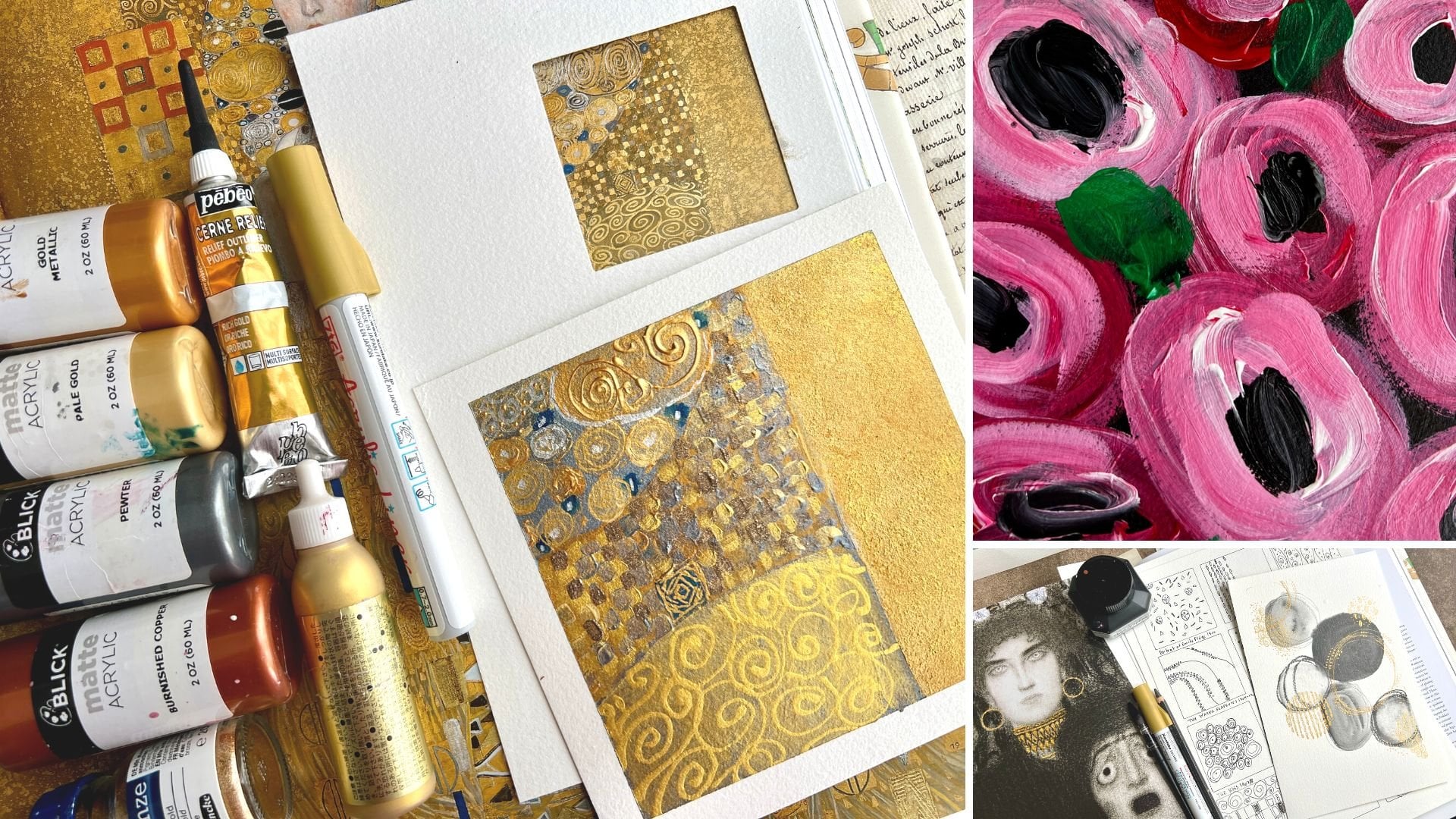
5. Supplies: Let's talk about your
supplies for your class. What I want you to do is to start looking through
your photos and coming up with some
of your own photos that you can create
color palettes from. And you can create palettes like I've created
and print them out. On your home printer, I
had these printed at. This is a square
postcard on the front. What move does is
they will print a different print on
every single postcard. This is a really fun
way to get, say, 25 or 50 of your own photos
as color palette cards. Which I love because
I'm really inspired by the color cube color palettes
which I use a lot of. This is the Color cube in the Color cube by Sarah Renee Clark.
She's got volume one. In volume two, you have wonderful color palette
cards that you can hold in your hand and use to be inspired and paint with and
create things with. I love this design seeds is also like the very
first thing I ever came across that had
color palettes like these from photos that
that lady did in her job. And she created color
palettes from them. And you can search
color palettes on Pinterest and come up with thousands of these where people come up with a
color pallet from photos. But what I really like
about this making your own, from your own photos, is now you're making
color pallets that are customized to your preferences and the things that you love. Like this one here, it's
one of my favorite photos. The pieces that we
paint in class from this photo are so gorgeous. The pieces that we paint from
this photo, super gorgeous. Also, this photo I used also
in class, totally gorgeous. And these are not colors
that I tend to pull out when I, when I photograph. My photography is dark
and moody and I figured that out after years
and years and years of photographing things. My painting tends to be
like blue and green, blue and orange or blue, green or pink and orange. Those color palettes like that. I don't get as adventurous
pulling colors out because you just get paralyzed
looking at all the colors. And you're like, well, I want
to pick the wrong colors. I don't want to pull
things that don't match. If you pull something like this, 456 colors out of, say, a photo that you love and create a custom color
palette for yourself. Now you're like, okay, let's
pull these six colors in whatever materials I happen
to have here in my art room. We will go from there. That's what we're
doing in class. I've given you all of these
palettes that are mine, that I created as a PDF in the projects and resources.
You can download that. I think you'll have to be on
a computer to see that page. You can download the PDF
and you can work right along with me with
my color palettes. If you want, then I want you to eventually pull your own
photos and pick some colors. And you don't have to use the palette template
that I give you. Also under the project
and resources, you can just look at a
photo and say, okay, I'm going to pull a dark pink, I'm going to pull a light pink. I'm going to pull this
dark color in the shadow. I'm going to pull maybe this little yellow coming at
the tip of the roses. You can just look at the photo and pull a palette together. I'd just like to be able
to have something to hold and look at and refer back to
later if I really loved it. Because now I could just
pull this out over and over and do it again if I wanted. I like having these to
hold and work with. Printed these at 0 has
the most lovely options. And they'll print something different on the front
of all your cards. So you'll have a PDF
of this that you can print on regular printer paper if you want to follow along. And then you can create
some of those for yourself. I tried to limit my colors for each
painting that we're doing, but also tried this
class to limit the supplies instead of being all over the board
with everything that I own, throwing the kitchen
sink at every piece, doing true mixed media stuff, I'm doing mixed media, but I want to limit that to some things so it's
not so overwhelming. I'm working in watercolor
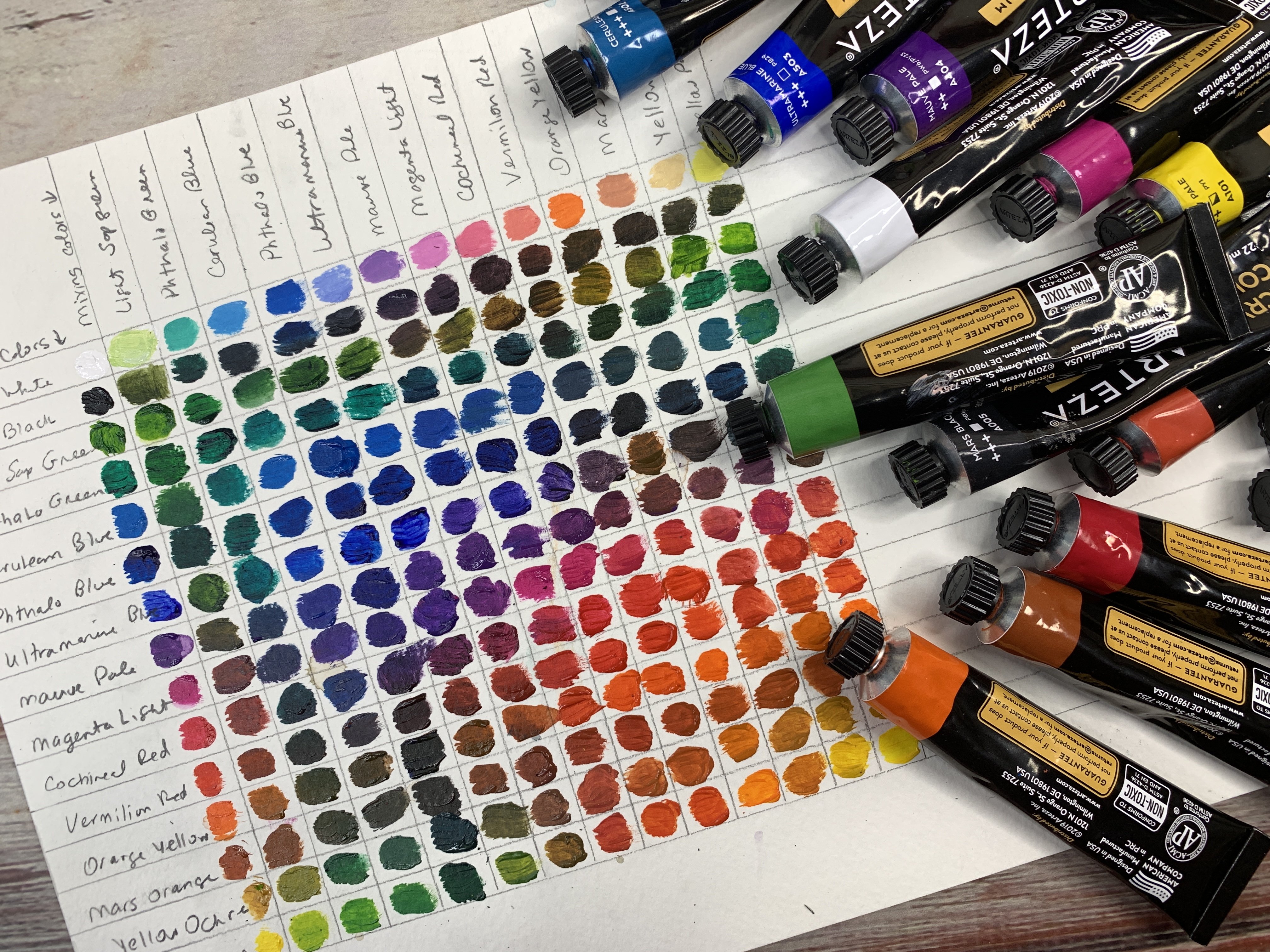
for the bottom layers, I'm using the Cura Taki. This is the 48 piece set, and this is the art nouveau set. And I do pull from
both color palettes because this tends to be so close to the colors that I like to use in my palettes that
it was so easy to be like. Okay, this looks
like yellow ochre, and this looks like
this dark pink, and this looks like the black. And this looks the
top, whatever it is, it was so easy to pull these without having to think on
top of everything else. Let me mix all my colors from
scratch. I'm using these. I'm obsessed with the
set of water colors. I love them. I've been using
them all year and they're. Favorite. I'm also today
painting on fluid, 100 cold press watercolor paper. It is 100% cotton paper, which I love to paint
on cotton paper is nice because it allows you a little more working time
with your paints, whereas the cellulose papers that paint soaks in and
dries a little faster. I like the 100% cotton because it's beautiful
paper to work on. And I'm working on the six by eight sheets and eight by
eight sheets in class today. I also using my Karen
Neocolor two crowns. And I do have a big set, but I use these a lot. And these are perfect for color palette challenges
because you have enough colors that you'd
be able to pull two, or three, or four from this set to do your color
palette challenges with. I'm obsessed with colors and color palettes
and I have been, even in my photography days, I love things that
revolve around color. The color palette challenges
have been a really fun, active project to do every
day that I've enjoyed doing. These come in super handy. You can just get away
with a couple of these if you wanted to pick a few
of your favorite colors. Maybe white and black, and you're probably good to go. That's what I'm using
mostly in class. I also pull out some
white acrylic paint. I've also pulled out
iridescent gold, fine golden heavy bodied paint. And I use those
with some stencils. I've used the Cubist stencil
by the crafters workshop, corrugated cardboard
by stencil girl. The paint brush I'm
using throughout class is a number four
Princeton Neptune quill. I pulled out a
couple of Posca pens to use and I've been using a 14 B pit graphite matt
pencil by fiber castel. You can use whatever mark making things that
you're wanting to use, but that's where I have
limited my supplies for class. I've got some painters
tape that I'm using to tape down my pieces. I'm taping those down
to an artist panel. I always have people ask me what this is that I tape
things down to. This is an artist panel that you can get
at the art store. And those are really
nice because then I can move it off my table
as it's drying and work on other things that of the supplies
that I've used in class. If I spring something
on you that I forgot about, I apologize. But I'm trying to limit it down to this for the projects today. All right. So let's get started.
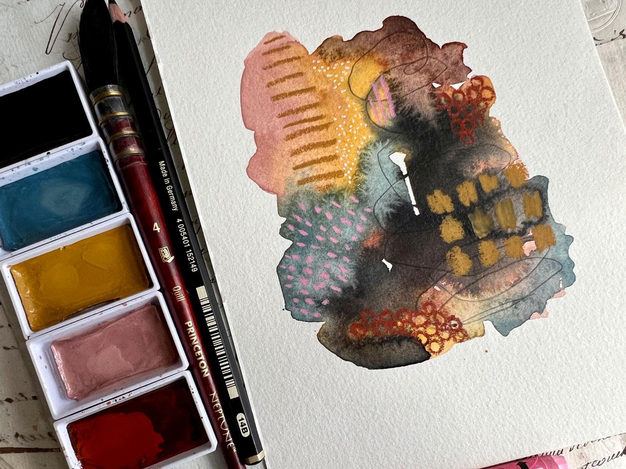
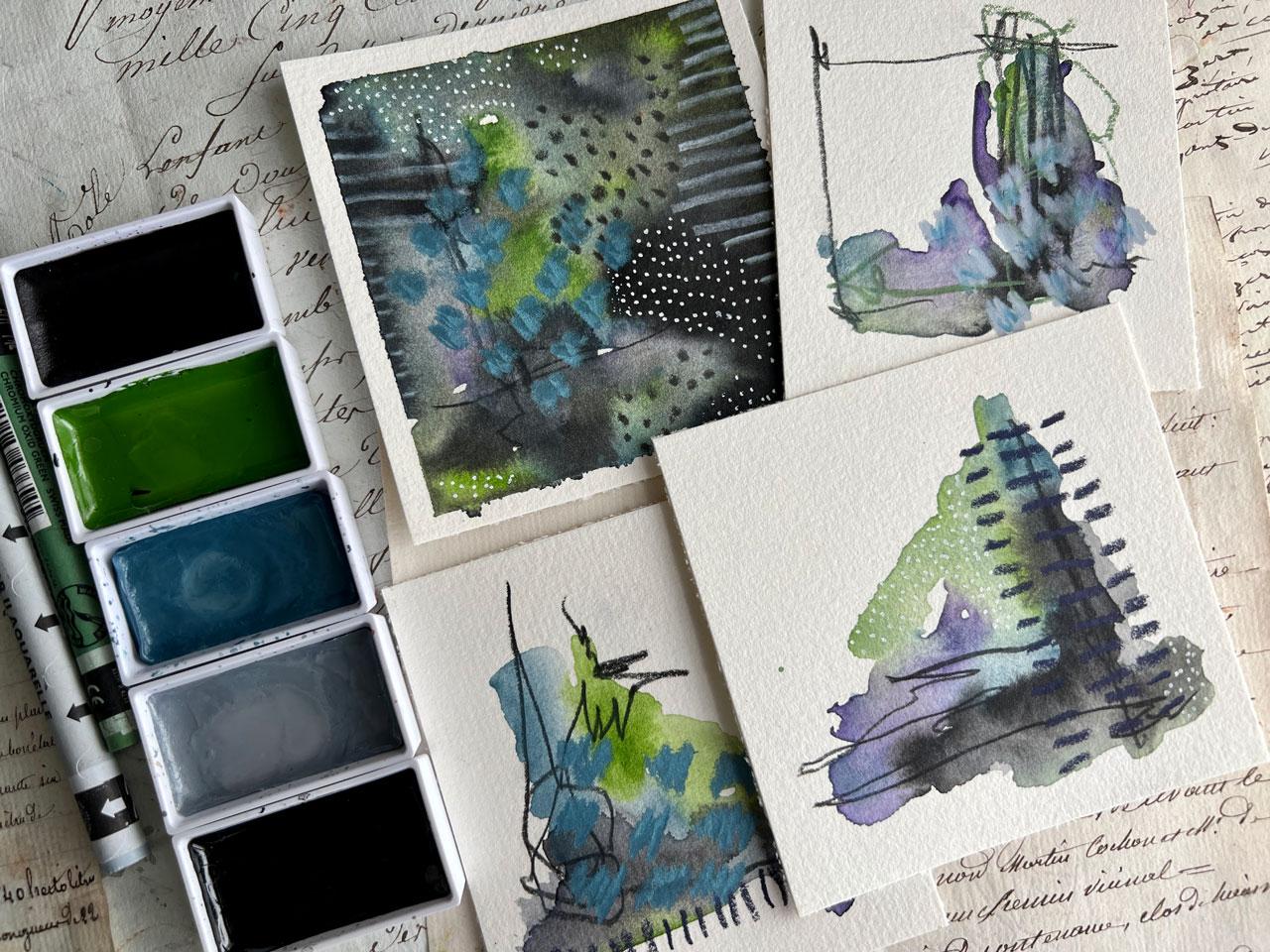
6. Ranunculus Color Palette: I thought we'd start
this first project with the cards that
I had printed. I've given you all of my
printed cards in a PDF. In your projects and resources. If you want to download that and follow along,
exactly, you can. But these are the
photos that I've pulled out of my own collection and pull color palettes
from most of these. I've done like five
colors that I've pulled just because I
thought they were beautiful. I think for this first project, I want to work with
this first palette here because I've always
loved the ranunculus, the blue background, the
pretty yellows in the vase. It's right up my alley for colors that I
want to create with. But I've given you 25 color
palettes that I created. Then I actually
printed these at 0, which is a really great
high quality printer. They have a printing
type where you can get a different photo on the front of every
item that you print. Say like postcards, I believe this is like
a square postcard. Business cards, you name it. Whatever they print, they
have an option where you can get a different item
on the front of every. Now what I've given you in the PDFs over there
in the projects and resources is some that you can print on
your home printer. The PDF pages, a whole letter size page, print them
on your printer. You can follow around
along with the paintings if you want with the
colors that I picked. Or you can create your
own color palettes and then be creative with the colors that
are custom to you. Then there's one
duplicate in there, but it's not really a duplicate. I loved all the colors
in these pigments so much that I picked two different color palettes out of it. I love that. But I'm
going to start with this painting using
the Ranunculus one. I love the dark charcoal
color, this pretty gray, blue ocher, this dusty pink, then this beautiful rust color. I'm going to create
a little set of abstracts with this color
palette for this project. I think that's fun.
These are super unique. They come in their
own little package and I can pull them out of
there or keep them pretty. I absolutely love
having you can print them on your home
printer and cut them out of a nice paper
if you've got that. Going to be working on fluid, 100 coal press watercolor paper because I had a pad of
it over here beside me. Use whatever watercolor
paper you have on hand to do your projects or whatever paper you like with whatever
materials that you want to use. I've just taped two sheets down, watercolor with artist tape. And I'm going to pick
some colors out of our palette and I'll be
right back. All right. I've pulled out
some water color. I'm working in my Cura
Taki water colors. I have the 48 Pi set, I have the art nouveau set. And I've pulled some colors
out of each of these. Because this collection has such a wide variety of colors, I can work within a color
palette and get very close. My goal is not to be exact, exact, but look how
close that looks. I think I did pretty darn good. My goal is to work
within a color palette. To use colors that I wouldn't normally
put together maybe. And just try to
work with that I'm a shade or two off of a
color in that palette. That's fine. I don't mind that. I'm still working
within, say, a charcoal, a gray blue, an oak, or a pink and a rust. I'm still in that color palette. It doesn't bother me
if it's a shade or two lighter or it's close,
but it's not exact. My goal is to play experiment within a palette and
just be creative. I've pulled out number
20 black number one. Number 61 grayish blue, 44 yellow ochre,
19 potters pink, and number 43 venetian red. Then I've also pulled out some neo color to crayons
just to make marks with. I've got the plocani blue and it's a
metallic bluish color. I've also got English Red ochre. Then I've pulled
out some graphite because this color here
looks like graphite to me. I've got white and black
Posca pen over here. I could also pull
out anything white, black, gold or silver. I consider neutrals. I do feel like I'm going to
be maybe pulling some gold out to do some
stenciling on top. Perhaps I might do marks on top. Who knows? I'm just
brainstorming with you here, giving you ideas and just
seeing what can we create. I like a little
abstracts where it's colors and it's like a color sampler and a
mark making sampler. I'm going to put
this to the side, going to get a little
bit of water here. And wet down my abstract, my abstracts, wet
down my water color. And let those be activating. I've got my Princeton
Quill number four brush. I like using this
for things where we're just starting
laying down colors. Usually what I'll
do is work within the colors that I really
like and then move on to the colors that
I'm less excited about just to see where
are we going to get. If I don't like the colors, don't use that color as
the biggest splotch. And I laugh because you
don't know how many times. I've just gone down
the road and thought, oh, I did not like that color. Why did I start with that? Now I say pick the
color that you like, Start with that and then we
can move around from there. I'm not thinking composition
very hard at this point, but I've done quite a few of
these where I start off with colors and I'm just
moving around and I'm letting them blend and I'm butting them up to
next to each other. Takis work a little
different than traditional water colors that
we're used to in the West. And I really love that
about the cuties. They're a different binder, they're a little more pigmented. They dry matt. They just give you
a different look. It's almost like a guash feel. That's what I love about these. I'm just tipping color in. Generally, I start
on the diagonal. I don't lay it like flat
right there in the middle, but I laying the first
color on the diagonal. And anywhere I put a color once, I'm probably going to put
a color in there a second time so that it's not
lonely by itself basically. It's not just laid in one area. Then we might come back on
here and add more color. We might use something very tiny and sparsely
because you're like, oh, I'm trying to work within
this color palette, but maybe I don't
love this color that I got to start with. Maybe it's not my favorite. Like the black is your
least favorite use, that the least amount. If the rust is your
least favorite use, that the least amount always
work on more than one piece. Because one piece
is always like, the other piece is
always like, oh my gosh, this is amazing and
this is my amazing. So far I want you to have the experience
of enjoying your art. I don't want you
to get stuck on, oh, that one didn't turn out. This was a terrible paint day and didn't do what I wanted. And I'm so upset with my art. Whereas if you create more
than 11 can be the dud, and the other one can be like, wow, look what I created today. And you can get very
excited about it. I don't know. For me that tends to
get me past my hang ups that I generally have
when I'm creating, when stuff is not working out. If I have more than one,
something works out. This is just my pit graphite, matt pencil and a 14 B. What if we just come in here and make some marks while
the water color is wet? I want you to start experimenting
with your supplies. It's just paint.
It's just paper. I don't want you
to get hung up on. Oh, I don't want to ruin it. Oh, I don't know about this. I'm scared. I don't know
where to go from here. I want you to just start
creating for the fun of it and seeing what would happen if
I did this or if I did that. I want you to start
having some fun and playing and figuring a
few of these things out. And I'm just going to mark
over here because I like it. It's dry, it'll let me go ahead and get some
fun mark making in here. I already love it.
This is the good one. But you know what? When
we're dry and done, the other one could
be the good one. It's funny what you
like as you're working versus what you like when you're done. Don't judge it yet. I am judging it though, because that is amazing. I think we're going
to have to let that dry a little bit and just see what do we end
up with once it's dry. I'm actually loving
the direction of this. Let's see how we've
done here with our inspiration color palette. I'm thinking that's pretty
darn right on the money, especially this one right here. Definitely feeling that we
hit the money on that one. Let's let this dry
and then we'll see what we want to
mark on top of it. We're still drying here, but one thing I want to mention before it's completely dry, this is the time to maybe
dab some water down into damp areas if you want to see your water color bloom out. And get that extra
texture in your piece. You want to do that before
the water is completely dry, before the water color
is completely dry. Because if it's completely dry, the water just sits on top. And then it'll just
make a texture with a circle around it. That's fine too, if you want
to reactivate that and get that texture with the
circle around it. But I like to do some
of it when it's damp, so that water color does its little fun
blooming and gives me some different effects
than I might normally get. It's just a way to
texture that water color. One extra bit, I did want to mention
that before it's dry, just while the paper
is still shiny. Not completely
sopping wet because it doesn't work but
still shiny and not dry. Drop in some color to add some texture and see
what that does for you. All right. I've let this
almost completely dry. There's a spot or two where
it's really heavy water. Rather than mop it
up with a cloth, I just want that to finally settle in and dry and
be a darker spot. I used this water color in the way that I
use acrylic paint. I wasn't looking for
very thin color washes. Like a lot of times when you're using watercolor
you're looking for, that's just not the way that I generally paint with watercolor. I like the transparency, but the vibrancy that these
cure talkies give me. I'm not just going for transparent watercolor in my
particular collection here. But you can play
and experiment and discover as you're going what it is that you are
wanting to create. Your goal may be totally
different than my goal. That's what I like about
doing stuff like this. When I start mart making, I got 1.1 That might be
the whoa, I love it. When I start mart making, I'm going to draw first
on the one that is not my favorite and then start drawing marks that I
loved onto my favorite. I want you to start working
in pairs or triplets, 3456 pieces at a time. That you don't get mad when you're sitting
here at your art table. And the one you did wasn't what you were hoping it was
going to turn out to be. Okay. So I'm going to start with some neo color crayon
and just start mart making and see what
can I get and just play, Maybe I've got some lines. I did something similar to this on another piece and I was like, oh, I love the line. See, look at that. I
do love the lines. Good one. Let's do that over
here somewhere. Let's just do it
right through here because we're going to layer. I don't even care
if I'm right on top of the other lines
that I got here. Because it's all
about the layers. I like to say with photography, there was this famous quote,
it's not good enough. Maybe you're not like
it's not good enough. Maybe you don't have
enough layers yet. That's what I like, layers. Okay, here is that
was the ocher, This one is this English red. What are we thinking?
We can do dots, we can do dashes,
we can do lines. We can just get creative in the stuff that we
want to lay on here. This is a mark making guide
that I made for myself. And I want you to start
collecting marks that you like, whether it be in a
sketchbook or on a piece of paper that you can hang on the wall
as you're working. But this is mine that I
made in one of the classes. I think it was the
Rolling Stones class. And it hangs on my wall and
I can keep adding to it. I can make multiple
sheets like this. I doesn't have to
be as fancy as I did it, but it's pretty. I even love it a year later, or however long it was
since I made that class. If you get stuck for ideas, refer back to the marks that you've gathered and
looked at and searched. And you can get on Pinterest
and Google mark making, and you can find all
kinds of ideas like this. But this is a good way to get inspired when you're
not sure where to go next is if you have a card like this that you can then
start referring to. I just wanted to point that
out before I get any further, but maybe I want to do
some round circles. This is all about the play. I'm not trying to cover the
whole painting with marks. That's generally not my goal, but that could be your goal. You might be a doodler. You might want to doodle or zentangle on top of your piece, and you might want
to cover every inch. Looking for more of
interest details, things that
complement the piece. And when you stand back, maybe you can't figure out
what all those elements are. But as you get
closer, you're like, oh, look at the details
in this and that area. That's what I'm searching for. I'm looking for the beautiful
surprises that we get as we come closer and we
discover parts of the painting that maybe we
couldn't see from far away. On this piece versus this piece, you can put these elements
on top of different colors. Like over here, I tried
it on top of the yellow. Maybe over here, I try
it on top of the blue. Just experimenting
and going with the flow and what you're
feeling and what feels good. Why you'd have fun
when you're at your art table and experiment. I always start a piece not really knowing where
I'm about to end up. Interesting observation
with the rust. I like the rust on top of the yellow better than I
like it on top of the blue. Interesting things that we
discover as we're creating. Maybe I'll come in here with some big color
splotches. Oh yes. Okay. I'm feeling the
big color splotch, but that's why we do
stuff like this to discover interesting things to take forward in
our art practice. My whole creative outlook
is all about discovery. Even when I make
photography classes, I'm not trying to make a macro class that's
a plain micro class. I'm trying to make something
that's interesting, we discover new things, and we get outside
our comfort zone, and we try lenses that maybe
are out of the ordinary, that we wouldn't normally
try all about experimenting. Every piece of art
and photograph that I've ever created
have come about because of a project
I was interested in or a deep dive of a subject
that I wanted to do. The same with these, I
want to create abstracts. I like to experiment with all
the different art supplies. Look how good that looks. That's my philosophy. I want to experiment and play, and test out all the things. And that's where my love of all the things that
I create come from. I'm not trying to
create specific things I want to create and just see where I can
get like what do I get if I do this
or if I do that? Different people
have different ways to create and they figure out how to get there in whatever way it
works best for them. Mine is experiment. You don't have to know where you're
going when you start. You might be one of those that visualizes the whole
project and has a plan. And when you create it, you've created what it
was that you visualized. I can do that sometimes
with photo projects, but in steel life get
something in my mind. But with art, I like to just
see where can I end up. I don't have to create
specific things. I'm not creating
for anybody other than myself and my enjoyment. I'm good, just seeing like where can this take me?
Oh, see I like that. Let's do some more
of that over here. I liked it. This is how I come up with some
of my favorite pieces that I've ever created. This experimenting that I do, pieces I have framed
in my house or I use as examples and things. This is how those come
about, all right? I'm really loving
where this is going. Feeling a little bit like I could use some
white dots in here. Let's get our Posca pen out
where we want to do this. Do we want it? I like picking where the colors transition
into something else. I like to pick those areas
to doodle and do dots in and stuff because it gives your eyes a line of where to
stop and start the dots. Like you didn't have
to do the whole piece. You had like a
little area that was controlled. I love that. That was super fun right there. It doesn't have
to be everywhere. It could just be
strategically something here and there where it gives that a little bit of whimsy. That's what I'm looking
for, the lovely whimsy that we get in pieces. Then at some point, you
might think, is it done? I don't know, do I need more? Maybe not. I can't decide. If you get to the point
where you're like stuck, put these to the side for
a while, live with them, and then later as you have more skills or you
learn new things, you're going to be thinking, oh, here's what that needs. And you'll start to see that you're progressing in the things that you like
and you don't like. Then what you thought
was finished might then sometime need some extra little
yumminess to go with it. I actually do think these
are finished now that I've sat here and looked at
it as I'm chatting with you. I actually love these. I do love this even more
than I thought I would. I thought this was
going to be my dud. But if you're unsure
and you're like, okay, I don't know where to go next, but I don't know
that it's finished. I want you to set
these to the side, hang them on your wall, live with them for a little while. One day you'll go, this is what that needs
or that really is finished or whatever it is that you happen
to come up with. This artist tape, I
really love because it peels off without
tearing my paper. You can get artist
tape on Amazon. This is Blik's artist tape
from the Blick art store. So you can look at your art
stores for artist tape. I also use painter's tape, but this is just coming right off without
tearing my paper, which is always a plus. Okay? I'm not actually
really digging these. I'm actually loving this one, even more than that one. How awesome is that? Let me tell you how I come up
with my best piece of art. Pick a color palette, limit your supplies, and then let's just see what
we can create. Because these palettes were
made from my photography, which is another form of
my art. Look at that. These are amazing in my color palettes because my photography is usually a little bit darker and moodier, Not so bright and flashy. And in your eyes, this is
a brighter color palette, actually, even than a lot of the moody stuff that I
do on dark backgrounds. I love how that translated
into a little abstract. How super cool was that, given your first palette? To try out whether you paint
with my palette or you pick a palette from a
photo that you created. But check out how fun this is. I had super fun painting these and I'll see you
in the next project.
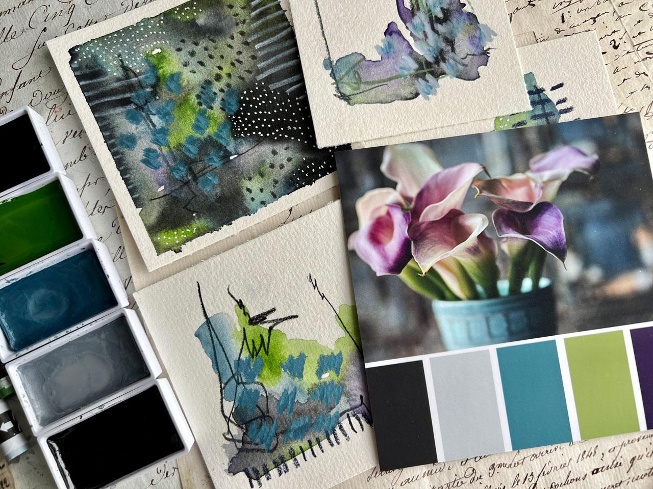
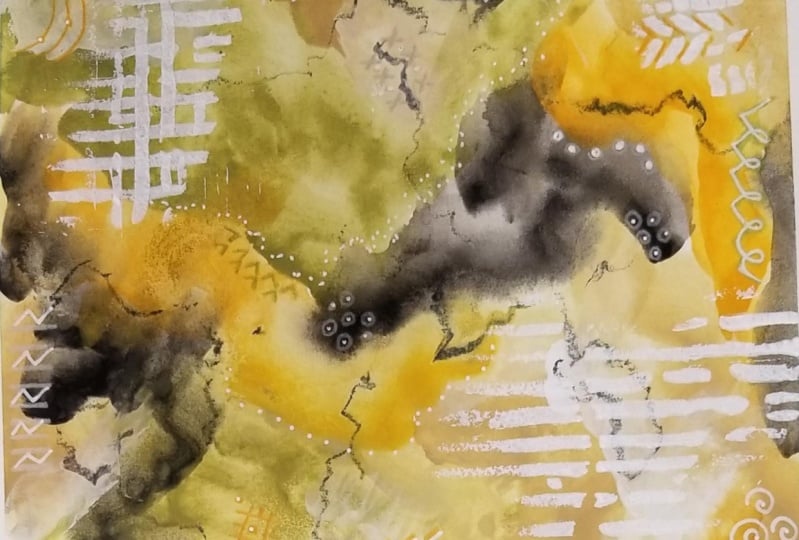
7. Rudbeckia Color Palette: All right. I'm going to do another
little set of abstracts. I'm using that same fluid, six by eight inch pad of 100%
cotton watercolor paper. I've just taken two pieces
out and taped it down. I want a little bit wider
border and I'm going to paint edge to edge rather than
the center pieces there. I'm going to pick another one of my color palettes
that I've got here. I'm digging this. It is very similar to the
one that we just did, and it's got pink and ochre, but it's also got
like a burgundy, a brown, and a black. Okay, that's one option. Or we could do this mostly neutrals with this
yummy pink in it. That's fun. That's a fun option. Let's just look real
quick at our options here like this. We've
still got that. Oh, oh, look at this one. Like these greens. That
orange. Oh, you know what? Let's just do it.
Let's be brave. All right, that's
our color palette that I'm going to
do on this project. You can follow along in your PDF or you can do one of the ones
that you created yourself. And I'm going to pull
some a Taki paints and then paint on top of that. I could pull acrylic paints. You can pull whatever
paint you got. I want you to pull from the
supplies that you have. I'm going to go with
these. I love this set. Look at this green four
oh five green gold. Let me set this up. Before I mess that paper
up, check it out. We've got this one over here. 54 green gray. I think this green gold though, is not going to be
this muted color. I think it's going to be a very bright look at this green here. We've got this yummy
green here, olive green. That might be like
a little mix there between the green gold
and the olive green. Or that could be a mix of the
olive green and some white. Okay, let's put the
green gold back. Green gold is very bright.
Let's just test it. And I can see for sure
see it's more yellow. If we go with this one, that's definitely,
you can do this, you can have a
little sample sheet. Okay, that's definitely darker.
All right. I like that. Now we're looking
for that pop of orange is like a true orange. Is that a little bit of a vintage orange
that we're feeling? Oh, yeah, feeling
that one right there. Picking colors are fun. All right, This is
42 Mars yellow. And then we've got like
this ivory color up here. This is 16 Cro bagen. That one right there
could be a charcoal. It could be the black. I've got the number 20 black.
Look at that. Lose er, feeling
good about that. I could also pull out the white. If I want to mix these
two, I could do that. Okay, I'm feeling pretty
good about our colors. I get so excited pulling the colors and
limiting our palette. I'm trying to limit
the supplies. For instance, as I've
got my Karen Neo color, two crayons, let's
just pick a few. This is what I do. Limit my
color palette right up front, look at this yummy green. All right, let's pick that,
limit my color palette. And then as I'm painting, I'm not so overwhelmed
with all the choices. Okay, there's not really a good like all of
green in these colors. But we do have lots of
oranges to pick from. We can just look like, which orange are we
feeling, feeling this one. Then we've got this
yummy sahar, yellow. Could be that. All
right. I'm loving it. We could use charcoal pencil trying to limit what I'm
doing in these projects. Sometimes look at that. Okay. What are we thinking? I'm feeling pretty good
about that because I tend to pull everything in the sun out when I'm doing projects. And I don't necessarily
want you to feel like you got to have
everything that I have. I have it because I have it. I'm pulling out
stuff that I have. And that's what I
want you to do. I want you to pull out stuff
that you have and work with things that you
already have, okay? My goal on this is
to go edge to edge. I might still pull some other
things out to paint with. On top of this, I am a true mixed media artist in the things that
I like to paint, but I'm going to
try to limit myself today to a specific
set of supplies. And just see a lot
of times I will start just like you
just saw in a corner, but then on the other one
I want to branch out. That's pretty much
what I was doing here. We've got that lighter
color in there. I might come back in here
with some white on top. I didn't have to contaminate my colors by mixing
them in a palette. I could just mix them
right on top and let that white add some different
things in there. I want you to start out with whatever color you're
wanting this to be dominant. If you wanted the whole
piece to be dominant, Orange. Start with the orange. If you want the whole
piece to be dominant, green and dark, with
orange accents, like I did with this one, Then leave the orange to
last to the little pieces. I don't want you putting the wrong color down
and then thinking, oh no, that's not what I wanted. I want you to think about
this right up front. I want you to start
with the color that you're feeling needs
to be the most dominant, the biggest swatch
of that color. Then whatever you
want to be the pop. Use that one last and just
see how that works for you. Look how pretty that is. Oh, I love this already. I never usually want
to start right in the center because I'm
thinking of composition. I want to start on the edges
and build that around. That's what I'm thinking there. My little mind set in there. All right? I'm not sure that this
little bit of this color, I'm not sure that's what I
would really, really wanted. But I put it in there. I want you to give
every color a go. Even if it's not
like your favorite, just give it a go. All right? I want some black in here. When I was picking colors in my photos that I
wanted to work with, say like in this color palette, I wanted to go in a range of colors for
some good contrast. I wanted there to be
a very dark color. I pulled a dark color out, and I wanted there to
be a very light color. I looked for the lightest areas, and then I wanted there to be other colors in
here as contrast. And this one even has like
a slight purple shade up here that I could
have pulled from. A lot of good things to think about as you're creating
your color palette. Whether you do it in Photoshop or whether you just look at that photo and pull the
colors that you're thinking. That's some of the things
that I was thinking of. I was looking at it going, okay, where are these ranges of color that I think I'm
going to want to play in? All I want more
green, more white. I could come back on
top with some orange. Don't forget the orange. Then I, I could come back
on top with acrylic paint. If I get to this point I'm like, I need something on top
of this, say white. And you know that you're
not going to get the white from the
white water color. We could come back
with acrylic paint on top of our piece
and just see like, what can we continue to
create mixing up our mediums. I am feeling like maybe because the orange is disappearing
into the darkness over here. That's pretty cool.
Check that out. I don't know what the
heck that's doing, but look at that. That's a happy accident. Wanting to maybe spread that
little accident around. It's not just in a
little tiny blob. Now, maybe we'll
do that over here. That was very interesting. I was going, oh no, it's mixing. But then I'm like,
oh, but look at it mixing, That was fun. All right, maybe I want a
little more of this green. I'm not looking for
white spots to stay. Okay, that's doing
some fun stuff. We could also take a damp brush, while some of these
colors are still damp. A little water back in here and more texture, that water color. Boom. Do some interesting stuff. You have to do it while it's Dp. Look at that texture
we just created. Oh my goodness, good stuff. All right. Excited with the color palette that
we've picked here. Like for reals, most of my
paintings are usually bright. Most of my photography is
usually a little moodier in the different ways
that your art goes, depending on what you're doing. I think that's very
interesting how that happens. I just threw in some
white water color. Just see what it does see if I want to throw in white acrylic paint on
top of that, maybe not. We'll see. All right, so we're going to let
this do its little thing. We're going to let it
dry and I'll be back. Okay. One thing I'm going
to do before it's dry, because I turn the camera off and then I
start thinking of, oh, I should do this
or I should do that. Let's do some mark
making in here. Before it's dry, I'm using
my pit mat graphite pencil. You can use any graphite
or any pencil to do that, because the goal isn't to
have the mark making show up. As dramatic as moving some paint around with
that mark making, hold the pencil further back. I'm not trying to be
perfect and exact. I like the imperfection of
the way scribbling looks. If you Url that pencil around or do it with
your non dominant hand, I like seeing non perfect marks. I don't want them to
be perfect and pretty. Okay, now let's let it dry. All right. We're about 85% dry. I've still got some very
heavy areas near the corners. I've resisted using a heat gun because if you heat
up near the edges, tape releases, and if you're working with something
like watercolor, it slips under the edges. I did hit it with a
heat gun a little bit, but on these really heavy areas, I just want them
to dry naturally. I resisted adding to that. Now I'm thinking, what
do I want to do on top? Do I want to add any white? Because I could add
white in the form of some type of stenciling. I do love distensil stuff. Now, I wasn't into stencils for years
and years and years, but I did have some stencils
from scrapbooking days. No man, I'm obsessed
with stencils, so maybe this corrugated
cardboard one from stencil Girl products might be a good choice for
some white marks. Let us see, I need
some palette paper. Let me grab a piece
of wax paper. All right. I got a little piece of wax paper here that I can
use as some palette paper. I got palette paper, but it's like in a closet
hiding from me at the moment. This is just Liquitex,
basic titanium white. I've got some little
artist sponges over here and I like the sponge to be dry and
the paint to be thick. Then you get good
results from stenciling. Then when I stencil stuff, I don't just use
the square stencil. I come in here and use parts of the stencil and let it be
a little more organic. See, that's what I
needed right there. You can do lines like
this with real cardboard. You can draw lines. You can get creative there. Oh yeah. That's
exactly what I wanted. You can get creative
there and how you want to mark, make. I have just gotten
to where stuff like this is exciting and I get really cool
stuff and I'm like, yeah, just go for it. If you like it, do it okay. There we go. I like that. I do feel like maybe I need a tiny bit up here and this
paint is a little bit wet. All right? We're going to resist at the
moment because this is all still wet and I don't think it's going to give me a stencil. Well, let's just try it. Oh, there we go.
That's what I wanted. And then do I wash
my stencils off? Not normally. This is a very
thin paint that I'm adding. I just let it do its
thing, then we keep going. All right. I love
that tad a white. I just throw that
sponge into some water until I'm ready to
do the next thing. Another thing that we
could do is I've got these little craft divers with a little piece of
sponge at the top. And I actually found
some I hadn't open, these are from
Michael's and it's a Dover set that was
not very expensive. Then I just wipe these off on some towels when I'm done and
then I can use them again. These are fantastic for
creating like dots. Let me grab my sample
thing and I can show you. Then we can decide, do
we want to do this? We can create some type of dot. I can see that that might not show up on this water color. I think that's not going
to be the thing that I do, but I do like showing you different things you
could think about. Okay, I've got my
neocolor to crayons. We might look at this and think, okay, what do we
want to do next? Let me move the paint
out of the way. Do I want to do lines? Do I want to do, do, do
I want to do shapes? Do I want to do some
organic line making? Do I want some big splotches of colors like we did on one
of the other projects? We might like some big
splotches of color. I could come in here
and highlight and define some of these dark areas a little darker if I need to. I could use acrylic
paint to do that. If you've got some acrylic inks, you could come on here with some mark making with your inks. Many choices. So many choices.
What do I want to do? Maybe with this yellow, maybe we'll do some lines up here just to see
what is this yellow. Oh, yeah, I see, I like that. And I could continue
coming down just because. Why not? Sometimes I like
it when there is some dominant force
coming through a piece. It's fun. Visually. Oh, just leaning so hard on
my crowns, I broke my crown. I'm just going to
take some tape. If you ever do
this, just tap it. Then as you get down to it, if you need to peel that tape, we got a little temporary fix. Not a big deal. There we go. I lean funny
when I'm doing stuff on here and just leaned right down
on that, nice and heavy. I like that Again, for me, with abstracts, it's all about the layers. If you're like, oh,
I don't know yet, it's not good enough yet, maybe you don't
have enough layers. That's what I'm
looking for is layers. If you're like, oh my
gosh, I love this so much before I put marks on it and
I don't want to ruin it. Set that thing to the side. You don't have to finish every piece of art the
day you started it. If you're not sure where
to go or you're scared, put it aside and live
with it for a while. And maybe that is
the finished piece, and then maybe later
you've got new skills. You're a little braver
and you're like, oh, now I feel like I can
finish this piece, that's when you go back
and finish that piece. Sometimes you just need
5 seconds of bravery. But maybe you don't
have it today. Love the little tiny bits of orange that shine through this. If you're scared to mess
up a piece, you're like, oh, I don't know if
I'm going to want to do this because
I might mess it up. I do multiple pieces so that
I can have a little series. But also because if I love
one more than the other, I can do all my testing on the one I didn't love
as much as the other, but I actually love both of these a lot of times too because there's
still wet paint on this. I use a paints stick for like a five gallon bucket that
you get at the paint store. I'd use this as my
hand stabilizer. We'll just get this
out. I'm actually just loving this so
much that I'm thinking. Does that need anything else? Because I'm loving this one too. This one doesn't have
as much orange in it. And maybe I do want
to have some type of orange showing up over here. Maybe that's in the
form of some scribble. Not everything has to be a dot, as a line or a splotch. It could be a scribble.
Look at that. I'm filling, let's get some
scribble action going. Oh, yeah, I'm filling
some scribble. And then if you tried
it and you're like, oh, I didn't like the scribble, then you'll know not to do that. Again, that's how you
learn these things. Practice, play, experimenting.
See I'm actually, I'm digging the scribble there. We could scribble off the edge. There we go, maybe some
over here in this edge. Then magically, when
we peel this tape, you're going to be like
holy cow just turned into. Piece of amazing art
and it was a hot mess. If you do more than
one, like I'm doing, then when you peel it, you love one and you hate one. At least the one you hated wasn't the only thing
you did that day. And you don't leave
your table mad. I love painting in multiples
because I always get at least one that made it worth hanging out at my
paint table that day. If you only paint one
and the one was bad, it's a terrible paint day. If you paint 61 was bad, four. So one was amazing. The one that was amazing
makes your whole day, okay. I love the orange
dot action here. That totally is an
exciting element that just pulled me
into this corner. I'm loving that. Let's
put a few more down here. Love the little orange dots. Who, who knew? All right. So now I feel like
over here I could do some orange dots to go
with my orange scribble. Used to be, I'd paint,
I'd get mad now every single time I sit down and
paint, it's a good paint day. If you're not to that stage
in your painting, keep going. Cut stuff up. I think when I learned
to cut stuff up, I got happy about art. I love to cut up
art, keep on going. Figure out what part of the art process that you like and do more of that.
I like to cut up. I like to paint in more
than one piece at a time. Now I do the things that
I know I'm going to get some enjoyment from that
day. That's pretty fun. I like that. Okay. Does
it need anything else? I don't know, like this,
that's what it needed. It's not something that's overwhelming that you're going
to be like, what is that? Until you get closer
and then you're like, oh, look at that
detail. This is this. It's called gold, but it
looks green. All right. So definitely like that
little tiny detail in here. Oh my gosh. Okay. I don't even feel like I pull
out a black ground. I don't even feel like
I need the black. I'm feeling like we're there. This corner still wet. So let me let this dry a tiny bit more and then
we'll peel the tape. All right. I did hit
this with a heat gun, so I just hope I didn't get
it up onto the tape because that heat pulls the adhesive. Oh, look at that. Look at that. I would like to point out that this fluid hundred
paper that we're using, let me pull it back out. Tape doesn't stick to the paper. It's nice and easy to peel the tape off and not
tear your paper. That is always a plus. I'm always about
a recommendation that we're not
tearing paper with our tape peel because
I love to tape things down in addition
to cut things up, in addition to do multiples
at a time. All right. And I wanted a little
bit bigger border, that's why I came
real heavy far over. But if your tape is tearing your paper or it seems
really hard to peel, use your heat gun,
heat the tape up, and pull that tape as
you're heating it up. You guys look how
amazing this looks like. Seriously, You peeled
the tape and all of a sudden it looked like an
amazing framed piece of art. Look at this one. I think this one going to
be my favorite. But man, that looked a a thing. All right, let's just
pull slope because it's hard to hold it down and hold the heat gun and pull the tape
at the same time. Look at this one. Look, oh my gosh detail. Look at all the detail as
we get in close to that. That is super fun. All right. Check it out. Our two paintings
are inspiration, color palette. How did we do? I think we did amazing
in this project. I hope you enjoyed doing this and giving this
technique out to try. And I'll see you back in class.
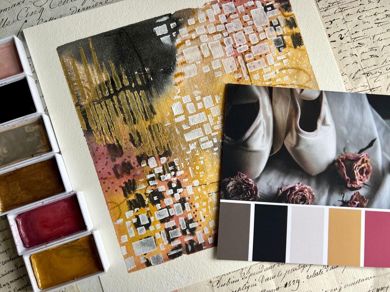
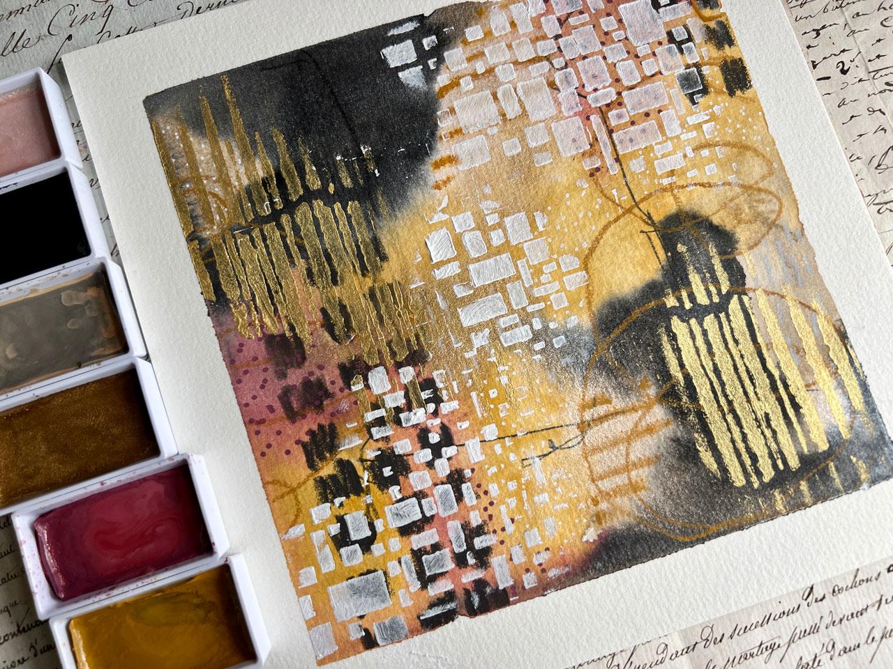
8. Ballet Slippers Color Palette: All right, let's pick
our next color palette. And I'm going to paint on an
eight by eight inch fluid, hundred co, pressed paper. Again, 100% cotton. But
it's the eight by eight. And I thought, let's do a square one and just see what we get. To set this up out of the way, I tend to set things on my paper and get
paint all over it. We've done these first
two color palettes. Let's just take a
brow through some of these other color
palettes that I have created from some of
my photos and see, do any of these really jump out at me in a
way that I'm like, wow, that's interesting
and unusual. That's interesting and unusual. This color pilot here,
that's a consideration. I am loving this with the
grays and the yellow. Let's see, let's
just check it out. I love doing still life
photography and these are different things I've
done throughout the years. And flowers, loving this too. This has got the pink and the ochre that we know I
love so much actually. I'm loving this one. It's quite a bit different than the other things that we've
done. I really like that. It's got this tope in here. I could pull in graphite
instead of black paint. I've got these lighter shades. Okay, that's a consideration. Let's see. I like the. All right, let's pick
out of these two, or this could be our
next two projects. I'm filling this one. Let's just go for this one. This one might be
the next project. Let's just see. So
I'm going to take my paper down card right here. Wait, let's pick out
the colors real quick. I already know I've got a yellow ochre over here that I love. I'm going to stick
in the same paints. I'm just trying to make
this a little easier than some of the other
classes where I pull out like 15,000 things. This time I'm trying to pull out a limited selection from, I've already got here. We'll call this
the whitish color, or we could even call that white gold and it'll
have a slight shimmer in it. What if we do that? I love it when I think of
stuff like that, we've got this pretty top
color here called beige, gray. It's very close. All right. And I can pull the
black or I can use something else in
the place of that. I have pulled out 46
beige gray number 20, black number 96, white gold number 44, yellow ochre, and
34o and crimson. Let's just go for it. I also feel like because we
have that yellow in there, maybe we could put
some gold in there. This is number 90, and I think number 90 is gold. Let's see. Because
I have a number 90. Here we go. It
just says 90 also, but it says 90 gold in
the box. There we go. All right, put these over here. Let me take my paper down. Wait, get ahead of myself. Let's pull out some of our
neo colored crayons because definitely having a good
time mark making with the crayons in some
of our pieces. Let's go ahead and pull some, actually almost like
this color right here. It's called purple, but it looks like a nice variation
on this mav color. That's a good one. We could
pull out our yellow ocher. We could also pull
that black back out, just in case we've
got the black. I could pull out
this grayish color if I wanted to mark make
in that light gray color. I've got this topi
color down here. I'm just pulling out
myself some options, doesn't mean I'm going
to use all of these. But I do find it helpful at the beginning if you're
doing something like this, let's say a color palette. If we go ahead and pull out
what we might consider using, I also got my graphite pencil. Then also up here behind us, I've got different things that I might consider adding to this. It could be gold,
it could be silver. I've got some different inks and things back here
that I like to use. Sometimes I will
keep those up for consideration because
I think white, black, gold, and
silver are neutrals. I do reserve the right to
pull out one of those. Let's go ahead and
tape our paper down and I'll be right back. All right. I have taped eight by eight piece down
with a fairly wide border. I did actually really
love the wide border on that little duo set that we did. Here is our
inspiration palettes. I'm going to sit that over here. I thought what you're
looking at this, and you're like, oh gosh,
I don't know how to start. What if we get started? With some mark making. I don't want my marks perfect. I do want them looking like
a three year old drew it. That's a good way to say, oh, I'm not scared of my paper anymore because I've
already messed it up. It gets us past white
page paralysis. We're working with water colors. There is a possibility
we'll still see some of this underneath
our water color. Just like with the other ones, I say pick the favorite of your colors and start with that. Then whichever one you're
like, I don't know about this, use that last let me go ahead, take my spray bottle
and activate these. There's two shimmery ones in
this set, which I'm loving. Where did I just put that
in that? I think I did. Let's just start laying
some color again. This is probably where
I'm going to start in one corner and do
this other corner. That's my thinking
there it gets, composition wise, it keeps me out of the center
right at the beginning. And it allows me to build color around from the
edges. I love that. I really loved on
the other piece, how we had the neutrals, like the greens and stuff
with the pops of the orange. What if we do the pink and the black instead
of it being dominant? But I don't know, I
just stuck that in there as I'm thinking
and picking up color, we might end up with
something different than what I was
actually intending. But I did like on that piece that we did on that
little duo set, I liked the pops of orange
through everything else. That was amazing. Let's come back with some white. White picked up some of that
pink, but that's all right. So it'll be like a
light pink in here, but it'll have a
little, tiny bit of a shimmer, which I like. All right, I haven't
put the black in yet. I want to put the black in last. Let's pick up the gold
because I'm feeling gold. We'll let that be like
that top color too, but it's going to shimmer some. You can see too, we're
using water color. You can definitely see
the marks underneath. That's interesting. Did we expect that?
Is it a surprise? Are like, oh, I didn't intend that. What
are you thinking there? Let's put some black in now. The black here, the
charcoal color, whatever it is that
we decide to use are pops of contrast. They're going to give our
eyes like places to go. That's fun and interesting
If you keep that in mind, where is your eye going as we're traveling around
through the piece? All right, I'm digging this,
We haven't ruined it yet. Might come back on
top with some more yellow because why not? Now is the time to just build
and we're going to let this do some drying after a bit and just see
where this got us. All right, I'm digging that. Did we get all the
colors? I think we did. All right, here's
where we started. It's interesting. I'm pretty excited to see
where we're going to go with this then as
this starts to dry, as it gets damp,
it's not sopping wet with puddles. It's damp. We can come back in here just like we did
on other pieces. We can lay some water
in here and let that start blooming out and adding some interesting
texture in there that not going to get. If we don't do that, I like the extra texture that
we can get doing that. Okay, so this is pretty cool. I'm actually digging this. I do feel like we've got some layers that are going
to come in on top of this. You need to decide now, do you need to do any
more mark making? Is the bit of mark making I've got under there,
Is that enough? Do we need some more?
Do we want to draw on top of this so many decisions. I think for the
moment I'm going to let this dry and
then we're going to layer on top of
this, all 99% dry. We're almost there. And what I think I'm going to
do is mark make with the neocolor two
crayons and maybe the graphite only move these colors out of
our way for a moment. Just look at this and think, okay, what does it need
and where do I want to go? Whatever is the least
scary, start there. What's the least scary? Do whatever that is for you. I want to say too, with the neocolor two pastels, these are water soluble, we could dip these in
water and draw with them. We could draw on here and
activate it with water. We can use a dry, lots of
options with these pastels. I actually think maybe
dip in water and just see what that gives us. Line wise, it's like a heavier, more saturated line
of color when we do that versus the dryer line that we get when we're
just using it dry. Super interesting. Okay, maybe I'll come
right over here. Stick in this shiny color here. Oh yeah. See I love
what that just did. Okay, we've got
some of this light. I could come back with
Posca pen too because I do like white dots something. Let's see, let's think
if you get stuck, say you're on this and you're
doing one piece and not multiple pieces and you're like, I don't know what I want to do. Make a color copy of this and print out your color copies. And experiment and play on those color copies
before you get onto your important piece. That's the way that you can figure out what next step
do you want to take? I just wanted to
mention that we could, let me just get this piece here. This is a random piece
I've done before, but I'm thinking
like splotches of colors like this in
one of these areas. That's what I'm feeling like. All right, Let's just be brave. I like to tell myself that I'm just going to
do that like right here. We could do this
with oil pastels, which I actually generally use. But I'm trying to
limit myself into the supplies that I decided
to use for this class, which was the cure
Taki watercolors and the Karen crayons. Maybe a paintbrush,
maybe a pencil. This is the way
that you can limit yourself in your own
projects so that you don't feel like you're overwhelmed with all the different things
that you've pulled out, all the different
things that you have available in your art room. Loving this, that's
what I'm doing, I'm sticking to what
I've pulled out. And then maybe if
something inspires us, we'll pull out something
else at the end. Maybe a stencil and some
gold paint. All right. That I'm loving. What if we've got this darker
red? Might be too dark. I actually have
colored Posca pins. Who? I actually have some of
these colored brush pins. I've got this metallic, not quite what I was thinking. I'm just spit
balling ideas here. Throw one in if you
got one boat with me as we're going throw one in. I know I'm funny, see I've got these yummy colored
Posca pens up here. Oh, see now this is a good one. Oh, yes. Okay. We're filling this, I've got colored posca, we're going to go for this
yummy, yummy color here. I could do dots,
I could do lines, I could do a shape,
could do little x. Definitely look at
your mark making idea sheet to see what is
it that we're thinking. But I think dots, because I don't do dots
in colored like this. A lot of times I do a lot of
white dots and black dots, and gold dots, and silver dots. But how often do we
do a burgundy dot? I actually did not think that
my lines are underneath. We're going to
stay that obvious. What a great lesson to learn. Usually when I'm mark
making on paper, I'm like coloring with
acrylic paints and stuff. I actually did not
expect that line to stay to the front like I expected it to fade
back and maybe even disappear. It did not fade back, It did not disappear. See, these are things that
you're never going to learn. If you don't just stop and experiment and play
and figure things out, Really push your supplies
and figure out like, oh, I didn't even know
this, did that thing. It's all the experimenting that gets me to the next project, or the next class, or
the next fun thing that I'm wanting to work on. Okay. I liked that
thinking on the other one. I really liked it when we
had a color that came in, Let's just do it. Be brave. I like to tell
myself to be brave. I want you to tell
yourself be brave. If you liked something on one of the pieces that we did earlier, like that, I like that. That's going to be like my
thing for a while, I think. Then do it again and do more of it and perfect what
it is you're doing. See, look how good those
look. I like that. I love that. Okay, we're getting somewhere
now. We're getting there. All right. This was just a little test, just some long lines, but you don't really see it in there until
you get real close. That's interesting.
Maybe I'll do a few more of those
in this gold. See super fun?
That is super fun. Did we do this brown? I got some brown here. No,
that's the black. I must have did this in that
brown. I actually like this. We could do some
of that over here. Like coming in, it kept
going, but it came in. I like things that appear in the painting that kept
going and you're like, oh, I wonder where that went, like, what's further
off that frame? I like it when you wonder
what it kept doing. Okay, I like that. I'm also feeling like we could use
some white posca dots. I'm definitely thinking that
we could get away with that. Let's just do it. Look at that. Super fun, we just added like just a little fun element
coming out of that. I like that. Look at that. Okay, so
we've got black in here. And I'm thinking
what if we took like a black pen or we could even do the graphite and did something
in the black area here. I don't know though. I'm loving
it like it is too though. Hmm, All right, we could also come back with
something on top of this, like white or black
stencil gold. What do you think about gold? Let's do some gold. I'm almost wondering, on
my favorite stencils, we've got that same
corrugated cardboard. Oh yeah. You know what?
Let's just do it. This is the stencil girl,
corrugated cardboard stencil. I think I'm going
to do this golden iridescent gold fine on this project because I
don't do enough gold in. My favorite one is my Kia
Taki gold mica paste. But it's very hard
to get and come by. I've been experimenting
with different golds today. I'm thinking this golden destin gold acrylic paint
because it's actually a lovely color and should be easy to get compared to the
other one I like to use. It's nice and thick.
Got my nice dry sponge. These are little artist sponges. They're little circle sponges
that I cut into fours. But I like them because
they are fatic. I can have a bunch of them
for nothing practically not, but they're not very expensive. Oh, see, now that is pretty. Okay, that's pretty. Let's
do some of that over here. It was just like a little
touch, a little yumminess. Sometimes I scrub, sometimes I dab your choice on how
you work your stencils. Oh, see. Now I like that, that was a good choice. Throw that sponge in the water. Now we've got a
little bit of area where if I lift it to the light, you can see that shimmer. That's my goal, to have that little bit
of shimmer in there. I'm wondering if we should
brighten this up with some white, that white paint. Let's pull that white paint back out because I feel like it could benefit
from some brightness. I've got this yummy
stencil here. It's called Cubist by
the crafters workshop. I'm thinking a little
bit of this might give me the brightness
I'm looking for. Let's just take a little
sponge and do it. Let's just be brave.
It's just paper. It's just, I used to worry
about messing stuff up, but I just don't even
think about that now. Oh, yeah. See that gives me back quite a bit of
the light and bright. Let's just come down
through here and do some more because I feel like
we were getting dark. And do see, look at that. Look at that. Okay. I'm
feeling that. All right. Now I got excited, now we got some weight, we
got a little bit of bling. All right? So that's
super fun. All right. Let's peel our tape and
just see what we got. This doesn't mean that you have to be done at this moment. This means that you're going to evaluate, maybe look at it, maybe decide doesn't need
anything else, maybe not. But I feel like I'm
at a point that I could peel the
tape and evaluate. When you peel the tape, it just magically turn your whatever you did could
be a piece of scribble. You peel that tape, it's magically a beautiful
piece of art, like it framed it out and
it was like just finished. It gave it that finishing edge. That's why I don't like going
edge to edge because I want this satisfaction of peeling it. If you're tearing the paper, use your craft gun to
heat the tape up so that, that ah, it releases. Look at that. Look at that. Look how pretty that is. Look how pretty that is with our little bit
of shine in there. How did we do compared to our palette that we
started out with? I think we did pretty darn
good, matching our colors. Look how pretty
that is. All right, so I hope you had fun with this project going a
little bit bigger, doing a single piece rather
than multiple pieces, playing in a color
palette that I might not normally
pull out for myself. That's what's so fun about
working with stuff like this. You push your directions
that you normally would go, come up with colors that
you normally wouldn't use, and create things
that you're like, wow, I never could have
created that any other way. So if you had fun
with this project, and I'll see you back in class.
9. Calla Lily Color Palette: In this project.
I thought we'd go ahead and do that
card that we picked. And then I picked the
ballet one and said, and I said, maybe
this will be next. Let's just try this, because this is one of my
favorite photos. It's a set of lilies taken in this very pretty
blue mug that I have up against these wonderful
antique ten tiles. It's long been one of
my favorite photos. I pull different
colors out of there, going from a very
dark to a very light, and then some colors in between. And just let's see
what we can create. That's my inspiration palette. I am still working
in the A Taki, the 48 piece set, in the art Nuvo set, so that I could pull the
colors that I thought was closest in match to the
colors here on our photo, I'm still working with the
fluid hundred co press. I pulled an eight by eight
sheet out and taped it down. And I want to do some minis and I didn't do exact
exact eyeballed it, but these are approximately 3.5 by 3.5 with a little
border around it, making them about four by four. Out of these colors, I've
pulled 38 Imperial violet, which I didn't test
that color out. But the one that looked
closest was a blue. And I'm like, oh, I
know that's not right. Let me just test it real quick. Oh, yeah. See it's a little, maybe even too bright. Let's just make sure
that's the one we want, because maybe I'd rather
have this purple. Let's see. I hope that's too light. Again, my goal on pulling stuff like this is to get close. It doesn't have to be 100% exact because that takes
the fun out of it. Unless your goal, see the one I thought is really a blue, we're
going to stick with that. Okay? Always fun just
to play and test. Okay, that was imperial
violet number 38. Part of the fun for me is just working in a color palette
that I wouldn't pull. Pull a purple, green, blue, gray and black. And you're there. I want to
get close, 53 sap green. But it doesn't have to be
100% Six oh one grayish blue. 20, 1 gray and 20 black. You see, I got pretty darn close if I didn't
get exactly spot on. And that's all my goal is
to get close and to play. Just see what we can create
in this color palette. I'm going to activate those. My rule of thumb on
sizes versus brush size. The smaller the piece, the
smaller your brushes could be. This is a zero. Raphael soft aqua on
the bigger pieces. Then I move up to
a bigger brush, like this, Princeton
quill number four. That's the way that I
determine brush sizes. The bigger the piece,
the bigger the brush. My thinking there at this point, I could draw with some
neocolor two crayons and I could water activate them. That might be fun.
I could draw with some graphite like we did on that one piece that
was pretty fun. I could start off
with something like liquid graphite and add
other colors in here. That could be fun. Because
the liquid graphite could be like this black. Let me just see. I think I've got that right up here on my shelf now that
I've thought about it. Cura Taki fluid graphite
is super duper fun. I might go ahead
and just open that. We might play in that also because that's a
pretty grayish color. Let's start out with the
color that we want and think, do we want to do solid
little abstracts like we did with the green
and orange set? Or do we want to make it more delicate and spread it out
and see what we can get? Maybe more minimalist
in style. What? Okay, now that I've
thought of all that, maybe a little
minimalist pieces, starting off with some charcoal, filling in with some color. All right, let's do it. Oh, ooh, see Now I like that. Okay, that's fun. Kind of try to make
them all different, not looking for
straight perfect lines. I'm looking for it to look
a bit more imperfect. That's what my favorite
thing is, imperfection. Maybe we can start off
with some color and just see what's this
going to do for us? I'm just playing at this point. I don't know where we're going. I like starting
off pieces of art, letting the art guide me and figuring out where
are we going to get. I'm not trying to get
anywhere specific here. Even though I pulled out
black, that could be my black. May not revisit the black. Interesting here where
we're thinking, huh? You may do a couple of these
and then we may fill one in. Even though I wasn't thinking
fill in, we could fill in, It's just interesting and go and see where
you end up with. I'm just throwing you
some ideas out there, maybe some of this green. Oh, look at that green. I'm doing real light
with the green, so it's not like super heavy, but man, it's cool. All right, that's fun.
That's that purple in there. I'm just looking at
different styles sometimes, like what can I do? How can we create something cool that we've
never done before? That's pretty fun. I can
mark make on top of these. I could just come
back and fill one in, now that I'm thinking about it. We could fill one in and make on top and
then have some that. Look, let's do that. Let's just do it,
let's just do it. Be brave, let's fill one in. Usually when I'm filling
stuff in like this, I do like to start with the corners instead of
right there in the middle. Even though I started
that in the middle, going with the corners there, then what if came back with the black and got our contrast
really contrast in here? That's pretty fun. I like that. I did that, but I
like these three, so I don't want to come
back and do that on those. I could come back with a
little bit of contrast and just see if I throw
some contrast in here. What would we get just
playing, letting go. Don't be super concerned
about where you're going and then we'll
just see what we get. I'm going to let these dry and then we'll mark make
on top of them. All right, we have
got this dry now. I just need to decide, look, how good our colors look. I think we got right
on with our colors. Good job. Everybody who I had to walk away so that
I could let this dry. The tendency is to get
your heat gun on it, but I don't want
the heat gun around the tape because
the tape would lift and the water would
go to the tape. I just walked away for a few minutes to let
that do its thing. Now we could come back
and do some mark making. I really like graphite marks. I could continue that, or I could use some of these neocolor two crayons that I pulled out in
the right colors. Just because you pull
it out doesn't mean you have to use it pulling it out, just having it available
for the next step. I actually think now that
I did pull these out, maybe on this one we could do some mark making
and some line drawing. Possibly there's a
tiny bit wet on that. I just touched it. Let me get my little stick out
that I put my hand on. This is a paint stick
from paint store, a little five gallon bucket
of paint stick stir. Now we can just come over here and maybe
do some mark making. I like to mark in the
areas of water color. It gives you a natural
place to start and stop. It gives your eye like
that visual stoppage area. Look at that. I really
like this gray one. This is just light gray. That's what the color is. I like that, Maybe I'll do that over here on this edge too. Nice. That's a fun.
Okay, that was fun. I could come back in
here with some other, could do some dots. This is like a brown, which is similar to
that black there pa. I might just come in
here with some pats. Look around in all your
little supplies and get creative in pulling out
stuff to work with. Then see what you can create. I want you to limit your color palette and then limit that to the supplies
that you pull out. And then as you're working, if something amazing
comes to mind, then pull something else
out if you need to. But for the most part, I want you to get creative and play in what you've
pulled out to use. I'm thinking this blue
and this is a shiny blue. This is that palo octane blue. I probably said that wrong. That's okay. It's
a very long word. It's little, tiny letters actually can see
all the letters. Even when my glass
is on, I have to get my magnifying glass out so I can see how many
letters are in there. Because it's like
20 letters long. I got to work with
the old people here. Don't put stuff
out that we can't see. Here's a fun green. Okay. I really like what
that did and I'm thinking, do I want any of this green? I really like the
green that's in there. Let's not do that. Okay, I also feel like maybe
we can do with some white, let's pull out our
little Posca pen. Maybe get some really
fine white lines. White lines, White dots. I like a little fine
dots and things that adds a whimsical touch
to your pieces of art. The delightful them. See now I like that a lot. Maybe I'll put some up here. It's a different
color, but I don't, I'm not too worried about that. I just think if you put
something in one place, sometimes it needs to be in more than one place so that
it doesn't look out of place. Does that make sense? Oh, there we go. I like that little touches. Oh, okay. We're going to go with
that for a moment and look at these and think, does this need anything else? I really liked these
blue splotches here. What if on one of these, I came in here with some
blue scribbly squotches? It's fun when you
take an element that you really liked from one piece and bring it into another piece to see how
would that work over here. What do we do with that? Okay, I didn't use the purple.
What if we do over here? I didn't use the purple
crayon up there. What if we come back
with some lines? Oh, see I like that. That's fine. Okay.
I really like that. Maybe we'll do that over here. Come right down this
line that's here. And maybe right outside that. I like that. Let's go
right inside that. And just make a whole
little statement here with these little lines that
are almost like a ladder. Like it. I like it. Okay.
And we'll see. All right. I'm loving that. I
like these marks here. Maybe we'll do some marks
over here in the gray. Will we even see them? I don't know. But we're
going to do it just because whatever you're thinking at the moment and
you're going to think, oh, let's just go with
it. Let's just be brave. It's my new mantra
this year. Be brave. I don't know if I
love that or not, but it was we could
come back on top of that with the blue just as an extra scribble right on top. Why not Fun little extra detail. All right, be brave and
play. Let's do the green. What do we want to do
with the green maybe? Oh, oh yeah, like just
like some funky marks. Oh, you might not see it, but it is fun to
put them in there. All right, that was fun. All right, I'm liking
the simplicity of this. I almost don't want
to add anything else, except maybe we could
come in with some dots. Maybe we need some dots. Do we need dots? I feel, I feel. Oh, yeah. I love that. Okay. I'm feeling
good about these. I want to see where we're at, so I'm going to peel the tape and check that these
are where I want to be. Maybe even cut them apart. Even though I didn't
heat the tape up, I didn't stick the
tape down super hard. Oh, I had something
on my finger. I didn't mean to do
that, but we're going to cut a border
around these anyway. Let's just cut these out
and see what we got. Look at this is what the tape pulled. Watch
when we cut this. We're going to love
this. Oh yeah, man, I love peeling tape. Let me go grab my cutter
and I'll be right back. This is just my
fisker paper cutter. I love this thing
because now I can trim things up to
exactly where I want it. Oh, yeah, I like that. If you get a spot outside your piece, like I just did that I
did not intend to do, I can trim that right off. Look at that. You better than I even thought we should have done a
whole set of that. All right. Let's trim this one
down and we'll get rid of this piece that I
added accidentally. Oh, see Now I like
that one that way. Okay. I'm loving that. Let's cut these two apart
and just see what do we get. Al right, there we
go, Right there. Okay. This one could be tighter. So let's tighten this one up. I'm not being exact
at the moment because this honestly is
just play for me. But I do want them to look nice and then I might
do something with them. That one. That one
turned out awesome. Oh my gosh. Truly, when I started
painting these, I doubted now that we're done, I'm like, oh, way
better than I expected. Way better. Oh yeah. I love making art that ends
up better than you thought. Yeah, let's set
right there. Okay. Let's see what we got to. These two are awesome. And this one Oh yeah. Good paint day. This one. I like painting more than one. I can try out ideas if
one doesn't work out, let's say you didn't like one, you still had two
or three others that you're like, whoa, amazing. Check out our colors
that we started with. I think we did pretty fantastic working within a color palette. That to be quite honest, I never would have pulled out. That is what I love about
challenges like this. You discover things
that are uniquely you, that you never would have tried. And maybe you love so much that you want to keep using
those going forward. Love these type challenges. Hope you enjoyed
this paint project and I'll see you back in class.
10. Final Thoughts: As we come to the conclusion of this enriching art class focused on custom color palettes
and abstract art, it's time to reflect on the journey that we've
embarked upon and the invaluable experiences we've shared together embrace
your creativity. We've learned that
creativity knows no bounds, and that every
individual possesses a unique artistic voice waiting to be heard. Art is a journey. It's not merely about
reaching a destination. It's a continuous journey
of growth and learning. As we part ways, artistic journey
never truly ends. It continues to
evolve, transform, and inspire, leading us to
new horizons of creativity. Keep that spark ignited. And may your artistic endeavors always be filled with passion, wonder, and the joy
of self expression. Thank you for being part
of this wonderful class, and may your artistic journeys flourish in the colors
of your imagination. Farewell and happy creating.
 DENISE LOVE, Artist & Creative Educator