Transcripts
1. Introduction: Welcome to the world
of Gustav Klempt, where we will be
taking a deep dive into the world of
gold and patterns. I have designed this
class to be fun and less intimidating than a
traditional master study of an artist just like you. I'm an artist always
looking to learn and grow the way I create
and see things. So I'm going to
break this down into easy digestible
projects that will have you excited to
explore and create. I'm sharing lots of ideas
and projects to help you observe and learn how
Klemp approached his pieces. And how you can
integrate some of his ideas into your
own art and workflow. You're going to learn
about the colors he used, the motifs he incorporated
into his work. And deep dive into
the patterns you see in his work.
I'm Denise Love. I'm an artist and
creative educator and I'm excited to bring to you this fun and exciting
dive into Gustav Let. I've also put together for
you several idea guides and project reference PDFs that are filled with inspiration
to get you started. So if you're ready, grab some of your favorite supplies
and let's get painting.
2. Class Project: Project. I'd love for you to
pick a painting and paint a project based on a portion of the painting that you
chose to replicate. As we do in class, I'd love to see the
painting you were inspired by and the
painting you created. I'd also love it if you shared a piece of art that
you created in your own style incorporating
some of Lemp's elements.
3. A Bit Of Klimt History: Exploring Gustav Klimt, a
comprehensive artistic journey. Early life, born in 18
62 in Vienna, Austria, Gustav Limps artistic
genesis occurred within the hallowed halls of the Vienna School
of Arts and Crafts. These formative years
laid the groundwork for the prodigious talent
that would later emerge. Klemp lived in poverty for
most of his childhood, and his work was scarce and the economy difficult
for immigrants. Artistic influences, Klimt, a connoisseur of diverse
artistic styles, synthesized classical traditions with the Arvantgarde influences. This amalgamation of
artistic pedigrees became the hallmark of his unique
and distinctive style. The Succession Movement, a pivotal figure in the
Vienna succession movement, along with his contemporaries, sought a departure from the constraints of
traditional art. The movement championed
artistic autonomy, herald Pardum shift in
the Vietnamese art scene. The golden period enter the golden period a
zenith in Limps career marked by opulent
compositions such as the Kiss and the portrait
of Adele Bloch Bauer. Here the use of gold leaf and the intricate patterns
reach an hypothesis, creating an ethereal aesthetic
symbolism in Lim's art. Beneath the visual grandeur lies a rich tapestry
of symbolism, geometric shapes
connoting unity and the portrayal of the them
fatal as a potent archtype. Each stroke in limps
work is laden with meaning, controversy,
and critique. The audacious departure from convention invited both
acclaim and censor. Lip's unorthodox approach
stirred controversies. Yet it solidified his
reputation as a visionary who challenged artistic norms,
legacy, and impact. Reflecting on limps journey, we recognize a lasting legacy. His influence
transcends generations, leaving an indelible
mark on the art world. Limps enduring
impact resonates in the work of subsequent
artist, personal life. Beyond the canvas, Limp led a Bohemian existence adding layers to his
enigmatic personality. His relations, intricacies of his personal life and
profound impact on the cultural Liu
in Vienna provides a nuanced understanding of the man behind the masterpieces. A lifelong bachelor Klemp has countless affairs
during his lifetime, frequently with his models, and he fathered some 14
children along the way. His most enduring relationship, however, was with Emily Flogg. As we conclude this journey, let the story of
Gustav Limp serve as an inspiration to transcend
creative constraints. Art is an ever
evolving expression and embracing its dynism, we find the true essence
of artistic exploration.
4. Klimt Books For Inspiration: This video, I thought
it would be fun to take a look at some really
excellent resources for studying some of limps paintings and patterns to
then use in class. You can of course,
use online resources. If you don't want to
purchase any books, you could go to the
library and check out some information if they've
got any at the library. I like Clem. Quite a while back, I bought this very
large Gustav Klimt, the complete
paintings by Tashan. Um, and this book
comes a lot smaller. There's a smaller version, but I'm like, heck no, if I'm going to look
at something as inspiration to study and then
take into my own artwork, I want it to be big
enough that I can see it. This book is actually even
more gigantic than I expected. I love that. We'll look
through that in just a moment. I also acquired several
Gustav Clem coloring books. I'm not really a
coloring person. Like coloring pages
and coloring books, it's not really my thing. What I love about the
coloring books is they give us line drawings of
pieces of his artwork. It's almost easier to study
pattern and design and art without all the color in there distracting
from what's going on. So you can dig a
little deeper into the nitty gritty of the
actual pattern itself. I got the Gustav Limp to make
your own art masterpieces. This is David Jones
and Daisy Seal. The I think are
probably all used. I got them off of Amazon, but they were from used
booksellers and I don't mind that one of these
three coloring books that I have is a very
obvious favorite. I bet when you see it, you'll know which one is my favorite. It's not this one. I do like this because I can
look and see pattern. But this is not my
favorite of the three. But it is an excellent choice if it's the only one
that you can find. Because like right here,
this is the stock freeze. You can see in the embrace
part of that larger freeze, you can see all the
design and the pattern. And this would be the
perfect thing to then look at and then be inspired by
all the pattern going on. In here, you can
actually see what makes up the pieces
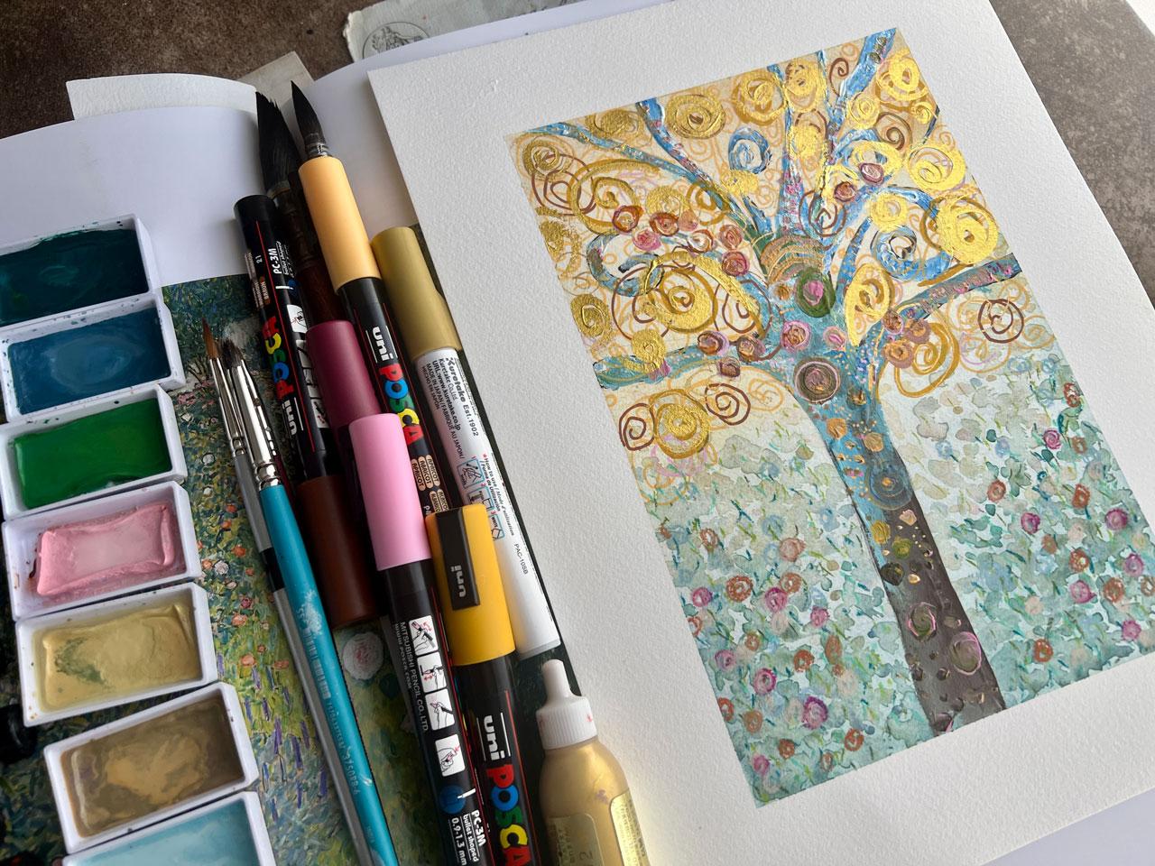
of the painting. There are excellent drawings. Again, the Stocolate freeze. This is the Tree of Life. I'm very inspired by the tree
painting personally because I'm not a people
painter and most of his famous artworks are the
people that he has painted. But I like the tree.
I'm feeling like my big project for
study could be some type of tree painting in a combination of the
trees and the patterns, but not necessarily
trying to copy his exact tree of life painting. I want to take those elements into a tree painting of my own. We'll see. I am glad
that's in there. I can see the
different elements and things that make that
up and the patterns, and it makes it very easy. This is another piece
of that Tree of life. But it makes it very easy to see the different motifs and
patterns that he's using. It's very Egyptian in the flare. There's lots of circles,
there's lots of, there's a lovely
bird in here that it looks like a black splot
on Internet photos. But you can see it's actually got detail and pattern in there. I like being able to get a closer look at what
is in that pattern, like the triangle,
double triangle here. Would I have caught that? Maybe not. But now that I can see it drawn out
as a line drawing, I can definitely see it. This is a good one. It's
not my favorite one. Okay, this one might
be my favorite. So let's look at this one first. This is Gustav Limped. It's a Peppin EPI in
artist coloring book 16 designs printed on
professional drawing paper. Okay, let me tell you what
I like about this one. This one, the paper
is really beautiful. If you wanted to do a paint by number type painting
with acrylic paint, it's on a really nice, heavy duty, lovely paper. Again, I like it because it's
large enough for me to see the details and the
different elements that went into the piece. And the tree is my favorite. Again, here's that embrace. Apparently all of
these people take after different ideas
from each other. I guess are they're all taking the same 15 or 16 most
famous paintings perhaps, and giving that detail. But check out this,
look at all the detail. I'm not sure if it's
showing up because that line drawing is so light. But look at all of
the flower detail and leaves and little
roses in here. That's a ton of detail. If you're just looking
at a painting, would you have seen
all of that detail? Maybe not Again,
this one right here, look at all that
detail in there. My goal is to take little
elements of these and be like, okay, and maybe make
myself a pattern guide. And I can take little sections here and use that
as my inspiration. And then definitely some
good stuff going forward. So many ideas. I just love it. Okay. This one here
is my favorite. This is Gustav Klimt. Gustav Limp to color in the founder of the
Piana succession. This is by Ham Lynn, HA, M, L, Y, N. Now, what I like about this one, I'll try to link these
but there just may not be a valid link for wherever you're at or they just may sell the couple of
copies that they have. But this one here
is my favorite. And the reason that I like it is because it got a
little info in here. But what it does back here, it's a info on the paintings, It looks like it talks about it. Then it has the painting
and the drawing. I love this one
the best because I can look at the painting
and see what's going on. Then I can look at the
page over here and see a line drawing
that's very detailed so I can see all the
different elements that maybe I'm not seeing
as clearly over here. This is an artistic
representation what they've seen and
thought and drawn out, which is exactly what
we're going to be doing, our own artistic interpretation of the different
patterns and such. But what I truly love is looking at what somebody else
has found in here that maybe I just
didn't see how they interpreted that as a line
drawing that I can then use. Because right here, this
little area right here, these sink in together without having the actual
painting in front of us. Without being able to
actually get up close, say in a museum, and look at that painting like a lot of people that do
master studies do. We're not going to see
all the intricate detail that might be going on
in this lower area. But over here I can see it's lines and triangles and vines, and I can see that detail
over here. Flowers mixed in. And it's a little
more simplified than what actually
might be painted here, but it gives me a direction
and an idea of where to go, look at all of these
yummy details in there. Like I truly love these books. I love it, I love it. Not really my thing with
the two ladies there. That's weird looking,
but I do like how this book is comprehensive enough that they give you what the painting is, a
little bit about it. Then you see the painting
and then you see the line drawing of the
details out of all the books. If you just want to have
one for your inspiration, even talking about
between the big one, if you just want one, this is the one that
I might recommend. Because it breaks down the
elements in a way that you can see it and draw it and very easily replicate
something like that. And then take that
into your own artwork. I know you're going
to love looking through some of that
because I'm going to love using this as my
inspiration for pattern making. A little bit later in class, look at this one,
the fulfillment. You can really see all
the detail going on here. This is a great, big
freeze on a wall. It's like a big mosaic piece. Then flower garden. Look at that flower garden that's right up my alley
for abstract painting. And I can incorporate something like that
into my own artworks, that would be an
easier one in my view. Rather than painting people, I'd rather paint
flowers than people. In my mind, I would either go for this or the Tree of Life, or something a little more
abstract. For the people. You could, if you
like to collage, you could collage
a magazine face and then paint the rest. That might be an
easy way to do it if drawing people and painting
people is not your jam. There's lots of different ways that you can do an artist study, turn it into something
of your own, like this. You could have the
whole head and shoulders of a beautiful
magazine piece. And then paint and collage
paper and pattern all around. That would be super cool.
Lots of good ideas. But I want to do
trees and flowers. Personally, this is my favorite out of the coloring
books, this Gustav Klimt. In color one, mine is used. I don't think it's probably new. And it looks like I didn't
pay very much for these. Like less than $10
on some of these. Definitely. This one
is worth getting. The big thing book.
I love these. And this one comes in a
smaller version that's like about this size
which definitely would be more manageable tote it around because this thing will
hurt you. It's so big. But what I truly love
is now it's so big. I can see the details like that big freeze
that's on the wall. I can see that these are tile, mosaic pieces that are
tiled to the wall. How amazing is that? I don't really know how they
did that because that's like a big seam here where
that white part must be like a big piece
of marble or something. That's amazing how they
cut the marble out in one big piece and then mosaic all the gold
pieces into it. Maybe it's painted, but I
don't know. It's amazing. That's a lot of work on. See there's a big picture
of the black bird. I was saying it looks
like a black spot on paintings that you
can see on the Internet, but that you can really see
all the detail in the bird. Now it's the biggest
piece of detail there. I like how I can see
things much larger. Here in this book, I can see the paintings. I can see the details. I can almost see the pattern of the canvas up
underneath the paint. That is what I love. This book is the complete works of Gustav, every piece he's ever created. It gives you a history as life. It talks about everything. Here's that freeze.
It's a great big piece on the wall there.
Look at that tree. The tree just keeps on going. But this goes through
all the work. What's really interesting is he uses different
shades of metallics. Maybe the gold is
different shades of gold, so it's not one gold paint. Then there's these three dimensional patterns
on top of that. I don't want to forget
that that's there, because I might want
to have elements drawn on top of my gold with some with some of this
PBO relief liner. Definitely. I'm
going to set that out so I just don't forget it. Because then I can paint
the gold and I can paint some swirlies
on top of the gold. And that's an element
that I really like here in his pieces. This is another view
of that freeze. I don't know what this place is. It's almost like
a fancy bathroom. I hope it's not a bathroom. Optum Read and see
what that actually was early in his life there he started off painting more traditional paintings
before he got into the works that
are more familiar. And this one right here, the portrait of
Adele Block Bauer, is where you can really see
the detail of the gold on the gold with the relief that's let me pull that
even closer for you. There you can see it's raised up gold and all those yummy
details in there that unless we had something photographed this large and very
high quality there in this picture that I feel like I'm almost there looking
at the painting now. I can see all the
details where if I had the smaller book or
an Internet picture, I'm not going to see it quite as nearly detailed
as this right here. That's amazing. I can
see all the circles drawn in the circles outlined. I can see the canvas
texture up here. I can see so many
details is exactly why I wanted this gigantic book. Because otherwise you just
can't see all that detail. Like look at all of the
different line work here in the shirt. It's like two or three colors that are in there
that are drawn. Like we could do that
with colored pencil, like several colors
of white and gray. To get all that detail
of that thing in there. Look at the detail there on
that pattern behind her head. Like I'm very excited
to dive in and study different little boxes with some dots, all
different colors. I can see the detail here. He did have more
traditional pieces along with his look at
that right there. Beautiful along with his lovely gold period
with all the pattern. I think it's very
interesting to see the progression and see all the pieces and see
what inspired him, a super cool, all the
different little tiny dabs of color that make up a piece. I love that this is almost like an abstract expressionist
of movement in here. And see he did some little
villages and move on further. He did have some charcoal period where he did charcoal
drawings and stuff. There's some of that in here. You can see the pre drawings of the paintings before
they were painted. I love that. Look at this,
this is pretty cool. It's like a charcoal
with gold details. That would be an
excellent thing to take into your own artwork
is what charcoal drawing can you do
and then bring in the bits of gold and
shine. I love that. Got some drawings back here. I really, I know I flipped through a lot
of this pretty fast, just to give you an idea of what these books have and what's in them and what
you might can see. The bigger book,
I can definitely see all the details
of the painting. I appreciate being
able to look at that. I can't travel.
Look at that one. I appreciate being able to get this a look at some of the
patterns and the details. Not all of us are going to
travel and find these pieces of artwork in person, in person. Then the ba, the listing there of the paintings
and more information. This book is amazing. These are what I'm going to
be referencing in class. I definitely like
seeing the details of the big book and the line
details in the coloring books. Just to help me separate out what's really going
on in here and be like, oh, okay, now I can see
the different patterns. I hope you enjoyed getting a look at some of the
resource materials. If you've got the
chance to get one of these, If you only get one, then the coloring book
might be the best option, just for breaking it down
a little easier for you. These two are my favorite out of the four that I've shown. I can't wait to see
what we're going to be creating today in class. And I'll see you
in the next video.
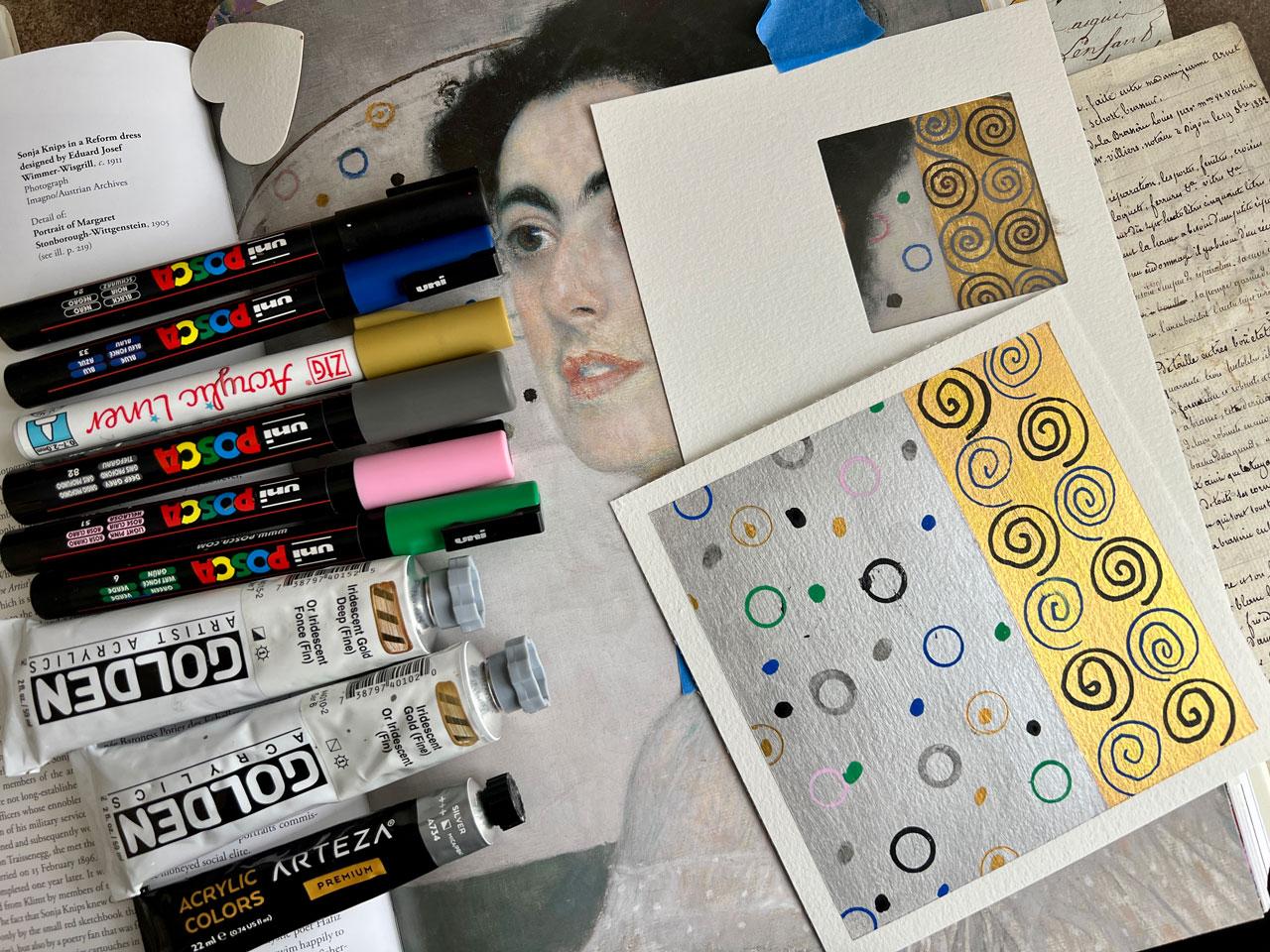
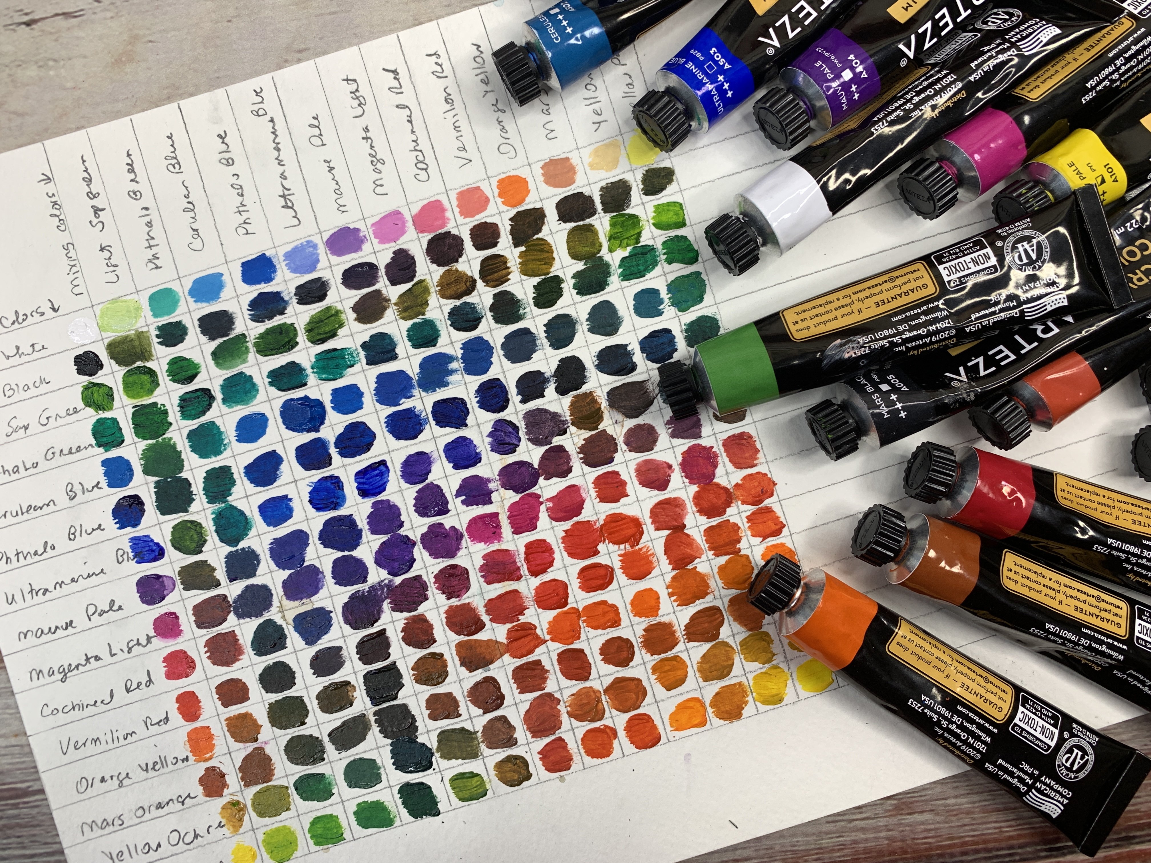
5. Klimt Study PDF Guides: In this workshop,
I have a ton of PDF guides that I've made for you over a variety of subjects. Definitely check out
on the projects and resources page the PDFs
that I've included. I just want to go through them real quick so you'll
know what you have out there. We do study one of the
paintings to just take a look at the colors that
Let used in his paintings. And then I thought I'm all about color palettes and
color palette cards and I love to reference them and create myself some painting challenges using a certain color palette
and just seeing like, hey, what can I create today? I have included a color palette set of cards here
in PDF form so that you could pick a
palette and then create from that palette and set yourself some challenges. What you might want to
create with that day. I've just taken sections of paintings and I
have pulled colors out of those paintings to be my palette inspiration
for each page. It also is an
opportunity for you to see parts of the
painting very large. This might be a good reference
point for you if you're creating the little abstracts based on one portion
of a painting. You can refer back to
this PDF if you'd like. It has some colors in there
that you could then pick and choose from and have
a little guide. I have done 1011 in here
for you in that guide. Then I do have some
PDF guides that go along with some of the
color and pattern studies. You can have the PDF of
that piece of painting that I was painting
from here in this PDF. Some of these I show the
supplies that I chose to use. I definitely want you to pull from the supplies that
you have on hand. But I do have this as
some companion pieces. We've got the Kiss
companion one, we've got the portrait of Margaret Stoneborough,
Wittensteinie here. That's the large blow
up of her painting. Then I have some
other little blow ups in here that you can reference. Then other pieces to study. I do have a few other pieces
behind that in this PDF. Just pieces that I
squared off with my little matt
piece and then took a picture for you
to then give a go. That PDF does have some
extra stuff in it. Then I've got the
portrait of Adele Bloch, Bauer color pattern study, which this one I
thoroughly enjoyed and I loved my little piece
that I ended up with. There's a blow up
of that one then, the painting that
I did in class, then this one also has
other pieces to study. I tried to vary them up. Each PDF has different sections. Just explore what we've
got there in the PDFs. Then a lot of these
you'll see on those color pallet cards because I then pulled from these
photos to create those cards. It is a little bigger
section of those paintings. And then I do have a PDF
with my gold Swatch sheet just so that you can take a look at the golds that I have. I've tried to list what
it is below each one. Hopefully you can read those and just get a look at what
you might be interested in. If you don't want to
purchase 50 golds, then I have my
Pattern Idea guide. This is the patterns
that I drew in class. I have some painting references in here that I was referencing. You can see we've
got large sections here that you can zoom in and look at and reference
for your paintings. You can see here, I did a little bit larger
eyeball inside the pyramid. As you get further along, you'll see why I mentioned this because just looking at
the painting in the book, I didn't see that those
had a pyramid around them. And it really does help to look at a blown up piece
of the painting. If you have the book yourself, I highly recommend you do
what I did and take pictures close up on your
phone and then you can zoom in even further
with your fingers. Totally helped me. I've got lots of
portions there that you can then look at and get
ideas and patterns from. Then behind that, I have my own patterns that
I drew in class. Those were what I was looking
at with Adele Bloch Bauer. I've included the paintings
that I was looking at for each of the patterns
here on this next section. And there's the kiss. Then on this I've written
down portrait of Emil Floater,
Serpentine, the kiss. Water, spent the kiss. And the kiss, you can see close
up what I was looking at. To then draw some
of these patterns. Then I've given
you a blank page. If you want to print
that out or you can create your own obviously. Then I've got some
painting idea guides that were created in, these are from mid journey. I don't like creating your original art
or creating art in mid journey or some
AI application and then claiming it as
your own because it's not. But I do like to generate
idea pictures and reference pictures
to then guide me when I get stuck or give
me ideas for composition. Maybe color ideas that I
never would have thought of. I do like generating ideas
in that type of thing. Then we're not using somebody
else's pictures that are copyrighted as
our inspiration. I like the concept
of using AI for generating ideas and reference
photos to then paint from. I've given you several guides of ideas just to get
you through being stuck and determining
compositions and looking at things in ways that you might not
have thought of before. I've given you ideas
for trees and forests. Because I'm painting a tree and the tree that
I paint in class, I do, I reference photo
to get us started. Then the trees two is in landscape orientation rather
than portrait orientation. Just a different guide for you there to
give you some ideas. Then I'll also give
you an AI guide for different ladies if you like to paint people and you
want to be clemped, inspired and maybe paint something a little different
than his actual paintings. I do have some of those in
here just to give you an idea. Then I also have some
flower gardens in here. Just an idea guide for some flowers and the gardens and maybe there's a
few trees in there. And I particularly
like on this photo, all the fun details
in the tree trunks. I think that is a wonderful idea to do to make it very clipped like and still
be in your own style. Just some yummy ideas to
look at and inspire you. Then I've also got one
on just abstracts, A few abstract paintings
in here where you're not referencing a flower
or a garden or a tree, or a person just in case
that happens to be your jam. Then I've also generated
some coloring pages. And I did this to give you a black and white
view of some ideas that you might consider in
the patterns and stuff. I liked all the different ideas. Just like looking at the
real Cmp coloring book, I thought seeing things in black and white
really lets you see all the details and shapes
that go into some pieces. And so I thought that was fun. I hope you enjoy going through the PDFs that I've
included in class and really getting just
that extra step deeper into your study and
I'll see you in class.
6. Supplies For Class: Talk about the supplies that I'm going to be using in class, but what I would tell you is use whatever
you've got on hand. This study is all about observing and looking at what Clinton does
and how he does it. He paints an oil
paints and gold leaf, I don't wish to
paint an oil paints. It's all about observing and looking at the
elements that he uses and figuring out how can we use these elements
in our own work. We'll start off by
creating several snippets of some of his paintings
so that we look a little closer and we
really see the details. But I want you to do
these snippets and things in the art supplies
that you have on hand already. Unless you just see
something that you're like crazy about and then add
that to your arsenal. But other than that,
this is not about using a certain supply to create
a certain painting. It's about using your supplies
and figuring out what he does and how some
of his elements might then be incorporated
into your own work. You're welcome to paint
on canvas, paper, panel, whatever it is that you want to use
as your surfaces. I'm going to choose to use paper because I already
like to work on paper. These are not pieces
that I want to take up a lot of space and
to then be hard to store or whatever it is that you do with paintings that you're doing studies
on and stuff. I don't sell artwork, so
I don't want to store lots of be canvases and I
choose to work on paper. I'm going to be working
on the Namule nine by 12 watercolor
coal press paper. Because I like this paper. It is turned out after
I've experimented on everything under
the sun to be one of my favorite
papers to work on. It's a cotton watercolor paper and I like the way the materials I choose to work with work on this paper,
that is what I'm using. Use whatever paper that you've got on hand, it's
not a big deal. And one big element of limps
work is his use of gold, which is what draws
me to his work because I already
like using gold and I have several
favorite gold items that you see me pull out
time and time again, including my Retake
gold Mica paste, and my Kuretak gold mica ink. These two are my favorite golds. They're very shiny and shimmery. It's these two here on my
gold sampler swatch page. I have the Swatch
book that I love. It's called the
Painter's Color Diary. And I swatch everything out, and when I get a new gold, I can come at it
to my gold page. And then I swatch
other things out too. After pulling all the golds that I own from all
over the place, and I'm sure I forgot a few. This is now all the golds I can come back and
look at and say, oh, look at the
color difference, the shade difference,
the shine difference. What's going to work best on whatever painting
I'm doing that day. But my very favorite
ones are the cure Taki. That is what I pull from time and time
again and that is what I love because they're Mica and they're just brilliant,
shiny, brilliant. To go with that, there's now a new Zig acrylic liner by a
talkie which is in pin form. It makes it a little easier than using the mica paste
with a dip pin. This is my new
favorite gold pin. It matches exactly these inks because it's made
by the same company. I think these are, might be a sketch box
exclusive right now. In the golds, pull
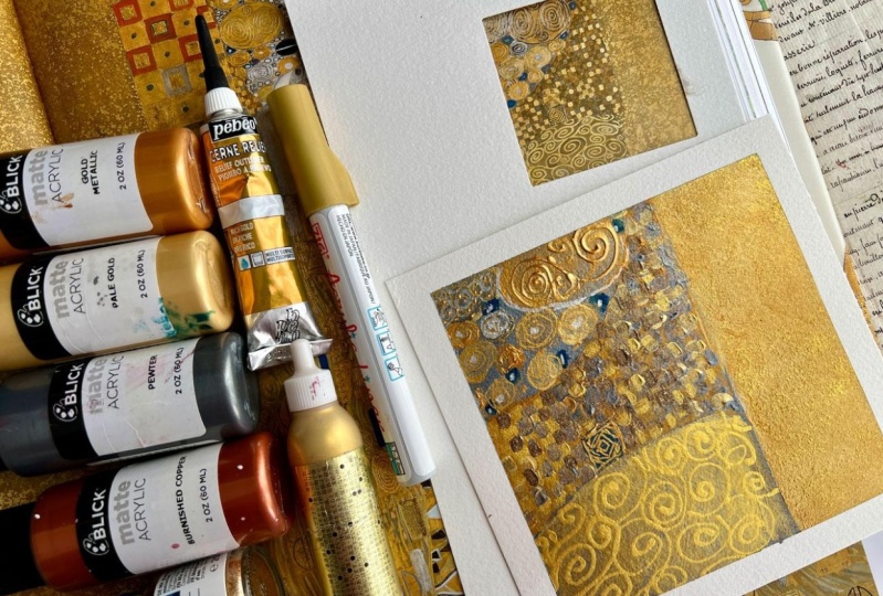
whatever gold you have and play and use those. This PBO Cern relief
is a favorite. If you pick one gold and the Cern relief,
that would be fun. This allows you to add a three dimensional
element to your work, which you'll see that a lot in Clint's paintings
as we go forward, looking at his work, he does a lot of gold on gold, in different colors, and
then some raised elements. This is what I'm going
to use for that. It's excellent choice. If you just want to gold, that's easy to find. You can use some of these
golden acrylic golds. Those are pretty easy to find
no matter where you live. Also, these Artisa golds,
it's a good choice. I do like the Artis colors
and they have the gold, silver, and like a
bronze copper color. That's an excellent choice, especially if you choose to
paint with acrylic paints, on some of these
paintings later in class. Because I choose to paint in some acrylic
paints as we're going. I love the artizas
because I have gotten a large quantity that came in a box
with all the colors. There was lots to pick
from and it worked out to about $1 a tube of paint. It's a good student grade paint. Especially for doing
something like studies, I do recommend the
Artiza sampler box that you can get the if you've already
got acrylic paints, then work with what you've got. Some of these little acrylic
Metallic Blick paints are a favorite favorite is some of this aqua bronze
pale gold pigment. Because you can add this to any acrylic paint
to make it shiny. That's another favorite. I've just got a variety
of favorite golds. I pulled them all
together for class. I've got a couple
silvers because there is some silver in climps
work that we pull from, just pull your metallic options together and have
those available. Does not have to be the
same as what I'm using. Does not have to
be the same pull from what you've got already. I also like working
in mixed media work. I do a lot of watercolor
on my base layer, and then on top of that I do acrylic paint work on top of that and then maybe
gold on top of that. I like layering things and
giving all that dimension. I will be using my
cutaki ganz tab, art nouveau watercolor set
on a couple of paintings. So if you want some
reference guides, more so than just
watching it on video, I like this Gustav Clinton
color coloring book. It's used, you might not be
able to get a new version, but what I really like about
having one of these to look at it breaks down
our pattern for us. Now we can look at this and
say what went into that. And if we can't
look close enough, we could probably look
over here and say, oh, look at those different things in there, or oh, look at this. I totally missed that.
It's a way of looking at, at the components of
the piece of art. This is an artist's
rendering also. Whoever did the coloring book, it's his rendering of that. But it just points out things that maybe we're, maybe
we would have missed it. There's lots going on
in these paintings. One of these coloring books like this really breaks
it down nicely. So that we can then
study a little further what's
going on in there. Then we can paint
our own sections. You could color these
pages if you wanted to. What I also like about this
particular coloring book is that it tells you
a little bit about the painting before it
shows you the painting, before it shows you
the coloring page. This is a particularly
nice example. My favorite limped book
is this gigantic one. They do make a smaller
version and that might be easier to
look out for you, but I wanted as big a book as I could get because I want to be able to see the details and this book does
not disappoint. This is the complete
works by Gustav Klimt, put out by Tahin. It's by Tobias G. Natter. You can see the bigger
that painting is, the more I can see these details and what's
going on in there. Then I also like on
some of these that has even a larger section of the paintings and the things
that we have going on. I like seeing bigger
details of some sections. This one has a bigger detail of. It also might just
be right up here. But what that lets
us do is really get a look at what's going on in certain sections
of the painting. Maybe it's not right up here,
it's in here somewhere. There was a see right
here. Look at that. Now that little painting, maybe I couldn't
see all the details of this particular one, but look at all the stuff
going on behind her head. Bigger detail. I can
see the brush strokes. Here we go. Great big detail. Now I can see all the stuff going on back here with
these circles and I can really get a close
look at this gold on gold with the raised
parts of the pieces. And I can see some of these details that maybe
I wouldn't have seen in just that bigger painting because there's so much
going on in these. How can you catch it all? I like being able to see parts of it. It may be studied this part rather than try to
create a whole painting. That's why I do little mini
pieces of one painting in that was very
manageable and bite sized, whereas trying to do this
completely overwhelming. This is the reference I
will be using in class. You are definitely welcome
to get the big one. There is also the smaller
one that's about this size. And I'm sure that would
be just fine too. But I wanted the
biggest possible. Also, I'm using a variety
of paint brushes in class. You use whatever paint
brushes you have on hand. I just have a bunch of these little Princeton
select brushes. I've got the flat shader, several sizes, There's
a four and an eight. This is probably the same size. Then I like this round
blender, number six. I'm using a lot of
these in class. I'm using a variety of stuff. I'm using one of these
Trechl Desert Blazes number four round brushes. I think that might
have came in one of my sketch box subscriptions or one of those art boxes
that I get every month. But I'm just using a variety pull out some of your favorite acrylic painting
brushes or whatever it is you're using to
paint. Go for that. I'm also probably
using in class this Raphael number zero
soft aqua brush, mop brush, because that's my favorite watercolor
brush, I do use that a lot. Just pull out a
little variety of brushes and have that handy. Also using mark making tools. I may be using some pencils, I may be using some
little woodies. Definitely going to be
using some Posca pens. And you can use the
Poscas different colors because they're acrylic paint, also using some graphite. Now that I'm thinking about it, I did a graphite
and gold painting, which loved that painting, focusing on a black and
white and graphite. It looks like a study
that Clint did called Tragedy Further back in
the book that we look at, I'm using the cura
Taki fluid graphite, which is liquid graphite
in a high viscosity fluid. Then I've got some
graphite pencils. I like the 614 in that high. Any pencils that you have
on hand would be fine, just start looking at the supplies you already
have and thinking, okay, what could I use that I've already got that
are going to work in these colors that I'm
going to be using to paint today and then seeing
what we can come up with. I'm going to show
you lots of things. You don't have to
use anything I'm using and I can't wait to
see what you're creating. I'll see you back in class. Good.
7. Gold Paint & Pen Comparisons: In this video, I thought
we would do a video about gold because I'm already obsessed with a little
bit of gold bling, Bling in my paintings, having gold paints and
a little bit of shine. This has become one
of my favorite things this year, is gold paints. One day I did a
little comparison, I pulled all the
gold paints out. And I'm like, okay, what do I have and what
does it look like? And I swatched a
lot of them out. I have one of these
painters dies. It's painters Color Diary. This is the watercolor pad
and it's 100% cotton paper, which I love because I
tend to love working on cotton papers in my artwork. Anyway, I just went through and pulled out
every gold I could find. There's a Blk gold Liquitex
basics gold hero Shimla, gold mica in the A gold mica paste the golden
heavy bodied gold, which is one of these. I have a gold mica flake which
is a flake in some medium, which I got to tell
you in the end. I didn't really like that one, but I tried it. If you get the golden
gold mica flake one, it's like flakes of glitter in a clear medium, like a glue. Then I've got the intapp. Let me tell you,
the Aria gold ones had the really
beautiful shimmer. It's inexpensive paint and
I'm like fantastic choice. I have the Pinata rich gold, an alcohol in this Pinata gold, even though it's a
really vibrant gold, it is a stinky alcohol
in the alcohol, inks aren't really color fast, traditionally, with
the regular colors. But I don't know if
the gold would be color fast or not either,
but it's amazing. Then I've got aqua
bronze, pale gold, which is the powdered
water color pigment there. Then the U, I love
the Kuretake gold, it's water color gold. And I've got several more
of the Cura Taki metallics, the Ganz tab color range. So I've got those on there. I've got stone ground which is watercolor metallics by
the Stone Ground Company. The fine tech is a good gold, it's also a water color. Then we've got que acrylic,
iridescent, bright gold. That's a Liquitex paint, which I've managed
to hide from myself. I'm sure it's sitting somewhere that it's
not supposed to be. Then I've got the PPO,
certain relief colors. I've got the gold
and the copper. So these are really
nice because you can make that raised pattern. I've got the whole buying Gh, which I have Gh, I just
didn't pull it out. Then I've got some heavy
bodied golden colors. I did one of these twice
because I did one up here, and then I got the other colors because I realized
there are more colors, and I put them down there. Then I've got the F. I may
not have one of those out, but the F is basically,
oh yeah, here it is. It's this one. The drown
placent acrylic ink, in color 117, which is a
gold, that's a pretty color. Now the point of all of this is look at how
many golds there are. I also have gold pins, which I didn't even
put on my gold thing. I have this Stadler
metallic gold brush pin. I have the Pascal. I have the Zig acrylic liner, which is a reminds me the most of these
mica in ones up here. The Mica, I've got
the Faber Castell, that's a smaller pasta and that was just what was
sitting on my table. Maybe if I looked
over in my pen, I would find even more
those I want to sample out as a check out the difference
in all the gold liners. But I wanted to compare colors and be able to
look at this and say, okay, what is my favorite? What has the most
brilliant shine? If I shine these in the light, you can see they all have a different amount of shininess. There's also a big color range. Personally, my very
favorite golds that I use almost all the time
are these Curatoki ones. When you're looking
at that versus the color ranges of all these other golds,
which is your favorite. I also really liked the
golden heavy body ones. For the gold, they have
a really pretty shimmer and I like the color tone, but it's amazing how all
the golds are different. I would pull together all of your golds and say,
what is my favorite? Sample them out and see
which is your favorite. I want to do that too
with the liners here. Let's just real quick do that. That's the zig and
it reminds me the most of the Kura Taki ones here. But it would be
really interesting if we go ahead and test it out. And just see this one
is the Faber Castel. That one's nice. All right, and then we've got the Pasa
Posca pen is acrylic paint. It, it should be like one of these paints,
but I don't know. Then we've got this
Stadler brush gold. I'm sure I've probably
got some more gold. This is the ST deal one. Oh, see. Now that one
almost looks more green. I'm glad we did that. Now, if I pick these up, I look at the shimmer and
the color of each of those, which is your favorite? My favorite is still
this a take zig because it does have
the shine to it, more so than these,
the posca one does, but again, it just
soaked in a little bit. My favorite happens
to this is new to me. I actually got this recently in my monthly sketch box
subscription that I get. They're really good about
introducing you to new stuff. They also introduced
me to the Mica in they must have like a
Ti deal going in class. I will probably use the Ai and I will
perhaps use the Golden. I'm definitely going to be using some Pbo because it's lifted. If I feel like I need a range
of colors in the painting. I really like the
arts budget wise, the artisas are my
favorite because they're shimmery and there's a nice
little range of color, but they're different
than the Mica gold color. It's just crazy how
many options there are. Then you can get. I don't
think these are on here. That might be what the
Blick gold is right there. Because I actually have the
Blick pale gold and gold metallic and just paints. You can also get golden in gold. And I've got this
out. I actually want to put a bit of the
iridescent paint out. That's way more than I intended a little bit of this bronze out. Let's just get a little
scoopy of the bronze. This is the aqua bronze
watercolor powder. Rather than mixing
it with water, which is what you generally do, let me get a little
paint brush here. Generally, I think this is
that aqua bronze powder. You mix it with a
little bit of water and you get a gold water color. I've already got that up here. But then you can
just paint on it and you can make it as thick
or thin as you need it, depending on how much of that powder you get
mixed into that water. I want to see if I did not
mix that powder into water, but I mixed it into
an acrylic paint, like this descent, the golden, high flow little paint, what that would look
like, because it's going to be different
than the paint itself. Who look at that? Let's just paint a little bit. Would have been done nice to
have a little base sampler. Oh, see look at how
that changes that. Let me dry it. Yeah, that drives fast. Okay, Look at that. We can add just to give you another idea of something
that we can do, we can add a little bit of a gold pigment if you've got gold pigments
like the algebrans, which are metallic
gold pigments in a watercolor binder
that's already made to mix with water and a paint. But if you've got some
of that or if you've got some mica pigment
or something like that, you can mix these in with a gold or iridescent
little high flow paint and get another look completely. And look how shiny that is. That was a fun little
test and something that I've been on my mind as another option way you could get creative with all your
paints and pull together. Say all the golds that
you already have on hand. Or take a look at what golds that I have on hand
and I'm showing you. Just decide what's
your favorite, Which ones might
you want to try. If you don't have any gold, this will give you an
idea of what's out there and just see
what one do you like? I'll just hold that,
you can screenshot it. And I did the best I could there with the different names. Hopefully you'll see a gold or something interesting
there that you like. All right, so let's set this to the side
now and we'll now know what we can pull
from when we get to needing some gold
on our paintings. All right, I'll see
you back in class.
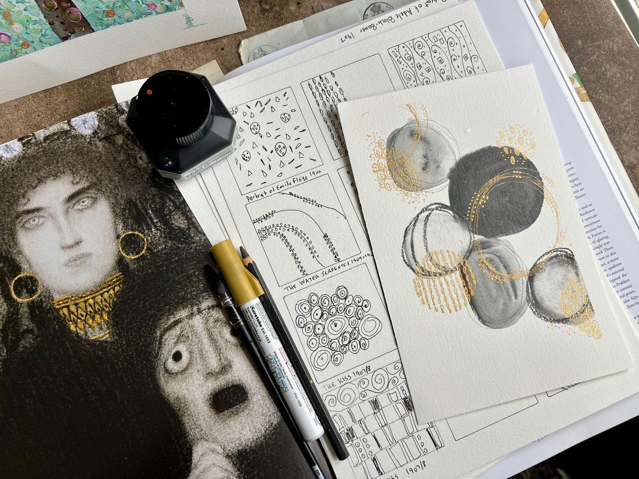
8. Creating Klimt Pattern Guide For Reference: This video, let's start our own personal
pattern catalog of patterns that we've glimpsed
in some of clips paintings. What this is going
to allow us to do is study the paintings in more detail and pull from the paintings the details that we want to use in
our own artwork. I've got a couple
of different ideas for ways that we could do that. I've made some pattern sheets where I've just drawn
some squares on there. And I thought we could, like in the coloring book, we could do sections of different patterns that we like to come up with our
own pattern guide. This will be very reminiscent of my pattern Swatch page that I created quite
a long time ago in one of the classes
where we just created quite a few patterns to reference and use
in our own artwork. This is the exact same idea that I want to do with the
clipped patterns. I already like patterns that works really well and
things that I like to do. This is the perfect
type of study to expand that work
and go further into my pattern making and really add more depth
into what I'm creating. I've got some pattern pages. I did include this template
in your downloads. Once I draw all these out, I'll put all those in
that template too. So that you'll have my ideas
to go along with your ideas, just to spur more ideas. What I thought we could
do, you don't have to draw boxes on your page
if you don't want to. I just thought that would be a really nice thing for the class to bind me
into different squares. You could start
with a blank page and just draw a
bunch of patterns. You could start
with little cards and do one pattern on each card, and then you'll have
little prompt cards that you can look at
later for pattern ideas. You could also do these
in a little sketchbook. What you might, could do is have several patterns on
there or have one where you've drawn the pattern
and one where you've drawn the pattern again and then
painted it on the other page. That might be a nice
way for you to record, keep, and book keep your
different pattern ideas. I'm just throwing out
some options for you. You can do this anyway
that you want to. I'm just working on a piece of the Canson XL watercolor paper. This is inexpensive
student grade paper. It's my choice to go to when I want to do projects like this. And I don't want to
necessarily use my nice paper. If I'm to the point where I'm
really needing to test out color and the way things
are going to work on my nicer paper or canvas, then I will generally work on the surface that I
will be later painting on so that I know exactly
how things are going to react to the paper I'll be using or the
canvas I'll be using. That's just some ideas for you. Another idea also is to
paint some of the squares with your favorite art product that you're going to be using. Here's some that I have painted. If you're going to be
using water color, then you might put down some watercolor bases and draw and pattern
make on top of that. That could be your catalog. You might even do this as
a way to color test and to swatch out and sample
the colors that you plan on using in the artworks that you're
going to create. But for the general
pattern making guide that I want to give
myself to start with, I want just a range of options. If I were setting out to make a really important
piece of art, then I would swatch out colors. I'm really planning on using
the materials I'm really planning on using so that I can get down what
it's going to be. Before I get started, I'm like, aha, yes, this works. Or oh, I'm glad I tested
that because it didn't work. You work out some of the issues before
you start painting. The important piece, I have just painted these with
Cuatki water colors. Clemped worked in oil
paint and gold leaf. I prefer to work in whatever medium that
you normally work in because I'm not trying
to do a master study where I'm copying his painting. Exactly. I like doing master
studies in different ways. I like to study the color
palettes of the masters. I like to study the patterns and lines that they used
and then think, how can I incorporate those
into my own abstract art, or whatever type of art it
is that you're creating? In this class, I personally
plan on using watercolor, maybe posca pin, maybe pencils. Whatever mixed media options that I happen to like and have. I'm going to be using
those as my study, but I want to be inspired by the patterns and the layers that Clint is introducing us to. That's my thought process
on doing a master study. I'm not trying to copy a piece of the part
of the painting. I want to get the elements
that I feel I can take forward in my own
artwork to get started. I'm thinking that we could
look at a painting and then do some patterns from the painting in
just pen and ink. Or pencil and ink. I was thinking maybe
we could start out with the portrait of
Adele Bloch Bauer. Because it's really popular, it's easy to find online if you're wanting to just
look at it online. It's one of the more famous ones that we associate with him. It's in his gold period
where there's tons of gold. I can also see there's
silver in here. If we get in closer, I can see that there's raised pattern on here.
It's not all flat. I like looking at all of these. There's like white
and there's blue, and I see some silver, and I see some gold. And I see different
shades of gold, like all the gold are
not the same color. I see square blocks, there's like an
orange red in this. We've got like
orangey red, blue. There's a little bit
of green up there. There's a little
green down here. It's not just in the one spot. Because if you didn't see this
down here and you thought, what is that one pop of green? Oh, we have it down here. That's something interesting
to take forward with us. If you put it in one
place and it's tiny, you might be confusing the scene and thinking,
why is that there? Whereas here now we've
pulled it in somewhere else. I'm like, okay, now I understand it's part of
the composition and color. Even though there's
very little color on here besides gold, it's very much an
expanse of gold. I love looking at
the different areas. He was very inspired
by Egyptian motifs. Geometric shapes,
squares, swirls. We've got some
little half circles, we've got some little tiny boxes and squares all lined together. We've got big sections
of circles in circles and out outlines
around the circles. There's so much in
here that we can definitely pick to make
on our little squares. Then we've got long
sections of rectangles. We've got long swishy
lines in those lines. We've got little triangles. We've got little zigzags
in two different colors. That would be really
cool in silver and gold, because that's what
that looks like. It's very interesting as we just rove our eye
around the piece, what are the different areas that we can pull a pattern from? If we look at this piece
in the coloring book, which I really like doing, because now I can see some
of the different elements that this artist has
picked out to color. You can see it's an artist interpretation of
what we've seen in here. But it makes it stand out. And I can see, oh, I can see some of these
different elements that maybe are getting lost in
all the sea of detail. I can then look a little closer at this and
I can be like, oh yeah, here's some swirls. We've got some dots out here, We've blocks of color. Got the more swirls, we've got the Egyptian
motif of the eyes. I can definitely get in
here and see some of this. Just to talk about
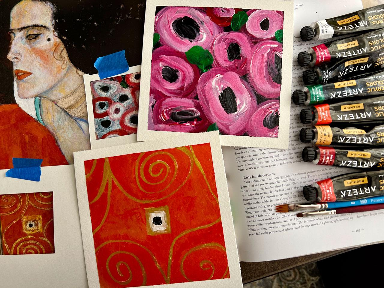
the portrait of a Adele Bauer in 1904 at the request of
Ferdinand Block Bauer, who made his fortune in the sugar industry and was the patron of many
succession artist, Clint began work on the
portrait of his wife, Adele, which he completed in 1907, the year of his exhibition. It took three years for the
artist to finish this work, inspired by the mosaics of the Basilica of San
Vital in Ravinia, particularly those representing
the empress Theodora from the sixth century, forming a square of 138
centimeters by 138 meters. It is painted on canvas, in oil, gold and silver. You can see I was seeing
all of that silver in here. I love that there's quite a
bit of the two metallics. Personally, I like the
shiny stuff, limped, makes invative and abundant
use of gold instead of color. Five years after the
portrait of Emily Flog, again follows the principle of large decorative surfaces with only the models face
and hands standing out. The finesse of detail lavished on her face
and hands prevents the subject from
disappearing into the richness of the complex
refined decoration. Portrait of Adele
Bloch Bauer marks a major step in limps portraiture looted
by the Nazi regime. The painting remained in the Bellevre Museum
in Vienna until 2006. After a long legal battle, it was returned to Maria Altman, the model's niece, and
it's now exhibited in the New Gallery in New
York. How cool is that? How cool is that He took
three years to paint this? That is not my goal. My goal is to pull
from the patterns. I don't necessarily want to take three years
on a painting. If I took three
years on a painting, I bet I could duplicate it. But that is a lot. What I want to do is take
our lovely painting here. I want to draw out different patterns and just see what is it that I
can use going forward. I'm just going to
pick a black pen. Hopefully I like
the one I picked. This is a fine
liner by graphics. I'm just going to
work in black and white to see what's in here and how can
I duplicate these? I really like the swirls. That's a pattern that I
want to take forward. I just want to start
practicing these and creating and just seeing like
how does he create these? They're going in
different directions. I can take this and then I can come off of this and
come the other way. It's what it's doing
all the way out there. And then there's some
that just come off of there and make little swirls. We're just filling the area basically is what
this is telling me. Maybe we'll come out
of here and do that. Maybe we'll start some by
themselves and just fill the space and just
see what do we get. I could have done this in gold, but I've done videos
with gold ink on white paper before
and nobody could see what the drawing was because
the gold is so light really compared to a black and white something
that you're drawing. That's why I'm doing
these in black ink. And it'll just give
me a really good idea of what we've got going on here. The goal here, for me
is not perfection. It's just to get laid down what I like
about the patterns, You don't have to fill
the whole square. You can do part of
the square like I'm doing here, but that's the goal. The goal for me is not to
be completely perfect. It's just to give myself
an idea of patterns. I can see over here in this yummy little
silver arm band that there are some swirls
a little different. I might just go ahead
and make an arm band, for instance, and give myself some parameters
for a pattern, because those are little swirls that maybe I should have
gave myself more room, but there's swirls
that go up and down. I'm just going to do it like this because I can come back and add some black detail
like we've got on this. It's not to be perfect, it's just to give
yourself some ideas. Then another thing you'll see as you practice these patterns, your hand will get used to
the motion of that pattern. The more you do, the better
those patterns will become. If you see a particular pattern in here that maybe you love, the practice of the
pattern is going to help you really
master that pattern. It's going to give you
some muscle memory, it's going to make it
easy to duplicate. When you get to the point of doing the piece on your artwork. That's another
thing I like about doing something like a
pattern guide like this. Is you get your hand
into the mode of drawing that pattern and
it'll get better and better. But in general pattern
going on that it doesn't matter if every line is
perfectly straight or perfectly. Formed because it's all going to be part of
the larger picture. As you step back, don't stress about
your drawing skills. I used to draw tons and
then I was a drafter. Now, drawing is
not what I enjoy, it's more of a slog and I'm out of practice
with the drawing. But as you pick up your
pen or your pencil and start working on the
different patterns and ideas here, it gets easier. Now we've got this yummy
little triangle decoration here on her top. I'm going to be inspired by those, just drawing triangles. We mostly like V shapes
that are all connected. If you painted those, these are all painted in
some different colors. It really makes them stand out as the pre triangle pattern. Drawing these, they're
almost like a diamond. Then looking closer
here at our pieces, they are a diamond, but
they're different color. It doesn't stand out as being like a diamond
like it does on, say, a black and
white drawing here. Just keep that in mind as you're looking
at this and you're dissecting the
different shapes in there in black and white, it might look like it's looking here
like little diamonds. When really, once you get them drawn out
and then painted especially, then they're going to turn into different shapes of triangles
that you can define. All right? So there's some
good triangles, all right? We also have some of these half circles In some
squares I could draw out some squares and then do some half circles in those ideas might even be easier to draw the half circles and
a square around it. Another idea for you there, if you're drawing
and you're like, oh, I don't like
my half circles, you're welcome to use
a circle template and get your half circles
even more circly. I mentioned that because I have drafting templates over
here with my circle, If you're not loving my circles, you are welcome to use a
circle template to get you. But what I like on
stuff like this, I like the shakiness, I like that it's not
perfect. I like that. You can see that he drew those in with a pencil or a pen or something that you can tell they're hand drawn,
they're not perfect. That's what I like about that. Not perfect is what I like, I think because I did Autocad and drafting on a real drafting table
when I was in school. And then I worked in
Autocad in my job 2020, which is a kitchen
design program. Because I did that for
so long and everything had to be so perfect that
I like the imperfection. Okay, now I see over
here in the dress that we have yummy Egyptian
shaped, almost like an eye. And then you've got
like a little.in there. And then you actually
have a circle around that and even
a circle around that. There is some lots
of details going on on these little eye shapes. I could even like common
shape around that with some extra detail because there is a lot going
on around these. That would be another
fun shape to add to our pattern page here. And he's got them spread out, I'm going to have them just
in this square as an idea. Then some of them even
come like really far out. I might even add
some of those ones, like they have the long
edges rather than squatty. Just another thing in here
to see as we're drawing. Then also see in here triangles. And then the triangles are, some of them are. Outlined, and some
of them are not. We're back in here with
this yummy triangle theme. We might draw some triangles
here in our pattern square. I've spread them out, because in our piece here, it's spread out, then we
have little squares here. In that case, I might
draw little squares and just know that these are going
to be in different colors. That's different colors
of gold and some silver, which I like in
something like that. We could use a little
tiny paint brush, which I'm sure he probably did, because they didn't make
these yummy pins when he painted this in the early 1900s. But we are so spoiled now, I could take every gold pin
I have and a silver pin, and I can make lovely
little squares. But you could also take a little tiny paint, brush with your gold and silver paint, make different color squares
with something like that. I'm just in my mind
thinking, okay, here's the pattern and
then how might I paint this pattern later
on my painting? You could do little squares
with pencil, with pastel. I'm going to be working
with whatever materials it is that I particularly like. I want to incorporate this in
my artwork as I go forward, different patterns and
designs and ideas. That's why I do these
master studies and really deep dive into a subject in
today's fast paced world, how many times do we take
the time to be a student and study again like we would have done when we
were in school, most people just are
like, I don't have time. Let's, everything's fast paced. Let's watch a fast video. I really want to dive
deeper than that. I want to study. I did a lot of that with
my photography and I would deep dive into different subjects
with my photography. Still live food, flowers, and I would just do a big, deep dive into a subject. I love doing that. Now back with my art practice, which I've been doing
art since I was a kid, I took art classes in all
of my levels of school. Then had basically
a creative career, Interior design and
kitchen bath design. I stayed within a creative
field my whole life. Then I did photography, and now I'm going back
to the art practice. Just because I'm burned out
on the photography stuff. I feel like I was in one long 365 day project for 12 years. Now I'm like, oh, I need to bounce back into some
creative art stuff. You can see I've done different
ways to do this squares. I've drawn individual squares, and then I drew lines and made squares, and then I made a grid. There's several
different ways that we could do these little boxes, but once you get to painting, then you'll end up with
a yummy little grid. Yeah. I love now picking
something like I love clipped. That was my very
favorite and I'm like, okay, I'm going to go
over here to the circles. I'm like, okay, that's the
first master that I want to do a deep dive study with because it's one that
I've always loved. I think it's the gold
that I love about it. I want to see how I can incorporate that
into my own work, which I already
use a lot of gold. But how can I do it in
a very clipped way, with more pattern we'll see. But I also want to do
like degas ballerinas and some other master
studies out there. I always feel like that
I'll have a nice project, something to deep dive in. I like having that goal
because then you actually sit at your art
table and create. Whereas, if you're just watching
a video and you're like, okay, now I think I got it, but you never sat and did it. Did you really get
it? Maybe, maybe not. I've done plenty of going to the craft
fairs and being like, oh, I could make that and then you go home and
could you make it? Did you try to make
it? Did you spend $100 to make something
that really should have just cost $5 and
maybe you should have just bought it from that
person that already did it? So funny, these are fun. And then right in the
middle of this yummy, fun circle thing, there are some large circles
with raised swirls. That's fun. What we could do is throw some
of those in here. And I draw the swirls first because then you can come back and add the
circle around it. And it'd be a little
easier than trying to fit this in whatever
circle that you drew. See how much easier that was, trying to fit it into a
line like I did up there. That's fun. I definitely
want to incorporate the color on color with the raised stuff.
I'm digging that. All right. So we
got some of that. I do like the random
bits of circles. I like that as a pattern
with different colors. As you get closer and you look
at these and you're like, look at all that stuff in there. Holy cow. You realize
today our art practice is I'm almost lazy because I like to do a
painting the day I sit down. And when I sit up from my
table, maybe I want to be done. Maybe I don't want to come
back to it over and over. Maybe I'm like, okay,
there's my 30 minutes. I've got a masterpiece and he
spent three years on this. It really makes you think and dig deeper in yourself
in your art practice. It makes you slow down and start thinking deeper
in what you're creating. Okay, like that. What else do we have in here? We have quite a bit of
just a modeled pattern. We could do something like
that with just some scribble. Basically, that's more of maybe we've put the paint on and then maybe we've removed, we could do that with a
sponge, we could sponge that. There's lots that
we could do there. I'm going to represent a
little modeled pattern, but I'm thinking that
could be sponge stamped, like we could take
an artist sponge and stamp that on and
get that pattern. That's what we're
going to represent here with this little
bit of a scribble here. If you pick a different
painting to do a painting and a different
design in every square, I've left room on my
little grid to note what painting that we've been
painting, what we've been doing. But I could also just write here at the bottom of this page, because I want this
page just to be this painting so that I know what it was that
I was inspired by. Okay, another thing that I notice in this
painting is we have these long lines
implying fabric. In the flow of the fabric, I definitely want to incorporate some lines and things like
that in maybe something. I'm going to go ahead
and represent that here in our block. They're not straight,
they're indicating movement. Whichever direction you
need some movement to go, this is a great way
to imply movement. Then there are shapes
in the middle of that. If you wanted to do one
with shapes, you could. But there are shapes
represented in there and a little
tiny triangles. We could actually even
come back and put some tiny triangles
in here so that we remember that there were triangles in this
particular pattern. Part like that as you think of things and then
you do it and you're like, I just got more exciting. I love that I could have one side with little triangles and one side without. Just to let me know there
are some options there, then let's see what
else we've got. We haven't done these yummy
little squares over here, now I'm thinking
definitely some squares. I'm just going to
draw these out a little easier with my pen. Again, I'm not looking
for perfection. That's why I'm not drawing
this with a ruler. Then that'll give you an
idea of what you can paint. Some of these have
painted squares in them, Some of them have a dot. There we go. We've
got painted squares, we've got a painted
squares, we've got a dot. That's the first half up here. And then it switches down
here where we've got different painted squares
and different outlines. We might do some of that here
on our pattern to denote, hey, there was a couple of different ways that was interpreted in the
painting that we studied. What would really
cool, there's that. Then let's just go ahead and do, we've got different
size squares, we could outline them like that. Feel free to, if you see something that you like
and you're like, oh, I like it but I'd like it
to be like this instead. Definitely go ahead and
make those changes as you're deciding because
then you personalized it, you've studied it, but then
you've personalized it into what's really
going to work for you. What would be really cool. Which I will probably do study several different
paintings and see if you can get 12 designs
out of each painting. Like this is the
portrait of a del, the net one would be Judith. Second, maybe there's
12 ideas in here. The next one could be
Lady with the Fan. I think this is Lady with fan. Just see how many patterns can
you glean from this piece. And then that's going to
let you know that you really studied
these pretty hard. Now I see some long elongated
pieces like this in there. They're just randomly spread about. We could
have some of that. Then I also see in some of these elongated pieces,
some raised pattern. There's some that are like this. Then there's some pattern in it. Would you have noticed
that if you hadn't looked at the
detail and thought, let me draw one little
section of this. You could even take this
section and be like, okay, I'm going to copy that section and get all those
details in that section. That would be another fun way to study these and
make your squares. I just spit balling ideas as, as I do these of ways
that you could turn this into your own study. Okay, I love that. Look at that. We did it, we came up
with 12 different items out of the one painting for
our pattern idea guide. I would like you to continue where I've left off and I'm going
to continue to, I'll give you some
other idea pages of the different paintings
that I decided to study. We'll have some ideas
to brain storm off, but I want you to
pick a painting, put it on your computer
if you want to look at digitally and just see, can you come up with
12 different designs out of each of the paintings? And what's your
interpretation of those patterns that we can
then use going forward? Hope you enjoy this fun practice because this actually
is really fun. It was meditative and if I were not talking
all the way through it, then I would of
course gone a lot faster probably in my
drawing, but maybe not. This is something
you can do while the TV is on in the background. It's just something fun
that you can just sit here and study and admire
what's gone into this. And then think, okay, what
can I glean from this? From my own patterns? All right, I can't wait to see what patterns
you come up with. And I'll see you back in class.
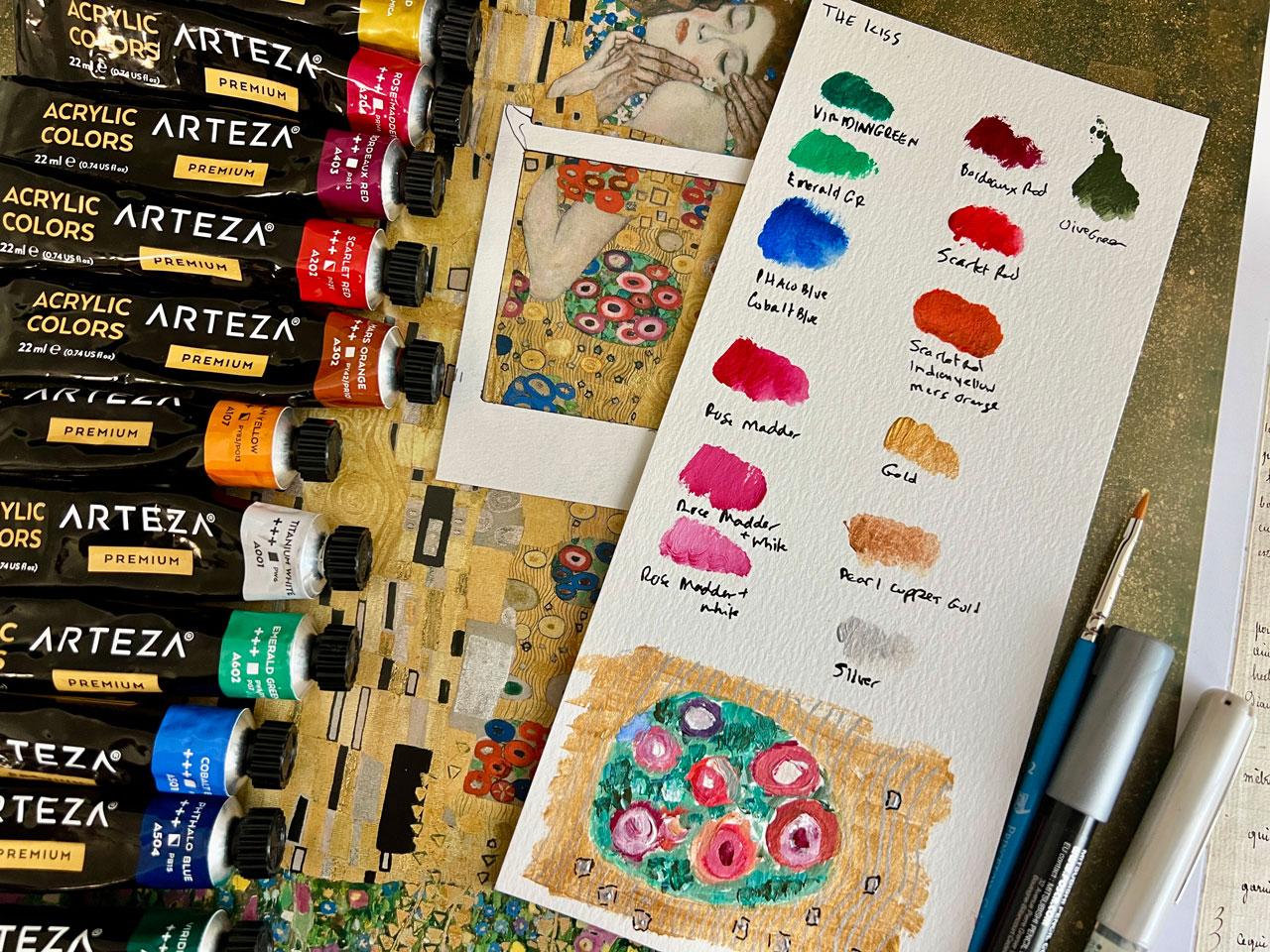
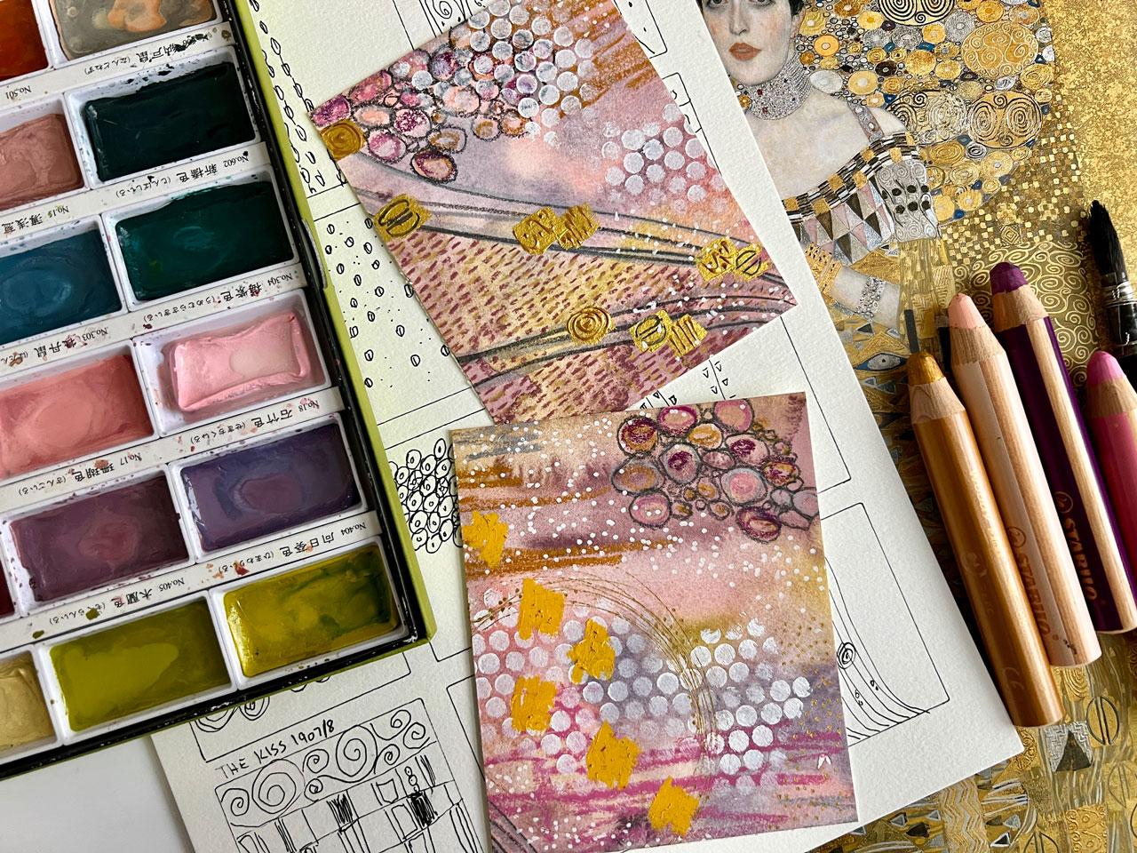
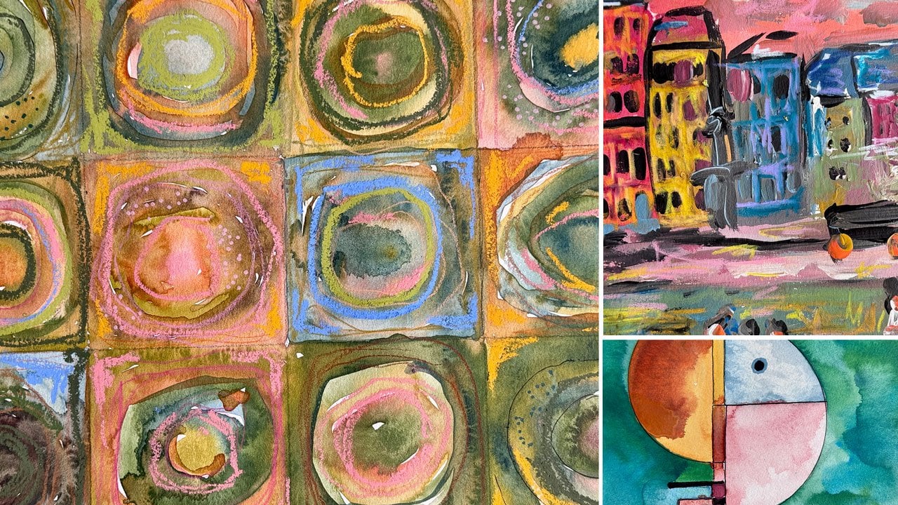
9. Color & Pattern Study - The Kiss: Let's take a look at the color palettes or
the colors that let uses in his paintings and do like a little
color palette study. You don't have to use these
in your bigger projects. But I think it's very
interesting to at least look and observe the colors that an artist used in their paintings. We're looking at the
Kiss from 19078. I'm going to do these with my little Artiza paints because
I had a whole little box of them that I got
off of Amazon at some point that are
pretty inexpensive. And they average
about $1.02 It's a nice student grade paint
to play in when you're doing studies and artist
studies like this. There's a large range of colors. You're not trying to
mix all your colors, because if you throw
too many elements at your learning process, you might just get stuck. I like the range of
colors and that we don't have to worry about just
mixing every single one. I've just been digging through my little paint
bucket here saying, okay, what colors
do I think I see in here and I see some blues. And I was pulling
out some blue here. I've got cobalt blue
and prussian blue. There's more blues in
my little stack here. I was just looking
and comparing like, which really would be the closest here to
what he's got in here. The thalo blue is nice. It could be a mix of
one of these colors. One of these colors
would be fine, feeling like maybe
the cobalt and the Prussian might be a good choice to pull
out to play with. I'm just digging
around in the colors. The serilium blue
is a good choice, but I really feel like
it's bluer than that. I'm sure somewhere on line
it tells you as colors. But this is about observation. Just figuring some
stuff out here is an emerald green and I see some pretty bright
greens in here. I also see some darker greens. I might just pull some
of these out to see oh, yeah, see like this
Paridian green. I can see some of
those down in there. Let's pull that out then. We've got some oranges
and pinks over here. Let's take a look at
some of our oranges and pinks that are in our
collection and just see, do any of these look
like what we need? I definitely need a
white because some of these colors are
super, super light. We'll definitely want to
mix some white into that. I'm almost thinking
definitely this orange, red, maybe even oranger. That one is more
of a salmon color. Let's see what else
we got in here. This one is like orange, orange. That's Indian yellow. It could be a mix between
these two though. For these flowers up here, that might be an opportunity. I definitely like
this Bordeaux red. I see some deep
burgundies over here. And these flowers, the rose, you see a bunch of
colors right in here. Let's maybe not that, maybe we'll keep the rose
matter and the pink. Let's keep those right
there. I like that. Definitely got some
orange color there. Let's see, what other
orange do we have? Orange, red, orange,
red is a good choice, but I still think, I still thinking a mix between
these two, possibly. Let's leave that one out
in case. Mars yellow. Oh, Mars orange. I can definitely see maybe
some Mars orange here. Let's leave that one out. I'm also seeing gold and silver and maybe some bronze in here because I can see some
different shades of metallics. I did pull out the silver, copper, gold in the arts, that's definitely in there. We've still like my other golds that we've used in
some other videos. I like my metallic gold to
add to maybe some of these. This is that aqua bronze, pale gold powder that we could make things
into a metallic. But I like the direction
that we're going here. Let me pull out a pallet paper that I can put some of this on. This Gray matter. Pallet paper. Jack Richardson Gray matters. And there's a
bigger pad of this. I use the little pad here. Here's the other one. This is the one I
was already using. I use the little
pad here for these because it's easier to fit
into my filming frame. But this does come in a
larger size thinking, why don't we make
some of these with our Canson watercolor paper. This is probably the
color palette of him, but we're going to
call this the kiss. I want to make them
smaller and cuter. I'm actually going to
make these a little smaller and just see
what we can do here. Maybe 4 " by 6, ", that'd be a good size. We could actually do several
of these if you wanted to study every painting and then
give the painting a name. Oh, yeah, 4 " was good because
it gave me the the third. Let's see, these are 4.5 ", probably would be
right and a half. Yeah, this might be too small. Let's just take a look. There are too many colors
for a little one that is feeling like this
should be a big one. Okay, just playing here. And then this outside bit, that could be like a green
with gold on top color range. I'm just going to pull paint, brush out, just swatch
out these colors. You don't need a lot of paint. You almost even might put these paints out of the
tube on your brush, but we're just doing like a little sample card
here of colors. The write the color
under each one. If I don't get these out of
order, that would be wise. Let's start that like that. We could go ahead
and write the kiss, then the colors that we've used. Let's just go ahead and say, we've got a yummy one there, we'll go into the next color. Oh yeah, See, I'm
definitely seeing that over here in these flowers. And then we've got a blue oh, yeah, See now, that
one's pretty good there. I like that for these blue flowers that we've
got over here, this is the opportunity
to say, well, could I add that with
this other blue and get even I like that, that feels like right on. I like both of those blues. What I just do with my pen. Here we go. This green, this neon pink is not right. This is exactly why, like doing this, That's
not right at all. So I'm not sure how I got
that color out of there. Let's put that one back. All right, let's come
back to the pink now. I'm thinking that
the pinks to be different shades
with the pink and the orange just wiping
off some water. Oh yeah, I'm feeling that one. I'm just going to go ahead
and speed this up a little, but I'm going to sample
these colors out. Here we go a tiny bit faster, but I am going to
mix a little bit of that pink with the white for that really light pink
that I see in there. And it could almost be a white on top of
the pink doing that. But I'm going to
mix a little bit and get that lighter color. Then I'm going to speed
these up and just sample out these and reason out what colors I think
I'm seeing in here. Again, this is not to
be completely perfect. This is more of observation. And just seeing how do
we get to each color. What could maybe mix if you need to have some
color mixes in here? And see how could I get to the range that we've
got in our painting? On this one, I put
the scarlet red down because there
is a little bit of a darker red in here, which could even
be like a mix of scarlet red and maybe bordeaux. But there's also this orange, which is a little
different shade than the oranges that I've got
straight out of the tubes. I'm thinking it
could be a mix of Indian yellow and scarlet red. I just put that on my palette
paper to get a mix to see, did I get to this orange? I think that needs to be a bit different
than that. Not quite. Maybe this color on top. Let's see, this is
the Mars orange. Is that a little se
that's almost yellow. Ear Brownie, maybe even a little
bit of white in there. See? Because it's a
little brighter even. It's just about playing, trial and error playing. It doesn't have to be perfect. It's about observation. And just seeing what's even orangier than
that. Like it's orangy. If you don't have the right
colors, it's not a big deal. It's time to observe. Oh yeah, there we go.
More Indian yellow. There we go. Now I'm happy. So don't get frustrated
mixing color. Just mix a little more and
play and just see like, how can I get closer? Because if you
play in the mixing of colors and experimenting, you do get closer and
closer, it gets easier. Let's just call that scarlet, red, Indian, yellow, orange. I think a little bit
of the Mars worked, but there we go. Now we can see how we got there. I don't really feel
like this orange, red is in there, so I'm
going to put that back. That's not feeling right then at the bottom of our piece. It would be nice if we could just take a
little section of something here, create that. We do that in one
of our projects. But it might be fun to look
at it on this piece too, just to give us an idea. I've got some little pieces that I cut out when I was making my little grid page that we
could just use one of these. Isolate out a little area or maybe because I was looking at these little
flowers and stuff, maybe I could isolate
some of that. I think that it would
be fun to just take a little area and
replicate it down here. And just see like how did we do? I'm going to take this
round thing of flowers here because that would be
easy to look at and observe. And we've got circles,
circles, and circles. And just see what goes into
painting that little area. Because I can see myself
including something like that on a painting
that I want to do, incorporating that
pattern into my work, I can see myself doing that. I'm not trying to copy it exactly like I
don't have to have the exact same number of
flowers in the same spot. I just want to come
up with the idea of what's going on there and
observe what's he got in there. Because if we look
a little closer, if we look, let me just take a picture of this and
we can look closer. Because I find
that very helpful. If you've got the book or
something really close up, you could take a
picture of that, then we could actually
zoom way into that. And I find this super
helpful because Sometimes I can't see
everything that's going on in that piece. Like maybe there's
the other piece where I looked at the eyeballs when
we were making patterns. And I didn't see that
those eyeballs were within the shape of a pyramid until
I zoomed in and I was like, oh, there's like a pyramid there and I couldn't
even see it. Just looking if you can zoom
into something like this, that would be super helpful. Okay. We've got some flowers. I've got way more
flowers than he had. I could even come back in with my eraser if I wanted
to actually like this. This is the needed eraser. But I also have up here, whoop, well, I may not
be able to get to it. That's all right.
We'll just use this. I have a different eraser
up there that's handy. I might just a flower out
of here because we can see there's a lot
of greenery and stuff in there and maybe we
don't need as many flowers. This is what the art of
observation helps us with. It helps us look and then see. And then say, oh, okay, maybe I want to do it this way instead, let's
do it like that. Take a few of those
out. We've got some green leaves and
different shades. I almost even see like a
pretty like army green in here that I now that
we've zoomed in, this is why I like to zoom in. Almost see knocked
over some books, but I almost like an
olive green in there. Yeah. For zooming in, because we can either
mix colors or we can look again and add
to our collection. Oh, that chromium green
is a nice choice. I also feel like I
have an olive green. I thought somewhere here we go, See I'm feeling like we've
got that color in there. Okay, definitely
that. All right. Now I feel like I need to
add an olive green up here. Because now that I've
zoomed in and can see that, I think that would be a good
option on our color palette. Yes, yes, yes, yes. You see how doing a sheet like this where it's a
little bit longer, you can keep adding
to your stash here and getting some
different shades. I like that. Now that we've
got this little area, we really zoomed in, I can see some different colors. Now it's almost like, okay, can we go ahead and paint
our little sample here? What we might even do when we're done is
surrounded in gold. To say, look here, it had gold everywhere. You could paint
the whole thing as your project sampler
if you wanted to use something like that
area as your painting example. But it's fun on these
little pieces to do a little tiny pattern places so that you can replicate
the color a little easier. We do a larger project coming up where we do
like the whole square. But I just want to do an
element on these pages. I definitely want
some of these greens. Let me put that green that we
just came up with out here. You can see it doesn't
take a lot of paints. That's why you want to have these paints
just a little bit. You don't have to
have too much out. Want this white over here. Just a little extra white. We can do the gold last. I've got the greens. I
got a little of the red, but I want more red out here. Maybe brighter, orange. Beside that, I've
got the burgundy. Let's put some of this
Bordeaux over here. I can almost see some
purple right there. Now I know that maybe
I'll need a little bit of a burgundy or
red with some blue, it's always good to
get a little closer. Maybe I'll put a
little of that there. Maybe a little extra white. Down here in the center of those is something
really dark. So we could have, it
might even be black. Which I didn't pull a black out. Let's just go ahead and see what we've got and
we might go with that. I think I need a little
bit smaller brush, maybe maybe I'll start
painting the flowers. I know there's a purple, Blue. Green. Yeah, Yeah. Yeah. Right there. Oh, look at that. And I can see like a little
blue in there. So I can definitely see
that he mixed colors there. Basically, I almost feel like I need even a smaller. This is the Princeton
select number four. This Princeton
select number two, I was using the round
shader, the round blender. Six Princeton select when I
was doing my samples there. If I didn't mention colors almost like that's an ivory
and not really a white. Just observing in there. You know what you could do too. You could get creative with
your other art materials and supplies and you could
color these in pencil. You could have done this
project with Posca pens. There's lots of different
options there that we could have used instead
of just acrylic paint. Don't get hung up
on what I'm using. I want you to get creative with what you think
is going on in those. Just use whatever art material
that you want to use. I just think it's fun to experiment with
different art materials. I probably don't plan on using the Artisa on
my bigger project. I'm going to go
ahead and make this more of how can I incorporate into materials
that I already use. I'm going to want to change it up when I get to
other art projects, but I do want to get as
close as I can when I initially start looking
at it and studying it. So that I don't
get so far off of observing what that master did and then I don't
even learn the lesson that I was setting out to learn. That's why I do
something like this. But I choose to do
it in acrylic paint rather than oil paint on that because I don't want to paint in oils for these
projects, personally. If you feel oil
is the way to go, definitely pull the
oil paints out. You don't have to, but you
could just more options. Because I almost feel
like for my big project, I want to paint the
tree I want to do. The Tree of Life. Might not be exactly Tree
of Life that I end up with, but I am feeling like I
want to do Tree of Life. I'm going to start feel like just idea generating
right now in my mind. But I feel like I might start
with watercolor and then do acrylic and stuff
on top of that. That's where I'm thinking
I'm going to go, okay, that's fine. Let's go back up here
to these greens now. Get some white out here. Now that I've done that,
I can see a little bit of blue in here a little bit. And now I'm just going to start filling in with just
some other shades here. Okay, What's the lesson
that we've learned here? Studying a color
palette by Clint. We have learned that
there's a lot of colors in this
piece, number one. Number two, we are
learning that there's no area of one color it, even though you think,
oh, that's green. When you get closer
to it, is it green? Because really it looks
like 15 shades of green. It's like, oh, now that
I've gotten closer to that, I can see all of these
different shades, shades, maybe
implied leaf shapes and triangles and colors. There's a lot going on in there that maybe we wouldn't
have seen originally. And then that is surrounded
by some lovely gold. Even in the gold, there is lines and shapes and other
colors in there. Even the gold is not
like a solid color. As we go forth and think about that in our own work, how can we Add more pattern because
that's where we're going with the clemped stuff.
Lots of pattern. Then how can we not have
like one solid color, Maybe it's an abundance
of color in there. Not saying that when I'm done, that's exactly where
I'm going to end up. But it is interesting to at
least make that observation, try to come up with something
out of the painting to solidify that information
in our mind, basically. Then as we go to our
abstract paintings, like in our own style, what can we pull
from these lessons? What information can I pull from Clem to enhance my own work? That's why we do a master study. It's not to do
everything that they do, It's to take the elements that
we like into our own work. There's our gold. I can see in the gold
there is some making. That mark making is almost in a gray or some darker shade. Let me move this little
paint thing out of my way. You know how I like to
stick my hand in paint. So let's dry this real quick. Okay, I have a silver pasta, which I don't think I've opened. I don't know if I have a
silver one that I've opened. I may. Maybe I do. Wait a minute, Let's see. Nope, that's something
else, maybe not. All right, let's
get this started. I feel like this
could be it. Okay. Feel like we've got
that started pretty good now. The gold. I just want to draw some lines if you're a
dip pin lover like I am, and you've got some silver ink in a dip pin, that
would work great. But we've got lovely
little sets of lines here. Now I'm thinking in
my own work that I could do little lines
and little clusters of these circle on circle on circle flower shapes like I'm already imagining
part of this. Can I take into my own work? I'm getting excited. You see how the power
of looking a little, trying to do a little bit
of that for yourself. You all of a sudden
see all these things. Now I can see like some type of silver clump in here,
circled in black. Let's see, we could do that
with the silver paint. Let's get our little
paint back out. Now we've got little clumps in here which we can
then circle in black. I'm going to set this so I
don't put my hand in it. Okay, Let me let
those dry. All right? It might not be dry, but
let's give these a try. And we're just going to circle that with some little black pen. Even the elements
like the colors, we talked about the colors
not being solid color. We could see a range of
variegated color in that color. Even the shapes are not like one simple,
single shape either. The shapes are in a shape, in a shape surrounded
by a shape outline. That's interesting. We learned that there is a wide variety of
color in his work. Within that color, there are
many shades of those colors. In his work, we talked about
creating one element of the piece just to look deeper
to see what is that doing. I highly recommend if you get like an Internet picture that you blow up part of it. Or if you get to look at a book, take a photo with
your phone so you could really zoom in and see all the details that are going on in the little section
that you're trying to paint. Because looking at a little
tiny picture is just hard. You can't see all these details in there until you zoom in. Look, I didn't even notice this if we zoomed
out a little bit. There's also big
circles of gold and silver also circled out
there in that gold. This is part of
her dress that we were painting on the kiss. But you don't see some of these details like
the squiggly lines. Maybe we might not even
noticed some of this until we zoomed in and
concentrated on one piece. I don't want to concentrate on the whole painting
when I'm doing a study because that's overwhelming
and there's so much there. But if we concentrate on a little tiny section
of the painting, now, we're like, Holy cow, Look at everything
that's in that. Let's paint something like that. I'm not looking to be perfect. I'm looking to
observe and come up with some ideas and use some of the elements and understand everything that
went into some of his. I hope you enjoyed
this little deep dive, color study of the Kiss, deciding colors with me, even though I was
using the artiza, you can certainly use any
paints that you have. The goal of this is to just observe what
colors we have in here. What are the marks, what are the mixes that we may
need to consider. Maybe do yourself a color card like I've done and a piece of the painting at the bottom to really cement these
ideas into your mind. So I can't wait to
see what you pick to do for your project and
I'll see you back in class.
10. Color & Pattern Study - Portrait of Adele B: This video I thought
we could do is pick a painting and create ourself. A little photo maat thing. We could move this photomat
all around and we could pick a different section or a section of one
of the paintings. And this is the portrait
of Adele Block Bower. And we could just
pick a section of it and paint that piece of it as a master study rather than trying to
paint the whole thing. I want to paint abstract and different
elements like that. What if we just picked one
little section and you could move your view finder around and be like I like
this or I like that. Let's try this piece
or that piece. I particularly like the scrolls. I do like the little
squares of dots. I like these circles up here, you can see how if
we pick one section, we can predetermine
our composition. We can look at it as
far as rule of thirds, we've got a piece over here
and the rest over here. And nothing is
directly centered, and this is broken up in
thirds on this direction. Also, we also have some good movement because
it's not all equally divided. You've got this piece
coming in from the corner, You've got this piece
leading your eye through, You've got these
pieces at the end. This might be a fun section. I was looking at the viewfinder before
I turn the camera on, and I had it stuck a
little further down. But now that I'm looking at it, I'm feeling like we could get a nice variety
of stuff in here. I feel pretty good about that. I'm just going to
let me tell you, I want to tear this page
out of this book so bad so I can put it flat on the table rather than it's
still being in the book. I almost did. I
thought, do I care? But I do love this
book. I didn't do that. I'm working on a
piece, personally, of the Honam watercolor, 140 pound press paper. Because I love this
paper this year, I've experimented with
lots of different papers, and this one seems to be
one of my very favorite. I have just cut this in half and created a six by six square. Because ideally, I
would like to do several little
studies of parts of the paintings and just
see where we can get. What I really like about this is there's a
lot of color there, but is there a lot
of color there? What we could do, this might
make it easier for us too, is while we're working, we
could take a photo of this with our phone or our ipad
or something like that. Then what we could do
is then zoom in even tighter and look at those details that we're
seeing in this square. If I zoom in, I can
really see like bronze. I can see like burnt umber. I can see some
dark putery color. I can see some darker gold. I can see some lighter gold. I can see some blue. I can see some silver. I can see some raised areas. When you start to look, especially at a particular
spot of a painting, then you start to say, oh, I didn't even see this
bigger square in here. Let me tell you the
perfect example of that. When you go to your drawing
pattern guide resource, on the resources
page that I made from the little patterns
that we were drawing. I made you copy of those and
put it on the resource page. When you get to the one of the Egyptian eyes in the
piece that had those, was that this piece?
It was this piece. Let me tell you what I did not notice and I'll
show it to you now. But when I was drawing the eyes, if I had zoomed in and really studied that a little bit better, let
me zoom in on this. If I had really done that, then I would've
noticed that the eyes are encapsulated in a triangle. I didn't even see
that just by looking. It's almost very beneficial
for you to be able to have a larger piece of the art to look at
or even the original, then zoom in and look at the details because
I completely missed those eyes are in triangles
like they're in the pyramids. It's a pyramid with
an eye in there. It fits in with all the other little
triangles that we see all around there being able to Zoom in on a particular
area is so helpful because look at the details that I missed on that
one little element. I thought that was
very interesting. Now I'm looking at this, I can see this is two shades of gold and I'm feeling like I could paint a base layer and we can top that with
our upper layers. I think that's what
I'm going to do. I'm going to start
with a base layer. I'm going to use water color as my base layer because it's convenient and I can get
the whole base covered. I'm using my cura
Taki water colors. I've got all the
colors and shades out here and I can just
swatch some out on the paper. This is what I'm doing with the other 3 " here that I've got. Just see like what's the right color of blue?
That one's bright. Let's see what this
color is. That's green. I do have my sample Swatch book, but it's just easier here
because it's almost like, oh, look at that,
that's it right there. I feel like that would
pull in a really nice or I could do burnt umber. I see umber under there. We could do it brown. Do we want to do the whole bait? Yes, let's do the
whole base as brown. I see a lot of that
element in here. And then from that, I can layer with
different golds on top and just see what we get. What color was that? That
was this one, wasn't it? Yeah, let's just do that.
What color is this? I like it because I almost thinking like indigo
would be a good choice. Number 67. Indigo. There we go. All right. So that is
where my thinking is. I'm going to set that back down. I'm going to just cover my whole surface with the
water color and let it dry. And then I have
something to start with. We've dove in, we have gotten
past blank page paralysis. I'm not even worried about
how neatly I put this on because it's very obvious here on our piece that we've
got lots of layers. I feel like I'm going to work in different golds, obviously. Maybe acrylic paint
and maybe pencil. I've got some choices or Posca pen and maybe
even that PBO. Let's go ahead and
let this dry then. Looking here at our drawing, let's think like how far over is that? Where are
we going to start that? I'm just using a mechanical
pencil to visually give myself some parameters
of where that's at. I'm going to say it's
about right there. Then about this far up is
this area with the swirls. Then coming in from
the corner here, we've got this bubble
with the circles. Then we've got some
random square piece here with some
diamond shape in it. There we go. I think that's
going to be my composition. Now we can start looking at the different ways that we
want to separate this out. I know I started with blue, it was just to get
something on the page, I almost want to have
some of my gold paints. Maybe I do like Mica paint, that might be an upper layer, All my little golds here
in a yummy little bucket. Let me see if I've
got some bronze. Because I really like
these Blick map paints. I'm feeling like those
are a good choice. Let's move that back over here. See, I can see this
color in here. I can definitely see
this color in here. Now I'm like the
Blick Matt acrylics might be a good choice and
I'd like to have a bronze. Let me dig through my paints
and I'll be right back. All right. I've just
pulled some paints. I pulled out the blick, pale gold because I like
that color in there. I've got gold metallic
because I can see some of this orangey color in here in the square part. I've got the Blick
matte, acrylic, silver, metallic, and pewter. I also found a burnished copper, I was thinking because I can
see like a dark burnt color. That I wanted, like
something dark. I showed you in the gold video, mixing the aqua
bronze gold powder in paint to give you
a different look. And I, and this might not work. I'm thinking through the
process with you here. I'm wondering if we use raw umber high flow fluid
with the bronze powder. Would I get more of
that bronze look, I can see in there that we're going to
experiment with that. I could have all this figured out and do this without you, but I want you to see
how did we get here. I don't want to paint the
whole thing without you. And then you think, well, how did you get there? I can't figure out
how to get from wherever I'm at to
wherever that is. Okay. I can see right now that this pale gold is translucent. That's very interesting. Was the blue the right
color to start with? I'm just using Princeton
select, this is a flat shader. Number eight, was
that the right color? Let's just have to think
about that for ourselves. But I'm just going to follow, in general my very
light pencil lines. I'm not going to worry
about erasing those. We're going to be
going on top of all of the base layers with
texture and pattern. I'm just trying to, in
my mind, break it down. What is that base layer and then what could I
put on top of that? I almost feel like
this base layer here could be the bronze. It's questionable about
what that could have been. That could have been silver. Because I can see silver
coming through that. If I pull my picture back out that I took
of that close up. Let's just do that. Let's take a look at that close
up that I took. Here we go. Then I can see there's some of that silvery color down in that. That's what I'm evaluating. We're never going
to get it exact, but we could certainly
get it as close as we would want
for like a study. That's all this
is. It's a study. It's just an exercise in observation and problem solving to see how close could I get, what could I do to get that
texture or that pattern, or that design,
or what have you? Let's just rinse that gold out. I use these microfiber cloths for everything. They're amazing. If you don't have those, you
need those, they're amazing. Feeling like we're going
to do a silver base here. Every artist is going to problem solve in
a different way. You might have
looked at that blue and thought, oh, wrong choice. In that case, what I
want you to do is you pick what you would have done it. How would
you have done that? What would you have
started that with? It doesn't have to be
the choices that I made. How would you problem solve
to get to the next bit, would you have used orange? That's a very common
underpainting color. We might not even see
the underpainting, but it's like, let's do this coppery color because I do see a lot of that in there. Maybe I'll do that Silver. Okay, I'm 11, where
we're going. All right. You might have different
painting experiences than I do. This is what problem solving and seeing how you can duplicate
and get something. It's about observing and seeing those fine details like the
eyeballs and the triangles. If we're just glancing
at a painting, we don't see a yummy fine
details. We miss all that. That's why this is an
exercise in observation, not an exercise in
making it perfect. I'm going to just
paint over this and I can come back and put
that box in there. Because quick looks and studies, just visually, you
just don't get, you miss a lot of stuff. And if you're trying
to actually paint, it doesn't matter
how far off you are. But if you're trying
to actually paint it, then you start to notice, oh, look at this item
here that I would never would have saw if I
was just looking at it. While I don't want I
finished paintings to be like a copy
of a clim painting. That's not how I
enjoy doing painting. I do want to maybe pick
a section and observe it very closely and see details
that I would have missed. And then go, oh, okay, how could I take this into
my work and what could I use with this information that I had gleaned by observing? Okay, I feel like I've at
least blocked out color. I want that to dry because now I want to put
color on top of this. I can almost see like two
colors in our blend there, but I really want
to use the Mica. The Mica, this is my
at gold mica paste. Which is basically a water
based acrylic paint, but it's shiny. That it's my very favorite
gold in the entire world. And anytime that I get low, I get on line and order two
or three little bottles, it is like the gold gold. I love it. But I'm
seeing a couple of colors in here and you don't
have to use this gold. Just pick out some of
your own favorite golds. But I am seeing, I'm going to do this first
because I'm several. I'm going to tape it off. Make it easy on myself there. This painter's tape, it
comes off of your stuff. Hopefully, I blended that. Hopefully I drive that enough. If you have a let's do this
little bit of color first. If you have a sea sponge that would be a good
texture for this. Like the natural sea sponges, they're usually in the bath area where you can get
those in the stores, but we're going to use, I'm using the little
round artist sponges and this was basically a
circle that I cut into squares but it has some
texture to it like you can see that there's
some texture to the sponge. And then I just
keep washing these, we're using them,
they last forever, but you can see how I'm
getting some good texture in there because we're starting to problem solve and see what texture is in
there, how can I get that? We're starting to try to figure out what elements are there. All right, now I've
got that and now I want the really gold
gold on top of it. Oh my gosh. Look at that. Y se definitely don't get
all the texture going, but now we're talking, and there's really
even more texture in the piece then what
I'm achieving. That might be another element where you're thinking, okay, do I need to have a
rougher sponge or do I really care if there's
more texture in there? Really what it could even be is there just needs
to be more layers. Pick the different metallics
and continue to layer in there until you get a
texture that you're like, okay, I'm feeling really
good how my texture looks compared to the sample piece
that you judging it from. It's a really good opportunity
on something like this, especially to play with different materials
that make texture. You may try a brush, you may bubble wrap
or seran wrap, cardboard or anything
like that that you think, what can I use to get
different texture with? Okay. I'm actually
really happy with that. It is different texture than what we have on
climps. I'm okay with that. That was that was a
fun problem solved. I'm going to just throw that sponge into water
so it can do its thing. Now, I'm going to move to
a different area here. I am going to, let's do
the circles up here. I'm going to use a Princeton
select round blender brush. I can see that these circles
are different colors. I like this brush. Don't put your
hand on the paint. Gosh, I can't tell
you about at that. We could go ahead and of
course pull that tape off. I like the way this particular brush lets me make circles and shapes
and stuff like that. I'm going to start up here, You can see it just lets me for whatever it is that
I'm trying to form, I'm going to put
that right up there. Just coming in from top part. It's got some raised part on
it that's a silver color. This is more translucent
than I like, but because there is an
element on top of that. I'm just going to let
that be the underside. These just look like ovals or circles in
different colors. There's also a blue in here. I need to pull out a blue paint. I've got a bunch of these
little Artis paints. What I like about
the Artisa paints, especially on a
project like this, is you can get a whole box
of all these little colors for practically
$1 or so, a tube. That's what I have and
I'm just going to pick out this Prussian blue. I like the range of colors
as I paint in my book. There we go, I feel like I could get some little blue dots. Oh, yeah, that is, that's the perfect color there, right there. Okay,
perfect color. I like the variety of color. There are some
metallics in this also, which would have
been a good idea for me to dig through
those and pull those out. I like those paints,
they're a good choice. Okay? There's a little bit
bigger circle right over here, like big, big, really. It takes up the,
this whole section. I'm almost thinking too
small when I'm looking at these circles and ovals. Because look, that's
pretty big right there. I need to go bigger. That's another interesting thing about observation is I was about to make
that a little circle, but was it a little circle?
Absolutely. Was not. Was a big one. Did I
go too small on these? Maybe, But we're going to have enough little circles in here
that it might not matter. All right, let's just keep
on adding some circles here, ovals, whatever we want to
call the um, get those going. And then to be perfect, we're
not looking for perfection. We're looking to cover the
space, see what it is. All right, that's pretty
interesting right there. We got a lot of color in there. We're going to come back
on top of that with more. Don't fret about what
you've got going on. It's all about layering. And what other layer could we
add then when they're dry, We may make some more choices. Thinking though, on this
little tiny squares, we could use maybe one of
these brushes, smaller one. Let's see, there's a
smaller one feeling like, well, maybe this one. Because again, I might
be thinking too small. All right, this is Princeton. Select flat shader number two and flat shader number four. I think I'm going to start
with the number four. It's just squares, We're
just going to have to maybe do some squares
every other one thing. Then we can come back
in and fill those in. Yeah, see, there we go. Now we can come back right here. Again, not looking
for perfection. We are looking to get
close and observe. Then you can appreciate how much detail that
that artist did, like, how hard that was to do
all the pattern and stuff. I mean, then we might
see why it took him three years to paint
these paintings. Okay, my squares are definitely
not as square as his. Again, not super worried about
that, Just an observation. Now, I'm just mixing them up, filling in the squares,
because why not? Because they do go
to different colors. There's this square here that
I'm about to paint over. Let's make a big square
here that we can come back and add gold
diamonds into it, or a diamond shape. I'm going to let that be blue. I can see blue shining
through that. There we go. We did not forget it. I also said, let's just do a little bit
of this before I forget there's some
darker in there. What if we took the
umber and a tiny bit of This gold. Aqua, bronze. Which is
this a water color? We can use it just like
it is if we want or Okay. I'm going to mix these with my brush here and just
see what does that do. Look how pretty that
is. Oh my gosh. That did exactly what I wanted. Yes, yes, yes. Look at that. I'm going to pull this a little closer here in a
minute so you can see. You don't want to mix
up a bunch of this just like what you're
wanting to use. But that did make that into a
lovely dark brown metallic. That is something
to consider too. If you don't have any
metallics at all, maybe you can make
some metallics with a little bit of like a
bronze aqua gold powder. And this is the pale
gold that I've got. You can see how much is in
there versus how much we use. This would last forever. You could make all
your metallics and look how shiny
that would be. Oh my gosh. Oh my gosh. I totally made my day. Now. I almost wish I had just made
all my metallics myself. But just a fun little element as we're trying things
out and experimenting. Who would have known that
that worked out so well? Look how good that is. Look how good that is. Oh my goodness. Now I wish I
had made all my Metallics. That was a fun learning thing. And see if we had
not been doing this, we would not have discovered
that that is super fun. Wow, I'm just thrilled. Now you're going to see this come out in different
art things. All right, let's come
back and throw silver in that, all right? So mine is definitely
nothing like his. But what you could do, if it's really
important to be exact, is work a little bigger, which I choose to work
a little smaller. What we could also
do, we could have drew a little grid and you could have filled
that in with pencil. You could have got a
real fine paint brush, much finer even than what I'm using and really got in
there with the details. I think working bigger
would have then the big difference because
these are gigantic paintings. But I do like what I got, I'm not hating it at all. I'm actually loving this. This part down here is all little swirls and
some gold mixed in. I'm almost thinking that
maybe what I should do is get some of this mixed in on top of that
silver and let that be a model background
to work on top of. Just add to what we got there. I'm just mixing the
different paints here. We're not going to have
one exact color in there. I don't know about you,
but when I think of doing something like a master
study, I think, oh, that's hard work and
sometimes I'm in the mood for that hard work and sometimes I'm like, wow, that's hard work. They come and go. Like sometimes I want the easy way and I want a 30 minute
abstract and be done. And sometimes I'm
like, let's actually stop and study and
learn something. That's what I'm in
the mood for now, is to stop and study
and let's learn something for this
moment in time. I know you're thinking, oh,
it seems like such hard work, but man, you learned so much
and these are actually fun. Okay? I'm loving that. Now I'm thinking, this
up here is probably dry enough for me to start
doing some stuff on top. And I've got lots
of different things that will give us
some different looks. Just to give you some ideas, I've got some of
my gold Mica Inc, which is my favorite
in the cure Taki, it's the same as that paste. I've got some gold
mica ink that I have put into a
fine line bottle, that is one choice. If we take a little
piece of paper here, we can, oh my gosh,
why did I do this? Let's wipe these pins
off. Move the paint. Move the paint. Tell yourself, move the paint, because I
think I'm done with the paint. There's no reason for that paint to be sitting there anyway. If I paint in my book, I'm not too precious
about everything. So there we go. Let's
move that out of the way. All right, let's try this again. We've got the Posca pens. Which we could do. Let's just do some little samples here. We've got the fine liner. What I like about
these is it gives you a lot of a nice application, but you have to use it with the bottle almost completely
flat with the paper. Because this stuff, if
you use it like this, it comes out too fast. If you use it to the side, you can control it. That's an option which
I might be using. It is very uncontrollable. That's a hard option,
but it is an option. Got a bigger fatter Posca pen, that might be a good choice. This is the larger 0.09
to 1.3 millimeter. And this one was 0.7
millimeter, it was smaller. We've got the Stadler brush pin. I don't know about that
one. We're going to say no to that one.
Put that one away. Then we've got this acrylic
zig liner which is basically in my mind that
Mica in, in a pin. I also have a pin
somewhere over there where it was like a fill
up your own marker pin. And I put that ink in that pin. I wonder what I did with that is somewhere right here
on my little table. But that pin is from a company that's like
a little company. I don't know where I've put it. It's over here somewhere anyway. So just be aware there are markers that you can
fill up out there. You might search empty
markers to put ink in. But I feel like that's what
this acrylic liner is. It's acrylic. It's got
that shimmer of that mica. In if we look at
these in the light, I see that this one has
a beautiful shimmer. And this has a
beautiful shimmer, of course, because it's the ink. I really want this one to work. I'm going to use this one. Really get a lot of ink
coming out of that. We're going to make some
marks on some of these. It's basically a circle
in a circle. In a circle. We are drawing more circles in the circles. In the circles. That's what I like about
his stuff is you've got so many layers that you have to look and say
what's comprising those, what's making those up. And then it'll make us
think in our own work. Think how can we
do that with ours? I might just have stopped with the circles on my own work, whereas I can see that there's so much more that we
can add to our piece. Okay, I'm like in that I do see that there's
some silver in there. Let's see what is this. Because some of
these are not gold, they're silver. Let's
see what this is. This is calligraphy, quick dry, permanent by Secura, trying to get it where
you can see that. But it's, I've never used it, it's came in, I get the monthly art boxes,
the sketch box. A lot of the fun elements that I get are different things
that I get in these boxes. Look at that. It's definitely
got a calligraphy tip. It's a long tip, but now that I have put
this on the paper, it's got a really
nice shine to it. So that's a good one. I can see that the center
of some of these are silver and I
could do that with silver paint or I could
just do this with this pin, can also have another layer
around some of these. Okay, I'm feeling good. I like different pins and
different metallics. This is one I've not had up out, so it's fun to give it a go. It's like the center of
all these are silver. Now that I look at that, see how observing a little bit closer, you see things that you just weren't going to
otherwise notice. The center of these
blue spots are silver. I wouldn't have maybe
even noticed that. Let's get a little silver.in. There then I feel like, see this is silver. But it could be raised, but there's an edge on it. I feel like I want to
do it in the gold. I've got the B, which I may have to
get a needle in there. Let's see, to get it
started sometimes. Oh, there we go. Hang on. I've got this clay thing
that I've used before. Let's you can do it with a
needle or the clay tool. This clay tool looks
like an ice pick. Do people even have ice
picks anymore now that all the refrigerators have
the ice in the fridge? Okay. There we go. Okay.
This one you got to practice a little bit
and get All right. Let's fold the bottom up. How about that? That would help. Okay. And then get a good
little motion going, and then you got to see,
this is called Rich Gold. It's a different color
really than I thought. You got to get a feel for how it's coming
out and how you could not stick the tip in
it the whole time. Okay, that might be a challenge, but we're going to
give it a go anyway. All right. So I feel like
I've got a little bit of it. Let's just see, it's got
this color underneath it. It's just like a
color on a color. It's not a huge deal if
it's perfect or not, because there's more going on in this circle
than just this. Look at that, That's super fun. I felt like some of
these could be raised. All right, so it was
only perfect on the one. That's okay. It's all
about play and experiment. Don't get overly excited. I'm going to put some
little details in here. You get creative after
you get going, like, oh, I think I want to add this to that piece
of art or whatever. You could definitely
play and get creative. It doesn't have to be exact. It is a master
study, maybe close. But you could then get creative and see what else
could you do in there. Okay, there's that. Let's get this here now. We've got swirlies over here. I almost feel like those need to be even stood out more
than what this does. Let's just see, I'm going
to start over here. That's not really
standing out very good. Let's see about the fine liner. I want them to be shiny and we'll just do
the best we can. Let me move this out of my way. Might be helpful to
have your rag handy to get the tip off a little bit. I could have done this with dip. I totally should
have done it with my dip pen. That's okay. Trying to give you easy options that you would
have easier access to. My dip pen that I love so
much is like $50 for the pin. But you could use different
dip pens with that ink. It doesn't have to
be like this liner, but I like the liner. Definitely takes a little
practice with the liner. Okay, I'm feeling
pretty good about that. Now, we need to let this
dry and then we can evaluate, are we done? I'm going to let this dry and
I will be right back slide. I'm back already. But what I just realized
was I didn't put the little diamonds
in our blue box here. I'm going to use the pen and draw that on top of that ink and try not to
touch what I just did, which I'm the best at. I'm the best at sticking
my hand right in the stuff. All right. Now we've got that. Oh yeah. Perfect. Okay. Now we're
going to let this dry. All right. I've let
these sit for a while. Hopefully we're mostly dry. Maybe that raised stuff would be the only thing that would take
a long time to really dry. But I'm curious to see, once we peel the
tape, what we think. Again, the goal is observation. It's not necessarily to become a master forger
with our paint skills. I definitely would never make it in the art forgery world. I just don't get
things that tight. But look at that. Now that
I've got the tape peeled, I don't think we did too bad. Check out, love it, okay? The goal of this exercise, it's all about observation. Rather than trying to
take a gigantic piece of a master's work and try
to do all that stuff, which that would be overwhelming like that would
take a long time. That's not the goal
of this exercise. The goal is to observe, look at the details
a little closer, see things that maybe you're not noticing just in a first glance. And maybe replicate
one little corner. This little box
that I cut out of this piece of paper
is not very big. It was 2.5 " by 2.5 ". I replicated that on a six inch by six
inch piece of paper. So it went a little bigger. But I think just in
the goal of what we were trying to
do, see the details, See things in there
like the little dots on the circles that I wouldn't
have normally even noticed. Along with the circles
in the circles, the outlines that are in there, the little bit of blue with
the silver dot on the blue. You see how we
start to really dig into just one section
and be like, okay, what's in that one
section that we can maybe learn from and maybe paint
and just experiment with? I don't think we did too bad. It's not about
making it identical, It's about observing and coming up with something
fun with your piece. I hope you enjoyed watching go through the process
and making the decisions. I could have painted a couple of these ahead
of time and been like, this is how you do it
and then you don't really see how an artist works through the problem solving of getting
that piece created. Wanted you just to see it all
raw from start to finish. I hope you enjoyed
seeing that process and our thoughts as we went and seeing that don't
have to be perfect. We're trying to get close
and observe what's there. Pian, enjoy painting one of these and I'll see
you back in class.
11. Color & Pattern Study - Margaret S: In this video, I want to do a pattern a little
different than some of the others just to give you some ideas of the ways I
might be thinking of going as I get closer and closer to creating my own piece of
art with my own materials. Just being inspired by
the patterns of limp. This is a detail
of the portrait of Margot Stromberg
Wittenstein, 1905. Sorry if I said that wrong, I think we can see the
full thing on page 219. Let's see where that page is. What I like about this? Oh yes. It's a great, big
portrait and what I really like is this little
detail behind her head. Now that I'm looking
at it, I wish we had this side of that detail, because it cuts it off right there where I want to see it. Because I actually want to do the detail of that little piece. I want that stripe of
gold with the swirls, and then I want this piece of the gray or the silver with the little
circles and the dots. That's what I'm looking at. I'm not looking at
doing her head. But I do want to
concentrate on this area here where we've got the
swirls and the dots. I've pulled some Posca pins, because I like Posca pins. They're acrylic paint pins. I'm still working
in acrylic paint and we can get a lot of these colors that I can consider doing
with this fun pattern. I thought what I would do
is paint a section of gold, paint the section of silver, and then fill in with
that particular pattern. I love just looking at the details of these paintings
and just seeing like, hey, what can we do? This is another piece of that six by six hono mule paper that I cut out of the
great big pad of paper. I cut the other one,
I cut this in half, and then I cut the
little edge off. And then I had two of these sized because I
wanted to work in a square as I was taping
off a square of pattern. I'm just going to pretend in this one that her
head is not there, like we got that other side of that painting and just
see what we can get. I've really enjoyed
coming up here to my art room creating
these every day. I've got several gold. I've got the golden, acrylic, iridescent gold, and
iridescent gold. I also have iridescent bright, but it almost looks
like super shiny gold. I could either go
with my U Taki gold, which is my very favorite. I could do that on top. I could do just a couple
of colors of gold and get that metallic
look in an acrylic paint. Which is what I think
I'm going to do because it's just
fun and different. I like to change things. There's a gold that I always
go to and I'm thinking, hey, let's not always do the
exact same thing every time. I also have this
Artisa silver and we could make that
silver or we could make that gray mixed with white. I'm feeling like silver. I'm going to put the
Artis silver out. I do have the Artisa gold, which we could have
used that just playing and mixing it up here. I'm going to pick a paint brush
and we're going to paint. I'm going to tape this
off because I do want this line to be as
straight as that line is. I feel like because on
the original portrait, the silver part is much
larger than the swirly part. Then the gold part,
I feel like it's such larger that I
want to offset that. I'm already thinking of
how do I want to compose my six by six sample of
that set of patterns. I'm using my little
blank prompt hearts that I just cut out of junk art. I'm, I've got some in
here that are blank. I've got some that have
art prompts on them, which I show off
quite frequently because these little
jar hearts are fun. But I have some that are
blank that I haven't put little prompts on the back
that I'm marking pages with, so I can flip back pretty easy. Let's just mark that page. I want to have that about
a third of the way over. I'm not getting exact, I'm just eyeballing it, but I'm just thinking
about right here. And then this will
be the gold part and this will be
the silver part. Let's just start with the gold. See, I might just mix these
gold because why not? And then we'll get a pretty
shimmer on this side. Once I've got that
gold on there, then I can let that dry and then come back with paint
pin on top of that. I'm almost thinking
because these are such almost perfect
circles that I might consider using a circle template to help me get that
perfect circle. All right, let's dry this very quickly and then I'll come
back with the silver. That's a nice thing of
working with acrylic paints. These don't take
long to dry at all, Then if I accidentally pull some of that of
tape, I can fix it. All right. So let's do that and then I'll
come back with the silver. I'm just using my Princeton
select oval mop brush. It's a half inch brush. I just picked a random one
out of here to play on these paintings because I'm
just spreading the paint. It's not like I'm doing anything in particular
at this point. I'm color blocking our colors. Basically, I might put a little more of the silver out the paint here on the piece. I can see that it's not
like perfectly painted. I could leave some white
or some brush marks. He's painting on canvas
and I'm working on paper, but I can still see some of the background
canvas shine through. It's not perfect. We could definitely make
sure to leave a little of this texture in the silver part rather than making it perfect. Because his paintings are
all about texture and layers and not having a
perfect, smooth palette. Let's see if I pull off, look, I did not even
pull off the gold. It's even shinier really, than the gold I've
used, but that's okay. It'll still shimmer
in the light. I could put the mica on top
of that if I wanted to, because I can actually see like what we should do.
We should just do that. Let me find where I've
put that. Here we go. I like the gold mica
paste. You could use that. You could probably do that
with the bronze powder, aqua bronze, pale gold powder, because it's super shiny too. Just depends on what you've got on hand that
you like to use. I didn't buy anything
special for this class. I just pulled the stuff
that you already see me using in a lot of
different projects. What if we take a fan brush now? I want to make sure this is dry, but you're just seeing
me pull supplies that I already have on
hand, I already use. And that's exactly what
I want you to do too. I want you to use
things that you have on hand that
you already use. If you see something
that looks super fun, then definitely go for it. But don't go buy a bunch
of materials to do studies because
you're just looking. The goal is to observe and
see and look at the layers. The goals not to mimic
what he's using. Because if I was trying to
mimic what he was using, I'd be using oil paints. And if you were trying to
mimic what I was using, you could buy all the stuff. But really, the goal is to figure out how you
can work things like this into your own artwork with the materials that
you already work with. Okay, just making sure
what I'm thinking. Because it looks like brush lines in there with that gold. I want to have that
brush line look, I'm going to do it with the Mica with a fan brush look at. That's just part of my own observations
here of the piece. The Mica stuff will shine differently
for me in the light. I like that the fan brush will give me the streaks that we
can see here in this piece. I like that too. There we go. I think that's what we're
going to go with. I like it. I like it wipe our brushes off, and now I'm going to dry that. And then we'll be ready to do our Posca pens, our
little designs. Let's just see what we can get. Really, you could do that
brush on this side too. You could brush in a
little bit of white if you wanted to get a little
bit of white in there. I think the silver
is going to shine, no matter which direction you're looking at it
in different ways. I'm okay with the way I
put that silver down. I have an architectural
stencil over here because years ago I was
a drafter in college. And wanting to use my
stencil that I already have to get just a little than I might get
drawing it myself. If I'm looking at these, what size circle is going
to get me an even number? I think I'm going to go with
this size circle right here, which is a seven eighth
of an inch circle. That's what I'm going to go for. The way I'm thinking here is I'm just going to start
and swirl it into the swirl and see if I can get it or might even
go like the one larger. Then I was thinking, let's see, Well, that get me that
might be too big. But yeah, I might
start off because I think at the bottom I'm
going to be a little bit of. But if we're not, that's fine. But I'm thinking
maybe I could start here and then swirl it around. Look at that. That's what I'm
thinking. Mine are a little bit thinner, possibly, than they'd be if I were
doing with a paint brush. Because I can see
it's definitely with a paint brush,
but that's okay. I definitely want to
make sure each one is dry before I move
to the next one. I got two colors here
because I'm thinking this is two colors and I almost want the other one to be even
darker than I was considering. But maybe we'll just do that
in the almost like a dark, dark purple or brown or
it's not quite black. But I think I'm going
to use the black because that is the
darkest that I have. My little posca,
dark pints to blob. I got to be careful here. Okay. I just noticed if
you heat up your stencil, your stencil does heat up. Oddly, I might not want to
heat the stencil again. Just all good observations. How far over did I have that? Okay, I had that about
half that line over. About I'm looking at this
little line here on my stencil. And now I can see
that this one goes the opposite direction
of the one I just did. There we go. If you get a thing where you've got some going under your
stencil and you're like, oh, no, guess what we can do? We can just grab a little
bit of paint and we can just fix that and let
that dry and keep going. Don't fret about anything
like that, it's just paint. And then we'll keep drawing
wet paint that dry first. Okay. And then with these, I observed well, let
me keep that out. I observed that, you know, they're just opposite
of each other and they're opposite
colors as we're going. So I did try to make
sure that I did that also because that's
kind of how he did these. Maybe not, maybe he did
go in the same direction. Going the same direction. Okay, there we go.
In that observation, I was thinking that they were backwards of each
other, but they're not. I don't know why I saw that
they're the same direction. But going down,
that's interesting. I don't feel like still I don't feel like
I've messed it up. But if I want to change that, it's acrylic paint, you could go and paint that layer
right back on top of that. This is definitely
the observation part that I wanted to
practice myself. Because initially I thought, oh, they're backwards
of each other. But now that I look at
them again really closely, I can see they're going
the same direction. Just opposite color. Same direction, opposite color. That is a good observation of, oh, I did that backwards
of what he did. Now I see that I did that. And I can take that
learning lesson going forward and
I'm okay with that. Not a big deal now. I'm going to go
ahead and leave it. I'm not going to paint
over and start again because I learned my lesson
that I was wanting to learn. These are a bit smaller than
the circle that I just did. I might come back
through because now I'm doing these little
different circles here. I'm going to do these with pins. Might do there's green and there's blue and there's
gold and there's pink. There's plenty of colors
here to pick from. What I might do is just pick a smaller circle and
get it started again. I'm going to try to make sure that I'm not going
on top of wet paint. As I go to the next circle, I might just do two or three in the same color and
then switch colors. Two, there's this bright green. That's a couple of these. The paint pins dry pretty quick, so I'm not worried about the paint pin really staying
wet for a long time. It's not like we're
working with oil paints. There's this pretty
light pink out here. There's like a gray in there. Do I have a gray? I think I do. It's a little bit bigger pin. We'll see if that gray shows up. Yes, it does. It's a
silver but that's okay. It says deep gray is the color. But on top of that silver, it just looks
silver, doesn't it? I like it. All right. And then get it to the point that you like it and you're like,
okay, I'm there. I could even do a black circle. I do see some black
circles up here. Then once you've got
it, where you're like, okay, I feel good about
where everything is. There's also, I got some gold. Here we go, I got a gold, that's one I haven't used. Let me find the one
that's been opened. I got a couple of these
because I love them. Maybe the one I've used I've used is in there.
This one is my favorite. I've ordered several. They ran a little sale at
the holidays too. I got them half price. All right, let's go in
with some gold ones because we don't want
to leave the gold out. This gold is the same
company that makes my mic. It's the same amount of
shininess that we did with the fan brush over here where we brush
some of this mic on. It's brilliant gold. And I'm not worried
about little, just going for it once you've
got all of those on there, now some gold has the gold. In the center, there's
some little gold dots. All the golds have a
gold.in the center, then there's a few gold dots. Then there's lots
of other colors. There's that all the colors that we made as circles are in here. Let's go in with some dots. These are just different
colors of Posca pens. You want to go and hit up your Arch store and just see
what options they've got. None of these are
actually touching. Even though that one's touching, I'll be careful with that, not to touch anymore. Let's see, we've got
really dark dots. I don't really see
any pink dots. I've got pink circles,
but not pink dots. We've got gray and then
there's some black dots. You can see how closely. I'm trying to observe what
he's done in his painting, even if we're not doing, if it doesn't look
100% like his, we at least made an
attempt and got close. I would definitely never
make a good art forger. Because no matter
how hard I try, even if I see something
I love and I'm like, oh, let me just copy that as a study and see if I can
get something close. Mine just never looks
like whatever it is I'm trying to duplicate.
And I'm okay with that. Okay. Let's go ahead, let's peel the tape because
even if ex it's close, the lesson here was to observe. And what did I didn't observe
very good with the swirls, because I did backwards of
what I intended, what he did. Even on the mistakes,
we learn good stuff. Okay. Somehow I touched
something in there. That's okay. All
right, so there we go. How did we do in our
duplication of his pattern? Actually, even though my
swirls are different, I got the gist of what
he did and I learned a lesson there in the direction
that I didn't observe. Very good then. We definitely did good with the silver and the
circles, and the dots. Those are some fun patterns
that we learn from the portrait of Margaret's
Stoneborosigstein. Hope you enjoyed that. I'll definitely add
this section to our PDF so you can look at it a little in our little
study guides. And I can't wait to see if you try the same pattern
or a different one. I'll snap a few pictures from different paintings in the book and I will see you
back in class.
12. Color & Pattern Study - Judith II: In this project. I
thought it would be fun if we took one painting. This is Judith two salome
1909 oil on canvas. And this is 70 " by 18.5 ". It's very long, large. I thought, what if we took two sections out of one painting and did a little two
different abstracts from the one painting? I wanted to do it
from this painting, and I thought it's not close enough for like say just the flowers or
just this section here. Then I was flipping around in this great big book over here. They had a close up
of the painting. I actually want to
do like a square of this orange and a square
of these crazy flowers. That's what I'm going
to do. I'm going to take this one painting, I'm going to do
different squares of the painting and just
see like what can we get. And I was thinking maybe I found it easier almost
to take a photo of those, like a cell phone photo. I was trying to just block
off some color there, but I almost found it easier just to take a cell phone photo of each square I wanted
to concentrate on. Then I could really get
in and see more detail. I found that to make
it easier for me, and you might consider doing
that for your pieces too. But most of these pieces, I actually put these in the projects and
resources for you. And so you can see
the blow up with me. But it is very helpful
actually to be able to then zoom in even closer.
That's what I'm going to do. I'm going to look a little
closer and then I can see what's actually
in this detail. And by doing that, I can actually see
that that gold line up there isn't always solid, like you can see where you
drug is brushed through it. That's good information
because I can just take that and I can feel okay if mine does that because
his is doing that. And I like that. It's an all over color with just the gold
and the squares. It makes a nice little
abstract to have all the movement and the way I compose the part of the painting that I
would like to try. And then getting in a little
closer with these flowers, I can now see that there's
a little bit of green in there where I actually wasn't
looking for the green. There's black. And then
the flowers are more like ovals rather than circles and they've got
different centers. It almost looks like the
whole background is black. And then we've painted these things on top
of it because I can see the black shining
through our color. There are white and our red. That's interesting
because that's not the way I was going
to approach this. I was going to approach it just starting with the circles. But I think now that I've zoomed in and
looked a little closer, the whole thing there
needs to be black. And then I can come back with the ovals and the circles
and make it roses. And I pulled some
colors out already, but now I can see
that I didn't pull a green out for the leaves. And I almost want
that to be like, yeah, this is a mid
green that works out. I also pulled out rose matter. I pulled out white. I was thinking there was
blue in there. But now that we can
zoom in and see that that's the black
shining through there, I don't think there is any blue. I'm going to put the blue back. You see how taking that picture of the section
you're wanting to do and zooming in and
really observing and looking changes your view about how you might
decide to paint this. I mean, that makes
a big difference. And then I've got Mars black. I'm just using
these Artiza paints because I've got plenty of them, all the different
colors for this, I'm definitely going to
be using my gold paint. And then I also need some
type of orangey red. This vermilion red
is really pretty. I might mix that with another shade because you can really see more than
one color in there. It's not just a solid
one color. Oh yeah. How about this carmine red? I can maybe mix the two
and get like a variation. And then we've got gold, we've got even a little bit of white or silver right there, and then we've got
a little black. I think I'm going to approach this one by painting
the whole background like orangy shade and then top off with all
the colors I need. On top of that, you can
see how photographing it, zooming it in, might change
the way you approach each of these pieces that
we're going to be painting. That's how I'm going
to approach this. I'm going to leave those there. I'm going to paint on top of the book to keep everything
in frame, I think. And just do the best we can. Maybe keep that right there. Got our palette paper over here. I'm just going to go ahead
and start with a new sheet. I like this pulling multiple
sections out of a painting because the Kiss and the
portrait of a del block power. Those paintings really
lend themselves to multiple abstracts
as we're painting. Maybe I'll set the
phone back there. They definitely lend
themselves to lots of things. As we're painting,
you could pull like 20 different abstracts
out of those. I like that. Let's put
down plenty of the black. I think I'm going
to need it then. A little bit of a white. We don't have to have
1 million colors, We can just have three or four. And really get our point
across with what we needed. Maybe this white over here. Then I've got these little Princeton select
brushes I'll be using. You could do this project too. I think I'm going to do
black and then orange. Maybe I'll go ahead
and put this over here also just to
have these out. Actually, this is less orange. Let's see, Might not
be orange enough. I might need to pull
a bright orange out. I think I will. I think
I need a bright orange. Oh yeah. See, that's
not orange enough, but maybe I'll be using it. Let's pull out, this is orange. Yellow. Is that the right shade? Let's see, bright, let's see
what other oranges we got. Orange, red. I'm feeling orange, red, filling, orange, red. Let's go for it. Oh, yeah. Orange, red, orange,
red, for the winner. Okay. Actually, I'm
going to do orange, red. Let's do that over here. Let's just go ahead and
start mixing these. And just getting that
out here on our square. And that can be drying while I coat the other one in black. And this is just that
Princeton select two inch oval mop brush. I feel like I need more or
I'm really off in the color. But really it's not my goal
to be exactly exactly, because it's not like
a master study where I have to mimic the whole
painting exactly and I spend months getting
every detail exact. It's more a project about observation and just seeing the different elements that
went into his paintings. And then seeing what part of those elements
can I bring into my paintings after we
spend a good amount of time creating my
stuff like this? I'm definitely darker
and now I almost see, now that I've got that on there, I might come back and do this. On top, I can almost see that
there's a yellow in there. I can really see that there's
almost a yellow in there, bringing that out,
which is a good lesson. Let's do this. Maples
yellow because I like it, that's a really good lesson. How many colors did he
have to go in that? Like, how did we get those
brighter ones in there? Yeah, yeah, yeah. Feeling it as we're painting. We can even observe like, there's some nuances in there. Maybe we're not getting with that initial layer and we're
going, what is it missing? Then we look a little
closer and it's like, oh, wait, I do see maybe some
yellow in there now. Okay. Now I'm feeling
pretty good about that. I'm not trying to be like
the brush look in there. You know that he's
got lots of patterns and layers as he's
going into his. That's what I'm mimicking, the I'm feeling good about that. We're going to let
that one sit and dry. We'll get some of this
paint out of my brush. I'm definitely going
to need more black. I can already see that because now I can see how much
paint that orange took. Let's just go ahead. Can tell I like the black here because I used
quite a bit of it. But I feel like I'm going
to definitely need that. Let's get that going so
that it can be drying. I set my thing right on top of my oranges added to
the pattern there, but I did not mean to do that. I need a big six foot table. That I can just
really spread out on, but then of course couldn't get all that in my camera frame. But I like to spread out. When I work, when I used
to work in a cubicle, when I was a kitchen designer, I worked in a gray
cubicle designing kitchens and baths and
things for builders all day. I had like eight feet of countertop in like
a little L shape. I spread my work out in all eight feet because then
I could get all everything organized and I could have
different jobs sitting out with different
notes about what I needed to accomplish
on each job. Okay. Maybe I didn't
need that much black, but there we go,
we got the black. Yeah, I just had I had all
kinds of stuff going on. I loved it now that
I work at home. My little tripod set up that this camera fits on
is three feet wide, Give or take a little bit. I need all the space. Okay. Now, I'm going to
set that to the side. I'm going to need
it in a moment with the orange almost dry. Let's try this. Yeah, with this, I've got about three feet, I've got about a half foot
on each side of that. And I think, man, I
need like a whole another five or
six feet over here to the left of me so I can have all my
stuff sitting over there. I'm just thinking about like why did he start
with black hair? And I think he
started with black because her hair is
black and maybe there was black hair down here and he put the
roses in her hair, like, is that what that was? It could have been
what that was. I flipped back to that painting. That could have been like
a swath of her hair coming down and then he put that
those flowers in her hair. That could be why that
was black, possibly. Interesting. Okay. I'm going to start with
the orange and I've got the Inc I'm
thinking gold Mica in. We could do it with
paint. I might not like the gold mica ink, but I'm going to
give it a little try because I'm thinking, here's a little tiny brush, this is a chisel
blender number four, we could draw this
out ahead of time. If we wanted, we could have done that and then followed it. But I think is this
going to be thick enough at debating here? We've actually got
like a square. I got like a square in here. Let's just see,
where's the square? Okay, I've got a square there. Just to visually tell me, this starts about halfway
and then ends about halfway. Maybe it goes like
from here to here. Let's see what if we
mark this a little bit with like a white to give us some little
direction here to go. This is just a white
jelly pen that came from sketch box, I can see that. This. Look at that. Tell me I'm doing that
on the black one. Oh my gosh. Stop
that right there. Just paint that back black. Oh my goodness. Oh my goodness. To get when I start talking. All right, let's start over. Glad I didn't go
very far with that. Hello, doing the orange
one. Oh my goodness. Were yelling at the screen for me because I feel
like I needed that. Okay, back to the orange. Okay, so we got a
square in here. Let's just just eke that out. Then this one, it actually starts from here and
goes up to the middle. And then comes over here
to about the middle. Then we can see that it comes
around and comes around, there we go, building that. That feels good. And
then it comes over here and then comes
around and comes around. Okay, I like that. Then
it's starting right here. We've got some
little swirls going off the edge because
this goes further. We're just picking a little
square of the painting. I know it keeps going, and we know that this
comes over here. It goes around and around. I'm not trying to pick all
the elements that are in here because I know it keeps
going, this goes here. And we could even go a little
further if we needed to. I can see here on this one, I didn't quite come down
far enough. That's okay. If I need to come back and cover some of this
with the white paint, With the orange paint,
that's not a big deal. All right, let's try
this chisel brush and see I'll come back and cover up any white
that we don't love. Okay. So the ink, you know, the inks going to
be kind of thin because it's ink thinking. Did I want to do the
paste or a paint? That's your choice.
It is a good. I still like the white. I still like the ink though
because it's easy to work with when it dries. It might just surprise
us at how good it looks. Okay. So there's that then. I'm okay. I'm almost thinking
that was okay. But what I've liked a brush like this a little
better because maybe I could. I don't know. Let's just try it. This is the Princeton
select pointed Filbert. I'm wondering, should I go
around, move it as I'm going, if I were doing like
the gigantic painting, it definitely would be
different than trying to do this one little section on
a six inch square here. See there. Now I did like this. Okay. This worked out
really well, actually. There we go. Come
back in here, okay. This one just playing and figuring out how can I take the elements that
he did into my own work, and this is the way that
I would probably do that. I'm trying to figure
out some of that even as I'm studying the
things that he did. I like that challenge
that we're setting for ourself and figuring out what can I use that's
going to work for me. It's a good way to figure out your own supplies and the stuff
that you're working with. I've never used
this Filbert brush. Now I'm like, okay, now I know how it works. I'm thinking this is a good one for when I need
something as a point. And maybe when I need
some directional help when I'm doing something
circly around. Which I might even use
like a dip pen for that. But playing in the different
tools that I've had, figuring some of that out also, let's start the square with that and then we'll
come back in. The square is not
perfect. I'm not trying to get the
square perfect, because this square
is not perfect. If we look a little
closer here at our piece, I can see the squares is
like not perfect at all. These little pieces that were going around are
not super perfect. I don't have to be
perfect, and that's okay. Okay. I'm liking what
we got going on there. I do need to come back with some white and black
to fill in that. And then I think I'll
be really close. This wasn't a super
hard painting, but what I could do
real quick is come back over the white now with
some of my orange. And just fill in where I drew
the white guiding lines. I'm actually just mixing
there the orange that we already had out and
the naples yellow. Trying to still keep
some of these colors, I don't want it to look obvious that I've come back
and filled that in with a red line on top of where we made the colors variegated
with that yellow on it. I don't want it to be like super obvious that we've
come back over it. You could have used something. We could have used
some type of chalk, and then we could
have rubbed it off. You can get creative
there and how you decide to make things
on your paintings. You don't have to do
anything I'm doing, I'm just winging
it as we're going. And then I might come back
and put some of that in. Like there's more
areas like that. It's not obvious that I've
touched any areas up. I don't want anything
to be like, oh, what you do there If a little bit of the
white line shows, I'm not concerned about that. If we have a tiny bit can
just be part of the design. And that gold dries pretty fast. It is drying up
there pretty good. Something else I like about these little Artisa
paints, they're not toxic. If you need to get your finger in there to work up some stuff, you could. I like
that about that. Why did I just move
that gold around? Now I'm overworking it and
making it really obvious. And his paintings
aren't perfect. I can see brush
strokes and lines and places where he's come
back and filled stuff in. I don't feel like I'm getting too far away from how he did his painting when I come back in here and add some
other elements. I don't feel like we're
getting too far off of how he did it. I like that. All right. I know that I've got in there some white and then we've got
up to the black. As I throw the lid down. Oh, I put white out on my thing. Hello. All right. We'll just have to remember
to find that lid in a bit. We're crazy. I know it, but I want to
show you as I'm painting, like how I work my
way through problems. Because some of the problems
you create for yourself, some of the problems
are going to be things that you're
discovering in the painting. How are we going to work
our way through that? It doesn't bother me
if it's not perfect. I'm not being perfect
as I'm filming it. I could film it all completely perfect and then make you think that when you're
having a whole bunch of issues that you're the
only one having the issues. And I want you to not be intimidated by
doing something like a master study and
then getting caught up in how I did it versus
how you're going to do it. Let's put out a little bit of this iridescent gold fine paint. I want you to know that we all have funny little issues as
we're painting and not to get stuck in the process because you're not
doing anything wrong. Okay. That didn't quite show up as much as
I wanted it to. That's okay. For this. We're there. I feel like
I understand what he did. I want to move into the
other one for a bit. We can always revisit one
of these if we need to. All right, now we're
painting the flowers. What I want you to
do, what I really want you to get in
the habit of doing, to set yourself a timer and give yourself 30
minutes per square, or 5 minutes per square or
whatever time amount you feel. I want you to set yourself a limit on the
squares so that you don't get overly concerned
and stuck in creating. I want you to observe. I want you to get it down quick. I want you to get these
paintings done in one sitting. I want you to just play
and figure out like, oh, how did we do this? Okay, this is great big ovals. I'm just going to start painting some great big
ovals here on this. And I can see on there is black show through
on some of the paints. The goal is not to be perfect. The goal here is to just get some flowers
down in a big oval. I imagine these
to be like roses. We're going to paint them different shades of the
pink and the white. Then there is some green in
there as we're coming back. Just go ahead and very
quickly get some of these shapes down and
you get what you get. It's not important
to be perfect. I like creating in this way. It takes a little
stress off of us. We're not trying to
match as brush strokes, We're not trying to match
the exact composition. I'm working within this
and I want to be close, but if I don't get
my exact roses in the same spot as
his, that's okay. I'm just learning a technique
here by observing his. All right? We've got
some white in here, got a lot of white up here. Got more white right in here. Flowers aren't something that I've really painted
a whole lot of. This is a nice little
learning experience here too, on how I might paint flowers in some
paintings Going forward. I actually appreciate this
bit that we're doing here. Okay, let's go ahead and
add some more layers. And I might just not even
paint black in there because I can see his blacks not really painted
unless of course, I cover everything up
like I just did is more like showing through the
stuff he's already done here. We're just layering
some circles and ovals in here and we're letting
that black do its thing. Okay. I did cover up a lot
of the black on that top. One that I might want
a little more black in here. Well, that was dumb. I just didn't even paint
it as an oval, Did. There we go, look
at that. I like it. I like the messiness of
the black on the top. It's fun. The stuff we
learn as we're doing that. Good stuff. People, good stuff. I did get the black out there further
than I intended let. Scoop that back
in, see like that? Yeah, yeah. Okay, look, here we are. All right, now we've got
some leaves in here, and then that will be an easy, I almost want you to set yourself a five minute
goal there with that, because wow, this one
came together super fast. Let's put a leaf right
in here. Oh, yeah. Okay. I'm feeling
good about that one. All right, so let's just
see what we ended up. Let's just go ahead,
take the plunge. Give yourself 15
minutes on each one. Set yourself a timer. See how fast you can do it. Let me drive this
one real quick. This is not completely
dry, it's very close. I'm actually super excited about these because now
I want to paint some abstract flower paintings that just totally inspired
how I would love to do that. You could do it with the flowers covering the whole squares. You could do it with
the flowers in a vase. But that was fast. It was easy. It was
a simple technique. And look how cool it is.
That was pretty cool. I wake up every day while I'm filming
this class and I think, okay, one painting today. What do I want to paint? And I do that one video
for that day, every day, I'm really surprised
at where I thought I was going to end
up and where I actually ended up like exciting look at
those, those come out. Oh my goodness. Oh my goodness. I'm like surprised every
day where I start, when I'm like, okay,
here's what I'm going to pick and then where are
we going to end up? Look how good those look. I'm actually super pleased with that. I want
you to try this. I want you to pick one painting, pick two spots out of
the same painting, and look how different they are. You wouldn't even
know those came out of that same one painting. I want you to see how
different squares that you pick can possibly
be set yourself a timer, 15 or 20 minutes. If you've got
something that you can simplify down to what I did and just see like
what can you create today with that technique? This was a super fun paint day. I'm thrilled at the flowers. That's going to be a technique
I take forward with me. You're going to see
that showing up again. And if you take this class, you're going to be like,
aha, I recognize that. Then this just speaks to my abstract heart. I
already like gold. We're definitely
going to be doing some yummy gold details and swirls in my own work going forward, that
was super fun. Can't wait to see what you do on this project and I'll
see you back in class.
13. Klimt Inspired Tree Painting: Let's paint something
inspired by Clem but not necessarily a part of Clips painting in your resources. I've given you several idea
PDFs for tree ideas and little villages and
some lady paintings and things like that that
are AI generated. I want to use those as
just some ideas and directions on things
that we might consider doing in some
of our paintings. The tree ones are some
of my very favorite. They don't mimic,
limped exactly. This is the idea, guide trees and forest. They don't mimic his
paintings exactly, But what they do is
bring in elements of what he uses
in his paintings. A lot of round circles and
we've got a lot of swirls. And we've got the tree motif, which is very inspired
by his Tree of Life painting and some of his
other nature inspired work. I want to do our own
personal project of a clem inspired
tree or forest and see how can we bring some of these elements
into our own work. I like these idea guides
because it played with colors, it played with
different patterns, it played with different
quantities of trees and the different decorations that maybe you could consider
putting on the trees. Because you'll notice in
the Tree of Life painting, there's lots of
decoration on the ground. There's lots of decoration
in the tree itself. There's lots of swirls. And then even within
those swirls, there are some elements that
you might consider using. There's different shapes,
there's clusters of flowers, there's all kinds of
interesting things that we can glean from this tapestry
that's on the wall. I think it's like a mosaic. Like a ceramic tile mosaic. Because if you look at the larger pieces
that are in the book, you can see that it's pieces
of tile or something. That they have
mosaic on the wall, which is duper, cool. I want to be inspired by
the different things that are in his style, but not necessarily copying
exactly what he has done. It's a master study of
pattern and themes. You could pull his colors in or you could deviate
from the colors. I just have a lot
of ideas to get you thinking outside of
your comfort zone and outside of your own box. When you get stuck
in a certain spot, you can come back and say, oh, what if I did this on
the trunk where it's got some circles and
swirls on the grounds. Now you can go a different direction or you
can come back to some of Clem's paintings
and observe some of the things going on in
his paintings and be like, oh, okay, now I don't
feel stuck anymore. We're going to paint a tree
or a forest in my project. You can take your project in any of the directions
that you want to go, but I have given you lots
of good ideas to look at and then hopefully
inspire a direction for you. All right, I'm going
to get out some paper. I'm going to start, personally I think I'm going
to start with watercolor. Then maybe I'll top
it off with paint, acrylic paint, maybe pencils. You could go. Definitely, some gold in there. Pull together the supplies that you might normally work in. And that's what we're going
to do in this project today. I'm just going to look and admire and see some
different elements in here and get some good ideas from that and then
we will get started. All right, I am
inspired by the idea of the single tree and
the top part being lots of swirls and designs
like his Tree of Life, which was a big tree with
lots of swirls and stuff. I think I've stopped on an idea similar to
something like that. And we can see as
we're looking at that, that we've got lots of
pretty swirls at the top. We've got the basic tree
shape in there in the tree. We have a lot of
variegated colors. It's not a solid tree trunk, which I think fits right
there with what he's done. And then we have different
decorations within those also. Then the back is just
modeled circle type shapes. I'm thinking what I'm
going to do is just an all over wash of water color. On top of that, we can come
back with acrylic paints and all of our other
materials and go from there. That is my plan, that's where my
inspiration started. In the end, I'm going to have something that looks
nothing like this, I'm sure, because that's
just the way I roll. But I do love at least
having a starting point and something that I
could refer back to if I get stuck. Let's
start painting. I'm going to set
that to the side. I've got my cure Taki water
colors over here because I do actually happen to really
like a lot of these colors. And I'm thinking that that might be a good
starting point. I'm working on a nine by 12
piece of the no mule paper. You're welcome to
work on canvas or whatever surface that
works best for you. Loving that color right there. Maybe some of this blue feeling like some of this neutral
color towards the top. That's where my
thoughts are going. We could almost just
pull these out for a moment and have
them available. I think I'm going to
paint the whole thing in these tones, work my way from dark to light. We could even have a little
bit of darker shade there. I feel like that's my color
palette to be inspired by. I'm going to go ahead
and let those down. You can see from our
inspiration piece, the color palette that
I've pulled out of there, that I will then build from. When we get to our upper layers, really we could do
all water color and then different things like
pencils on top of that. Lots of directions
that we can go. I'm pretty excited. Think I'm going to have an all over color that I
want to start with. We might even start with wet
paper, which I never do, but it might give us a nice wash to start with. I'm
going to do that. I'm going to start just with wetting the
whole sheet down. Let me see if I can see that the water is
all the way on it. Then I'm going to just pull some color and work
my way up like a gradient and just give myself some starting areas here
because the paper is wet. These are really going to mix in with each other
and blend as I go up. And that's my goal then. I'm already loving that. You can see from my inspiration piece, how we can see the different colors there
that we've gotten started. I almost want more of
this blue down here. Maybe I'll come back and just
lay some more color in here while it's wet and let
that do its thing, then I think I'm going to
let that dry and then let us get started on how
we want to do stuff. We could also let it
dry and then come back and lay some of those
circles in on top of that with more
water color because it'll reactivate and do
some different things. For us, I was just using a Princeton Neptune
number eight mop brush just to get the
whole thing started. Now I'm going to stop for
a moment and let that dry. I feel like I at least have a little starting
point at this point. We could also take a pencil and map out the direction of our tree to give
us some directions. I'm going to let this dry
as we think about that. All right, This is mostly dry. I tried really hard
to not touch it. Just let it do its own
thing and just see how could we get that as it dry. Just let it do its
natural thing with the water color so that I
could then come back on top. I'm just using just
a pencil and I'm going to map out like where
do I want my tree to be? I know that this is like
some type of flower garden, or round circles or something down there
implying a landscape. This is our twirly
swirly bit up there, implying the tree branches
and leaves and everything. I just need to decide
how I want to take that. You might just map that off with a pencil that before
you start painting, you're not just like hitting the ground with the
paint and then thinking, oh, I have the wrong portion. Or I have the wrong
whatever it is, I'm feeling like the tree is going to come to do
something like this. Then off of that, there will
be plenty of little swirls. And I might not draw
all the swirls on here, but I do want to get an idea
of where things are going. Then you might get
right here and think, where do we go from there? And that's where the idea
guide might give you a good idea of how to take that, like not get stuck right there at the opening
of the tree there. And this is a case where maybe this was a branch
off here where we went. And now I can look
at it and say, okay, maybe the tree continued
here and branched off again. Maybe that branch
was from there. You can see how now
you can make some of these decisions on how you might paint that and
have that tree continue on. It's not that you have
to follow that exactly, but it is nice to at least have some direction and some
scale as you're going. I'm like where we've
gone and we've got maybe some branches that
come off from the side here. There's some that come
off from the side here. Then we can fill in with
pattern and swirls. There we go, I feeling like
this is our direction. If you put a line
down and you're like, oh, wrong spot, one of
these needed erasers, you could just come
back in and you can get rid of your pencil marks
as you're painting later. You can scrub off
your pencil marks. If you've got something showing
where you didn't intend. Even here, I could start idea generating on the tree if
I wanted to say, well, what am I going to be
putting on that tree and where you can definitely be idea generating as you go and just giving yourself
some direction before you start laying down your other mediums up to you
on what those mediums are. I splayed my tree out, but I can see now on
my inspiration piece, that tree was
straight and came up. You never saw the
actual ground part that I feel like that might
be the direction of my tree. I am to map this
out a little bit, I'm using a hard pencil. This is a, an HB pencil, which is the same as like
a number two pencil. You could use like a two H
pencil, that would be good. The H means the lead is harder, the B means the lead is bolder. The HB is like, right in the middle of
the hard and soft leads. If you use a really soft
lead, that bold lead, it's going to be
really dark lines and it's going to be very hard to cover those up
as you're creating, and you don't want to get yourself stuck with some lines that you didn't really want. I like using a number two
pencil or an HB pencil or something that's right in that middle so I
can map things out. But it's not so dark that, that I can't re, erase it
and get rid of it later. Just some thoughts
there on your leads. Now I got to decide, do I want this background
to have like dabs of water color or do I want
it to be dabs of paint? And we could just continue on with the water
color if you wanted to do some of these
lovely dabs of color. And I can even see
in these dabs, there's even like
some light pink and there's some light
green. I love that. Even on these idea guides, there's a whole
bunch of nuance in there that if you zoom in, you can see I almost think there's
a little bit of pink and there's some green that we could then add just some washes here in that bottom part and then
we can go from there. I almost want like a palette. Let me get a watercolor palette, because these are
really faint colors. If I go gang busters
like I always do, and dip right out of
the container here, it's a lot darker then I might
normally want to work in. I can lighten that up. If I have a little palette
here that I can pull from, then I'm just going to start
dabbing color in here. Maybe working fast, they might not be perfectly
round, I'm fine with that. I just want some dabs of these working their way into our
little background here. I am keeping my
inspiration piece up, I could keep my clipped. Pictures up. If I
had a if I wanted to have the Clint book open
beside me, I could do that. I am just keeping
everything, all my ideas. I could have out my
mark making guide. If I thought that was
going to be helpful, I would pull that out and
have that sitting here beside me that as I'm creating, I'm keeping all of the different elements
and things in mind. I'm staying true to
the inspiration, but not necessarily
copying Cms painting. Exactly. I'm going to go ahead, continue just picking
up different colors and dabbing that into our
piece with the water color. Okay. So I'm going to let
this dry and I'm going to show you some
inspiration pictures. I'll be right back. You'll
notice here on my piece that I went with dabs and they're
not circles and that's okay. I'm going to scoot this out of the way for just a
moment because it's all wet and I don't want to
set the book on top of it, which, you know,
I'm prone to do. See, there we go. Let's
hope that doesn't fall off. If we look further
back in the book, even though inspired
by the Tree of Life, Clint did quite a few landscape
things in his career. If you go back further
in this larger book, you get into his
landscape series. Let me put a piece back there. You can see that
the modeled look that I've created on my Tree of Life looks a bit more like the landscape studies
and things that he did. I might go back and be further inspired by actual
pieces that he did. This is Garden
Path with Chicken. Even though I have
inspiration guides to get us started and help us through the
hump of what should I do next and give
you some ideas. Also still want to refer back to the paintings that Clip did
through his life and say, okay, I've done something
that's very reminiscent of say, this painting right here. And I can veer a little into that direction
as we're going. The thing that I was
inspired to start with may not be lead
me to my end painting, but it definitely got me in the direction that
I was needing to go. Like this one right here has that same look that I was creating on the bottom of
that watercolor piece. These gardens like this right here totally looks
like the speckles. I can see myself coming back in to the piece and
drawing flowers and stuff down there and bringing
out some more definition as that dries because
really part of limps work is all the layers
and patterns that went into the piece rather than being overwhelmed by looking
at the whole painting. That's why we were looking
at different sections, zooming in to see, okay, what went into that layer. To create that layer then, that's what we're going
to do on our own pieces. We're going to put a layer down rather than get stuck and
not know where to go next. We're going to be like, okay, what is the next thing
I can add to this layer then what is the
next thing that I can add to the layer
on top of that? You just need to think
of it as many layers. If it doesn't feel
quite right yet, you don't have enough layers. Which I say that in
my own abstract art, if it's not finished yet,
if you're like, okay, I don't know if it's done, what else do I need to do? Then you need to add more layers because you're not there yet. I already go in with that
philosophy and feeling, see this right here
looks very much like the blobs of colors and stuff with more detail added and some more
definition going in there. I love looking at his landscape period and
his tree of life and be inspired by that and create like my own
version of that. We're just getting started
here with our tree that we're painting or that I'm
painting and then whichever version of the
abstract that you're painting, just early layers yet. I'm going to let this dry
and then I'll be back. Okay, that's mostly dry
and I feel like I want to get a base of
that tree started. I'm going to do that
with acrylic paint and then I may do pencils or Pastel pencils or
something on top of that. I've just pulled out
some of these artizas. I've got the Mars
brown and raw umber, just so that maybe the tree
is not all the same color. I think I'm going to work it
with maybe a smaller brush. When I get up here I can get something a little
better in direction. This is a number six flat
shader feeling like this. Where I want to go, I'm working
on top of the book here. I'm not bothered if I
get something on it. I'm not precious about
stuff like this, especially if I'm doing
studies and stuff. But I want to be
able to then refer back to some of
my inspiration as I'm painting and just see where might this,
where might we go. I overlapped some of the
watercolor background there onto my tree so that when I came
back to flush the tree out, I could just cover it right back up and it wouldn't matter. That's what we've
got going on there. Then again, this is base
layer on this tree. This is again, not even where we're going
to end up going, but I am getting
some base layers and some direction for our
piece mapped out here. Okay, I feel like
we've got a start of our tree base and then I'm not really worried about anything being perfect at this point. Because remember this is just a bottom layer and we'll be adding to
stuff on top of that. We're going to let that
start to dry the tree. What we might do is come back and start working on
some of the details. Maybe in the bottom
part perhaps, then I'll have to be
really careful to not get all on top
of my wet tree. I think I'm going to use my carbonthalo chalk
pastel pencils because I like
working in pastels. You could use regular pencils, But what I like about
the chalk pastels is I could come back and lay on top
of that tree and such too, I think, and do pretty good. I'm wanting to lay some detail in flowers
down here in the bottom. Probably should work
from the top down. Maybe maybe I should
work from the top down. Because up here I'm
going to do swirls. I'm maybe going to do gold pin. Really, that's just acrylic
paint. Let's just dry it. Just throwing my ideas out
there as they're coming to me. Rather than coming
and being like, here's what we're going to
do and just getting started, I want you to see how did
we get to where we got. I don't want to
just get there and then you know how to
get there yourself. In the thought process
and the way you work on your pieces, we're mostly dry. What I'm thinking too, we could always do pasta pin. Just shooting some ideas
out there for you. I know we like a lot of gold. If I'm using pastels, I'm going to have to
use a pastel fixative. I will fix that with the
senili, soft pastels. Because if you're drawing
on top of pastels later, like say gold pin
or what have you, we might have a trouble
adding to that actually, While we're looking here, let me look at my
inspiration photo. Let me think about directions. I can see that there's in this particular
piece a lot of blue, a lot of yellow and
gold and silver. Perhaps even though I started with a brown
base on our tree, it really was that just a base. Now I want to start
filling in with blues. Maybe I do want to do that with Posca pen and then
layer on top of that. Again, I'm feeling that you could do that with acrylic
paint and a paint brush. You could do it really any way there that
you're feeling inspired. Think, let me set that bit there so I can keep that in mind. Paint might be a
good acrylic paint. Acrylic paint would give me
lots of color variations. Now that I'm looking
at that even further, maybe we pull out
several blues from our artiza paints,
knocking stuff around. Okay, so I really like
the Cerilian blue. Let's do this. Let's pull
different shades of blue. We've got sky blue, I'm
going to need some white. Okay, I'm feeling
better now sometimes. You just got to think through, you just got to think through
where you want to go. Here's some pearl sapphire. I like the idea that it's shiny. Here's some cobalt here. You see why I like these
little things of the artis. There's 1 million colors. Let's stick with
these like these. I'm going to set the paints
over here to the side, and I hope I don't
knock them off. Okay, Sometimes you just got to think through what
materials do you have, what direction do
you want to go then. There's more pattern
even on top of this, that might be the place
to then do pencils. On top of that, I actually have some other pencils too that
I might consider favor Castells Polychroma
pencils because they are really soft pencil
that I wouldn't have to put spray on top of. Just lots of different
things I'm thinking through as I'm working my way
through this process. Something interesting
to notice here on our tree with our pattern just
as an additional layering, it goes from darker to lighter. We might consider doing
that on our piece. Go from dark to
light and there's some other colors down
there as we're doing that. Just more things
to keep in mind. I'm going to pull
maybe this little bitty Princeton chisel
blender number four. That's a nice choice, I could. Let's see what else
we've got over here. I've got these Princeton
select flat shader. It's about, that's even bigger
than the one I was using. All right, let's go
a little because I'm thinking we want to come
and make our way down. I'm going to do that.
I'm just going to mix all the blues and get
different shades go in here. Then I'm going to work my way in and let the color be variegated as we're going. I like that it
goes off the tape. I purposely made a
gigantic border on my tape because I love peel on
tape when I'm done. I want this to be a
definitely defined, lovely piece of art
with a big frame on it, like a big white frame.
I did that on purpose. I like that. You don't
have to do that. I'm just telling you my
thought process and how I got to that great piece on here. A lot of people are like, why do you do whatever it is you do? And there's no reason
what was I inspired to do that day is what gets me to the decision that I made. I was inspired to have a lovely painting with a big white border and then
when we peel that tape, it's going to reveal
something amazing. I'm confident if it
doesn't, that's okay. It was a study in working in the style or being inspired by Gustav Klimt and how much work maybe it takes to really get all the layers and the heavy
pattern that we observe in his work to really develop an appreciation
for how much work an artist puts into the
pieces that he creates. And I want us to get
that same appreciation. Whereas I generally create, or what I enjoy creating most, it changes through the years, but what I enjoy
creating most is abstract art that's
less defined. Maybe there's a lot
less going on in the piece than we have in
a piece like Gustav limps. Maybe I'll sit down and
finish a painting in an hour, a half hour, maybe 20 minutes. I like that speed and that abstraction and that
intuitive painting style. Whereas something like
this is more planned out, you're looking at
it thinking, okay, what is my next step in the
piece that you're painting? It's interesting to work in
different ways like that, to broaden your
horizons basically, and your thoughts and how you're thinking of
composing pieces. It might take you down. Into a whole new collection or a whole new direction in
the way that you work and the appreciation that other artists put into the
work that they're doing. I love just seeing
other people's process and determining like how did you do that and
why did you do that? And some of it's just being inspired by whatever is
going on in the day. I'm going to continue building
in the tree here with the blue and I'm going to look
at my inspiration again just to get an idea of where
I'm wanting to go. And I can see as I zoom
in that I'm making these lines and maybe I should have been making
these more splotchy. I think I would have liked that. Let's just come in and do a
better splotchy job there. Splotchy job, come back in with some of that
a little bit in here, really give it that
extra dimensional layer that I was almost
smoothing out too smooth. And I like that coming
back and saying, oh look, if I did this,
oh look, if I did that, it may start off doing this, but I might come back on top adding in some yummy texture. That's what you're going
to see me doing here. And I'm going to speed this up so you don't have to slog
through every paint stroke. I think I'm going to add
a little green in here just because as we
get further down, it did get a little darker. And I might like to, who don't
knock that off the table, I might like to see a little green start being introduced as I
get further down. That's what I'm doing there. So I've painted most of
this with the chisel brush, but I really like this
round blender brush number six and it's got a
different tip to it. And so I could actually be using that for
these different kind, more rounded rather
than chiseled shapes. That's another option too. I could come back in with that. I like the shape of this brush. I maybe even should have
been using that one. Experiment with your brushes and see which ones are giving you the shapes and is it giving
you the shape you wanted? And just see how's
that working for you. Because I do like this
round blender brush number six by Princeton Select. I might, for giggles, switch over to this
brush for a bit and finish up and see how that does, as far as giving me a shape
I like in that paint. I was just telling you
where I was thinking there, switching this brush and just thinking this might have
been a good choice. Okay? Actually love that.
I love where we're going. And now we can start, maybe I'll let that dry and
then we can start doing some swirls and twirls and all kinds of fun stuff
here at the top. And then filling
in some details. How about that?
14. Klimt Inspired Tree Painting Finishing: I've got a couple gold
pins, the Posca pins, Faber Castell pins, I've got my favorite new zig pin that's shiny like
the gold mica ink. I also have the gold Mica ink that could
be a good choice, might need to move
this paint out of my elbow because I'll
stick my hand right in it, Set these blues to the side, because I'm thinking that it might be good to draw
these with a pin. I could do it with a little
paint brush if I wanted to, but I feel like I have
more control with a pin. I have some other colors. It doesn't have to be a.
Let's start with this one. This is a bullet shaped 0.091
0.3 millimeter in Apricot. If we look at our inspiration, we can see that there's tons and tons of swirls
in different colors, in the blues and the oranges, and the yellows and the golds. I'm going to try to
incorporate that. There's just a lot going on, it's not just a little. And see how can we fill that in, similar to our inspiration
that we're going with. Maybe we start with this right here because it's not like
super duper in your face. Then I feel like we
can draw on top of it, it's acrylic paint because we're working with
a paint marker. Doesn't have to be perfect. It's probably not
going to be perfect. We can draw right on top of
our blue more than anything. It's a little chaotic and you're just making your way to
a finished painting. But the more and
more layers that you add a color like this, it blended in before
we even got going. So it's like a nice sinking
into the background color. Okay. I'm already getting
excited with some of this, so now I'm just looking at my different Posca pens
that I got back there. I got a brown, so let's just kind of keep on adding One color you might do is an all over background color
like I kind of did. And then come back on top with all these other
little colors. And then maybe we'll top
this off with some gold. See that Taki Gold really
had to shimmer in there. I know it feels like we're
all over the place here. But that's the nature of his paintings all
over the place. It, it's all in good fun and in the nature of studying what
another artist has done. That's why we do a master study. You could of course, copy
his Tree of Life exactly. If you feel like
going off on your own is a little too
out there for you. At the beginning, it's all about tailoring your study
to what you feel good with. I'm feeling pretty
good with that. I also want to look again at my little inspiration piece
and see that we've got some circles and
some definite color with the circles
inside the circle. You remember when we painted like the roses with the different colors
inside of those colors? We could go back in
there and do that. I could do that
with the Posca pen. But it might be easier just
to draw as some ovals with our paint brush feeling like. I had some Naples yellow. Maybe there was a
pretty like Mars orange or something like
that that I liked. We still want some blues, some of these kind
of orangy tones. Oh, the slight Apricot
might be a nice, that's about the same
color as what I just used. Hm, Indian yellow.
That's a good one. Oh yeah, that looks like
that color right there. All right, let's
start with those. That pulls out. Oh, you know what
else we could do? We could pull out some
of these metallics. Like maybe this gold acrylic
could pull some of that out. Yeah, yeah, Yeah, I like that. If you're starting
to paint and you're like not getting
the look I want, keep adding some layers. It's not a big deal. See, that's why I
like this thing here, lets me do a little
circles like that. Then maybe I can come back in the middle of that
with something else. Got water droplets, I feel like it's going to
drop on my piece, maybe the center
with another color. I could do that
with a round brush to if that would be easier coming back in
with some details, we could do that with a
little brush like that, with a tip if you feel
like that might be easier. This is a number four
round by tracheal. It's a random one that
came in one of my boxes. I like being inspired
by my picture here because then I feel
like I don't get stuck. This is, there is some like rainbow lines here almost. That's pretty cool. Oh yeah. Like a round brush. That's
actually even easier. I like that even better. Okay. Then we've got some of
these that are like round with a bull's eye. They almost look
like a bull's eye. Like there's more
around it there. I like that. A little
extra dots in there. Good choice, like that one. Now I feel like I want some other color besides
what I've got out here. But I don't know, I almost want some pink because there is some
pink kind of out there that's just called
pink kinda matches that Posca marker over there with the Posca pen. I'm trying to keep
in mind all of the pattern and pattern within pattern that we've
got with the Clint. And there's a lot of
little areas where there's little dots that fill
in some spacing. I thought that might
be a nice point to add in some extra little dots
in going along the piece. I loving using dots in my own work that does fit right in with the
work that I enjoy. I'm definitely going to
pull colored dots and different things into my work
more than I already have. But that's another way
that I can then add some extra pattern and dimension to what we've already
got going on here. I might do that with
more than one color just to be in the spirit
of extra layers. I know as you're going
you're going to be like oil, hot mess, hot mess. But that's okay. We're working our way
through the hot messes. Might come back and add
some extra little lines and dimensions here
to our circles, like our roses that
we've made there. He does a lot of
clusters of flowers. I might even come in here with a bigger cluster of the circle, circle on circle flower shapes that we've got going on there. I do like those. I really like
this section of the tree. There's a lot going
on at the top, but there was a lot going on
in our inspiration piece. Also, I'm feeling like maybe I want the extra,
extra mica gold. This is my cura, take gold
mica paste that I love. Because it's the sh,
shiniest gold I've ever had. We could come back in
here with it and do gold on top of everything, because it's going
to be the ****. It's like that pen
that I was using, but in a little bit
thicker paint form. I like that and I can get maybe some super shine
as it hits the light. I'm just adding
that in there and this brush makes it
easier to make swirls. Number four, round
brush, good choice. That'll get us some
extra shine out here. See, now, you don't
discover some of these things until
you give it a try. Like if I hadn't looked up and thought, what
about that brush, I might not have
figured out that oh, okay, this was a good choice
for doing swirls and stuff. You just got to play
with some of this. Then you can, as I shine
that in the light, you can really see
that come out. I like that, I almost
feel like I got too much going on in
the background up there, but that's okay. It is what it is. We're just going to add a little more on top of there
when we get done. And we've got enough gold on
top when we peel that tape. A lot of times that's
where the magic is. For me, it magically turns a hot mess into
something amazing. I reserve judgment
until I peel the tape, but there is a lot
going on here. Your first piece that you do
is a master study like this. It's probably going to be the
worst piece that you paint. Maybe paint one
and get the worst one out of the way and
then come back and paint more and then the yummy
ones then start being made. Just realize that the
first piece you paint definitely going to
be the worst piece and that's just fine. Want some more of these rod rosy flowers in here now that we got that going because
those are pretty. Might just make some of those in our tree
up here randomly. Then we can come back with a
different color in that and then circle them
with our Posca pen. I'm almost thinking, let's
try that a little bit. Almost thinking maybe this
darker shade. Oh yes. So we do got a lot
going on there now. We just need to decide, do we want to add more?
Do we want to add more? I'm kind of feeling like maybe pull the pastel pencils out possibly and come in here with some details in our
grass down here. These are those Stabilo
Carbonthllo pastel pencils. I just layer some pattern just on top of the pattern
that we've already got there in the form of some
little circles or swirlies or like little flower areas like we see in our
painting here. I could come in with
some grass shapes if I wanted to pull the
grass shapes in there. But I'm going to start
layering some of this now. In just different shades. I'm just going to keep
picking up different colors and saying yes, this next color. And we could throw some
grass shapes in here. Picking up from the
inspiration from these photos here
that I'm using, you can see why a
pencil or even like that round number four brush a good choice for something like this because you have
a lot of control. You can come back in with
lots of shades and colors. I'm going to pick up some of these yellows and greens here as to work in more by color blocking that whole bottom section
with water color. Maybe I don't need as many marks filling it in as I might have if I were just doing
it with pencil. That's something consider. Okay. If you wanted
to do a garden, this right here is turning into such a lovely little area. It was not hard to create. We could just do a whole garden. I should just cut that out. And that could be our study
of this garden right here. Come on, that's amazing. Now I'm like, oh, now I
want to come back and do a garden study of this little rose garden here and just do this
whole thing like this. That right there is beautiful. Looks like a totally
separate painting than the rest of our painting. But I don't even clip paintings
outrageously out there. A lot of times that even if you had other things going
on in different areas, they don't necessarily
all match each other. I'm okay with that,
I'm good with this. Some of those paints still wet, but if the paint dry, we
could draw on top of it. Now we're almost there. I feel like I could
almost be there with this piece because I like
what the bottom is doing. I don't even have to
have it do anymore. I like what the tops doing. Got to look at it and decide,
do we want to do more? If I look at our
inspiration piece, I'm there, I've
got more swirlies. Our inspiration
piece started out have a lot of fun things
going on with the trunk. It's a tiny bit
brighter in spaces than maybe I
originally intended, but I'm still digging
where it went. I almost want to peel the
tape, see where we're at. A lot of times you might look at a piece and evaluate
it and then think, oh, I need to add some
extra areas in there. The little flowers down
here is my very favorite. Let's just peel tape
and see where we're at. It's just about discovery, seeing what we get versus
what was inspired. Oop, I have some
running water color. That's all right. That's why I like a big border
because then I have some space
to do stuff with. I could deckle the edges. That would be pretty,
oh, look at that. There's a lot going on there. I really like the way the
colored pencil part of this. Turned out that
was a nice choice. A little brighter. A little
brighter at the top. That's fun, fun fur. That is super fun. I almost want to go ahead
and decor the edges, but look how pretty that is. That's actually really pretty. I like the shine that
we get in the sun. It was a nice exercise
in starting to add pattern and just seeing how we do being inspired
by Clem themes, but not necessarily copying a painting that was a fun piece and I'm going
to call it done today. The next project I want to do is creating an abstract
in your own style, but incorporating some of the things that we've
learned throughout class. I hope you enjoy painting
something inspired by Clem, maybe a landscape,
maybe a flower garden. That flower garden would
be really pretty to paint. That's the Italian
garden landscape 1913, especially all in pencil. Doing this technique that
we did here at the bottom, you could easily do that
whole technique here, fill in with pencil, fill in with flowers, and you would have that
painting pretty dead on. I hope you enjoyed seeing
where we went with the tree. Even though it is a
little bit of a hot mess. I do still love it and I can't wait to see what
you're creating out of these and I'll see
you back in class.
15. Klimt - Tragedy Graphite & Gold: In this project, I want
to do two paintings done in our own
style of painting. I was really inspired
by the charcoal, the dark piece with
the gold accents. What is that piece? Let's
see what this piece is. That is tragedy finished drawing for allegoriumew foliage 18 97. This is black chalk
smudging pencil wash, heightened with gold and white. I already like working
in graphite and gold. This speaks to me in
a way that I could maybe incorporate some of the graphite and
gold in my work. And I can see some
lovely patterns here. I like the vine down
here that looks like it's a vine with
heart shaped leaves. I like the swirls and swirls
that we've got going on. I like the different
elements in here. And I thought for one piece we could do a graphite
and gold piece. And then maybe for the
other piece we could do some colors
with some pattern. I thought we would just go ahead and do our
two piece painting. We could split this video up. That's my intention. Let's do that.
That's my intention. For the last two pieces
that I want to create, I want to create a piece inspired by the
charcoal and the gold, or the graphite in
the gold stuff. I'm going to paint
an abstract piece in a style that I like using some of these elements
here from tragedy in 1997. I want to keep
that page in mind, but I also like being able to see a little bit
larger drawing of it. I've got both pages here
where I can see them. Let's just do that. This is going to be the
graphite and gold. And then the next video, we'll paint something with some color. Because that way you're not
stuck trying to watch through two whole projects to get to part that you might
be interested in. I actually have liquid
pencil and graphite and different types of we
could paint with gray, we could paint with
tinted charcoal. That we could paint
with tinted graphite. Let me just pull
these out of here. This one is my graphite box. It's different shades. Now
what I like about these, I'll probably stick
truer to the painting. But what I like about these is there are lots of good colors. Again, I'm not super
precious about my books. I don't mind getting
anything on them because I like to play
and do stuff like this, and I don't get too stuck
on what I've got going on. This is graphite also, but I think I Ten charcoal. I've got ten charcoal
and graphite. We've got some choices here. I also have liquid pencil. You could just throwing out
different ideas here for you. You could also work with dark black inks and water those down in
different quantities. I also have up here
fluid graphite. I'm just throwing
lots of ideas at you to see what you've got and what you might
want to work with. I'm going to work with graphite. This might be the
original graphite set. There's a newer set, which would be this other set. This is the win graphic set. What I love about the graphic ten set is
there's lots of colors. But what they've done
is they've now taken out the solid graphite colors. I want the graphite colors. You can do this with charcoal. You can do this with
fluid graphite. This is the cura
taki fluid graphite, which is a high viscosity
graphite material. You could also do it
with liquid pencil. I've got some sketch box
signature liquid graphite, it's like a liquid pencil. You could also do a
project like this with some graphite powder or
some graphite water colors. There are the cura taki graphite water colors
that are a good choice. Lots of good options here. I really feel like I want to make something that's abstract. I did get that on my paper when I spilled that graphite over. If you get a little bit of graphite where you
didn't intend, just take one of these
needed artist erasers and that gets that
right off your paper. I'm feeling like
I want something organic and different shades of gray now that I've
got all of this out. Another thing I like about these is they're water soluble. What I might do is
start out with a brush. I might start with
the fluid graphite, just because it's nice and easy to dip my brush
into if I wanted to. Let's just see, I could dip into it and just get something going. Thinking like maybe
some organic shape flowing through maybe
one of my bubble pieces. The bubble pieces might be
fun. Let's do a bubble piece. You could use water soluble graphite pencils
for something like this. You don't have to
do the project with any of the supplies
that I'm using. I'm just pulling
from all the, umm, supplies that I have
here available to me. But you can certainly use
whatever whatever you've got handy feeling like if I do some different
little shapes of these, I can come back on top with some of this other graphite and maybe even with some pencil. I'm not doing anything
in particular here. I might be touching
the bubbles to see if those will spread
into each other. But nothing specific,
Just organic, odd shaped, maybe maybe we're coming
out here on the page. This a way up here, I'll go out of the page
with some mark making. Could come back on here
with some little marks. I could let it dry and come
back on here with pencil. So many options, I
want you to just create something in the style that you would normally create. But I want you to also
consider creating in the style of clip
really like this, but I think I want
it to be darker. Come back on here with some pencil graphite, fluid graphite. I really want this one. I want
some dark and some light. I'm going to get some water
on that and I'm going to get I'm going to get a tissue because
that's what's handy. But sometimes I use
that was water. I'm going to pull
some of this out so that it's lifted back up. How we lift some water color, is that a piece? Let's see. Got a little drop right
here, but it's pencils, so it so a then if it doesn't
erase your satisfaction, you can go back and mark
make on top of that. I really like how light that is. I want to come back and
maybe lift some over here. Oh, super cool. All right. So we're going to need
to let some of this dry. I just got to decide,
am I done with this? I think I am done with this. We're going to start
with that now. I think so. Do we want to do some
of this on top of that? Because we could look
at that. I like it. We've got some drawing on top. Then we can start looking into our clipped stuff and we're
going to let this drop, we start looking into our clipped patterns
and now I'm thinking, what do we want to
do on top of this? I'm going to let this dry, okay? We've got some lovely lines
with some swirls on it, and we've got some
lovely earring pieces. Let's flip over here, where
we can actually see some of those gold details that
we could consider using. We've got circles, we've
got some diamonds in here. We've got some rope with some little triangles
in the rope. We've got the bracelets
down here on her arm. I'm already feeling
inspired by the circles. Of course any gold pen that
you have you could use. I'm going to use the Zig
acrylic liner by Kuai. Might be a sketch box exclusive, but it's the same color as the Kuai gold Mica in the
Kuretake gold Mica paste. If I were to use
these three items in conjunction with each other, they are all the same color. I already want to be
inspired by those. I'm also looking here at our pieces that we created earlier from
different paintings. And I'm really inspired by the circle and circle
and circle pieces. That could be a really
super interesting element to add to here and
maybe go off the page. Or out of the
elements that we've already got also inspired by the vines with
the little leaves on it that we got out of
one of our pieces. Or the vines with the
triangles on each side. Which is the similar
feel as that. I'm looking at our guide
of pieces that we created. The elements that
we might consider using some of these circles. I want to use thin lines. We could also, if you
don't feel like you can do some circles the
way you want it, then you can use a circle
stencil if you wanted to. Almost feeling like lovely
thin lines. All right? So I love that, I love that, I love that. Okay, that was a good choice. Then I'm thinking,
do we want to do, let's just grab a
little sample here. Here's what I'm
thinking on this. Now, I could go ahead
and add some of our, our little leaves and vines. Look, I could incorporate
that feel into our circle here with some dots on each
sides of those lines. You can see where I'm being very inspired by what let has done, but not necessarily copying exactly some of these elements. Keep that in mind too, like take the parts
that you're feeling really good about and
incorporate that into your work. You don't have to
take it exactly. You can as an artist say, okay, this is the part I like, how can I change this
up for my own work? I love this. Oh,
yeah, Yeah, yeah. Some of these elements you're
not going to see until they shine in the light or
you might not see them. See if we get real
close to that. Now you can see that
shiny bit in the light. You might not see
them either until you get close and take
a look and think, oh, what is that element
we've got going on there? I do like that like
circles with pearls. It's one of my things that
I'm already drawn to. This circles with
the double pearls on either side of a line, definitely appealing to me
there, that's a good choice. I'm thinking with
these little circles that we got out of one of
our things that we could do a whole bunch of little odd shaped circle
bits as a pattern. Just testing that idea out here and seeing what do
we think about that. I don't remember what
painting we got that out of, but I do remember might have
been some of the roses, some of the flower things. And this will be like our
gold version of that. But you can see as an
exercise in repetition here, how cool that element
would look in our piece. I'm definitely
liking this pattern. I'm going to pull
out my paint stick. This is a paint stick to a five gallon bucket of paint that I got
at the art store. I'm going to do some of these odd shaped circle
pieces over here. And then I may do it
in another place, but I feel like a cluster of those could add to the clustering I've
already got going on here. I might just go ahead and
do a bunch of shapes, get my idea cemented as
to where I want that. And then come back and do
the inner rings and dots that those have displayed there, that could just be
extra circle detail, More circles in our circles. I like that a lot,
thinking down here, we'll just work that idea
out as we're working. They're not circles,
they're more like ovals. That's what I'm going for there. I'm not trying to get a
perfect circle, I like that. That's a yummy choice. Okay. I'm going to go ahead and do
that circle in the circle, and then some of those even
have a circle in that circle. I'm sticking to true to
our color palette that we had there with the
gold and the graphite. I love it. A speaking
to me there. Then I have another idea. As I'm adding these, I do like dot, there's lots
of dots in clips work. So I do feel like we can do
some dot work on either side of some of this and really
pull that in further. Your goal for this
project is to do something graphite or
charcoal colored and gold. Keep that to a very
monochromatic feel like we are inspired there by the
tragedy painting there. Okay, look at that already
looking very lovely. I'm going to do some dot work
on either side of those. Extend that pattern
a little further. I like going outside of
the painted elements. I think that's really
to let you know that that artwork keeps on
going. Just my preference. You do whatever rock your inspiration at the time that you're going to do your
own piece like I'm doing. But I do want you to play with this limited color palette. That's pretty pencil to me. Could be very grungy,
but I've just really led it up and
made it very pretty. I love it. We could, we could do another, something in a gold circle, but not necessarily with
a line drawn around it. We could take a circle template. This is just an
architectural template from when I was in school. We could take this and do a
circle shaped gold element, because these were
elongated and clustered. We could do something like that. Wondering what if, let's
look at our patterns here. Or even our little piece here. Something like that
is really pretty. Just thinking out loud, looking at my
different ideas here, we could do one with triangles. That was fun. I really like this circle dot thing that
already have some circle dots. This line with the
ovals is real fun. And it's a little
different than what we've already got
going on there. What do you think we
do that right here. And then we could
extend further out if I see something else
that I need to do. But that is more of
like some long, ovally, leafy shaped things that
are lined up like that. Let's just do that
within the shape a circle and see what we think. Oh, look at that. Okay, that was a good choice. I like that. Look at that. Okay. Yum, Yum. Okay. That was a good
choice. Now, kind of almost, what do you think? What do we think? Almost? Do we need another one of those, Maybe coming out over here, over here, going off the way. So that like that idea
like that it's solid too. Because we could do
something different. Doesn't have to be
the same. But we could do something
a little out here. Maybe we could just do all, maybe we could do this dot. All right. We're
going to do these. These right here, little circles with the lines and the dots around
it. Let's do that. Okay, I like this pattern, like it feels good. It's looking good. I can see myself using
this again again, which is the purpose
of a study like this. When into clim work, what can we observe and then
take into our own work? He has so many lovely patterns
in all his stuff that I definitely want to his stuff for inspiration.
Oh, look at that. Than, that's pretty all
right. I'm loving it. Do we want to do
some little swirls? Do we feel done? I almost feel like
the circle element needs to be in a second place. I've got it in that one place, but maybe it needed
to be somewhere else. Like perhaps coming in from this side because I've got so much going off
the page over here, but nothing really going
off the page over here. I could have done this here, Chris cross and what
I've already got there. But I'm just using
this as an element. I could also, I did like
that actually a lot. And we could even do our thought on each side of the line, just tying it into that. Now we could also do pencil. I've just got some graphite
pencils and stuff. Let's see, I've just
pulled a random one. This is my art graph, six B. I could do some more mark
making because remember, part of climps work, like what makes it so amazing is the incredible amount of details and things that
he's got going on. Like there's layers and layers. Not every layer is
just a solid color. Let's sharpen this. I'm just using a fiber
Castile sharpener there. I like it. Get a nice point. Then some of what limps work
has in it is like lines. What if we added like a line in this darkness that really you're thinking what's
going on there? Can I see something
in that darkness? And as you get closer,
you're like, oh, there is more detail in there and it's not
just a solid color. Yeah, yeah, yeah, yeah. I'm feeling good about that. Look at that. Okay, let's zoom in
and see if you can see the little bit of lines
that I've added in there. Can we see those? It's
very subtle, Beautiful. And I'm going to
go ahead and just go ahead and finish
filling that in. Then another thing on
that tone, on tone color, some of those lines had dots in between them. We
could come back in. It might be so subtle
that you never see it. And at the same time
it might be like, oh, there's another
something in there, some dots, doesn't
have to be every set. But just again, incorporating
another design that we saw in some of his paintings. That might be cool. Oh, yes, see. And I
can see them too, so I'm going to zoom in and see. Can you see the little bit
of extra line work in that? This is going to
be a pretty piece. Okay, so that's super fun. Is there anything else
that we want to do? We want to do any swirls. I feel like let's not do swirls. But I could come back with
a little extra pencil mark. Just again thinking because even when you're
like, am I done? And then you look at clem
stuff and you're like, well, he wasn't done quite yet. But I'm feeling good about this. We've used patterns, we gold. We were inspired very
heavily by tragedy with the graphite gold colors. I'm feeling good about this. Let's go ahead and
peel the tape and see if we're at a good point because I am pretty happy with this and just see what our
piece inspired by Clem, but in our own style,
has turned out, as I kept my supplies really quite as simple
as I possibly could. It's not about using as
many supplies as you can. It's about playing
and seeing what you can create with
this inspiration. Oh, look at that. This is a lovely piece. It isn't the style
that I like to make these bubble abstracts
that do fun things. It doesn't have to be the
style that you create in. But I definitely want you to see if you can get
in real close there, do the lines and
the extra details in some of your pieces. I want you to be
inspired by several of the limped patterns that we created as we were working
through our pattern guide. And then working in
some type of gold, lovely color palette
and inspiration. Hope you enjoy playing in this
project where you're just taking inspirations from limped and creating a piece
of your own style. I can't wait to see what
some of those look like. I definitely share that in the class projects
and I'll see you in the next project go.
16. Abstract In Your Style With Klimt Elements: All right, in this
project I want to create another piece
in my own style, just like we did with the
graphite and the gold. But I want to, being inspired by clem patterns and
colors and shapes. I'm thinking another
abstract piece, maybe using the Kuretake
Ganzi tab art Nuvo set. I'm almost thinking I
want to be either in these pinks and purpolis
or the blues and greens. But I think I'm leaning this way now that
I'm looking at it. I've got a painting
open here in the book of the Adele block
Bower close up. Because I like being able to look and see the
patterns pretty big here. And I want to be
able to use that, some of these as my inspiration. We've got some swirls, we've got some lines with dots. I really like that right there. I don't think I've used
that anywhere so far. I like these triangles. I like the lines that are
squared into elongated shapes. Then with some gold fit in, I like the circles with the circles around it
that really speaks to me and a style that I use a lot
of times when I use pastels. We could do that
with pasta pins, we could do that with paint. A whole bunch of good
ideas in this painting. I'm going to get started. I'm going to paint
here with my colors. Let's just go ahead, this is the colors I want. Maybe that one may, the pinks. I'm just going to activate all in those colors right there. The greens and these
pinks and these purples. Now that I've done that, I
think I want to start off with this medium purple. Let me move some of our ink side of the way so that
those are here with us. Okay, we'll start with this. On this type of abstract, I like coming in from the corners and working my
way towards the middle. Not necessarily
starting anything right there in the middle. I'm just going to
fill the piece with the different colors and
opacities that looked the same. Let's come back with
this pink here. Maybe we can go down this way. I'm just going for a lovely, intuitively
painted abstract. Let's come in with this color. This color is very
striking and I like how it adds an extra
pop to our pieces. It's like a green gold. And I like it's come in here
with some lighter pink. Maybe a lot of times too, I'll start mark
making on the paper before I put the paint. But today I didn't do that. I had an idea in my mind of wanting the
paint to be on top. That was my thought process
there. That's where I went. But if you've got white page
paralysis and you're like, oh, I don't want
to mess this up, then definitely
consider starting with some mark making on
the paper to begin with. This was actually a little more elongated even than
I have done before. I like that little bit
of difference here. Maybe some extra
little green pops. I like the way that this
water color blooms out. If you put some
more water to it, it'll bloom really pretty. That's always fun to test out. I really like where it's at. I'm going to add maybe a
little more purple in here. And then I think I'm
going to let this dry and then we are going to start doing some
yummy marking. I'll be right back. All right, our piece is dry and I want
to be inspired by some stuff that we've got going on
over here in this painting. I really liked some of the
swirl patterns in here. I really liked the
circles in the circles. There's lots of colors
going on in there. I could do all kinds of
good stuff with that. I also like the squares. This is the painting that's got. On the squares and
stuff in it we can pull back and look at that painting a little
bigger if we need to. It's just right over
here. There we go. We've got these squares.
Things that we could do. I don't really feel
like that's my style. We've got the whole section of the swirls there, that
would be really fun. We could incorporate some of the pyramid triangle
motif if we wanted to. Like this zigzag pattern that we can see down
here at the bottom. I also like the silver lines
with the half circles. Now that I'm going a
little bigger and can see that thinking maybe that possibly it's almost
like it's a double line. We could look at that and say, okay, what do we want to do
to draw some of that in? Let's just hit the paper. Sometimes when you're like, I don't know what I want to do, just start talking to the
paper or your friend or call a friend or what have
you and just go for it, like put the thing down and go. That was rather exciting. I think I'm going to use
my gold zig pen again. Pin with your ink, you can use all
stuff we could use. I do have some of this si here because these
are silver lines. I could be inspired by that. I've got this hero Arts
glimmer, metallic silver stuff. Let me just shake it up. Let's see what it looks
like when we open it. Okay. Oh, it's a little tip. We maybe let me
clean this tip off. I'm glad I looked at that. Squeeze what's in the bottle. Out of the bottle
out of the Dauber there and then just
see it's thick. I could do that
with a paint brush. I don't feel like I can do it
necessarily with that tip. Maybe I could, but
I'm not feeling it because it is thick. It is very thick inside. That one might be
a little bit dry. I also have a speed
ball ink in silver. I also have a Katie in silver. Just giving you a
lot of options here. You have to shake these up. You can use acrylic paint
too. There's plenty of that. I like just throwing out
some options for you. I think I'm going to use the
silver and maybe a dip pin, this is just a regular dip pin, this is just silver in you
could use whatever's handy to where you are and we could just get
it started and be like, okay, do we like that? Is that what we were thinking
tested out? I do like that. It's got a nice shine to it, so it could be what
we're thinking, it fits in with what
we got going on there. Which, what we could even do, something like a woody. I got a silver woody. See, I'm just throwing lots of, oh you know what, Maybe we
should just do the Woody. Silver looks good too. Or silver pencil if you've, now that I've pulled
all that out, thinking the Woody, let's just clean our dip pen back off. I know I just went several
directions on you, but that's what creating
art is all about. Making these decisions. Looking at what you've got, deciding is this the thing
that's going to work for this painting? Oh, yeah. Yeah. See, okay, good choice. Sometimes you just
reason it out. These do look double
line in the painting. You can tell it's more
than one line in there. I like that extra detail and that it was something
super easy that we could use. Then it also has in here some half circle shapes
with the line through it. Some of that is on
top of gold squares. Now that I'm looking a
little closer at that, it's all on top of gold squares. Now that we've done that, we
could do some gold squares. I have the mica paste. Let's just get this out here. This is just my
favorite gold use. Any gold you have, you can use the gold sheet
that I gave you to pick one out that you like in your projects and
resources. I did. I gave you a PDF with my gold sampling of the different golds you can
pick which one you like. Okay, I'm just
putting this on with the Princeton select flat
shader number eight. And look at that, It made
a really good square. Let's just go for it and then
we can let that square dry. And then we can
draw on top of it. That's fun shape that I've
never used in any of my work. I'm glad that we're
giving it a little go today and just
seeing what we get. I'm not trying to
be perfect, didn't have to be perfect
little squares, I'm just playing and
just looking at it. And some of these are
doubled on top of each other where they've got
different patterns in there. I'm going to come back
on these and double sum up and we can put a different
pattern in each of those. This is getting, as you look at these and you
make these decisions, it's exciting, it's
like, oh, I love that. Or ooh, that's fun. I've
never done this before. Can't feeling good about that. Okay. I'm going to let that
dry and we will come back into this and add
some other stuff. I'm almost wondering, do I
need another one right here. Y as you're thinking it. Put that brush down
and just do it. Save yourself from the
stress of wondering, do I like it, do I not like it? Okay, now I'm almost
thinking some cluster of something because I want to
use some more of his ideas. Let's just draw this,
let me finish one idea. Mentally dry those. If we look here, it's
just half circles, two halves of a circle. That might be one thing
that I include here. Let's just do, it
might not be 100% dry, but I'm using my bold pencil
and it's doing pretty good. Look at that. Yes, Yes. Okay. So I do like that. I like that good stuff. Okay. I love that. Okay, That's fine. So
let's look and see what other stuff we have
going on in here now. I have some swirls
and some stuff. That's thing we could do that. I've got that PBO, the PBO Cern relief.
This is that one. This is the one where
it's got the raised. Let's see, What color is this? This is the rich gold.
It is very thick. I've had this a while. You got to push, it might
be clogged a little bit. Let's see if we stick a
sharp thing down in there, we can clear that
out. There we go. I felt there we go. Maybe that will clear out the clog then I just
clean that off. Definitely worth
practicing a little bit before you move on to
your actual piece. Because what I want to do is maybe make a little bit of
some raised pattern on here. I can see it's raised, maybe I can get some
raised pattern. All right, so now that
we've done a little bit of practice work,
let's just do it. I almost want it even
finer but that's okay. I've got like a different
color came out. All right, Where's
my paint brush now? I can see a little under
color came out of that. Let me just make that
back fresh. There we go. Sometimes you got to get these
things started and going. There we go. That's going okay. Now we've got let's go up here, some little o with
a dot and a dot. Oh, yeah. Yeah, Yeah. Okay,
there we go. And a dot. That's this little
piece here I'm in, that it's going to be raised, it's a little bit
different colors. You're definitely going
to be able to see it. Super fun. Then we could do that
in the little swirl, because some of
these are swirled. I can see the swirly
bit in there. Maybe I want this one
here to be swirled. So good then it's almost to like some of this is a paste you've
dragged through. But that's okay. We're going
to do one with some lines, because there is one with
some lines right here. Maybe, maybe we'll do
the lines on this one. And it's just an element. And then we'll put
the lid back on. It's just an element that's going to be three dimensional. I'm going to have
to be very careful. That was discern relief by PBO. You could do that with two
different colors of paint. Doesn't have to be something
that's raised like that. Just a fun element that I've
not really done before. You can see I like that little difference
that we get there. Now I've got to be real careful not to put my hand on that. Let me see if I can
dry it a little bit, then let's see what else
we can be inspired by. I like the swirls.
I like a lot of the pattern that we
see in Cles work. I'm almost thinking
if I pull out, because I'm already going to be working with some pastels. I feel it, feel it in my bones. What if I work with a little
bit of pastel pencil? I've got my
carbonthlostabilopencils over here. I like those because they are just a nice set working with pastel like you do
pastel drawing and stuff. It's just a really nice
set with lots of colors. In this case might give me some interesting marks and stuff as I'm getting
into maybe some of this area because a lot
of clips paintings, there's like no solid
painted anything. I almost feel like
I could get away with adding some
pattern in my pattern, maybe in a light color. So it's not like overly
done, but maybe we can. Oh, there we go. I'm feeling that this
is in the idea of clem, but maybe a mark that
I like and I'm feeling in areas of the painting so
that it's not just plain. What about that? Then, of course, if I'm
using soft pastels, this is a pastel even though
it's in a pencil form. Then I'm going to finish
it with a fixative spray, like I've got the soft pastels. I'll finish the soft layer with the soft pastel
fixative just to set it. Then if I do oil pastels, I will then do a layer
of the oil pastel five, this will make the
oil pastels firm up and you don't have
to use anything at all that I'm I'm just giving you some ideas as
we're painting, how I handle some of the obstacles that I know people are
going to ask like, oh, I don't like
pastels or if I use pastels, do you fix it? But you don't have to
use anything I'm using. The purpose of this project is to create in your own style. Bringing some of the
climped ideas that we have studied all through class
into your own work. And I know that clip does
no really solid colors. And bringing in a mark
that might be mine, but in the style of repeated patterns really fits in with the way
that Clint worked. And I feel like I'm bringing
some of those ideas into my own work by using some of his motifs and some of
my motifs and some of his ideas of filling in all
the space with something. Okay, I like that, that looks like a pretty skirt
with some pattern on it. I do have my paint
stick out here so I can make sure as I'm working
in the wrong direction, I can have something
to put my hand on. This is a five gallon bucket of paint stir stick
from the paint store. I'm really loving what
I've got going there. I almost wondering if I
had another color in here. I can't really see
that, so that's okay. What about this yummy mustard fills in a little
bit of a gold look. But yes, this definitely one good one, just another element. Because remember,
limps paintings are like patterns on
patterns on patterns. It's not even like just
one single pattern. Sometimes I'm liking that good one, good one. Okay, so this was
such a lovely color, I can't read what
it even says on it. So these are part of the Stapillo colors in a
lovely like lavender and gold. I can't read what was on
the side of the pen though. Okay. I feel like that corner is done out of
all of it. That's a good one. What else do I want
to do, feeling like we could separate this in two different patterns just to give ourselves something fun? I don't know, Just
thinking here, I almost feel like
I need to bring that silver and that
back up here somewhere. If we come back with the oval flower looking
things, let's just see. Just put the pen
down and commit. Now I'm getting inspired by
hoping those are, oh good. I didn't want to mess
up my raised parts, but I'm being inspired
by the circles here. We're just going to
draw into these. Then I might come back and do these as different
colors or maybe not, we're just getting
our bearings here. Okay, now I'm just going to
come in and fill circles in. I could do that with
the pastel pencils. As I throw some pencils
down on the floor, I could pull some
pastel colors in. I could also do it
with oil pastels, which I'm feeling I've
got Mongo oil pastels. I like this set because there's so many
colors and it's not super expensive compared
to some of the other ones. Or I could just do woodies. Just, again, throwing
lots of ideas. I know we're all over the place, but sometimes when
you're creating, maybe we'll just
stick with woodies. I do feel oil pastels
coming though, but I want to feel
some circles in. Don't necessarily have to
have anything specific, but there's lots of
colors in there Now, spitballing ideas with you
and taking you wherever my brain is thinking at
that moment. This is gold. This was a pink. You can see how I'm
taking his idea, but maybe slightly different. Making it my own, doing a little different doesn't all have to be exactly identical to his. But you can definitely see
where that inspiration came from and then decide how can
I take that into my work. Oh yeah, I like the woodies. Let's do the woodies purple. I'm just pulling out colors that goes with our
color palette. This is more of a intuitive painting that we're doing today. We're just going
where it feels good, even though I'm throwing lots of ideas out at you and telling you some of my favorite
supplies in the end, maybe we'll use them
and maybe we don't. It's just about
play and discovery, and seeing what it is that we like as we're
creating and ideas come to us. Ooh, I like those. Okay. Those are super fun. Almost feel like there
needs to be maybe some. I'm thinking here, I almost
wanting you might have gone, who would you just do? But I like some big marks too. I don't want it to just be little things
getting stuck there. See now, there we go. Now I feel good about that. You might not have liked that, might not have felt
as good to you. But I do like where
that went to, pulled out some other
movement and pattern for me. Now I'm just looking at it, thinking what else do I need? I like white dots. Even though that's not
specifically climped, He does these lovely
circly things. I almost feel like I could
top that off with white dots. This is punchinella,
which is sequin waste. I found some of this on Etsy. I've seen it rolls on Amazon. There's also some stencils
that look like Punchinella. If you Google
Punchinella stencils, there are a few that come up. I'm feeling like I want to do that as one of
my own elements. And this is just white paint. I want to pull some white back. This is heavy body
Liquitex, titanium white. I like it because it's not
supposed to be see through. I just put this on
with an artist sponge. I have these little round
sponges that I've just cut into quarters and I
just keep them over here. And that's what I'm going
to put this on with. And I'm feeling like we need
some organic white dots. I don't ever do like edged edge. I fill in and do it where
it just feels good. The. What's underneath shows
through. That's okay. I'm not being super picky here, I am just organically
going there. See, there we go.
That's what I wanted. You can do that in
gold. You'll see me do that in gold a lot. Let's overlap what's over here. Oh yeah. Feeling
good about that. Okay. There's one of my own layers that
I would have done, inspired by Clem, but not necessarily something that he would have done
or had access to. Let's put these woodies up here thinking what could
we do on top of that? Now I'm still looking
and thinking, let me grab a Posca pen. Maybe we want some
lovely little dots. I'm all about little dots
and we've got plenty of reference photos in our Clint paintings where he
has some dots and do motifs. I feel like we're still within
our inspiration of Clint. All right, now you see
we're building pattern on top of pattern and bringing in other elements. I like that. Now let me just think for a moment about where I
want to go from here. I'm going to be right back as I kind of study
this for a moment, are we are not done? Would I rather cut a
piece out of this? Do I want to turn it around
and go other directions? Oh, look at that now. That's fun coming
in from that way. I'm, if I actually cut
this down further, I'm all about cutting
up my artwork. If I'm creating and I'm
like, I don't know, I almost feel like I
want to cut this up and then see if it needs
any more embellishment. I really like it this way. Let's peel the tape.
Let's do this. Let's peel the tape,
then I'm going to see, let's just see where it's at. Sometimes you need to peel
the tape and evaluate the. You can always
keep adding to it. You could retape it back down sometimes if you're
not sure where to go or if you like it live
with it for a while, actually like it like that. Look at that. I like it. I do. But I do want to, in the
spirit of checking it out, I'm going to get out some
of my little frames. Got several of these. And we can just look and see, do I like this bit right here? I'm feeling that right there. I like the way
things move through. I can check out the composition, I can move stuff around and see, do I like this better,
Liking that too. This would be the perfect
project if you did a great big sheet with all these elements and then came back in and cut pieces up. I'm really filling
this right here. Then even I can see doing a little pastel mark making on top of that to finish it off. Let's see, now that right there, oh, now maybe I just
like it cut in half. See, that's just
not very exciting. I haven't got enough
going on over there. I've definitely got plenty
going on right there. I could come back now
with the pastels if I wanted so many choices. I feel like this one right here might be the piece
for today though. I'm actually cut that. I'm cut in half
because I like that. I think I'm going to
cut this in half. Just grab our cutter. Let's see this, nine by 12. So if I cut that in half, I am using the
Namule paper still. If I didn't mention that
and needed these videos, I just used half a sheet
of that on both of these projects of my own style. Definitely like
that right there. See now we could look
at that framed out, loving that right there I
am loving that right there. I'm going to go ahead and
cut the white off of this. Since I did that, then it'll be ready to frame up into
a frame if you wanted. Okay, that is super cool. I'm going to go ahead and cut
this out of its white also. And I might finish it
with something else. We'll see. Like I could now that I know that I like the way that I've got on this one that
I cut that in half. Not really. I didn't
measure that out very good. I could because I like those
lines in the gold squares. On that one, I could come
back here and add some lines. I could do some gold squares. I could make it match. I could just come back on
this one with some gold work. Now that we've cut those out, we could be inspired
with our gold pen. Now that I've thought of that,
I feel like that's a go. Now I'm, what am I thinking? Do I want swirls? I could do swirls or
I could do circles. I do like circles,
thinking circles. Let's just come here. Going off the board, let me get some more gold paint. Going here on this pin, maybe our little double line of gold like we did on that
graphite gold piece. I'm feeling pretty
good about that. Maybe we can even do some
gold work over here, because this is the stuff that's going to
shimmer in the light. That's super fun. I almost feel like I can do one more element on top of this. I'm going to come back here to the Ngos and
look at this and say, okay, how about this color? See, now that's a
fun element there. That was a crazy bright yellow. But I am feeling it, I feel like we're still
pulling in the gold dish. But it's not
necessarily like gold. That was super fun actually. I do like that and
I've got some pink. I could come back
in with some pink a little bit, but I don't know. I f like I like where that went. It was very similar to
these squares I did that. I feel like at the moment I feel like for the
moment we're done. Okay, that finish
that off for me. Okay, Today's project
and you just never know where you're going to end
up unless you're very specific in the way that
you create and consistent. But I like to create very
organically today's project. I pulled different elements
out of limps paintings, especially this portrait of Adele Bloch Bauer with these lines and these
circle motifs and the gold. And just some different
elements that we've noticed with the
raised gold on gold. And just played to see
what could we create in our own style of work and using clipped
elements, what can we get? That was actually a fun project. I can't wait to see what your abstracts end up looking like. Definitely come back and share those and I'll see
you back in class.
17. Final Thoughts: As we wrap up our
artistic escapade into the world of Gustav Klemp. I'm buzzing with
excitement about the fantastic journey
that we've taken together from decoding
his patterns, to infusing his essence
into our own creations. It's been a blast exploring the nuances of Klemp's genius. Remember, art is all
about the journey, not just the destination. So whether you're rocking
your own version of a clipped inspired masterpiece
or weaving elements into your signature style, you've added a splash of clipped magic to your
artistic repertoire. Keep creating, keep
experimenting. And most importantly,
have fun with your new found
insights and until our brushes meet
again, happy creating.
 DENISE LOVE, Artist & Creative Educator