Transcripts
1. Introduction: I love finding new creative ways to get color palettes
for a abstract art. I'm Denise Love and I'm a full-time artist
and photographer with more than 25 years experience in design
and the arts. Today, we're going to be inspired by the
colors that we wear. I want you to go hunt through your closets and
your drawers and pick out the
favorite pieces that you love to wear all the time. Pull those out and be inspired by the color palettes
in those pieces. For instance, if we're
going to take a shirt. We're going to pull
the colors out of that shirt that we find the most appealing and use those color
palettes in our art pieces. I'm very excited to explore
the colors of my world, my interiors, and my
clothing to create art. I know you're going to find this very eye-opening
and exciting. You may even have a couple of surprises where you're like, oh, didn't even know this was so fantastic as a color
palette to use in my art. I can't wait to see
what you end up creating with this
exciting exercise. Let's get started.
2. Class Project: Your class project is to go through your wardrobe, pick out some of your
very favorite pieces that you love to wear, and bring those back to your
art area and come up with the color palette that are in
those articles of clothing. I want you to pick one color
palette per item that you select and create
some abstract art using that color palette. I think by being inspired by the things
that we love the most, is going to help us come up with some color palettes
that we might not have thought of or realized would
work really well in our art. I can't wait to see what
you're creating today. Come back and share the inspiration garment and
the piece that you created, and the color palette
and why you loved it. I can't wait to see
what inspired you. Come back and share
your projects and I'll see you in class.
3. Supplies: Let's talk about
the supplies that we'll be using in class today. This class is all about exploring new color palettes and the way we're going to do that is by going
through our closet and pulling out 3 or 4 or 5, or how many inspire you garments that you think
home and I love this. Let's just see what
I can create using these colors. That's
what I've done. I've pulled out four
different shirts and I thought let's see
what I can make today. Some of these are maybe
colors that I would wear, but it's never
really occurred to me to create with these colors. You got to think to
yourself, well, why not? You'd like to wear it. I like to be inspired by
the environment around me that's why I get
inspired by interiors. I get inspired by the
old masters and now I'm going to be inspired
by my clothing. I want you to go through your closet and pick out
several garments and that's going to be your
inspiration jumping-off point for the projects that
you create in class. The supplies are truly, what do you have on hand? I'm going to be working with lots of different
supplies just to give you some ideas and things that you might
consider working with. Maybe things that you're
like, what is that? Then, let's just see what we can make today being inspired by these color palettes
that we surround ourselves with but maybe we
didn't think to create with. I am going to work with
a stencil on one of my pieces and with that stencil, I'm experimenting with ink and thicker acrylic paste and
just seeing what worked, what didn't wash my
brush dry enough. Did I smear things
under the edges? It's time to experiment a little bit with your favorite stencil
on the top, possibly. I did do a little
bit of stencil work with this Moroccan stencil, which I don't really
recall where I got it. It doesn't have a
brand name on here, but if you Google
"Moroccan stencils", you'll come up with lots of
different options like this. That's how I came
across this one. I highly recommend
at the craft store you buying a few of
these pre-made mats. These are such
wonderful viewfinders for searching out pieces of art within the
bigger composition. You don't have to
buy them either. I've also got some that I just cut out of a piece
of watercolor paper. I basically drew the shape
I want it and cut it that right out and left a nice border so I
could search that out. That's another option. This is like a 3 by 3. This one's like a 4 by 6. This one's like a 6 by 9 maybe, or 5 by 7. I like having lots of
different sizes because I always start off every piece thinking if I don't love
it, I can cut it up. I always end up
with stuff I love. Even if I had to cut it down to a better composition
out of a larger piece. I'll leave my art
table happy every time now where I
used to get so mad because nothing was
working out and maybe my big piece was just a big dud. Now if I had done now what
did back then what I do now, I would have left
with a piece of art every time I got up
here and created because we can find really interesting pieces
in the bigger piece. I am going to be creating on Canton watercolor paper
from this XL pad. It's under 40-pound
cold press paper. This is the perfect
opportunity for you to pick whatever paper you've
been wanting to try out. Whether that be watercolor
paper or mixed media paper, hot press, cold press, rough press, you name it. If you've got a paper
that you're like, let's play with
this paper today. Grab whatever paper that you have that you
want to play on. It's not imperative that you use any of the supplies
that I have today. I'm just showing you what I
was inspired to create with. I want you to look
at your pieces. Look at these supplies
you have on hand and say, let's try this today. In one of the projects, I worked with watercolor paper and neo-color to crayons and I tell you what those
colors are from my inspiration garment
in those projects. I do like the neo-color to crayons because
they're water-soluble. I was able to enhance the depth of what I was creating
by using some of these. I have several of those. I want you to have a
couple paintbrushes and try the fan
brush, new favorite. It's not a new brush, obviously, fan brushes have been
out there forever, but it's a new
discovery on my part of a favorite tool to create
lines and marks with. I loved the stiffer one, the one that's
made for more like acrylic paint or oil paint. The watercolor one's
too soft for really getting good lines
and perfect tool. A couple of brushes, water, and a fan brush I've
just got a variety that I was playing in depending on what paints I
was pulling out. I was testing out the Mica
paste versus the ink. These are both by
Kuretake gold Mica paste, gold Mica ink, to see with the stencil which
one I would like better. I did like the paste
better because I got too wet on the
brush with the ink, but either would work good. I liked that little
bit of pop of shine. I gave my permission to veer off my color palette a tiny bit. For the most part, I
was trying to stick to the color palettes
as tight as I could because what's the
purpose of picking a color palette if
we're just going to not use it in the way that we see it and then change
it up after that? The very first time you do it I want you to do it
the way you see it. I want you to try
to match the colors and use that color palette. Then I want you to take
what you've learned from that and create
other pieces. Whether that color palette
shifted a little bit, stayed exactly the same maybe
doing some gold or black or white I want you to play
around with some of those. Definitely have some of your favorite mark-making
tools around. Punchinella is my very
favorite mark-making element. You can get Punchinella in
lots of different places. This is basically the
leftover metal mesh from when they cut
stencils out of it. It is metal and
it lasts forever. One piece is great. I also like shelf liner
and bubble wrap as some of my go-to
mark-making things. I like having just
a mechanical pencil that I can draw with. I've got one of those. I did
dip into my tinted charcoal, watercolor by
Derwent for a gray. That worked out
really good on one of the pieces for one
of the colors in it because the shirt had very watercolor-looking
patterns on it. I thought let's change I was going to go
with acrylic paints, but I thought this
very watercolor. Let's pull the
watercolors out and I pulled that charcoal out too. Then I also pulled out my little
acrylic paints. I like having this bucket of these little bitty
Liquitex basics sample or pieces because it really made a project like this much easier just to dig through
this bucket of paints and come up with some colors
that I'm like these colors are in this shirt and maybe
this color was in a shirt. I could, without spending too much time thinking
on it and mixing, I could focus just
on color palette. These were super
fun and then if you find some colors that you run out of then you know that's a favorite color
let me go buy a big one. I feel like I don't
waste paint by having little sampler pieces and
doing things like this. If I discover a color
palette that I'm like, this is going to be amazing I can get big things of paints. I like these little
sampler pieces. I did use some acrylic paints
on some of these projects. This is not about using
everything that I'm using. Also used a palette knife. I'm looking up, seeing that. This is about picking what color palette
you want to create in and pulling from supplies that you've got that you
can work with very easily. Feel free to go shopping if you love shop for art
supplies like I do, and something looks
interesting like the charcoal. Then definitely
grab those to use, but you don't have
to use anything and I'm using in this class, this is about coming up
with a color palette and working with what you've got
to see what you can create. I'm very excited to
have you in class today and I can't
wait to get started. I'll see you in class.
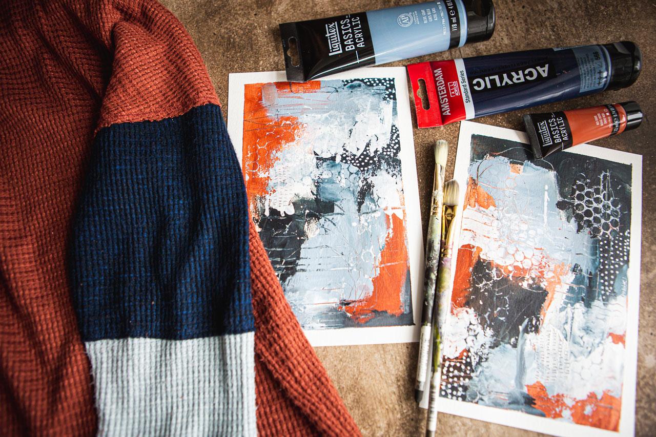
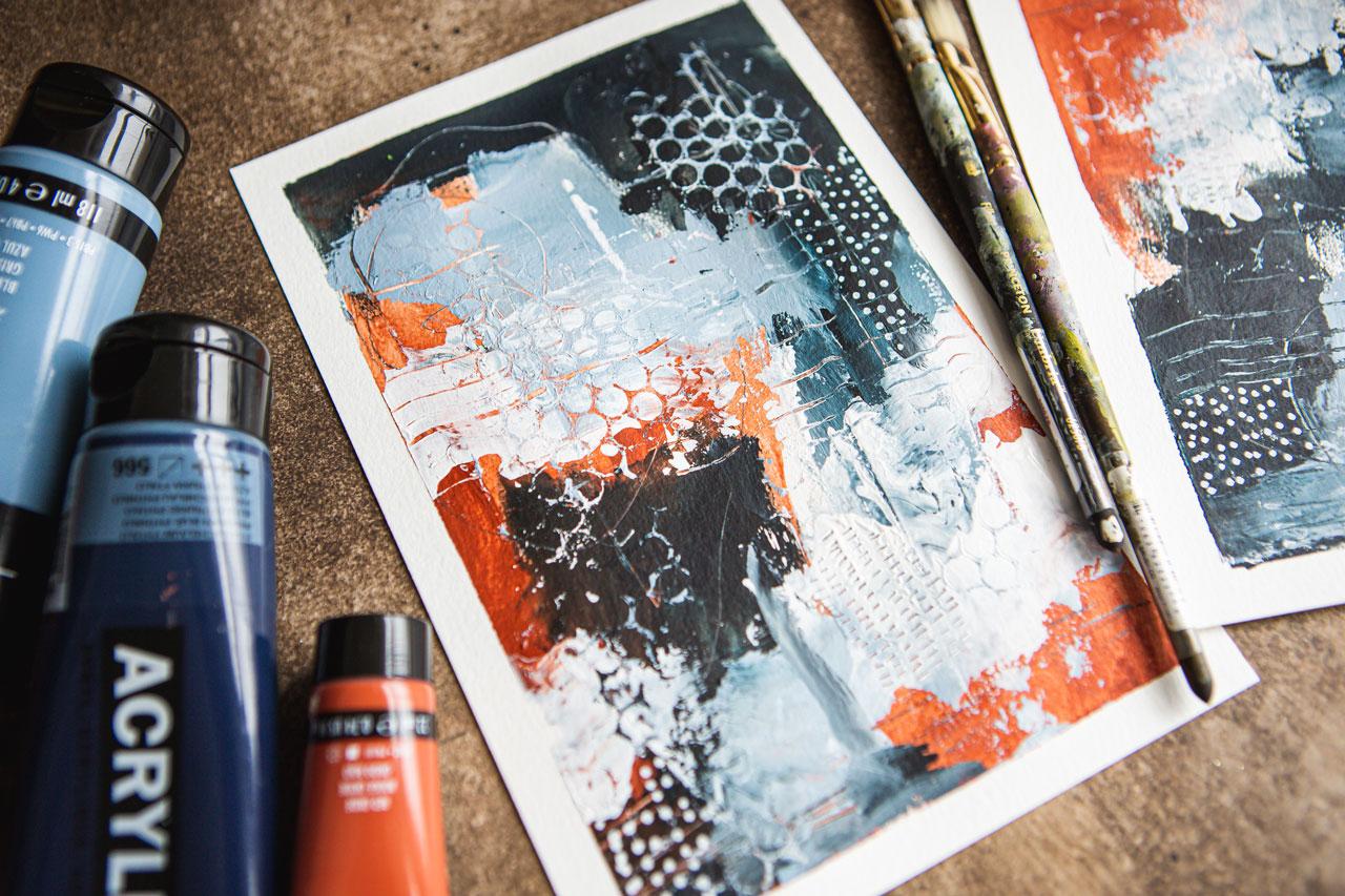
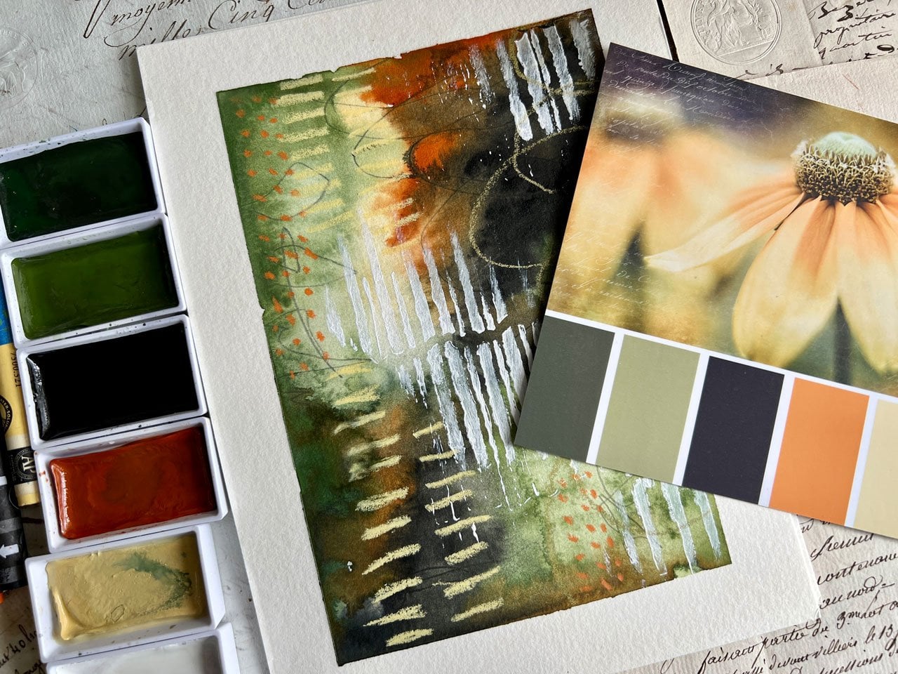
4. Rust & Blue: For this project, I thought
we would use a sweater that I have that I like
to wear in the winter just because it's soft and
the colors are interesting. What I've got here,
it's a pretty rust, and on the sleeves, it's got this pretty
dark navyish color and then a light
blue gray color. I was wearing this
the other day and this whole workshop
idea came to me, why not use our wardrobe to be inspired in our
color palettes for art? Because the things
that we tend to wear are the colors that
we're attracted to. Sometimes I might just pull a whole bunch of
colors that I like, but not really know how to
pull the palette together. I thought, let's just go
dig through our closet, find some of our favorite shirts and let's be inspired by the color palettes
in those shirts. I've just pulled out
some Liquitex basics and some Amsterdam
acrylic paints because I just want to be
inspired by the palette. I'm not trying to
create an exact match. You can certainly use
that as your project if you want to get
completely exact and working color mixing, that could be the
way you want to go. I want to focus on just being
inspired by these colors and creating some abstracts
using the color palette, and then just see, hey, did this work,
did it not work, is it something
that I'm interested in using going forward? This is the exact
way that I come up with some of the
fun color palettes. This is Amsterdam,
Prussian blue halo, and I was thinking
indigo or Payne's gray, but the only indigo
and Payne's gray I have are in my acrylic inks, so I do have those available. But this is a really dark blue. I'm going to give it
a try thinking that it's going to be
really close to that. Then this is a light blue-gray, so I'm actually going to
use Liquitex blue-gray. I might mix that in
with some white to get it lighter so I've
got that available. Then I also found because
I have a whole bunch of these little three-quarters
of an ounce Liquitex colors, got a whole bucket of them, these come as a whole box set. What I love about these is then you can try
out all the colors. When you get something
that's gets really empty, like my light pink, then you can say,
I love this color, let me go by that
in a bigger size. Then you don't have to buy all the colors in the big size, you can test them
all out and see what ends up being
your favorite. That has been my
little go-to trick on figuring out paint
colors and what I love. I actually pull that red oxide, burnt sienna, and we
could go either way. The burnt sienna is maybe
a teeny shade darker and the red oxides like
a teeny shade brighter. I could mix them if I wanted to mix them both in together. But I really feel, I feel dark like
let's try red oxide because I know I use
burnt sienna quite a bit. I like that color. That's our color palette. I've also pulled out a
couple of brushes I like. My mechanical pencil
to do some mark-making and draw through the paints, I might use that, I always reserve
the right to use white and black and my pieces. I've got my white Posca Pen for maybe some marks at the end. I've also got white
Gesso, black Gesso, and I'm clear Gesso
just handy over here. The white Gesso I'm going to use as white paint basically. What I like about
using the Gesso is that when you mix
that in with your paint, it gives that paint
a little bit of grit and a little bit different
texture when you're painting. What's good about that is
then you can come on top of that acrylic paint with
other mark-making stuff like your Neocolor crayons or your
pastels or other things. Because traditionally,
acrylic paint's very shiny, it dries very slick. It's basically a
plastic that we're painting with and the Gesso gives us that little
bit of kick we need to keep working
on top of it. I'm going to put that
out on my palette also. That's the colors that
we're working with. I'm going to set
that to the side. I have taped two
pieces of paper down. These are just working
on my Canson XL, 140 pound cold press,
watercolor paper. You can do this
project on any paper that you have on hand that
you want to play with. I just have a lot of that
paper because I like it for testing new ideas and
doing projects like this. That's the one I'm going to use. Also in my brushes, I've pulled out a fan brush and just some random other brushes. I've just discovered
that I love a fan brush. We can get different
marks and patterns and I haven't played with it
much with the acrylic paint, but I've got one out
there because it's like a new favorite little
supply to play with, even though I know
it's not like new. But it's newly
rediscovered by me. Let's just put a little bit
of our color palette out. Like I said, I'm not
trying to maybe nail the palate like dead-on exact. Look at that color. But I want to get close. I'm being inspired by that
color palette for a reason so I definitely want
that blue to be lighter. We're going to put
some Gesso out. You can use white paint too, but the Gesso is like a cheap
version of the acrylic paint and it goes along way. We can mix it in. Now that we've got our three
colors that we're playing in, definitely feel
free to use shades and tints of those
colors and your pieces. The goal here was to start
with a color palette that inspired you
and work from there. If you want to add white
to that to make it lighter or black to that
and make it darker, definitely jumped in with
that if you need to. But I'm wanted to stay true to the color palette a little bit so I think I'm going to use these in maybe the
trueness of the color. This is clear Gesso because
I might want to mix the clear in with my
other two colors. Let's just jump in and feel free to
substitute your colors, substitute what you
mark-make with, substitute different
materials that maybe you want to work with,
substitute different paints. This is all about experimenting
with a color palette and working with what you have. I'm going to start with
some marks on the paper. I find that that
helps get rid of some blank page paralysis that we tend to start with
if we're working and we're thinking,
the page is white, I don't know what to
do, and you get stuck. If I start with drawing
on the white page, I get past that fear
of the white paper. What do we want to do here? Let's just get started with this yummy red oxide. This is a really good
way to test out too, like how thick is
the pink color, what is the pink color? Like now, as I'm
painting this on here, maybe I would have liked it
to be that darker shade. This would be the time
to switch that up if you're thinking, not quite what I thought
it was going to be, this is the time to play
and change that up, but I like it, so we're going to
just go with it, and I'm just mixing
it a little bit with that clear Gesso. Another benefit of
the Gesso that I like is that it makes the paint a little more map so
it's not so shiny. I just don't like shiny paint, it's just not my jam. I'm just going to paint and make some little
abstracts here. I'm going to go with
what feels good. These are a little bit like my intuitive painting
sessions where I'm like, let's just paint and
see where we go. Let's maybe jump into
this beautiful blue, which now that I just
mixed that in there, and I can see more
of that color. Look how bright
and vivid that is. I almost think that's
going to end up being way more vivid
than I intended, and I bet I can solve that just by using a
little bit of black, just so in with that. I don't want it to
be like neon blue. I want it to be like deep, dark Payne's gray kind of black. See, now there we go. Now I've got the blue in there, but it's really dark,
it's almost black. Is it almost black in my shirt? It's a little bit
lighter than that. I could come back with
a little bit of white but that's the name of the game, play and figure out what works, what doesn't work,
did you like it? Did it work? Did you get where you
were intending to go? That's what we're
working on here. I consider white and
black to be neutral. If you're working in
your color palette and you're like, I like that, but I want this or I want that, feel free to tweak these to
what's going to work for you. White and black are going to be your free colors and the
reason I tape the paper down, I'm treating these
like maybe a pair, like doing a pair because sometimes one works
out, and one doesn't, and you painted the one that doesn't work out first,
you're very sad. Let's jump in here
with this light blue that I'm going to
mix with the white. I want it to be that
really light color. There we go. Yeah, great color. In Experiment 2, I use the same color
palette more than once. Experiment with one
color being much heavier than the other
two colors and see, did you like more orange or did you like more
of the darker color or did you like more of the light grayish here? Experiment with how
dominant each color is too. You might do several sets
in the same color palette. Don't give up after one set unless you completely
hate the color palette, which has definitely
happened to me before. But I want you to experiment with the dominance of each color and we can continue
layering too. Because the more we do this, the thicker the layers get. We can keep layering on top, the acrylic paint
dries very fast. In the middle of this, let's do some
mark-making and really add to the layers of our piece. I did some pieces a while back where I did these
lines like this. I did it with
something different. It was like the
oil and cold wax, but these lines that
were created by, I think I was
working with one of those rubber mark-making tools. But as I was going
down like this, it created this stabber lines like that and I'm
like, I love those. It's interesting
as we're working, what you discover might
be your signature marks. I like that. Maybe your signature marks are going to be way different
than my signature marks, but that's what's going
to make your piece unique and individual, and beautiful to you. Also, we could come in
here with a palette knife , with some white. Wait, let's see if we just do some of this and
just see what we get. I'm just dipping it in that
white just so to do this. Just adding some extra elements. Just fine. Just what feels good. I like doing the
intuitive paintings like this because it's
like what feels good, what rolls in that
moment are you feeling? Then surprisingly
enough, the pieces are better sometimes than when
I'm way more intentional, and I'm like, our new
discoveries, new colors, new color palettes,
what have you, and things get exciting. This is looking
very interesting. Now let's just go ahead
and work it a little more and just see what feels good, what do we need to
do, what's left? Mark-making, is there some extra mark-making that we
need to do in here? You get to a point
where you're like, I don't know where
to go with this. Then I want you to
stop and you can set those to the side and you can
come back to those later. You don't have to make all
your decisions in one sitting. I'm really digging the
way this is going. I have some of these. You know what? I was about to say I
have some of these drag tools from Ranger, which are super fun. But I'm working with
acrylic paints, so these are going to dry before I can really drag
these through it. Isn't really cool though? They've got like
different shapes. Look at that. Never mind. I'm glad I went
ahead and did that. That's super fun. Drag tools, anything you want
to drag through your piece. I like that. Wipe those off. These are just little
mark-making texture tools by Ranger at rangerink.com. I don't know if they're
still available or not, but they are super fun. Another thing that I have that always love is
the punchenella, which is the metal leftovers
of when they make sequence, and also some shelf liner. I saw some different
shelf liners the other day and I
thought, do I need more? But this stuff goes a long way, you just need a little piece. Bubble wrap, always fun. These are super fun
if we come back in, and see what it just did? I just put that on that
wet paint and pulled it up and you can already see
some circles were made. That right there
could be enough. What you could do is just
take a palette knife, smear it up, and see if
you get that in there because now I've got white
paint on the back of this. Look at this. You could come over here. Look at that, oh my gosh. Dang it if I don't
love discovering, super fun, I'm loving that, super fun ways to add
some texture and color. That's good there. Let's see. Anything else I want to add? Do we need any dots? Do we need any
extra mark-making? We've still got our Posca Pen. If you're at this point, you're like, I don't know, does it need anything else? You can always peel your
tape and evaluate it, and see what you got. I am feeling Posca Pen though. So let's go ahead and
do some Posca Pen.
5. Rust & Blue Finishing Up: Because I've already
allowed myself white, I'm going to do
white Posca pen just because I'm a dot girl. Let's do some dots. You can figure out where's that going to
work best for you. But I like picking a swash
of one color and doing the dots all in that color and letting where the
color starts and stop, guide me for where I
start and stop the dots. You could be a little more
strategic if you wanted and make the dots do
something specific. I like following
colors with the dots. Consider doing it in more than one area,
preferably odds. If you do it once, do it 1, 3, 5 times, but sometimes
twice is fine. You're just getting into some of your own
preferences there. What feels good? What ended up striking your
fancy as you were painting? For me, I'm feeling like two. Even though you have the rule of odds in art a lot of times, sometimes, it's okay
to break the rules. Super fun. Another thing that we could have done is some hash
marks and some lines, and we could have actually
draw through wet paint. Some of those white
gesso is still wet, so why don't we, if you've got any
wet paint areas, come back with maybe
some little lines or dots or dashes or
hash marks or whatever your favorite
mark-making technique is and come back and draw
through the wet paint? We're looking for layers and
we're creating interest. The closer you get to the piece, the more you start discovering these little surprises that
we've put into our piece. If you're afraid
that you're going to put your hand on wet paint, I always keep a little
ruler handy and I can hold the ruler
up from my paper and just brace it on
something with no paint on it and then brace
my hand with that. I'm not putting my hand
directly on my piece of art. Has that saved me
a million times? This is just a
little metal ruler. You can have a
little wood ruler. It just needs to be sturdy
enough so that you can hold it up just lightly, so your hand is not on your
paper smearing wet paint. But I just wanted another
little set of these dashes over here in that piece to
blend with this piece. Super cool. We could have done each
piece a little differently. I could have done
one dominant color over here and a different
dominant color over here, like you could have gone
ahead and played with that. I want matching pairs when
I'm doing stuff like this. Check it out. Super fun. These are a little bit wet, so I'm going to draw
them real quick with the heat gun and then
we'll peel the tape. [NOISE] Let's peel some tape. This is my favorite part because we really
reveal the piece. I think for our own safety, I'm going to move the
wet paint palette out of the way off my hand. I'm so clumsy. Look here, I did not use the fan brush. That's a goal in one of
the other ones, though. We'll use the fan brush. I found, especially if you have a lot of trouble with your
paint peeling your paper, if you'll peel it at an angle, fairly consistent pull rate, got a little piece
of tape there, if you'll pull it at an angle consistent in your pressure, it's less likely to
pull off your paper. Look how clean that pull is. I've just used artist tape. I also use a lot
of painters tape, that blue painters tape. This is artist tape that I
got at the **** Blick and it is actually just
called Pro Art tape, because I thought
sometimes it might be fun to have white
tape or some other, just test out different stuff. But look, if you pull it at the angle pretty consistently, we don't tear our paper. If you're having trouble with the tape peeling your paper, take your heat gun and
heat the tape up a little bit and that will help the
tape release your piece, which is one reason
why I don't use a heat gun in-between, especially like watercolor
layers and things like that because the heat
is releasing the tape. Now you're not going to get
the clean edges because you release the tape and the next
layer can now sink under. Just be aware of those. Just slow and steady. Look how pretty that
is. I love that. I get so excited to
reveal the pieces. Abstract art is one of my
favorite kinds of art and it's a struggle sometimes to get beautiful abstract pieces. But if you just
enjoy this part of the process and
you're not trying so hard to create a masterpiece, I just find that
I'm delightfully surprised at what I
created when I'm done. This one just got
so much prettier. [LAUGHTER] I just enjoy
it and you create pieces that you were
meant to create. [LAUGHTER] Look at that. If we pull our garment back out, how did we do? I do see, just self-evaluating, I do like how dark
I got the blue. The gray, this is almost even, could have been lighter, so I could have lightened
that up even more. The burnt color, I
bet if I had used, I went red oxide, if I had used the burnt sienna, I think that would
have been darker or maybe even less transparent because that ended up being fairly transparent with the paper shinning
through it a little bit. Just as evaluating
a color palette that I get close to the
colors, I sure did. Did I love the colors now
that we're done? I sure do. I vaguely feel like I may have created something
similar to this in one of my oil and coal wax
palettes where I was inspired by an interior that I was
looking at in a book, which is funny because
being inspired by your surroundings and the things that you decorate with and the things that you wear and the things that you'd
like to look at, those are the perfect places
to get color palettes. I love this color palette. This is definitely
one that I will revisit again. Check that out. I want you to get
in your closet and see what is your
favorite shirt to wear, which one are you always
gravitating towards, and see what we can create. I'll see you back
in class. [MUSIC]
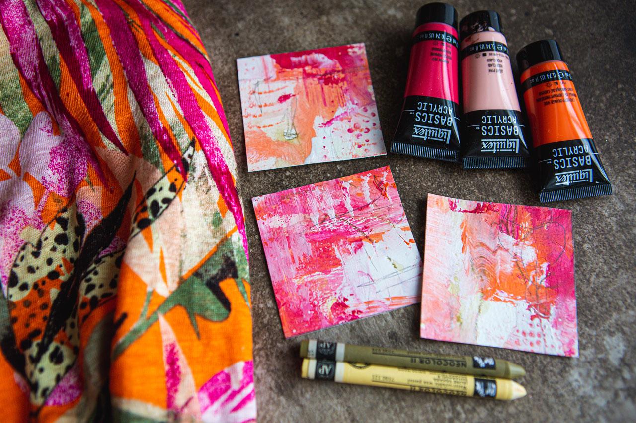
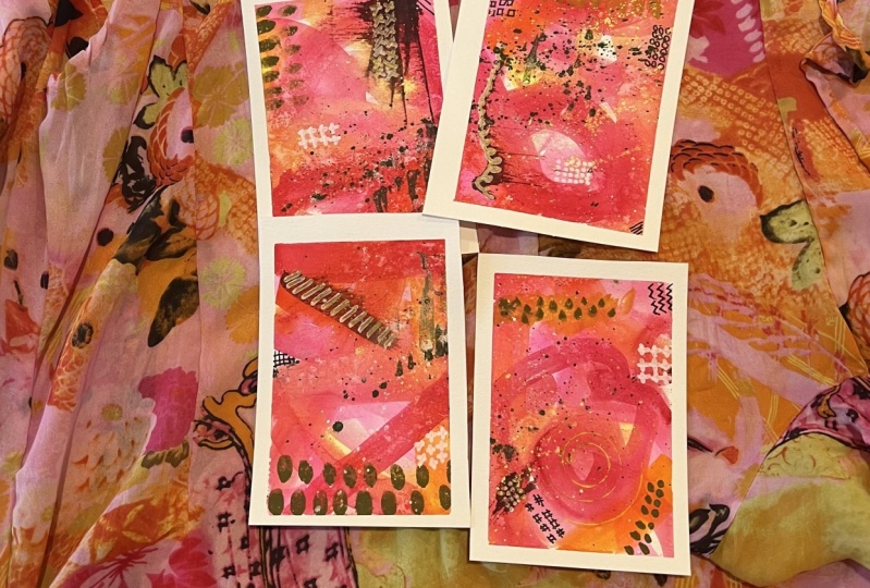
6. Pink & Orange: In this paint project, I'm going to be inspired by a really bright orange
shirt that I have. I tend to flip back and forth between the ultra-neutral
and the ultra-bright in the things that I wear, which is appropriate because
I do that in my art too. I am just a little scattered
in some of my preferences. I like all the things. Sometimes, I find
it hard to settle down into one look or one style, or one color palette. That's just not me in real life and apparently is not
me in my painting. But check it out, what I
really like about this, and this might be a
tiny bit brighter than what I normally
wear now which is funny. Because I remember I had this
shirt when I was a teenager and it had this
funky pattern on it, and I came out and
my dad was like, "Did you take the curtains off the wall to make that shirt?" I know he thought
he'd been funny and I was totally insulted. But, I tend to like
to wear things that have a lot of color and pattern and definition and design. Then other times I want
to be super neutral, and let the things
around me inspire me. Today, I thought, why not this bright
color palette? Because I've mentioned
in other classes, pink and orange is a color
palette that I like. Now that I'm looking at the paint palette I've
already put out, it looks like I put
out of the pink and none of the orange, so let's put that out. Here's what I'm going to
be inspired by today. I put out extra pink]. I like that this has
bright orange overall. We've got this pink and
magenta color in here. We even have a dash
of this pretty green and a tiny bit of yellow. Then we have some black
drawing on top like we took our Posca Pen and drew a botanical
on top of our piece. This is a perfect opportunity to create in different ways. We could either
create an abstract, my intuitive abstracts that
I really love creating. We could create a
botanical piece and let this inspire your
different botanicals that would work really well, especially if you like
working in the watercolors. Do all your botanical work, do some black ink
drawing on top. You see how many different ways that we can go using an
inspiration piece like this. I am going to go for abstract and maybe some botanicals
drawn on top perhaps. This would be perfect if I
wanted to work in watercolors with some of those types
of abstracts that I do, it'd be perfect for working
with the acrylic inks and those type of abstracts
that I like to do but they employ in
an acrylic paint, and that's where
I'm going to take this inspiration piece today. But, see how we can revisit
this multiple times, and try this color palette
out with multiple supplies and just see what
direction can I go today. The direction I'm
going is going to be abstract with black
ink drawn on top. That could be in mark-making, I can make botanicals,
I can make dots, I can do anything that
inspires as I'm painting. Let's go ahead and do this. I have pulled out some colors that I thought were
in this shirt. You can see I'm very close. I have pulled out
cadmium orange hue, light pink, and primary red. I've got my glasses on, but
now I need some better ones. This is primary red. I also thought, what if we pull out some
Neocolor II crayons? This is olive-brown
and a Sahara yellow because those are in there; those are right there. I probably do have olive, I don't know that
I have this yellow because that's not in
my color preferences. I got a black Posca Pen and a couple of various
paintbrushes over here. I also have my favorite
mark-making tool which is my pencil
but I thought, because that olive in
that yellow is in here, what if we just start our
abstract piece with that? It will probably be
covered up a lot but we could leave
some of this showing and look what we could do. This is why I like using these because they're water-soluble. Let's just get some
of this on here, get that white page with
some movement going. We're going to look
at this and think, what was I thinking? Now you can see why. Check it out. We can move this around
with some water. See now that yellow
turned a little more buttery when we did this. Fun to push through
some thought. What else can we get
them to do beyond hat we always do with them? Let's do that. Let's let that be its thing. Then let's just attack
it with some color. Here we go, color. Because those are leafy with other colors
running through, it might be a good time for me
not to forget the fan brush because I like the fan brush. I've got my pink and orange, I got double pink accidentally. I've got my white
and clear Gesso that I'll be mixing
in with these. I'm just going to go ahead and attack some of these
and just see we can get. A lot of times when I'm
thinking of pieces like this, I'm always painting
with the option that I can cut these up. I say that a lot
because my favorite way to create is to
create for the fun, not for the worry of
am I getting it right? Did I get that in
the right spot? Have I ruined the piece
for whatever reason? I don't like to create that way. It tends to be a
block in my mind. I want to create
without the expectation that it's got to be amazing. Look at that color palette. I started off saying, I don't like these colors
with that yellow especially, but look at what it just did. Happy discovery there. What if we did some dominant
different on each piece? I'm really digging this. What if we make something
else dominant over here? I'm just going to go ahead and I keep a couple of different paint brushes handy doing this. I can mix them together if
I want but let's go ahead. I'm going to mix in
some Gesso with these because I like the way
Gesso makes the paint work, makes it look, and allows
me to do stuff on top. Look at this pretty
so many color I just created mixing
it with the white. Play with me here, I want you to experiment
some of these things. My point is, I don't worry about the composition at this point because I always create almost with the intention
of cutting it up. But you notice how many times
we don't cut the piece up, but if you create with the
intention of I cut this up, you don't get so bogged down
in this is not working, did I do this wrong? Do I get stuck in the pieces? You don't get so stuck. I'm going to paint
with my fingers here, you allow yourself some freedoms that when you're painting
more intentionally, you just don't have, that's when painting
becomes hard work to me and I get frustrated
and I don't enjoy it and so the longer I create, the more I like to be
surprised with my end result. Let's say that you end up with something that was so amazing, you never expected it, and now you've got a new series and you had fun creating it, if art has to be as
hard to work as work, why would we do it? I want to enjoy
this process a lot more than I allowed myself
when I was younger. If you end up with a
composition that you're like, this just doesn't work, I'm loving this right here almost don't want to do
anything else to it, if you end up with
something that you're like, it's just not working,
then, you know what? When we peel that tape,
if you're like, okay, that didn't work out
the way I hoped, we can cut the piece up and make it into
something amazing, we can use these
for collage scraps, we can use these as cards that we send people little
tiny abstracts from, there's all things
that we can do with abstracts like this that
we cut into other pieces. Sometimes with the composition, it's just a matter of
tightening it in a little bit or cutting off the one
section that doesn't work, so it's not all about
perfection for me, it's more about
enjoying the process and exploring these colors and I almost wish
I left that one with just that light pink, but that is not the
spirit of what I'm doing, so let's just keep
on adding to it. Because when you peel these, you might be
delightfully surprised, I mean, I'm delightfully
surprised every time I create, but I do feel now
that these two colors and the light pink,
that is something I might revisit on their own. What if we take
that palette knife like we did in that other piece and come through
with some white? Look at that, look what
I just created there. Super fun to discover, weirdo lines and movement in your piece by doing
something crazy like this, then I would just
push it up across it but this paper has, once you get some stuff on it, it might buckle a little bit, so it started to
curve a little bit. Just dragging it gives you different results
than if the paper is still flat look at that, what if I put those
in the water yet? What if we get that fan brush and see what we can get
with the fan brush? Yes, get that fan
brush out people get that fan brush out and play and look what we just created. Great movement, man, look at that extra excitement, so what if I do that same thing, but with that light pink
on this one over here? It's not showing up
as much maybe white, let's do white,
I'm going to get, I'm getting stuff on
everything over here, we don't want it all
over our Posca Pen. I need two more feet when I'm doing this stuff
two more feet, yes, you want off the white, that's fun with the white but maybe it would have been even
tanner with some orange. Now we're just going
to go up through here, see now that was what I
wanted, that's super fun. Another thing that we
could do with the fan, we don't have to
drag it every time, here we could go, let me make sure that's going
to give me there we go, we can do, look at that, fun little mark-making element, some little fan marks there. Let's see, maybe over here, we'll do that in
the white hang on, let's just, yeah up the
side, look at that. Just laugh with me. So what if we took
maybe the pink, like we did the white,
and do a little draggy and create some other
stuff with pink here? See, that's pretty
coming off of there, totally just reminded me of some spooky
Halloween noise I just made there ,
see, that's pretty. Let's do that over here. That's real pretty, I love that right there, get out the palette
knife do some dragging, I want you to use some tools
that maybe you don't use all the time and this time
I know I used the punch, and Ella before
because I love it but what if we come back here with shelf liner, put some dots and then let those dots
go out here on the piece and other places
and it's still wet. I'm just really honestly moving some paint around
here with the mark-maker. Look at that right there, that was good, I'm just moving some
of that around, adding to the marks, so this actually needs to dry. I do want to do some
botanical on top in the black because it's in our piece but I don't want to
ruin the piece either, don't we all get
into that mindset? Let me dry this a
bit with my heat gun and I'll be right back.
7. Pink & Orange Finishing Up: [MUSIC] I've dried
it quite a bit. But I really didn't do a lot of mark-making on
this while I was painting. I got distracted. I want to come in here and just see can I move anything around? Is it all completely dry, or is there still
a spot that I can get maybe an extra
mark-make, an extra drag? So I got it pretty dry. I should have been
dragging right there in the middle of it all being wet. I got excited about
moving to the next point. I can already feel in my
mind I'm digging this, I'm not digging this, I'm
feeling like cut this up. Let me continue to draw
this and I'll be back. I just wanted to throw in there. Don't forget the art-making. [LAUGHTER] I'm getting some
on my little viewfinders out. I'm going to move the wet paint for a moment out of my way. We'll reserve the right
to bring that back. I have little viewfinders. I'm going to peel the tape
and then see do we love it? Do we need to trim
pieces out that we love more like check out
that right there. That's a furnish piece. [LAUGHTER] That is gorgeous, but maybe the whole
piece is gorgeous, but I can see some yummy little micro abstracts coming out of this and I checked that one right there that one oh my gosh. I just got excited
about that and that. Then we can still paint
with black on top so let's peel this tape
away and evaluate. I like to paint, I
like to evaluate. Then I like to decide or cut up. Again, I pull it out of
a consistent pressure at an angle and I usually have really good luck not
to tear the paper. Really depends on the paper too. A lot of wood pulp content in that paper gives things
for the tape to grab onto. But surprise, surprise sometimes
with the cotton paper. I've had some terrible tearing
but pull it up that angle. See now that's actually
rather delightful. I don't know if I can
cut that up or not now. At any time, feel
free to give yourself permission to not do an
element that you expected. Like, do I want to do the black botanicals
on top of that? Maybe, maybe not. Give yourself permission
to change your mind. You don't have to
think, oh, I like it, but I decided I was
going to do XYZ. If it's at a point that
you're like, yum, yum. [LAUGHTER] Seeing I'm already feeling this one is just
not going to be the one. It has no obvious focal areas. It's a little more
mishmashed in the colors. It doesn't have the contrast. Like on this one,
let's evaluate these. On this one, I've got
contrast from light to darkish with this red. But on this one, I didn't have that level of contrast
anywhere really. This one for me that works as a great big piece and I'm
very happy with that. But it also works as a micro piece
because check that out. Then, does this work
better than this? That's only a question that
you can answer for yourself. But I can see several
micro collages like, oh, like right there. Several that just work because now got some defined
elements in there. I've got the light
and dark contrast. I got some movement. I also have some differences in the whole piece where
it's not like all the same so I can see that one. I can see this one right here. This one I love because again, I've got enough contrast. I've got movement coming
through the piece. With this one, I'm thinking of splitting my canvas
up into say, thirds. I've got like this pink
area here, that's a third. Got this orangey collection that's like a third and then
I've got this white here, that's like a third. Then if I look at
the rest of this, I've got this bottom third
with this white at the bottom, and this top two-thirds
with some color. That works for me in a
compositional standpoint. Same thing with this. I've got movement where
it's at the diagonal, moving through the piece. That's another composition
that we might be going for. I've also got that Canvas split up with some color
along the thirds. Third of the page, third of the page,
third of the page. Like if you're imagining
it cut up into thirds, I've got those color separators. It's like my subject
is not in the center. There's movement
in the whole piece that I can then enjoy. Some of that is just intuitively what is working for you as
you're viewing these pieces. As I'm coming around and
you're thinking, Well, how did you pick that
versus say that? Well, I don't know. For some reason, it just doesn't intuitively appeal to me. I'm looking at that
and I'm just like, whereas if I'm coming around
here and I'm like, whoa, stop right there, that
I know it's going to be a good composition because I got excited when I saw it. You need to start oh, see, look at that right
there. That would be good. I'm not going to be
able to get all of those but like right there. I can definitely do those two. Start training yourself,
like looking at the pieces and moving a
viewfinder around and thinking, why does this work, or why does this not work? It's very subjective. Art is very subjective
and if you're just all gung-ho and convinced that this is the
most amazing piece like it is, stick with it. I'm feeling this piece right here and I think we
went here a minute ago. I like it because we've
got about a third of the painting in the white and about two-thirds in
the pink and orange. I also like it because there's
this movement and there's interesting mark so that my eye is flowing around the piece. I feel like today's
project is going to be, we're going to veer a
little bit off of what we originally said with
the black stuff on it. But I'm going to
save the piece to maybe do some
botanicals out of it. I'm going to go ahead
and cut the compositions out that I am super gaga about. These can be three
micro collages. One thing I like about doing micro collages is
you can mount this little bitty
three-by-three square because this is
about three inches. I've just cut this out of a
piece of watercolor paper, so there's nothing
special about it. But it is three inches. It's a three-by-three
square that I just cut out of a piece of watercolor paper,
so nothing special. Another way you could do
this is get some mat board from the art store
or the framer. Look here we could have, I'm going for squares today because in my mind I
can imagine the square in the middle of a big white piece and then framed and they can
be super dynamic, just having that pop of color on the middle of each of these. That's what I'm feeling. But look at here, we could
have done that right there. These little pre-cut map
pieces, I love getting those. They come in different
sizes and we could have put the mat
on here and thought, okay, it's framed. Does it work? This actually still
works as a big piece. I like the movement, I like the color, I like the marks. Whereas if I put that on here, it's like flat, like it's not exciting at all for some reason somehow
it goes flat. That's why I like to create anticipating cutting things up because of that right there
now, I'm not disappointed. I'm like, but wait a
minute, check out this. If I cut it here, if I cut it there, look
what I can turn this into. It's just not upsetting
to me anymore. [LAUGHTER] I want
you to get there. [LAUGHTER] There's our pieces
that we're going to cut out and we can just do that
with a pair of scissors, or you could do it with
your paper cutter. It just depends on what
you want to do there. I don't think my
little three-by-three square is perfectly square, but it is close enough
for me to create, like I can tighten these up on a paper cutter if I need to. When I say mount these in the middle of a
piece of white paper, I'm going to show
you what I mean. Because these are going
to be super dynamic. I don't think it's
perfectly straight, so I would actually like these
to be perfectly straight. Get the paper cutter out and
straighten it if we need to. Let's cut this other one out, which I could go ahead and try to cut that with
the paper cutter. Let's see if we cut this
with a paper cutter. Sometimes you cut with
the scissors because you've got pretty
stuff left over. I'm pretty okay cutting
this with the paper cutter. I'm like, Where
did the cutter go? [LAUGHTER] Let me get
that right there on it. Oh, yeah. Much straighter. [LAUGHTER] Trim the paper
down closer to this. If you're afraid you're
going to cut off something that you
love, look at that. [LAUGHTER] Oh my God. This one is cut
out better though. [LAUGHTER] Lessons
learned as we're going. I've cut out so many
with scissors before, but I do like them
straight personally. It bugs me if it's not
straight. [LAUGHTER] Look at that, these are gorgeous.
Set that down. I might pick that back up
now that I've done that because let's take
a look at what if, so this is a 9 by
12 piece of paper. What if we took these, made it square, so 9 by 12. I want to cut this to a nine, hopefully I don't have paint all over the bottom
of this thing. Let's see, let's
cut this to a nine. Now we have yummy square and can take our
bits and pieces, mount this right in the
middle of that piece, and now frame that wide out
there with a goal frame. How gorgeous would that be? This is my thought on the micro collages
is to do this and mount the three that I
found like that and then as a three piece like that
with all that leftover. Basically, it's a
three-by-three square. It's a nine by nine piece
of paper so we got 3, 3, 3 our little edges
are 3 inches wide. I liked the symmetry in that and the dynamic pop
that that creates. I would just glue that
down with a little dab of glue and that would be my
finished micro collage. Look how gorgeous all
three of those are. I'm going to give myself
permission to not paint those. But what if we took
one of these others? Like I'm really feeling
this section right here. Like right about
there. Let's cut that. Let's cut the white off since we're doing a trimming and then now you're ready to do some type of maybe black botanical
something on top of here. Let's get our posca
pen. Here we go. Now we could say, what botanical do I want to draw on here as I'm getting
black paint everywhere? Now I'm thinking something with some pretty leaves maybe we
could have something come up. We could have just something
go through the middle. Let's just do something
through the middle. Something fun on here that
we could consider doing. Instead of just doing
lines like it's a leaf, we could do a line
like look here, we could do the leaf line, or we could do dots. It's like, let's make
these more interesting. They don't have to be just the standard
leaf that we drew. Look at that. I like that. On this one maybe we could
do some little circles. This might be easier
with my finer posca pen, but we're already
going with this, so we'll just stick with it and we don't have to do
both sides of the leaf. Like look at what
we have here on this side of that
leaf. I love that. [LAUGHTER] We can
come back over here, what could we do over here? We could do some little x's, maybe just to give ourselves
three different patterns. I want you to do, well 1, 2, 3, 4 different patterns. [LAUGHTER] I want you
to do some type of botanical and a different mark on each side of it.
Check that out. See now that's super fun so we could do something like
that and that would be fun. I could have some
pieces coming in. Like there's more the
tentacles off to the edge. If I wanted to imply that this was more leaves and things out here to the
side. We could do that. That one turned out
better than that one. That one's a weird
whatever here. Let's see. Let's go ahead and
do some mark on that so maybe the weirdness
will blend in [LAUGHTER]. See? Now that's fun. I want you to think
about these in terms of what can
you do a little different and do
some mark-making. That's fun. There's also some real heavy little
splotchy things on that inspiration t-shirt. We look back at this. There's leaves with great
big splotches in it. That's another thing
I could have just done. But that's okay. We'll do what we got here. I could do with those big
splotches if I wanted. Super fun. I like that. I'm liking that. I've got lots of pieces that
I could do that on. Look at all these pieces. I could do little botanicals
on that one's a good one. Super fun. Now if we evaluate, how did we do compared to our inspiration piece,
here's the ones I like. Let's just keep all
these so let's compare. How did we do? Now I can see the shirt's even more
vivid than I went. Somehow might've been
mixing with the white, or maybe this cadmium
orange hue is not even as bright as I thought
it was when we painted. But for the most part, how did we do color
palette wise? I think these are
freaking gorgeous and I like it with the black
botanical drawn on the top. That's a fun
technique to do going forward because I like
all the marks and interesting things
underneath the botanical that we can
see shining through. Super fun and if you do some
of these and you're like, Let's cut these up into
the micro collage set. Then cut these up, cut
three pieces of paper, mount those right
to the center and those are ready to be
furnished and framed. [LAUGHTER] I love how
we can see some of this yellow and green shining from underneath that bottom
layer that we did. Sometimes you're
going to cover up the very favorite part of the piece and sometimes
lucky enough, you get some of it shining
through that you love. These were two cut out
from that first piece, I can tell because I left more of the background
shining through. I wish I had done that
on the other piece, but the goal was
to experiment with two different pages and
make something more dominant on one that's
dominant on the other. I think we did a
very successful trio there that I cut out of those. I hope you have fun finding something in your
closet or being inspired by the piece
that I pulled out of my closet and just seeing
what we can create today. I'll see you back in class. [MUSIC]
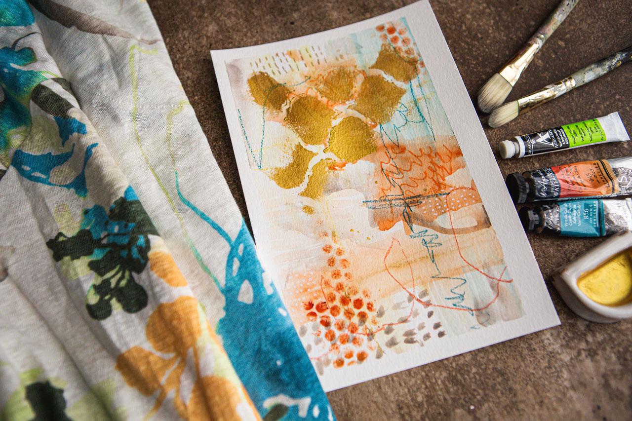
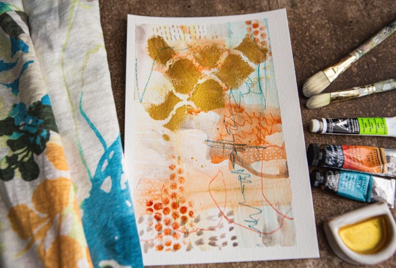
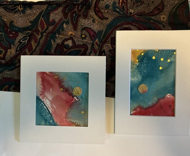
8. Orange & Blue Watercolor: For this project, I have this pretty
wild tropical shirt and I thought look at
these crazy colors. Sometimes I wear things and I don't really think to
paint with these colors. This is a pretty shirt. I don't know that it's
my most favorite, but it was one of the more
colorful ones that I thought, you know what, let's
experiment with this. I was looking here real
close at the colors and it's actually
almost watercolorly. Now that I'm looking
at that I might change up what I do because I could be inspired by what these colors are blending
and doing in themselves, and not just the color palette. What if I actually
had in my mind to pull out some
of these basics, colors in the right colors, obviously with some
neon color to crayons? But now that I'm looking
even closer at this what if we pull out some of
our favorite watercolors? Because I have a
really amazing orange that I haven't used hardly any because it's a new
color to me and it's this Chinese orange
by Sennelier. Then I also have this
brown pink color, which actually might not exactly be 100 percent this
green color but it would be interesting to let that be the green
and experiment with it. Because remember, we're
doing these as inspiration. I have a light gray because
there's a gray in here. The thing is to be inspired by the color palettes and just see how can we get close to it even if we get like a
shade off here and there. Here we go. This
one, cobalt green, definitely feels like
this teal color. Now I'm thinking, what if we do watercolors
instead of acrylic paints just to change it up on
ourselves? How about that? I want you to get creative
here when you're doing these types of
experiments and say, what have I not used before? I need a gray. Did I put
the gray back? I did. Here we go. What have
I not used before? What I want to try out? That is a Lunar blue. Just, you know what,
tinted charcoal, I want you to experiment with some of these
things and say, what have I not done before? Let's use this opportunity to not only test out
new color palettes but maybe play in some of the colors and see
what we can get. The reason I just pulled out the tinted charcoal
because it's basically a watercolor and there
is a pretty gray. What if this gray is our
light gray that's in here? Then we've got cobalt green and Chinese orange for
the blue and green, I've got a Neocolor II
crayon in Sahara yellow. I actually went
ahead and cap out this olive brown because this is an all of the color in
here and thought, why not? It is a bright green so
should I go with this brown, pink, which is not
actually the color in there or should we
look a little further? What about serpentine green? See now that might
be a good one. That's a pretty color. It's very bright, it's not
exactly what's in there. I must have squeezed it
at some point because I did a little pop and
more pink came out. I don't feel like
that's the right color and this is a bill mess now that I'm creating
here, aren't I? Maybe when you pick your colors, don't have your favorite shirt right under all of the paints that we're pulling
out just in case. Good little lesson there. I didn't get any on my shirt but what would be my favorite if I did or
would you even notice it? Because it's all
painty here anyway. Let's just see, is
that sap green, see that's not as
light as that either. That's a really light color like maybe it's the
pthalo yellow-green. I'm feeling that
is what that is. Look how bright that, that's
awfully bright though. Do you want to try that bright? Because it is awfully bright right over here. You know what? Let's just be brave
and put that out. Let's put the brown
pink-back up. Now we've got cobalt, Chinese orange, pthalo
yellow, yellow-green and our Neocolor
crayons talk about stepping outside our
comfort zone and the gray tinted
charcoal paint pan set, which is basically a tinted
charcoal watercolor. I like using this moment
to experiment and just try things that we
would not try otherwise. Now, because I've got
these watercolors out, I'm going to grab a
little palette that I can use for watercolors. I've got our little
watercolors here. Let's put these colors out
and then when we're all done, we can just look
and see how we did. I'm not sure about this green, but this is how we
discover new things. Is this going to work? What works about
and what doesn't? I think, before I started out with two pieces
on this one today, I'm going to do these like my big intuitive paintings and pretend this is all one
big piece of paper. I love doing these because it frees you up from thinking of composition and things on
one sheet of paper and now I'm just going with
the flow on big papers. You know my philosophy, I'm always going to
start off a painting thinking I can cut this up. What I've done is I've
just taken two of these 9 by 12 sheets of
the cold press, 140 pound Canson XL watercolor paper and I've
just cut it in half. Then had two sheets, that's 1,2 and I've
got four pieces. We're going to pretend this is one big piece and
just paint, and play, and have fun and
peel the tape and then see did we get any that
we loved like they were, and can we find any interesting compositions out of there? Because this is the most
fun I have painting when I can just go scribble
draw, have some fun. I really liked the way that this yellow looked when we
added water to it. Just looking at it like this, I wouldn't have thought that I liked it so much, but I do. Just to get us out of our
white page paralysis, I'm drawing here on these and I'm going to
activate it with water and just do some mark making
and see what can we get. Let's just start off like this. I'm just going to
pull out one of my watercolor brushes I have a bunch of
acrylic brushes ready, but I'm not doing acrylic paint. Now that I've gotten
going, here we go. This is a number,
yellow soft aqua, rough number zero brush. What's tends to be my favorite.
This is the number 18. I've got a couple of these. I'm going to start
with the number zero, and I've just got
some water back here. I'm going to put a
little bit of water on my charcoal pen
and just let it be activating until I
get around to it. I'm going to start just
smearing these colors around, because, I love that the neocolor crayons
are water-soluble. When we're all done because
we're working in watercolor, we're probably going to
see some of these marks. Fun experiment just to see, did we like what we did? Did we not like what we did? Did we like the
colors, did we not? I can guarantee you even
if you don't like it, once we get to the
point that we're evaluating and really looking at things and thinking what can I do with this if I
don't love the big piece? If we cut those up, there's always something
in the bigger piece. There's always some smaller
piece that's amazing. We'll end up with
something that we like even if we don't
love the big pieces. In my mind, just always
start off thinking, probably not going to love the big piece, but that's okay. You know what I really love? You're going to see
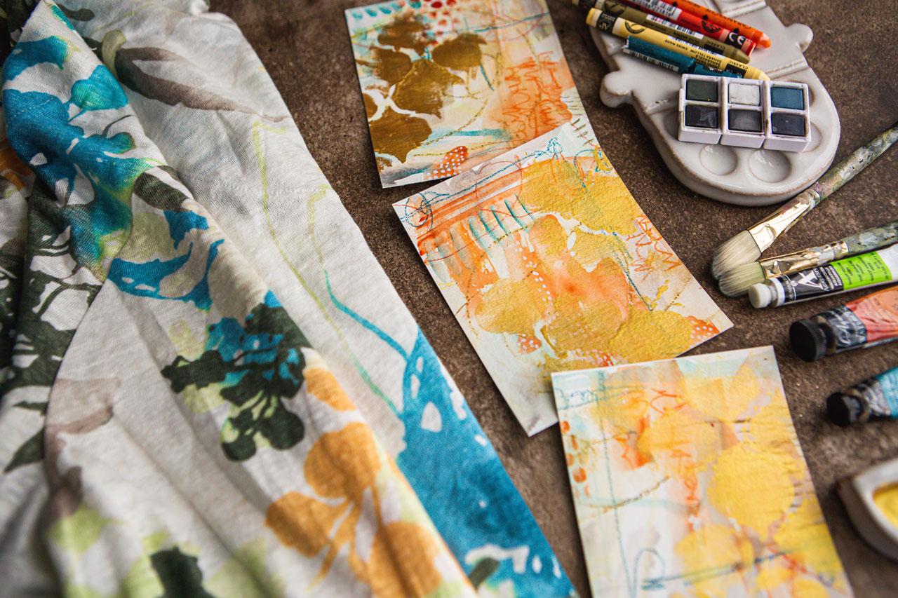
me mention this a bunch, the fan brush. Let's get crazy here. Do this Chinese orange
with the fan brush. Look at that color that is such a pretty color
and we can do different lines and marks and just see like
what can this fun? I want you to experiment
with your brushes. Maybe do some different shapes. Maybe come in with some just fine different things that you wouldn't
have thought of. Look at that. Know
what else we could do? We might do this on top. We could do some
mark-making with the fan. Let's do that on top. Actually, I want to play with some different
brushes here. Let's get a bigger brush. This is a great big one. Maybe put it in this turquoise. We can get some bigger areas. Let's just experiment and play. I don't have any
specific composition or idea or pattern
in mind quite yet. I do want to treat these like they're one great big painting. Don't be afraid just to tape. Paint right over that tape. Just like that. Just keep going. Just pretend that
tape is not there. This is a really pretty color. Let's jump into
this crazy color. Then maybe we can just do
some interesting real light. Move the brush, almost
like we're doodling, and just work that
color in somehow. I don't know that I love it. I don't hate it, but I
don't know that I love it. But when we're all done, it might be like the
piece that's like, that totally made
the whole piece. We just never know. Let's go back in here
with some of this. Do some of that too
with this little. Can do like some
little fun marks. I just want you to try
some different things. I'm not looking for some
major masterpiece here. But if you don't try out
new stuff like this, you'll never know what
you could get to. Look at that. That's fun. You could play an
experiment even more if you want to play with mixing the colors to get like another
color, go for it. I'm in my mind feeling like I want to stay true to the color palette in
my inspiration piece. I'm just going to go ahead
and use the colors in a way that I feel
like it's right in line with that piece. Look at that. Keep in
mind that you can take these brushes and get different marks with
the different brushes. That's fun to experiment with. Look at that. That
is fun. I like that. Just stamping that down. Getting that pattern there. The more pattern and texture and layers that you
can get in your pieces, the more interests you add, the more exciting
the piece becomes. Then when we're all done, we might think, what else
can I do on top of that? We might take it and do some art-making
and stuff right on top. Doesn't have to be completely finished just with
the watercolor. I might come in on top with
Posca pen. Look at that. I like rolling the
brush because you get some really cool
watercolor texture and pattern that you
might not normally get. I've heard other people say, I've never thought
of rolling the brush before. That's what I'm doing. I'm rolling the brush
with the paint to get some interesting texture
and pattern like that. Let's pull in some
of this gray on this charcoal and just see. That's like a brown actually, wasn't quite the gray I thought. But now that we're
going, of course, that could be the orange
paint in my brush still. But now that we've got it going, let's just go with it. I do find actually
feel like that is the color in my shirt. I'm good with that.
Let's just go with it. It must add a little bit orange still left here in the brush. That's super fun. These aren't in there
very good, are they? Let's glue those down. These came in my art box that I like
to get every month. Sometimes the art boxes
have amazing things in it. Sometimes they have duds. I feel like enough pencils
to last me a lifetime. But I still get to sketch
box every month because of those times when I get a little Jim's like this and I'm like, new favorite product to play in. Didn't even know I needed it. That's why I love getting those. You'll hear me talk about
it quite frequently. This is something I got
in that monthly box. That's why I talk about those because I would never have
discovered it otherwise. Look at that. I did some stripes and then
went back over it. Now we have some strategic
striping in there. I love that. We could
mark make on top of this. We don't have to stop there
if we want to come back with one of our colors that
we particularly liked. We can see an area
where maybe it would benefit from some
lines or whatever, pick out some of the colors
in your color palette. I could come back with a
Neocolor orange or brown, gray or this blue, and start mark-making and doing interesting stuff on
top of our pieces. Which now that I've
thought of that. I am feeling like
we could do with some yummy mark-making
on top of here. In maybe orange or teal.
9. Orange & Blue Finishing Up: I like to do a little bit of each element on each piece. We're still tying all our pieces together and when
we pull them apart, you can tell they were
all one collection. I am just playing
around with that. I did go ahead and
pull out a few more of these neo-colored crayons,
and this one is flame red, which is more of an orange. I pulled out vermilion, which is more of a red-orange. I pulled out malachite green, which is I don't know, this one is breaking
several times. I've broke it several times, so we'll just keep
all the little pieces because it's like the
perfect pretty color. It helps if you
keep a little piece of watercolor paper
around and you could test out the color palettes that you're planning on using. The reason why on some of
these I just go right into the creating the art is
because on these pieces, is it so important to get
the color palette exact? Maybe. If it is, go ahead and do color
palette testing and just see what can you create before you
start painting. I'm a little more
fly by the seat of my pants when I'm creating, so I just tend to dive right in, but if it's something
that's really important to me or I'm just totally unsure, like what is this
really going to do? Then I will do some color
palette testing. Look at this. Let's do some scribble. Like there's some
writing in there, but you're not quite
sure what it says. I think that's pretty in the orange because
it's like a detail that you got to get close to be like
what's in that orange? It blends rather than contrast. Sometimes that's fun to add an extra element in
the layers that it'll blend with and just add some fun detail
as you get closer. Super fun. You could even
scribble backwards, doesn't have to
really say anything. People can look at that
and think, what is that? It can talk to them in whatever way they are
inspired at the moment. Super fun. Look at these. Let's see, what do
we want to do here? I've got this dark orange. You'll see, I'm just going
from one piece to the other. I want this to look like one big piece that
these go together. You can see if they
were by each other. You could see those
lines continuing on. That's different. That totally turned into a
scribble fest there, didn't it? What if Posca pen? I love Posca pen. Posca pen in white, it's probably my number
one favorite tool to mark on top of stuff and I want to
get it started here. We can also take a dry brush. If you have any
favorite stencils or something like the
punchinella that I like so much, we can dry brush some
texture through here. I say dry brush, I'm using the paint, the
brush is completely dry. This is not one I've
put in the water because too much water in that stuff just
goes everywhere, but if we do it with
our brush mostly dry, look at that. Yeah. That's what I'm
feeling that we needed. We can just dry brush that
in there strategically. Doesn't have to
fill up everything. Just enough to be an
element in there. Yes, I'm feeling
that I like that. Really anytime you can do some punchinella,
you can't go wrong. It's definitely a
favorite stencil for many years now. I've loved the punchinella for as long as I've
known it existed. But this is the
perfect time to do any stenciling that you like. If you've got a
favorite stencil, maybe do that on top and
just see what you get. Now that I've said that, we could come on top
of here with some type of stencil work
as a top element. I've got a stencil
here that I've wanted to use for a long time. It's just been hanging out. It's a DIY, decorative stencil craft in
the Moroccan style. I don't remember
where I got this from and it doesn't
have a label on it, so it probably came off of Etsy. If you like stuff like this, look up or Google
Moroccan stencils and that's a pattern
that's in that style. I'm going to give myself permission to veer
off a little bit. I want you to take things
as they inspire you. I'm going to do some gold, a little bit of gold
on top of here. I've got my favorite gold
mica ink by Kuretake. This is the ink not that
paste because I want it to only be able to dry
brush it pretty easy. I'm just going to hold
this down and just strategically cover some of this and just see what we get. We may love it, we may hate it. We will just see. We'll just go with the flow. I would love to know
what experiments you try that do or do not work out. The ink is very inky, so it might have been
better to use the paste. You know what, this
is a perfect time to test out our theory
of which is better. Was this ink better, or is the paste better? Because I have the paste
right over here also. So that's very interesting
and a little bit smeary. I've got the paste also, this is the Kuretake
gold mica paste. I really like it
because it's like a thick acrylic paint, so I can just squeeze some out on a piece of paper
on my palette. This is going to be a lot
thicker and a little more controllable than that ink was, so just very interesting to experiment and see which
one would turn out better. I'm doing that with
a dry paintbrush because when you're
using a stencil, the drier the brush, the better. Just work it right on into your nooks and
crannies there. I don't want it to be solid. See, now this one did
actually work out better than the ink, so that's a very
interesting experiment. Now, we've got a little bit of some fun stencil work in there. I think it was more successful using the paste than the ink. You might try
different watercolors and stuff to see
what you can get. We can also now go
right on top of that. It's still wet and it's
not that wet, I guess. That stuff dried pretty fast. But I'd say we could stamp
some of the ink around, but I think I'll
have to actually put ink on here to do that. I don't think I want
it in that anyway. At this point, let's re-evaluate
and see where we're at. Is anything working? Is anything not working? I like to do this
in a big set of four because then I can say, one is great and three sucks so I'm still happy because
the one was great. But I want to look at
this and then see, do I want to cut
any of these out? Because I do see some
better compositions within the piece, and then also I can evaluate, don't want to add more marks. Sometimes you got to let it dry and look at
it, peel the tape, sometimes put tape back down
before you can fully say, did you love it or not? I'm going to peel the
tape and we're going to look at these, and then we can decide if
we want to add more to it. When I peel this tape, you'll notice I did
a real good job of not tearing the paper. Of course, now I'm
going to jinx myself. But, I like to pull it
at a consistent angle and a consistent pull rate. Just be careful and
pull at an angle, and you'll do really good usually and less likely
to tear your paper. This watercolor paper,
this Canson XL, I didn't know I have
pretty good luck with not peeling the paper
when I peel the tape. Some papers, doesn't
matter how hard I try, I tear paper every time. Sometimes, it's because the
paper is still maybe wet near the edge. So if
you're working on something like this watercolor, maybe give that paper
time to dry so that it doesn't latch onto the
tape as you're pulling. These are way outside
my comfort zone. But tore paper on that one, I just totally did that
on what might have been more favorite
than the other ones. I would say out of that, my stencil was the least
successful part of that on some of these pieces. But it's interesting. I almost want to take one of my viewfinders and hunt
out some compositions. This is the bigger one. I can frame it up
and say is that done or does it need
more? That's it. What I liked about
the gold mica is the shine that we
get after the fact. Let's just look at
each of these and see, are any of them, in
our minds, finished? See? I actually feel like this one, very successful. I'm
loving that one. We can even flip it around. I even like that my mat is clipping in a
little bit from what? Our pieces but I
could come a little bigger and take
that outside mat. See, I like it
clipped in further. I'm feeling this one
with the gold on the top and the orange coming up off that
bottom right there, this one is gorgeous. We're going to say
that one's successful. I'm going to leave
that one like it is. If we look at some
of these others, let's keep that one,
that one I love. I actually like this
one too a little bit. Not as much as the first one, but as I'm moving it around, what I really like about it is the movement and the
colors that we have. What I don't like about it is I wasn't careful enough with my stencil to get nice clean edges like I
was on that first one. If we look at this as other pieces, and you can
tell, I use this a lot, I've got color all over it, I can now break this into several pieces that I
think would work better. I'm really feeling
that right there. I'm thinking of the most
interesting compositions. You don't want
things just centered unless you do it on purpose. I like the way you've
got all the movement. I like the way that this gold encroaches into the frame
and comes into the center. There's a lot of movement. I like that nothing is centered, your rule of thirds in the field that the way that
it's breaking up. There's a little
bit of an orange peeking through
here at the bottom. Do we like that more
or do we like it less? I like the more
orange at the top. Really, if we just go ahead
and take this right here. See, I told you, it doesn't
matter what you create. When you're all done, you can get something
amazing out of your piece that you could love. Just cutting it up like
this just made me happy. Cut that big enough to frame it. Going to cut the
white edges off. Cut the white edge
off of this one. See? Now, that is a
successful composition. When I go to frame that up, you can frame it up about right, great, there's what I'm feeling. There we go, two
successful pieces. Let's look at the other ones and see what did we
get that we loved. I feel I want a couple. See, right there. Totally made me
happy right there. Let's just see. Don't get discouraged with
anything that you're creating. Create with the
intention to cut it up, because then you
end up with that. You can be so much
happier in your art. If you don't look at it
and think, "Oh, I failed." If you look at it
and think, "Oh, let's cut this up,"
and then all of a sudden, look at that. I totally just got giddy with that one. Good one. You really sometimes have
to have a little piece of mat board to identify
that excitement. Anything at all
speaking to me here? Anything talking to me? Come here, talk to me somehow.
10. Orange & Blue Final Cuts & Evaluating: Now see. Right there. Now we're there. Let me tell you what
I like about this now that I have
turned it all around. I was getting, I almost gave up. I almost thought,
this one's not going to work. But look at this. The gold runs through the frame and gives me
some good movement. Nothing is really centered. As we put that
towards the light, you can see the shimmer. Now, we're getting there. We're getting there. Let's cut this other side. Don't you just love it when a plan comes together. Anybody old enough
to watch that show when they were a kid under 18? Not the new 18, but
the real old 18. Look at that. I really love, if I
get it right there, I love this blue coming
through here like this. The gold coming
through. The movement. That piece has just turned into something
really beautiful. Let's see how we did. Now, these pieces,
don't throw them away. These make fantastic
collage elements. I can see using some of
these in a creative collage. Definitely keep your scraps because these do amazing things. I might not keep
something like that, but I would definitely keep
all these bigger pieces. These can be micro
pieces of art. They could be something
that you use in a card. I can see this one right here
has a micro piece of art. If we cut that, we cut this edge off. These are things that you can include on the front of a card. You could frame
it. Look at that. You could put this
in the middle of a much larger piece and then
frame that out and say, a goal frame or something. That would be super cool. Micro collage pieces, don't forget to hunt those out. That one was really nice. Now I feel like I want
another micro collage piece. This is the one that we loved. Let me cut these
white edges off. I would definitely
frame these under a glass and a piece
of matte board. Check it out. That one right there. I love those. We got some
excellent pieces today. Many times during this process, I really doubted myself. I always doubt myself. I know you do too. It's part of the process.
Let's make this one. I'm trying to get
it the same size just about or close enough. We could have a couple of
pretty little micro pieces. There we go. Let's cut this
one right about right there. You look at that. Super pretty. Now as a pair, now I could mount both of
those on a bigger sheet, and have a nice big
white border around it, and have a super cool pair. Look at that. That one
just made this one. That totally just made that. Keep in mind that. With these, when I mount these in a white piece of
paper like this, I tend to have the same
amount of space at the top, and the bottom, and the sides. If you've got two
inches at the top and two inches at the bottom, make sure your sides
are two inches. I like that uniformity, but these were already
pieces of paper I had cut up to paint and so I'm just trying to give you an
idea of what these can look like
mounted on something bigger and then framed. They take up a ton of area on the wall when you frame out
micro pieces like this, but they're so impactful because of that punch
of color in the middle, these are amazing like that. Now as the full painted pieces, I was not super excited
with what I was getting. But as we cut these up, all of a sudden these
pieces became amazing. Check that out now. This is a super fun collection
that I got out of here. If I'm painting and I just got those four initial
paintings done, I definitely would have been
upset when I left my table. I'm telling you you need to adjust your thought process
when you're creating so that you get more
enjoyment out of this process. Let's
see how we did. This was my inspiration garment. Look at that. I think we
did pretty darn good. Those are blending and looking very much like
the inspiration garment. I can see this yellow, I can see this
orange, this blue. It is that teal color, so I got good with the teal. Other than the gold,
which I allowed myself a little step outside
of my color palette there, other than that, I think we've nailed it on the color palette. As we cut the pieces up,
they became amazing. Check these out. Super fun. I'm actually super
pleased with this. I actually pulled the shirt
out of my closet thinking, this is stepping way outside of my comfort zone and maybe I'm
not going to like this set. Because a lot of these I start thinking, am I going to like it? Am I not going to like it? Am I going to fail on
camera with this one? But man, I surprise
myself every time. Check these out. These are amazing. I want you to have this
much fun painting. If you get the big
pieces and you're like, these are all duds, start looking for amazing pieces in that bigger piece and
get a better composition out of it because look what
I got that I would not have created if I had not been
doing this particular project. I can't wait to see yours and I'll see you back in class.
11. Final Thoughts: How much fun was this today? Can you not tell me that
you weren't pleasantly surprised by some of the pieces that you
found in your closet? You came up with a color
palette and then you're like, I'm pleasantly surprised here with what I've come up with. I was, there's definitely
a couple of things that I discovered in these pieces that I'm going to
carry forward with me, like using that yellow and green and
those neo-color crayons with the light pink. Wow. I'm thinking that
could definitely have our little series
in it and those are some that I'll pull out again because that yellow totally
wouldn't have used that, I'm not attracted to a
lot of the yellow shades. When I did that and added water and put some
pink paint on it, all of a sudden it
became the pink and ocher that I'm already fond of. Even though you think, I don't think I'm
going to like these in other iterations together
with some other colors, you might be like that's just the pop of color I needed
and didn't even know it. Hope you enjoy this whole
exercise and experience. I want you to carry this
forward with you and be inspired by the colors of your life to create
some of your art. I can't wait to see the
projects that you create today. This was a very fun
experiment on my part. Definitely come
back and share with me your inspiration, garments, and the pieces that you created and why you love
that color palette. I can't wait to see those and I'll see you next time.
 DENISE LOVE, Artist & Creative Educator