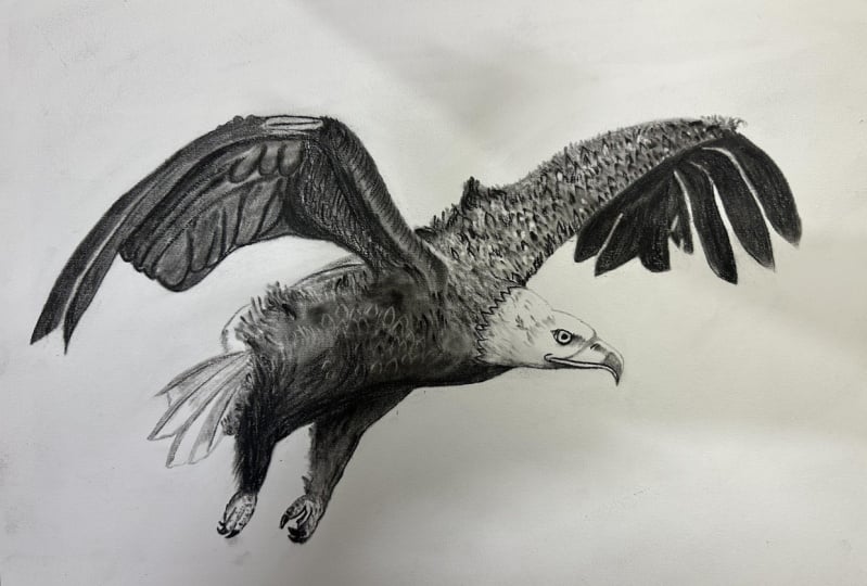
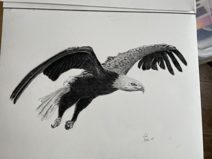
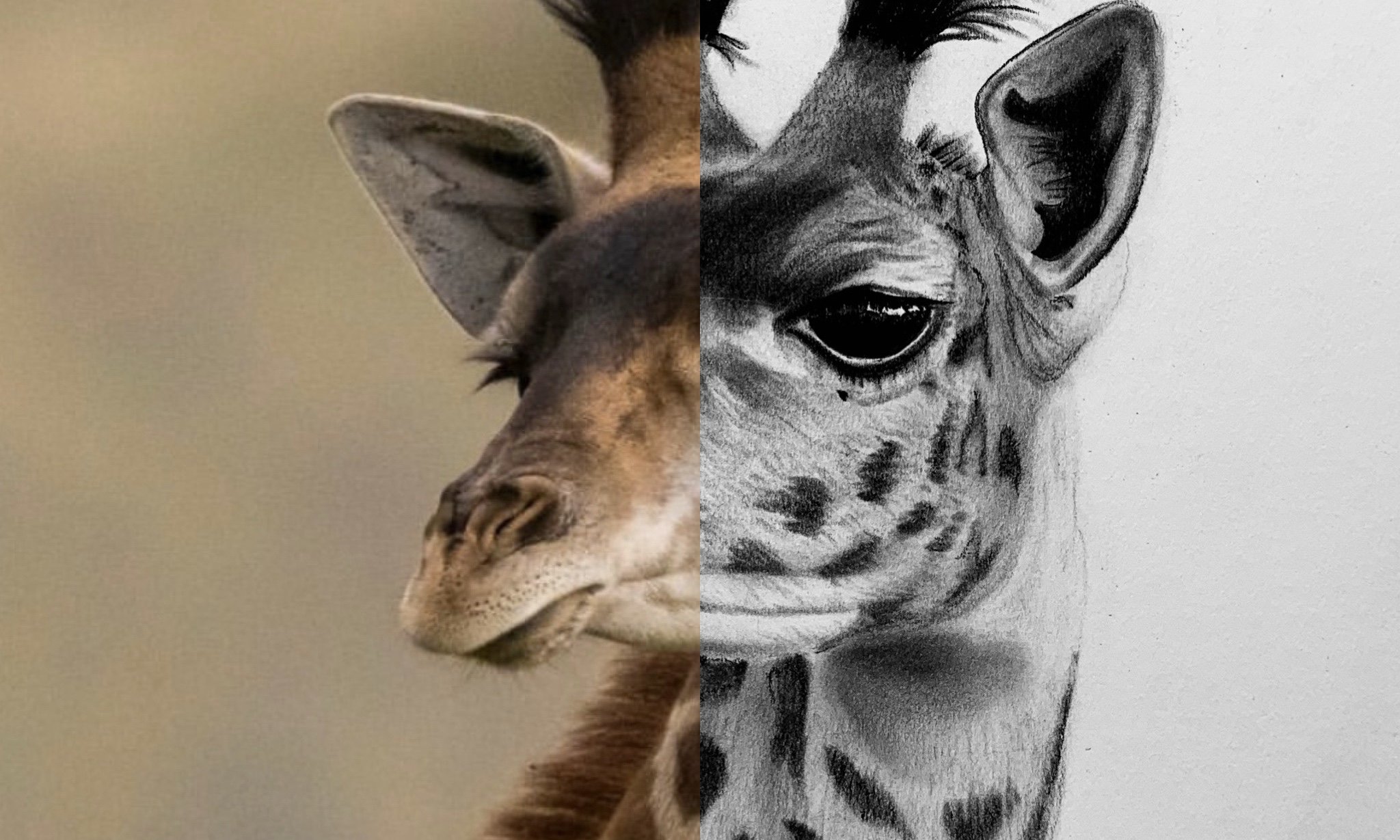
Transcripts
1. Introduction: Hey. My name's Braden Messer. I am an artist, an
author, a YouTuber. And today, I'm
going to be the one that teaches you how to draw. Now, I get it. Charcoal drawing. It can be challenging, especially if you don't
know what you're doing. This series is going to teach you everything that
you need to know and allow you to be able to unleash that drawing potential that
I know you have in you. This is part one. Of a three part series that I'm making where I'm
taking you through and I'm showing you how you
can use what's known as the three layered method
to draw charcoal renderings. The one thing I will
say before we dive into this class is that if you find yourself enjoying and
you're like, You know what? This is clicking,
This is making sense. I'm really enjoying
this, then I would highly recommend that you pick
up a copy of my new book. Drawing the portrait,
step by step lessons for mastering classic techniques
for beginners. Yes, I know. It's a portrait book,
but throughout the book, it also teaches you about the three layered
method in detail, step by step, just like what you're going to
experience in this class. If that seems like something that you
would be interested in, then I will leave
a link inscription of the class so that if you want to pick
one up for yourself, you can most definitely do that. Okay. Now, here's
what to expect. In this class, we're
going to start off, and I'm going to show
you how you can use contour lines to build out
the outer edge of the eagle. Once we have the
contour lines placed, I'm then going to show you
how you can start to lay down your foundation
layers with soft charcoal. We're going to be doing
this in sections so there is no need for you
to feel overwhelmed. As we progress, I'm
going to show you how we layer medium charcoal on
top of soft charcoal. I'm going to be showing
you how we can retrieve high values with our erasers, and that will help us bring out the details in the drawing. This drawing
specifically is going to have some challenges
with the plumage, but I'm going to show you
how we can easily conquer those challenges with different techniques
throughout the drawing. And before you know it, you're going to have a
very realistic bald eagle. So, this, of course, would not be Skillshare if
you didn't follow along and create your own drawing and
then upload your project. And also, after you've
uploaded your project, be sure to leave your review. When you leave a review
for one of my classes, I get to actually
feature your project in my monthly newsletter
that goes out to the 10,000 students that I
have here on Skillshare. So it's a great way for you to not only get
your name out there, but your art amongst the community that we have
here on Skillshare, as well. Now, I know that this is a
lot and it can be daunting, especially if you've never worked with the three
layered method before. So what I would recommend
just for your own sanity is go through once and just
sit back and watch the class. This way, you can
kind of just zen out. You can soak in everything
that I'm doing, everything that I'm saying, and you can really prep yourself for the second
time that you watch it. And that second time is when
I want you to go through, follow along and
actually draw with me. I think you'll find that it'll definitely
help you if you do. Forget. I now offer
one on one sessions. You can find my one on one sessions at the
top of my homepage. It's a 30 minute
consult with me, yours truly. And I
can look at your art. We can talk shop, talk tactics,
techniques, viewpoints. All the things. That's it. That's all. And Ip
see you in class.
2. Tools & Contour Lines: Okay. So first up, we're going to be using
a basic graphite pencil, as well as a hard, a medium, and a soft rated set
of charcoal pencils. And we're also going to be using a couple of different brushes. I have my basic number six, and then I have a
diagonal cut brush from the same brush kit. Yes. And then we're
gonna be using a couple of different
sets of erasers. We're gonna be using an artisan
battery operated eraser, a Pentel click eraser. This is for erasing charcoal
that gets away from us, as well as my favorite, my
detail eraser, Mono zero. Eraser. I like this one cause you can get free refills for it. And, yeah, all three of those, you can never have
enough erasers. As well as a couple of
different smudgers, I got my number seven. I got a number one,
and then I got a 316 little guy for
smaller details. We're also going to be using a scratch piece
of paper to check our tones before we put
them down onto the paper. And then we're going to have a little bit of
ground soft charcoal. This will be for our base layers when we initially put that charcoal down
onto the paper, okay? Alright. Here we go. So whenever you are
drawing from a reference, the first step, obviously, is to draw the basic
shape of your reference. So we're just going
nice and light, and you want to go
nice and light and use a nice light pressure control
because if for any reason, you find that maybe your
proportions are off, you can go back in and you can easily erase it and start new. But I'm just starting
with the wing here. And this reference is unique
because we have bits and pieces of the bird that
are complete white, and then we have other
bits and pieces of it that are complete black, and of course, everything
else in between. So this will be a really,
really nice one for you to use and kind of expand. Your techniques. And the big thing
about this step, too, is don't think that it has to
be picture perfect, right? The shape, when it comes to the overall process of
the three layered method, is very much
customizable, right? Like, we can go in,
we can erase it. We can draw it new
if we need to. You can use little
reference points like this here from
the armpit up. That's about where the top of that wing starts to fold
over towards the edge. And then, of course,
we have the arm here where it attaches into the shoulder in the
back of the bird. And then we can pull
this up. Wonderful. And just have fun with it, guys. That's the big thing.
Just have fun with it. I would actually say that
this part right here, drawing out that basic shape, this is probably one of the most tedious and
hardest parts of drawing. This bird. Because
charcoal as a medium, especially when you compare
it to other art mediums, it's actually very
forgiving, right? So I would say, especially
if you are very early on in your art
career and drawing, get very familiar with charcoal because it's a confidence
booster, right? It's something where
even if you make a mistake, you can go
ahead and erase it. You can put layers
on top of a mistake, and the end result
looks very nice, right? Okay, from here, we're gonna pull down and
the right about there. This is where the bottom
of that chest is gonna be. I'm just gonna pull
this up a little bit. Then right about
right about there. That's gonna be where the
other wing kind of ties in to the other
shoulder of the eagle. Very lightly pull this up. Then pull this up and
over. Just like that. And you can see why I wanted
to do this one in real times because I want you guys to be drawing along
with me, ideally. No, that's why I make these
tutorials the way that I do. Now, obviously, in areas
that are fairly repetitive, like if we're building our lower values or if I'm going in, I'm retrieving a lot of high
values with my eraser and kind of bringing some
detail to the drawing, then because of its
habitual nature, I kind of speed
through those parts, but when it comes to parts of the drawing that
are not repetitive, right, that are very much
kind of one and done, I like to go in real time. That way you can follow
along. Pulling this down. And I'm really excited to
get to the base layering, and we have a lot of brush
work with this one that I think you guys will very
much enjoy. I know I do. The three layered
method in and of itself is fairly unconventional. I've mentioned this before,
and other tutorials. I never went to a
formal art institute, even though my art instructor in high school
begged me to do it. He even wrote me a formal
letter of rec, but I, um I wasn't ready. I figured that if I was
gonna make a go in art, that I could do it on my own
if it was truly meant to be. Then right about here. Yeah, something like that. Let's pull this over like that. Wonderful. See how we kind of have that brow a little bit. And then that allows us to
kind of tuck that eye in. I always say, when
it comes to drawing, your shape should
be ugly, right? It should be something
where you're like, man, I don't know, that doesn't really look very accurate to me. But the most important part was shape because by definition, your shape is two
dimensional, right? There's no volume to it. It's just the shape. So shape is very important in a drawing specifically because it has to do with your
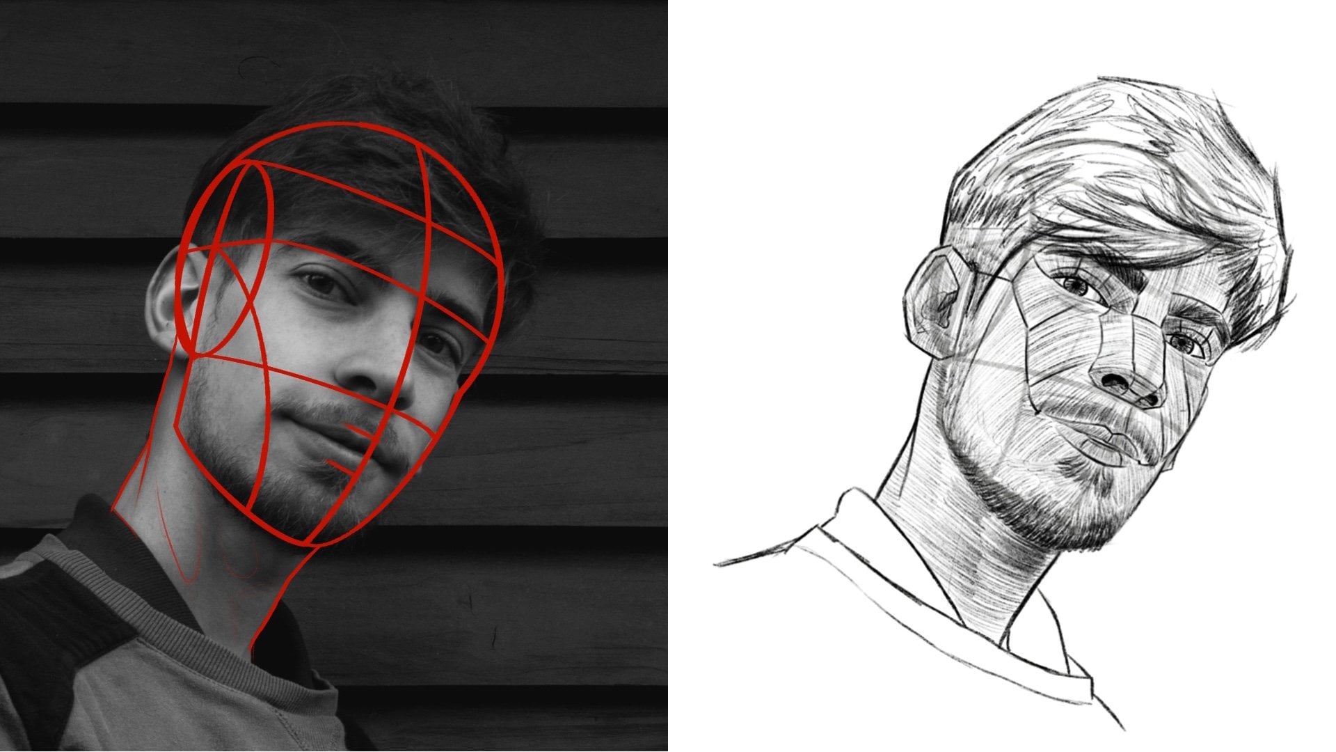
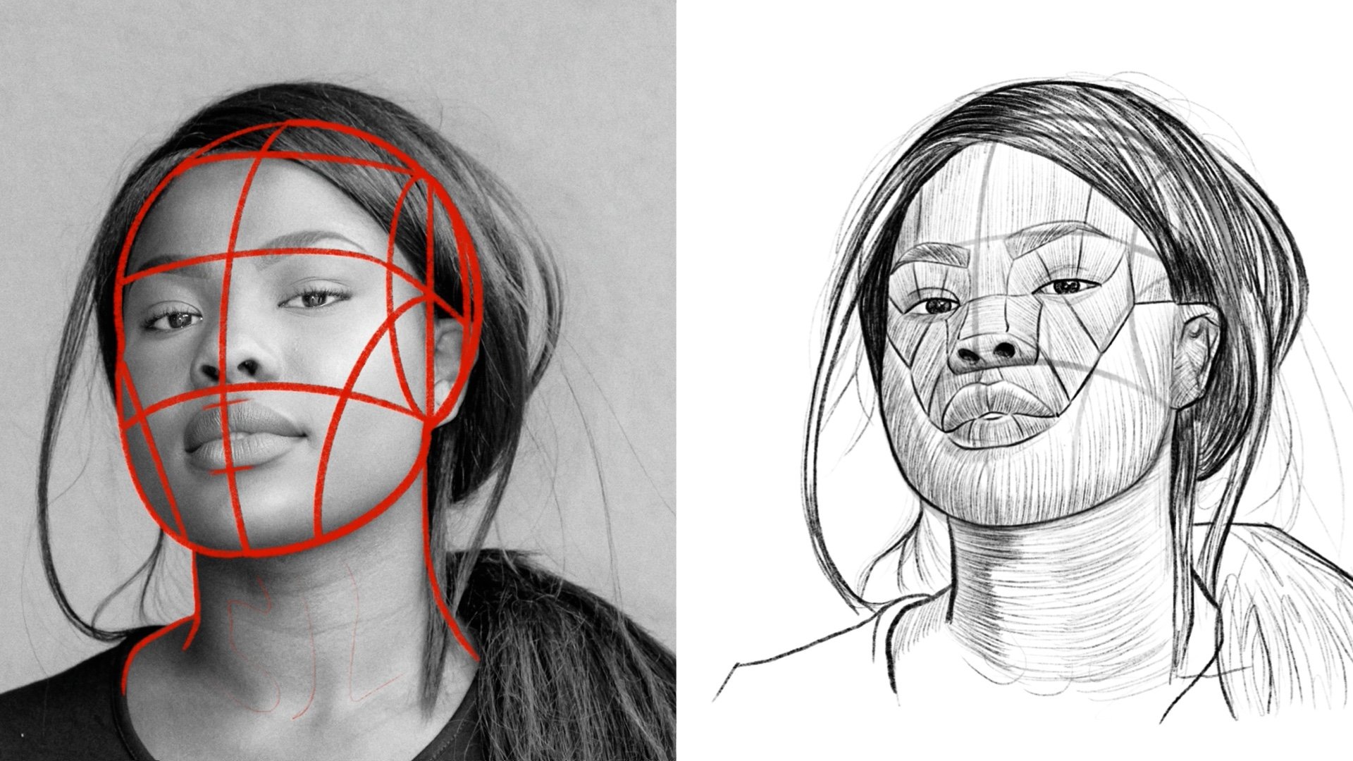
proportions, right? Like when I teach portraiture, I show you guys how to use the lumus head for
your foundation. And the reason why I
teach you how to draw the lumus head
before I ever teach you how to draw any features
or details or shading, anything like that, is because if your
proportions are off, then the drawing itself is
kind of null and void, right? It's not going to look right, even if you have all the
detail in the world because that underlying form isn't
true to the reference photo. So that's why shape
is so important. Okay. We are getting
there with this one. And then if you
want to, you can go ahead and you can add as
much detail as you want, as far as how you want
that shape to look as far as layering down
your charcoal, okay?
3. Drawing the Left Wing: But here we got
our scratch paper. And then I got my soft charcoal. And we're gonna go
ahead, and we're going to start flying. We are
going to start flying. I'm going to grab
my number six brush here. I'm gonna load it up. Alright, get a decent amount, just tap the paper and see all that extra gunk
that fell off. That's when you know that your brush is fully
loaded, okay? Then just like this,
we're gonna do nice light poles, okay? And the key here, is
to make sure that you are using a very light
pressure control, okay? The reason why you want to make sure that you're using
a nice light pressure is because when you think
about the mechanics of what it is that you're
doing, paper is porous. No matter what kind of
weight of paper you get, it does have pores, kind
of like your skin, okay? Charcoal and graphite
are both guilty of this. But when you put
them on the paper, if you use too heavy
of a pressure control, you're actually going to
push those bits of charcoal. Into the paper, right? We're going to push them
down into the paper. We don't want that. Not yet. At this stage in the drawing, what we want is we want that charcoal to rest
on top of the paper, which is why we
want to use a very, very light pressure control
because if we need to go back in and use an eraser and
retrieve our high values, we'll be able to easily do that. But if we use too heavy of
a pressure control where that charcoal has been pressed down into the pores
of the paper, it's going to make it
a lot more difficult, so just be aware of that. Charcoal is a lot like
cutting hair, right? If you put too much charcoal
down onto the paper, it's like cutting
too much hair off. Very hard to bring that hair
back once it's cut, right? It's the exact same
thing with charcoal. It's very hard to retrieve
that charcoal and elevate that value to a higher level when you've used too heavy of a
pressure, so just be aware. But what we're doing
is I'm looking at the reference photo and
anywhere where that value, right when we think
about the value scale, we have complete
white at the top, we have complete
black at the bottom, and so we have a high value, which is white by definition, and then a low value, which
is black by definition. So I always say, whenever
you're looking at it, especially with your
base layers of charcoal, put down your charcoal
in the areas of your reference photo that
are of a lower value. Okay. We'll blow that
off there. There we are. Okay, so now, like I
was saying before, retrieving high values, right? Make sure you have a
nice clean eraser tip. This is the mono zero eraser
that we are using here. And what I want to do is
I just now that I kind of have that base layer put down, I'm just going to
clean this up, right? I'm just going to clean this up, make it a little sharper. Charcoal is one
of those mediums. It's actually probably
the most notorious medium for getting away from artists
and just being very messy. So even though the
three layered method for as refined as it is, charcoal still gets away
from you if you let it. So this is a good way
to kind of maintain the boundaries of your drawing, make them nice and crisp, and keep that charcoal where
it's supposed to be. Okay. So a medium charcoal, okay? I'm going to use a
medium charcoal here. And the reason why I'm using the medium charcoal
for these bits of lines is because for those
of you that don't know, I devised the three
layered method because it utilizes
soft charcoal, medium charcoal,
and hard charcoal. Soft charcoal from the factory has little to no binder in it. Is one of the reasons why we use it for base
layers because it spreads nice
and evenly because it's pretty much
just plain charcoal. Medium charcoal has a little bit more binder infused into it, so it's much nicer
because it holds together for line
work and building up specific low value points in a drawing, like
what I'm doing here. Then there's hard charcoal. Hard charcoal is
for detail work, certain line work depending on the weight and quality
that you're going for. But hard charcoal has the
most amount of binder in it, so that charcoal
doesn't really spread. Hence why you're able to get
such detail work with it. Yeah, that's a little
high level review of the three layered method. But what I'm doing here Ooh. Broke the tip off. It's okay. Just go ahead and
pull it like that. There we go. What
I'm doing here is I'm inserting defined
lines into the drawing. Now, when it comes to lines, let's just go over
the definition of those while we're here. A line is just basically
a dot on a piece of paper that is pushed or
pulled across the paper. That's what a line is in
its most basic sense. Now, there are contour lines, contour lines are lines that show you where
an object ends. So you can think of basic shape. We're using contour lines
to convey our basic shape. Now, when it comes
to individual lines, there's what they call line
quality and line weight. They're similar, but
they're not the same thing. Line quality is the
relative thinness or thickness of a line. So when you vary that quality, say it starts off a little thicker and then
it ends a little thinner, that can help you convey the illusion of that
third dimension. Now, line weight
is what they call the strength of a line or how
dark or light it appears. Obviously not all the time, but thicker lines tend to have a heavier weight
or thinner lines tend to have a lighter weight. Again, not all the
time, but the majority. So then there's what
they call defined lines. Now, this is what
I was laying down here on the edges
with this pencil. Defined lines are where you continue a line without
any break in it. So typically, defined lines are, you know, they'll
have like a mid to a heavier line weight. And then there's implied lines. Implied lines are pretty much just in its most basic sense, contrast between a high
value and a low value. You don't actually have to draw a line so much as
you just have to have definitive contrast
between a high and a low value, and that will give
the sense that there's a break there
between values, in a sense, a line, but you don't ever go in and
define it with your pencil. So just be aware. But what I'm doing
here is I'm going in and make sure
that when you're doing this on your drawing that you're also using a
light pressure control. Everything that we're
going to do in this video, you're going to use a
light pressure control. The reason why is because
when it comes to paper, regardless of weight,
albeit thicker papers, heavier weighted paper
tends to be a little more resilient to
pressure control. But if you press too hard, you scratch the paper,
and then you have a whole another problem on
your hands, don't do that. But here I'm just going through, and I'm building up
those low values. And what this is doing
is this is giving this wing some
definition, right? It's giving it
volume, in a sense. If it looks gritty, don't worry about that because I'm
going to show you how you can go in with
your smudgers and you can push that charcoal into the paper and you
can effectively blend it and give yourself
a smoothness to it. And then I'm going to show
you how to take your brush and give it a nice gradation across all of your
values as well. And that'll make
it look nice and smooth and much more realistic. Because let's face it, birds and feathers, that's soft, right? All that is very, very soft. Think of when you
pick up a chicken or when you look at a chicken, it looks soft. All
birds are that Okay. So now we're gonna take our number seven
smudger. And just like this. Just nice tight circles, going back and forth and going
right up to these lines. And we're lending
blending that charcoal. Let's see how the
overall aesthetic of that charcoal changes,
right? That's what we want. And those lines,
those defined lines that we punched in with
our medium charcoal, we want to blend the charcoal
right up to that line, but we don't want to actually blend the line itself, okay? Just want to blend
it right up to it. We want the integrity
of that line to be maintained. Just like this. Everything about
drawing is a process. Everything about drawing is a process. One step at a time. Drawing is a step
by step process, so that's how I teach it. Especially for the
novicet artists, you know, it seems, you know, if you're
looking at it and you're fairly
new to drawing, you know, you think, Wow,
how do they do that? It's like, Well, it's a
lot of layering, right? It's a lot of layering. And then what I'm doing here is I'm just going through and I'm
using my Mono zero eraser. I'm making sure that my eraser
tip is clean right here. And I'm just retrieving
my high values. I'm basically looking
at the reference photo, anywhere where I
need to retrieve that high value,
that's what I'm doing. And this kind of gives
me that variation between my high values
and my low values. And all the shades in between. Then here I'm just taking
my diagonal brush. And I'm just pressing
into the paper like this. And what this does is this effectively is lowering the
value because let's face it, when you look at the
reference photo, the light source is coming from up and kind of
behind the eagle. So the tops of its wings, its back, the top of its head, its tail feathers,
that's where all of the higher values in the
drawing are going to be. But especially under the wing
on the bottom side here, it's going to be an extremely,
extremely low value. No altogether completely black. And this is another one of the things I
want to talk about. Whenever you have
reference photos such as this where
you might have a part of your drawing that there's just
not a lot of light. And because there's
not a lot of light, you're not seeing a
lot of definition as far as features or
details in the drawing, you can actually use
other reference photos of that same subject to help you convey detail in
your drawing so that your drawing doesn't look
flat in certain places. Okay?
4. Drawing the Right Wing: All right. So same thing as with the first side,
with the second side here, what we're doing is we're
going through nice and light and we're putting down
that base layer, right? Putting down that base layer. And this is the thing. You
can do this exact same thing, layering with the
soft charcoal first. You can do this with a smudger. I always say in tighter spaces, obviously, what
becomes necessary. In tighter spaces,
control becomes necessary because the thing
I always say about brushes is you can move a lot
of charcoal very quickly, but you sacrifice having the control over exactly
where that charcoal goes. With smudgers as far
as spreading charcoal, you move a little slower,
but you gain control. And then, of course,
the ultimate control that you have when it
comes to spreading charcoal for base layers or
building up low values in places where it is needed
is using your pencils. And then right here, go ahead and see how
I'm pulling this, pull it this way.
Just like this. Just pull it. There we go. Even in this step, guys, always keep in mind the
direction that you're pulling and pushing
your brush work, okay? Because by pulling it this way, we've already started
to help our viewers understand the flow of
the Eagles wing, right? It flows slightly up
and back up and back. That's how we want that wing to be understood by the viewer. Okay. So we're gonna
take this number seven smudger here and remember how I was
talking about control. I need more control, especially when it
comes to building up these low values up until the edge of each
one of these feathers. Just like this. I was polling. Nice and light still. Nice
and light. Don't press hard. Let the smudger do
the work for you. And it will. And it will. The smudgers, the
brushes, the pencils, the erasers, they are
all eager to please. Eager to please. Just like this. And notice notice the way that I'm that I'm pushing and I'm
pulling that smudger, right? Every step that direction, understanding that underlying
form, even with feathers. And I would say, actually,
especially with feathers, because in a sense, you want your drawing to be
anatomically correct, right? This was one of the big parts of renaissance artists was that they wanted to make sure
that what they were drawing, even from underneath, you know, the skin, actually was
anatomically correct, you know,
scientifically correct. So when it comes
to this drawing, just keep that in
mind, okay? All right. So now what we're doing is
we're switching it up to a medium charcoal pencil
because I want what? More control, right?
More control. So we started off with our
base layer by using our brush, our number six brush, moved a lot of charcoal,
very little control. Then we went in
with our smudger, more control, moving a
little less charcoal. And now what we're doing is I'm going in with
even more control, but I'm moving even slower. But the cool thing
about slow and steady, one of the reasons
why they say that is because it's a proven method, right? Slow and steady. You can be a lot more accurate. A lot of times, in order to
be accurate with something, you have to take your time. Oh that's what separates
amateurs from masters, is that amateurs move slowly
because they're unsure. Masters, they know the
outcome of what they're going to get with
certain actions. That's true of anything,
not just drawing. You think about cooking
dinner in the kitchen? Maybe you're cooking a recipe that you've never cooked before. You're going to be
a little unsure. You're going to be like, Man, is this what I do or is
this how I do it? Versus something that you've cooked your whole life
and, yeah, you do this, you do that, you don't
even think about it, you just do it and it
turns out amazing. It's the exact same thing
with drawing, guys. It's the exact same
thing with drawing. Keep that in mind. Okay. So now, I'm just going through
and building this. Nice and light nice
tight little circles. Nice tight little circles. And if it does look gritty, don't worry about
that cause remember, just like with the first wing, where we went in
with the smudger and blended all the charcoal, and then we hit it with a brush. We're gonna be doing that
exact same thing on this side. So don't worry about that. And then right here, I'm just, you know, I got some
runaway charcoal, so I want to make sure
that I'm staying up to snuff on that. Okay. Medium charcoal pencil, doing
the exact same thing here. As I would challenge you when you're doing this
part of the drawing, try to observe and pull out each one of those feathers
because in this drawing, this wing is much
more visible than the other wing as far as exactly where do each one
of those feathers lay, right next to each other, halfway on top of each other, but still next to
each other, right? Ask yourself those
questions and look at it and try to see if
you can pull that out. You know, in your drawing. I never go into any
drawing thinking that I'm going to
draw it perfectly. In fact, I actually get
anxious when I think that way. And so I stopped doing
it a long time ago. I do not consider myself
to be a master of drawing. Absolutely not. There's so
much that I do not know. But the one thing that
I've always tried to do with my art is I've
always tried to have fun. Because you can be the
best at something, but if you don't actually enjoy what it is that you're
doing holistically, just the very idea of doing something if that doesn't make you happy or give
you this sense of, like, I'm gonna have
fun doing this today. Then why would you
ever do it, right? I always figured if you chased your happiness, the
rest would follow. And so even this
right here, filling in this feather this
makes me happy. I very much enjoy
this. But I'm not drawing this feather with the idea that it's
going to be perfect. You know, I've talked about this in some of my podcast
recordings that, you know, if you actually were to achieve a state of
mastery in something, would you still have
fun doing it, right? It's a question you
need to ask yourself, because for some
people, absolutely. Yes. But then for other
people, no. You know, a lot of us tend to get bored with things as soon
as they're mastered. It's like, Okay,
cool. That was great. I don't want to be doing
this for the next 30 years. What's next type deal. Right. Okay, now, just like
the other wing, I'm taking my number seven smudger and I'm just
blending this, right? You'll notice when
I'm blending this, how all of a sudden that form
of each individual feather starts to come out much more because rather than
having that gritty, streaky look with the
charcoal onto the paper, it's blending is becoming
smoother, right? Nice and smooth, like see that. And this is one of the
fascinating things about charcoal as
a medium, guys, especially with the
three layered method, is that you can do
stuff like this, right? It's it's all about
that process. It's understanding exactly how to layer the charcoal
and then use your tools so that you can
effectively blend them and get this type of
aesthetic onto the paper. And you don't have to push
hard with the smudger either. The smudger wants to push that charcoal into the paper and give you the
look that you want. You just have to let
it do its thing, R? It will. It will. Just like this. Then we're blending it, we're going right up to that line, right up to that line. Notice how I didn't put a lot of charcoal
right up to the line. The reason why I did
that on the inside of this feather here is
because I want there to be a certain gradation, if you will, on that feather. If you look at the
reference photo, you can actually see how
the edges and the tips of these three big feathers
are very much that way. They're dark on the top, but then as you move
to the bottom of the feather towards
the bird's beak, they do tend to get
lighter in value. Okay, so what I'm doing
here is this is actually a medium, right here. And I'm actually gonna
do the exact same thing. I'm just gonna go
ahead just like I did with that first big feather. Nice and light. Gonna do
tight little circles. And I'm gonna kind of build
up these lower values here. Just like this. There we go. And also, be aware. Like, when it comes
to these feathers, you can see how there's these lighter value parts at the top of them where it
kind of plugs into the wing, and you're gonna
want to showcase those because that gives that illusion of those
feathers kind of resting on top of
each other, right? And kind of giving you, like, a fan type type of look, so you know, the monochromatic
scale is fascinating. You know, black and white, and then all the shades of gray. Everyone's gonna build this up. There we are. And then just like this same
thing. Same thing. There we are. Remember, we're
not pressing hard. Building this up. And then we're gonna go in with the smudger because we
want to have more control. We're gonna blend it real nice. Okay. And next to the body
and the legs of this eagle, underneath these wings
are some of the darkest, lowest values that we have
in the entire drawing. Seems gonna lend this
here. Just like this. Wonderful. Don't
overthink it, guys. Just put down your base layer, and pick which tool you want to use as far
as your control, and then blend it.
That's pretty much that.
5. Drawing the Plumage of Right Wing: Okay. So now, I'm gonna
take my monozero eraser. We're just gonna go in here,
and I'm just gonna try to try to bring out kind of just the shape of some of these some of these feathers,
especially right in here. These are the ones
that I really want to kind of showcase, right? There we go,
something like that. Now, this is important
brush work, okay? So what we're doing here is we're hitting this
with the brush, and this is doing a
couple of things. It's helping us blend
the charcoal, right, and it's making it look a lot smoother because remember how we were talking about
birds are smooth. But it's also helping us with our gradation across those
different values, right? It's giving us the blend,
but it's giving us the blend across all of our charcoal, which is much needed
at this point. Okay. So now we're kind of
moving up on top of the wing. So here I'm going to put a define line because
at this part, we do have some shorter feathers that are pretty much
on top of each other, and then they're resting on top of our flight feathers here. Something like this. And what I like to do is
I like to go through them with my medium charcoal in
certain areas like this and just kind of
give these feathers a little bit of framework
so that I can go in with my smudger like this and I can start to play
with those lower values. A lot of times,
whenever you go into a new part of the drawing, if you just focus on
your lower values first. So when you're looking
at it, anywhere that's pretty much black or a darker shade of black or gray, that is where you're
going to want to focus and kind of bring
out that texture. Because when you do that,
by black and white, it's very nature, they
contrast each other. They're the ultimate contrast, in fact, ultimate opposites. And so when you focus on
your low values first, those high values tend to
come out on their own. Someone's going to put a
defined line right here. Then this is a hard
charcoal, right? Notice how thin those lines are. Notice how light of a
weight that line is, how thin of a quality
those lines are. And if you're still fairly
uncertain about line work, you definitely won't be
after this tutorial. That's the thing about feathers is at least the
way that I draw them, is I very much like to define certain parts
of them, right? So much as in life, with drawing is balance, right? Too much of something
is a bad thing, too little of something
is a bad thing, but it's that goldilocks. It's finding that middle road, that middle way that will really help your
drawing pop in all aspects. So I'm just kind of going
through and lining that out. Okay, so this is where we're going to start having
some fun, okay? We're gonna take our
3/16, our little guy. We're gonna check our
tone here. Wonderful. Now, we're gonna look
at the reference photo, and we are going to start
placing the breaks in our values for all
of our feathers as they flow from the
beginning of the wing. All the way into the
back of the wing. It's important here, okay, to understand that this
isn't going to be perfect, but you need to make
sure that you have substantial breaks between where you push your smudger onto the paper and
when you lift up, and then you push again, right? Because again, it's all
about that contrast. We want to make sure that we have the ultimate
accentuation of the value scale across
the top of this wing from complete black to complete white and everything in between. As far as the complete white, obviously, we do have that
base layer of charcoal, but we're going to be
going in with our erasers and we're going to be retrieving
a lot of high values. Okay. Then here what I'm
doing is I'm actually changing out my smudger
to the number one, okay? Because I want these blotches
to get a little bigger. The reason why is because when you look
at the reference photo, the feathers start
off very small, and then as you progress across the top of the
wing into the back, the feathers themselves
actually start to get a little bigger, right? So this is a way that
you can do that. So we're placing these
all the while we are keeping that underlying form in the back of our mind, right? The way it flows, it's
all about how it flows. Just notice the technique
that I'm using, right? I'm going up and then
I'm pulling down, almost like a triangle up
and then I'm pulling down, or I'm pulling over and then I'm pulling back down
and then over again. So it's almost more
rounded, right? And this is just the base layer. Cause remember this method
is the three layered method. It's very forgiving, especially
if you're an amateur. Then here we're just
kind of pulling this cause notice
this is the shoulder, right, how the shoulder rolls
onto the back of the bird. It rolls. I want to bring that. Focus where the low values are. That's all you have to do. And you will notice, too, that as you use that
smudger more and more, if you start to get
a little you know, if your value starts
to get higher because you're running
out of charcoal, you can go back in, grab
some more charcoal, just like I'm doing here, check your tone, make sure
it's where you want it, and then you can go back in and continue to strike the paper and place that charcoal
where you want it to be. If you pull, if you push
and pull just like this, you get a little longer streak and that can
actually help you to convey underlying
form in your eagle. Just like this. The most important thing with this step is just making sure that you have those breaks
between high and low values. And you can achieve that
with proper spacing, right? Proper spacing. Don't spend too much
time on the top of the wing because when you
look at your reference photo, obviously, that's where
the highest values are. Then here I'm just gonna clean
up this line a little bit. Has some charcoal running away. I need to fine it. Notice how that's a little crisper, right? That's what we want.
Something just like that. Now, swap that out for a
medium charcoal pencil. And yes, we're gonna go in here. I think what I want to
do is I kind of want to I want to start lining
out some of these feathers. But this is where a lot of
technique comes into play. Notice how I'm just doing
short short little pulls and just I'm not making these
lines very big at all. And what you can do, this is the Finness part of this
drawing, okay? I'm flying. I'm going super fast, simply because
there's just a lot of drawing that I have to get done in a short amount of time for you guys
for the tutorial. But when it comes to your eagle, if you take any amount
of time at all, I want you to take time
in this step, okay? And notice how I'm lining out certain bits of
feathers, right? Now, the reason why this
part takes a lot of finesse is because you can overdo it with line work, right? But if you just do short
little pools here, don't put a line there, like, just just nice light
breaks, right? Because the last
thing that you want your drawing to look
like is to look wooden. Leonardo Da Vinci, actually, with his paintings
when he was studying in Florence under Verrocchio, his master, he and many artists of the time
were guilty of doing this. They would put defined lines
in a lot of their paintings, which made their paintings
look wooden, right? Now, with the
monochromatic scale, I believe that you can kind
of get away with lines. And I would actually argue that lines are crucial to convey certain aspects of a drawing as far as elongating the image. But what DaVinci would do is he wouldn't put defined
lines anywhere. Rather, what he would
do is he would take his thumb and right up to
where the line would be, he would just blend
it and he would actually add black to a lot of his paints to lower the hue
of that specific color. But in a sense, he was
still utilizing linework. He was just by definition,
using implied lines. Not define lines. But here, what I'm doing is
just notice how I'm able to go in with the pencil and really target exactly where I want those lower
values to be, right? Just a line here, a
little line there. That's really what
it's all about. This will definitely test your
fins with your line work. But the biggest thing is
just vary your line quality, vary your line quality,
vary that thickness. You press a little harder, that thickness will get thicker, you press a little lighter, it'll get nice and thin, of course, your line
weights will vary as well. Then right here, I'm
just taking my brush and I'm just going to kind of
blend this a little bit. Because we've used such a
light pressure control, I'm actually going
to be able to go in now using my mono zero eraser, and I'm going to be
able to retrieve some high values, okay? Actually, what I'm
going to do is, I'm actually going to use my artisan battery operator
eraser and just show you some of the high value
retrievals that you can get. Now, all the while, even though a lot of the line
work has been done, you can go in and actually lighten some of
these feathers, right? And follow those lines, right? Follow the defined lines
that you laid down and spend a little bit more
time on the top of the wing than you do on the bottom of the
wing because again, the nature of that light
source is coming from the top. And even if you don't have
a battery operated eraser, don't worry about that because
you can still accomplish the same thing with
a monozero eraser. Or if you just have
a regular eraser, go ahead and take a
eraser and you can cut it down to a point and you can
achieve the same thing. We're just following
a lot of those lines. You could almost think of it
like you want to highlight those defined lines that you put down with your charcoal pencil.
6. Drawing the Eagle's Head: Okay. So now I'm just taking
my number one smudger, and we're going to start messing around with some of the
base layering here. Then back in here, I got pretty much the lower
back of the eagle. So this is all base layering. Now remember how I said
you can do base layering with your brush work
or your smudger. The cool thing about using
your base layers and getting them laid down with your smudger is that because
you have more control, you can actually really start to convey some of the
first layers of detail work as far as which way your
feathers flow, right? Then here we have the tail
feathers, so, same thing. You'll notice that
the lowest value on these tail feathers
is at the top. So Alright. I'm gonna shorten
this up a little bit and clean this
up now that we have that linework punched
in for the wing itself. Then, see, just like this. Remember how I was
saying, you can use a model zero eraser and
achieve the same thing. The one thing I will say
about the Model zero eraser because it's a manual eraser, it's not automatic
with the battery, you do have more control,
especially if you're a little uncertain of
your eraser work right. If you're still very much
building your confidence, then the model zero
eraser might actually be the better option
for you for now as far as highlighting your
feathers and kind of bringing out that texture. Okay. So now, I'm just going to
go back in here because there are
some other parts. There's some lower
values in some of these feathers that I wanted
to kind of bring out. Contrast is everything, right? When it comes to the
monochromatic scale, contrast is everything, complete black to complete white and everything in between, that will make your drawing
pop like none other. So much of the time, you'll see drawings where artists have utilized a part of
the value scale, but they haven't
actually gone in heavy handed and really
socked in, you know, their low values or maybe
not retrieved or left some of their high
values alone enough to where they're completely
white, right? A lot of that comes
with time and experience and just drawing, but then what I'm
going to do here is because this part
of the drawing, where that neck plugs in
to the torso of the eagle, we have some intense
contrast here, especially as we go down farther and farther
towards the chest. So what I'm doing is I'm
going through and I'm using my medium charcoal pencil and I'm placing in just
some defined lines. Now, if this looks really harsh, don't worry about
it because it's not going to for long, right? Because what I'm going
to do is after I have my base layers done, I'm going to go in
with my charcoal and I'm going to go right
up to those lines and I'm going to pull them back from the neck and they'll
actually blend away. Okay. So now, the bald
eagles head, right? We're gonna do a base layer
of soft charcoal here. And we're gonna start
at the bottom, okay? Because when you look
at the reference photo, when you look at the
head, what do you see? The top of that head is completely white,
a very high value. However, the bottom
of the head has a very low value because the
lights on the top, right? And this is the chance
that you get to continue to convey that underlying form
with your brush work, right? Each one of those
strokes is critical and very important to helping you sell kind of the flow of that eagle's head and their neck and where it
plugs in to their body. Now what I'm going to do is I'm going to take
my 316 smudger. I'm going to go ahead
and I'm just going to start lowering the value here. So it's pretty much the
eye socket of the bird. And I'm using my 316 smudger here because I
don't have a brush that is small enough for the accuracy that
you need, right? So I'm using my
smallest smudger, and I'm just very, very
lightly hitting the paper, okay, very, very lightly. Here I'm going to
follow the beak, and then I'm just going to
kind of pull up, right? Pull down and there we go. This kind of gives me the
form that I'm looking for. Again, keep your
smudger and keep your low values away
from the top of the beak and the top
of the head, right? And that'll help you really
accentuate the value scale. Then that actually
looks pretty decent. So now, I'm going to go in
with my heart charcoal, okay? Because I need to have a very, very thin quality and
light weight for this. So this is what's
called pulling, right? I'm pulling the line to me. Whenever you do line work, there's what they call pushing
a line or pulling a line. Pushing a line is where
you push it away. Pulling is where you
pull it towards, right? So right now, so I
pulled that first line. I'm pushing this
line. There we go. And depending on what
situation you're in, you might have to pull
a line or push a line. It just really depends. It's
very much case by case. I'm going to push this
line away and then up, and then I'm going
to pull it and then just lift up, right? Again, it's all about
varying that line quality. So now we're going
to switch that for the medium charcoal. This one has a little
less binder in it, and it's going to give
me a lower value. Because there's more charcoal in it than that hard charcoal. I'm just going to get that
brow started because I want this eye to really kind of
sink into the head, right? And the sharper your charcoal
pencil is, the better. So keep that in mind. I'm just going to kind of
thicken this up a little bit. The thing with eyes, regardless of what kind of eye it
is that you're drawing, is you can overwork
an eye very quickly. So just kind of get in
and then just get out. Sometimes less is truly more, and when it comes to eye
work even on the Seagull, that is very much the
case. There we go. Okay. And then, actually I think what I'm gonna do is
I'm gonna actually erase that graphite
circle in there, just get that cleaned out
real quick. There we are. Now I'm gonna go back in
with my medium charcoal, and I'm just gonna draw
a circle in its stead. There we go. And then just
gonna blacken that out. I actually have a video on this, but a lot of times, depending on the grade
that you use of graphite, you can layer graphite
with charcoal, but if it's not the
right grade, I mean, down to specific groupings of different grades as they
correlate to each other from graphite to charcoal,
they don't work. That's one of the reasons
why I erase that. That graphite. Now here, what I'm doing is I'm
going to push this line, which is medium on top of that hard charcoal because I just want to thicken it
up a little bit, right? Just thicken it up.
Here it's very lightly. I'm just going to kind of
hit this a little bit. I give it a little
bit of texture. There we go. Being sure
not to press too hard. It's very lightly. I'm
trying to darken this up. Because I need a lot of control. I actually need more control
darkening this up than my 316 smudger can give
me in this specific area. This is a little dark or
things like that. There we go. Okay. And then right here, let's kind of thicken
this line up. What I'm going to do is
I'm just going to go like this then lower this to. But I'm not pressing hard
right here because with this, I'm going to go in with my smudger and I'm
actually going to blend this because the very, very bottom of this
bird's head and throat, there's a very low value there because again the
lights on the top, right? But then we can go in
if you don't like that, and you can blend this
out a little bit. Then here what I'm doing is
I'm just kind of pushing and pulling and see how that
all kind of blends away. Gonna blend this. Make sure we're pulling it
all the same way. There we go. That's
looking a lot better. Then we're just kind of
kind of pulling, right? Pushing and pulling.
Nice and light, though. Being sure to stay away
from the very tip top. And then notice how it's
very streaky, right? All the feathers
here. They're very small and they're just
they kind of lay together, and they're all very much
the same the same value. So I'm just run this right
along the bottom. See that? See how all of a sudden, it looks like it's rounded.
That's what we want. And
7. Drawing the Eagle's Body: That's looking pretty good. Now, I'm not gonna touch that graphite line on
the top of that head, and I'm not gonna touch the line on top of
the beak, either. The only lines really that I'm gonna mess with when
it comes to that beak is the bottom beak where it plugs into the bottom
jaw of the bird. And that right there
is a prime example of varying line qualities. Lot of times when
you have a drawing where the line quality
is the same all across, that's when you get anesthetic that you probably don't want. It'll be many things,
but it's not going to be realistic like
you want it to be. An right here, see
what I'm doing. Remember how I told you I was going to pull
right away from these lines and they
were going to pretty much blend away effectively. That is what I'm doing. I'm
using a smudger here because I need to have as much
control as possible. There you go. Yeah, whenever you get excess of
charcoal like that, just blow on it, and
it'll blow away. Then right here, I'm just
gonna kind of beef up that line a little bit
with my medium charcoal. Then here I'm just gonna gonna clean that
up a little bit, make that a little sharper. It a little sharper.
There we go. That Eagles so cool. I love bald eagles. When I was a kid, you never
used to see them. They were very, very rare. Like, you'd probably see
one once every five years, and that was even when you
were up in the mountains. And now you see them all
the time. It's really cool. I kind of cleaning
this up a little bit. Here we go. I notice how I'm
varying that line there. I'm not actually going
to continue that line. I'm just going to right here, butte this up. There we go. Now all of a sudden
that beat kind of has some dimension
to it, right? It's got some thickness on the bottom, and
that's what we want. So now I'm going to
go in right here with my mono Zero eraser. I'm just gonna pull these
nice short little pools. But I'm maintaining
that direction, right? Maintaining that flow. That underlying
form so important. And I'm just gonna kind of
darken this up a little more. Okay. Enough messing around. Take my number six
brush here, load it up. Let's, uh, let's start getting this this body taken care
of here. Nice and light. I'm getting we're not forgetting about that underlying form. And actually, with the leg here, I'll show you 'cause you can't really see it in the
reference photo, but I'm going to show you how we never forget about
that underlying form. It's always with us in
the back of our mind. Kind of like Pinocchios
Jiminy Cricket. Same thing. Your conscience. Your drawing conscience,
that's what we'll call it. Listen to that. Let
that be your guide. Do do do two. Nice and light here. Okay.
Actually clean this up. Clean up this it's always
right along the edges. That's where your charcoal
will get away from you. Okay. So now I'm going
to use my smudger. I'm just going to
kind of build this up right here because
it's a break, but it's not one
that's necessarily that I'm going to want to
use to find lines for, you know, as far as we
got the Eagles right leg, and then there's that
flare up of feathers, and then of course, you
have the back of it, right? That's more of a contrast game than a line game right there. Then right here, I'm
just going to kind blend this a little bit more. Notice how the more I blend
it, the more I push on it, that value just gets lower
and lower and smoother, and that's what we want. Okay. So now, what I'm going to
do is I'm gonna take my medium charcoal. I'm just going to start start defining the bottom of the chest of this
bird as it goes back. But you can use your
pencil like this just to kind of maximize your
control and help you form, pretty much the edges, right? The edge of the drawing.
But I'm not pressing hard. It's nice and light.
Just going over the same area again
and again and again. There we go.
Something like that. Because regardless of how
gritty the charcoal looks, even though technically
you are layering it, even this part of the
layering process is crucial as far as the
direction that you're pulling your pencil
across the paper. So just keep that in mind. That direction is everything. But of course, we're going to be hitting it with
smudger and blending it, then hitting it with the brush
and blending it as well. But we still want to keep in
mind that underlying form. Okay, so right here, kind of a bigger feather, then it ties in right there. I think I'm just going to put a defined line right here just because what this does is this brings that wing forward, right? And then it pushes the lower back of the eagle
back just a little bit. And that kind of gives us that
illusion of depth, right? Depth of field, you know, foreground background and such. Even in a specific
object, You know, I've mentioned that in
other drawing tutorials, but it's one of those things where you always want to keep in mind that depth,
that depth of field. Even on a drawing such as this, linework from my own experience, I have found really
seems to help with the viewers perception
of depth when it comes to, like, you know, is a hand
closer than the face, is, you know, a wing closer
than the tail feather. You know, whatever it
is that you're drawing, the principle is the same. So let's kind of
keep that in mind. I feel like in color theory, you cannot apply
the same principles for linework that you can
for the monochromatic scale. There are people that do,
but at the end of the day, art is very subjective as far as how you convey certain
aesthetics onto paper. Now there are certain
scientific elements of drawing that cannot
be argued, right? Kind of like how
a piece of paper, you would think, you know, if you didn't know that maybe
it was two dimensional, but no, a piece of paper itself is actually
three dimensional. It has height, width and depth, but a drawing is only
ever going to exist in two dimensional space on the surface of that
piece of paper. So it's just that
can't be argued. You know, that's science. When it comes to
how you use, say, lines in a specific
piece of art, that's totally up
for interpretation. But notice how the
top of that leg, we've kind of
brought that out in the base layering
of that charcoal. And then, of course,
we've hit it with the brush to kind
of blend it and give us some nice gradation across all those different
variances of value. And then here I'm just using
my modo Zero eraser and we're just kind of clean this
up just a little bit here. Just a little bit. Here we are. Yeah. Okay. So now I get
the smudger going here. I think it's time time for
some of these feathers. So let's just do
these feathers right. I'm just going to go
through and kind of outline the top of these ones here, and then right along the top, this is how I'm going to bring out each one
of these feathers. Cause again, what
we're doing is we want to target the low values, right? Target the low values.
Don't worry about the high values,
just the low values. And all of a sudden your feather will start to take shape. Now, this is
something you can do. You can pretty much
just pull down from the top of the feather. The shaft is what it's called, and that's the only part of the feather that we're actually going to be putting a
defined line in for. Everything else
will be super soft, very much an implied
line, you know, to kind of give the
viewer the sense that those tail
feathers are just that, that they are soft, right? Okay. So and then we're going to take a sweter like this and we're just going to kind of
put it on its side. Then we're gonna kind of bring
this leg forward, right? I'm gonna push
those tail feathers back just a little bit.
Just a little bit. Okay, so number six brush, make sure it's fairly unloaded. I'm just gonna go in here. I I want to kind of put a nice, nice light blend
on these feathers, 'cause I'm gonna show
you a trick with our monozero eraser
that we can use to bring a little bit of form and dimension to
these tail feathers. Oh Okay. Actually,
while we're here, just gonna load this
up just a little bit. He goes right in here, we have a little bit of shadow. Basically, we have
the tail feather, but their feathers underneath
other feathers, right? So, given the nature
of the light source, they are of a lower value. So I just kind of
want to convey these. And these all really pop once we take our smudger and we kind of blend the
rest of that leg. And then that will
give us our depth that I was talking
about earlier. Should be pretty good. Pull
this up blend it like that. Same thing here. Okay. So now we're going to
take our hard charcoal, and this is where we're going to put the what they call the
shaft of the feather, right? I'm using a hard charcoal
because I need that thinness. I need that thin
quality to the line. And then I also need that nice light line weight to
the shaft, as well. Pull and lift, right? Just pull it, and then just
lift it as you conclude. That'll also vary
the quality as well.
8. Drawing the Eagle's Legs: Okay, so now here, go like this. Take your monsorase
and just pull down. Pull down from the shaft. Or you can pull up to the
shaft, just like this, whatever you will.
Whatever you will. And what that does is that
this is almost more like a subconscious type of detail or a subconscious
kind of edit. It's very subtle, but this will elevate your bird drawings because it's just it's that
extra little bit of effort, you know, that the artist puts into their bird
drawings that just, you know, makes them
look really realistic. So just make sure you do that. Okay, so now we've swapped
it back out for the medium. And I'm just looking at the reference photo here and notice these little feathers. These little feathers,
how they kick out. This is what we're doing. We're
just going to go in here. We're going to
focus on the edge, and we're going to
place these feathers. And how you can do it is you
can just kind of push out, push out and lift up, right? Push and lift up,
just like this. And this will help
you, you know, bring out the edge of the feathers,
especially on the leg. Because that's the
thing about most birds, not just with eagles, but all birds have different
types of feathers on them. Some are longer, some
are flight feathers. Others are, you know, just super, super short. Some are long, some are round, some are almost more
triangular at the edge. Like it really depends. And we're just going to
pull down like this. And then up. Okay, so now I got
enough space here, so I'm just going to
load up my brush, and we're just going
to continue to bring down this base layer here, following those
contours that we set up with our first base layer, then we're just gonna pull
down right to the feet. There we go. Wonderful. That's looking good. And if you think that
leg looks too light, don't worry because
we're gonna be throwing a lot more
charcoal around. So, hey, since we did
one, let's do the other. Now notice this. I'm
gonna take my brush, and we're gonna start building up that base layer on the leg, but I'm gonna run it right up
right up to the other one, right up to the other one. I'm gonna leave a little bit
of a gap, just a little bit. Yeah, something like
that. There we go. Because remember how I was talking about the
reference photo, how this one it's pretty dark. That value is so low on
the chest of the eagle and especially the one leg that you kind of lose the
form and the detail in it. And that's actually
a trick that I wanted to share with
you for this tutorial specifically is that
I went ahead and used multiple reference photos
to really understand the plumage that bald
eagles have, right? Because I didn't want to draw this drawing true
to the reference photo. I wanted it to be
very, very similar, but I also want to
practice my technique. And so all eagles have
plumage all over the place. Just because the light source is extremely low in a drawing. That doesn't mean that you
shouldn't at least try to draw an eagle's feathers. Even in low light
areas of the body. But notice what I'm
doing here is I'm just kind of going back and forth and I'm doing nice
tight little circles. And so what this does
is this is pretty much a precursor to
what I'm going to go in and I'm going
to show you how I'm going to actually put plumage all throughout the
eagle's chest and his legs. Then here, I'm just
gonna continue to kind of build this
up a little bit. But again, even
through all of this, even through all
of this, I'm not pressing hard, guys. Not at all. Okay. Let's actually clean
this up just a little bit. Bring this in just a
little bit. There we are. Okay. So now, same thing. I'm just gonna take
my medium charcoal, start it right here and I'm
just gonna run it down. Nice, define line. Why not? Pull that up. Perfect. And now I have that
boundary, right? I have that line to which
I can run right up to, and I kind of pull it back. Nice and light. Don't want
to scratch the paper. There we go. Okay. Notice exactly where I'm putting
that charcoal to, right? I want to kind of showcase that the right leg is actually
in front of the left leg. And you can do that by not running your
charcoal all the way in to where I have
the majority of my low value along the boundary
of that right leg, right? Then here I'm just gonna
work on some more feathers. Gonna push them out. I'm gonna pull these out here. Okay. So now let's take our brush, and we're
just gonna blend this. We want to blend
it, and we want to bring out that gradation, right? 'Cause we want it to be soft. Right now it looks gritty
and doesn't look soft. So this is what we
do. This is how we convey that you
could reach out. You could touch this
bird. Just like that. See how it all goes away. Gradation is a
wonderful thing. Hmm. There we go. Looking good. Looking
good. Alright. So now let's get these
feces figured out here. These claws, talons. All right. So what we're gonna do is I'm looking at the reference photo, and just like with
the tail feathers, I'm putting my charcoal onto the paper where those
low values are, right, those roles in the muscles
of the bird's foot, right? Everywhere where the rolls are. And I'm being certain not to just willy nilly put
charcoal anywhere, right? Only where it needs to be. Like along the edges.
Obviously each one's going to be a
little different. Just like that. This is the first layer, right? It's all about layers.
All about layers, just like onions, right? Alright, so now it's
punching the talons. So we'll go up like
this back around. It's a nice, define line. And we'll probably end it. Right there. There
we are. There's one. It's punching her second
one right about there. There we are. And
then looking at it, let's pull this down, actually. And you can use defiant
lines on the foot to kind of give the foot a
little bit more dimension. It's really up to you. It's
your bird, your drawing. Okay. Pull this up, and then back around O. Perfect. I'm going to show you guys how to
fill these talons in to give them maximum definition. And as much dimension
as possible. What's up like that.
He's kind of got that one curled. Okay. And then here, you can just put a defined line on here.
Blah up like that. This is kind of what I was
talking about from DaVinci, how we talked about defined
lines and paintings made individuals look
almost wooden like. But I think with the monochromatic scale,
they're necessary. Obviously, you know, this
drawing's monochromatic. Davinci dealt more
with color theory. So how lines are applied
to each of those vary. And then, of course,
it also boils down to what kind of overall
aesthetic you're going for. But just something
to be aware of. So now what I'm gonna do is I'm going to fill in these talons, but I'm going to go right up to the edge of the
top of the talon, but then I'm going
to leave it alone. See that? Just like that. And that's gonna give them a dimension that they
wouldn't have otherwise. It's gonna make them
look rounded, right? The way that light strikes them. Just right up to the top
and then just leave. Very nice. Okay, so now texture, right? Look at the reference photo. Very lightly. And I
mean very lightly. Just go ahead and just This is the cool thing
about charcoal. You want it to look
a little gritty because this is the
type of texture that exists on bald
eagle feet. See that? Let's do it again.
Just like this. Just like this. See
that? That grittiness? The majority of the
time, greediness is bad, but not here. That is much needed texture. That is exactly what
we want, right there. Okay. And then what
you can do is you can take your smudger
and you can kind of blend it in certain
places, right? Certain places. You know, kind of give
those kind of give those feet a little bit of a
wrinkle here, wrinkle there. Gonna blend them in
lower lower parts. Okay, so now we're gonna
take our mono zero eraser and we're just gonna go
ahead and we're gonna punch in some more lower values here. And then I'm just
gonna go up here. Kind of blend this in
just a little bit more. Okay.
9. Final Thoughts & Details: I'll pull this. And that's the other thing about
this method, guys, is because charcoal is so forgiving and because
of the way that we have layered the
charcoal in the drawing, you can go back through and add as much detail as you want. You can spend hours and hours on a render drawing anything, and it'll look
really, really good. Alright, so now what
I'm gonna do you remember how I was talking
about how I actually looked at another reference
photo because I wanted to understand the plumage across
the entire bird's body. Well, this is what I
found. So check this out. What I'm doing is
I'm going through, and I'm actually
starting to punch in the feathers that you see
on this part of the bird. The feathers are
of varying sizes and keep in mind that they
also flow with the body. The biggest thing here
is to make sure that the tip of your monozera
eraser is clean, and you can go ahead and you
can punch in your feathers. Notice how that gives the
eagle that extra bit, right? Just that extra
extra sense of form. Detail is the cherry
on top, right? Detail is really what makes
something come to life. As far as drawings
are concerned. All right, so now now that
we have those punched in, the other thing about feathers
is that they do vary. Some are darker than others. So what we're going to do
is we're going to go to, like every other
one here and there, and we're just going to start
darkening them up, right? We're going to lower that value. What this does is this helps
the viewer's eye really pick up this plumage because we are accentuating the
value scale, right? Remember how I was
talking about, if everything tends
to be right around the same type of tone for
black or your white parts, then your drawing
tends to look flatter. However, if you go
in and you vary it black next to white and you really bring out
those different tones across the value scale, then this is what you get. You get a much more
realistic look. There we go. It's
looking pretty good. But the biggest thing with
this part of the bird, just like with the
feathers on the top of the wing is a little
goes a long way. You do very much want
to have a variance. So just kind of
keep that in mind. I just like this.
I'm just going in. If you get any excess of charcoal, don't
worry about that. Just blow it off the paper
and continue on your way. Alright, so now fairly
light, fairly light. I want to kind of
blend this, right? 'Cause a bird at the end
of the day is very soft, so nice and light, like, very, very lightly. Just kind of want to want to blend the top here
just a little bit. Then I kind of want to
blend these, as well. But I'm barely touching the
paper right here, right? Just barely touching it. There we go. Then even
here on the Fetzis, you can just kind of
blend these a little bit, but not too much. Not too much. Remember, that
texture, that grittiness. We want to keep
that same texture. We want to keep that
same grittiness on those talons to really give the drawing kind of that
variation across all the detail a animals tend to have
multiple types of texture. It's not necessarily drawing
a portrait of a person. Granted, there are different
types of textures, but there's a lot less on the human form
than there is on animals. But then just very lightly,
right here, right? Just very lightly because
let's face it, like, the light is not really
hitting this part of the bird, so we kind of want to
doll that detail down. However, your viewer, when
they look at your eagle, will still very much
be able to tell that that plumage
is there, right? And then here I'm just
taking a model zero erase, and we're just going to go ahead and retrieve some of this. But notice, like, this is how forgiving this
method is, guys. You can blend in eras
and blend in eras. So long as you use a
light pressure control, you will be totally fine. Always remember when it comes to the three
layered method, everything uses light
pressure control. I hope you enjoyed it. I hope you learned one or two things, stay happy, stay healthy and remember. Never
stop drawing.
 Messer Creations, Artist | Author | YouTuber