Transcripts
1. Introduction: Hey, guys. Welcome
to another class. My name's Braden Messer. I am an artist, an author, a YouTuber, a tattoo. Basically, I'm just one
perpetual creative soul. In this class, I'm
taking you through, and I'm going to
show you how you can utilize the three
layered method, which is a charcoal
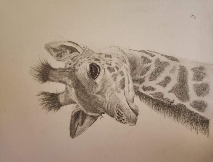
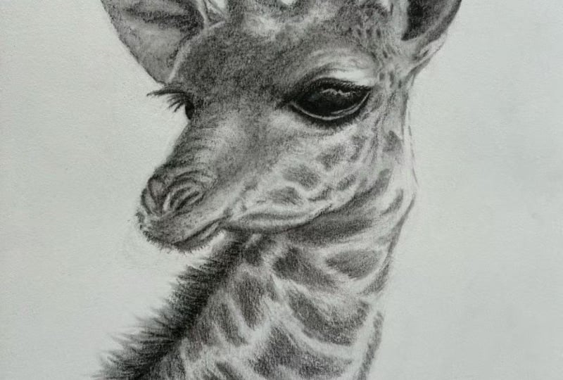
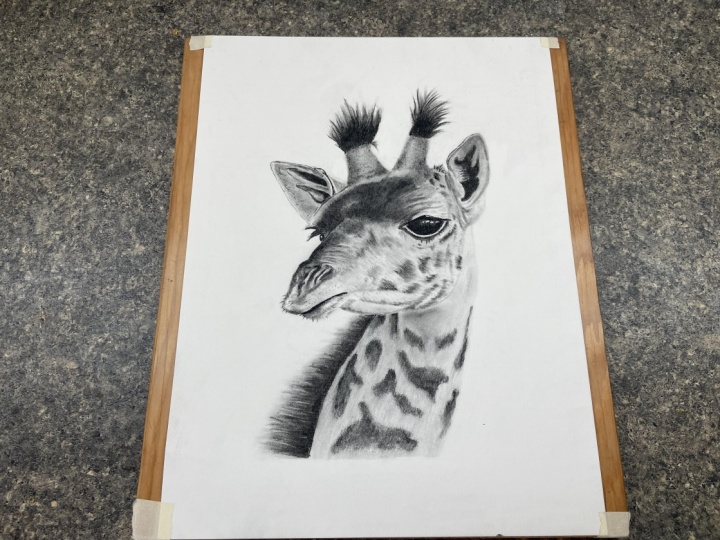
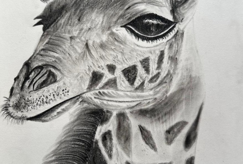
drawing approach that I created to help you draw. A beautiful giraffe. So, what to expect? We're going to go through,
and we're going to start off with using a
graphite pencil, and I'm going to
show you how you can draw the contour
lines of subject. Once the contour lines of
the giraffe are drawn, I'm then going to show
you how you can utilize soft charcoal to create a foundation for drawing
for your values. Once that is placed, I am then going to show
you how you can use charcoal pencils and smudgers to continue to build and layer
all of your mid tones and thus lower values to help to
accentuate the value scale. We are going to be
doing this drawing in sections so that you
don't get overwhelmed. Every lesson will focus on one specific heart of
drawing the girafe until we have successfully gone through and
completed the drawing. So that's pretty
much what to expect. Now, there are multiple parts, obviously, of the drawing. We're going to be utilizing
brushwork, smudger work, and then detail work to
really make this drawing pop. So I will say, there's a lot to the
three layered method. And so as a best practice, what I would recommend is go through the class
and just watch it once. Really just watch it. Don't draw with me. Don't try to do that. Just really take it all in. So that you understand and grasp the concepts that
I'm teaching you. Once you've done that, then go through and watch it
again and this time, draw with me and make
sure that you create your project that you upload
at the end of the class. I always love to see
your guys as projects. I love to give you my
feedback on them and not to mention by uploading a project
and leaving your review. That enables me to share your project in my
monthly newsletter. So this is a great way to be able to get your
name and your out there amongst the
artistic community that we have here on Skillshare. If you enjoy this class, there is more where that
came from on my homepage. That's pretty much
what to expect. And I hope to see you in class.
2. Tools & Contour Lines: Alright, so for this one,
we're going to be using a graphite pencil
and a Hoho eraser, a Pentel click eraser, and a mono zero eraser. We're going to be using a soft medium and hard charcoal pencil. We're also going to
be using a three 16th and a number three smudger, as well as a sand paper strip, our tone check paper, and last but not
least, the brush. Okay. So as with all drawings, the first step in
this one is drawing the basic outline of
our reference image. So when it comes to outlines, we like to use our
graphite pencil. Reason why is because it's
extremely easy to erase. And essentially what we're
doing here is we're just going through and we're
doing what I like to call framing our charcoal piece. So what I'm doing is
I'm simply identifying the main contours of
the reference image. I'm not going to worry about form or anything like
that. In this step. I'm simply drawing out the basic outline of
the reference image. But if you look at
the reference image, anywhere where there's going
to be significant changes in tone from complete
black to complete white, I want to highlight those and
outline those in my image. So, say, for example,
here I am outlining the eye and the eyelashes
of this giraffe. And the reason why is because
these are going to be different tonal values of black space next to
all white space. But anywhere where there's
going to be those breaks, say, for example, the spots
on this giraffe. I definitely want
to outline those. And these don't have to
be perfect by any means. Remember what I always
say I'm a big fan of Salvador Dali because he
was quoted with saying, Don't worry about perfection.
You'll never reach it. Well, I like that
because that gives us the ability and the freedom to make mistakes with
this drawing and grow. But as you can see there, I didn't like the way
that looked initially, so I just hit it with
my Monozoa eraser and started over.
And you can do that. Don't think that you're
committed at this step. You are totally not.
This is just to get a basic idea of where that
charcoal is going to lay. But here for the neck, I'm just outlining the dark areas first. In this case, it's all
spots where I'm going to be laying down a
lot of dark charcoals. Okay. So that just
about does it. But then, of course,
here, these are what I like to call form lines. Now, this is for you to see, and you'd probably benefit from actually doing this in
your own drawings because what this does is this gives you a basic understanding of how
that form is in your image. These are lines
that don't actually exist on the reference
images you can see, but they are there for you to not forget the principle
of underlying form, which is something that can
be a hard concept to grasp, but it is a concept that will only benefit you
once you understand it.
3. Ears & Ossicones: So now we're gonna take
our tone check paper. We're going to grind on some soft charcoal and
some medium charcoal here. Okay. So now I'm going to take
my number three smudger. I'm gonna grab some
soft charcoal, a little bit do a
little tone check, make sure I have
the proper tone. I'm going to start
here at the ear. And you'll notice
that we are only focusing on our dark tones, first, and then we're going
to build off of that. One of the reasons
why I like to focus on the dark tones in an image first is because through more smudger work
and brush work, especially, we'll
be able to speak to those lighter tones
because what's going to happen is we're going to be taking as we hit the
paper with our brush, we're going to be
bringing that charcoal over to those lighter tones. And thus, not only is
that going to give us a nice blend
between our tones, but that's also going to help accentuate the
value between them. And then here what
I'm doing is I'm just taking a medium charcoal. And I'm just very
lightly putting in a broken defined line. And I'm also going in here
on top of those dark tones. And this is really
where you're able to define exactly where
those darker tones are at. So this is basically building
our tones by layers. But the cool thing about
having the medium pencil here is that it just gives
me a little bit more control than the smudger. Here, I don't like that, so
I'm gonna bring that in with the monozura eraser.
There we go. I'm going to take
my 316 smudger. It's a little smaller, offers a little bit more
pinpoint control. And I'm just blending my dark tones next
to my light tones. And this is really
helping me bring out the inner form of the inside
of this giraffe's ear. And then here's a
cool trick if you want to take your smudger, lay it sideways,
and just slightly dab the smudger onto the paper. What this will do is this
will give you a nice blotchy look that we see on the inside of the ear
on this reference image. Okay. And now I'm going to take
the number three smudge with some soft charcoal. And I'm just going
to start building up the ossicone of
this giraffe here. What we're doing is
I'm not worrying about finite detail here. This is simply the
first layer of mini that we're going
to be laying down. The cool thing about
this approach with the soft charcoal is
that we'll be able to build more value in this part of the drawing
with more layers. But here what I'm doing is I'm taking that medium charcoal. And I'm just pulling up. And this is giving me
that really nice break between complete dark
and lighter tones. And thus, this is giving
me the maximum amount of value in the top of the
drafts Ossie cones here. Then I'm just taking a smudger. I just kind of blending this. What this is doing is
this is softening up the hair and making it look just a little
bit more realistic. Looks like we got some runaways here too that initial layer. And then here, if
you need to build any shadows or
anything like that, just press a little harder
with your smudger and you'll get a darker tone. Put these runaway
hairs here. Sweet. Okay, now we're going
to do the same thing on the giraffe's other ossicon. So this is just soft
charcoal, remember, the big difference
between soft charcoal and medium charcoal
and hard charcoal is that as you go
down the scale, soft charcoal has the least
amount of binder in it, medium has a little more, and then hard charcoal
has the most. And because of that,
the charcoal will hold together nicer with the
more binder that it has, and thus, it's going to
give you a darker tone. So that's one of the reasons
why we use soft charcoal, and then we progress
down the line. It's all about tones. And the more tones you have when compared to
complete white space, the greater you accentuate the overall value
scale of your image. Okay. So now we're
gonna do another tone check here. All right. Now, on here, the eye
is coming forward. So this part of the head
between the ear and the ossice, we want that to be a little
darker so that it is pushed back in
contrast to the eye. But here with the ear, I'm
focusing on the dark tones, first the inside of the ear. And then here what I'm
doing is I'm just going in with my medium charcoal because it gives me
a lot more control. And I'm simply outlining where I'm gonna be filling
in the inside of the ear. And then I'm just slowly gonna
build up that dark tone. Just nice tight little
circles. Nothing fancy here. Now I'm just gonna
take my smudger, and I'm going to blend it. See how it gives me
that really nice blend, makes it nice and smooth,
nice and cohesive. That's what we want. And bear in mind, I'm moving very quickly
with this tutorial. With a normal drawing of mine, I'd probably be sitting in
the chair for 12 to 14 hours. But in this case, I did this drawing
in about 3 hours and then I compressed
it through editing. And that's one of the
things that I really wanted to speak
to in this video. I wanted to show you
guys that my drawings, like my time lapse drawings
like say the Mo Shark, for example, I drew that over
the course of two weeks, you know, working
a full time job, coming home, working on
it for about an hour. And then whenever I
would get frustrated and I'd lose my concentration,
I would stop. I think DaVinci was the one that said Take a break and
come back to it and there'll be things
about your drawing or your piece of art that maybe
you didn't see before. Now we're gonna take the brush. We're just going to
hit it real lightly. You don't have to push
very hard at all when it comes to brush work
with this technique. And as you can see, it gives you a really nice blend and it brings all of those
different tones together. Then here what I'm doing
is I'm just going through with my medium charcoal, I just putting on some
broken up defined lines to kind of bring a little
bit more form to that ear. Then here it looks like
there's a little bit of hair on the giraffe's man that goes all the way
up back of its head. I'm just going to hit
that with a smudger. Now I'm gonna go in with
a medium, charcoal here. I'm just gonna pull
these real quick. There we are. To look good. Then put a little
define line right there, and that'll bring
that ear forward. But I'm not getting too crazy with my defined
lines on this one. The majority of the texture
on this giraffe is very soft, so I want to adhere to that. But then here here's
some texture. This is the same type of
technique that we're using on the lion in our
previous tutorial. But what I'm doing is I'm
pressing very lightly, and I'm just essentially
going in tiny little circles. Yeah, something like this here, see if you can see this a
little bitter. There we are. See, something like that.
They can be bigger circles. They can be smaller circles. But the big thing about this part of the drawing
that I want you to take away with you is that
you don't have to press hard because all of the different tone breaks
and then that value that you see underneath the
texture, we want to keep that. So we're kind of get in
and then just get out. Hit it real quick,
maybe one pass, maybe two, start from the edge like I did here,
and then work your way in. As you can see, this
approach will give you that really nice
realistic look that we see in the reference image
on this drafts Ossie Cones. I like that word Ossie cone. I didn't realize
that's what they were called until I did
some research on them. But anyway, I would just go through I'm just dabbing this
very lightly with my brush. That you can see that kind of
softens it up a little bit. Just be very careful,
though. You can overdo this. You know, I'm not
trying to take away all of the sharpness.
I like that. There's certain parts of this that need to be a little darker. So the tone does get darker when you dab
it with the brush.
4. Nose & Forehead: Now here, this is
where those form lines come into play because
what I'm doing is you can see the forehead of this
giraffe kind of slopes down onto the nose. And so what I'm doing
is I am adhering to the flow in the basic
underlying form of the giraffe's face even with my brushwork this is why those form lines that we put down in our outline
step are so important. The thing about this
forehead that you'll notice is if you
just lightly dab the charcoal on the
top where you want basically the brim or the top of the brow to be
and then pull down, you'll get a nice sloping look. But remember, this is
just an initial step. We are going to be adding
detail by using our erasers, especially our
model zero eraser, and we're going to be
adding detail by taking charcoal away. So
keep that in mind. But the basic principle
of identifying those darker tones
and accentuating those first is still
very much in play here. We're always going
to be going after our dark tones first
because subconsciously, when the viewer is
looking at your drawing, their eye automatically picks
up lighter tones first. That's one of the
reasons why we go after the dark tones
when we're drawing is because we will
be able to blend those lighter tones with
brushwork and d eraser work. And if that's what the viewer's
eye picks up initially, those lighter
tones, then we want to be able to showcase that. So just keep that in mind. But out here on the lip,
what we're doing is, I'm just going through and
I'm pulling left to right. I'm kind of giving that lip. I'm starting to give it
that form, as you can see. I'm just going to grab
some more charcoal. It's going to vary lightly go under the line that
I drew in the outline. What this is doing
is this is bringing that lower lip and tucking it underneath the top
lip of the giraffe. In other words following that jaw line straight onto the face. Then you'll notice in this
part of the reference image, our tones are going
to be extremely dark. And even with dark tones,
you can build those. So just because it
might not be as dark as you're going to finish
it off with initially, it's just a step. And see by adding a darker tone, essentially what we've done
is we've taken that side of the giraffe's face
and we've tucked it behind the nose of the giraffe. And this is speaking to the
overall form of our image. And using the smudger, what this is doing is this is
just giving us a nice blend and it's softening the
look of our charcoal. So now here what we're gonna
do is I'm gonna go in and I'm gonna put a defined
line right here. This is the eye of the draft. Do the defined line
on the outsides, and then I'm moving
in and filling in the eye. There we are. Then the eyelashes drafts have some pretty thick eyelashes. So I'm just gonna pull that out. Just on the top,
or on the bottom, and then on the top,
and then fill it in. Then do the same thing
with this part as well. Okay. Now, this is something
that I wanted to show you. Whenever you're using
straight charcoal pencil, always be aware that
it's extremely powerful, so you can go in and you
can make something a little bit too dark if
you're not careful. So as you can see, I'm just
going through and I'm doing the same type of
thing that I did on the top of the ossicones. I'm just very lightly
adding charcoal to the tones that I've laid
down initially with my brush. And as you can see,
it's gritty, right? It has that gritty
charcoal texture. But don't worry about that. Because we're going
to be going in with smudgers and our brushes, and we're going to be
softening all that up and blending that
together so that the aesthetic that it has
when you initially lay it down is not going to
be the final product. So now, as you can see,
we're taking our smudger. And I'm just very
lightly pressing and I'm smoothing and bringing out that gradation in between the different tones
that we have. And all the while I'm not
forgetting about form. When it comes to the
forehead of the giraffe, I'm pulling down
when it comes to the nose, I'm pulling sideways. And when it comes to the lip,
I'm pulling left to right. That underlying form is
absolutely crucial to remember when every
stroke of your pencil, your brush, your smudger, and even your eraser,
especially your eraser. But here we have a kind
of a blotchy texture. And that's one of the
reasons why I like to start off my tones and
my underlying form with a brush because it gives me a really nice light tone, something that I can
build all of the tones in between that tone and
the darkest tone. And that allows me
to be able to really accentuate my
overall value scale for this individual piece. So definitely keep that in mind. I'm just going to with
my Mono zero eraser. This is one of the
steps that I love. I'm going to get rid
of this form line here because I know
that it's there. I just put it there for
you so you can see. This is how I do the
majority of my detail work. This is something that
we showcased a lot of in the great white shark
tutorial that we did, where I was showing you guys all the different things
that you could do when it comes to detail
work with your erasers, whether that be Huh eraser, your Pentel click Easer or
using now my Mono Zero eraser. I'd have to say out of
all of them, though, the mono Zero is probably my favorite because of
its versatility. As you can see, I'm able
to go in and put lines in. I can have really
short small poles, and that'll give me that really, really short hair
texture like we had on the lion's face in our
other tutorial that we did. But now here for the nostril, I'm just going to put
in a nice saturated, defined line for the nostril. There we go. There's some
other defined lines here. These are the nostrils.
They're very kind of crinkly. And so right here,
what I'm doing is anywhere where I know that
there's going to be a really, really dark tone,
I can go in with my pencil because
I have a lot of control and I can really
speak to that part of it. And like I said, even
though it's gritty, I'm going to go ahead and
I'm going to hit it with a smudger after I'm done here, laying all this charcoal down, and it's going to smooth
it together. Here you are. See that? Boom. That's it. And as you, you know, study these tutorials and you
start to see my approach, my approach for the most part, is very much the same. It doesn't really change, regardless of the type of
animal that we're drawing. The only thing that might change is maybe the steps that I use to get to that desired. Look. And that really depends
on what the texture is. You know, if it's a
giraffe or a lion, obviously, we're going to be
using a lot of brushwork. We're going to be
using a lot of eraser work for all the hair, whereas, you know,
if it's a shark, it's probably just
going to be all brush work and we don't really have too much eraser work outside of trying to convey
that underlying form, which is a last step. The hammerhead Tutorial does a good job of speaking to that.
5. Eye & Tone Building : Okay. So now the eye,
the good old eye, eyes can be tricky,
but in this case, what we're going to
do is even though, if you look at the
reference image, you can see that this
part of the eyelashes of this eye, it's all
clumped together. It's one kind of black mass, but I'm going to go through, and I'm just going
to build it and we'll get to that point. So here what I'm doing is I'm pulling the eyelashes
individually, and then I'm clumping them together. Now, I
could have started off. So, a lot of people
could say, Well, why didn't you just clump
them together initially? It's like, Well, I
could have done that, but I prefer this approach because I find that
it keeps you honest. So now right here, I'm
putting in a nice, heavy, saturated define line, one of the few defined lines
in this entire drawing. This is probably the single
biggest defined line. And then here, this eye has a slight bend
to it on this side. So I'm just gonna go ahead
and accentuate my line there. There we go. And
now we can go in, we can fill this in. And now what I'm going to
do is I'm going to take my three 16th smudger. And I'm going to build
these tones here. Now, essentially what
this is doing is this is giving that
eye that really nice, that really nice form that you see in the reference image. I'm gonna take my Mono
zero eraser here? I'm just kind of accentuating
this white line. And this is one of
the reasons why I love the Monozoo eraser is 'cause you can get into really
tight spaces like this. There we are. Okay. Do a quick little tone check,
continue to build this. It's a little darker. Let's see how I'm
building this and I'm staying away from
that white line. This is adding to
that form for me. And here on this side,
you see how there's some pretty heavy lines that come up over the
front of the eye. Well, this is how
you can get those. You just stand your
smudger on its side and then just do straight poles. Okay. Now, when it comes to the eye, what I like to do is
I like to start from the bottom and then
I'll work my way up. And this is kind of like
with the eyelashes. You know, you start
slow and then you build up to your end goal. I like to do it this way
because I find that it allows me to really bring out that
rounded look of the eye. And it's just kind of
like cutting hair. I like to start off lightly and build up to my desired effect versus just going
straight first mi, yeah, I'm just going to fill this with a bunch of dark tone, then maybe it just looks
like a black blob. There we go. But this is
just a medium charcoal here. I'm starting from the bottom, and I'm just kind
of packing it in. When you look at this
reference image, this eye is probably the darkest tone in the entire drawing that
we're going to have. Okay. And then you can take
your medium charcoal because it allows
for more control. We're just going to
go in, we're going to add some detailed work here. Looks like some of the hair starts on the drafts,
face below the eye. Then here we're just bringing out some darker tones
on the forehead. Because it's got that gritty
look, we don't want that, so I'm going to go in with my smudger and just
kind of blend that. And I'm going
through and I'm just continuing to build those tones. And then here what
I'm doing is I'm just pulling the charcoal
very lightly, and this is giving me kind of that underlying texture
when it comes time to really pack in the texture of the hair
of the drafts face.
6. Mouth, Jaw, & High Value Retrievals: So here with the
smudger, what I'm doing is I'm doing the second of three steps to accomplish
good hair texture. The first step was
the brush work that was bringing out
the lighter tones. Now it's smudger work where we're accentuating
the dark tones, and then eraser work is where we solidify the tone breaks and we optimize on that contrast
between tonal values. But then here on
this jaw muscle, I'm going to take my smudger. I'm going to lay it on the line that I laid down on my outline. I'm just going to suddenly
go back and forth, left to right, very lightly. You don't have to push
very hard at all. Then I'm just gonna
clean this up with my model zero
eraser right here. I'm going to go with
my graphite pencil and just add some lines here. And when it comes to the nose, this is just detail work. So this is medium charcoal. Just make sure that
your charcoal pencils are very sharp for this step. You can go in and you can add all sorts of little details, little spots where
you make hairs coming out of the drafts, lips. Then here this is where we're
going to separate the lips. So we're going to put a
nice define line here. There we are. That looks clean. So what
that's done is that's brought the top lip and brought it in front
of the lower lip. Now, we're just doing
quick short pulls for the hair on the drauf. And you can get carried
away with this part of it, but just remember when
it comes to detail work, so much of the time,
less is truly more. So you don't have to get carried away with your
detail work at all. Sometimes just a good thing to keep in the back of your
mind is get in and get out. You don't want to
overwork the paper. So now what we're doing is we're gonna grab number three smudger. I grab some charcoal. We're gonna blend everything
that we just laid down with our medium
charcoal pencil. Okay. Now we're just
polling left to right. We're bringing out the form of those jaw muscles
of the draft. And then here I'm
just beefing up all of the spots on
the diraf's face. Someone grabs a medium charcoal 'cause the medium charcoal has more binder in it than the
soft charcoal and thus, it's going to give us
a richer, darker tone. But here real quick,
what I'm doing is I'm pushing left to right, and as you can see,
this is giving the edges of the spots
that jagged look. So I'm thinking about my
texture in this step, even though I'm not
going to be able to really accentuate
and bring out that texture until I
use my monozero eraser. But you can just
dab it real quick. Just make sure your
smudger is loaded up with a lot of charcoal so that when you hit
it on the paper, it builds that tone for you and you hardly
have to push it all. May, make sure you're
checking those tones, and here I'm going
to lighten it up. Because as you can see, we do have some spots on this draft. They're a little lighter. So now what I'm doing is I'm adding another layer to the fur of the face of this draft,
and this is how I'm doing it. I'm pushing up and
then I'm pulling down, pushing up, and then
I'm pulling down. I'm being sure that
when I push up and I pull down that I'm leaving, I try to leave as much
white space in between my poles as the poles themselves take up
with that darker tone. So it's very much a balance, so just keep that in mind. Remember, lighter tones
are just as important, and because the human
eye subconsciously picks lighter tones up, first when it looks at an image, you definitely
want to accentuate those as much as possible in your drawing so that you can
maximize your value scale. Now what we're doing is this is almost the final step of really bringing
out that texture. This is the same
approach that we used in the ion tutorial for all of the short hair
on the lion's face. This is adding detail by
taking charcoal away. This is a fundamental benefit of the three layered method. And this is one of the reasons why if you're just
starting out and drawing or maybe you're trying to get familiar
with charcoal, for the first time,
this is a method that can really help you because
it's very forgiving. You don't have to
nail any part of your drawing right out of
the gate when you're laying down your tones and
building form with your brushes because
the monozura eraser can fix a lot of those
mistakes for you. But now here's what I
wanted to show you. So basically, I'm going
to pull on one side, and then I'm going to move to the other side of my dark tones, and I'm going to
pull from that side. As you can see, that gives
me that really nice texture. I'm just going to
go in with my brush very lightly, very lightly here. I'm not touching or pushing
hard on the paper at all. I'm letting the brush blend those tones for me in
spots that I needed. This is helping to bring out that underlying form
of my giraffe here. Okay.
7. Neck, Details, & Final Thoughts: Si, let's start on the neck. So just like with the
face, what we're doing is we're hitting this with a
brush with a soft charcoal. And I'm just getting that
base layer. Alright. Now what I'm doing
is I'm building up my dark tones
first, like always. And I'm just building up all of the spots on
this giraffe's neck. There we are. And one of
the reasons why I laid down that initial light
layer of charcoal with the brush was because
when I go back with my monozura eraser to
create that furry texture, it's gonna be very easy. Okay, so we're just
gonna erase this here. I'm gonna bring this neck over
to the right a little bit. There we go. Alright,
this is pretty cool. So now what I'm gonna do is
I'm going to take my smudger. We're just gonna do a quick
poll from right to left. There we are. We're just
going to keep doing that. Now, on this part, basically what you want to do is
you want to pull it, bring it, drop it down,
and then pull it again. And with each one, push a
little harder and then a little lighter and then push a little harder and then
push a little lighter. And then turn it sideways and run it up close to the neck. And then you can pull
out. There we are. And this is going to
give us a really cool effect for the giraffess neck. Now what I'm going to
do is I'm going to take my medium charcoal. I'm just going to put just
a very light defined line, kind of a broken defined line. It's not heavily saturated. It's more or less there,
but the whole point of this is to push the hair back And then what I'm doing is I'm taking my
medium charcoal and I'm just kind of building up
those darker tones that we see in the hair here. You know, it looks
kind of greedy, so now I'm gonna take my brush. Very lightly, pull from right to left and blend
that all together. There we are. That's nice. Now what I'm gonna do is
I'm gonna take my smudger. And I'm just smudging
the hair that's immediately next to the neck and the reason why is
because that's where all the hair is the
closest together. So light's not really going to penetrate through there like
they are on the ends here. So now I'm just going to
take my monozur eraser. I'm just doing real
light, subtle pols. You want to be careful when
you're pulling left to right, because if you have a dirty tip, it'll actually put a spot
of charcoal on that side, and it won't look
nearly as realistic. Okay, now we're done with that. So what' going to do
is I'm gonna grab some soft charcoal
with my brush. I'm just going to darken up. This part of the neck, as you can see from
the reference image, this part of the
neck is very dark. And by darkening this up,
what this does is this brings the head of the
giraff forward and makes it look like the
jaw and the nose of the giraffe are closer to us than the neck is, and
that's what we want. That brings that realism to us. Ben out here at the
Monesur cerums going in, and as you can see from
the reference image, this is where our light source
is coming from the right, so the whole right side of the giraffe is very
bright, very bright. So very light tones. Here we can start to
build those tones, nice short little strokes. We do one line, we
pass into one line, and then we come
back into another line just under that line. Remember, each stroke, you
move over so that you have that same amount of space and dark tones immediately
next to your light tone, and that'll give you
that furry texture. We want. There we are. So much of this approach is
just just planning ahead. You know, when I
laid down all of this charcoal for
this check texture, I hadn't even done all the hair on the back of the neck yet, but I knew that this was coming. And so as you draw more, you'll start to understand
why you're doing things three steps before
you actually go in, say, with your eraser
and finish that texture. So and then here this is
a little darker overall, so I'm just taking my
brush very lightly. I don't want to lose
all of the texture that I just laid
down with my eraser. And this is one of the
reasons why the brush is so important for
you as an artist, especially a charcoal artist, especially if you like to
utilize this type of approach, because it gives you a
very nice aesthetic. And the biggest thing with
the brush that I have found, I'm just going to darken
in the ears here. The biggest thing with the brush that I have found is that it really allows me
to speak to form. So much of the time in
realistic type drawing, whether you're drawing people
or animals or buildings, a lot of it is all
about your form. Tons are important, yes. Texture, of course,
is important, but underlying form is
absolutely crucial. Form is one of the
hardest things to comprehend and execute on
when it comes to drawings. I struggled with it for a long
time. But I never stopped. I never stopped drawing.
I never stopped learning. I never stopped reading. And
that's all you have to do. That's all you have
to do to get better. But here, what I'm doing
is I'm just going in. I'm just doing
subtle detail work. If you look at the
reference image here, some of these dark
spots on the giraffes, they have darker parts, like blotches, almost, if
you will, within them. And so a medium charcoal hit real quick can
speak to that. But that's pretty much
it for this one, guys. Um, I hope you enjoyed it. I know it was a little longer than other tutorials
that we've done, but, uh, I really had a lot
of fun drawing this one. It's the first time I've
ever drawn giraffe, so hopefully it
won't be the last. And that is pretty much it. I like how this one
turned out. Voila.
 Messer Creations, Artist | Author | YouTuber