Transcripts
1. Introduction: Welcome to this short class, where I'll guide
you step by step through my process of creating a tropical inspired print like this and turning it into a
seamless pattern in Photoshop. Hi, my name is Vinita, an illustrator and a
designer based in Singapore. We will begin by
sketching and painting our tropical elements
before moving on to arranging them into a
seamless pattern in Photoshop. Along the way, I'll also share my personal tips and tricks to help you work more efficiently. I have attached the list
of tropical elements and the reference images in the resource section
of this class. These are few tropical
inspired prints that I created using
the same method, and I hope it inspires
you to create your own. I can't wait to see
your beautiful prints in the project section
of this class, so see you in the class.
2. Tropical Print Process: I began the process by compiling a list of
tropical elements, including birds, flowers,
animals, and insects. You can find this in the
resource section two. Next, I gather reference images, mostly photographed myself, and others are sourced
from royalty free sites. It is really helpful to think about your elements
in three categories. That is the hero,
secondary, and filler. The hero element is your star. It is the focal point
of your design. Around the hero element, you add your secondary elements. These are slightly smaller
and less dominant. Finally, you have
the filler elements. These are the small details that ties everything together. Next, I would like to walk you through my illustration process. Let's see the process of
illustrating the horn Bills. The first step is sketching. I'm using a few
reference images to understand the shape and the
details of the hornblls. You can either sketch
freehand, like I'm doing here, or you can trace it if you
want a more accurate outline. Both ways are perfectly fine. Once the sketching is complete, we can move on to the
watercolor stage. I have listed all the materials I'm using in the resource
section of this class. Let me lighten this
sketch before we begin. You can also use a needed eraser to gently lift some of the
pencil lines if needed. The watercolor
techniques I'm using are quite simple,
nothing too complicated. I'll start with a basic
wash as my first layer, then add some gradient effect for depth and
smooth transitions. I chose to include
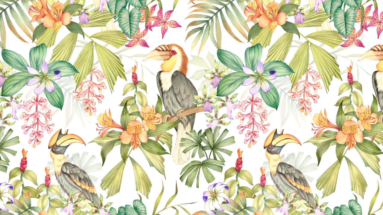
the hornbills in this tropical print because it is such a unique and
eye catching bird. These birds are found in tropical forest and are often seen perched
high in the trees, which makes them a perfect fit for a jungle or
tropical theme design. You are free to
create this print in any medium of your choice, whether it is a watercolor, color pencil, markers,
or even digital tools. The key is to stick with one
consistent medium throughout your design so that the overall
pattern feels cohesive. And this is a wreath hornbill which in particular has
a beautiful feature. Not only it adds
visual interest, but also brings a bit of story and personality
to the print. The hero element could be something bold and detailed like this tropical bird or a large flower or any motif
you want to highlight. Once I have finished laying down the base colors
with watercolor, I'll switch to colour
pencils to add sharper, finer details to create
more depth and dimension. Now moving on to my secondary
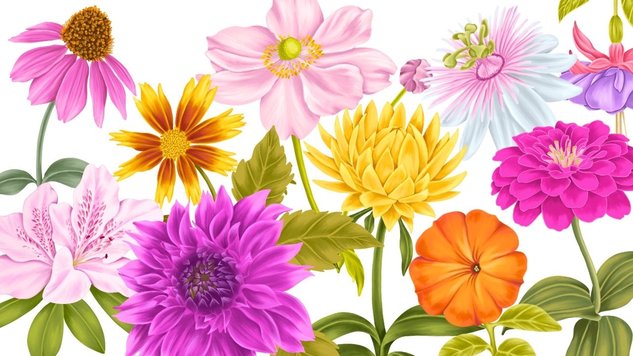
and filler elements. Incorporating flowers
into the print instantly adds vibrancy
and burst of colors. Flowers not only enhance the visual appeal but also
help balance the composition. They can act as hedo
secondary or filler elements, depending on their
size and details. You can definitely experiment
with the different types of tropical flowers you can
include in your tropical print. I have chosen flowers like
orchids and astromdia, but there are countless other
options you can explore. Each flower has its
own unique shape, color palette, and personality. So the ones you choose can really influence the
mood of your print. When working on
your illustrations, it is always a good
idea to create a few extra elements beyond
what you think you'll need. Having additional motives ready gives you more
flexibility during the layout stage and saves you the time of going back
to paint again later. Sometimes while
arranging the pattern, you might find gaps that needs filling or realize
that the balance could be improved with another leaf or flower
or small details. One of the most important
element when it comes to a tropical inspired print
are adding palm leaves. They enhances the
tropical vibe and reinforces the lush jungle
like atmosphere to the print. They are also incredibly
useful for filling in empty spaces between
other elements, helping the composition feel balanced and full
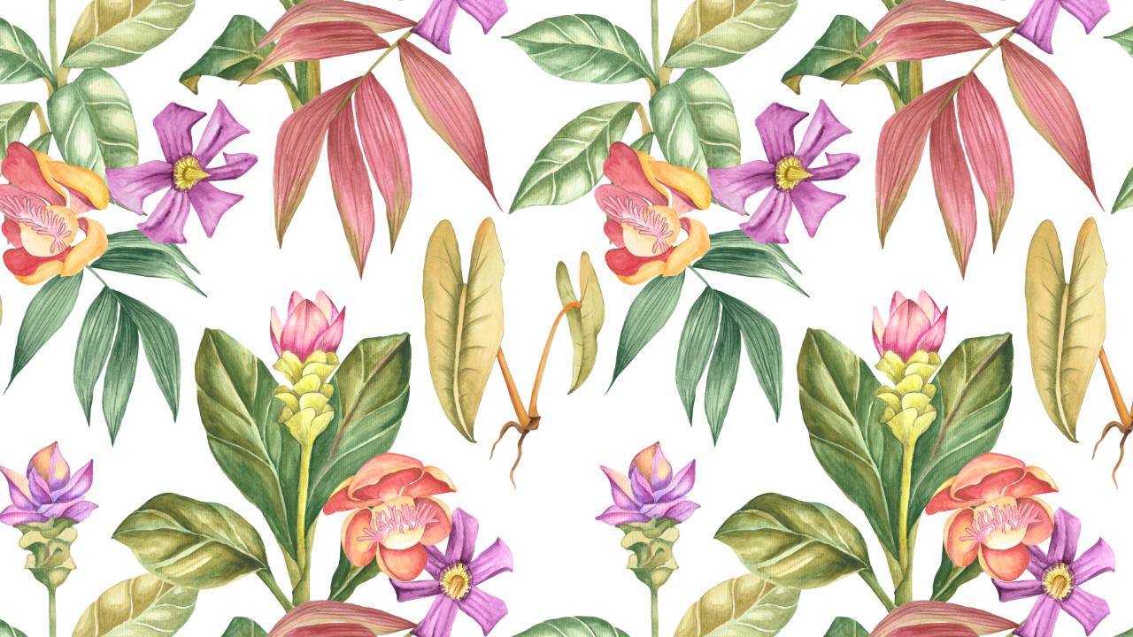
without overcrowding. There are a wide variety
of tropical leaves and plants that you can
incorporate in your design. Each type of leaf
or plant brings it its own character and
texture to the print. For example, a large monstera leaves with their
iconic cutouts, add a bold graphic element, while banana leaves can give a more dramatic
and layered look. Combining different types of tropical greenery not only enhances the richness
of the design, but also helps to fill
spaces naturally. Once I have all my
illustrated elements ready, the next step is to scan
them at a resolution of at least 300 DPI to ensure they are crisp and
high quality for print. After scanning, I move on to cleaning up the artwork by
removing the background. There are many different
ways to do this. For me, the most
effective method is to carefully erase
the background manually, which can be done
with the eraser tool in Photoshop or on the iPad. So right now I have all my
elements in one document, and this document is
8,000 by 8,000 pixel, but the size can depend on the client's requirement or on the project you
are working on. I just selected all the elements and got them in one group. We'll start by hiding
all the layers, as we will be working with
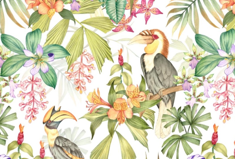
one element at a time. I always start by placing
my hero elements. The birds are the hero
element for this print. Before we move on
to the next step, let's get our pattern preview under review, select
pattern preview. There are several different
types of print layouts, such as trailing, bouquet, stripe, and all overs. But for this design, I will be working with
the bouquet style. Once the hero
element is in place, I start arranging supporting
elements around it, almost as though I'm building
a bouquet around each bird. For the placement
of my second bird, I am arranging it in a way that follows a half drop repeat, which is similar
to how designs are structured in a
diamond shaped tile. Instead of placing the bird directly next to the
first one in a simple, predictable grid, the
half drop technique creates a more natural flow. When it comes to arranging the secondary and the
filler elements, it is important to place
them in a way that feels balanced and organic. Instead of copy and
pasting the same element, I like to vary their
position by rotating, flipping or cropping, so they blend naturally
into the design. The goal is to make the
repeat seamless and interesting so that when the pattern is applied
on a larger scale, the eye keeps
discovering new details instead of noticing
obvious repetitions. By carefully choosing and
placing filler elements, you can enhance the
overall flow and make the composition feel
richer and more cohesive. Think of them as the
background rhythm that keeps the whole pattern
lively and complete. Next, I'll be adding
few elements in the background to help fill
up some of the empty spaces. To make sure these don't
compete with the main motif, I'll reduce their opacity and set their blending
mode to multiply. This way, they appear
lighter and more subtle, almost like they are
sitting in the background, which adds depth and dimension without overwhelming
the overall design. It's a great
technique to achieve a fuller composition while still keeping the hero
elements in focus. So we are ready with
our print here. Let's move on to trying
some background colors. I'll go to adjustments and
select the option solid color. When it comes to
tropical prints, bright backgrounds
always works best, but this can depend on the seasons or the client
you're working for. These are a few of
the mockups to see how the print looks on
different products.
 Vinita Upadhya, Illustrator & Pattern Designer