Transcripts
1. Introduction & What You'll Learn: Welcome to the series of short classes where
I'm going to share my personal process of creating a print from
start to finish. Hi, my name is Vinita, an illustrator and a
designer based in Singapore. In today's class,
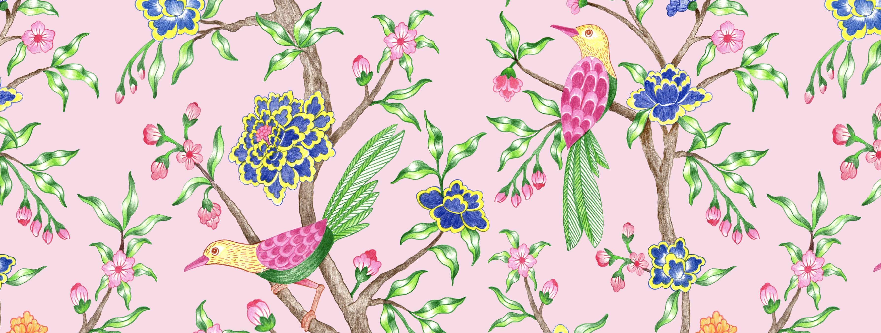
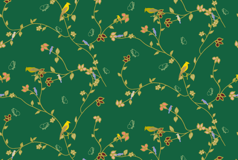
we will be creating a hand drawn print inspired
by traditional Sin vasari. The medium I will use to create this print is watercolor
pencil colors. You can use any medium
of your choice. And I'll be guiding you
step by step through my entire process for creating
this print in Photoshop. A technique I'll
be showing you to create another version
of this same print. For your class project, create an illustration
of any elements or a pattern inspired by
the Shin Wasii style. I have included a PDF
file with a mood board, a list of suggested elements, and example sketches of
elements for your reference. Feel free to use these as
inspiration or even trace them to help you
get started with your first Sn vasori
inspired print. This resource is
designed to give you a strong starting point for building your
own unique pattern. I hope this series can
inspire you to create your own print centered around
similar themes and topics. So see you in the class.
2. Chinoiserie Print Process: Mood board and research. These are essential first
steps when creating a print. You can create a very
basic mood board as it helps to visually
organize these ideas, allowing you to see
a cohesive theme. Three important
thing that you can observe are the color palette, motive or the elements, and the illustration style. Or you can even create a trend board that can
look something like this, a collage or a
snapshot of what's trending in the industry
around the similar style. Here are the list
of common elements that you might want to consider. So once I decide on my elements, I start with my first
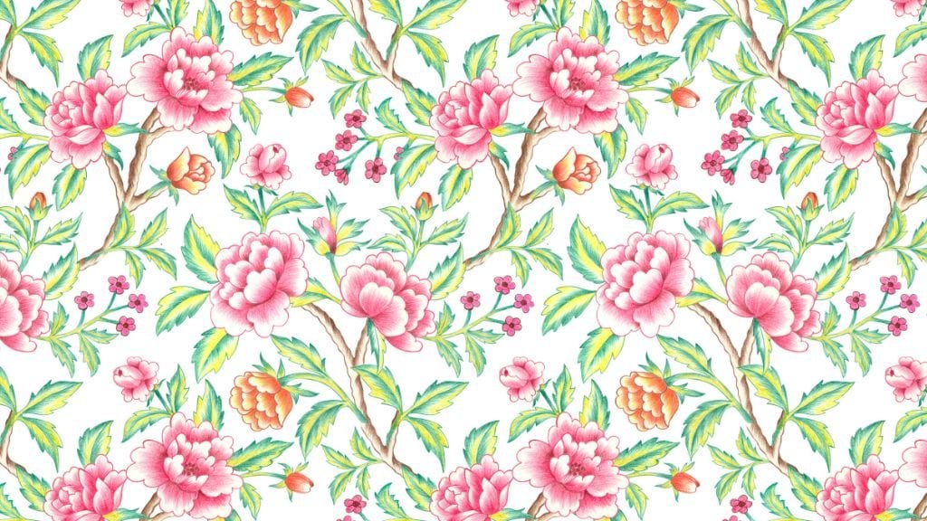
initial rough sketches. These prints are
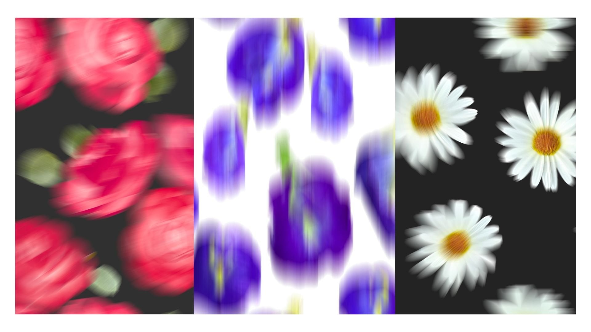
typically very intricate, featuring lush blooming flowers like peonies or cherry blossoms. A lot of twisted branches that gives a very storybook
quality feel to it. Your illustration can
be done digitally or with any traditional
medium on paper. I have created my print on paper using watercolor
pencil colors, and I will be walking you
through my entire process. Here I'm using an A three
size basic mixed media paper. It's 300 GSM, and the
quality of paper you choose can depend on the medium you're using
for your illustration. Once I'm ready with
my rough sketch, I'll erase and lighten
the whole sketch. So the pencil marks are not visible on my final
illustration. When I'm adding these
colors and shading, I'm also referring
to the mood board for the illustration style. You can choose any traditional
medium of your choice, like watercolor, guauch
or even markers. Fashion brands such
as dam and Gucci have recently incorporated this print style into
their collections. You can adapt, modernize and incorporate this print to
reflect your own unique style. One very important tip is, if you have a clean outline, it is easier to remove
the background. So while you are in your
illustration process, make sure to have clean
and finished lines. Once you're ready with
all the elements, our next step is to scan. One of the very important
thing to keep in mind while scanning is to scan on a very high resolution that is minimum of 300 DPI. Other than that, I don't use any other editing
setting while scanning. After scanning, we import
this image in Photoshop. The first step here
is to duplicate this image or this layer
that is Command J, just so I have an
extra copy of it. I'll hide my first copy. Next, we'll go to images,
adjustments, and levels. Here you'll find these
tiny little three arrows. We'll move the first one that
will brighten up our image. Second one for some
saturation and contrast. And the third one
is very important. It will make our background a little more white and clear. You can adjust them slightly until you're satisfied
with your results. Our next step is to
remove the background. It is easier to remove when you have a clean
white background. Once you're done, click Okay, and we'll move on to
the Magic Wand tool. I'll select the Magic Wand tool. I keep my tolerance
very high in 50-70, and I'll click anywhere on the white background and
tap delete on my keypad. If you see any other
white backgrounds in between these illustration, select them separately
and delete again. Next, we'll add a black
background layer below this. So I will add a new layer and I will fill it
with black color. Or any other dark color. This is to make sure the
background is removed properly, and we have a very
clean, cleared motif. I will zoom in and
check each part of this motif if there is any
part of white background left. I will select my eraser tool
with a smaller brush size. Zoom in and erase if there is any rough edges
or white background. There are plenty
of ways to remove the background in both
Photoshop and Procreate. This can also depend
on the type of motif or the medium of
illustration you've used. Now I have all my elements ready with cleaned
up backgrounds. Make sure you have all
your motive files open. Next, we'll create a new canvas so that we can start
building up our print. Press Command N on your keyboard to
create a new document. I will be creating my print
on 5,000 by 5,000 pixel. This can depend on your
client or the type of print. Next, I'll drag and drop all the elements
into this canvas. Select the layer, hold it, go to the canvas and
drop in the center. I'll repeat the same for
the other motives too. Once I have all the
elements on my canvas, I will select all these elements and group them and duplicate. So that I have an extra
copy on this canvas. I will hide the first group and open the folder
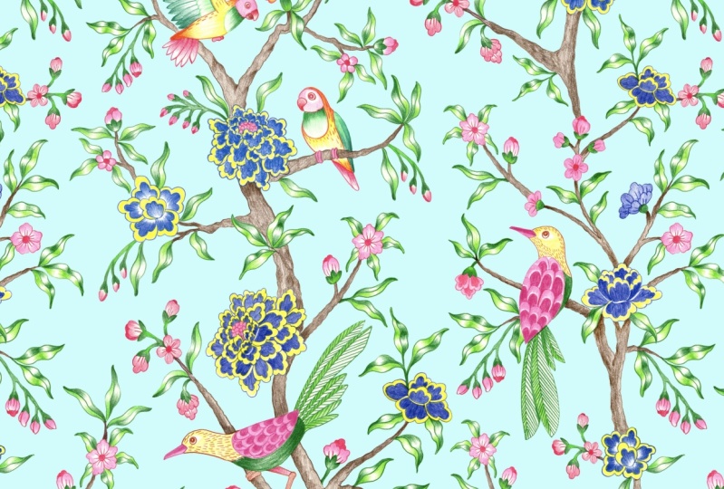
for the second one. Now we can start arranging our elements to
create our print, hide all the other elements, and I will start working
with one element at a time. So before I even started my illustration
for these motifs, my plan was to create this
trailing print where I have these branches connecting each other and creating
this continuous flow. Now to place my third motif, I will switch on my
Pattern Preview. For that, I'll go to View
and click Pattern Preview. I'm trying to place these
elements in a way that the branches look connected and looks like a
continuous trail. Now, to fill in these empty
gaps and the negative space, with my Lasso tool, I will copy paste these tiny elements and arrange them to the different
parts of the print. So you can copy paste tiny
elements from your main motif, or you can even illustrate separate small
secondary elements that you can add in the end to
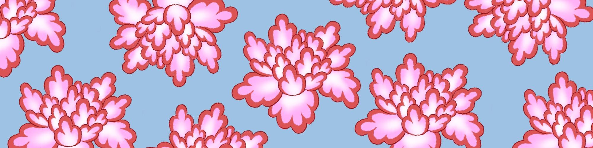
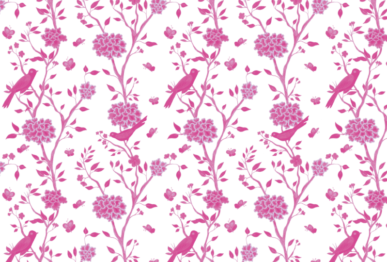
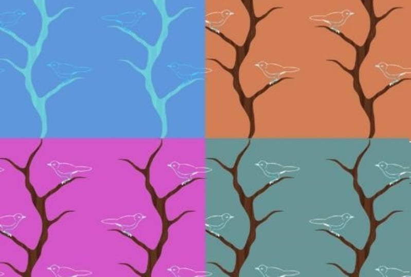
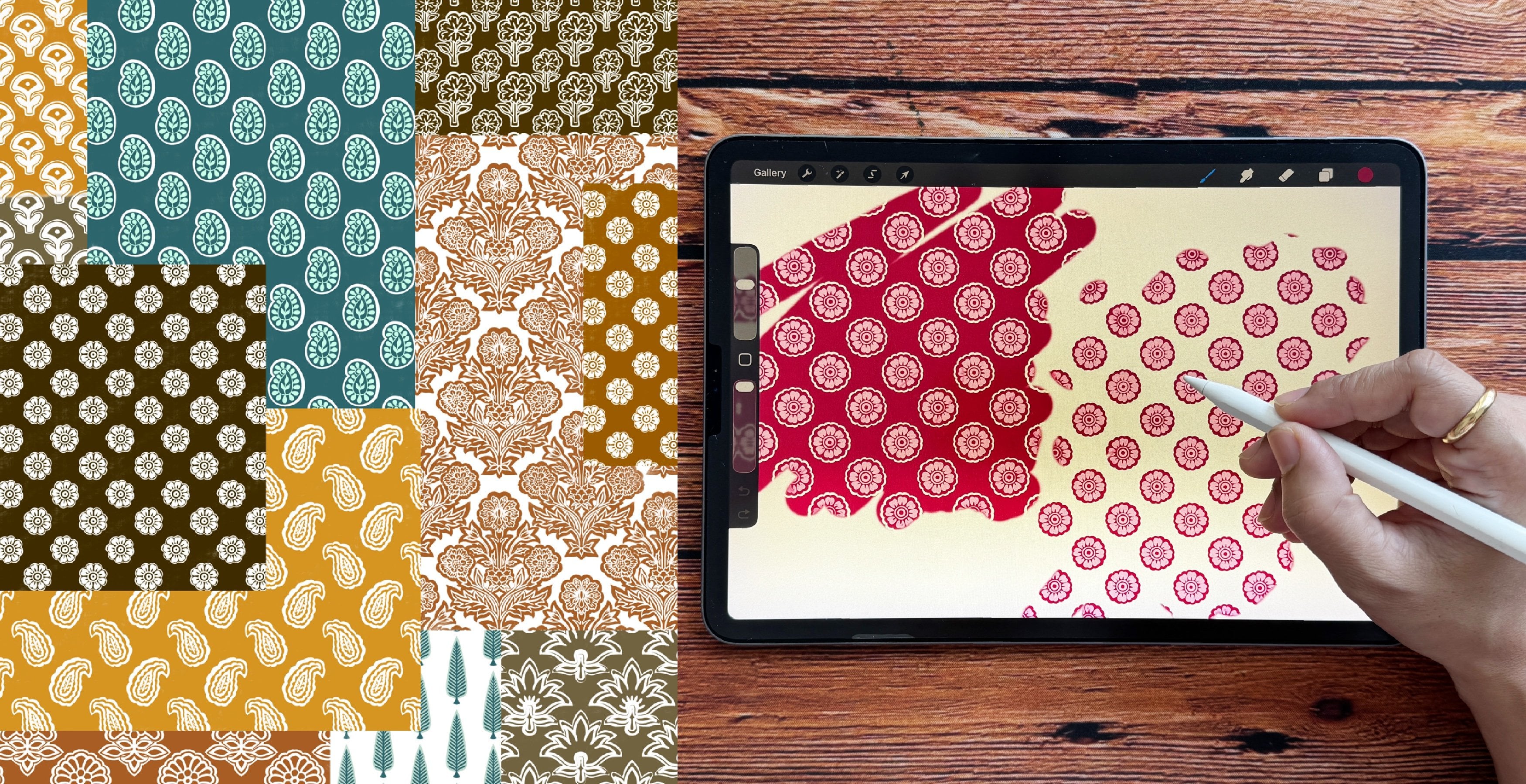
create a nice busy print. So I'm happy with my print now. Let's see some different
background colors. For your background colors, too, you can refer to your mood
board or the trend board. There's a technique I
want to show you to create another version
of the same print, for which the first step is
to merge all the layers. Before you merge, make sure you have an extra copy
of this print. You can duplicate the group
with all the elements. Next, open the new group, select all the layers
with the elements. Right click and click
on merge layers. Now I have the whole
print on just one layer. Next, go to image. Under image, go to adjustments. Under adjustments,
select Gradient Map. Now, this will create a gradient effect for
your whole print. Tap on this little bar. And here I already have some custom made
gradient effect here. I'll select one of them. My goal here is to create this gradient effect
with just one color. That is the blue color,
different tones of blue. Now, on this bar, you can adjust the colors and even
change the color. You can hold this
tiny square and move around to see the
effect on the print. You can adjust this until you're satisfied
with the effect. You can even change
the color by selecting the square and then clicking
on this tiny rectangle, and you can adjust
the color here. Once you're happy with
the results, click Okay. And again, click Okay. And this is how the print looks like with different
background colors. I hope this class and examples
inspire you to create your own unique print with this beautiful print
style and technique. Thank you for taking
this class with me.
 Vinita Upadhya, Illustrator & Pattern Designer