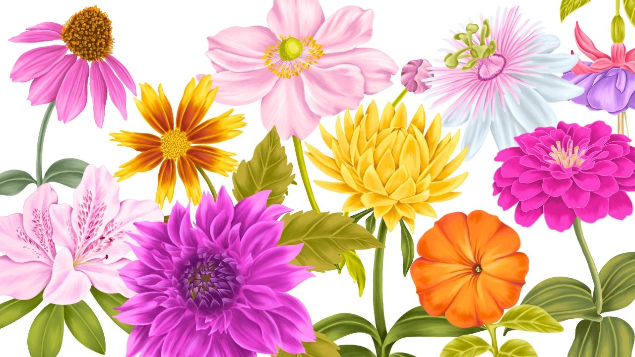
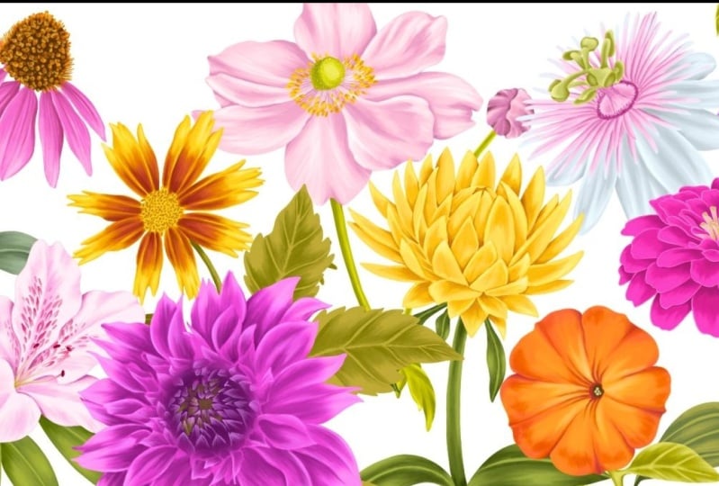
Transcripts
1. Introduction: When I first started learning
Illustration in Procreate, I wish there was a class where I could not
only practice daily, but end up with a complete
cohesive collection. And that's what I
have created here. Class that not only
teaches you techniques, but also guides you
through creating a collection of ten
beautiful garden flowers. If you're feeling stuck
in a creative block and looking for a
structured way to practice, this ten day Procreate challenge is a perfect place to start. I know how overwhelming
a blank canvas can feel. So I have made this process
easier by including sketches, color palette, reference images, and also procreate brushes
for each of these flowers. You can dive right in without worrying
about where to begin. Throughout the class we'll explore ten different
garden flowers, each one with its own
unique personality. Some flowers have delicate
overlapping petals, while others feature
bold defined edges. Some have intricate centers
packed with details, while others are more minimal. By working through
these different shapes, details and textures, you'll gain a deeper
understanding of how to approach floral
illustration in Procreate. Along with techniques you can apply to illustrate any
other flower of your choice. This variety makes
the class a wonderful opportunity to not only
expand your skills, but also grow your confidence. I'll also be sharing
tips and tricks along the way on
how to use filters, adjustments, and settings like blur to enhance your
flower illustrations. These tools can help you
refine colors, add depth, create soft transitions, and give your artwork a
more professional look, all while keeping the
process simple and creative. By the end of the ten days, you'll have a complete set of ten beautiful flower
illustrations that can be used in so
many creative projects, such as surface pattern design, wallpaper, greeting cards,
or even art prints. Whether you're a beginner
or brushing up your skills, this class is designed to guide you and inspire
you step by step. See you in the class.
2. Project & Resources: For your class project,
you can illustrate any or even all the
ten garden flowers. You are even welcome
to choose a flower of your choice to make it easier for you to
kickstart this project. I have also included sketches, color palette, reference
images, and the brushes. You will be able to download all the resources from the
project section of this class. They are attached at the
bottom of this page here. You can access them on
either your laptop or iPad. There are ten procreate
files with the sketches for each flower and on the
second layer of each file, you'll be able to see reference
images for those flowers. I have also included
custom color palettes, which you can easily install and access in the color panel. Along with this,
there is a brush set containing four brushes
for different purpose, like base layer, shading, smudging, and adding
fine details. I am really excited to see your beautiful flower
illustrations. Please don't forget to post them in the project section
of this class.
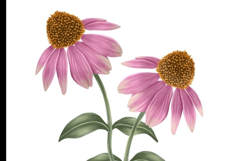
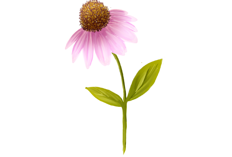
3. DAY 1 - Coneflower: Welcome to day one of Illustrating beautiful
garden Blooms in Procreate. Our first flower
is a Coneflower. You can download this file from the resource
section of this class. So there are two layers here, one with the reference image, and the other one
is with the sketch. Our first step is to add this image into our
reference window. For that, we'll go to
action under Canvas. You'll find this option
called reference. Toggle on this option
here under Image. You can either import an
image from the gallery or you can drop this reference
image into this window. Now I can hide my
image from the canvas. And I'll zoom in the image so that we can see
the flower clearly. Next, we can start by creating a base layer for the
flower and the leaves. For each flower, I have attached a color palette in the resource
section of this class. So here is the color
palette for this flower. I'll set this as default. By doing this, you can see this color palette under
this disc section, making it much easier to pick
colors while illustrating. Next, we can go to layers. Add a new layer under
the sketch layer. I'll reduce the opacity of
my sketch to around 50%. Next, we can select a
brush for the base layer. Go to brushes, and I'll
select my first brush. That is the studio pen brush. So most of the time, the base
layer has to be a mid tone. So from my color palette, I will be selecting
this second pink. A mid tone is something that is not too light and not too dark. Somewhere in the middle,
this will help you build highlights and
shadows more effectively. I will start with an outline for the petals following my sketch. Coneflower are popular
garden flowers, known for their
daisy like shape. They're most commonly
seen in purple, but they can also come in many other beautiful colors
like pink, white, and orange. You can definitely choose your own color palette
for this illustration. These flowers are loved by pollinators like bees
and butterflies, making them a lively addition
to your any garden scene. If you are new to Procreate, you should know that you
can only fill a shape with the color when the
outline is fully closed. Even a tiny gap will stop
the color from filling, and it is going to bleed
all over your canvas. Once you're ready
with your outline, you can drop and fill
color into this shape. Now let's move on to the
center of this flower. We need a base layer for the center too. We'll
add a new layer. Now we can select the color, go to the color palette, and I'll select this
dark brown color. We need to create an
outline for this center. But I want to also
make sure that I have this spiky detail too. You also have to
make sure that there are no gaps between these lines. This can happen when there is an open end to your outline. So you have to go back and check if there is
any space left. Once you're ready
with your outline, fill it with the same color. I'll zoom in to
check if there is any left outut space or spots. So we are done with the base for the center of this flower. Let's move on to the
stem and the leaves. We'll need a new layer for this. It should be below
our petal base layer. Next, we can go to
this color palette and select the second green. We can follow the same steps
and create an outline. Once you're done
with the outline, fill it with the same color. Now, we're done adding
all the base layers. Let's move on to adding some
shadows and highlights. We'll start with the
petal layer first. I'll add a new layer and add
clipping mask to this layer. Now for the shadow, we'll
select a color that is a few tones darker
than our base color. I will select this third
pink from my color palette, go to the brushes, and I'll
select the second brush. That is labeled as shading. My brush size is around 15%. I will start adding these brush strokes towards the center. Make sure you're following
the shape of each petal. I'm trying to follow
the reference image to add these details. Like if you can see the shadow
area between each petal. So once you're done adding
these rough brush strokes, we'll move on to the blending for which we need
the Smudge tool. So I'll select the Smudge tool. Here, under the Smudge tool, make sure your third
brush is selected. My brush size is
slightly smaller. It's around 3%. Also, the opacity is around 60%. The opacity can decide the
intensity of the smudge. So you can adjust depending on the area
you're working on. So we are done with
our shadow layer here. Let's move on to the highlights. We'll add a new layer
above our shadow layer, tap on this layer and add
clipping mask to this layer. Now from the color palette, we need a color lighter
than our base color. That is the first color
from my color palette, and following the
reference image, we can start adding
highlights to our petals. The steps are very similar to the way we did for
the shadow layer, but there are a few things
that we can keep in mind while adding
these highlights. One is to not completely
cover the base color, leaving parts of the base
layer visible will help maintain depth and give your flower a more
natural finish. Also, try to place highlights on the edges and the
curves of the petals, where the lights
would naturally hit. Just like shadows, follow the shape of the petal while
adding the highlights too. Highlights also help define where one petal
overlaps another, making the layers appear
clear and more dimensional. Now let's move on
to the blending. Before blending, I want
to hide my sketch layer. We can start by selecting
the Smudge tool. And the Smudge tool, make sure your third
brush is selected. While I'm blending, there is very little pressure
on my Apple Pencil. Depending on the area
you're working on, you can adjust the brush size and the opacity of the smudge. So here I can see the separation of the
petal is not very clear. So I will go back to
the shadow layer, select a darker color. So we can create a little
shadow here on the lower petal. Next, I want to show you
how adding a filter to your layer can improve the
effect of your highlights. Under the highlight layer, you can scroll down to your
filter to the screen option. You can instantly see the difference on your
flower highlights. Now, let's move on to the
center of this flower. We need a new layer on
top of the base layer. Add a new layer, tap on this layer and add clipping
mask to this layer. Make sure your shading brush is selected from the color palette, select the second orange. Now, following the
reference image, I'm trying to add this
nice spiky detail, very similar to the
one in the image. Like you can see in the image, the outer area is covered with orange spikes and followed
by the spots in the center. Now for the highlights, I'm going to select
this lighter yellow from my color palette,
the first one. A little highlights on
each of these dots. So we are done with the
center of this flower here. Et's move on to the
leaves and the stem. We'll start by adding a new layer on top
of our base layer. Add a new layer, tap on this new layer and
add clipping mask. I'll unhide my sketch layer, go to my color palette, and I'll select
the darkest green. Now, if you see in
the image here, the leaf for this flower is very simple with just one
vein in the center. Now with the shading brush, I'll start adding these details, roughly adding these details
so we can blend later. Now for the leaves, we will leave some space
in the center for the veins and some space on both the sides
for the highlights. Now, let's move on
to the blending. I'll select the Smudge tool. Make sure under the smudge tool your smudge brush is selected. Now, we're almost done
with the blending here. But if I hide my sketch layer, you can see the attachment of
the leaf is not very clear. So we'll go back to
our shadow brush, unhide my sketch layer, and I'll add this shadow detail. So it can clearly show the placement and the
attachment of the leaves. Blend slightly with
my smudge tool. So here we have completed day one of the garden
Flower challenge. And this is what my
final illustration for the Coneflower looks like.
4. DAY 2 - Azalea: Welcome to day two of Illustrating beautiful
Garden blooms in Procreate. Today's flower is Azalea. You can download
this sketch from the resource section
of this class. When you open this file, you will find one layer with the sketch and the second one
with the reference image. You will also find
the brushes and the color palette in the
resource section of this class. Now let's get our image
in the reference window. For that, we'll go to action
Canvas here under reference, Togo on this option. You can place this little
window anywhere on your canvas. I'll place it on my left here. Here you should be under image. There are two options here. Either you can import from your gallery the image gallery, or you can drag and
drop from the layer, unhide your reference image, drag and drop it into
this reference window. Now we can hide the
reference image layer. Adjust my reference image so we can see the flour clearly. Next, we can go to layers. I'll reduce the opacity of
my sketch to around 50%, and now we can add a new layer. This layer should be
below the sketch layer. Now, under the brushes, make sure your studio
pen brush is selected. This is to create a base
layer for our flower. Next, we can select the color. From my color palette, I'll select the lightest
pink here, the first one. I will create two separate
base layers for each flower. I will start by creating an
outline for my first flower, and we can fill it
with the same color. Now we'll add a new layer
for our second flower. For that, I'll go to layers, add a new layer, and this layer should be on top of
our first layer. For this one, I want to select a slightly lighter color so that while we
are illustrating, we can see the
difference between the first and the second. Follow the same steps and create an outline and fill it
with the same color. Now let's move on to the leaves. I'll go to layers,
add a new layer, and this layer should be
below all our flower layer. Now from the color palette, I'll select my second green. And I'll start with
an outline first. Now, for this, we
cannot have open ends, so I'll hide both my
flower base layer, and I will make
sure that there are no open ends and I will close this so that this can overlap with the flower and it will be under
the flower layer. Now let's unhide both
the flower based layers, and this is what our
base layers looks like. Before we start our
illustration process, one way is to add clipping mask to each of these base layers. Add a new layer
on top of each of these base layers and tap on this new layer
and add clipping mask. This can also be
done one at a time while you are illustrating
or all at once. So let's start illustrating
our first flower. I'll start with this
front facing flower. Make sure you are on your clipping mask
layer for this flower. Go to the brushes and
select the second brush, which is for shading. From the color palette, I'll select this second pink, which is slightly darker
than our base color. Now we can start adding shadows following
the reference image. I'm going to roughly add the brush strokes as we
will be blending it later. A few things we can keep in mind while adding these shadows. One is to follow the
shape of the petal. Another one is to always add shadow between
each petal so that it looks like they
are under each other like they are
overlapping each other. Look for any folds or bends in the petals and add a bit
of shadow there too. Once you're done
adding the shadows, let's move on to the blending. For that, we'll select
our smudge tool. Make sure your third
brush is selected. Here you can change the size and the opacity depending on
the area you're working on. Most of the time, my opacity, while smudging is around 60%. That decides the
intensity of the smudge. I am smudging with very little pressure
on the Apple Pencil. Now I want to show you
a few tricks on how you can make your shading
deeper and heavier. One is to duplicate the layer, duplicate your shading layer. This will instantly make
your shading heavier. Another trick is to add
filter to this layer. One filter that really
works is linear burn. This gives a nice deeper
and vibrant shadow. Another is multiply.
For this flower, I will go with multiply
because it gives a more natural and
softer finish. You can even adjust the
opacity to make it lighter. Another step that
you might want to add when your flower
is this light. When I hide my sketch layer, you can see the edges of the
flowers are not very clear. So we can add a little
shadow on the edges. So right now I am on
the multiply layer. Make sure your shading
brush is selected. With the same shade of pink
that we use for the shadow. I'll add this thin layer of
shadow around the edges. So we are done with
our shadow layer here. Et's move on to the tiny
pattern on these petals. For that, we need a
new layer on top of these layers and add a
clipping mask to this layer. For these patterns, we can use the same shading
brush, the second one, but with a brighter pink color, this fourth color
from my color palette and with a smaller brush size. And now following
my reference image, I'll start adding
these tiny patterns. This looks very similar
to an animal pattern. If you see them closely, they are following the
shape of the petal. It starts from a little
bigger in the center and then branches out with a little softer and smaller on the sides. We are done with
the pattern here. Let's move on to the
center of this flower, which I think is also
known as the stamen, for which we will
need a new layer on top of this pattern layer, but make sure there is no
clipping mask for this layer. And we can pick up the lighter
shade of pink for this. I'm not sure if this
color will be visible. I think for now, we can
start with a darker pink so that the shape and the
illustration is visible. So here I am not exactly
trying to follow the image, but something that goes
with the illustration. Okay, first, we need to add a clipping mask
to this layer. And second, we need to change the color to a lighter
shade of pink. But before that, I want to also smudge the ends here
with my smudge tool. I have also increased the
opacity of my smudge tool. I now let's move on to changing the color
to a lighter shade. Tap on the base layer of the stamen and add alpha
lock to this layer. Select the lightest shade of
pink from my color palette, tap on this layer,
tap on fill layer. Now go back and select
the clipping mask layer. Now, I want to select this yellowish green,
a lighter shade. And with my shading brush, I will add this brush stroke, starting from the center and getting lighter
towards the end. Now selecting a darker
shade of the same color, and I will add another
layer on top for shadow. Now with my smudge
tool, I'll blend Now, with a darker
shade of pink, I want to create
this gradient effect that goes from top
to the bottom. I'll hide my flower layer so we can see the
center clearly. Now with my smudge tool,
I will blend these. For this, I am not following my reference image because
in the reference image, it is very light, and I want the center
to be visible. Now, for these tiny round tips, I want them to be more
darker and brighter. I'll select this really bright pink from
my color palette. Now blend them with
my smudge tool. Here we are done with the
center of our flower. I will unhide my flower layer. Now let's move on to the leaves. Select the clipping mask layer that we added for the leaves. I'll adjust my
reference image so we can see the shape of
the leaves clearly. I'll select my
shading brush from the brush library and this third green color
from my color palette. I will try to create this
curve shape for each leaf. So it doesn't look flat and
has this dimension to it. If you see this flower has a very simple shape to the leaf, just one vein in the center. So we can divide the leaf in two parts and leave a little space in the
center for the vein. Now with my smudge tool, I will blend this following
the shape of the leaf. Now I can add another
layer of darker green. So I will select a darker green, the fourth green from
my color palette. Blending with my smart tool. I want to add another layer
of shadow to our flower. For that, we need a
new layer on top of our previous shadow layer and make sure that it
has clipping mask on it. Now we need a darker shade of
pink from my color palette. I'll select this third pink. With a smaller brush size, I will add these shadows
to the area where I feel the shadow needs to be
more heavier and darker. I'm done adding the shadow here. I'm going to
slightly blend them. I will add a filter to this
shadow layer so that we can have this shadow
vibrant and darker. I'll go with linear burn. To keep the class from
becoming too long, I completed the
remaining part of the flower off
camera as it shows the same repetitive steps shown earlier and can be easily done by following
the same process. So here we have completed day two of the garden
flower challenge. And this is what my
final illustration for the flower
Azalea looks like. See you tomorrow
with a new flower.
5. DAY 3 - Petunia: Welcome to day three of Illustrating Beautiful
Garden blooms in Procreate. Today's flower is Petunia. This is how my
sketch looks like. If you have downloaded my file, and when you go to layers, you will be able to see there
are two layers in the file. One is with the sketch and the second one with
the reference image. Let's start by reducing
the opacity of our sketch. I'll keep it around 50%. Now let's get the reference
image on the canvas. I'll start by unhiding my layer. Now to get this to
our reference window, we'll go to action. Under action, you
should be under Canvas. Under Canvas, you'll find
this option called reference. When you toggle on this option, here you should be under image. When you tap on image, you can either
import an image from your library or you can
simply pull this image, the reference image and drop
it into this little window. And I'll hide the layer again. I'll zoom in the reference image so we can see the
flower clearly. Now, let's start with our
illustration process. We'll start by
adding a new layer. Next, we need to select our
brush to create the base. For that, we'll select
our first brush. That is the studio pen brush. Now for the color palette, I have color palette for each flower in the resource
section of this class. Each palette also have a name on the top,
the flower name. So I'll set this as default. This will help the process of selecting the colors easier. I'll select this
second bright orange from our color palette. Our next step is to create a
base color for our flower. Make sure you are
on your new layer. I will create an outline
following my sketch. I've slightly increased the
speed of the video here. Otherwise, the class
will be too long, but you can pause and
take your own time. When selecting your base
layer, go for a mid tone. This will help you
build your highlights and shadows more effectively. Pick a color that's
somehow in the middle, not overly bright
or not too deep. This flower is known for their vibrant colors and
soft velvety petals. We'll try to achieve that
through our illustration today. Once you're ready
with your outline, we'll drop the same
color into this shape. So this will be the base
color for our flower. I will be doing the same steps for the stem and the leaves too. For that, we'll add a new layer. Pull this layer below
our flower based layer. For this, we'll
select a green color, this second bright green color, which is, again, a mid tone. I will start
creating an outline. Make sure the ends are close, for example, like this. Otherwise, when you fill
or drop your color, it is going to be all
over your canvas. Once you're done, you can fill the same color
into this outline. Now that we have our
base layers ready, let's add clipping
mask to these layers. We can start with
the flour first, select the flower layer, add a new layer, tap on this
layer and add clipping mask. Now under brushes, make sure your shading
brush is selected. Next, we need to
select the color. We have to make sure
the color is few tones darker than our
base color layer. So from the color palette, I'll be selecting
the third orange. You can change the brush size depending on the area
you're working on. Right now, mine is around 60%. So we'll be adding this
layer of darker color, following the shape
of this flour, following the shape
of the petal. Now adding another layer
of the same color. You can even select a
slightly darker color, but here I'm using
the same color. Next step is smudging. So make sure under
the smudge tool, your brush is selected. This is the third brush. By adjusting the opacity here, you can adjust the
intensity of the smudge, and my brush size is around 10%. Smudging will help to blend the areas where the lines
feel too harsh or uneven. You can gently smudge following
the shape of each petal. Be careful not to overdo as
too much smudging can make your illustration look overly digital and lose its natural
and hand drawn feel. I want to hide my sketch
layer to see if there is anything that I feel I want
to smudge or make it smooth. I'll unhide my sketch layer again and next we need
another new layer. I'll add a new layer, tap on the layer and add
clipping mass to this layer. From the color panel, I'll select this fourth
red color, a darker shade. This is to add another layer
of depth to our flour. We'll add shadows
between these petals to create this overlapping and separation of the petal effect. You can use a smaller
brush size for this. I'm following the sketch and the reference image
at the same time. This particular layer of shadow
is very important because it helps to create this overlapping and
separation between each petal. For now, I'll cover the
center with this color, and later we can add the
darker shade of brown. Once you're done adding
all your shadow details, we'll move on to
the Smudge tool. Under the smudge tool, make sure your third smudge
brush is selected. Now, next, we need to
make sure the opacity of the smudge tool
is around 50 to 60%. This decides the
intensity of the smudge, and the brush size is
around nine to 10%. Now we can start blending
the shadow details. Make sure while you're blending, you are following the
shape of each petal. Et's move on to the
center of this flower. I'll start by
adding a new layer. Go to my color palette, select this dark brown color
from my color palette. Make sure your shading
brush is selected. And with a smaller brush size, we can add this
detail in the center. I'm not fully covering the
red and the orange base. I'll need another darker
shade of the same color. So I'll diagonally go right and add another layer of darker. Now for the tiny yellow
detail in the center, I will pick up the
color directly from my reference image with
a smaller brush size. I can add this tiny spot
following my reference image. Okay, one trick I
want to show you here is I feel my shadow
layer looks too light. I want it to look more heavier. So for that, I'll
select the layer, swipe left and duplicate. You can see instantly it looks
more darker and heavier. You can also control the intensity by
adjusting the opacity. I'll keep mine at around 30%. Now let's move on
to the highlights. For that, we will
need a new layer on top of our shadow layer. So add a new layer. Make sure your shading
brush is selected. From my color palette, I'll select this first
light yellowish orange, adjust my brush
size to around 40%. Now, following my
reference image, I'll start adding these rough brush strokes
for the highlights. I feel the color of the
highlight is too dark. I want it to be lighter. For that, I'll go to
adjustments, curves. I will pull the string up. You can see the color getting lighter, just slightly lighter. Now we can go to
our Smudge tool, make sure your smudge
brush is selected, and we can start
blending this layer. Now let's move on to the
leaves and the stem. We need a new layer on
top of our base layer. We'll add a new layer, tap on the layer, add
clipping mask to this layer. I will unhide my sketch layer, and we can start
with the shading of our leaves and the stem. Adjust my reference image so we can see some of
the leaves clearly. Make sure your shading
brush is selected, and select this darkest
green from my color palette. So I'm going to divide these leaves into
three tiny sections, leaving some space in the
center for the veins. Make sure you are also following the shape and the
direction of each leaf. Adding some shadow on
one side of the stem. I'll follow the same steps
for the other leaves too, roughly divide them
into tiny sections, leaving some space
for the veins. Once we start blending, you will get a better idea on what the final illustration
will look like. So I'm done with my
shadow layer here. Let's move on to the blending. I will select my smudge tool and make sure my smudge
brush is selected. Now, with the help
of the smudge tool, I am going to push
these colors and create this leaf like shape with
the veins and the shadows. So here we are done
with our first leaf. I'm going to follow
the same steps for the other leaves
and the stem, too. Now, here, if you can see
the darker shadow is very important to show that the
leaf is overlapping the stem. A layer of darker
shade at the bottom here to create a
little shadow effect. Now we don't need the
reference window. We are almost done here. I feel I need another
layer of highlights, so I will duplicate
our highlight layer. And here we have completed day three of our ten day
garden flower challenge, and this is what my complete flower illustration looks like. I can't wait to see yours in the project section
of this class.
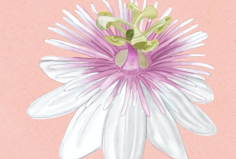
6. DAY 4 - Passion Flower: Welcome to day four
of Illustrating beautiful garden
blooms in Procreate. Today's flower is
a passion flower. You can download
this sketch from the resource section
of this class. So when you go to layers, you can see there
is one layer with the sketch and another one
with the reference image. We'll start by reducing the
opacity of my sketch first. Next, we can get this image
into our reference window. For that, we'll go to action. Under action, you
should be under Canvas. Under Canvas, you'll
find this option called reference Toggle on this option. You can place this window anywhere you're
comfortable with. Under this window, you
should be under image. Here you can import your
image from the gallery, or you can drag and drop
this image into the window. Now I can hide this image layer. Add a new layer. This new layer is to create the
base for our flower. I'll adjust my reference image so we can see the flour clearly. Now to select the brush, we'll go to the brush library, select our first brush. That is the studio pen brush. We will be using this brush
every time we need to create a base layer for
any part of the flower. For the color palette,
which you can find in the resource
section of this class, you can select the palette
for this particular flower. You can set this as default. So you will be able to find
under the disc section here. Now, our next step is to create a base layer for our petals. For that, I'll select this second gray from
my color palette. Make sure you are on a new
layer under the sketch layer. Now following my sketch, I'll create an outline
for the petals. We will be creating
a separate layer for the center of the flower. When you have a white
flower to illustrate, different shades of
gray is a good idea. Once you're done with the outline, fill it with the same color. Now let's create a base
layer for the center. For that, we'll add a new layer. Now from my color palette, I'll select this first
light pink color and we'll follow the same
steps and create an outline. Because the shape looks
slightly complicated, make sure you don't leave
any space in between. So this center will
have one more layer on the top for the
stamen like shape. So there are few areas
where you can see, I'm trying to overlap. So finally, I'm done
with this spiky outline. I will fill the same pink
color in the center. Now let's move on to the
third part of this flower. I will add a new layer for this stamen like
shape in the center. I will select this second
green from my color palette. So let's create a base
layer for this too. I will zoom in my
reference image so we can see it clearly. This can look slightly
tricky at first, but if you follow the
sketch and follow my demo, you will be able to figure out. It should look something like this when you fill the color. Now, let's start
with the shading and the highlights
for the petals first. So we'll add a new layer, tap on the layer and
add clipping mask. Now for the shadow, we need to select a shade darker
than our base color. I'll select the third gray. Next, we need to select the
brush from the brush library. Make sure the second brush
for shading is selected. Now following my
reference image, I'll start adding these shadows. I'm adding these
rough brush strokes as we will be
blending this later. Now for blending, I'll
select the Smudge tool. Under the smudge tool, make sure your third
brush is selected. Now, there are two
things that you can adjust depending on the
area you're working on. One is the opacity, and the second one is
the size of the brush. With opacity, you can adjust
the intensity of the smudge. Mine is mostly around 60% when I am illustrating
these types of flowers. While blending, make sure you are following the
shape of the petal. Here we are done with
the shadow layer. Let's move on to the highlights. For the highlights, we will
need a new layer on top of this shadow layer and add
clipping mask to this layer. Now, from my color palette, I'll select this lightest gray. Following my reference image, I'm going to add
these highlights. One of the most important
part for the highlight is the area where the
petals are overlapping. Y. Once you're done adding the rough brush strokes, we'll move on to the blending. I'll select my Smudge tool
and hide my sketch layer. Also, I want to change the
color of my background to be a little darker so that we can see the edges of
the flowers clearly. Now we can start blending
our highlight layer. There's one tip that I want
to show you that will add so much more clarity and
depth to your illustration. Select the shading brush
and reduce the size. Add a very clear brush
strokes where the petals are overlapping and then blend with the SmuHTolOly the inner
side of the brush stroke. Now let's move on to the
second part of this flower. That is the pink
part of this flower. I will unhide my
sketch layer and we'll add a new layer with
the clipping mask on it so that we can
add some shading and details to this spiky
part of the flower. We can start with the
lighter color first. I'll select this lightest
gray from my color palette. And I want to add
on the outer edges. My goal here is to achieve this gradient effect where it starts with a darker
pink in the center, and as it goes out,
it gets lighter. Now for the center,
I'm going to select this darker pink from
my color palette. Now I can blend this
with my smudge tool. I can hide my sketch layer so we can see the lines clearly. Because this dark pink and the white is on the same layer, we need to make sure that they blend and create this
gradient effect. We need to make sure that each of these spikes
are separated with a darker shade so that even when you
hide the sketch layer, the spikes are clear and the
separations can be seen. Two I'm adding brush strokes for the shadows and
blending at the same time. Now let's move on to the
green part of this flower. For that, we'll
select the layer, add a new layer,
tap on this layer, and add clipping mask. I will unhide my sketch layer so that we can see
the details clearly, select the darkest green
from my color palette. Now following my
reference image, I can start adding my shadows. Now with my smudge tool, make sure the third brush
is selected for the smudge, and I will start blending. Try to follow the shape
while you're blending. Now let's move on to
adding some highlights. For that, we'll add a
new layer on top of our shadow layer and tap on this layer,
add clipping mask. Now, from my color palette, I'll select this lightest green. Now for the highlights, too, I'm trying to first follow
the reference image to see how the light is falling and where is
the lightest area. Also, it is very important to add highlights where
you want to show separation of certain areas or overlapping of these different
parts of the flowers. Make sure you are not completely
covering the base color, adding rough brush strokes
that we can blend later. If you see in the
reference image, there is this tiny hair
like layer in the center. For that, I'll add a new layer, and we don't need clipping
mask for this layer. I'll select this darkest
pink from my colour palette. And we can add this
tiny brush strokes in a circular shape. Let's change the
background to white again. Like you can see in
the reference image, we can add these tiny
details in the center. For that, we'll select this six B pencil brush and adding these
tiny uneven spots. Another detail I want to
add in the center here. I will add a new layer and with my shading brush and
a darker shade of pink. This will create
a sense of depth. Now with my smudge
tool, I can blend. So here we have
completed our day four of illustrating the
garden flower challenge. This is what my passion
flower looks like. See you tomorrow
with a new flower.
7. DAY 5 - Coreopsis: Welcome to Day five of Illustrating beautiful
garden blooms in Procreate. Today's flower is Coreopsis, and this is what the
sketch looks like. You can download
this sketch from the resource section
of this class. When you go to layers, there is one layer with the sketch and the second one
with the reference image. I'll start by reducing the opacity of my
sketch to around 50%, and I'll unhide my
reference image. So we can add this to
our reference window. For that, we can go
to action, Canvas. We can toggle along this
option called reference. Here, you should be under image. Now we can go to layers, drag and drop this
image into this window. Now we can hide the
reference image layer, adjusting my reference image so we can see the
flower clearly. Now let's move on to
the color palette. Go to the color panel, and we can set our
color palette as default so that it is easier to pick colors
while illustrating. You can find it in the
disc section here. Now, before we leave the panel, let's select the base
color for our flower. It is the second yellow
from the color palette. Now, let's select the
brush for the base layer. For the base, we need to select the studio pen brush,
the first one. Now under layers,
we need to have a new layer under the sketch
layer, add a new layer. Now, our first step is to create a base layer
for the petals. So we'll start with an outline. I'll follow my sketch
and make sure there are no open ends as we will be filling this
with the same color. Now, once you're ready, we can fill this
with the same color. Now, let's create a base layer for the stem and the leaves. For that, we'll need a new layer below our flower based layer. Now from the color palette, I'll select this second green. We'll start by creating an outline and filling
it with the same color. Once you're done, we can drop this color
into the outline. Now, before we start with the
shadow and the highlights, we need a new layer of this
red color on our flower. For that, we'll add a new layer, tap on this layer and add
clipping mask to this layer. Now we need the shading brush. So we'll go to brushes, select my second brush. Now, from my color palette, we can select this second red. I need to check the brush size, which works better
for this area, slightly higher and also
reducing the opacity. So I'm going to
start roughly adding these brush strokes following
my reference image. So once you're done roughly
adding these brush tokes, we can start blending. For that, we'll select
the Smudge tool. Under the smudge tool, make sure your third
brush is selected. For smudging, you have to adjust your opacity and the brush size depending on the area
you're working on. For this, my opacity
is around 60%, and the brush size
is around seven. So now I can gently
start blending, but I have increased
the speed of the video here so that the class
is not too long. But you can pause the lesson
and take your own time. Try to keep the ends uneven so that it gives a more
natural and softer finish. Next, we can move on to the highlights for
the yellow area. So for that, we'll
add a new layer. I'll select this lighter
yellow from my color palette. Make sure your shading
brush is selected. Now, following my
reference image, I'm going to follow
the lightest area trying to see where
the light is falling. I feel the color
for the highlights looks very similar
to the base color. So you can select a little more lighter
shade of the same color. Now with my Smudge tool, make sure your correct
brush is selected. Adjust the brush size
and the opacity, and we can slightly
blend the highlights. Y. Next, we can move
on to the shadow. For that, we need
a darker color, the third yellow from
my color palette, and with a smaller brush size, we also need a new layer on
top of our highlights layer, tap on the layer and add
clipping mask to this layer. For the shadows, you can follow the reference image and also follow the folds and the corners and the
overlapping of the petals. Coreopsis is a very
cheerful flower known for its bright,
daisy like blooms. It usually comes in sunny
shades of yellow, gold, and sometimes red, adding warmth and vibrancy to
your garden collection. They are loved by pollinators
like bees and butterflies. This flower can
bring a lively pop of color to any
wildflower collection. Let's move on to the
center of the flow. For that, we'll add a new layer. We don't need clipping
mask for this layer with the same darker shade of yellow and the shading brush, but with a smaller size, we can start adding
these tiny uneven spots. Like you can see in
the reference image, there are spots in the center, and as we go out, there are these wiggly lines Adding some highlights with
a lighter shade of yellow. I want these spots to
be slightly darker. For that, we'll go to adjatments hue saturation and brightness, and I'll just adjust the brightness to
be slightly darker. Now we need another layer
of red for the shadow, so I'll add a new layer on
top of our first red layer. From my color palette, I'll select this darker red. Now following my
reference image, I can start adding these
rough brush strokes. Especially towards the center
of the flower, where the petal starts. Once you've done adding
your brush strokes, we can move on to blending. For the blending, we can
select the Smudge tool. I will gently blend
the rough edges. We are done with our
flower part here. I will hide my
sketch layer to see if there is any blending
or anything left. Now let's move on to the
stem and the leaves. For that, we'll add
a new layer on top of the green base layer and add clipping
mask to this layer. Make sure your shading
brush is selected. Now, from the color panel, I'll select the darkest green, the third green from
my color palette. We can start with
the tiny bud first, adjust your reference image so you can see the bud clearly. So following the
reference image, you can roughly place these
darker brush strokes. Also try to follow the shape of each element while you're adding shadow and blending both. If you see in the image, you can see the leaf has
just one vein in the center. So while I'm adding this shadow, I'm going to leave
a little space in the center for the veins. I'm done adding my shadow here. Let's move on to the blending. For that, I'll select
my Smudge tool. You will need to adjust the
brush size and the opacity of the smudge depending on
the area you're working on. I am done blending
my shadows here. Let's move on to adding some highlights to the
leaves and the stem. For that, we need to add a new layer on top
of our shadow layer, tap on this layer and add
clipping mass to this layer. Next, we need a lighter color. I want the lighter color to be lighter than our base color. We can start with
the tiny bud here. I'll make sure that I can see it clearly on my
reference image. I'm trying to follow my reference image to
add this highlight. Roughly adding these brush
strokes for the highlights, and we can blend later. Before blending, I will hide my sketch layer and
with my smudge tool, make sure the correct
brush is selected. And here we have completed day five of our ten day
garden flower challenge. This is what my
final illustration for Coreopsis looks like. So see you tomorrow
with a new flower.
8. DAY 6 - Anemone: Welcome to Day six of Illustrating Beautiful
Garden Blooms in Procreate. Today's flower is an anemone, and this is what the
sketch looks like. You can download
this sketch from the resource section
of this class. Let's start by
reducing the opacity of my sketch to around 50%. Next, I can unhide
my reference image. That is on the second
layer. We'll go to action. Under action, we should
be under Canvas. There's this option
called reference. Toggle on this option, and you'll find
this little window. Here, you should be under image. You can either import an
image from the gallery or you can drop this
reference image into this little window. Now that we have our reference
image on the canvas, I'll hide my reference image
layer, add a new layer. I'll adjust my reference image so that we can see
the flow clearly. Now to create a base
layer for our flower, I'll select our first brush. That is the studio pen brush. Select your color palette. You can find this
color palette in the resource section
of this class. I'll set this
palette as default. Now I can find
this color palette under the disc section here. Select the second pink color
from this color palette. This is for the
base of the flower. Make sure you are
on the new layer. Now we can create an outline
following the sketch. We will be filling this
with the same color. So make sure there are no open ends between
these outline. These flowers are very
delicate and graceful, often recognized by their cup like shape and dark
contrasting centers. They come in soft
shades like white, pink, purple and blue. For this illustration too, you can have a color
of your choice. Once you're ready
with the outline, fill this with the same color. Now we will be following the same steps for the
stem and the leaves. For that, we'll add a new layer. Pull this layer below
our flower layer. I'll select the second green
from the color palette, and we'll start with the outline for the stem and the leaf. So what we are doing
here is creating base layers for a different
part of the flower. Most of the time,
it is better to choose a mid tone color
for your base layer. This will help you build highlights and shadows
more effectively. Pick a base color that is
somewhere in the middle, not overly bright or
too dark or deep. H. So once I'm done with the outline of
these leaves and the stem, I'll fill this with
the same color. Now for the bud, we can create a separate layer because it
is a different color too. So I'll add a new layer above our stem layer and I'll select this dark pink
from the color palette, and we can create a base
layer for this bud, too. H. Now our next step is to add shading
and highlights. For that, we need a new layer, add a new layer, tap on the layer and add clipping
mask to the layer. Now for the brush, I'll select this second brush that
is named as shading. We'll start with
the shadow first. So we need a shade that is
darker than our base color. So I'll select this
third pink color from my color palette. I'll adjust my reference image
so we can see the flower clearly because I
will be following the reference image to
add these shadow details. I'm using the reference
image to help me see where the
shadow should go. You will want to add
shadow between each petal to clearly show where
they separate or overlap. The strokes I'm adding right
now looks a bit rough, and that's okay because we will be smudging
them later to blend. For now just focus on
following the shape of the petal as you
add these strokes. Based on the area
you're working on, adjust the brush size and
sometimes the opacity. Smaller areas may
need a finer brush, while larger section can be filled more easily
with a bigger one. Lowering the opacity
can also help you build up soft shading gradually. So once you're done
adding your strokes, we'll move on to
the Smudge tool. Go to the Smudge tool and select the third brush that is
also named as smudge. For smudging, my opacity
is always around 50%, 50 to 60%, and the brush
size to around seven to 8%. Adjusting the opacity of
the smudge tool controls how soft or strong the
smudge effect will be. Make sure you also move your smart tool in
the same direction as the petals shape. That way, the shading will
look soft and realistic, matching the curves
and flow of the flour. Also, this creates a sense
of depth and softness, making the flower look less
flat and more dimensional. Once you're done
with your smudging, hide your sketch layer to see. Now, if you can see
the separation between the flowers and the shape
of each petal clearly, you can also fix some
of the harsh lines or any uneven areas now, for example, if you
see in this area, there was a tiny little petal there if I turn on
my sketch layer. So without the sketch layer, you cannot see this tiny petal here because I didn't
add the shadow detail. So we cannot see the
separation of these petals. So I can add a little shadow
around the sketch lines and smudge Hide my sketch layer so I can see the
blending clearly. So we are done with
our shadow layer here. Let's move on to the
highlight layer. For that, we'll add a new layer, tap on the layer and add
clipping mask to this layer. We'll select a color lighter
than our base layer. That is the first pink here. And I'll start adding my
highlights to the flow. The process is very similar
to the shadow layer. I'm going to follow
my reference image and add these rough lines. And later with the Smudge tool, we will blend these lines. There are few things to keep in mind when adding highlights. First, is to be careful not to completely cover
the base color. You can place the
highlights on the edges or curves of the petals where the
light would naturally hit. Is also help define where
one petal overlaps another, making the layers appear
clearer and more dimensional. Once you're ready, roughly
placing your highlights, we'll go to the Smudge tool. Make sure your third
brush is selected. I have renamed that as smudge. Now we can start
blending these strokes. Make sure you are
following the shape of the petal while smudging. Now let's move on to the
center of this flower. For that, we'll add a new layer. Let's select a color. I'll select this second
green from my color palette. Make sure your shading
brush is selected. And I'll just add this little circle in the
center following my sketch. Next, we can add some shading and highlights to the center. For that, we'll go to layers, add a new layer and add
cripping mass to this layer. We can start with
the lighter color. I'll select a shade lighter
than the base color, following the
reference image to add this detail and select the darker green from
my color palette, adding on the same layer as
this is a very tiny element. After roughly adding the colors, we can blend with the
Smudge tool while smudging, trying to follow the shape, Now let's move on to the
detail around this bud. We'll start with a new layer. I'll select this
darker yellow from my color palette and
following my sketch, we can start adding these
little dots around the bud. I'll reduce the size of my brush because this
detail is really tiny. Now, let's move on
to a new layer. We need a new layer to add
this little string like detail that connects the center to these tiny yellow dots. For that, we'll select this
six B pencil brush from my brush set and this off white color
from my color palette, almost like a white colour. Now, following my sketch, I'm going to add these lines Now, let's add some detail
to the tiny little dots. For that, we'll go two layers, and I'll add alpha ok to this layer because I feel
that element looks too flat. So I'll select my shading brush, and we can select a shade
lighter than our base color. I feel these yellow bud like element are
looking too scanty. So what I want to
do is duplicate this layer and select
the lower layer. And I will slightly shift the position of
this lower layer. This will help us create another layer and make
it look more heavier. Also slightly rotate and place
it in a position that it doesn't look exactly like
the one on the upper layer. Now to create a little depth, I want the upper layer
to be slightly lighter, so I'll select the upper layer, go to ajasins curves, and now you can pull
this string a little up. This will make the
layer lighter. Now I want to erase these tiny buds that is overlapping on the
center of our flow. With the help of
the eraser tool, I will just erase the one that is showing on the top
of our green center. I feel my lower layer
needs to be darker, so I will make sure the
lower layer is selected. With the curves, I will
pull it down to make it darker so that it creates
this shadow effect. Another detail I want to add in the center area on the green
is these tippling dots. For that, we'll add a new layer, and we need a light
green colour. From the color palette, I'll select a
really light green. With my shading brush, I'll add these tiny little dots. Now let's move on to the bud. Make sure in the
reference image, you can see the bud clearly. Under layers, I'll go to
the base layer of this bud, add a new layer, tap on the layer and add clipping
mask to this layer. Now, from my color palette, I can select a shade lighter
than our base layer. Now following my
reference image, I can start adding these
shading and highlights. Selecting a more lighter color for another layer of highlights. Now we can use
amuchTol to blend. Now we can add a little
shadow and a darker shade. First, let me hide
my sketch layer so I can see the bud clearly. I'll add a new layer and add
clipping mask to this layer. Go to my color palette, and I'll select the darkest pink here from my color palette. And I'll add some shadow. This will help us
create some depth And some blending
with the Smart tool. Now let's move on to the stem. We can start with
the color first. I'll select this
third green that is a darker green from
our base color. Next, we'll select
the base layer. Add a new layer, tap on the layer and add
clipping mask to this layer and make sure your
shading brush is selected. Now, following the
reference image, we can add some
shadow to this stem. I will unhide my sketch layer because I cannot see the
separation of the stems clearly. Once you're done
adding your shadows, make sure your correct
Smudge tool is selected. You might need to
reduce the brush size for shading and
highlighting your stem. Now for the highlights, we
will need another layer. So I'll add a new
layer on top of our shadow layer and add
clipping mask to this layer. Select the lightest green
from my color palette. I'll slightly make
it more lighter. Following my reference image, I'm going to add highlights
to both stem and the leaf. Now, we can blend
with a Smudge tool. And we are done with
our sixth flower here. I will close my
reference window. Using the same sketch and
the illustration process, you can even add your own twist. So this is what my
final illustration looks like for the
Anemone flower.
9. DAY 7 - Strawflower: Welcome to day seven of Illustrating beautiful
garden looms in Procreate. Today's flower is a Strawflower. You can download
this sketch from the resource section
of this class. When you open this file, you will be able to see that
there are two layers here, one with the sketch and another one with the
reference image. Our next step is to get this image into the
reference window. For that, we'll go to actions. Under Canvas, there's an
option called reference. Toggle on this option. Here you should be under image. You can either import an image
from your gallery or you can drag and drop this reference
image into this window. Now, our first step here
is to add a new layer, to create a base
layer for our flower. Next, we can set
the color palette for this flower as default. Under the disc section, we'll be able to see
the palette here. From my color palette, I'll select this second yellow. From my brush set, I will
select the first brush. That is the studio pen brush. Before we start, I need to reduce the opacity of my sketch. So I'll go back to my layers, reduce the opacity to
around 30% to 40%. Make sure you are
on the new layer, and now we can start
with an outline first. Following this sketch,
I'm going to create this outline and make sure there are no open ends as we will be filling
this with the same color. Once you're done, we can fill the same color
into this outline. Now let's move on to the
stem and the leaves. We'll go back to layers, add a new layer, and this layer should be below
our flower base layer. Now from my color palette, we can select this second green. Now following my sketch, we can follow the same steps
and create an outline. Here, I will hide my flower
base layer so that I don't leave any open ends for
these leaves and the stem. I will drag and drop the same
color into this outline. Now we are ready with
both the base layers. Let's move on to the
shadow and the highlights. We'll add a new layer on top
of the flower based layer, tap on this layer and add
clipping mask to this layer. Now we can select the brush
and the color palette. For that, we'll go to
the brush library, select my second brush that
I have renamed as shading. Next, we can go to
the color palette. We need a color darker
than our base color, so I'll select the third
yellow from my color palette. I will start adding my shadows following the reference image. Because there are so
many overlapping petals, adding shadow becomes
really important. It helps to create a sense
of depth and separation. You can follow the
sketch and focus on placing subtle shadow
between each petal, especially where they
overlap or curve inward. I'm also using the
reference image as a guide, which really helps me understand where the light source
is coming from. Observing the reference image allows you to see which part of the flower are catching the light and which
area falls into shadow. This makes it much easier
to decide where to place your highlights and
shadows in the illustration. Paying attention to these
light and shadow areas not only make your
artwork more realistic, but it also helps add depth
and form to each petal. Once you're done
adding the shadows, you can check by hiding the sketch layer if there
is any petal left out. Our next step is to blend. For that, we'll select
the Smudge tool. Under the Smudge tool, make sure your third
brush is selected. And before you start blending, you need to adjust the opacity, which should be
around 60% and the brush size depending on the
area you're working on. While you're blending, make sure to follow the shape
of each petal. Another thing to understand is where the petals
are overlapping. Now let's move on
to the highlights. For that, we'll
need a new layer. Tap on this layer and
add clipping mask. Next from my color palette, I'll select the lightest yellow, the first one here and make sure my shading
brush is selected. I want my brush
size to be smaller, as I will be adding these highlights majorly
on the tips of each petal. Also on the ones where the
petals are overlapping, we need highlights on the
one that is on the top. I think I forgot to add shadows for a few
of the petals here. So I will go back
to my shadow layer and add some shadows
with my darker color. Now going back to my highlights. Next, I want to
add another layer of shadow with a
more darker color. So from my color palette, you can select this
darkest yellow and we'll need a new layer on
top of our highlights layer. Tap on this layer and add
clipping mask to this layer. I will hide my sketch layer and with a very
small brush size, make sure your shading
brush is selected. And now we can start
adding some shadow. So this layer should
help you create some clean and crisp
separation between each petal. A blending at the same
time using my SmudHtol. Here I want the shadow
layer to be more deeper, so I will change the
filter to multiply. It can give a more vibrant and natural finish to
your illustration. Adding some more
shadow at the bottom. Let's move on to the
stem and the leaves. We'll start by selecting the
base layer, add a new layer, tap on this layer and
add clipping mask, increase the opacity of my sketch layer so we can
see the lines clearly. Now, from my color palette, we need a darker shade
from the base color, so I'll select the third
green from my color palette. If you see in the
reference image, like many other flowers, this flower leaf two has
just one vein in the center. So while I'm shading, I'm going to leave some space
in the center for the vein. And now with my smudge
tool, I can blend. We'll be following
the same steps for the other leaves too. While you're adding this
base shading layer, make sure to follow the shape
and the flow of the leaf. This will give a more natural
feel to your illustration. Okay, here I need to erase
some of my base layer. This is a tiny gap in
between these leaves. So with my eraser tool, I will go back to my
base layer and erase. Now going back to
my shadow layer and we can finish
rest of the leaves. Now, once you're done adding
your rough brush strokes, we'll move on to smudging. Now with my smudge tool, we can start blending and
follow the shape of each leaf. Select a more darker shade of green and adding another
layer of shadow. So here we have completed day seven of our ten day
garden flower challenge. This is what my
Strawflower looks like. Okay, I can see an
overlapping of the leaf, which doesn't look very
clear, so I'm gonna fix it. We need a darker
color of shadow on the lower leaf so that it
looks like it is overlapping. So we are done with
our straw flour here. See you tomorrow
with a new flour.
10. DAY 8 - Zinnia (Part 1): Welcome to day eight of Illustrating beautiful
garden Blooms in Procreate. The flower we are going to illustrate today is
known as Zinnia. This is the sketch that you can find in the resource
section of this class. In this same file, you will
also find a reference image. Our first step is to get this image into the
reference window. This you can find under action, Canvas, TogolonT option
called reference. Here you should be
under the option image. You can either import
the image from your gallery or you can
dragon drop from the layers. I can hide my
reference image layer, unhide my sketch layer. Make sure you can see your
reference image clearly. Next, we can set our
color palette as default. You will find this
color palette in the resource section
of this class. Tap on these three
dots, set as default. This will show your color
palette under the disc section. Our first step is to create
a base layer for our flower. For that, I'll select this second pink from
my color palette. Next, we can select our brush, tap on the brush library, and select the first brush. That is the studio pen brush. Now we need to add a new
layer below our sketch layer. Add a new layer, pull this
below our sketch layer, reduce the opacity of the
sketch to around 50%. Now following this sketch, we can add an outline
to this flower. These are very bright
and cheerful flowers. They come in a variety
of colors like pink, orange, red, and even green. You can even select
any other color of your choice and
follow in the class. They are beautiful addition
to any wildflower collection. Their bold layered petals and bright colours instantly add a cheerful pop to your artwork. Once you're done
with the outline, we can fill this
with the same color. Now our next step is to add base layer for the
stem and the leaves. For that, we'll add a new layer. Pull this layer below
the flower base layer. We can select this
second green color from my color palette. And on this layer, we can only add the stem. We can follow the
same steps that is starting with an outline and filling it with
the same color. Now for the leaves, I
will go back to layers, add a new layer, and this
should be below our stem layer. For the leaves, I want
the color to be slightly darker so that we can differentiate between
the stem and the leaves. Following the sketch,
I'll draw an outline. Now we can fill it
with the same colour. Now, here when I hide
my sketch layer, you can still see the difference
between the two layers. Now let's move on to adding some highlights and
shadow to our flower. For that, we'll need a new layer on top of our base layer. Tap on this layer and
add clipping mask. Now we need a darker
shade of pink, darker than our base color. So I'll select this third
pink from my color palette. Now following my
reference image, I can start adding
shadows under each petal. Make sure under
the brush library your shading brush is selected. For this flower, if you see, the petals are
arranged in layers, radiating outward
from the center. Each petal slightly overlaps
the one beneath it, creating a natural depth. So to enhance this
layered effect, we'll add soft shadows
underneath each petal. Zinnia come in a variety
of bold colors like pink, red, orange, yellow and purple. You can select any color of your choice and follow
along in the class. They are loved for
their easy growth and ability to attract
butterflies and pollinators. Now, feel free to take your own time and follow
along at your own pace. I've increased the
speed of the video since the flower has
quite a lot of petals, and adding shadows and blending
can take a little while. Don't rush and
enjoy the process. You can follow the reference
image and also my video. Now, for the center
of this flower, you can select the lightest
yellow from my color palette, or you can directly pick up
from the reference image. And we can add this on few
of the petals in the center. Okay, now I feel I want my
shadow to be slightly darker. So for that, we'll go
to adjasins Curves. When you tap on curve, you'll
find this little string. Make sure you're on
the first option. Just pull this down to
get your shadow darker. You can even use the
filter option for this. You can add either multiply
or inion burn to your layer. Now let's move on to blending. For that, we need to
select our Smudge tool, make sure your third
brush is selected. The opacity of the brush
should be around 60%, and the size of the brush can depend on the area
you're working on. Also, while smudging,
make sure you are following the shape
of each petal. So I'm adding very
little pressure on my Apple pencil and
gently blending. Now let's move on to adding another layer of deeper shadow. For that, we'll add a
new layer on top of our first shadow layer and add clipping
mask to this layer, and we'll select this darkest
pink from my color palette. Make sure your shading
brush is selected, and with a very
small size of brush, we also need to add shadows in the tiny corners and
spaces between each petal. This layer of shadow helps create more depth
and separation, making each petal stand out. If you notice, the area I
am covering with this layer of shadow is quite smaller
compared to the previous one. Hiding my sketch layer so I
can see the edges clearly. Now with my smart tool, make sure the correct
brush is selected, and we can slightly
blend the edges. I have divided the lesson for
this flower in two parts. So let's move on to Part
two in my next lesson.
11. DAY 8 - Zinnia (Part 2): Welcome to Part two
for the flower Zinnia. We can start here by adding a new layer and adding
clipping mask to this layer. We'll select this
lightest pink from my color palette and make sure your shading
brush is selected. On this layer, we will be
adding a white outline, like you can see in
the reference image. We will be adding
this to each petal. With the smaller brush size, I will start adding the outline. So we're done with the
outline layer here. Let's move on to the
leaves and the stem. For the leaves, we'll start
by going to the base layer, adding a new layer on top of it, and add clipping
mass to this layer. I'll adjust my reference image so I can see the leaves clearly. Now make sure your shading
brush is selected. Now, from my color palette, I'll select this third green, which is darker than base color. If you see in the
reference image, the leaf for this
flower has three veins, like they're divided
into three parts. So with my shading brush, I will try to first
divide the leaf in three parts and leave some space in between
for the veins. I'll hide my stem layer, the base layer for the stem so I can see the leaf clearly. Now, with the help of
my selection tool, make sure your wrap
option is selected, I can gently hold and shaft so that it can take
the shape of the leaf. Next, I want to add another
layer of darker shadow. For that, we'll need a new layer on top of this shadow layer, tap on this layer and
add clipping mask, and we'll select the darkest
green from my color palette. Now I can add this in the
corners and the areas where it can be more
darker and more deeper. You can also follow the
reference image for this. Now I can blend with
my smudge tool. I will just erase
this extra shading overlapping the other leaf. Now let's go back to our first
shading layer and we can follow the same steps to add shading for the other
two leaves too. Now we can also unhide
our stem layer. So I have increased
the speed of my lesson here as the process is
same as the first leaf. You can even pause the lesson
and take your own time Now time for the darker
shade of shadow. Go back to the previous layer. Select the darkest green. Now let's move on
to the third leaf. Now let's move on to the stem. For the stem two, we'll add a new layer on the top
of our base layer, add clipping mass to this layer, select the third green
from my color palette, which is few tone darker
than our base layer. Adding shadow to one side of the stem and blending
with a smart tool. I also want to add
highlights to the stem. We can select the lightest shade of green from my color palette and add a new layer on top of this shadow layer and add
clipping mask to this layer. Slightly blending
with the Smudge tool. So we are done with
our flower here. I will cancel my
reference image window. So there's one thing that
I would like to fix here, this edge of the leaf here. Let's add some
highlights to this. For that we'll add a new
layer and add clipping mask. And with my lightest color from the color palette with the
lightest shade of green, I will create this
clear curve to my leaf and blend slightly
with my smudge tool. And here we have
completed our day eight of the ten day
garden flower challenge, and this is what my complete
Zinnia flower looks like. See you tomorrow
with a new flower.
12. DAY 9 - Fuchsia (Part 1): Welcome to day nine of Illustrating beautiful
Garden blooms in Procreate. Today's flower is Fuchsia. You can download this file from the resource section
of this class. In this lesson, you cannot see the reference image
in the layers, but I have attach a sketch and a layer with the reference
image in the resource section. So let's start by reducing
the opacity of our sketch. I will reduce it to around 50%. Next we can add a new layer. Pull this layer below
our sketch layer. Now under the brush library, I'll select the first brush, that is the studio pen brush. We'll need this brush to
create the base layers. Next, we can get the reference
window on the Canvas. For that we'll go to
action under Canvas. Toggle on this option
called reference. Here you should be
under the option image. Under image, you can
either import from the photo gallery or you
can drag from the layer. I will zoom in my
reference image so we can see the
flower clearly. Next, we can start
illustrating our base layers. We'll start with
the leaves first. For that, we'll select the
color from the color palette, select the second green from my color palette with
the studio pen Brush, I'll create an outline. You can just follow
the sketch and create an outline for the
leaves and the stems, and we will be filling
it with the same color. Make sure there
are no open ends. H Now let's move on to creating a base
layer for the flower. For that, we'll
need a new layer. Pull this layer below
the leaf base layer. We'll divide the flour
base layer in two parts. For example, if you see
in the reference image, we'll just create a base
layer for the top first. For that, we can select the second pink from
my color palette. Now we can start creating an outline and fill it
with the same colour. Make sure there
are no open ends. You can even hide
your leaf based layer so you can see the
petal clearly. So we are done with our first
part of the flour here. Let's create another base layer. For that, we'll add a new layer. Pull this layer below
our first base layer. For the second
part of the flour, we can select a purple colour. From my color palette, I'll select this second purple. We can follow the same steps, create an outline and fill
it with the same colour. There's another base layer
that we need for the stamen, the part here at the bottom. I'll zoom in so we can see in the reference
image clearly. We can pick an off
white color from the color palette
like the second one. We can add a new layer for this. This should be below
our purple base layer. And we can follow the sketch
and create a base for this. Next, we can start with the
shadow and the highlights. For that, we'll need
a clipping mask layer for each base layer. You can either add all the
clipping mask at once in the start or later while you're illustrating
one at a time. Right now I'm adding clipping
mask for each base layer, adding a new layer, tap on this layer and
add clipping mask. Now let's start with the shadow
for the pink petal first. I'll select the layer about the base layer of
the pink petal. Next, we can select the
brush from my brush set, the second one for shading. Next, we need to select a
color from myColor palette, a shade darker than
our base color, which is the third one. Now following my
reference image, we can start adding
our shadow layer. So this little bump will be lighter because this
is in the front, so we need to make the
petal behind it darker. I just realized that this is the part of the purple layer. So I will go back to
my pink base layer, select my eraser tool, and under my brushes, I'll select my studio pen brush, and I will carefully
erase this little area. This is supposed to be a
part of the purple layer. So I will erase this
and we'll go back to our purple base layer
and add purple here. I can see a little bit
on this side, too. Now I can go back to
my purple base layer, select the same purple
from my color palette, select my studio pen Brush. And now I can add
the extra petals. Next, we can move
on to blending. So we'll go back to
the pink shadow layer. Select the Smudge tool. Under the smudge tool, make sure your smudge
brush is selected. That is a third brush
from my brush set. My brush size is around 6%, and the opacity of the
brush should be around 60%. We can start blending
the shadow layer. Make sure you are following
the shape of each petal. Next, I'm going to add another
layer of darker shadow. For that, we'll select
a darker shade of pink. So from my color palette, I'll select this darkest pink and we'll add a new layer on top of our first shadow layer. This layer will create
more depth and clarity. Oh, I forgot to add the
clipping mask to this layer. I'll go back to my layer, tap on the layer and
add clipping mask. Now, let's move on to blending. For blending, we'll
select our Smudge tool. Under the Smudge tool, make sure my third
brush is selected. And with very little pressure on my Apple pencil, we
can start blending. I missed this area on
the first shadow layer, so I'll go back to my
first shadow layer, select the same color and
add few strokes and blend. Now let's move on to
the highlight layer. For that, we'll need a new layer on top of our shadow layers. Tap on this layer and
add clipping mask. I'll select the lightest pink, the first one from
my color palette, hide my sketch layer so we can see the lines
and the folds clearly. Now, following my
reference image to see the lightest color and where and how the light is
falling on this flower, we can add our highlights. Now let's move on to blending. For that, we'll
select our SMAT tool. Make sure your third brush is selected with very little
pressure on the Apple Pencil. Now let's move on to the
second part of this flower. That is the purple base layer. We'll select the layer
about this base layer, put the clipping mask on it, hide my sketch layer so we can see the petals and
the overlappings clearly. Next, we need to select a color darker than
our base color. So we'll go to the color panel. I'll select the
darkest purple from my color palette, the third one. Select my shading brush.
That is the second one. Now following my sketch, I can start adding my shading. Also follow the reference
image to understand how the shadow and the darker area looks
like in the image. Now, blending with
my Smart tool. While blending, you will also notice that I'm trying to follow the shape of each petal and follow the
direction and the ans I have divided the class for
this flower in two parts. So let's continue adding the second layer of shadow
in the next lesson.
13. DAY 9 - Fuchsia (Part 2): Let's move on to the
second layer of shadow. For that, we'll add
a new layer and this layer has to be on top
of our first shadow layer. Tap on this layer and
add clipping mask. From the color palette, I'll select this darkest purple with a smaller brush size, we can start adding our
second layer of shadow. Make sure the strokes are shorter compared to
the previous layer. This layer will help us create more depth and more
defined lines. Now, with the help
of the Smudge tool, we can start blending. If you look here, this
part looks too flat. So I'm going to add some shadow and
highlight to this area. For that, I'll go back to
my first shadow layer, select the same color we used
for our first shadow layer, add some rough brush
strokes, and then blend. I am also trying to follow
the reference image to understand the darker
and the highlight areas. Selecting a darker
shade of purple here to add more depth. Now, if you see in
the reference image, it looks quite similar. Next, there are some
more areas here on the petals where I feel
it looks too flat. So I'm going to go back to my first shadow layer and start
adding some details here. The color is the same we used
for our first shadow layer. That is the third purple
from my color palette. Next Blending with
my Smart tool. Next, we need to add a
layer of highlights. For that we'll add a new layer on top of our shadow layer, tap on this layer and
add clipping mask. We'll select this
first purple from my Color palette,
the lightest one. I'll be following my
reference image to understand where the light
is falling on the flower. Now, with a smaller brush size on the edges of each petal, Now blending with
my Smudge tool. Now let's move on to the leaves. I'll unhide my sketch layer, go to the layer above
our green base layer, the one we made for the
leaves and the stem. Next, we can select the green that is darker than
our base color. This is our base color, and we need the third green
from my color palette. Make sure your shading
brush is selected. Now following my
reference image, I'll start adding my
first layer of shadow. Now for the leaves, I
am going to roughly divide it into four
to five sections, and we can leave narrow gaps
in between for the veins. I'll follow the same steps
for the other leaves too. As the process is same
as the first leaf, I am going to speed
up my video here, just dividing roughly the
leaf into five sections. Now, let's move on to blending. We can do this tiny
leaf later on the top. Before that, we can select
the Smudge tool and blend. Now, time to blend
with my Smudge tool. Now let's move on
to this tiny leaf. I'll start by selecting
my eraser tool. Under eraser, I'll select
my studio pen brush. We can erase this extra overlapping from
the previous leaf. Next, we can move on to our last section of this
flower, that is the stamen. For that, we'll select a layer
ao our stamen base layer, hide my sketch layer so we can see the tiny parts clearly. Zoom in my reference image, so we can see the stamen
in the image too. For the color, we need to select a shade darker than
our base color. That is the third of white, almost like brown from
my color palette. Adding shadows and
blending at the same time. For the extreme bottom, I can pick up this bright
yellow from my reference image. And for a little highlight, I'll pick up this
light yellow blending with my Smart tool. Hiding my sketch layer so I
can add some deeper shadows. Adding a little highlight
with a very light of white. So here we have
completed our day nine of the ten day
Garden Bloom challenge. This is what my
final illustration for Fuchsia looks like. I can cancel my reference
image window now. See you with a new
garden flower tomorrow.
14. DAY 10 - Dahlia (Part 1): Welcome to day ten of Illustrating Beautiful
Garden Blooms in Procreate. Today's flower is Dahlia. This is what the
sketch looks like. You can find this sketch in the resource section
of this class. There are two layers
on this file, one with the sketch and another one with the
reference image. We can start by reducing the opacity of my
sketch to around 50%. Next, we can get this image into the reference window and hide
the layer for this image. Go to action. Under action, you should be under
Canvas, tap on Canvas. Here you should toggle on
the option called reference. You can hold and place this window anywhere you
are comfortable with. Here you should be under the
option image, tap on image. You can either
import an image from your photo gallery or you can drag and drop this image from
the layer into this window. Now we can hide this
reference image layer. Now we can add a
new layer to create a base for our flower,
add a new layer. Make sure this new layer
is below our sketch layer. Now we can select the color. You can find this color palette in the resource section two. I'll set my color
palette as default. Now we can see the color palette under the disc section here. For the base layer, we'll select this second pink from
my color palette. Now, under the brush library, make sure your first
brush is selected. That is the studio pen brush. Now we can start creating
an outline for our flower. Make sure there are no open ends as we will be filling
this with the same color. Once we are done, I'll drag and drop the same color
into this outline. Next, we can create a base
color for the leaves too. For that, we'll add a new layer. Put this layer below
our flower base layer. From my color palette, I'll select this second green. We can follow the same
steps of creating an outline and filling
it with the same color. I will hide my flower base layer so we can see the outline clearly for the leaves and
we can close the ends. I'll dragon drop the color into each leaf and hide my
flower base layer, and we'll move on to adding some highlights and
shadow to our flower. We'll start by
adding a new layer. Add a new layer on top of
our flower base layer, tap on this layer and
add clipping mask. Make sure under
the brush library your shading brush is selected
from the color palette, I'll select a shade darker
than our base color, the third color from
my color palette. Dahlias are known for
their stunning layers of petals that forms a
full rounded bloom. So placing shadows between
the layers will help separate each petal and giving
it a more natural volume. While adding shadows,
make sure to follow the natural shape and
flow of each petal. If you look closely at
the reference image, you'll notice that
the petals have a certain direction and even contains darker
strokes within them, not just between the petals. So I'm going to roughly add these brush strokes as we
will be blending it later. There's this area
in the center that you see is green in color. For that, we'll select this third green from
my color palette. Now let's move on to blending. For that, I'll
select my SmuHTol, make sure your third
brush is selected, adjust the size of the brush depending on the area
you're working on, and the opacity of the
brush should be around 60%. And we can start blending
our shadow layer. Make sure you follow the
shape of each petal. Now let's move on
to the highlights. For that, we'll add a new layer, tap on this layer and
add clipping mask. This layer should be on
top of your shadow layer. Make sure your shading
brush is selected, select the lightest pink
from my color palette, and we can start
adding a layer of highlights to each petal. For this, I'm trying to
follow my reference image and figure out the lightest
area on each petal. I have divided the lesson for
this flower into two parts. So let's continue
blending the highlights in the next lesson.
That is the part two.
15. Day 10 - Dahlia (Part 2): So this is the second part
of our Dahlia flower, and we can continue
blending here. There is very little pressure I am adding to the Apple Pencil. Also, while you're blending, make sure you follow the shape and the flow of each petal. So here we are done adding our highlights and blending
them for the bigger petals. Now let's move on to the
tiny ones in the center. For that, I'll go
back to my brushes, make sure my shading
brush is selected, select the lightest pink
from my color palette. Now with a smaller brush size, we can start adding highlights to the smaller petals
in the center. Now, let's blend the highlights. For that, I'll select
my Smudge tool, make sure your third
brush is selected. While you're
blending, try to keep the lines crispier
on the outside, like to have an outline
that is more crisp and clear and you
can blend inwards. There are a few
petals I missed here. I'm going to go back and add some highlights
in the center. I'm just trying to
follow my sketch and add some rough brush strokes
that we can blend later. Blending with my smut tool. Next, I want to create
this darker center. For that, we'll
need a new layer, and this layer has to be
just above our base layer. So I'll select the base
layer and add a new layer. And from my color palette, I'll select this darkest purple, which if you see in
the reference image is very close to this color. Make sure your shading
brush is selected. I'll keep my brush
size to maximum, and we can create this
round shape in the center. Now, our next step is to add
blur to this little circle. For that, we'll
go to adjustments and select Gashi and blur. Now, either with your Apple
Pencil tip or finger tip, slide right on the screen, and you can adjust
the intensity of the blur by going
left and right. On the top, if you see there's
a percentage for that, I'll keep mine to around 16%. Another way is to adjust
the opacity of the layer. I'll keep mine to around 80%. If you see in the
reference image, the outer area of the
flower are more lighter. Let's add that to our flour. For that, we'll select the
base layer of the flour. Go to the selection tool and make sure your
free hand is selected. And I will roughly
select the outer area, like the outer petals with these wiggly selection.
Close the selection. Now you can tap on this
option called invert. This will invert your selection. Next, we need to tap on feather. Keep the amount as 13% to 14%. Next, under the adjustments, select hue, saturation
and brightness. Here we can increase the
brightness to around 55 to 58%. You can see the petals getting lighter in
the selected area. And I will decrease the
saturation a little bit because it looks too
bright and deselect. We can hide the sketch
layer to see how the flour looks like
without the sketch. Now let's move on to the leaves. I'll unhide my sketch layer. We'll start by going to the
base layer of the leaves. We need a new layer
on top of this. Tap on this new layer
and add clipping mask. Next, make sure your
shading brush is selected. We'll select a color that is
darker than our base color. That is this third green
from my color palette. I will adjust my reference image so we can see one of
the leaf clearly. Like you can see in
the reference image, this flower has a leaf with a lot of veins and
sections in them. So to keep my illustration
more simple and easier, I'm going to divide my leaf
into three to four sections, leaving some gaps in between these sections for the veins. I'll hide my flower layer so we can see the
leaves clearly. Once you're done adding these
sections, we can blend. For blending, we can
select the Smudge tool. Make sure your smudge
brush is selected. Now, while you're
blending these sections, you have to make sure that you are not blending the win area, only the inner area
of each section. We are done with
our leaves here. Et's unhide our flower layer. Now I can also cancel
my reference window. So here we have
completed our day ten of the ten day
Garden Bloom challenge. This is what my final illustration
for Dahlia looks like. So now you should have
a mini collection of ten garden flowers ready.
16. Final Thoughts: Congratulations for
completing this class. I hope this ten day challenge
has been beneficial to you and has added value to
your illustration journey. If you have any question
or doubt regarding the class or the
illustration process, you can add your comment in the discussion section
of this class. I'm always here to assist you. I will eagerly wait for your beautiful
flower illustration in the project section
of this class. Your feedback through
reviews help me improve and plan
my future classes. You can follow me on
Skillshare to get notified when I
publish a new class, and for more behind the scenes
and illustration process, you can follow me
on Instagram two. Thank you for taking
this class with me. See you in my next class.
 Vinita Upadhya, Illustrator & Pattern Designer