Transcripts
1. Introduction: Do you also love to
illustrate and you are always on the lookout for a new prompt and inspiration? Then this class is for you. In our seven-day Urban
Sketching challenge, we'll go on an adventure
of traveling through art, and you will learn a fun
and easy way to create quick sketches and
colorful scenes inspired by beautiful locations. Hi. I'm Iva Mikles, an illustrator and designer
based in Central Europe. A decade ago, I decided to build my creative career and since then I build my business online, working with awesome clients
and amazing project, which allows me to explore
the world and get to know people, cultures,
and locations. I believe that we are all creative in infinite
numbers of ways. So I have made it my mission to teach you
everything I know to contribute in a small way to waking up your creative genius. So you are able to pick up a new hobby, express
yourself artistically, and if you take the lead, make it your
lifestyle so you can spend more time
doing what you love. In this class, you
will learn how to observe from photo
references and locations so you'll
get inspired to create your own unique
travel illustrations. You will be applying your
new skills in a fun project, illustrating doors by using
seven location prompt. I believe drawing doors is a great way to start with
urban sketching because they are less complex than full house architecture,
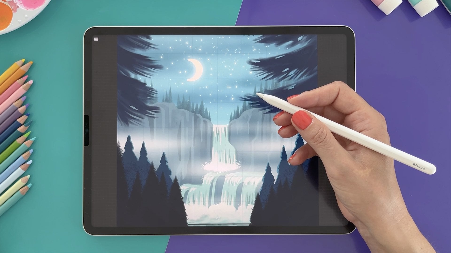
streets, and towns. Basic Procreate knowledge
is helpful but not necessary for this class as
I will guide you through it. So without further ado, let's start and see
you in the class.
2. The Challenge: Welcome to our
seven-day challenge where we will be traveling through art and illustrating wonderful things with
beautiful doors. We will have seven prompts
for our challenge. They are, first, doors of Great
Britain and Ireland. Second, doors of Scandinavia. Third, doors of Asia. Fourth, doors of Mediterranean. Fifth, doors of Caribbean. Six, doors of America and
seven, doors of India. To join the challenge
here on Skillshare, please upload your sketches and illustrations in the
project section. If you are joining on Instagram, please use the hashtag and also tag me with
art side of life in your posts so I can see your artworks and share
them with others too. In this lesson, you will
discover tips on how you can approach the challenge and how you can get the
most out of it. First of all, have fun and enjoy the journey
through the locations. Don't sweat the schedule
and rather focus on the inspiration and
the consistency of sketching and illustrating. I included seven prompts which
you can do in seven days in a row or on every
second or third day. The aim is to do all
seven so you can feel accomplished and inspired
to sketch even more. You can choose to participate in the challenge by
sketching outside, on location, or at home,
by using references. Drawing in location can be super rewarding because it
involves all your senses. If you have the
possibility to do so, here are a few tips that will make the challenge
more interesting. When I draw on location, to remember my idea
for the composition, I usually create a
very rough sketch. I mean, very rough sketch, either black and
white or in color. Sometimes I can only tell what the sketches are so you can imagine how rough they can be. Then I make few
color combinations because the colors we see are different from the
ones captured by camera, especially the shadows. For example, you can see some purples or blues in the
shadows in real life, and when you look at the
picture or the photo, you might see only dark tones. Try to observe these color
details in real life too. Then I take a picture
so I can continue working on the illustration
later on if I want to. If you are sketching at home, you have the comfort
of your home obviously so comfortable sofa or a chair. Then you can either
use photos of lovely locations you took yourself or a colleague,
various references online. We will be taking this approach in the class because of
the technical reasons. If you ask how you can
finish the challenge in seven days if you have very
limited time every day. If you are short on time, devoting just 10 to
15 minutes a day to observing the reference
or on location and sketching various
elements you'll notice is usually
enough to develop a habit of quickly seeing and realizing a concept or an image. You may be really
surprised how fully realized such a quick
sketch can actually become. If you take this approach
within 10 to 15 minutes, here are a few techniques
you could use. You can sketch only the door itself and focus on the shape. Long, short, wide, arching top, and so on. Add a color and shadow
and few details like a door handle and maybe
a doorstep if you want to. Then you can also
take an approach to sketch in black and white and focus on noticing the shapes
and elements significant for the prompt location
as I will show you in my approach
for each prompt. It saves you quite a bit of time when you don't have
to decide on colors. In other approaches,
if you have more time, you can draw all the elements in color without creating
a full scene. Let's say the prompt,
doors of Asia. You can, for example, sketch the door, the bonsai, and lantern. Another approach is, last but not least, if you have more time and
you feel more confident, you can create the full scene
inspired by the door from the location and add other details and
elements in the scene. Please feel free to create as
complex scenes as you want. When you want to take it
easier for yourself in terms of perspectives and
distortion in perspective, think of and find a reference
in the frontal view. I recommend you notice
different elements on location and if possible
from your own references, rather, only from my
examples because we are all unique and it's so fun to see
what you can come up with. Try to also combine different references
into one illustration to avoid copying someone
else's photo composition and details and colors. Or better yet, use your
own photos and memories. Before you look at
the references, try to imagine and write down your first ideas for
the illustration. In this way, you find more relevant photo
references and make your illustration
more unique. Then you can write down few
words and objects you like to see in the illustrations or
you want to draw or sketch. Or you can sketch them right
away from the references, as I will show you in
the following lessons. Afterward, you can implement these sketch ideas into your base prompt
final illustration. Regarding the references, you can search for references
in many places nowadays, in the books, on YouTube, Google, or Pinterest. I like real-life references
combined with my imagination, but I don't always have the luxury to travel
to locations. Let us use Google
images and let's search for doors and
architecture now. As you can see, you
can find quite a lot of interesting examples
quite quickly. I also prepared a board on Pinterest with various
doors as reference. You can see the
references I'm using on the side of my screen later
on during drawing process. These examples I found on
the stock photo sites. In the following lessons, we will look at how you can
prepare for the challenge, including brushes,
composition tips, and more. See in the next video.
3. Brushes: [MUSIC] Before we discuss ideas for the door locations
for our challenge, I will show you which brushes
I'll be using in the class. In addition to this, I will share tips on other brushes which
I currently like. If you want, you
can find a lot of free unpaid brushes
to test them out. But I like brushes that
already come with Procreate, both for sketching and coloring. Tap on the brush icon. As you can see, there are many brush folders that come with Procreate
which is great. There are also some folders I
created to organize myself. There is also a recent brush
folder which as you might guess are the brushes
you have used recently. This is quite handy. I will create a new
folder for this project. To do that, swipe down on the brush folders
and you will see the plus sign then tap on it and rename the folder
to the name you like. I'm typing the project
name as you can see. Then I will drag
the brushes I will use for this project
into my new folder. From the inking folder, I like this brush which has
lovely pencil like texture. [MUSIC] Besides sketching, I also use this
brush for coloring and it has a nice texture
when you tilt the pencil too. If you watched my other classes, you know it is my most
used brush for sketching. On one side, I like
how buttery it feels and on the other side it
has a chalky look to it. I also created my
own similar brush for coloring with a
bigger brush tip size. [MUSIC] Now the opaque brush
that I currently like is also in
the inking folder. I will drag it to my new folder so I don't have to look for it next time I want to use it. This brush is
interesting because it has a rough edge and it creates an interesting look
when you want to create a more geometrical
look and feel, and then it doesn't look too polished with this rough edge. I will also select one smooth opaque brush
and drag it to our folder. [MUSIC] The last one I want
to show you here is one textured brush
which I currently like, which I will use
for final details. This is a nice example of a textured brush and you can find it in the Artistic folder. It has nice rough texture which would fit quite
well as a wall texture. These are the main
brushes I plan to use for this project and I try to limit their amount so I
don't have to spend too much time jumping
between many brushes. [MUSIC] Before we go to the next lesson, try to spend 10-15
minutes testing few brushes and create
a folder with few of your new favorite brushes
so you don't have to spend extra time to search for brushes while you are
doing the challenge.
4. Composition Ideas: After you select the
brushes you want to use, let's look at what compositions
you can choose and work with to design
your own unique ideas. In this lesson, we will draw a simple door
compositions and edges, the elements to create different compositions
quickly and easily. I will share with you a great exercise on how
you can get creative and come up with new
composition ideas in very simple and easy way. Let's get a few ideas together. To keep things simple. I'm thinking of a
composition with a rectangle door with
greenery hanging above. If you feel more confident, you can create more complex
scenes with many details. To start, I will sketch a rectangle as a frame
for my composition. As you can see, I'm drawing
the lines quite loosely. I'm sketching the first idea
without using references. To make it easier on yourself, choose a reference with the
front view where there is not too much perspective and
distortion in perspective. The door is rectangular
with plants hanging on top of the
frame, as you can see. The plants are
split in the middle above the door to break
up the overall shape, creating a more
interesting composition. Now, how can we make it more interesting
in terms of space? I will copy this sketch to do another version with
a quick adjustment. That would be adding
the sense of space with a path or porch in
front of the door. How cool is that? By adding just one line, we made the composition
already quite different. Now, I will copy
the sketch again. [MUSIC] Let's take the hanging plants above the door now
into consideration. What can we do about them? For example, we can close
the gap and add more plants. [MUSIC] Another idea, if you said let's
change the split and move the gap above
the door to a side, for example, left
side, you're right. Then you can try
and another side, the right side now and see
if you like that layout too. [MUSIC] Next, let's consider the ratio. Do you like the
rectangular layout, or would you prefer
a landscape format? [MUSIC] Now, looking at the examples, I quite like the
landscape format. The last thing we
can consider here is the balance and
negative space. We have a lot of greenery on
top part of the composition, which feels quite heavy. We can try to balance
it out and fill in the negative space at the bottom part of
the last version. To fill the negative space, you can also make
the door wider. [MUSIC] As you can see, with these simple adjustments, we have quite a lot of
versions of this composition. To learn more and practice
the negative space, please watch my class
about compositions, which you will find in
my teacher's profile. After exploring the
composition ideas with the simple adjustments, let's take the first
prompt from our challenge, which is doors of Great
Britain and Ireland. I will use it to
explain the techniques I will be using in
our art challenge. See you in the next video. [MUSIC]
5. Day 1 - Elements - Doors of Great Britain and Ireland: [MUSIC] In this lesson, we will sketch elements
for our first prompt, doors of Great
Britain and Ireland. Please feel free to use
references you find online yourself or take a picture if
you travel to the location. Now, I will open one of my references next
to Procreate by swiping up and dragging the Gallery window to
the left on my screen. [MUSIC] When looking
at the reference, I've already notice a couple of things I want to
add to the sketch. But I'm starting
with the shape of the door because this is the main subject of
this illustration. As I mentioned in
the project part, first try to notice
if the door is long, short, wide, round, or in
any other special shape. For example, does it have
an arch or other details? [MUSIC] As a next step, I tried to notice
where the shadows are, and where the light sources. In this example, it's an overcast day
which means cloudy day. So it's hard to see the shadows. But after looking closer, I noticed the shadow
on top of the door, just under the door frame, and then under the door. On a separate layer
below the sketch, I will add the shadow. I will use the same
approach from now on. Sketch on one layer, and shadows on the layer below. [MUSIC] Then I will try to notice and sketch more elements from
the reference, which will help me to make the location more recognizable. For example, the
symmetrical greenery in the pots by the door, brick wall, and the pillars. For all of these elements, I first draw the overall shape, and then I'm adding the shadows as I notice
them in the reference. After I notice and sketch
the shape of the door, I will mark down a few shapes
which are above the door. [MUSIC] As a next step, I'm thinking about
what I can add from the architecture to bring
even more visual interest, details, and decorative
field to the illustration. What about this arch
that is above the door? I think it's very
pretty and decorative which helps the illustration
to be more interesting. Let's edit. This part will become our decorative element
for this illustration. [MUSIC] I will go through a few
more references and try to see if there is something
else I want to add. I'm using a short
checklist to help me think of all the important elements
for our illustration. First, what is the
shape of the door? Long, short, and so on. Second, do I have shadows? Third, what makes this
location more recognizable? When you look at it and you
know exactly what it is. Fourth, what is my
decorative element? Meaning, what makes my
illustration more interesting? [MUSIC] Now, I'm quite happy
with the elements. Let's have a look
at how we can put them together in
the next lesson. In the following lessons, we will put all the
elements together into a more polished
composition. I will show you how to use one helpful
Procreate tool that is especially handy
for urban sketching on iPad [MUSIC] in this
type of illustration. See you in the next video.
6. Day 1 - Composition - Doors of Great Britain and Ireland: [MUSIC] In this lesson, you will learn how
you can put and test the elements together in a
rough sketch before coloring. Now, I will put both
layers into one group and copy the group in case I need
it in the same size later, because I plan to
scale this down. I scale down the copy of the group for a
reference and sketch everything again
within a composition and not as a separate element. [MUSIC] For the composition, I'm thinking about
symmetrical composition with the door and the
stairs in the middle. [MUSIC] The stairs are helping me to create
more sense of depth and interests
in the illustration. [MUSIC] For more
visual interests, I'm also adding the
arch and the pillars. [MUSIC] Then instead of a pot of
flowers I sketched before, I decided to add a fence because it fits my
composition better. Feel free to do the same
and exchange some of the elements while you are
illustrating the composition, but if you want to
keep things simple, just use the
elements you already sketched and cut and paste them within the composition and just move them around
and play like that. [MUSIC] If you want to make the
composition more unique, try combining
different references. If you watch my previous class about the custom
Procreate brush, you'll recognize
this composition and this is how it came to be
from different references. Once we are done with
this composition sketch, let's test the color
variations in the next lesson. See you in the next video. [MUSIC]
7. Day 1 - Colors - Doors of Great Britain and Ireland: I often quickly test the colors using the color thumbnails, which I think can speed up your illustration process a lot. Let me show you an example. As you might already know, I'm a big fan of color thumbnails because they
help me quickly decide on colors for the
illustration without spending too much time
on changes later. After I have my sketch, I try to look at various references and
markdown colors that I like next to the
sketch if I don't want to color the shapes
in the sketch right away. This saves me a lot of time. Just noticing colors. Then I can decide which part of the sketch will be
which color later on. I mark a few colors
and I plan to add darker and lighter tones of those selected
colors later on too. If you want to practice
and learn more about how I choose the colors
and color palettes, and how you can create your own unique color
palettes in more depth, please watch my
color palette class and color and light masterclass. You will find them in
my teacher's profile. After looking at few references, I can create a new color palette and save my favorite
color tones there. When I want to test
out the colors on the color thumbnails, I will just copy the
layer with a sketch few times and merge the layers. Then I will set this
layer to multiply and add the colors on the layer under
the sketch layer. Before you watch me take
on the first prompt, let's have a quick look at the useful procreate
symmetry tool, which can help you quite a
lot with this challenge. See See you in the next video.
8. Symmetry Tool: [MUSIC] There is
an awesome feature in Procreate that is especially helpful for our door challenge, and it is called
a Symmetry tool. Now, I will keep my color exploration as a
reference here on the side, because I will draw directly in color using the Symmetry tool. To turn on the Symmetry tool, go to Canvas and then tap
"Edit" the Drawing Guide. Here, switch the
guide to symmetry and you can adjust the color
of the guide on the top. I like the guide to be pink. [MUSIC] Then choose a color you like based on your
exploration or a current mood. Choose an opaque brush which is selected in the
lesson on brushes and start sketching
the shape for the door on one
side of the Canvas, and voila, it appears on the
other symmetrical side too. How cool is that? If you prefer more
straight lines, but you are not comfortable
with drawing them just yet, hold the pencil after
finishing the line, and this will automatically
straighten the line. After that, you can also adjust the angle by tapping
on top of the screen. Maybe you are already aware of this feature from some
of my other classes, but I think reminders
are always lovely. I will draw more neatly now, but still keeping the
lines more hand-drawn and not entirely
geometrical and perfect. Straight lines often
come in handy if you want to draw
architectural elements, which we are doing
in this class. However, I personally like the look of a
hand-drawn line more, which is little bit more wobbly, and therefore I often
hand-draw the boxes, even though you can get
help from Procreate or the ruler when
sketching on paper. The more you practice the
straighter you can draw these freestyle hand-drawn
look without rulers or other app help. [MUSIC] Then you can just drag and drop the
color into the shape. When you create a new layer
to use the Symmetry tool, you have to activate the
Guide for that layer again by tapping on the "Layer" and selecting it from
the drop-down menu. [MUSIC] Now, I can draw the door
details quite quickly, [LAUGHTER] and if you tap and hold with your other
hand on the screen, the shapes will be even more neat and well more geometrical. [MUSIC] If you're thinking everything needs to have the
symmetry in the middle, well, actually no, you can adjust the guide if you need an angled symmetry too. When adding details on the art, I can tilt the guide too. [MUSIC] Then to add a greenery
on another layer, I'm using the brush I created in my previous class about
Procreate brushes. Combined with the Symmetry tool, it helps me to create these
lovely detail super fast. [MUSIC] But nature is rarely
symmetrical and perfect, you can turn the
Symmetry guide on and off on each layer
within this process, just tap on the "Layer"
and select from the drop-down menu to
activate or deactivate it. [MUSIC] Another option to break the symmetry after you
created some elements, is to later move the elements
around the composition, so it doesn't look exactly
the same on both sides. For example I can move part of this brick
pattern on the wall, how cool is that? Before we move on and you
haven't done so before, try to play with the
Symmetry tool a bit, so you perhaps discover
how to use it even more. In the next video
to get inspired, you can watch the full
time-lapse of me take on the first prompt before we
continue with the next prompt, the doors of Scandinavia. See you in the next video. [MUSIC]
10. Day 2: Elements - Doors of Scandinavia: [MUSIC] In this lesson, we will look at references for the traditional Scandinavian
door and settings. I will show you what I
notice on references and I will sketch few elements inspired by Scandinavian
architecture. For this prompt, I'm thinking of red and white wooden
architecture, which I have seen a lot
when living in Scandinavia. You can of course,
explore different types, like traditional
wooden Viking doors or decorated doors in Denmark. Scandinavian design is usually characterized by
merging the structure with the surrounding environment using good and natural elements, materials, natural
light, clean lines, neutral colors, and so on. Modern Scandinavian architecture is minimalistic and simplistic. From the old traditional look, I love, for example, all doors from Ribe, Skagen and Fano
Island in Denmark. There are so many
beautiful old doors, and I may add details
from there in the colored version and the interior design
it's so gorgeous. I will not start talking about that because
I will never stop. Anyways, if you get to visit, don't forget the
head because it's quite the windy in Scandinavia. [MUSIC] Now back to my sketch
of the wooden door, inspired by these
older housing Sweden, I am noticing the cool
contrast of white and red, as well as the iron hatches on the door and the rounded
crooked stone stairs. Before adding the wooden
texture on the door, I'm noticing the shadow area
around the door frame again. I will add darker colors
in these areas later on. I liked that the
tilted wooden texture on the door itself too, which is a nice contrast to bear placed wood on the walls. [MUSIC] Also on many doors and walls, I know this is the
diamond shape door handles or diamond
shape windows. I blend to keep the
overall design simple and maybe add some greenery
around the door illustration. [MUSIC] Because I love the
Scandinavian look and feel and design, I'm super curious which one you will choose for this prompt. Viking, all the doors
with card wood, or Danish decorated doors, or like me here, red and white wooden
doors from Sweden, or something
completely different. I am very much looking
forward to see your take on this prompt
of the challenge. [MUSIC] In the next
video to get inspired, you can watch the full
time ones of my take on the second prompt
of the challenge before we continue
with the next prompt, which will be the doors of Asia. See you there. [MUSIC]
11. Day 2: Timelapse - Doors of Scandinavia: There
12. Day 3: Elements - Doors of Asia: [MUSIC] In this lesson, we will look at the references for the Asian door settings. I will show you
what I know based on the references and sketch few elements inspired by these beautiful type
of architecture. As you can imagine, there are many different
Asian architecture styles. One of the most famous
or well known are the roofs tilted upwards,
especially in China. I'm curious to see what elements you
choose for this prompt. To introduce a bit of variety in the door shapes
through our challenge, I decided to use the
round shape door for our door collection
for this prompt. It's called and moon gate. A moon gate is circular opening in the garden
wall that act as a pedestrian passage
way and it's a traditional architecture
elements in Chinese gardens. According to my research, you can find moon gate
in other countries too. For example, I saw
them in Japan as well. As you can see, first I'm marking down the round
shape for the door. Then I'm marking
different color wall split in the dark and light. [MUSIC] Afterwards, I'm trying to notice the darkest area and the
shadow in the reference. As I see it here now, it's on top of the door frame, just under the wall surrounding
the wooden door frame. Then, of course, I will keep in mind
the bright color of the door in contrast
with the walls, which I will use probably
in color palette later on. Another thing that
I'm sketching, are the interesting round door handles with decorative details. [MUSIC] Then also the roof feature it's also quite distinctive
architecture element, which will make our
door illustration more interesting and
location specific. When you are not
sure how to draw, you can approach this
element with drawing a simple tube shape and always add a shadow in
between these tubes. [MUSIC] Opening another reference, I'm noticing iron screws and bolts on the heavy
wooden and door frame, which I think we'll became
an interesting detail. [MUSIC] As a last thing I
want to sketch down here as an idea is
beta of a greenery. I think bonsai tree
fits very well with this setting or maybe even
a cherry blossom tree. When we visited Japan during
the cherry blossom season, it was very magical. Definitely I will consider
adding cherry trees. Maybe like this idea too. There are lots of examples
you can find online with cherry trees in Beijing
and Shanghai too, and of course other
areas in Asia as well. [MUSIC] I'm quite happy with
the elements here so I will move on to
the colored version. In the next video,
to get inspired, you can watch the full time
labs of my day prompt on this third prompt
of the challenge before we continue
with the next prompt, which will be doors
of Mediterranean. See you there.
14. Day 4: Elements - Doors of Mediterranean: [MUSIC] In this lesson, we will look at
the references for the Mediterranean doors setting, and I will show you
what I know this is again on the references and sketch view elements inspired by this type of architecture. In this first reference
I like and I will focus first on the door
shape and the silhouette. Even though the reference
is not in the frontal view, I will keep the sketches and illustration in the frontal
view as we talked before. First, I will draw the rectangular shape
for the wooden door, and notice the
door is split with an opening in the middle so
I will draw a line there. Then I will notice and sketch along verticular
door handles, as well as the vertical
wooden pattern and the shadow on top
part of the door. [MUSIC] I will also mark the horizontal part on
the bottom of the door, and I find that these black
and white simple sketches are always a great training
for practicing the shadows. [MUSIC] Next I'm noticing and sketching the
arch above the door. Then also the low wall, like a step shape. [MUSIC] Then as well the art around the whole door frame [MUSIC]. Whether a thing adds to the
Mediterranean look and feel is not only the terracotta
tiles on the roofs, but also the terracotta pots, which you can see in
this reference and here what looks
like an olive tree. I will sketch that and
observe the shadows here too. Mediterranean homes
are different in style depending on the specific
architectural influences, so you can find
different references from Southern
European countries. Characteristics include arched
windows and doors, wood, wrought, iron details, clay roof tiles, sticker
walls and so on. [MUSIC] Then I will also sketch
the shape above the door, which often appears on
the old stone buildings. I remember some of
them say 14 or 1500. This might be a nice detail addition to our
illustration later. Looking at the next reference, the first thing I
notice is the colors, which I might use later. The color combination
of the blue doors and pink flowers hanging above
is just mesmerizing. [MUSIC] Another detail I like here add, a small lamps by the door. I schedule those too. [MUSIC] Moving to the next reference, I'm noticing the decorative
stones on the path. I love the high contrast of the dark stones against
the white wall. You can consider
adding these stones on the wall too
instead of the floor. You can be creative here and
see if you like the look. Also if you like the
arch above the door, you can look up more
references with different styles
of these arches. They're a little bit
different than the arches in the Great Britain and Ireland so you can compare
those details too. [MUSIC] While looking at
more references, I notice another
lovely wooden door finish with rectangular shapes. I will sketch and observe
the colors and details on this reference as well before moving to the final
illustration. For example here, I love the pink wall, but I will probably stick
to blue and pale green for the door design and white wall
in the final illustration. In the next video,
to get inspired, you can watch the
full time-lapse of my take on the fourth
prompt here before we continue to the next prompt
[MUSIC] which will be the doors of Caribbean.
See you there.
16. Day 5: Elements - Doors of Caribbean: [MUSIC] Now, we will look at references for the tropical door setting, and I will show you what I
notice on the references and sketch view elements inspired
by Caribbean architecture. There are many different
areas in the Caribbean, so I tried to look at
variety of locations. One of the main things
I noticed first, beside the architecture
are the colors; pinks, greens, yellows,
and turquoise. I plan to add them in
the final illustration. When thinking about
the shape for the door, for a change, I am creating a taller, more narrow door frame with
a slight arch on the top. As you can see in
this reference, there is a darker or
more defined shape around the doors, and In the top part
of the door you can see a window or
a decorative part, which doesn't open, or I
think it doesn't open. Also above the door, there is a rectangular shape, which is wider at the top. [MUSIC] Next, I'm also observing and marking down the shadows
on the layer below the sketch to remember
where I can add darker colors when finalizing the illustration in
the later stages. When looking at
other references, you can notice various
colors like bright pink, green, or blue for the walls and save the colors you like
to your color palette. [MUSIC] Then I open another
reference and try to notice more architectural
elements which I can add. [MUSIC] For example, wall decorative
elements or the shape of the balcony and the railing
which has lovely details. This beautiful and intricate
railing or a fence, if we can call it that, It's a nice contrast to the more chunky wall
door frame shape. [MUSIC] Then to create a tropical
and Caribbean feel, well, which is in my head, I'm thinking I definitely
need some tropical plants, and what is better and feels more tropical than palm trees? I will sketch a few palm
tree shapes as an idea without thinking too much about the design of this
plant just yet. Of course, I
encourage you to draw any plants and all the details in your style and more greenery and more
tropical look and feel. [MUSIC] Before moving to
the next lesson, I will look at one more
reference for wall details. I might want to add around
the door because it might be nice to add a little bit
more visual interest in this part of
the illustration. [MUSIC] I'm quite happy with
all the ideas here, and in the next lesson, I will put it all together using brighter color tones
like yellow, pink, and green together with the decorative wall and some
decorative fence elements. In the next video,
to get inspired, you can watch the full
time-lapse [MUSIC] of my take on of the fifth
prompt of this challenge before we continue to look
at the references with the next prompt of the doors
of Morocco. See you there.
18. Day 6: Elements - Doors of Morocco: In this lesson, we
will take a look at the references and elements
for the Moroccan doors. Throughout the ages, Morocco has been influenced
by many cultures. It has very unique architecture which is super interesting. One of the things
which I'm noticing first on this type
of architecture is the shape of the
door with an arch and then straight shape for the
bottom part of the door. I will sketch these
lovely shape. Looking at another reference, you can see wonderful
intricate details including geometrical patterns, ornamental calligraphy,
and ceramic tile mosaics. The main design elements usually include sharp wide walls, sukkah roofs among the
arches, and large domes. You can research even
more design elements like tiles and their
colors and shapes, lamps, and the rags to
add to your illustration. As you can imagine, you can find many
references with beautiful ceramic
tile decorations, which you can include
in your illustration and it will add a lot
of visual interest. For example, looking at this, I really like this
grid-like tile pattern with blue, white, and yellow so I'm marking
down the idea that I want to add some tile pattern
to the illustration. I quite like this one. Maybe this one it is. But let's see. I will look at more references and see
if this is the one. Then I can also decide
where I will add the tiles, maybe on the half of the wall, or maybe some colorful tiles
will be on the stairs. You have variety
of options there. But I definitely think it's
nice to add some tiles. Very often in Morocco, you can find the
courtyard with a lots of greens and fountains or pools, as in this reference, which is super beautiful and feels and look very tranquil. Some of these old houses with courtyards and fountains
in Marrakesh and in Essaouira are today
hotels and restaurants so it's easy to visit them if you get a chance in the future. I will sketch this lovely
ceramic pot with the plant too. As I mentioned, the courtyard can be quite lush and even feel tropical so you have few options for the type
of plants here too. You can try something like a banana leaf or
different type of plant. Or for example, I
can do orange or a lemon tree which are
according to my research, quite popular for
these courtyards. As I mentioned, you can
add even more plants into your illustration together with the Moroccan door to create
more lavish setting. I'm quite happy with the ideas for this
illustration prompt. In the next lesson, I will put it all
together in one scene. In the next video,
to get inspired, you can watch the full
timelapse of my daily prompt, the sixth prompt
of the challenge, before we finish with
our last prompt, the doors of India. See you there.
20. Day 7: Elements - Doors of India: [MUSIC] In this lesson, we will look at the references
for the Indian doors. I would say this
architecture will be my new favorite to draw due
to all the intricate details, colors, shapes, and decorations. I can't wait to start. There are many styles of
architecture in India, as you can imagine, varied from North to South. Looking at this first reference, I will start with
rectangle for the door and ornamental art
on top of the door. [MUSIC] You can either combine your inspiration from different areas of India for this one illustration
or stick to inspiration from one
region or a place. I plan to combine
different references, especially for the
detailed arches and some of the details, the symmetry tool will
help you to balance the proportions as well as
save time when drawing. [MUSIC] I am not drawing all the
details at this stage just yet, but then mark down
that I want to add various decorations
around the arches. Looking at the references, I'm trying to notice
the amount of details, the intricate patterns, types of decorative
pictorial motifs, elements, colors, and
sketch a few ideas. [MUSIC] These colorful, detailed, and decorated arches are so
mesmerizing and beautiful. Besides of all the
beautiful colors, details and architecture
try to notice the dark and light areas when looking at the
references as well. For example, you can see that
the bottom of the arches get more light compared to the darker corners
under the roof. [MUSIC] Looking at the next reference, I loved the decorative arch
above the door with the leaf shapes radiating outwards
from top of the door. I skipped some of
this detail here. I remember the shapes better in case I want
to edit later on. You can also notice the beautiful flower details
on the sides of the door. At this stage, try to decide on how many details
you will add. Try not to overdo it in
the final illustration and balance the details with simple areas in
the illustration. You can see here, a lot of gorgeous details
in contrast with white, beige, and more plain areas around the door frame
and wall fence. The door itself, it's less colorful as well as compared to the walls
around the door. You can think of it as negative space in
terms of composition. Balancing out the busy
areas and more calm areas. [MUSIC] Now, I'm quite happy with
my research sketches. In the next lesson, I will put the concept together, thinking about references
we just looked at, and in the next video, to get inspired, you can watch the full time-lapse
of my take on the last seven prompts
of this challenge of the doors of India. See you in the next video. [MUSIC]
22. How did it go?: How did it go? I hope you had a lot of
fun traveling through art and sketching your
unique door illustrations, and you got inspired
to sketch even more. To join the challenge
here on Skillshare, please upload your sketches and illustrations in the
project section. If you are joining on Instagram, please use the hashtag and tag me with art side of life in your post so I can see your artworks and share
them with others too, and I can't wait to see
your lovely illustrations. To recap, if you want to expand on the knowledge
you learned in this class, you can watch my
other class about composition,
perspective, and colors. This is my teachers'
profile to find them. If you like the class, please leave a review
because first of all, I learned so much from the
constructive feedback, and second you will also help
other students to discover the class and you may also contribute to their
artistic journey. If you have friends or family
members who would love to participate in
these art challenge or traveled through art, please share this
class with them. If you have any questions
or suggestions, please leave a comment in
the discussion section, and I would love to help out. See you in the next class.
 Iva Mikles, Illustrator | Top Teacher | Art Side of Life