Transcripts
1. Introduction: Drawing the landscapes
with nature, It's so much been in
combining, drawing scenes, magical starry night
sky, waterfalls, and found Procreate
brushes is even better. Hi, I'm Eva. I'm full-time illustrator
based in Central Europe. I will guide you through
every step of the process. So even if you don't have any experience with
Procreate or Drawing, tried to have been
during the process. So you can end with these lovely night scene
with hidden waterfall. In addition to all the
tips and tricks we'll be using pitching in our
digital sketchbook. We will be using simple stylized shapes to create the Cliffs
and the Waterfall. And then we will add variety of trees before putting
it altogether in one magical
looking illustration with glowing moon and
stars in the sky. So I hope when you
follow this class, you will feel super happy
about the work you created. And you will feel like, Oh, I can't wait to share my
illustration with others. And when you are sharing
it on Instagram, please make sure that
you tag me in the image, not only into Description, because that way I can see your illustration and maybe you will see it in one
of the next videos. Like these amazing
illustrations made by wonderful creative people
who watch my classes. So if you don't know yet, you can find even more drawing
tutorials and classes. There are Procreate
and other tutorials. And I have more than 30
classes there that he's a variety from beginner level
to more advanced levels. And you can also find
different topics. So without further ado, let's dive and see
you in the class
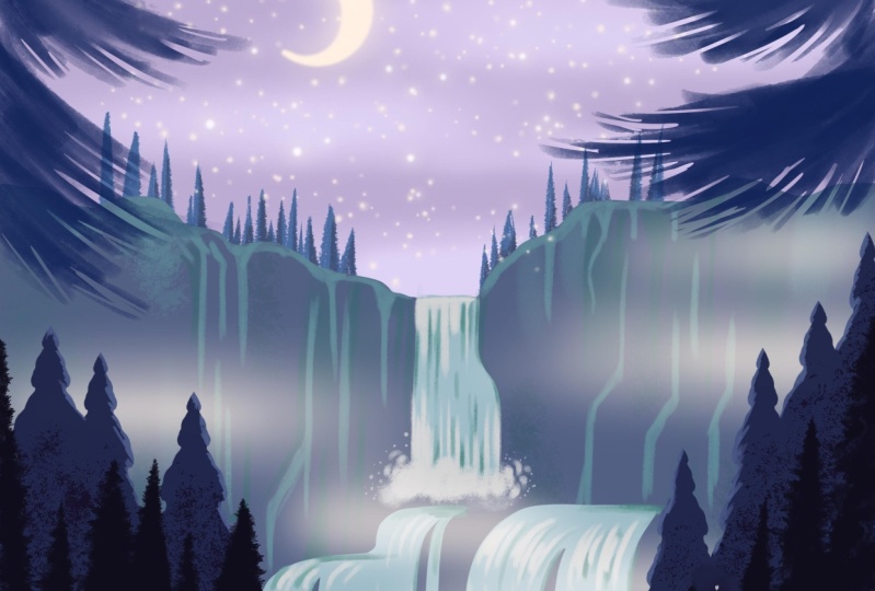
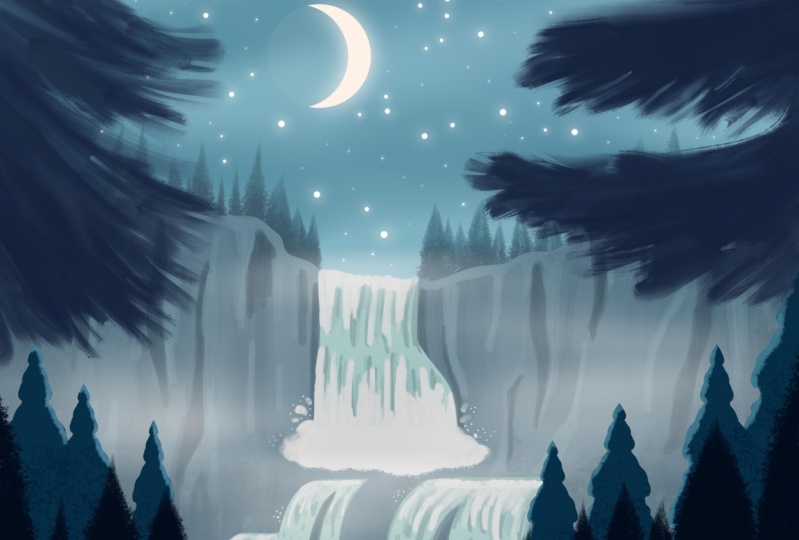
2. Resources and Canvas Setup: We will be creating
these Waterfall, which is kind of in a
magical setting full of stars and surrounded by
magical looking Forest, kind of highlighted by moonlight with little
bit of fog, the water. And overall this kind of hidden
feel for Waterfall plays. And I will take you
step-by-step to create these
beautiful landscapes, hoping, and I hope you enjoy it. So let's get to you. So let's first
talk about Canvas. For this illustration, the canvas size that we're
working with is 3,000 by 3,000 pixels at 300 DPI and
the color profile is SRGB. And I also have free
Procreate brushes, which you can download and
use in this illustration. And I linked the color
palette in the description. If you want to use the
same color palette, is I'm using during
this video it, so let's get to it. Alright, as a first step, we will turn on
the Drawing Guide, which will help you to create
more balanced composition. So go here on the top-left
to the wrench icon. Under Canvas, you will
see Drawing Guide. Click on the button to
enable the Drawing Guide. Then click on the
Edit Drawing Guide. And from these settings
at the bottom, click on the grid size to
adjust the size of the grid. And here from the numbers, you can type 370. So you will have the same
grid size as I have. When you are happy, you can click done. So you can see the grid
size change to 370. And you can also adjust
the color of the grid. Maybe we can set it up to
doesn't want to go with. So let's try. Okay, now it's working. I can maybe adjust the
grid color to blue. I think this is nice. And
then you can also change thickness of the
grid and opacity. I will keep it to 36%
and thickness 64. When you are happy with
the setting, click done. Perfect. And now we have the grid setup. Now I will zoom out
a little bit so it's easier for me to draw on
the edges of the Canvas. So maybe something like this. Perfect
3. Drawing the Cliffs and Waterfall: Okay, Now let's start
creating our moonlight scene. So first, go to the brushes. And as you know, you can download my brush set, which we will be using for free. And then you also have
additional brushes we will use, which is one of the
Pine Tree brushes, which I give you
this brush for free. And then also from
my starry set brush, we'll be free for you
to download as well. So now if we go to
the main brush pack, I will take the
Brush number one, which is the smooth liner brush. Then go to the color
palettes because I prepared also the
color palette for you, which you can use
for this tutorial, or you can use your own colors. If you are using the
same colors as me. From this first row of colors, take this fifth color, which is this bluish gray. And now we will start
drawing our Khalif side. So click somewhere on the canvas to exit the color palette mode. And now we will draw the Cliffs somewhere in the
middle of the Canvas. So you can mark down based on this grid where the
Cliffs we'll be. And I would like to
have the middle of the Cliffs little bit lower and the side of the Cliffs
a little bit higher. So the middle part of the
Cliffs will be around 1234. So somewhere here. So you can create a mark. And then the higher part
of the Cliffs I will place on the fifth
line of this grid. And now I will create uneven
line to draw these Cliffs. You can start on the left side
and create a wobbly line. Doesn't have to be perfect
because rocks are not perfect, but try to keep the top
part of the cliff more or less straight or a
little bit rounded. Now connect with
this middle part and then these right side, it would be nice if it is not the same line as this left side. And again, try to create a
wobbly line going upwards, towards the point
that you marked. Maybe this one is two rounded, so I will try one more time. Okay, I think this is nice. And now when you are happy with your Cliffs line or
the quid cliff edge, take the color and
drop it to the shape. And as you can see, there is
little bit of white here. So you can drag the pencil to the right to adjust
the color drop. And before it overflows, it should feel the Gibbs here. You can always zoom in to check the areas and clean
up the shape. Alright, And I think
there was something here. Alright, perfect. Okay, I think this is nice. Now let's start
creating our Waterfall. Go to the layers and click on the plus sign to
create a new layer. Now, go to the color palette. Intake, the first color
in the second row, which is this lighter blue. And before doing that, Let's create a clipping
mask on this layer. Click on the layer and
select clipping mask. This will help us to Draw only within the shape
of the cliff side. So now with a waterfall, I will create one part of the Waterfall going
somewhere until here, a little bit above
the second line. And then we will
have another part of the Waterfall starting from the second line going downwards. So don't worry if it
is not too perfect. But you can draw more
or less straight line, but I don't want to have
it perfectly straight. So you can try a few times because if you want to have
it perfectly straight, you can just hold the pencil and Procreate will help you
to straighten the line. But I think it's nicer if it
is little bit more verbally. So try to create the straight line with
free hand movement. Alright. Now here on the right side, I will do the same by just going only to the mid section
of the Waterfall. This side of the Waterfall
will be a little bit wider. So something like this. Then when you are happy, you can close the shape. We will fix the bottom part
later on with other colors. So this doesn't
have to be perfect. When you are happy, you can
drop the color in the shape, but as you can see, we forgot to go to
the ear on the top. So let's go back and
close the shape. Now. Drag-and-drop the color Perfect. Now let's create the other
part of the Waterfall, starting somewhere
above the second line. And creating a curved line here. On the top, it will be straight. Connect these two lines. And somewhere in the middle
of this waterfall curve, the line going downwards. And try to keep these
curves similar. Then in the middle, the Waterfall we'll split. So I will create similar line, curved on the top and
going straight down. And then I will
do the same here. And as you can see, this brush, it's thinner with low pressure and thicker with
bigger pressure. So you can practice these lines strokes with
this brush as well. Then you can close these
shapes here and drag and drop the color and fix some of the
color if it is not perfect. And let's create another part of the Waterfall starting
in the similar height. Curving. So first going straight curve
and then straight down. Then connect the Waterfall here. Going down to the similar height on the grid size is
with these other two. And then on this side, I will create another
straight line and curving downwards. Now, this Waterfall
will be split as well. So I will create similar line first going straight,
curve and down. And then another
line like that here. And one more here. Perfect. Now I will connect these shapes so I can
drag and drop the color. And I think this one
is fine as it is. Drag-and-drop the color into the shape and you can drag to the right to feel
the shape entirely. And now we can also draw
a leg here at the bottom. So the leg will be covered
with the trees as well. So we don't have to
make it perfect. So in order to do that, I can just actually
draw a line here. Somewhere in the middle of
these two lines of the grid. Tried to make it straight. If you don't have it straight, you can tap on the
canvas because we want to have this trade
horizon line of the lake. And now you can drag
and drop the color and fix some of these shapes if you are
not happy with them. So I will zoom in and I
think it will be nicer here if this is connected with more straight lines to the
lake so I can fix that. This one is fine. And also this one. Perfect. So we have the first part
of the Waterfall already
4. Highlights and Shadows on the Waterfall: All right. Now, let's continue
building up our waterfall. Go to the layers, click
on the plus sign, so we can create a white part of the waterfall
where the foam is, where the water is falling
down on the surface below. Go to the color palette and select the second color
in the second row, which is the grayish
white color, and then go to the brushes
and from the free brush peg, go to the brush number four, which is water flow. Now we can zoom in
on the waterfall, and here I will create the curved shapes to create
the water splashing around. Here we can make the brush
a little bit bigger. I would say 7% is nice, and now I will create
the rounded shapes. Okay. Try to keep it around
the bottom of the waterfall. Now I can make it a
little bit smaller, 5% and create another
shape here on the side. Then I can also draw
a few lines going upwards and you are pulling basically the
color from bottom to top. Now I will add few more rounded
shapes here on the right. Okay. And then I will make the
brush smaller around maybe two let's see. 3%. I think it jumped here, so let me remove these. When you click, you can
remove the save size, and when you want to
create the save size, again, you can click on
the plus sign like this. I will remove the saved setting. I will go to the
brush with a 3% size, and now I will create
another line going upwards. I'm trying to keep it aligned with the
edge of the canvas. Some are longer and
some are shorter. Perfect. Now I can add more
splashes here on the side, just curved shapes here
and maybe a few dots. Then I can do the same
on the left side. Perfect. Now, go to the top of the waterfall
and we can add some of this white color
going from the top to the bottom. Okay. Perfect. Now, this part
can be here in the middle. That would be
longer. Then you can connect the color here on the top and add
another line here. We will have few of them and then make the brush
a little bit smaller, 2% and then one more line here. Then we can add one of
these lines here as well. Perfect. Now let's do the same for this
bottom part as well. I will make the brush
a little bit bigger. We had 5% before, if I remember correctly here. Now I will zoom out so we can create these
shapes here too. Here we can add a bigger splashes because
this waterfall is wider. Round the shapes
again here, so here. I am creating the shapes with bras movement
from right to left. Okay. So we can add few here. It's kind of like this
fluffy soft clouds created by the
water falling down. Okay. Perfect. Then with the circular movement, we can add softer shape
here at the bottom. I am using also lower pressure and just spreading the
color around the canvas. Now with the movements
from left to right, add a little bit of the
color here as well, also with the low pressure. Perfect. Now you can add a little bit more of
the white color here as well because I
think there is maybe too much blue here
compared to this part, and we can spread the
color here as well, a little bit, so it's similar. With the round movement, do the same here, and then we can add some
white color here too. Perfect. Now let's make the
brush smaller. 3%. Then I will add these
lines here on the top. The same way as we did on
the top of the waterfall, the curved lines following
the shape of the water here from shorter and longer. Now I will make the brush a
little bit smaller again, 2%, and I will add few
lines on the left side and creating fewer ones
and few shorter ones. So here. Then I will
add one more line here and creating the lines from bottom to top because this brush is taking the color, which is already on the canvas. Then I will add
another line here. So just adding a
little bit more of this white color
to the waterfall. Let's add some
white here as well. Perfect. And then I will add
some white color coming from the bottom to top, just dragging the paint
from this bottom part. Upwards and trying to keep the lines more or less straight. But as I said,
they don't have to be perfect because I think it adds this nice charm to the illustration when
it's not perfect. Let's add a little bit
of this white also to this corner of the
waterfall and also here. We have it on these
spots spread around. I think maybe a little bit
more here would be nice. Now, let's zoom out
and see how it looks. I think it's starting to
look super nice And now, let's create another layer, and this one should be below this layer and above
the blue water layer. Click on this layer and click on the plus sign
to create new layer. Now go to the color pallete. From the color palette, take this third color
in the second row, which is a little bit darker
blue than we had before. Now let's add some darker
shades to the waterfall. I will add some of
these darker lines also coming from the bottom of
the foam and waterfall because we would have a little
bit of that shadow coming through the water
also from this foam. Going around and
basically variety in colors from the waterfall. Because we also see
maybe the rock behind the waterfall and
other surfaces. Basically, the water will have different colors
when it's falling down and you have different reflections
on the water as well. I'm just creating these lines going from the
bottom to the top. Then we can add few of these darker lines also
under these white shapes. Here I'm using the
curve movements. Let's add a little bit of this darker color
here in the corner. So we can blend
this waterfall to the cliff side and
let's do the same here. All right. I will add some of
these colors here too, and also to this corner
of the waterfall. I think this is nice. Let's do the same here on the
top part of the waterfall, add some of these darker shades
under the lighter shades. We have this white
grayish color on top, and then we have some of these darker streaks
of color under that. Let's do it also here. Okay. All right. Okay, I think this is turning into super nice waterfall color. Now, waterfall color.
Is that the color? Okay. Anyway, waterfall, it's turning up to be looking
very nice, I think. So let's go to the
color palettes again. And from the second row, let's take this fourth color
which is dark bluish green, and let's add few of these even darker shades
into the water. I will add some darker shades here to the left
side of the waterfall. Maybe there is rock behind
the water or something, or the light is hitting the water surface in a different way than
the other areas. Then I can add a little bit
of these darker spots here, and then in the middle of
the waterfall as well. And here as well. I'm using the movements
from top to the bottom, and I will add some darker
spots in the middle of this part of the waterfall
and here as well. Let's add to this side to Still using the same
brush size as I had before. Then I will add some
darker spots here, but try not to cover all the other mid values
that we created before, this lighter bluish green tone. I am not covering all the areas that we created a second ago, but just some areas. Now, I will add a little bit of this darker color to the
edges of the waterfall here. All right. And also here. I'm creating this outline
for the waterfall, and I will do it here as well. Here you can practice
your lines and brush strokes trying to follow the shape that
you created before. You can do it with
more movements. You don't have to do it
with just one movement, so it doesn't have to be
perfect and you can redo it a few times if you are not
happy with the shape. Okay. So we can add some of these here and also on the top part, moving from left to
right, and also here. Okay, we cover these parts
of the waterfall as well. Basically the top line of the water coming
there and here as well. All right. I think
this looks great. Let's move on to the next part.
5. Adding Colors to the Sky: All right, Next step, let's add some color to the Sky. So let's zoom out so we
can see this guy and now go to the layers and create a new layer by
clicking on the plus sign, then drag this layer under the first layer so we can create the Sky on this area or
behind the Cliffs side. And now go to the
color palettes. And from the Colors, select the first color
in the first row, which is this bluish tone, and drag and drop the
color into the shape. Now we don't see the
Cliffs side dead well, so now I will go to the brushes, and from the brush pack, I will choose the
Brush number six, as you can see already here, which is basic blends of Brush. And going back to
the color palettes, I will go and take the third
color in the first row, which is this lighter blue tone. And then I will adjust
the size of the brush. So let's see, maybe 45
per cent should be nice. And then I will create
streaks of light, or basically these
lighter areas between the clouds or how you
would imagine the Sky. And with movements
from left to right, I will lighten up the Sky. So I will start
somewhere around here. I'm not using very
high pressure. And when you see you will use bigger pressure
with a brush. The brush will become lighter. So try to create shapes
with lower pressure. And then you can build it up with a bigger pressure later on. So first using lower
brush pressure, moving from left to right. And then maybe I can create the shapes with
a smaller brush size. So 3%. And then I will use
higher brush pressure. Building up these shapes so they are little a bit
more translucent on the edges and lighter
in the middle. So as you can see, Then I will make
the brush a little bit smaller, maybe 2%. And then I will lighten
up this area to okay. And if you see hard edges
which you don't really like, we can always soften
those edges in a moment. So let's create one shape here, and maybe another shape here. Before softening
up, these shapes, go through the color
palette and select this second color
in the first row, which is a little bit darker than the one we started with. And let's darken some of
these areas in the corner. So still moving
from left to right. And I will add the
darker area here too. And maybe here as well. Alright, now go to the adjustments and
select Gaussian blur. And let's blur this
area little bit. So by sliding to the right, I think nine per
cent works nicely. Perfect. Click to exit this mode.
6. Drawing Shadows and Highlights on the Cliffs: Now let's add some
lighter and darker areas on the Cliffs side. And before adding details
to the cliff side, Let's make the Cliffs
actually a little bit darker. So make sure that you are
on the correct layer. And then go to the
color palettes and cell-like the fourth
color in the first row, and drag and drop the
color into the shape. Now, go to the layers and create a new layer above
the cliff side. Now, go to the colors again and select the fifth
color in the first row, which is this lighter gray. Make sure that you have the brush that we
selected before. We choose this
Brush number five. And it has this
fluid, nice texture. And now we will add few shapes
going from top to bottom, trying to keep these shapes aligned with the
side of the canvas. The brush size is around 4%. And now let's add
few shapes here. Let me zoom in so you
can see it better. So I will add some lighter
shades here on the top. And then straight going down, following the shape of the Cliffs side that
you created before. And trying to keep these shapes pretty angular because
of the rock surface. And here you can play with the shapes going from
like thicker, thinner, and they can have
different angles, but mostly going
from top to bottom. So some are aligned
with the side of the canvas and some
are little bit angled. So here, let's add
one line here, which is more straight. Then angle it to the right
and then straight again. And then I will connect it
with the edge of the water here and create the wider
shape here at the bottom. Then I will create
similar shape here, which is aligned with the
edge of the Waterfall. And I will create similar
angled shape like here. And then going down again. Then I will add one more
straight line here. And as I said, you can play with these shapes and
create more of them. Kind of creating similar
shapes like if they are cracks on the rock side and Cliffs side of
these waterfalls. So one more here. And then we can add more lighter lines and
shapes going from the top. Because we will have
a light from the Sky. Okay, now go to the
left side as well. And let's create
few straight lines going from top to bottom
on this side as well. They can be angled to and then
going down again and here. So you can really play
with these shapes and create their
own how you feel. There can be these
cracks in the rocks. Alright, so one more here. And here, I can add maybe a little bit more
compared to this side, so they are a little
bit different. And I can add one more
angled shape here. So you can imagine there is like a flat area which gets
more light from the Sky. Even though it's not daylight, we will still have
light from the moon. Then let's add more of these shapes here on
this side as well. And maybe here, okay, I think this is enough
for these lighter shapes. And now let's add some
darker shades as well. So go to the color
palette and go to the seventh color you can
count, which is 123456. Actually, it's six
colors on seven color. So let's take this one and let's add some darker
areas as well. So I can add a darker
area here, for example Then another one here, so you can try to balance it. So it's not the same everywhere. So I will add a line here. So it's kind of
another angular shape. Let's add one here. Let's go to this side as well. We can add a darker area
next to the Waterfall. So here. Then I will add one
line in this area. Also here. Maybe one, a bigger on this side. Still keeping this
angular shapes. And then on this side as well. So this is little
bit different shape than the ones we
created until now. And maybe there can be
darker area here too. So trying to balance the amount of a lighter and darker areas. All right, and now let's add some texture to our Cliffs side. So go to the Layers. Click on the plus sign
to create a new layer. Now go to the layers
EGN from the brushes, select the Brush number eight, which is called Rust. Now from the colors, I will keep this same color
that we were using until now, which is the seventh
color in this row. And now let's make the
brush little bit bigger. So let's see, maybe
30% will work nicely. And now I will paint on this
side of the cliff side. So basically movement
from top to bottom, creating this nice rust texture. And I'm eating this
texture only to the bottom side of the cliff. And let's add some of
that also to this side. Without lifting the pencil, hitting some of
these textures here. Alright, now, go to the layers and click on
the plus sign to create a new layer and move it
under these rock cracks. Now, go to the brushes and
select the Brush number four. Go through the colors
from the colors. We will still keep these color
that we were using before. We choose the six color
in the first row. And we will add some
of these darker areas, but we the different brush
and lower brush pressure. Just moving the pain from top to bottom to add more variety
to our Cliffs side. And the brush size I have
here is eight per cent. And I will add some of these
darker areas here as well. And it's under the texture. The texture is not
so strong here. Okay, now we can add another
layer with the texture. Maybe we have so many layers already that you might
be thinking like, Oh, I have too many layers. So if you're happy, you can merge these
texture layers together. And let's create another layer. So click on the plus sign. I will go to the brushes and select the
Brush number eight. And go to the color palettes and select the fifth color
in the first row. I will make it the
Leilah beat bigger, 12%. And we can add some
lighter texture here. We can add some texture
here to and basically adding some of these
rough textures on the top part of the cliff. Now go to the colors and select these darkest color
in the first row. Now make the brush a
little bit bigger, so 30% or maybe 32 per cent. And we can add some
of these darker spots by moving the pen
from top to bottom. And I will make it a
little bit smaller, 22%, and add some
areas here as well. Alright, I think this
should be enough. Maybe a little bit
more here as well. And anything that cliff
side is looking nice
7. Drawing the First Trees: Alright, let's start
adding some trees. I will zoom out, so it's easier for
us to add trees. Now, go to the brushes. And from the Pine
Tree Forest said, I prepared one of these
brushes for you to download. So you have this Pine
Tree Forest brush, which is one of the three
shapes that I created. And with this brush, Let's go to the color palette. And let's take this second
color in the third row, which is this
darker, bluish tone. We can test the
size of the brush. Okay, This is a
little bit too small. So we will make the
brush maybe 18%. And of course, we
also need to create a new layer for our Trees. So I will go to this
layer number three and create a new layer above
all what we just create it. Okay, let's the
size of the brush. I think this size
is pretty okay. With the arrow. I can move the three
little bit lower with the freeform transform tool and we'll make the three
little bit more narrow. Alright, I think this
works pretty nicely. I will zoom out a
little bit more so we can see the bottom
part of the canvas. And you can move the
three little bit lower. Just be aware when you move the three little bit
outside of the Canvas. When you release these tool
and the transformation, this will be cut off, but I think displacement
works pretty nicely. Alright. Now let's repeat
this process again. I will go to Layers and I will create a new layer
for another three. If you're running out of layers, you can always merge
the water layers together and the
Cliffs side together. Now click on the plus sign and
let's create another Tree. I will make the brush a
little bit bigger, 30%. This time, I will click in
the middle of the canvas and with the arrow transformation
to end the free form, I will make the
Three more narrow. This time, I will move the
three little bit to the side. Let's make it more narrow. Okay. I think something like this. Okay. I will move the three
somewhere here or let's see. I will place it here. Okay, let's click on
the plus sign again. Egn create a new tree. As you see, I already just
touch the canvas very softly. And then U3 was created. But it's fine in displacement because we want to
move it anyway. So I will move this tree. Then we the free
form selection tool. I will make it more narrow
but not the same as this one. Alright? Then I will place it somewhere here with a little bit
different distance than the previous one. I will release. Alright, let's
make another tree. I will make the
brush even bigger, so it will go to 86%. And I will create
another brush shape. Now with the arrow to, I will make it a little bit
more narrow and taller. So as you can see, it's a transform tool, not Arrow tool, but there
is an icon of arrow. Now, I can move this tree here, and before moving it into place, I will duplicate this layer. Now, I will hide this layer
and I will save it for later. Now with this tree
layer number 11, which we created originally, I can make it even more narrow
and move it to the side. Perfect, I think
this works great. So I can merge these
trees together, except this top one. Now I will uncover
the layer and I can make it more narrow
as these other Trees. And I will move it
here to the side. Perfect. I will create new layer
and create one more three. Now, I will make it more
narrow again and move it here. And I can make it even longer. And just put it
here on the side. We can merge these two. Click on the plus sign again. And let's create another tree. Let's make it more narrow. So we have a variety in shapes. And I think this
works quite nicely. Alright, perfect. And now we have these nice
row of trees created. Let's go to the layers and then we can merge them together
8. Drawing the Foreground Trees: Now let's create another
layer and you can explore different shapes
of the trees if you want. But this time I can use
another of these free brushes, which you can download. So I will take
these Brush number 13 and then go to
the color palette. And take the third
color in the third row, which is this dark as
blue color we have here. And let's check if we have
a new layer so we don't draw accidentally on the
layer that we don't want. And I will test the brush size. Alright, and let's make
the brush five per cent. Now with the movements
from top to bottom, we will create smaller trees
here in the Foreground. So I will start with lower
pressure and increase the pressure when I'm closer to the bottom part
of the canvas. And I will build up these three shapes that they
are more narrow on the top. Why there at the bottom? Perfect, I think this is
nice and you can continue creating these
cone-shaped trees. So they are more stylized. Of course, they are not
realistic as you can see. But I think they create
nice variety in shapes. For this illustration. We can have one taller
one here on the side, and it can be also wider at the bottom compared
to the ones on the left. And I'm always
lifting the pen at the end so I can add
another one here. So starting always on
the top and releasing, going to the bottom. Maybe I can make this
one a little bit wider. Okay? And I can create more shapes here on the left side as well. And maybe this one can be a
little bit wider on the top. Okay, I can add one more here. And maybe one more narrow here. Maybe this one can be a little
bit taller than this one. And then let's add one more here so we can feel the space. Alright, I think this
works very nicely. Maybe I can adjust these
edges little bit more. So just to paint
softly on the air. So it's not so GCD
here on the edge. And I will add little
bit more texture here. Perfect. Now let's go to the layers and go to the trees that
we created before. Now, I will go to the
main brushes again. You can select the
Brush number 11, which is dry sponge. Now from the Colors, select this fourth
color in the last row, and let's make it a
little bit bigger. I think five per cent, maybe 6%. And let's go back to the
layers because we need to turn on Alpha Lock by
clicking on the layer, you can select Alpha Lock
from the drop-down menu. And now we can paint
only within the trees. So I will add little bit of this darker color at the
bottom of the Trees. Perfect. Now let's go to the brushes again and go back to
the Brush number 13. Then go to the color palette, and from the Colors, select the second color
in the first row. And we can add little bit of the highlight on the
left side on the tree. But as I can see, we definitely need to
make the brush smaller. So let's go back
and let's make it 1% and just add a little bit. Let's zoom in so
you can see better. And let's just add a little
bit here on the left side. And I will add a little bit
on each of these trees. I think here maybe we can
get away with two per cent. Okay, So let's do that. And a little bit
here on the top. Okay. And let's add it
to this one as well. And so you would add a little bit of these
Highlights on the edges, kind of coming from
the moonlight. And then we can edit also
here on the left side. And I'm using the
movement from top to bottom in the
angled kind of way. So kind of back-and-forth. Alright, I think these trees
are looking pretty nice. Actually, looking
at these trees. I think these row of trees
can be a little bit darker. So let's go to the layers, find the correct layer, go to the color palette, and select the fourth
color in the last row, and drag and drop the color onto the Trees and address
the threshold. I think to, let's see, around 40%, I think will work. Let's do the same
on the other side. Alright, I think this is better, so they work better together.
9. Drawing Tree Branches: Now let's create some trees on the top part of our composition. Let's create a new layer. Click on the plus sign and
drag the layer to the top. Now go to the brushes. And from the brush back, Let's go and take the
Brush number four, which is watery flow. And we will create quiet like a rounded shapes and then we
will delete parts of them. So let's go to the Colors. Let's add one more
color into our palette. So you will, of course
heavy it already available, but I will just edit
here because I think it will be better for
the Branches on the top. So now with the
watery flow brush, Let's create top Branches
so I will zoom out. I think it's easier
to create shapes. Let's make sure you
are on separate layer. Okay, let's start
with the shape, which is in-between these
two lines of our grid. So we'd movements
from left to right. You can create these fine
branch kind of shape. All right? Now we will create
another one under this line and crossing little bit of this
line of the grid. So curving upwards and creating
similar shape on the top. Perfect. And let's
create one more, which is little bit longer. And it's sitting somewhere on this line and ends maybe here. Okay, something like this. Perfect. Now let's add some shapes
also on the left side. So these ones can be
a little bit shorter. So also on the top
side of the grid, in-between the two top lines. And moving the brush
back and forth. And let's add another one here which is little bit longer. All right. And then one more here. Again curving upwards and moving the paint
from side-to-side. And you don't have to create
any spatial pressures, shapes because they can look
a little bit more organic. So we have different
shapes on both sides. Now go to the Layers, click on the layer
and create a mask. So we can erase from this layer, but not actually erasing, but just masking so you can go back if you want to
change something. Now we will take a
different brush. So number one, liner smooth. And we will paint
into these shapes. And as you can
see, this brush is a little bit thinner
when you press Softer and thicker when
you press harder. So I will add few of these lines on the ends of these Branches. So for example here. Then we can add like a gap here. So there is maybe like
a thinner brands. So there is like a variety. The needles of the
three branch or not so dense in that area. You can get creative with these shapes here and
you can always go back because you are just painting on the mask layer and not
actually deleting. So we can Take out part of these. Maybe I can add a gap here. Let me also here in this area. So here we are basically
creating the illusion that the branches are
less dense at the end. So let's take out some
of these areas through. I'm using the brush
size around 30 per cent and we can make
it a little bit smaller as well, 15%. Let's try one more time here. You can vary the size of
the brush or the pressure. So you have different
lines here. Okay. And we can maybe remove
some these areas as well. Maybe I can add the gap here. Maybe one more gap here. This one can be made
a little bit longer. Alright? When you are happy
with these shapes, you can go to the layers
and merge these two layers. Now, go to the brushes. And with the watery flow, we can soften some
of these edges. So moving from outside
to inside of the branch. And either way as well, maybe this is too
much that maybe I can paint softly on some
of these edges. So we made some pines or
some of these needles of the pines sharper
and some will be a little bit more
painterly and flowy. So you are kind of pushing
it around the paint here and making it stylized and
painterly at the same time. So if you are happy, Let's move on to the next part.
10. Drawing Background Trees: Okay, Now let's go
through the layers. Then let's create a new layer. Let's move it. So dragon movie it
just below the Cliffs. So below the layer number one. Then go to the color
palettes and take the first color in the
third row from the brushes. Let's go again to the
fluffy Pine tree branch. Or if you have the
Pine Forest said, you can choose some of
the shapes that you like. So with these Pine Tree brand, we will create smaller shapes
here on the Cliffs side. And if you use the
Pine Forest said, maybe you can take
these Brush number 27 and you can just paint the trees here in the
background very quickly. But let's create them one-by-one with these
fluffy Pine branch brush. So you kind of draw
each three one-by-one. So let's start here. And let's make the brush
little bit bigger. As I can see, it's too small, so maybe three per cent. We can zoom in so we can
see a little bit better. And I will create
some trees here, making them a little bit wider on the edges and more
narrow on the top. And let's make the brush
little bit bigger. Maybe five per cent
would be even better. I think four would be at
the end of last year. And with the TLT pencil, I am drawing the
Trees one-by-one, more narrow on the tough
anyway there at the bottom. So some are taller and
some are smaller here. So we have nice variety. Then we can create few of them
here on this side as well. This one can be maybe taller. Maybe this is too much. So let's go back. I think this would be nice. This one will be smaller. This one can be a
little bit taller, so we will fill in this space and then we
can add some of them here to behind these branches. So creating nice variety
in the three sizes. And you can have a bigger gap here and create
few of them here. And maybe some here as well. Perfect. Now let's go to the layers and click on the
layer to activate Alpha Lock. Then go to the color palette. And now let's take these
last color in the first row. And let's reduce the opacity of this brush to 45 per cent. Then we can paint on
the bottom side of these trees to add little
bit of shadow there. And because we have the
clipping mass activated, it's easy to paint
within the shapes. Perfect. Now let's go
to the layers again. And let's create a new layer. Now, let's drag it to the top, just under these Branches. And now we can add some
stars and the moon. So from the brushes, Let's go to the
smooth line there. Brush em go to the
color palette. And let's take this lightest
color in the last row, which is the fifth color here. And let's draw a moon. Here. You can create the curved
line and hold at the end. And you can edit the
ellipse to your liking. When you are happy
you can release. Then you can draw the inner side Hold and you can also edit
the Ark there to your liking. I think this is nice. And now you can drag and
drop the color to the shape. I think this shape is nice. I can move it slightly lower. And I think we can make it
a little bit smaller here, but this is up to you how big the moon you want to
have here in the Sky. Perfect. Now go to the brushes. And I also prepared
another free brush for you from my starry set. And it's Star number
one, which is glowing. So now let's go
to the Layers and let's create another
layer for these stars. And now you can just paint and create a starry sky very easily. And as you can see, there
is variety in sizes. Or you can just type the Canvas and play with
the size of the brush. But if you keep it to nine per cent and
don't lift the pen, you can create these
nice shapes and create the full starry sky very
easily and quickly. Now, I can see that the, don't have any stars
here near the horizon, so I can add some
there. Perfect. And I will move this layer
below the moon layer. And I can see that some of the stars are on
top of these trees. So we need to actually move
this layer below these trees. Perfect. Now let's duplicate
the moon layer with the bottom layer selected. Go to the adjustments and
select Gaussian Blur, and move the slider to the right to create
this nice glow. I think 17% is nice. Now on the same layer, click on the N, M select screen. Perfect, So now our moon
is glowing as well. Now let's create another
layer and we can create these nice fog around the Waterfall because that
often happens in the nature. So let's create a layer
just above this layer, which is layer number three. And below the three layers. Click on the plus sign, go to the brushes. And from the brush pack, select the Brush number six, which is the soft brush. And let's make the
brush little bit bigger, around maybe 4%. And I will zoom out. So I can see a little bit
better or maybe okay, let's make it bigger,
five per cent. And then I can add few
strokes from side-to-side, which are a little bit bigger. I can add one more here. Let's make it now a little
bit smaller, three per cent. And with strokes
from left to right, create these fog hanging
around the Waterfall. Because sometimes
that happens with the different with the
difference in temperatures. Now let's make the brush
a little bit smaller. So two per cent. And also here, with the bigger pressure to
create more opacity. I will make it now
three per cent. And I can paint also
here a little bit. Maybe here as well. Okay, I think this
is nice balance. Maybe I can make this
a little bit longer and little a bit also
here on the top. And now go to the
adjustments and CELAC motion blur and
move from left to right. Okay. I think so 67 per cent is nice. And then go to the layer, click on the N. And
let's select screen. And let's reduce the opacity
of this layer. Little of it. Perfect. I think this is turning
apps super nicely. Now we can add little
bit more shadow to the water and maybe a little
bit around these Waterfall. So let's create a
new layer here, just above the water And go to the brushes and
select the watery flow. Then go to the colors and select the fourth color
in the second row. And we can add a
little bit more of these darker shades
here at the bottom. I think maybe smaller
brush would work better. So 3%. And you can add some darker
shades just under the foam. And here on the edges. Let's make it even smaller, 1%. And let's create lines here on the water
so you can see it better from left to right. And I can add little bit darker tones
here in this area as well. Perfect. Okay, and let's add few more small details
around the water. So click on the
layer number three, which is the wide
part of the water. Go to the brushes and select
the Brush number one, which is lying, they're smooth. And go to the colors and
select the white color. And let's add few spots here. On the edges. You can make the brush a
little bit bigger, maybe 25%. Just to add these
small detail here. And I'm the water. Maybe I can make it even bigger. 39. And I can add few
of these dots here. Perfect. Okay. I think this is turning
out super nicely. And I think we are almost done. And when you are happy
with all the details, you can zoom out to see
the full illustration. And you can also switch the preview to see it
in the dark setting. You can just go to the Canvas
setting and preferences. And you can swap the light interface
into a dark interface. I usually prefer working
with lighter interface, but you can work in darker
interface if you prefer that. Alright, so this is it. I hope that you enjoyed creating
these beautiful kind of magical looking Waterfall
setting in a Pine Tree Forest. And I can't wait to see your versions or your
take on this project. And thank you again for being
here and see you next time.
11. What to Draw Next?: So how did it go? I can't wait to see all
your awesome artwork. Please share your drawings
and illustrations. Also the work in
progress if you want, in the Project section. If you want to expand on the knowledge you will
learn in this class, you can watch my
other classes about characters and
also about Colors, called color palette and
color and light masterclass. Visit my teacher
profile to find them. And if you would
like me to share your project on Instagram, please tag me in the
Instagram stories, in the post and
post Description. So I can help you and your are to be discovered
by more people. So thank you so much for being here and see you
in the next class.
 Iva Mikles, Illustrator | Top Teacher | Art Side of Life